The Galway Kitchen Picnic Dips: Packaging Design
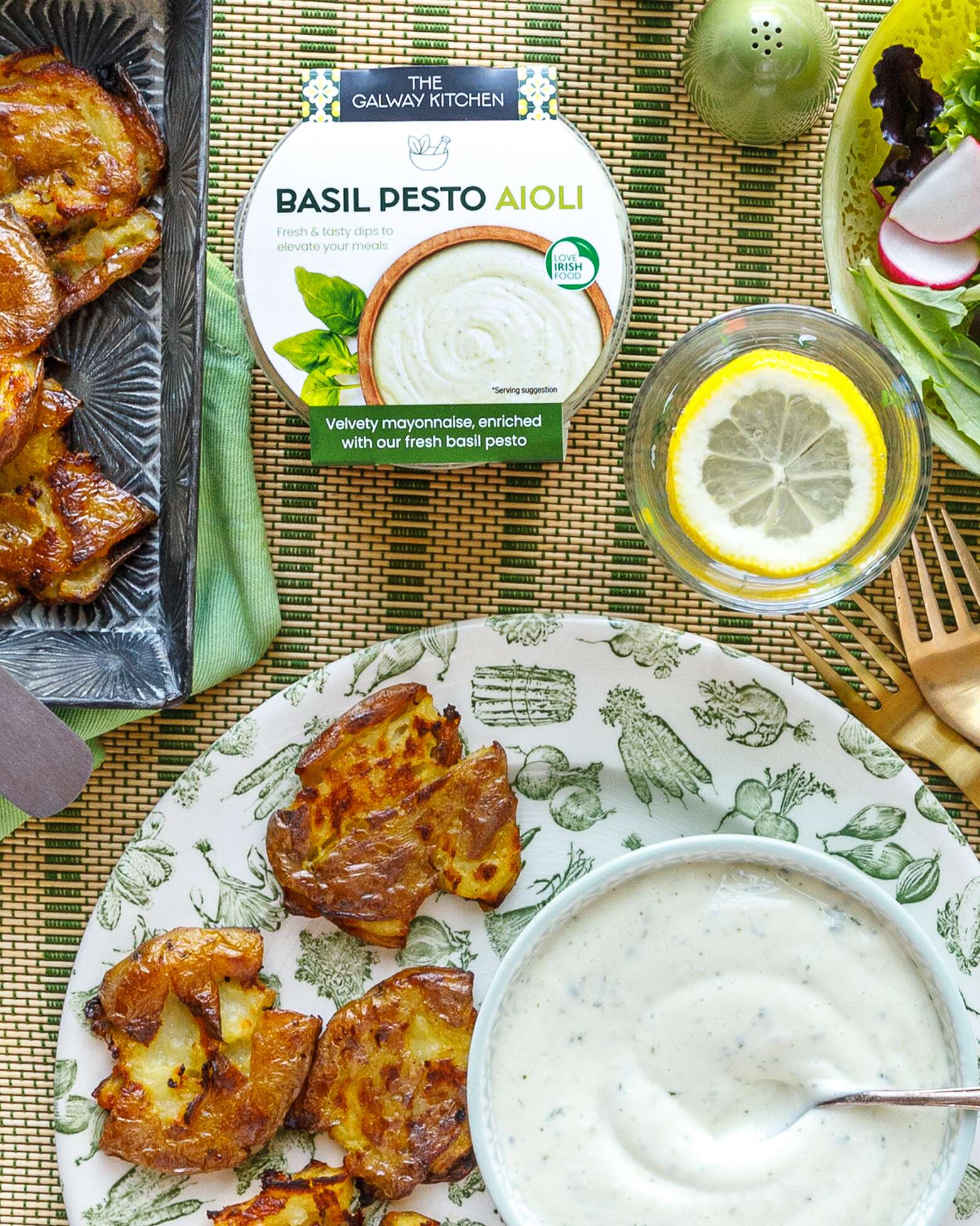
The Galway Kitchen Aioli Dips: Packaging Design
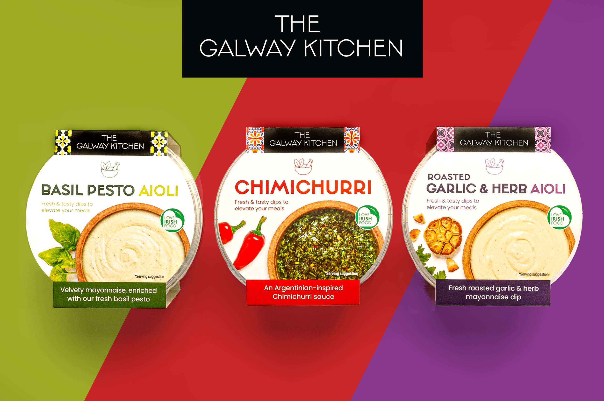
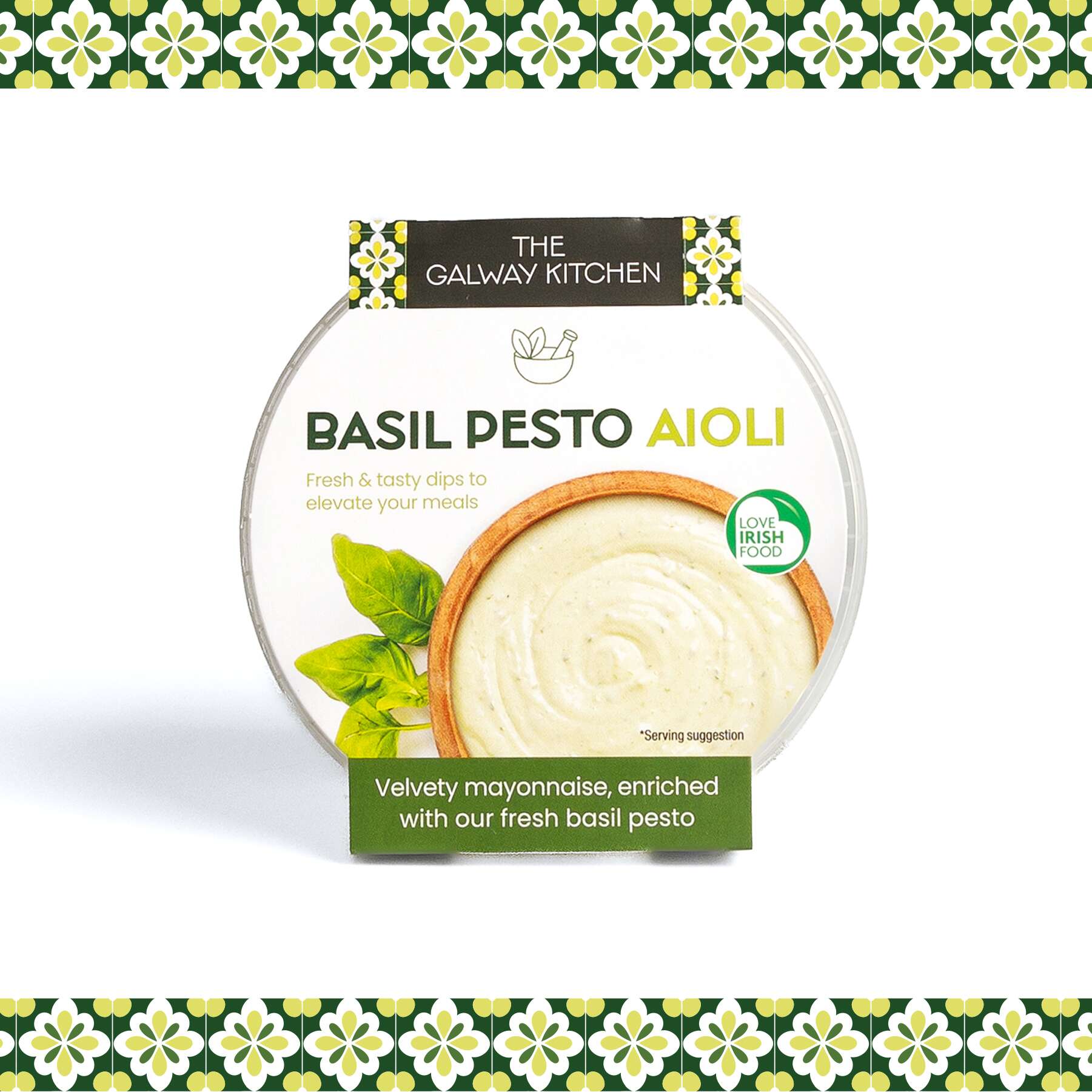
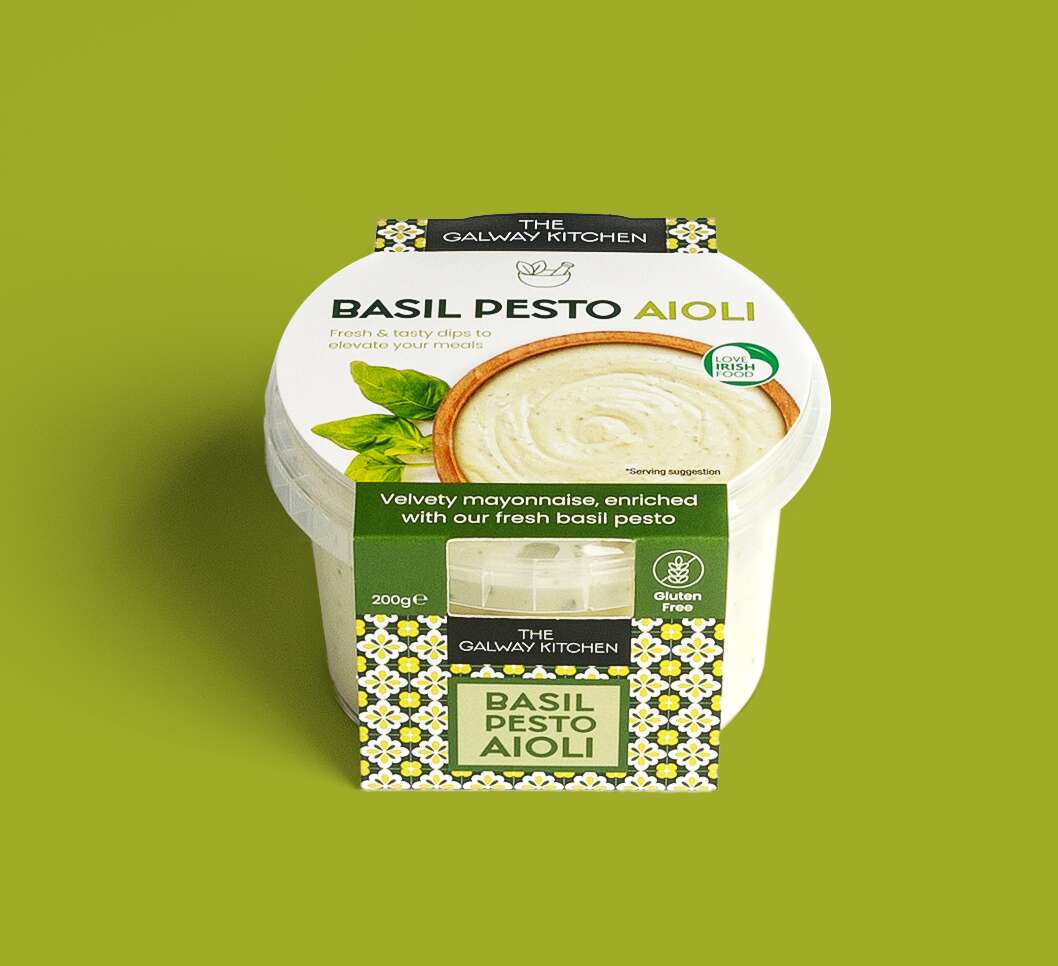
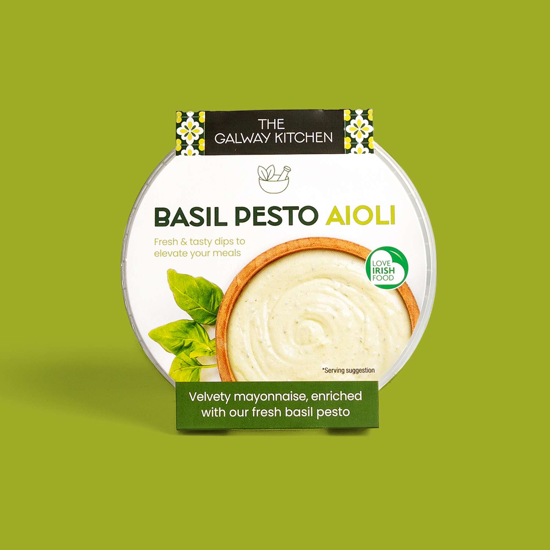
The Galway Kitchen have recently launches these new tasty threesome of dips. The condiments range are delicious as a dip or try them drizzled on some freshly grilled meat or fish for an elevation of flavour like no other.
The Galway Kitchen Ranks No. 2 among Ireland’s Top Prepared Dips and Sauces Brands in 2023*. As with all of their creations, these recipes have been expertly crafted by their team of in-house chefs and are made fresh in Galway with quality ingredients.
The three variations of dips are:
-
Garlic & Herb Aioli
-
Basil Pesto Aioli
-
Chimichurri
This trio of delicious dips are a convenient and tasty way to elevate any meal or snack – your new fridge essential!
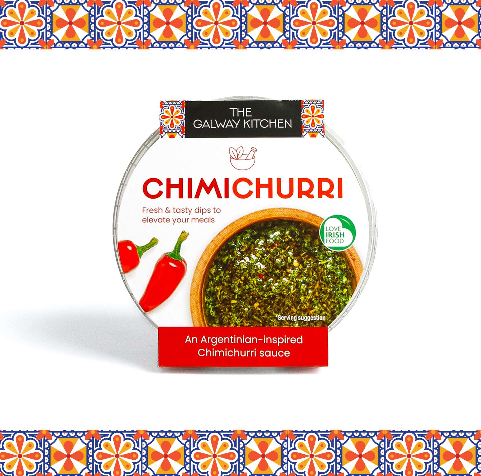
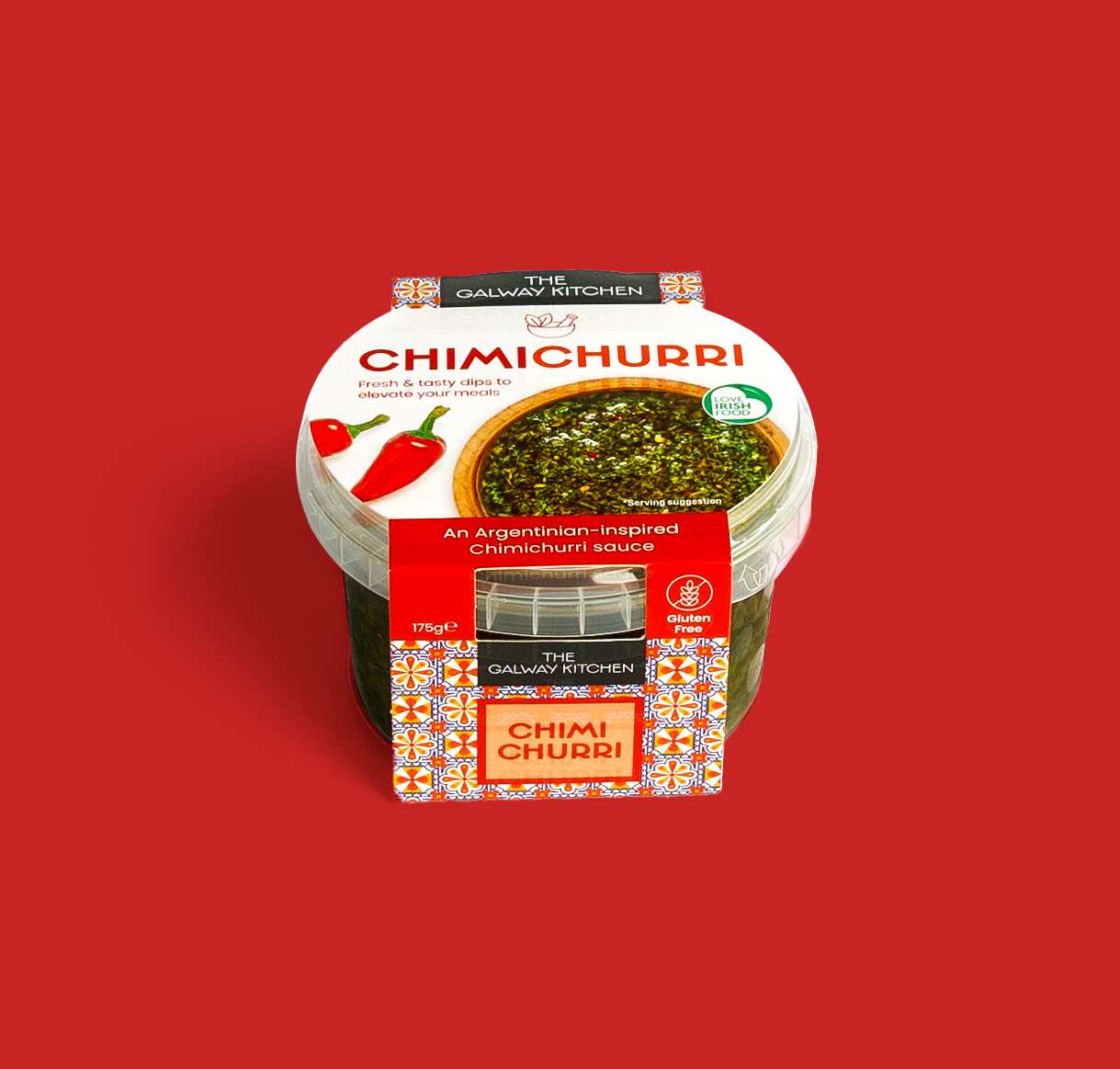
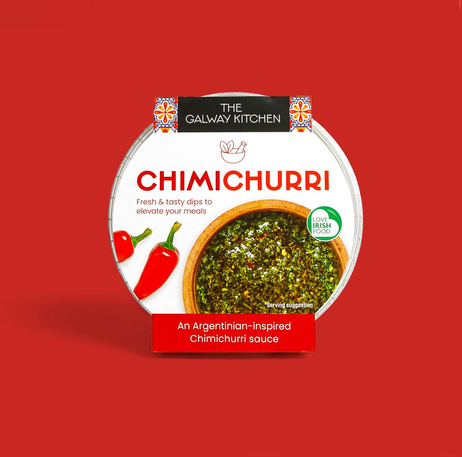
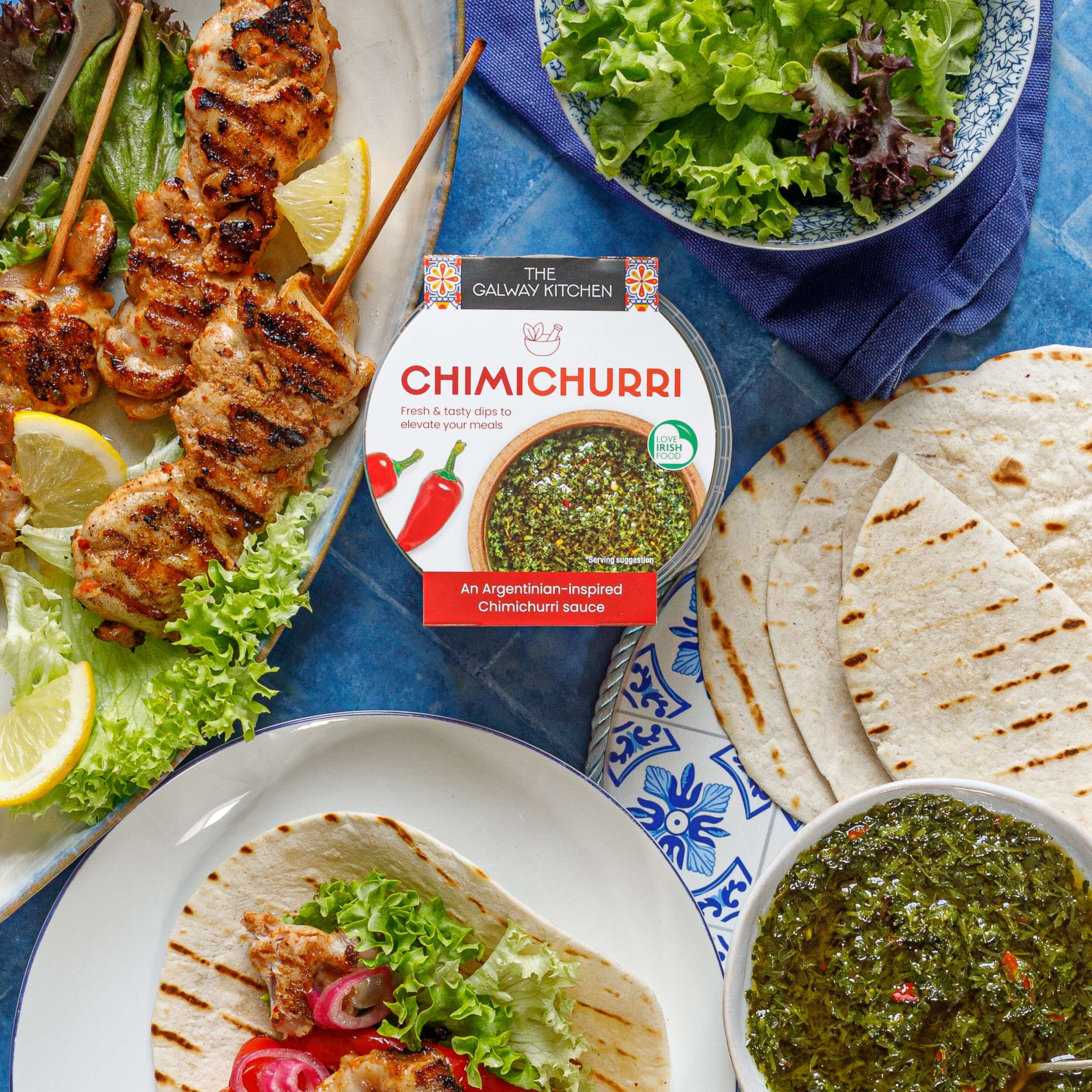
The Galway Kitchen brand already existed for their popular houmous dips range when they contacted Clare Lynch Creative. They asked if we could create the packaging design for these aioli dips packs to work well alongside their existing houmous range, and also the snack pack range designed by Clare Lynch Creative, which incorporate bright mediterranean patterns alongside clean, minimal typography and imagery, whilst bringing a fresher vibrant look to the packs to ensure a strong and bold standout impact on shelves. They loved the final design outcome of the range altogether.
The Galway Kitchen’s food range includes global flavours, inspired by much-loved tastes from around the world, made in their kitchen at the heart of Galway.
The beautiful photography of @thegalwaykitchen range is by Irish photographer @jenniferocooks
They are available in @tescoirl stores.
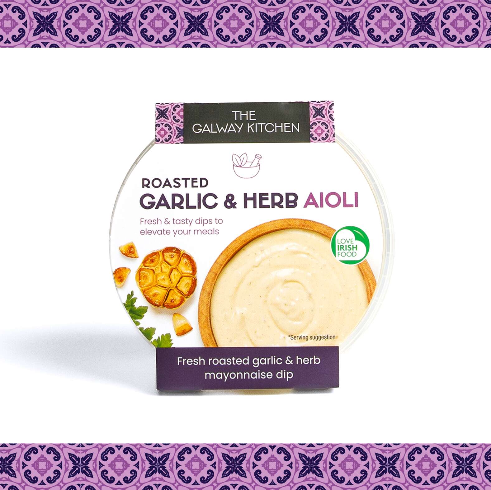
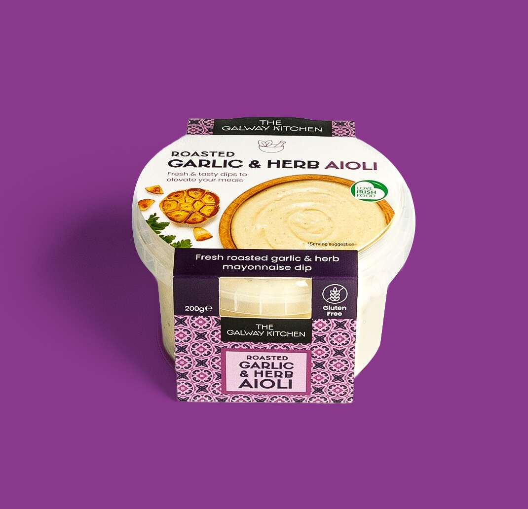
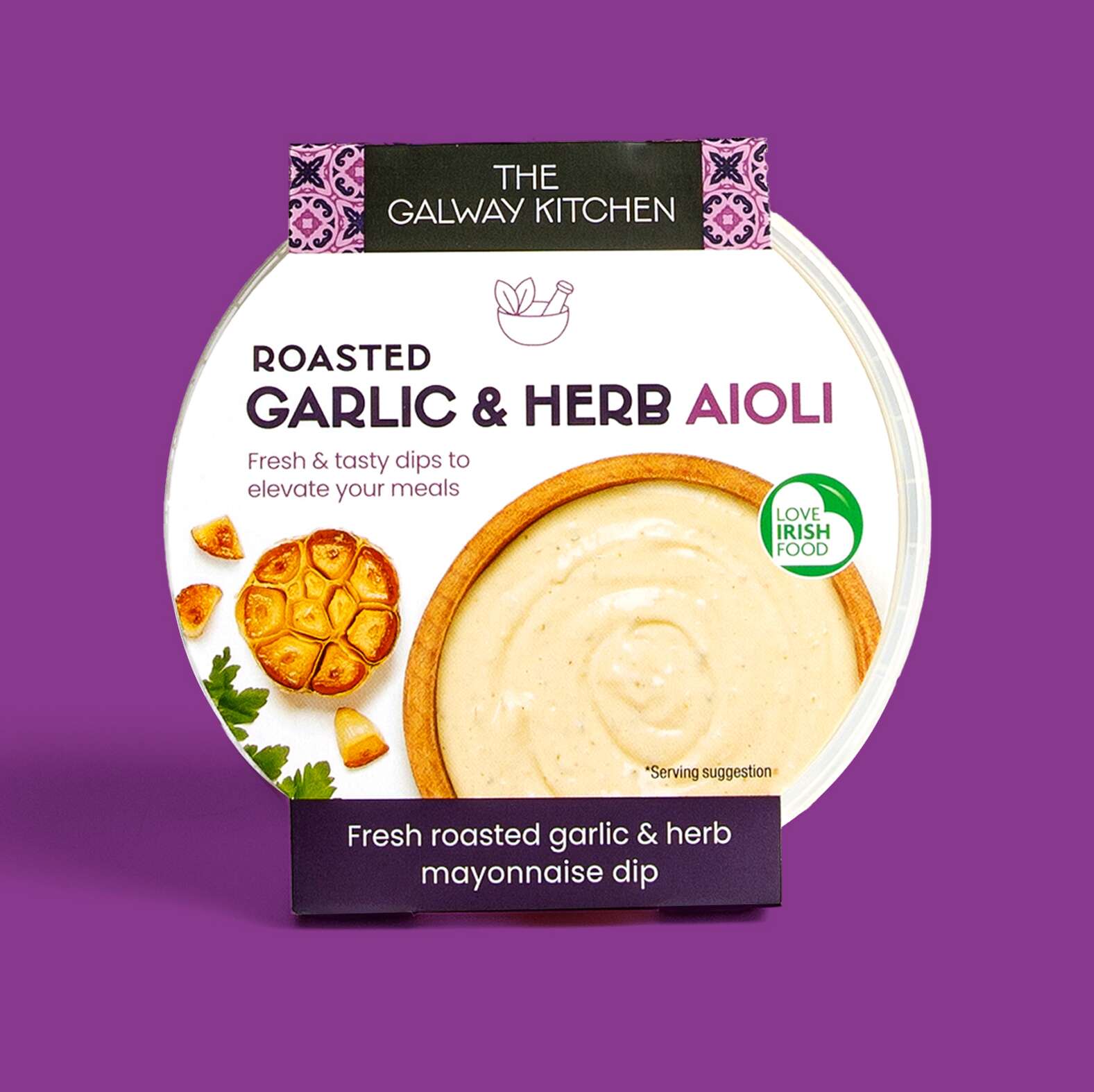
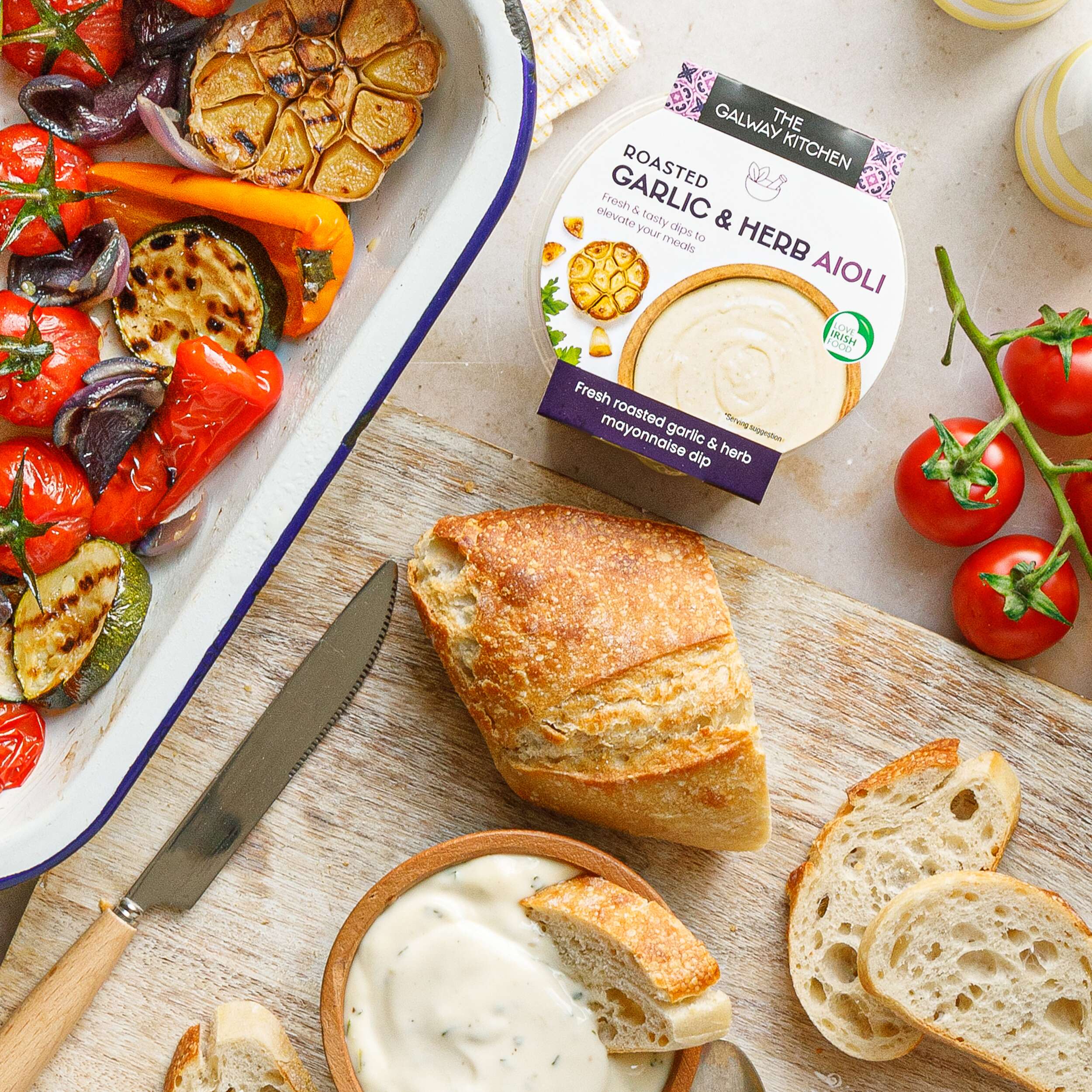
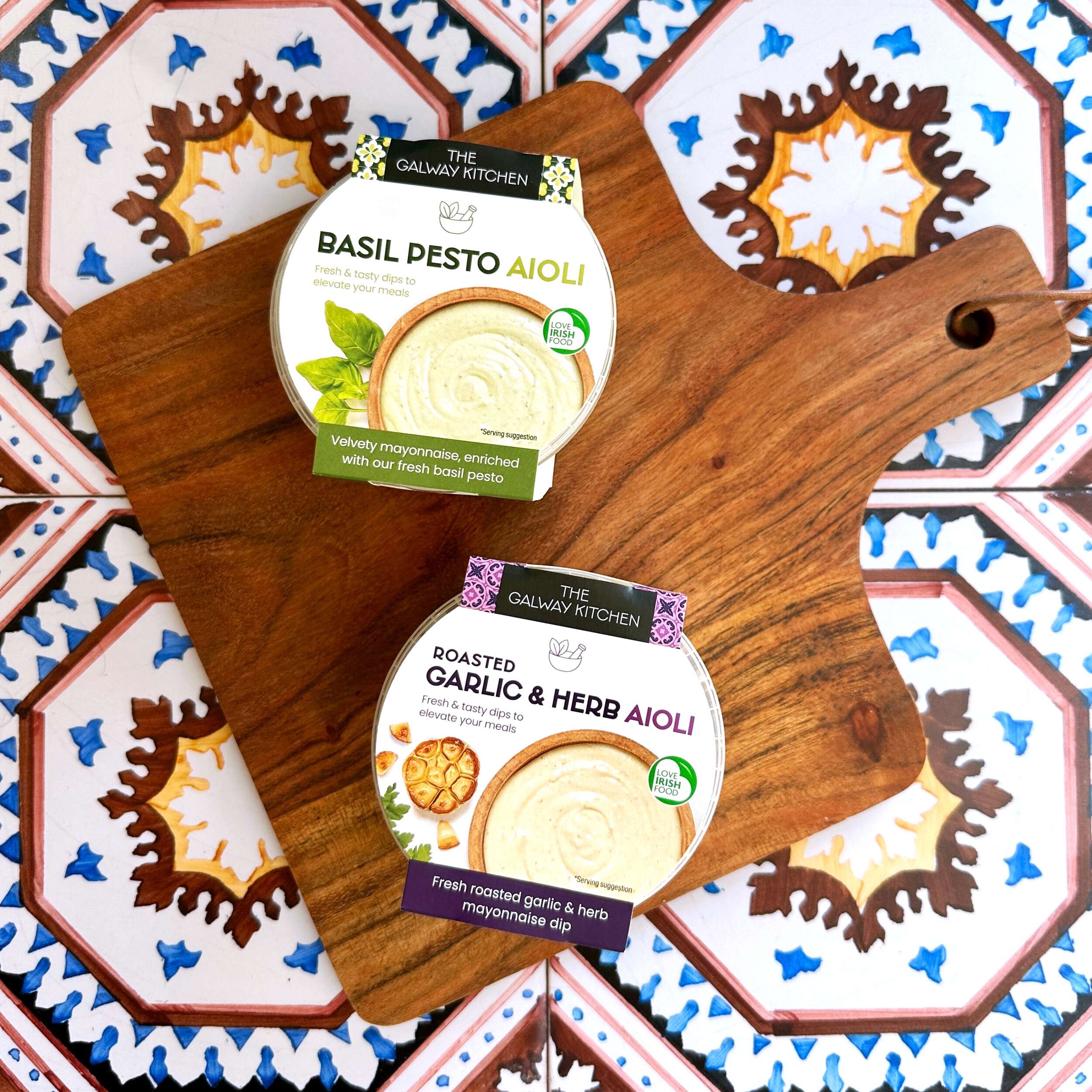
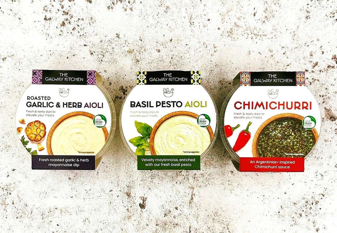
These dips are must-have condiments of the Summer ☀️
The Galway Kitchen range is available at selected Tesco Ireland stores:
Find them in the fridge at your local Tesco Ireland
www.tesco.ie
www.instagram.com/tescoirl/
Follow The Galway Kitchen at:
@thegalwaykitchen
Photography by Jennifer Oppermann:
@jenniferocooks
www.jenniferoppermann.com
Packaging printed by Priory Press Packaging.
The Galway Kitchen are produced by quality Irish fine food producer Galmere Foods.
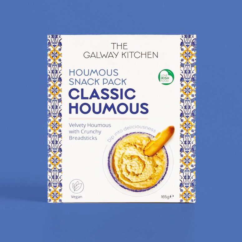
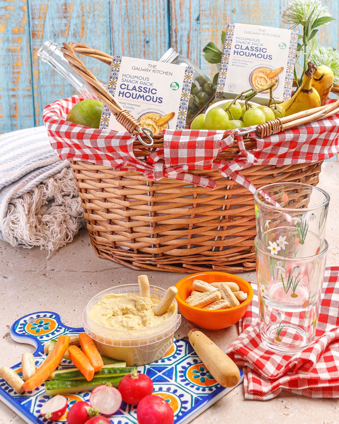
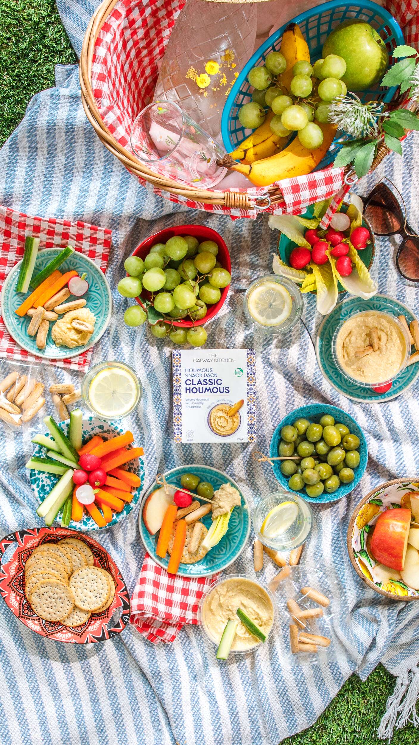
The Galway Kitchen Snack Packs: Packaging Design
New project
The Galway Kitchen Snack Packs: Packaging Design
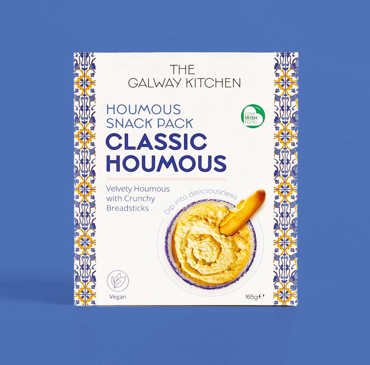
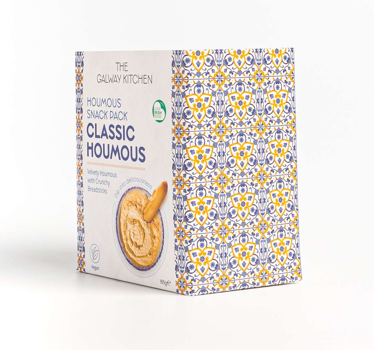
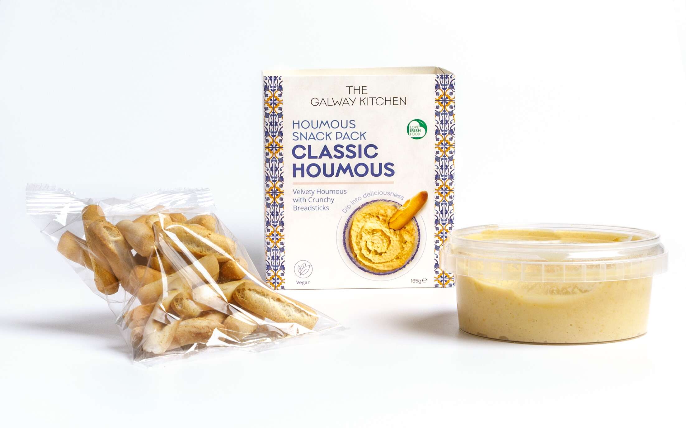
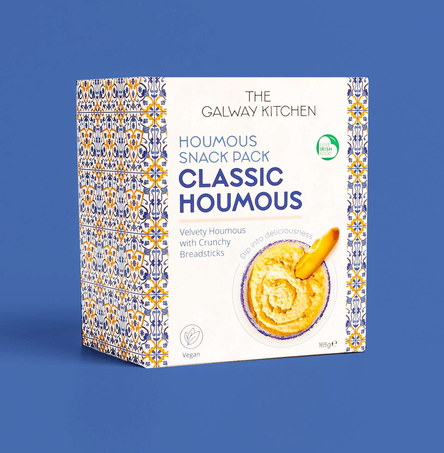 The new Classic Houmous Snack Pack by @thegalwaykitchen has recently launched! Each pack includes a tub of The Galway Kitchen’s signature Classic Houmous, created with a creamy blend of chickpeas and tahini with a hint of lemon, Organic and Reduced Fat along with a serving of mini, Italian breadsticks, specially developed for scooping and giving that perfect, light crunch. These flavour-packed treats are great for a healthy lunch snack!
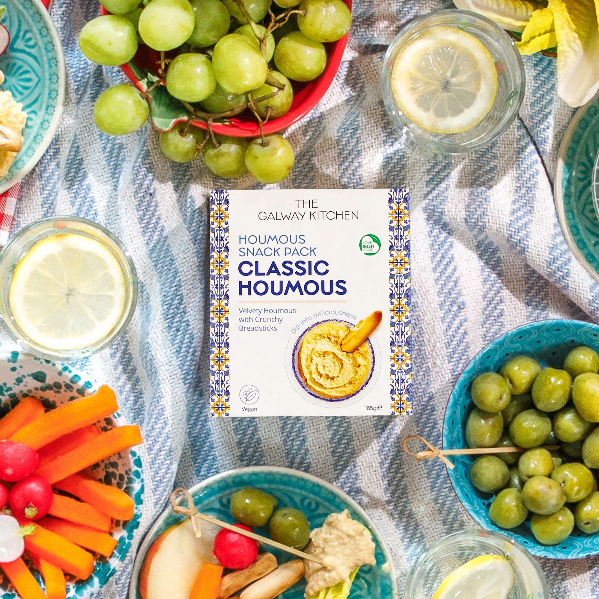
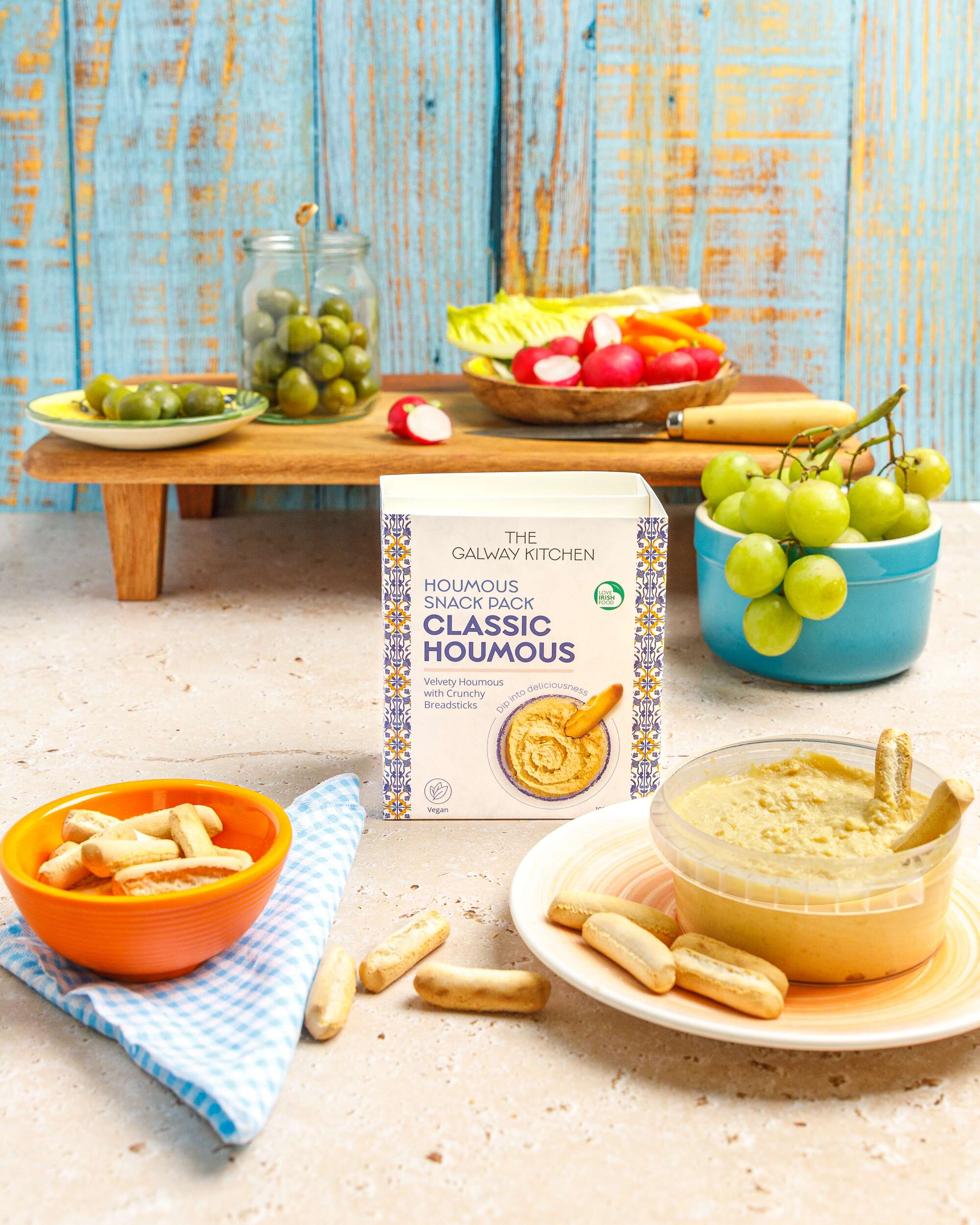
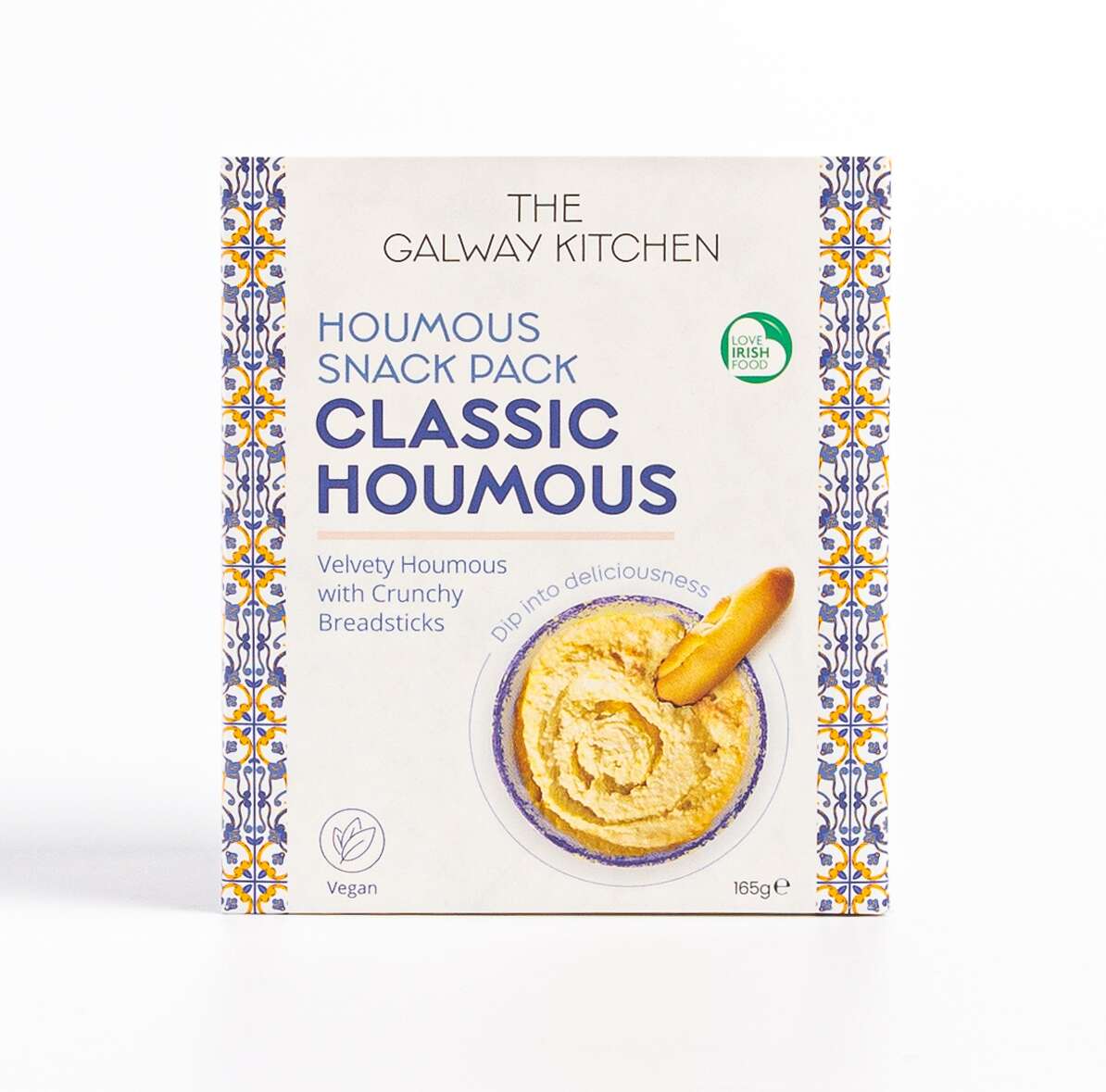
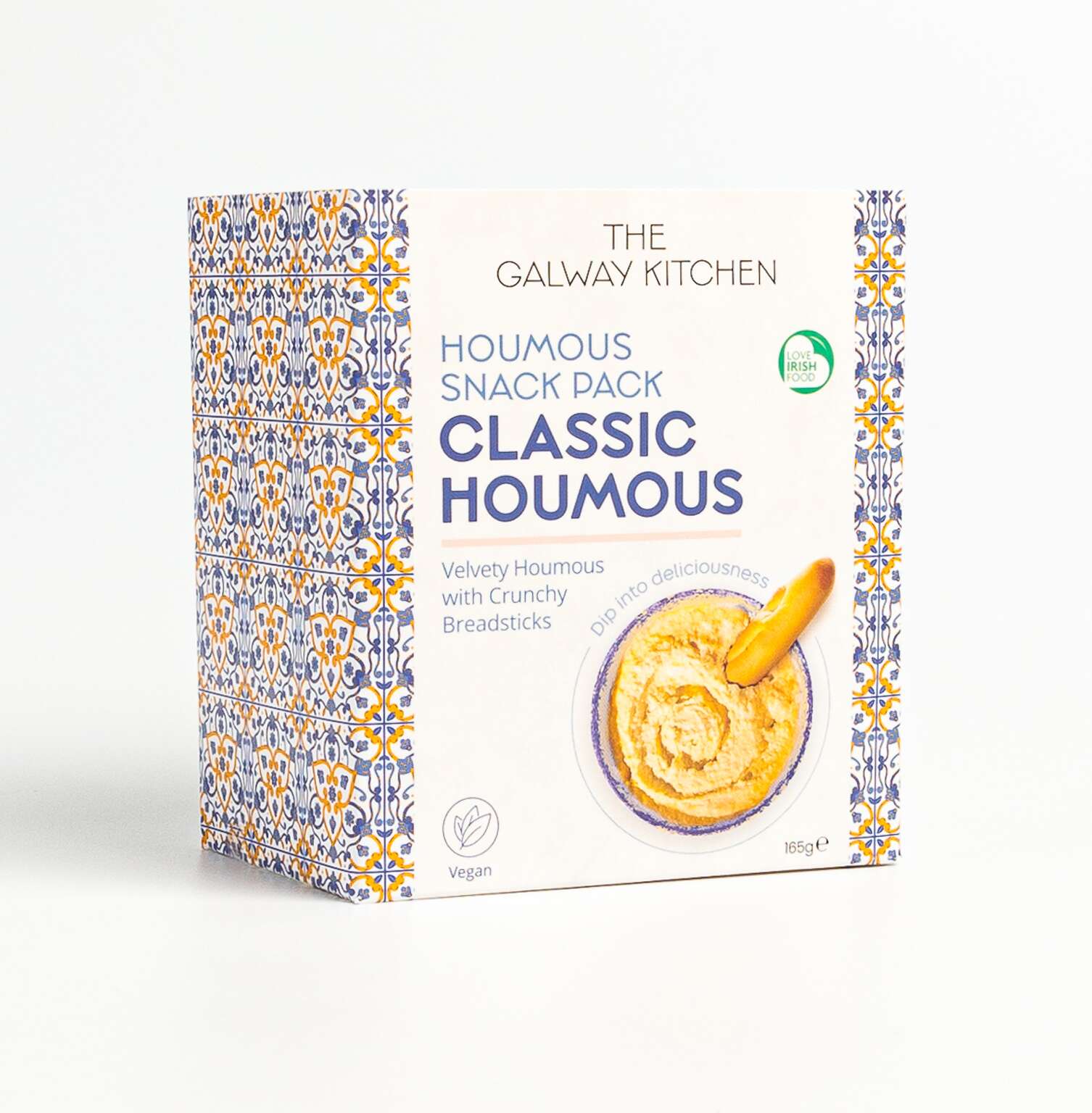
The Galway Kitchen brand already existed for their popular houmous dips range when they contacted Clare Lynch Creative. They asked if we could create the packaging design for these snack packs to work well alongside their existing range, incorporating bright mediterranean patterns alongside clean, minimal typography and imagery, whilst bringing a fresher vibrant look to the packs to ensure a strong and bold standout impact on shelves. They were very happy with the result.
The Galway Kitchen’s food range includes global flavours, inspired by much-loved tastes from around the world, made in their kitchen at the heart of Galway.
The Galway Kitchen range is available at selected Tesco Ireland stores:
www.tesco.ie
www.instagram.com/tescoirl/
Follow The Galway Kitchen at:
@thegalwaykitchen
Photography by Jennifer Oppermann:
@jenniferocooks
www.jenniferoppermann.com
Katie’s Kombucha New Slim Cans Packaging Design
New project
Katie’s Kombucha – New Cans Packaging Design
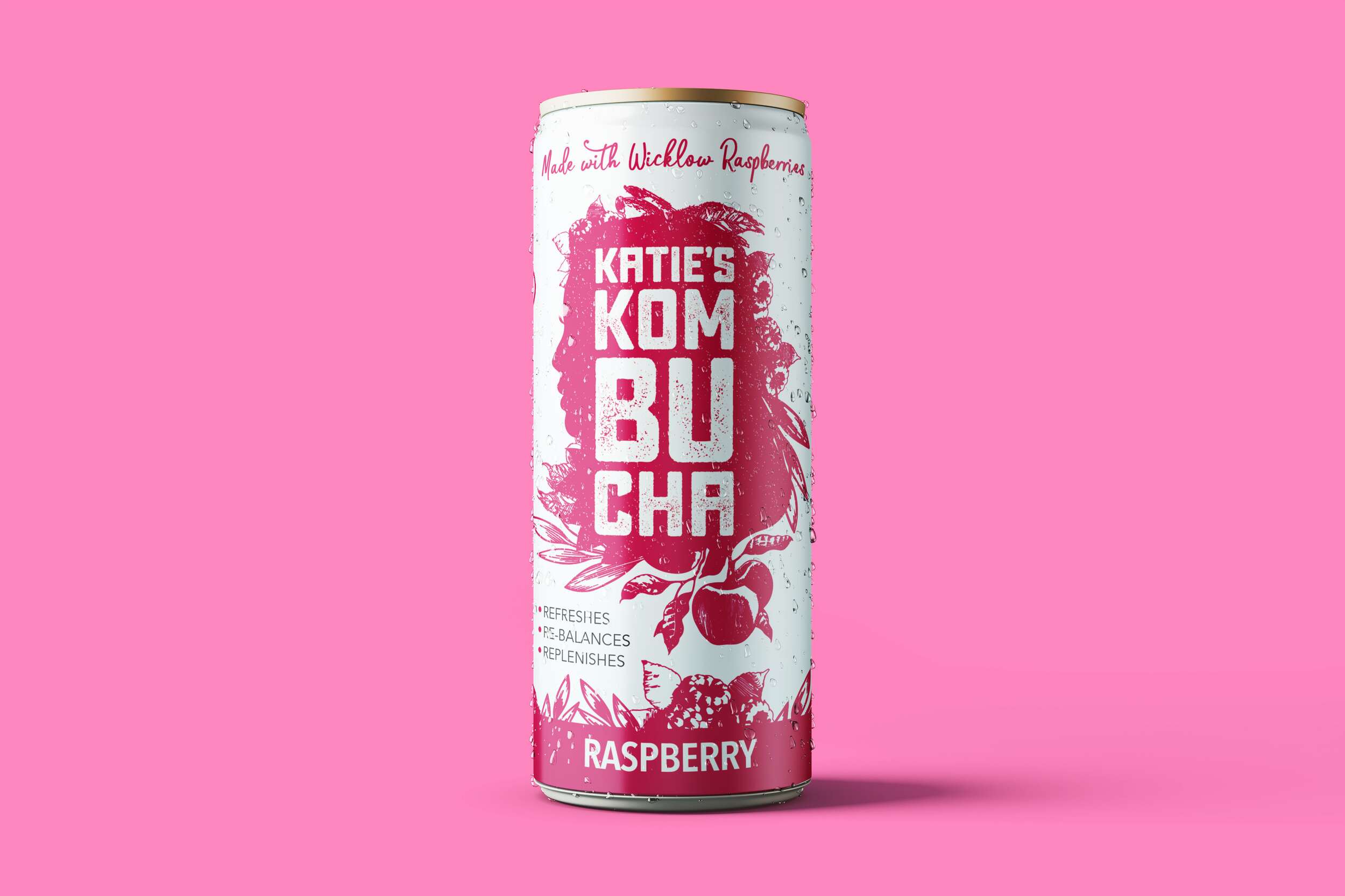
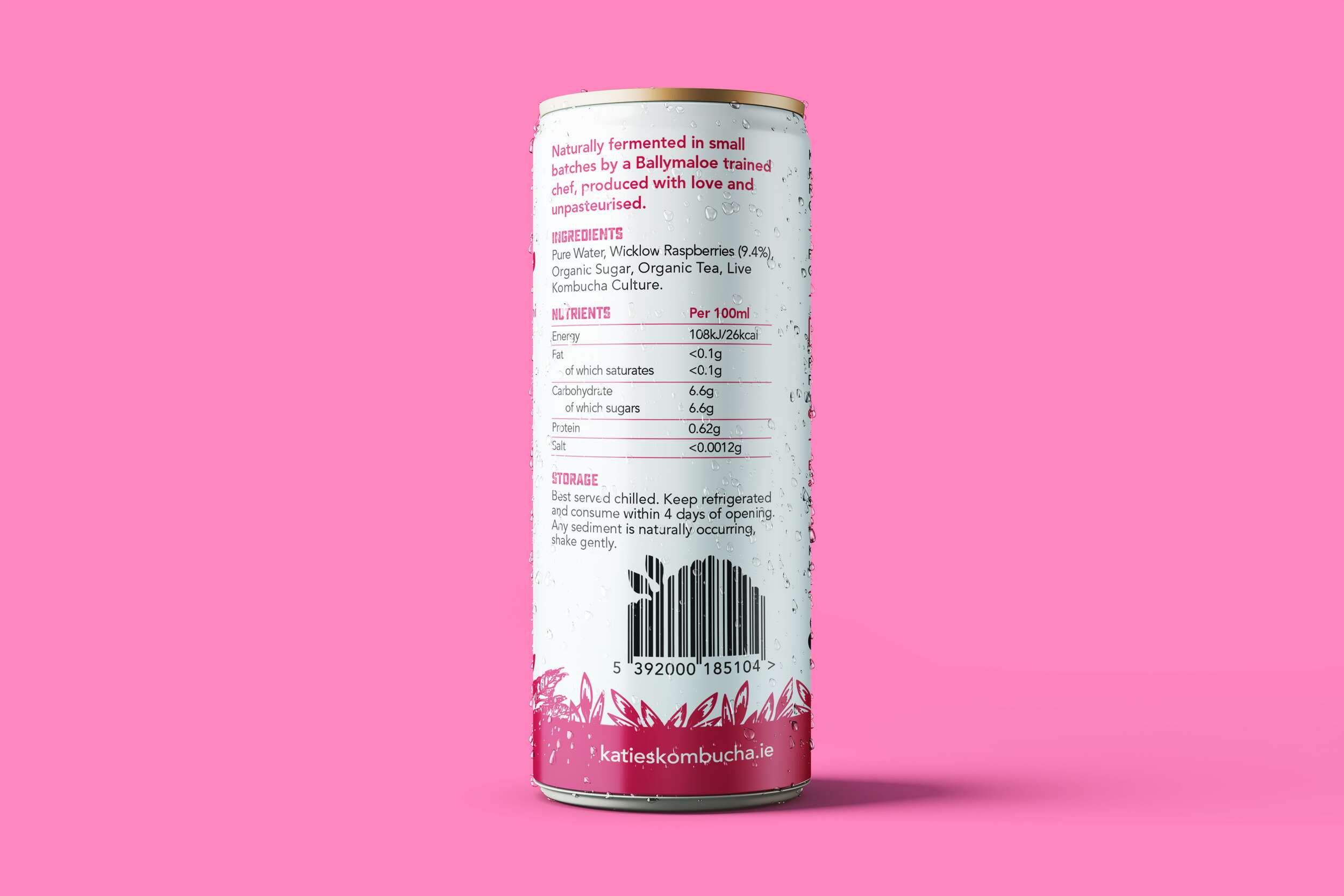
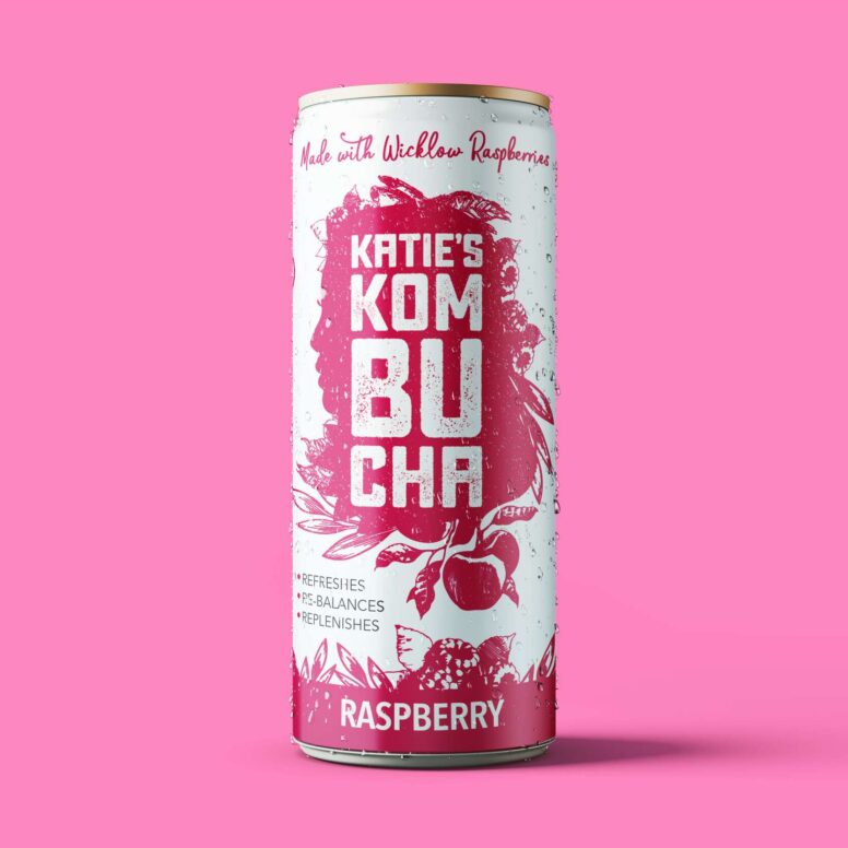
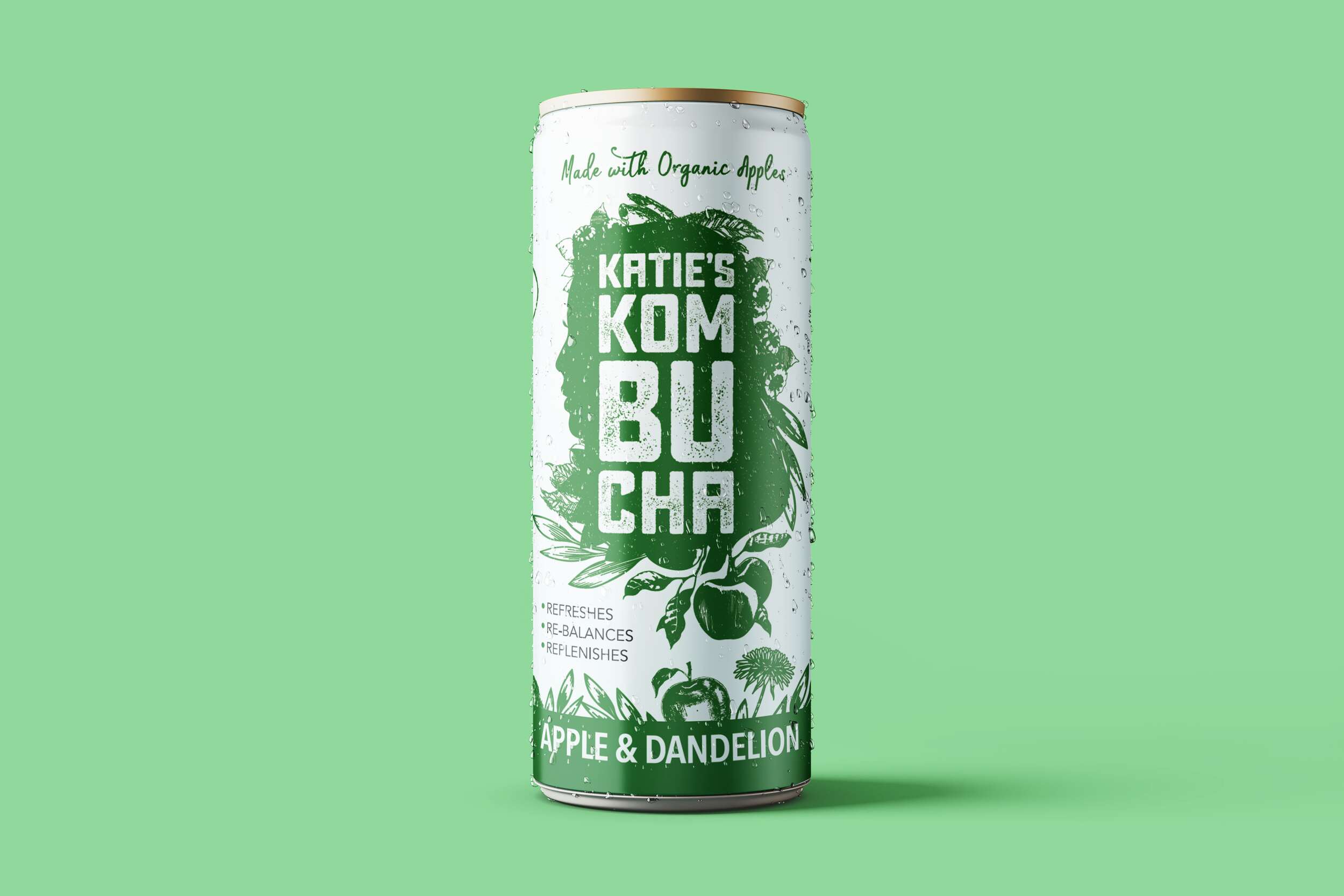
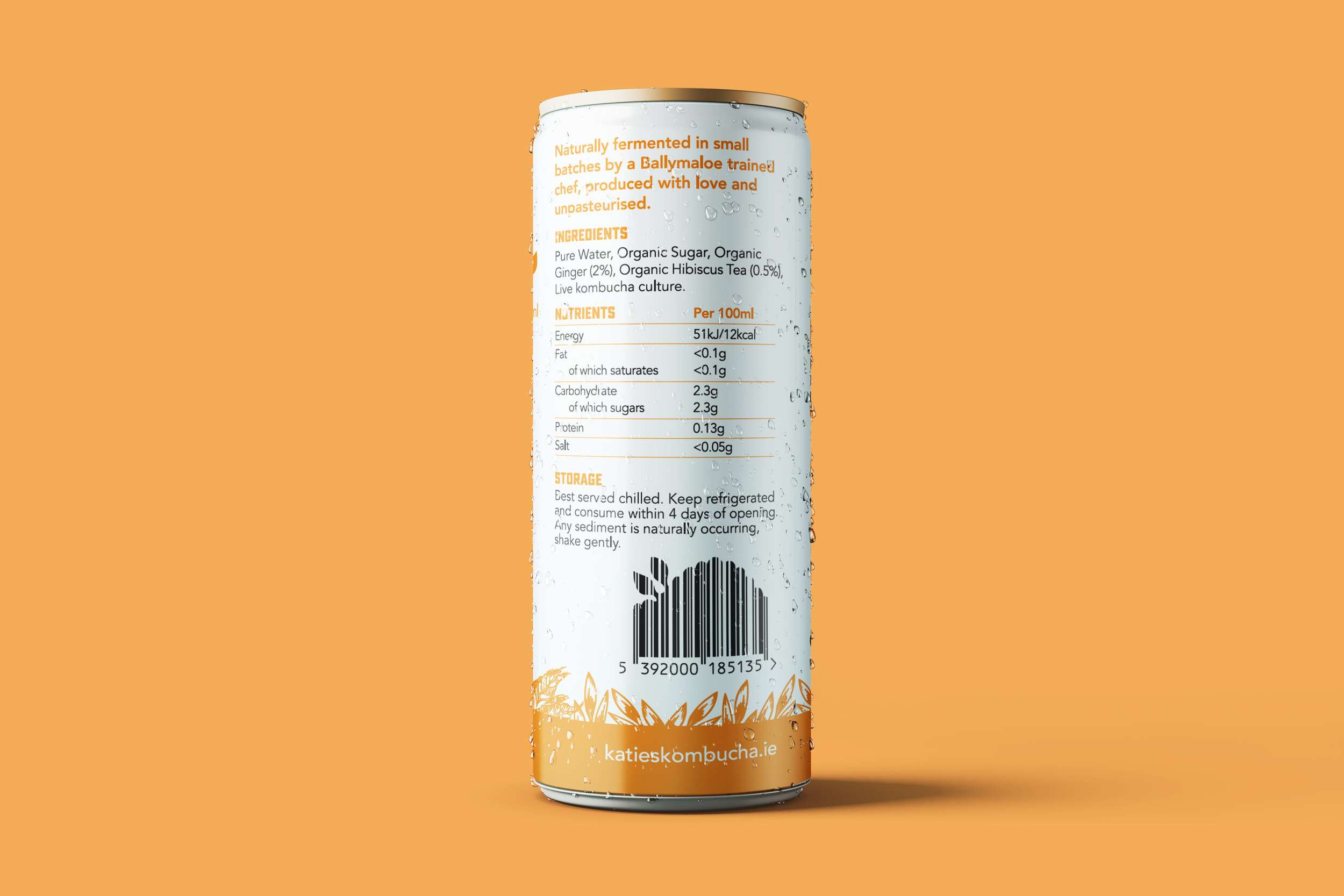
We are loving how well the brand packaging design of the Katie’s Kombucha range translated from the original glass bottles to these lovely slim cans. They are now available in both the bottles and cans in three tasty flavours.


A little about kombucha for those of you unfamiliar with it…
Kombucha is a great alternative to sugary drinks. It contains elements that offer nutritional and digestive support, strengthen the immune system, and assist in removing impurities from the blood and organs. Poor dietary choices and chronic stress are the root causes of many modern diseases. Both diet and stress can trigger physiological imbalances and degradation, particularly in the immune system. Kombucha contains prebiotics which are beneficial for gut health (great immune booster).
✔️ Maintains a health pH
✔️ It’s antioxidants help fight disease
✔️ Contains beneficial probiotics
✔️ Encourages good microbes to grow in the gut
✔️ It’s acetic acid helps fight bad bacteria
✔️ Helps your skin glow
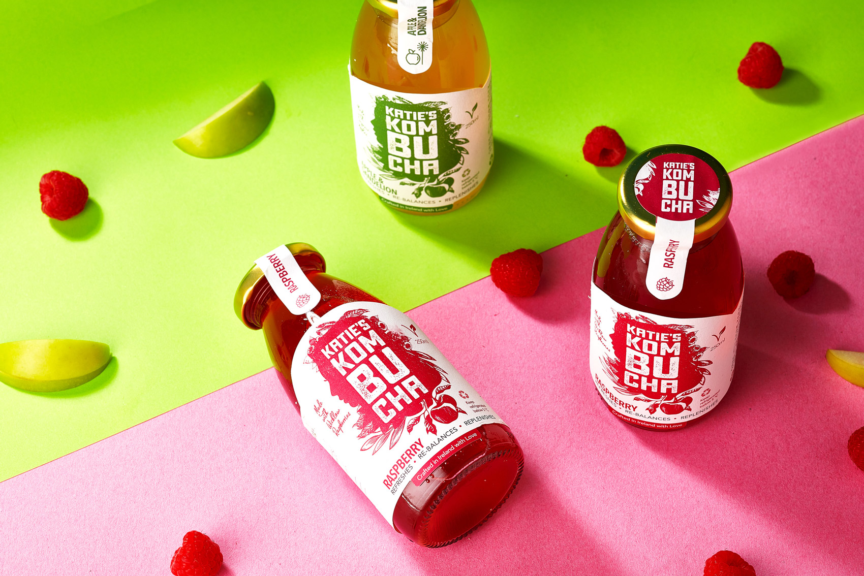
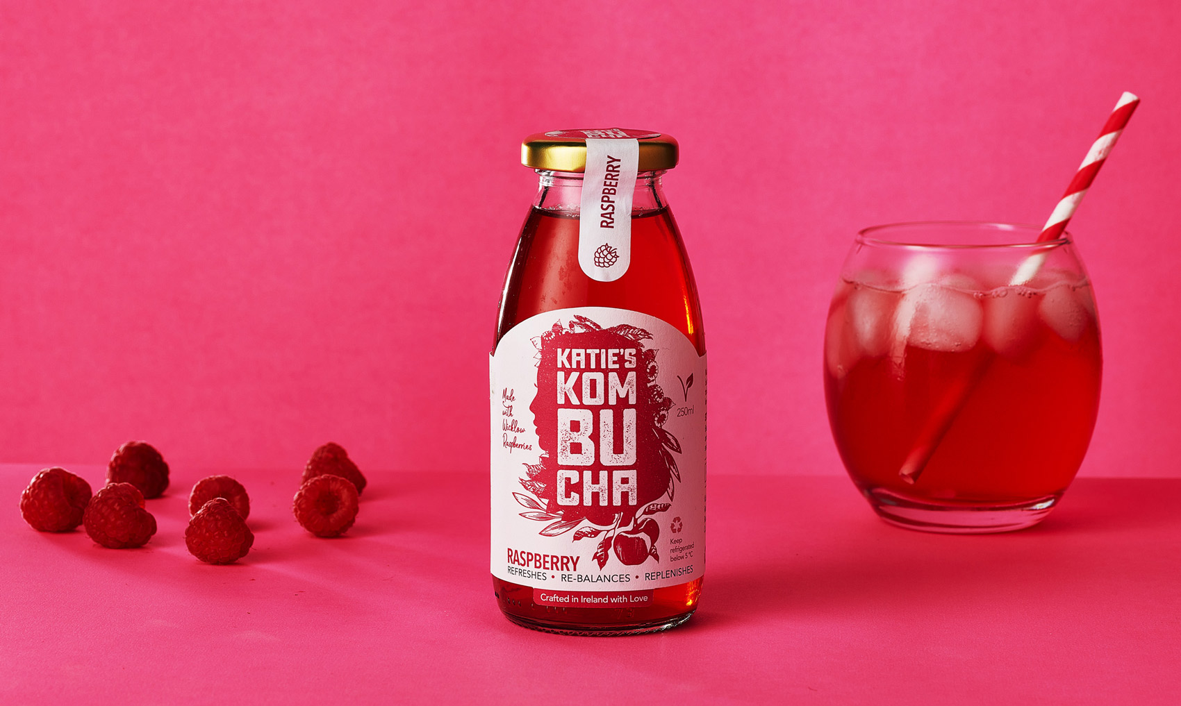
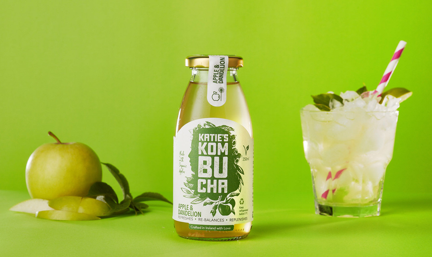
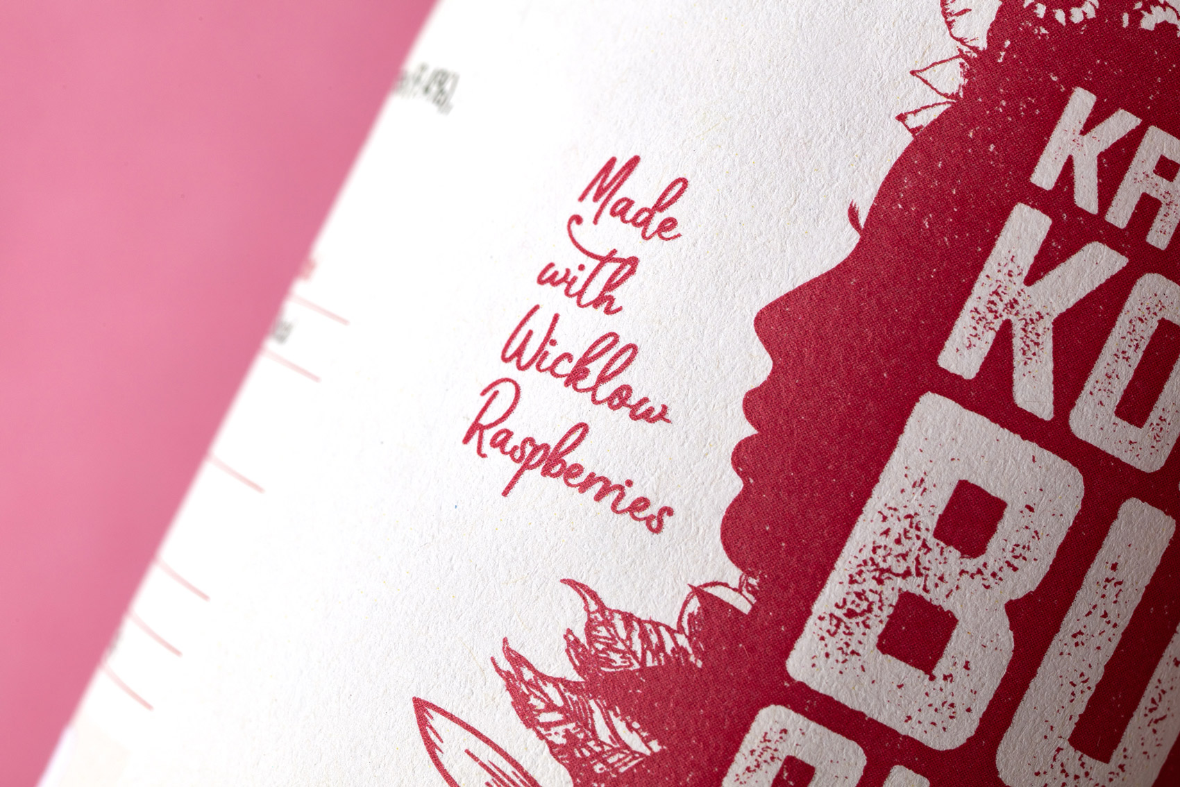
Katie’s Kombucha supports local and buys delicious raspberries from a raspberry farmer in Wicklow.
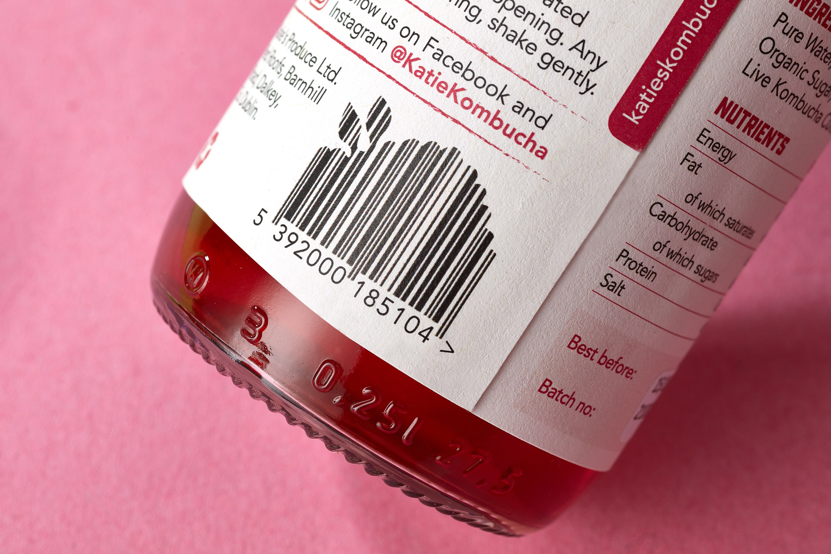
Katie’s Kombucha is available at Fresh stores @freshthegoodfoodmarket and SuperValu @supervalu_irl stores, along with many more locations.
Follow Katie’s Kombucha at:
@katiekombucha
Tara Gartlan Chocolate: Easter Eggs Packaging Design
Tara Gartlan Chocolate: Easter Eggs Packaging Design
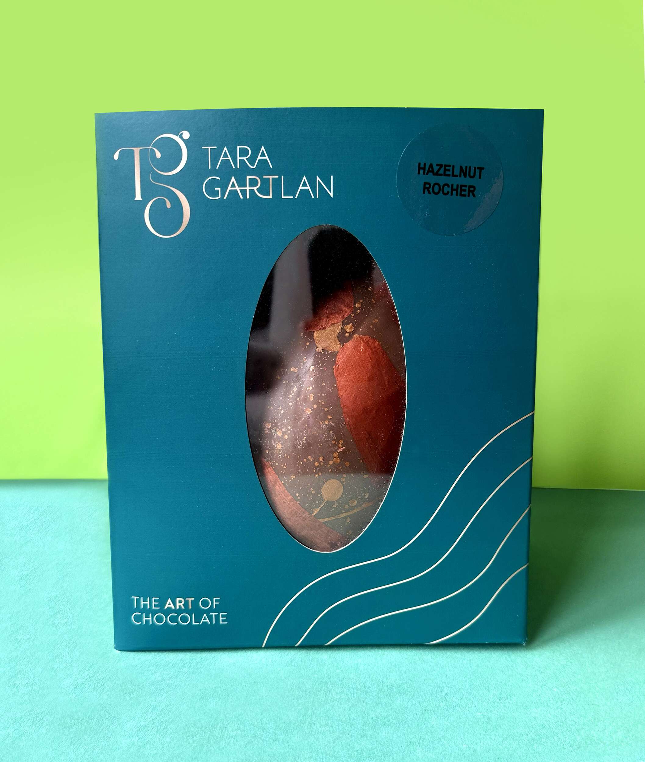
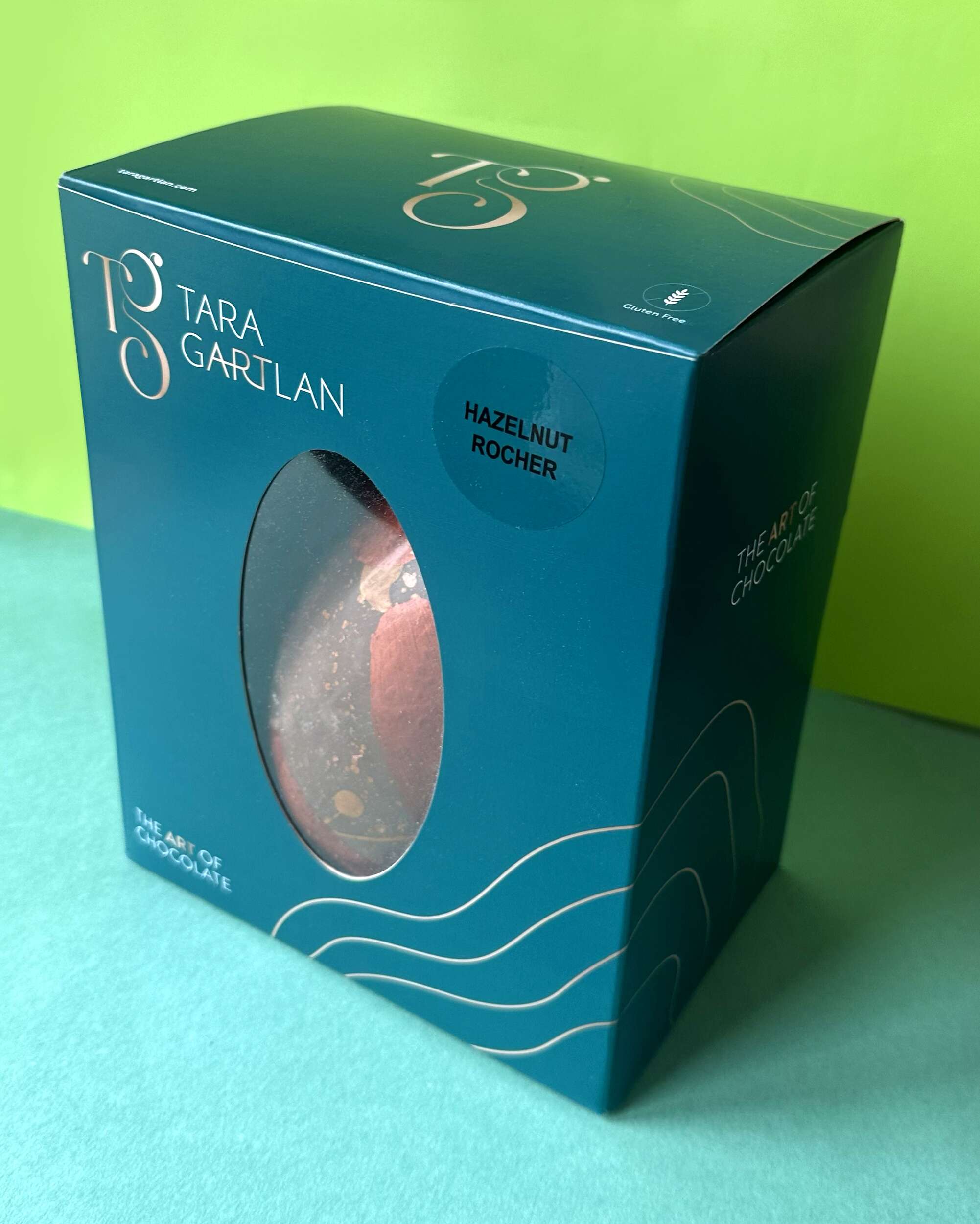
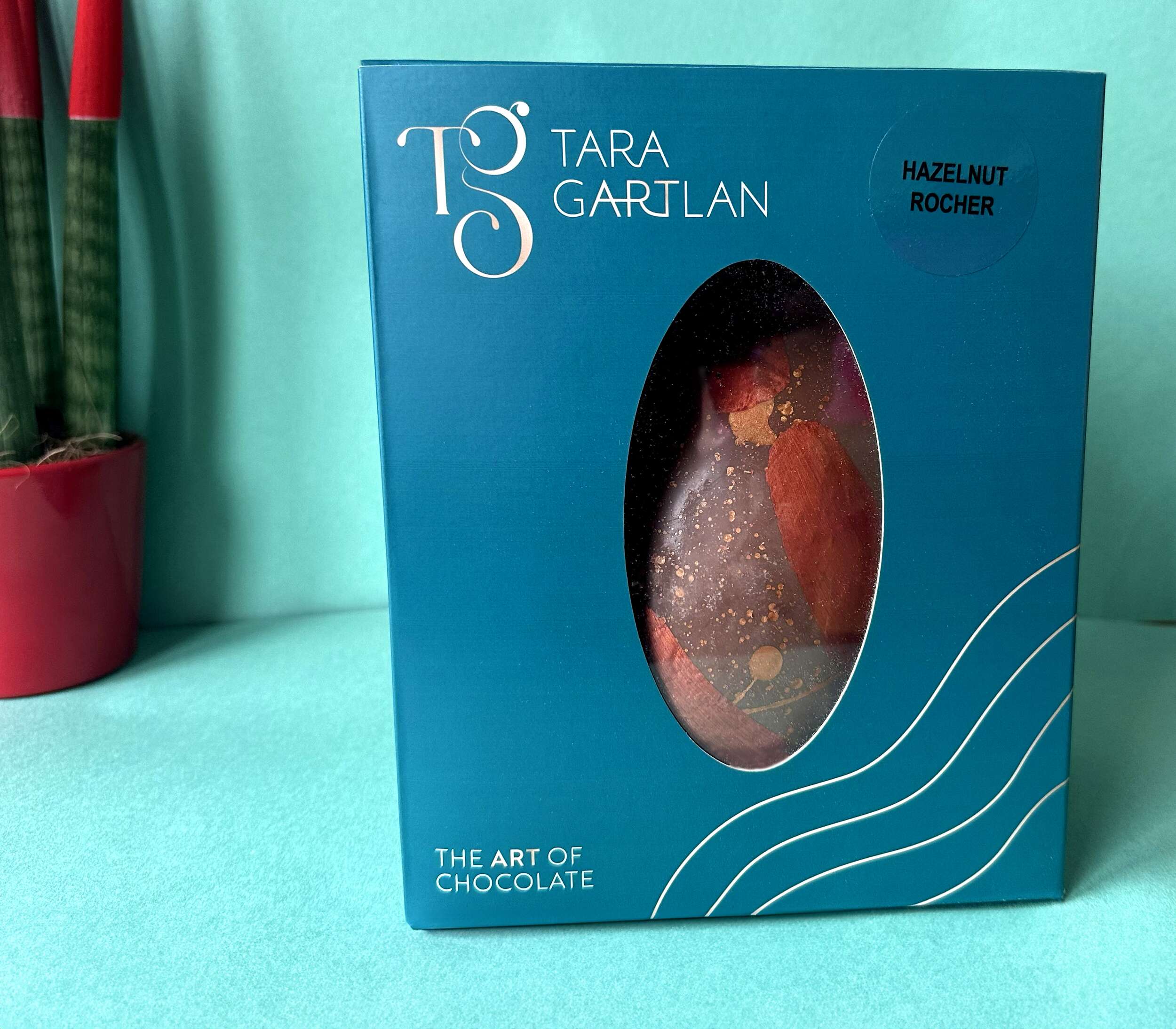
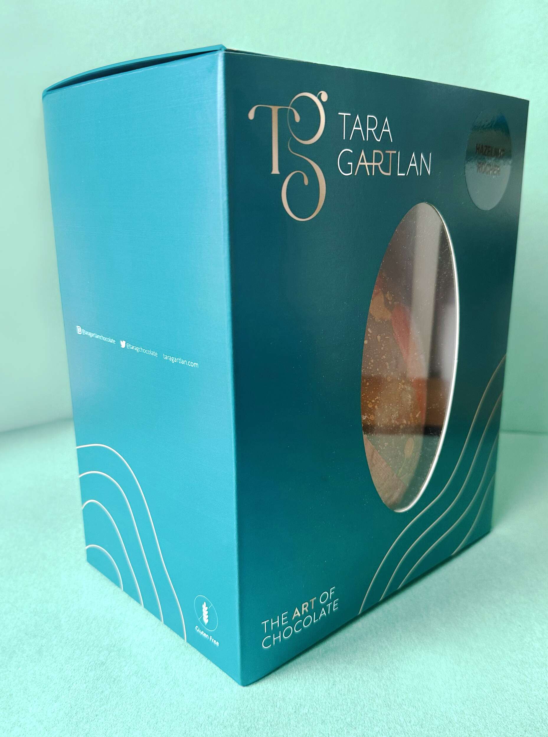
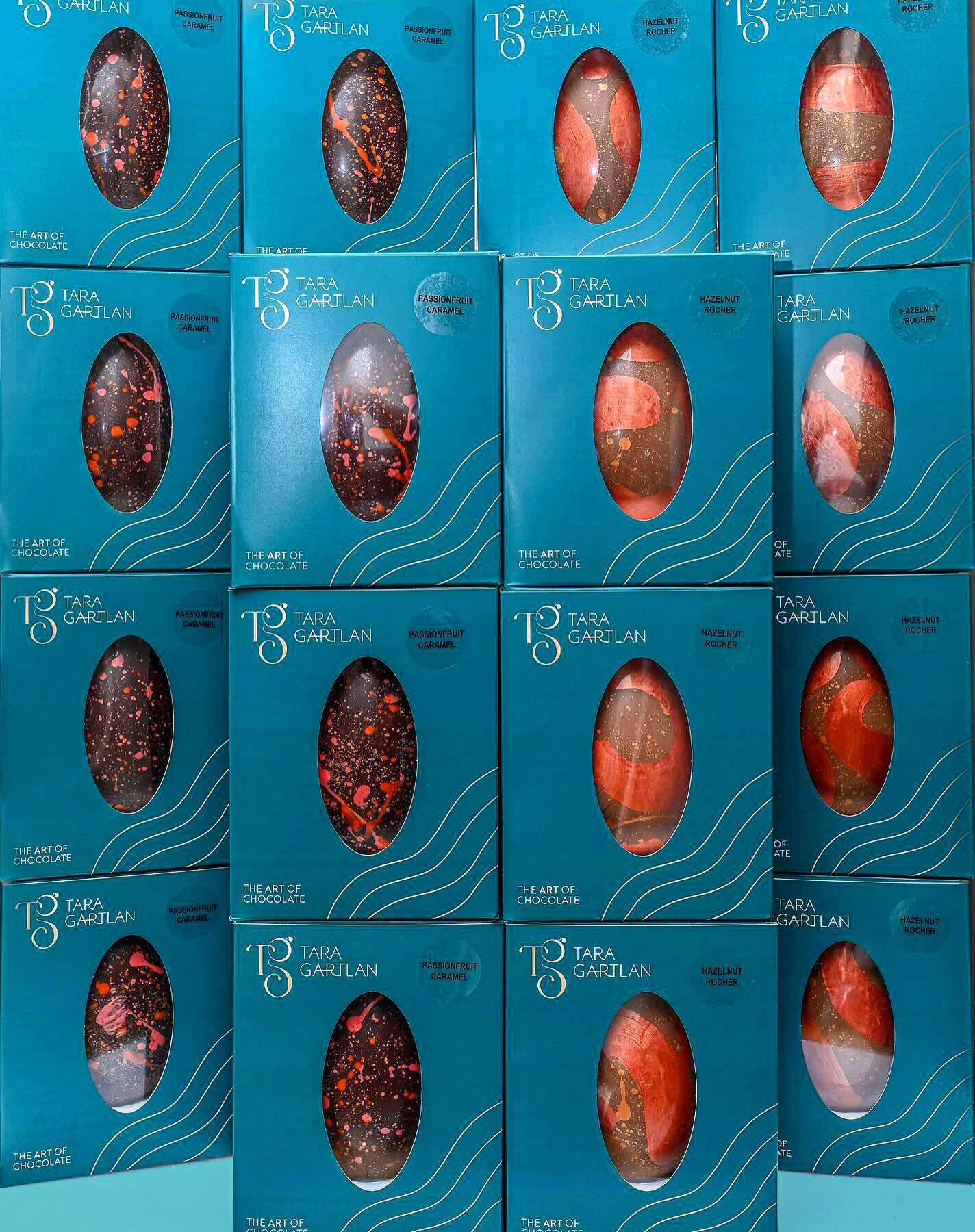
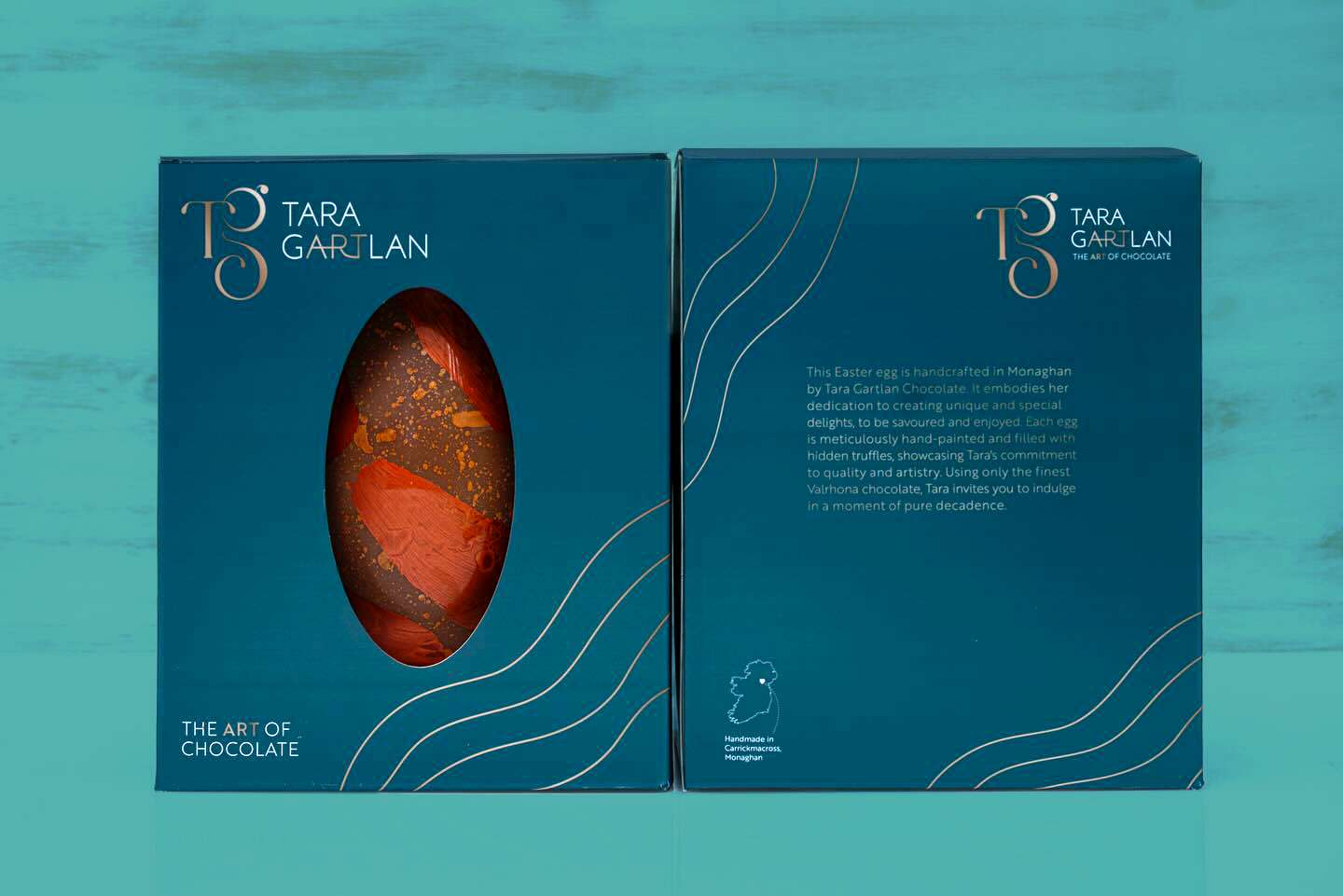
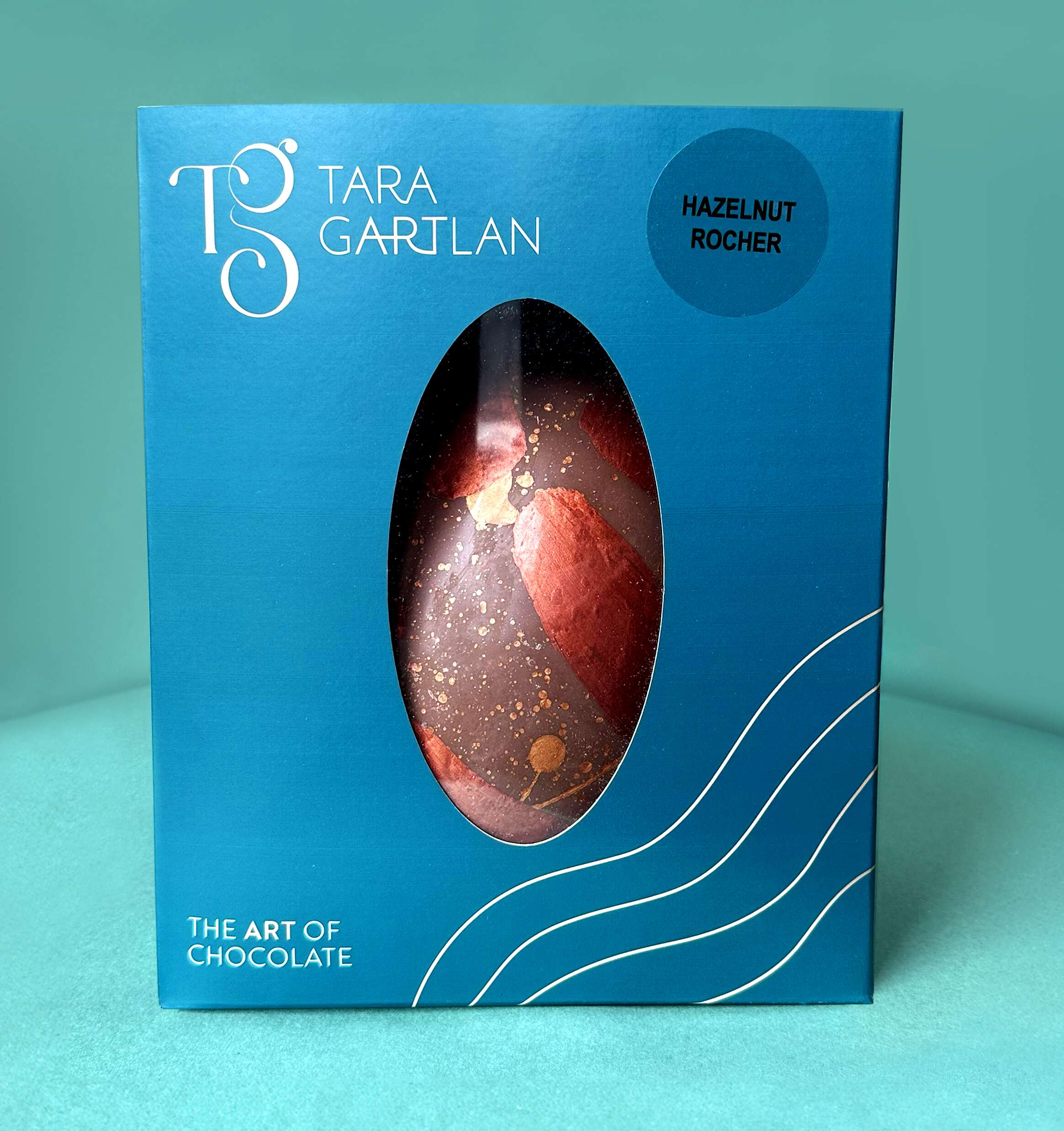
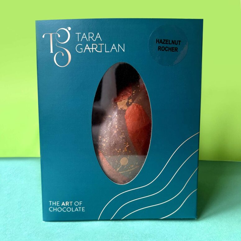
The Packaging Design of these beautiful Easter Eggs are a lovely addition to the Tara Gartlan Chocolate range designed by Clare Lynch Creative.
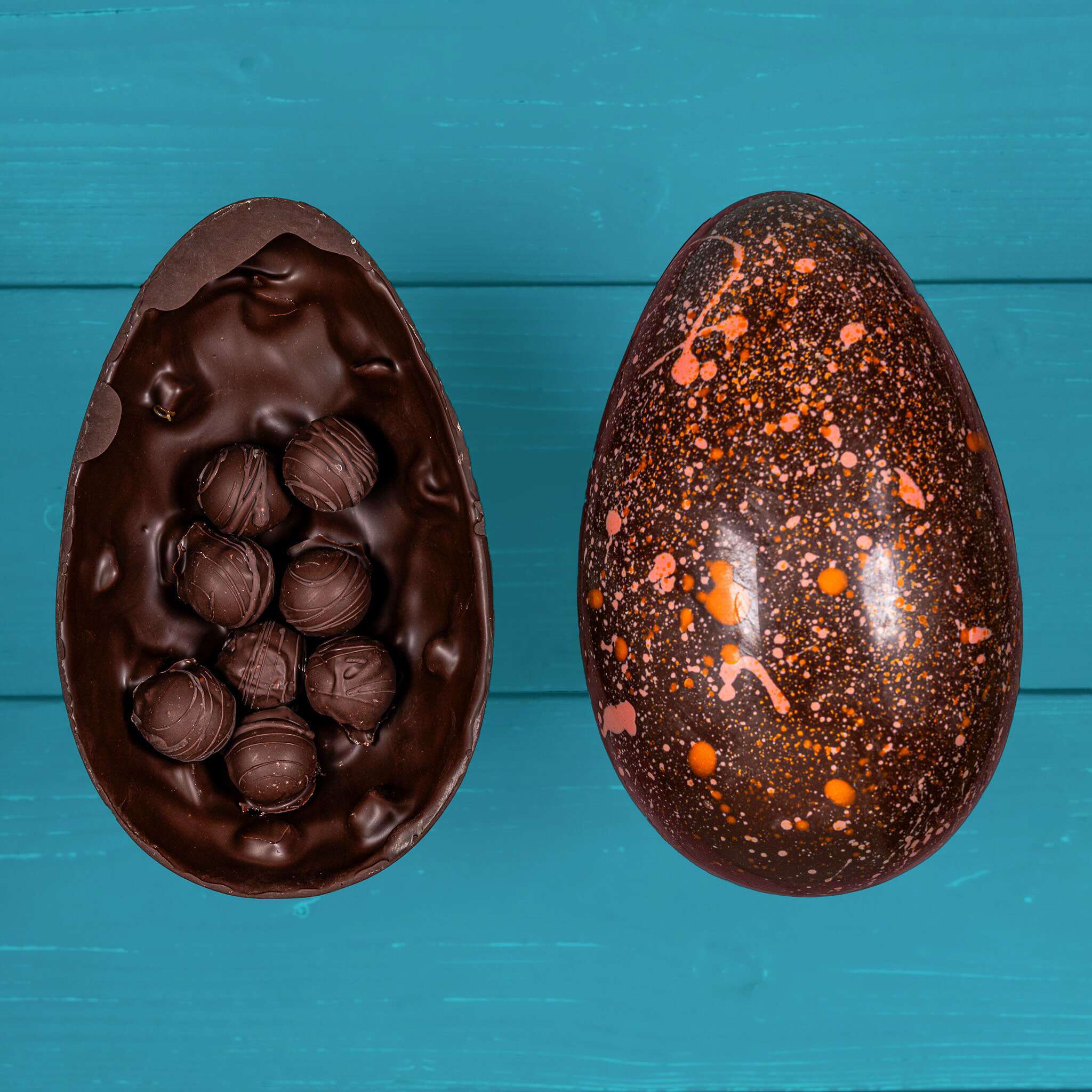
These Easter Eggs are handmade in Carrickmacross, Co. Monaghan, Ireland by Michelin star pastry chef, Tara Gartlan. They embody her dedication to creating unique and special delights, to be savoured and enjoyed.
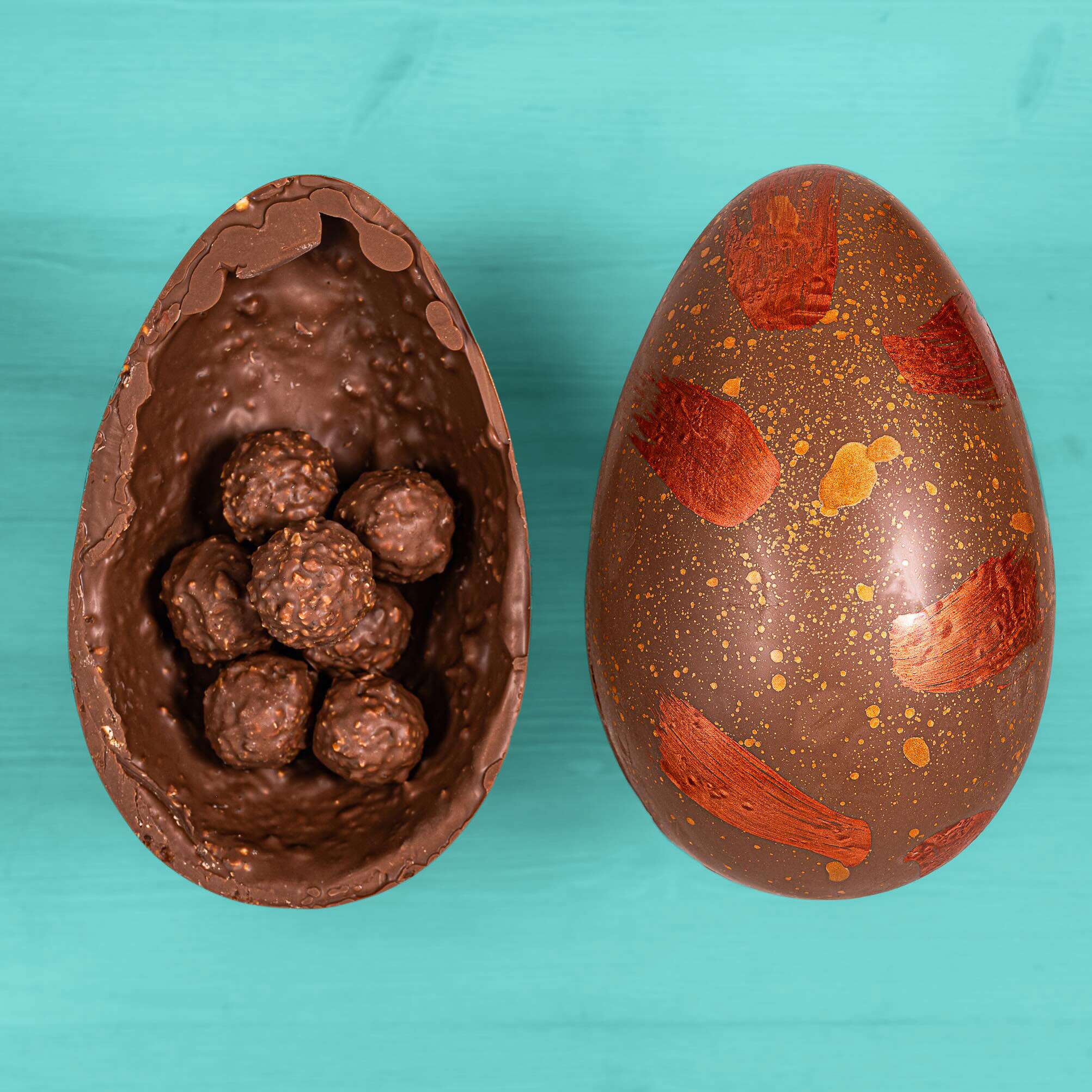
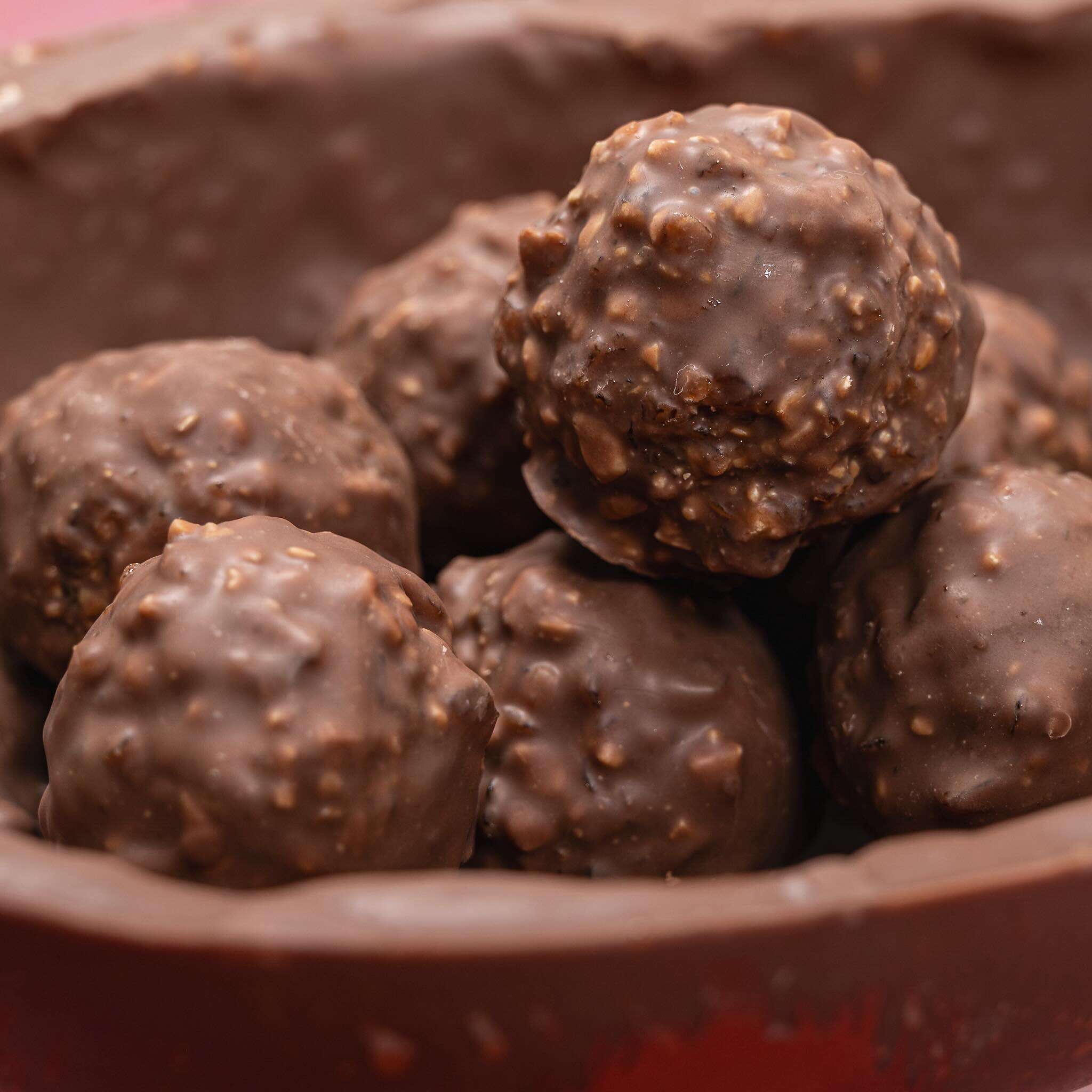
Each egg is meticulously hand painted and filled with hidden truffles, showcasing Tara’s commitment to quality & artistry. Using only the finest Valrhona chocolate, Tara invites you to indulge in a moment of pure decadence.
You can choose from the Hazelnut Rocher Egg with delicious Hazelnut Rochers tucked away inside a milk chocolate & hazelnut praline egg or the Passionfruit caramel Egg. If you really can’t decide, just have both! Everything is gluten free, as signature to all of the Tara Gartlan Chocolate range. The beauty is you wouldn’t know as the taste is amazing.
They can be ordered several months in advance of Easter each year via the website www.taragartlan.com
Follow Tara Gartlan Chocolate on Social Media:
Instagram: @taragartlanchocolate
Twitter / X: TaraGChocolate
Order Tara Gartlan Chocolates here: www.taragartlan.com
Tara Gartlan Chocolate – Brand Packaging Design
Tara Gartlan Chocolate: Brand Packaging Design
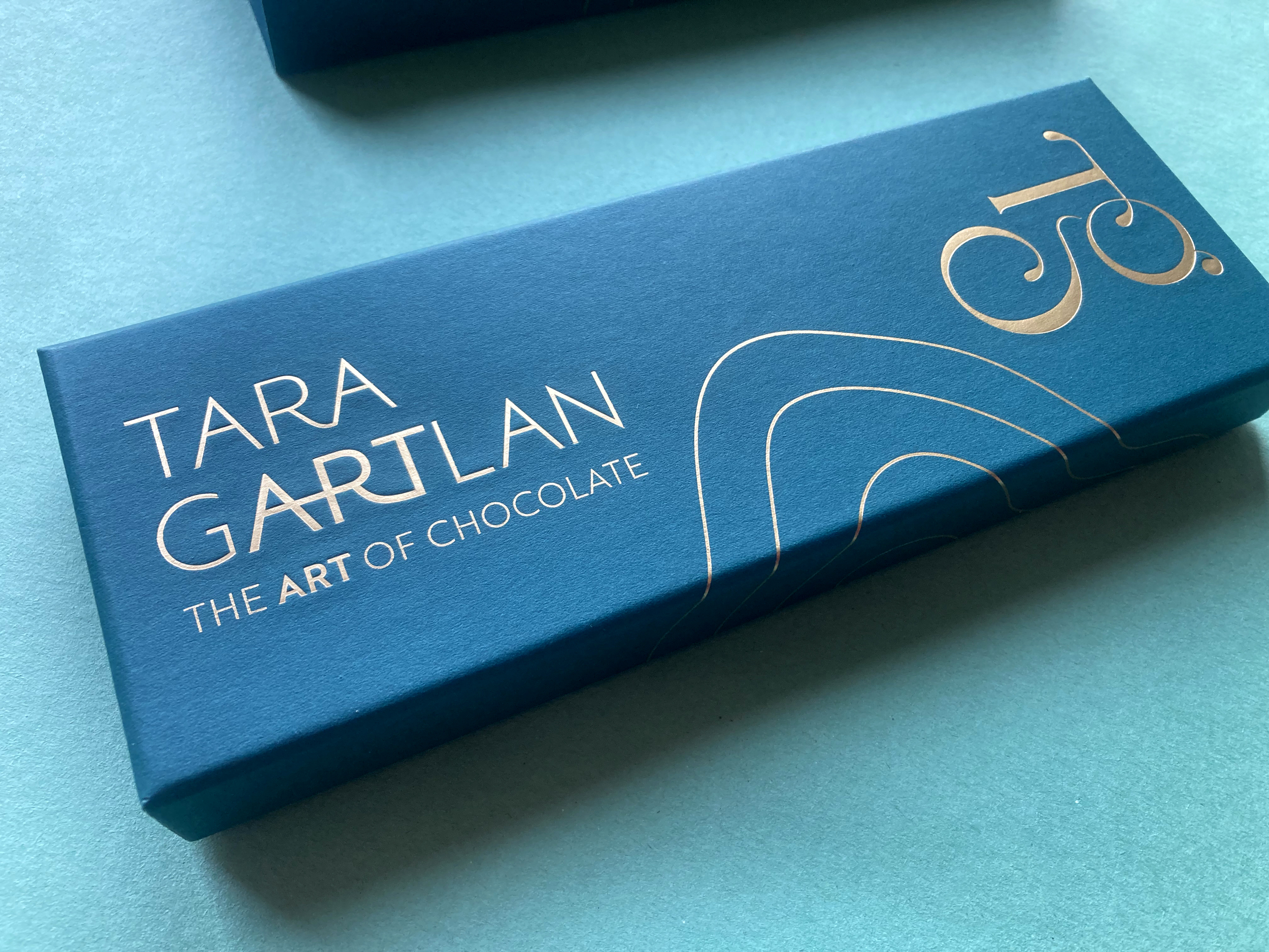
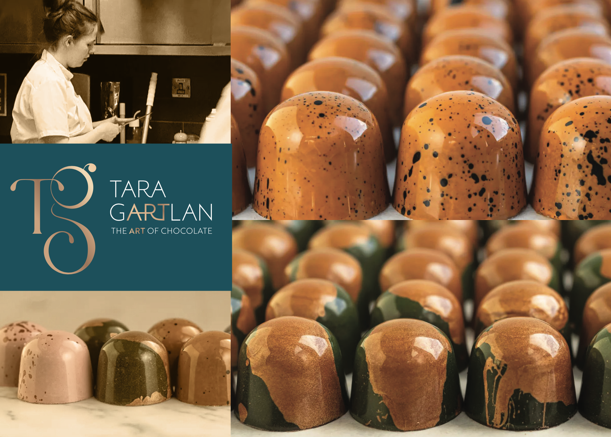
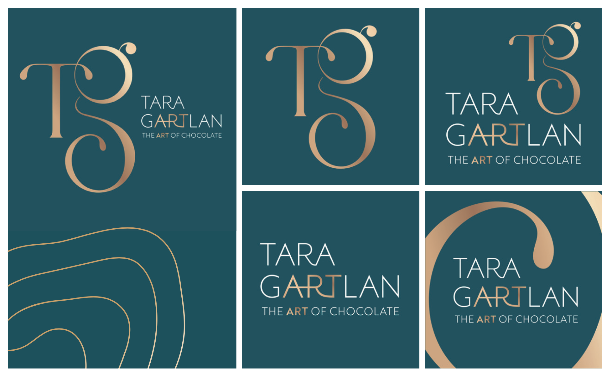
Introducing the Brand Packaging Design for Tara Gartlan Chocolate – luxury handmade chocolate bonbons, created by Michelin star pastry chef Tara Gartlan.
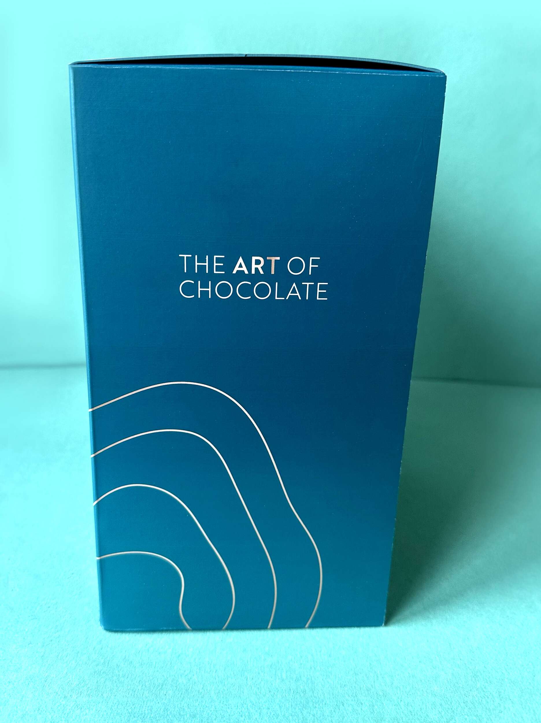
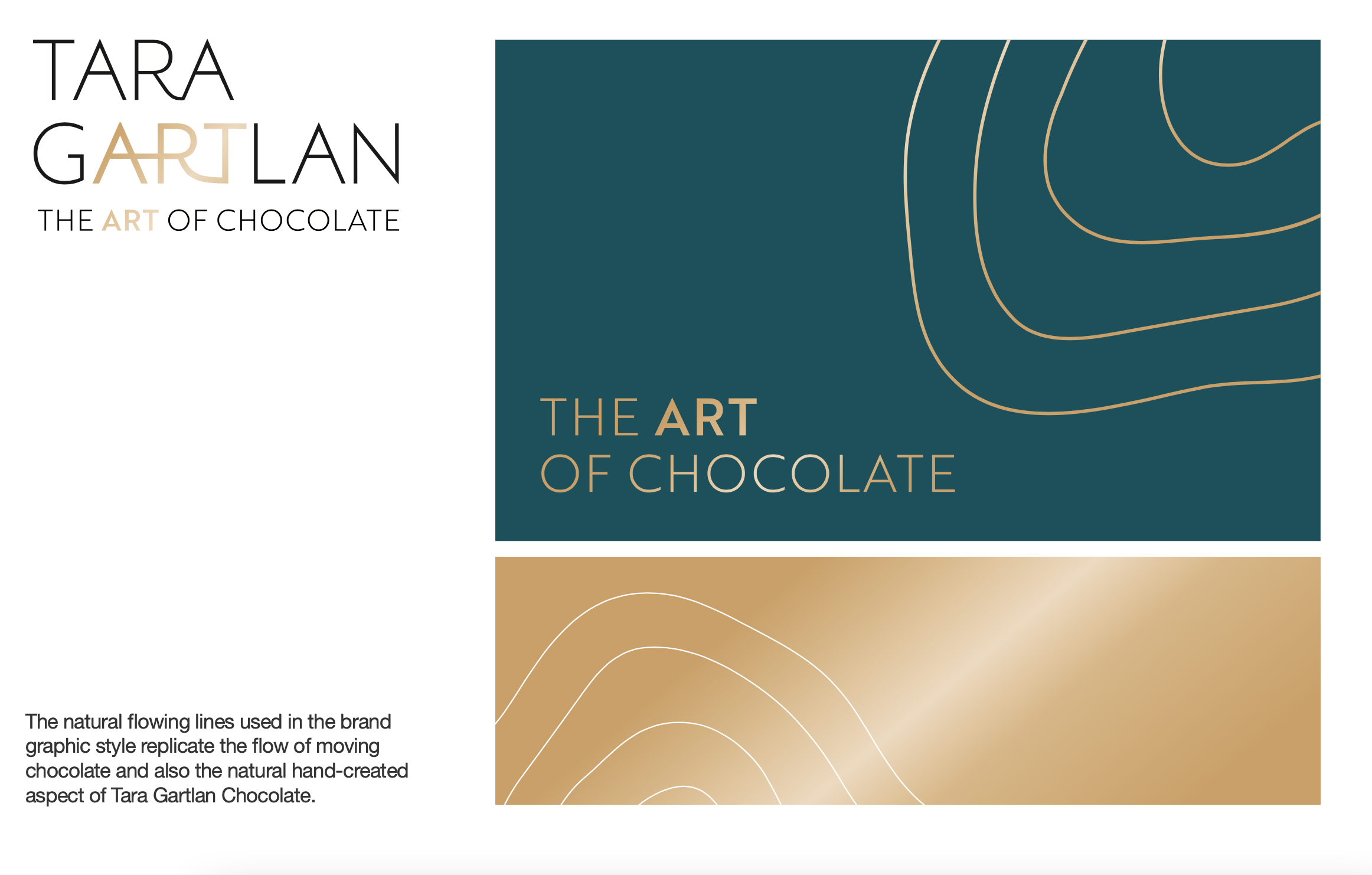
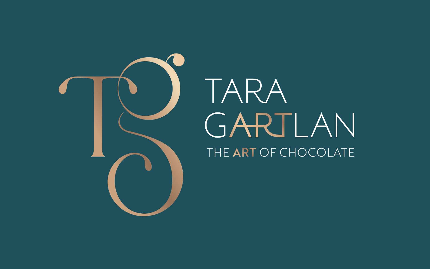
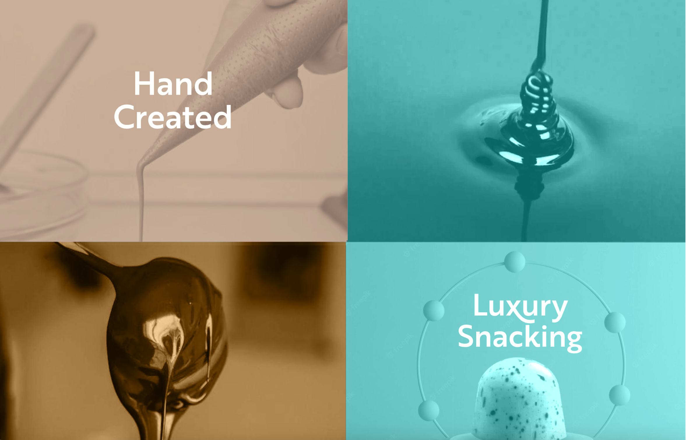
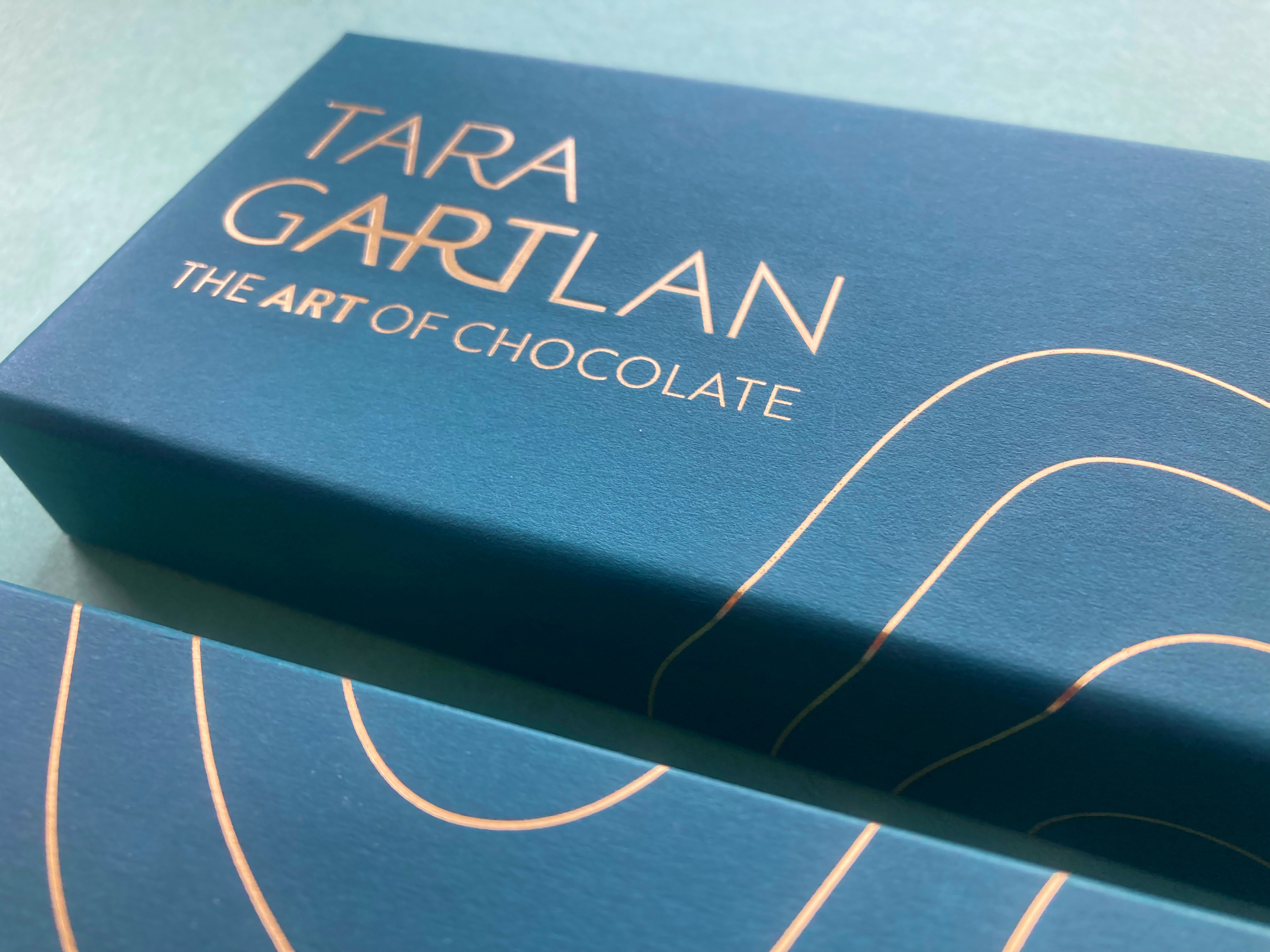
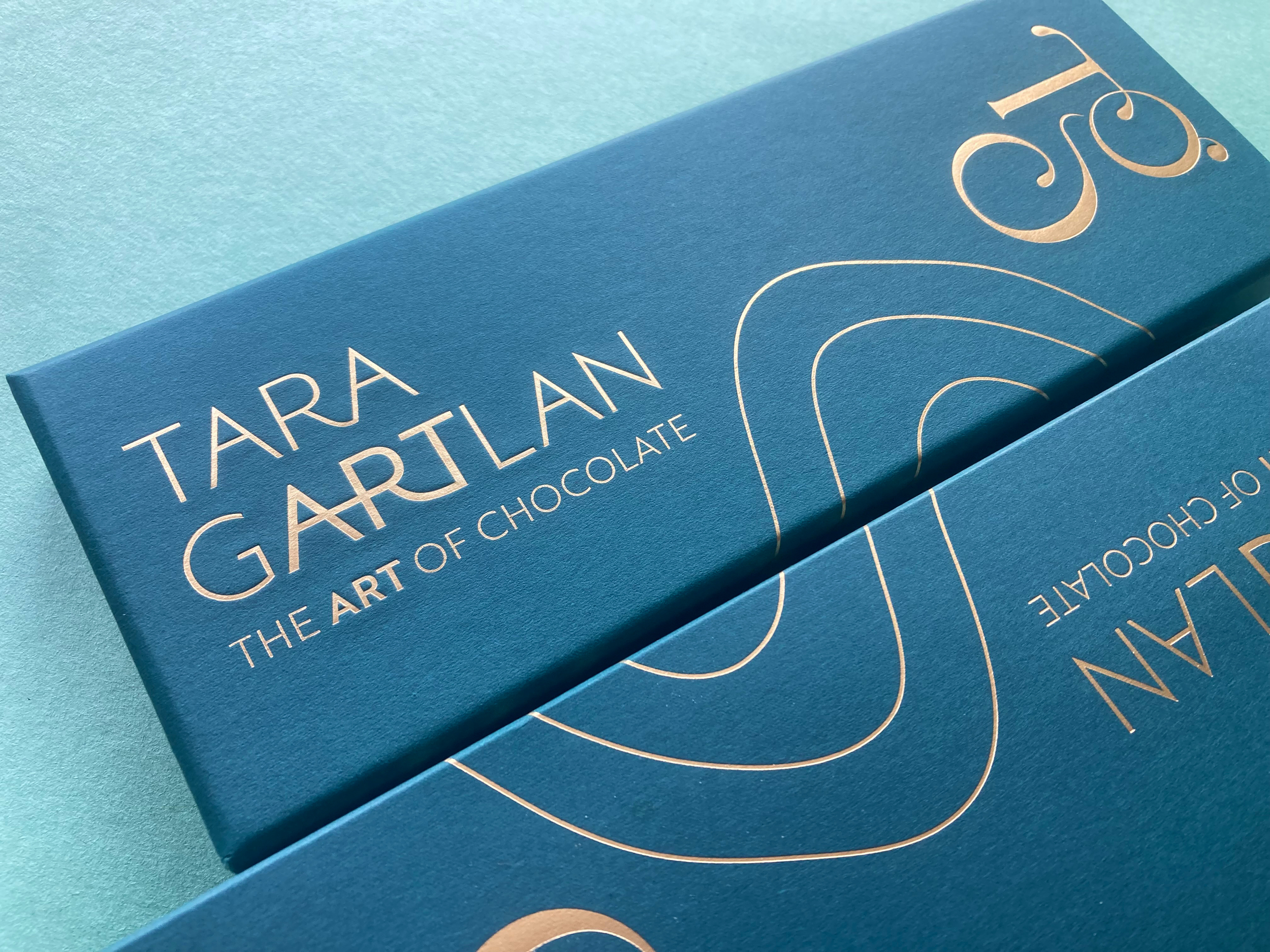
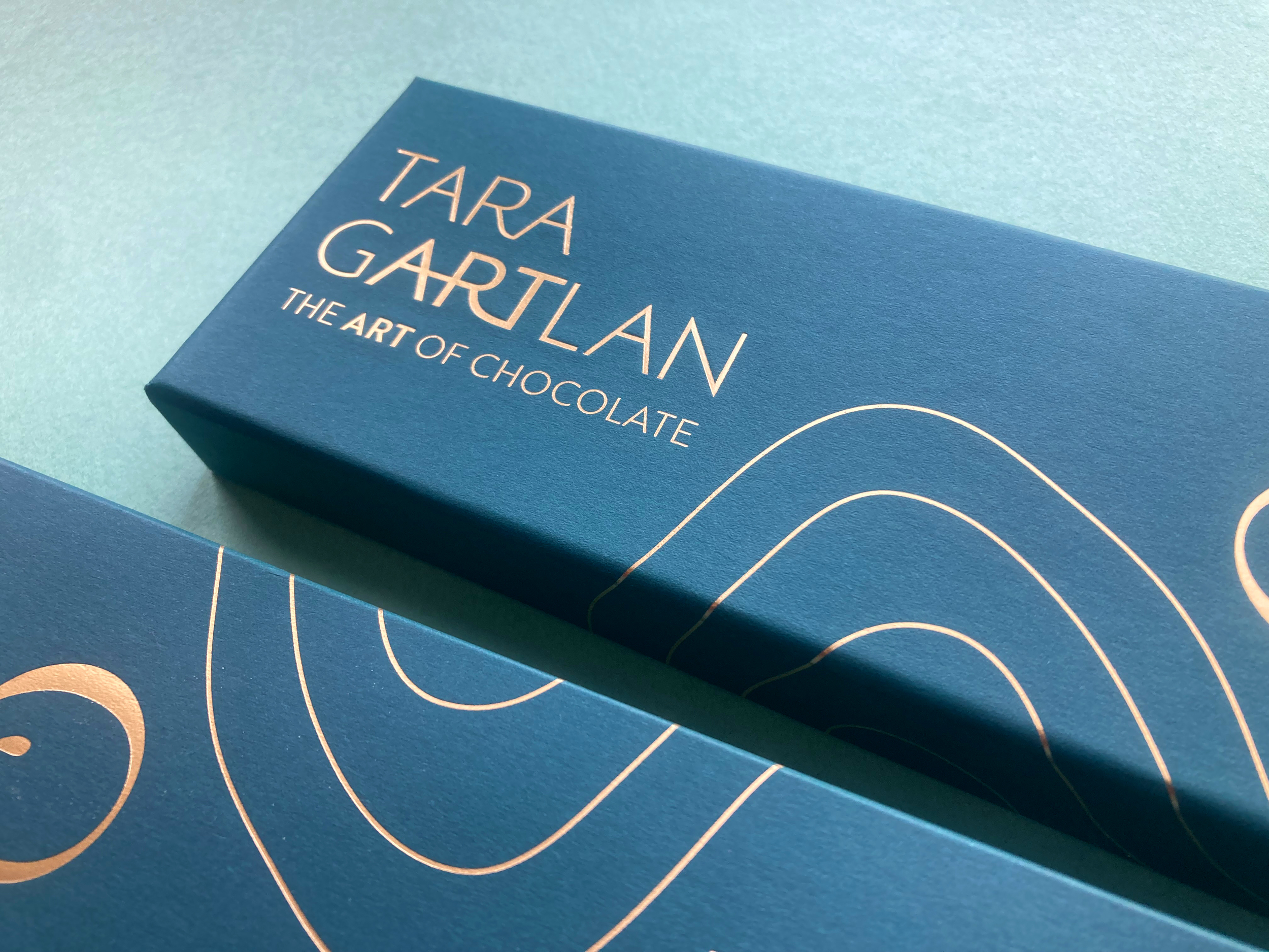
Each chocolate collection is like a work of art – every chocolate is meticulously handmade with beautiful designs, which lead to us creating the tagline ‘The Art of Chocolate’, highlighting the word ‘Art’ tucked within Tara Gartlan’s name. Cocoa butter is used artfully for decoration and all recipes are expertly crafted by Tara Gartlan. They look almost too good to eat! But once you do, you’ll be reaching for another one.
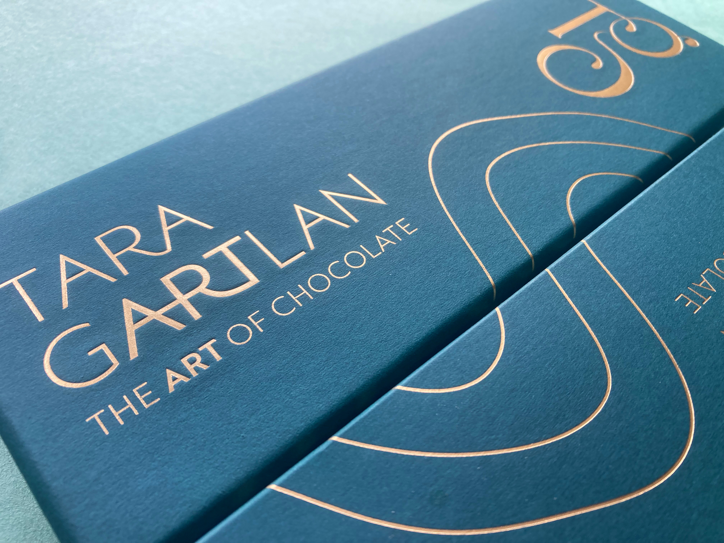
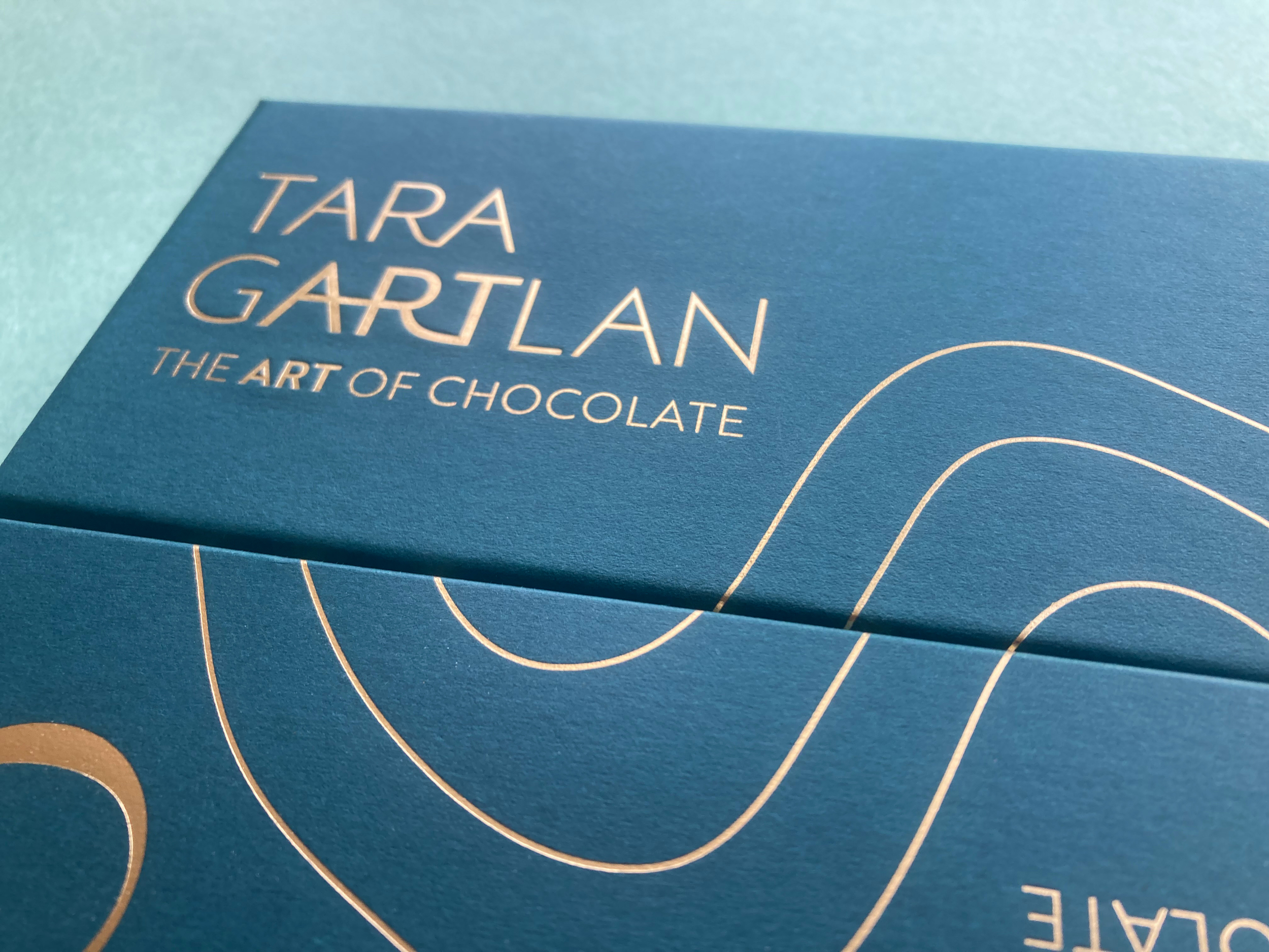
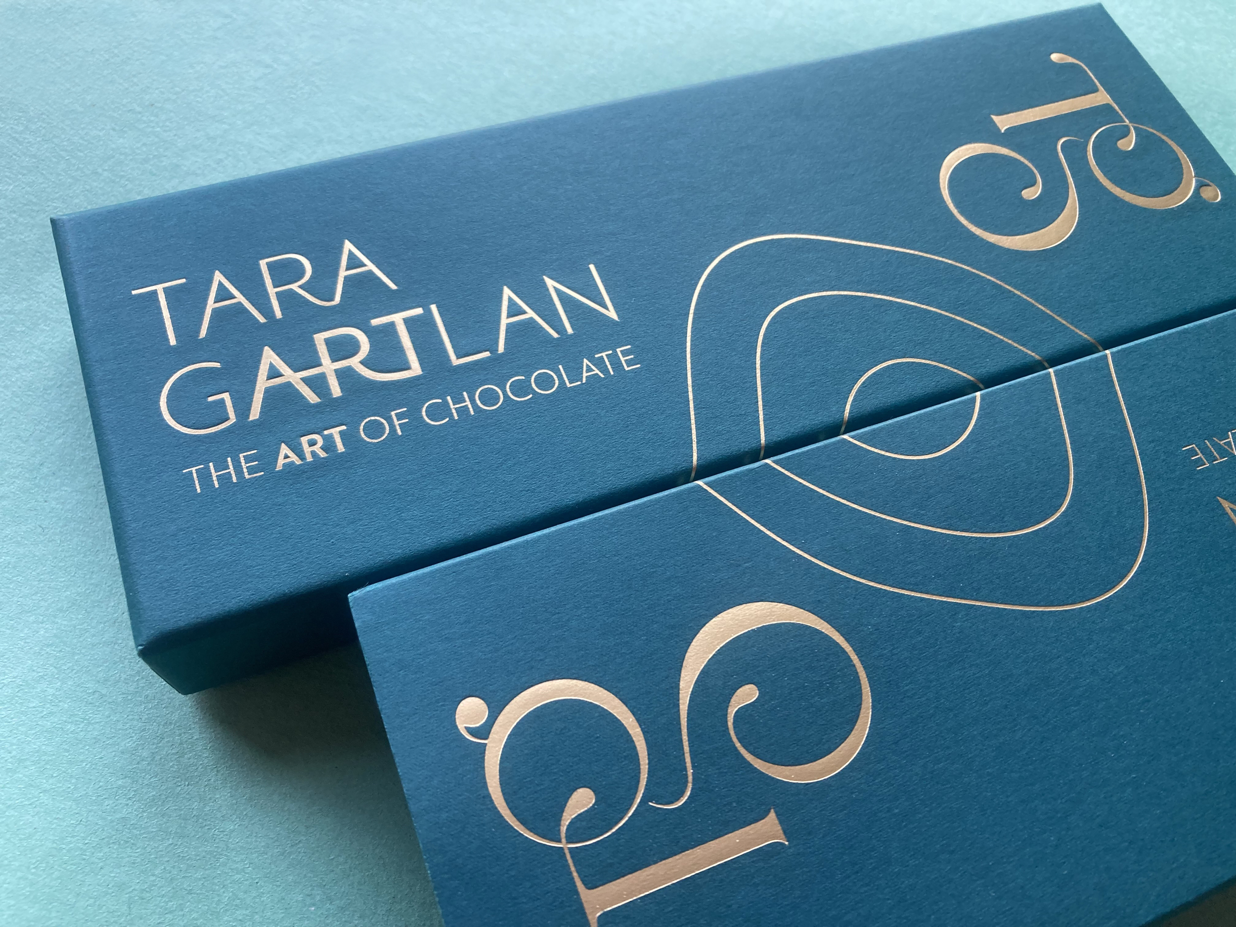
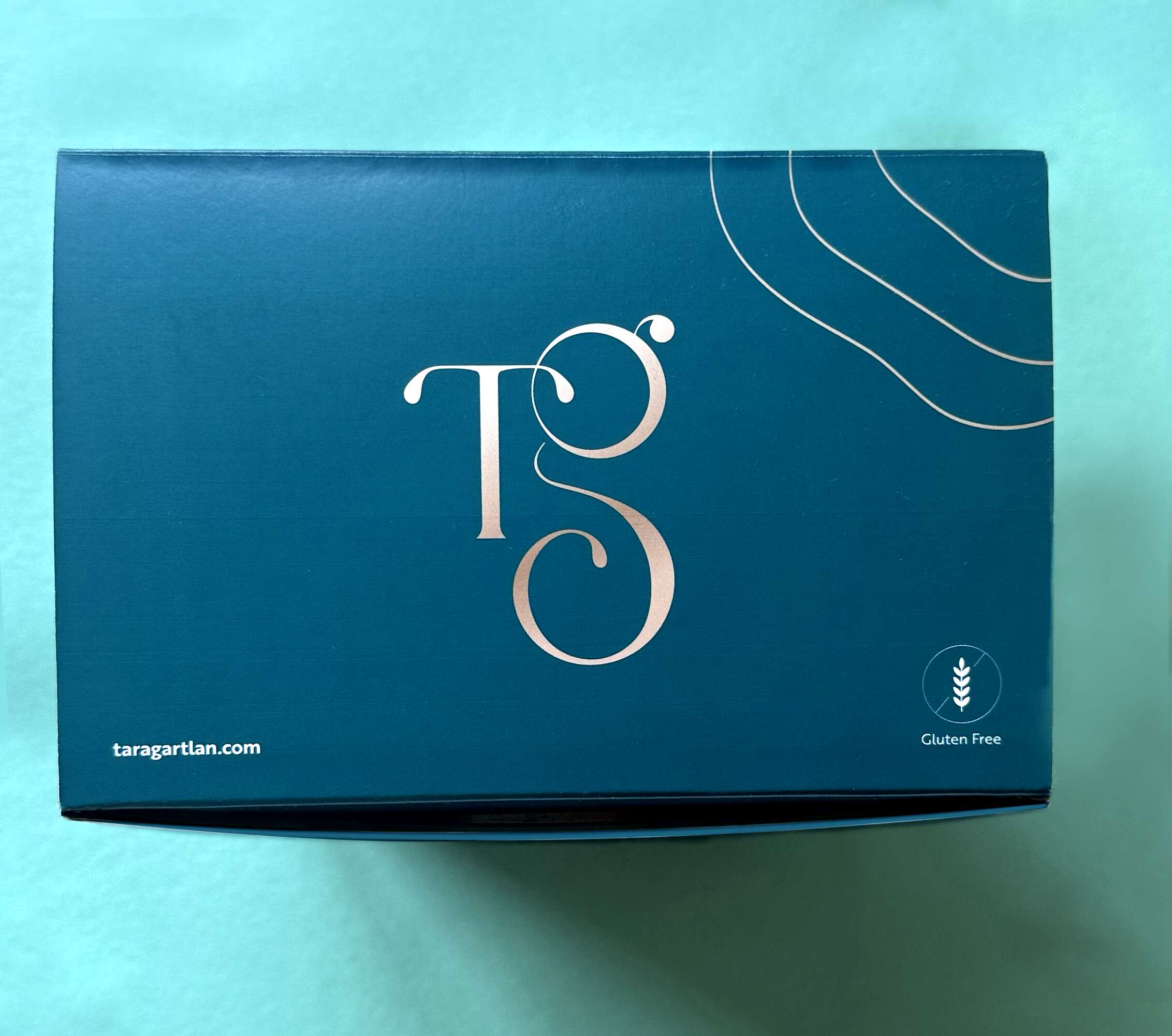
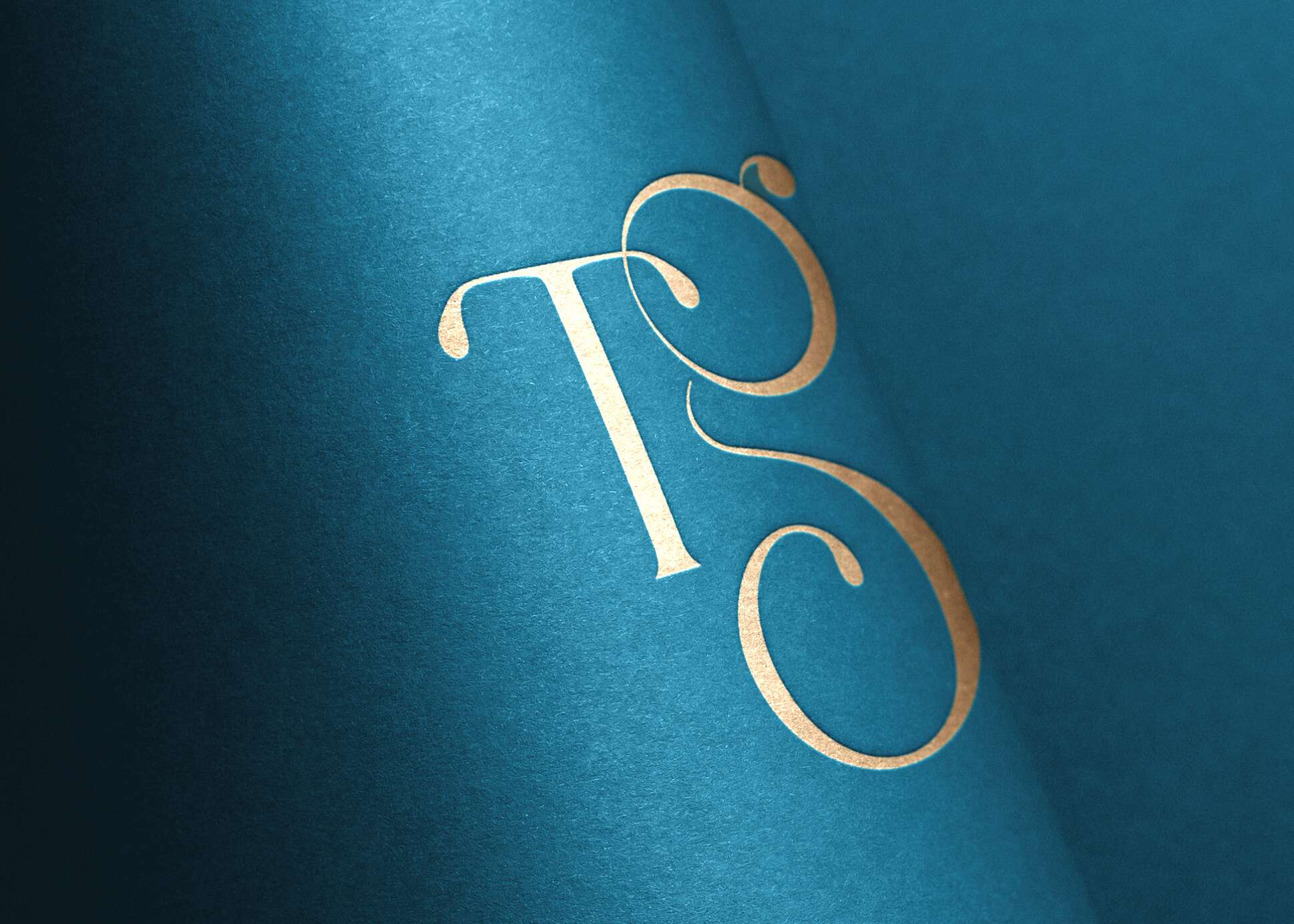
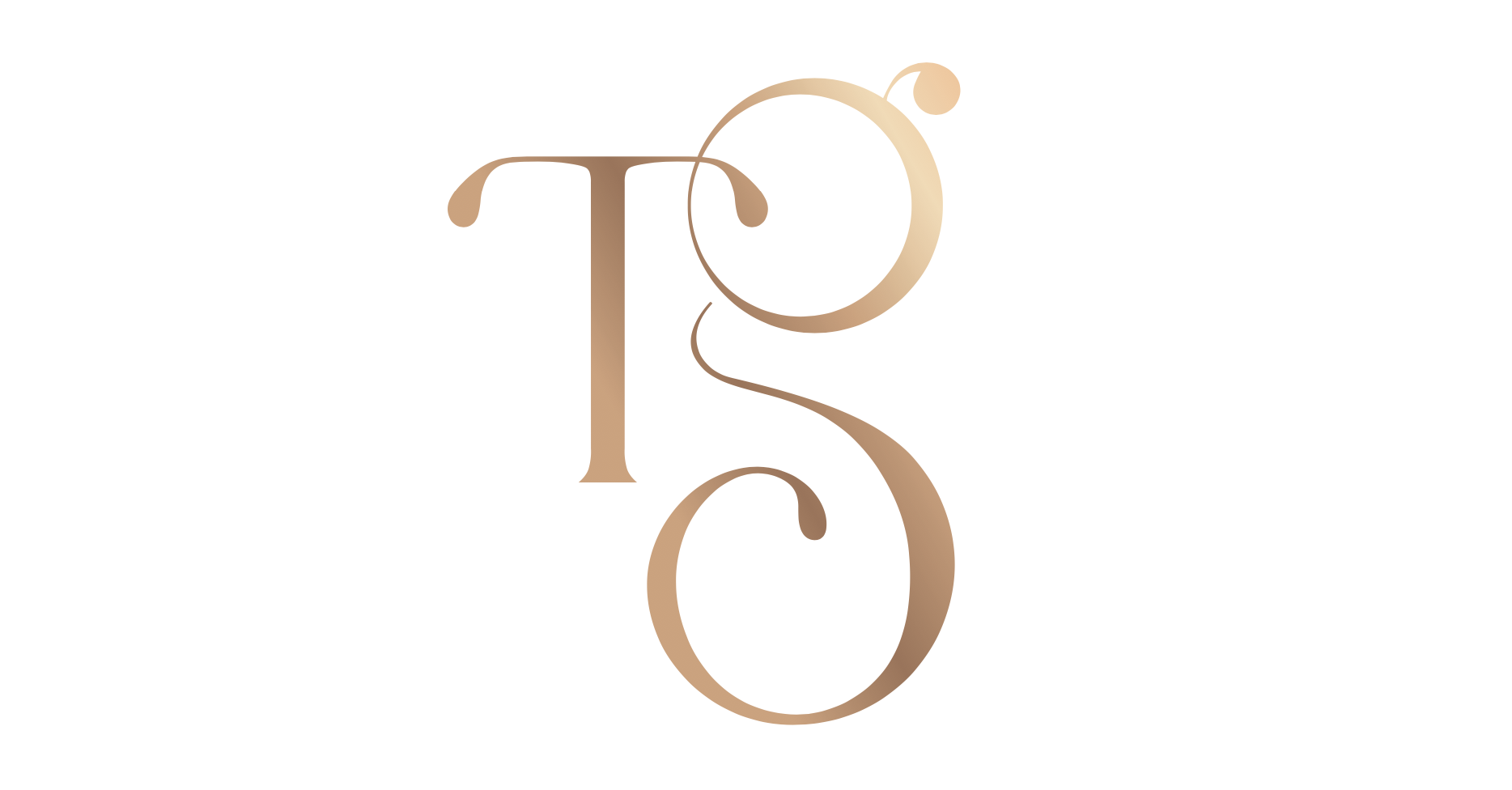
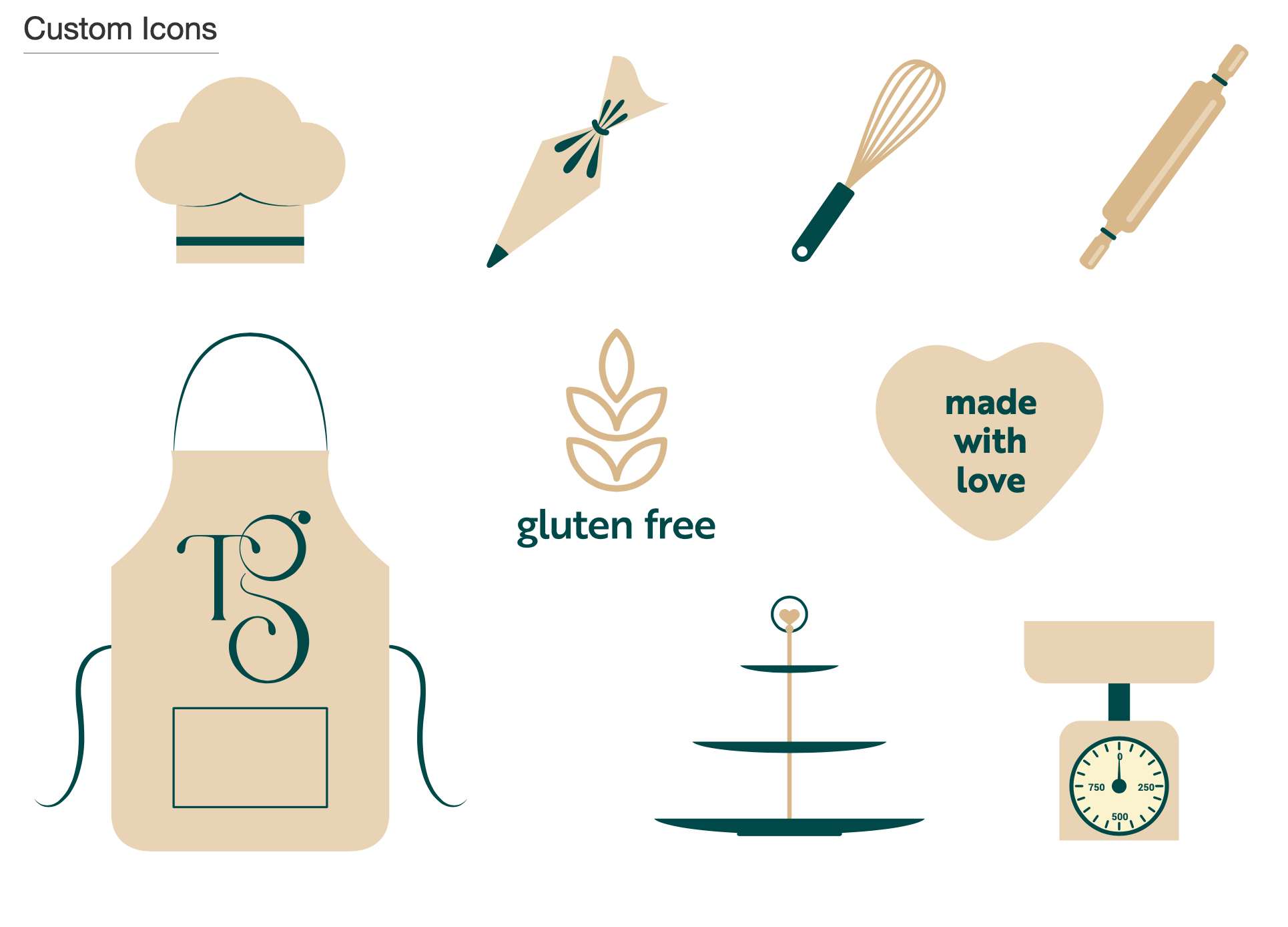
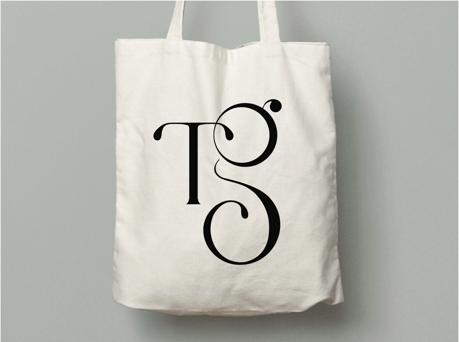
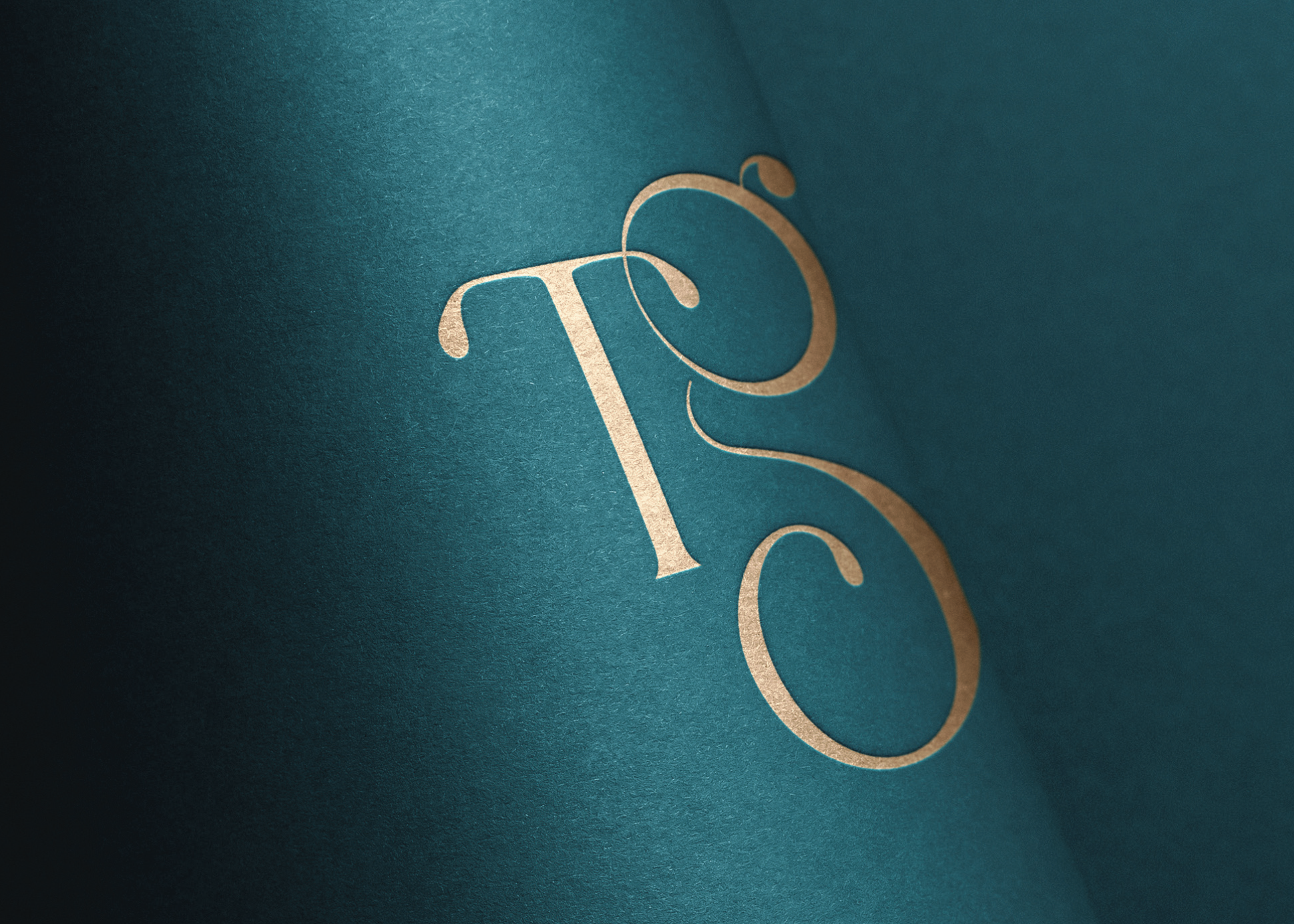
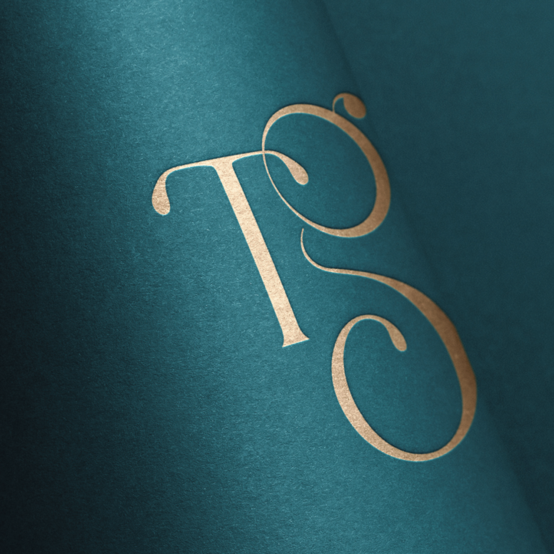
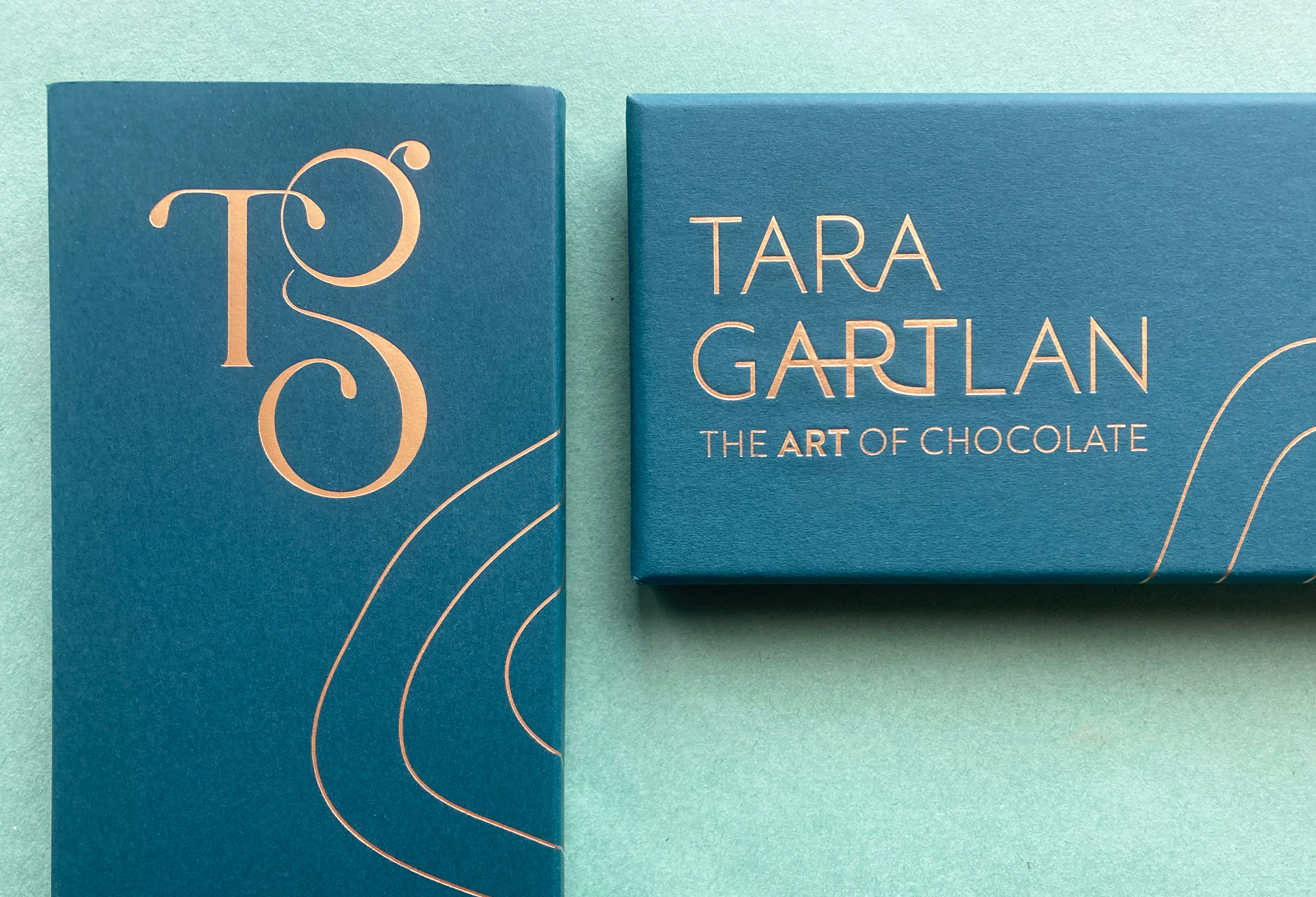
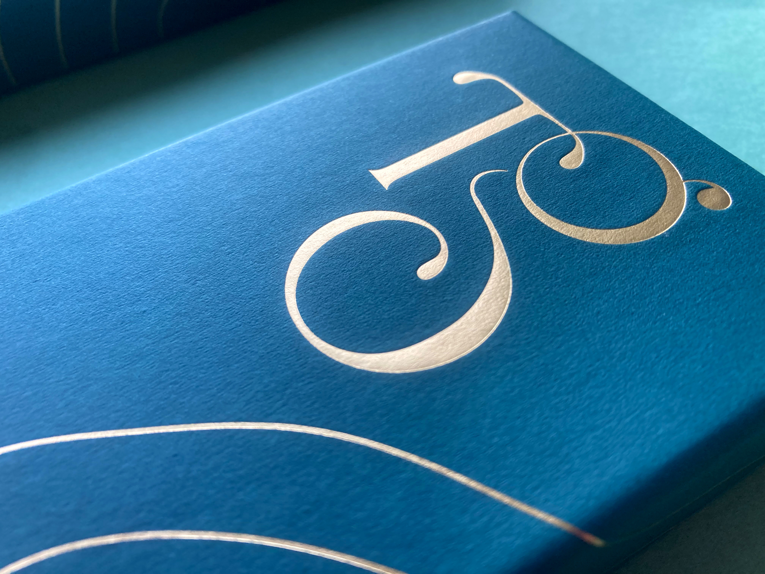
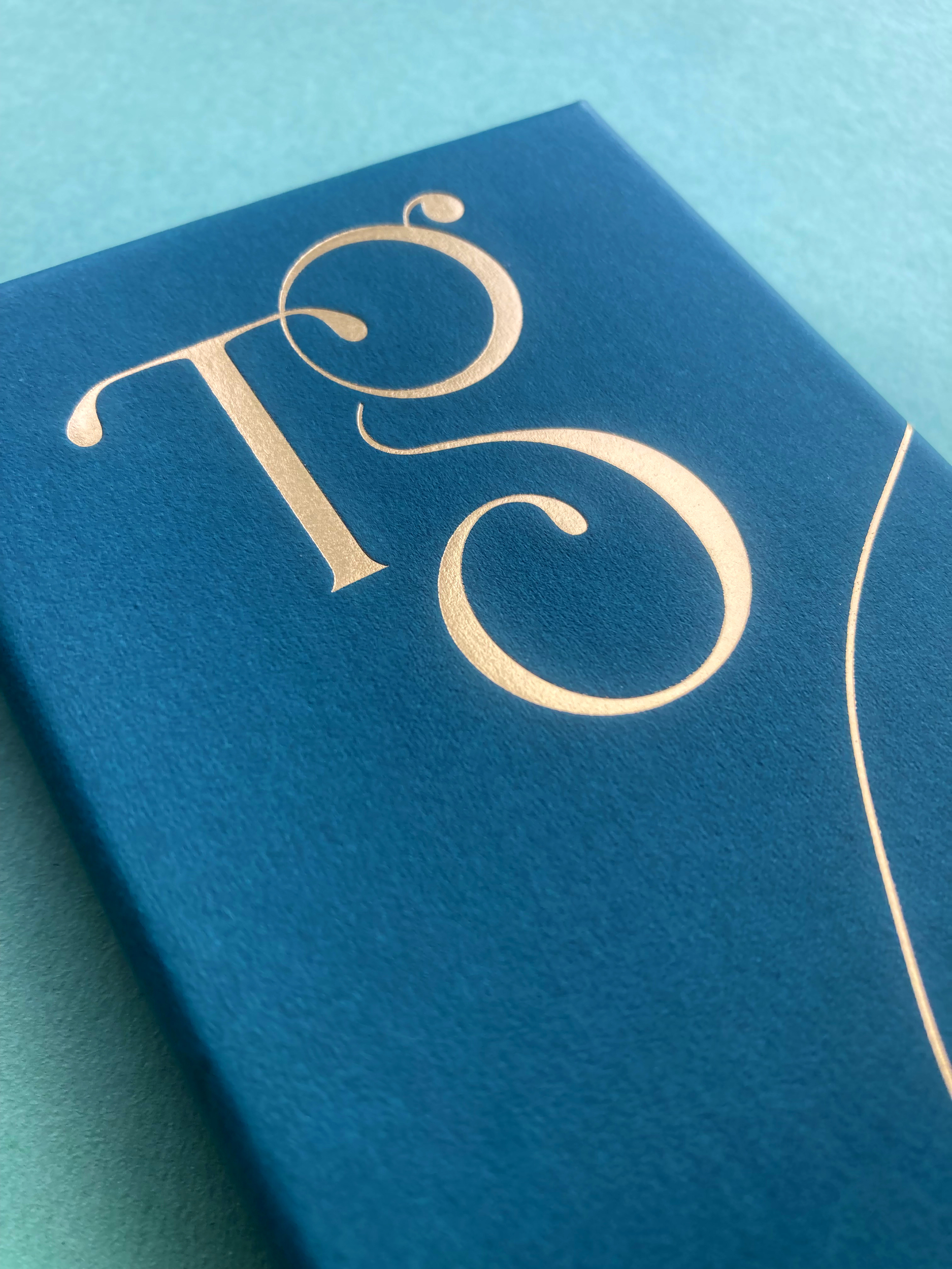
We took the initials ‘TG’ from Tara Gartlan’s name and created a strong graphic symbol with it, taking cues from the flowing nature of chocolate and incorporating droplets, like with chocolate dripping. There is a subtle ‘c’ within the base of the ‘G’ for the word ‘chocolate’ and also for ‘coeliac’, as these chocolates are coeliac-friendly.
The beautiful boxes exude quality, the gold-detailed curvy lines take cues from the free-flowing way that chocolate is poured and the natural flowing lines in nature, as many of the ingredients are grown locally, guaranteeing the most fragrant flavours.
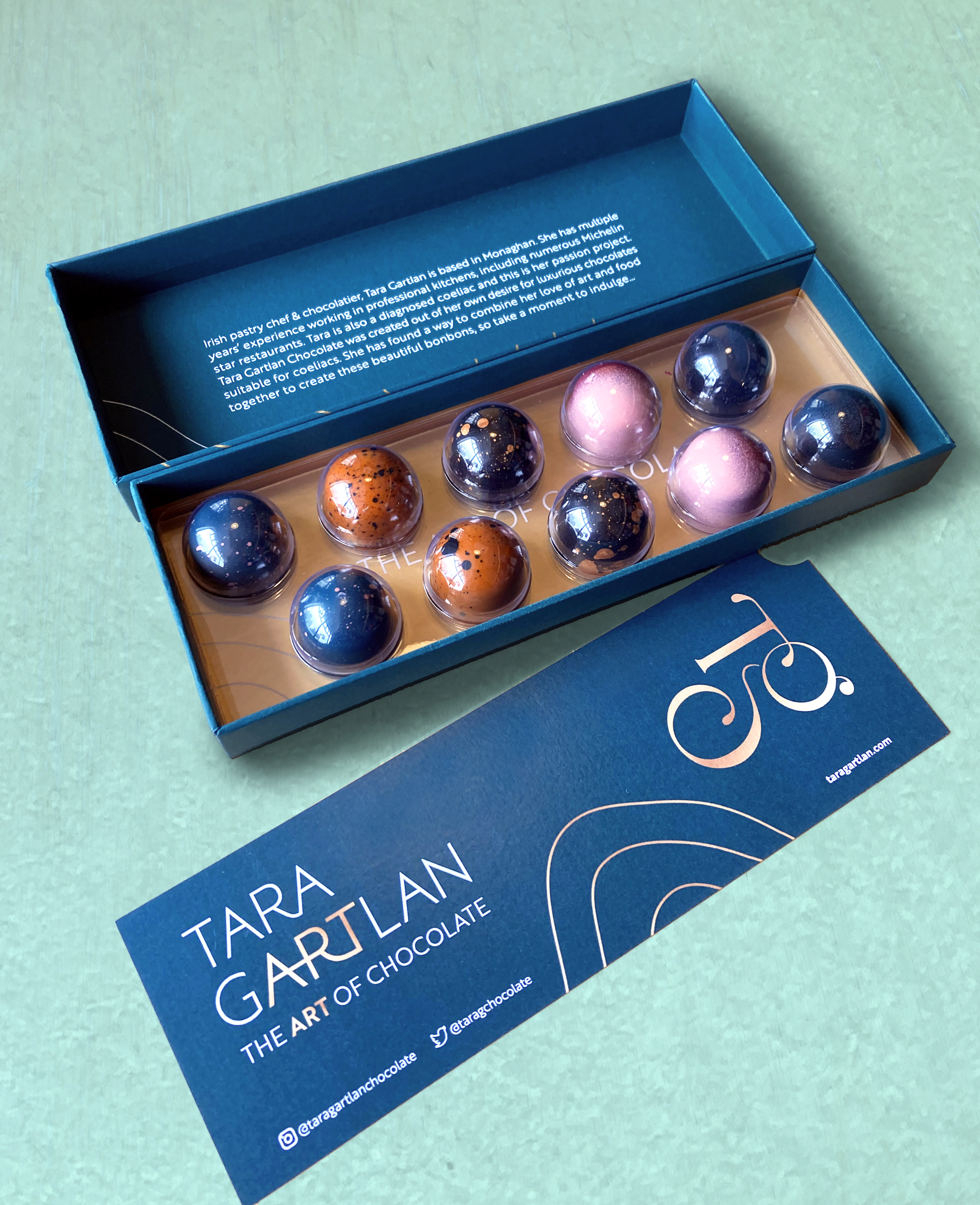
They are made with Valrhona chocolate and filled with beautifully seasonal ingredients. They are Gluten Free but the secret is – you wouldn’t know! Sometimes gluten free is perceived to be less tasty but I gave them to people to try and only told them after and they were shocked!
JJ O’Toole Ltd did a beautiful job on printing the packaging at a very premium standard – and are also a pleasure to deal with. All chocolate collections are available on www.taragartlan.com


 Brand Guidelines & Assets
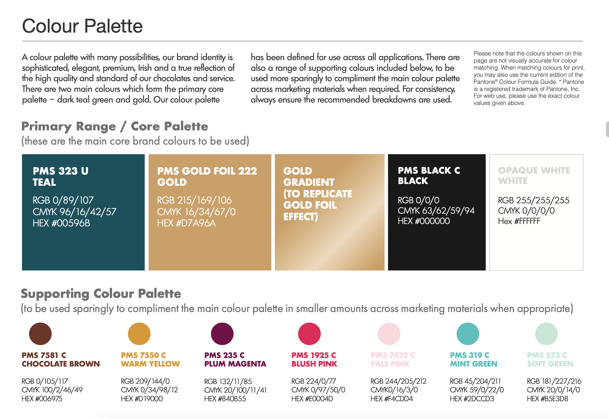
A colour palette with many possibilities, the Tara Gartlan Chocolate brand identity is sophisticated, elegant, premium, Irish and a true reflection of the high quality and standard of our chocolates and service.
Follow Tara Gartlan Chocolate on Social Media:
Instagram: @taragartlanchocolate
Twitter / X: TaraGChocolate
Order Tara Gartlan Chocolates here: www.taragartlan.com
Duhallow Organics Brand Packaging Design
Duhallow Organics Brand Packaging Design
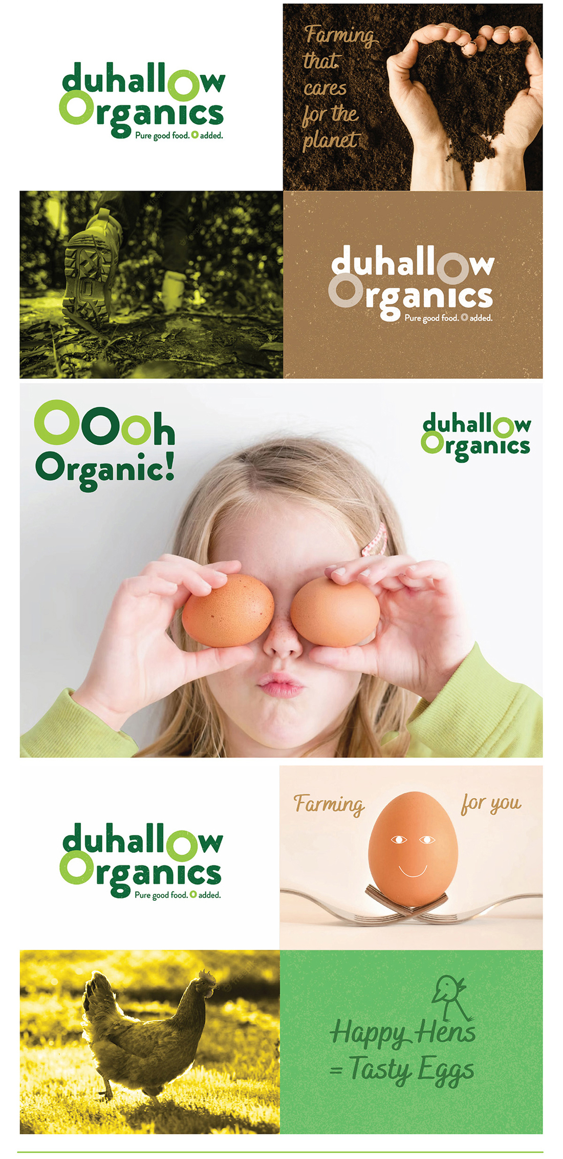
 The Duhallow Organics farm is situated on the old Moynihan family farm in Boherbue in the heart of Duhallow, Co. Cork. Certified Organic since 2008, they produce Organic Eggs and grass finished Dexter Beef.
Duhallow Organics care about People, Animals, Sustainability, Biodiversity & the Community. Everything they do has these values at their core. They create Pure Good Food, Cork style, with 0 Additives, Pesticides, GMOs or Fertilisers. They farm for you and your family.
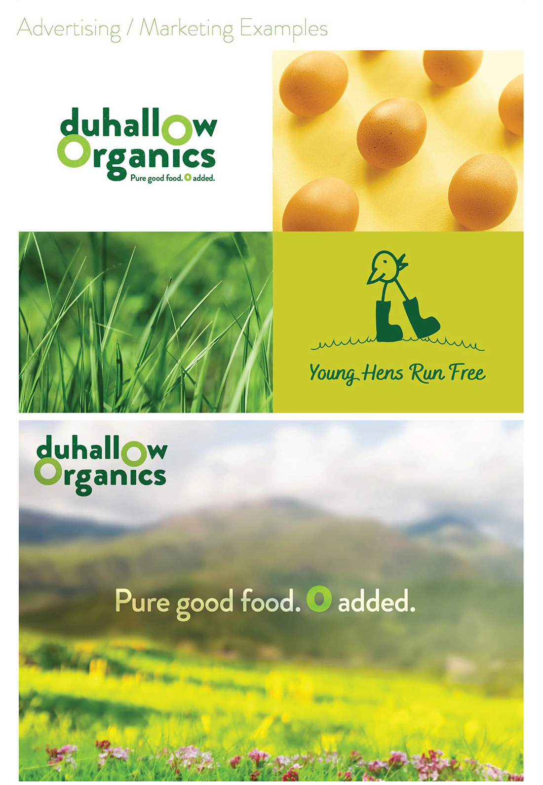
Within the brand logo design, the 0’s have been highlighted to emphasise how there are zero additives used in the food that they produce, as it is organic and natural. There is a grain texture within the letters of the logo, to further communicate the natural and organic aspect of the food produced from this farm.
The tagline we developed for them is ‘Pure good food. Zero added‘. The word pure cleverly plays on the way native Cork people use the word ‘pure’ is used to say ‘very’ or ‘absolutely’ and also how the farm is organic so the food produced by Duhallow Organics is very clean, healthy and pure.
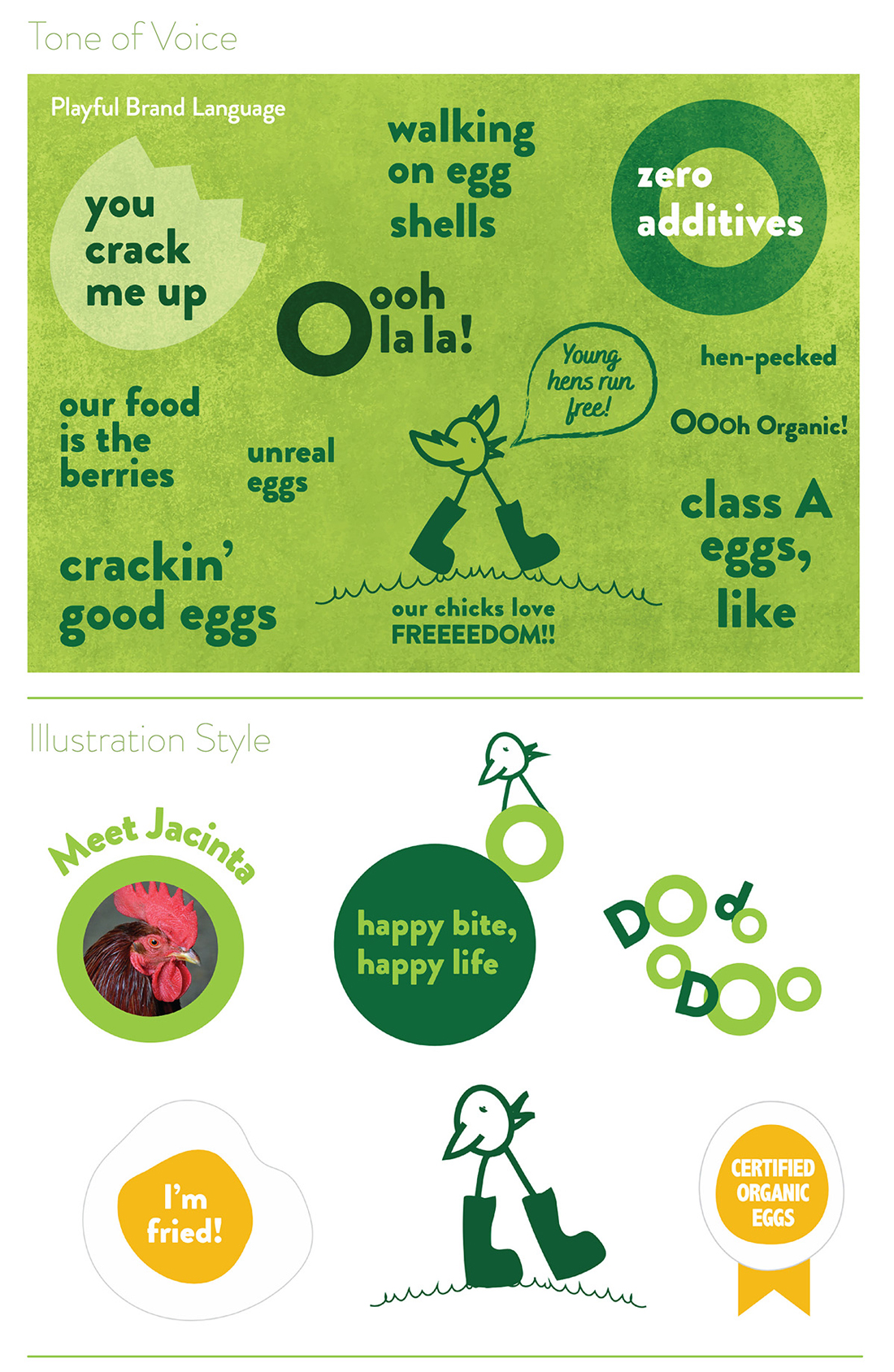
The Duhallow Organics brand is fun, quirky, bright and playful to appeal to customers and indicate how their animals live freely and happily – while still clearly communicating the brand ethos and values, to signify what they stand for, such as how they care about animals, the environment and sustainability at their core.
Fresh Organic Eggs
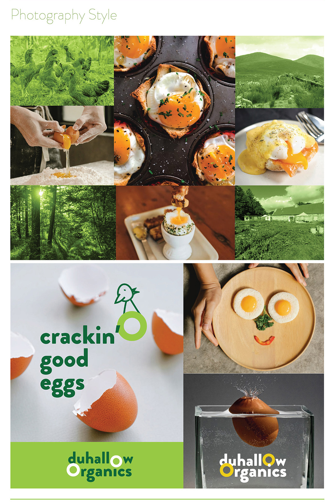
Their hens live a lifestyle which complements the holistic Organic ethos of the farm. The girls live in a mobile hen shed in the field and enjoy a rich bounty of Organic grubs and grasses. Their happy girls produce magnificent eggs which are as natural as an egg should be.
-
They work with nature to nourish you and your family.
-
They farm with nature using holistic farming practices to produce pure good food.
-
Their aim is to increase biodiversity on the farm, both above and below ground, which gives you healthier and happier animals and a better, more natural product.
Brand Guidelines & Assets
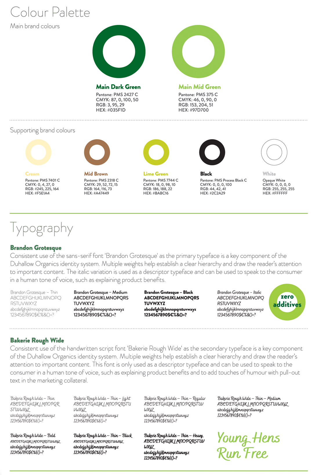
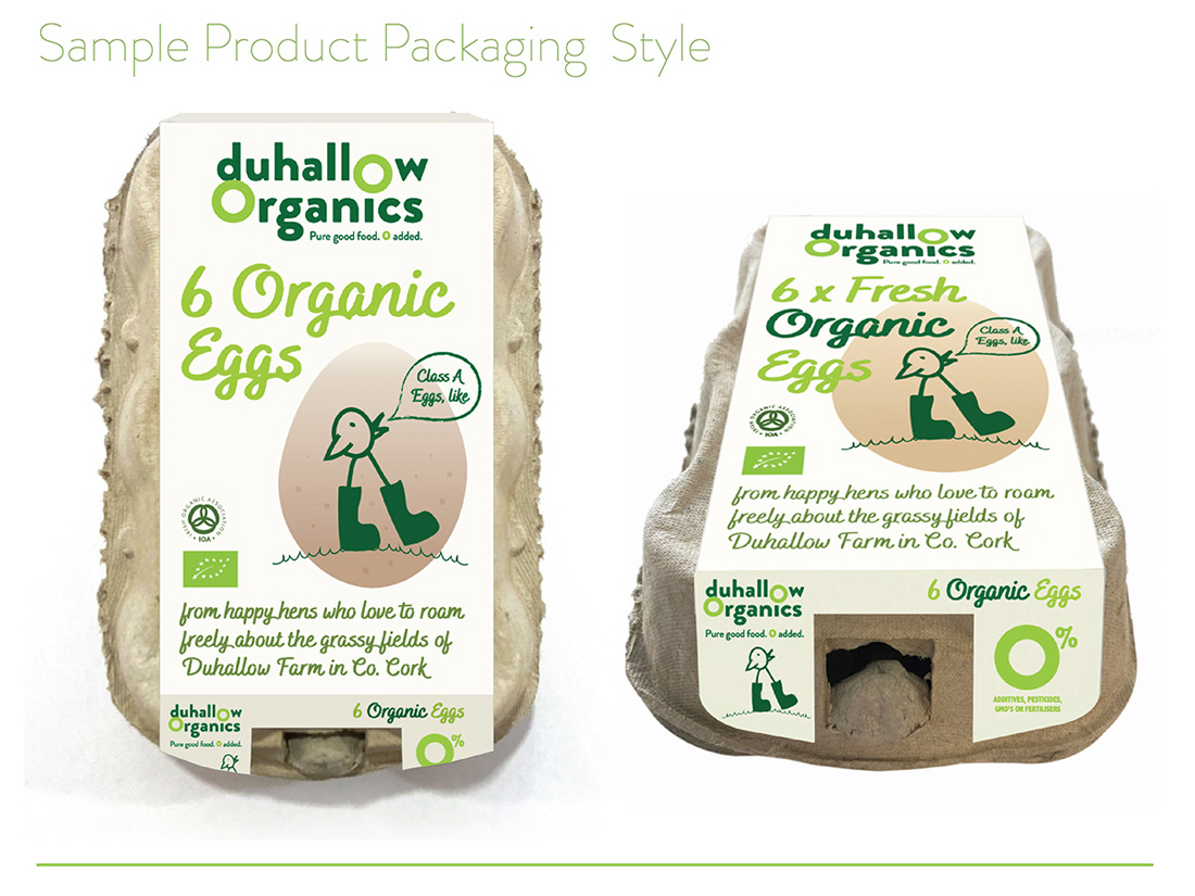
A mini guidelines were included with this brand packaging project. The colour palette and typography chosen are earthy, natural, bright and fresh to indicate these aspects of how the Duhallow Organics farm runs. Illustrative icons and descriptor text on the packaging design communicate some of the other brand USP’s, such as that the eggs are ‘Class A‘ and have ‘zero additives’, that there is ‘0% additives, pesticides, GMO’s or fertilisers‘.
The barcode is playful, featuring an icon of a cute and playful chicken in welly boots walking freely over a hill on grass, as part of the barcode device, replicating the same chicken character which appears in a larger scale on the front of the pack, symbolising how the hens are happy and free. The brand ethos is featured on the side of the pack, to allow consumers to connect with the family farm’s brand story and background.
The Duhallow Organics range is available in shops across Cork and Kerry.
Follow Duhallow Organics on Social Media:
Instagram: @duhalloworganics
Facebook: www.facebook.com/DuhallowOrganic
Website: www.duhalloworganic.com
Clare Anne Taylor Couture Cakes – Brand Packaging Design
Clare Anne Taylor Couture Cakes: Brand Packaging Design
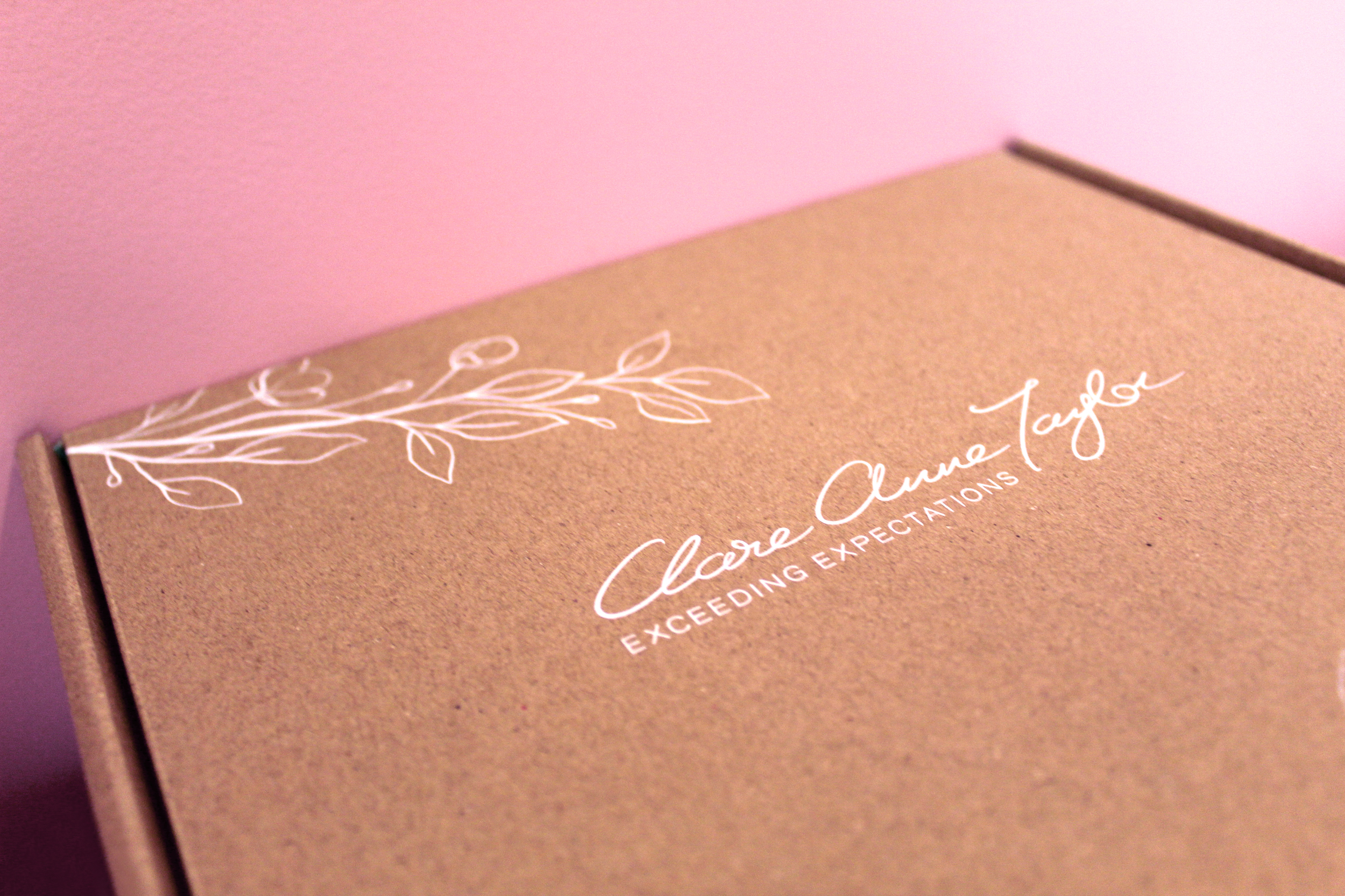
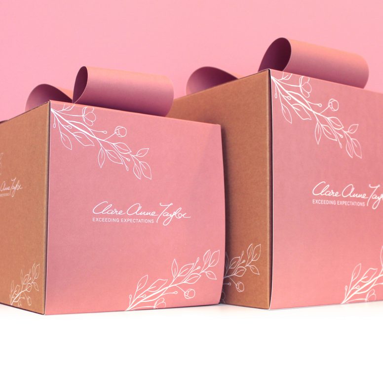
 Clare Anne Taylor Couture Cakes are one of Ireland’s leading luxury cake designers for special events and weddings. The core of the business is luxurious quality and elegance in the design and craft of their cakes and confections.
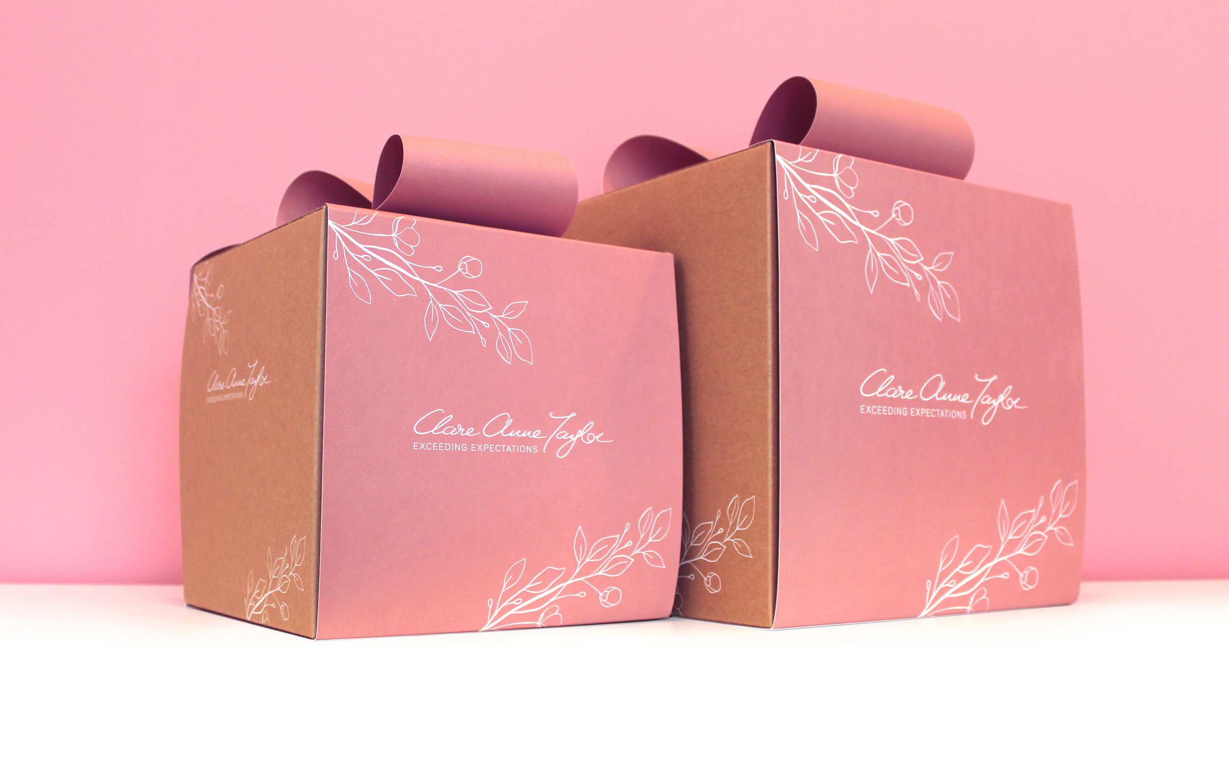
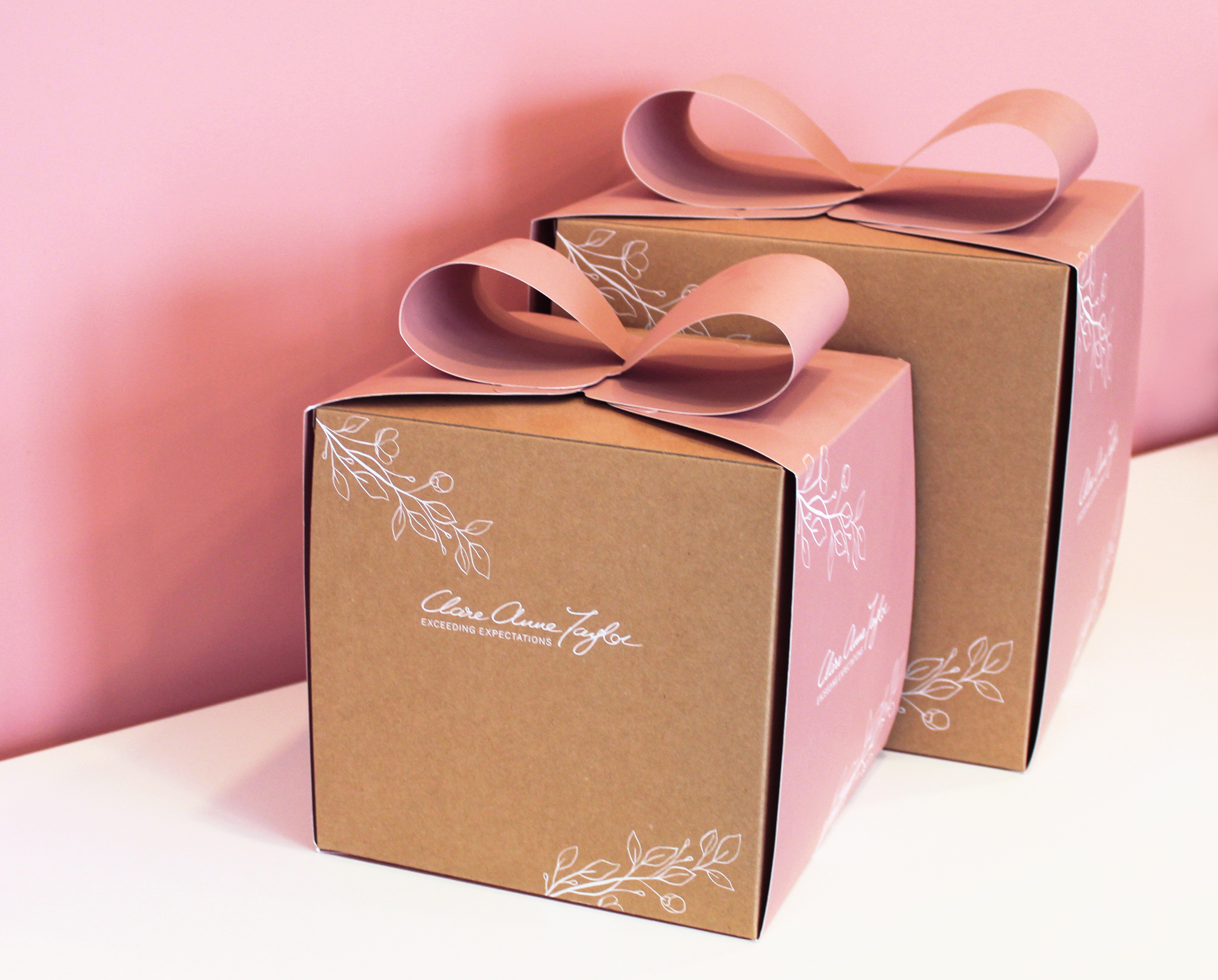
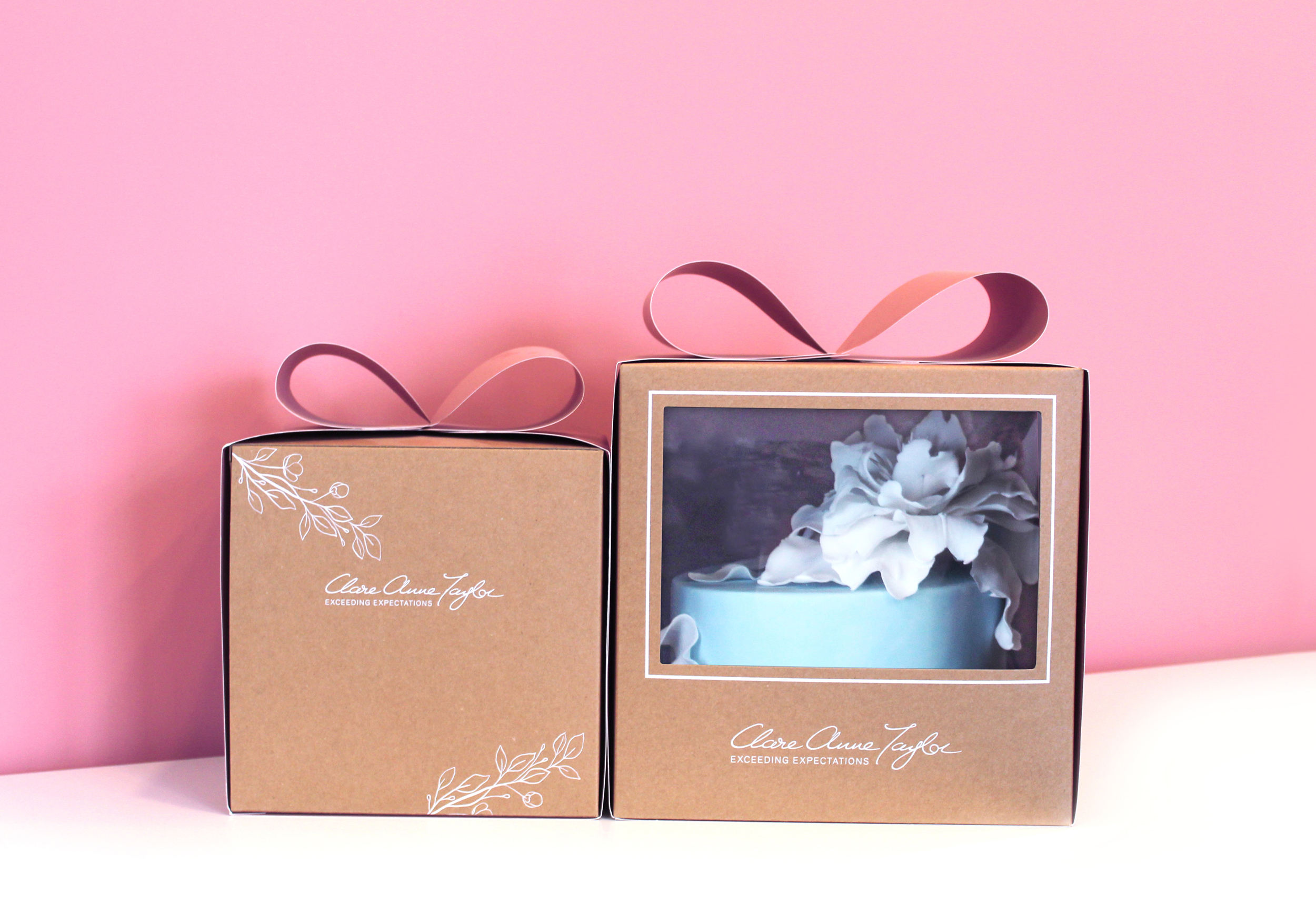
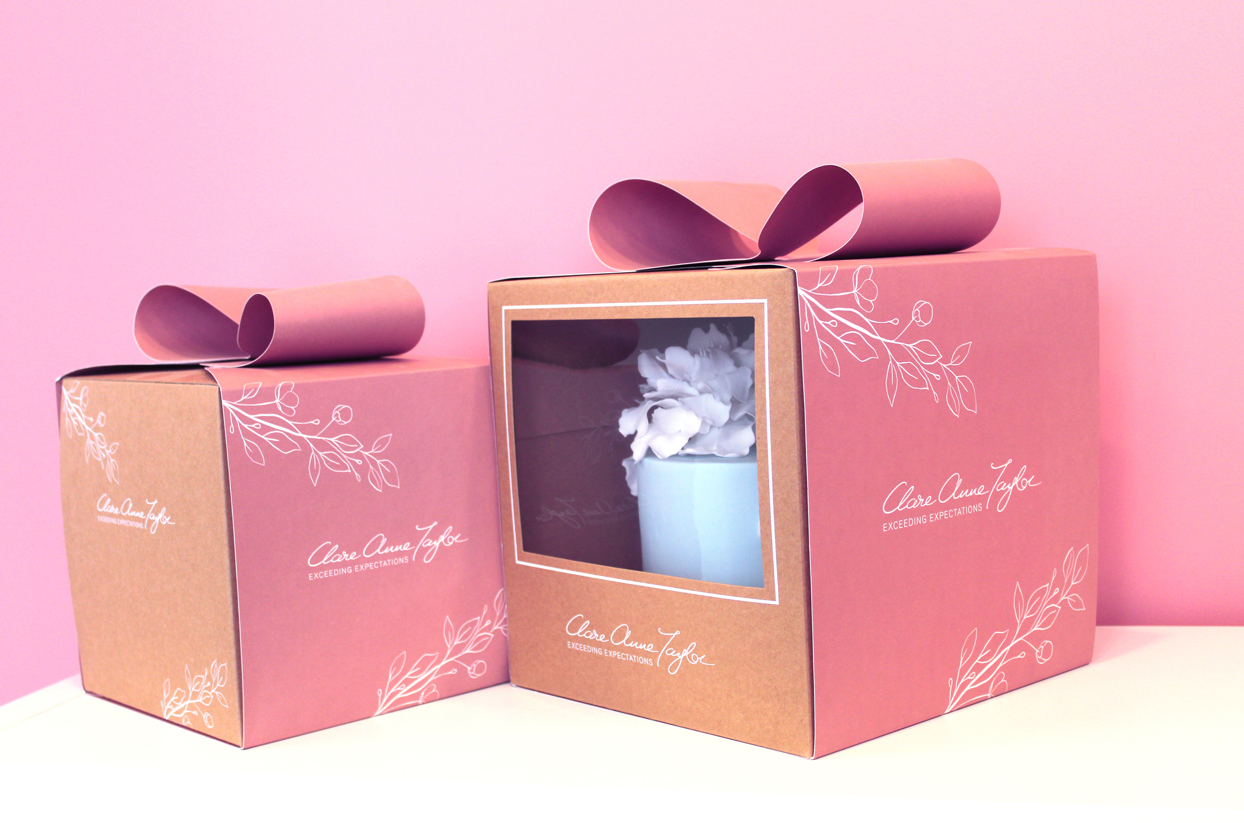
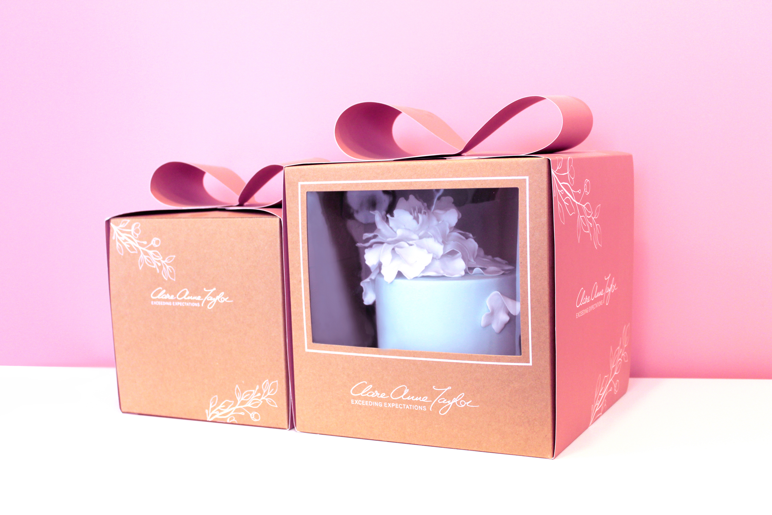
The client, Clare Anne Taylor, wanted the packaging to be suitable for gifting. When bringing to someone, the box should be beautiful and elegant enough to give the feel of a gift presentation. She wanted the brand to epitomise the highest standard and quality available on the market.
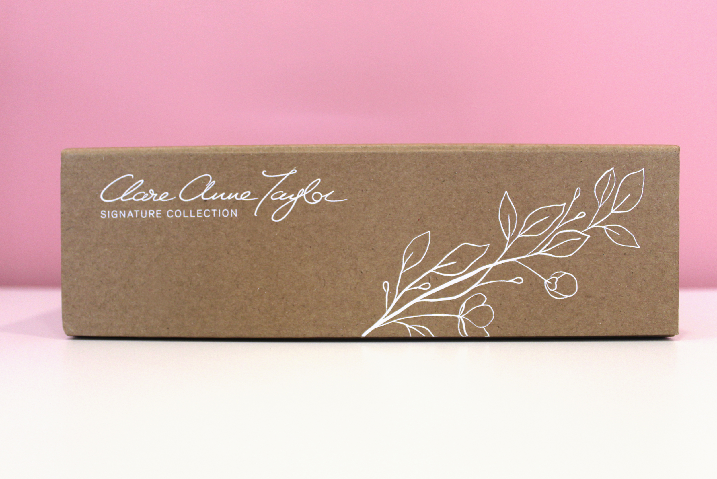
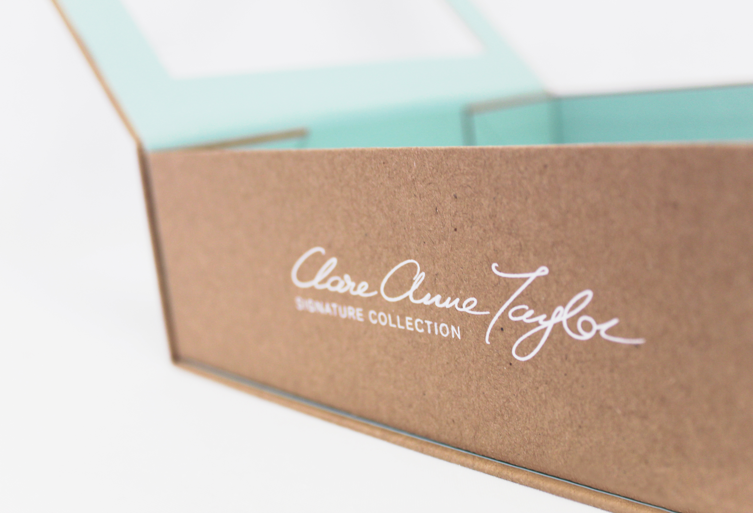
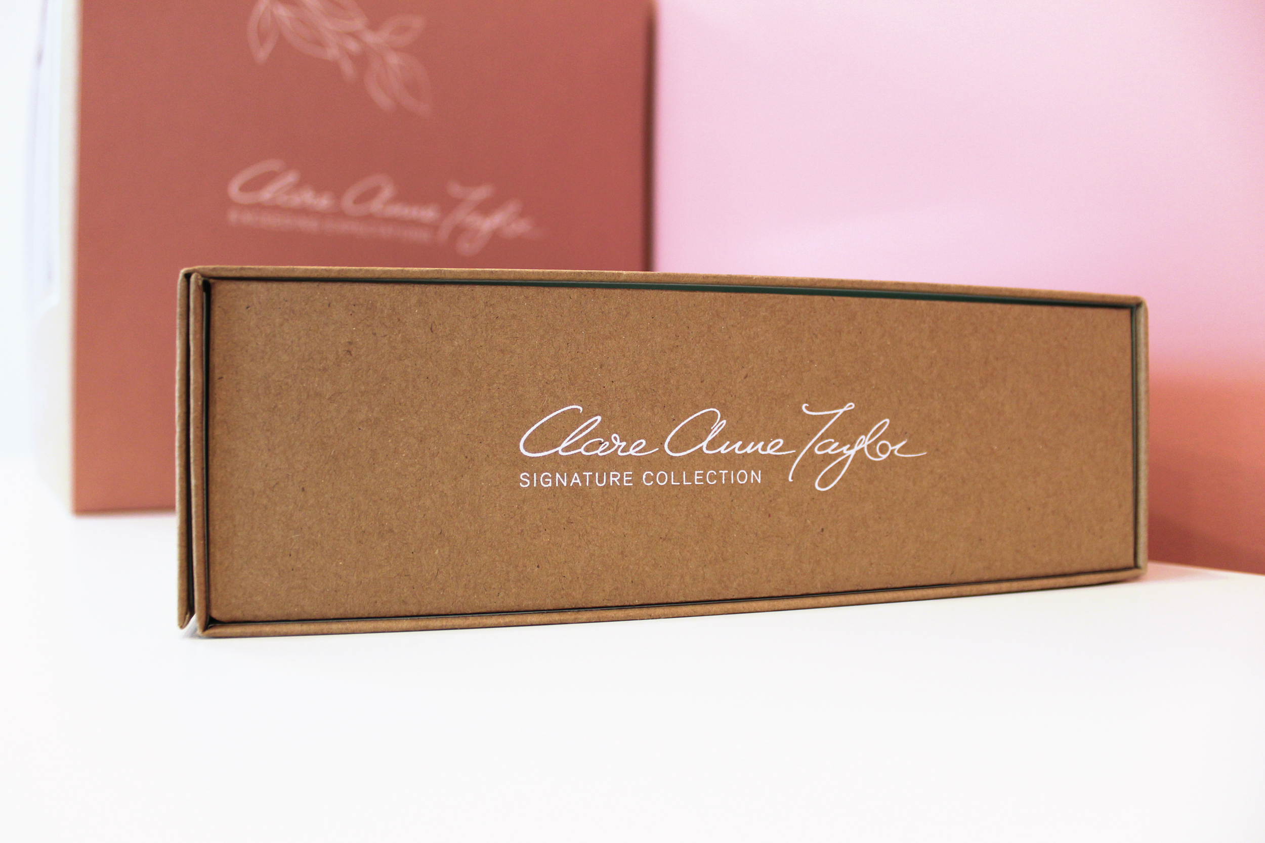
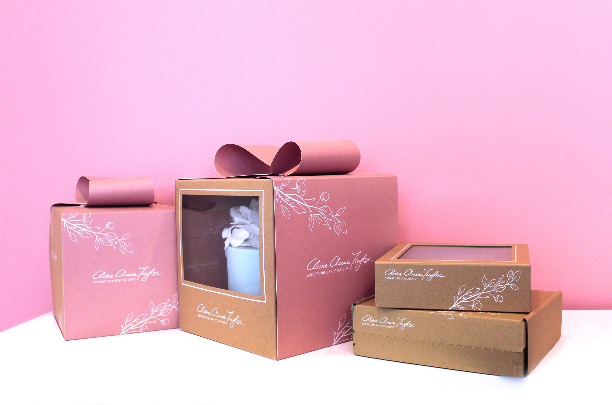
The client needed to easily separate between the ranges, while maintaining a consistent brand style. A PMS colour palette was created for each range, to create clarity in differentiating between the ranges. A pink swatch was selected for the main Clare Anne Collection, green for the Signature Collection for confectionery and a Warm Grey for the Couture Collection. Clare Anne had been using similar colours to these in her labelling as she liked the soft, feminine tones. We therefore developed these colour swatches to slightly deeper hues, to allow the brand to stand out more prominently, as the existing colours were quite faded, making legibility a little difficult.
Another way to separate the ranges in a subtle, sophisticated manner was to alternate the strapline/tagline under the brand name/logo for each range. In the brief, Clare mentioned that she would like to exceed expectations for customers. Therefore, for the main ‘Clare Anne Collection’ range, I created the tagline ‘Exceeding Expectations’. This was then changed to the individual range names for the ‘Signature Collection’ and the ‘Couture Collection’.
For the main Clare Anne range, we created the concept of a pink, bow sleeve around kraft boxes, to meet the brief’s aim of communicating the experience of receiving a beautiful gift. Clare wanted to showcase the beautiful artistry of the cakes within, therefore we designed a large window on the front of the boxes to meet the brief’s aims, leaving space at the back of the boxes for possible ingredient/nutritional labels to be added per cake, as each cake is bespoke.
For the box and sleeve design, the design is simple and minimal to convey the quality of the brand. The boxes and sleeves feature a delicate floral illustration to connect to the beautiful artistic floral designs that Clare creates on her cakes. Another factor used to communicate the level of quality is the premium standard of printing of the kraft boxes and pink sleeves. The Signature Collection features a green interior with three different inserts for various types of confectionery. The e-commerce box was created to hold the confectionery boxes securely for delivery. The printing specialists that we worked with to reach our design requirements and unique print specifications for this project’s packaging range was JJ O’Toole.
See more about Clare Anne Taylor Couture Cakes:
Instagram: instagram.com/taylorclareanne
Website: clareannetaylor.ie
Hello Hinterland Book Illustration
Hello Hinterland: Book Illustration
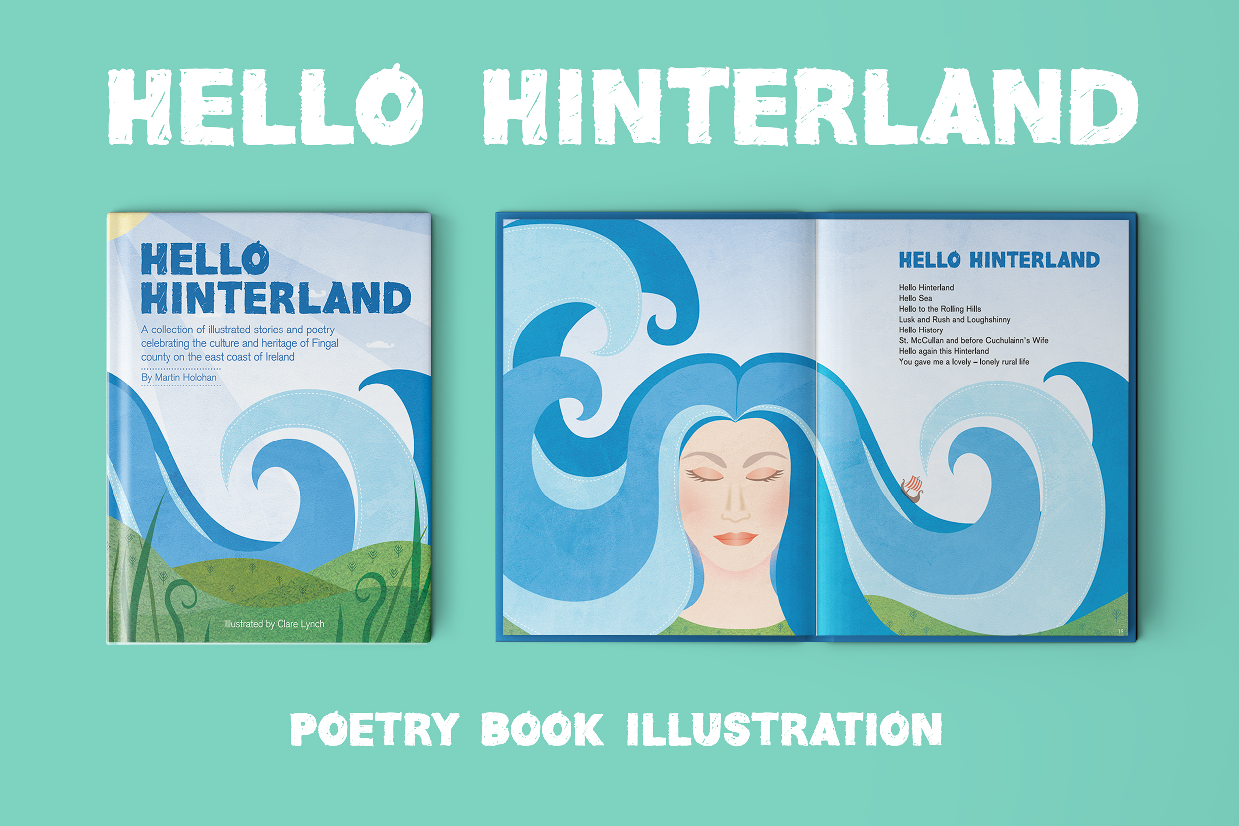
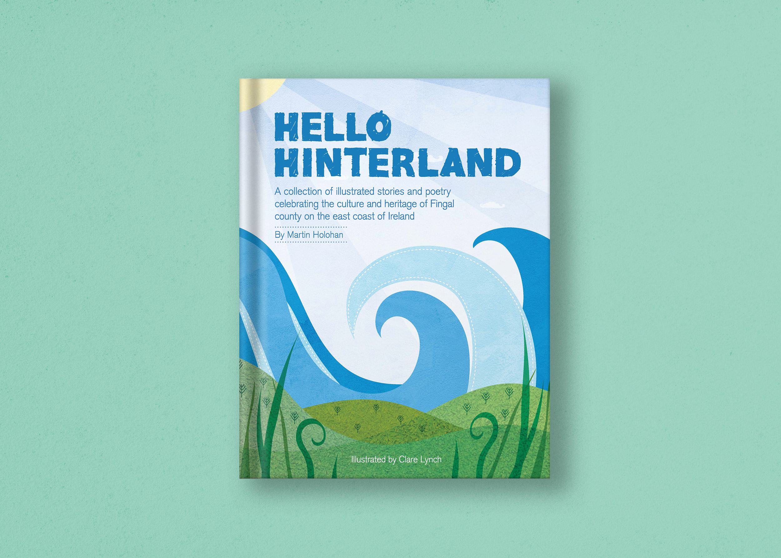
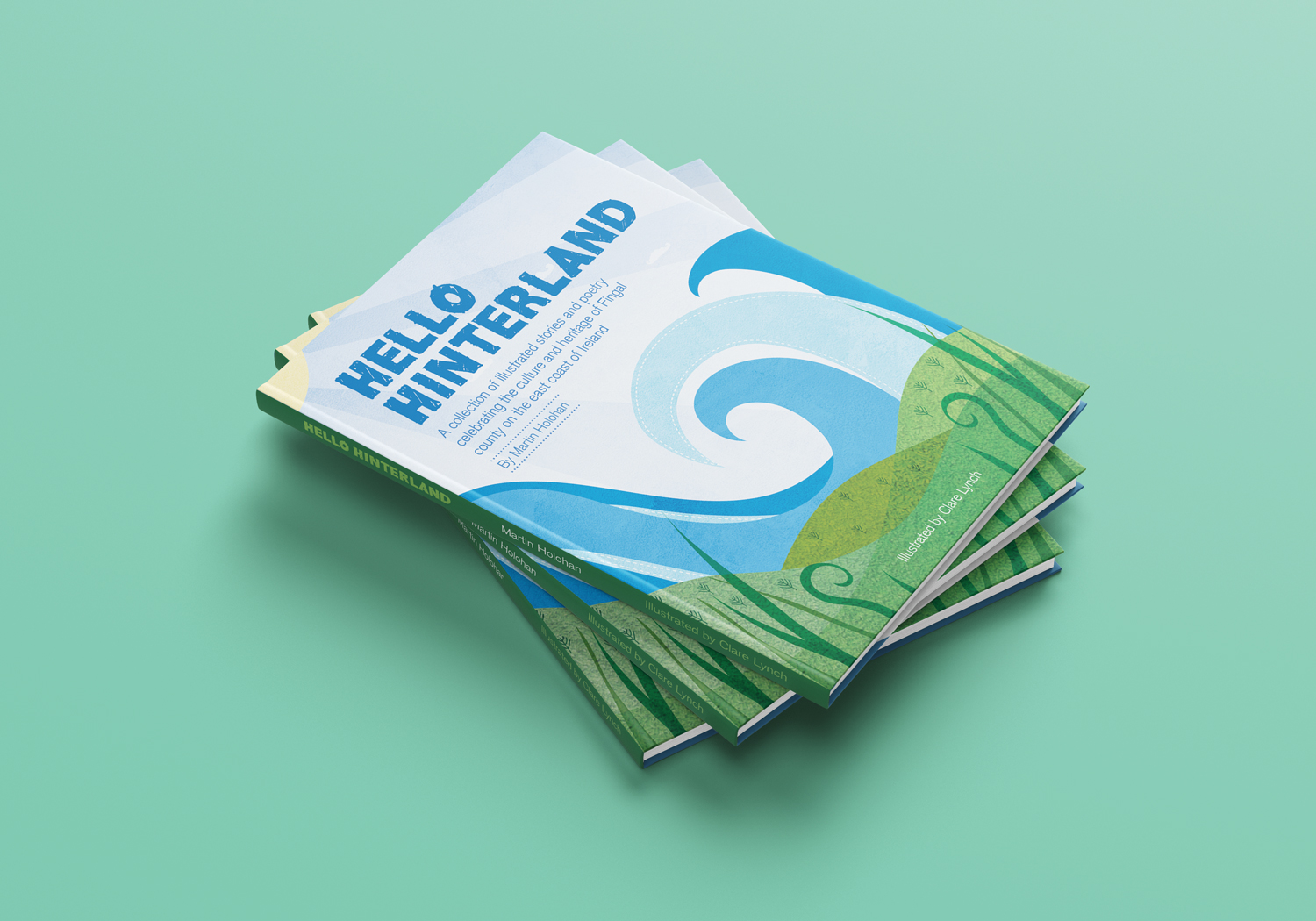
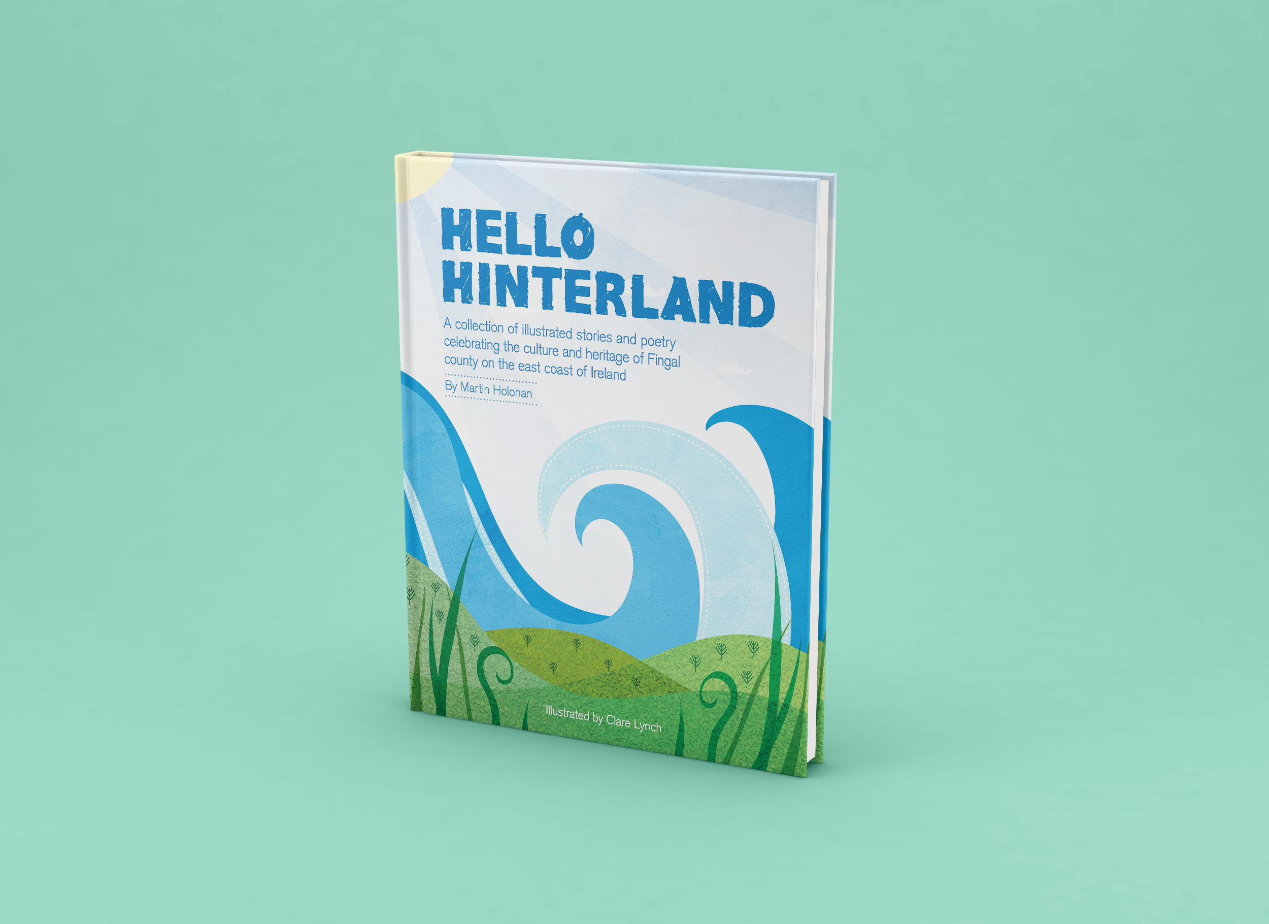
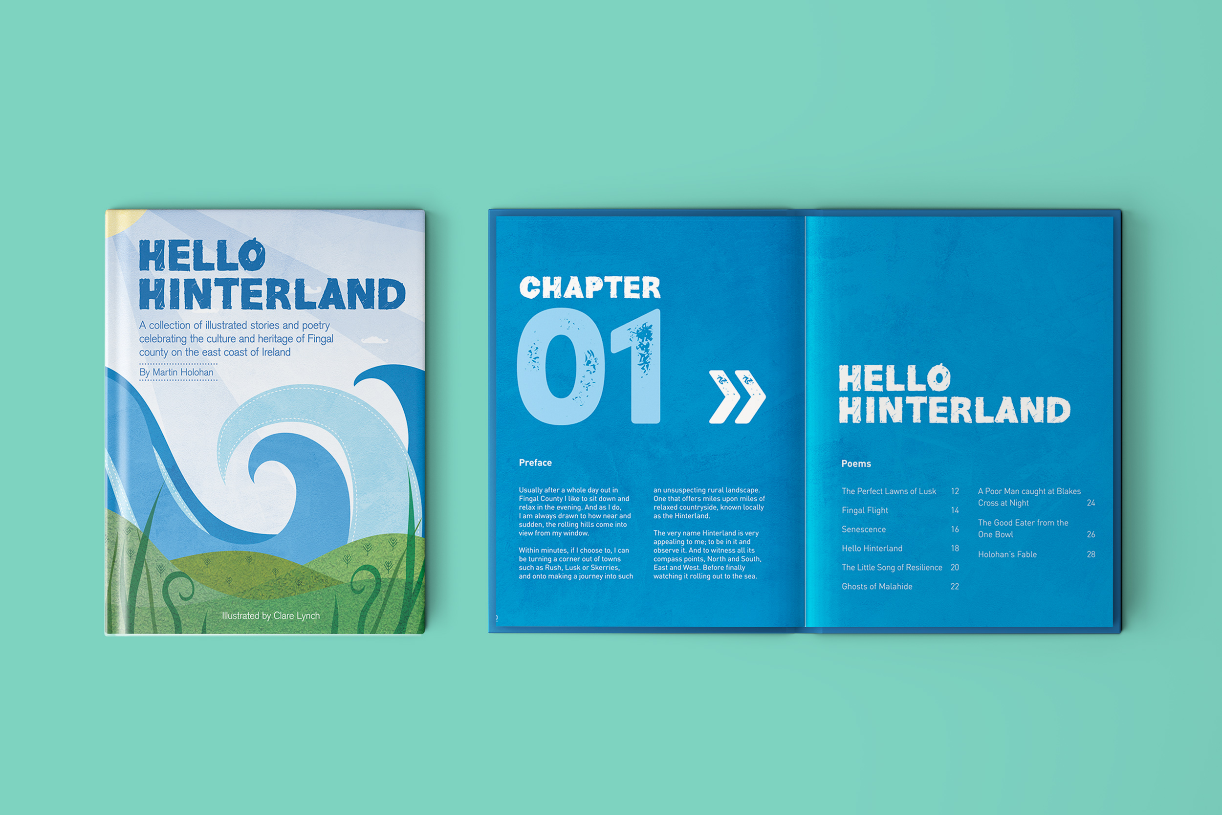
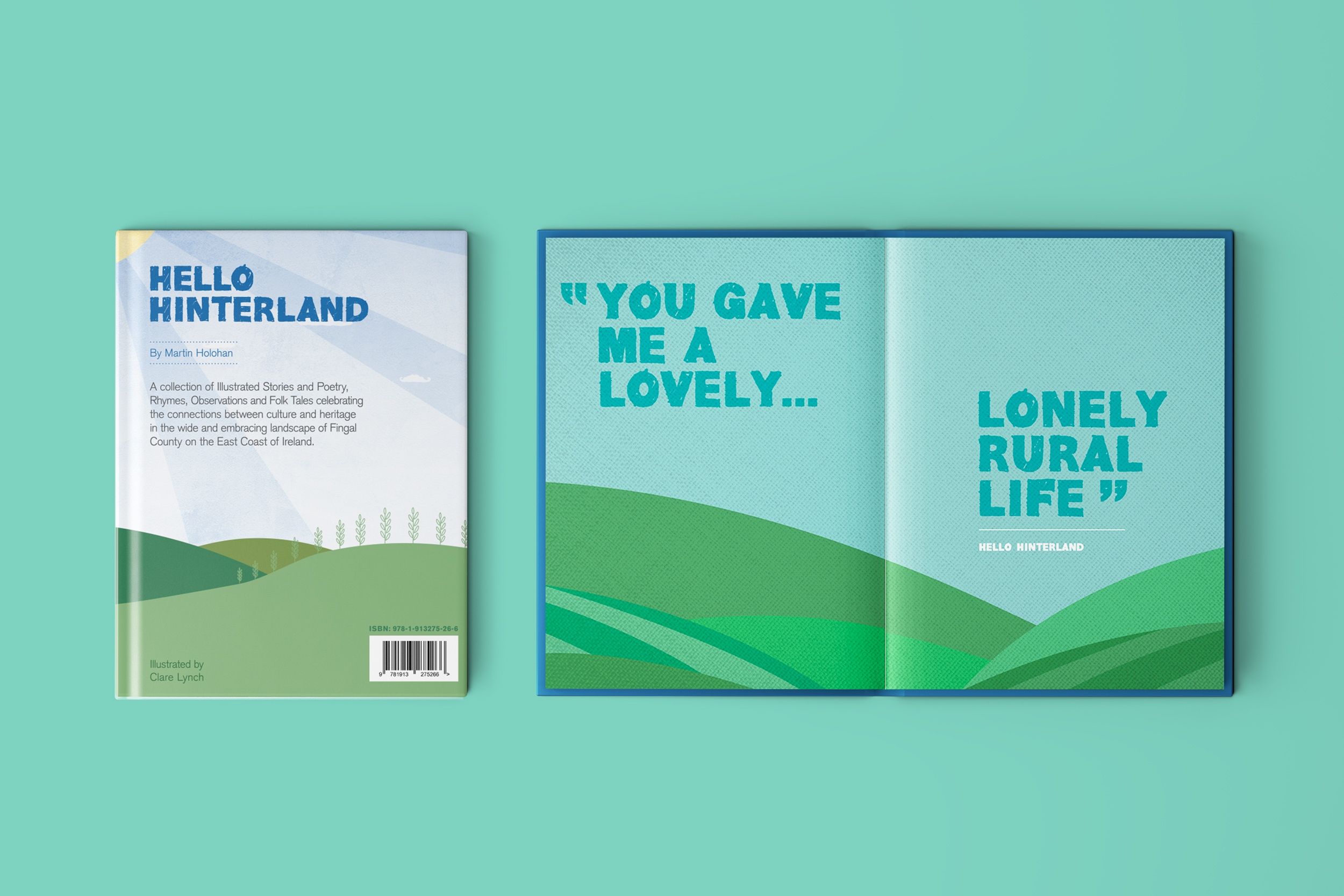
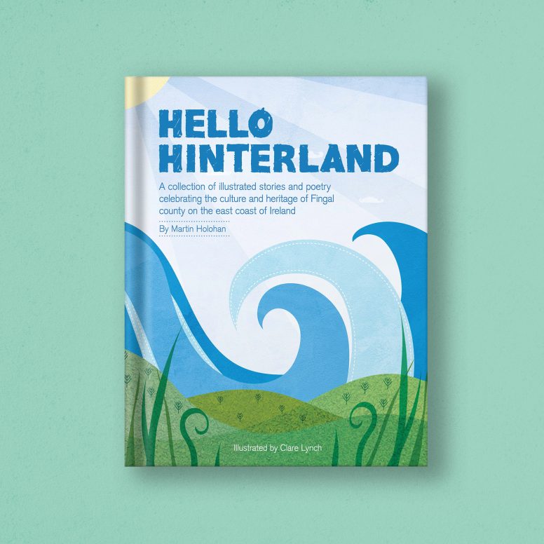
Hello Hinterland is a collection of illustrated stories and poetry, rhymes, observations and folk tales, celebrating the connections between culture and heritage in the wide and embracing landscape of Fingal County, on the East Coast of Ireland. This was my first book illustration project and I feel very proud and excited with the result.
The project came to life when poet and author of Hello Hinterland, Martin Holohan, approached me as he was seeking an illustrator for his new poetry book. I have done illustration as part of my graphic design, branding and packaging design projects and smaller side projects, but this was my first time to fully illustrate a picture book from start to finish, along with creating and putting the book together using my graphic design skills.
The process was really enjoyable. Martin gave me free creative range in terms of how each illustration could be. He wanted it to be a collaborative process, where I take inspiration from the words in each poem using my creative thinking, rather than him directing me on how each poem should look. There was a lovely freedom to this process. We began by working on the first five poems, where I presented him with the illustrations for these select few. His response was as it continued to be throughout, what we might call ‘the dream client!’ where he was blown away and completely enthusiastic and excited about each poetry illustration he was presented with.
When creating each poem, I loved deciphering the meanings of each one, many with clever words related to Irish culture and history, current times, Irish mythology and the local Irish Fingal landscape. The illustrations are full of life and character, reflecting the words in the poetry. Martin wanted the book to appeal to younger children, along with older audiences – therefore, I brought a lot of colour and brightness in to the illustrations – aiming to draw the younger audience in easily with an immediate impact, where as the words will naturally interest and entertain an older audience.
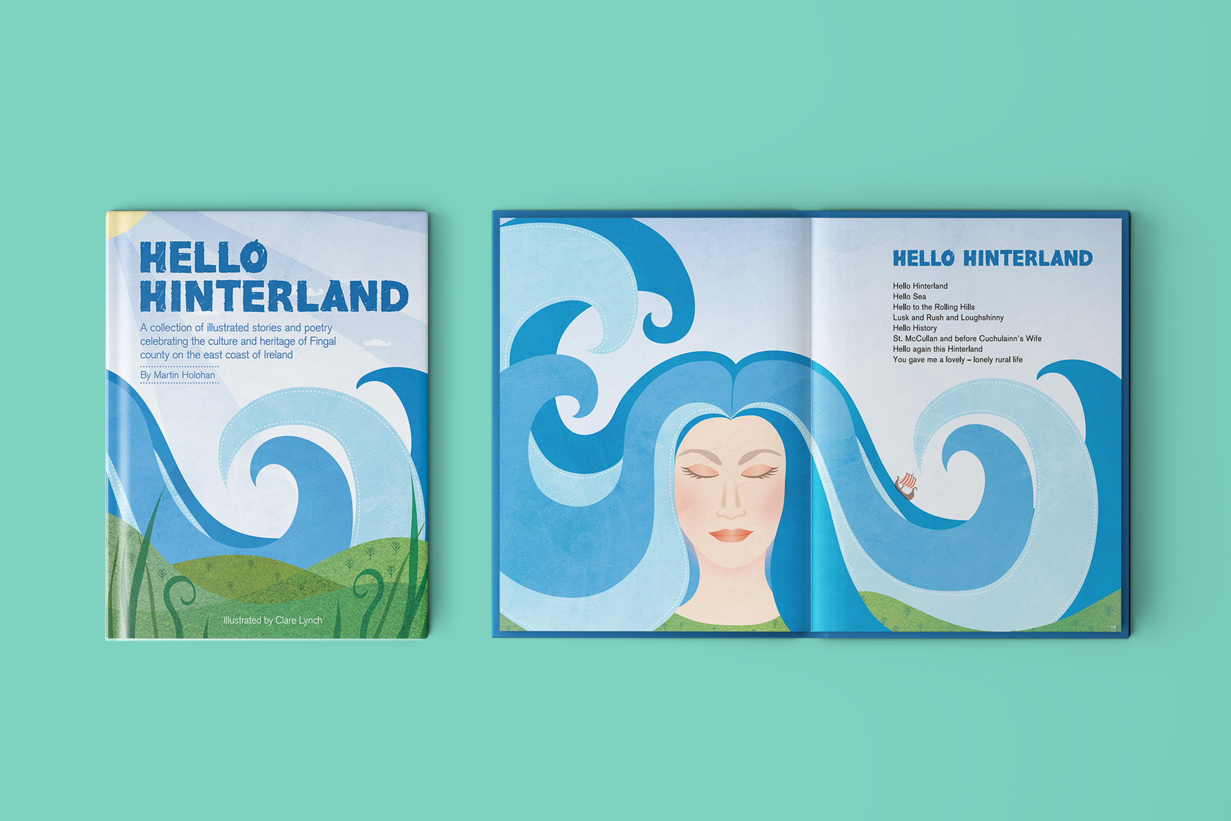
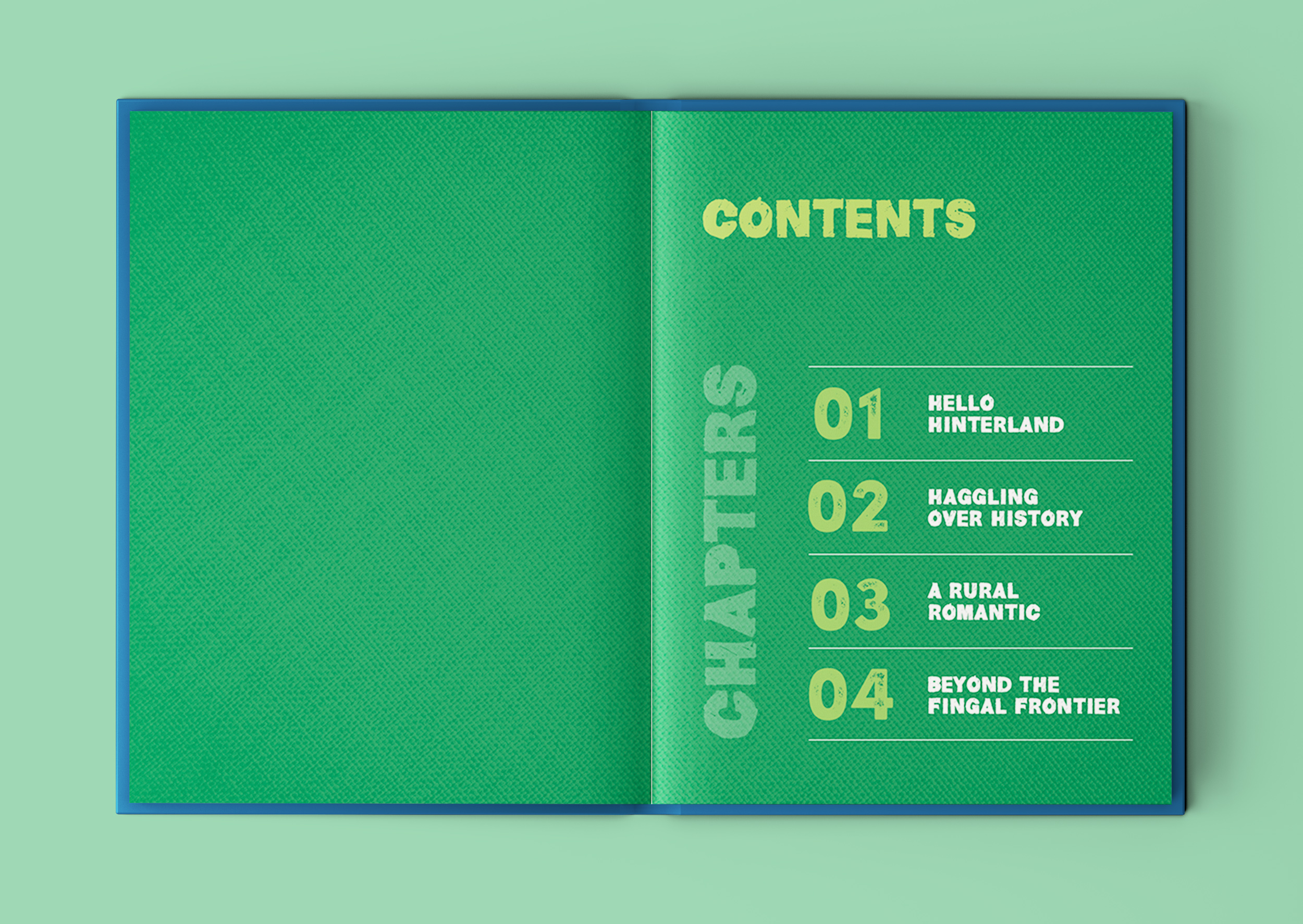
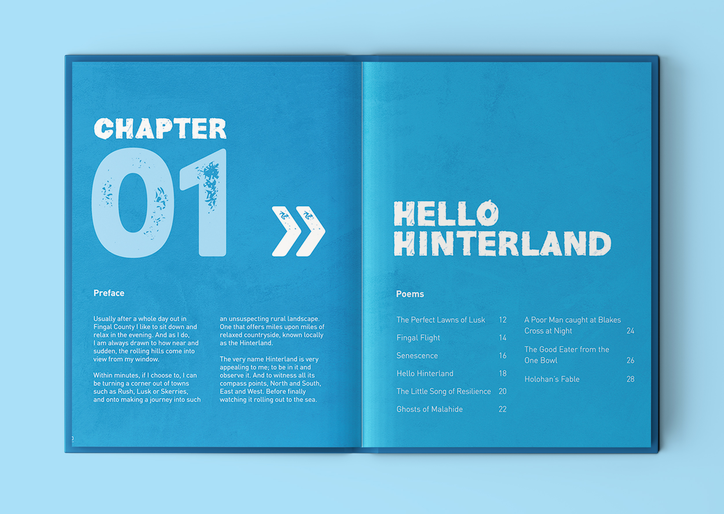
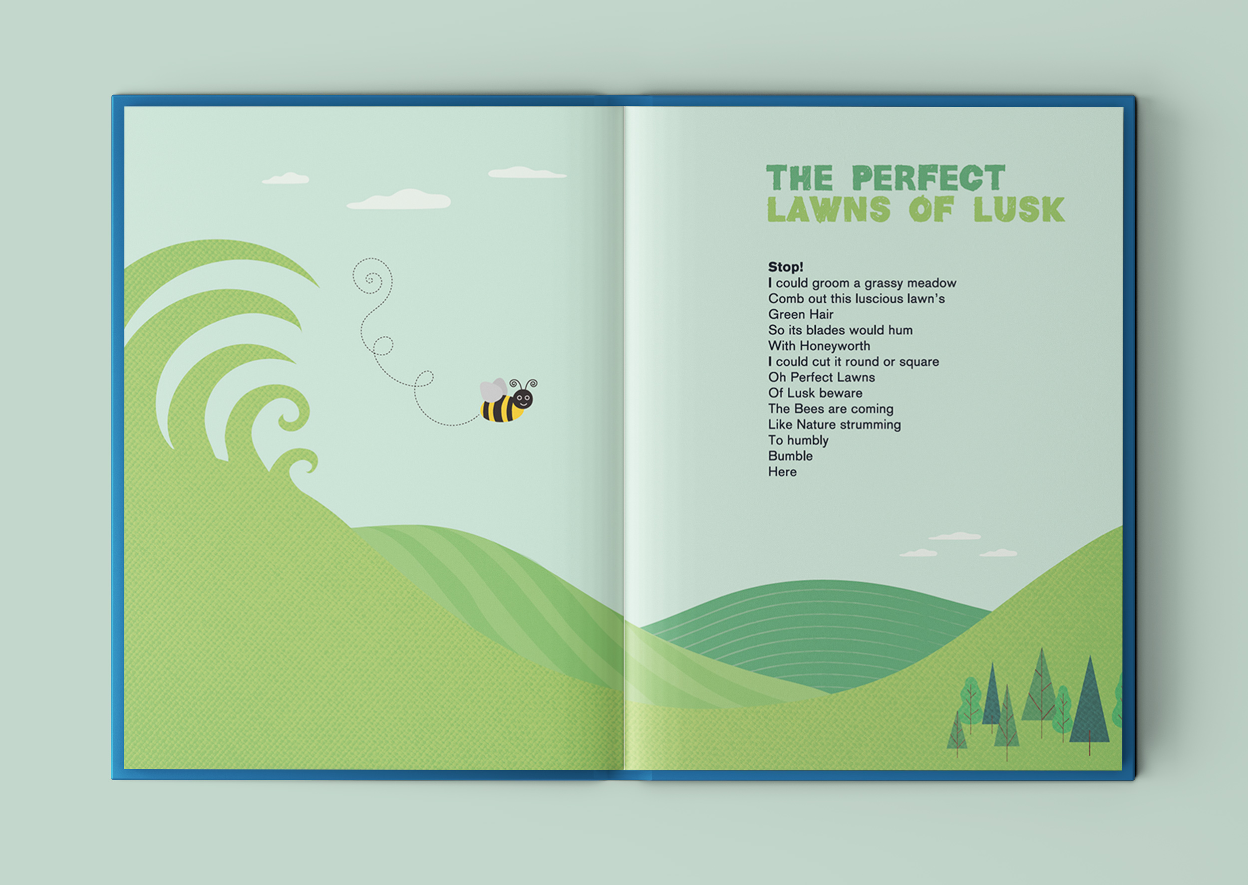
I began by drawing some loose sketch ideas for each one, and then developed them in Adobe Illustrator. I created the book structure in Adobe Indesign. I kept the text of the poetry in the same position on the double-paged spreads for each poem, and ensured that the illustrations I created fitted well with the text so that they could be both enjoyed in an easy-to-read style, with a natural flow to how the text and image are viewed together. The picture book is 100 pages, with almost 40 poetry illustrations, each one spread spaciously across two pages (a spread). Each chapter is clearly divided with a colourised spreads for each.
The aims for Hello Hinterland is for it to be a coffee table book in people’s homes, where they can often pick it up and have a read while enjoying a relaxing break from their day to get lost in the stories and themes of the poetry. Another goal for the book is for it to be enjoyed by schools and libraries throughout Ireland. It was printed as a hard-back book with heavy paper stock for this reason – it needed to be durable to withstand a lot of handling by children and the thick paper stock was also a way to present the colourful illustrations to the fullest. Martin would also like it to be seen and used as a ‘Walking Heritage Trail’ through the people and places living along the beautiful landscape of Fingal County, by the sea.
 Chapter 1: Hello Hinterland
The Perfect Lawns of Lusk
Senescence
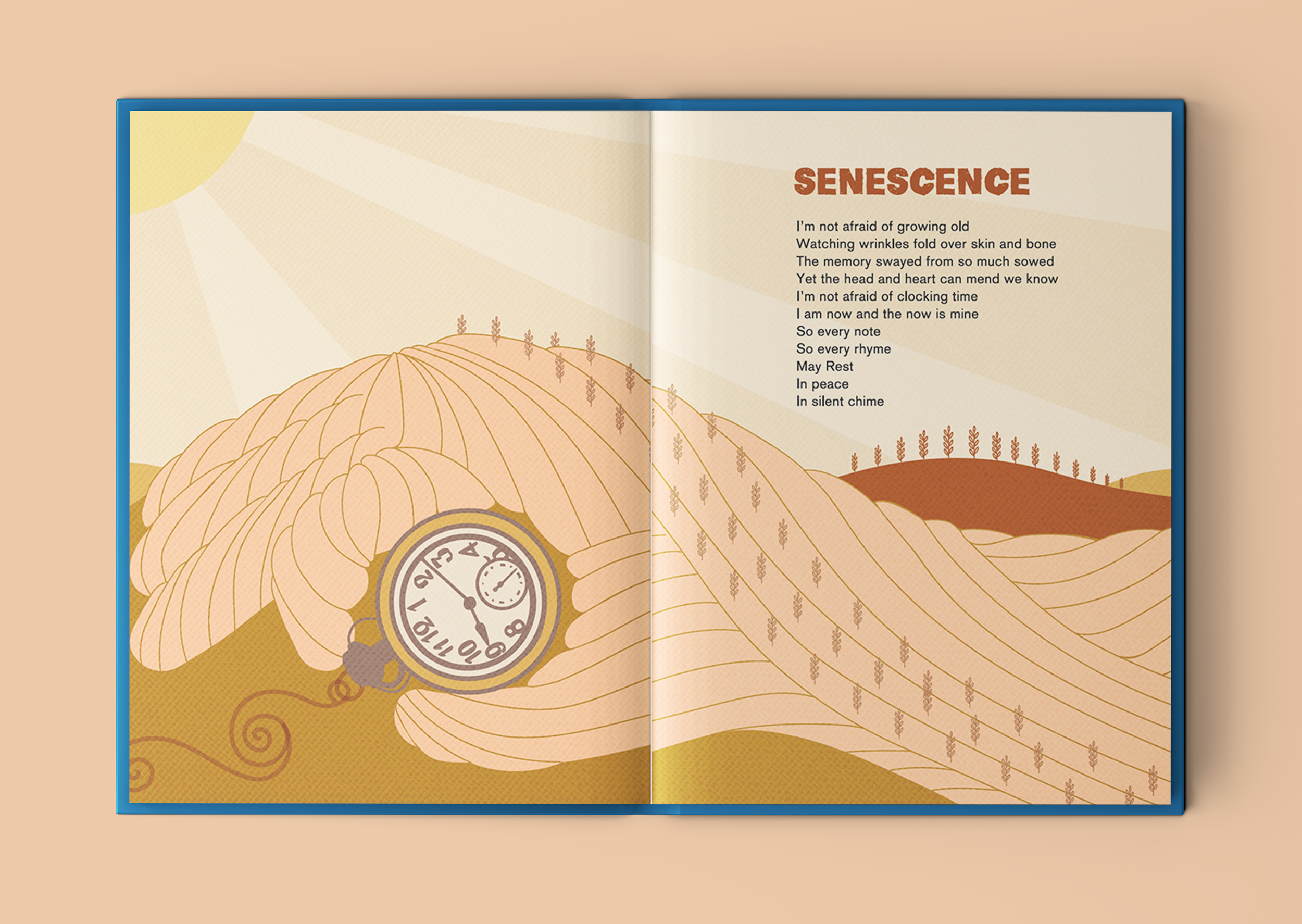
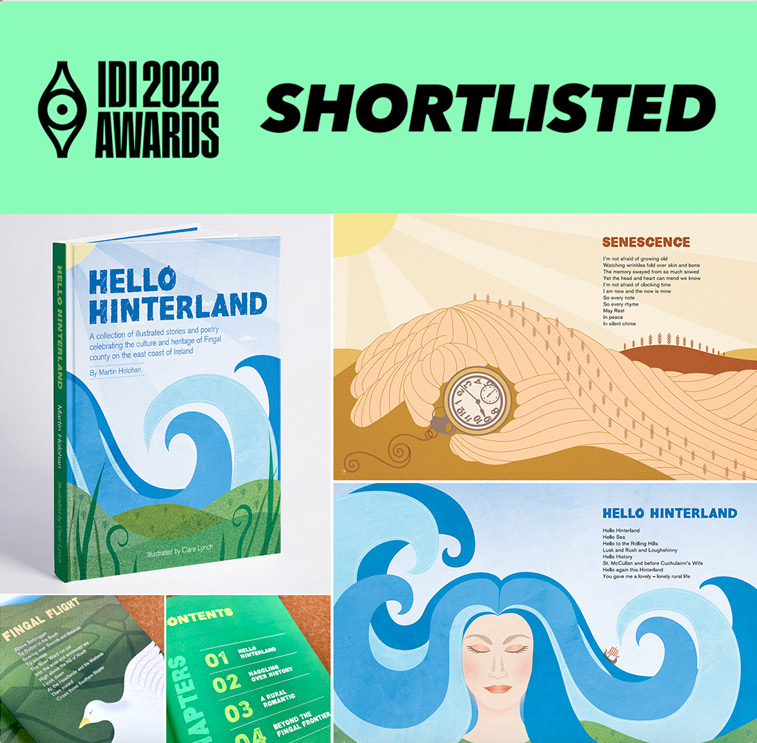
I like how this poem talks about embracing growing old – the illustration cleverly narrates the words from the poem.
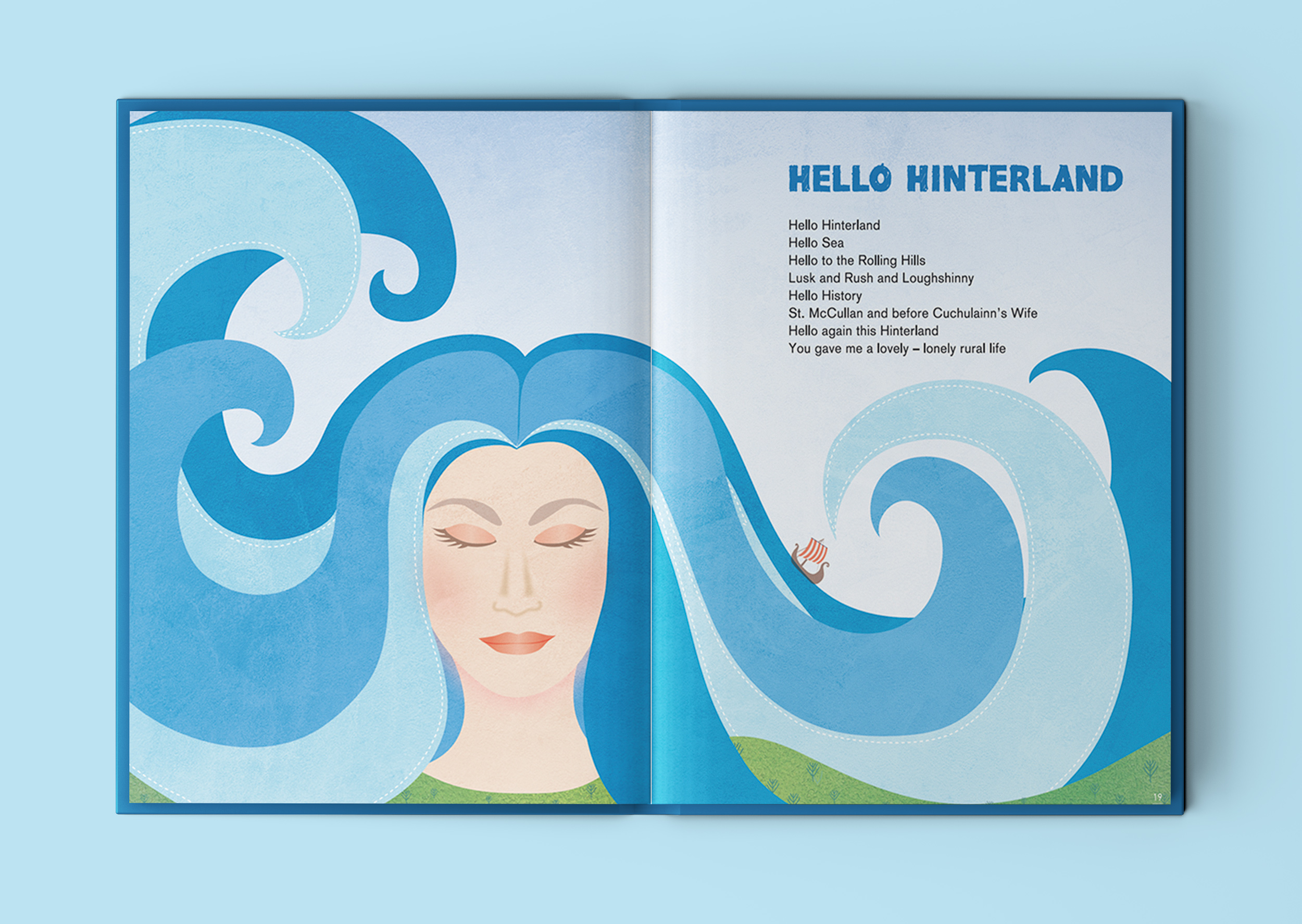
Hello Hinterland
This illustration that depicts a female character, with long flowing hair that doubles-up as sea waves, is inspired by the lines in the poem that mention Irish legend Cuchulainn’s wife Emer, who is said to have hailed from Lusk. It incorporates the references to the sea and rolling hills of Lusk into her portrait.
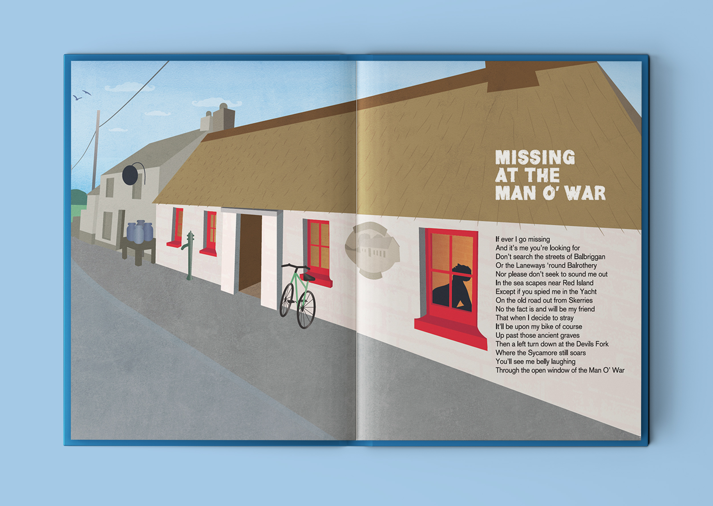
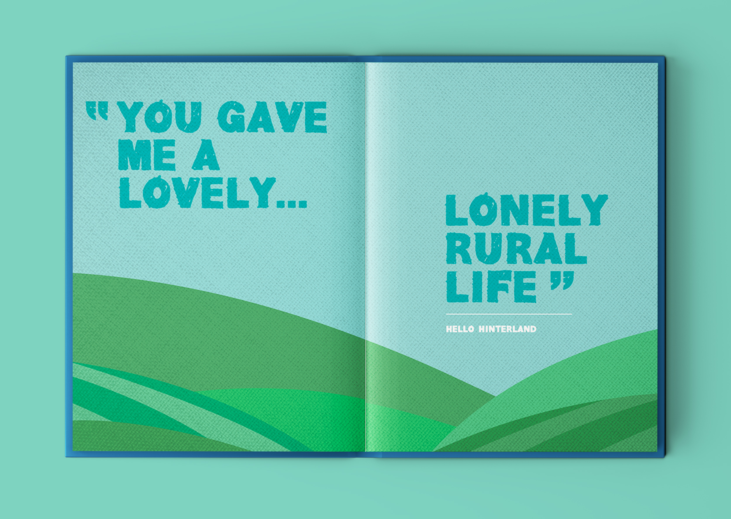
This poem features one of the strongest lines in the poetry book ‘You gave me a lovely… lonely rural life’. This refers to how author and poet, Martin Holohan, thought when he was moving from Dublin city to Lusk (in the hinterland rural outskirts area of Dublin) that he might find it too quiet and remote, but instead, he thrived in that loneliness… whether it be with long luxurious cycling trips out on his bike, the unfolding of his passion for writing and creativity and having the time and headspace free to indulge in it and let all his ideas flow out on to the page, all of this accompanied with an occasional trip for a quiet refreshment in the quaint ‘Man O’ War’ establishment. He found that he fell in love with this quieter ‘lonely’ life. The word lonely can have negative associations, but for Martin – he found moving to the hinterlands actually turned out to be an opportunity to embrace and fall in love with this loneliness and from it, creativity flowed from his heart unstoppably to create the book Hello Hinterland and many other writing projects currently in the pipeline.
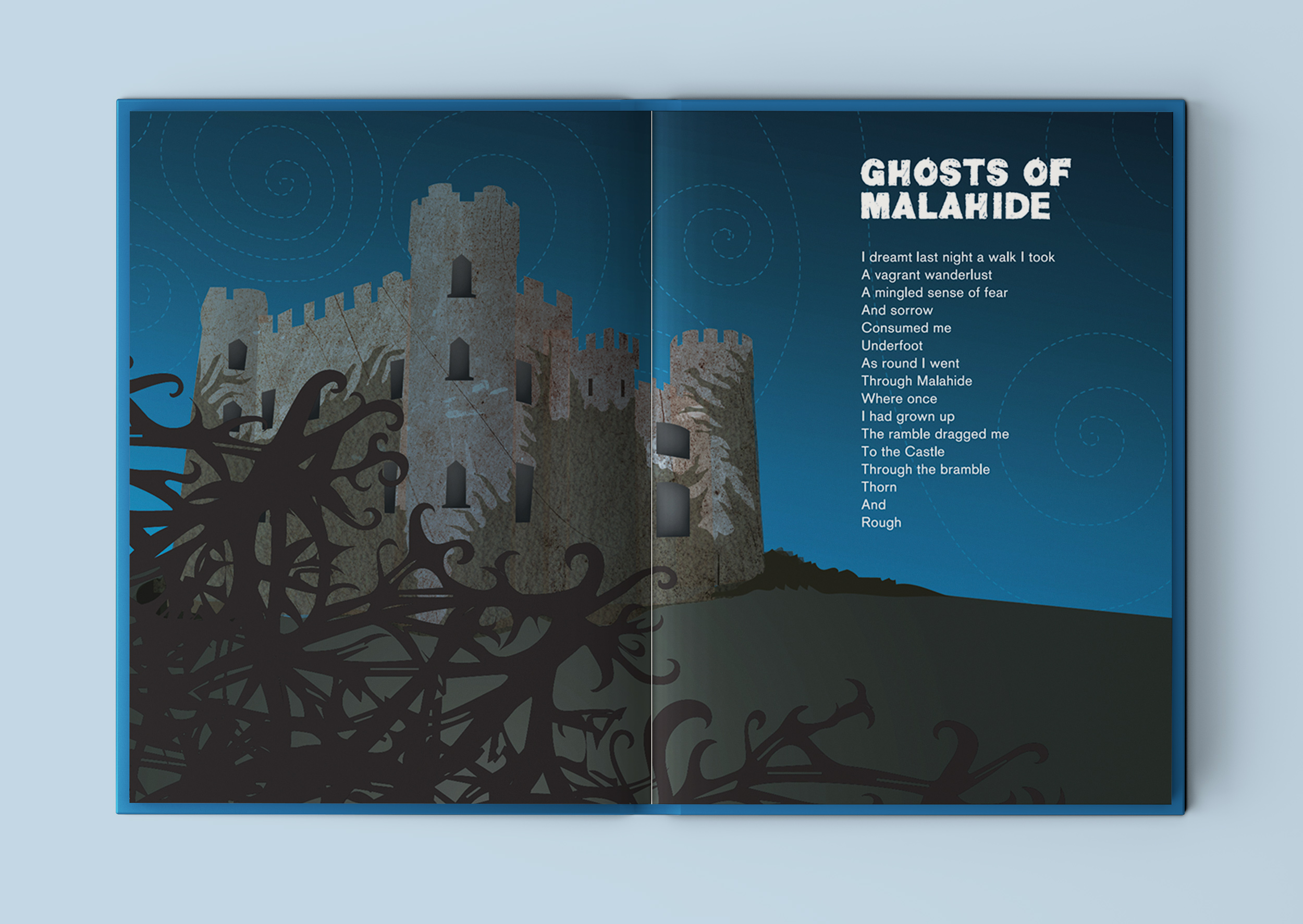
Ghosts of Malahide
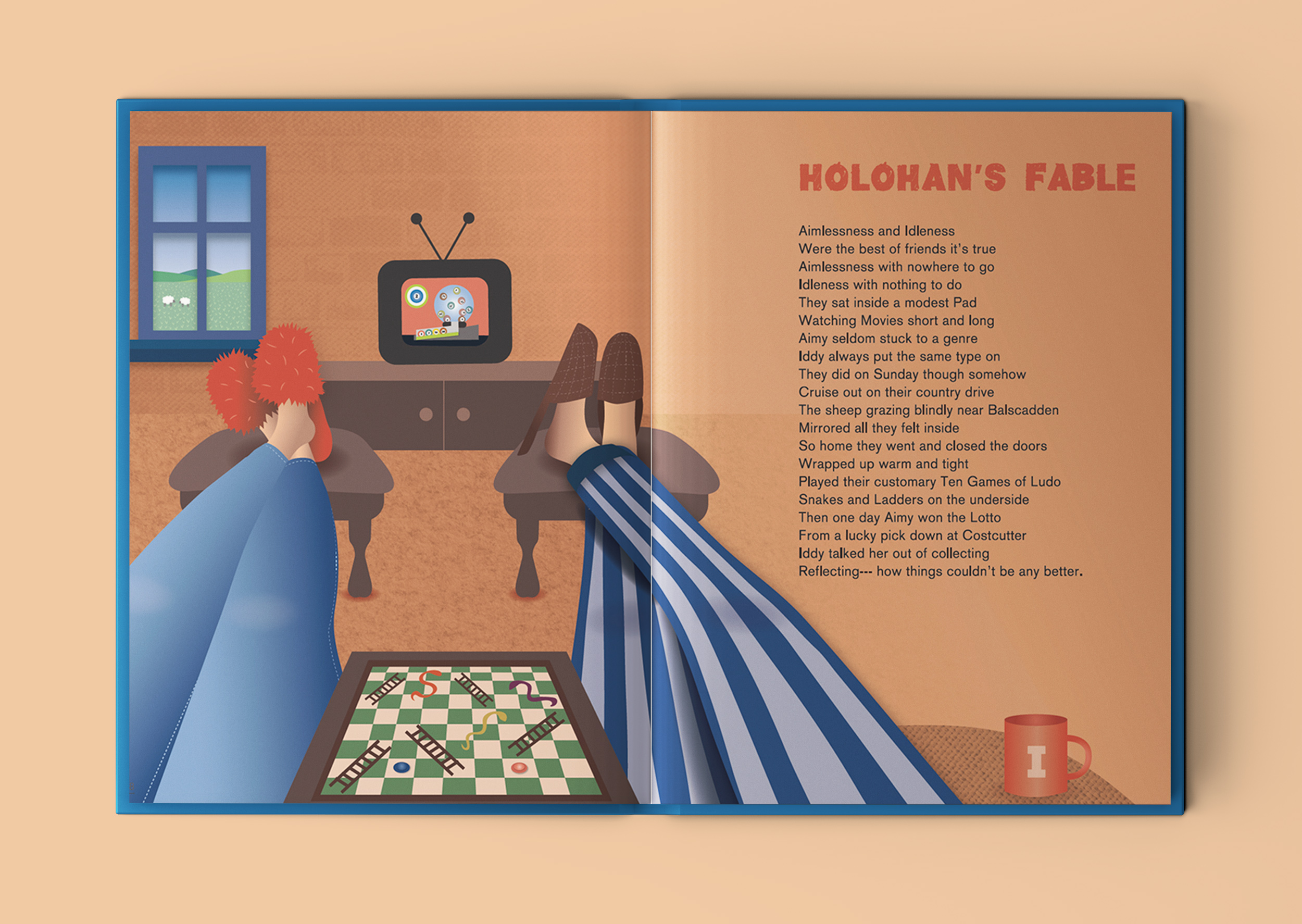
Holohan’s Fable
One of my favourite poems is ‘Holohan’s Fable’. It’s about a couple so content in their daily routine, that when they win the lotto, they decide not to claim it – as they couldn’t be any happier! It’s a fable with a message about appreciating what you have in life.
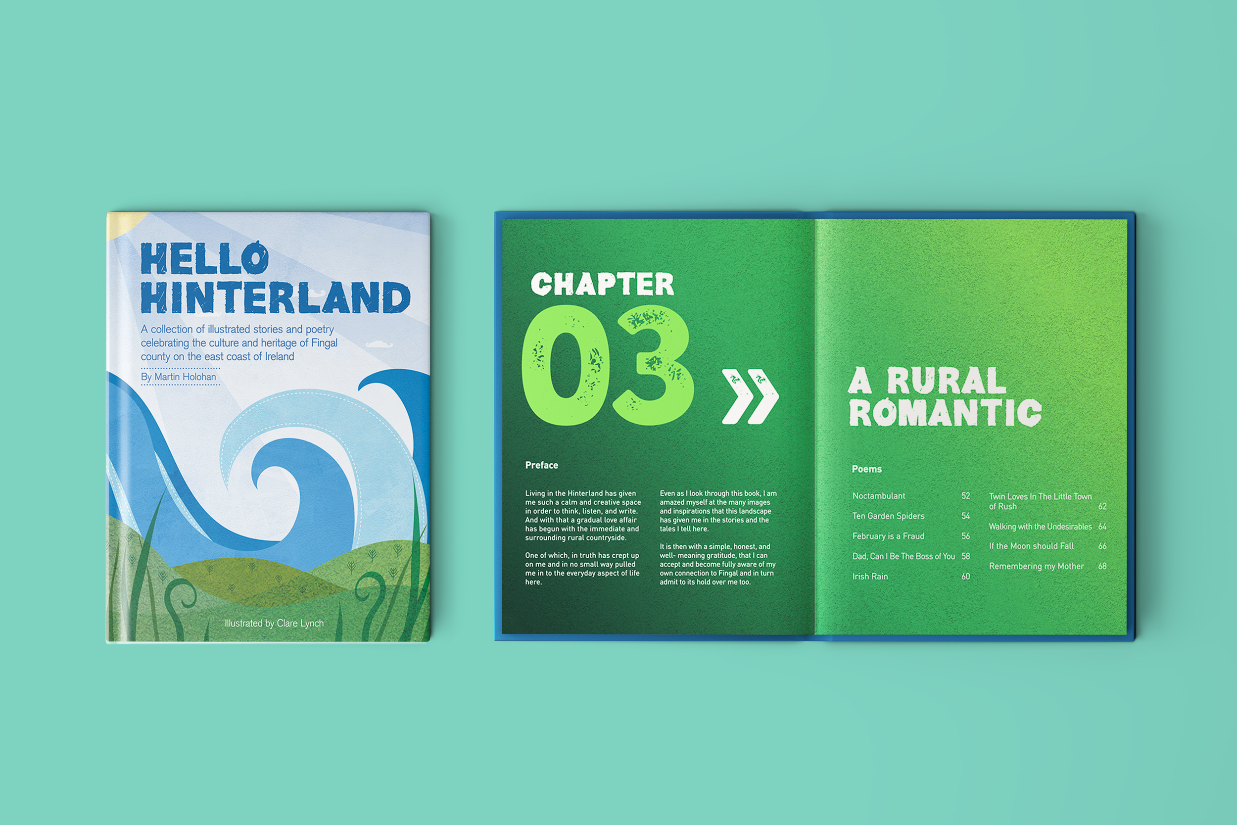
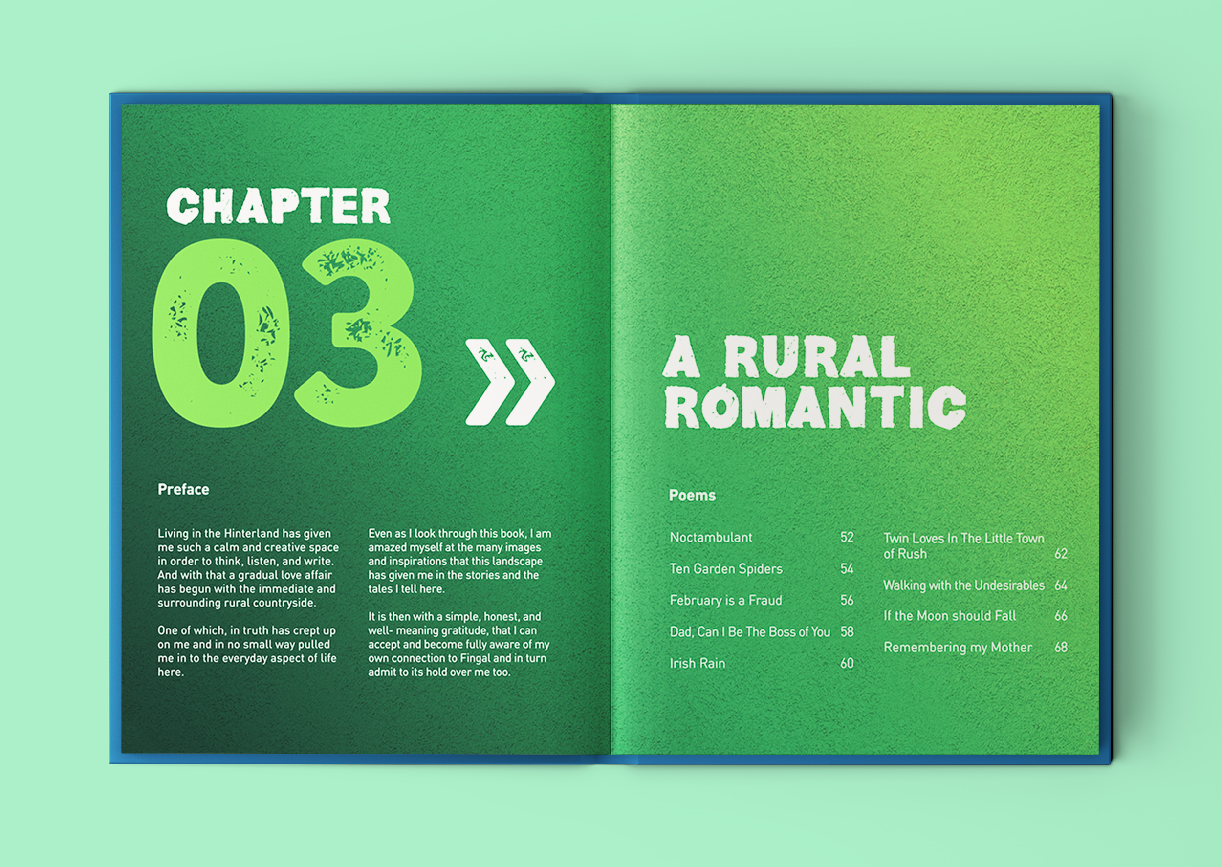
Chapter 3: A Rural Romantic
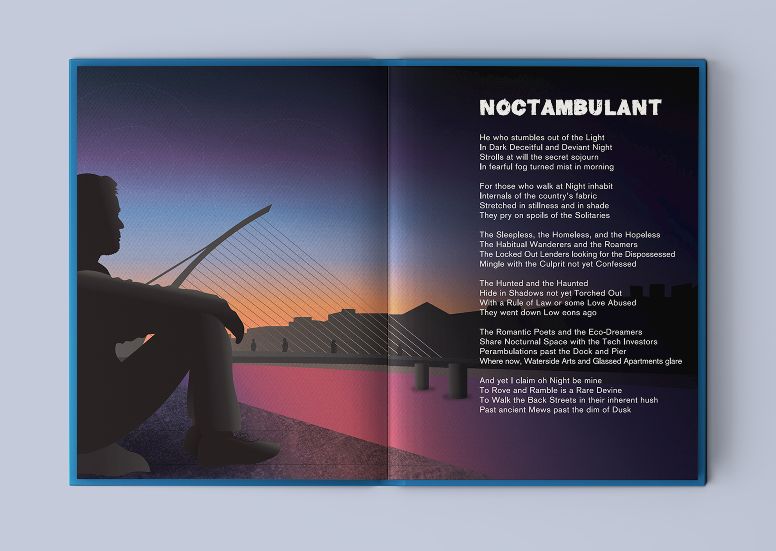
Noctambulant
This beautifully illustrated book includes positive underlying themes of resilience, appreciating the little things in life, social inclusion and enjoying the local landscape, weaving through the book.
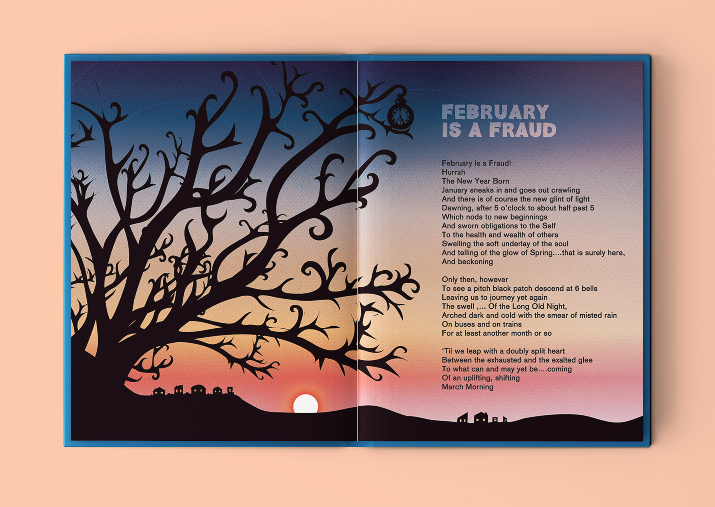
February is a Fraud
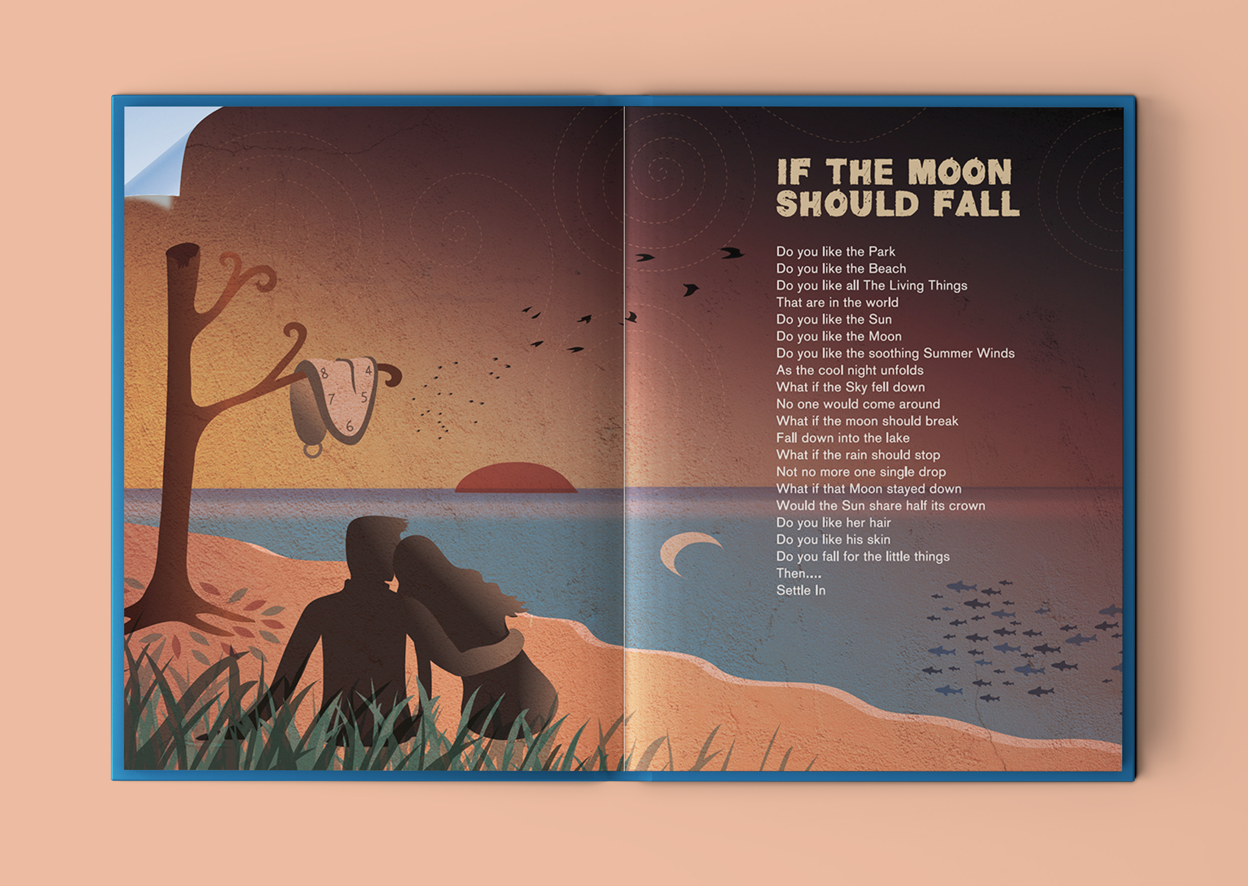
If The Moon Should Fall
This is another of my favourite poems from the book. I took the meaning to be to enjoy an appreciate the little things that we have in life. Sometimes we can over-complicate things in life, looking for potential things that could go wrong or imperfections. When, if we focus on all the good right in front of us, we might be surprised how content we can be with everything that we already have. I saw this as a romantic poem, encouraging the reader to let down their walls to let someone new, that they know they like, in to their world and to go with the flow and enjoy it. I reflected this and all the words of the poem in the illustration, with a little wink towards Salavatore Dali’s ‘end-of-the-world-like’ surrealist paintings.
Missing at the Man O’ War
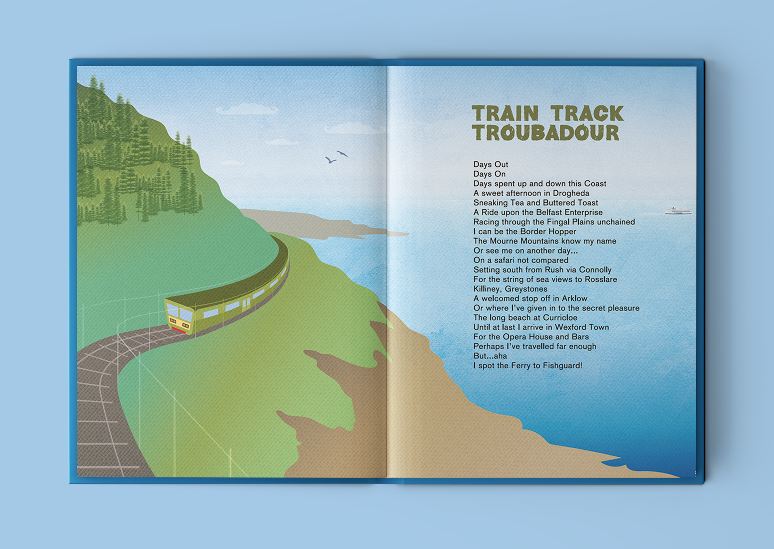
Train Track Troubadour
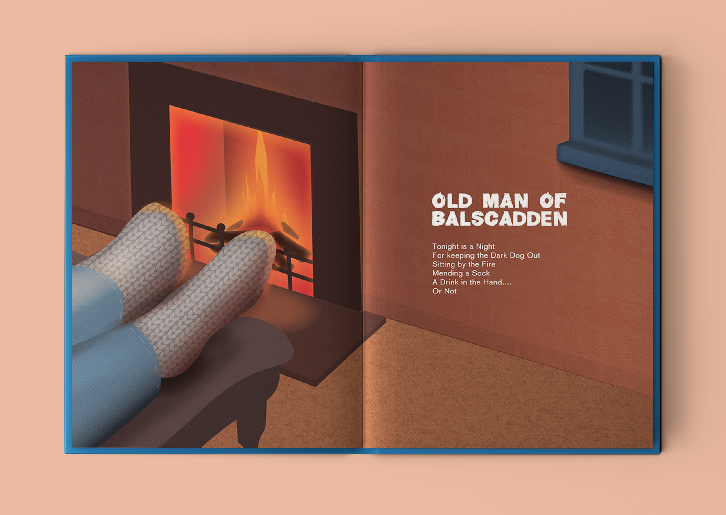
Old Man of Balscadden
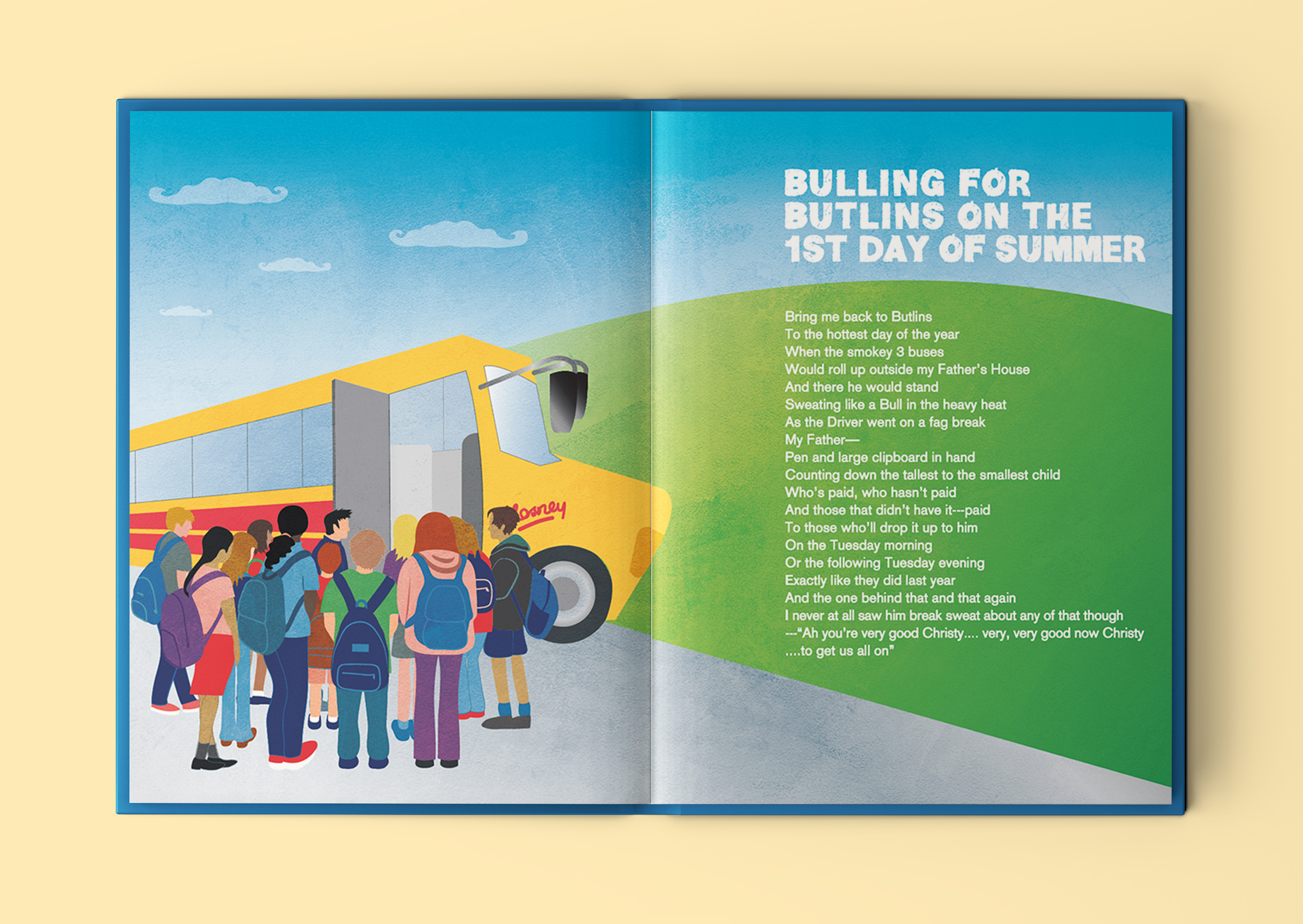
Bulling for Butlins on the 1st Day of Summer
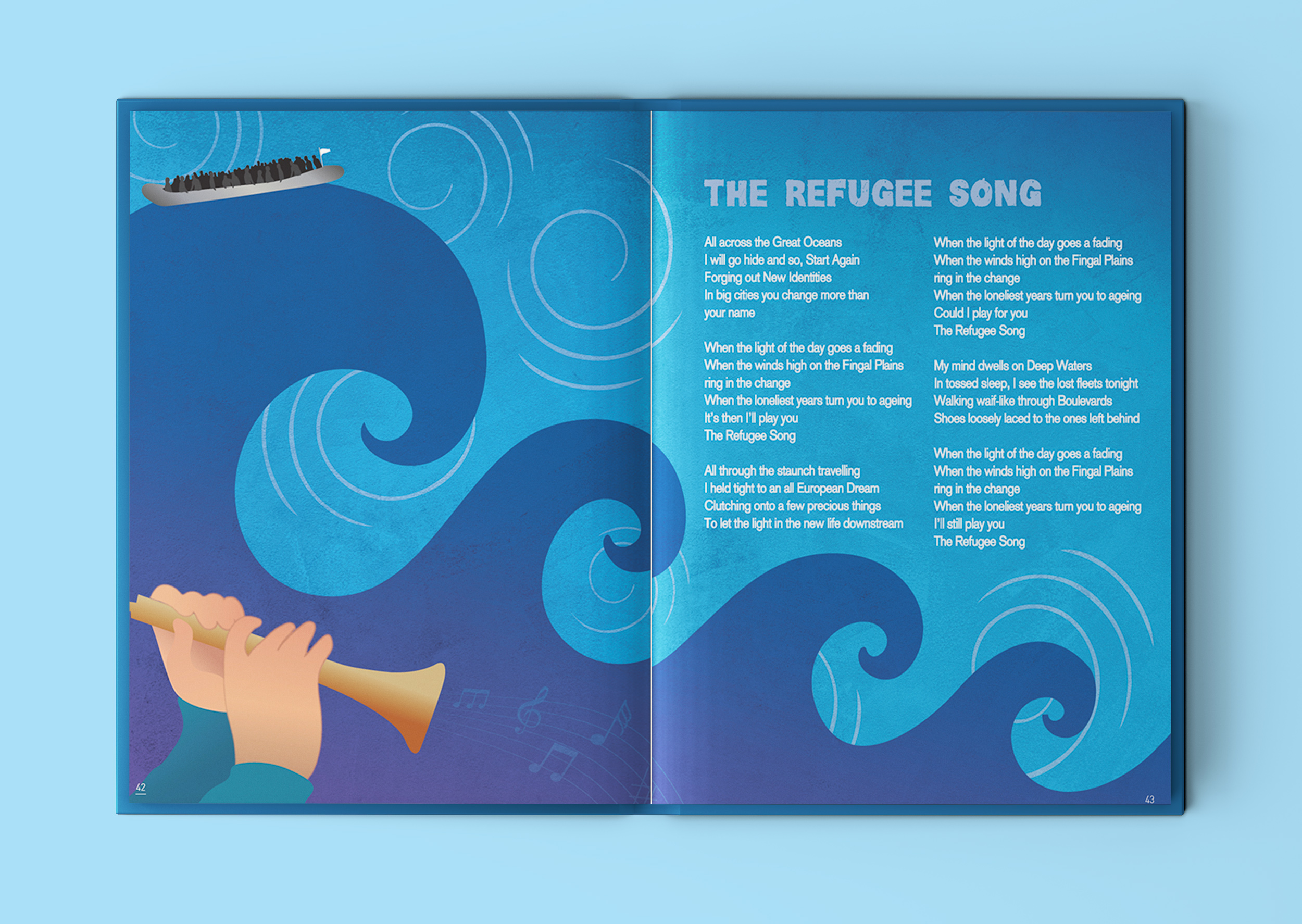
The Refugee Song
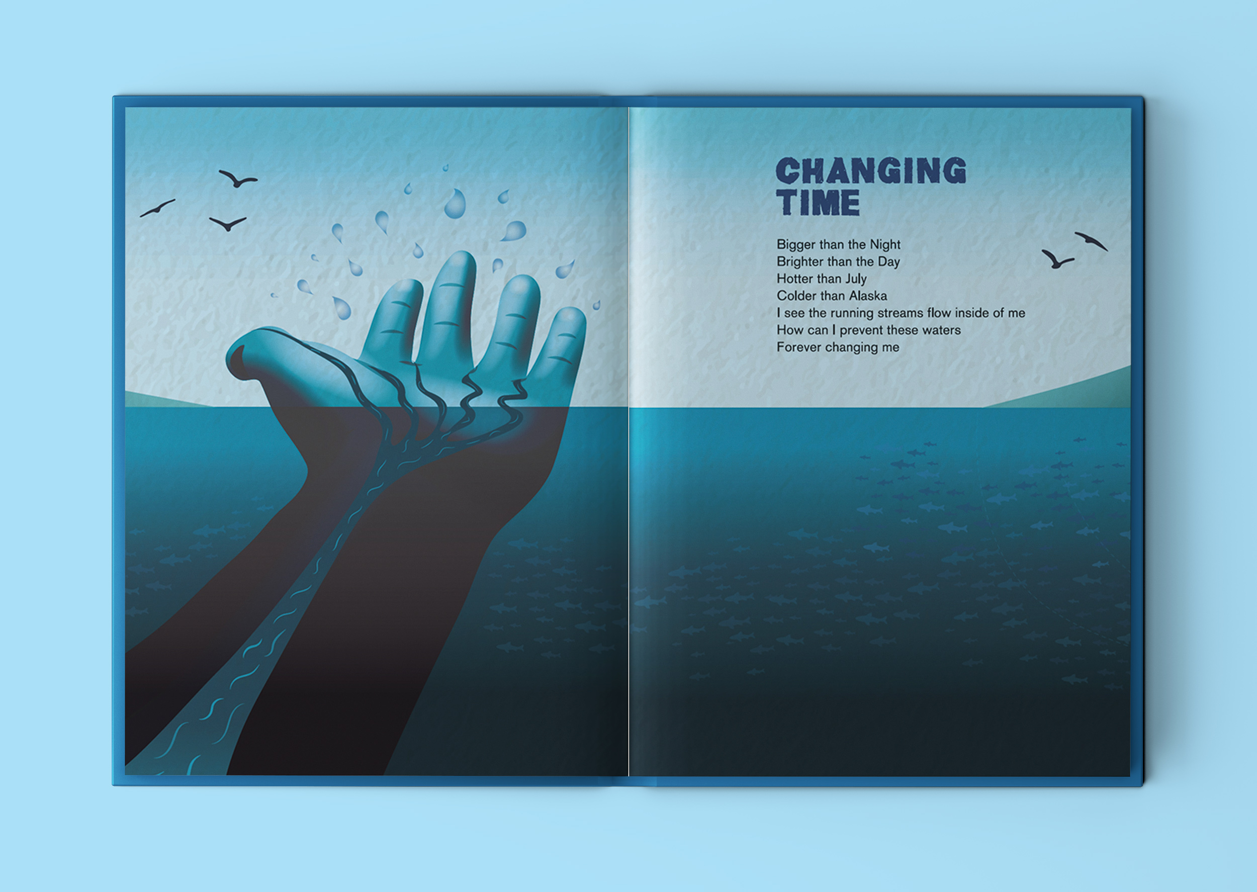
Changing Time
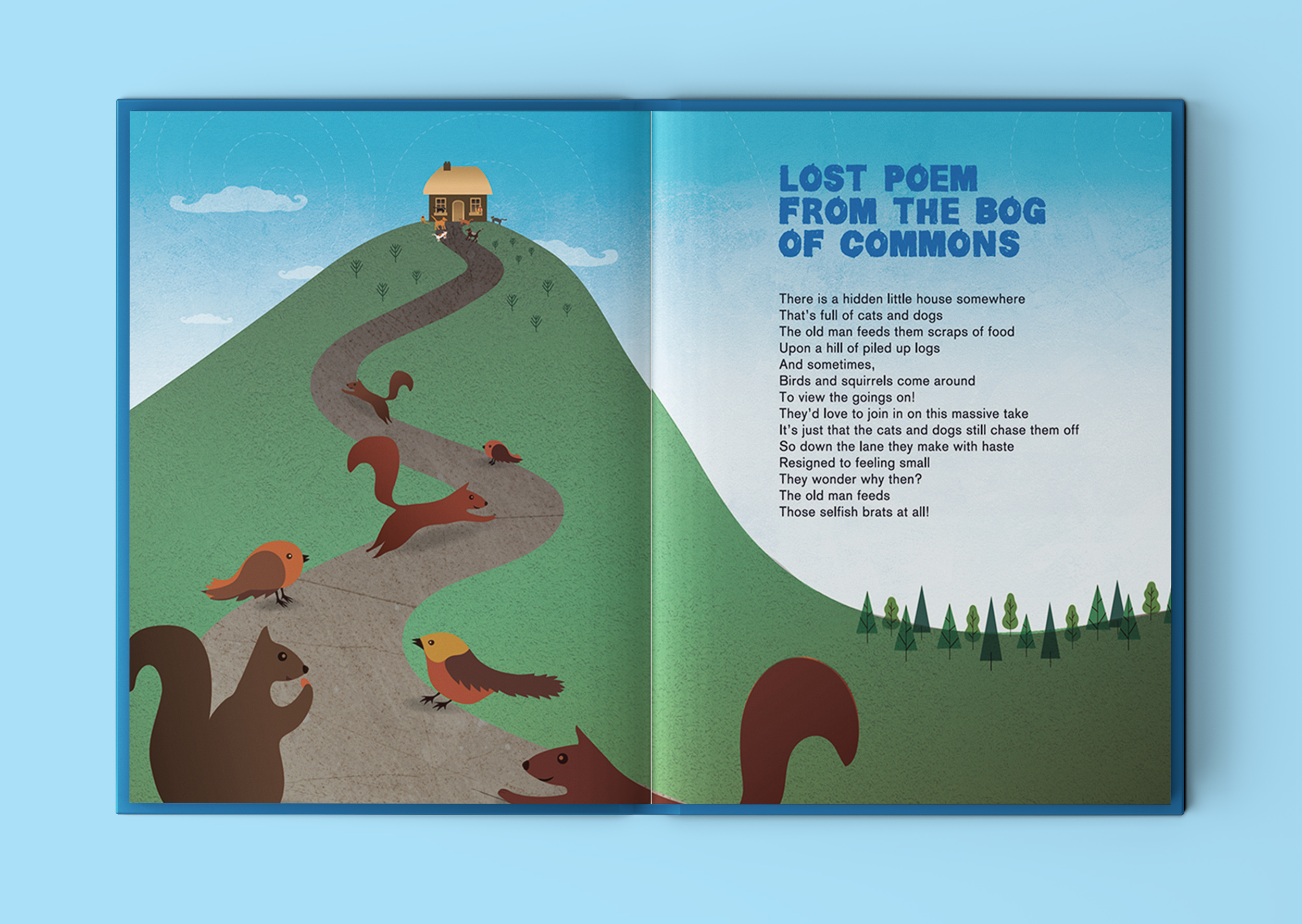
Lost Poem from the Bog of Commons
Quote: “You Gave Me A Lovely… Lonely, Rural Life”
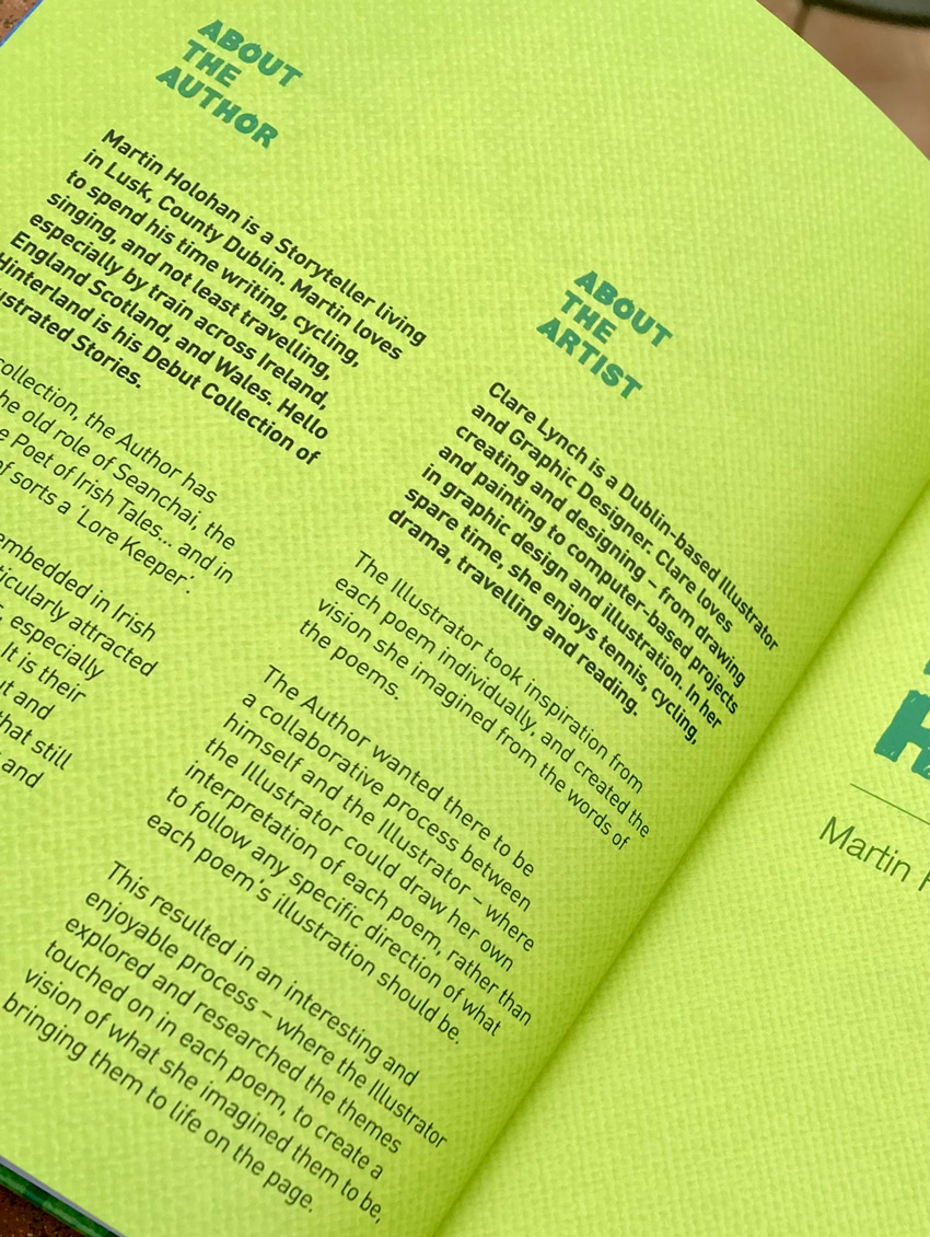
Martin Holohan is a storyteller living in Lusk, County Dublin. Martin loves to spend his time writing, cycling, singing, and not least travelling, especially by train across Ireland, England, Scotland and Wales. Hello Hinterland is his Debut Collection of illustrated stories.
In this collection, the author has adopted the old role of Seanchai, the Bard, and the Poet of Irish Tales… and in that regard is of sorts a ‘Lore Keeper’. Lore Keepers are embedded in Irish Folklore and are particularly attracted to the Land themselves, especially where they currently live. It is their defining attribute to seek out and explore the spots and places that still have a strong spirit of the Myths and Legends of old.
The Lore Keeper aims to mix and match the past and present so as to bring New Tales and Observations from our beautiful island, Ėire.
The book, published by Choice Publishing Ltd, focuses on the journeys Martin makes across a wide and sometimes rural region and aptly incorporates people and places living close to the East Coast of Ireland there in Fingal County. Moreover, his real contribution is highlighting the ‘aspects of the everyday’ in places around that particular part of the country, which are remarkably only a short distance by train or car out of Dublin City.
Most notable are the titles…’The Perfect Lawns of Lusk‘, ’Twin Loves in the Little Town of Rush’ and ‘Hello Hinterland‘.
“Hello Hinterland is more than just a modern Illustrated Poetry Book…it acts too like a folklore companion guide towards a walking Heritage Trail…through the people and places… living along the beautiful landscape of Fingal County by the sea”.
Martin Holohan, Poet & Author of Hello Hinterland
You can hear Martin talking more about the book in this Near FM interview here…
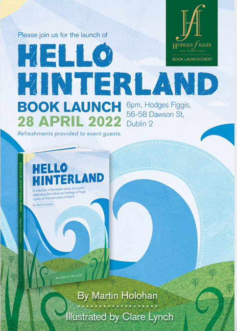
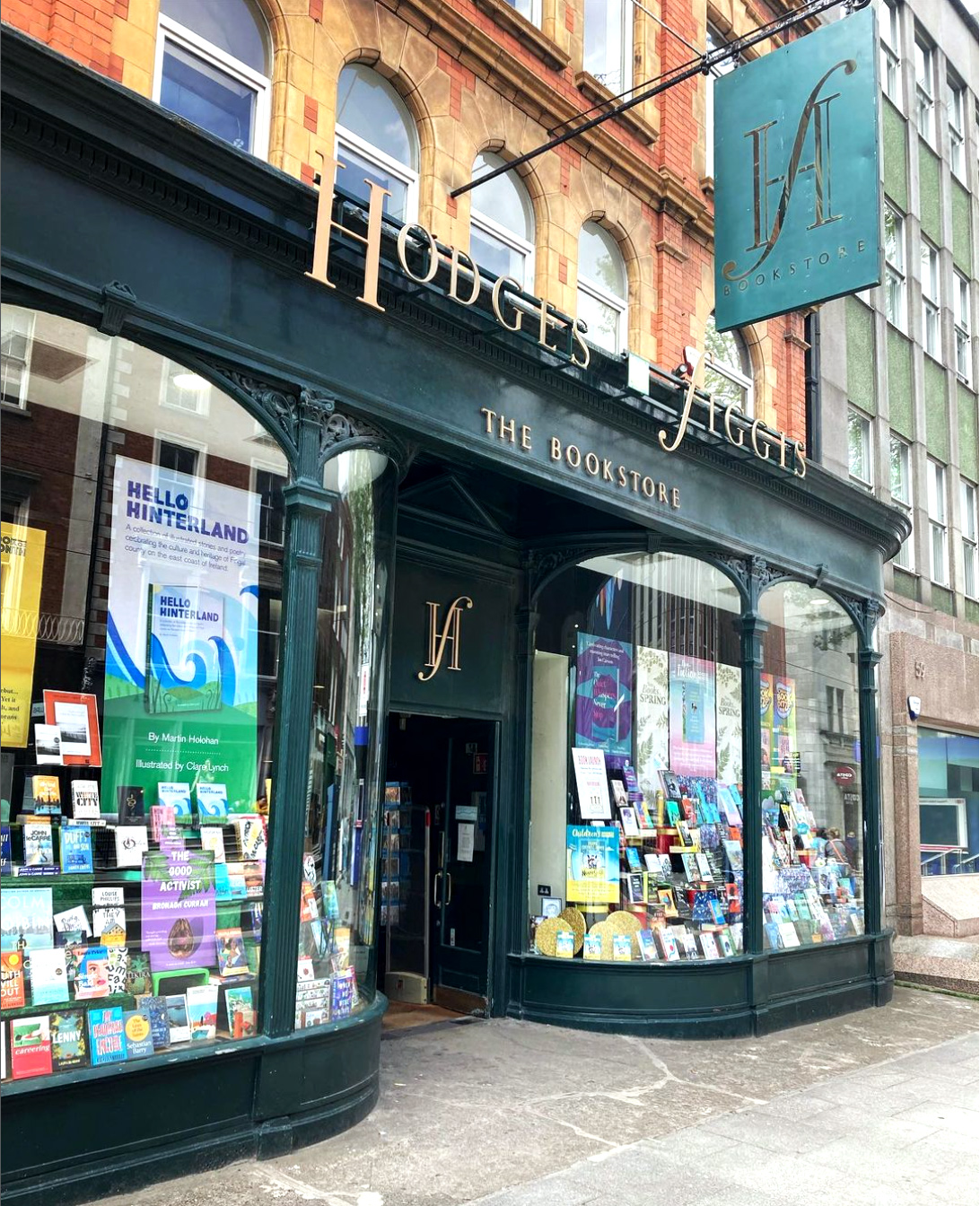
Hello Hinterland Book Launch at Hodges Figgis Dublin
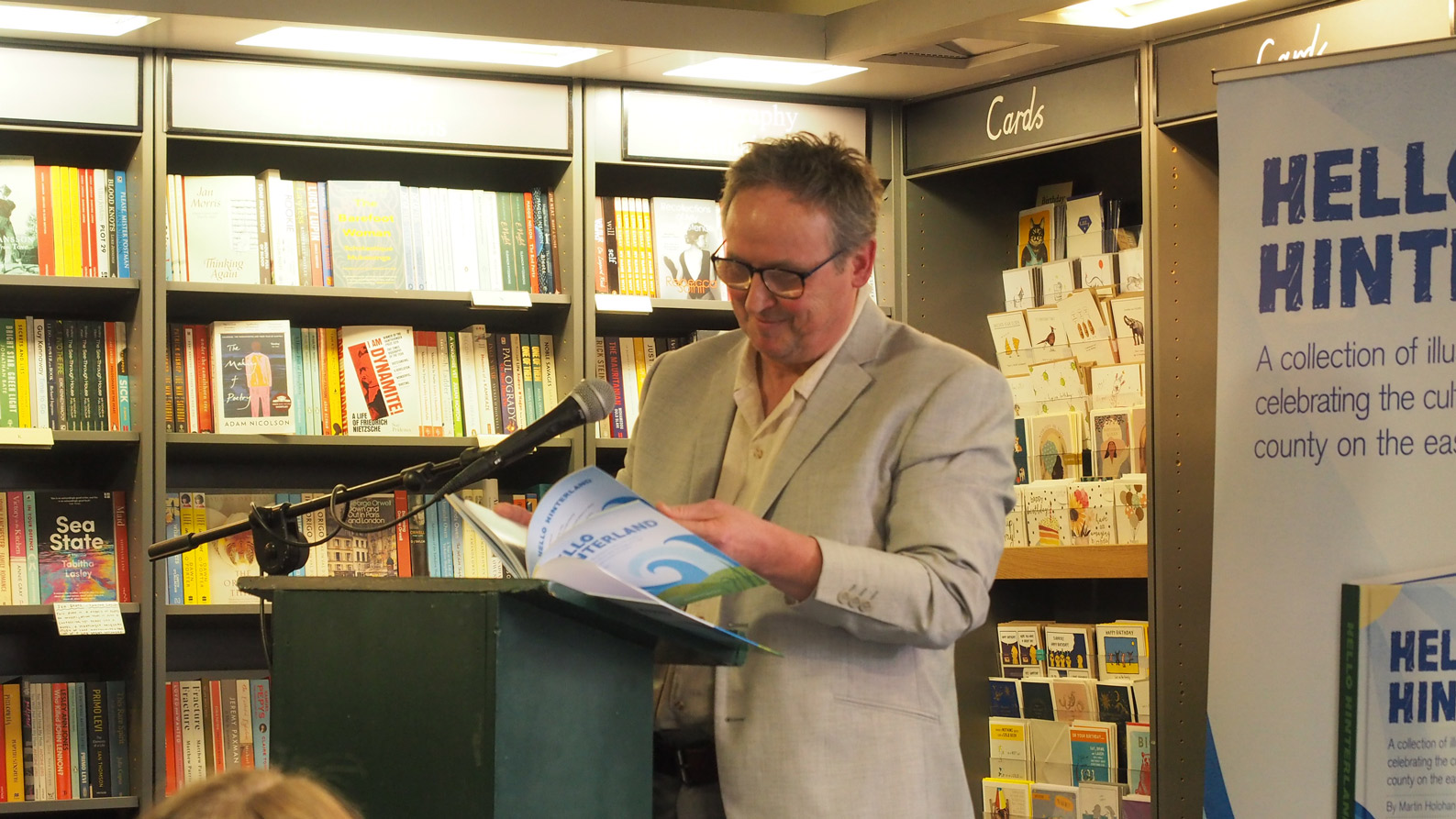
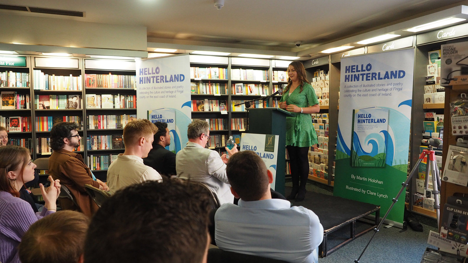
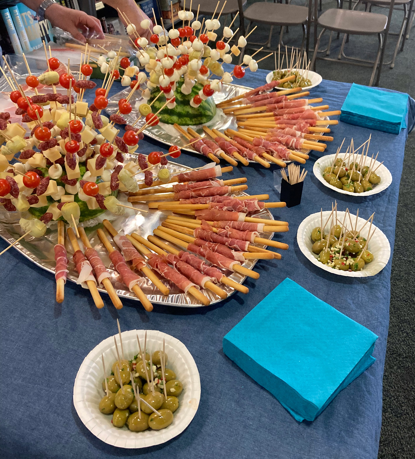
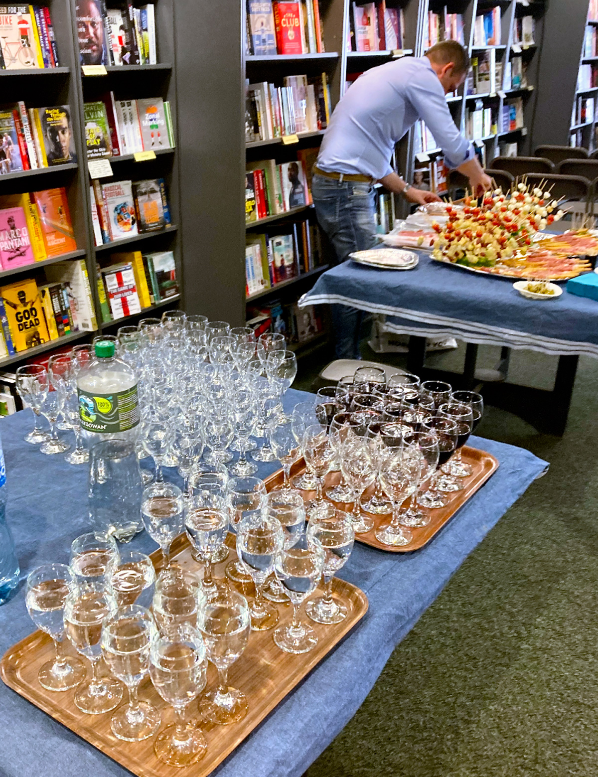
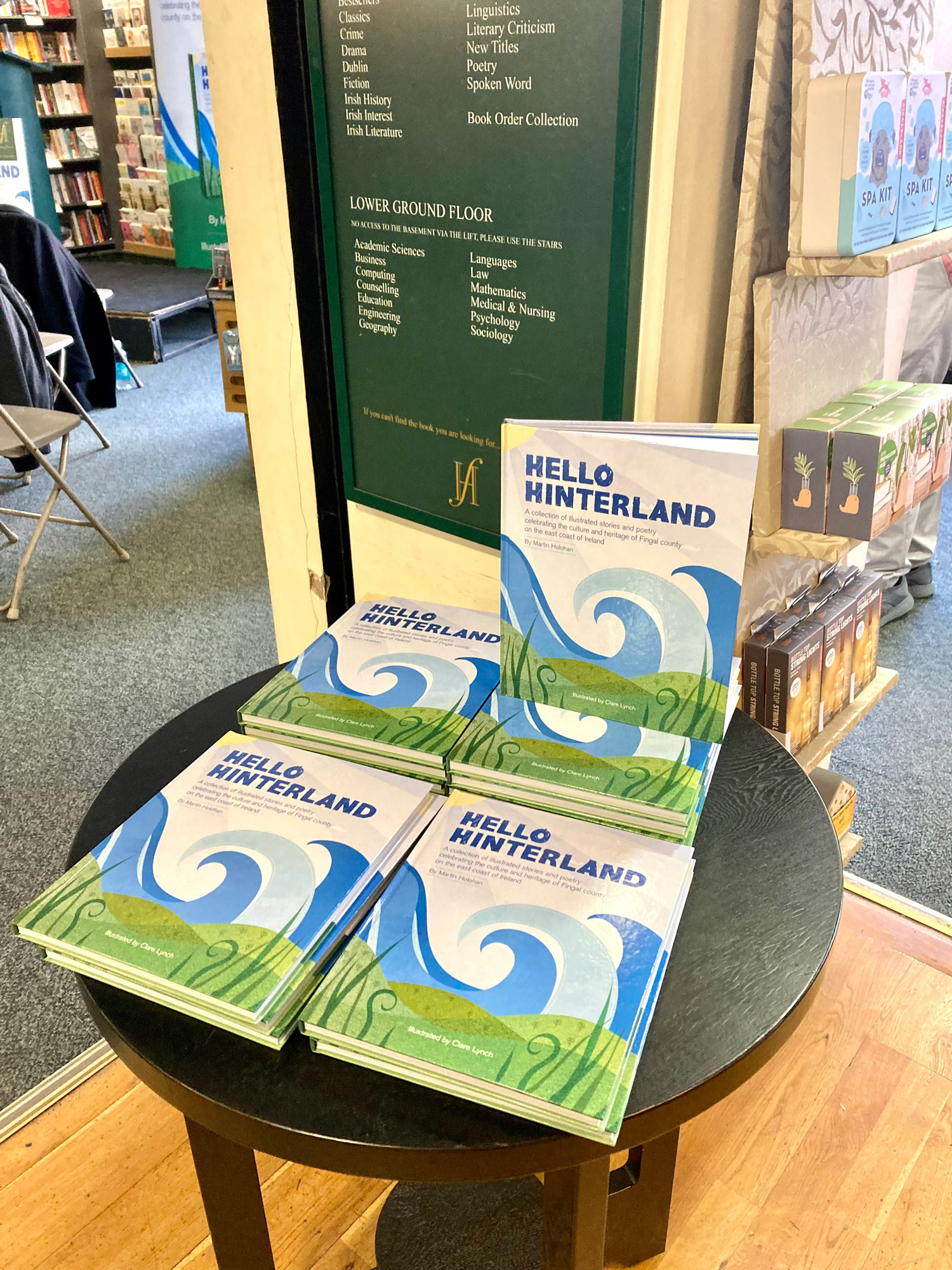
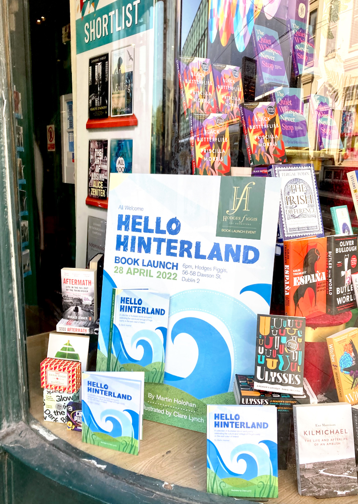
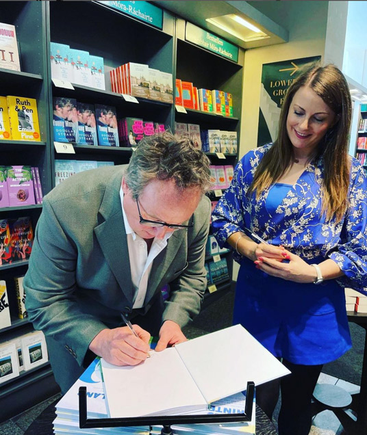
We held the book launch at the famous Dublin bookstore, Hodges Figgis, one of Dublin’s oldest bookstores, situated near Trinity college on Dawson Street. I designed the promotional collateral for the event, such as social media graphics, flyers, pull-up banners and large-scale posters for the front window display. This event was a lovely evening accompanied by refreshments, wine and cheese, where myself and Martin spoke to the guests about the creation of the book and the collaboration process and read some of our favourite poems from the book.
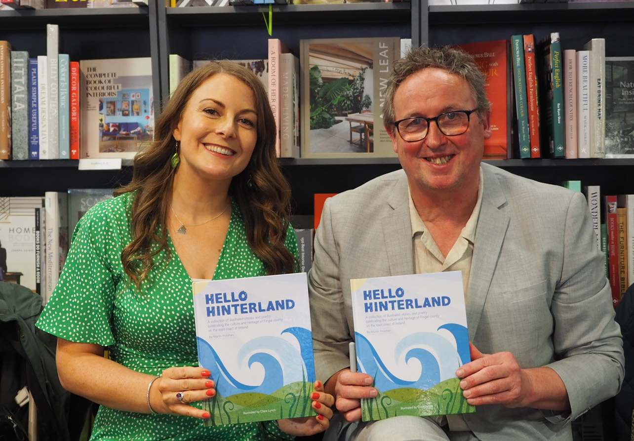
Book Signing at Hodges Figgis
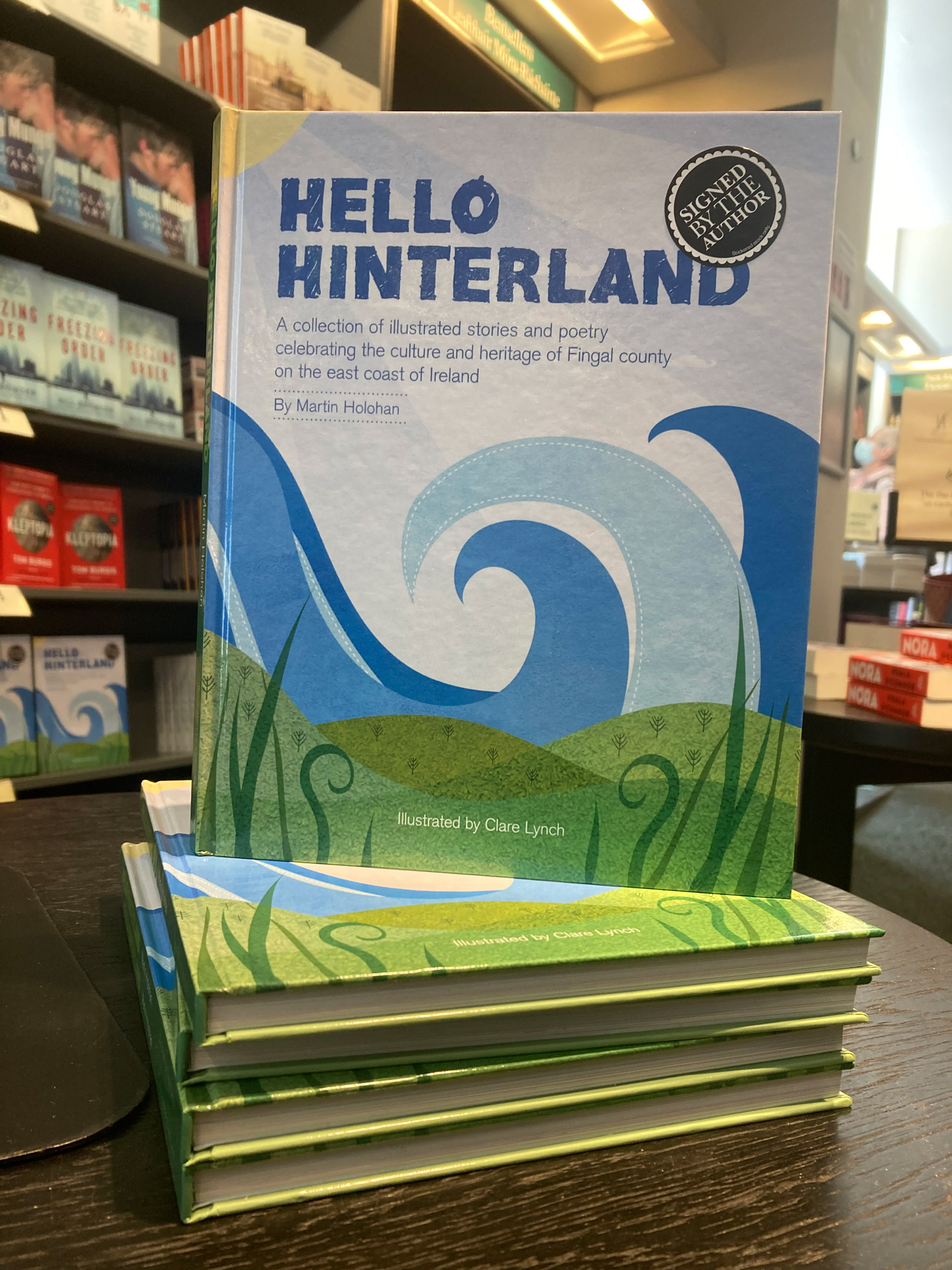
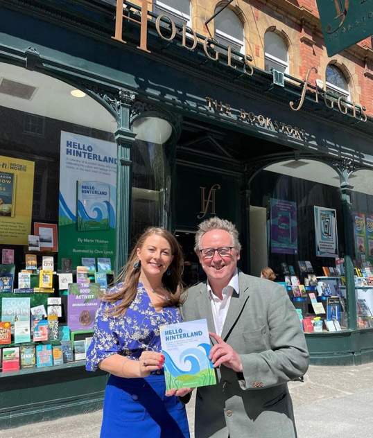
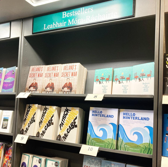
Featured in the ‘Top 10’ Bookseller List at Hodges Figgis
Shortlisted for the IDI Awards 2022
The IDI Awards select and showcase the best of Irish design. The awards provide designers with a platform to showcase their talents, benchmark against their peers and provide inspiration for all.It was so exciting to be shortlisted for the Illustration of the book Hello Hinterland in the 2022 IDI Awards. It was an honour and great achievement to be shortlisted and recognised in the creative field among the many talented designers in Ireland.
– Alan Hanna’s Bookshop, 270 Rathmines Rd Lower, Rathmines, Dublin 6 – See location on map…
– Tales for Tadpoles, 3 Albert Walk, Bray, Co. Wicklow, A98 TC03 – See location on map…
– Antonia’s Bookstore, The Gate House, Navan Gate, Trim, Co. Meath – See location on map…
– Choice Publishing, Drogheda, Co. Louth – See location on map…
– Hodges Figgis on Dawson Street, Dublin 2 – See location on map…
Online:
Tales for Tadpoles:
Alan Hanna’s Bookstore:
Choice Publishing:
Waterstones / Hodges Figgis:
Antonia’s Bookstore:
Blackwells Book Stores:
Browns Books:
Library Stockists:
Maynooth Library, County Kildare
https://maynoothuniversity.com
Further Details about Hello Hinterland:
Published by: Choice Publishing in HardbackWritten by: Martin HolohanIllustrated by: Clare LynchEdited by: Isabel AustISBN: 978-1-913275-26-6Priced: €25.00Distributor: www.alanhannas.com Website: www.holohanbooks.ieInstagram: www.instagram.com/holohanbooks
