
Saltrock Dairy Packaging Design Range Development
Saltrock Dairy Packaging Design – Range Development
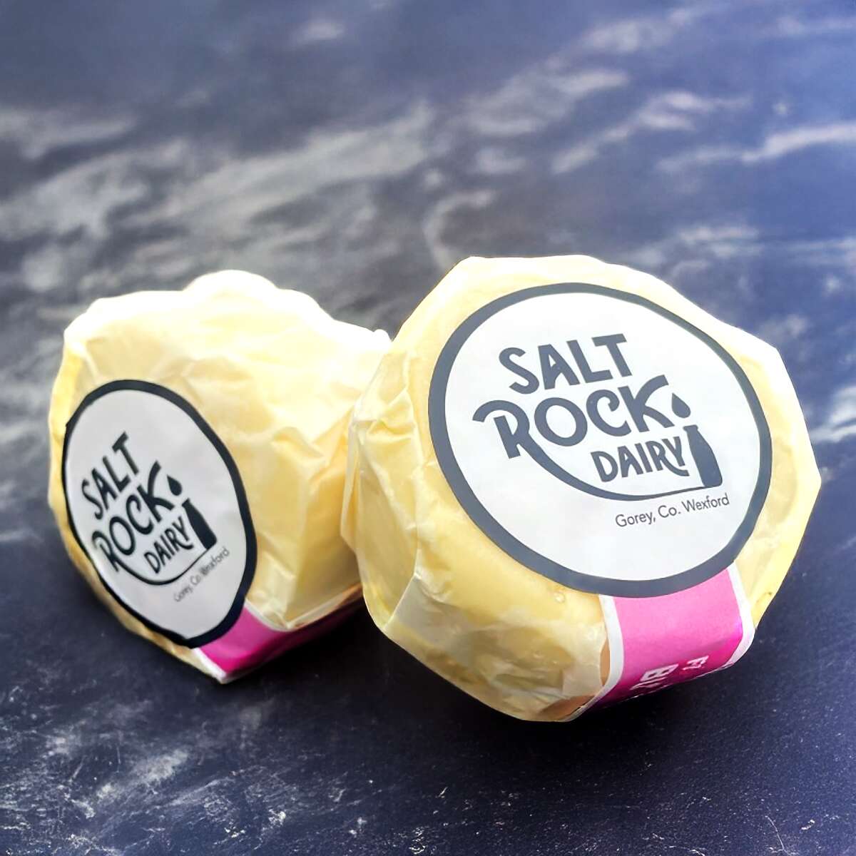
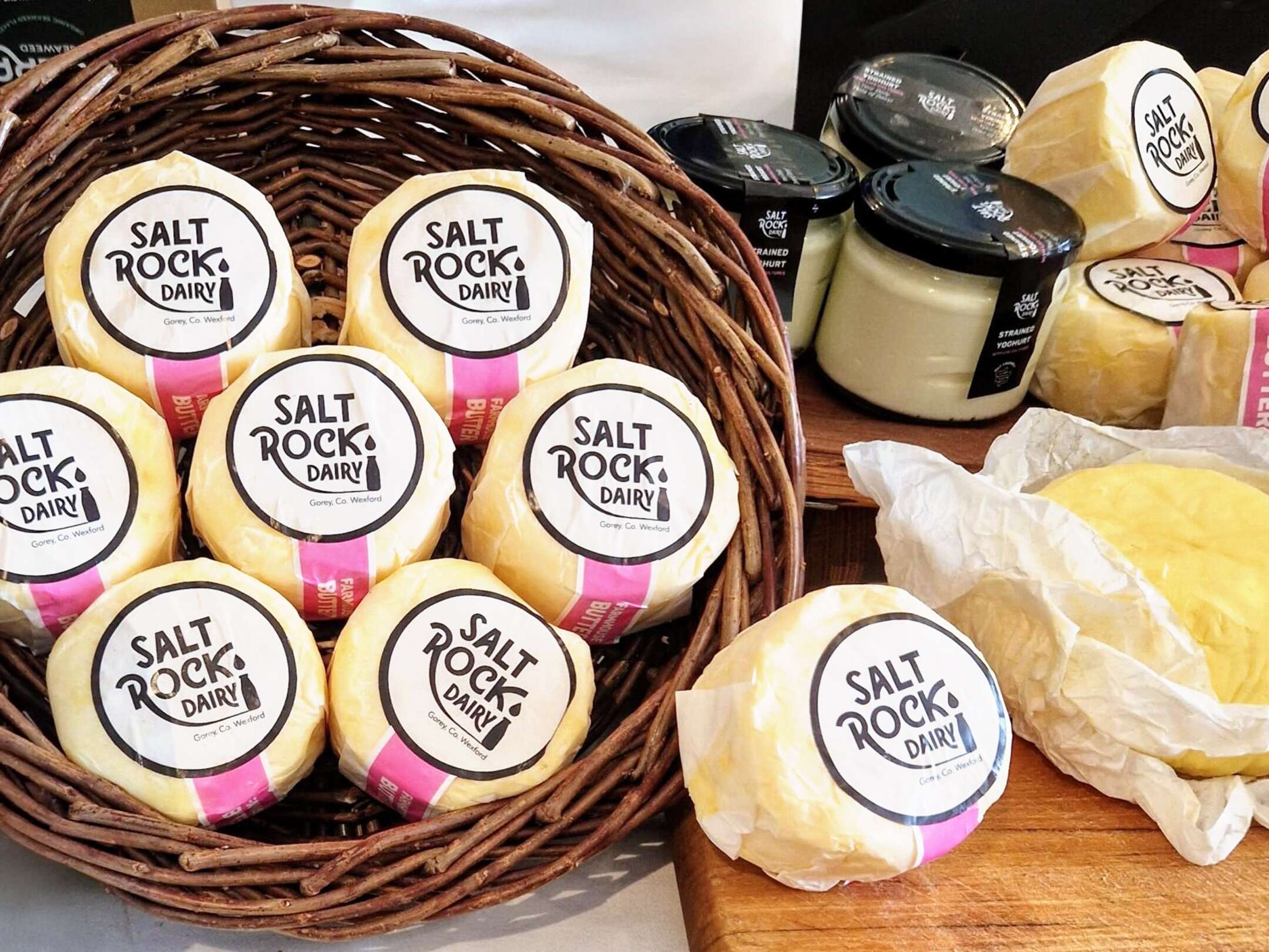
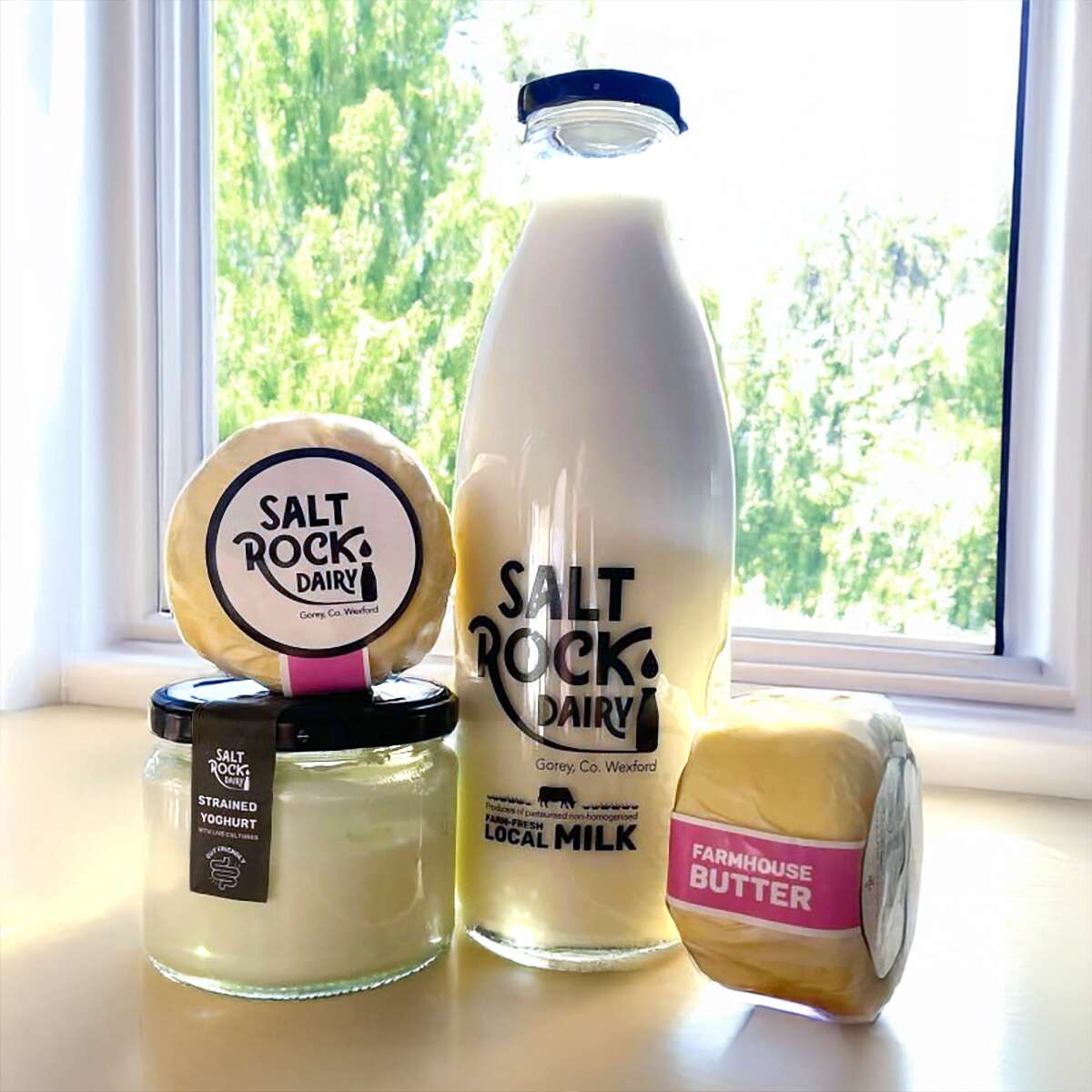
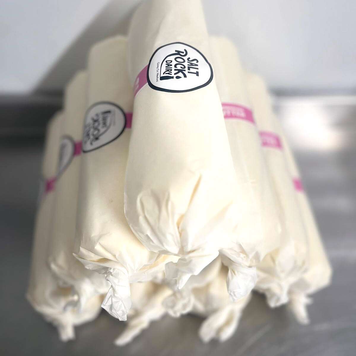
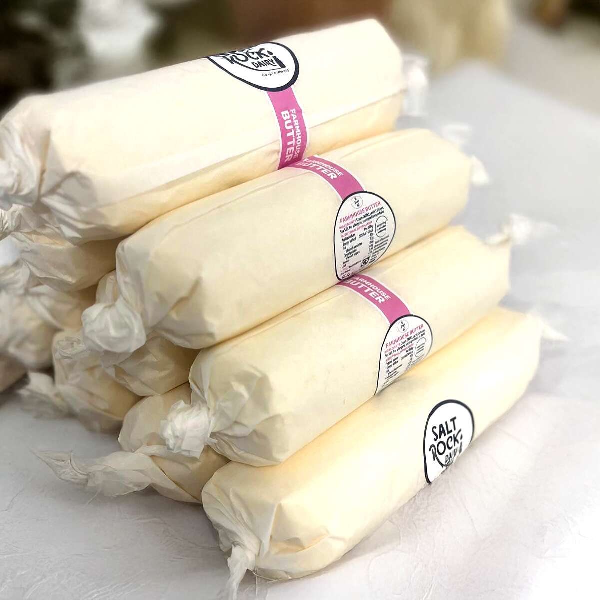
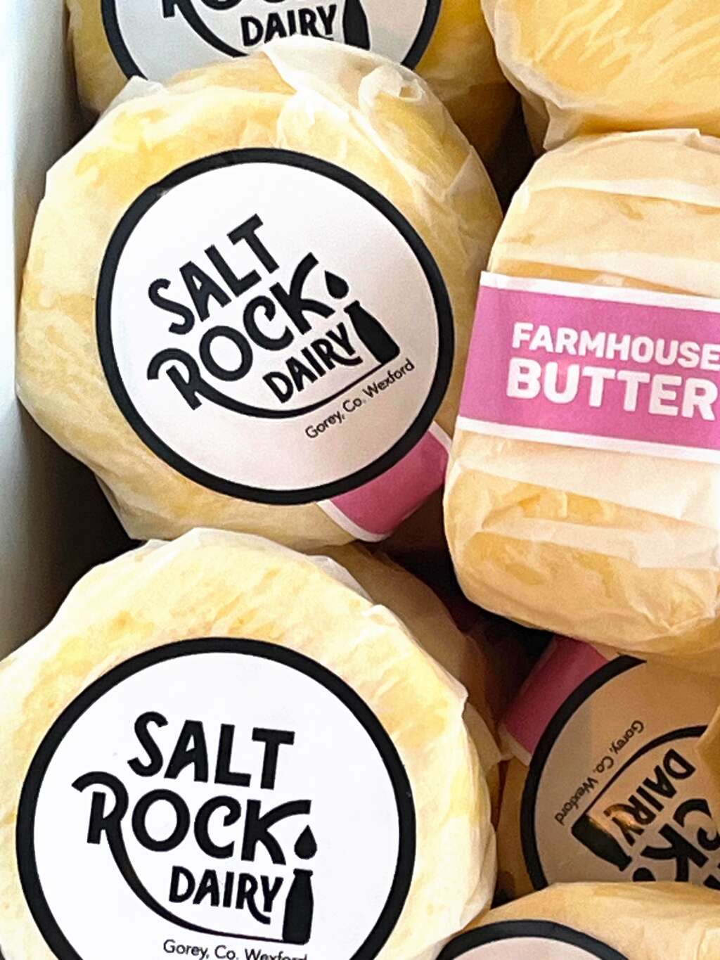
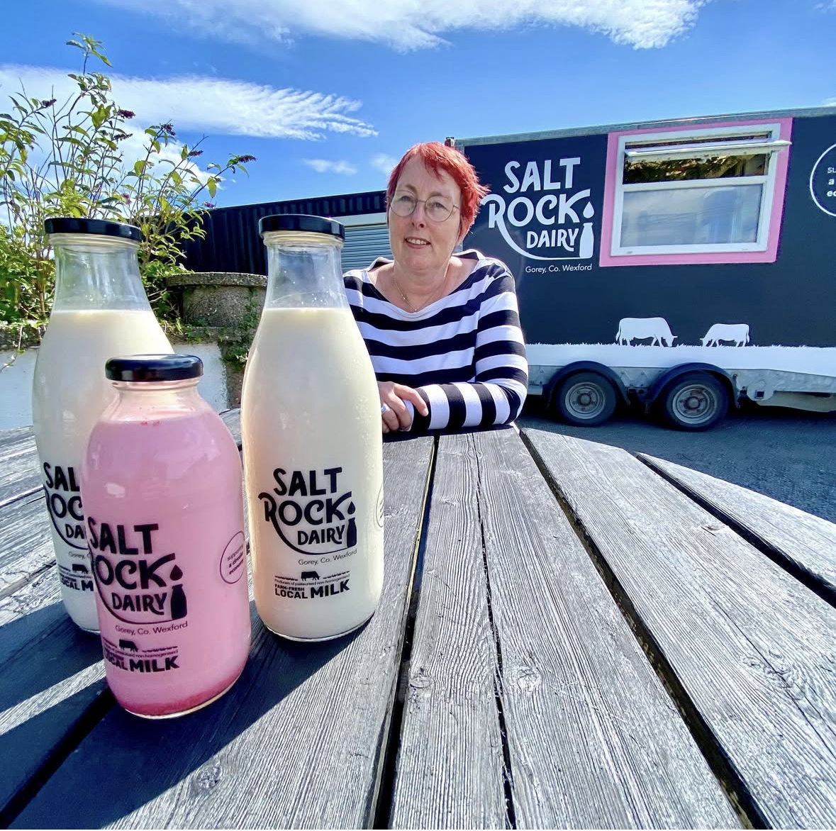
Saltrock Dairy asked us to help develop their packaging design range from the fresh milk products to Irish Cultured Farmhouse Butter and Strained Yoghurt. We ensured to keep a consistent look and feel with the existing brand, ensuring the new products had the same vibrant stand-out shelf presence and impact as customers associate with Saltrock Dairy.
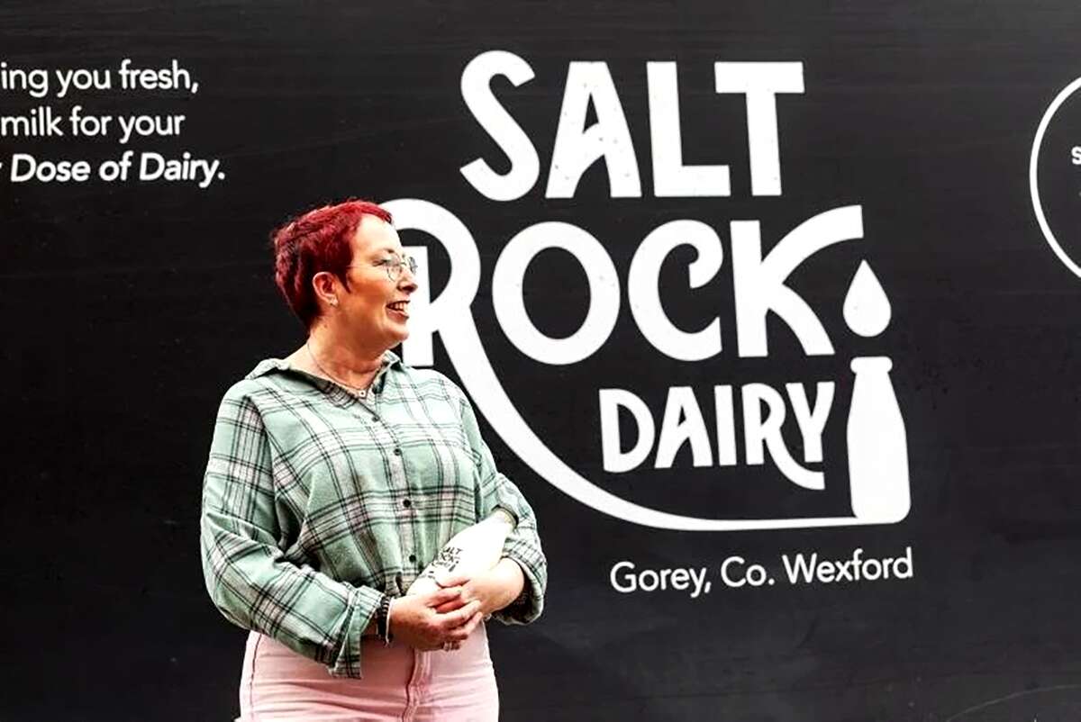
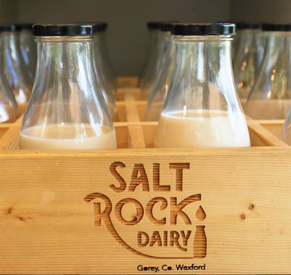
Based in Gorey, Co. Wexford, Saltrock Dairy is a family-run farm situated on Tara Hill. Their mobile milk trailer travels around North County Wexford each week, supplying everyone with their weekly top-up of pasteurised non-homogenised milk.
![]()
Their new range is available in select stores such as Nolan’s in Clontarf and can be ordered online at:
www.SaltrockDairy.ie
Give them a follow on their Instagram page to find out where you can next spot the Saltrock Dairy trailer.
Orija Nutrition: Brand Packaging Design
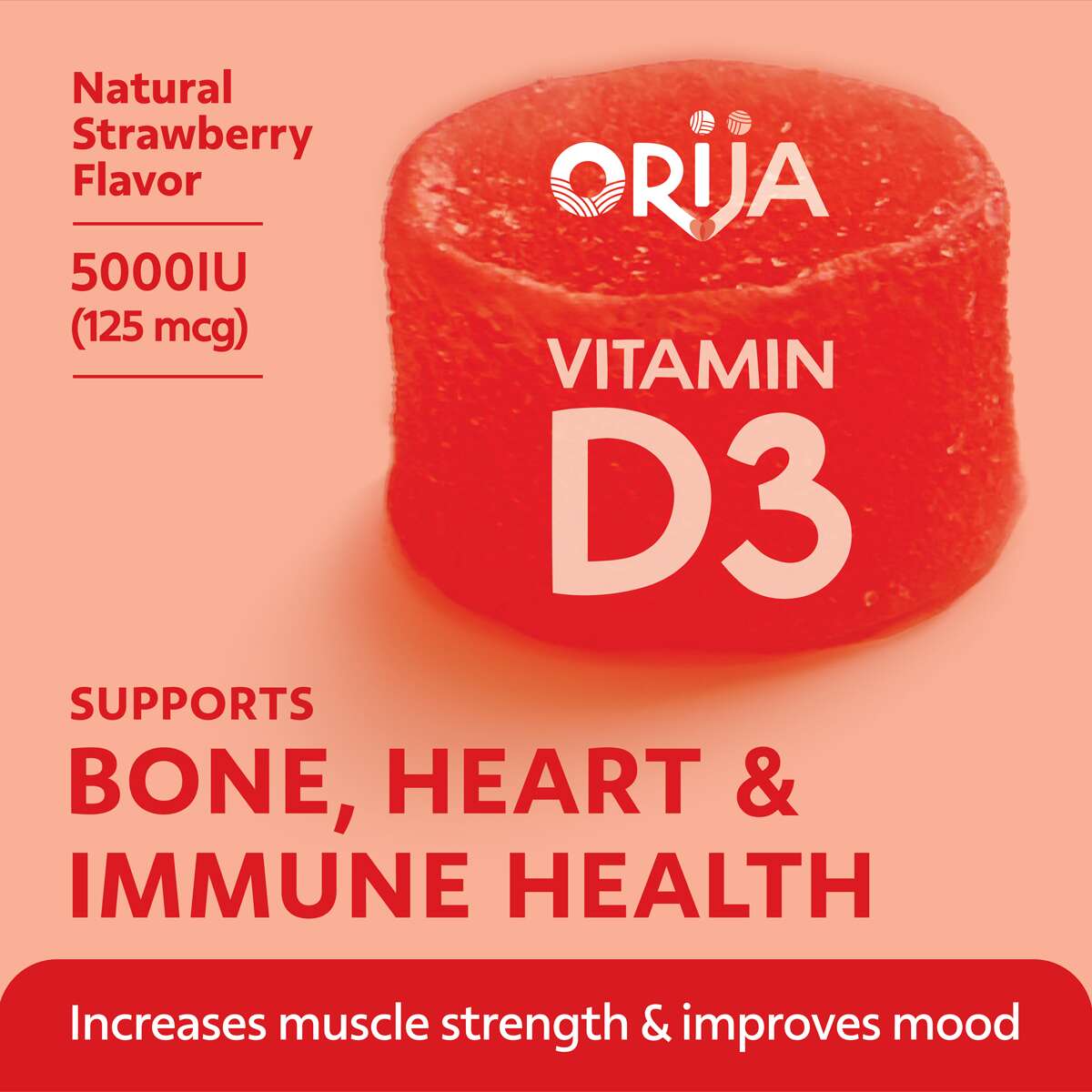
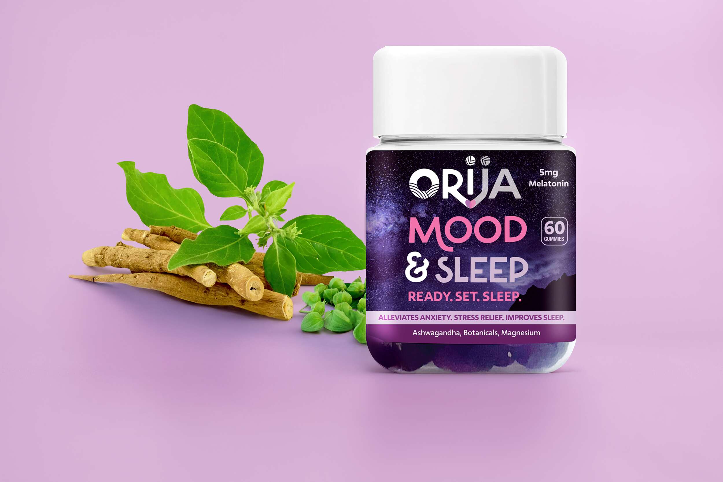
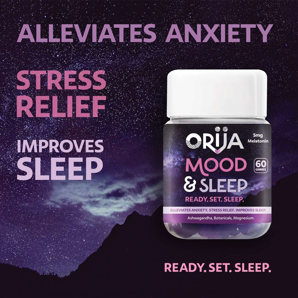
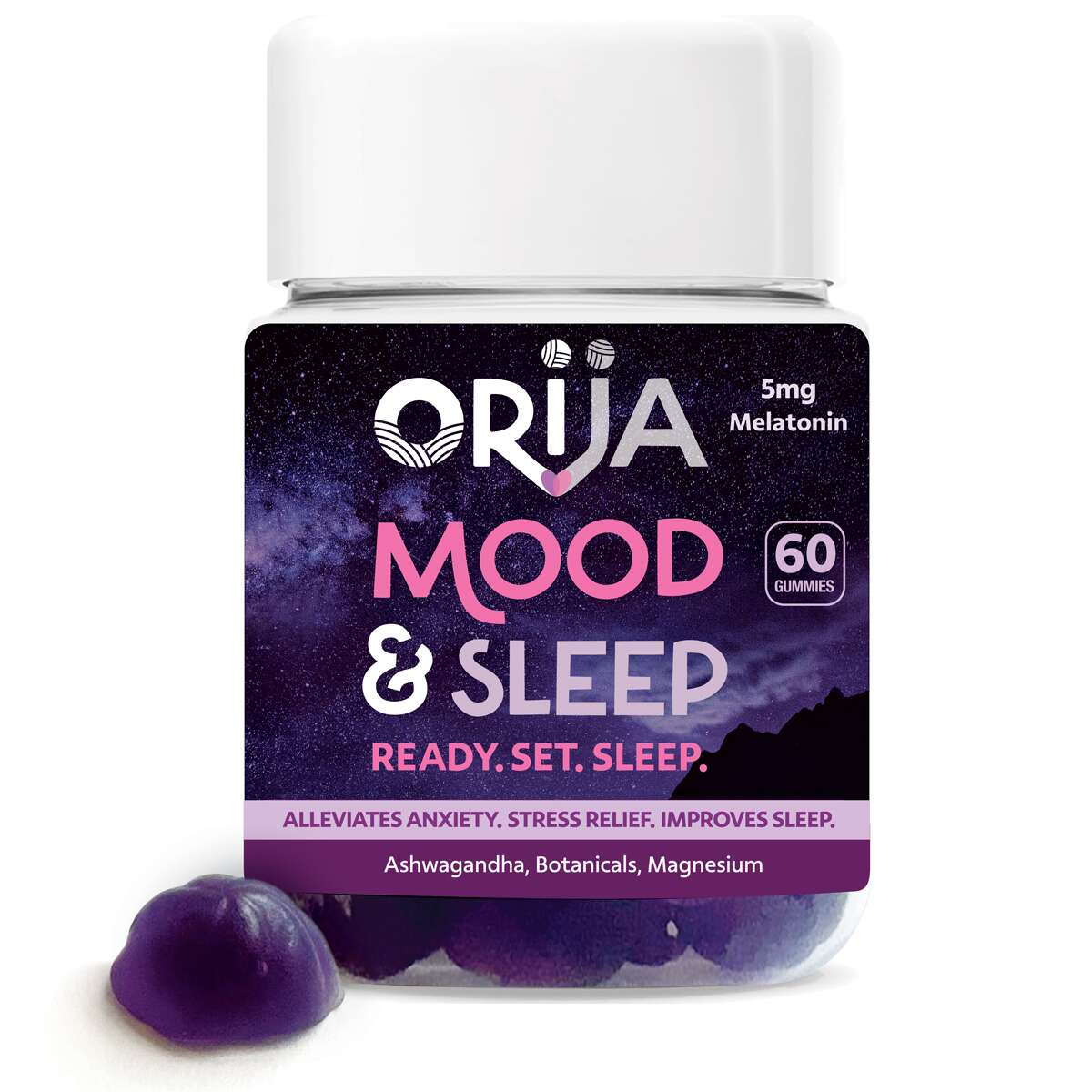
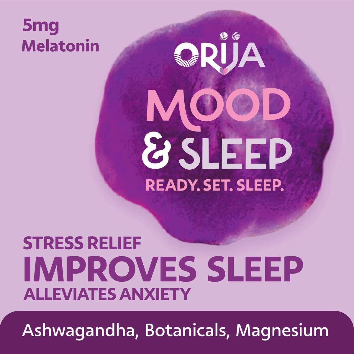
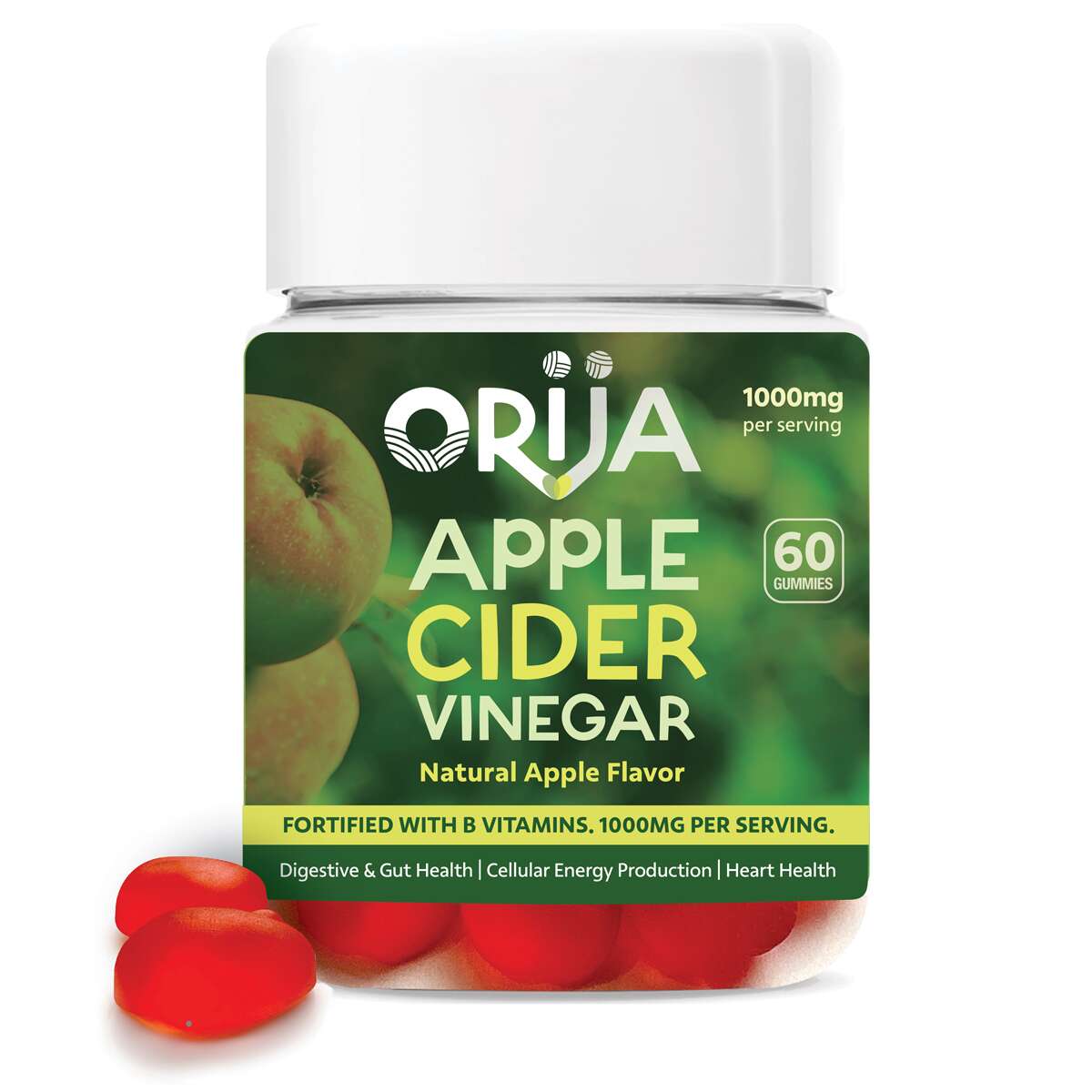
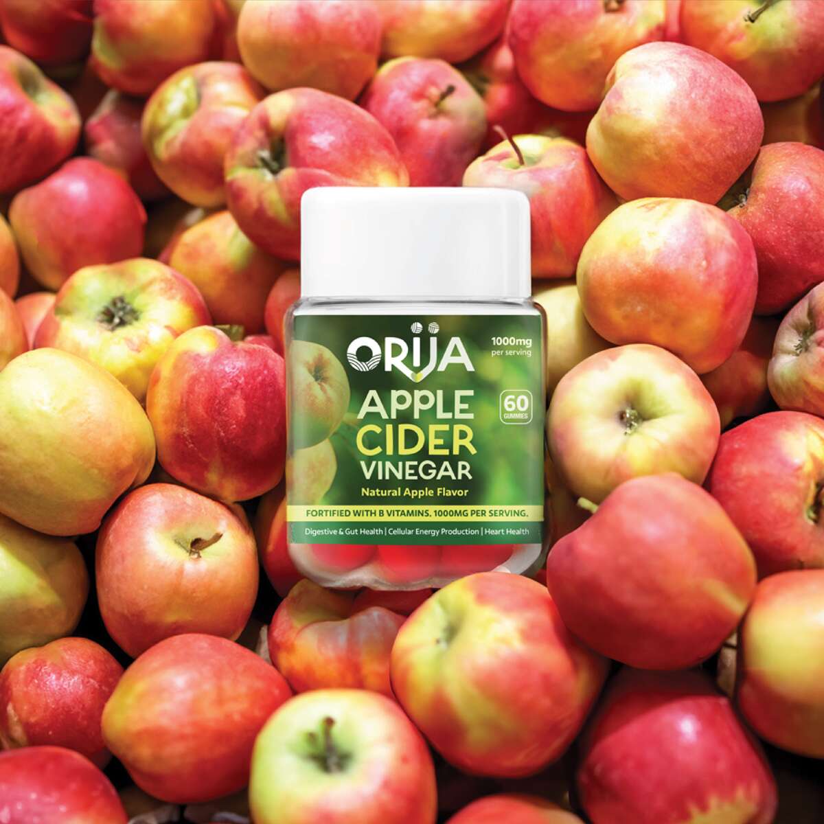
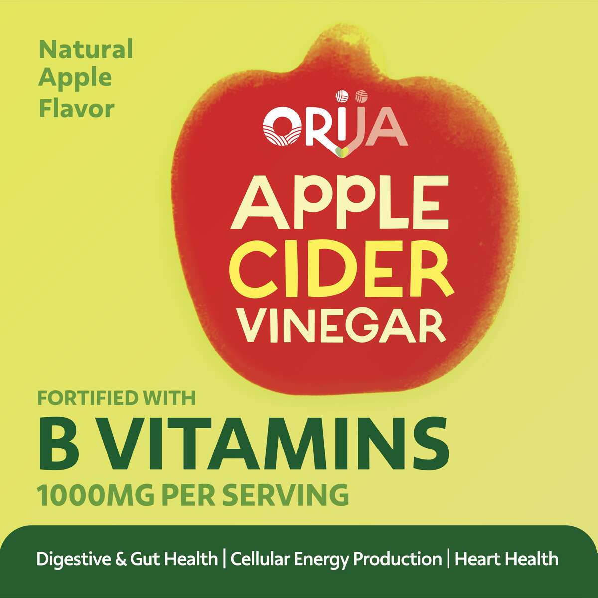
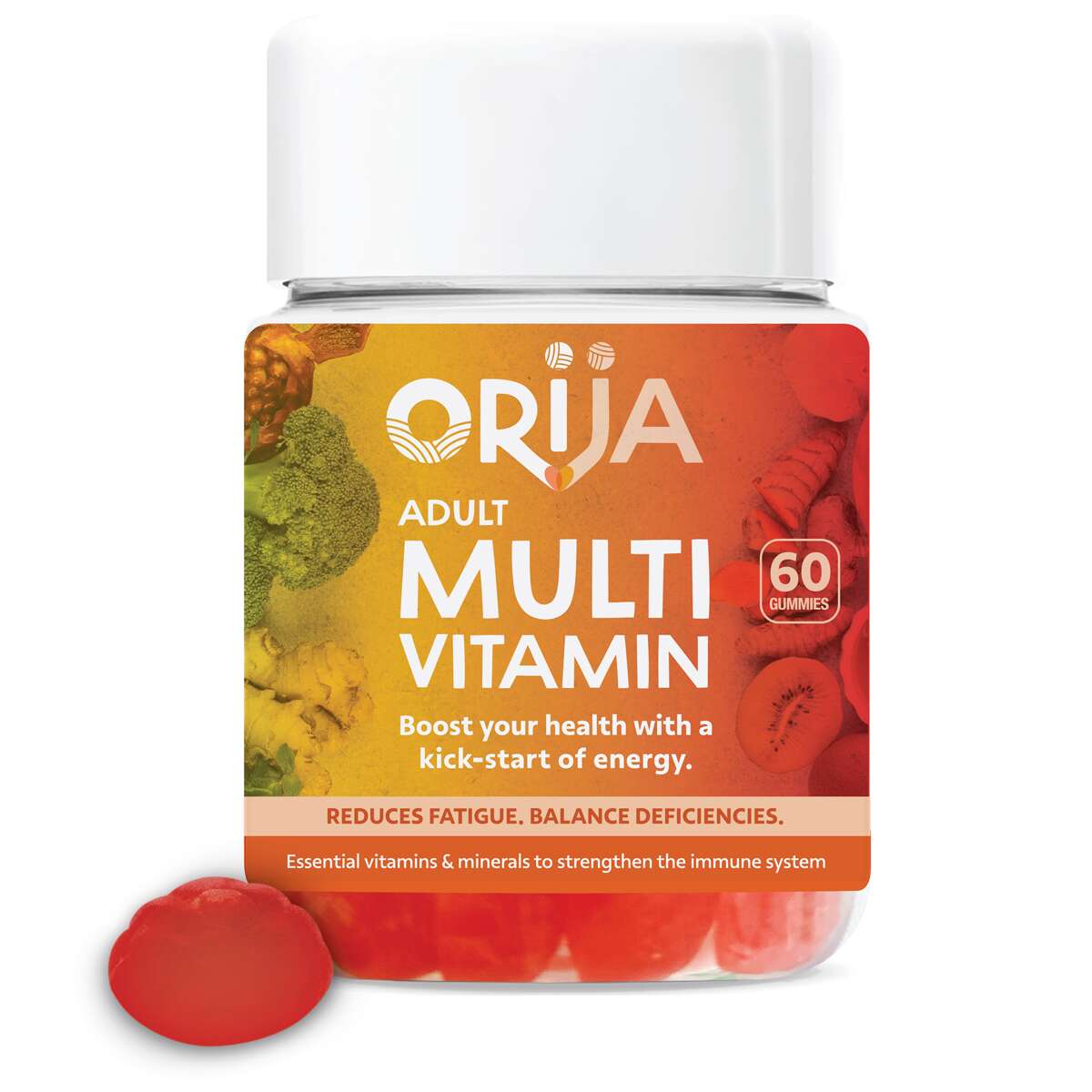
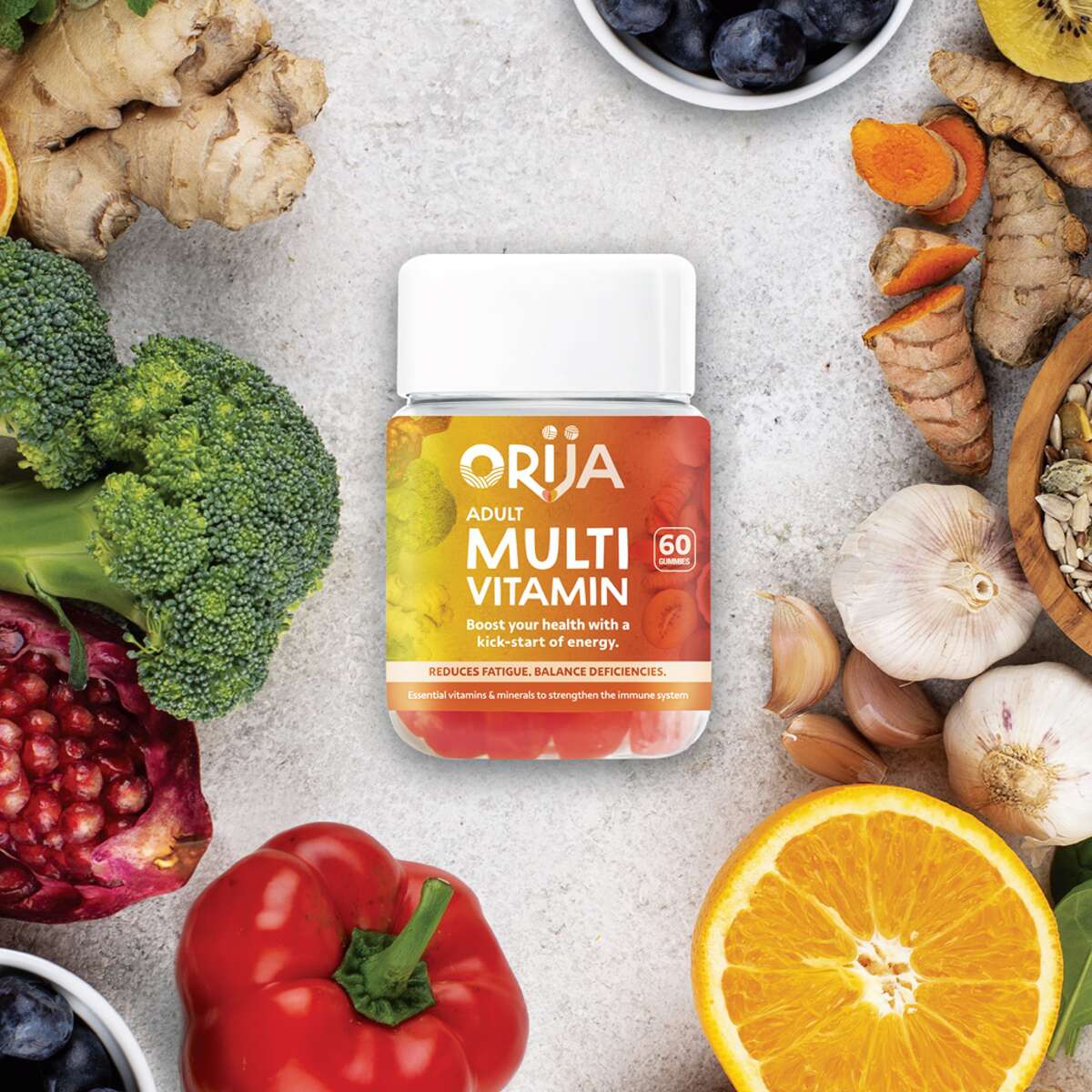
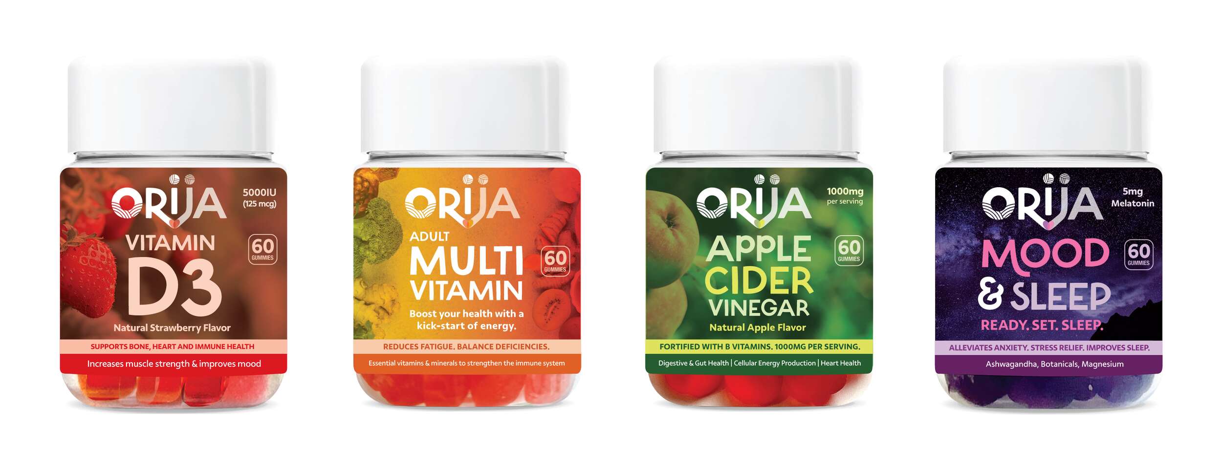
Orija Nutrition: Packaging Design – Gummies Supplements Range
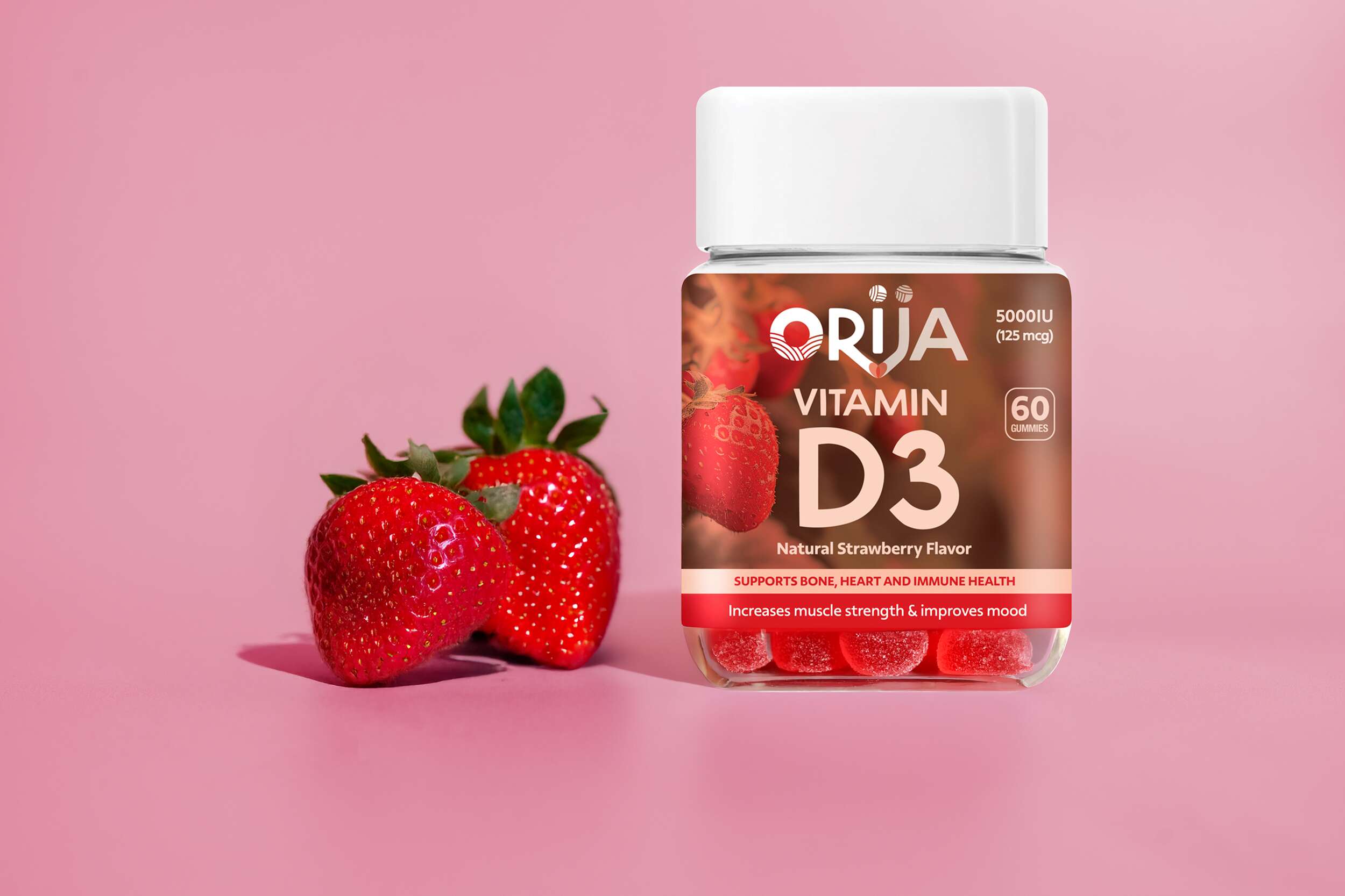
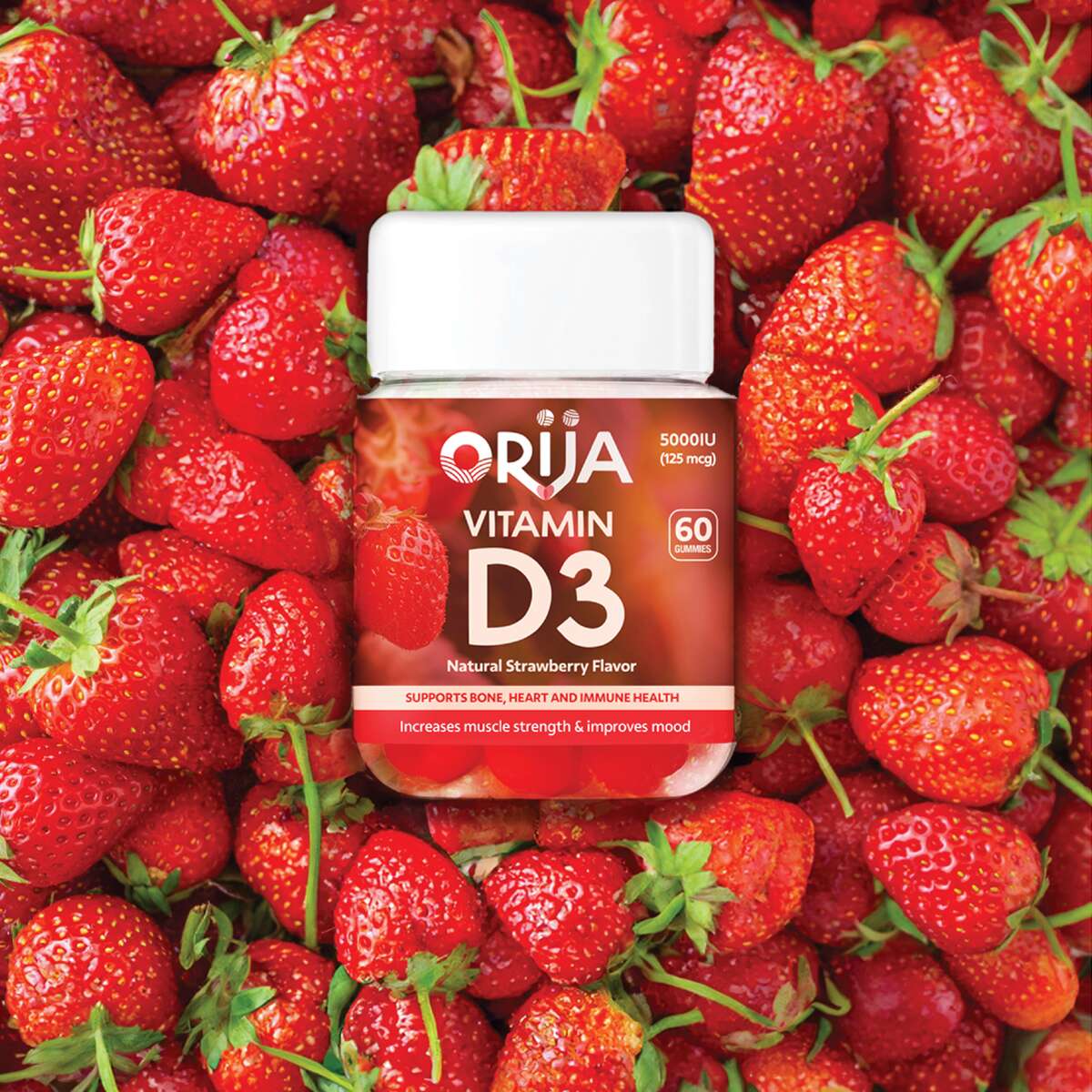
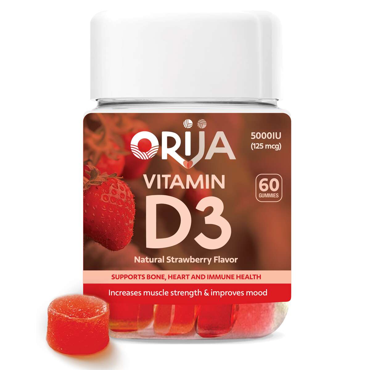
Following the successful launch of Orija’s first retail herb and spice range, we had the pleasure of continuing my collaboration with them to design packaging for their newest innovation, a line of functional nutraceutical gummies.
The collection includes Apple Cider Vinegar, Vitamin D3, Mood & Sleep, and Adult Multivitamin – each formulated to support daily wellness through clean, plant-based ingredients.
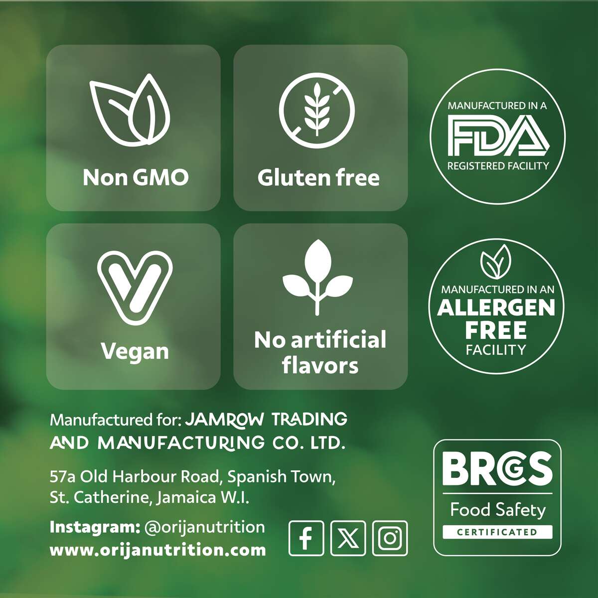
Our design approach focused on creating a premium and fresh look, combining bold colour palettes influenced by the gummies’ natural flavours with clean typography and subtle background photography. Each label highlights key benefits and icons, clearly communicating Orija’s values of quality, integrity, and transparency.
Vitamin D3
Mood & Sleep
Apple Cider Vinegar
Adult Multivitamin
The Full Range
It’s been great working with an authentic Jamaican company, their vibrant energy creates such an inspiring partnership. They are a family-run business expanding into the retail wellness space. The final designs deliver a fresh, credible aesthetic that positions Orija among leading supplement brands while keeping its unique island heritage front and centre.
Follow Orija on Instagram:
@OrijaNutrition
Orija Nutrition: Brand Packaging Design
Orija Nutrition: Brand Packaging Design
Nutraceutical Superfood Range
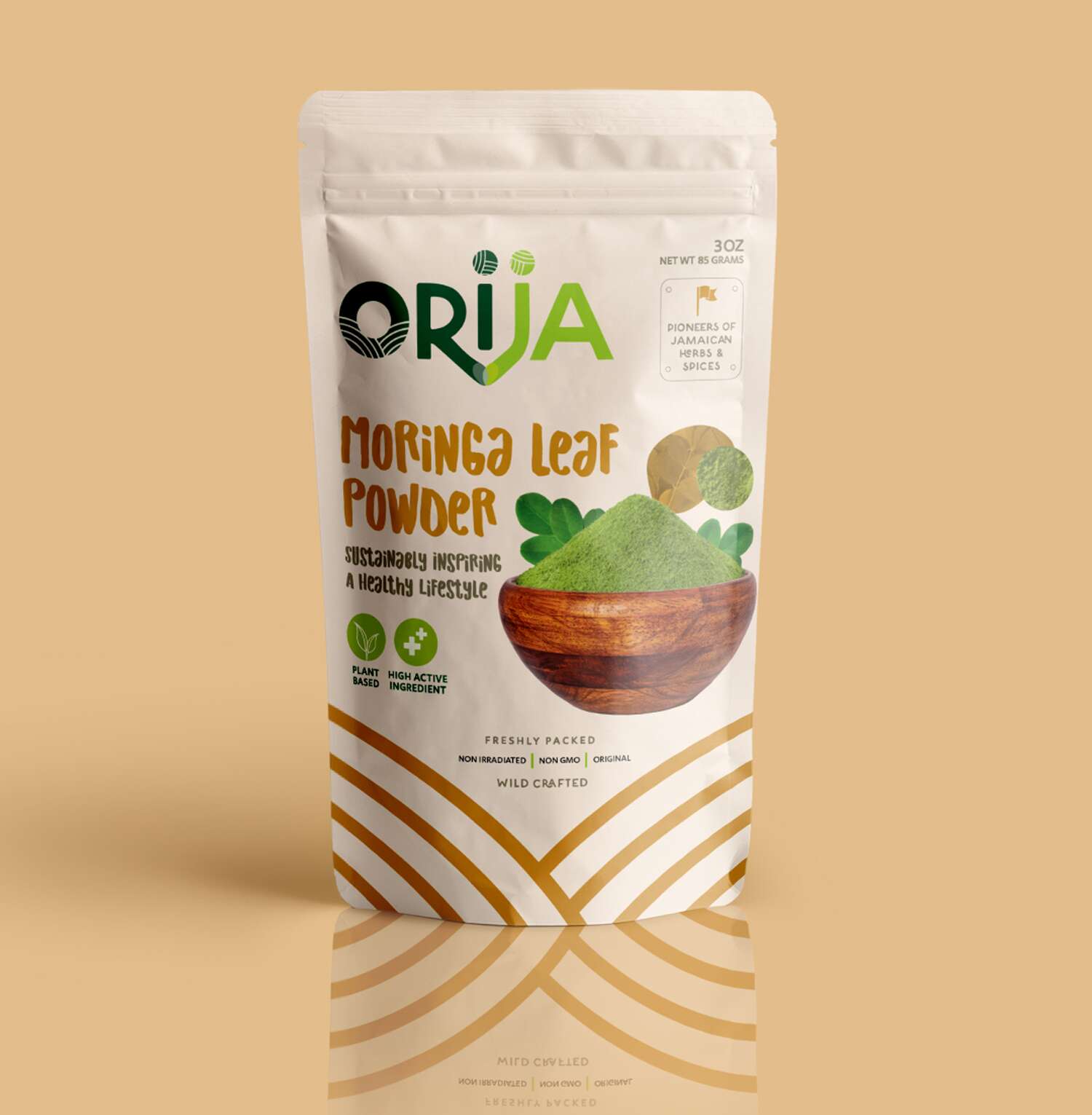
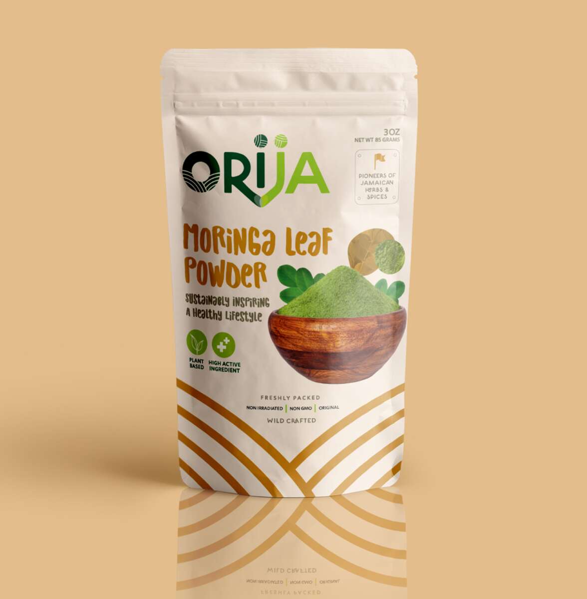
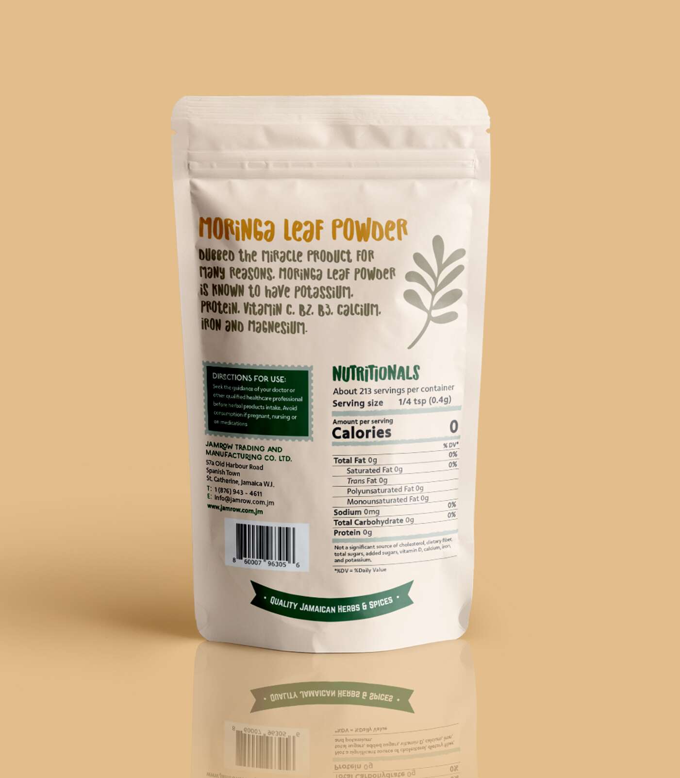
Moringa Leaf Powder 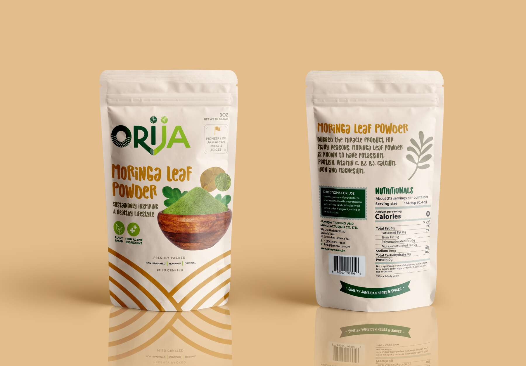
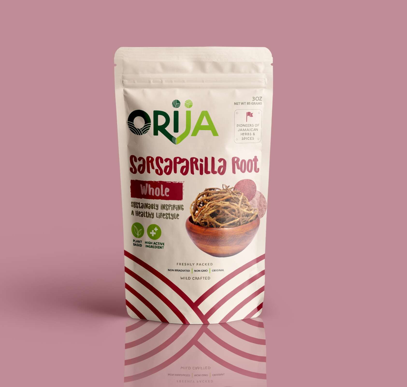
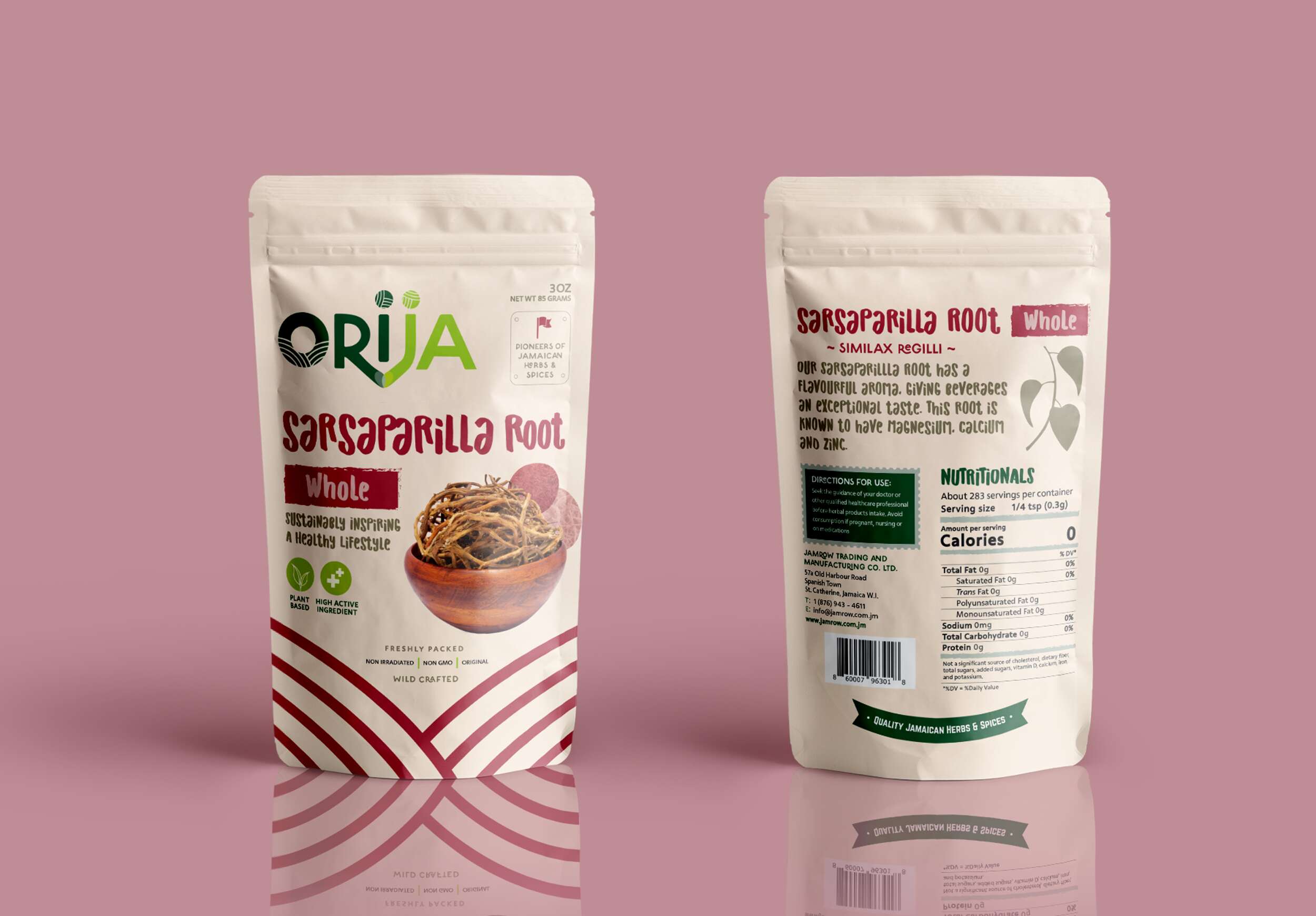
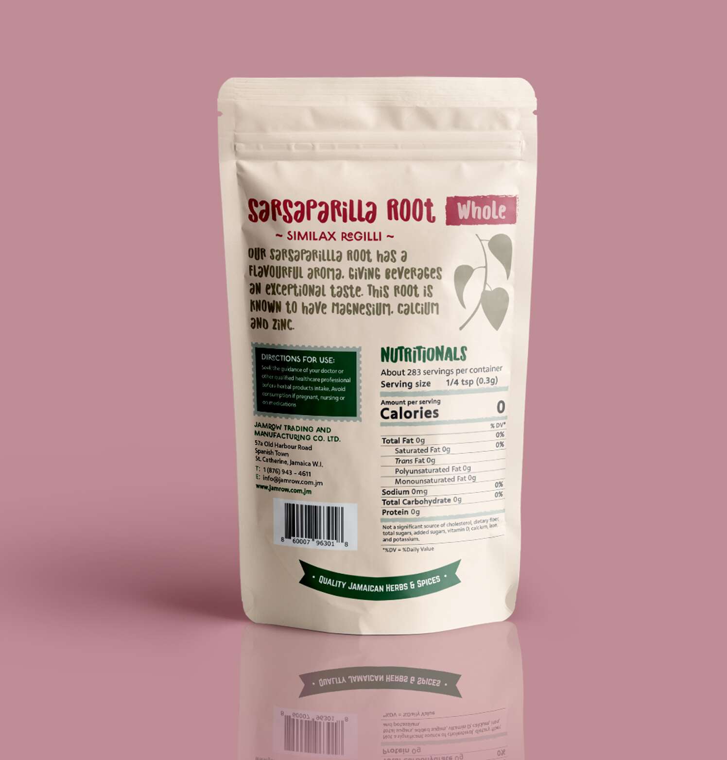
Sarsaparilla Root – Whole
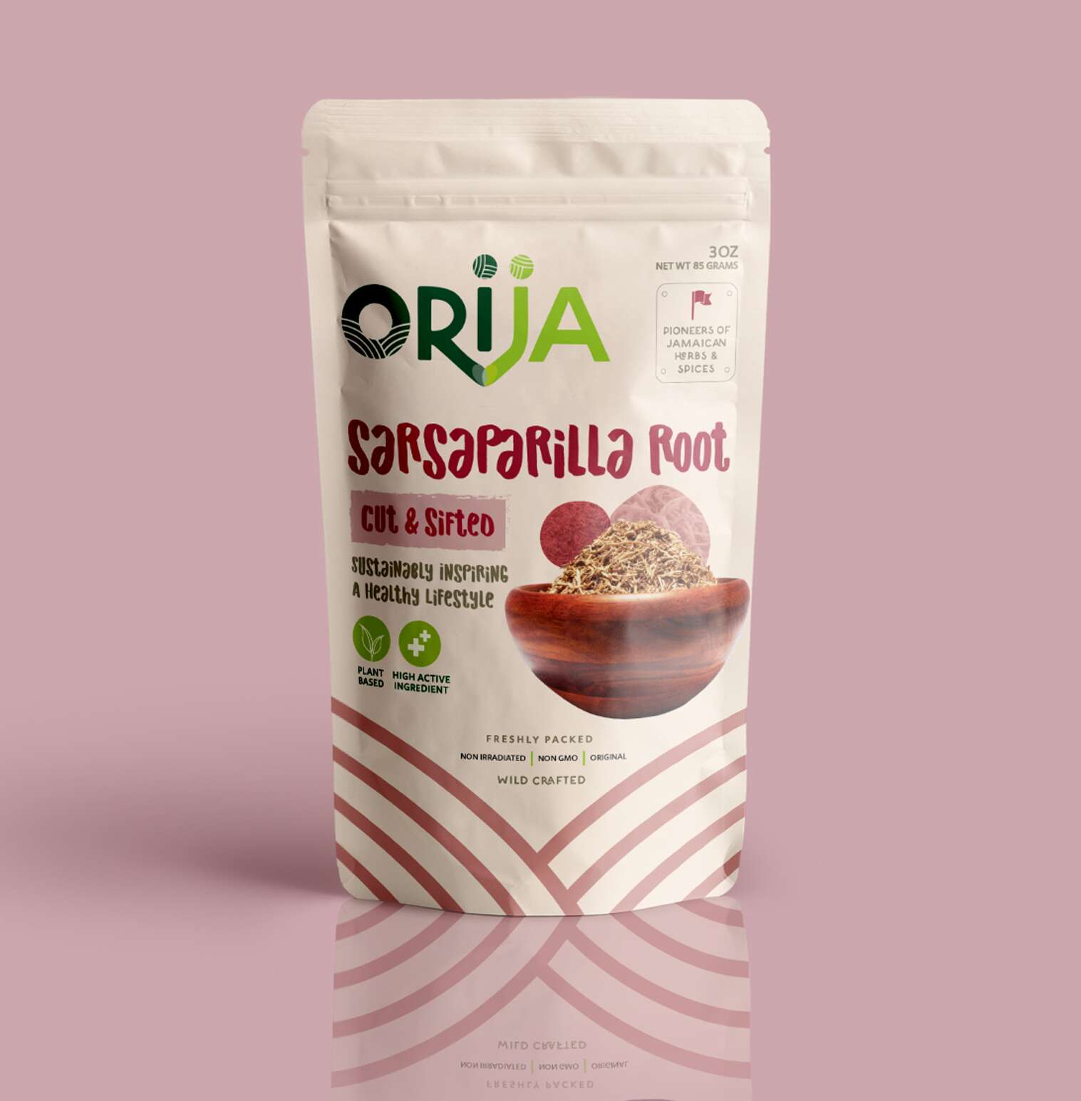
Sarsaparilla Root – Cut & Sifted

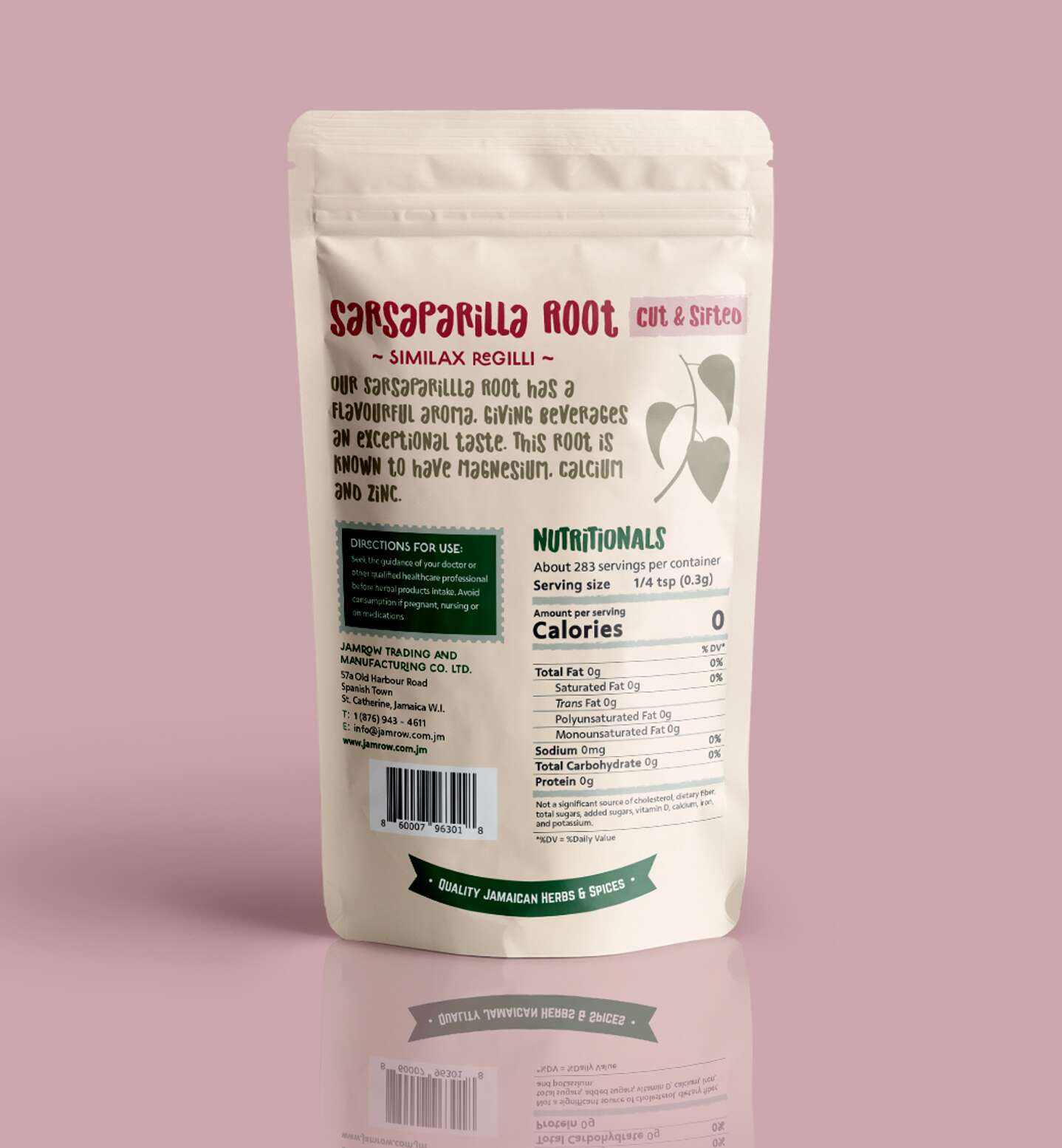
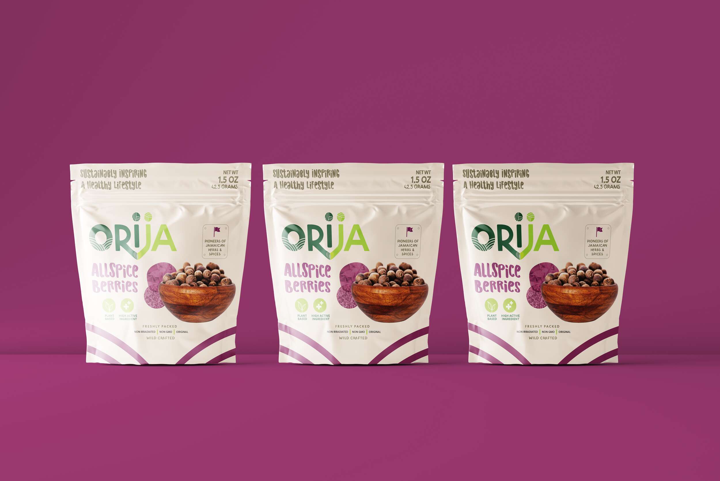
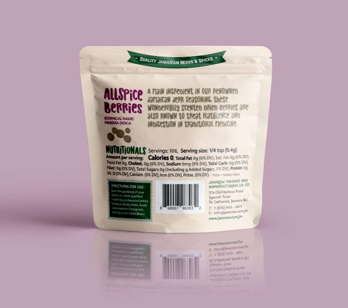
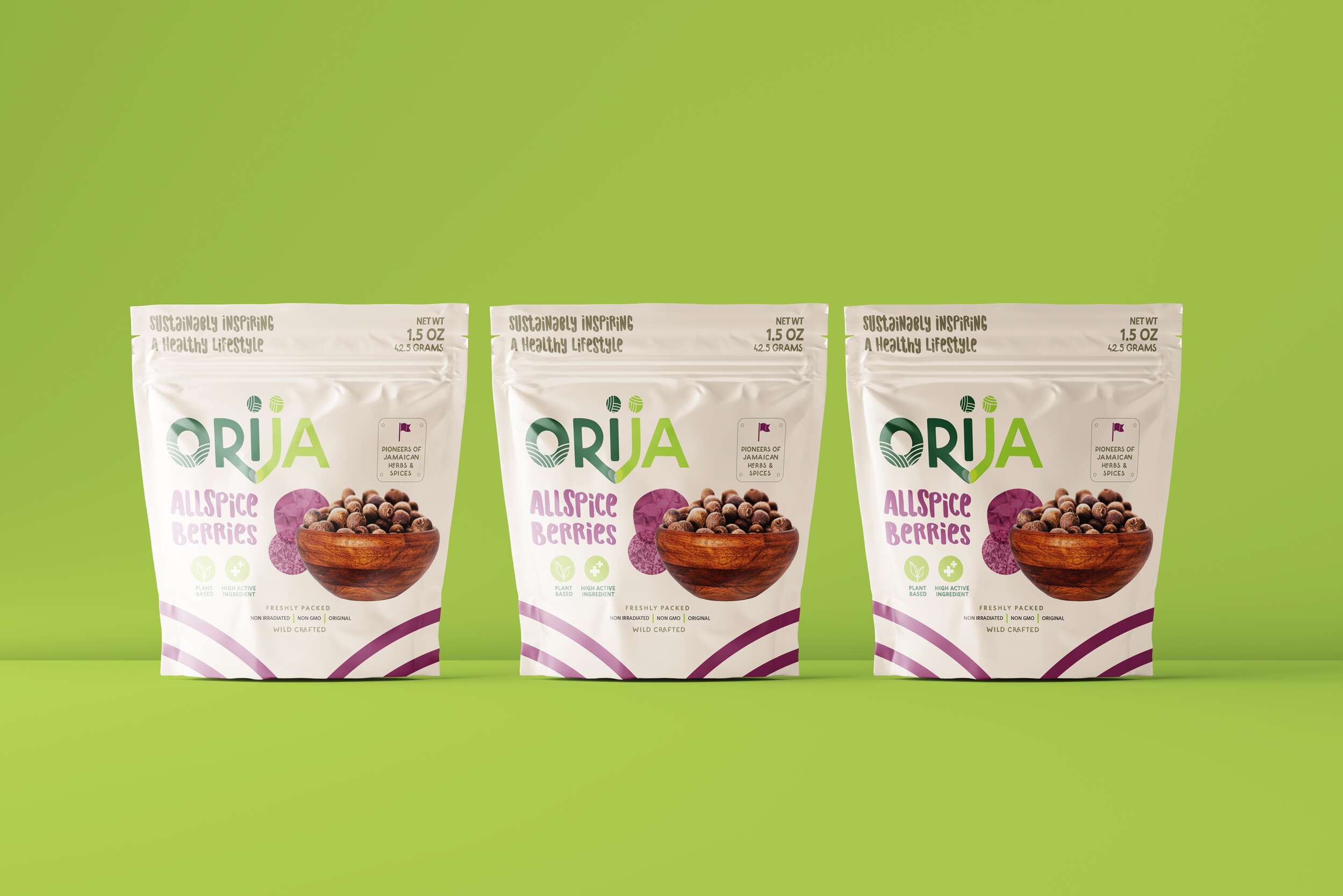
Allspice Berries
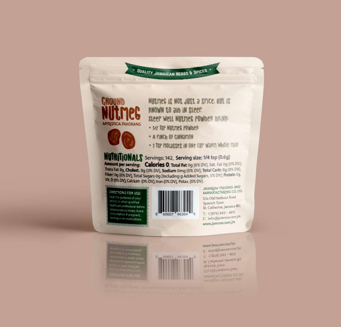
Ground Nutmeg
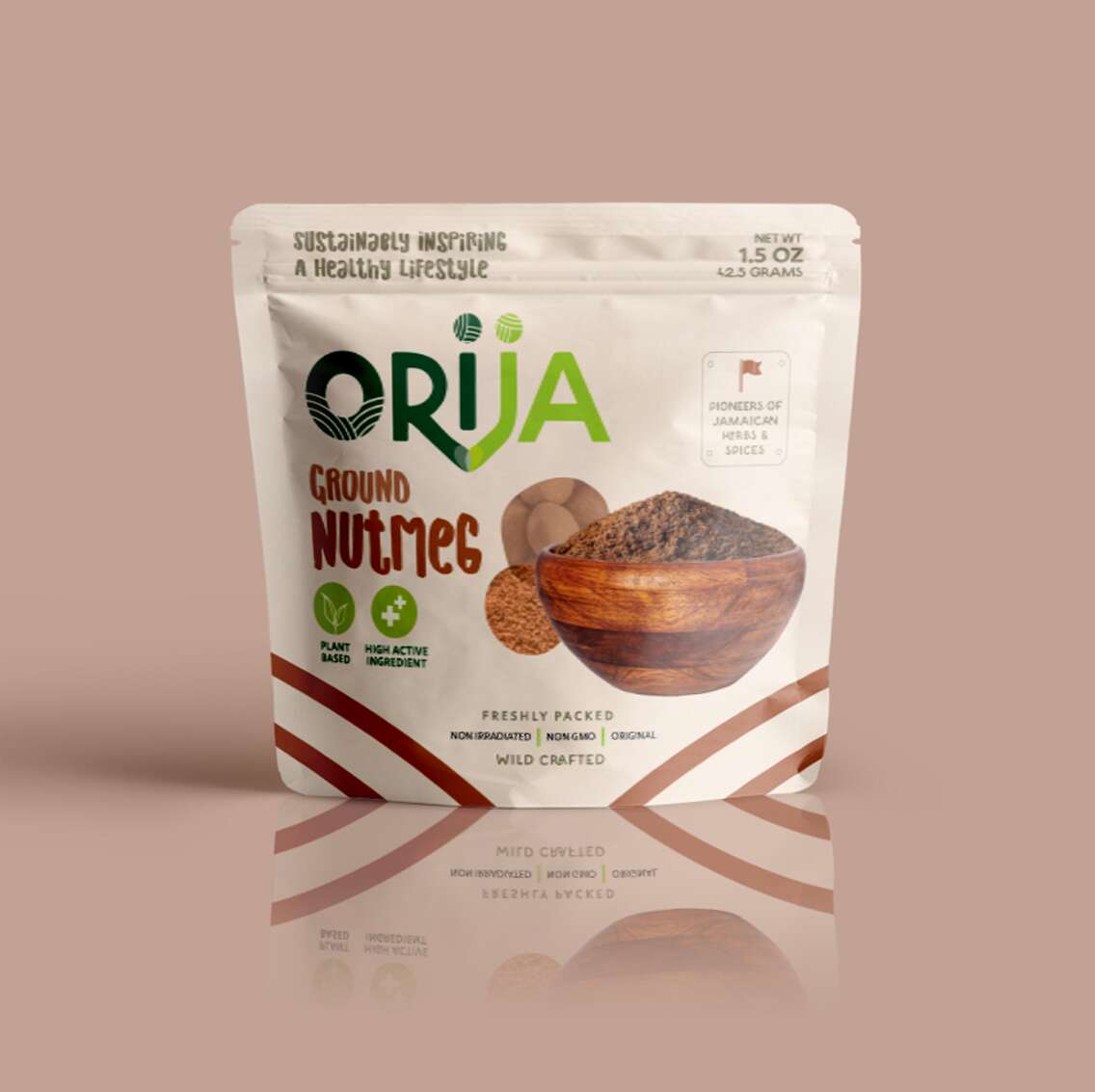
For over 30 years, Jamrow Trading has exported raw botanical ingredients across the globe. With the birth of Orija Nutrition, they’ve taken a bold leap – from bulk ingredients to premium retail with this range of functional foods and herbal supplements. I had the privilege of leading the brand and packaging design for their debut product line under this exciting new venture.
From concept to pouch, the Orija identity is rooted in function and flavour. The logotype uses custom letterforms that connect, symbolising Orija’s mission to nourish heart, mind, and body, while bridging cultures through Jamaica’s rich herbal heritage. Each pack features vivid colours inspired by the product inside, playful-yet-elevated imagery, and a clean layout that communicates trust and quality at a glance.
The tagline, ‘Sustainably inspiring a healthy lifestyle’, threads throughout the visual language, complemented by hand-lettered typography to honour the brand’s natural, unrefined essence.
From Moringa Leaf Powder to Sarsaparilla Root, the Orija pouches are more than just packaging – they’re a celebration of Jamaican wellness, tradition, culture and bold innovation. I’m proud to have supported this generational business as they prepare to launch retail locally and internationally.
We love to design with purpose, and to shaping brands that stand the test of time.
Follow Orija on Instagram:
@OrijaNutrition
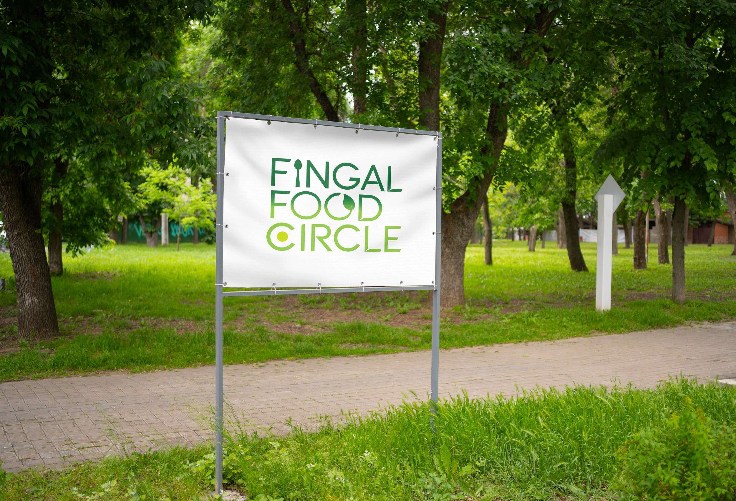
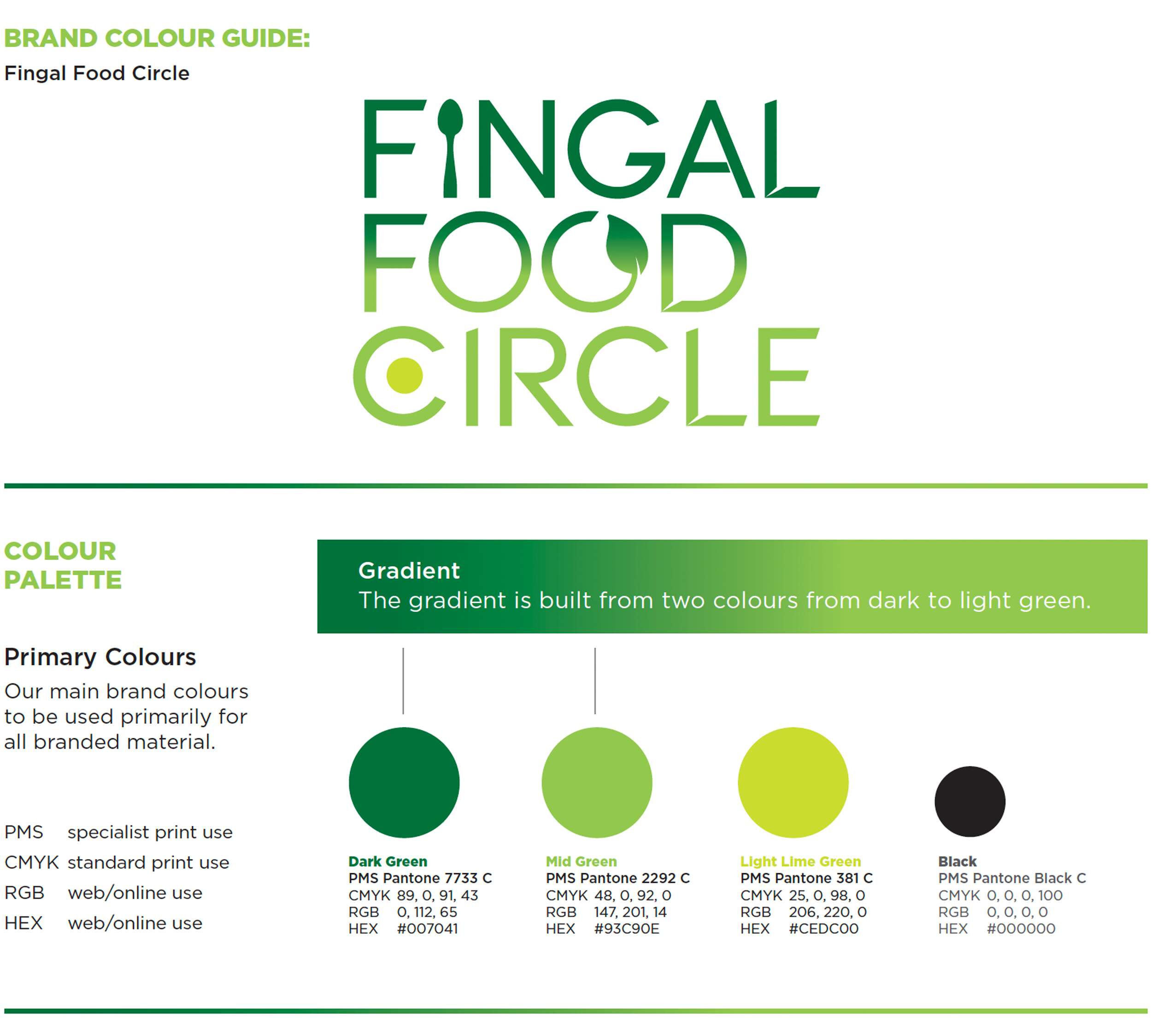
Fingal Food Circle: Brand Identity Design
Fingal Food Circle: Brand Identity Design
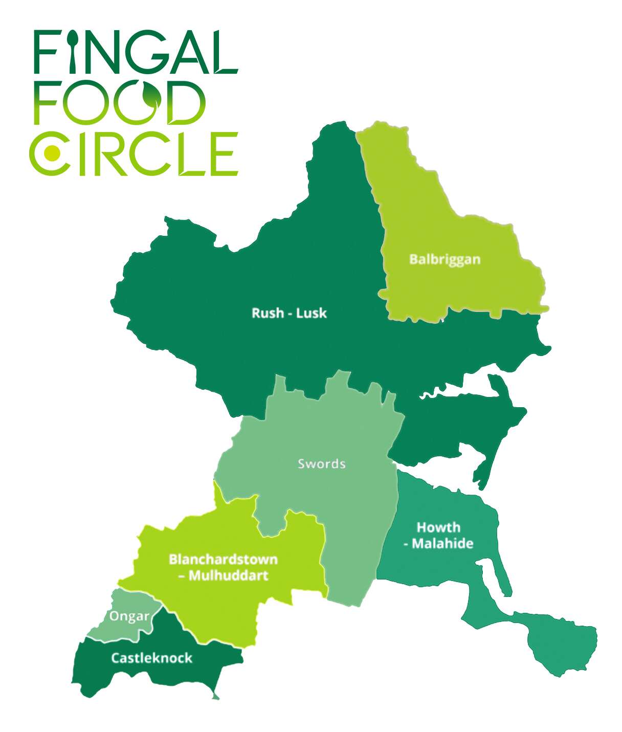
I recently created a new brand identity for Fingal Food Circle, a food and drink network based in North County Dublin. This initiative brings together local producers, restaurants, cafes, culinary experiences, and food tourism operators, all under one umbrella. The goal was to develop a strong and distinctive brand that celebrates local provenance, encourages collaboration, and supports the wider food and drink community in the Fingal region.
Before this project, Fingal Food Circle had no existing brand or visual identity. They needed a design that would establish them as a clear and confident voice for the industry – something that could work across everything from events and training to tourism promotion and media engagement. It also had to reflect the diversity of its members, while remaining flexible enough to grow with the network over time.
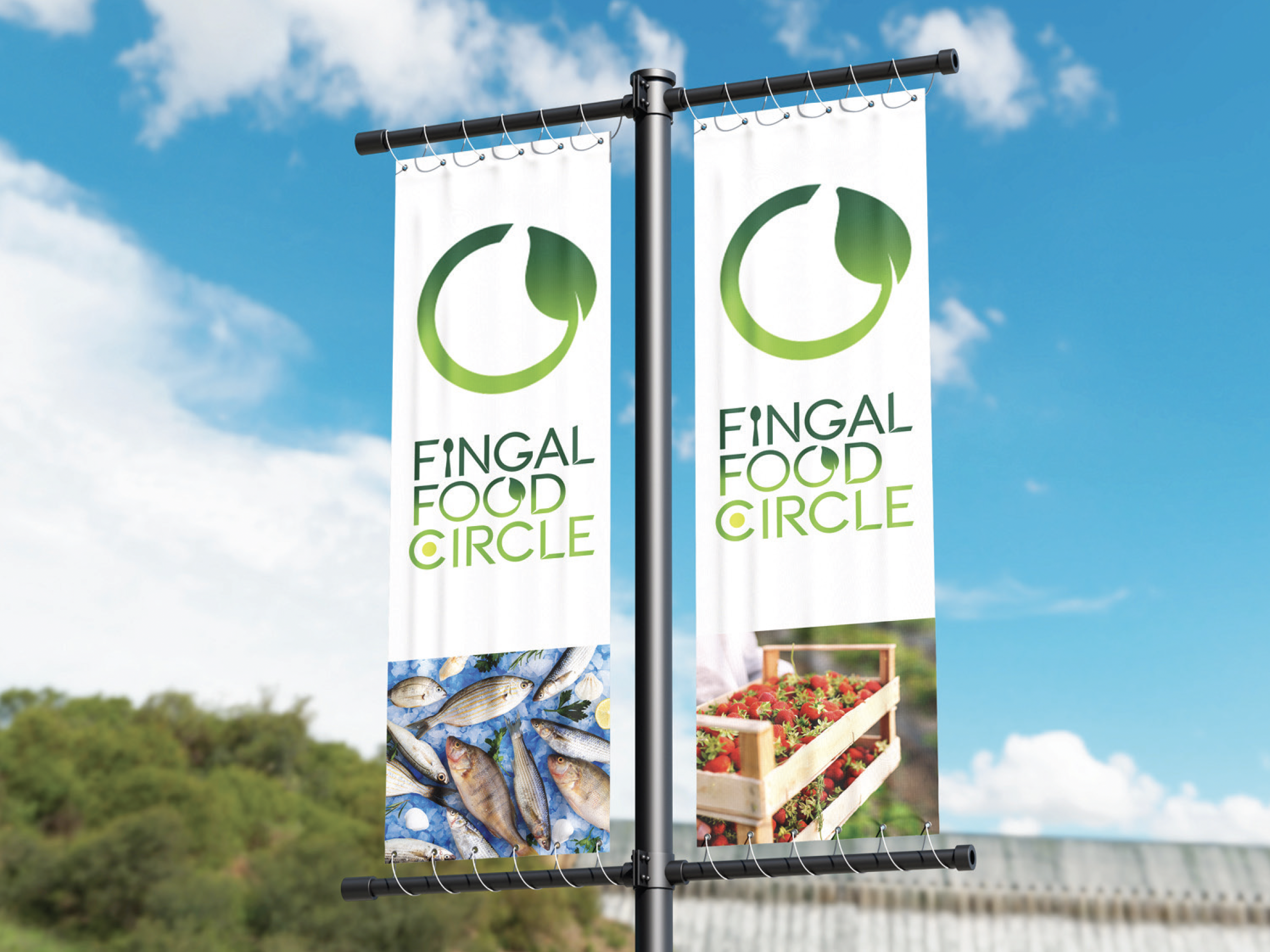
The chosen design direction focused on a custom typographic logo that feels open, welcoming, and grounded in food culture. A spoon subtly replaces the ‘I’ in ‘Fingal’ to represent the culinary aspect of the network. The circular form of the ‘C’ includes a green circular dot to reference the landscape and community and link with the brand’s name, while the open ‘O’ features a small leaf – symbolising fresh produce and the concept of growth and inclusion. The overall design is clean, modern, and tailored, while still feeling warm and approachable.

This new brand identity helps Fingal Food Circle communicate who they are at a glance: a grassroots but professional collective that promotes local food, fosters connection, and invites people to experience everything the region has to offer. The identity is launching publicly at the Flavours of Fingal Festival, marking the beginning of a stronger, more visible presence for the network in the local food and drink scene.
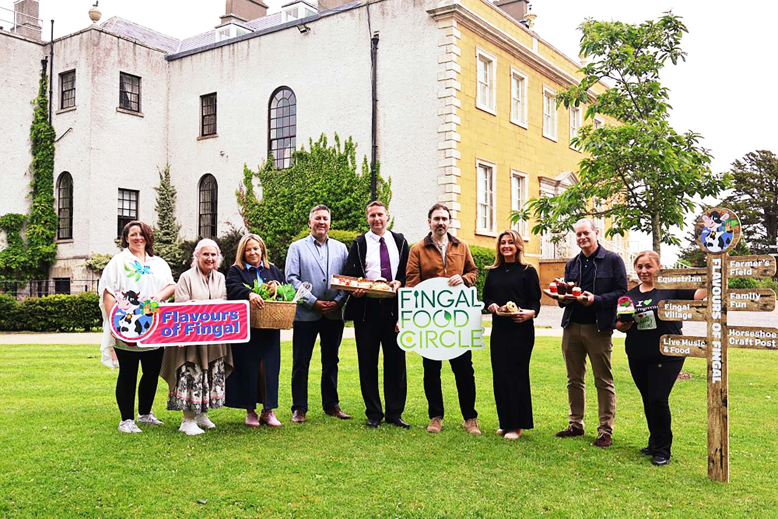
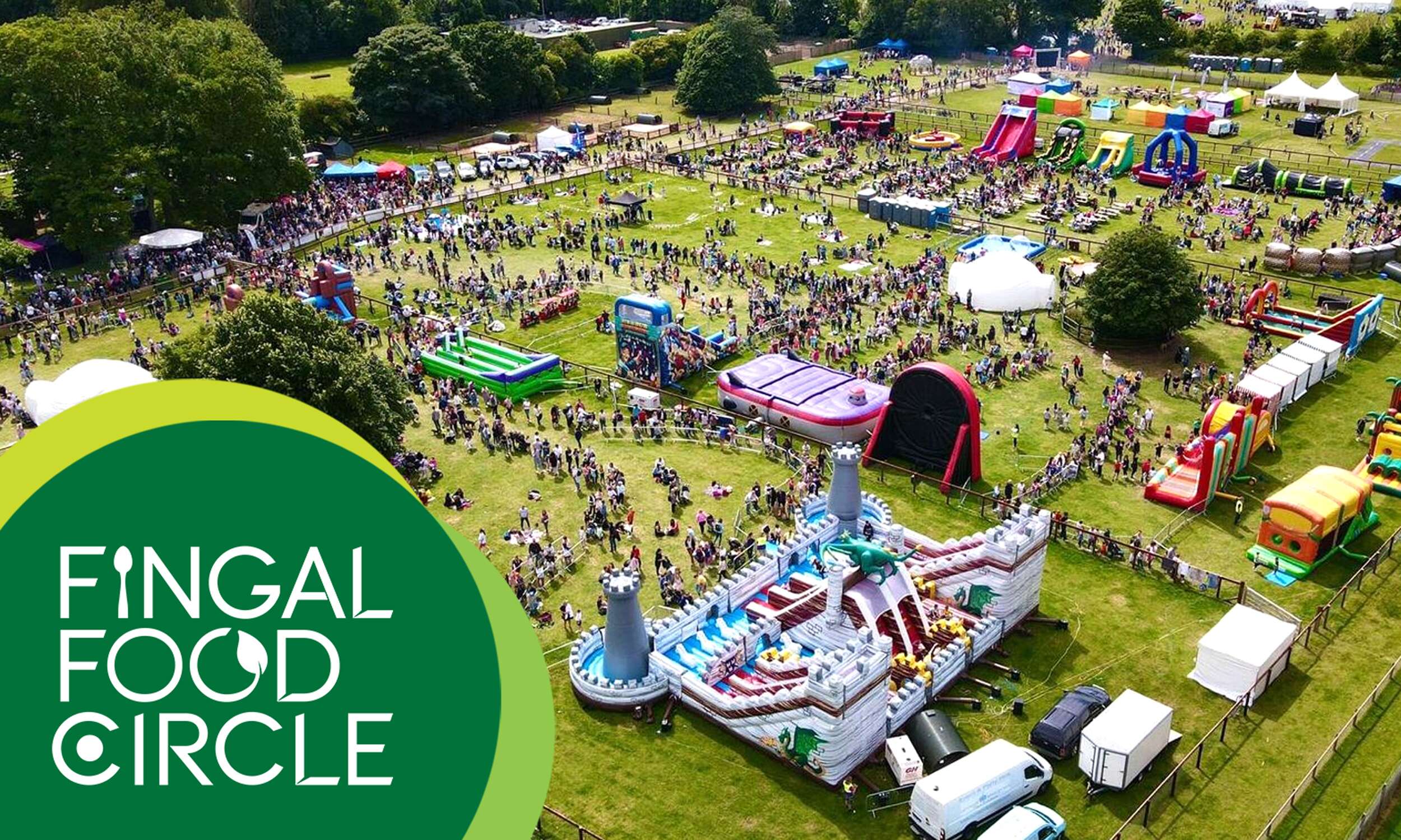
Flavours of Fingal, a vibrant two-day festival at Newbridge House and Farm that celebrates the region’s rich food culture, local producers, and community spirit, bringing over 65,000 visitors together for a truly unforgettable experience. The Fingal Food Circle is looking forward to making its debut there this year.
Flavours of Fingal Launch of the Fingal Food and Drink Policy 2024-2029 at Flavours of Fingal, Newbridge House and Farm, Donabate.
Picture by Shane O’Neill, Coalesce.
Follow Fingal Food Circle online:
Instagram: @fingalfoodcircle
Facebook: @fingalfoodcircle
Website: www.fingalfoodcircle.ie
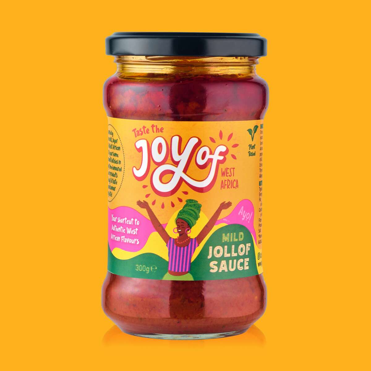
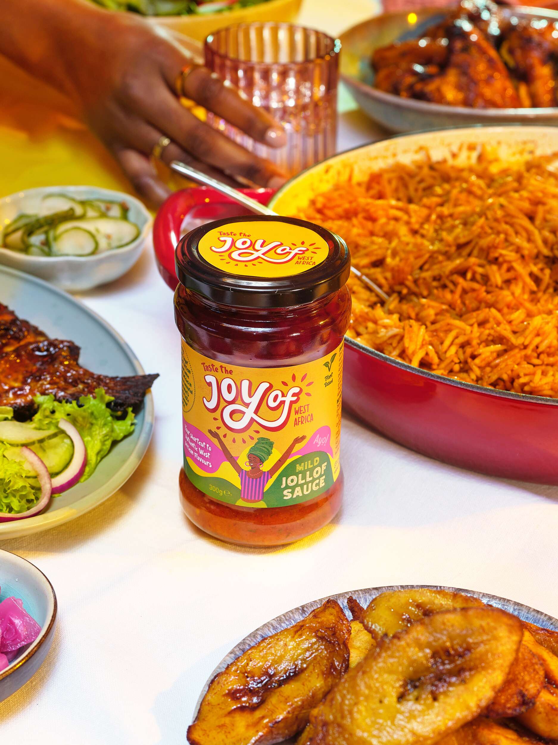
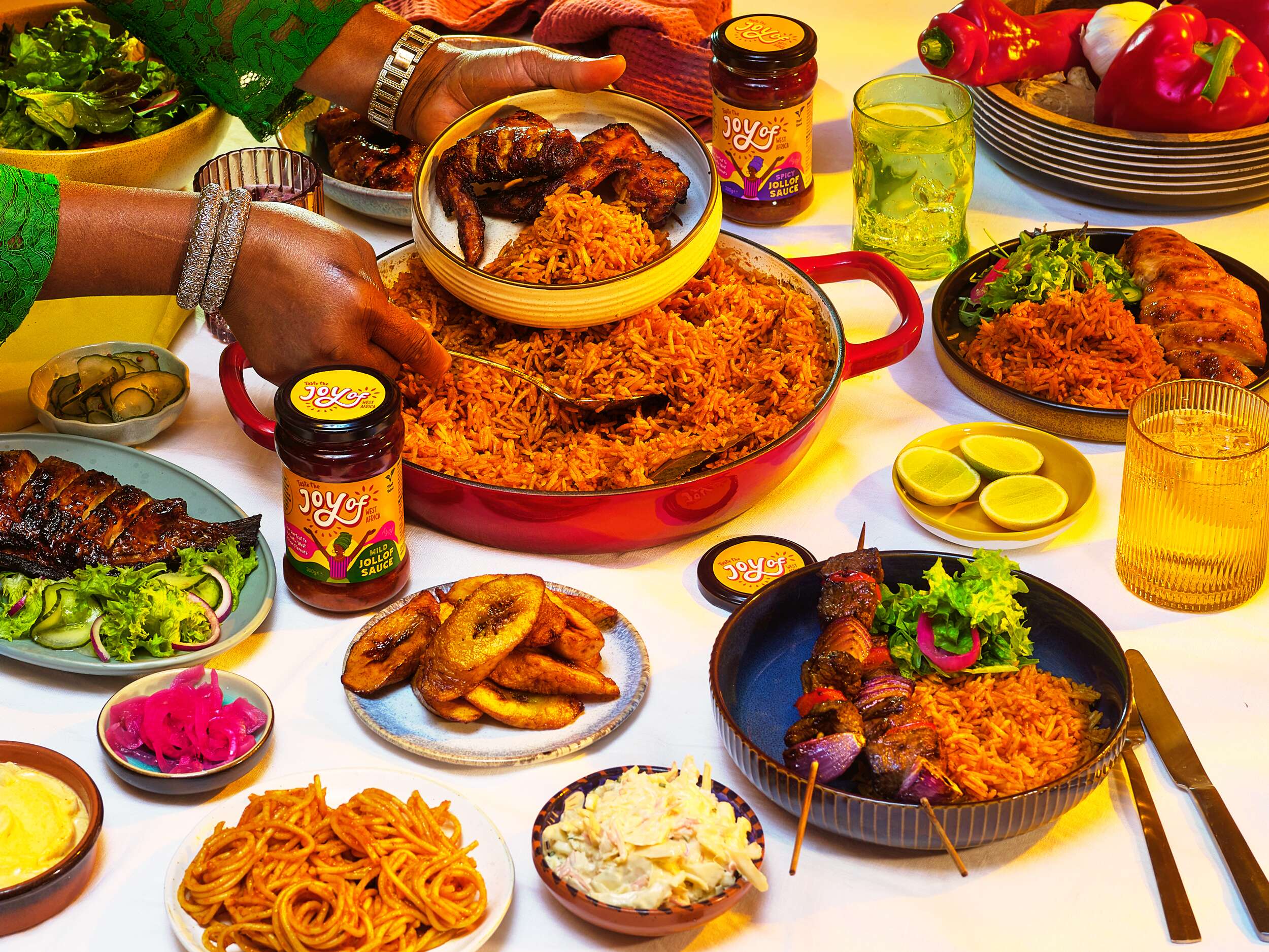
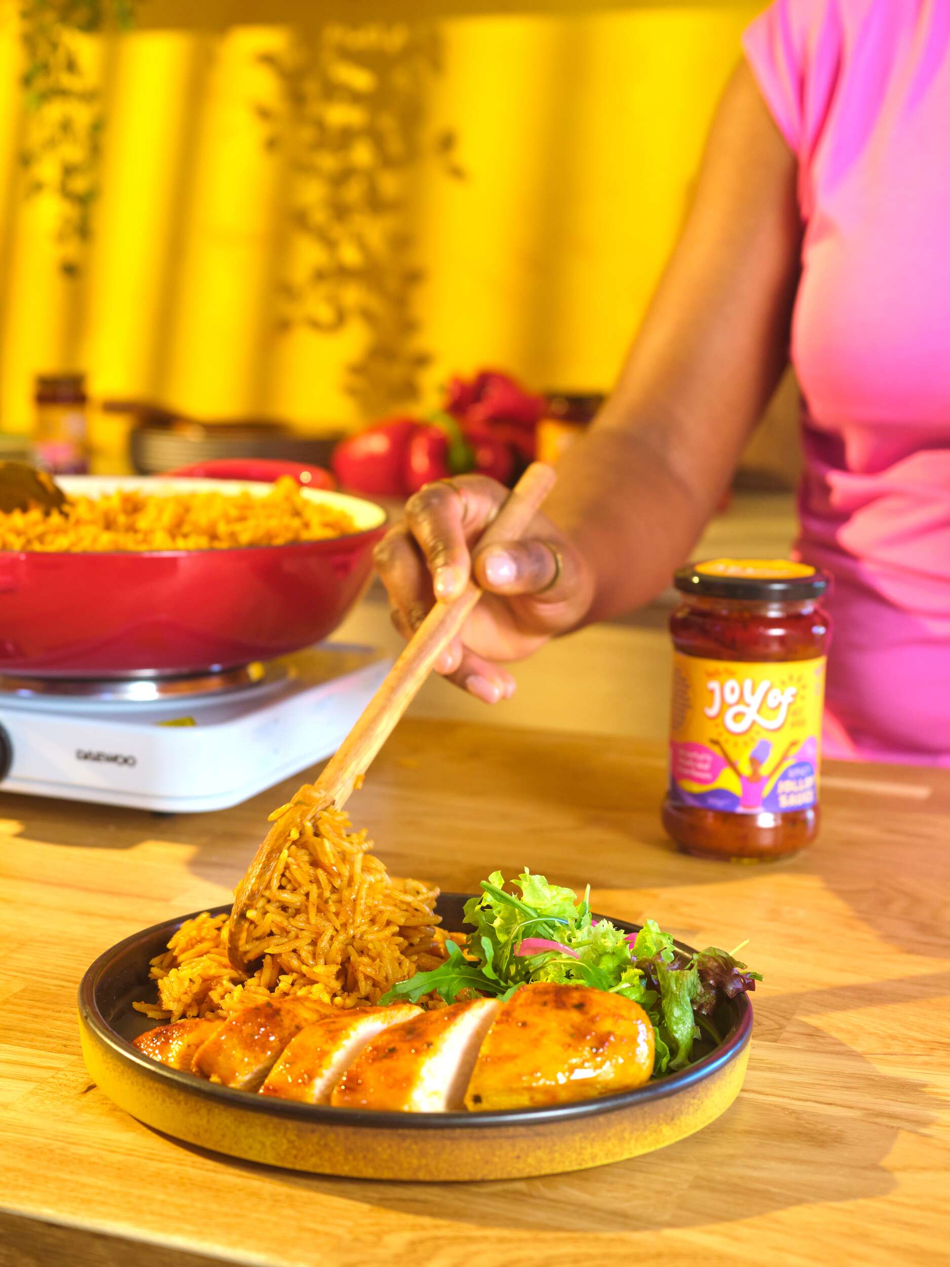
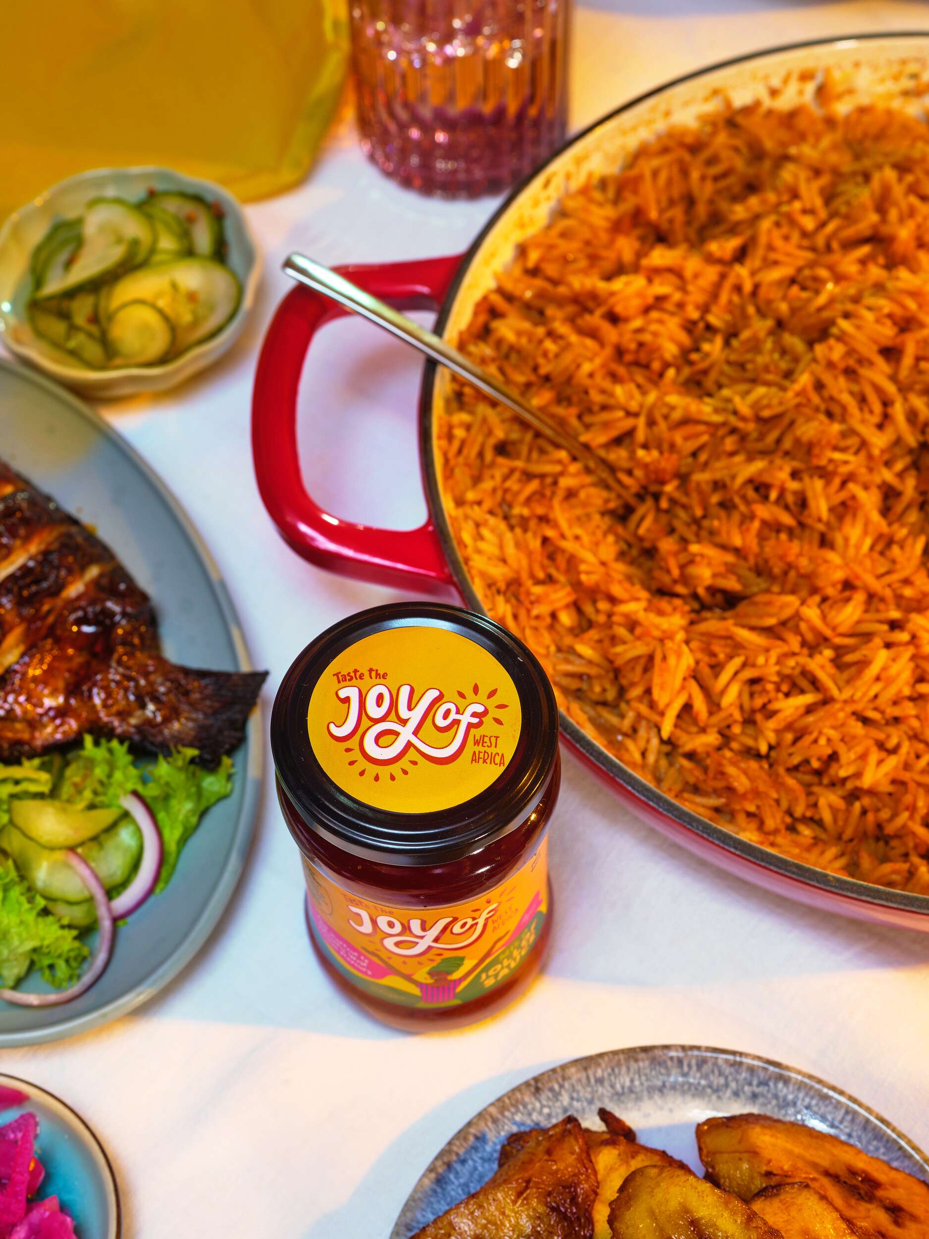
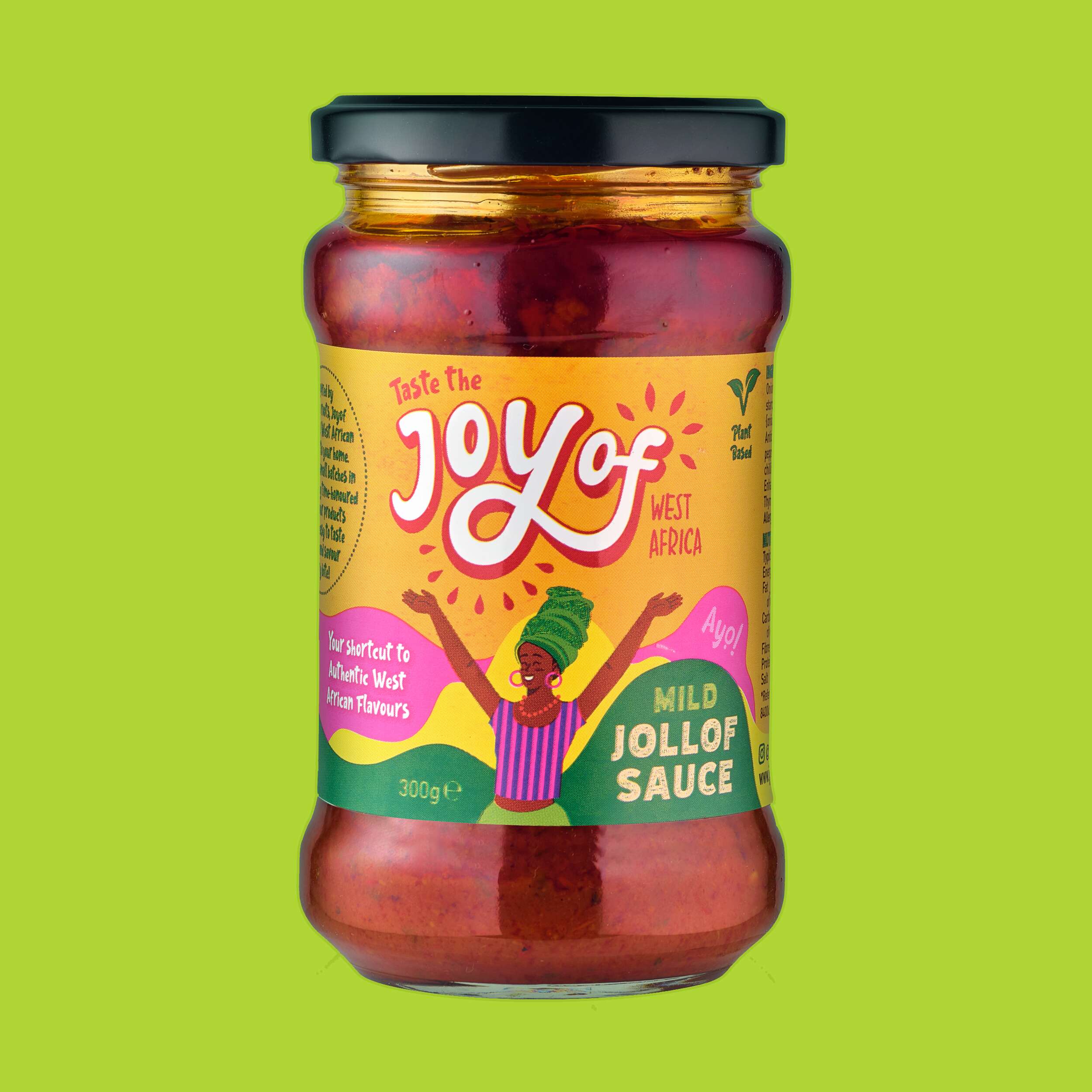
Joyof Foods: Brand Packaging Design
Joyof Foods: Brand Packaging Design
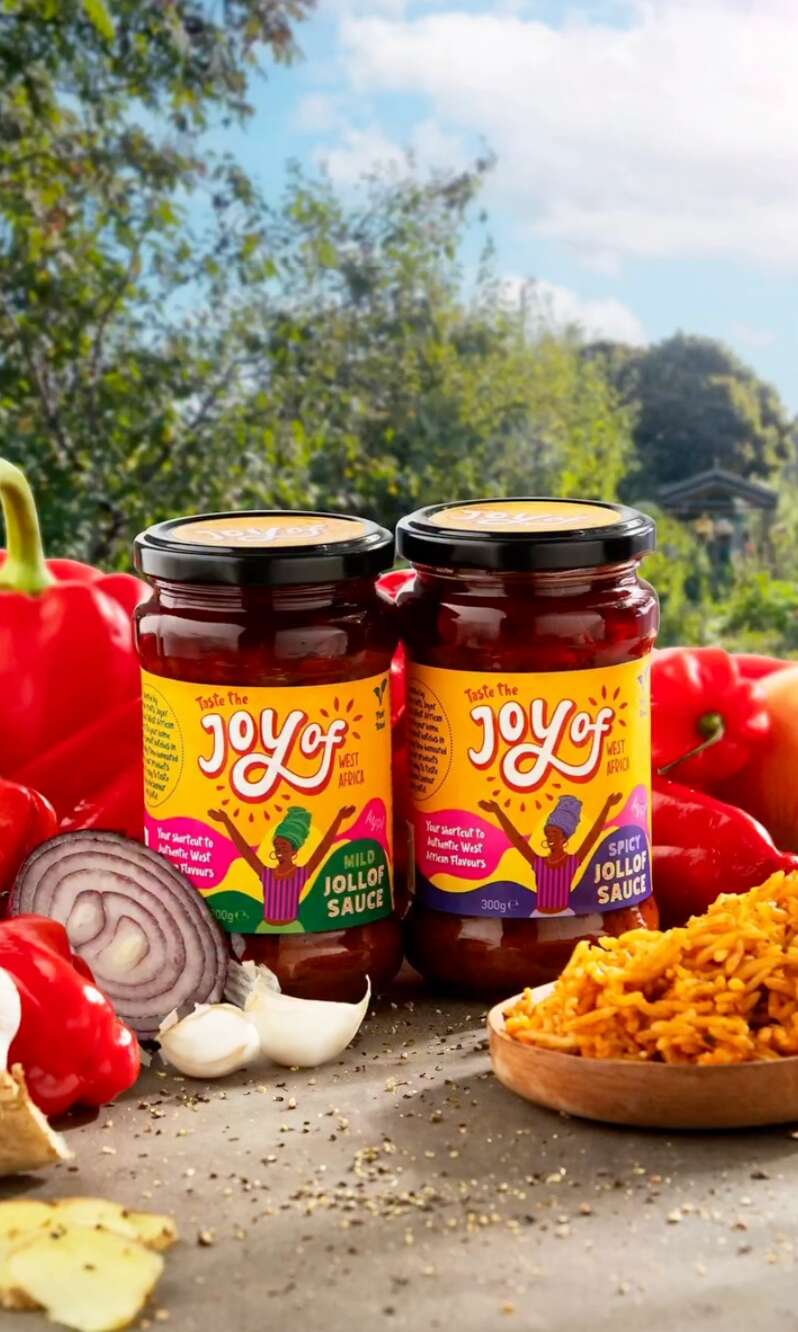
West African Food Range

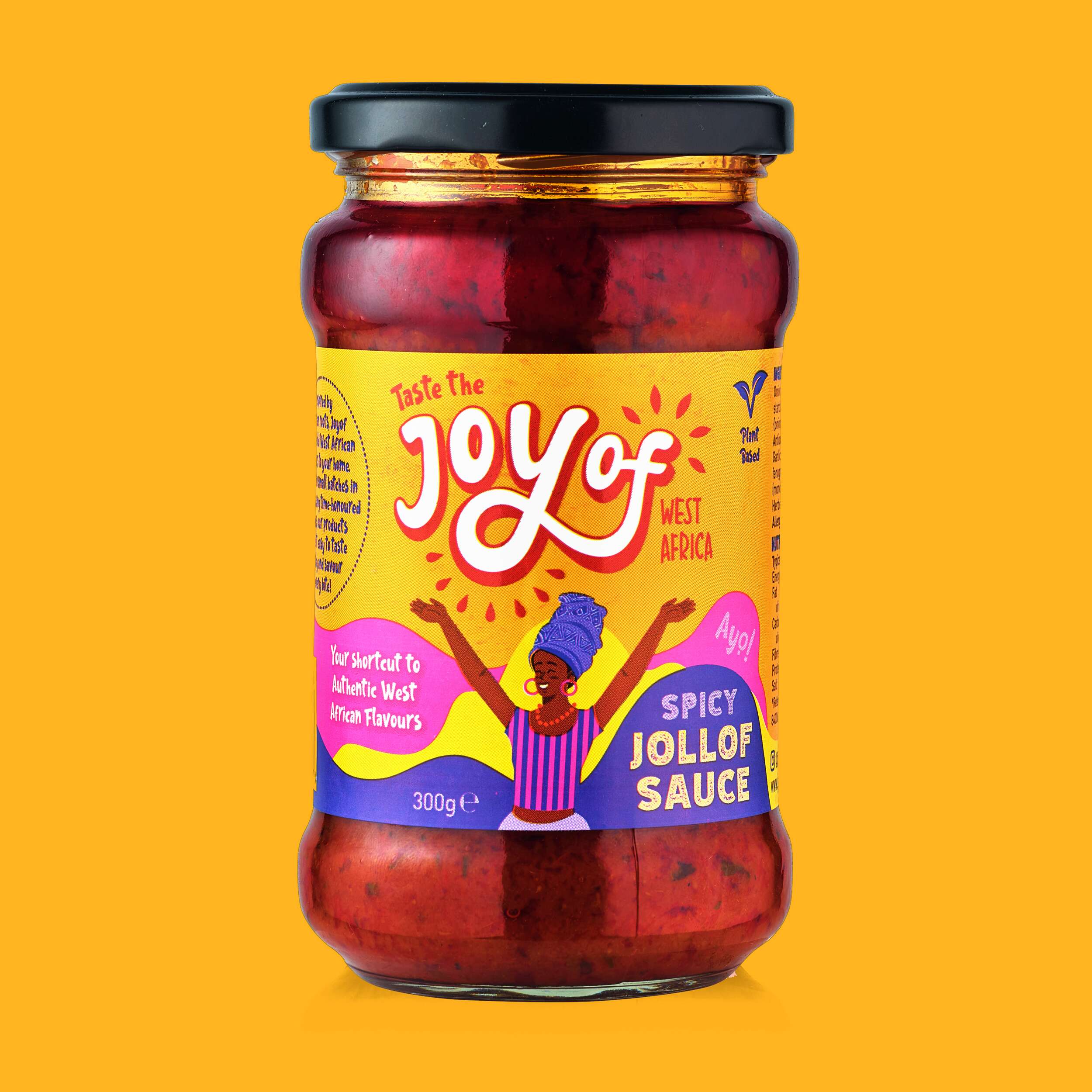
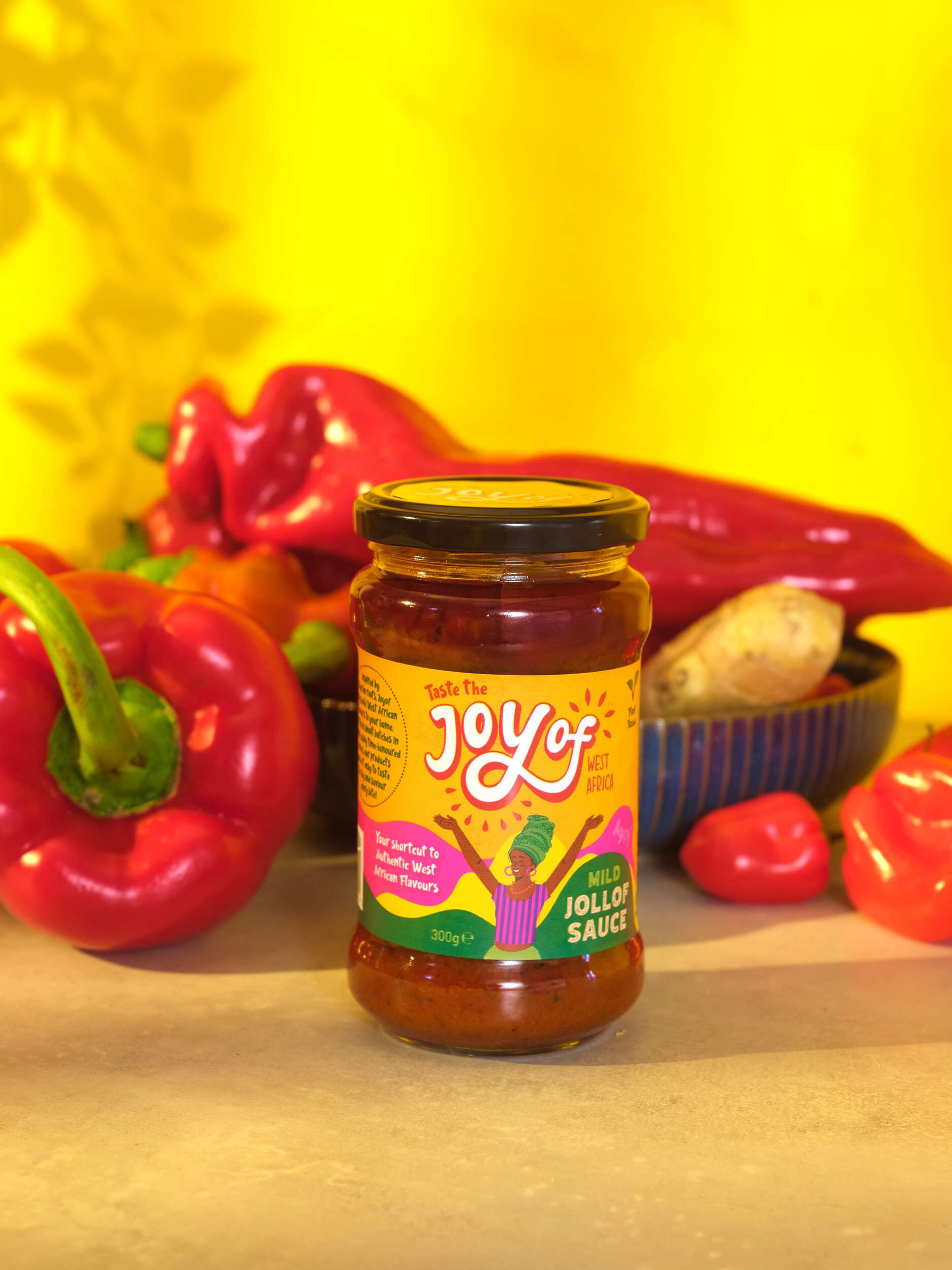
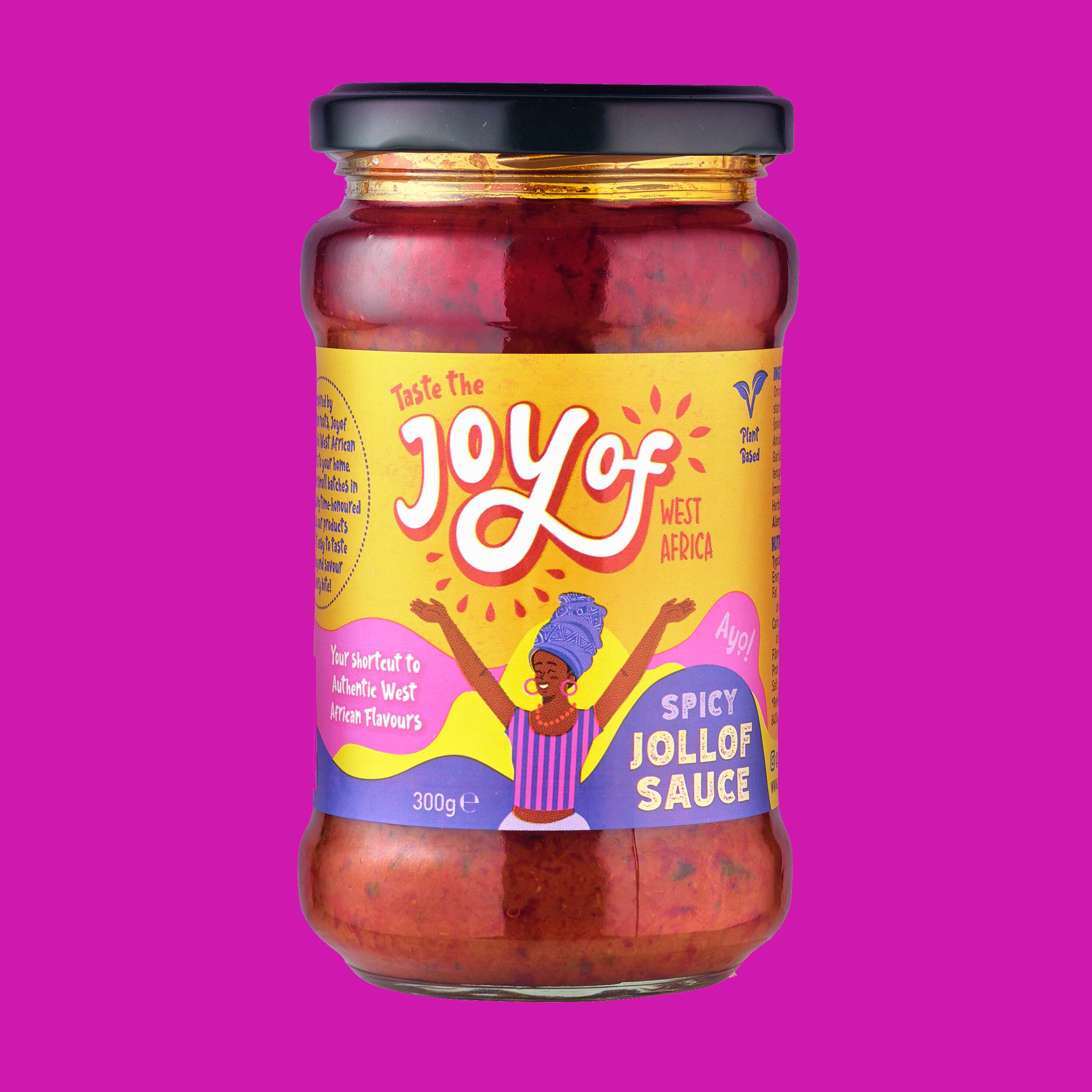
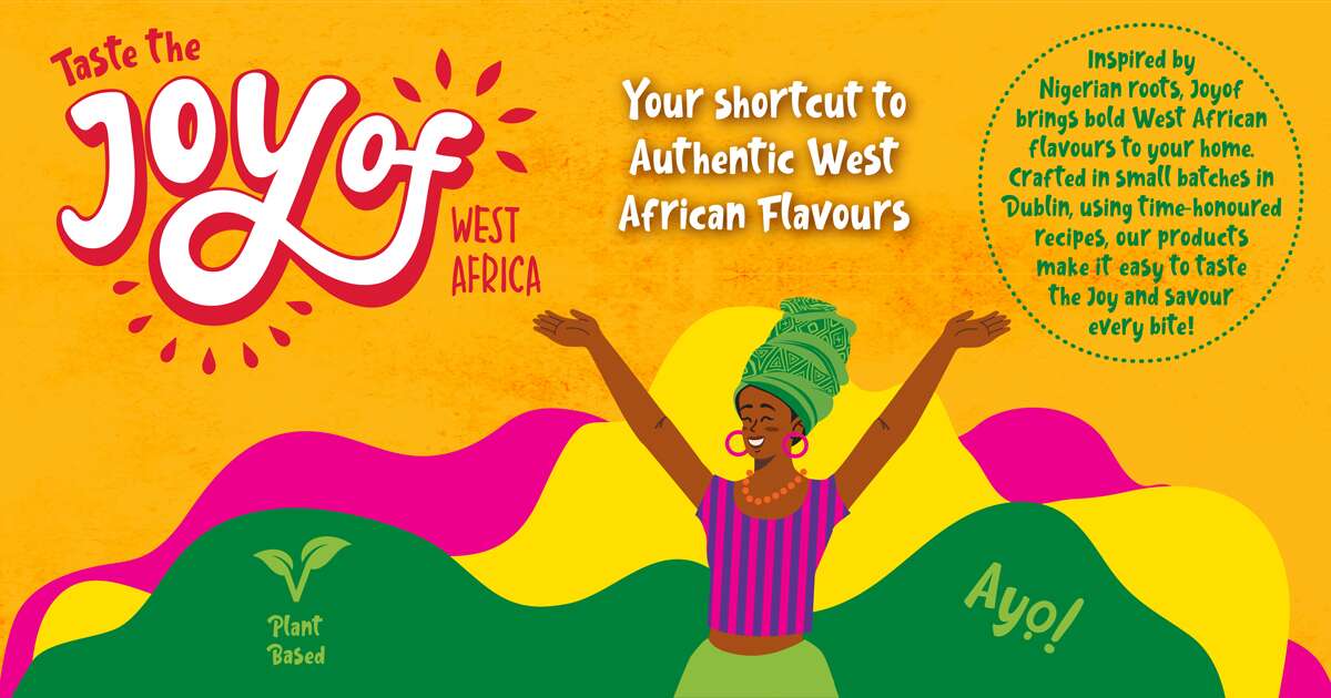
Joyof provides convenient, high-quality products with authentic flavours, reducing cooking time and making it easy to enjoy traditional West African meals even on the busiest days – bringing the joy of West African cuisine to Ireland.
By solving the issues of accessibility and time, they are helping people reconnect with their roots, try something new, and bring the vibrant flavours of West Africa into everyday life without compromise.
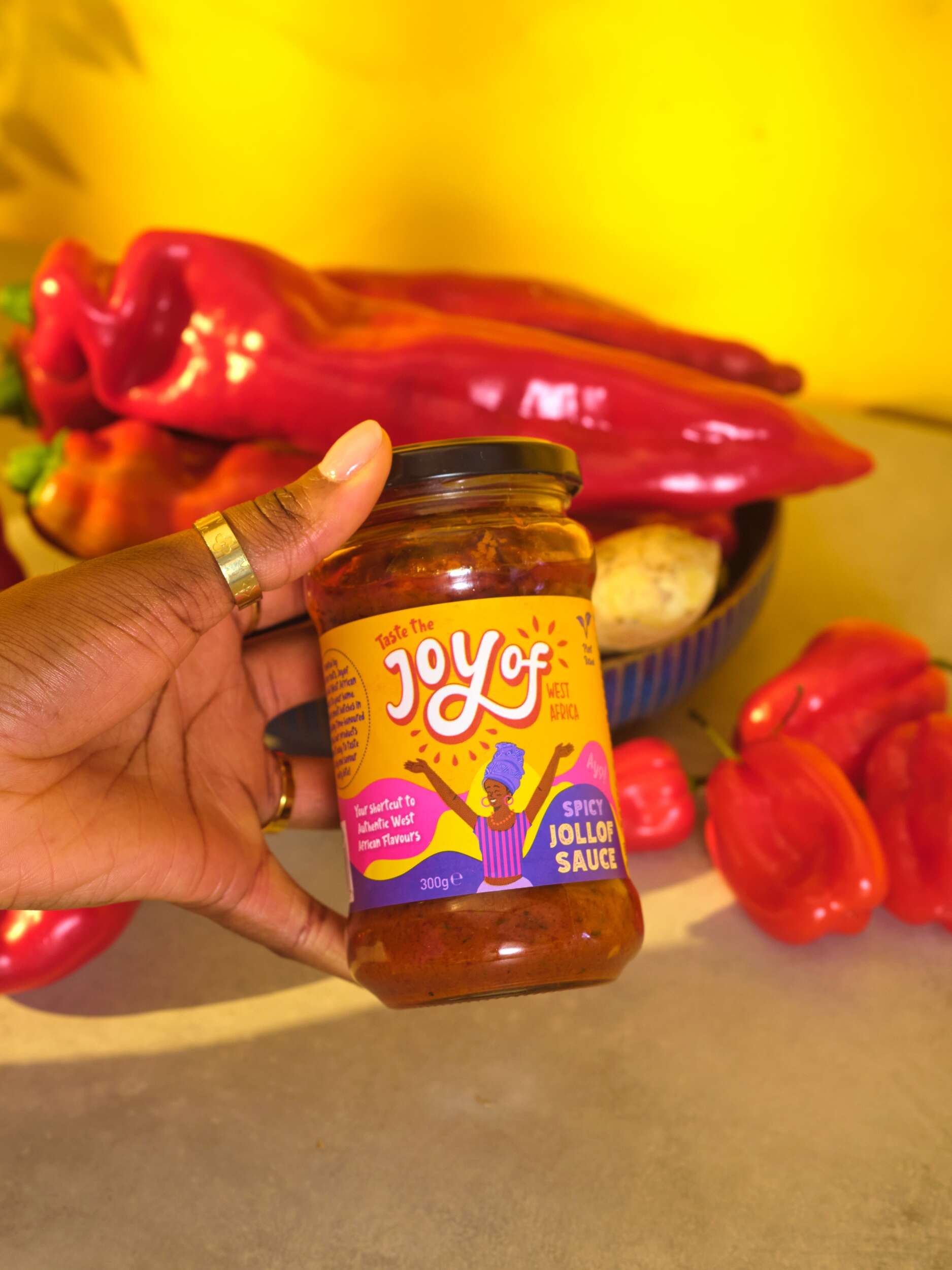
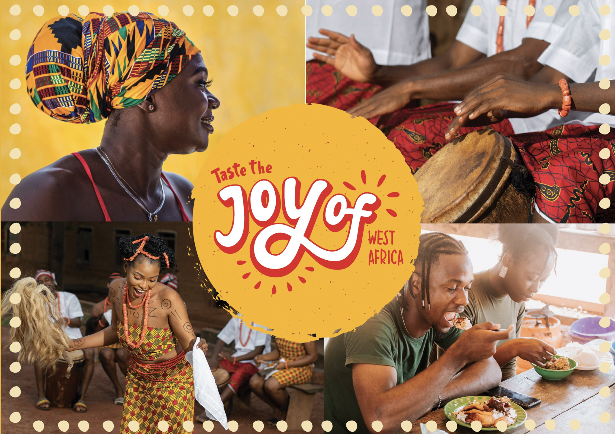
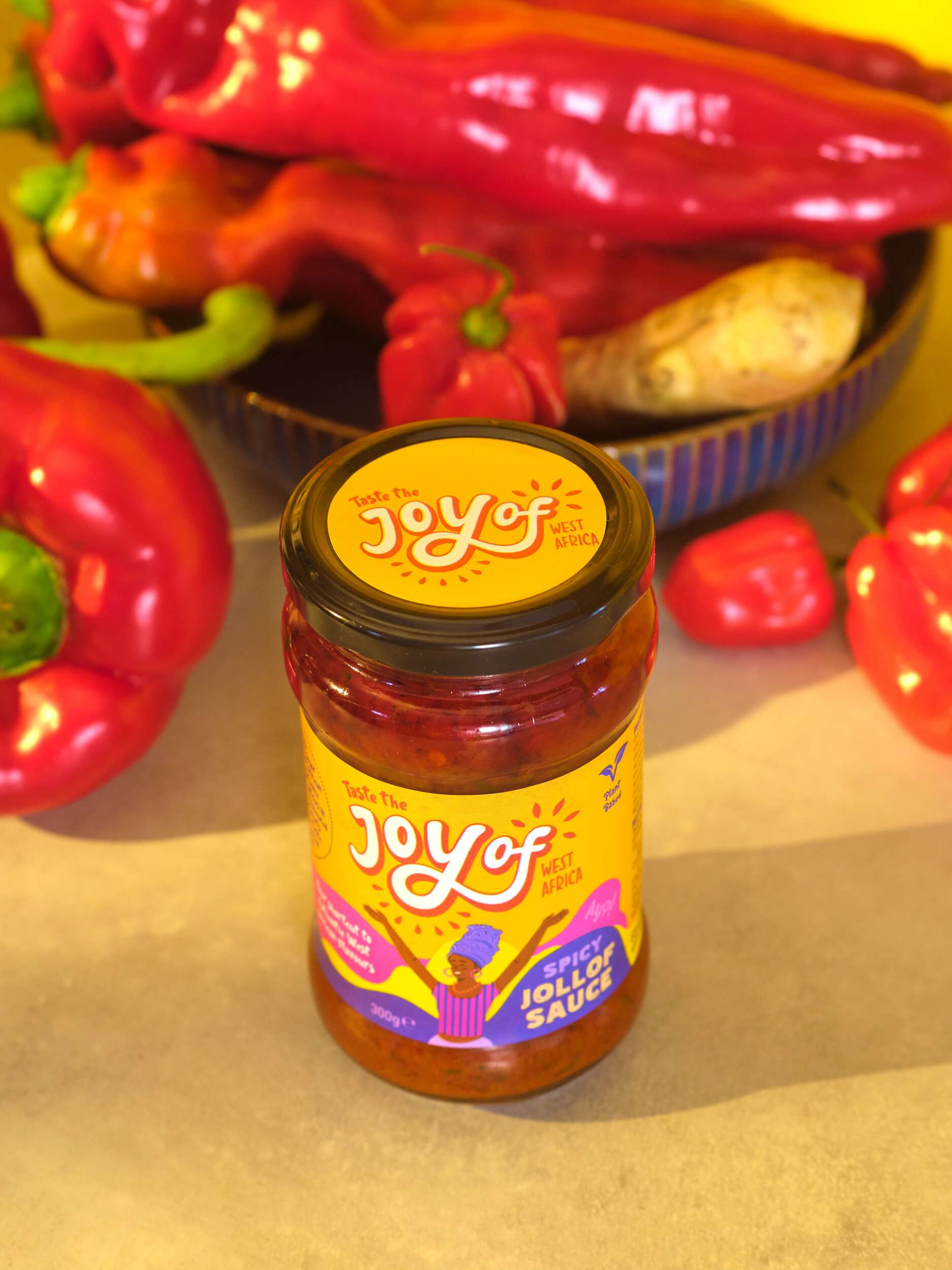
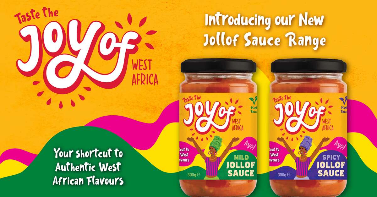
The design concept draws inspiration from traditional African drawings and patterns, aiming to capture their vibrant, playful energy. The typography is hand-drawn to evoke authenticity, reflecting the handmade quality of the food, and expresses the pride and joy rooted in West African culture.
The design process evolved from creating letterforms were slightly spaced to highlight the phrase ‘joy of’ reinforcing the brand’s celebration of West African cuisine. We developed this on to bring the letters closer together, integrating ‘of’ more seamlessly to be read as a single, joyful expression.
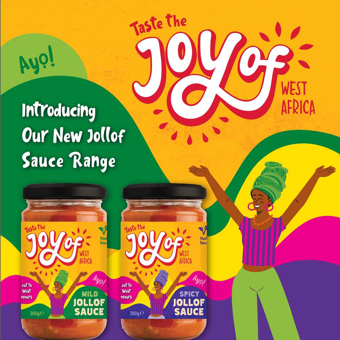
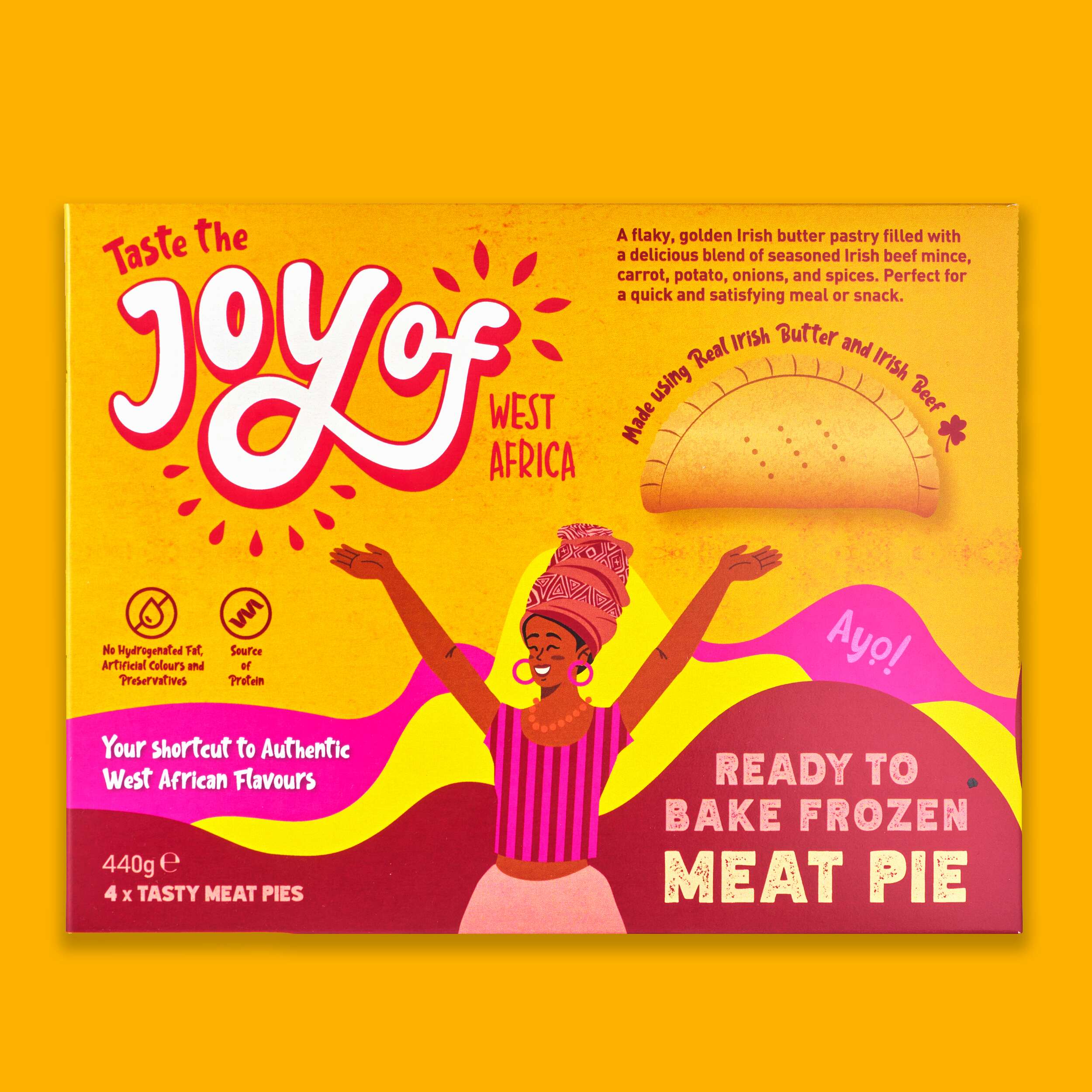
Surrounding shapes suggest bursts of life and energy. They represent leaves and natural ingredients, emphasising the freshness and vitality of the products. The bright and vibrant colour scheme further communicates this.
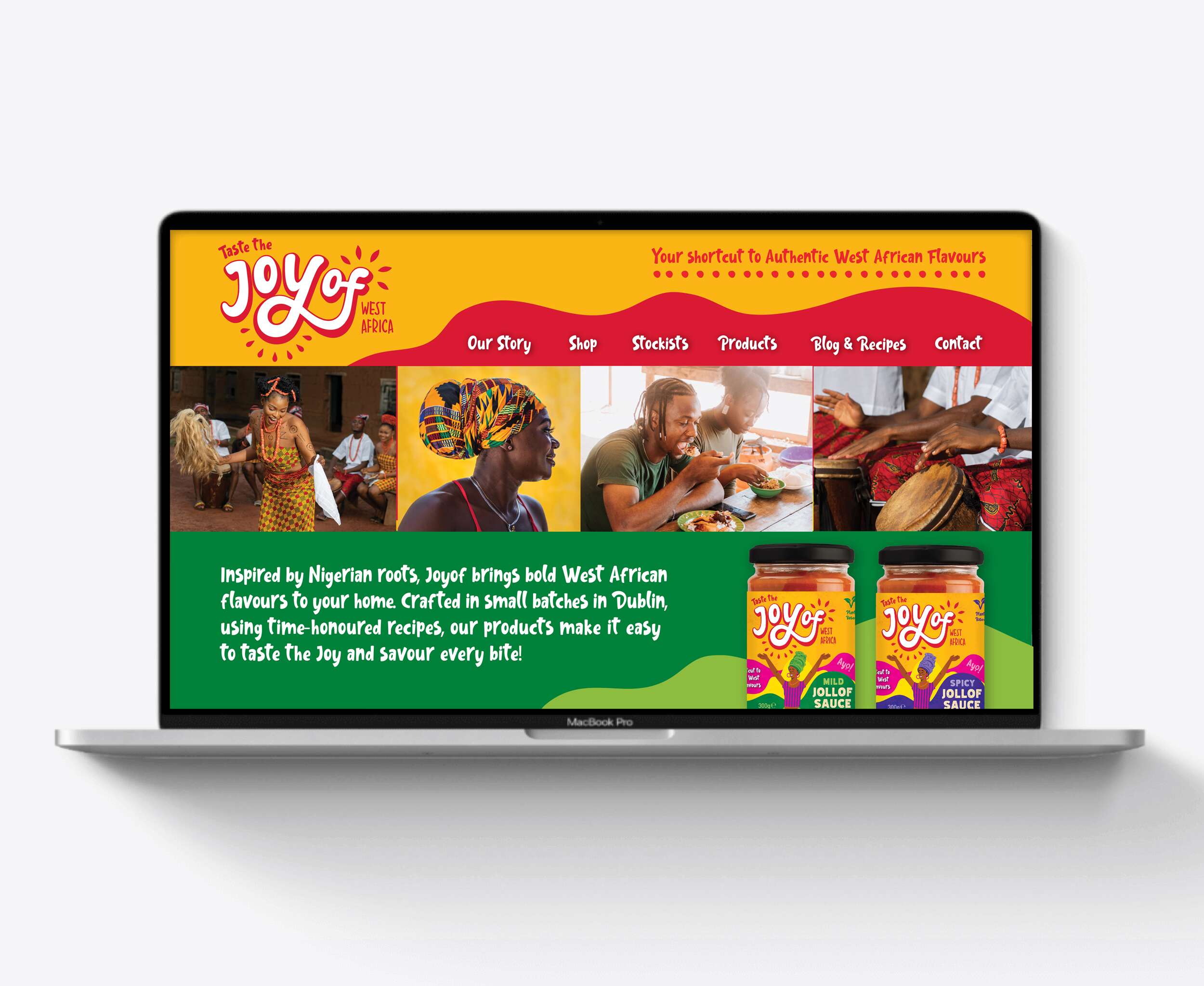
Follow Joyof Foods online:
Instagram: @joyof.foods
LinkedIn: joyof-foods
TikTok: @joyof.foods
Website: joyoffoods.com
Available in selected SuperValu stores and other food independent stores.
Photography by Brendan Ryan Photography:
Instagram: @brendanryanphoto
Website: www.brendanryan.ie
Video Production:
Brendan Ryan Photography (as above) and:
Raouf Ferkous
Instagram: @raouf.ferkous
Packaging printed by Reel Print:
Website: Reel Print
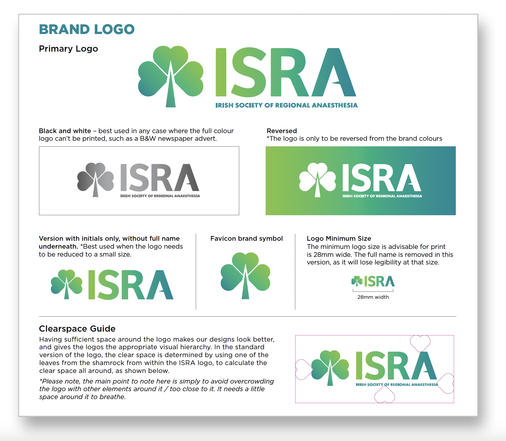
ISRA: Brand Identity Design
ISRA: Brand Refresh & Visual Identity Design
The Irish Society of Regional Anaesthesia (ISRA)

The Irish Society of Regional Anaesthesia (ISRA) is a respected not-for-profit medical organisation dedicated to promoting excellence in regional anaesthesia education and practice across Ireland.
Despite being a relatively small society, ISRA has an impressive international footprint, with more members per capita represented in the European Society than any other European country – underscoring its commitment to advancing the subspecialty both locally and globally.
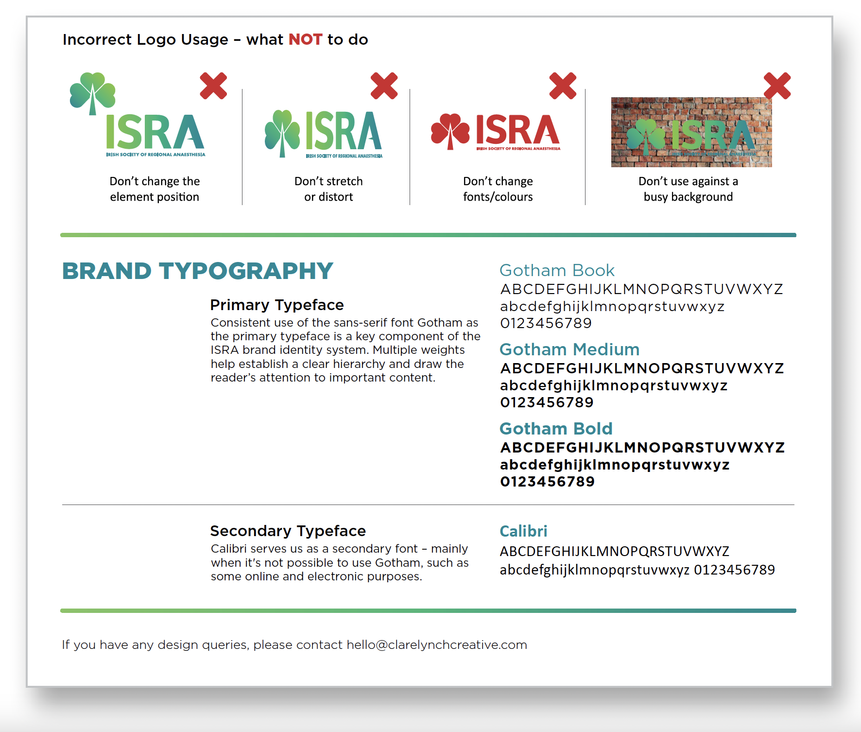
Our brief was to elevate the society’s brand presence with a refined, more professional visual identity, while preserving the warmth, accessibility and distinctly Irish character that define ISRA’s community. The goal was not to reinvent the wheel, but to build on what already worked and make it clearer, stronger, and more cohesive.
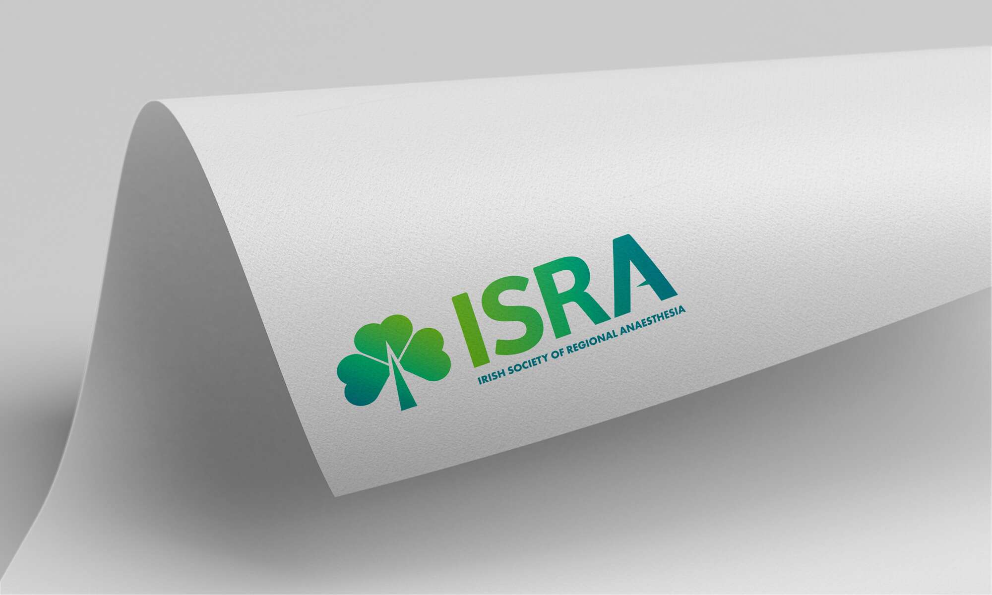
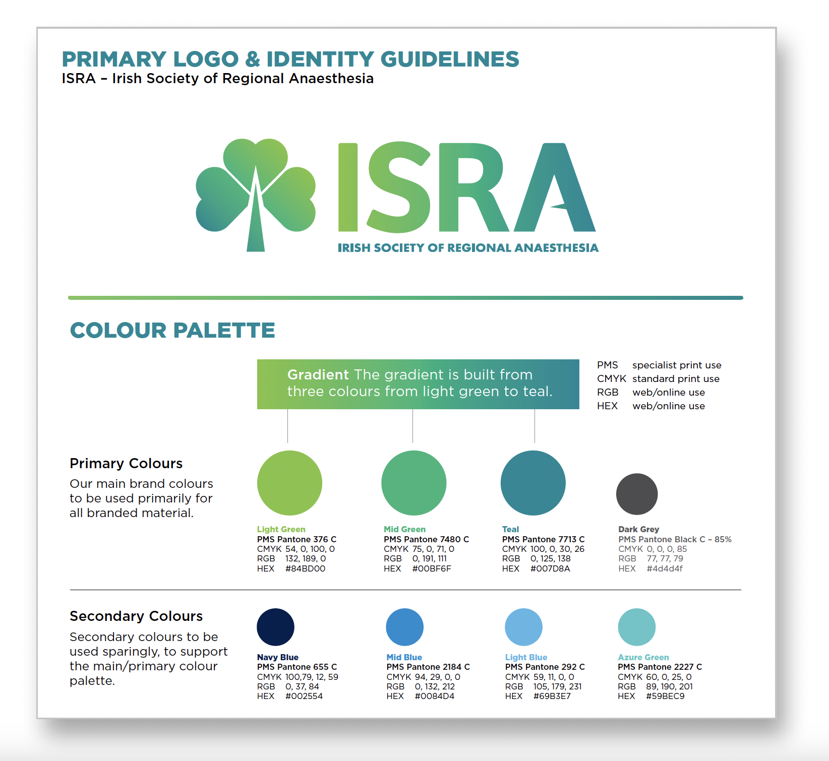
At the centre of the brand refresh is a redesigned logo that carefully balances symbolism with simplicity. The shamrock – a timeless emblem of Irish identity – remains a key feature, now formed by three heart-shaped leaves symbolising the care anaesthetists give to their patients. The stem of the shamrock subtly doubles as an anaesthetic needle, while a pointed mid-bar in the letter ‘A’ adds another discreet reference to the tools of the trade. These thoughtful details communicate ISRA’s focus without overwhelming the design.
A refreshed colour palette brings new energy to the brand, combining vibrant, modern greens with touches of blue – creating a clean, clinical feel that also nods to broader medical aesthetics. The result is a look that sets ISRA apart from other national societies, while positioning it confidently within the wider professional landscape.
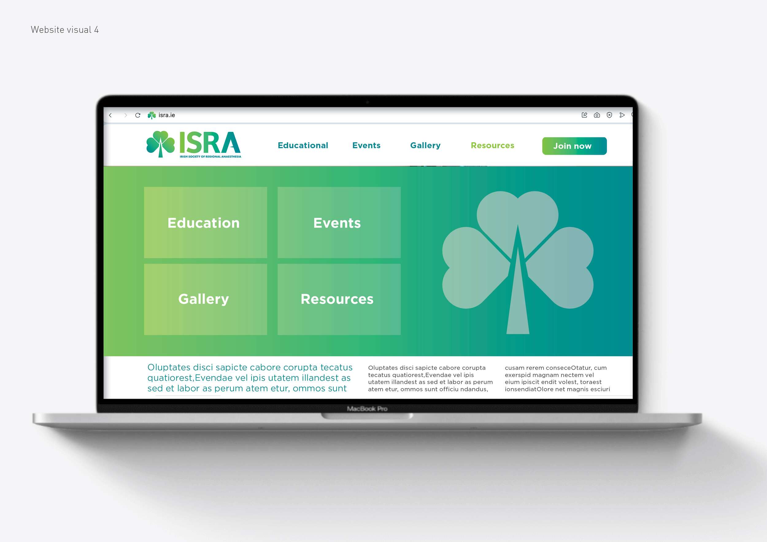
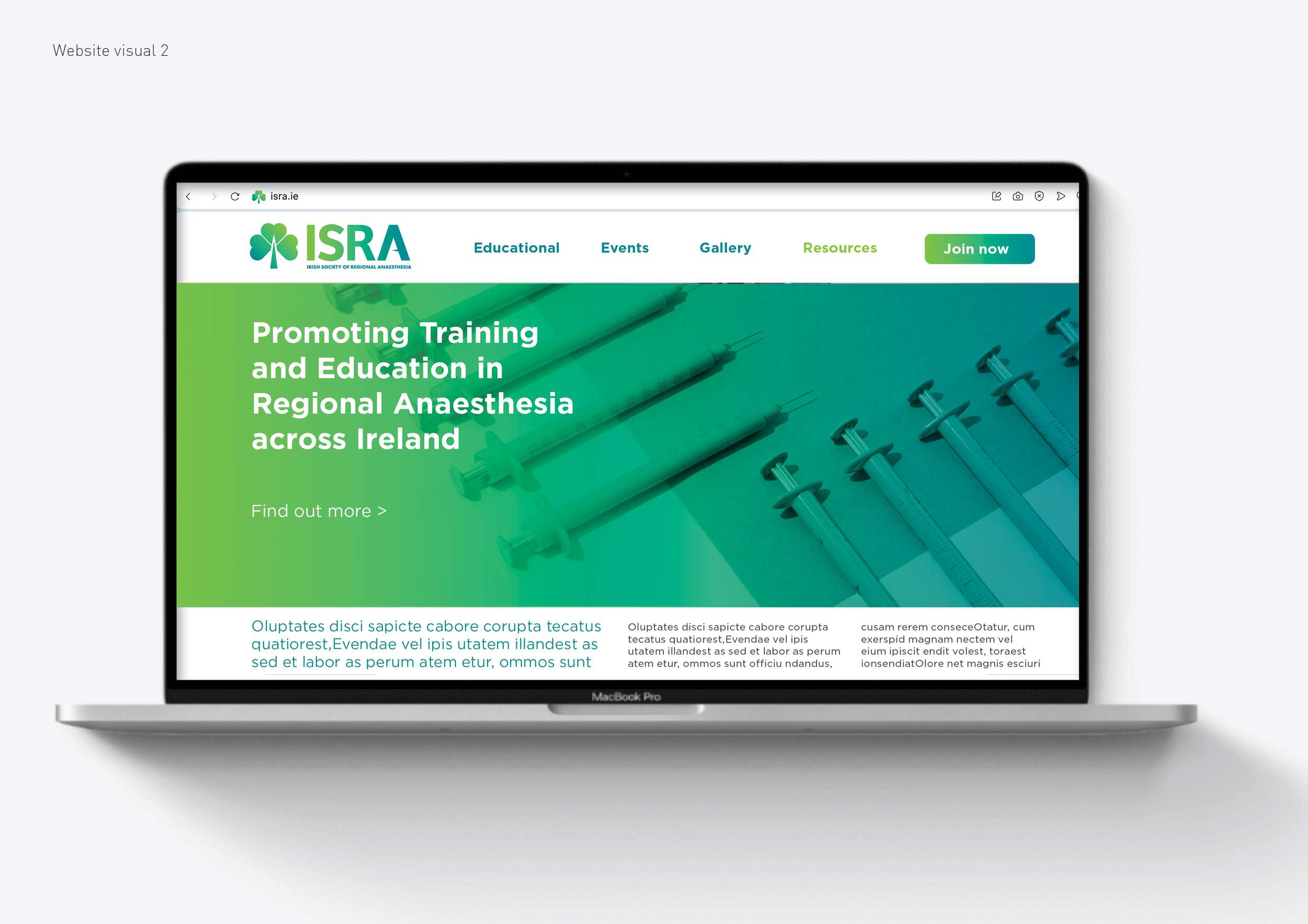
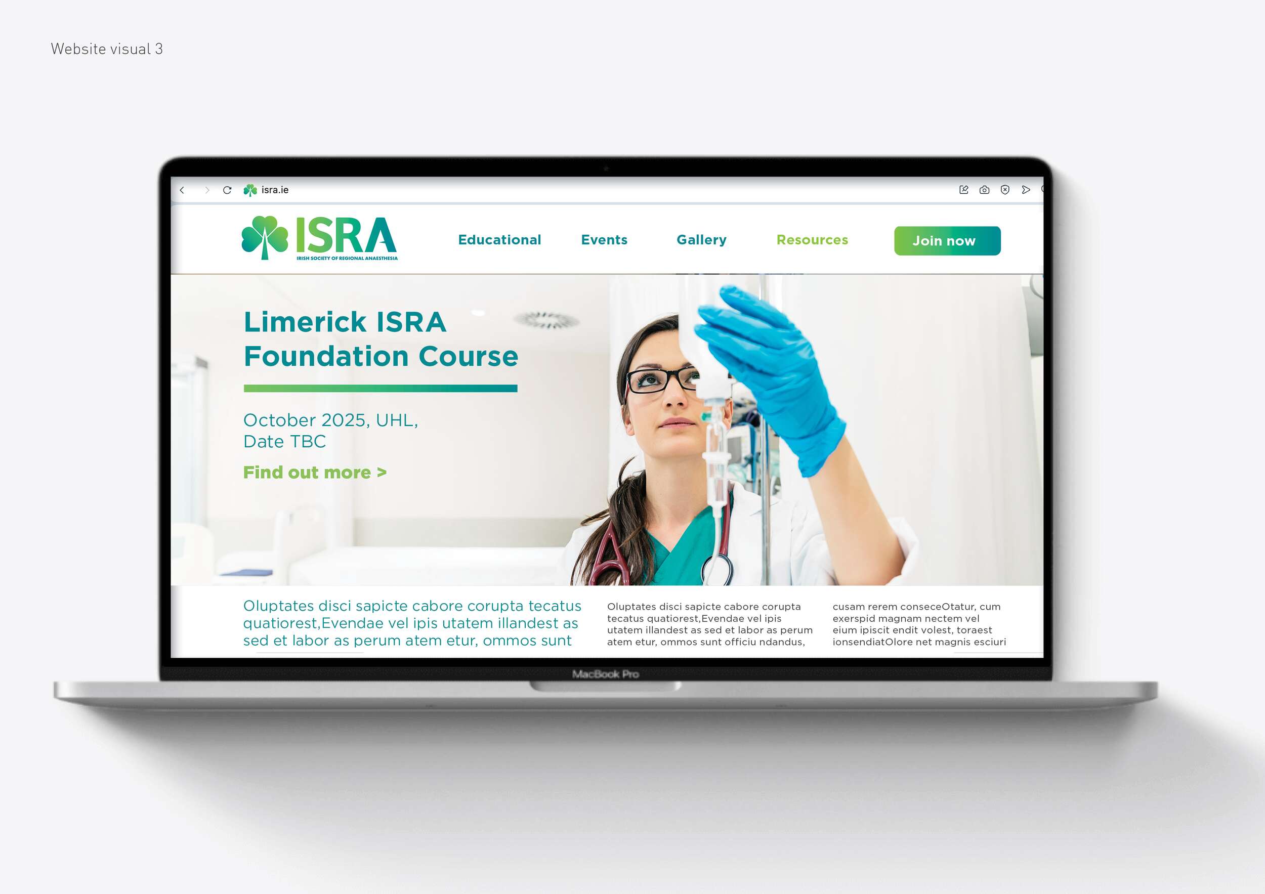
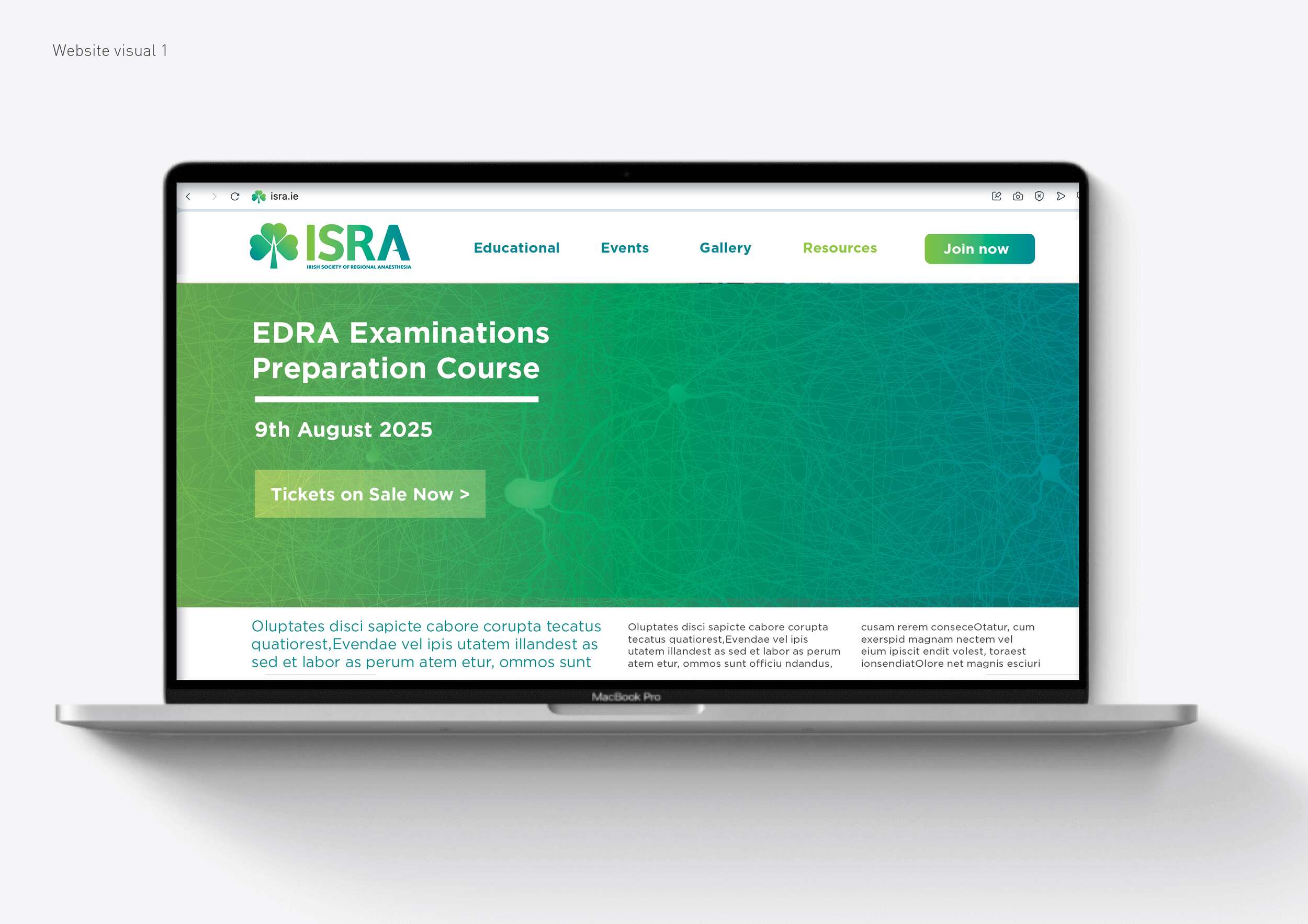
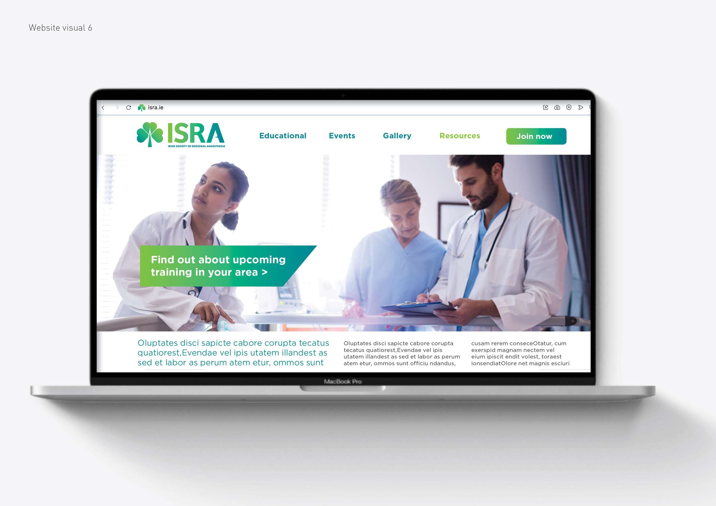
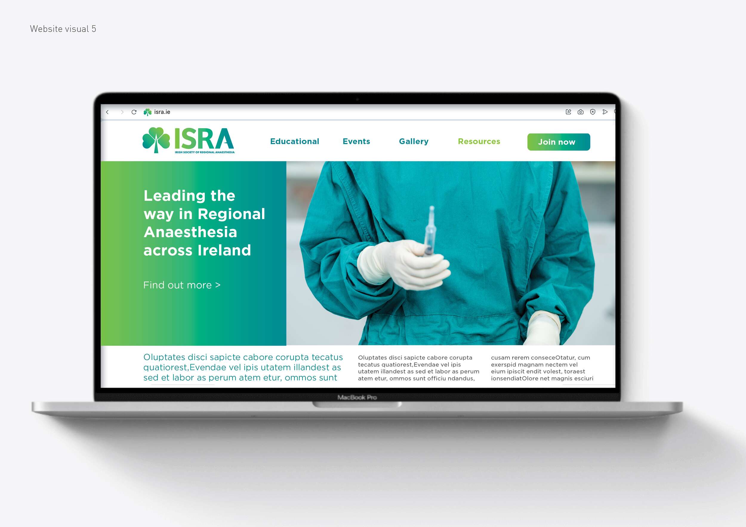
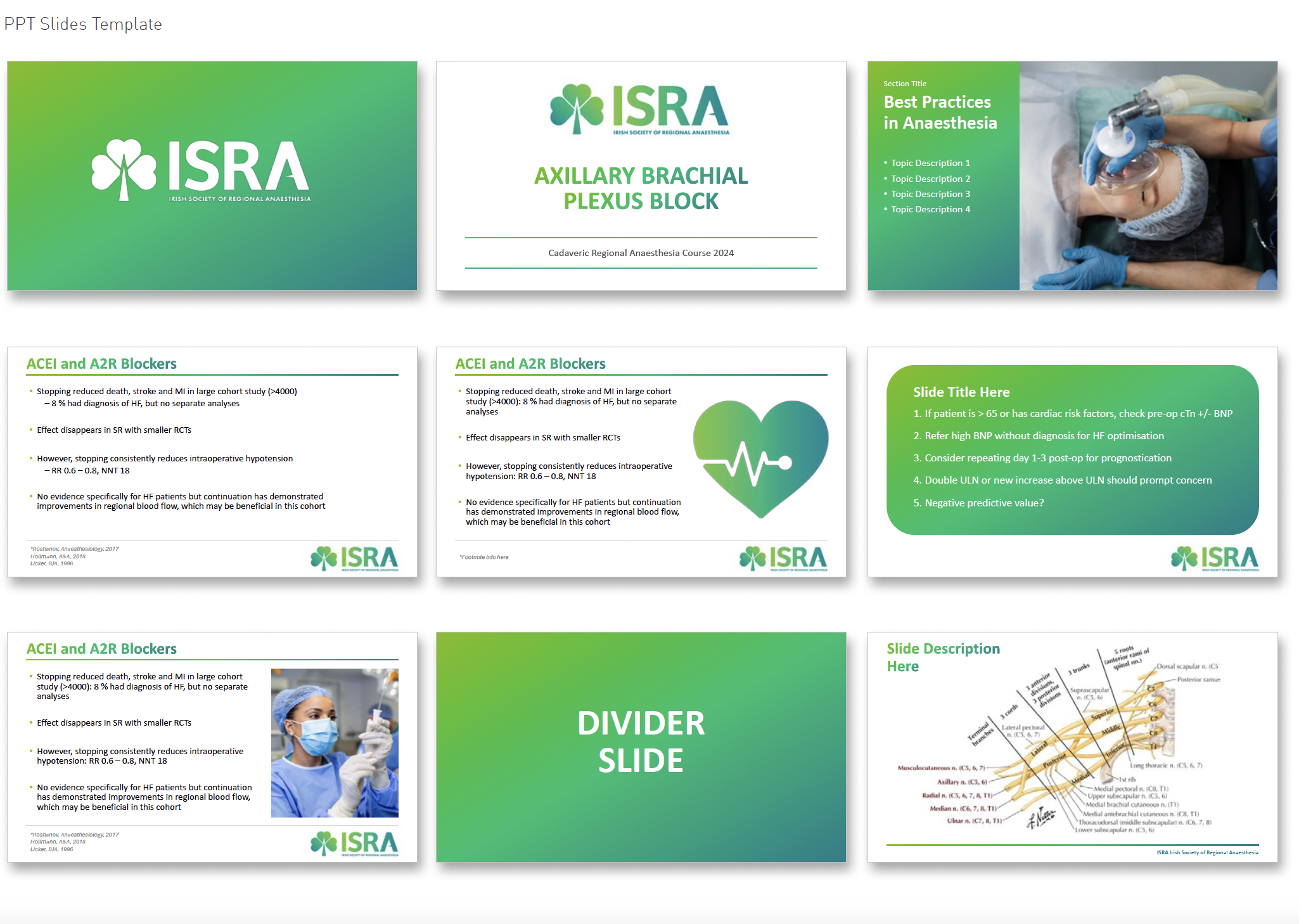
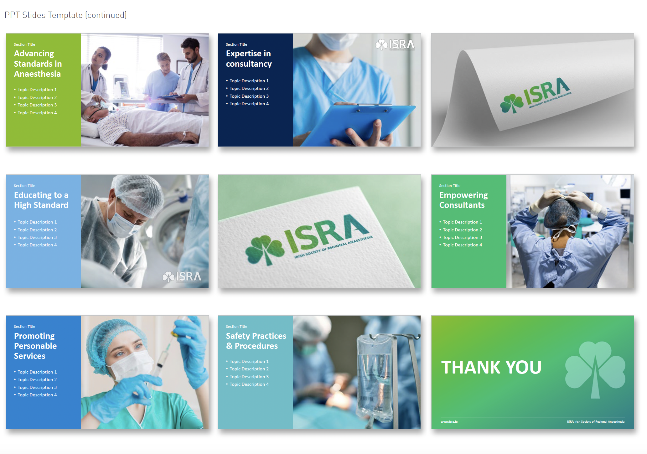
In addition to the logo, we delivered a versatile visual toolkit for use across event materials, presentations, digital platforms, and merchandise such as brand guidelines, posters, event programmes, membership cards, certificates, social media graphics, a newsletter template, Powerpoint templates, website design visuals and stationery visuals.
This system is designed to support ISRA’s educational mission, improve recognition, and help the society put its best foot forward – whether hosting a local workshop or representing Ireland on the international stage.

Follow ISRA online:
Twitter / X.com: @ISRA_Ireland
Facebook: @ISRAIreland
Website: isra.ie

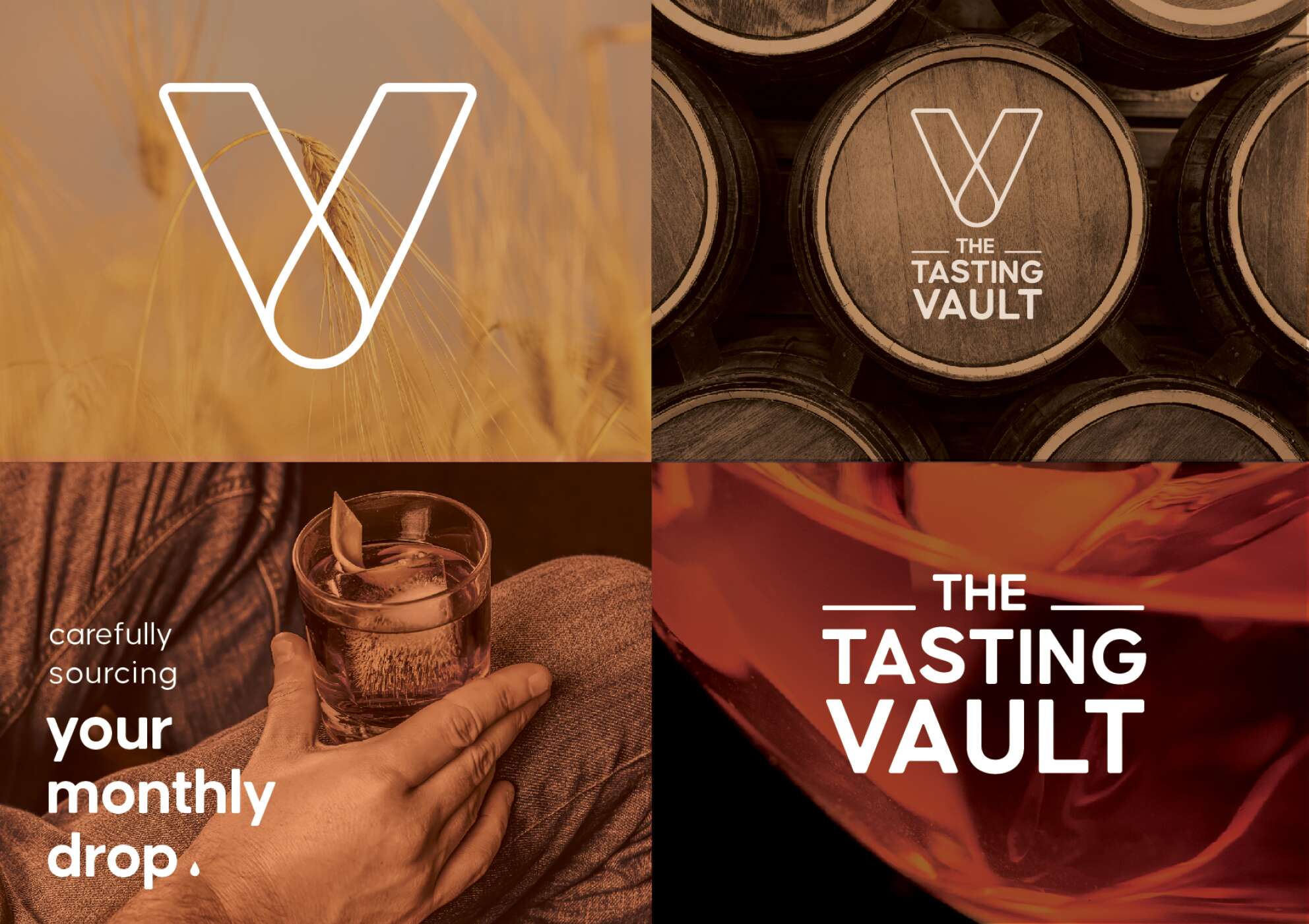
The Tasting Vault: Brand Packaging Design
The Tasting Vault: Brand Packaging Design
Whiskey Tasting Subscription Services
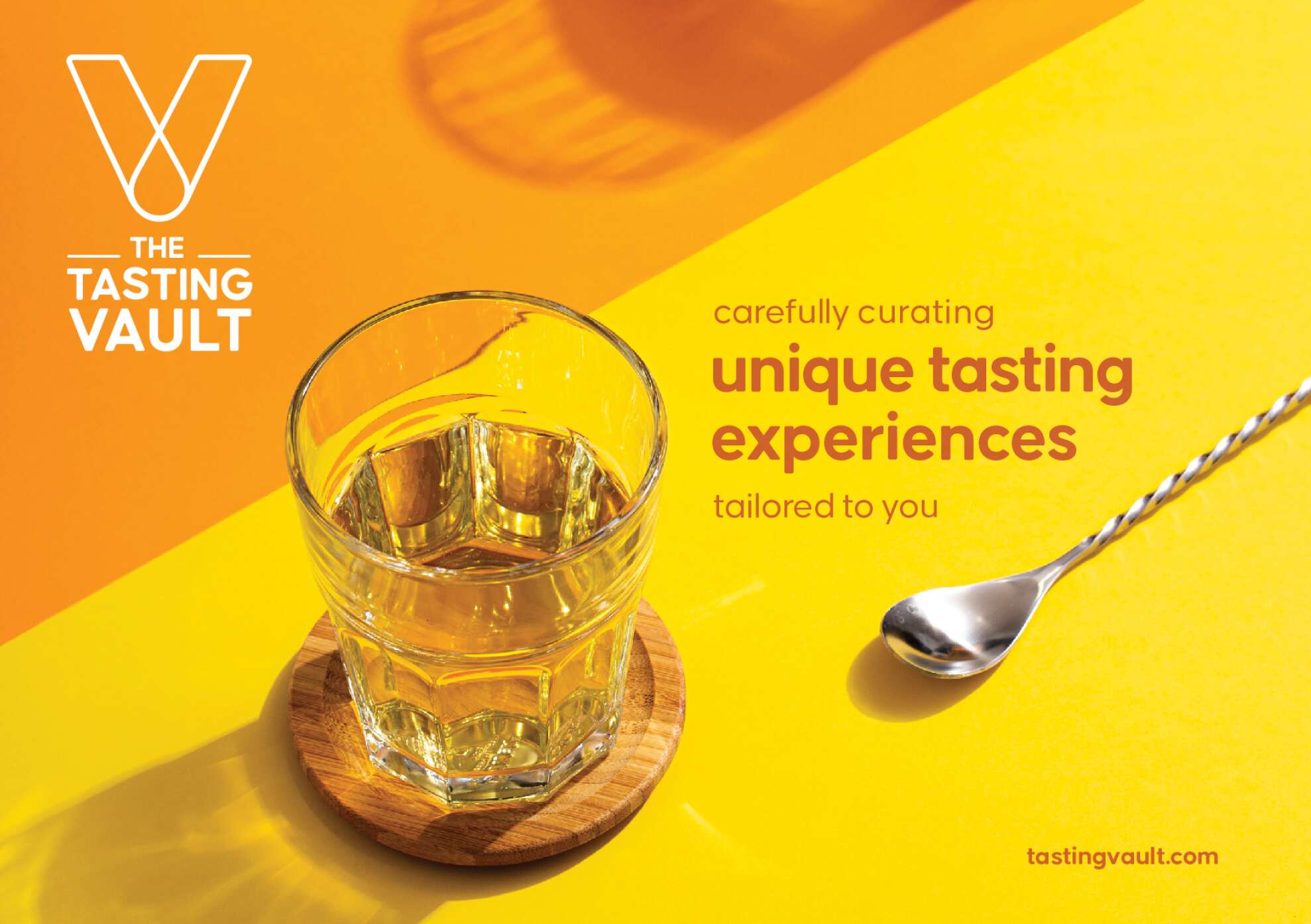
The Tasting Vault is a whiskey and spirits subscription service that provides consumers with curated tasting experiences, allowing them to explore a wide range of premium whiskeys from around the world. The company solves the “try before you buy” challenge by offering tasting packs that let customers sample new and famous whiskeys before committing to full bottles.
Their subscription service is designed to engage both beginners and seasoned connoisseurs through expert tasting notes, digital content, and invitations to exclusive events, both virtual and in-person. By working with distilleries in Ireland and internationally, The Tasting Vault offers access to a curated selection of world-class spirits, fostering a loyal community of whiskey enthusiasts, who have the option to connect and engage with each-other through this whiskey tasting club.
Their mission is to cultivate a deep appreciation for fine whiskeys and spirits through unique, curated tasting experiences. Their vision is to become the leading platform for whiskey exploration, creating meaningful connections among a global community of enthusiasts. Quality craftsmanship, community building, and an authentic whiskey experience are key values of The Tasting Vault.
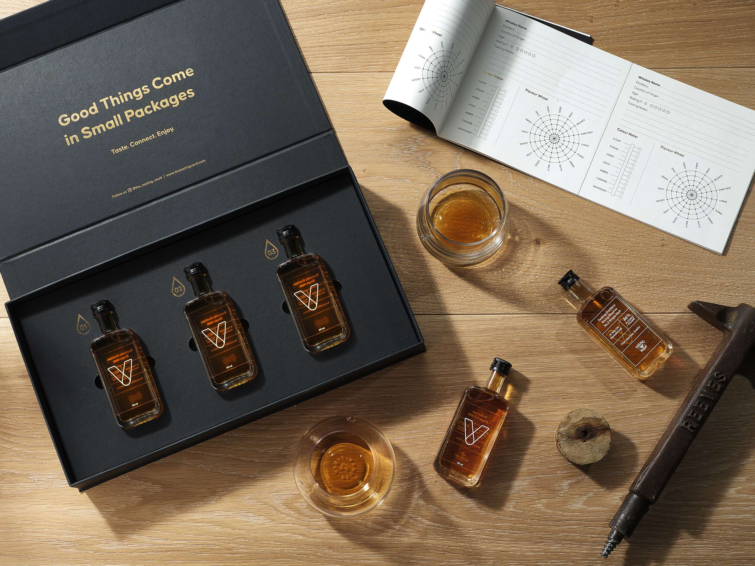
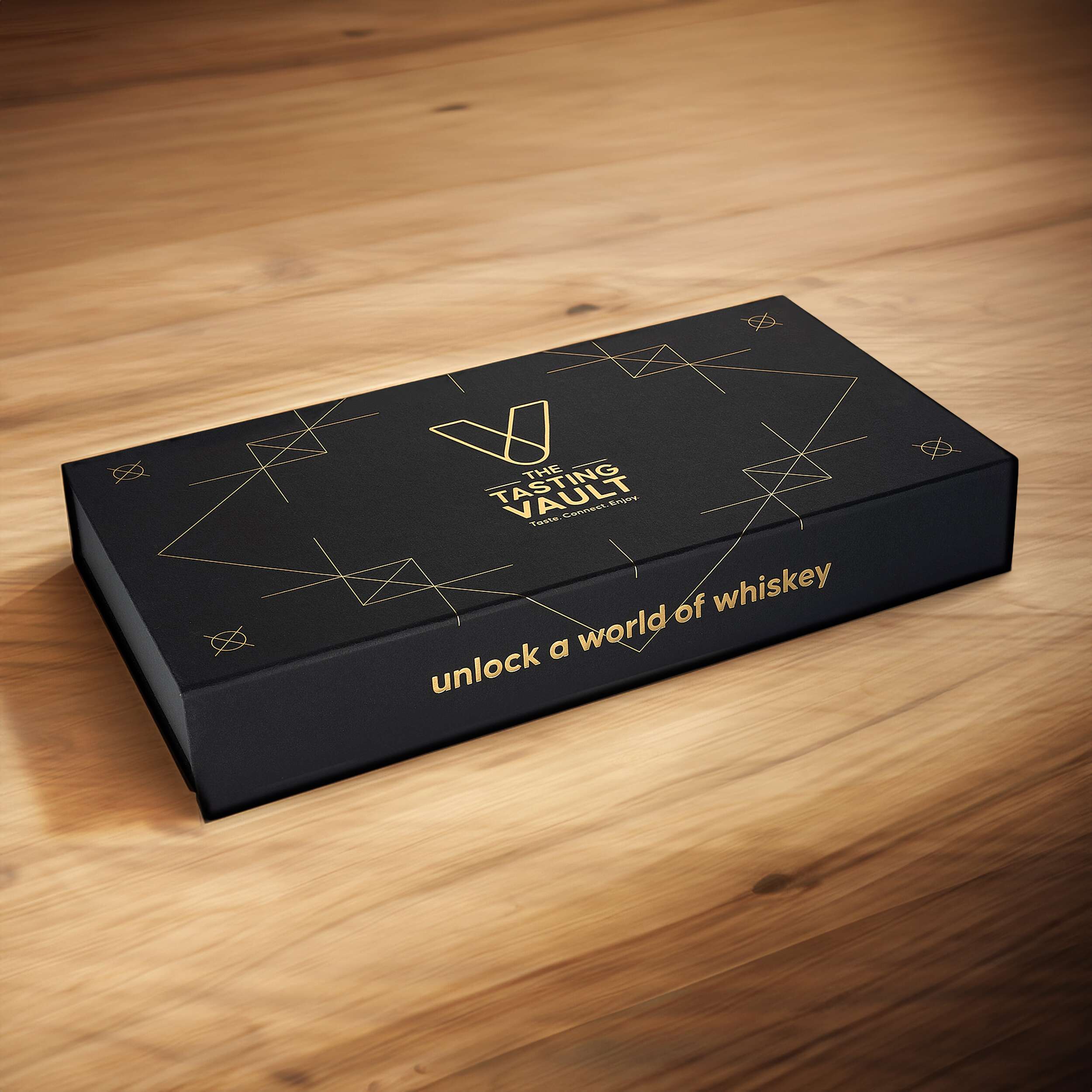
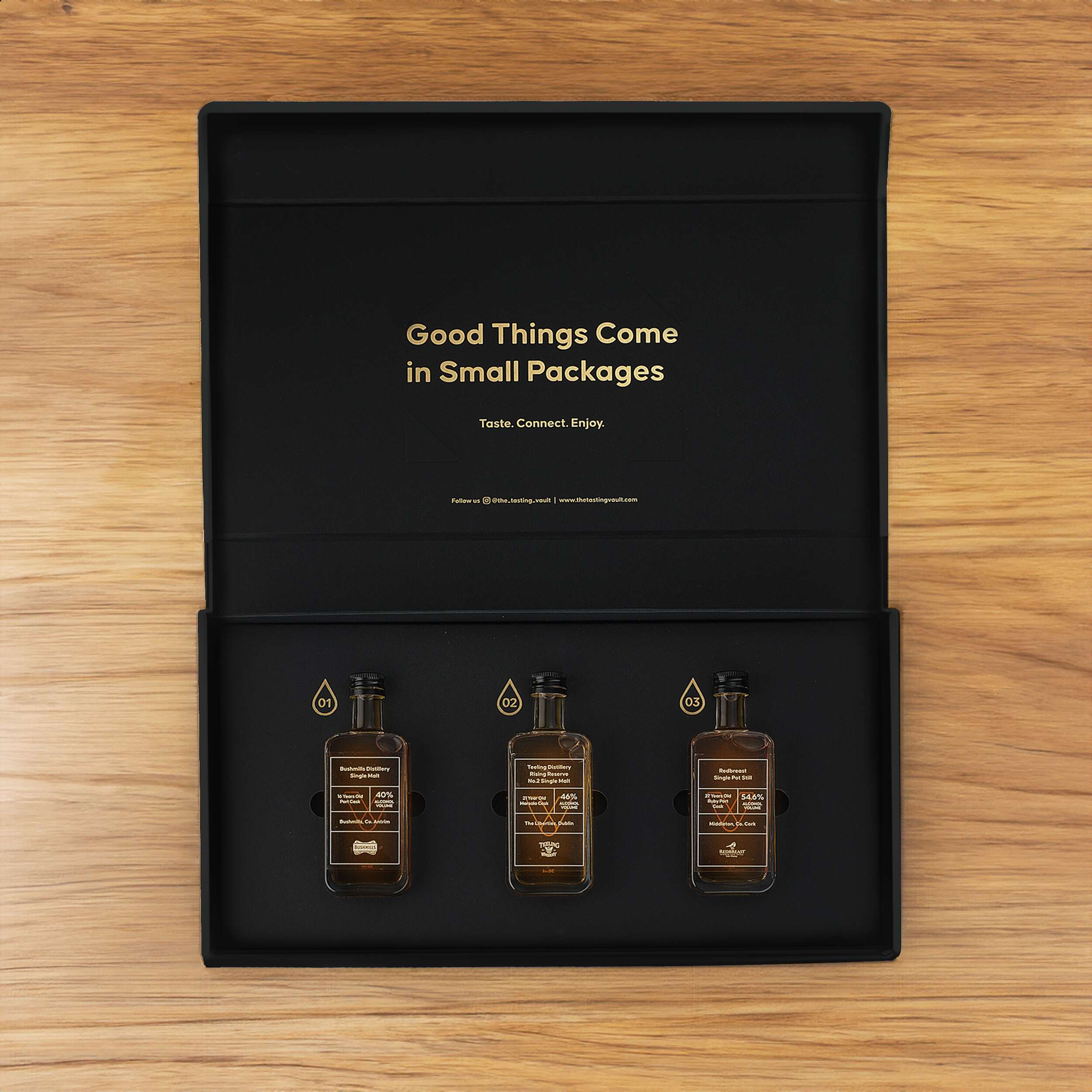
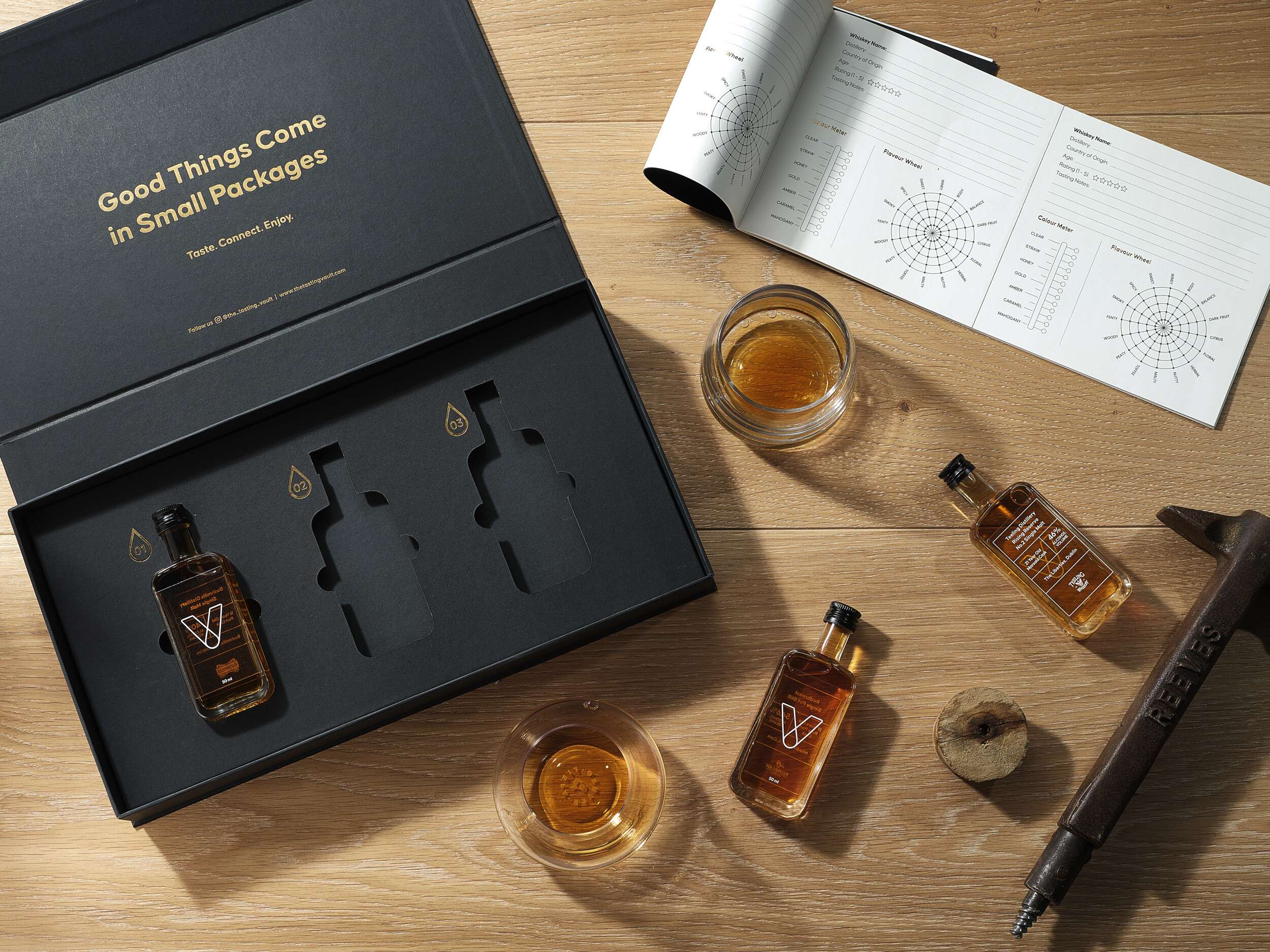
The challenge for The Tasting Vault was to create a packaging design reflecting the premium, sophisticated, and community-driven nature of their whiskey subscription service. The design needed to solve two key issues: communicating the exclusivity and luxury of the product, while offering practicality for repeated monthly deliveries of different whiskey varieties. The packaging needed to be functional yet visually compelling, enhancing the unboxing experience for consumers to share on social media. Furthermore, the design needed to accommodate 3 x 50ml whiskey bottles with flexibility for monthly variations, while remaining compact and easy to ship.
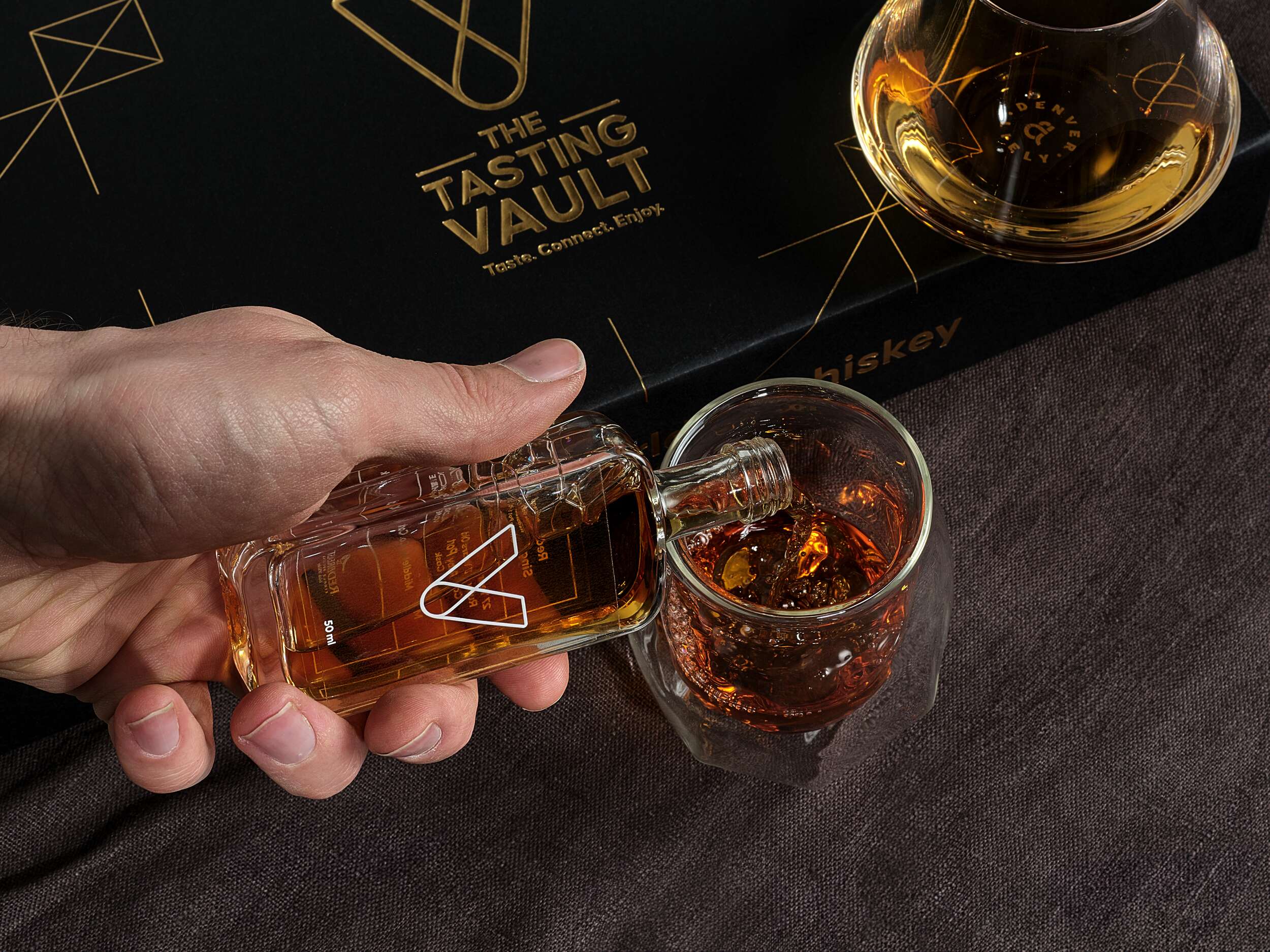
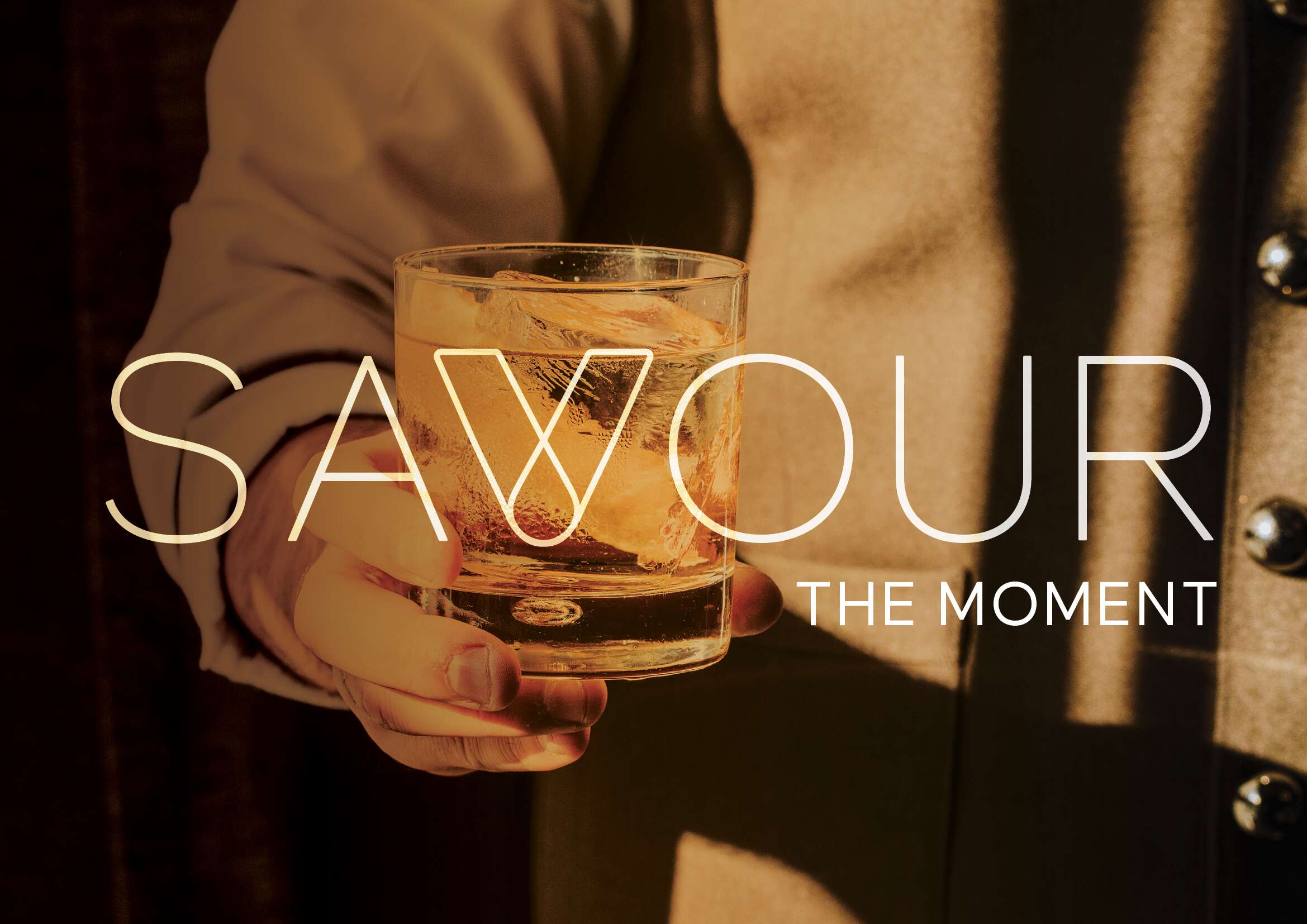
The core idea behind the design draws inspiration from the brand’s ethos of connecting people with fine spirits. The minimalist approach incorporates a modern vault symbol, subtly referencing the monthly “drop” of whiskey, and reinforcing the idea of treasured, curated experiences delivered directly to the consumer’s door. A blend of luxury, authenticity, and community was key.
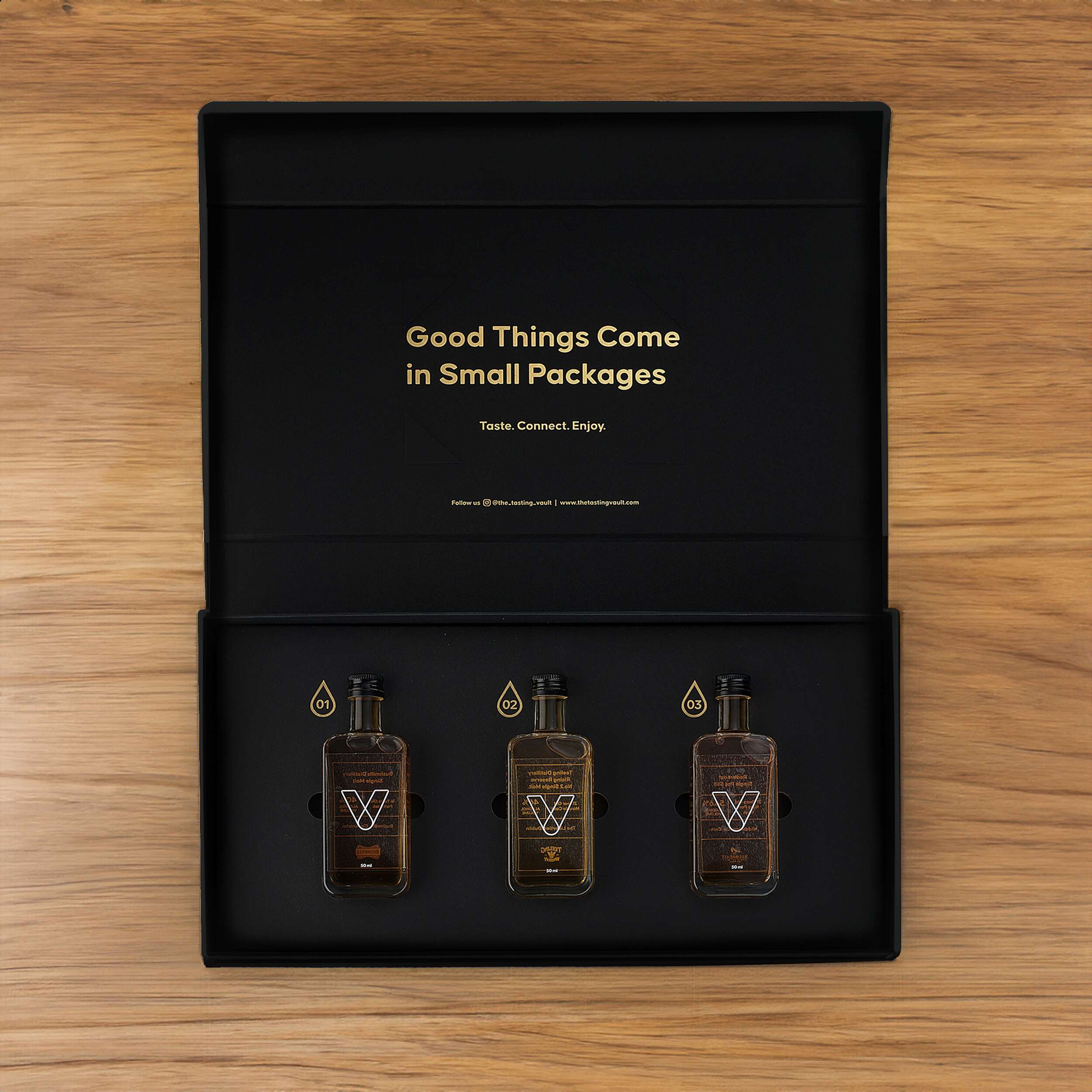
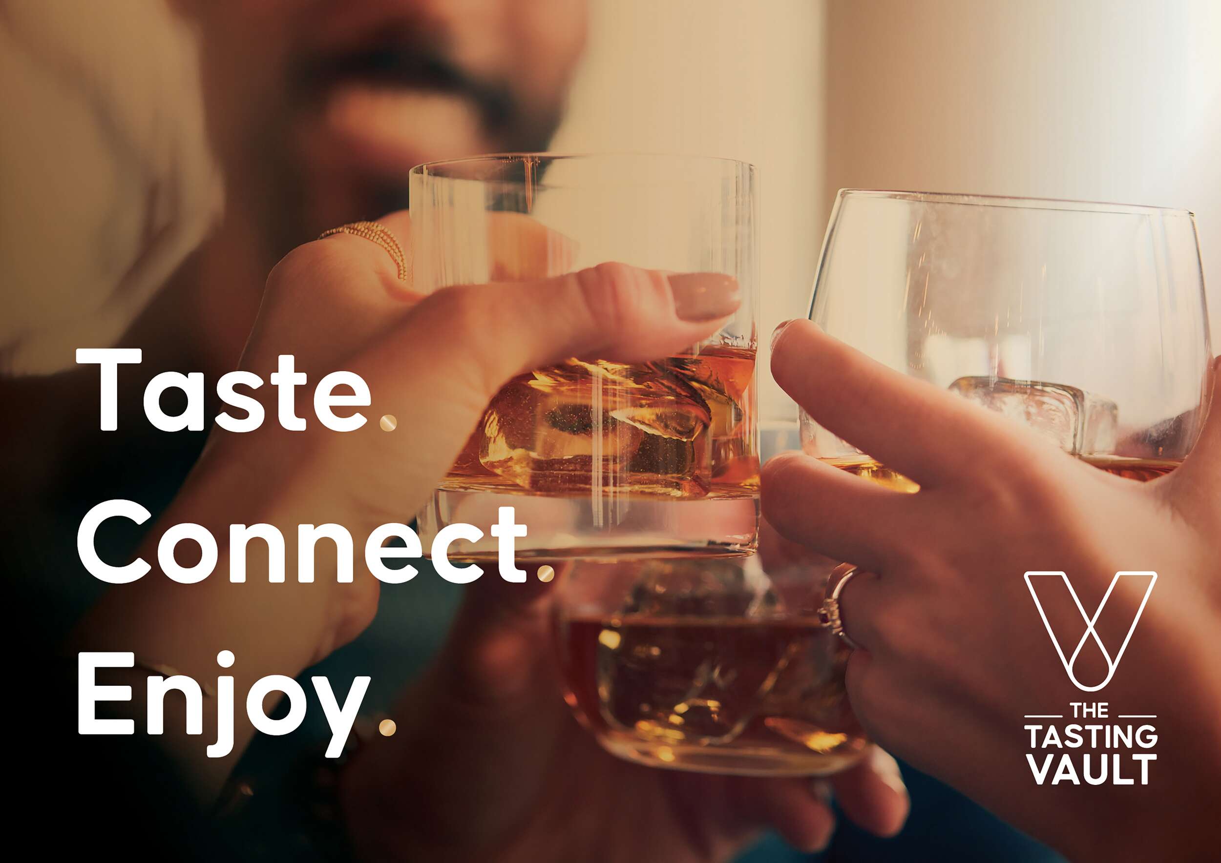
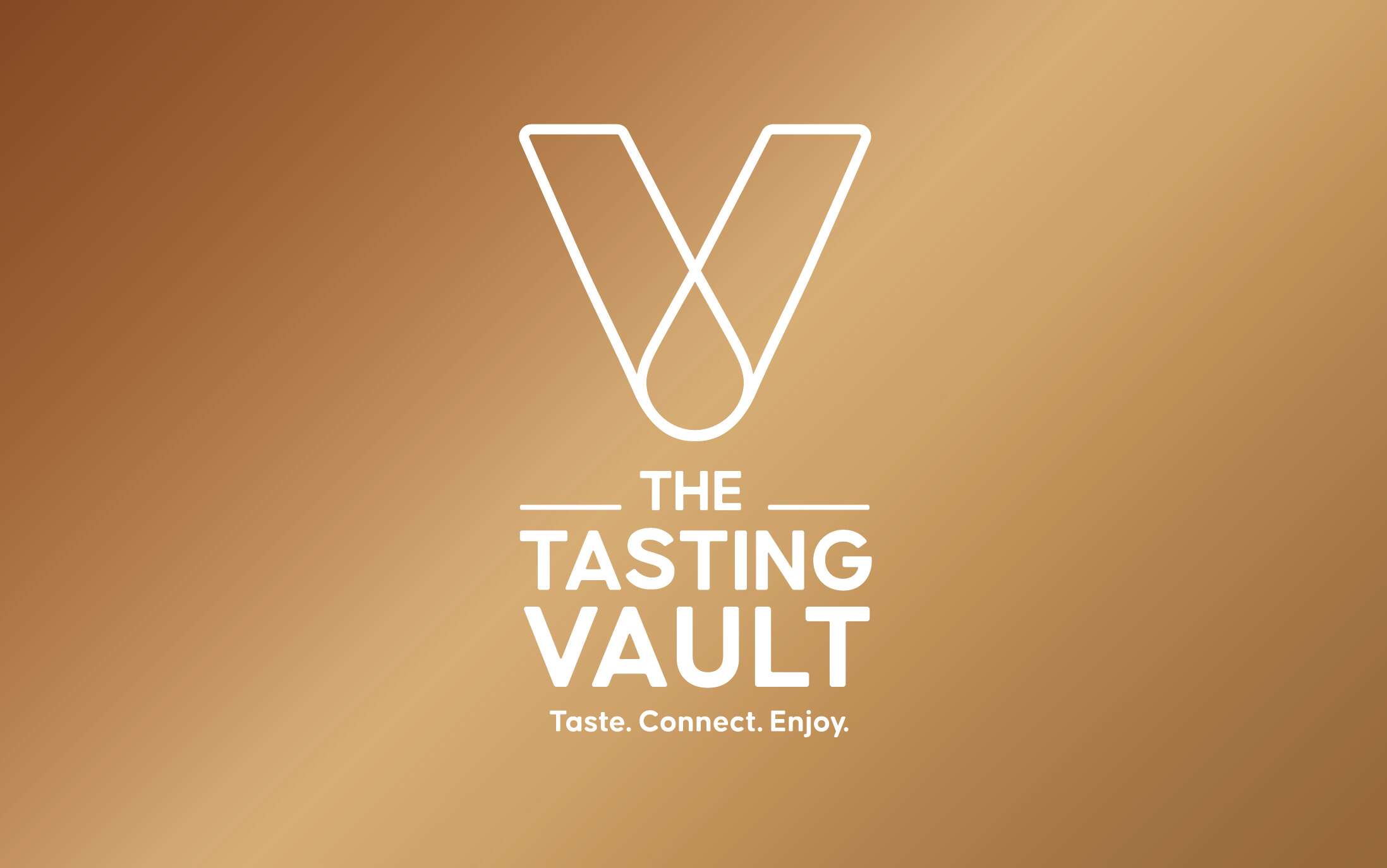
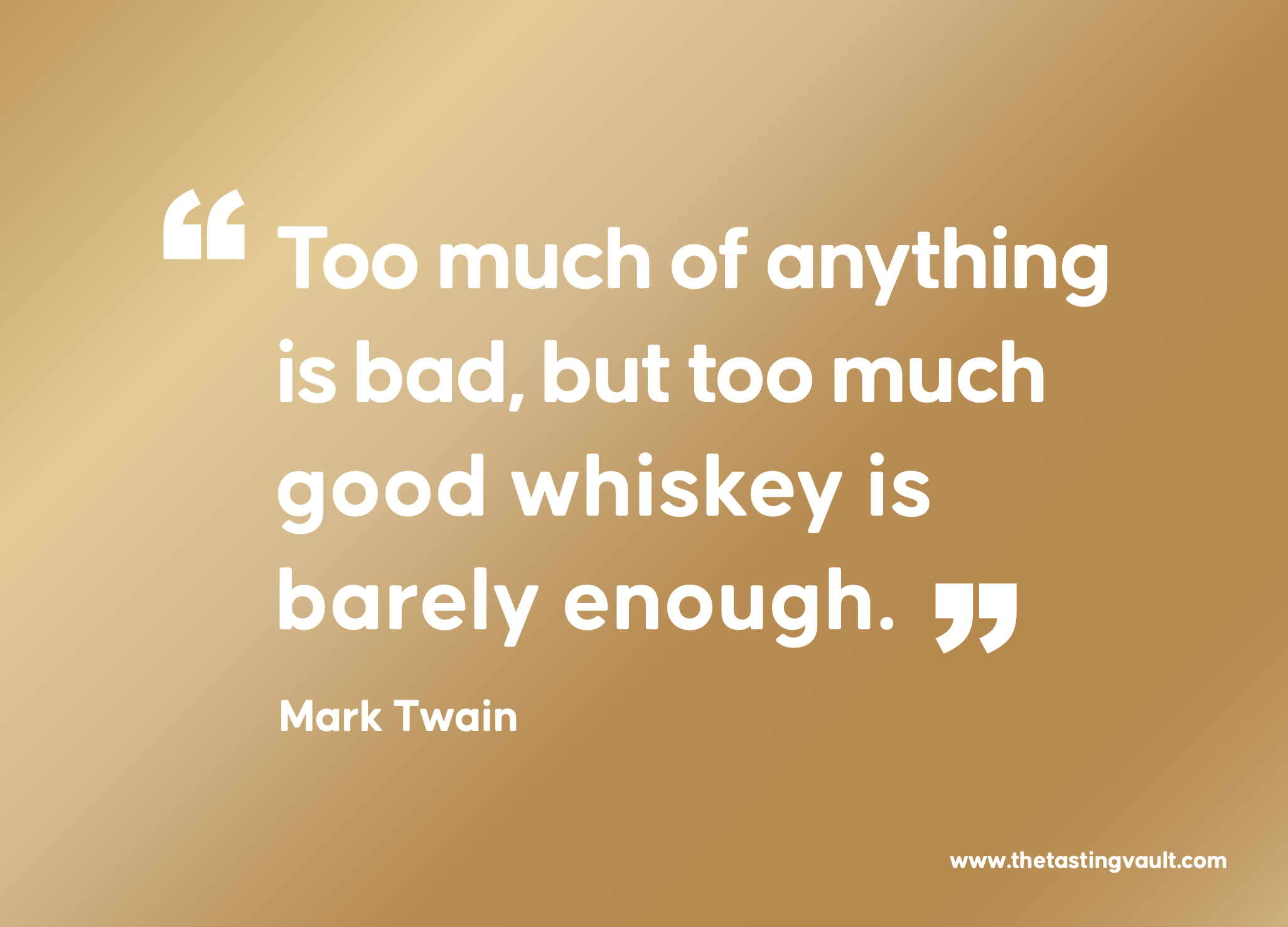
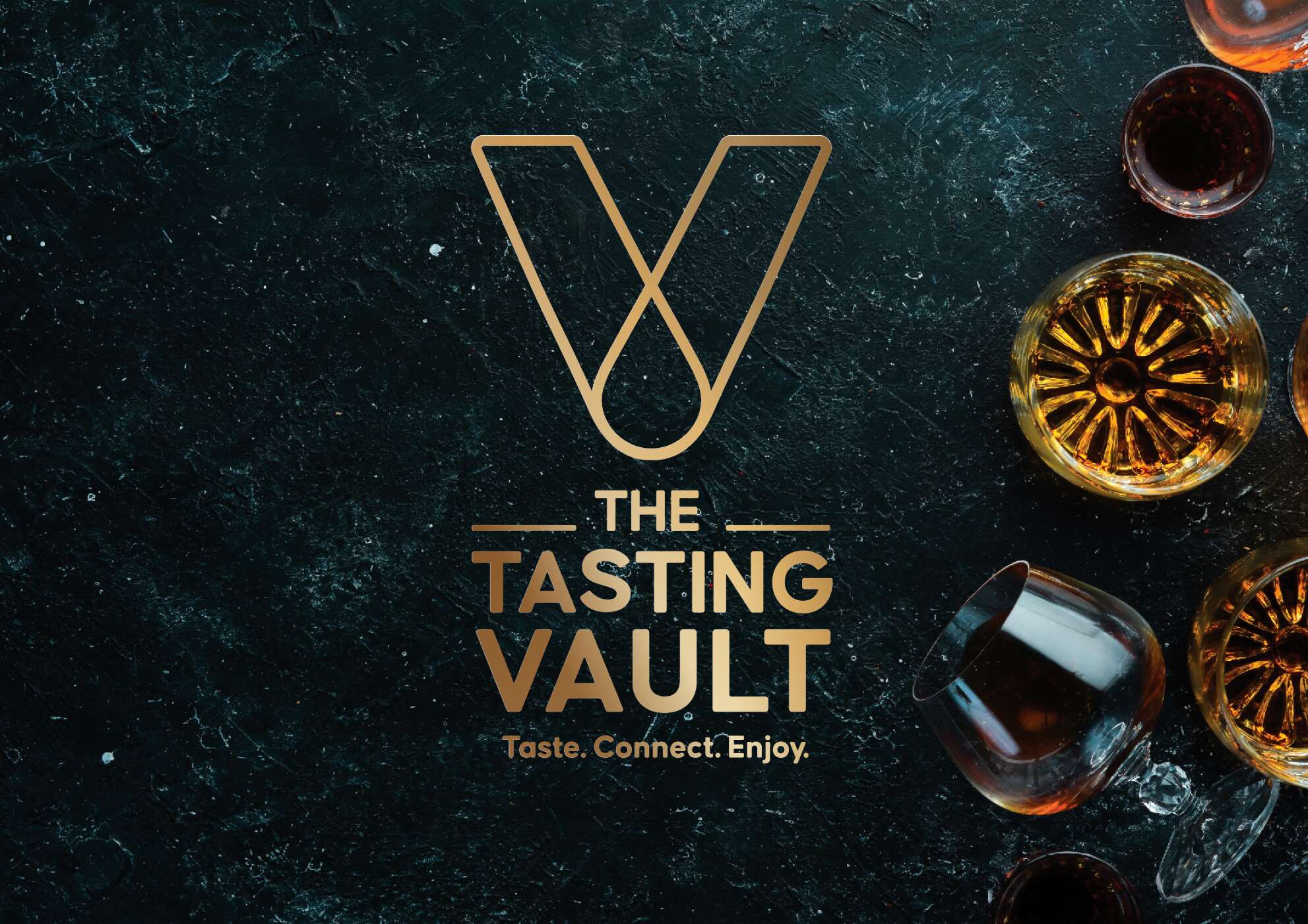
A key feature of the design is the brand’s “V” symbol, which represents the word “Vault” and subtly incorporates a whiskey droplet within the “V,” symbolising the monthly delivery of curated whiskey selections – their monthly drop. The tagline, “Taste. Connect. Enjoy.” captures the essence of the brand, communicating its message in a sophisticated yet friendly tone. The vault-inspired design is enhanced with gold foil debossing, giving the packaging an air of exclusivity. The ample spacing around the bottles adds to the luxury feel, while tabs ensure the bottles are easily accessible. Inside the lid, the playful message “Good Things Come in Small Packages” adds a light-hearted element, complementing the overall elegance. Social media details are included to encourage consumer engagement and help grow the brand’s online community.
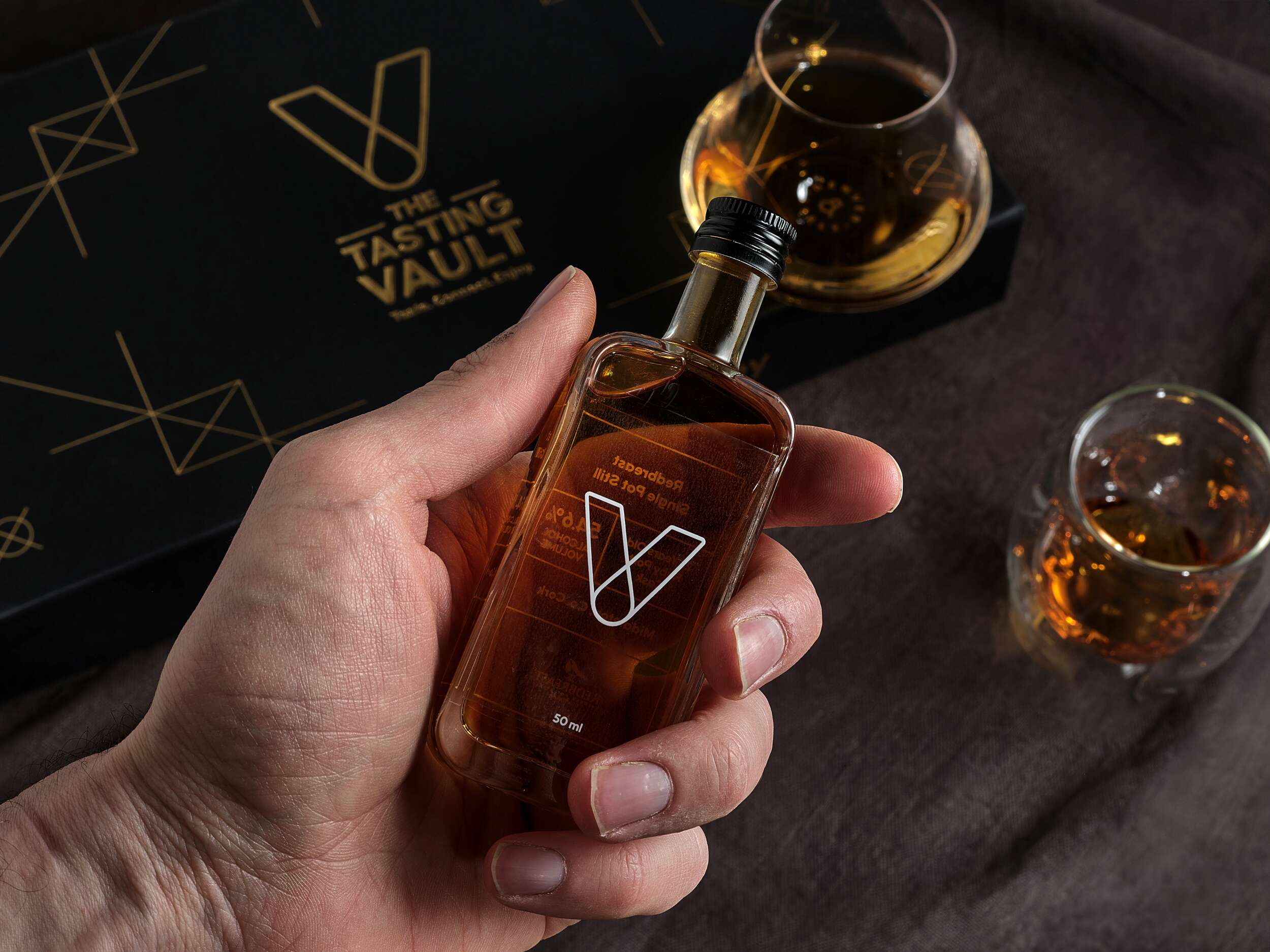
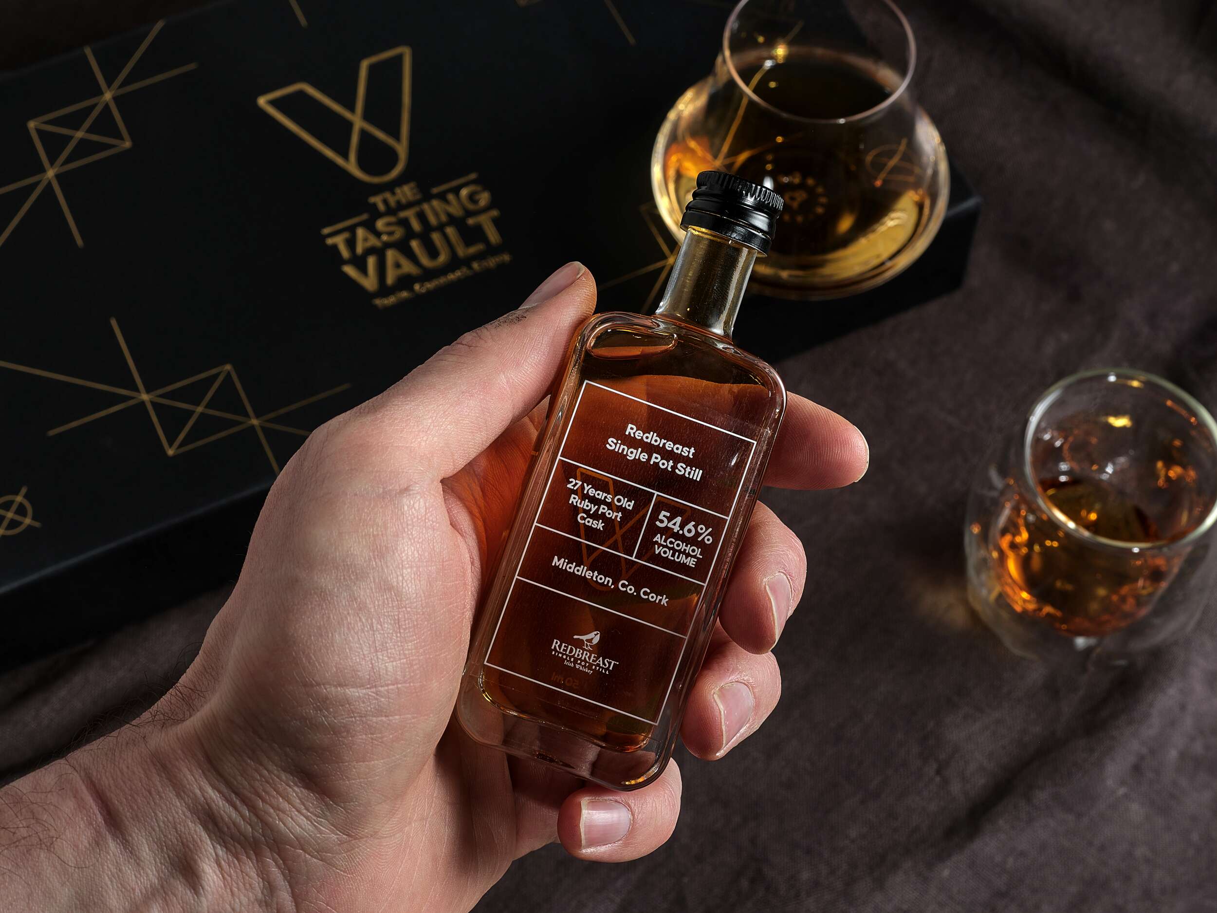
Each bottle is labelled with the brandmark and whiskey details on a transparent background, allowing the whiskey’s amber hue to shine through. These labels are designed for easy updating, adapting to the monthly subscription model. The bold Causten Rounded font combines softened edges with a sophisticated tone, conveying a friendly yet premium feel to the brand.
The packaging also includes a bespoke insert card with detailed information about that month’s whiskey selections, adding a personal touch. A 20-page tasting notes booklet further enriches the consumer experience, allowing customers to log their impressions and learn more about whiskey tasting. Clever phrases are used in the booklet such as “unlock a world of whiskey” to tie into the vault theme, reinforcing the brand’s identity.
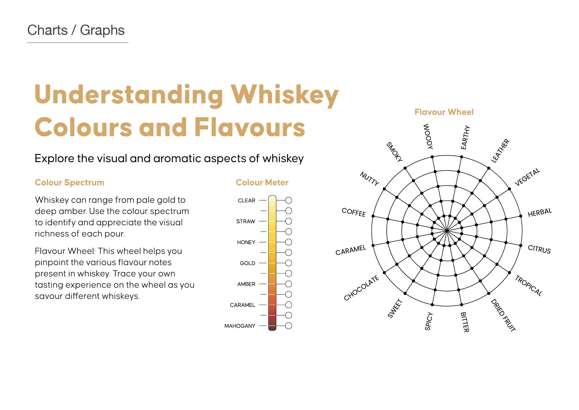
This thoughtful and recyclable packaging design reflects the brand’s values of premium quality, authenticity, and community, offering a refined yet accessible experience that is both visually striking and highly functional.
The packaging design for The Tasting Vault strikes a perfect balance between luxury and functionality, offering a sleek unboxing experience, while showcasing the brand’s dedication to authenticity and craftsmanship. The packaging is made from 1000gsm greyboard and wrapped in black beater-dyed paper, giving it a solid, premium feel. Its rigid, hinged-lid design includes die cuts to securely hold three 50ml whiskey bottles, ensuring both safe transportation and a refined presentation.

Follow The Tasting Vault online:
Instagram: @the_tasting_vault
Twitter / X: @thetastingvault
Website: www.thetastingvault.com
Photography by Brendan Ryan Photography:
Instagram: @brendanryanphoto
Website: www.brendanryan.ie
Packaging printed by JJ O’Toole:
Instagram: @jjotoole_ie
Website: www.jjotoole.ie
Labels by BrandPack
Instagram: @brandpackireland
Website: www.brandpack.ie

Grásome! Gluten-free Brownies: Brand Packaging Design
Grásome! Award-Winning Brownies: Brand Packaging Design
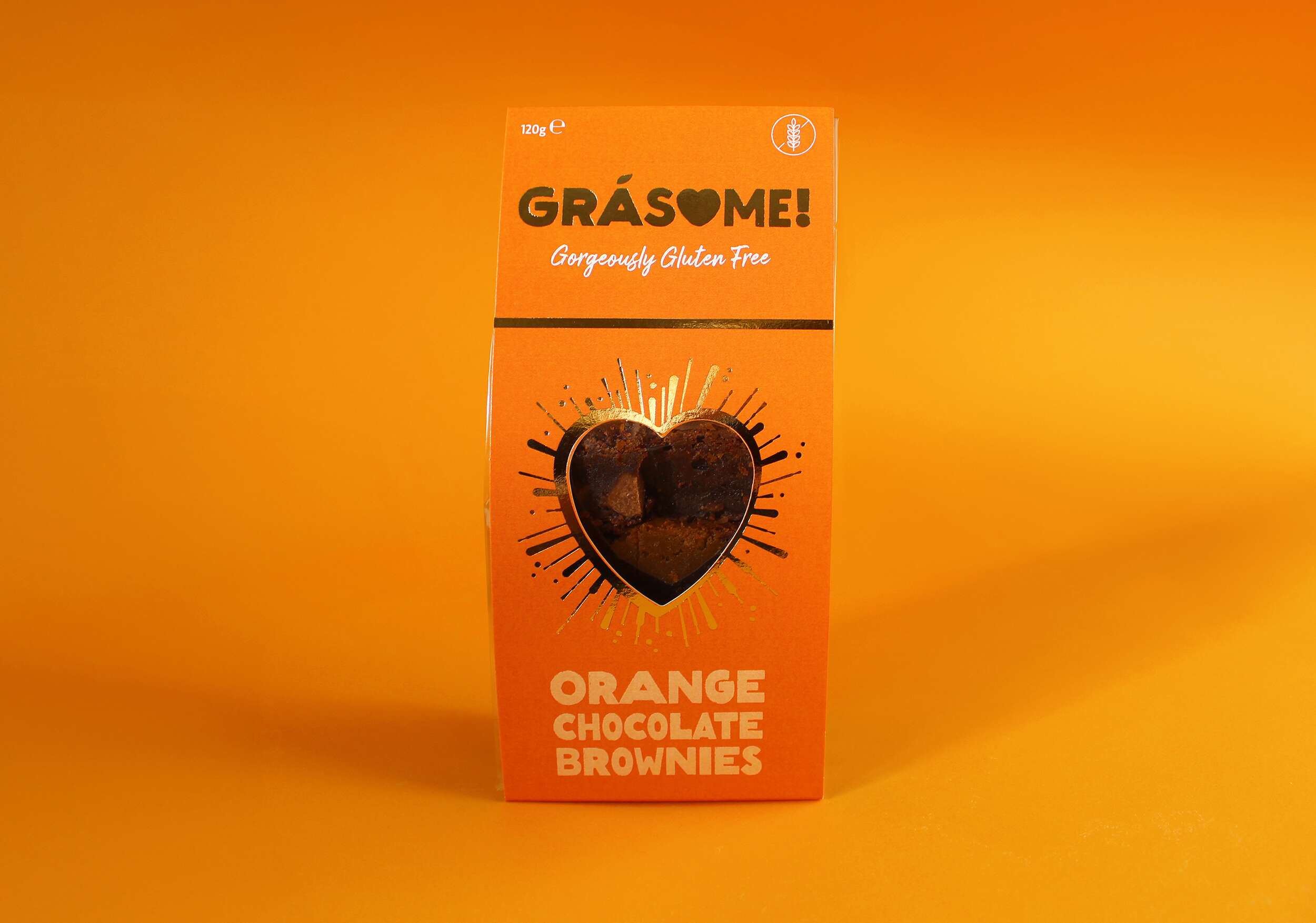
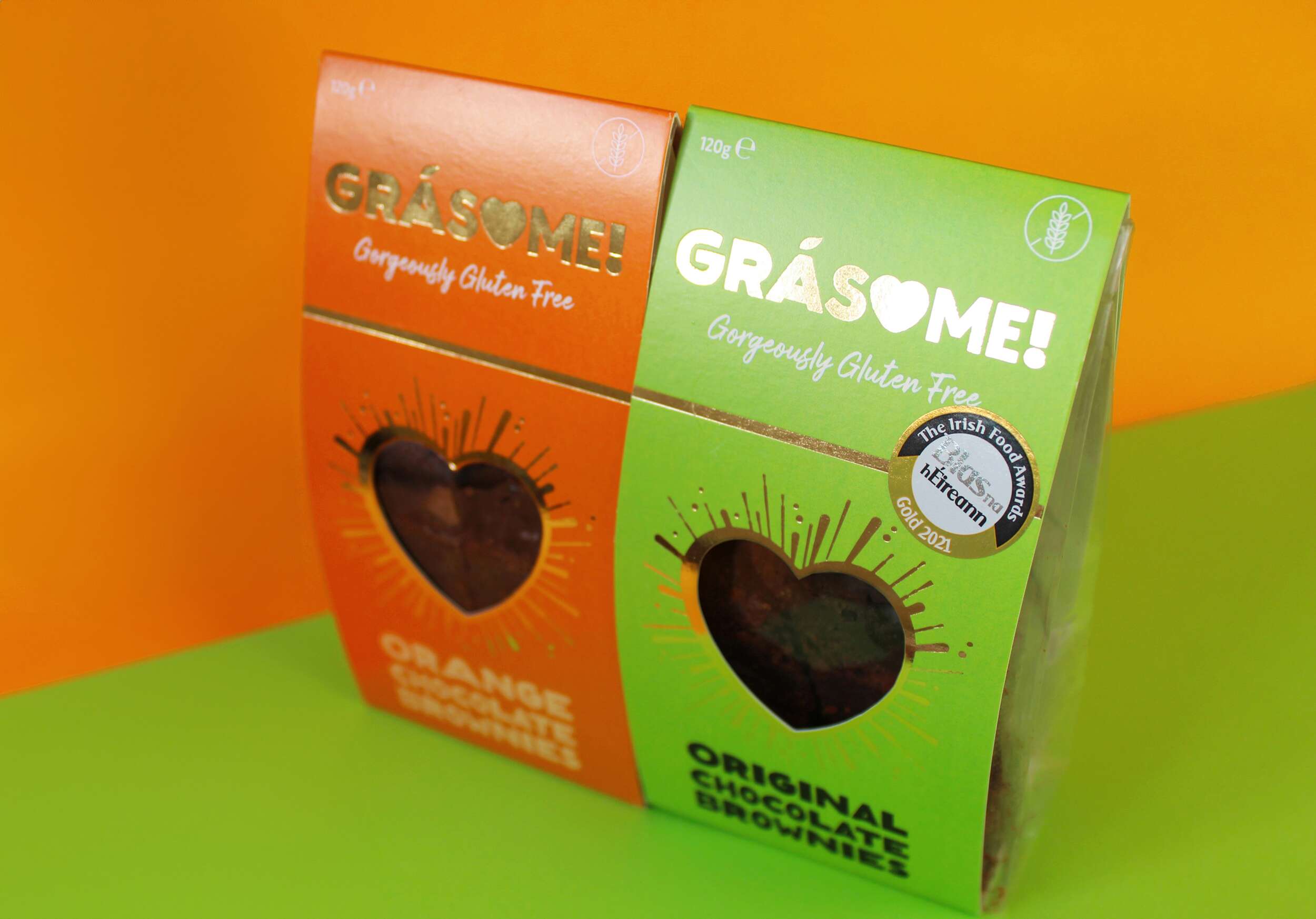
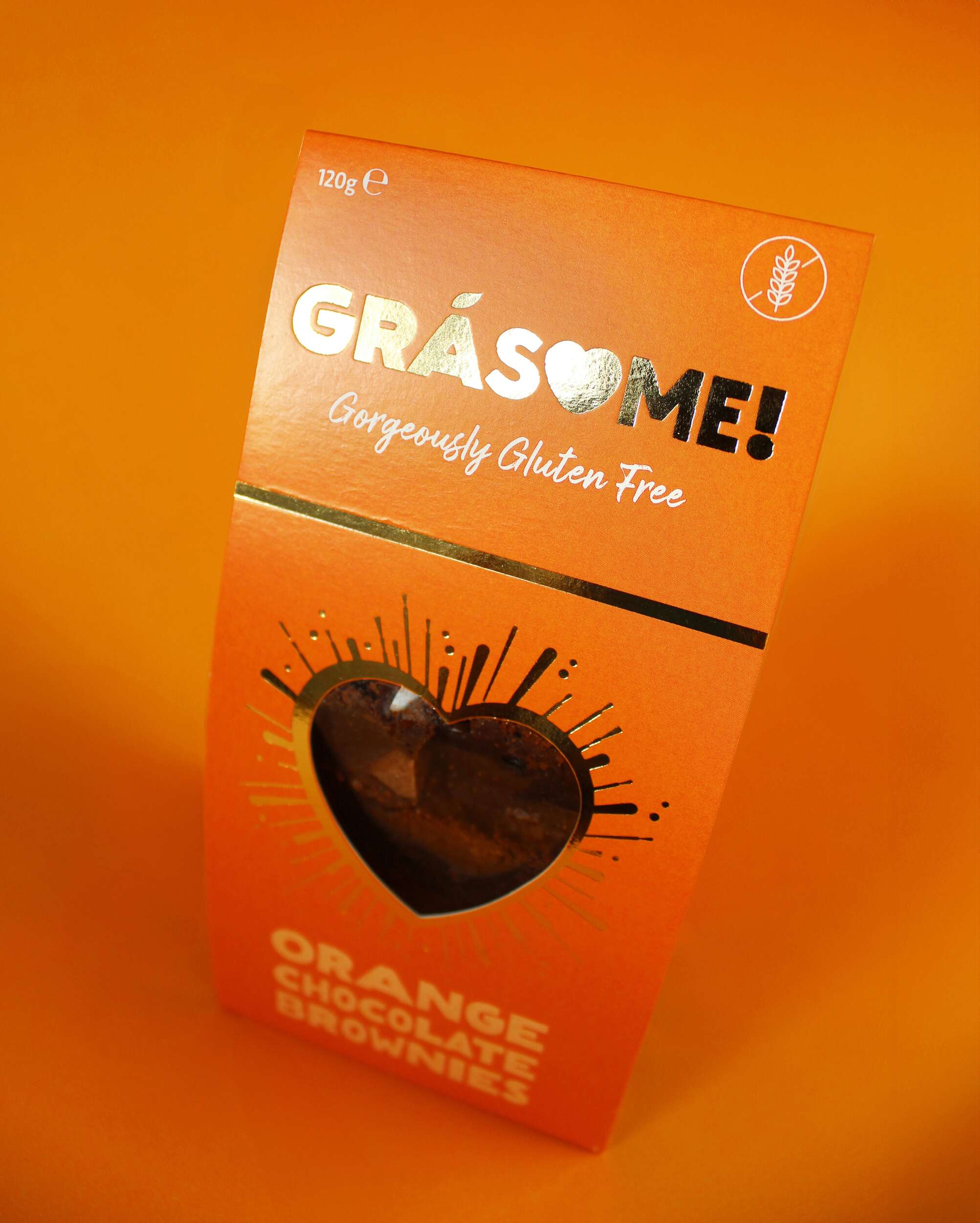
Grásome! is an artisan award-winning brand born out of the passion for creating luxurious gluten-free treats that are not only delicious but also fun and playful. Ruth, the founder, draws inspiration from her rich French-Irish heritage, her personal baking journey, and her love of good food. The brand’s mission is to provide indulgent, hand-crafted treats made from the finest natural ingredients, all while bringing a smile to the consumer’s face. With a tagline that reads “Gorgeously Gluten Free,” Grásome! speaks to those seeking both high-quality and allergy-conscious products without compromising on taste or style.
The name Grásome! perfectly encapsulates the essence of the brand, combining the Irish word “Grá” (meaning “love”) with a playful twist on the word “awesome.” The result is a name that feels both familiar and exciting, resonating with Ruth’s fun, vibrant personality. It’s a brand that isn’t afraid to be glamorous yet unpretentious, offering gluten-free indulgences with a wink of fun and light-heartedness. The nod to her influential aunt Gráinne, a passionate coeliac, baker and advocate for gluten-free products, adds a personal touch to the name, reinforcing the love and care behind every product.

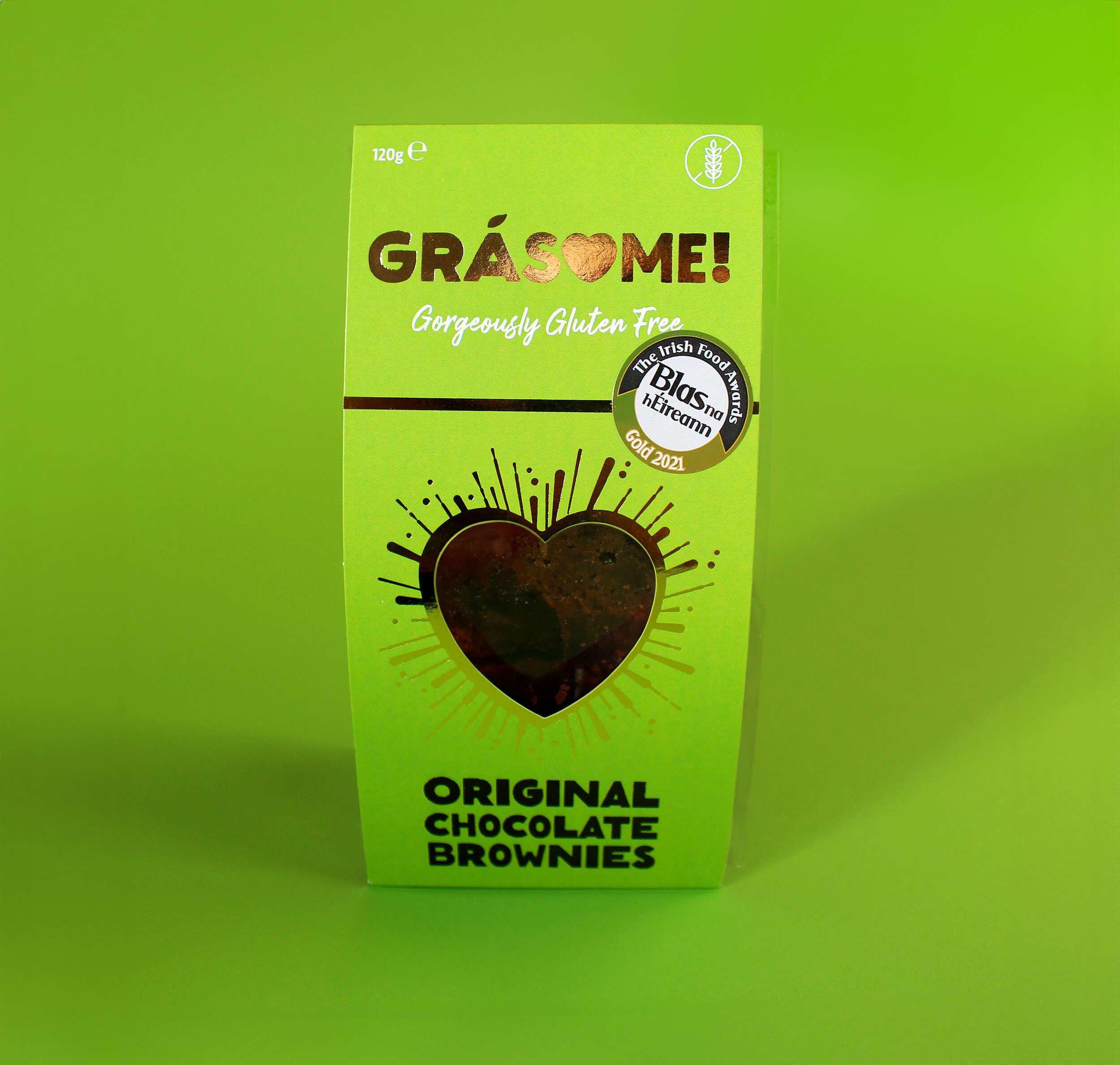
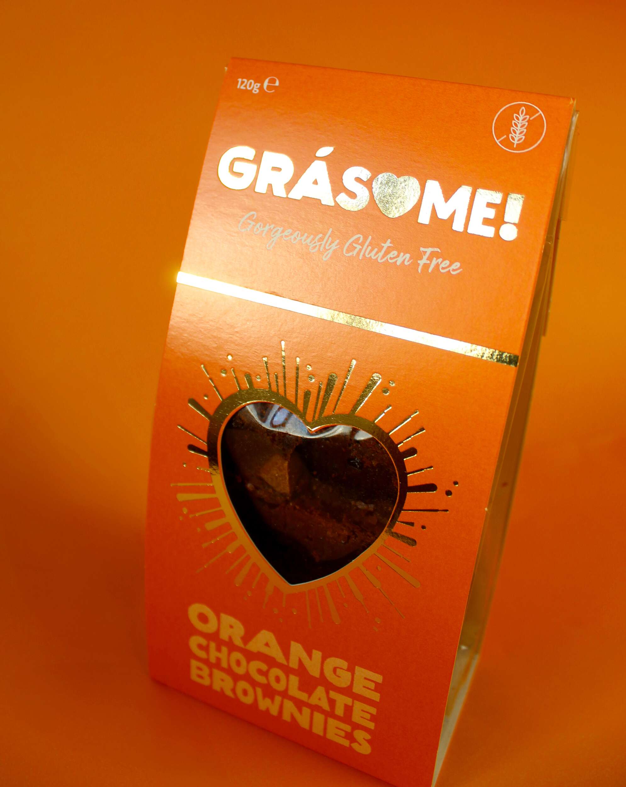
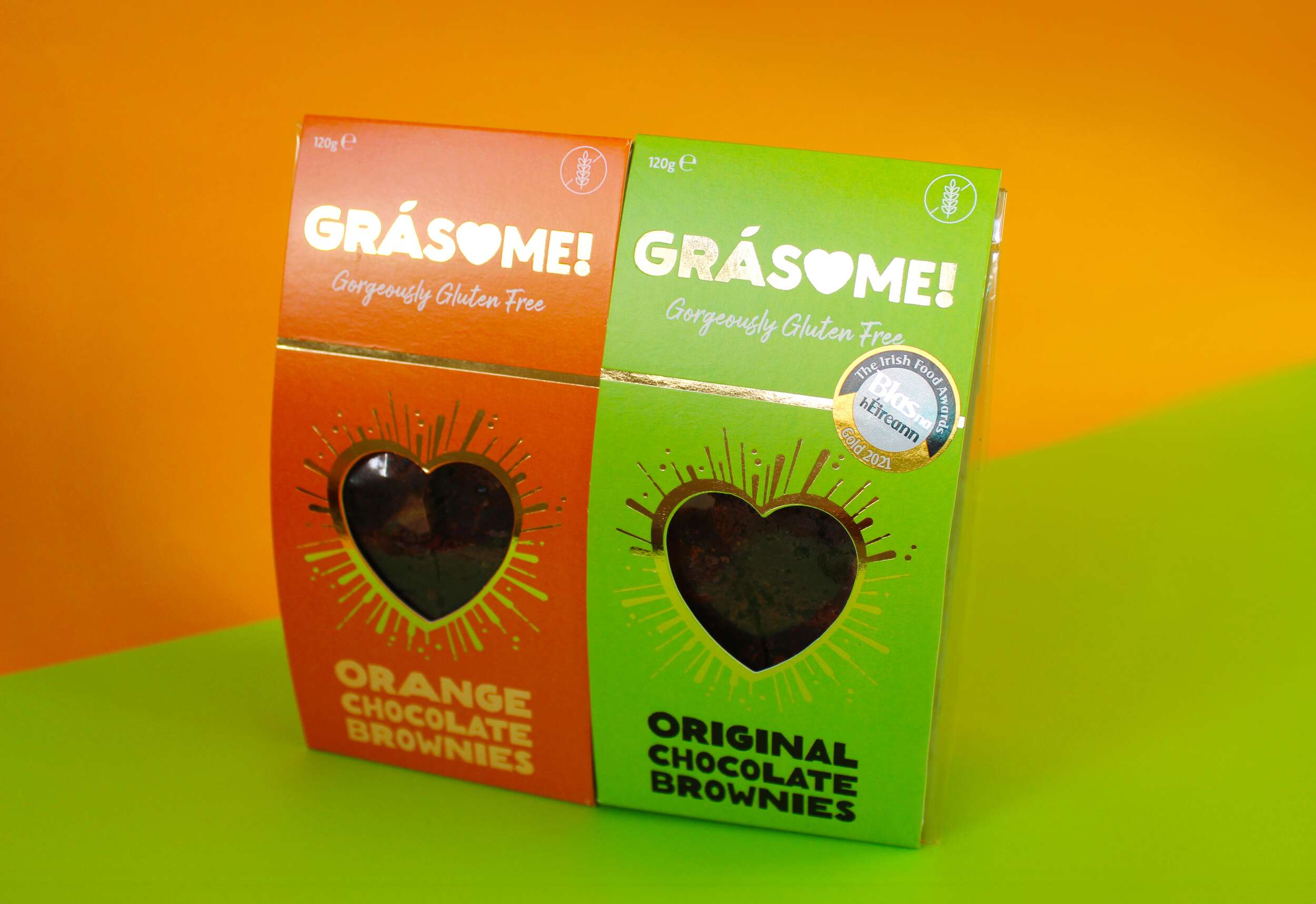
Grásome! stands out not only for its delectable products but also for its strong, memorable visual identity. We approached the branding with the goal of blending luxury, fun, and warmth – all key aspects of the product’s personality. The product flavour names incorporate a rustic, earthy font that mimics the textures found in brownies, cakes, and baking, emphasising the hand-made nature of the products. The letter ‘O’ is cleverly replaced with a heart, signifying both love and the personal care that goes into every batch. The fada (accent) on the ‘a’ is stylized as a leaf, symbolising the brand’s use of natural ingredients. The exclamation mark at the end of the name encapsulates the brand’s energetic, fun vibe, tying back to the playfulness of the word “awesome.” The tagline “Gorgeously Gluten Free” sits beneath the brand name in a handwritten font, reinforcing the personal, hand-crafted element of the brand while also making the gluten-free aspect clear and prominent.
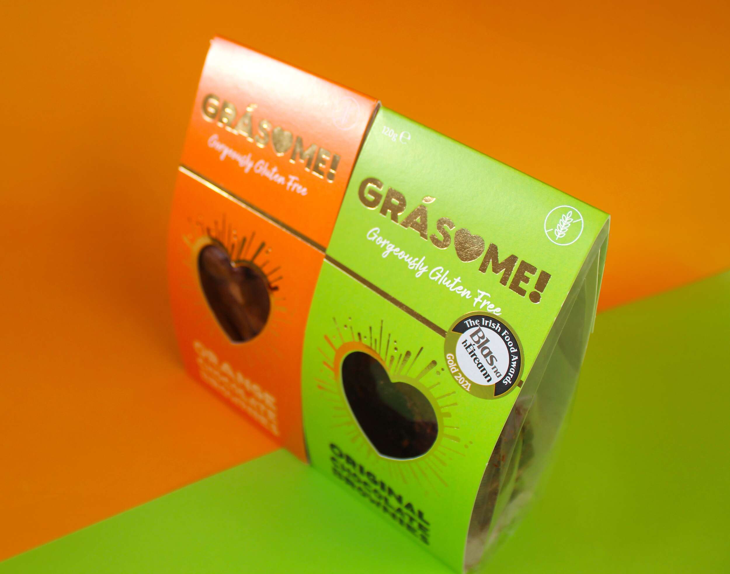
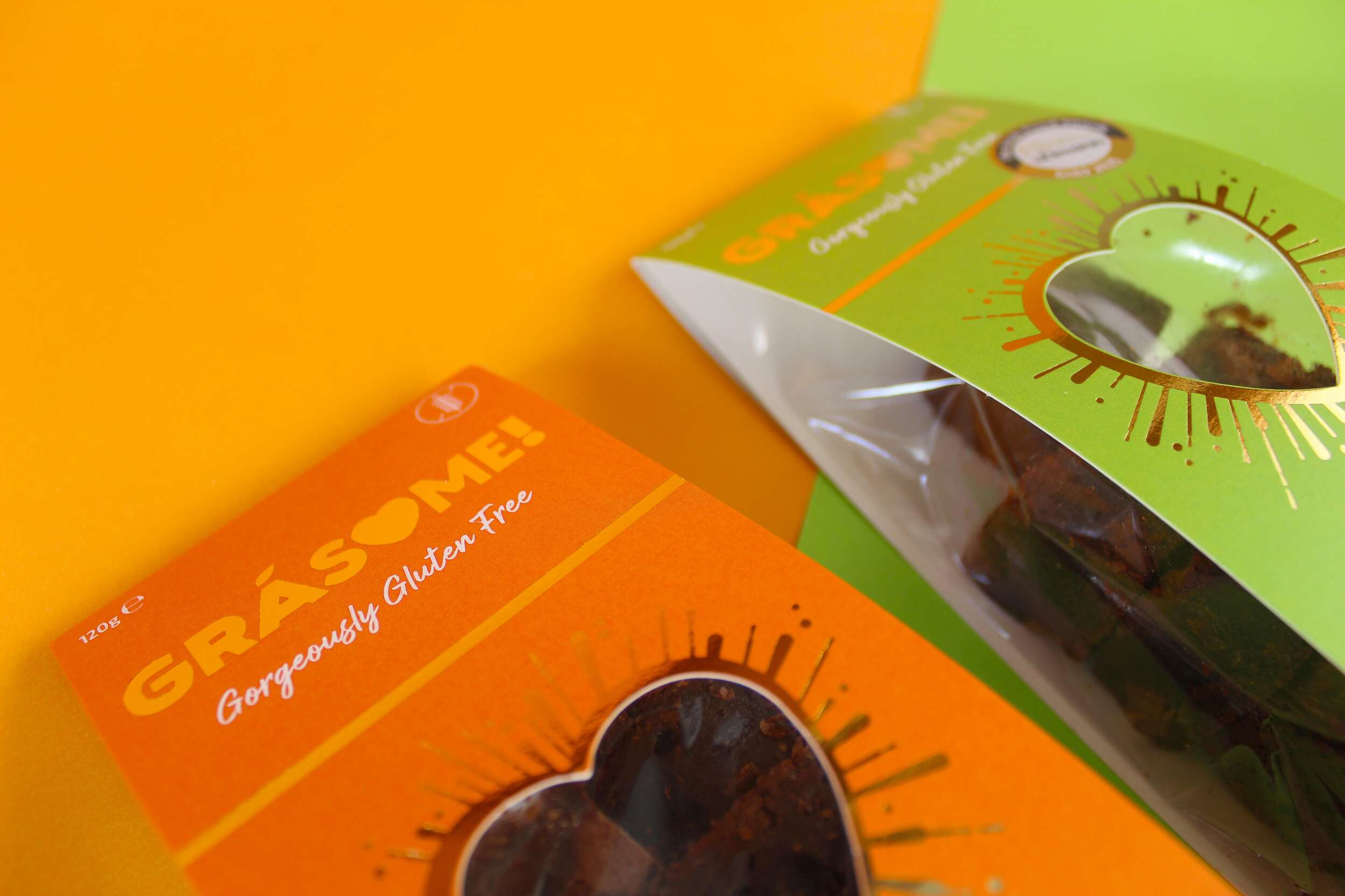
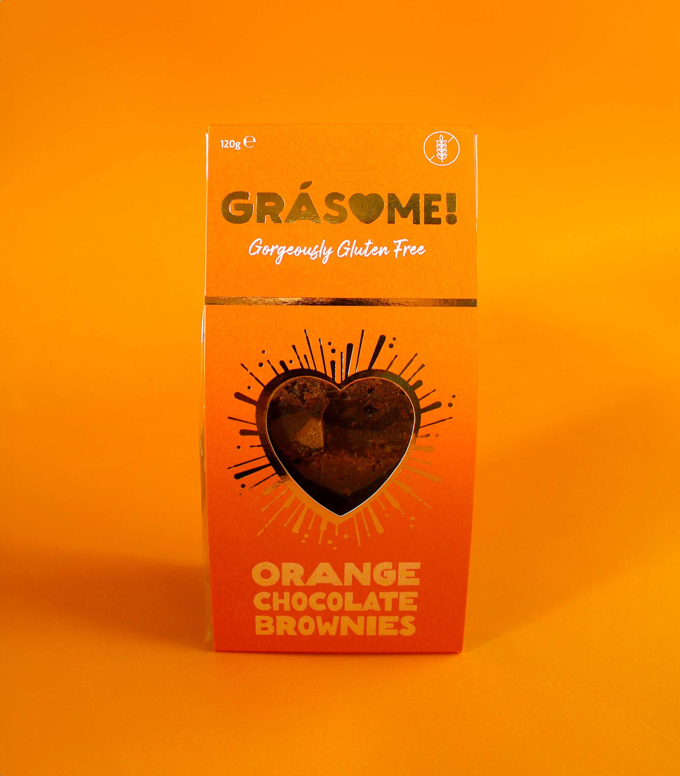
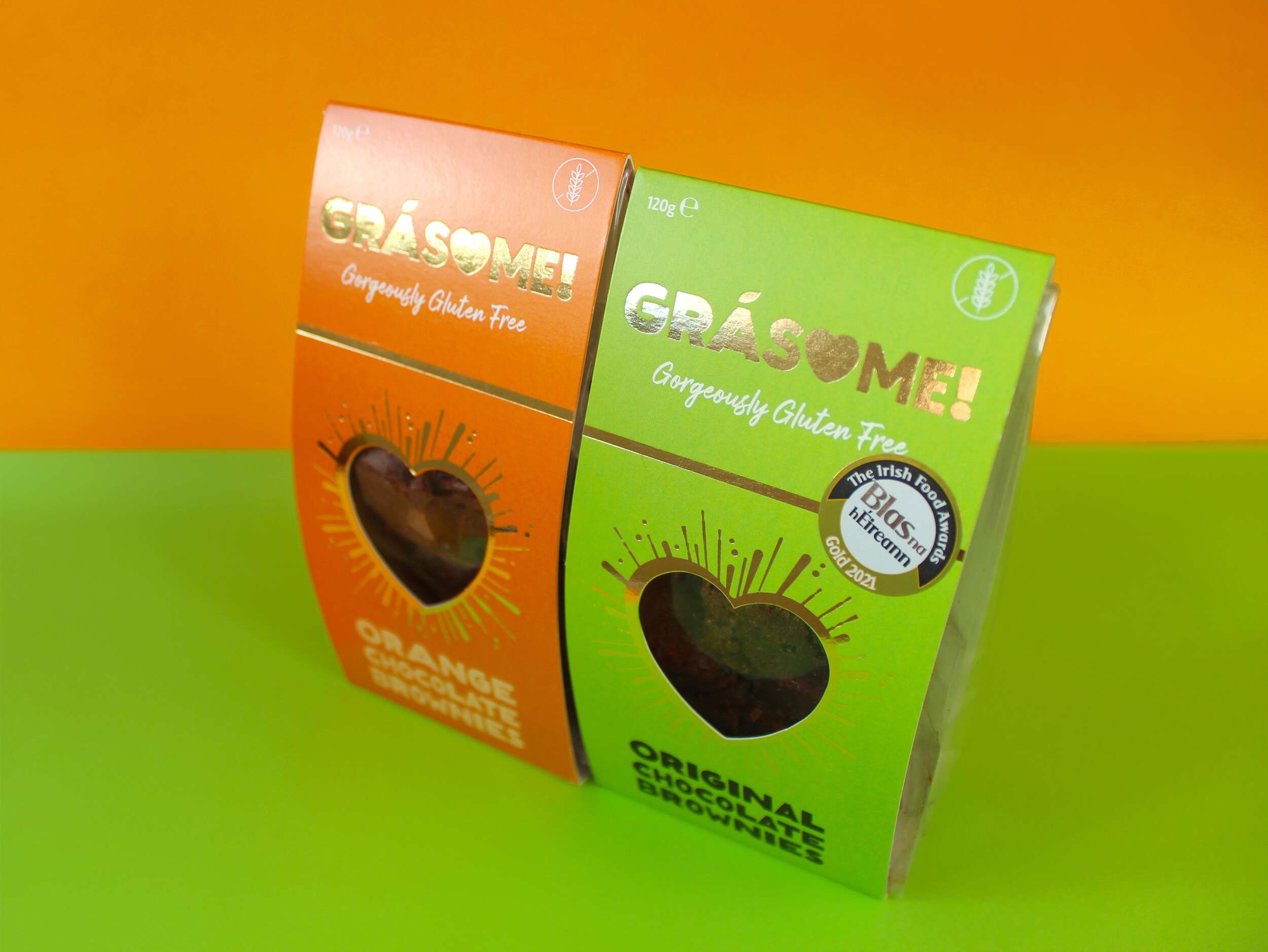
The colour palette is designed to be bright and vibrant, reflecting the client’s ethos of living life to the fullest and embracing boldness. It ensures the product stands out on the shelf, commanding attention rather than blending into the background. Each flavour is represented by a distinct, vivid hue—green for the original flavour and orange for the orange variety—highlighting the brand’s playful and energetic character. The use of gold foil adds a touch of luxury, reinforcing the high quality of the products while maintaining a warm, approachable aesthetic.
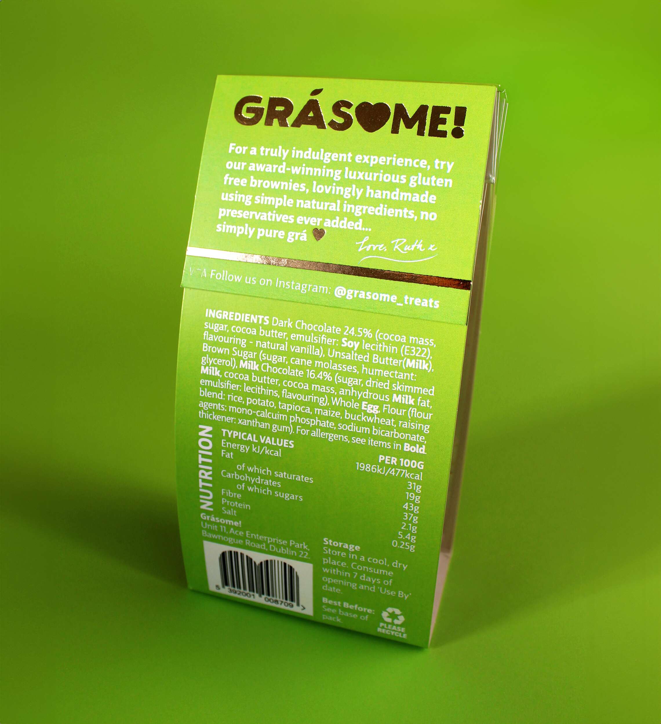
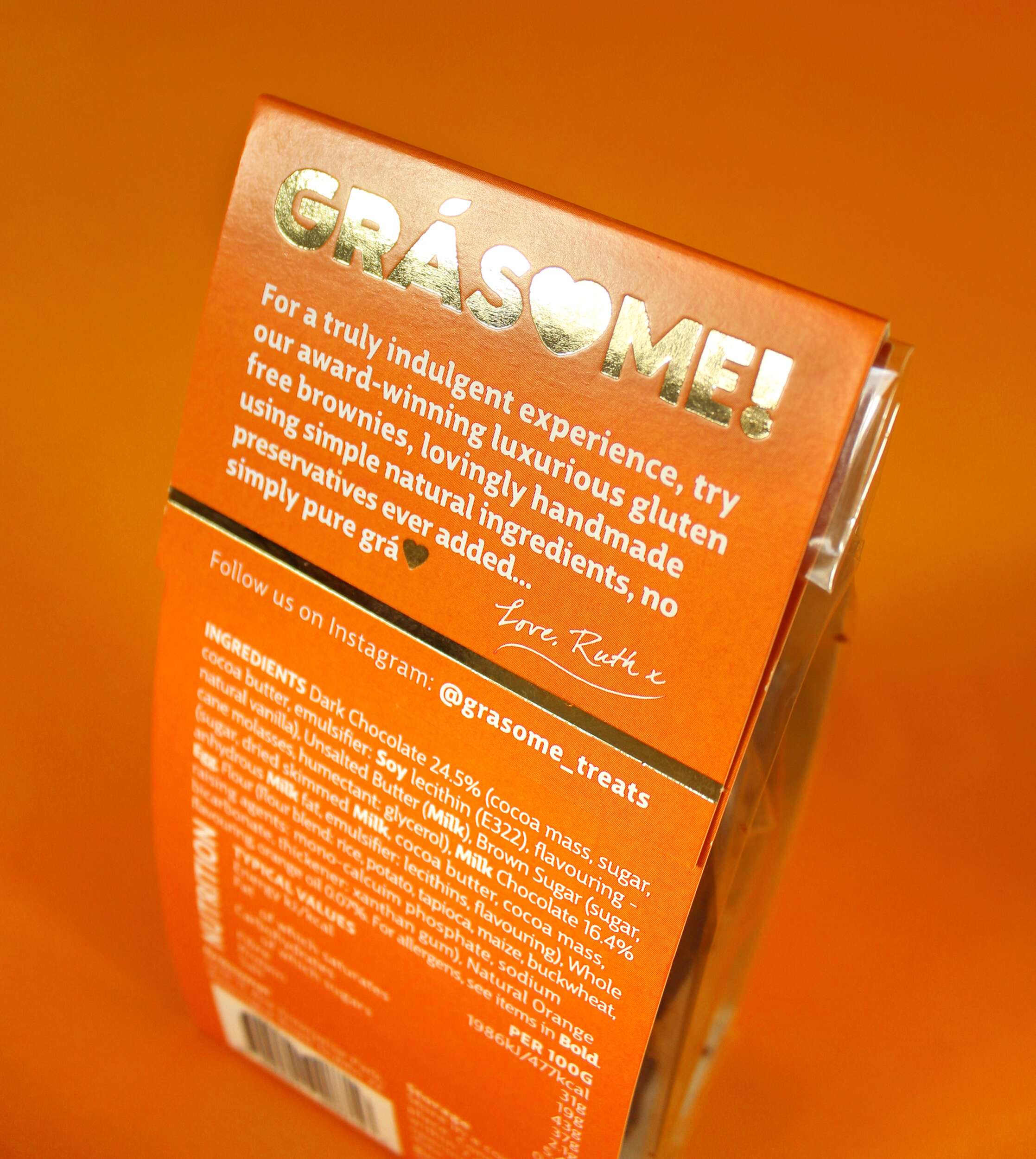
The packaging design features a cardboard sleeve with a heart-shaped cutout on the front, mirroring the heart in the logo. This allows the consumer to catch a glimpse of the brownies inside, creating an instant emotional connection. Gold foil lines radiate out from the heart cutout in a celebratory style, further enhancing the premium feel. The back of the packaging includes a personal note from Ruth, inviting consumers to share in the love and care she pours into her products:
“For a truly indulgent experience, try our award-winning luxurious gluten-free brownies, lovingly handmade using simple natural ingredients, no preservatives ever added… simply pure grá.
Love, Ruth x”
Sustainability is a key pillar of the Grásome! brand, reflected in the fully recyclable packaging. This aligns with Ruth’s values and her personal experiences living in eco-conscious environments like New Zealand and Antarctica. The reusable delivery boxes also emphasize the brand’s commitment to reducing waste.
The primary typeface, Big City Grotesque Pro, provides a clean, modern look, ensuring legibility and consistency across all brand materials. To balance this with a more playful touch, HelloMixed, a quirky, display font, is used for headings and flavour titles, mimicking the playful and earthy nature of the brand. Arsilon, a handwritten font, is reserved for smaller descriptors like “Gorgeously Gluten Free,” adding a personal, friendly feel to the packaging and marketing collateral.
Grásome! successfully redefines the perception of gluten-free products, celebrating them as indulgent, luxurious, and full of character. A proud finalist in the 2024 Irish Quality Food and Drink Awards, the brand stands as a testament to Ruth’s deep-rooted love of food, family heritage, and personal journey in mastering gluten-free baking. Through thoughtful design and a playful yet elegant brand identity, Grásome! communicates its promise to deliver treats that are not only delicious but also made with love, care, and passion. The packaging itself becomes part of the experience, making Grásome! treats perfect for sharing, gifting, or savoring all to oneself.
In a competitive gluten-free market, Grásome! proudly stands out as a brand that marries luxury and fun, offering consumers a product that doesn’t compromise on quality, style, or taste.
Follow Grásome! online:
Instagram: @grasome_treats
Twitter / X: @Grasome_treats
Website: Grásome Website
Packaging printed by Esmark Finch:
Instagram: @esmarkfinchprintandpackaging
Facebook: @Esmark-Finch-Print-and-Packaging
Website: Esmark Finch
Elgin Energy – Candidate Pack Brochure Design
Elgin Energy: Candidate Pack Brochure Design
Candidate Pack Brochure Design

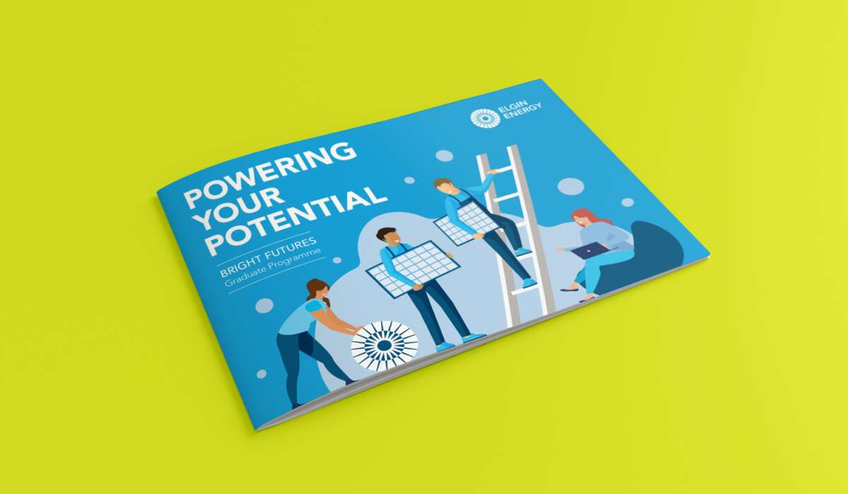
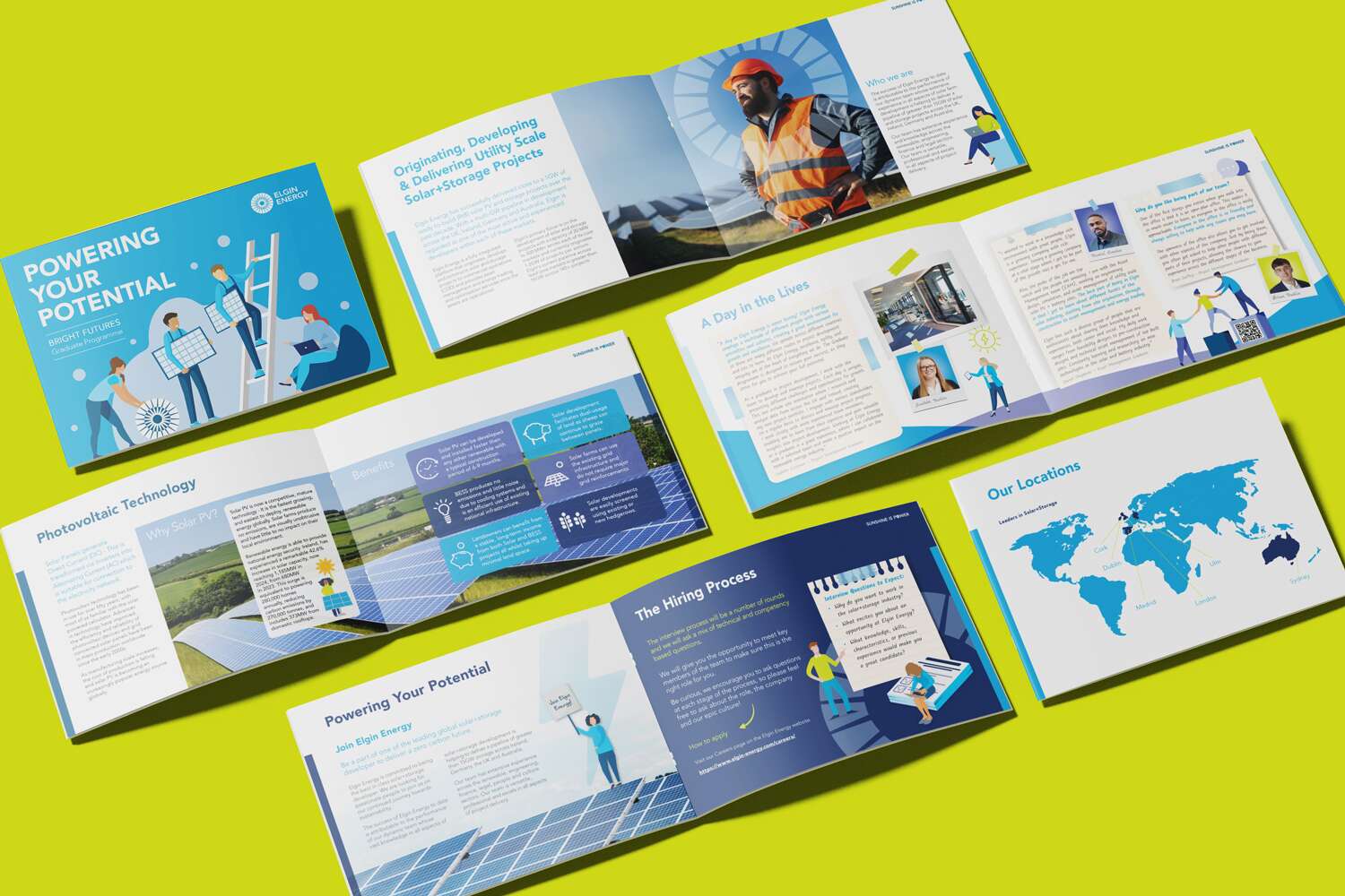
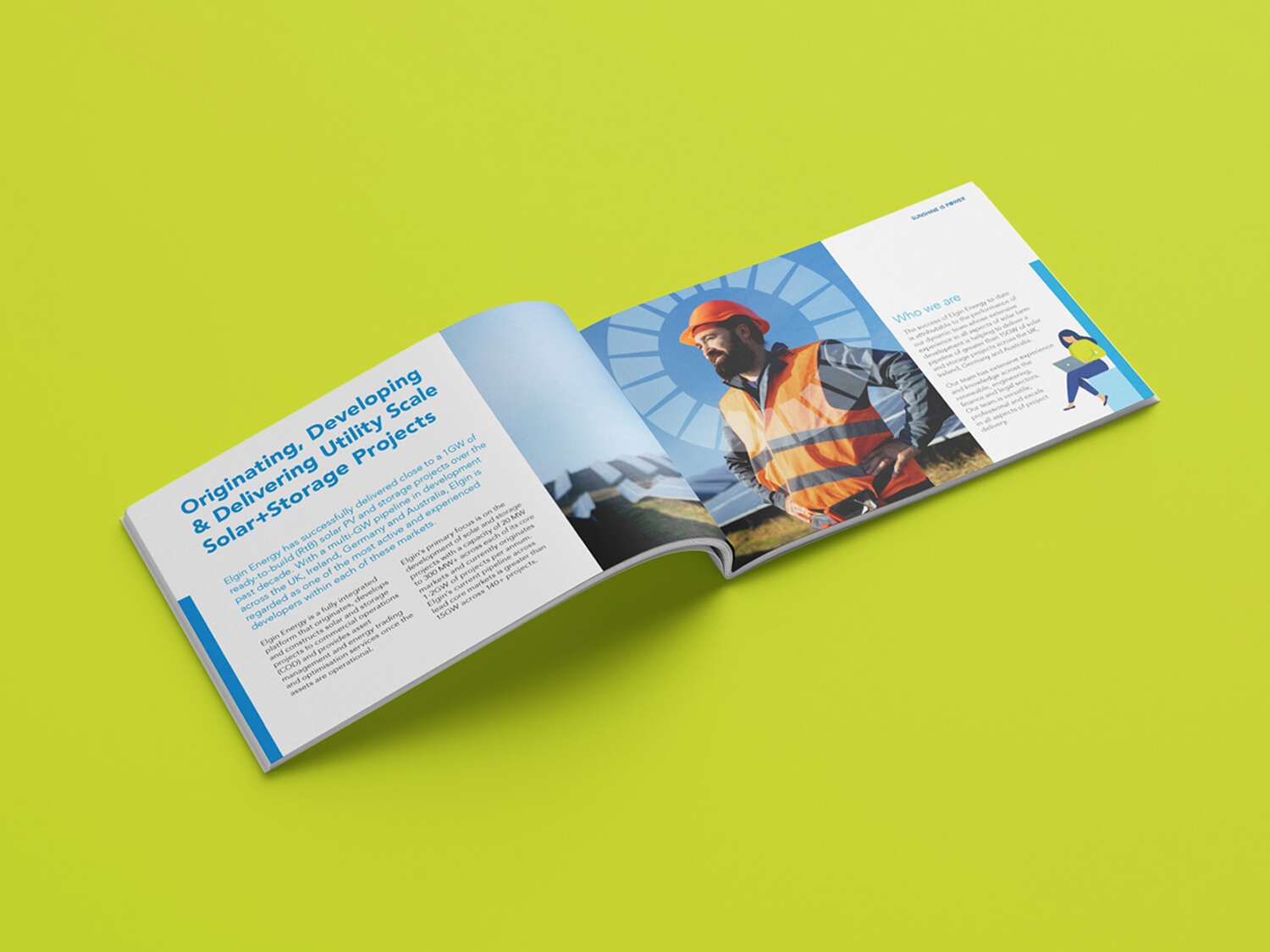
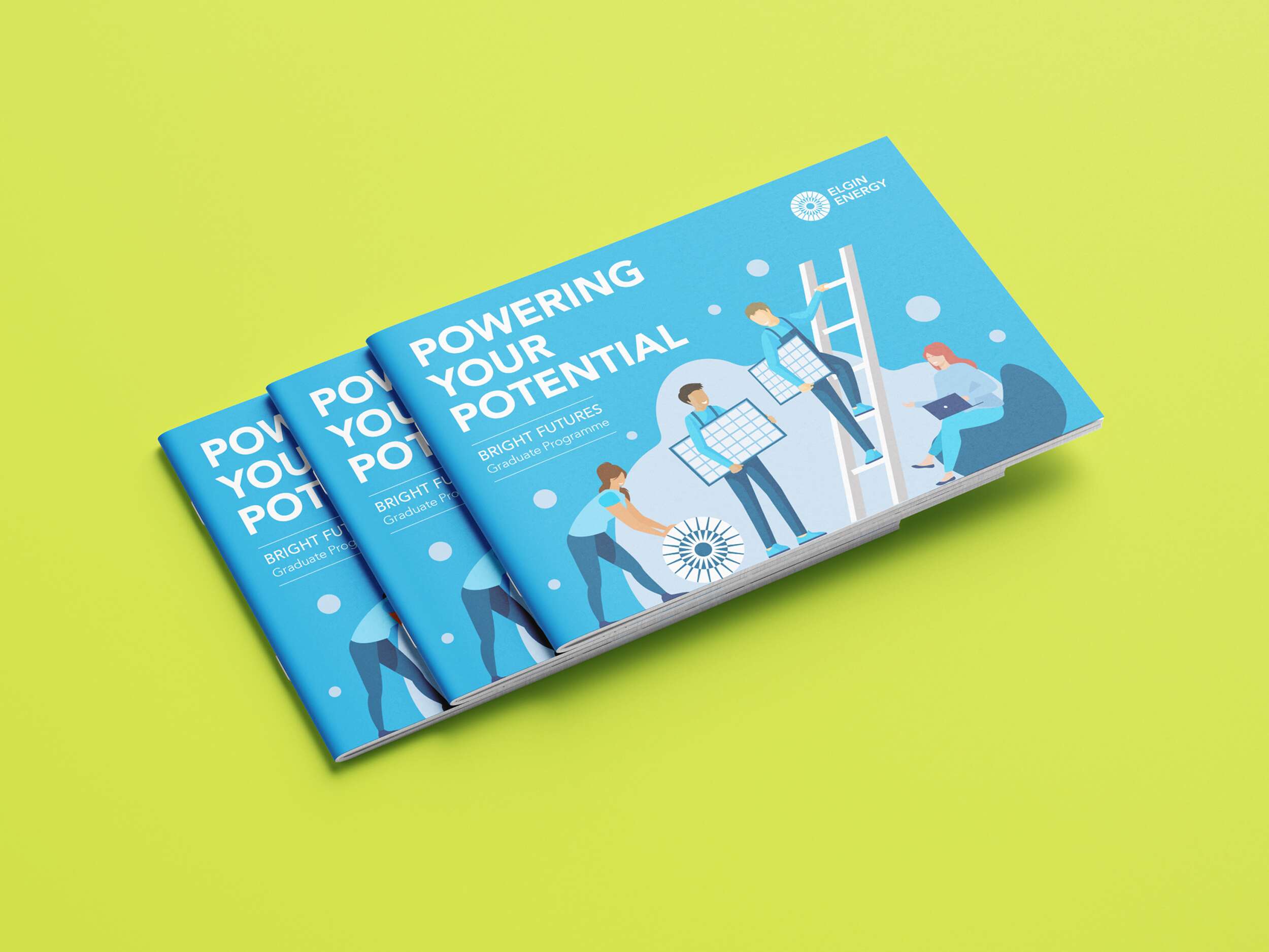
This brochure was created as a Candidate Pack for Elgin Energy, designed to be both an introduction to the company and a compelling invitation for potential new team members. With Elgin undergoing a major period of growth, scaling from a team of 60 to 250, the goal was to design something that felt fresh, engaging, and reflective of the company’s forward momentum and collaborative culture.
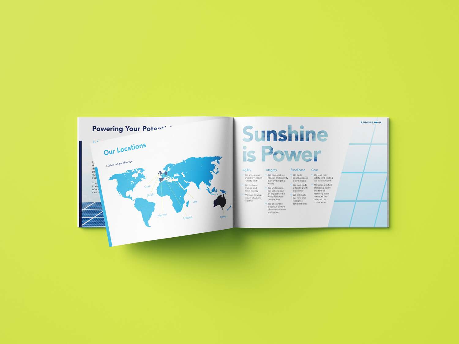
The concept developed is centred around the theme of teamwork and collective progress, the idea of moving upward together toward a shared goal. This is visually expressed through playful, people-focused illustrations that represent collaboration, while also incorporating clear nods to Elgin’s solar and energy work, like integrated solar panel motifs and the brand’s emblem.
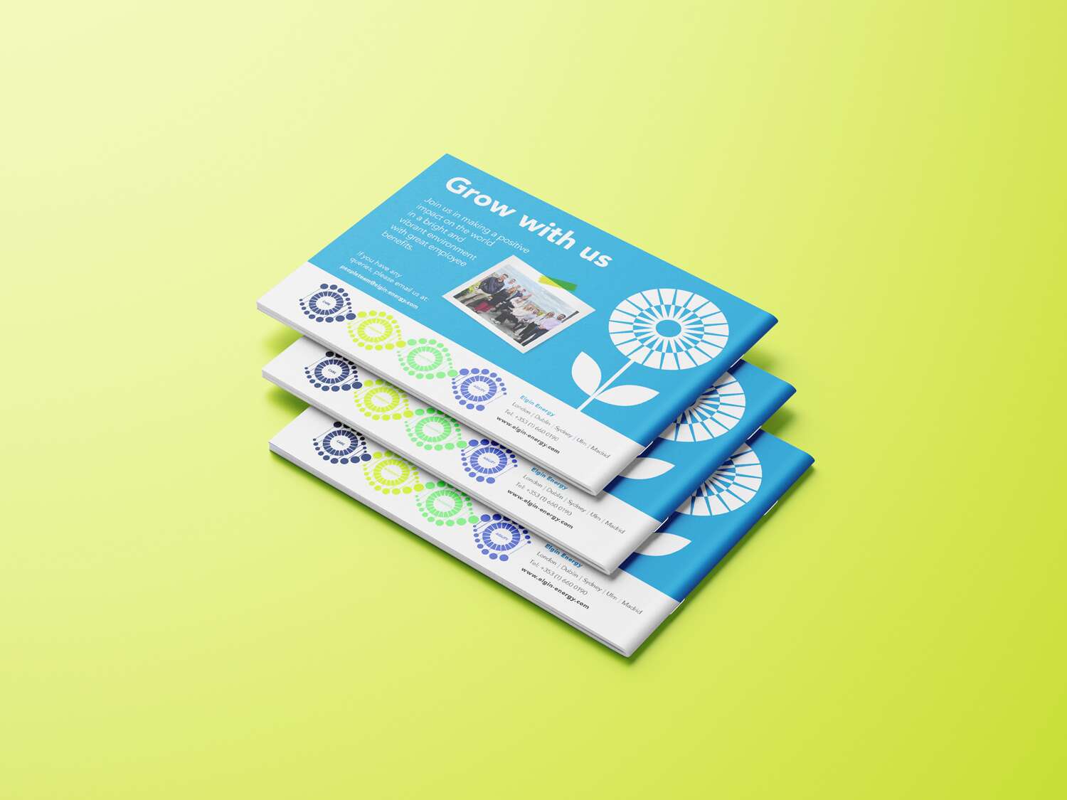
The emblem itself is used throughout to help build instant brand recognition, including one page where it forms the shape of a flower alongside the phrase “Grow with us,” which ties back to the company’s emphasis on development and opportunity.
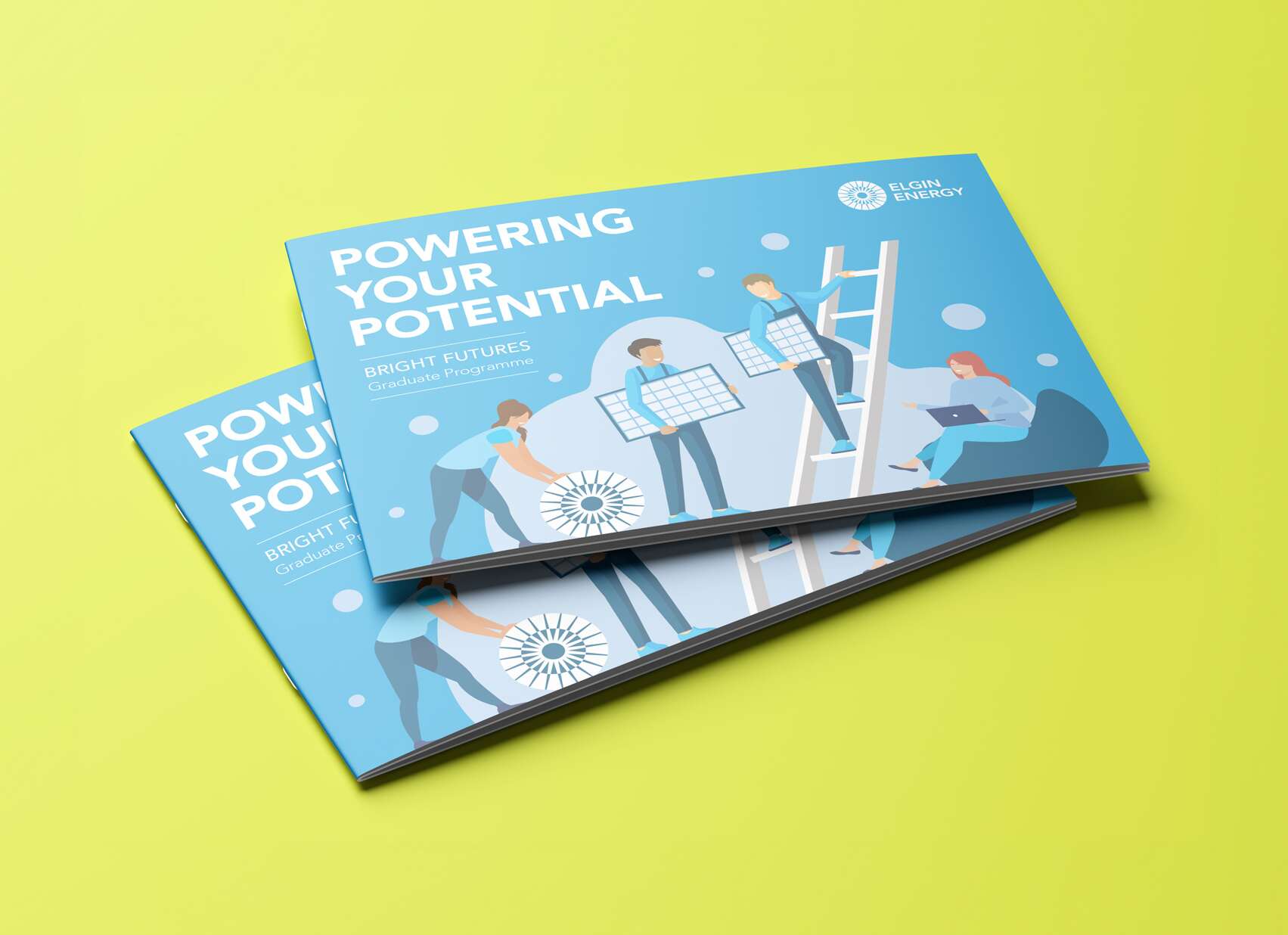
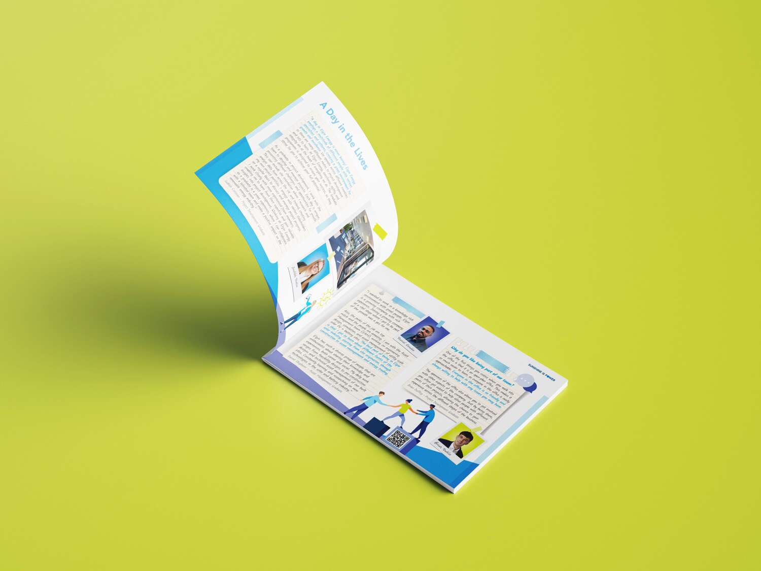
The format chosen is an A5 landscape layout with twelve pages in total – five internal spreads plus front and back covers. The layout is designed to be clean, modern, and easy to read, with a magazine-style flow that combines vibrant photography with thoughtful use of white space and a bright colour palette drawn from Elgin’s brand identity. It strikes a balance between being professional and polished, while still feeling human, fun, and accessible – avoiding anything too stiff or corporate.
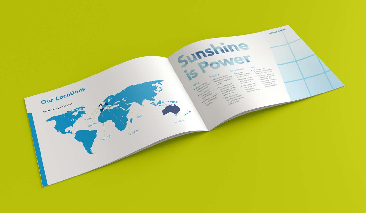
Within the pack, there’s a clear breakdown of who Elgin is and what they do, an overview of their teams and office locations across the UK, Ireland, and Australia, employee testimonials that bring authentic voices into the mix, and a step-by-step guide to the recruitment process. There’s also a dedicated section for the ‘Bright Futures Graduate Programme’, tied in with Elgin’s core message of growth and innovation, and reinforced by the optimistic slogan, ‘Sunshine is Power’.

The overall aim was to design something that not only informs, but also excites – to capture the energy of Elgin as a company, reflect its values, and makes prospective candidates feel inspired to become a part of it. Elgin were very happy with the results.
Follow Elgin Energy online:
Facebook: @Elgin-Energy
Website: elgin.com

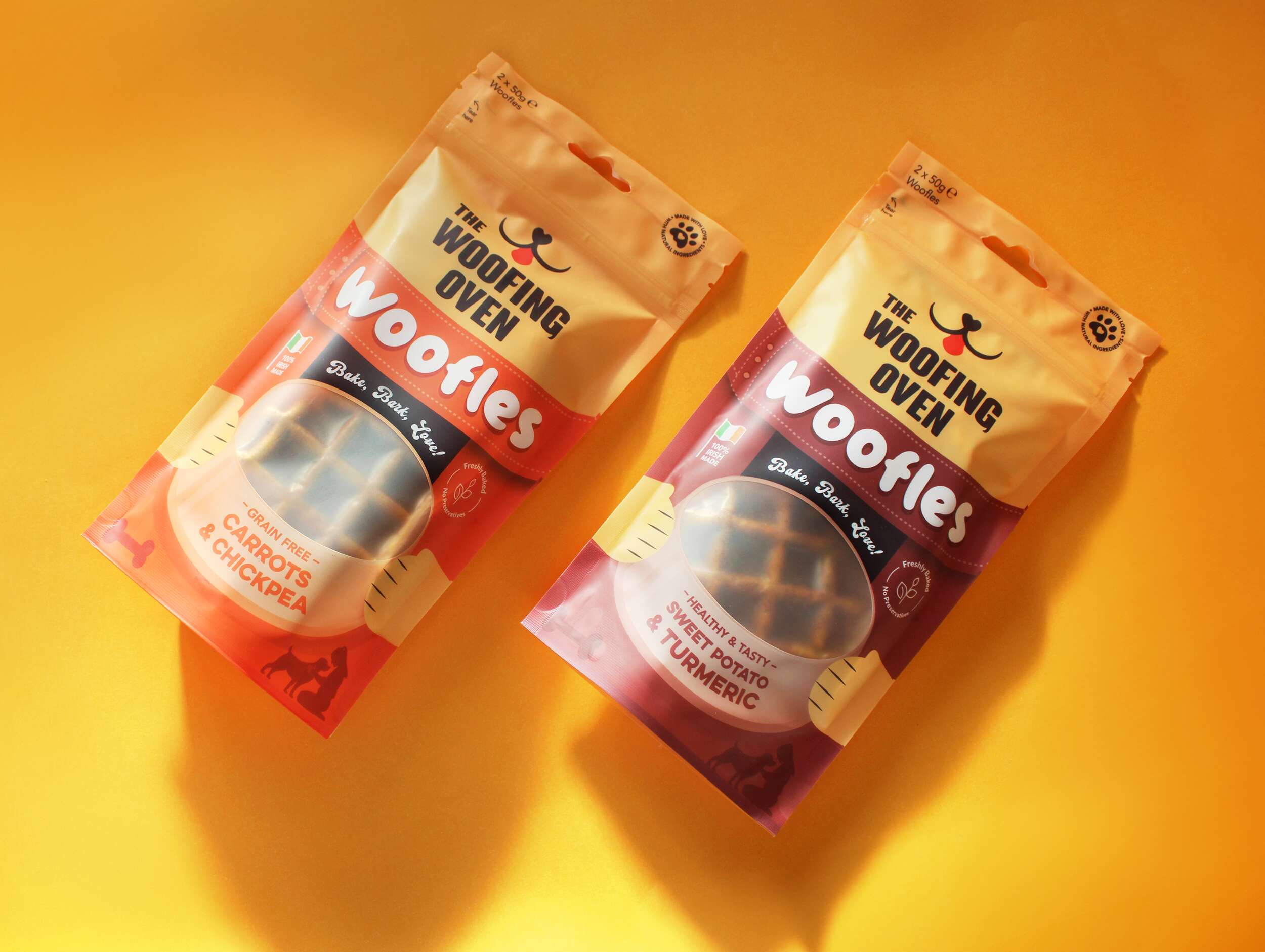
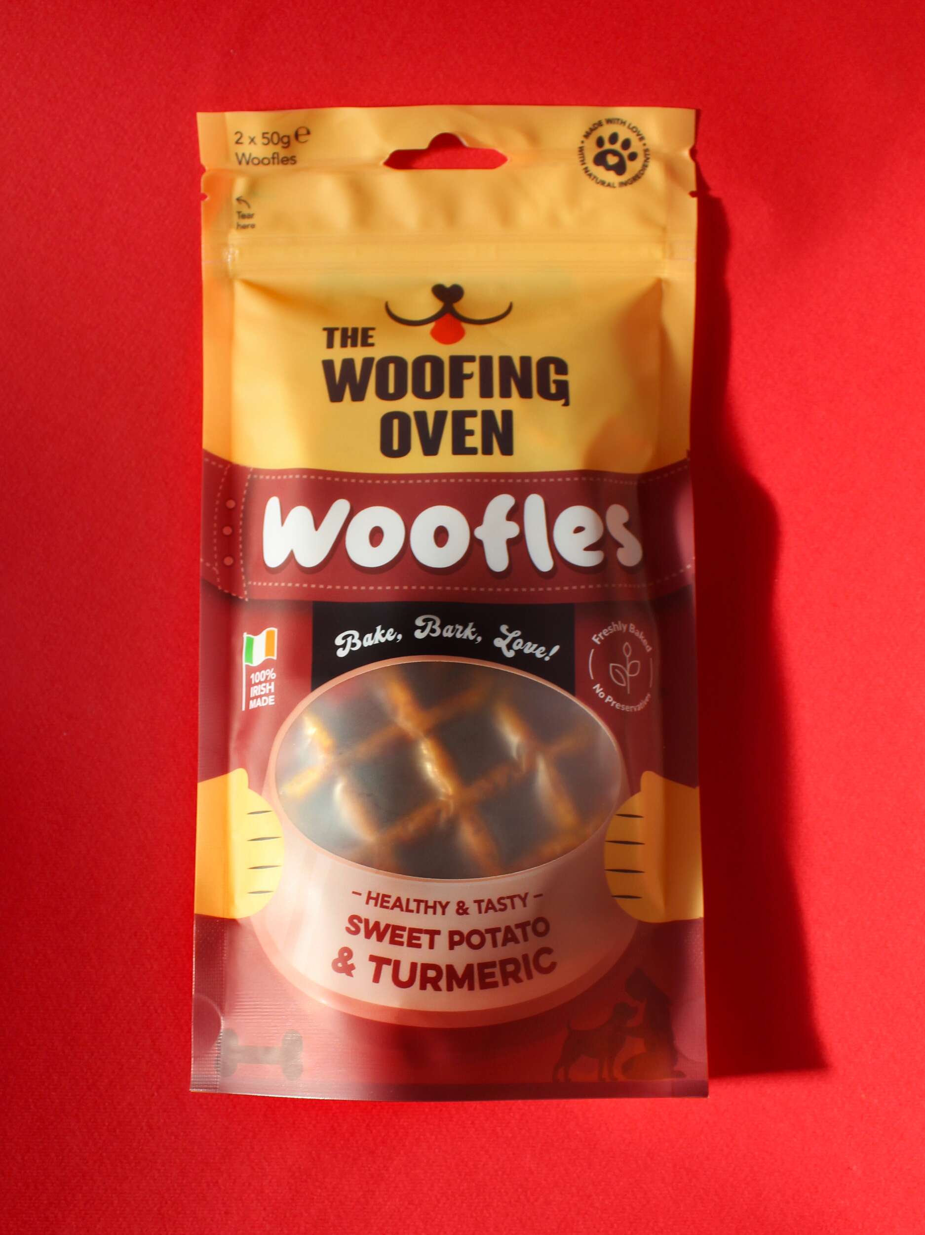
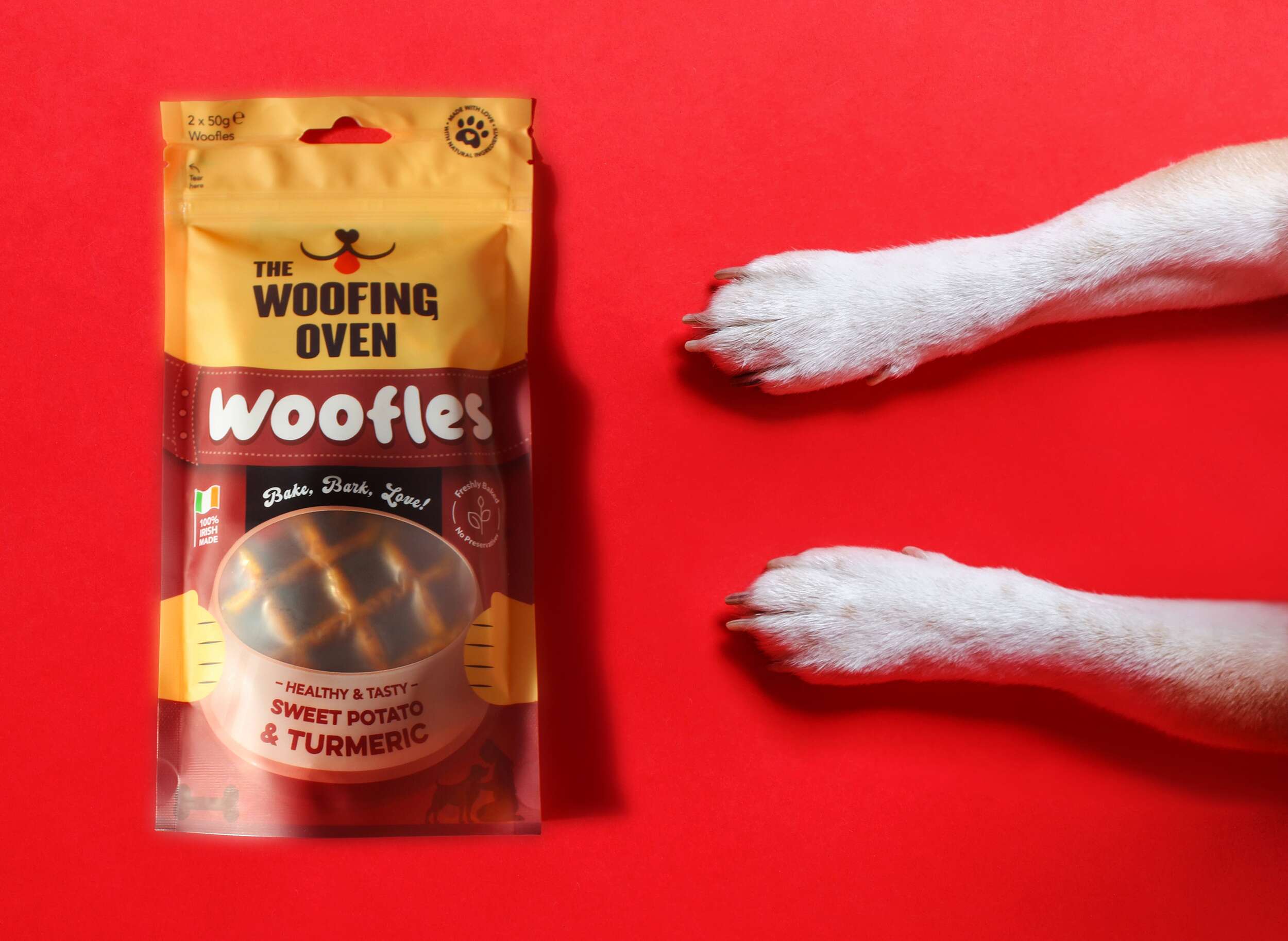
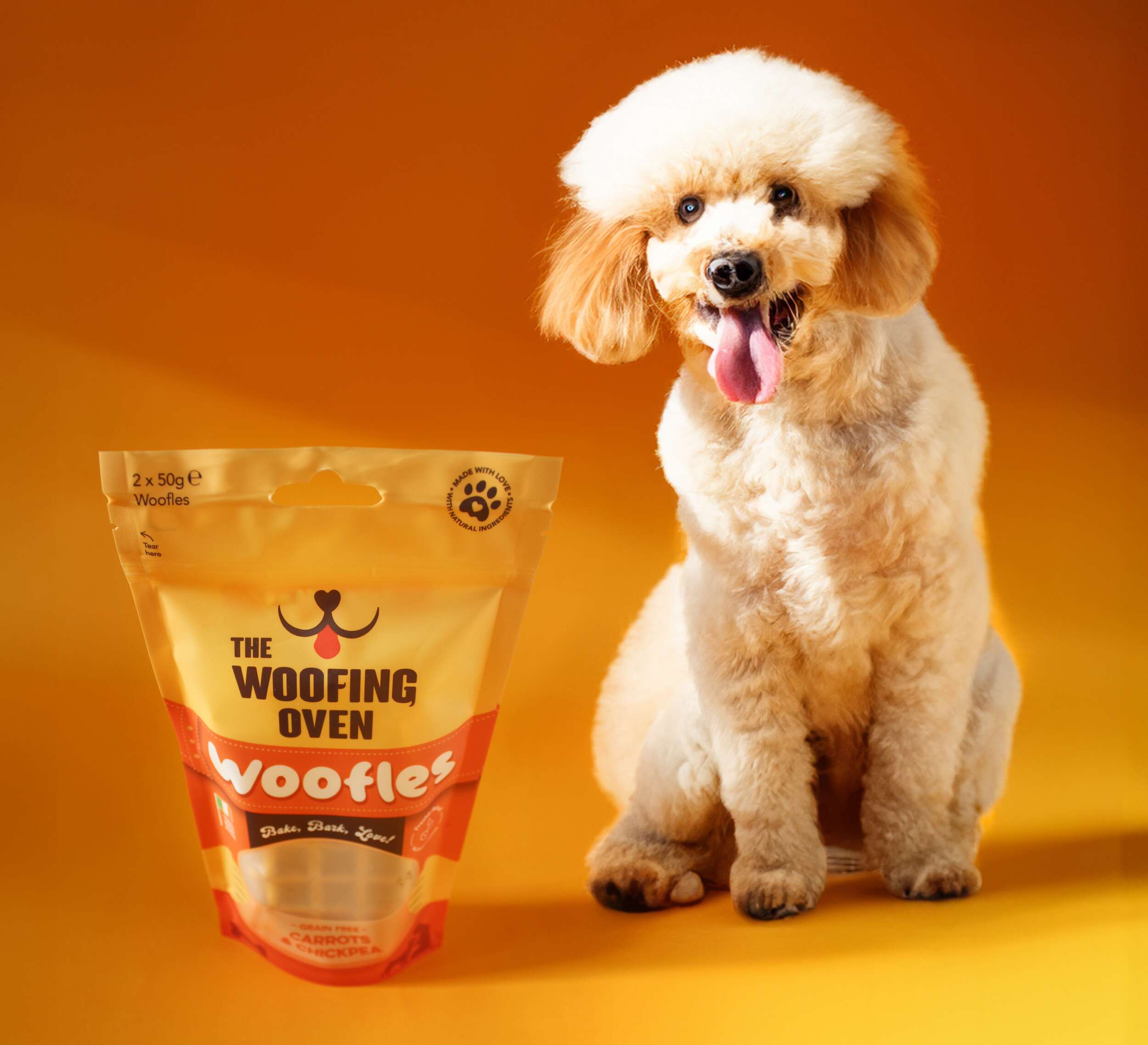
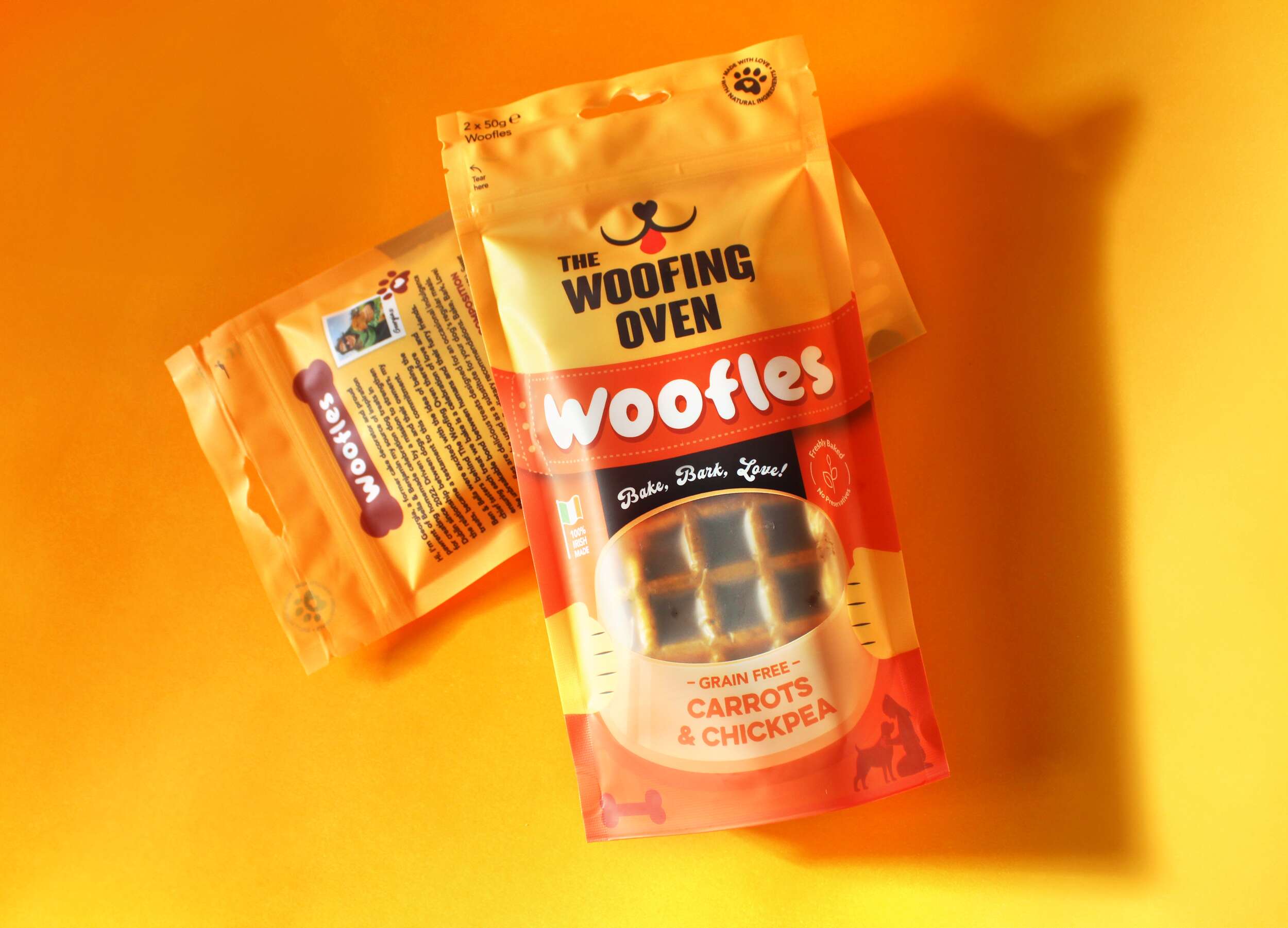
The Woofing Oven Dog Bakery: Brand Packaging Design
The Woofing Oven Dog Bakery: Brand Packaging Design

The Woofing Oven is a Dublin-based home-run bakery for dogs, crafting a fun and creative range of gourmet treats to pamper your furry friends with the love and care they deserve.
The Woofing Oven firmly craft their dog treats with love, care, and thoughtfulness. All of their products are homemade and created in small batches, reaffirming their commitment to producing celebratory dog treats made from 100% natural ingredients, locally sourced, and proudly the first specialised treats produced and marketed in Ireland.
Their mission is to become Ireland’s foremost dog bakery, expanding their product range while remaining dedicated to their goal of being a part of your dog’s milestone moments.
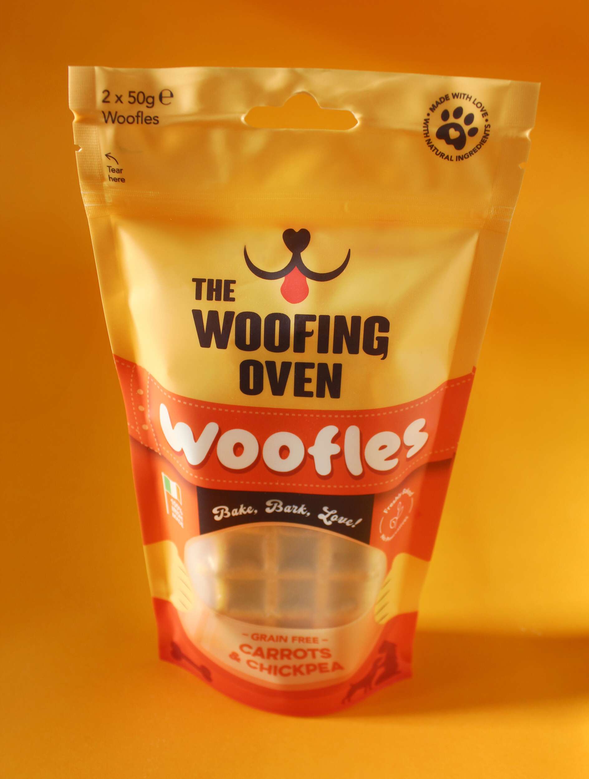

 The Woofing Oven’s packaging design challenge was to create a visually striking, retail-ready package that reflects the brand’s fun, celebratory nature while emphasizing its commitment to quality, natural ingredients, and Irish craftsmanship. The existing brand (formerly known as Bon A Pet Treats) needed a fresh identity that would stand out in a crowded dog food aisle, making the transition from local markets to mainstream retail.
The packaging had to balance playfulness and sophistication, capturing the brand’s core values: gourmet quality, homemade care, and the celebration of the bond between dogs and their owners. Our goal was to create a design that was instantly recognizable, incorporating bright and vibrant colours with a playful dog icon and a fun logo featuring flicks reminiscent of dog tails. The use of fonts like FTF Brotein for headings and Hittedal Script for a handwritten touch helped to convey the brand’s personal, handcrafted approach.
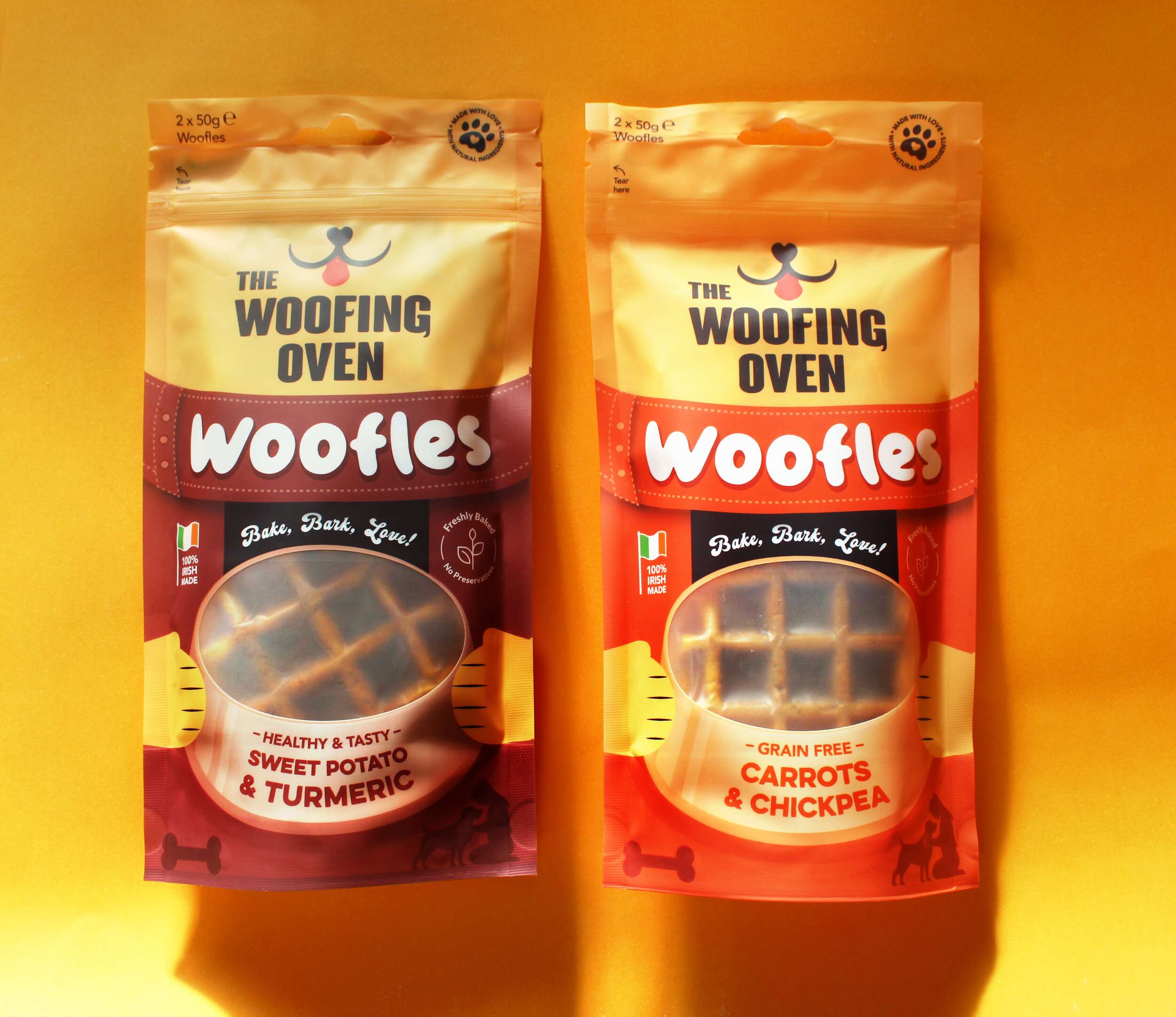
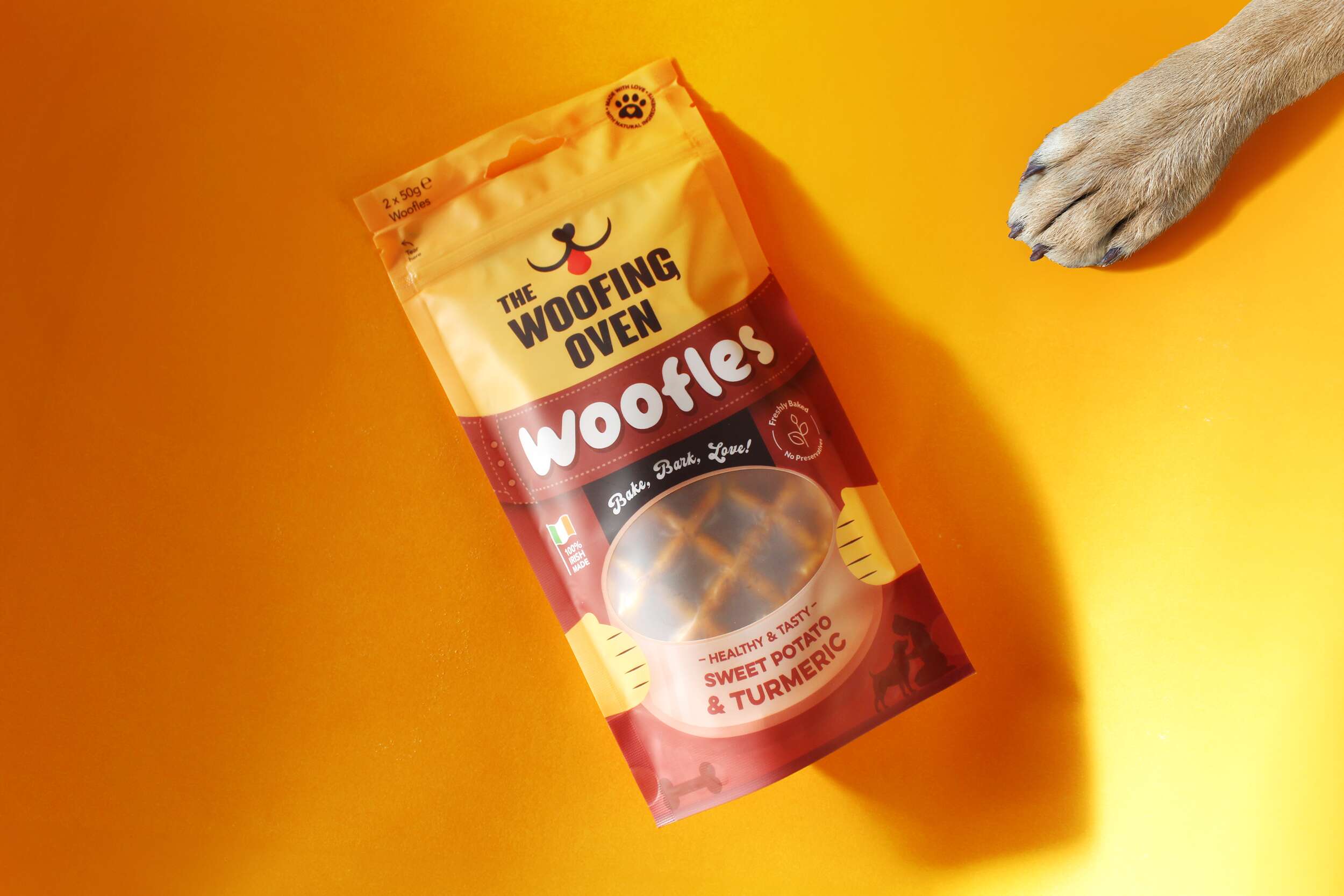
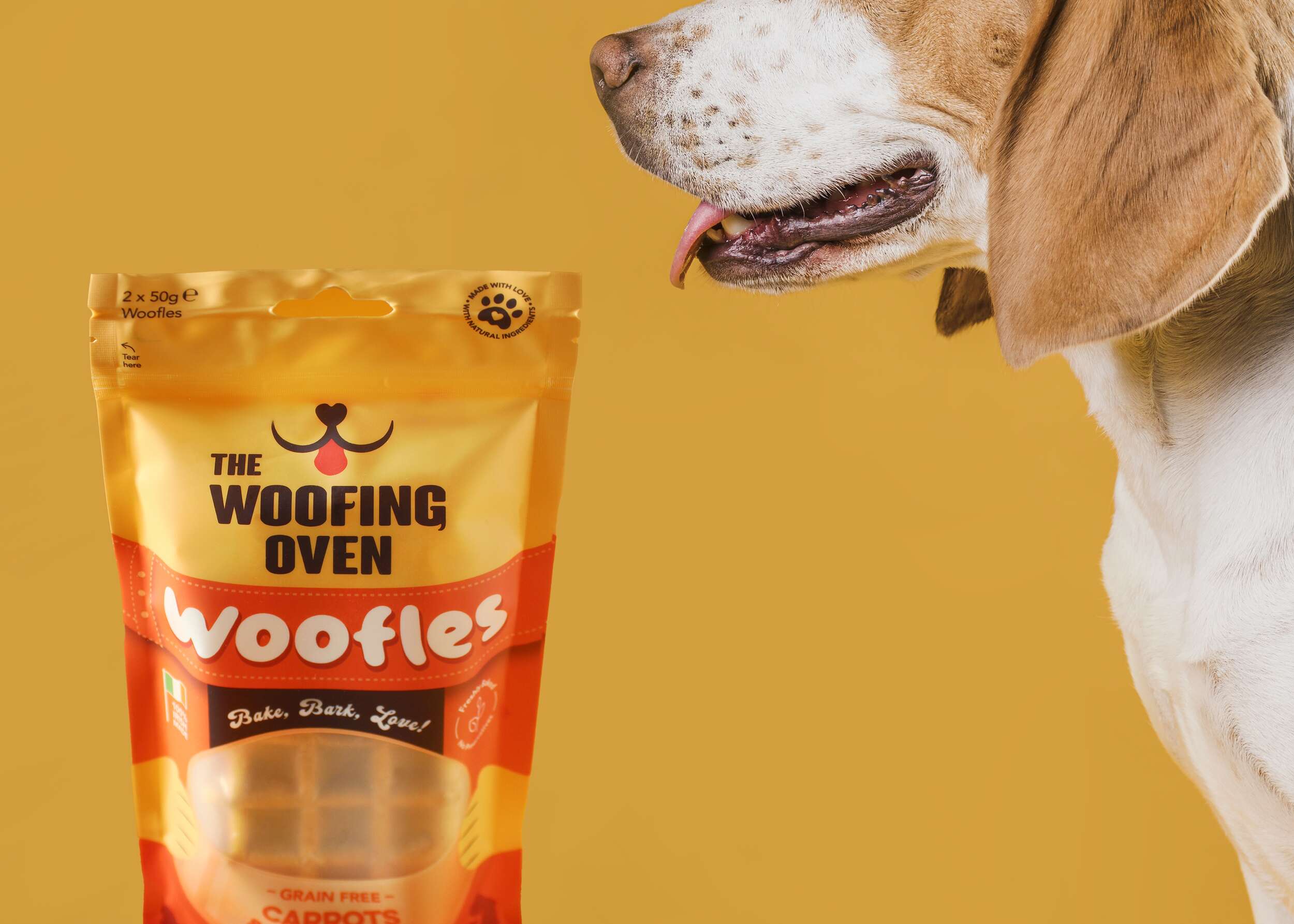
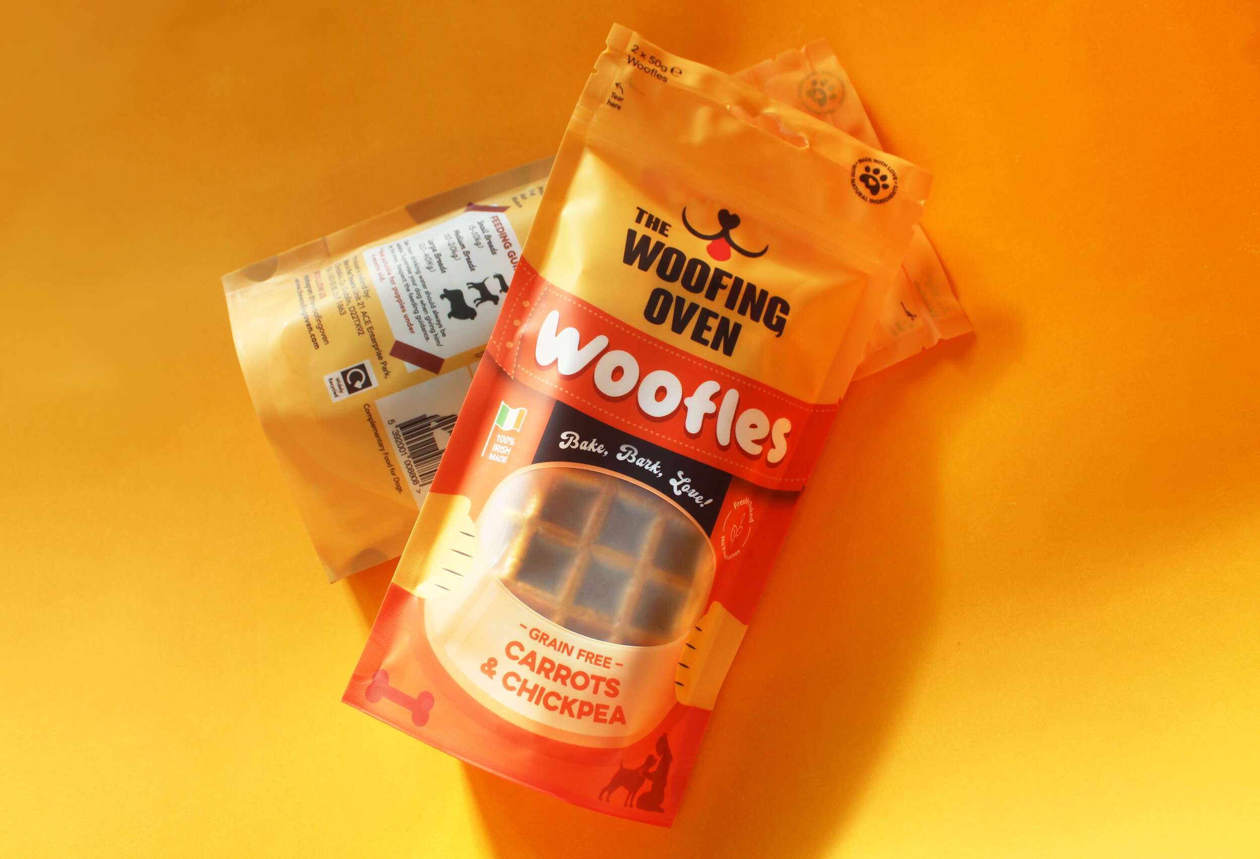
The packaging design for The Woofing Oven reflects the brand’s mission to provide gourmet, all-natural dog treats in a way that’s both fun and functional, while ensuring retail success. One of the standout features of the packaging is the window at the front of the packs, which showcases the product itself – “Woofles,” a unique waffle treat for dogs. This window is framed by a graphic of a dog bowl, with an illustration of two paws holding the bowl on either side. The product’s appearance is a key selling point, and this window allows the Woofles to be seen directly, reinforcing the quality and novelty of the treat.
To further enhance flavour recognition, each flavour pack features a distinct colour, making it easy for consumers to differentiate between products on the shelf. The flavour description sits within the dog bowl graphic on the front, adding clarity to the playful design. An icon with a paw print containing a heart is prominently displayed alongside the text “Made with love, using natural ingredients,” reinforcing the brand’s commitment to homemade, high-quality products crafted with care.
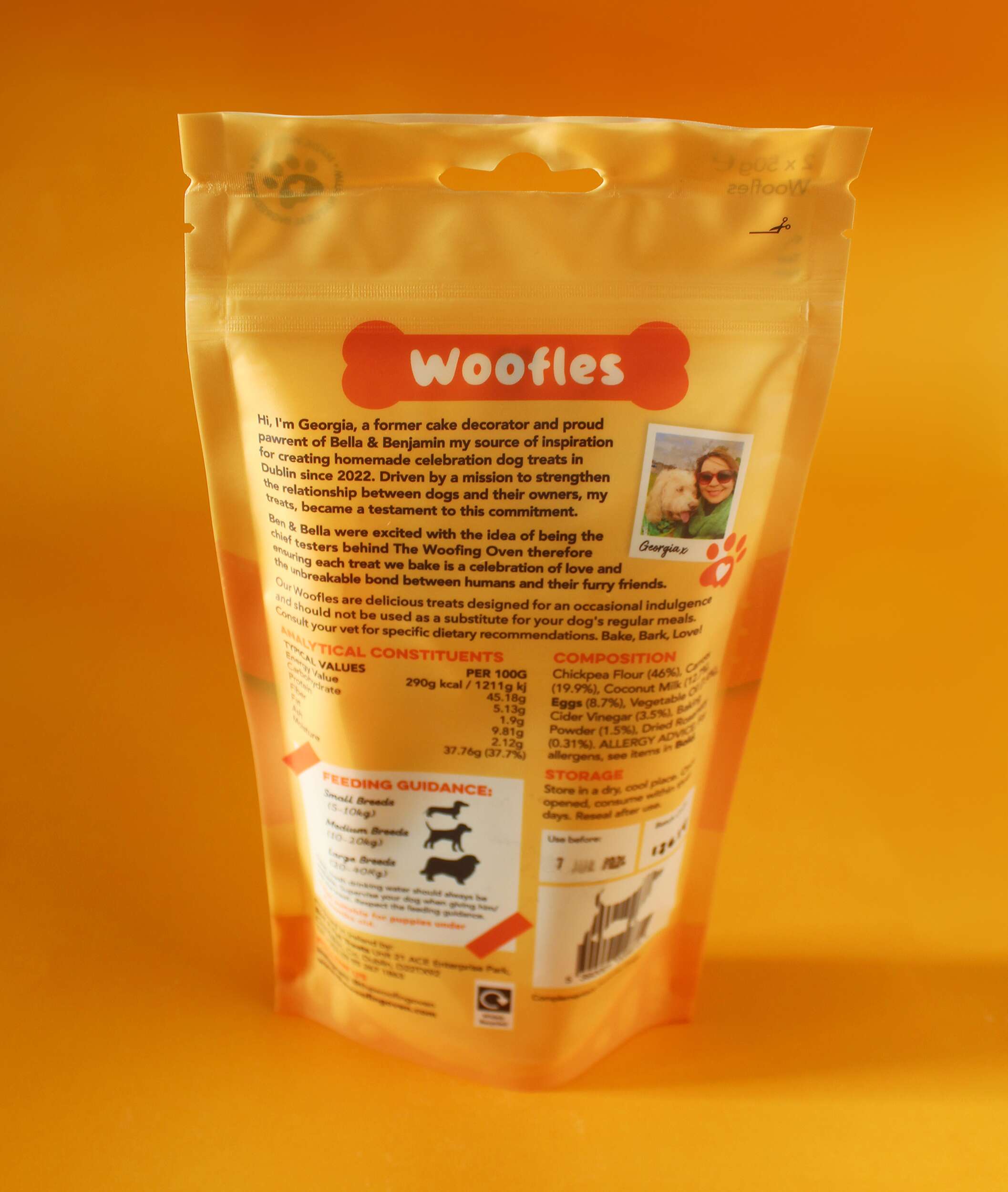
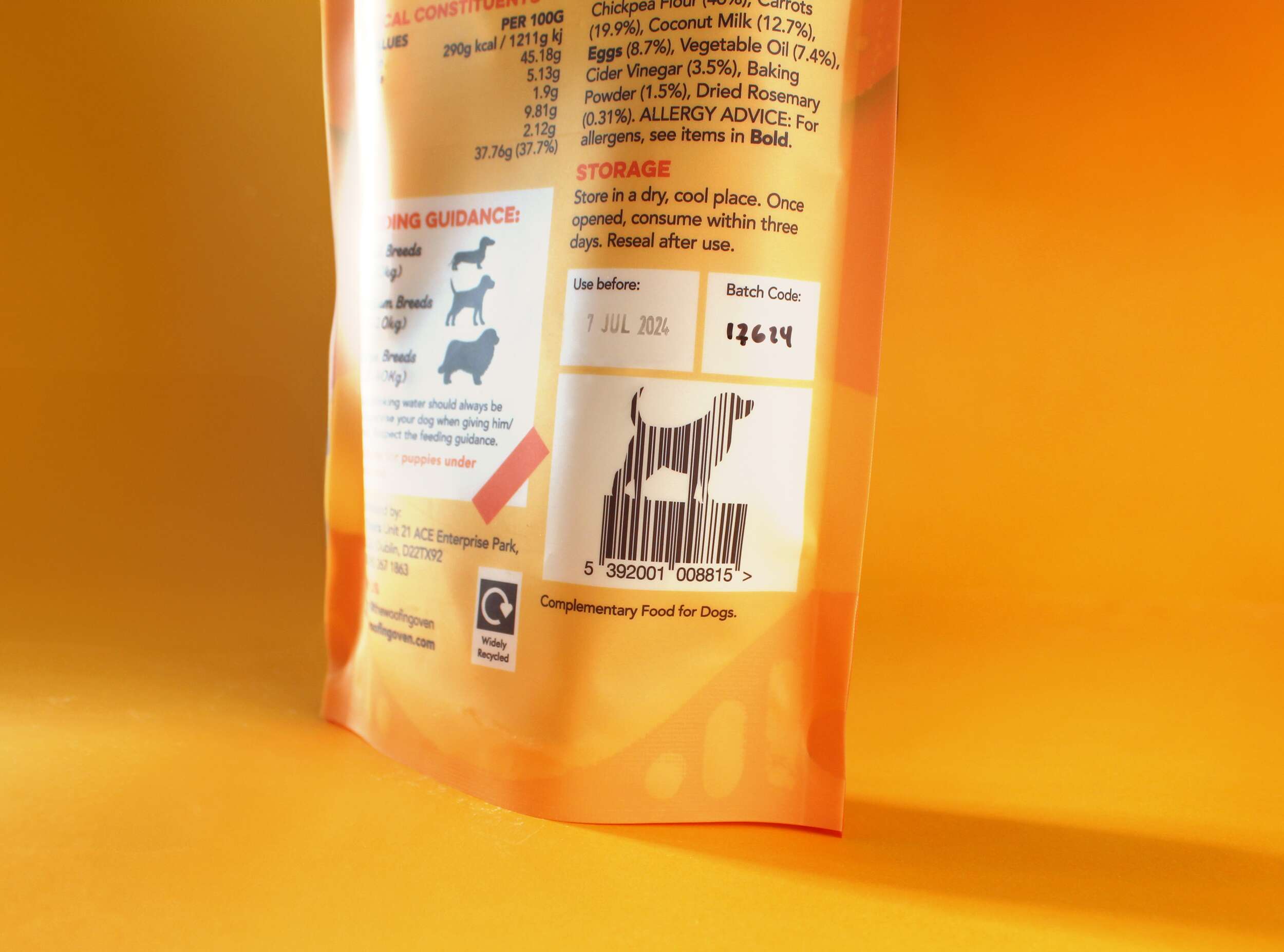
The back of the pack offers additional features aimed at connecting with consumers. It includes a personal brand story, helping to establish the business as a small, local bakery with a strong passion for dogs. Feeding instructions are displayed with icons showing portion sizes for different dog breeds, helping consumers make informed decisions based on their dog’s size. Another unique element is the barcode, shaped like a dog, adding creativity that aligns with the fun, dog-centric theme.
The packaging highlights the product’s sustainability, featuring an icon communicating that the pack is widely recyclable, as it’s made from polyethylene (PE). Small visual touches throughout the design, such as icons of a plant with the phrase “Freshly baked, no preservatives” and an illustration of an owner with their dog, further that these treats are healthy, natural, and designed specifically for dogs.
The Woofing Oven’s packaging design strikes the perfect balance between playful visual elements and key functional features, making it memorable, engaging, and informative for dog lovers seeking premium treats.
Follow The Woofing Oven on Social Media:
Instagram: @thewoofingoven
Facebook: The Woofing Oven
Packaging printed by Epac Flexibles:
Instagram: @epacflexiblepackaging
Website: epacflexibles.com

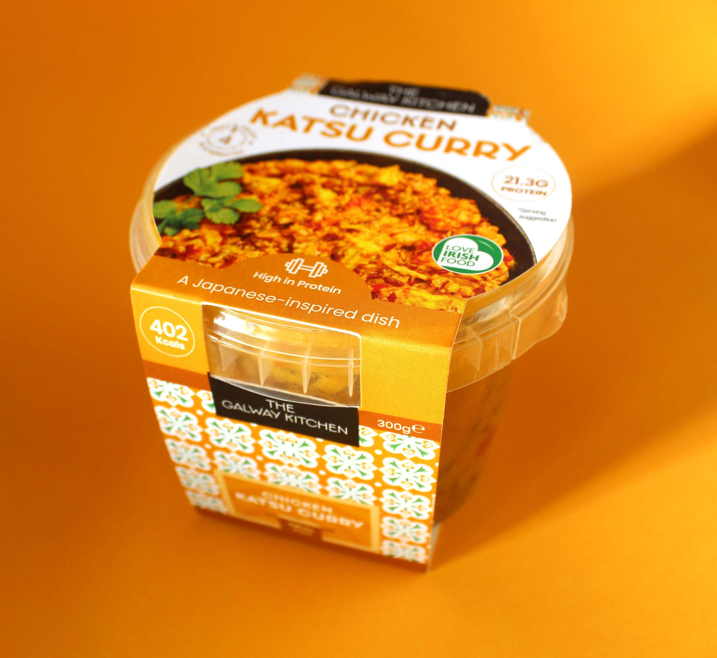
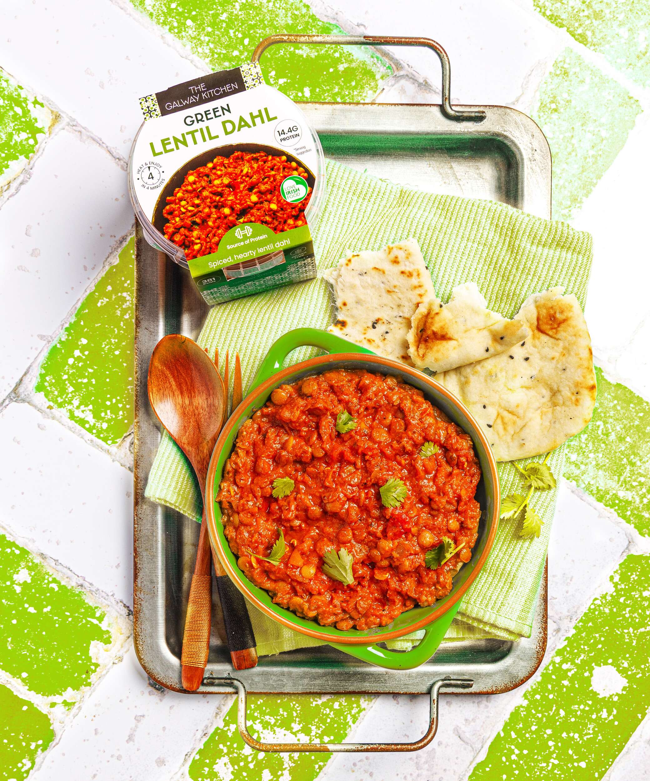
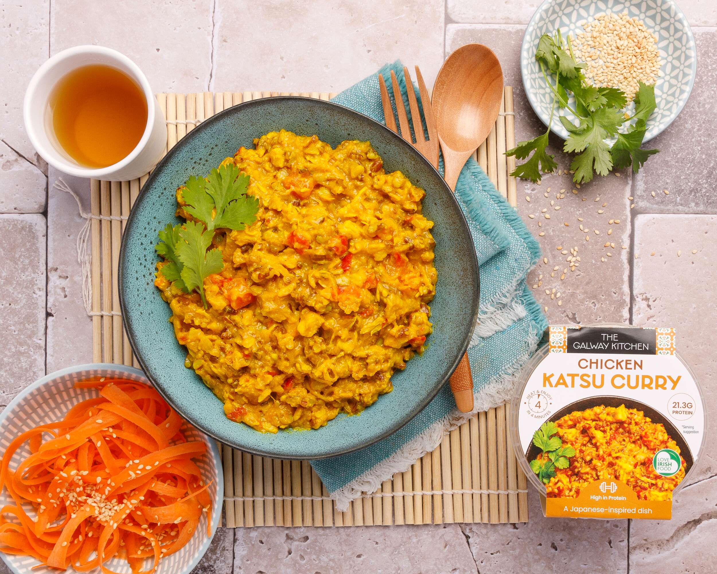
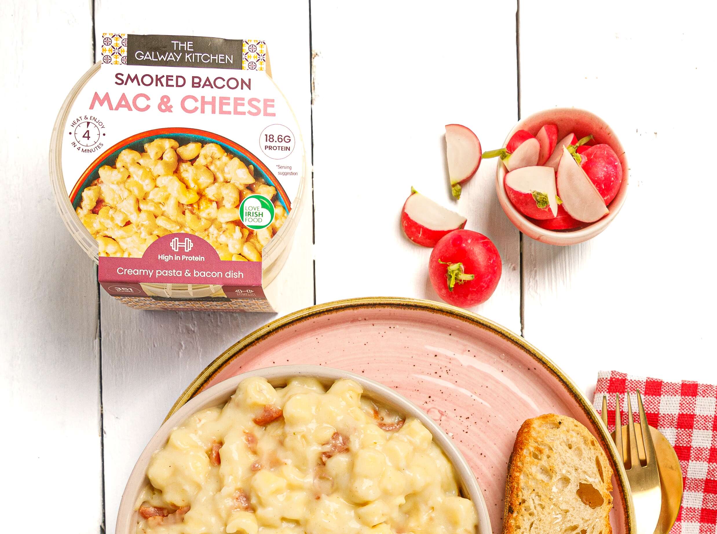
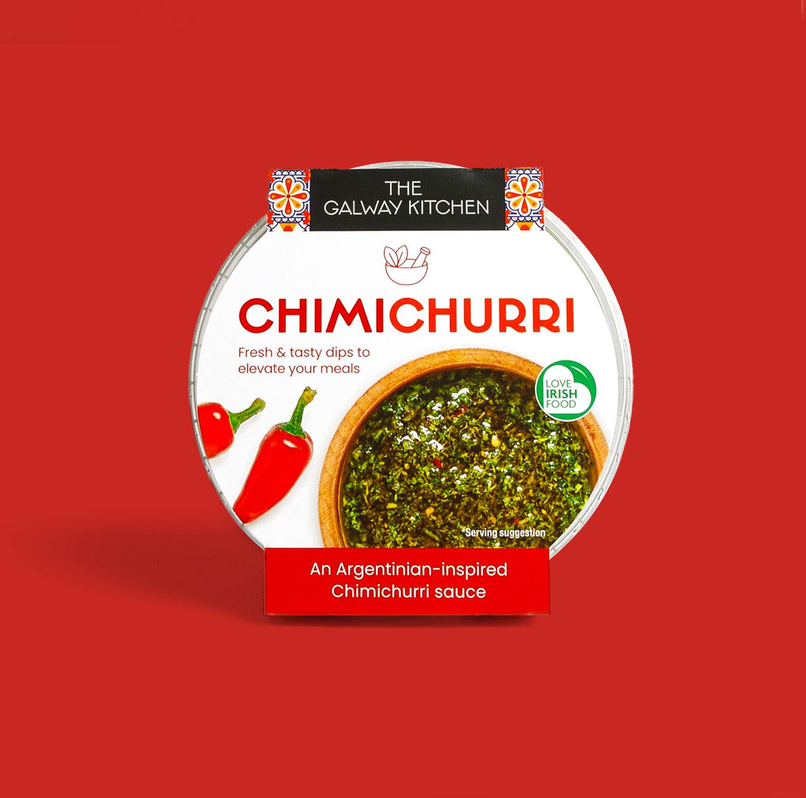
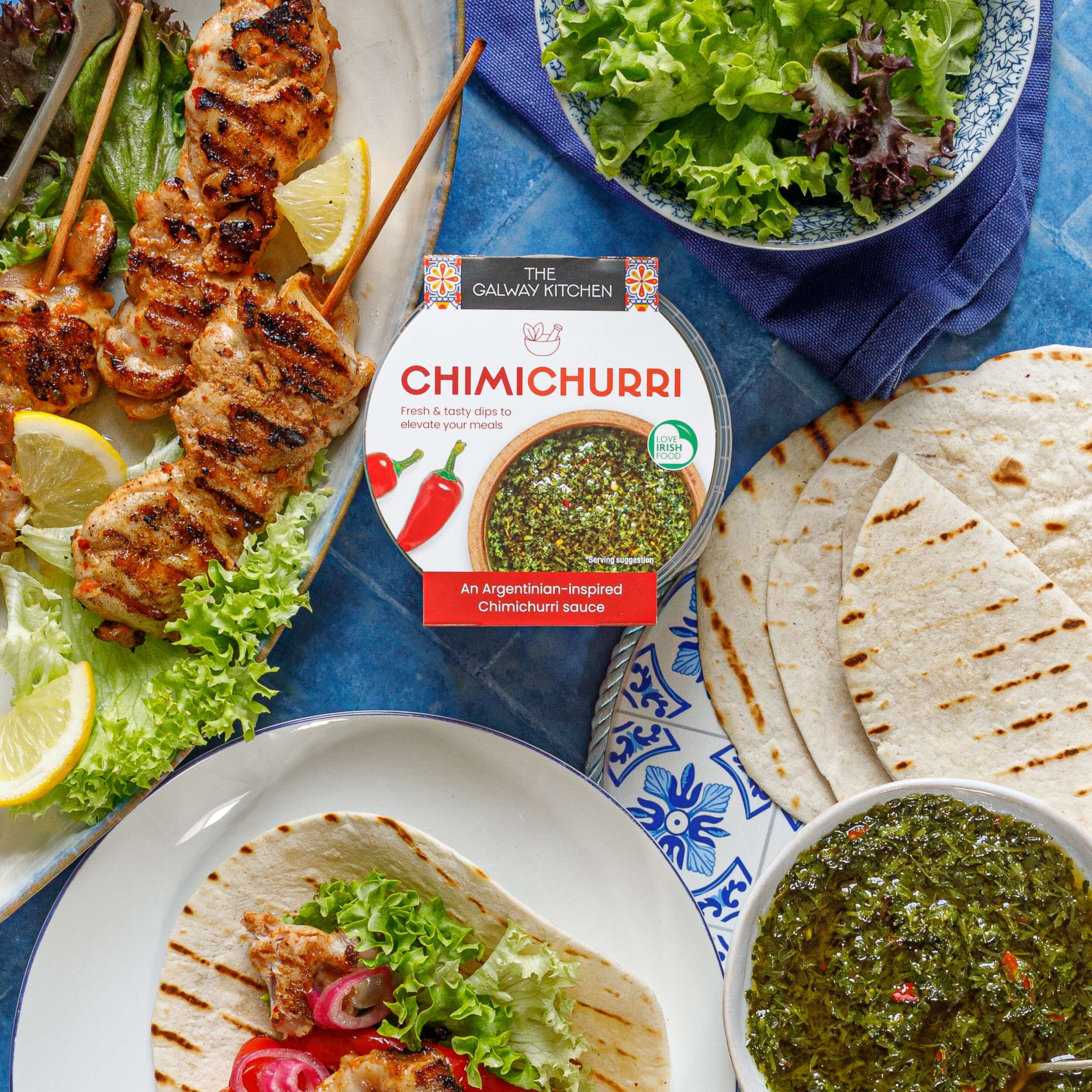
The Galway Kitchen: Hot Pot Ready Meals Packaging Design
The Galway Kitchen: Hot Pot Ready Meals Packaging Design

The Galway Kitchen’s food range includes global flavours, inspired by much-loved tastes from around the world, made in their kitchen at the heart of Galway.
The Galway Kitchen brand already existed for their popular houmous dips range when they contacted Clare Lynch Creative. They asked if we could create the packaging design for these hot pot ready meals, to work well alongside their existing houmous range, and also the snack pack range and tasty dips range designed by Clare Lynch Creative, which incorporate bright mediterranean patterns alongside clean, minimal typography and imagery, whilst bringing a fresher vibrant look to the packs to ensure a strong and bold standout impact on shelves.
Another brief request was to show the quality and wholesomeness of the meals by including mouth-watering photography taken by @jenniferocooks. Jennifer also took beautiful in-situ shots of the finished products with their packaging on completion, with the ingredients displayed around the tubs. The Galway Kitchen were delighted with the final design outcome of the range altogether and how well it fits with the rest of their brand range. See their testimonial here…
They are available in @tescoirl stores.
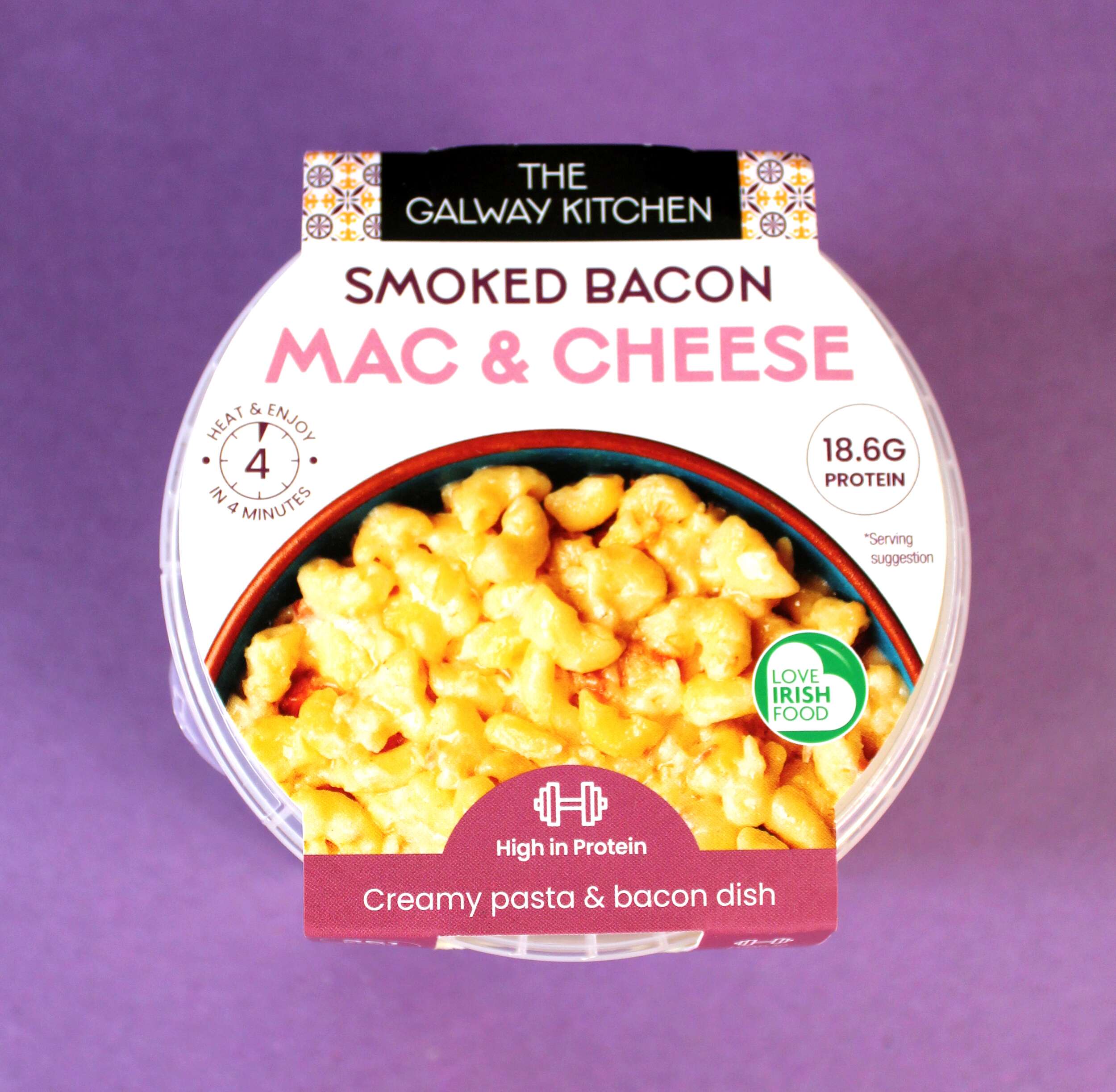
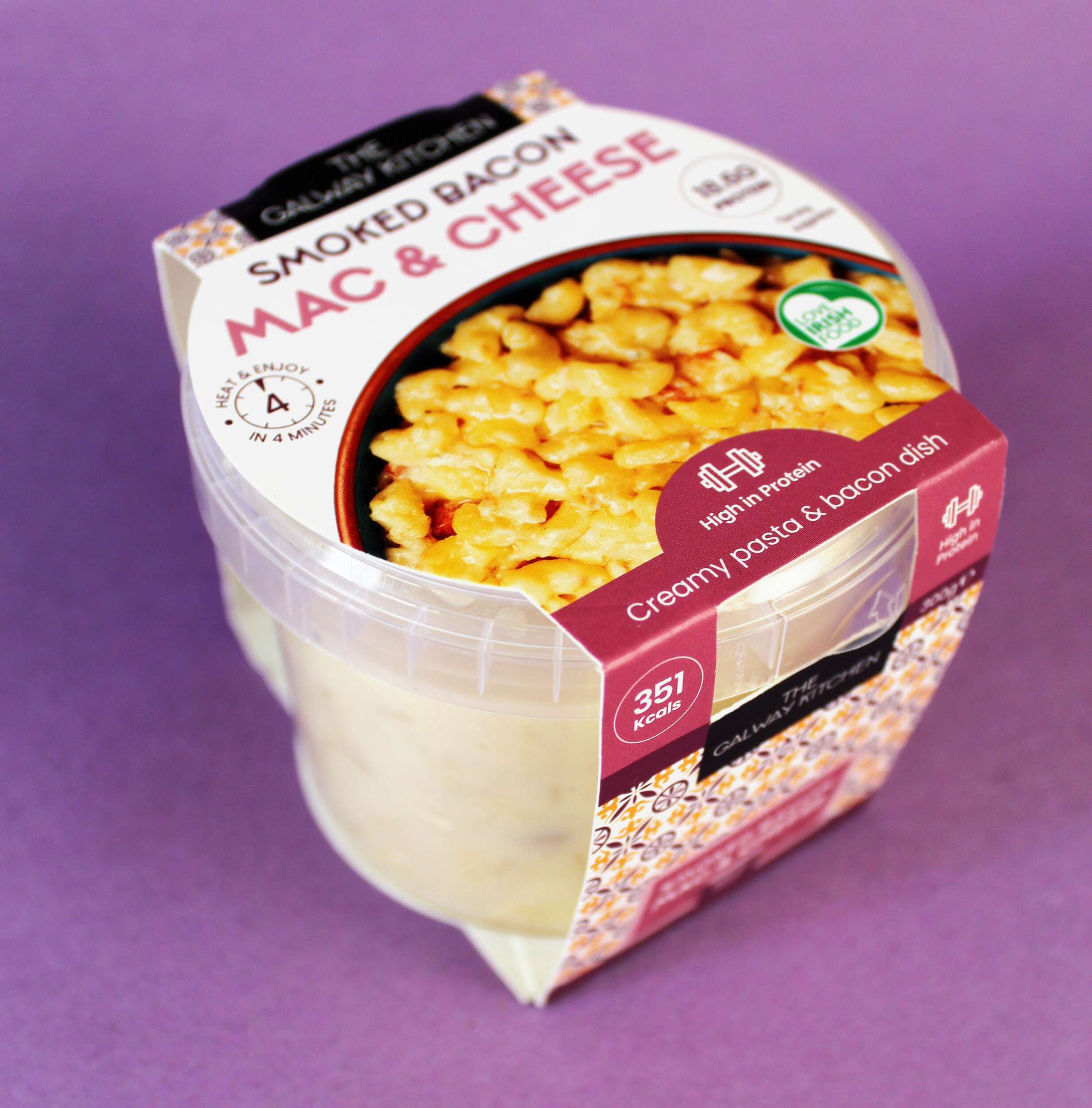
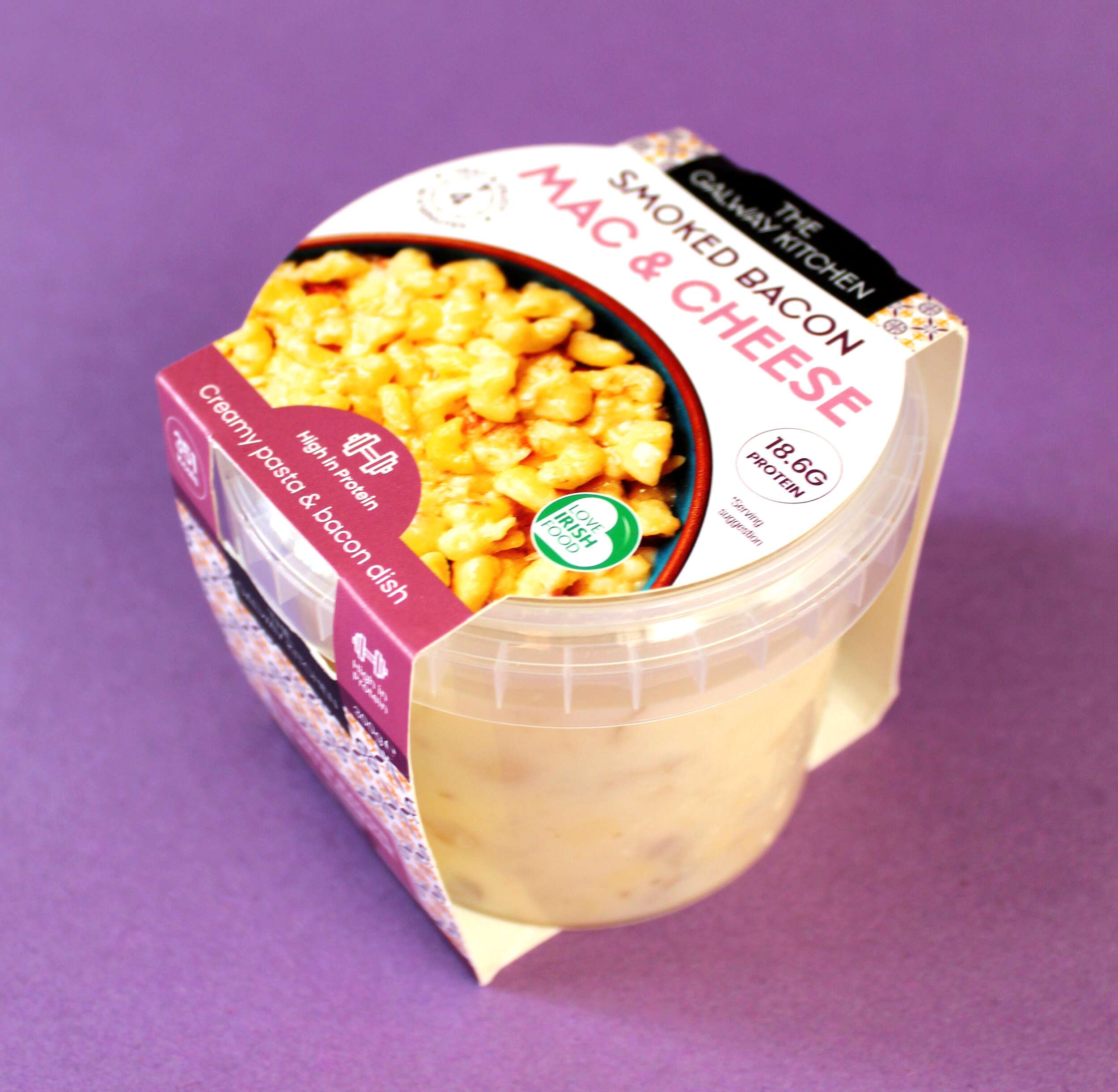
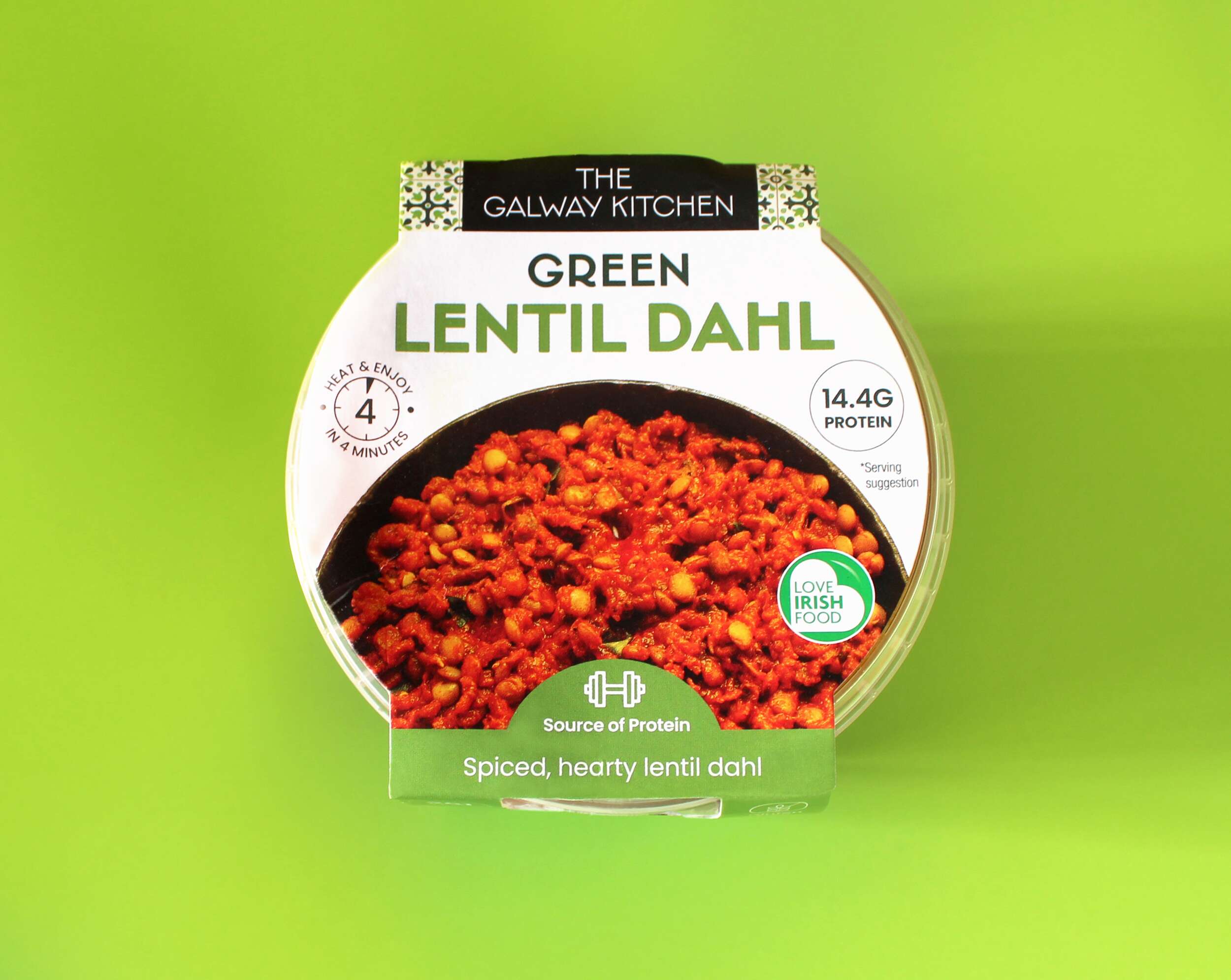
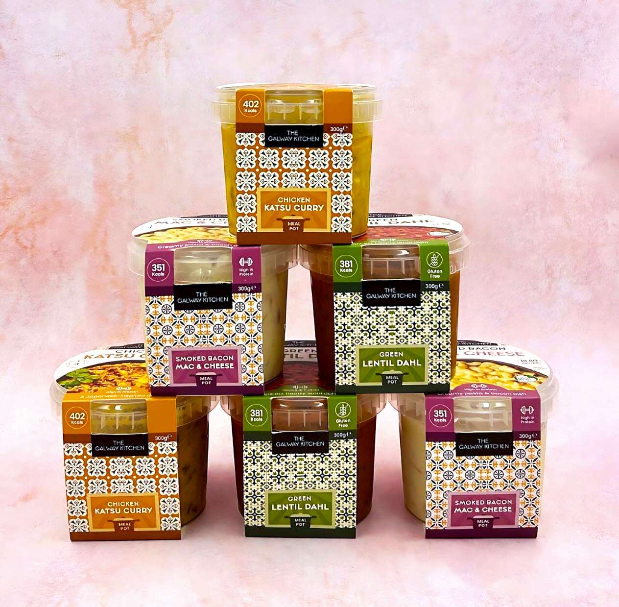
The tasty trio of innovative recipes are inspired by global flavours and made locally in Galway. There is Green Lentil Dahl, Smoked Bacon Mac & Cheese and Japanese-inspired Chicken Katsu Curry. Designed with convenience, great taste and nutrition in mind, these ready meals are a quick and healthy lunch option. The high protein recipes have been developed by their expert team of in-house chefs and are available at Tesco Ireland.
The Galway Kitchen range is available at selected Tesco Ireland stores:
Find them in the fridge at your local Tesco Ireland
www.tesco.ie
www.instagram.com/tescoirl/
Follow The Galway Kitchen at:
@thegalwaykitchen
Photography by Jennifer Oppermann:
@jenniferocooks
www.jenniferoppermann.com
Packaging printed by Priory Press Packaging.
The Galway Kitchen are produced by quality Irish fine food producer Galmere Foods.
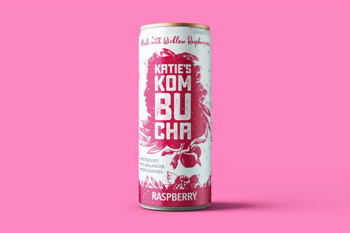
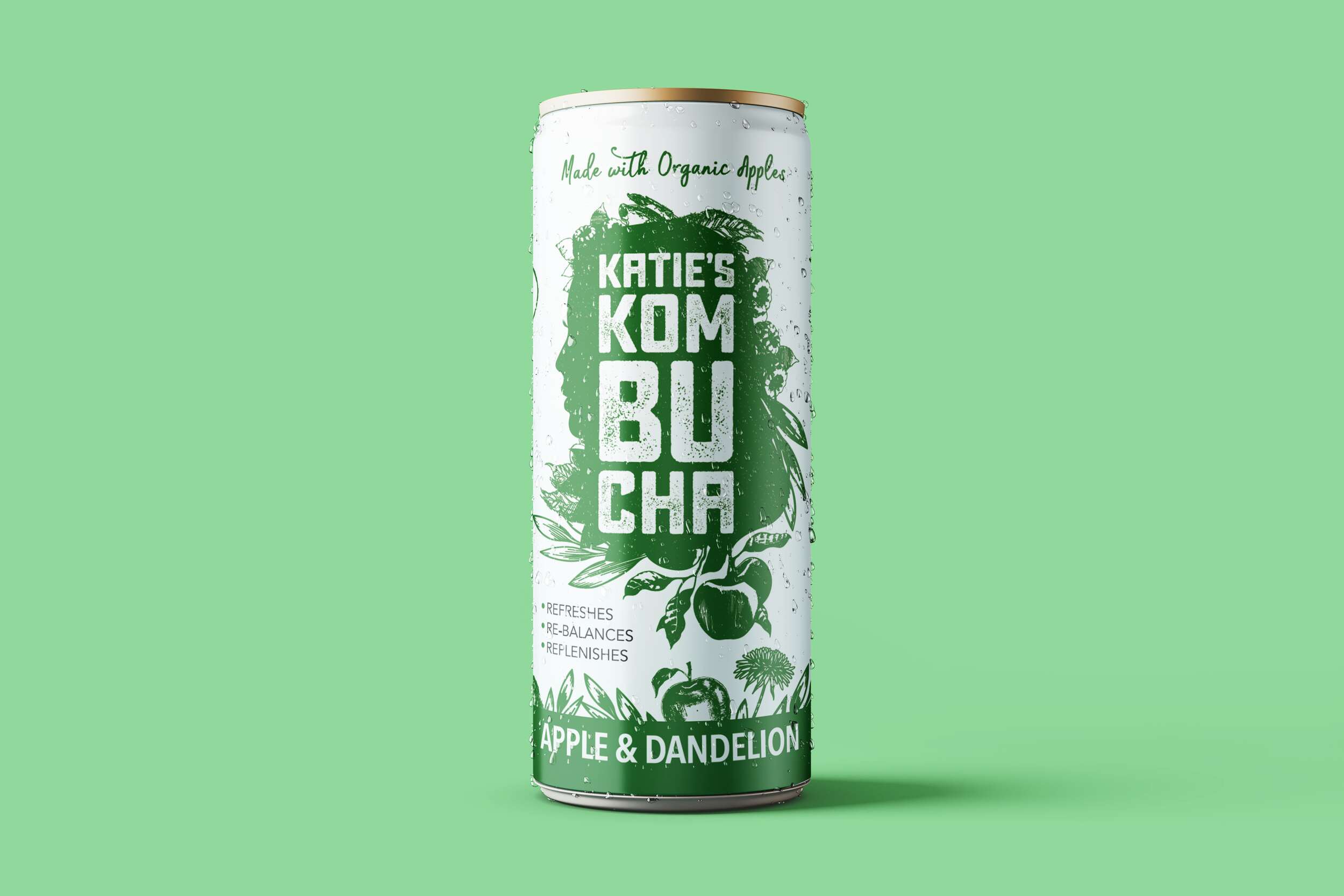
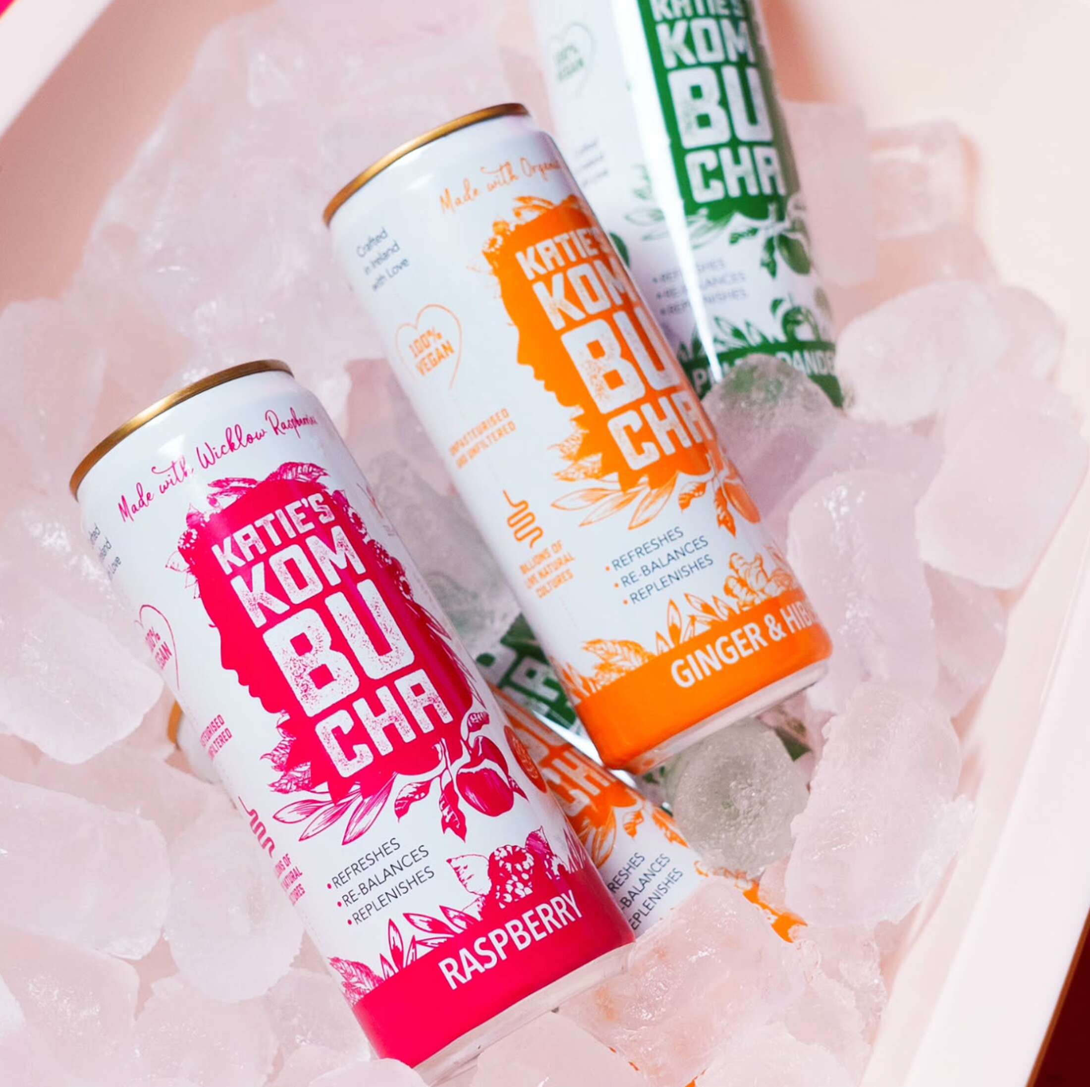
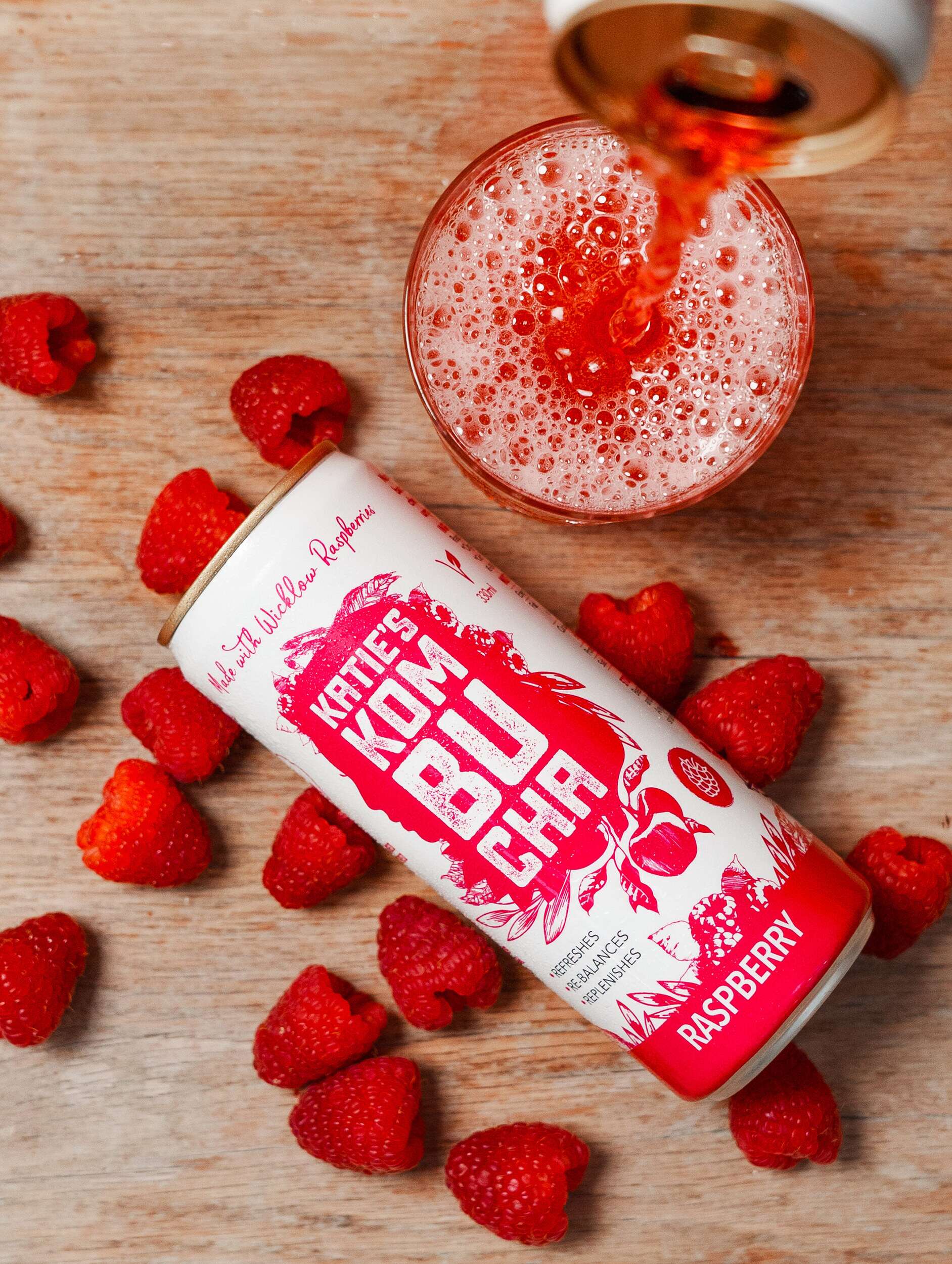
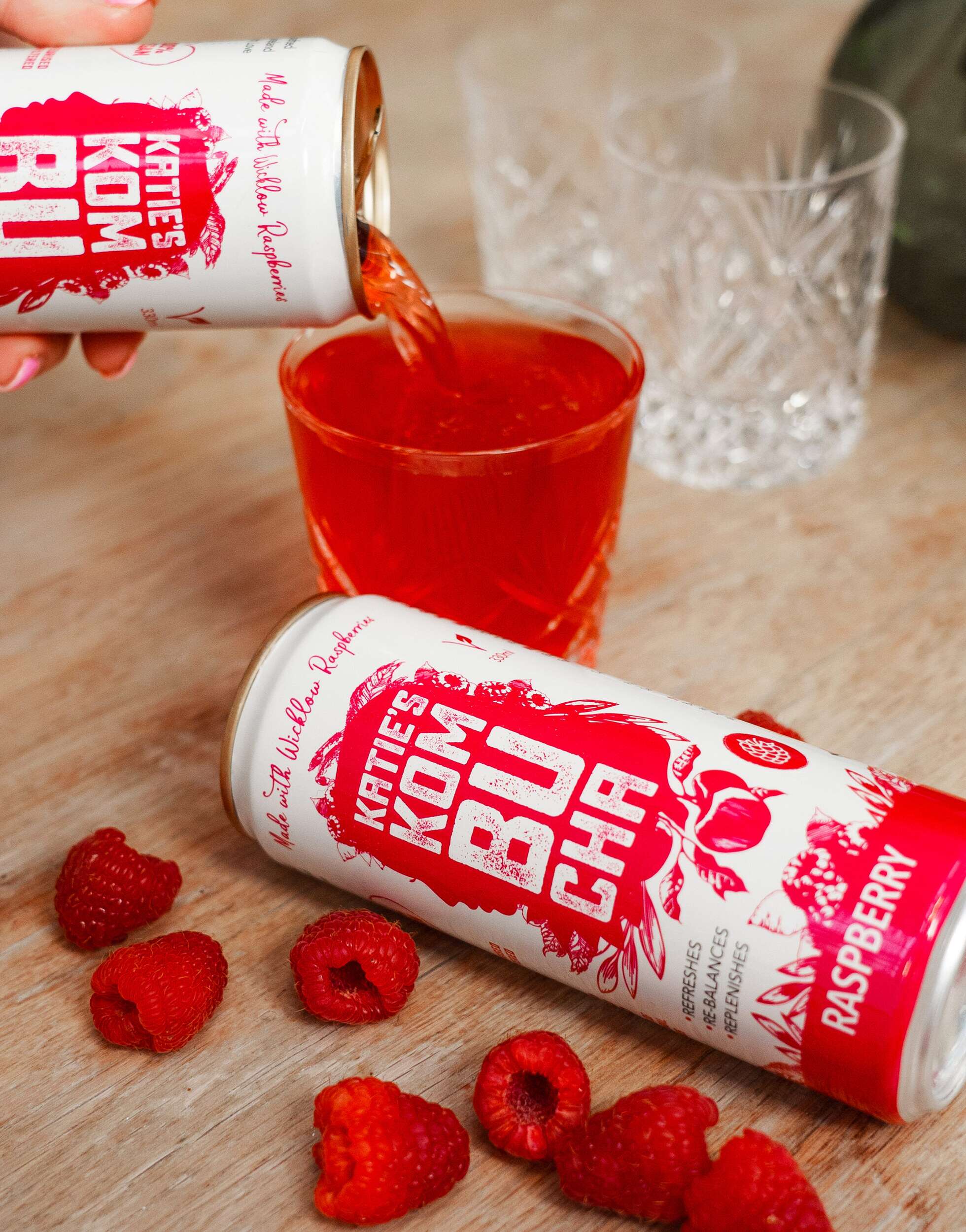
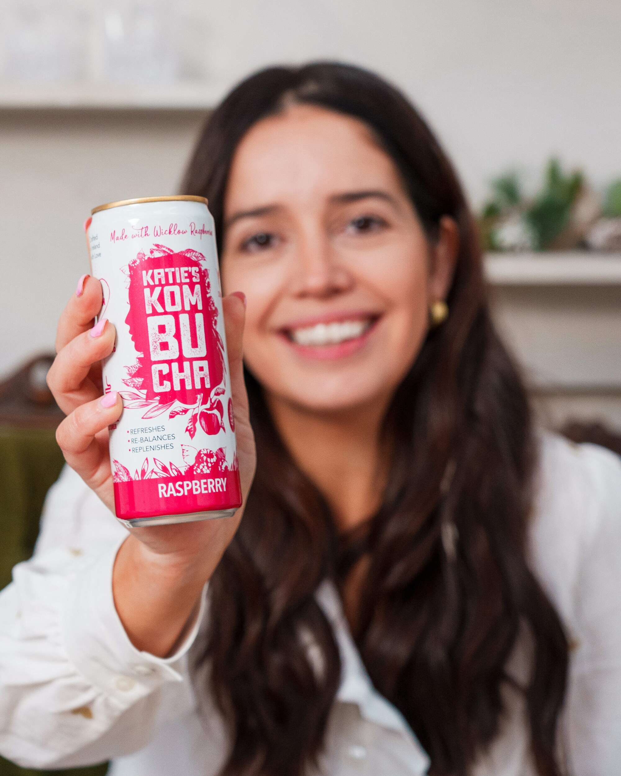
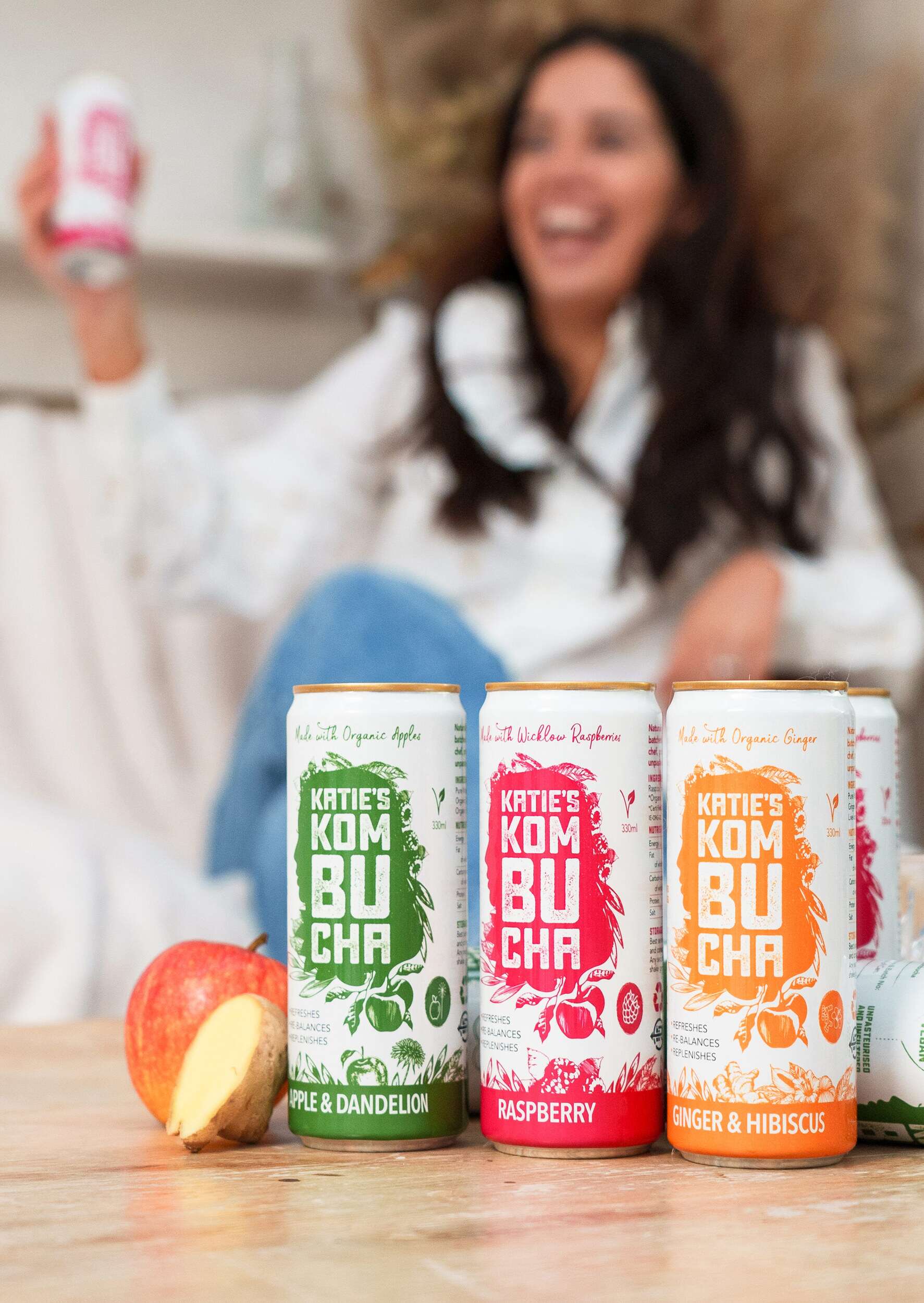
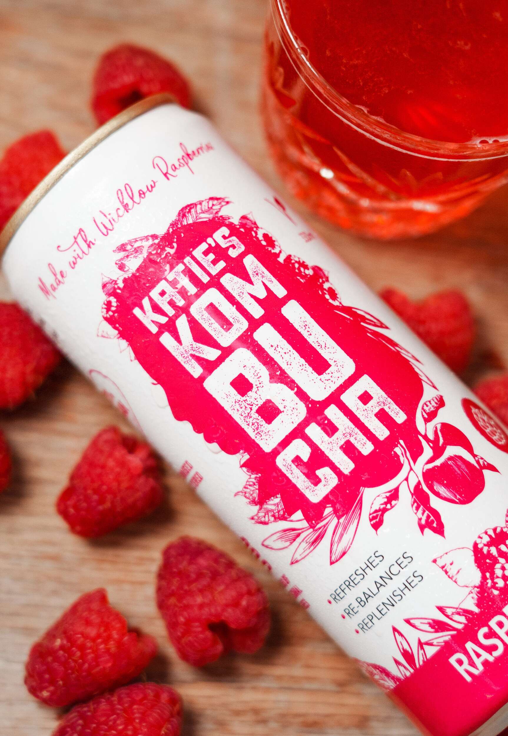
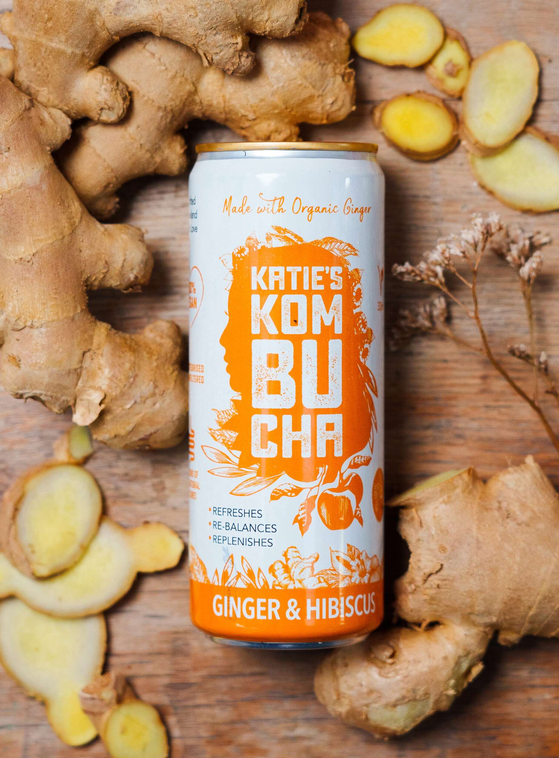
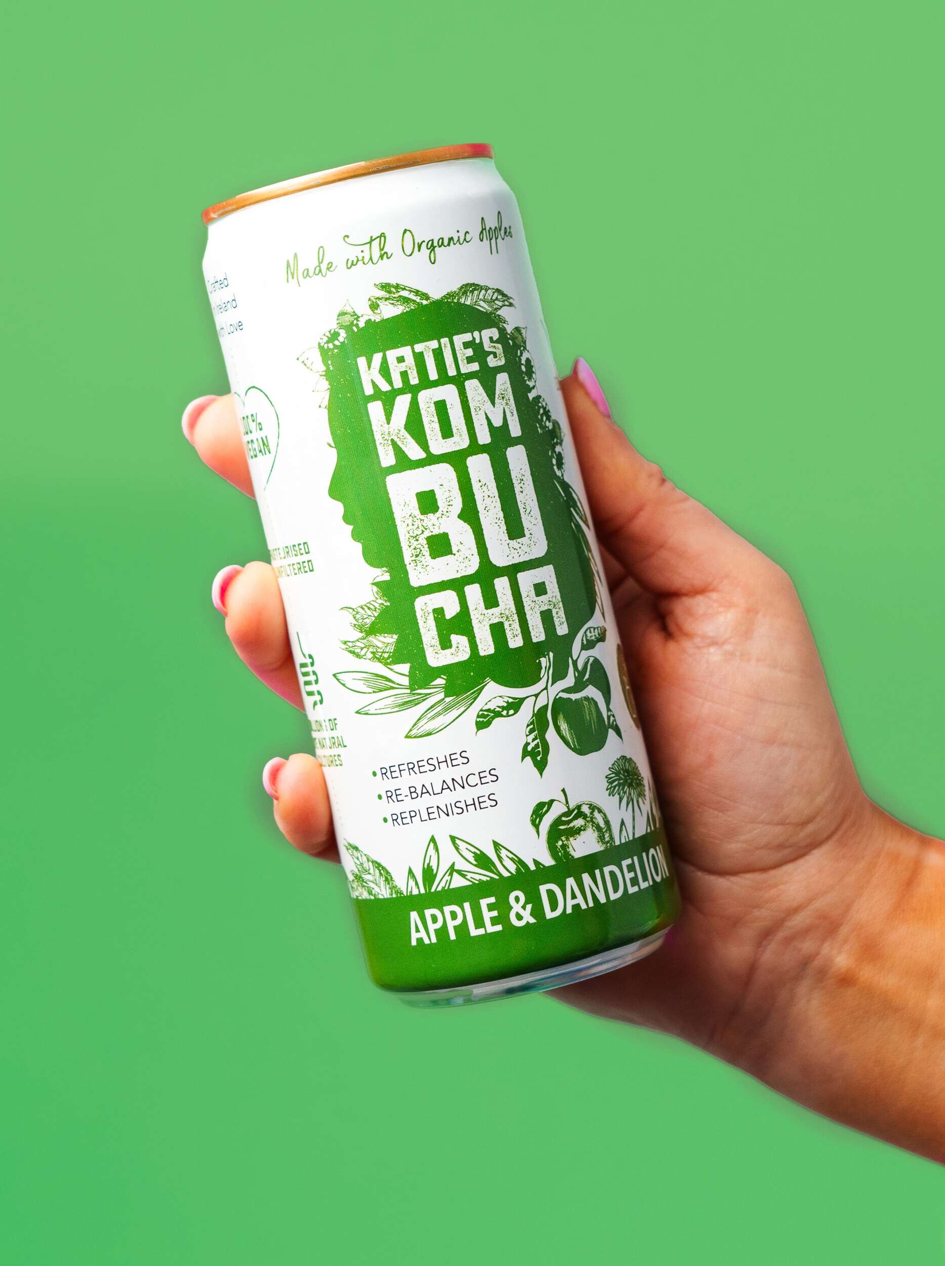
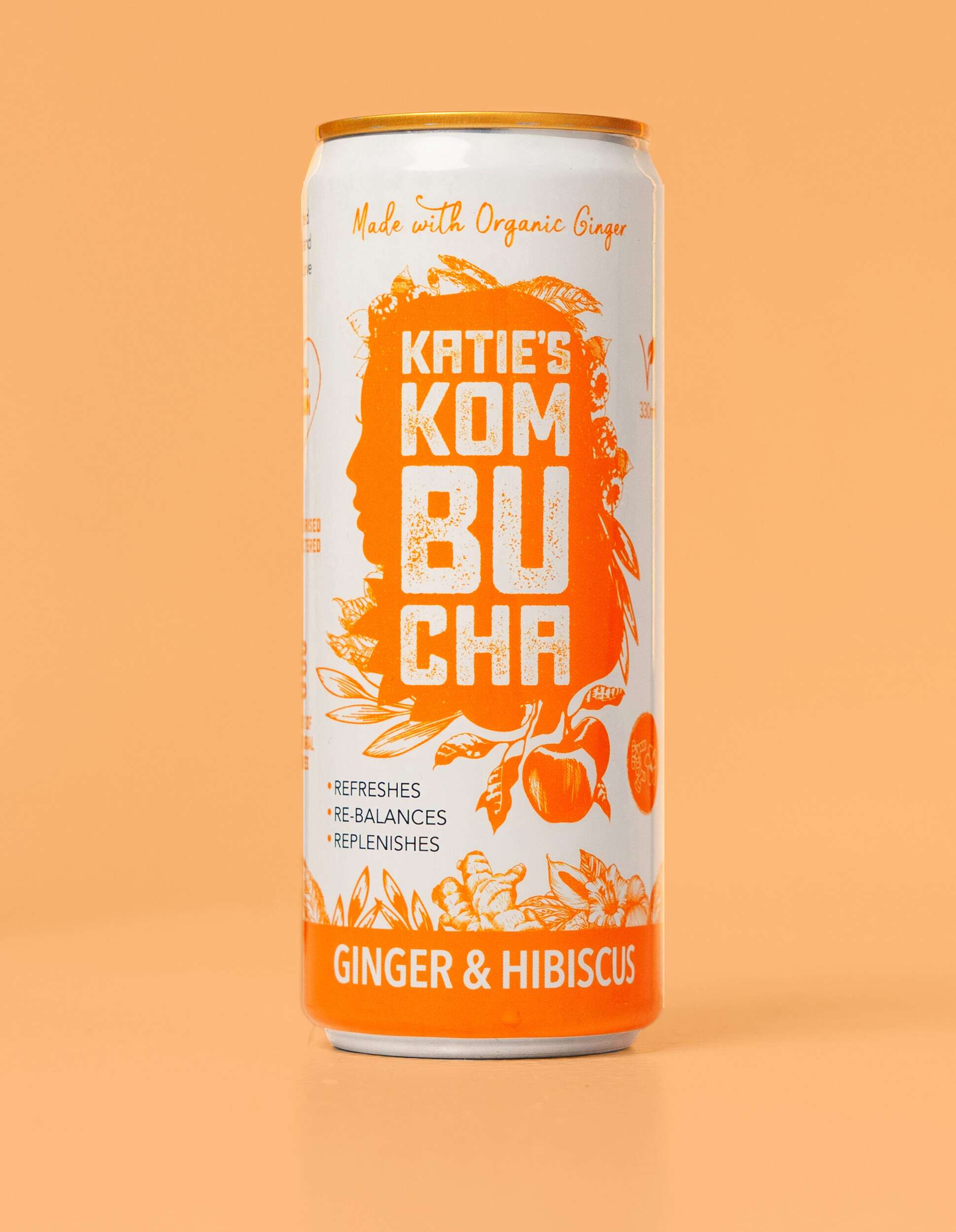
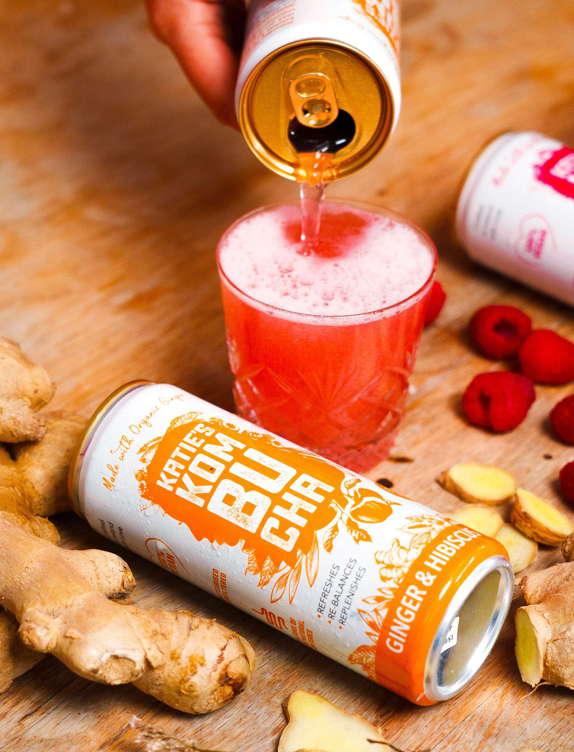
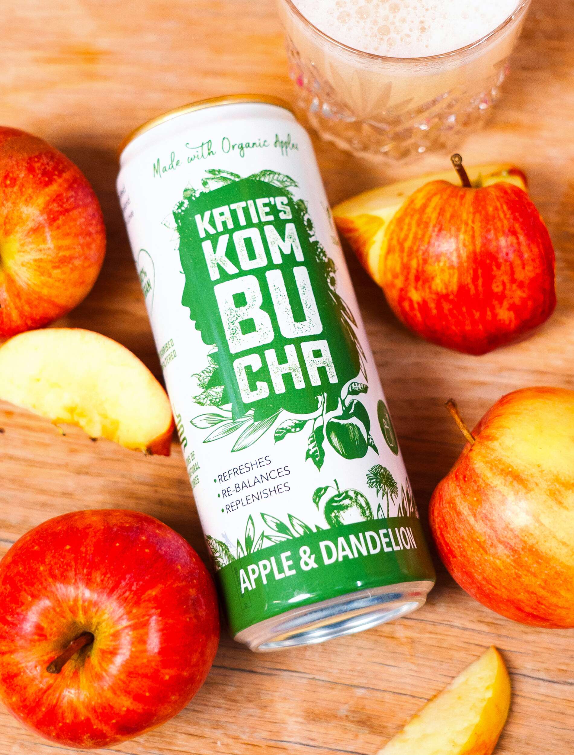
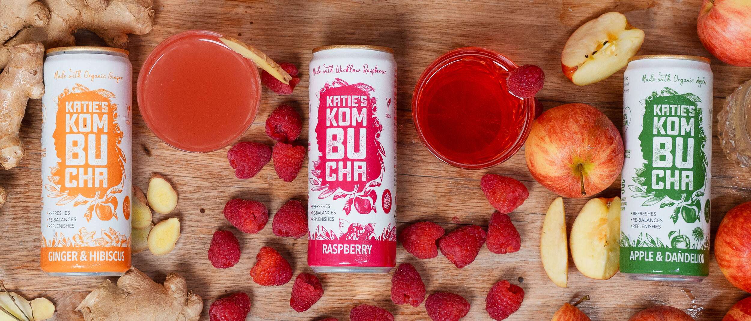
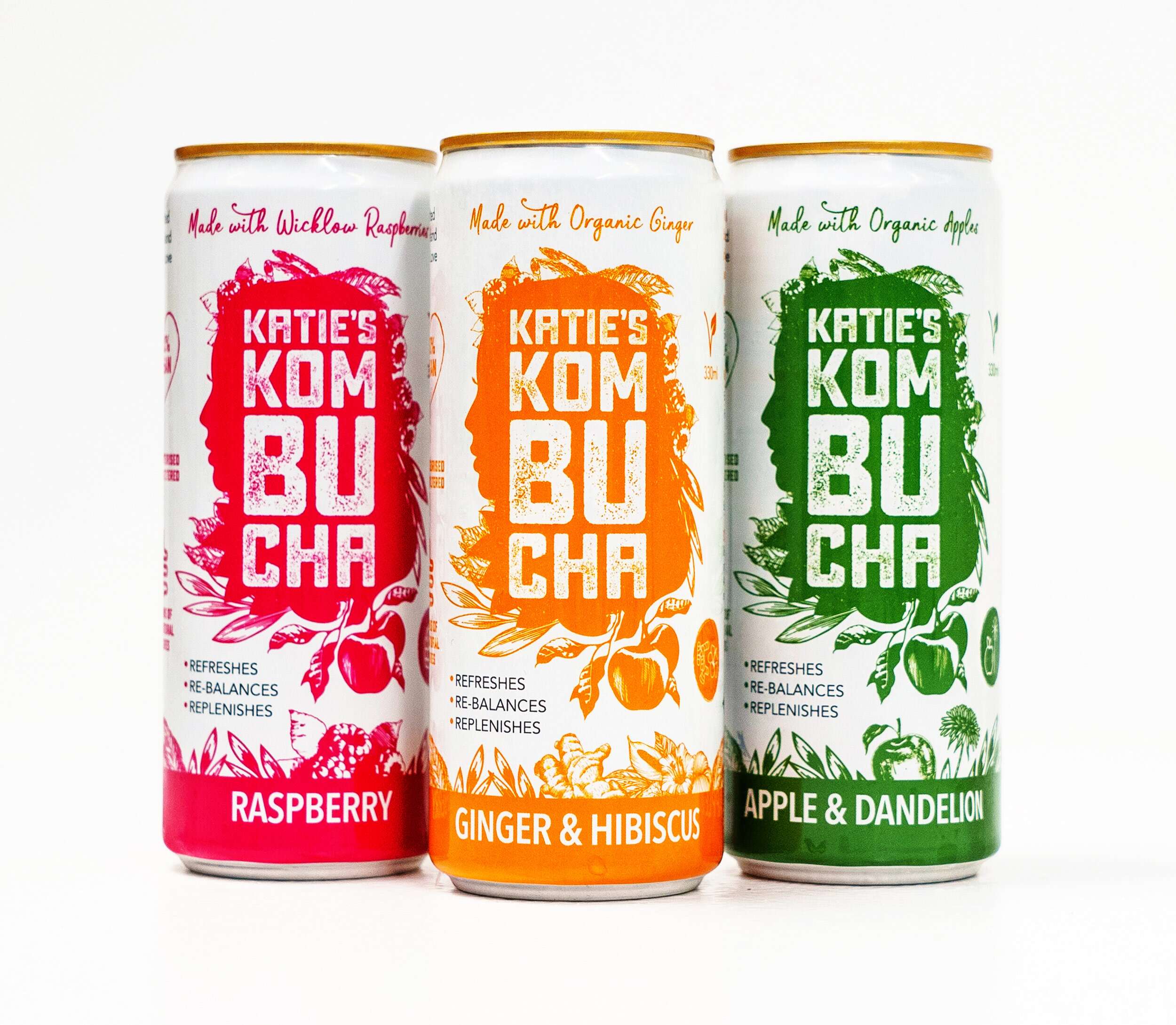
Katie’s Kombucha New Slim Cans Packaging Design
New project
Katie’s Kombucha – New Cans Packaging Design
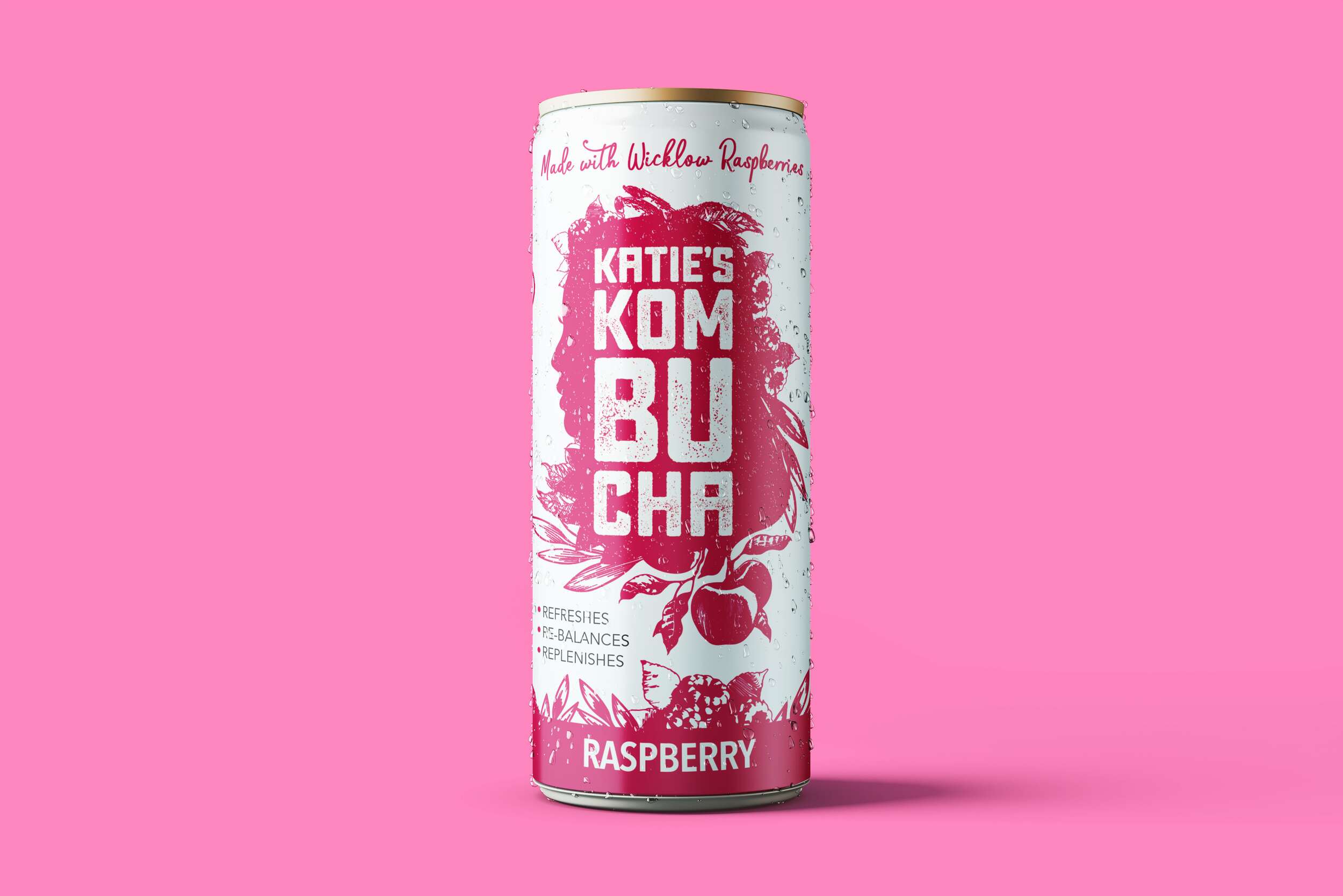
We are loving how well the brand packaging design of the Katie’s Kombucha range translated from the original glass bottles to these lovely slim cans. They are now available in both the bottles and cans in three tasty flavours.


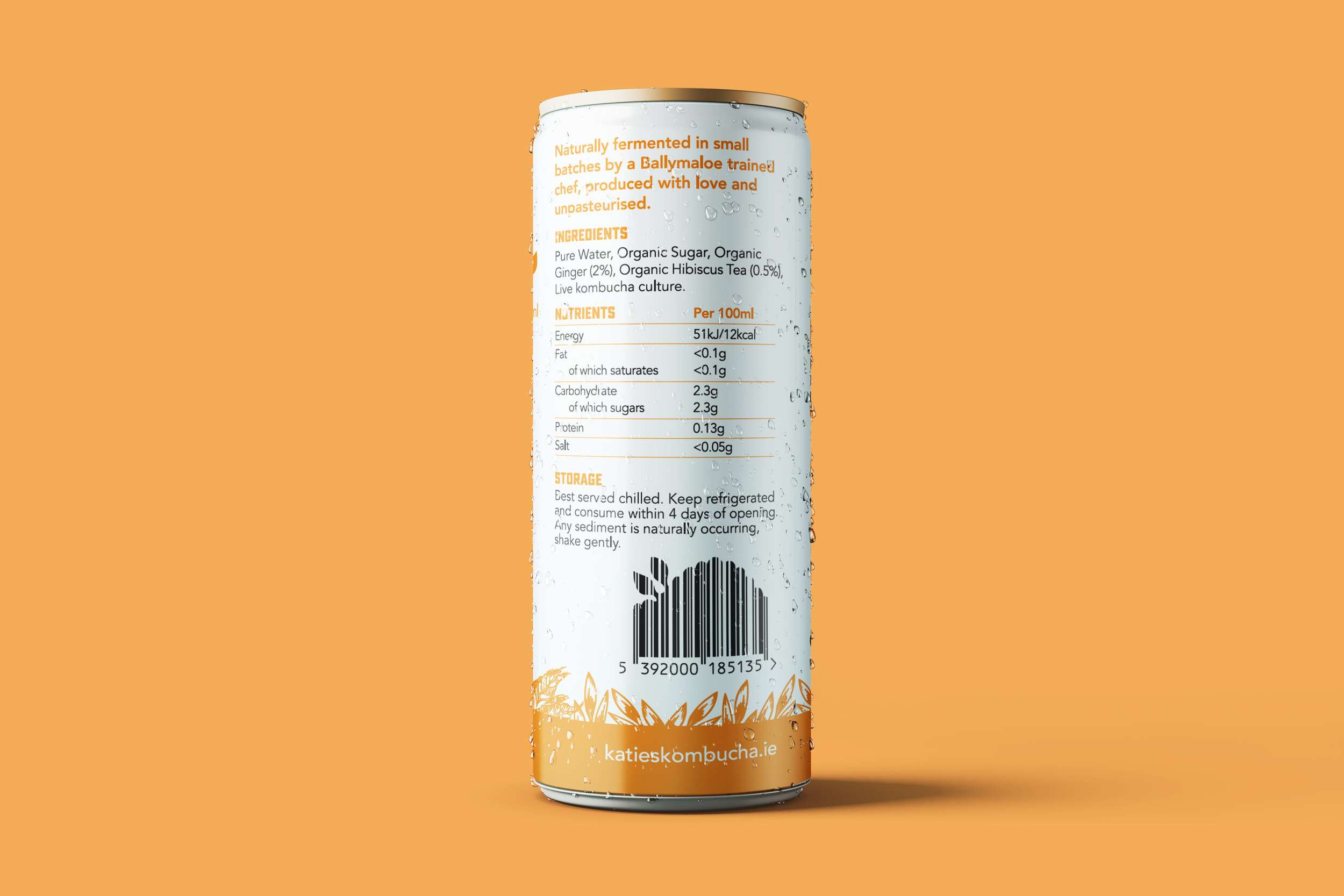
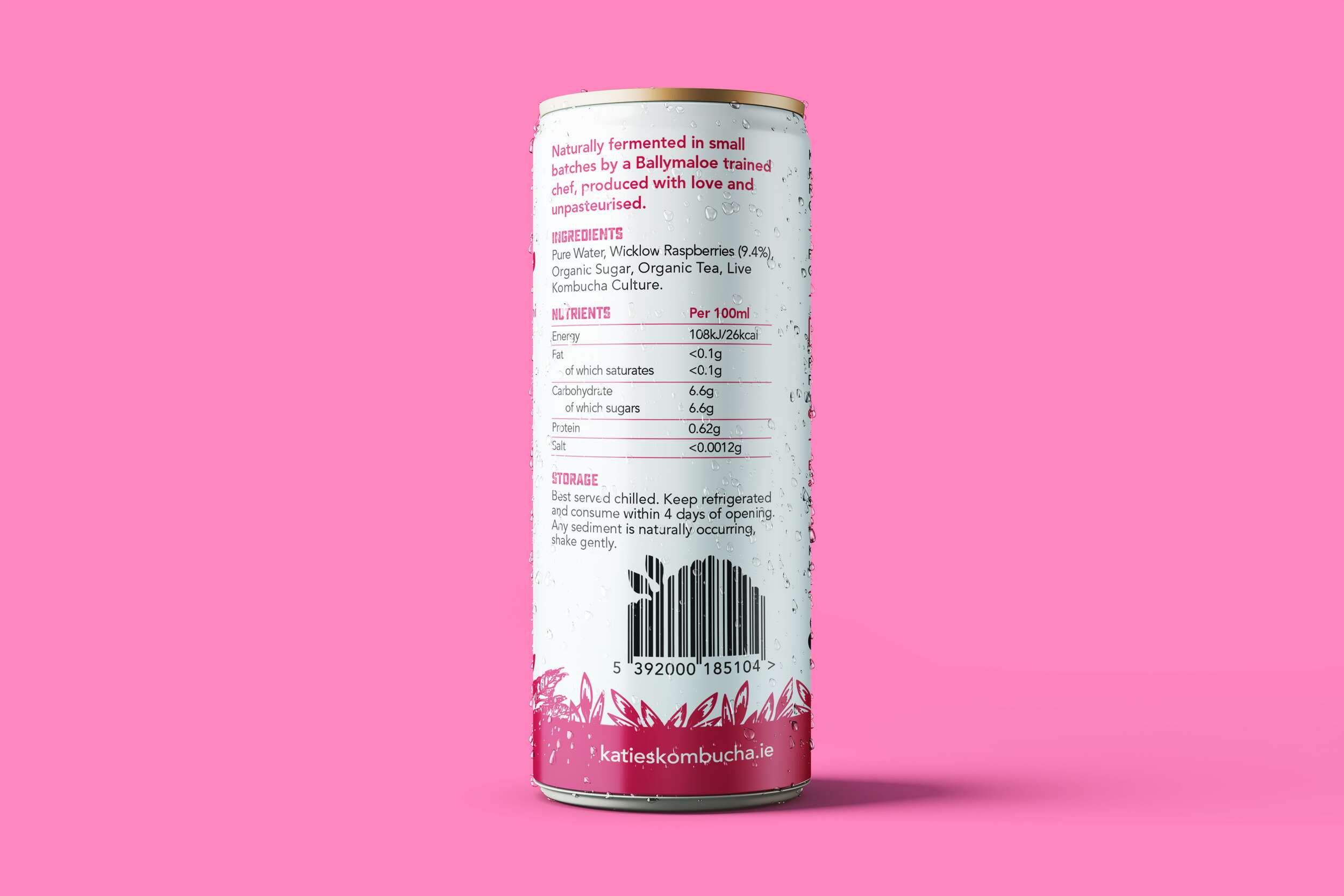
A little about kombucha for those of you unfamiliar with it…
Kombucha is a great alternative to sugary drinks. It contains elements that offer nutritional and digestive support, strengthen the immune system, and assist in removing impurities from the blood and organs. Poor dietary choices and chronic stress are the root causes of many modern diseases. Both diet and stress can trigger physiological imbalances and degradation, particularly in the immune system. Kombucha contains prebiotics which are beneficial for gut health (great immune booster).
✔️ Maintains a health pH
✔️ It’s antioxidants help fight disease
✔️ Contains beneficial probiotics
✔️ Encourages good microbes to grow in the gut
✔️ It’s acetic acid helps fight bad bacteria
✔️ Helps your skin glow
Katie’s Kombucha supports local and buys delicious raspberries from a raspberry farmer in Wicklow.

Follow Katie’s Kombucha at:
Instagram: @katiekombucha
Facebook: @katiekombucha
Website: katieskombucha.ie
Katie’s Kombucha is available at Fresh stores @freshthegoodfoodmarket and SuperValu @supervalu_irl stores, along with many more locations.
Photography by Braeden Riehl Photography @braedenriehl

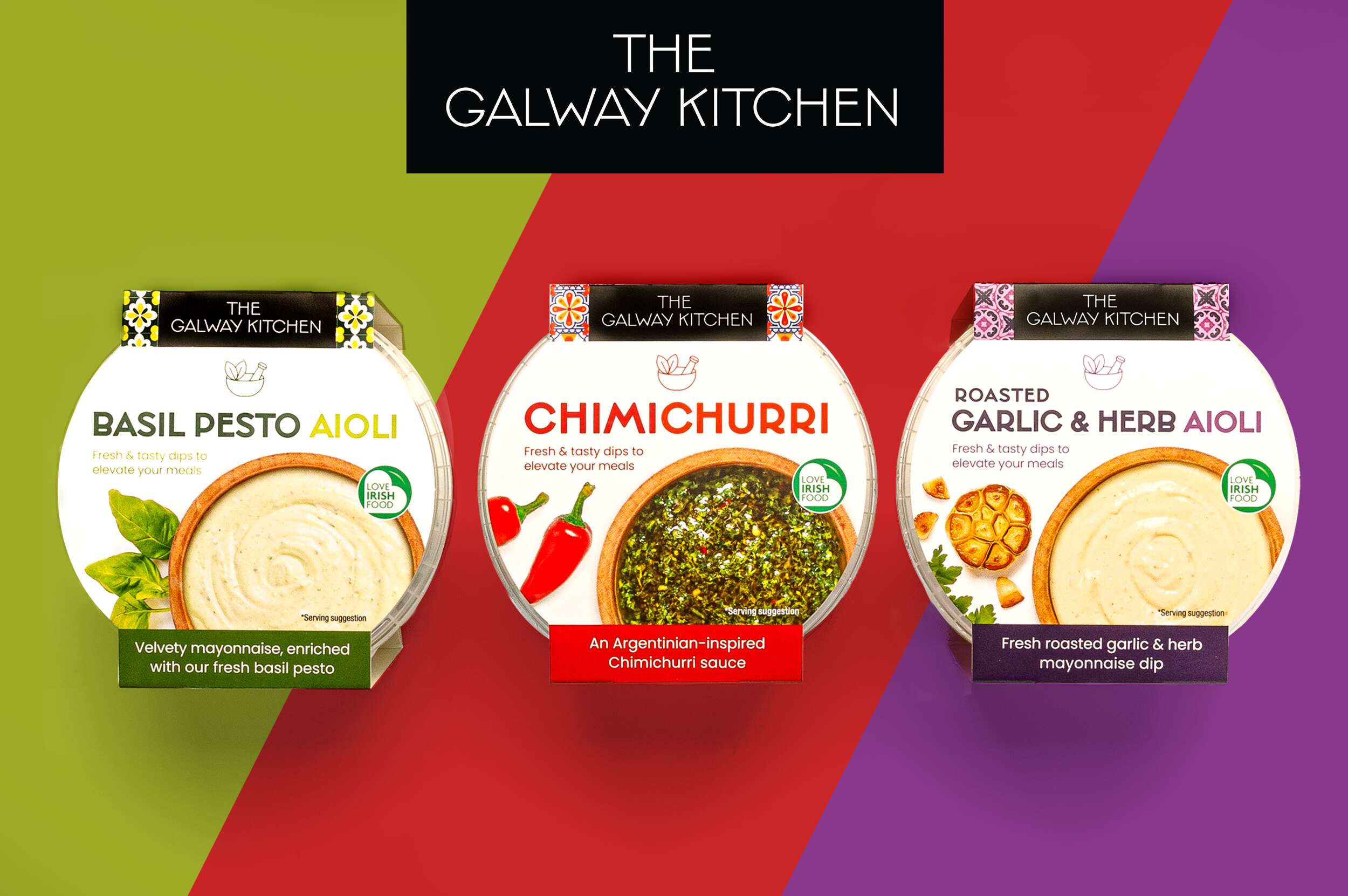
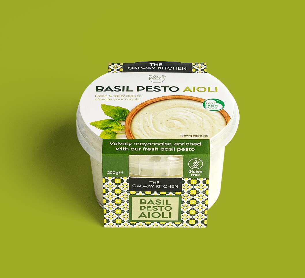
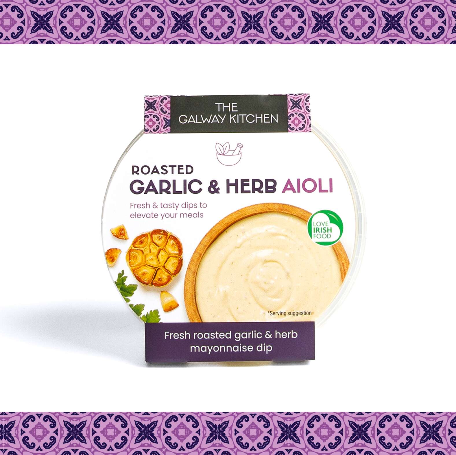
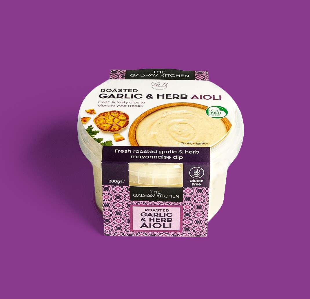
The Galway Kitchen Picnic Dips: Packaging Design
The Galway Kitchen Aioli Dips: Packaging Design
![]()
![]()
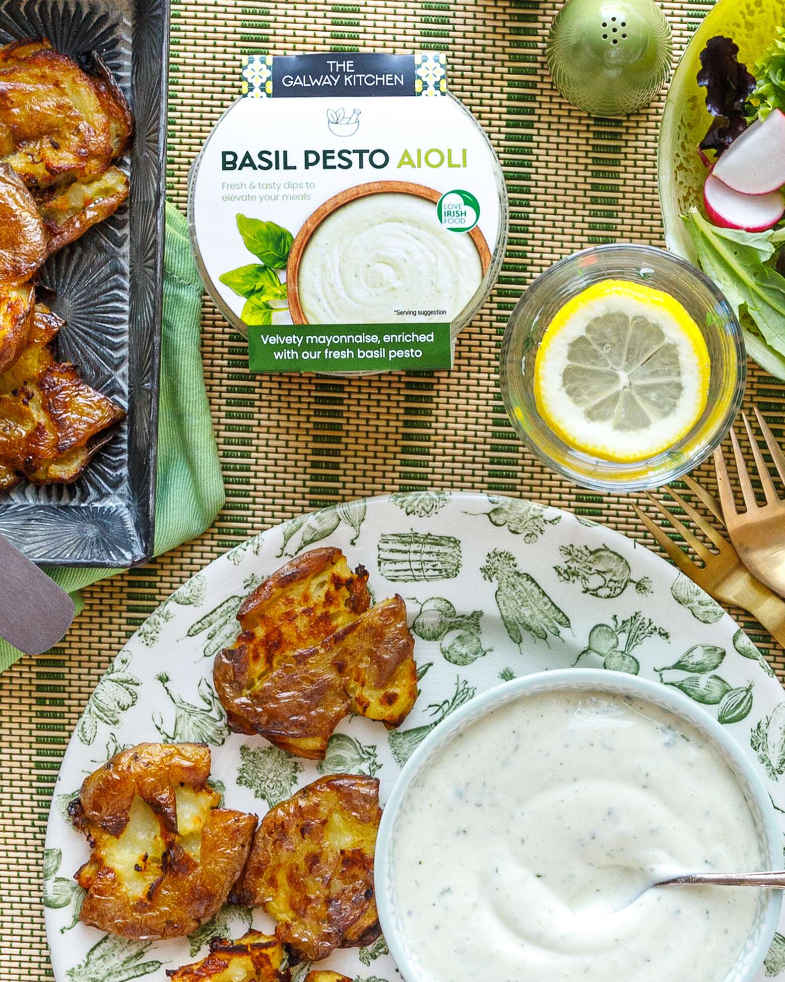
The Galway Kitchen have recently launches these new tasty threesome of dips. The condiments range are delicious as a dip or try them drizzled on some freshly grilled meat or fish for an elevation of flavour like no other.
The Galway Kitchen Ranks No. 2 among Ireland’s Top Prepared Dips and Sauces Brands in 2023*. As with all of their creations, these recipes have been expertly crafted by their team of in-house chefs and are made fresh in Galway with quality ingredients.
The three variations of dips are:
-
Garlic & Herb Aioli
-
Basil Pesto Aioli
-
Chimichurri
This trio of delicious dips are a convenient and tasty way to elevate any meal or snack – your new fridge essential!
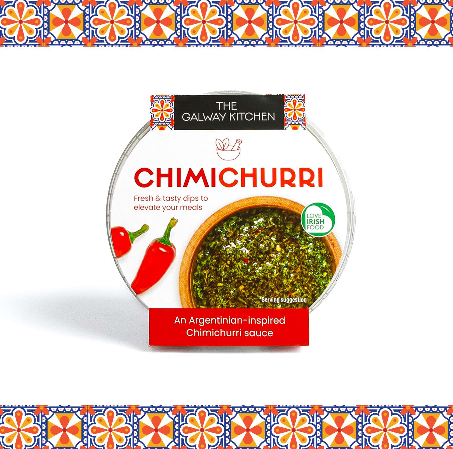
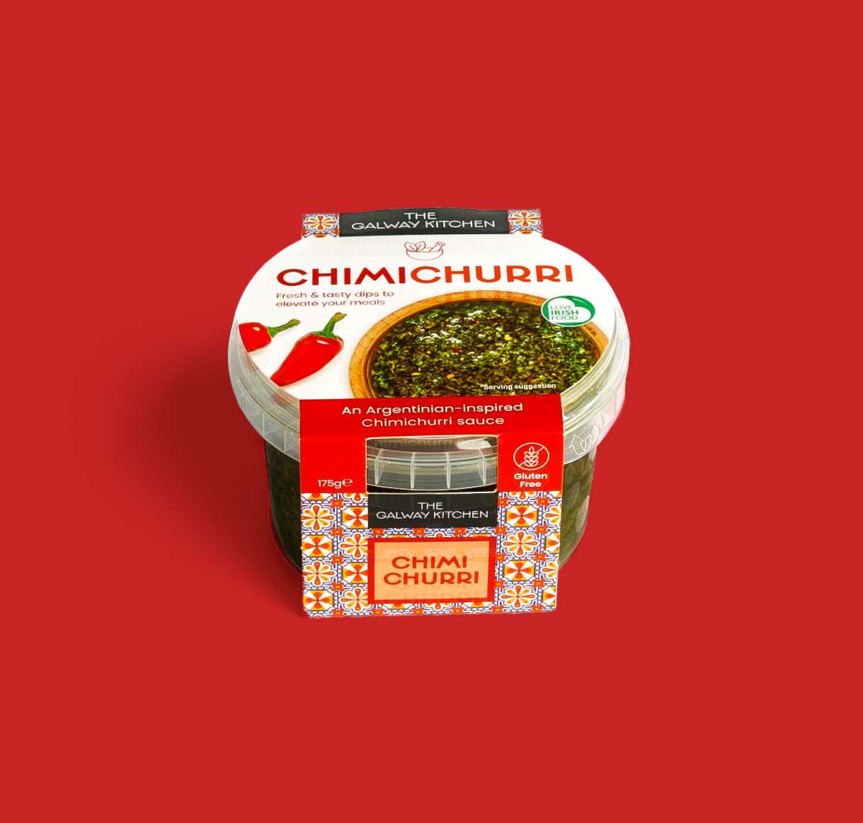
The Galway Kitchen brand already existed for their popular houmous dips range when they contacted Clare Lynch Creative. They asked if we could create the packaging design for these aioli dips packs to work well alongside their existing houmous range, and also the snack pack range designed by Clare Lynch Creative, which incorporate bright mediterranean patterns alongside clean, minimal typography and imagery, whilst bringing a fresher vibrant look to the packs to ensure a strong and bold standout impact on shelves. They loved the final design outcome of the range altogether. See their testimonial here…
The Galway Kitchen’s food range includes global flavours, inspired by much-loved tastes from around the world, made in their kitchen at the heart of Galway.
The beautiful photography of @thegalwaykitchen range is by Irish photographer @jenniferocooks
They are available in @tescoirl stores.
These dips are must-have condiments of the Summer ☀️
The Galway Kitchen range is available at selected Tesco Ireland stores:
Find them in the fridge at your local Tesco Ireland
www.tesco.ie
www.instagram.com/tescoirl/
Follow The Galway Kitchen at:
@thegalwaykitchen
Photography by Jennifer Oppermann:
@jenniferocooks
www.jenniferoppermann.com
Packaging printed by Priory Press Packaging.
The Galway Kitchen are produced by quality Irish fine food producer Galmere Foods.
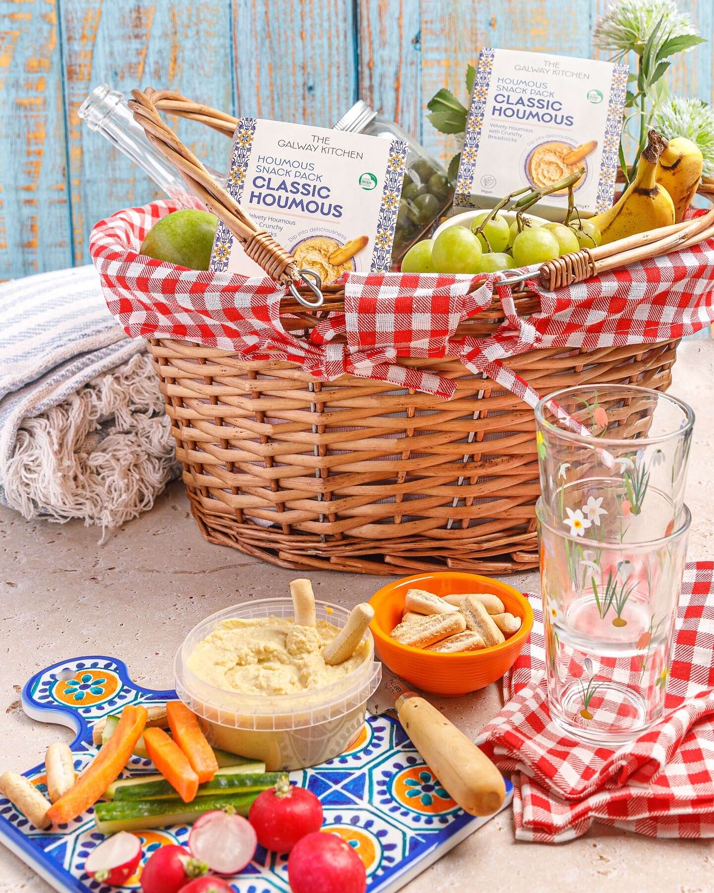
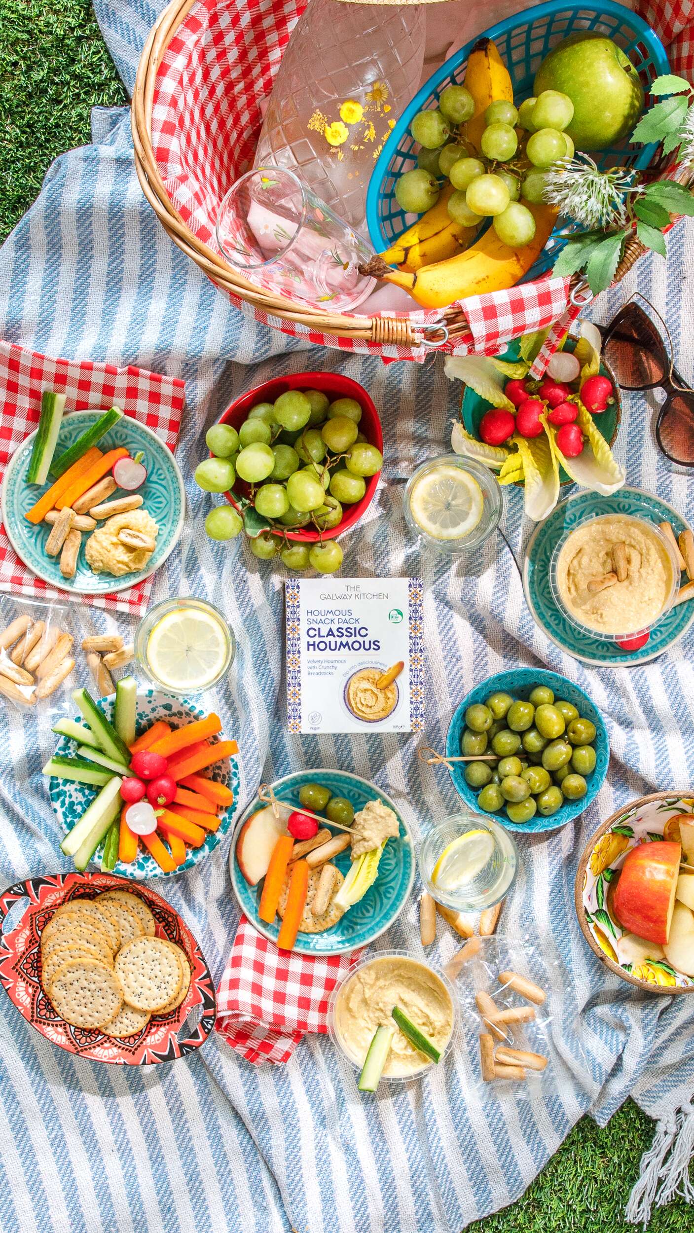
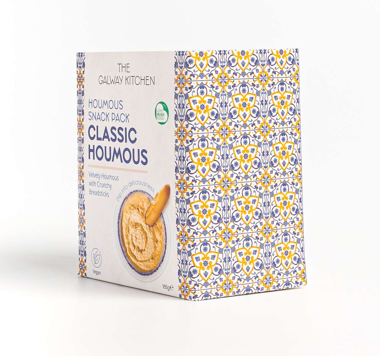
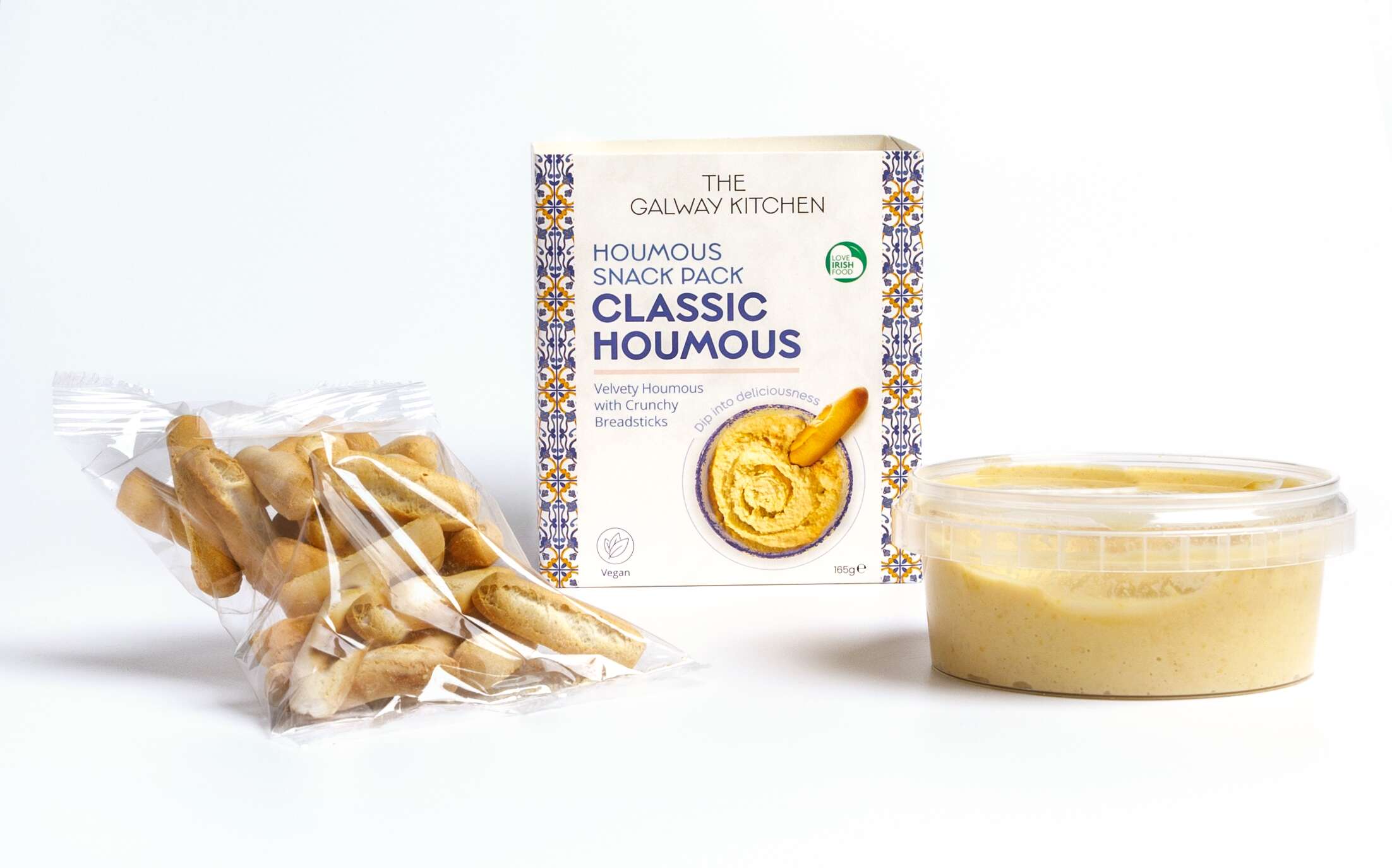
The Galway Kitchen Snack Packs: Packaging Design
New project
The Galway Kitchen Snack Packs: Packaging Design
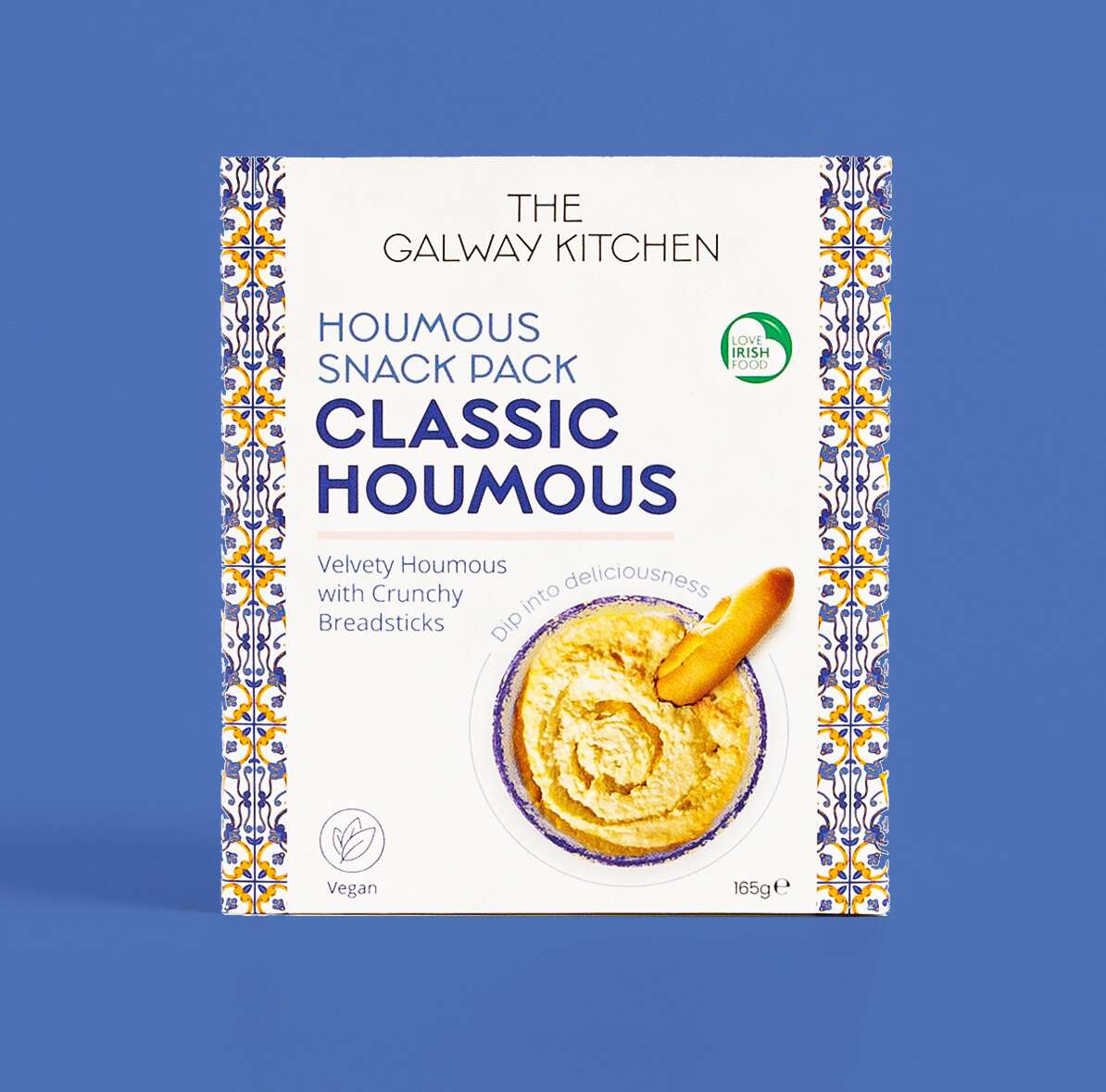
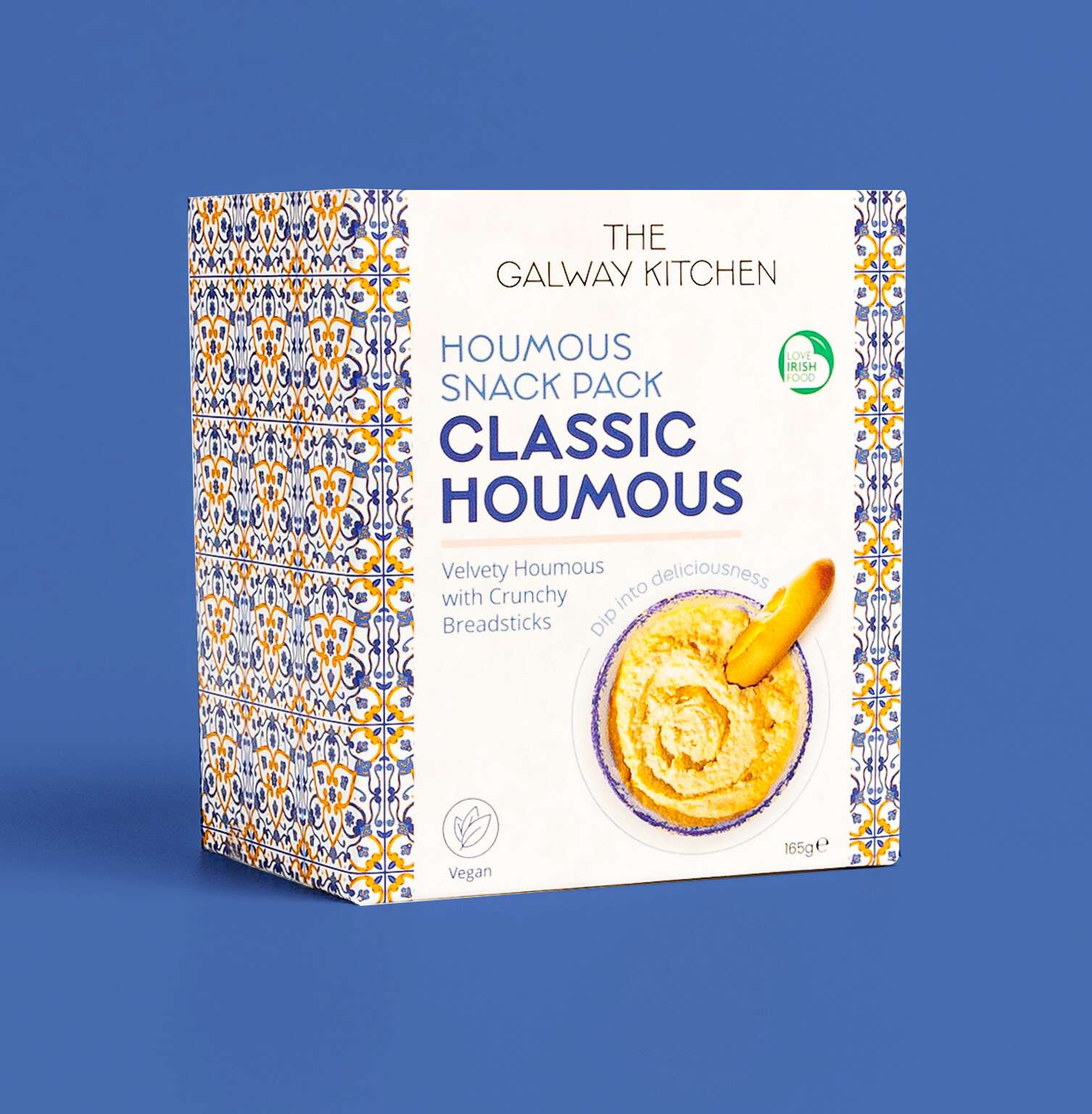 The new Classic Houmous Snack Pack by @thegalwaykitchen has recently launched! Each pack includes a tub of The Galway Kitchen’s signature Classic Houmous, created with a creamy blend of chickpeas and tahini with a hint of lemon, Organic and Reduced Fat along with a serving of mini, Italian breadsticks, specially developed for scooping and giving that perfect, light crunch. These flavour-packed treats are great for a healthy lunch snack!
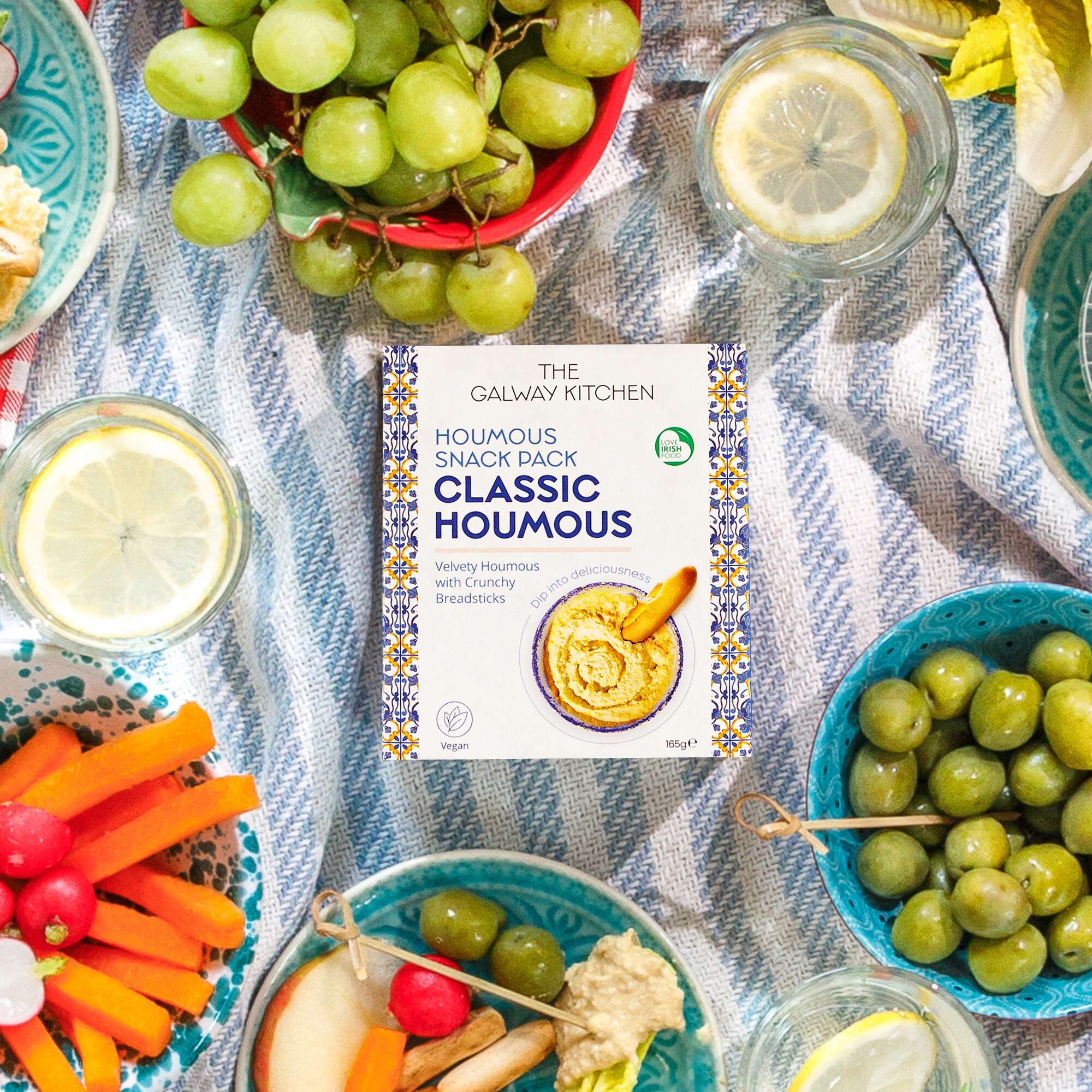
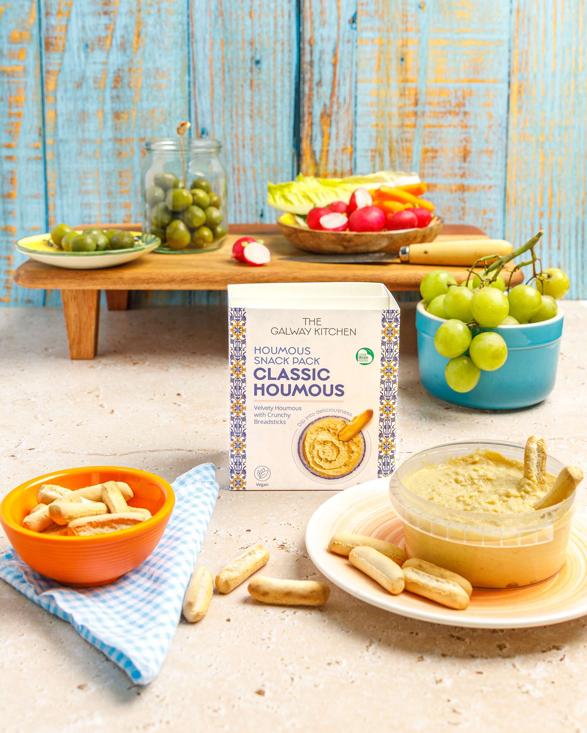
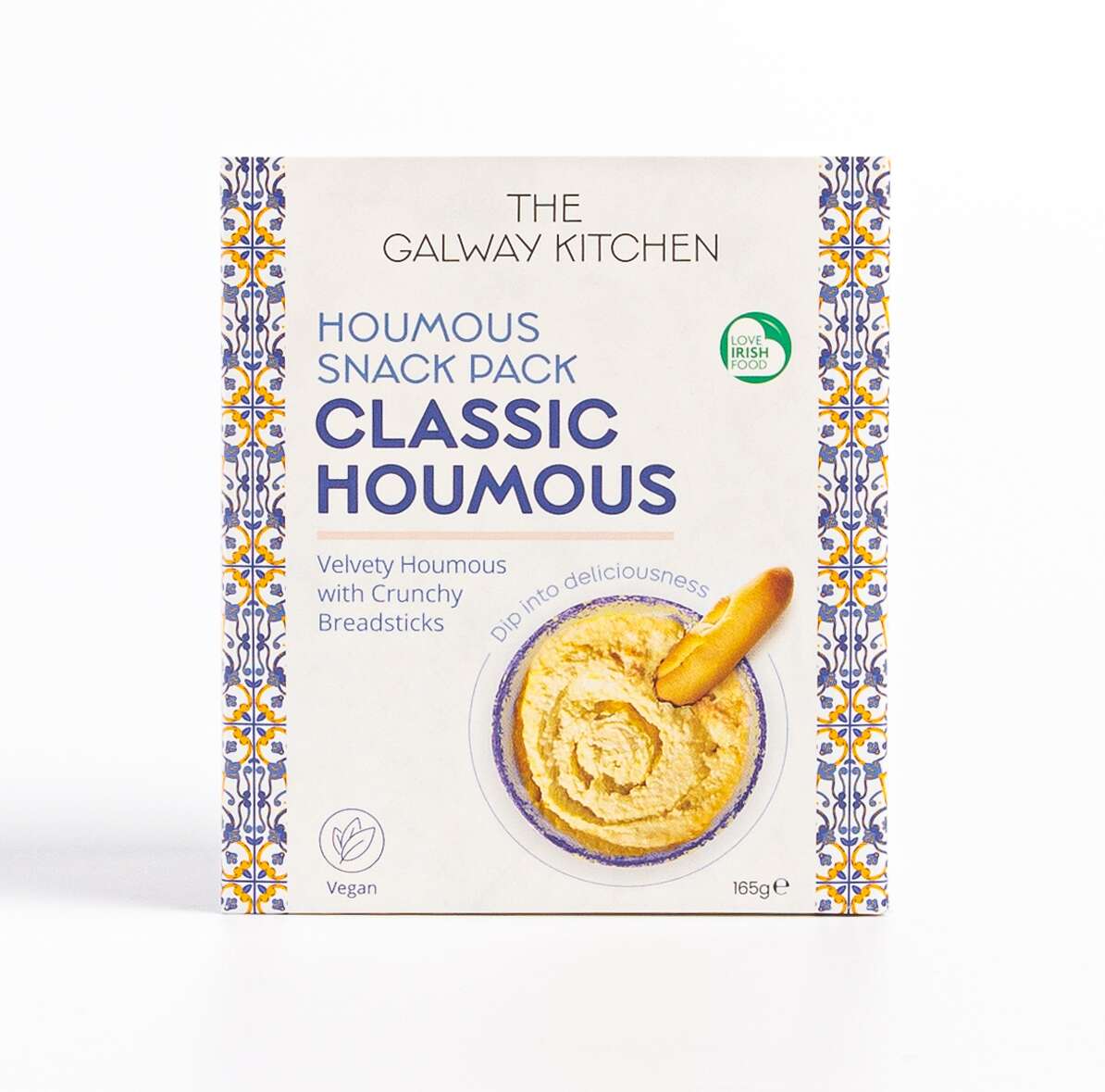
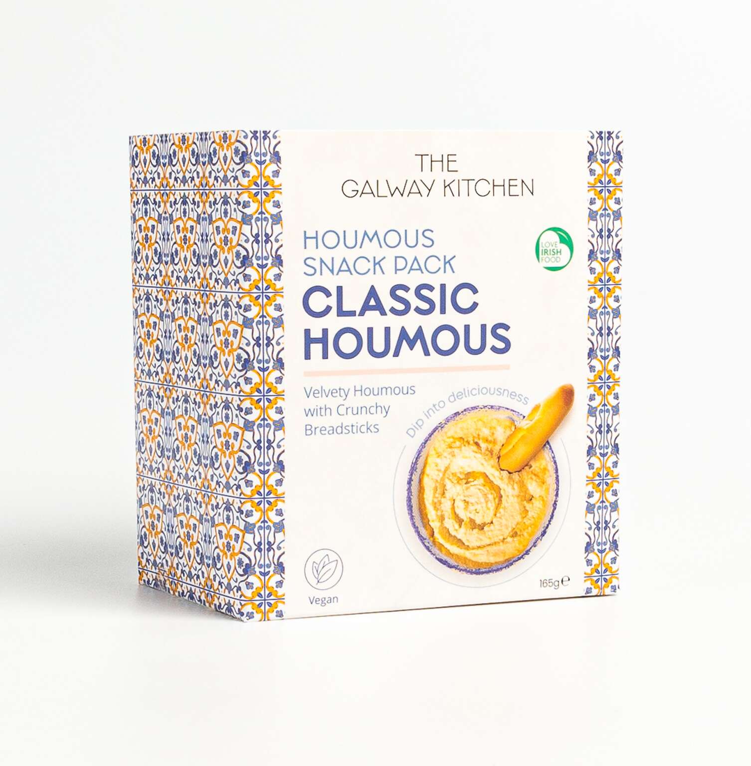
The Galway Kitchen brand already existed for their popular houmous dips range when they contacted Clare Lynch Creative. They asked if we could create the packaging design for these snack packs to work well alongside their existing range, incorporating bright mediterranean patterns alongside clean, minimal typography and imagery, whilst bringing a fresher vibrant look to the packs to ensure a strong and bold standout impact on shelves. They were very happy with the result. See their testimonial here…
The Galway Kitchen’s food range includes global flavours, inspired by much-loved tastes from around the world, made in their kitchen at the heart of Galway.
The Galway Kitchen range is available at selected Tesco Ireland stores:
www.tesco.ie
www.instagram.com/tescoirl/
Follow The Galway Kitchen at:
@thegalwaykitchen
Photography by Jennifer Oppermann:
@jenniferocooks
www.jenniferoppermann.com
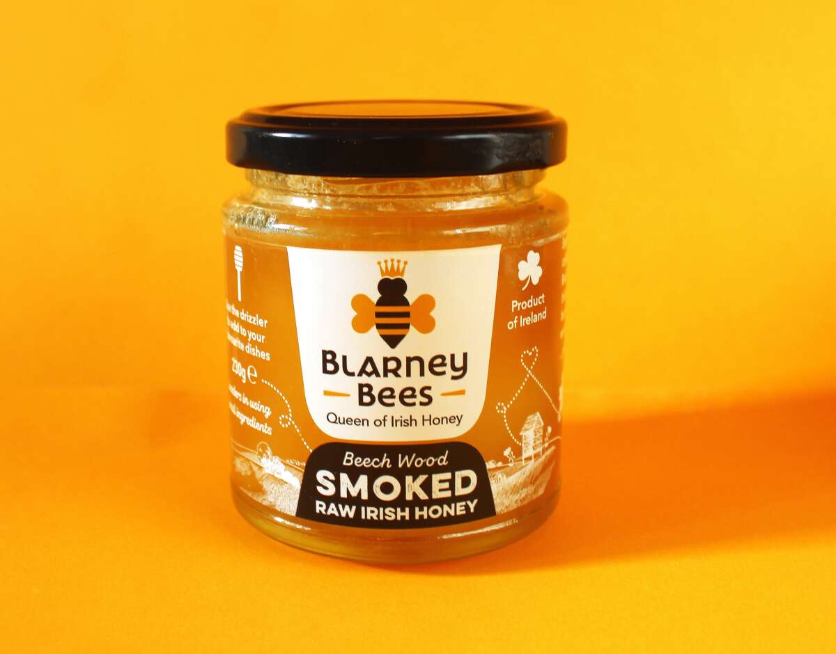
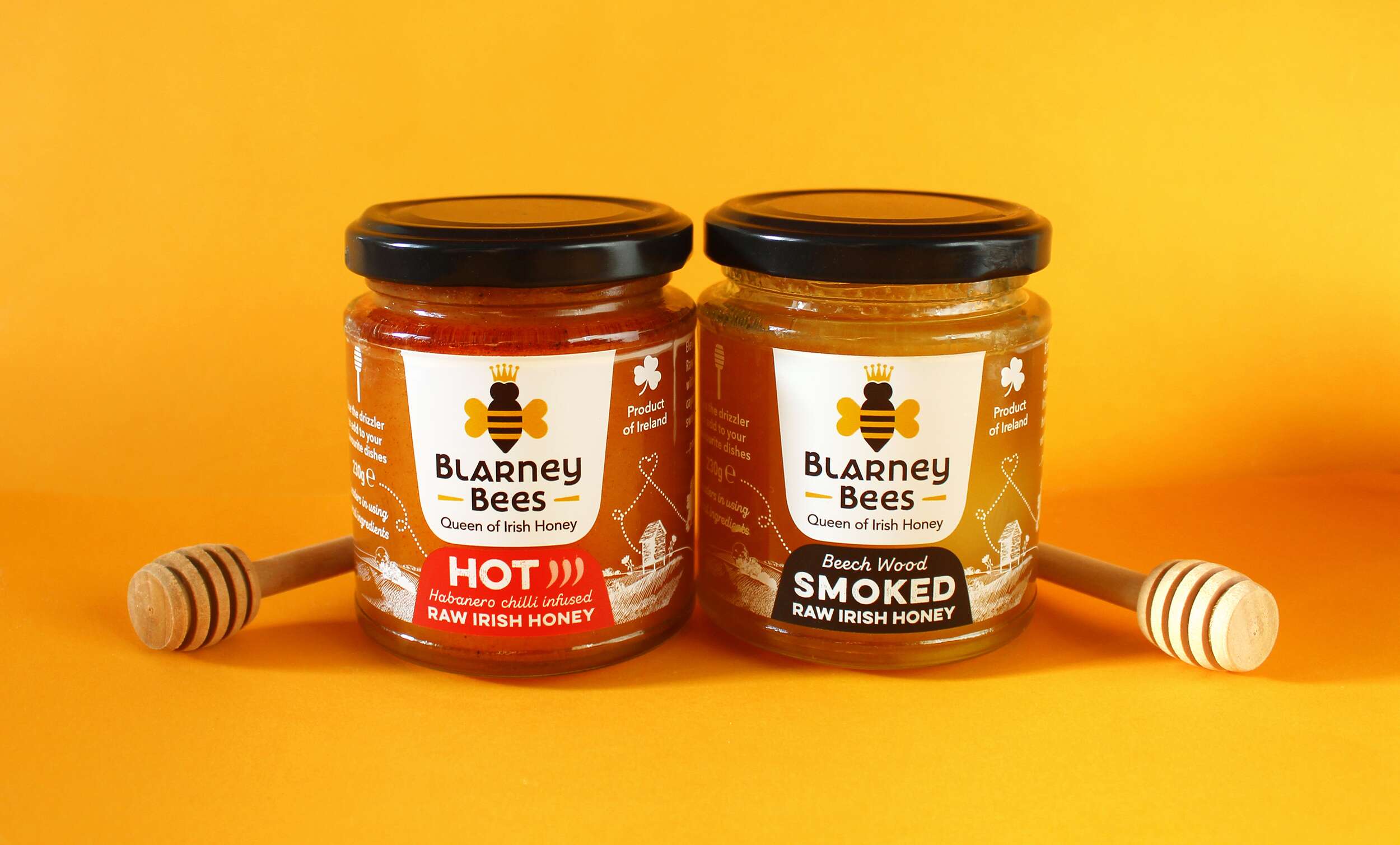
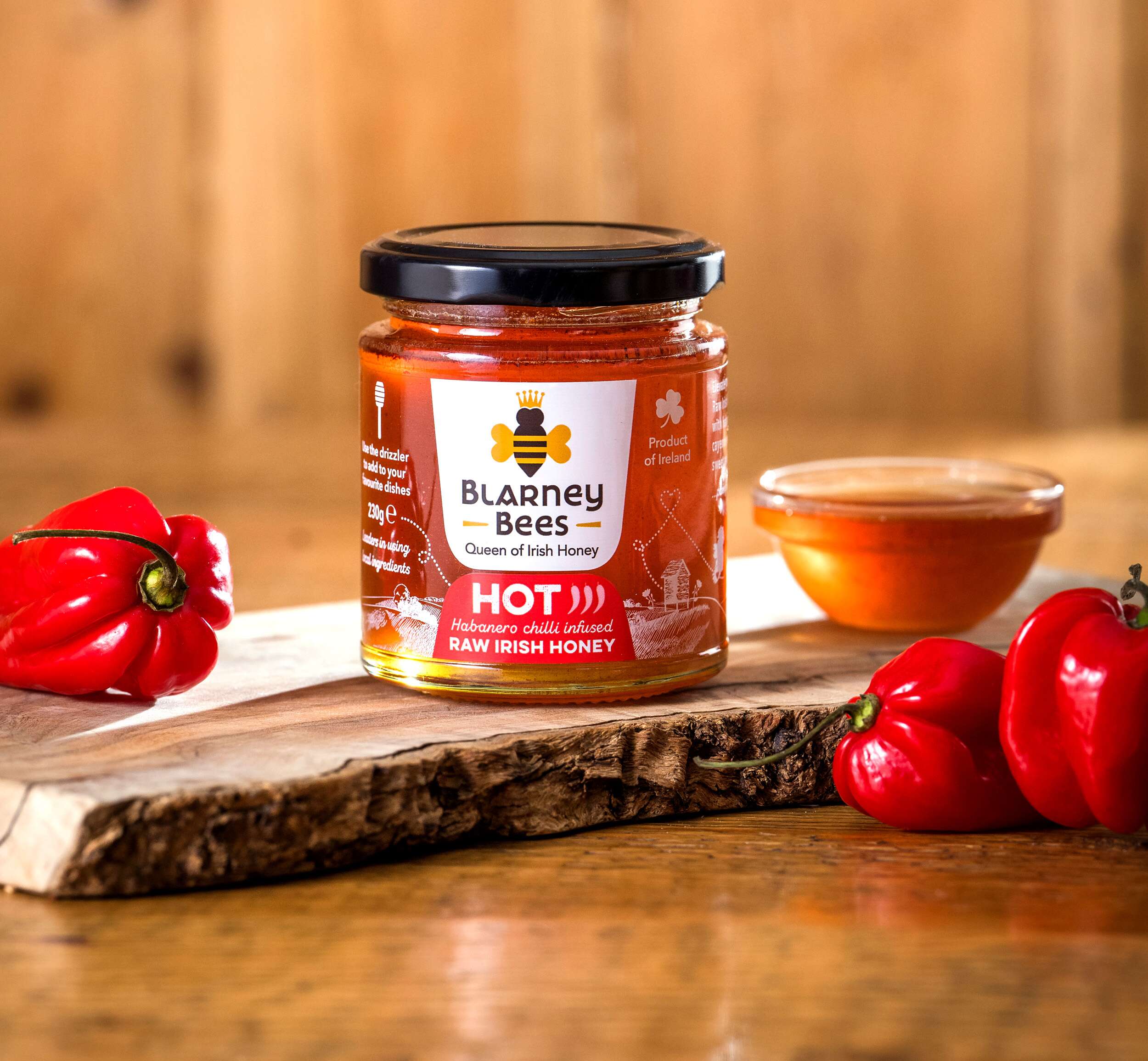
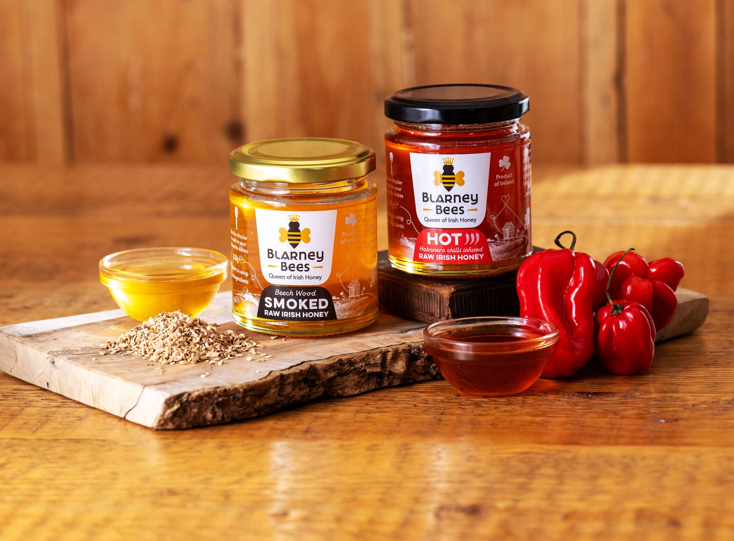
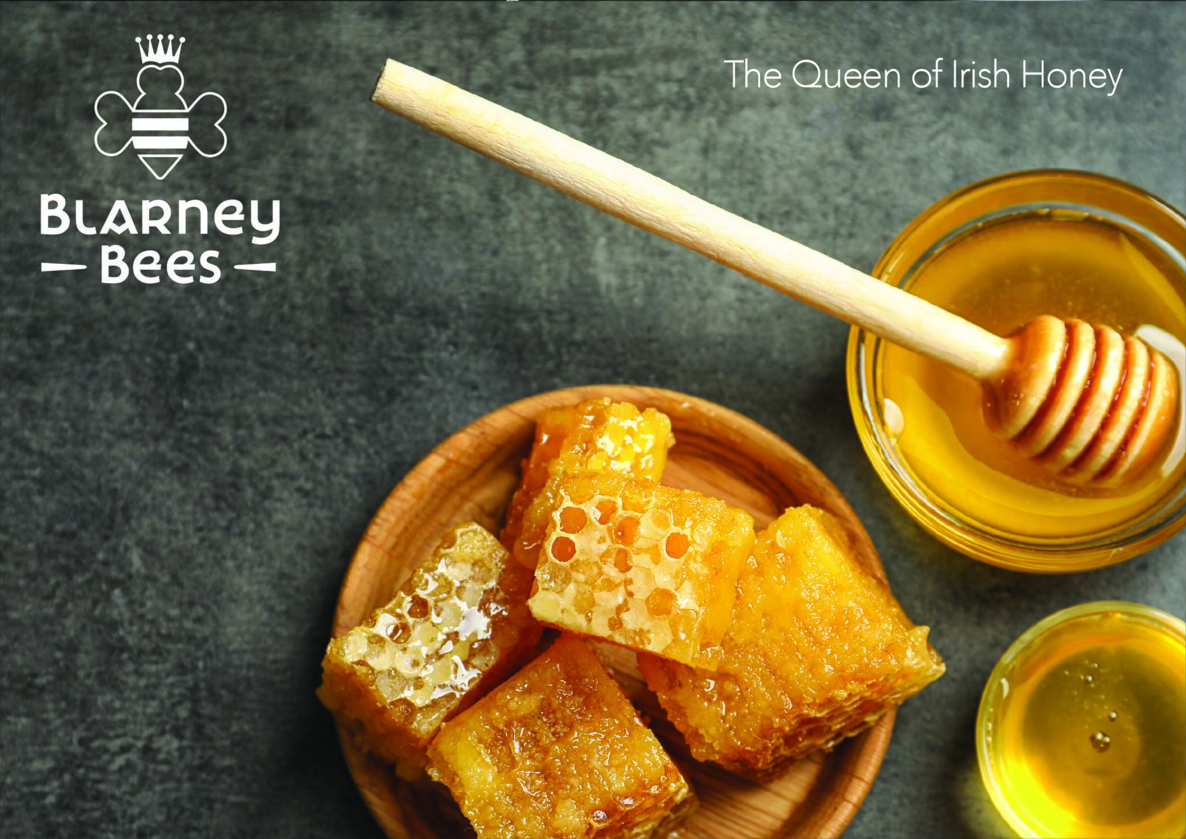
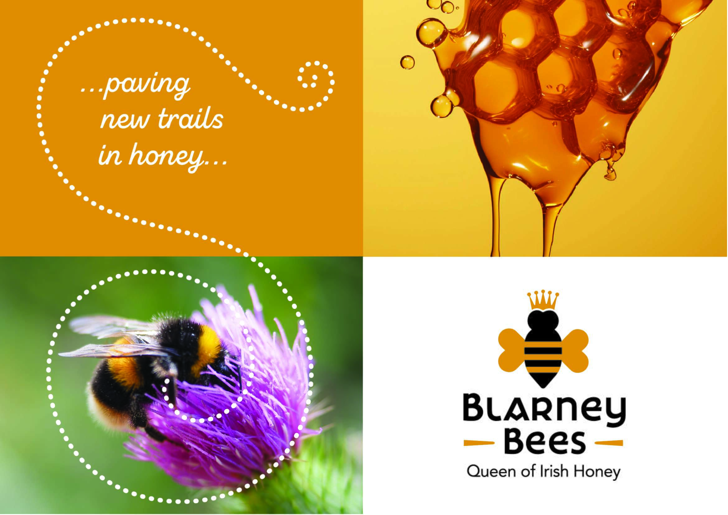
Blarney Bees Honey: Brand Packaging Design
Blarney Bees Honey: Brand Packaging Design

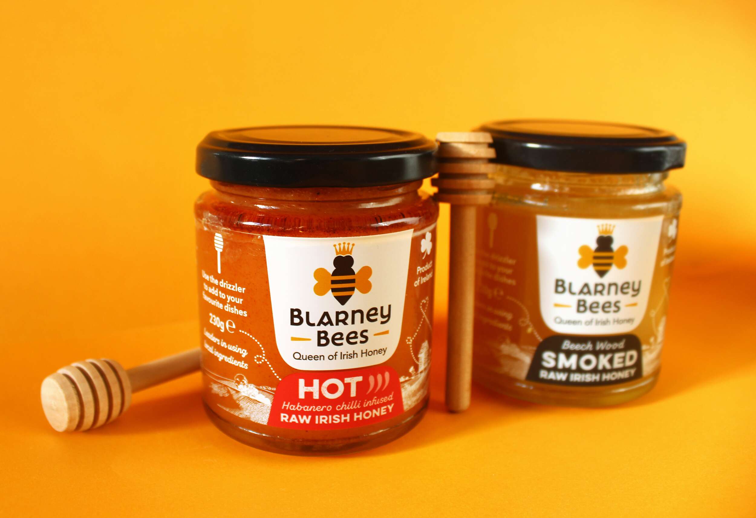
Fusing the raw essence of Irish honey with tantalizing flavours. Blarney Bees Honey are a small, family-run business with two generations of beekeepers. They create traditional and modern Irish honey infusions, using 100% Pure Raw Irish Honey, crafted by their Irish honeybees in Blarney, Cork, in the South of Ireland.
The small-batch production method guarantees a distinctive flavour for each lot while preserving the aroma, texture, and taste of raw Irish blossom honey. The distinctive flavour is a result of golden nectar thoughtfully collected from a variety of trees and flowers that the honeybees forage on. Their honey is raw, unpasteurized, and coarse cold-filtered to maintain the integrity of the enzymes and nutrients.
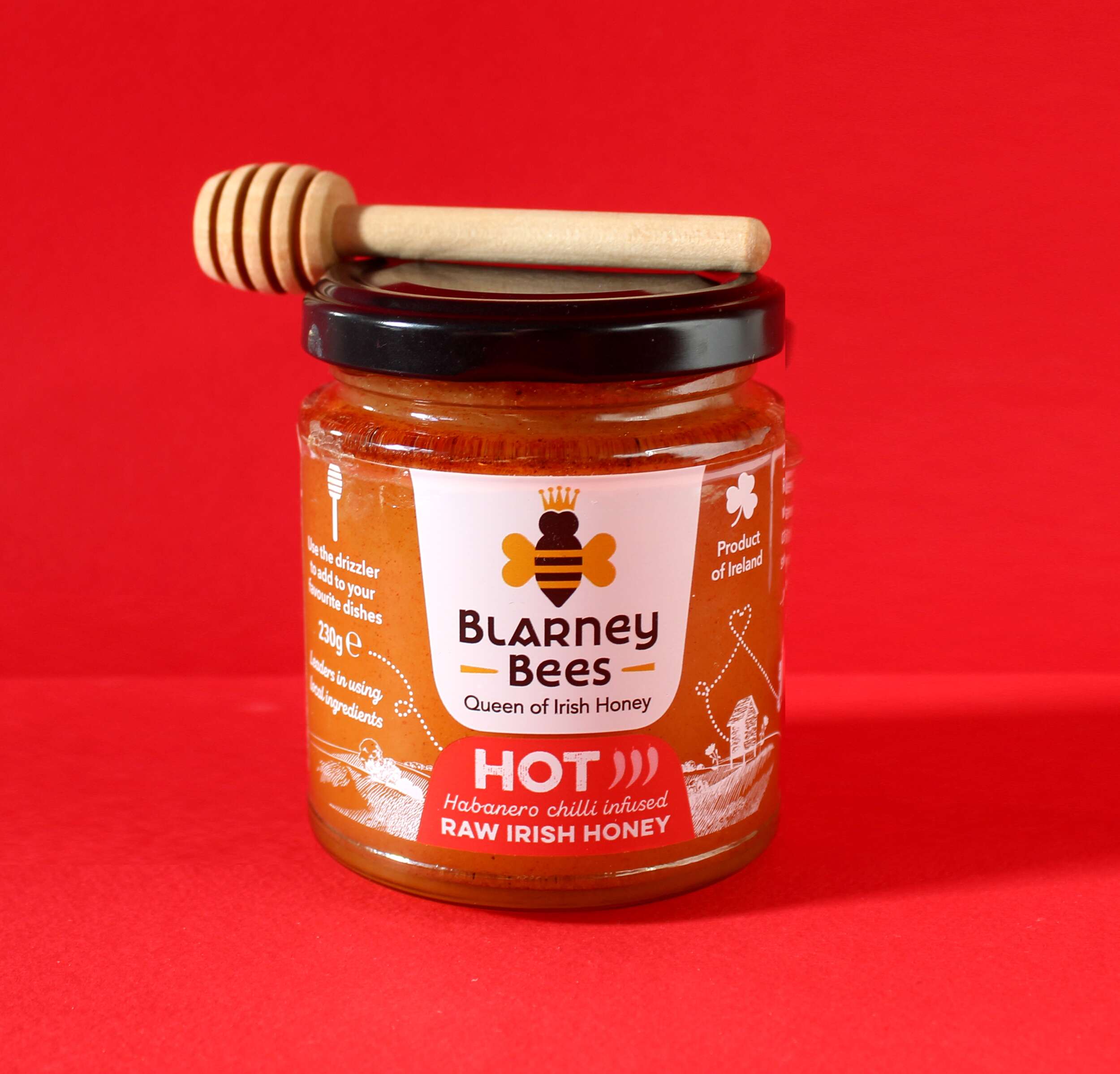
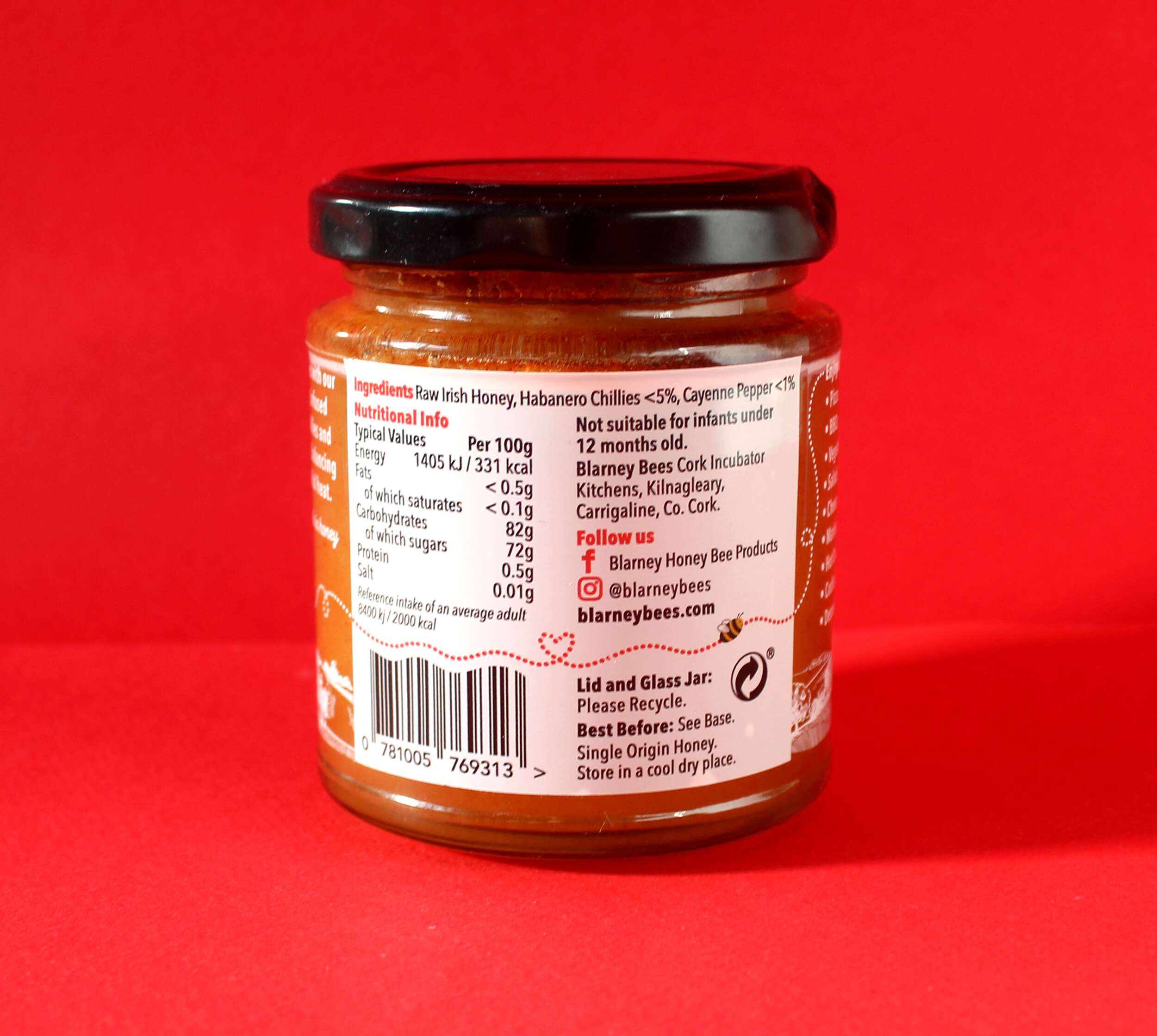
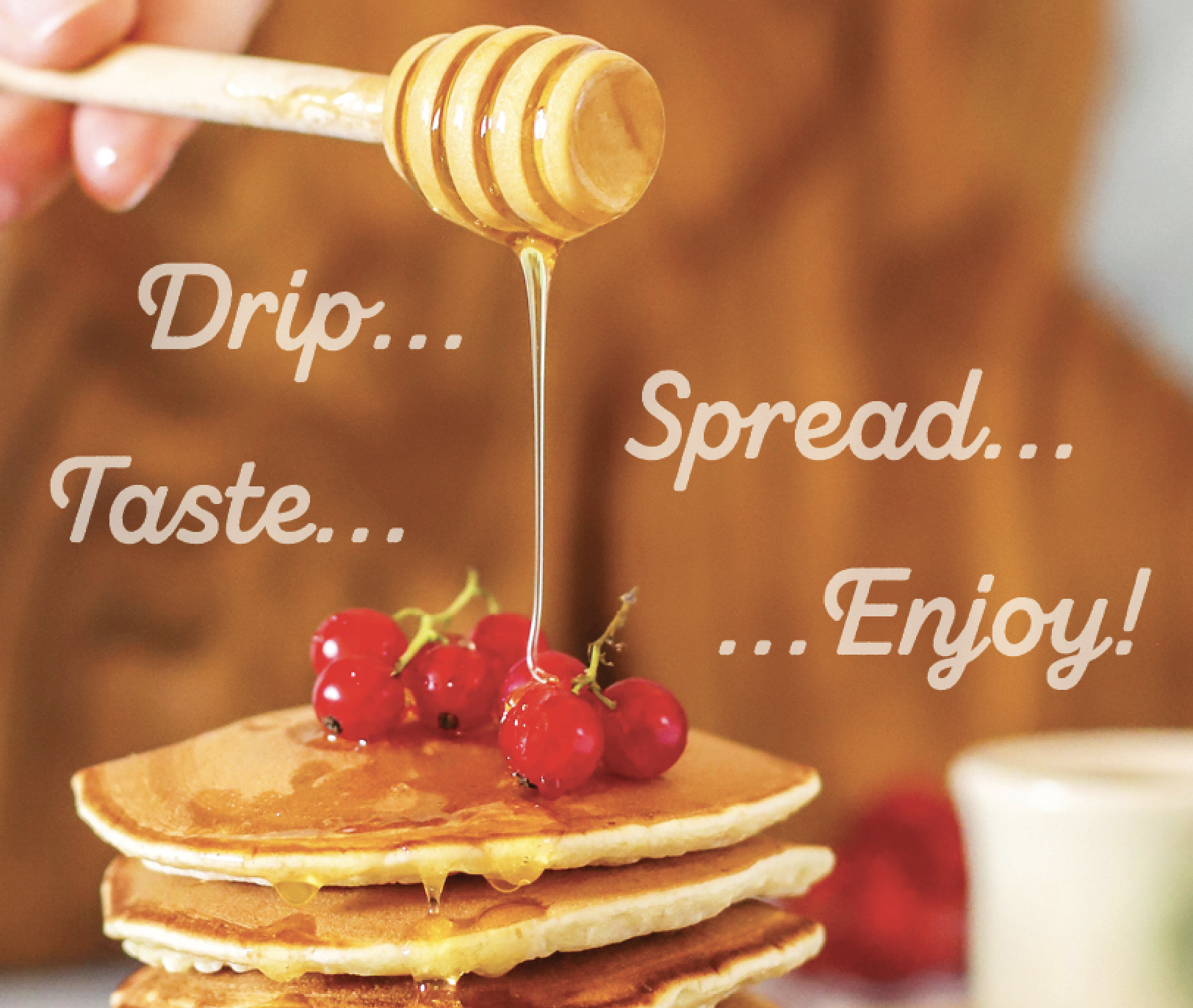
The result is a perfect balance of sweet and fiery with their Raw Irish Honey infused with habanero chilies and cayenne pepper. Crafted from the nectar of Ireland’s wildflowers, this honey boasts a captivating contrast of raw sweetness and the bold, healthful heat of cayenne pepper, offering a unique and versatile addition to your culinary creations.
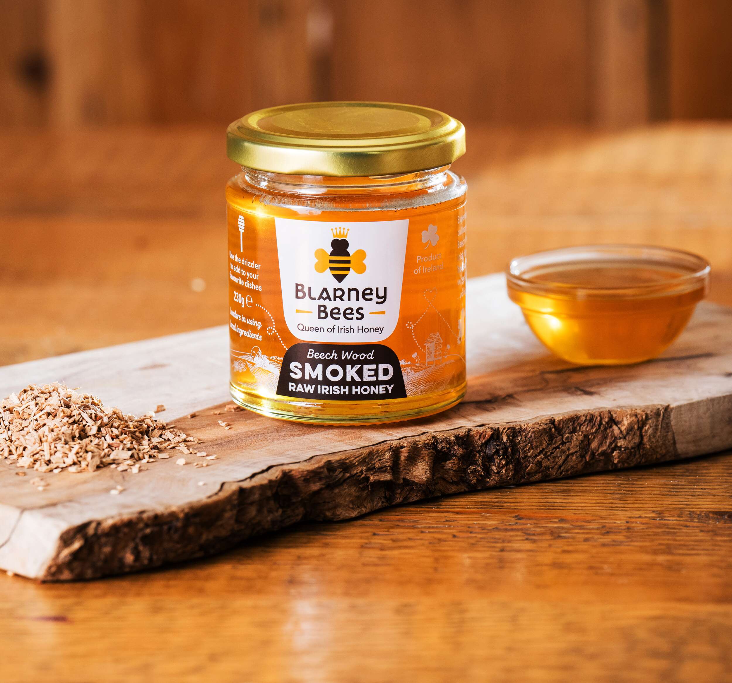
The Beech Wood Smoked Raw Irish Honey is a masterpiece of craftsmanship that blends the essence of Ireland’s wildflowers with a subtle smokiness using a cold smoke process. The deep amber honey, rich in antioxidants and natural antibacterial properties, offers a delightful balance of floral sweetness and earthy undertones. It enhances a wide range of dishes and beverages while also delivering a taste of the Irish countryside. Sourced sustainably, this honey is a harmonious union of nature’s best, encapsulated in every jar. Experience a uniquely Irish culinary journey with the Beech Wood Smoked Raw Irish Honey.
Sustainability
Their philosophy is to produce Irish Honeybee Products in the most sustainable way possible, by sourcing organic ingredients for their products that are free from chemicals/perfumes and partner with vendors who are making like-minded sustainability choices, reducing waste, and reusing materials as much as possible. All ingredients are locally sourced, and packaging is made from recycled materials. They also support local non-profit organizations with educational talks on biodiversity and observation hive visits to sites.
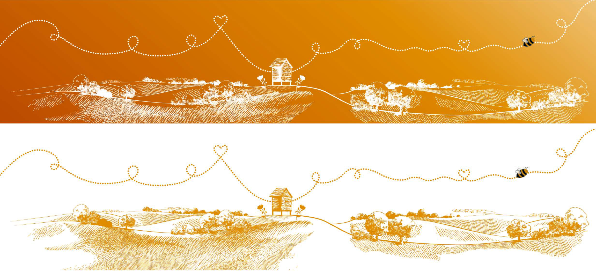
Queen Bee Character Brand Identity Concept
Within the honey bee colony, the Queen Bee is an important figure. Therefore, the concept developed features the queen bee as a character with a crown to represent how this honey is the ‘queen of the crop / the queen bee of honey’ as the quality is of the highest standards. Her wings are made up of two hearts, giving her a friendly appearance and representing how the honey is made with love. This creates a strong, distinguished brand symbol, easily associated with honey and their brand. As Blarney Bees are based in Blarney in County Cork, they wanted to communicate its heritage and how it’s an Irish brand – therefore we chose a Celtic style font, but with a modern and fresh take, to avoid looking like a stereotypical / twee old-fashioned Irish brand. We hand-tailored this font, to personalise it for Blarney Bees.
Packaging Design Considerations
For the packaging design, the client wanted to show as much as the product within. Therefore, we featured the logo and flavour descriptions prominently for easy legibility, and then reversed the design as white printed on to the honey background for the sides of the jar to show the honey within. We created an illustrative background featuring a natural environment, a bee hive apiary and a bee trailing a trail which wraps all the way around the jar. This bee trail weaves a small heart within it, indicating how the honey is made with love. This also brings a fun and playful feel to the packaging. Each flavour is differentiated by a different colour, to ensure each flavour is easily recognisable. The font chosen for the flavour description is bold for easy legibility and has a rustic grained texture within it to denote how the honey range is raw and natural.
Blarney Bees have been shortlisted as Finalists for the Irish Quality Food and Drinks Awards 2024 @irishqfa with both of their Raw Irish Honey products and their Beechwood Smoked Raw Irish Honey has won a gold star at the prestigious Great Taste Awards @guildoffinefood.
Blarney Bees Honey is currently available in the below SuperValu stores in Cork and to order online at:
www.blarneybees.com
@quishs_ballincollig
@supervalu_tower_
@ryanssupervalutogher
@ryanssupervalugrange
@Scallys Supervalu Blackrock
Follow Blarney Bees Honey on Social Media:
Instagram: @BlarneyBees
Facebook: @Blarney-Honey-Bee-Products
Photography by: @joleencronin
www.joleencronin.com

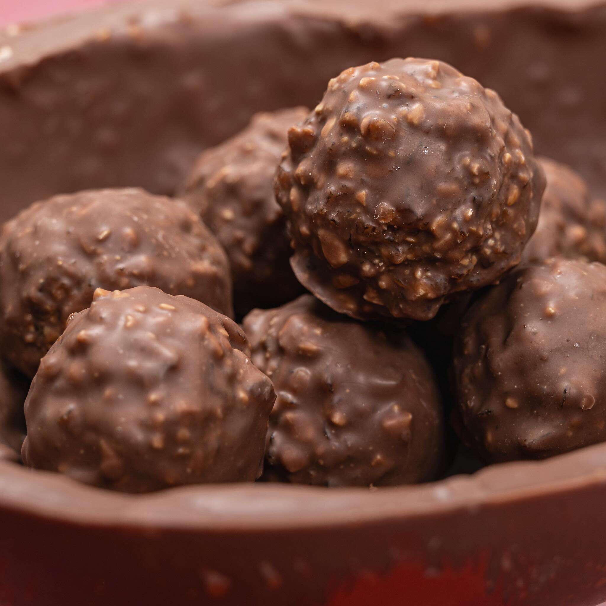
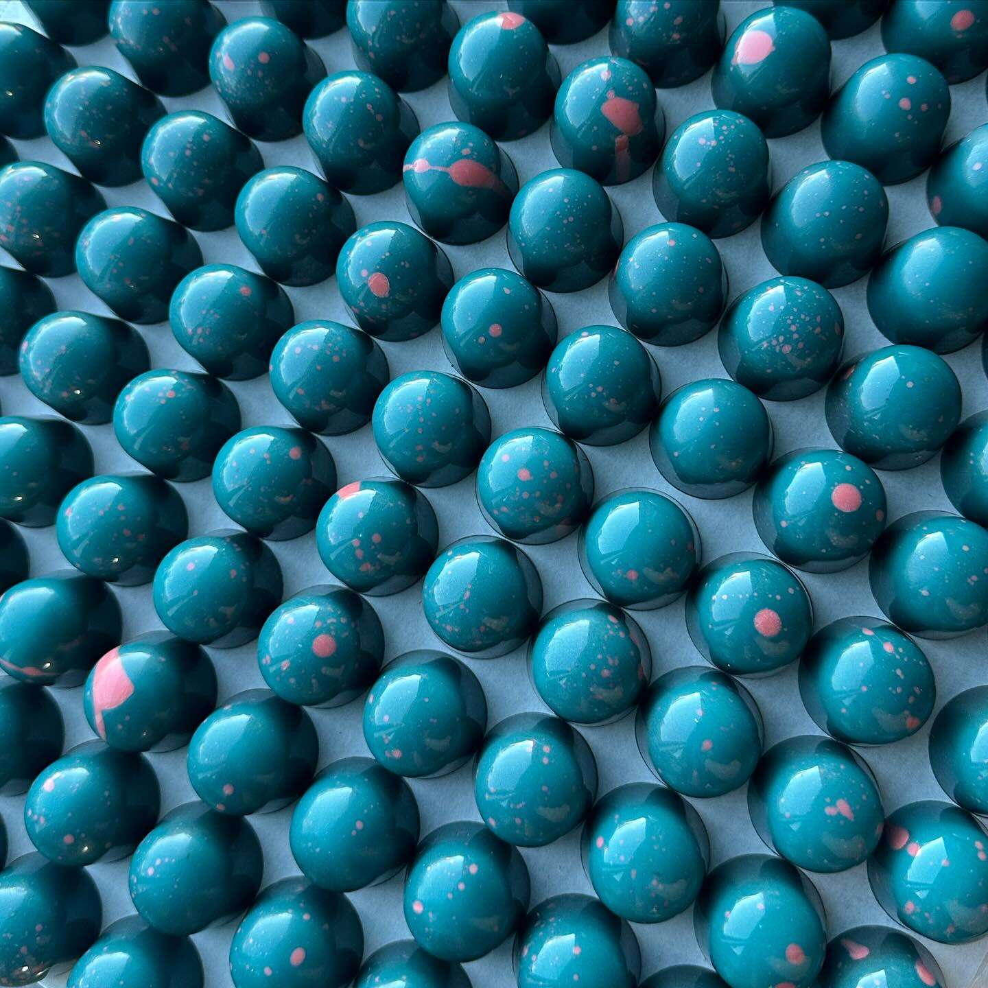
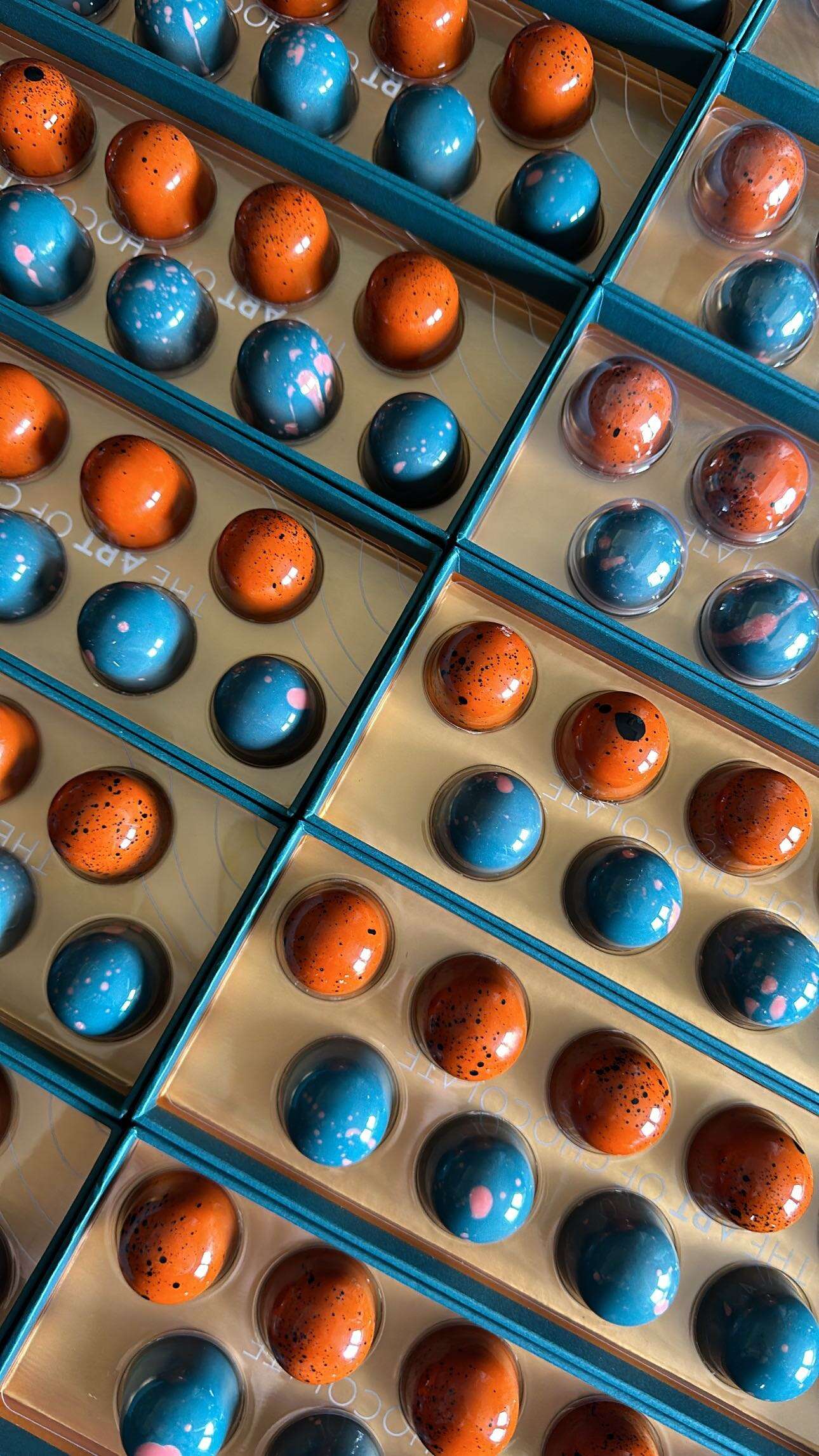
Tara Gartlan Chocolate: Easter Eggs Packaging Design
Tara Gartlan Chocolate: Easter Eggs Packaging Design
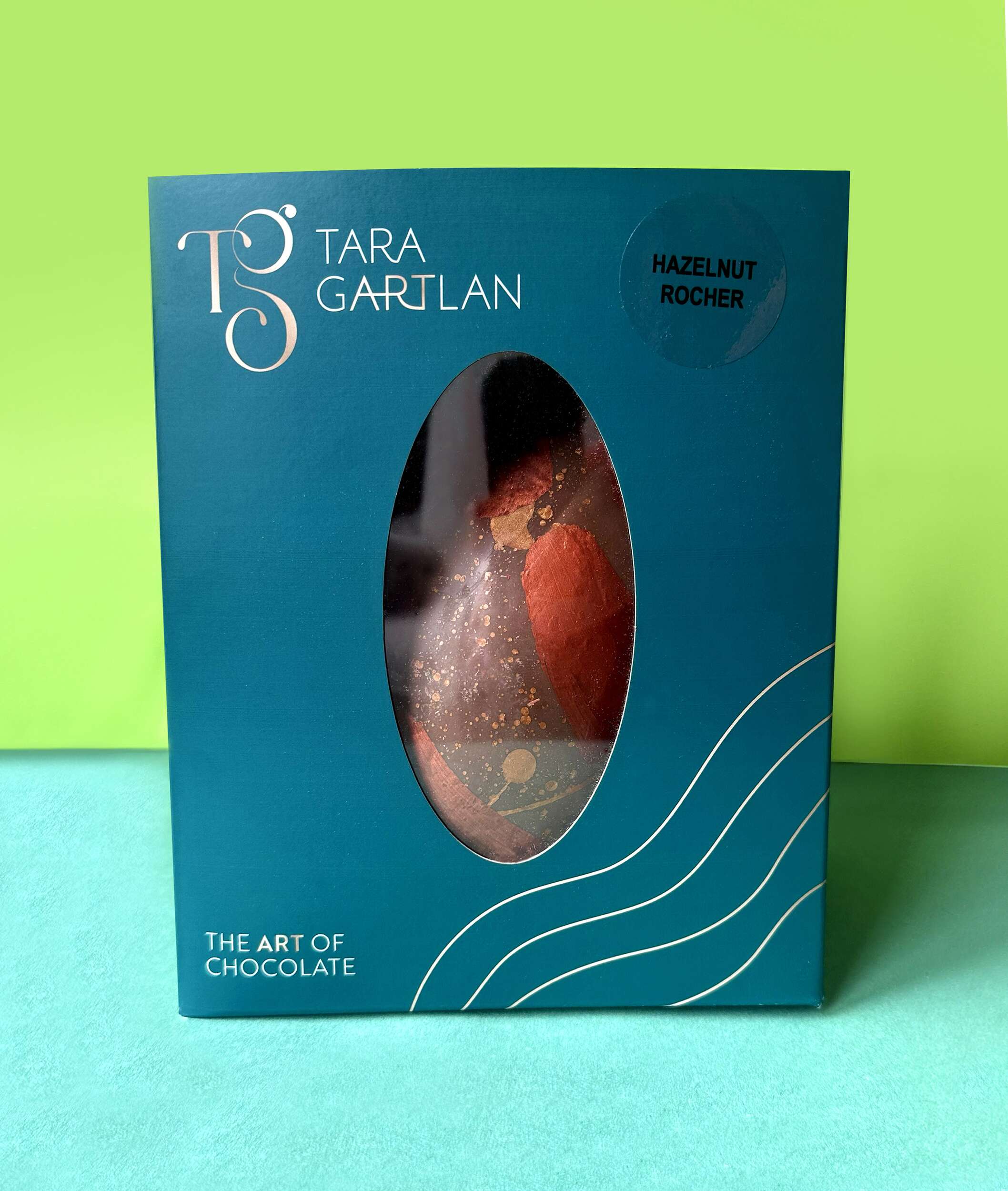
The Packaging Design of these beautiful Easter Eggs are a lovely addition to the Tara Gartlan Chocolate range designed by Clare Lynch Creative.
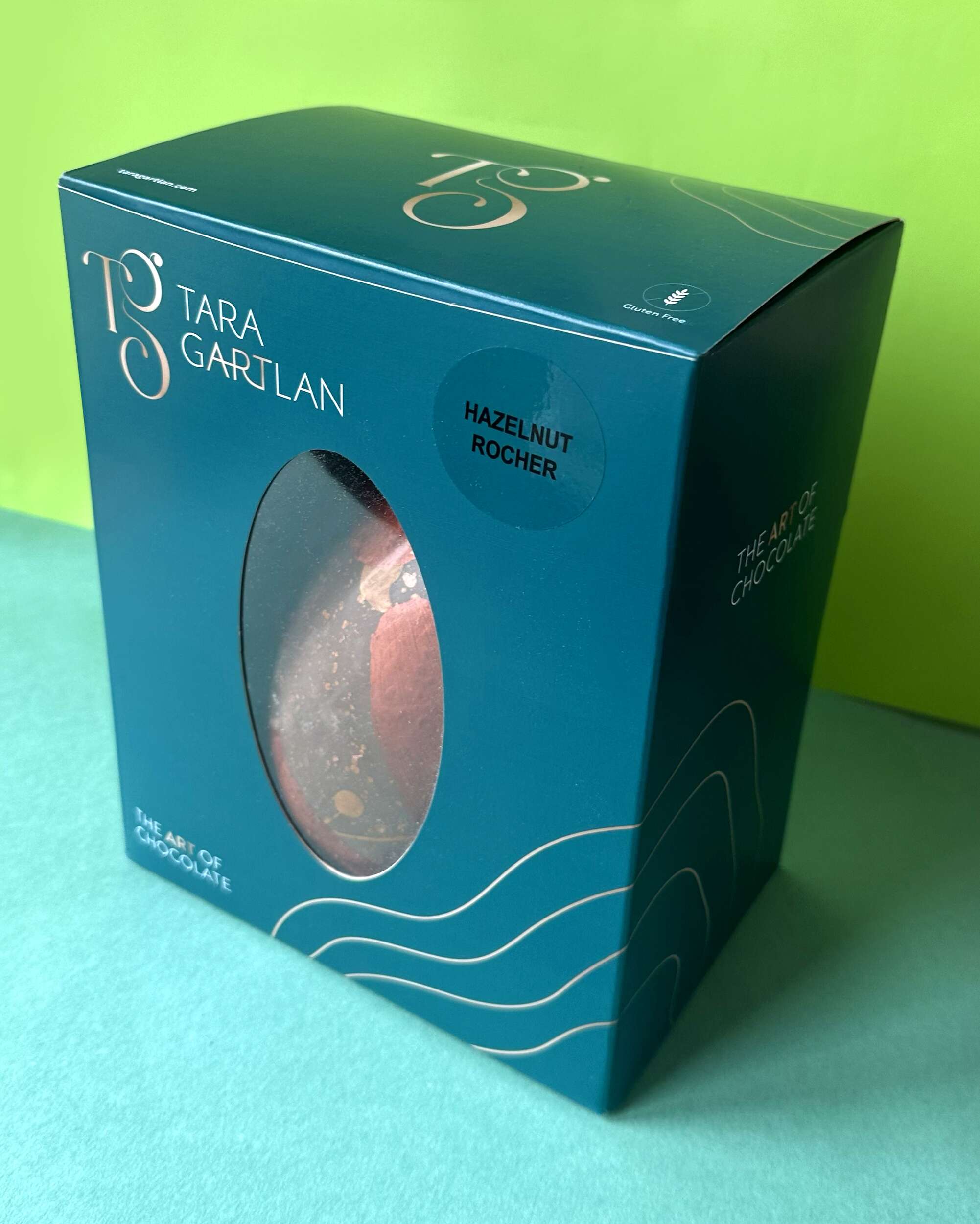
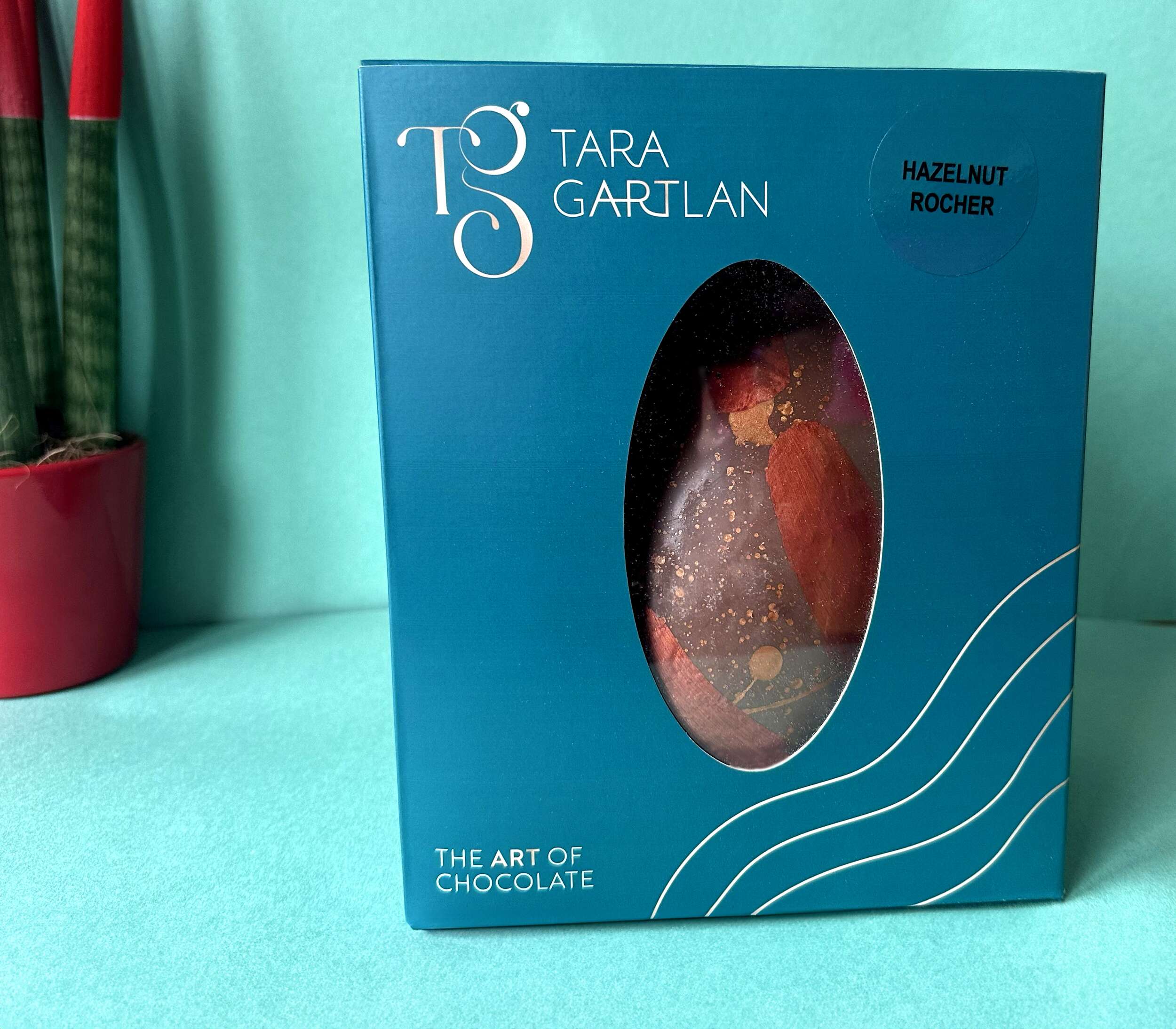
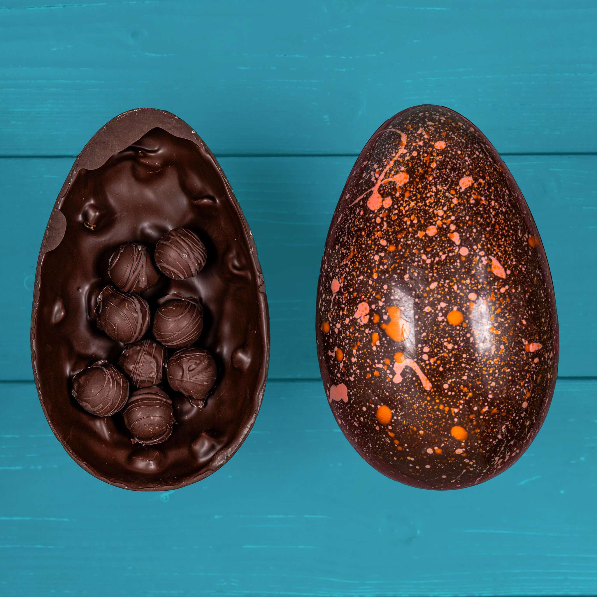
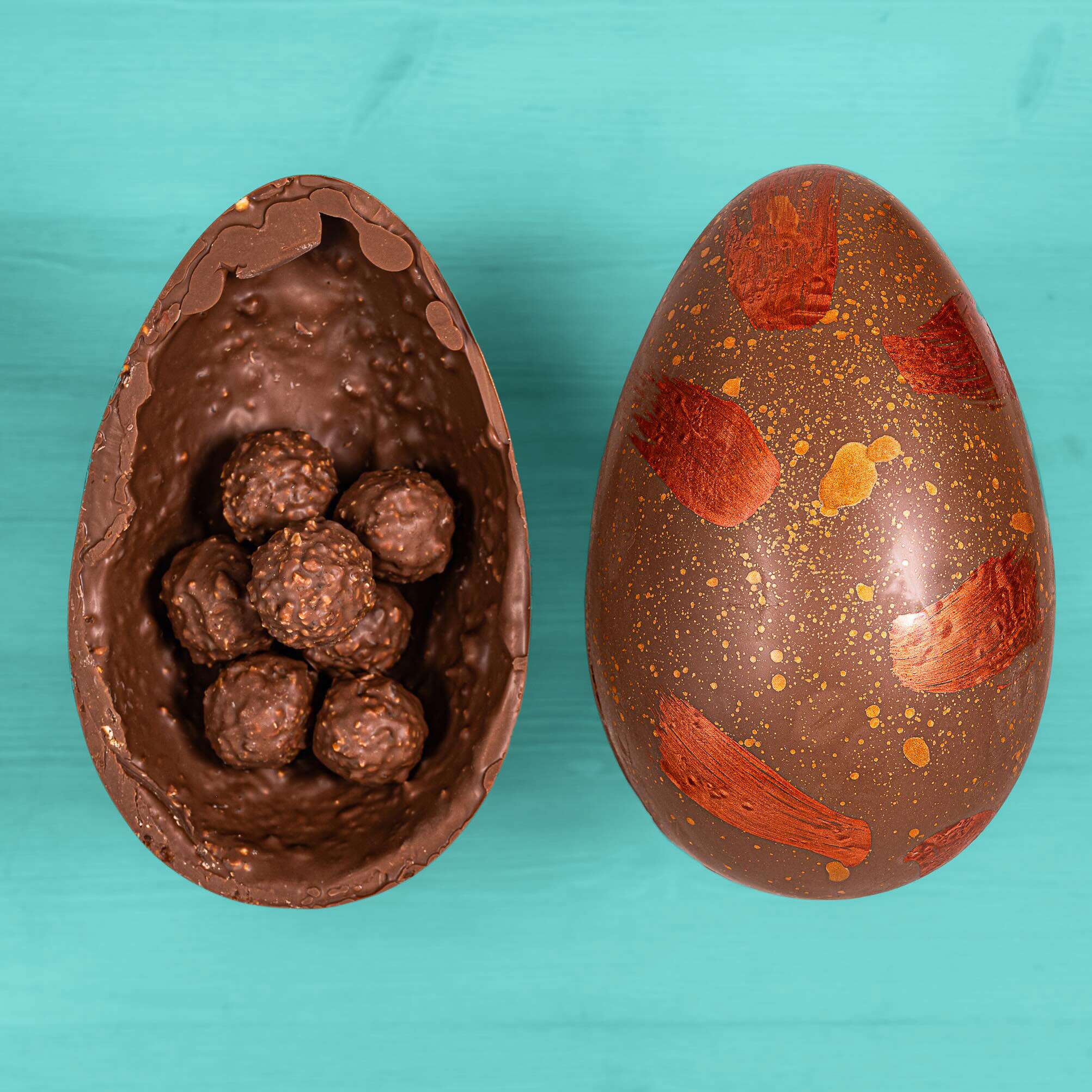
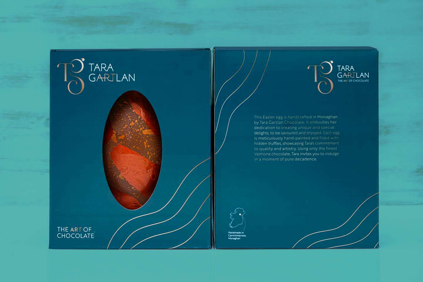
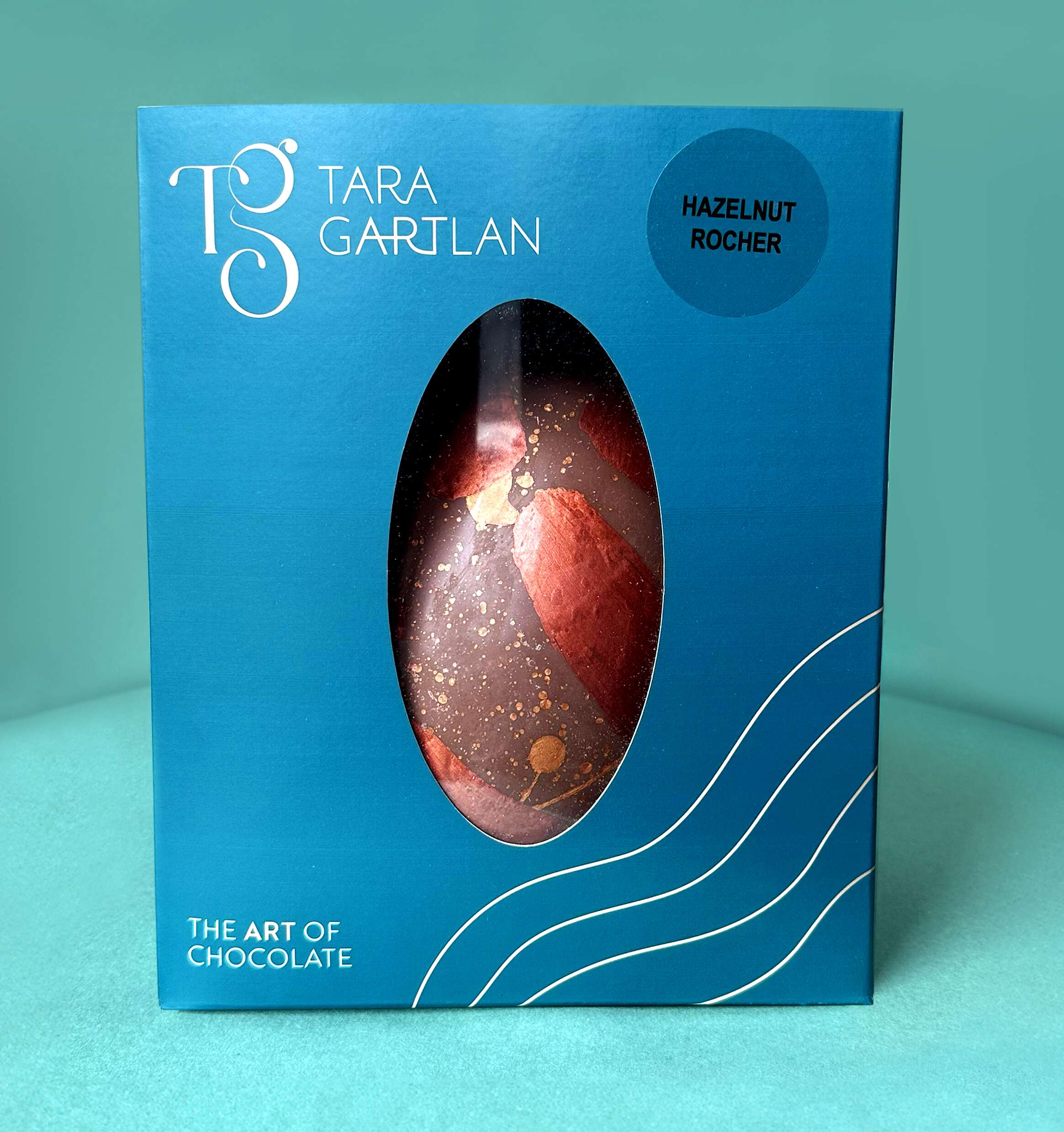
These Easter Eggs are handmade in Carrickmacross, Co. Monaghan, Ireland by Michelin star pastry chef, Tara Gartlan. They embody her dedication to creating unique and special delights, to be savoured and enjoyed.
Each egg is meticulously hand painted and filled with hidden truffles, showcasing Tara’s commitment to quality & artistry. Using only the finest Valrhona chocolate, Tara invites you to indulge in a moment of pure decadence.
You can choose from the Hazelnut Rocher Egg with delicious Hazelnut Rochers tucked away inside a milk chocolate & hazelnut praline egg or the Passionfruit caramel Egg. If you really can’t decide, just have both! Everything is gluten free, as signature to all of the Tara Gartlan Chocolate range. The beauty is you wouldn’t know as the taste is amazing.
They can be ordered several months in advance of Easter each year via the website www.taragartlan.com
Follow Tara Gartlan Chocolate on Social Media:
Instagram: @taragartlanchocolate
Twitter / X: TaraGChocolate
Order Tara Gartlan Chocolates here: www.taragartlan.com

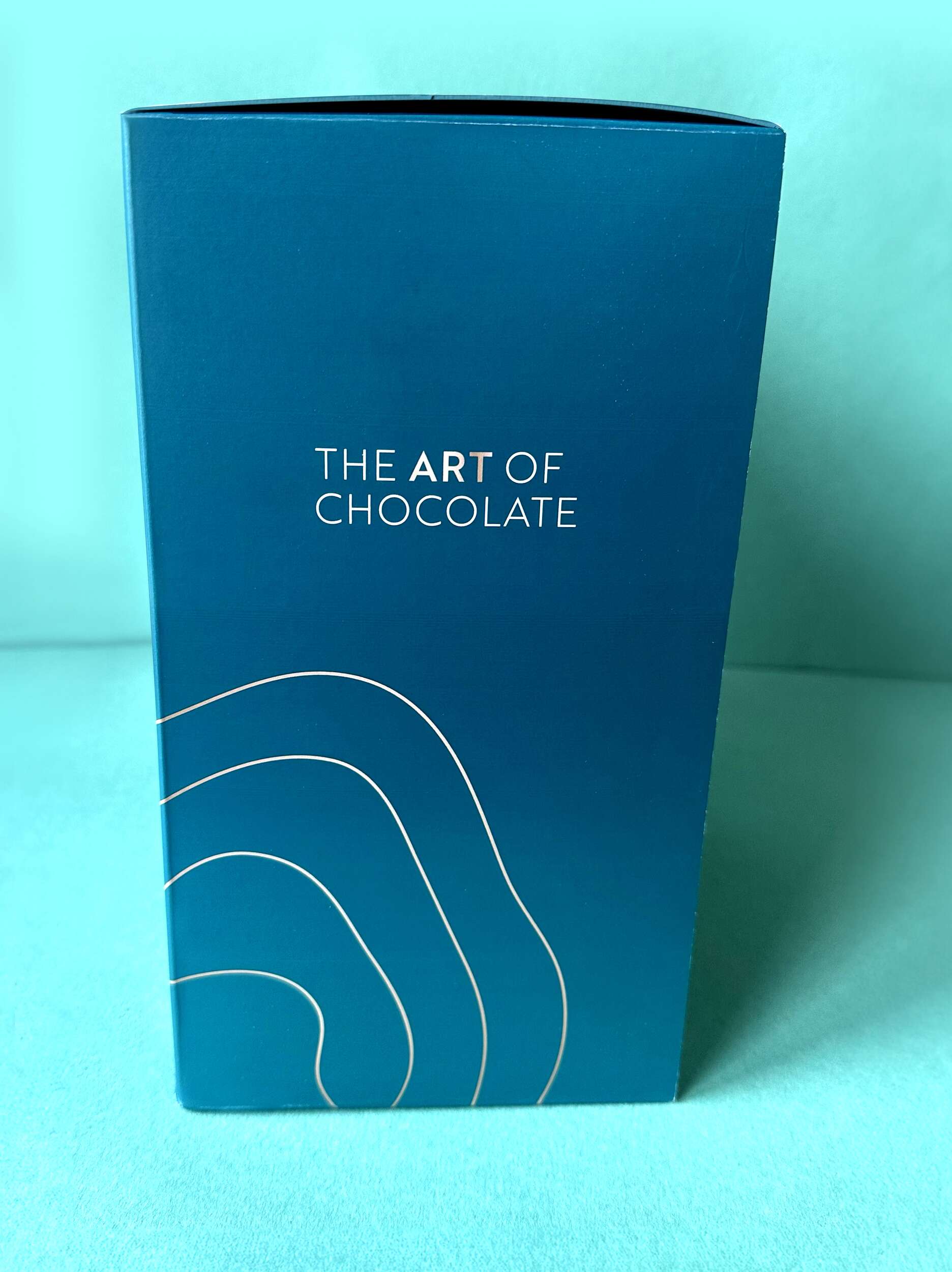
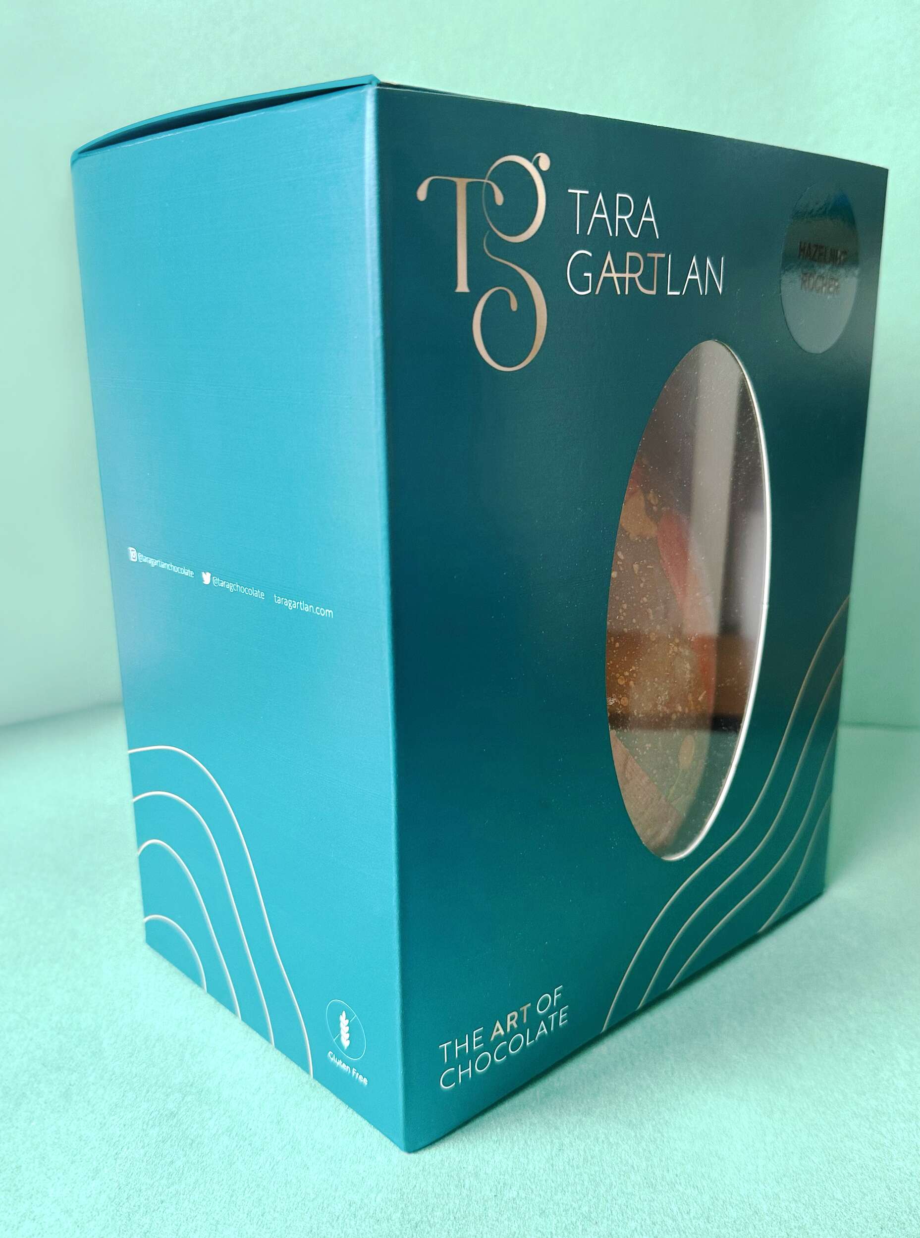
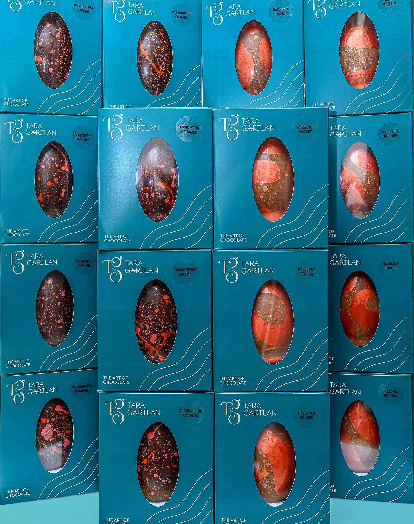
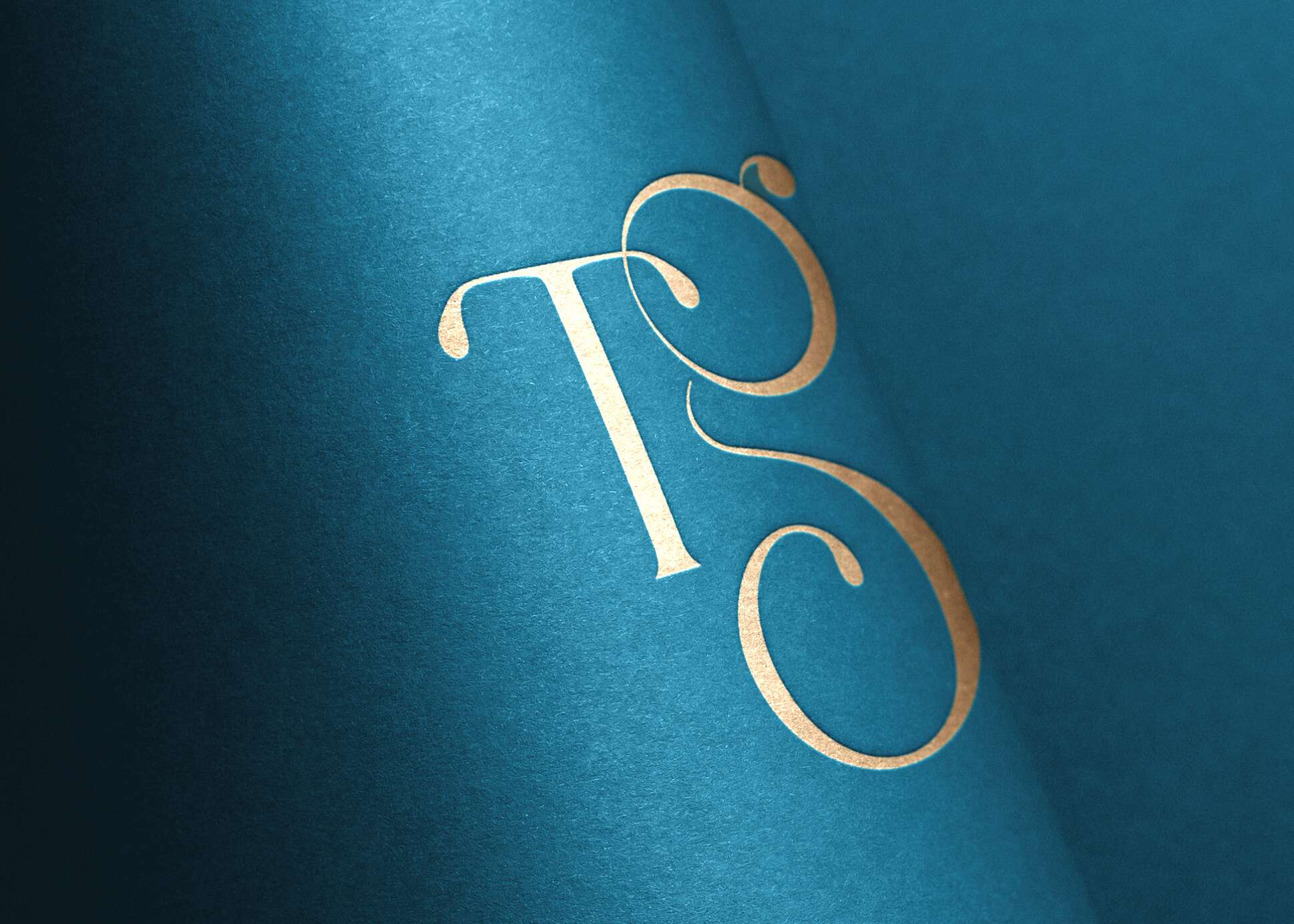
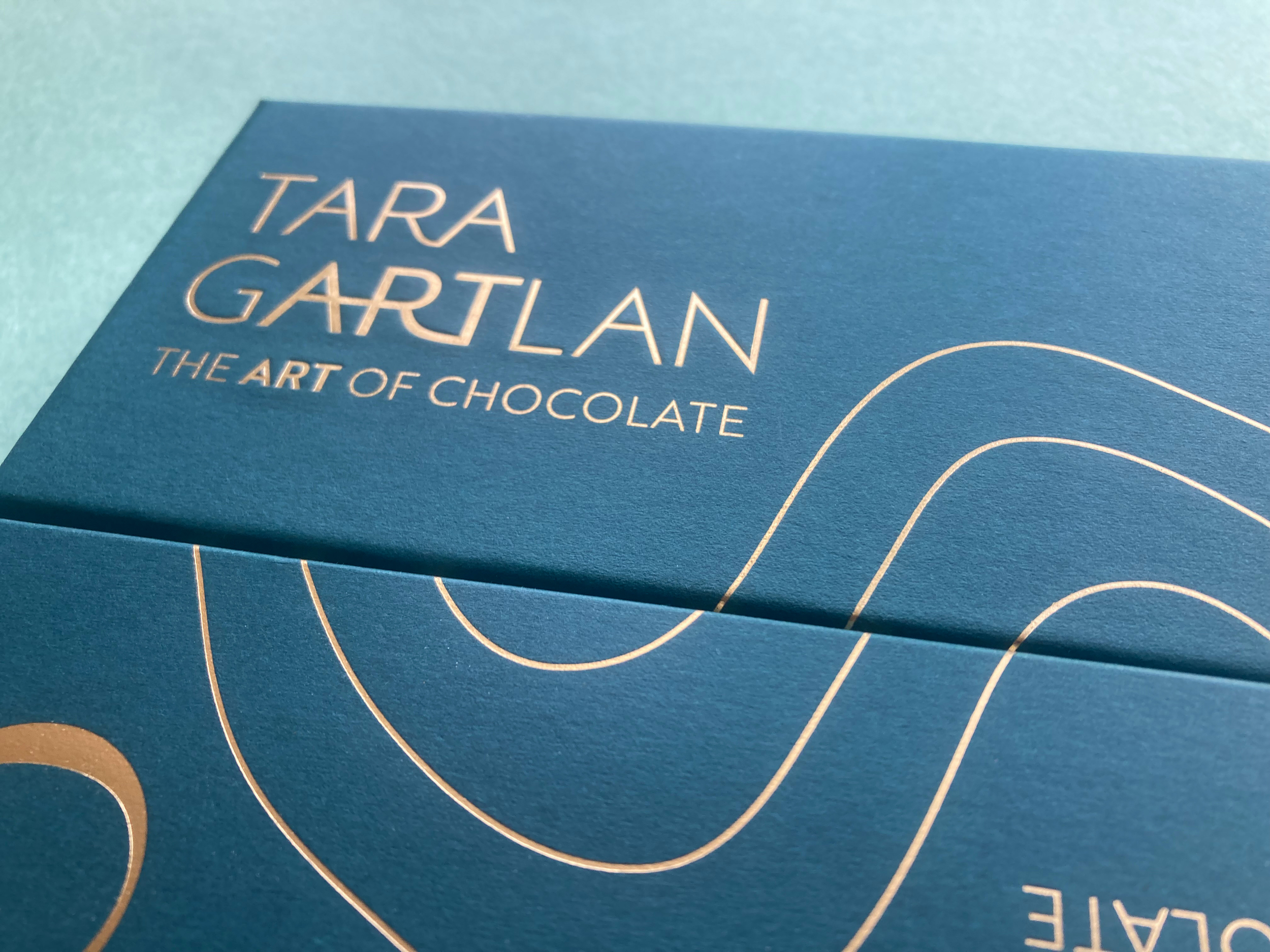
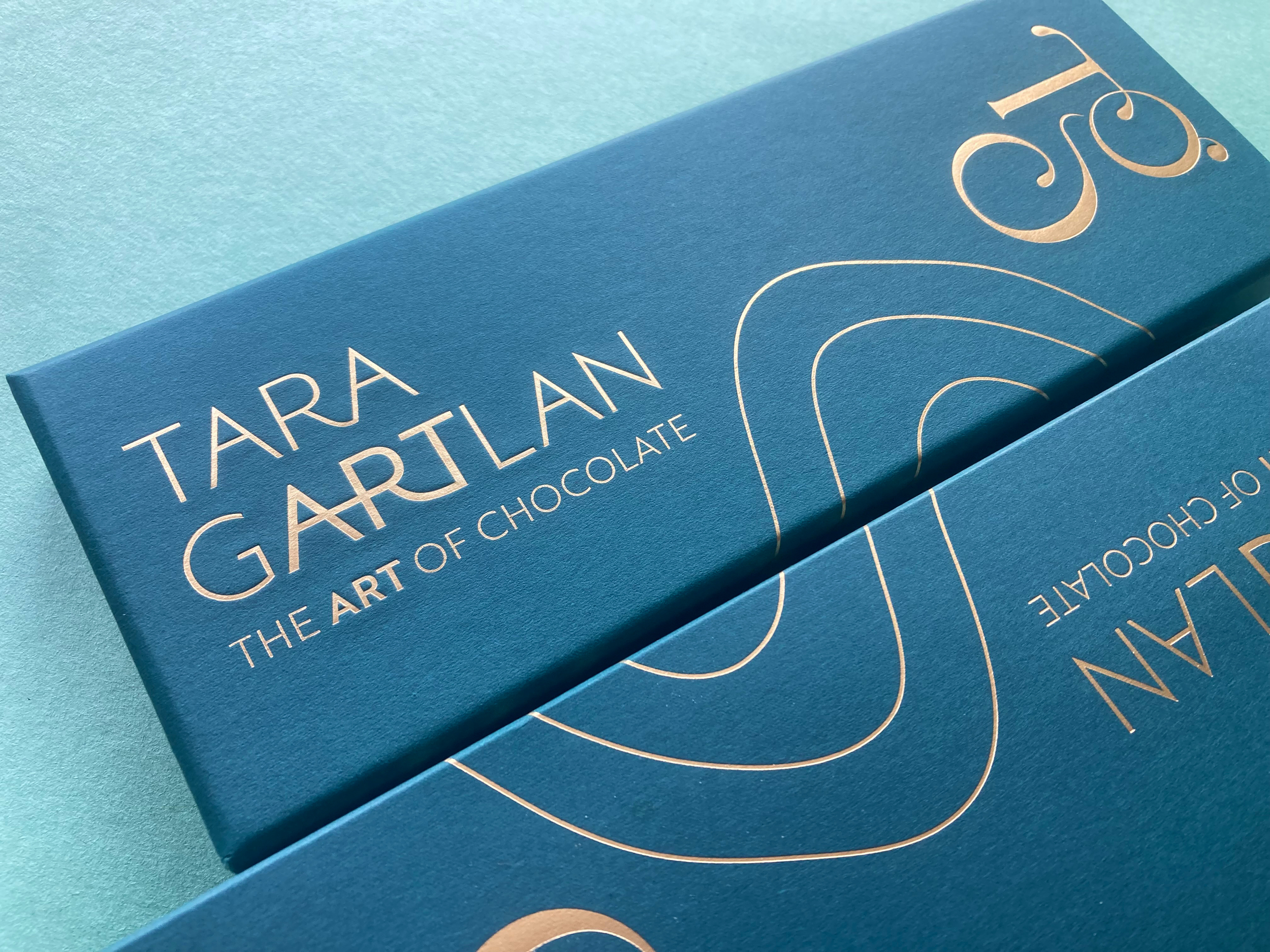
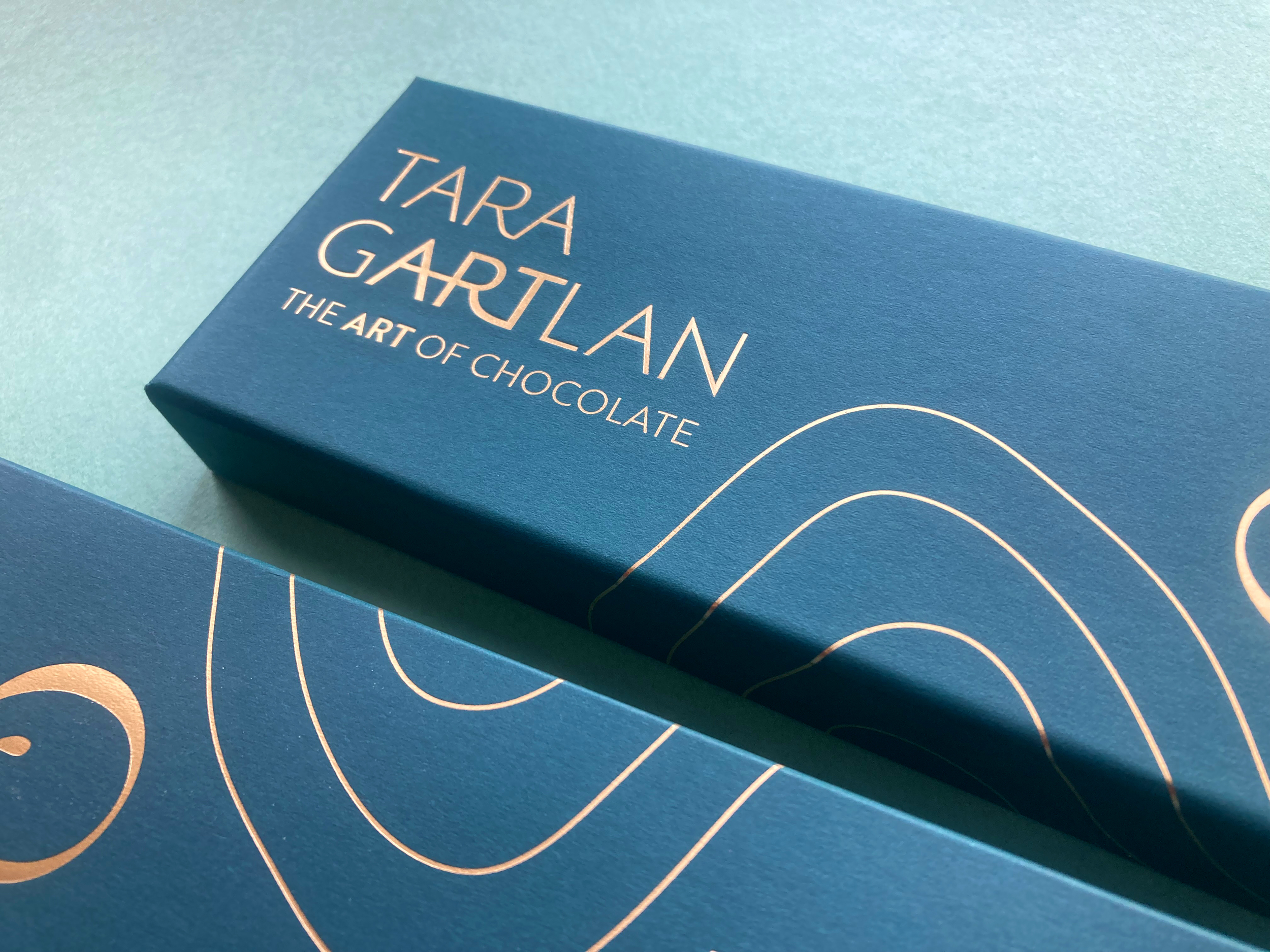
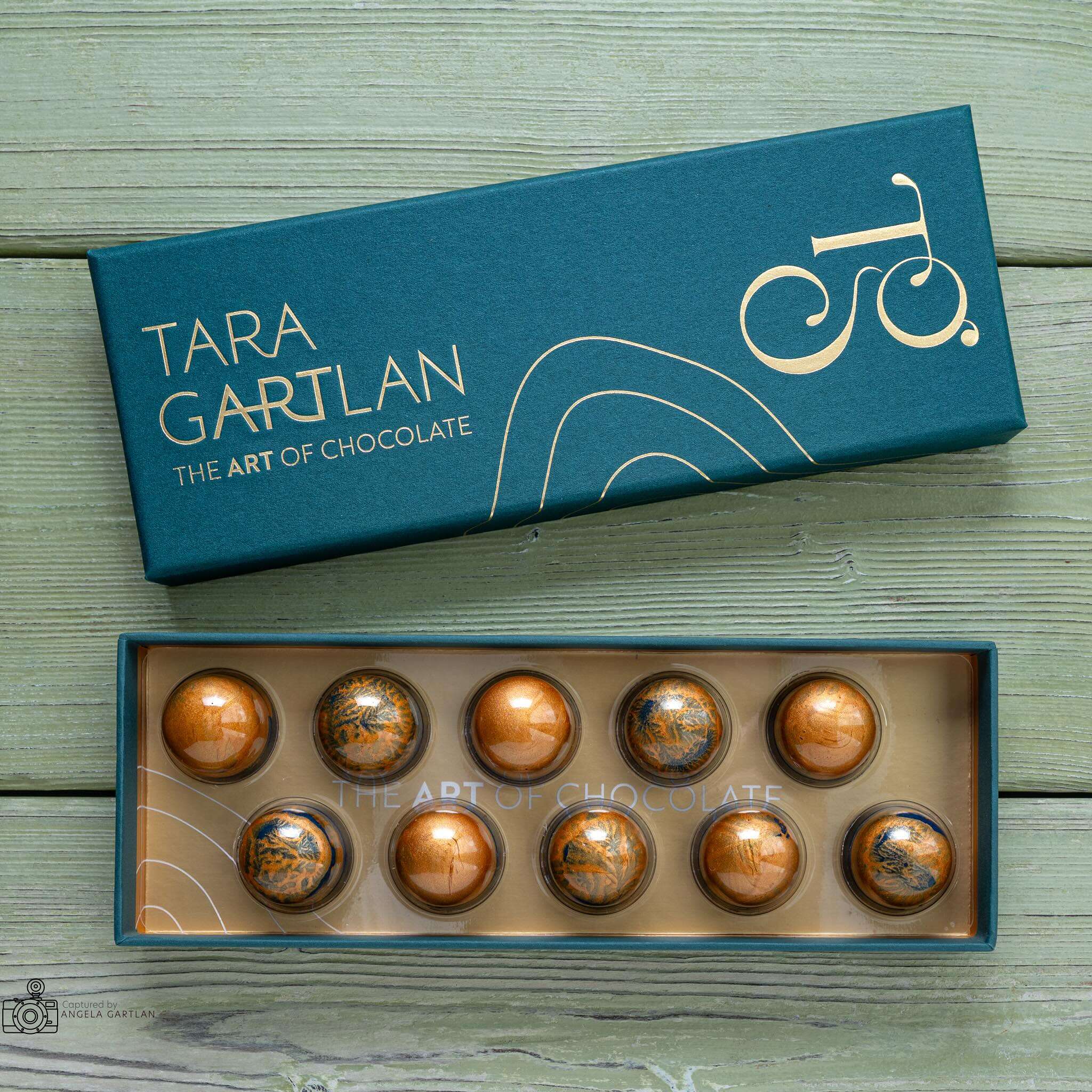
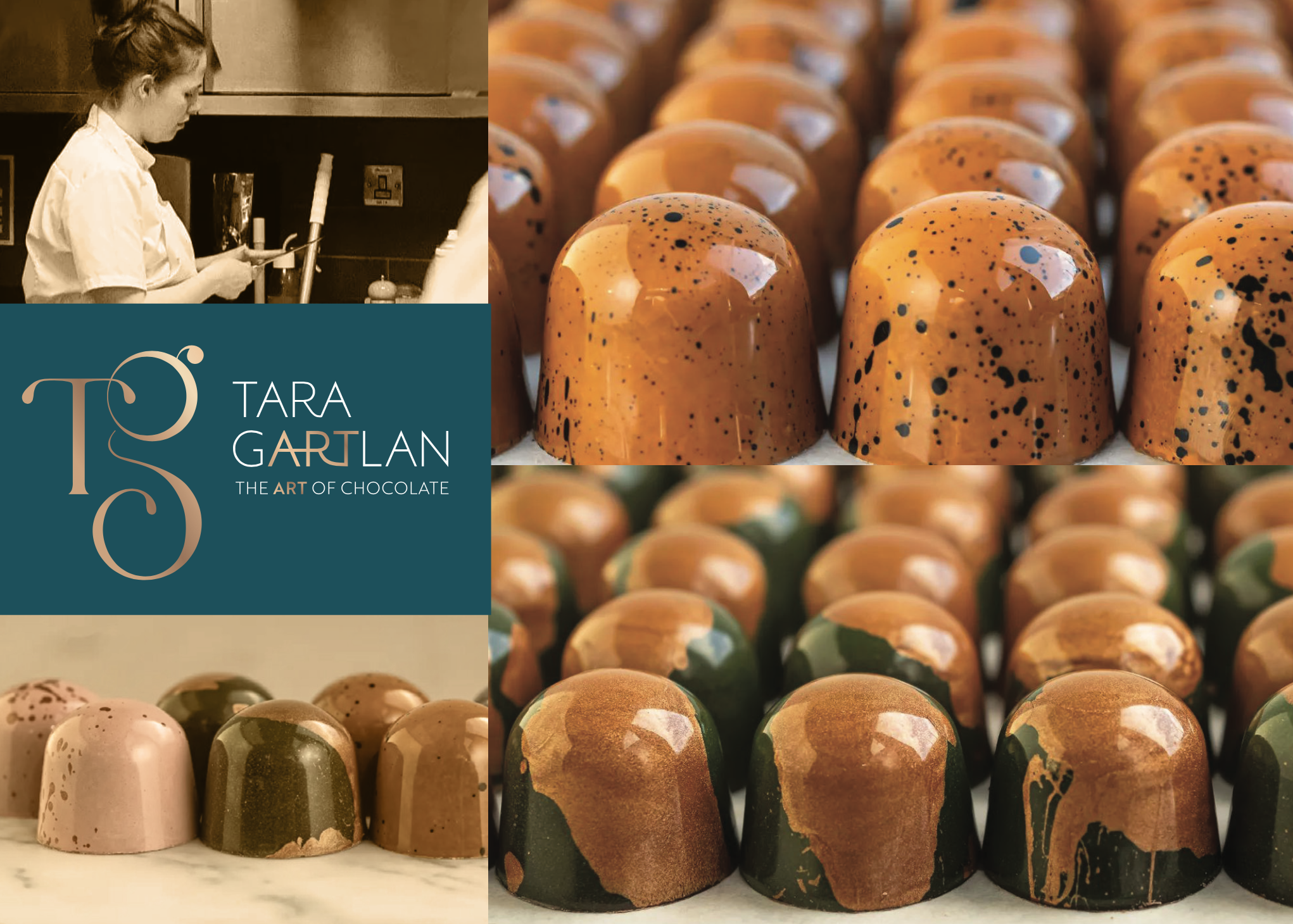
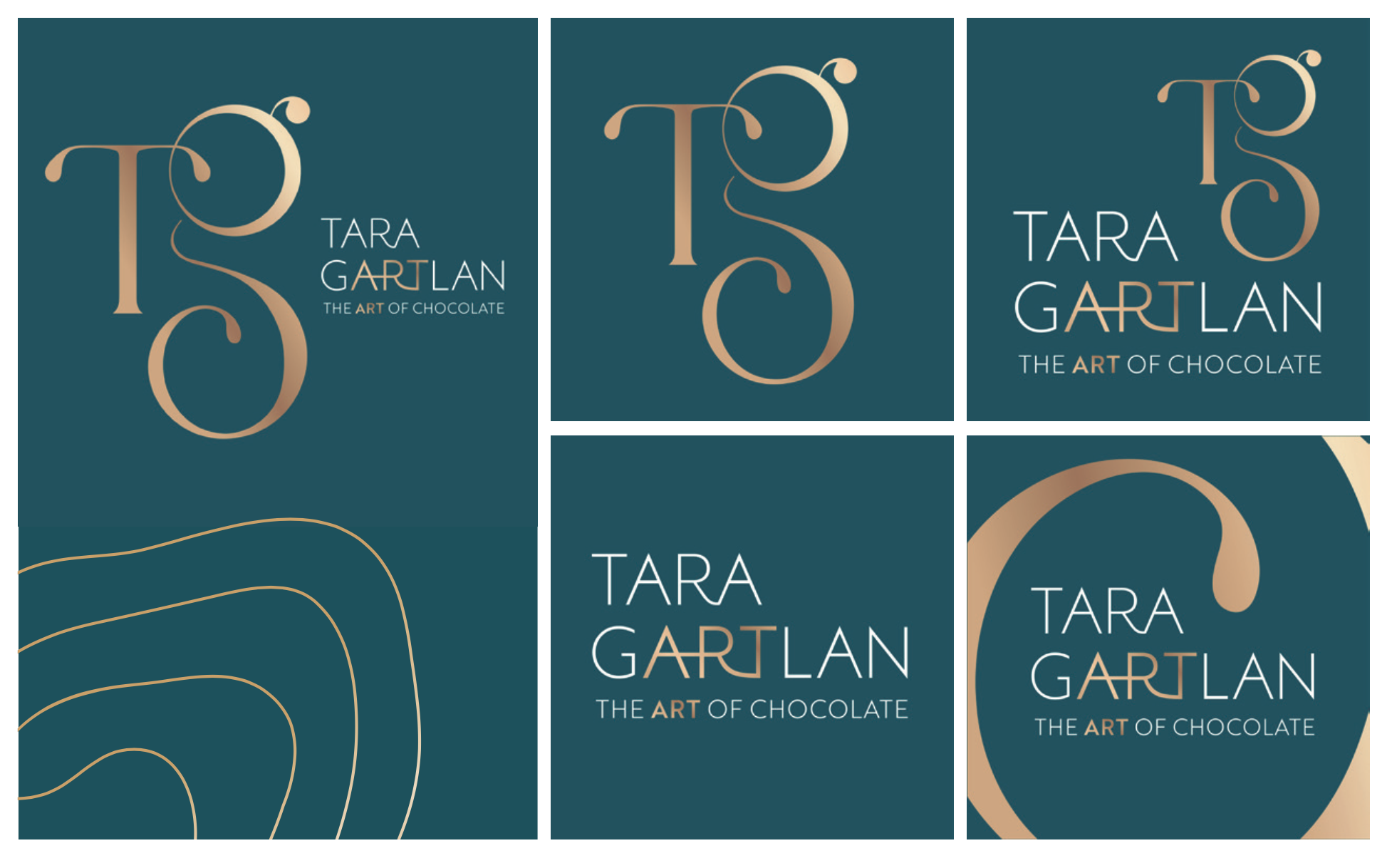
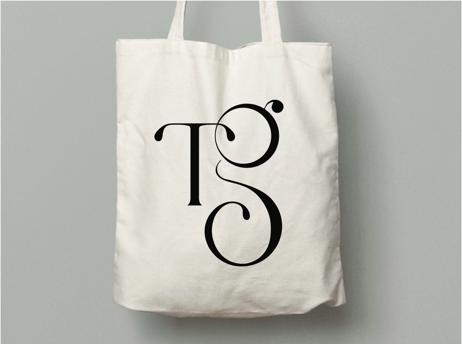
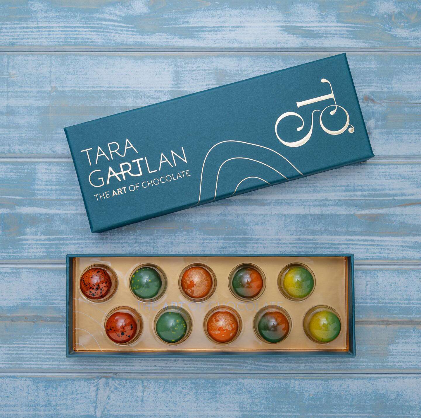
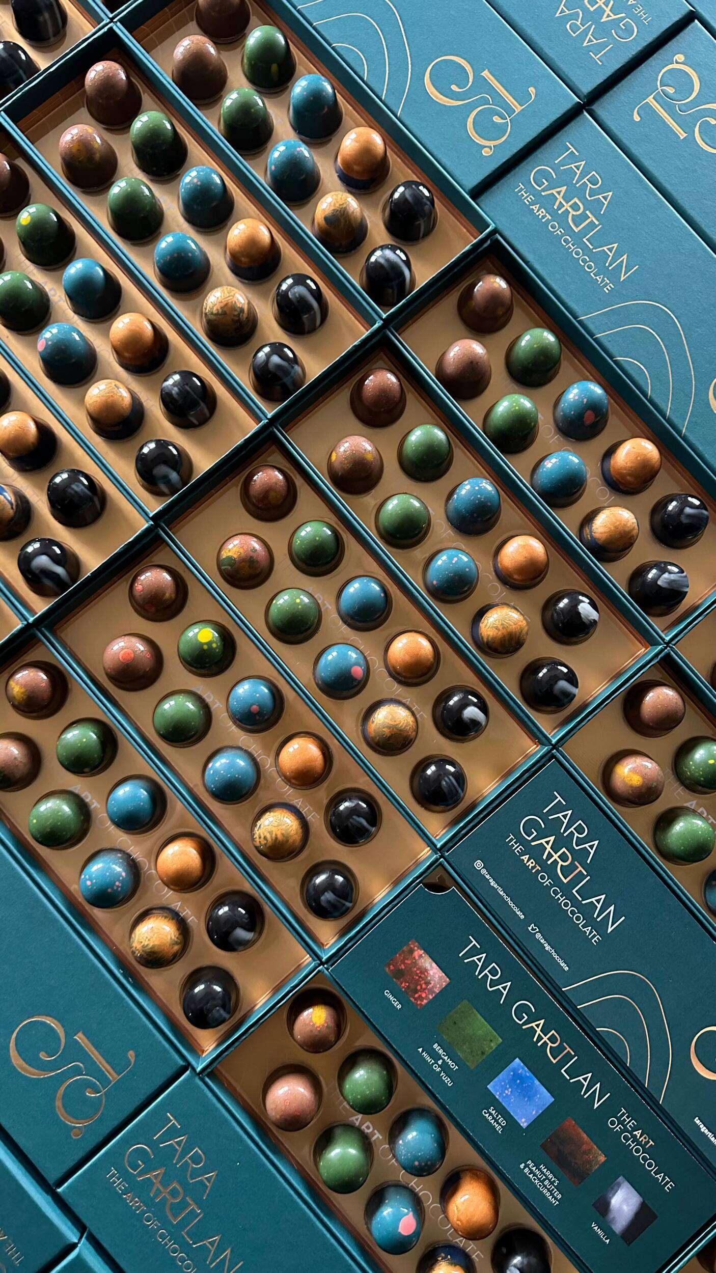
Tara Gartlan Chocolate – Brand Packaging Design
Tara Gartlan Chocolate: Brand Packaging Design
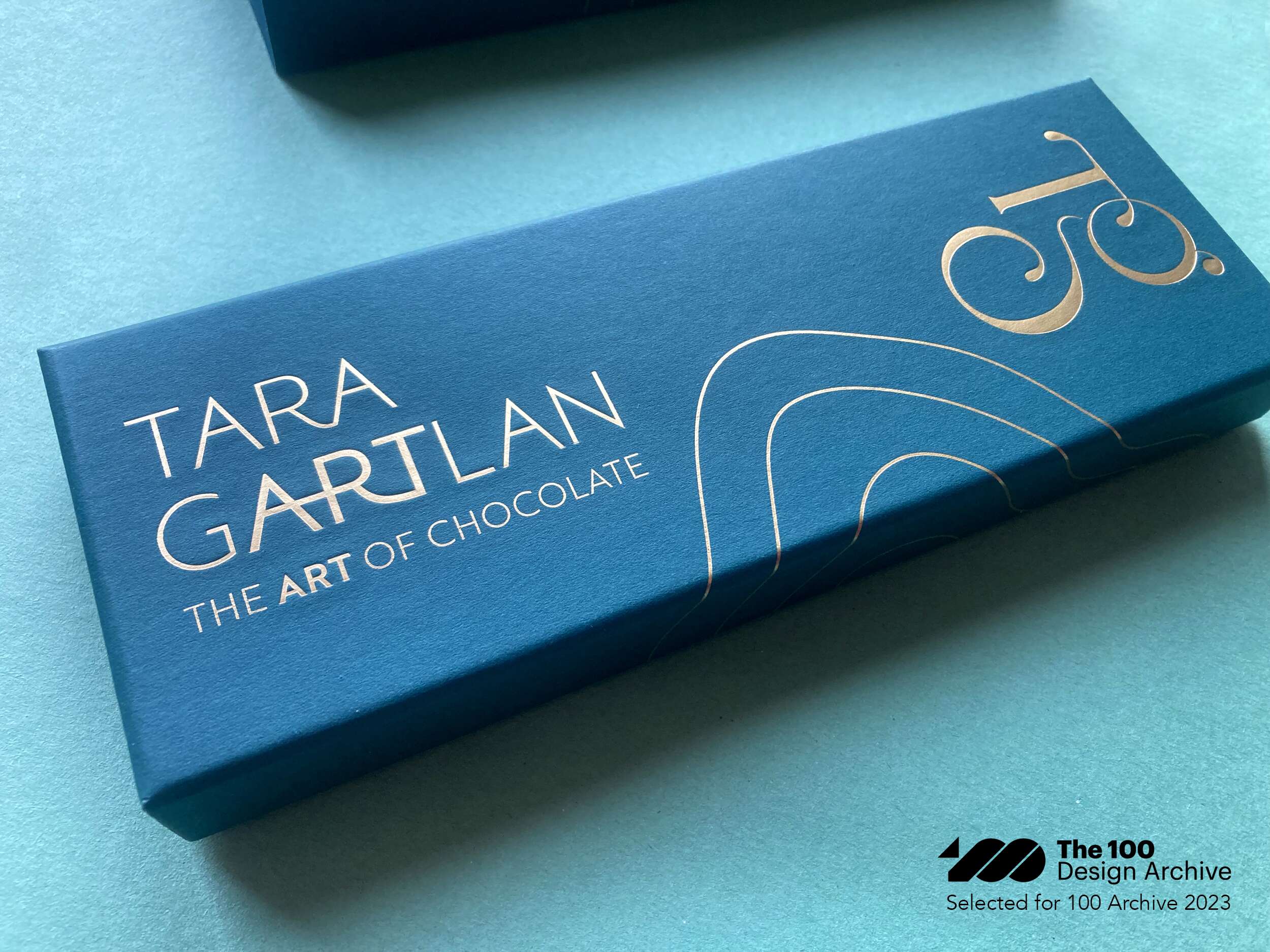
Introducing the Brand Packaging Design for Tara Gartlan Chocolate – luxury handmade chocolate bonbons, created by Michelin star pastry chef Tara Gartlan.
Each chocolate collection is like a work of art – every chocolate is meticulously handmade with beautiful designs, which lead to us creating the tagline ‘The Art of Chocolate’, highlighting the word ‘Art’ tucked within Tara Gartlan’s name. Cocoa butter is used artfully for decoration and all recipes are expertly crafted by Tara Gartlan. They look almost too good to eat! But once you do, you’ll be reaching for another one.
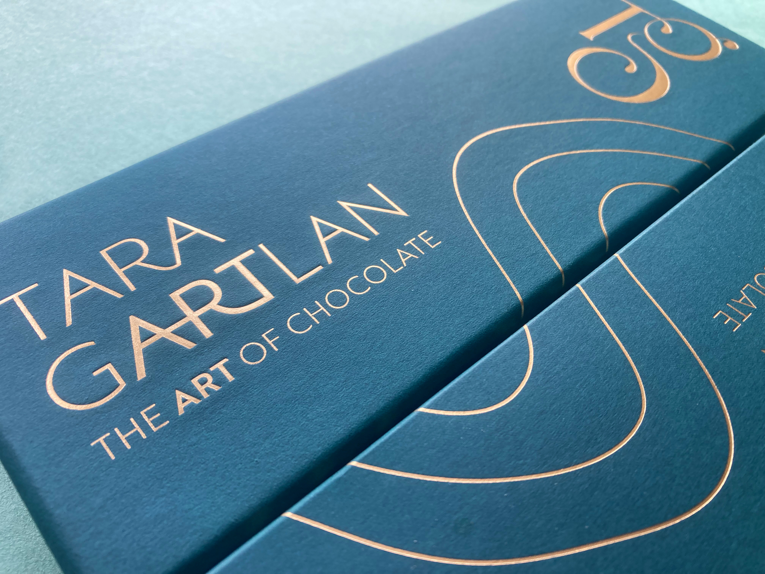
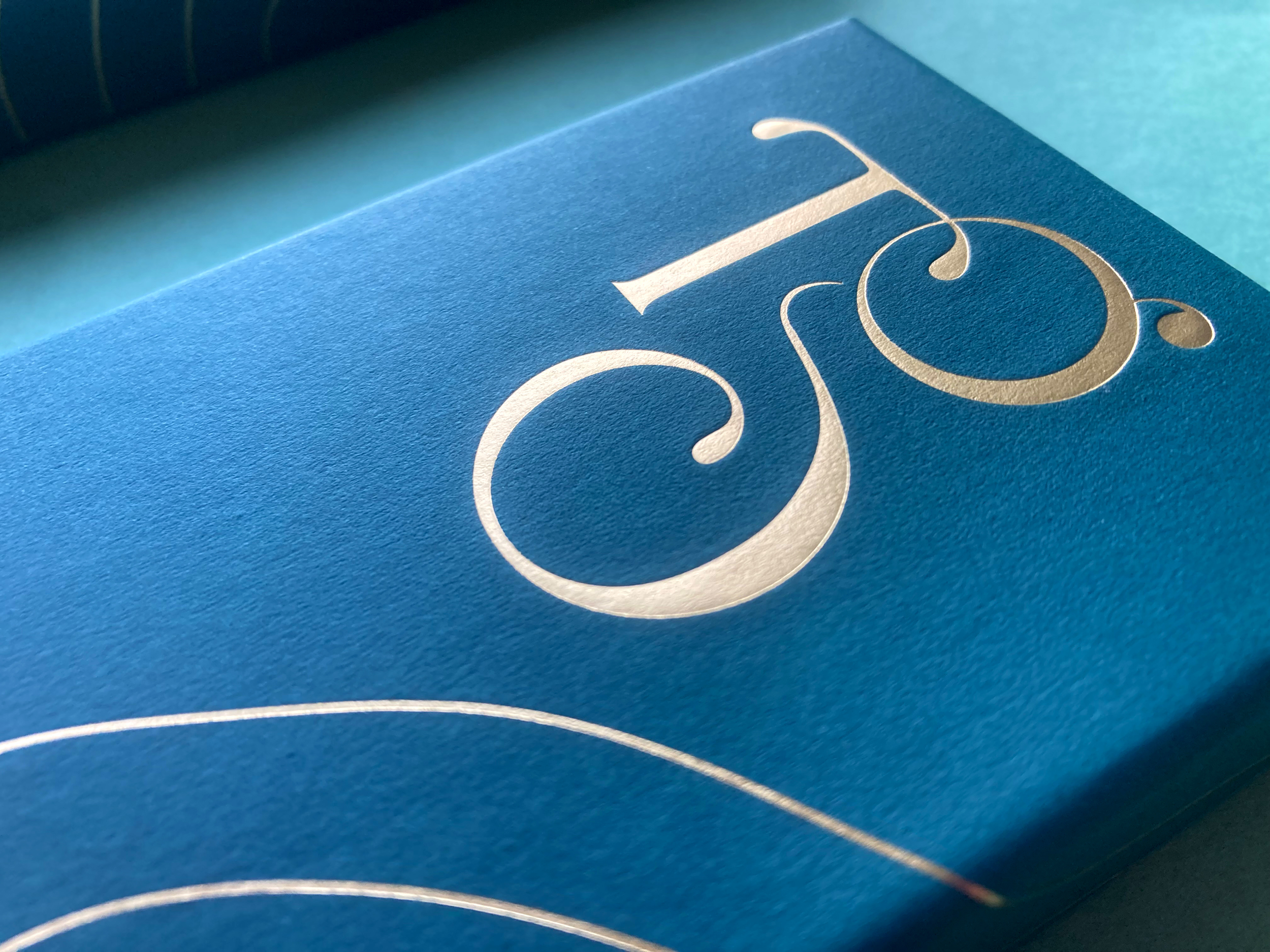
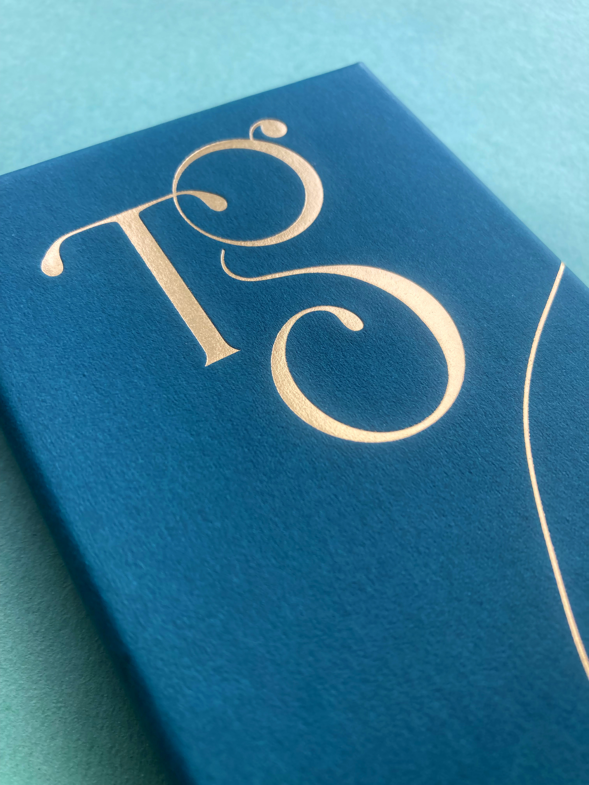
We took the initials ‘TG’ from Tara Gartlan’s name and created a strong graphic symbol with it, taking cues from the flowing nature of chocolate and incorporating droplets, like with chocolate dripping. There is a subtle ‘c’ within the base of the ‘G’ for the word ‘chocolate’ and also for ‘coeliac’, as these chocolates are coeliac-friendly.
The beautiful boxes exude quality, the gold-detailed curvy lines take cues from the free-flowing way that chocolate is poured and the natural flowing lines in nature, as many of the ingredients are grown locally, guaranteeing the most fragrant flavours.
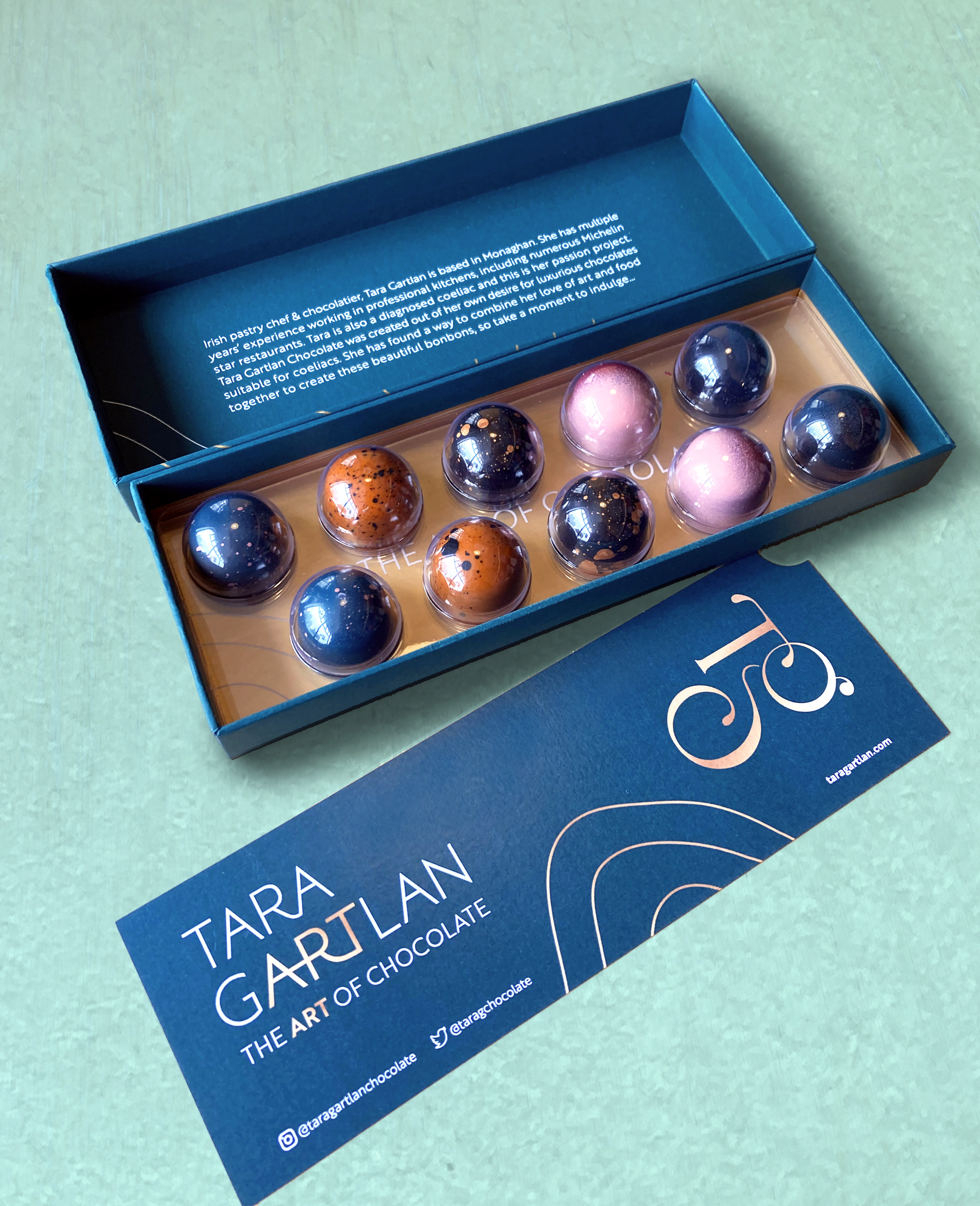
They are made with Valrhona chocolate and filled with beautifully seasonal ingredients. They are Gluten Free but the secret is – you wouldn’t know! Sometimes gluten free is perceived to be less tasty but I gave them to people to try and only told them after and they were shocked!
JJ O’Toole Ltd did a beautiful job on printing the packaging at a very premium standard – and are also a pleasure to deal with. All chocolate collections are available on www.taragartlan.com
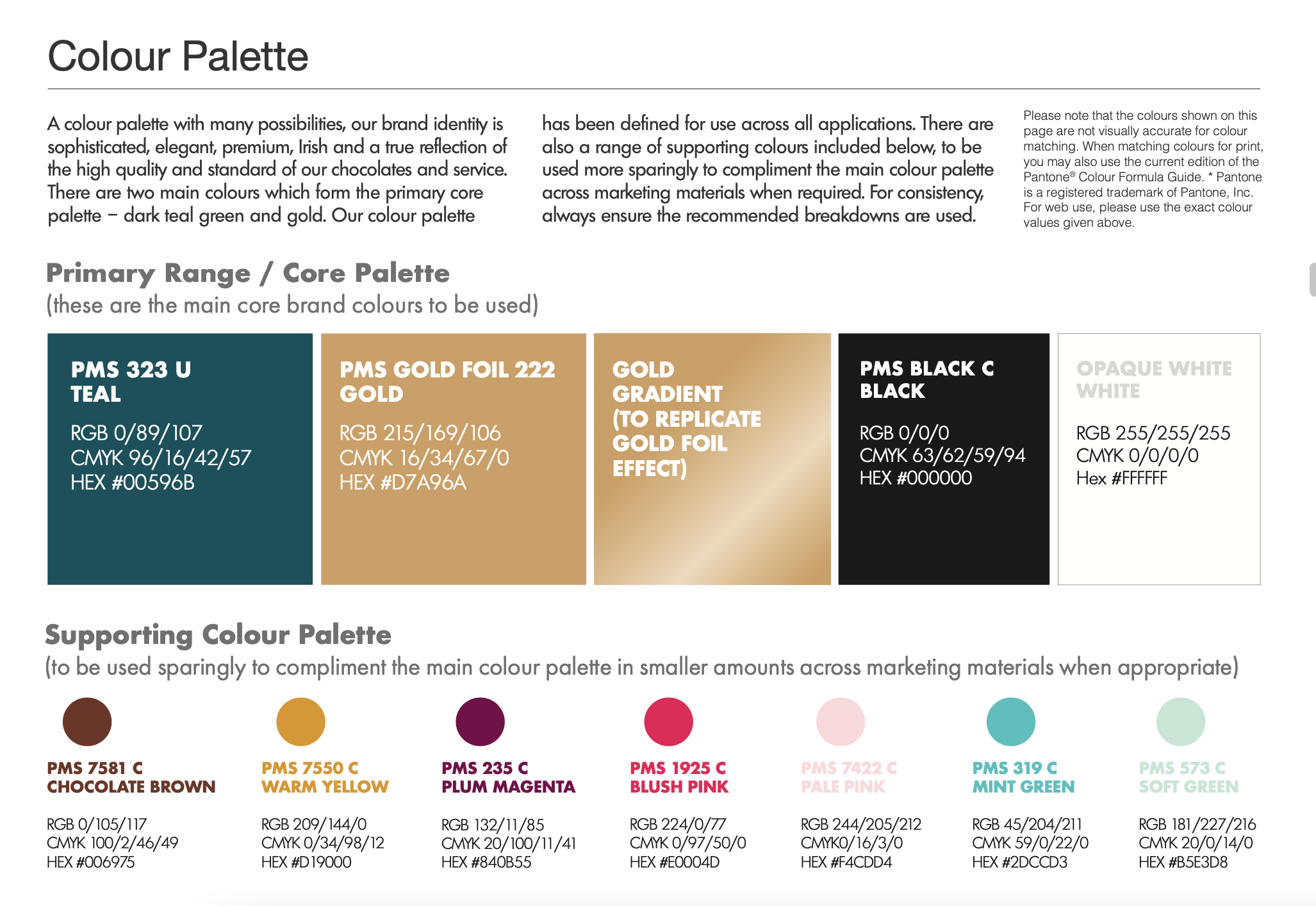
Brand Guidelines & Assets
A colour palette with many possibilities, the Tara Gartlan Chocolate brand identity is sophisticated, elegant, premium, Irish and a true reflection of the high quality and standard of our chocolates and service.
Follow Tara Gartlan Chocolate on Social Media:
Instagram: @taragartlanchocolate
Twitter / X: TaraGChocolate
Facebook: Tara Gartlan Chocolate
Order Tara Gartlan Chocolates here: www.taragartlan.com
This project was selected for the 100 Archive 2023, which selects the best 100 designs in all disciplines of that year.
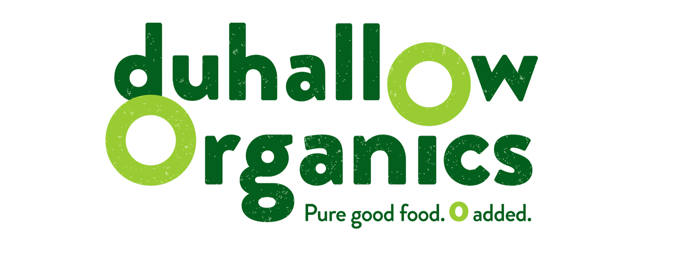
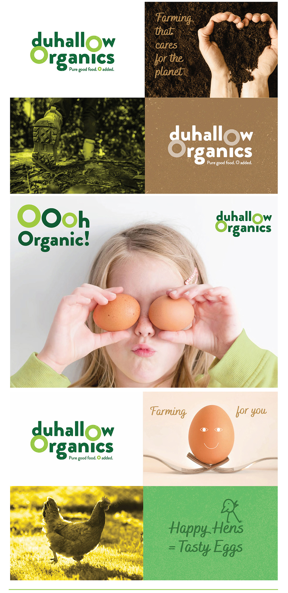
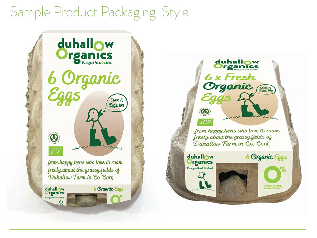
Duhallow Organics Brand Packaging Design
Duhallow Organics Brand Packaging Design
 The Duhallow Organics farm is situated on the old Moynihan family farm in Boherbue in the heart of Duhallow, Co. Cork. Certified Organic since 2008, they produce Organic Eggs and grass finished Dexter Beef.
Duhallow Organics care about People, Animals, Sustainability, Biodiversity & the Community. Everything they do has these values at their core. They create Pure Good Food, Cork style, with 0 Additives, Pesticides, GMOs or Fertilisers. They farm for you and your family.
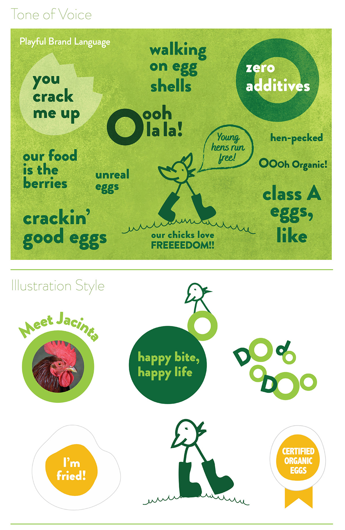
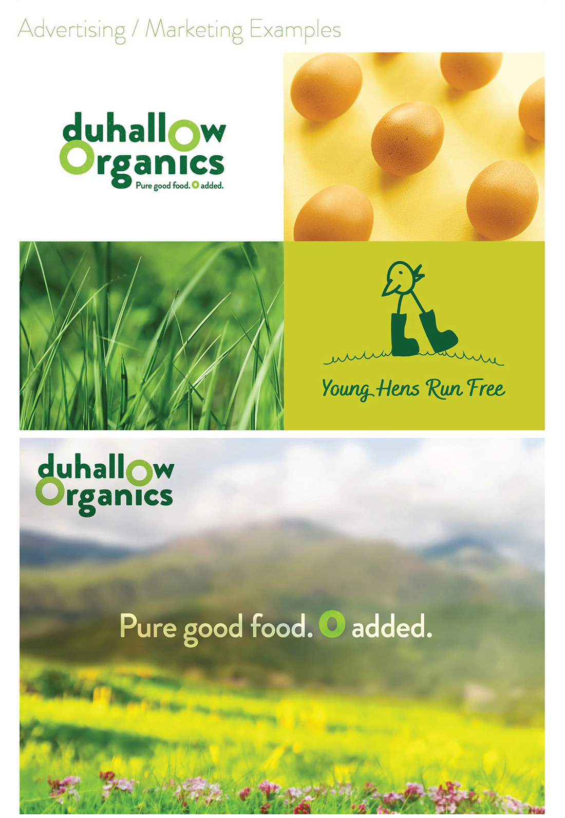
Within the brand logo design, the 0’s have been highlighted to emphasise how there are zero additives used in the food that they produce, as it is organic and natural. There is a grain texture within the letters of the logo, to further communicate the natural and organic aspect of the food produced from this farm.
The tagline we developed for them is ‘Pure good food. Zero added‘. The word pure cleverly plays on the way native Cork people use the word ‘pure’ is used to say ‘very’ or ‘absolutely’ and also how the farm is organic so the food produced by Duhallow Organics is very clean, healthy and pure.
The Duhallow Organics brand is fun, quirky, bright and playful to appeal to customers and indicate how their animals live freely and happily – while still clearly communicating the brand ethos and values, to signify what they stand for, such as how they care about animals, the environment and sustainability at their core.
![]()
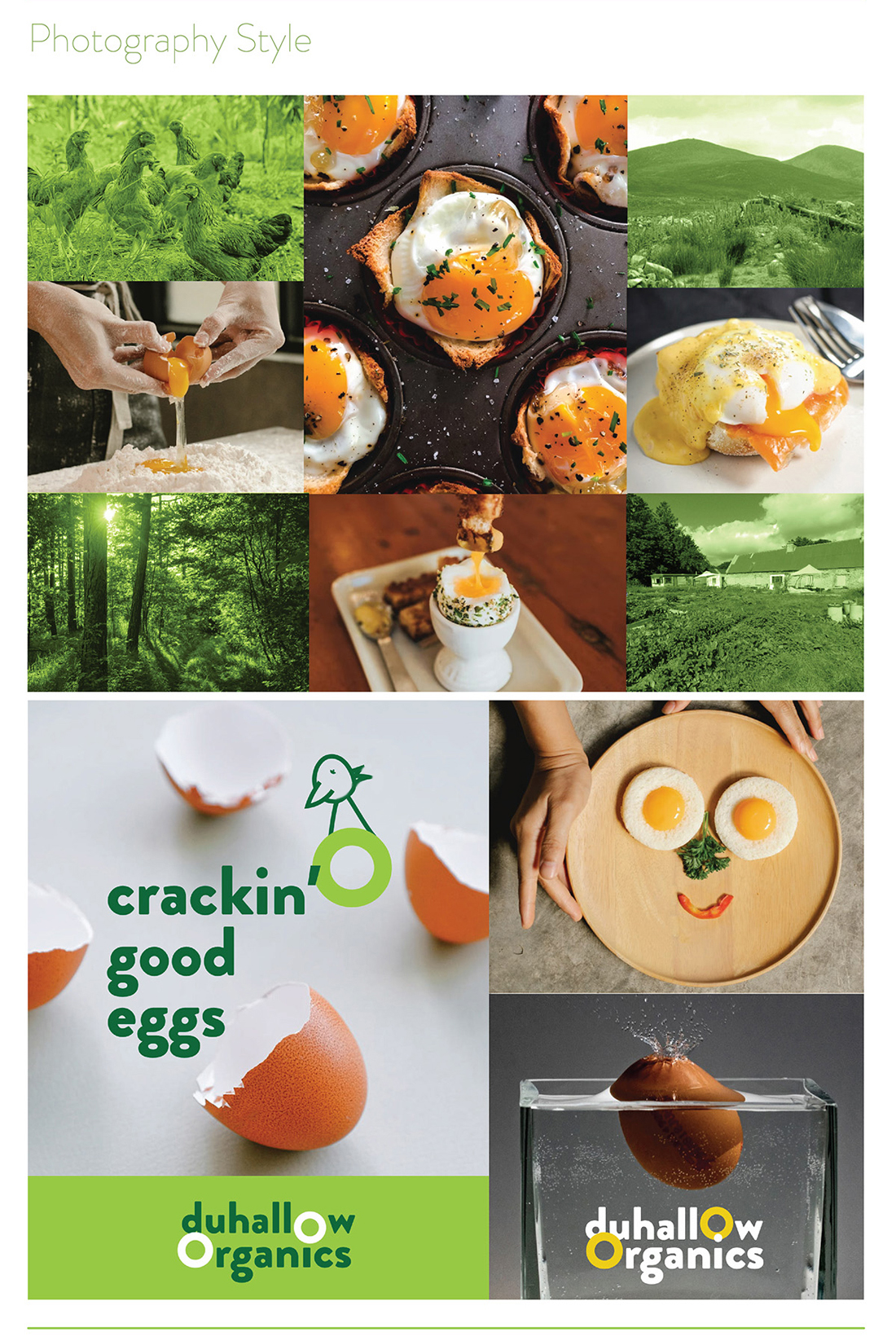
Fresh Organic Eggs
Their hens live a lifestyle which complements the holistic Organic ethos of the farm. The girls live in a mobile hen shed in the field and enjoy a rich bounty of Organic grubs and grasses. Their happy girls produce magnificent eggs which are as natural as an egg should be.
-
They work with nature to nourish you and your family.
-
They farm with nature using holistic farming practices to produce pure good food.
-
Their aim is to increase biodiversity on the farm, both above and below ground, which gives you healthier and happier animals and a better, more natural product.
Brand Guidelines & Assets
A mini guidelines were included with this brand packaging project. The colour palette and typography chosen are earthy, natural, bright and fresh to indicate these aspects of how the Duhallow Organics farm runs. Illustrative icons and descriptor text on the packaging design communicate some of the other brand USP’s, such as that the eggs are ‘Class A‘ and have ‘zero additives’, that there is ‘0% additives, pesticides, GMO’s or fertilisers‘.
The barcode is playful, featuring an icon of a cute and playful chicken in welly boots walking freely over a hill on grass, as part of the barcode device, replicating the same chicken character which appears in a larger scale on the front of the pack, symbolising how the hens are happy and free. The brand ethos is featured on the side of the pack, to allow consumers to connect with the family farm’s brand story and background.
The Duhallow Organics range is available in shops across Cork and Kerry.
Follow Duhallow Organics on Social Media:
Instagram: @duhalloworganics
Facebook: www.facebook.com/DuhallowOrganic
Website: www.duhalloworganic.com

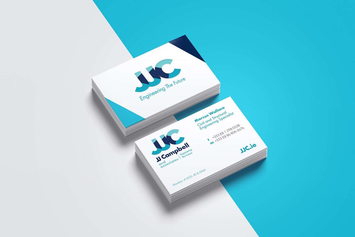
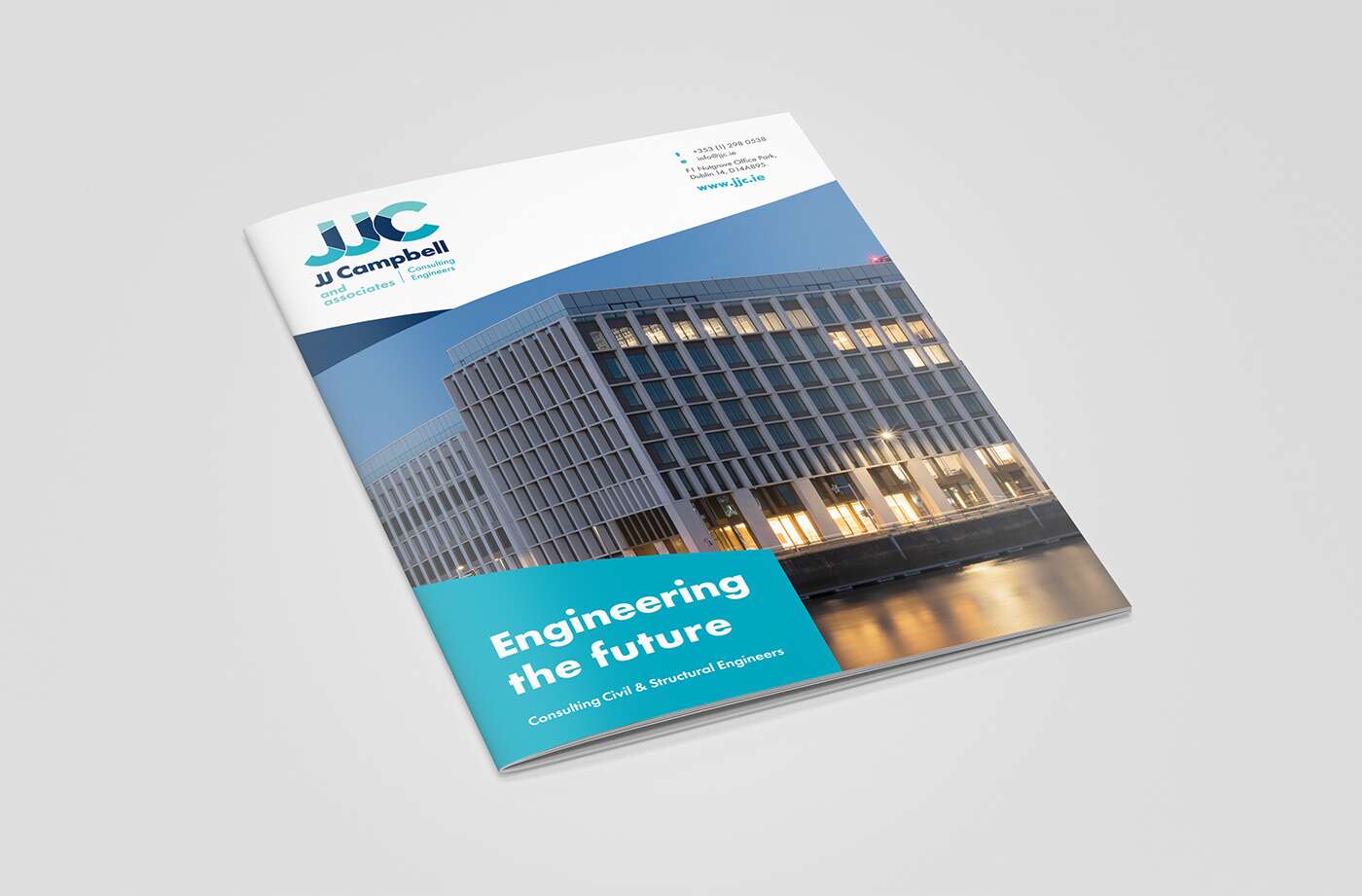
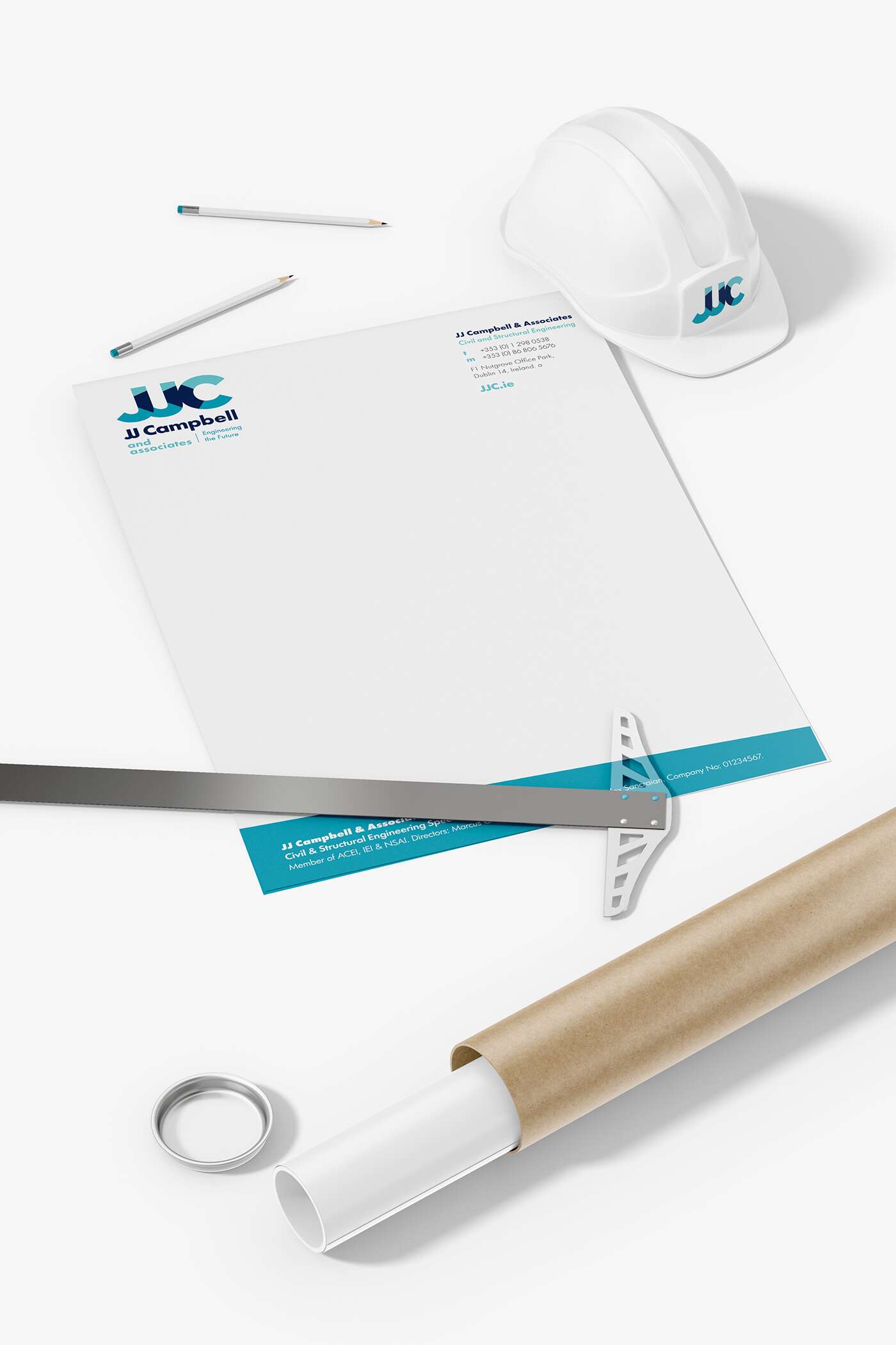
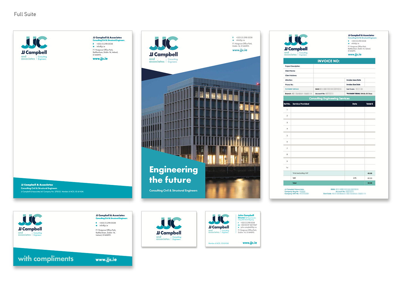
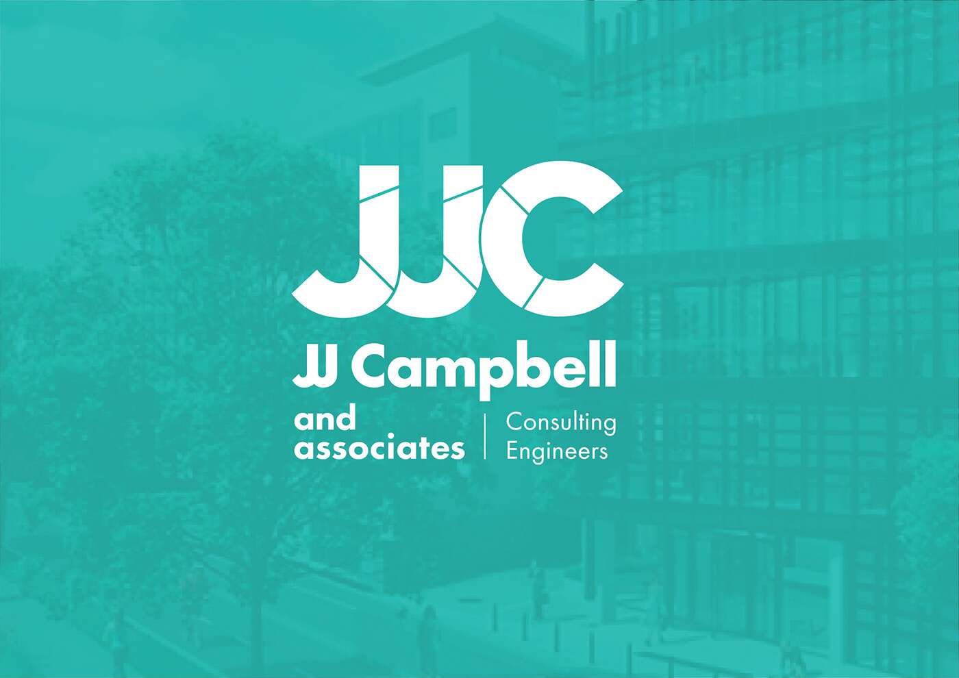
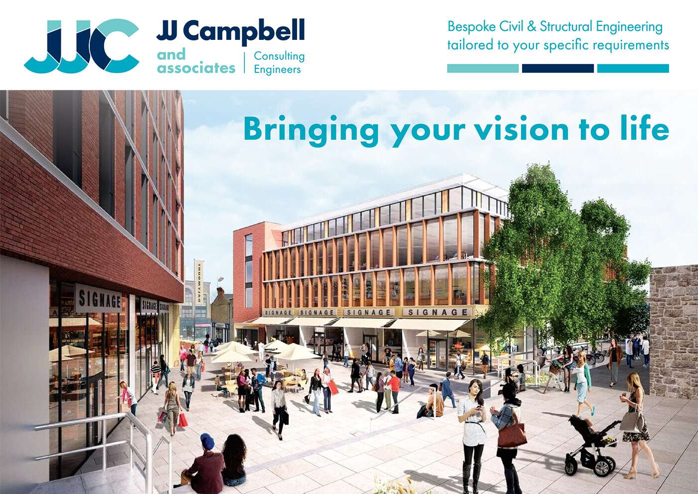
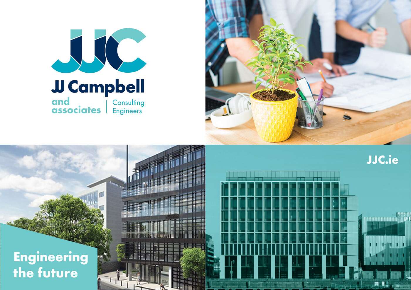
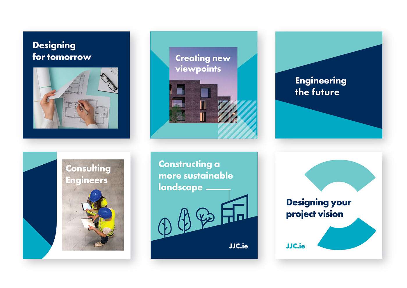
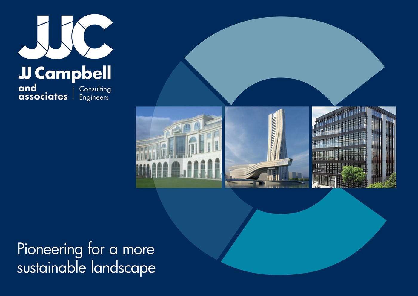
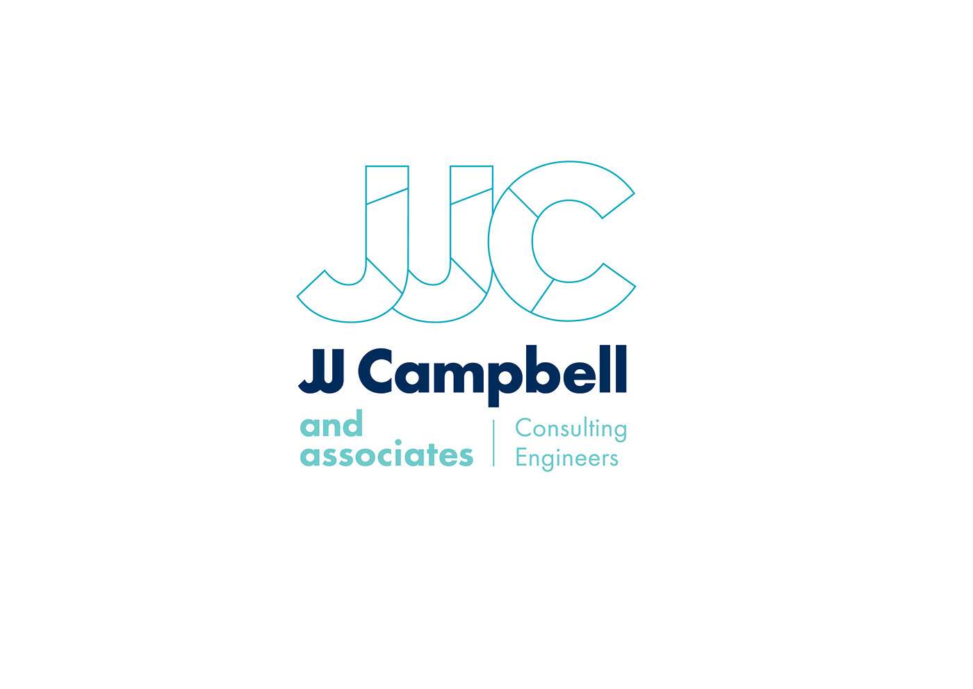
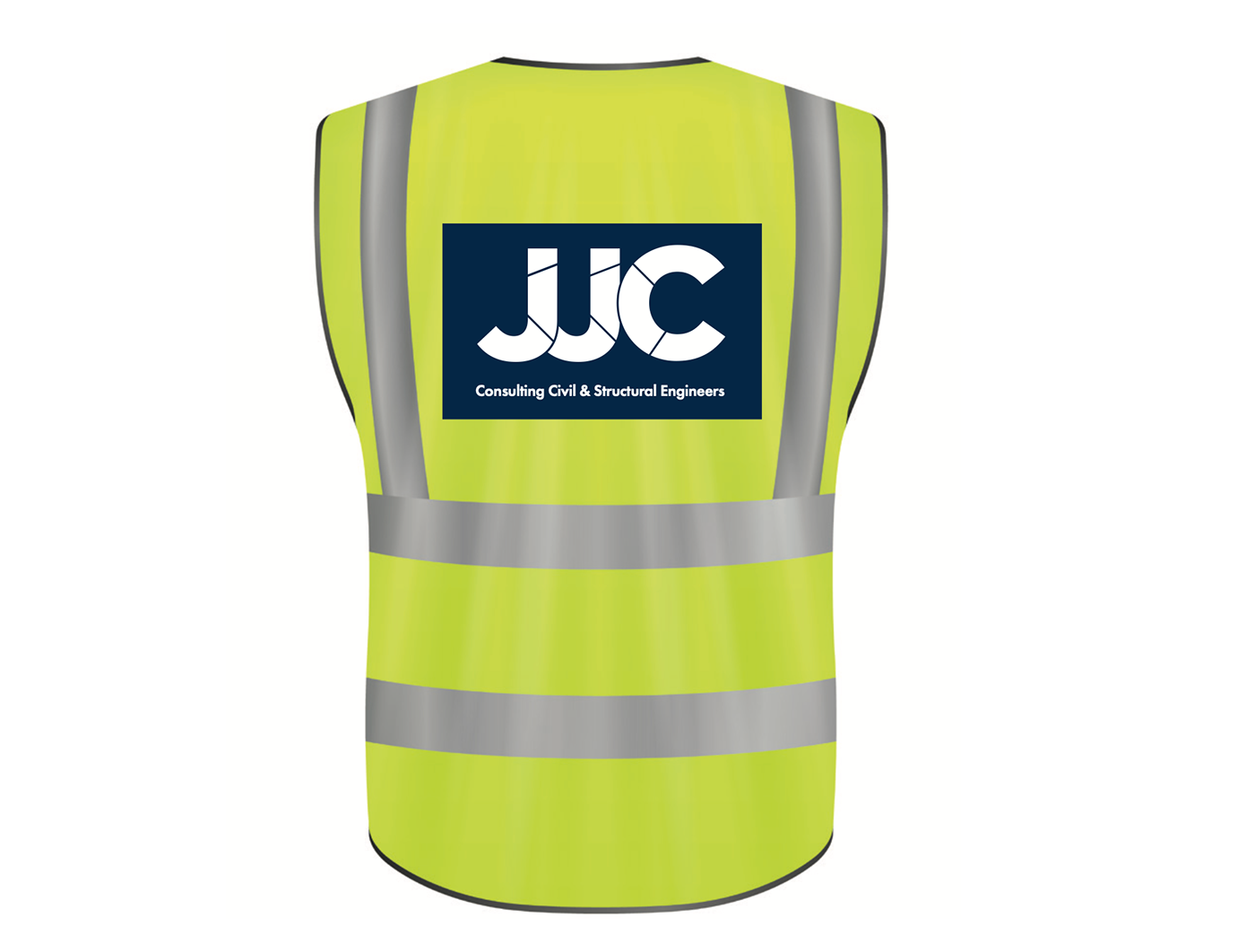
JJ Campbell Brand Identity & Marketing Collateral
JJ Campbell Brand Identity & Marketing Collateral
JJC Contracting Ltd. – Building & Commercial Contractors
Brand Identity, Report Covers, Icons & Stationery Suite Design
JJC specialises in all building works, with high end quality and high spec being their main goal. All building expertise is covered with their workforce are trade qualified in their respected profession with Fetac national craft recognition. All of their management team and staff have relevant diplomas & degrees in construction management, project management, quantity surveying and building surveying.
We drew out the main letters in their name, to create a strong and recognisable brandmark. The letters are divided in to shapes in their brand colours, replicating how building are constructed of many parts to make a whole. The tagline we developed ‘Engineering the Future’ is bold and confident, building trust in their skills with their target market.

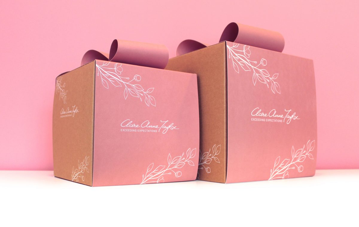
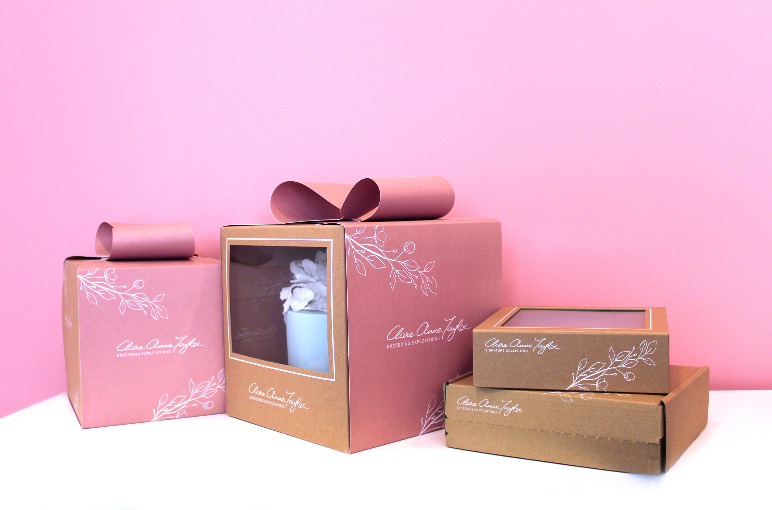
Clare Anne Taylor Couture Cakes – Brand Packaging Design
Clare Anne Taylor Couture Cakes: Brand Packaging Design
 Clare Anne Taylor Couture Cakes are one of Ireland’s leading luxury cake designers for special events and weddings. The core of the business is luxurious quality and elegance in the design and craft of their cakes and confections.
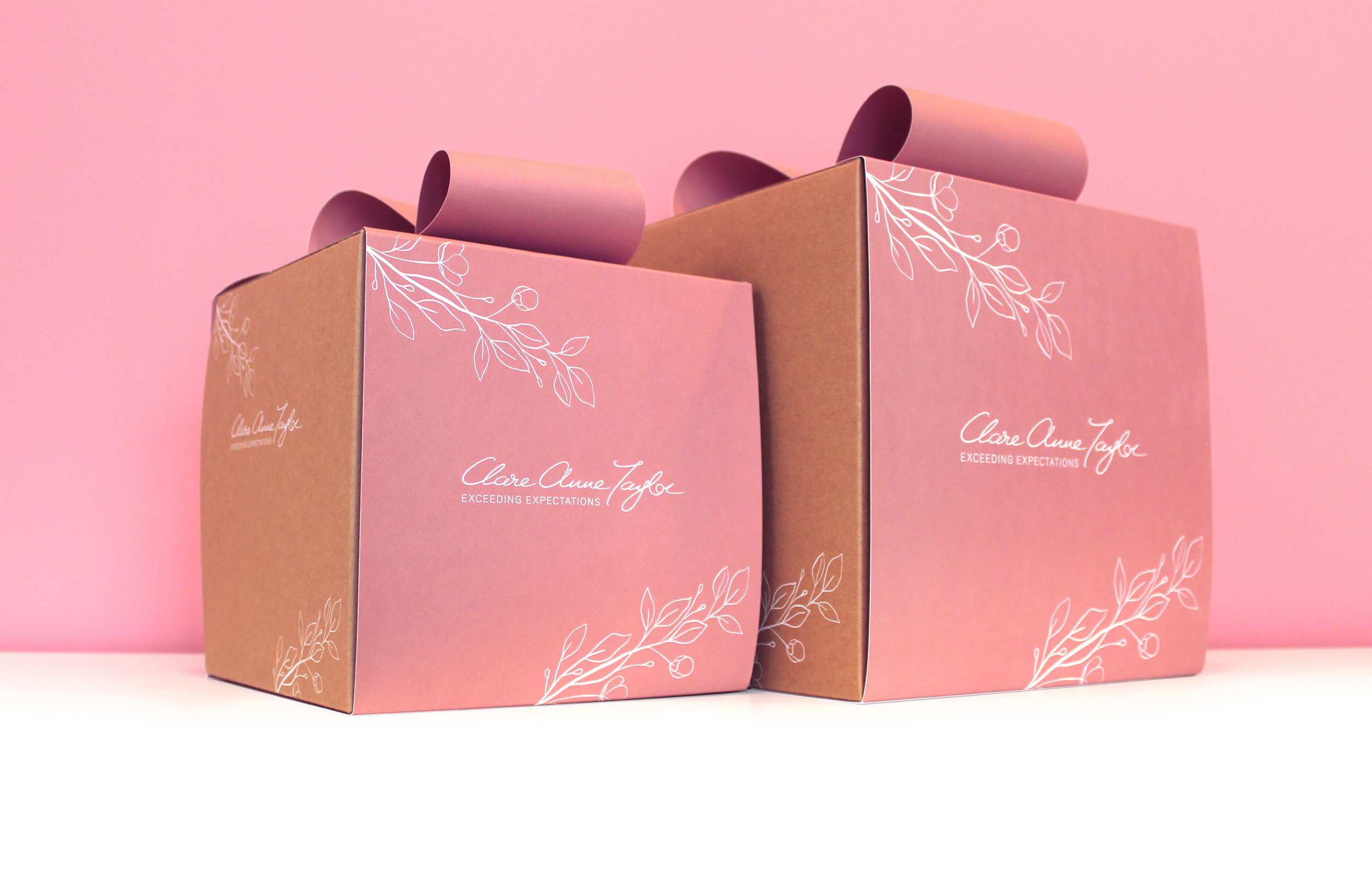
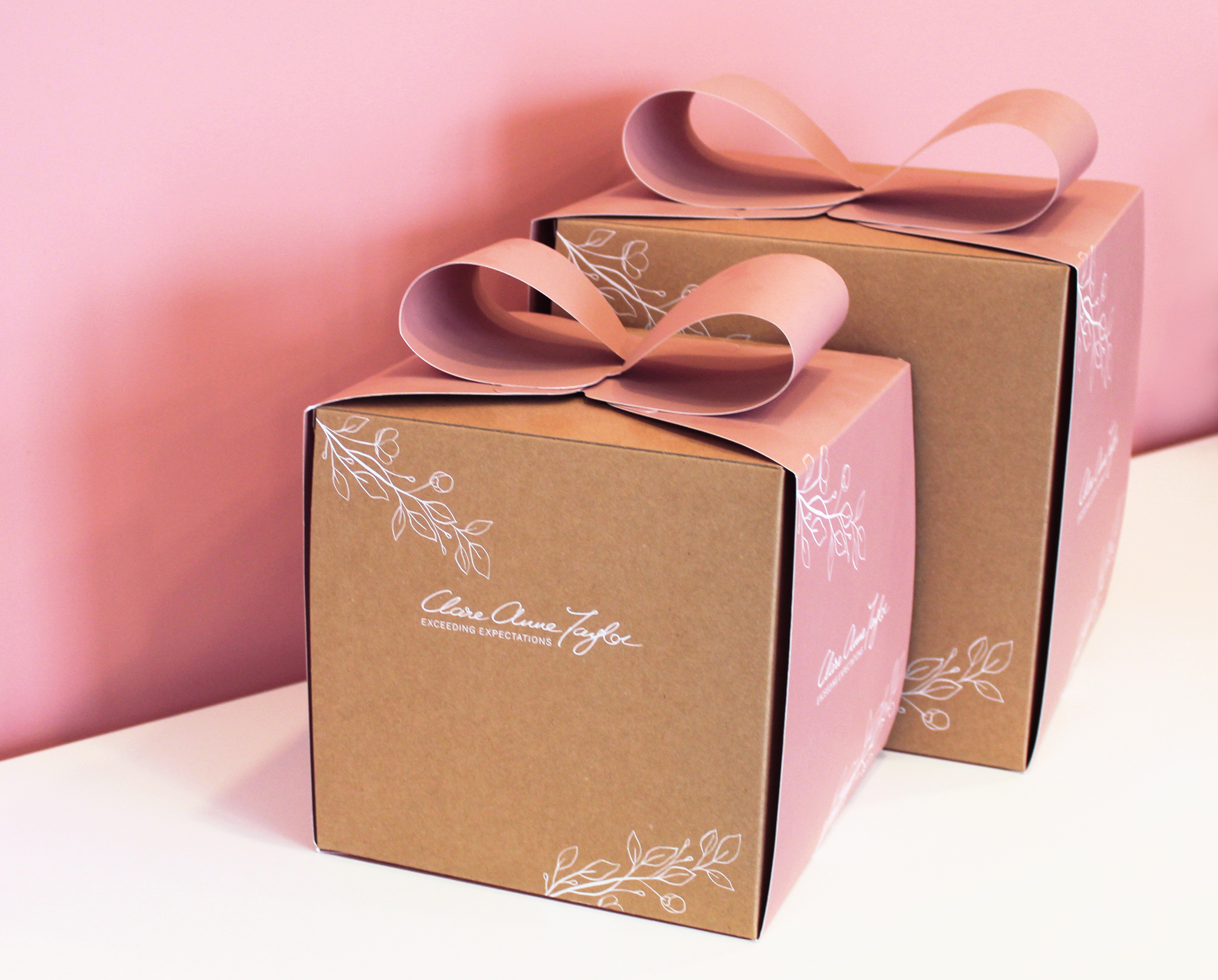
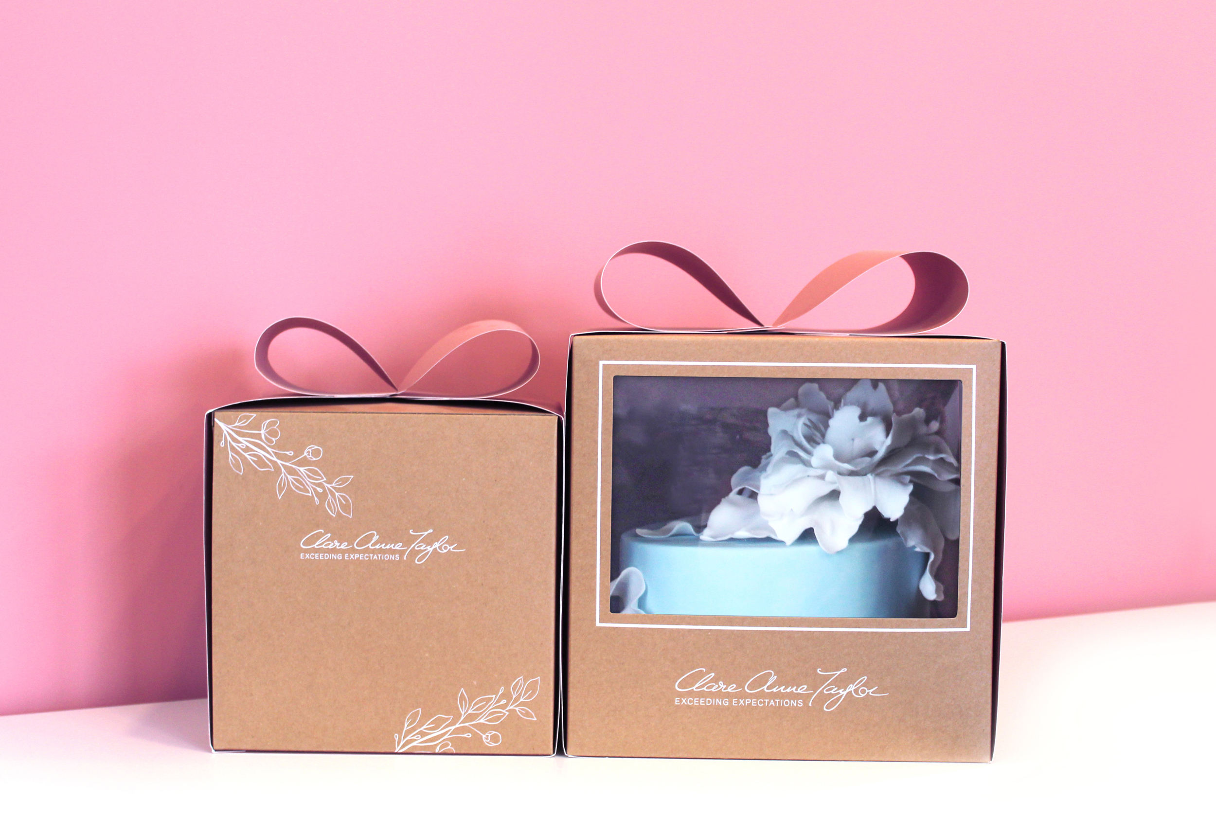
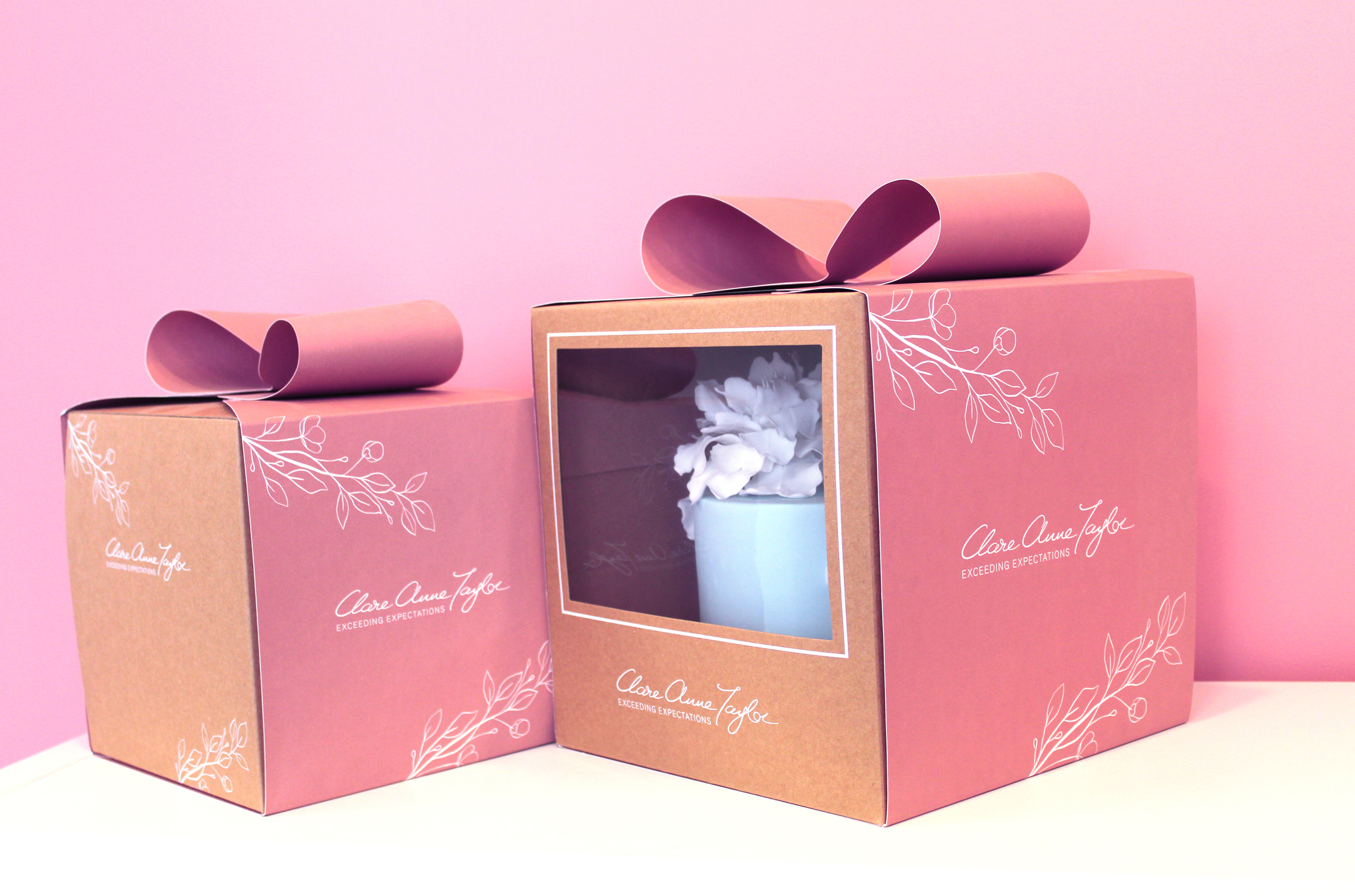
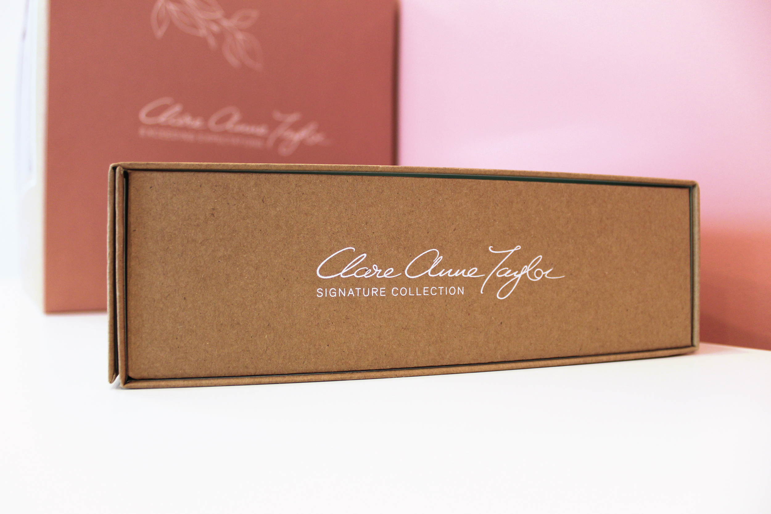
The client, Clare Anne Taylor, wanted the packaging to be suitable for gifting. When bringing to someone, the box should be beautiful and elegant enough to give the feel of a gift presentation. She wanted the brand to epitomise the highest standard and quality available on the market.
The client needed to easily separate between the ranges, while maintaining a consistent brand style. A PMS colour palette was created for each range, to create clarity in differentiating between the ranges. A pink swatch was selected for the main Clare Anne Collection, green for the Signature Collection for confectionery and a Warm Grey for the Couture Collection. Clare Anne had been using similar colours to these in her labelling as she liked the soft, feminine tones. We therefore developed these colour swatches to slightly deeper hues, to allow the brand to stand out more prominently, as the existing colours were quite faded, making legibility a little difficult.
Another way to separate the ranges in a subtle, sophisticated manner was to alternate the strapline/tagline under the brand name/logo for each range. In the brief, Clare mentioned that she would like to exceed expectations for customers. Therefore, for the main ‘Clare Anne Collection’ range, I created the tagline ‘Exceeding Expectations’. This was then changed to the individual range names for the ‘Signature Collection’ and the ‘Couture Collection’.
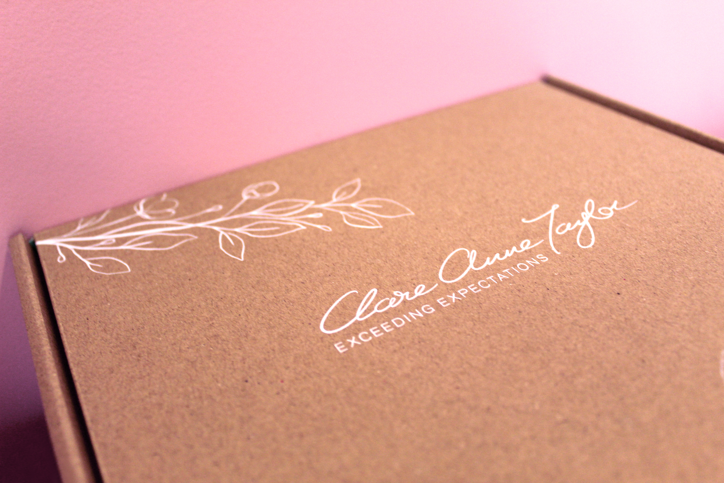
For the main Clare Anne range, we created the concept of a pink, bow sleeve around kraft boxes, to meet the brief’s aim of communicating the experience of receiving a beautiful gift. Clare wanted to showcase the beautiful artistry of the cakes within, therefore we designed a large window on the front of the boxes to meet the brief’s aims, leaving space at the back of the boxes for possible ingredient/nutritional labels to be added per cake, as each cake is bespoke.
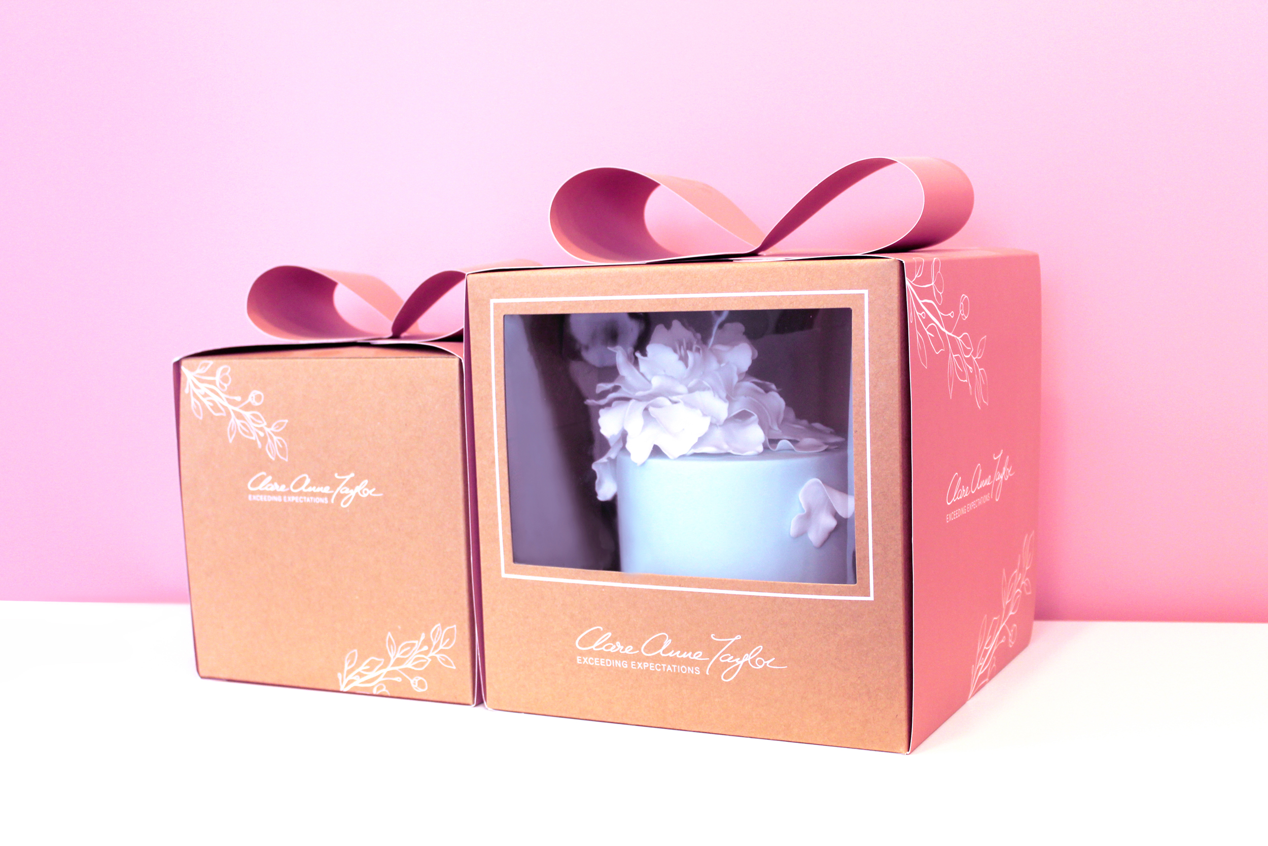
For the box and sleeve design, the design is simple and minimal to convey the quality of the brand. The boxes and sleeves feature a delicate floral illustration to connect to the beautiful artistic floral designs that Clare creates on her cakes. Another factor used to communicate the level of quality is the premium standard of printing of the kraft boxes and pink sleeves. The Signature Collection features a green interior with three different inserts for various types of confectionery. The e-commerce box was created to hold the confectionery boxes securely for delivery. The printing specialists that we worked with to reach our design requirements and unique print specifications for this project’s packaging range was JJ O’Toole.
See more about Clare Anne Taylor Couture Cakes:
Instagram: instagram.com/taylorclareanne
Website: clareannetaylor.ie
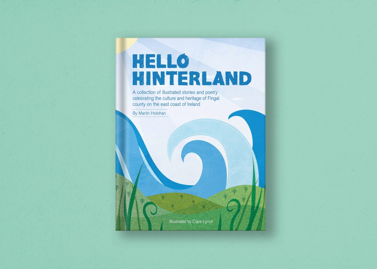
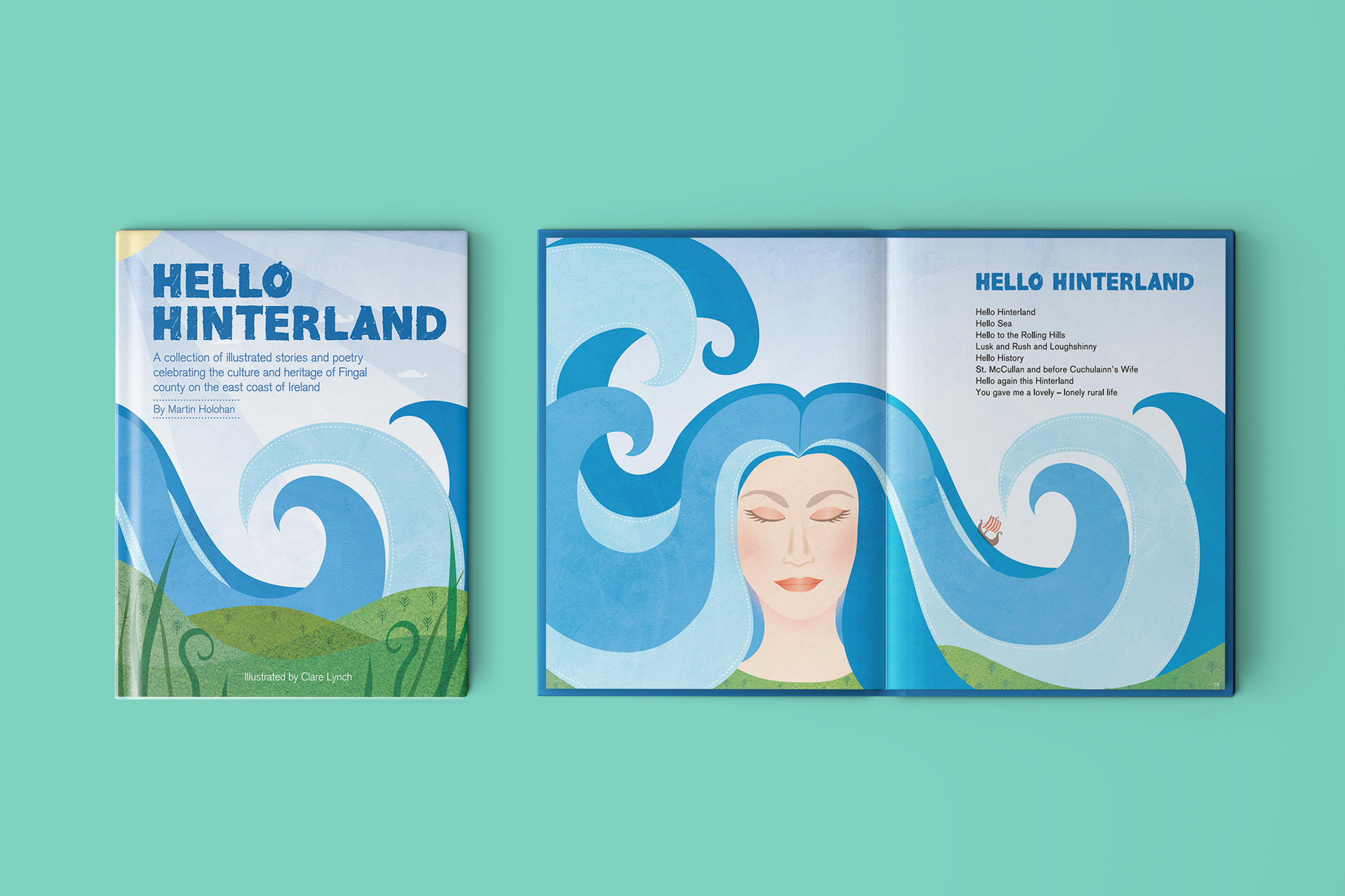
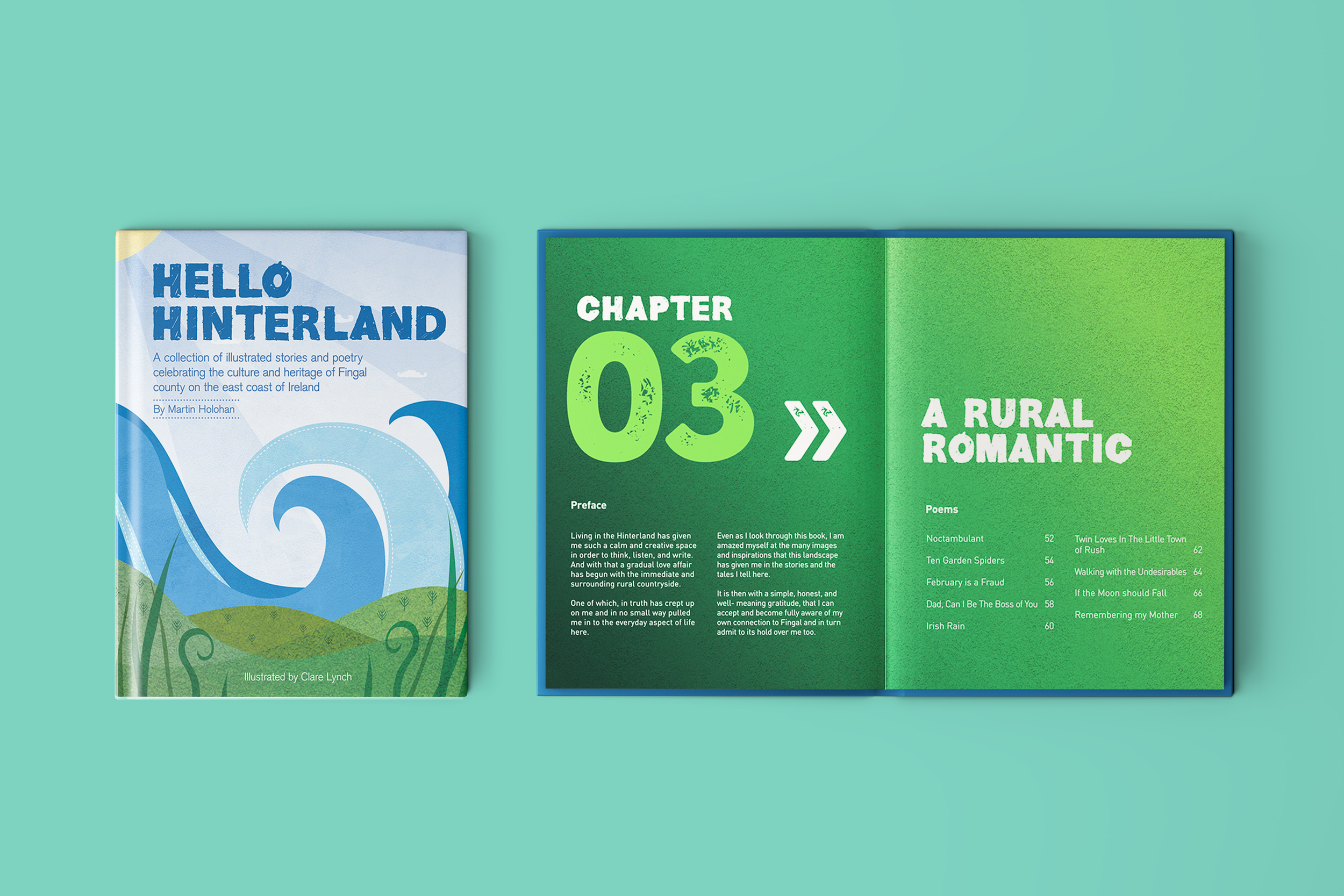
Hello Hinterland Book Illustration
Hello Hinterland: Book Illustration
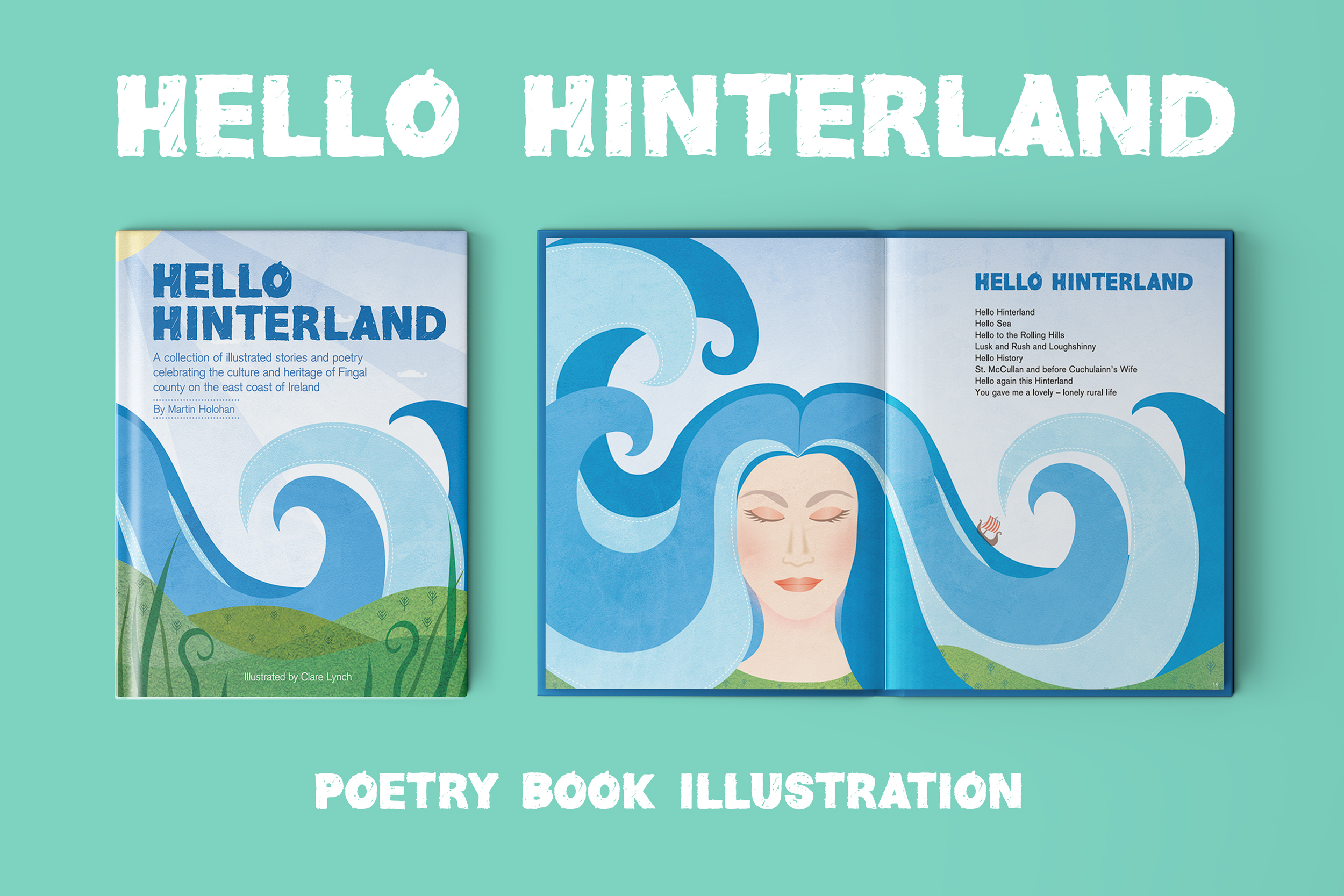

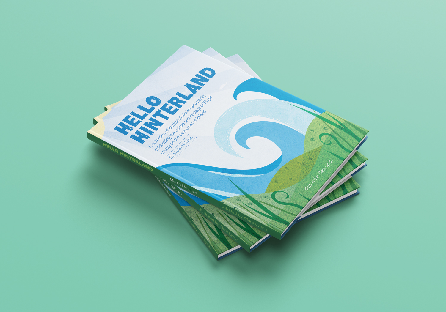
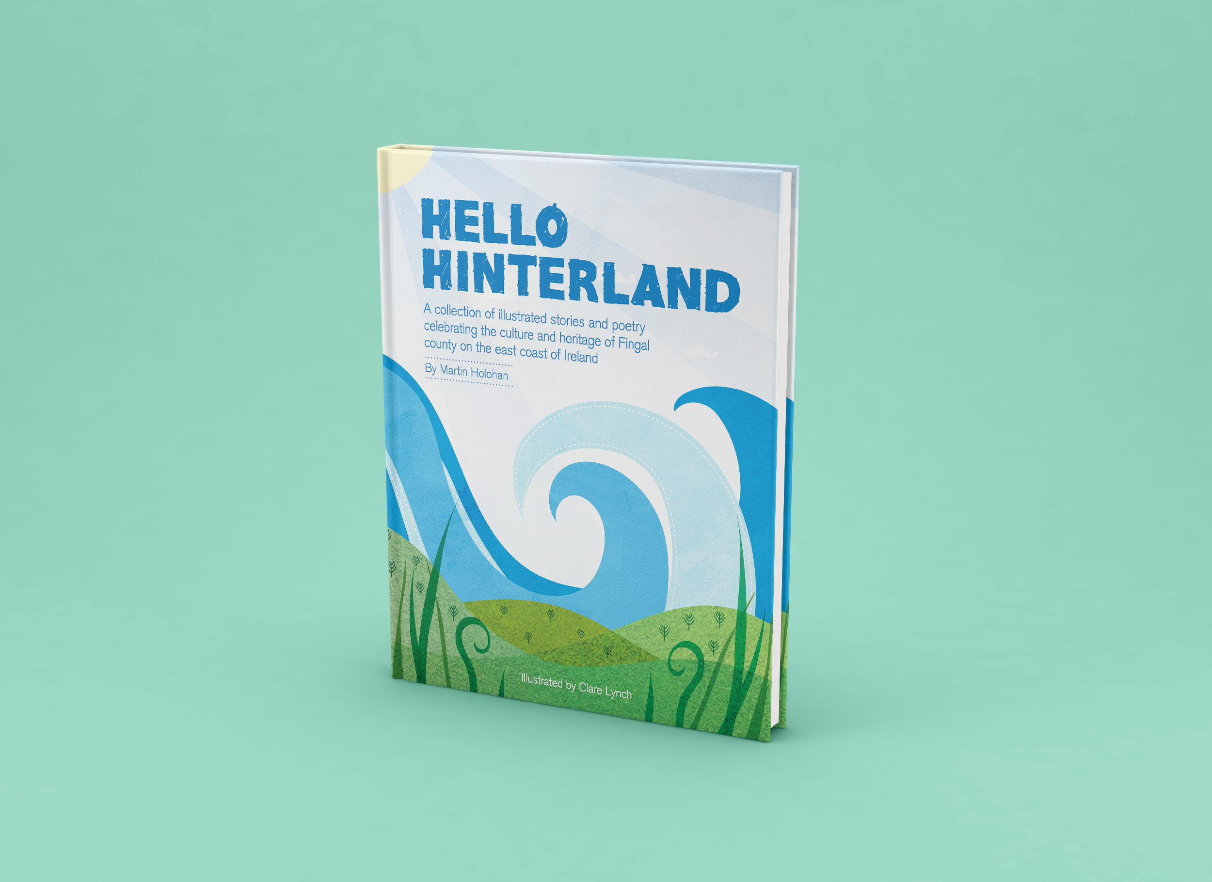
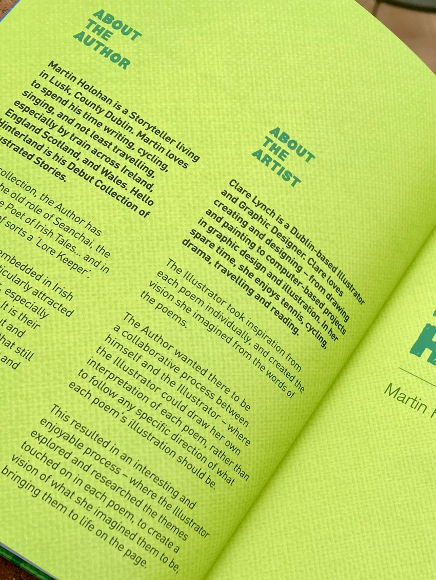
Hello Hinterland is a collection of illustrated stories and poetry, rhymes, observations and folk tales, celebrating the connections between culture and heritage in the wide and embracing landscape of Fingal County, on the East Coast of Ireland. This was my first book illustration project and I feel very proud and excited with the result.
The project came to life when poet and author of Hello Hinterland, Martin Holohan, approached me as he was seeking an illustrator for his new poetry book. I have done illustration as part of my graphic design, branding and packaging design projects and smaller side projects, but this was my first time to fully illustrate a picture book from start to finish, along with creating and putting the book together using my graphic design skills.
The process was really enjoyable. Martin gave me free creative range in terms of how each illustration could be. He wanted it to be a collaborative process, where I take inspiration from the words in each poem using my creative thinking, rather than him directing me on how each poem should look. There was a lovely freedom to this process. We began by working on the first five poems, where I presented him with the illustrations for these select few. His response was as it continued to be throughout, what we might call ‘the dream client!’ where he was blown away and completely enthusiastic and excited about each poetry illustration he was presented with.
When creating each poem, I loved deciphering the meanings of each one, many with clever words related to Irish culture and history, current times, Irish mythology and the local Irish Fingal landscape. The illustrations are full of life and character, reflecting the words in the poetry. Martin wanted the book to appeal to younger children, along with older audiences – therefore, I brought a lot of colour and brightness in to the illustrations – aiming to draw the younger audience in easily with an immediate impact, where as the words will naturally interest and entertain an older audience.
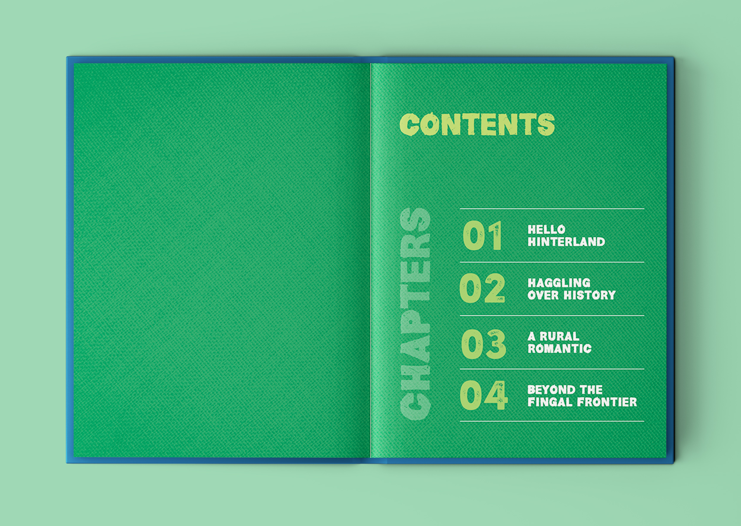
I began by drawing some loose sketch ideas for each one, and then developed them in Adobe Illustrator. I created the book structure in Adobe Indesign. I kept the text of the poetry in the same position on the double-paged spreads for each poem, and ensured that the illustrations I created fitted well with the text so that they could be both enjoyed in an easy-to-read style, with a natural flow to how the text and image are viewed together. The picture book is 100 pages, with almost 40 poetry illustrations, each one spread spaciously across two pages (a spread). Each chapter is clearly divided with a colourised spreads for each.
The aims for Hello Hinterland is for it to be a coffee table book in people’s homes, where they can often pick it up and have a read while enjoying a relaxing break from their day to get lost in the stories and themes of the poetry. Another goal for the book is for it to be enjoyed by schools and libraries throughout Ireland. It was printed as a hard-back book with heavy paper stock for this reason – it needed to be durable to withstand a lot of handling by children and the thick paper stock was also a way to present the colourful illustrations to the fullest. Martin would also like it to be seen and used as a ‘Walking Heritage Trail’ through the people and places living along the beautiful landscape of Fingal County, by the sea.
 Chapter 1: Hello Hinterland
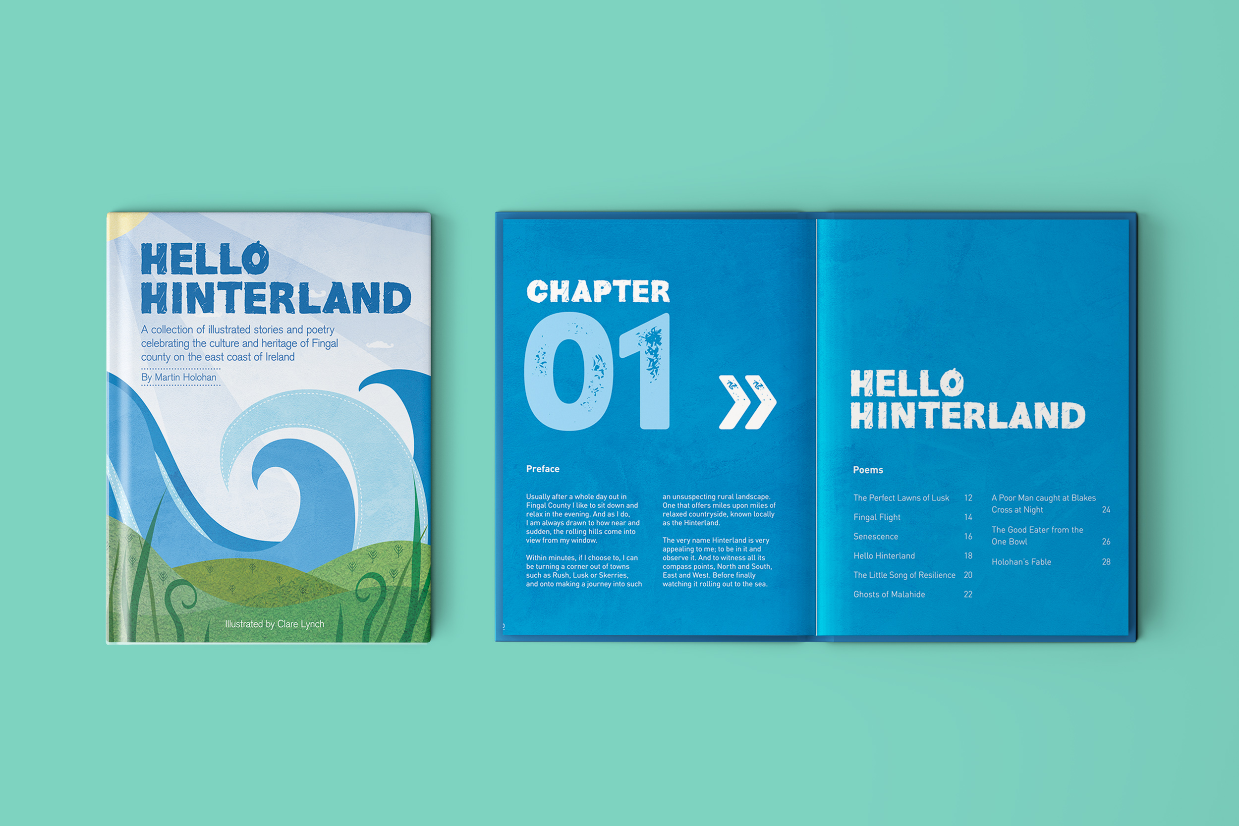
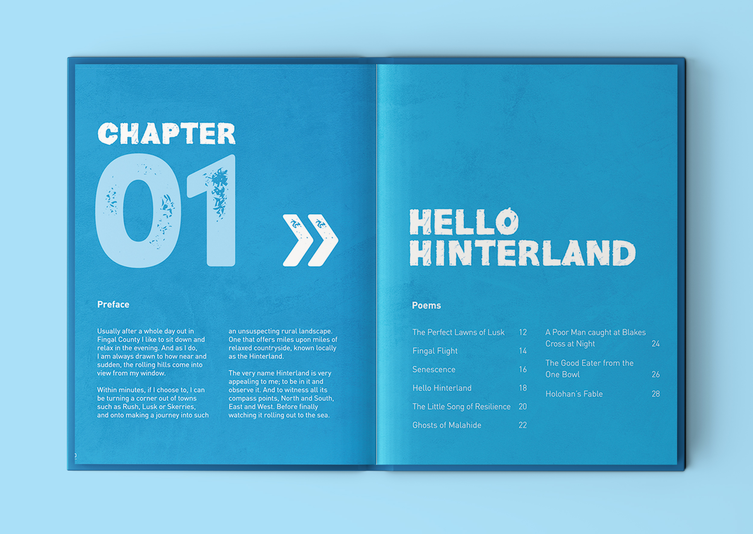
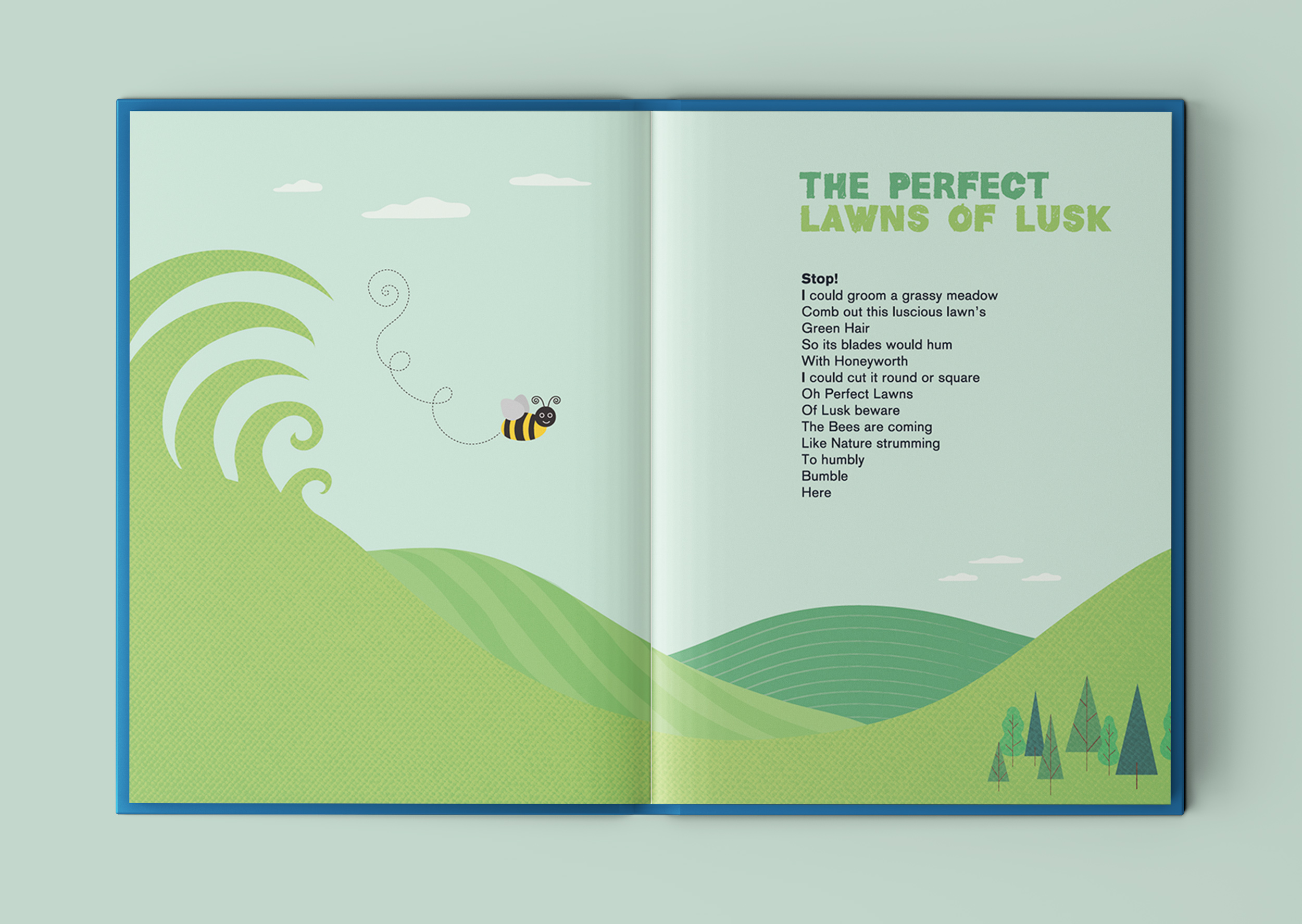
The Perfect Lawns of Lusk
Senescence
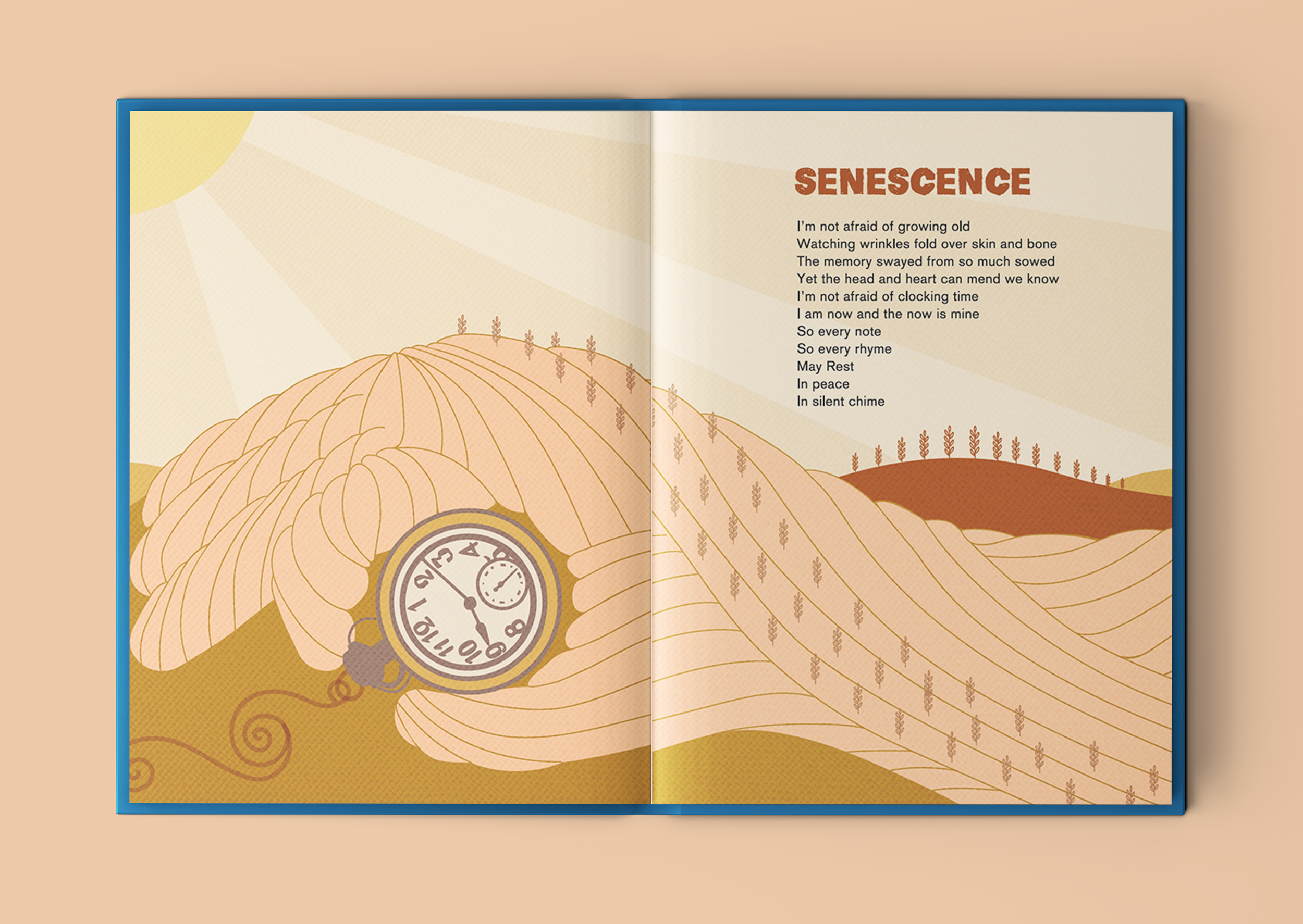
I like how this poem talks about embracing growing old – the illustration cleverly narrates the words from the poem.
Hello Hinterland
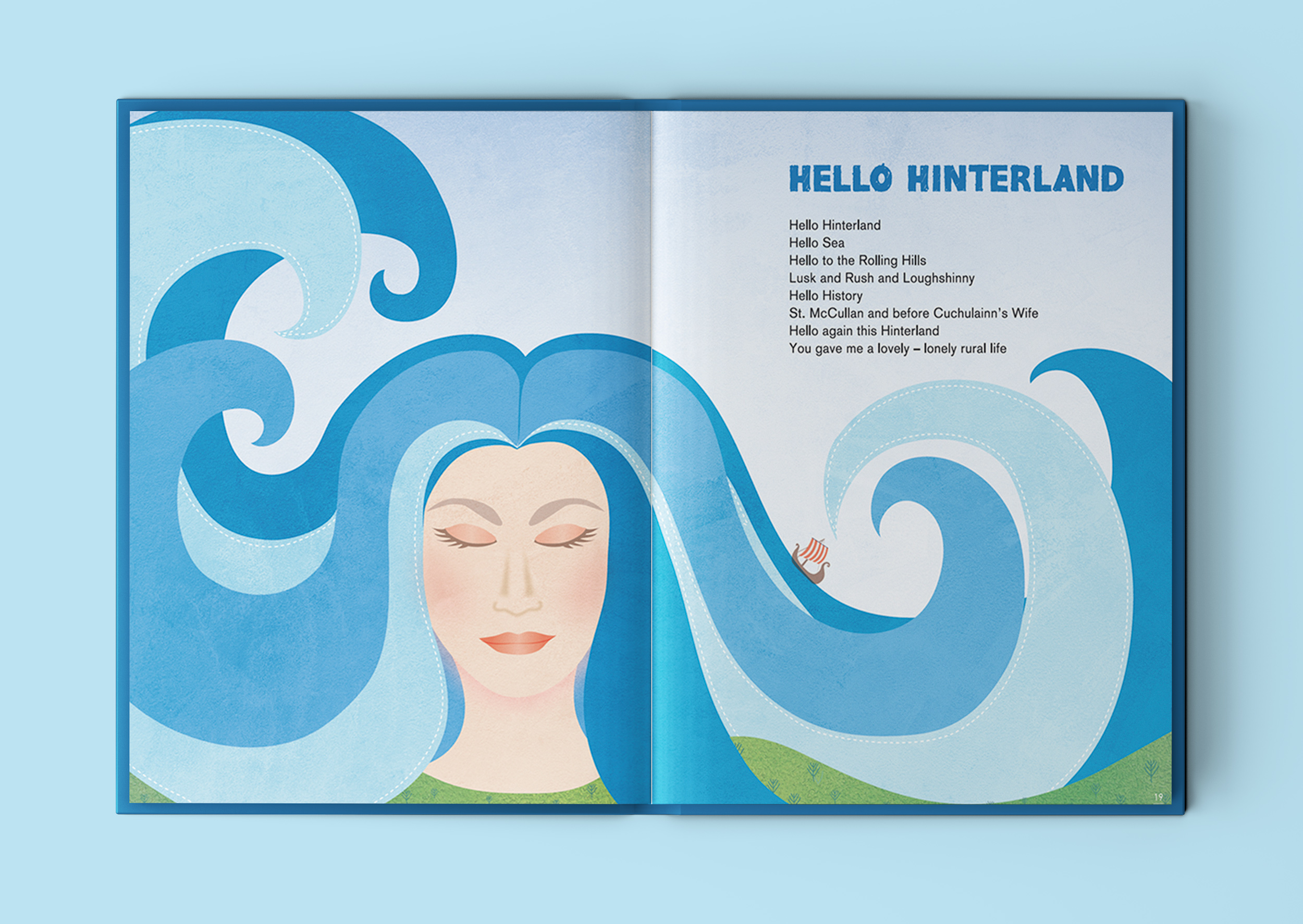
This illustration that depicts a female character, with long flowing hair that doubles-up as sea waves, is inspired by the lines in the poem that mention Irish legend Cuchulainn’s wife Emer, who is said to have hailed from Lusk. It incorporates the references to the sea and rolling hills of Lusk into her portrait.
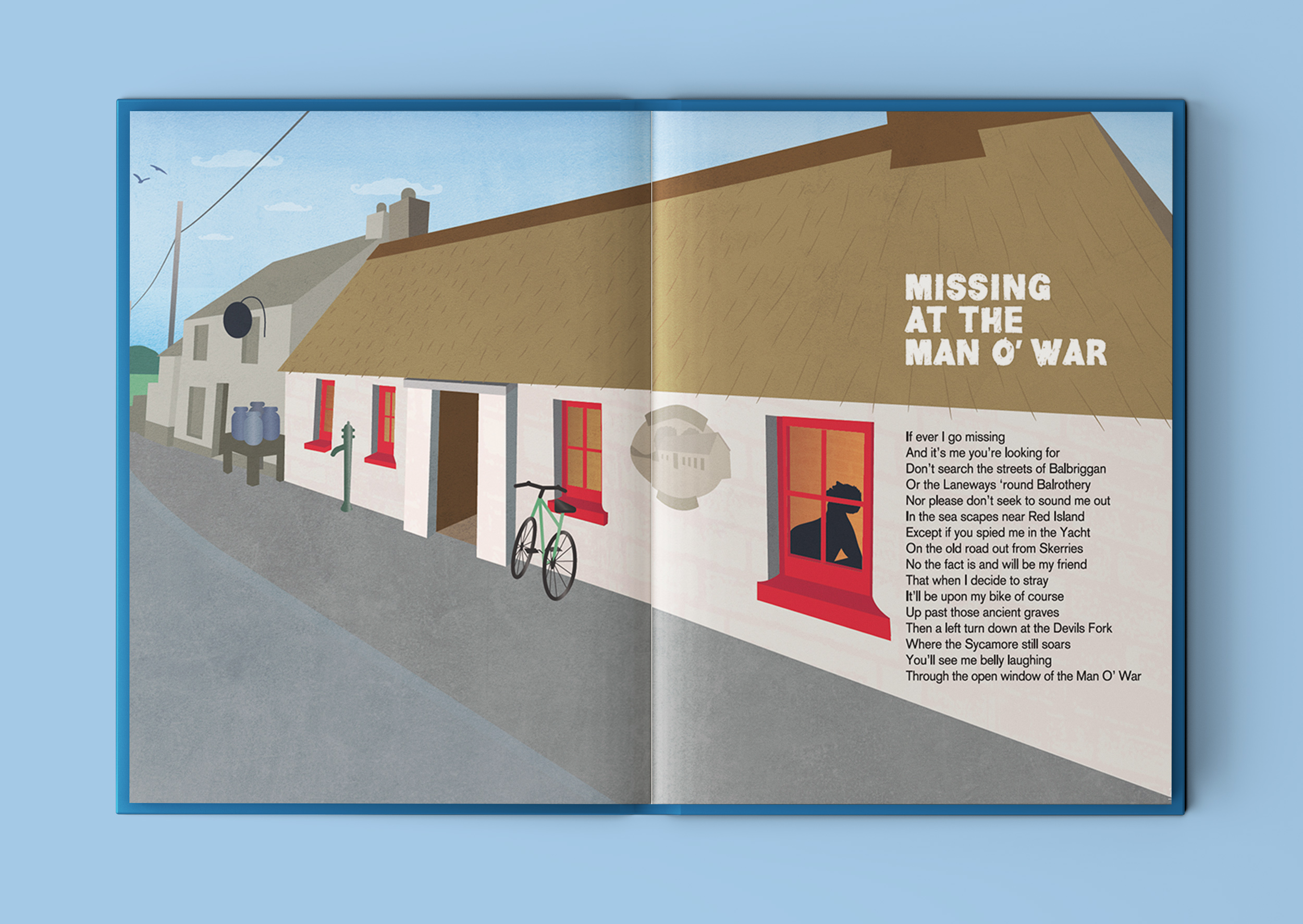
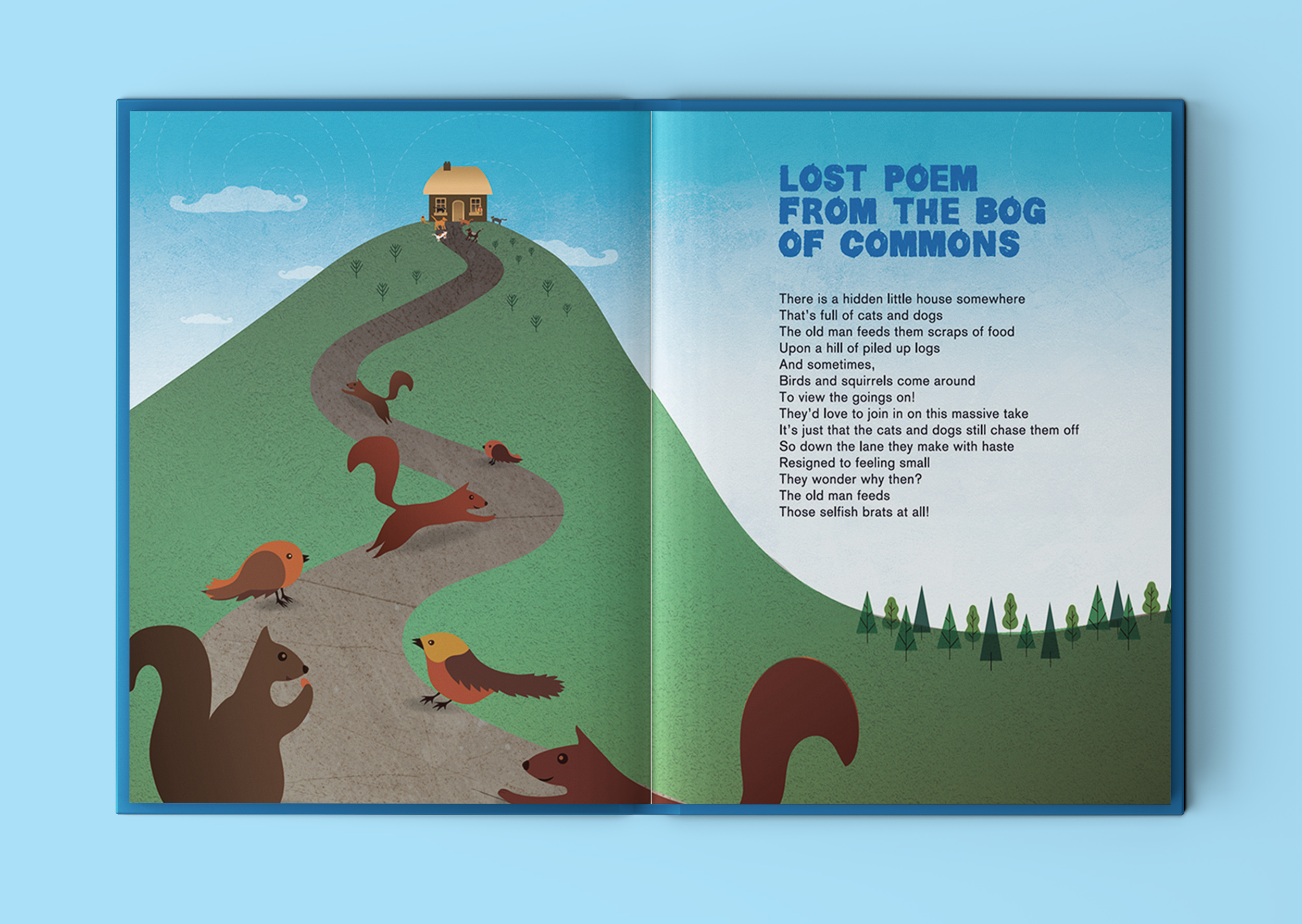
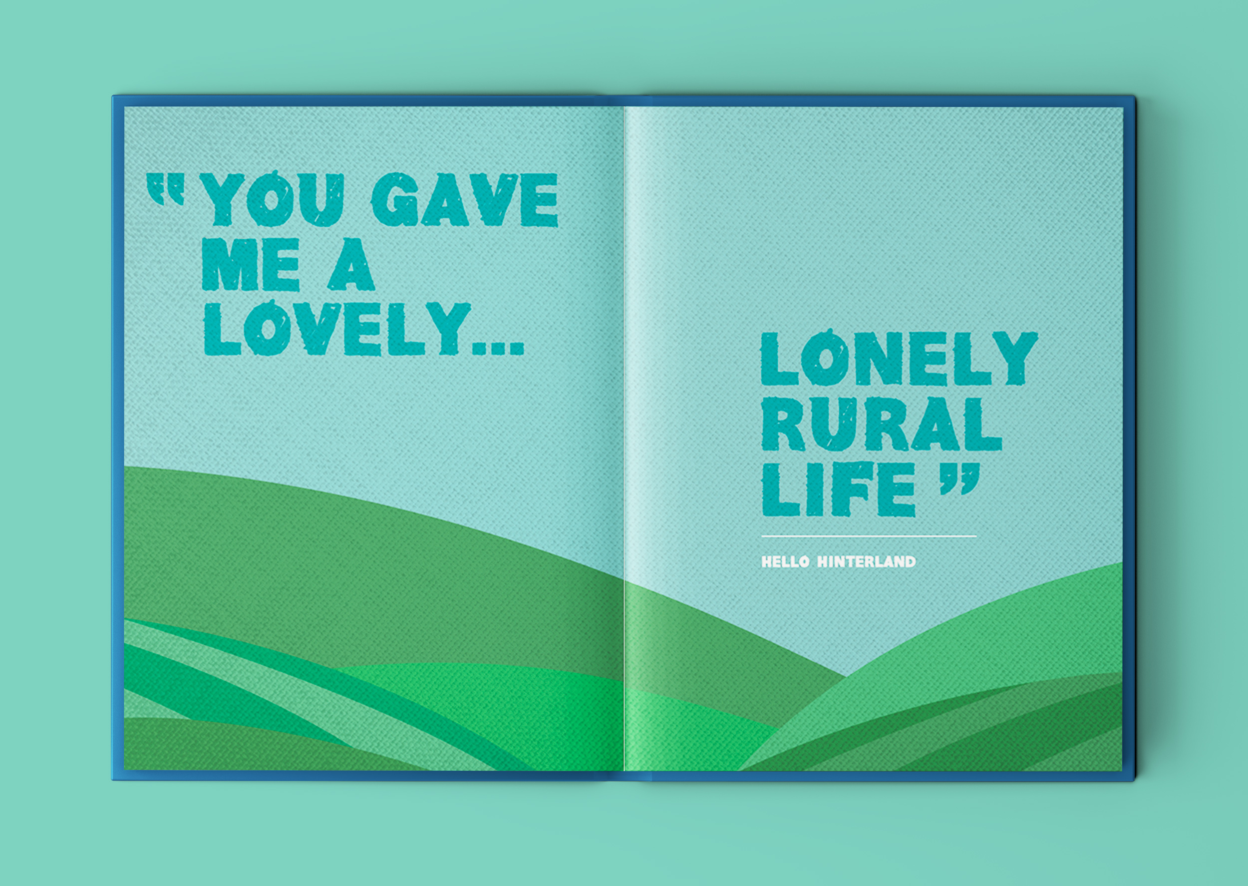
This poem features one of the strongest lines in the poetry book ‘You gave me a lovely… lonely rural life’. This refers to how author and poet, Martin Holohan, thought when he was moving from Dublin city to Lusk (in the hinterland rural outskirts area of Dublin) that he might find it too quiet and remote, but instead, he thrived in that loneliness… whether it be with long luxurious cycling trips out on his bike, the unfolding of his passion for writing and creativity and having the time and headspace free to indulge in it and let all his ideas flow out on to the page, all of this accompanied with an occasional trip for a quiet refreshment in the quaint ‘Man O’ War’ establishment. He found that he fell in love with this quieter ‘lonely’ life. The word lonely can have negative associations, but for Martin – he found moving to the hinterlands actually turned out to be an opportunity to embrace and fall in love with this loneliness and from it, creativity flowed from his heart unstoppably to create the book Hello Hinterland and many other writing projects currently in the pipeline.
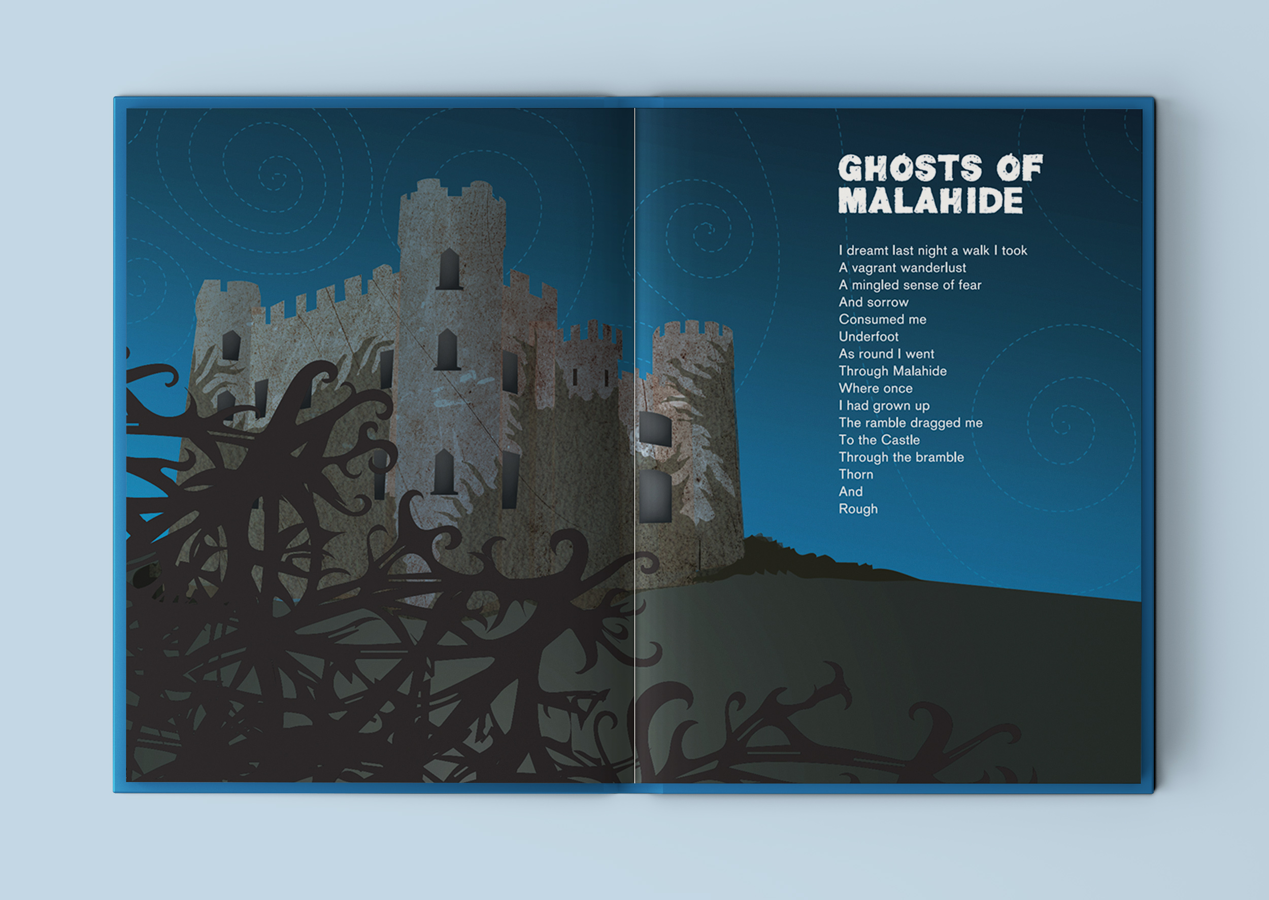
Ghosts of Malahide
Holohan’s Fable
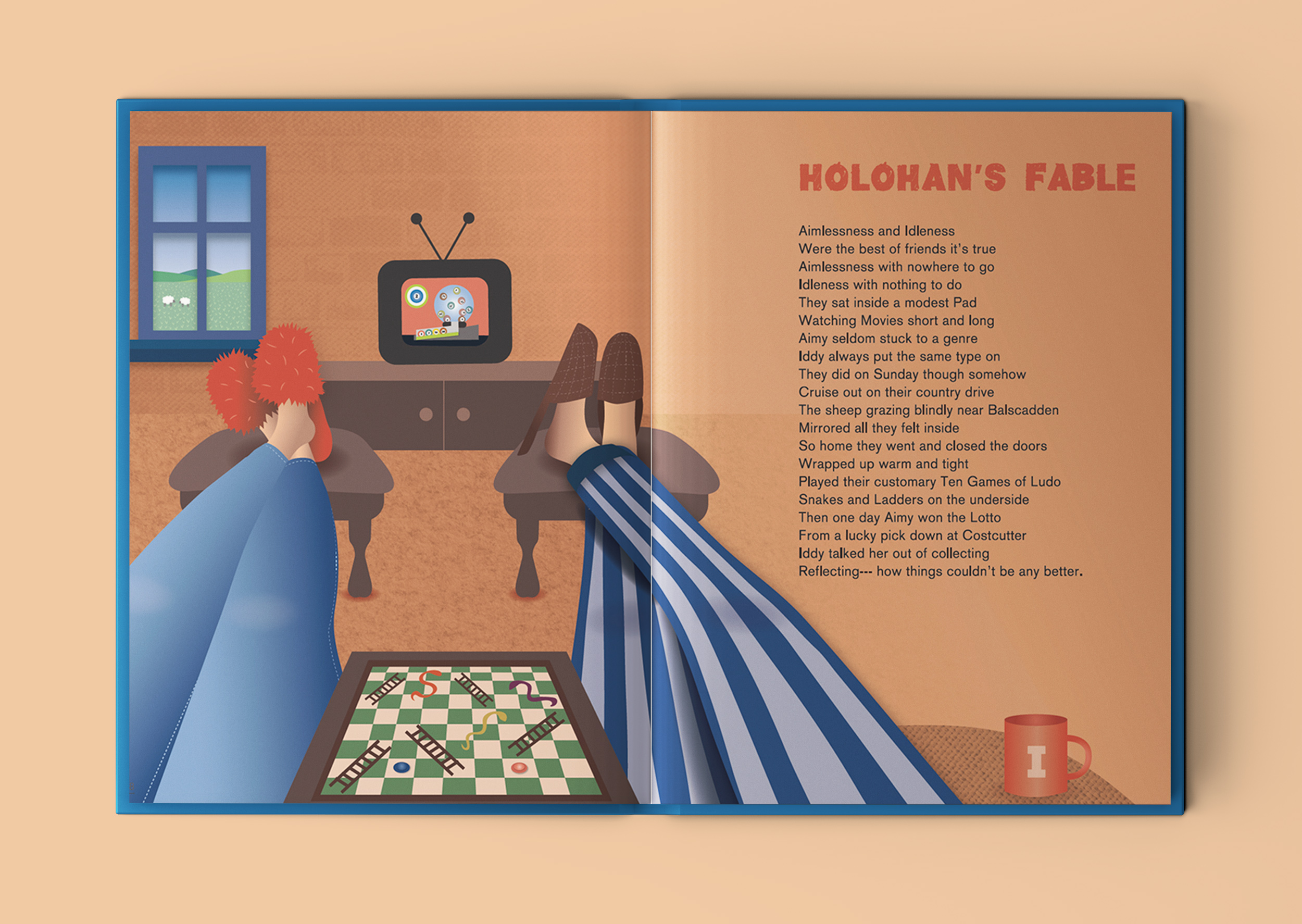
One of my favourite poems is ‘Holohan’s Fable’. It’s about a couple so content in their daily routine, that when they win the lotto, they decide not to claim it – as they couldn’t be any happier! It’s a fable with a message about appreciating what you have in life.
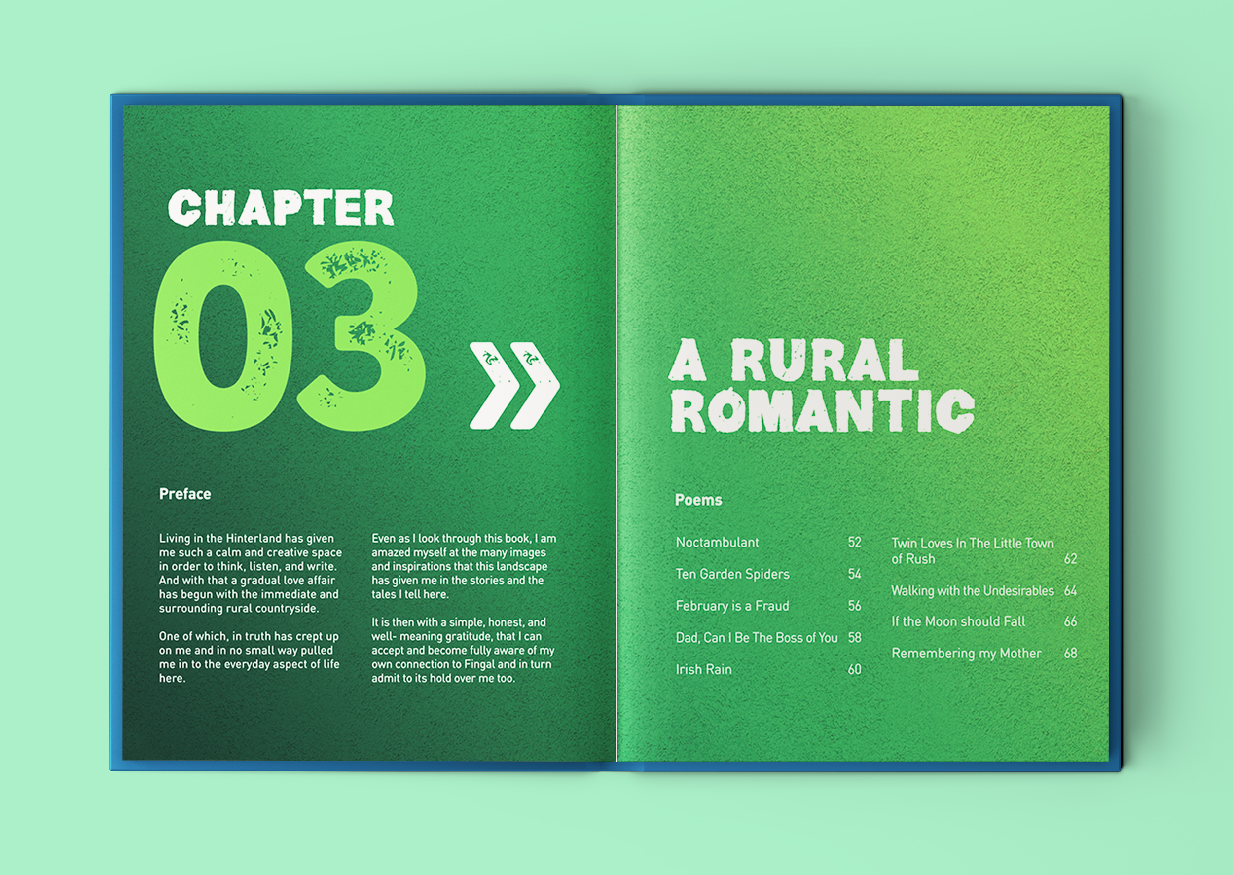
Chapter 3: A Rural Romantic
Noctambulant
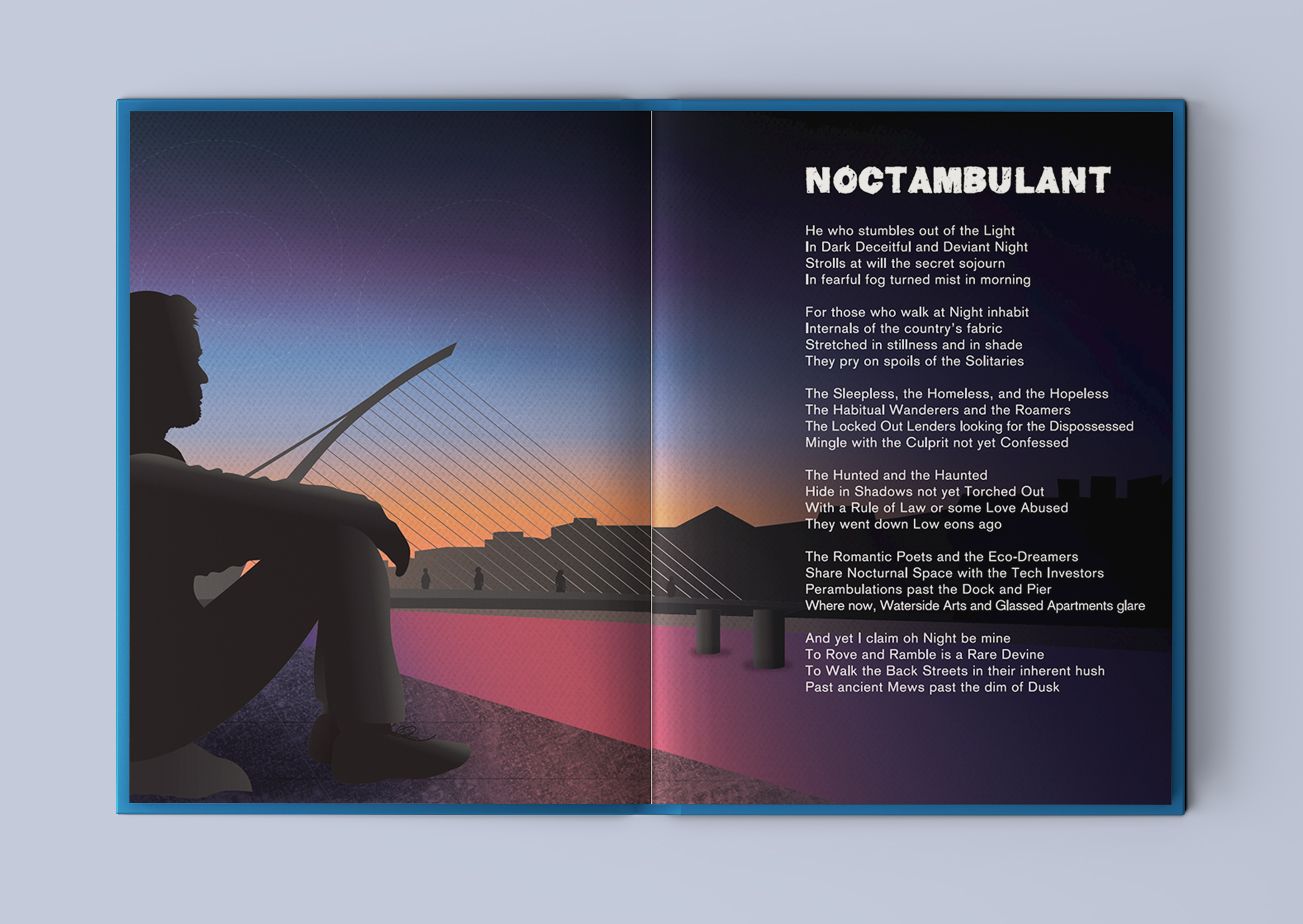
This beautifully illustrated book includes positive underlying themes of resilience, appreciating the little things in life, social inclusion and enjoying the local landscape, weaving through the book.
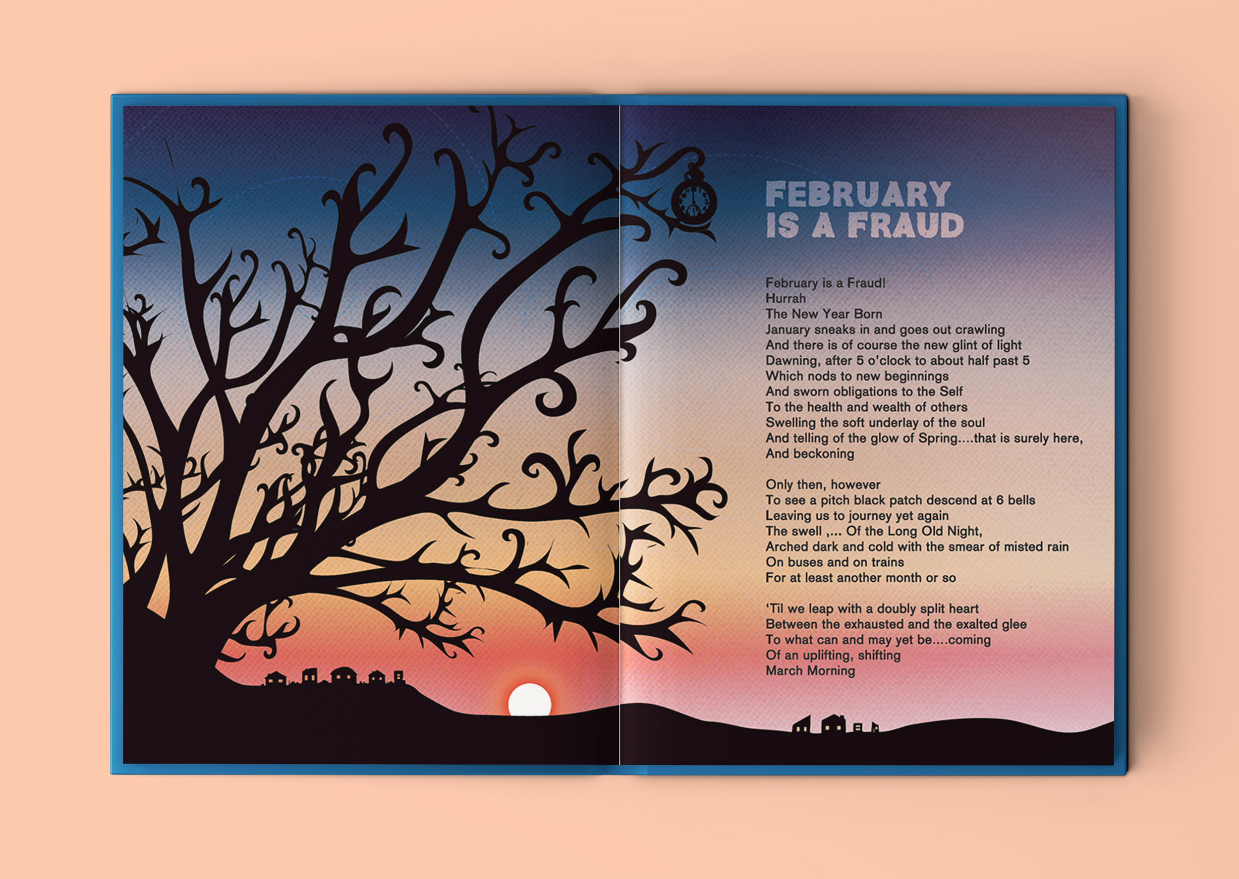
February is a Fraud
If The Moon Should Fall
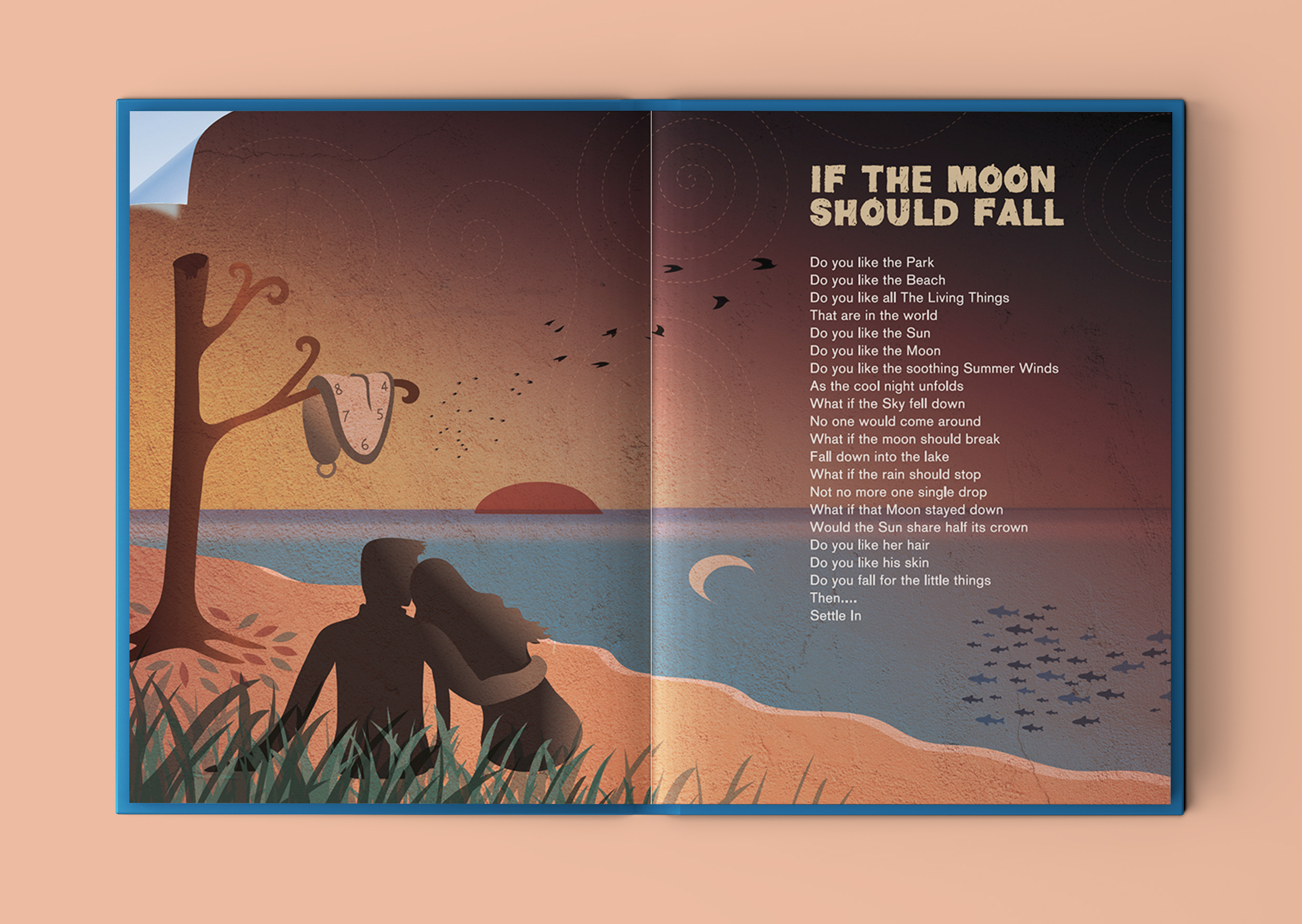
This is another of my favourite poems from the book. I took the meaning to be to enjoy an appreciate the little things that we have in life. Sometimes we can over-complicate things in life, looking for potential things that could go wrong or imperfections. When, if we focus on all the good right in front of us, we might be surprised how content we can be with everything that we already have. I saw this as a romantic poem, encouraging the reader to let down their walls to let someone new, that they know they like, in to their world and to go with the flow and enjoy it. I reflected this and all the words of the poem in the illustration, with a little wink towards Salavatore Dali’s ‘end-of-the-world-like’ surrealist paintings.
Missing at the Man O’ War
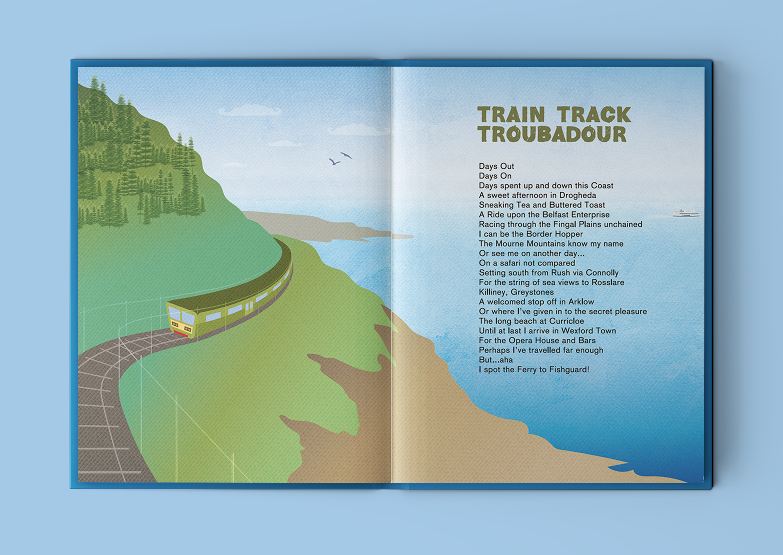
Train Track Troubadour
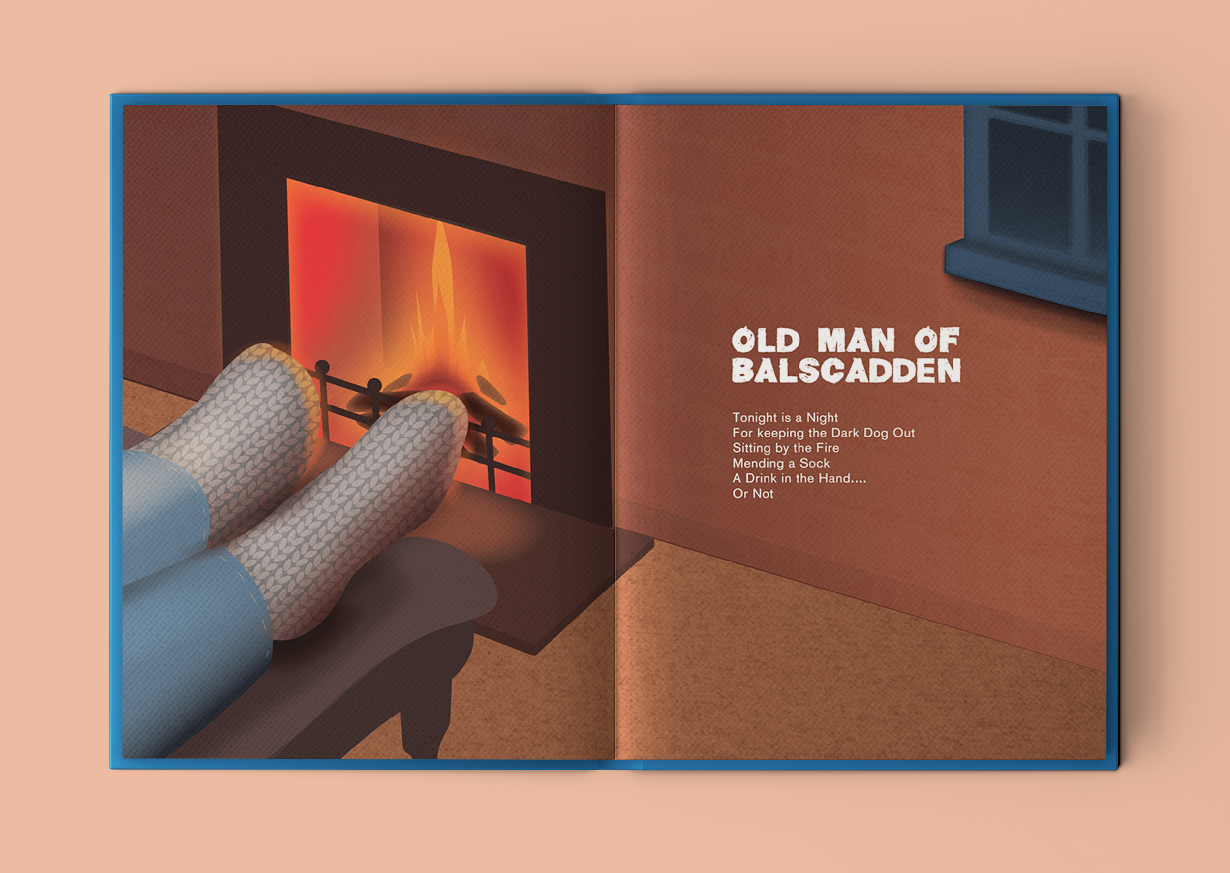
Old Man of Balscadden
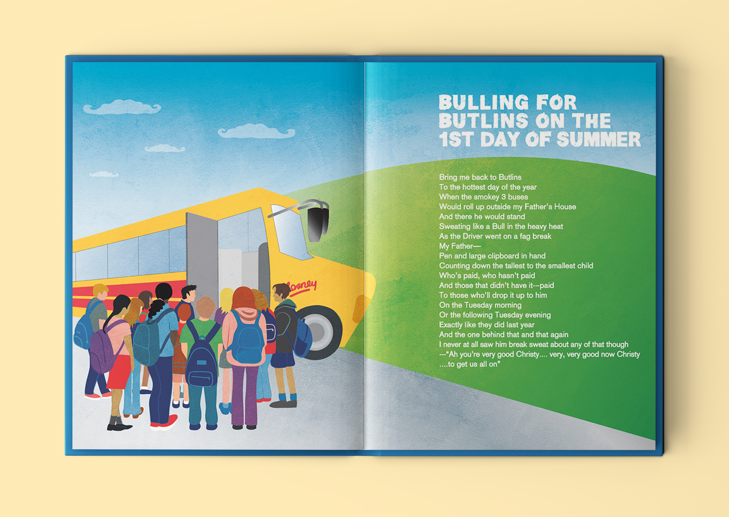
Bulling for Butlins on the 1st Day of Summer
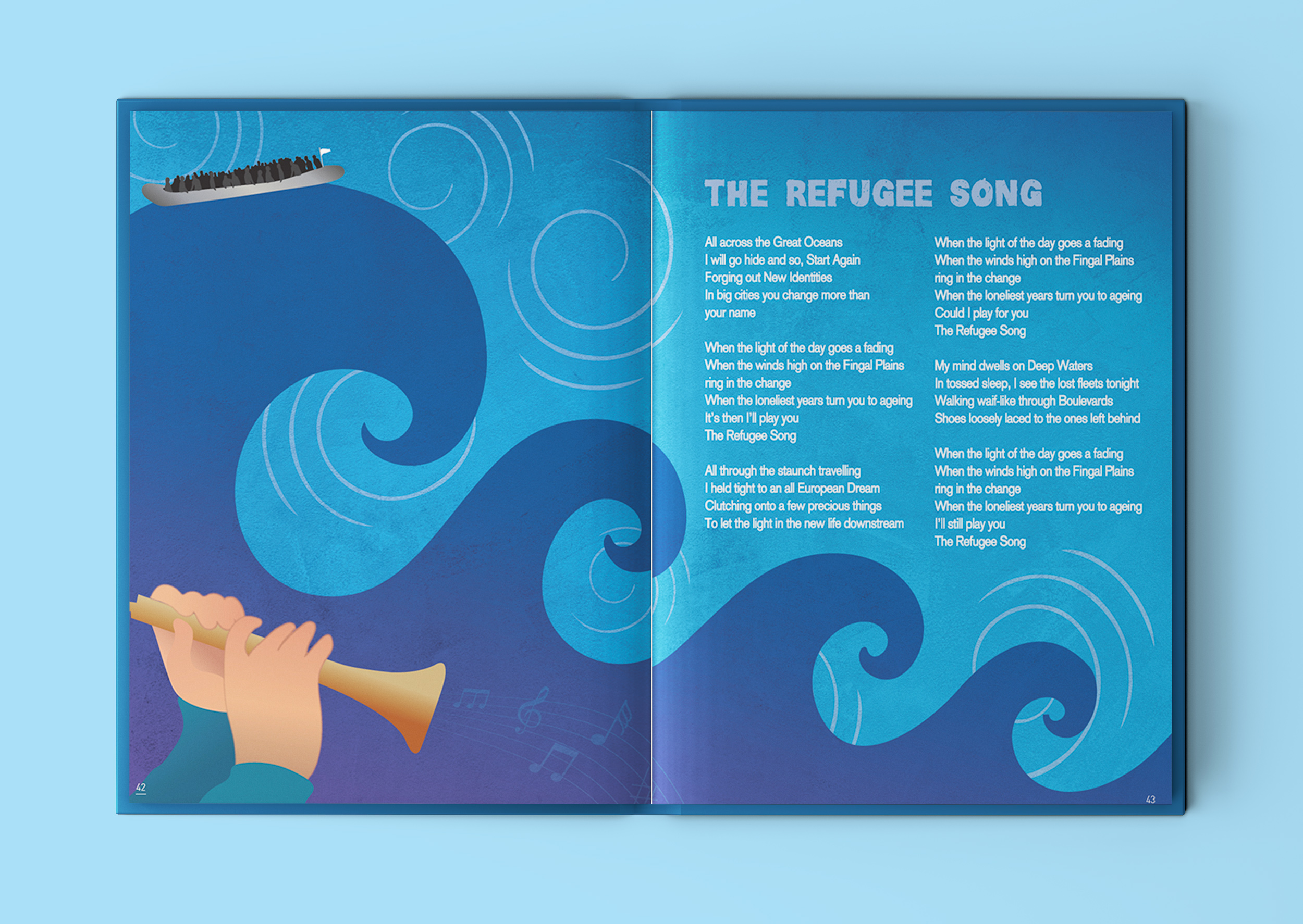
The Refugee Song
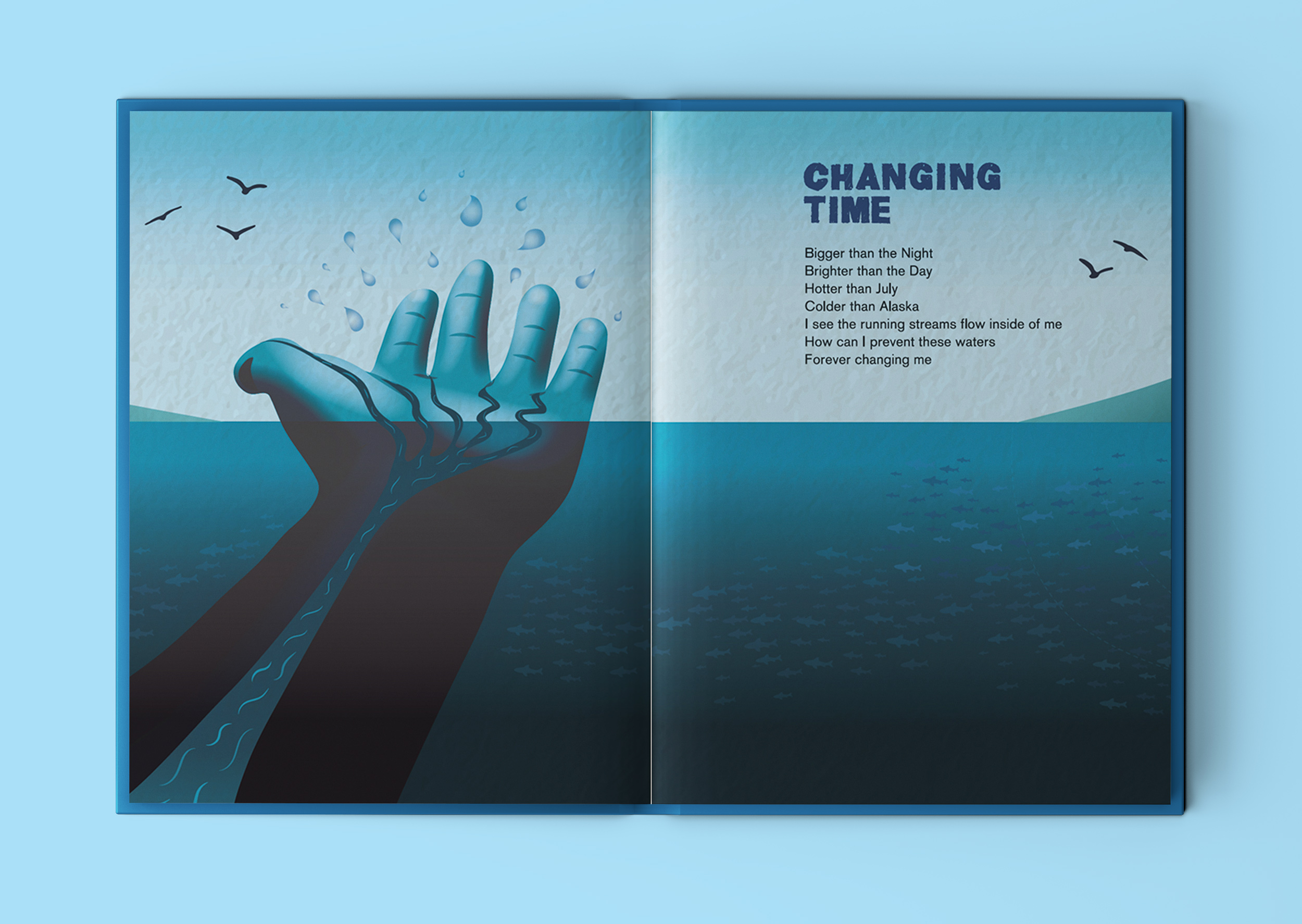
Changing Time
Lost Poem from the Bog of Commons
Quote: “You Gave Me A Lovely… Lonely, Rural Life”
Martin Holohan is a storyteller living in Lusk, County Dublin. Martin loves to spend his time writing, cycling, singing, and not least travelling, especially by train across Ireland, England, Scotland and Wales. Hello Hinterland is his Debut Collection of illustrated stories.
In this collection, the author has adopted the old role of Seanchai, the Bard, and the Poet of Irish Tales… and in that regard is of sorts a ‘Lore Keeper’. Lore Keepers are embedded in Irish Folklore and are particularly attracted to the Land themselves, especially where they currently live. It is their defining attribute to seek out and explore the spots and places that still have a strong spirit of the Myths and Legends of old.
The Lore Keeper aims to mix and match the past and present so as to bring New Tales and Observations from our beautiful island, Ėire.
The book, published by Choice Publishing Ltd, focuses on the journeys Martin makes across a wide and sometimes rural region and aptly incorporates people and places living close to the East Coast of Ireland there in Fingal County. Moreover, his real contribution is highlighting the ‘aspects of the everyday’ in places around that particular part of the country, which are remarkably only a short distance by train or car out of Dublin City.
Most notable are the titles…’The Perfect Lawns of Lusk‘, ’Twin Loves in the Little Town of Rush’ and ‘Hello Hinterland‘.
“Hello Hinterland is more than just a modern Illustrated Poetry Book…it acts too like a folklore companion guide towards a walking Heritage Trail…through the people and places… living along the beautiful landscape of Fingal County by the sea”.
Martin Holohan, Poet & Author of Hello Hinterland
You can hear Martin talking more about the book in this Near FM interview here…
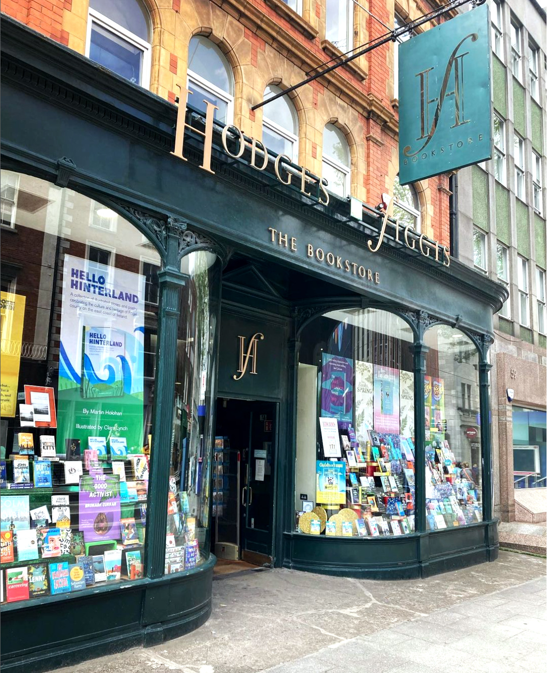
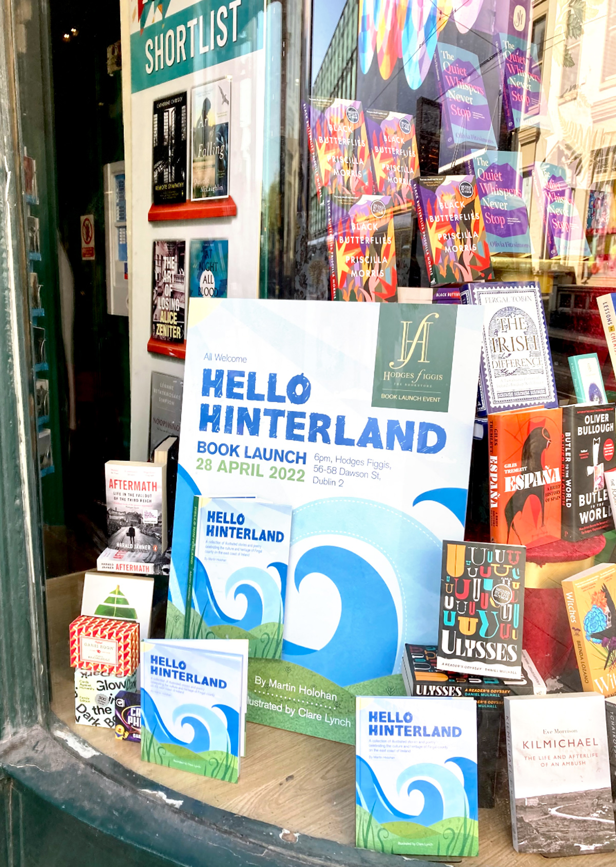
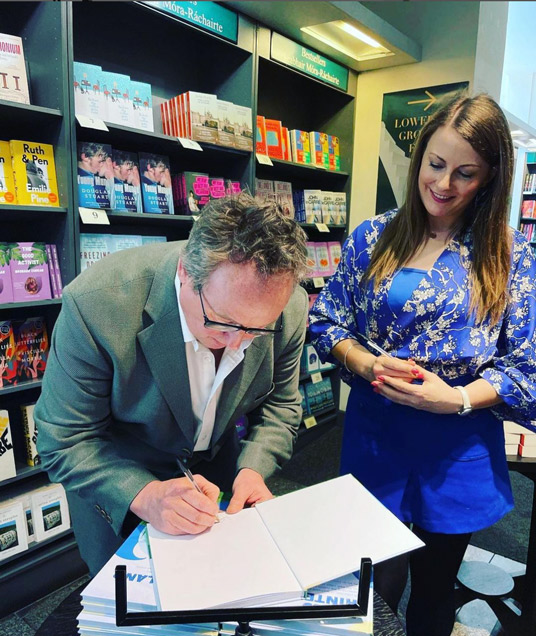
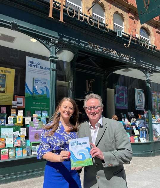
Hello Hinterland Book Launch at Hodges Figgis Dublin
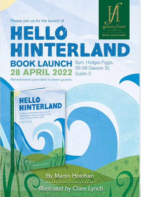
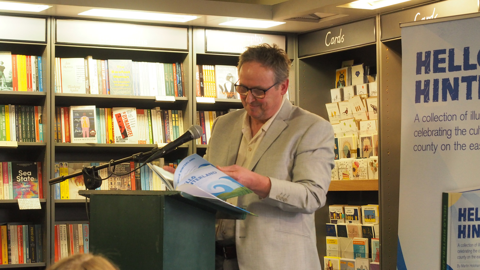
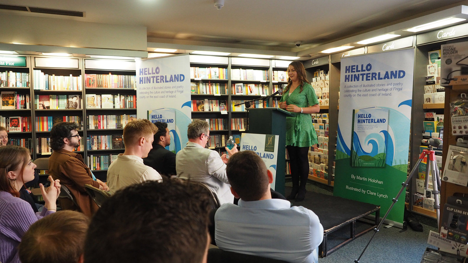
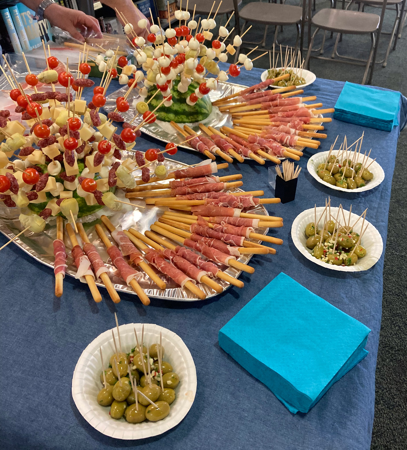
We held the book launch at the famous Dublin bookstore, Hodges Figgis, one of Dublin’s oldest bookstores, situated near Trinity college on Dawson Street. I designed the promotional collateral for the event, such as social media graphics, flyers, pull-up banners and large-scale posters for the front window display. This event was a lovely evening accompanied by refreshments, wine and cheese, where myself and Martin spoke to the guests about the creation of the book and the collaboration process and read some of our favourite poems from the book.

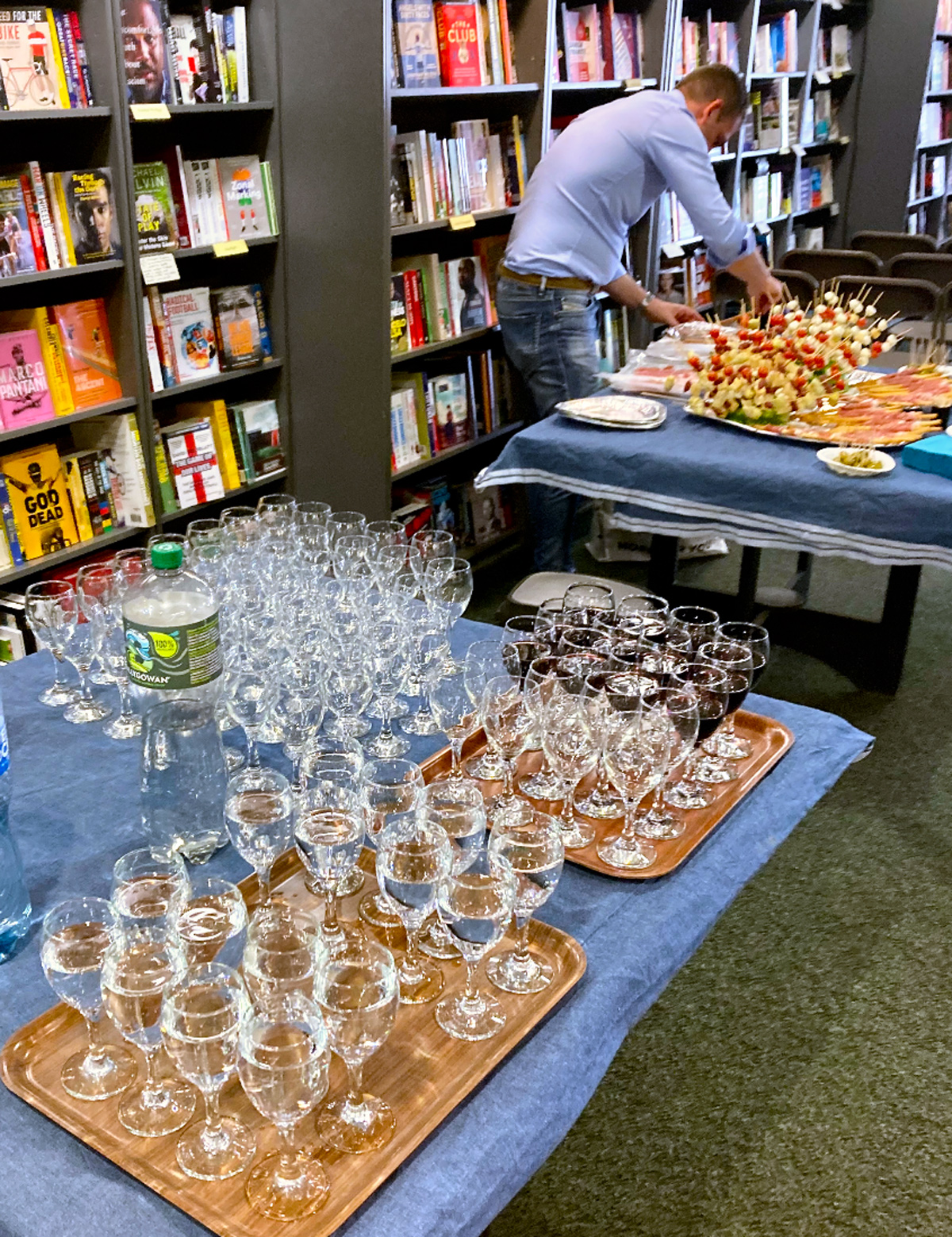
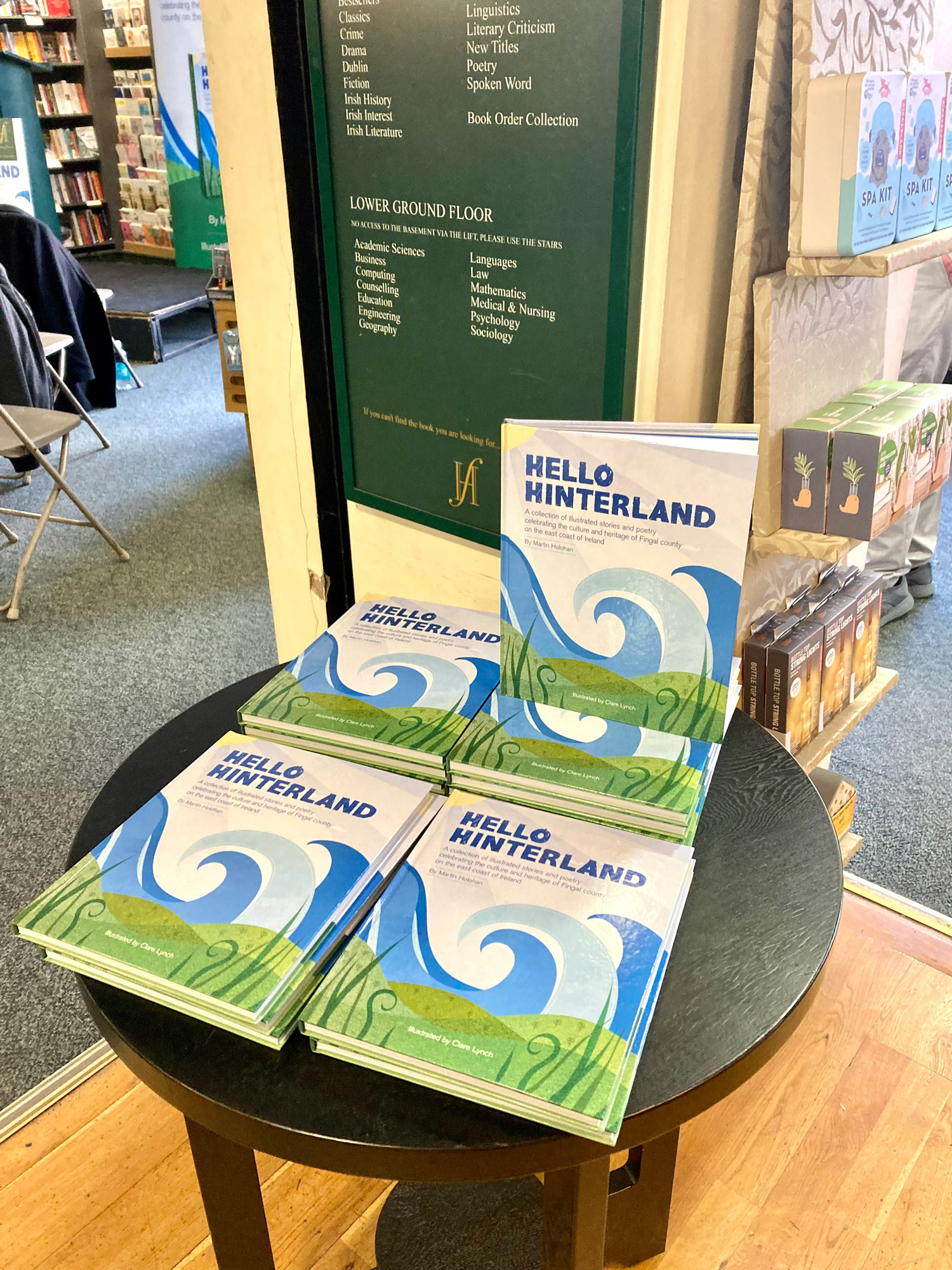
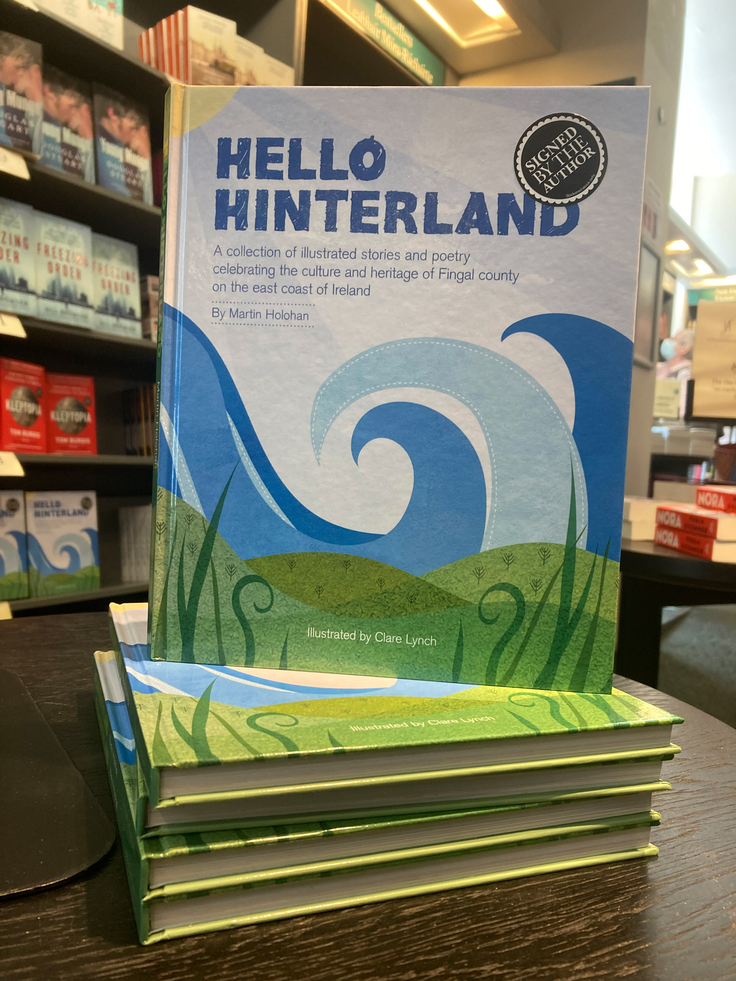
Book Signing at Hodges Figgis
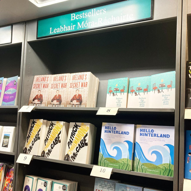
Featured in the ‘Top 10’ Bookseller List at Hodges Figgis
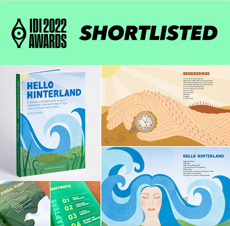
Shortlisted for the IDI Awards 2022
The IDI Awards select and showcase the best of Irish design. The awards provide designers with a platform to showcase their talents, benchmark against their peers and provide inspiration for all.It was so exciting to be shortlisted for the Illustration of the book Hello Hinterland in the 2022 IDI Awards. It was an honour and great achievement to be shortlisted and recognised in the creative field among the many talented designers in Ireland.
– Alan Hanna’s Bookshop, 270 Rathmines Rd Lower, Rathmines, Dublin 6 – See location on map…
– Tales for Tadpoles, 3 Albert Walk, Bray, Co. Wicklow, A98 TC03 – See location on map…
– Antonia’s Bookstore, The Gate House, Navan Gate, Trim, Co. Meath – See location on map…
– Choice Publishing, Drogheda, Co. Louth – See location on map…
– Hodges Figgis on Dawson Street, Dublin 2 – See location on map…
Online:
Tales for Tadpoles:
Alan Hanna’s Bookstore:
Choice Publishing:
Waterstones / Hodges Figgis:
Antonia’s Bookstore:
Blackwells Book Stores:
Browns Books:
Library Stockists:
Maynooth Library, County Kildare
https://maynoothuniversity.com
Further Details about Hello Hinterland:
Published by: Choice Publishing in HardbackWritten by: Martin HolohanIllustrated by: Clare LynchEdited by: Isabel AustISBN: 978-1-913275-26-6Priced: €25.00Distributor: www.alanhannas.com Website: www.holohanbooks.ieInstagram: www.instagram.com/holohanbooks
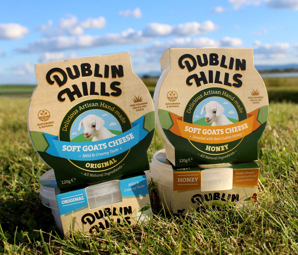
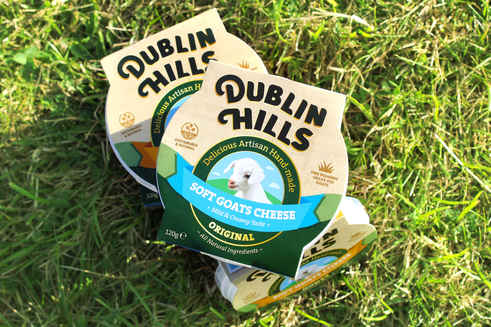
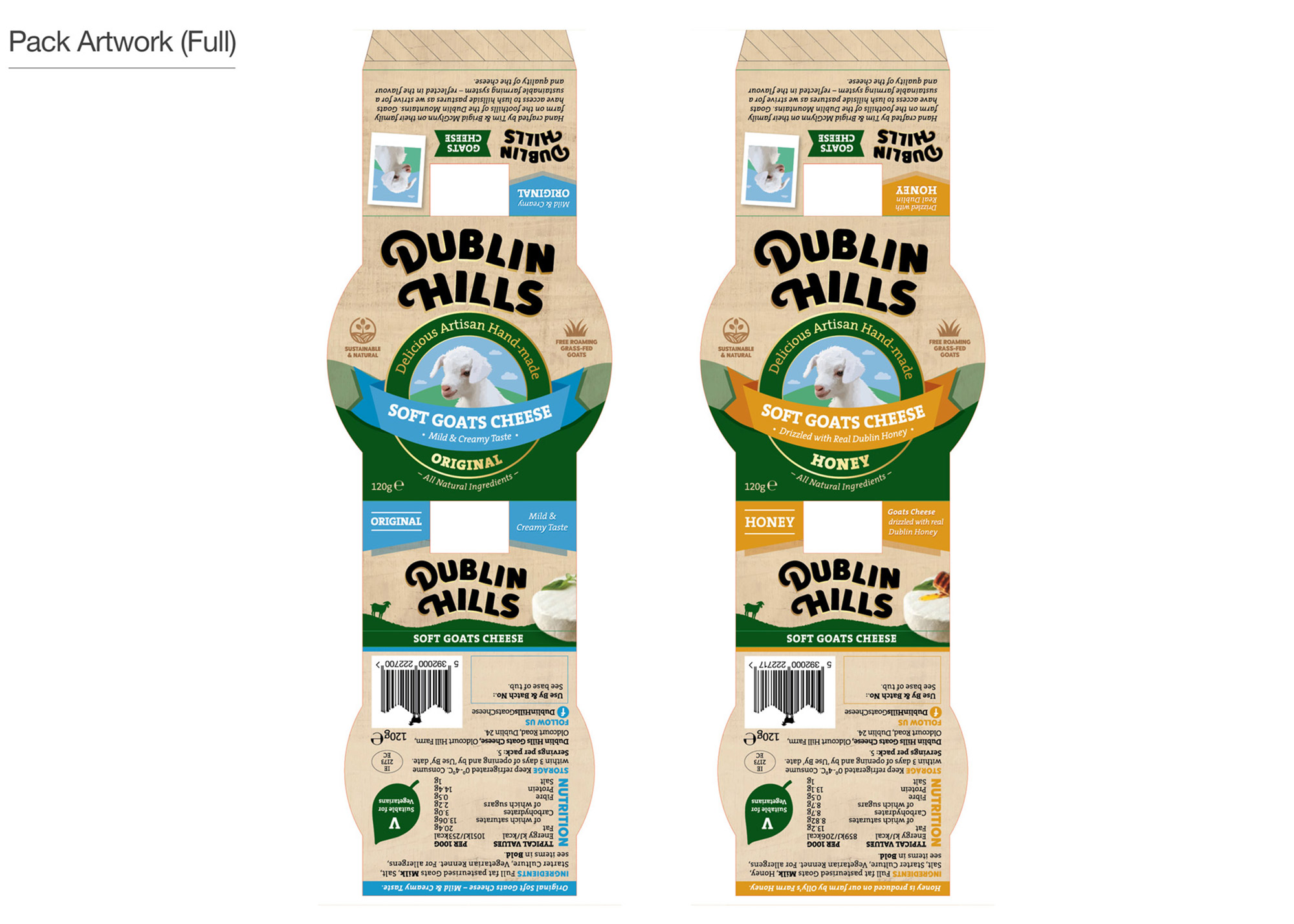
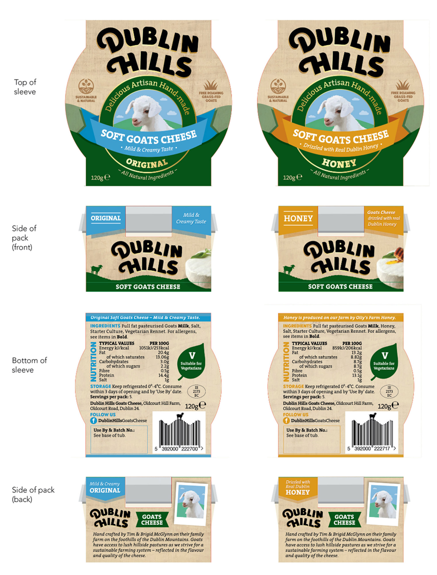
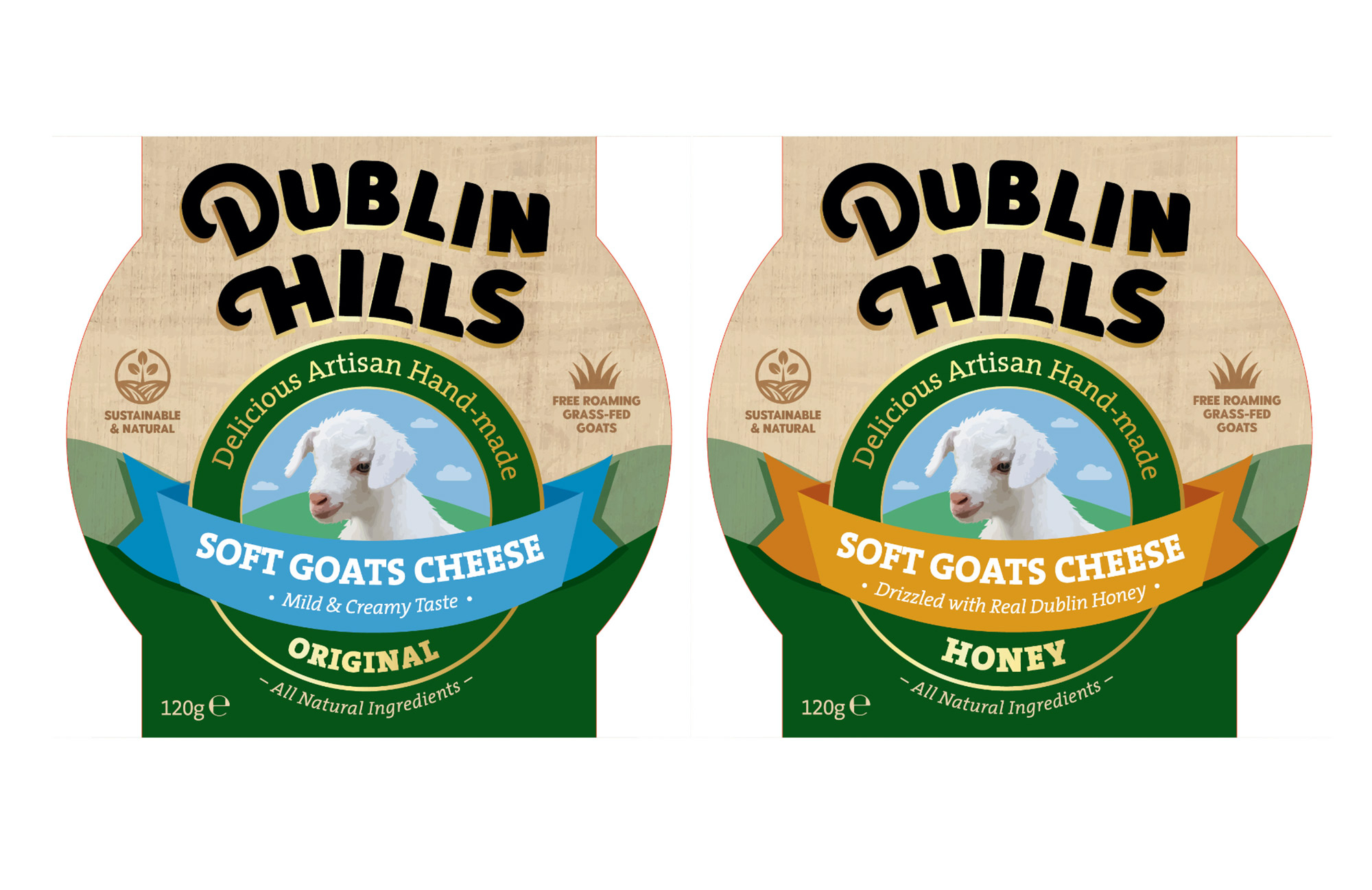
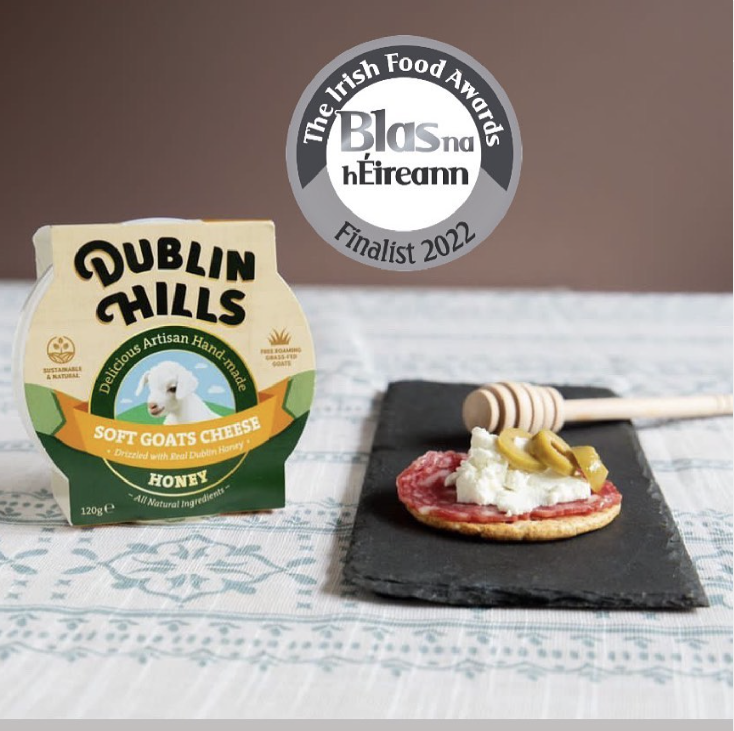
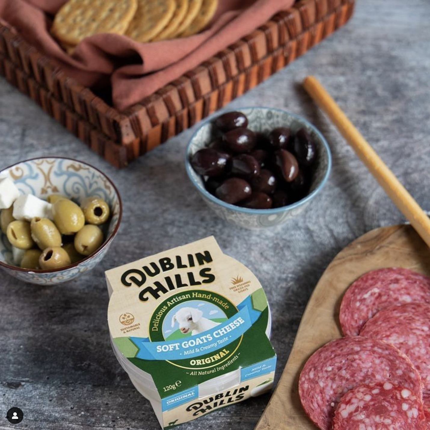
Dublin Hills Goats Cheese Brand Packaging Design
Dublin Hills Goats Cheese Brand Packaging Design
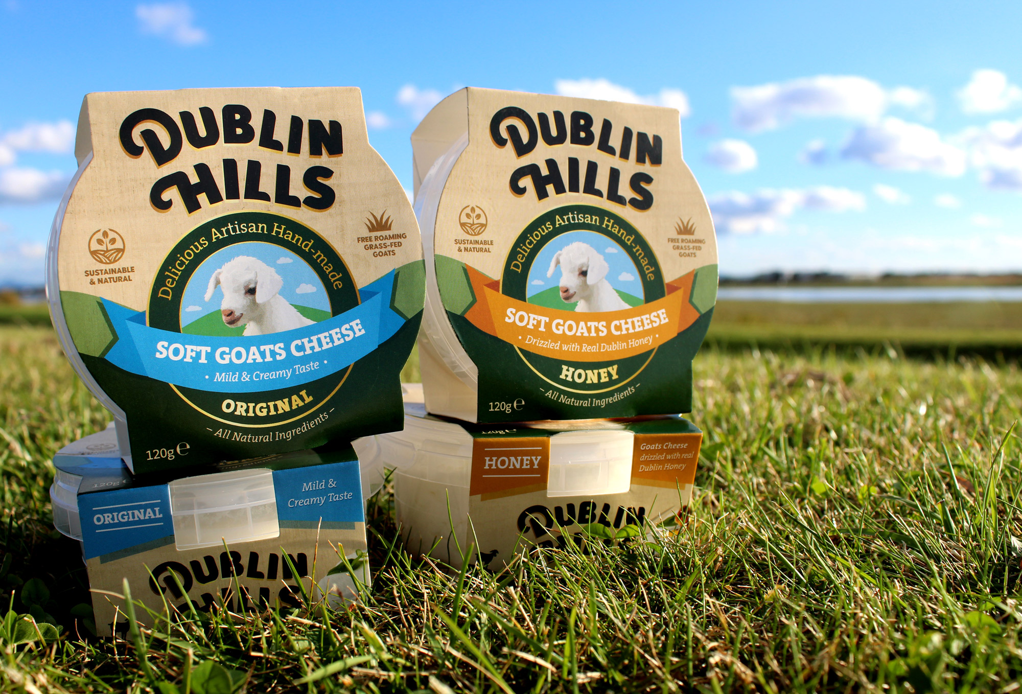
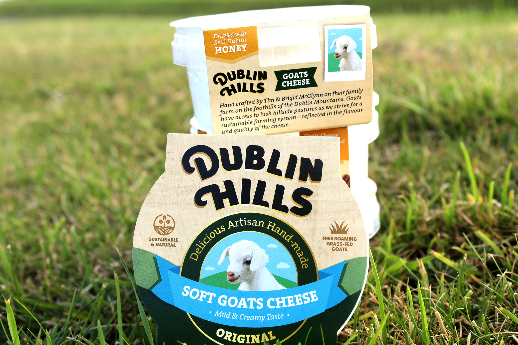
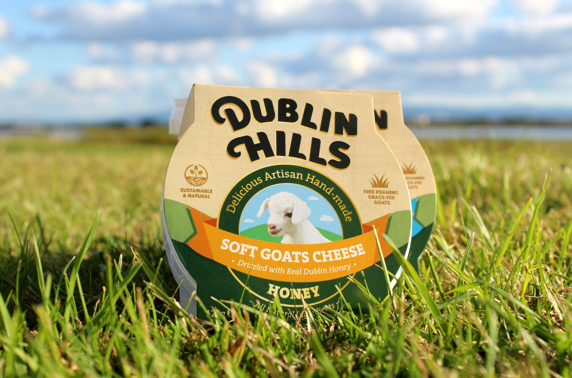
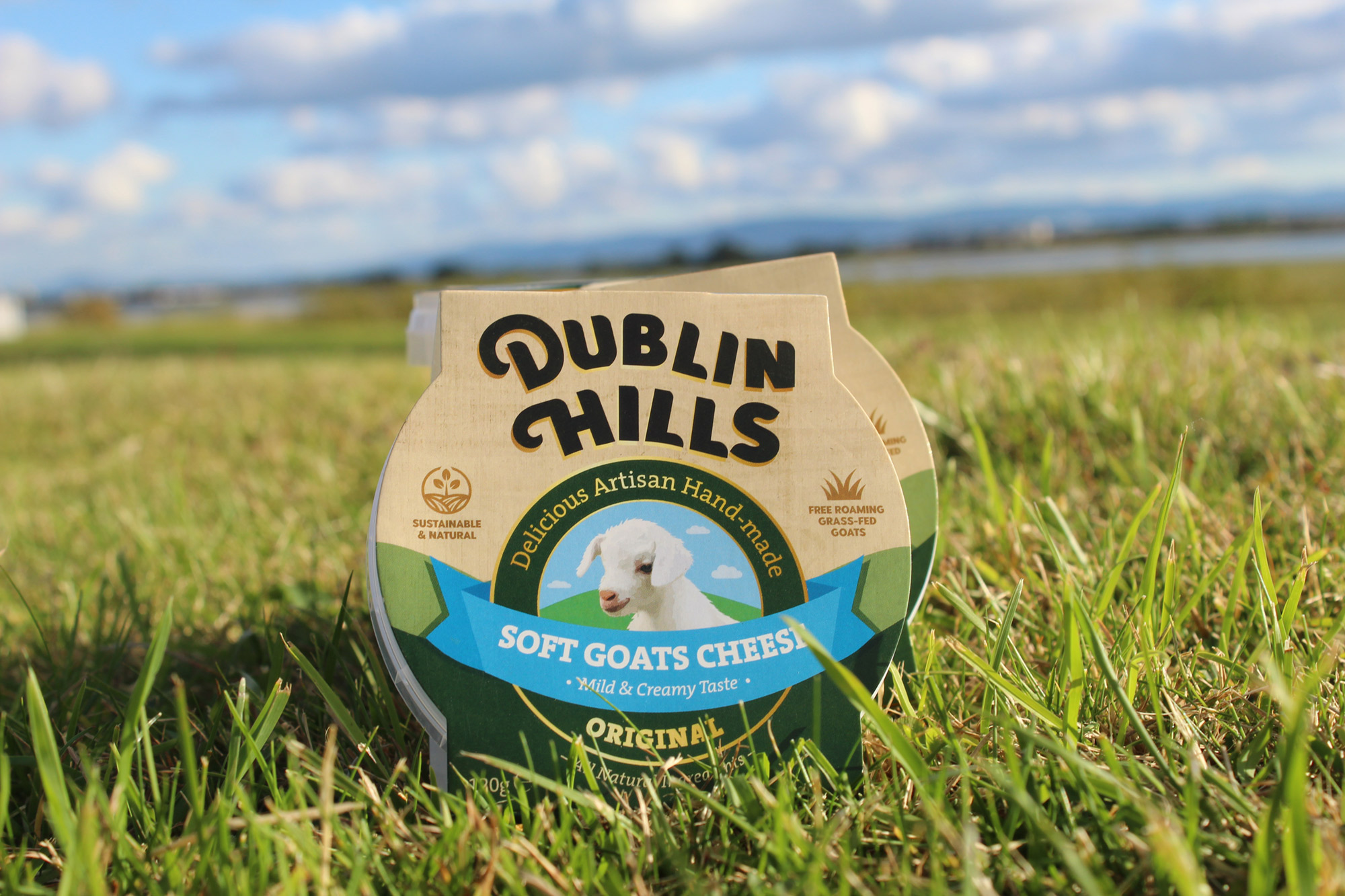
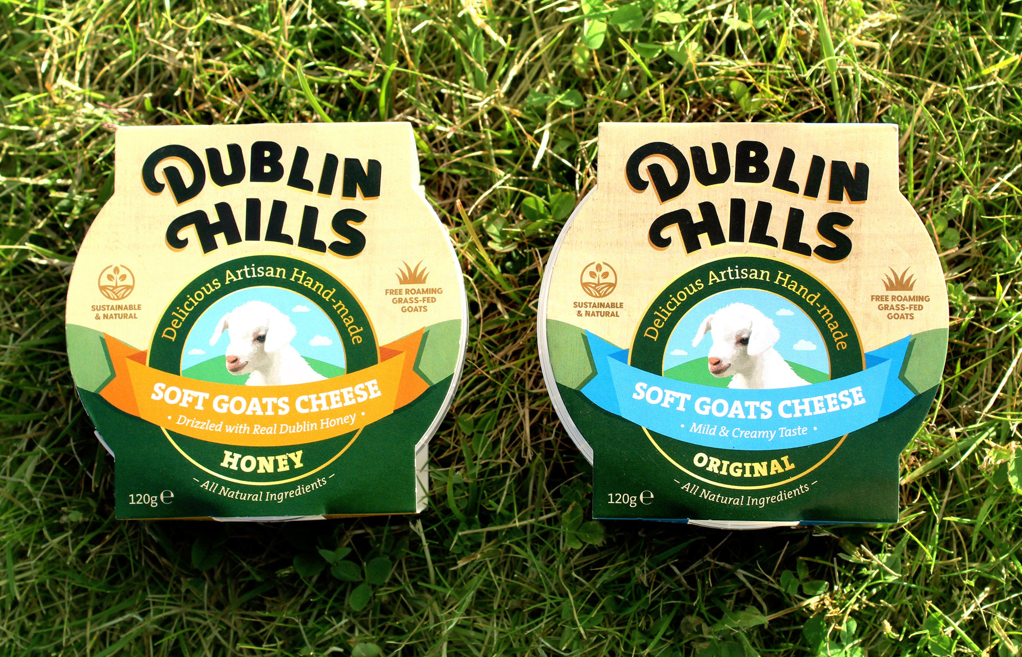
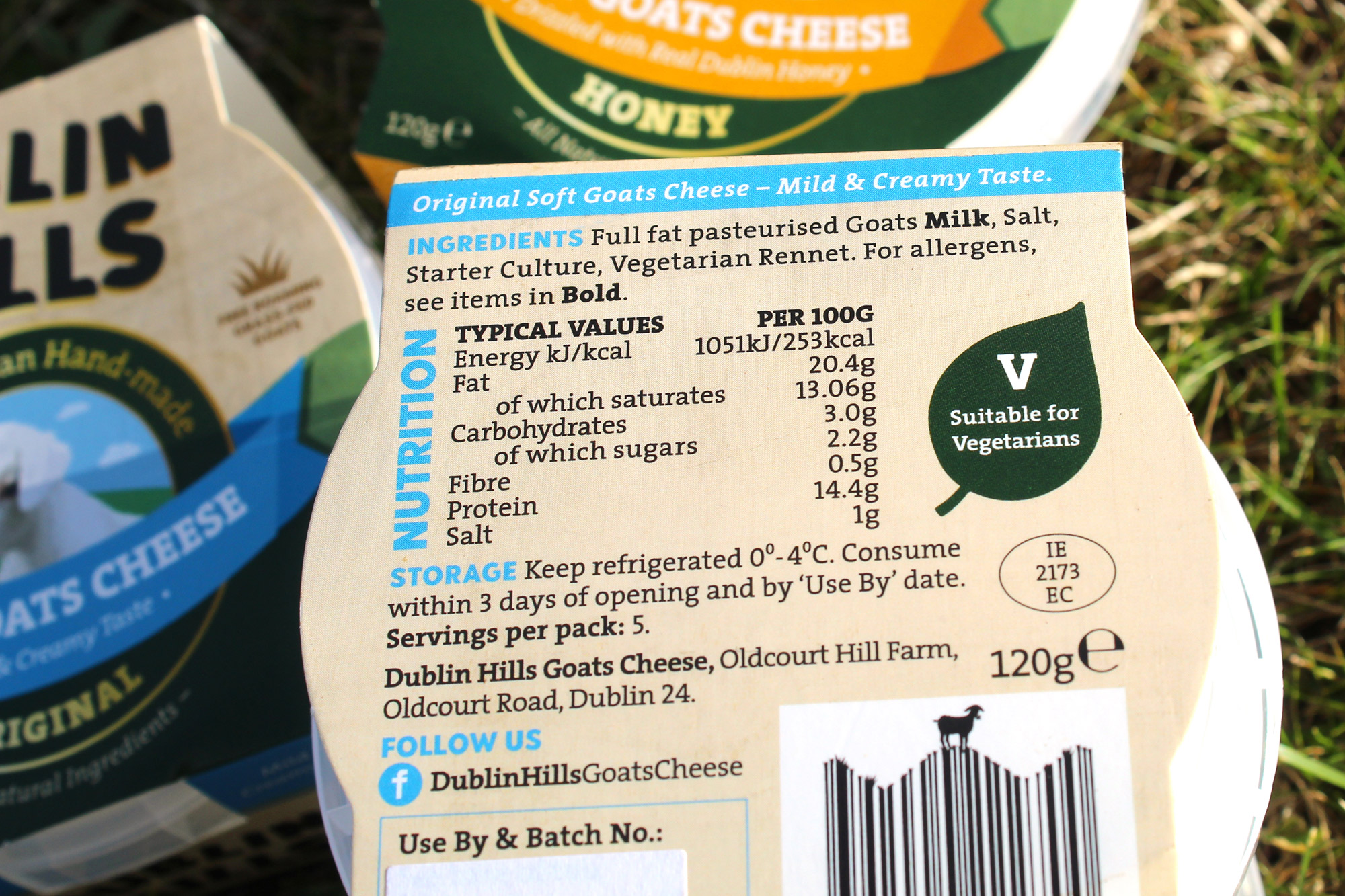
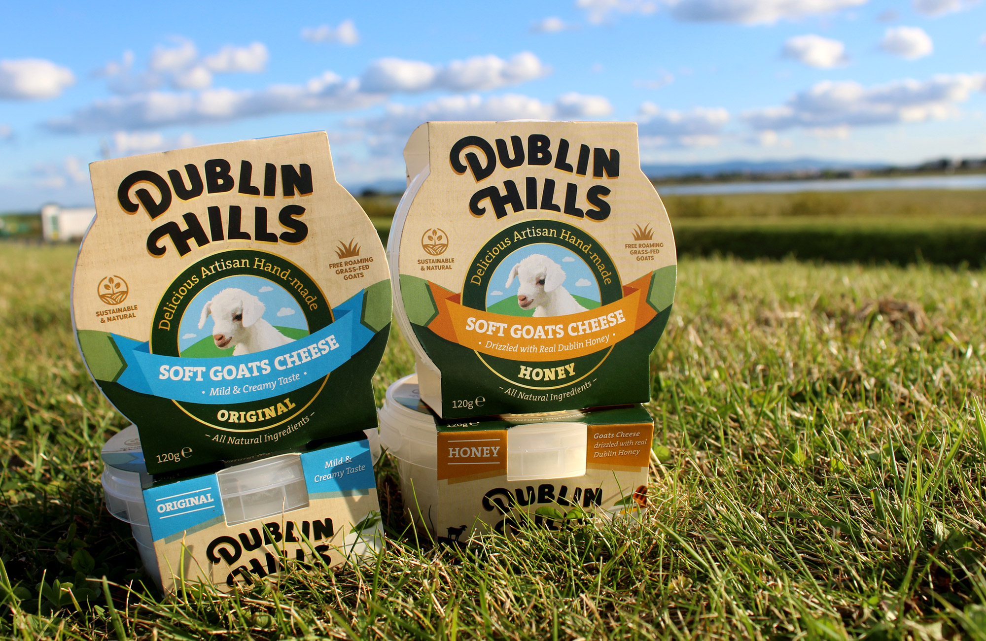
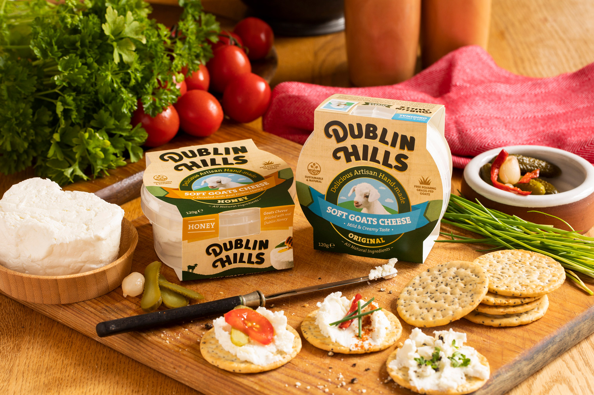
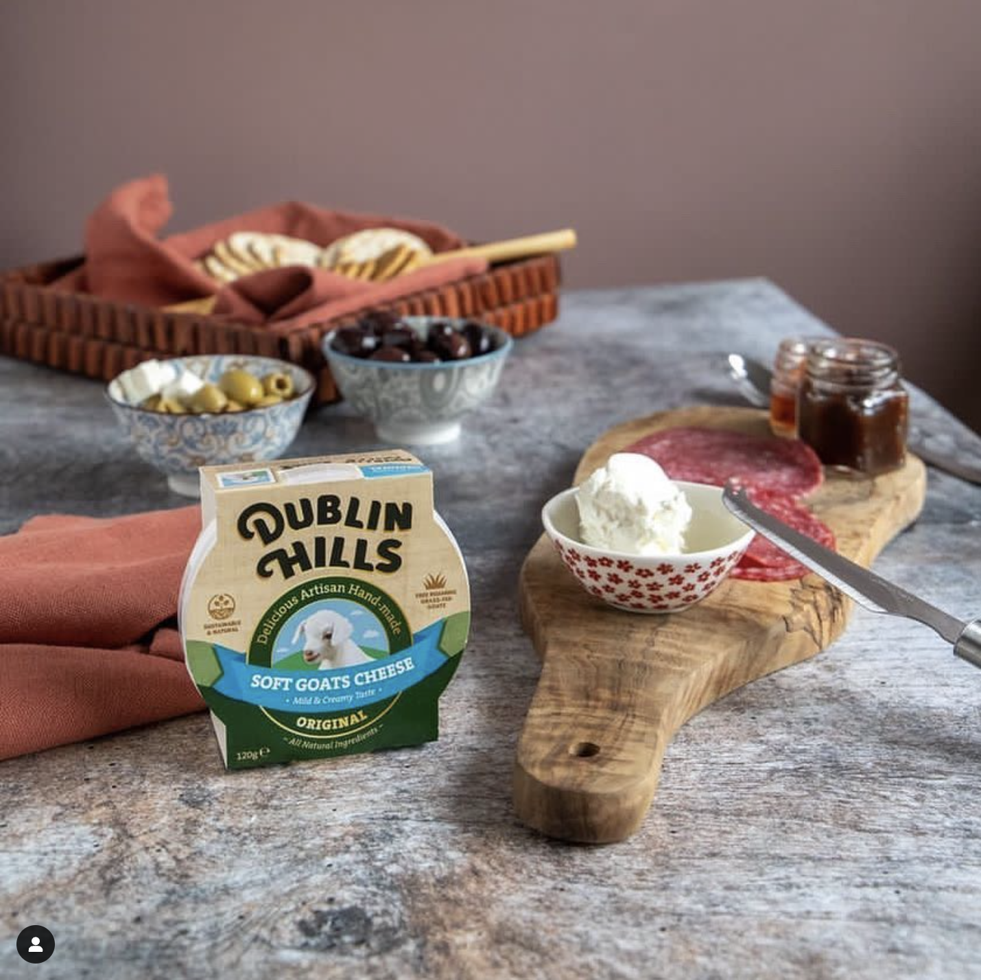
Dublin Hills Goats Cheese is handcrafted on the foothills of the Dublin Mountains. It is natural and sustainably made, using just four simple and natural ingredients. The goats are grass-fed and roam freely in the fresh green fields at the foothills of the Dublin Mountains and is suitable to be enjoyed by vegetarians. Dublin Hills is the only goats cheese maker in Dublin. The company is run by farmer and food producers, Tim and Brigid McGlynn. They have a herd of dairy goats and free-roaming hens on their farm, known locally as ‘Oldcourt Hill Farm’. The honey flavour is drizzled with honey from Olly’s Farm.
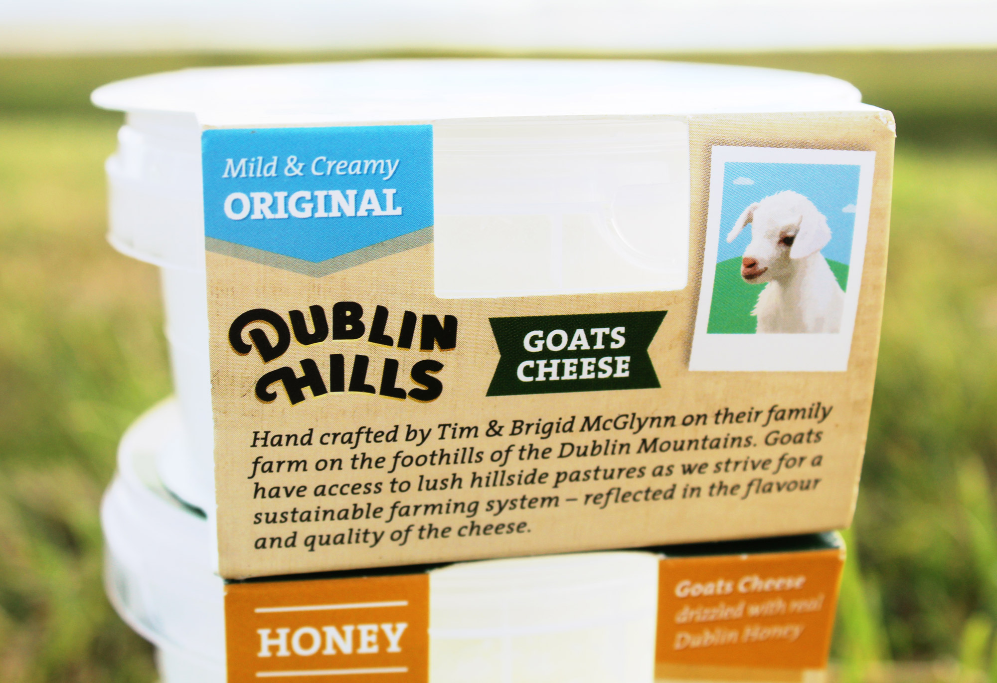
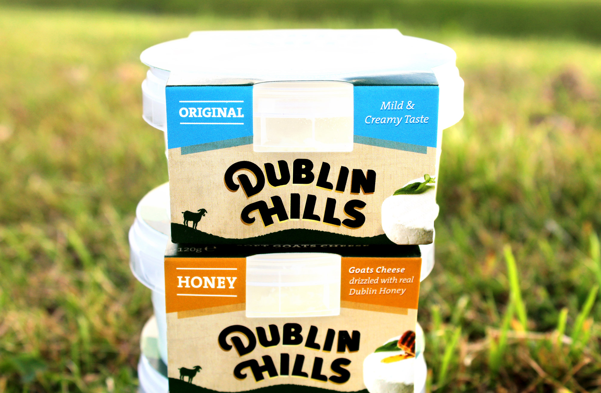
Dublin Hills strive for a sustainable farming system, which is reflected in the flavour and quality of the cheese. They pride themselves on producing local, natural and sustainable goats cheese on their family farm, with goats roaming freely on their lush hillside pastures. This unique and delicious soft, creamy artisan cheese has a reputation for being extremely addictive! You can find it in local SuperValu stores and Tim has been known to be there on occasion offering tastings of the cheese to consumers.
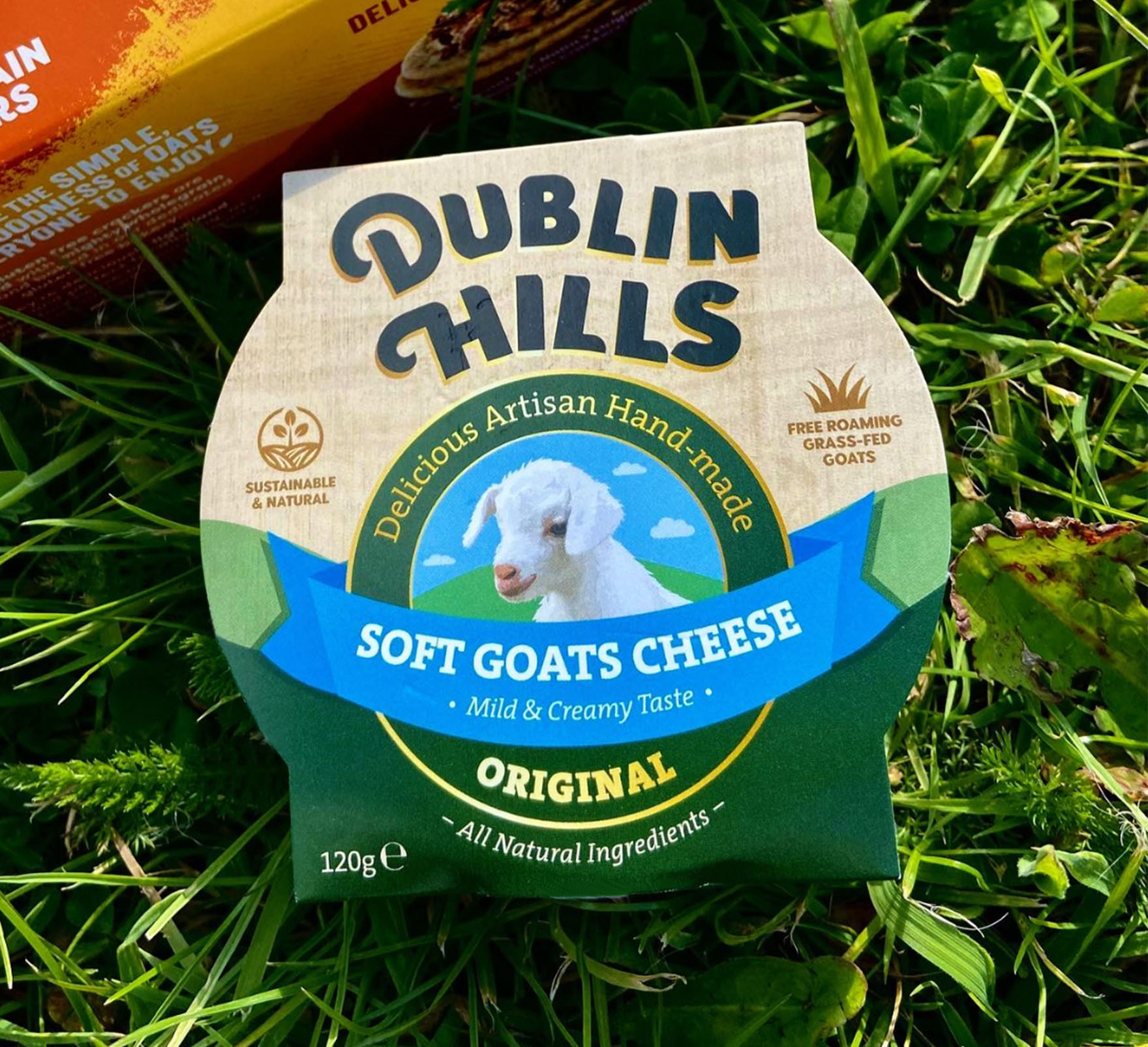
The project began with a brainstorming phase for the name, with the final decision on ‘Dublin Hills‘ working effectively to clearly communicate one of the company’s USP’s (Unique Selling Point) – their provenance and that they are a local, Dublin based goats cheese producer. The Dublin Mountains can be seen from various points all over Dublin, from North to South (where they are located) and are a much-loved and popular landmark feature of Dublin anyone living in the county.
Their provenance and location also informed the design of the logo – the typography playfully mimics the curves of the foothills of the Dublin Mountains that their farm is situated on, almost as if the brandmark is sitting on the hills itself. This is crafted in a sophisticated and premium style. The gold underlay to the bold black type denotes the quality of the cheese. There is a small illustrative icon locked up with the typography which further emphasises their location.
The client wanted to communicate how they are a small local farm with free-roaming goats that graze in their natural surroundings. To consider this, we incorporated an illustration of a goat in a meadow of fresh grass, with mountains in the background on the packaging. The taste of the goats cheese is mild and soft, from young goats milk, and so the goat depicted is young in appearance to indicate this. This young goat sits within a ribbon badge on the front of the packaging – this is a visual cue to symbolise the quality of this cheese.
![]()
Brand Guidelines & Assets:
![]()
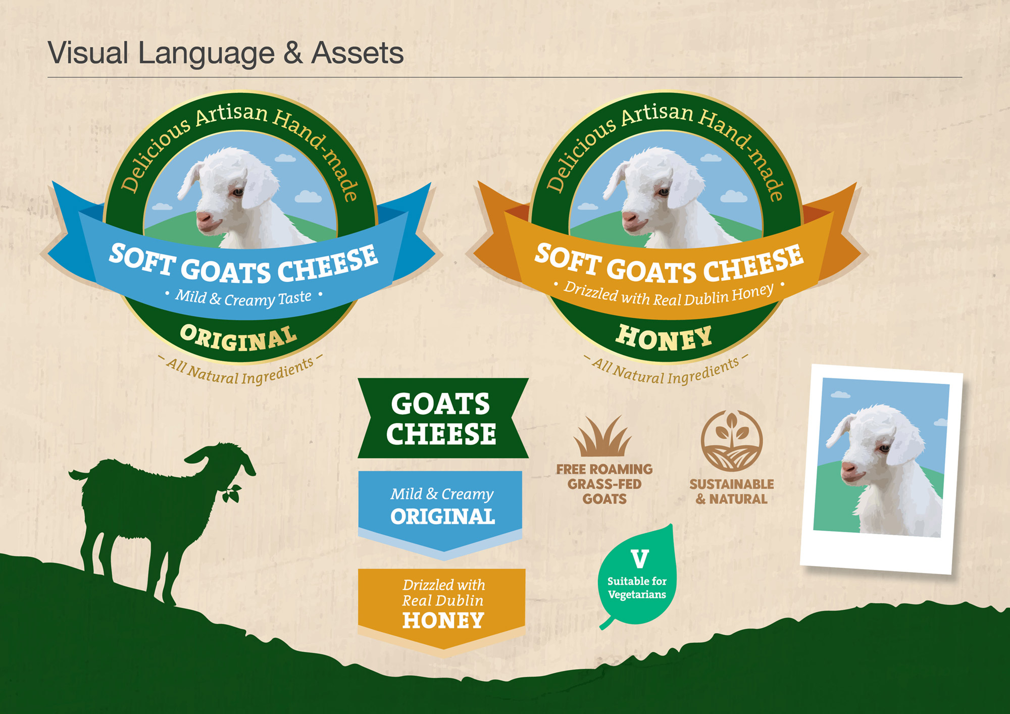
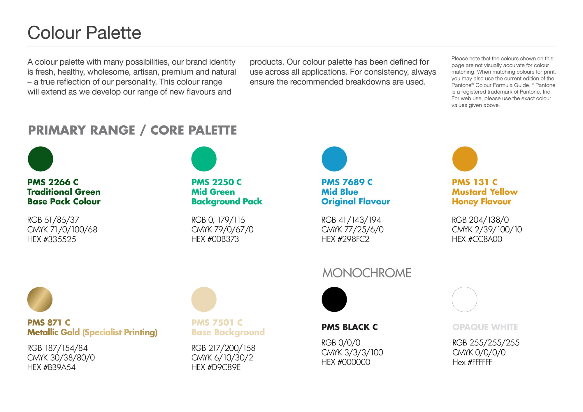
A full brand guidelines were included with this brand packaging project. The colour palette and typography chosen are earthy, natural, bright and fresh to indicate these aspects of how the Dublin Hills handcrafted cheese is produced. Illustrative icons and descriptor text on the packaging design communicate some of the other brand USP’s, such as that the cheese is ‘Sustainable & Natural’, that the goats are ‘Free-Roaming, Grass-Fed Goats’ and that the cheese is ‘Suitable for Vegetarians’. The barcode is playful, featuring an icon of a young goat on a hill as part of the barcode device. On the front side of the packaging design, images of the cheese are included to visually appeal to consumer’s taste buds. The brand story is featured on the back side of the pack, to allow consumers to connect with the McGlynn family’s brand story and background.
![]()
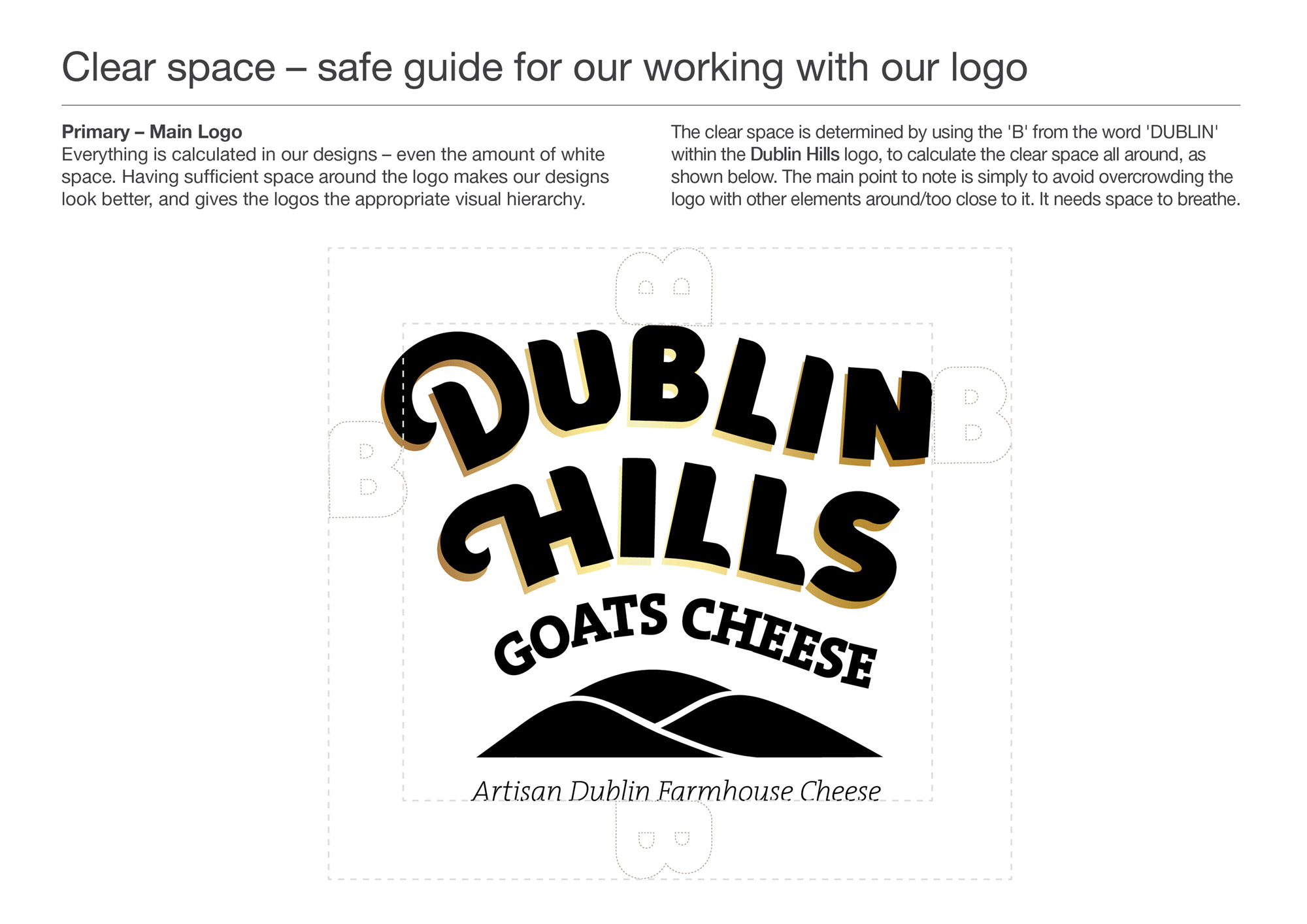
A minimum Clear Space recommend guide was defined for best use of the brand. There is a version of the logo with the strapline ‘Artisan Dublin Farmhouse Cheese‘, which is used on occasions where the full pack artwork isn’t there to communicate their values.
![]()
Dublin Hills Goats Cheese is currently available in SuperValu stores:
Dublin:
Orwell, Templeogue, Dublin 6
Rathgar, Rathfarnham, Dublin 6
Ballyroan, Rathfarnham, Dublin 14
Get Fresh, Rosemount SC, Rathfarnham, Dublin 14
The Merry Ploughboy Pub, Rathfarnham, Dublin 14 (in their food menu)
Knocklyon, Templeogue, Dublin 16
Firhouse, Tallaght, Dublin 24
Lucan, Co. Dublin
Wicklow:
Blessington, Co. Wicklow
Follow Dublin Hills Goats Cheese on Social Media:
Instagram: @dublinhillsgoatscheese
Facebook: www.facebook.com/Dublin-Hills-Goats-Cheese-114380377922359/
Your Life Audit Brand Identity
Your Life Audit – Brand Identity
‘Your Life Audit’ is a coaching business run by Catriona Kennedy, specialising in one-to-one personal life coaching, corporate coaching and coaching for schools and groups. It aims to empower clients with the tools and resources they need to unlock, achieve and maximise their personal and professional development and fulfilment.

Life coaching is a rewarding process aimed at giving you the control and direction to embrace life and fulfil your potential. It can help you identify and utilise your innate skills and qualities, develop optimism and build positive relationships, find true meaning and purpose in life and more. To put simply, coaching is all about creating positive change for you, with you and in you. Catriona is a certified Life Coach, with Neuroscience, and the creator of Your Life Audit and she believes in the power of YOU.

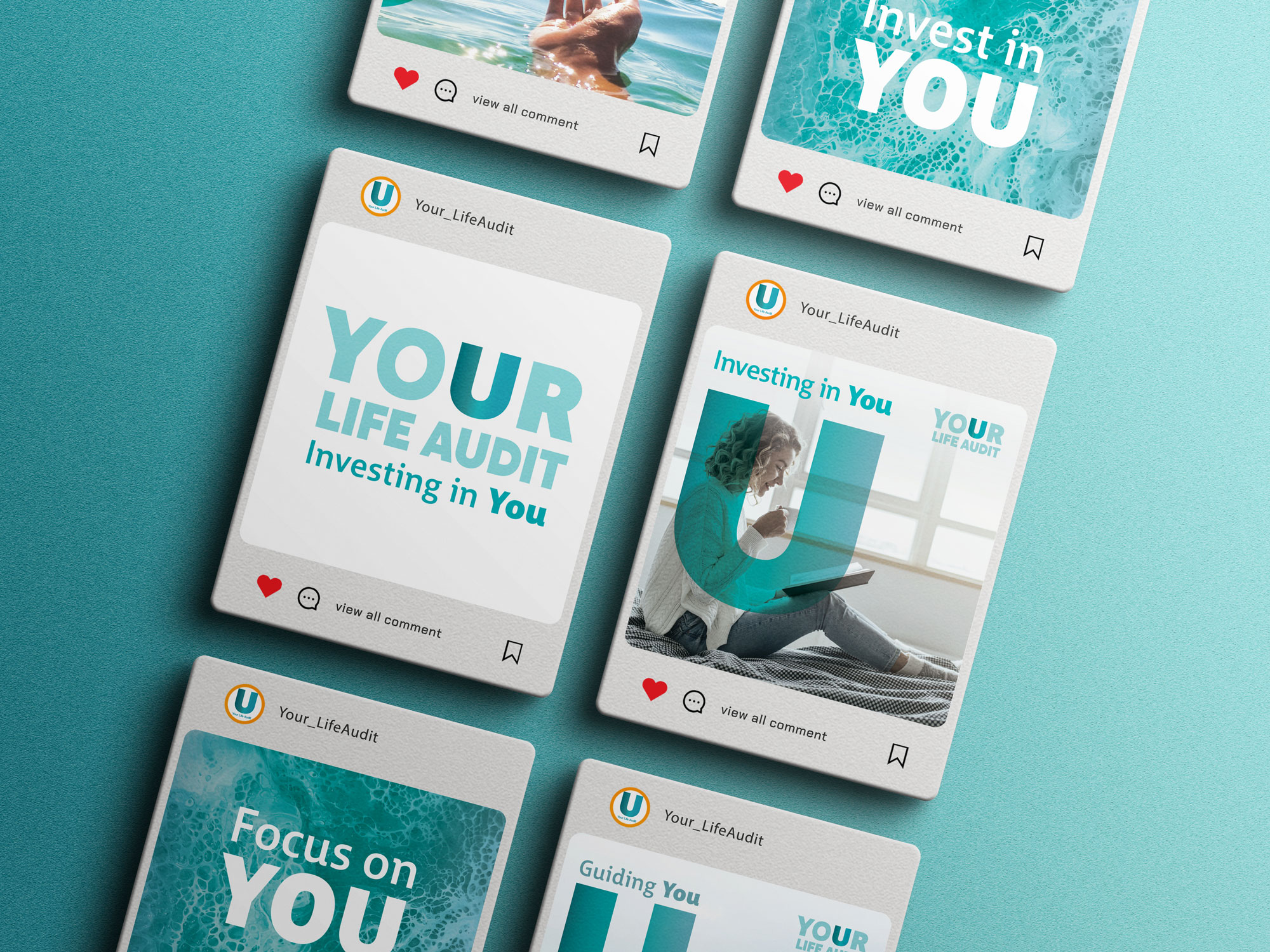

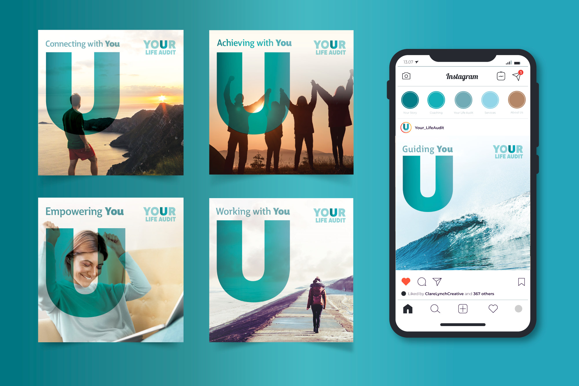
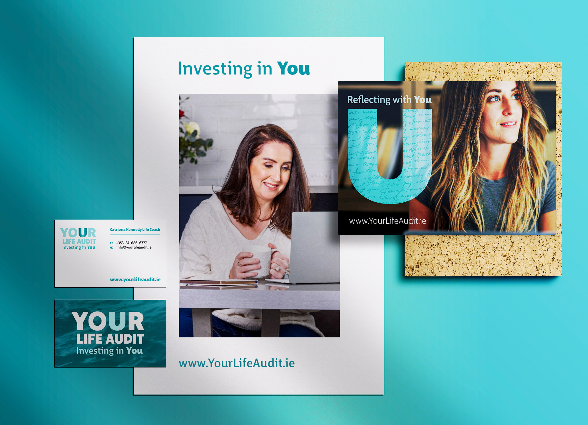
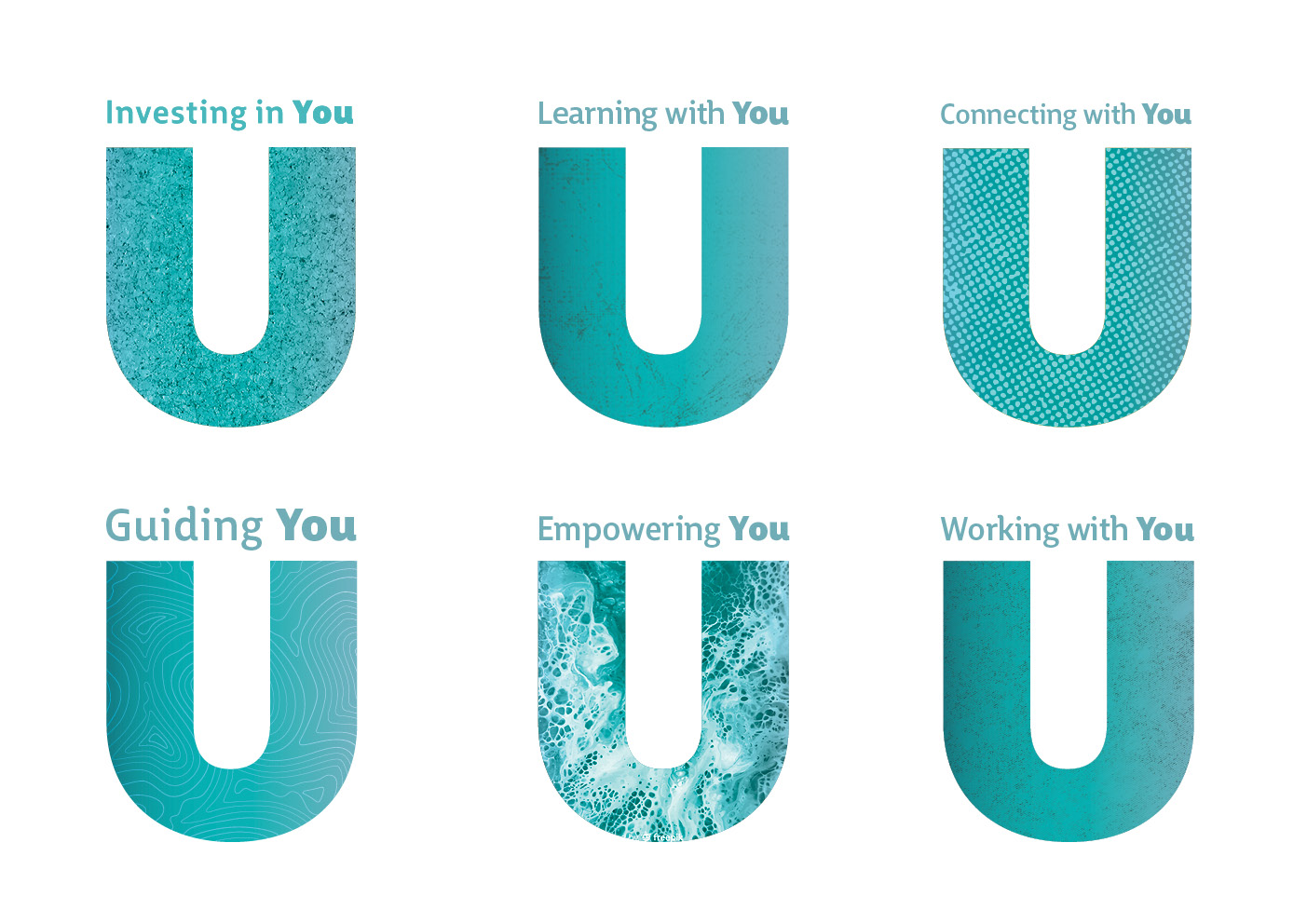
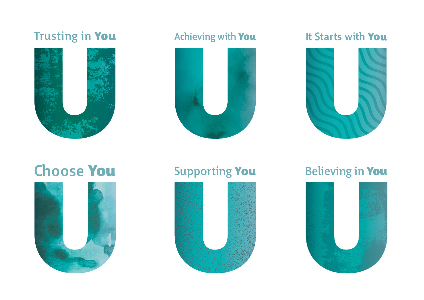

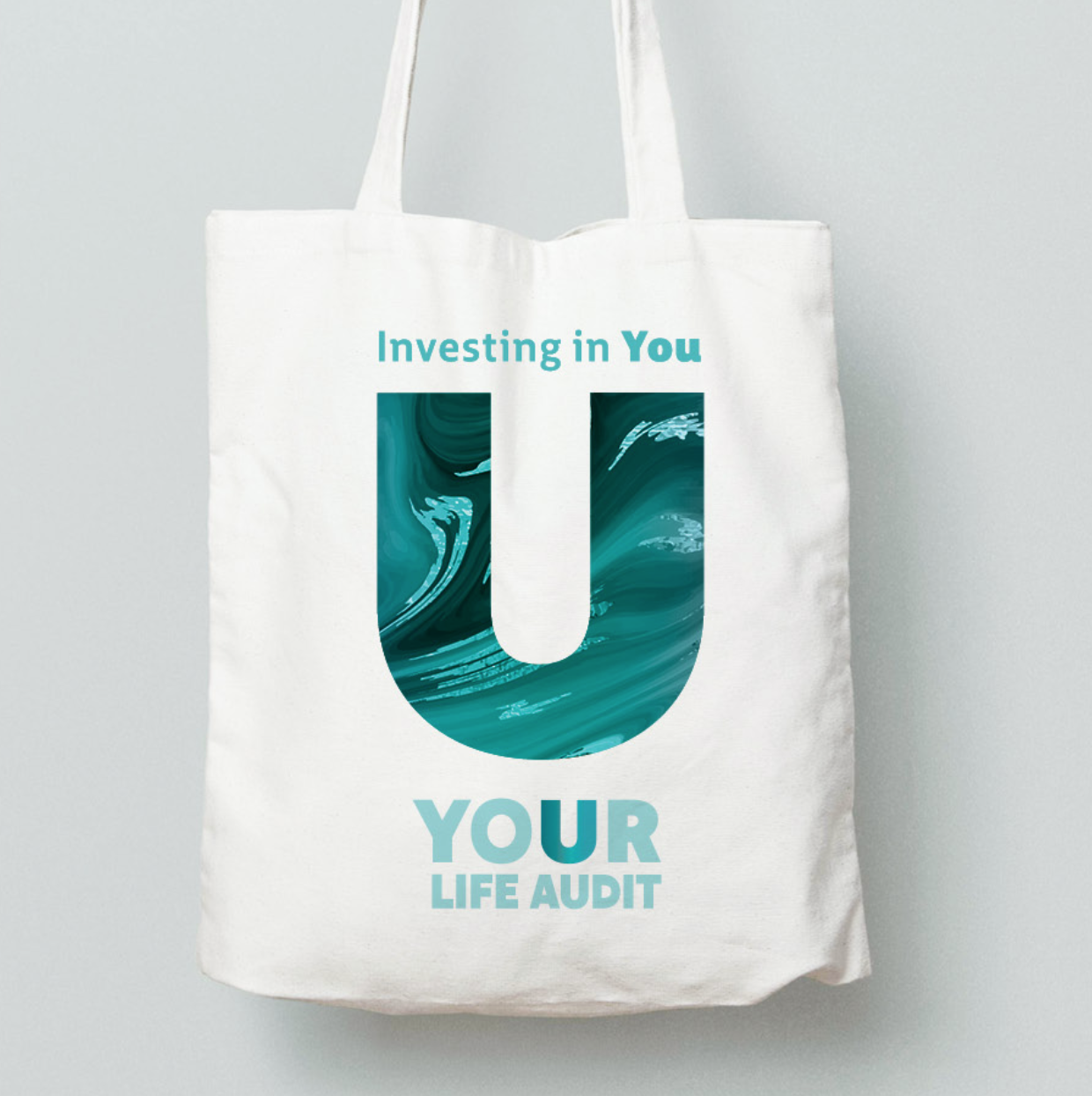
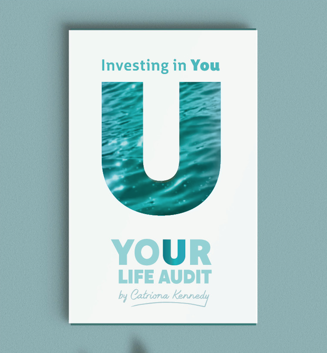

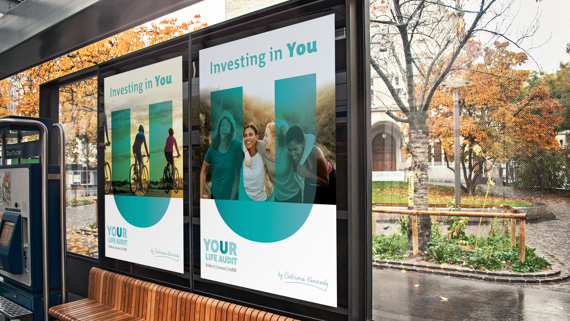
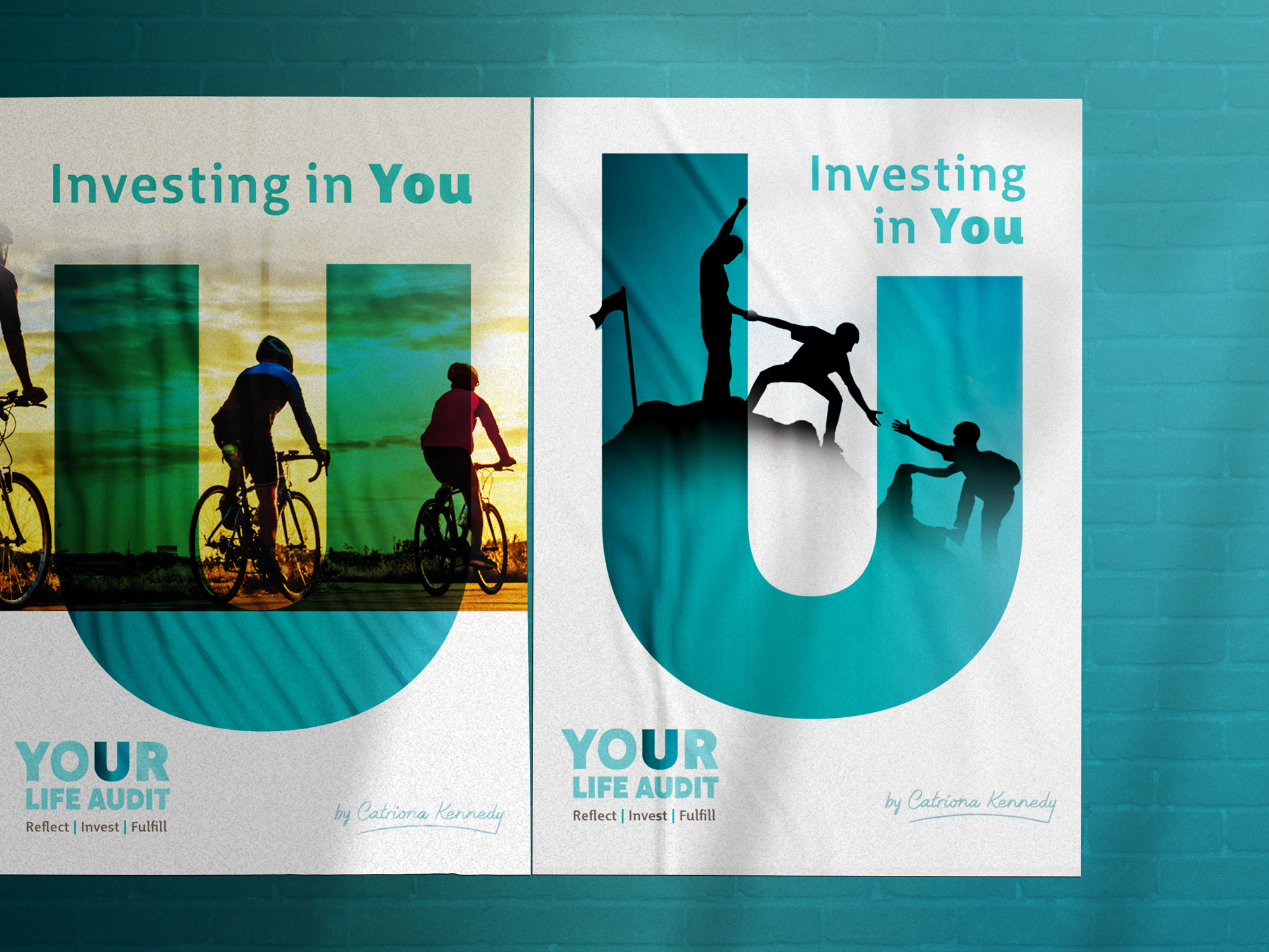
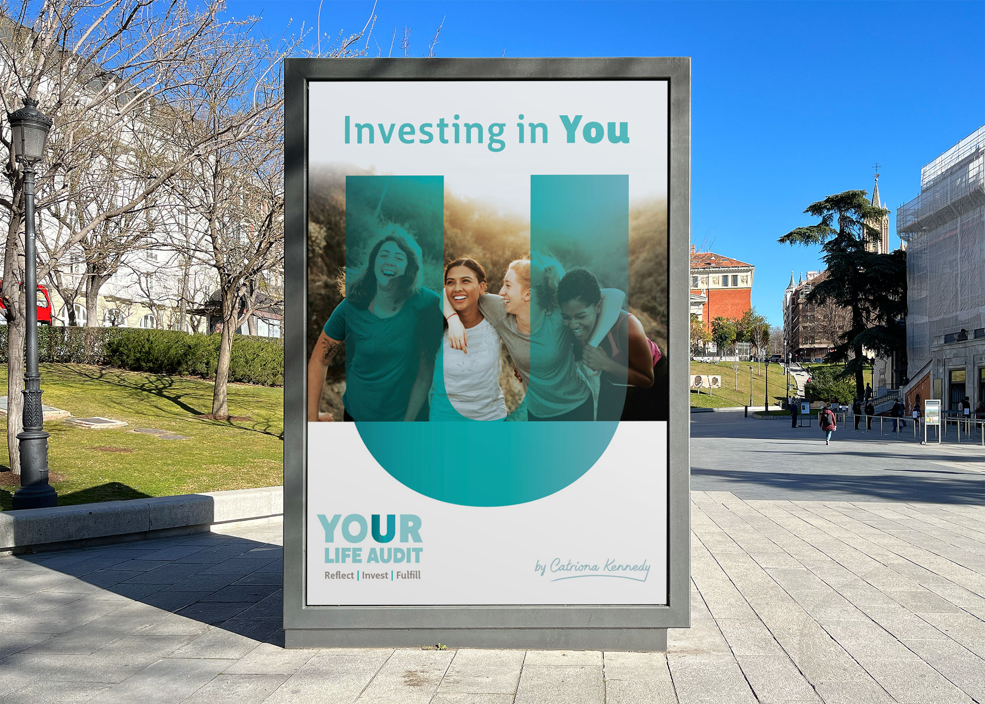
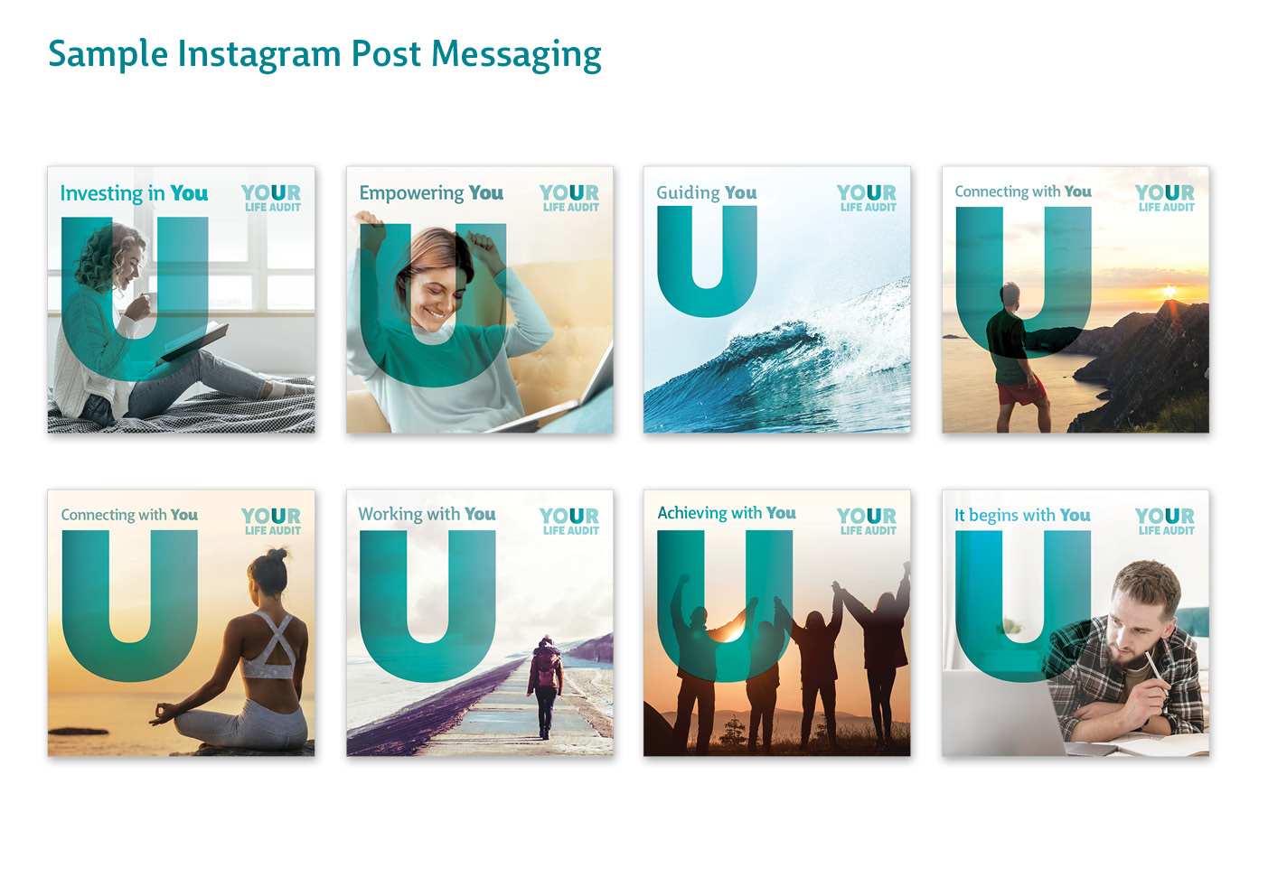
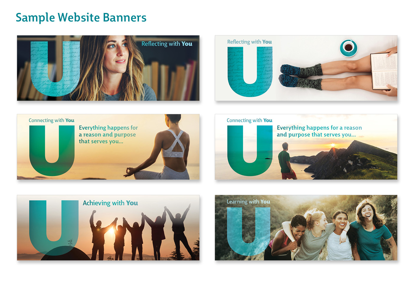
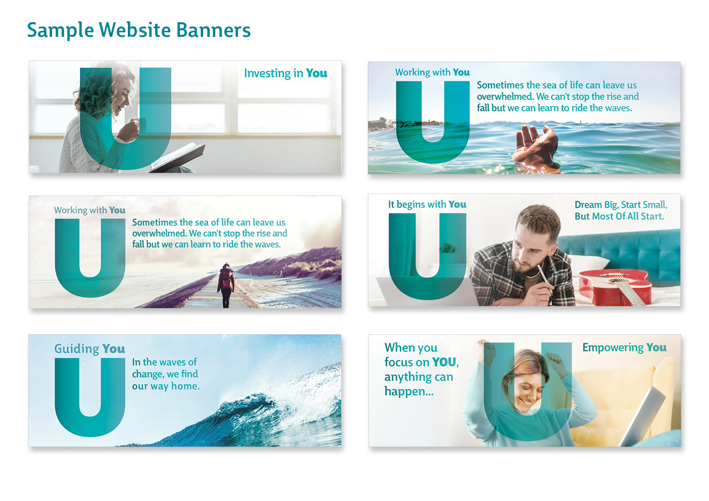

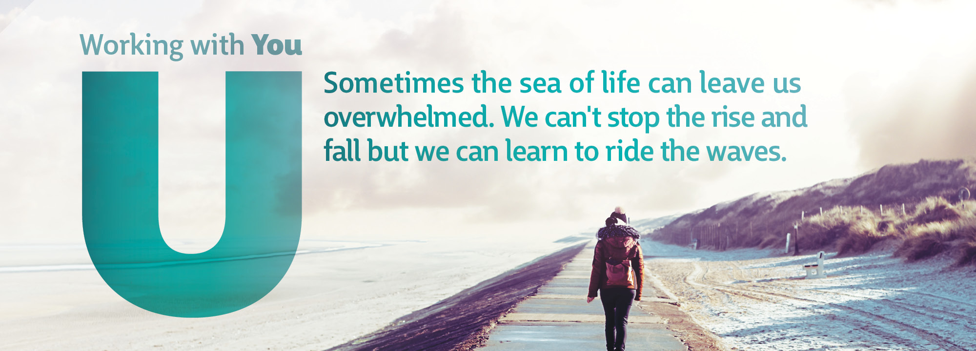
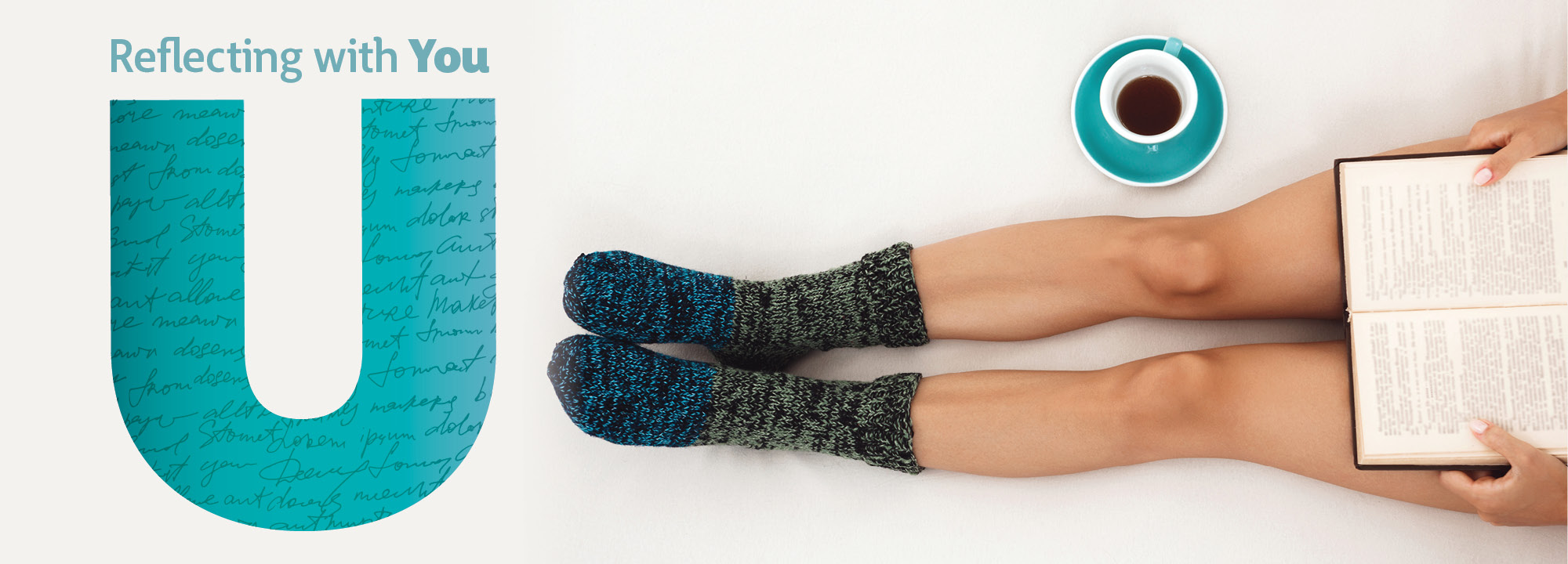
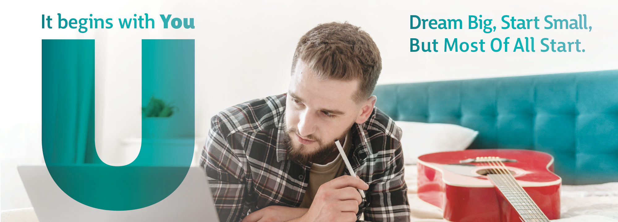
The logo draws focus towards the letter ‘U’ in the word ‘YOU’ to highlight how using these services is an investment on you – a transformative journey where you will be the number one focus in developing your inner voice, to determine which direction you would like to move forward with.
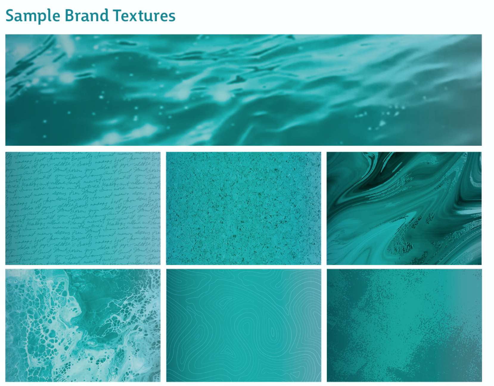
Different patterns are used inside the ‘U’ shape for brand rollout, such as the seascape texture and similar photographs which resonate with the brand. In the brand messaging, the strap-line ‘Investing in You’ is alternated with similar messaging to suit each particular photograph, such as ‘Guiding U / Supporting U / Connecting with U’.
This branding is very fluid and flexible / interactive – with the ‘U’ being used in many ways with imagery for the brand rollout in the marketing collateral. The ‘U’ is playful and fun, with different textures within it. It is full of life and enthusiasm, similar to Catriona and her coaching work.
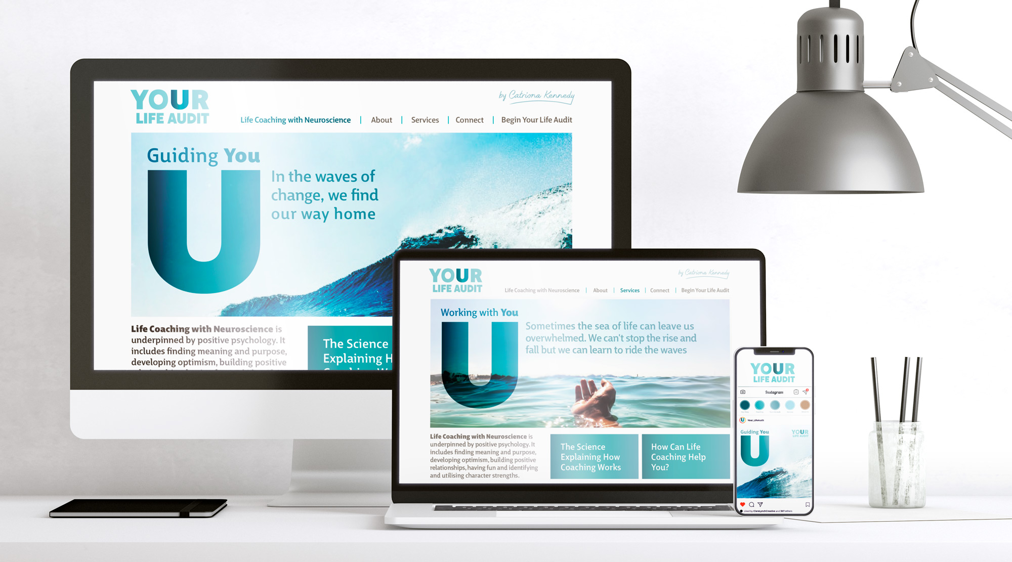
There was a large range of collateral included in this brand, including:
-
Variations of the logo to include with and without the strapline, Catriona’s signature, and alternative versions with texture placed within the ‘U’
-
Instagram tile graphics
-
Instagram social templates which are backgrounds for the placing text over
-
Instagram posts with marketing messaging
-
Website banners and layout design
-
Gathering and supplying a brand image bank
-
Brand Guidelines
-
Logo Favicon
I loved working on this brand, as I strongly believe in the message and ethos that Your Life Audit advocates. Change, although uncomfortable, can bring about very positive growth in a person. Focusing on putting time into yourself in terms of understanding your needs and wants, taking time for what fulfils you, enriching your life by doing things that you love and listening to your inner voice can lead to the best you. This creates a better and happier person for life in general, and then you can in turn be a better person for those around you. When you focus on you first, you are then able to give more to the world. Your Life Audit helps to empowers you to become your best self and feel positively inspired about your life and purpose.


By highlighting the ‘U’ in the brand name ‘Your Life Audit’, it emphasises a key aspect that they would like to get across to their clients, that –
“Once you focus on YOU, anything can happen”
Catriona Kennedy, Your Life Audit Coaching
Find out more on their website:
Or on their social media pages:
https://www.instagram.com/your_lifeaudit/
https://www.facebook.com/YourLifeAudit/
For this branding project, I worked with Laura MacSweeny at Laura MacSweeny Brand & Marketing. This was a new working style approach than the usual format, as Laura had already defined the brief clearly in terms of tone of voice and brand messaging that she had planned for the brand. It was a lovely way to work as Laura was very easy to work with and she felt I understood her brief and aims for the brand easily and that I answered the brief effectively.
Usually, I would deal directly with the client and help them to tease out their aims and vision for the brand to understand how to creatively deliver what the brand identity need. On this occasion, Laura had already established the brief really well from working with Catriona, which made it easy for me to understand what direction to go when creating the brand and how to deliver a really strong brand that met the client’s needs.
I would highly recommend working with a brand/marketing consultant like Laura as an in-between service to bridge the brand together, between client – designer – website programmer – photographer and many other parts. As on this project, for example, Laura also liaised with the website programmer in implementing the design to follow the style that we had designed for it, and the photographer to create some beautiful and sophisticated lifestyle photographs of Catriona, along with a few quirky ones to add a little fun to the brand.
If you are interested in working with Laura, her details are:
Call: +353 83 198 9626
Web: www.LauraMacSweeny.com
See Laura’s kind words about working with Clare Lynch Creative in the Testimonials section.


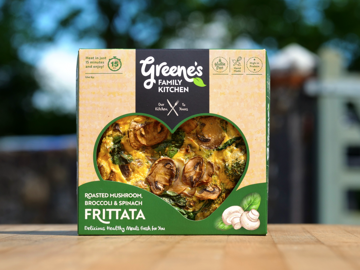
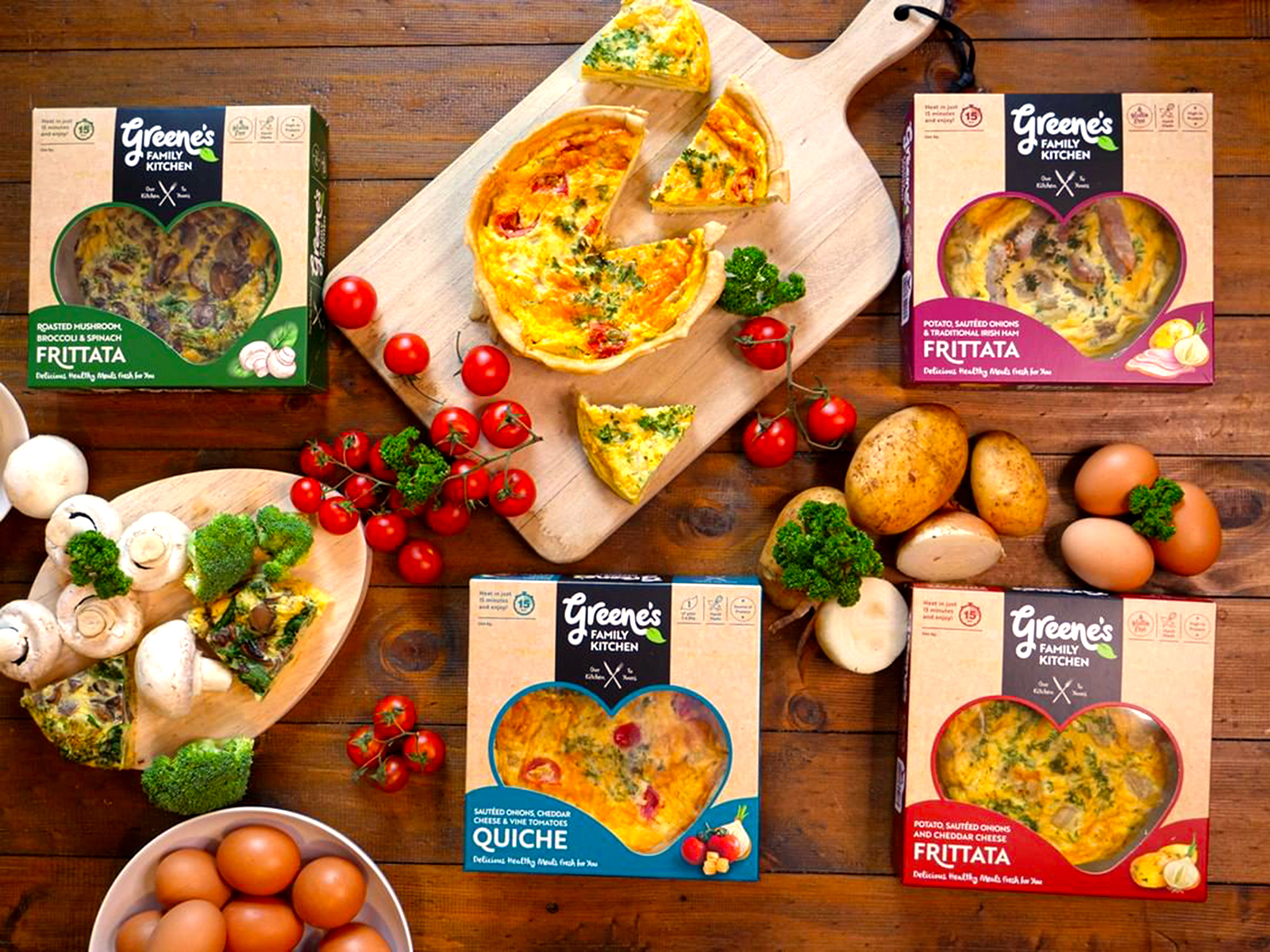
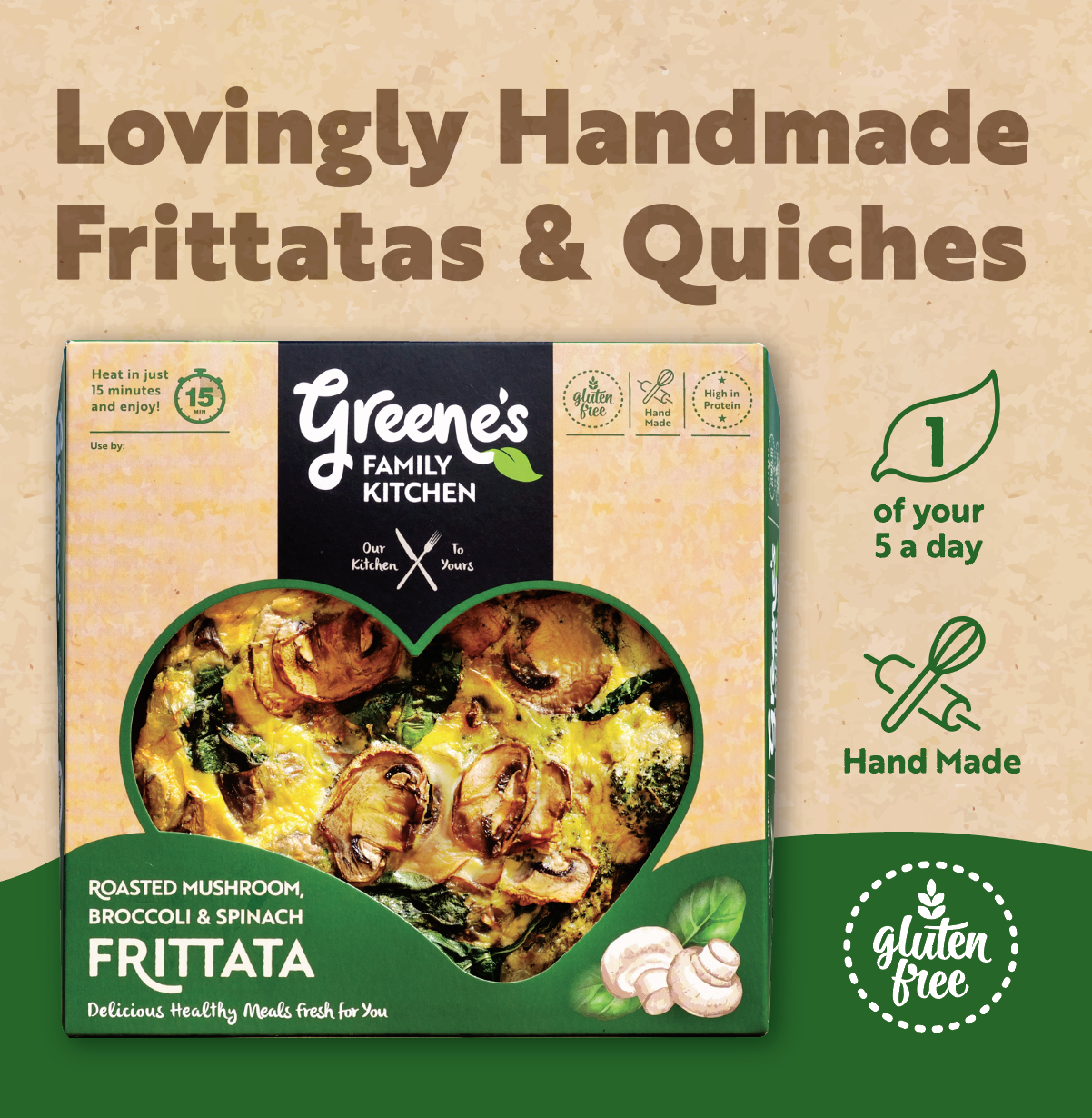
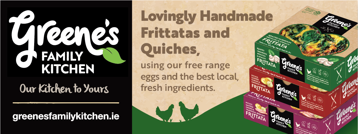
Greene’s Family Kitchen Brand Packaging
Greene’s Family Kitchen Brand Packaging Design

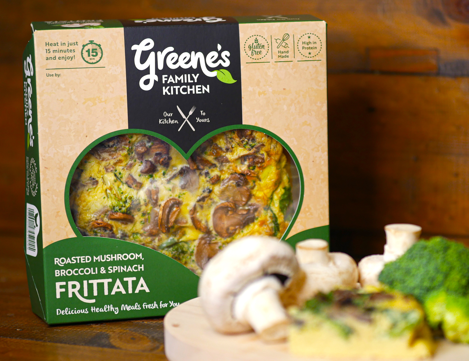
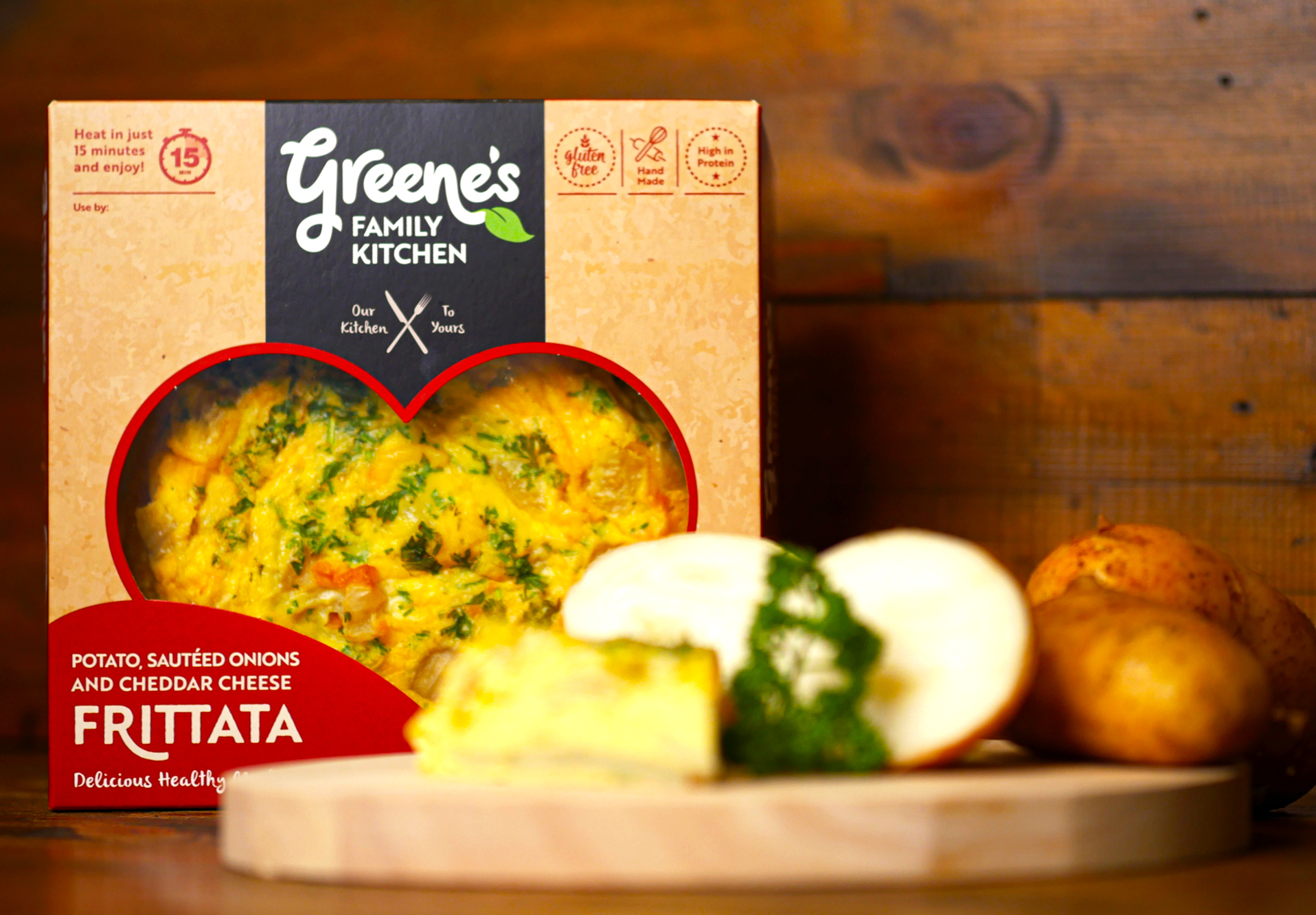
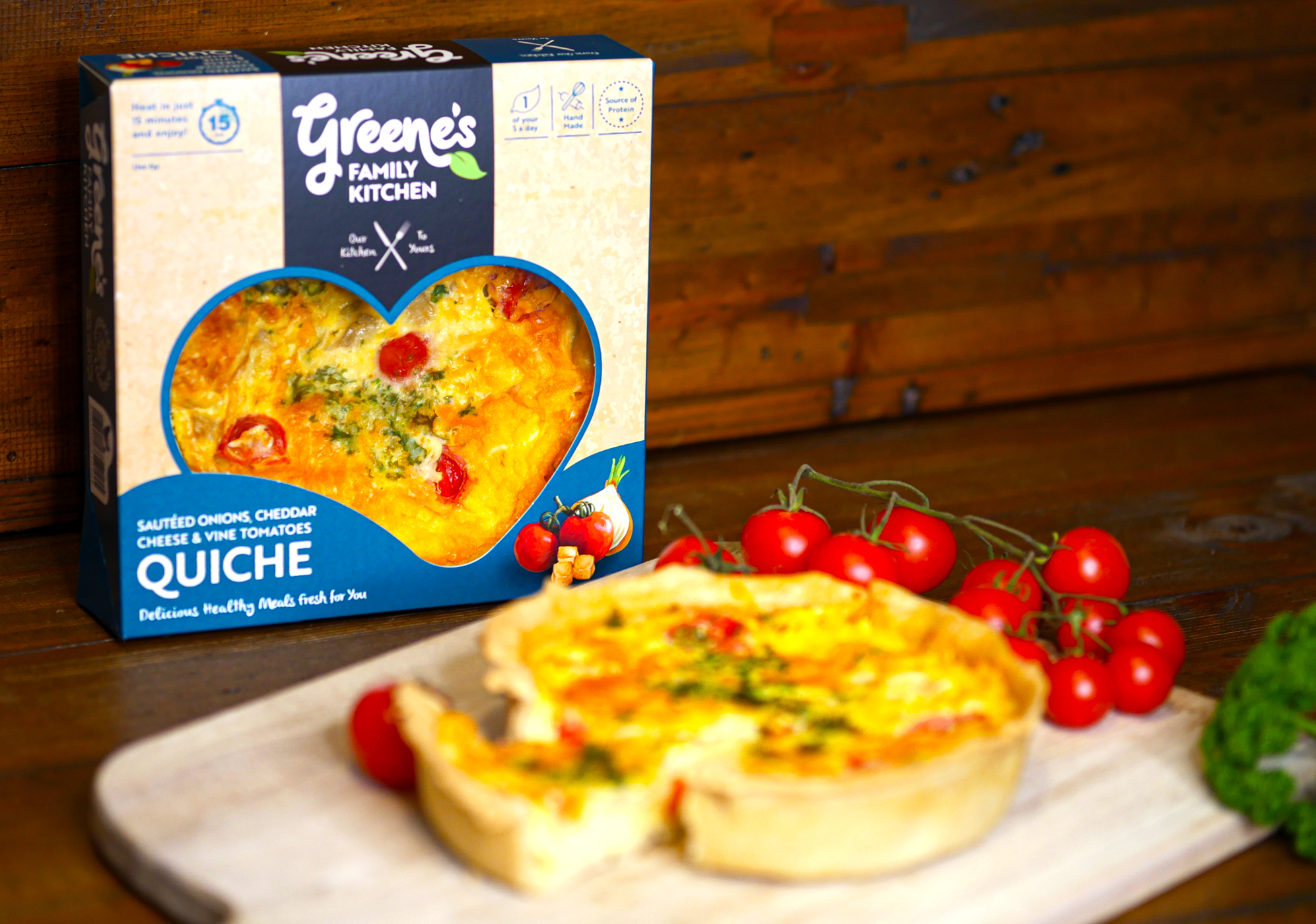
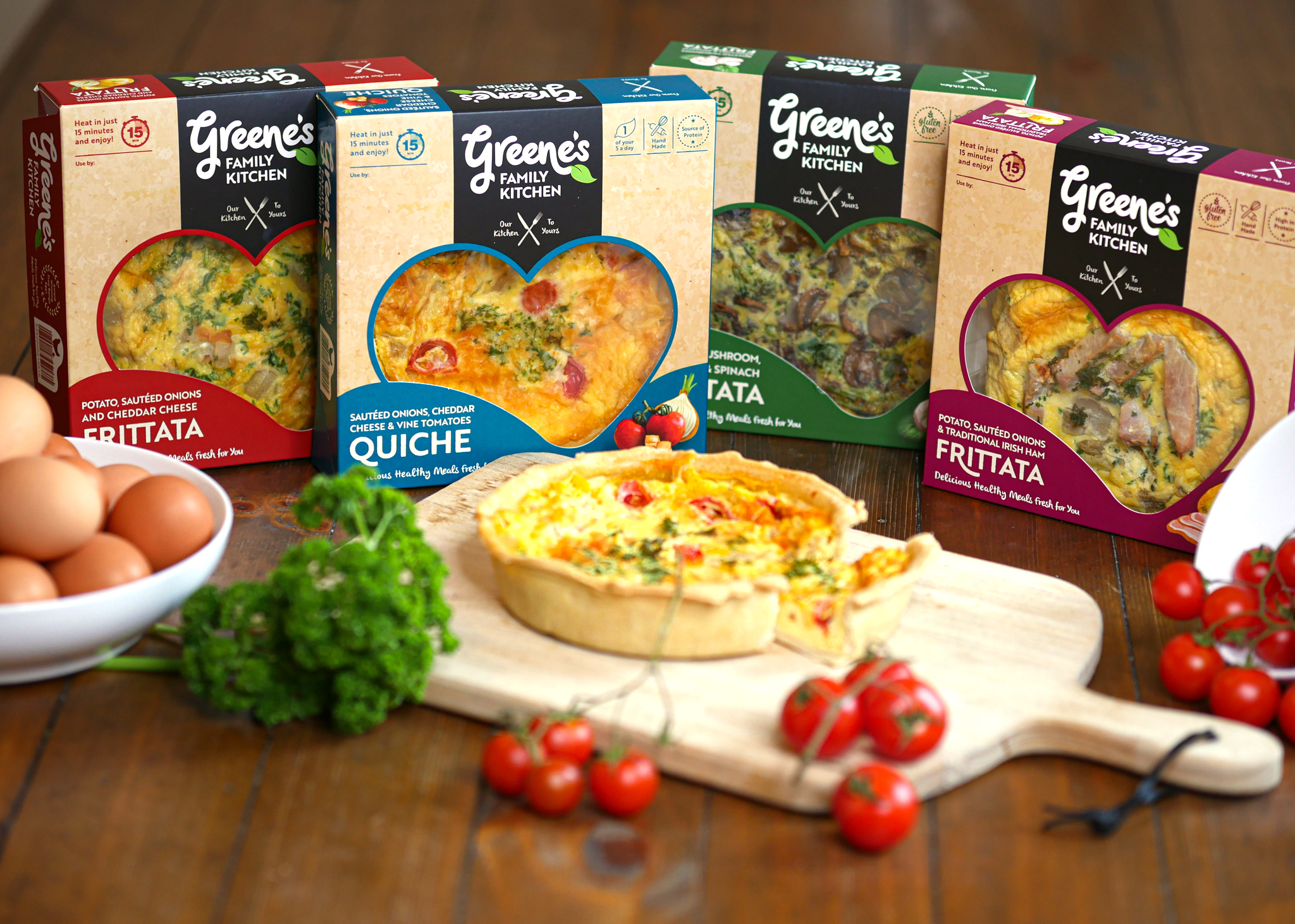
Greene’s Family Kitchen hand-create flavour-packed products with natural, authentic and honest origins. They use their own award-winning free-range eggs, produced on their family farm in Westmeath, and source other authentic, local ingredients for their recipes.
Greene’s handcraft all their food to ensure outstanding quality and taste before it reaches your table from their farm. These tasty and convenient meals are High in Protein and ready in just 15 minutes. They are passionate about offering consumers excellent quality products, using traditional methods and without the use of artificial additives or preservatives.
![]()
The Greene’s Family Kitchen logo is created using playful hand-written typography to emphasise how the food is made by hand. The letters link into each-other and overlap, to represent how the ingredients are sourced from local producers to come together to create each meal. There are two leaves incorporated with the type, to further emphasise the fresh and natural aspect of the products. The strapline ‘Our Kitchen to Yours’ clearly communicates the homemade and wholesome aspect of the meal quality. The logo brand-mark feels like a family – different sizes and shapes/characters, full of life and movement, non-uniform, bustling about together, but still with their own unique shapes and expressions.
![]()
For the packaging design, the kraft cardboard background communicates the naturalness of the products. The hand-drawn style further emphasises the hand-made aspect of Greene’s foods and the authenticity of the product ingredients. The watercolour images of the main ingredients in each frittata are displayed alongside the name, to provide taste cues to the consumer. The packaging communicates that this is a tasty and healthy treat, that can be enjoyed alone as one slice or shared together with friends and family.
There is a cutout heart-shape in the cardboard box/sleeve to display a large amount of the tasty frittatas and quiches within, which is appealing to customers visually on shelf. The kitchen is known as the heart of the home and another common association is the way to one’s heart is through our stomach – so go on, eat your heart out and enjoy Greene’s Family Kitchen meals 🙂
USP (unique selling point) icons are carefully placed within the packaging design. Different colours are used to indicate each flavour.
Where to Purchase:
Call into your local SuperValu stores to try these delicious meals. Greene’s Family Kitchen’s quiches and frittatas are already stocked in 17 SuperValu stores across Dublin, Meath, Westmeath & Kildare.
Dublin:
Fresh, Grand Canal Dock • SuperValu, Mount Merrion • SuperValu, Templeogue
Kildare (SuperValu stores):
Kildare • Sallins
Meath (SuperValu stores):
Enfield • Ratoath • Ashbourne • Navan • Trim • Dunshaughlin • Kells • Oldcastle
Westmeath (SuperValu stores):
Mullingar • Athlone • Monksland • Moate
See more at:
Website: www.greenesfamilykitchen.ie
Instagram: instagram.com/greenesfamilykitchen
Marino Institute of Education Strategic Report
Marino Institute of Education Strategic Report
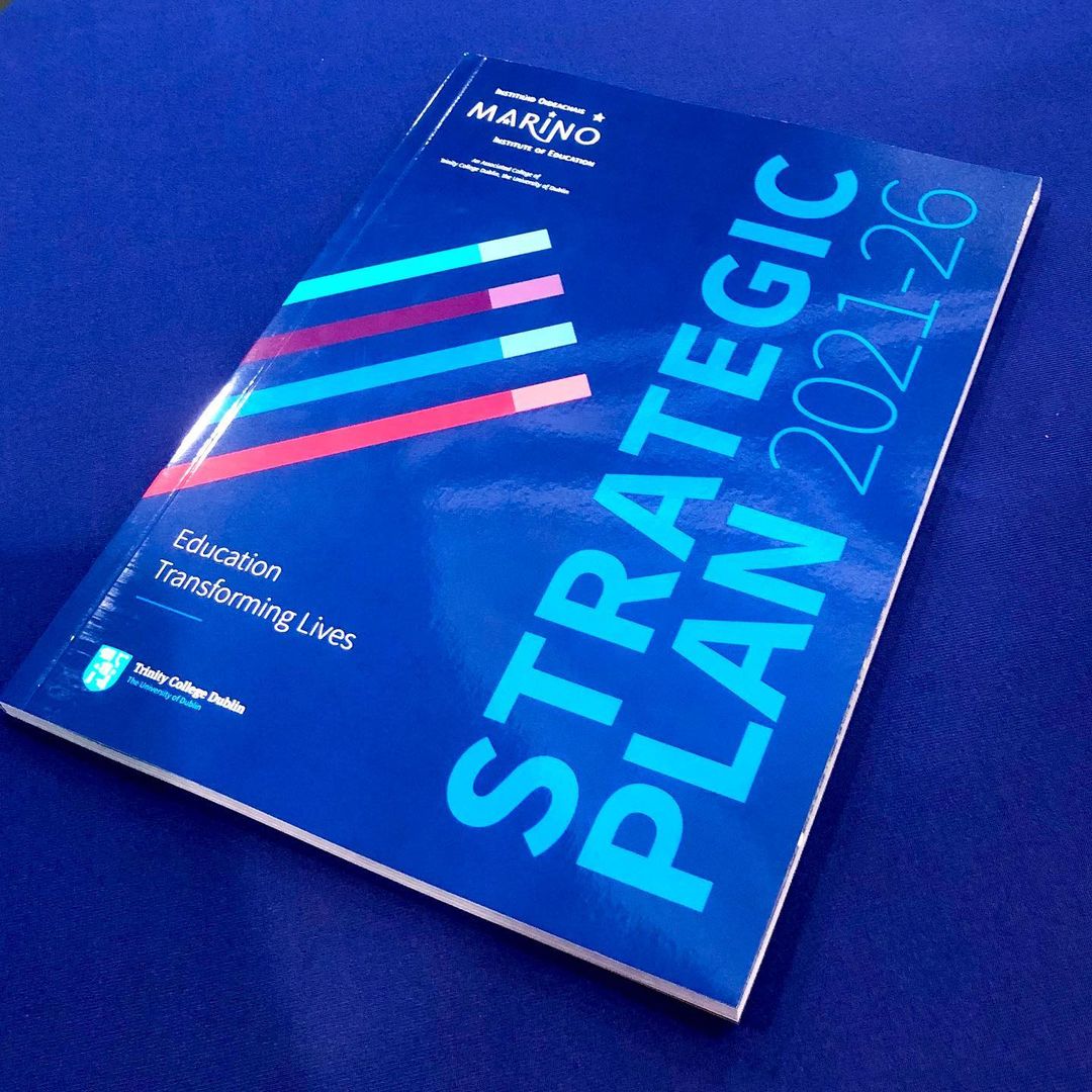
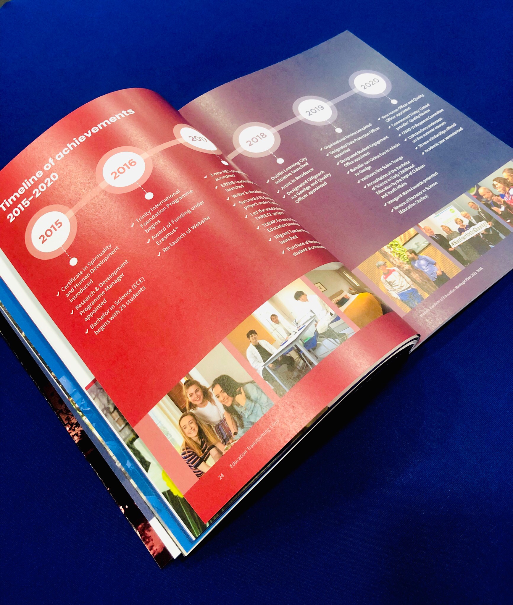
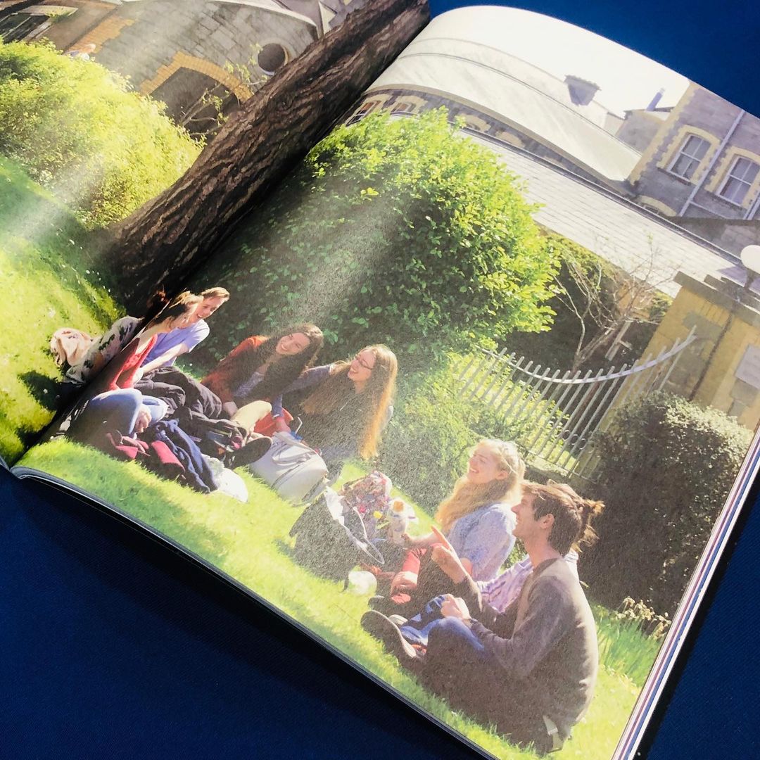
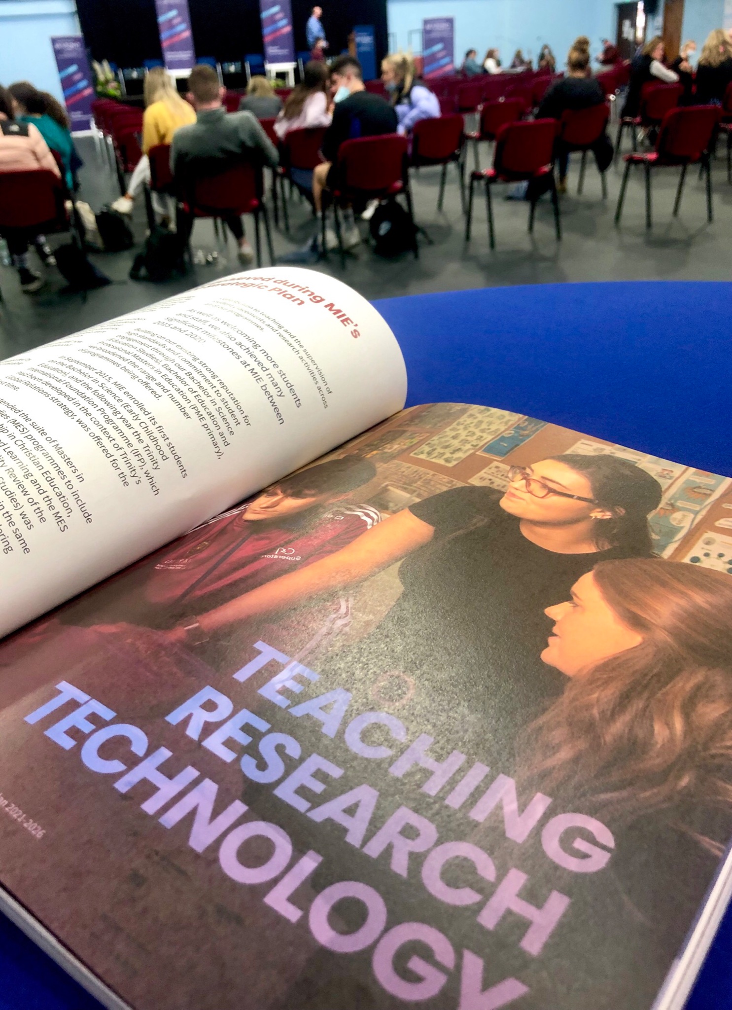
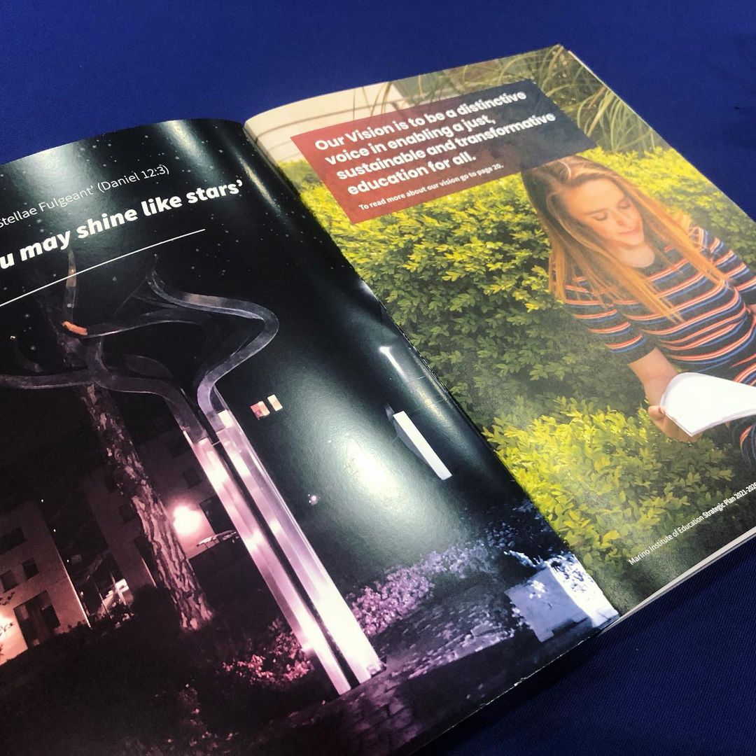
Marino Institute of Education Strategic Report 2021-26.
The report’s focus is on how ‘Education Transforms Lives’, and how enabling people from all backgrounds of life (for example, from disabilities to financial hardship) to further education, will empower them and give them greater opportunities in life.
We co-created the report in collaboration with Laura Macaulay at NavigatebyDesign. We used a gradient colour system throughout to indicate the transforming aspect of this report, with bright images of the students, lecturers and the lovely Marino grounds. The report is a complex piece of work, developed with MIE over an extended period of time.
We worked carefully in communicating a large amount of information in an easy-to-read digestible manner, maintaining the professional feel that an education body like Marino Institute would like to convey, in a clean and fresh style. It was also important to maintain the Marino brand colour palette and showcase the college grounds, societies, people and facilities. The report is flipped in half between an English and Irish language version of the report. The printing of this report is FSC Certified, supporting sustainability and the environment by using paper when printing that is FSC approved.
The launch event for this important body of work took place in the Nagle Rice hall on the beautiful grounds of Marino in North Dublin, hosted by TD and Minister for Further and Higher Education, Simon Harris. Everyone was very happy with the design of the finalised printed report and the success of the launch event.

A Good Mood Food Packaging Design
A Good Mood Food Brand Packaging Design
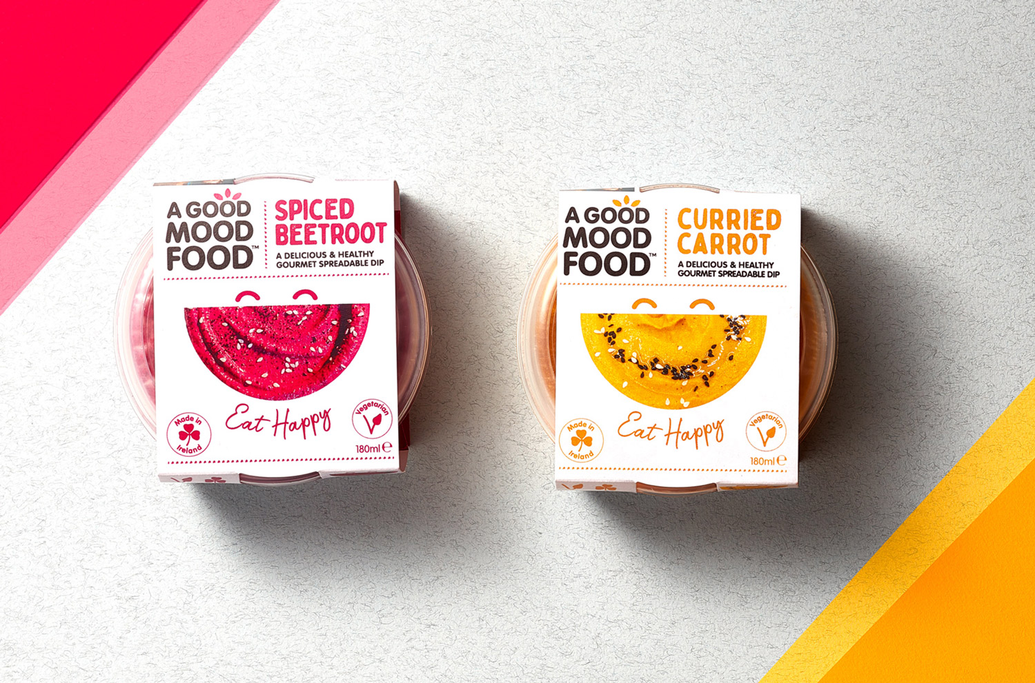
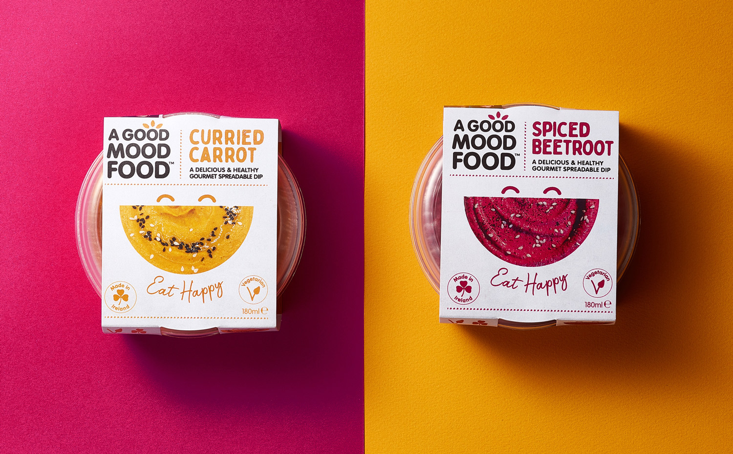
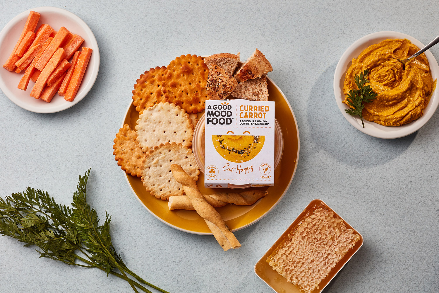
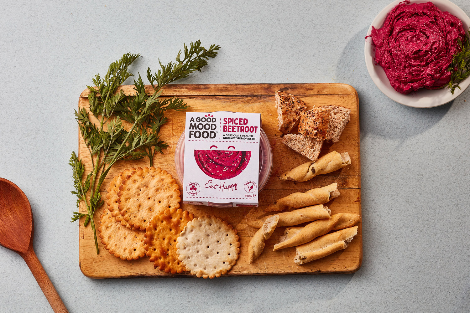
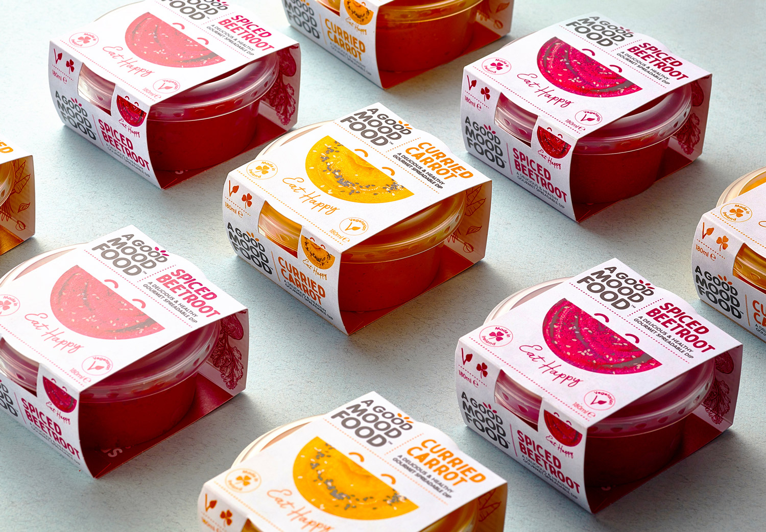
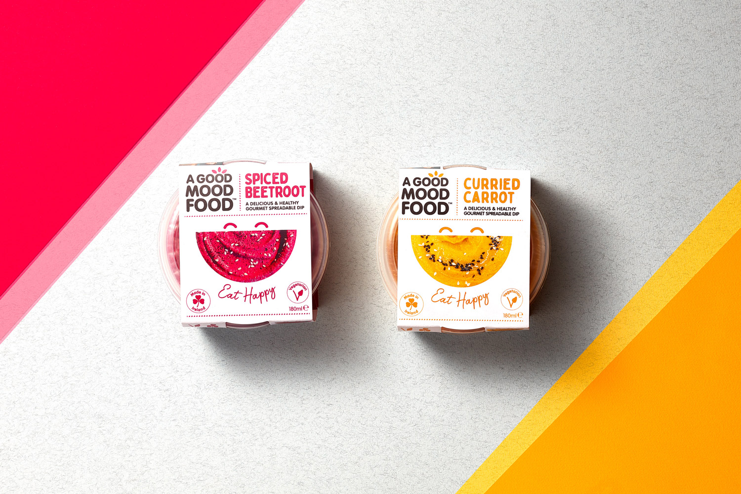
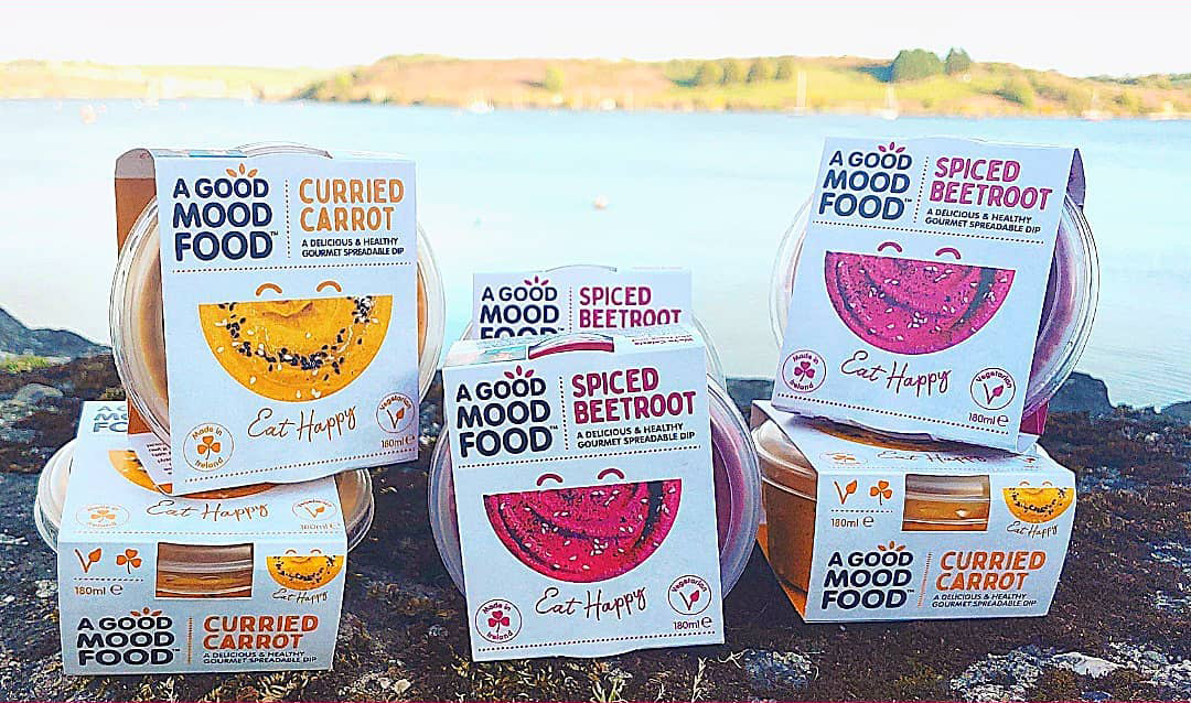
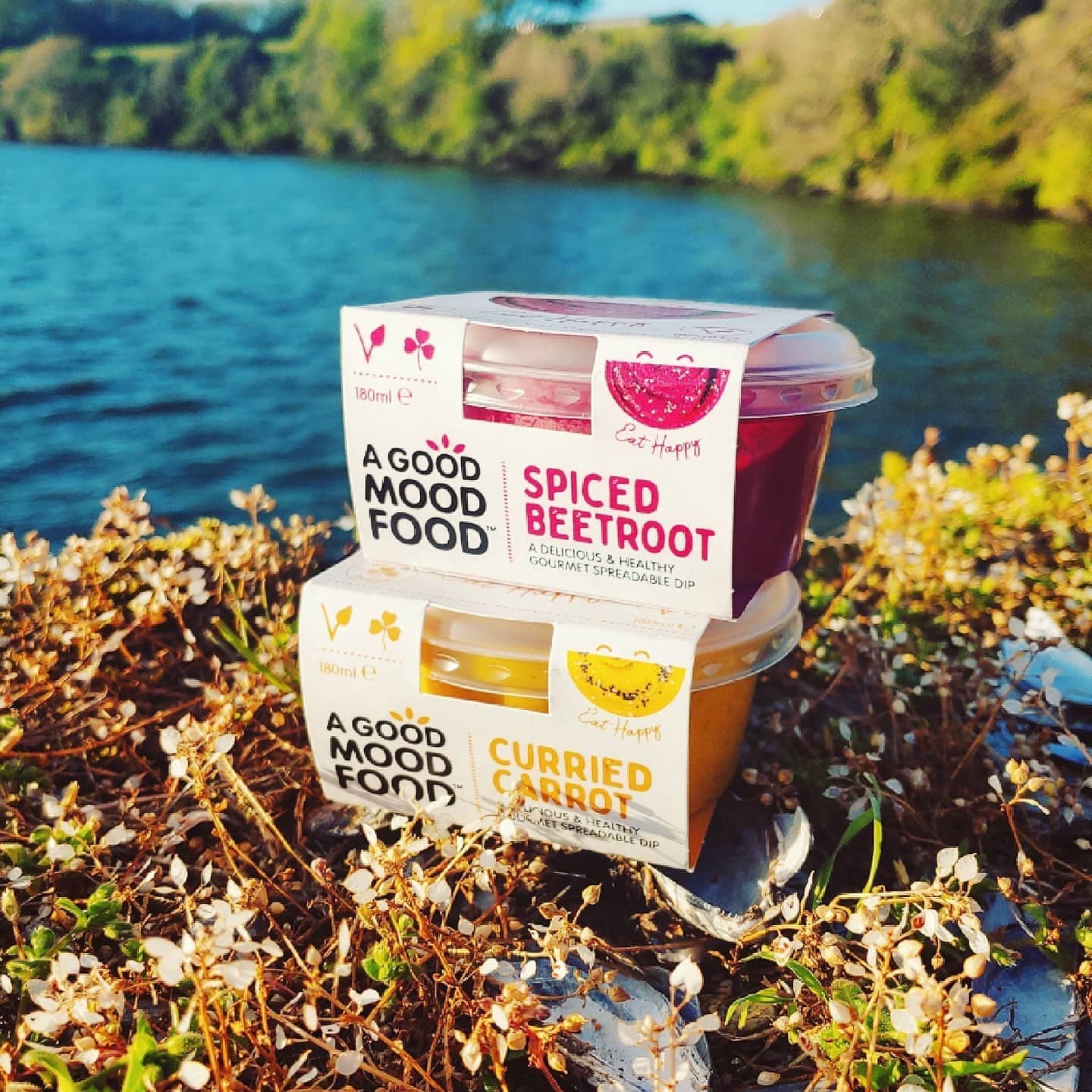
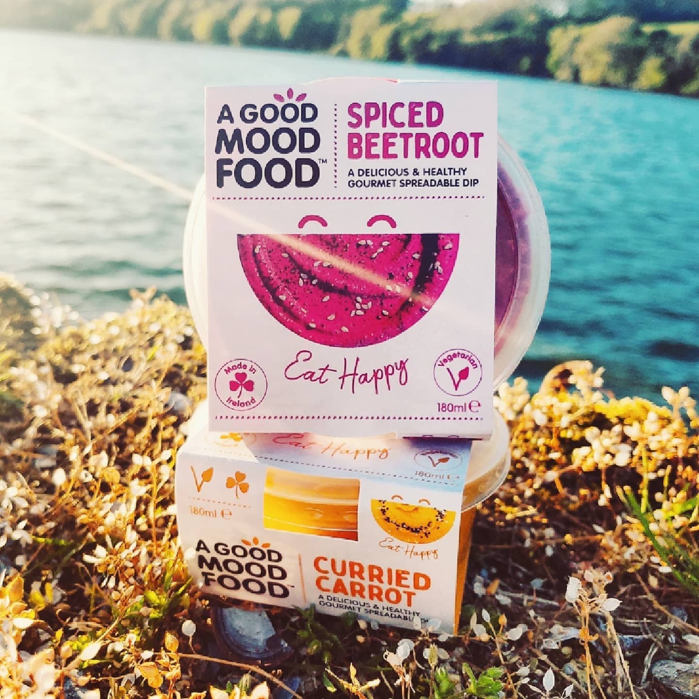
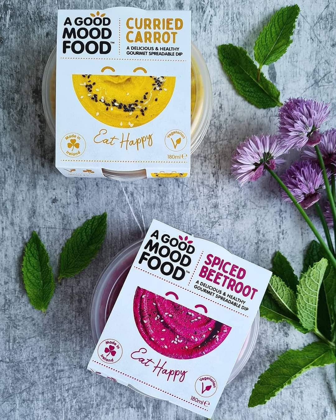
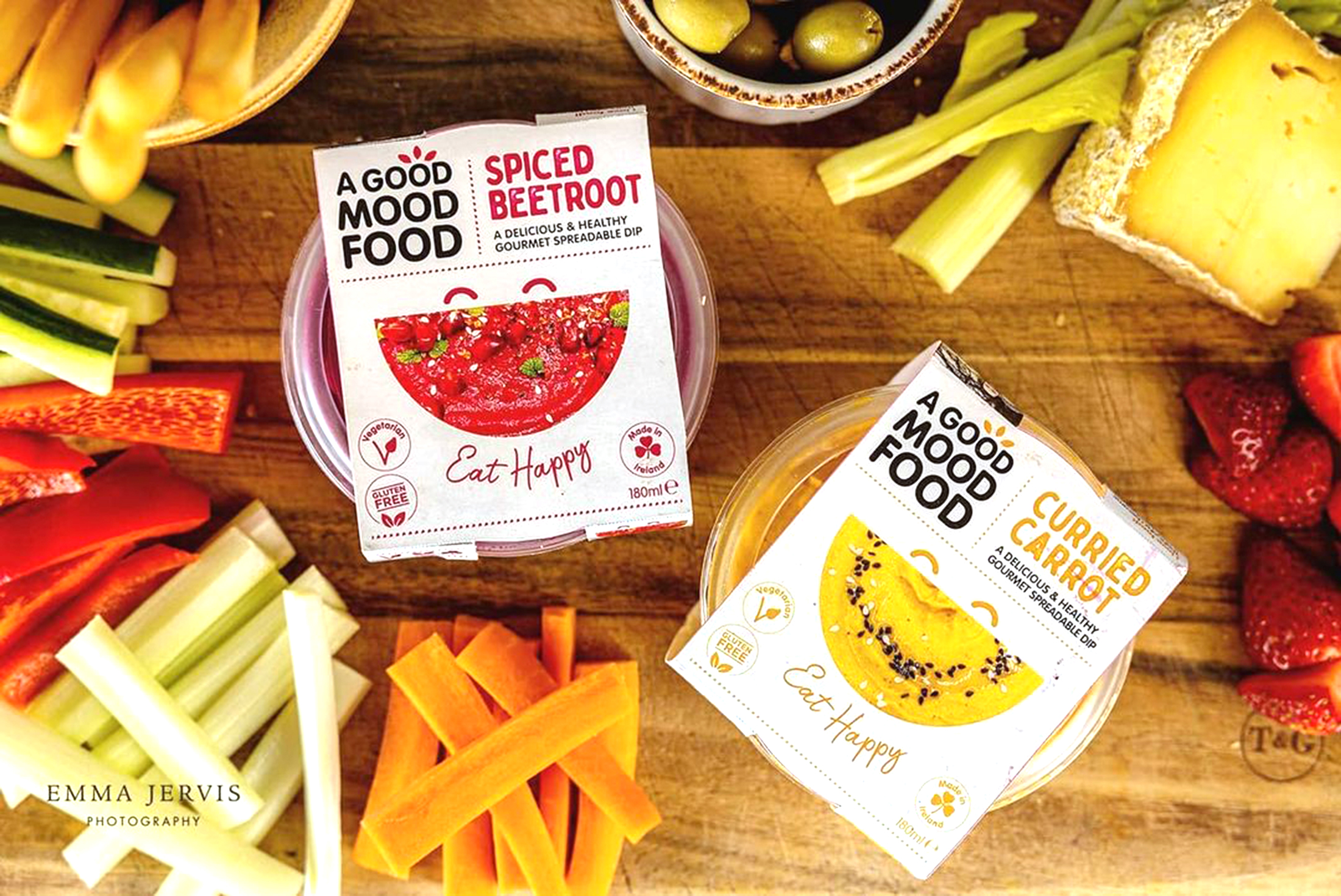
A Good Mood Food creates flavoursome and healthy dips, made with real ingredients, locally sourced. The branding is based around the idea that when you eat healthy, you eat yourself happy, as you are nurturing your mind and body by feeding it with goodness.
The packaging communicates this happy and fun vibrancy that the dips brings to the consumer with the big smile, showcasing the tasty dips within. The strapline ‘Eat Happy’ further emphasises this. Each flavour is easily distinguished by colour – linking with the colour as the main ingredients inside – such as deep pink for the ‘Beetroot’ flavour and warm yellow for the ‘Curried Carrot’ flavour. There is also a new green ‘Garlic’ flavour coming soon.
Each artisan pot is lovingly crafted with ingredients sourced locally. They carefully select the best produce from nearby farms, which is then expertly seasoned and blended with rich local yogurt to create indulgent dips that are made from over 50% vegetables. The leaves placed over the ‘o’ in the typography of the logo, link to how there are healthy, local and natural ingredients used in the dips.
The benefits and unique selling points are clearly highlighted with icons, such as how are the healthy dips are Vegetarian, Gluten-free and Made in Ireland, encouraging consumers to buy local, as a growing trend is how people in Ireland want to support local, Irish businesses and the environment which reduces the carbon footprint by purchasing products made by local businesses who source local ingredients. The cardboard sleeves are recyclable and can also be kept as a keepsake, as the inside of the packs feature tasty recipe suggestions which are handy to stick on the fridge! This further reduces waste as the sleeves can have a longer life.
These tasty dips are made with love in West Cork. They are available in SuperValu stores in Cork, to purchase online at Farmsy and in local Farmer’s Markets such as Rohu’s Country Market in Cork. Find out more on their website.
A Good Mood Food partners with Food Cloud to maintain a Zero Food Waste business, they work with their local branch to help redistribute any extra products among the community. This prevents disposing of any extra waste. Food Cloud help provide over 5 million meals yearly to people in need resulting in 2,450 tonnes of food being redistributed and received by charities across Ireland. This is just one of the ways A Good Mood Food operate to keep their business sustainable and care for the community. It helps to ensure that every time their products are purchased, a local business is being supported.
As a group, the packaging of the tubs together look like a group of smiling, happy characters – full of energy and life. A Good Mood Food create food that feels good. Keep an eye on their Instagram page for tasty recipe suggestions.
*Photography:
Brendan Ryan Photography & Emma Jervis Photography
Photo Styling:
Clare Lynch & Betsy Gach
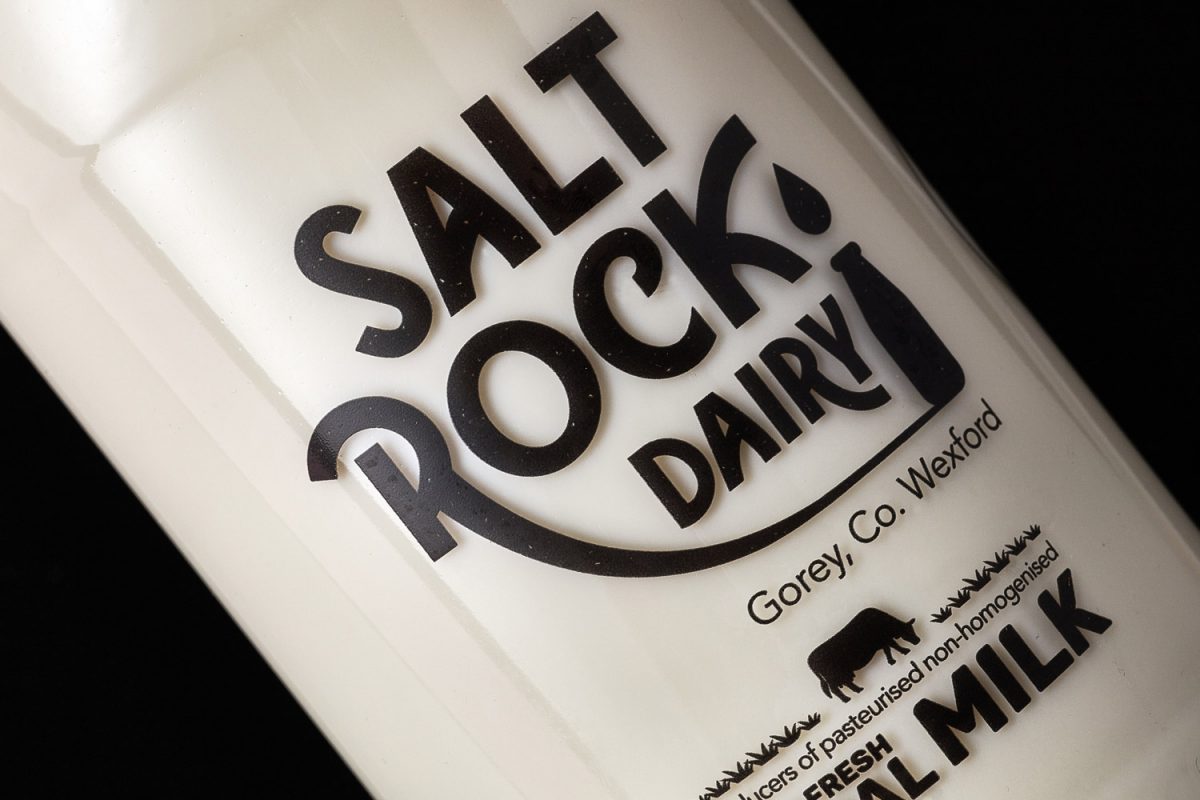
Saltrock Dairy Packaging Design
Saltrock Dairy Brand Packaging Design
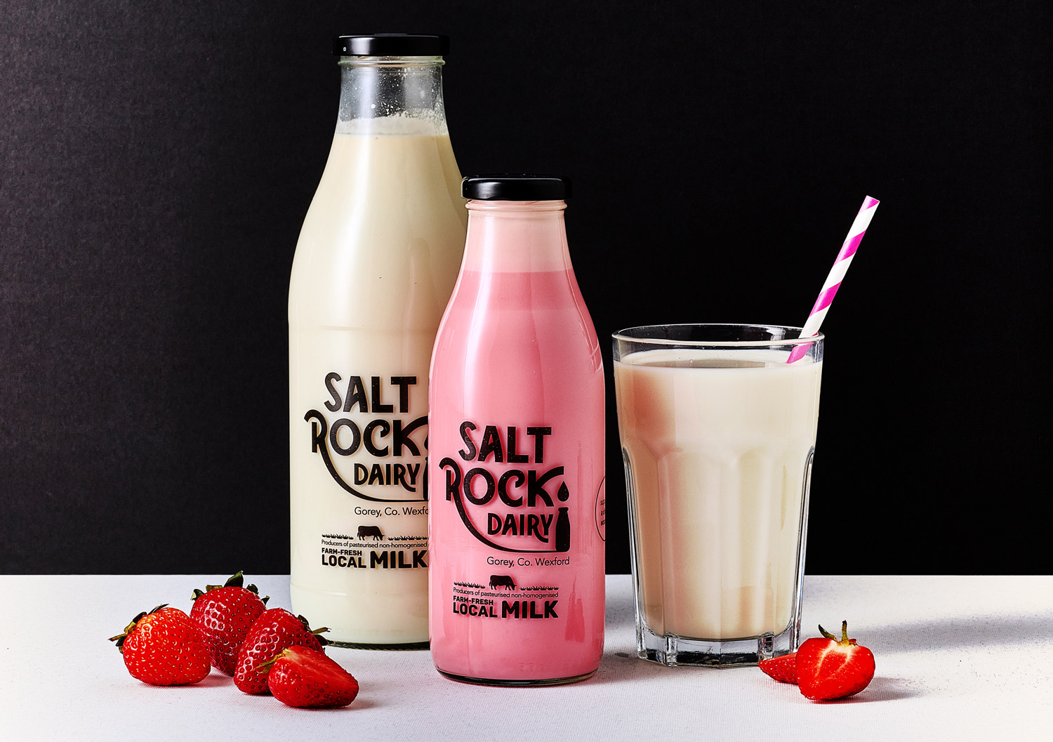
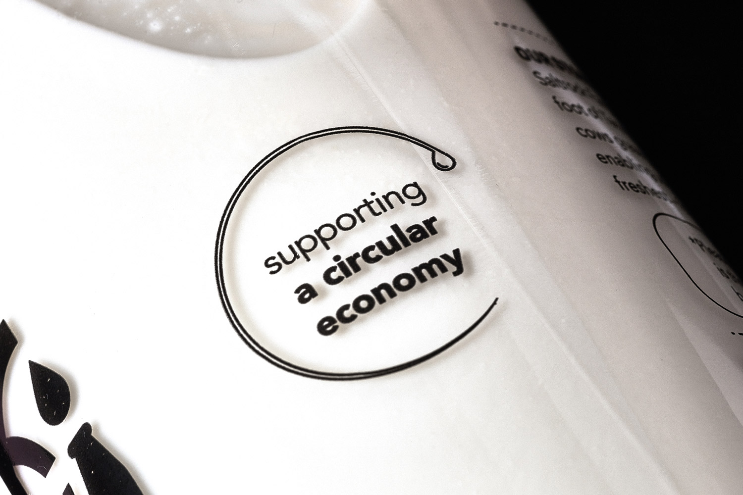
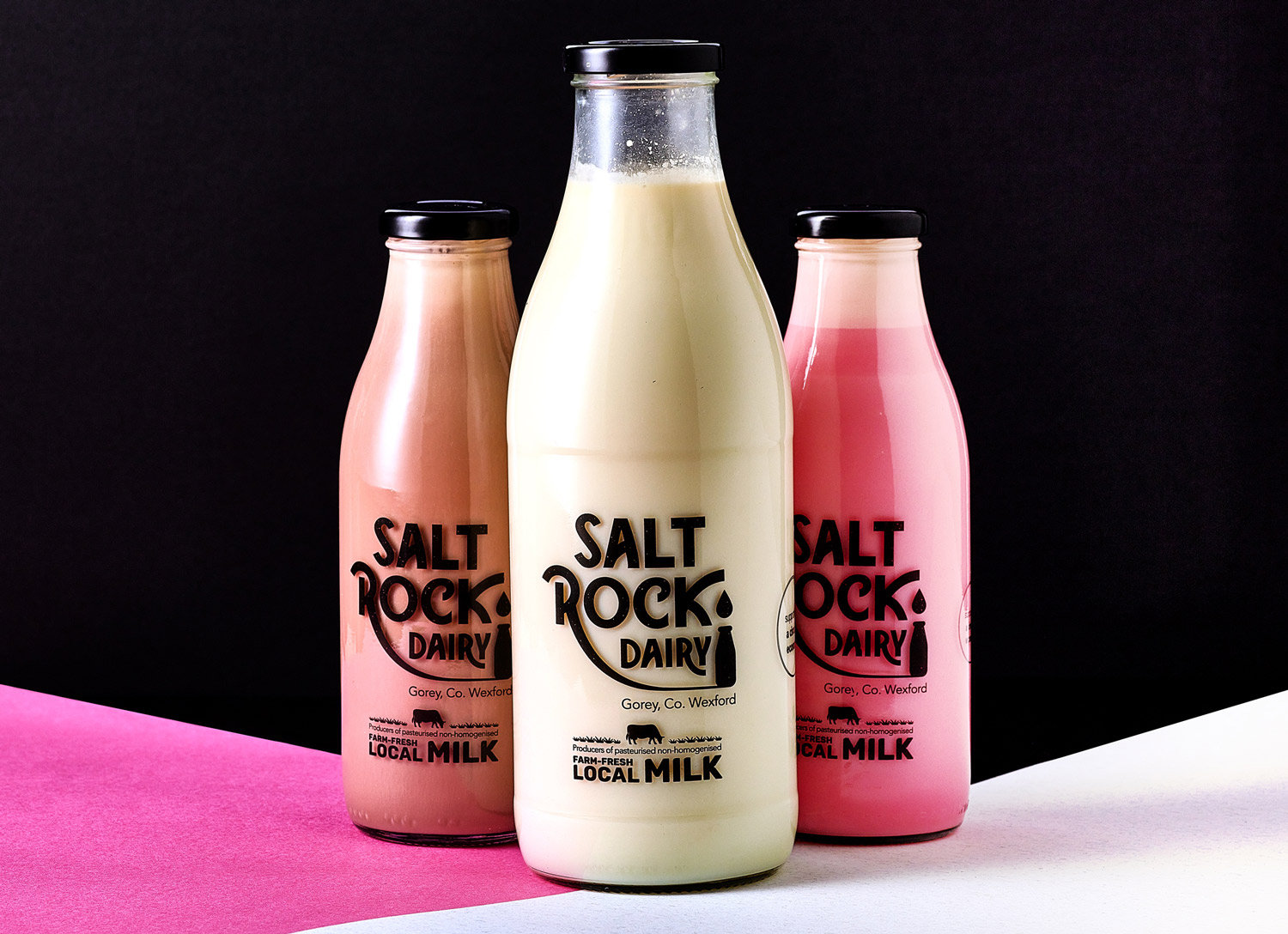
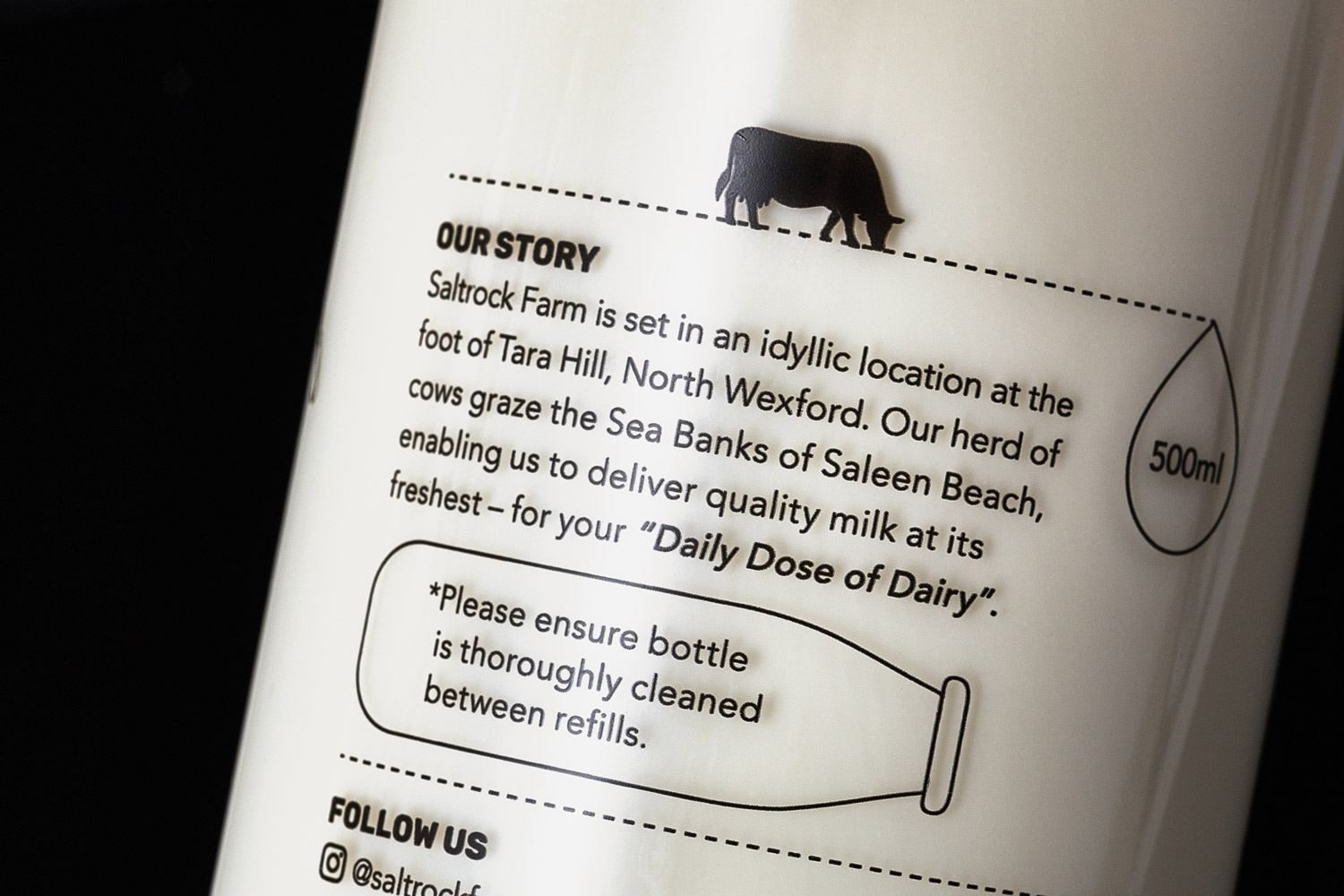
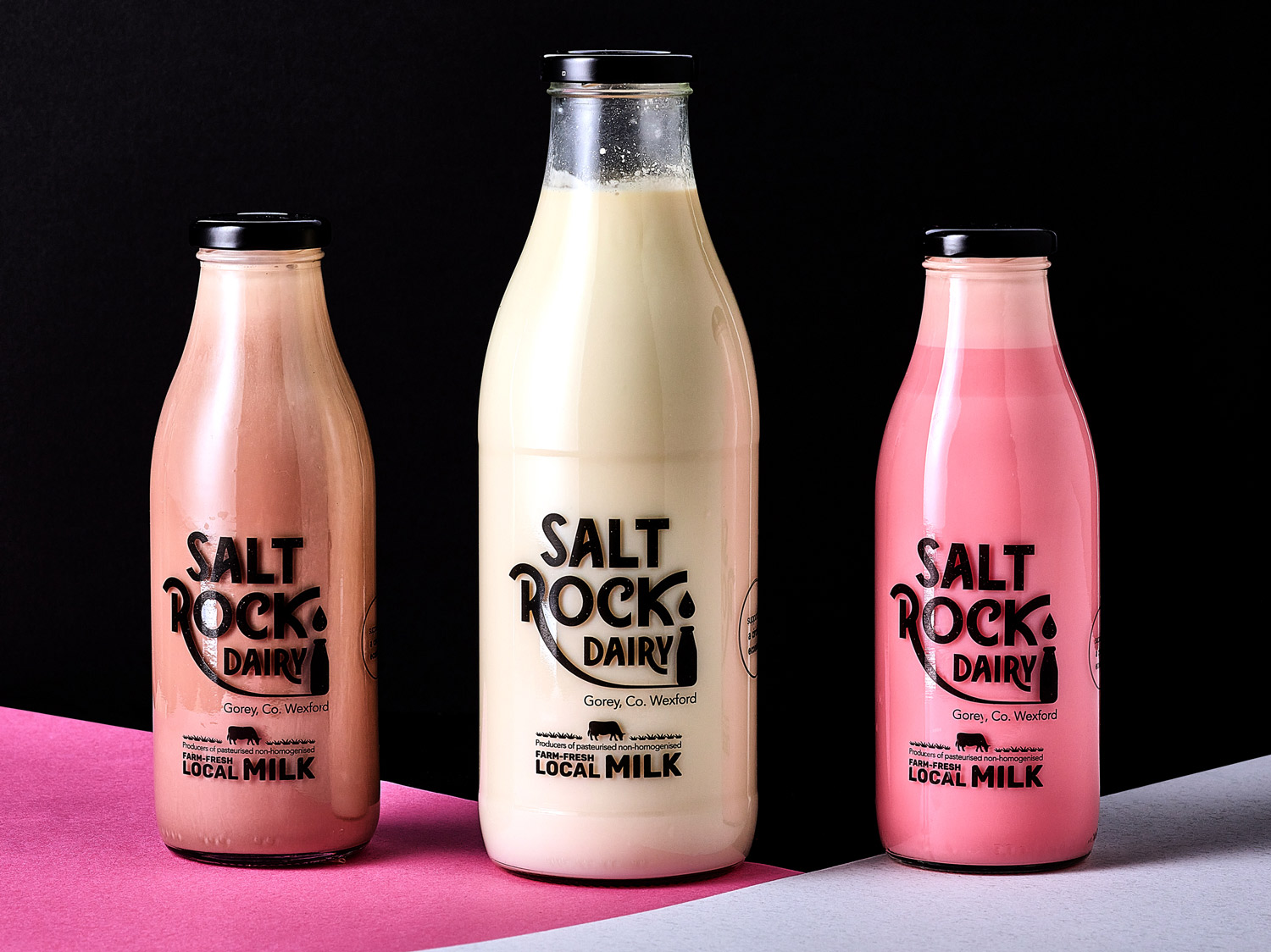
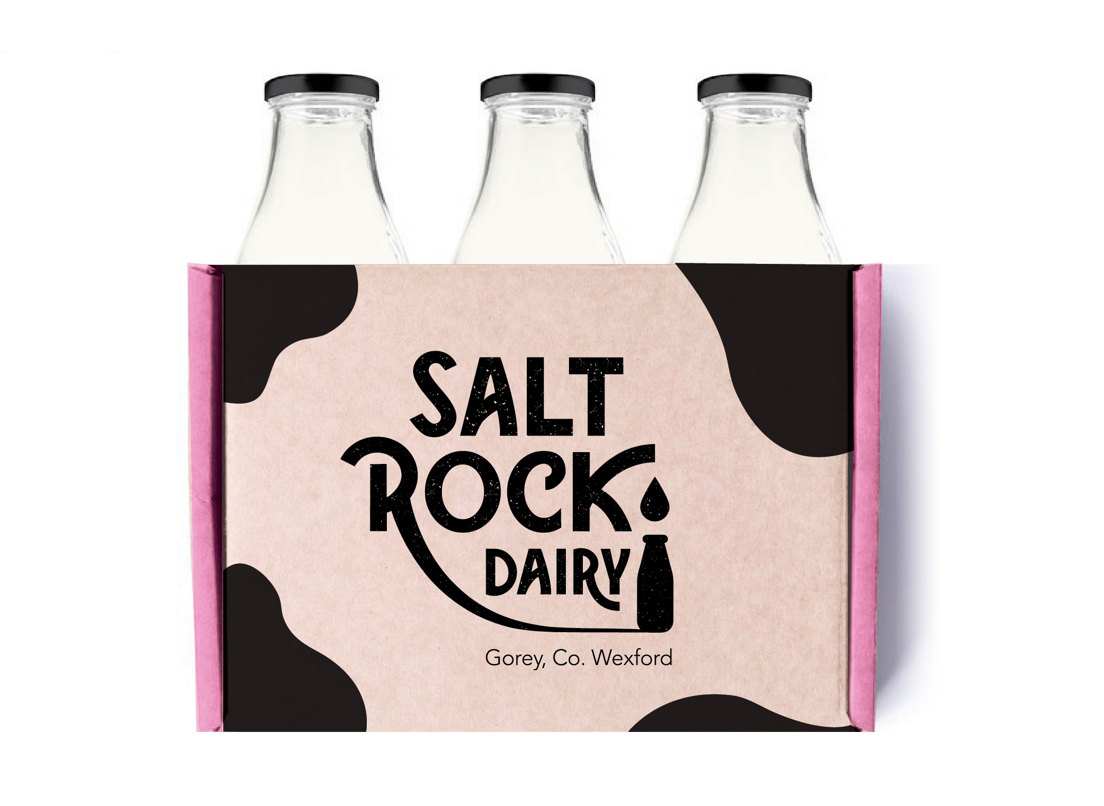
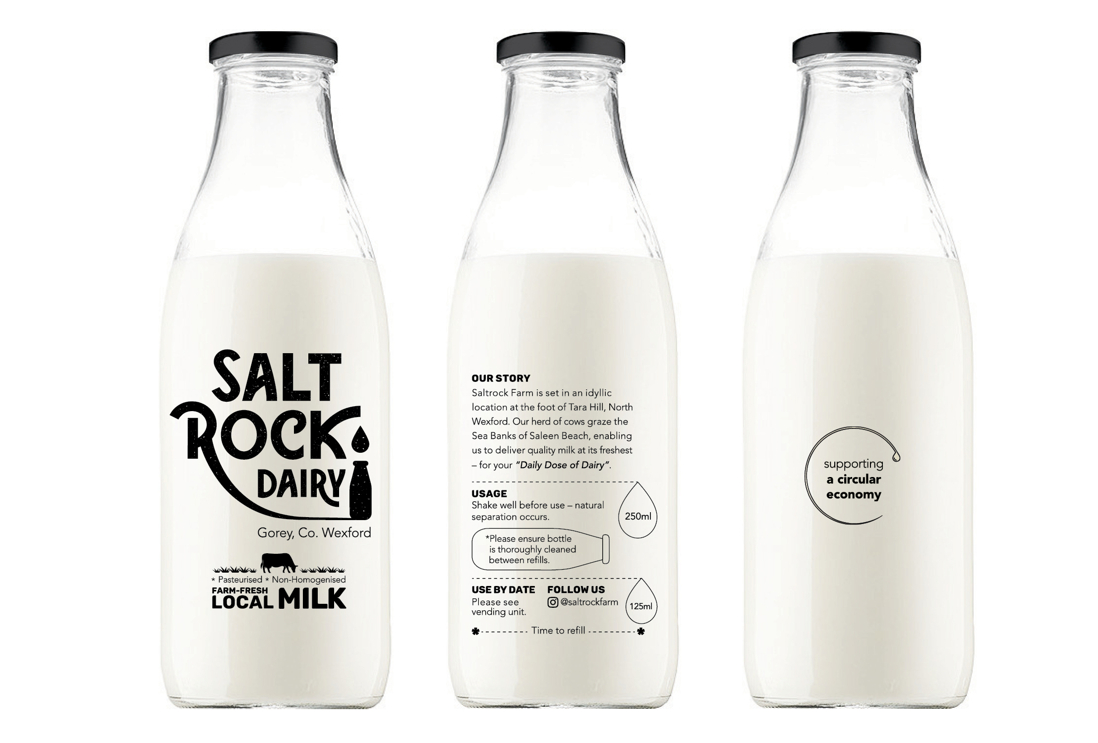
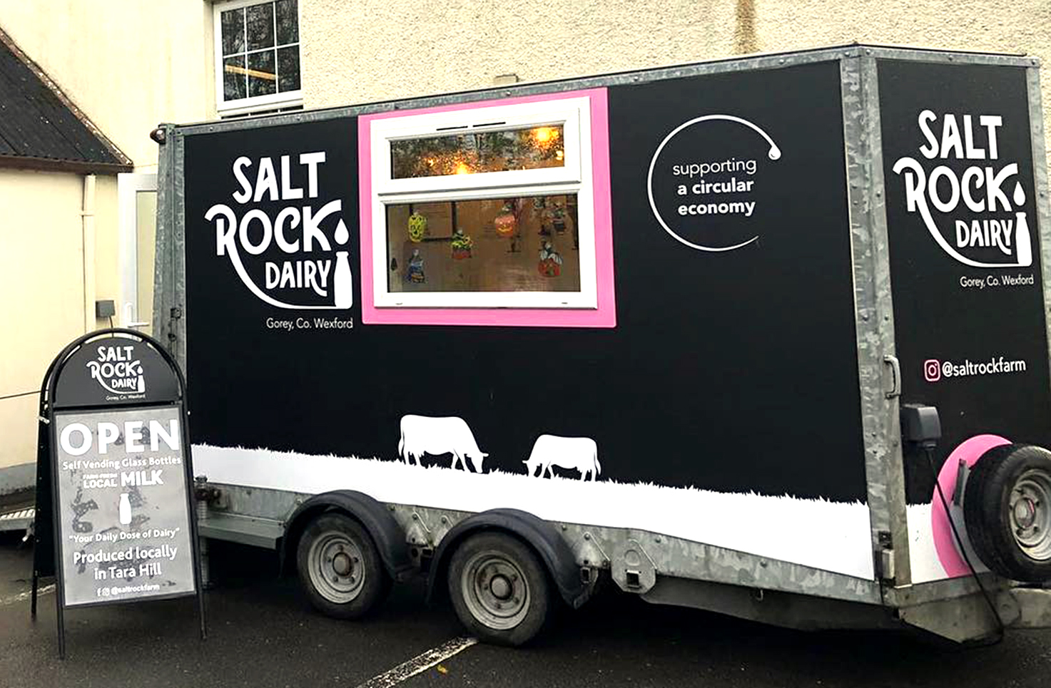
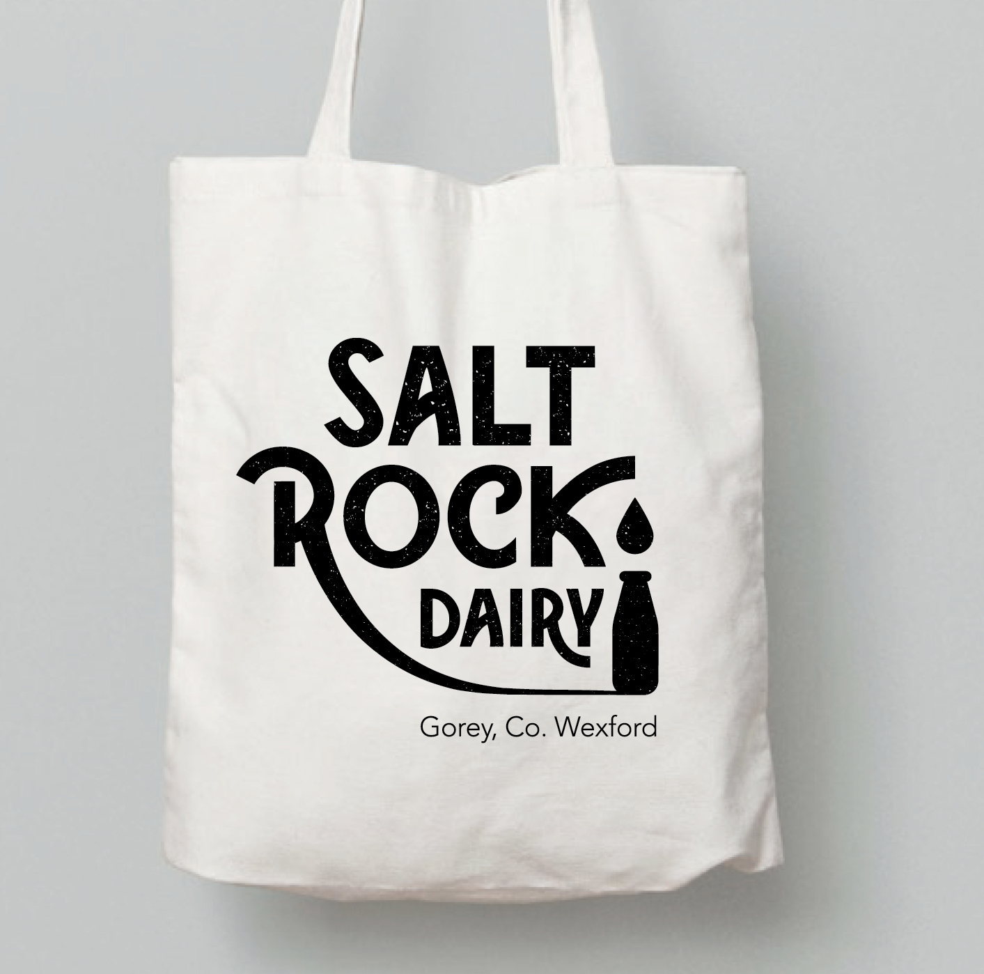 Saltrock Dairy is a contemporary fresh brand, bringing milk to consumers in a new, innovative and sustainable way. Saltrock Farm pasteurise their own milk from their family farm, cutting out unnecessary food milage to bring customers their ‘Daily Dose of Dairy‘. The milk is non-homogenised, local and farm-fresh.
Milk and milkshakes are available to be dispensed via self-vending units, in branded trailers at local Farmers Markets. The customer takes one of the retro bottles of Saltrock Dairy (or several bottles) and fills it up via the vending unit, then when it’s empty, they wash it and bring it back and refill it. This concept is innovative and contributes to a circular economy as customers bring their bottle back to re-use and refill each time and it doesn’t need to go through the processing of recycling plants.
This message is clearly and cleverly communicated in the logo and brand packaging, with a milk drop dripping from the letter ‘K’ in the typography of the word ‘Saltrock’ in the logo, dropping down to the bottle below. The brand is retro, edgy and unique – bringing fresh and traditional milk to consumers in a new and innovative way. There is a grain texture within the font, to communicate the natural and farm-fresh aspect of the milk. On the back, there are droplet markers which indicate the amount left in the bottle, to make it easy for users to tell when they need to refill. This is also helpful when working out measurements when baking.
We worked with Saltrock Dairy on designing the branding from start to finish, to include the logo, the brand guidelines to include the brand colour palette and typography, the packaging design of a range of bottle sizes, the wooden branded crate, the vending unit and the trailer graphics. The client and her daughters were a pleasure to work with, adding their energy and enthusiasm to bring this innovative new brand to life.
See more about how the self-service vending unit works here. Saltrock Dairy hails from the foot of Tara Hill in Gorey, Co. Wexford and can be found in nearby locations. Give them a follow on their Instagram page to find out where you can next spot the Saltrock Dairy trailer.
*As seen on RTE’s The Late Late Show.
Printing: www.glassprinting.ie
Photography:
Brendan Ryan Photography
Instagram: @brendanryanphoto
Photo Styling: Clare Lynch and Betsy Gach
*As featured on The Late Late TV Show.
Oat in the City Brand Packaging Design
Oat in the City Packaging Design
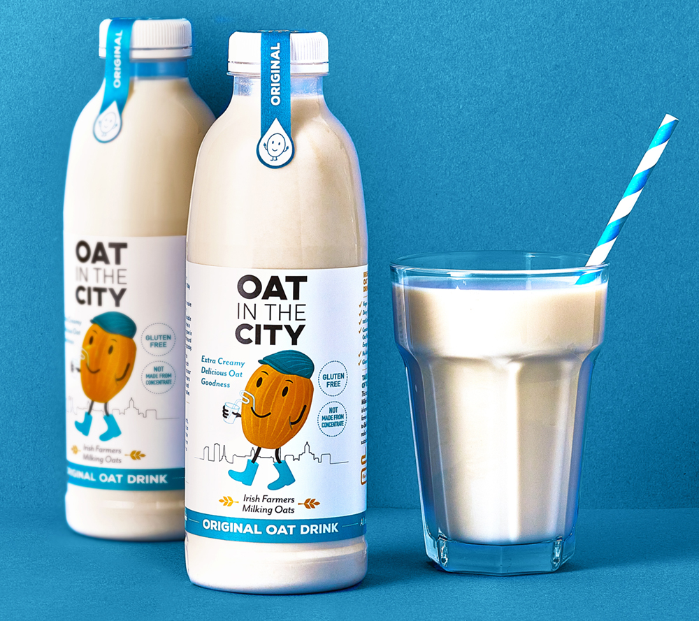
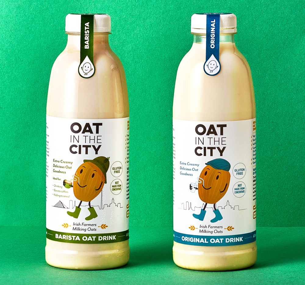
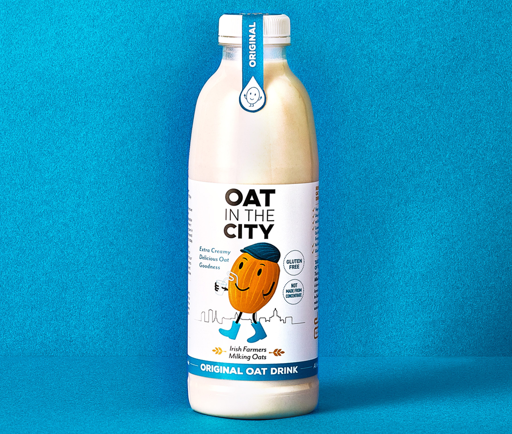
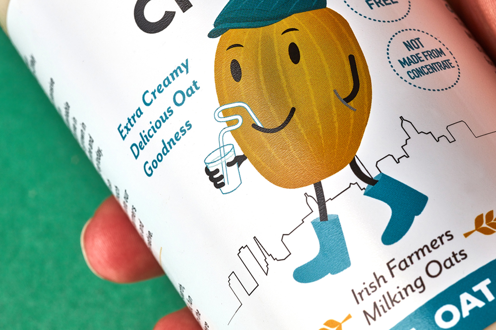
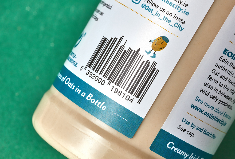
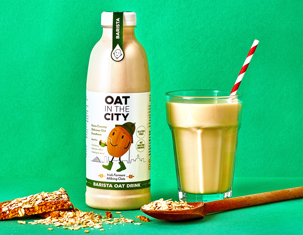
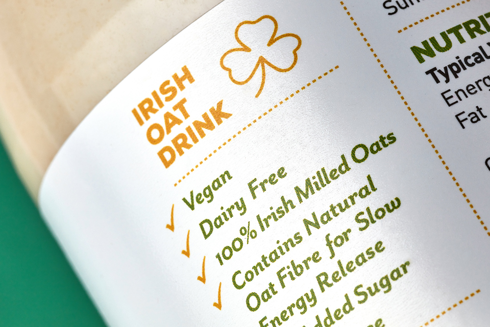
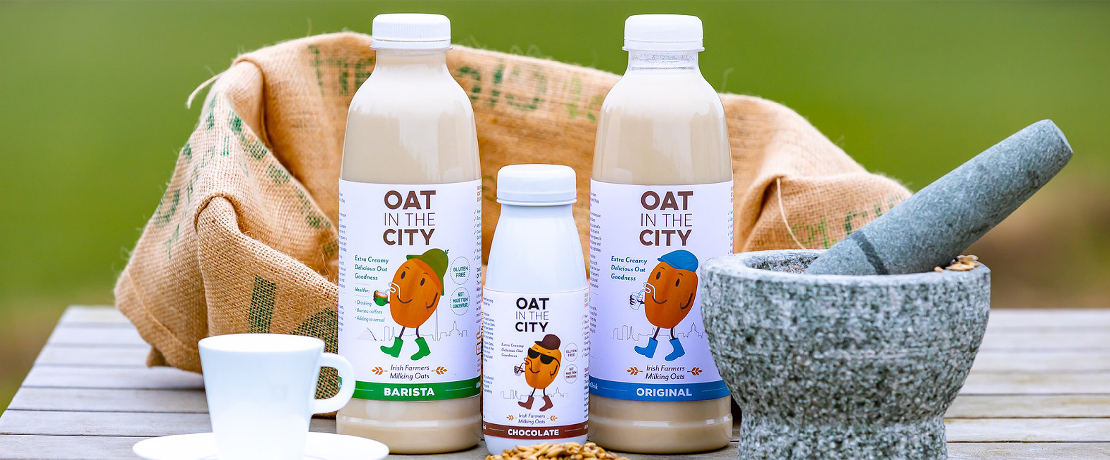
Oat in the City is an Irish oat drink brand. The product range includes a 750ml Original oat, a 750ml Barista drink and a 250ml dairy-free Chocolate flavoured drink.
The packaging design features an illustration of a unique character ‘Eoin the Oat’. Eoin the Oat is a down-to-earth authentic chap. He is a cool, fun oat. Each flavour has a different version of the oat character and also a different colour – blue ‘Original’ – the townie lad, green ‘Barista’ – the country bumpkin and brown ‘Chocolate’ – the cool dude. The colour variation and alternating versions of the character allow for easy flavour recognition and to bring a quirky, fun appeal to the packaging. The product benefits are highlighted on the front of the bottle, such as it is Dairy-free, Vegan, Gluten-free, and Extra Creamy, with Milled Irish Oats. Each bottle features a unique barcode to fit with the brand style.
We wanted to communicate that this is an authentic oat drink – therefore, when developing the brand name, the word ‘Authenticity’ lead on to the similar sounding ‘Oat in the City’. The name and brand story were developed to play on the expression of ‘spreading your wild oats’ in a humorous way – ‘Eoin the Oat’ likes to travel around the country spreading his wild oaty goodness with this oat milk drink. The illustrations feature a cityscape in the background, representing how Eoin is always on the move. The brand strapline is ‘Irish Farmers Milking Oats’, as the client wanted to communicate the local and authentic roots of the drinks range. Oat icons are used to denote this also.
Oat in the City stands out from competitors on shelves not only from a design point of view – from a nutritional and sustainable aspect also. Oat in the City has just 0.4 grams of natural sugar from the cereal (compared with generic oat milk brands which have up to 5.0 grams of sugar), alongside fibre and protein for healthy nutrition and a slow energy release. It retains a lot of the goodness in the finished product, compared to other oat milks. Oat in the City use all of the Oat and retain the oats natural fibres, beta glucans and protein. It has no added sugar and is low in natural sugars. This makes it a sustainable choice, as food waste is one of the leading causes of climate change. The process by which most commercial oat drinks are made results in the stripping away the parts that have the fibre and the protein, so that you’re mostly getting oat sugar. Oat in the City stands above competitors as it isn’t made in this way – it retains more of the oaty goodness, making it a healthier choice, creamier in taste and reduces waste and therefore is better for the environment.
Read more: https://www.shelflife.ie/a-taste-of-freedom/#ixzz7dShE6ais
This is a fun and playful brand and has already received a lot of media coverage nationwide, with Eoin the Oat slipping in to the hearts (and fridges) of Irish consumers.
Keep an eye on their Instagram page to find out more about where Eoin the Oat is!
Available in Fresh stores, Donnybrook Fair, Nolans and SuperValu stores. See more on the Oat in the City website also.
*A big thank you to Brendan Ryan Photography for the brand photos and Betsy Gach for assisting with the photo styling.
As featured on The Late Late TV Show on RTE.

Sodalicious Soda Bread Packaging Design
Sodalicious Soda Bread Packaging Design
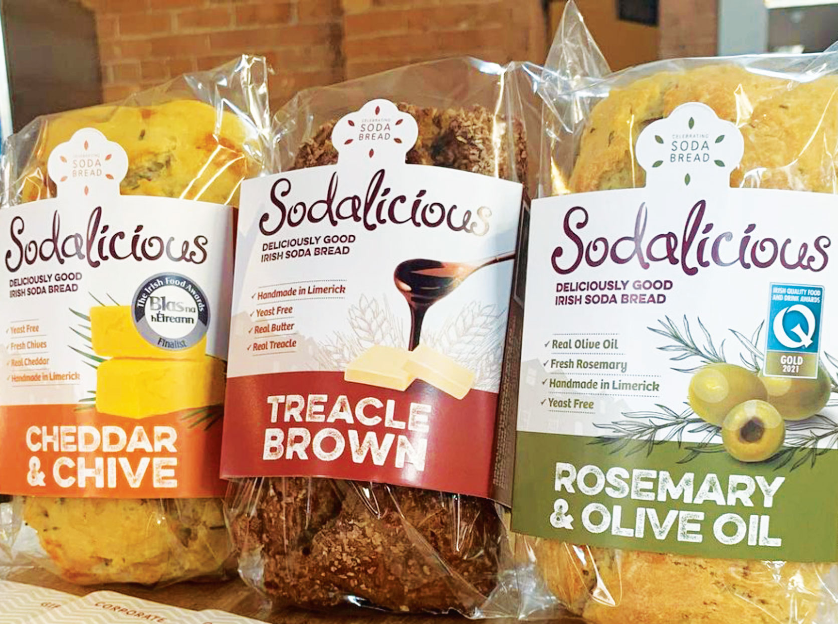
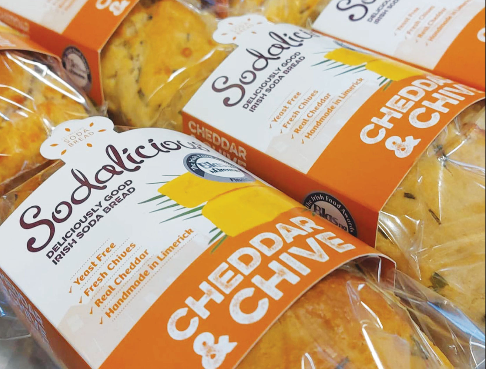
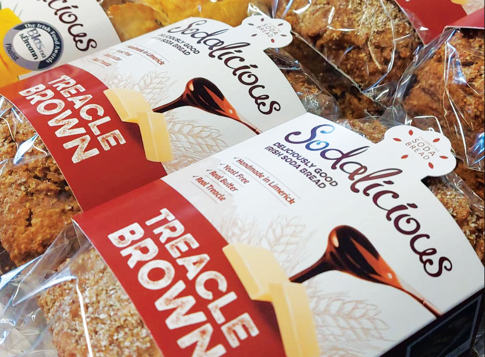
Sodalicious Soda Bread Packaging Design
Sodalicious bread prides itself on celebrating their wonderful indigenous Irish soda bread, by reinventing it with many fresh flavours. Using the traditional Irish soda bread recipe, they have given it a modern twist by adding many different flavours baked in many different shapes resulting in a contemporary classic.
Their hand-made bread is flavoured only with fresh, natural ingredients for example fresh herbs, cheese, olives, olive oil, nuts, seeds and fresh fruit in the scones. They don’t use any artificial additives. It is a yeast free product and uses reduced sugar in the sweet range resulting in many health benefits including a low fat content. It also contains sodium bicarbonate which aids digestion. The result is a premium quality range of soda bread, that doesn’t loose the integrity of this wonderful Irish staple.
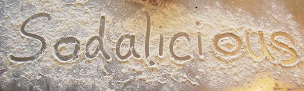
Sodalicious is a dedicated soda bread bakery and cafe, based in Limerick. It is ran by Jane Conlon, a powerhouse behind this brand, along with her family and loyal team. Jane is a fireball of energy and spirit. Jane gained her level of expertise from a wide range of experiences such as growing up learning from three generations of bakers, gaining qualifications in the renowned Ballymaloe Cookery School, then training under an expert pastry chef in a top London restaurant and traveling the world experiencing the breads of the world, to coming back home to Ireland and setting up her own cafe and bakery. All the while, bringing up a family of seven children! A very inspirational lady 🙂
When contacting Clare Lynch Creative, her objective was to grow the Sodalicious brand by bringing some of their breads to the wholesale marketplace and to make Sodalicious bread become a household name. They already had their logo, the word ‘Sodalicious’ in a script font, which is featured at a large-scale on the outside of their building, on their signage and aprons and a range of their collateral, so she wanted to keep this and use this on the packaging design. She wanted their bread packaging to include images of the fresh ingredients that are used in the bread, to be colour-coded in a stylish way and to include their brand story and some recipe suggestions. Sodalicious bread is a Blas na hEireann Irish Food Awards & Irish Quality Food & Drinks Awards Gold finalist, therefore she wanted it to convey a feeling of quality, premium product, in an inviting way.
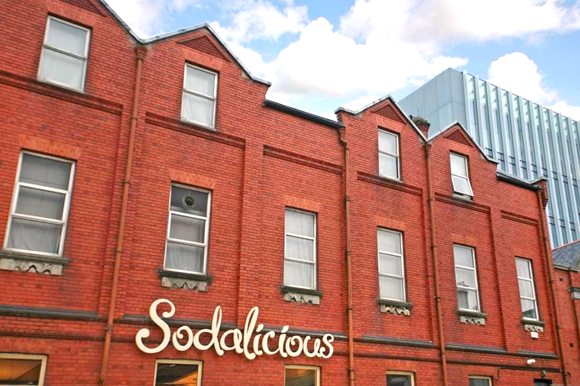 To answer the client’s brief, the packaging design highlights taste cues by featuring the main ingredients of the bread in a quality, vintage illustrative style. The Sodalicious cafe is situated in a beautiful historic red-brick building on Cecil Street in Limerick City, built between 1907-09, with an oriel window and a seven-bay side elevation. To incorporate the cafe’s unique location and heritage, a silhouette of the building is subtly featured in a light hue background of the packaging design. The font and colours are natural and rustic, communicating the fresh, natural qualities of the bread.
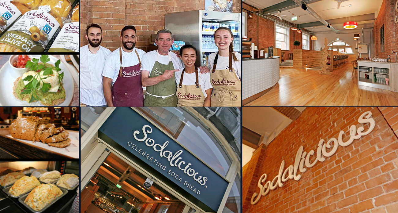 As the client was eager to make sustainability a priority in the packaging design, it was important to do research of sustainable options for bread packaging first. The findings were interesting, such as elite cardboard boxes with handles folding closed together, presented like a gift bag. This was fully recyclable and could give a premium, unique, quality feel to a bread range. However, the brief requested the bread texture to be visible, so this option wouldn’t work. This also wouldn’t facilitate much of a shelf-life in preserving and protecting the bread from outside spoilage, so it failed to meet these functional needs. “With packaging design, it is important to consider factors such as the construction, the material used, the production, durability, legibility and safety issues – it’s not just about graphics alone, the technical aspects are just as important as the design”
(viction:workshop, 2007).
Further online research led to a printing company offering biodegradable and compostable labels. On review of these label samples and the brief, it was noted that the client preferred not to use stickers due to the glue and there was also a risk they could crinkle and look amateur on the packs as the bread is an uneven shape, so this route wasn’t viable.
The chosen solution is a one-piece, light cardboard sleeve that bends around the bread from front to back. It’s clean, simple, visually-effective and easy to pack. It shows a good portion of bread, meeting one of the aims of the brief. The die-cut cardboard sleeve features a baker’s hat with the Sodalicious tagline ‘Celebrating Soda Bread‘. The seeds jump around the tagline in fun, celebratory style. The inside of the cardboard sleeves feature recipe suggestions, along with the brand story – this gives the sleeve a longer-life value as customers can keep it and share the recipes with friends.
Underneath this cardboard sleeve, a biodegradable cellulose bag was chosen instead of the existing single-use plastic currently used by the client. There is a good cellulose compostable and biodegradable film brand called NatureFlex, which offers tailored protection barrier to prevent spoilage, high heat resistance properties, high gloss and transparency for good visual effects and it meets global compostable standards. Another similar option which was more cost effective for the client, was to wrap the bread with a recyclable plastic wrap. The bag length was too long for the bread shape, so the client purchased an ‘L sealer’ heat-sealing machine to trim them. Customers will be happy to be aware that they are choosing bread with packaging that supports a sustainable and circular economy.
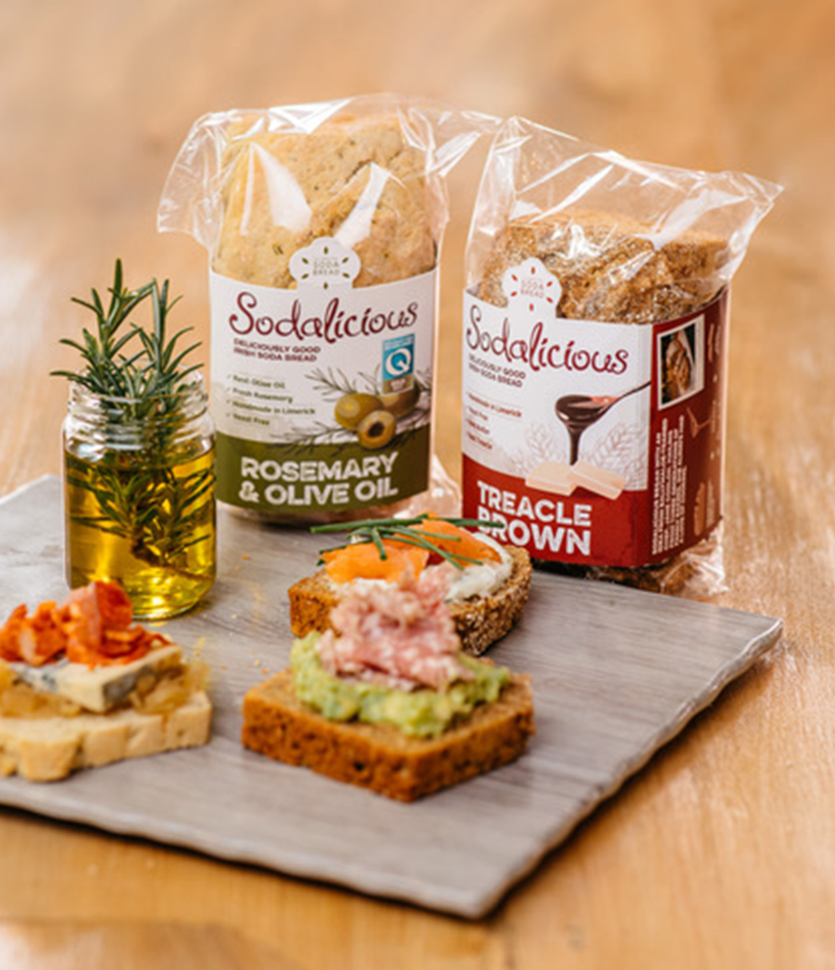
The design helps to sell the product by creating taste cues with imagery and colour. It focusses on the taste and flavour of the ingredients, using beautifully hand-drawn illustrations of the herbs that are used in the bread such as olive oil and rosemary. It has a quality, authentic feel, focusing on the hand-made nature of the bread and highlighting the taste to appeal to the appetite of consumers. The flavour names are displayed in a bold, rustic font to further communicate this and there is a light hue tone of the iconic building of the client’s café and bakery in the background. A mini brand story is featured on the side of the pack to help consumers connect with the brand. Colour is the first thing an observer notices about a package. Therefore, each pack is colour-coded for easy recognition of each flavour and the pack colour communicates the herbs added – such as ‘Rosemary & Olive Oil’ being green.
 Required details were added to the back of packs, including a photo showing the bread in a tasteful style for each flavour, the ingredients and nutritional information, how to recycle and the clients contact details. Social media links were added, along with a fun and quirky barcode featuring a rolling pin within it. They chose a local printer, another factor which is aligned to their carbon footprint goals.
The client was really pleased with the final result and has been enjoying the popularity of the delicious Sodalicious bread in their cafe, SuperValu and local stores so far since it’s launch in 2022.
Find out more about Sodalicious:
Instagram:
instagram.com/sodaliciouslimerick/
Facebook:
facebook.com/Sodaliciouslimerick/
Website:
Supporting Families – Brand Identity & Promotional Collateral
Supporting Families: Brand Identity & Promotional Collateral
Supporting Families – Early Intervention in Family Law
In partnership with an Irish Law Association and Donlon Brands, we designed a complete brand identity and report for the ‘Supporting Families’ initiative, which champions early intervention and child-centred practices in family law disputes. This project seeks to provide families with therapeutic support, while advocating for system-wide adoption of child-friendly practices within the legal process.
The Supporting Families initiative brand identity and logo design is thoughtfully crafted to embody empathy, balance, and a commitment to child welfare. Key elements of the logo reflect these themes:
-
Dual Pathways: The graphic depicts a single-family unit branching into two new directions, symbolising parents moving in opposite directions while still connected through the shared focus on their children’s well-being.
-
Legal Balance: Subtle scales embedded within the design represent the initiative’s legal foundations, emphasising fairness, peace, and equity as guiding principles in family law.
-
Unified Hands: The logo illustrates two parents shaking hands, with an adjudicator figure between them, symbolising the initiative’s role in fostering cooperation and positive outcomes. A gentle smile within the design reinforces the project’s focus on the well-being of both children and parents.
-
Child-Centred Colours: Bright, positive colours were chosen to signify the child-focused nature of the initiative, resonating with themes of hope and new beginnings.
This brand identity establishes a consistent, optimistic tone that can be applied across all communications, from printed materials to digital assets, ensuring the initiative appears credible, professional, and compassionate to both families and legal stakeholders.
We developed a 12-page A5 Promotional Brochure that introduces stakeholders to the Supporting Families initiative, detailing the pilot project’s objectives, methodology, and anticipated outcomes. The brochure is designed in alignment with the brand identity, ensuring a cohesive and approachable presentation that appeals to judges, lawyers, policy advisors, and family advocates.
We also provided website graphics as digital concepts for an introductory website, reinforcing the brand’s visual language and supporting consistency across platforms. These graphics serve as an online resource to engage a wider audience and provide foundational information about the project’s goals and methodology.
By integrating these design elements, the Supporting Families initiative is positioned as a credible, empathetic, and solution-oriented model within family law, aiming for systemic improvements and positive, long-term outcomes for families in Ireland.
See past projects in the archive section…