The Tasting Vault: Brand Packaging Design
The Tasting Vault: Brand Packaging Design
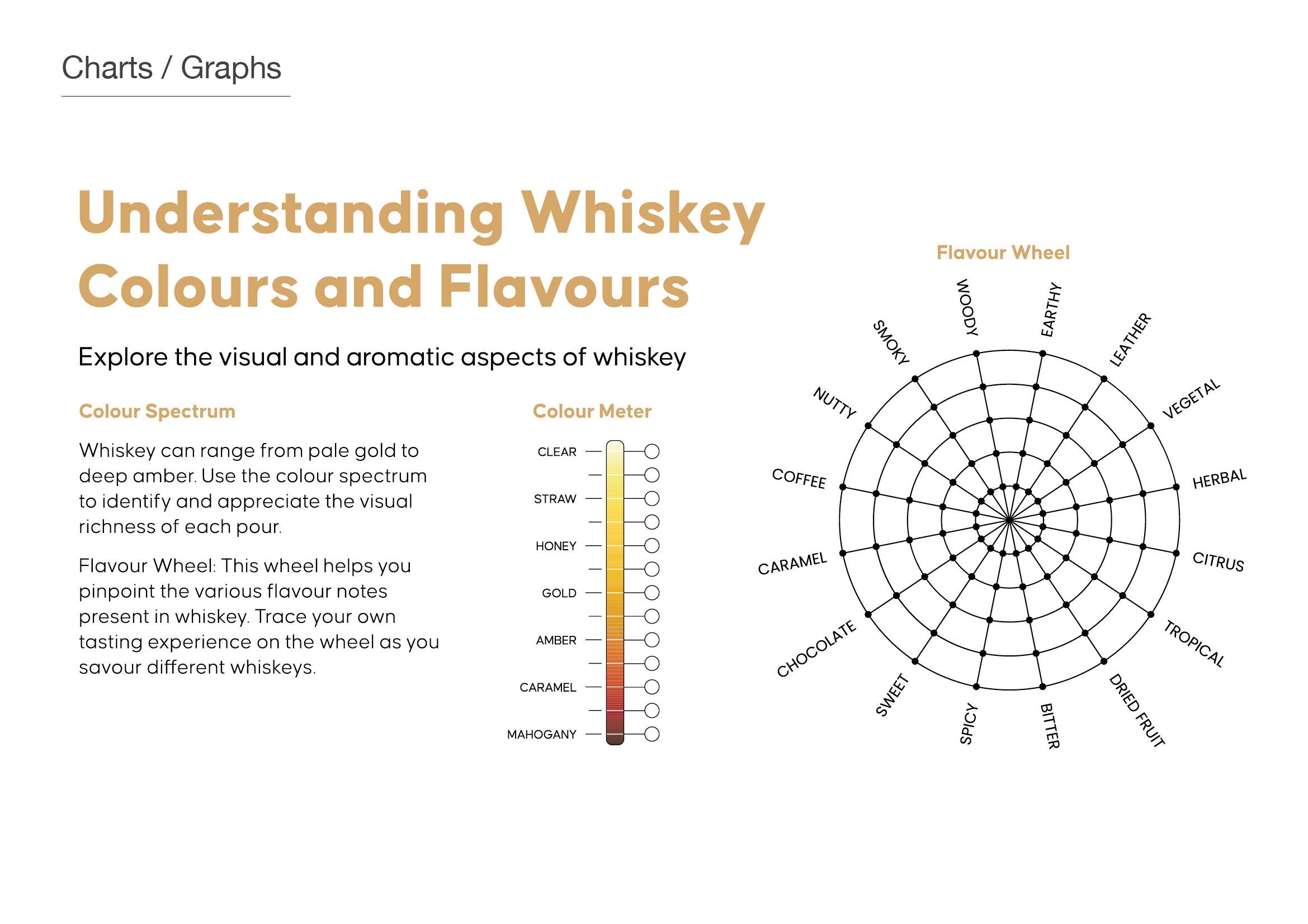
Whiskey Tasting Subscription Services
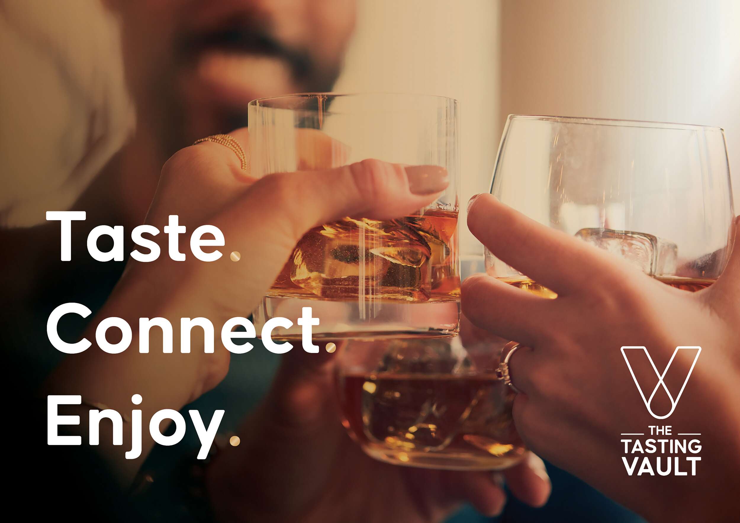
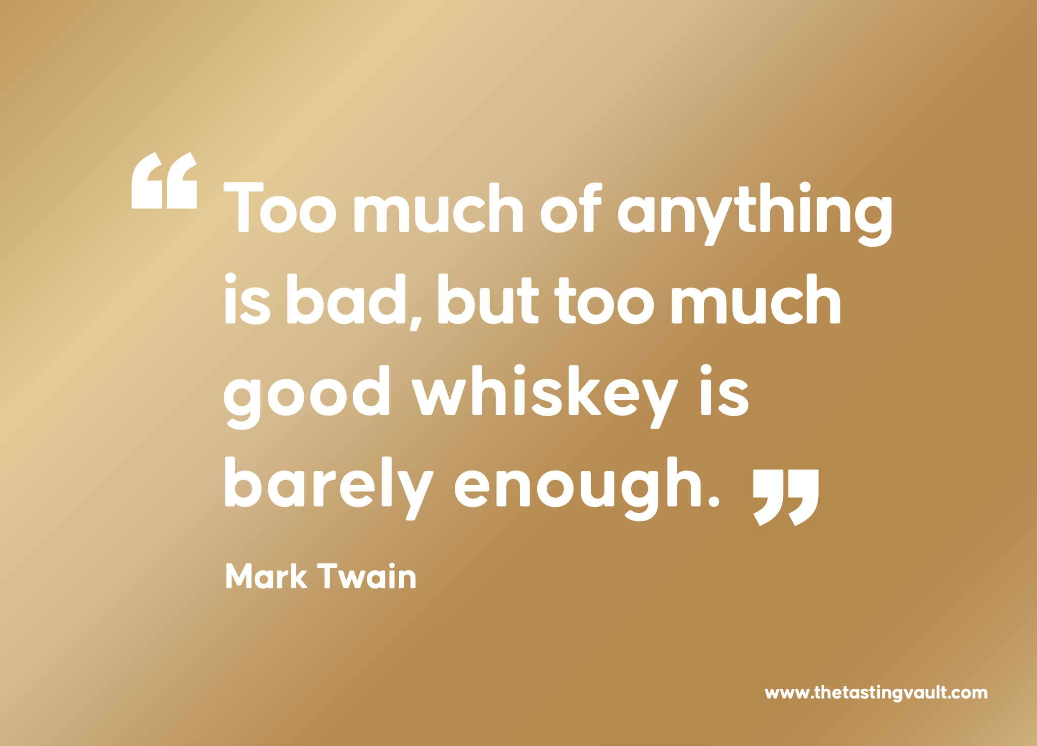
The Tasting Vault is a whiskey and spirits subscription service that provides consumers with curated tasting experiences, allowing them to explore a wide range of premium whiskeys from around the world. The company solves the “try before you buy” challenge by offering tasting packs that let customers sample new and famous whiskeys before committing to full bottles.
Their subscription service is designed to engage both beginners and seasoned connoisseurs through expert tasting notes, digital content, and invitations to exclusive events, both virtual and in-person. By working with distilleries in Ireland and internationally, The Tasting Vault offers access to a curated selection of world-class spirits, fostering a loyal community of whiskey enthusiasts, who have the option to connect and engage with each-other through this whiskey tasting club.
Their mission is to cultivate a deep appreciation for fine whiskeys and spirits through unique, curated tasting experiences. Their vision is to become the leading platform for whiskey exploration, creating meaningful connections among a global community of enthusiasts. Quality craftsmanship, community building, and an authentic whiskey experience are key values of The Tasting Vault.
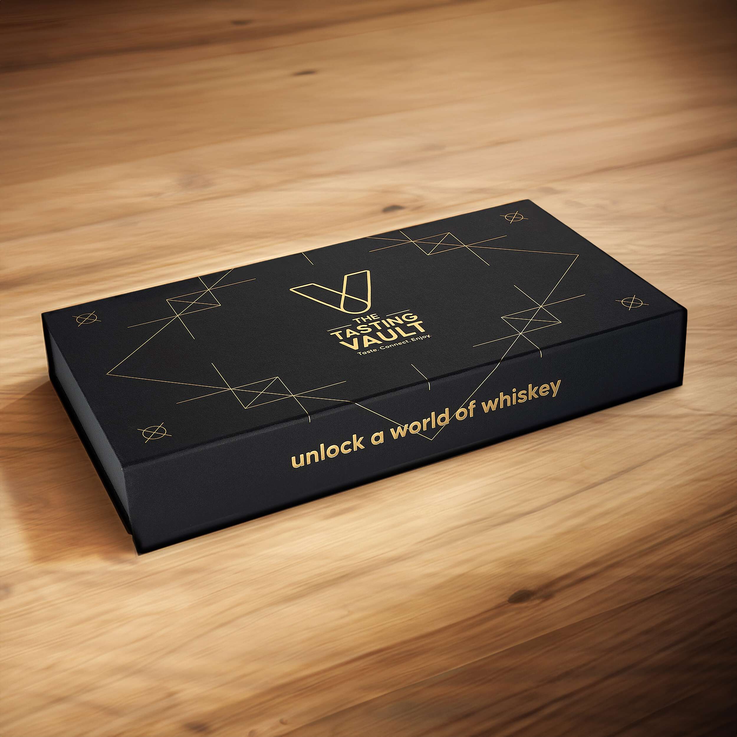
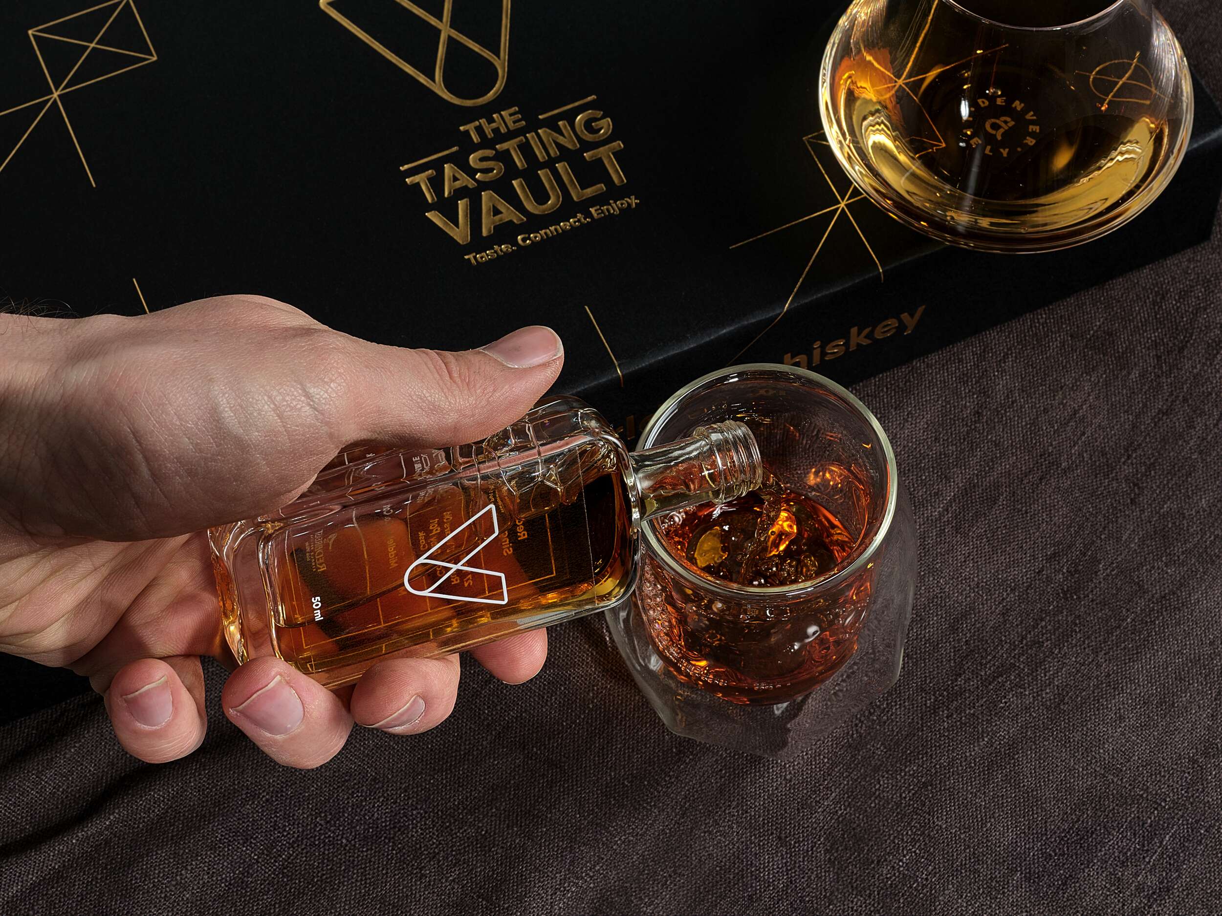
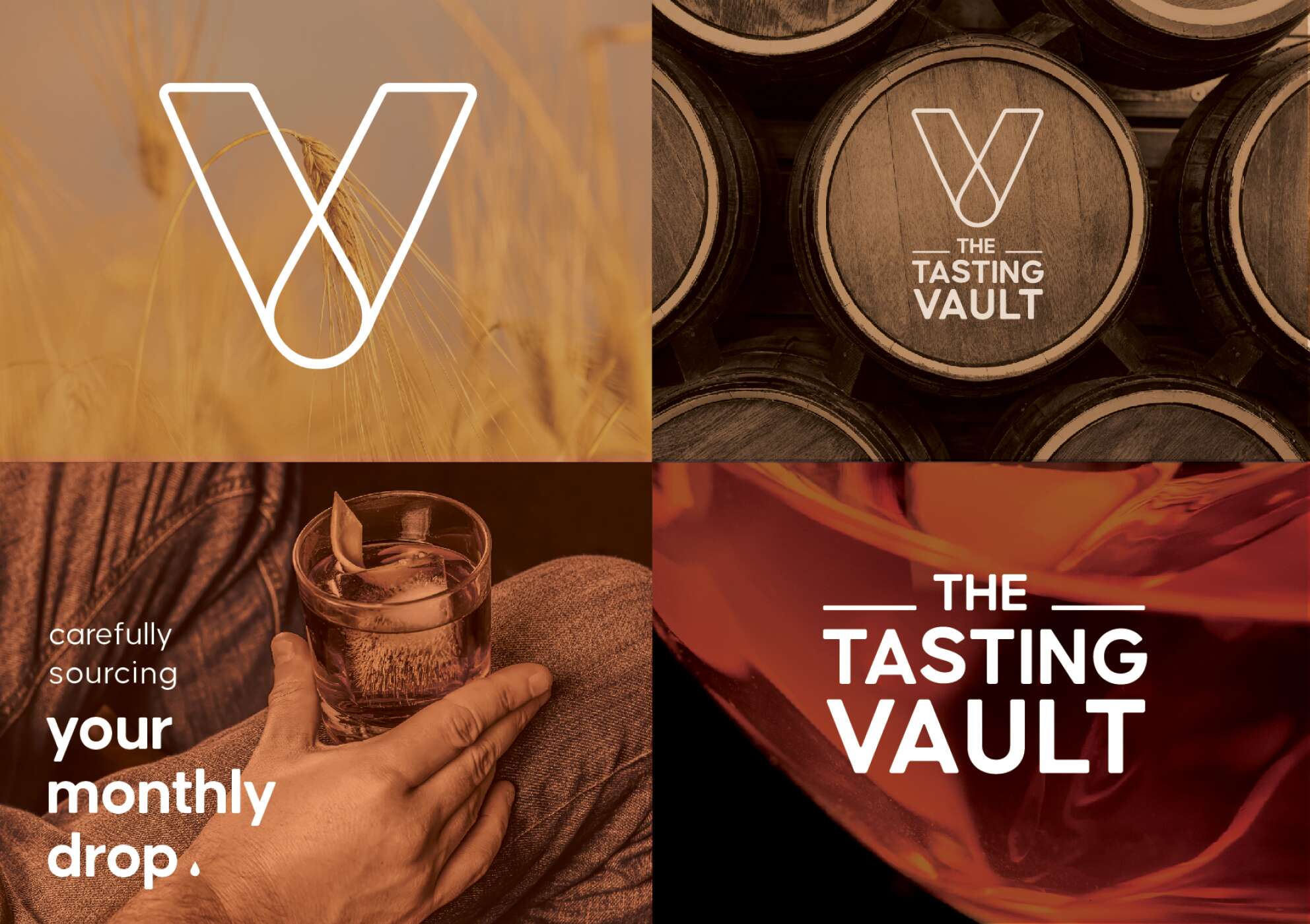
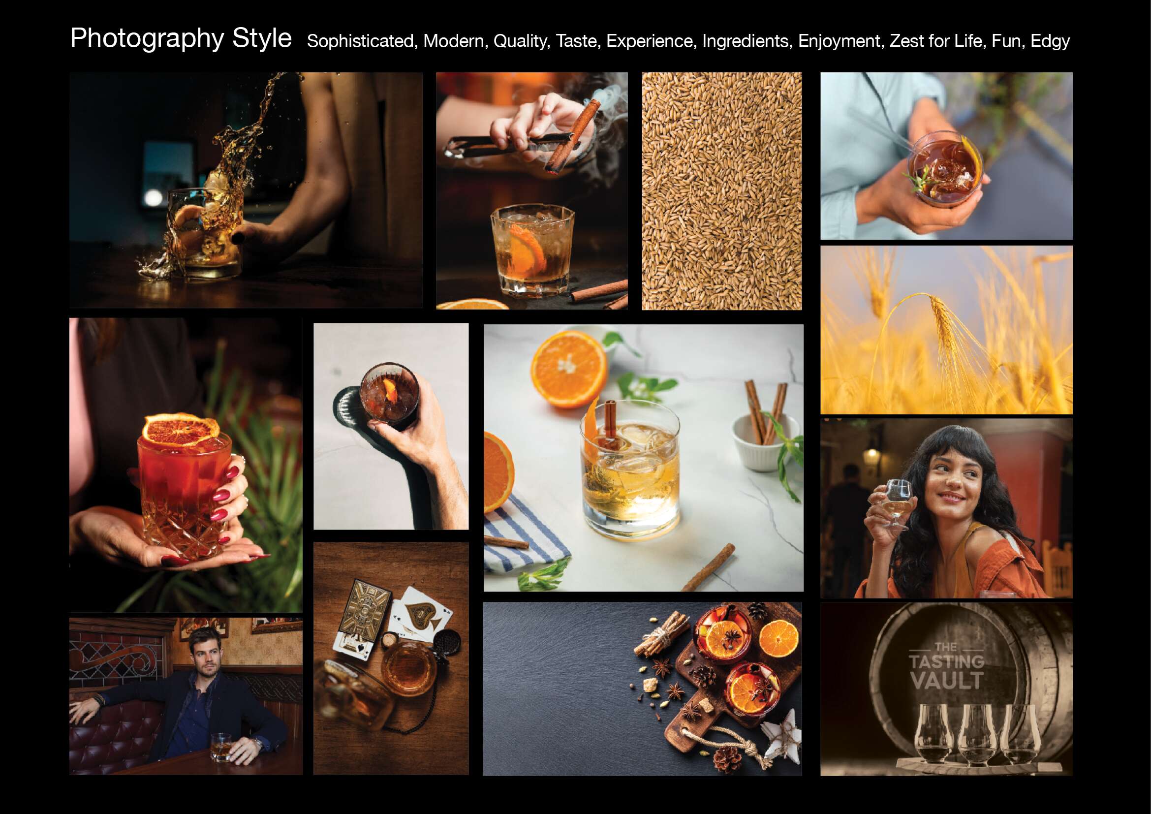
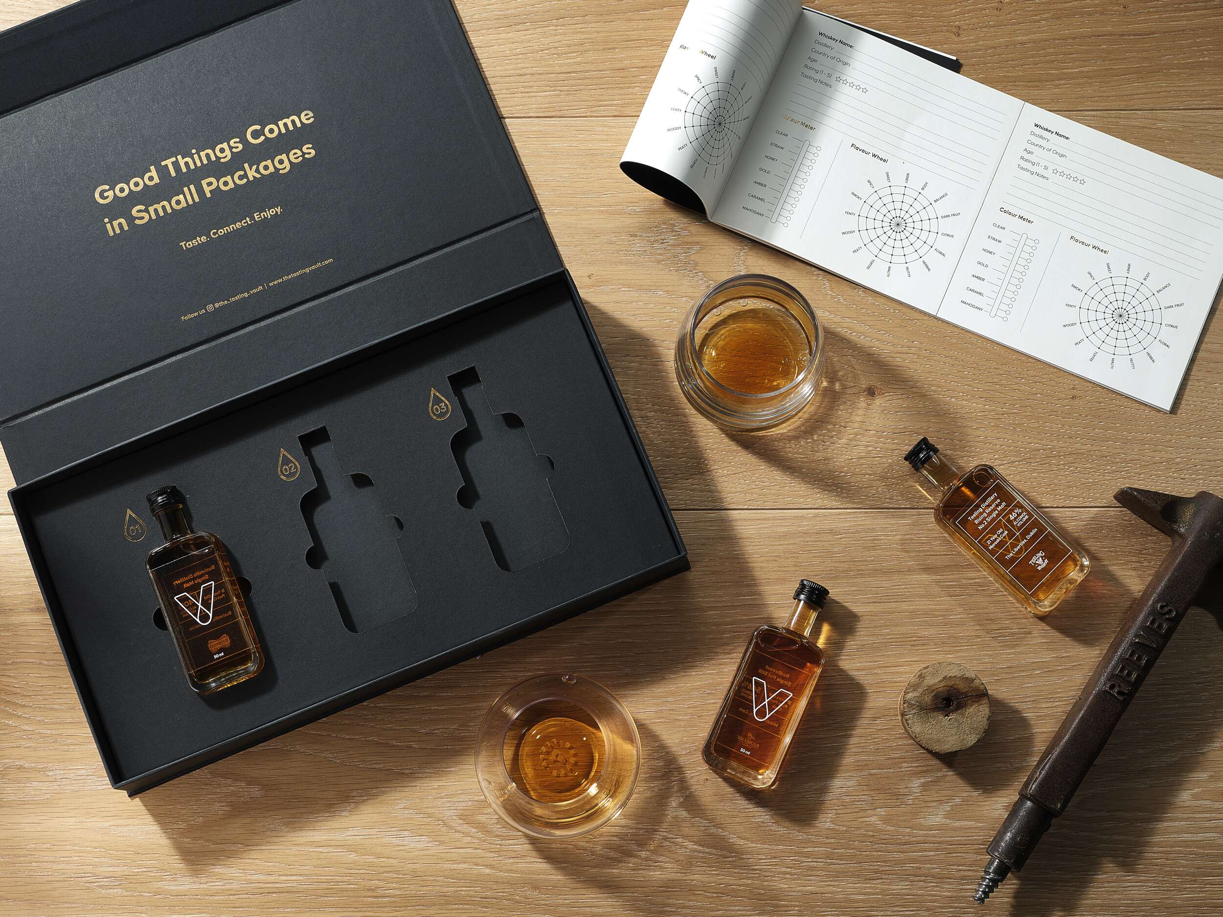
The challenge for The Tasting Vault was to create a packaging design reflecting the premium, sophisticated, and community-driven nature of their whiskey subscription service. The design needed to solve two key issues: communicating the exclusivity and luxury of the product, while offering practicality for repeated monthly deliveries of different whiskey varieties. The packaging needed to be functional yet visually compelling, enhancing the unboxing experience for consumers to share on social media. Furthermore, the design needed to accommodate 3 x 50ml whiskey bottles with flexibility for monthly variations, while remaining compact and easy to ship.
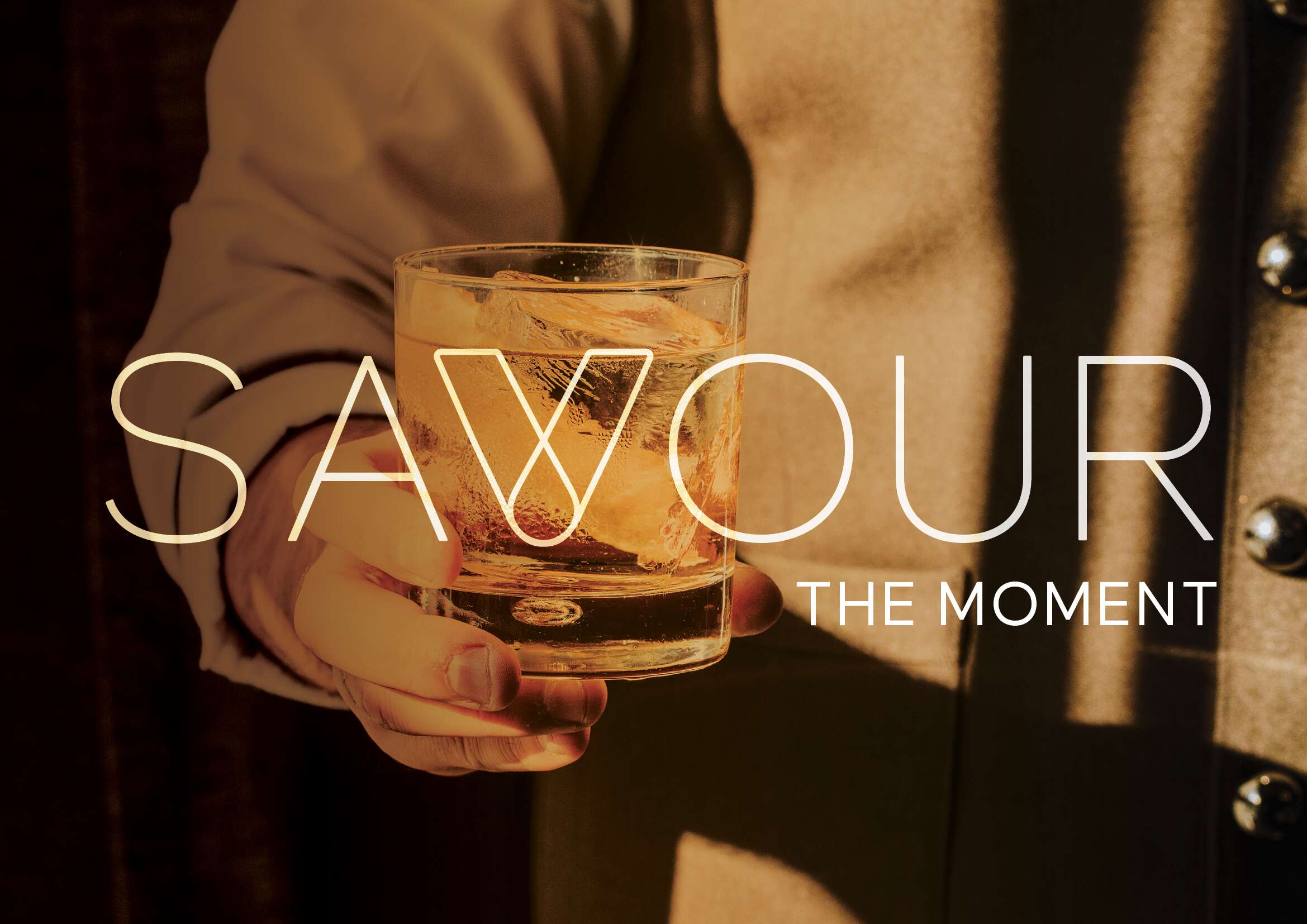
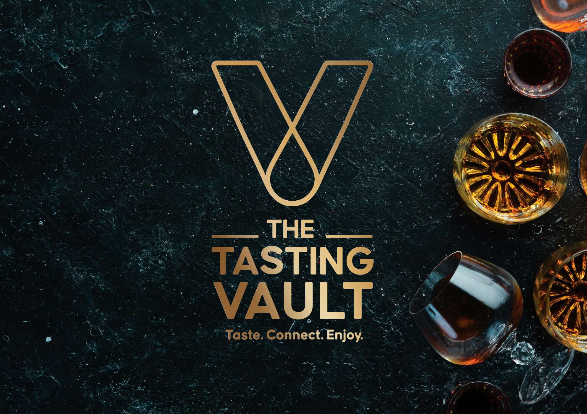
The core idea behind the design draws inspiration from the brand’s ethos of connecting people with fine spirits. The minimalist approach incorporates a modern vault symbol, subtly referencing the monthly “drop” of whiskey, and reinforcing the idea of treasured, curated experiences delivered directly to the consumer’s door. A blend of luxury, authenticity, and community was key.
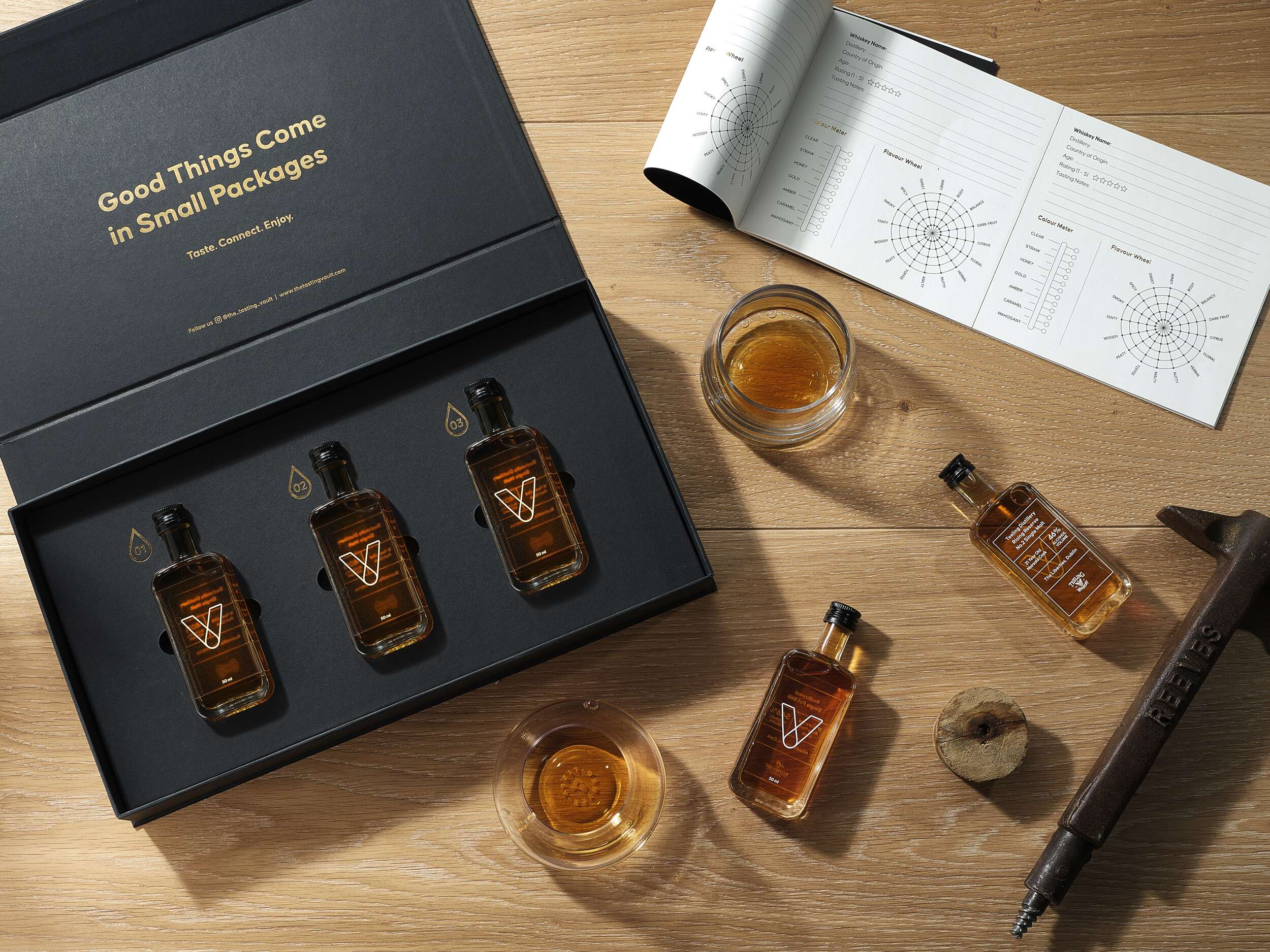
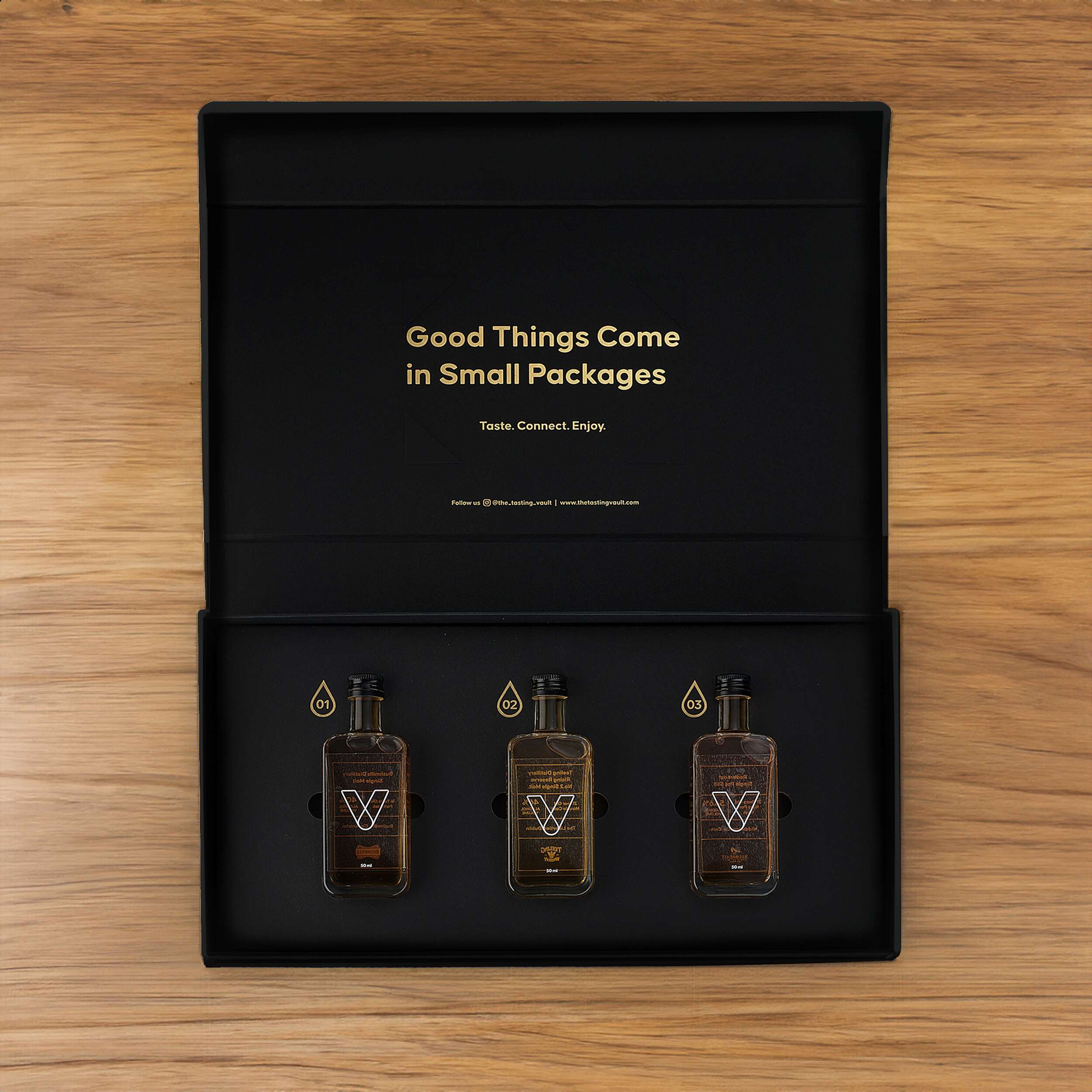
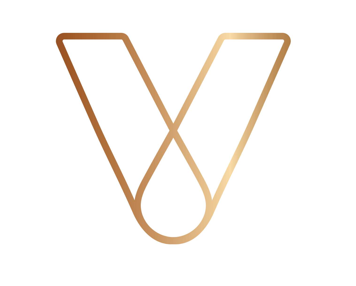
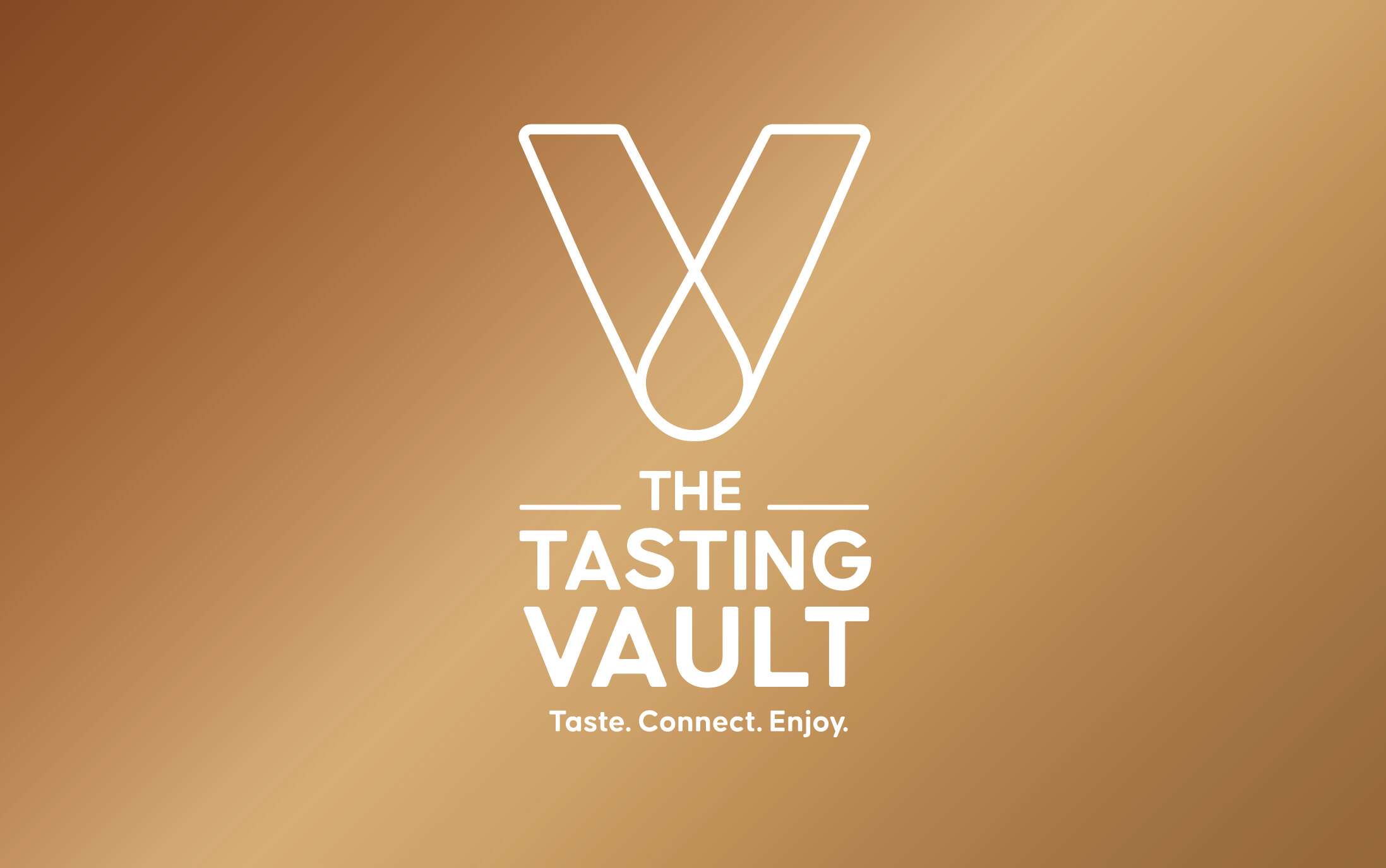
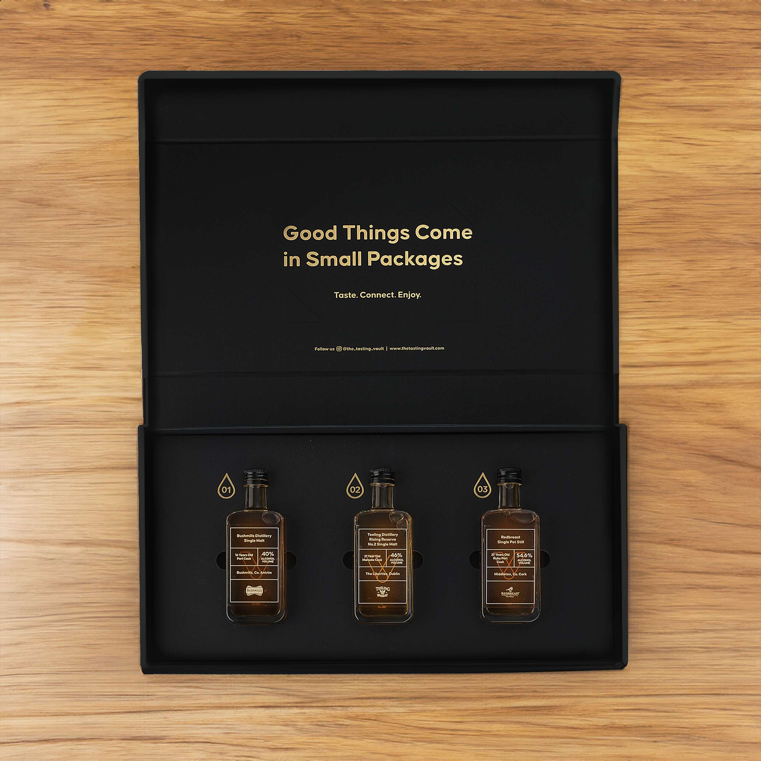
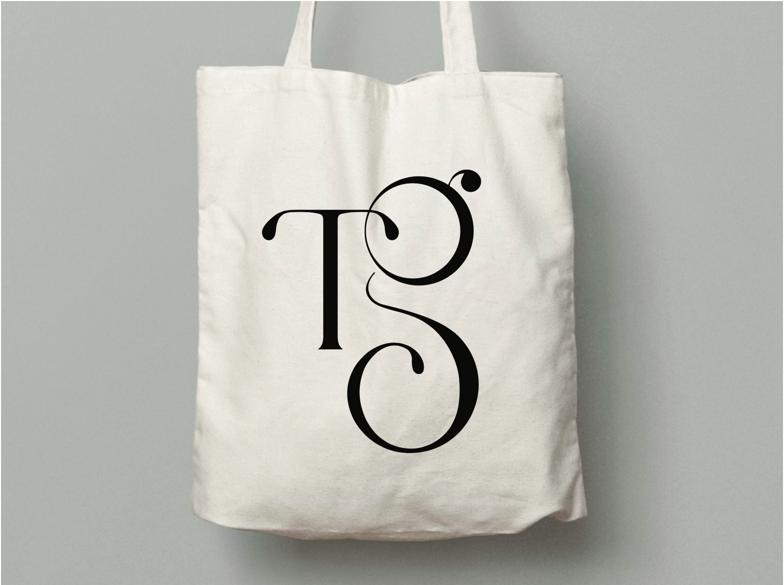
A key feature of the design is the brand’s “V” symbol, which represents the word “Vault” and subtly incorporates a whiskey droplet within the “V,” symbolising the monthly delivery of curated whiskey selections – their monthly drop. The tagline, “Taste. Connect. Enjoy.” captures the essence of the brand, communicating its message in a sophisticated yet friendly tone. The vault-inspired design is enhanced with gold foil debossing, giving the packaging an air of exclusivity. The ample spacing around the bottles adds to the luxury feel, while tabs ensure the bottles are easily accessible. Inside the lid, the playful message “Good Things Come in Small Packages” adds a light-hearted element, complementing the overall elegance. Social media details are included to encourage consumer engagement and help grow the brand’s online community.
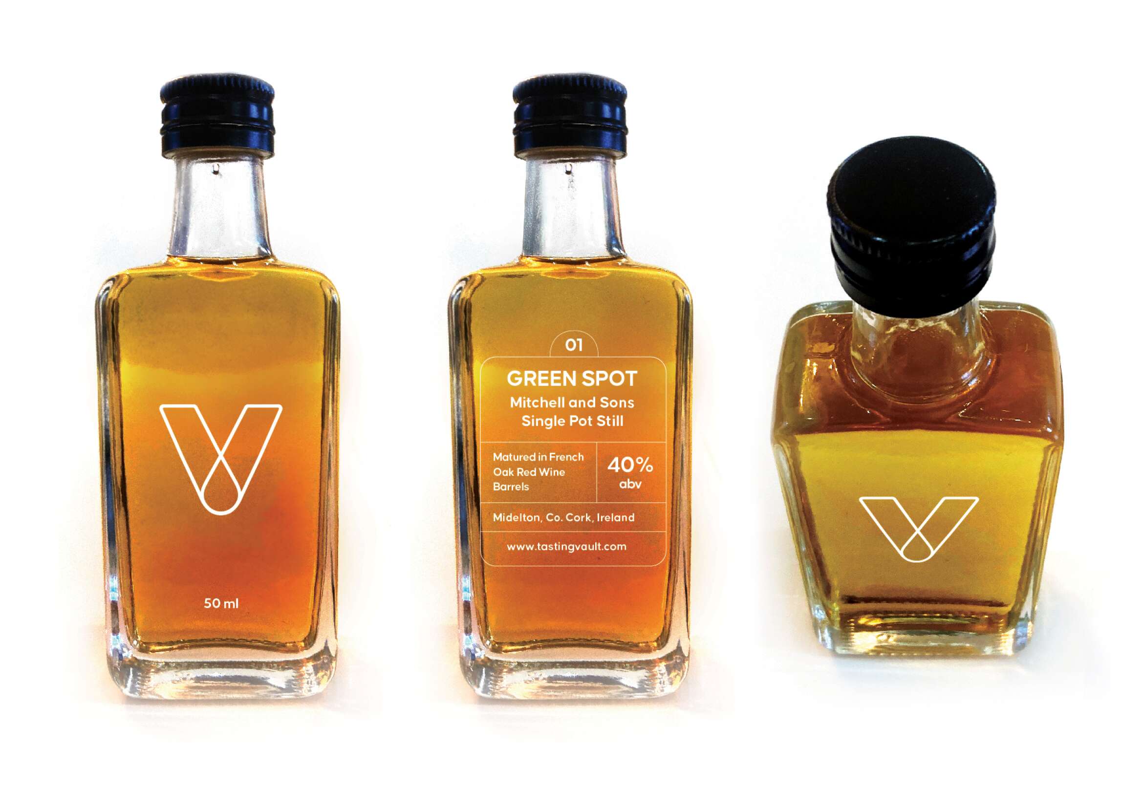
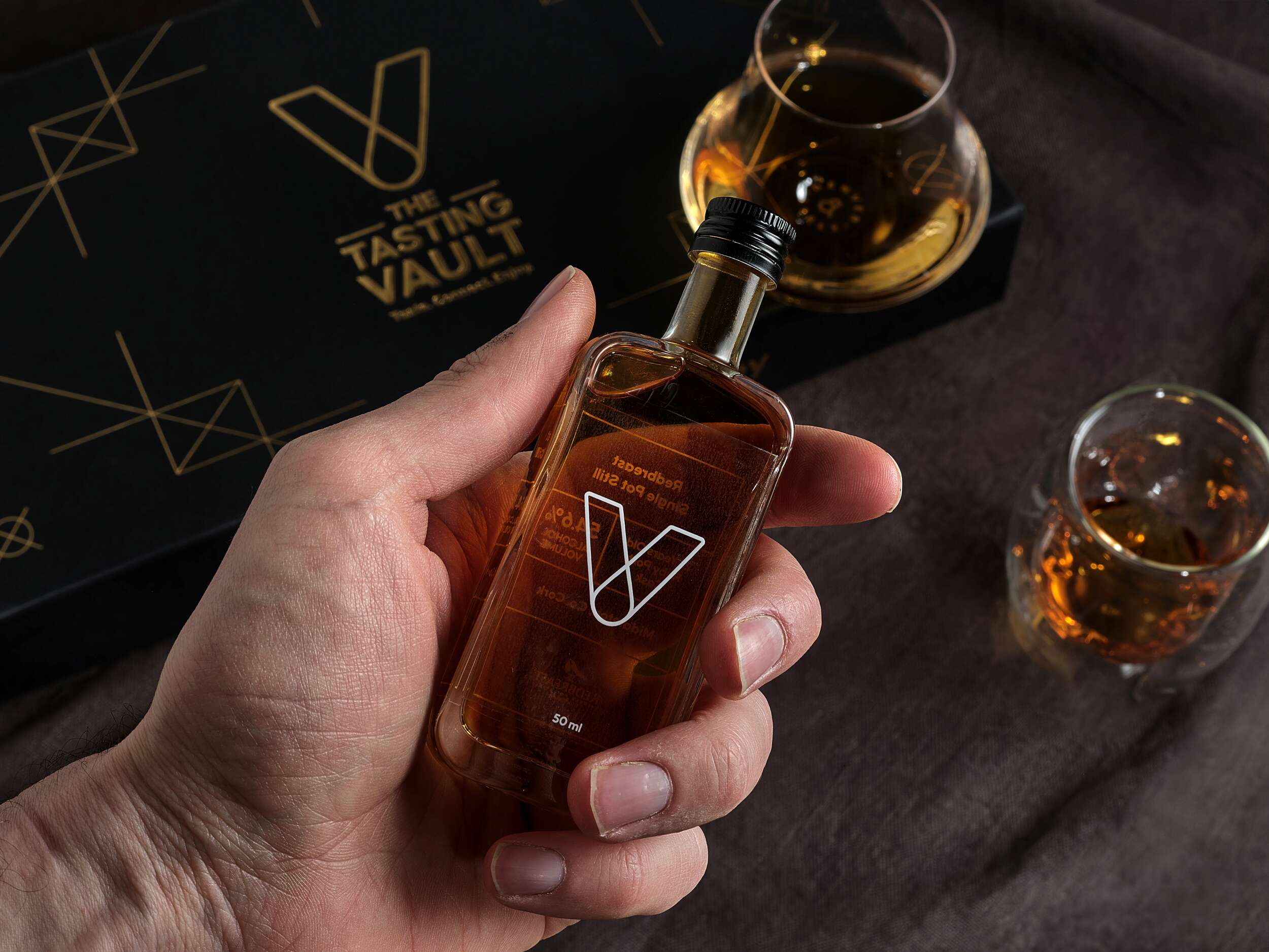
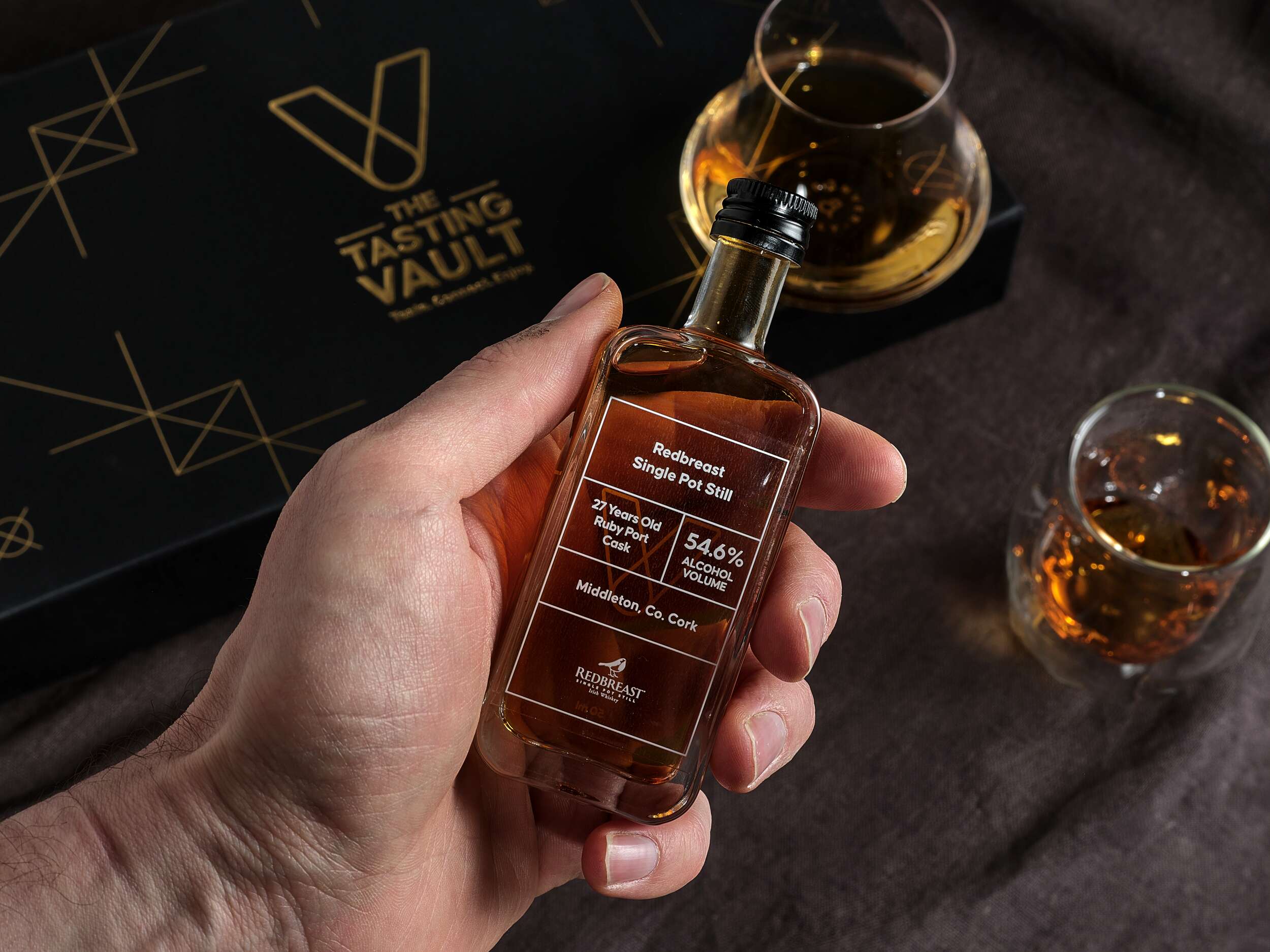
Each bottle is labelled with the brandmark and whiskey details on a transparent background, allowing the whiskey’s amber hue to shine through. These labels are designed for easy updating, adapting to the monthly subscription model. The bold Causten Rounded font combines softened edges with a sophisticated tone, conveying a friendly yet premium feel to the brand.
The packaging also includes a bespoke insert card with detailed information about that month’s whiskey selections, adding a personal touch. A 20-page tasting notes booklet further enriches the consumer experience, allowing customers to log their impressions and learn more about whiskey tasting. Clever phrases are used in the booklet such as “unlock a world of whiskey” to tie into the vault theme, reinforcing the brand’s identity.
This thoughtful and recyclable packaging design reflects the brand’s values of premium quality, authenticity, and community, offering a refined yet accessible experience that is both visually striking and highly functional.
The packaging design for The Tasting Vault strikes a perfect balance between luxury and functionality, offering a sleek unboxing experience, while showcasing the brand’s dedication to authenticity and craftsmanship. The packaging is made from 1000gsm greyboard and wrapped in black beater-dyed paper, giving it a solid, premium feel. Its rigid, hinged-lid design includes die cuts to securely hold three 50ml whiskey bottles, ensuring both safe transportation and a refined presentation.

Follow The Tasting Vault online:
Instagram: @the_tasting_vault
Twitter / X: @thetastingvault
Website: www.thetastingvault.com
Photography by Brendan Ryan Photography:
Instagram: @brendanryanphoto
Website: www.brendanryan.ie
Packaging printed by JJ O’Toole:
Instagram: @jjotoole_ie
Website: www.jjotoole.ie
Labels by BrandPack
Instagram: @brandpackireland
Website: www.brandpack.ie

Grásome! Gluten-free Brownies: Brand Packaging Design
Grásome! Award-Winning Brownies: Brand Packaging Design
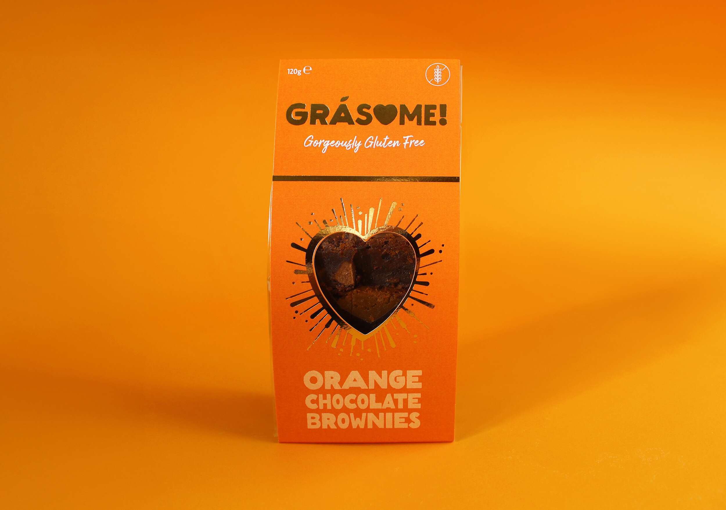
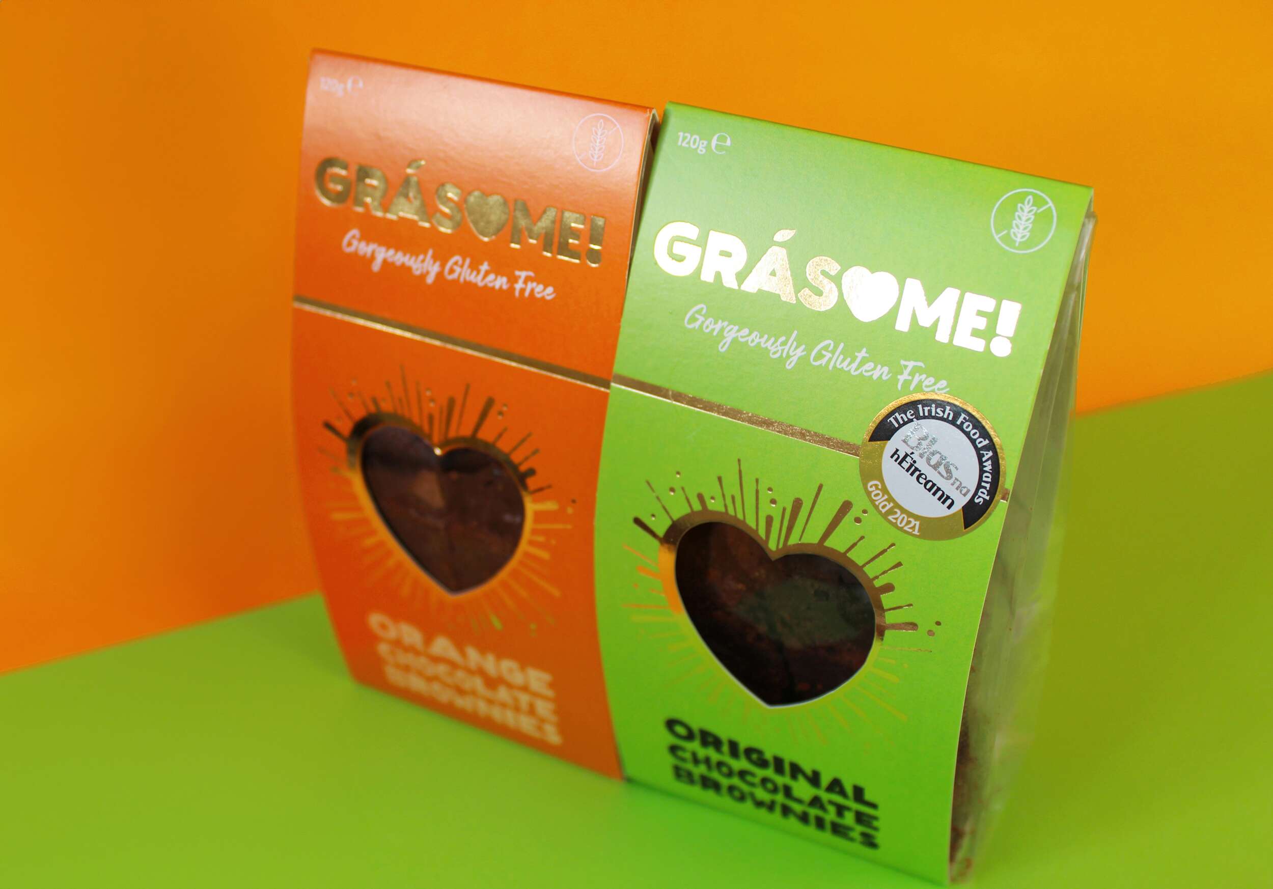
Grásome! is an artisan award-winning brand born out of the passion for creating luxurious gluten-free treats that are not only delicious but also fun and playful. Ruth, the founder, draws inspiration from her rich French-Irish heritage, her personal baking journey, and her love of good food. The brand’s mission is to provide indulgent, hand-crafted treats made from the finest natural ingredients, all while bringing a smile to the consumer’s face. With a tagline that reads “Gorgeously Gluten Free,” Grásome! speaks to those seeking both high-quality and allergy-conscious products without compromising on taste or style.
The name Grásome! perfectly encapsulates the essence of the brand, combining the Irish word “Grá” (meaning “love”) with a playful twist on the word “awesome.” The result is a name that feels both familiar and exciting, resonating with Ruth’s fun, vibrant personality. It’s a brand that isn’t afraid to be glamorous yet unpretentious, offering gluten-free indulgences with a wink of fun and light-heartedness. The nod to her influential aunt Gráinne, a passionate coeliac, baker and advocate for gluten-free products, adds a personal touch to the name, reinforcing the love and care behind every product.

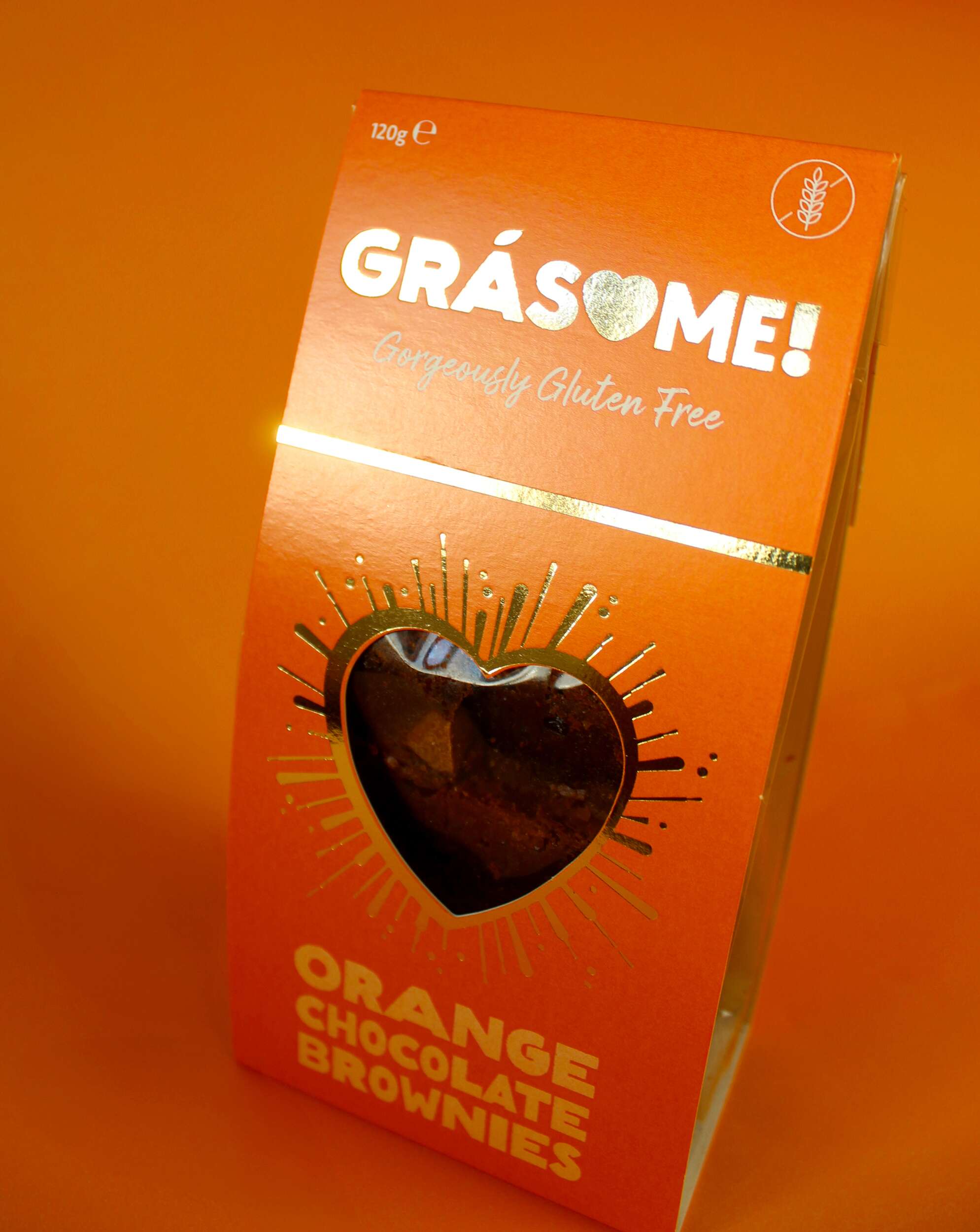
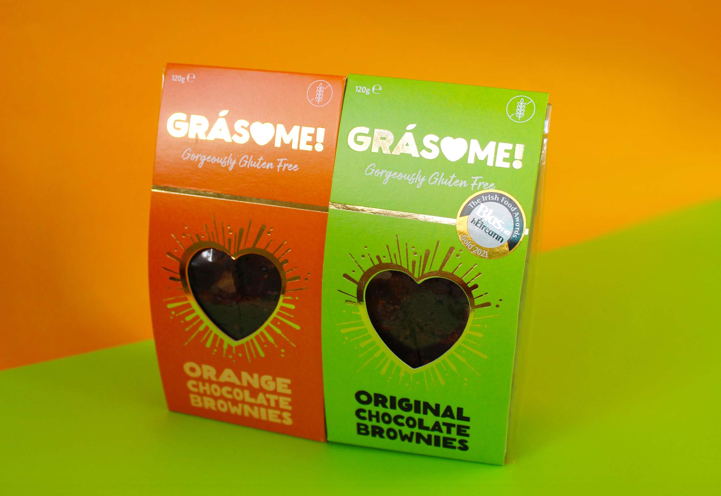
Grásome! stands out not only for its delectable products but also for its strong, memorable visual identity. We approached the branding with the goal of blending luxury, fun, and warmth – all key aspects of the product’s personality. The product flavour names incorporate a rustic, earthy font that mimics the textures found in brownies, cakes, and baking, emphasising the hand-made nature of the products. The letter ‘O’ is cleverly replaced with a heart, signifying both love and the personal care that goes into every batch. The fada (accent) on the ‘a’ is stylized as a leaf, symbolising the brand’s use of natural ingredients. The exclamation mark at the end of the name encapsulates the brand’s energetic, fun vibe, tying back to the playfulness of the word “awesome.” The tagline “Gorgeously Gluten Free” sits beneath the brand name in a handwritten font, reinforcing the personal, hand-crafted element of the brand while also making the gluten-free aspect clear and prominent.
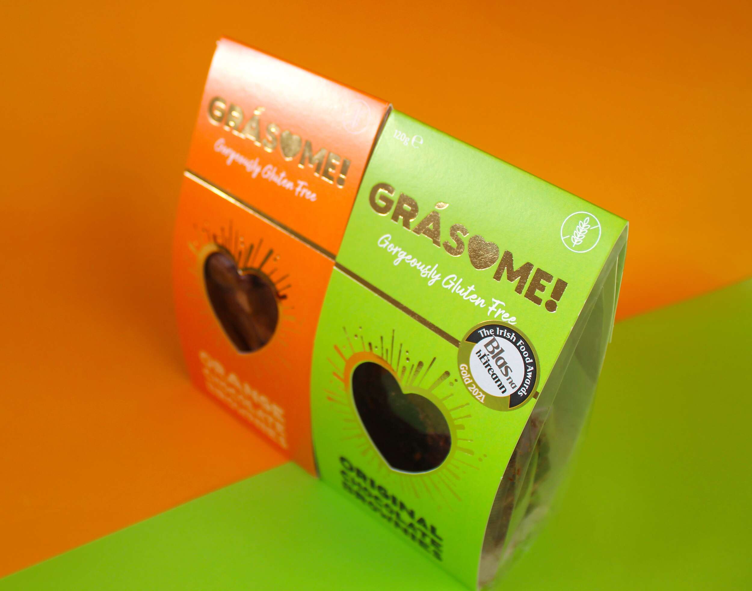
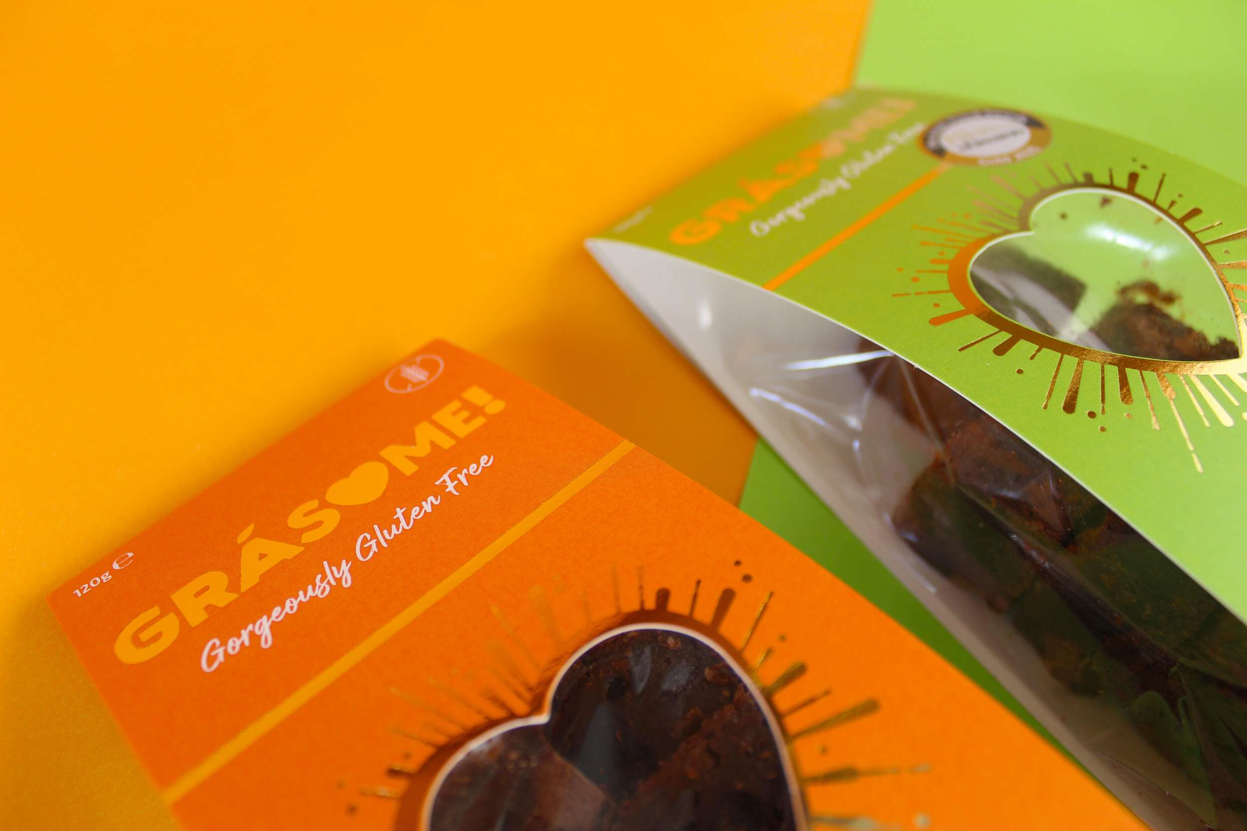
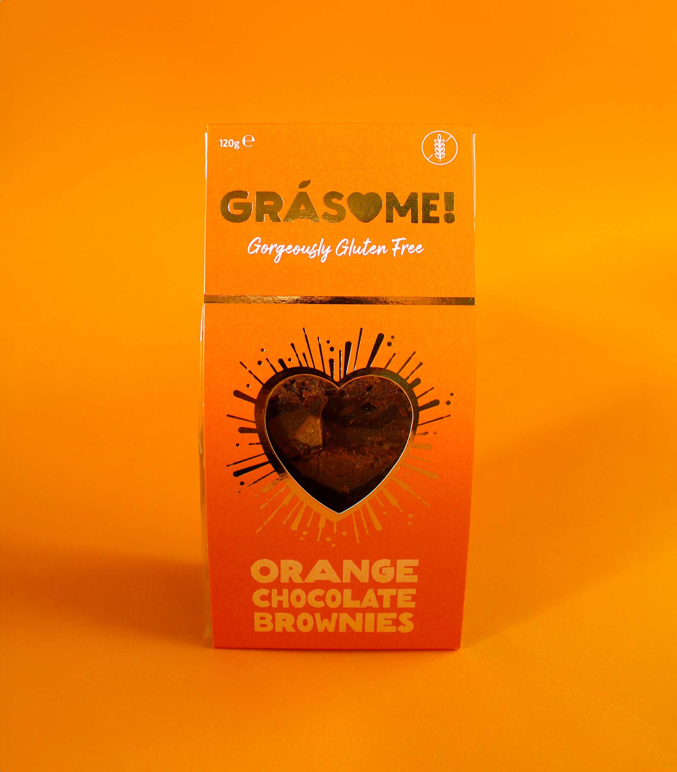
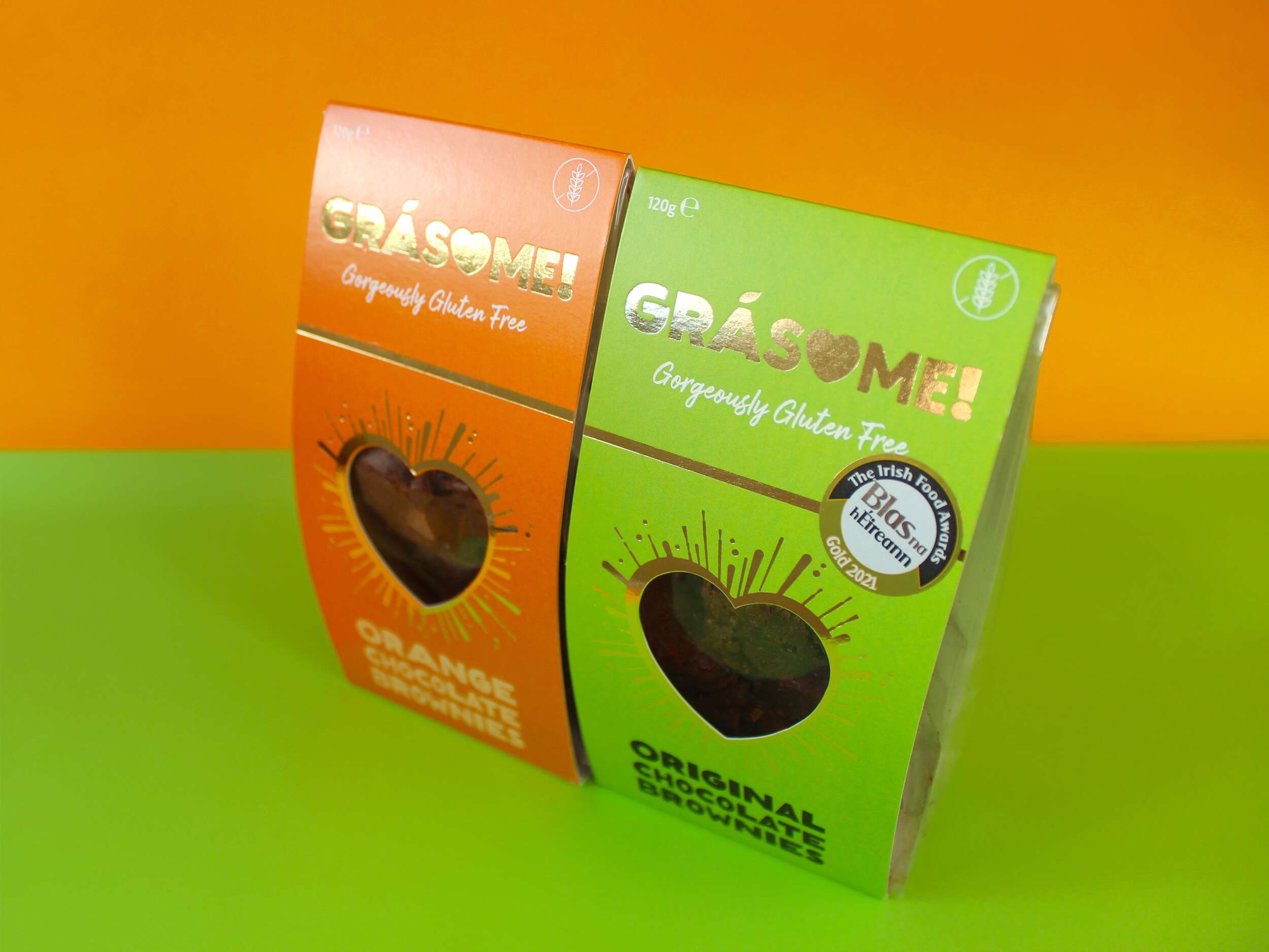
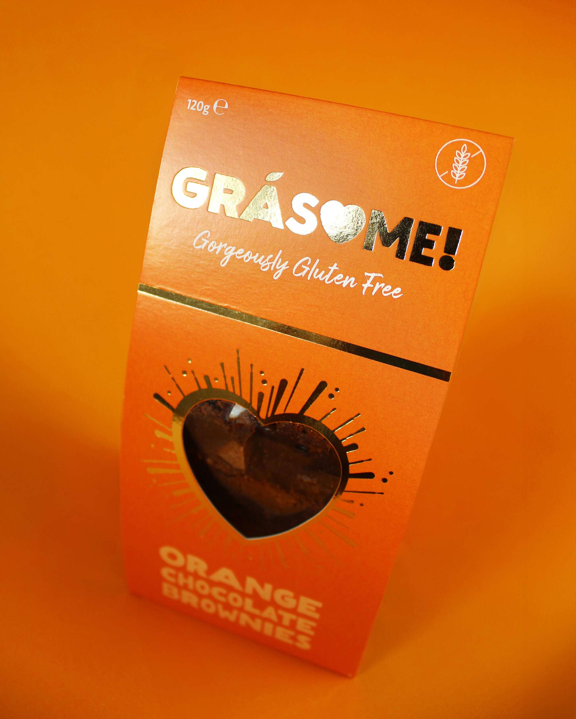
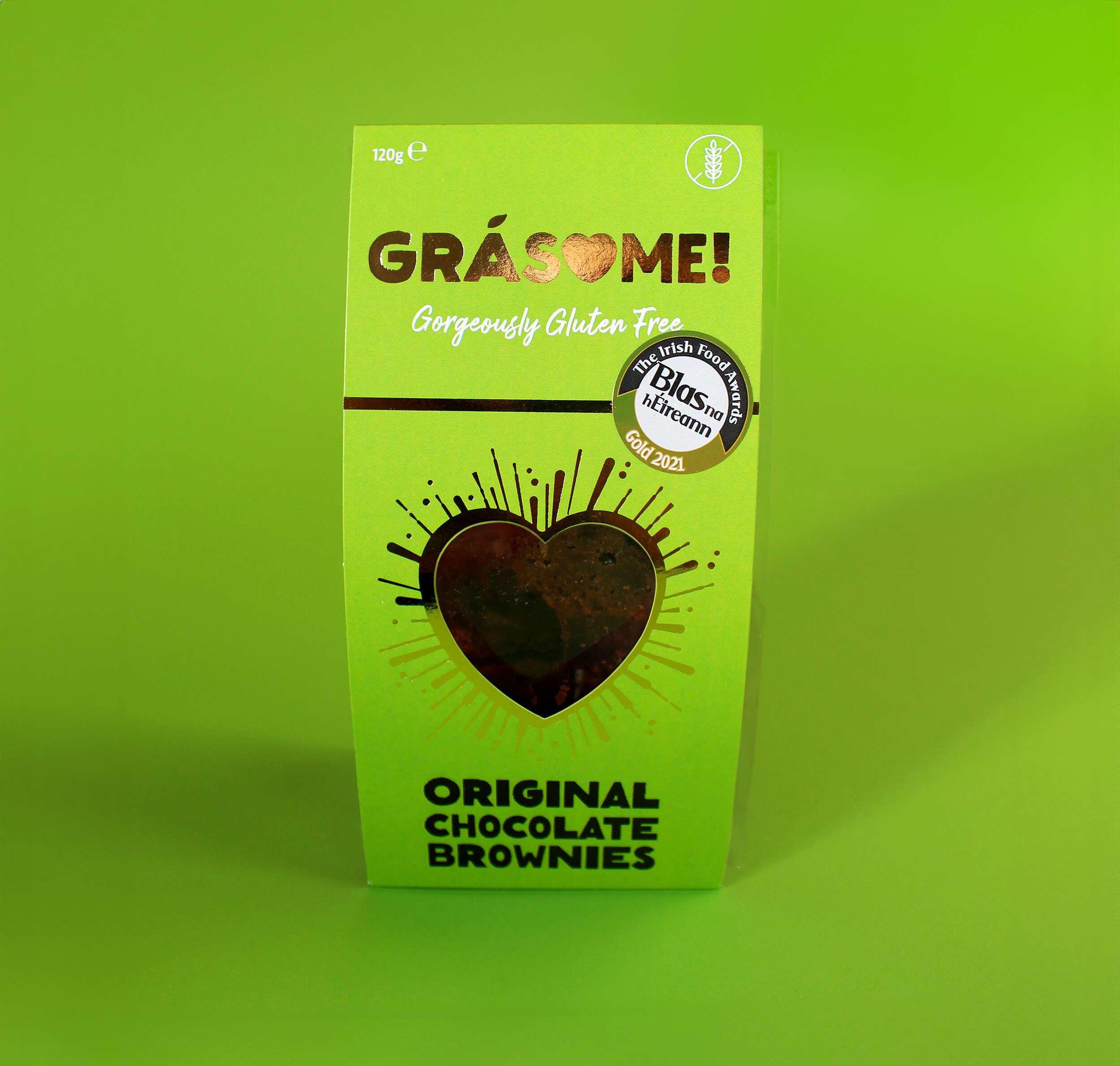
The colour palette is designed to be bright and vibrant, reflecting the client’s ethos of living life to the fullest and embracing boldness. It ensures the product stands out on the shelf, commanding attention rather than blending into the background. Each flavour is represented by a distinct, vivid hue—green for the original flavour and orange for the orange variety—highlighting the brand’s playful and energetic character. The use of gold foil adds a touch of luxury, reinforcing the high quality of the products while maintaining a warm, approachable aesthetic.
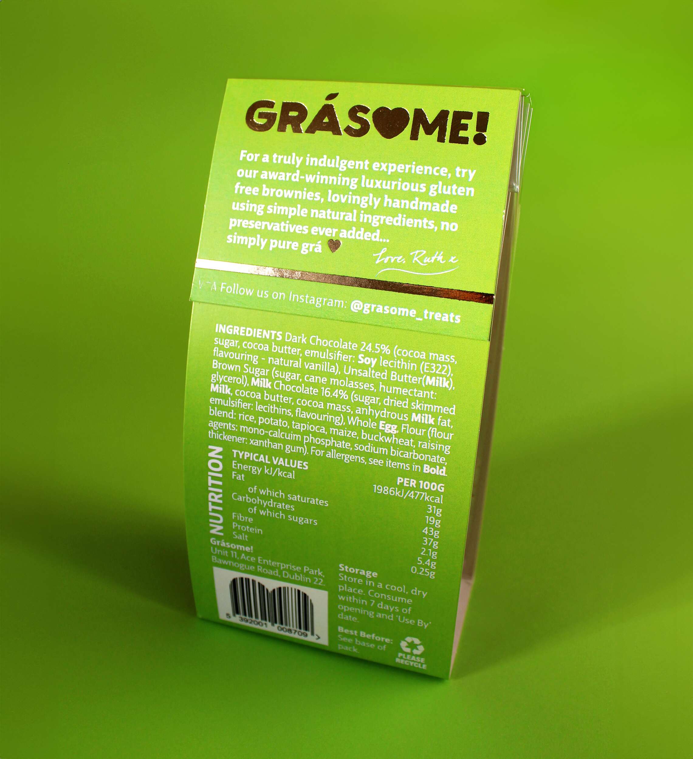
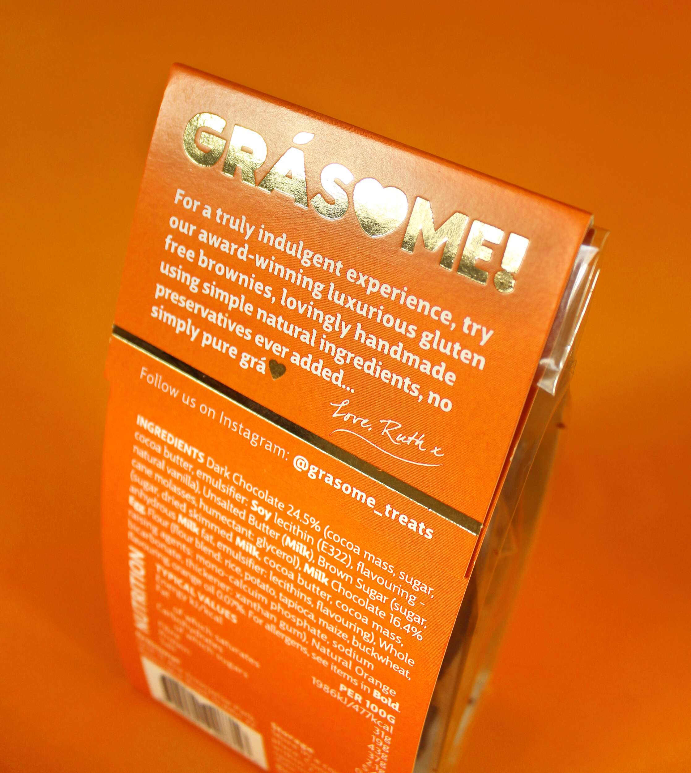
The packaging design features a cardboard sleeve with a heart-shaped cutout on the front, mirroring the heart in the logo. This allows the consumer to catch a glimpse of the brownies inside, creating an instant emotional connection. Gold foil lines radiate out from the heart cutout in a celebratory style, further enhancing the premium feel. The back of the packaging includes a personal note from Ruth, inviting consumers to share in the love and care she pours into her products:
“For a truly indulgent experience, try our award-winning luxurious gluten-free brownies, lovingly handmade using simple natural ingredients, no preservatives ever added… simply pure grá.
Love, Ruth x”
Sustainability is a key pillar of the Grásome! brand, reflected in the fully recyclable packaging. This aligns with Ruth’s values and her personal experiences living in eco-conscious environments like New Zealand and Antarctica. The reusable delivery boxes also emphasize the brand’s commitment to reducing waste.
The primary typeface, Big City Grotesque Pro, provides a clean, modern look, ensuring legibility and consistency across all brand materials. To balance this with a more playful touch, HelloMixed, a quirky, display font, is used for headings and flavour titles, mimicking the playful and earthy nature of the brand. Arsilon, a handwritten font, is reserved for smaller descriptors like “Gorgeously Gluten Free,” adding a personal, friendly feel to the packaging and marketing collateral.
Grásome! successfully redefines the perception of gluten-free products, celebrating them as indulgent, luxurious, and full of character. A proud finalist in the 2024 Irish Quality Food and Drink Awards, the brand stands as a testament to Ruth’s deep-rooted love of food, family heritage, and personal journey in mastering gluten-free baking. Through thoughtful design and a playful yet elegant brand identity, Grásome! communicates its promise to deliver treats that are not only delicious but also made with love, care, and passion. The packaging itself becomes part of the experience, making Grásome! treats perfect for sharing, gifting, or savoring all to oneself.
In a competitive gluten-free market, Grásome! proudly stands out as a brand that marries luxury and fun, offering consumers a product that doesn’t compromise on quality, style, or taste.
Follow Grásome! online:
Instagram: @grasome_treats
Twitter / X: @Grasome_treats
Website: Grásome Website
Packaging printed by Esmark Finch:
Instagram: @jjotoole_ie
Website: www.jjotoole.ie

The Woofing Oven Dog Bakery: Brand Packaging Design
The Woofing Oven Dog Bakery: Brand Packaging Design

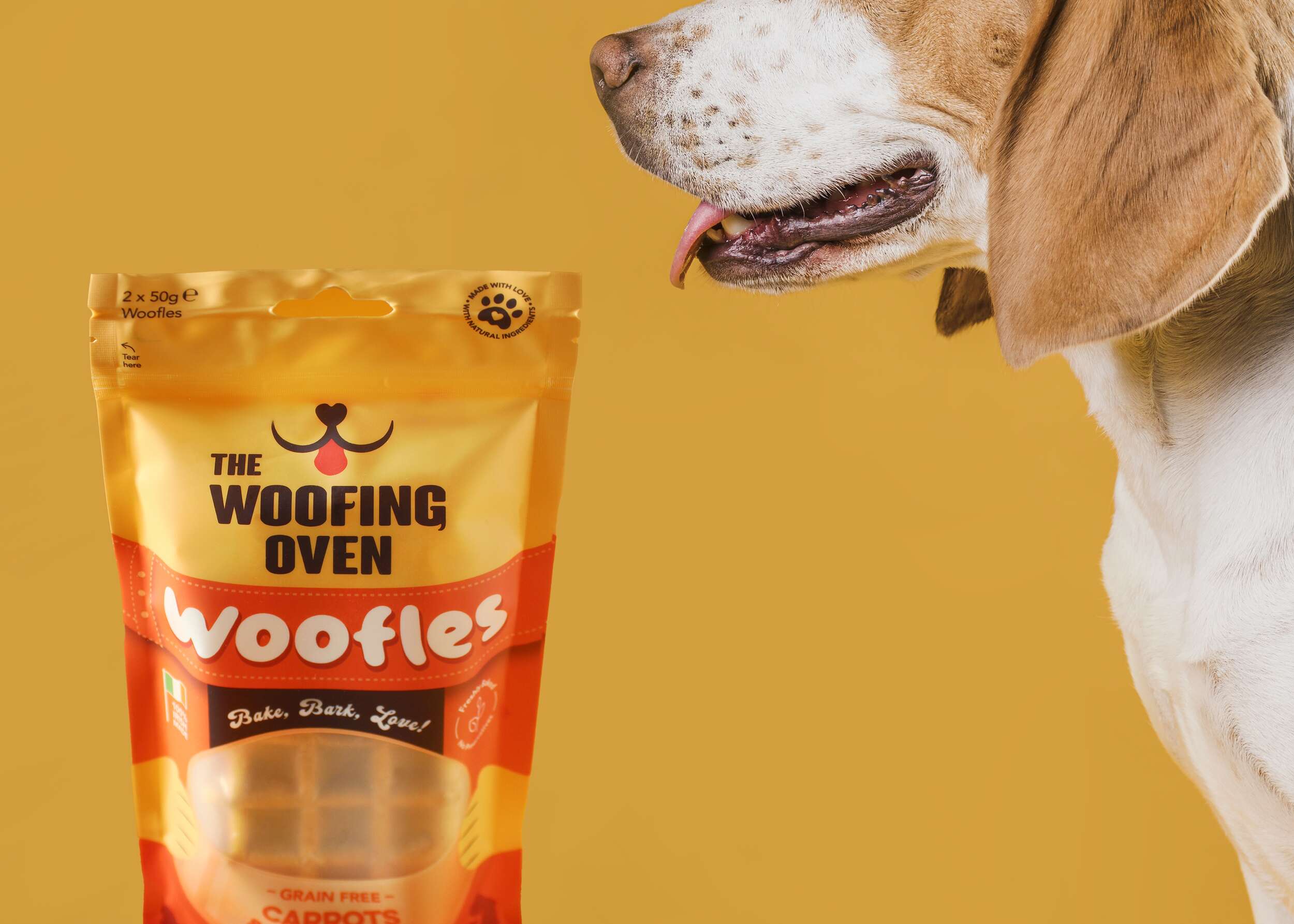
The Woofing Oven is a Dublin-based home-run bakery for dogs, crafting a fun and creative range of gourmet treats to pamper your furry friends with the love and care they deserve.
The Woofing Oven firmly craft their dog treats with love, care, and thoughtfulness. All of their products are homemade and created in small batches, reaffirming their commitment to producing celebratory dog treats made from 100% natural ingredients, locally sourced, and proudly the first specialised treats produced and marketed in Ireland.
Their mission is to become Ireland’s foremost dog bakery, expanding their product range while remaining dedicated to their goal of being a part of your dog’s milestone moments.

 The Woofing Oven’s packaging design challenge was to create a visually striking, retail-ready package that reflects the brand’s fun, celebratory nature while emphasizing its commitment to quality, natural ingredients, and Irish craftsmanship. The existing brand (formerly known as Bon A Pet Treats) needed a fresh identity that would stand out in a crowded dog food aisle, making the transition from local markets to mainstream retail.
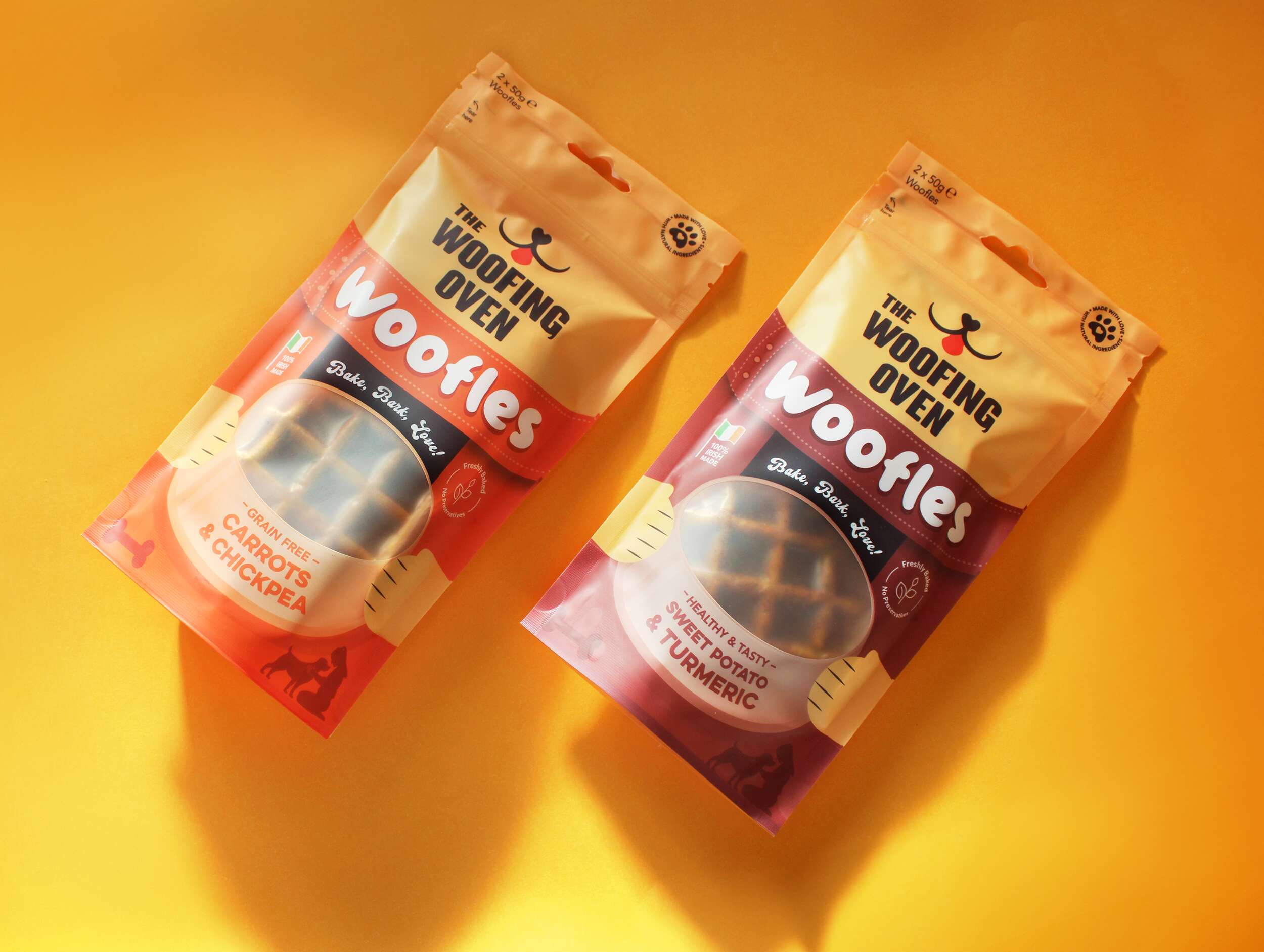
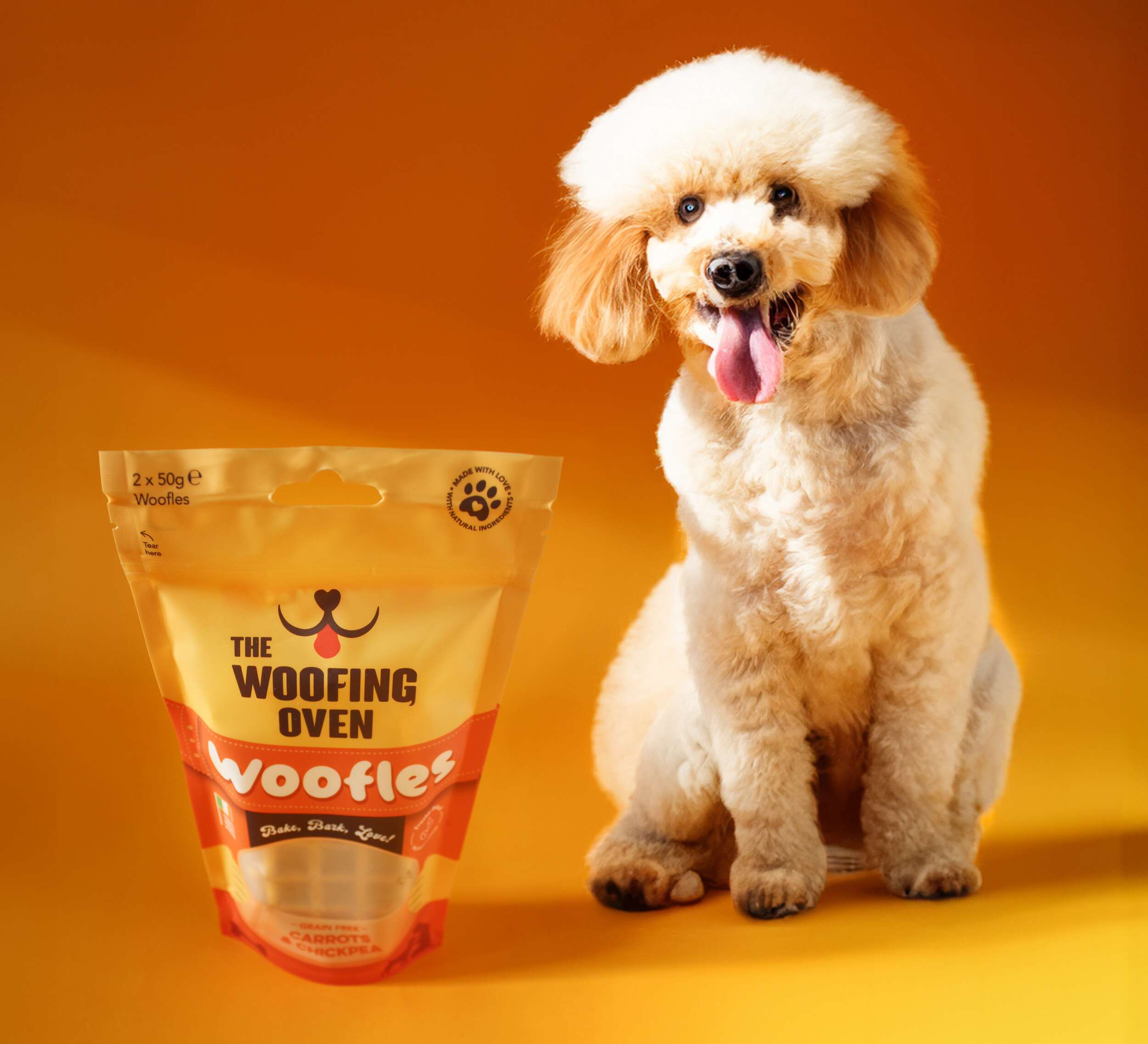
The packaging had to balance playfulness and sophistication, capturing the brand’s core values: gourmet quality, homemade care, and the celebration of the bond between dogs and their owners. Our goal was to create a design that was instantly recognizable, incorporating bright and vibrant colours with a playful dog icon and a fun logo featuring flicks reminiscent of dog tails. The use of fonts like FTF Brotein for headings and Hittedal Script for a handwritten touch helped to convey the brand’s personal, handcrafted approach.
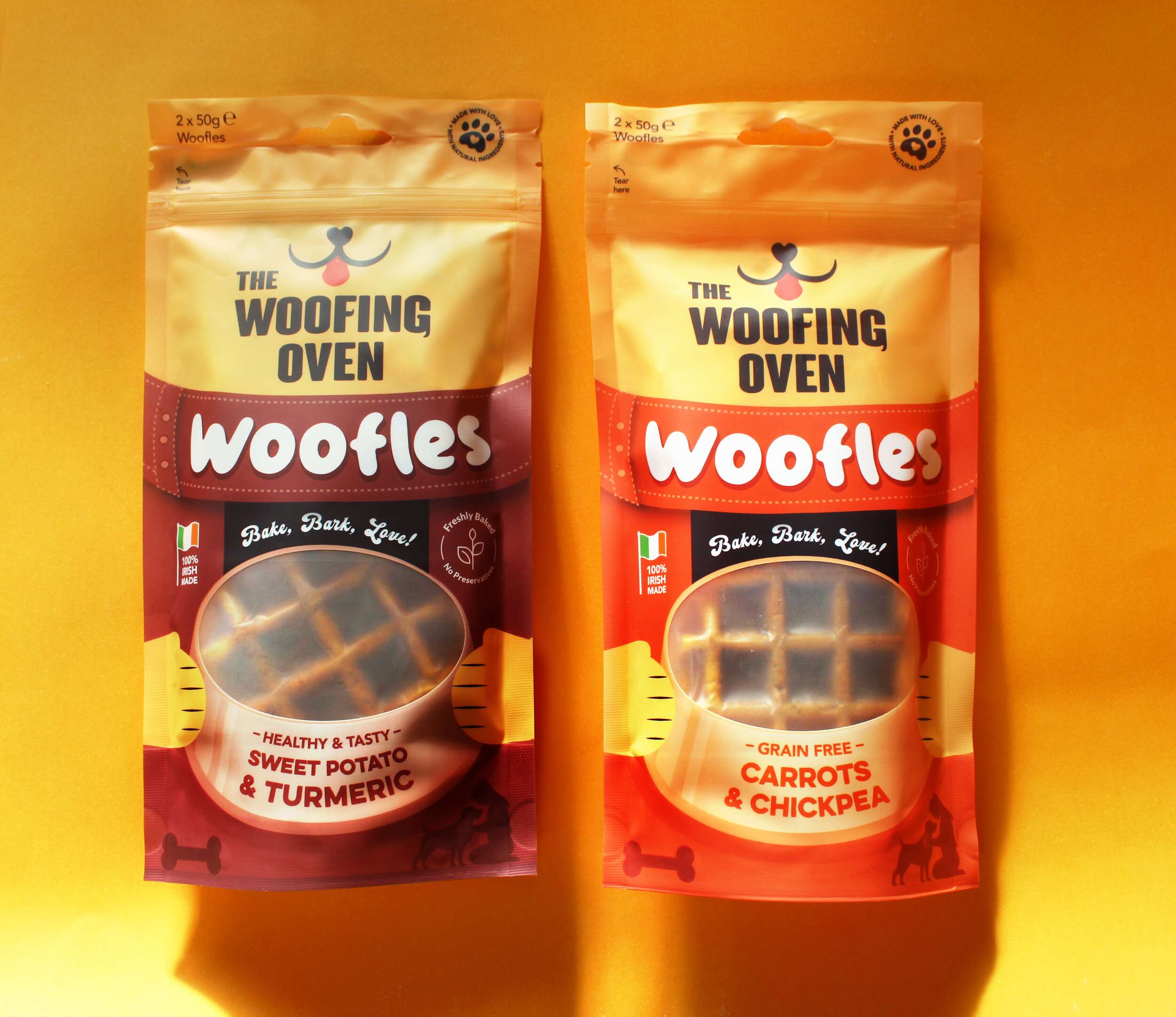
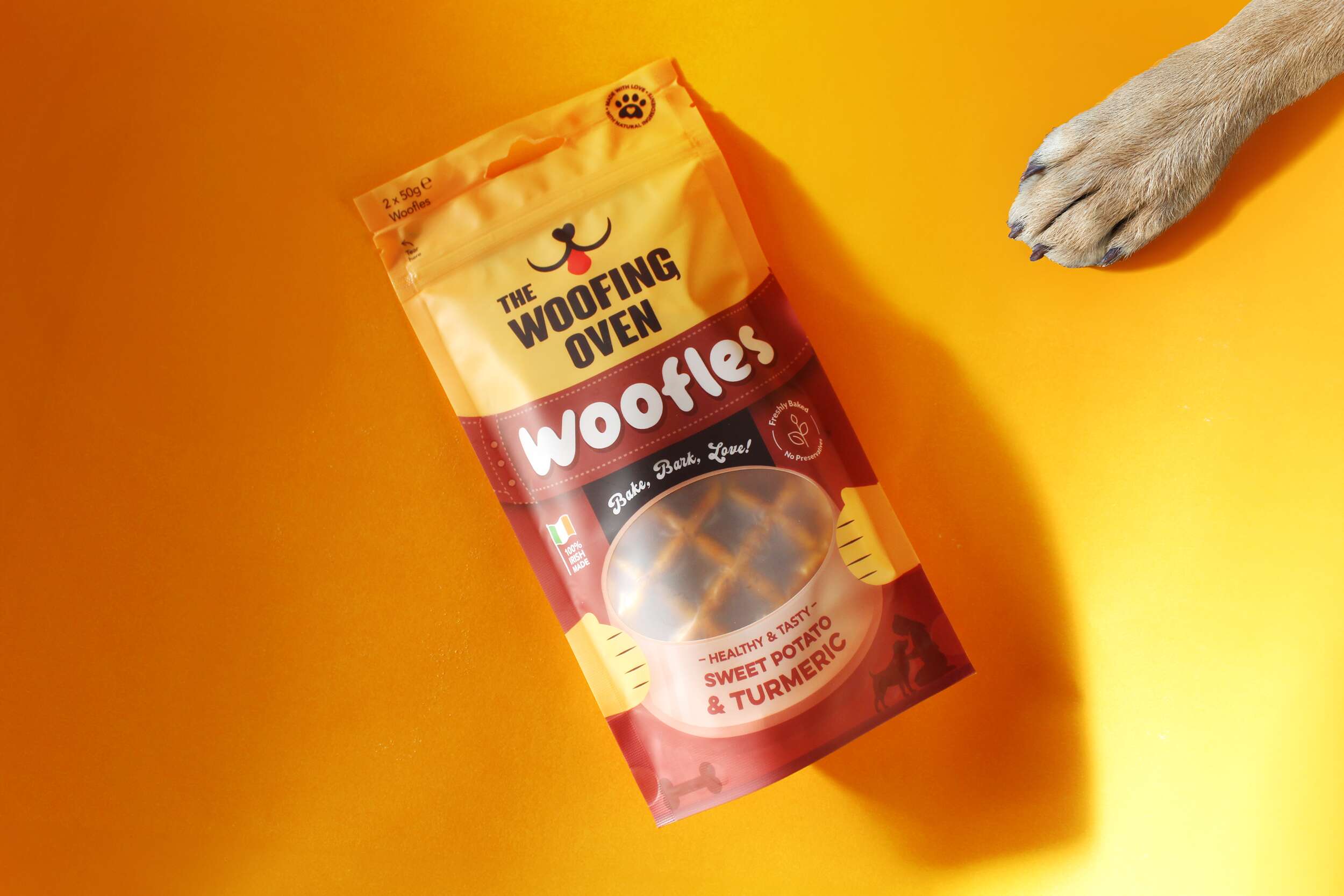
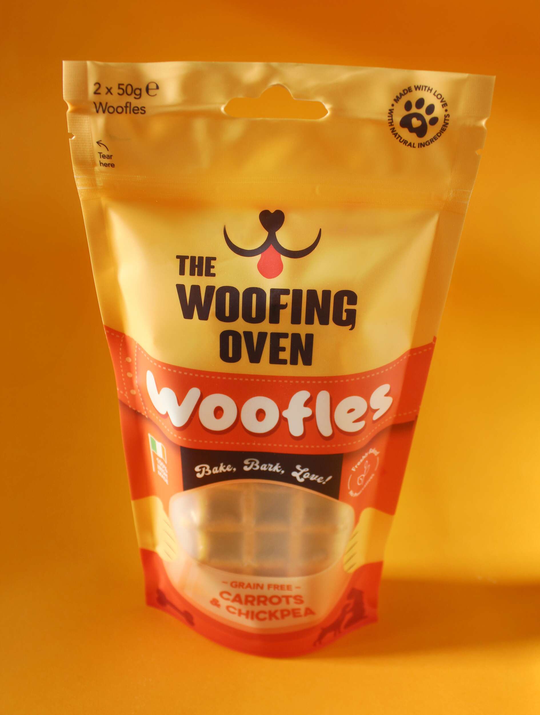
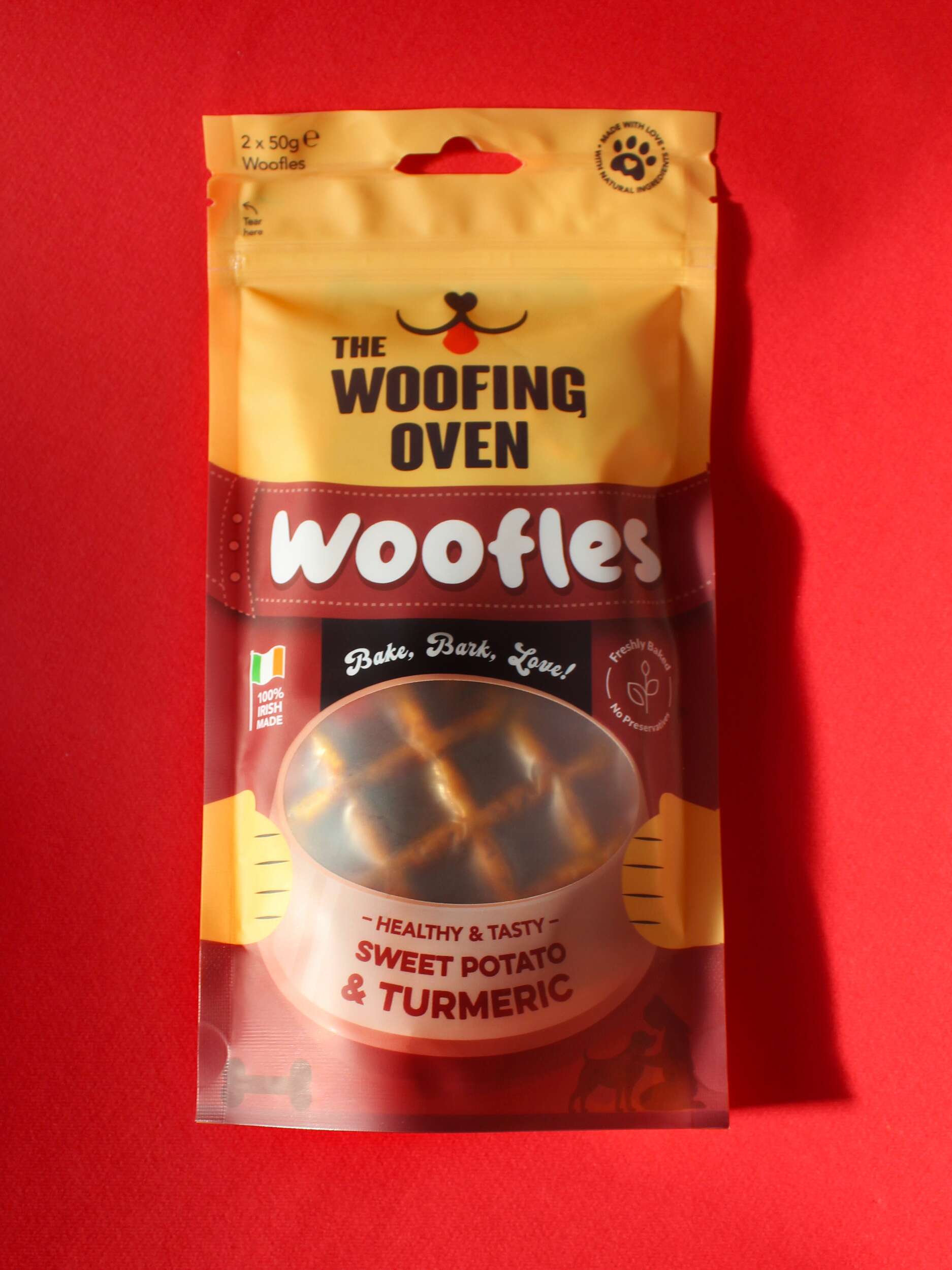
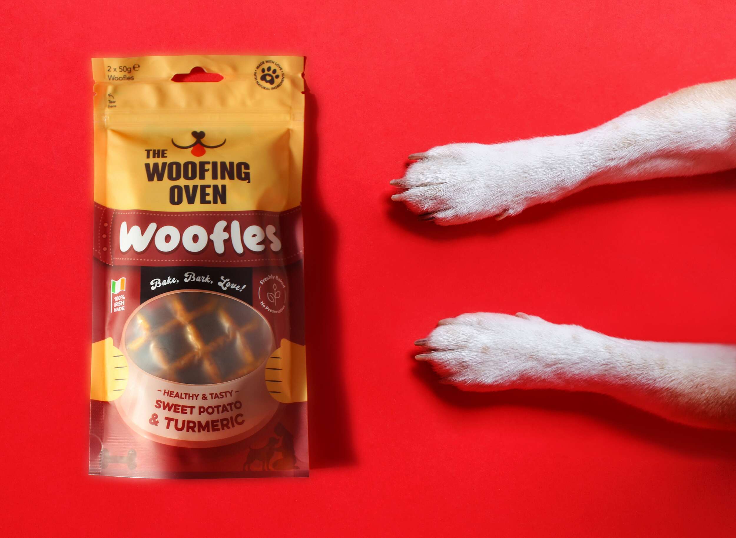
The packaging design for The Woofing Oven reflects the brand’s mission to provide gourmet, all-natural dog treats in a way that’s both fun and functional, while ensuring retail success. One of the standout features of the packaging is the window at the front of the packs, which showcases the product itself – “Woofles,” a unique waffle treat for dogs. This window is framed by a graphic of a dog bowl, with an illustration of two paws holding the bowl on either side. The product’s appearance is a key selling point, and this window allows the Woofles to be seen directly, reinforcing the quality and novelty of the treat.
To further enhance flavour recognition, each flavour pack features a distinct colour, making it easy for consumers to differentiate between products on the shelf. The flavour description sits within the dog bowl graphic on the front, adding clarity to the playful design. An icon with a paw print containing a heart is prominently displayed alongside the text “Made with love, using natural ingredients,” reinforcing the brand’s commitment to homemade, high-quality products crafted with care.
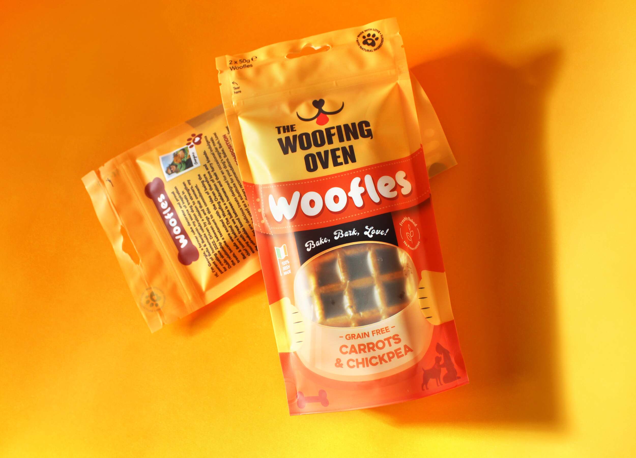
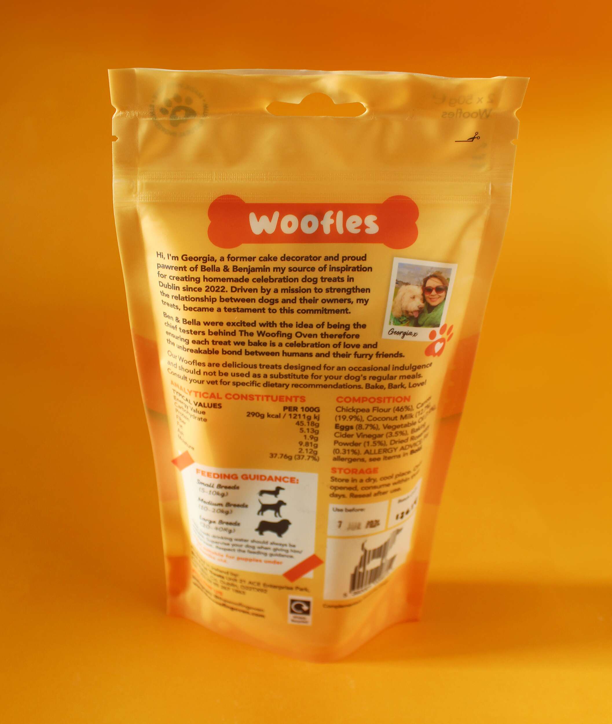
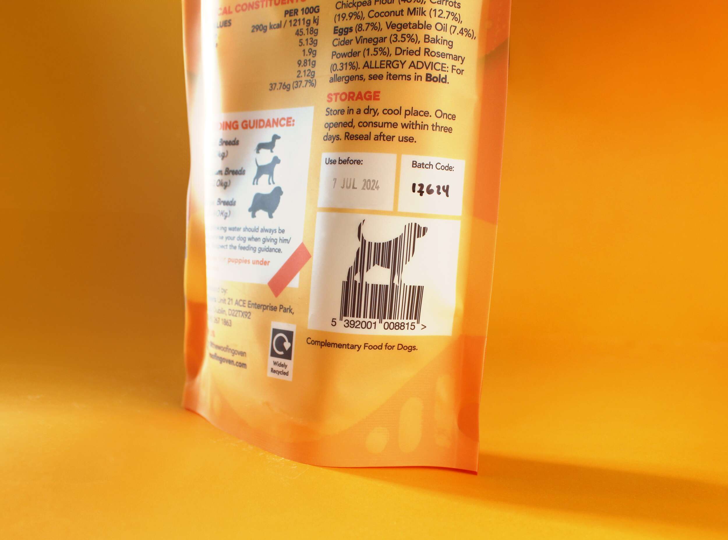
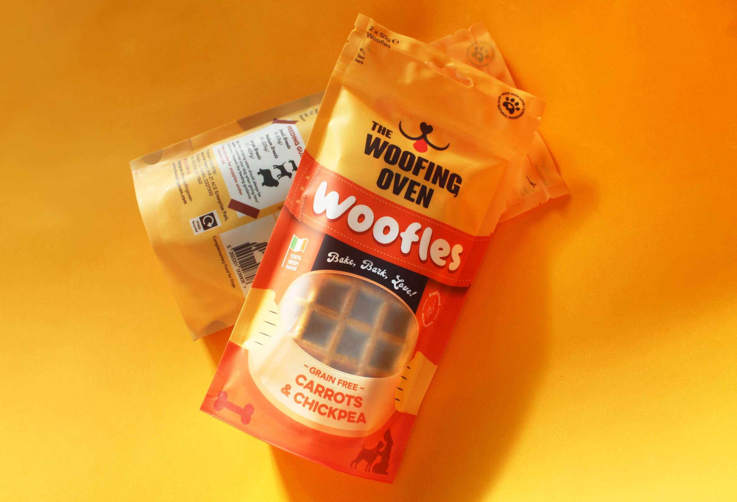
The back of the pack offers additional features aimed at connecting with consumers. It includes a personal brand story, helping to establish the business as a small, local bakery with a strong passion for dogs. Feeding instructions are displayed with icons showing portion sizes for different dog breeds, helping consumers make informed decisions based on their dog’s size. Another unique element is the barcode, shaped like a dog, adding creativity that aligns with the fun, dog-centric theme.
The packaging highlights the product’s sustainability, featuring an icon communicating that the pack is widely recyclable, as it’s made from polyethylene (PE). Small visual touches throughout the design, such as icons of a plant with the phrase “Freshly baked, no preservatives” and an illustration of an owner with their dog, further that these treats are healthy, natural, and designed specifically for dogs.
The Woofing Oven’s packaging design strikes the perfect balance between playful visual elements and key functional features, making it memorable, engaging, and informative for dog lovers seeking premium treats.
Follow The Woofing Oven on Social Media:
Instagram: @thewoofingoven
Facebook: The Woofing Oven
Packaging printed by Epac Flexibles:
Instagram: @epacflexiblepackaging
Website: epacflexibles.com

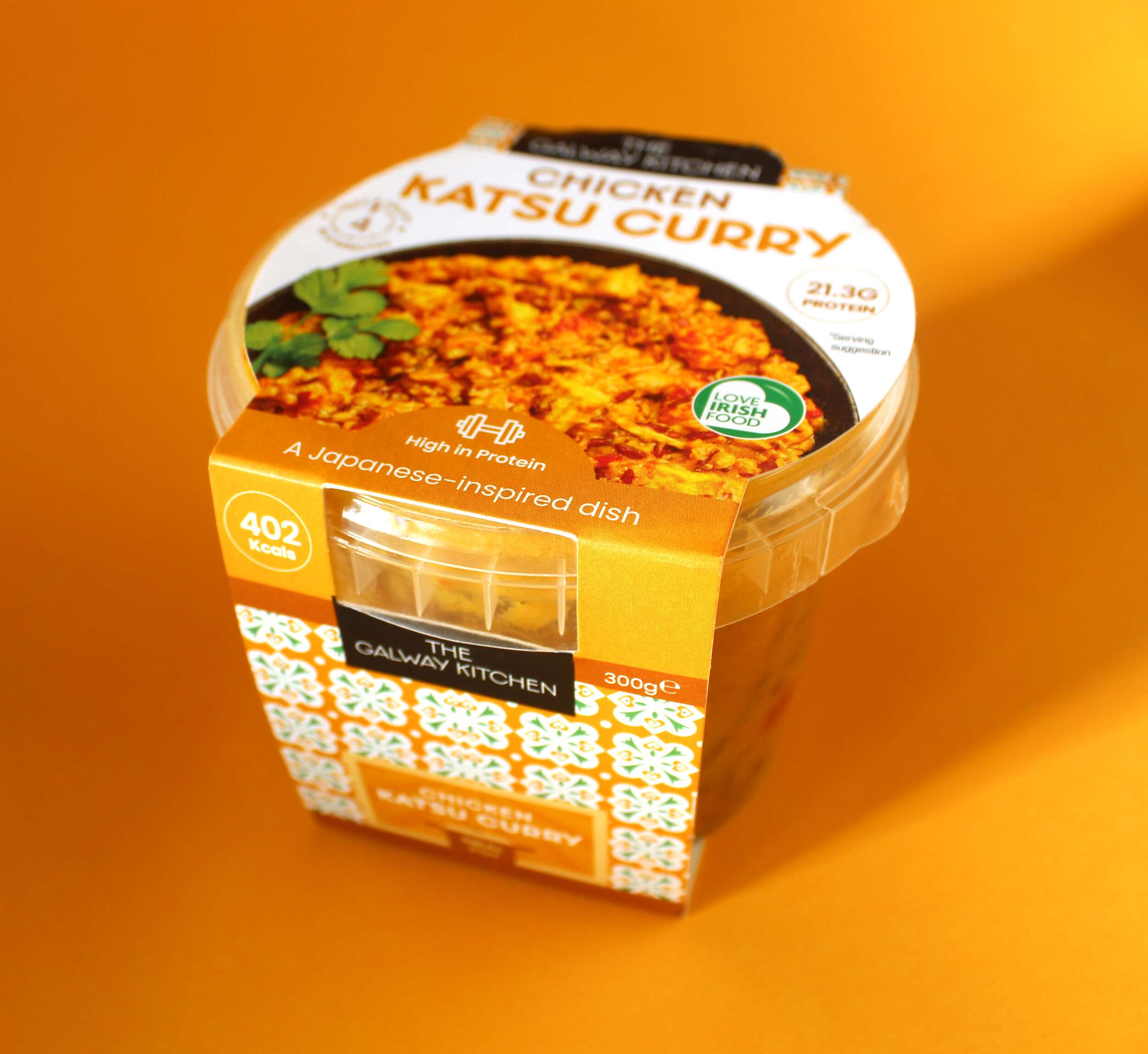
The Galway Kitchen: Hot Pot Ready Meals Packaging Design
The Galway Kitchen: Hot Pot Ready Meals Packaging Design

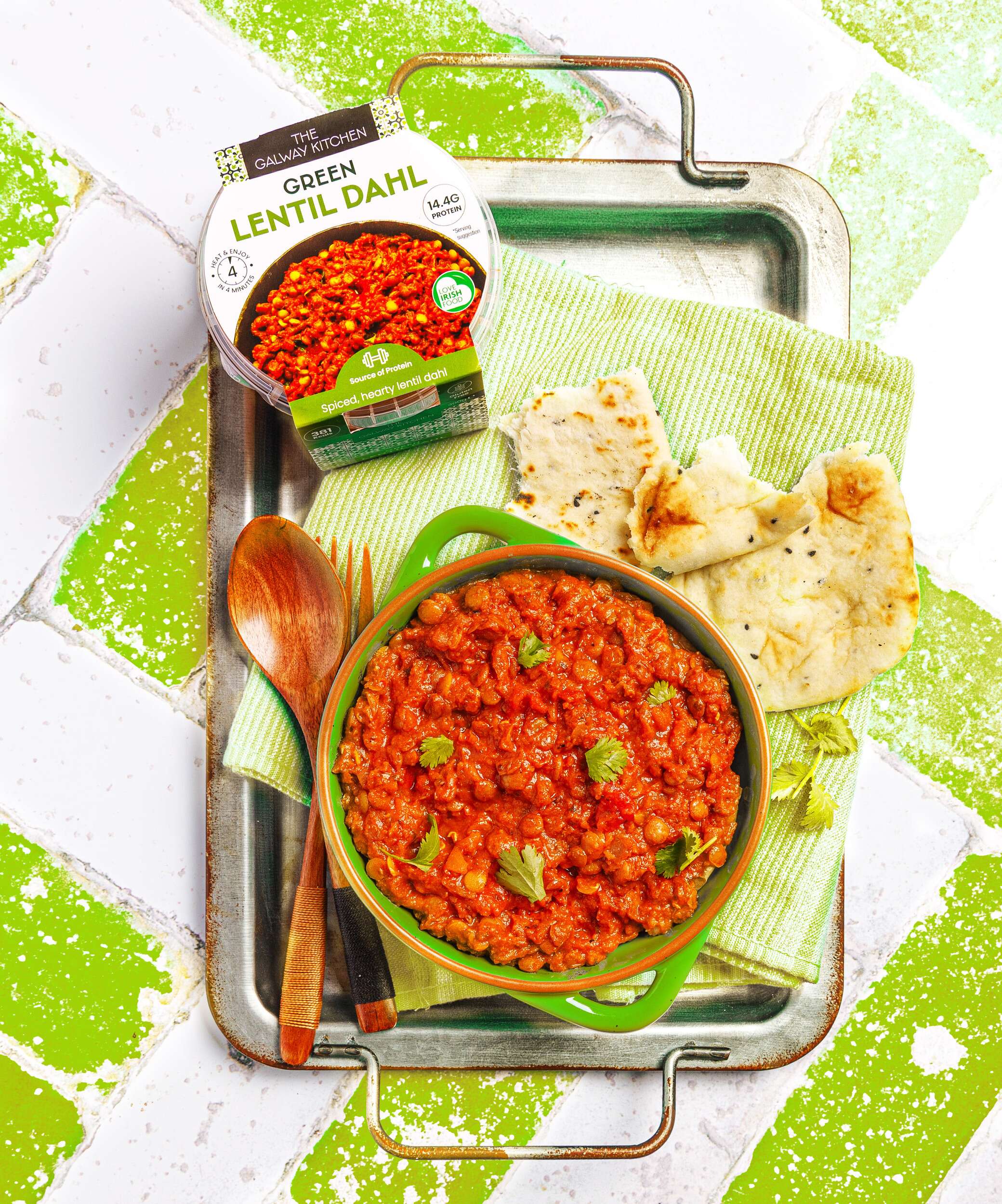
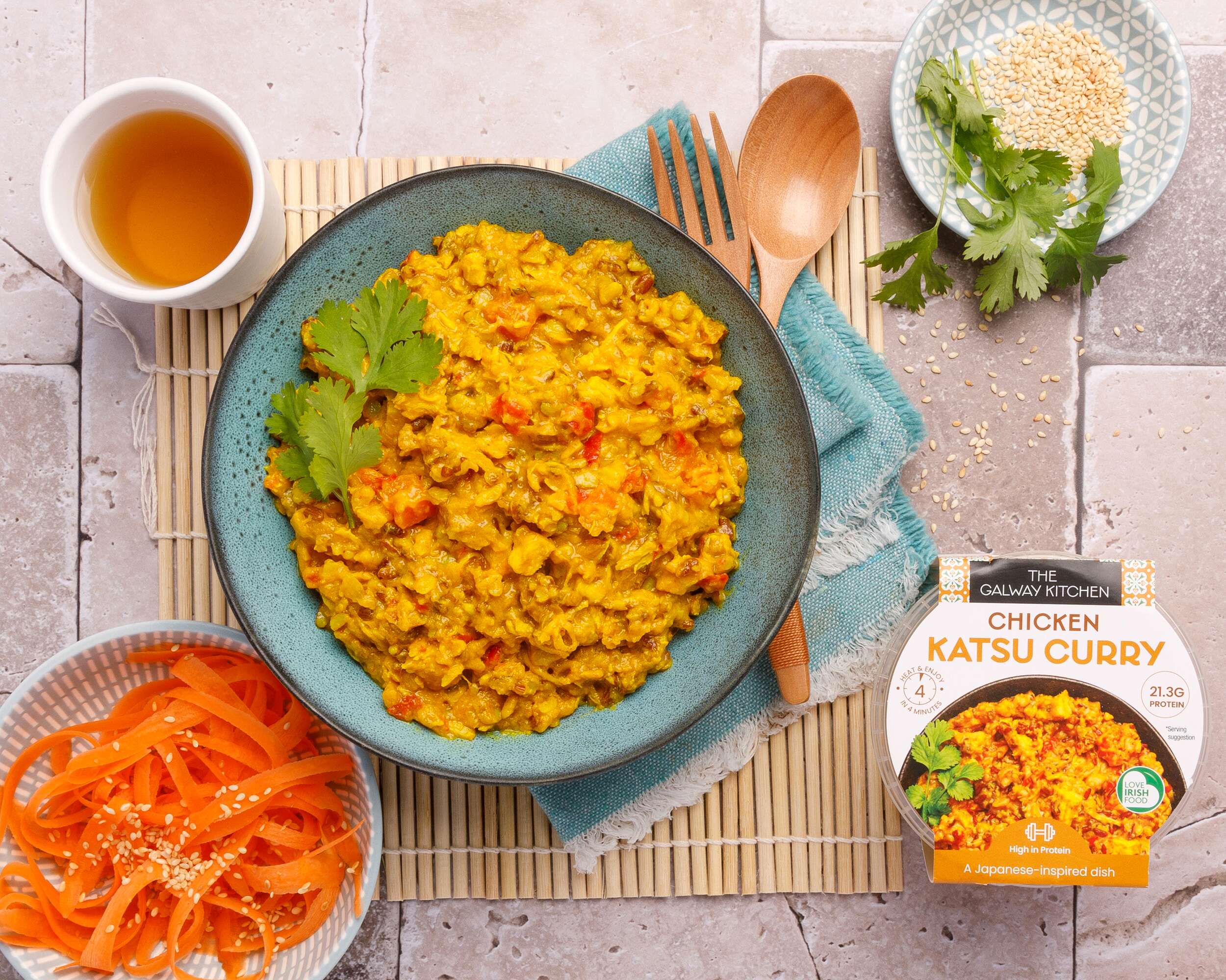
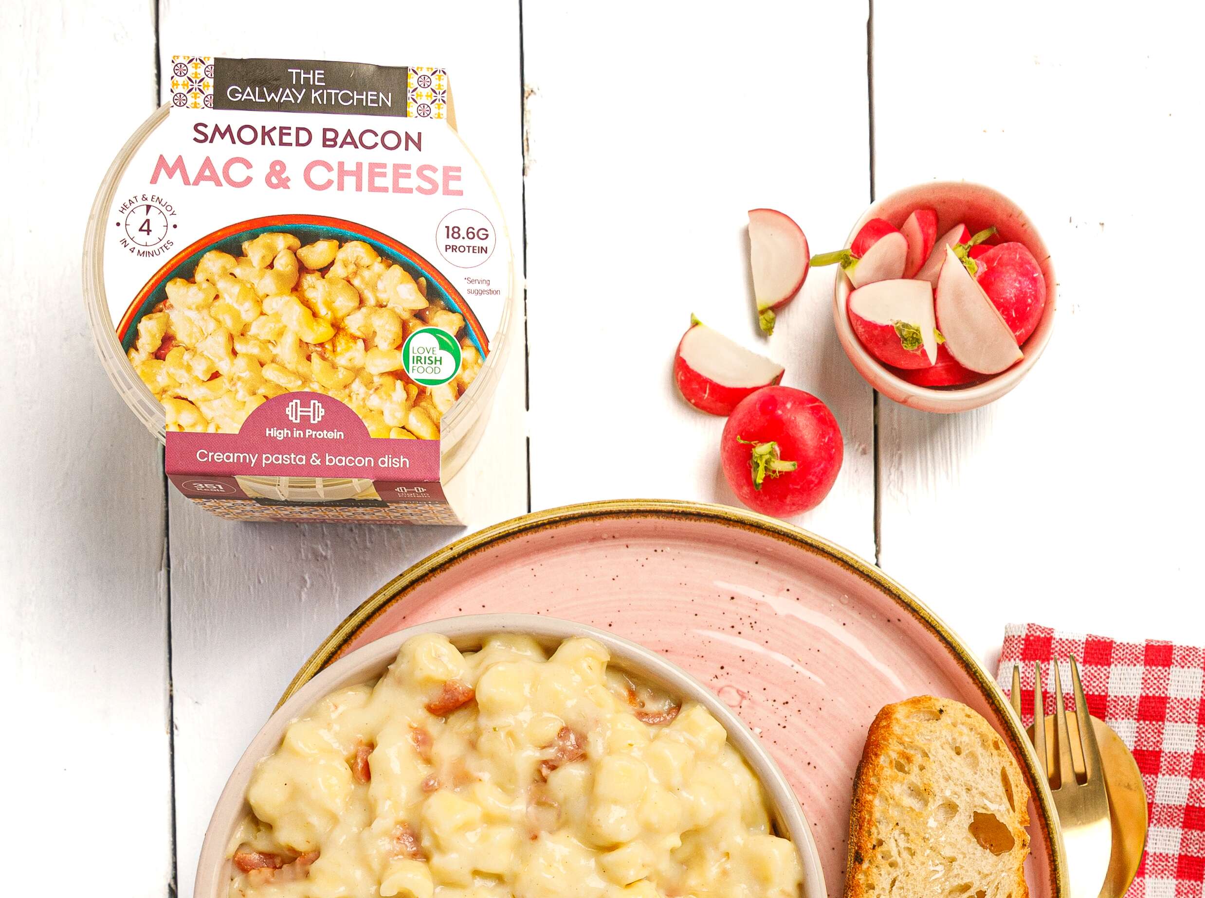
The Galway Kitchen’s food range includes global flavours, inspired by much-loved tastes from around the world, made in their kitchen at the heart of Galway.
The Galway Kitchen brand already existed for their popular houmous dips range when they contacted Clare Lynch Creative. They asked if we could create the packaging design for these hot pot ready meals, to work well alongside their existing houmous range, and also the snack pack range and tasty dips range designed by Clare Lynch Creative, which incorporate bright mediterranean patterns alongside clean, minimal typography and imagery, whilst bringing a fresher vibrant look to the packs to ensure a strong and bold standout impact on shelves.
Another brief request was to show the quality and wholesomeness of the meals by including mouth-watering photography taken by @jenniferocooks. Jennifer also took beautiful in-situ shots of the finished products with their packaging on completion, with the ingredients displayed around the tubs. The Galway Kitchen were delighted with the final design outcome of the range altogether and how well it fits with the rest of their brand range. See their testimonial here…
They are available in @tescoirl stores.
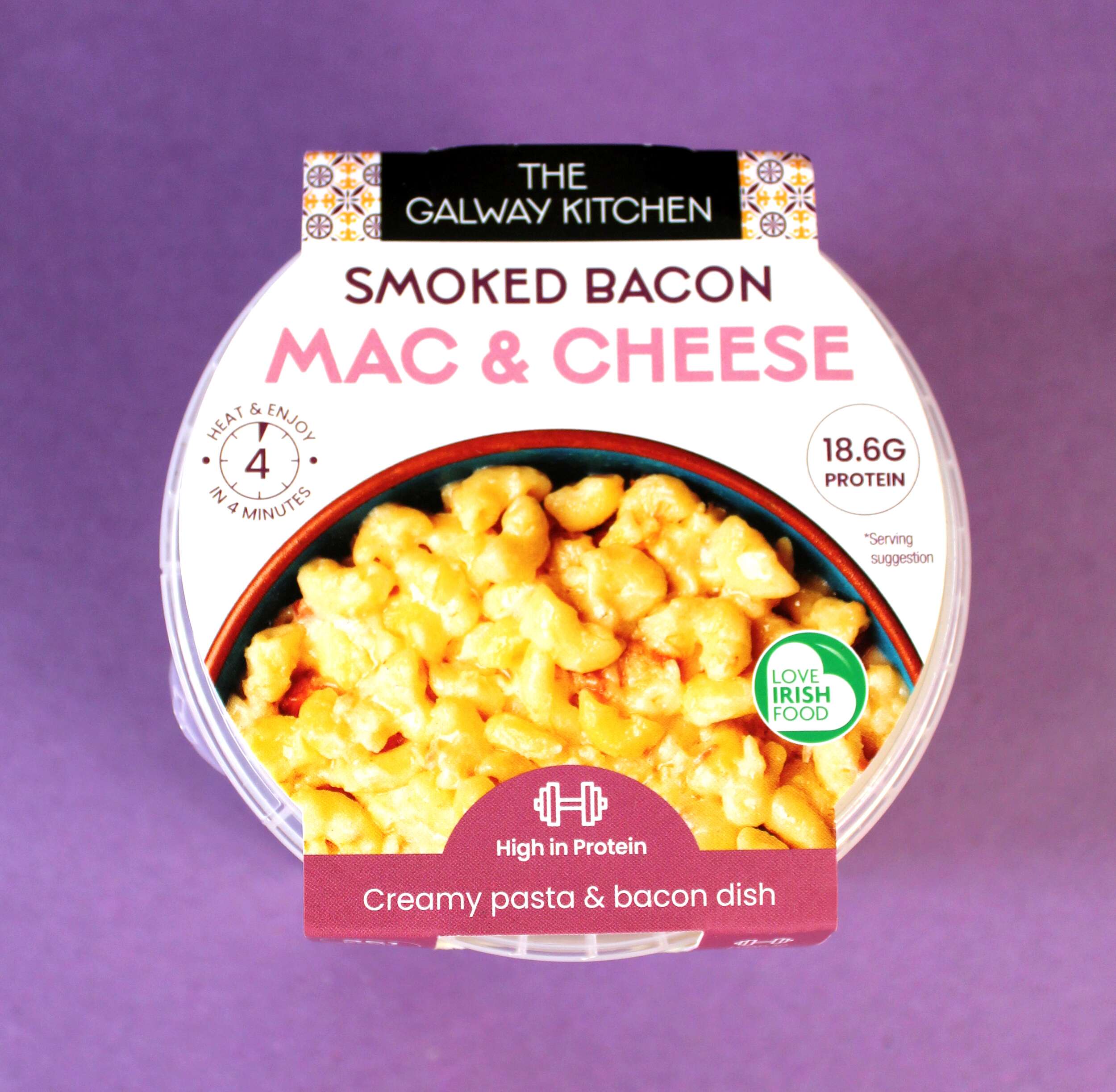
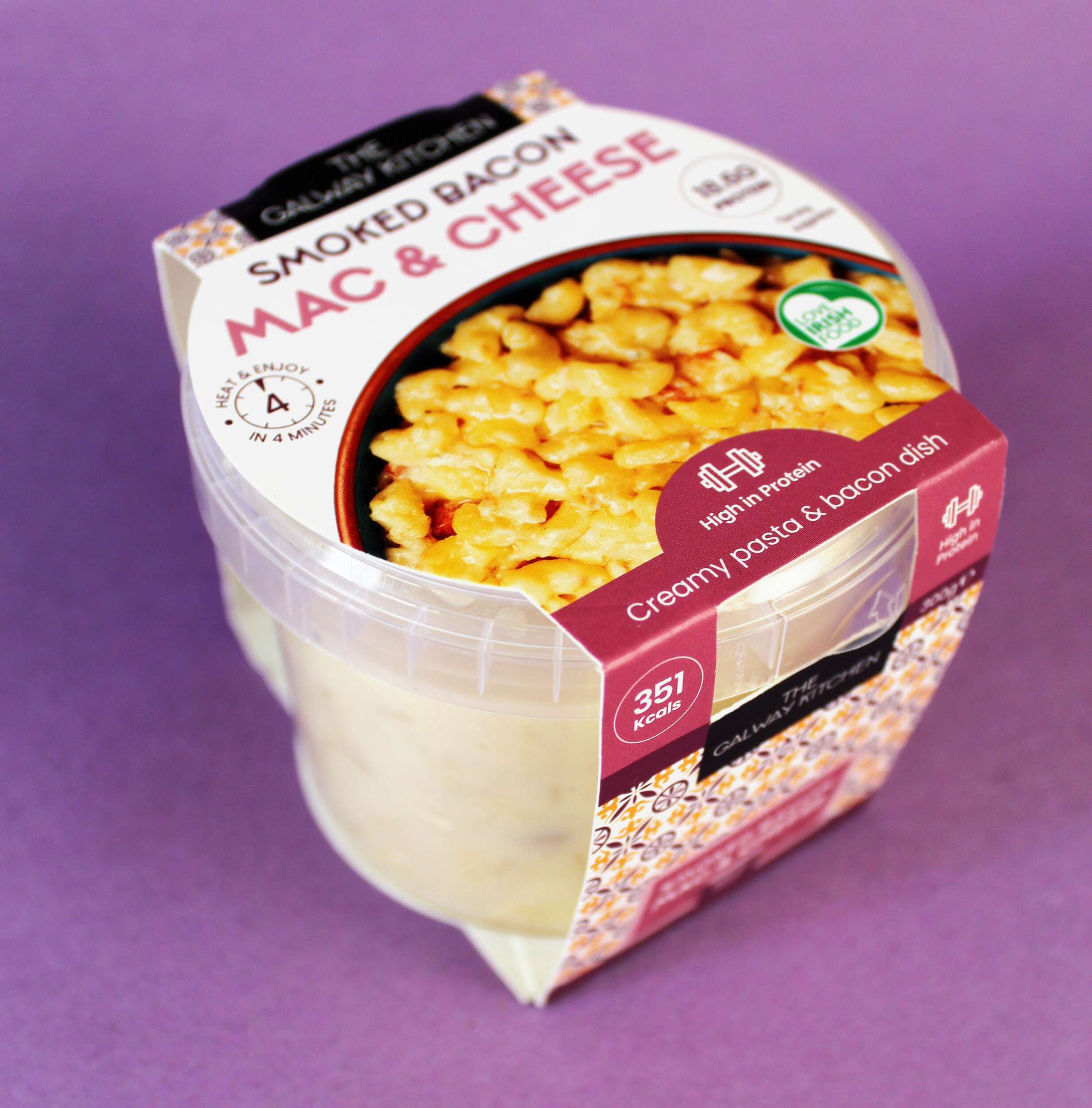
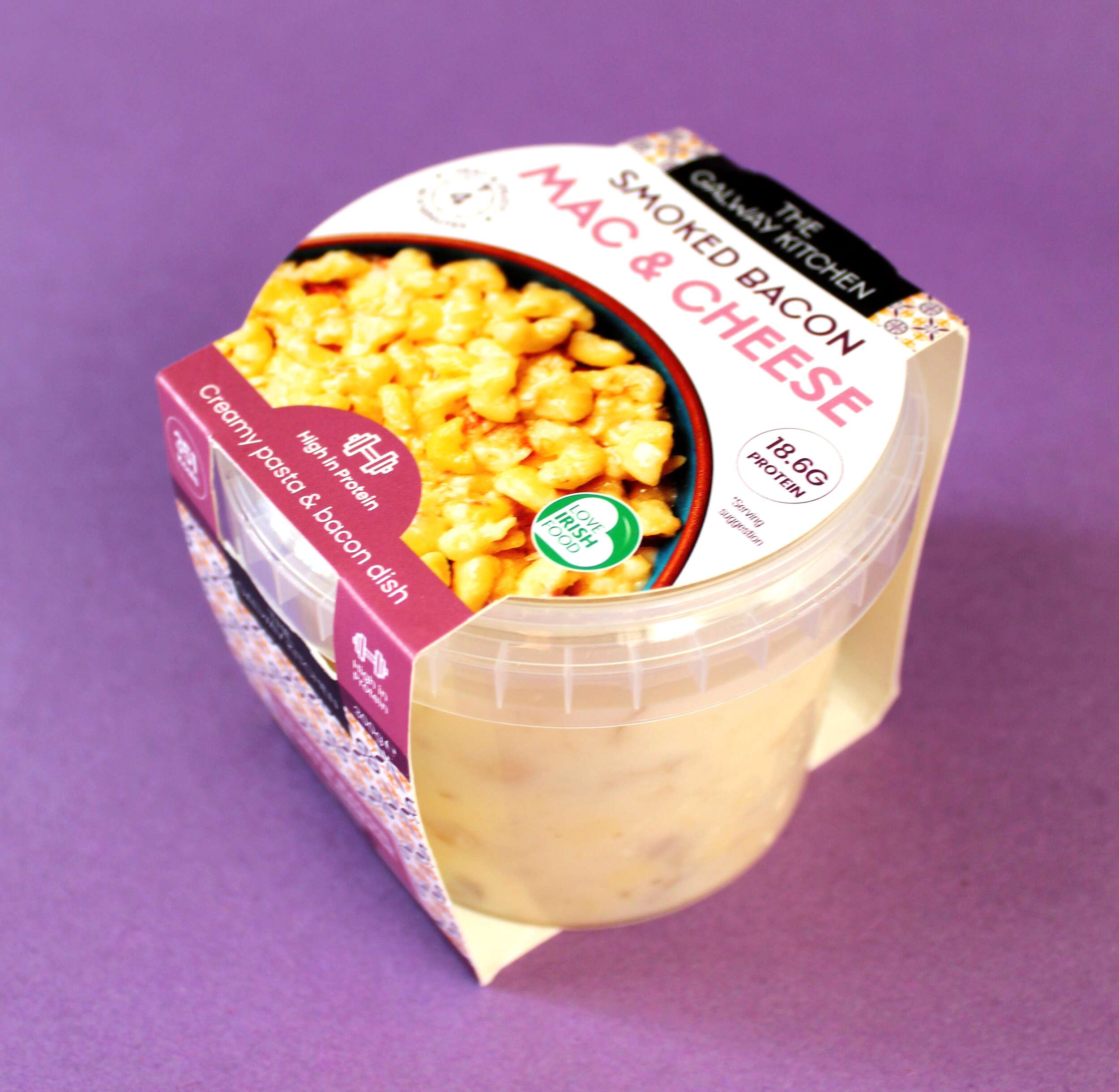
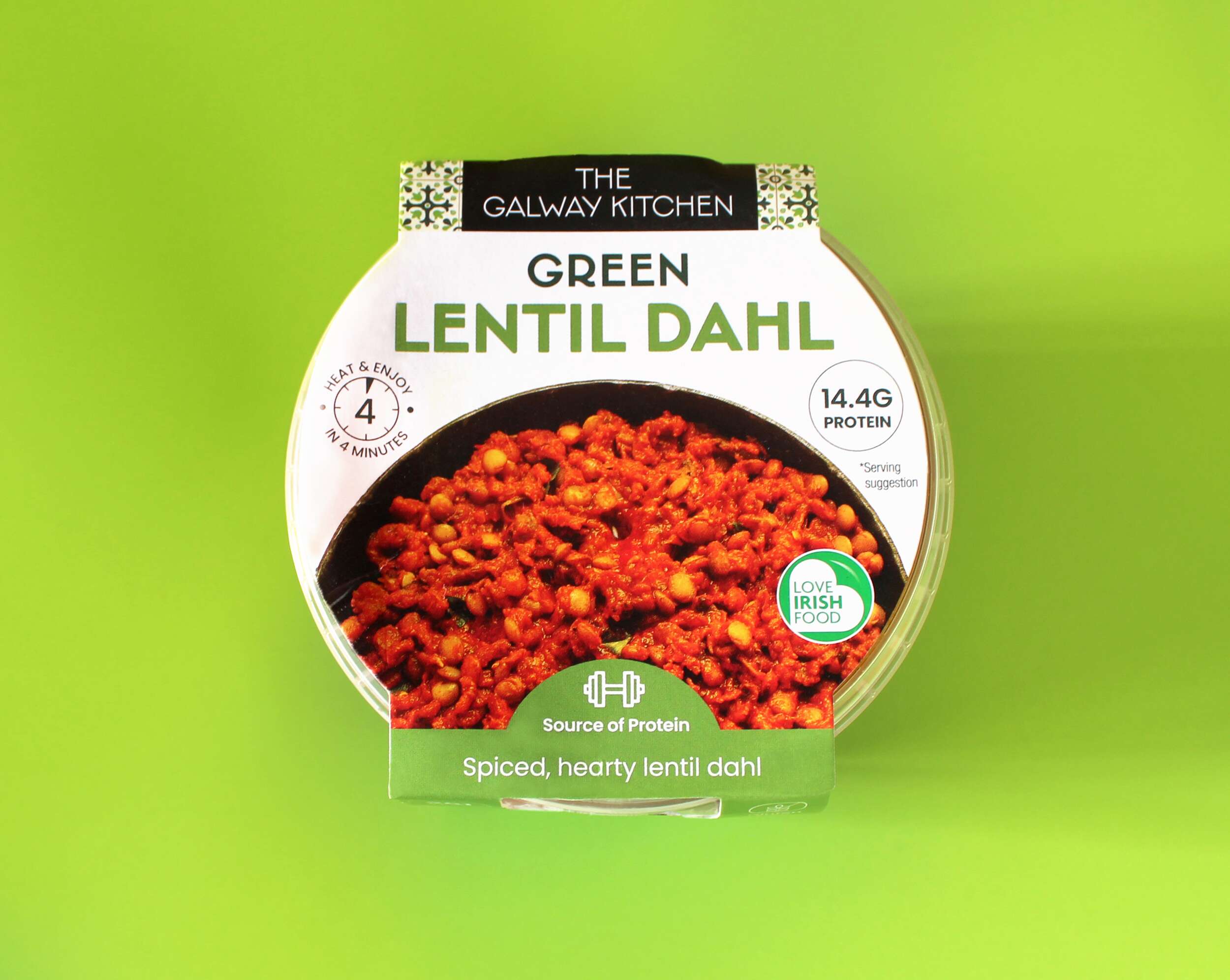
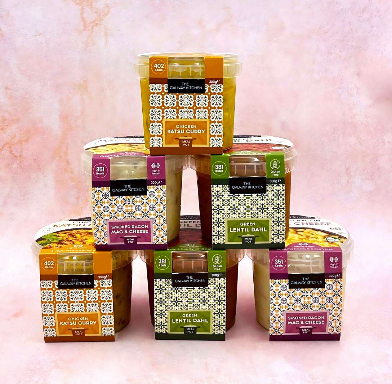
The tasty trio of innovative recipes are inspired by global flavours and made locally in Galway. There is Green Lentil Dahl, Smoked Bacon Mac & Cheese and Japanese-inspired Chicken Katsu Curry. Designed with convenience, great taste and nutrition in mind, these ready meals are a quick and healthy lunch option. The high protein recipes have been developed by their expert team of in-house chefs and are available at Tesco Ireland.
The Galway Kitchen range is available at selected Tesco Ireland stores:
Find them in the fridge at your local Tesco Ireland
www.tesco.ie
www.instagram.com/tescoirl/
Follow The Galway Kitchen at:
@thegalwaykitchen
Photography by Jennifer Oppermann:
@jenniferocooks
www.jenniferoppermann.com
Packaging printed by Priory Press Packaging.
The Galway Kitchen are produced by quality Irish fine food producer Galmere Foods.
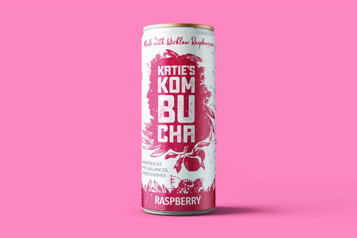
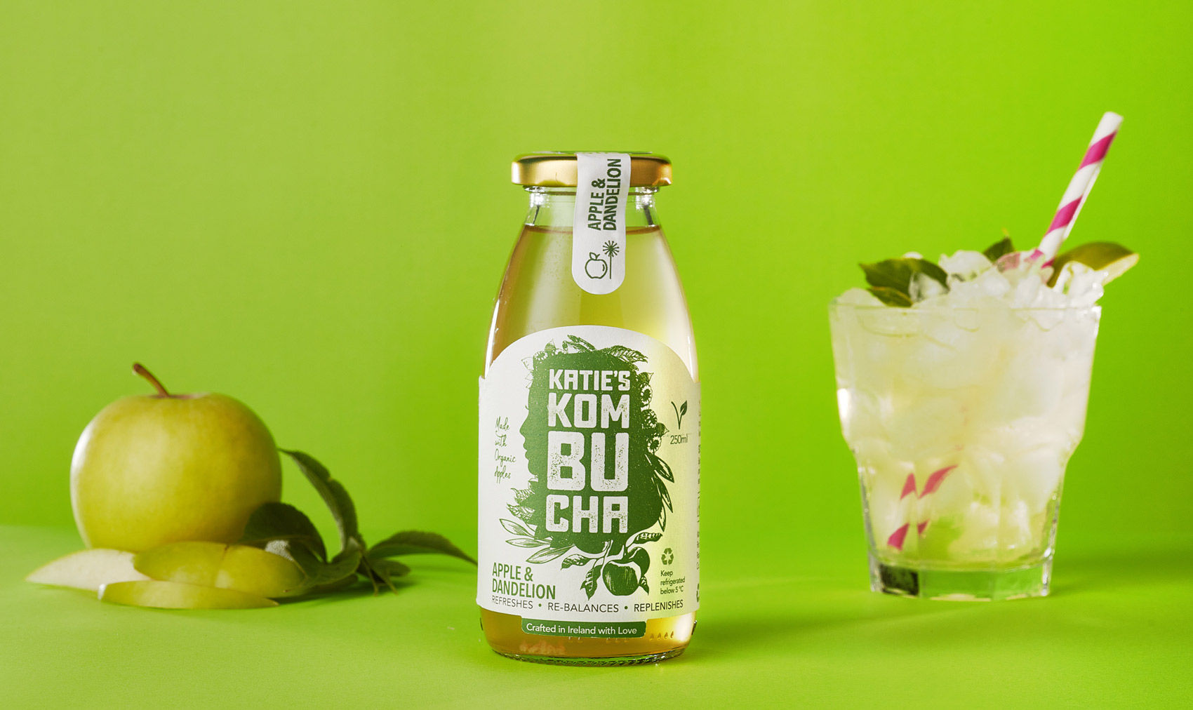
Katie’s Kombucha New Slim Cans Packaging Design
New project
Katie’s Kombucha – New Cans Packaging Design
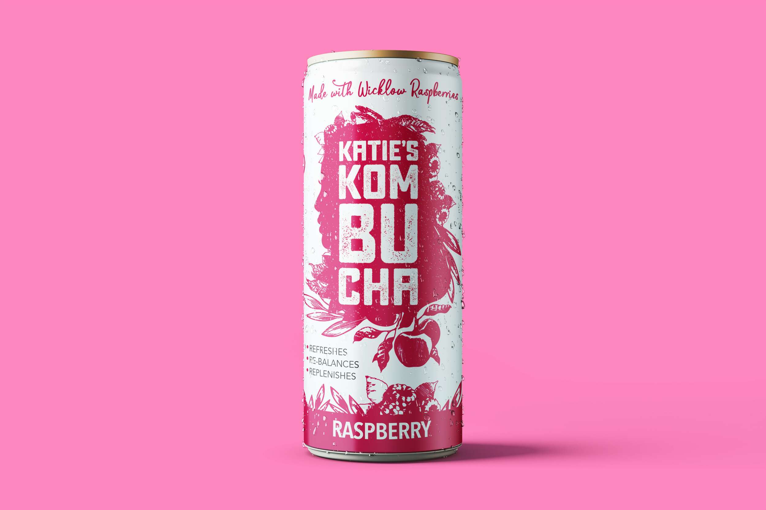
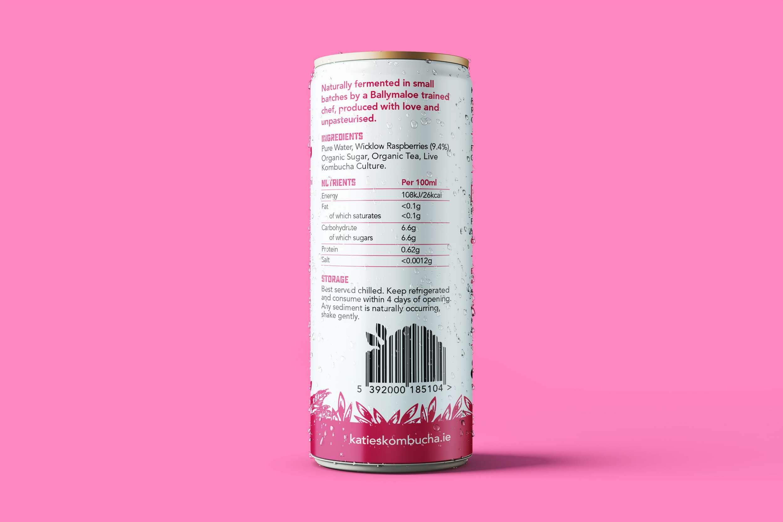
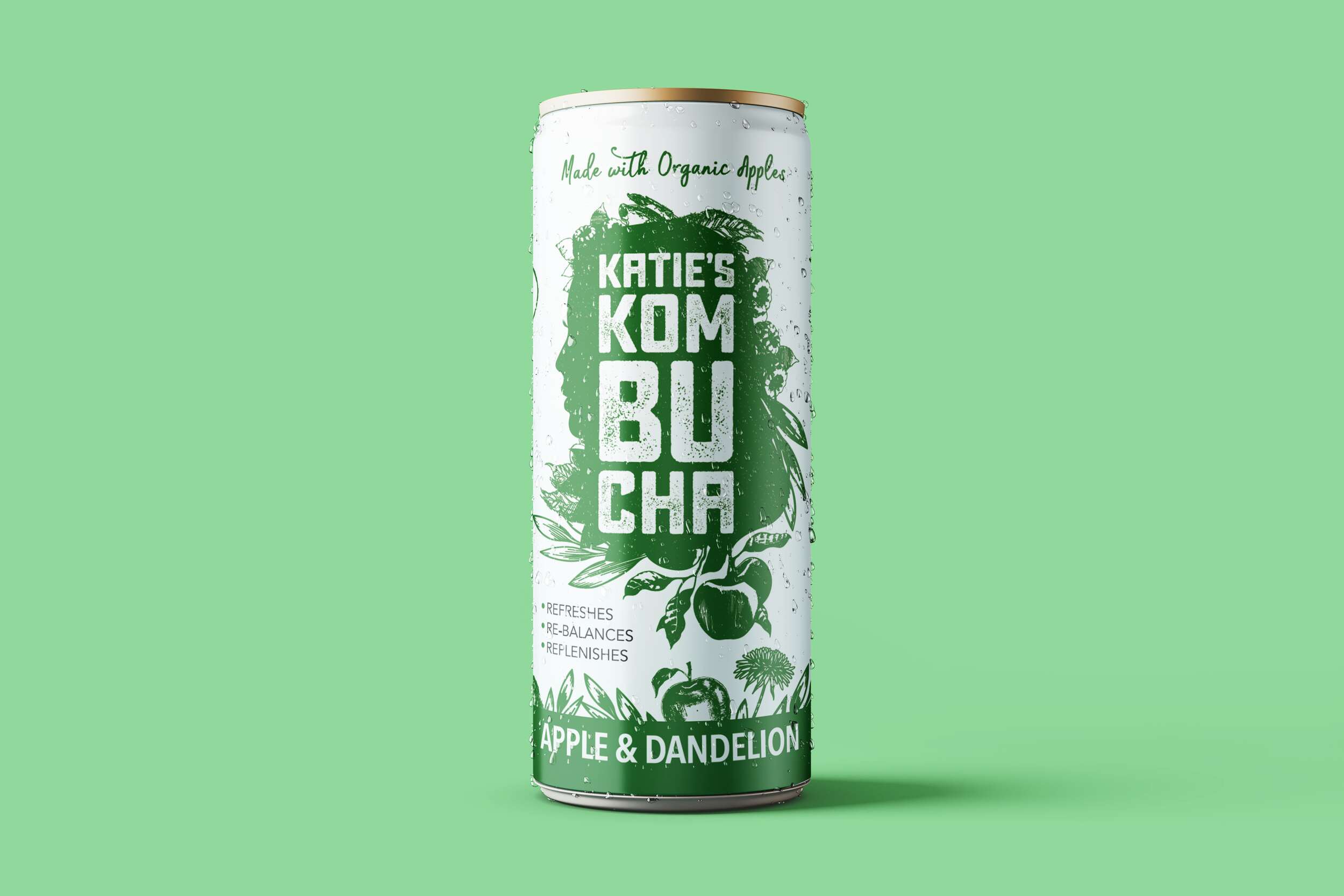
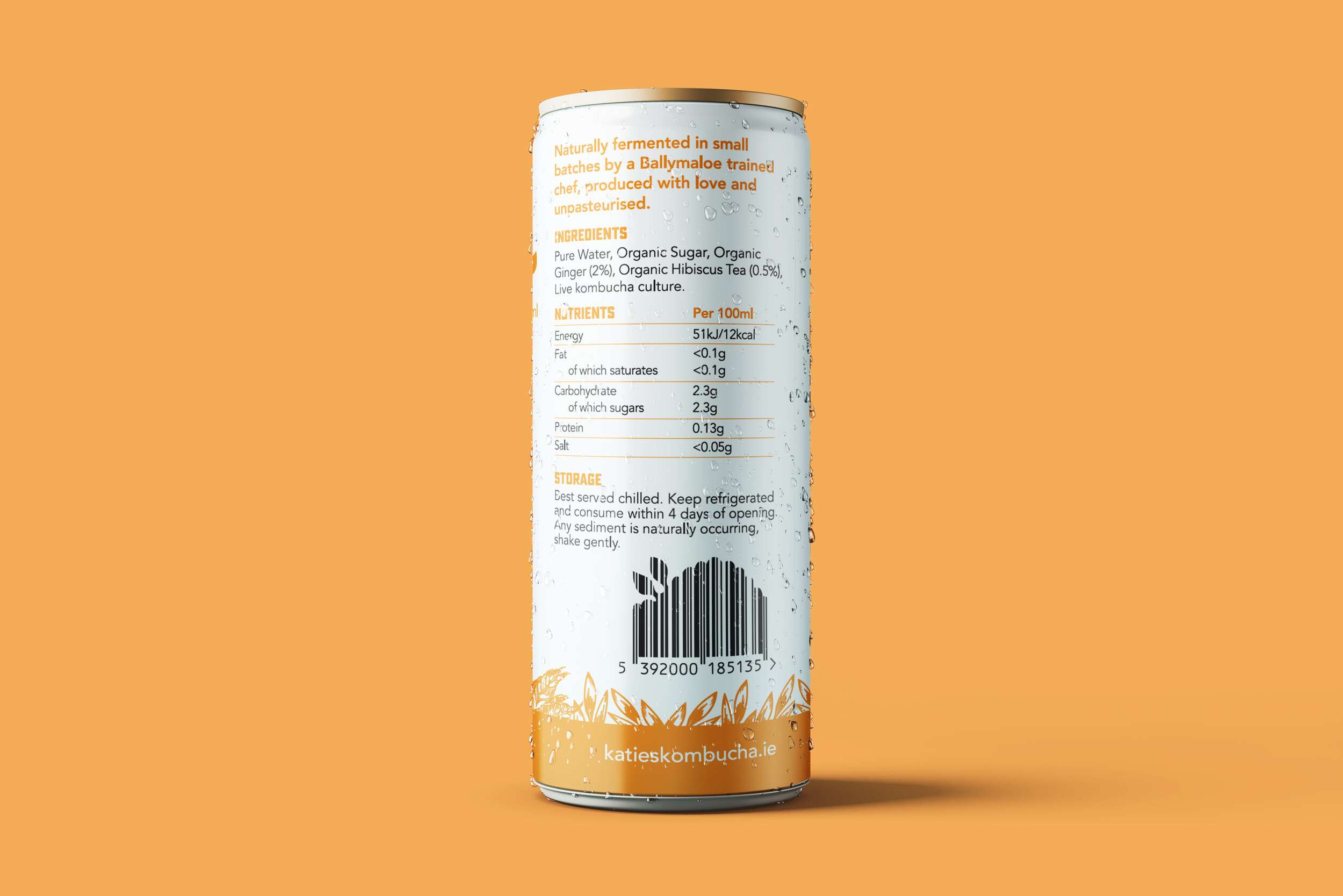
We are loving how well the brand packaging design of the Katie’s Kombucha range translated from the original glass bottles to these lovely slim cans. They are now available in both the bottles and cans in three tasty flavours.


A little about kombucha for those of you unfamiliar with it…
Kombucha is a great alternative to sugary drinks. It contains elements that offer nutritional and digestive support, strengthen the immune system, and assist in removing impurities from the blood and organs. Poor dietary choices and chronic stress are the root causes of many modern diseases. Both diet and stress can trigger physiological imbalances and degradation, particularly in the immune system. Kombucha contains prebiotics which are beneficial for gut health (great immune booster).
✔️ Maintains a health pH
✔️ It’s antioxidants help fight disease
✔️ Contains beneficial probiotics
✔️ Encourages good microbes to grow in the gut
✔️ It’s acetic acid helps fight bad bacteria
✔️ Helps your skin glow
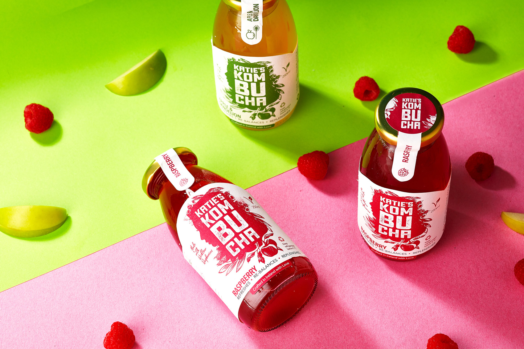
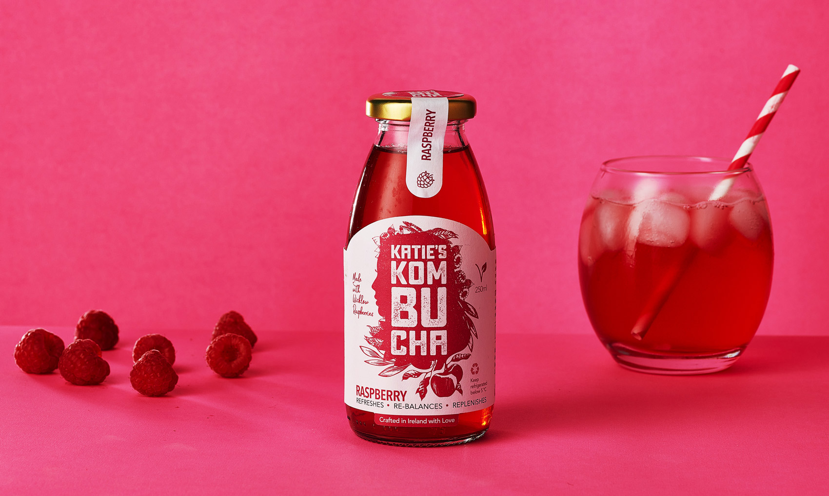
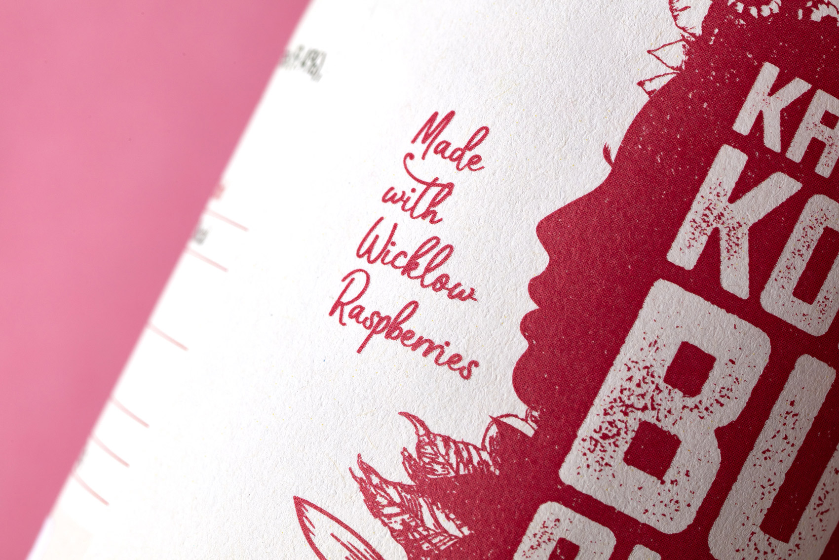
Katie’s Kombucha supports local and buys delicious raspberries from a raspberry farmer in Wicklow.
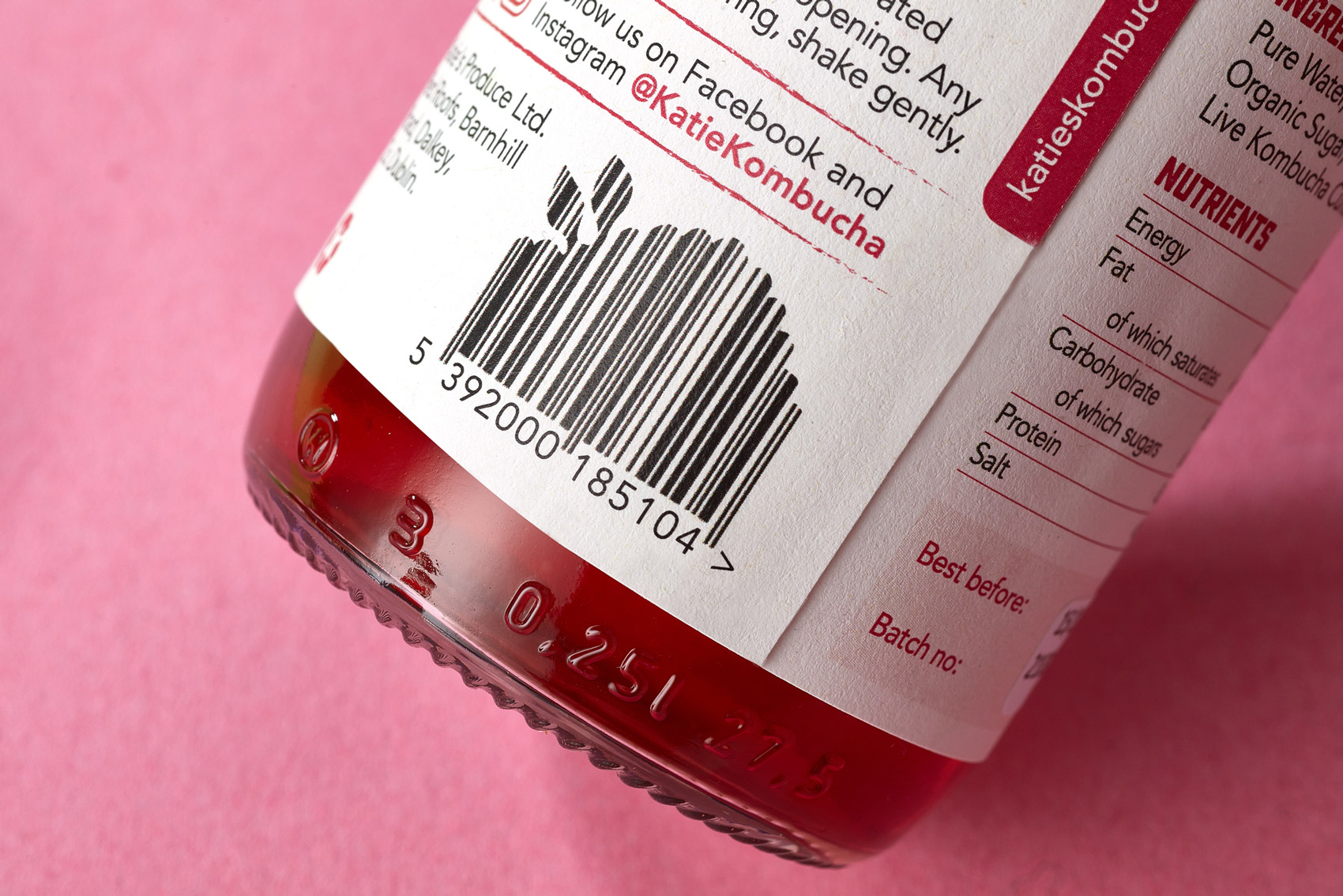
Katie’s Kombucha is available at Fresh stores @freshthegoodfoodmarket and SuperValu @supervalu_irl stores, along with many more locations.
Follow Katie’s Kombucha at:
@katiekombucha

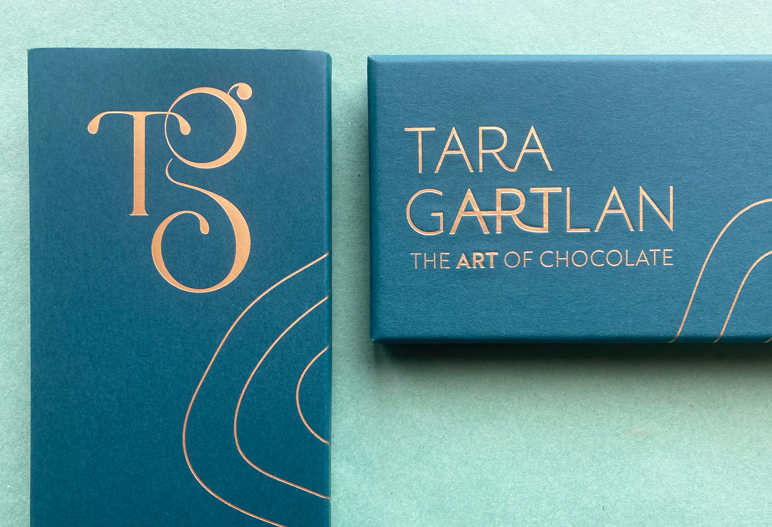
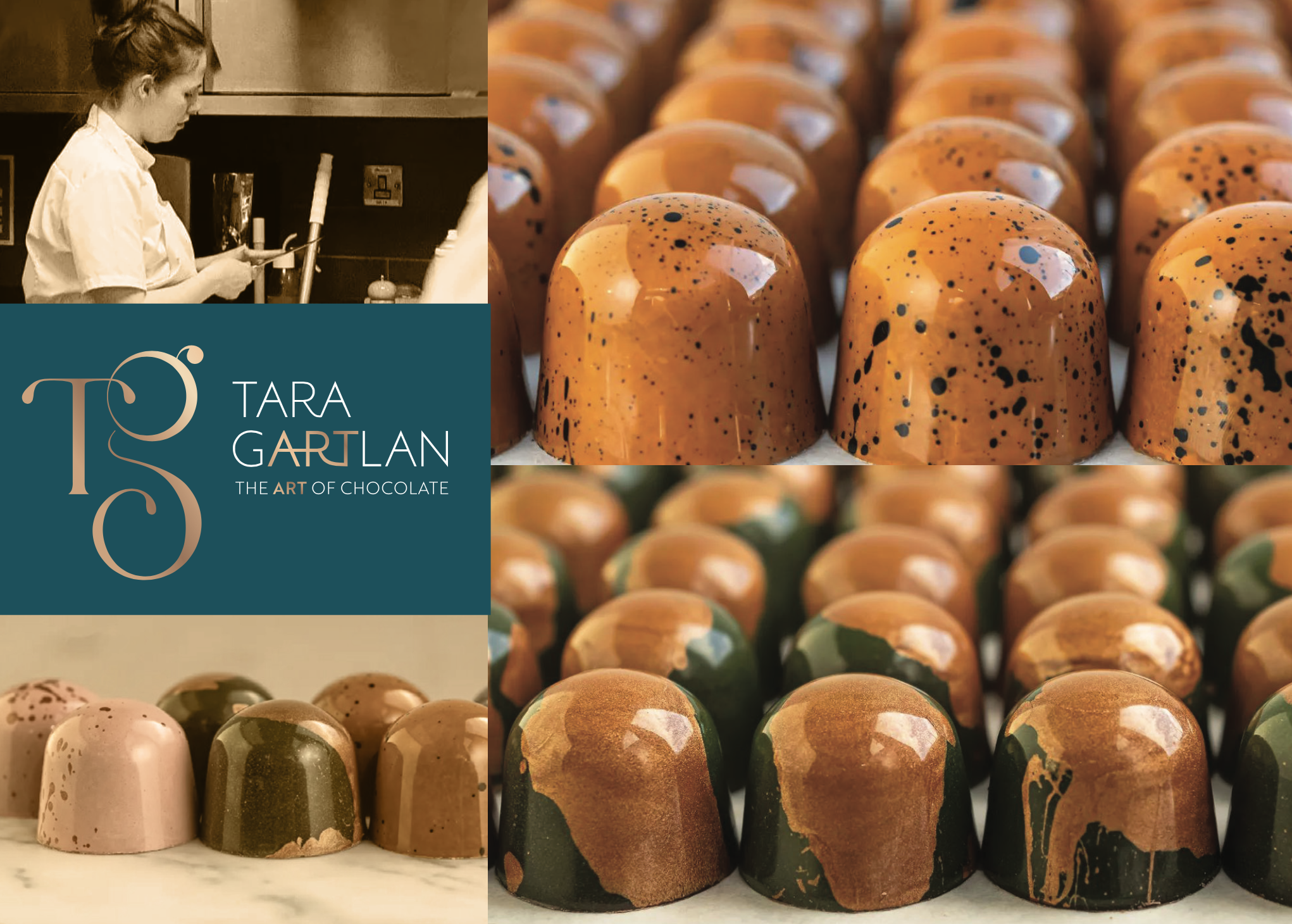
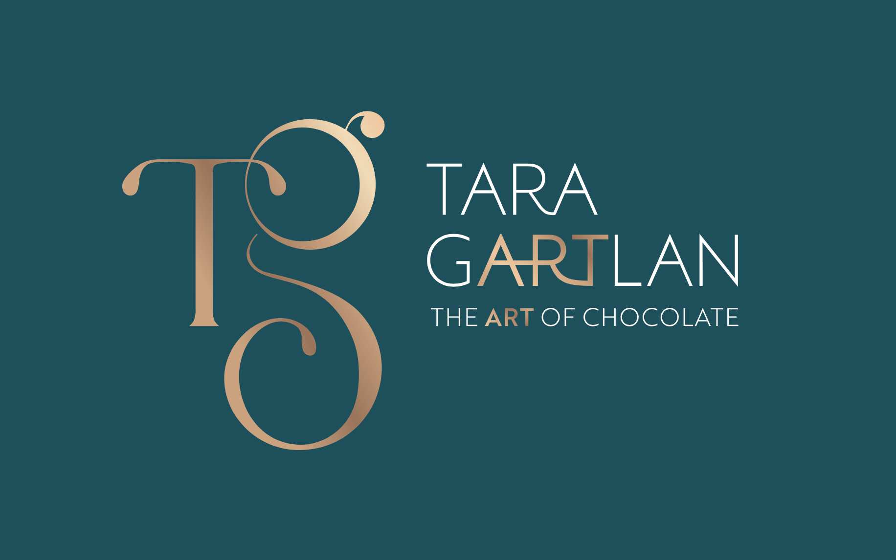
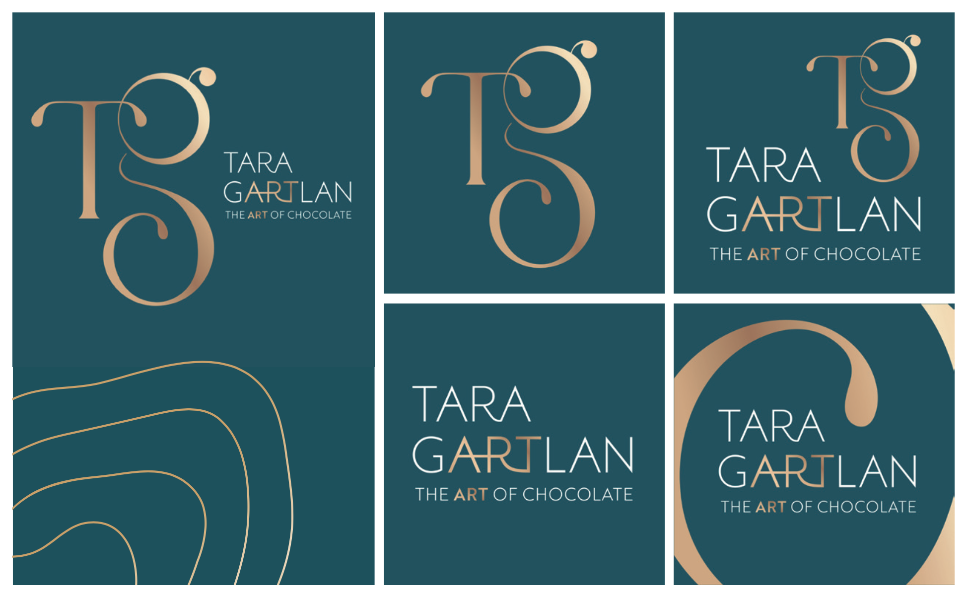
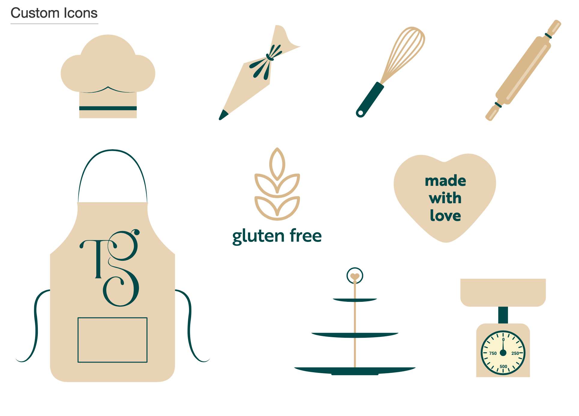
Tara Gartlan Chocolate – Brand Packaging Design
Tara Gartlan Chocolate: Brand Packaging Design
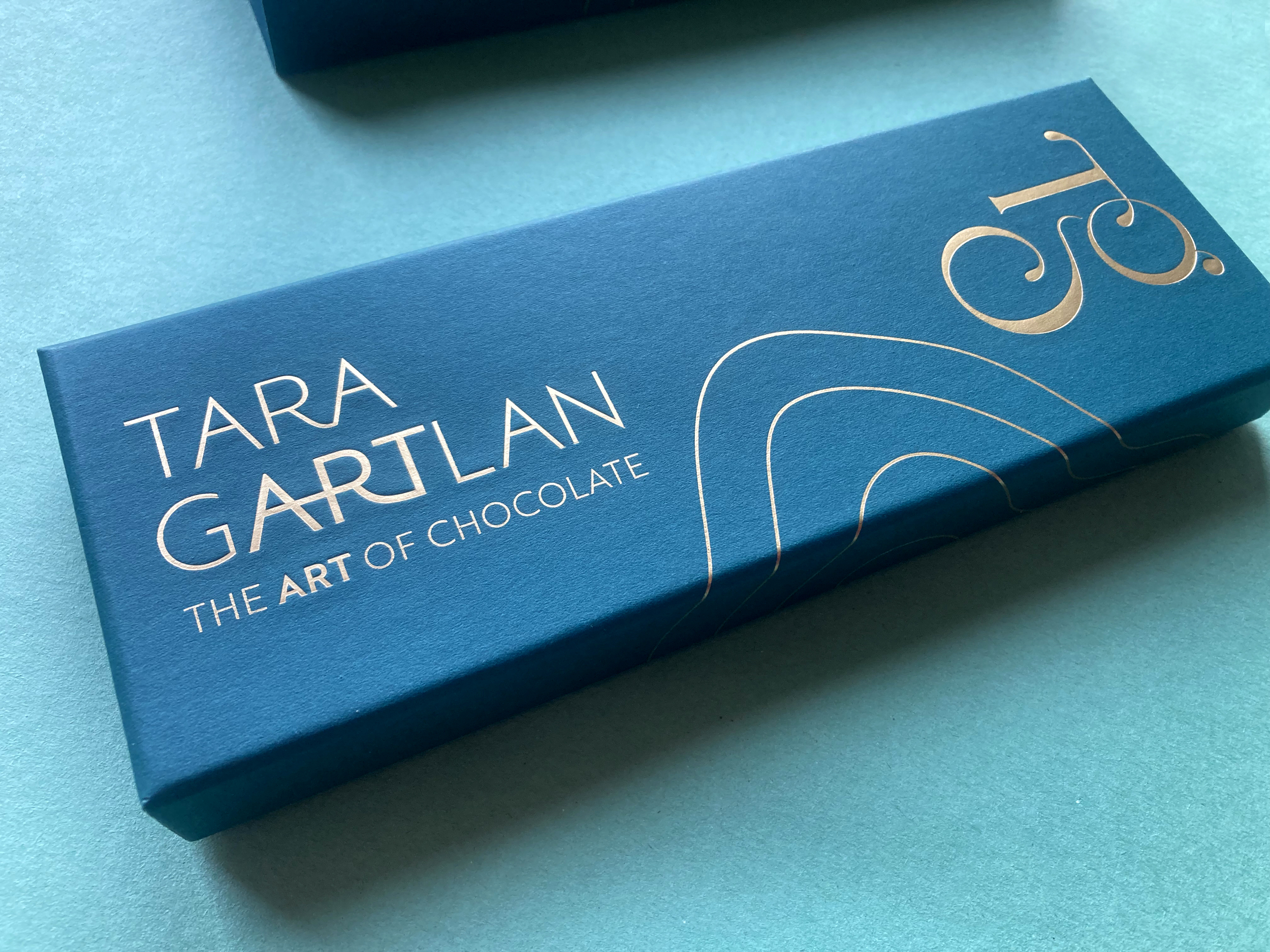
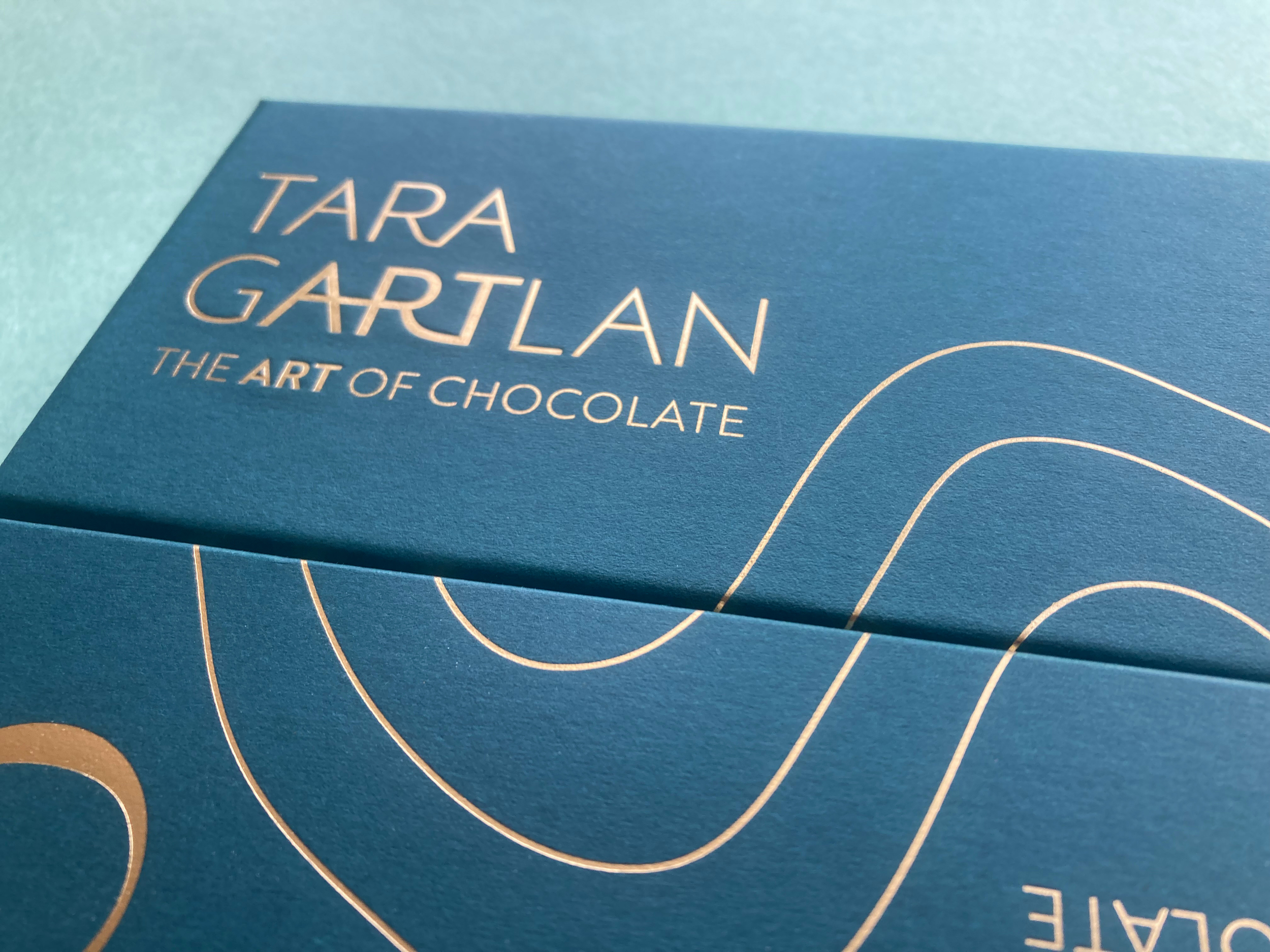
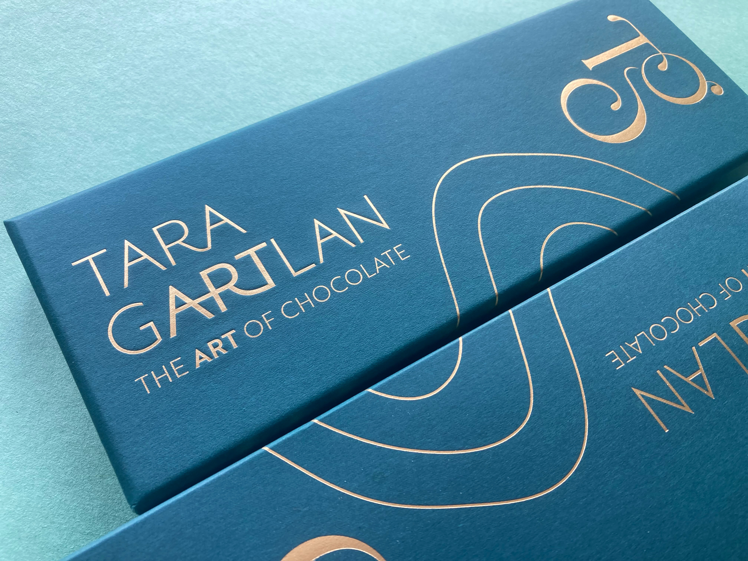
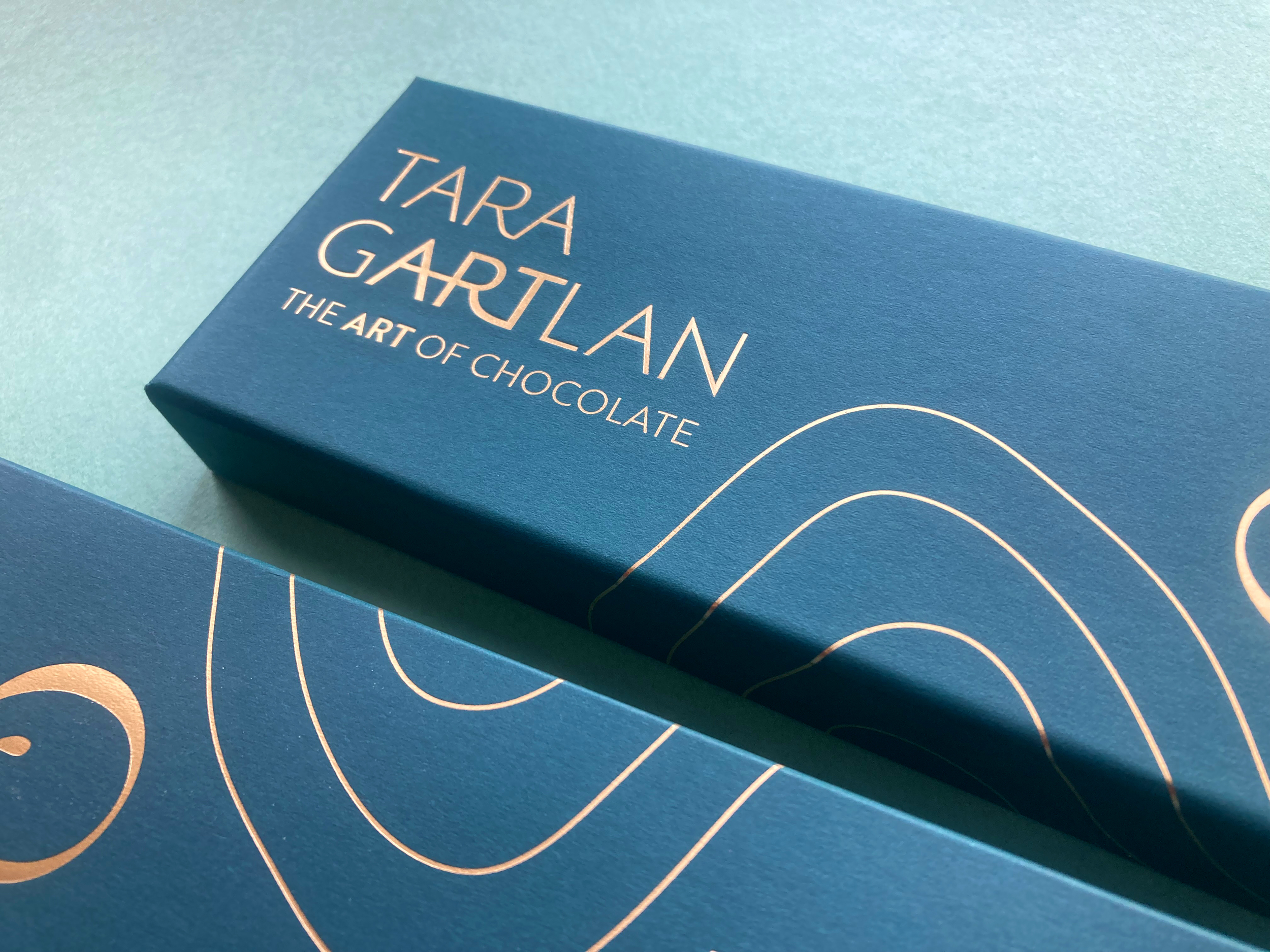
Introducing the Brand Packaging Design for Tara Gartlan Chocolate – luxury handmade chocolate bonbons, created by Michelin star pastry chef Tara Gartlan.
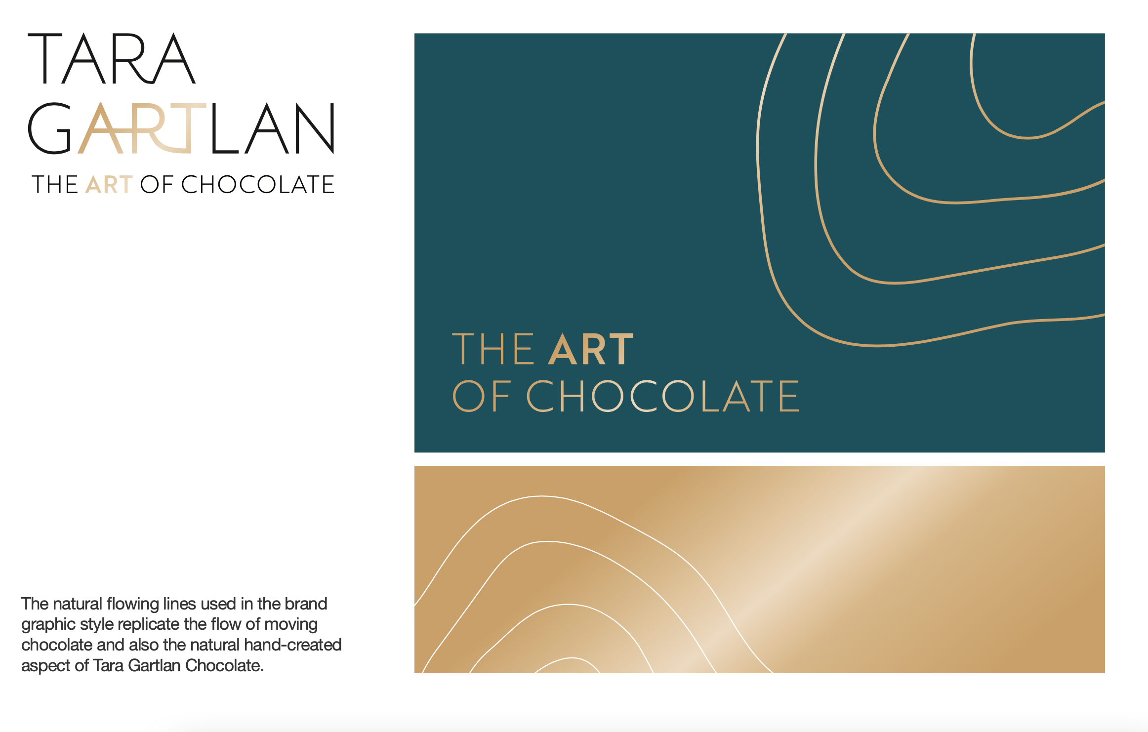
Each chocolate collection is like a work of art – every chocolate is meticulously handmade with beautiful designs, which lead to us creating the tagline ‘The Art of Chocolate’, highlighting the word ‘Art’ tucked within Tara Gartlan’s name. Cocoa butter is used artfully for decoration and all recipes are expertly crafted by Tara Gartlan. They look almost too good to eat! But once you do, you’ll be reaching for another one.
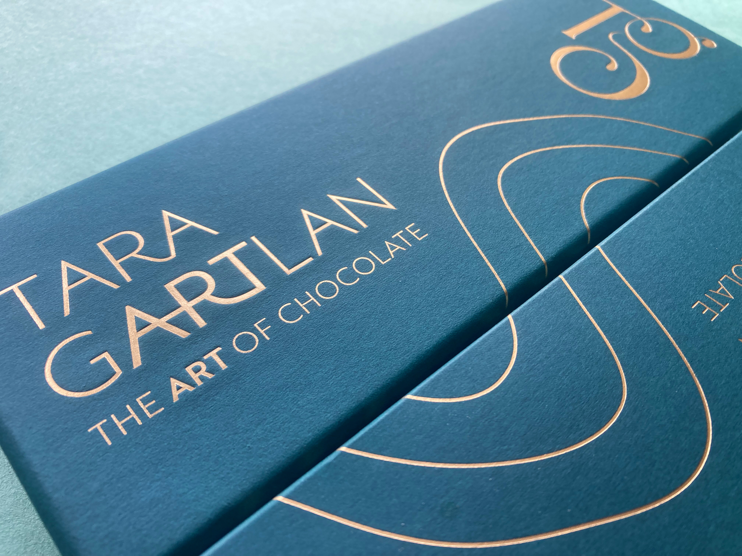
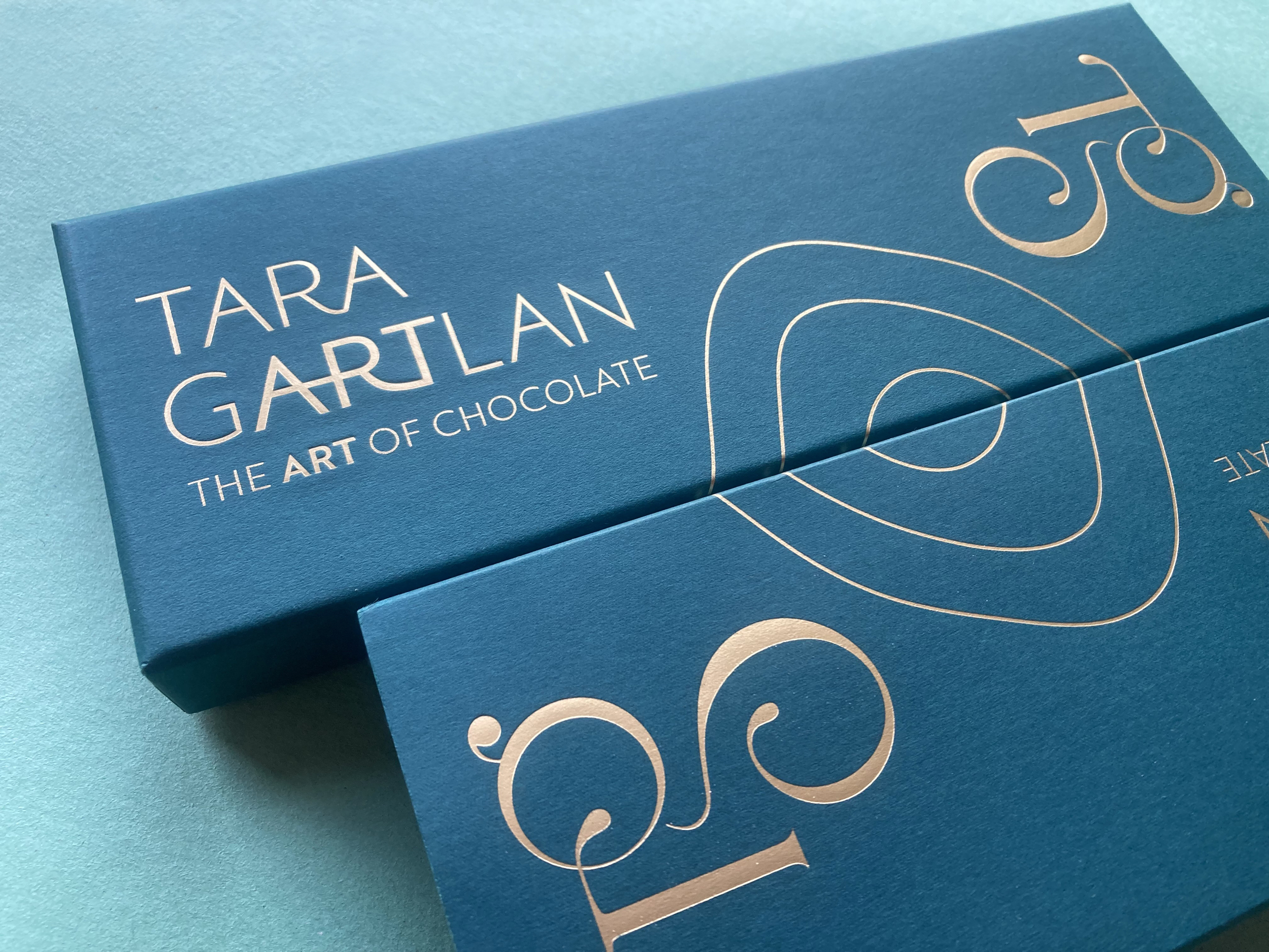
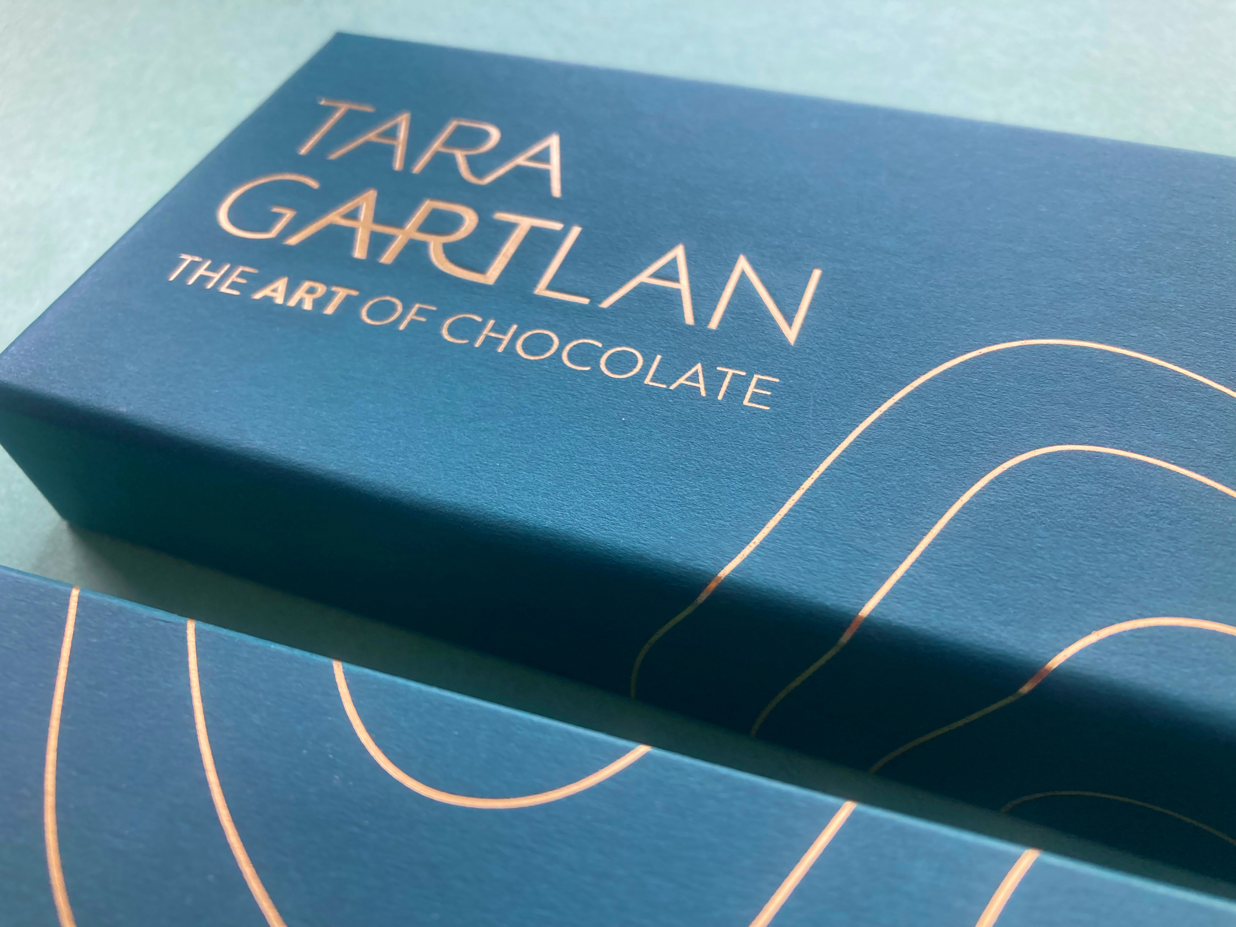
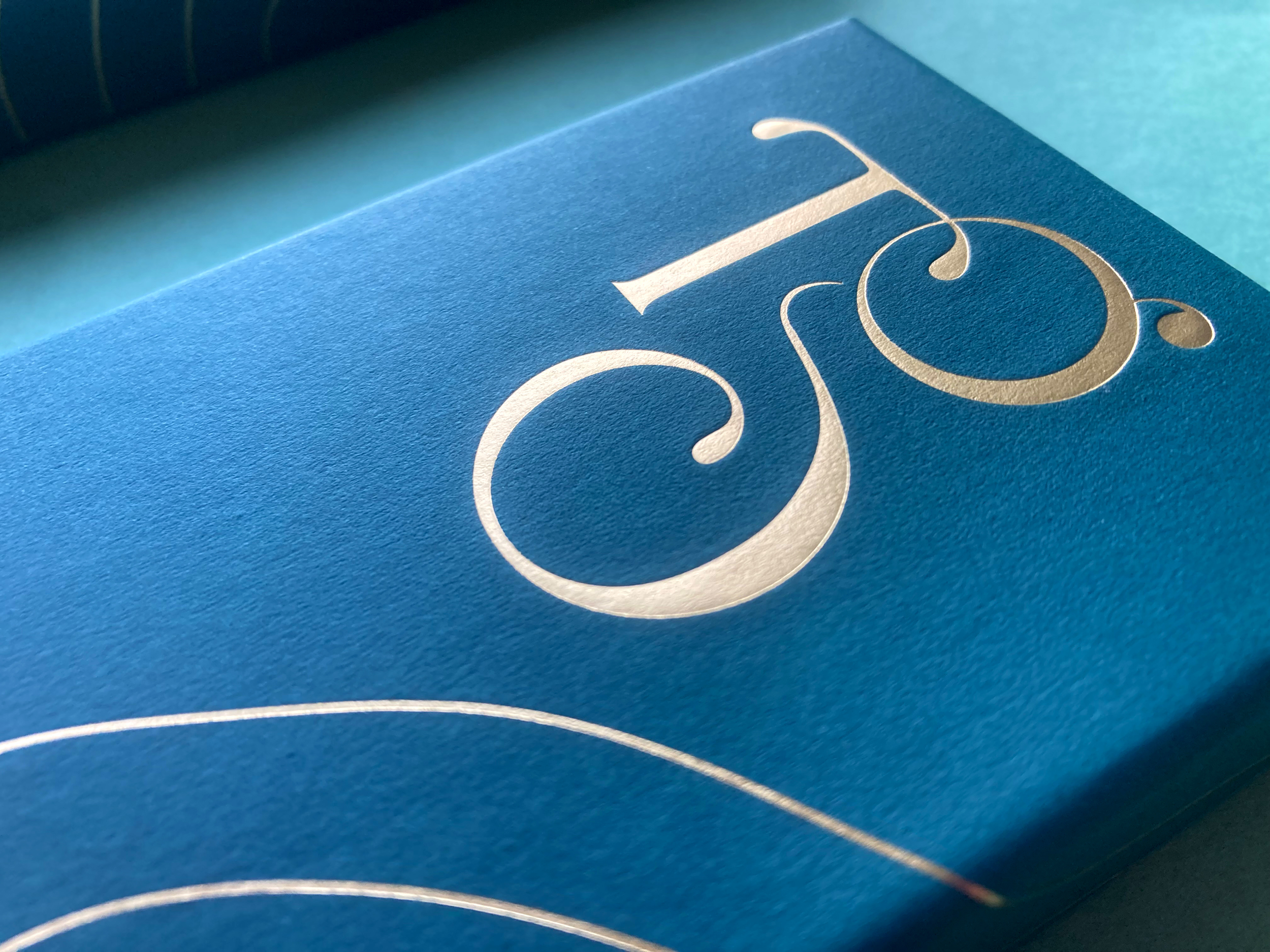
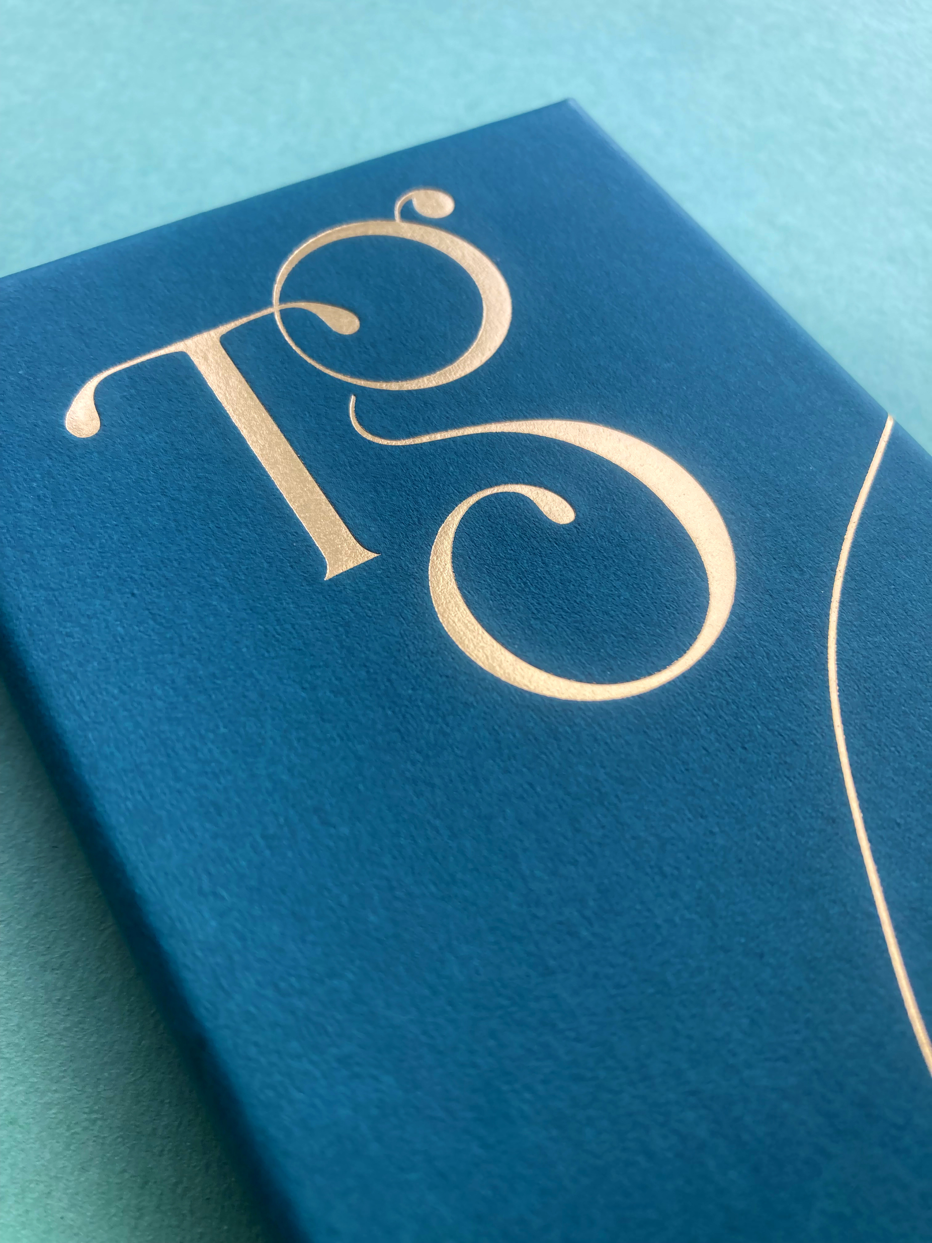
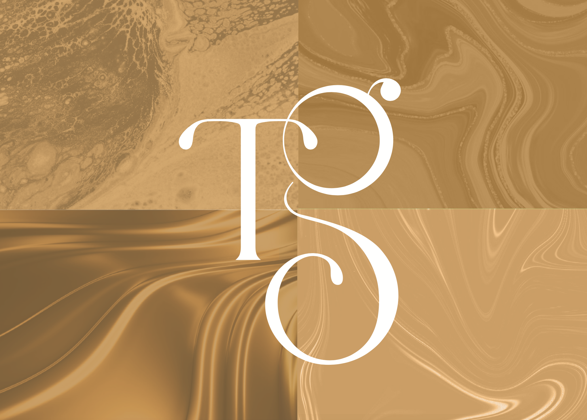
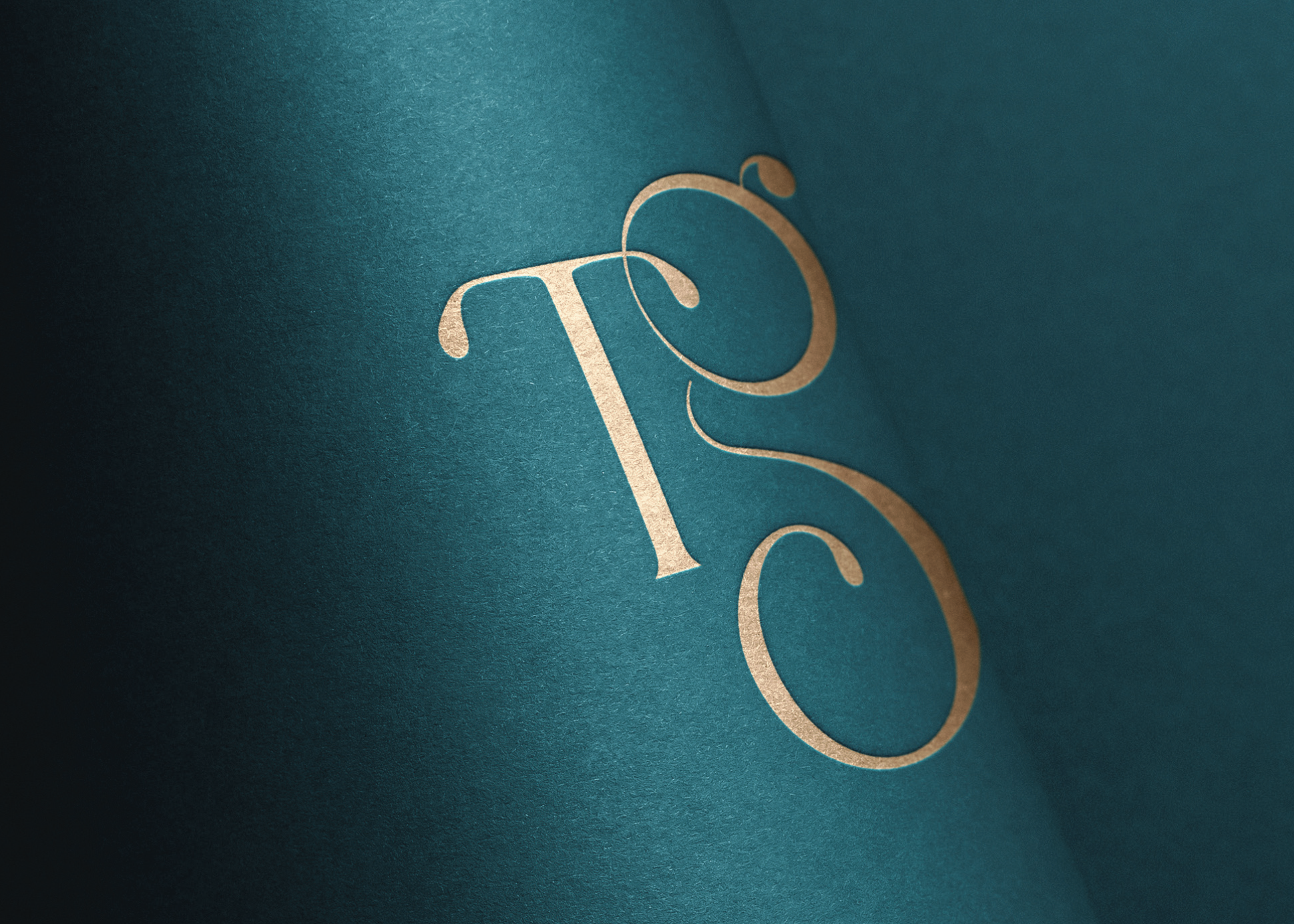
We took the initials ‘TG’ from Tara Gartlan’s name and created a strong graphic symbol with it, taking cues from the flowing nature of chocolate and incorporating droplets, like with chocolate dripping. There is a subtle ‘c’ within the base of the ‘G’ for the word ‘chocolate’ and also for ‘coeliac’, as these chocolates are coeliac-friendly.
The beautiful boxes exude quality, the gold-detailed curvy lines take cues from the free-flowing way that chocolate is poured and the natural flowing lines in nature, as many of the ingredients are grown locally, guaranteeing the most fragrant flavours.
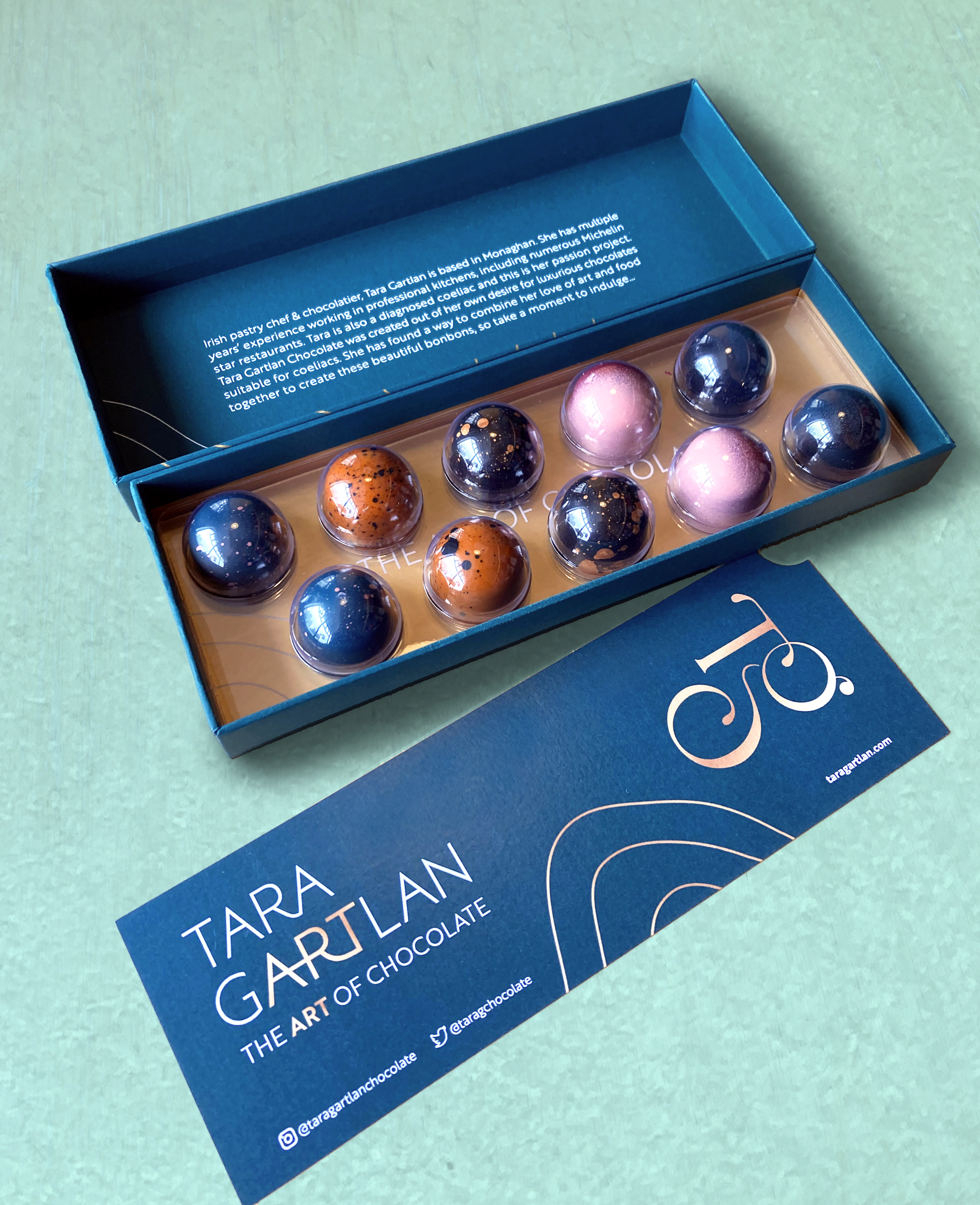
They are made with Valrhona chocolate and filled with beautifully seasonal ingredients. They are Gluten Free but the secret is – you wouldn’t know! Sometimes gluten free is perceived to be less tasty but I gave them to people to try and only told them after and they were shocked!
JJ O’Toole Ltd did a beautiful job on printing the packaging at a very premium standard – and are also a pleasure to deal with. All chocolate collections are available on www.taragartlan.com
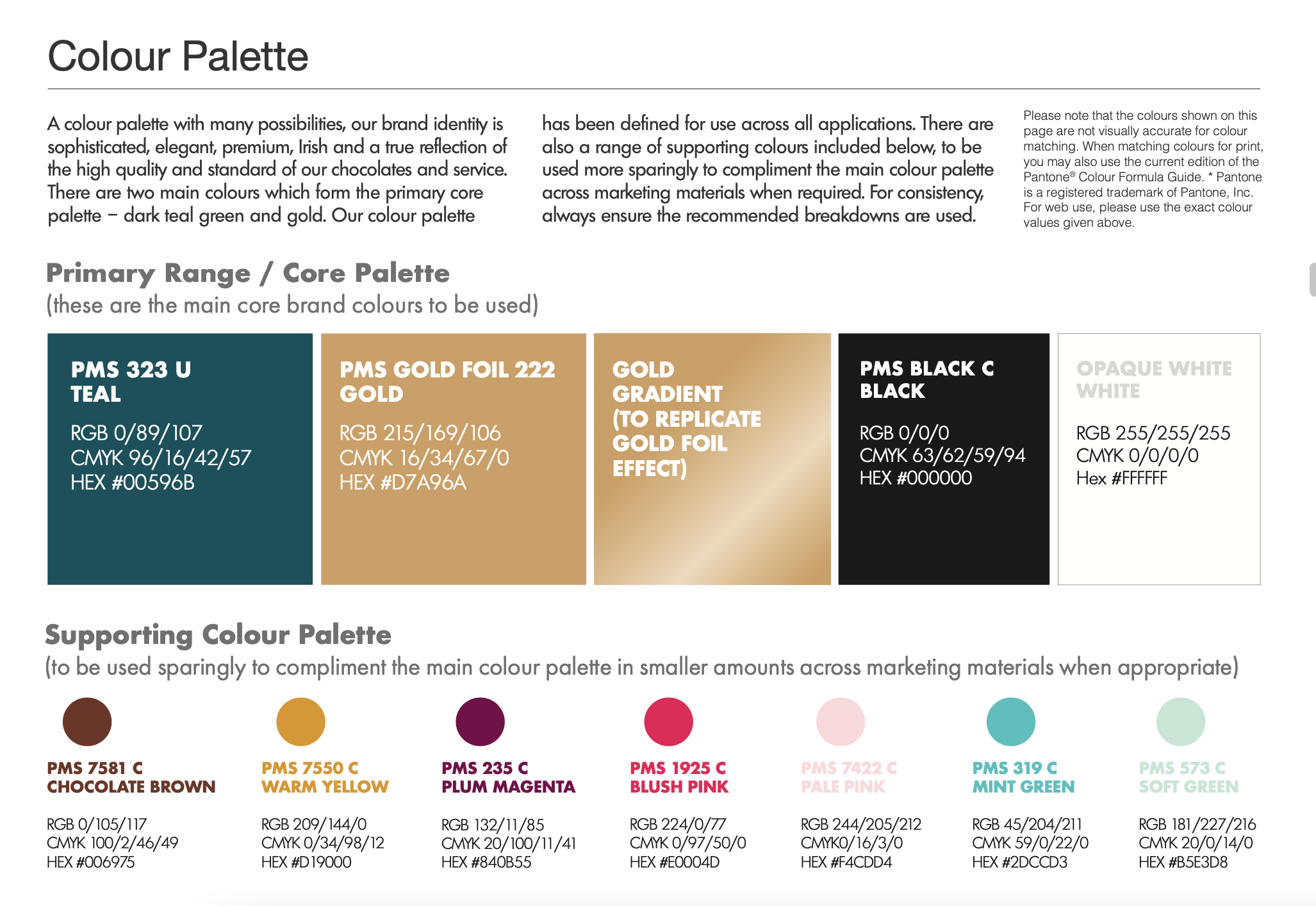
Brand Guidelines & Assets
A colour palette with many possibilities, the Tara Gartlan Chocolate brand identity is sophisticated, elegant, premium, Irish and a true reflection of the high quality and standard of our chocolates and service.
Follow Tara Gartlan Chocolate on Social Media:
Instagram: @taragartlanchocolate
Twitter / X: TaraGChocolate
Order Tara Gartlan Chocolates here: www.taragartlan.com
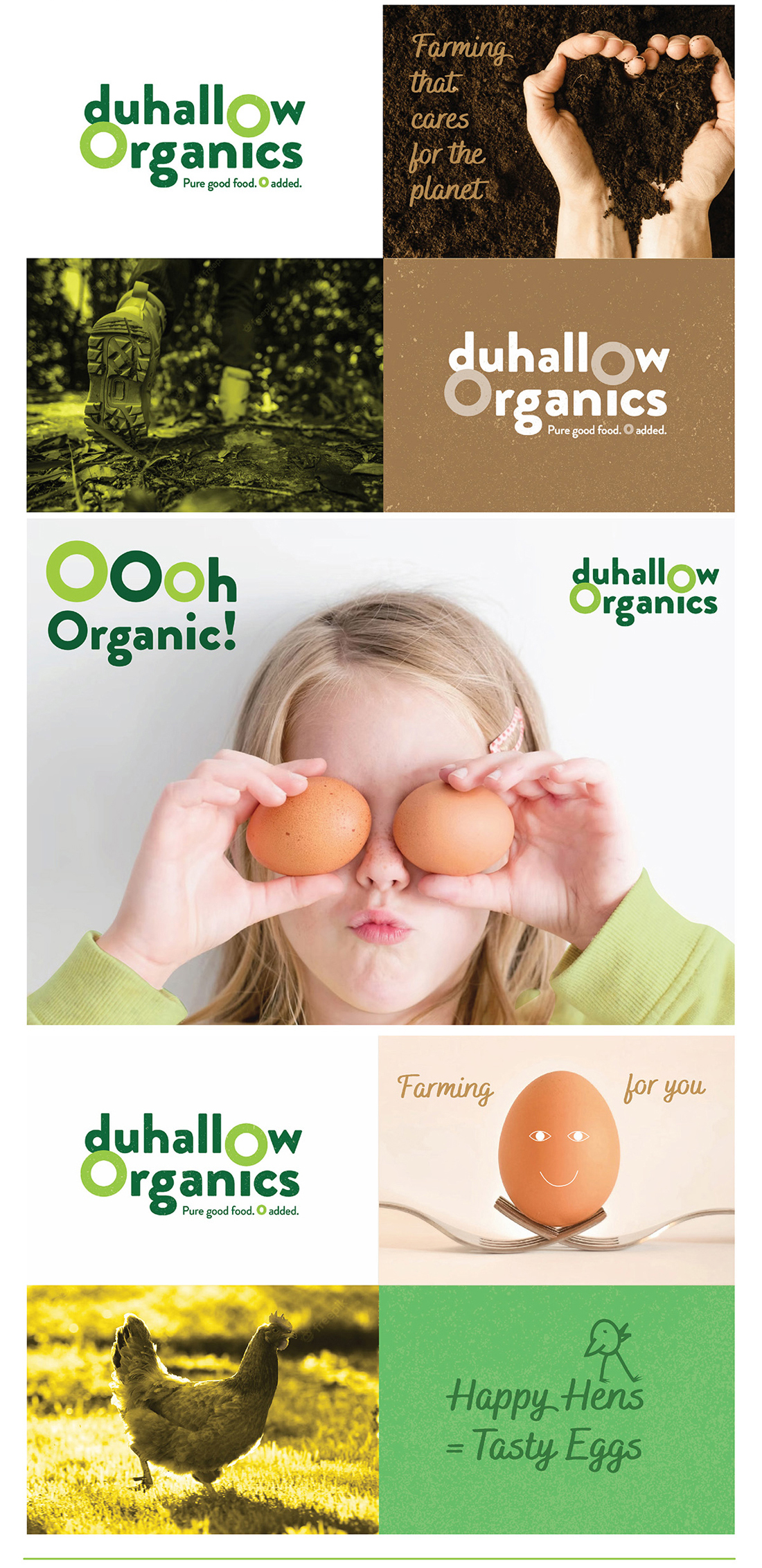
Duhallow Organics Brand Packaging Design
Duhallow Organics Brand Packaging Design
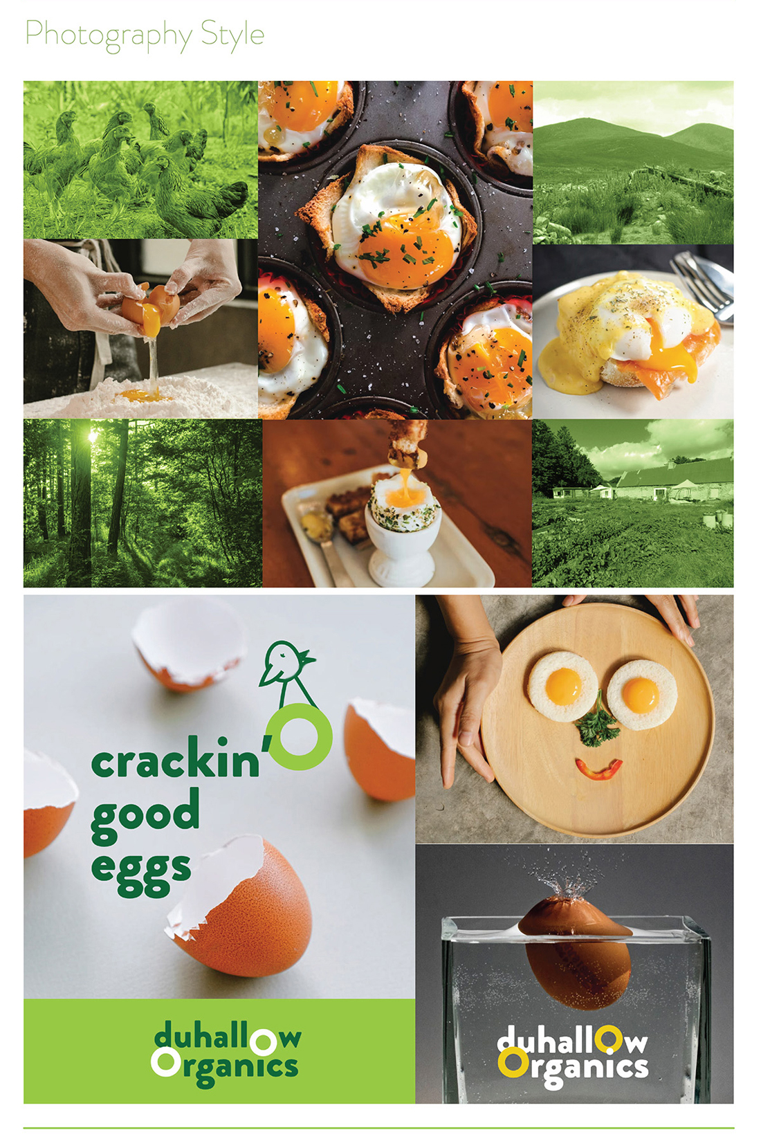
 The Duhallow Organics farm is situated on the old Moynihan family farm in Boherbue in the heart of Duhallow, Co. Cork. Certified Organic since 2008, they produce Organic Eggs and grass finished Dexter Beef.
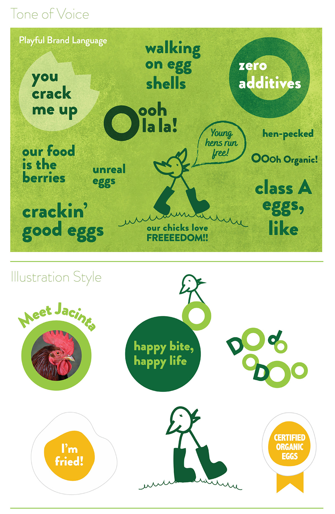
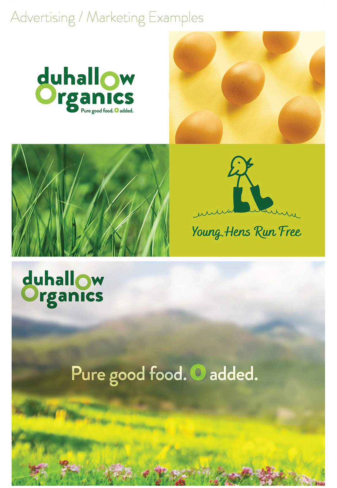
Duhallow Organics care about People, Animals, Sustainability, Biodiversity & the Community. Everything they do has these values at their core. They create Pure Good Food, Cork style, with 0 Additives, Pesticides, GMOs or Fertilisers. They farm for you and your family.
Within the brand logo design, the 0’s have been highlighted to emphasise how there are zero additives used in the food that they produce, as it is organic and natural. There is a grain texture within the letters of the logo, to further communicate the natural and organic aspect of the food produced from this farm.
The tagline we developed for them is ‘Pure good food. Zero added‘. The word pure cleverly plays on the way native Cork people use the word ‘pure’ is used to say ‘very’ or ‘absolutely’ and also how the farm is organic so the food produced by Duhallow Organics is very clean, healthy and pure.
The Duhallow Organics brand is fun, quirky, bright and playful to appeal to customers and indicate how their animals live freely and happily – while still clearly communicating the brand ethos and values, to signify what they stand for, such as how they care about animals, the environment and sustainability at their core.
![]()
Fresh Organic Eggs
Their hens live a lifestyle which complements the holistic Organic ethos of the farm. The girls live in a mobile hen shed in the field and enjoy a rich bounty of Organic grubs and grasses. Their happy girls produce magnificent eggs which are as natural as an egg should be.
-
They work with nature to nourish you and your family.
-
They farm with nature using holistic farming practices to produce pure good food.
-
Their aim is to increase biodiversity on the farm, both above and below ground, which gives you healthier and happier animals and a better, more natural product.
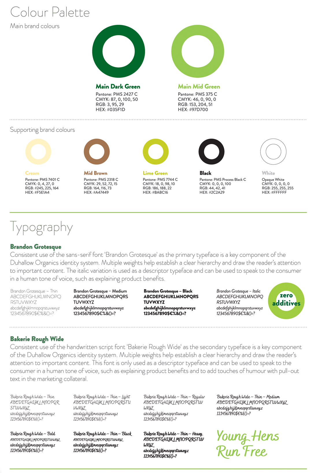
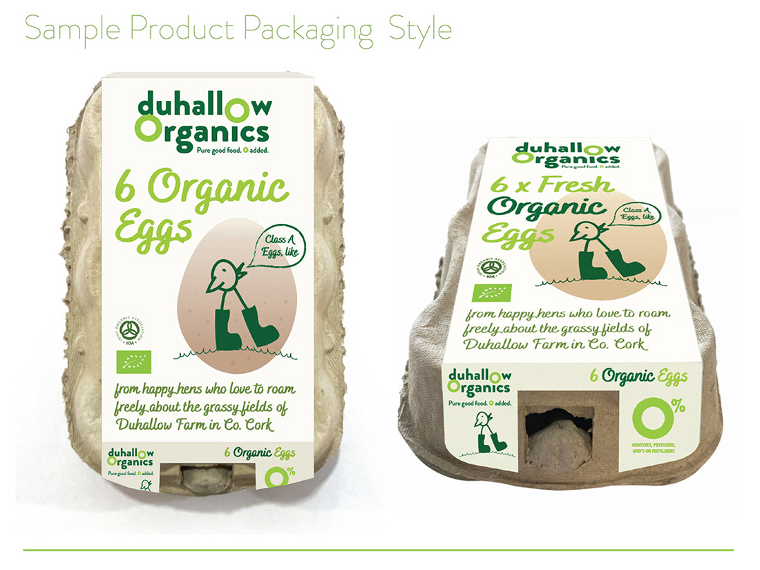
Brand Guidelines & Assets
A mini guidelines were included with this brand packaging project. The colour palette and typography chosen are earthy, natural, bright and fresh to indicate these aspects of how the Duhallow Organics farm runs. Illustrative icons and descriptor text on the packaging design communicate some of the other brand USP’s, such as that the eggs are ‘Class A‘ and have ‘zero additives’, that there is ‘0% additives, pesticides, GMO’s or fertilisers‘.
The barcode is playful, featuring an icon of a cute and playful chicken in welly boots walking freely over a hill on grass, as part of the barcode device, replicating the same chicken character which appears in a larger scale on the front of the pack, symbolising how the hens are happy and free. The brand ethos is featured on the side of the pack, to allow consumers to connect with the family farm’s brand story and background.
The Duhallow Organics range is available in shops across Cork and Kerry.
Follow Duhallow Organics on Social Media:
Instagram: @duhalloworganics
Facebook: www.facebook.com/DuhallowOrganic
Website: www.duhalloworganic.com
Clare Anne Taylor Couture Cakes – Brand Packaging Design
Clare Anne Taylor Couture Cakes: Brand Packaging Design
 Clare Anne Taylor Couture Cakes are one of Ireland’s leading luxury cake designers for special events and weddings. The core of the business is luxurious quality and elegance in the design and craft of their cakes and confections.
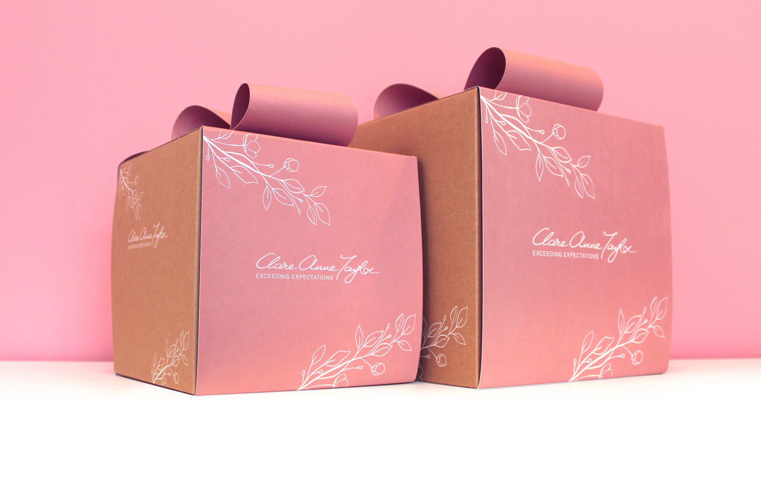
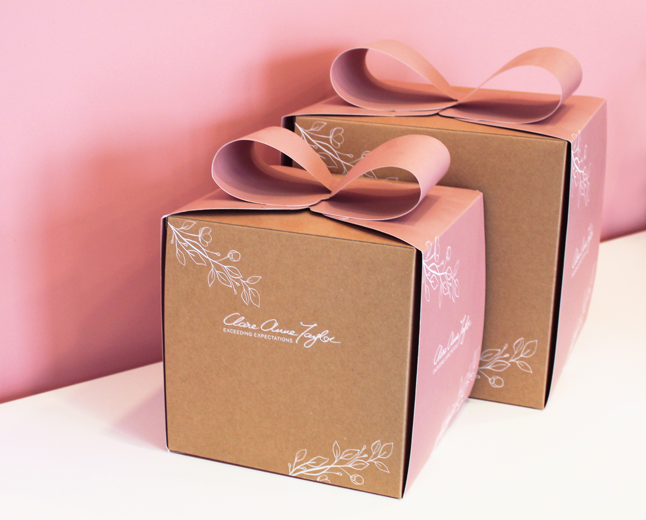
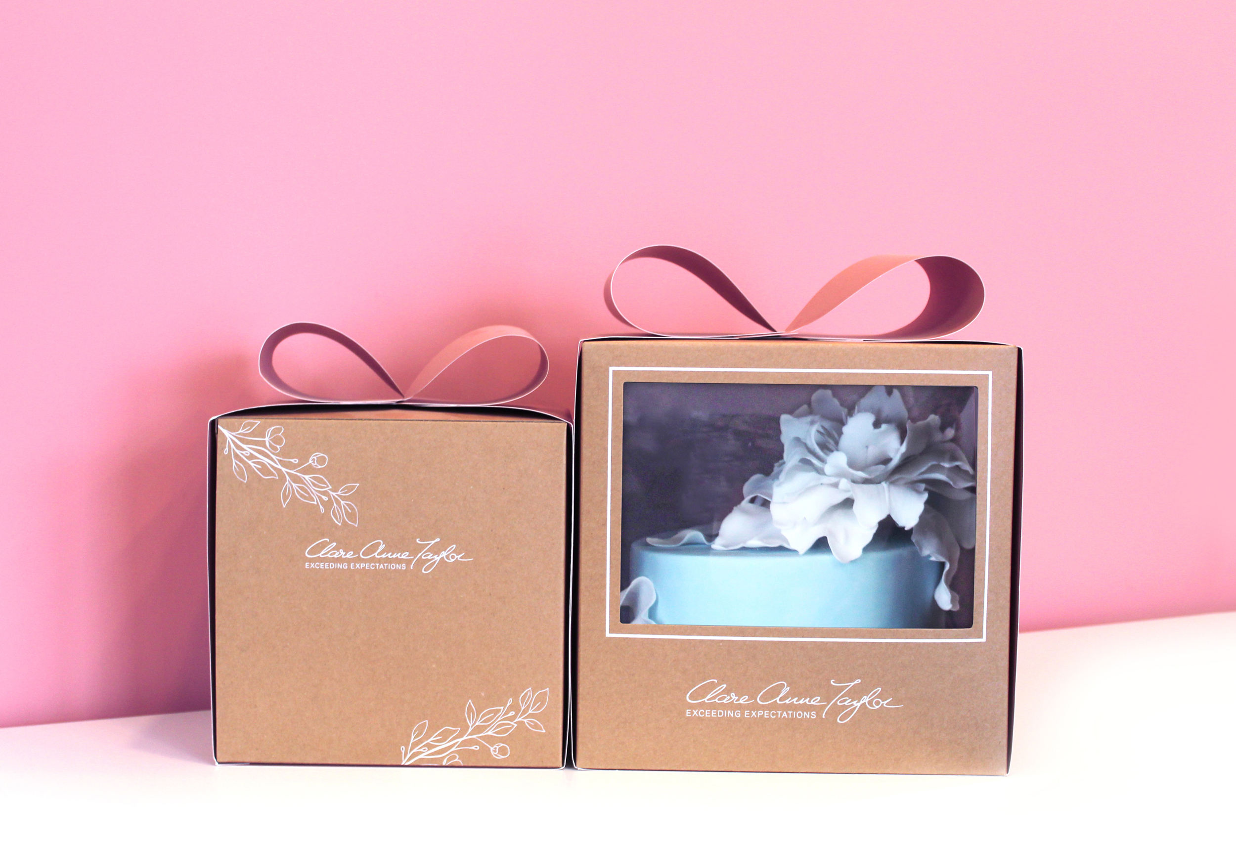
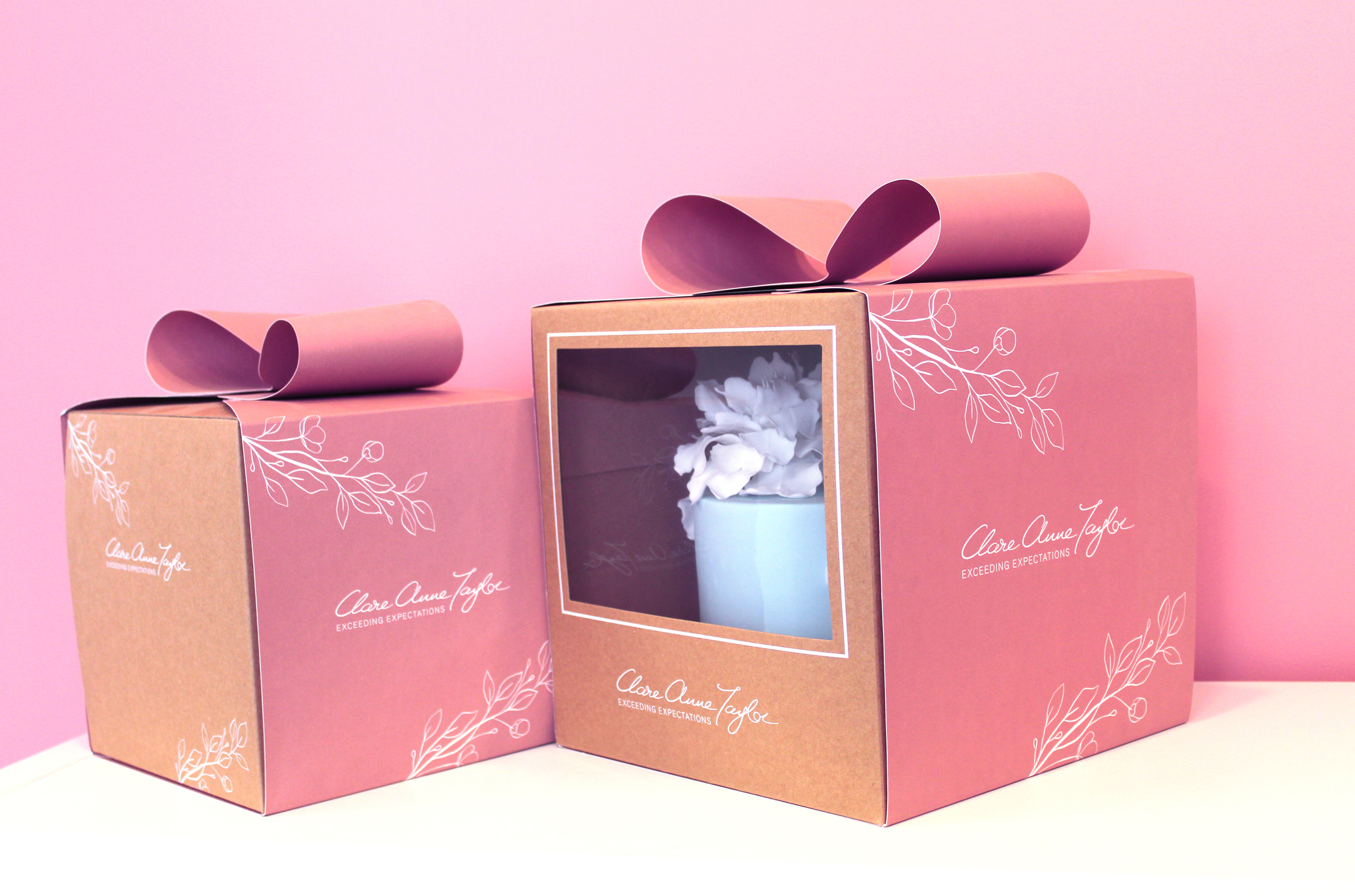
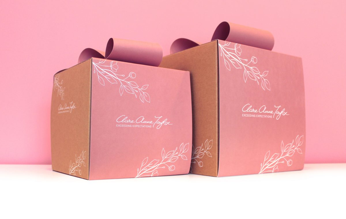
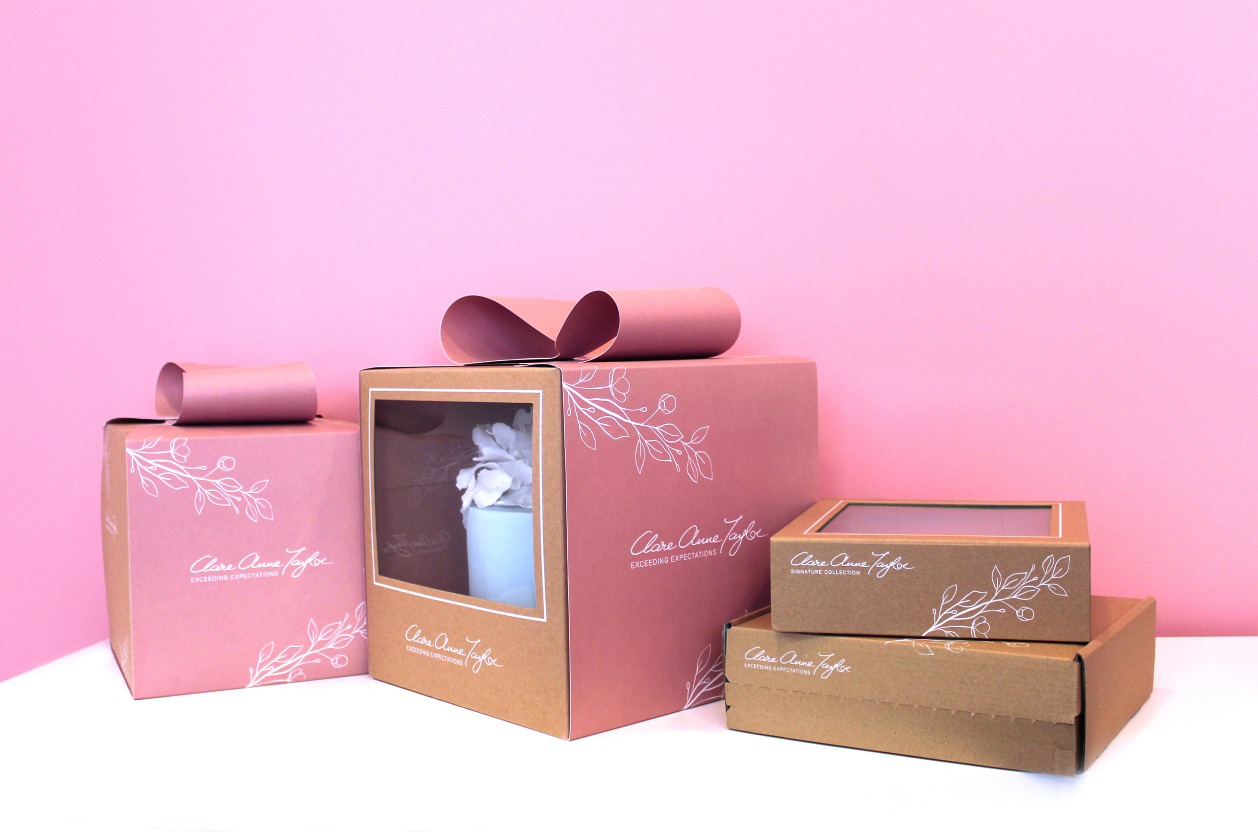
The client, Clare Anne Taylor, wanted the packaging to be suitable for gifting. When bringing to someone, the box should be beautiful and elegant enough to give the feel of a gift presentation. She wanted the brand to epitomise the highest standard and quality available on the market.
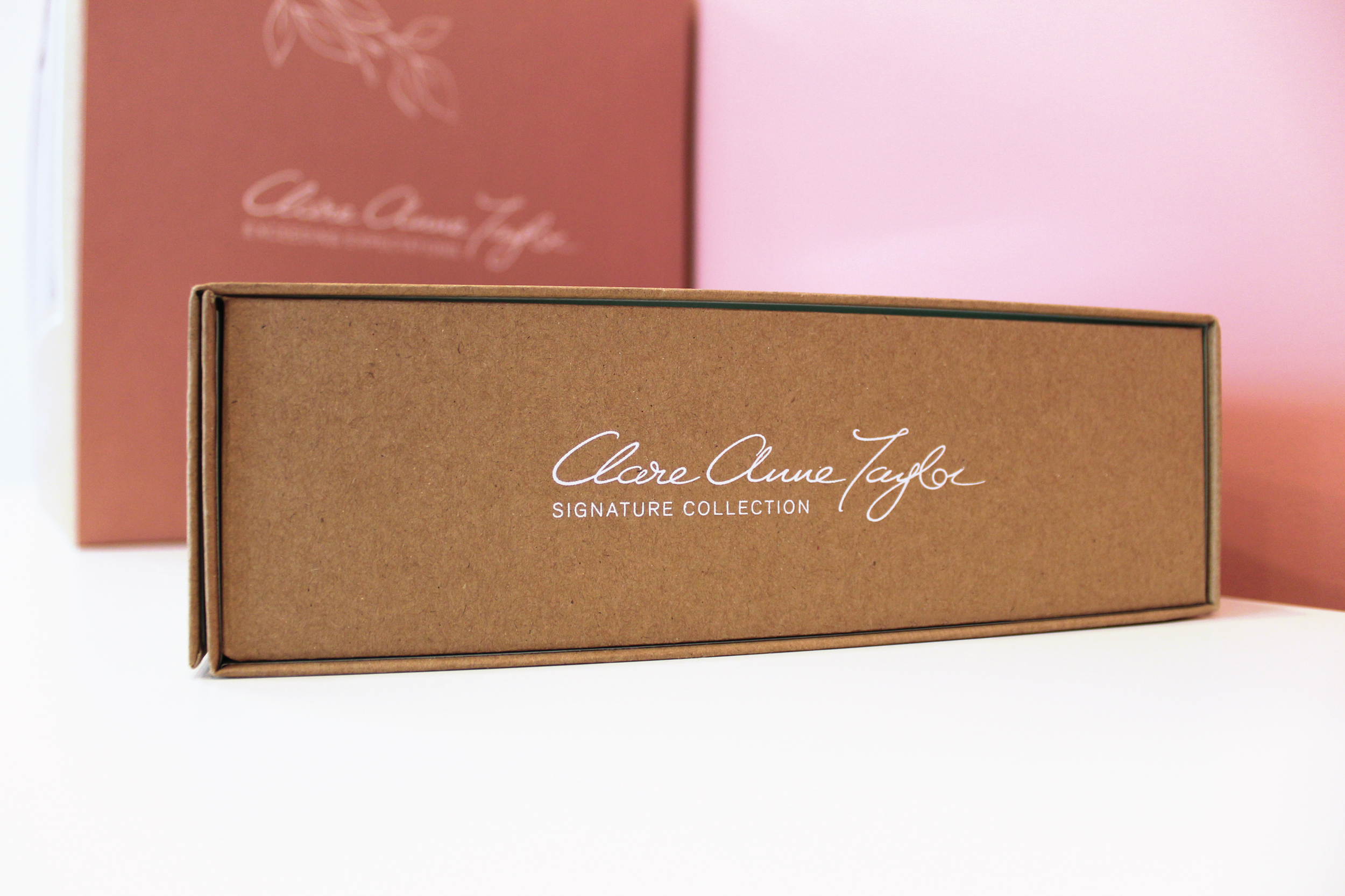
The client needed to easily separate between the ranges, while maintaining a consistent brand style. A PMS colour palette was created for each range, to create clarity in differentiating between the ranges. A pink swatch was selected for the main Clare Anne Collection, green for the Signature Collection for confectionery and a Warm Grey for the Couture Collection. Clare Anne had been using similar colours to these in her labelling as she liked the soft, feminine tones. We therefore developed these colour swatches to slightly deeper hues, to allow the brand to stand out more prominently, as the existing colours were quite faded, making legibility a little difficult.
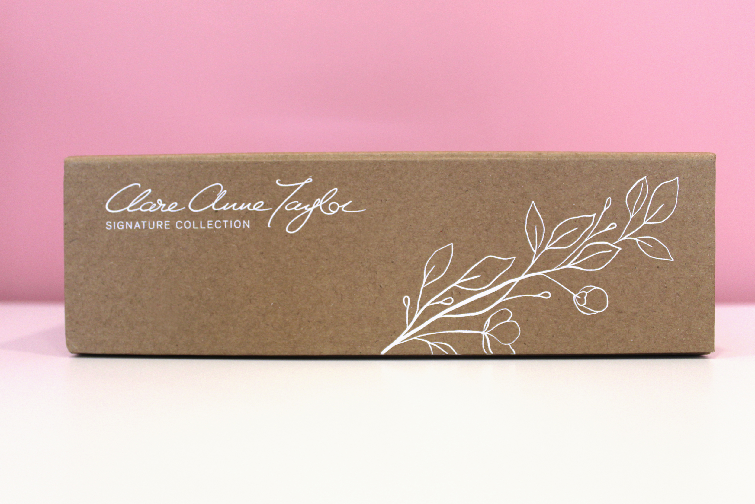
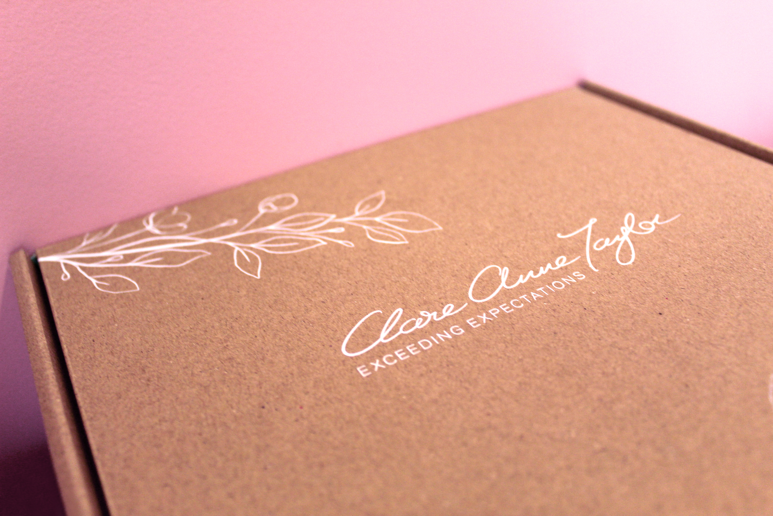
Another way to separate the ranges in a subtle, sophisticated manner was to alternate the strapline/tagline under the brand name/logo for each range. In the brief, Clare mentioned that she would like to exceed expectations for customers. Therefore, for the main ‘Clare Anne Collection’ range, I created the tagline ‘Exceeding Expectations’. This was then changed to the individual range names for the ‘Signature Collection’ and the ‘Couture Collection’.
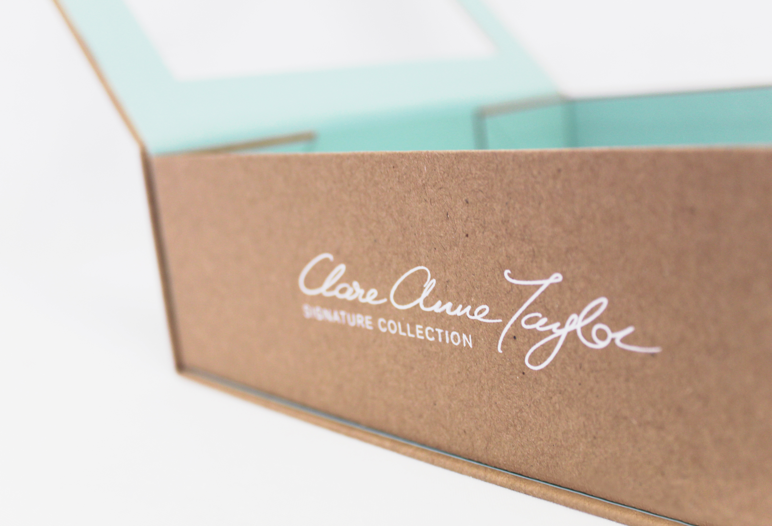
For the main Clare Anne range, we created the concept of a pink, bow sleeve around kraft boxes, to meet the brief’s aim of communicating the experience of receiving a beautiful gift. Clare wanted to showcase the beautiful artistry of the cakes within, therefore we designed a large window on the front of the boxes to meet the brief’s aims, leaving space at the back of the boxes for possible ingredient/nutritional labels to be added per cake, as each cake is bespoke.
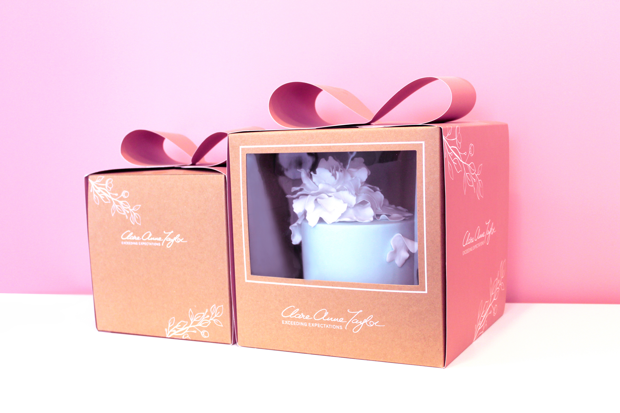
For the box and sleeve design, the design is simple and minimal to convey the quality of the brand. The boxes and sleeves feature a delicate floral illustration to connect to the beautiful artistic floral designs that Clare creates on her cakes. Another factor used to communicate the level of quality is the premium standard of printing of the kraft boxes and pink sleeves. The Signature Collection features a green interior with three different inserts for various types of confectionery. The e-commerce box was created to hold the confectionery boxes securely for delivery. The printing specialists that we worked with to reach our design requirements and unique print specifications for this project’s packaging range was JJ O’Toole.
See more about Clare Anne Taylor Couture Cakes:
Instagram: instagram.com/taylorclareanne
Website: clareannetaylor.ie
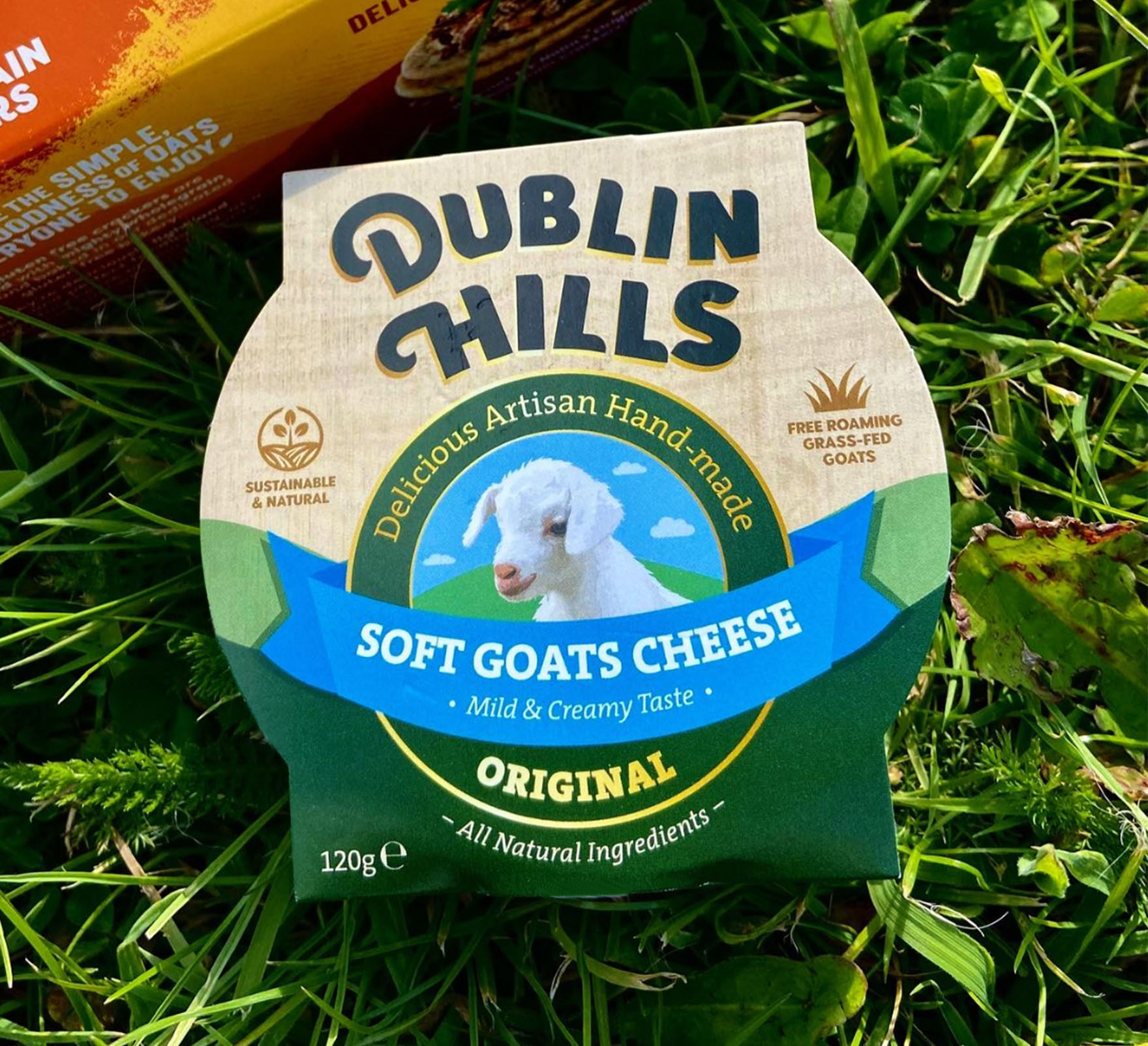
Dublin Hills Goats Cheese Brand Packaging Design
Dublin Hills Goats Cheese Brand Packaging Design
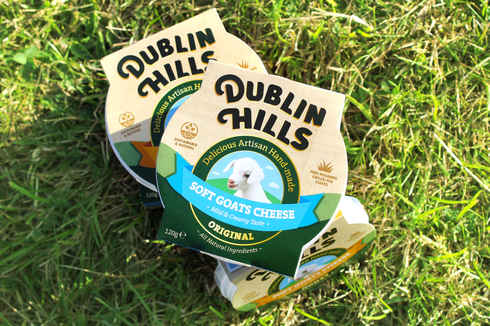
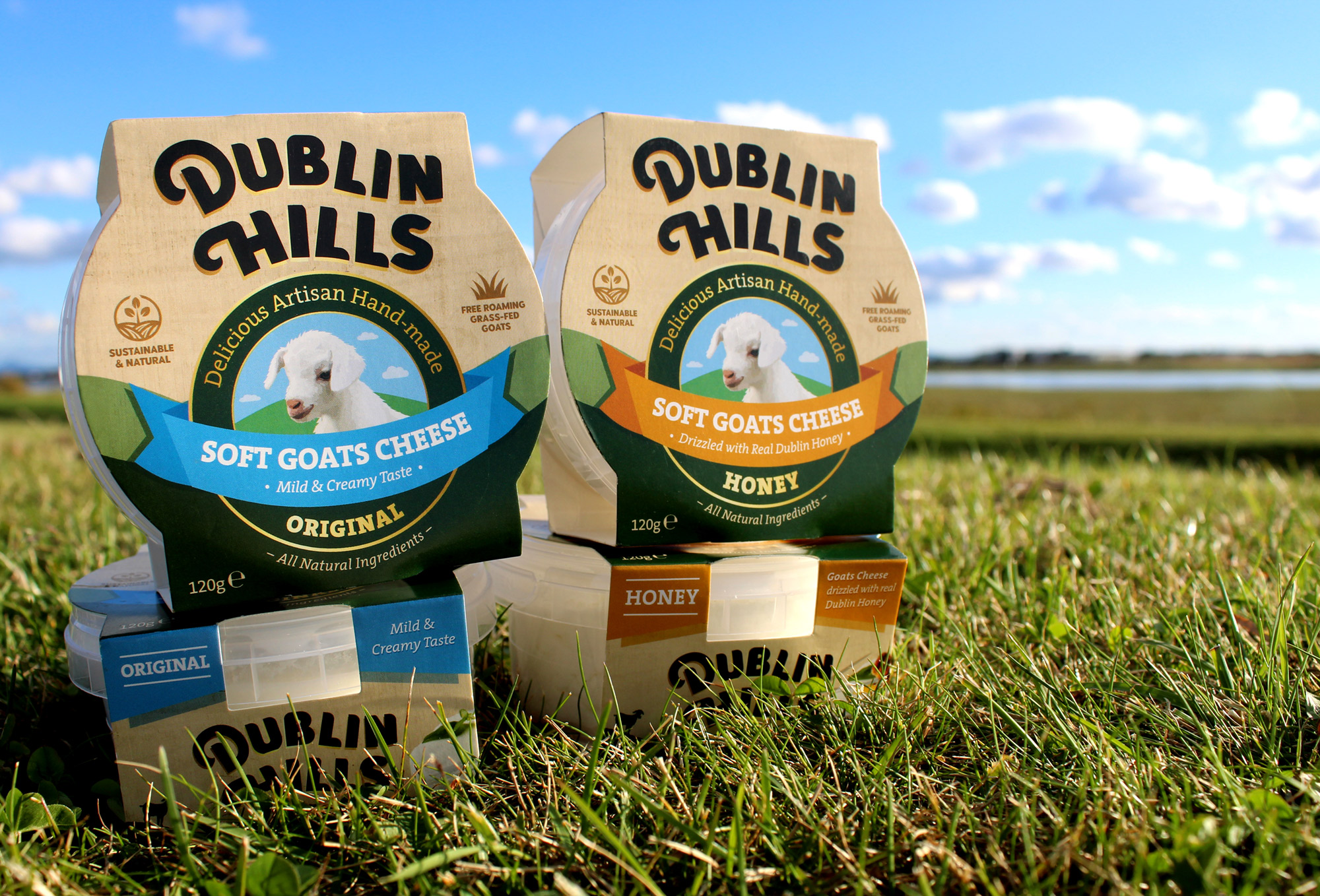
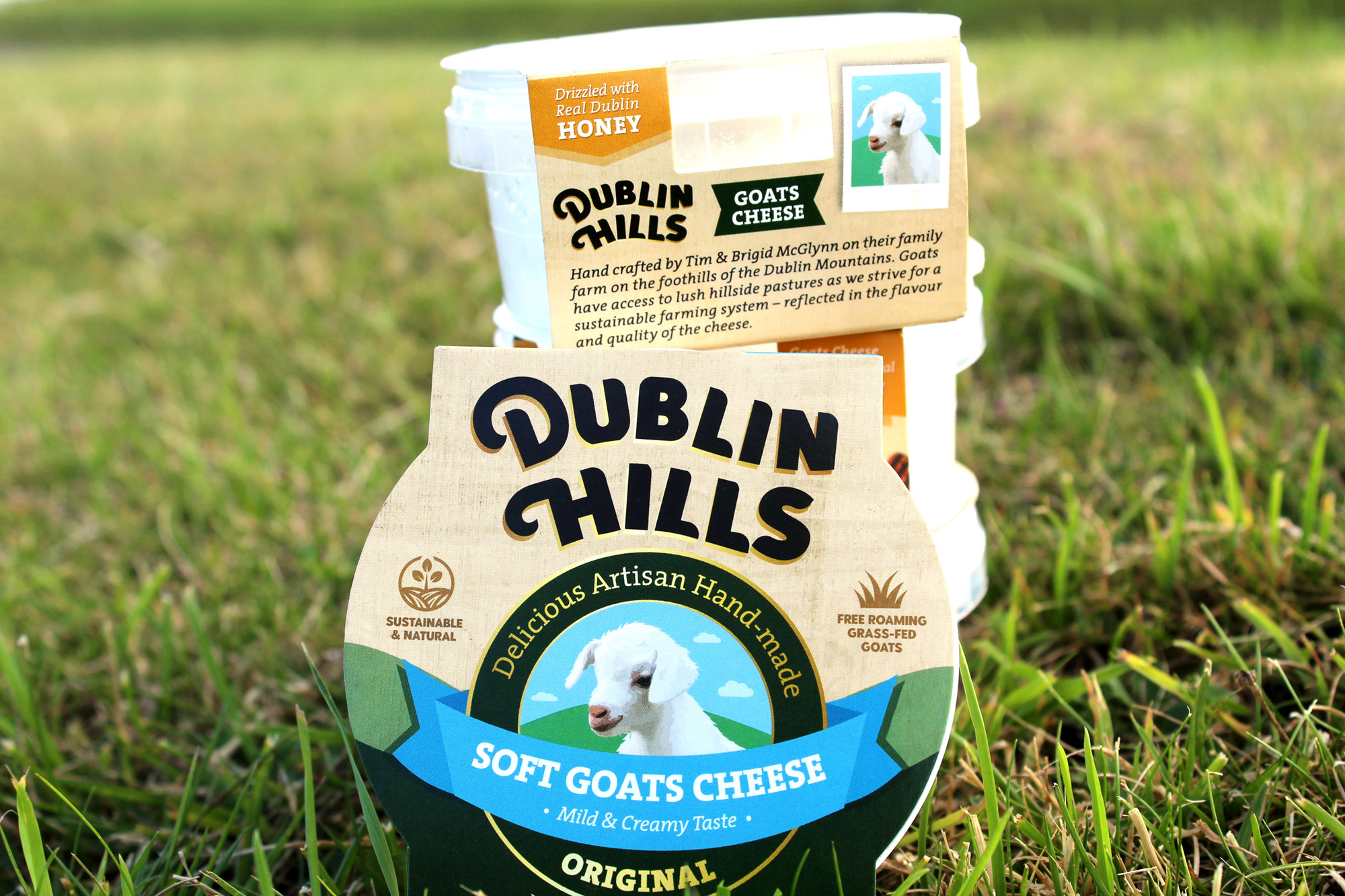
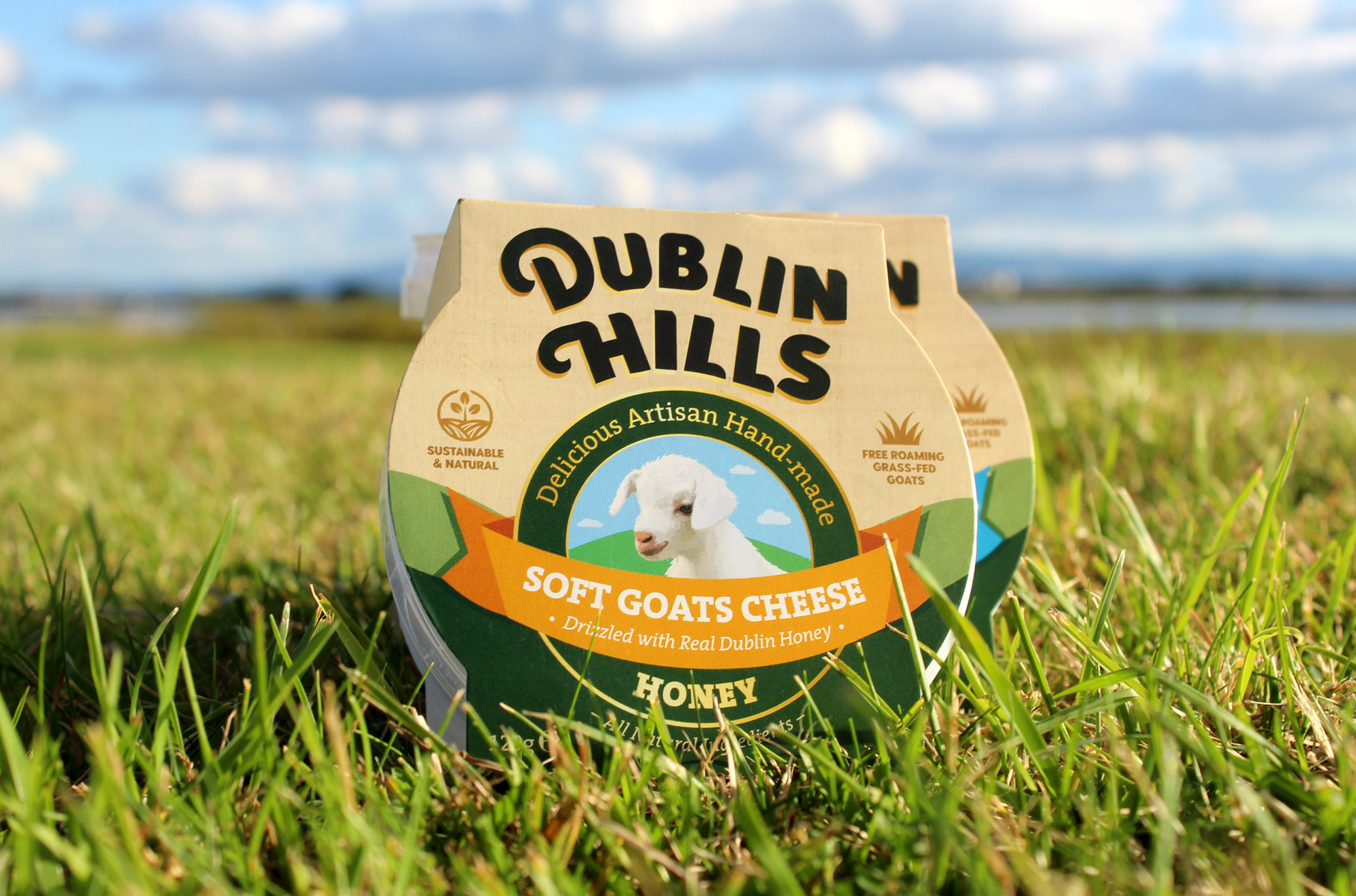
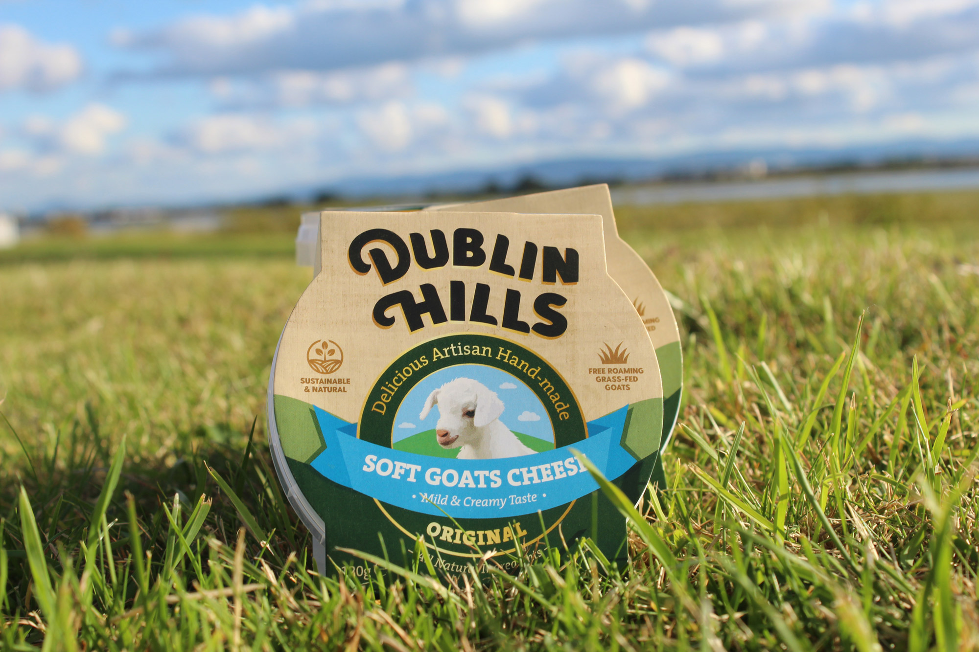
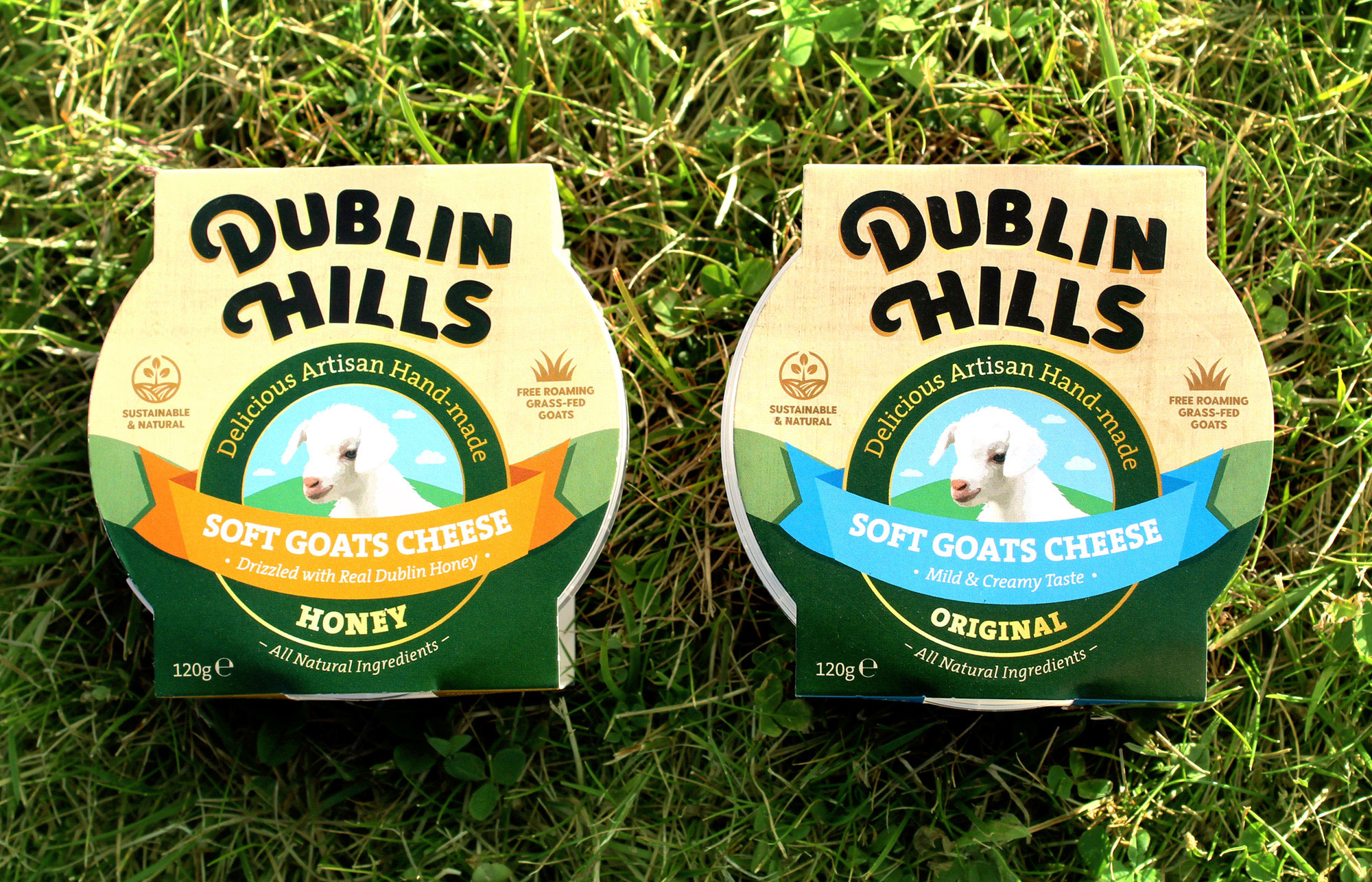
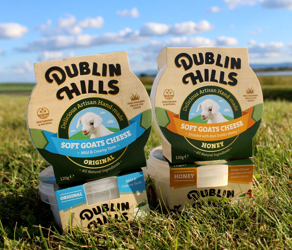
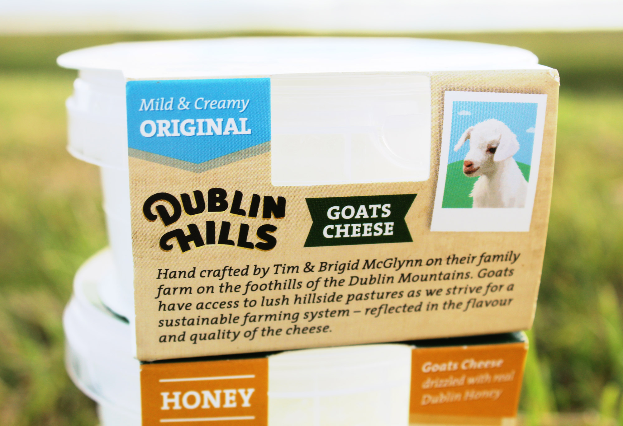
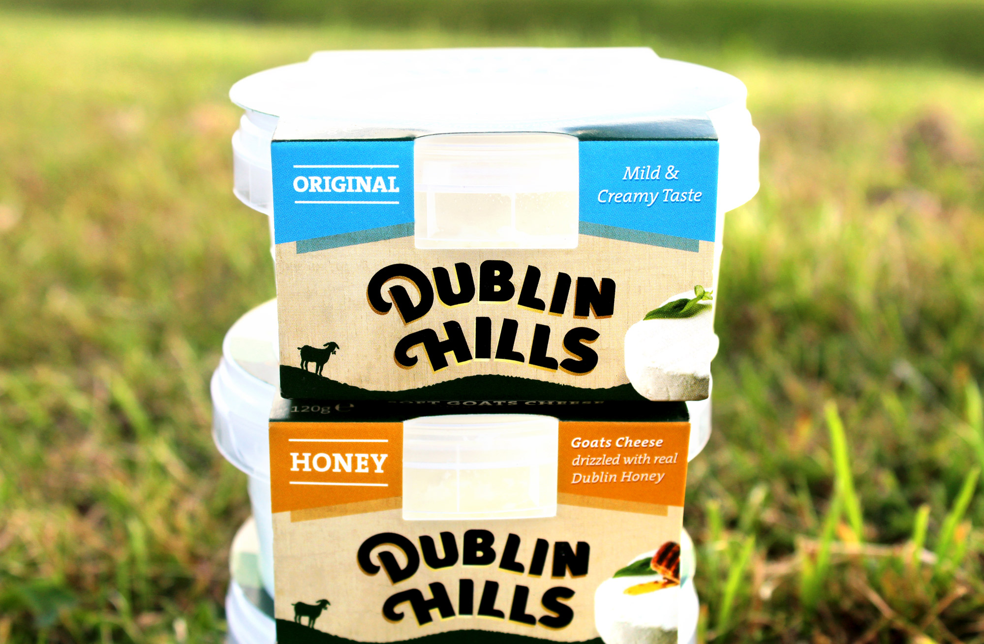
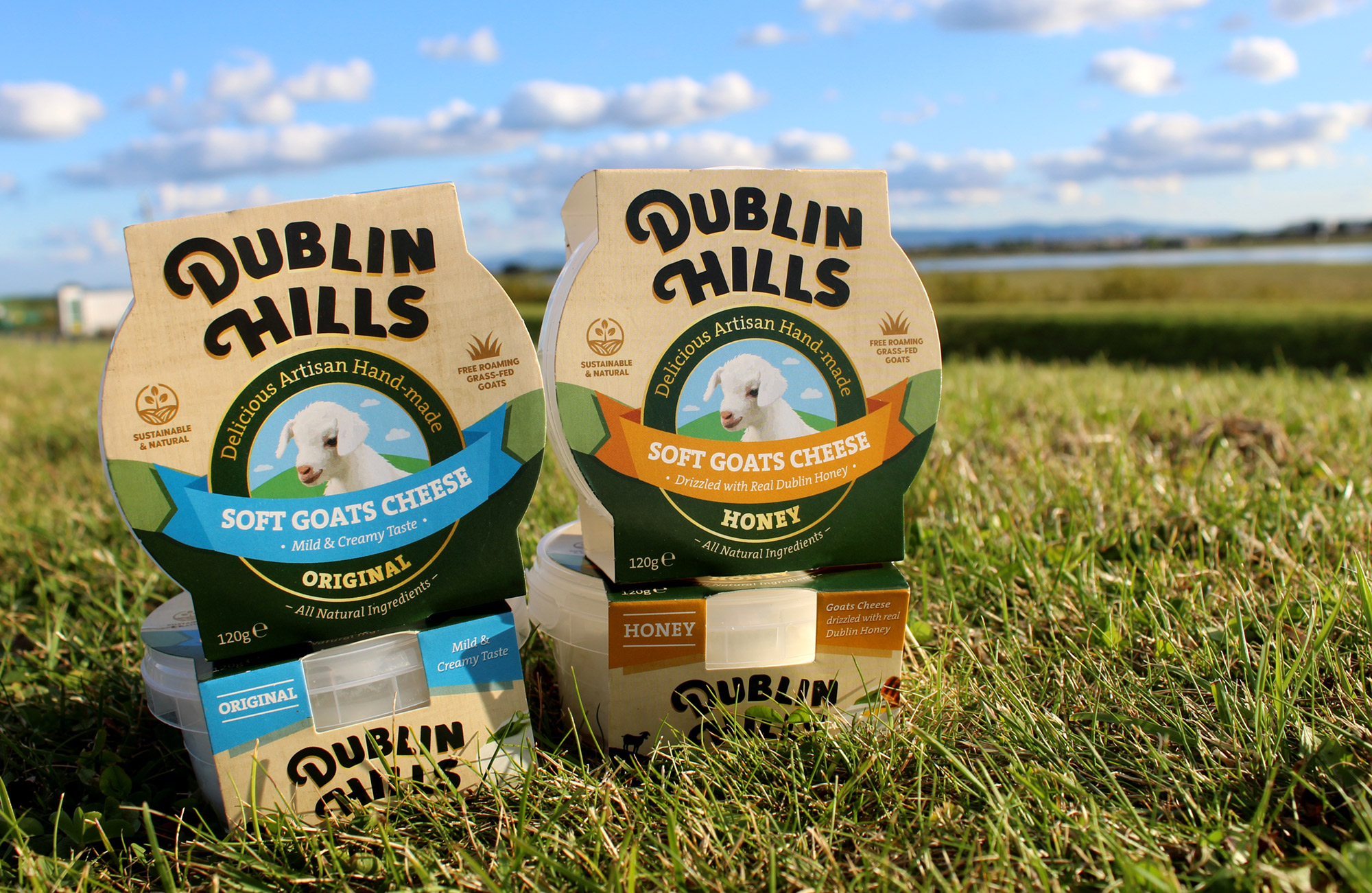
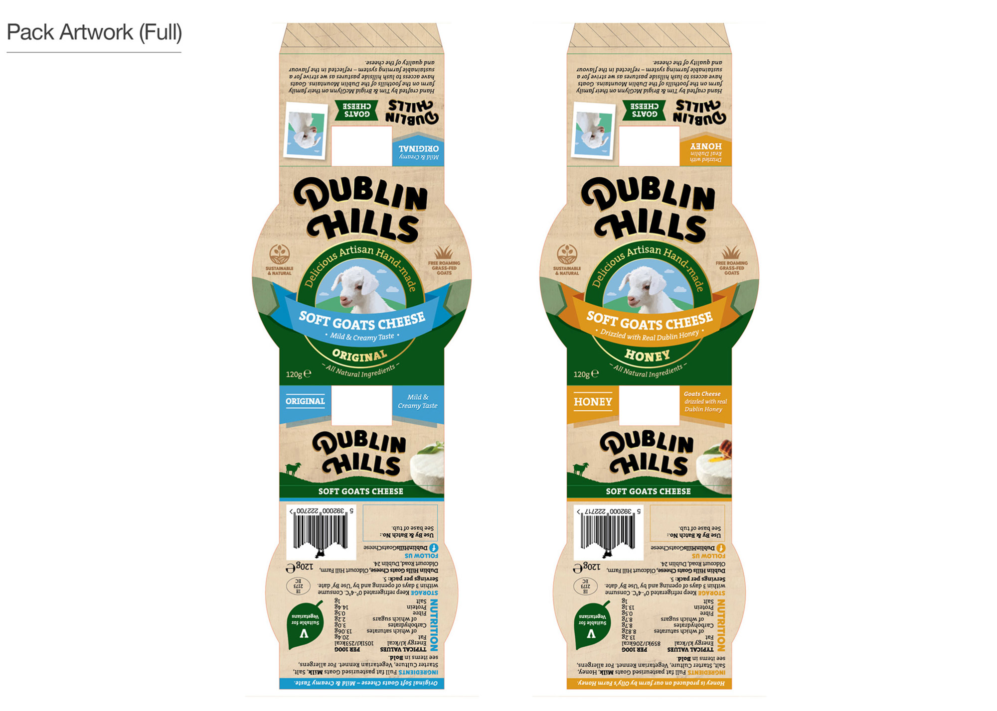
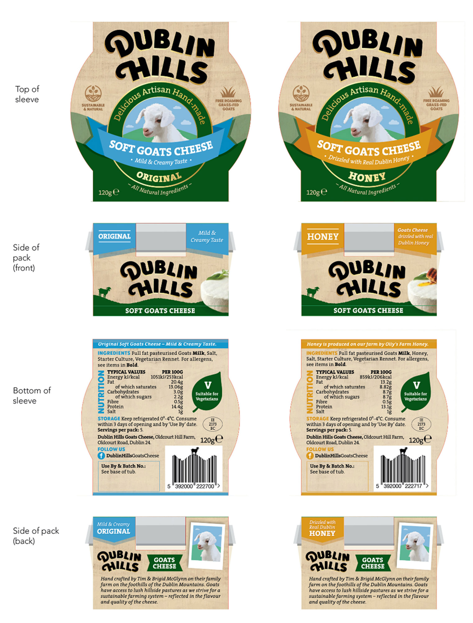
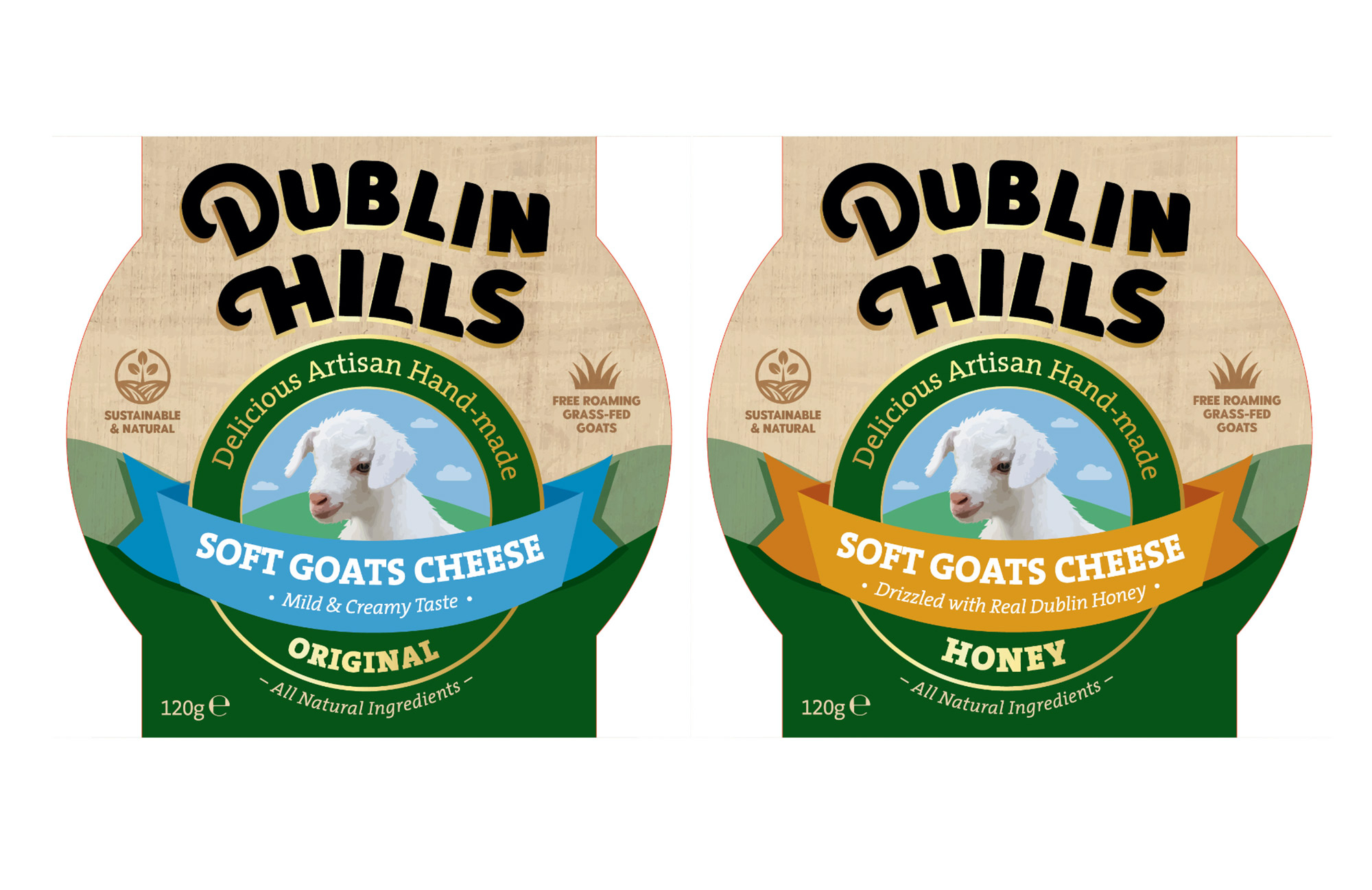
Dublin Hills Goats Cheese is handcrafted on the foothills of the Dublin Mountains. It is natural and sustainably made, using just four simple and natural ingredients. The goats are grass-fed and roam freely in the fresh green fields at the foothills of the Dublin Mountains and is suitable to be enjoyed by vegetarians. Dublin Hills is the only goats cheese maker in Dublin. The company is run by farmer and food producers, Tim and Brigid McGlynn. They have a herd of dairy goats and free-roaming hens on their farm, known locally as ‘Oldcourt Hill Farm’. The honey flavour is drizzled with honey from Olly’s Farm.
Dublin Hills strive for a sustainable farming system, which is reflected in the flavour and quality of the cheese. They pride themselves on producing local, natural and sustainable goats cheese on their family farm, with goats roaming freely on their lush hillside pastures. This unique and delicious soft, creamy artisan cheese has a reputation for being extremely addictive! You can find it in local SuperValu stores and Tim has been known to be there on occasion offering tastings of the cheese to consumers.
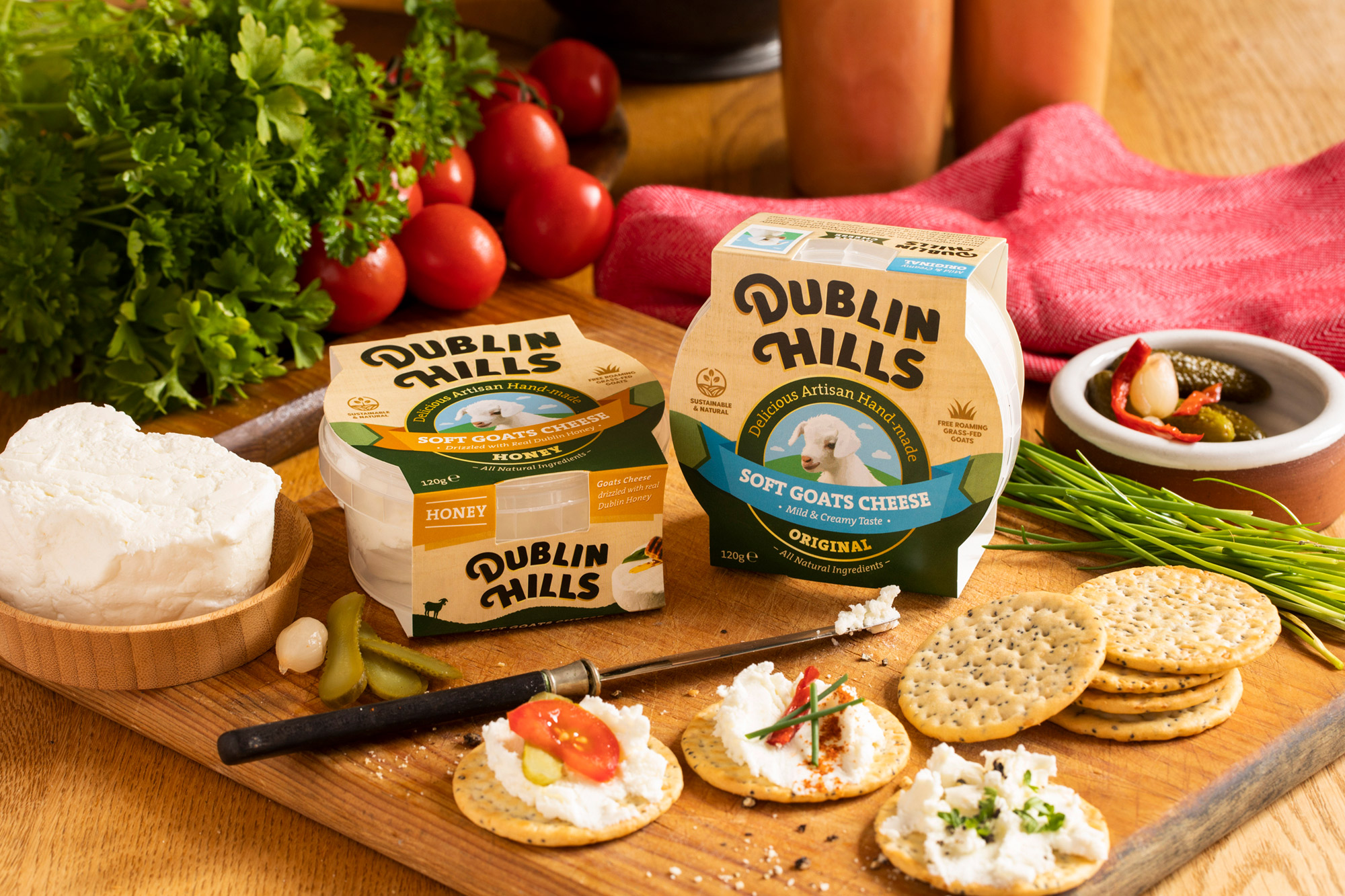
The project began with a brainstorming phase for the name, with the final decision on ‘Dublin Hills‘ working effectively to clearly communicate one of the company’s USP’s (Unique Selling Point) – their provenance and that they are a local, Dublin based goats cheese producer. The Dublin Mountains can be seen from various points all over Dublin, from North to South (where they are located) and are a much-loved and popular landmark feature of Dublin anyone living in the county.
Their provenance and location also informed the design of the logo – the typography playfully mimics the curves of the foothills of the Dublin Mountains that their farm is situated on, almost as if the brandmark is sitting on the hills itself. This is crafted in a sophisticated and premium style. The gold underlay to the bold black type denotes the quality of the cheese. There is a small illustrative icon locked up with the typography which further emphasises their location.
The client wanted to communicate how they are a small local farm with free-roaming goats that graze in their natural surroundings. To consider this, we incorporated an illustration of a goat in a meadow of fresh grass, with mountains in the background on the packaging. The taste of the goats cheese is mild and soft, from young goats milk, and so the goat depicted is young in appearance to indicate this. This young goat sits within a ribbon badge on the front of the packaging – this is a visual cue to symbolise the quality of this cheese.
![]()
Brand Guidelines & Assets:
![]()
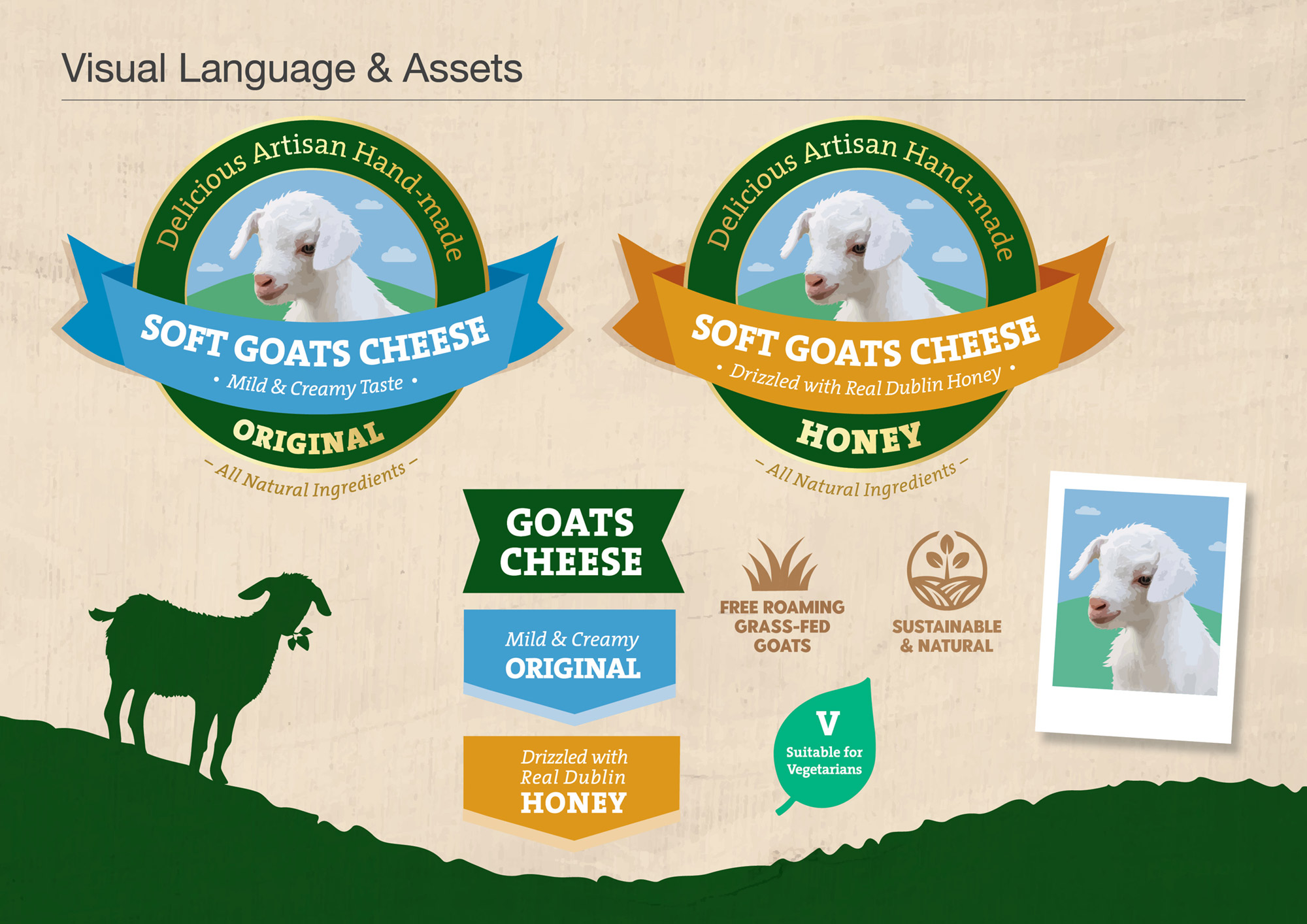
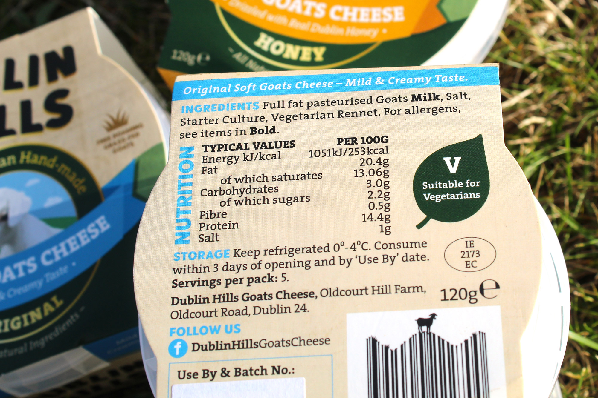
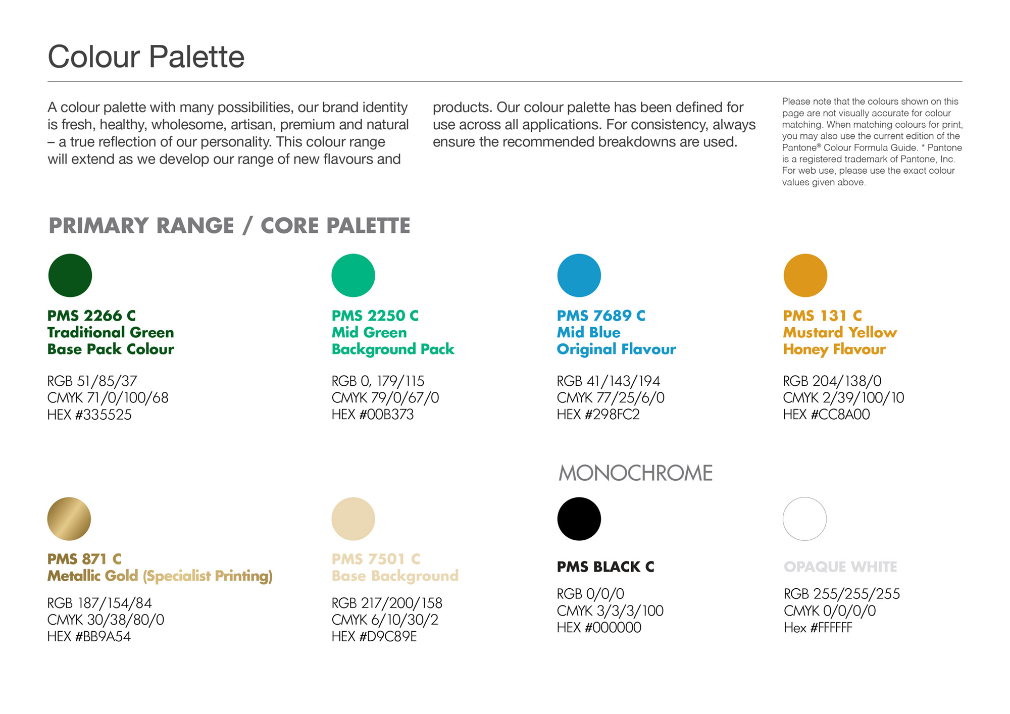
A full brand guidelines were included with this brand packaging project. The colour palette and typography chosen are earthy, natural, bright and fresh to indicate these aspects of how the Dublin Hills handcrafted cheese is produced. Illustrative icons and descriptor text on the packaging design communicate some of the other brand USP’s, such as that the cheese is ‘Sustainable & Natural’, that the goats are ‘Free-Roaming, Grass-Fed Goats’ and that the cheese is ‘Suitable for Vegetarians’. The barcode is playful, featuring an icon of a young goat on a hill as part of the barcode device. On the front side of the packaging design, images of the cheese are included to visually appeal to consumer’s taste buds. The brand story is featured on the back side of the pack, to allow consumers to connect with the McGlynn family’s brand story and background.
![]()
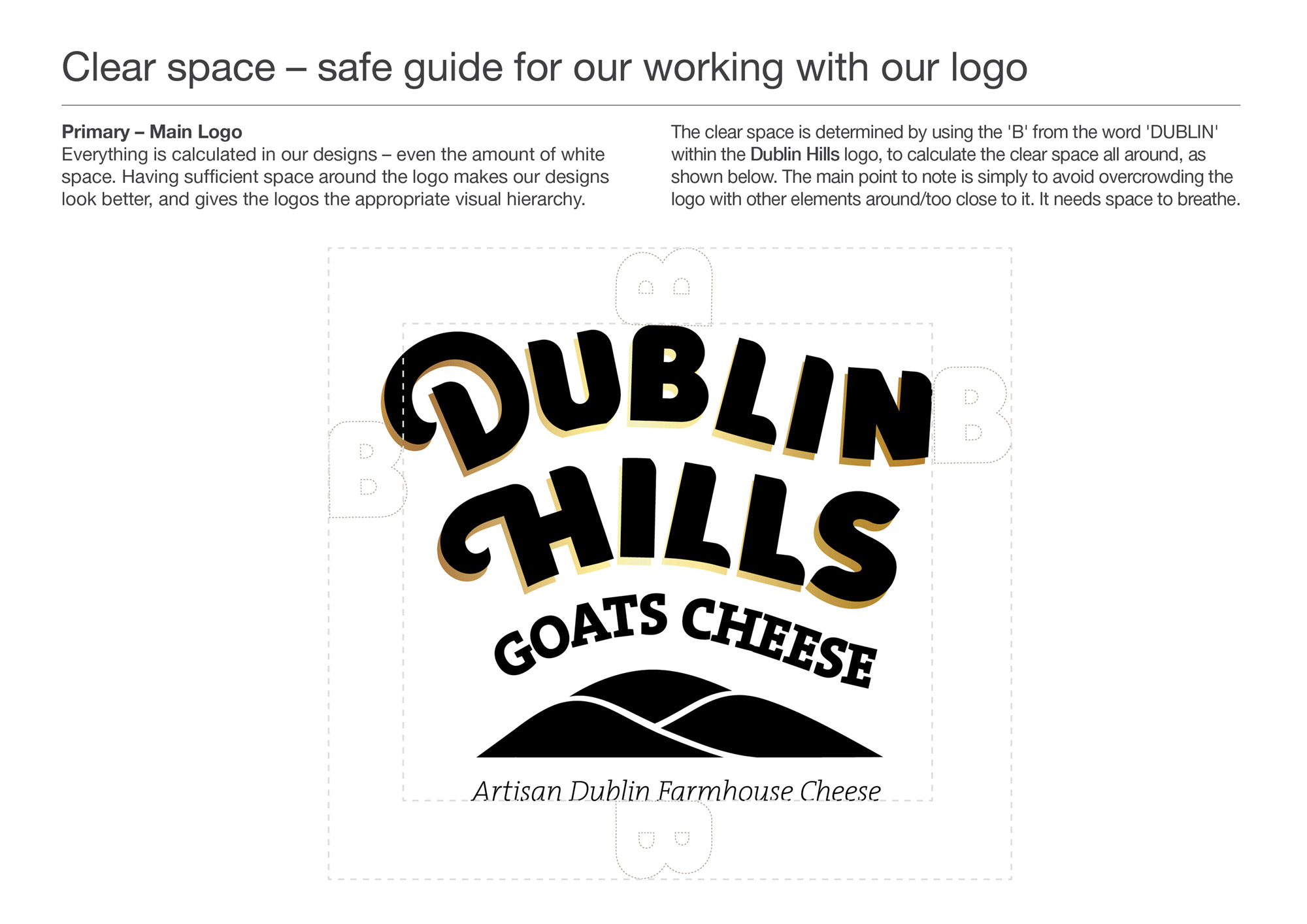
A minimum Clear Space recommend guide was defined for best use of the brand. There is a version of the logo with the strapline ‘Artisan Dublin Farmhouse Cheese‘, which is used on occasions where the full pack artwork isn’t there to communicate their values.
![]()
Dublin Hills Goats Cheese is currently available in SuperValu stores:
Dublin:
Orwell, Templeogue, Dublin 6
Rathgar, Rathfarnham, Dublin 6
Ballyroan, Rathfarnham, Dublin 14
Get Fresh, Rosemount SC, Rathfarnham, Dublin 14
The Merry Ploughboy Pub, Rathfarnham, Dublin 14 (in their food menu)
Knocklyon, Templeogue, Dublin 16
Firhouse, Tallaght, Dublin 24
Lucan, Co. Dublin
Wicklow:
Blessington, Co. Wicklow
Follow Dublin Hills Goats Cheese on Social Media:
Instagram: @dublinhillsgoatscheese
Facebook: www.facebook.com/Dublin-Hills-Goats-Cheese-114380377922359/
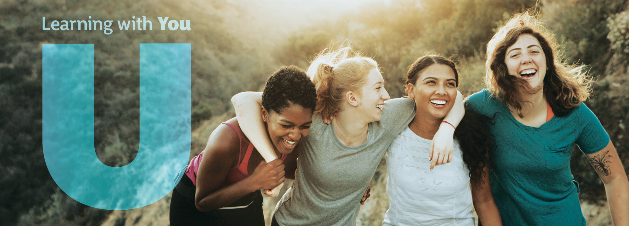
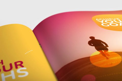
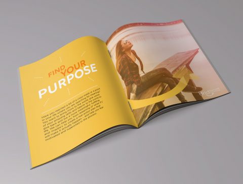
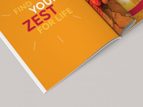
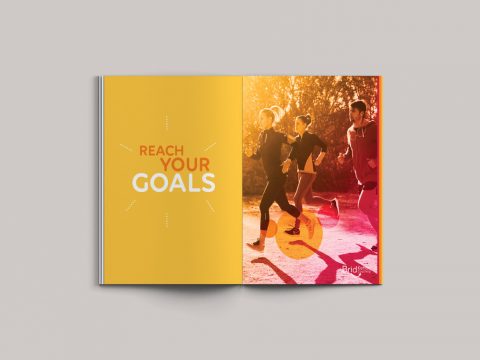
Your Life Audit Brand Identity
Your Life Audit – Brand Identity
‘Your Life Audit’ is a coaching business run by Catriona Kennedy, specialising in one-to-one personal life coaching, corporate coaching and coaching for schools and groups. It aims to empower clients with the tools and resources they need to unlock, achieve and maximise their personal and professional development and fulfilment.

Life coaching is a rewarding process aimed at giving you the control and direction to embrace life and fulfil your potential. It can help you identify and utilise your innate skills and qualities, develop optimism and build positive relationships, find true meaning and purpose in life and more. To put simply, coaching is all about creating positive change for you, with you and in you. Catriona is a certified Life Coach, with Neuroscience, and the creator of Your Life Audit and she believes in the power of YOU.
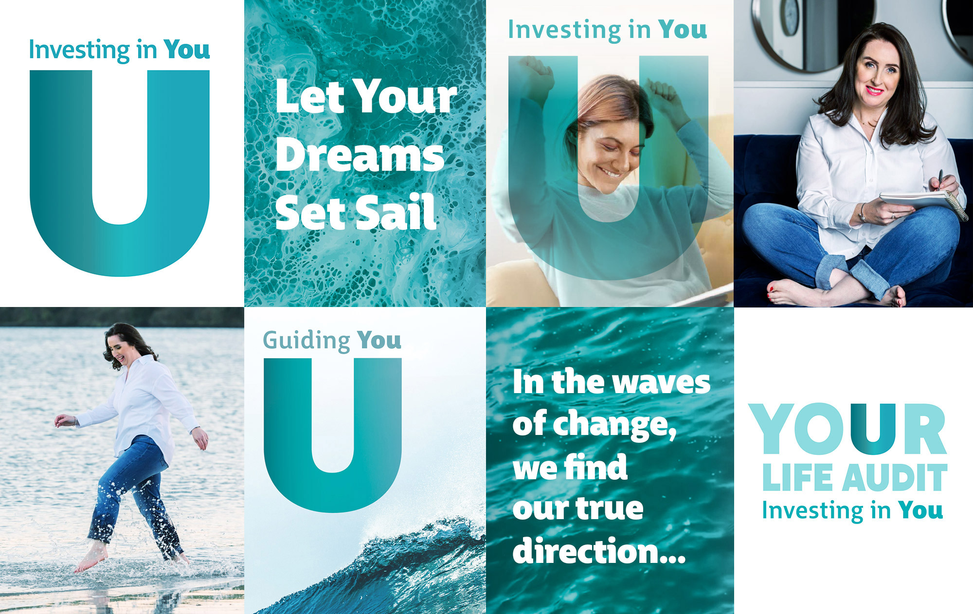
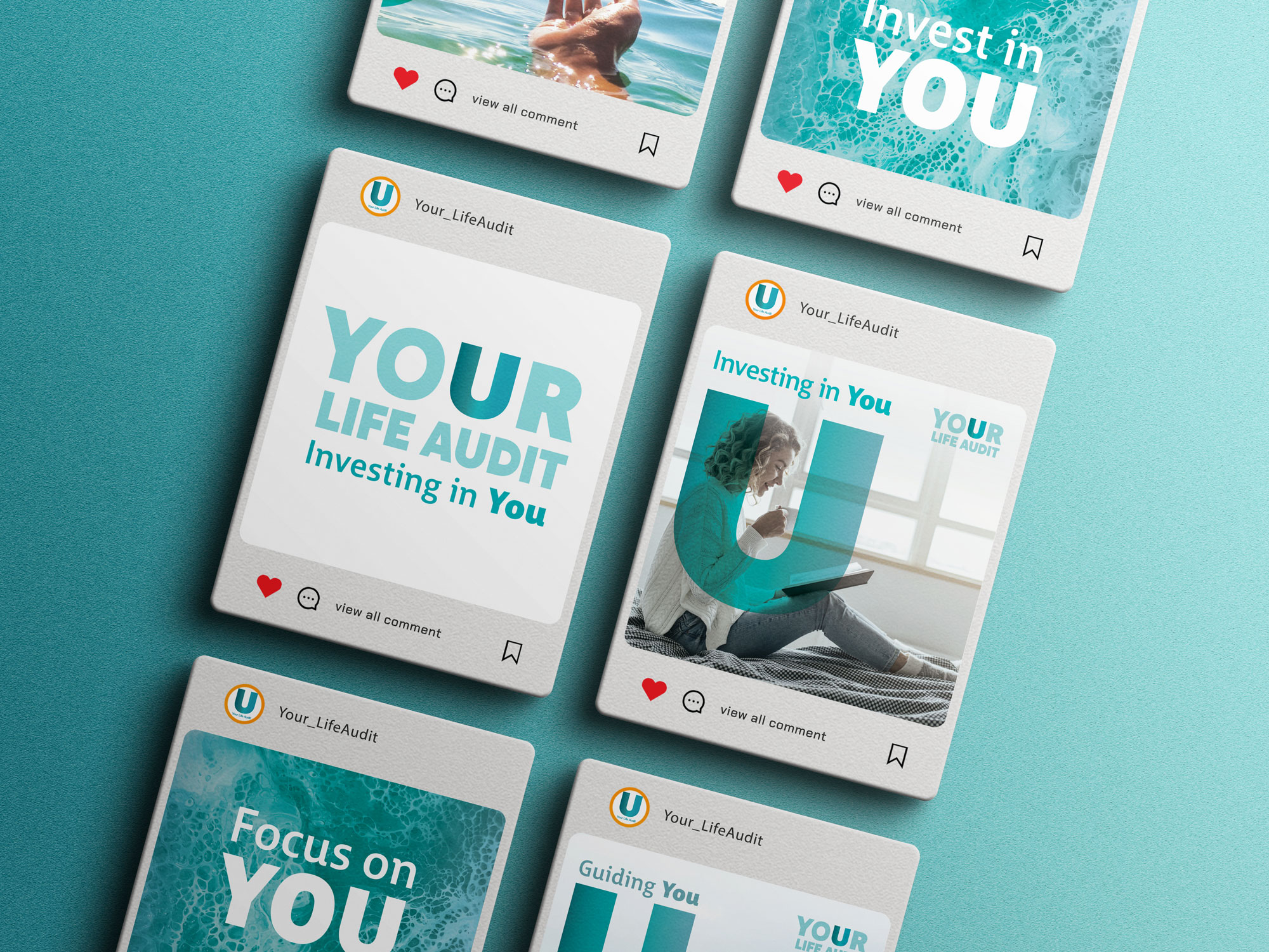
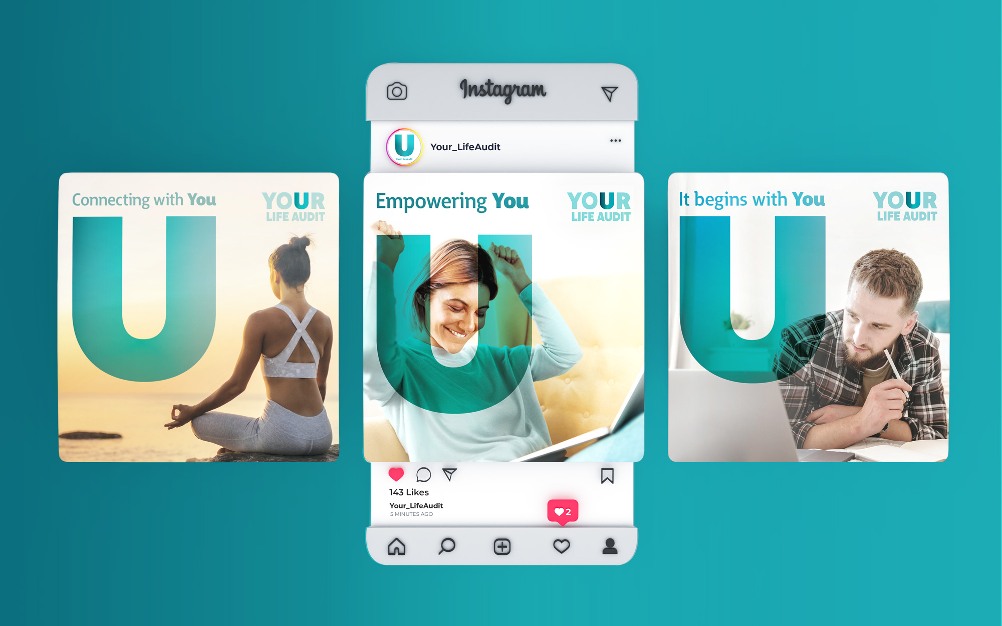
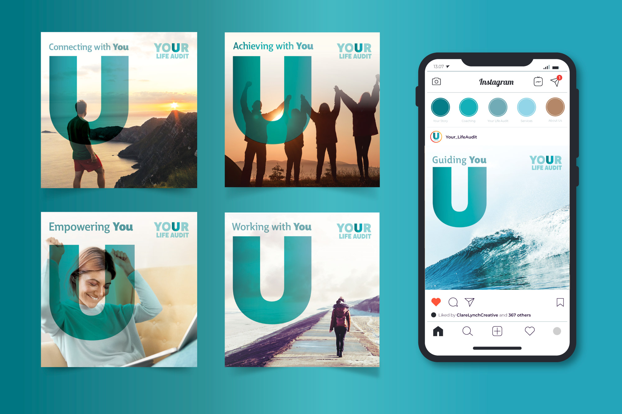
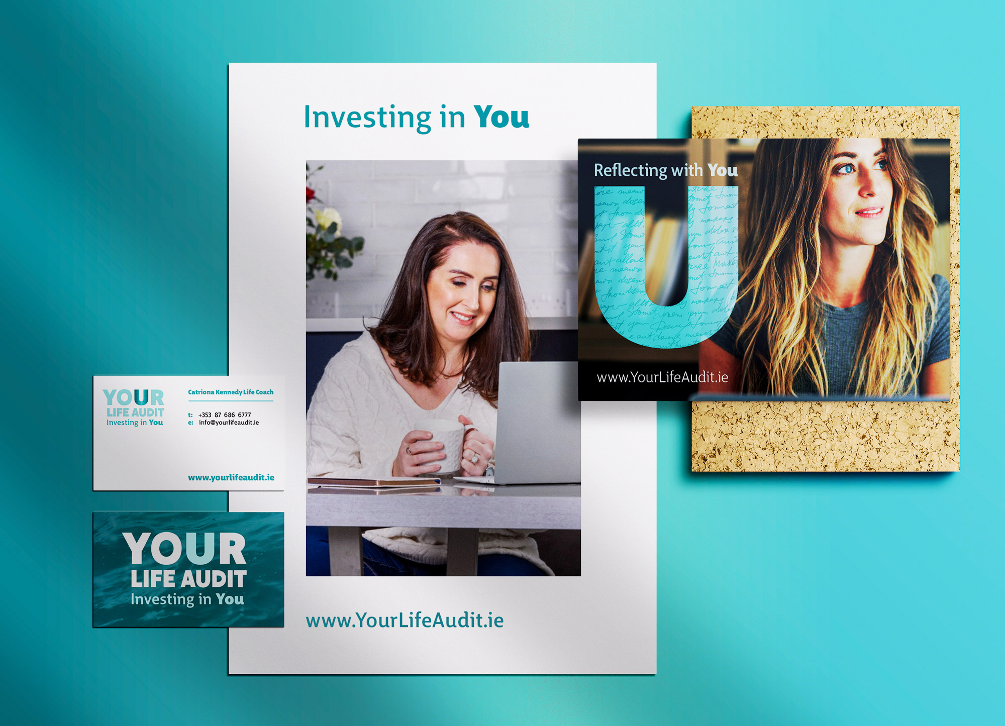
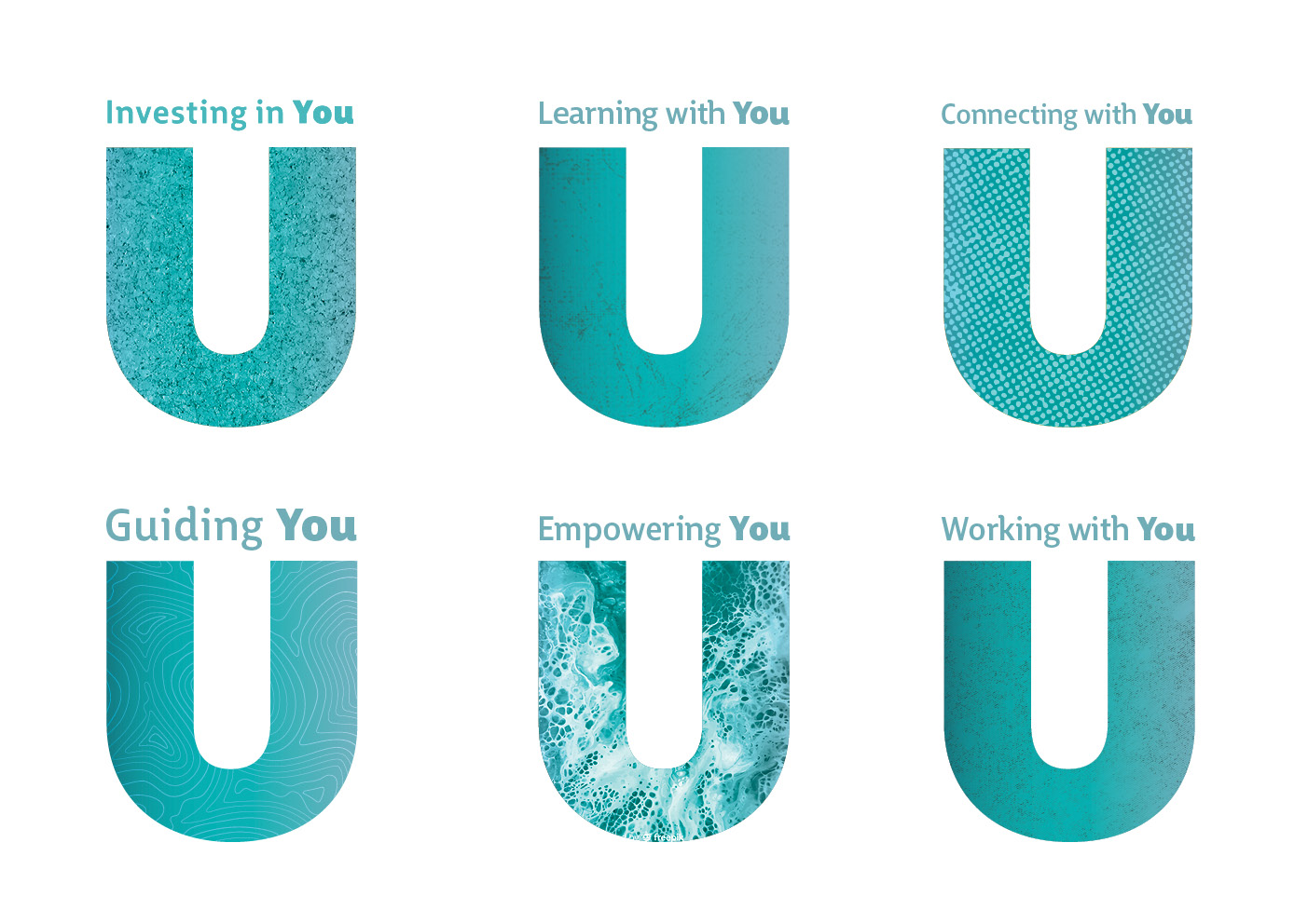
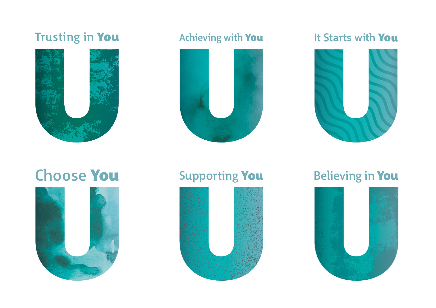

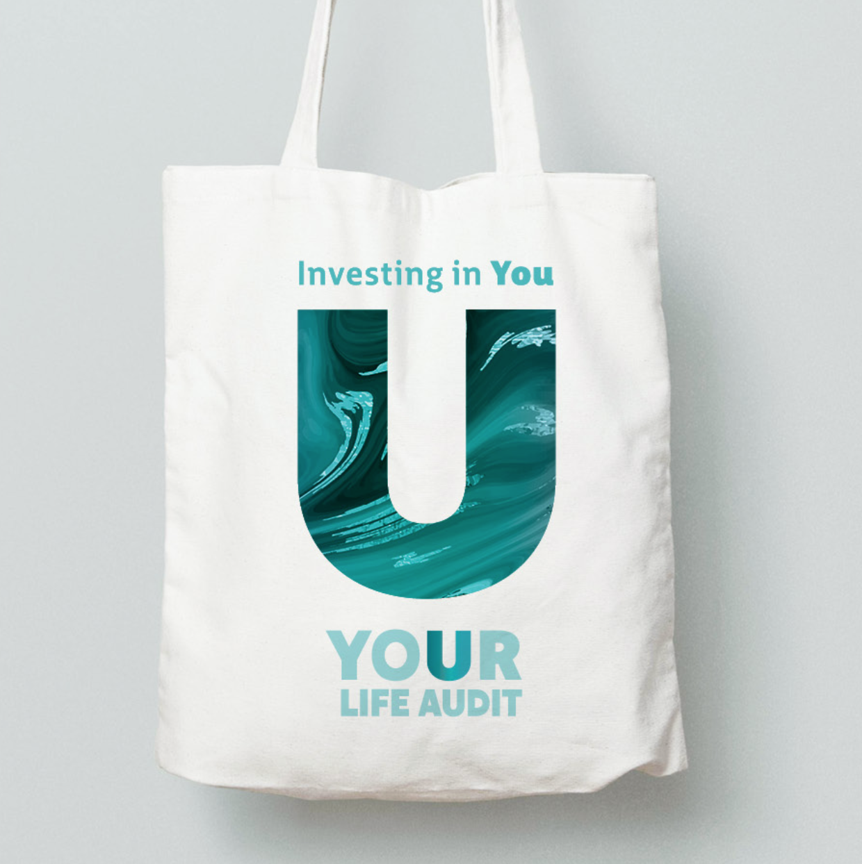
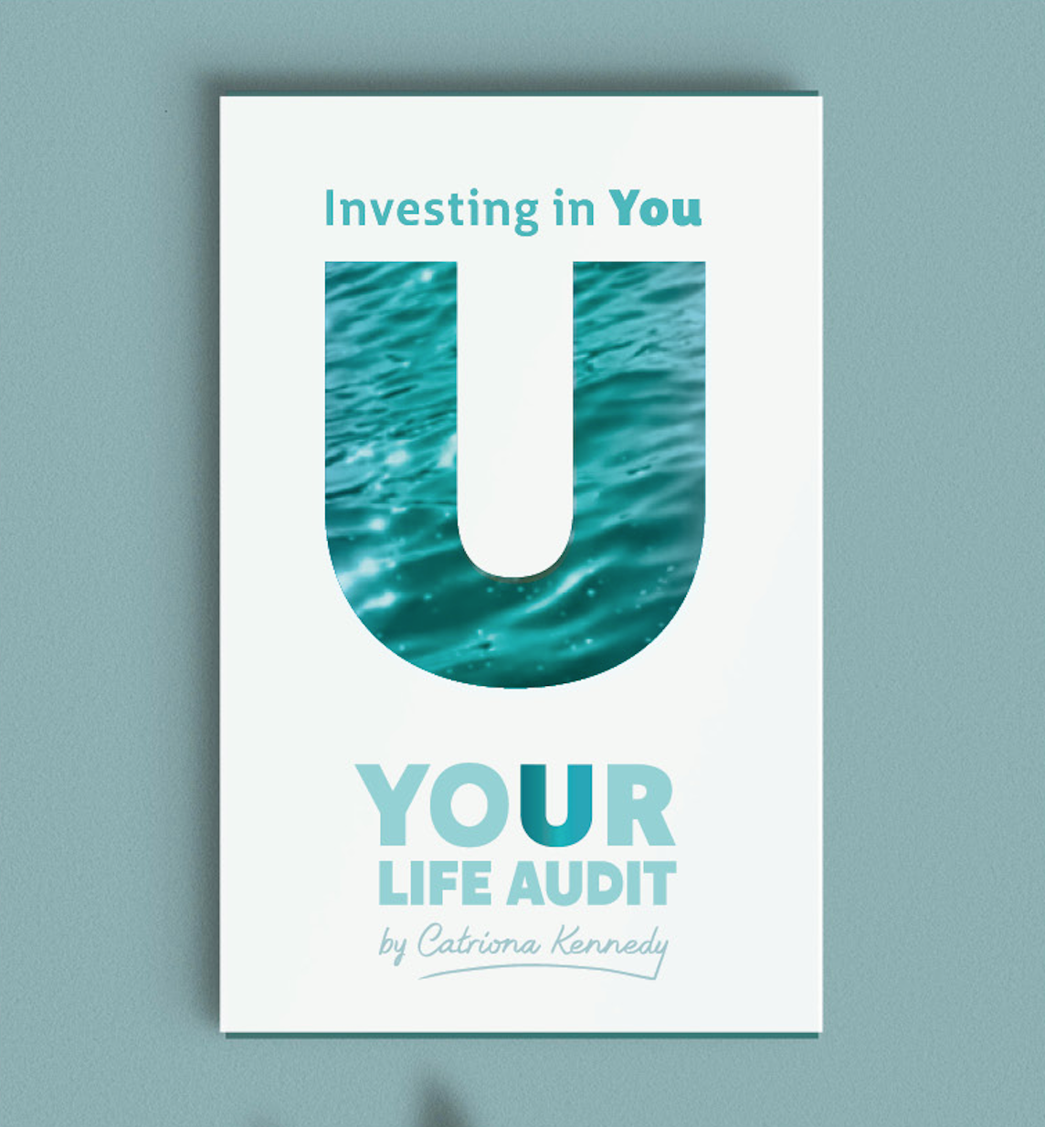

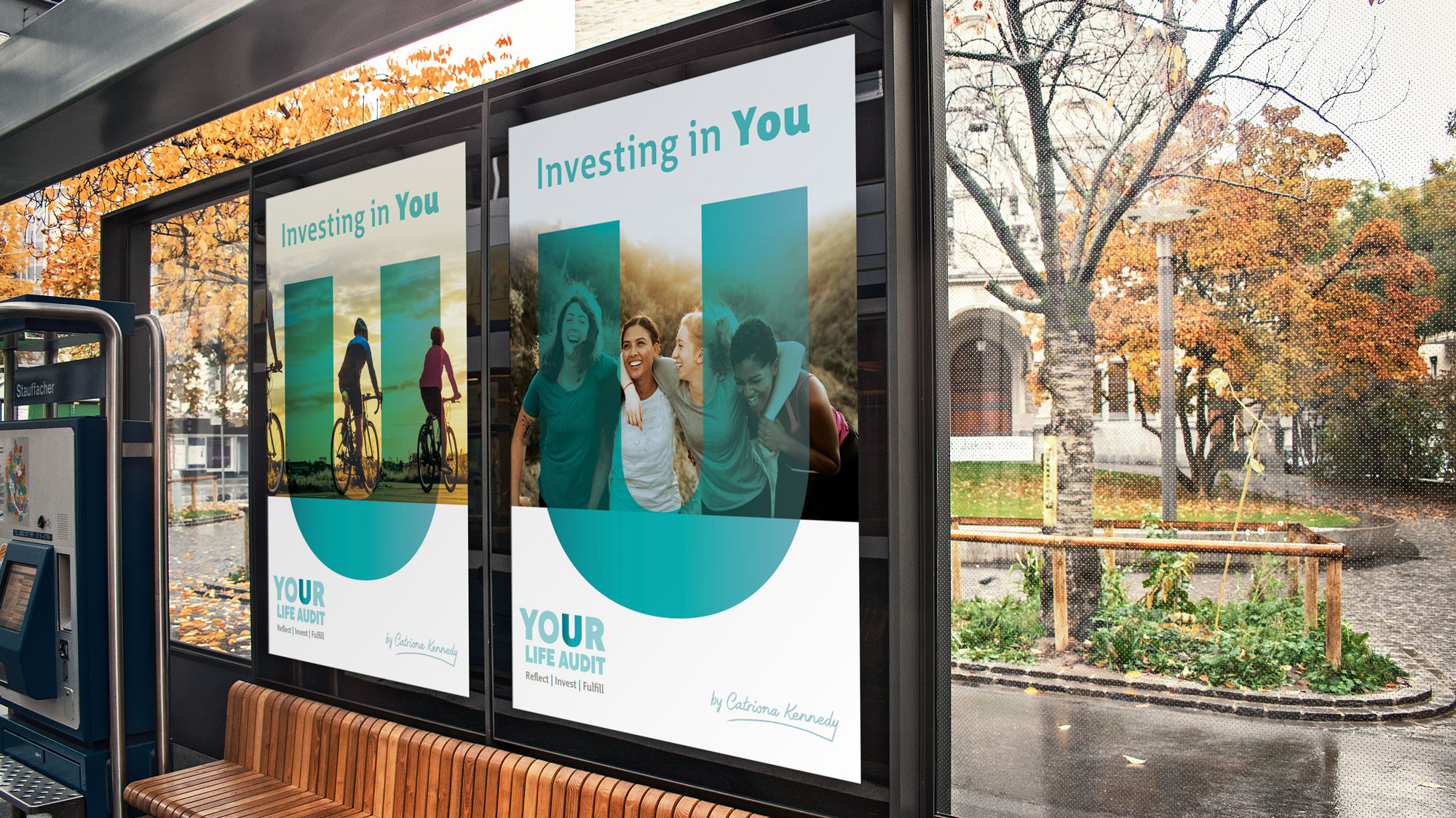
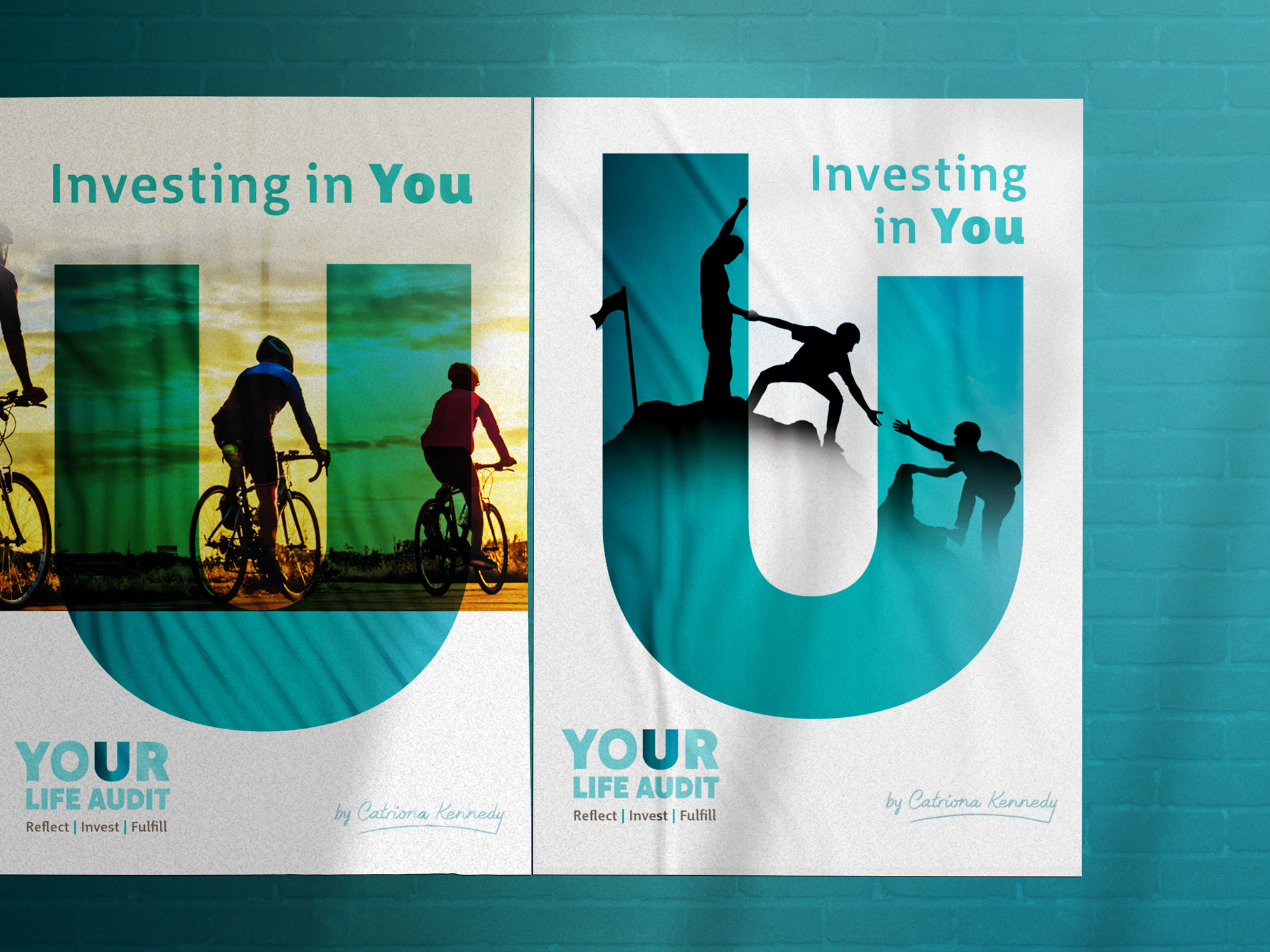
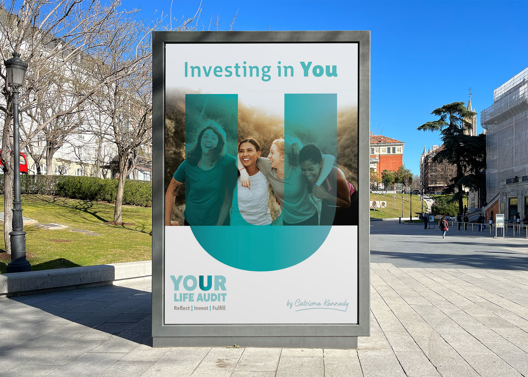
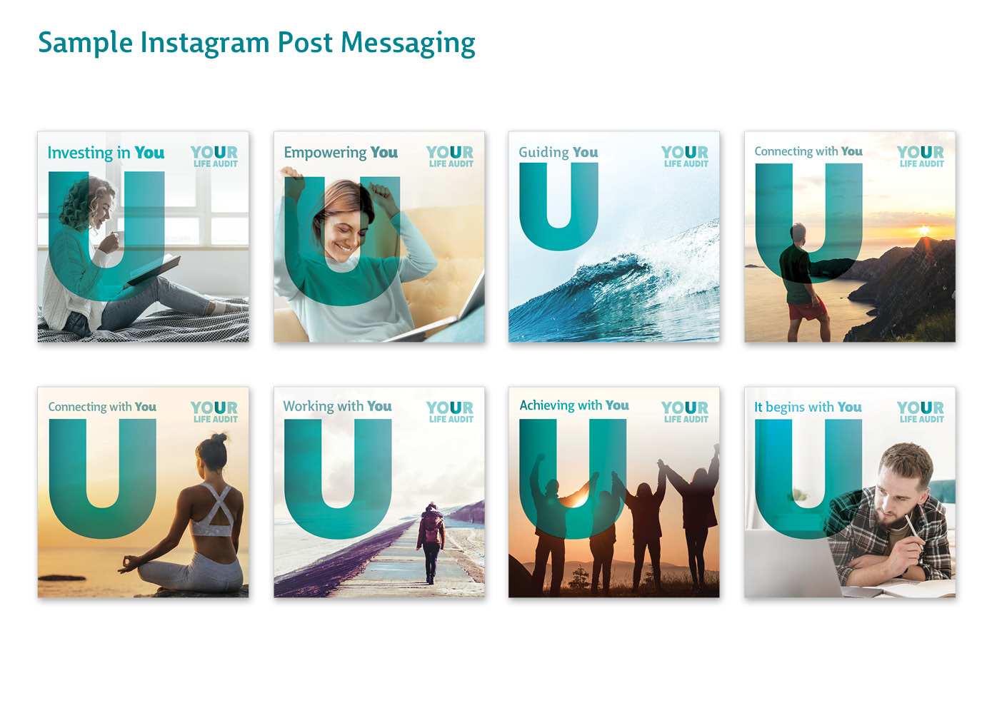
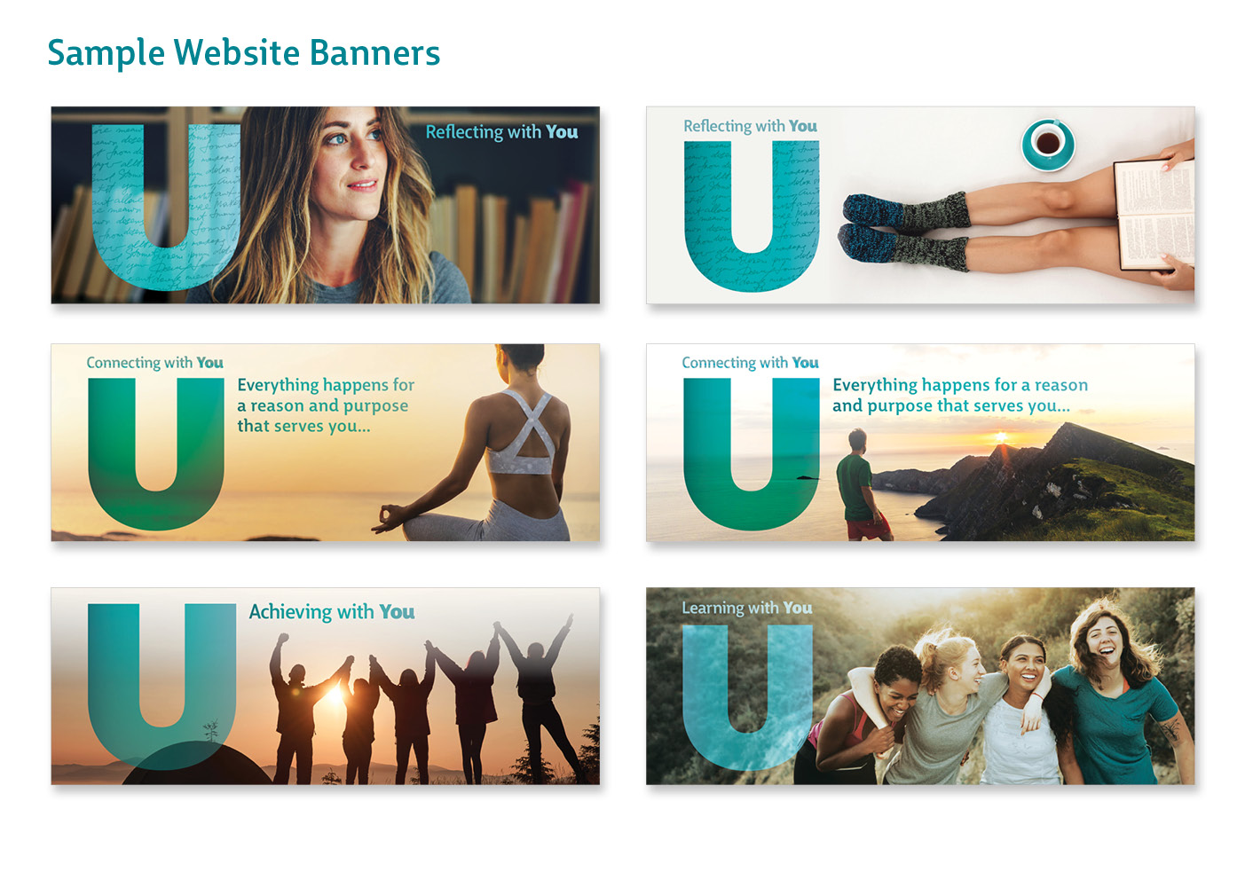
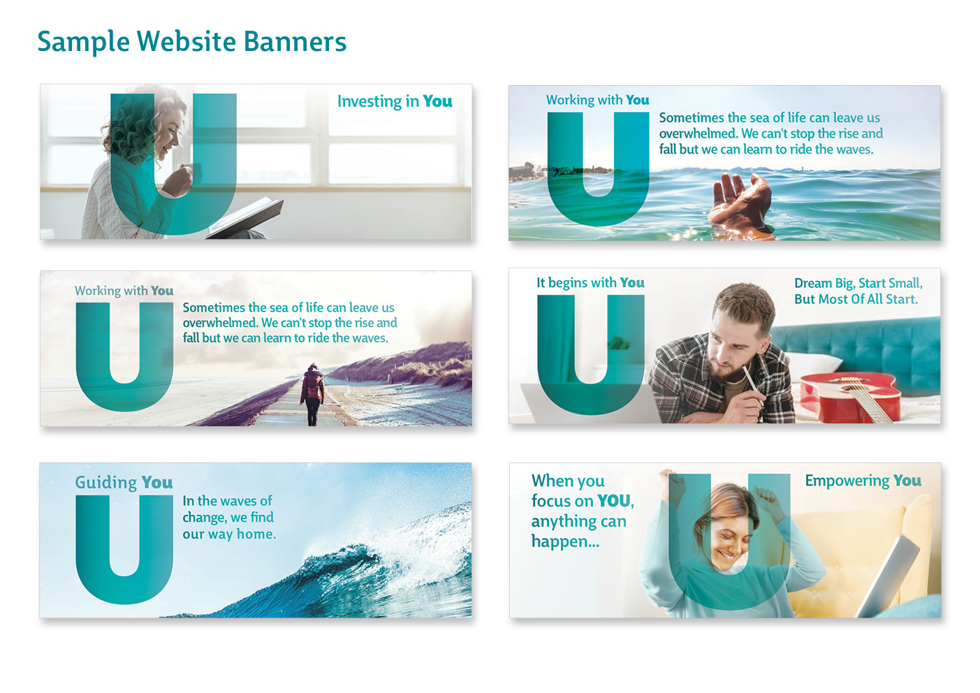

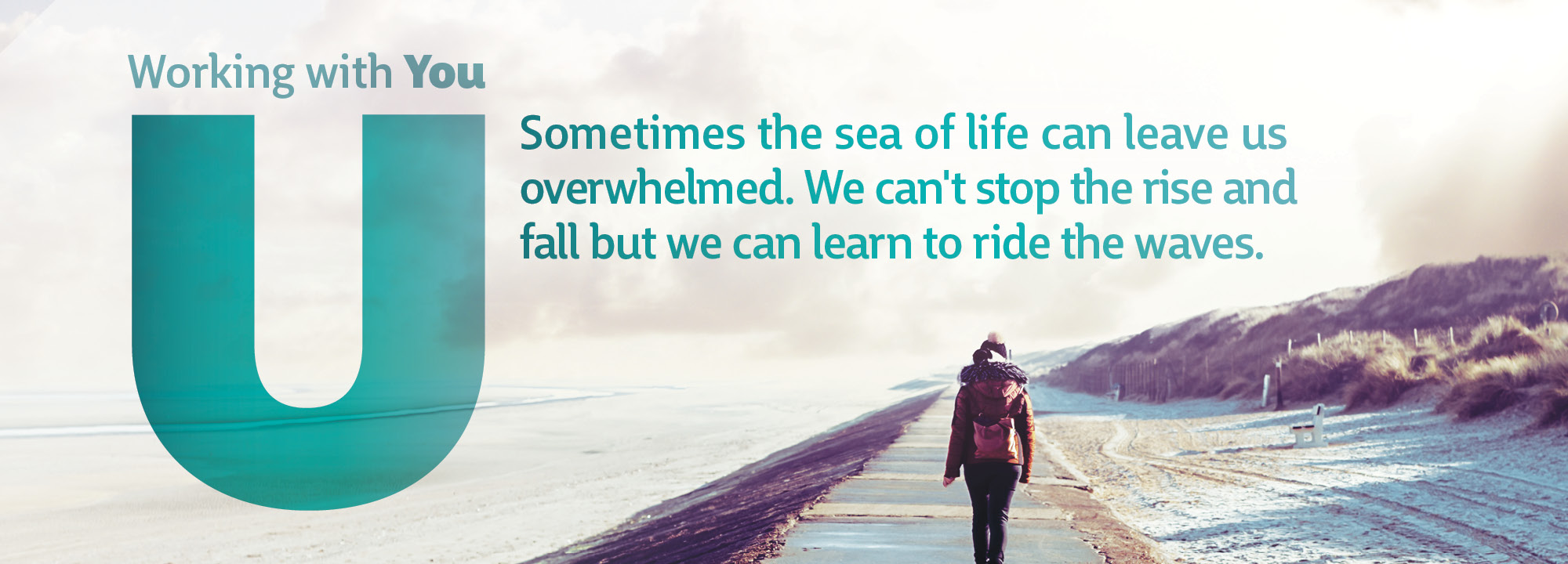
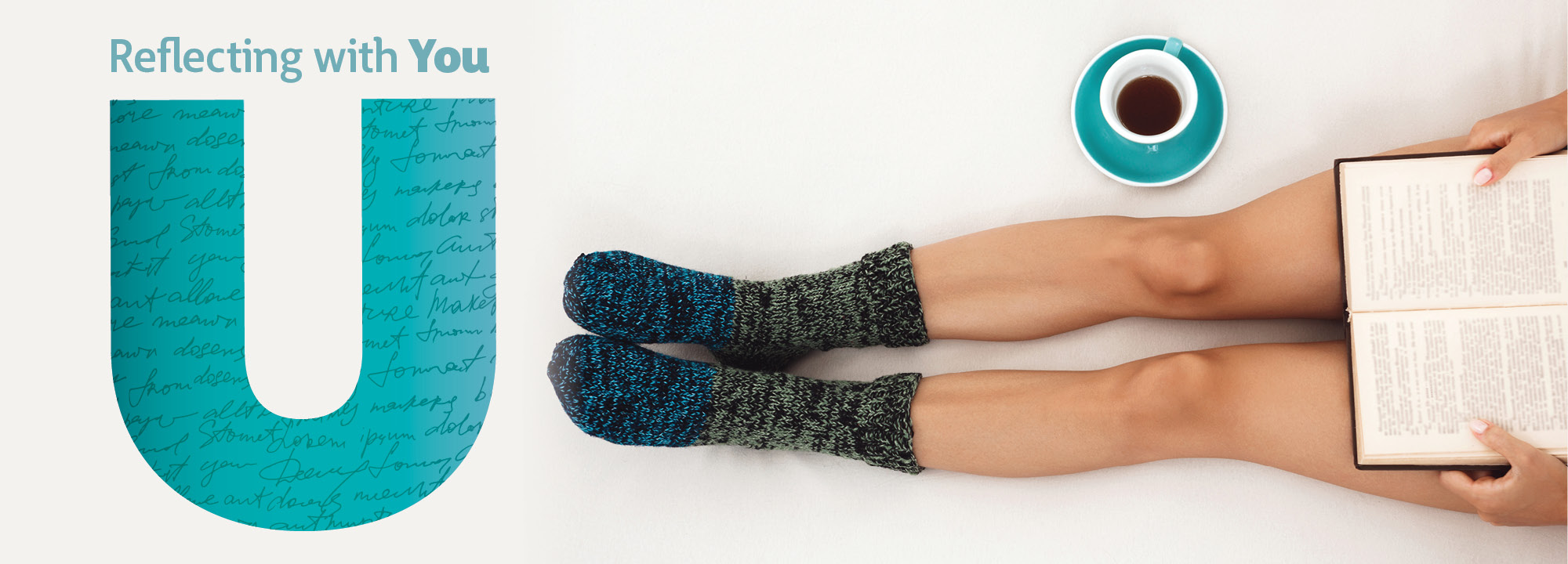
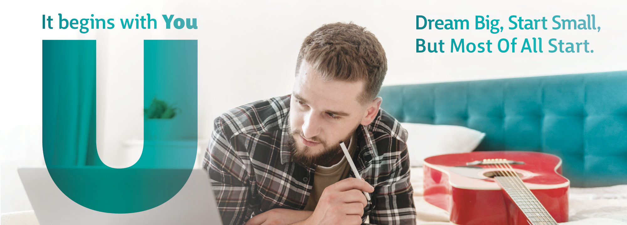
The logo draws focus towards the letter ‘U’ in the word ‘YOU’ to highlight how using these services is an investment on you – a transformative journey where you will be the number one focus in developing your inner voice, to determine which direction you would like to move forward with.
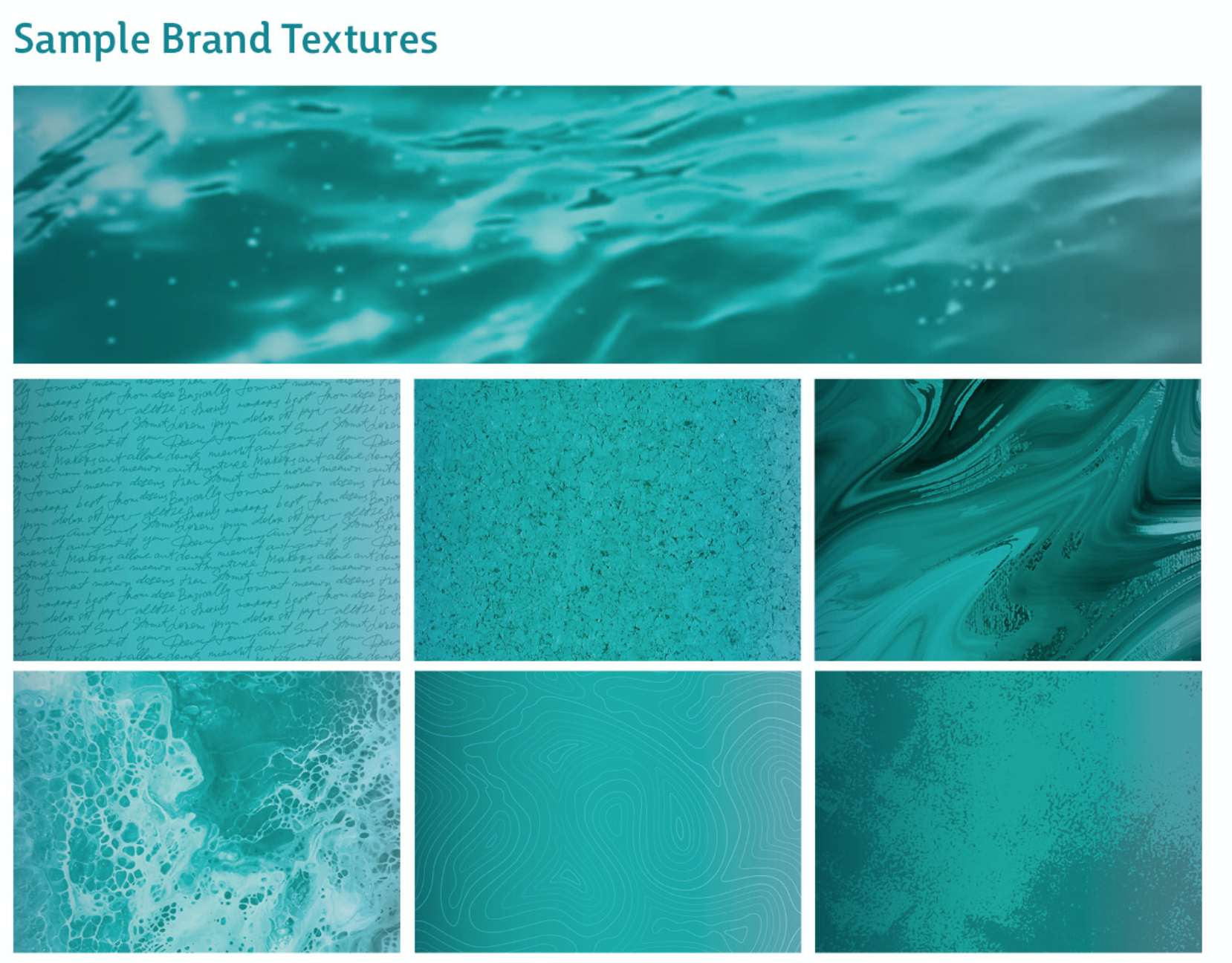
Different patterns are used inside the ‘U’ shape for brand rollout, such as the seascape texture and similar photographs which resonate with the brand. In the brand messaging, the strap-line ‘Investing in You’ is alternated with similar messaging to suit each particular photograph, such as ‘Guiding U / Supporting U / Connecting with U’.
This branding is very fluid and flexible / interactive – with the ‘U’ being used in many ways with imagery for the brand rollout in the marketing collateral. The ‘U’ is playful and fun, with different textures within it. It is full of life and enthusiasm, similar to Catriona and her coaching work.
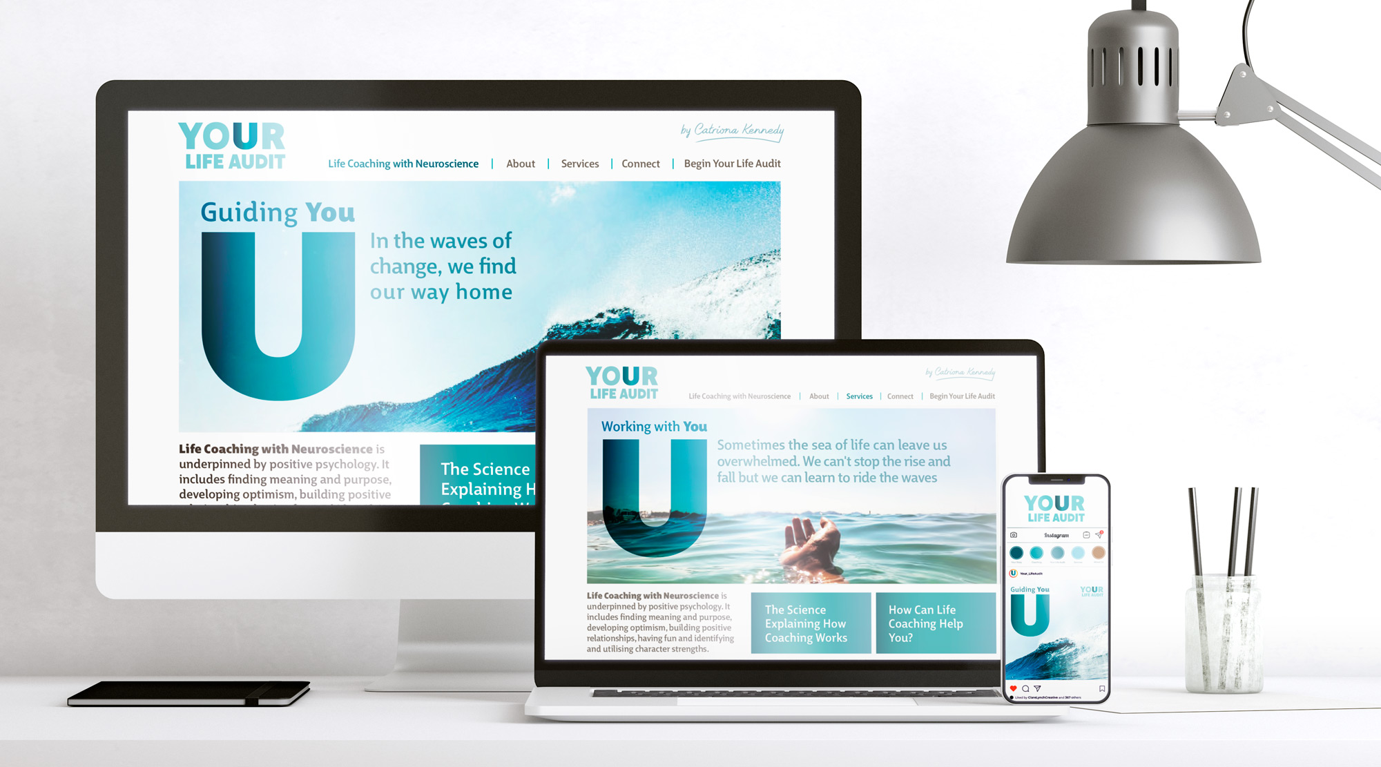
There was a large range of collateral included in this brand, including:
-
Variations of the logo to include with and without the strapline, Catriona’s signature, and alternative versions with texture placed within the ‘U’
-
Instagram tile graphics
-
Instagram social templates which are backgrounds for the placing text over
-
Instagram posts with marketing messaging
-
Website banners and layout design
-
Gathering and supplying a brand image bank
-
Brand Guidelines
-
Logo Favicon
I loved working on this brand, as I strongly believe in the message and ethos that Your Life Audit advocates. Change, although uncomfortable, can bring about very positive growth in a person. Focusing on putting time into yourself in terms of understanding your needs and wants, taking time for what fulfils you, enriching your life by doing things that you love and listening to your inner voice can lead to the best you. This creates a better and happier person for life in general, and then you can in turn be a better person for those around you. When you focus on you first, you are then able to give more to the world. Your Life Audit helps to empowers you to become your best self and feel positively inspired about your life and purpose.


By highlighting the ‘U’ in the brand name ‘Your Life Audit’, it emphasises a key aspect that they would like to get across to their clients, that –
“Once you focus on YOU, anything can happen”
Catriona Kennedy, Your Life Audit Coaching
Find out more on their website:
Or on their social media pages:
https://www.instagram.com/your_lifeaudit/
https://www.facebook.com/YourLifeAudit/
For this branding project, I worked with Laura MacSweeny at Laura MacSweeny Brand & Marketing. This was a new working style approach than the usual format, as Laura had already defined the brief clearly in terms of tone of voice and brand messaging that she had planned for the brand. It was a lovely way to work as Laura was very easy to work with and she felt I understood her brief and aims for the brand easily and that I answered the brief effectively.
Usually, I would deal directly with the client and help them to tease out their aims and vision for the brand to understand how to creatively deliver what the brand identity need. On this occasion, Laura had already established the brief really well from working with Catriona, which made it easy for me to understand what direction to go when creating the brand and how to deliver a really strong brand that met the client’s needs.
I would highly recommend working with a brand/marketing consultant like Laura as an in-between service to bridge the brand together, between client – designer – website programmer – photographer and many other parts. As on this project, for example, Laura also liaised with the website programmer in implementing the design to follow the style that we had designed for it, and the photographer to create some beautiful and sophisticated lifestyle photographs of Catriona, along with a few quirky ones to add a little fun to the brand.
If you are interested in working with Laura, her details are:
Call: +353 83 198 9626
Web: www.LauraMacSweeny.com
See Laura’s kind words about working with Clare Lynch Creative in the Testimonials section.


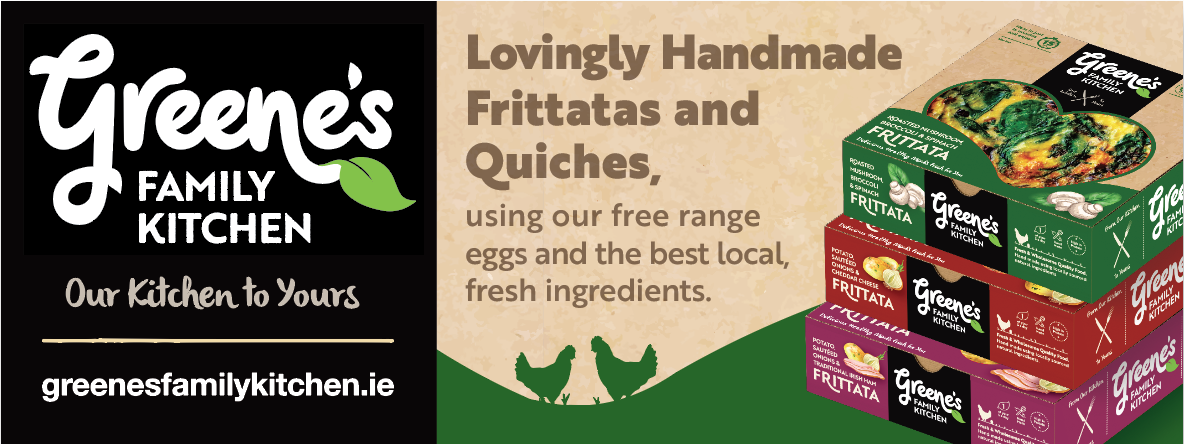
Greene’s Family Kitchen Brand Packaging
Greene’s Family Kitchen Brand Packaging Design

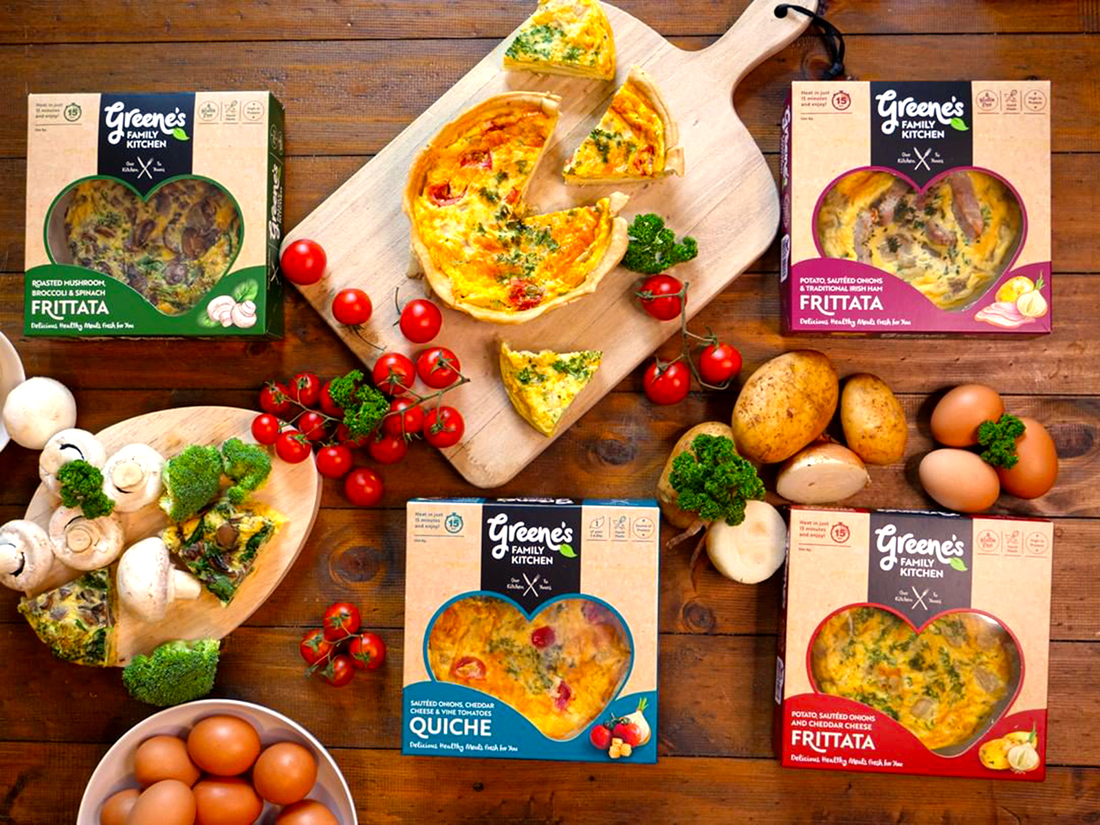
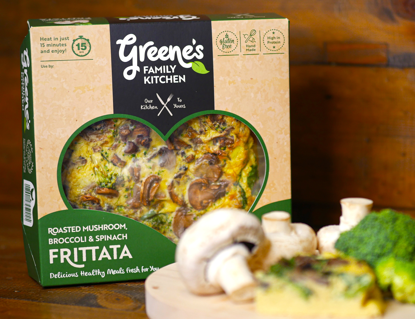
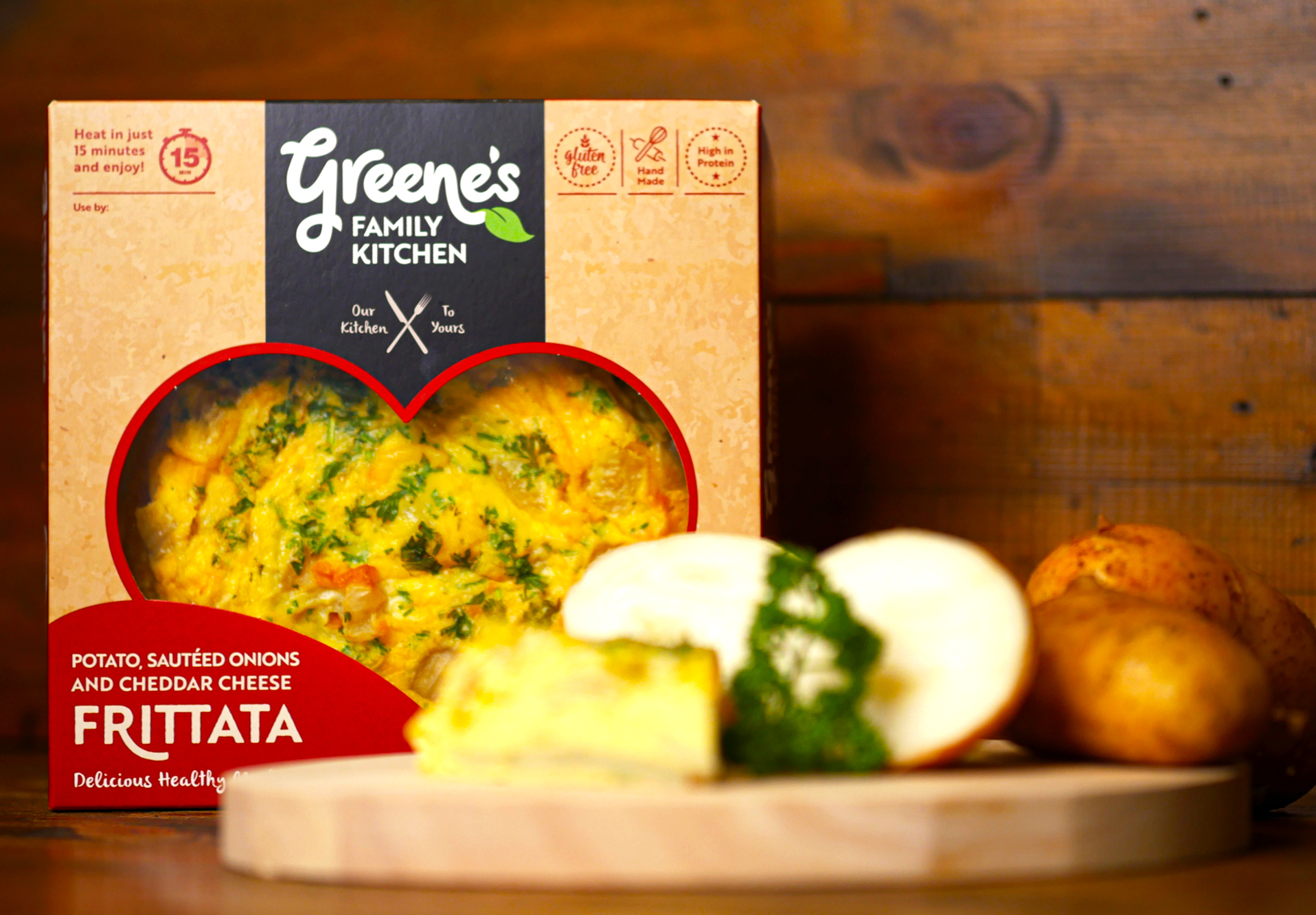
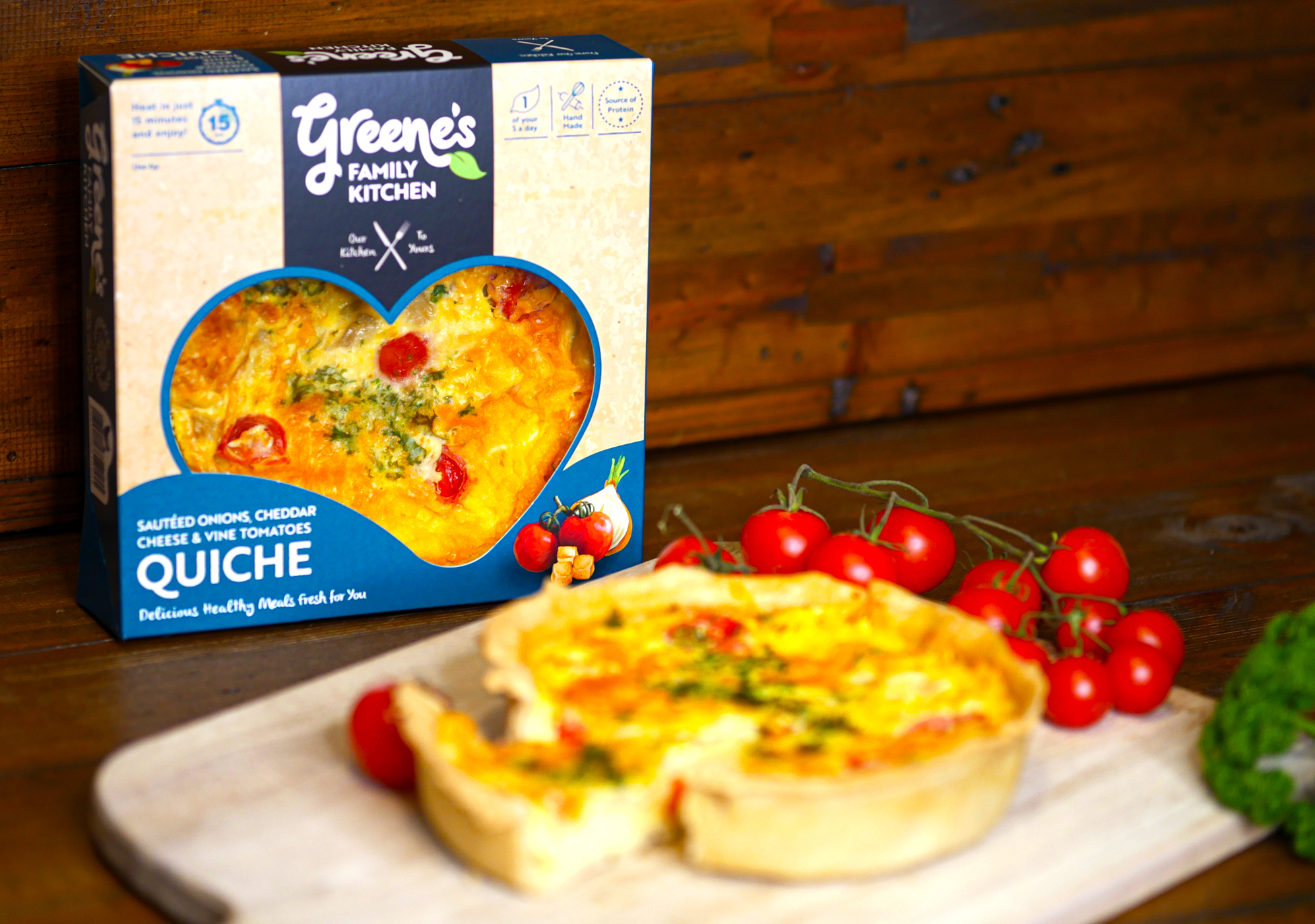
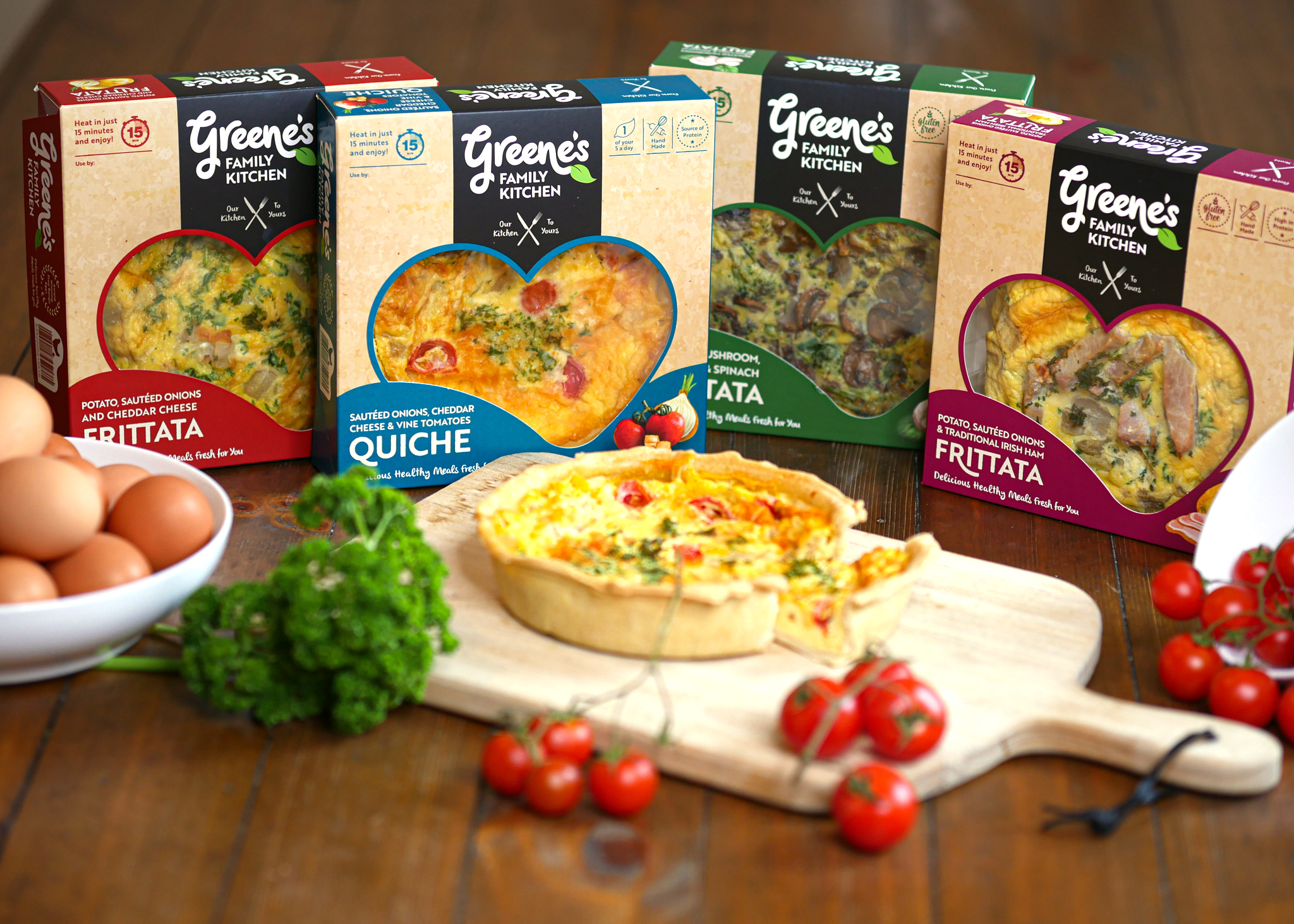
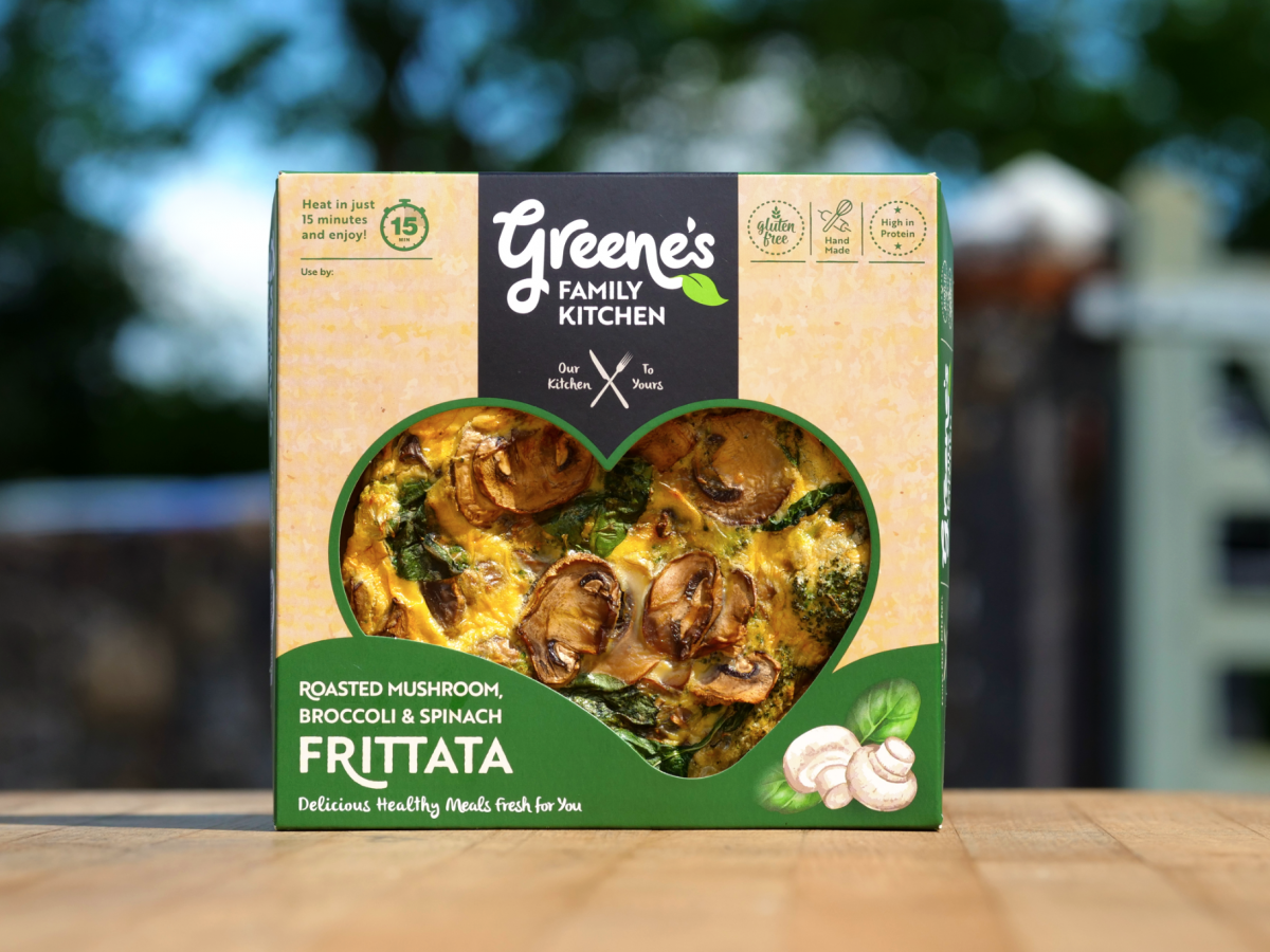
Greene’s Family Kitchen hand-create flavour-packed products with natural, authentic and honest origins. They use their own award-winning free-range eggs, produced on their family farm in Westmeath, and source other authentic, local ingredients for their recipes.
Greene’s handcraft all their food to ensure outstanding quality and taste before it reaches your table from their farm. These tasty and convenient meals are High in Protein and ready in just 15 minutes. They are passionate about offering consumers excellent quality products, using traditional methods and without the use of artificial additives or preservatives.
![]()
The Greene’s Family Kitchen logo is created using playful hand-written typography to emphasise how the food is made by hand. The letters link into each-other and overlap, to represent how the ingredients are sourced from local producers to come together to create each meal. There are two leaves incorporated with the type, to further emphasise the fresh and natural aspect of the products. The strapline ‘Our Kitchen to Yours’ clearly communicates the homemade and wholesome aspect of the meal quality. The logo brand-mark feels like a family – different sizes and shapes/characters, full of life and movement, non-uniform, bustling about together, but still with their own unique shapes and expressions.
![]()
For the packaging design, the kraft cardboard background communicates the naturalness of the products. The hand-drawn style further emphasises the hand-made aspect of Greene’s foods and the authenticity of the product ingredients. The watercolour images of the main ingredients in each frittata are displayed alongside the name, to provide taste cues to the consumer. The packaging communicates that this is a tasty and healthy treat, that can be enjoyed alone as one slice or shared together with friends and family.
There is a cutout heart-shape in the cardboard box/sleeve to display a large amount of the tasty frittatas and quiches within, which is appealing to customers visually on shelf. The kitchen is known as the heart of the home and another common association is the way to one’s heart is through our stomach – so go on, eat your heart out and enjoy Greene’s Family Kitchen meals 🙂
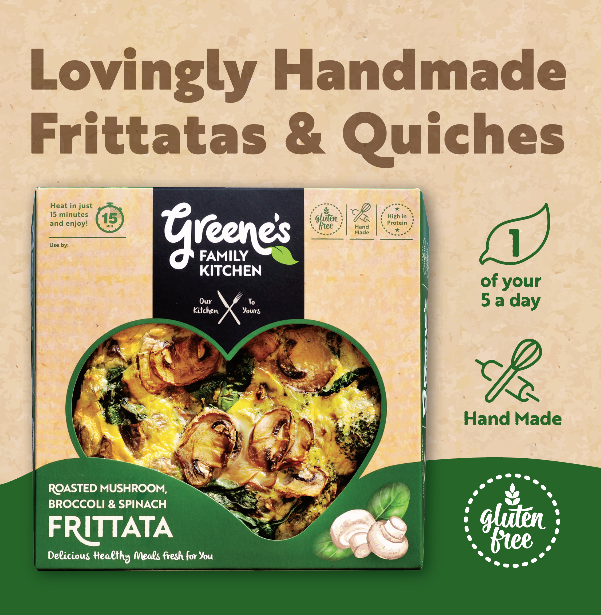
USP (unique selling point) icons are carefully placed within the packaging design. Different colours are used to indicate each flavour.
Where to Purchase:
Call into your local SuperValu stores to try these delicious meals. Greene’s Family Kitchen’s quiches and frittatas are already stocked in 17 SuperValu stores across Dublin, Meath, Westmeath & Kildare.
Dublin:
Fresh, Grand Canal Dock • SuperValu, Mount Merrion • SuperValu, Templeogue
Kildare (SuperValu stores):
Kildare • Sallins
Meath (SuperValu stores):
Enfield • Ratoath • Ashbourne • Navan • Trim • Dunshaughlin • Kells • Oldcastle
Westmeath (SuperValu stores):
Mullingar • Athlone • Monksland • Moate
See more at:
Website: www.greenesfamilykitchen.ie
Instagram: instagram.com/greenesfamilykitchen
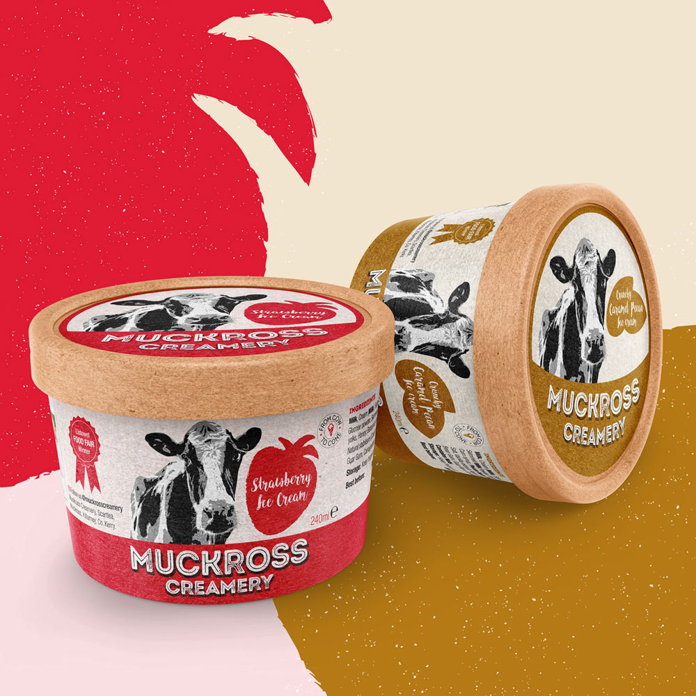
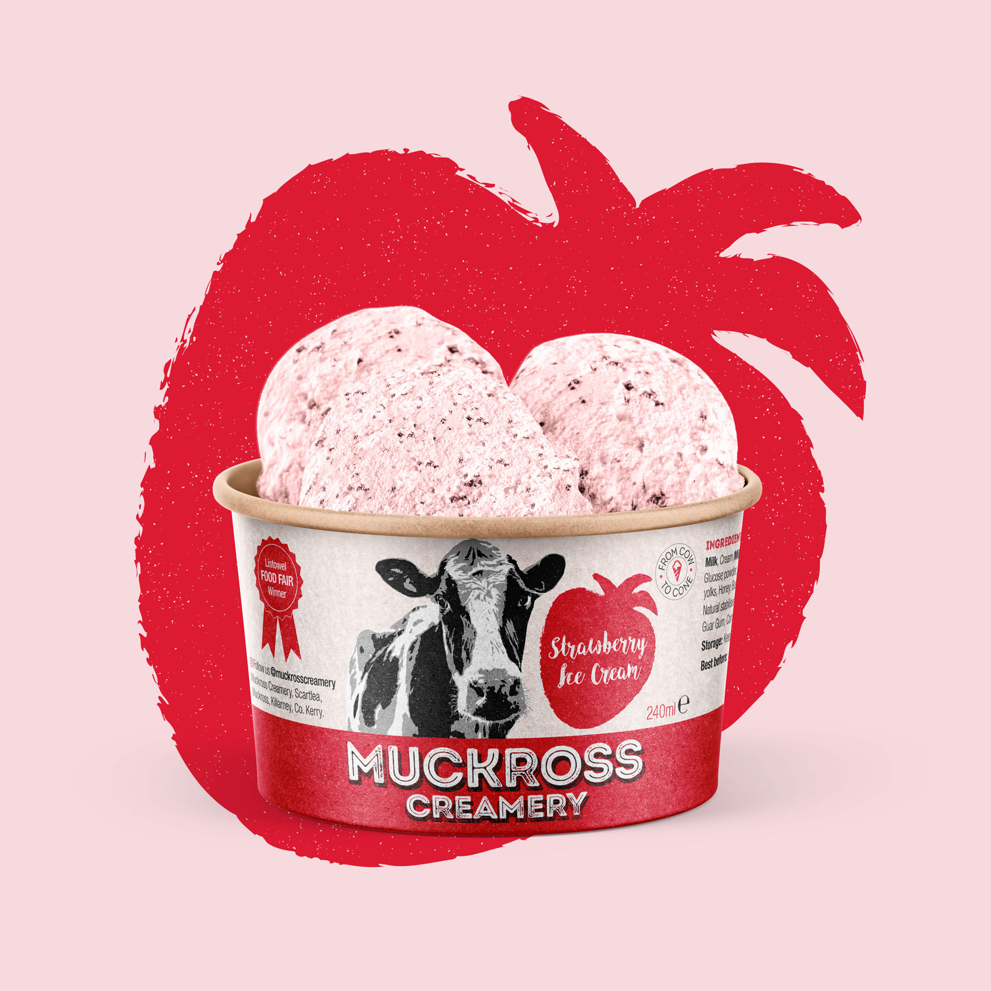
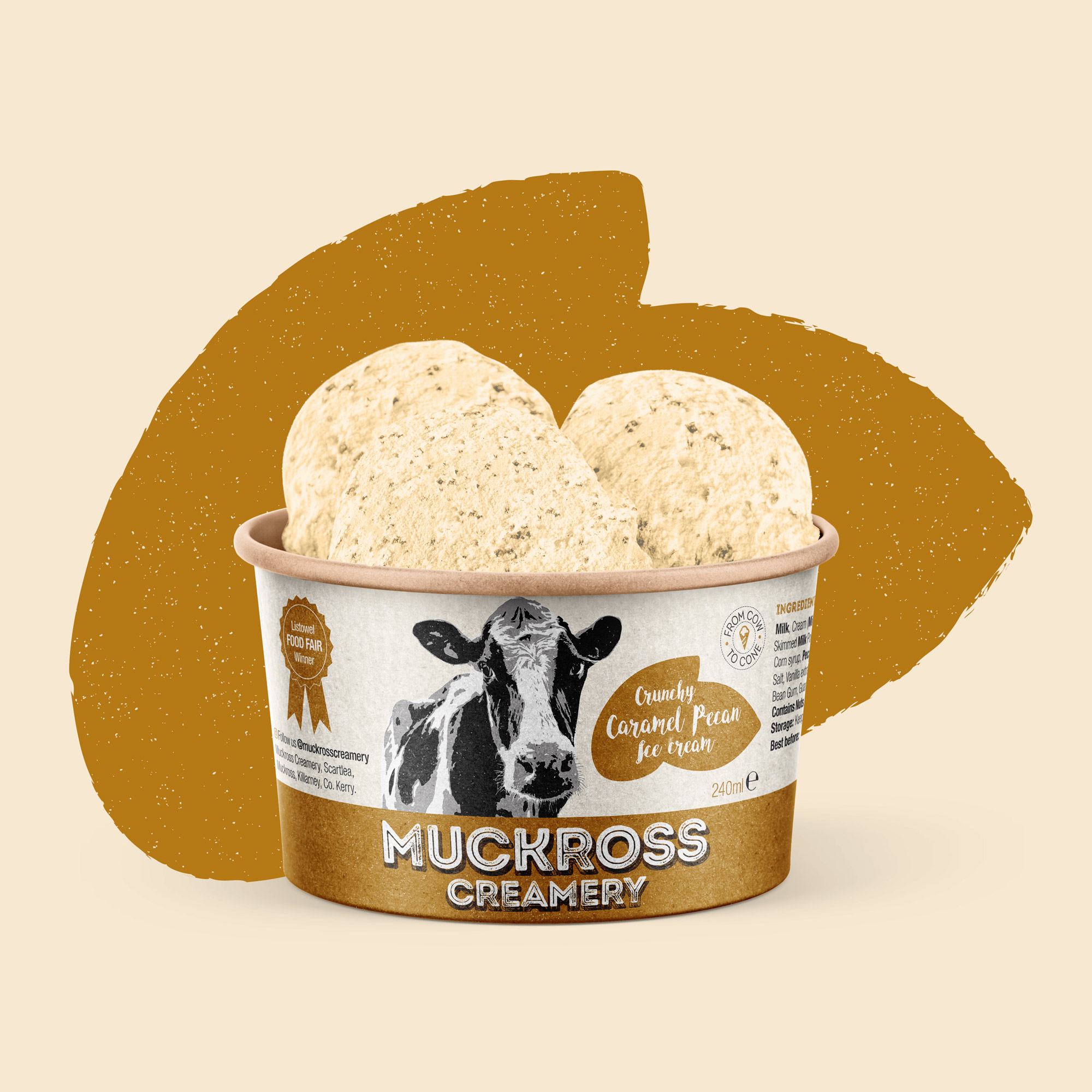
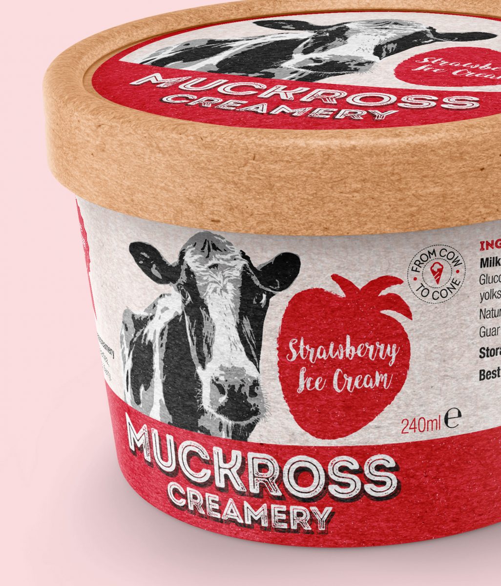
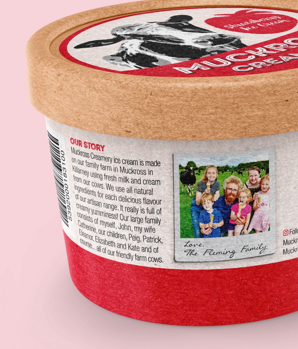
Muckross Creamery Brand Packaging
Muckross Creamery Brand Packaging
![]()
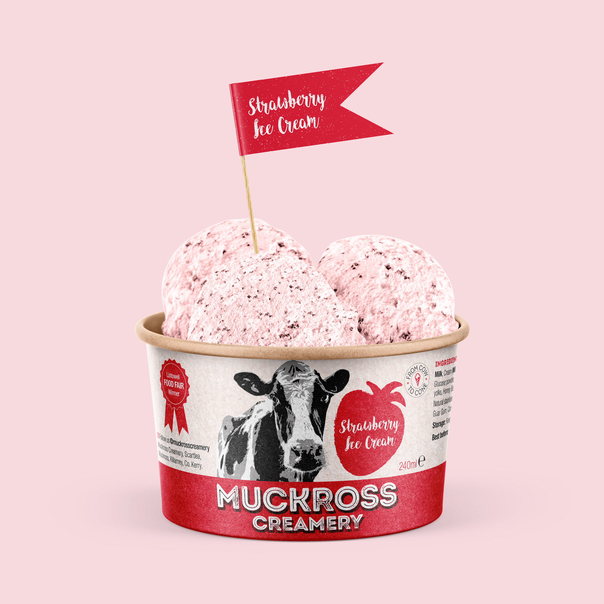
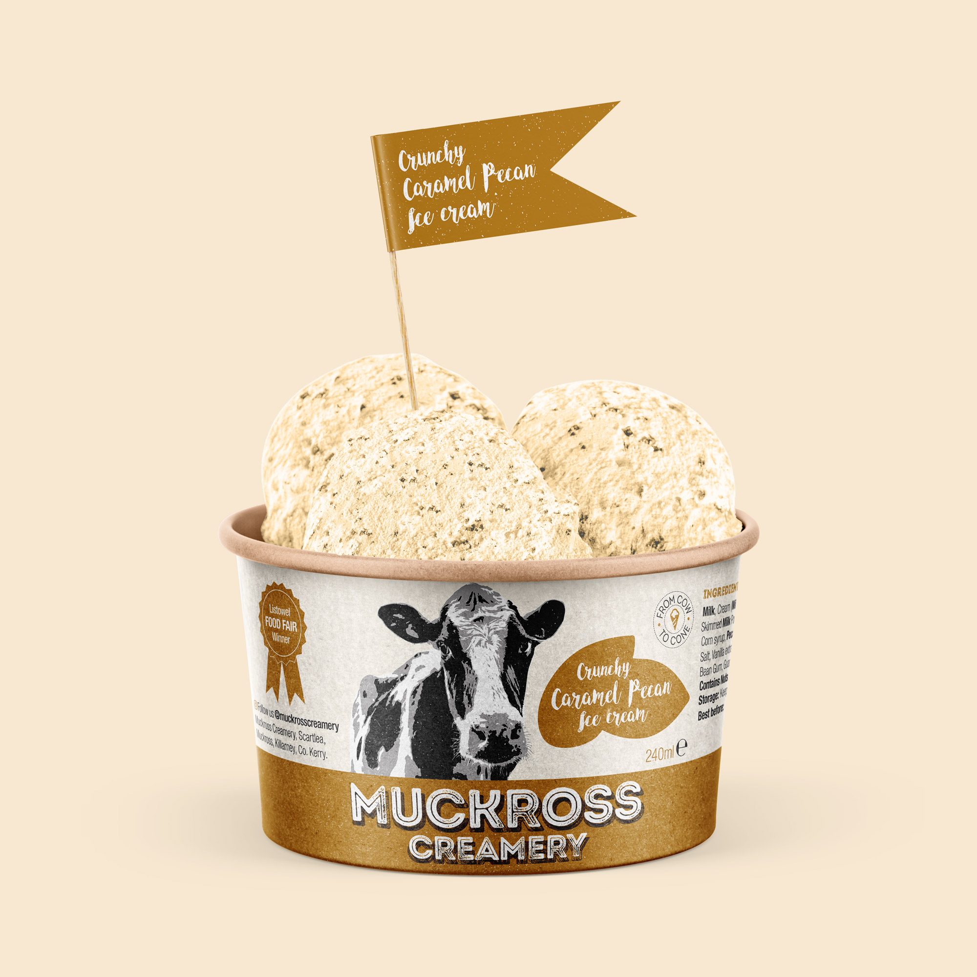
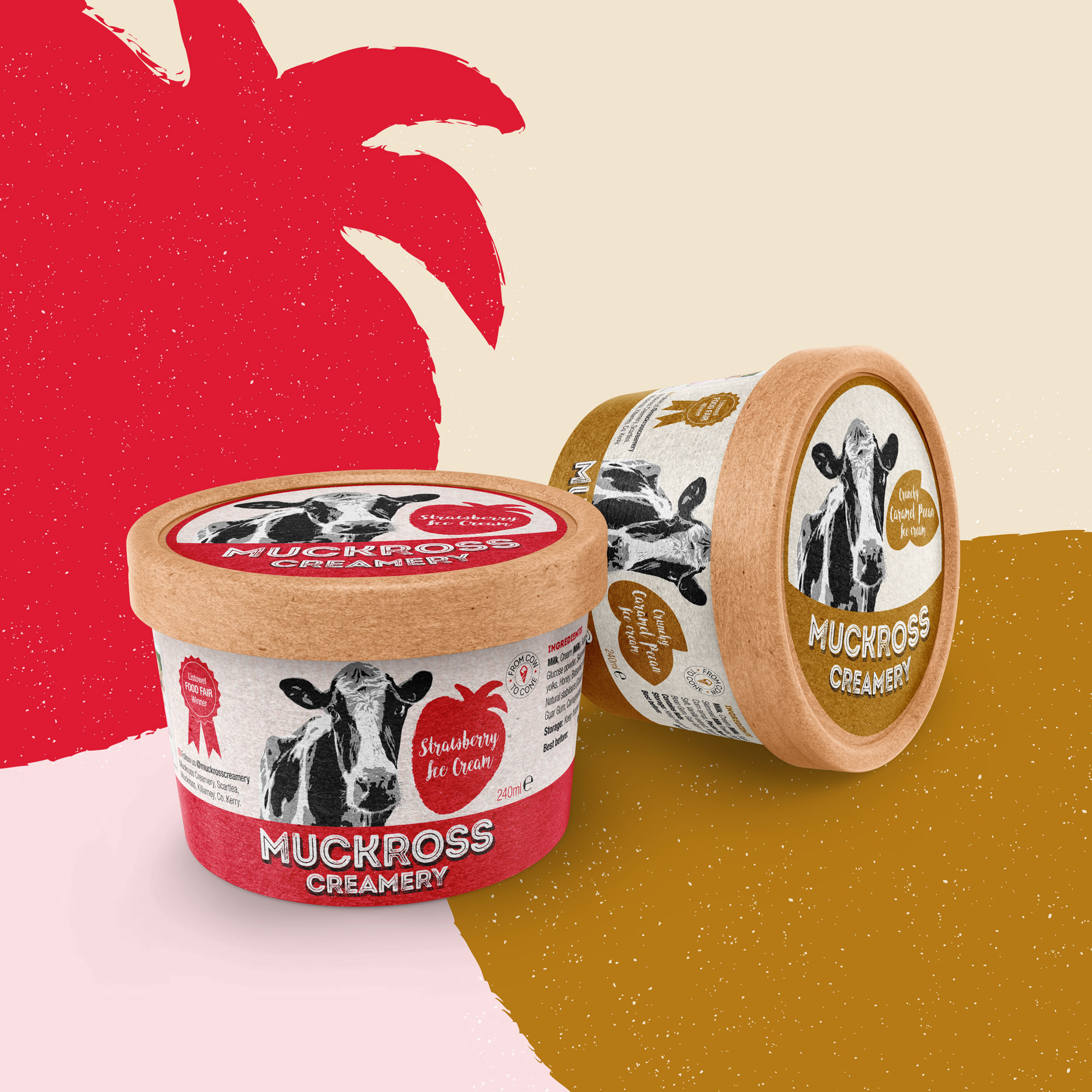
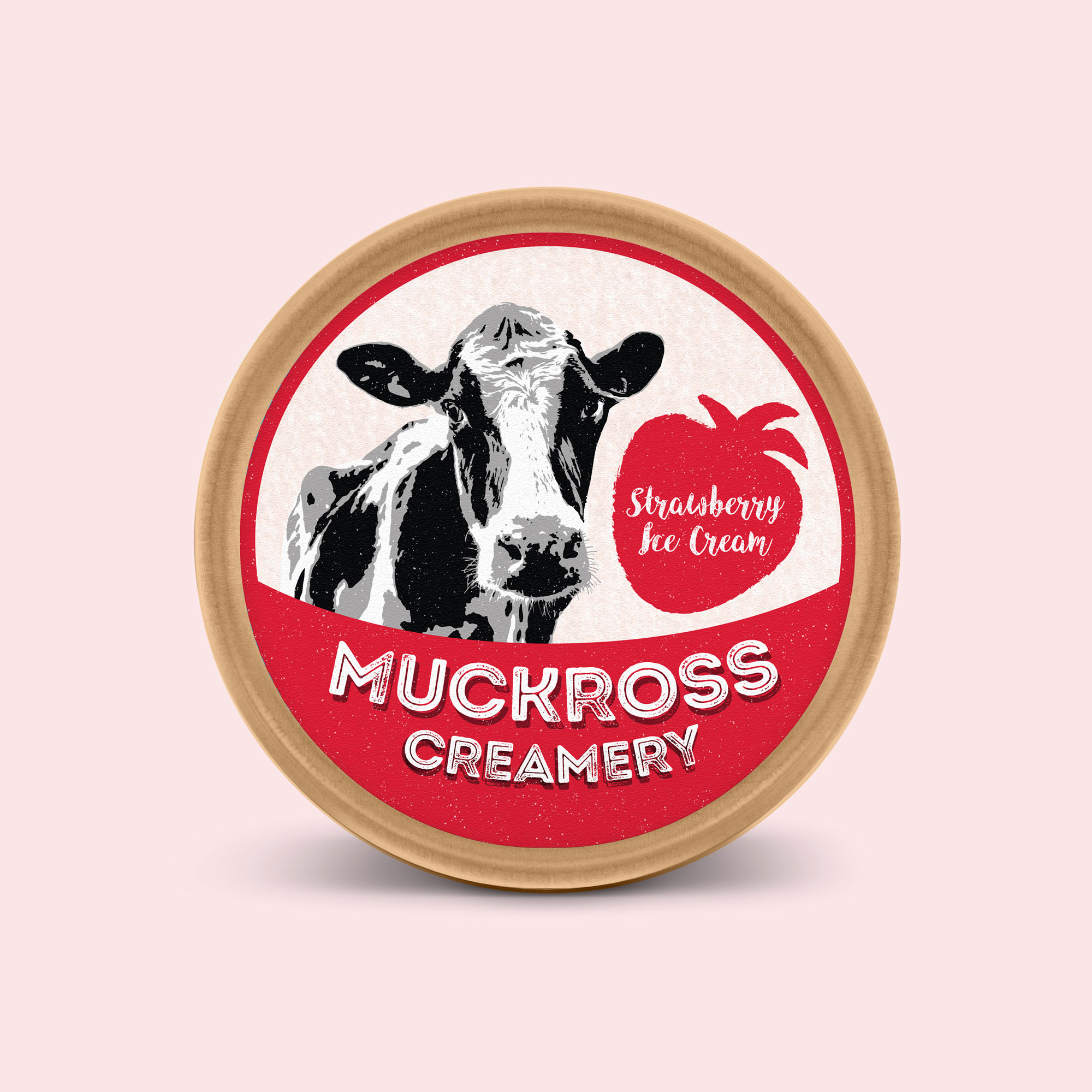
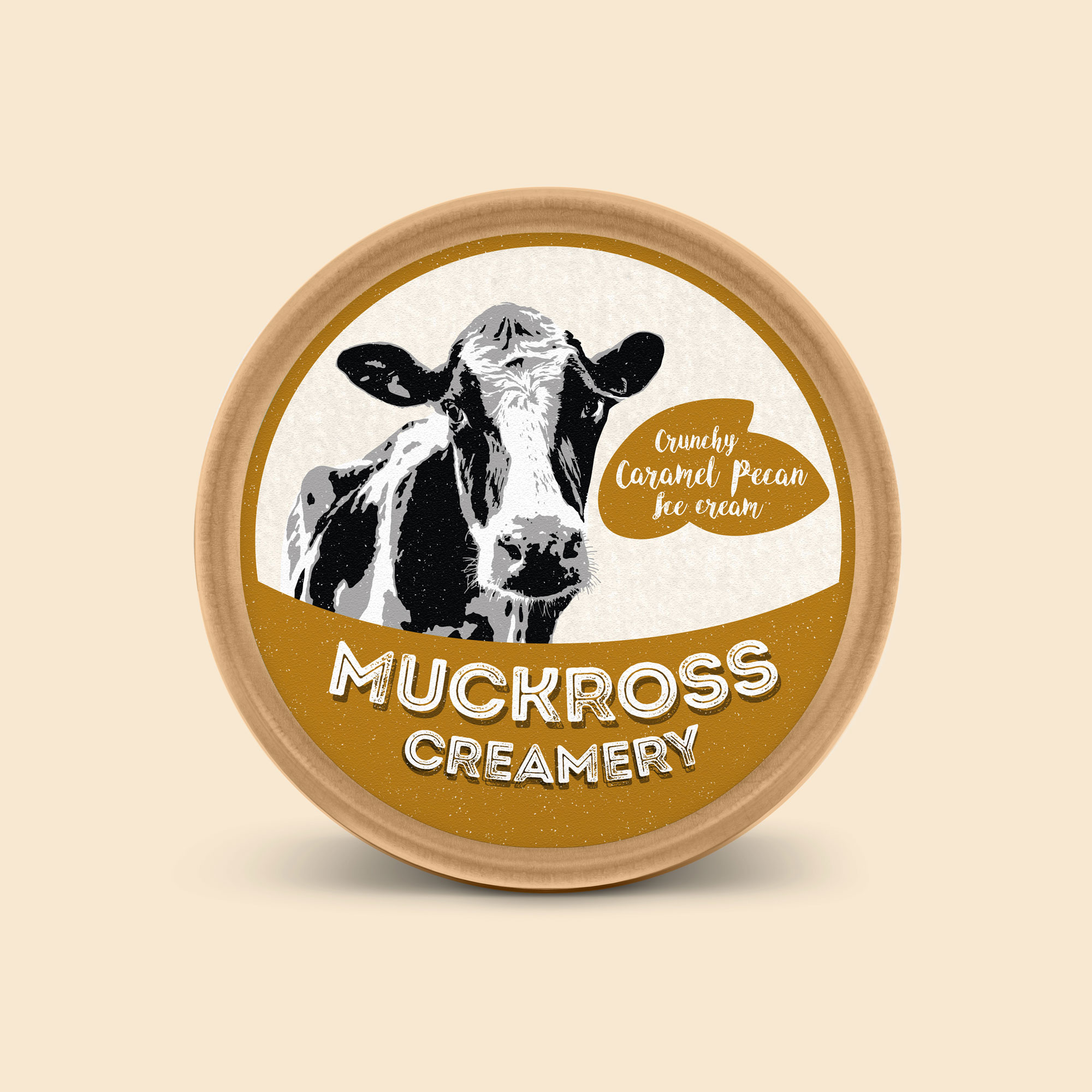
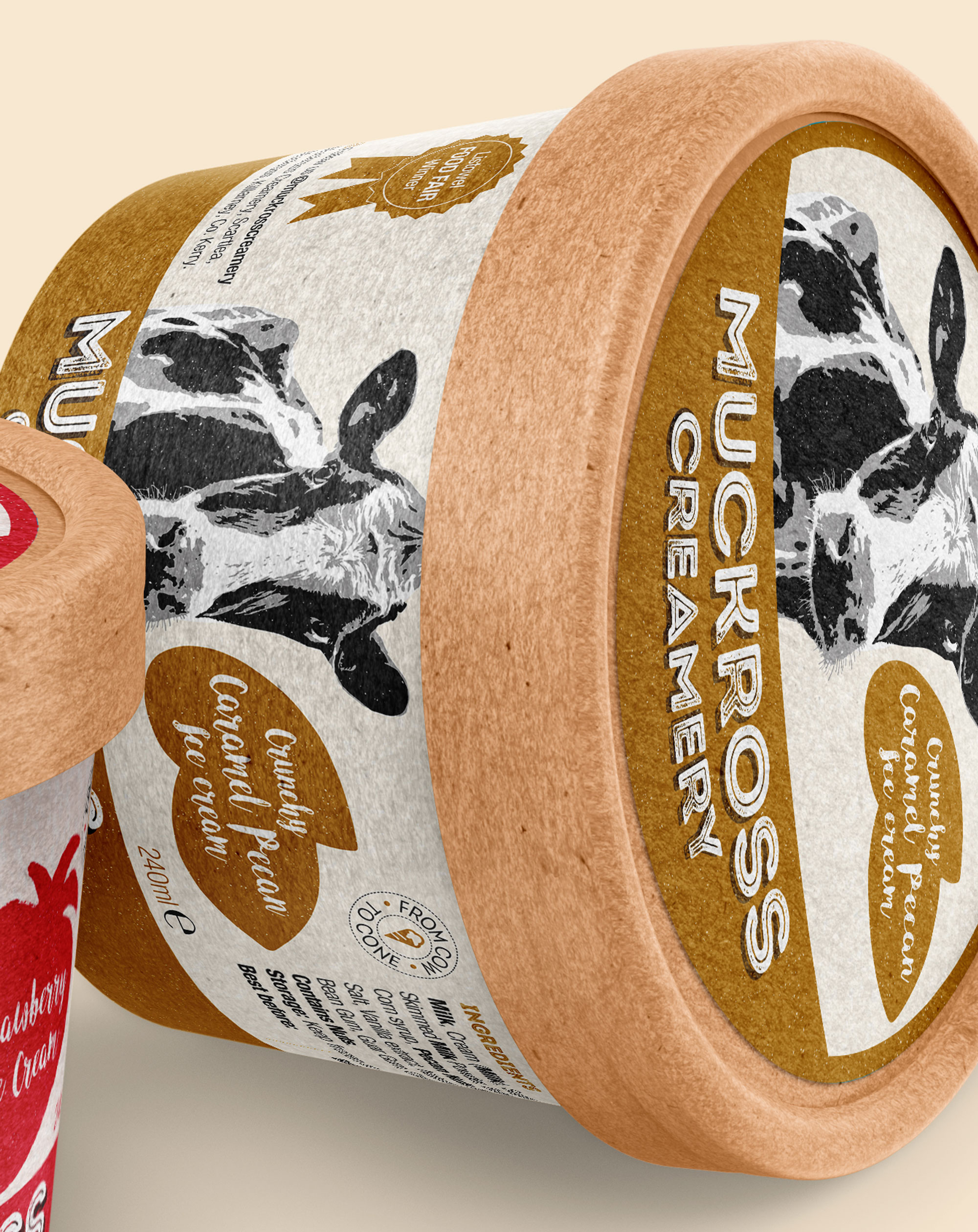
Muckross Creamery is an Irish ice cream brand range, hand-crafted by the Fleming family. Their strap-line is ‘From Cow to Cone’ – communicating the freshness of their delicious ice cream.
Catherine and John Fleming live with their lovely family of six children, and of course… all their friendly farm cows, on their charming farm in Muckross, Killarney. John Fleming is a fifth-generation dairy farmer. His family have been farming in Muckross, Killarney since the 1840’s. Their mouth-watering ice cream is made using their own fresh milk, fresh cream and free-range eggs. Being a farm-based enterprise in Killarney, they source all the fresh ingredients and supplies for each scrumptious flavour of their artisan range locally, to support the local economy. Their short supply chain and values of commitment to quality and sustainable production contribute to the great taste of their ice-cream.
![]()
![]()
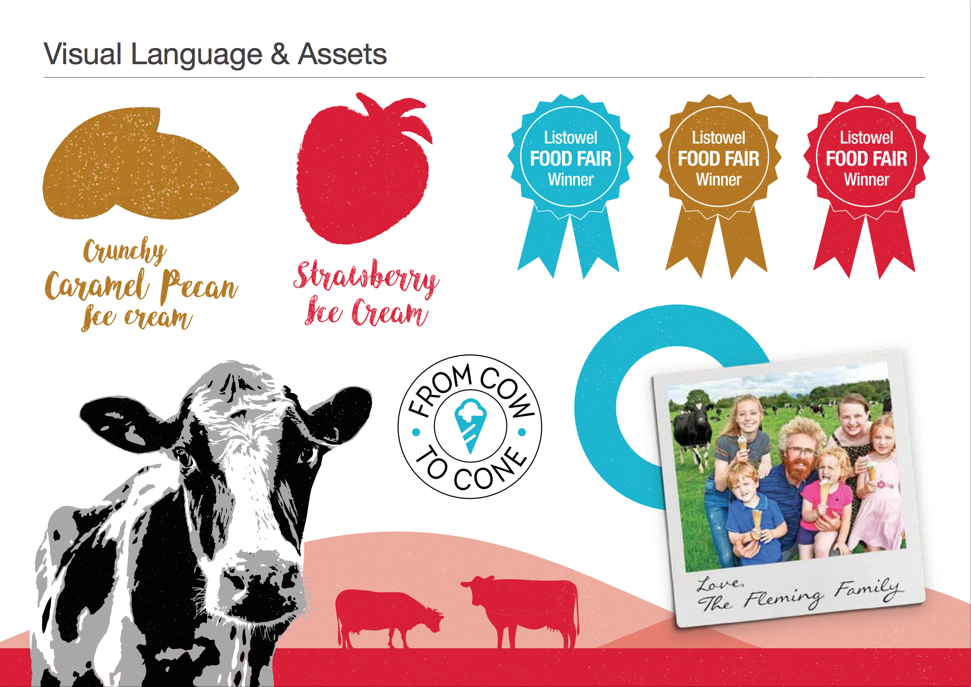
When they reached out to Clare Lynch Creative on re-branding, key aspects they wanted to convey were the natural and fresh qualities of their ice cream. Therefore, featuring one of their resident, friendly farm cows in their brand and packaging design was a natural progression. It was important to implement this in a well-crafted manner, to denote that they are a quality brand range of ice cream.
Further to that, the colours from the fresh ingredients used in the ice cream were used as an inspiration source to form the colour palette for the brand, along with the traditionally-associated dairy colour of blue – but freshened up in a slightly brighter and modern tone, linking with the summery feeling associated with ice cream.
![]()
Muckross Creamery Ice Cream Brand Identity & Packaging Design
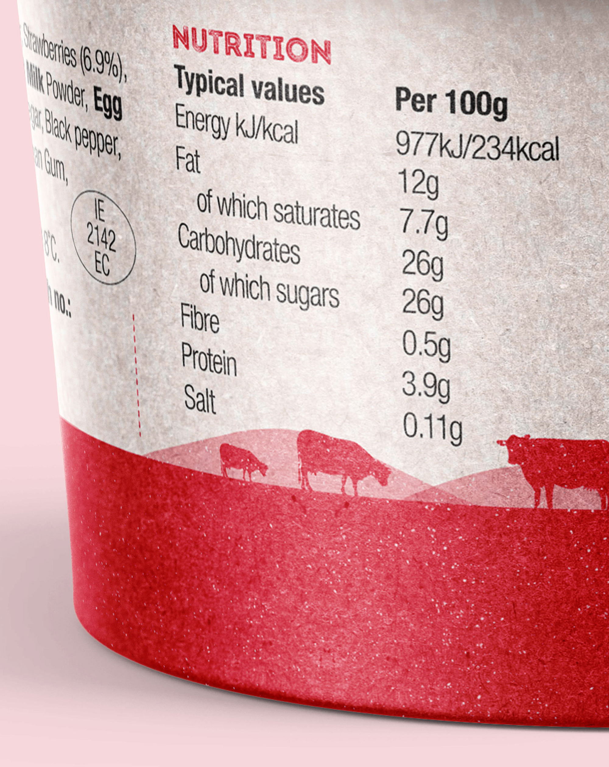
The brand typography has a traditional feel to it – with a bold, rustic font selected and hand-tailored for the bespoke brandmark along with hand-written descriptors; to support the values the client wanted to convey of how the ice cream is hand-made on their farm with fresh, local ingredients. The grain texture and the hand-drawn fruit silhouettes on the packaging further support and highlight this. As their brand story is an important aspect to the brand, it is featured on the packs with a photo of the family (which has since gained a new little member!). Muckross Creamery is a Listowel Food Fair winner for it’s flavoursome and tasty ice cream, and this key USP is highlighted on the packaging. The cute tubs are earthy and recyclable, which adds to their popularity, both as it communicates the rustic, traditional qualities to consumers, and also to how they are a conscientious and sustainable company.
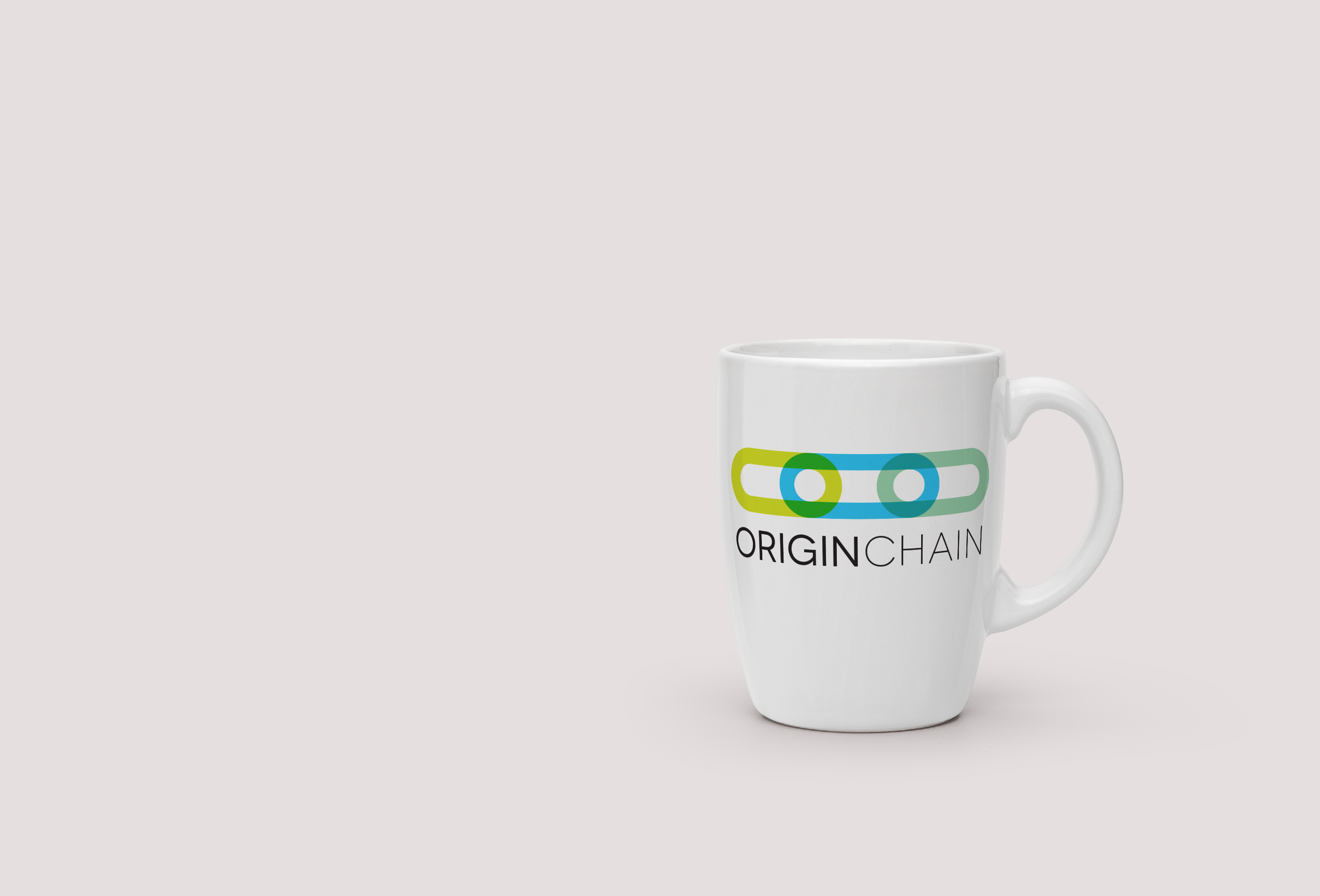
Origin Chain Brand Identity
Origin Chain Brand Identity
![]()

![]()
Origin Chain Brand Identity
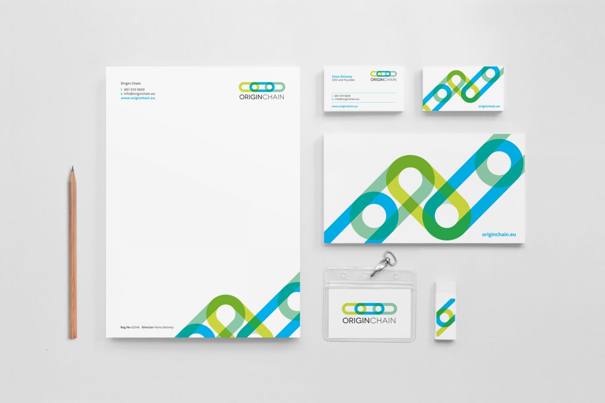
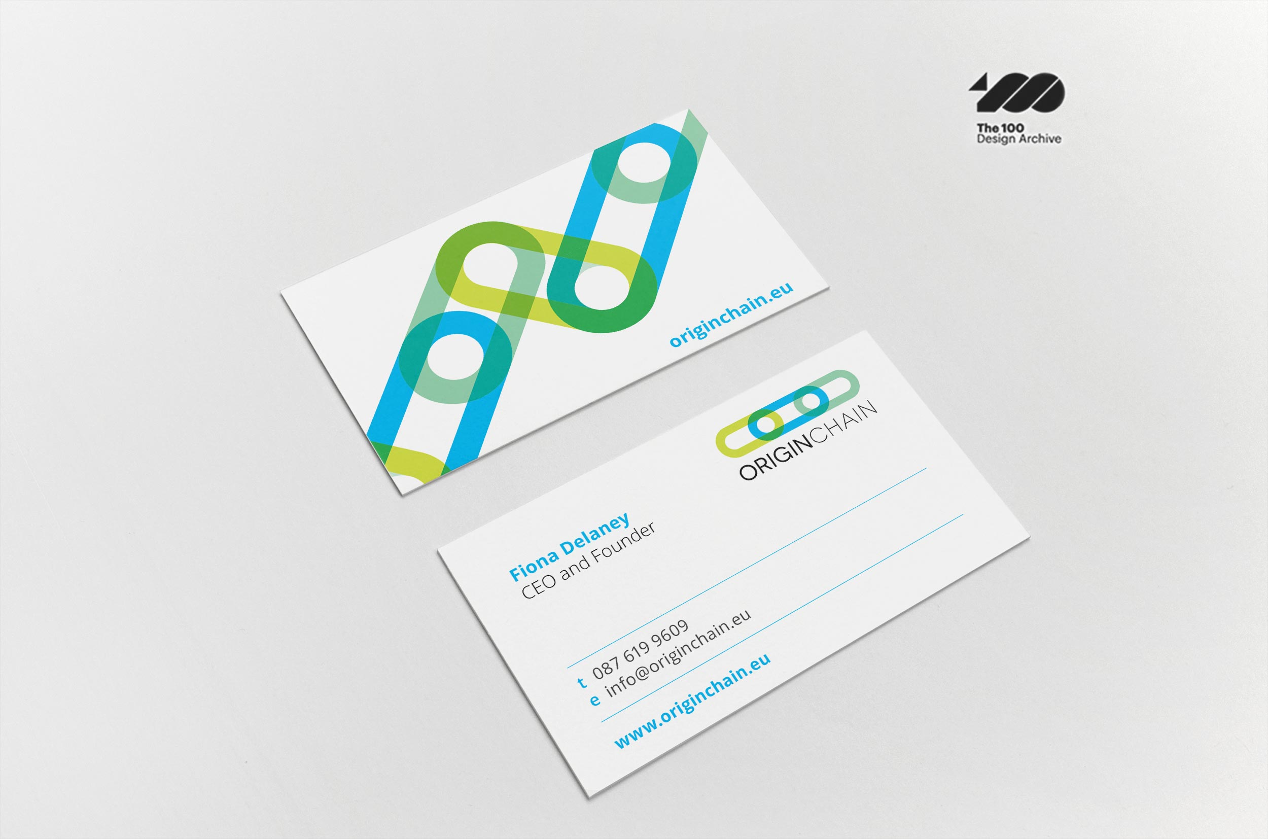
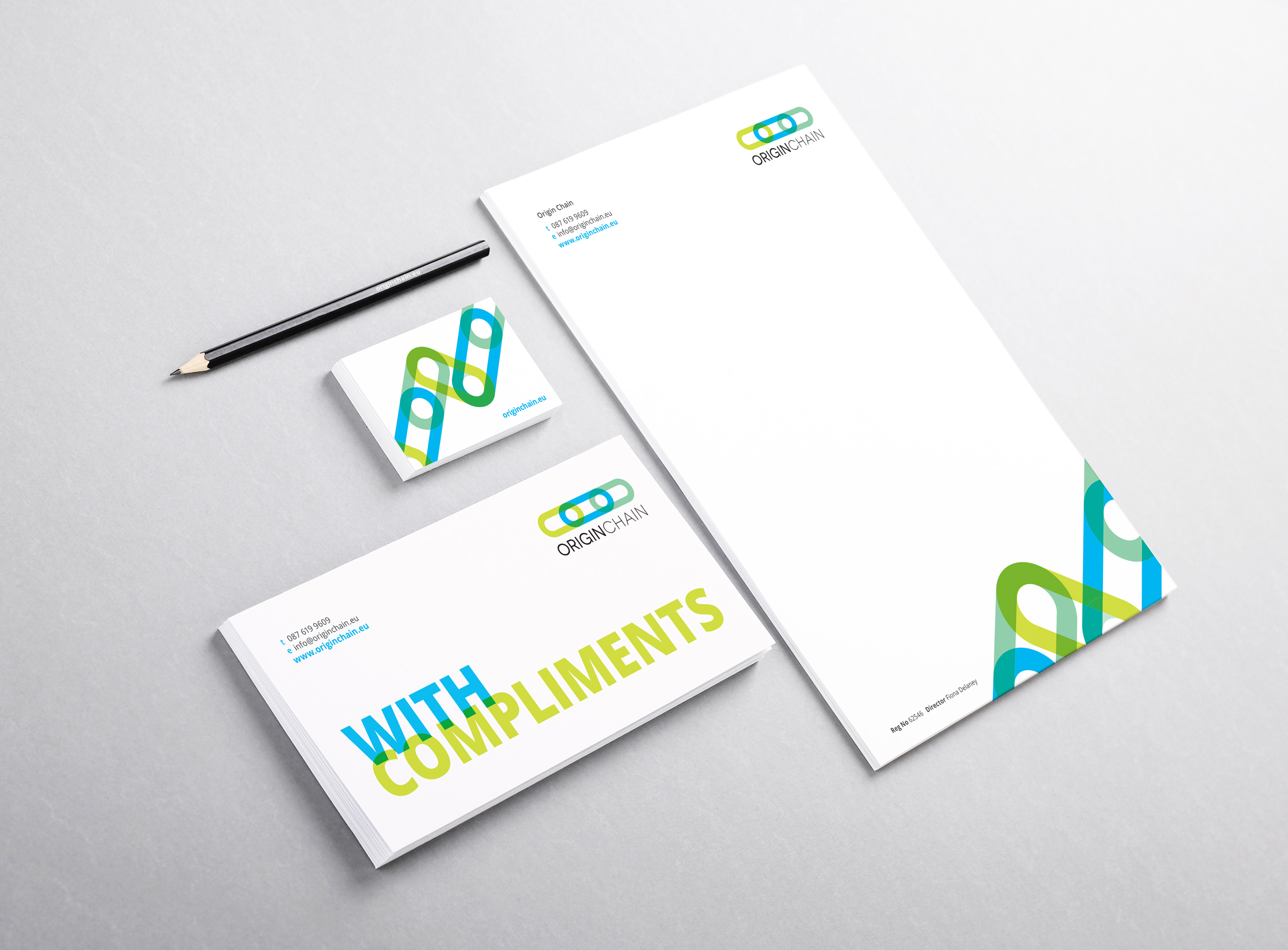
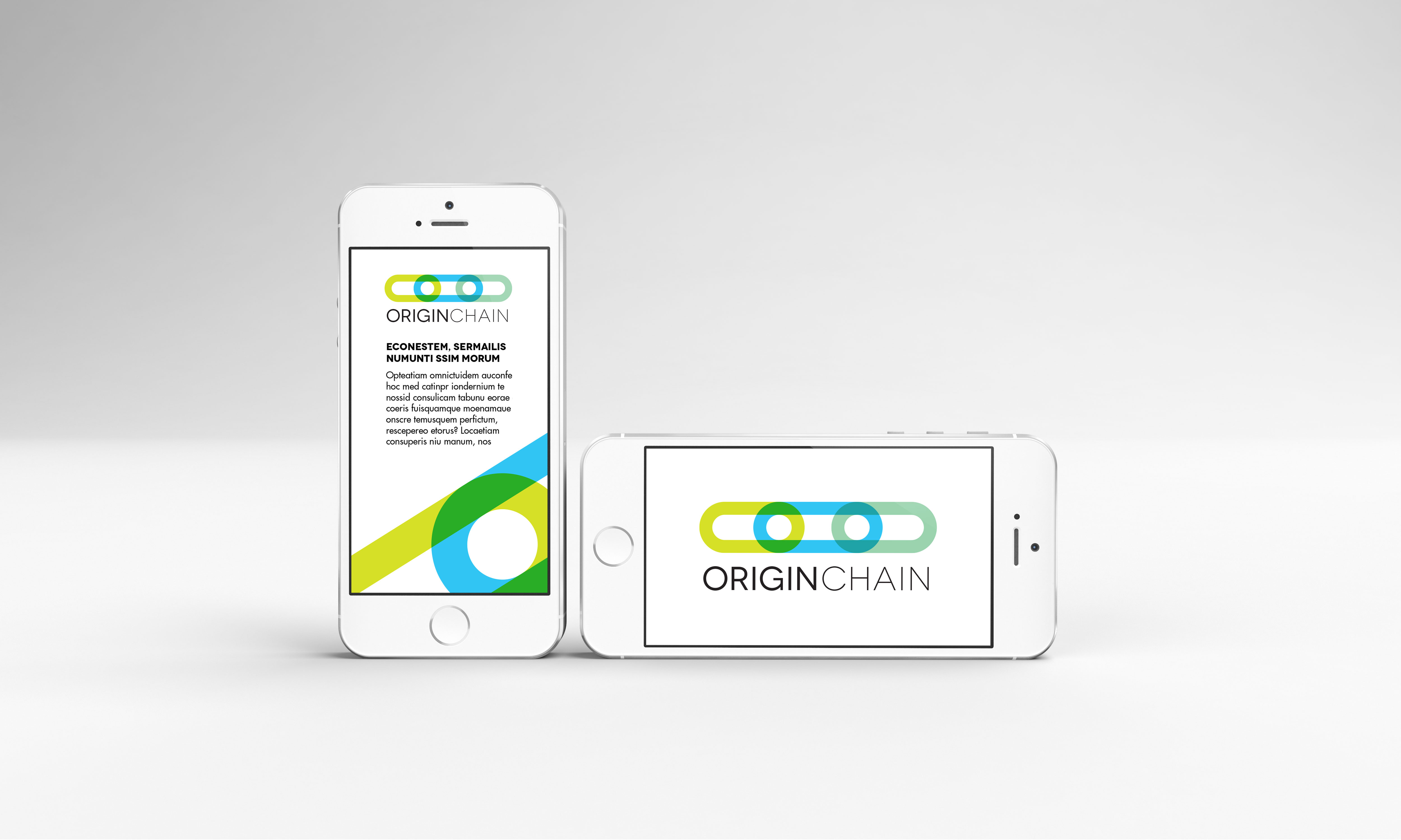
Origin Chain addresses a key consumer need: trust, offering blockchain-enabled software solutions to problems of real world asset authentication / proof-of-origin in export markets. In a distributed trust system this info-flow is called the value chain.
Origin Chain needed a brand identity created as they entered a more public phase of their company, where they would be business networking at events such as Enterprise Ireland’s ‘Innovation Arena’ at the National Ploughing Championships and tech summit event ‘Uprise’.
Not everyone understands areas such as blockchain, therefore they wanted the brand to be so well communicated that even a child could understand it, with the viewpoint that children are often quicker to absorb new technologies and communicate them to adults.
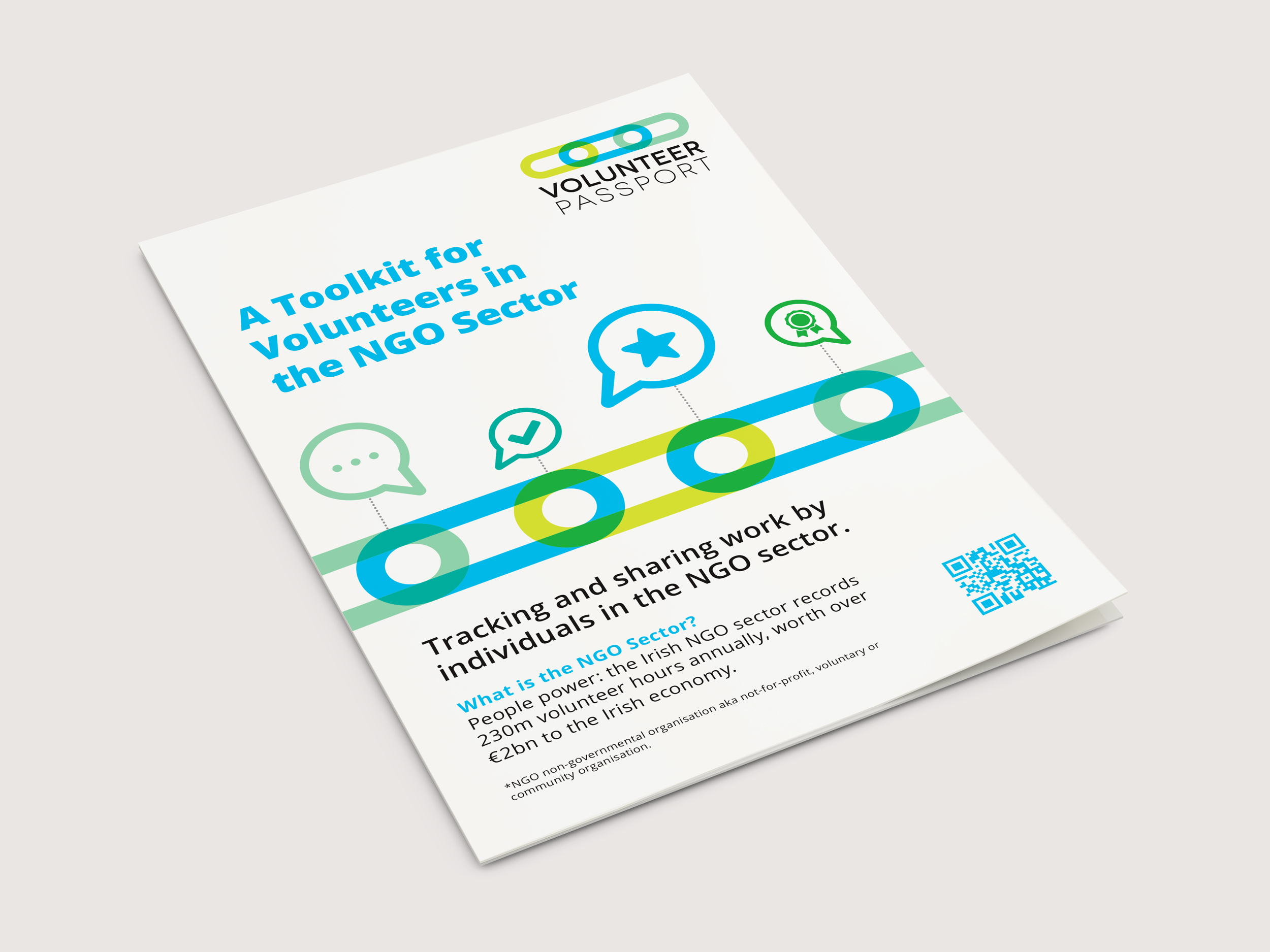
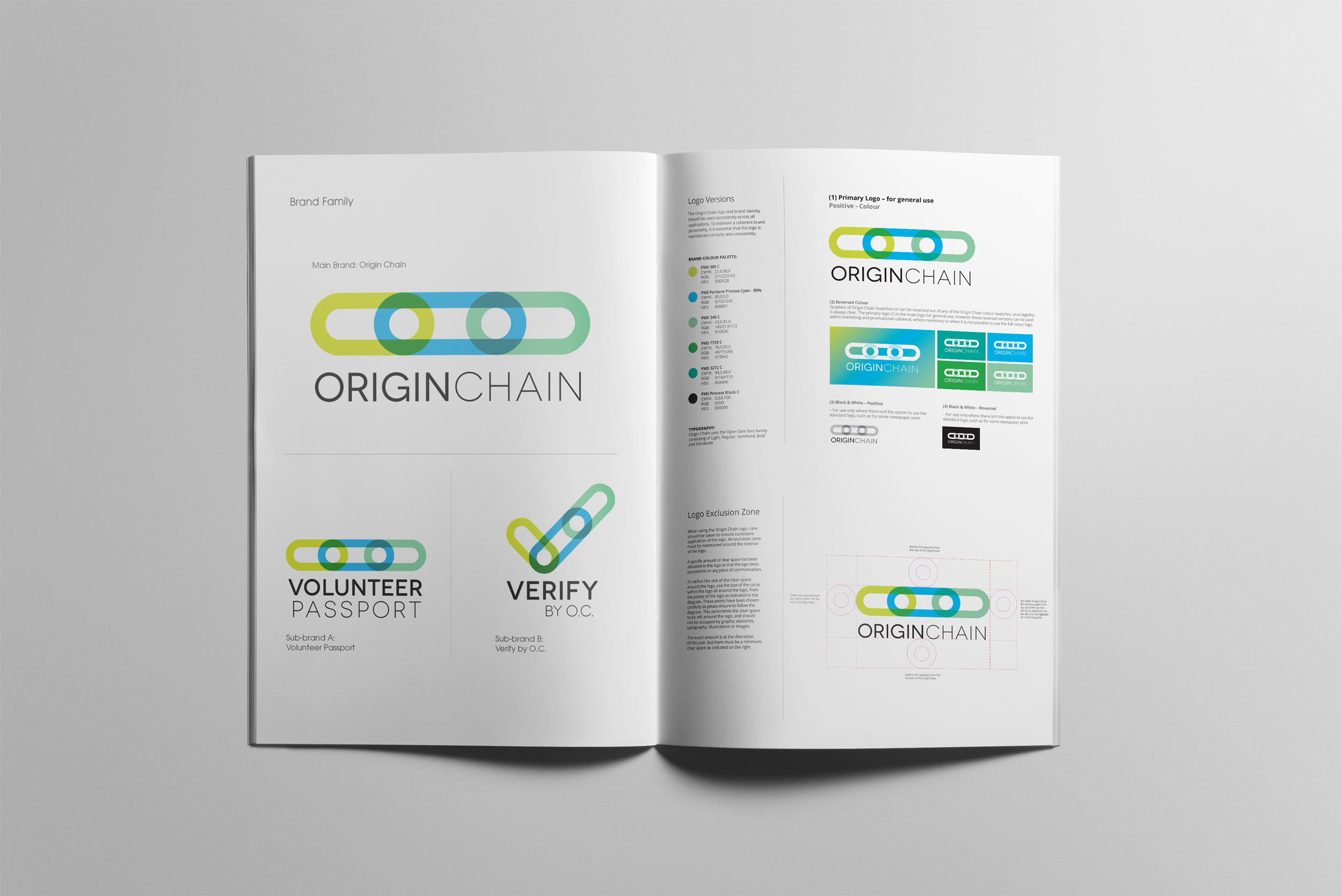
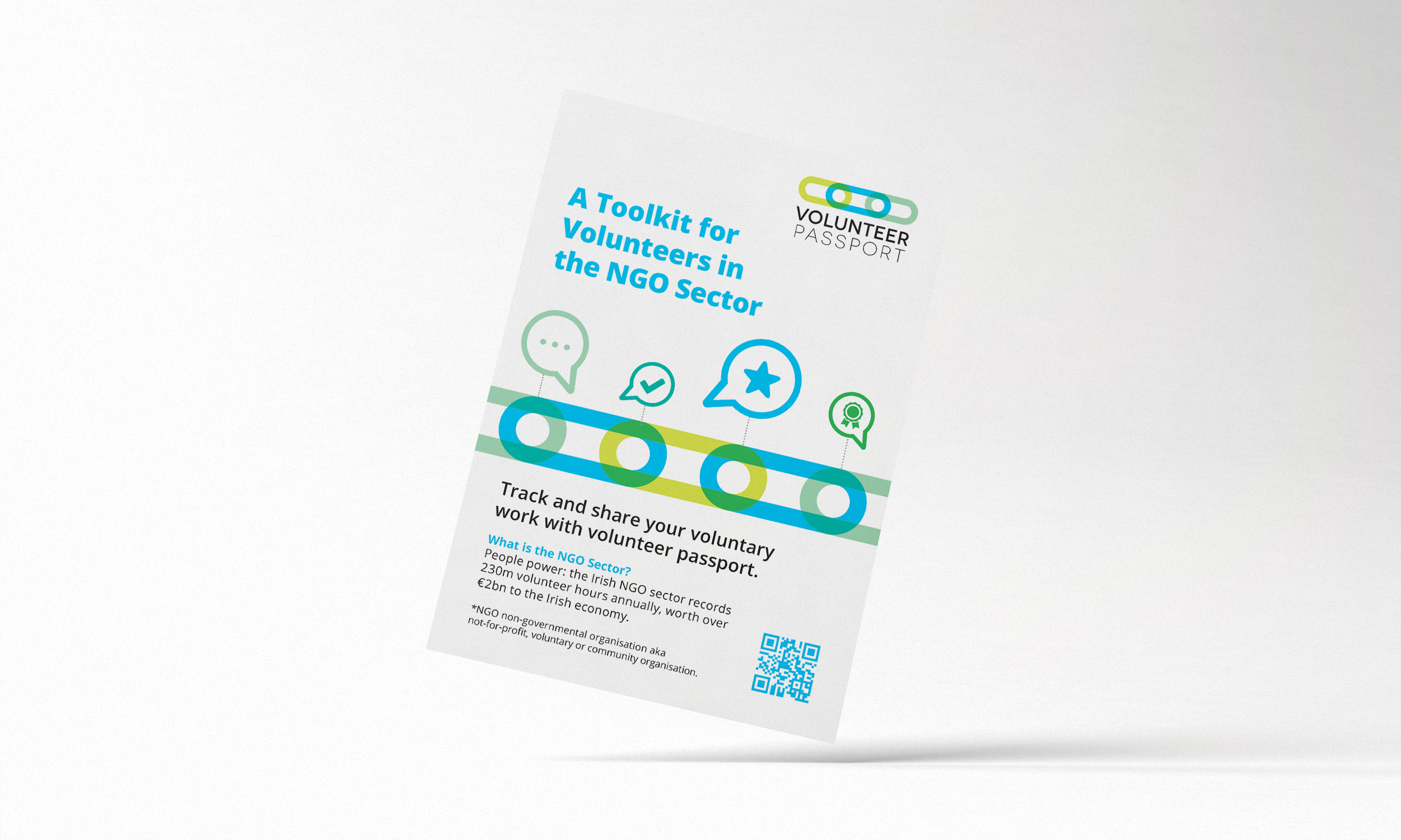
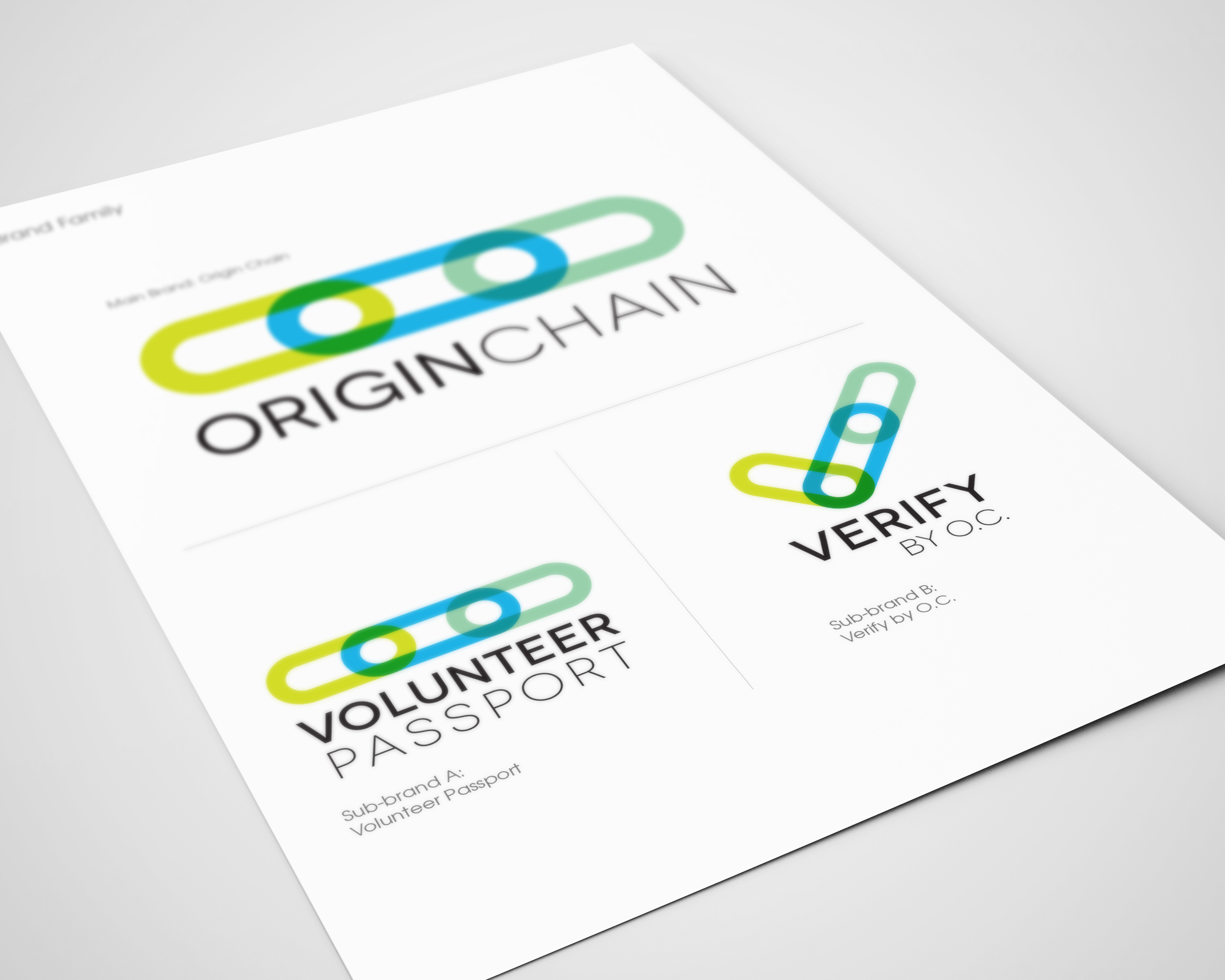
They have two sub-brands that sit under Origin Chain (Volunteer Passport and Verify by O.C.), and needed brandmarks for these in order for all three to work together as a family.
On reviewing Origin Chain’s needs and values, they wanted to be perceived as trustworthy, new-tech and user-friendly. Their software allows direct online transactions along a secure blockchain. These transactions are transparent and can be viewed by anyone.
A good way to envision this is to picture a value chain of a food item. E.g.; a banana you purchase with a barcode. On scanning the barcode, you can view the trail of where it has originally come from – from the farmer who picked it, to each input along the way, up until to the store delivery. It provides a sense of reassurance of knowing the root source of an item along the chain and be able to openly view it’s journey. With Volunteer Passport, it enables people in the volunteer sector to track and share their voluntary work. It enables a verification system, which allows one easy authorized and verified passport for all workplaces.
Factors considered were as follows:
-
Representing the links of a block chain as a strong, graphic symbol. The links also representing trust and security, a key value of Origin Chain.
-
The feeling of movement within the chain, emphasizing the interactive process of the blockchain technology.
-
Overlays of colours within the logo represent the transparency within Origin Chain’s software – the trust of anyone being able to see everything within the process.
-
Subtle hidden circles within the links represent eyes – the observing eye of the open visibility features of blockchain.
-
Closed links locked in to each-other to show solidarity of how when data is entered into a blockchain, it cannot be removed and is there forever.
-
Use of blue as the link colour, to further denote trust, the green tones signify the verification of the green light signaling approval.
-
For ‘Verify by O.C.’, the same brand style is used to create a tick of approval of the verification process.
The client was very happy with how the end result met the brief requirements, her feedback was as follows:
“I’m very pleased with how they look together. It’s been a real pleasure to work with you. As well as being a wonderful talent, you’re sort of unflappable too. The very best kind of designer in my book.”
*This work received a graphic design award in the International Design Awards with an Honorable Mention for brand identity.
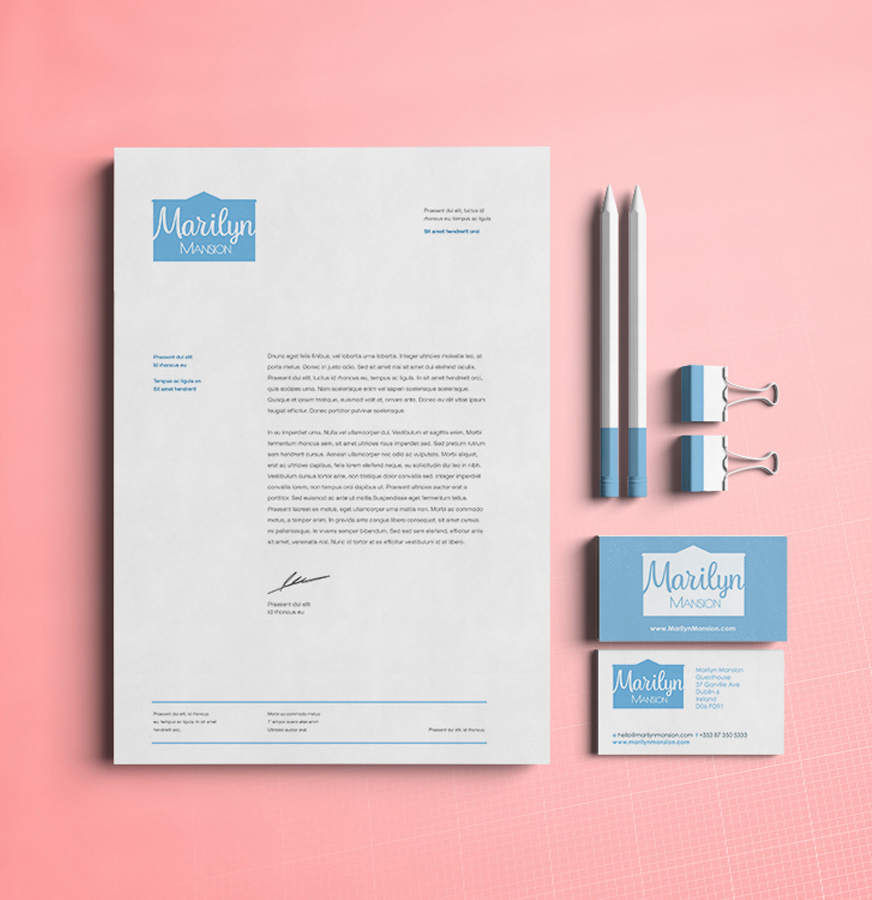
Marilyn Mansion Branding
Marilyn Mansion Guesthouse Brand Identity


Marilyn Mansion Guesthouse Branding
Marilyn Mansion Guesthouse is located in a beautiful, green street in Rathgar – one of the quietest area of Dublin, only 10 min bus away from the city centre. They have a fun, friendly, welcoming and calm environment.
Their unique point of difference is that their name and rooms are designed to celebrate some of Hollywood’s famous celebrities such as Marilyn Monroe and Marilyn Manson. Clare Lynch Creative worked with them on developing the concept behind their name by re-creating their rooms to highlight and pay tribute to these Hollywood greats, by using touches such as pop-art prints and graphics and movie-star style mirrors (Monroe-inspired) and gothic dark colour schemes with black, white and red finishing touches and accessories (Manson). This is a current work-in-progress on developing rooms one by one to embody this concept.
The visual identity incorporates the classic shape of the actual guesthouse, as a compact, memorable shape, which holds the ‘Marilyn Mansion’ name and uses a classic 50s-style script font and 50’s style classic pastel colour palette to create a dreamy, fantastical feel connecting to people’s love of Hollywood glamour and stardom. The business cards include a map as a practical, compact leave-behind sales tool for tourist offices in Dublin.
The client was very happy with the additional input and ideas that developed for their guesthouse, from working together on the brand identity.
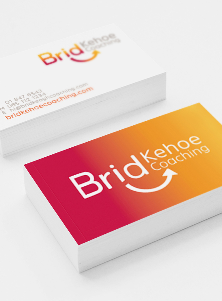
BK Coaching Branding
BK Coaching Branding
![]()


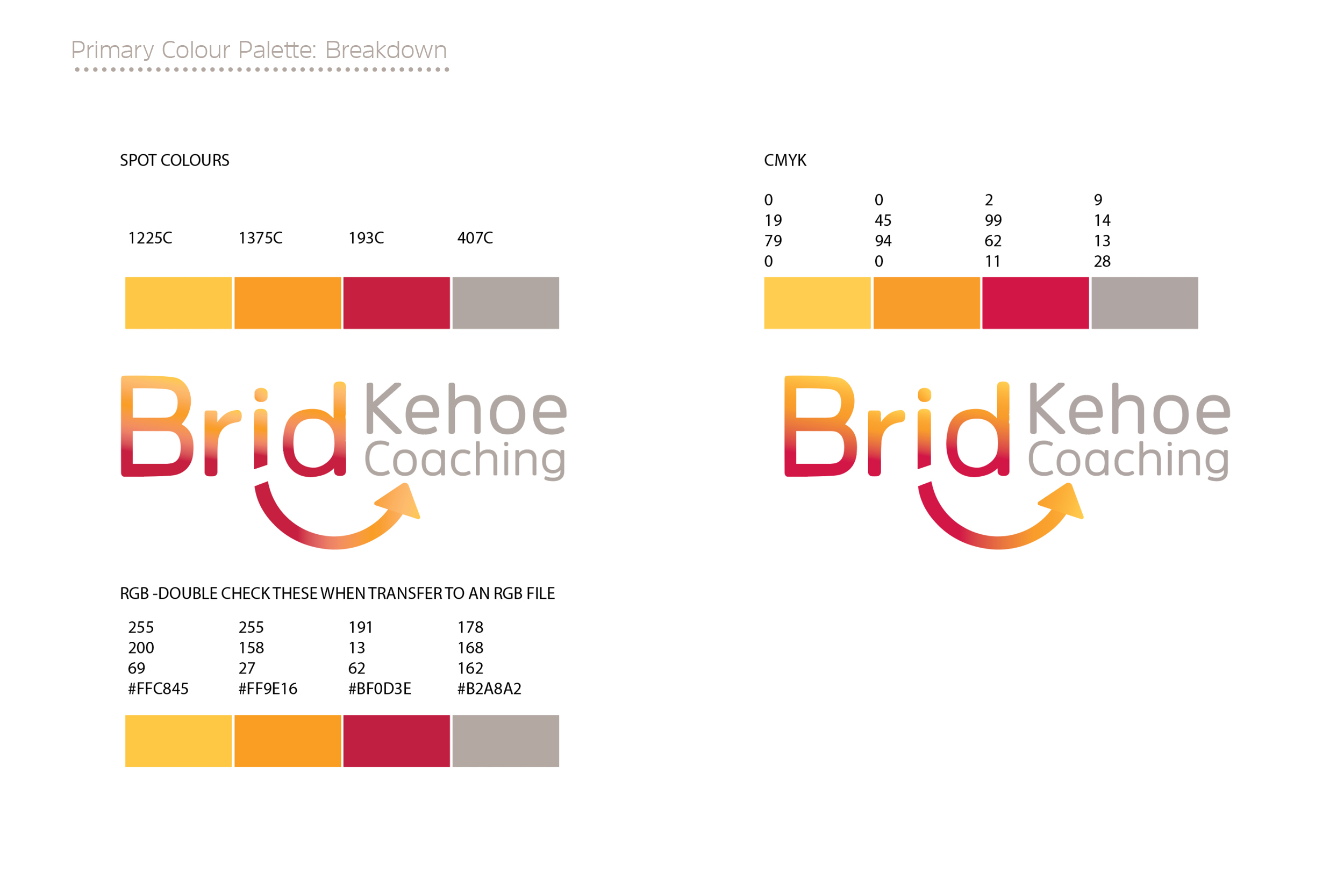
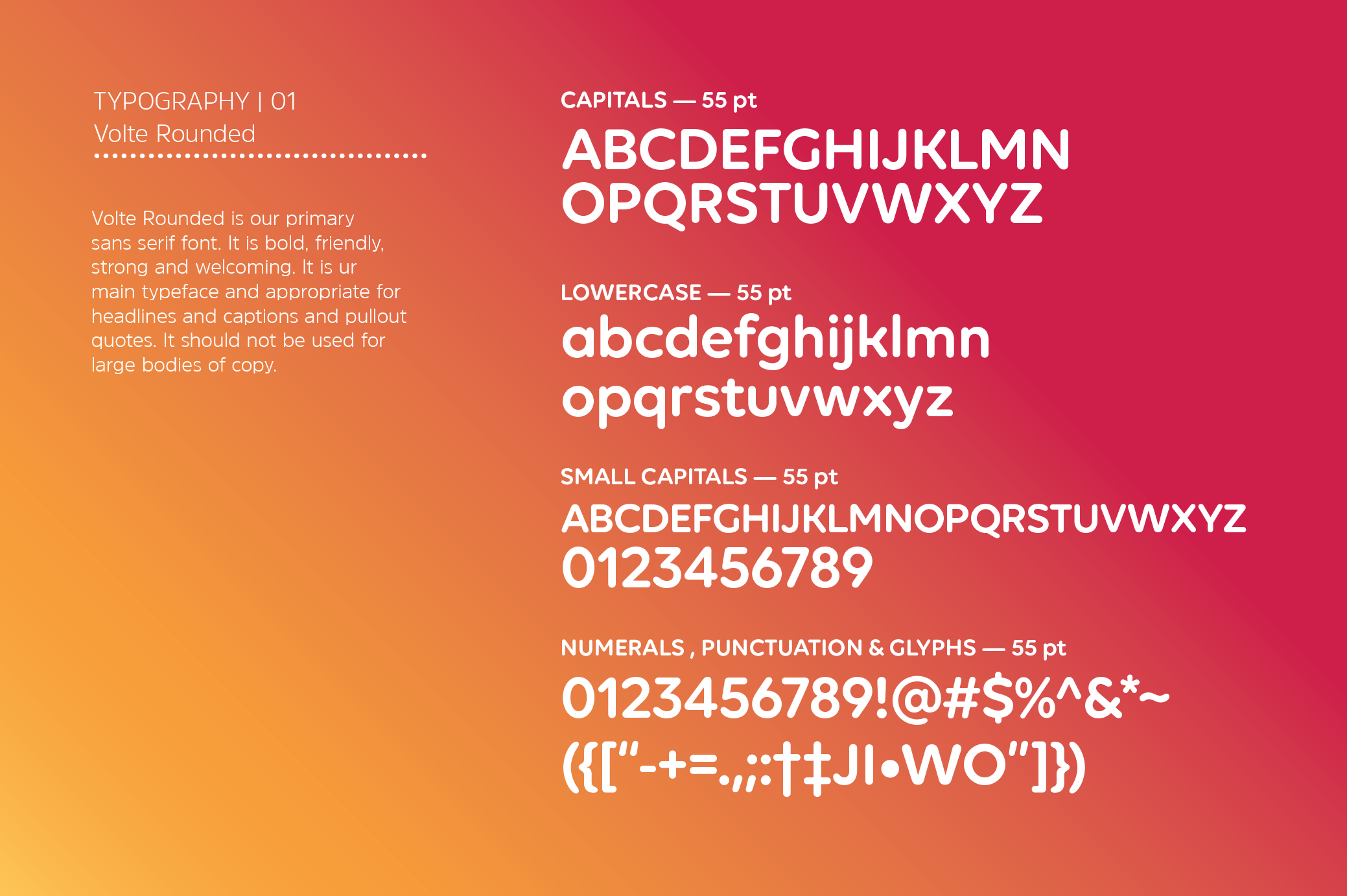
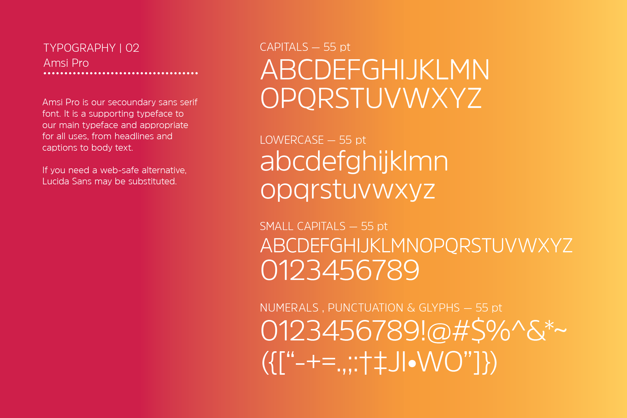

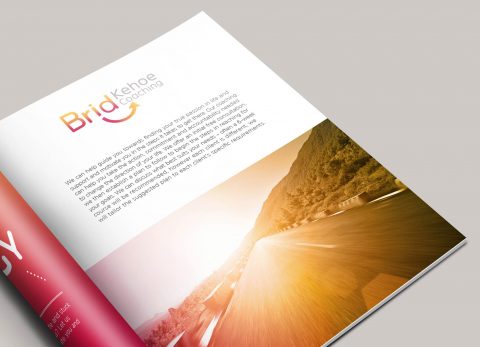
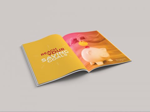
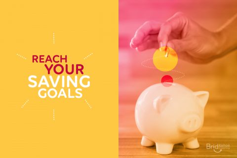
Brid Kehoe Coaching
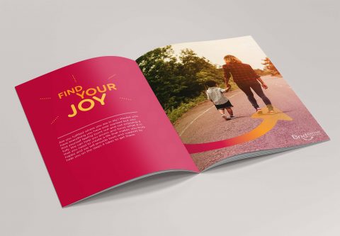
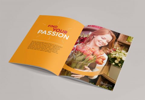
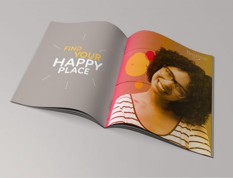
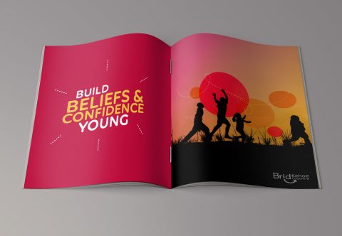
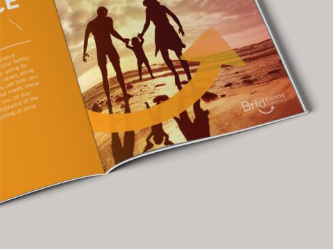
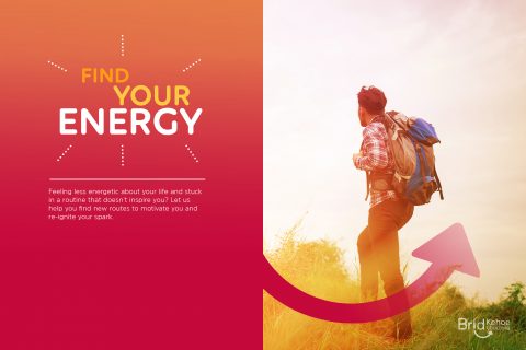
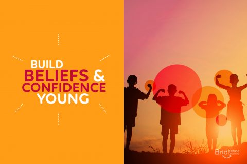
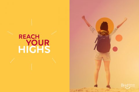
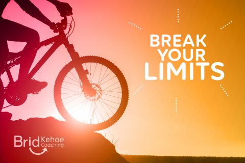
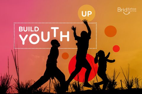
Brid Kehoe Coaching are a holistic coaching practise who support clients in taking steps forward to change for the better and help them to uncover new routes to get there. They guide clients to improve wellbeing and focus, change career and much more through support, encouragement and introducing new creative strategies.
The arrow in this identity lockup represents how Brid Kehoe Coaching focus clients in an upwards direction in their life; the subtle smile and bright colours communicate the positivity and fresh outlook that they bring to all their clients.
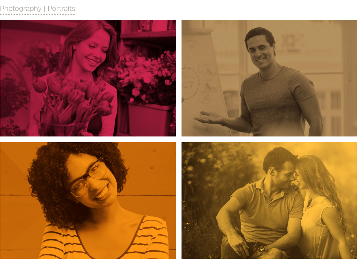
The visual identity kit includes the stationery suite and brand guidelines featuring the photography style, visual language, typography and colour palette which maintain a consistent brand style through all BK Coaching’s communication and points of contact with their potential clients.
See also Brid Kehoe Coaching Brand Booklet and BK Coaching Client Toolkit is to follow soon.
*This work received a graphic design award in the International Design Awards with an Honorable Mention.
CashAnalytics Re-Brand
CashAnalytics Re-Brand & Brand Guidelines

![]()
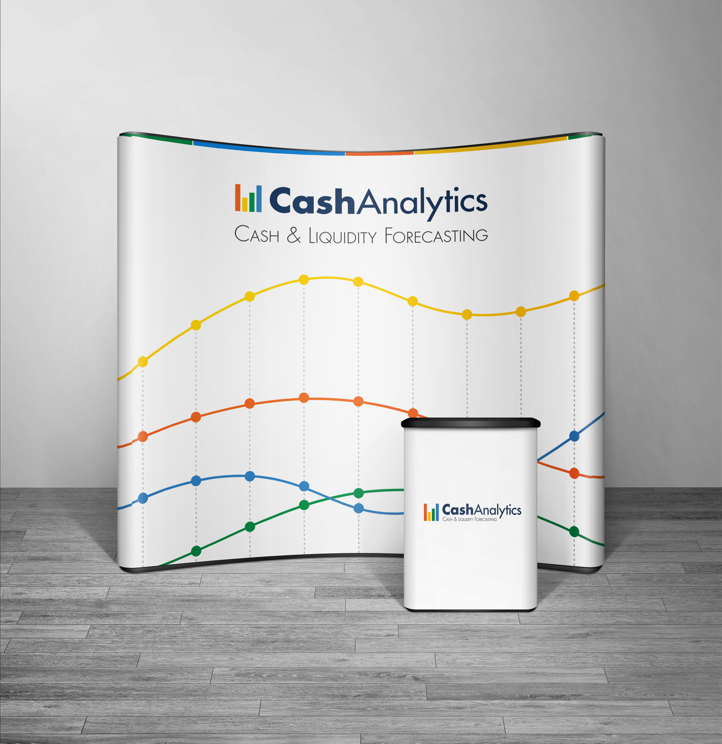
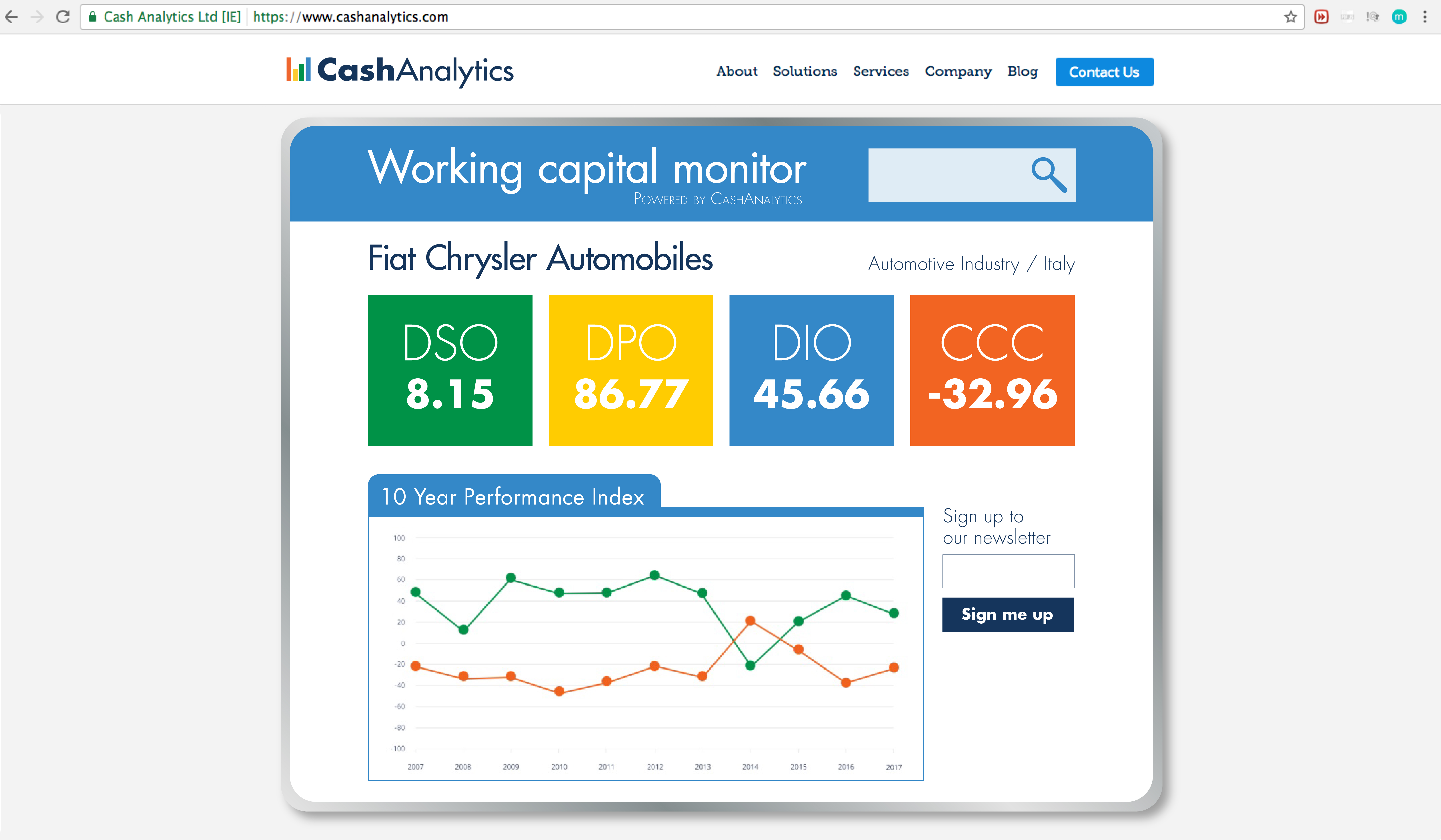
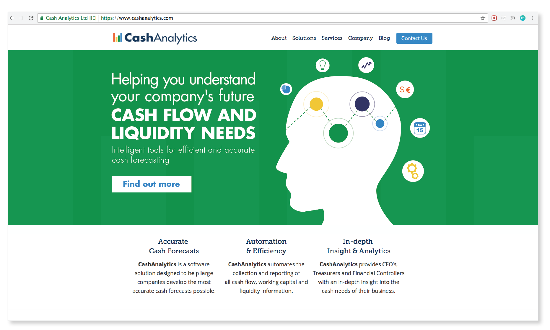
CashAnalytics Re-brand, Brand Guidelines & Marketing Collateral
CashAnalytics build software that solves problems using the latest cloud and web based technologies, that help large companies manage their day-to-day treasury, risk and compliance challenges in an efficient and controlled manner. They work with a broad spectrum of organisations ranging from mid-tier private equity backed companies to stock market listed multinational enterprises. They are experts in corporate cash and treasury management, compliance, software development, customer service and project management.
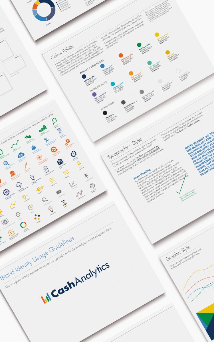
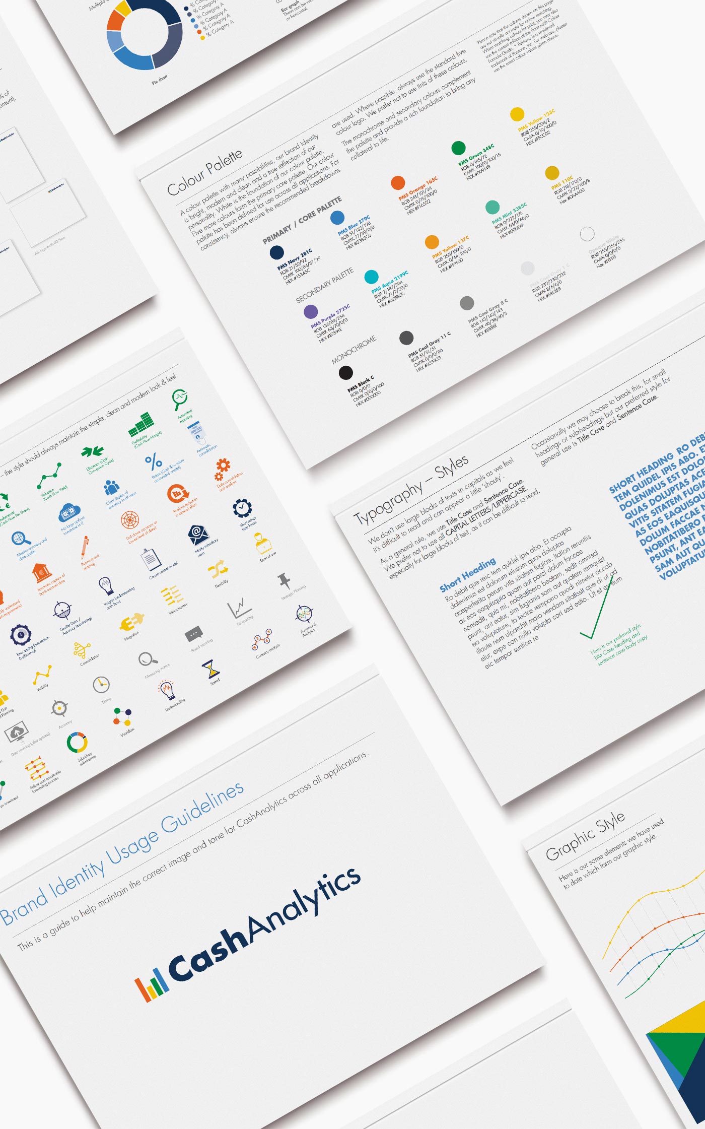
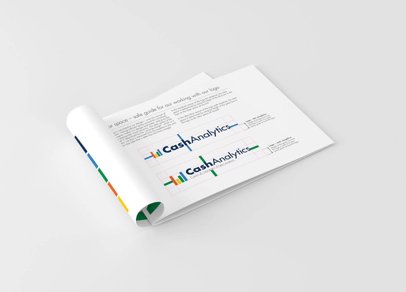
They liked their existing logo to some extent, but wanted a more modernised look and feel, to ensure their logo was contemporary and communicated how the services they offer use the latest software technology to create results in a fast time-frame compared to their competitors. To create this, the bars from the treasury building in the original logo were used to stand alone as a strong analytics symbol, along with the cleaner, modernised Futura typeface. This created a new, modern CashAnalytics logo, which still easily links to be an evolution of their previous logo. There is a secondary version of their logo, which includes their strapline ‘Cash and Liquidity Forecasting’, for more specific uses.
The brand was then further developed across stationery, infographics, web graphics, eNewsletters, eBooks, brochures, exhibition graphics and brand guidelines, to roll out the re-brand in a consistent manner across all CashAnalytics collateral. The client was very happy with the new streamlined result across all their points of contact with clients.
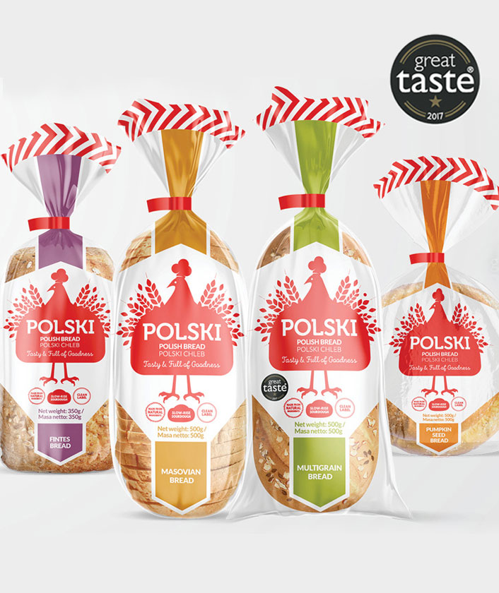
Polski Bread Packaging
Polski Bread Packaging
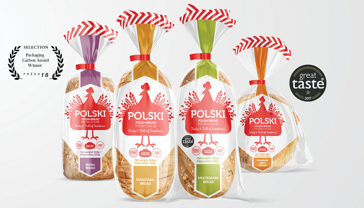
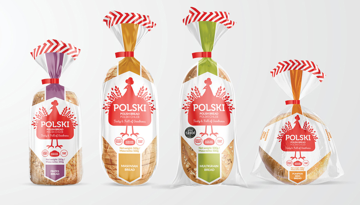
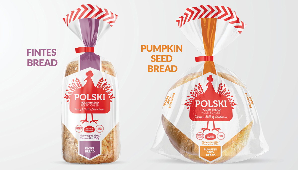
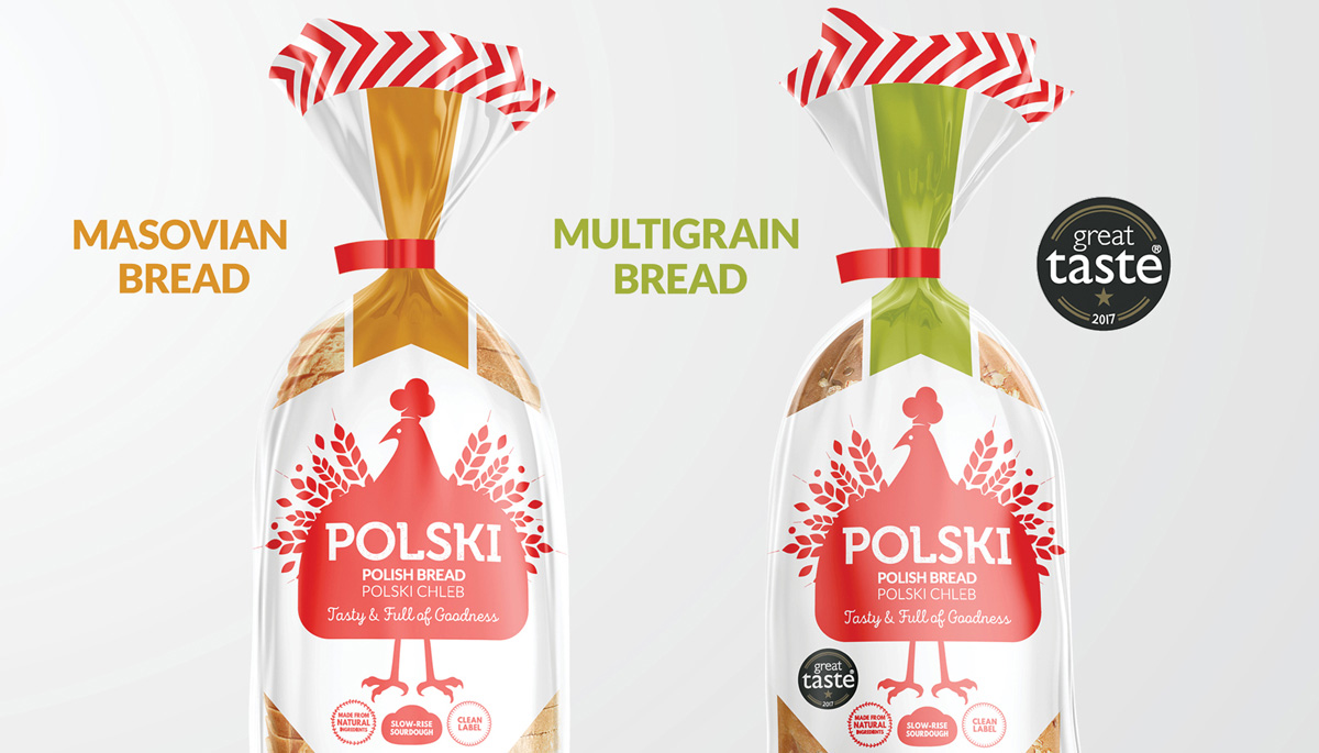
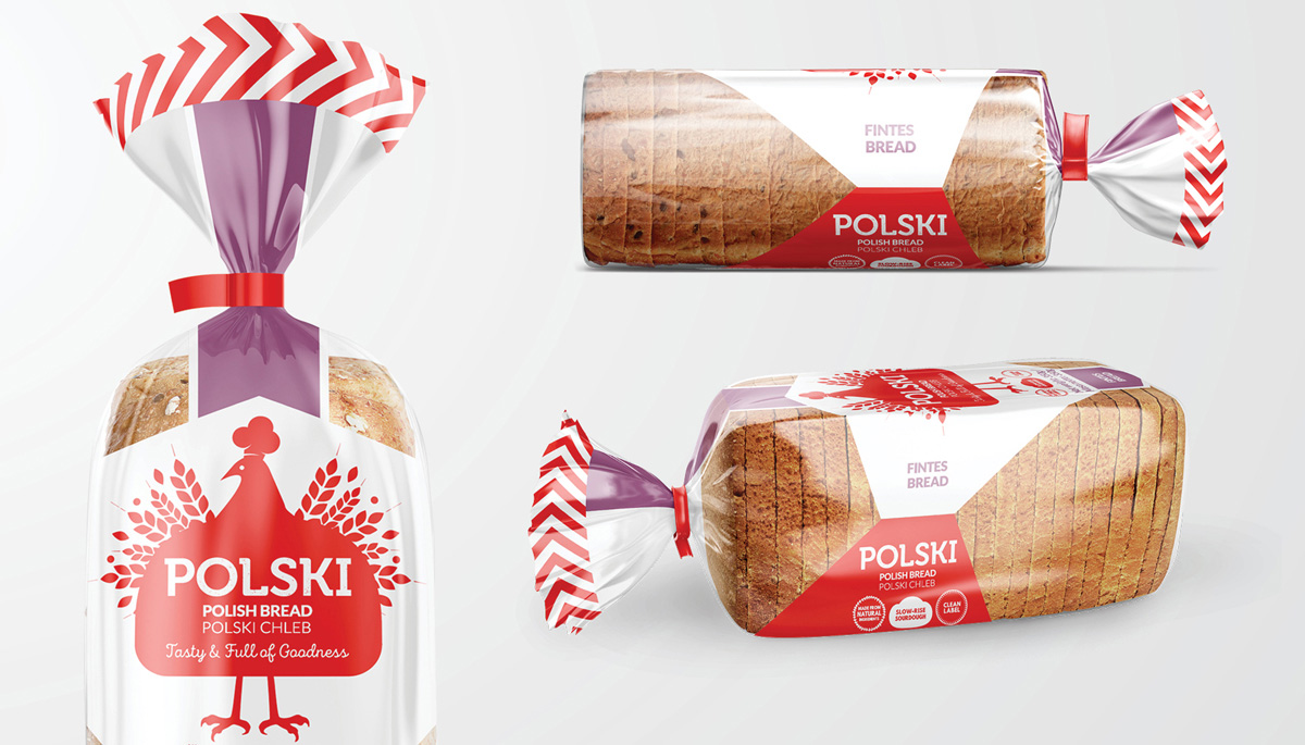
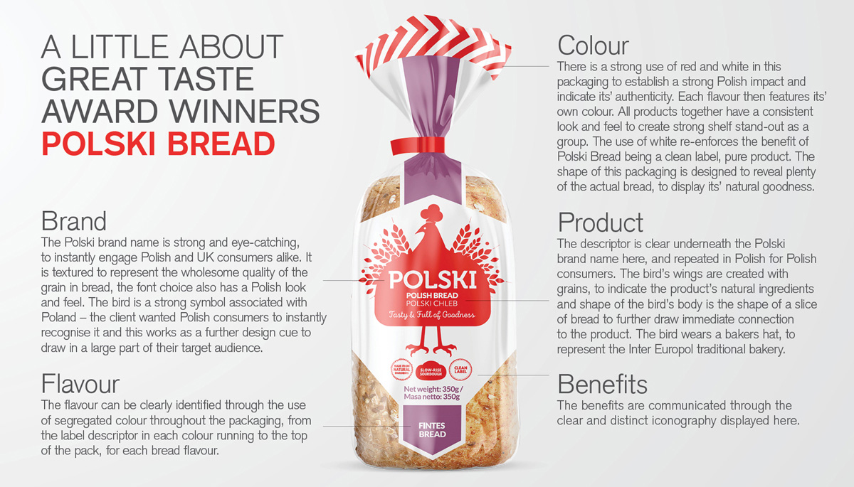
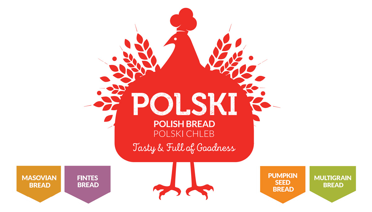
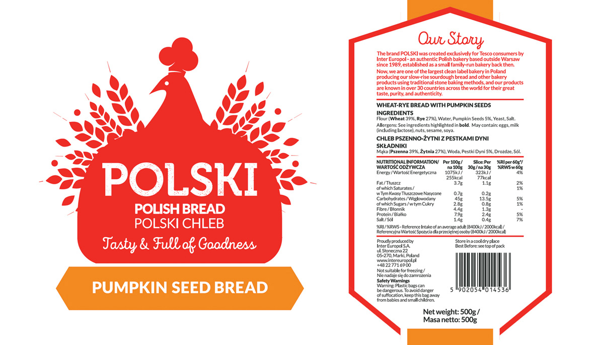
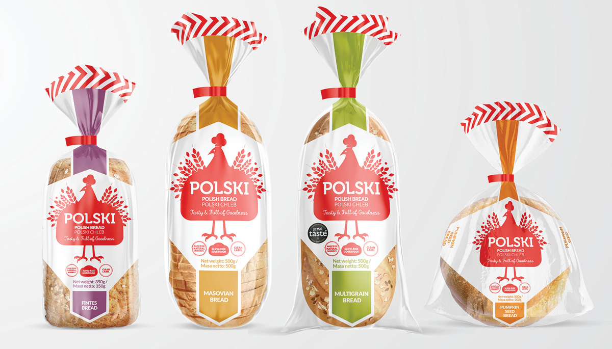
POLSKI Bread was created by authentic Polish bakery Inter Europol, exclusively for Tesco consumers. Known for their taste, purity, and authenticity, they’re the largest clean-label bakery in Poland, producing real slow-rise sourdough bread and other bakery products using traditional stone-baking methods for over 30 countries worldwide.
The brief was to design a new packaging brand for a range of Polish bread to be launched in Tesco stores across the UK. The main target audience is consumers who love Polish food, therefore it was important to ensure that the branding made a clear, instant connection to Poland, for strong shelf stand-out.
Some factors considered to answer this brief include:
– Using the colour palette of the Polish flag (with colour variants per flavour) / the use of white to represent its’ clean label benefit.
– Packaging shape designed to reveal the bread’s natural goodness.
– Featuring the Polish bird mascot – with wings formed from grain, a bread-shaped body and a baker’s dough-shaped hat.
– Simplified folk-art style ‘Wycinanki’ illustration.
– Traditional Polish typography in a modern style, containing an earthy, grain texture signifying the bread’s wholesomeness.
– Consistency across four different shaped packs, for strong brand impact.
The result is engaging design, carefully tailored to their target audience.
*This work received a graphic design award in the Frēsh 18 Design Awards.
*Featured on The 100 Archive and Packaging Design of the World.
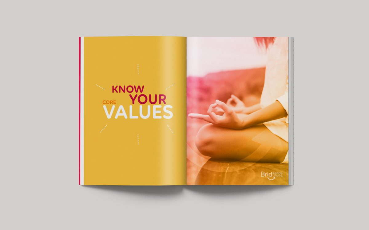
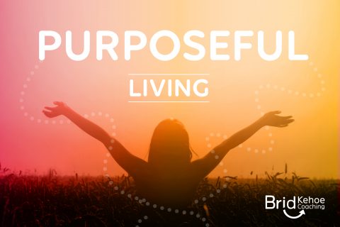
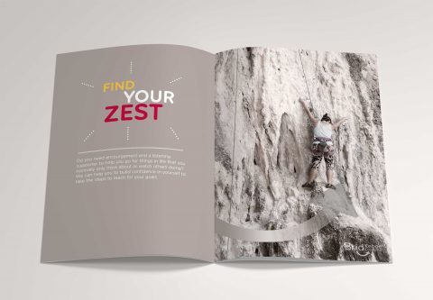
BK Coaching Brand Booklet
Brid Kehoe Coaching Brand Booklet
 <img
<img

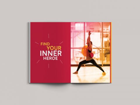


BK Coaching Brand Book & Marketing Collateral
Brid Kehoe Coaching are a holistic coaching practise who support clients in taking steps forward to change for the better and help them to uncover new routes to get there. They guide clients to improve wellbeing and focus, change career and much more through support, encouragement and introducing new creative strategies.
The arrow in this identity lockup represents how Brid Kehoe Coaching focus clients in an upwards direction in their life; the subtle smile and bright colours communicate the positivity and fresh outlook that they bring to all their clients.
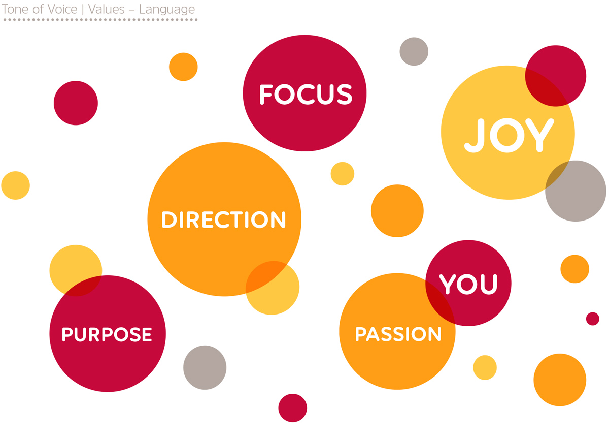
This booklet was designed to communicate BK Coaching’s brand mission and values of their aim to improve their client’s lives by helping them to choose a direction which leads them towards their goals and to find happiness in their lives. Brid Kehoe Coaching work on one-on-one coaching sessions with individual clients and also work with groups, both in the work environment and in youth work, empowering people to grow and become the best and happiest version of themselves. This booklet evokes and carries across the same feelings of joy, passion and enthusiasm for life that the BK Coaching brand represent.
See also Brid Kehoe Coaching Brand and BK Coaching Client Toolkit is to follow soon.
*This work received a graphic design award in the International Design Awards with an Honorable Mention.
NZ Channels Branding
NZ Channels Brand Identity
![]()
![]()


The aim with NZ Channels was to create an identity for a company who provides an online media and television network of all the towns and cities in New Zealand. NZ Channels provides videos, links and information on past and upcoming events in each town.
The viewer can go online and watch televised events in the town that they are interested in, whether it is their hometown or a town they will be visiting. The website also provides various other information from each town so that it is an easy online information source.
As it online-based, and a transfer from one media source to another, I chose a pixelated look for this logo. It is also designed to be open to animation as it will be seen in an interactive media platform.
*Freelance whilst at UGP Design
Inukshuk Brand Identity
Inukshuk Brand Identity
![]()


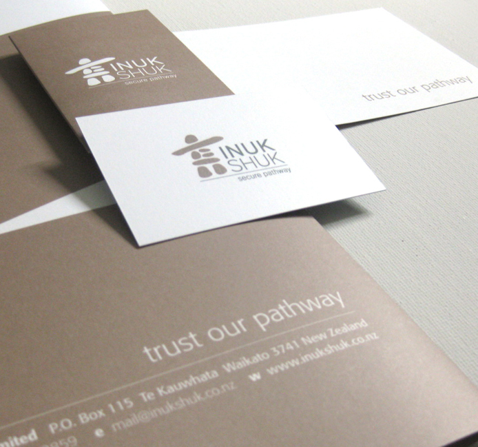
Inukshuk Secure Pathway provide technical and operational requirements of the security industry to deliver secure alarm systems and telecommunication pathways to their clients.
The client wanted to use an inukshuk as an element in their identity to represent the safe and secure telecommunication pathways they provide, as an inukshuk is a symbol of ‘safe pathways’ and a marker to guide people in the right direction. It symbolizes Inukshuk’s service.
I chose a muted and earthy look and colour palette to establish that that Inukshuk are a trusted, down-to-earth brand and the strong directional lines to denote the guidance they offer. I designed the brand identity and website look and feel for this brand.
*Freelance whilst at UGP Design
Elevate Executive Selection Branding
Elevate Executive Selection
Branding
![]()
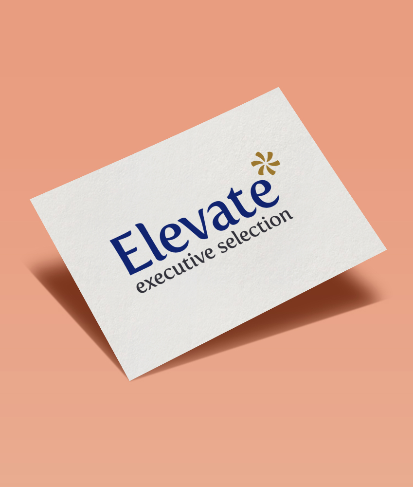
Elevate Executive Selection provides high-end recruitment services to it’s clients. The service offered by Elevate is innovative, professional, sincere, and results based. I created a brand that was high quality and professional, denoting the feeling of being specialized and selective, highlighting it’s point of difference from other recruitment agencies.
Another strong value Elevate wanted to portray towards it’s target audience is a feeling of optimism, fun and a brightness towards the future, whilst still maintaining a corporate feel. This is all tied in very well together with the unique brandmark created – a clean, simple and strong representation of what Elevate stands for in the current market.
Arriba Wine Packaging Design
Arriba Tempranillo Wine
Packaging Design
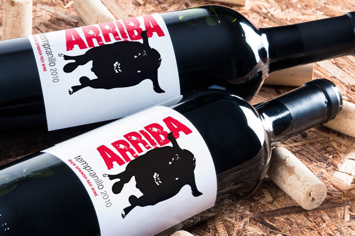
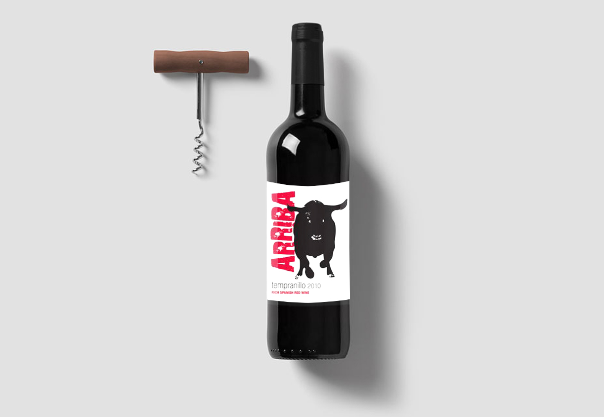


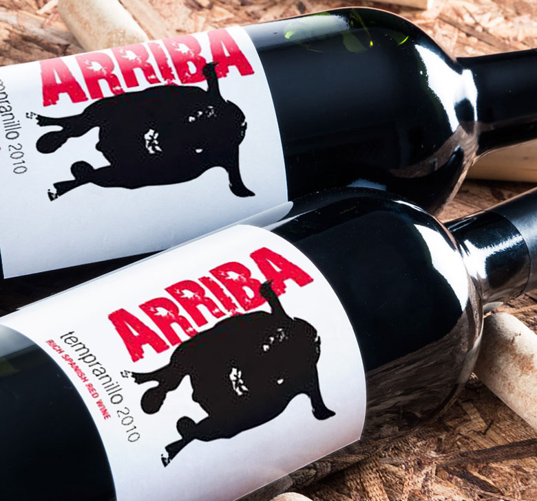
Arriba wine is tempranillo, a full-bodied Spanish wine label. The client was interested in incorporating a bull in to the design for the label, as he wanted a strong association with it’s Spanish roots and strong, fruity taste. The look and feel of this label is strong and direct.
The word ‘arriba’ has meanings including ‘come on’, ‘hurry up’, ‘let’s go’ – all very action-based words. I have designed the font to represent this along with the lively, energetic spirit of the Spanish – an urgent movement which contrasts strongly with the strong, steady bull but compliments the bull’s fiery charge. The lid draws on the Spanish colour palette – overall a modern and contemporary wine label.
*Freelance whilst at Design Dairy
Dynamic Media Solutions Brand Identity
Dynamic Media Solutions
Brand Identity, Livery Design


Dynamic Media Solutions are an innovate and leading company in Ireland that provide services such as vehicle wraps, environment wraps, in-store digital wallpaper, print and signage.
They specialize in vinyl wrapping of everything from vans and buses to building exteriors and tunnels. They are a new and fresh company and they wanted to portray this in their branding. They wanted to stand out in the marketplace and be an easily recognized brand.
Their ethos is a can-do, flexible and innovative approach. Using their initials as a brand-mark, I created a logo typeface that generates this feeling of movement and also re-enforces exactly what they do. I used the mesh pattern which makes up vinyl as a graphic element on the stationery. The result is a clean, professional brand with it’s own unique personality, with a graphic style which has the potential to easily be translated onto other mediums such as posters and advertisements in the future. The client was very happy with the result.
Joe Lynch Electrical Brand Identity


A unique and stylish identity for Dublin based electricians, Joe Lynch Electrical. The J and L letters from the owner’s name where used to create a strong graphic brandmark which symbolises a bolt of electricity and also re-directs the focus to the company’s name. The colours used were bright and fresh, and veer away from the typical blues and reds used with electrical companies, making JLE stand out in the marketplace.
The website is strong graphically and drives clear messages to the visitor of the available electrical services.
The website has effective SEO which drives new customers to the site on a regular basis, whilst also being a good touchpoint for existing clients.
WebDoctor.ie Branding
WebDoctor.ie Logo & Website Template
![]()


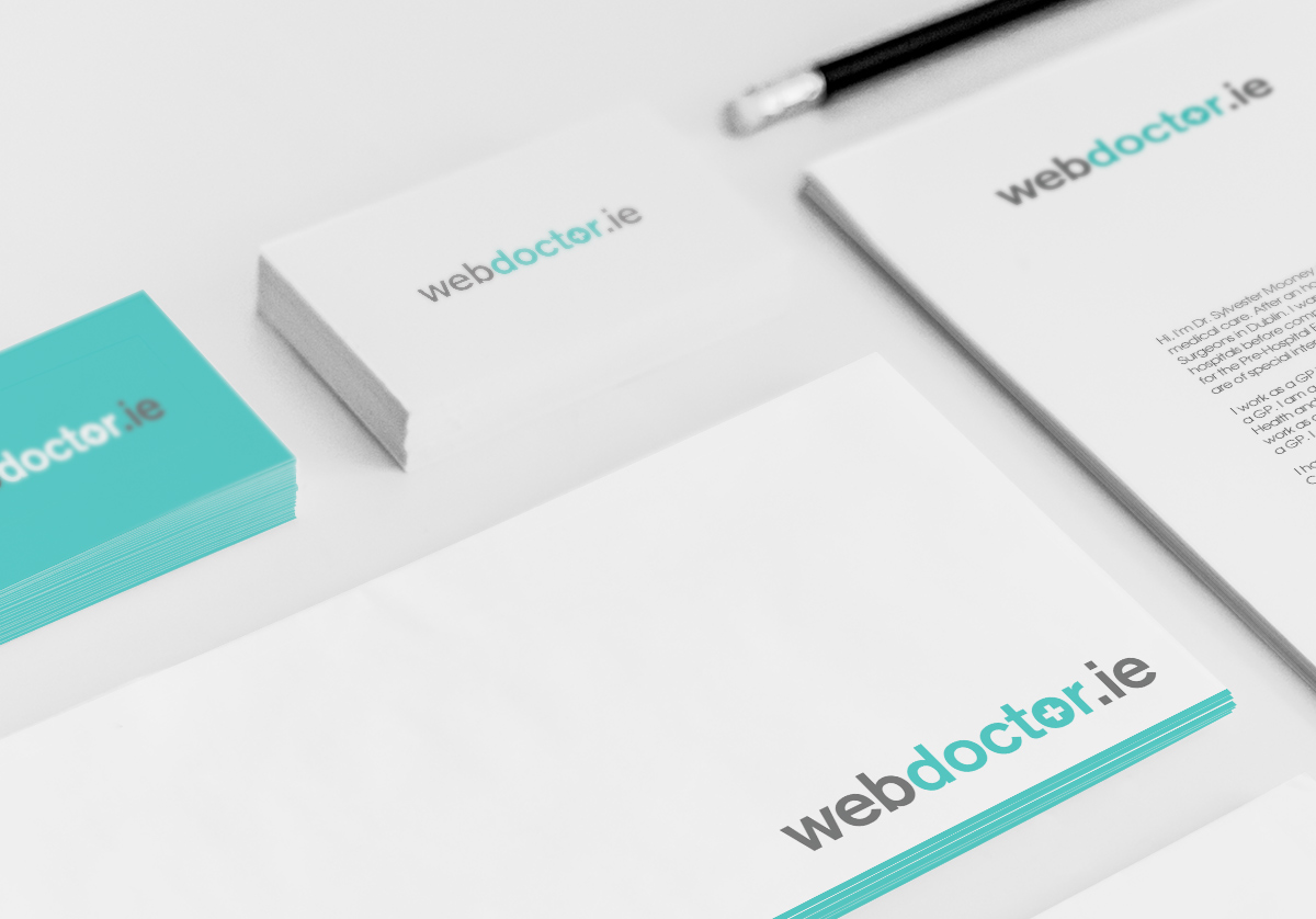


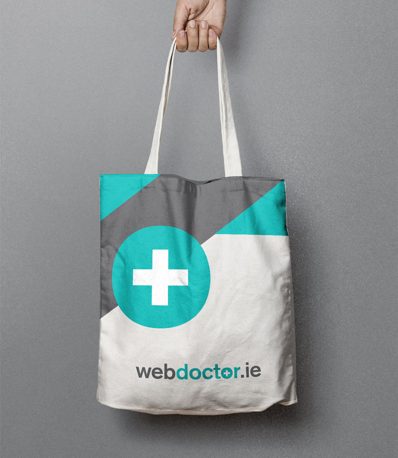
webdoctor.ie are a safe and affordable Irish online doctor service that conveniently delivers prescriptions to your door. Customers can simply fill in an online consultation for their desired treatment and it is conveniently posted to their homes or prescriptions can be used at any Irish pharmacy.
The aim was to create a clean logo and website template with plenty of whitespace and less content for a clear user experience, as webdoctor.ie aims to create a simplified process in seeking medical aid so the logo and branding needed to represent this.
Their mission is to provide a dedicated team with the highest quality of medical care.
The final logo chosen uses the universally-recognised medical square cross symbol to create easy association with what the company does. We kept the ‘.ie’ within the logo to re-enforce the message of it being an online-only doctor service. The main brand colour chosen is a soft green tone to form an immediate connection on first impact with the medical field.
The result is a clean, professional, direct logo and website template which potential customers can connect instantly in the service webdoctor.ie offer.
Some of the nice feedback from the client:
“Many thanks for your great work!!! And thanks for being so responsive, we’ve already recommended you to some other people! We think you’ve done some great work, really looking forward to working with you much much more!”
Oisin Kim – Director, webdoctor.ie
Campbell Rochford Branding
Campbell Rochford
Branding & Guidelines


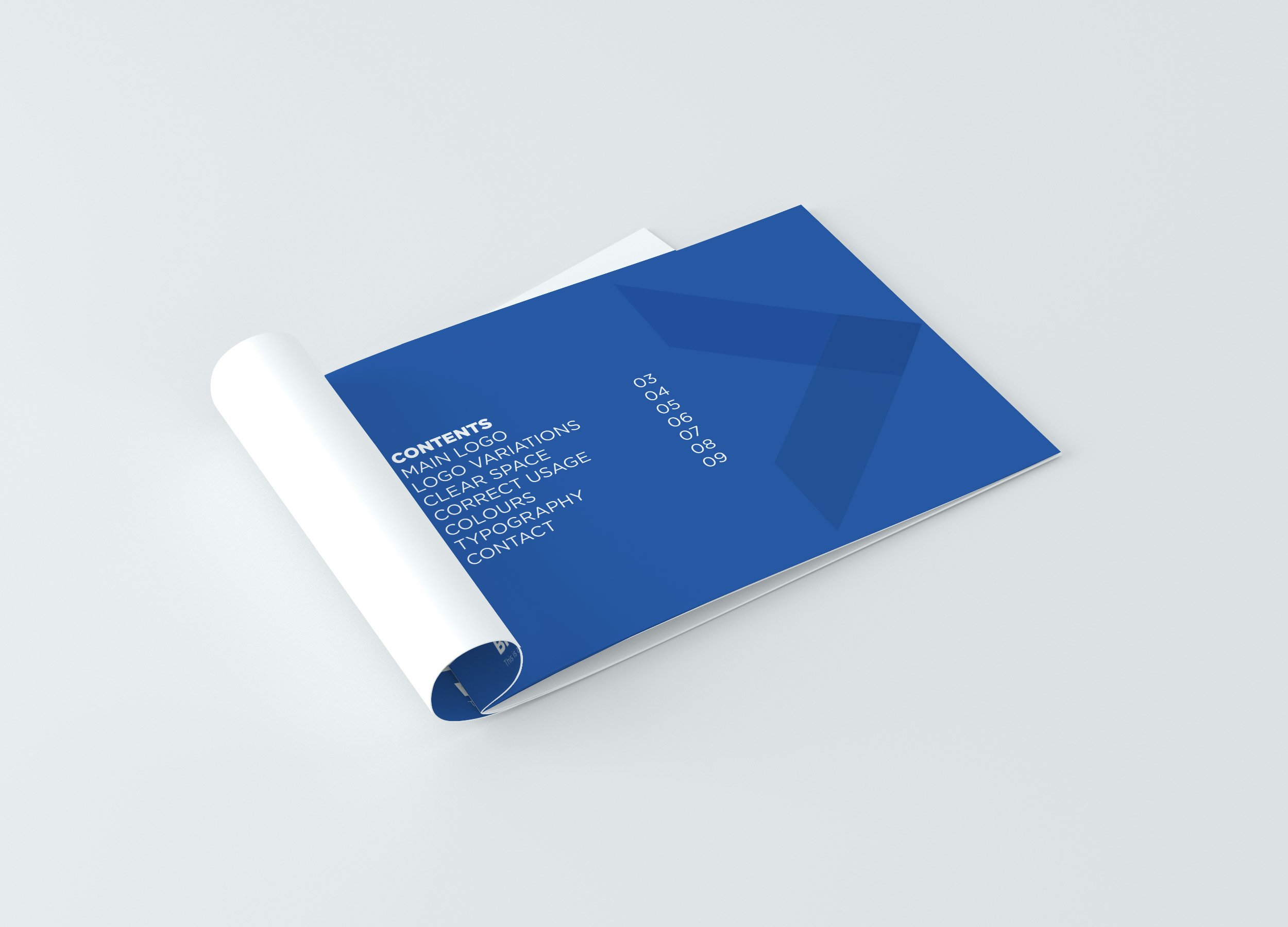


Campbell Rochford Branding & Guidelines
Campbell Rochford is a specialist Financial Services Recruitment company focussing on the recruitment needs of Banks, Insurers and Finance clients and candidates. Their aim is to grow the business incrementally each year by monetizing the goodwill and experience of previously working with select Financial Services clients.
The new logo needed to reflect a serious, professional company, one that gives a feel of a well-established firm with a reputation to match. Campbell and Rochford were names of late relatives of the company founder and the name was chosen to carry their legacy forward.
Some of the original logo concepts Clare Lynch Creative developed focussed on representing this unique heritage story of Campbell Rochflord, incorporating the C and R from the words Campbell Rochford to create a strong graphic corporate symbol and a recognisable brandmark.
As development continued with the client, we decided to take another direction playing on the word ‘great’ using a direct connection with accounting and the ‘greater than’ mathematical symbol to form a graphic element.
Campbell Rochford represents all that is great. They work with great staff and help people and companies connect to become greater. The strong graphic corporate mark created in the logo symbolises two entities being connected by Campbell Rochford (who are the centre-point in the connection). It also doubles-up to represent a positive step forward symbol for candidates / clients alike.
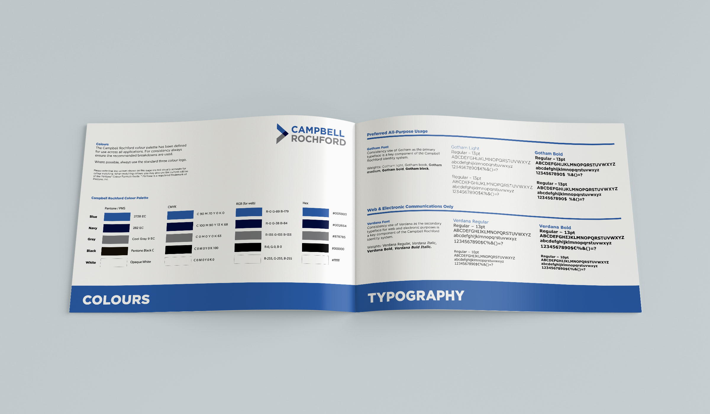
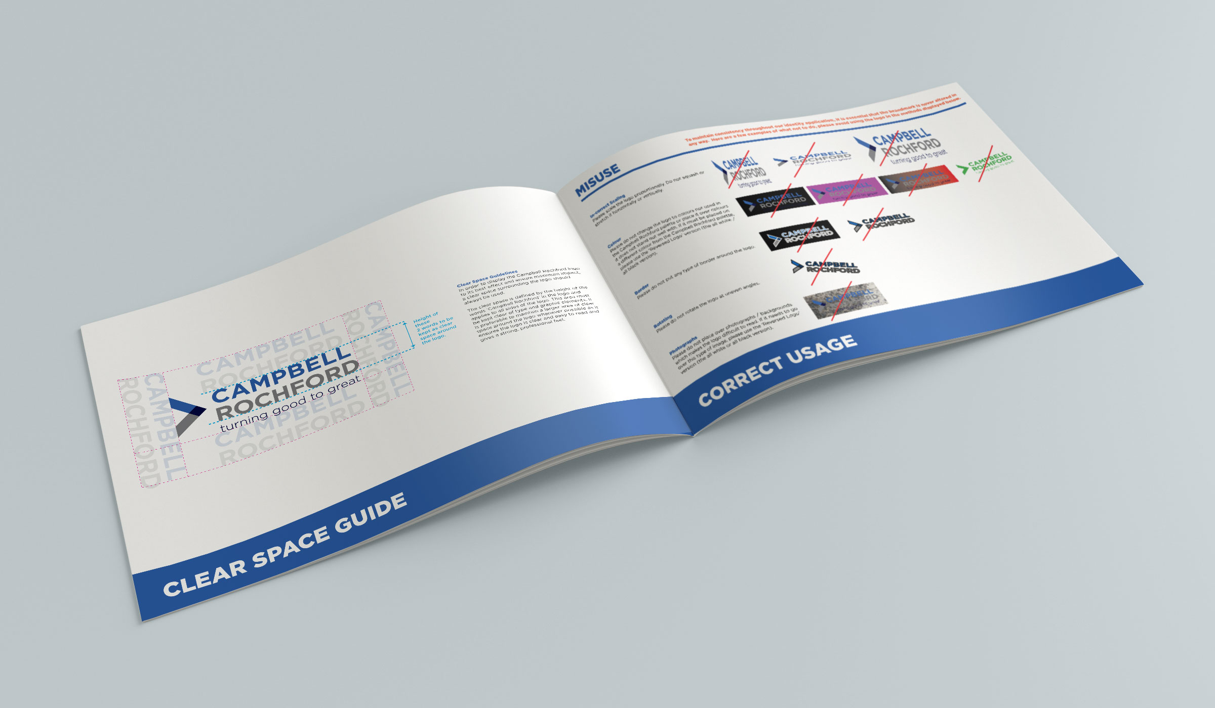
The overlapping and linking of the shape & colours in the symbol here represent the links and connections constantly flowing with Campbell Rochford and their clients and candidates. This symbol is a strong brandmark which evokes the feel of a quality and established company, keeping it simple and clean with a sophisticated feel. The font used is modern and clear, with a touch of elegance and the colour palette chosen convey the values Campbell Rochford aim to represent of trust, professionalism and confidence.
“I’m delighted with how my logo turned out and having shown it to people since, everyone was really impressed. The logo really helped my website and I’m glad it looks a lot more professional as a result. I also ordered my first batch of business cards so thank you very much for your advice in this regard on the print”.
Gerard Quinlivan – Director,
Campbell Rochford
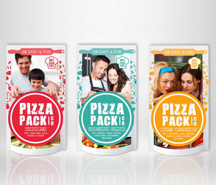
Pizza Pack Co Branding & Packaging
Pizza Pack Co
Identity, Packaging & Advertising


Pizza Pack Co is a fun home pizza-making kit, which equips the customer with ingredients and instructions to make their own fresh and tasty pizzas at home in just 10-15 minutes. Each pack comes supplied with pizza dough, tomato sauce and topping ingredients for the chosen flavour / type of pizza. This is a fresh and innovative new idea to the market that creates a whole new enjoyable experience out of the usually-mundane task of making dinner.
It is primarily aimed at a young, interactive target audience but can also appeal to different categories. For example, it is an easy and fun activity to do as a couple’s date-night / as an adult & child bonding activity or as friends having a night in together. The brief was to create branding and packaging for Pizza Pack Co that embodied youth, colour and brightness while evoking a feeling of energy and life.
Some elements considered when creating this branding were: the raw feel of pizza fresh from the oven, the light-heartedness and fun of making the pizza from scratch along with emphasizing how the ingredients are fresh. I chose imagery which conveyed the energy of the target audience enjoying the experience along with fun, quirky baking tool icons. There is a D.I.Y. feel incorporated into the layout and typography in the collateral, giving a sense of action and movement. The language used is open and friendly, using slogans that are bright and fresh to appeal to the vibrant, fast-paced target audience.
Displayed is the range of collateral designed for Pizza Pack Co, which includes the logo and colour variations, business card, outdoor advertisements, wobbler tag and the box & pot images. The client was very happy with the result and felt it embodied all the values that they wished to portray to consumers correctly.
*Whilst at Bravo Outdoor Advertising.
See past projects in the archive section…