Tara Gartlan Chocolate – Brand Packaging Design

Tara Gartlan Chocolate: Brand Packaging Design

Introducing the Brand Packaging Design for Tara Gartlan Chocolate – luxury handmade chocolate bonbons, created by Michelin star pastry chef Tara Gartlan.

Each chocolate collection is like a work of art – every chocolate is meticulously handmade with beautiful designs, which lead to us creating the tagline ‘The Art of Chocolate’, highlighting the word ‘Art’ tucked within Tara Gartlan’s name. Cocoa butter is used artfully for decoration and all recipes are expertly crafted by Tara Gartlan. They look almost too good to eat! But once you do, you’ll be reaching for another one.


We took the initials ‘TG’ from Tara Gartlan’s name and created a strong graphic symbol with it, taking cues from the flowing nature of chocolate and incorporating droplets, like with chocolate dripping. There is a subtle ‘c’ within the base of the ‘G’ for the word ‘chocolate’ and also for ‘coeliac’, as these chocolates are coeliac-friendly.

The beautiful boxes exude quality, the gold-detailed curvy lines take cues from the free-flowing way that chocolate is poured and the natural flowing lines in nature, as many of the ingredients are grown locally, guaranteeing the most fragrant flavours.

They are made with Valrhona chocolate and filled with beautifully seasonal ingredients. They are Gluten Free but the secret is – you wouldn’t know! Sometimes gluten free is perceived to be less tasty but I gave them to people to try and only told them after and they were shocked!

JJ O’Toole Ltd did a beautiful job on printing the packaging at a very premium standard – and are also a pleasure to deal with. All chocolate collections are available on www.taragartlan.com


Brand Guidelines & Assets

A colour palette with many possibilities, the Tara Gartlan Chocolate brand identity is sophisticated, elegant, premium, Irish and a true reflection of the high quality and standard of our chocolates and service.


Follow Tara Gartlan Chocolate on Social Media:

Instagram: @taragartlanchocolate

Twitter / X: TaraGChocolate

Order Tara Gartlan Chocolates here: www.taragartlan.com


Duhallow Organics Brand Packaging Design

Duhallow Organics Brand Packaging Design


The Duhallow Organics farm is situated on the old Moynihan family farm in Boherbue in the heart of Duhallow, Co. Cork. Certified Organic since 2008, they produce Organic Eggs and grass finished Dexter Beef.

Duhallow Organics care about People, Animals, Sustainability, Biodiversity & the Community. Everything they do has these values at their core. They create Pure Good Food, Cork style, with 0 Additives, Pesticides, GMOs or Fertilisers. They farm for you and your family.


Within the brand logo design, the 0’s have been highlighted to emphasise how there are zero additives used in the food that they produce, as it is organic and natural. There is a grain texture within the letters of the logo, to further communicate the natural and organic aspect of the food produced from this farm.

The tagline we developed for them is ‘Pure good food. Zero added. The word pure cleverly plays on the way native Cork people use the word ‘pure’ is used to say ‘very’ or ‘absolutely’ and also how the farm is organic so the food produced by Duhallow Organics is very clean, healthy and pure.

The Duhallow Organics brand is fun, quirky, bright and playful to appeal to customers and indicate how their animals live freely and happily – while still clearly communicating the brand ethos and values, to signify what they stand for, such as how they care about animals, the environment and sustainability at their core.


Fresh Organic Eggs

Their hens live a lifestyle which complements the holistic Organic ethos of the farm. The girls live in a mobile hen shed in the field and enjoy a rich bounty of Organic grubs and grasses. Their happy girls produce magnificent eggs which are as natural as an egg should be.

  • They work with nature to nourish you and your family.

  • They farm with nature using holistic farming practices to produce pure good food.

  • Their aim is to increase biodiversity on the farm, both above and below ground, which gives you healthier and happier animals and a better, more natural product.


Brand Guidelines & Assets

A mini guidelines were included with this brand packaging project. The colour palette and typography chosen are earthy, natural, bright and fresh to indicate these aspects of how the Duhallow Organics farm runs. Illustrative icons and descriptor text on the packaging design communicate some of the other brand USP’s, such as that the eggs are ‘Class A‘ and have ‘zero additives’, that there is ‘0% additives, pesticides, GMO’s or fertilisers‘.

The barcode is playful, featuring an icon of a cute and playful chicken in welly boots walking freely over a hill on grass, as part of the barcode device, replicating the same chicken character which appears in a larger scale on the front of the pack, symbolising how the hens are happy and free. The brand ethos is featured on the side of the pack, to allow consumers to connect with the family farm’s brand story and background.

The Duhallow Organics range is available in shops across Cork and Kerry.


Follow Duhallow Organics on Social Media:

Instagram: @duhalloworganics

Facebook: www.facebook.com/DuhallowOrganic

Website: www.duhalloworganic.com


Clare Anne Taylor Couture Cakes – Brand Packaging Design

Clare Anne Taylor Couture Cakes: Brand Packaging Design

Clare Anne Taylor Couture Cakes are one of Ireland’s leading luxury cake designers for special events and weddings. The core of the business is luxurious quality and elegance in the design and craft of their cakes and confections.

The client, Clare Anne Taylor, wanted the packaging to be suitable for gifting. When bringing to someone, the box should be beautiful and elegant enough to give the feel of a gift presentation. She wanted the brand to epitomise the highest standard and quality available on the market.

The client needed to easily separate between the ranges, while maintaining a consistent brand style. A PMS colour palette was created for each range, to create clarity in differentiating between the ranges. A pink swatch was selected for the main Clare Anne Collection, green for the Signature Collection for confectionery and a Warm Grey for the Couture Collection. Clare Anne had been using similar colours to these in her labelling as she liked the soft, feminine tones. We therefore developed these colour swatches to slightly deeper hues, to allow the brand to stand out more prominently, as the existing colours were quite faded, making legibility a little difficult.


Another way to separate the ranges in a subtle, sophisticated manner was to alternate the strapline/tagline under the brand name/logo for each range. In the brief, Clare mentioned that she would like to exceed expectations for customers. Therefore, for the main ‘Clare Anne Collection’ range, I created the tagline ‘Exceeding Expectations’. This was then changed to the individual range names for the ‘Signature Collection’ and the ‘Couture Collection’.

For the main Clare Anne range, we created the concept of a pink, bow sleeve around kraft boxes, to meet the brief’s aim of communicating the experience of receiving a beautiful gift. Clare wanted to showcase the beautiful artistry of the cakes within, therefore we designed a large window on the front of the boxes to meet the brief’s aims, leaving space at the back of the boxes for possible ingredient/nutritional labels to be added per cake, as each cake is bespoke.

For the box and sleeve design, the design is simple and minimal to convey the quality of the brand. The boxes and sleeves feature a delicate floral illustration to connect to the beautiful artistic floral designs that Clare creates on her cakes. Another factor used to communicate the level of quality is the premium standard of printing of the kraft boxes and pink sleeves. The Signature Collection features a green interior with three different inserts for various types of confectionery. The e-commerce box was created to hold the confectionery boxes securely for delivery. The printing specialists that we worked with to reach our design requirements and unique print specifications for this project’s packaging range was JJ O’Toole.


See more about Clare Anne Taylor Couture Cakes:

Instagram: instagram.com/taylorclareanne

Website: clareannetaylor.ie


Dublin Hills Goats Cheese Brand Packaging Design

Dublin Hills Goats Cheese Brand Packaging Design

Dublin Hills Goats Cheese is handcrafted on the foothills of the Dublin Mountains. It is natural and sustainably made, using just four simple and natural ingredients. The goats are grass-fed and roam freely in the fresh green fields at the foothills of the Dublin Mountains and is suitable to be enjoyed by vegetarians. Dublin Hills is the only goats cheese maker in Dublin. The company is run by farmer and food producers, Tim and Brigid McGlynn. They have a herd of dairy goats and free-roaming hens on their farm, known locally as ‘Oldcourt Hill Farm’. The honey flavour is drizzled with honey from Olly’s Farm.

Dublin Hills strive for a sustainable farming system, which is reflected in the flavour and quality of the cheese. They pride themselves on producing local, natural and sustainable goats cheese on their family farm, with goats roaming freely on their lush hillside pastures. This unique and delicious soft, creamy artisan cheese has a reputation for being extremely addictive! You can find it in local SuperValu stores and Tim has been known to be there on occasion offering tastings of the cheese to consumers.

The project began with a brainstorming phase for the name, with the final decision on ‘Dublin Hills‘ working effectively to clearly communicate one of the company’s USP’s (Unique Selling Point) – their provenance and that they are a local, Dublin based goats cheese producer. The Dublin Mountains can be seen from various points all over Dublin, from North to South (where they are located) and are a much-loved and popular landmark feature of Dublin anyone living in the county.

Their provenance and location also informed the design of the logo – the typography playfully mimics the curves of the foothills of the Dublin Mountains that their farm is situated on, almost as if the brandmark is sitting on the hills itself. This is crafted in a sophisticated and premium style. The gold underlay to the bold black type denotes the quality of the cheese. There is a small illustrative icon locked up with the typography which further emphasises their location.

The client wanted to communicate how they are a small local farm with free-roaming goats that graze in their natural surroundings. To consider this, we incorporated an illustration of a goat in a meadow of fresh grass, with mountains in the background on the packaging. The taste of the goats cheese is mild and soft, from young goats milk, and so the goat depicted is young in appearance to indicate this. This young goat sits within a ribbon badge on the front of the packaging – this is a visual cue to symbolise the quality of this cheese.

Brand Guidelines & Assets:

A full brand guidelines were included with this brand packaging project. The colour palette and typography chosen are earthy, natural, bright and fresh to indicate these aspects of how the Dublin Hills handcrafted cheese is produced. Illustrative icons and descriptor text on the packaging design communicate some of the other brand USP’s, such as that the cheese is ‘Sustainable & Natural’, that the goats are ‘Free-Roaming, Grass-Fed Goats’ and that the cheese isSuitable for Vegetarians’. The barcode is playful, featuring an icon of a young goat on a hill as part of the barcode device. On the front side of the packaging design, images of the cheese are included to visually appeal to consumer’s taste buds. The brand story is featured on the back side of the pack, to allow consumers to connect with the McGlynn family’s brand story and background.

A minimum Clear Space recommend guide was defined for best use of the brand. There is a version of the logo with the strapline ‘Artisan Dublin Farmhouse Cheese‘, which is used on occasions where the full pack artwork isn’t there to communicate their values.


Dublin Hills Goats Cheese is currently available in SuperValu stores:

Dublin:

Orwell, Templeogue, Dublin 6

Rathgar, Rathfarnham, Dublin 6

Ballyroan, Rathfarnham, Dublin 14

Get Fresh, Rosemount SC, Rathfarnham, Dublin 14

The Merry Ploughboy Pub, Rathfarnham, Dublin 14 (in their food menu)

Knocklyon, Templeogue, Dublin 16

Firhouse, Tallaght, Dublin 24

Lucan, Co. Dublin

Wicklow:
Blessington, Co. Wicklow

Follow Dublin Hills Goats Cheese on Social Media:

Instagram: @dublinhillsgoatscheese

Facebook: www.facebook.com/Dublin-Hills-Goats-Cheese-114380377922359/


Greene’s Family Kitchen Brand Packaging

Greene’s Family Kitchen Brand Packaging Design

Greene’s Family Kitchen hand-create flavour-packed products with natural, authentic and honest origins. They use their own award-winning free-range eggs, produced on their family farm in Westmeath, and source other authentic, local ingredients for their recipes.

Greene’s handcraft all their food to ensure outstanding quality and taste before it reaches your table from their farm. These tasty and convenient meals are High in Protein and ready in just 15 minutes. They are passionate about offering consumers excellent quality products, using traditional methods and without the use of artificial additives or preservatives.

The Greene’s Family Kitchen logo is created using playful hand-written typography to emphasise how the food is made by hand. The letters link into each-other and overlap, to represent how the ingredients are sourced from local producers to come together to create each meal. There are two leaves incorporated with the type, to further emphasise the fresh and natural aspect of the products. The strapline ‘Our Kitchen to Yours’ clearly communicates the homemade and wholesome aspect of the meal quality. The logo brand-mark feels like a family – different sizes and shapes/characters, full of life and movement, non-uniform, bustling about together, but still with their own unique shapes and expressions.

For the packaging design, the kraft cardboard background communicates the naturalness of the products. The hand-drawn style further emphasises the hand-made aspect of Greene’s foods and the authenticity of the product ingredients. The watercolour images of the main ingredients in each frittata are displayed alongside the name, to provide taste cues to the consumer. The packaging communicates that this is a tasty and healthy treat, that can be enjoyed alone as one slice or shared together with friends and family.

There is a cutout heart-shape in the cardboard box/sleeve to display a large amount of the tasty frittatas and quiches within, which is appealing to customers visually on shelf. The kitchen is known as the heart of the home and another common association is the way to one’s heart is through our stomach – so go on, eat your heart out and enjoy Greene’s Family Kitchen meals 🙂

USP (unique selling point) icons are carefully placed within the packaging design. Different colours are used to indicate each flavour.

Where to Purchase:
Call into your local SuperValu stores to try these delicious meals. Greene’s Family Kitchen’s quiches and frittatas are already stocked in 17 SuperValu stores across Dublin, Meath, Westmeath & Kildare.

Dublin:
Fresh, Grand Canal Dock • SuperValu, Mount Merrion • SuperValu, Templeogue

Kildare (SuperValu stores):
Kildare • Sallins

Meath (SuperValu stores):
Enfield • Ratoath • Ashbourne • Navan • Trim • Dunshaughlin • Kells • Oldcastle

Westmeath (SuperValu stores):
Mullingar • Athlone • Monksland • Moate

See more at:

Website: www.greenesfamilykitchen.ie

Instagram: instagram.com/greenesfamilykitchen


A Good Mood Food Packaging Design

A Good Mood Food Brand Packaging Design

A Good Mood Food creates flavoursome and healthy dips, made with real ingredients, locally sourced. The branding is based around the idea that when you eat healthy, you eat yourself happy, as you are nurturing your mind and body by feeding it with goodness.

The packaging communicates this happy and fun vibrancy that the dips brings to the consumer with the big smile, showcasing the tasty dips within. The strapline ‘Eat Happy’ further emphasises this. Each flavour is easily distinguished by colour – linking with the colour as the main ingredients inside – such as deep pink for the ‘Beetroot’ flavour and warm yellow for the ‘Curried Carrot’ flavour. There is also a new green ‘Garlic’ flavour coming soon.

Each artisan pot is lovingly crafted with ingredients sourced locally. They carefully select the best produce from nearby farms, which is then expertly seasoned and blended with rich local yogurt to create indulgent dips that are made from over 50% vegetables. The leaves placed over the ‘o’ in the typography of the logo, link to how there are healthy, local and natural ingredients used in the dips.

The benefits and unique selling points are clearly highlighted with icons, such as how are the healthy dips are Vegetarian, Gluten-free and Made in Ireland, encouraging consumers to buy local, as a growing trend is how people in Ireland want to support local, Irish businesses and the environment which reduces the carbon footprint by purchasing products made by local businesses who source local ingredients. The cardboard sleeves are recyclable and can also be kept as a keepsake, as the inside of the packs feature tasty recipe suggestions which are handy to stick on the fridge! This further reduces waste as the sleeves can have a longer life.

These tasty dips are made with love in West Cork. They are available in SuperValu stores in Cork, to purchase online at Farmsy and in local Farmer’s Markets such as Rohu’s Country Market in Cork. Find out more on their website.

A Good Mood Food partners with Food Cloud to maintain a Zero Food Waste business, they work with their local branch to help redistribute any extra products among the community. This prevents disposing of any extra waste. Food Cloud help provide over 5 million meals yearly to people in need resulting in 2,450 tonnes of food being redistributed and received by charities across Ireland. This is just one of the ways A Good Mood Food operate to keep their business sustainable and care for the community. It helps to ensure that every time their products are purchased, a local business is being supported.

As a group, the packaging of the tubs together look like a group of smiling, happy characters – full of energy and life. A Good Mood Food create food that feels good. Keep an eye on their Instagram page for tasty recipe suggestions.


*Photography:
Brendan Ryan Photography & Emma Jervis Photography
Photo Styling:
Clare Lynch & Betsy Gach


Saltrock Dairy Packaging Design

Saltrock Dairy Brand Packaging Design

Saltrock Dairy is a contemporary fresh brand, bringing milk to consumers in a new, innovative and sustainable way. Saltrock Farm pasteurise their own milk from their family farm, cutting out unnecessary food milage to bring customers their ‘Daily Dose of Dairy‘. The milk is non-homogenised, local and farm-fresh.

Milk and milkshakes are available to be dispensed via self-vending units, in branded trailers at local Farmers Markets. The customer takes one of the retro bottles of Saltrock Dairy (or several bottles) and fills it up via the vending unit, then when it’s empty, they wash it and bring it back and refill it. This concept is innovative and contributes to a circular economy as customers bring their bottle back to re-use and refill each time and it doesn’t need to go through the processing of recycling plants.

This message is clearly and cleverly communicated in the logo and brand packaging, with a milk drop dripping from the letter ‘K’ in the typography of the word ‘Saltrock’ in the logo, dropping down to the bottle below. The brand is retro, edgy and unique – bringing fresh and traditional milk to consumers in a new and innovative way. There is a grain texture within the font, to communicate the natural and farm-fresh aspect of the milk. On the back, there are droplet markers which indicate the amount left in the bottle, to make it easy for users to tell when they need to refill. This is also helpful when working out measurements when baking.

We worked with Saltrock Dairy on designing the branding from start to finish, to include the logo, the brand guidelines to include the brand colour palette and typography, the packaging design of a range of bottle sizes, the wooden branded crate, the vending unit and the trailer graphics. The client and her daughters were a pleasure to work with, adding their energy and enthusiasm to bring this innovative new brand to life.


See more about how the self-service vending unit works here. Saltrock Dairy hails from the foot of Tara Hill in Gorey, Co. Wexford and can be found in nearby locations. Give them a follow on their Instagram page to find out where you can next spot the Saltrock Dairy trailer.

*As seen on RTE’s The Late Late Show.


*A big thank you to Brendan Ryan Photography for the brand photos and Betsy Gach for assisting with the photo styling.
As featured on The Late Late TV Show.

Oat in the City Brand Packaging Design

Oat in the City Packaging Design

Oat in the City is an Irish oat drink brand. The product range includes a 750ml Original oat, a 750ml Barista drink and a 250ml dairy-free Chocolate flavoured drink.

The packaging design features an illustration of a unique character ‘Eoin the Oat’. Eoin the Oat is a down-to-earth authentic chap. He is a cool, fun oat. Each flavour has a different version of the oat character and also a different colour – blue ‘Original’ – the townie lad, green ‘Barista’ – the country bumpkin and brown ‘Chocolate’ – the cool dude. The colour variation and alternating versions of the character allow for easy flavour recognition and to bring a quirky, fun appeal to the packaging. The product benefits are highlighted on the front of the bottle, such as it is Dairy-free, Vegan, Gluten-free, and Extra Creamy, with Milled Irish Oats. Each bottle features a unique barcode to fit with the brand style.

We wanted to communicate that this is an authentic oat drink – therefore, when developing the brand name, the word ‘Authenticity’ lead on to the similar sounding ‘Oat in the City’. The name and brand story were developed to play on the expression of ‘spreading your wild oats’ in a humorous way – ‘Eoin the Oat’ likes to travel around the country spreading his wild oaty goodness with this oat milk drink. The illustrations feature a cityscape in the background, representing how Eoin is always on the move. The brand strapline is ‘Irish Farmers Milking Oats’, as the client wanted to communicate the local and authentic roots of the drinks range. Oat icons are used to denote this also.

Oat in the City stands out from competitors on shelves not only from a design point of view – from a nutritional and sustainable aspect also. Oat in the City has just 0.4 grams of natural sugar from the cereal (compared with generic oat milk brands which have up to 5.0 grams of sugar), alongside fibre and protein for healthy nutrition and a slow energy release. It retains a lot of the goodness in the finished product, compared to other oat milks. Oat in the City use all of the Oat and retain the oats natural fibres, beta glucans and protein. It has no added sugar and is low in natural sugars. This makes it a sustainable choice, as food waste is one of the leading causes of climate change. The process by which most commercial oat drinks are made results in the stripping away the parts that have the fibre and the protein, so that you’re mostly getting oat sugar. Oat in the City stands above competitors as it isn’t made in this way – it retains more of the oaty goodness, making it a healthier choice, creamier in taste and reduces waste and therefore is better for the environment.

Read more: https://www.shelflife.ie/a-taste-of-freedom/#ixzz7dShE6ais

This is a fun and playful brand and has already received a lot of media coverage nationwide, with Eoin the Oat slipping in to the hearts (and fridges) of Irish consumers.

Keep an eye on their Instagram page to find out more about where Eoin the Oat is!

Available in Fresh stores, Donnybrook Fair, Nolans and SuperValu stores. See more on the Oat in the City website also.

*A big thank you to Brendan Ryan Photography for the brand photos and Betsy Gach for assisting with the photo styling.
As featured on The Late Late TV Show on RTE.


Sodalicious Soda Bread Packaging Design

Sodalicious Soda Bread Packaging Design

Sodalicious Soda Bread Packaging Design

Sodalicious bread prides itself on celebrating their wonderful indigenous Irish soda bread, by reinventing it with many fresh flavours. Using the traditional Irish soda bread recipe, they have given it a modern twist by adding many different flavours baked in many different shapes resulting in a contemporary classic.

Their hand-made bread is flavoured only with fresh, natural ingredients for example fresh herbs, cheese, olives, olive oil, nuts, seeds and fresh fruit in the scones. They don’t use any artificial additives. It is a yeast free product and uses reduced sugar in the sweet range resulting in many health benefits including a low fat content. It also contains sodium bicarbonate which aids digestion. The result is a premium quality range of soda bread, that doesn’t loose the integrity of this wonderful Irish staple.

Sodalicious is a dedicated soda bread bakery and cafe, based in Limerick. It is ran by Jane Conlon, a powerhouse behind this brand, along with her family and loyal team. Jane is a fireball of energy and spirit. Jane gained her level of expertise from a wide range of experiences such as growing up learning from three generations of bakers, gaining qualifications in the renowned Ballymaloe Cookery School, then training under an expert pastry chef in a top London restaurant and traveling the world experiencing the breads of the world, to coming back home to Ireland and setting up her own cafe and bakery. All the while, bringing up a family of seven children! A very inspirational lady 🙂

When contacting Clare Lynch Creative, her objective was to grow the Sodalicious brand by bringing some of their breads to the wholesale marketplace and to make Sodalicious bread become a household name. They already had their logo, the word ‘Sodalicious’ in a script font, which is featured at a large-scale on the outside of their building, on their signage and aprons and a range of their collateral, so she wanted to keep this and use this on the packaging design. She wanted their bread packaging to include images of the fresh ingredients that are used in the bread, to be colour-coded in a stylish way and to include their brand story and some recipe suggestions. Sodalicious bread is a Blas na hEireann Irish Food Awards & Irish Quality Food & Drinks Awards Gold finalist, therefore she wanted it to convey a feeling of quality, premium product, in an inviting way.

To answer the client’s brief, the packaging design highlights taste cues by featuring the main ingredients of the bread in a quality, vintage illustrative style. The Sodalicious cafe is situated in a beautiful historic red-brick building on Cecil Street in Limerick City, built between 1907-09, with an oriel window and a seven-bay side elevation. To incorporate the cafe’s unique location and heritage, a silhouette of the building is subtly featured in a light hue background of the packaging design. The font and colours are natural and rustic, communicating the fresh, natural qualities of the bread.

As the client was eager to make sustainability a priority in the packaging design, it was important to do research of sustainable options for bread packaging first. The findings were interesting, such as elite cardboard boxes with handles folding closed together, presented like a gift bag. This was fully recyclable and could give a premium, unique, quality feel to a bread range. However, the brief requested the bread texture to be visible, so this option wouldn’t work. This also wouldn’t facilitate much of a shelf-life in preserving and protecting the bread from outside spoilage, so it failed to meet these functional needs. “With packaging design, it is important to consider factors such as the construction, the material used, the production, durability, legibility and safety issues – it’s not just about graphics alone, the technical aspects are just as important as the design”

(viction:workshop, 2007).

Further online research led to a printing company offering biodegradable and compostable labels. On review of these label samples and the brief, it was noted that the client preferred not to use stickers due to the glue and there was also a risk they could crinkle and look amateur on the packs as the bread is an uneven shape, so this route wasn’t viable.

The chosen solution is a one-piece, light cardboard sleeve that bends around the bread from front to back. It’s clean, simple, visually-effective and easy to pack. It shows a good portion of bread, meeting one of the aims of the brief. The die-cut cardboard sleeve features a baker’s hat with the Sodalicious tagline ‘Celebrating Soda Bread‘. The seeds jump around the tagline in fun, celebratory style. The inside of the cardboard sleeves feature recipe suggestions, along with the brand story – this gives the sleeve a longer-life value as customers can keep it and share the recipes with friends.

Underneath this cardboard sleeve, a biodegradable cellulose bag was chosen instead of the existing single-use plastic currently used by the client. There is a good cellulose compostable and biodegradable film brand called NatureFlex, which offers tailored protection barrier to prevent spoilage, high heat resistance properties, high gloss and transparency for good visual effects and it meets global compostable standards. Another similar option which was more cost effective for the client, was to wrap the bread with a recyclable plastic wrap. The bag length was too long for the bread shape, so the client purchased an ‘L sealer’ heat-sealing machine to trim them. Customers will be happy to be aware that they are choosing bread with packaging that supports a sustainable and circular economy.

The design helps to sell the product by creating taste cues with imagery and colour. It focusses on the taste and flavour of the ingredients, using beautifully hand-drawn illustrations of the herbs that are used in the bread such as olive oil and rosemary. It has a quality, authentic feel, focusing on the hand-made nature of the bread and highlighting the taste to appeal to the appetite of consumers. The flavour names are displayed in a bold, rustic font to further communicate this and there is a light hue tone of the iconic building of the client’s café and bakery in the background. A mini brand story is featured on the side of the pack to help consumers connect with the brand. Colour is the first thing an observer notices about a package. Therefore, each pack is colour-coded for easy recognition of each flavour and the pack colour communicates the herbs added – such as ‘Rosemary & Olive Oil’ being green.

Required details were added to the back of packs, including a photo showing the bread in a tasteful style for each flavour, the ingredients and nutritional information, how to recycle and the clients contact details. Social media links were added, along with a fun and quirky barcode featuring a rolling pin within it. They chose a local printer, another factor which is aligned to their carbon footprint goals.

The client was really pleased with the final result and has been enjoying the popularity of the delicious Sodalicious bread in their cafe, SuperValu and local stores so far since it’s launch in 2022.


Find out more about Sodalicious:

Instagram:

instagram.com/sodaliciouslimerick/

Facebook:

facebook.com/Sodaliciouslimerick/

Website:

sodalicious.ie

[/vc_ro

Muckross Creamery Brand Packaging

Muckross Creamery Brand Packaging

Muckross Creamery is an Irish ice cream brand range, hand-crafted by the Fleming family. Their strap-line is ‘From Cow to Cone’ – communicating the freshness of their delicious ice cream.

Catherine and John Fleming live with their lovely family of six children, and of course… all their friendly farm cows, on their charming farm in Muckross, Killarney. John Fleming is a fifth-generation dairy farmer. His family have been farming in Muckross, Killarney since the 1840’s. Their mouth-watering ice cream is made using their own fresh milk, fresh cream and free-range eggs. Being a farm-based enterprise in Killarney, they source all the fresh ingredients and supplies for each scrumptious flavour of their artisan range locally, to support the local economy. Their short supply chain and values of commitment to quality and sustainable production contribute to the great taste of their ice-cream.


When they reached out to Clare Lynch Creative on re-branding, key aspects they wanted to convey were the natural and fresh qualities of their ice cream. Therefore, featuring one of their resident, friendly farm cows in their brand and packaging design was a natural progression. It was important to implement this in a well-crafted manner, to denote that they are a quality brand range of ice cream.

Further to that, the colours from the fresh ingredients used in the ice cream were used as an inspiration source to form the colour palette for the brand, along with the traditionally-associated dairy colour of blue – but freshened up in a slightly brighter and modern tone, linking with the summery feeling associated with ice cream.


Muckross Creamery Ice Cream Brand Identity & Packaging Design

The brand typography has a traditional feel to it – with a bold, rustic font selected and hand-tailored for the bespoke brandmark along with hand-written descriptors; to support the values the client wanted to convey of how the ice cream is hand-made on their farm with fresh, local ingredients. The grain texture and the hand-drawn fruit silhouettes on the packaging further support and highlight this. As their brand story is an important aspect to the brand, it is featured on the packs with a photo of the family (which has since gained a new little member!). Muckross Creamery is a Listowel Food Fair winner for it’s flavoursome and tasty ice cream, and this key USP is highlighted on the packaging. The cute tubs are earthy and recyclable, which adds to their popularity, both as it communicates the rustic, traditional qualities to consumers, and also to how they are a conscientious and sustainable company.


You can follow them on Instagram @muckrosscreamery

Katie’s Kombucha Brand Packaging

Katie’s Kombucha Packaging Design

Katie’s Kombucha is a healthy probiotic drink, which is good for the gut and immune system. It is a delicious, refreshing vegan soft drink range, made with love by Ballymaloe-trained chef, Katie McCann.

When it comes to health, the gut is a key area to begin with, known as the body’s ‘second brain’ – it is trusted to support the body to fuel our happiness, health and wellness. The drink is alive and contains a community of healthy bacteria living inside which is beneficial to our bodies. When you feel alive, you can create what you love and love what you create.

Katie’s Kombucha is naturally fermented in small batches and is a naturally functional food. There are two flavours launched to date – ‘Raspberry’ (flavoured with 100% Wicklow raspberries) and ‘Apple & Dandelion’ (flavoured with 100% organic apples). It is unpasteurised, sustainably produced, vegan, gluten free and has recyclable packaging. Katie’s Kombucha refreshes, rebalances, replenishes the body.

Some key factors Katie wanted to communicate with the brand was her passion for creating kombucha, how it is a healthy product that’s good for you and that it’s wholesome and natural.

As Katie and the passion she has for what she does is the essence of the brand, the design outcome created for the brand packaging design uses the silhouette of a woman, representing Katie. The silhouette of the woman (Katie) has the fruits which the kombucha consists of intertwined into the shape of her hair, in a natural and organic style.

To make the word ‘kombucha’ easy to read for those unfamiliar with it, the three syllables are in a stacked block reading ‘KOM-BU-CHA’ to make up the brandmark. The hand-tailored font in the logo is earthy and rustic, communicating the natural ethos and ingredients of the kombucha. A texture with a subtle grain has been integrated with the typography and silhouette to further accentuate the wholesome qualities of the brand.

Each favour is differentiated by colour (guided by the fruits each contains), along with it’s own fruit icon. There was a third flavour ‘ginger’ created, to be launched at a later date. A hand-written font is used for the flavour descriptions, further emphasising the hand-made and personal process to how Katie’s Kombucha is created. An additional detail created is the unique barcode, showcasing the silhouette of leaves and berries. A hand-drawn heart icon highlights the feature that the kombucha is 100% Vegan.

Another key factor to consider when designing the kombucha was Katie’s highly conscientious nature in relation to being sustainable and the environment. Therefore, she chose a uniquely-shaped bottle which is easy to recycle and we ensured to work with the printer to use the earthy, recycled paper stock ‘Shiro’ rather than a sticker to make them easily re-usable and recyclable. They are then sealed with a tamper-proof seal.

Katie loved how the results communicate her brand essence and values, with strong visual impact on shelves in stores and has received much positive feedback on the new packaging from her customers and on social media. It’s sales have grown to a wide range of stores such as many of the SuperValu’s throughout Dublin, online deliveries stockist Neighbourfood, 3FE cafes and a number of other unique stores and cafes around Dublin and Wicklow.


Please enjoy the below video with sound and follow Katie’s Kombucha on Instagram @katiekombucha


See the positive feedback I received from Katie here.

Design: Clare Lynch Creative
Photography: Brendan Ryan Photography
Photo Styling: Clare Lynch, Betsy Gach.
Video: Shane Caffrey


Flying Squirrel Vegan Cheese Packaging

Flying Squirrel Plant-based Cheese

Flying Squirrel are a range of delicious, plant-based cheese alternatives, new to the market. The brand packaging and identity is fun, happy and vibrant; showcasing a quality, sophisticated product.

The artisan producer, Colm Farrell, grew up in the Irish countryside where he where he first fell in love with nature and animals and gained an appreciation for the environment. He went vegan in 2014 and one food he really missed was cheese. He noticed a gap in the market for plant-based cheese that tasted good and began attending cookery schools in the UK and Germany, studying traditional, centuries old techniques of the craft such as culturing, fermentation, coagulation and ageing and developed a real passion for food and cooking. His hand-made artisan range is carefully crafted in his Dublin kitchen with love and passion, using traditional techniques. All Flying Squirrel products are dairy and lactose-free and are suitable for vegans, vegetarians and those making a conscious decision to change their eating habits for health, ethical or environmental reasons.

We worked together in the naming process to define the name ‘Flying Squirrel’. It is inspired by the free-spirited energy of animals such as the flying squirrel, left to roam happy and freely in nature. This ‘cheese from trees’ is made mainly from nuts, and as squirrels are known to gather nuts, this is a further connection with the name to the cheese brand.

In the packaging, the illustration created depicts a flying squirrel character soaring over the natural outdoor landscape, connecting with how the cheese is made using 100 per cent natural ingredients and is naturally kind to the planet. We worked with Farrell to create a visual brand and packaging identity which best represents this philosophy. Although one of the key aims of Flying Squirrel is to provide a solution for consumers looking for a delicious alternative to dairy cheese, all cheese lovers can enjoy it. For this reason, the ‘v’ to signify it’s vegan appeal, is highlighted in a subtle manner within the ‘y’ in the brandmark typography. A small Irish shamrock symbol is included on the front of the packaging to signify its origin for consumers who like to buy local.

There are three flavours – Original (camembert) 150g, Almond 110g and Almond & Cheese 110g. Each have been separated visually using the brand’s colour palette and featuring illustrative taste cues. Each product has it’s own unique barcode, incorporating the squirrel character and nuts. Originally, we had mocked up plastic jars for two of the flavours. However, we then moved to glass jars, to become more environmentally friendly so that the packaging can all be recycled and have a lower carbon footprint. We art-directed the photoshoot with photographer Brendan Ryan, bringing out the bright, fun and vibrant essence of the brand, with colour paper backgrounds, linking with each flavour and the ingredients each flavour contains and taste cues, displayed around the packs playfully.

The combination of the elegant and clean typography with the vibrant and natural illustrations come together to create a fresh, memorable, and essentially, unique brand that consumers can align with. The results have proved successful, with market research showing that those purchasing Flying Squirrel in supermarkets are a mix of vegan and non-vegan consumers. Demand is high since its launch and it has already been requested for select health food stores and cafes.

See the positive feedback I received from the client Colm Farrell here.


***This project is featured on the Packaging of the World website and was a Gold Winner of the Muse 2020 Design Awards.


Follow Flying Squirrel on Instagram @flyingsquirrel.ie

Polski Bread Packaging

Polski Bread Packaging


POLSKI Bread was created by authentic Polish bakery Inter Europol, exclusively for Tesco consumers. Known for their taste, purity, and authenticity, they’re the largest clean-label bakery in Poland, producing real slow-rise sourdough bread and other bakery products using traditional stone-baking methods for over 30 countries worldwide.

The brief was to design a new packaging brand for a range of Polish bread to be launched in Tesco stores across the UK. The main target audience is consumers who love Polish food, therefore it was important to ensure that the branding made a clear, instant connection to Poland, for strong shelf stand-out.

Some factors considered to answer this brief include:
– Using the colour palette of the Polish flag (with colour variants per flavour) / the use of white to represent its’ clean label benefit.
– Packaging shape designed to reveal the bread’s natural goodness.
– Featuring the Polish bird mascot – with wings formed from grain, a bread-shaped body and a baker’s dough-shaped hat.
– Simplified folk-art style ‘Wycinanki’ illustration.
– Traditional Polish typography in a modern style, containing an earthy, grain texture signifying the bread’s wholesomeness.
– Consistency across four different shaped packs, for strong brand impact.

The result is engaging design, carefully tailored to their target audience.


*This work received a graphic design award in the Frēsh 18 Design Awards.


*Featured on The 100 Archive and Packaging Design of the World.

Arriba Wine Packaging Design

Arriba Tempranillo Wine
Packaging Design


Arriba wine is tempranillo, a full-bodied Spanish wine label. The client was interested in incorporating a bull in to the design for the label, as he wanted a strong association with it’s Spanish roots and strong, fruity taste. The look and feel of this label is strong and direct.

The word ‘arriba’ has meanings including ‘come on’, ‘hurry up’, ‘let’s go’ – all very action-based words. I have designed the font to represent this along with the lively, energetic spirit of the Spanish – an urgent movement which contrasts strongly with the strong, steady bull but compliments the bull’s fiery charge. The lid draws on the Spanish colour palette – overall a modern and contemporary wine label.


*Freelance whilst at Design Dairy

Home & Clean Packaging Design

Home & Clean Packaging Design

Home & Clean were sourcing and developing new lines of household cleaning products for everyday use to be sold in Irish market and needed to develop a quality brand range of packaging to support this. The target market were middle-class consumers who are price-conscious and quality aware so the products needed to appeal to this audience and be focussed on being recognised as being good value for money, whilst also being considered as a good quality, strong and credible brand.

Considerations with the Home & Clean packaging were to create a soft and friendly look, to add warmth and brightness around the home and emphasize the clean and fresh results that the products can bring in to any household. The colour range, typography and illustrations create the look and feel to support the desired outcome of a fresh, bright quality brand packaging and products for everyday use in the household. The client was very pleased with the results;

The design is just what I wanted, outstanding. I am very happy. Many Thanks.

Kokako Packaging

Kokako
Organic Bars Packaging


These Kokako bars are a new addition to the popular NZ-based, well-established Kokako food and coffee range for their café and other wholesale outlets. The client wanted to continue to use the friendly kiwi kokako bird used in their branding for these organic, healthy bars.

The characters I created for this range provide a friendly and fun feel, along with bright, diffrientiating colours, to attract attention on the store and cafe shelves. This brand has a quirky style to it and this is represented here also.

Displayed are the colourful and friendly healthy Kokako snack options, photographed having fun in their natural environment.


*Freelance whilst at Design Dairy

Fresh Plus Packaging

Fresh Plus Packaging


fresh plus cat litter packaging is bright and fun packaging design which indicates it’s use clearly to potential consumers with it’s playful feline characters along with the display of the content through the flower-shaped device. The earthy colour tones and floral illustrations draw attention to it’s all natural properties. The playful feel is used consistently throughout from the main graphics to the barcode detail.

This product packaging has been designed to create a light, airy and bright feel for a product which holds a less-than-attractive use. The bold feline character and product name featured large-scale on the front of pack creates easy brand recognition and shelf-standout against competitors.

The client’s feedback was positive;

Thank you ever so much for great and unique job you have done with this packaging design. Many thanks.

*As featured on The 100 Archive and Packaging of the World

Pizza Pack Co Branding & Packaging

Pizza Pack Co
Identity, Packaging & Advertising


Pizza Pack Co is a fun home pizza-making kit, which equips the customer with ingredients and instructions to make their own fresh and tasty pizzas at home in just 10-15 minutes. Each pack comes supplied with pizza dough, tomato sauce and topping ingredients for the chosen flavour / type of pizza. This is a fresh and innovative new idea to the market that creates a whole new enjoyable experience out of the usually-mundane task of making dinner.

It is primarily aimed at a young, interactive target audience but can also appeal to different categories. For example, it is an easy and fun activity to do as a couple’s date-night / as an adult & child bonding activity or as friends having a night in together. The brief was to create branding and packaging for Pizza Pack Co that embodied youth, colour and brightness while evoking a feeling of energy and life.

Some elements considered when creating this branding were: the raw feel of pizza fresh from the oven, the light-heartedness and fun of making the pizza from scratch along with emphasizing how the ingredients are fresh. I chose imagery which conveyed the energy of the target audience enjoying the experience along with fun, quirky baking tool icons. There is a D.I.Y. feel incorporated into the layout and typography in the collateral, giving a sense of action and movement. The language used is open and friendly, using slogans that are bright and fresh to appeal to the vibrant, fast-paced target audience.

Displayed is the range of collateral designed for Pizza Pack Co, which includes the logo and colour variations, business card, outdoor advertisements, wobbler tag and the box & pot images. The client was very happy with the result and felt it embodied all the values that they wished to portray to consumers correctly.


*Whilst at Bravo Outdoor Advertising.

See past projects in the archive section…
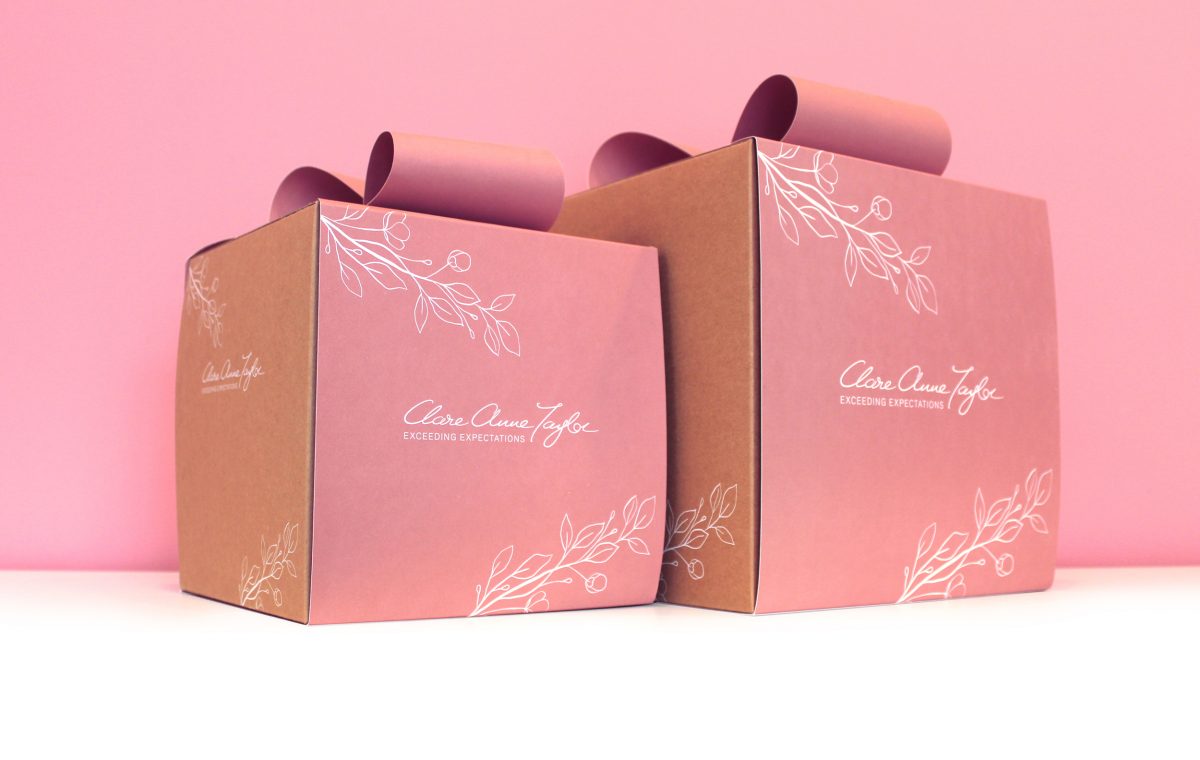
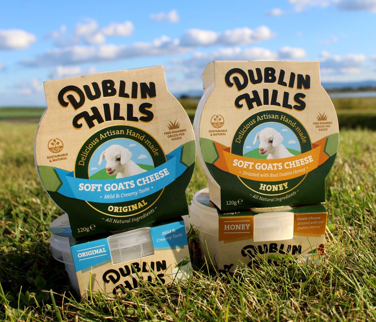
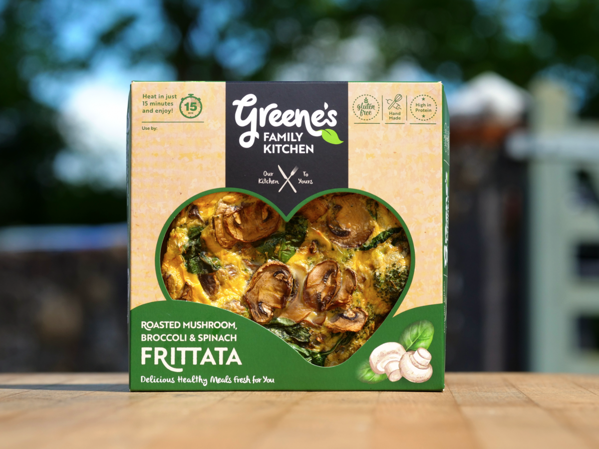
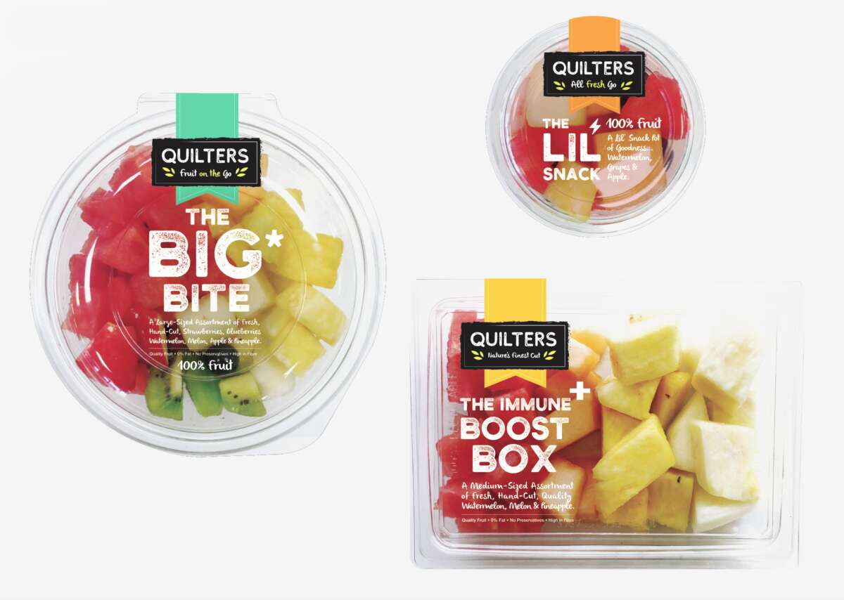
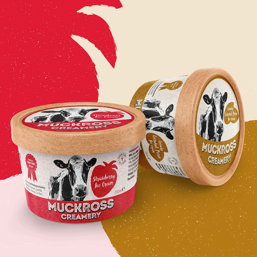
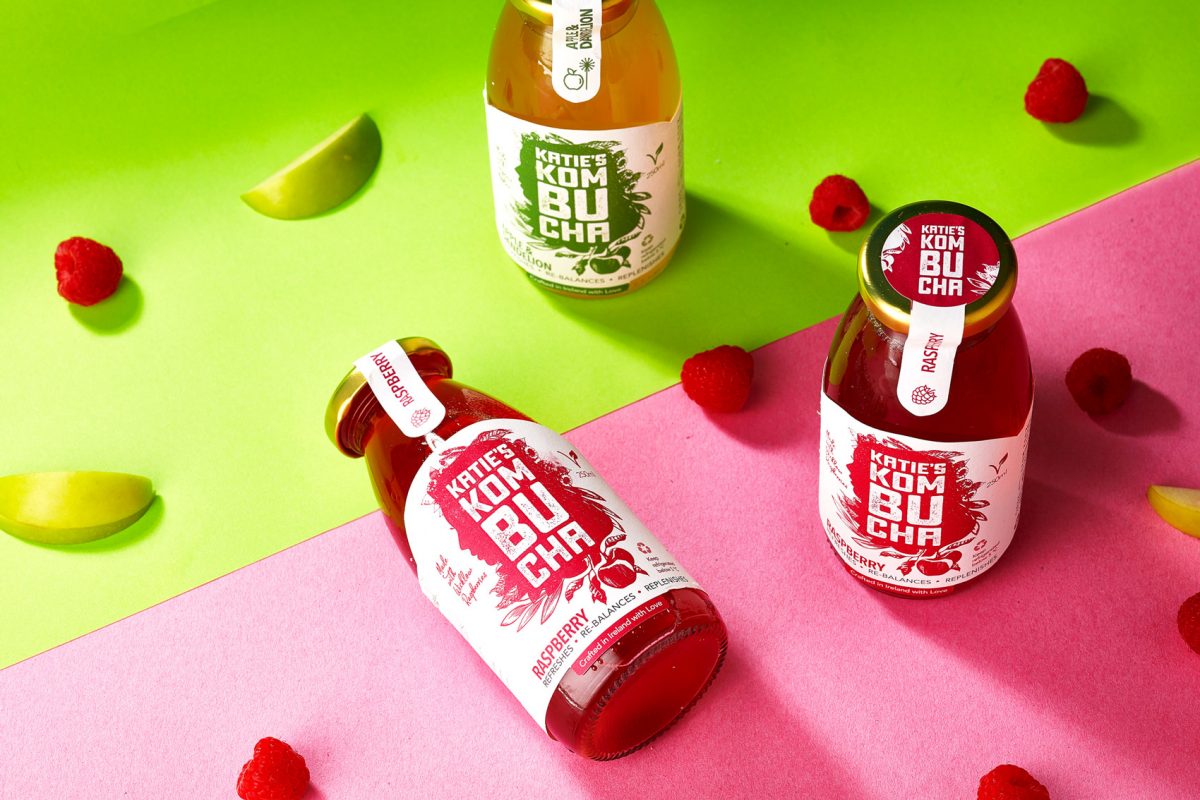
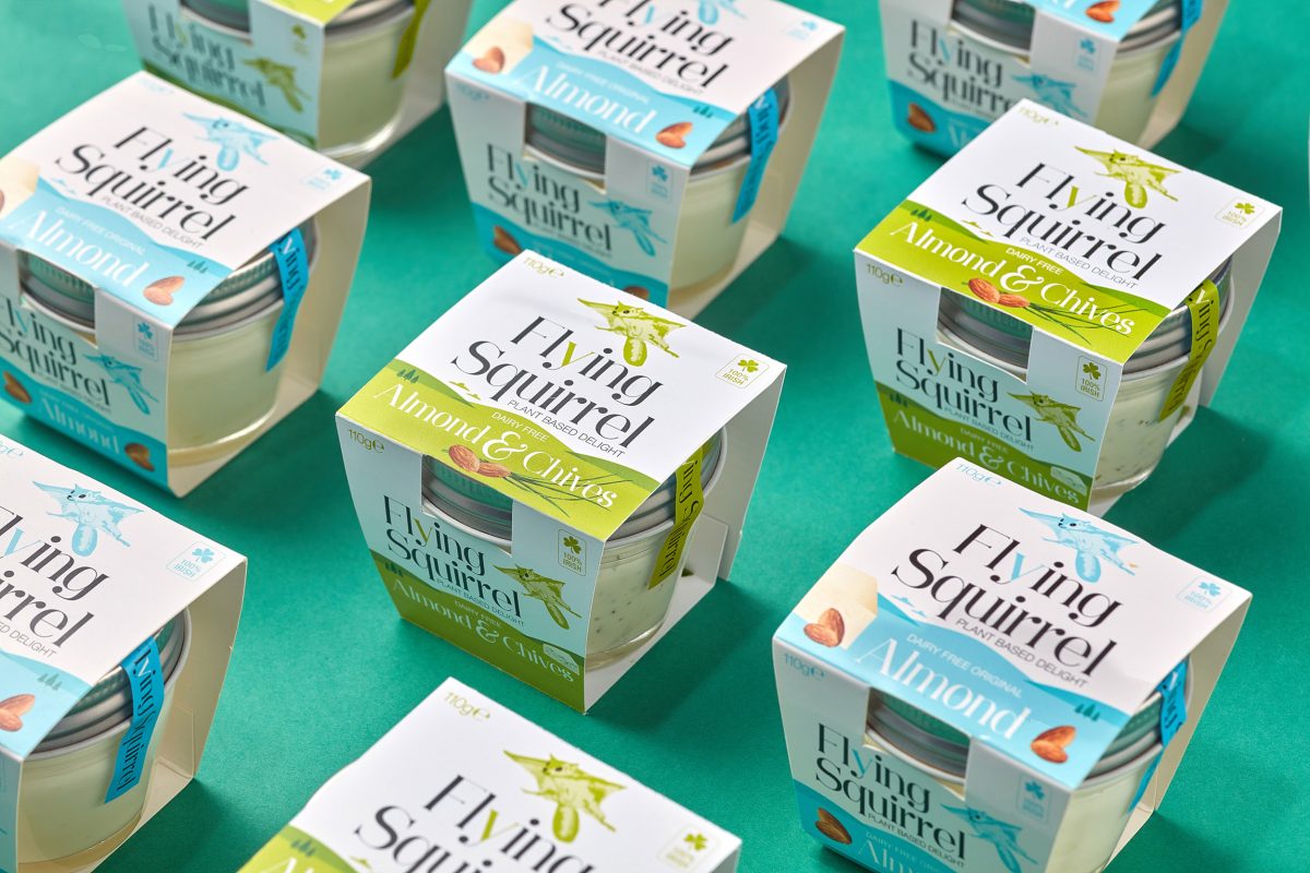