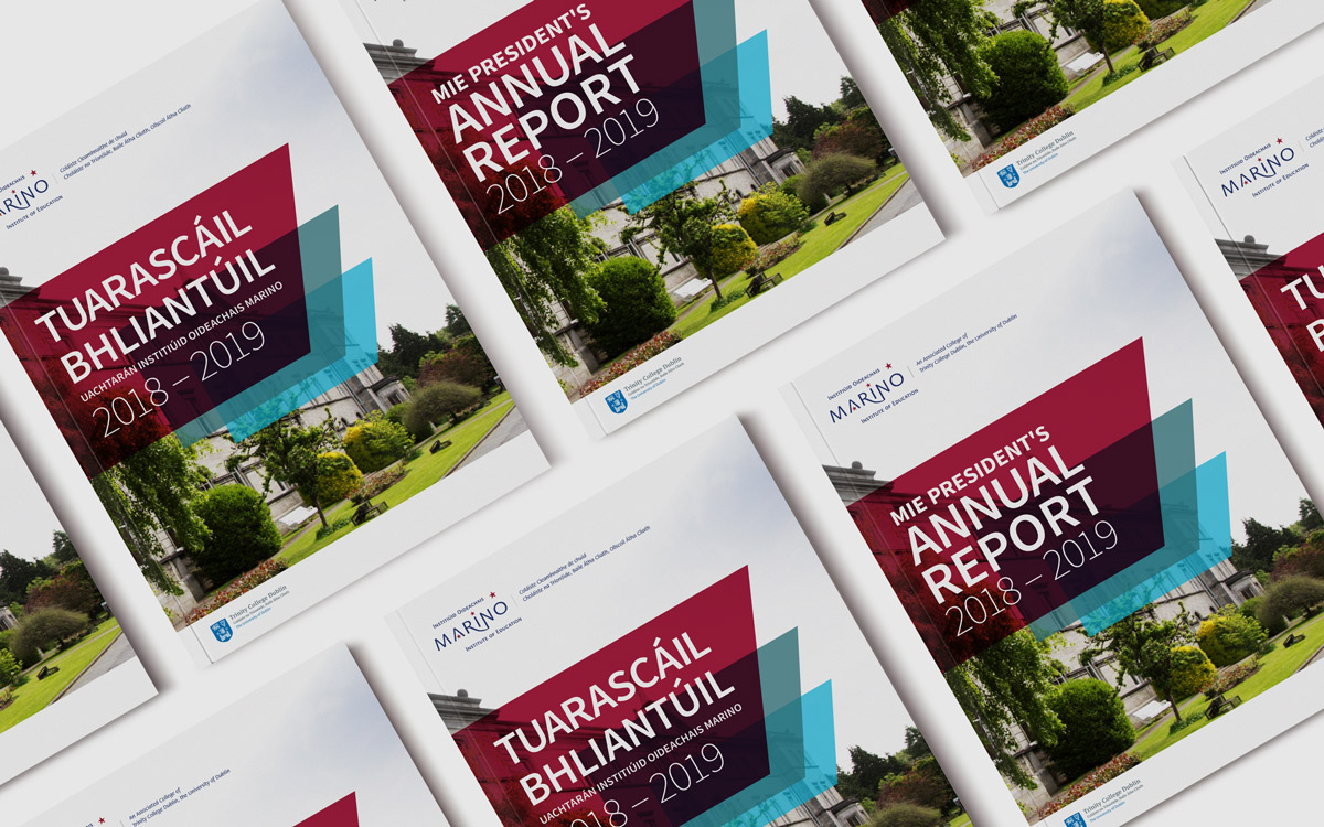
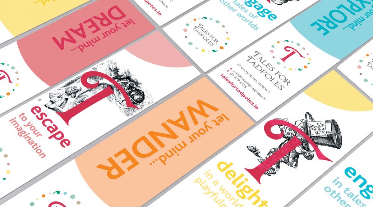
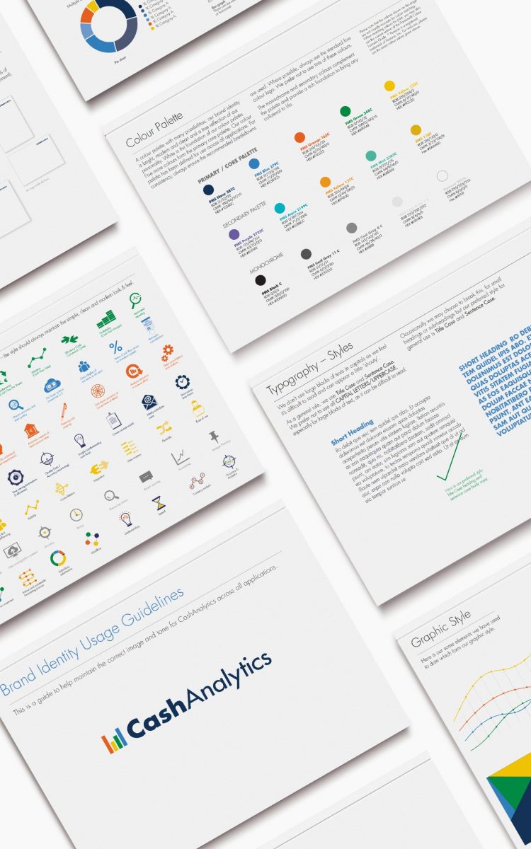
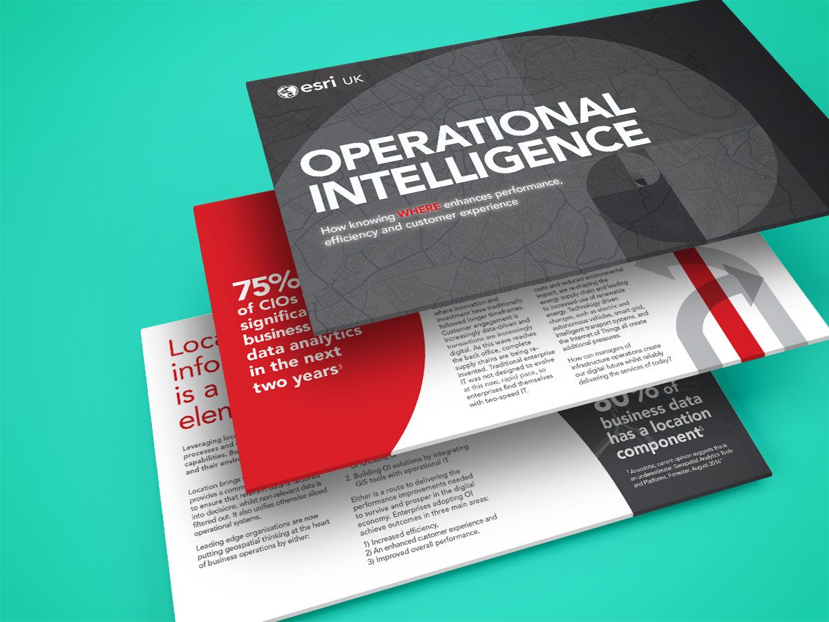
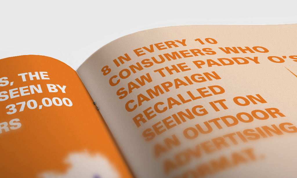
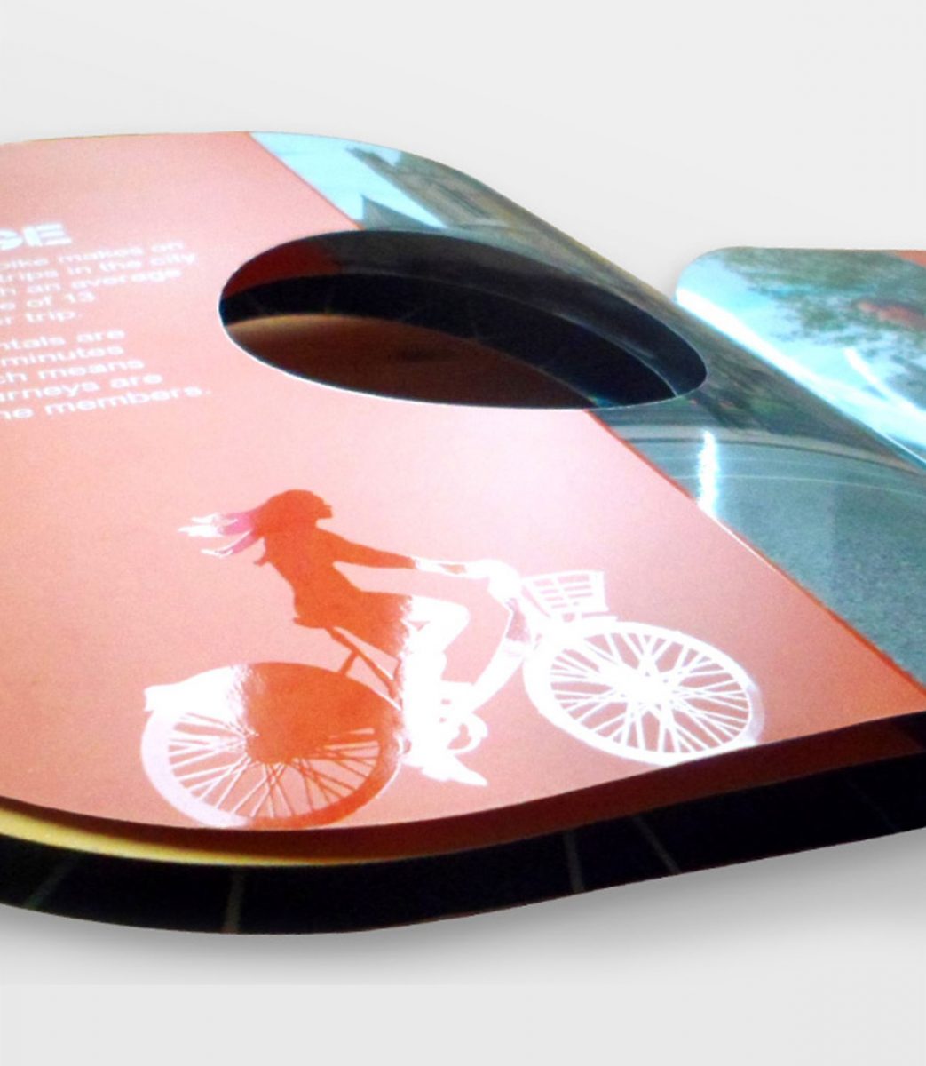
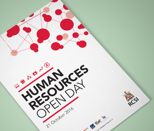
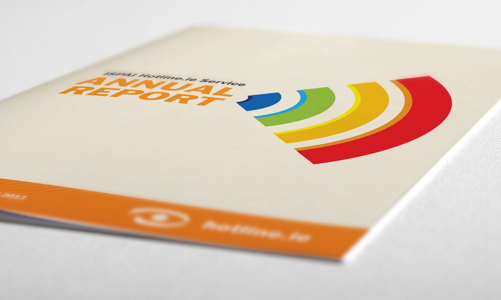
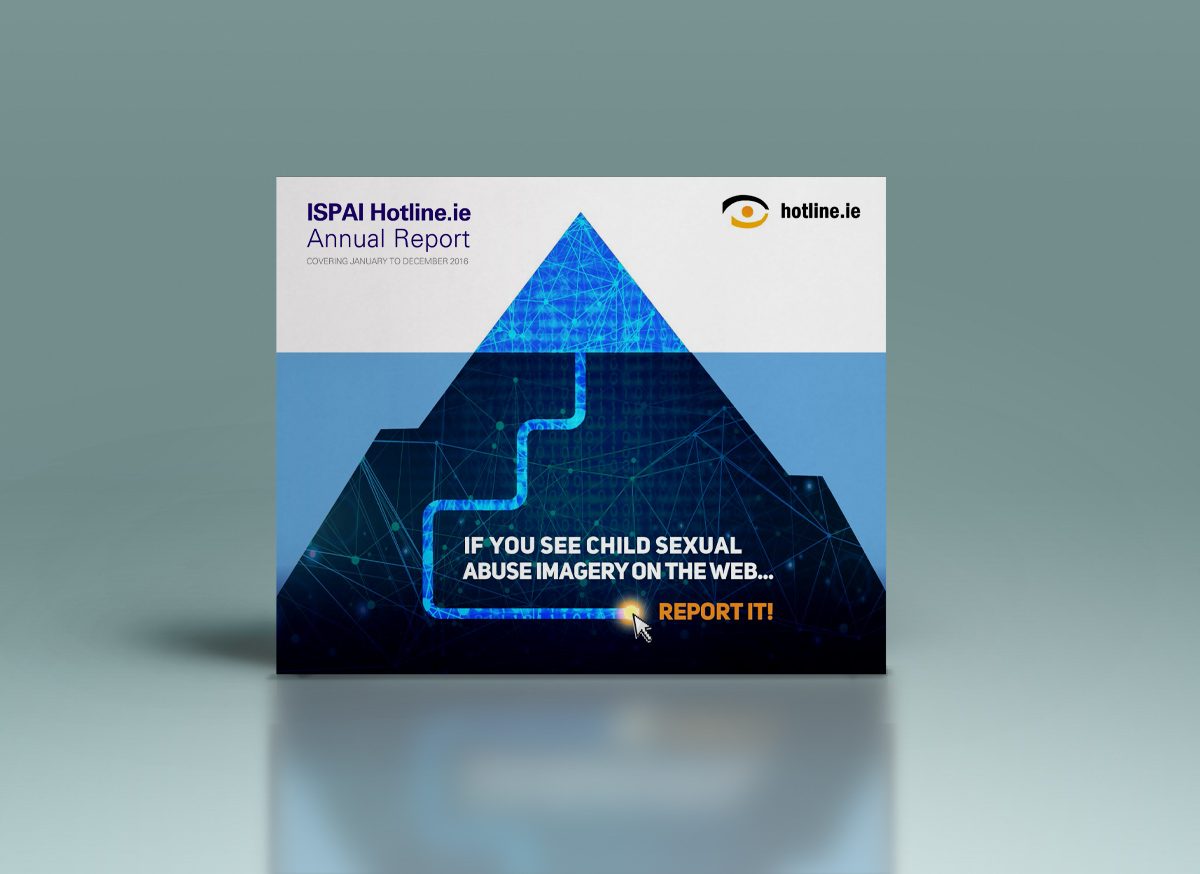
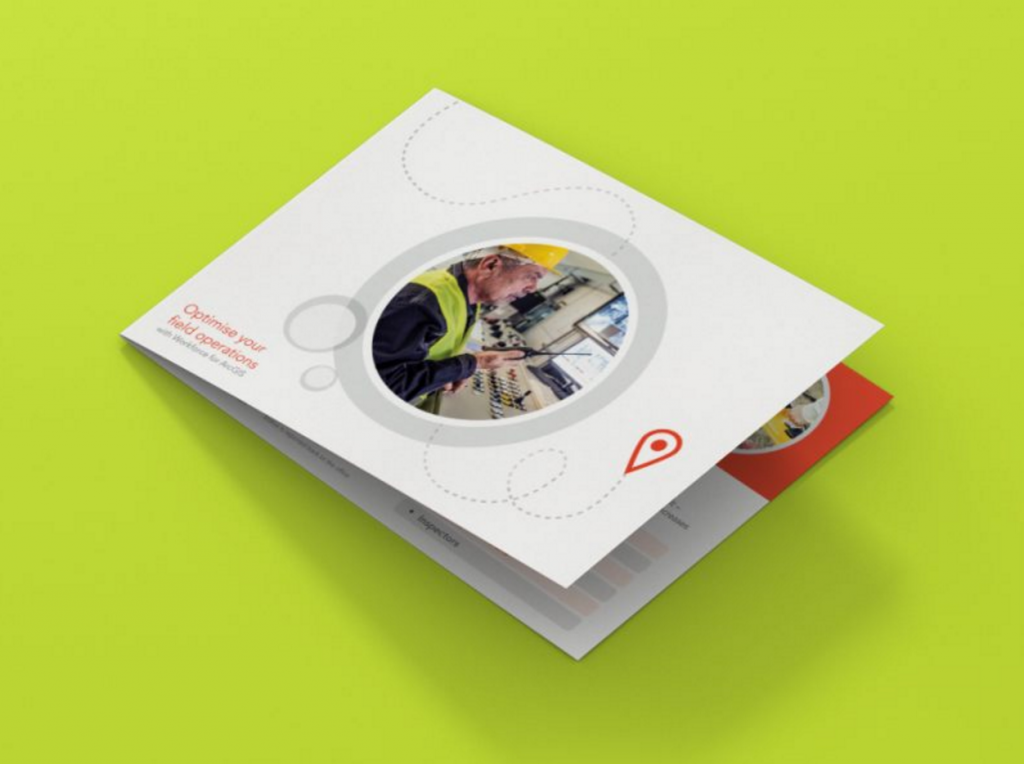
Marino Institute of Education Strategic Report

Marino Institute of Education Strategic Report

Marino Institute of Education Strategic Report 2021-26.

The report’s focus is on how ‘Education Transforms Lives’, and how enabling people from all backgrounds of life (for example, from disabilities to financial hardship) to further education, will empower them and give them greater opportunities in life.

We co-created the report in collaboration with Laura Macaulay at NavigatebyDesign. We used a gradient colour system throughout to indicate the transforming aspect of this report, with bright images of the students, lecturers and the lovely Marino grounds. The report is a complex piece of work, developed with MIE over an extended period of time.

We worked carefully in communicating a large amount of information in an easy-to-read digestible manner, maintaining the professional feel that an education body like Marino Institute would like to convey, in a clean and fresh style. It was also important to maintain the Marino brand colour palette and showcase the college grounds, societies, people and facilities. The report is flipped in half between an English and Irish language version of the report. The printing of this report is FSC Certified, supporting sustainability and the environment by using paper when printing that is FSC approved.

The launch event for this important body of work took place in the Nagle Rice hall on the beautiful grounds of Marino in North Dublin, hosted by TD and Minister for Further and Higher Education, Simon Harris. Everyone was very happy with the design of the finalised printed report and the success of the launch event.


Marino Institute Annual Report

Marino Institute Annual Report

Marino Institute of Education is an Irish College of Education, an associated college of Trinity College Dublin, focused on providing education courses. Established in 1905, the college became a recognised provider of teacher education in 1929, with a proud heritage as a provider of higher education for more than one hundred years. It’s degrees and diplomas are awarded by the University of Dublin, Trinity College.

Clare Lynch Creative was contracted by Marino Institute to create their 2018-2019 Annual Report. They required the style to be clean and modern, with a fresh new look. The institute is set in the grounds of Lord Charlemont’s Estate, on Griffith Avenue, and offers state of the art facilities in this unique setting and the client wanted the report to showcase images of the campus and the student life. They also required a version of the report in Irish (Gaeilge), with the overall report incorporating both versions, back to back.The result is fresh and visually engaging, showcasing the institute’s activity for the year in a clear, attractive and easy to read manner.

The client was easy to work with and really pleased with the final outcome.

Tales for Tadpoles Bookmark Range

Tales for Tadpoles Bookmark Range

Tales for Tadpoles Bookmarks Set

This set of bookmarks was designed for Tales for Tadpoles, a children’s bookstore on Drury Street in Dublin city centre. The bookstore features classic tales in picture books and related merchandise.

The brief was to design a set of bookmarks, to display at the counter in-store and to give as a takeaway for customers with their purchases, as a friendly and useful reminder of the store and to show appreciation for their business.

The monotone images used on the bookmarks are the much-loved characters from classic tales (available for public use as out-of-copyright). They have been intertwined with the ‘T’ from the Tales for Tadpoles logo to create strong brand association. Each bookmark features a unique tagline, linking to the joys of reading and the pleasure found in the world of books. The colour palette is soft pastels, in-line with the brand colours and to appeal to the target audience of children. They have been designed for customers to cherish as a keepsake and to encourage repeat business, as customers can collect a different bookmark with each purchase until they have acquired the full set.

The client loved the results and they have received positive feedback from their customers.


Inishbofin Guide Book

Inishbofin Guide Book

Inishbofin Guide

This is a guide to Inishbofin, a small island off the coast of Ireland. Inishbofin has a population of 180 people and relies heavily on tourism. This project explored a way of attracting more tourists to the island. The concept behind it is to create a series of landmarks around the island, which honour Inishbofin’s history and culture. As Inishbofin is an eco-friendly island, they seek to achieve sustainable tourism that does not negatively impact upon the island’s natural environment, while at the same time benefits and supports the local community. Therefore, the concept was each sculpture would be created with eco-friendly, sustainable materials such as wood, bog oak, stone and earthy materials which would be in harmony with the local landscape and for each one to be clever and creatively designed. Some of the landmarks/highlights I thought of were the famous Grace O’Malley, the Cleggan Disaster, the island’s Flora & Fauna wildlife, the Patron Saint of Bofin, Cromwell’s Barracks, the White Cow (the island’s name) and Cockles & Mussels. I explored different ways in which these sculptures would be created. The idea being that visitors can interact with the sculptures and will want to find each one, to take photographs with them and tick them off their list of cultural things to see on the island. Beside each sculpture would be a small plaque which also naturally blends in with the local environment, which tells the story behind the sculpture.

Taking visual cues from the Camino de Santiago, where there is the a subtle shell with an arrow showing the direction to walk, I designed an icon which would work in the same way for Inishbofin’s sculptures. It is a simple boat shape, where the sail is an arrow – the direction of the arrow indicates which way to walk to each attraction. These would be set subtly in stone around the island, to ensure not to impact the island’s beautiful and natural landscape.

The main piece was an A5, side-stitched booklet with a fold-out A3 map showing the location of each sculpture around the island in the centre-fold. It was riso-printed using a rigorous 7-colour process, with some lovely ‘happy accidents’ of colour offsets in the finished booklet. The cover was then debossed with the shape of the map. Each page uses modern typography and layouts. On researching the island, many people said how Inishbofin was a place that people come to get lost and find themselves in, enjoying the slower pace of life and the fresh sea air and nature. The expression ‘There’s plenty of time on the island’ is a commonly used expression. This inspired the name for this booklet, with the play of words ‘A Guide to Getting Lost’. I created an icon for each sculpture, which visitors can easily find on the map, and used some expressions throughout which represent the essence of life on Bofin.

At this stage of the project, I created a 3D wooden stylised map of the island, with laser etchings of the icons, and also created 3D-printed icons to represent each sculpture (although not aimed to be the finished sculpture design). For the numbers on the map, I tailored an old Irish Celtic font to create individual, unique numbers which still embody the Celtic feel, but with a modern twist. I then laser printed these personally-designed numbers on to wood, to have as physical items to display as part of the overall proposed exhibition display. The use of wood for the display stand added to the sustainability, eco-friendly culture with which Inishbofin is proud of.

CashAnalytics Re-Brand

CashAnalytics Re-Brand & Brand Guidelines

divider-line2


CashAnalytics Re-brand, Brand Guidelines & Marketing Collateral

CashAnalytics build software that solves problems using the latest cloud and web based technologies, that help large companies manage their day-to-day treasury, risk and compliance challenges in an efficient and controlled manner. They work with a broad spectrum of organisations ranging from mid-tier private equity backed companies to stock market listed multinational enterprises. They are experts in corporate cash and treasury management, compliance, software development, customer service and project management.

They liked their existing logo to some extent, but wanted a more modernised look and feel, to ensure their logo was contemporary and communicated how the services they offer use the latest software technology to create results in a fast time-frame compared to their competitors. To create this, the bars from the treasury building in the original logo were used to stand alone as a strong analytics symbol, along with the cleaner, modernised Futura typeface. This created a new, modern CashAnalytics logo, which still easily links to be an evolution of their previous logo. There is a secondary version of their logo, which includes their strapline ‘Cash and Liquidity Forecasting’, for more specific uses.

The brand was then further developed across stationery, infographics, web graphics, eNewsletters, eBooks, brochures, exhibition graphics and brand guidelines, to roll out the re-brand in a consistent manner across all CashAnalytics collateral. The client was very happy with the new streamlined result across all their points of contact with clients.

BK Coaching Brand Booklet

Brid Kehoe Coaching Brand Booklet


<img


BK Coaching Brand Book & Marketing Collateral

Brid Kehoe Coaching are a holistic coaching practise who support clients in taking steps forward to change for the better and help them to uncover new routes to get there. They guide clients to improve wellbeing and focus, change career and much more through support, encouragement and introducing new creative strategies.

The arrow in this identity lockup represents how Brid Kehoe Coaching focus clients in an upwards direction in their life; the subtle smile and bright colours communicate the positivity and fresh outlook that they bring to all their clients.

This booklet was designed to communicate BK Coaching’s brand mission and values of their aim to improve their client’s lives by helping them to choose a direction which leads them towards their goals and to find happiness in their lives. Brid Kehoe Coaching work on one-on-one coaching sessions with individual clients and also work with groups, both in the work environment and in youth work, empowering people to grow and become the best and happiest version of themselves. This booklet evokes and carries across the same feelings of joy, passion and enthusiasm for life that the BK Coaching brand represent.

See also Brid Kehoe Coaching Brand and BK Coaching Client Toolkit is to follow soon.

*This work received a graphic design award in the International Design Awards with an Honorable Mention.

Esri UK – Design of Educational & Promotional eBooks

Esri UK – eBooks Design


01: Making the Connection

IPAD1xx

ipad7c

ipad7


02: Geospatial Intelligence


ipad5

ipad6


03: The Internet of Things


laptop2
laptop1
laptop4


04: Operational Intelligence


Esri UK ‘Bring Meaning to Maps’. Their technology combines maps with data so that you can see the world in a smarter way. They do this using powerful mapping software ‘ArcGIS’. ArcGIS connects people with maps, data, and apps through geographic information systems (GIS). It is a location platform that’s accessible to anyone, anywhere in the world at any time. Esri’s software is used by leading brands, government, defence, utilities and tech start-ups throughout the world.

Esri UK came to Clare Lynch Creative seeking to create a range ebooks to easily explain what they do and what they have to offer to both their existing and potential customers. These ebooks provide information about how their software works, along with up-to-date industry information and relevant key case studies. This content is displayed throughout the ebooks in an easy to follow visual style – using infographics, large imagery, block quotes and icons.

eBooks and online content are becoming more and more popular today, as it’s so easily accessible to everyone and also can be more cost-effective to businesses as opposed to printing and postage costs, so it’s great to work on such relevant digital projects with Esri UK. You can find out more about them here.

The ebooks have been highly commended to date, the client’s comments on the latest ebook were:

“Thanks – it looks great to me. It’s emerged as an excellent high quality piece of content that will prove very valuable.” – with the copyrighter we collaborated with adding: “The end result looks superb, I am very pleased with it and I think Esri are too.”

Fame Campaign Case Study Brochure

Fame Campaign Case Study
Brochure


The Fame Campaign was a competition run by Bravo to encourage small Irish businesses to compete to win €150,000 of outdoor advertising resulting in brand exposure and recognition – also known as the ‘Make Me Famous’ competition. The winner was Paddy O’s Granola.

The campaign helped to catapult his brand in to the public eye, with sales being quadrupled from 8% to 35%. This brochure was created to highlight the success of the campaign, using detailed research from the Irish market research company Figureheads.

The Fame case study’s two main goals were to show the success of the campaign and how well outdoor works as an advertising medium. Therefore it was to be used as a sales tool.

Taking this into consideration, I decided to make the book feature large images strongly – really highlighting the strong visual impact of an outdoor advertising campaign. I also made the market research statements large and prominent, using the range of the Bravo colour palette and simple graphics to re-enforce the message on each page.

The result was a strong and effective, visually appealing brochure, which clearly delivers the message of the success of the campaign using strong imagery and typography, simple icons and then beautifully printed & saddle-stitched on to an earthy, uncoated stock to give a matte finish, tying in with the winner’s wholesome identity and also the Fame Campaign theme of building up small Irish businesses through the natural medium of outdoor advertising.


**The case study was short-listed in The Media Awards 2013 and came second place, with the feedback within the industry highly commending the innovation of the overall campaign concept, the implementation of the winning advertising campaign and this solid piece of research displayed to a high quality standard in the overall case study brochure as above.


*Completed whilst working for Bravo Outdoor Advertising

dublinbikes Promotional Brochure

dublinbikes Brochure


dublinbikes were celebrating their fifth birthday and are constantly looking for new ways to grow to expand their success. To mark their 5th birthday, they saw an opportunity on the mud-guards of the bikes where they could partner with a sponsor / partner to feature their brand on them, which would be an excellent advertising opportunity for a potential sponsor, as dublinbikes have become a strong presence in and around central Dublin.

They decided they need a brochure to use as a sales aid / point of reference to companies and agencies that they were aiming to approach. The brochure needed to hold a USB stick featuring the presentation with further information on the package which was on offer. This brochure needed to look different and be visually appealing to display how unique this advertising opportunity with dublinbikes could be.

As an important factor of this brief was to stand out as unique from a standard brochure, the shape was an important factor in achieving this. To highlight further attention to what dublinbikes were offering, the bike’s shape and materials were key in creating this piece. The brochure features rounded corners, drawing similarities with the round shape of the wheels of the bikes, whilst still leaving the actual brochure shape area large enough to feature the text and images that needed to be included.

The aim was to draw attention to both the mudguard and the presentation, therefore the die-cut out centre circle really draws the eye in to mud-guard shaped USB containing the presentation. The front and back cover design feature spokes which again connect with the theme of the bike and also draw the eye further in to the centre of the piece, highlighting the unique selling point of the branded mudguard-shaped USB displayed within. Throughout the brochure, landmarks of Dublin are depicted on each spread, with illustrations of various commuters on bikes highlighted in Spot UV throughout to enhance their attraction to the target audience, while keeping other areas with a clean matte finish.

The cover is made up of a metallic mirror board which has a number of benefits including connecting with the metallic spokes of the bikes, being highly appealing and different visually and being of strong enough support to hold the USB key, which is held in place on the back cover with a small glue dot. The font chosen for the headlines connects with the typography used on cycle tracks around Dublin.

The result is a bright, fun brochure and strong sales tool which succeeded in easily attracting the attention of the potential target audience and gaining a sponsor – Coke Zero who are now a proud feature of dublinbikes.


*Completed whilst working for JC Decaux

Royal College of Surgeons Promotional

Royal College of Surgeons
Promotional & Marketing Collateral

RCSI_CLC_Booklet_Closeup_view
RCSI_CLC_Booklet_1
RCSI_CLC_Booklet_2
RCSI_CLC_Booklet_3
RCSI_CLC_Booklet_4
RCSI_CLC_Booklet_6
RCSI_CLC_Booklet_7
RCSI_CLC_Booklet_10
RCSI_CLC_Booklet_11
RCSI_CLC_Booklet_13
RCSI_Flyer_03-web
RCSI_Flyer_08-web
RCSI_Flyer_10-web

The Royal College of Surgeons in Ireland are responsible for setting the highest standards in surgical care and training in Ireland and are an internationally recognised medical school with over a 200 year heritage.

Clare Lynch Creative works regularly with RCSI on a range of material to help streamline the look and feel of their brand collateral to ensure consistency across the visual assets and communicate each brief in a clear, contemporary and unique manner.

This collateral ranges from promotional and advertising material, invites, calendars, programmes, annual reports to an array of miscellaneous internal design collateral. They are a pleasure to work with.

Displayed here are two recent pieces designed for RCSI, a Human Resources booklet for their 2016 Open Day and an information factsheet, featuring infographs to visually communicate the roles of their specialists.

Hotline.ie Annual Report

ISPAI Hotline.ie Annual Report


The brief was to design a mini-annual report for Hotline.ie publishing results for the year of 2013, with a greater focus on infographics to achieve a strong immediate impact. The client’s aim was for it to be more visually-appealing than their previous annual reports which were quite text-heavy and to make it easy to read and understand. It was designed along with a suite of other supporting collateral for their launch event including an invite and flyer.

As Hotline.ie rely on reports made about illegal content to them online, the cover symbol represents both the recognised WiFi internet signal icon and a loudspeaker for the awareness alerted through reports. The colour scheme is primary representing the innocence of the children needing protection. The clients were very satisfied with the results and said it helped them get their message across well on the day of the launch event. See Hotline’s feedback here.

Promotional Campaign: SICDA Task Force

SICDA Task Force Promotional Campaign

SICDTF_booklet_visual_1C
sicdtf_leaflet_1
sicdtf_leaflet_1
sicdtf_leaflet_1
sicdtf_leaflet_1
sicdtf_leaflet_1
SICDTF_booklet_visual_2
SICDTF_A5_Leaflets-1
SICDTF_A5_Leaflets-2

SICDTF_A3-Slainte_Poster-1.jpg

SICDTF_Indoor-Advertising-slainte
SICDTF_Outdoor-Advertising-slainte

SICDTF_A3-Slainte_Poster-2.jpg

South Inner City Drugs & Alcohol Task Force is an initiative funded by the Drugs Programmes Unit set up to tackle the harm caused to individuals and society by the misuse of drugs.

They approached Clare Lynch Creative to create promotional material for a campaign to help raise awareness about the effects of alcohol and how people can be more conscientious with their relationship with alcohol. They wanted to show this in a bright and light-hearted way, to attract the attention of the regular social drinker easily, as well as more heavy drinkers, and to get their message across that alcohol can be enjoyed in moderation and in less of a binge-drinking way than many people would treat it and to suggest alternative choices when it comes to socialising and lifestyle.

Another main focus of this campaign was to highlight the social event they are hosting – Sláinte – an event created to celebrate new ways to socialise with less alcohol, which features an afternoon of music, talks, food and markets.

For the event poster, an exclamation mark symbol was used as a graphic element as an aim to stop people in their tracks and grab their attention, both towards the event and also towards having a think about their relationship with alcohol. It also represents the excitement of Sláinte, as it’s filled with lots of interesting elements such as talks, music, special guests, food stalls and markets.

The booklet is designed to be bright and fun, using Dublin slang along with monochrome illustrations to reach the target audience. It displays facts and a drinks tracker to help make the reader more aware in an easy-to-read way. Both pieces use the South Inner City Drugs & Alcohol Task Force brand colour scheme.

It’s enjoyable to work on projects like this where the aim is to better people and educate them to bring more positive change to our great city.

ISPAI Annual Report 2016

ISPAI Hotline.ie Annual Report 2016

ISPAI Hotline.ie Annual Report & Twitter Cards 2016

ISPAI Annual Report highlighting the successful work completed by Hotline.ie in 2016.


Esri Ireland Direct Mail Campaign

Esri Ireland Direct Mail Campaign

Esri_DM_Flyer_1
Esri_DM_Flyer_2
Esri_DM_Flyer_3b
Esri_DM_Flyer_4
Esri_DM_Flyer_5b
Esri_DM_Flyer_6

Esri Ireland are a software and services organisation specialising in the application of geographic information systems or “GIS”. GIS is based on the simple principle of attaching a location to every piece of data. They help customers record where things happen and analyse why, to give business insight on which to make better decisions. Clare Lynch Creative has worked with their Irish and UK offices on many projects over the past year, including online marketing & advertising campaigns, ebooks, printed mailers and infographics.

These two promotional pieces, a DM and an A5 info-booklet provide information on one of their popular software packages ‘Workforce for ArcGIS’ which helps field workers optimise how they work – tracking and scheduling jobs easily, creating a much easier information-capturing system for these companies. Location-based data and tracking play a big role in influencing the design when working with Esri. The client was pleased with the overall result;

“It looks great, thanks a million, delighted with how it all turned out. Nice work!”

See past projects in the archive section…