Fingal Food Circle: Brand Identity Design
Fingal Food Circle: Brand Identity Design
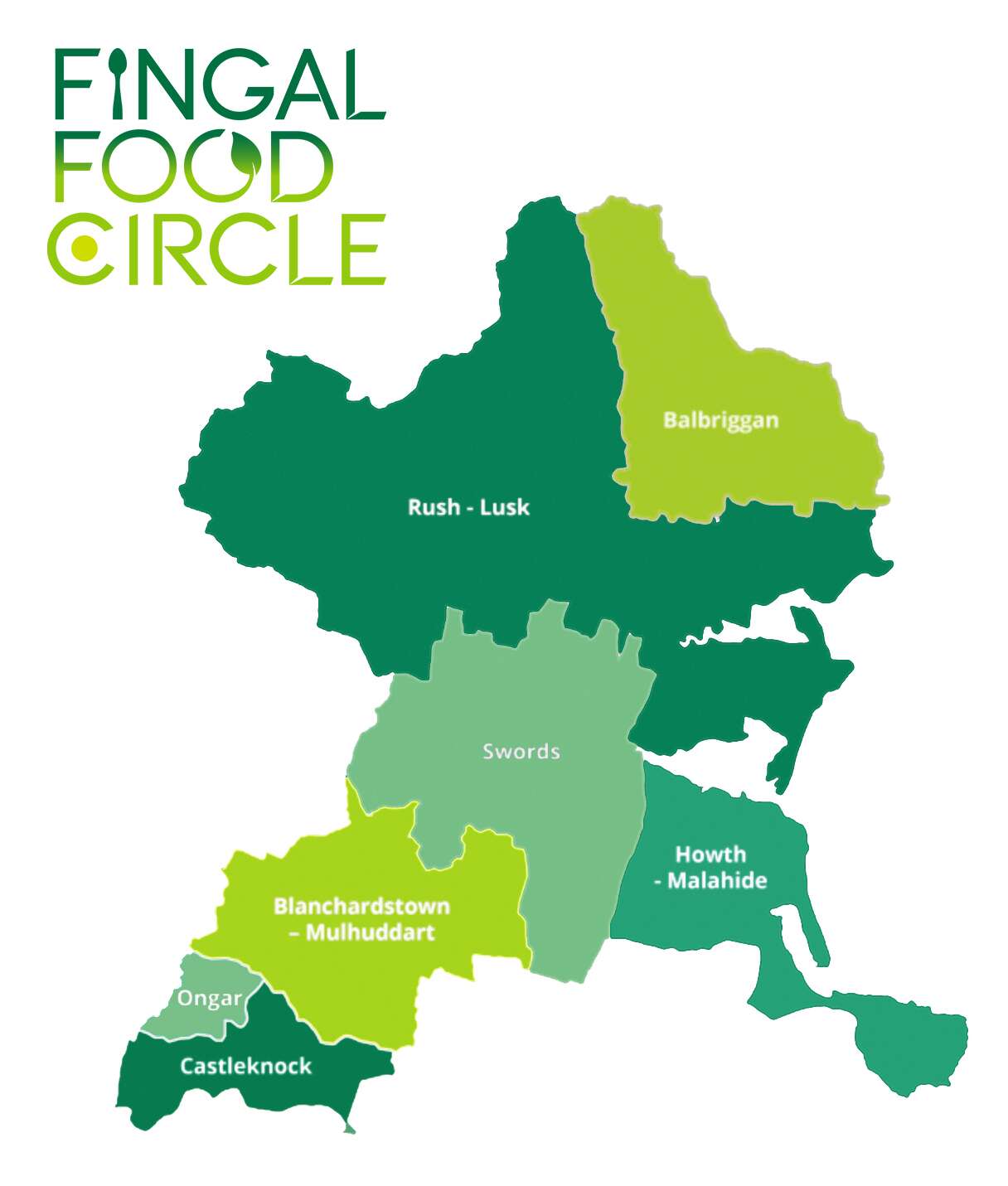
I recently created a new brand identity for Fingal Food Circle, a food and drink network based in North County Dublin. This initiative brings together local producers, restaurants, cafes, culinary experiences, and food tourism operators, all under one umbrella. The goal was to develop a strong and distinctive brand that celebrates local provenance, encourages collaboration, and supports the wider food and drink community in the Fingal region.
Before this project, Fingal Food Circle had no existing brand or visual identity. They needed a design that would establish them as a clear and confident voice for the industry – something that could work across everything from events and training to tourism promotion and media engagement. It also had to reflect the diversity of its members, while remaining flexible enough to grow with the network over time.
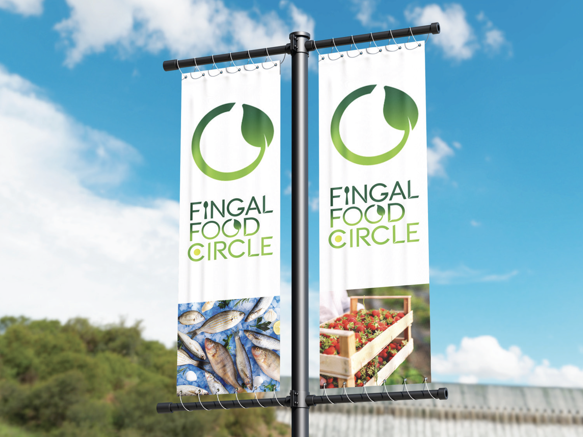
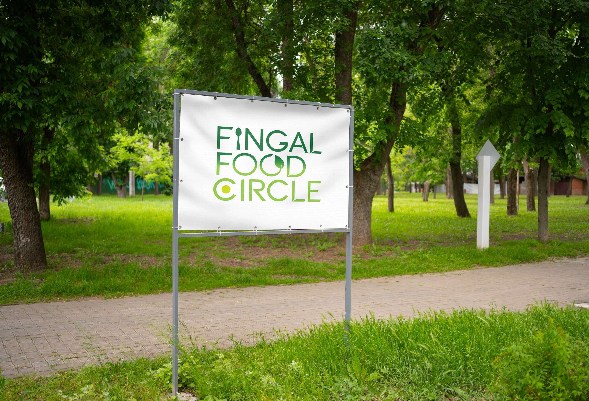
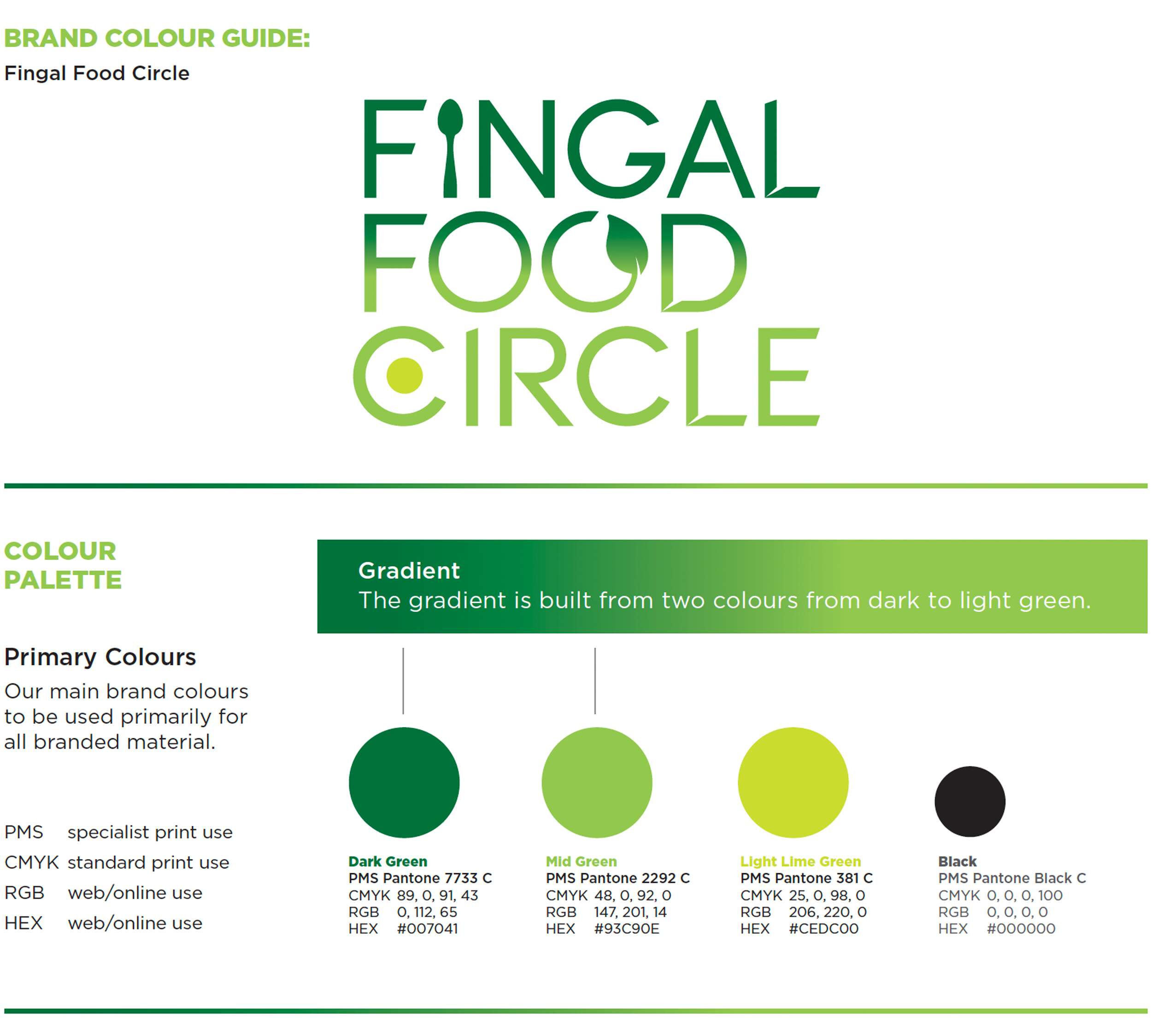
The chosen design direction focused on a custom typographic logo that feels open, welcoming, and grounded in food culture. A spoon subtly replaces the ‘I’ in ‘Fingal’ to represent the culinary aspect of the network. The circular form of the ‘C’ includes a green circular dot to reference the landscape and community and link with the brand’s name, while the open ‘O’ features a small leaf – symbolising fresh produce and the concept of growth and inclusion. The overall design is clean, modern, and tailored, while still feeling warm and approachable.

This new brand identity helps Fingal Food Circle communicate who they are at a glance: a grassroots but professional collective that promotes local food, fosters connection, and invites people to experience everything the region has to offer. The identity is launching publicly at the Flavours of Fingal Festival, marking the beginning of a stronger, more visible presence for the network in the local food and drink scene.
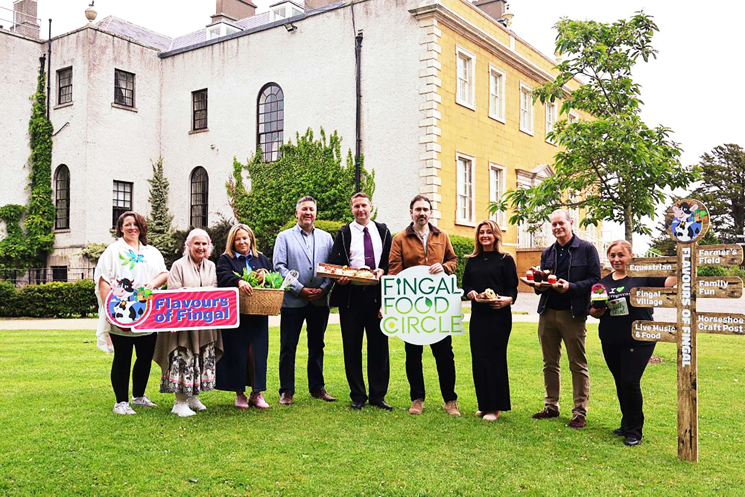
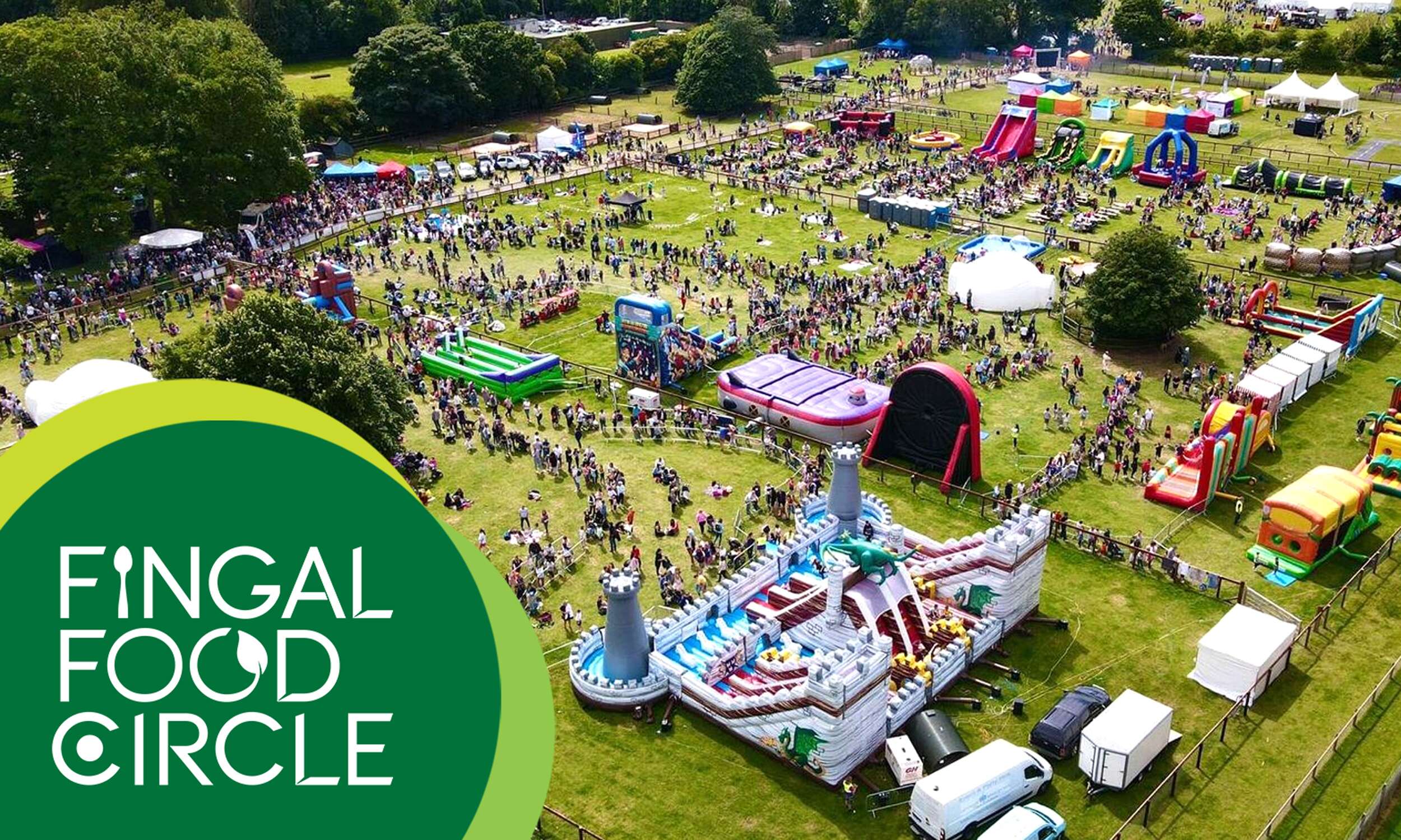
Flavours of Fingal, a vibrant two-day festival at Newbridge House and Farm that celebrates the region’s rich food culture, local producers, and community spirit, bringing over 65,000 visitors together for a truly unforgettable experience. The Fingal Food Circle is looking forward to making its debut there this year.
Follow Fingal Food Circle online:
Instagram: @fingalfoodcircle
Facebook: @fingalfoodcircle
Website: www.fingalfoodcircle.ie
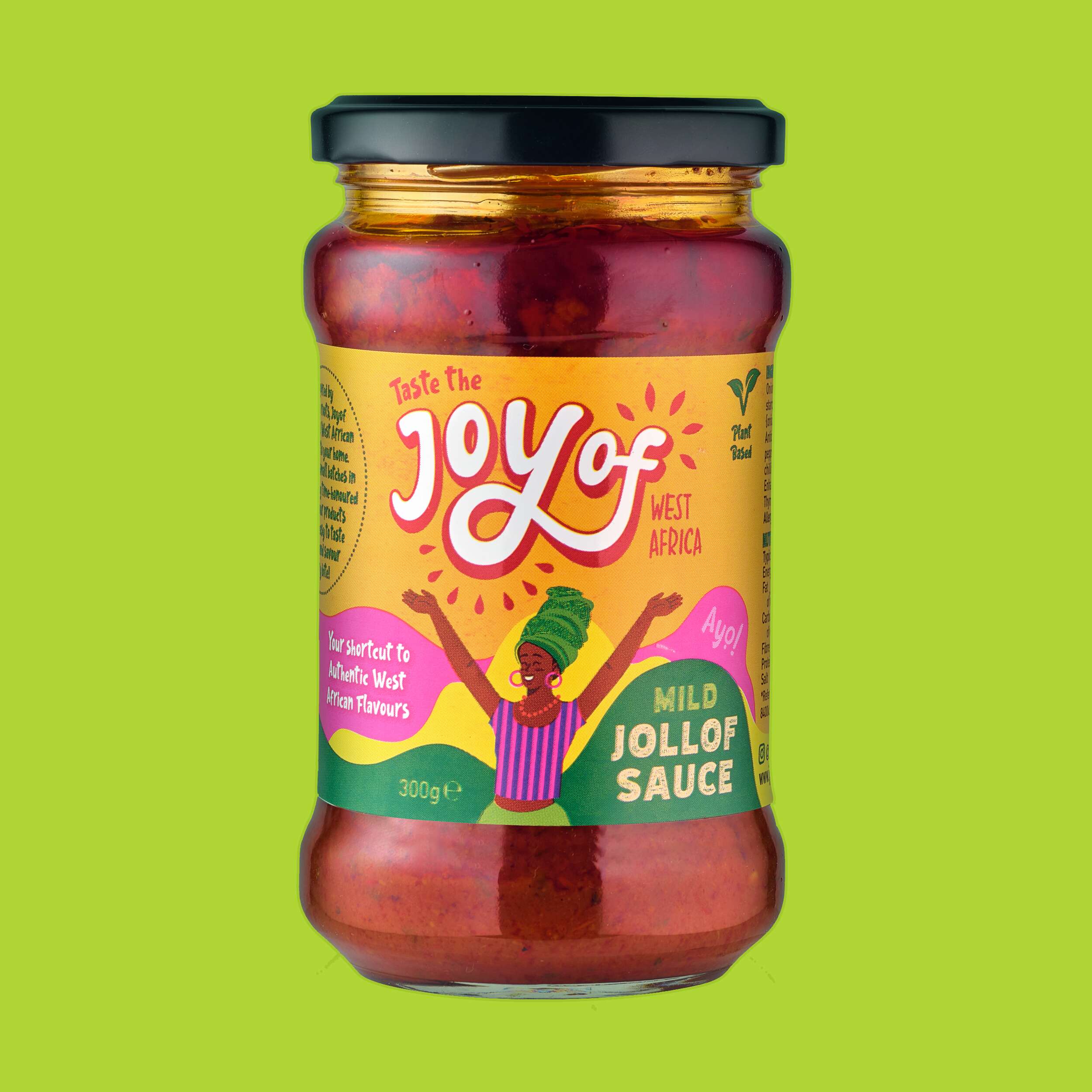
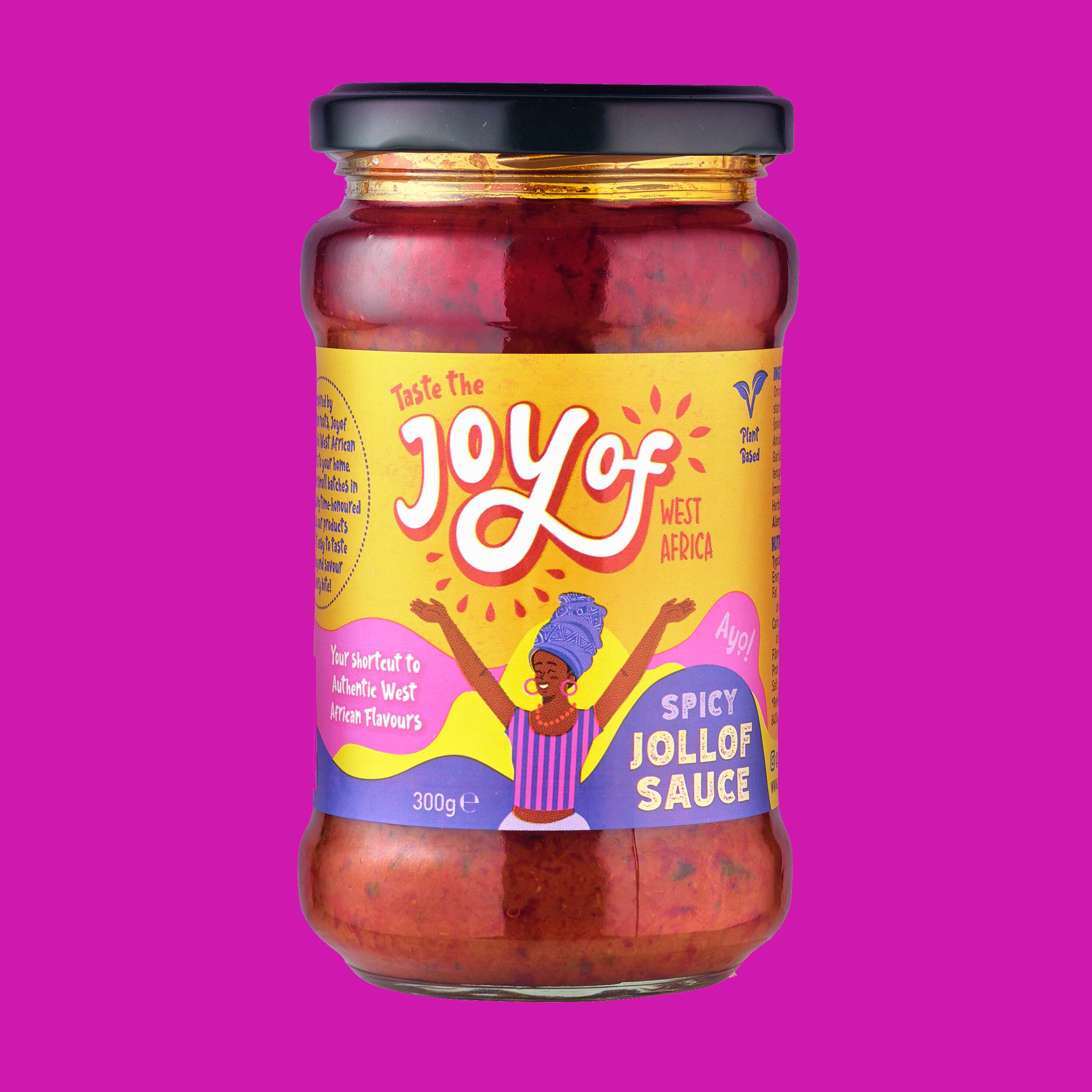
Joyof Foods: Brand Packaging Design
Joyof Foods: Brand Packaging Design
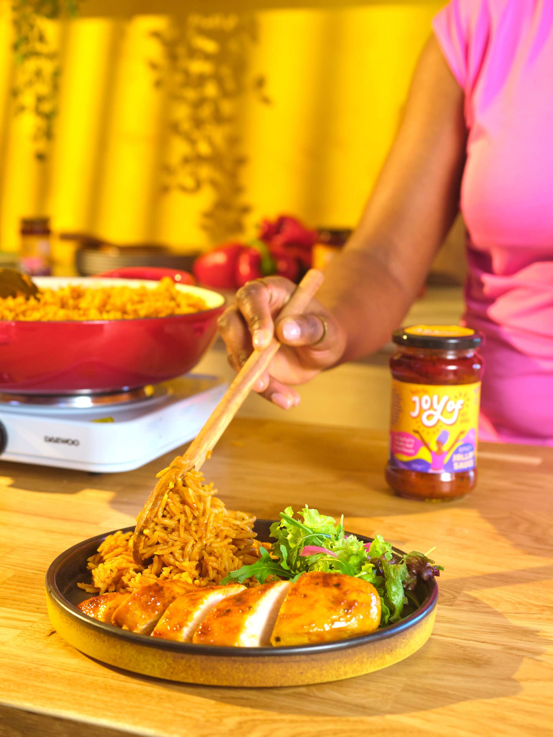
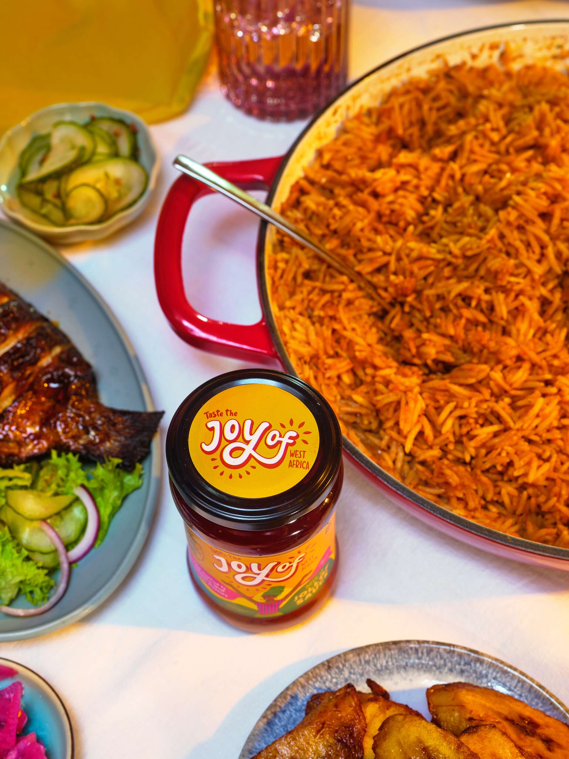
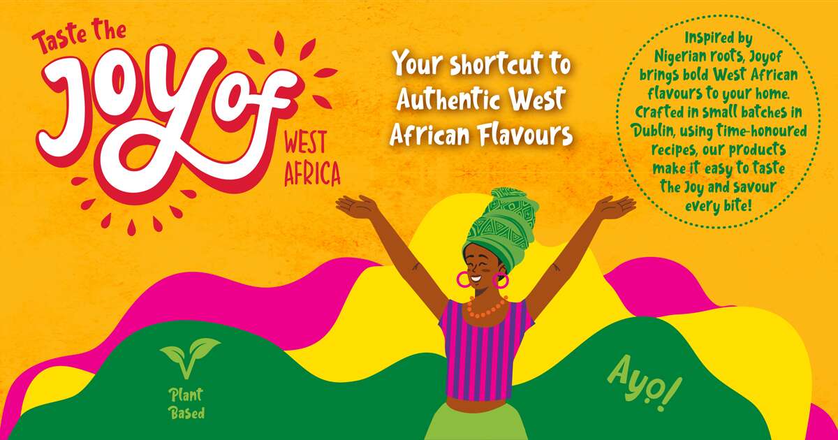
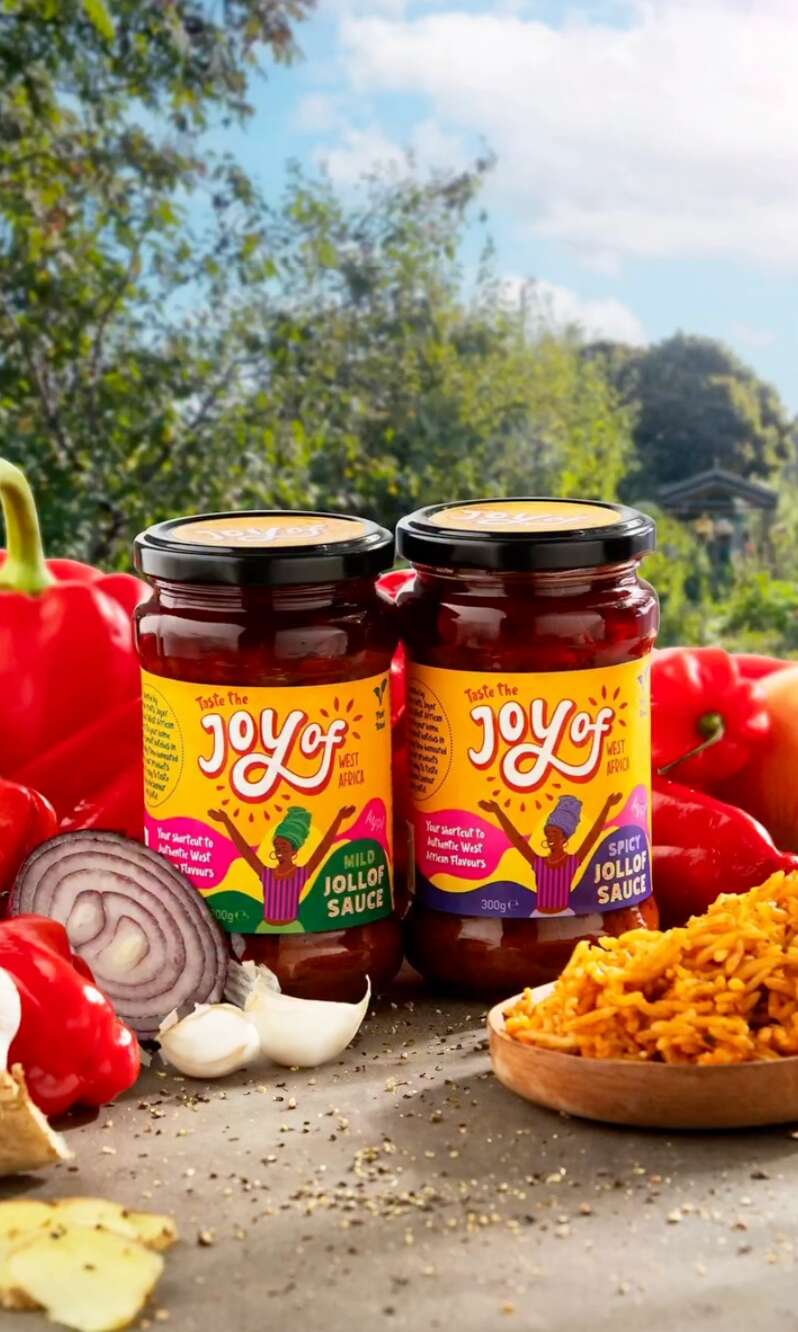
West African Food Range

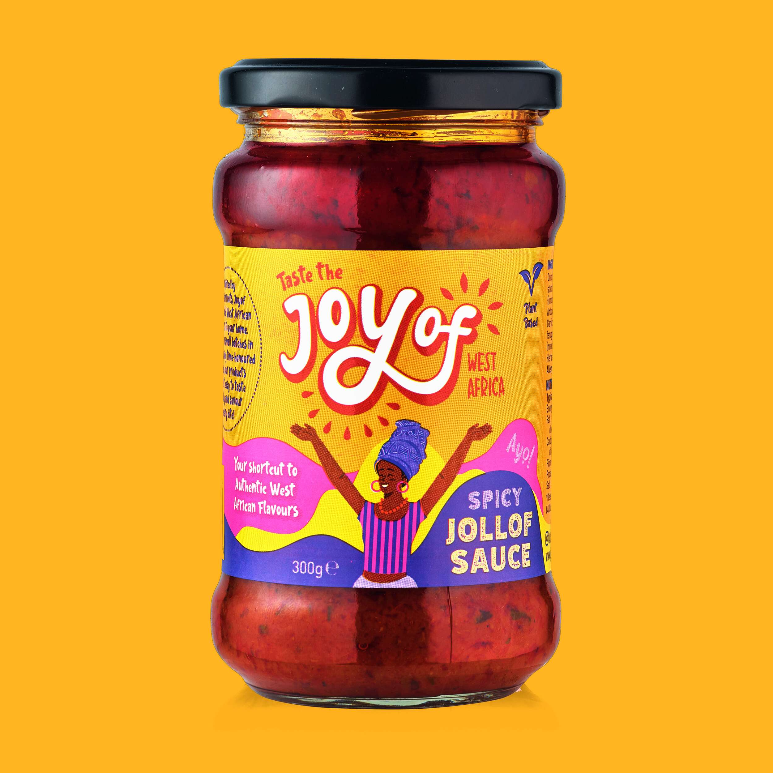
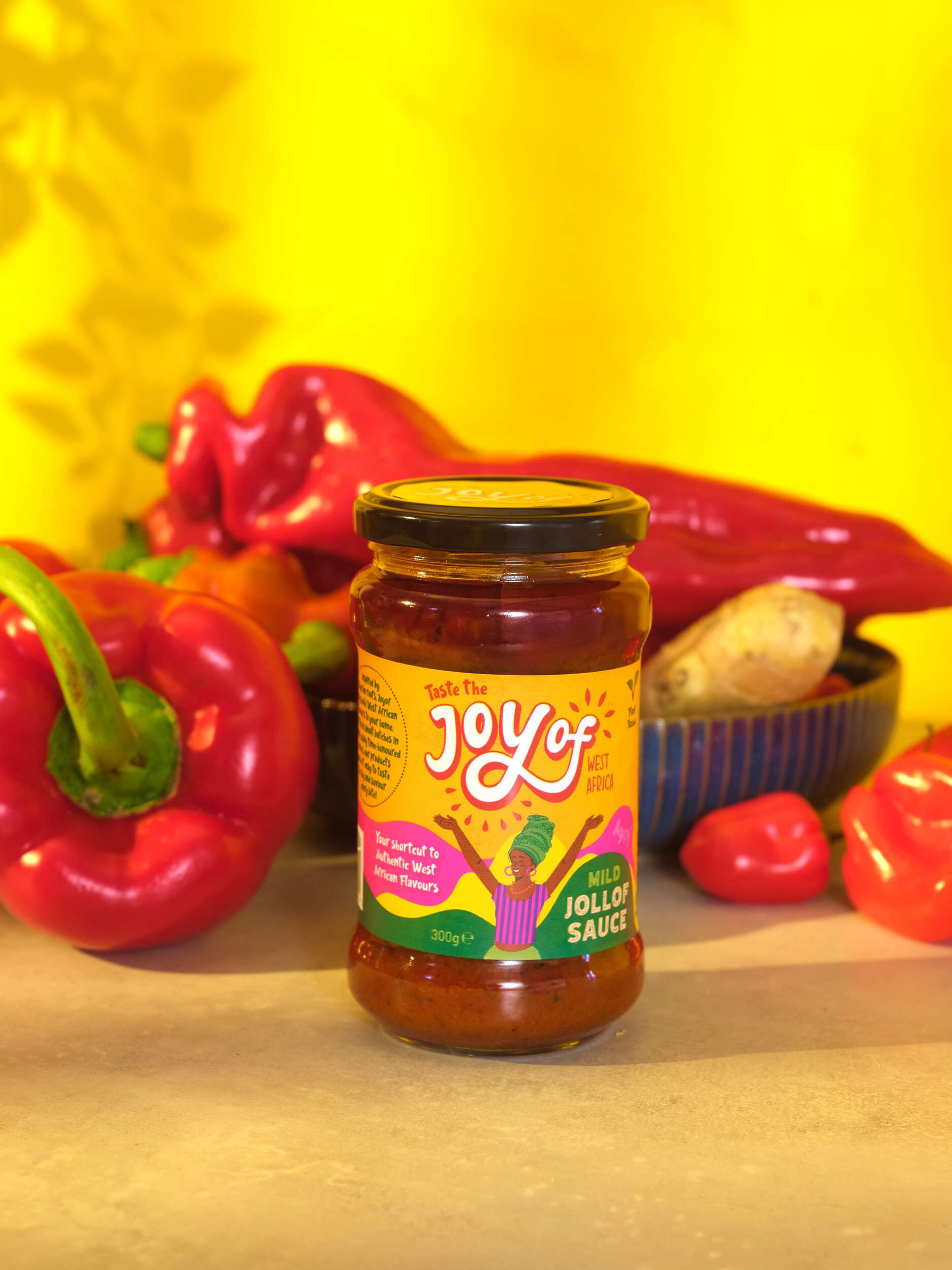
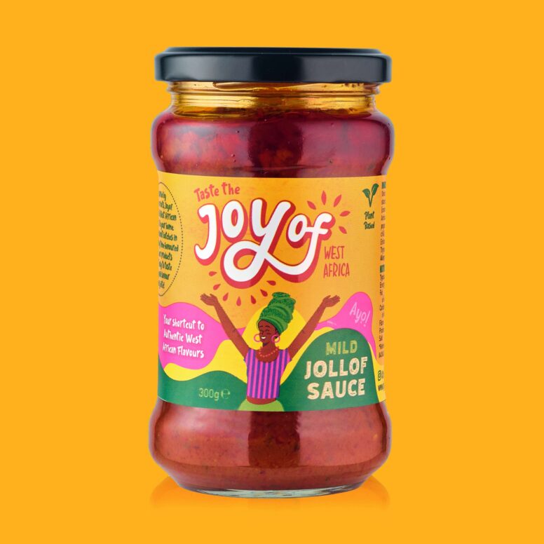
Joyof provides convenient, high-quality products with authentic flavours, reducing cooking time and making it easy to enjoy traditional West African meals even on the busiest days – bringing the joy of West African cuisine to Ireland.
By solving the issues of accessibility and time, they are helping people reconnect with their roots, try something new, and bring the vibrant flavours of West Africa into everyday life without compromise.
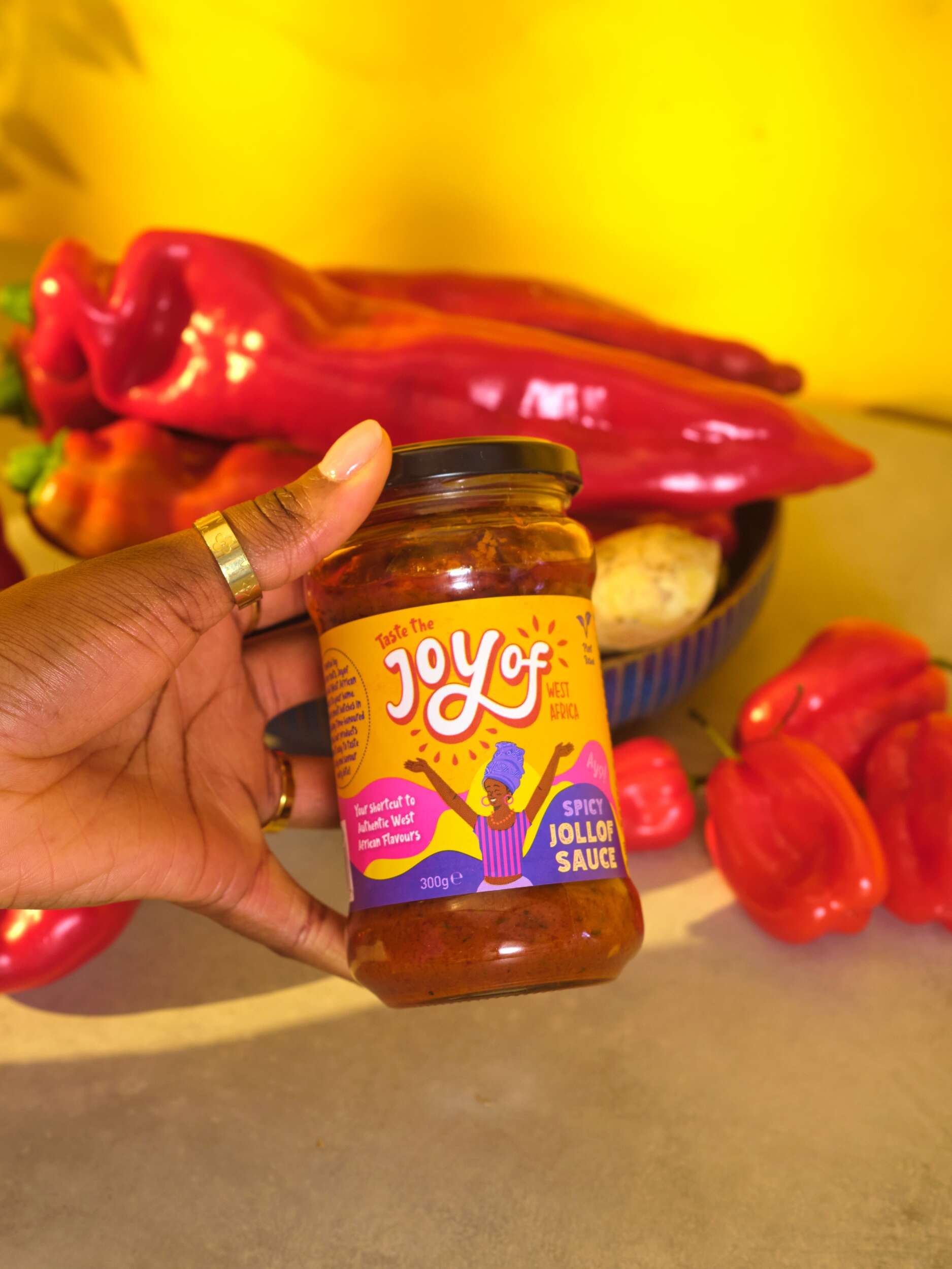
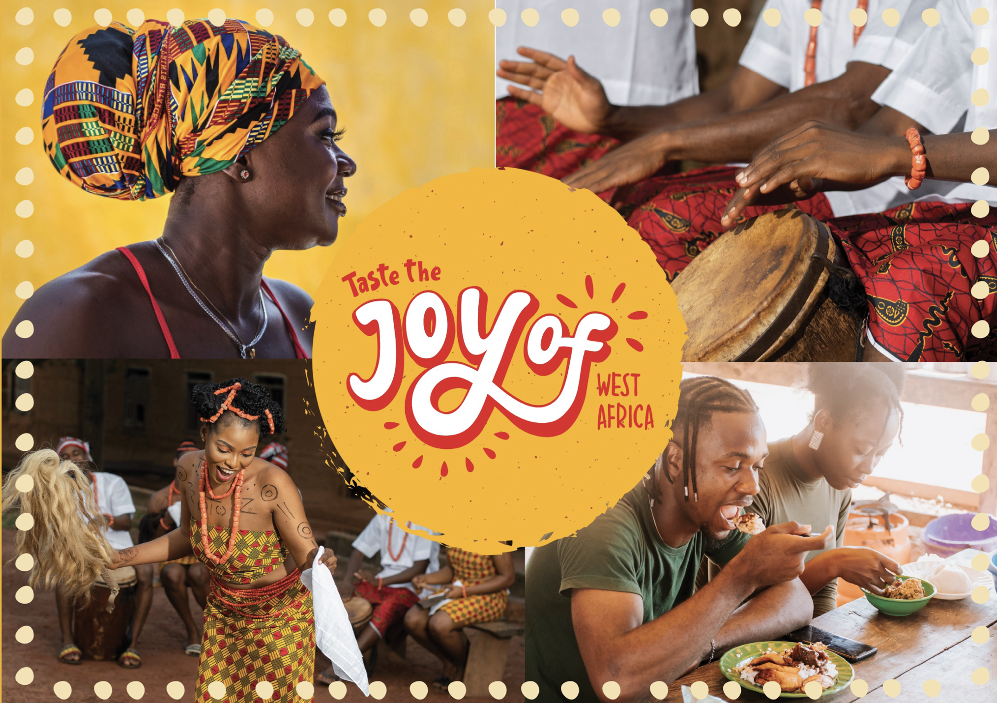
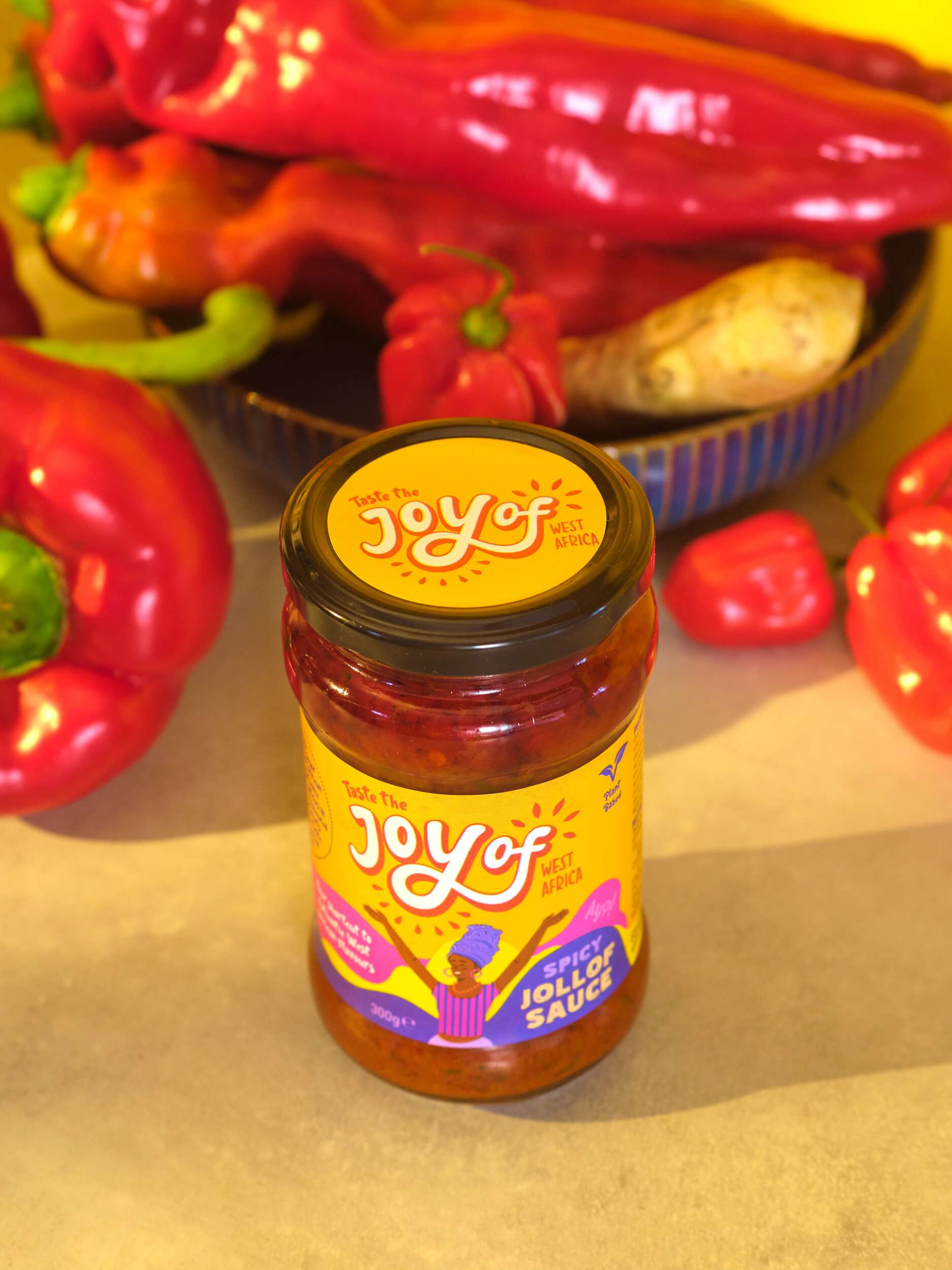
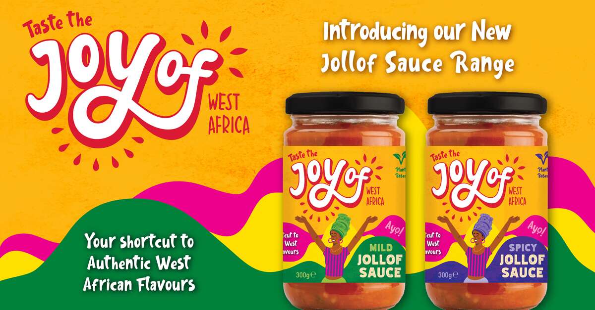
The design concept draws inspiration from traditional African drawings and patterns, aiming to capture their vibrant, playful energy. The typography is hand-drawn to evoke authenticity, reflecting the handmade quality of the food, and expresses the pride and joy rooted in West African culture.
The design process evolved from creating letterforms were slightly spaced to highlight the phrase ‘joy of’ reinforcing the brand’s celebration of West African cuisine. We developed this on to bring the letters closer together, integrating ‘of’ more seamlessly to be read as a single, joyful expression.
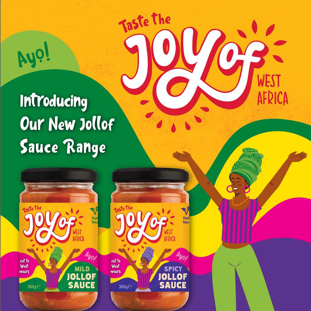
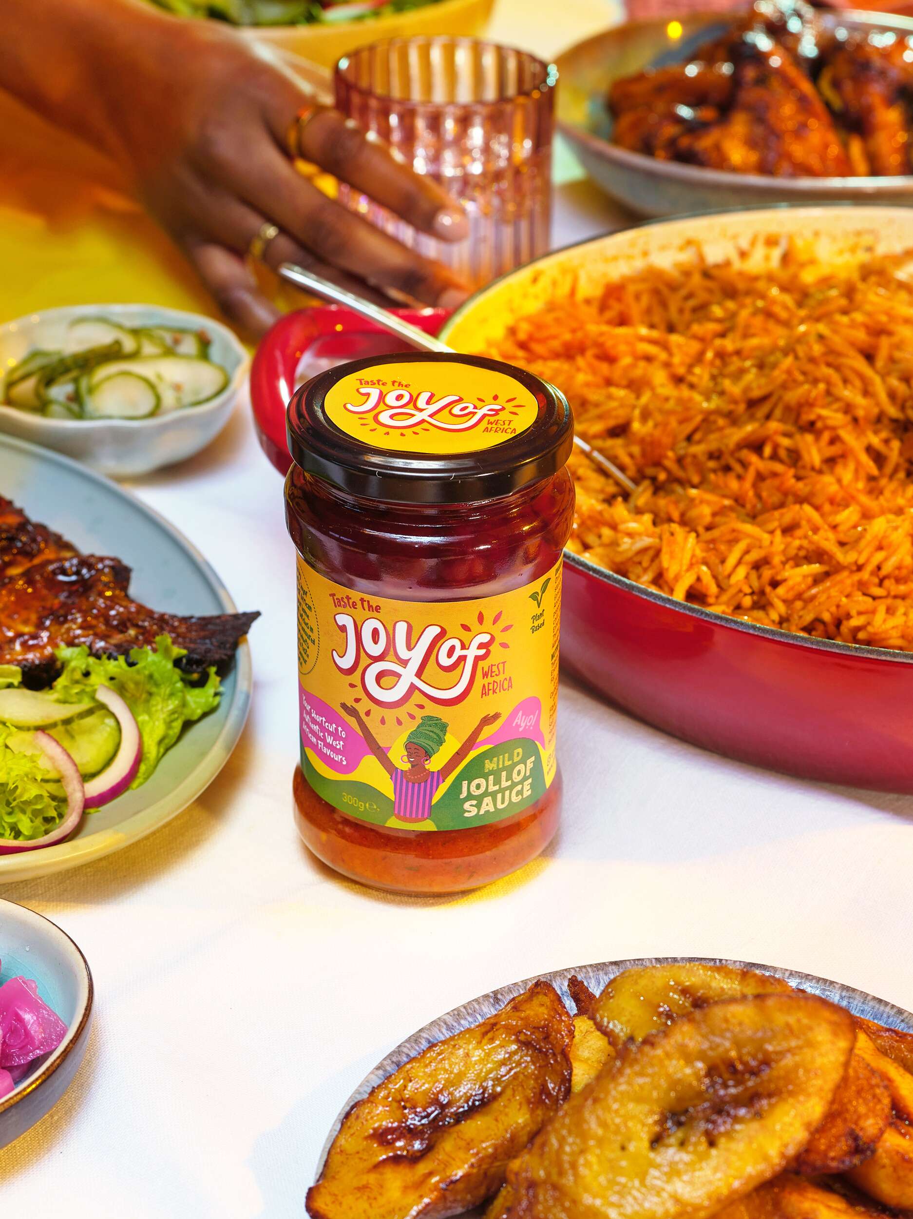
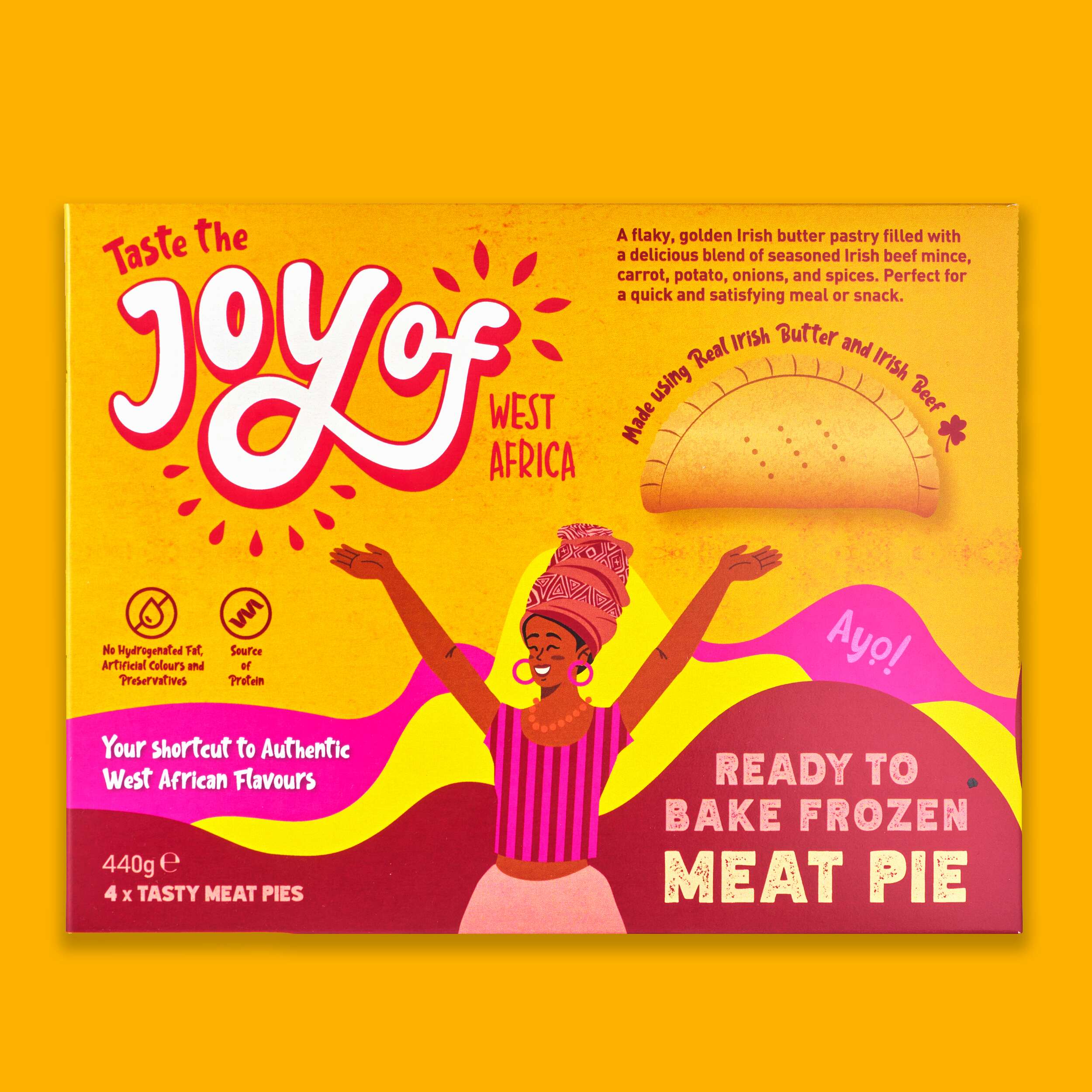
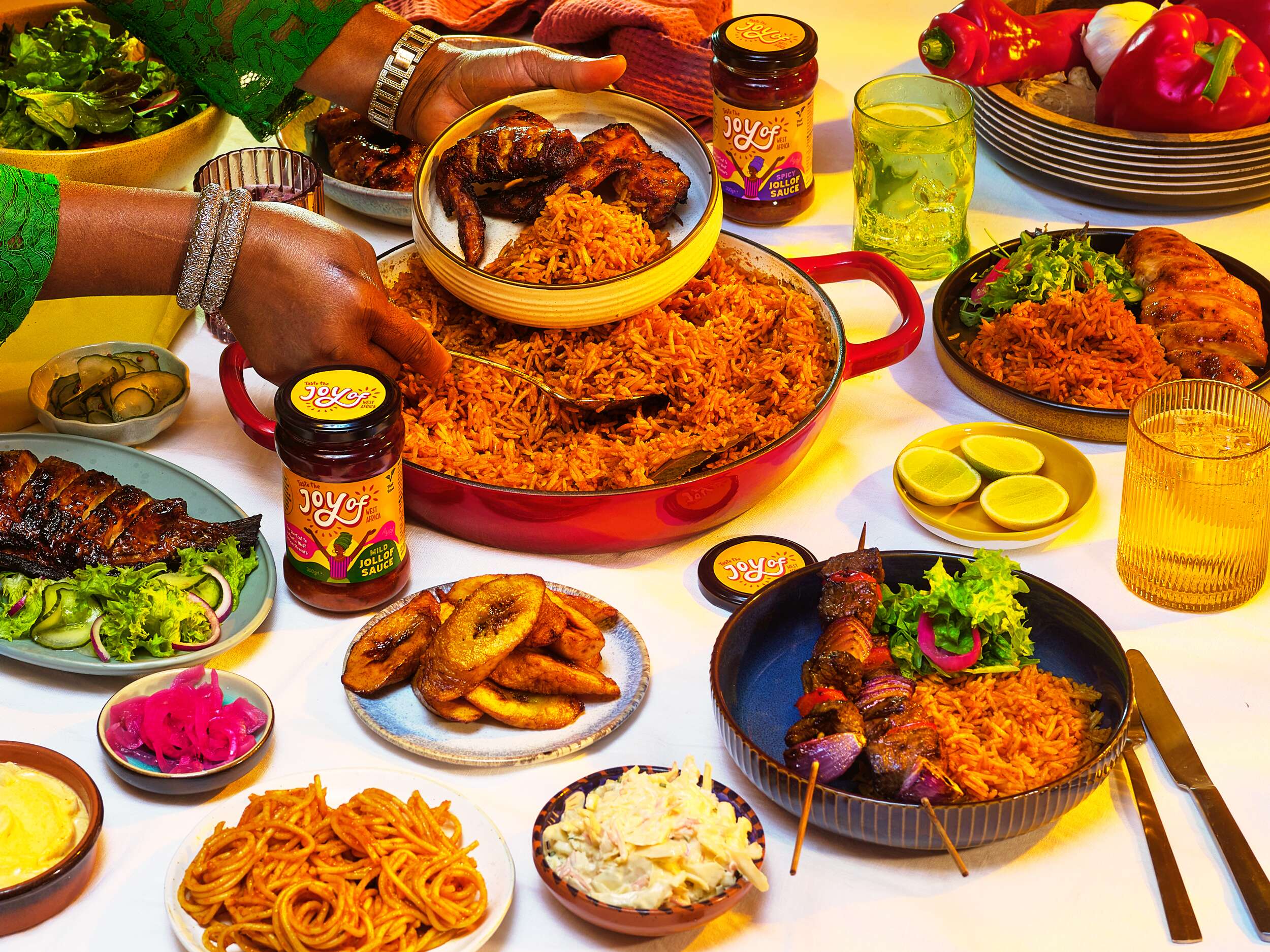
Surrounding shapes suggest bursts of life and energy. They represent leaves and natural ingredients, emphasising the freshness and vitality of the products. The bright and vibrant colour scheme further communicates this.
Follow Joyof Foods online:
Instagram: @joyof.foods
LinkedIn: joyof-foods
TikTok: @joyof.foods
Website: joyoffoods.com
Available in selected SuperValu stores and other food independent stores.
Photography by Brendan Ryan Photography:
Instagram: @brendanryanphoto
Website: www.brendanryan.ie
Video Production:
Brendan Ryan Photography (as above) and:
Raouf Ferkous
Instagram: @raouf.ferkous
Packaging printed by Reel Print:
Website: Reel Print
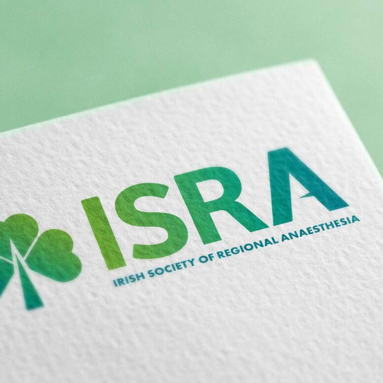
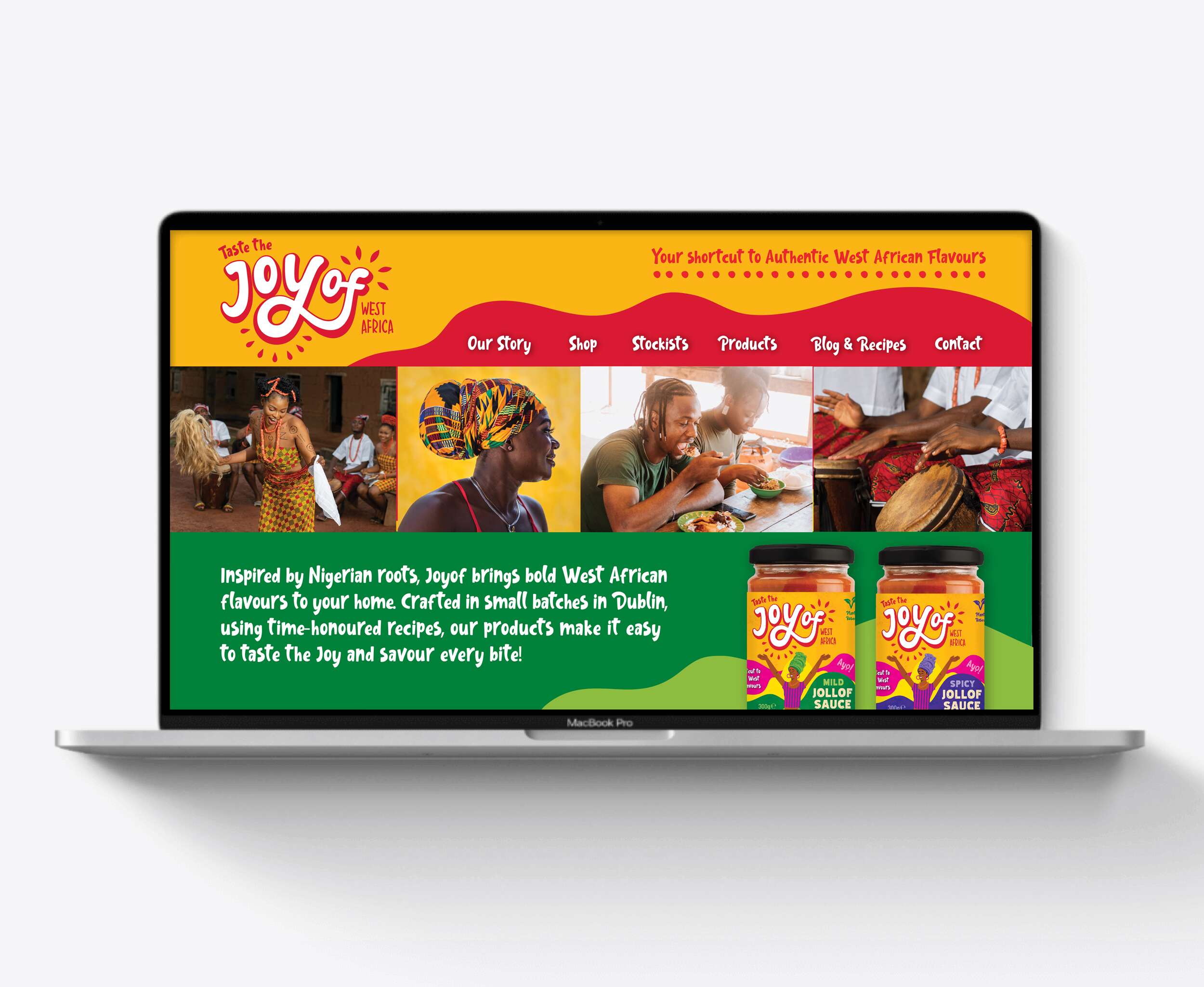
ISRA: Brand Identity Design
ISRA: Brand Refresh & Visual Identity Design
The Irish Society of Regional Anaesthesia (ISRA)
The Irish Society of Regional Anaesthesia (ISRA) is a respected not-for-profit medical organisation dedicated to promoting excellence in regional anaesthesia education and practice across Ireland.
Despite being a relatively small society, ISRA has an impressive international footprint, with more members per capita represented in the European Society than any other European country – underscoring its commitment to advancing the subspecialty both locally and globally.
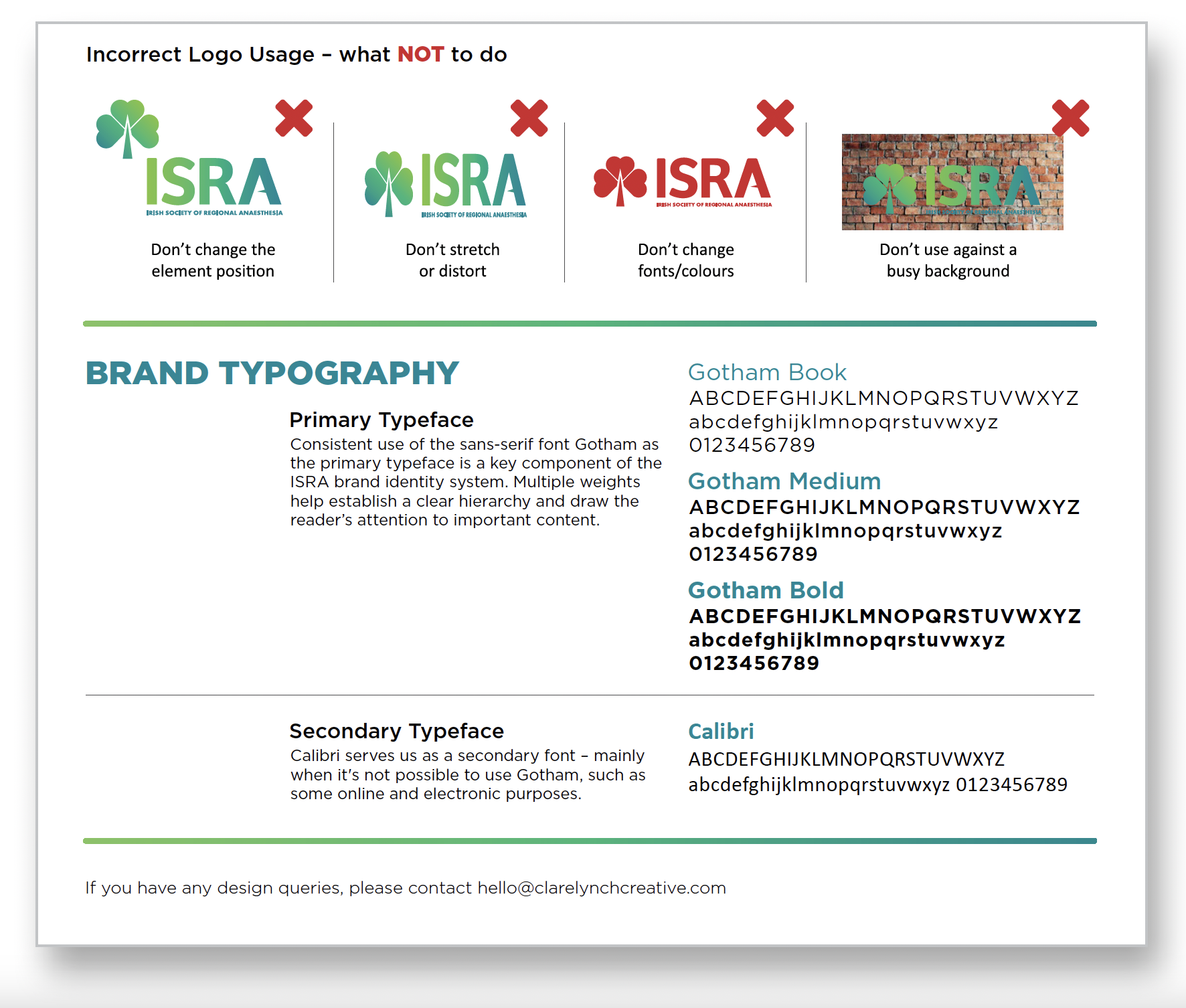
Our brief was to elevate the society’s brand presence with a refined, more professional visual identity, while preserving the warmth, accessibility and distinctly Irish character that define ISRA’s community. The goal was not to reinvent the wheel, but to build on what already worked and make it clearer, stronger, and more cohesive.
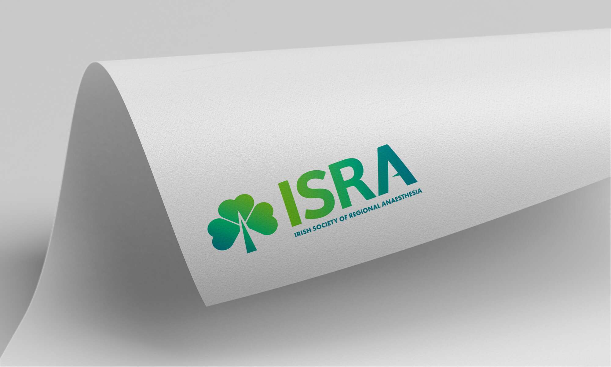
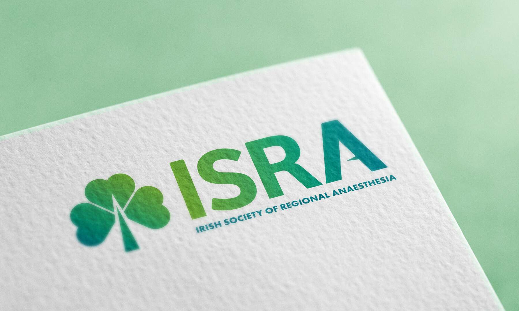
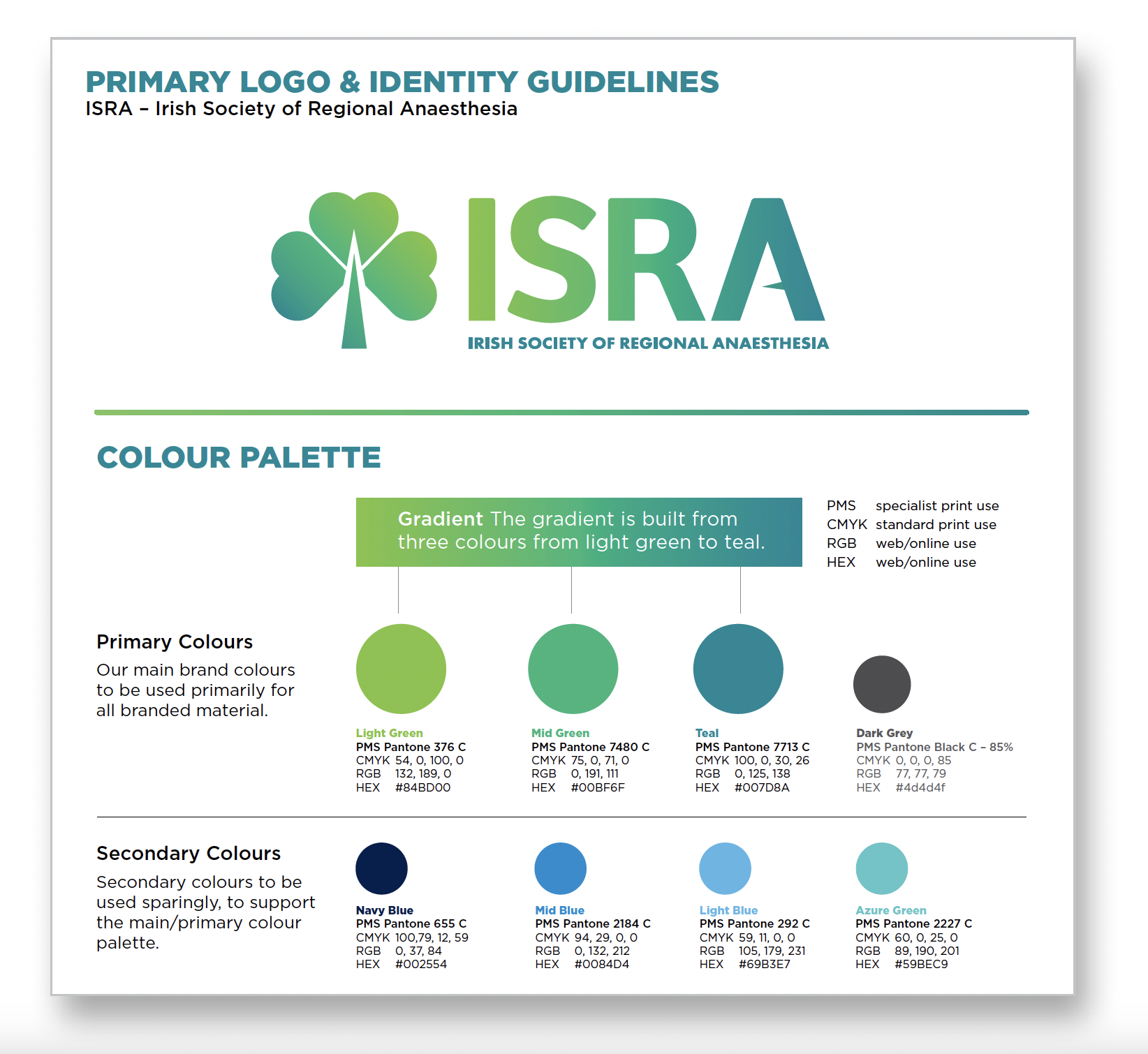
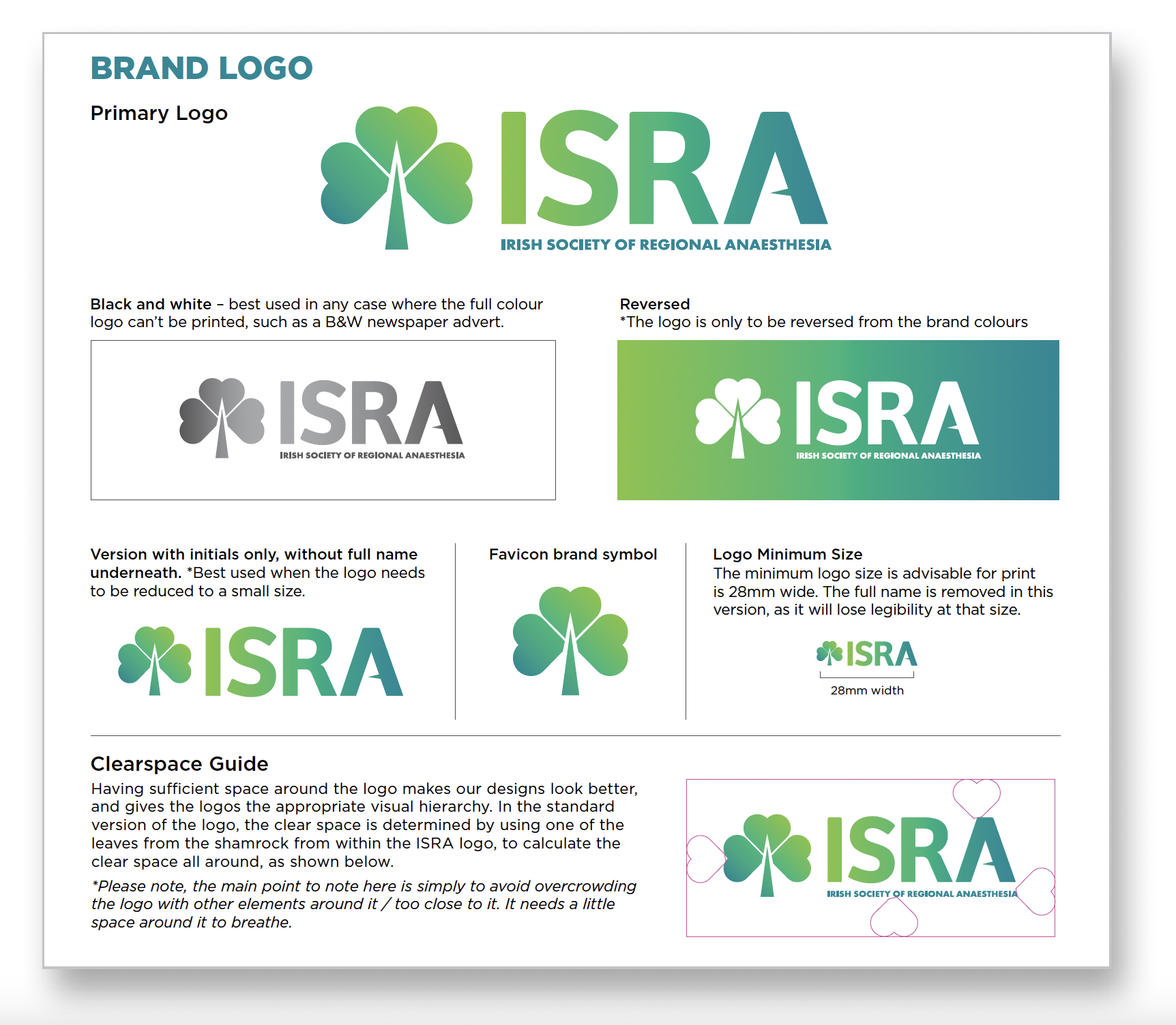
At the centre of the brand refresh is a redesigned logo that carefully balances symbolism with simplicity. The shamrock – a timeless emblem of Irish identity – remains a key feature, now formed by three heart-shaped leaves symbolising the care anaesthetists give to their patients. The stem of the shamrock subtly doubles as an anaesthetic needle, while a pointed mid-bar in the letter ‘A’ adds another discreet reference to the tools of the trade. These thoughtful details communicate ISRA’s focus without overwhelming the design.
A refreshed colour palette brings new energy to the brand, combining vibrant, modern greens with touches of blue – creating a clean, clinical feel that also nods to broader medical aesthetics. The result is a look that sets ISRA apart from other national societies, while positioning it confidently within the wider professional landscape.
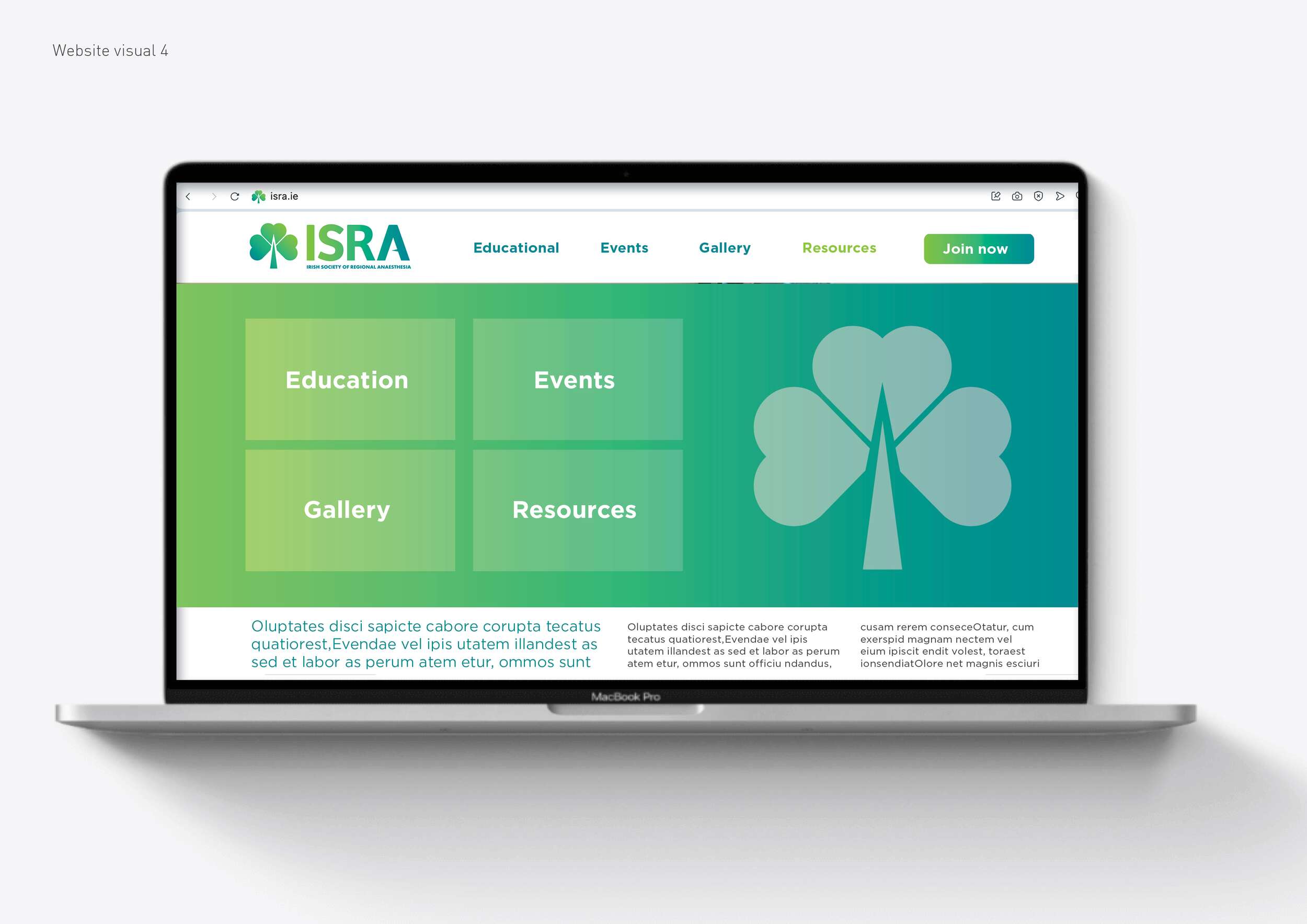
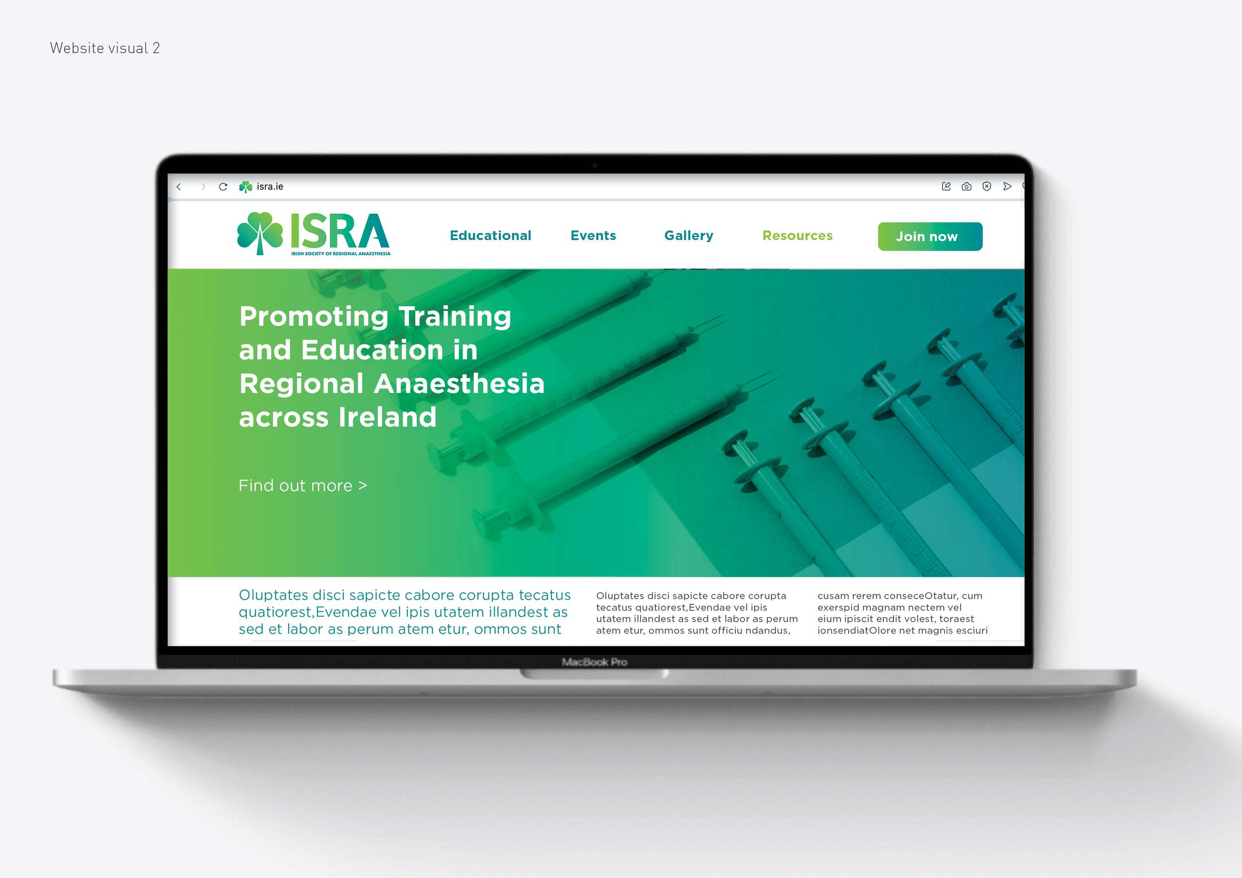
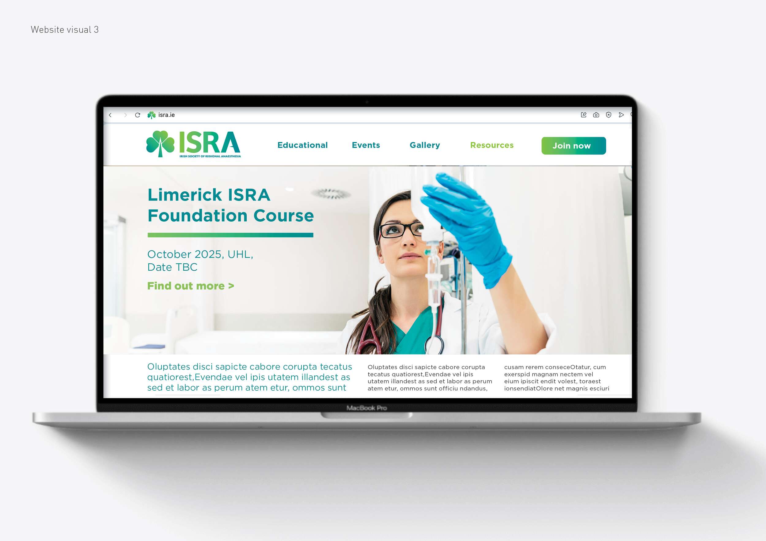
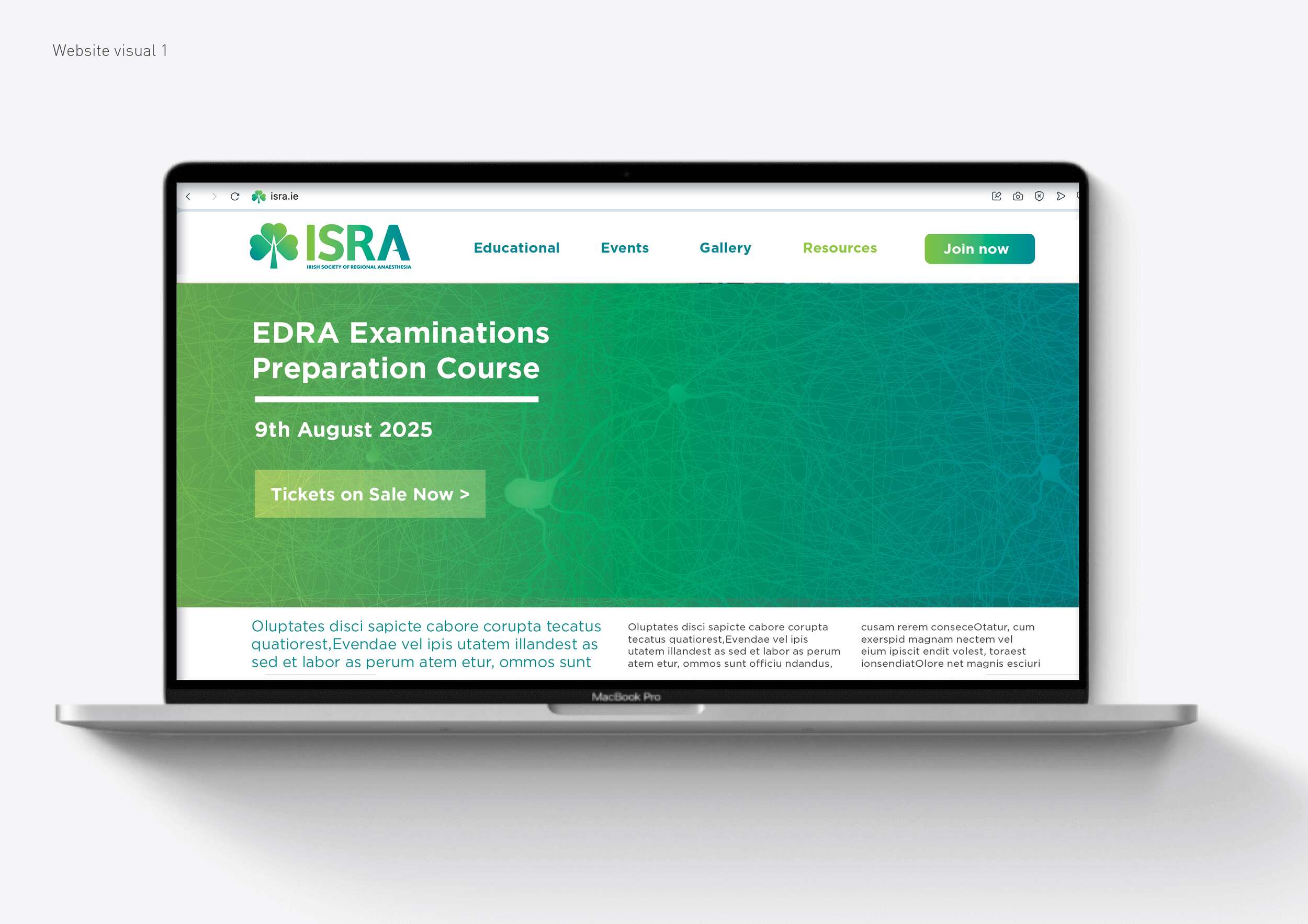
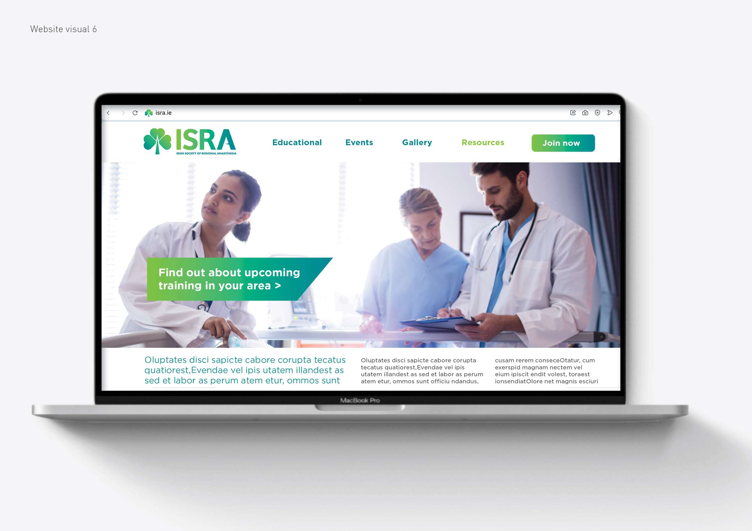
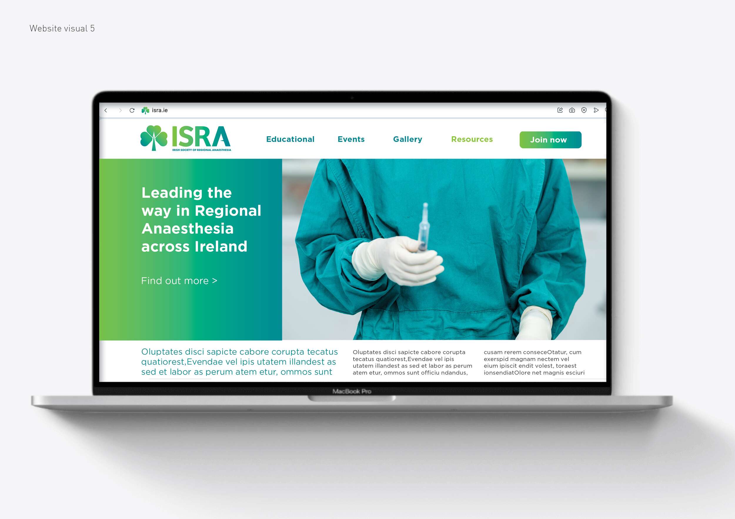
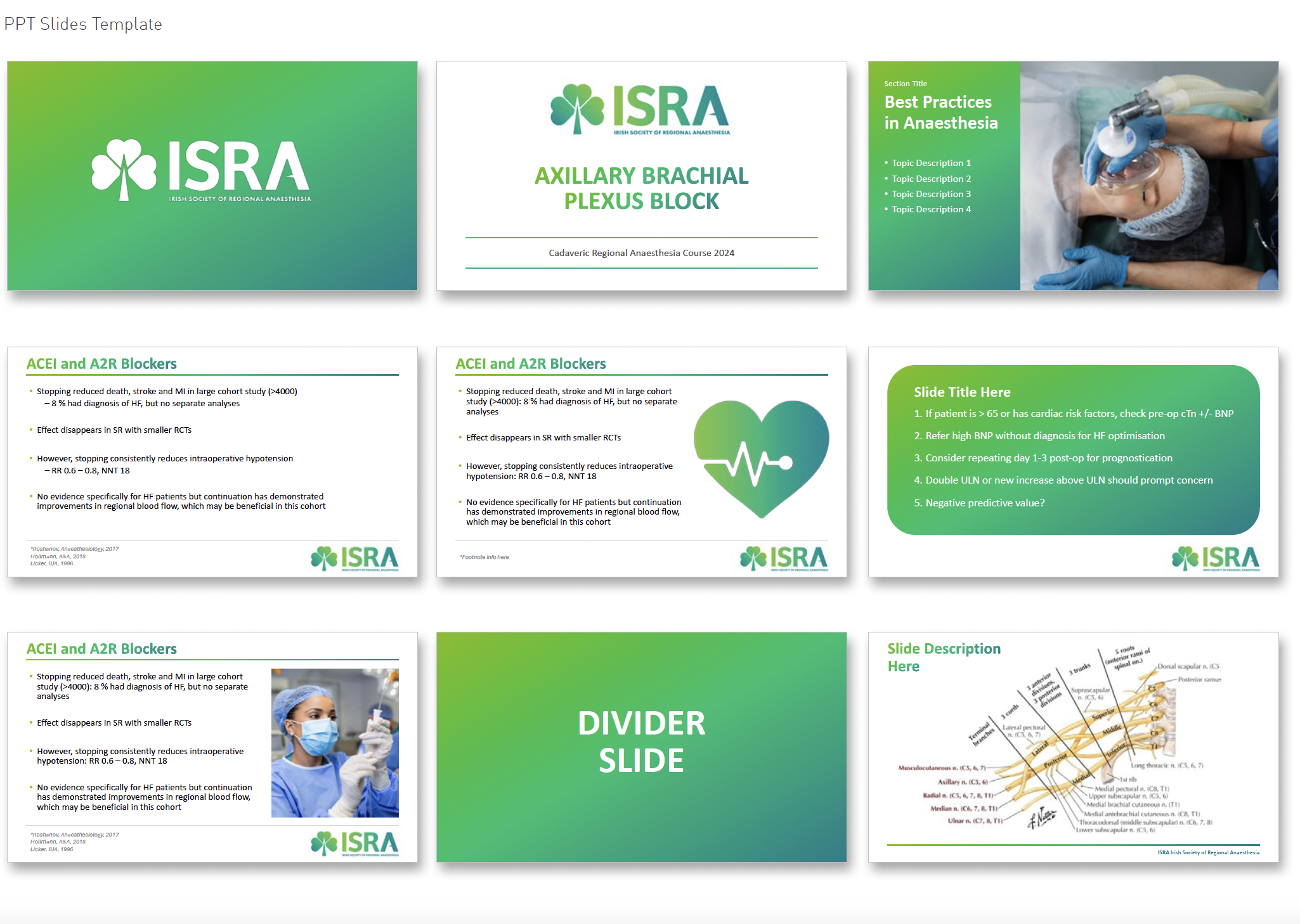
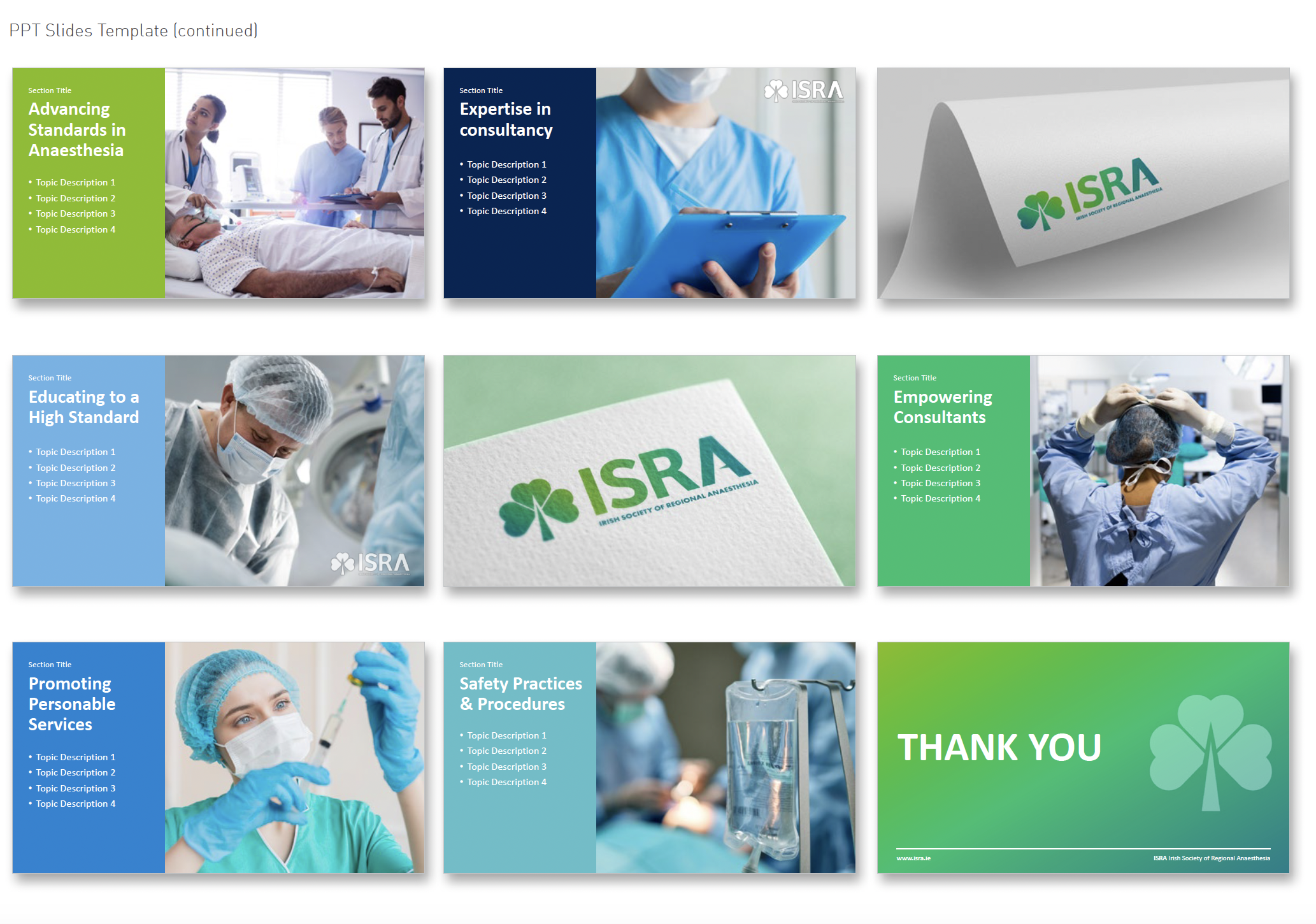
In addition to the logo, we delivered a versatile visual toolkit for use across event materials, presentations, digital platforms, and merchandise such as brand guidelines, posters, event programmes, membership cards, certificates, social media graphics, a newsletter template, Powerpoint templates, website design visuals and stationery visuals.
This system is designed to support ISRA’s educational mission, improve recognition, and help the society put its best foot forward – whether hosting a local workshop or representing Ireland on the international stage.

Follow ISRA online:
Twitter / X.com: @ISRA_Ireland
Facebook: @ISRAIreland
Website: isra.ie
Fingal Food Circle: Brand Identity Design
Fingal Food Circle: Brand Identity Design
I recently created a new brand identity for Fingal Food Circle, a food and drink network based in North County Dublin. This initiative brings together local producers, restaurants, cafes, culinary experiences, and food tourism operators, all under one umbrella. The goal was to develop a strong and distinctive brand that celebrates local provenance, encourages collaboration, and supports the wider food and drink community in the Fingal region.
Before this project, Fingal Food Circle had no existing brand or visual identity. They needed a design that would establish them as a clear and confident voice for the industry – something that could work across everything from events and training to tourism promotion and media engagement. It also had to reflect the diversity of its members, while remaining flexible enough to grow with the network over time.
The chosen design direction focused on a custom typographic logo that feels open, welcoming, and grounded in food culture. A spoon subtly replaces the ‘I’ in ‘Fingal’ to represent the culinary aspect of the network. The circular form of the ‘C’ includes a green circular dot to reference the landscape and community and link with the brand’s name, while the open ‘O’ features a small leaf – symbolising fresh produce and the concept of growth and inclusion. The overall design is clean, modern, and tailored, while still feeling warm and approachable.
This new brand identity helps Fingal Food Circle communicate who they are at a glance: a grassroots but professional collective that promotes local food, fosters connection, and invites people to experience everything the region has to offer. The identity is launching publicly at the Flavours of Fingal Festival, marking the beginning of a stronger, more visible presence for the network in the local food and drink scene.
Flavours of Fingal, a vibrant two-day festival at Newbridge House and Farm that celebrates the region’s rich food culture, local producers, and community spirit, bringing over 65,000 visitors together for a truly unforgettable experience. The Fingal Food Circle is looking forward to making its debut there this year.
Follow Fingal Food Circle online:
Instagram: @fingalfoodcircle
Facebook: @fingalfoodcircle
Website: www.fingalfoodcircle.ie
Joyof Foods: Brand Packaging Design
Joyof Foods: Brand Packaging Design
West African Food Range
Joyof provides convenient, high-quality products with authentic flavours, reducing cooking time and making it easy to enjoy traditional West African meals even on the busiest days – bringing the joy of West African cuisine to Ireland.
By solving the issues of accessibility and time, they are helping people reconnect with their roots, try something new, and bring the vibrant flavours of West Africa into everyday life without compromise.
The design concept draws inspiration from traditional African drawings and patterns, aiming to capture their vibrant, playful energy. The typography is hand-drawn to evoke authenticity, reflecting the handmade quality of the food, and expresses the pride and joy rooted in West African culture.
The design process evolved from creating letterforms were slightly spaced to highlight the phrase ‘joy of’ reinforcing the brand’s celebration of West African cuisine. We developed this on to bring the letters closer together, integrating ‘of’ more seamlessly to be read as a single, joyful expression.
Surrounding shapes suggest bursts of life and energy. They represent leaves and natural ingredients, emphasising the freshness and vitality of the products. The bright and vibrant colour scheme further communicates this.
Follow Joyof Foods online:
Instagram: @joyof.foods
LinkedIn: joyof-foods
TikTok: @joyof.foods
Website: joyoffoods.com
Available in selected SuperValu stores and other food independent stores.
Photography by Brendan Ryan Photography:
Instagram: @brendanryanphoto
Website: www.brendanryan.ie
Video Production:
Brendan Ryan Photography (as above) and:
Raouf Ferkous
Instagram: @raouf.ferkous
Packaging printed by Reel Print:
Website: Reel Print
ISRA: Brand Identity Design
ISRA: Brand Refresh & Visual Identity Design
The Irish Society of Regional Anaesthesia (ISRA)
The Irish Society of Regional Anaesthesia (ISRA) is a respected not-for-profit medical organisation dedicated to promoting excellence in regional anaesthesia education and practice across Ireland.
Despite being a relatively small society, ISRA has an impressive international footprint, with more members per capita represented in the European Society than any other European country – underscoring its commitment to advancing the subspecialty both locally and globally.
Our brief was to elevate the society’s brand presence with a refined, more professional visual identity, while preserving the warmth, accessibility and distinctly Irish character that define ISRA’s community. The goal was not to reinvent the wheel, but to build on what already worked and make it clearer, stronger, and more cohesive.
At the centre of the brand refresh is a redesigned logo that carefully balances symbolism with simplicity. The shamrock – a timeless emblem of Irish identity – remains a key feature, now formed by three heart-shaped leaves symbolising the care anaesthetists give to their patients. The stem of the shamrock subtly doubles as an anaesthetic needle, while a pointed mid-bar in the letter ‘A’ adds another discreet reference to the tools of the trade. These thoughtful details communicate ISRA’s focus without overwhelming the design.
A refreshed colour palette brings new energy to the brand, combining vibrant, modern greens with touches of blue – creating a clean, clinical feel that also nods to broader medical aesthetics. The result is a look that sets ISRA apart from other national societies, while positioning it confidently within the wider professional landscape.
In addition to the logo, we delivered a versatile visual toolkit for use across event materials, presentations, digital platforms, and merchandise such as brand guidelines, posters, event programmes, membership cards, certificates, social media graphics, a newsletter template, Powerpoint templates, website design visuals and stationery visuals.
This system is designed to support ISRA’s educational mission, improve recognition, and help the society put its best foot forward – whether hosting a local workshop or representing Ireland on the international stage.
Follow ISRA online:
Twitter / X.com: @ISRA_Ireland
Facebook: @ISRAIreland
Website: isra.ie