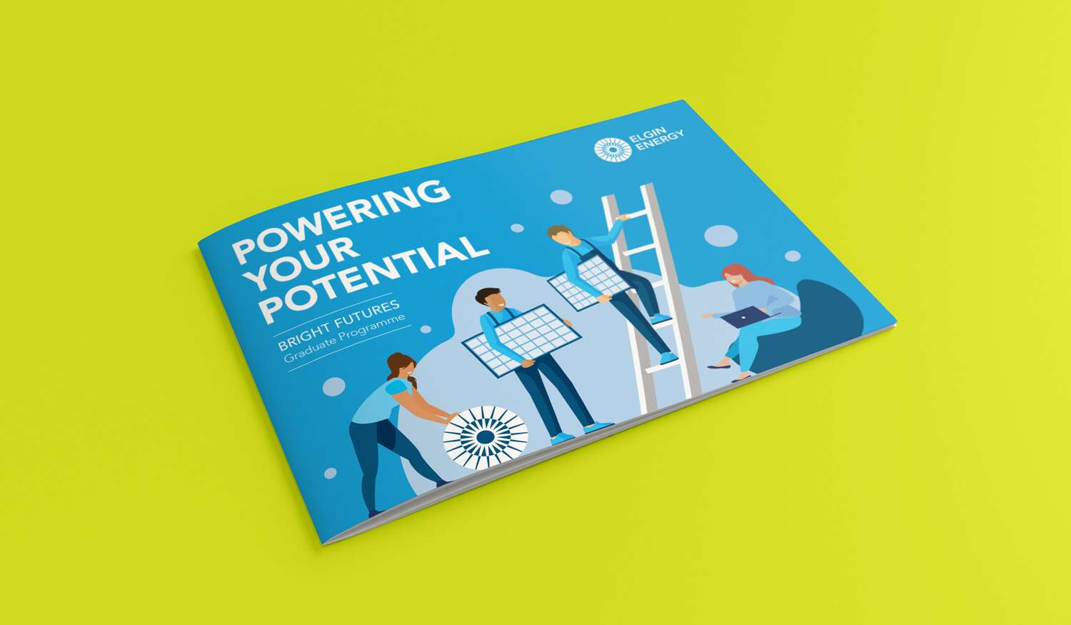
Fingal Food Circle: Brand Identity Design
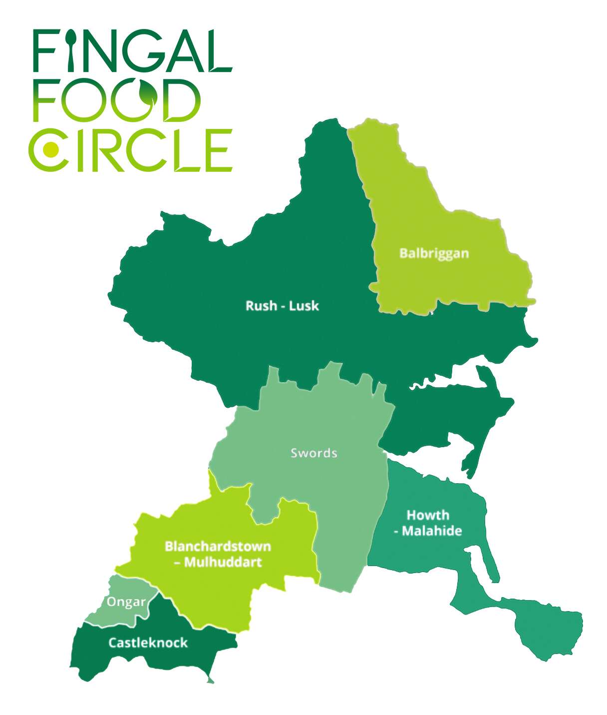
I recently created a new brand identity for Fingal Food Circle, a food and drink network based in North County Dublin. This initiative brings together local producers, restaurants, cafes, culinary experiences, and food tourism operators, all under one umbrella. The goal was to develop a strong and distinctive brand that celebrates local provenance, encourages collaboration, and supports the wider food and drink community in the Fingal region.
Before this project, Fingal Food Circle had no existing brand or visual identity. They needed a design that would establish them as a clear and confident voice for the industry – something that could work across everything from events and training to tourism promotion and media engagement. It also had to reflect the diversity of its members, while remaining flexible enough to grow with the network over time.
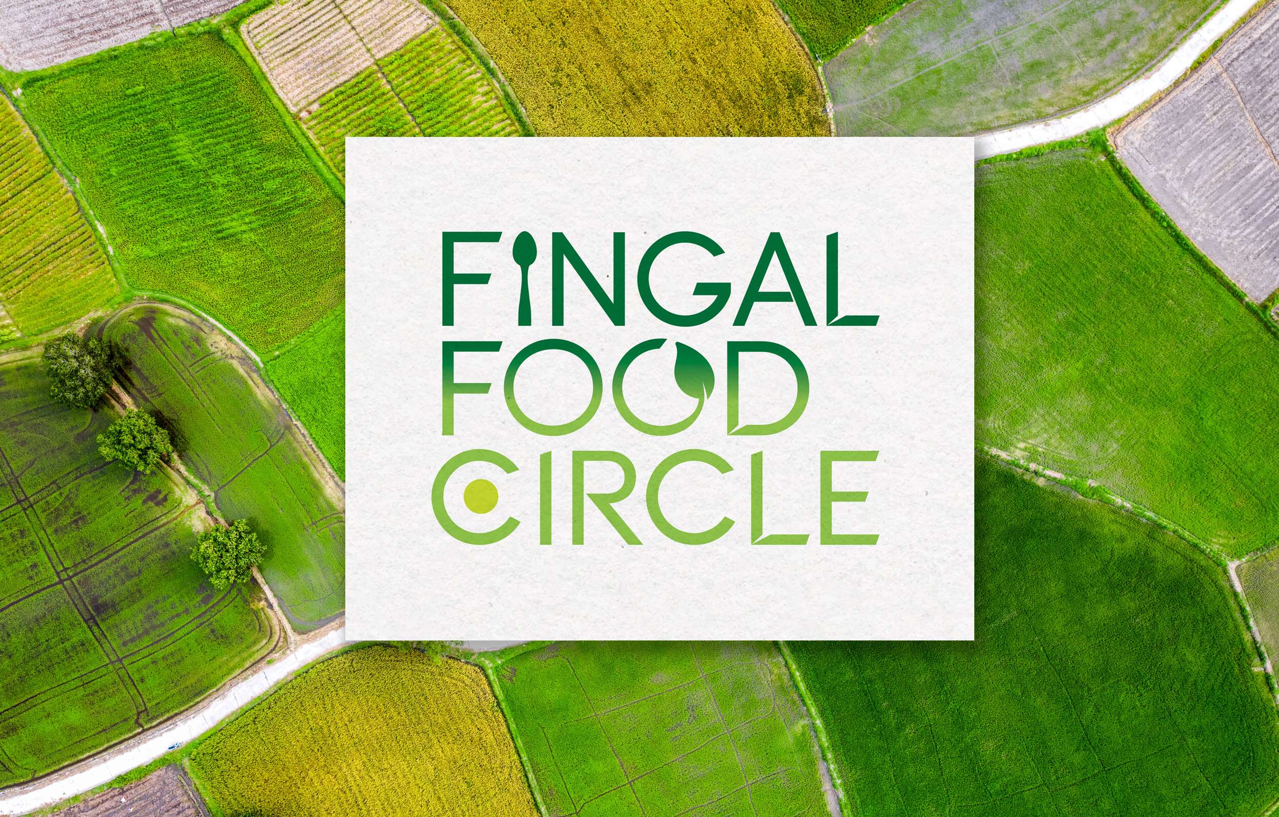
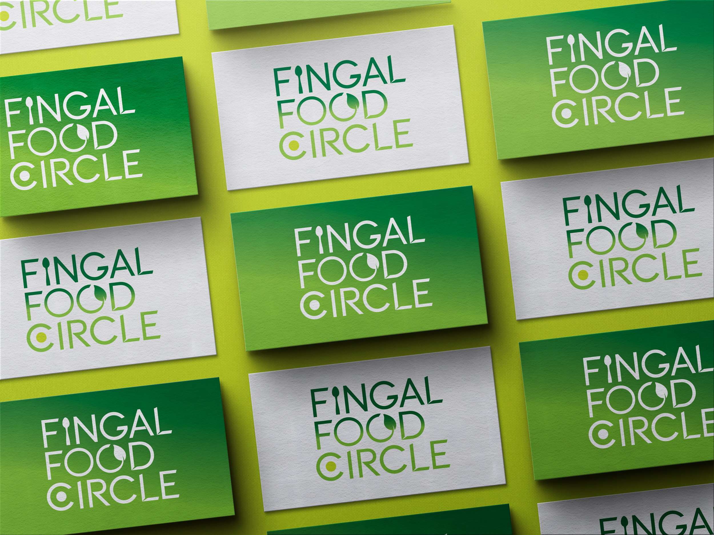
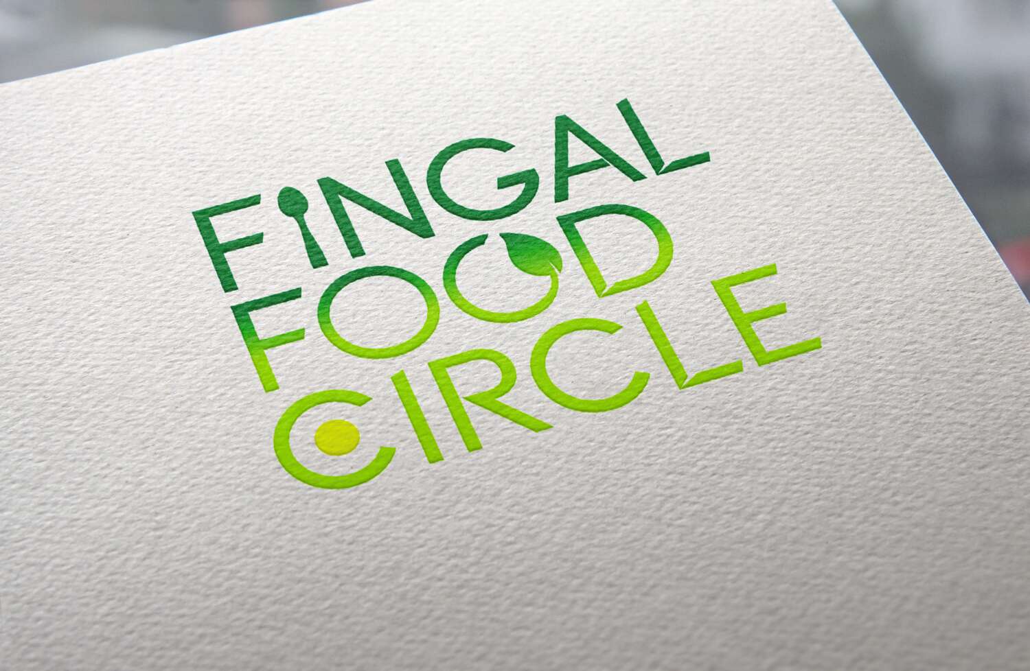
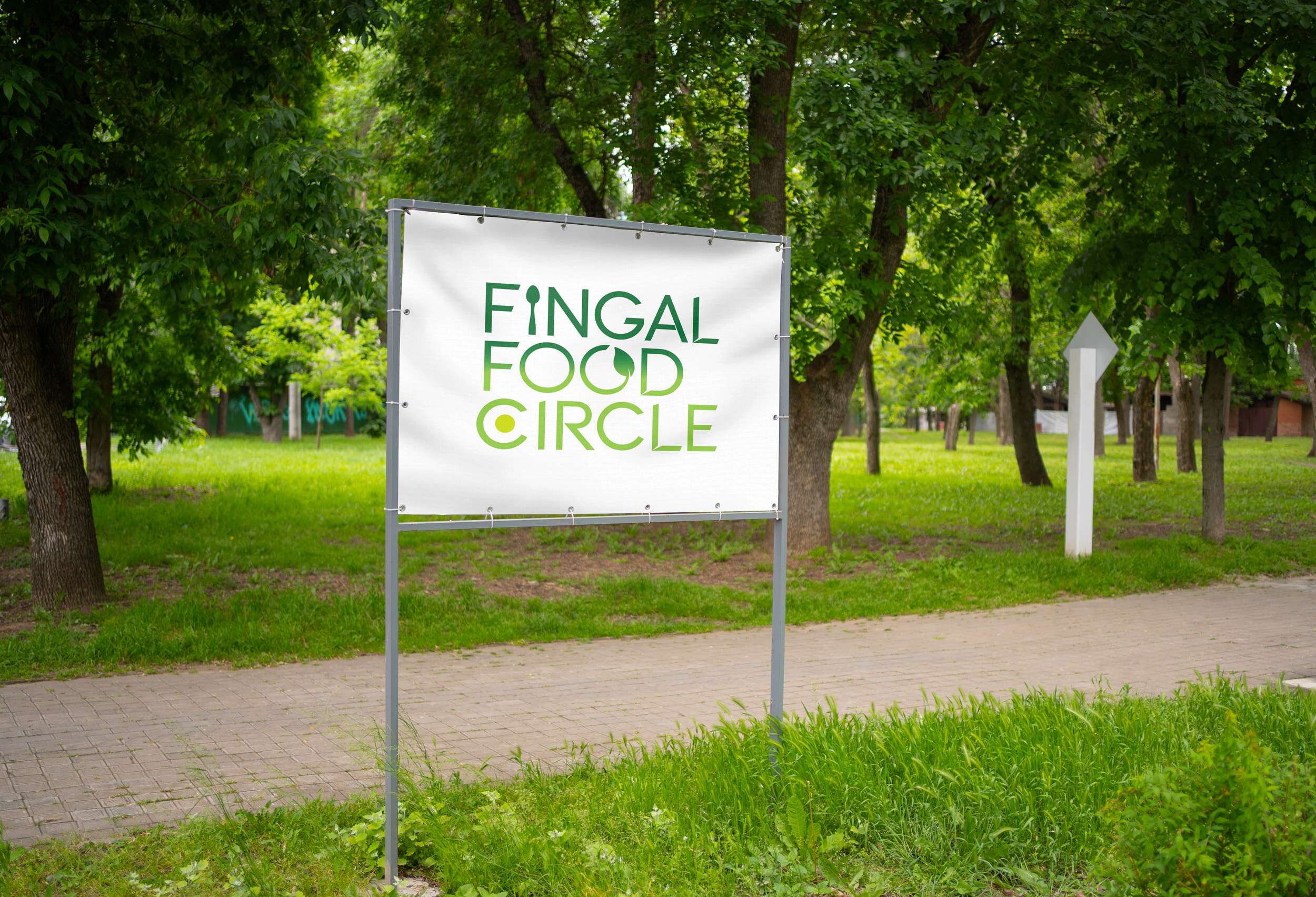
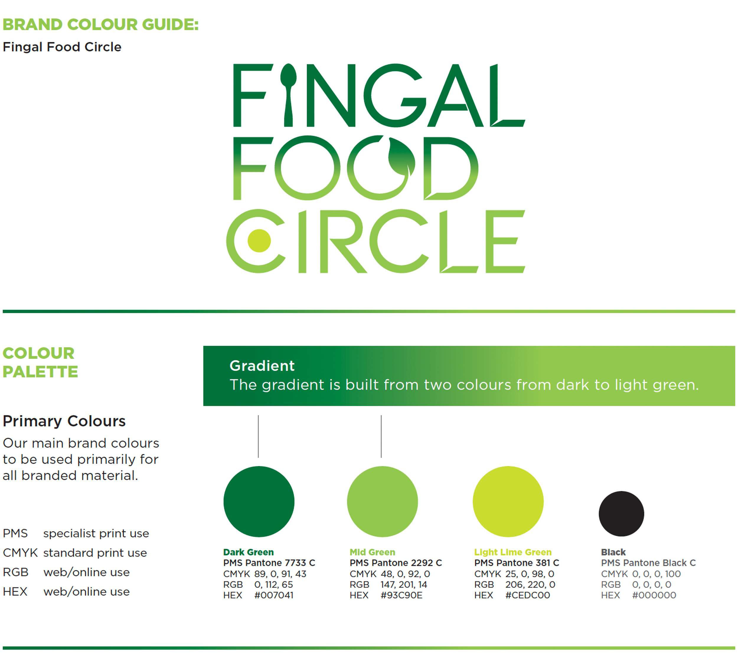
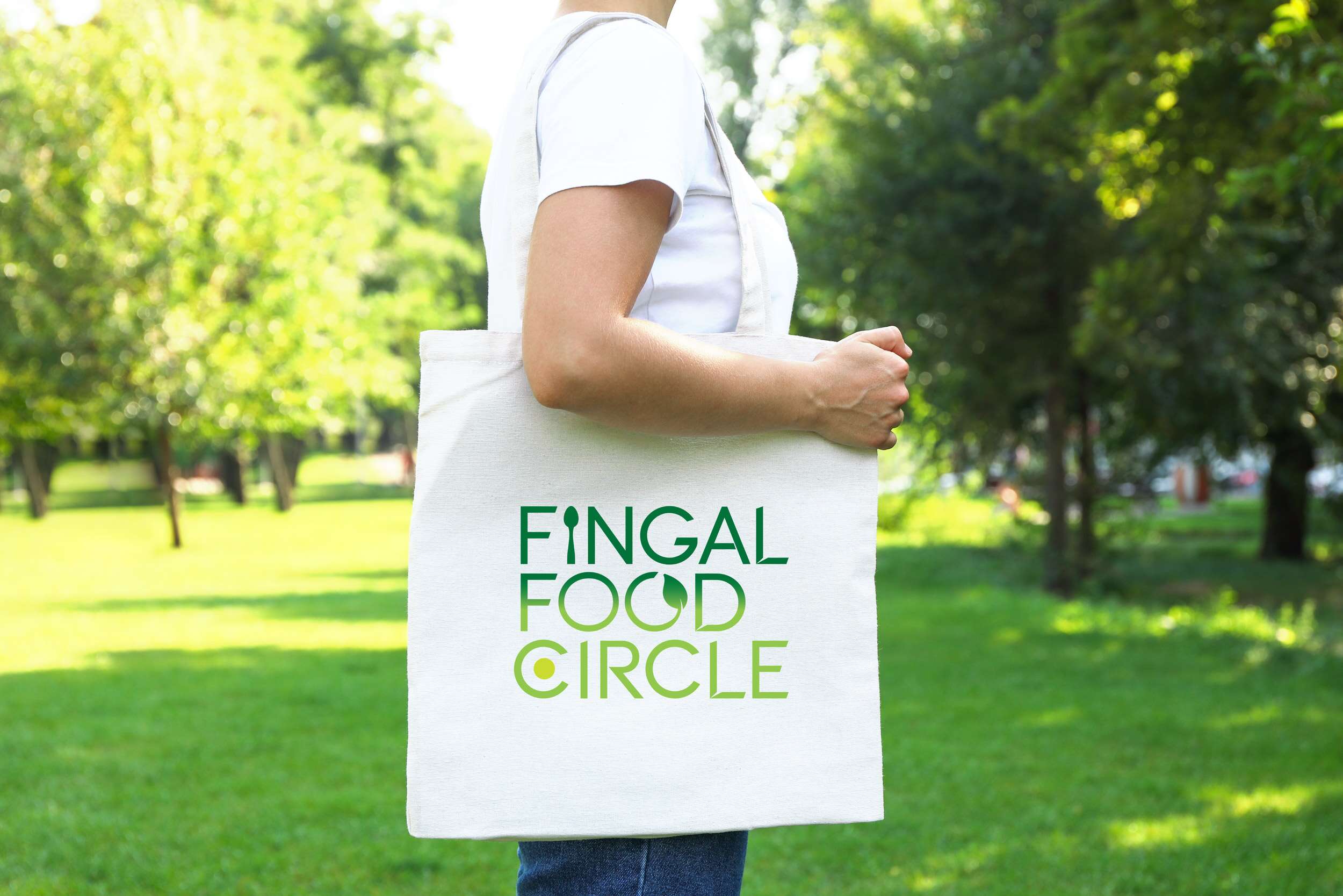
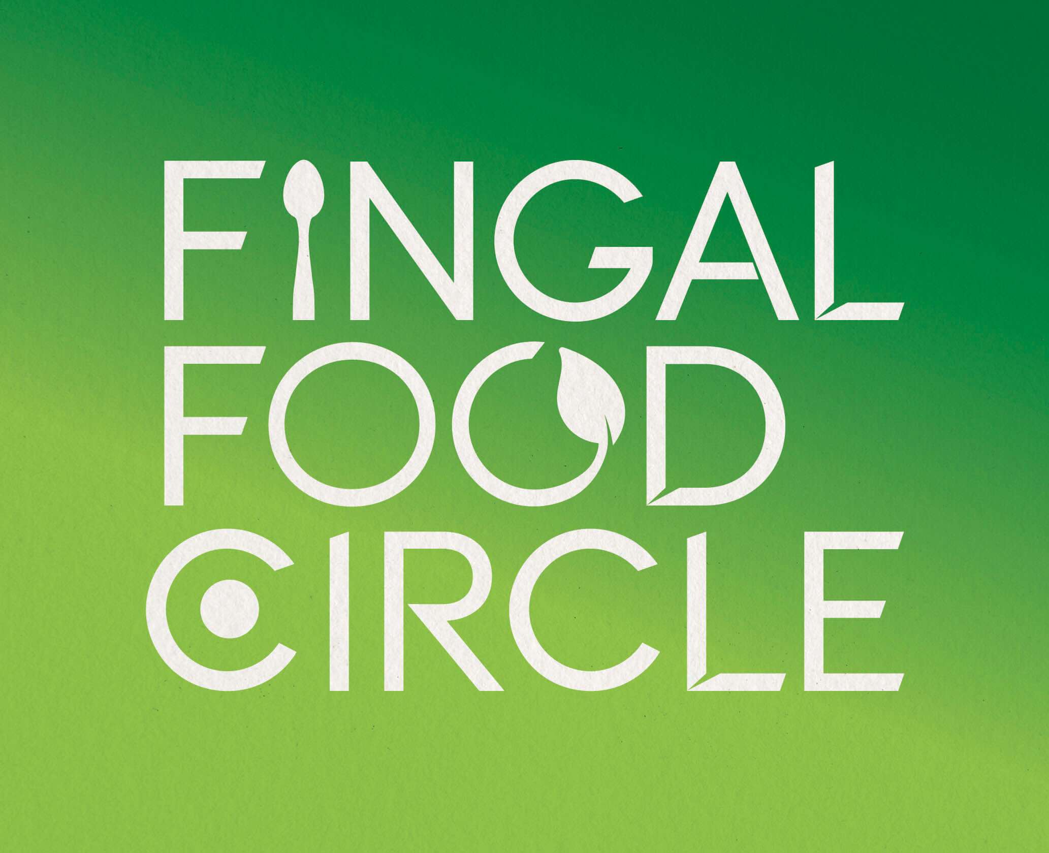
The chosen design direction focused on a custom typographic logo that feels open, welcoming, and grounded in food culture. A spoon subtly replaces the ‘I’ in ‘Fingal’ to represent the culinary aspect of the network. The circular form of the ‘C’ includes a green circular dot to reference the landscape and community and link with the brand’s name, while the open ‘O’ features a small leaf – symbolising fresh produce and the concept of growth and inclusion. The overall design is clean, modern, and tailored, while still feeling warm and approachable.

This new brand identity helps Fingal Food Circle communicate who they are at a glance: a grassroots but professional collective that promotes local food, fosters connection, and invites people to experience everything the region has to offer. The identity is launching publicly at the Flavours of Fingal Festival, marking the beginning of a stronger, more visible presence for the network in the local food and drink scene.
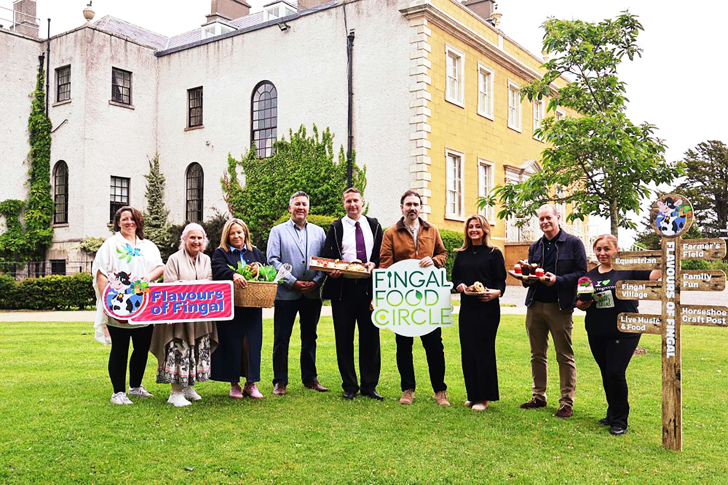
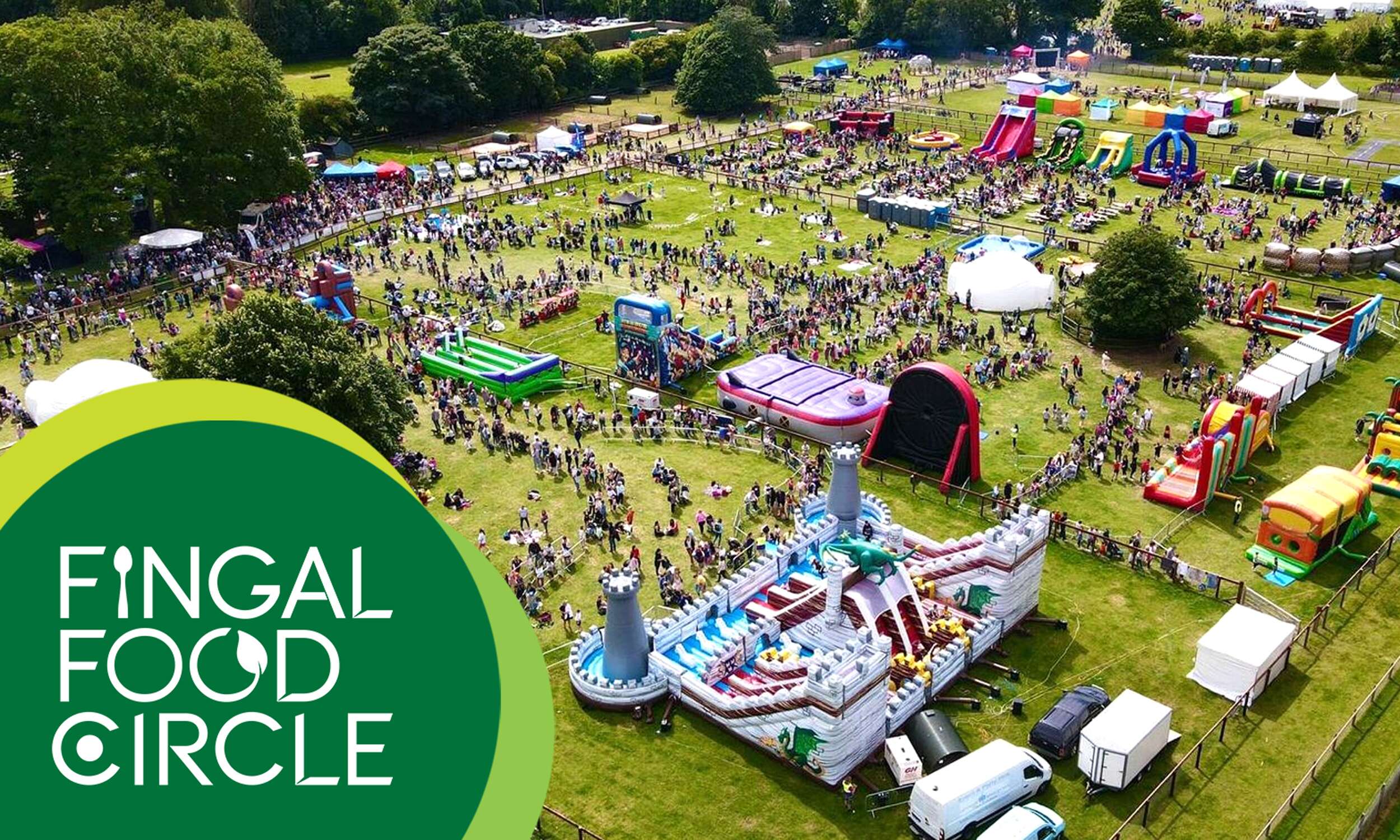
Flavours of Fingal, a vibrant two-day festival at Newbridge House and Farm that celebrates the region’s rich food culture, local producers, and community spirit, bringing over 65,000 visitors together for a truly unforgettable experience. The Fingal Food Circle is looking forward to making its debut there this year.
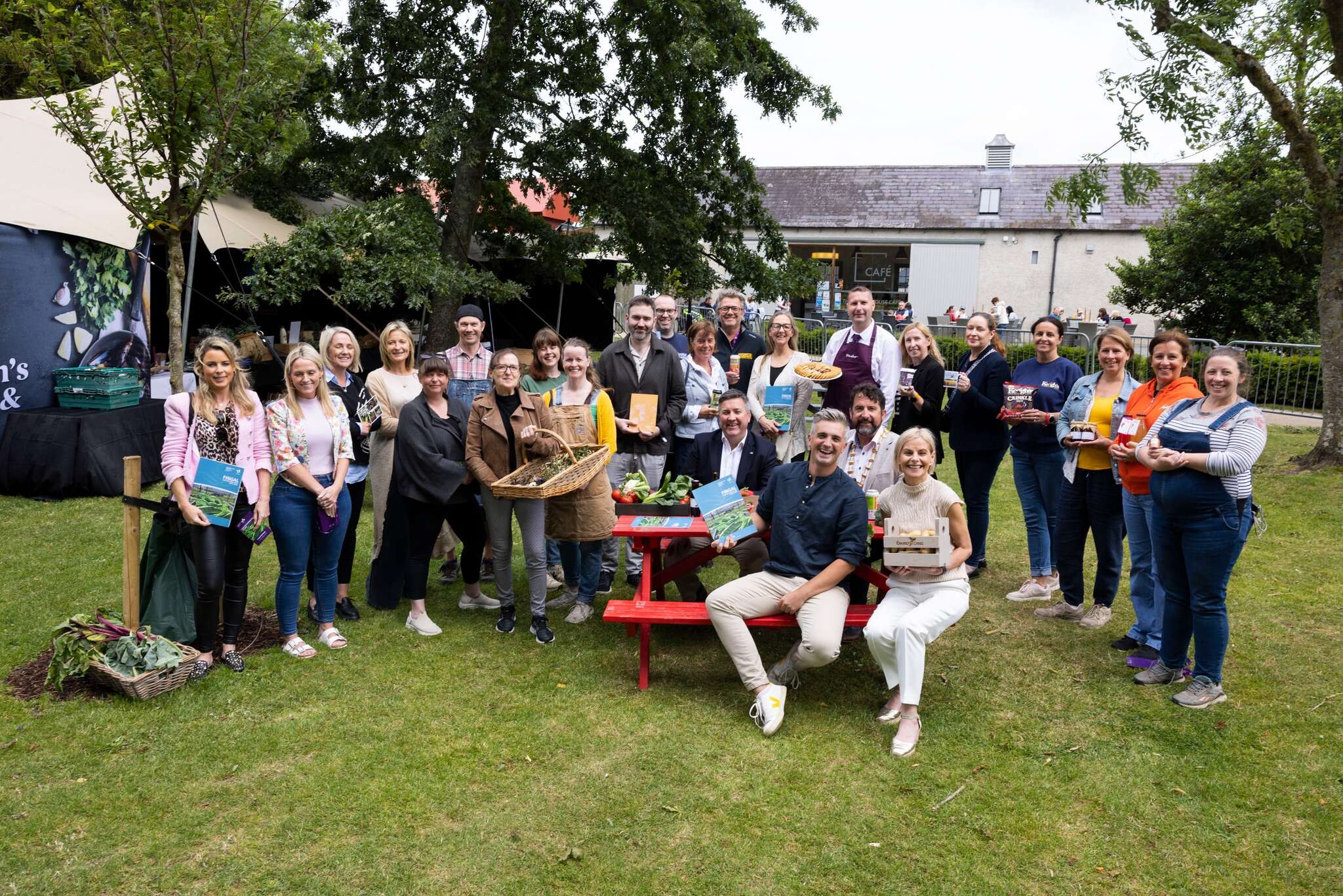
Flavours of Fingal Launch of the Fingal Food and Drink Policy 2024-2029 at Flavours of Fingal, Newbridge House and Farm, Donabate.
Picture by Shane O’Neill, Coalesce.
Follow Fingal Food Circle online: