Inishbofin Guide Book
Inishbofin Guide
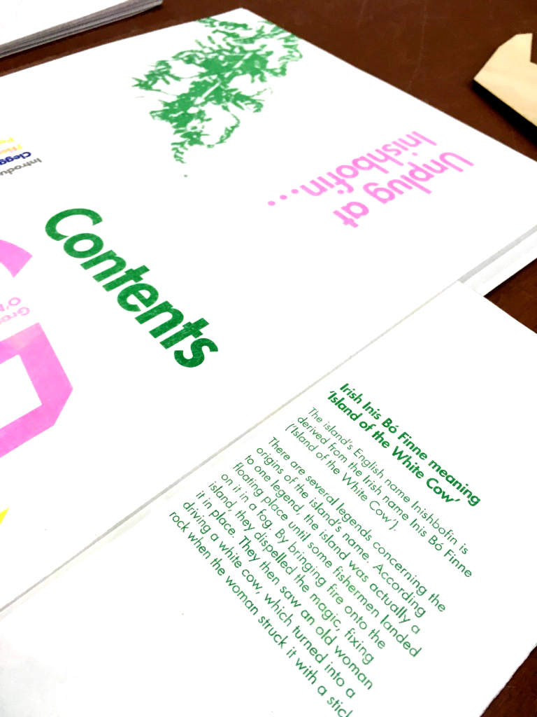
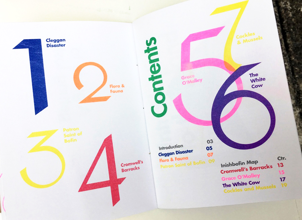
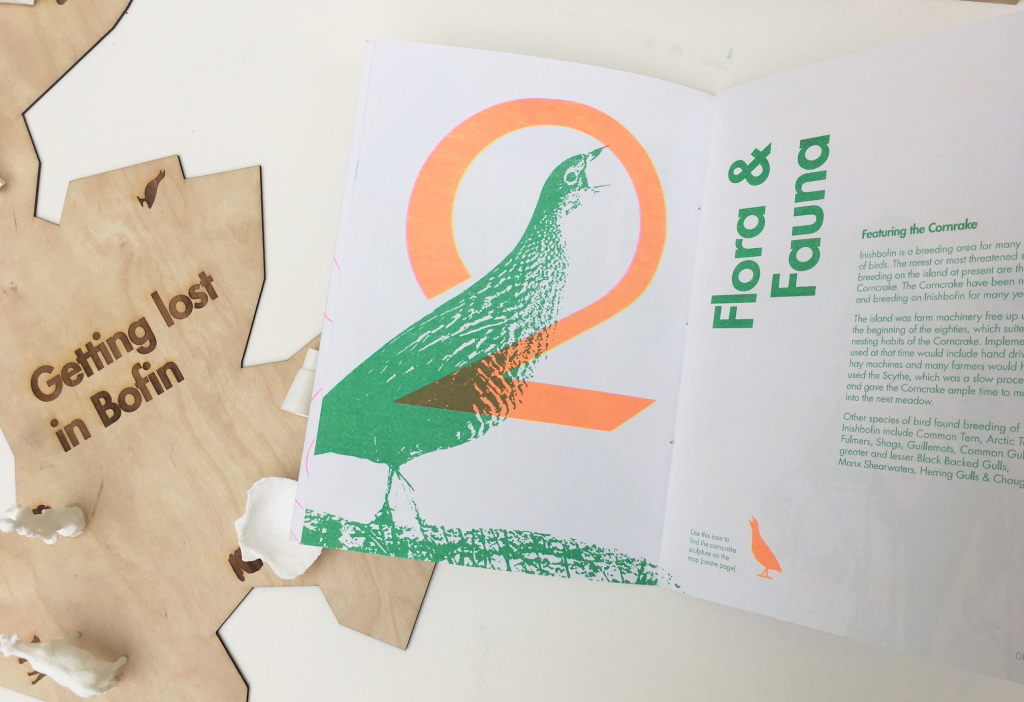
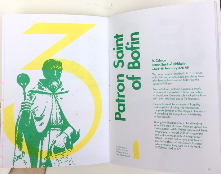
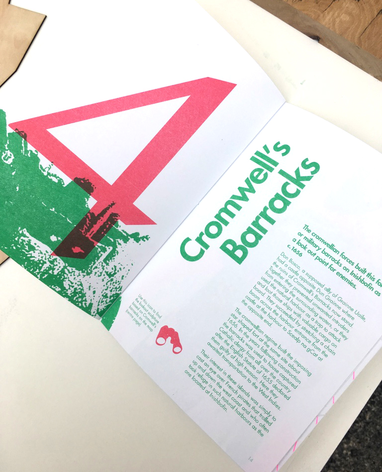
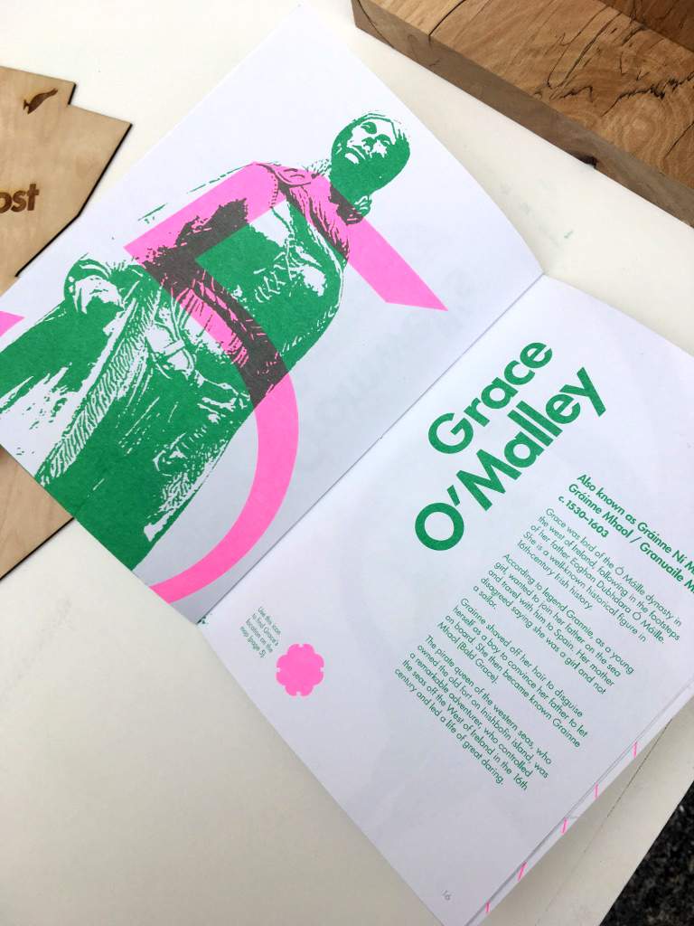
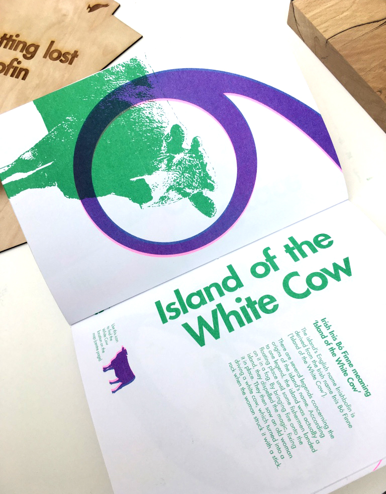
This is a guide to Inishbofin, a small island off the coast of Ireland. Inishbofin has a population of 180 people and relies heavily on tourism. This project explored a way of attracting more tourists to the island. The concept behind it is to create a series of landmarks around the island, which honour Inishbofin’s history and culture. As Inishbofin is an eco-friendly island, they seek to achieve sustainable tourism that does not negatively impact upon the island’s natural environment, while at the same time benefits and supports the local community. Therefore, the concept was each sculpture would be created with eco-friendly, sustainable materials such as wood, bog oak, stone and earthy materials which would be in harmony with the local landscape and for each one to be clever and creatively designed. Some of the landmarks/highlights I thought of were the famous Grace O’Malley, the Cleggan Disaster, the island’s Flora & Fauna wildlife, the Patron Saint of Bofin, Cromwell’s Barracks, the White Cow (the island’s name) and Cockles & Mussels. I explored different ways in which these sculptures would be created. The idea being that visitors can interact with the sculptures and will want to find each one, to take photographs with them and tick them off their list of cultural things to see on the island. Beside each sculpture would be a small plaque which also naturally blends in with the local environment, which tells the story behind the sculpture.
Taking visual cues from the Camino de Santiago, where there is the a subtle shell with an arrow showing the direction to walk, I designed an icon which would work in the same way for Inishbofin’s sculptures. It is a simple boat shape, where the sail is an arrow – the direction of the arrow indicates which way to walk to each attraction. These would be set subtly in stone around the island, to ensure not to impact the island’s beautiful and natural landscape.
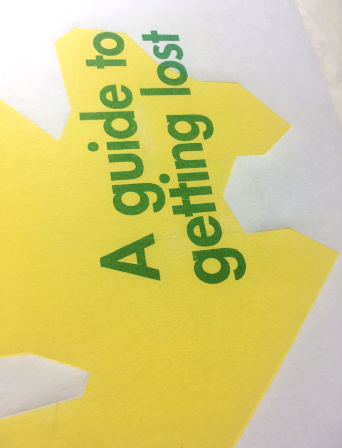
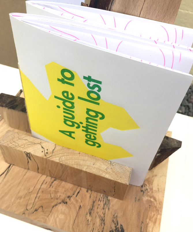
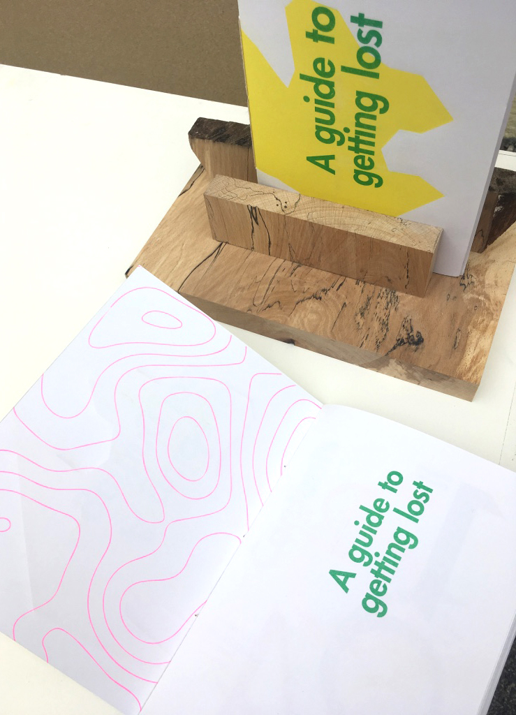
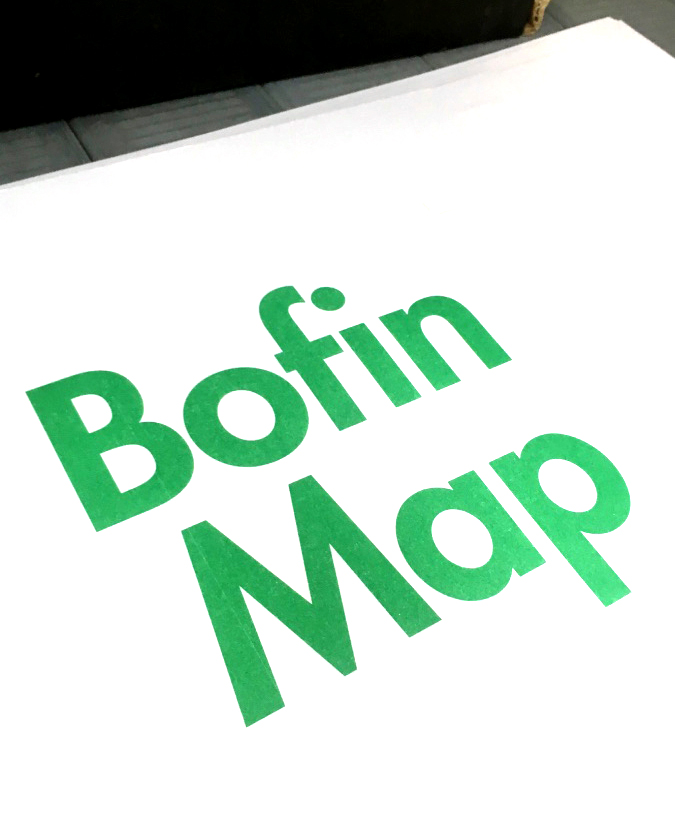
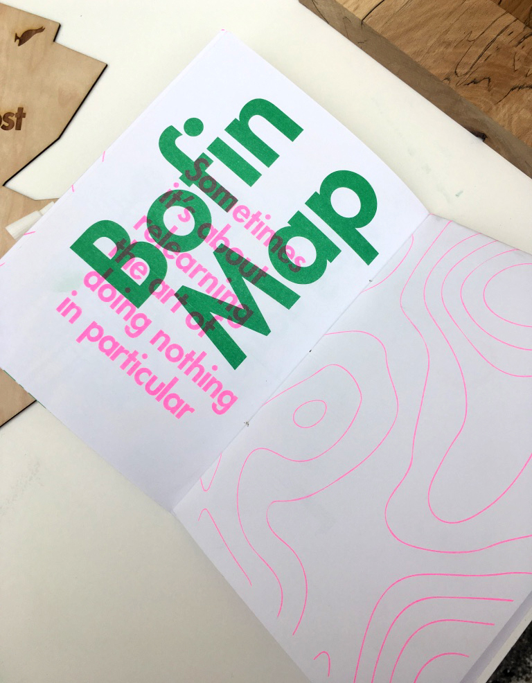
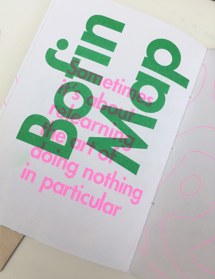
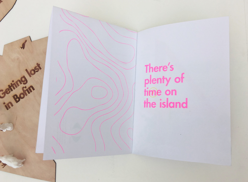
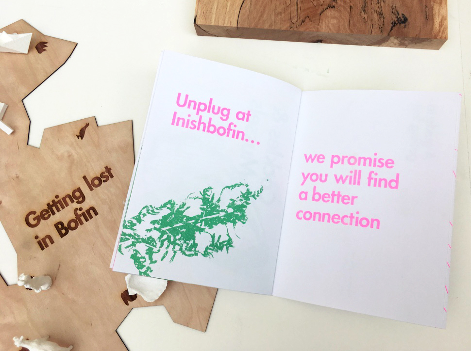
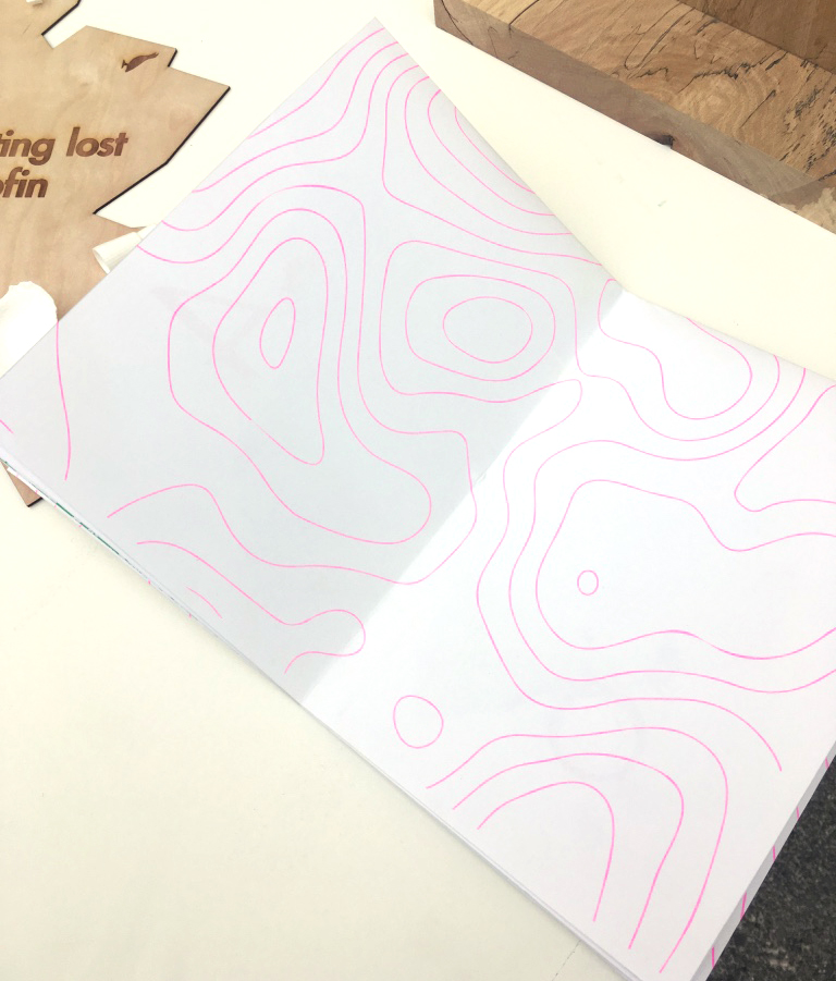
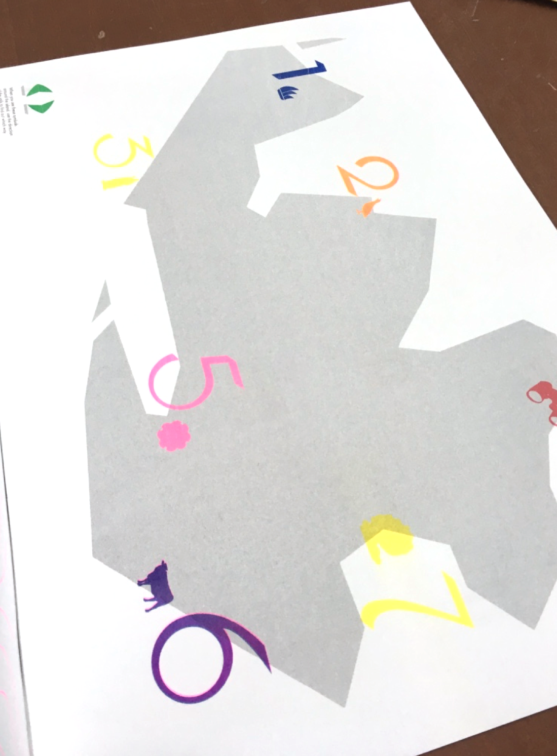
The main piece was an A5, side-stitched booklet with a fold-out A3 map showing the location of each sculpture around the island in the centre-fold. It was riso-printed using a rigorous 7-colour process, with some lovely ‘happy accidents’ of colour offsets in the finished booklet. The cover was then debossed with the shape of the map. Each page uses modern typography and layouts. On researching the island, many people said how Inishbofin was a place that people come to get lost and find themselves in, enjoying the slower pace of life and the fresh sea air and nature. The expression ‘There’s plenty of time on the island’ is a commonly used expression. This inspired the name for this booklet, with the play of words ‘A Guide to Getting Lost’. I created an icon for each sculpture, which visitors can easily find on the map, and used some expressions throughout which represent the essence of life on Bofin.
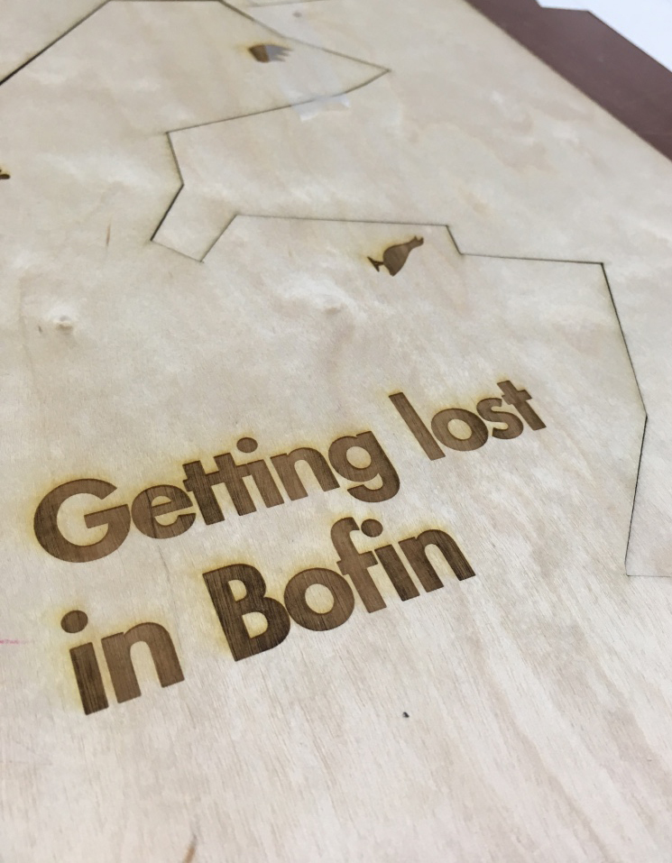
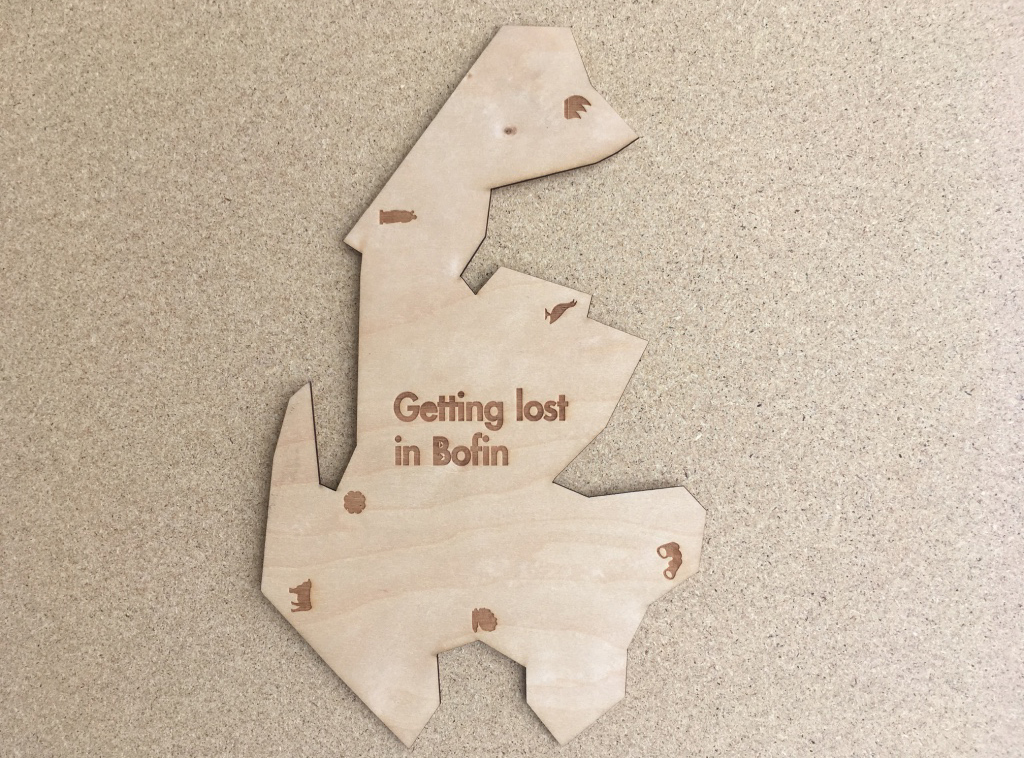
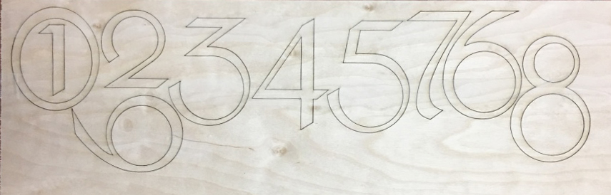
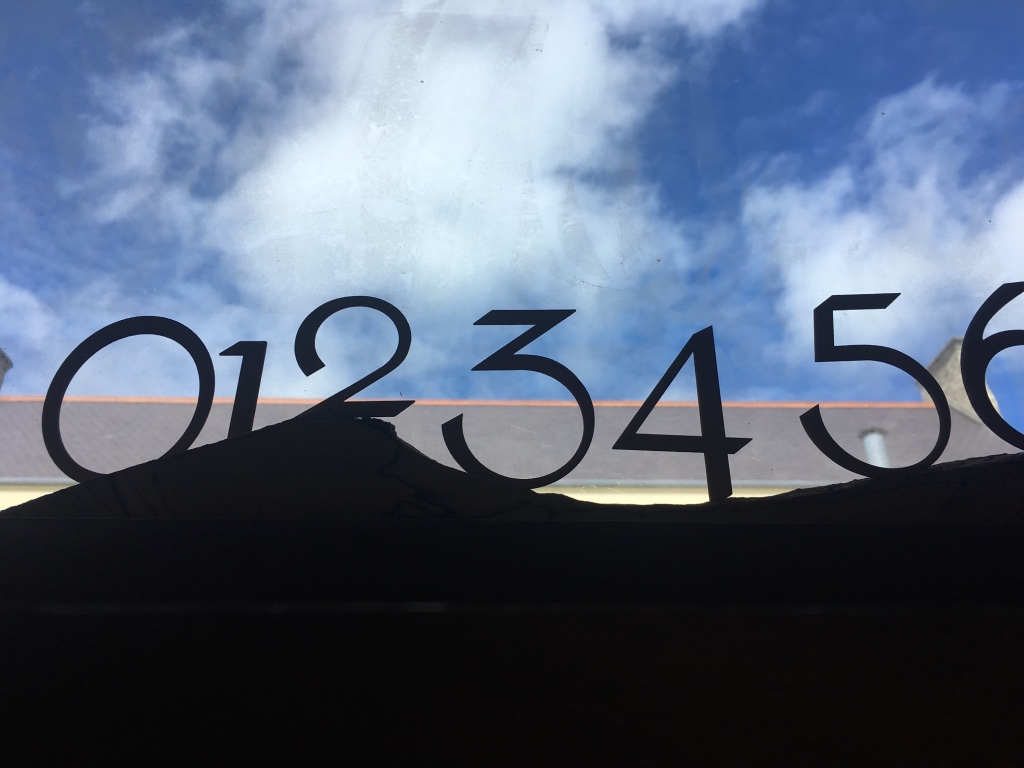
At this stage of the project, I created a 3D wooden stylised map of the island, with laser etchings of the icons, and also created 3D-printed icons to represent each sculpture (although not aimed to be the finished sculpture design). For the numbers on the map, I tailored an old Irish Celtic font to create individual, unique numbers which still embody the Celtic feel, but with a modern twist. I then laser printed these personally-designed numbers on to wood, to have as physical items to display as part of the overall proposed exhibition display. The use of wood for the display stand added to the sustainability, eco-friendly culture with which Inishbofin is proud of.