


Related Work
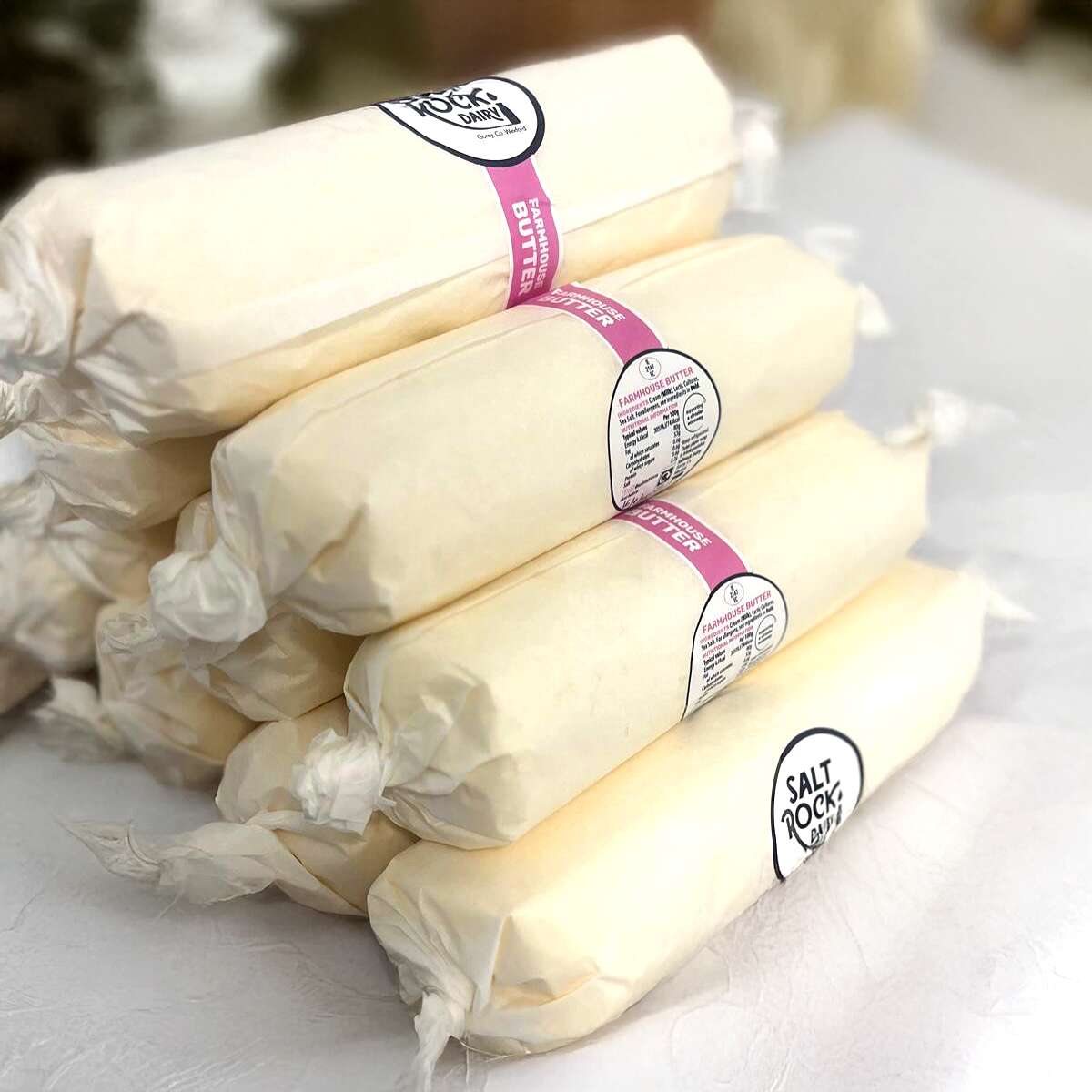
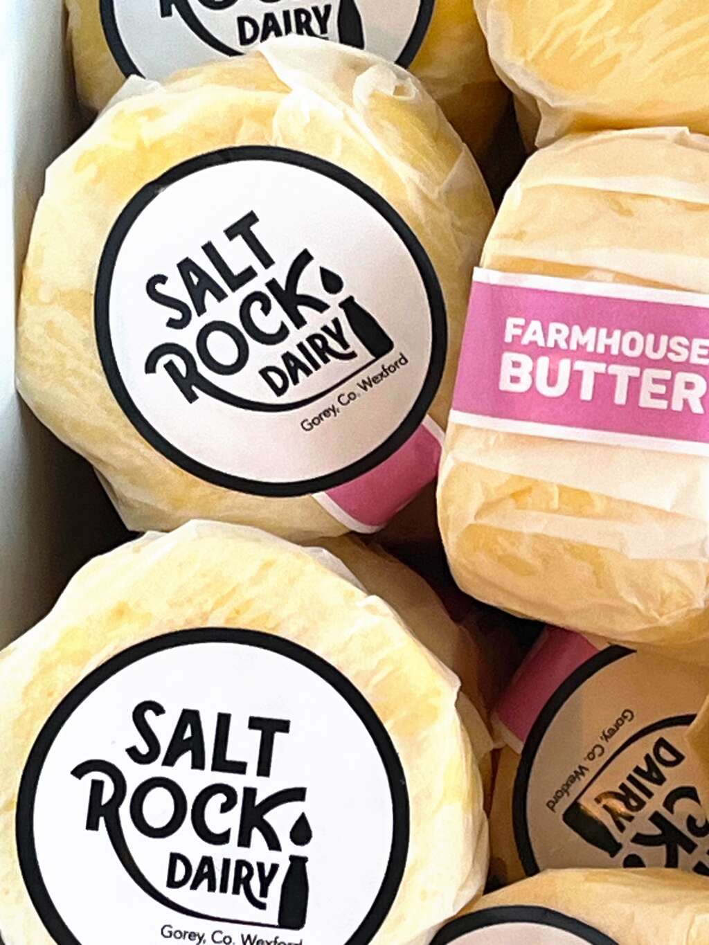
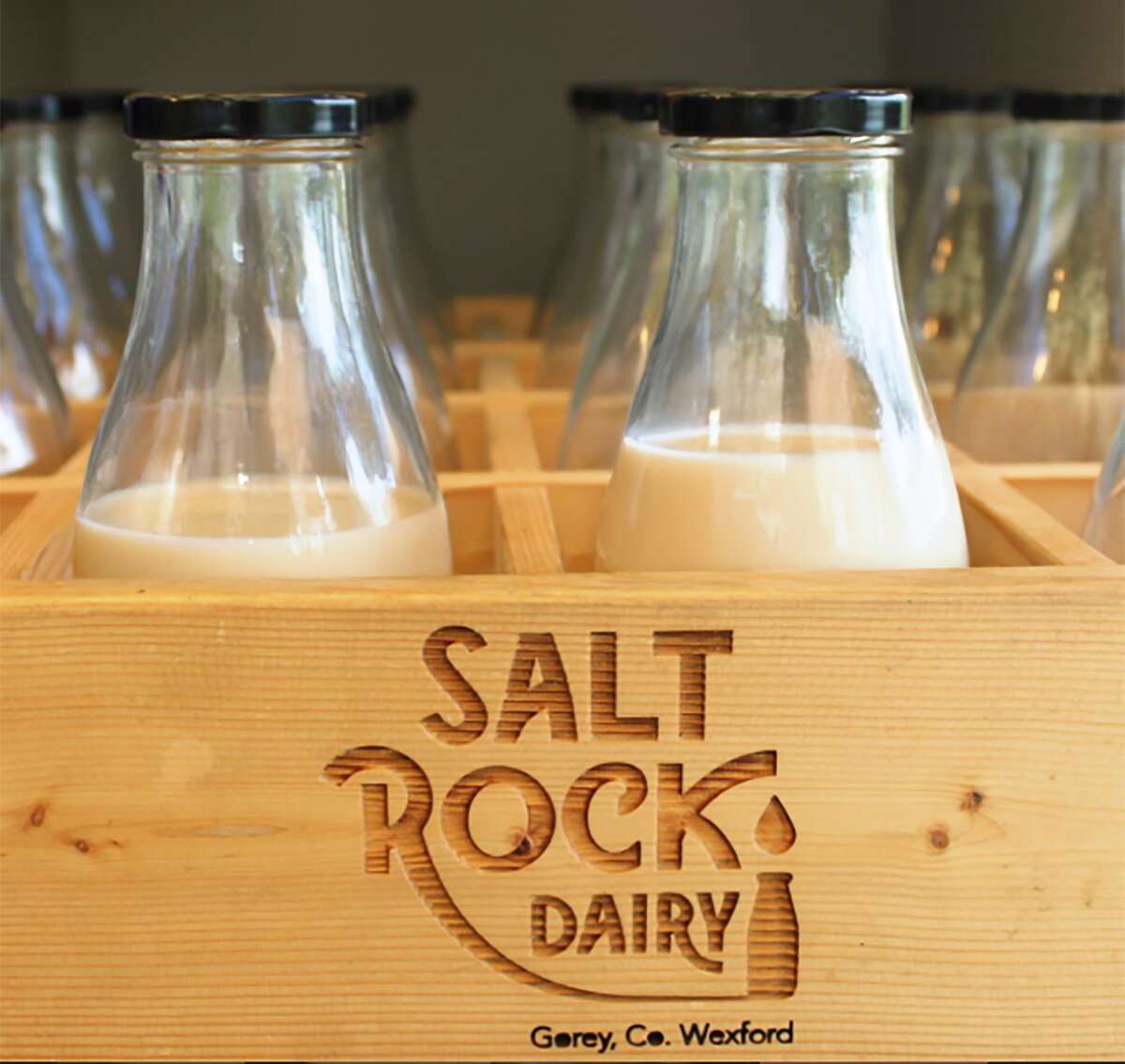
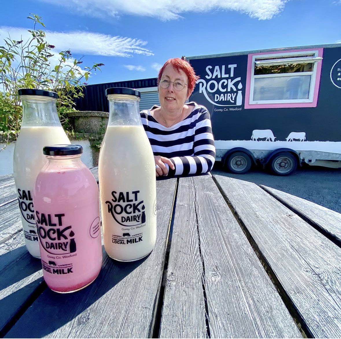
Saltrock Dairy Packaging Design Range Development
Branding, Design, Packaging
Saltrock Dairy Packaging Design – Range Development
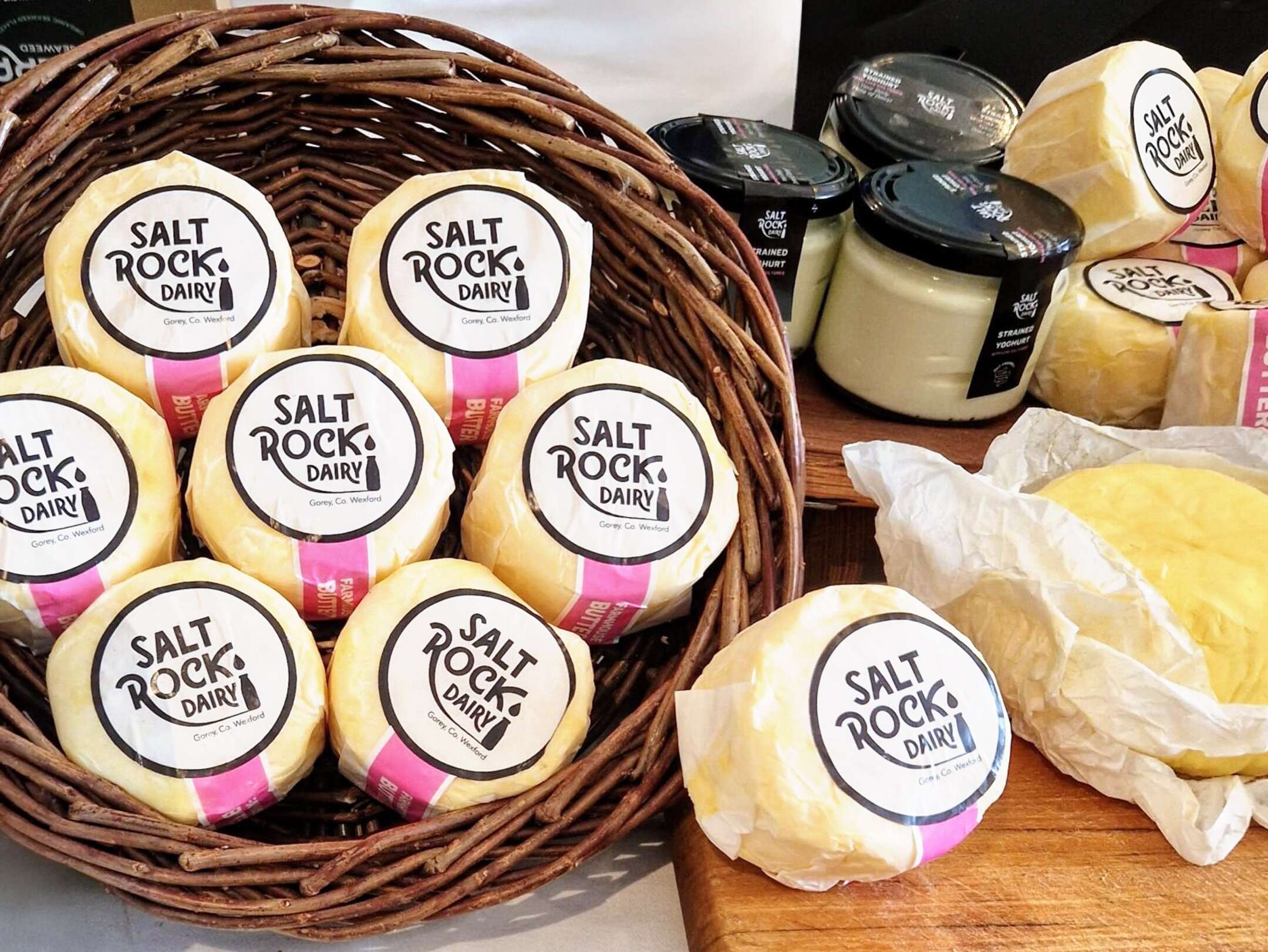
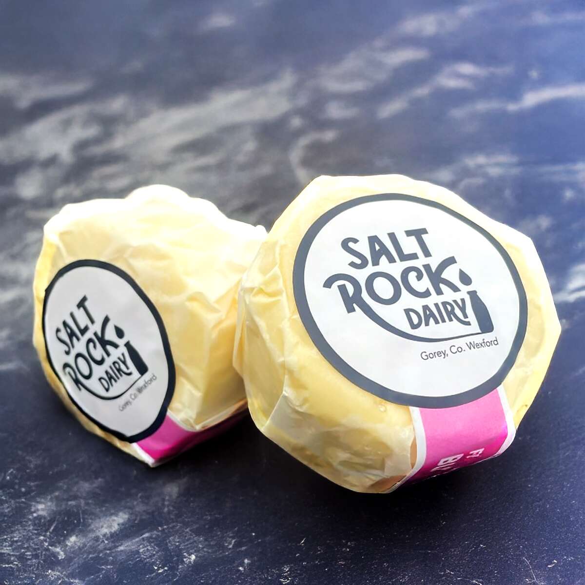
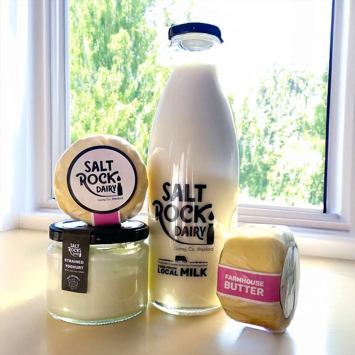
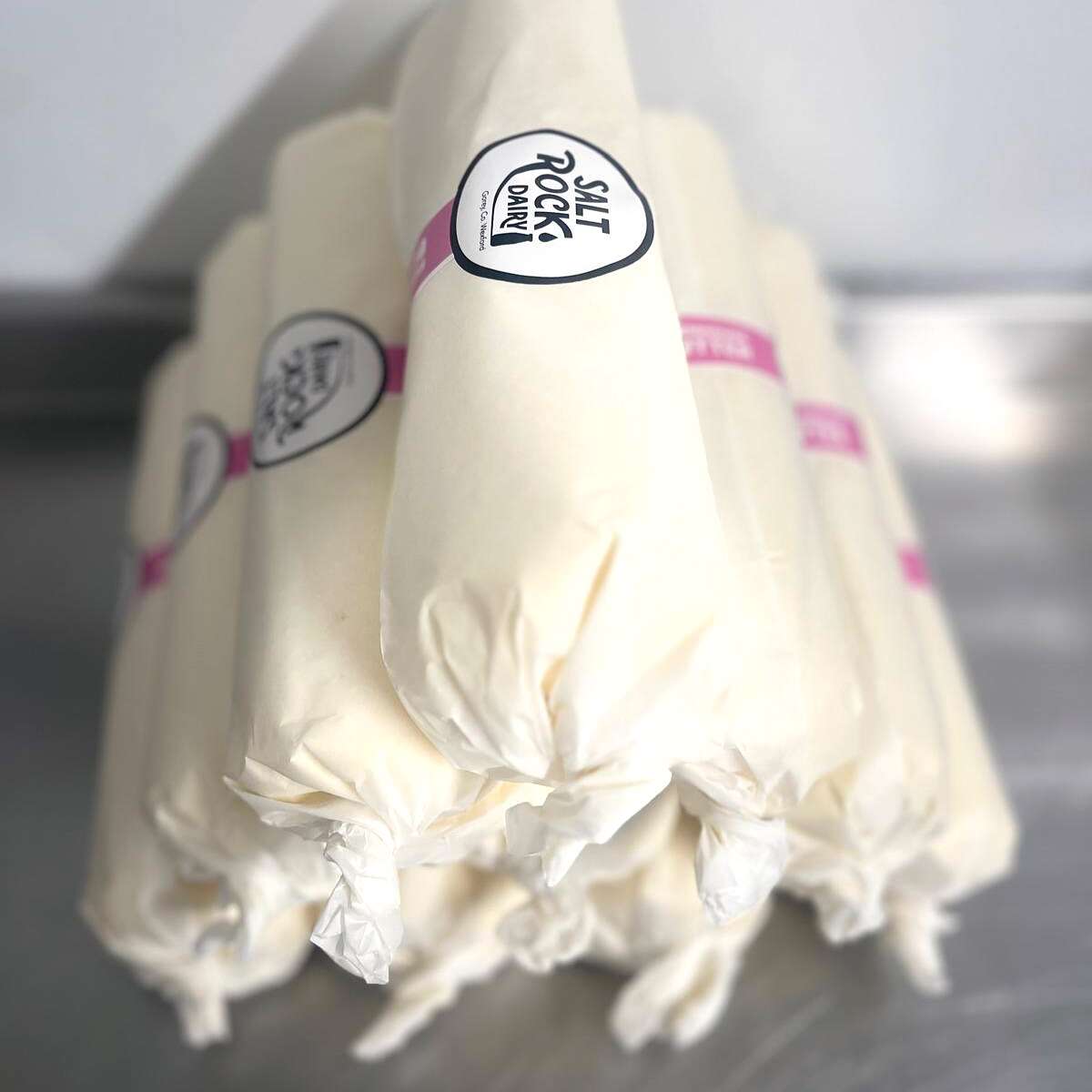
Saltrock Dairy asked us to help develop their packaging design range from the fresh milk products to Irish Cultured Farmhouse Butter and Strained Yoghurt. We ensured to keep a consistent look and feel with the existing brand, ensuring the new products had the same vibrant stand-out shelf presence and impact as customers associate with Saltrock Dairy.
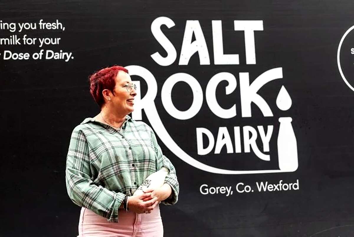
Based in Gorey, Co. Wexford, Saltrock Dairy is a family-run farm situated on Tara Hill. Their mobile milk trailer travels around North County Wexford each week, supplying everyone with their weekly top-up of pasteurised non-homogenised milk.
![]()
Their new range is available in select stores such as Nolan’s in Clontarf and can be ordered online at:
www.SaltrockDairy.ie
Give them a follow on their Instagram page to find out where you can next spot the Saltrock Dairy trailer.
Orija Nutrition: Brand Packaging Design
Branding, Design, Packaging
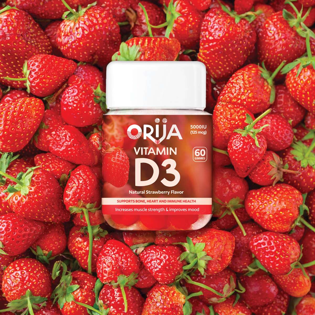
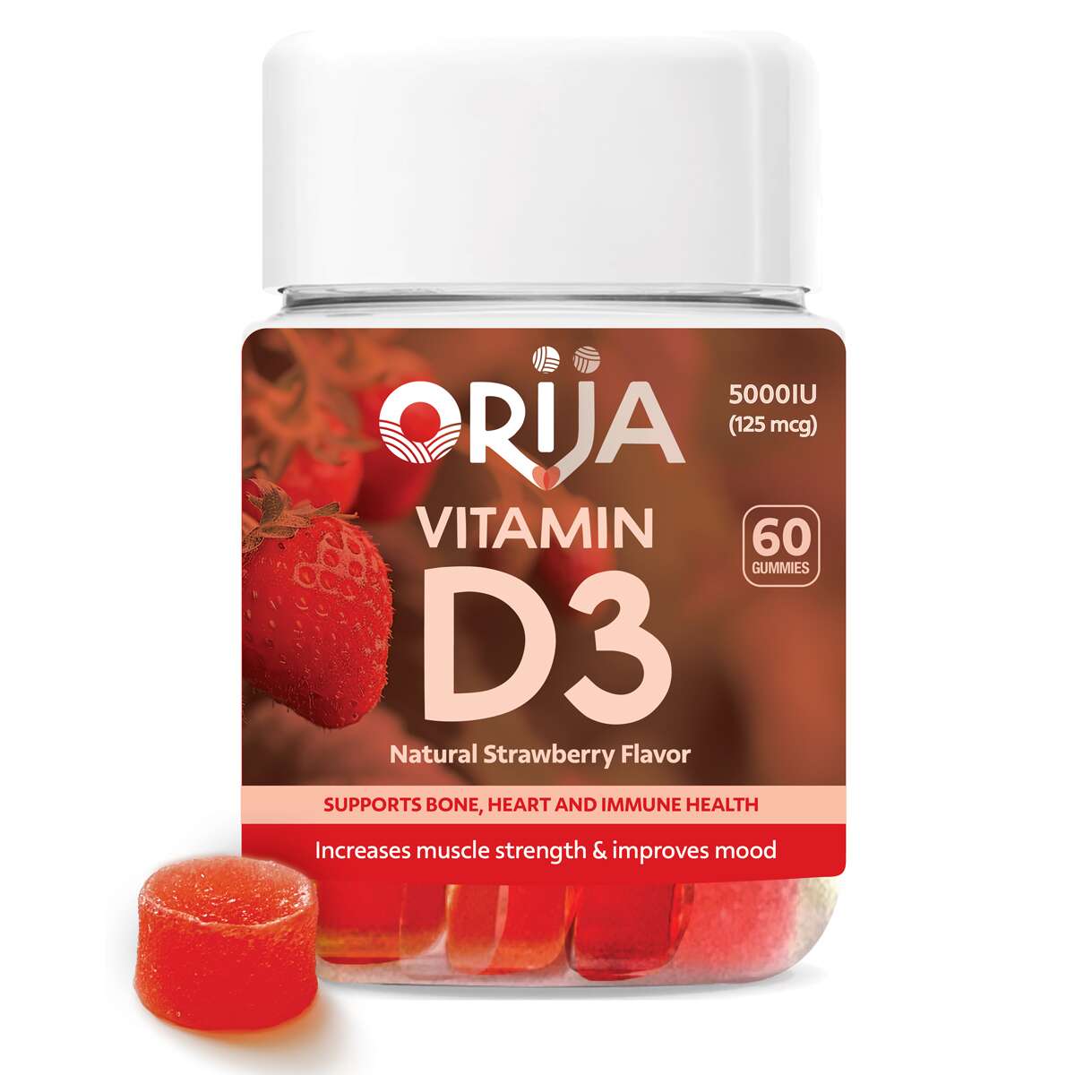
Orija Nutrition: Packaging Design – Gummies Supplements Range
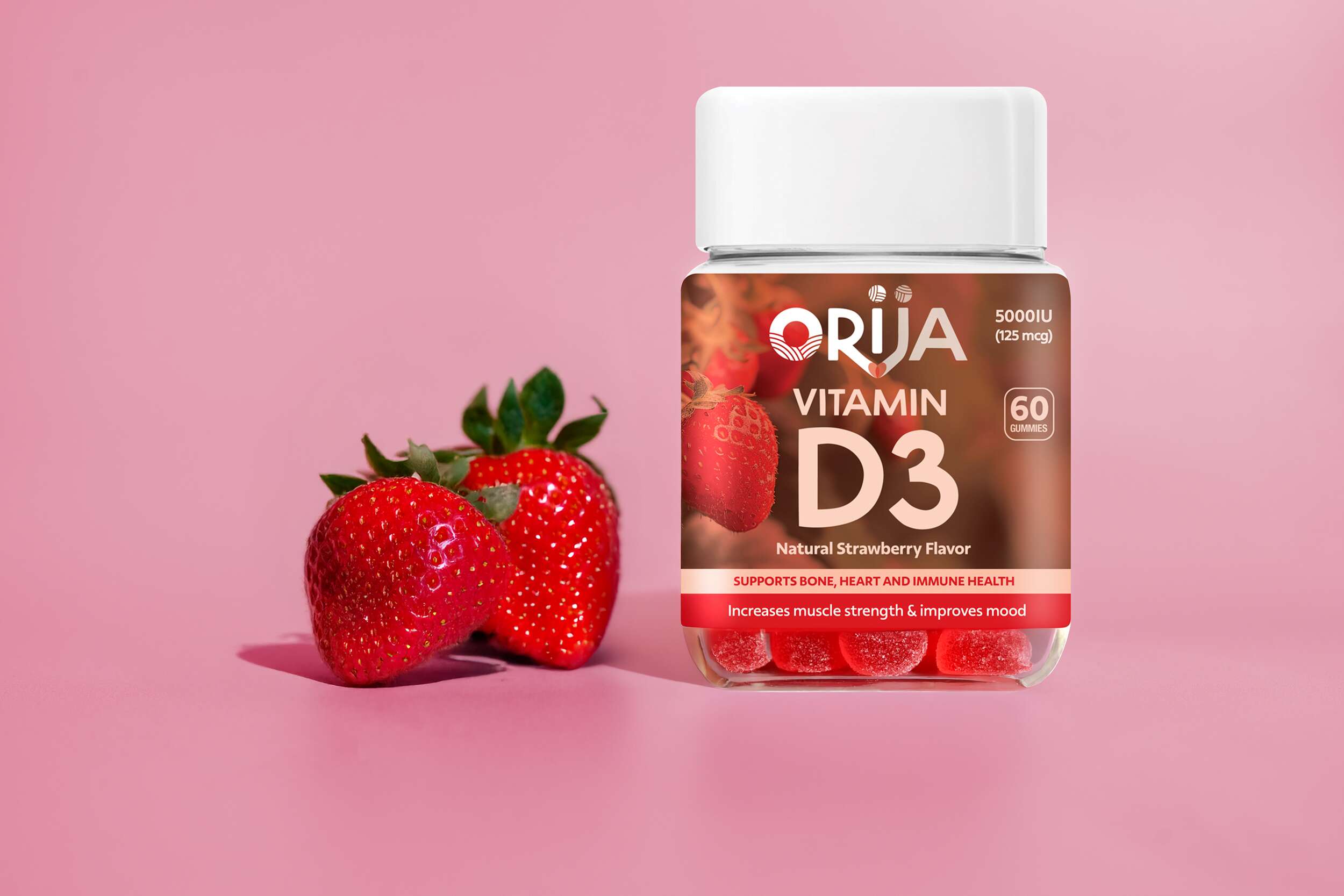
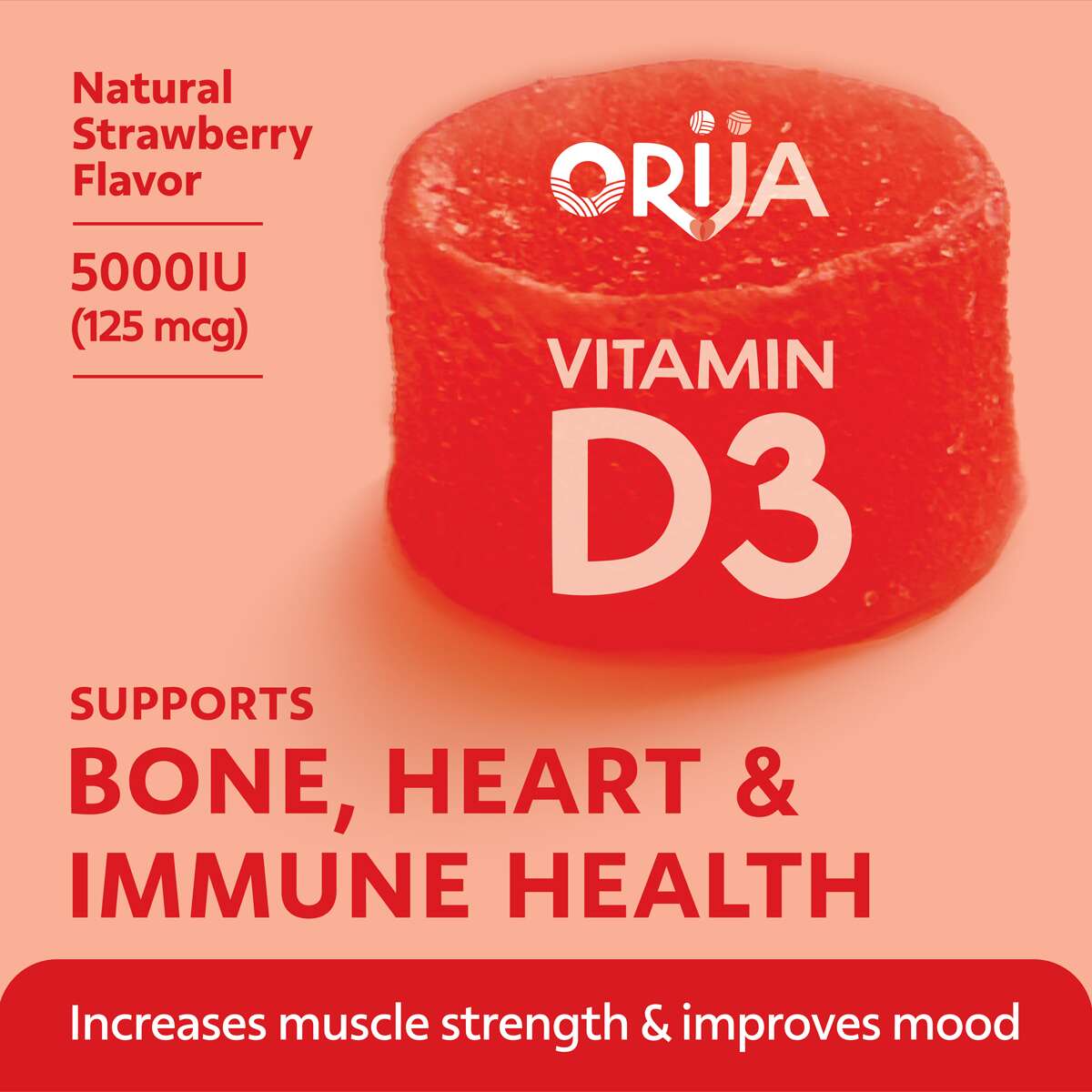
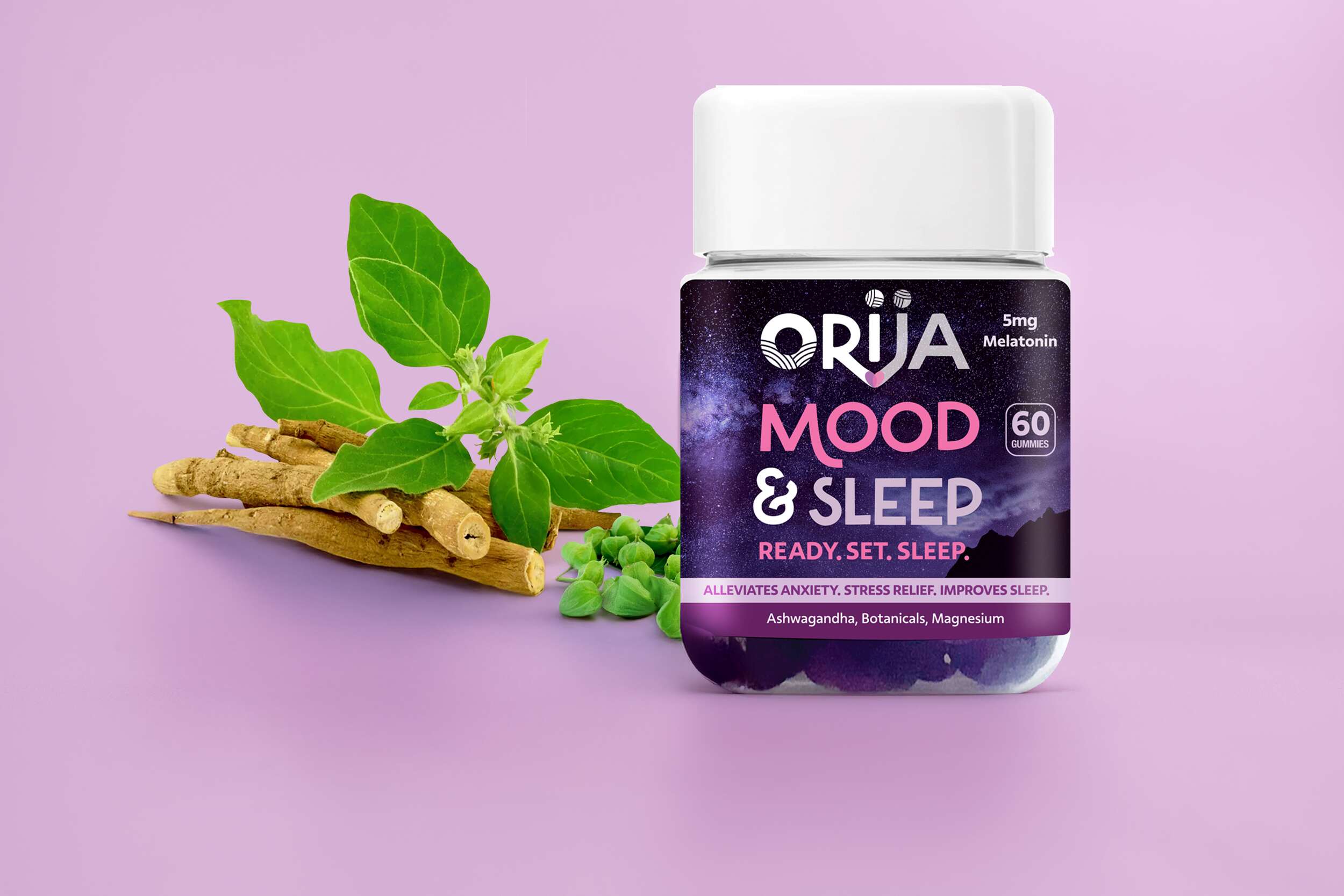
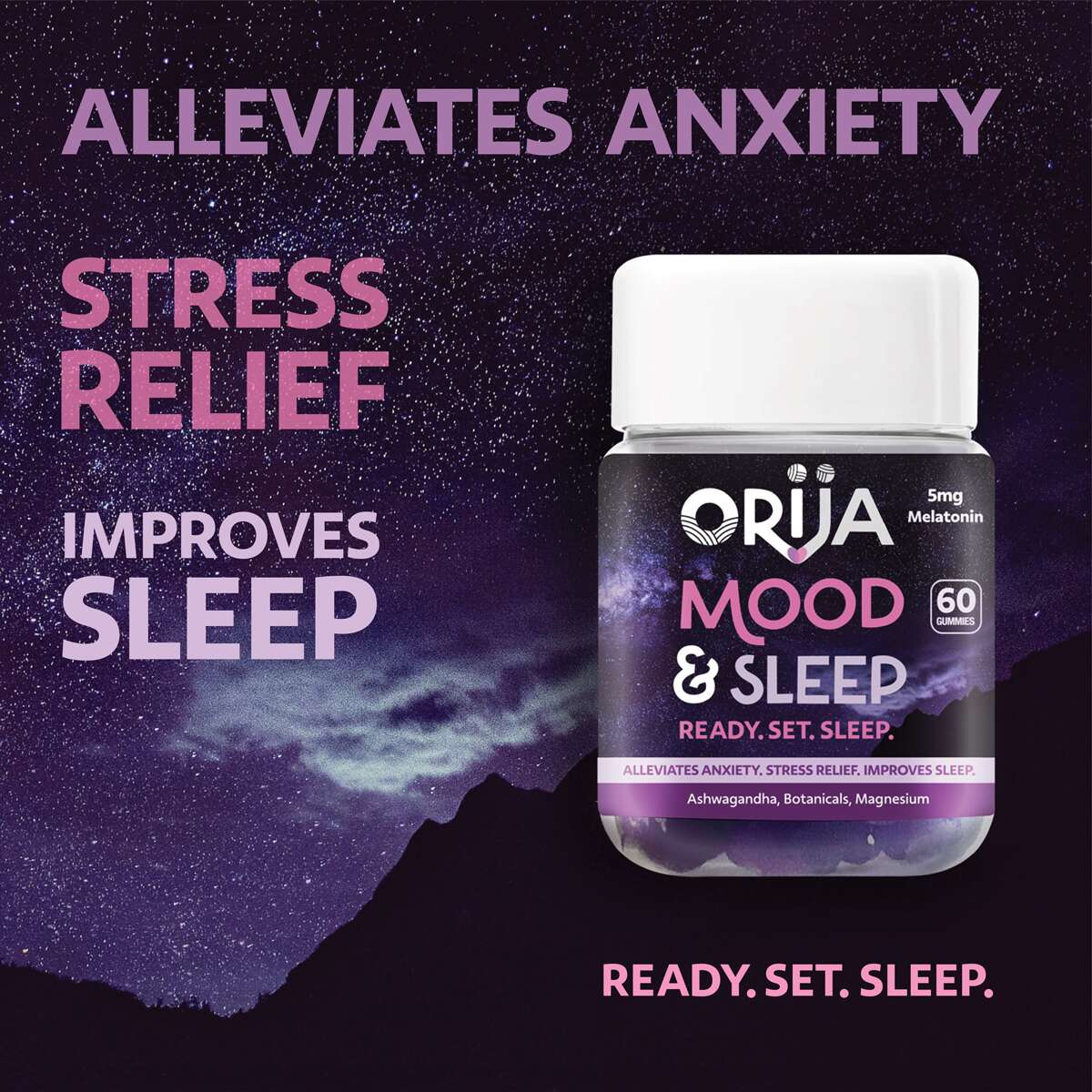
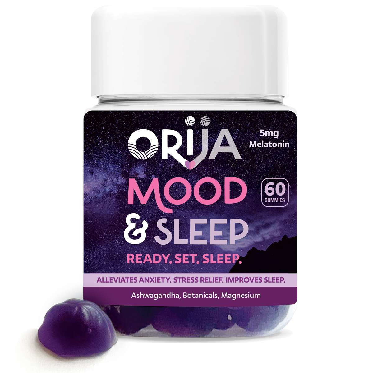
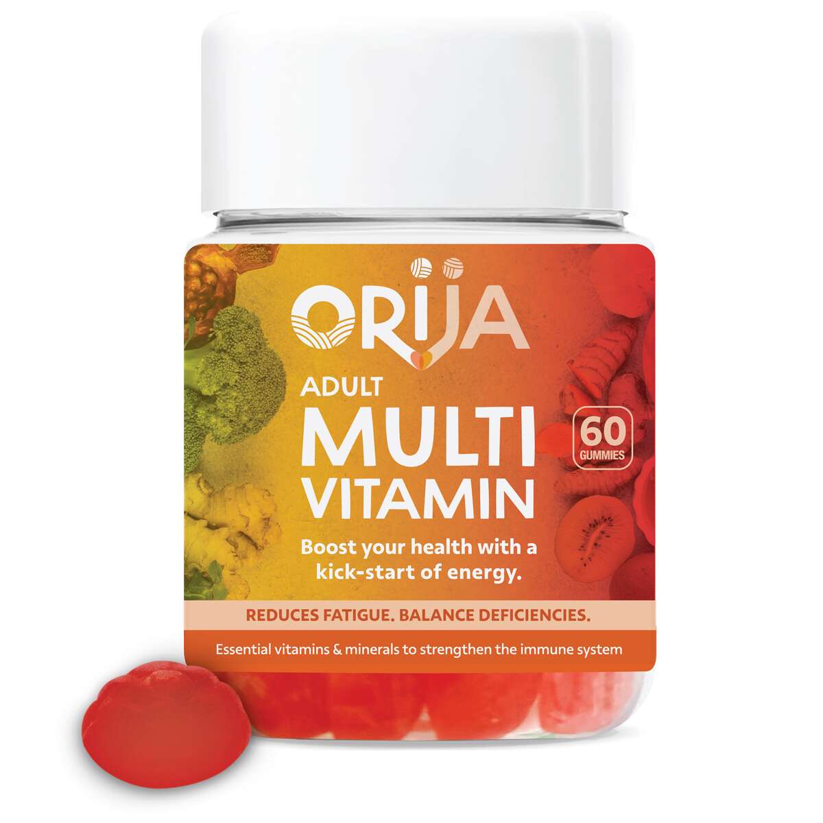
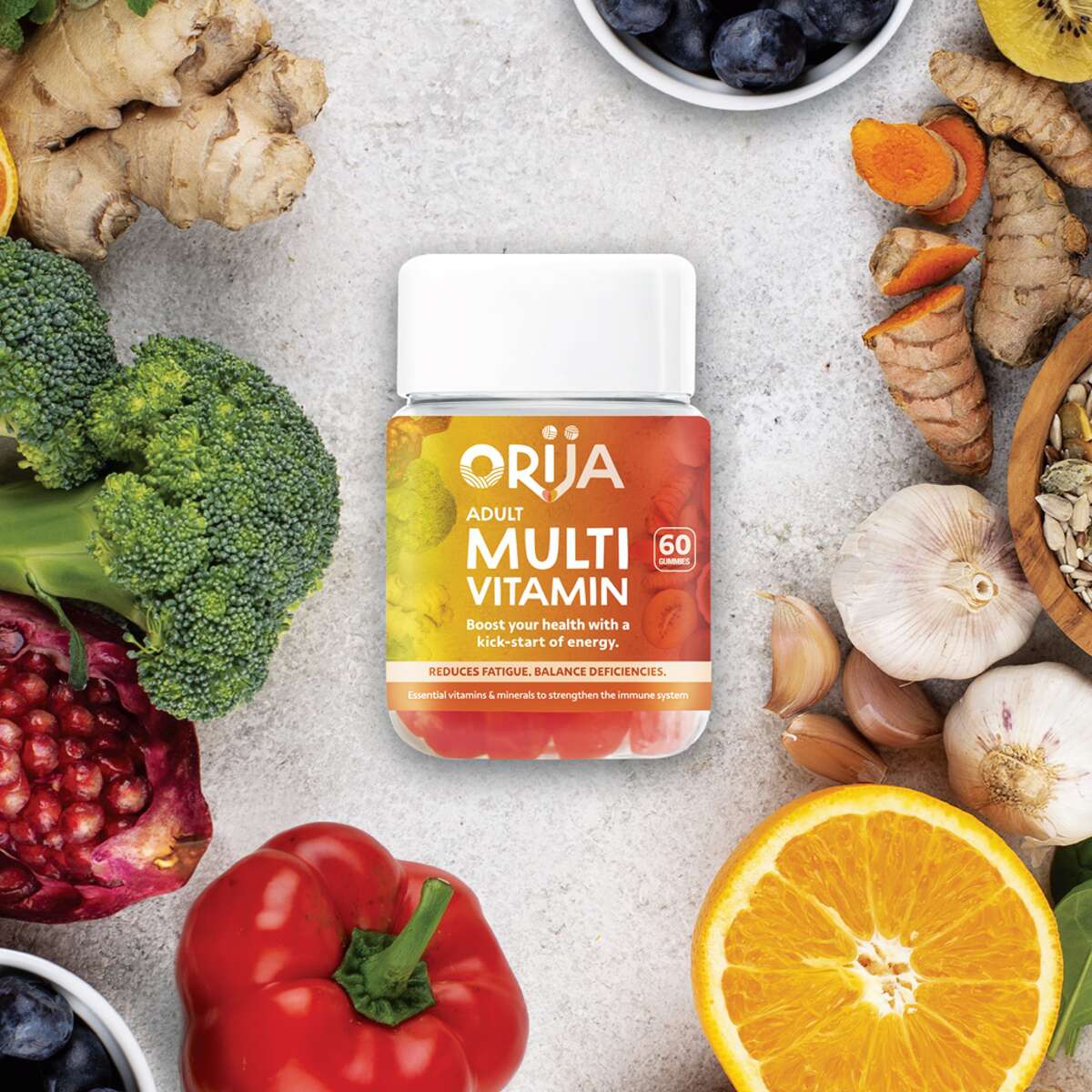
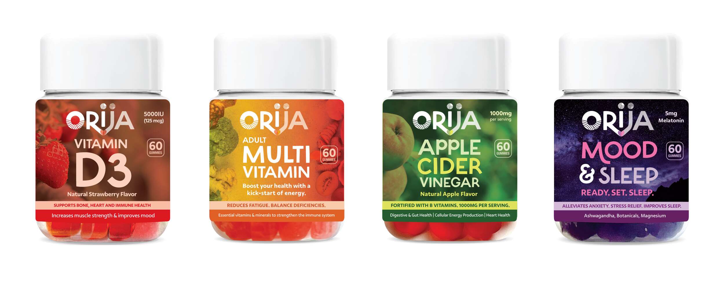
Following the successful launch of Orija’s first retail herb and spice range, we had the pleasure of continuing my collaboration with them to design packaging for their newest innovation, a line of functional nutraceutical gummies.
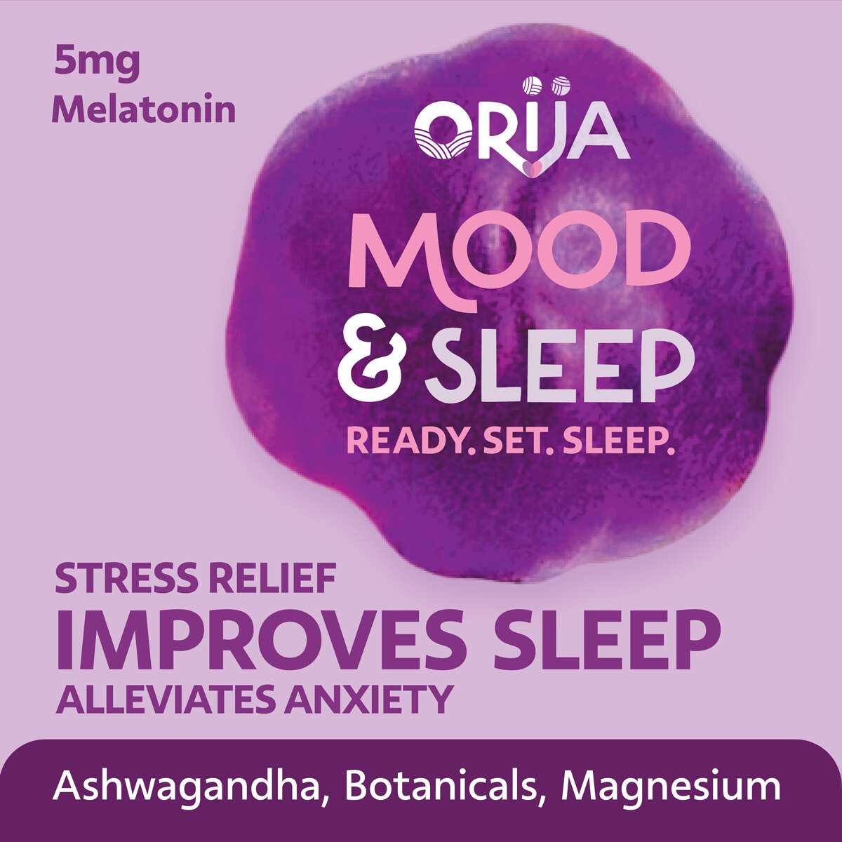
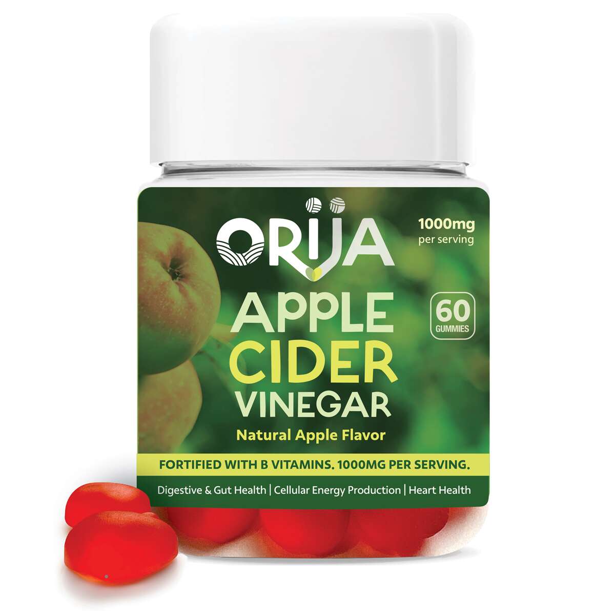
The collection includes Apple Cider Vinegar, Vitamin D3, Mood & Sleep, and Adult Multivitamin – each formulated to support daily wellness through clean, plant-based ingredients.
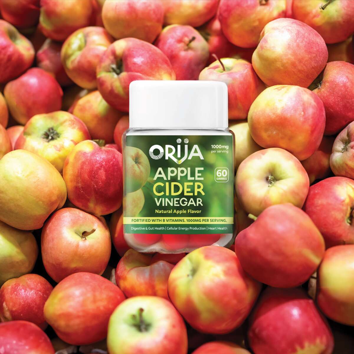
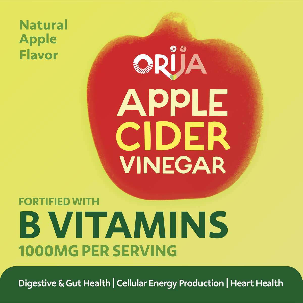
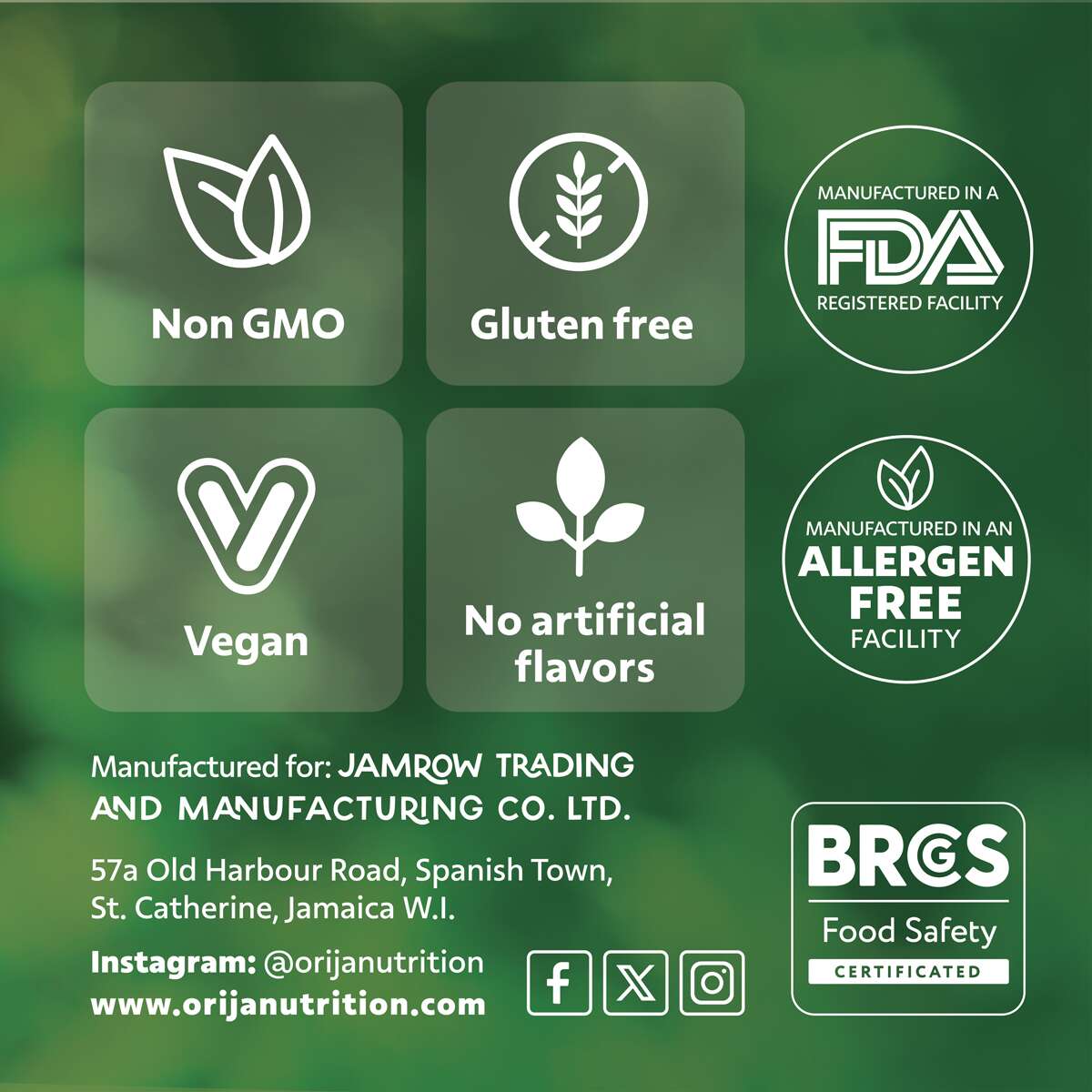
Our design approach focused on creating a premium and fresh look, combining bold colour palettes influenced by the gummies’ natural flavours with clean typography and subtle background photography. Each label highlights key benefits and icons, clearly communicating Orija’s values of quality, integrity, and transparency.
Vitamin D3
Mood & Sleep
Apple Cider Vinegar
Adult Multivitamin
The Full Range
It’s been great working with an authentic Jamaican company, their vibrant energy creates such an inspiring partnership. They are a family-run business expanding into the retail wellness space. The final designs deliver a fresh, credible aesthetic that positions Orija among leading supplement brands while keeping its unique island heritage front and centre.
Follow Orija on Instagram:
@OrijaNutrition
Orija Nutrition: Brand Packaging Design
Branding, Design, Packaging
Orija Nutrition: Brand Packaging Design
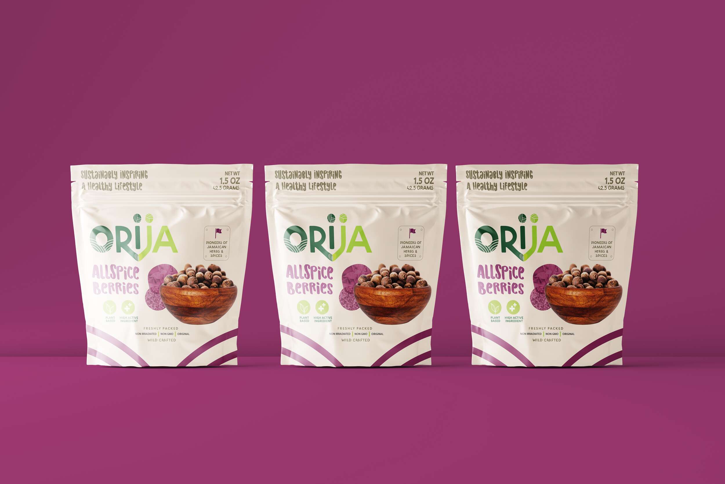
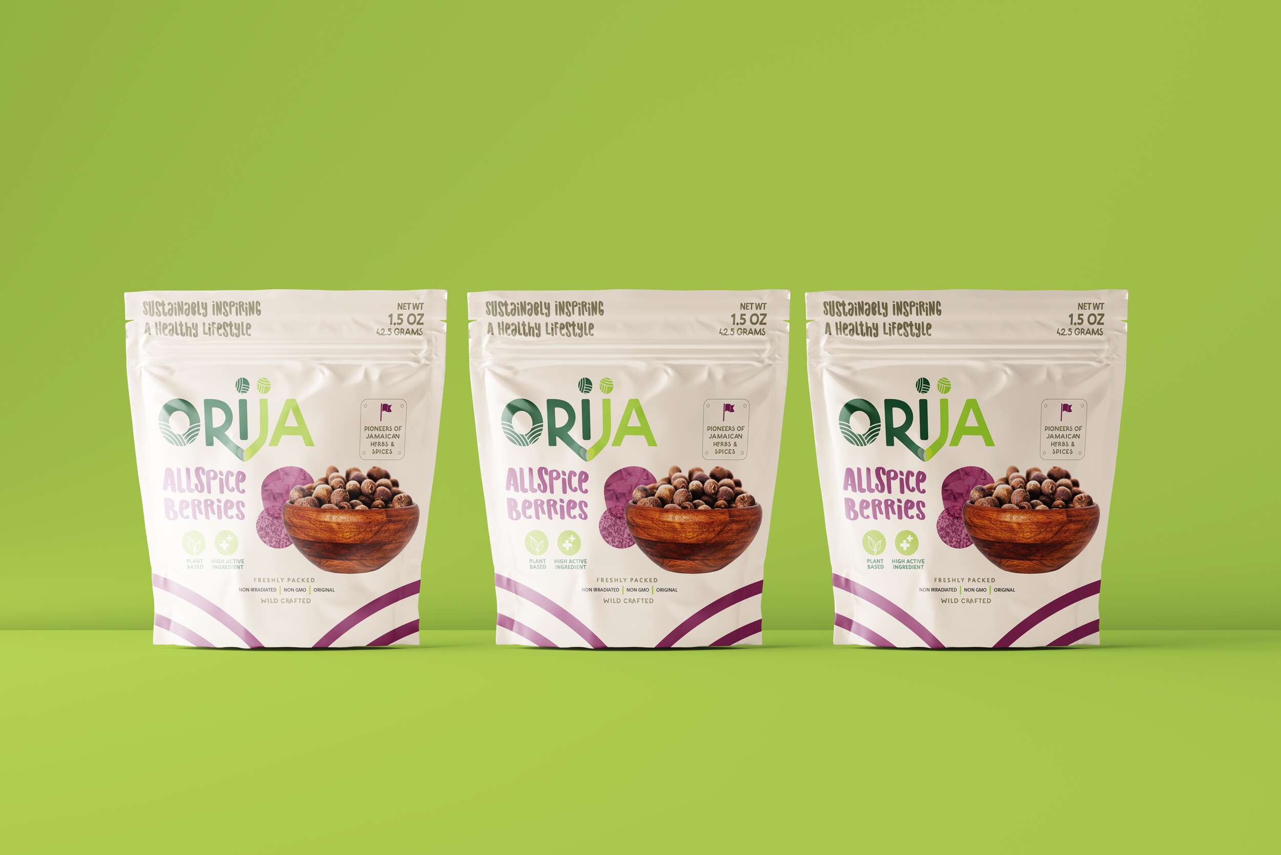
Nutraceutical Superfood Range
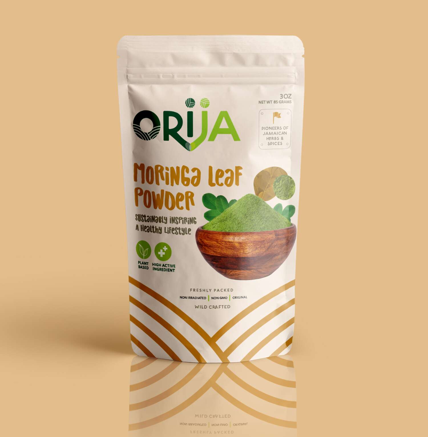
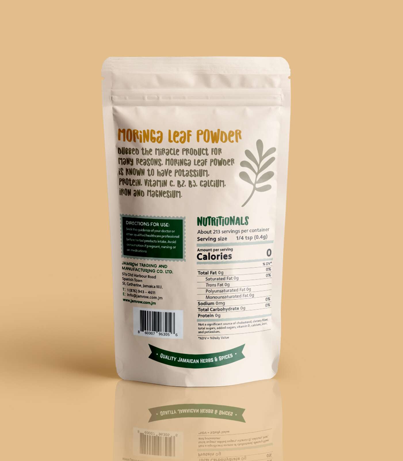
Moringa Leaf Powder 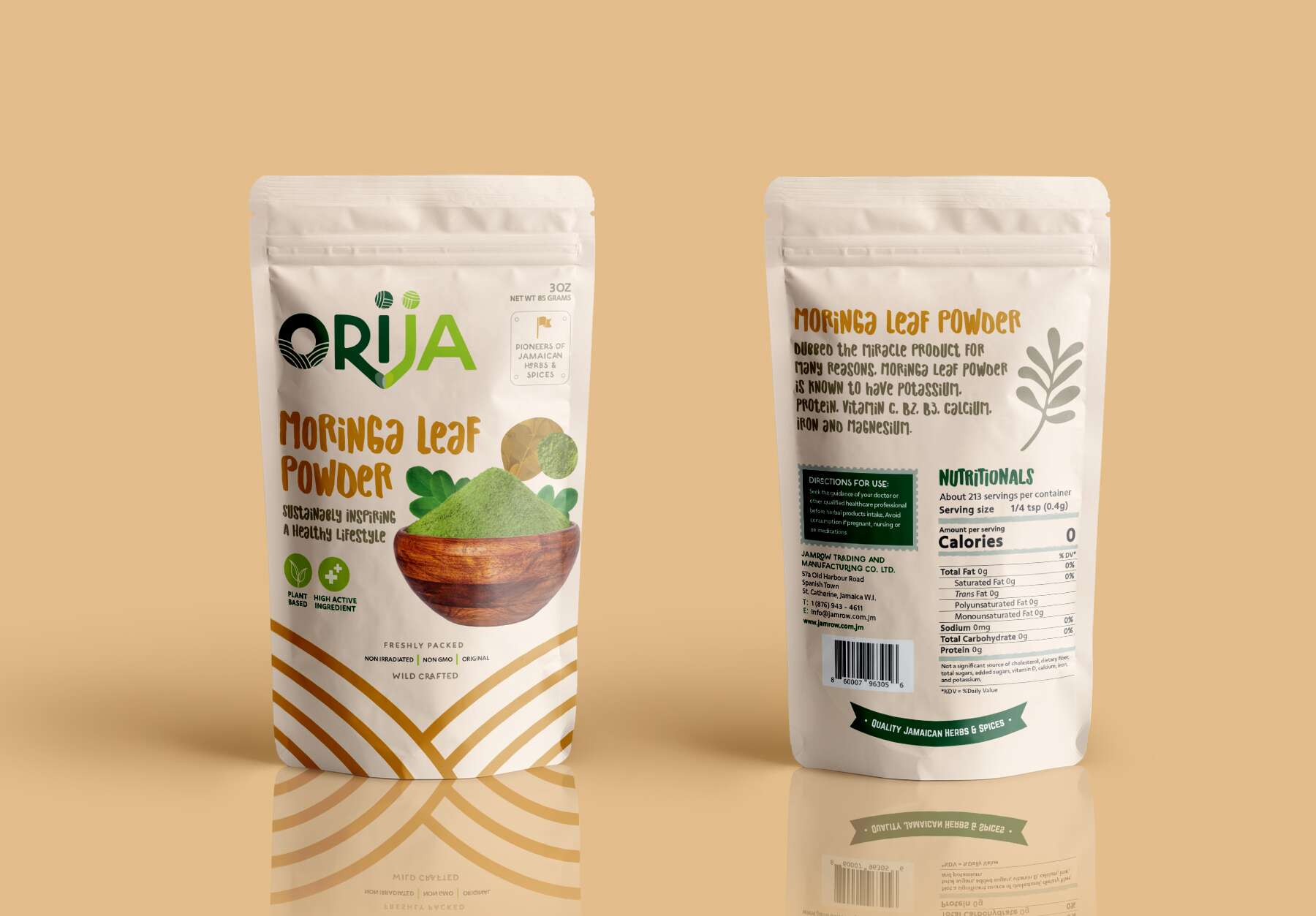
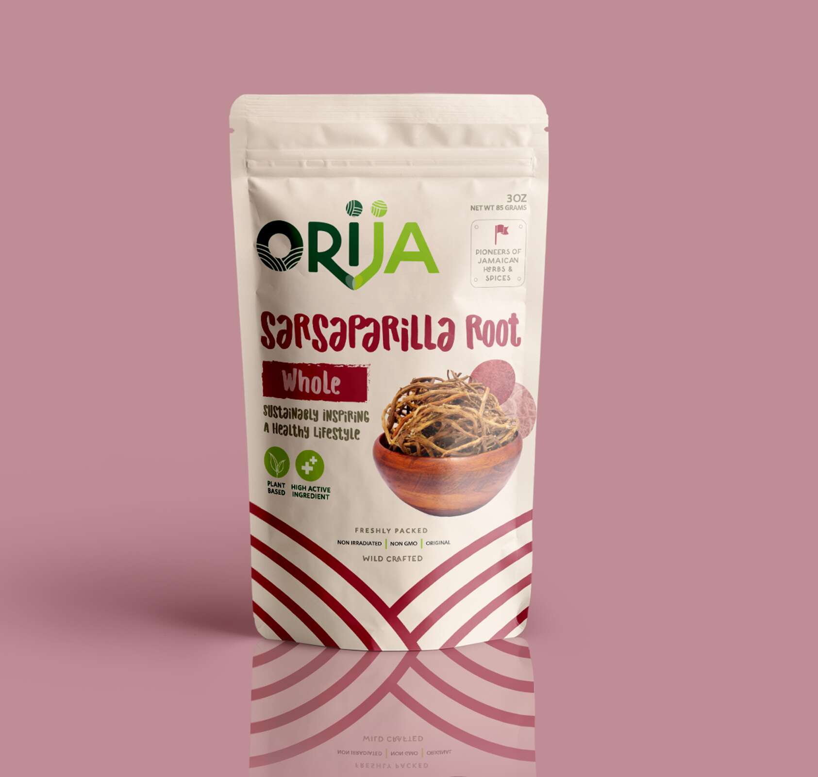
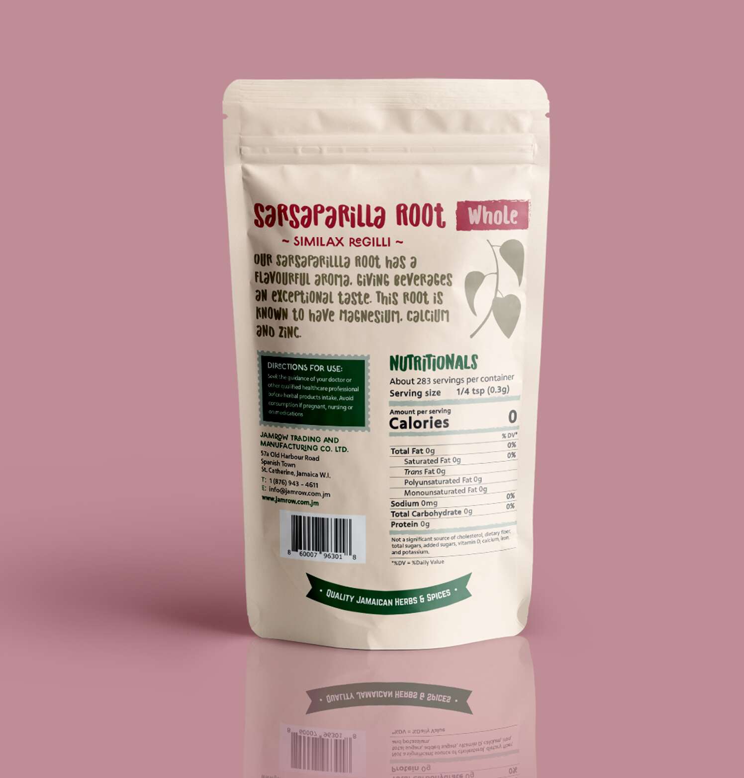
Sarsaparilla Root – Whole
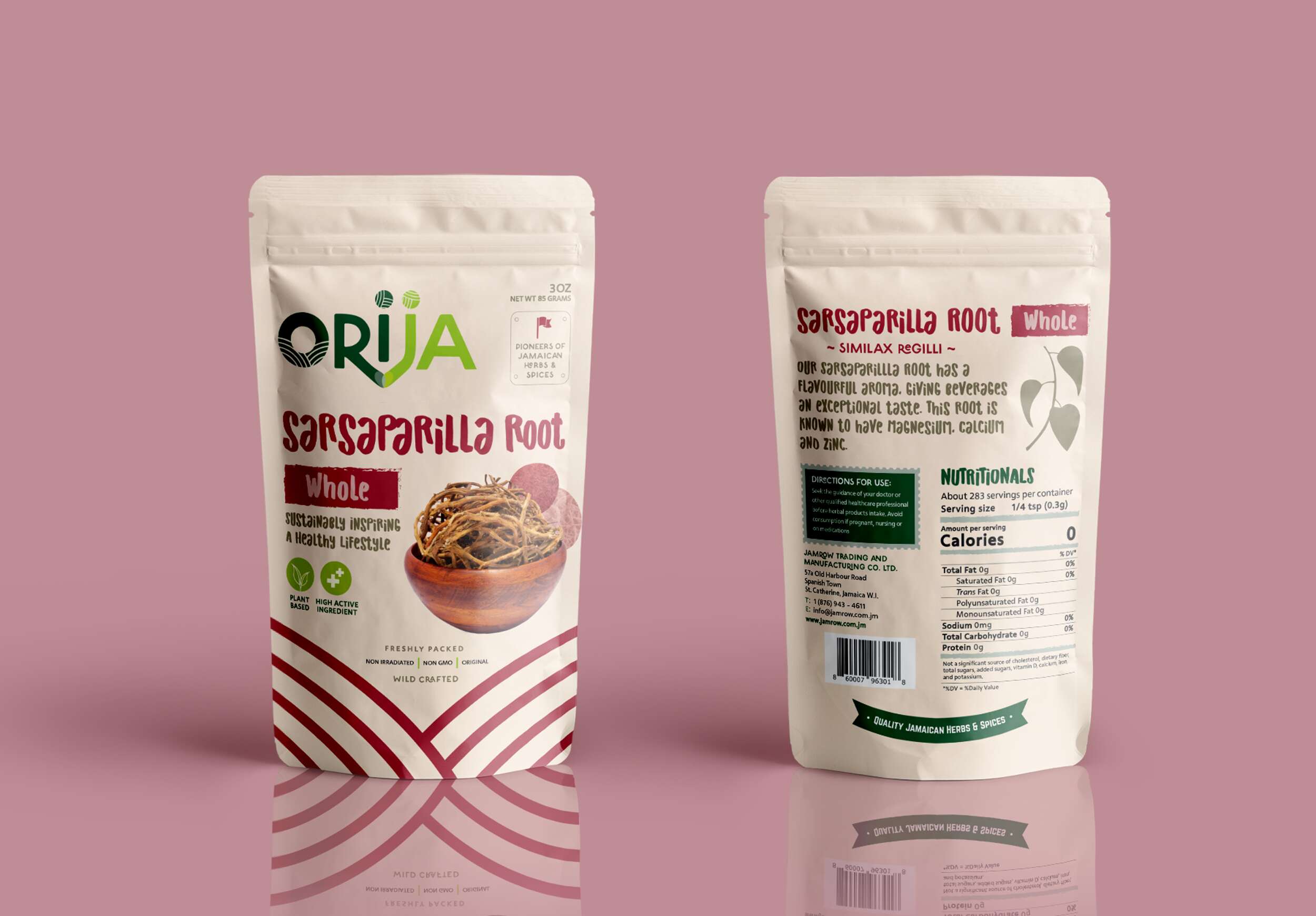
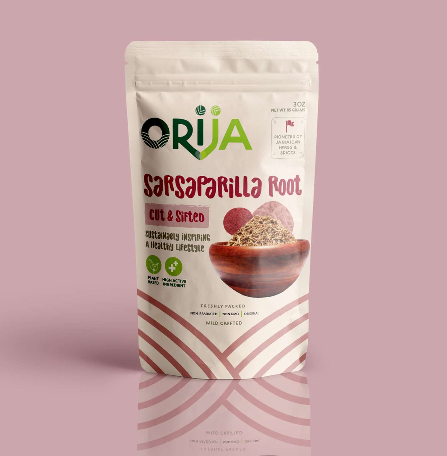
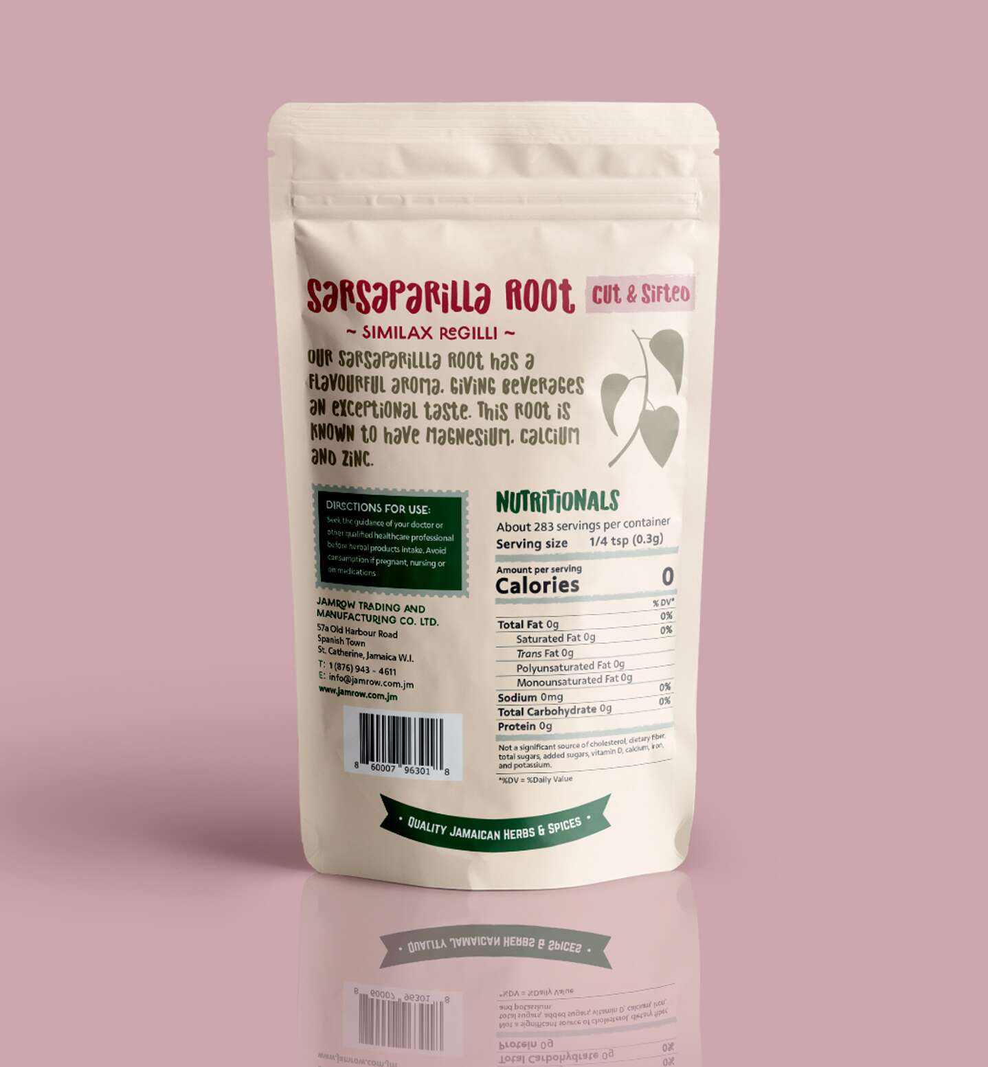
Sarsaparilla Root – Cut & Sifted

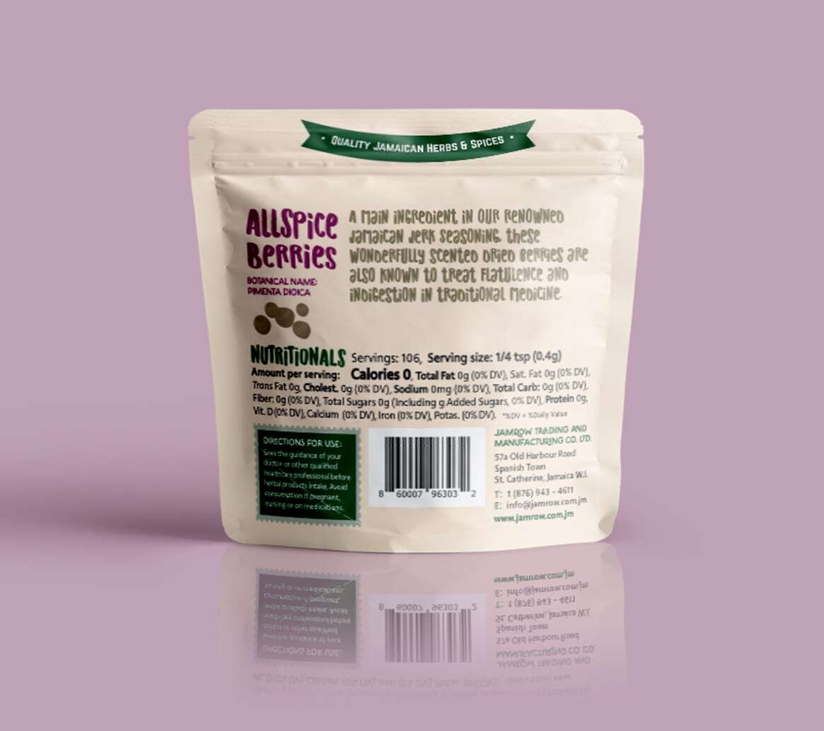
Allspice Berries
Ground Nutmeg
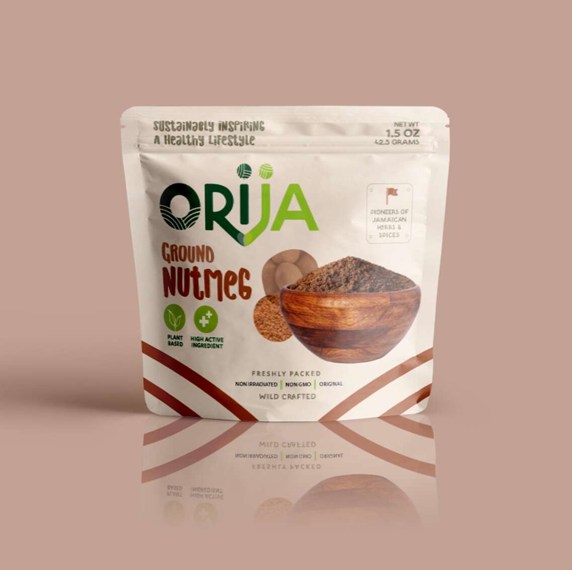
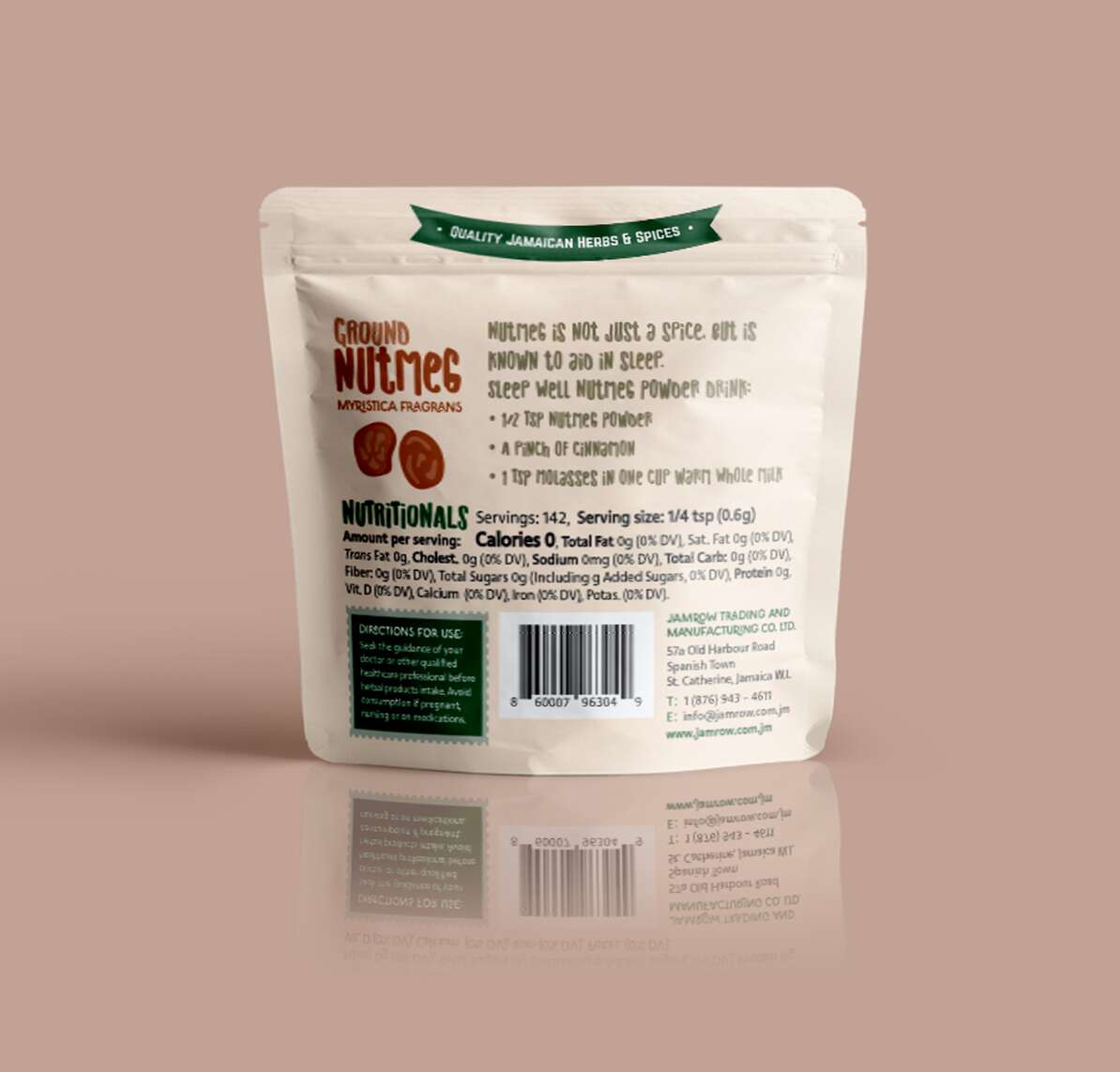
For over 30 years, Jamrow Trading has exported raw botanical ingredients across the globe. With the birth of Orija Nutrition, they’ve taken a bold leap – from bulk ingredients to premium retail with this range of functional foods and herbal supplements. I had the privilege of leading the brand and packaging design for their debut product line under this exciting new venture.
From concept to pouch, the Orija identity is rooted in function and flavour. The logotype uses custom letterforms that connect, symbolising Orija’s mission to nourish heart, mind, and body, while bridging cultures through Jamaica’s rich herbal heritage. Each pack features vivid colours inspired by the product inside, playful-yet-elevated imagery, and a clean layout that communicates trust and quality at a glance.
The tagline, ‘Sustainably inspiring a healthy lifestyle’, threads throughout the visual language, complemented by hand-lettered typography to honour the brand’s natural, unrefined essence.
From Moringa Leaf Powder to Sarsaparilla Root, the Orija pouches are more than just packaging – they’re a celebration of Jamaican wellness, tradition, culture and bold innovation. I’m proud to have supported this generational business as they prepare to launch retail locally and internationally.
We love to design with purpose, and to shaping brands that stand the test of time.
Follow Orija on Instagram:
@OrijaNutrition
Fingal Food Circle: Brand Identity Design
Branding, Design
Fingal Food Circle: Brand Identity Design
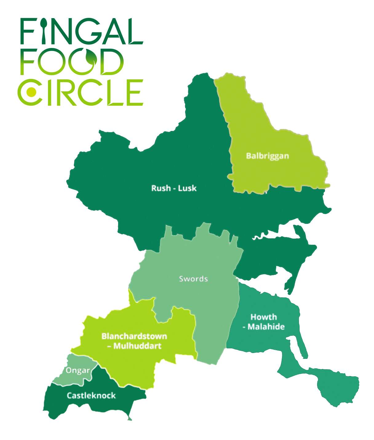
I recently created a new brand identity for Fingal Food Circle, a food and drink network based in North County Dublin. This initiative brings together local producers, restaurants, cafes, culinary experiences, and food tourism operators, all under one umbrella. The goal was to develop a strong and distinctive brand that celebrates local provenance, encourages collaboration, and supports the wider food and drink community in the Fingal region.
Before this project, Fingal Food Circle had no existing brand or visual identity. They needed a design that would establish them as a clear and confident voice for the industry – something that could work across everything from events and training to tourism promotion and media engagement. It also had to reflect the diversity of its members, while remaining flexible enough to grow with the network over time.
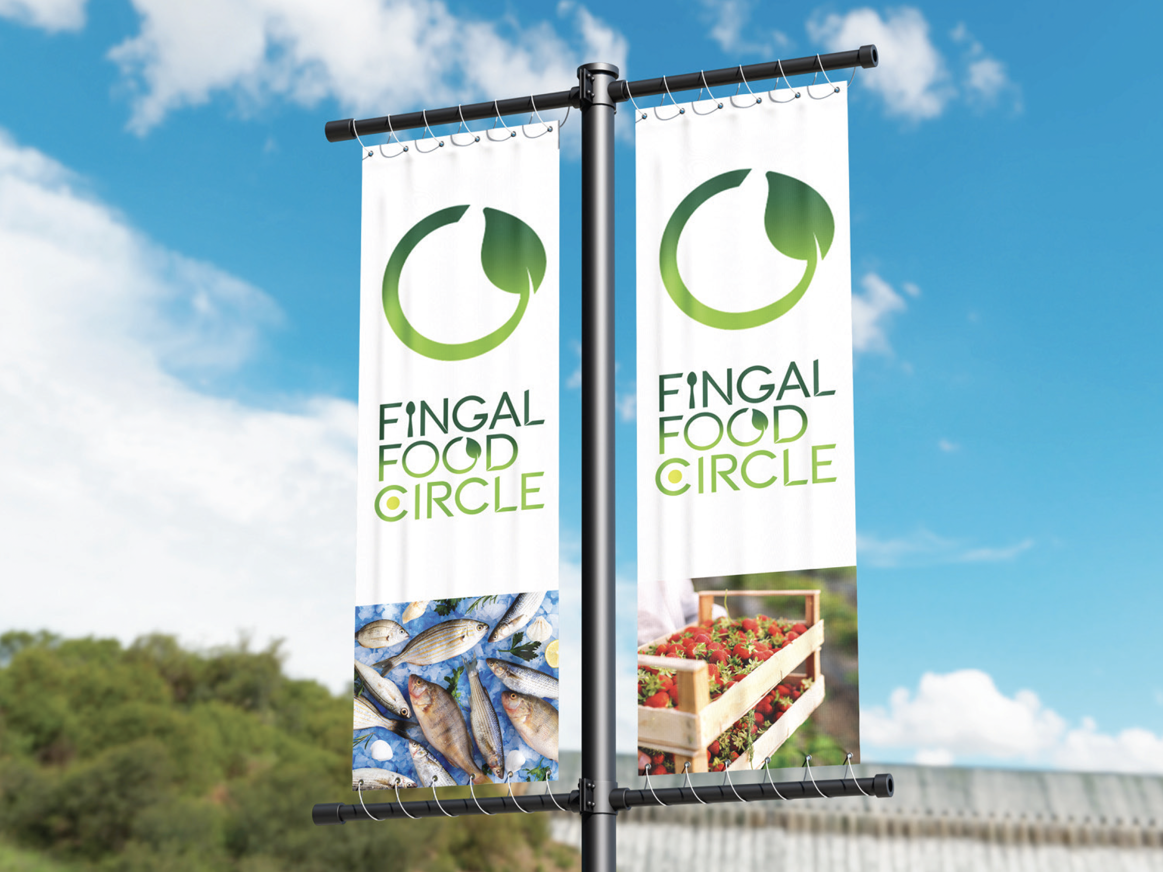
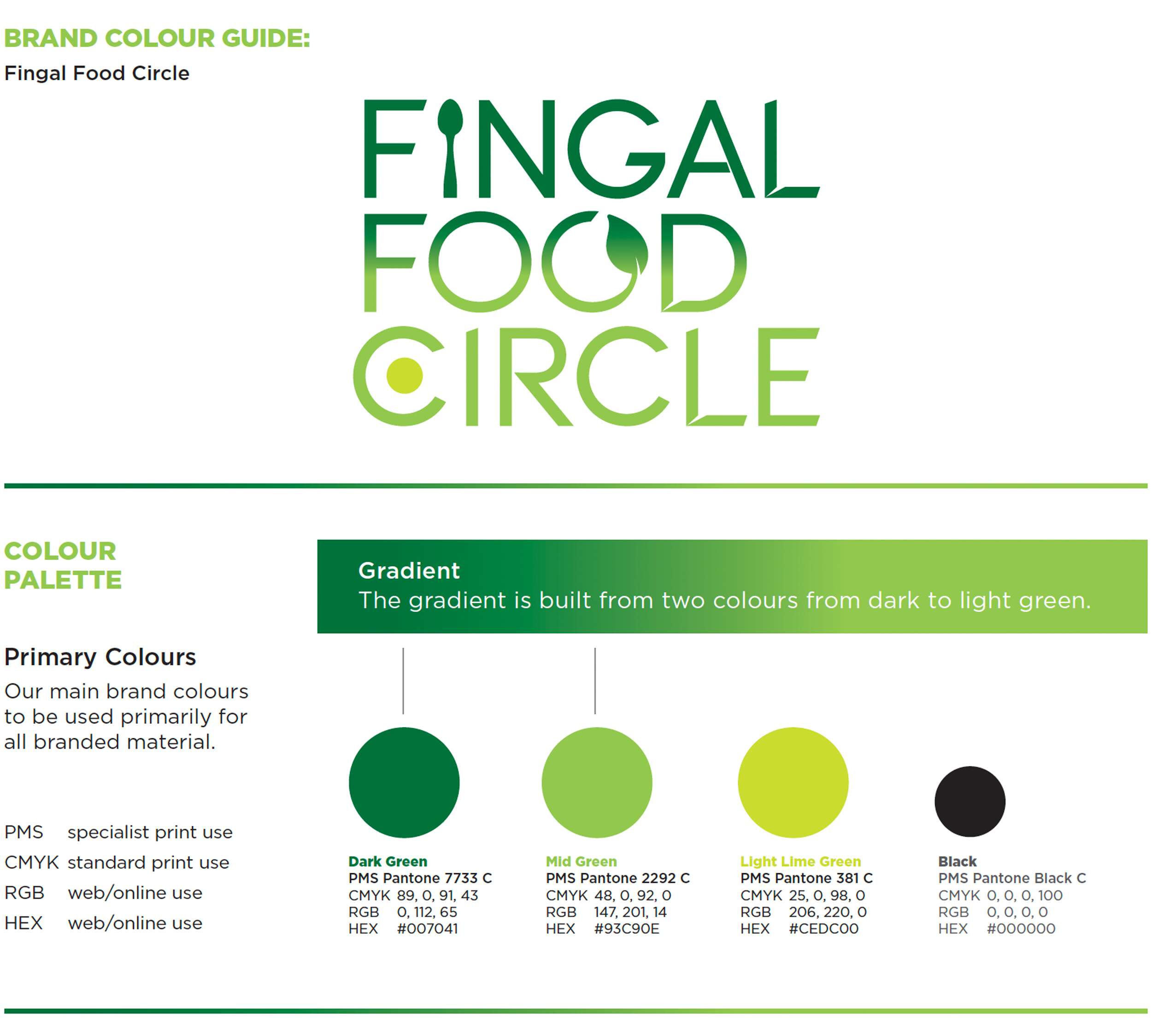
The chosen design direction focused on a custom typographic logo that feels open, welcoming, and grounded in food culture. A spoon subtly replaces the ‘I’ in ‘Fingal’ to represent the culinary aspect of the network. The circular form of the ‘C’ includes a green circular dot to reference the landscape and community and link with the brand’s name, while the open ‘O’ features a small leaf – symbolising fresh produce and the concept of growth and inclusion. The overall design is clean, modern, and tailored, while still feeling warm and approachable.

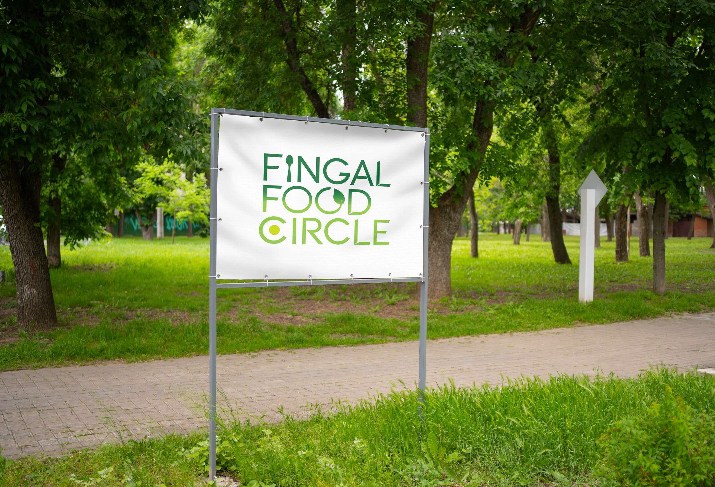
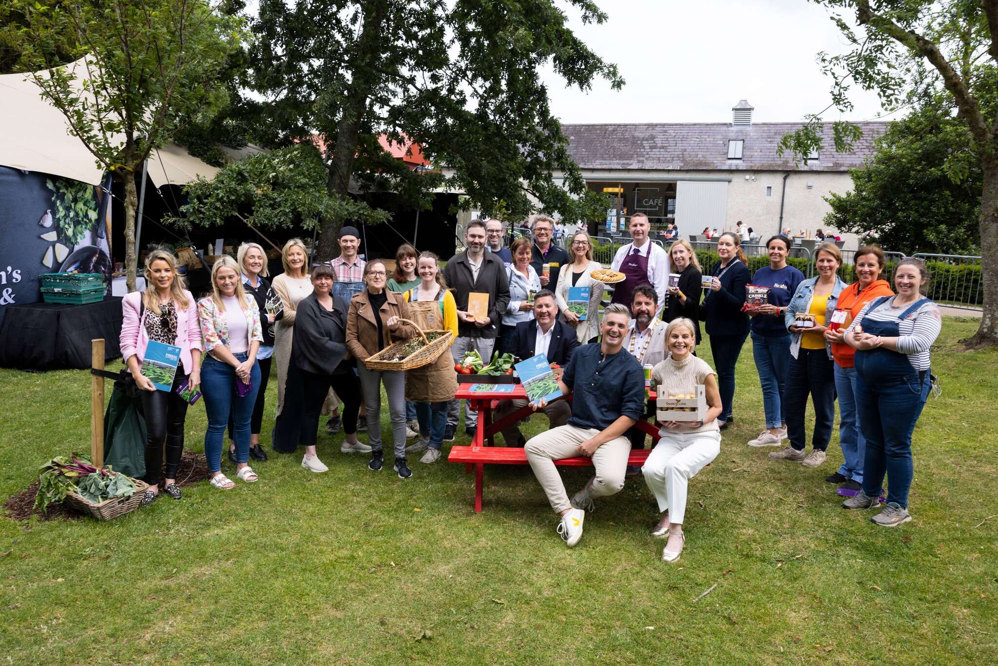
This new brand identity helps Fingal Food Circle communicate who they are at a glance: a grassroots but professional collective that promotes local food, fosters connection, and invites people to experience everything the region has to offer. The identity is launching publicly at the Flavours of Fingal Festival, marking the beginning of a stronger, more visible presence for the network in the local food and drink scene.
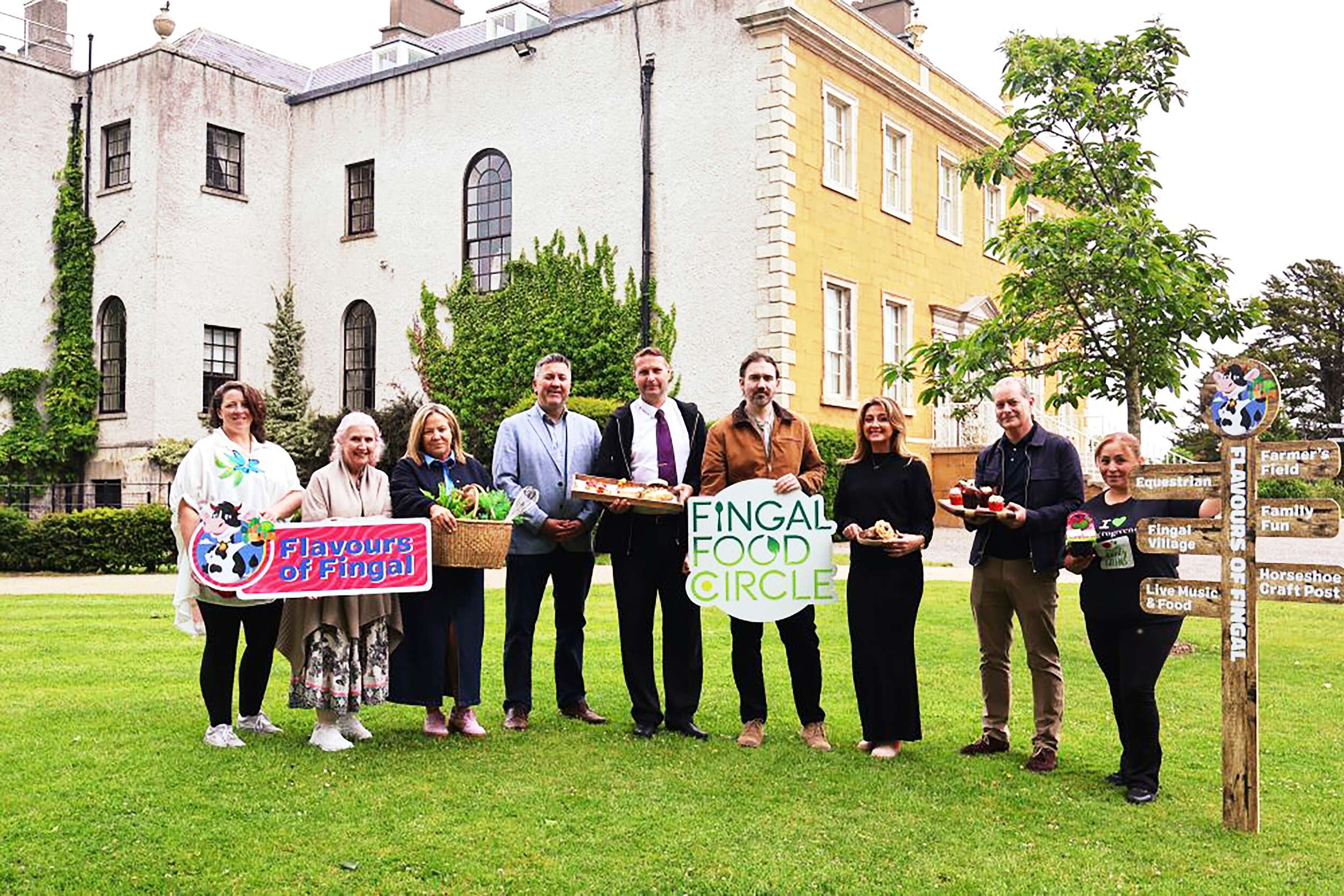
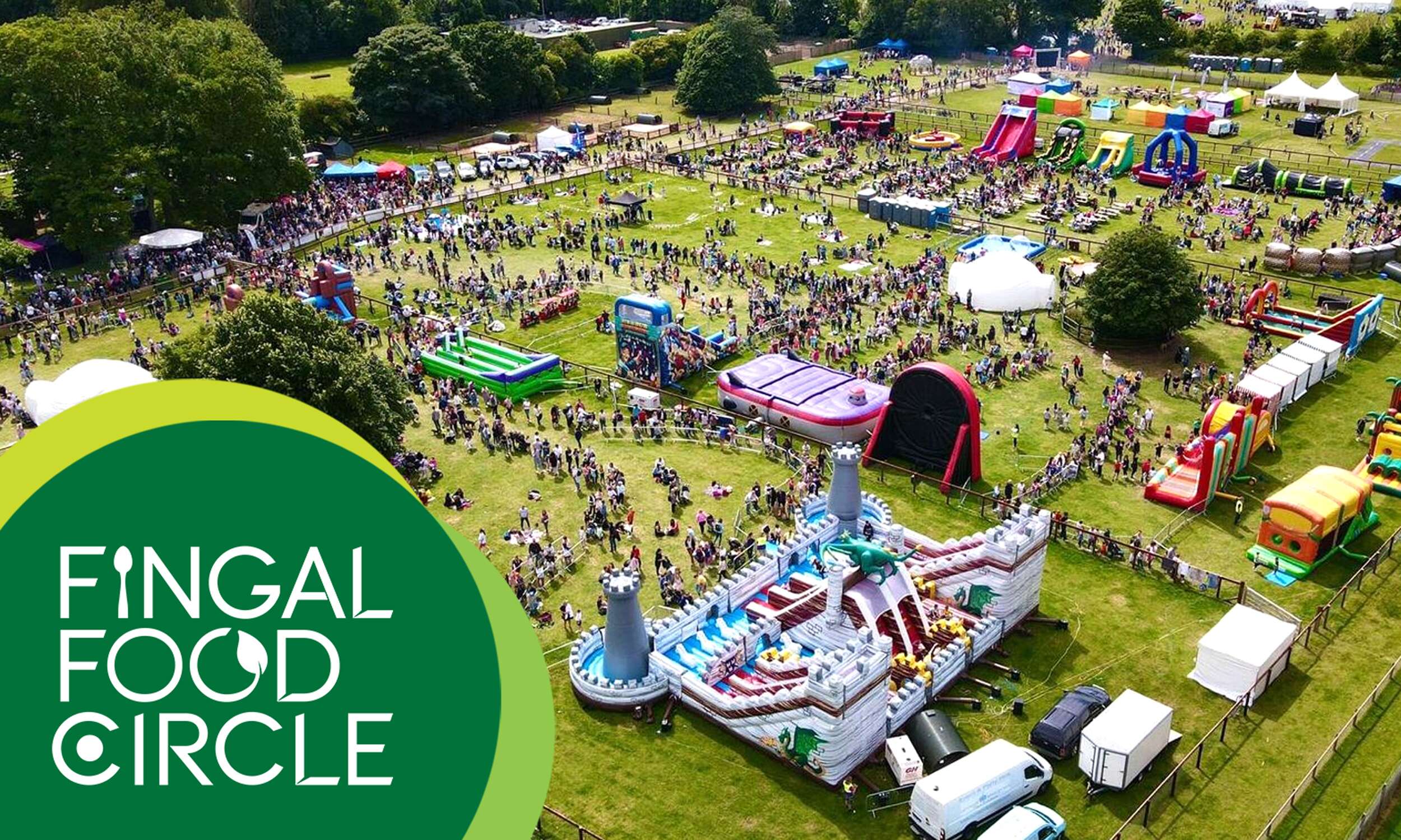
Flavours of Fingal, a vibrant two-day festival at Newbridge House and Farm that celebrates the region’s rich food culture, local producers, and community spirit, bringing over 65,000 visitors together for a truly unforgettable experience. The Fingal Food Circle is looking forward to making its debut there this year.
Flavours of Fingal Launch of the Fingal Food and Drink Policy 2024-2029 at Flavours of Fingal, Newbridge House and Farm, Donabate.
Picture by Shane O’Neill, Coalesce.
Follow Fingal Food Circle online:
Instagram: @fingalfoodcircle
Facebook: @fingalfoodcircle
Website: www.fingalfoodcircle.ie