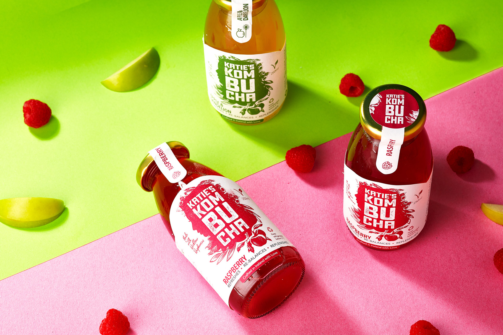
Katie’s Kombucha Packaging Design
Katie’s Kombucha is a healthy probiotic drink, which is good for the gut and immune system. It is a delicious, refreshing vegan soft drink range, made with love by Ballymaloe-trained chef, Katie McCann.
When it comes to health, the gut is a key area to begin with, known as the body’s ‘second brain’ – it is trusted to support the body to fuel our happiness, health and wellness. The drink is alive and contains a community of healthy bacteria living inside which is beneficial to our bodies. When you feel alive, you can create what you love and love what you create.
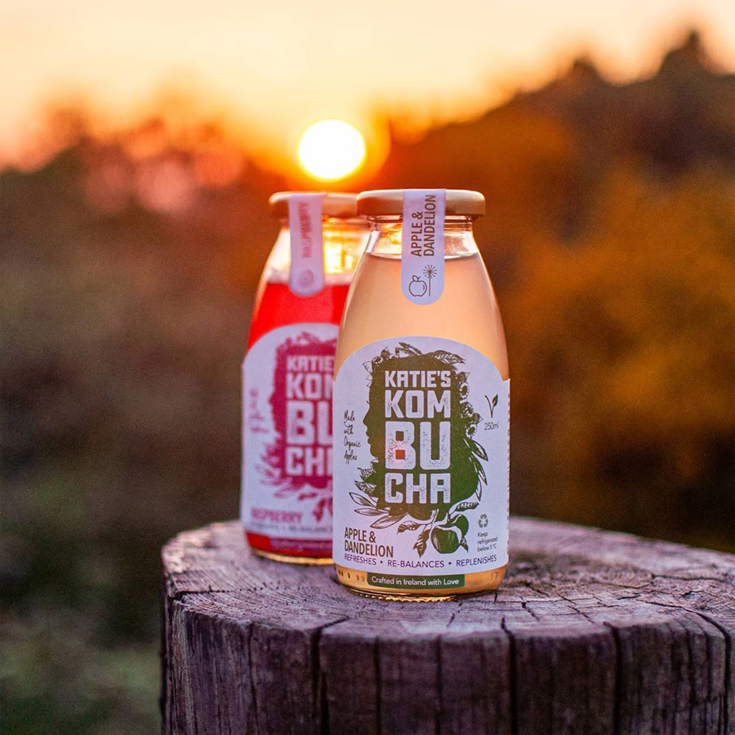
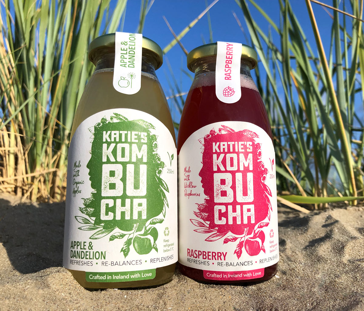
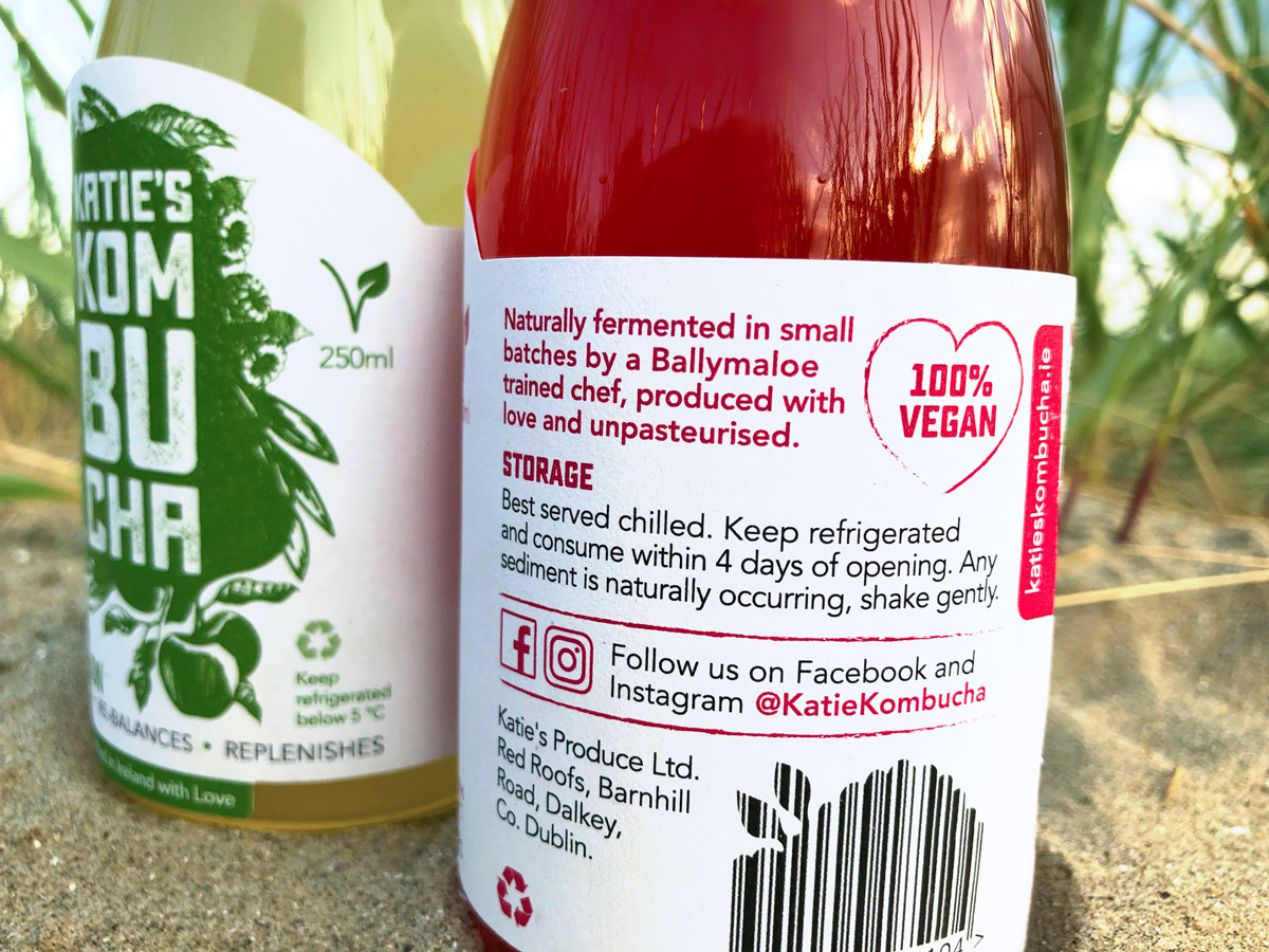
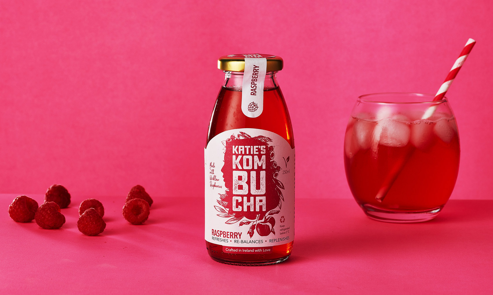
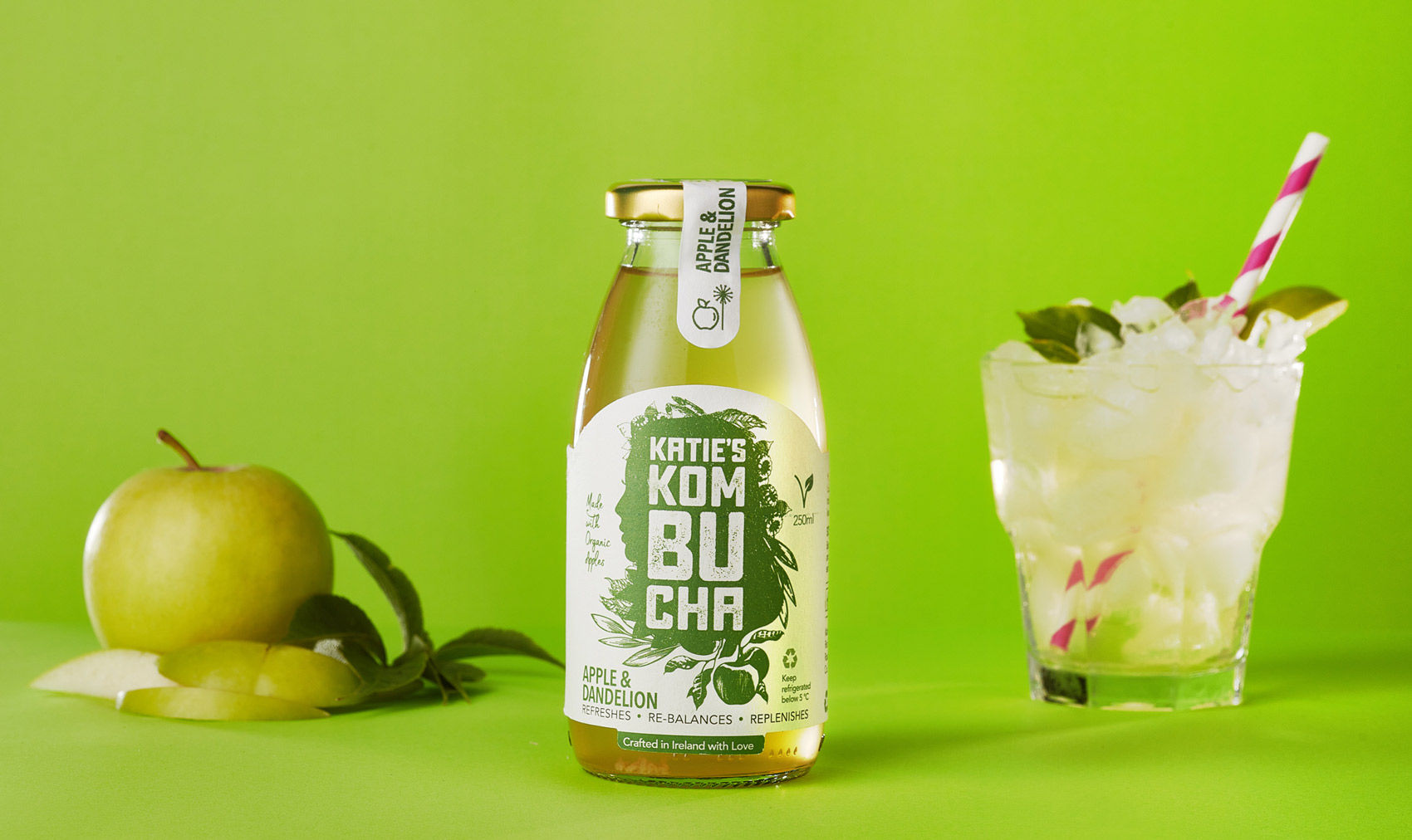
Katie’s Kombucha is naturally fermented in small batches and is a naturally functional food. There are two flavours launched to date – ‘Raspberry’ (flavoured with 100% Wicklow raspberries) and ‘Apple & Dandelion’ (flavoured with 100% organic apples). It is unpasteurised, sustainably produced, vegan, gluten free and has recyclable packaging. Katie’s Kombucha refreshes, rebalances, replenishes the body.
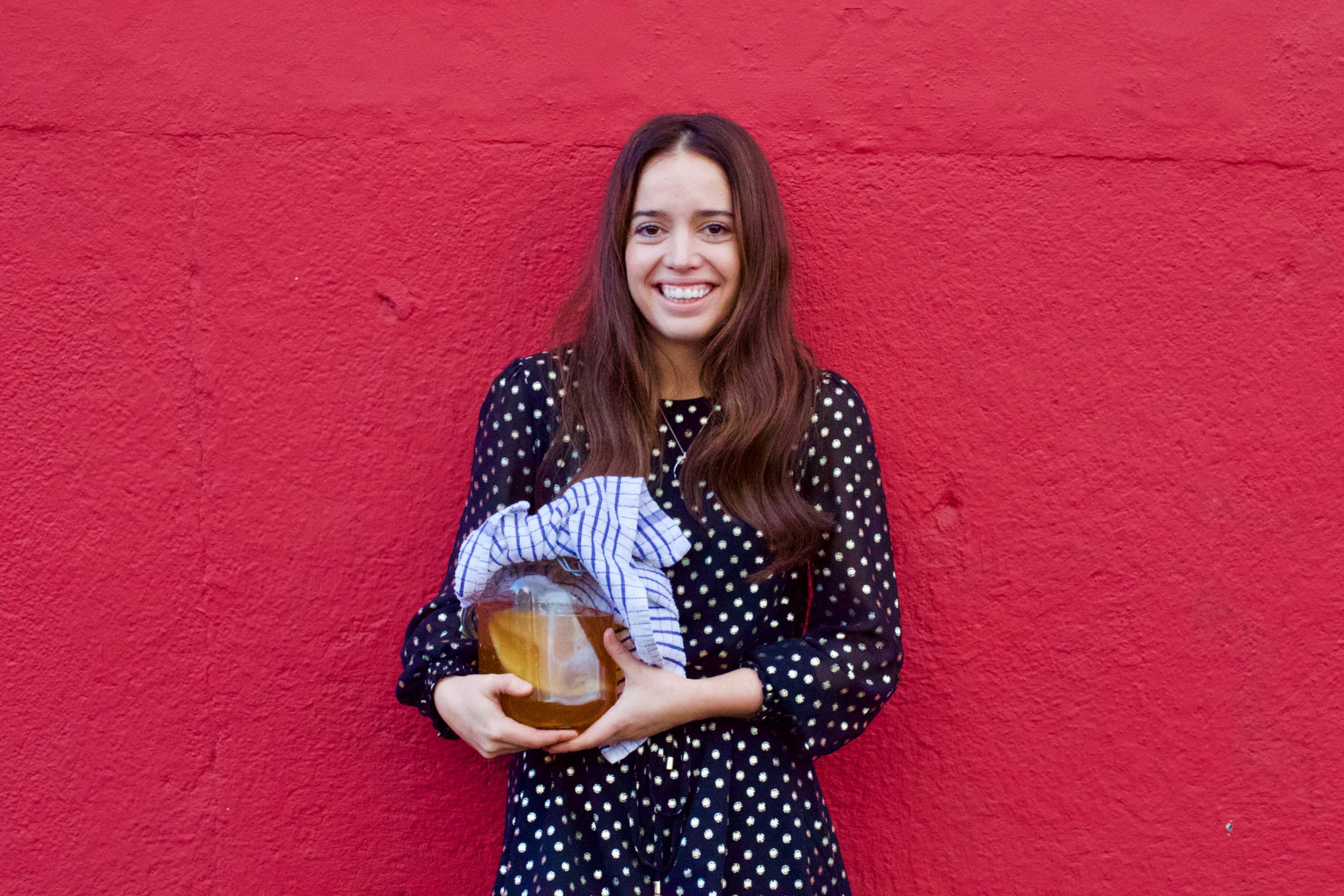
Some key factors Katie wanted to communicate with the brand was her passion for creating kombucha, how it is a healthy product that’s good for you and that it’s wholesome and natural.
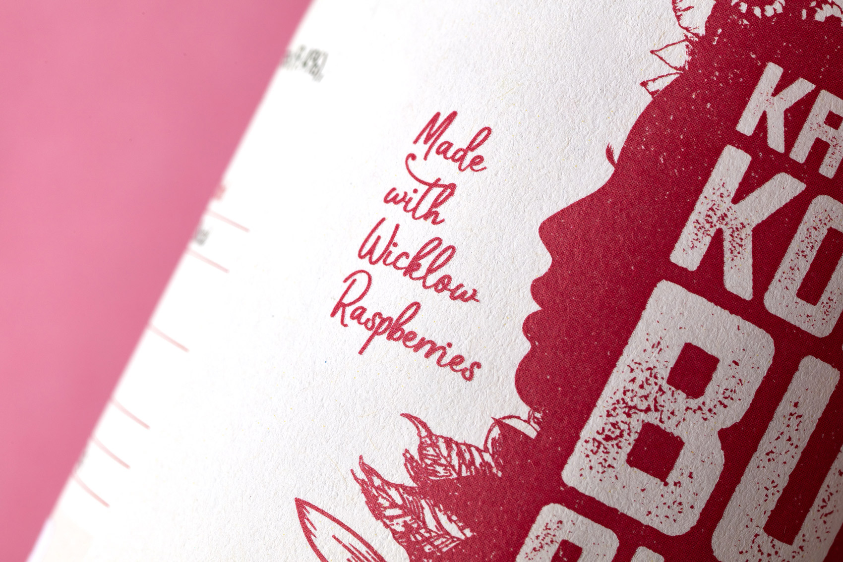
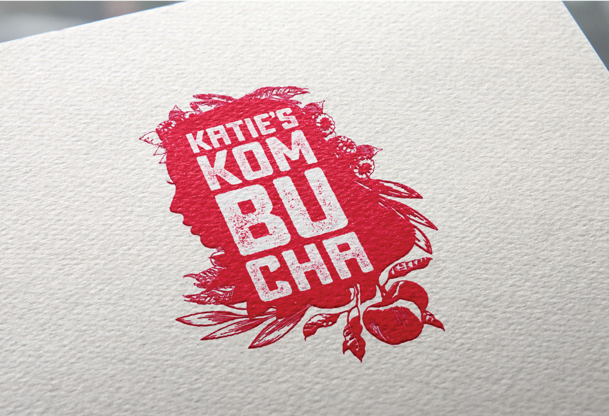
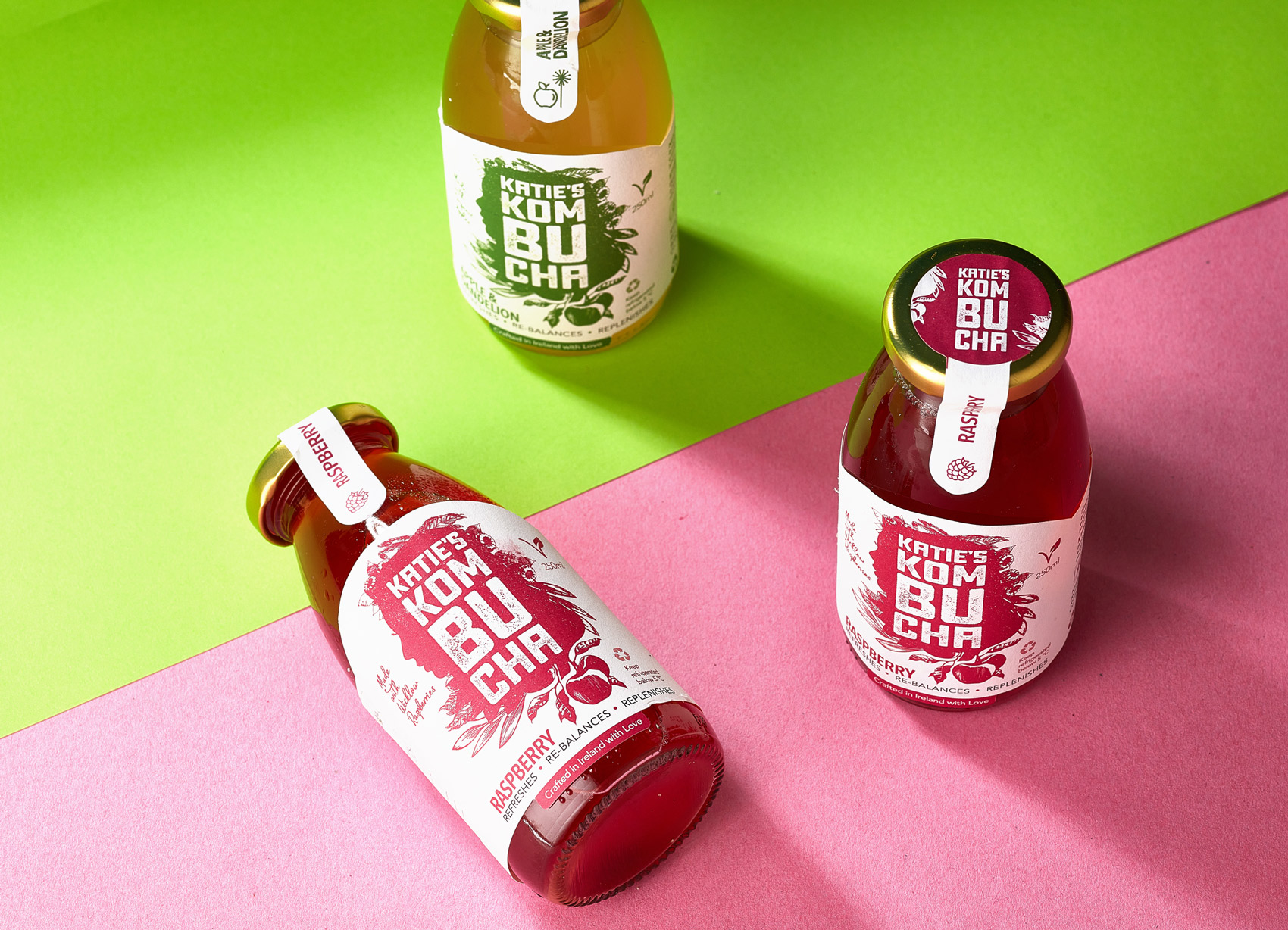
As Katie and the passion she has for what she does is the essence of the brand, the design outcome created for the brand packaging design uses the silhouette of a woman, representing Katie. The silhouette of the woman (Katie) has the fruits which the kombucha consists of intertwined into the shape of her hair, in a natural and organic style.
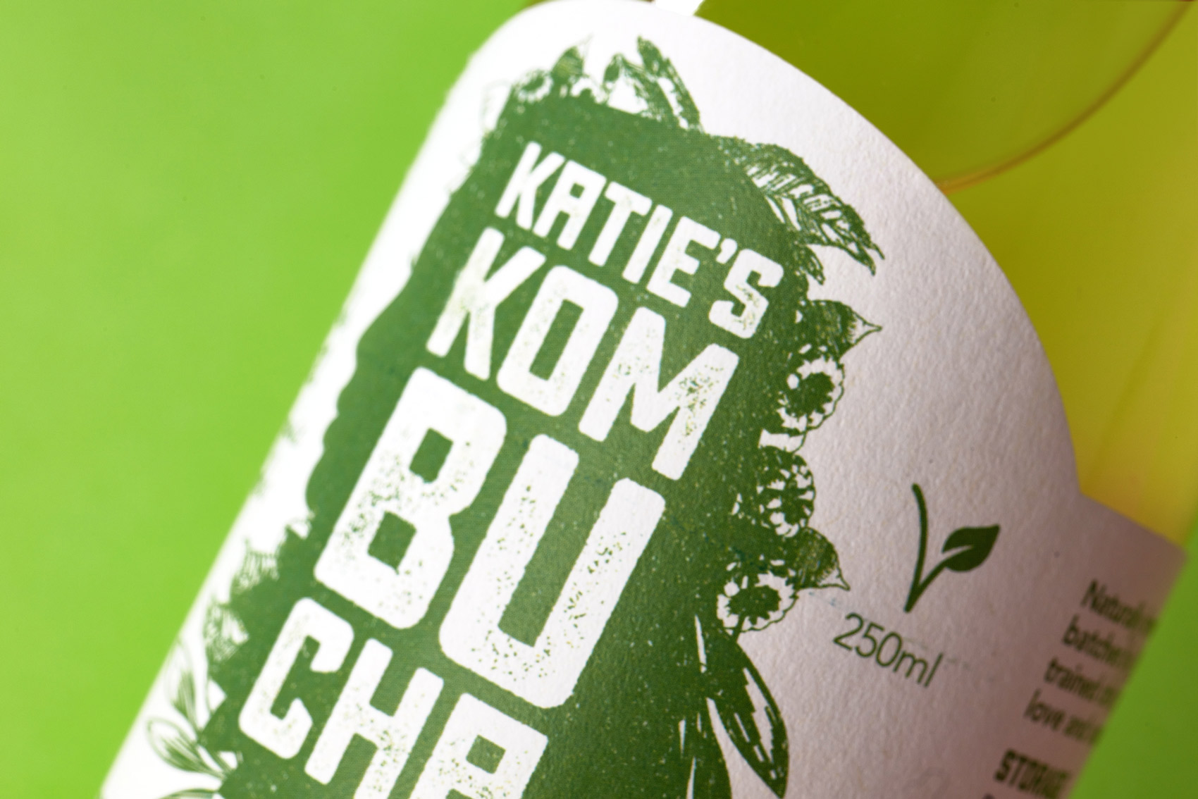
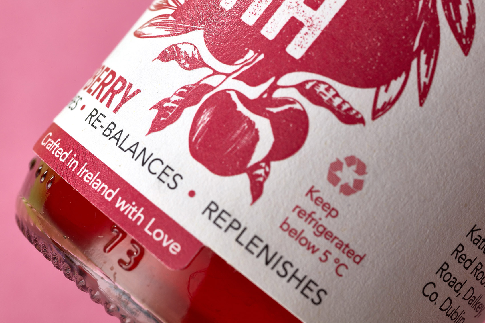
To make the word ‘kombucha’ easy to read for those unfamiliar with it, the three syllables are in a stacked block reading ‘KOM-BU-CHA’ to make up the brandmark. The hand-tailored font in the logo is earthy and rustic, communicating the natural ethos and ingredients of the kombucha. A texture with a subtle grain has been integrated with the typography and silhouette to further accentuate the wholesome qualities of the brand.
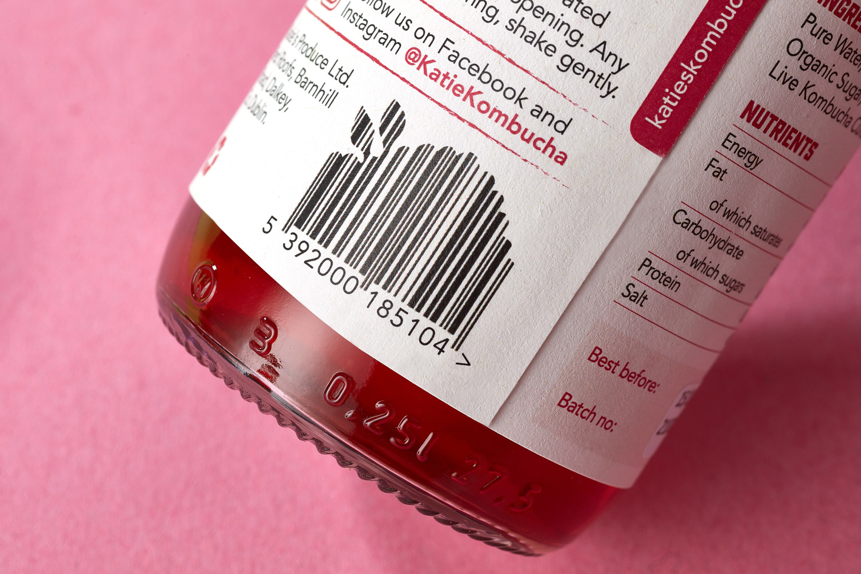
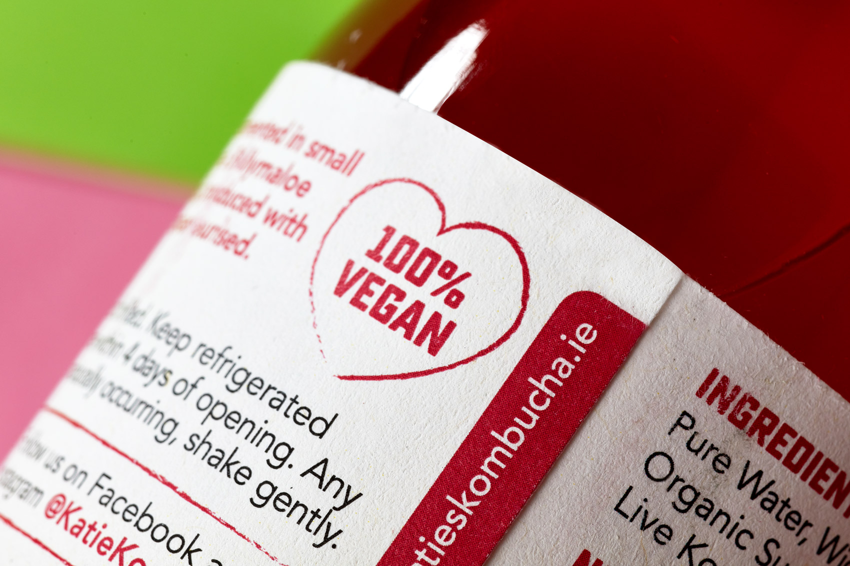
Each favour is differentiated by colour (guided by the fruits each contains), along with it’s own fruit icon. There was a third flavour ‘ginger’ created, to be launched at a later date. A hand-written font is used for the flavour descriptions, further emphasising the hand-made and personal process to how Katie’s Kombucha is created. An additional detail created is the unique barcode, showcasing the silhouette of leaves and berries. A hand-drawn heart icon highlights the feature that the kombucha is 100% Vegan.
Another key factor to consider when designing the kombucha was Katie’s highly conscientious nature in relation to being sustainable and the environment. Therefore, she chose a uniquely-shaped bottle which is easy to recycle and we ensured to work with the printer to use the earthy, recycled paper stock ‘Shiro’ rather than a sticker to make them easily re-usable and recyclable. They are then sealed with a tamper-proof seal.
Katie loved how the results communicate her brand essence and values, with strong visual impact on shelves in stores and has received much positive feedback on the new packaging from her customers and on social media. It’s sales have grown to a wide range of stores such as many of the SuperValu’s throughout Dublin, online deliveries stockist Neighbourfood, 3FE cafes and a number of other unique stores and cafes around Dublin and Wicklow.
Please enjoy the below video with sound and follow Katie’s Kombucha on Instagram @katiekombucha
See the positive feedback I received from Katie here.
Design: Clare Lynch Creative
Photography: Brendan Ryan Photography
Photo Styling: Clare Lynch, Betsy Gach.
Video: Shane Caffrey