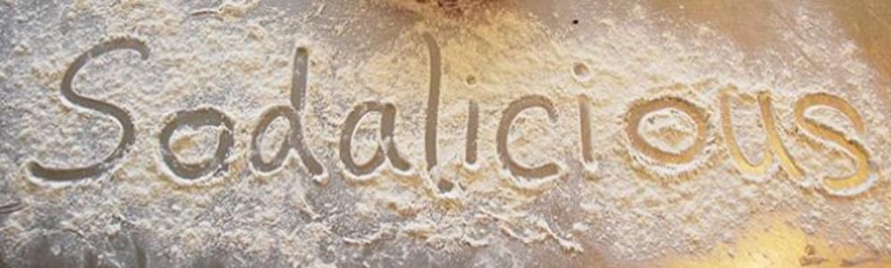
Sodalicious Soda Bread Packaging Design
Sodalicious Soda Bread Packaging Design
Sodalicious bread prides itself on celebrating their wonderful indigenous Irish soda bread, by reinventing it with many fresh flavours. Using the traditional Irish soda bread recipe, they have given it a modern twist by adding many different flavours baked in many different shapes resulting in a contemporary classic.
Their hand-made bread is flavoured only with fresh, natural ingredients for example fresh herbs, cheese, olives, olive oil, nuts, seeds and fresh fruit in the scones. They don’t use any artificial additives. It is a yeast free product and uses reduced sugar in the sweet range resulting in many health benefits including a low fat content. It also contains sodium bicarbonate which aids digestion. The result is a premium quality range of soda bread, that doesn’t loose the integrity of this wonderful Irish staple.
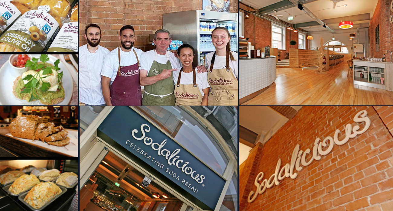
Sodalicious is a dedicated soda bread bakery and cafe, based in Limerick. It is ran by Jane Conlon, a powerhouse behind this brand, along with her family and loyal team. Jane is a fireball of energy and spirit. Jane gained her level of expertise from a wide range of experiences such as growing up learning from three generations of bakers, gaining qualifications in the renowned Ballymaloe Cookery School, then training under an expert pastry chef in a top London restaurant and traveling the world experiencing the breads of the world, to coming back home to Ireland and setting up her own cafe and bakery. All the while, bringing up a family of seven children! A very inspirational lady 🙂
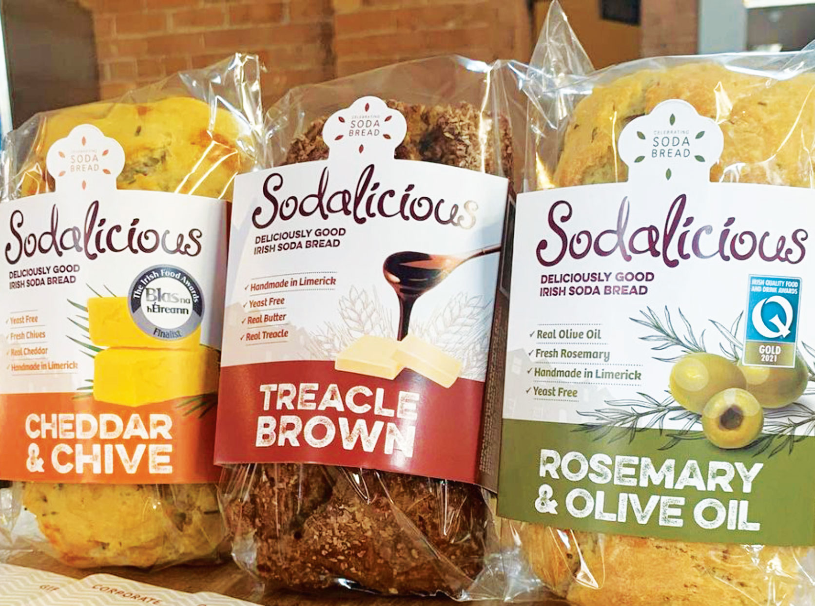
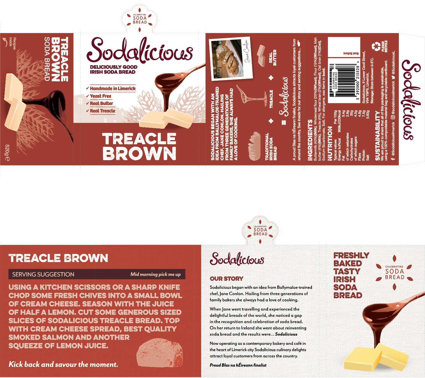
When contacting Clare Lynch Creative, her objective was to grow the Sodalicious brand by bringing some of their breads to the wholesale marketplace and to make Sodalicious bread become a household name. They already had their logo, the word ‘Sodalicious’ in a script font, which is featured at a large-scale on the outside of their building, on their signage and aprons and a range of their collateral, so she wanted to keep this and use this on the packaging design. She wanted their bread packaging to include images of the fresh ingredients that are used in the bread, to be colour-coded in a stylish way and to include their brand story and some recipe suggestions. Sodalicious bread is a Blas na hEireann Irish Food Awards & Irish Quality Food & Drinks Awards Gold finalist, therefore she wanted it to convey a feeling of quality, premium product, in an inviting way.
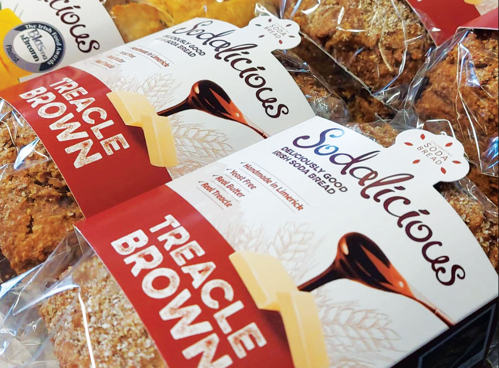
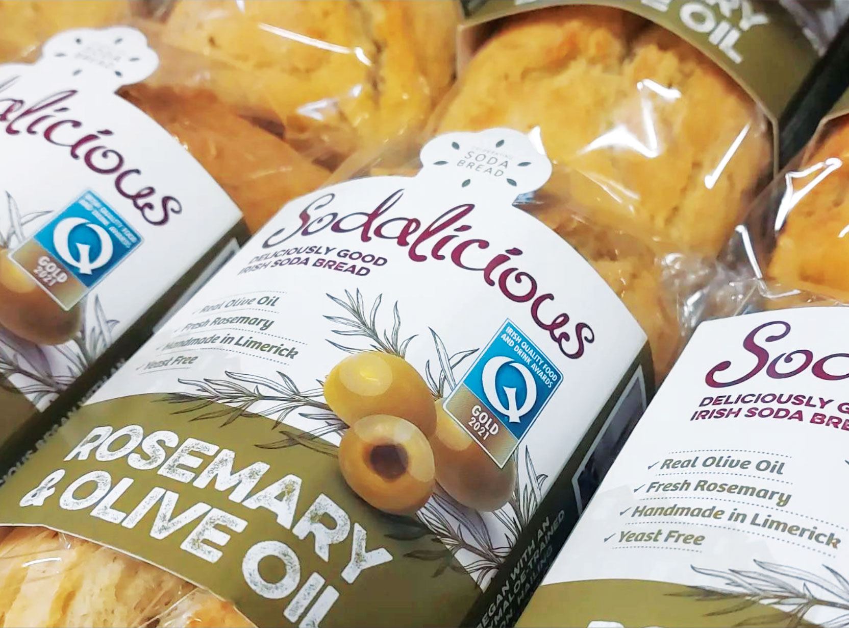
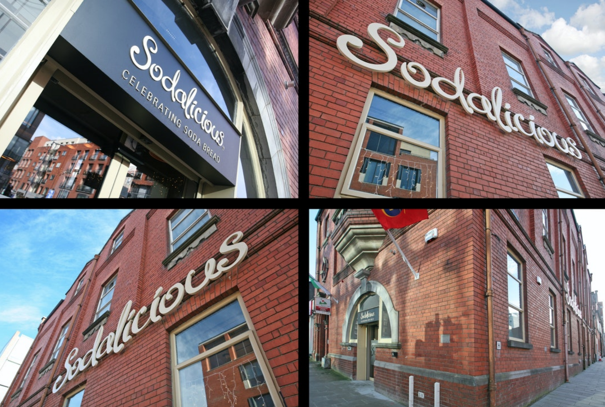
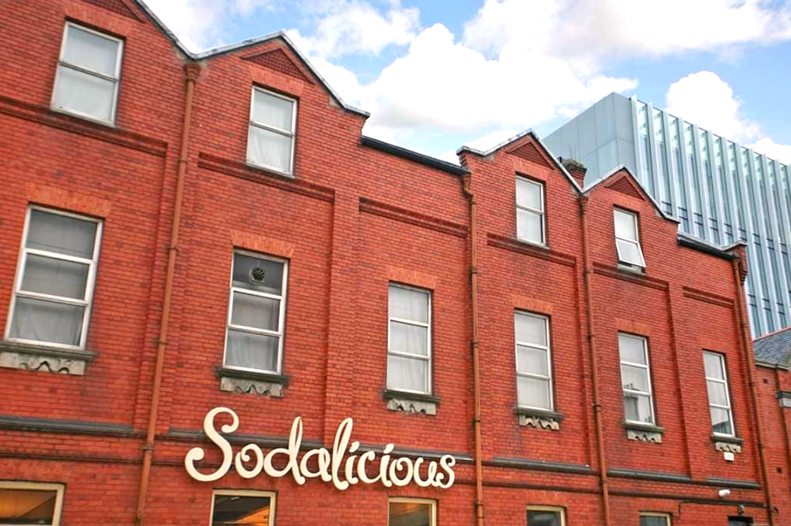 To answer the client’s brief, the packaging design highlights taste cues by featuring the main ingredients of the bread in a quality, vintage illustrative style. The Sodalicious cafe is situated in a beautiful historic red-brick building on Cecil Street in Limerick City, built between 1907-09, with an oriel window and a seven-bay side elevation. To incorporate the cafe’s unique location and heritage, a silhouette of the building is subtly featured in a light hue background of the packaging design. The font and colours are natural and rustic, communicating the fresh, natural qualities of the bread.
 As the client was eager to make sustainability a priority in the packaging design, it was important to do research of sustainable options for bread packaging first. The findings were interesting, such as elite cardboard boxes with handles folding closed together, presented like a gift bag. This was fully recyclable and could give a premium, unique, quality feel to a bread range. However, the brief requested the bread texture to be visible, so this option wouldn’t work. This also wouldn’t facilitate much of a shelf-life in preserving and protecting the bread from outside spoilage, so it failed to meet these functional needs. “With packaging design, it is important to consider factors such as the construction, the material used, the production, durability, legibility and safety issues – it’s not just about graphics alone, the technical aspects are just as important as the design”
(viction:workshop, 2007).
Further online research led to a printing company offering biodegradable and compostable labels. On review of these label samples and the brief, it was noted that the client preferred not to use stickers due to the glue and there was also a risk they could crinkle and look amateur on the packs as the bread is an uneven shape, so this route wasn’t viable.
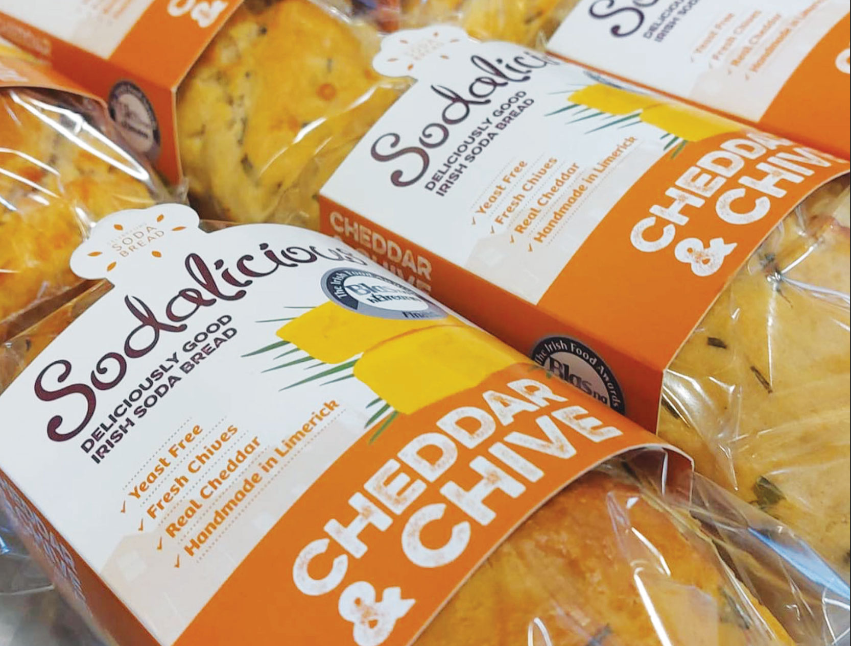
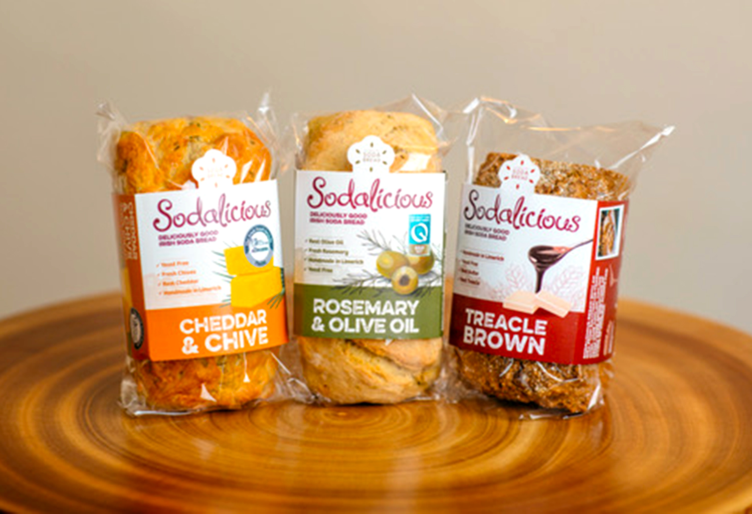
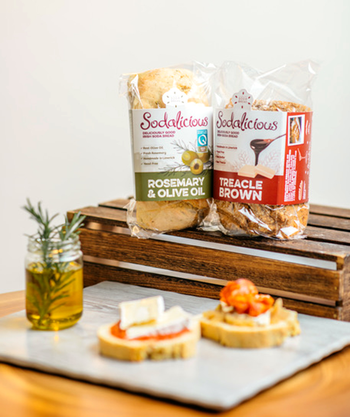
The chosen solution is a one-piece, light cardboard sleeve that bends around the bread from front to back. It’s clean, simple, visually-effective and easy to pack. It shows a good portion of bread, meeting one of the aims of the brief. The die-cut cardboard sleeve features a baker’s hat with the Sodalicious tagline ‘Celebrating Soda Bread‘. The seeds jump around the tagline in fun, celebratory style. The inside of the cardboard sleeves feature recipe suggestions, along with the brand story – this gives the sleeve a longer-life value as customers can keep it and share the recipes with friends.
Underneath this cardboard sleeve, a biodegradable cellulose bag was chosen instead of the existing single-use plastic currently used by the client. There is a good cellulose compostable and biodegradable film brand called NatureFlex, which offers tailored protection barrier to prevent spoilage, high heat resistance properties, high gloss and transparency for good visual effects and it meets global compostable standards. Another similar option which was more cost effective for the client, was to wrap the bread with a recyclable plastic wrap. The bag length was too long for the bread shape, so the client purchased an ‘L sealer’ heat-sealing machine to trim them. Customers will be happy to be aware that they are choosing bread with packaging that supports a sustainable and circular economy.
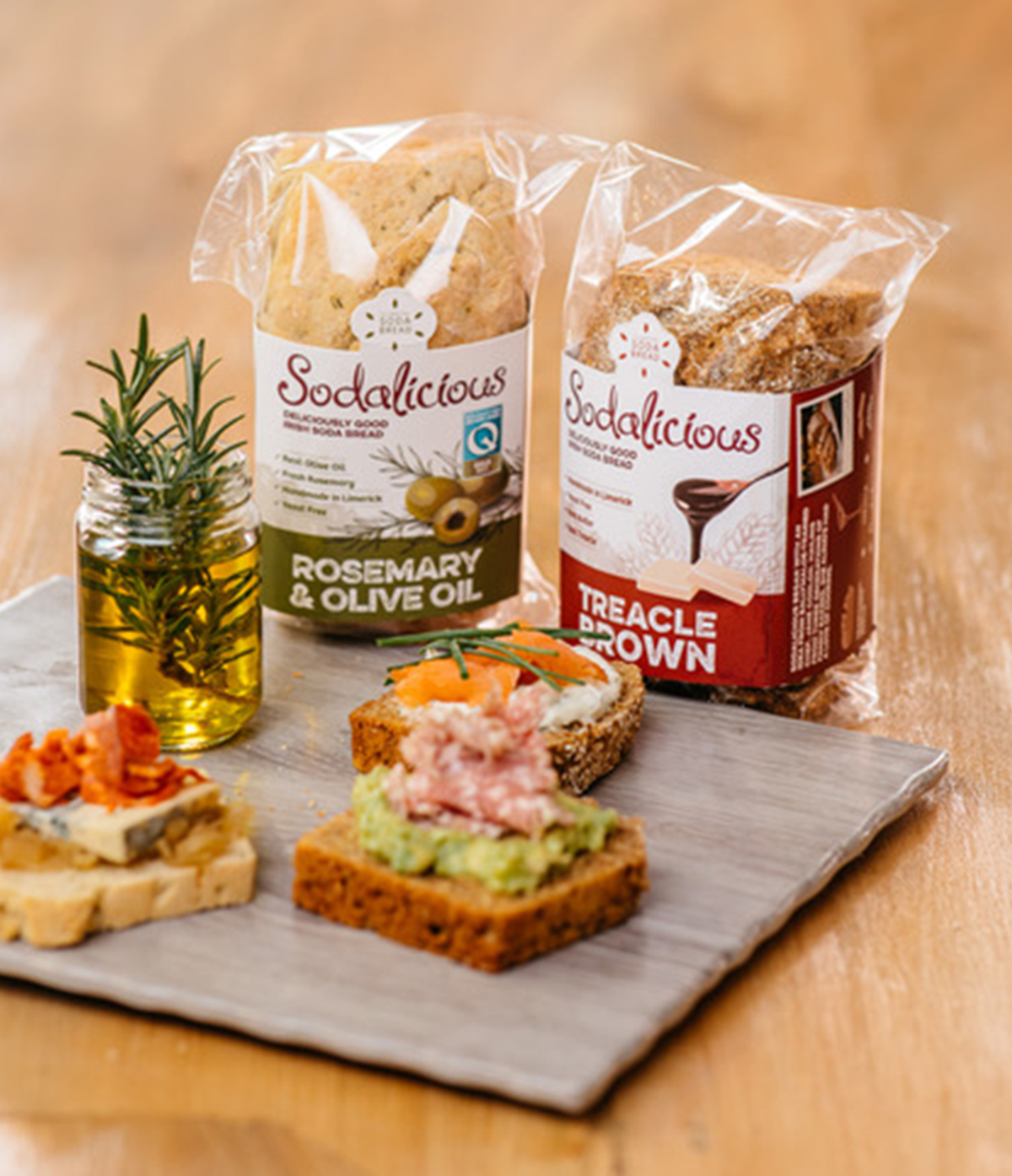
The design helps to sell the product by creating taste cues with imagery and colour. It focusses on the taste and flavour of the ingredients, using beautifully hand-drawn illustrations of the herbs that are used in the bread such as olive oil and rosemary. It has a quality, authentic feel, focusing on the hand-made nature of the bread and highlighting the taste to appeal to the appetite of consumers. The flavour names are displayed in a bold, rustic font to further communicate this and there is a light hue tone of the iconic building of the client’s café and bakery in the background. A mini brand story is featured on the side of the pack to help consumers connect with the brand. Colour is the first thing an observer notices about a package. Therefore, each pack is colour-coded for easy recognition of each flavour and the pack colour communicates the herbs added – such as ‘Rosemary & Olive Oil’ being green.
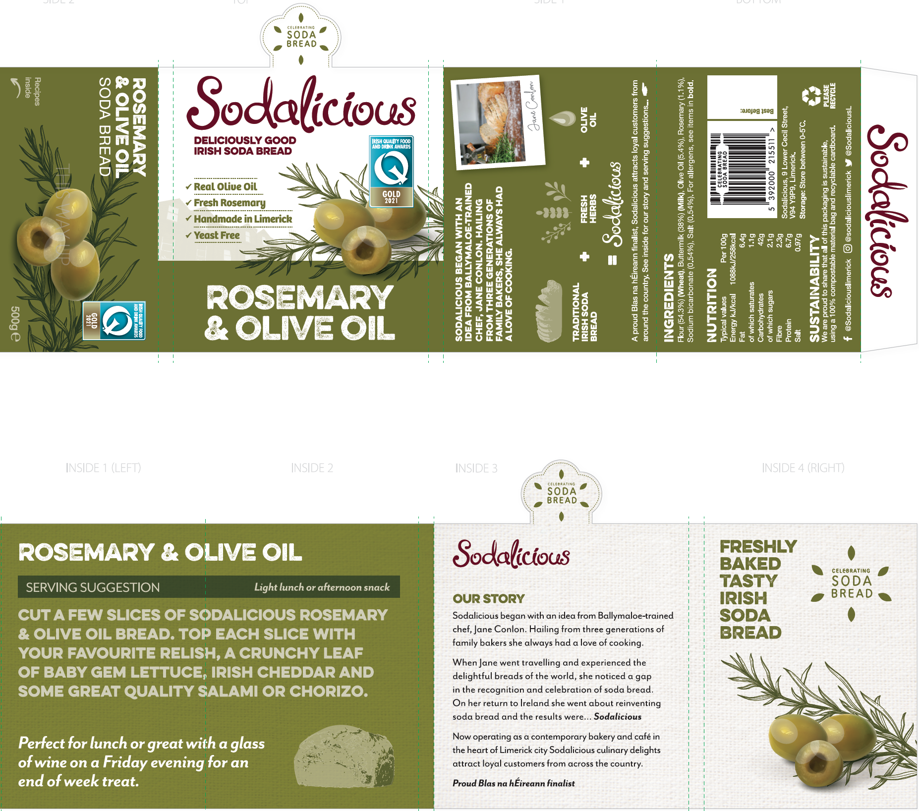
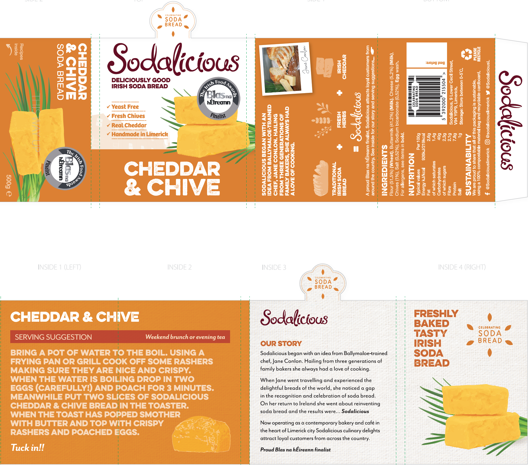 Required details were added to the back of packs, including a photo showing the bread in a tasteful style for each flavour, the ingredients and nutritional information, how to recycle and the clients contact details. Social media links were added, along with a fun and quirky barcode featuring a rolling pin within it. They chose a local printer, another factor which is aligned to their carbon footprint goals.
The client was really pleased with the final result and has been enjoying the popularity of the delicious Sodalicious bread in their cafe, SuperValu and local stores so far since it’s launch in 2022.
Find out more about Sodalicious:
Instagram:
instagram.com/sodaliciouslimerick/
Facebook:
facebook.com/Sodaliciouslimerick/
Website: