ISPAI Hotline.ie Annual Report 2016
 ISPAI Hotline.ie Annual Report & Twitter Cards 2016
ISPAI Annual Report highlighting the successful work completed by Hotline.ie in 2016.
 ISPAI Hotline.ie Annual Report & Twitter Cards 2016
ISPAI Annual Report highlighting the successful work completed by Hotline.ie in 2016.
![]()

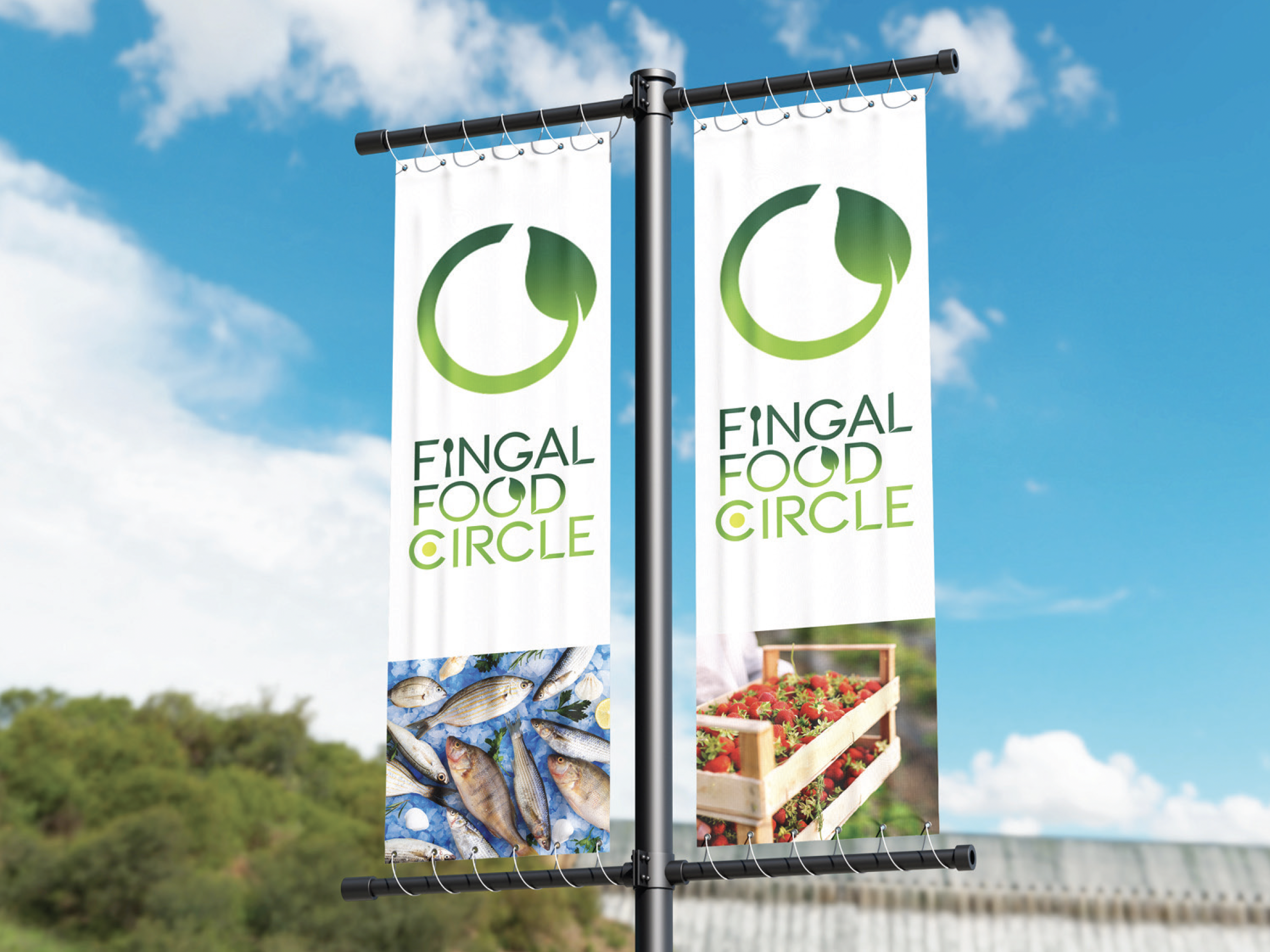

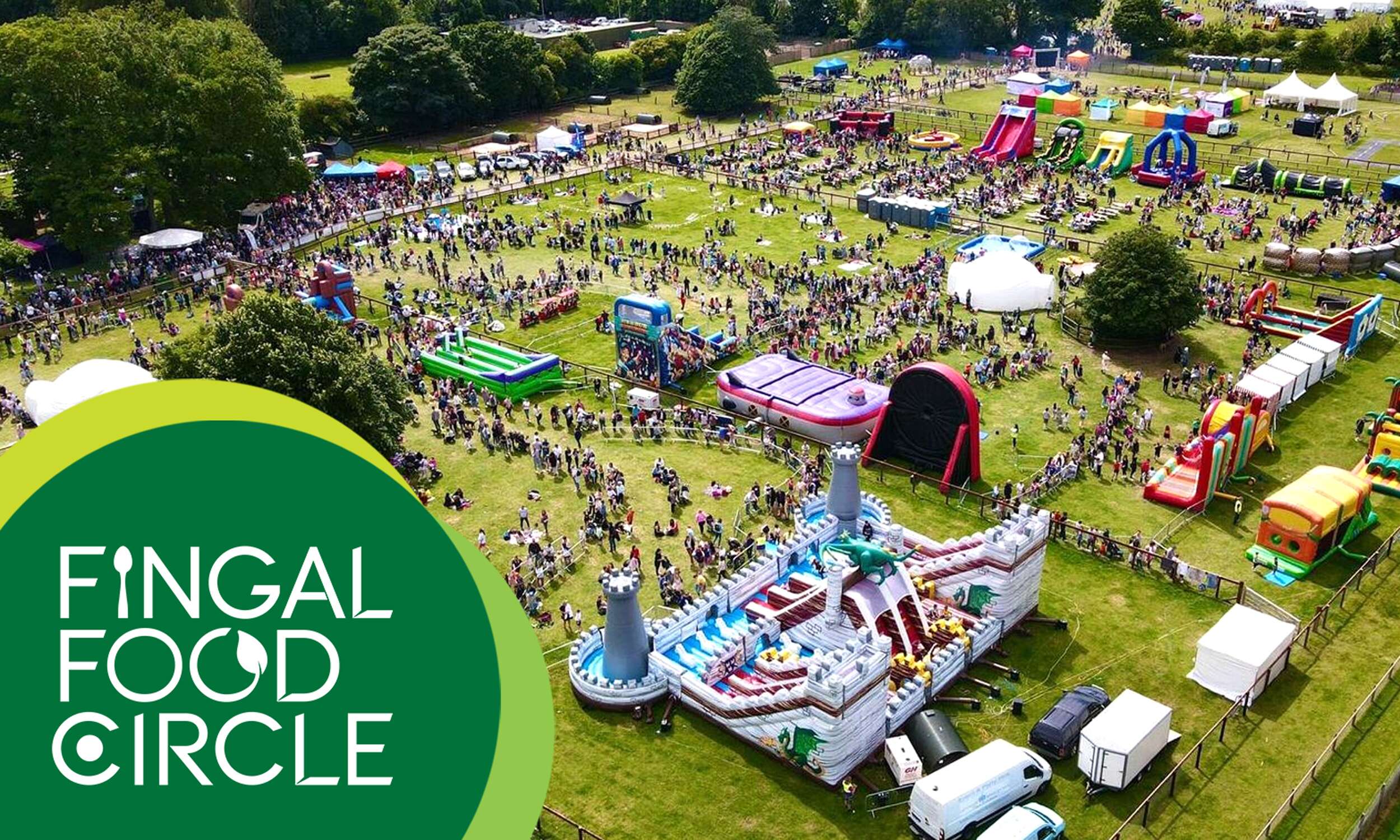
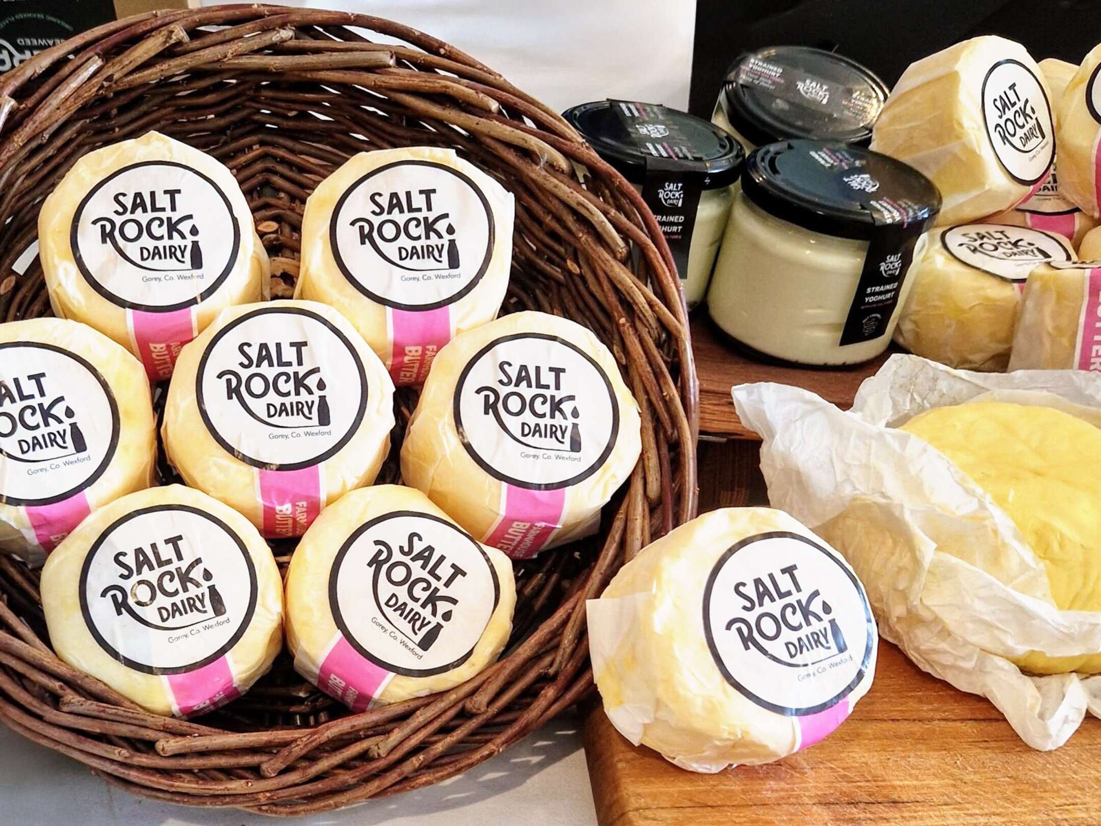
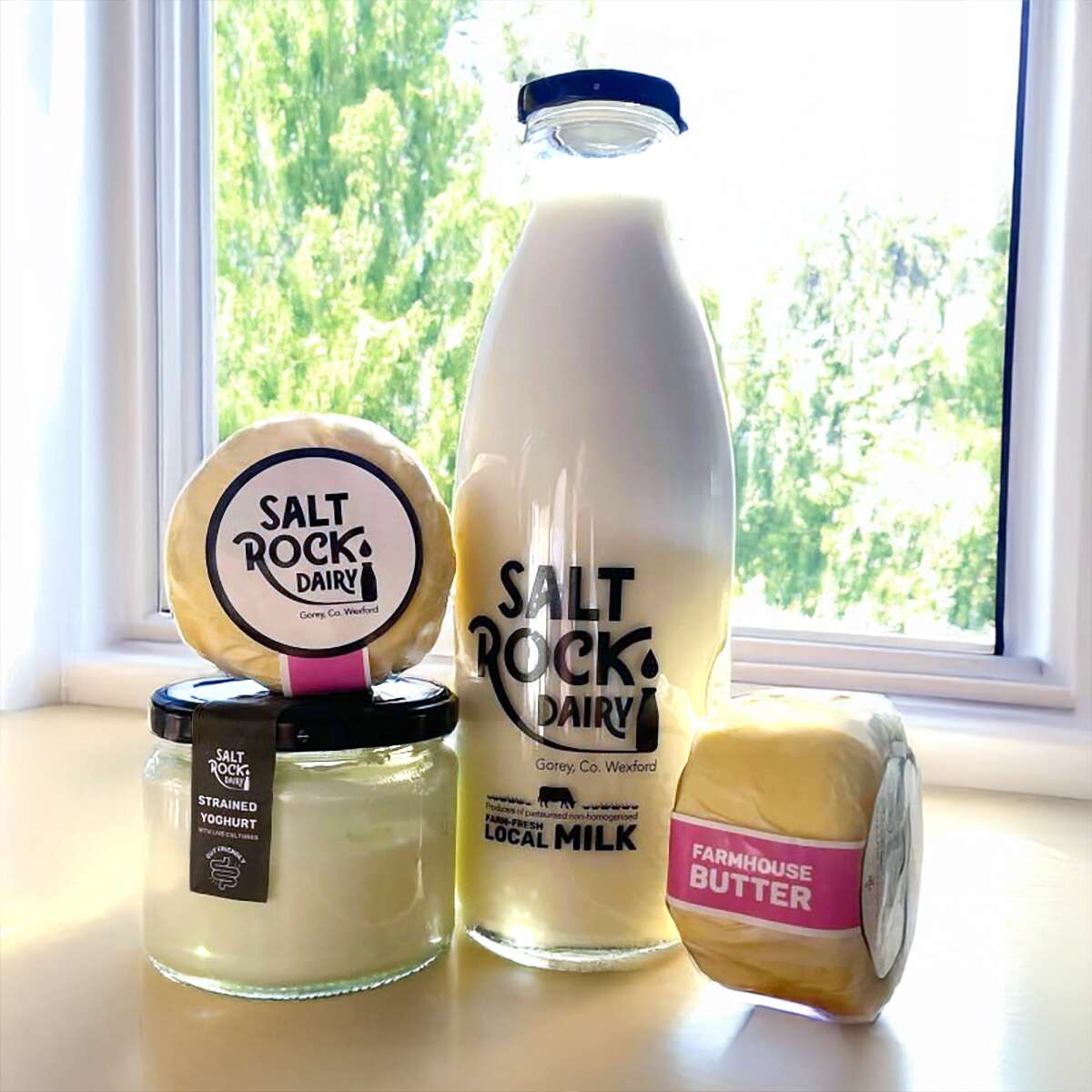
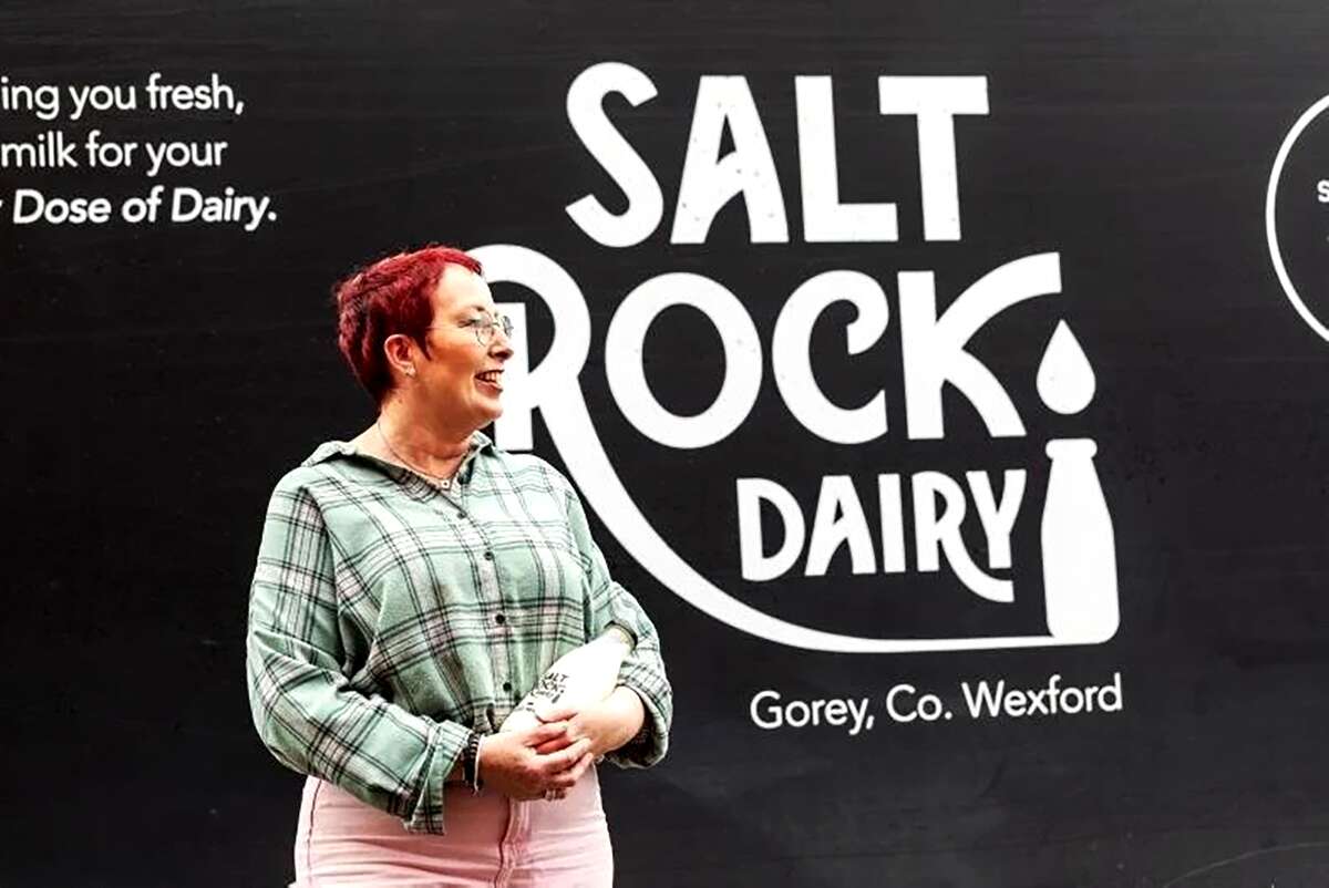
Flavours of Fingal, a vibrant two-day festival at Newbridge House and Farm that celebrates the region’s rich food culture, local producers, and community spirit, bringing over 65,000 visitors together for a truly unforgettable experience. The Fingal Food Circle is looking forward to making its debut there this year.
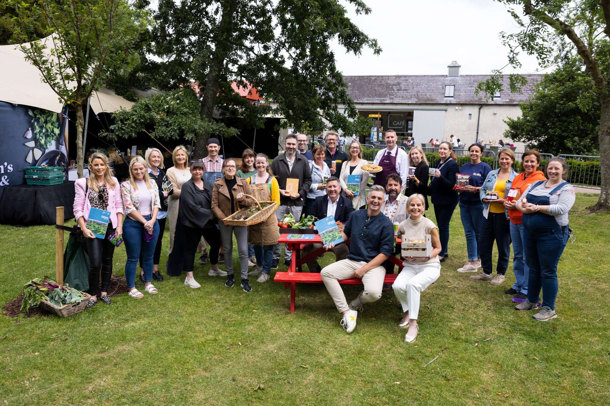
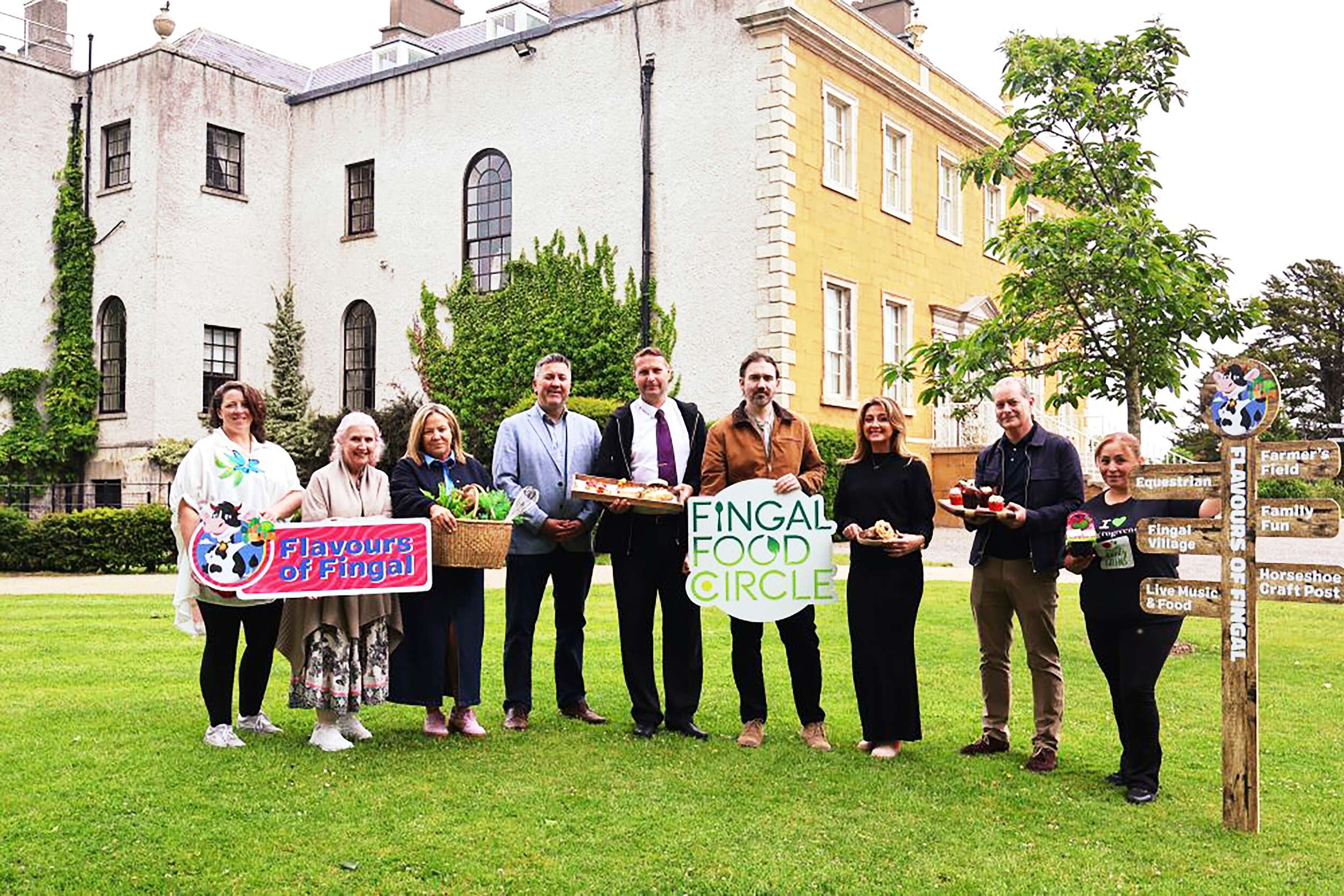
Flavours of Fingal Launch of the Fingal Food and Drink Policy 2024-2029 at Flavours of Fingal, Newbridge House and Farm, Donabate.
Picture by Shane O’Neill, Coalesce.