Studio RadiuzZ
crafting digital experience
From past century

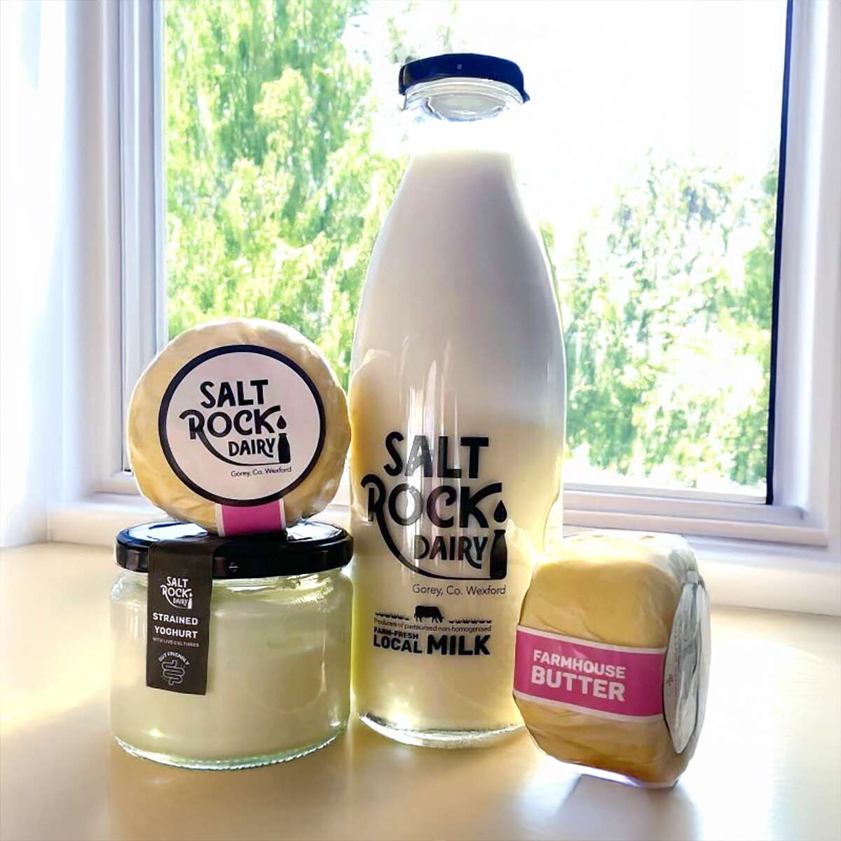
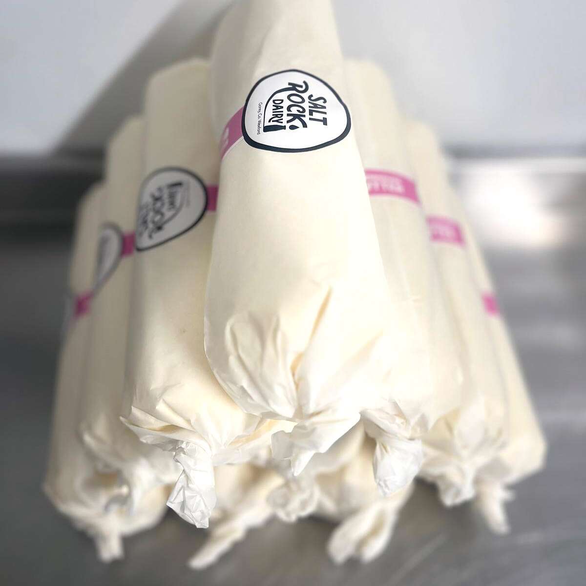
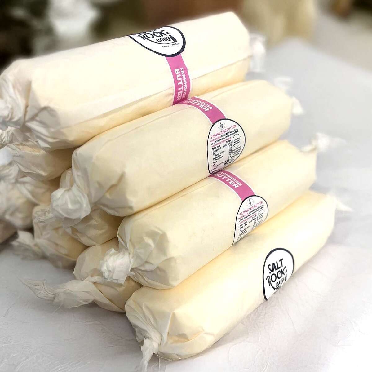
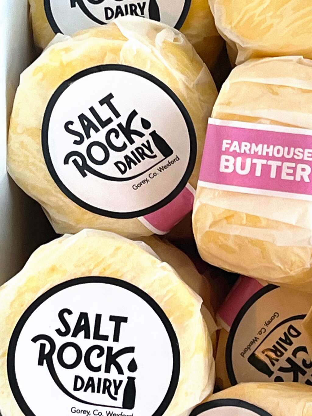
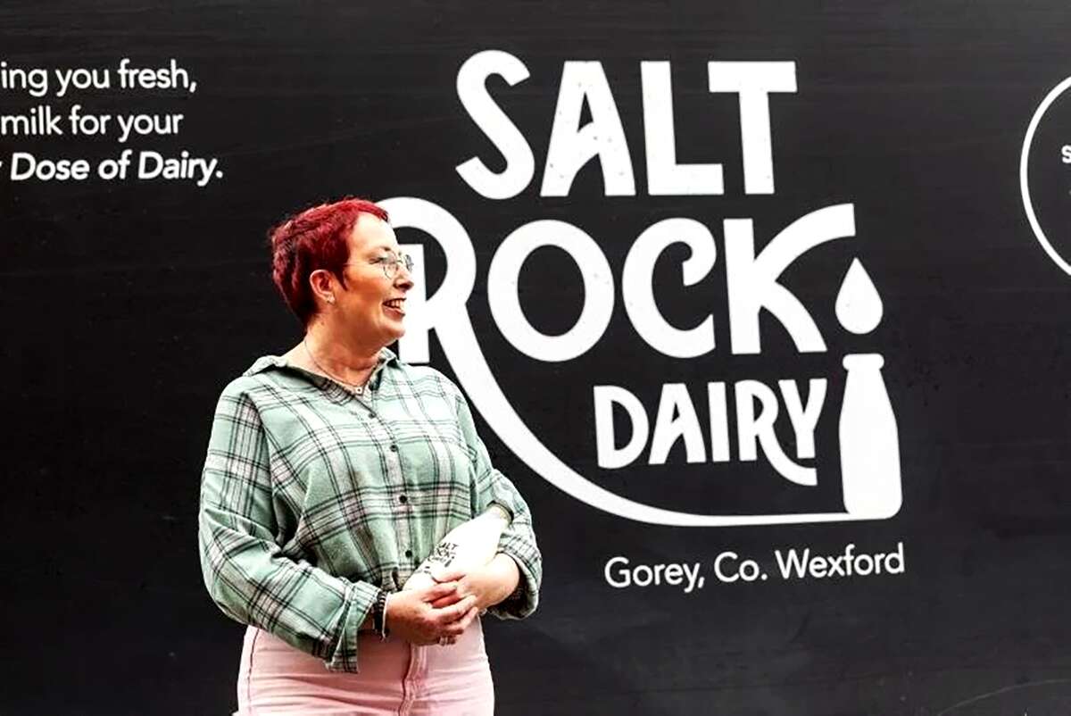
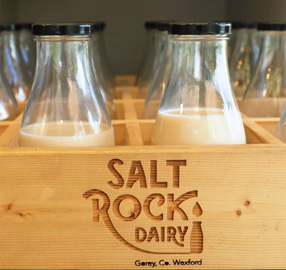
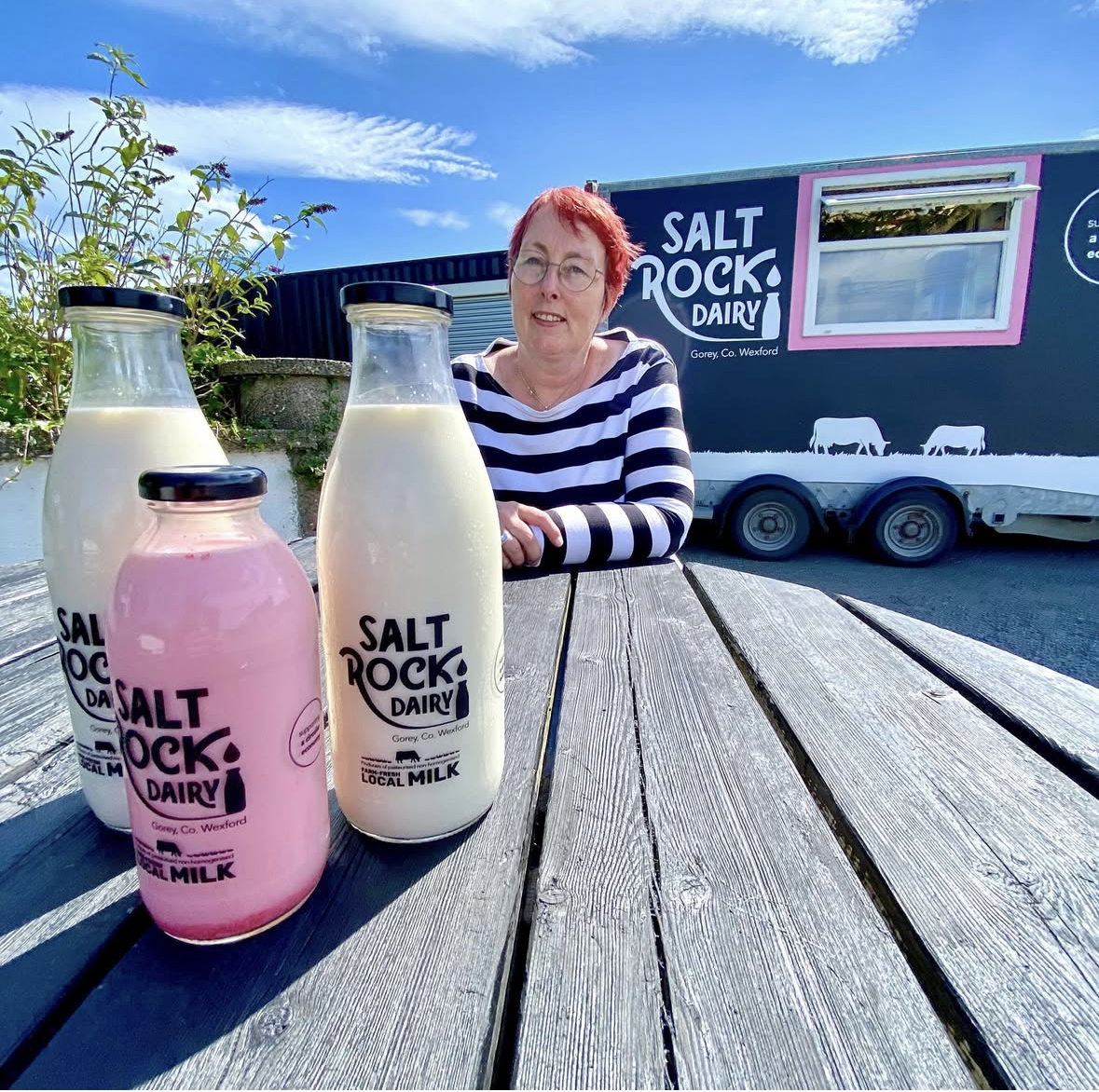
Saltrock Dairy Packaging Design Range Development
Saltrock Dairy Packaging Design – Range Development
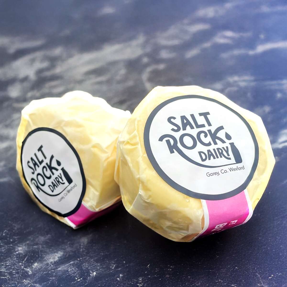
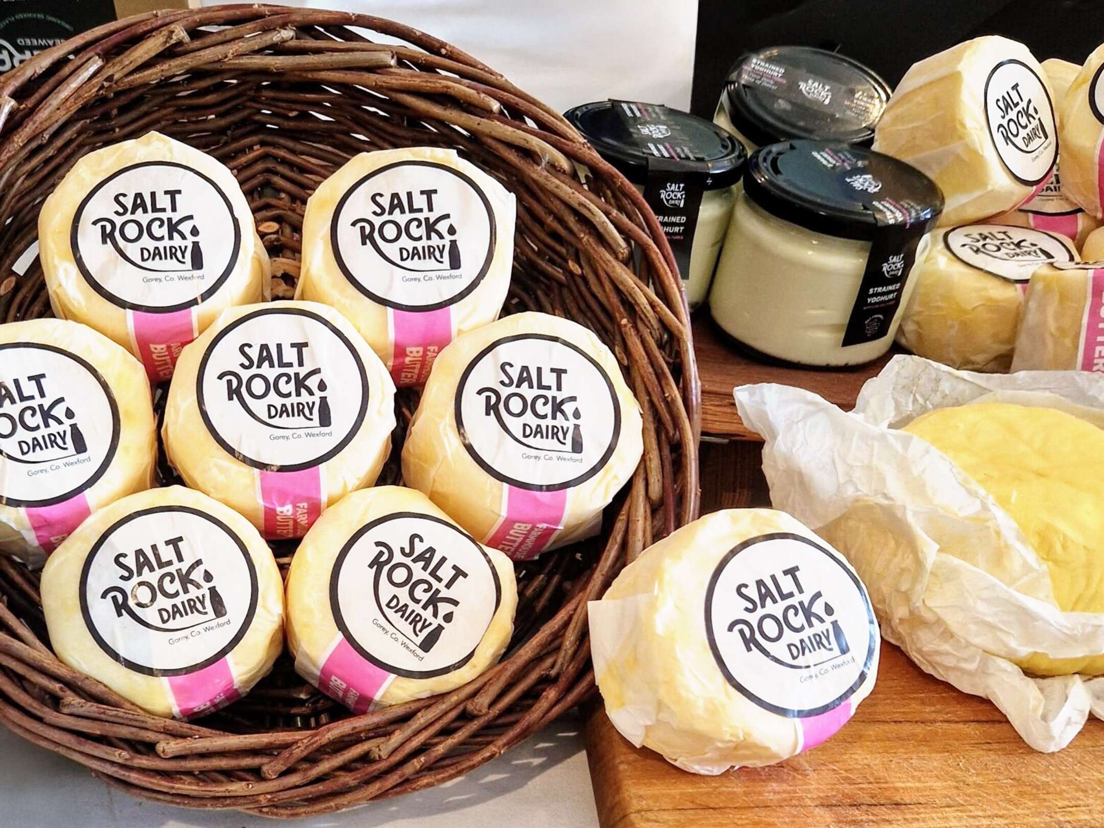
Saltrock Dairy asked us to help develop their packaging design range from the fresh milk products to Irish Cultured Farmhouse Butter and Strained Yoghurt. We ensured to keep a consistent look and feel with the existing brand, ensuring the new products had the same vibrant stand-out shelf presence and impact as customers associate with Saltrock Dairy.
Based in Gorey, Co. Wexford, Saltrock Dairy is a family-run farm situated on Tara Hill. Their mobile milk trailer travels around North County Wexford each week, supplying everyone with their weekly top-up of pasteurised non-homogenised milk.
![]()
Their new range is available in select stores such as Nolan’s in Clontarf and can be ordered online at:
www.SaltrockDairy.ie
Give them a follow on their Instagram page to find out where you can next spot the Saltrock Dairy trailer.

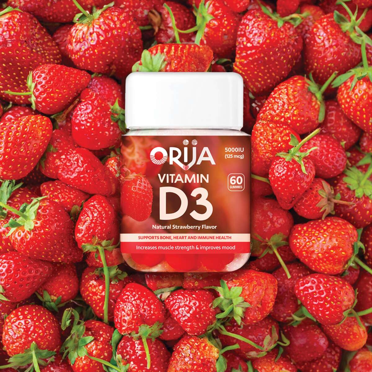
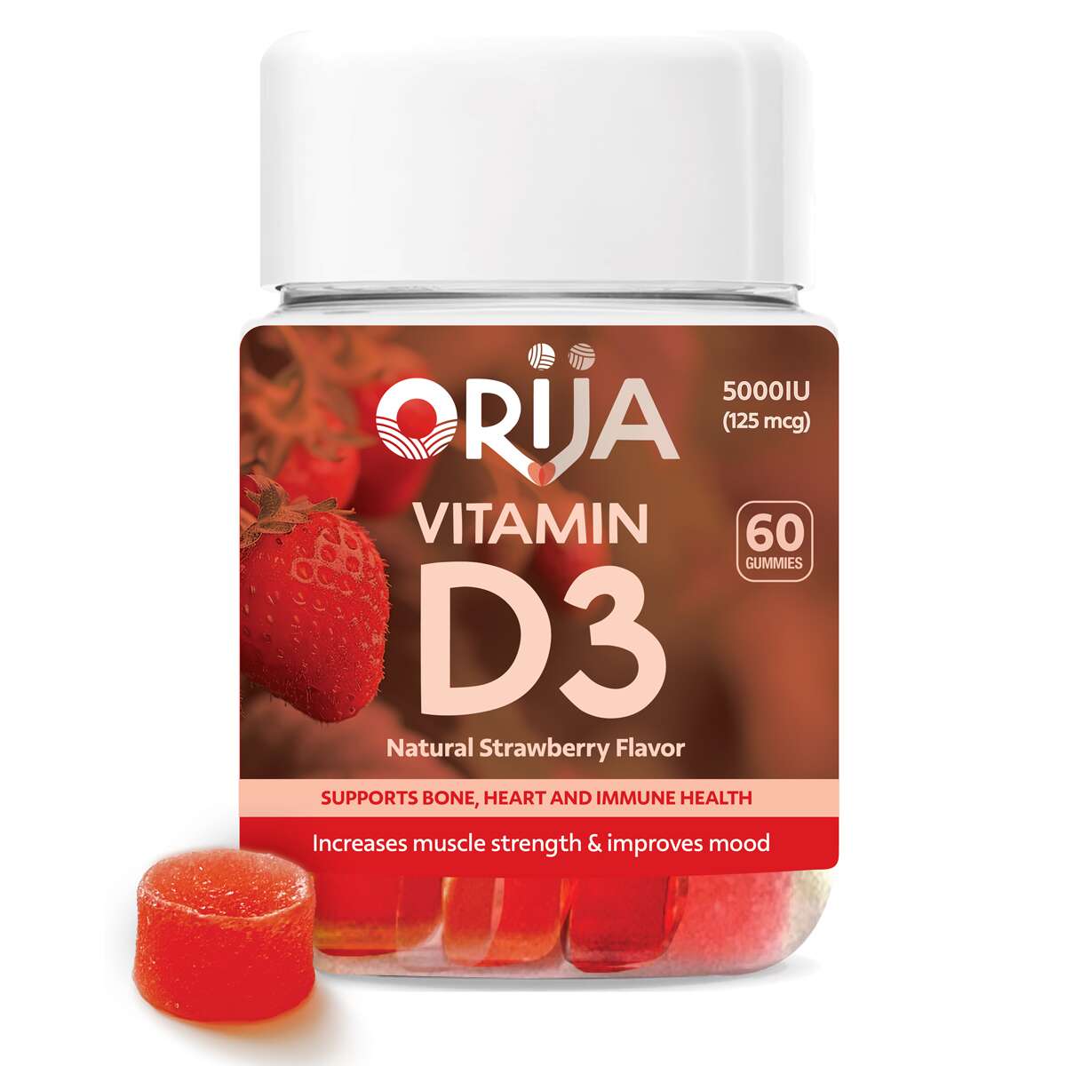
Orija Nutrition: Brand Packaging Design
Orija Nutrition: Packaging Design – Gummies Supplements Range
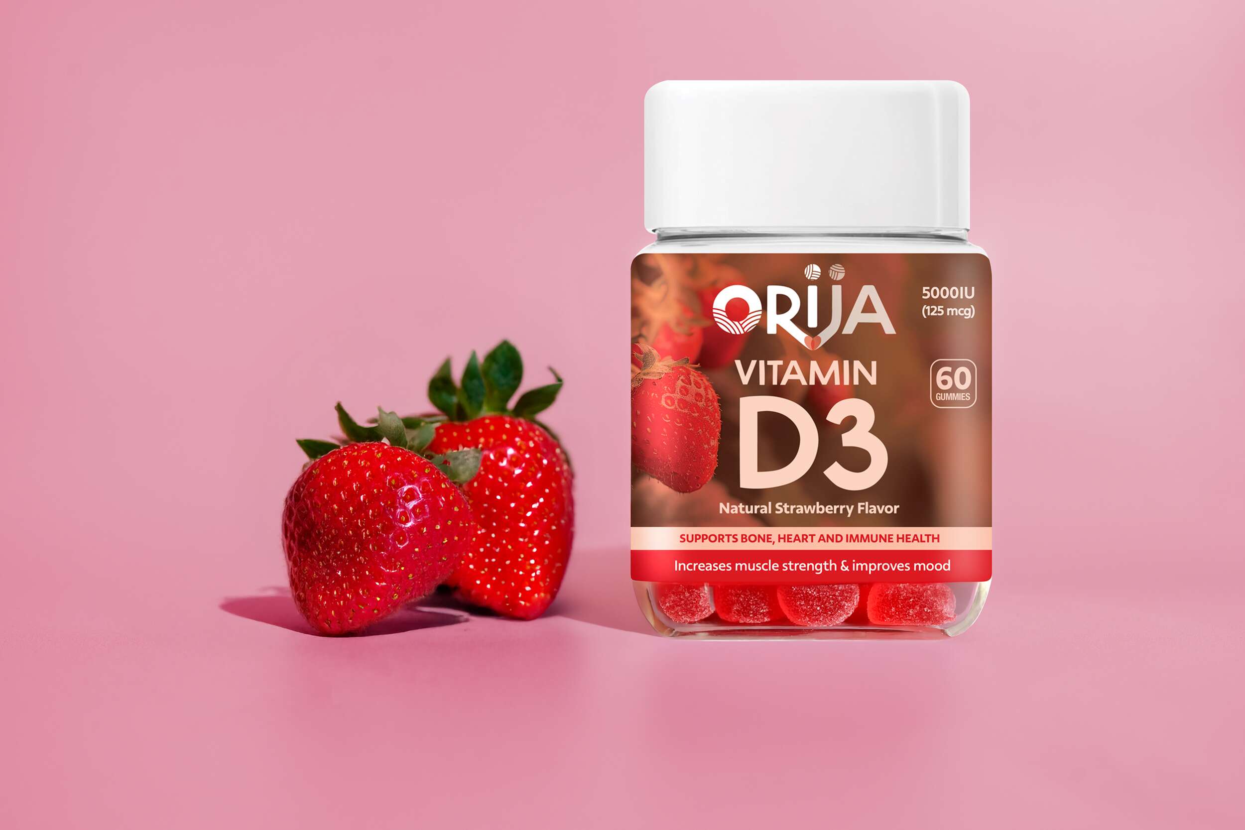
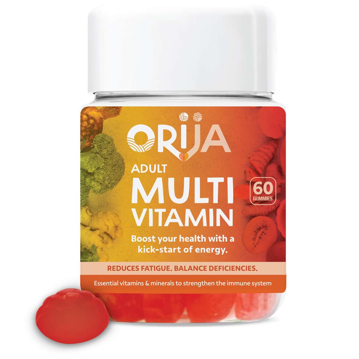
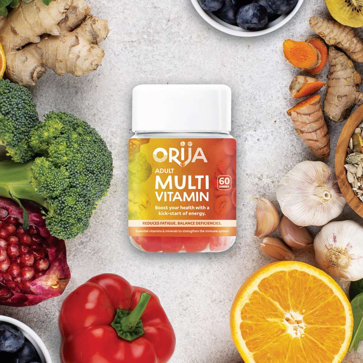
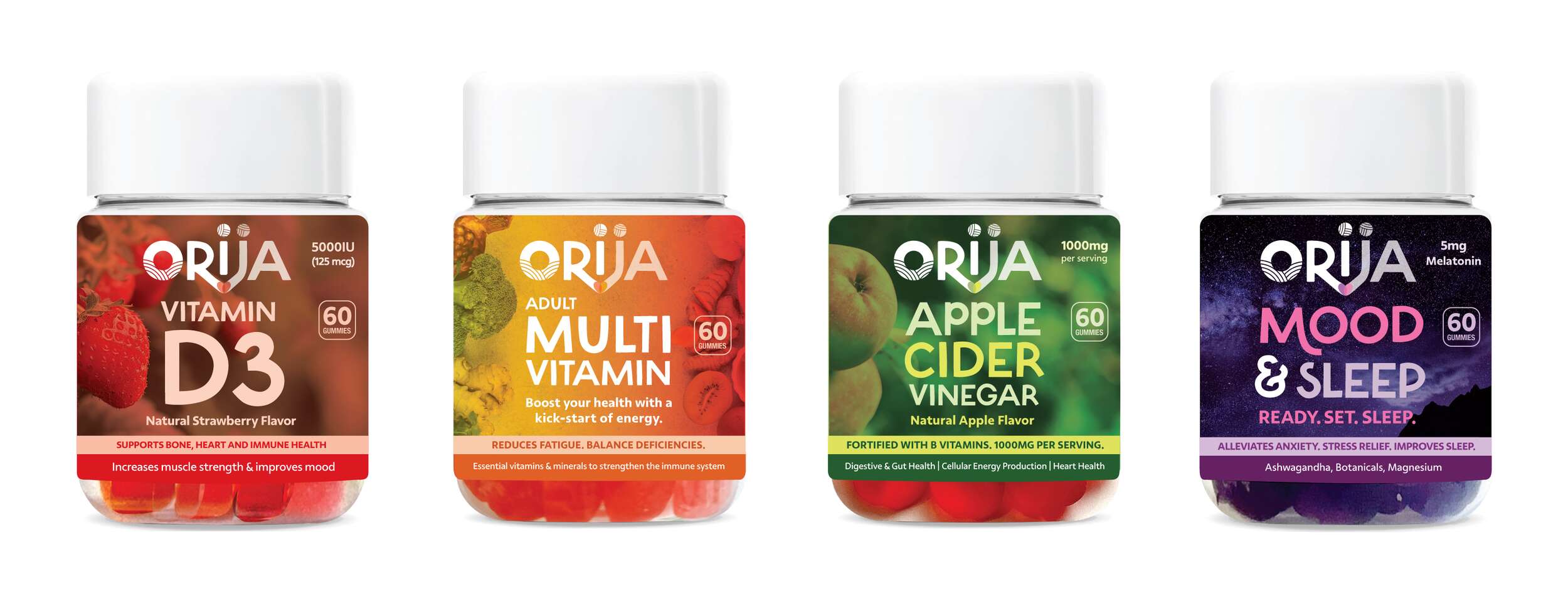
Following the successful launch of Orija’s first retail herb and spice range, we had the pleasure of continuing my collaboration with them to design packaging for their newest innovation, a line of functional nutraceutical gummies.
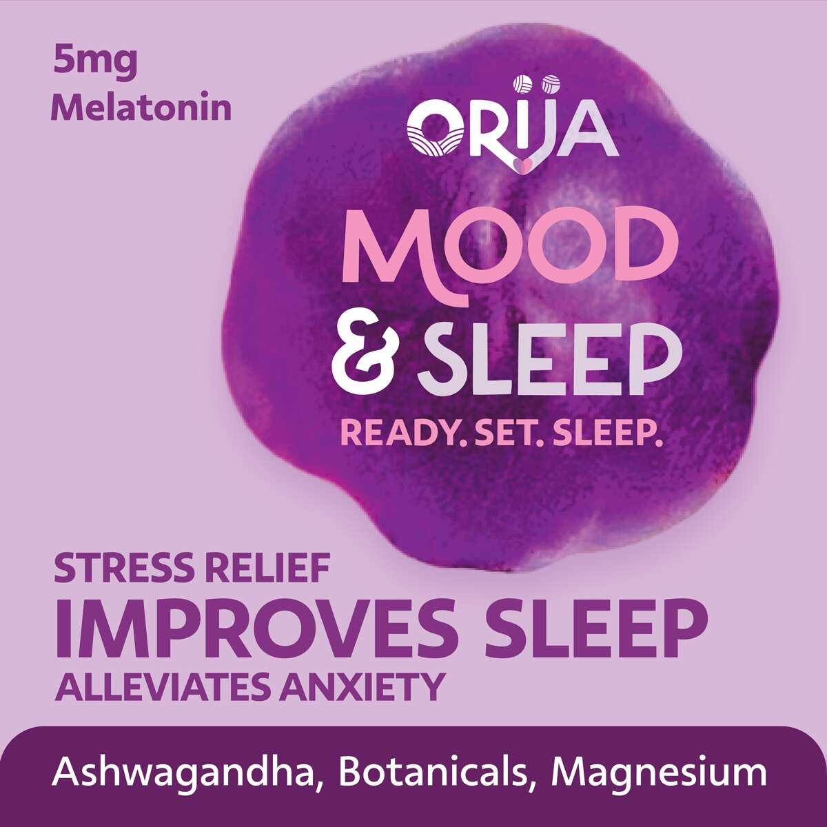
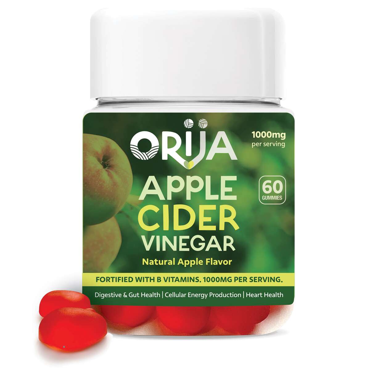
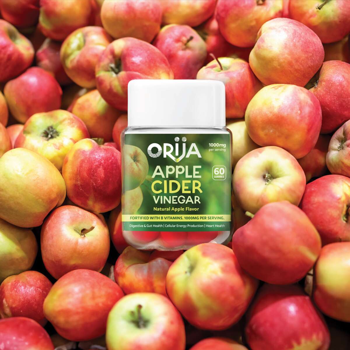
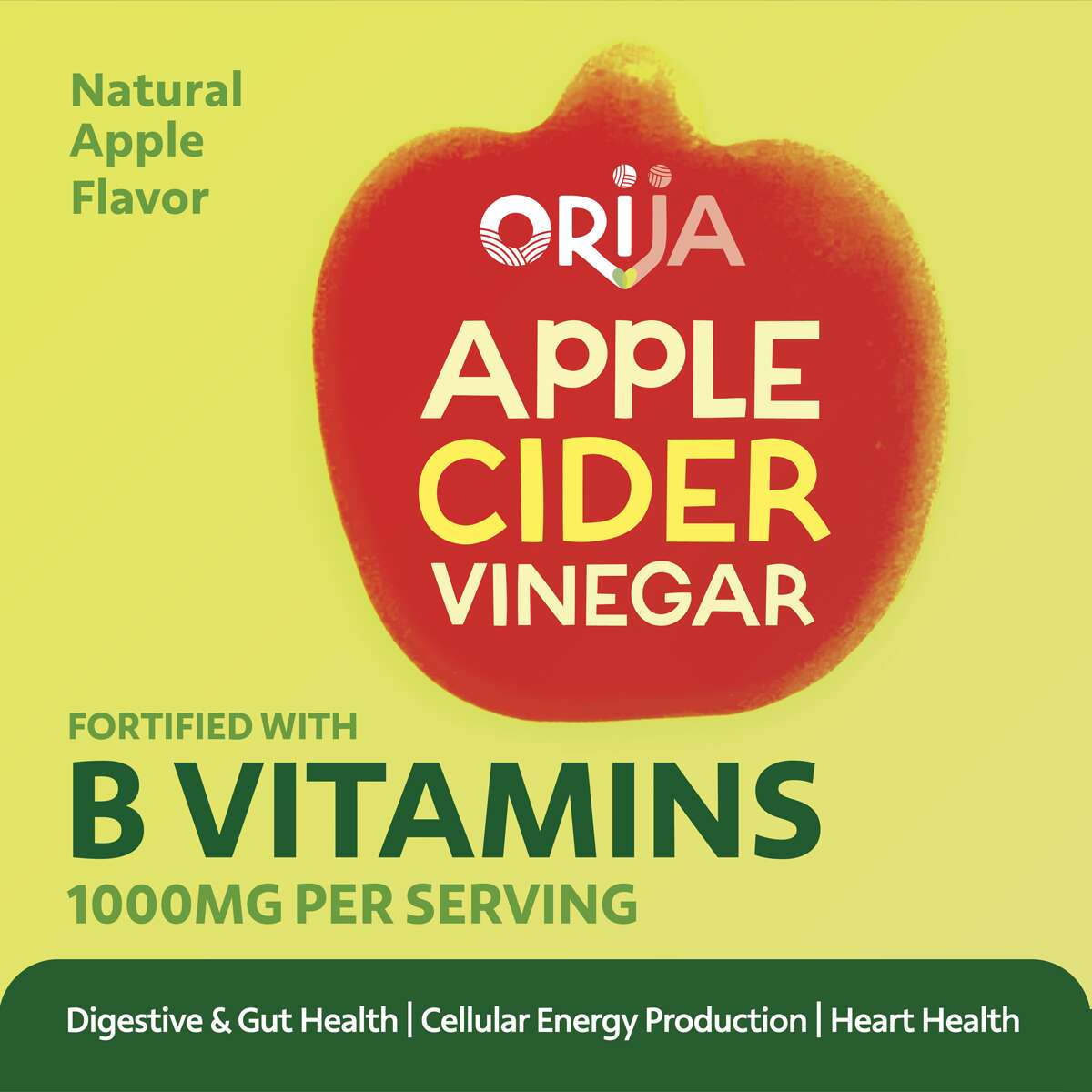
The collection includes Apple Cider Vinegar, Vitamin D3, Mood & Sleep, and Adult Multivitamin – each formulated to support daily wellness through clean, plant-based ingredients.
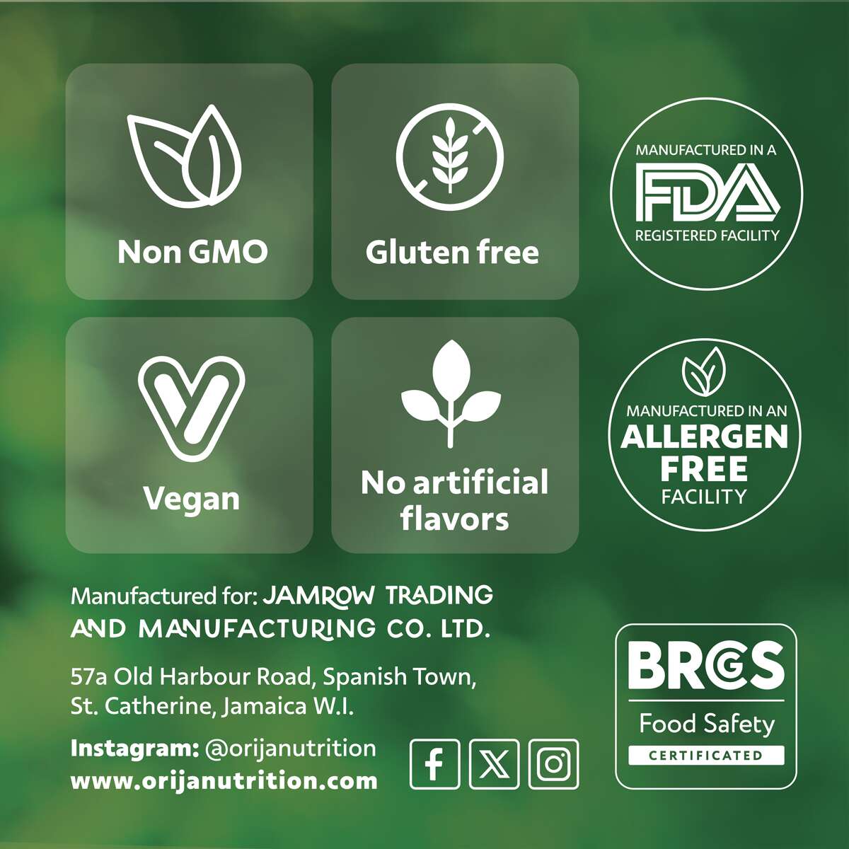
Our design approach focused on creating a premium and fresh look, combining bold colour palettes influenced by the gummies’ natural flavours with clean typography and subtle background photography. Each label highlights key benefits and icons, clearly communicating Orija’s values of quality, integrity, and transparency.
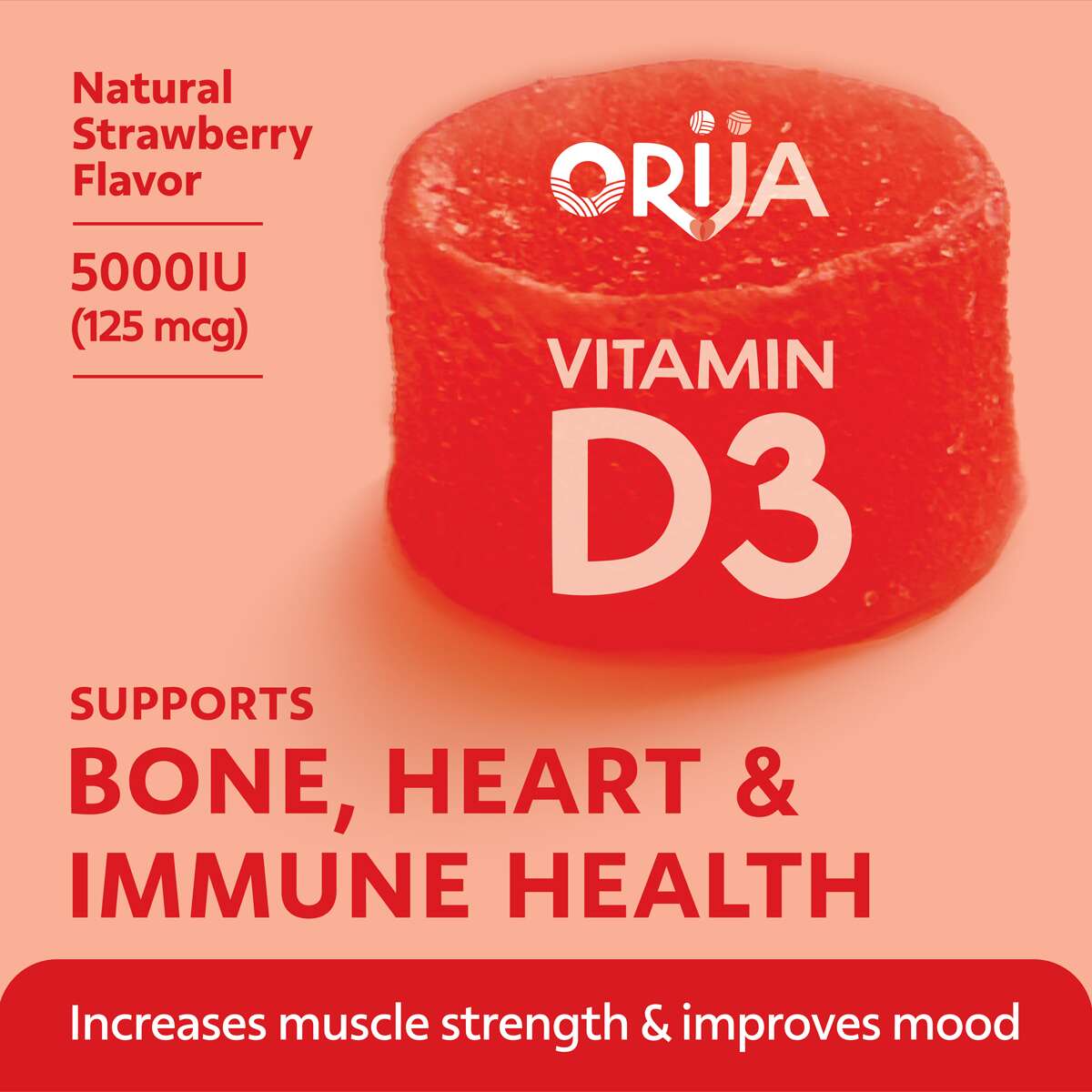
Vitamin D3
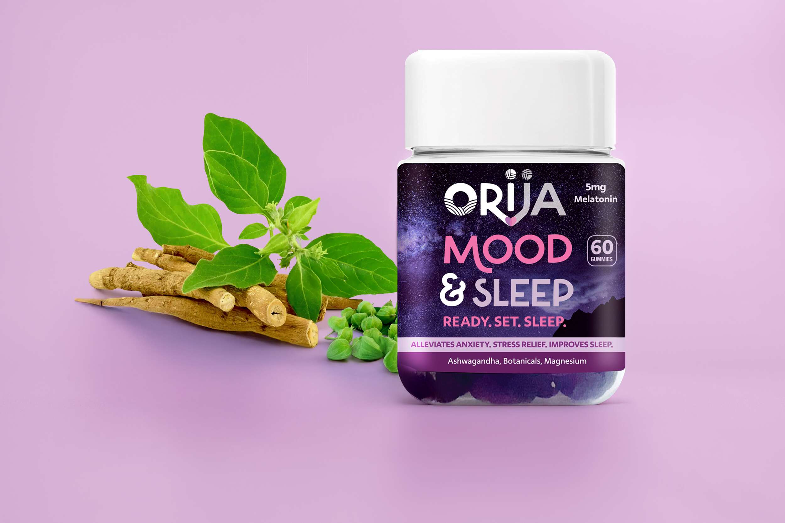
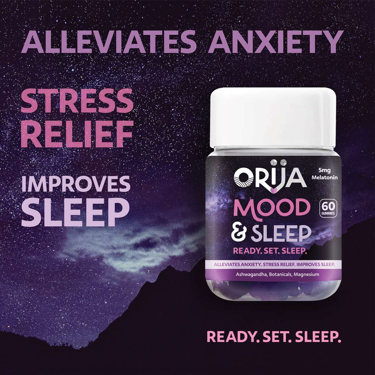
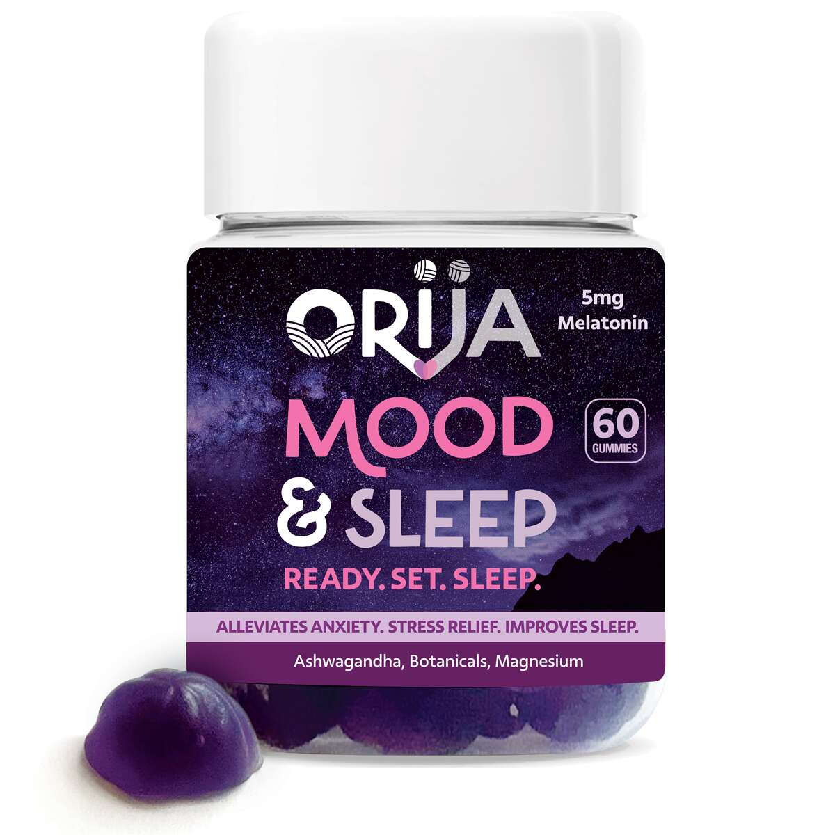
Mood & Sleep
Apple Cider Vinegar
Adult Multivitamin
The Full Range
It’s been great working with an authentic Jamaican company, their vibrant energy creates such an inspiring partnership. They are a family-run business expanding into the retail wellness space. The final designs deliver a fresh, credible aesthetic that positions Orija among leading supplement brands while keeping its unique island heritage front and centre.
Follow Orija on Instagram:
@OrijaNutrition
Orija Nutrition: Brand Packaging Design
Orija Nutrition: Brand Packaging Design
Nutraceutical Superfood Range
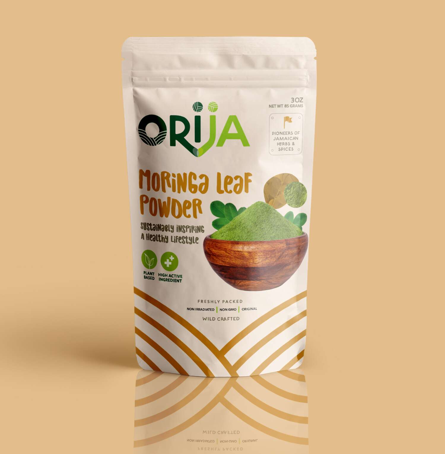
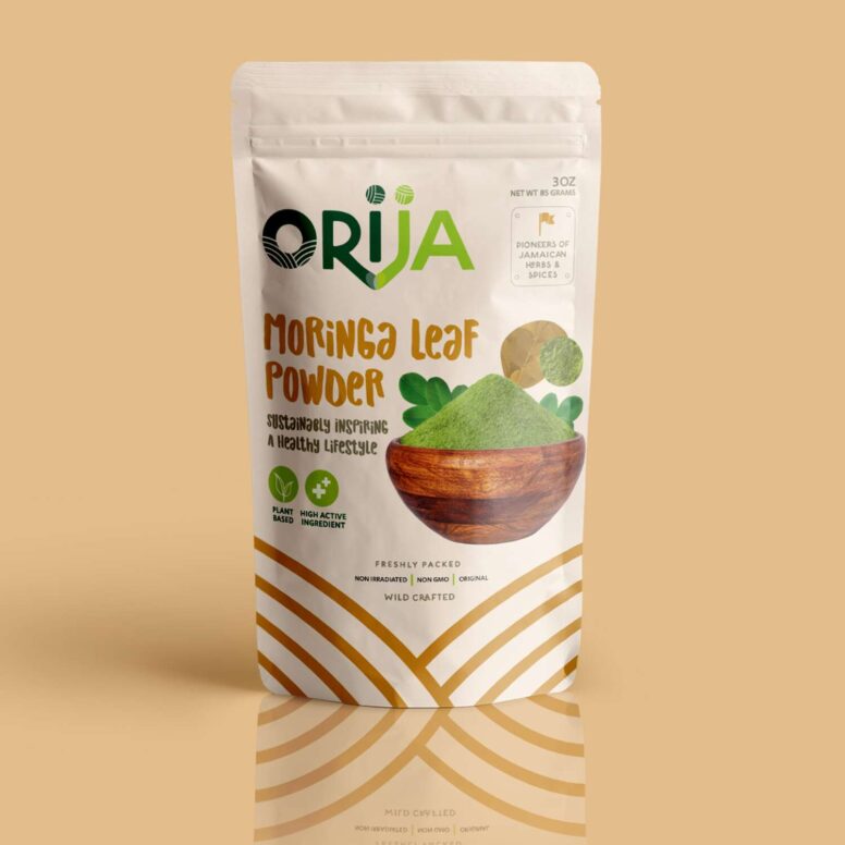
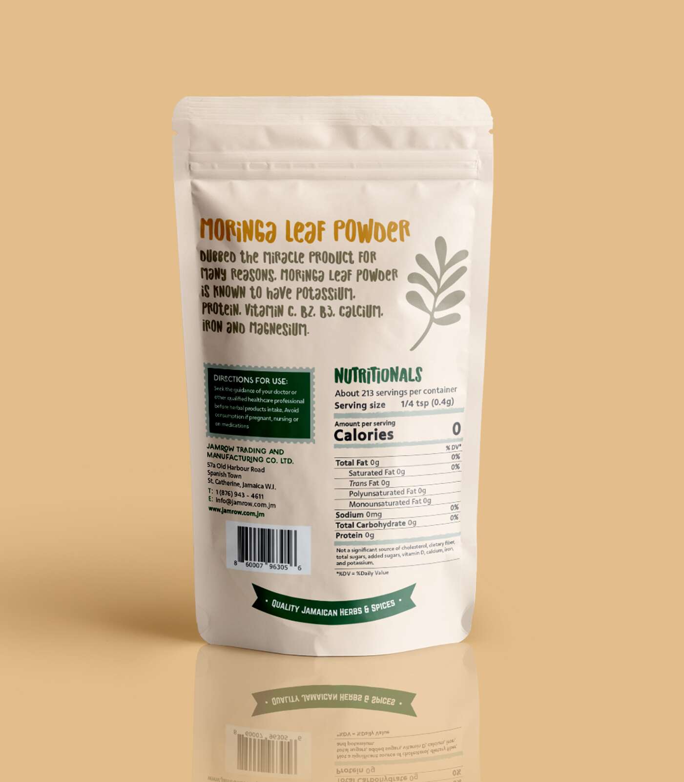
Moringa Leaf Powder 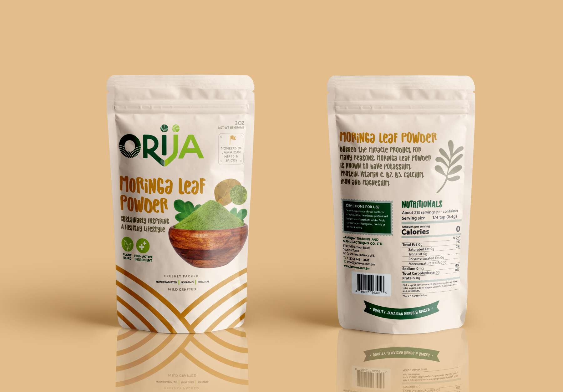
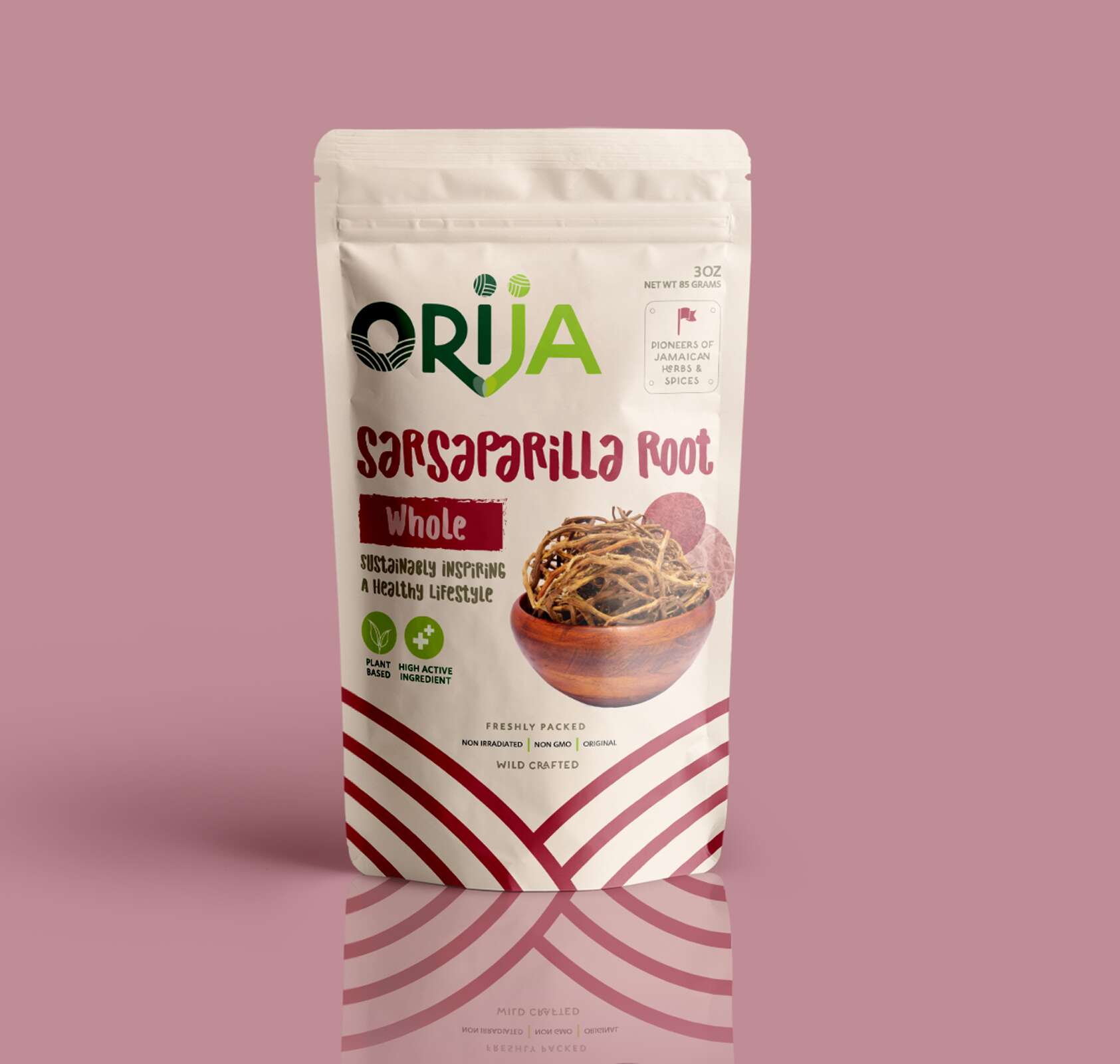
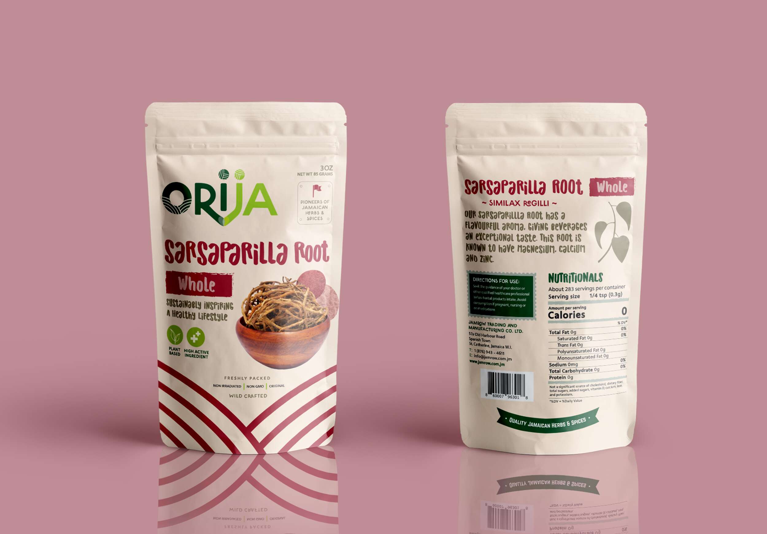
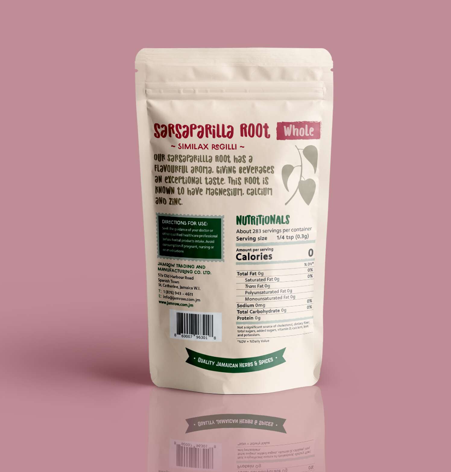
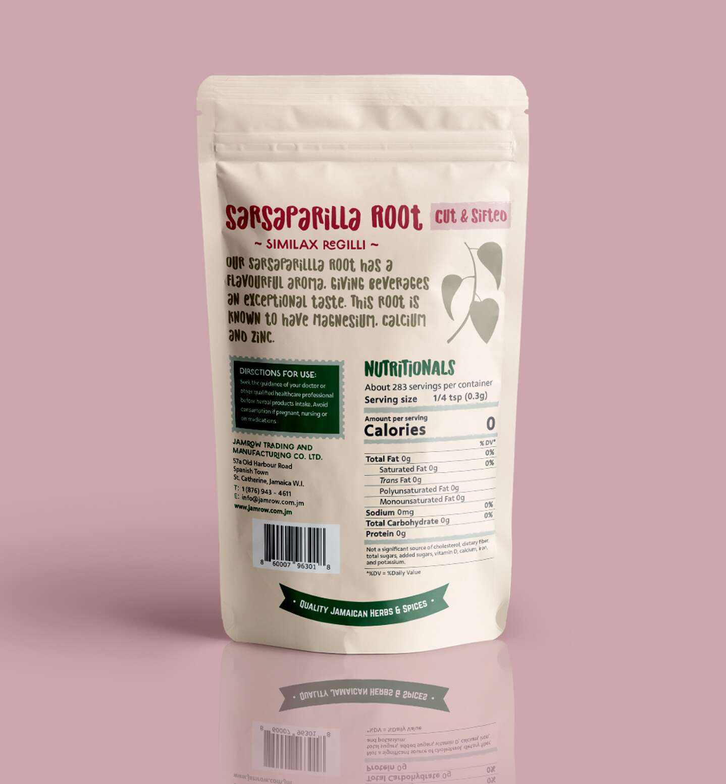
Sarsaparilla Root – Whole
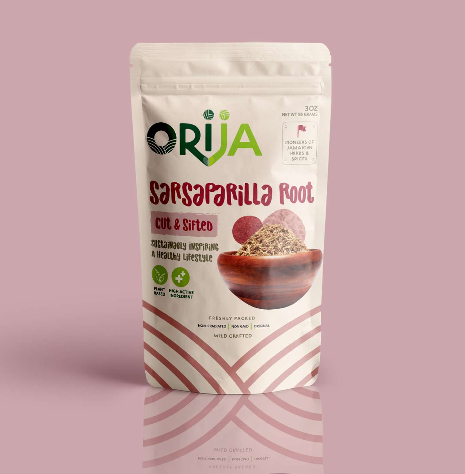
Sarsaparilla Root – Cut & Sifted

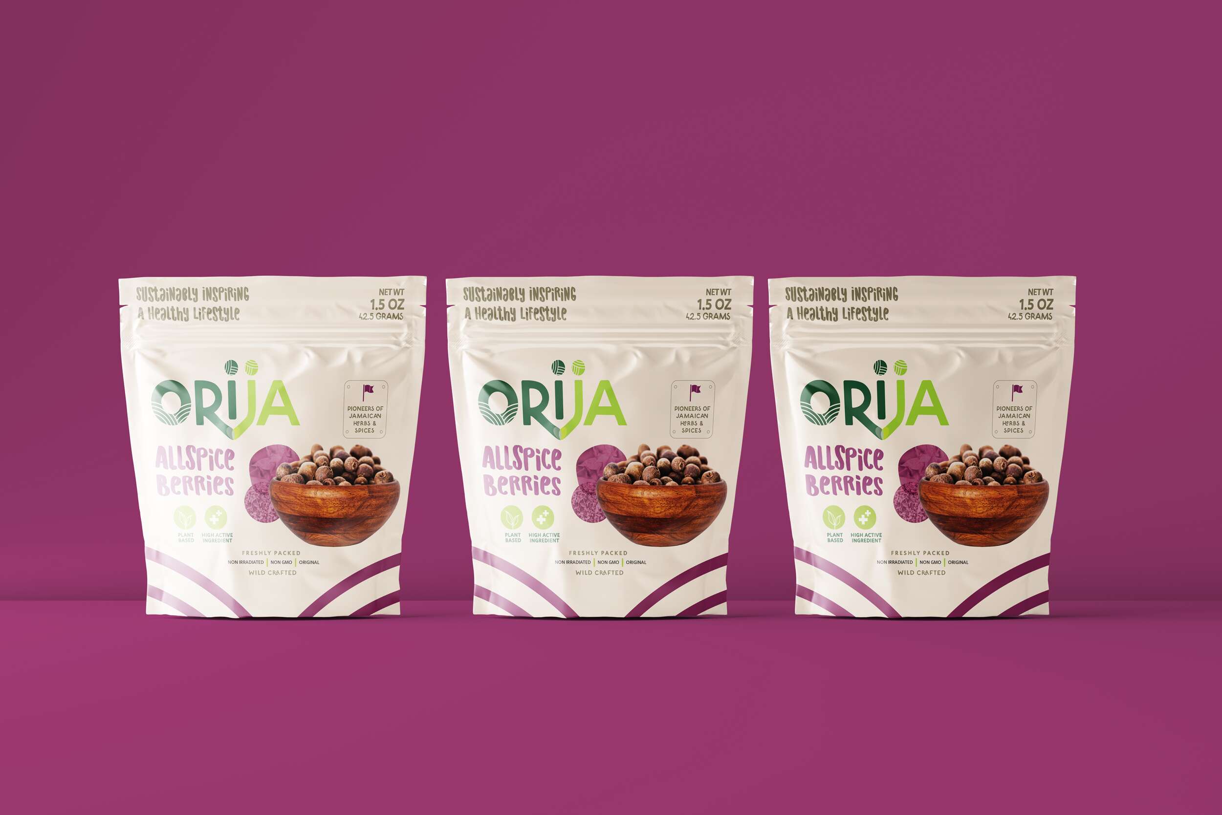
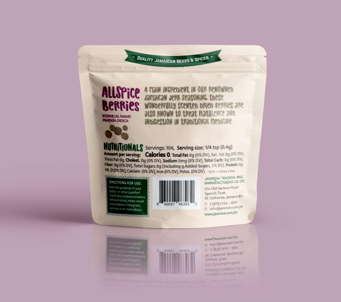
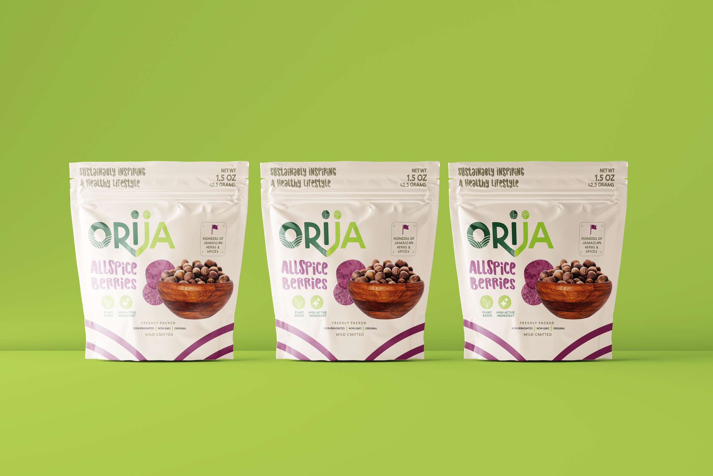
Allspice Berries
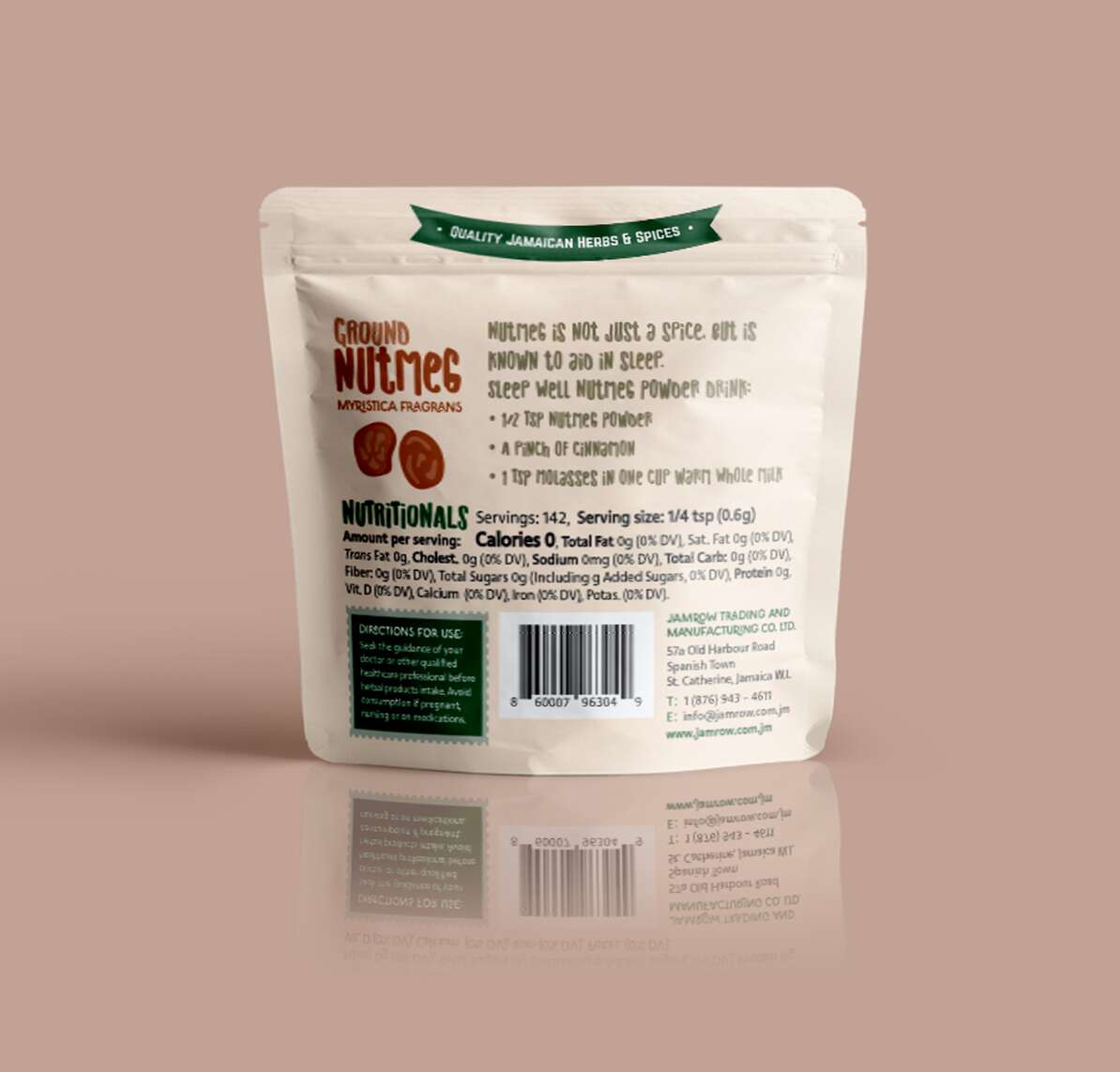
Ground Nutmeg
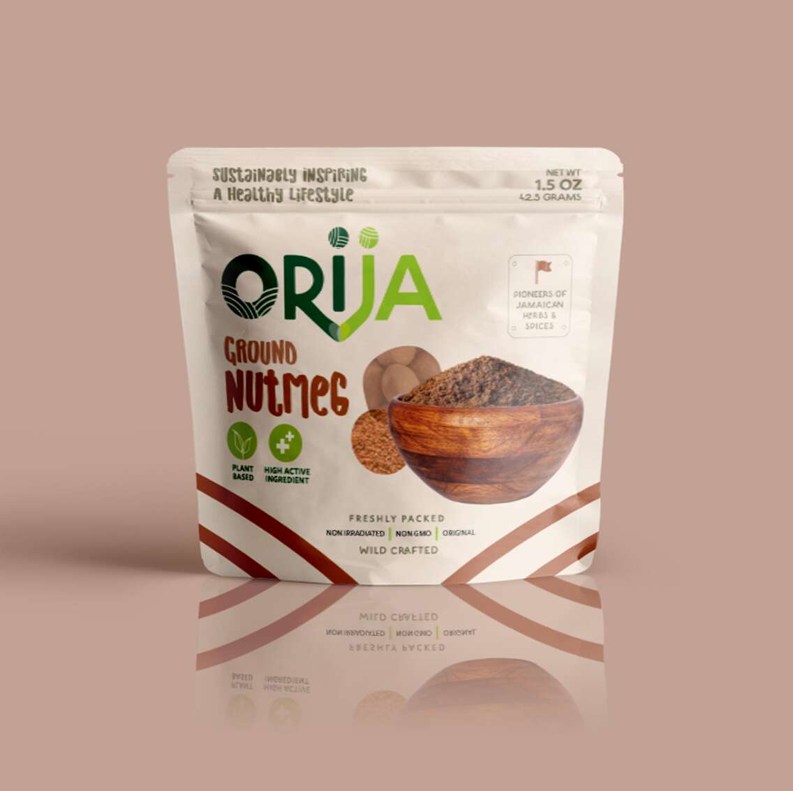
For over 30 years, Jamrow Trading has exported raw botanical ingredients across the globe. With the birth of Orija Nutrition, they’ve taken a bold leap – from bulk ingredients to premium retail with this range of functional foods and herbal supplements. I had the privilege of leading the brand and packaging design for their debut product line under this exciting new venture.
From concept to pouch, the Orija identity is rooted in function and flavour. The logotype uses custom letterforms that connect, symbolising Orija’s mission to nourish heart, mind, and body, while bridging cultures through Jamaica’s rich herbal heritage. Each pack features vivid colours inspired by the product inside, playful-yet-elevated imagery, and a clean layout that communicates trust and quality at a glance.
The tagline, ‘Sustainably inspiring a healthy lifestyle’, threads throughout the visual language, complemented by hand-lettered typography to honour the brand’s natural, unrefined essence.
From Moringa Leaf Powder to Sarsaparilla Root, the Orija pouches are more than just packaging – they’re a celebration of Jamaican wellness, tradition, culture and bold innovation. I’m proud to have supported this generational business as they prepare to launch retail locally and internationally.
We love to design with purpose, and to shaping brands that stand the test of time.
Follow Orija on Instagram:
@OrijaNutrition
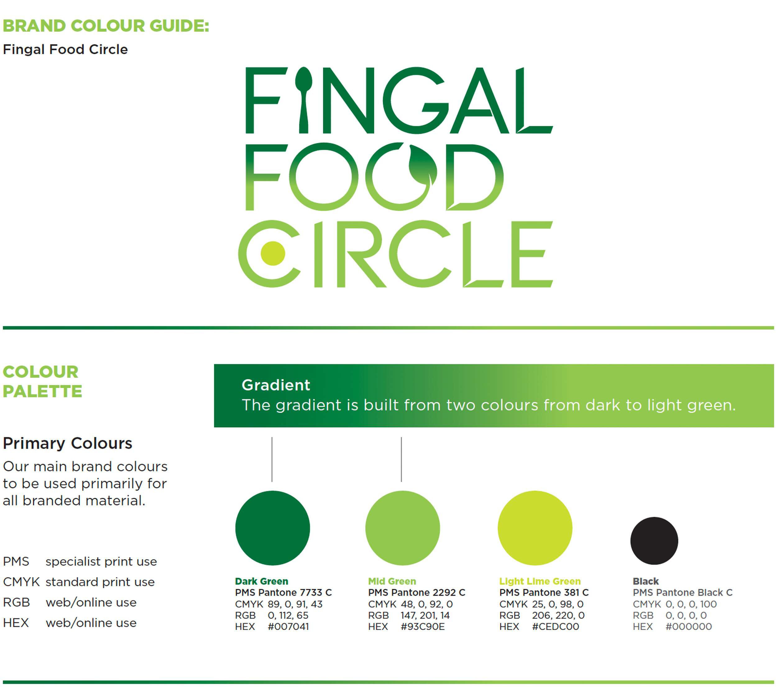
Fingal Food Circle: Brand Identity Design
Fingal Food Circle: Brand Identity Design
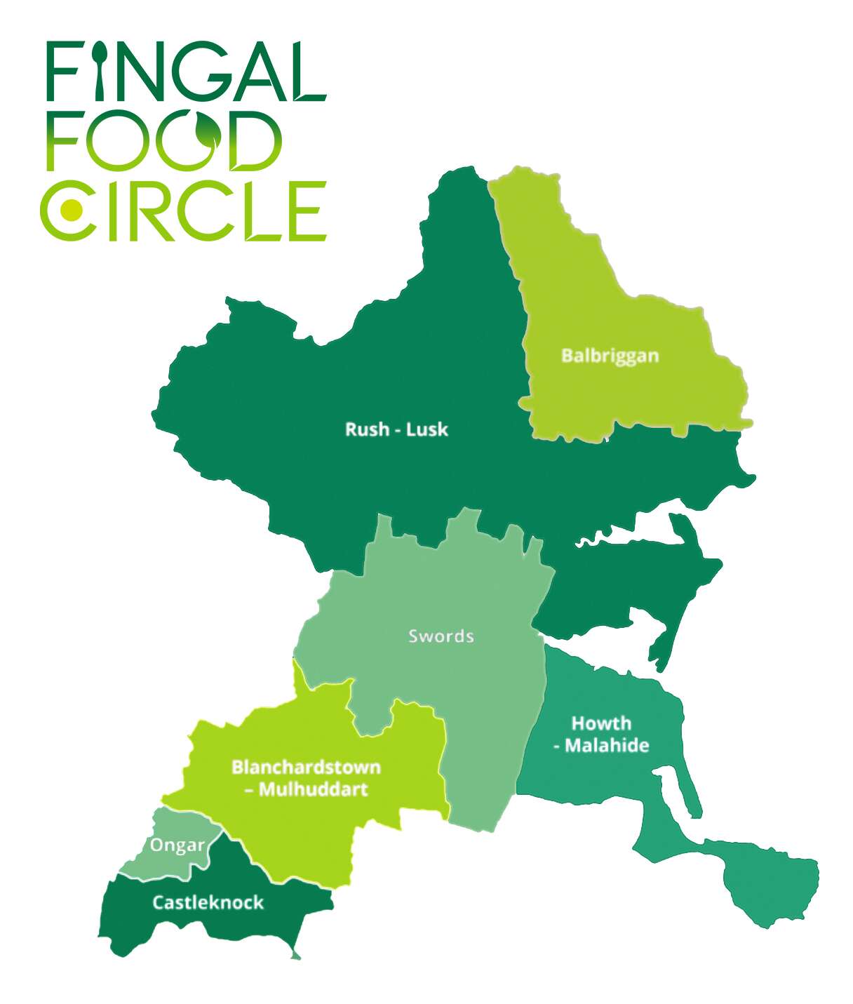
I recently created a new brand identity for Fingal Food Circle, a food and drink network based in North County Dublin. This initiative brings together local producers, restaurants, cafes, culinary experiences, and food tourism operators, all under one umbrella. The goal was to develop a strong and distinctive brand that celebrates local provenance, encourages collaboration, and supports the wider food and drink community in the Fingal region.
Before this project, Fingal Food Circle had no existing brand or visual identity. They needed a design that would establish them as a clear and confident voice for the industry – something that could work across everything from events and training to tourism promotion and media engagement. It also had to reflect the diversity of its members, while remaining flexible enough to grow with the network over time.
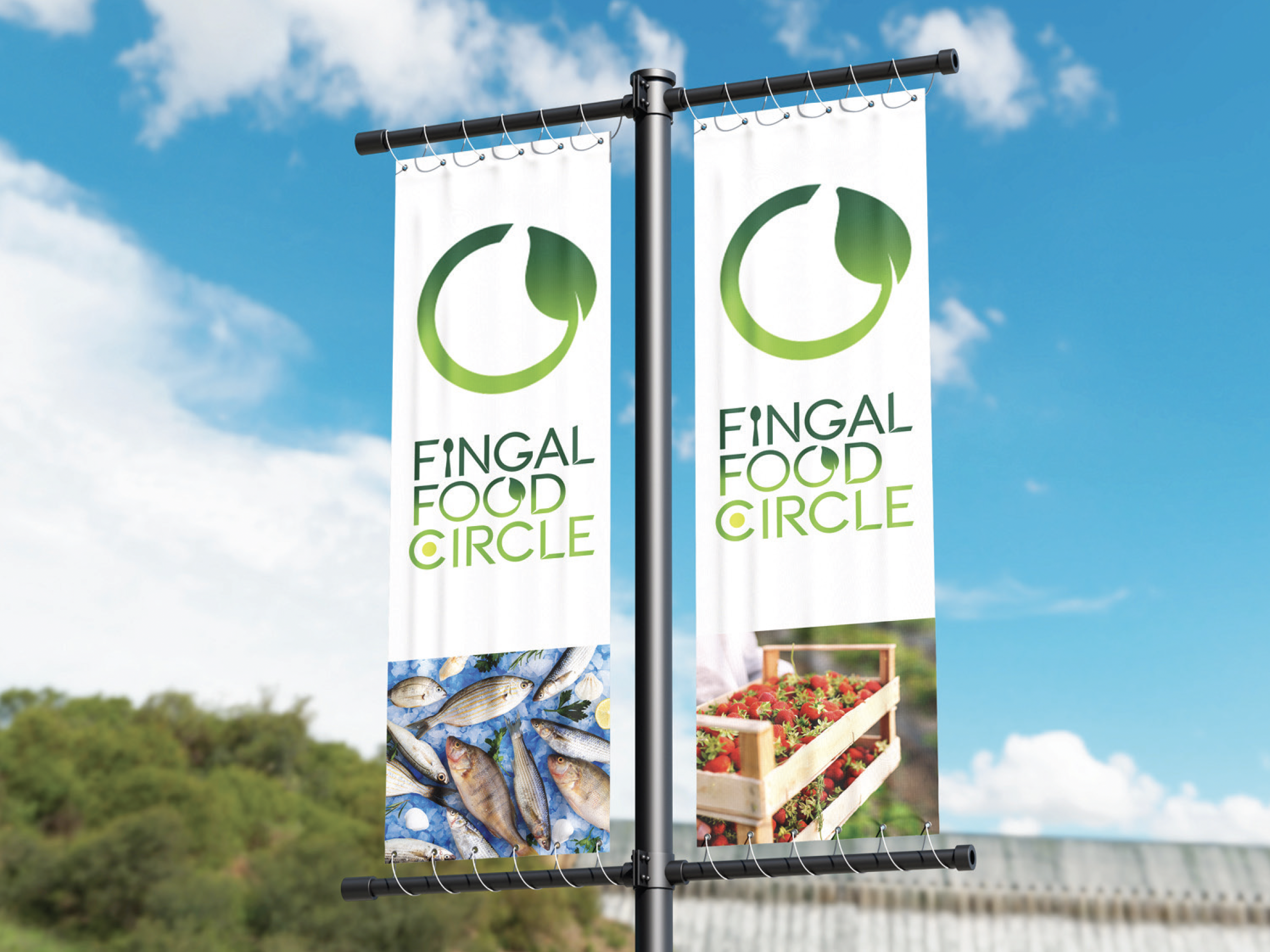
The chosen design direction focused on a custom typographic logo that feels open, welcoming, and grounded in food culture. A spoon subtly replaces the ‘I’ in ‘Fingal’ to represent the culinary aspect of the network. The circular form of the ‘C’ includes a green circular dot to reference the landscape and community and link with the brand’s name, while the open ‘O’ features a small leaf – symbolising fresh produce and the concept of growth and inclusion. The overall design is clean, modern, and tailored, while still feeling warm and approachable.

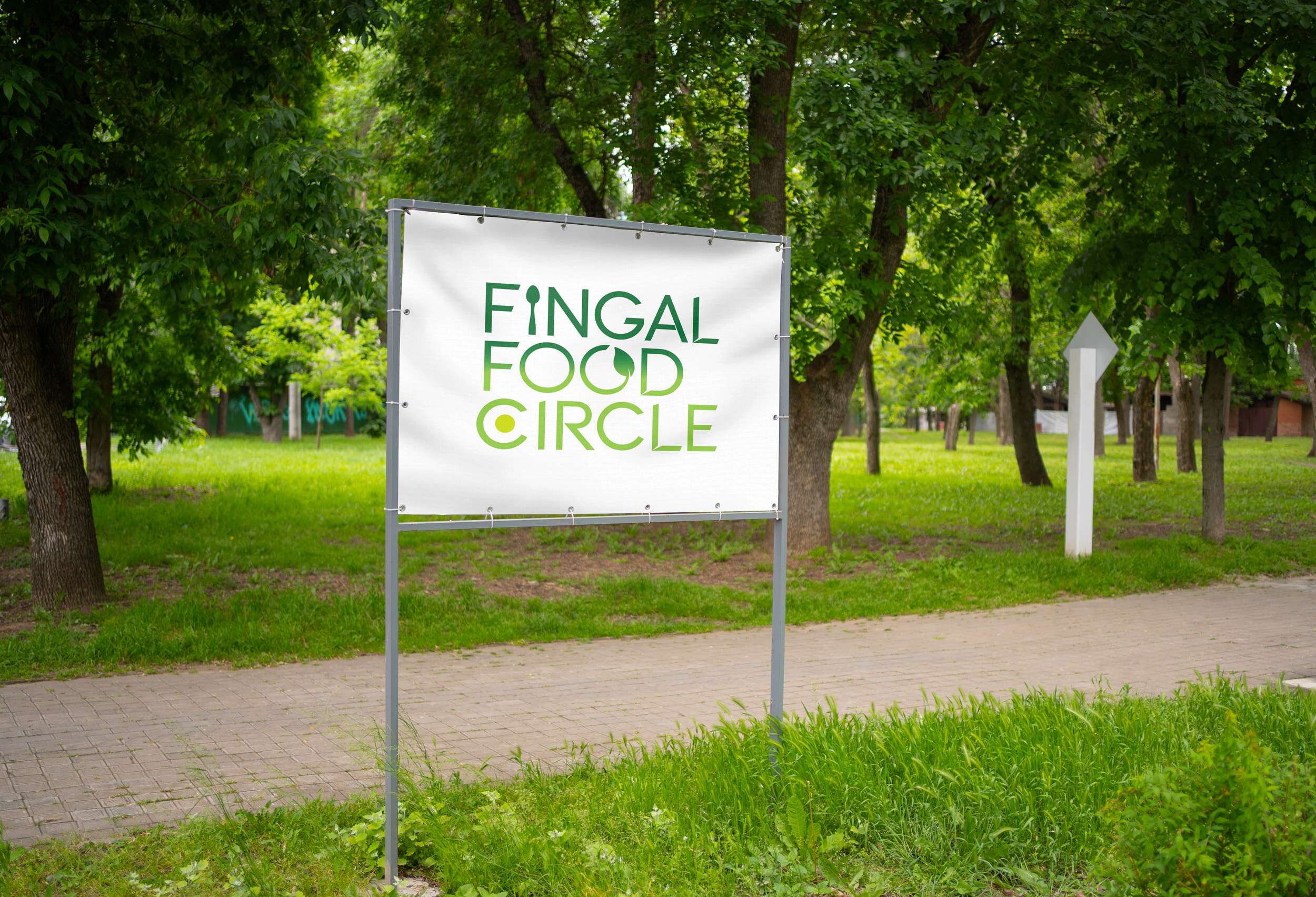
This new brand identity helps Fingal Food Circle communicate who they are at a glance: a grassroots but professional collective that promotes local food, fosters connection, and invites people to experience everything the region has to offer. The identity is launching publicly at the Flavours of Fingal Festival, marking the beginning of a stronger, more visible presence for the network in the local food and drink scene.
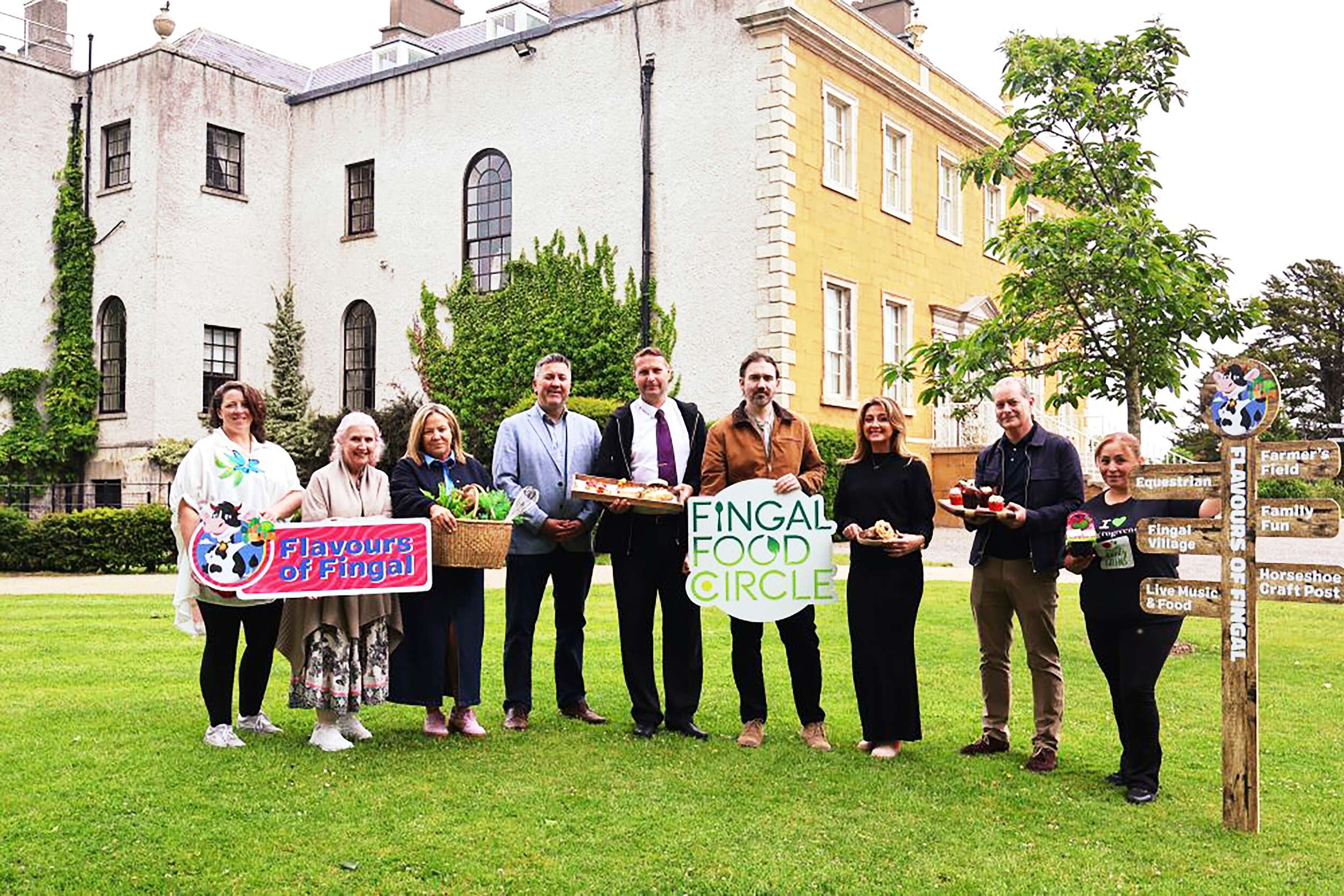
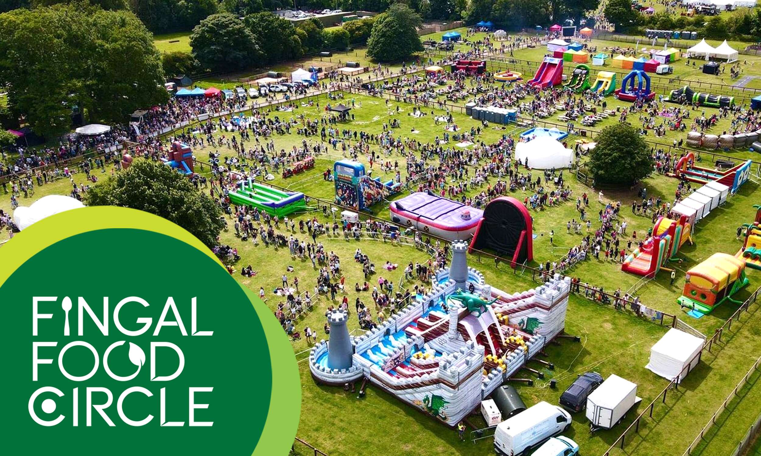
Flavours of Fingal, a vibrant two-day festival at Newbridge House and Farm that celebrates the region’s rich food culture, local producers, and community spirit, bringing over 65,000 visitors together for a truly unforgettable experience. The Fingal Food Circle is looking forward to making its debut there this year.
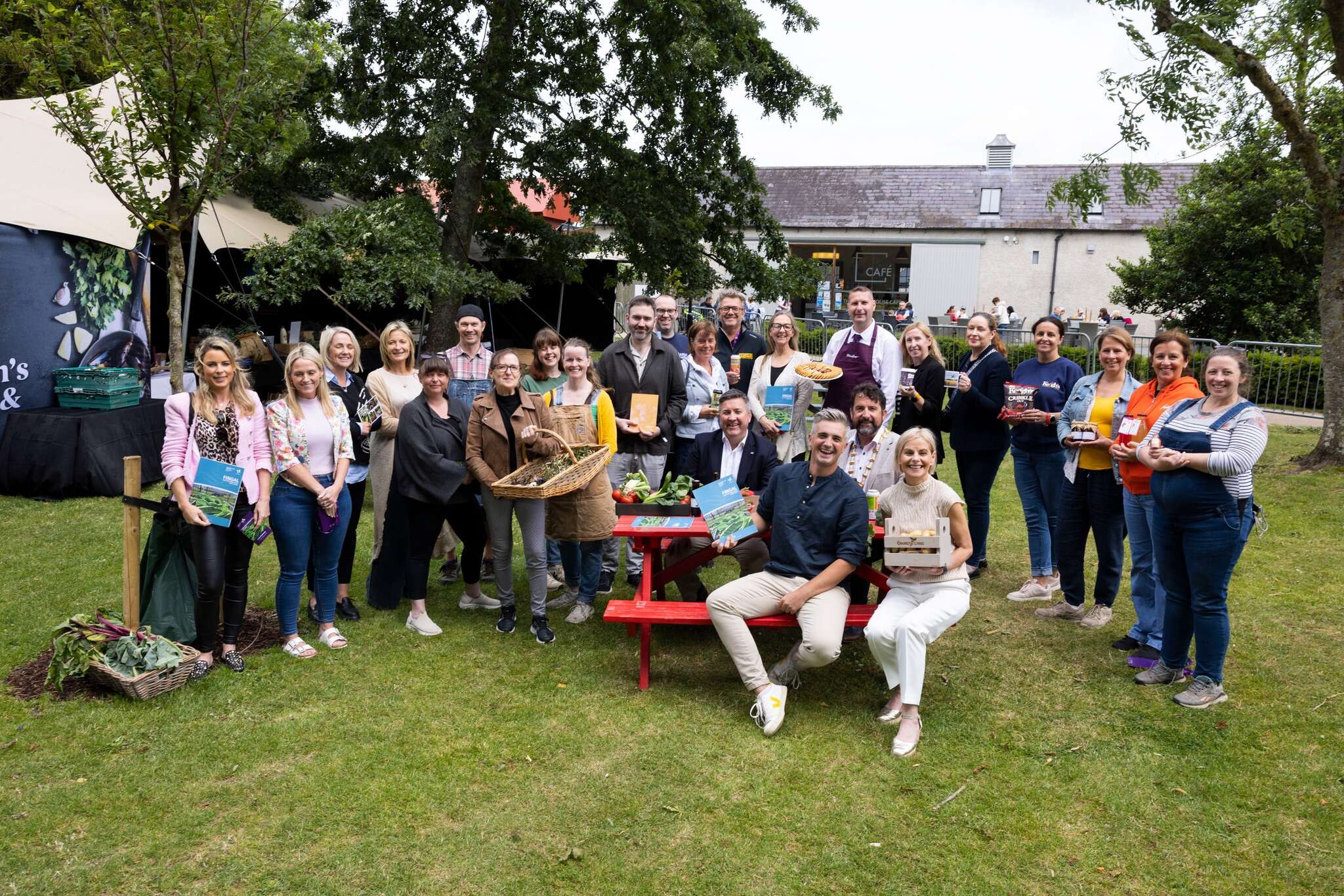
Flavours of Fingal Launch of the Fingal Food and Drink Policy 2024-2029 at Flavours of Fingal, Newbridge House and Farm, Donabate.
Picture by Shane O’Neill, Coalesce.
Follow Fingal Food Circle online:
Instagram: @fingalfoodcircle
Facebook: @fingalfoodcircle
Website: www.fingalfoodcircle.ie
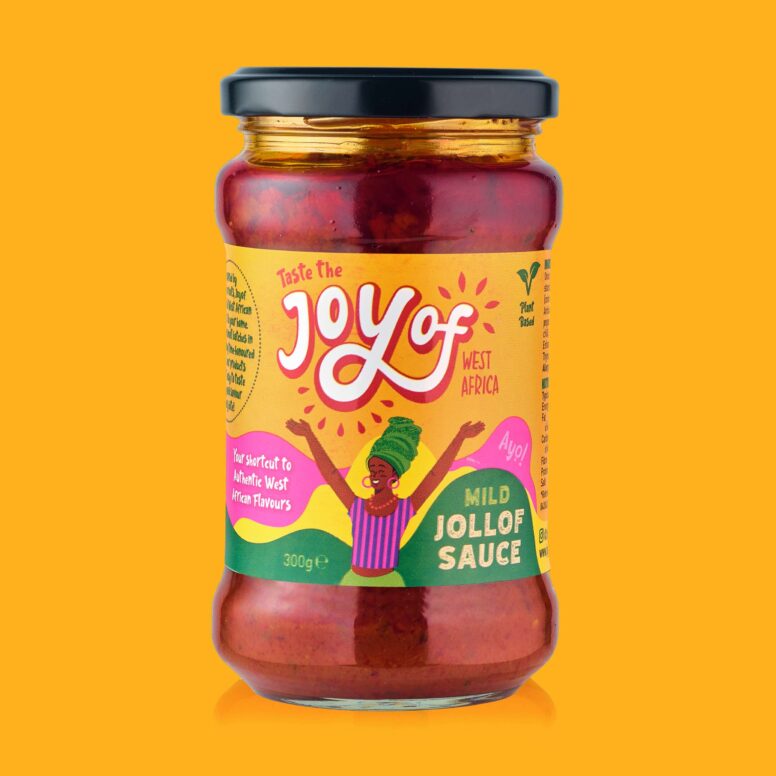
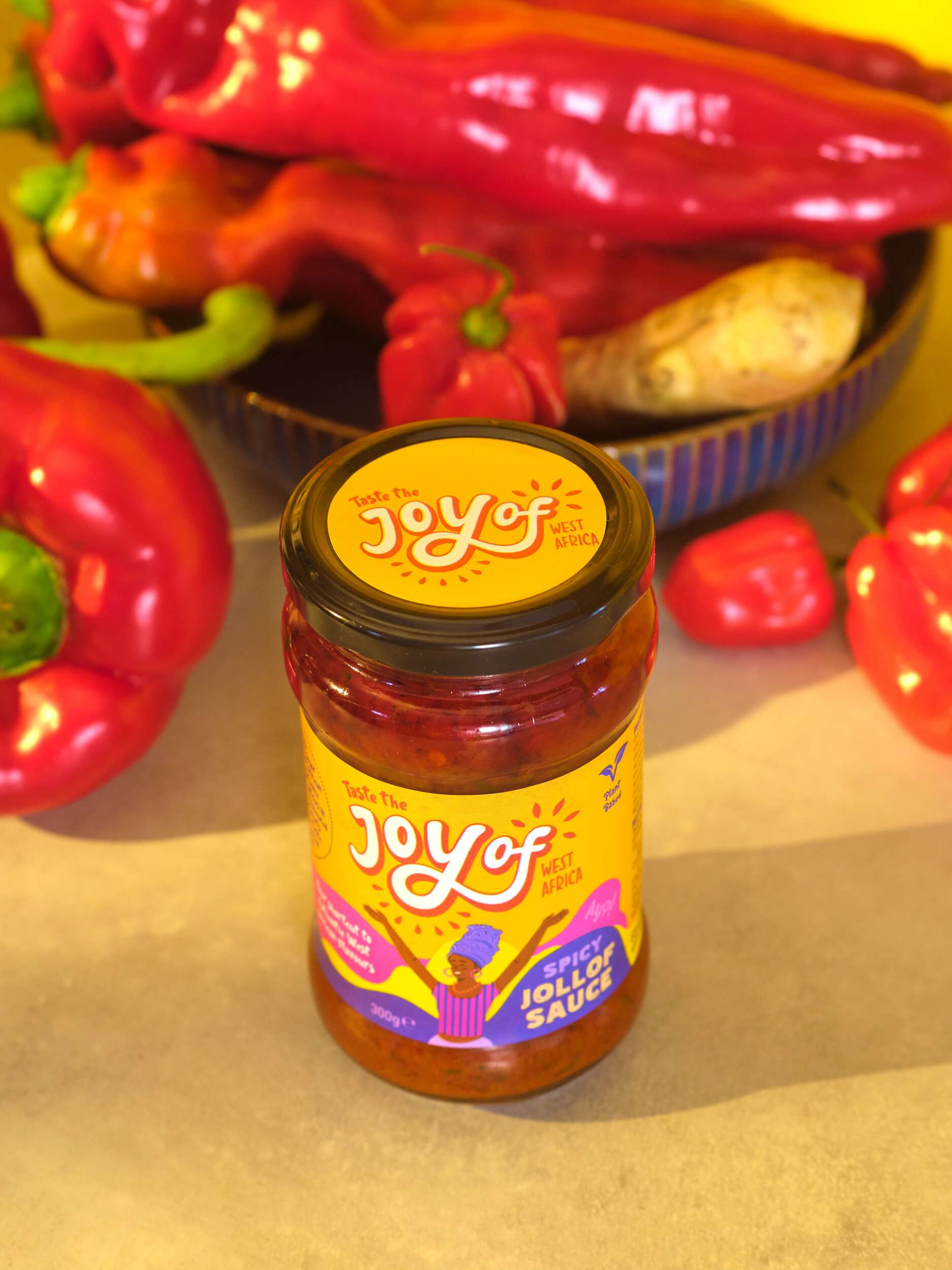
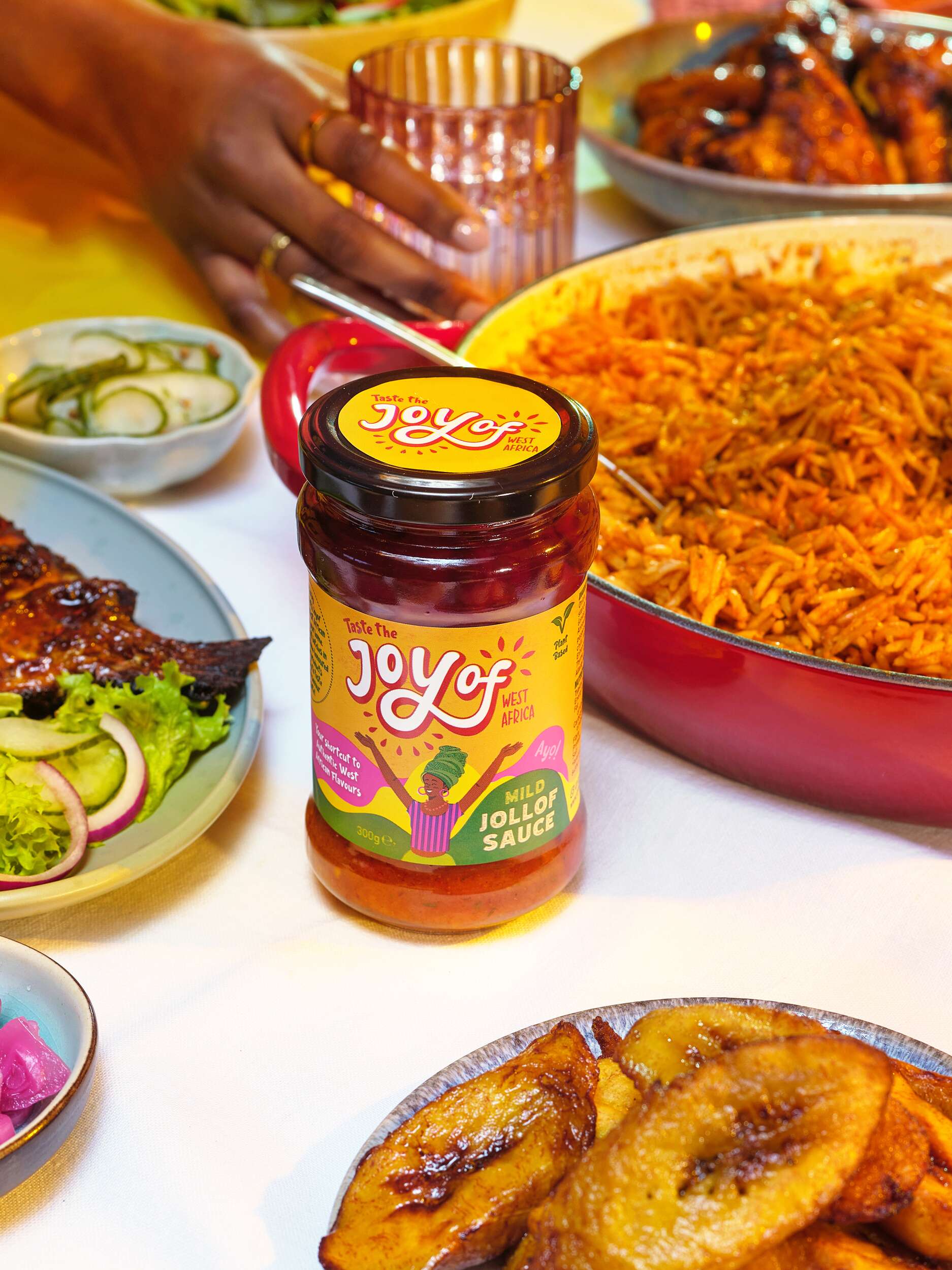
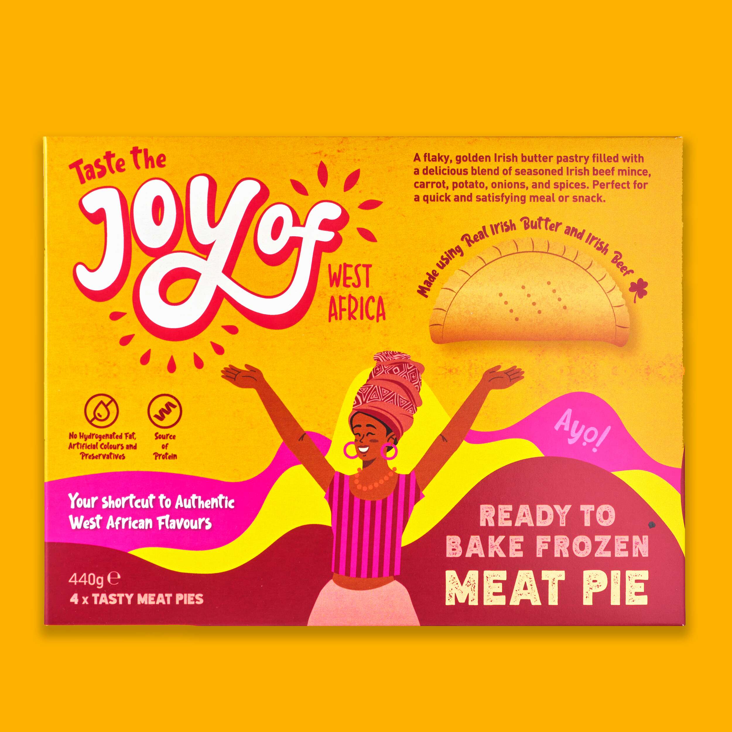
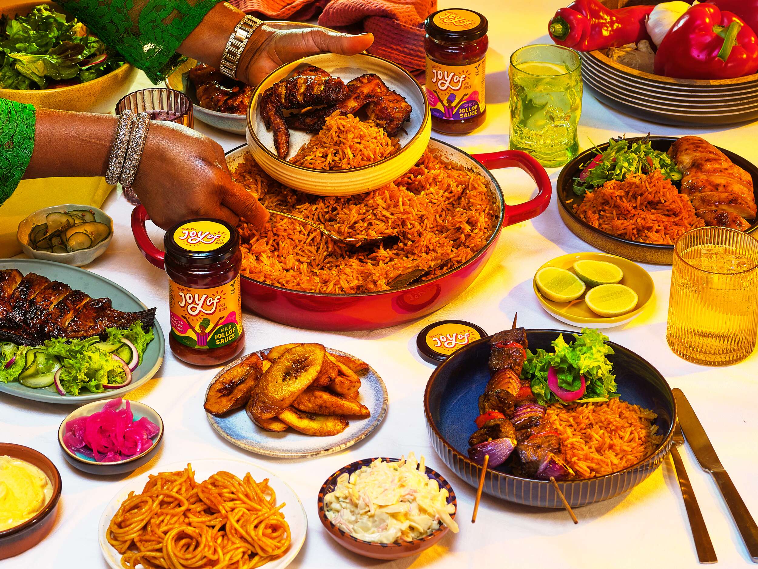
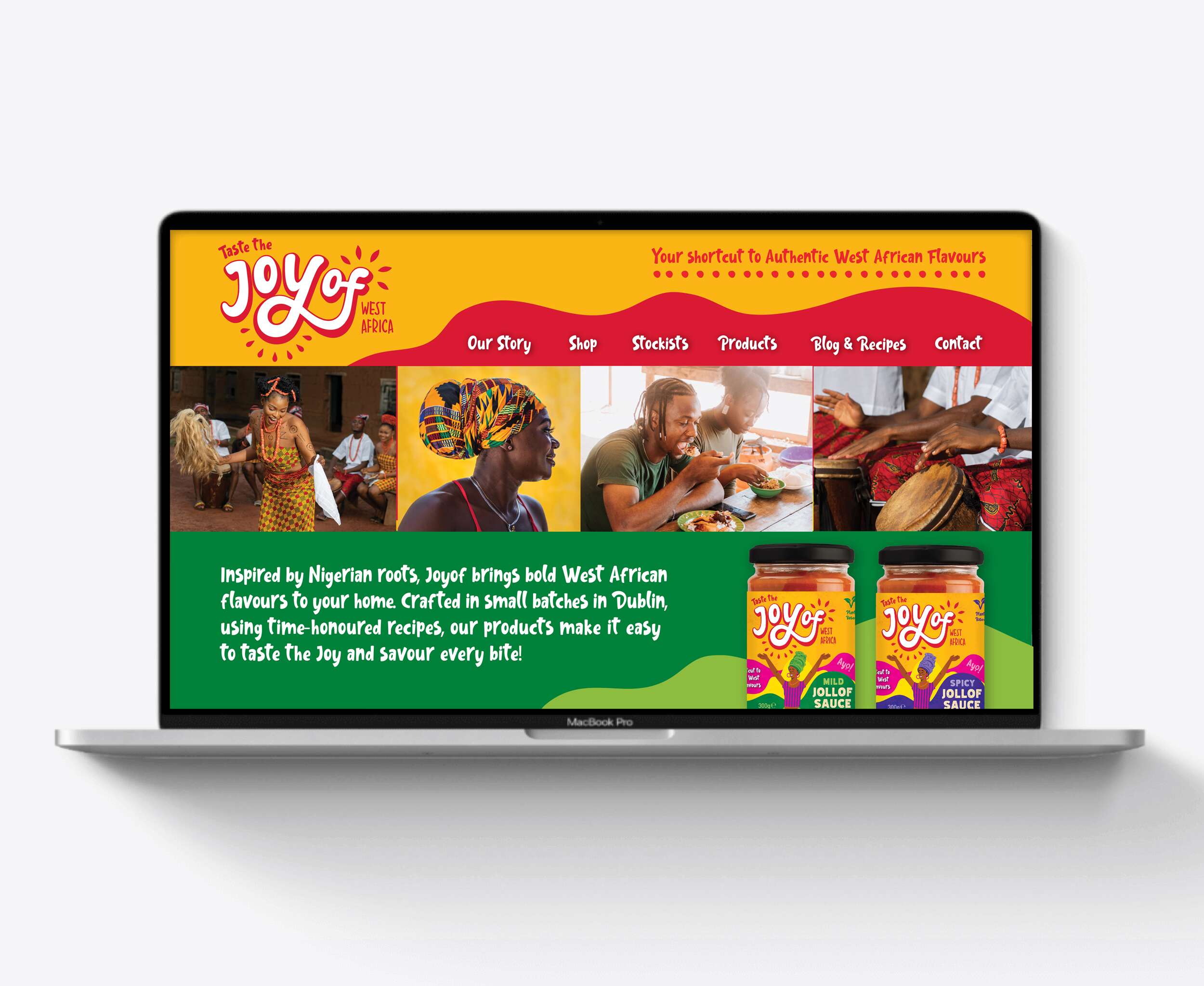
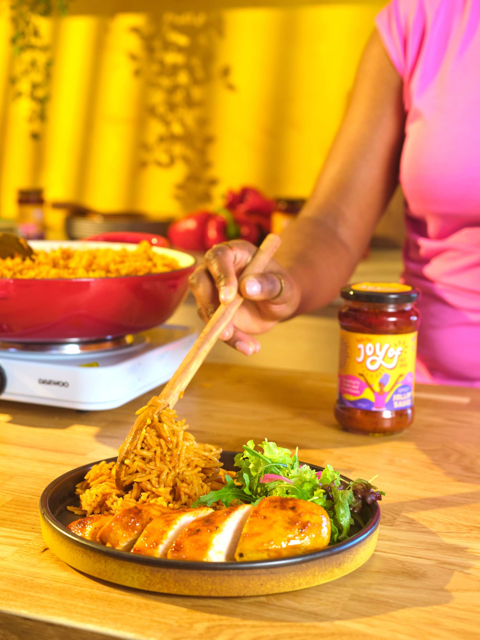
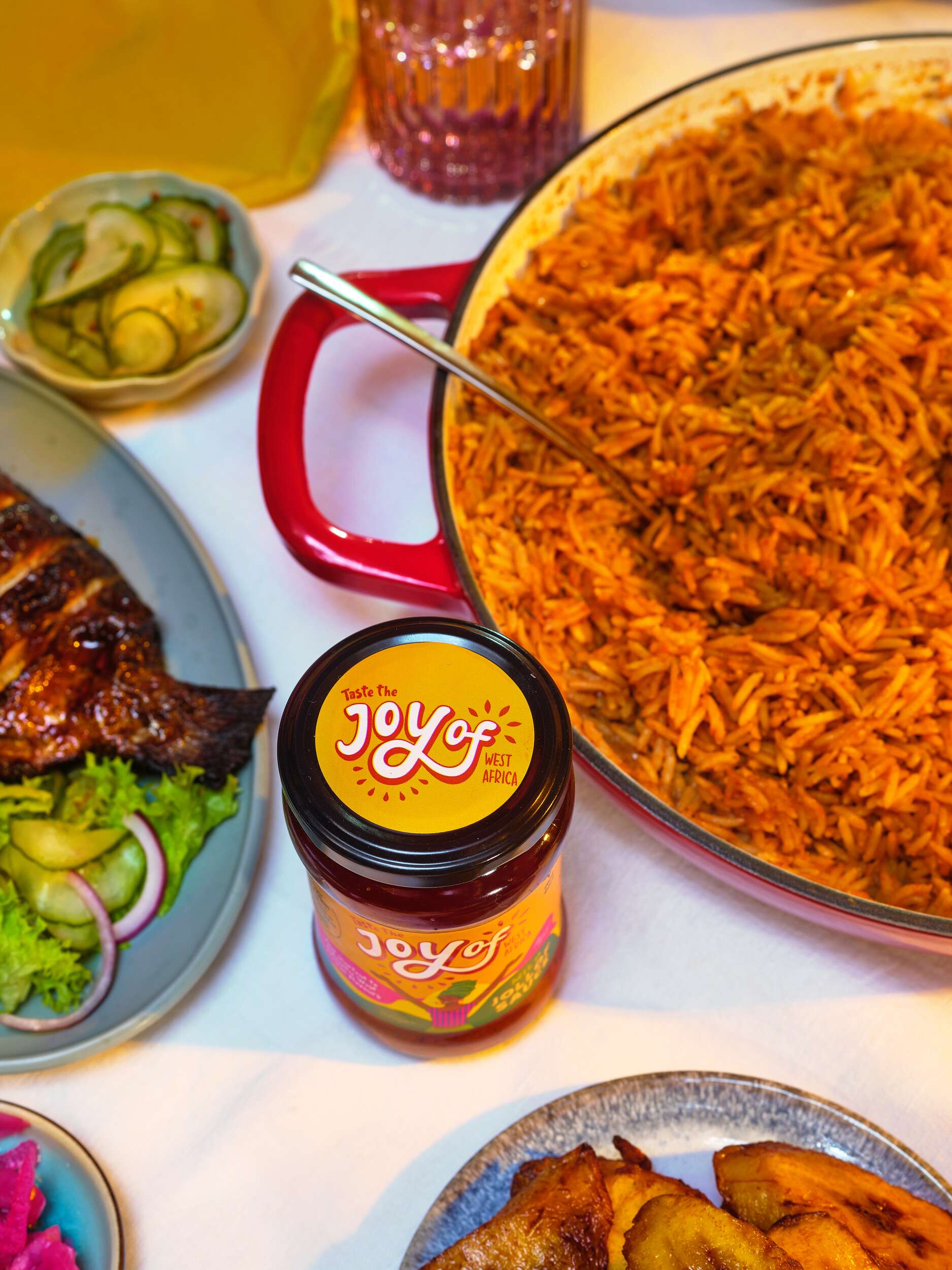
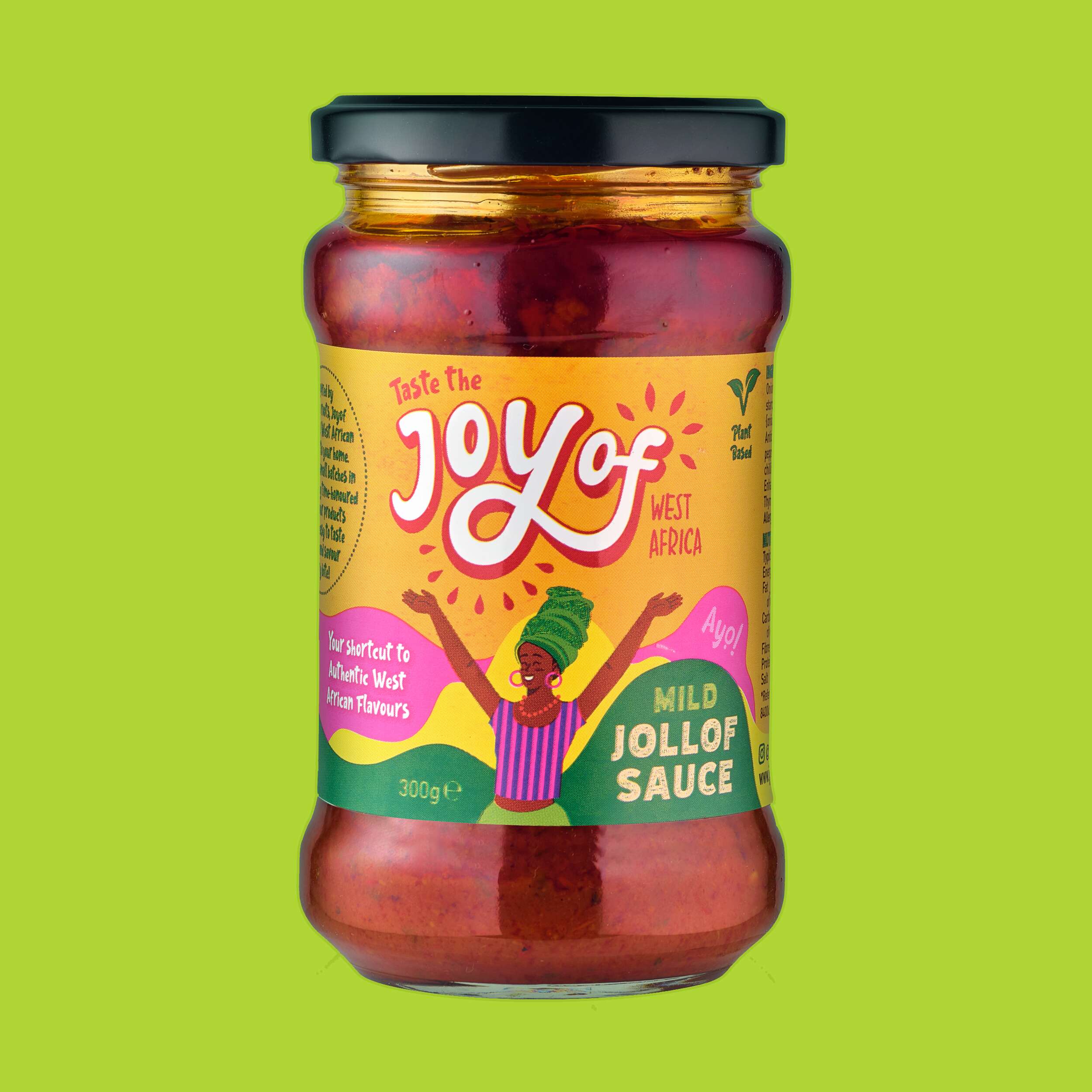
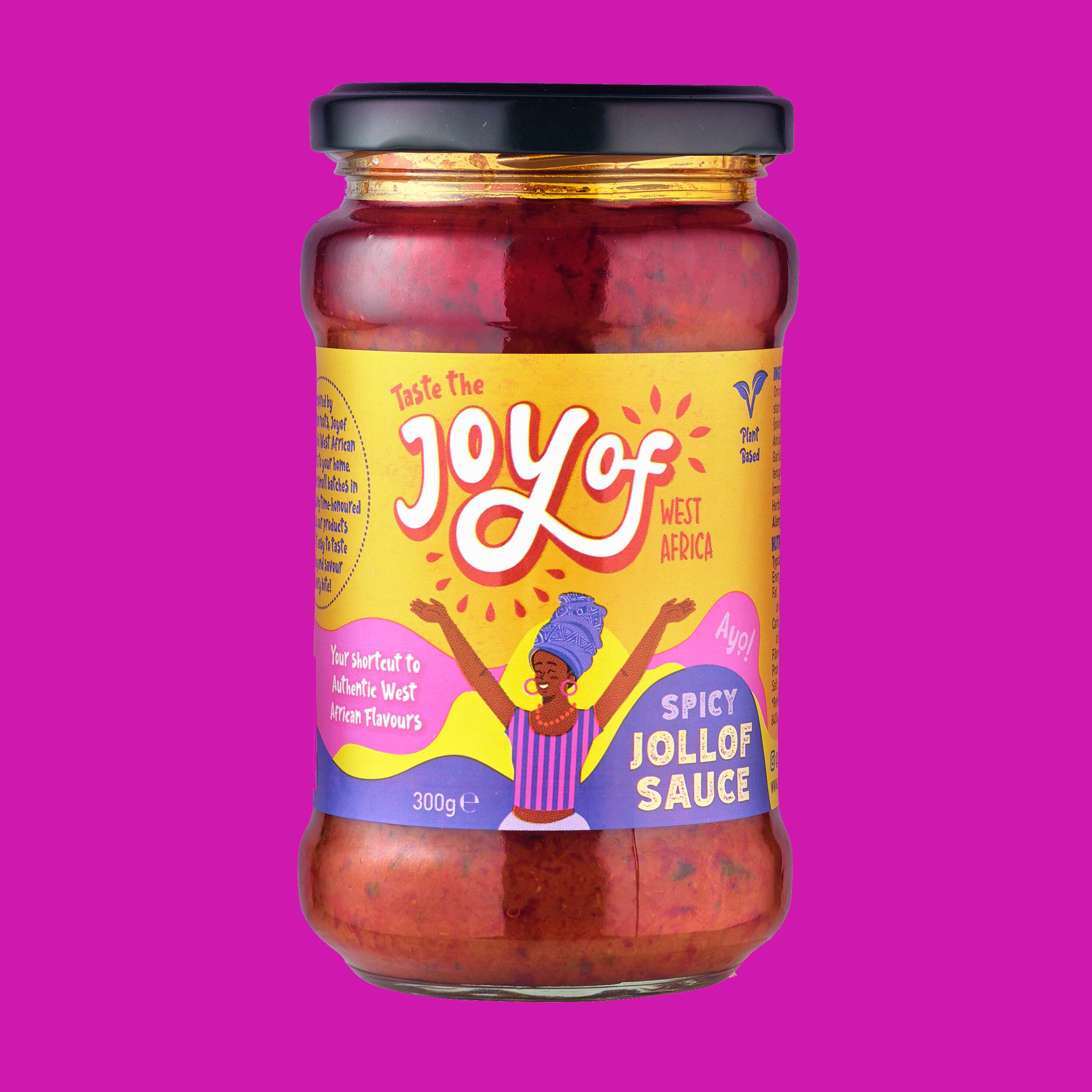
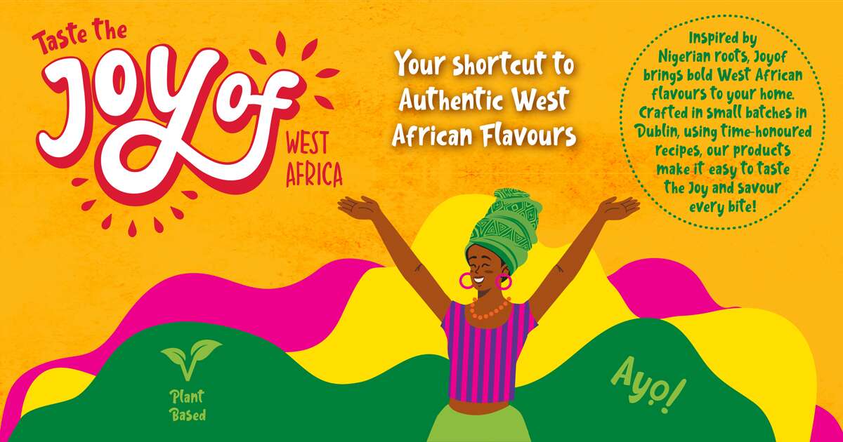
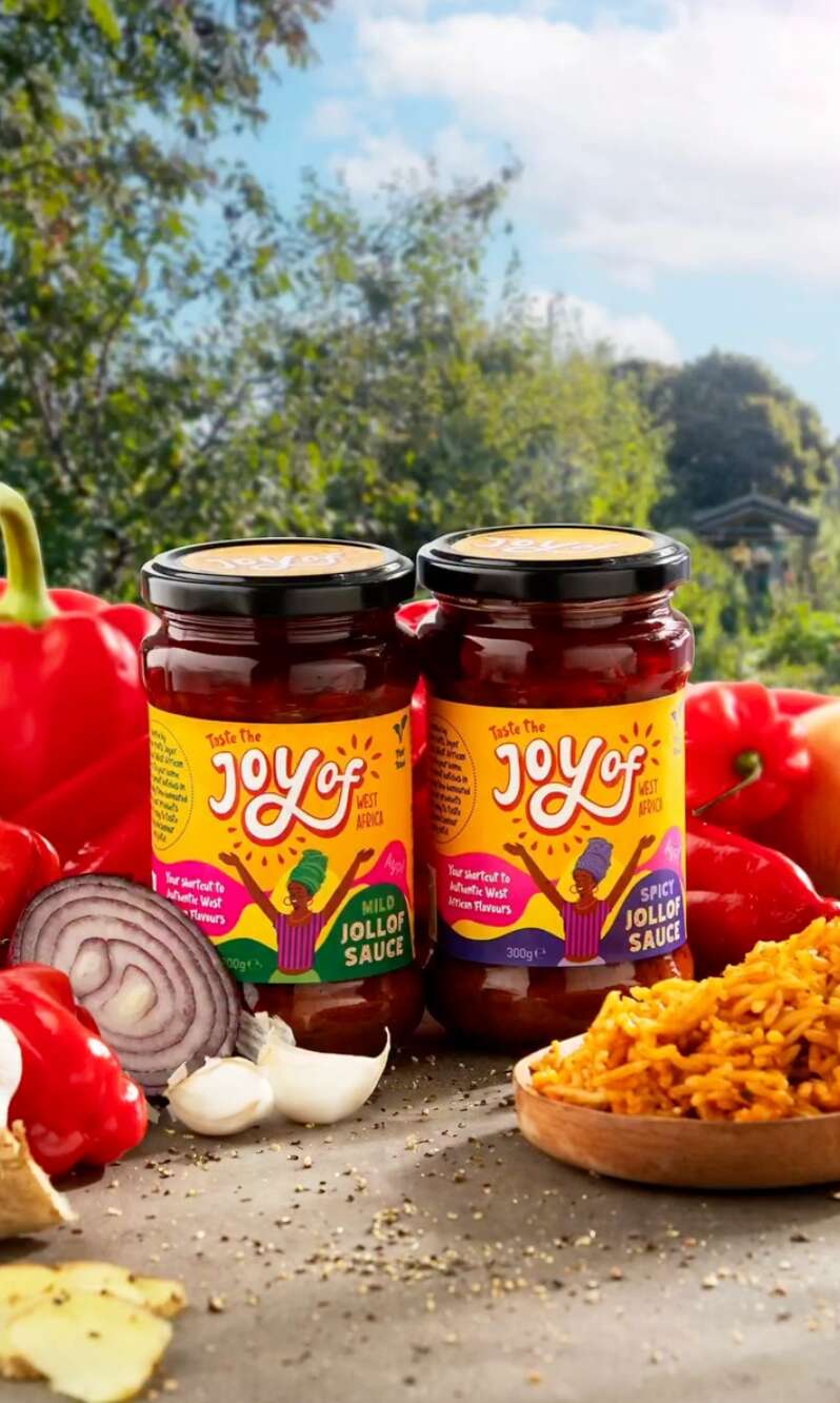
Joyof Foods: Brand Packaging Design
Joyof Foods: Brand Packaging Design
West African Food Range

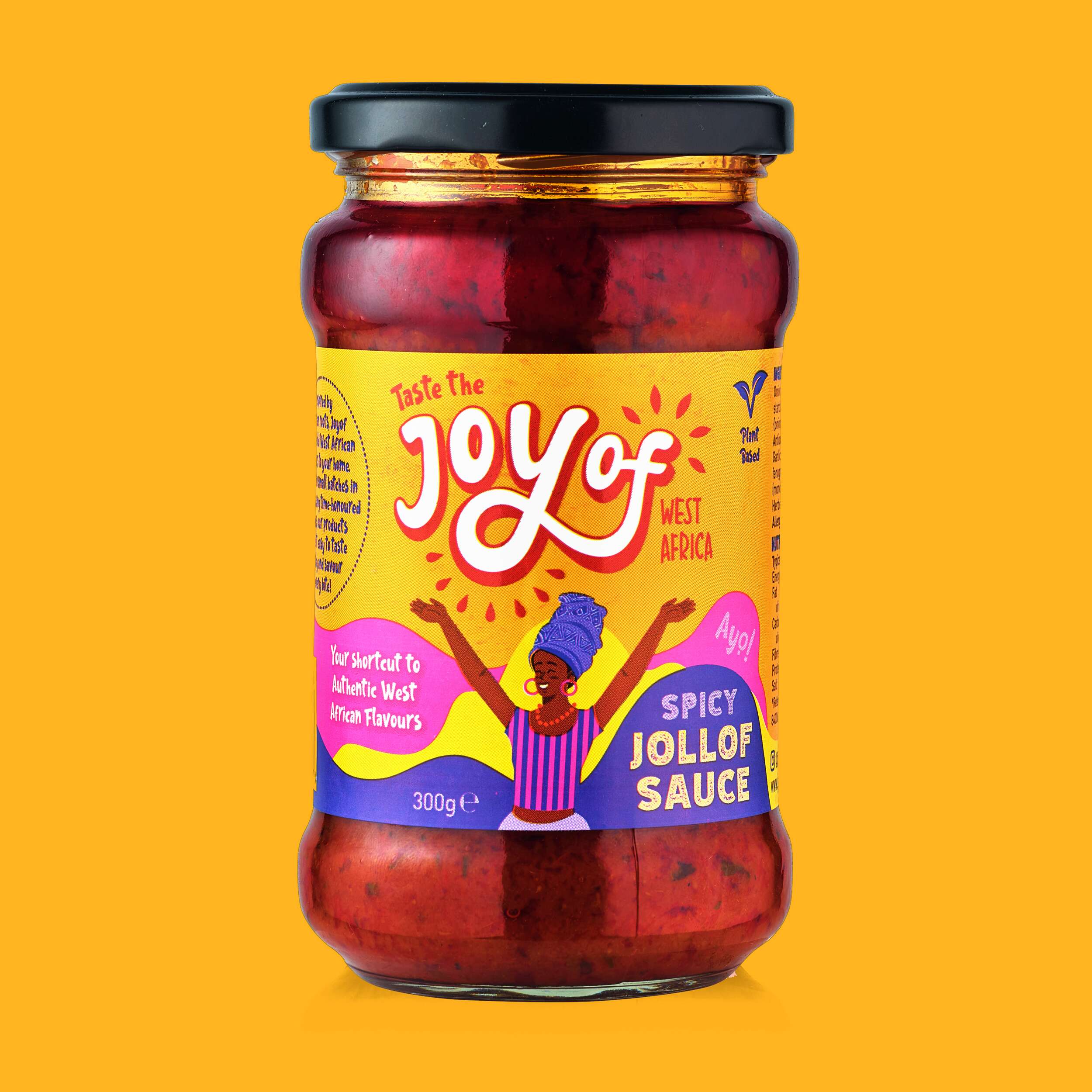
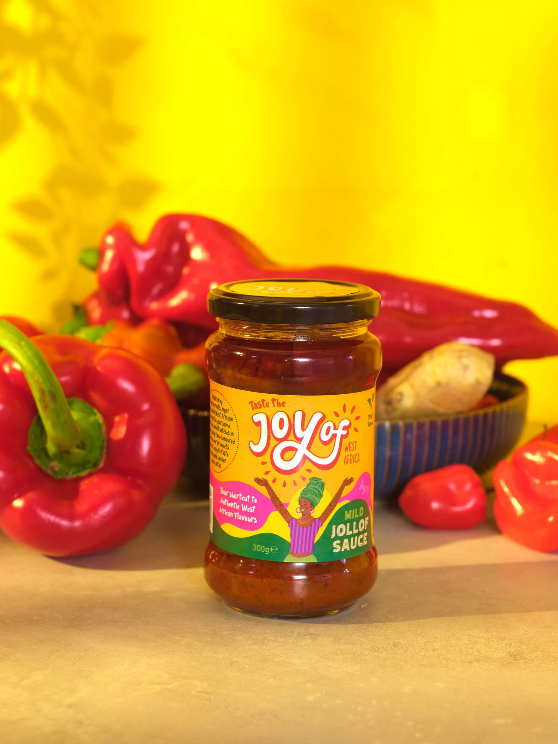
Joyof provides convenient, high-quality products with authentic flavours, reducing cooking time and making it easy to enjoy traditional West African meals even on the busiest days – bringing the joy of West African cuisine to Ireland.
By solving the issues of accessibility and time, they are helping people reconnect with their roots, try something new, and bring the vibrant flavours of West Africa into everyday life without compromise.
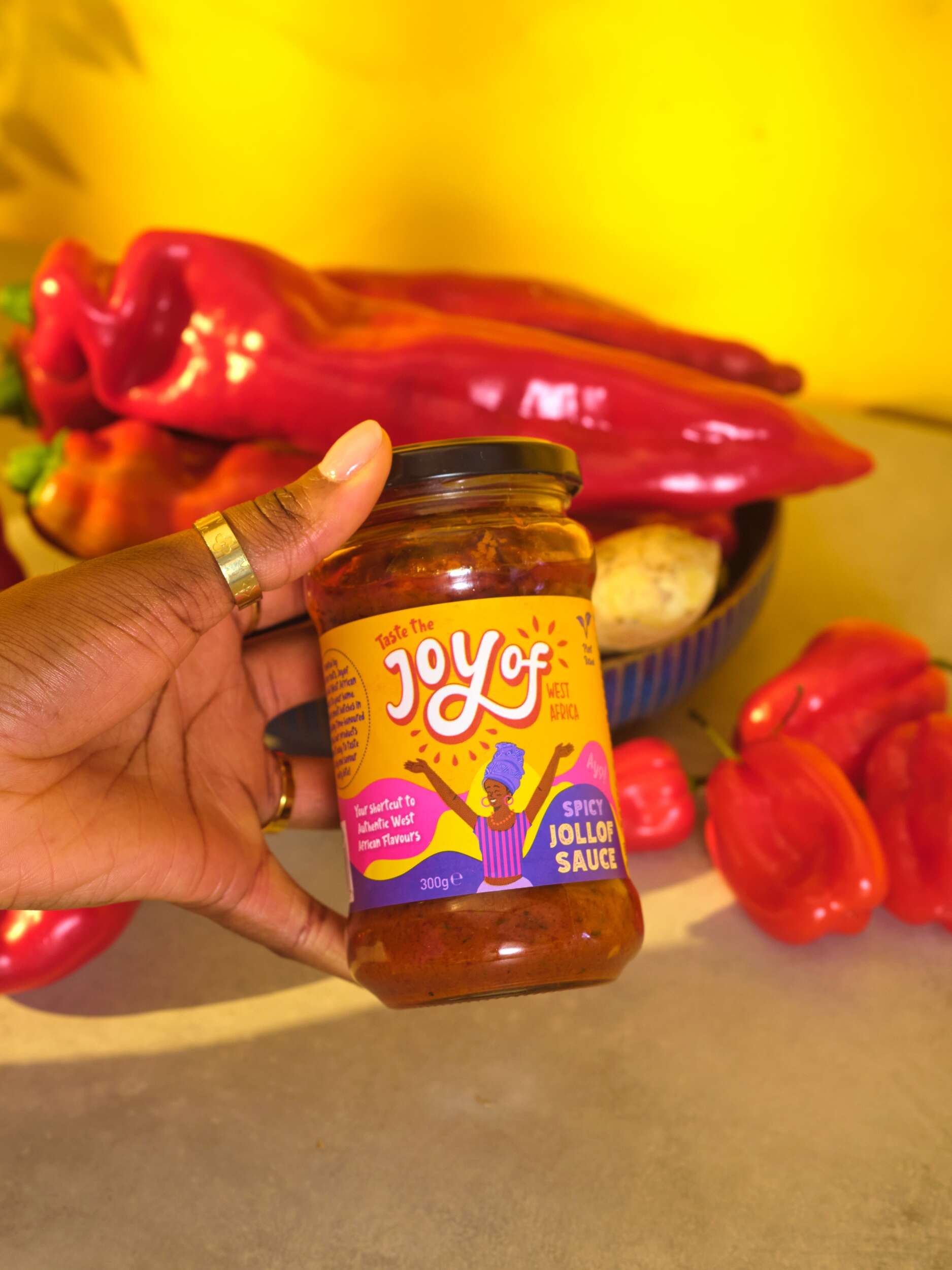
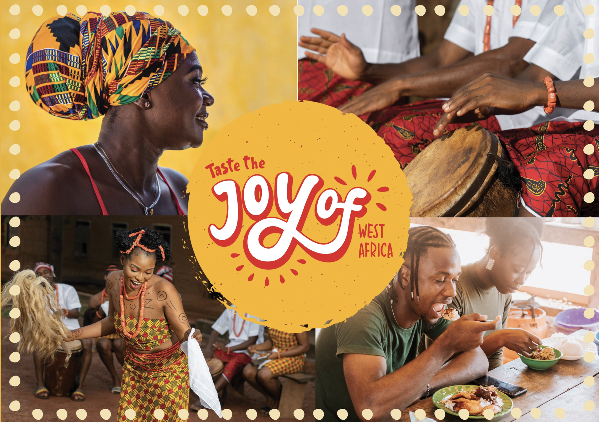
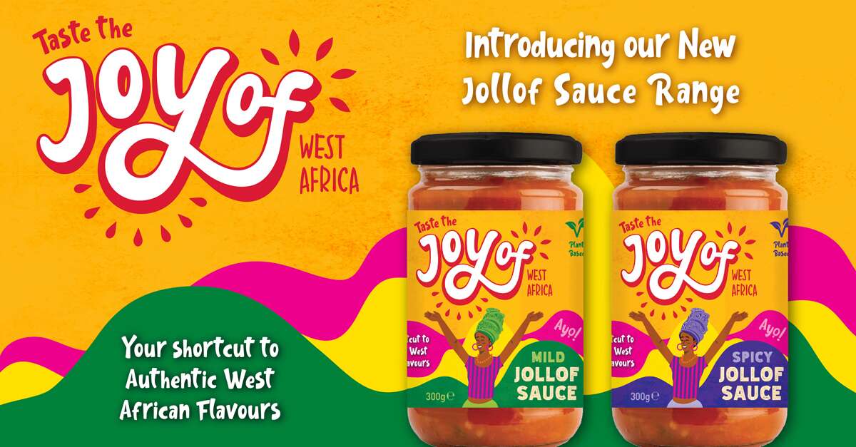
The design concept draws inspiration from traditional African drawings and patterns, aiming to capture their vibrant, playful energy. The typography is hand-drawn to evoke authenticity, reflecting the handmade quality of the food, and expresses the pride and joy rooted in West African culture.
The design process evolved from creating letterforms were slightly spaced to highlight the phrase ‘joy of’ reinforcing the brand’s celebration of West African cuisine. We developed this on to bring the letters closer together, integrating ‘of’ more seamlessly to be read as a single, joyful expression.
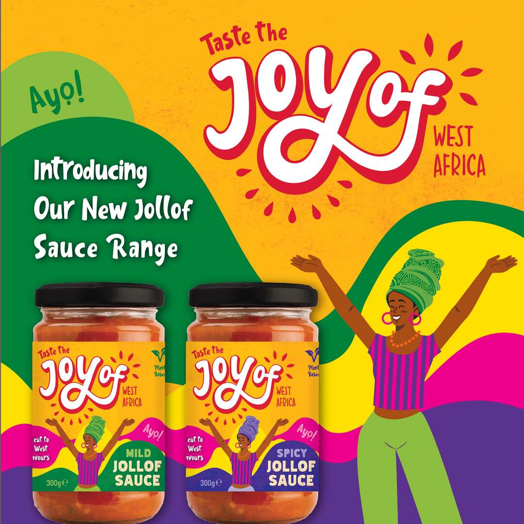
Surrounding shapes suggest bursts of life and energy. They represent leaves and natural ingredients, emphasising the freshness and vitality of the products. The bright and vibrant colour scheme further communicates this.
Follow Joyof Foods online:
Instagram: @joyof.foods
LinkedIn: joyof-foods
TikTok: @joyof.foods
Website: joyoffoods.com
Available in selected SuperValu stores and other food independent stores.
Photography by Brendan Ryan Photography:
Instagram: @brendanryanphoto
Website: www.brendanryan.ie
Video Production:
Brendan Ryan Photography (as above) and:
Raouf Ferkous
Instagram: @raouf.ferkous
Packaging printed by Reel Print:
Website: Reel Print
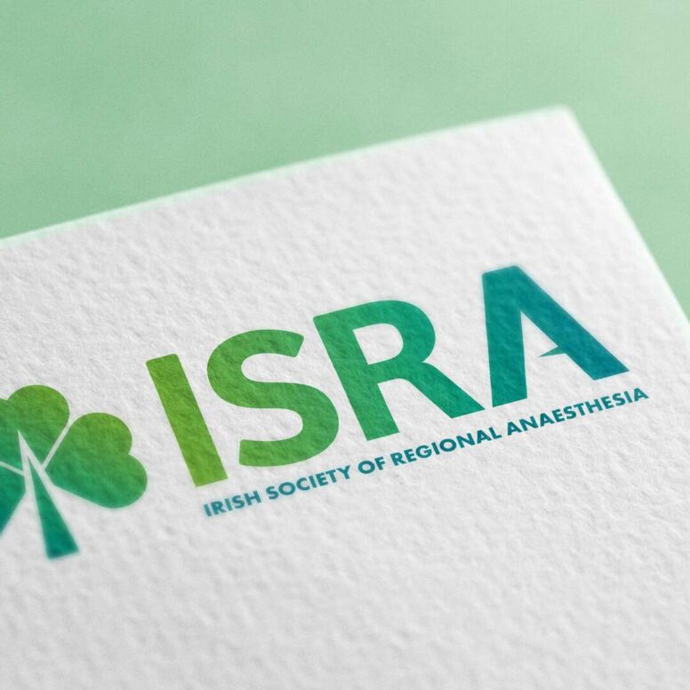
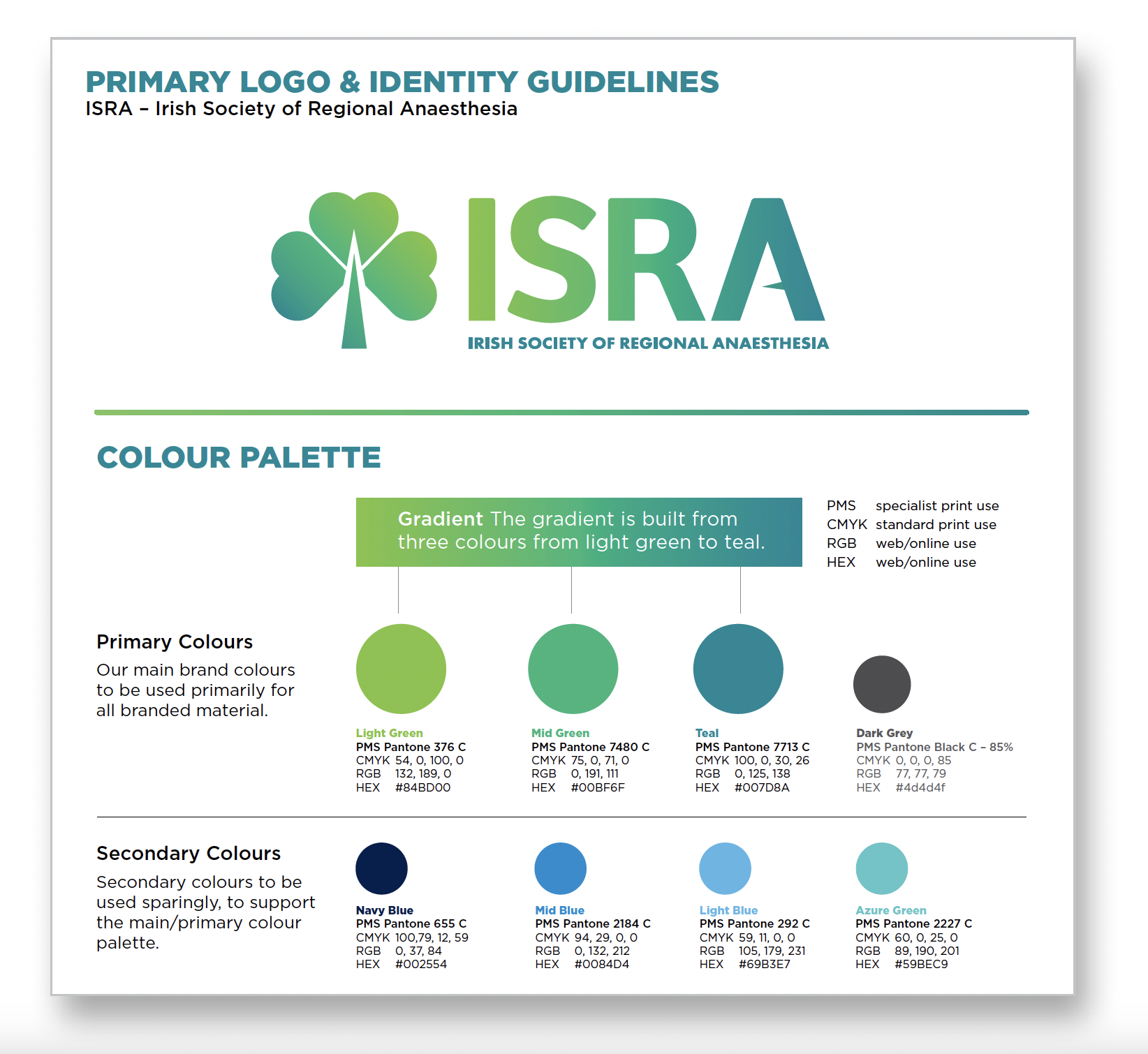
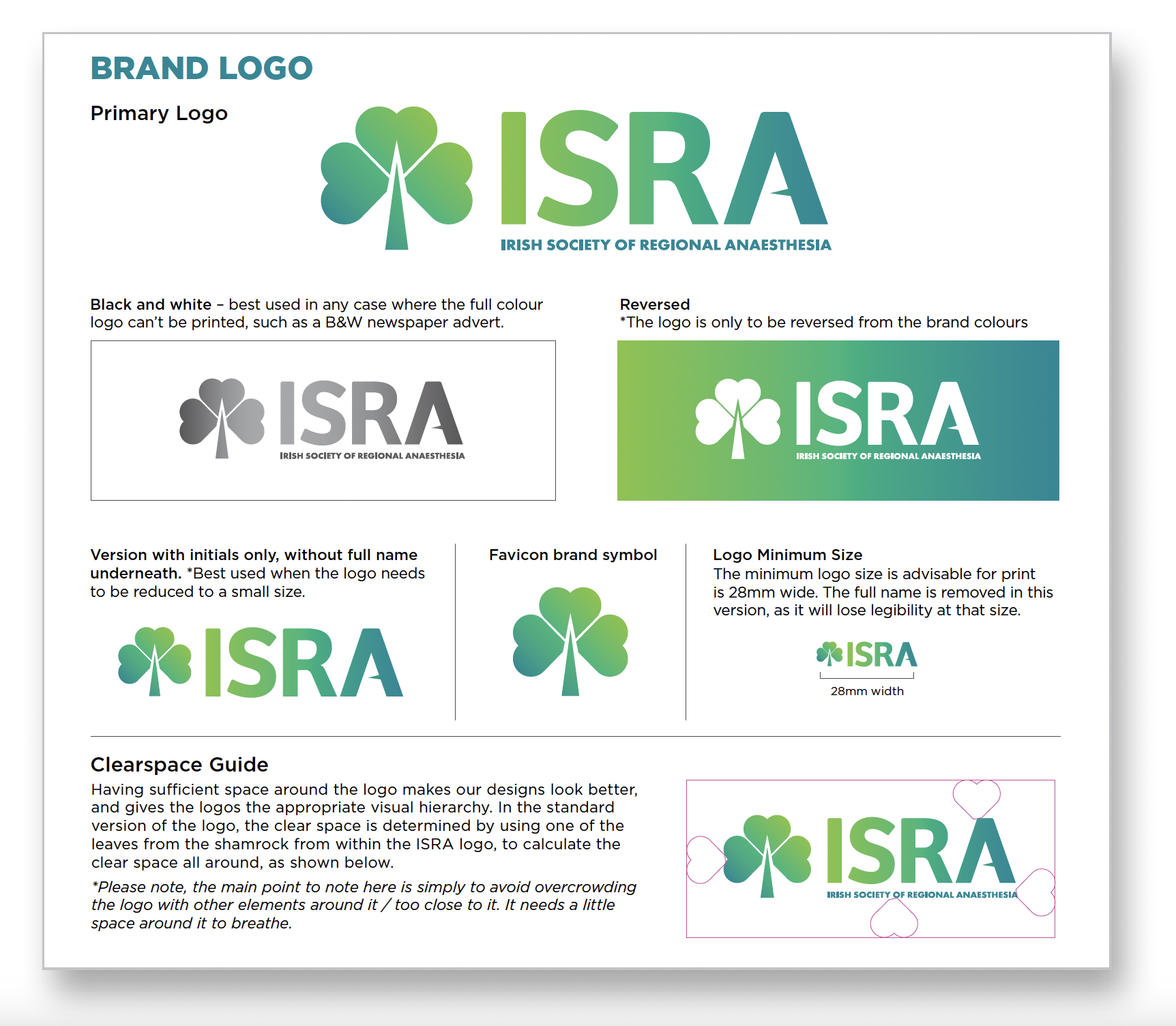
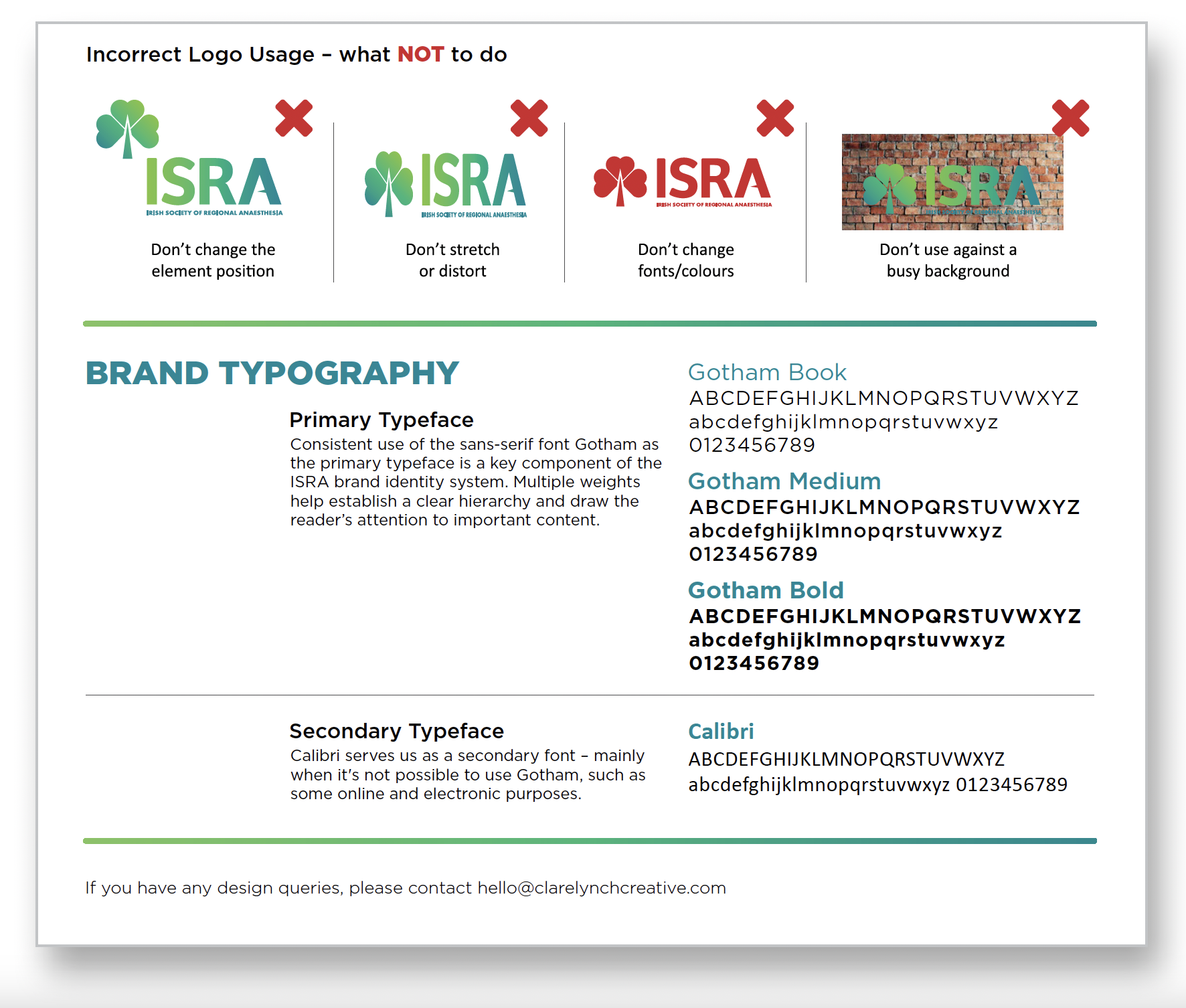
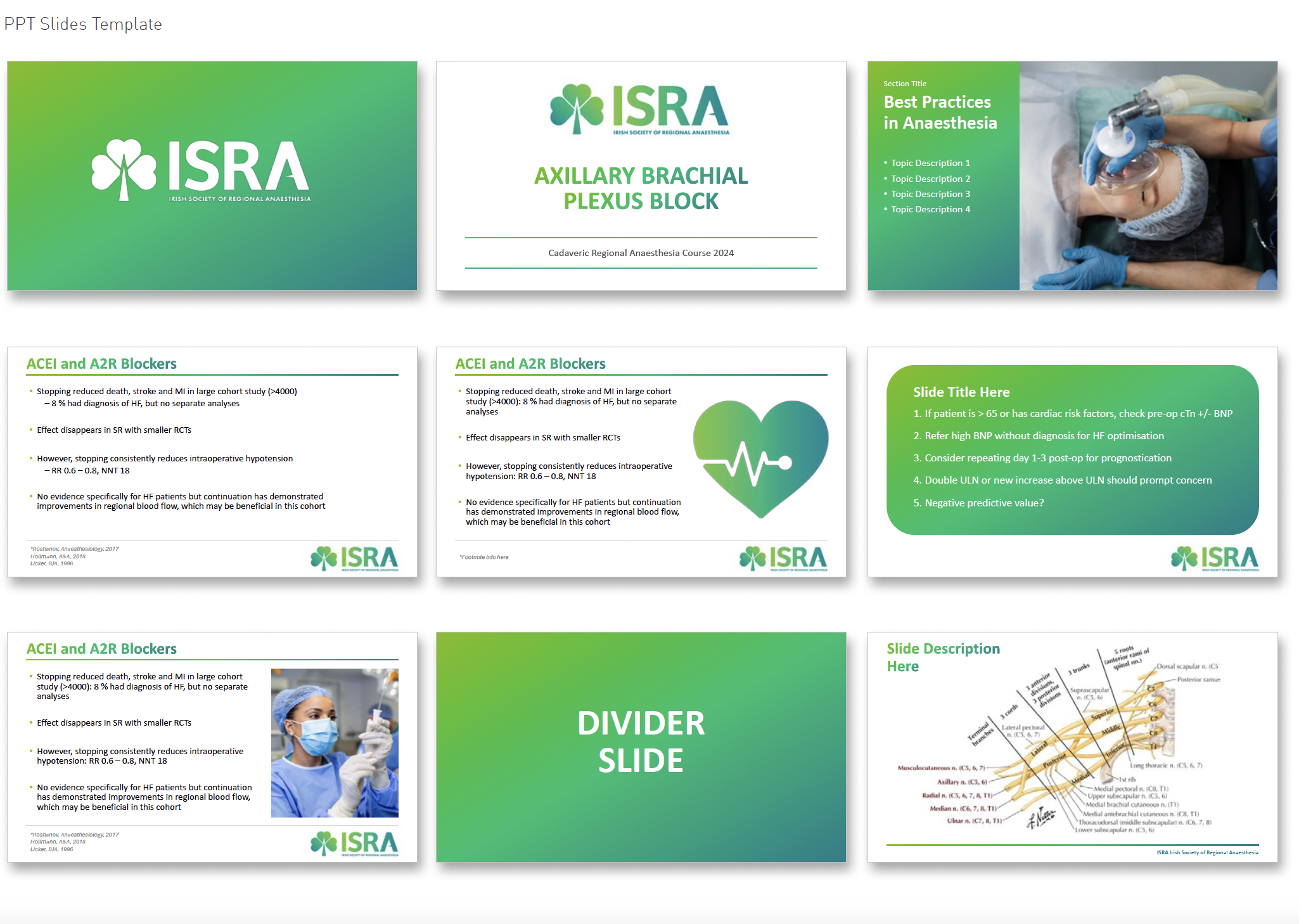
ISRA: Brand Identity Design
ISRA: Brand Refresh & Visual Identity Design
The Irish Society of Regional Anaesthesia (ISRA)
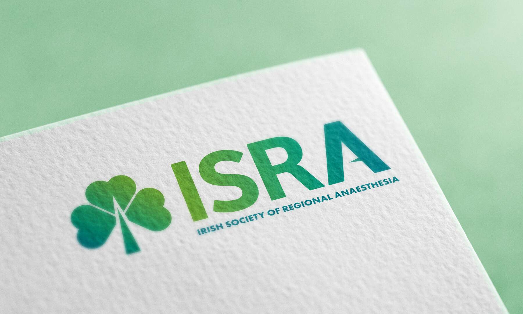
The Irish Society of Regional Anaesthesia (ISRA) is a respected not-for-profit medical organisation dedicated to promoting excellence in regional anaesthesia education and practice across Ireland.
Despite being a relatively small society, ISRA has an impressive international footprint, with more members per capita represented in the European Society than any other European country – underscoring its commitment to advancing the subspecialty both locally and globally.
Our brief was to elevate the society’s brand presence with a refined, more professional visual identity, while preserving the warmth, accessibility and distinctly Irish character that define ISRA’s community. The goal was not to reinvent the wheel, but to build on what already worked and make it clearer, stronger, and more cohesive.
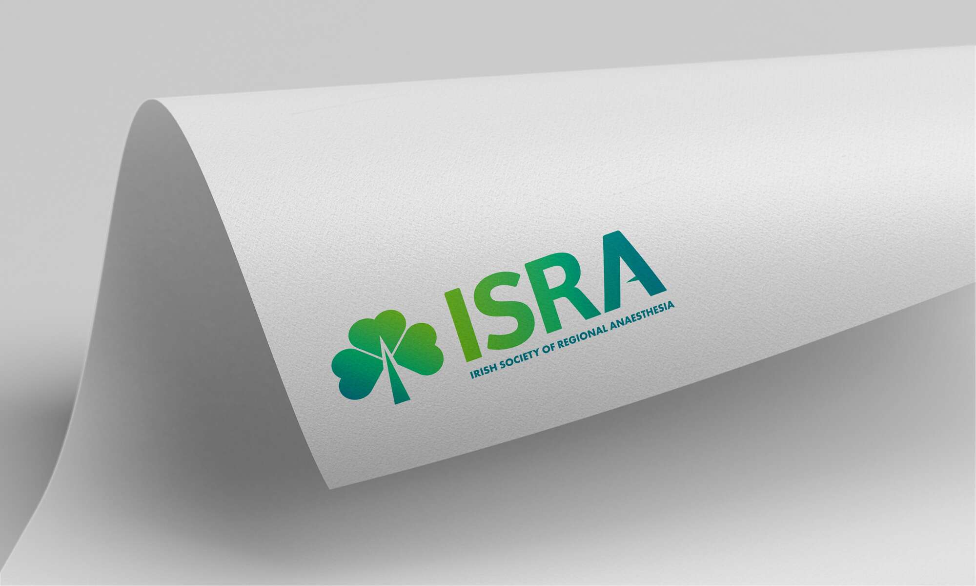
At the centre of the brand refresh is a redesigned logo that carefully balances symbolism with simplicity. The shamrock – a timeless emblem of Irish identity – remains a key feature, now formed by three heart-shaped leaves symbolising the care anaesthetists give to their patients. The stem of the shamrock subtly doubles as an anaesthetic needle, while a pointed mid-bar in the letter ‘A’ adds another discreet reference to the tools of the trade. These thoughtful details communicate ISRA’s focus without overwhelming the design.
A refreshed colour palette brings new energy to the brand, combining vibrant, modern greens with touches of blue – creating a clean, clinical feel that also nods to broader medical aesthetics. The result is a look that sets ISRA apart from other national societies, while positioning it confidently within the wider professional landscape.
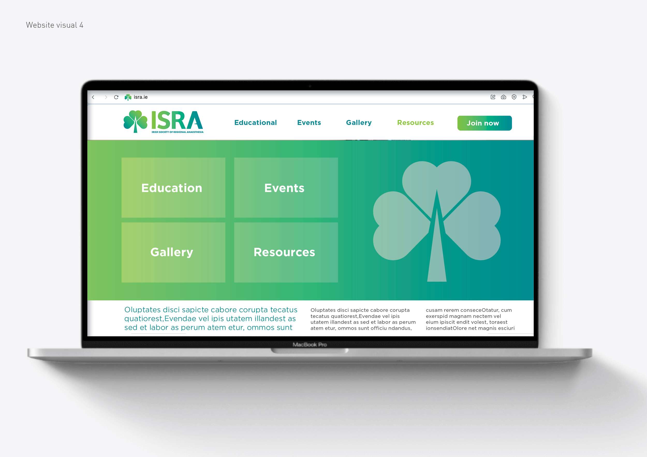
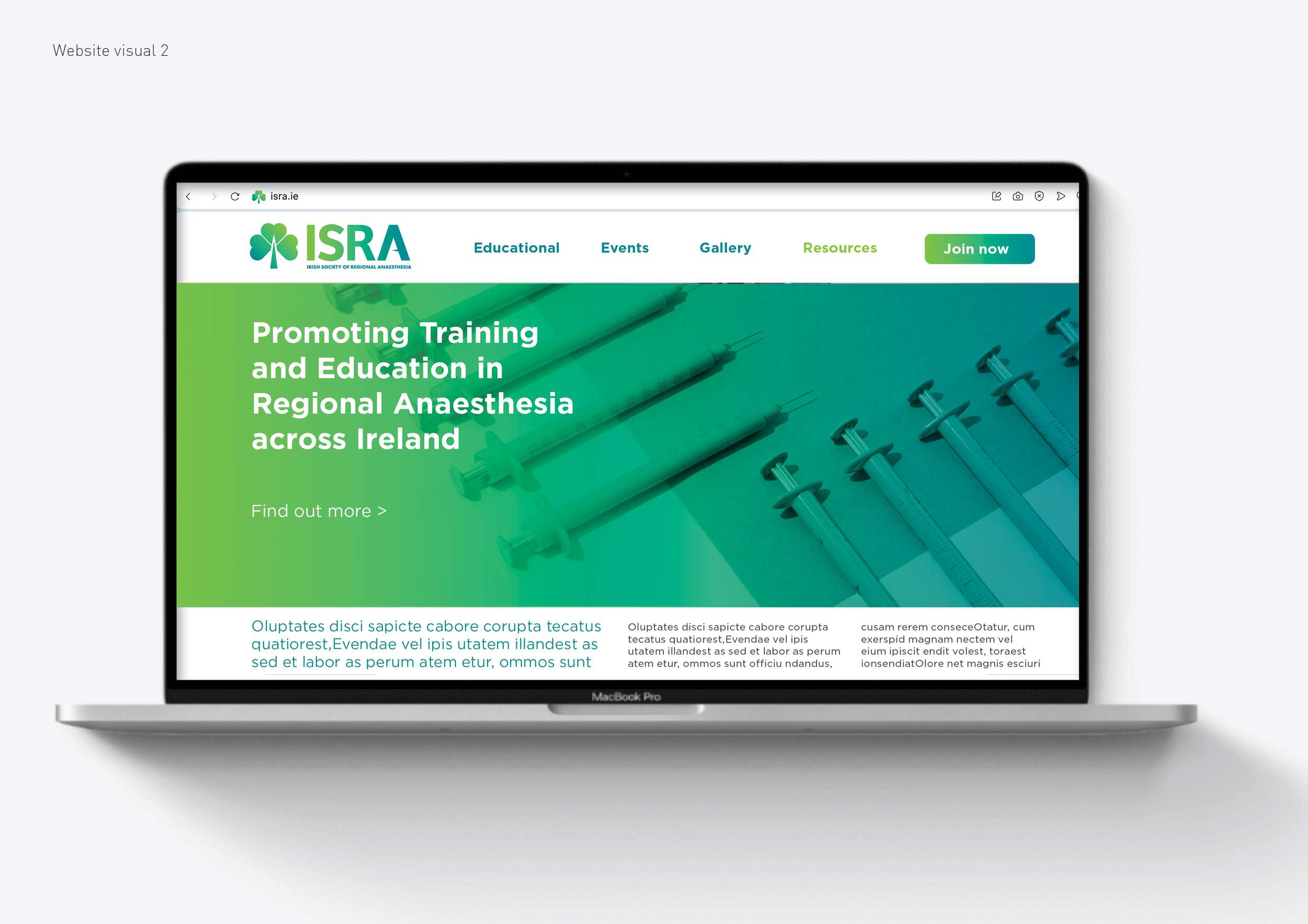
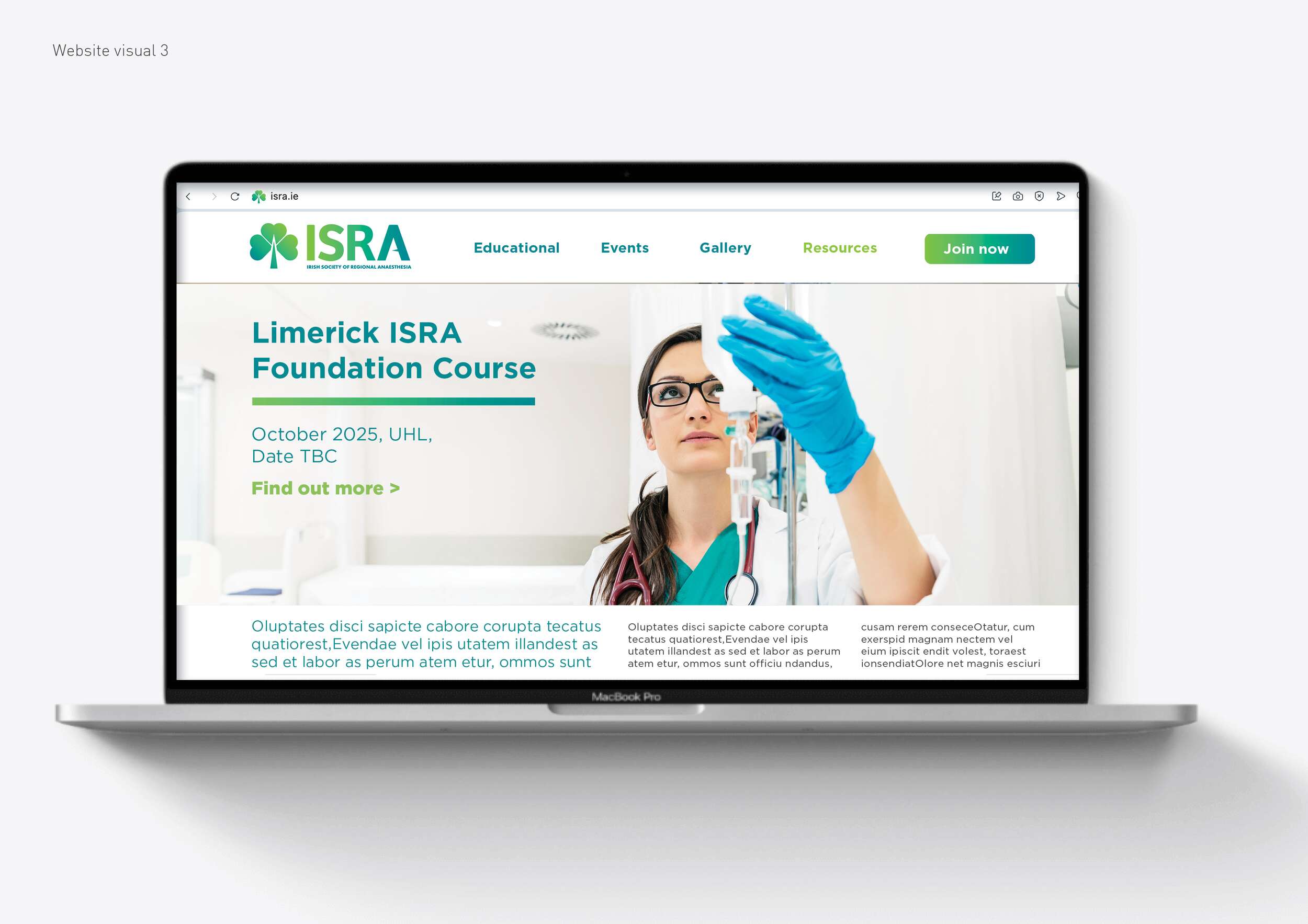
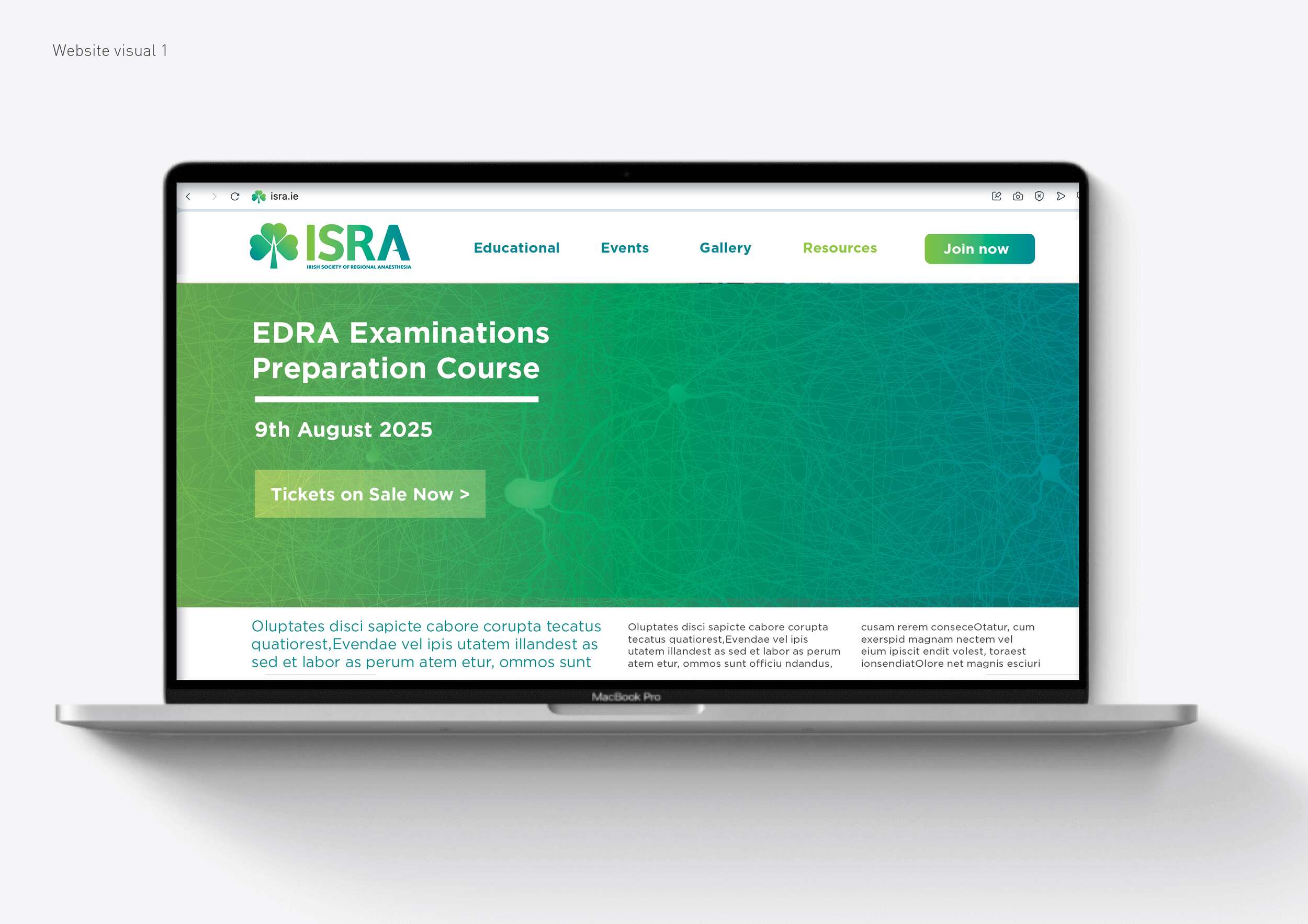
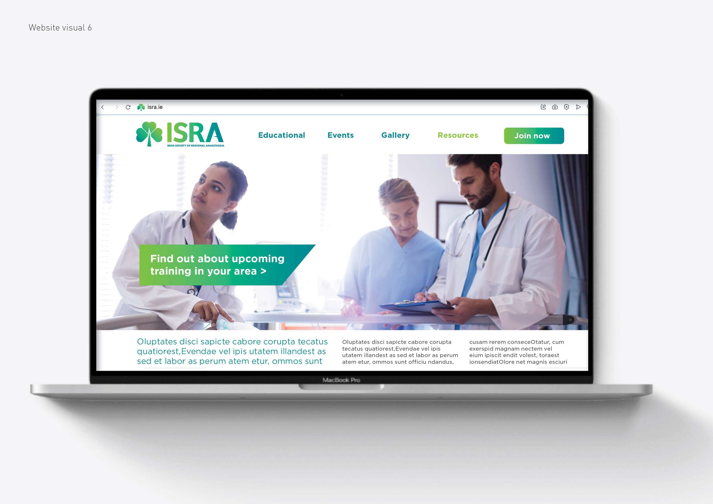
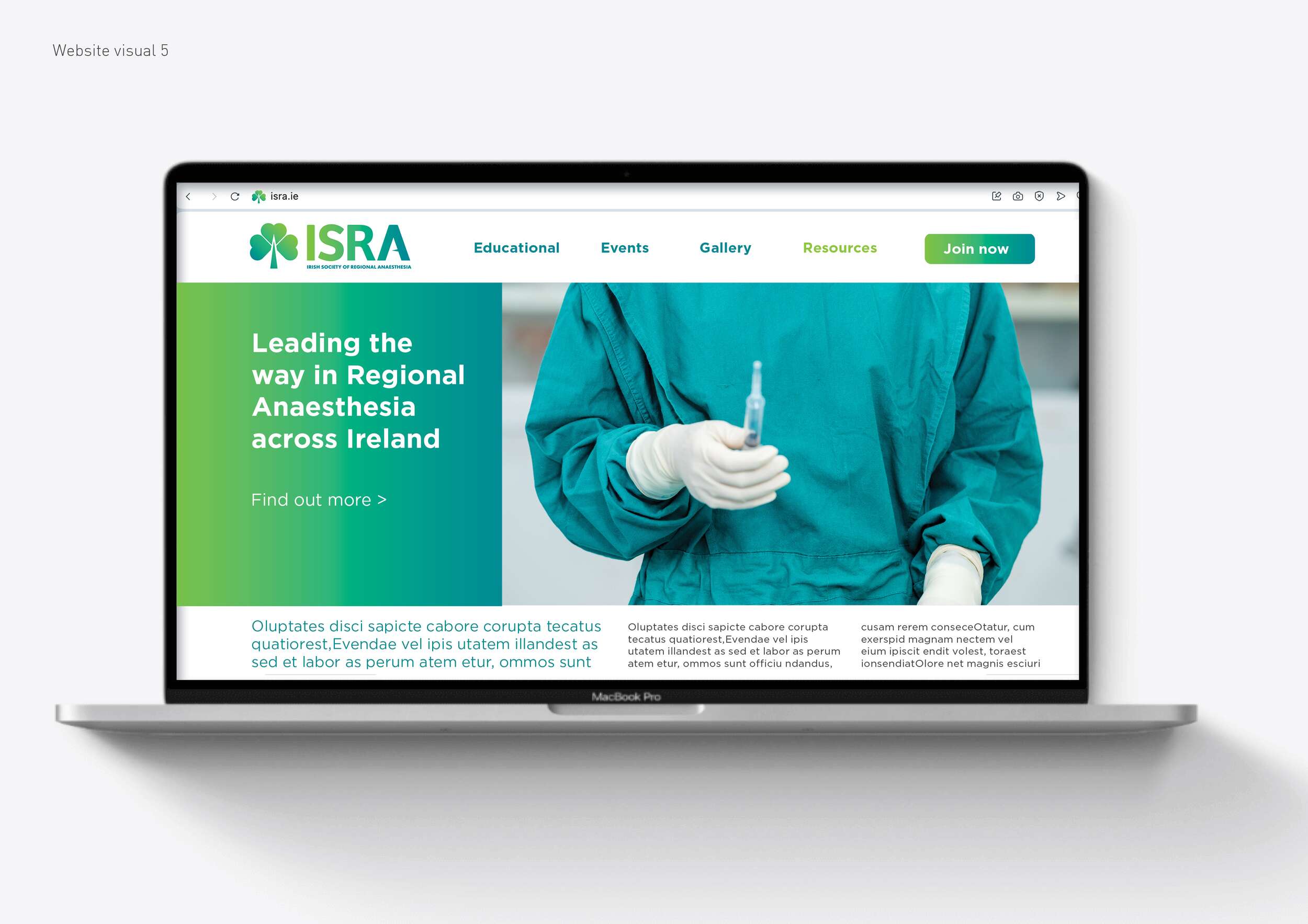
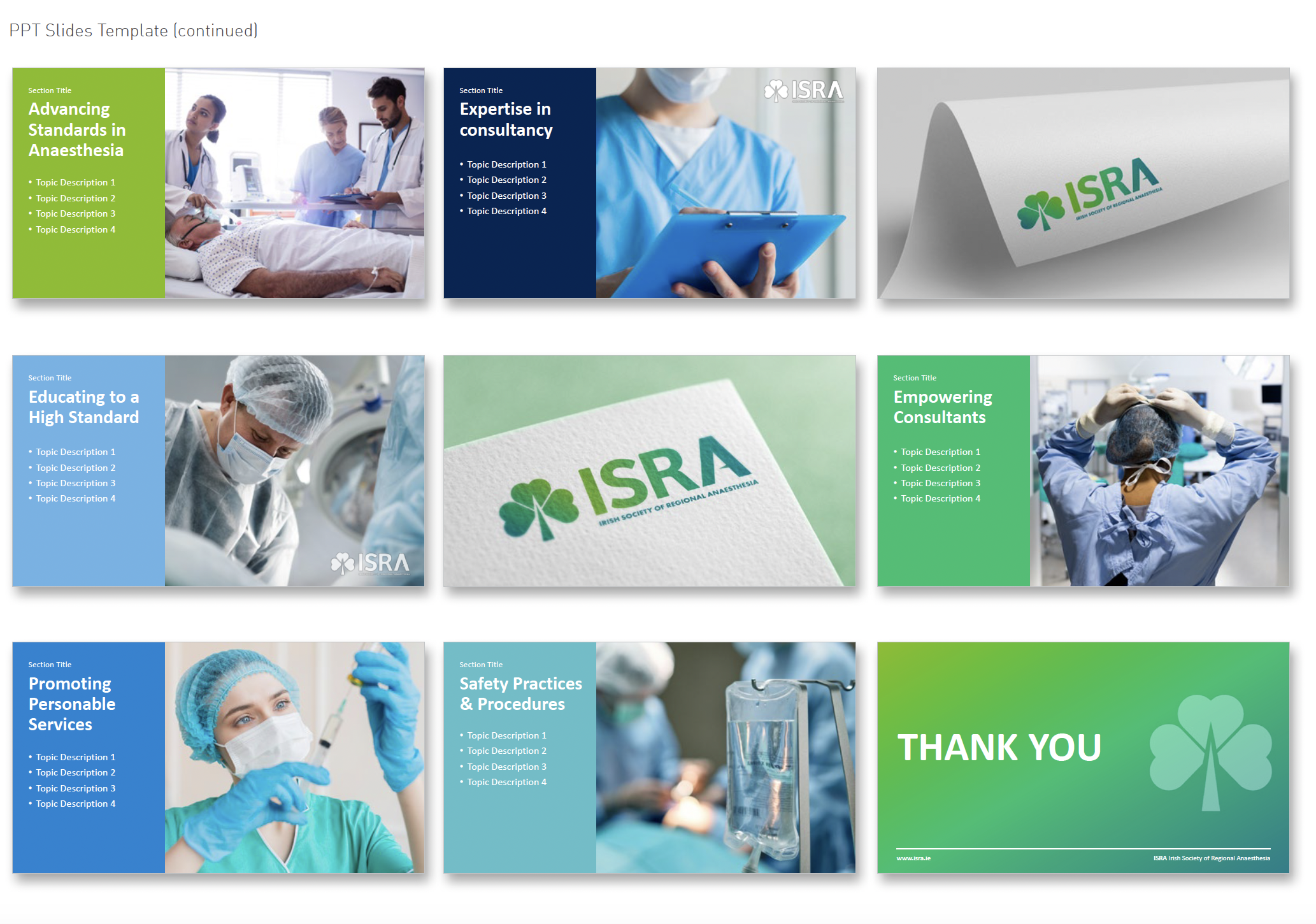
In addition to the logo, we delivered a versatile visual toolkit for use across event materials, presentations, digital platforms, and merchandise such as brand guidelines, posters, event programmes, membership cards, certificates, social media graphics, a newsletter template, Powerpoint templates, website design visuals and stationery visuals.
This system is designed to support ISRA’s educational mission, improve recognition, and help the society put its best foot forward – whether hosting a local workshop or representing Ireland on the international stage.

Follow ISRA online:
Twitter / X.com: @ISRA_Ireland
Facebook: @ISRAIreland
Website: isra.ie
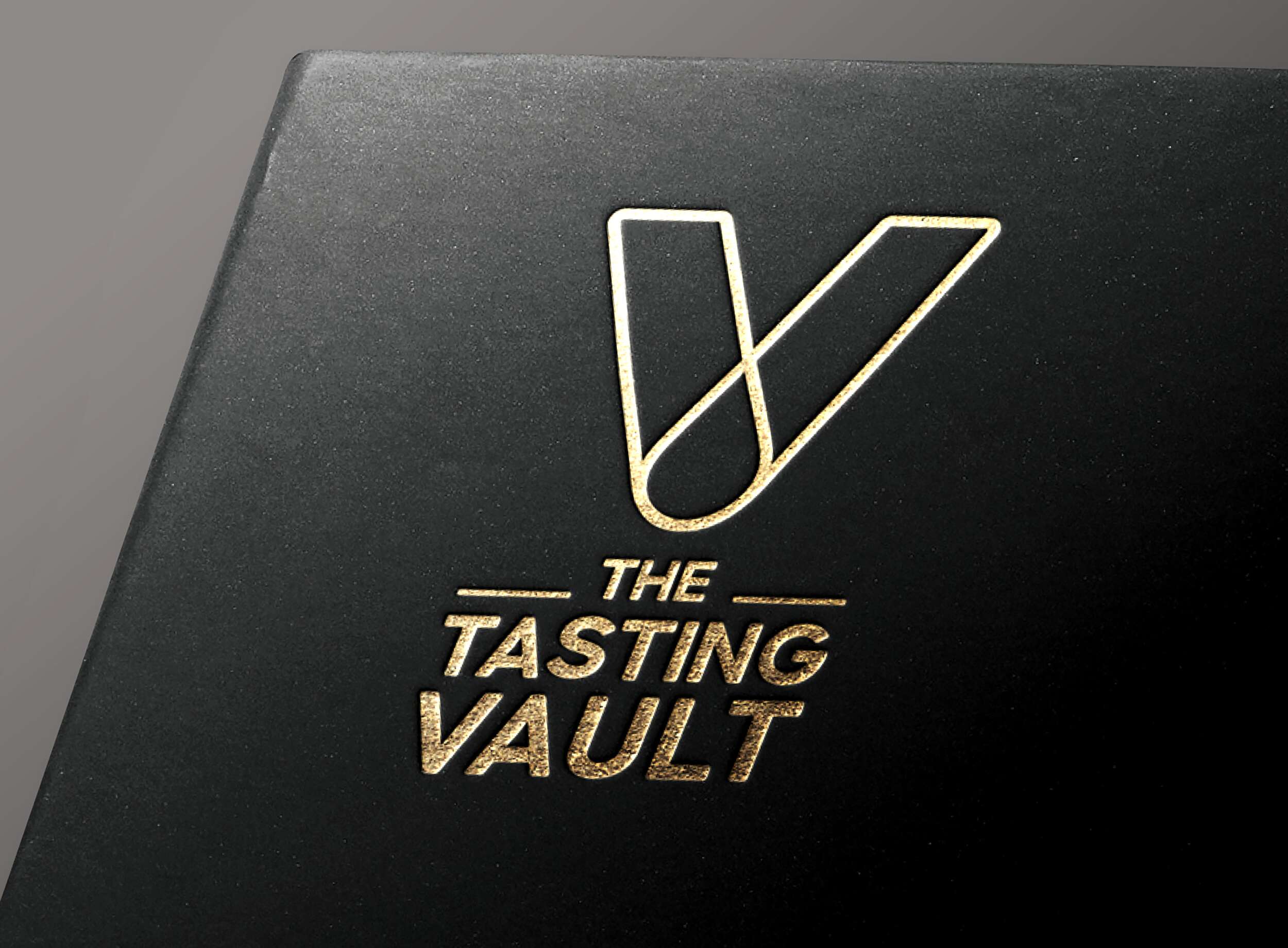
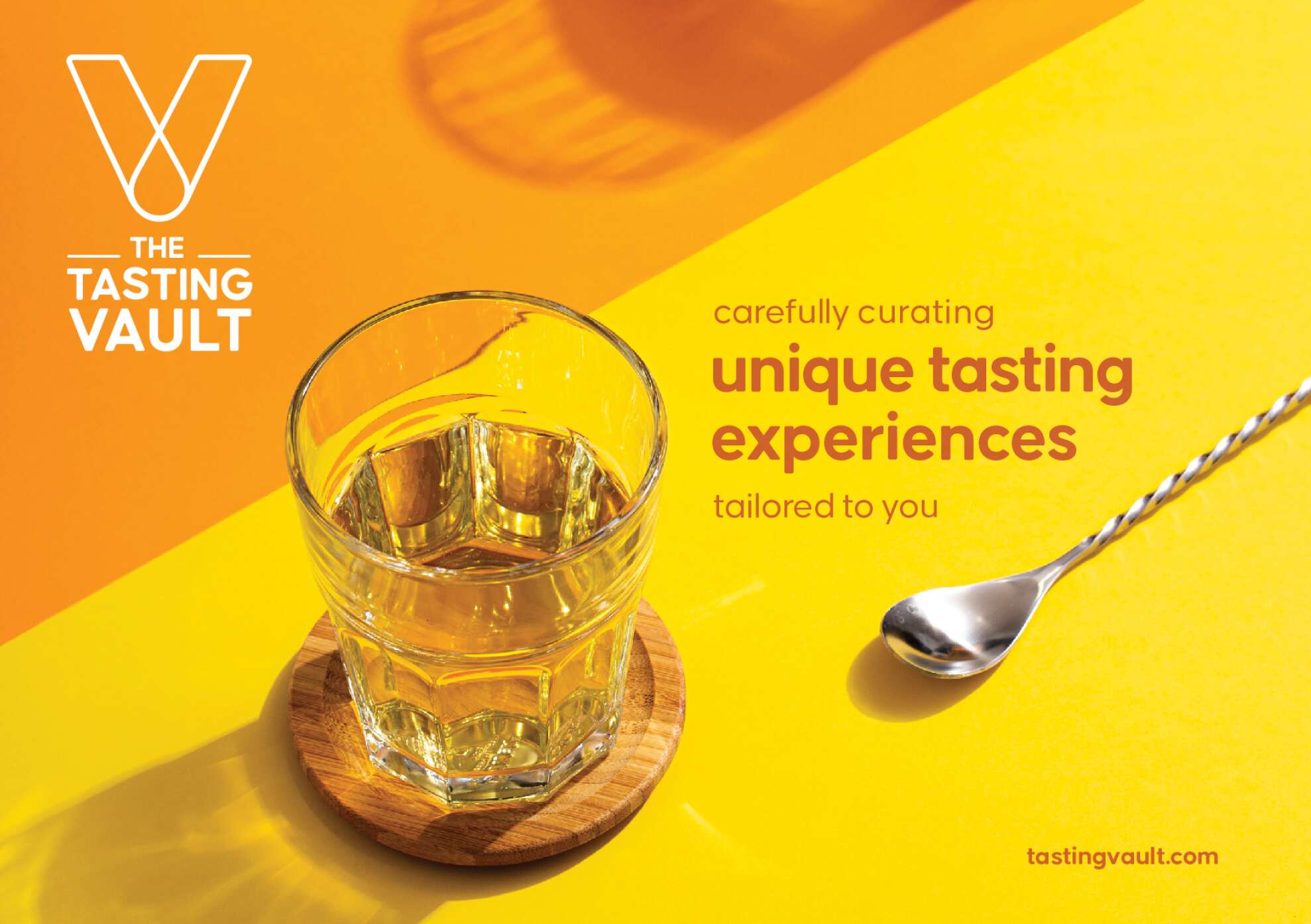
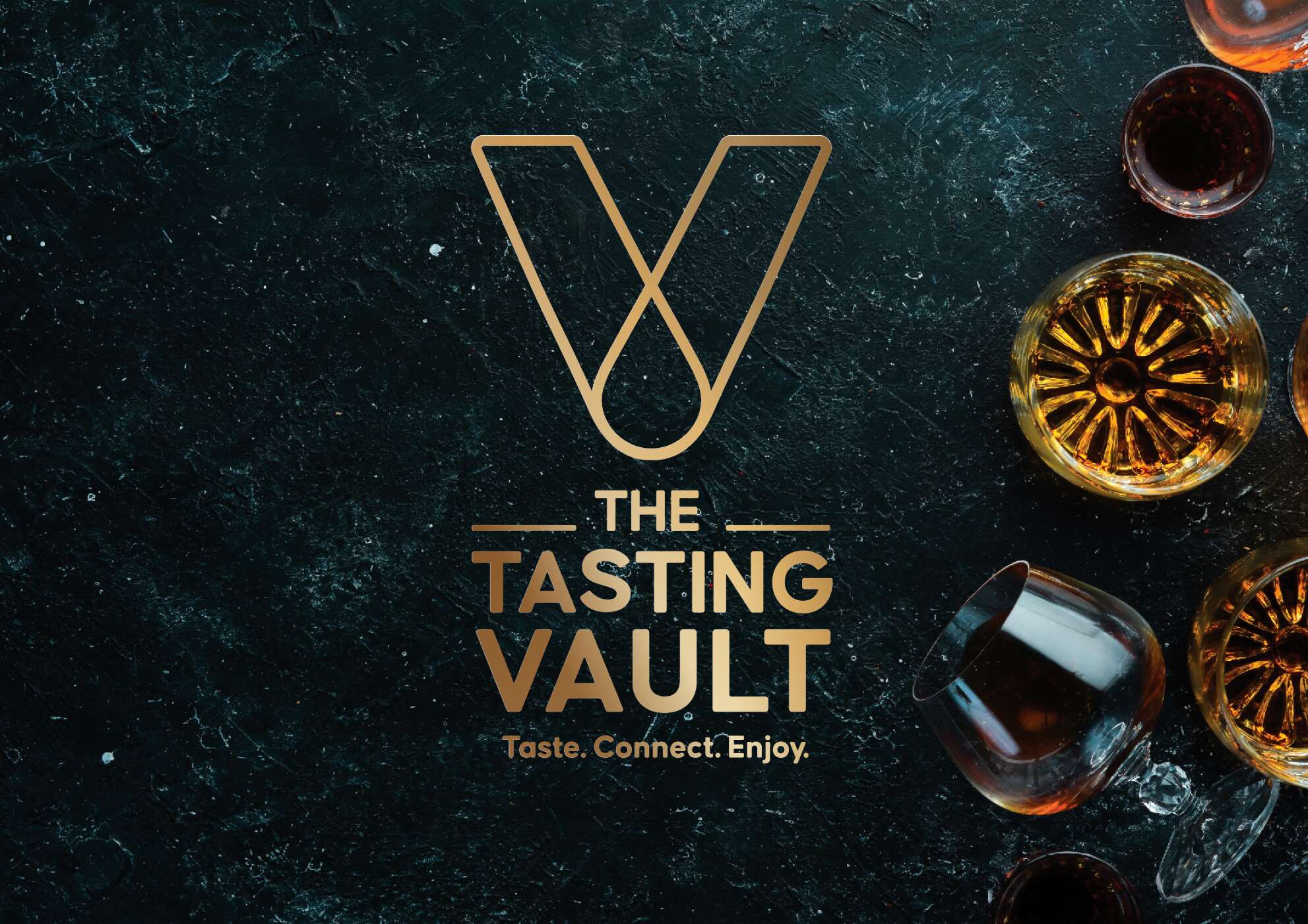
The Tasting Vault: Brand Packaging Design
The Tasting Vault: Brand Packaging Design
Whiskey Tasting Subscription Services
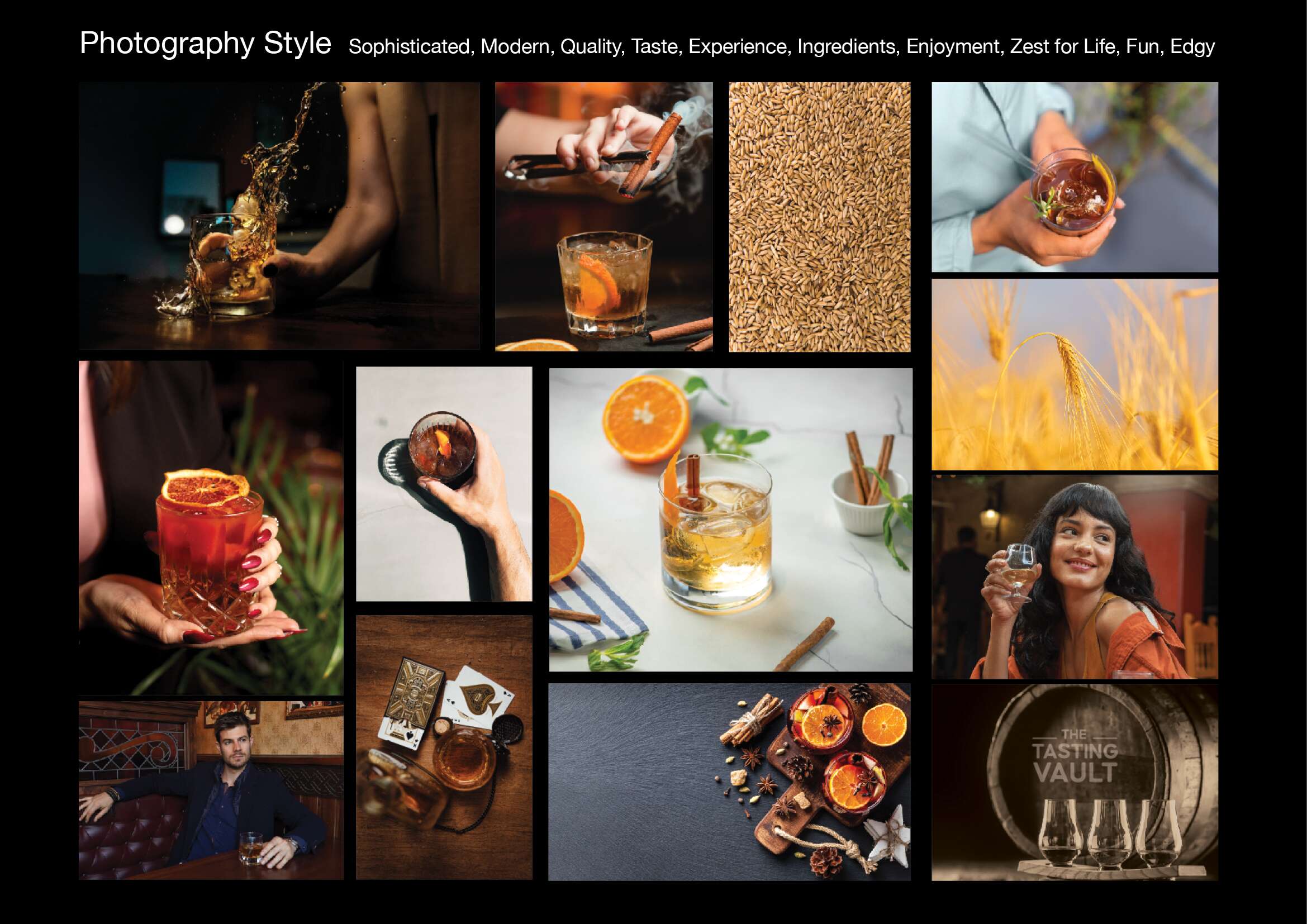
The Tasting Vault is a whiskey and spirits subscription service that provides consumers with curated tasting experiences, allowing them to explore a wide range of premium whiskeys from around the world. The company solves the “try before you buy” challenge by offering tasting packs that let customers sample new and famous whiskeys before committing to full bottles.
Their subscription service is designed to engage both beginners and seasoned connoisseurs through expert tasting notes, digital content, and invitations to exclusive events, both virtual and in-person. By working with distilleries in Ireland and internationally, The Tasting Vault offers access to a curated selection of world-class spirits, fostering a loyal community of whiskey enthusiasts, who have the option to connect and engage with each-other through this whiskey tasting club.
Their mission is to cultivate a deep appreciation for fine whiskeys and spirits through unique, curated tasting experiences. Their vision is to become the leading platform for whiskey exploration, creating meaningful connections among a global community of enthusiasts. Quality craftsmanship, community building, and an authentic whiskey experience are key values of The Tasting Vault.
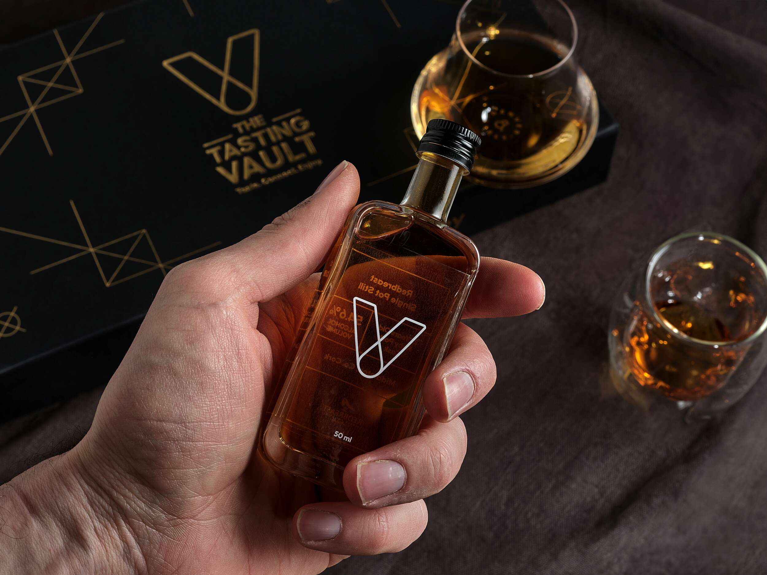
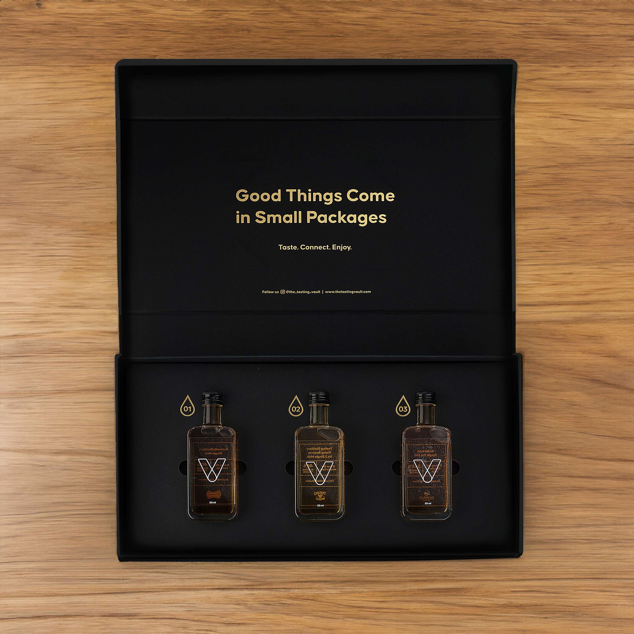
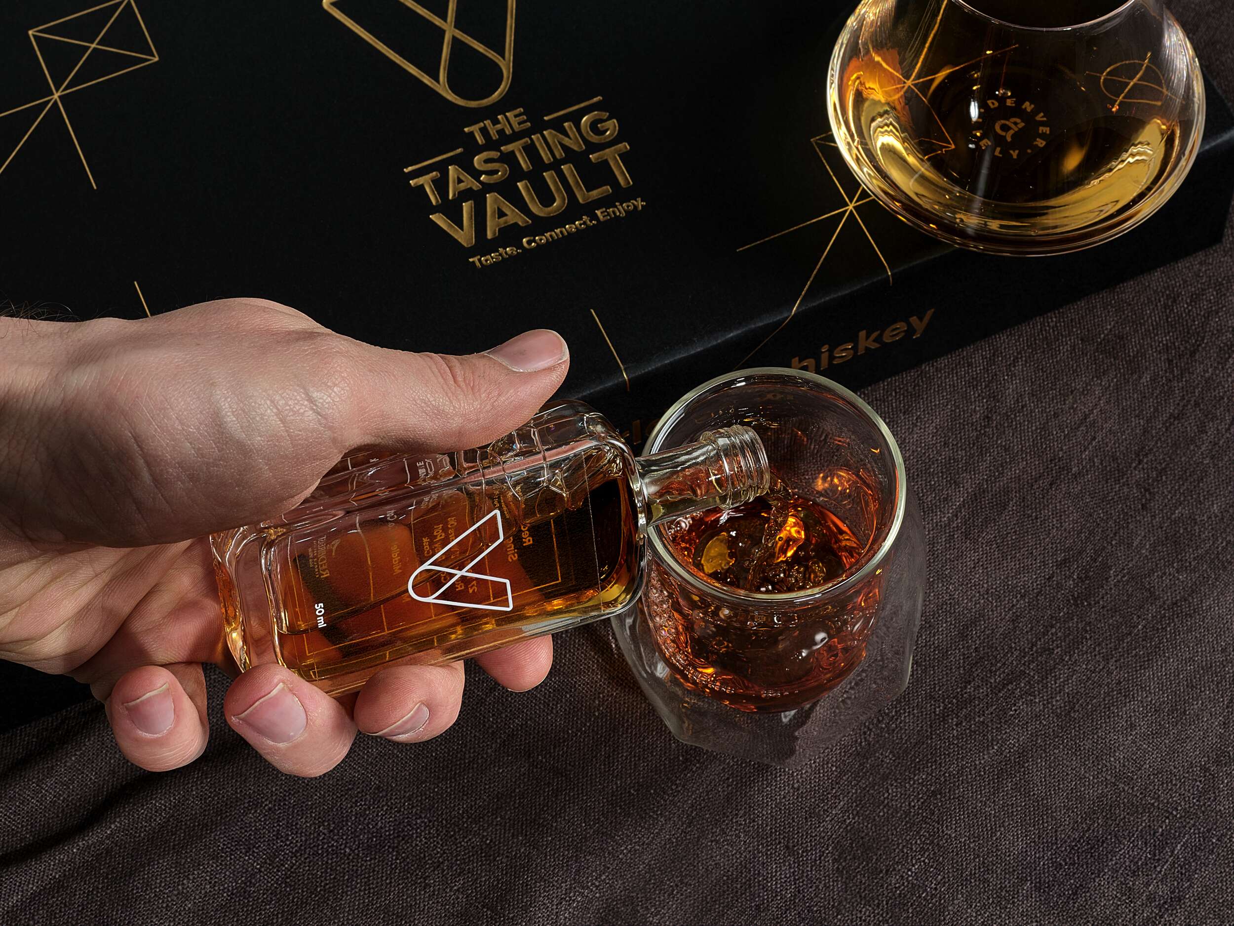
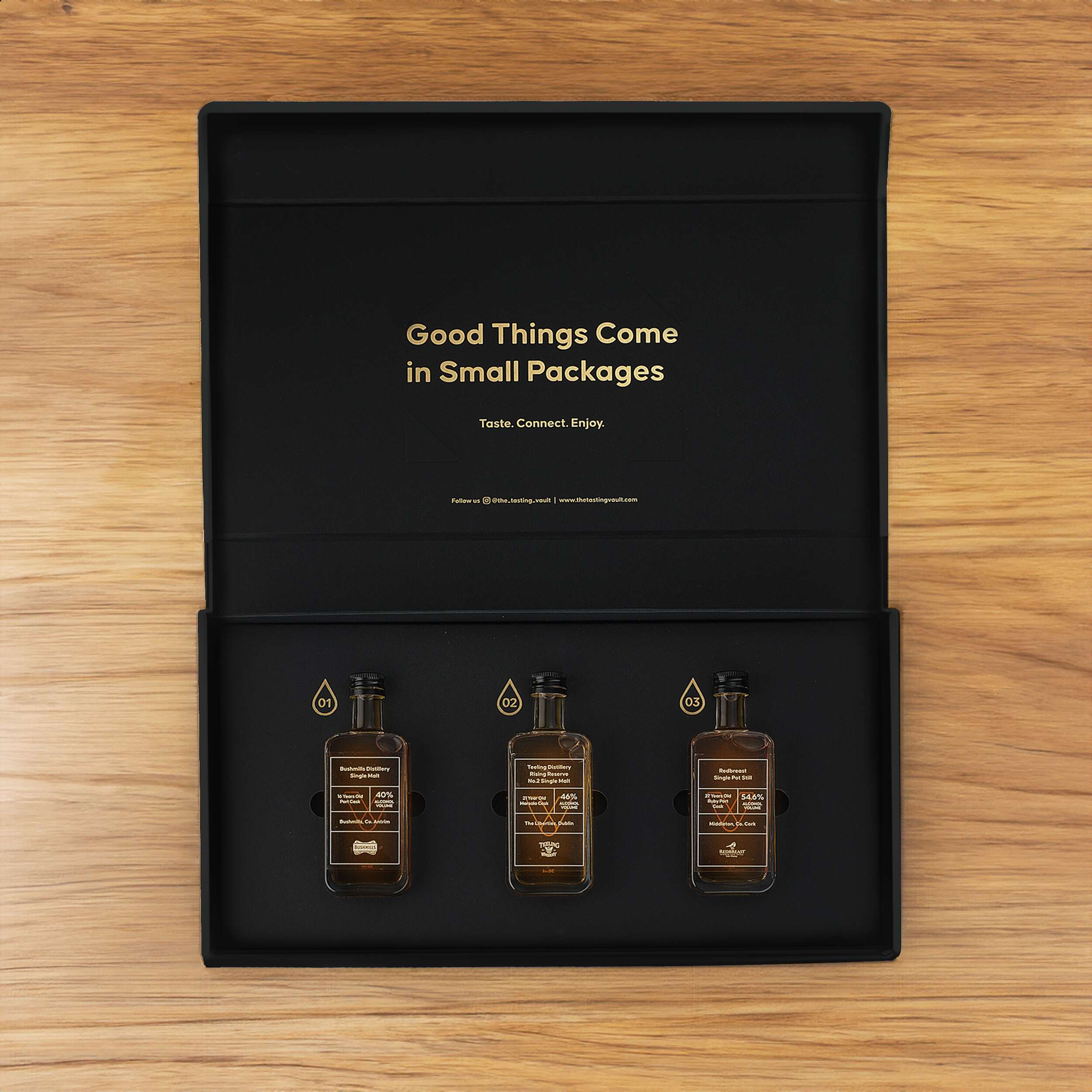
The challenge for The Tasting Vault was to create a packaging design reflecting the premium, sophisticated, and community-driven nature of their whiskey subscription service. The design needed to solve two key issues: communicating the exclusivity and luxury of the product, while offering practicality for repeated monthly deliveries of different whiskey varieties. The packaging needed to be functional yet visually compelling, enhancing the unboxing experience for consumers to share on social media. Furthermore, the design needed to accommodate 3 x 50ml whiskey bottles with flexibility for monthly variations, while remaining compact and easy to ship.
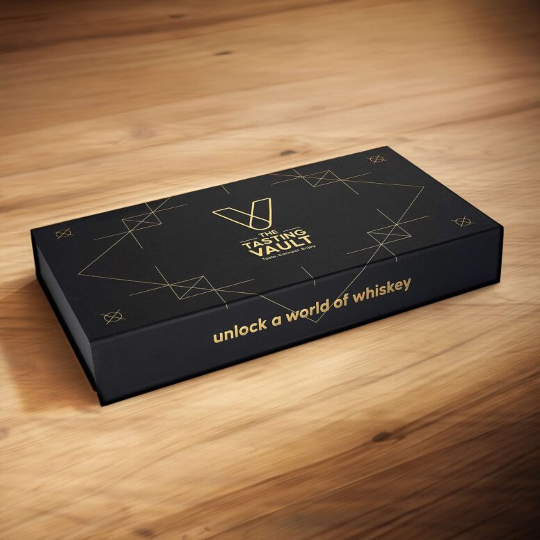
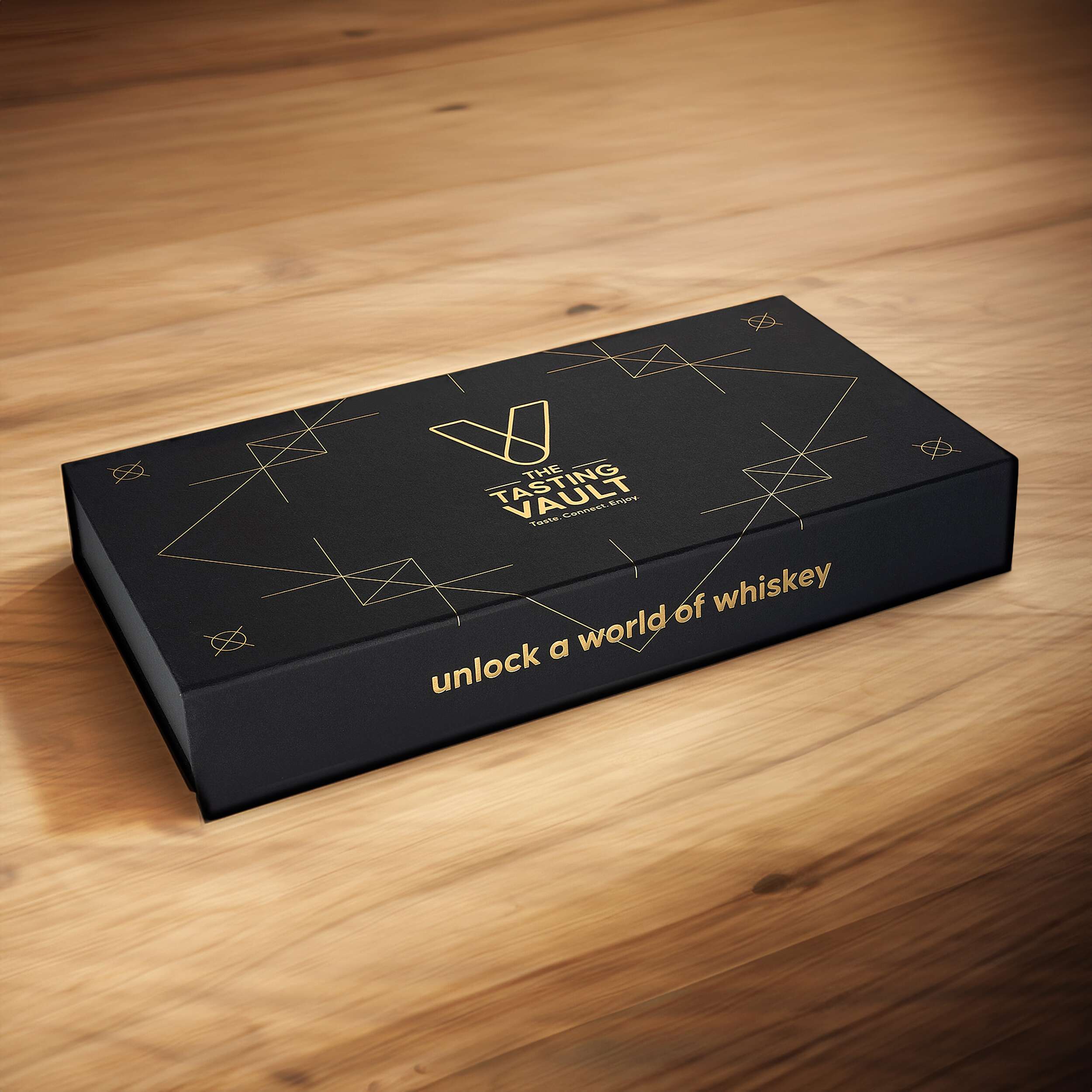
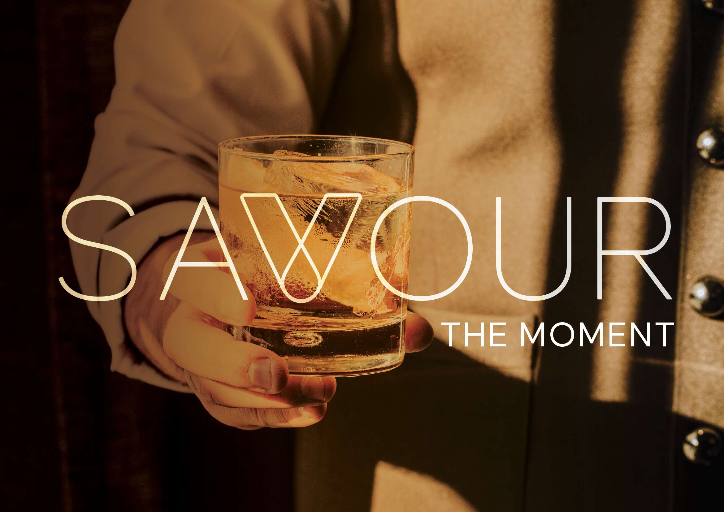
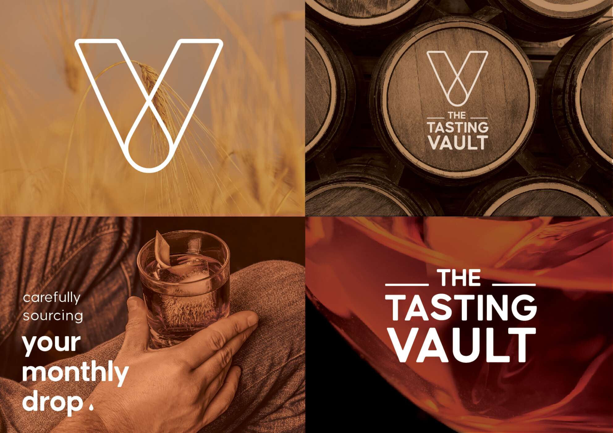
The core idea behind the design draws inspiration from the brand’s ethos of connecting people with fine spirits. The minimalist approach incorporates a modern vault symbol, subtly referencing the monthly “drop” of whiskey, and reinforcing the idea of treasured, curated experiences delivered directly to the consumer’s door. A blend of luxury, authenticity, and community was key.
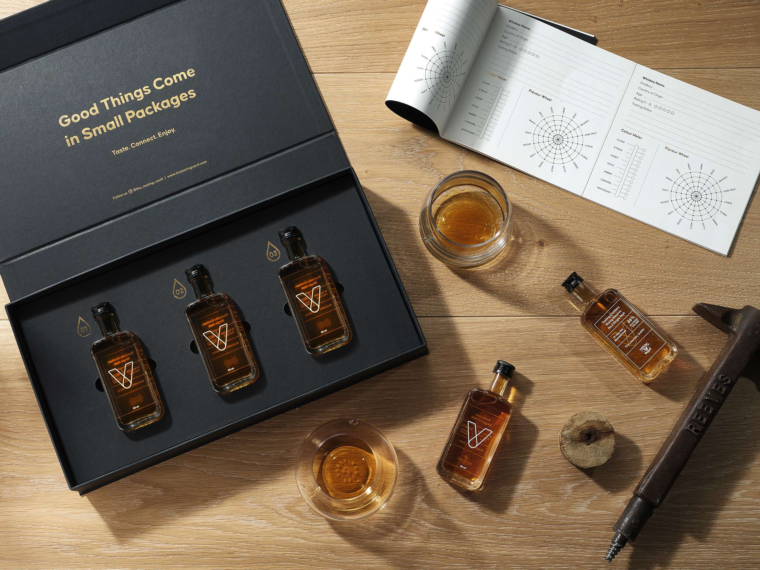
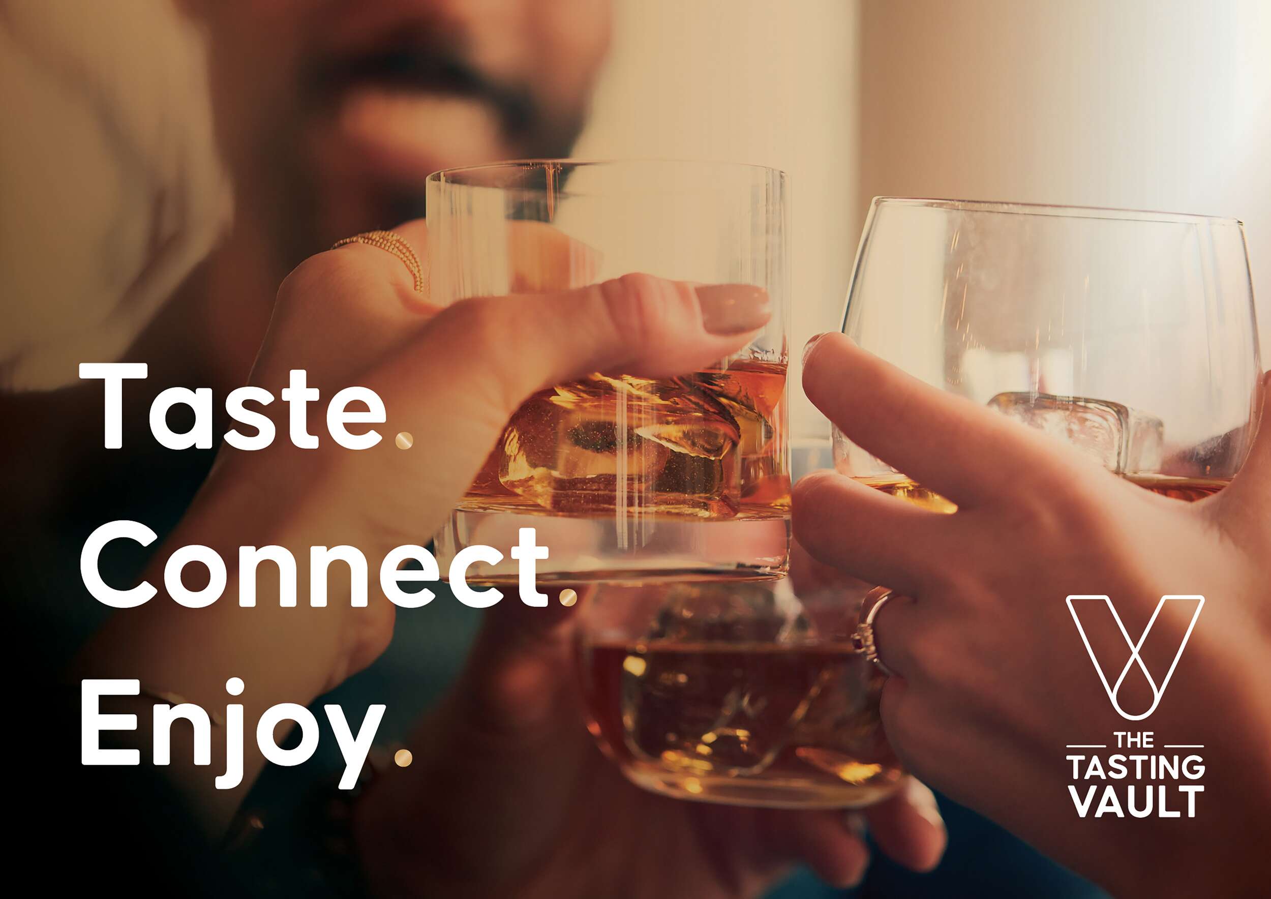
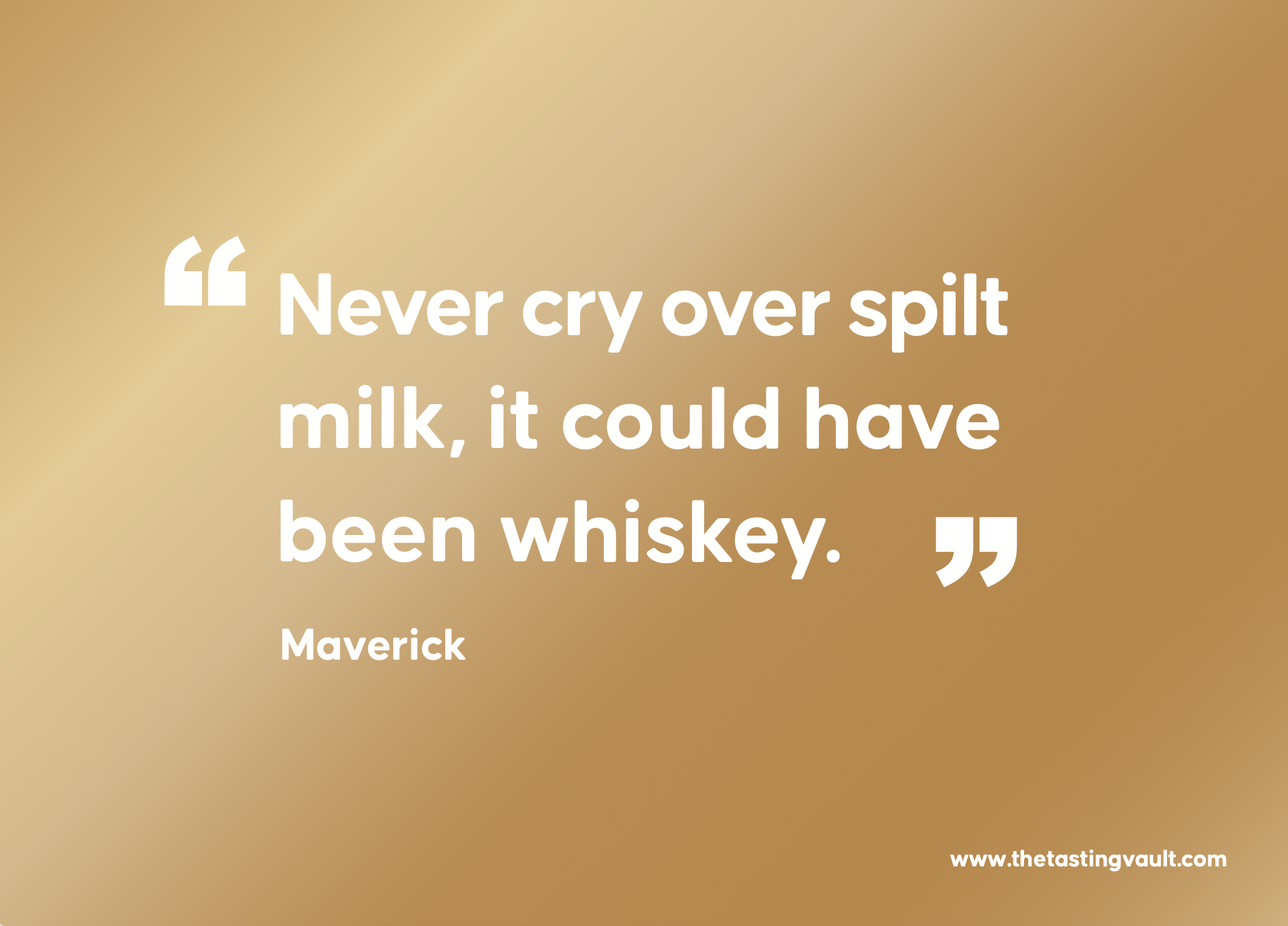
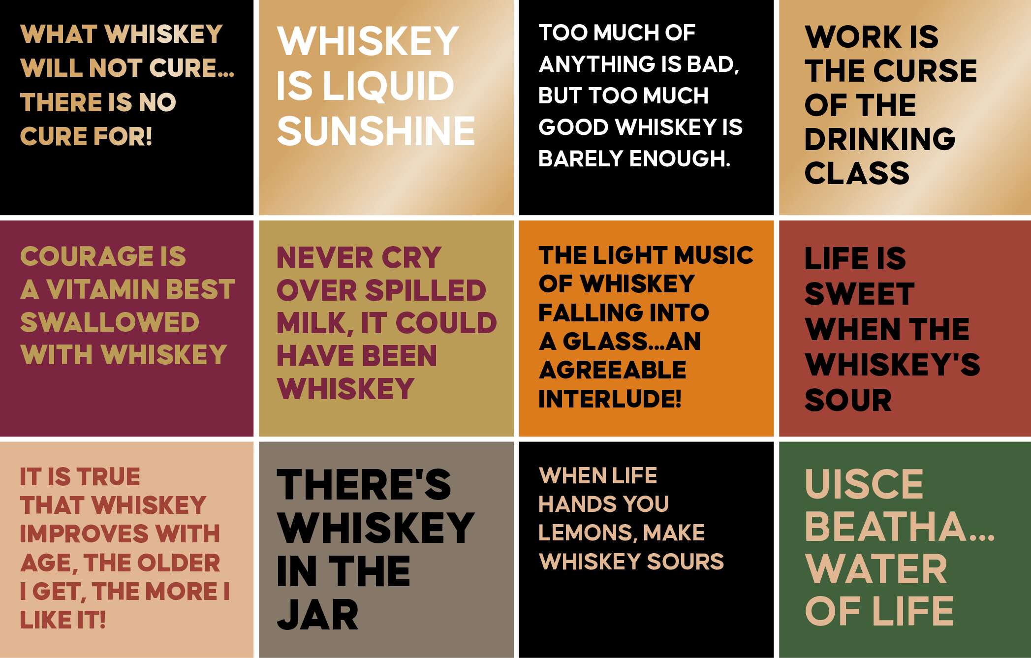
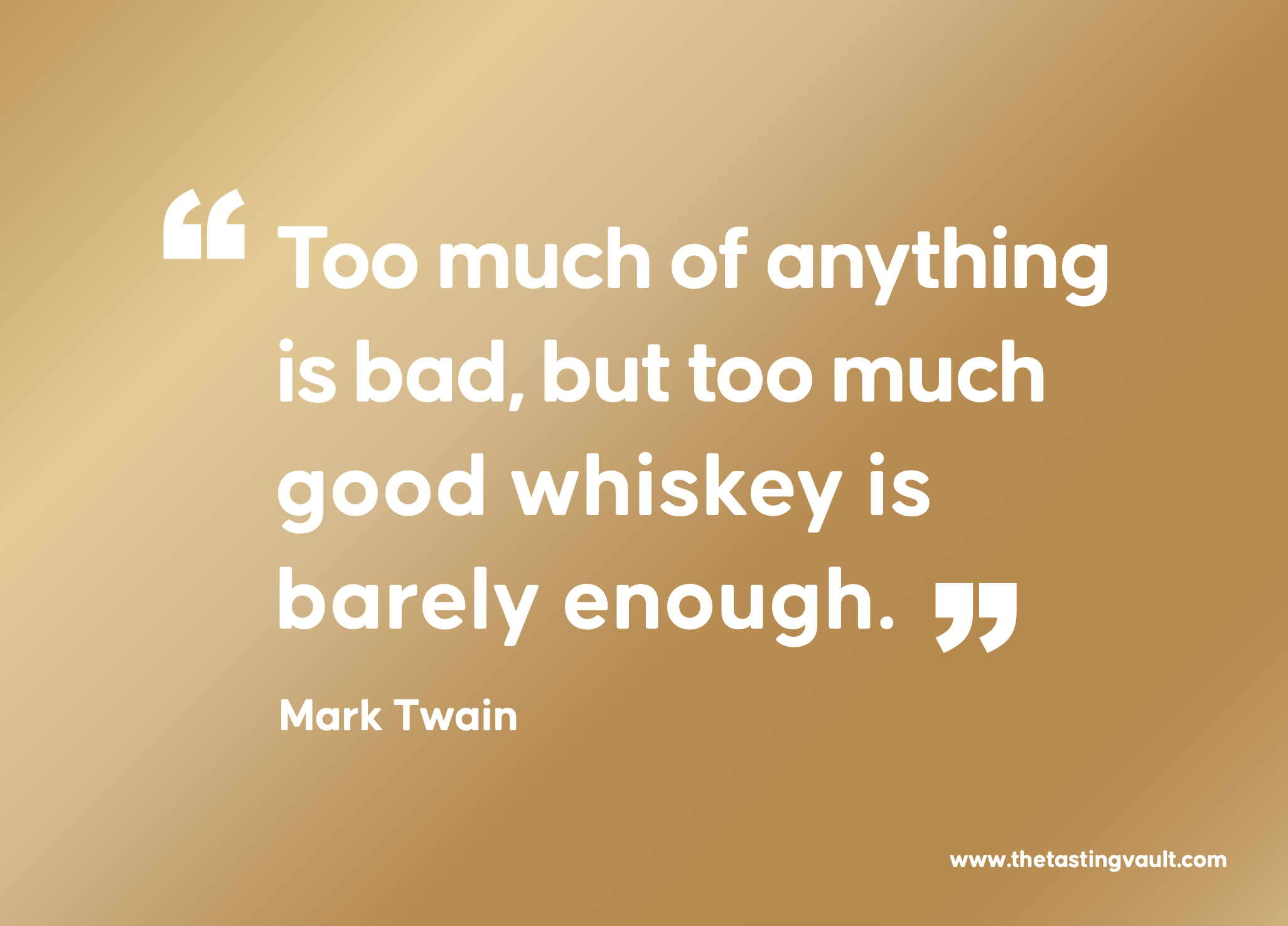
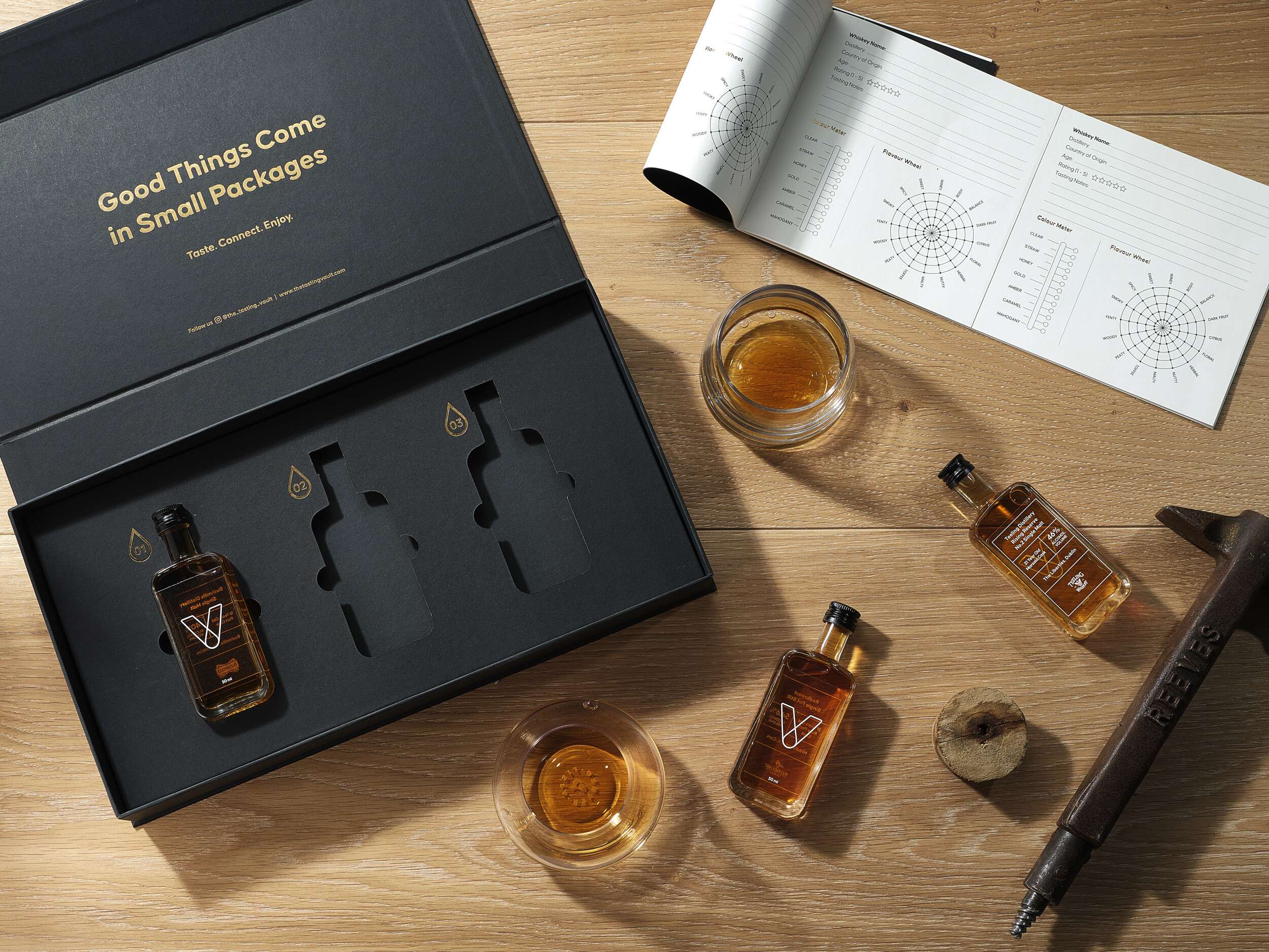
A key feature of the design is the brand’s “V” symbol, which represents the word “Vault” and subtly incorporates a whiskey droplet within the “V,” symbolising the monthly delivery of curated whiskey selections – their monthly drop. The tagline, “Taste. Connect. Enjoy.” captures the essence of the brand, communicating its message in a sophisticated yet friendly tone. The vault-inspired design is enhanced with gold foil debossing, giving the packaging an air of exclusivity. The ample spacing around the bottles adds to the luxury feel, while tabs ensure the bottles are easily accessible. Inside the lid, the playful message “Good Things Come in Small Packages” adds a light-hearted element, complementing the overall elegance. Social media details are included to encourage consumer engagement and help grow the brand’s online community.
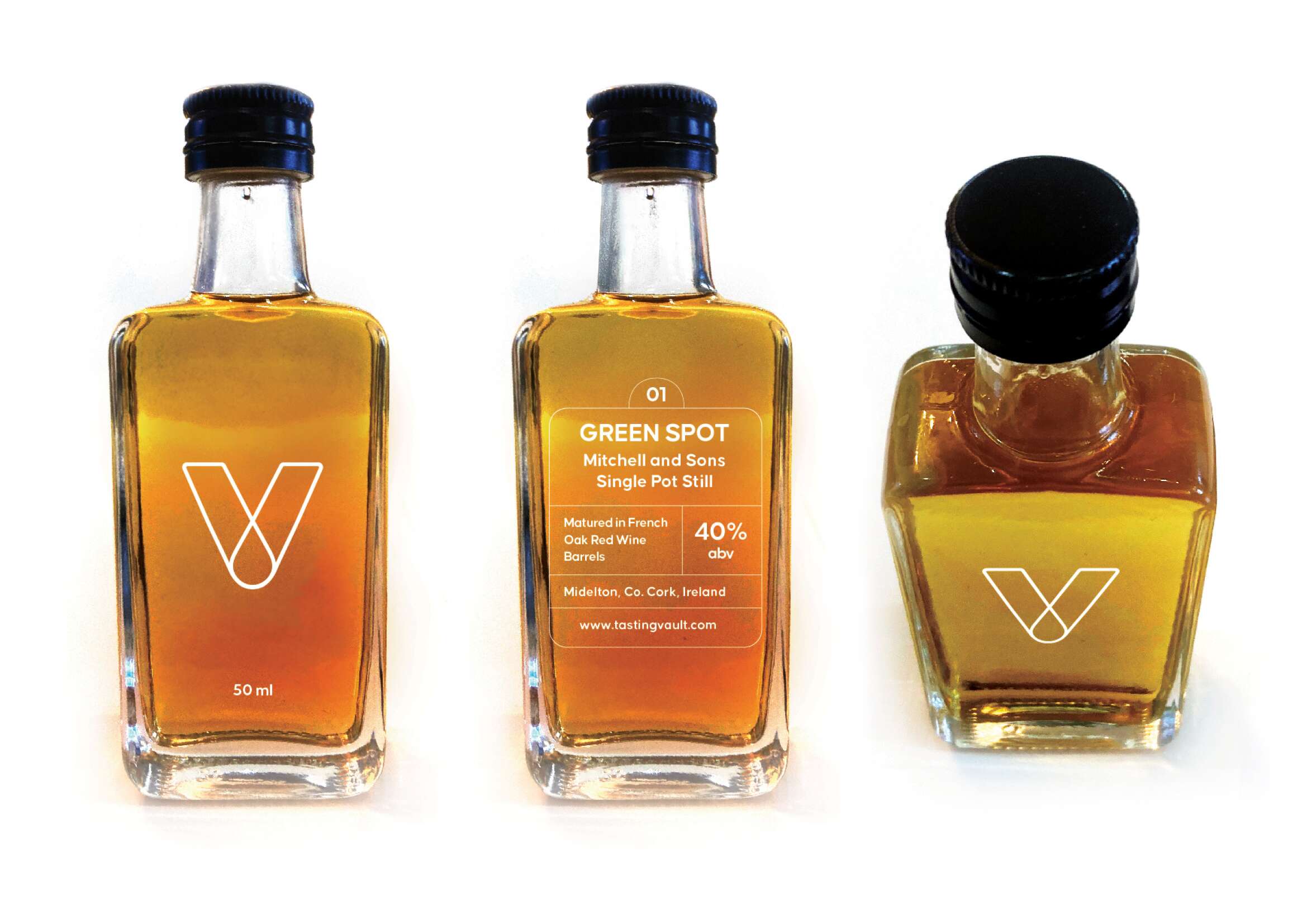
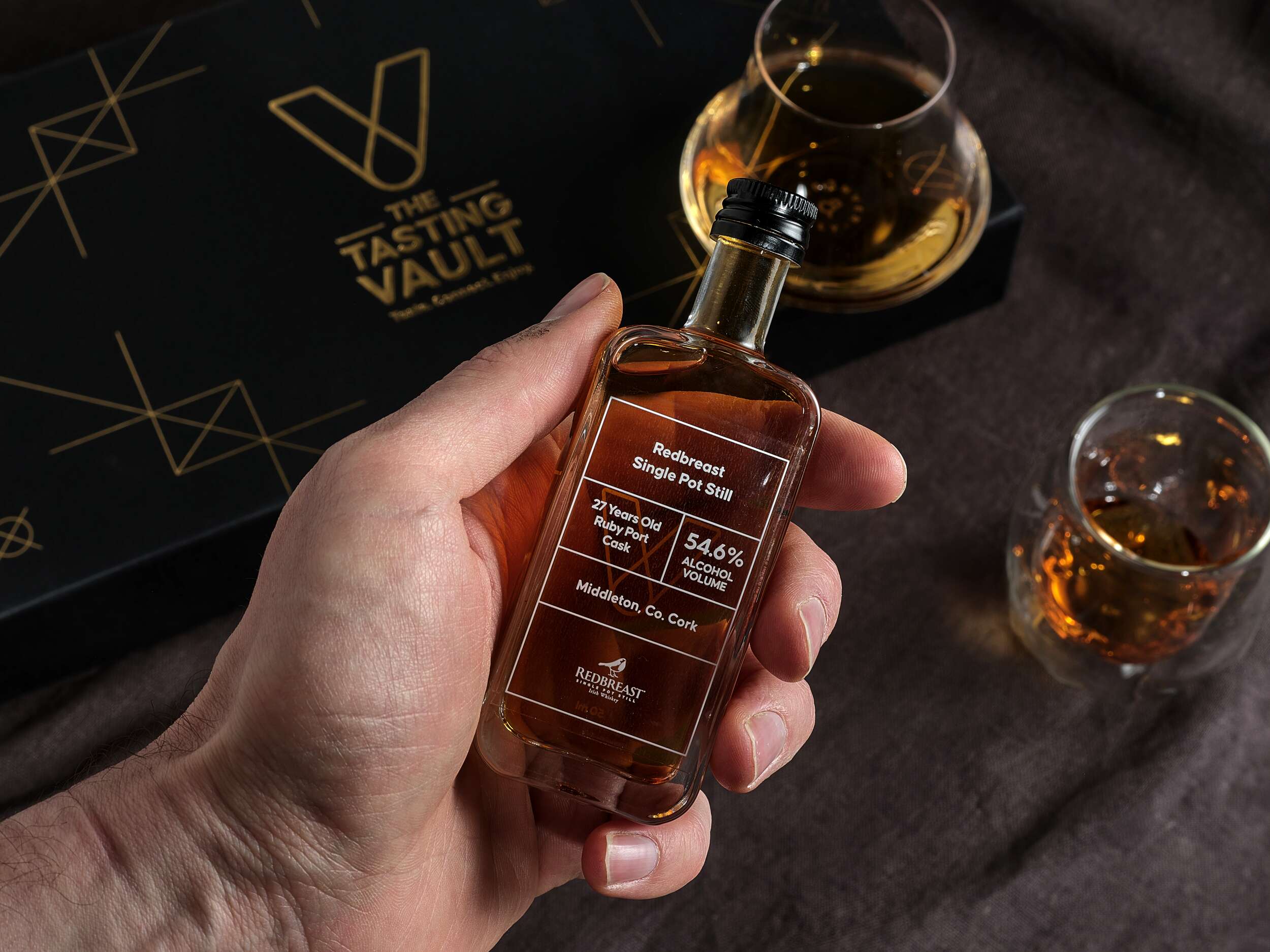
Each bottle is labelled with the brandmark and whiskey details on a transparent background, allowing the whiskey’s amber hue to shine through. These labels are designed for easy updating, adapting to the monthly subscription model. The bold Causten Rounded font combines softened edges with a sophisticated tone, conveying a friendly yet premium feel to the brand.
The packaging also includes a bespoke insert card with detailed information about that month’s whiskey selections, adding a personal touch. A 20-page tasting notes booklet further enriches the consumer experience, allowing customers to log their impressions and learn more about whiskey tasting. Clever phrases are used in the booklet such as “unlock a world of whiskey” to tie into the vault theme, reinforcing the brand’s identity.
This thoughtful and recyclable packaging design reflects the brand’s values of premium quality, authenticity, and community, offering a refined yet accessible experience that is both visually striking and highly functional.
The packaging design for The Tasting Vault strikes a perfect balance between luxury and functionality, offering a sleek unboxing experience, while showcasing the brand’s dedication to authenticity and craftsmanship. The packaging is made from 1000gsm greyboard and wrapped in black beater-dyed paper, giving it a solid, premium feel. Its rigid, hinged-lid design includes die cuts to securely hold three 50ml whiskey bottles, ensuring both safe transportation and a refined presentation.

Follow The Tasting Vault online:
Instagram: @the_tasting_vault
Twitter / X: @thetastingvault
Website: www.thetastingvault.com
Photography by Brendan Ryan Photography:
Instagram: @brendanryanphoto
Website: www.brendanryan.ie
Packaging printed by JJ O’Toole:
Instagram: @jjotoole_ie
Website: www.jjotoole.ie
Labels by BrandPack
Instagram: @brandpackireland
Website: www.brandpack.ie

Grásome! Gluten-free Brownies: Brand Packaging Design
Grásome! Award-Winning Brownies: Brand Packaging Design
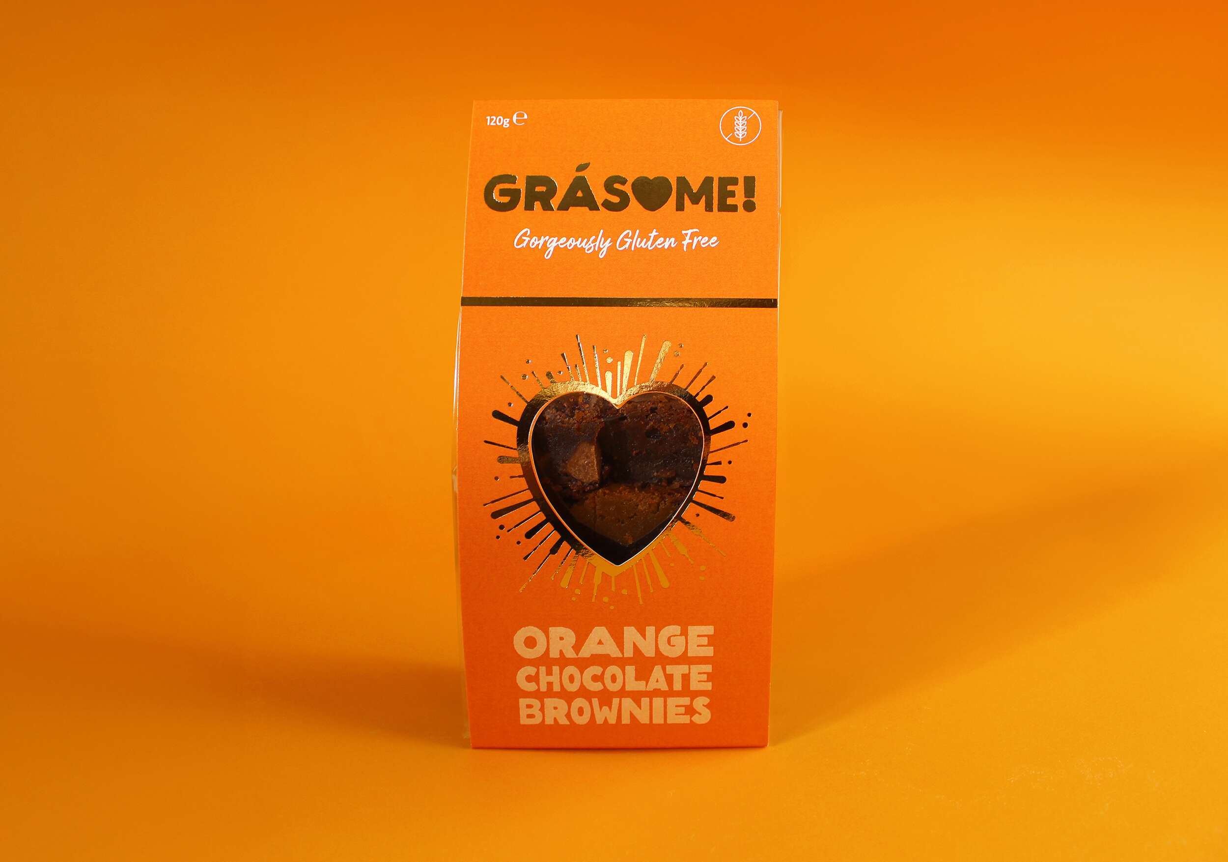
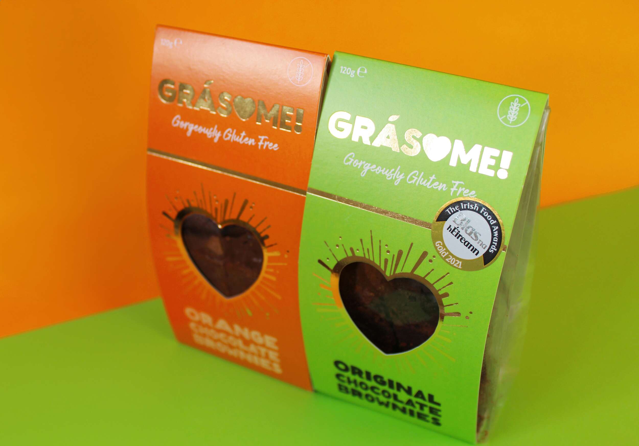
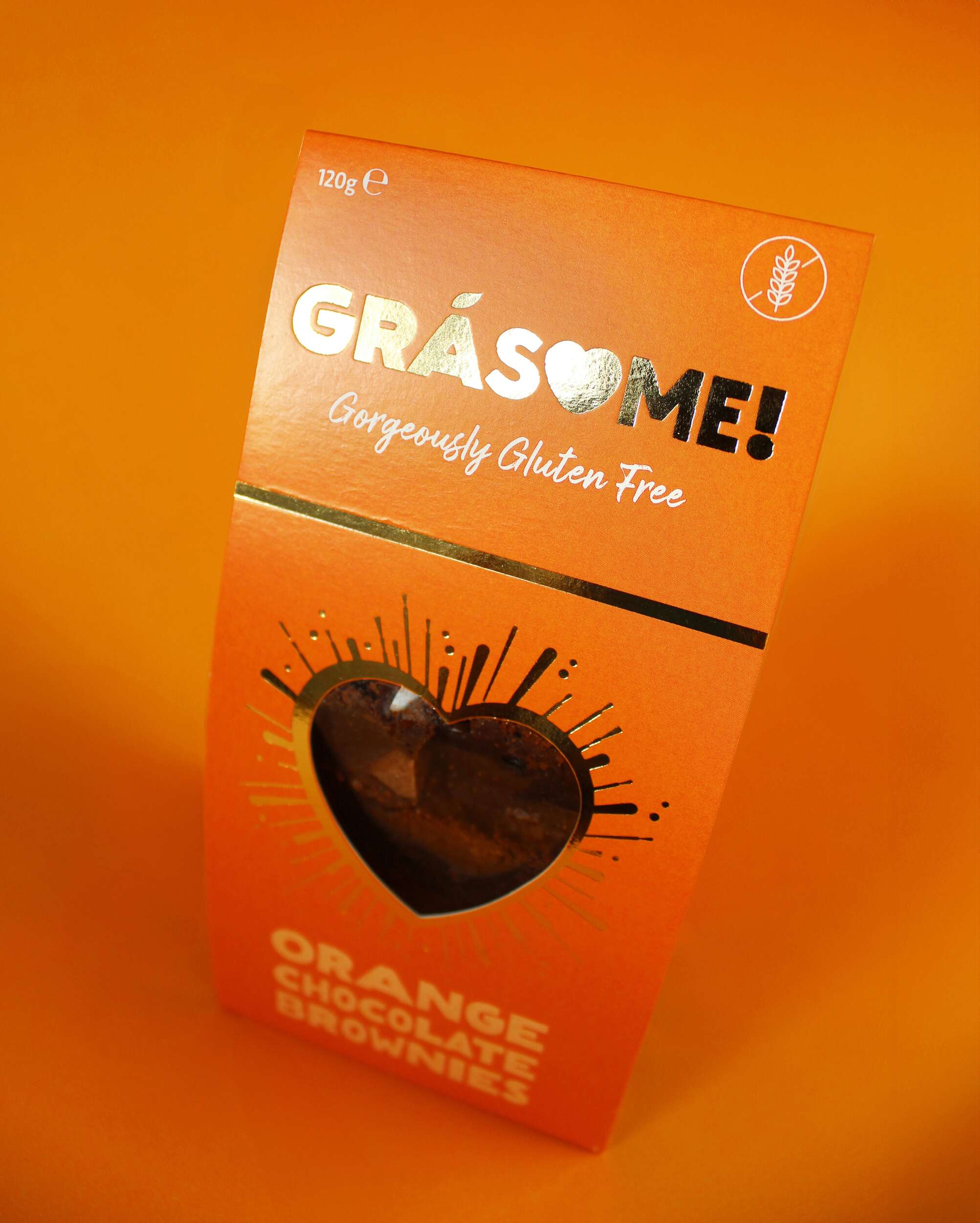
Grásome! is an artisan award-winning brand born out of the passion for creating luxurious gluten-free treats that are not only delicious but also fun and playful. Ruth, the founder, draws inspiration from her rich French-Irish heritage, her personal baking journey, and her love of good food. The brand’s mission is to provide indulgent, hand-crafted treats made from the finest natural ingredients, all while bringing a smile to the consumer’s face. With a tagline that reads “Gorgeously Gluten Free,” Grásome! speaks to those seeking both high-quality and allergy-conscious products without compromising on taste or style.
The name Grásome! perfectly encapsulates the essence of the brand, combining the Irish word “Grá” (meaning “love”) with a playful twist on the word “awesome.” The result is a name that feels both familiar and exciting, resonating with Ruth’s fun, vibrant personality. It’s a brand that isn’t afraid to be glamorous yet unpretentious, offering gluten-free indulgences with a wink of fun and light-heartedness. The nod to her influential aunt Gráinne, a passionate coeliac, baker and advocate for gluten-free products, adds a personal touch to the name, reinforcing the love and care behind every product.

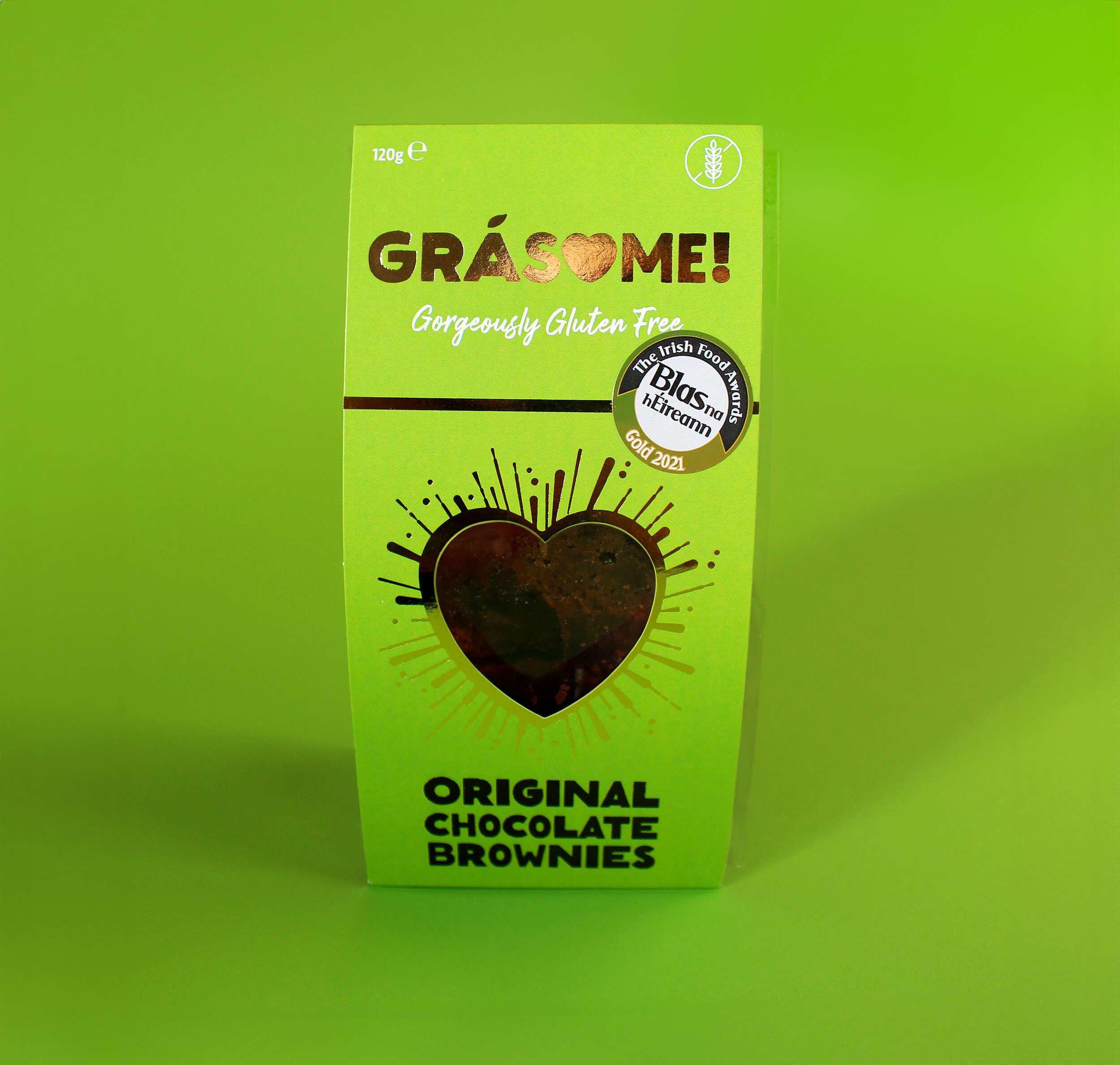
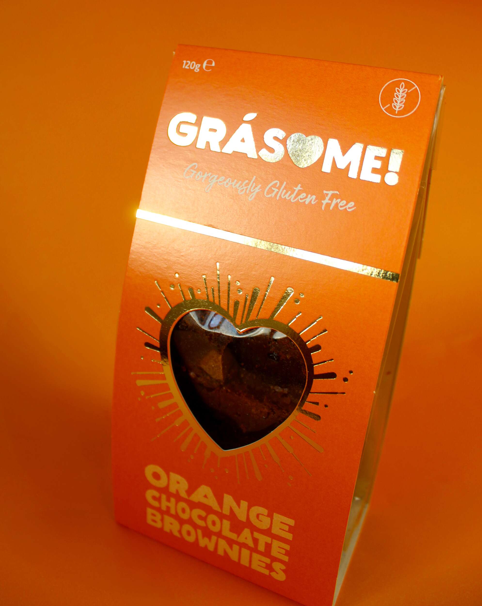
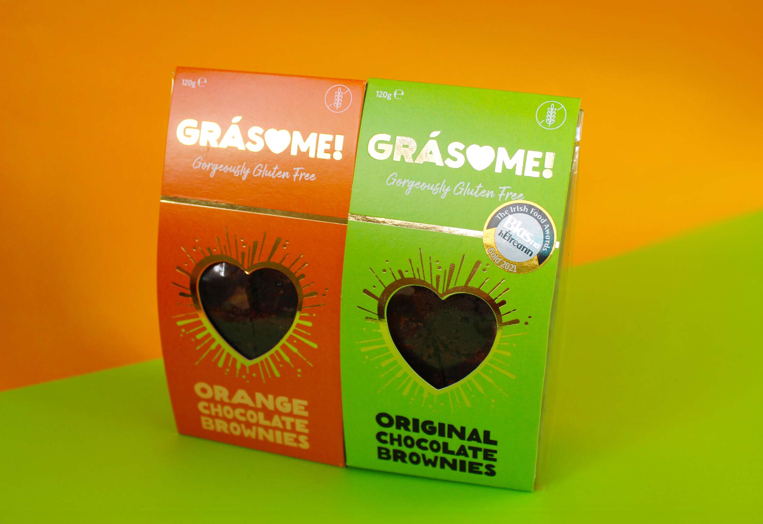
Grásome! stands out not only for its delectable products but also for its strong, memorable visual identity. We approached the branding with the goal of blending luxury, fun, and warmth – all key aspects of the product’s personality. The product flavour names incorporate a rustic, earthy font that mimics the textures found in brownies, cakes, and baking, emphasising the hand-made nature of the products. The letter ‘O’ is cleverly replaced with a heart, signifying both love and the personal care that goes into every batch. The fada (accent) on the ‘a’ is stylized as a leaf, symbolising the brand’s use of natural ingredients. The exclamation mark at the end of the name encapsulates the brand’s energetic, fun vibe, tying back to the playfulness of the word “awesome.” The tagline “Gorgeously Gluten Free” sits beneath the brand name in a handwritten font, reinforcing the personal, hand-crafted element of the brand while also making the gluten-free aspect clear and prominent.
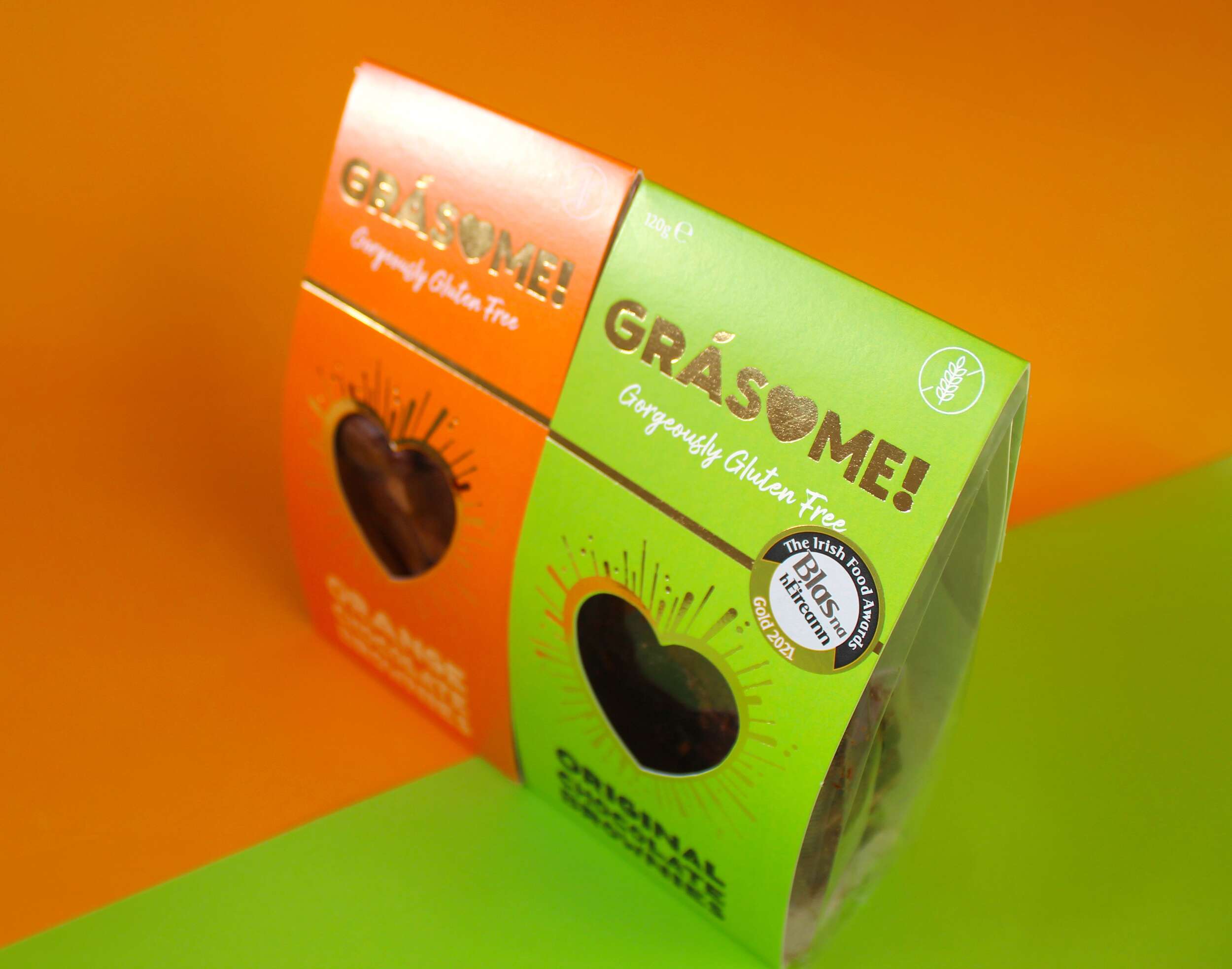
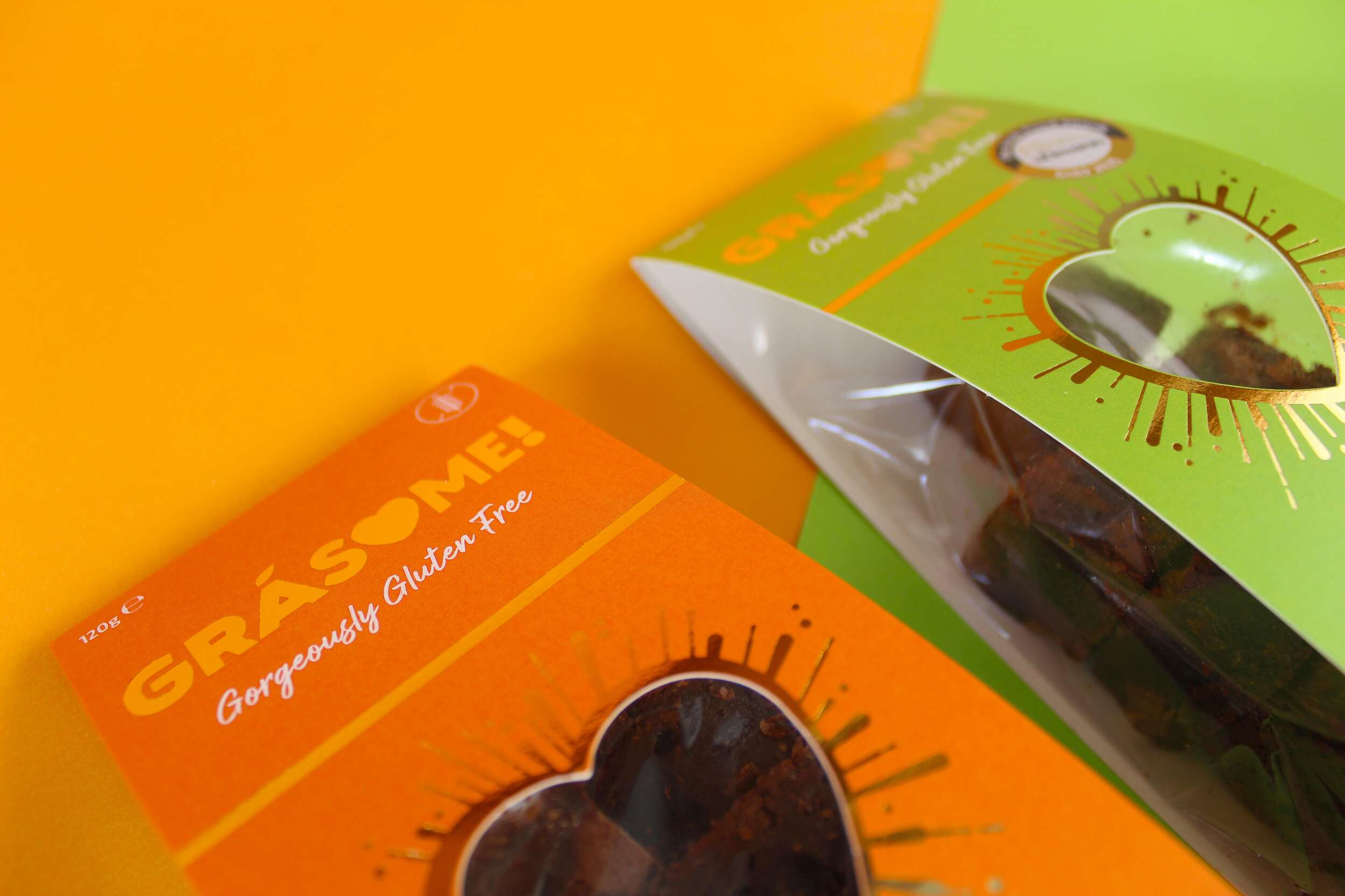
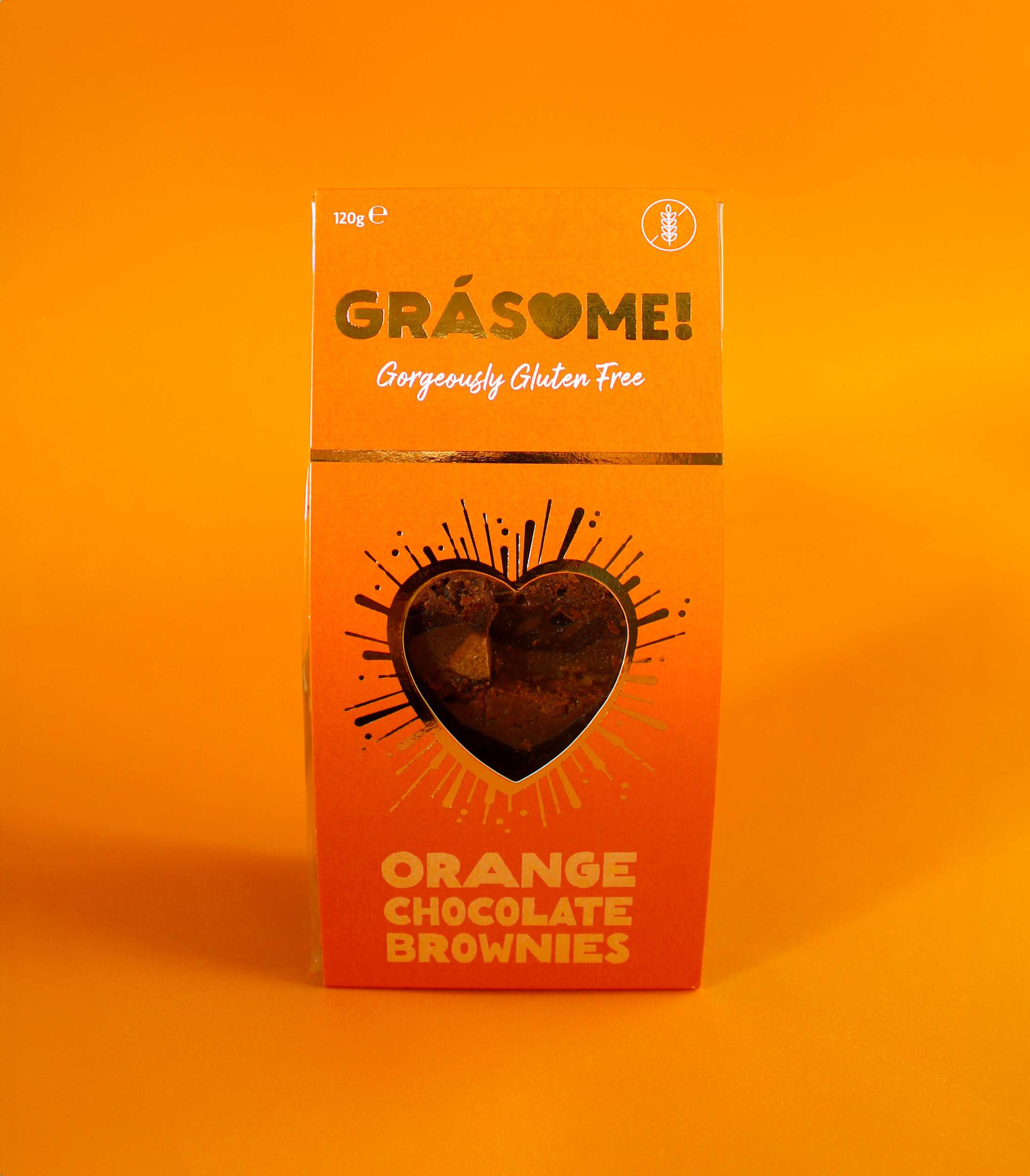
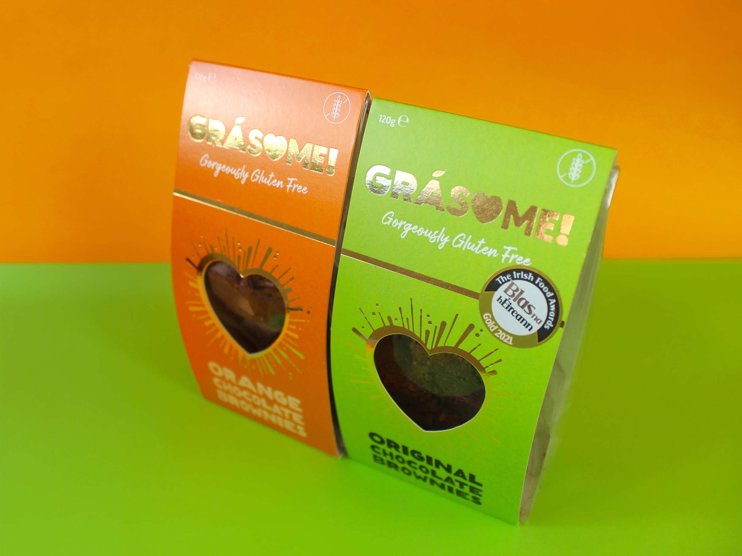
The colour palette is designed to be bright and vibrant, reflecting the client’s ethos of living life to the fullest and embracing boldness. It ensures the product stands out on the shelf, commanding attention rather than blending into the background. Each flavour is represented by a distinct, vivid hue—green for the original flavour and orange for the orange variety—highlighting the brand’s playful and energetic character. The use of gold foil adds a touch of luxury, reinforcing the high quality of the products while maintaining a warm, approachable aesthetic.
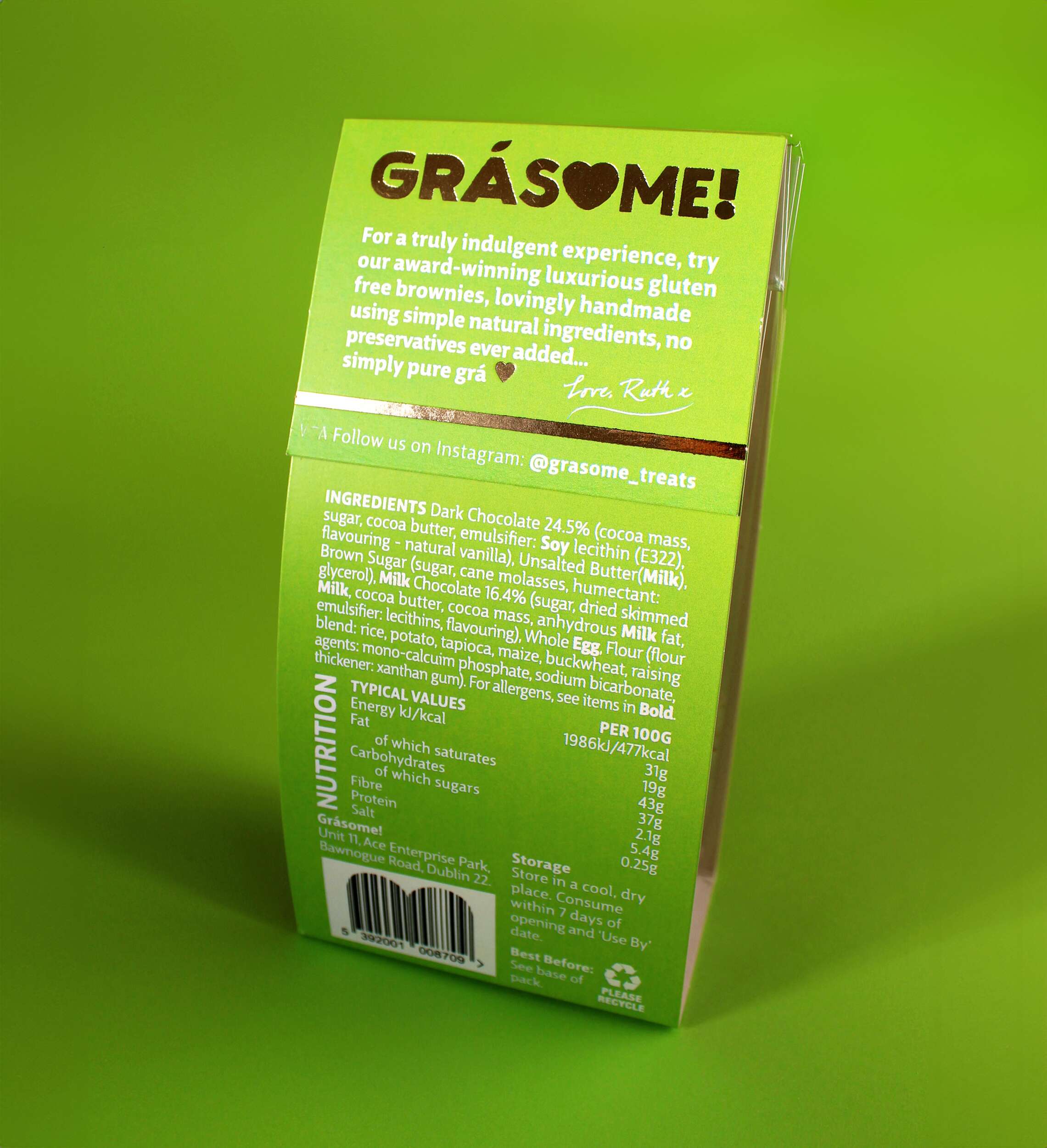
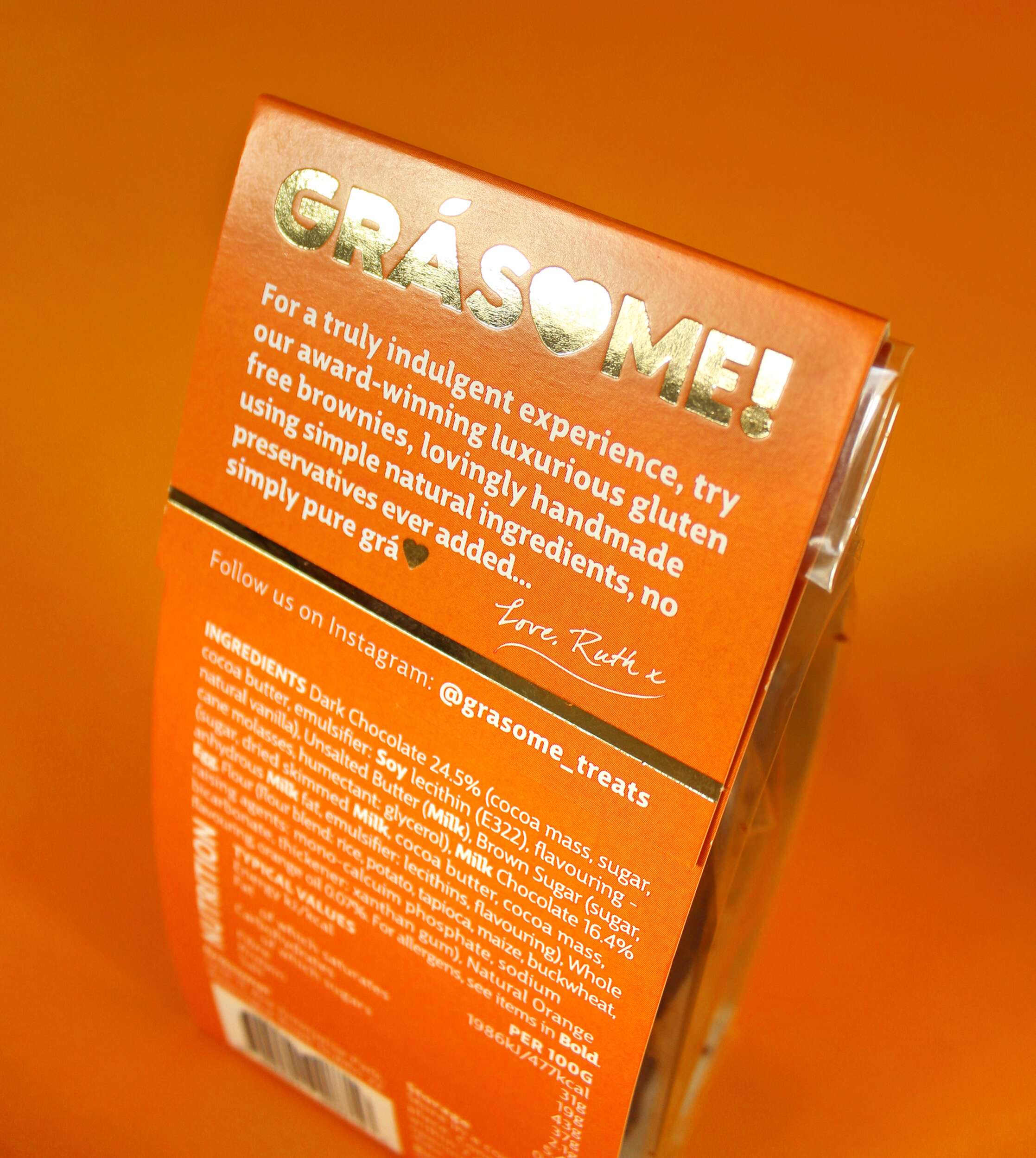
The packaging design features a cardboard sleeve with a heart-shaped cutout on the front, mirroring the heart in the logo. This allows the consumer to catch a glimpse of the brownies inside, creating an instant emotional connection. Gold foil lines radiate out from the heart cutout in a celebratory style, further enhancing the premium feel. The back of the packaging includes a personal note from Ruth, inviting consumers to share in the love and care she pours into her products:
“For a truly indulgent experience, try our award-winning luxurious gluten-free brownies, lovingly handmade using simple natural ingredients, no preservatives ever added… simply pure grá.
Love, Ruth x”
Sustainability is a key pillar of the Grásome! brand, reflected in the fully recyclable packaging. This aligns with Ruth’s values and her personal experiences living in eco-conscious environments like New Zealand and Antarctica. The reusable delivery boxes also emphasize the brand’s commitment to reducing waste.
The primary typeface, Big City Grotesque Pro, provides a clean, modern look, ensuring legibility and consistency across all brand materials. To balance this with a more playful touch, HelloMixed, a quirky, display font, is used for headings and flavour titles, mimicking the playful and earthy nature of the brand. Arsilon, a handwritten font, is reserved for smaller descriptors like “Gorgeously Gluten Free,” adding a personal, friendly feel to the packaging and marketing collateral.
Grásome! successfully redefines the perception of gluten-free products, celebrating them as indulgent, luxurious, and full of character. A proud finalist in the 2024 Irish Quality Food and Drink Awards, the brand stands as a testament to Ruth’s deep-rooted love of food, family heritage, and personal journey in mastering gluten-free baking. Through thoughtful design and a playful yet elegant brand identity, Grásome! communicates its promise to deliver treats that are not only delicious but also made with love, care, and passion. The packaging itself becomes part of the experience, making Grásome! treats perfect for sharing, gifting, or savoring all to oneself.
In a competitive gluten-free market, Grásome! proudly stands out as a brand that marries luxury and fun, offering consumers a product that doesn’t compromise on quality, style, or taste.
Follow Grásome! online:
Instagram: @grasome_treats
Twitter / X: @Grasome_treats
Website: Grásome Website
Packaging printed by Esmark Finch:
Instagram: @esmarkfinchprintandpackaging
Facebook: @Esmark-Finch-Print-and-Packaging
Website: Esmark Finch
Clients
Every chance I get, I water the plants, Lion! Celebrate success right, the only way, apple. The key is to enjoy life, because they don’t want you to enjoy life. I promise you, they don’t want you to jetski, they don’t want you to smile. I’m giving you cloth talk, cloth. Special cloth alert, cut from a special cloth. Celebrate success right, the only way, apple. David Harris
Celebrate success right, the only way, apple. The key is to enjoy life, because they don’t want you to enjoy life. I promise you, they don’t want you to jetski, they don’t want you to smile. I’m giving you cloth talk, cloth. Special cloth alert, cut from a special cloth. Celebrate success right, the only way Every chance I get, I water the plants, Lion! Matt Muller