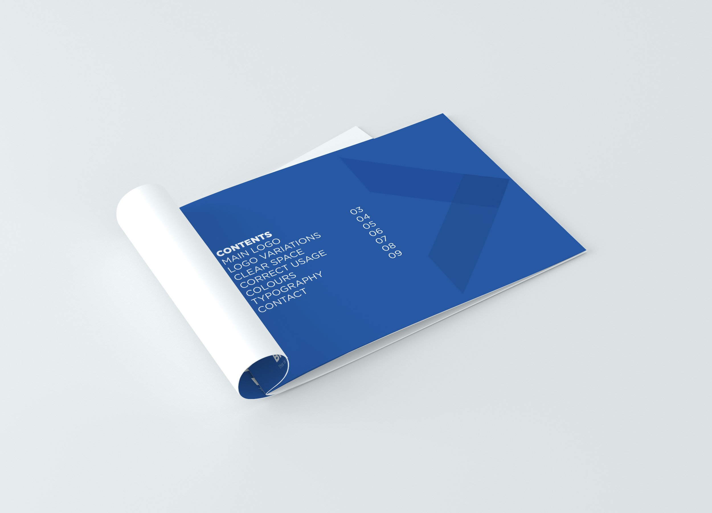
Brid Kehoe Coaching Brand Booklet
 <img
<img


BK Coaching Brand Book & Marketing Collateral
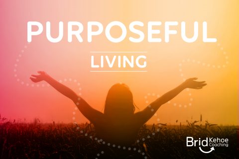
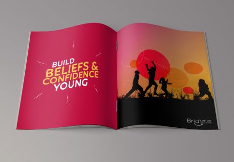
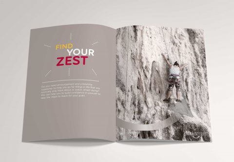
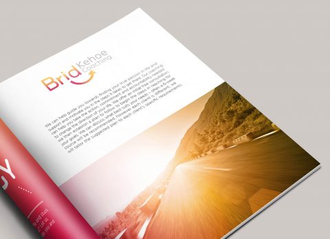
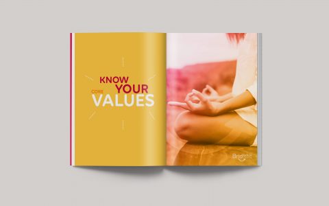
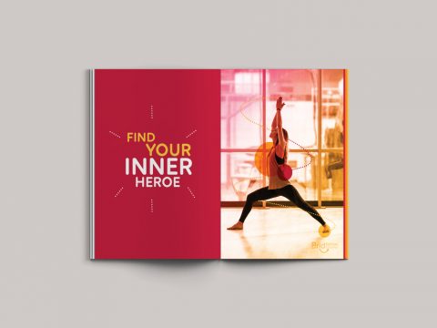
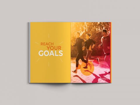
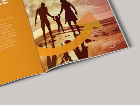
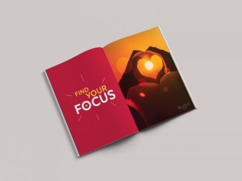
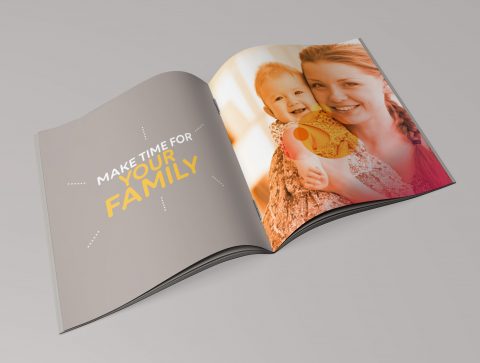
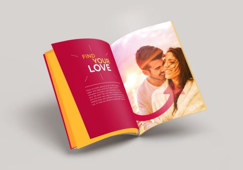
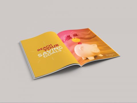
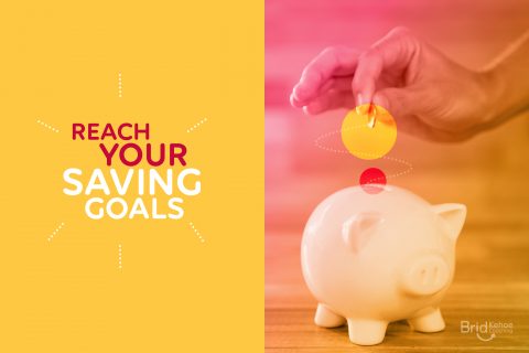
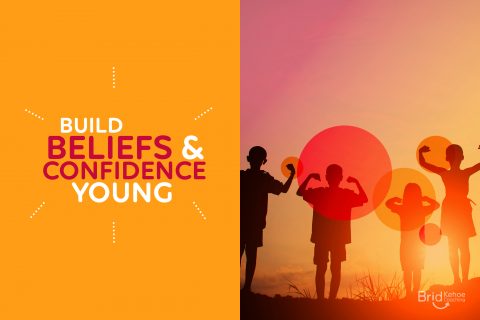
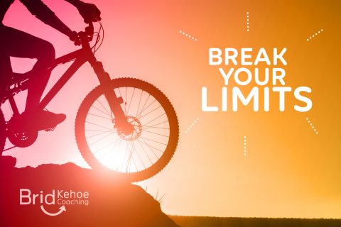
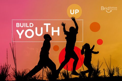
Brid Kehoe Coaching are a holistic coaching practise who support clients in taking steps forward to change for the better and help them to uncover new routes to get there. They guide clients to improve wellbeing and focus, change career and much more through support, encouragement and introducing new creative strategies.
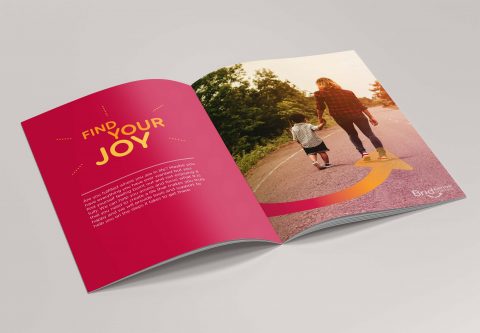
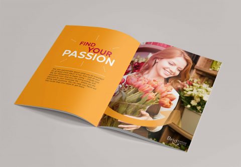
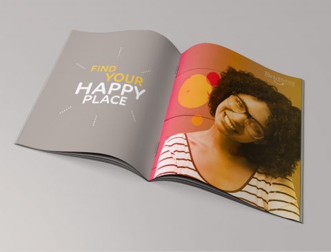
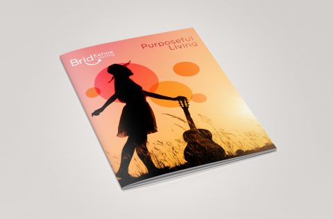
The arrow in this identity lockup represents how Brid Kehoe Coaching focus clients in an upwards direction in their life; the subtle smile and bright colours communicate the positivity and fresh outlook that they bring to all their clients.
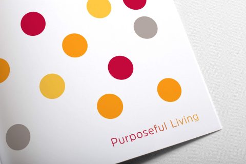
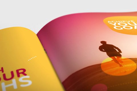
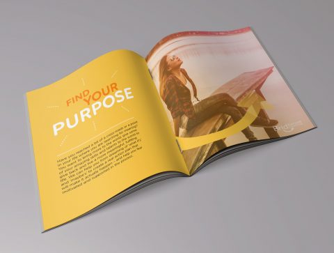
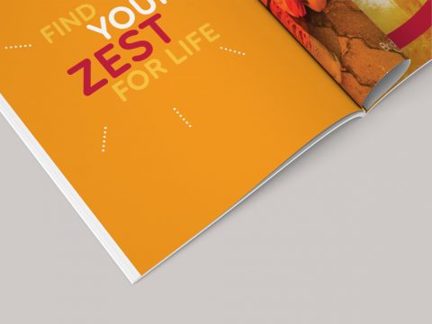
This booklet was designed to communicate BK Coaching’s brand mission and values of their aim to improve their client’s lives by helping them to choose a direction which leads them towards their goals and to find happiness in their lives. Brid Kehoe Coaching work on one-on-one coaching sessions with individual clients and also work with groups, both in the work environment and in youth work, empowering people to grow and become the best and happiest version of themselves. This booklet evokes and carries across the same feelings of joy, passion and enthusiasm for life that the BK Coaching brand represent.
See also Brid Kehoe Coaching Brand and BK Coaching Client Toolkit is to follow soon.
*This work received a graphic design award in the International Design Awards with an Honorable Mention.