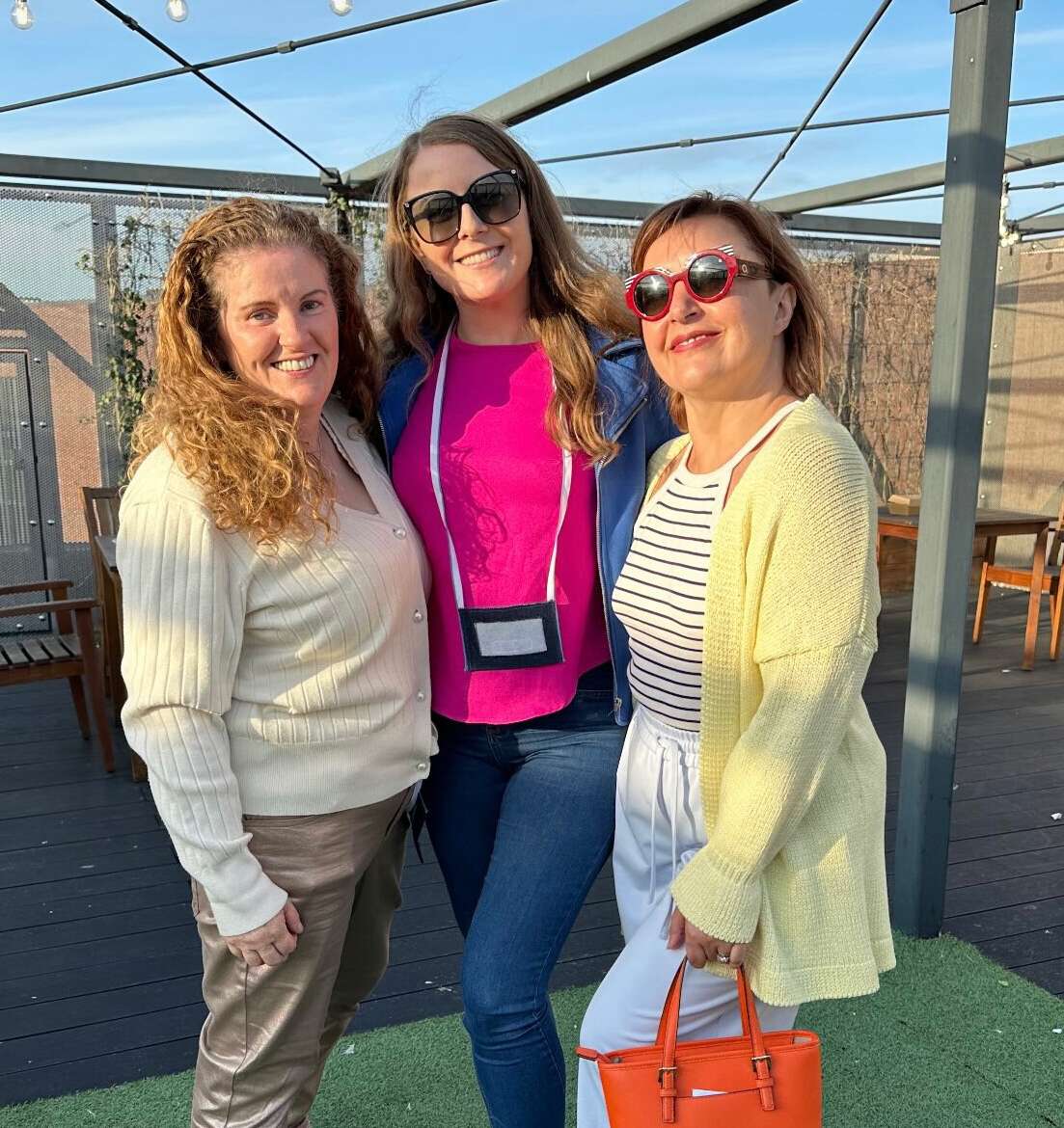
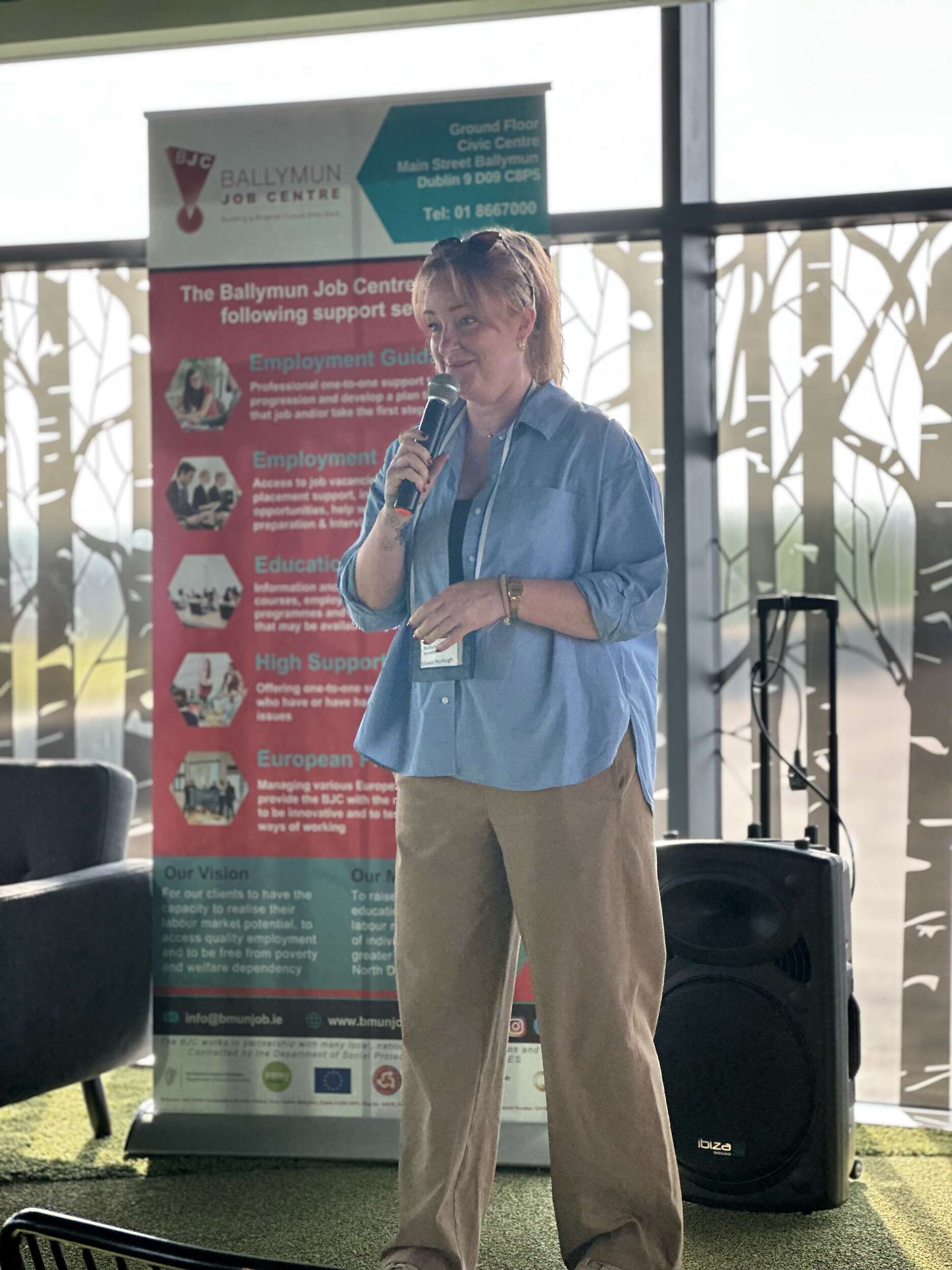
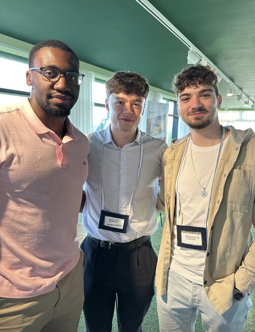
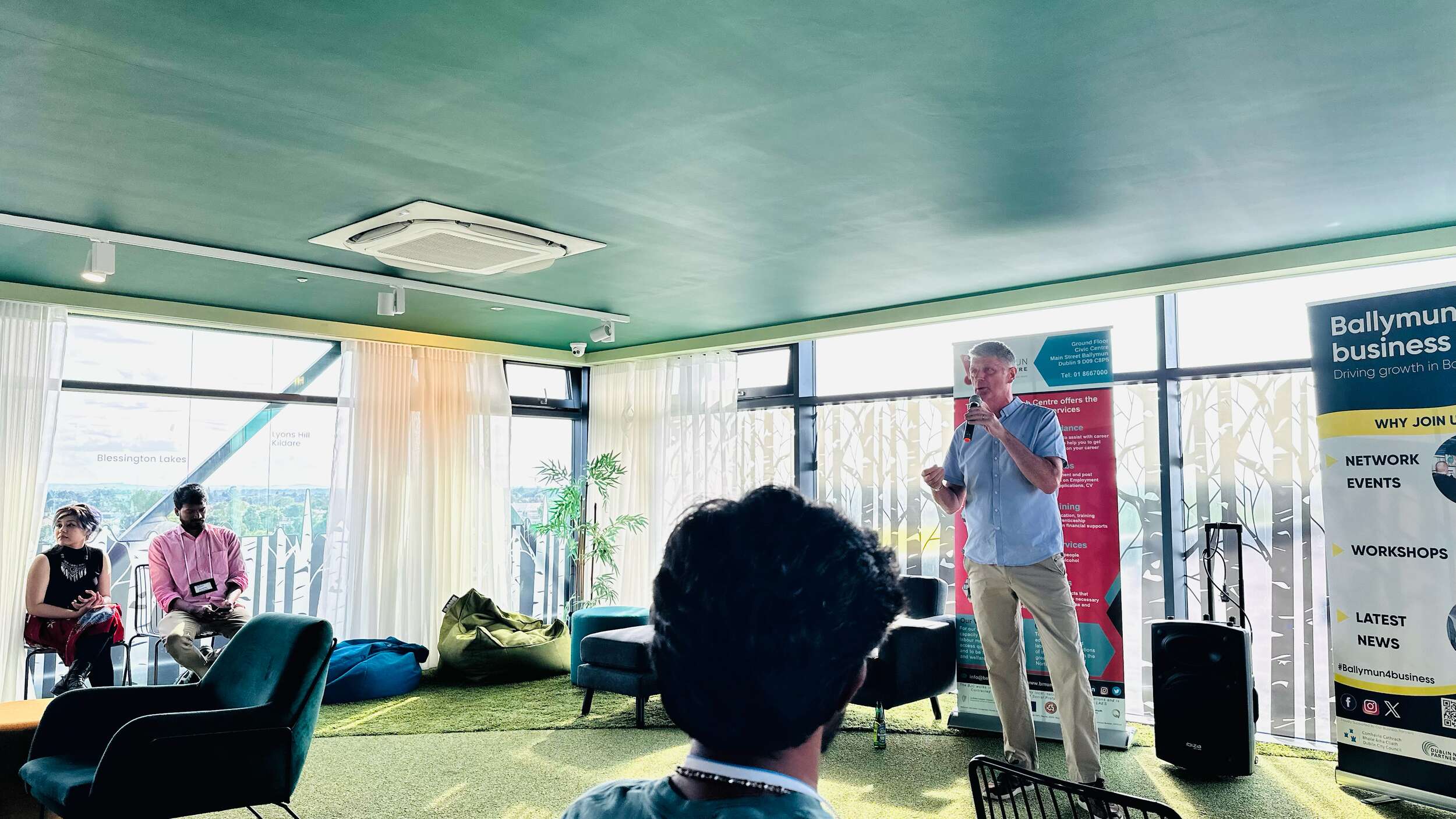
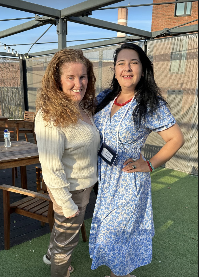
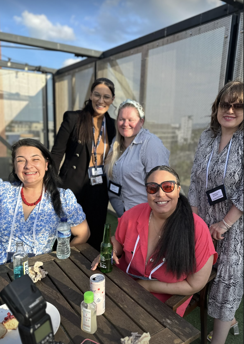
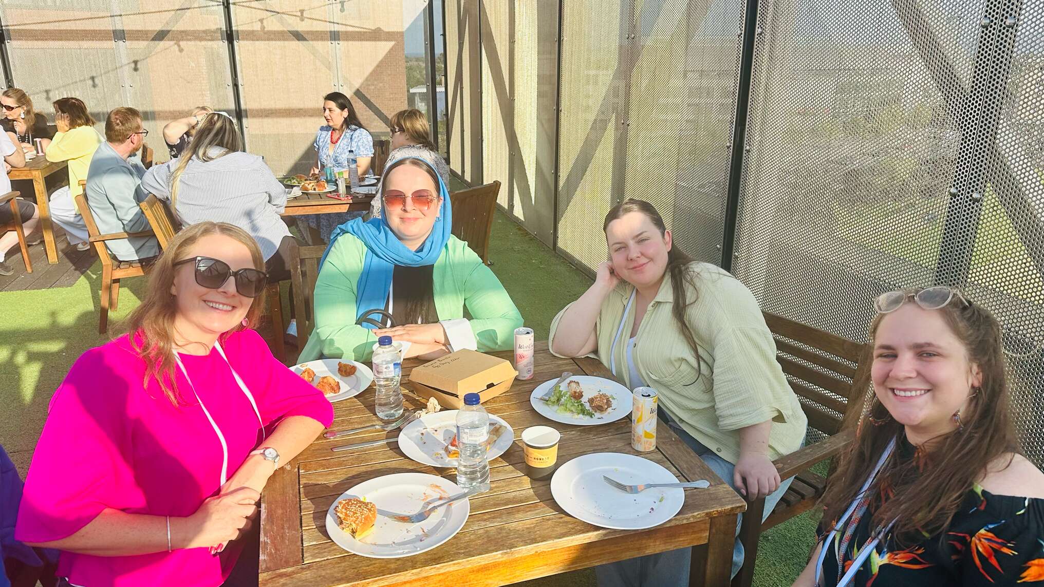
Great to see everyone at the Ballymun 4 business ‘Grill ‘n Chill’ business networking event yesterday evening! The Aspen building was a unique spot for it, with views looking out over the lovely Dublin 🙂 We were blessed with the weather and the community spirit is always brilliant to be part of at their events.
Thanks to Sabrina Morris and all the B4B team for bringing it all together! Inspiring words from Robert Murphy and Eileen McHugh among many others and photography from the charismatic and talented Marie-Clare Byard.
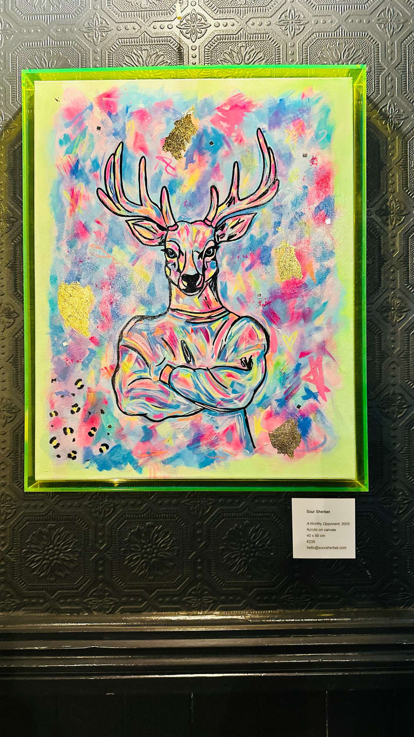
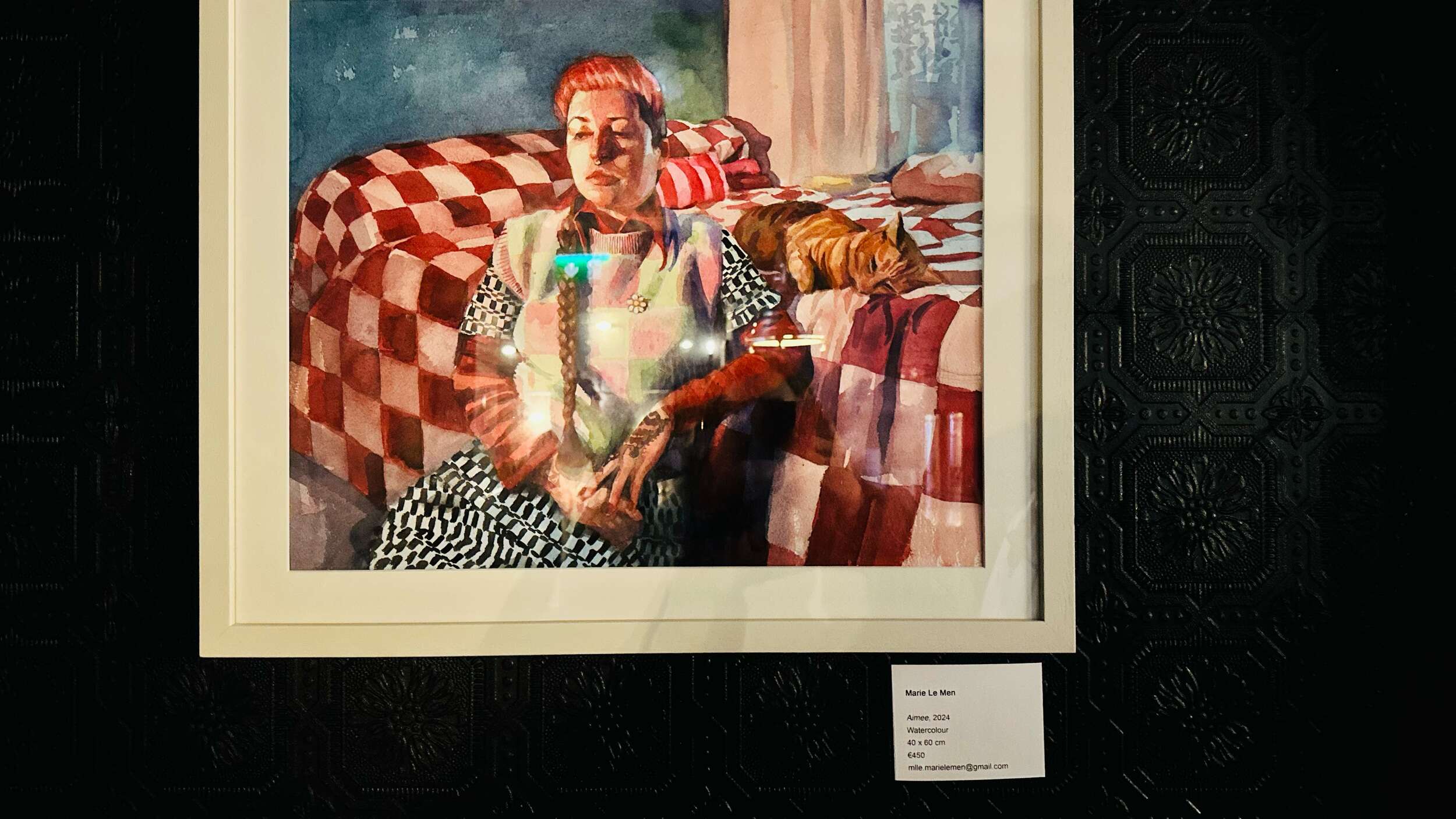
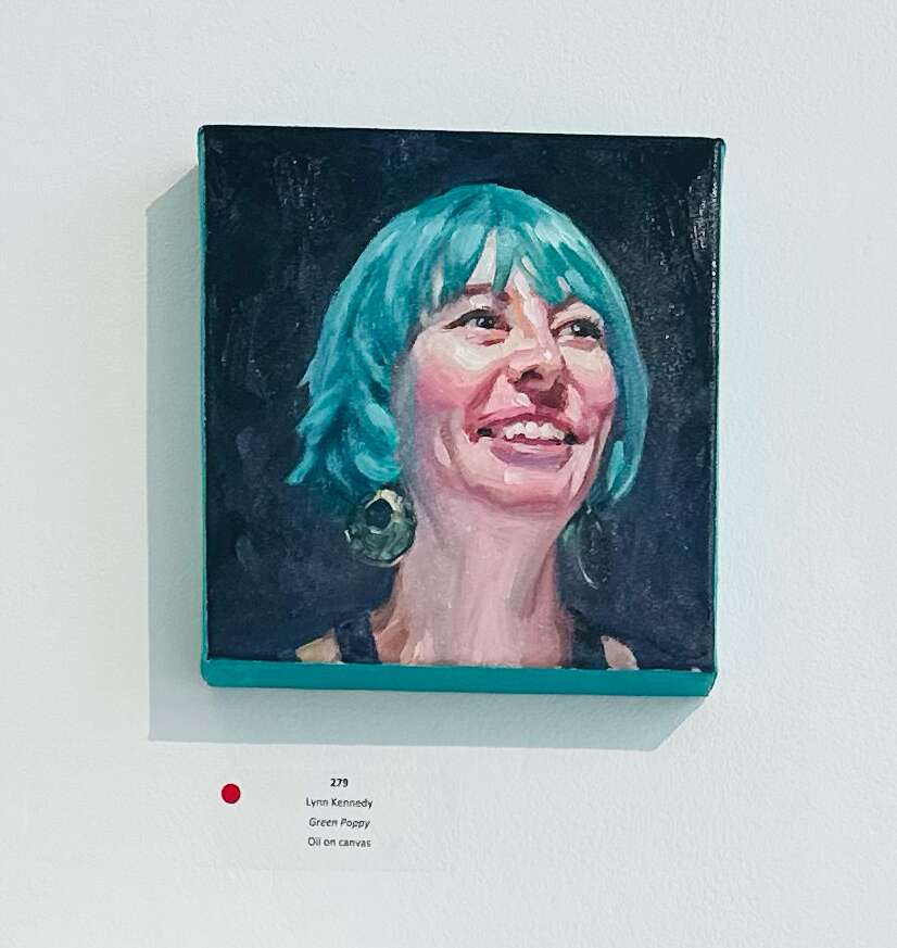
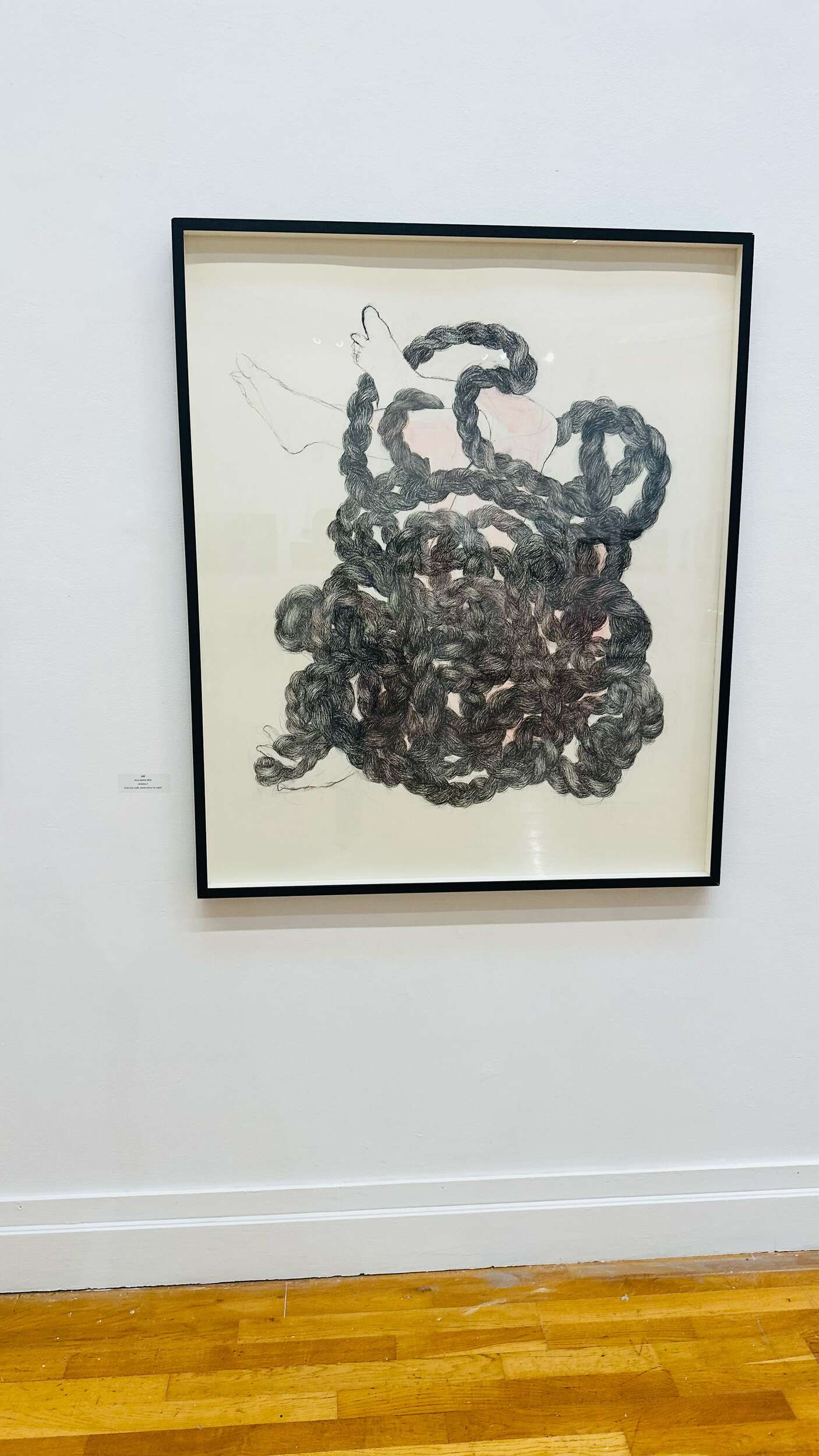
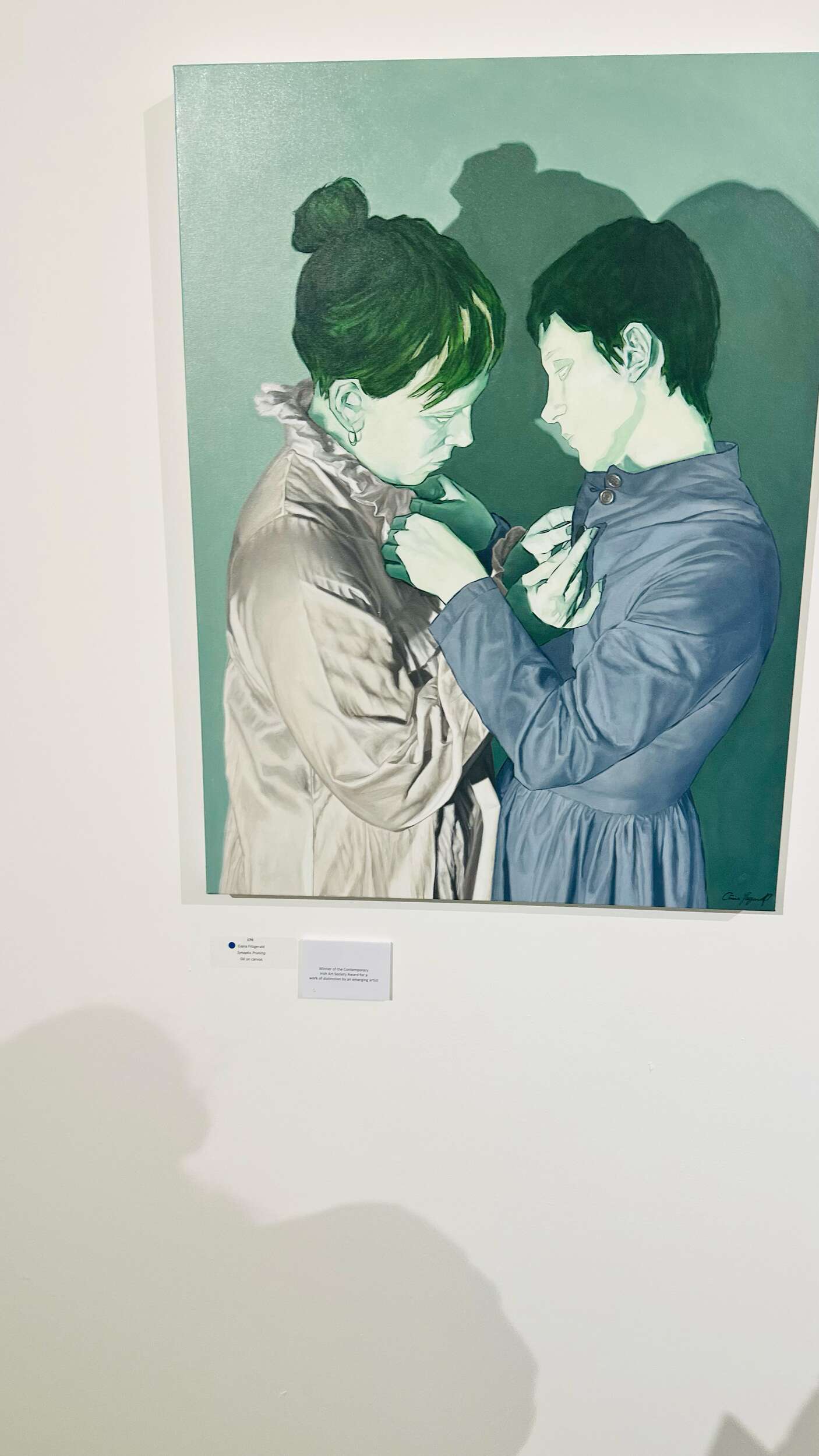
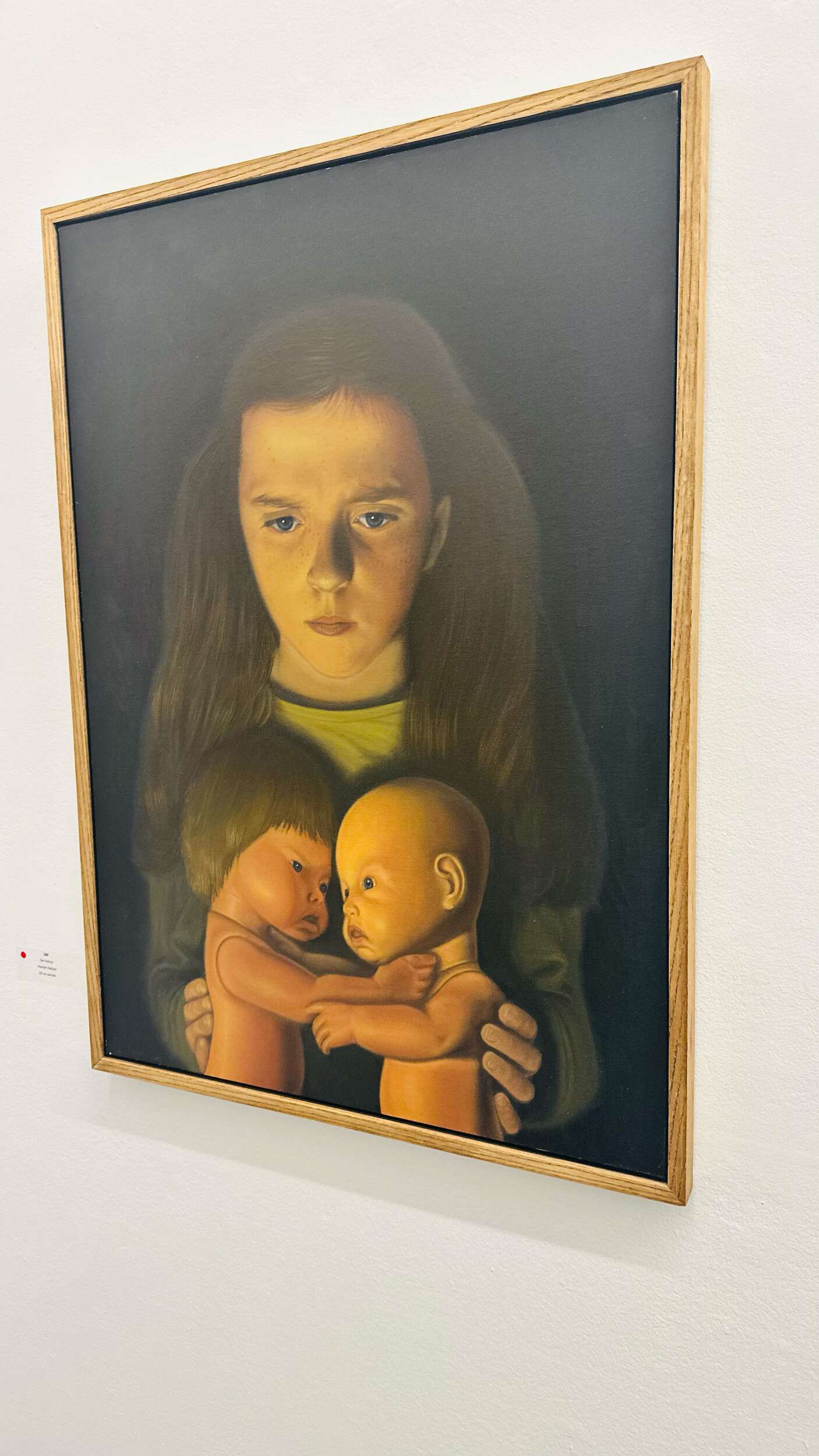
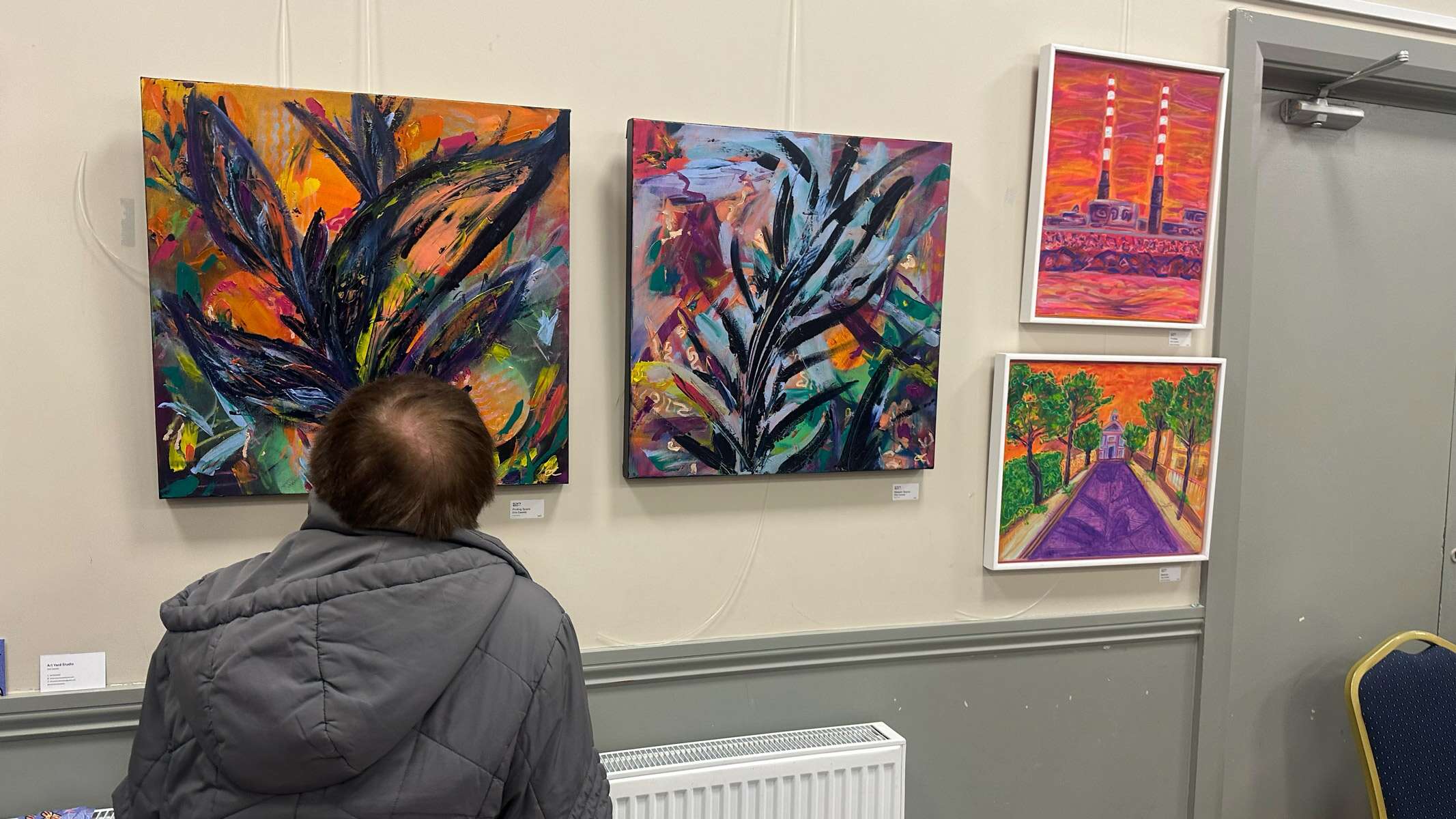
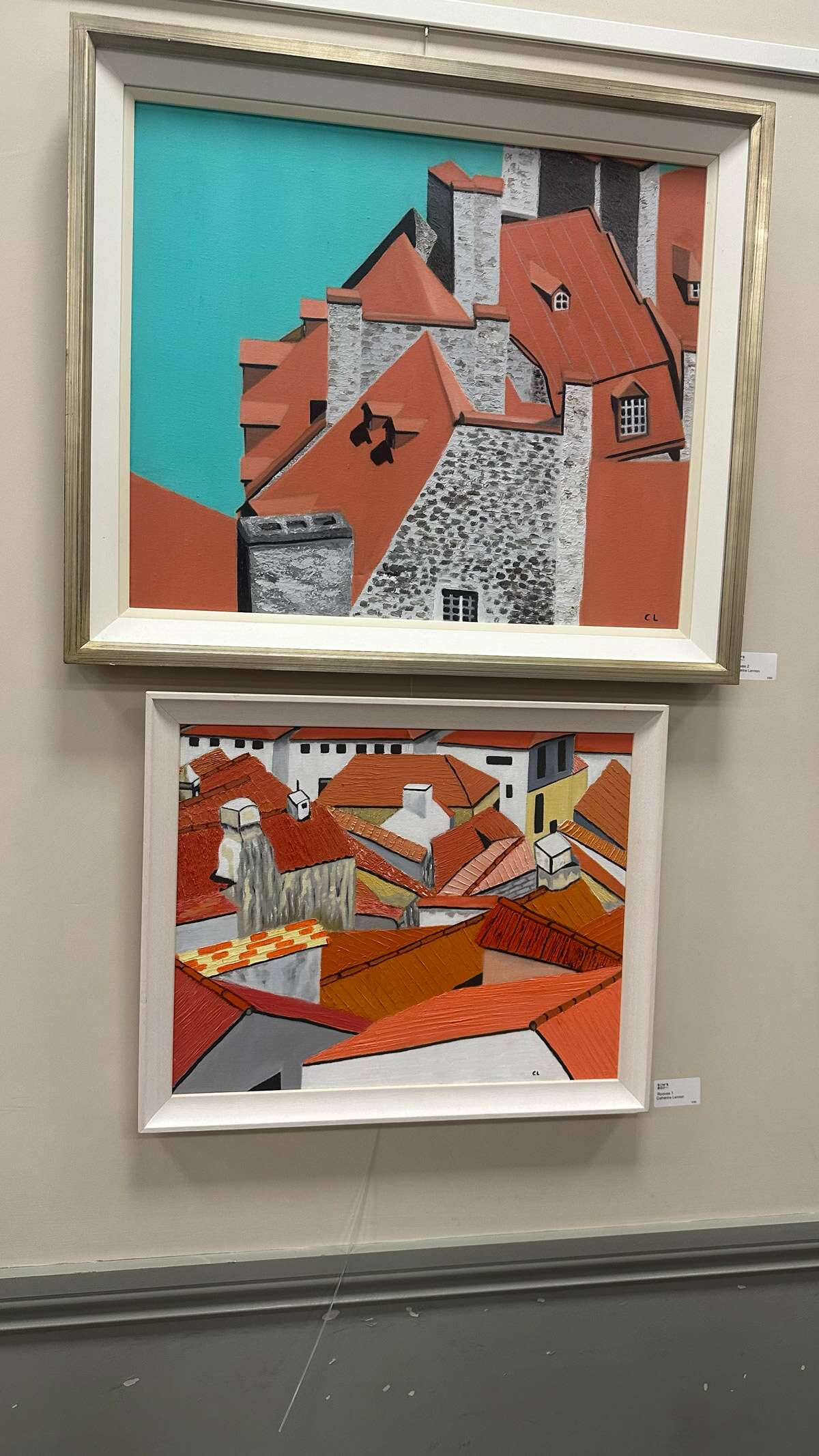
I love to visit art and design exhibitions to stay creatively inspired. It’s always exciting to see how there are so many different styles of art and every artist is unique and brilliant in their own way. Below are some exhibitions I’ve visited over the past few months. I enjoy painting and drawing myself, so seeing these artworks motivates and inspires me to what is possible to achieve. It also often inspires my design work. I find keeping active in creative interests and outlets outside of graphic design fuels and enhances my design work.
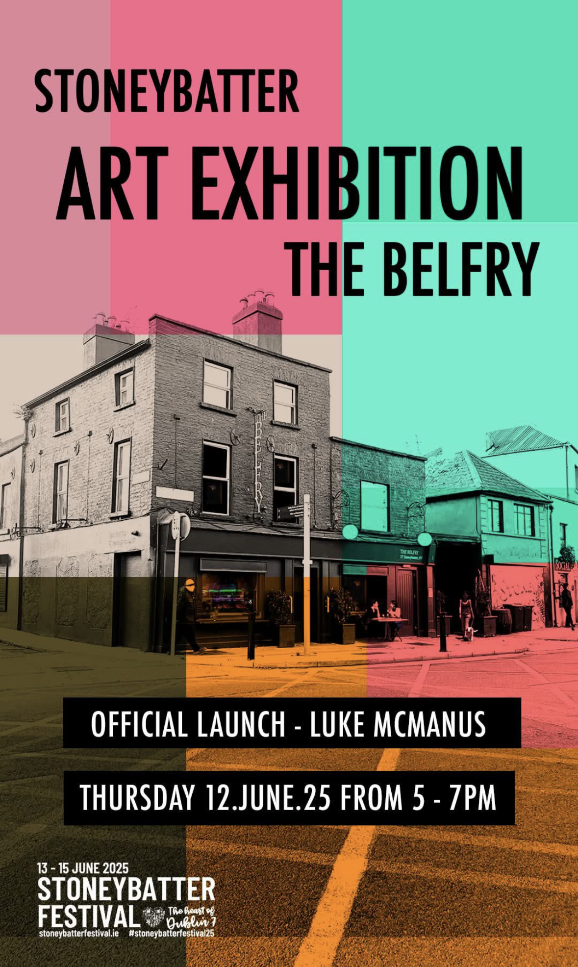
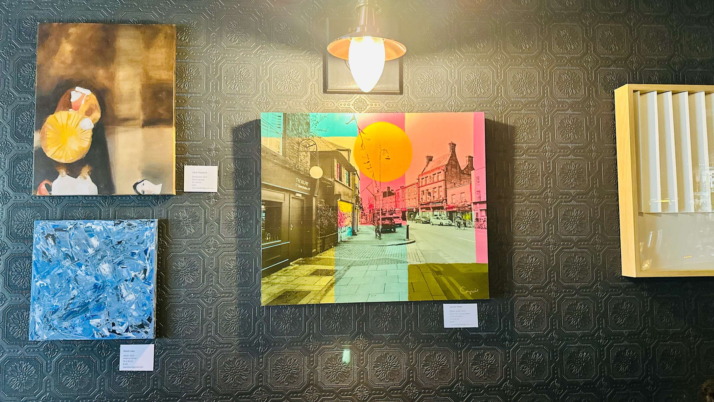
Stoneybatter Arts Festival Exhibition at the Belfry
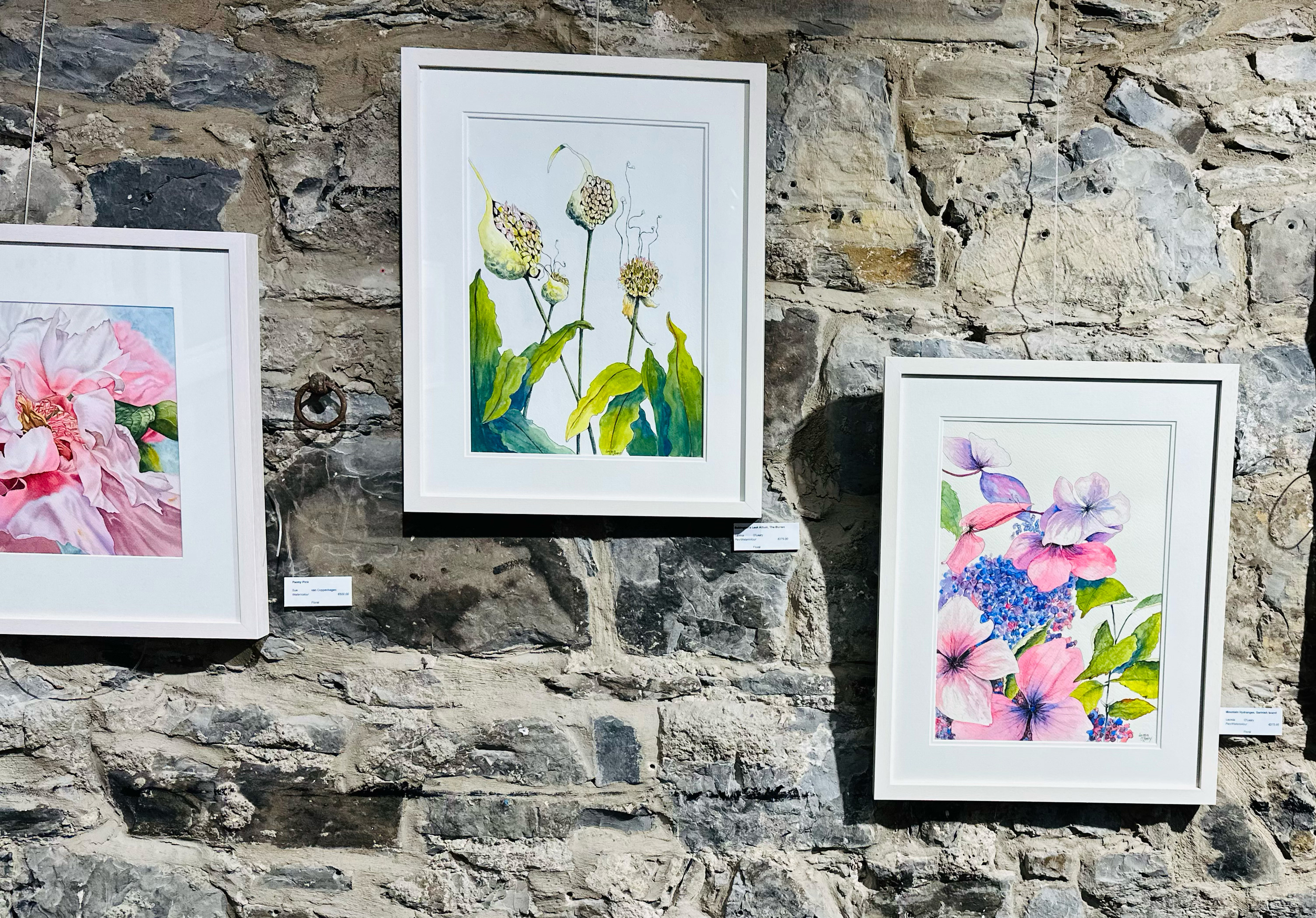
3. Bloom Art Exhibition at the Phoenix Park Visitor Centre
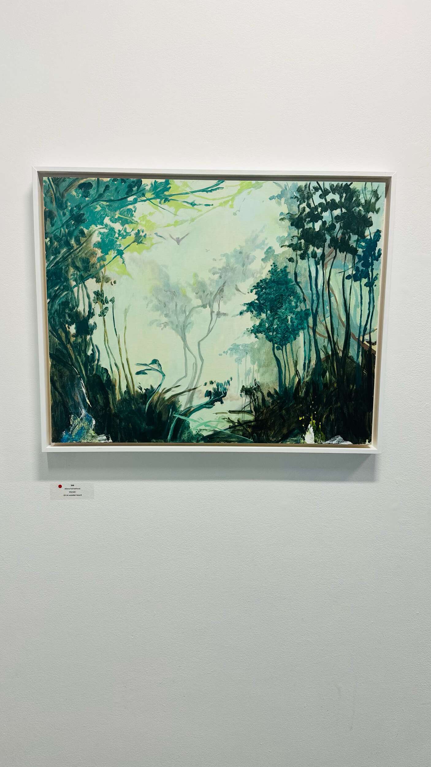
Great to see the stunning botanical art from Lavinia O’Leary at the 11th annual Bord Bia Bloom 2025 Art Exhibition in the Phoenix Park Visitor Centre in Dublin recently.
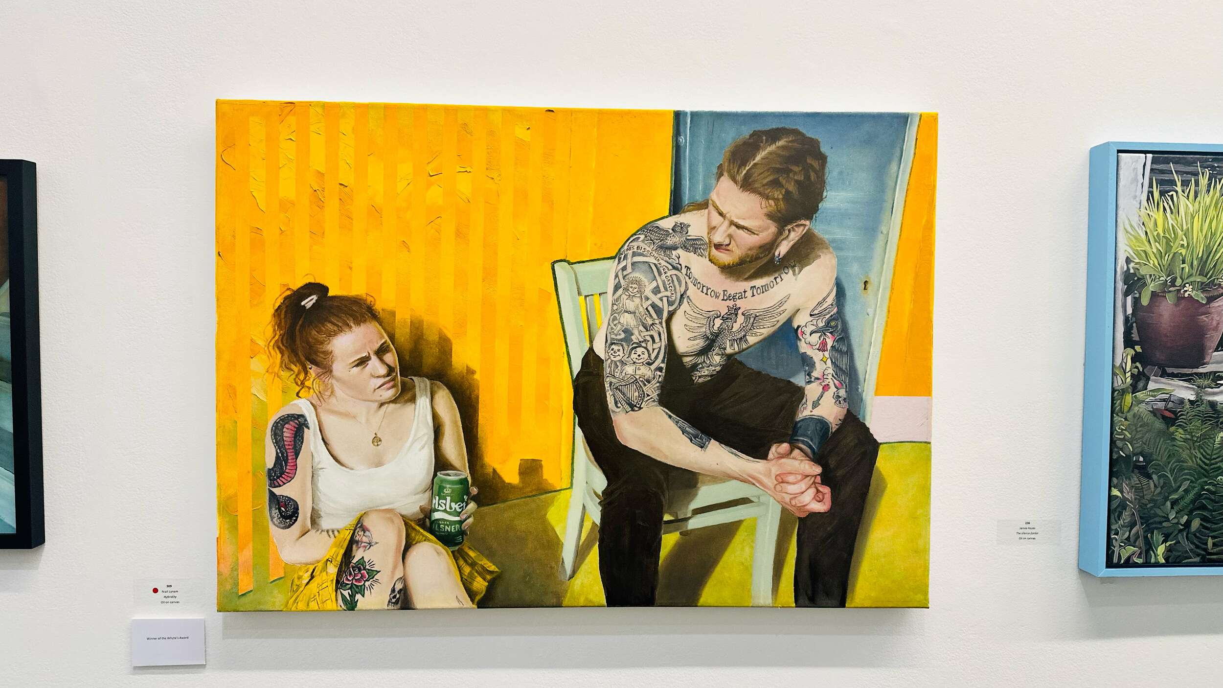
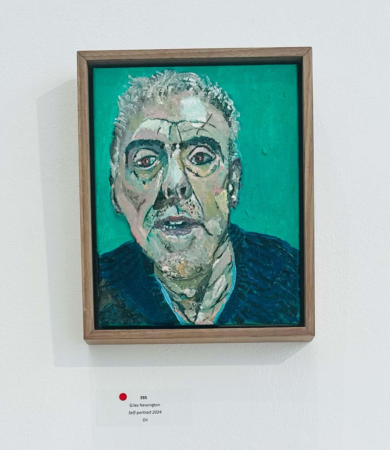
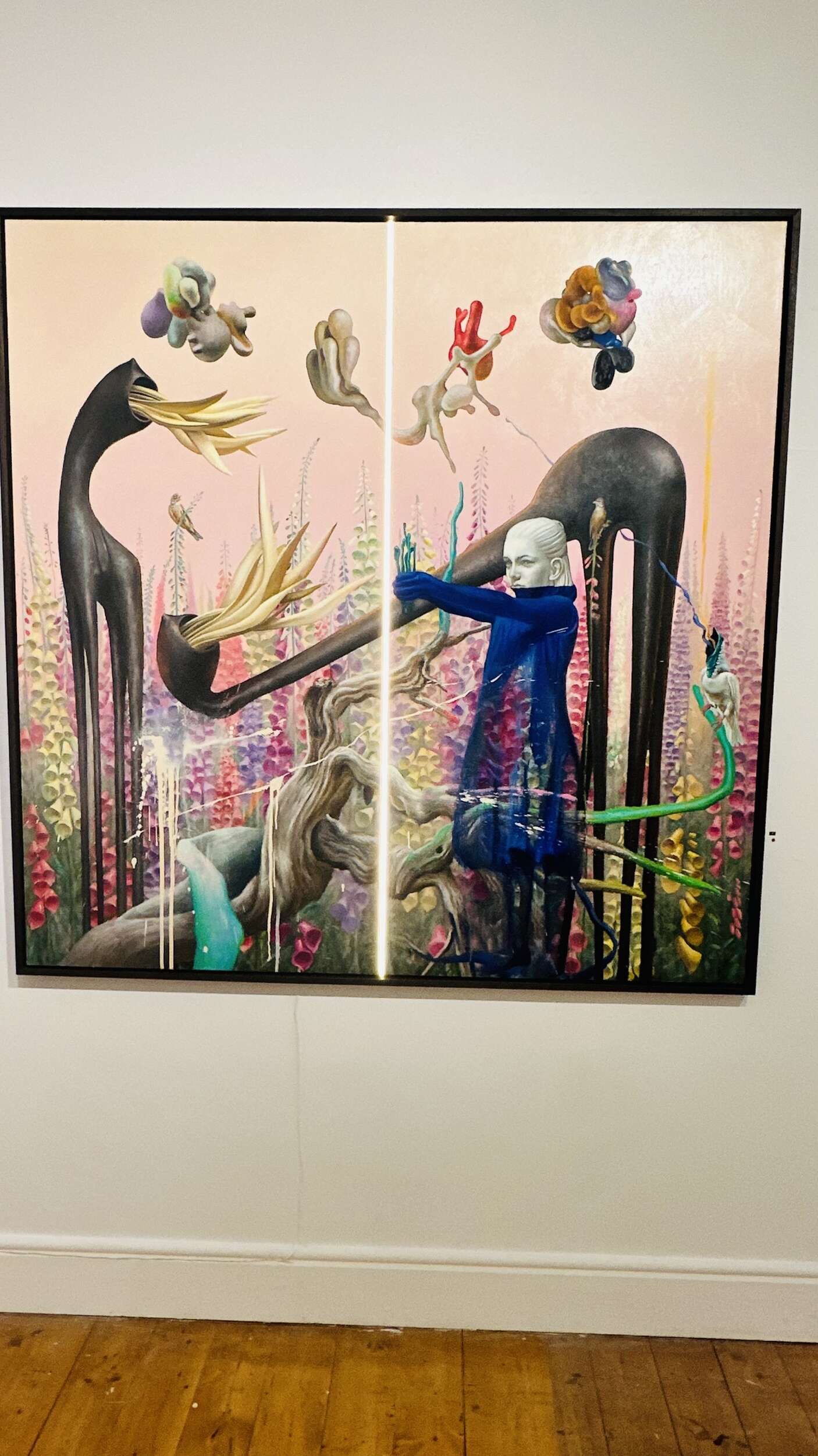
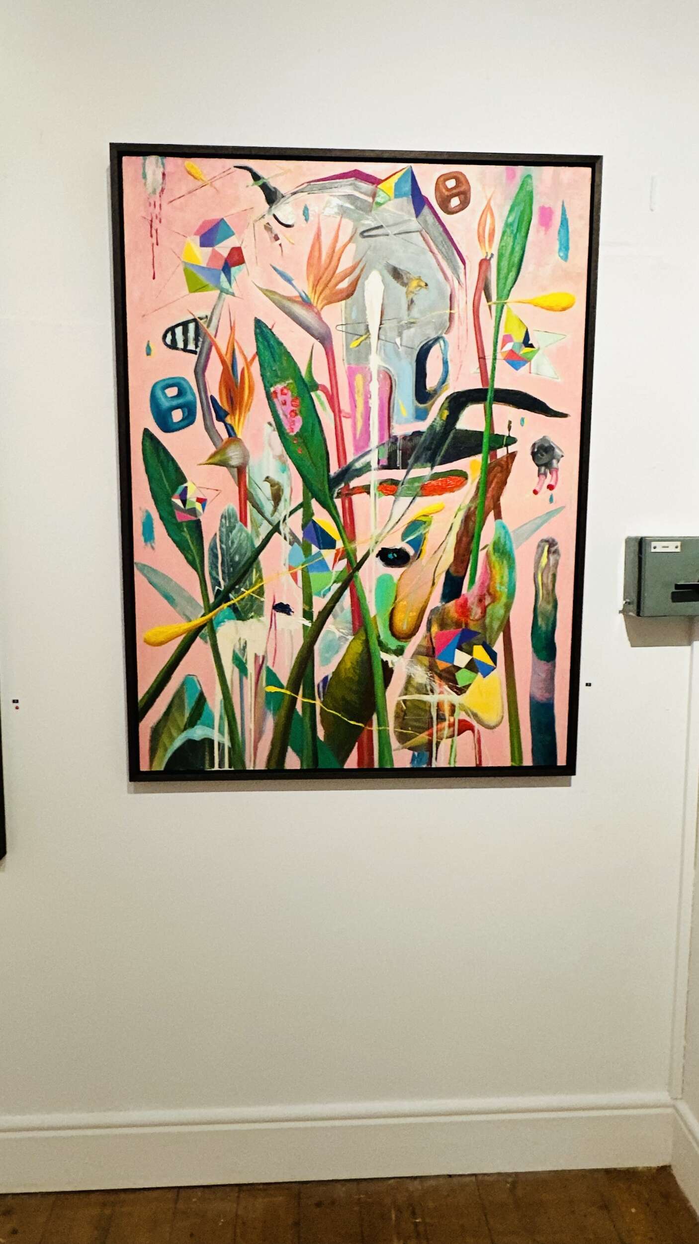
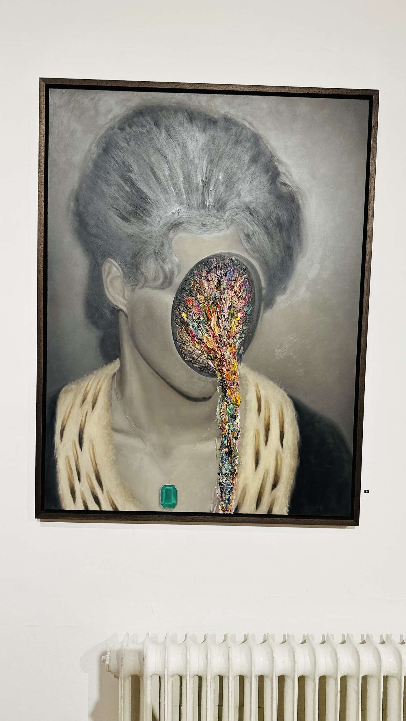
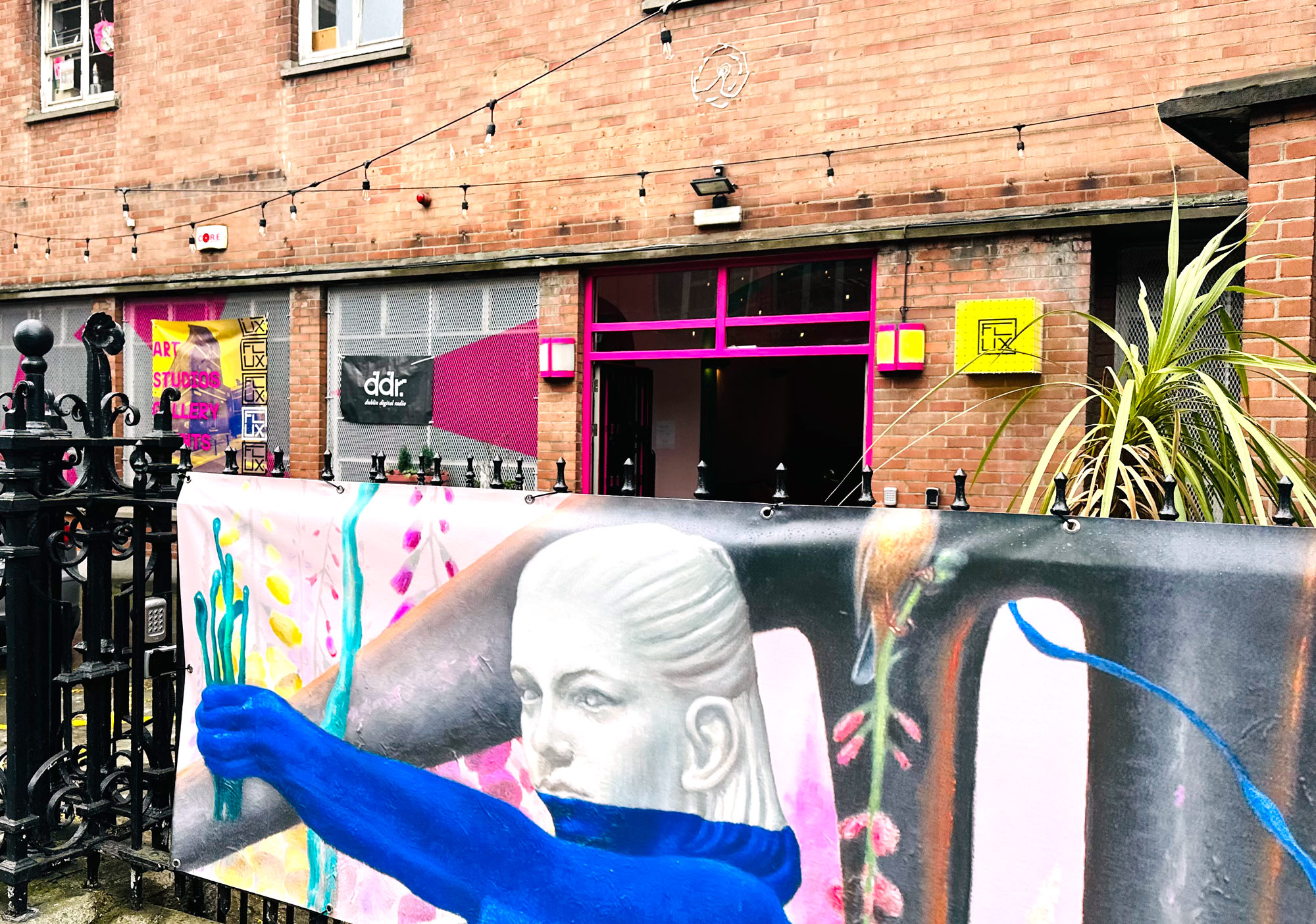
Rasher aka R. M. Kavanagh’s art exhibition ‘Don’t Anger the Gods’ showcased at FLUX, Dublin 2, in May 2025. His emotionally-charged figurative oil paintings focus on the human condition, blending abstraction, realism, and surrealism to create this unusual and uniquely thought-provoking style in this recent body of work.
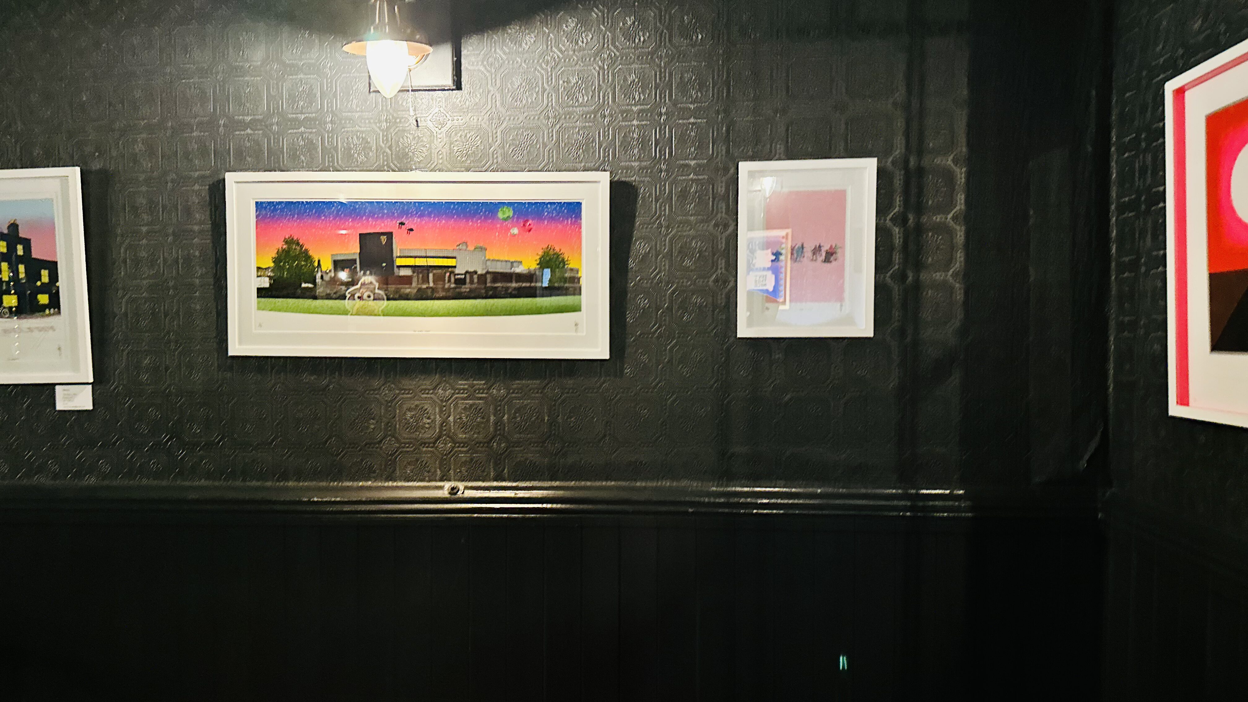
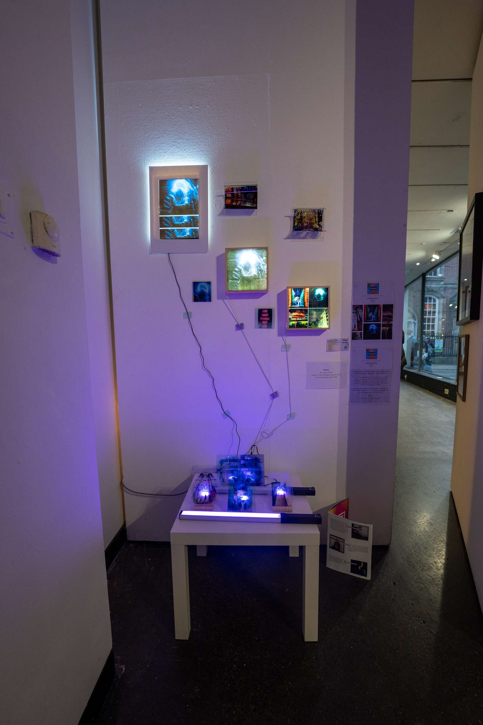
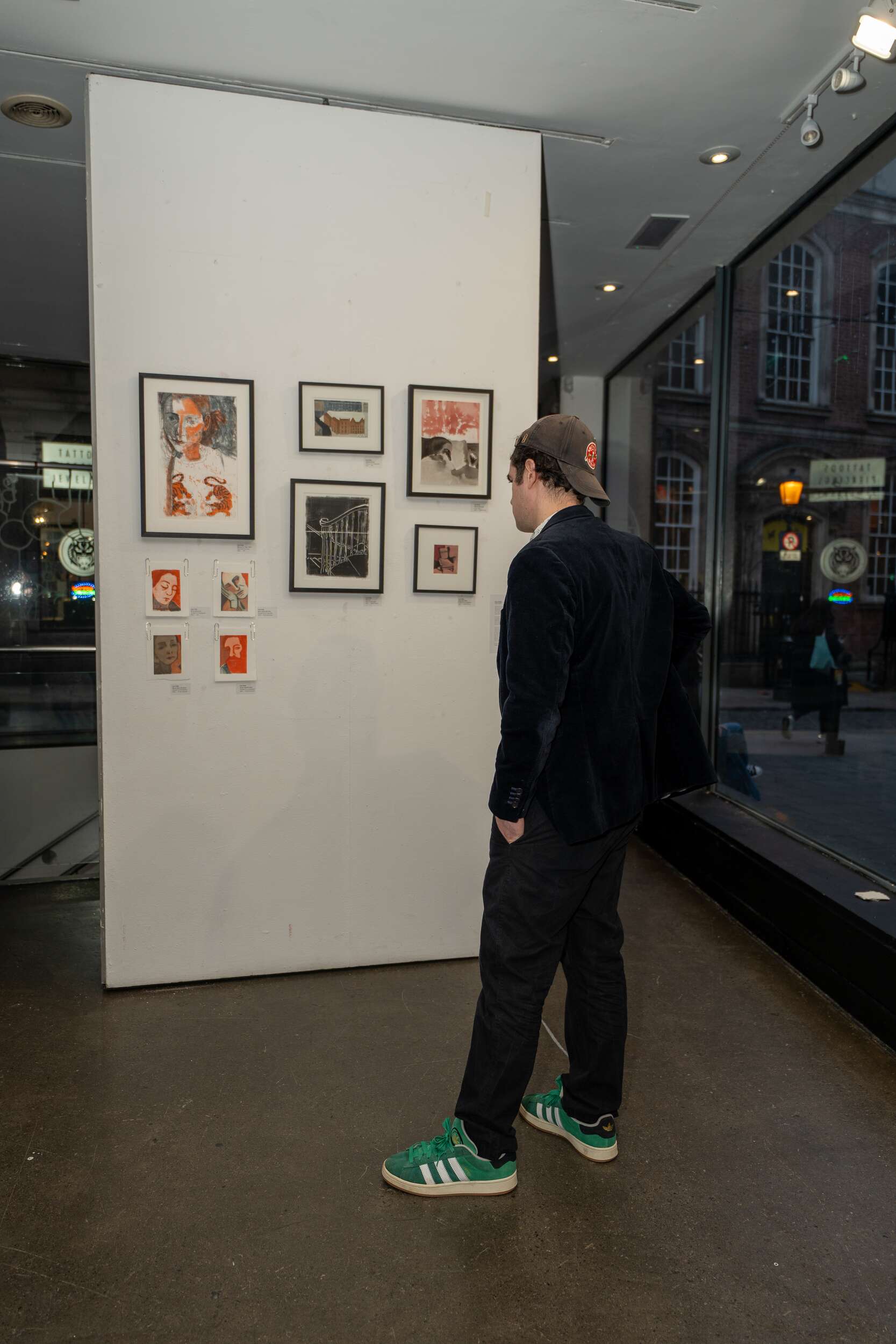
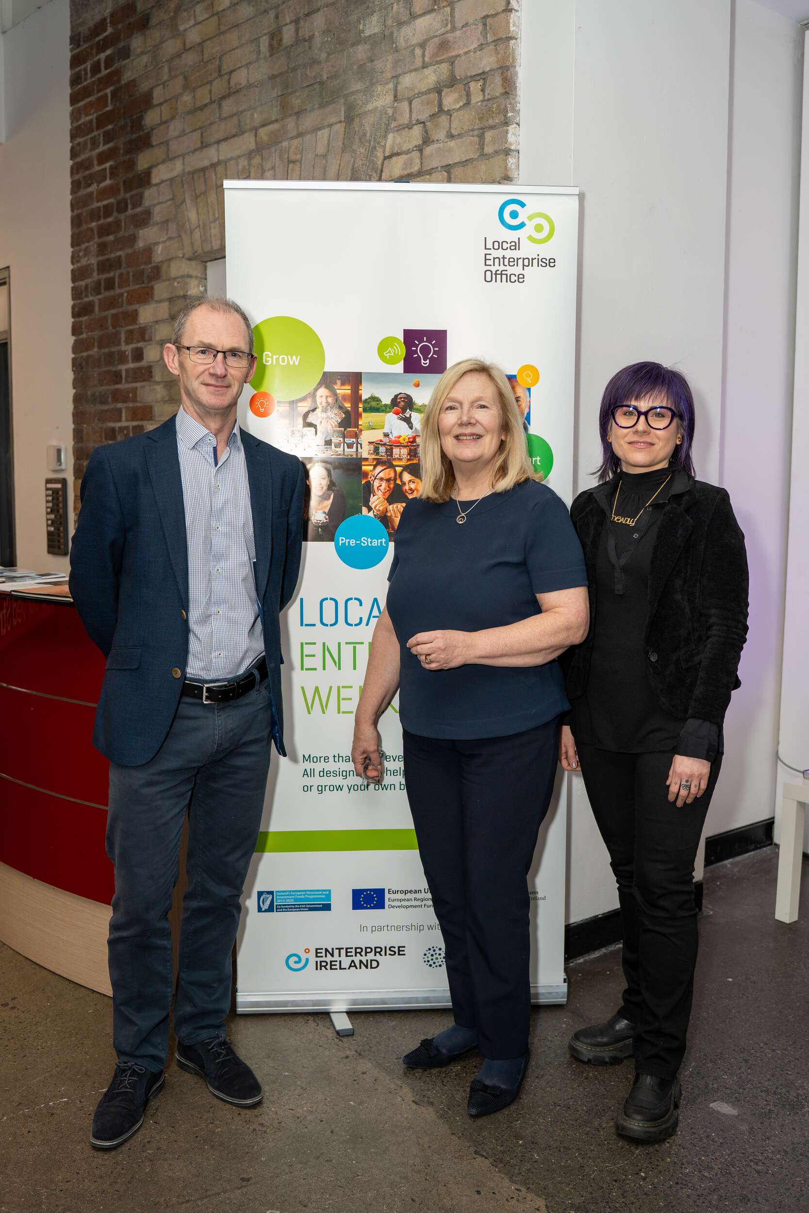
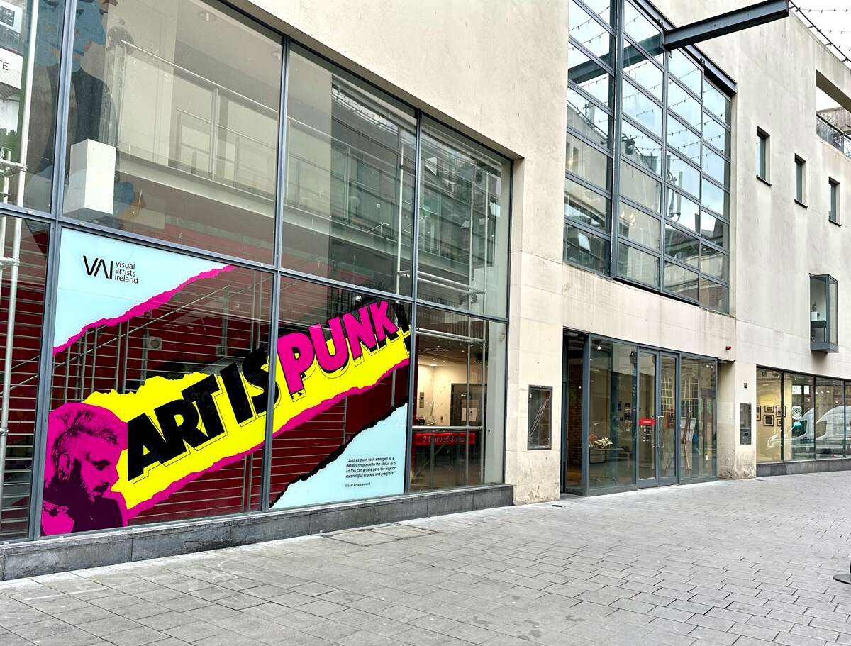
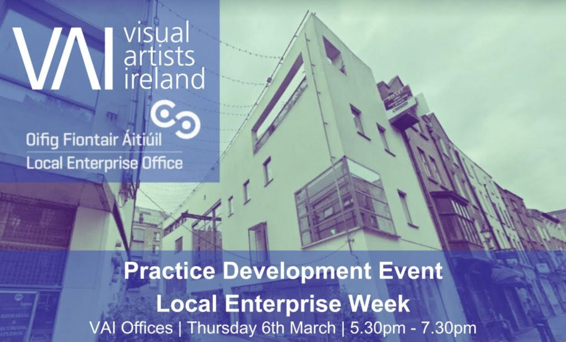
Let’s Talk Creative Dublin City LEO & VAI Creative Business Programme Venue: 2 Curved Street, Dublin 2
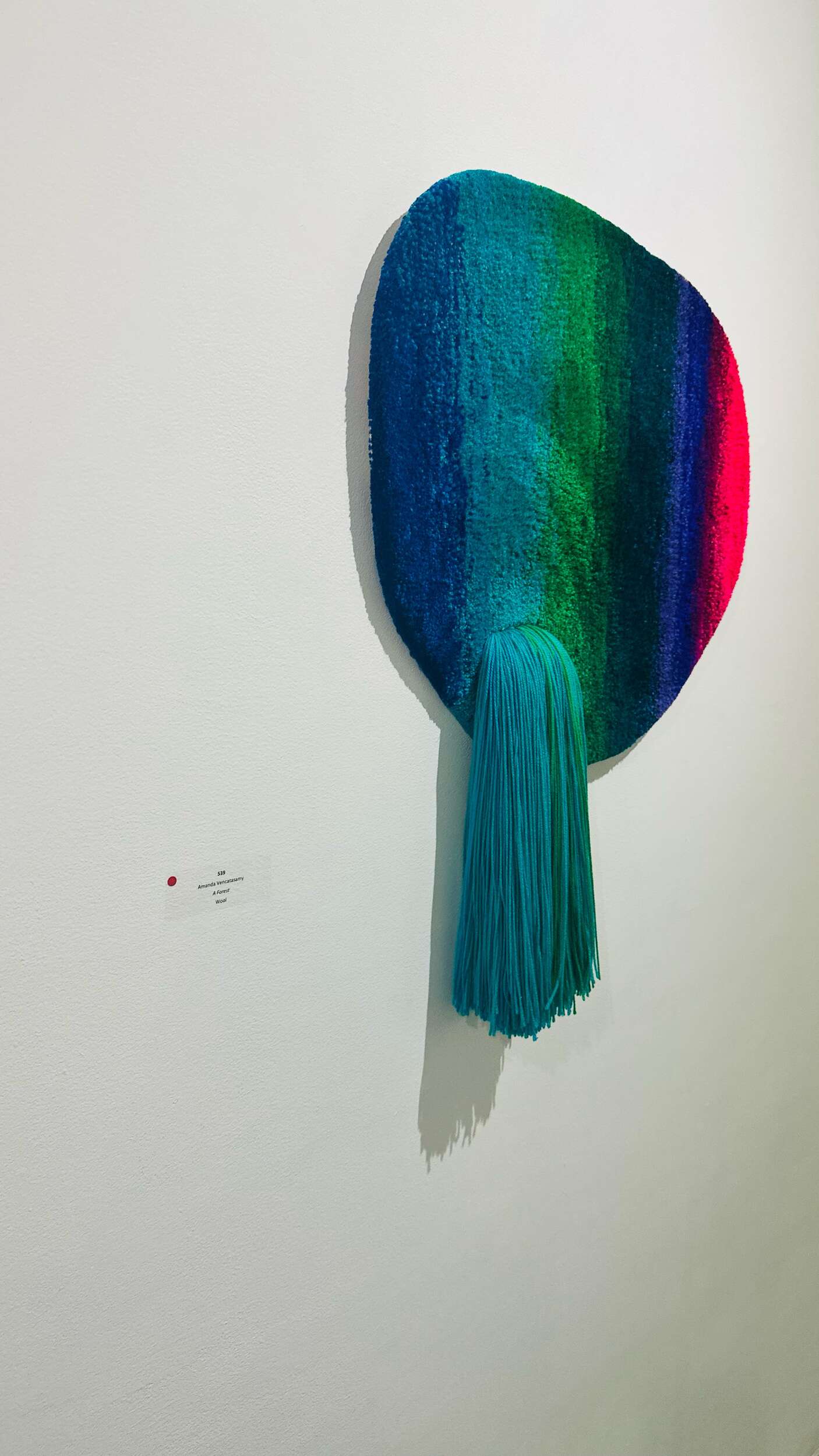
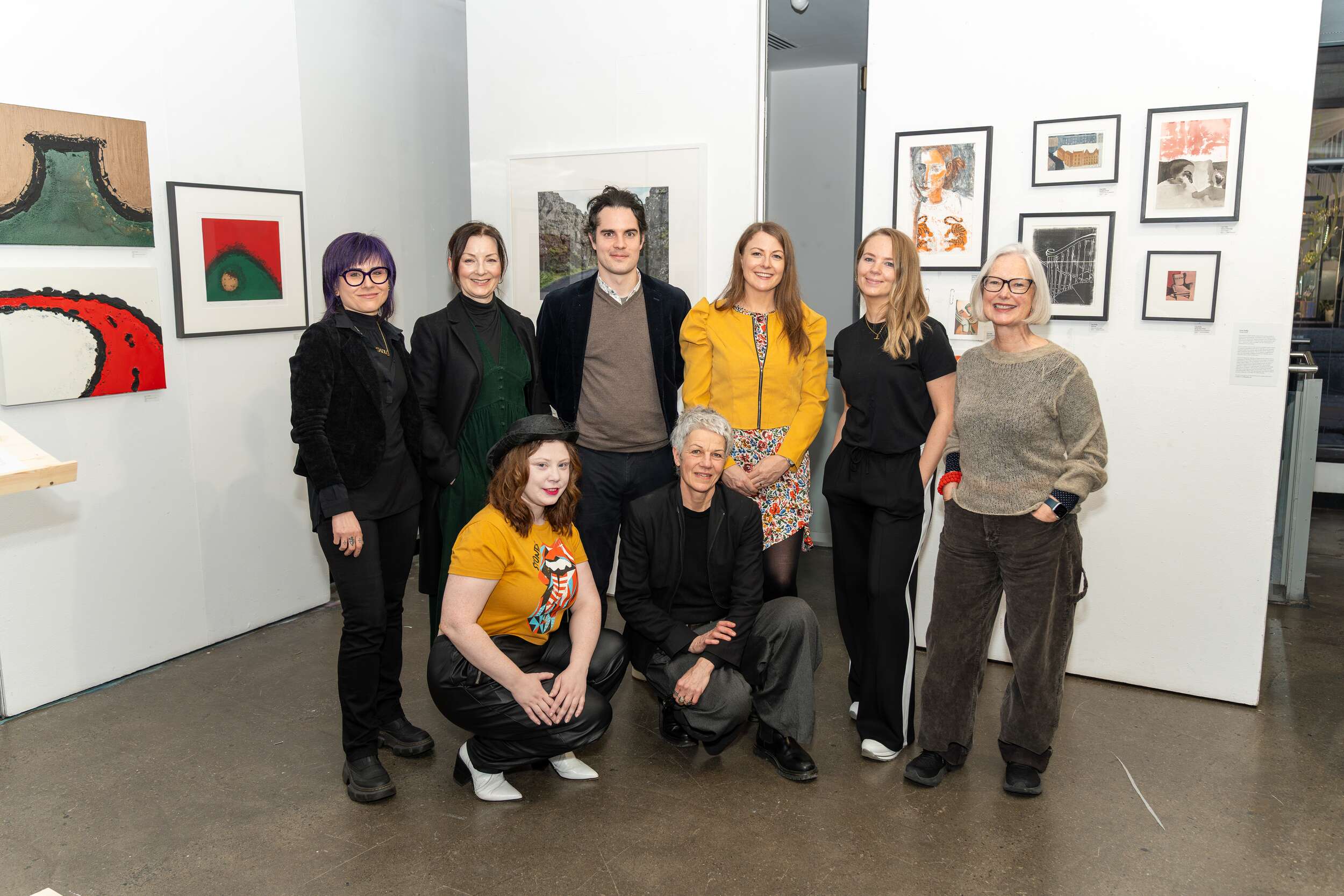
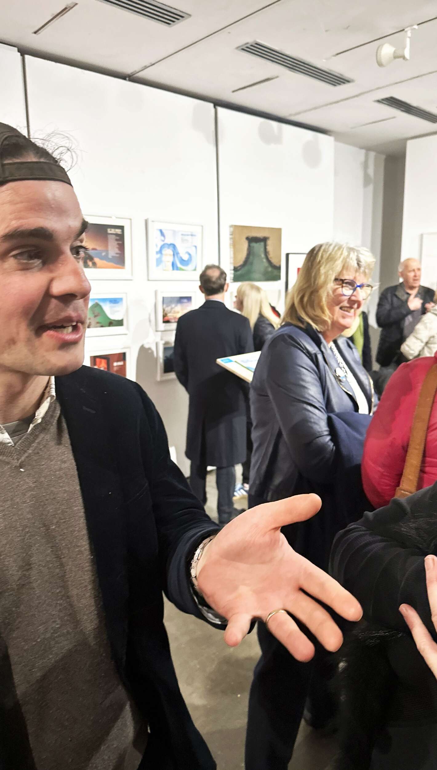
It was great to be part of this art and design pop-up group exhibition, organised by Dublin City LEO & VAI Creative Business Programme, curated by Valeria Ceregini, featuring myself Clare Lynch along with fellow artists, creatives and designers: Amanda Vencatasamy, Carolyn Walsh, Chris Judge, David Killeen, Derval Turbidy, Helen Mooney, Liv Webster, Liza Kelly, Katherine Shankey and Melissa Carton.
This exciting showcase featured a selection of works by a unique and original mix of Dublin’s artists and designers, highlighting the dynamic fusion of art and design in the city’s creative landscape. The exhibition, which took place on the 6th of March at the VAI exhibition space at 2 Curved Street, Dublin 2, celebrated the ongoing dialogue between the two disciplines, emphasising their ability to inform and inspire each other.
As part of the Dublin City LEO & VAI Creative Business Programme, which aims to support emerging creatives, Creative Convergence showcased visual art, design, limited-edition prints, photography, sculpture, books and originals pieces, each of which reflects Dublin’s vibrant cultural identity. This exhibition brought together local talent, offering visitors a chance to experience the diversity of the city’s creative scene in one captivating space.
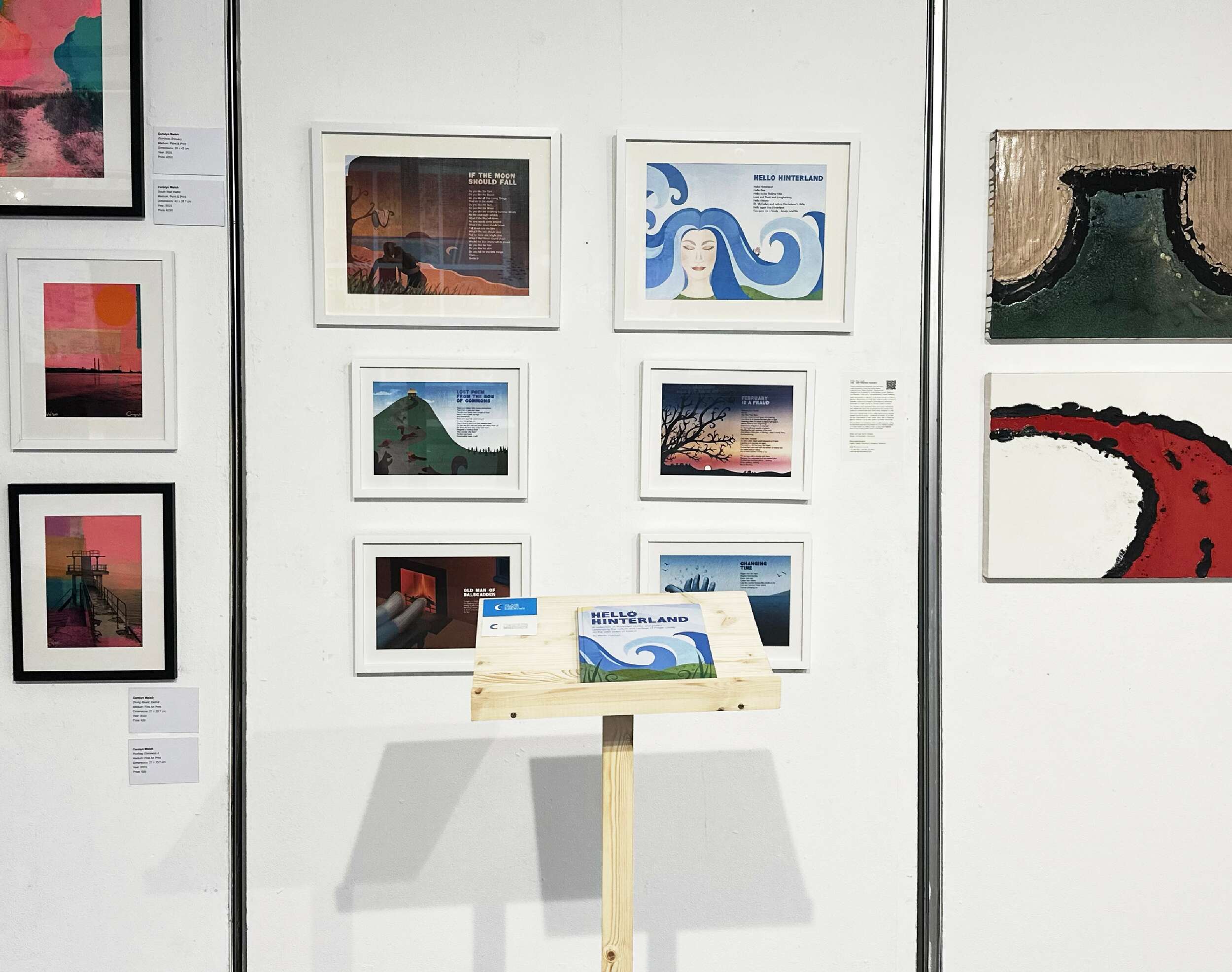
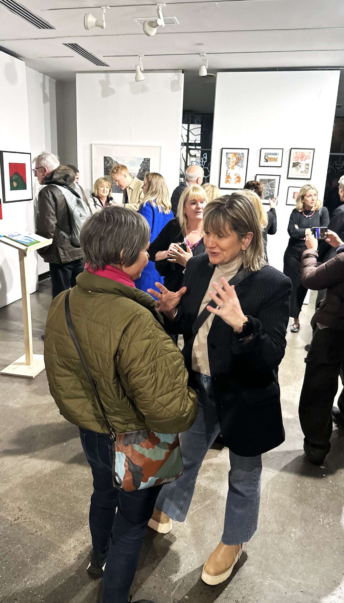
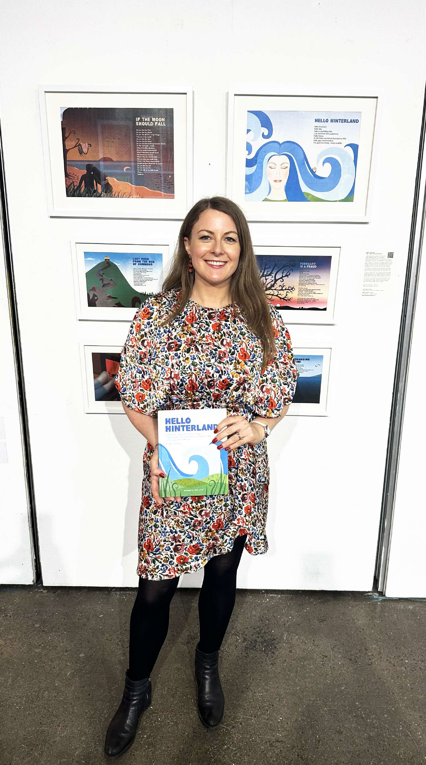
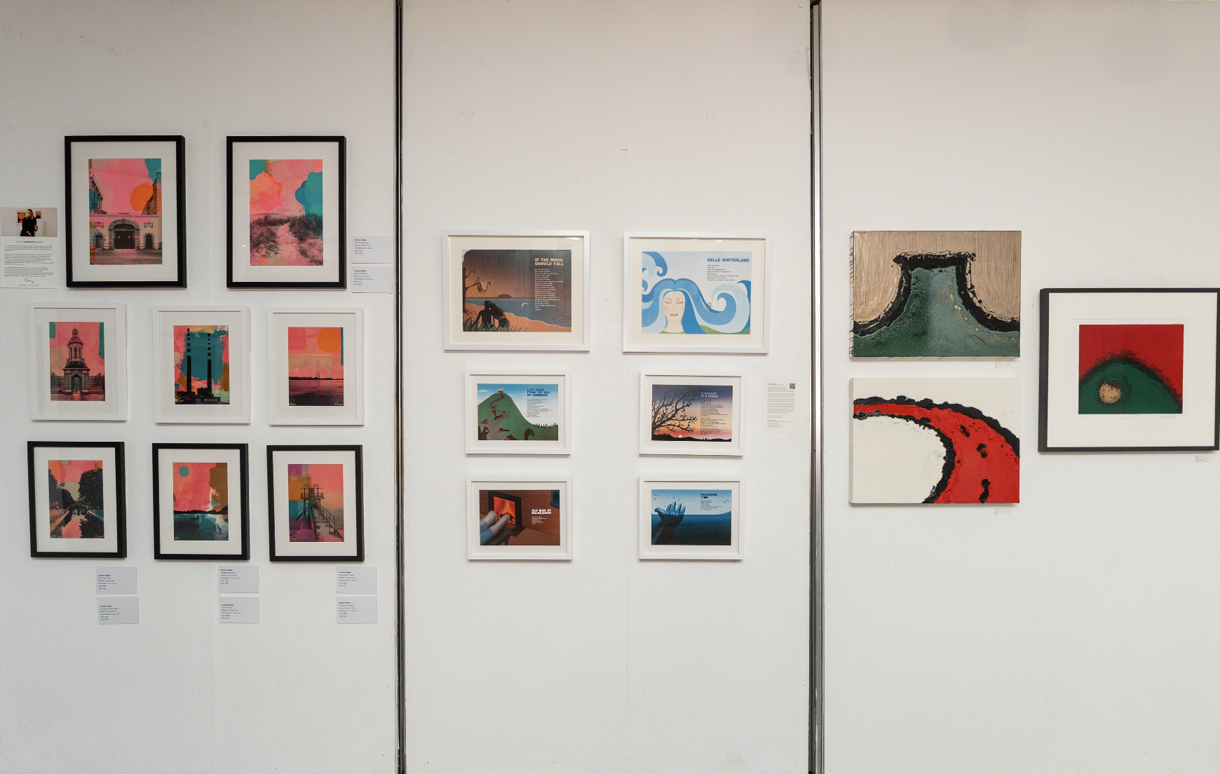
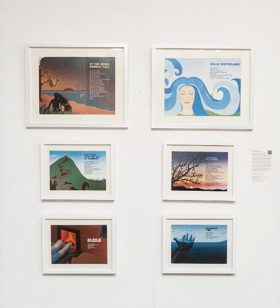
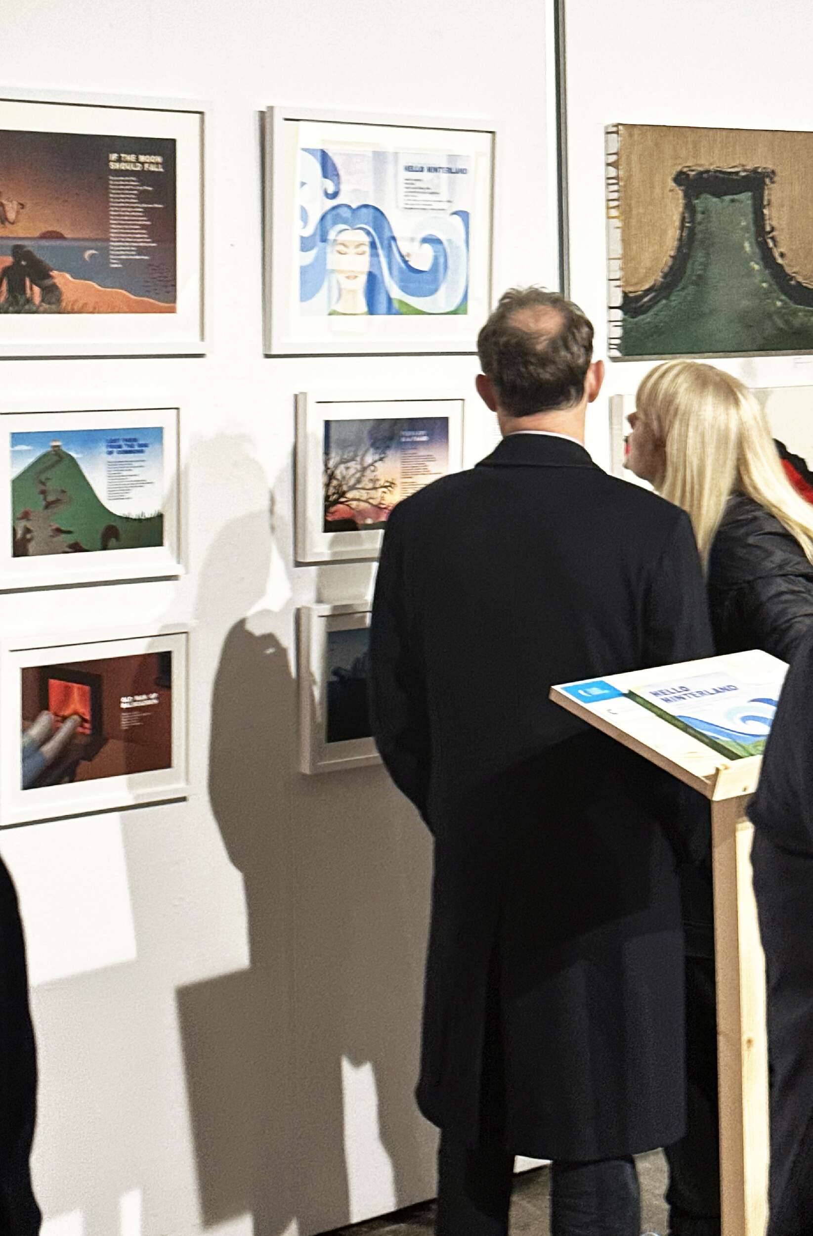
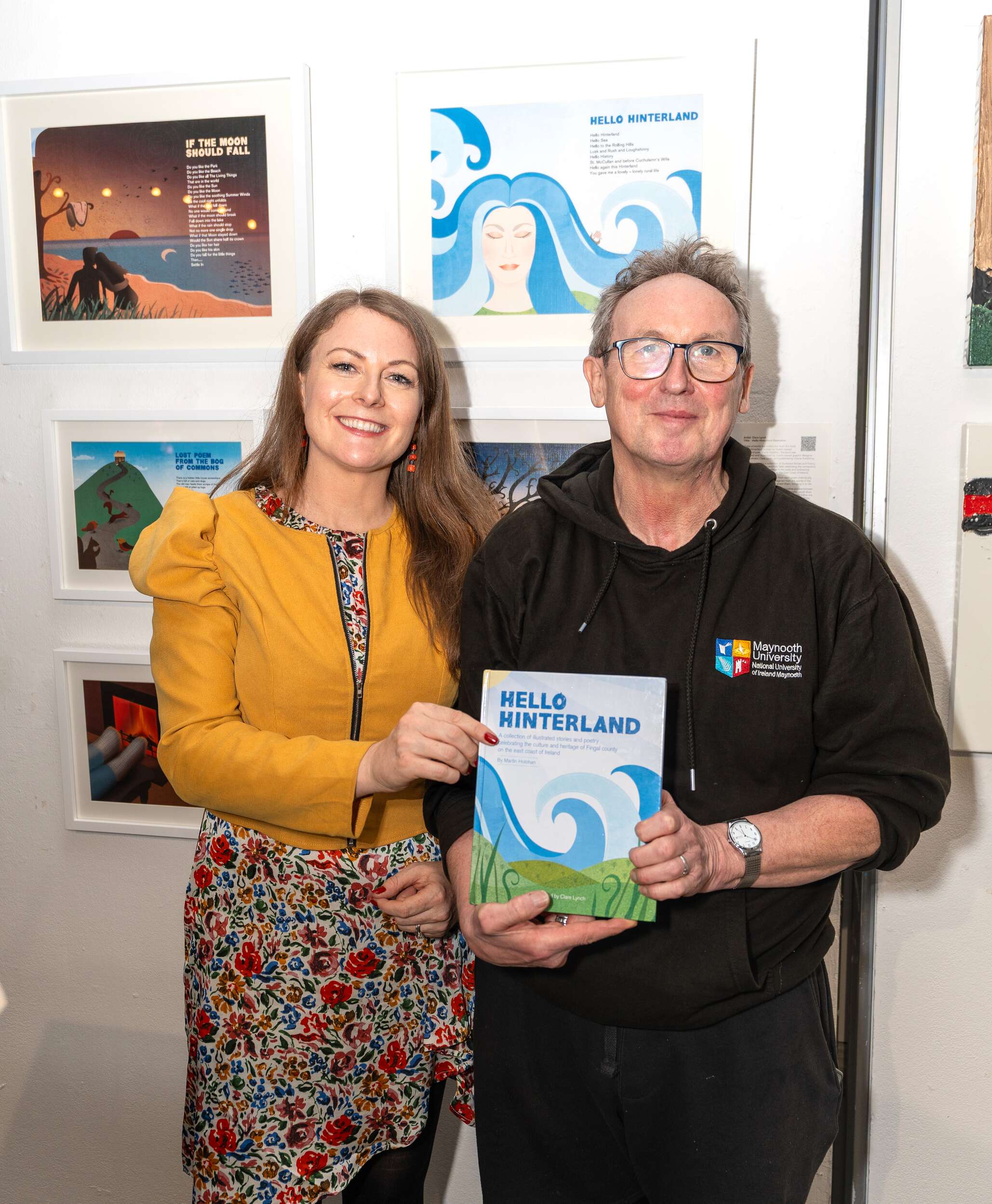
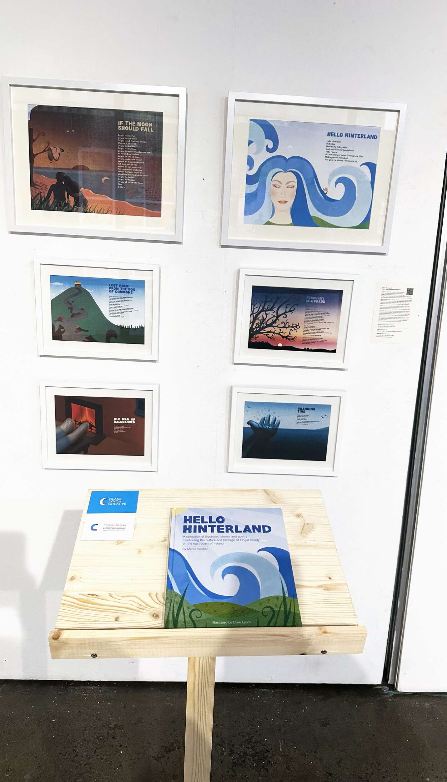
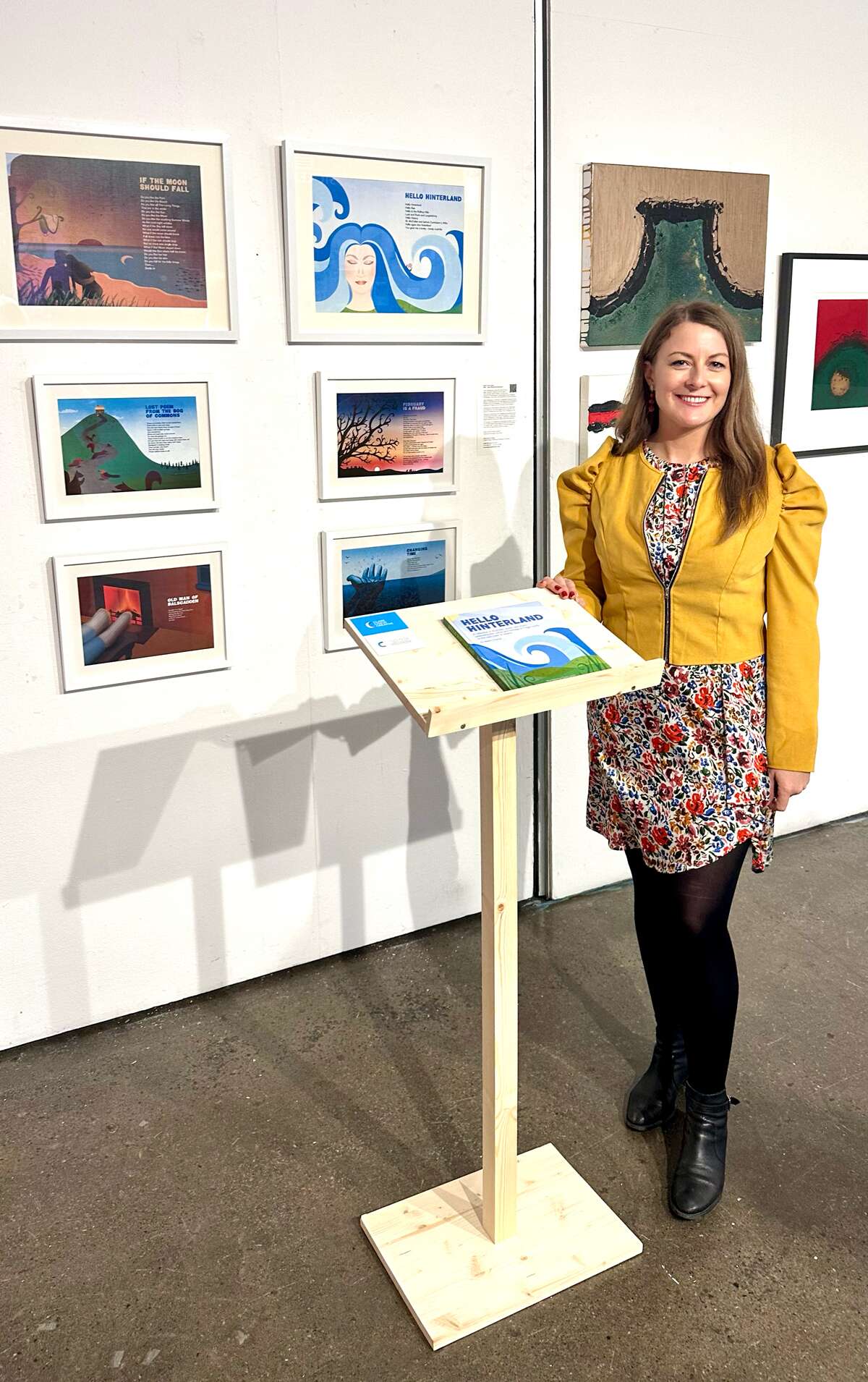
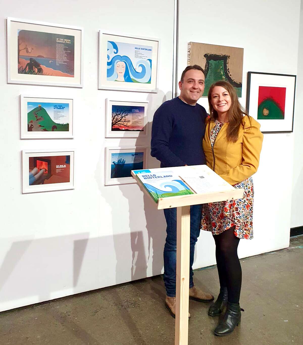
Included are some framed high quality prints of my illustration work from the book, Hello Hinterland, written by Dublin-based poet and writer Martin Holohan, which I designed and illustrated. The book was displayed on a wooden stand, in front of the prints, to allow exhibition attendees to look at the full range of illustrations. Martin Holohan came along on the night to see his words on display with the illustrations. It was good to reminisce with him about the good times during the process of creating the book. It was a great experience to be part of the exhibition and come together with the other talented artists. There was a range of creative business advice talks on the night, which added to the evening.
Valeria Ceregini’sCuratorial Vision: “This exhibition is a demonstration of the power of cross-disciplinary dialogue. The curation of work from diverse artists, designers and creatives serves to elevate the conversation around what defines art and design today. Creative Convergence does not merely present objects but explores the relationships between form, function, and emotional engagement, creating a space where boundaries blur, and creativity thrives. The show is a celebration of how art can influence design and how design can elevate art.
The concept of Creative Convergence is rooted in the idea that art and design are not isolated from one another. They are intertwined—each discipline feeding off the other to create new experiences and interpretations. In Dublin, a city known for its rich history of both artistic expression and innovative creatives, this exhibition is an opportunity to highlight the exciting collaborations that are pushing the boundaries of both fields. I’m incredibly proud to present such a talented group of artists, creatives and designers, each offering their unique perspective on how art and design meet in our world.
Pop-up Exhibition: Featuring works from local artists, Creative Convergence: Where Art and Design Meet demonstrates the dynamic and diverse artistic practices thriving within the city. The exhibition will offer a unique opportunity to experience Dublin’s artistic scene, featuring a wide array of mediums and styles.“
During the event we had a photographer, Sherii Shapoval, who took some fabulous shots of the opening night – See Serhii Shapoval
The exhibition was supported and promoted by Dublin City LEO & VAI Creative Business Programme. Visual Artists Ireland (VAI) is the representative body for visual artists in Ireland, supporting their professional development through advocacy, services, and opportunities.
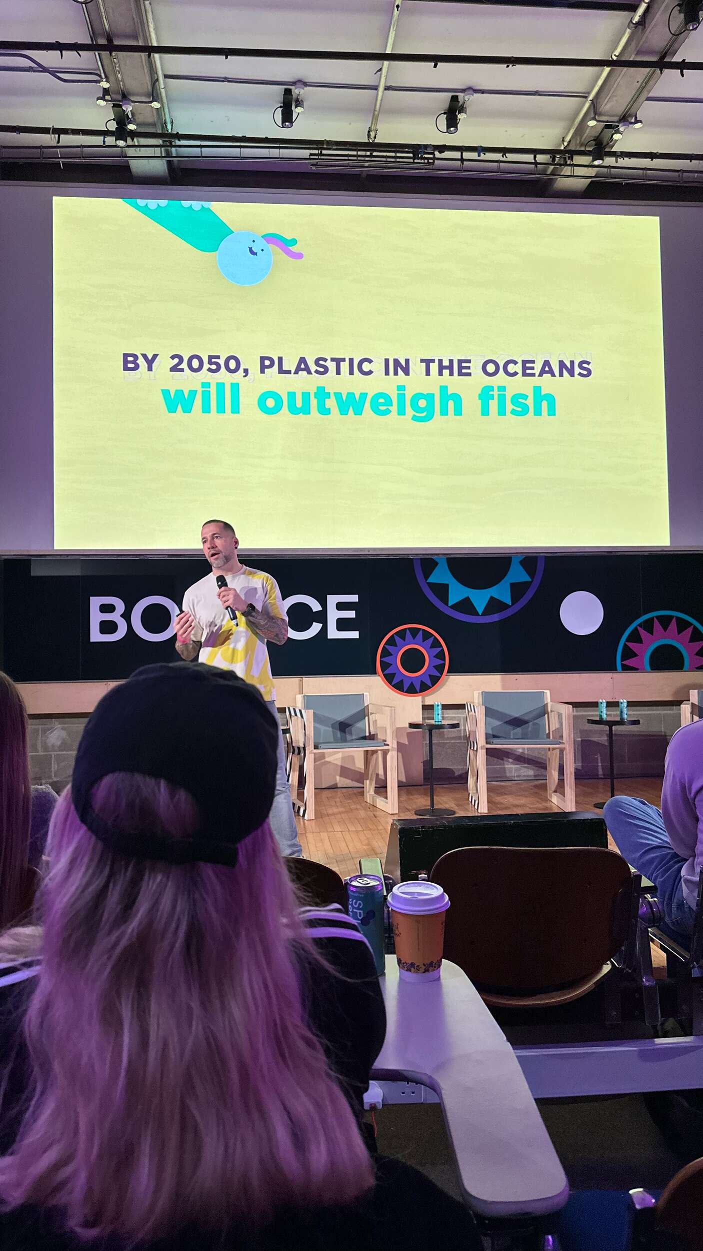
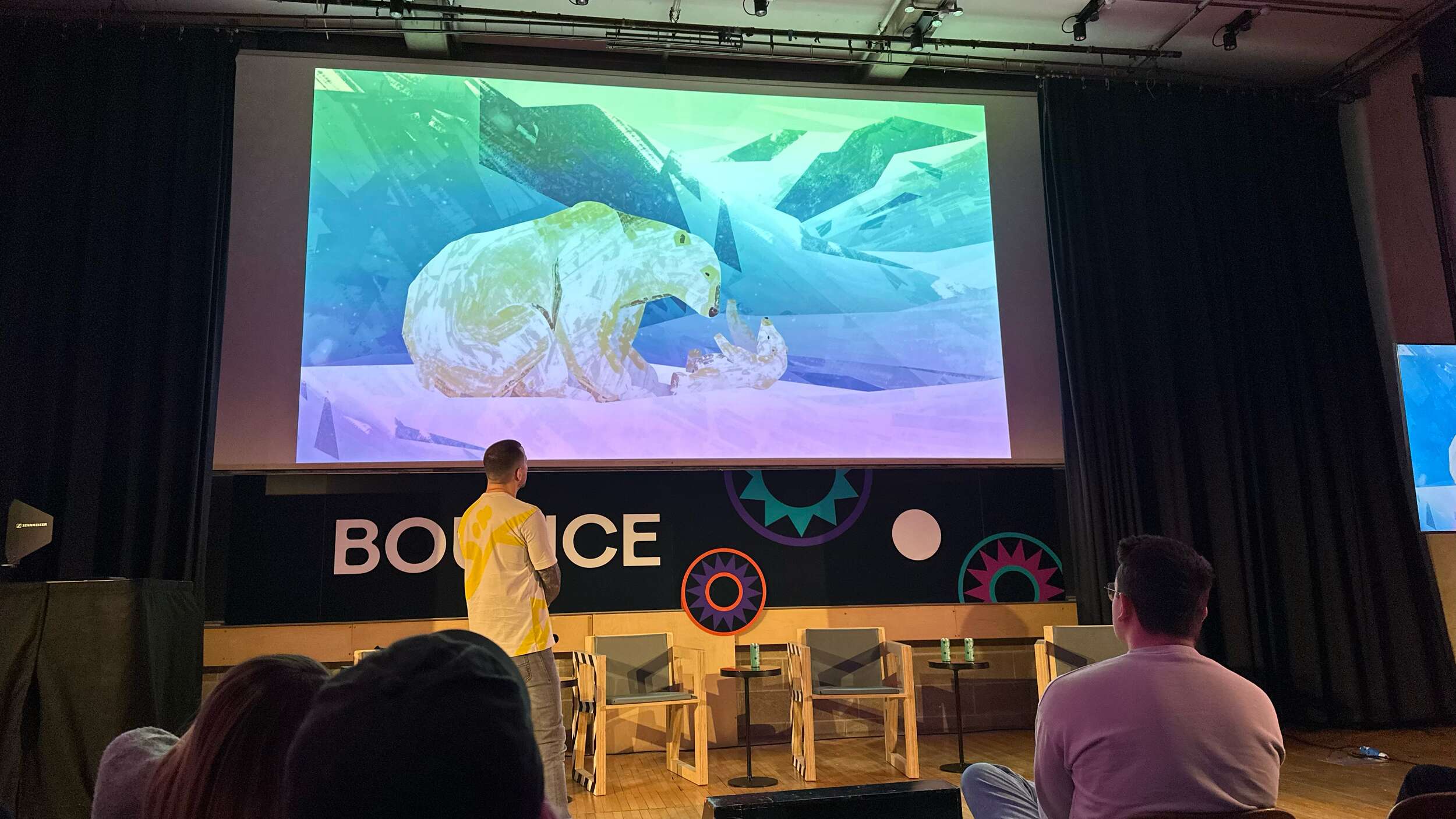
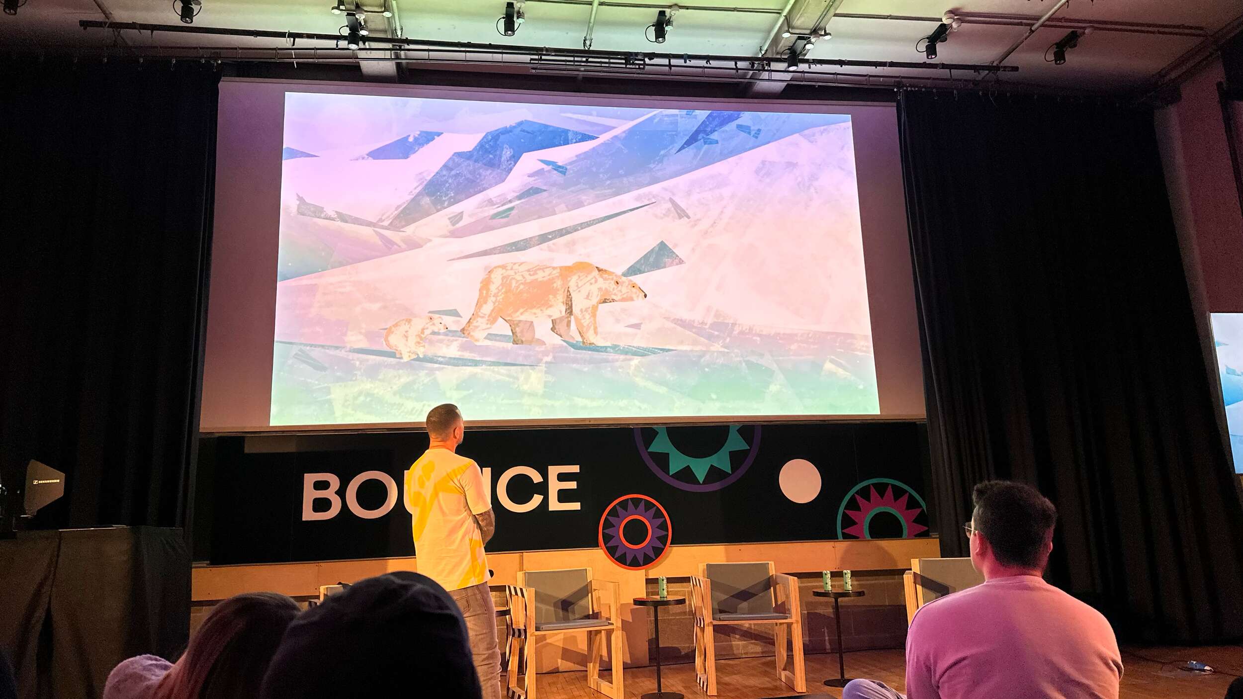
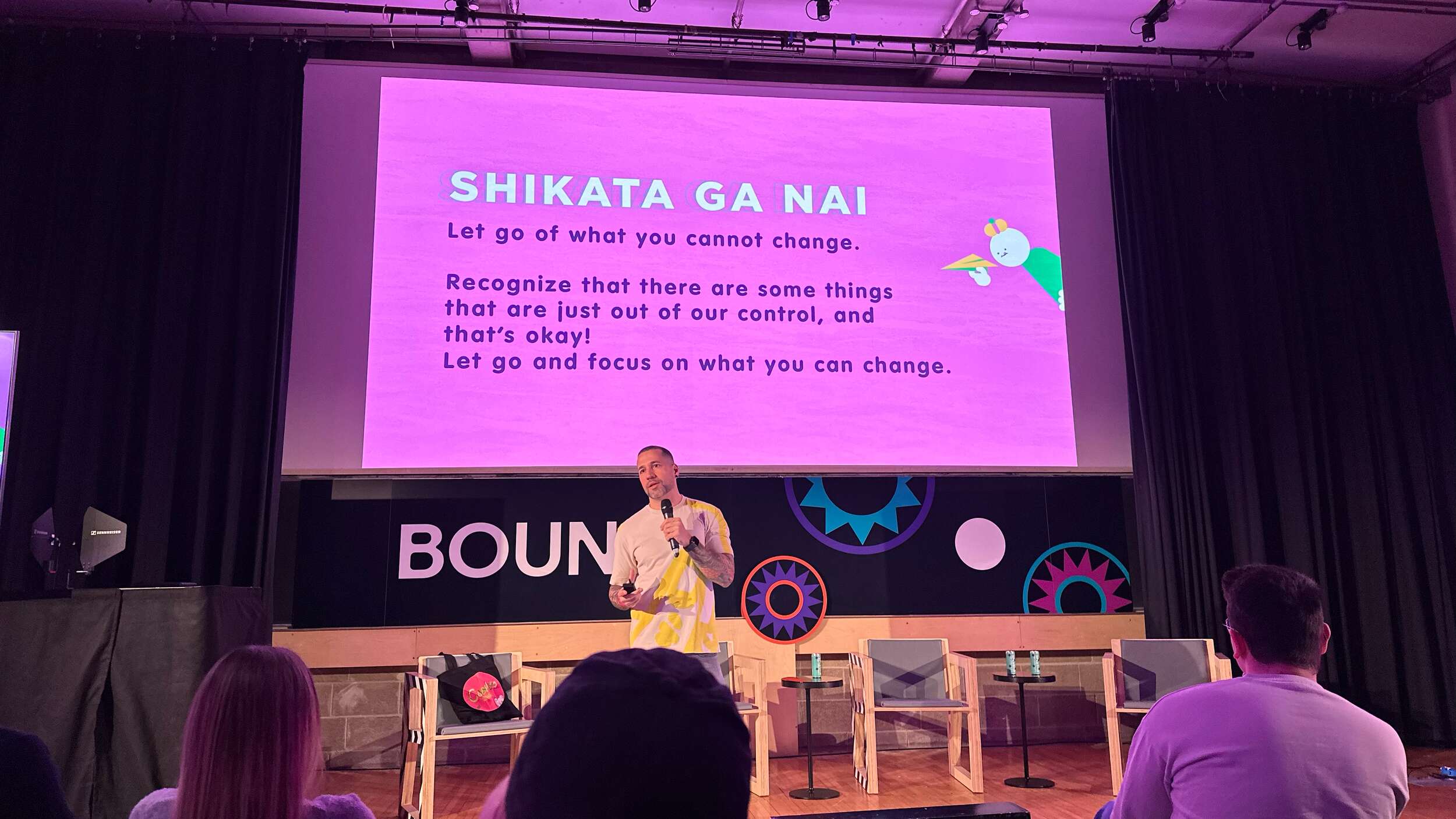
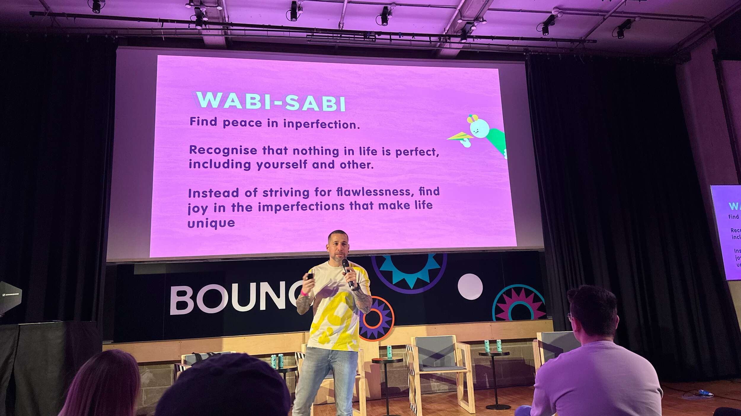
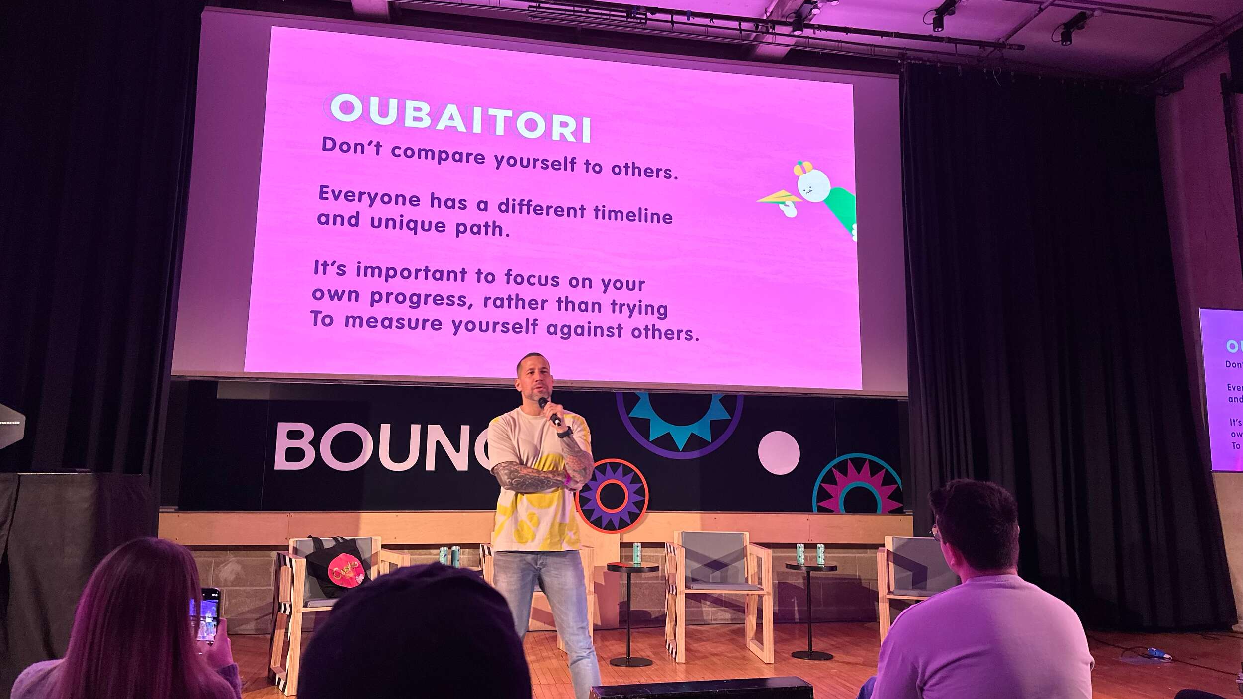
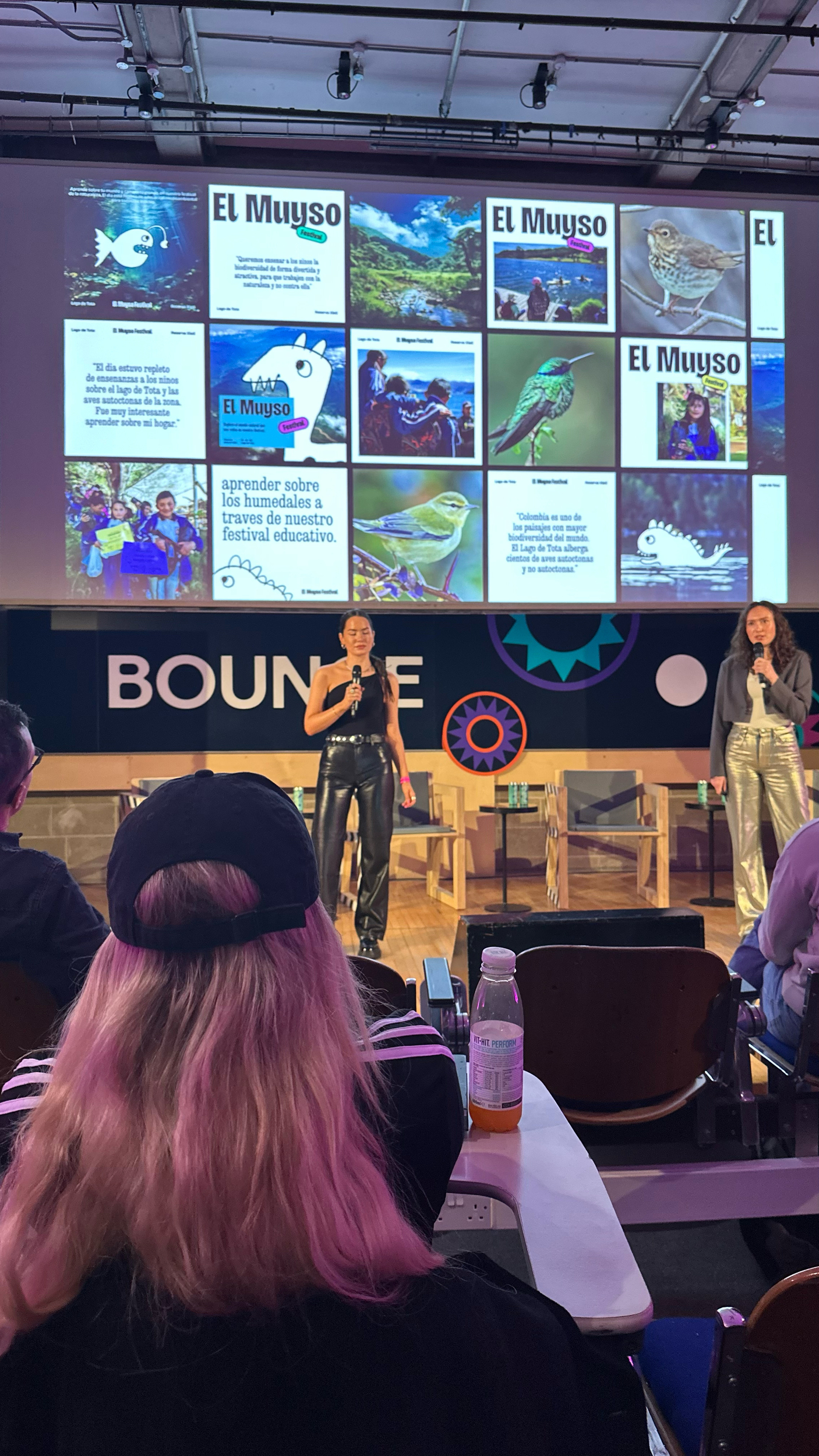
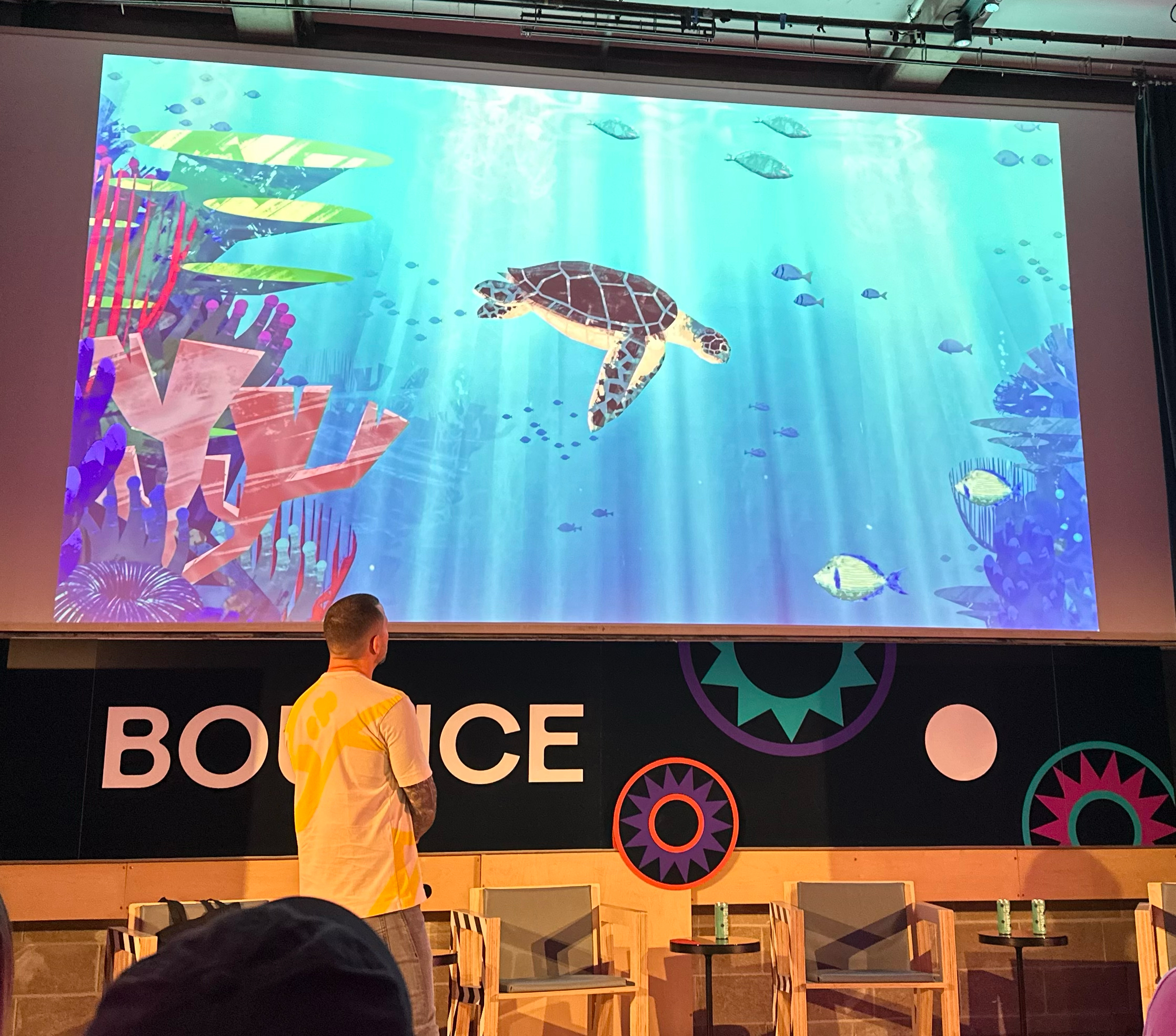
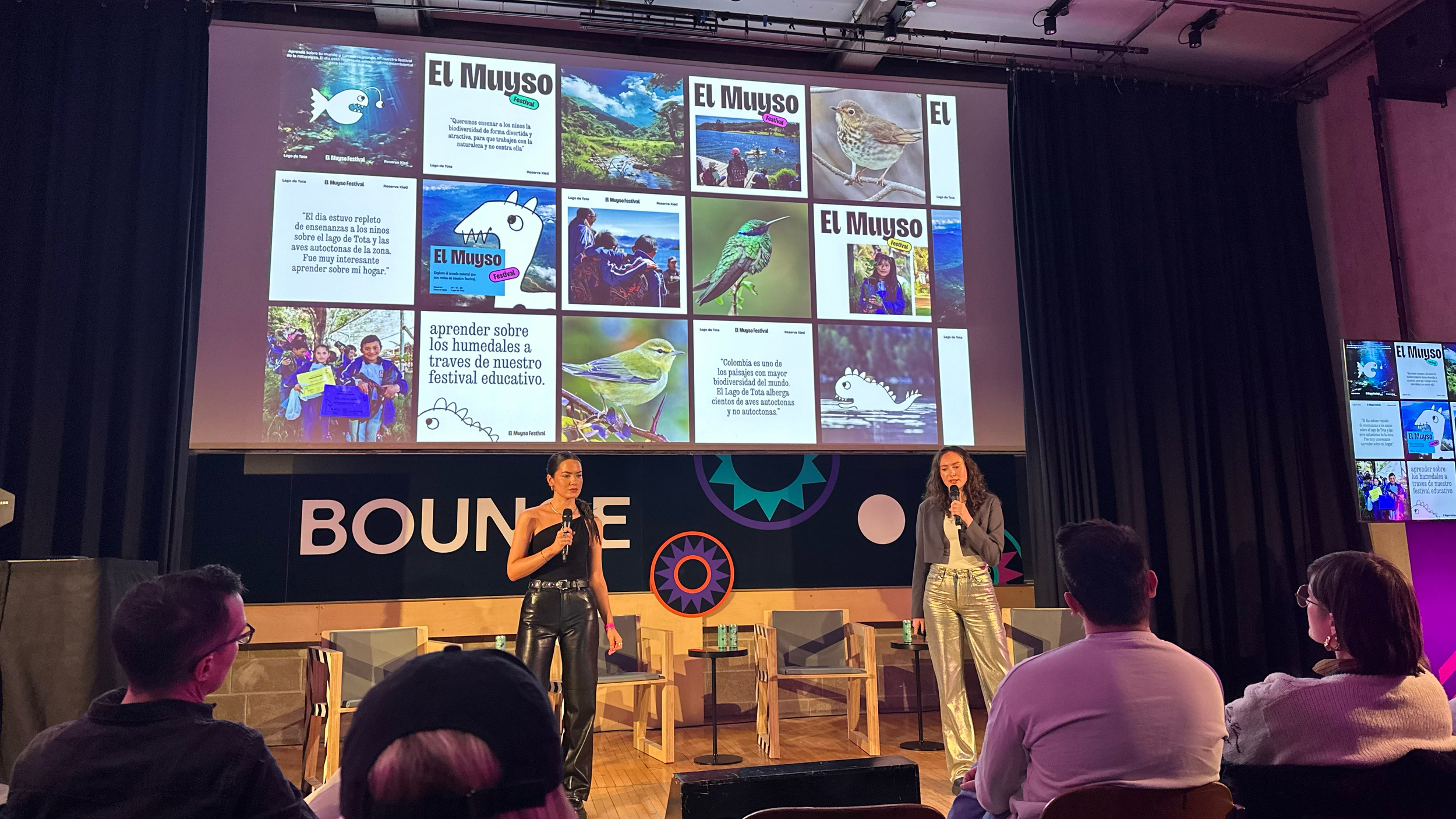
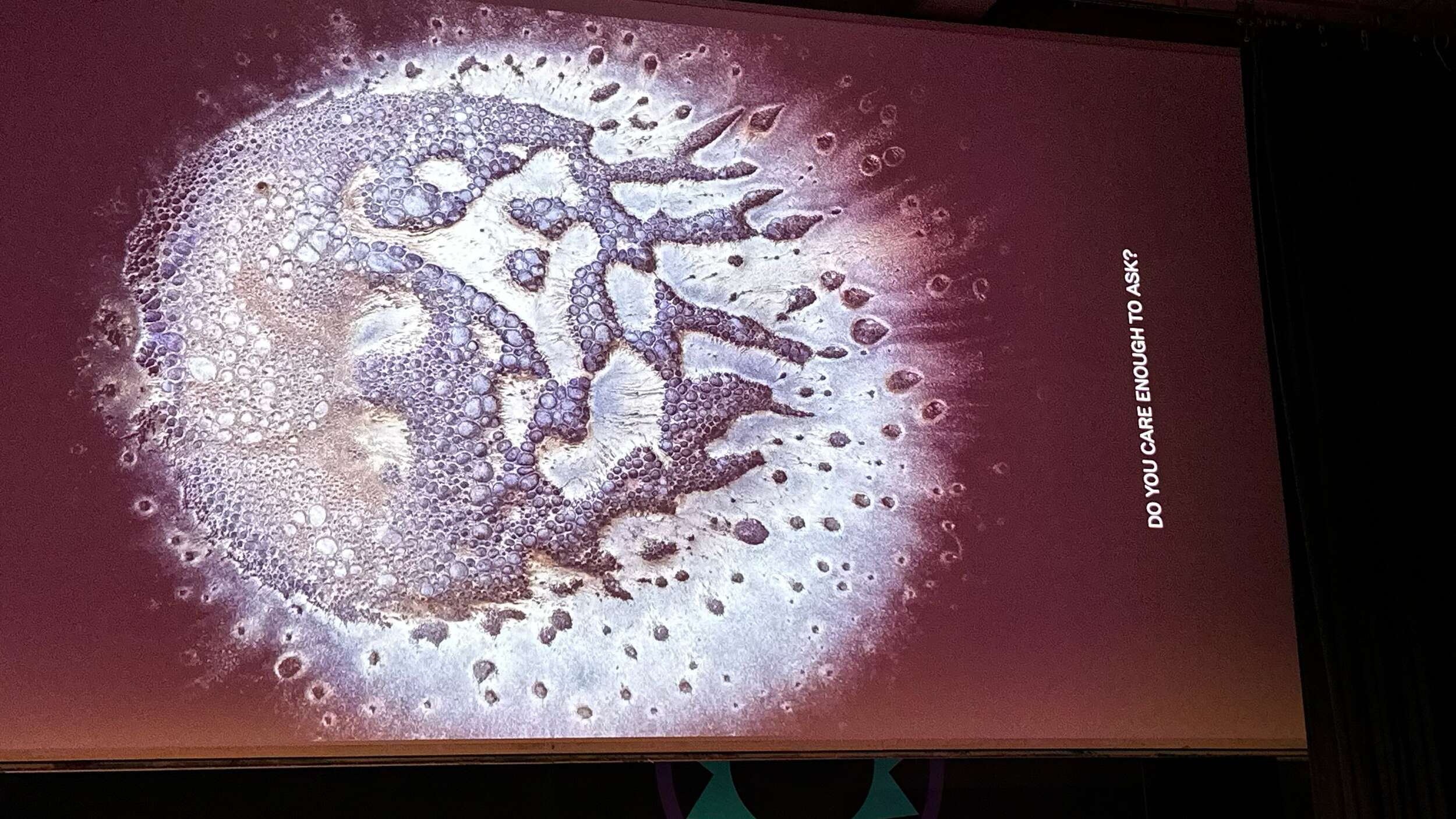
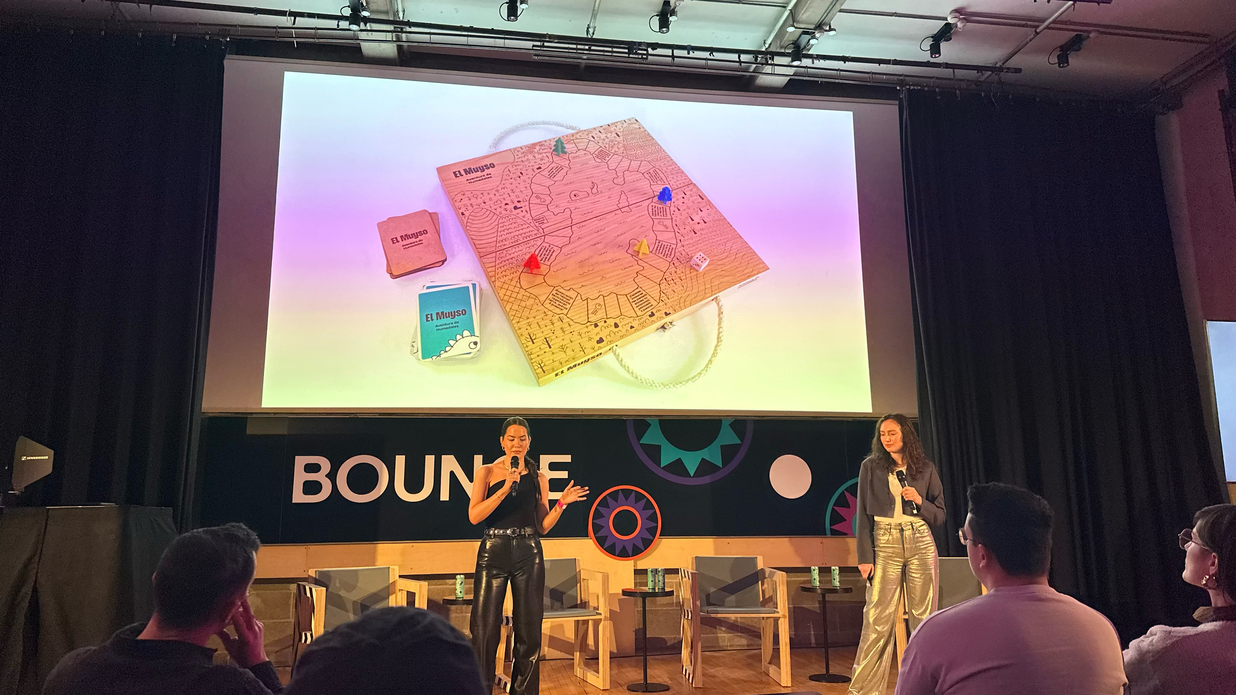
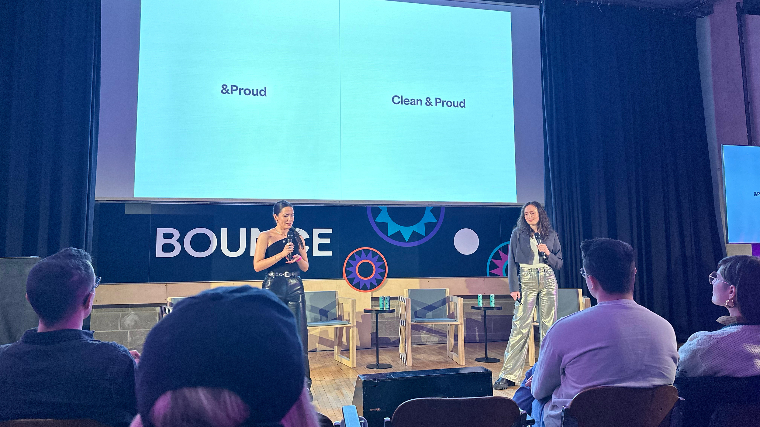
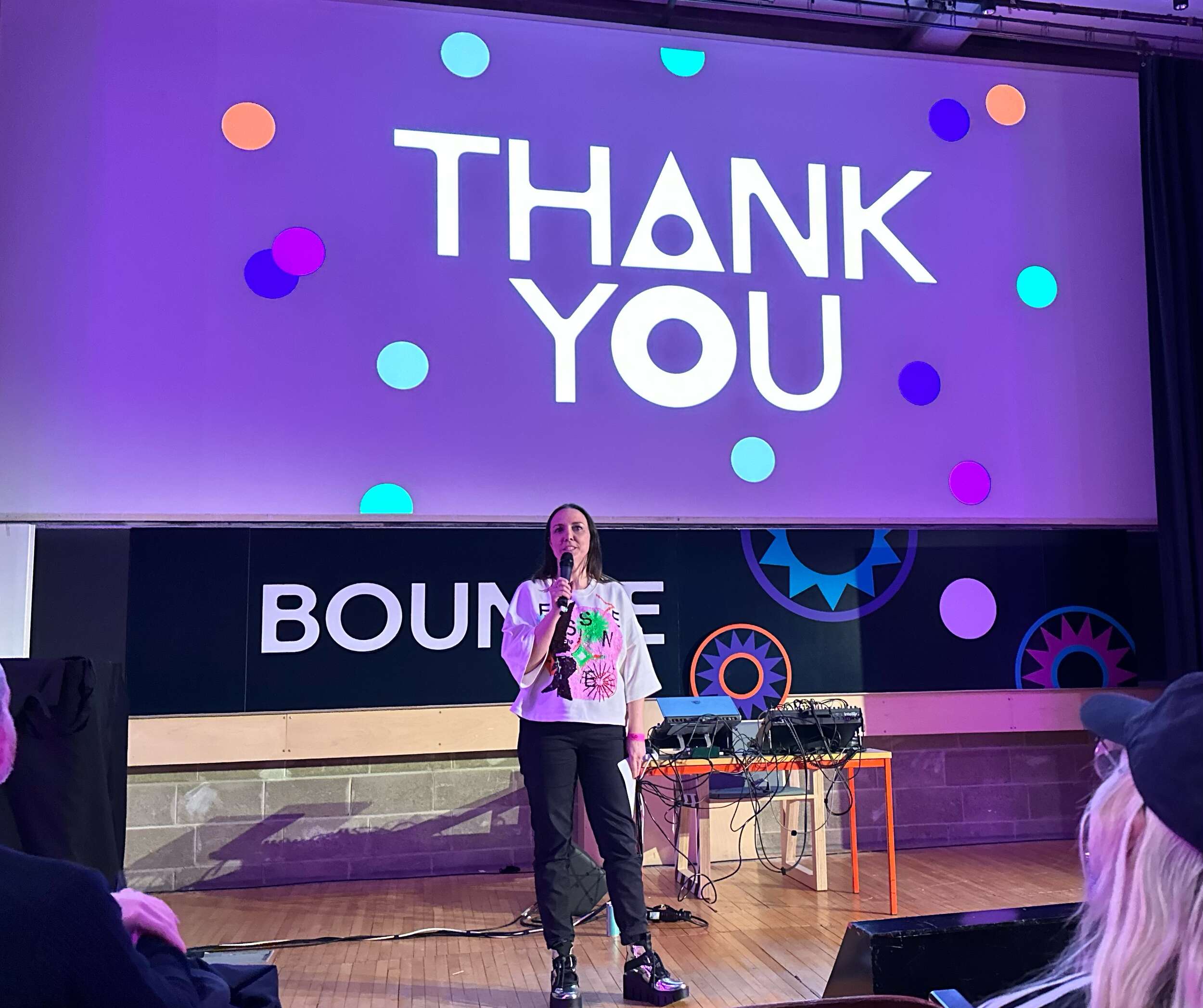
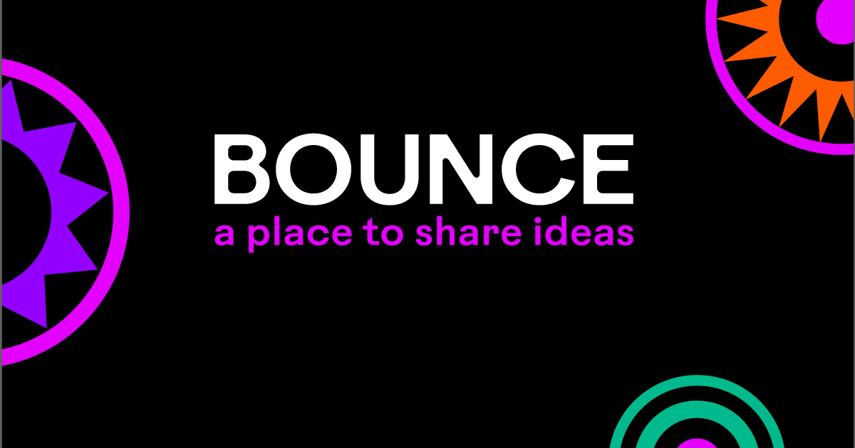
It was great to attend the new design event, BOUNCE, run by the IDI (Irish Design Network). The event ran over January 9th – 10th 2025, at Trinity College Dublin. This two-day event, crafted by the design community for the community, offered fresh, critical perspectives on the design process, giving designers a unique opportunity to explore, engage, and be inspired.
Since the previously run Dublin-based design festival Offset ceased – creatives have missed design conferences like this, as an opportunity to network and stay inspired with the latest projects happening in all areas of design worldwide, so this was a great step towards a positive resurgence of design inspiration and events in Dublin.
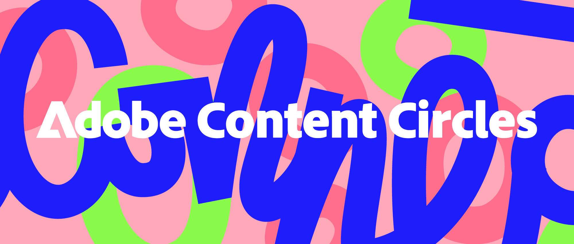
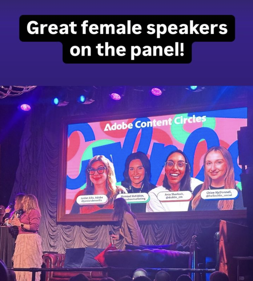
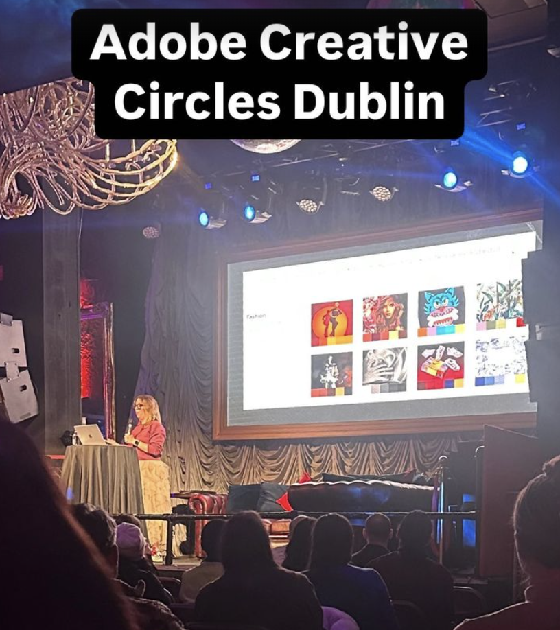
Enjoyable evening at the Adobe Content Circles event this week, as part of Irish Design Week in Twenty Two, South Anne Street in Dublin’s city centre. There was a panel discussion with Jordan Dené Ellis from Adobe Express and Ania Sherlock from Creative Mornings Dublin among other speakers. Software is progressing at a fast pace, with AI tools becoming incorporated in to the design programs to improve functionality and productivity. Designers need to keep informed of the latest developments with events like these to keep up to date with the ever changing digital landscape.
The event was well run, the venue was perfect, food and drinks were supplied, and they gave away some nice extras on the night from Adobe branded notebooks to some free software annual subscriptions for some lucky winners. Dublin is a great city to keep linked in with the vibrant creative community with events like these.
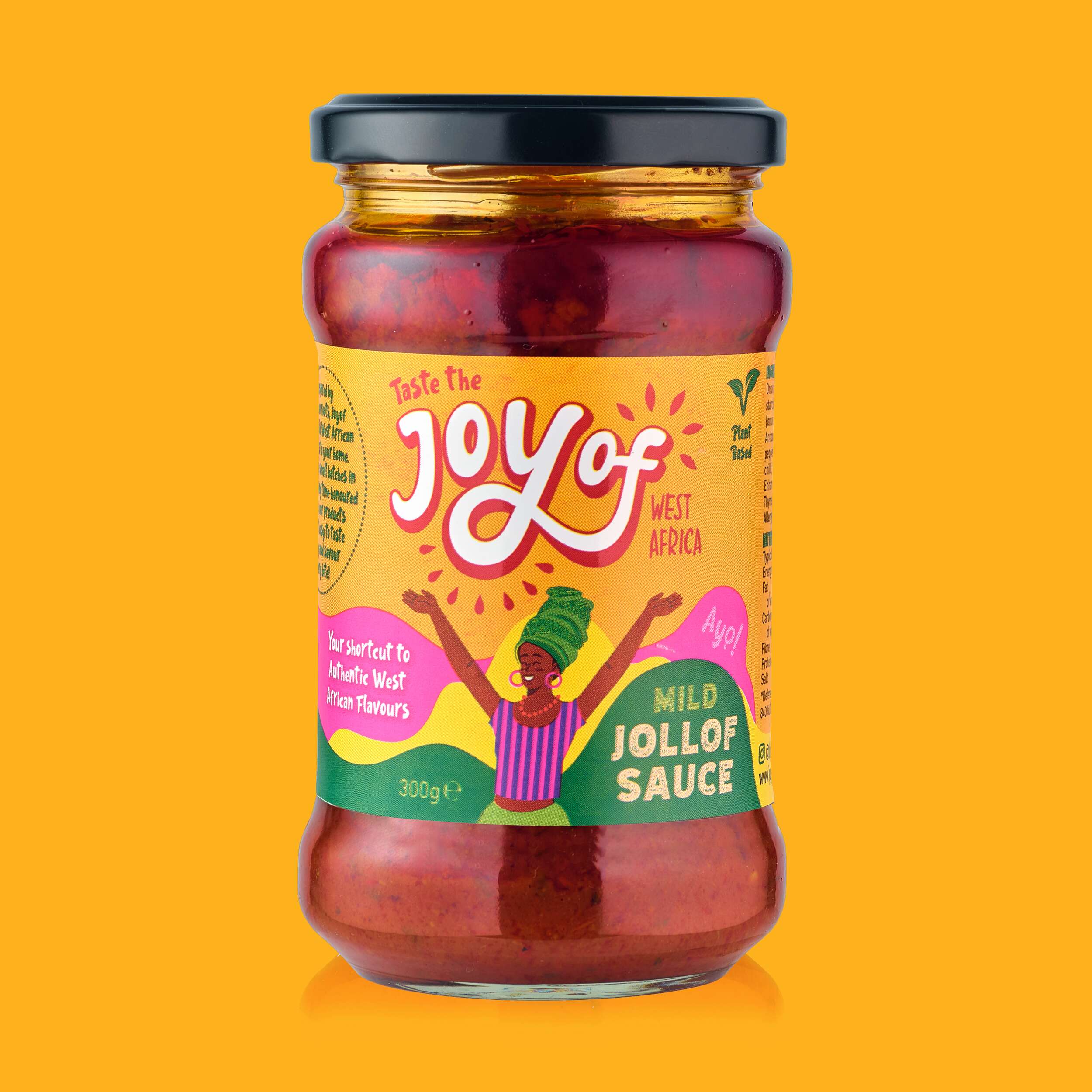
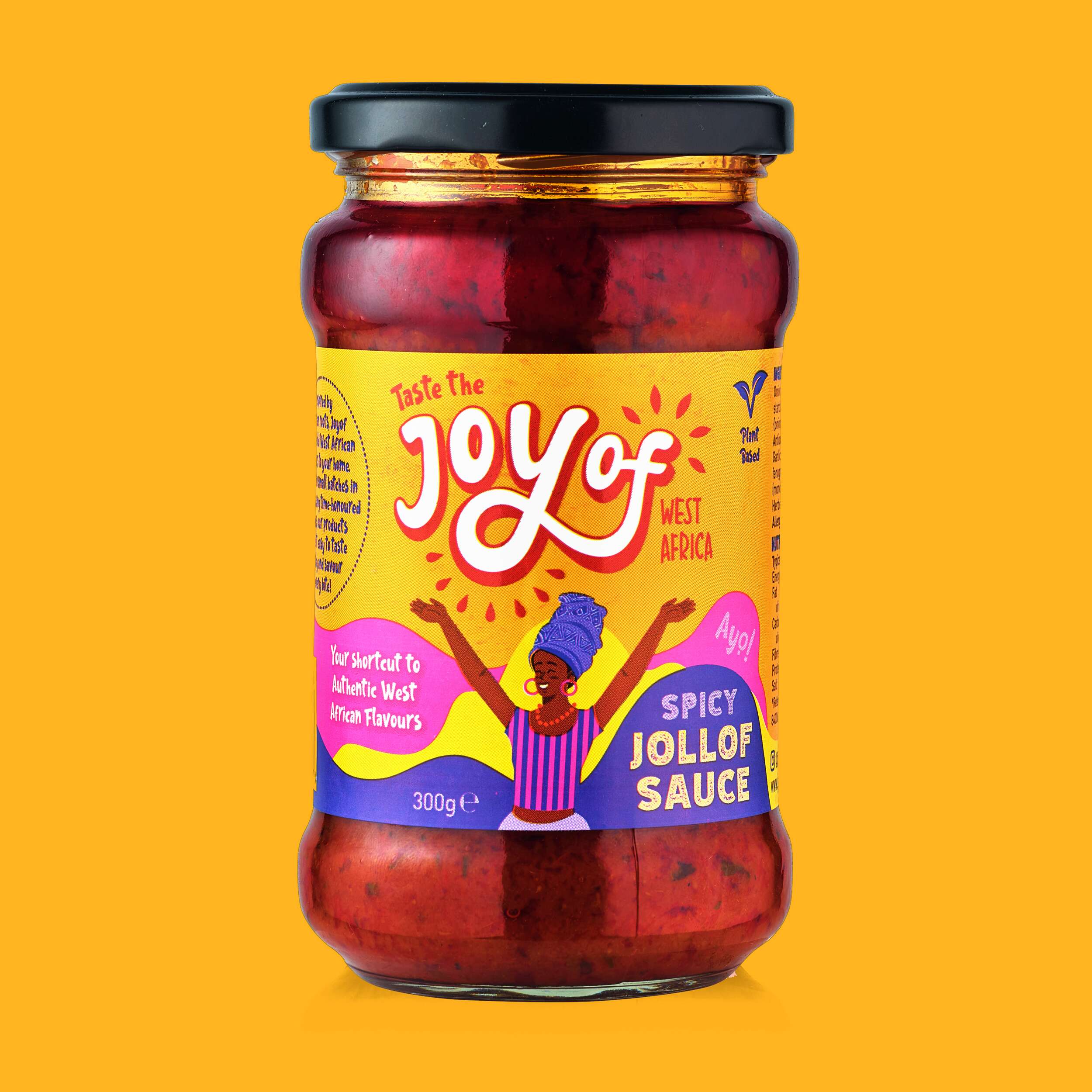
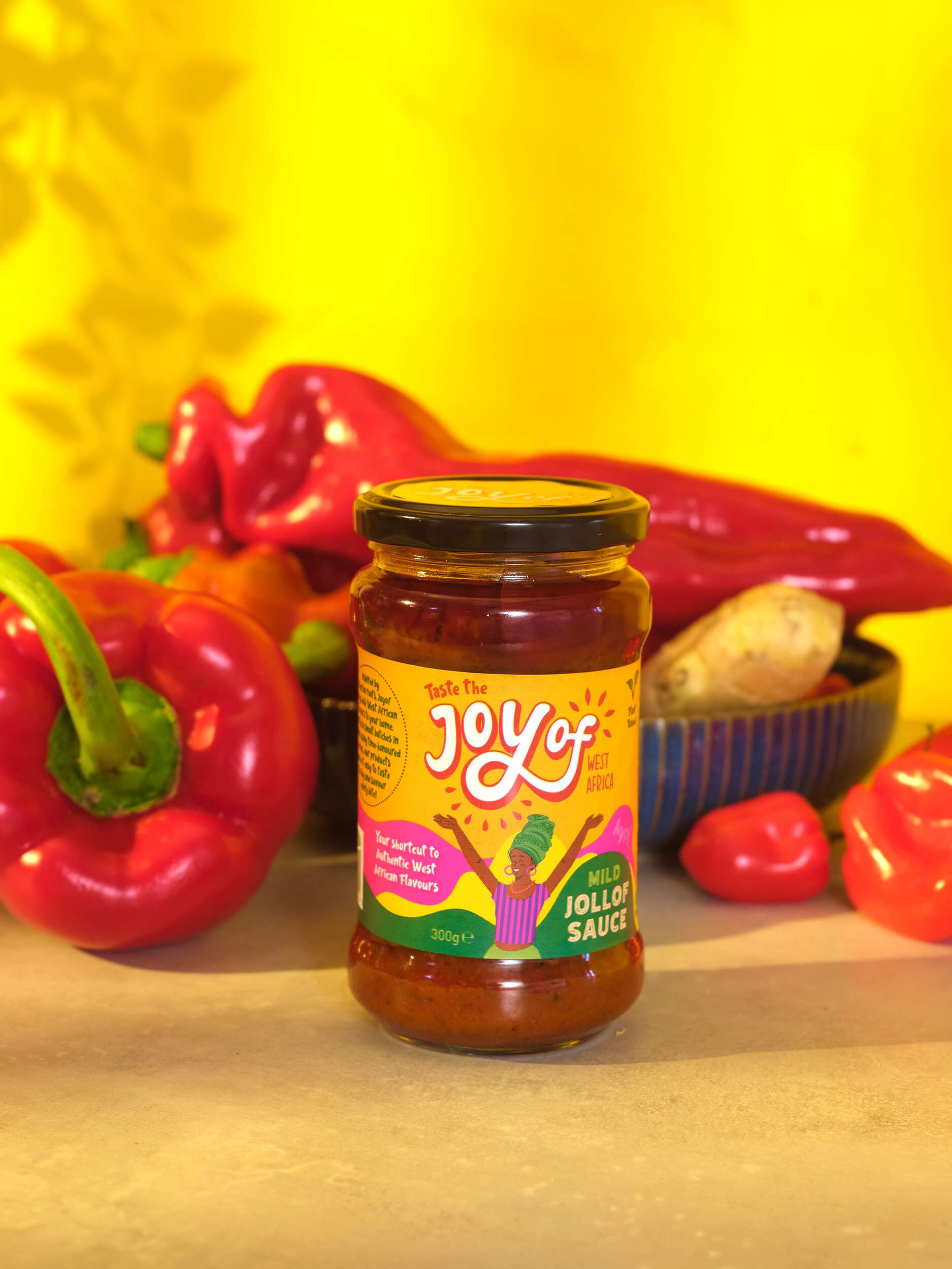
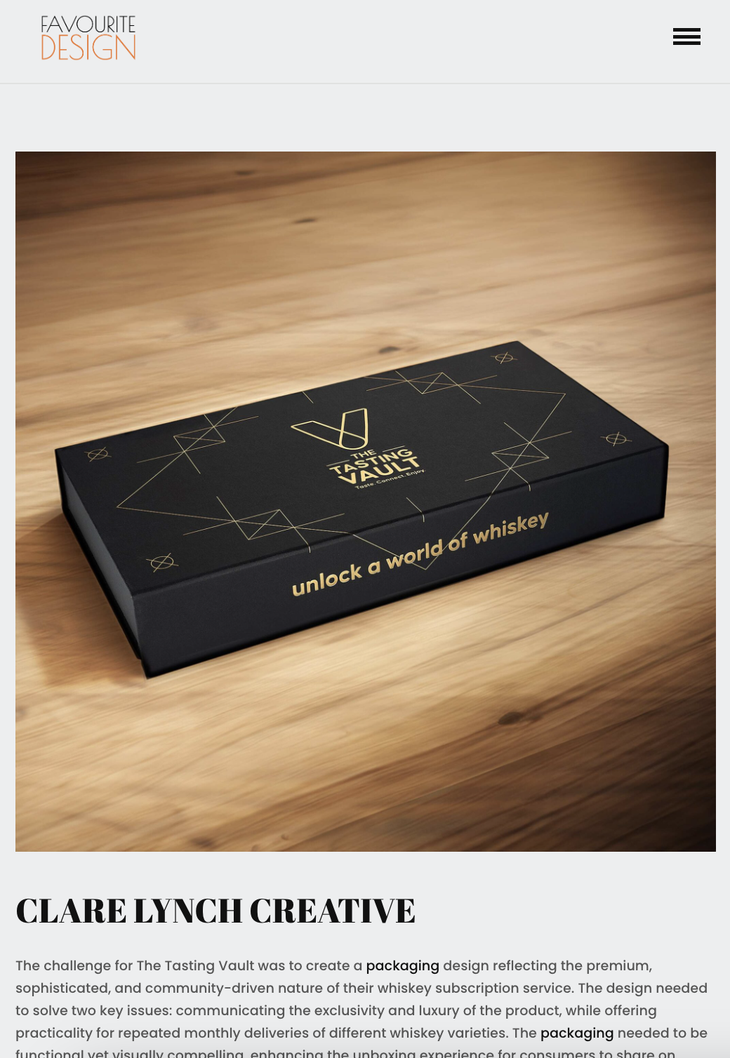
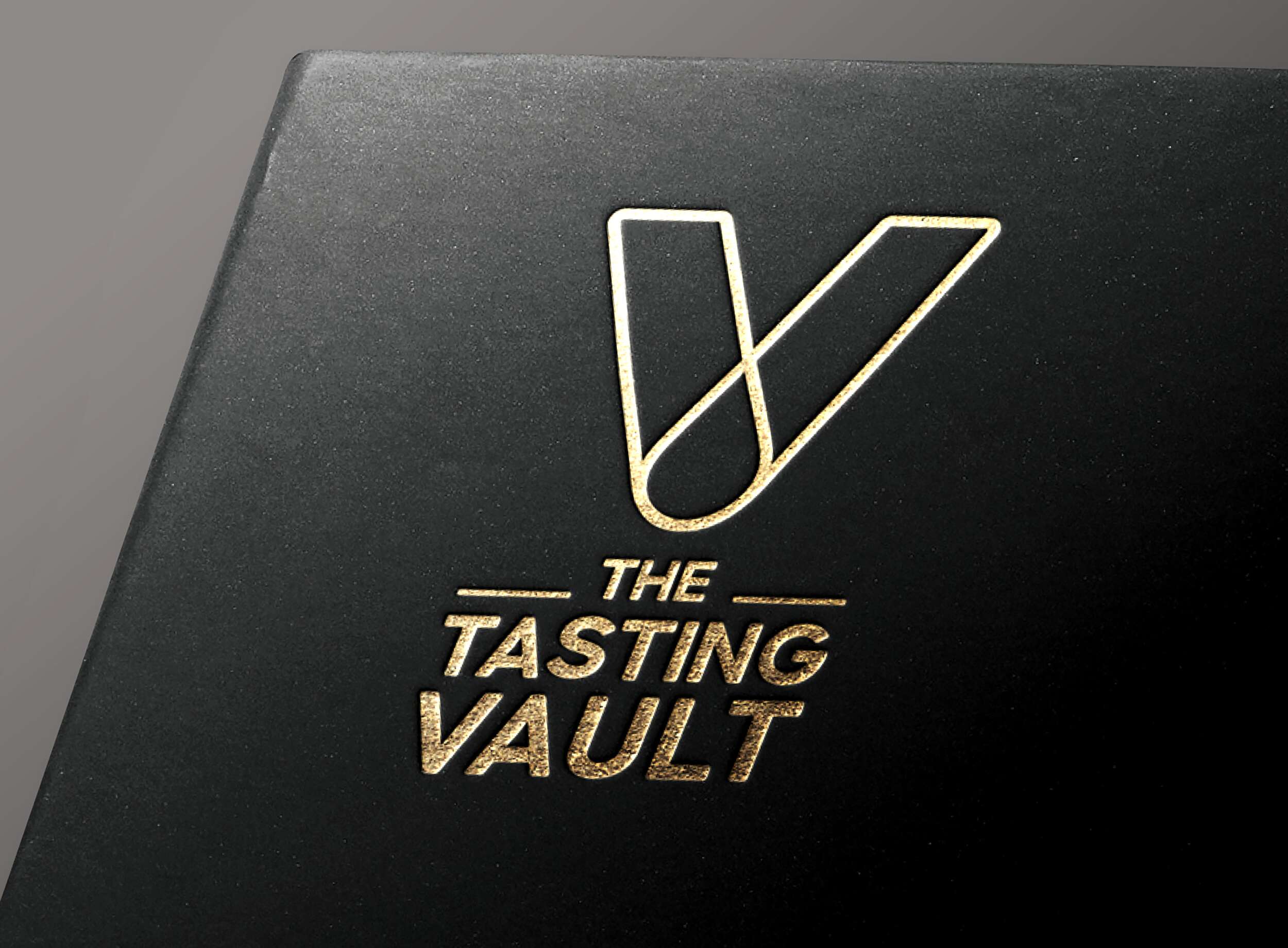
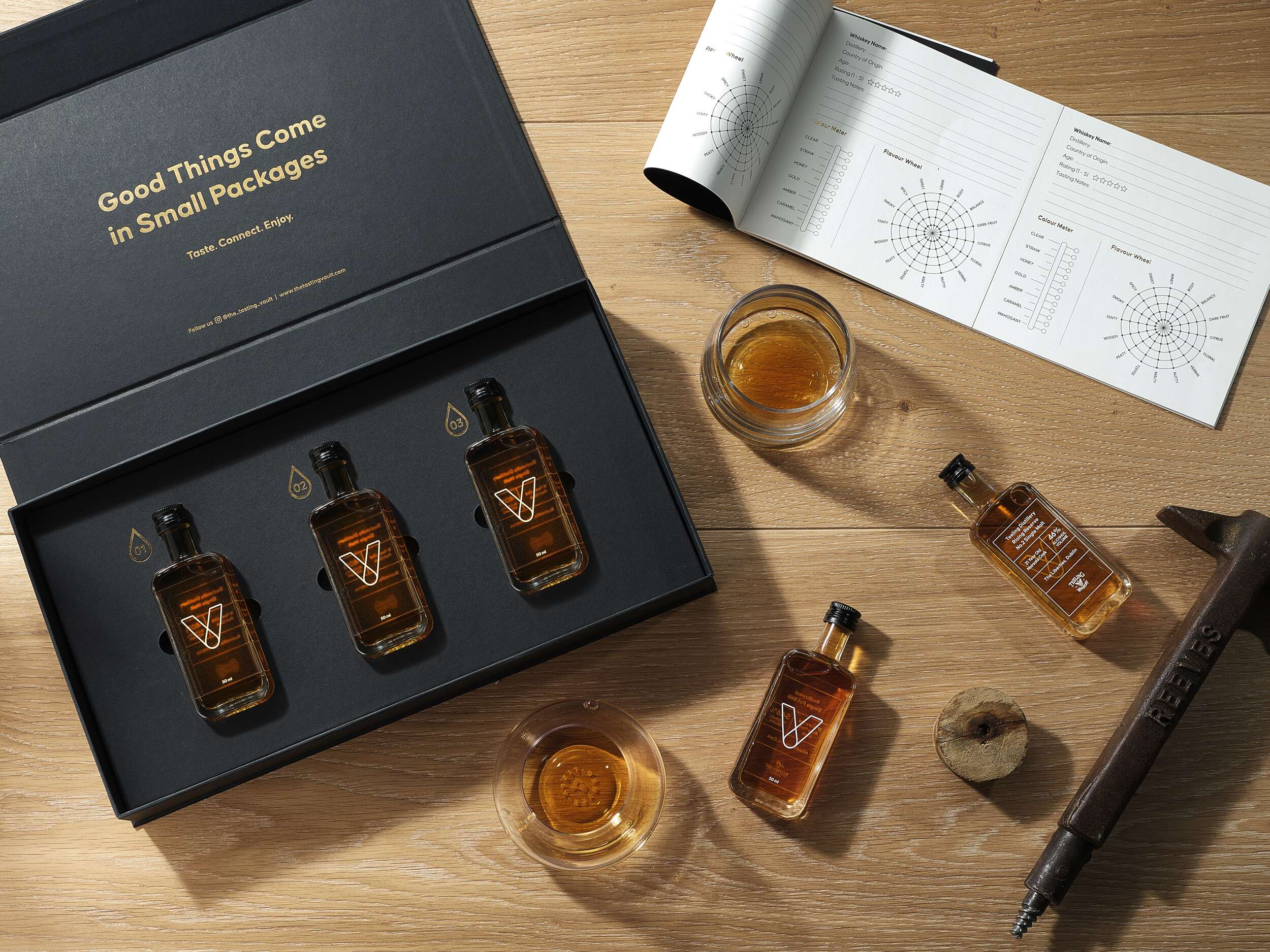
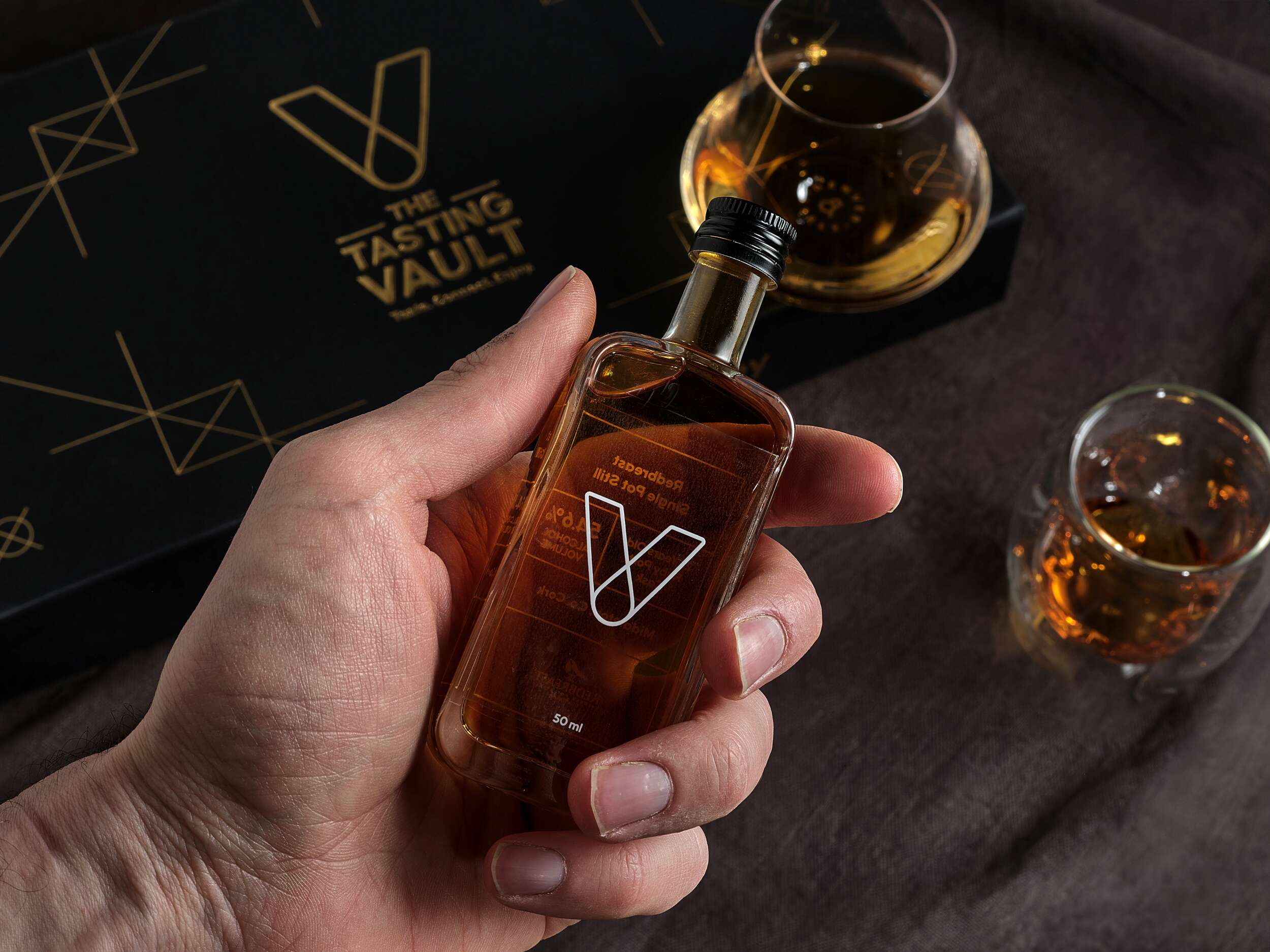
Thanks to the Favourite Design blog for the feature of our Brand Packaging Design project for The Tasting Vault Whiskey Tasting Subscription Services on their website, Instagram and Facebook pages. The Tasting Vault is a whiskey and spirits subscription service that provides consumers with curated tasting experiences, allowing them to explore a wide range of premium whiskeys from around the world. The company solves the ‘try before you buy’ challenge by offering tasting packs that let customers sample new and famous whiskeys before committing to full bottles.
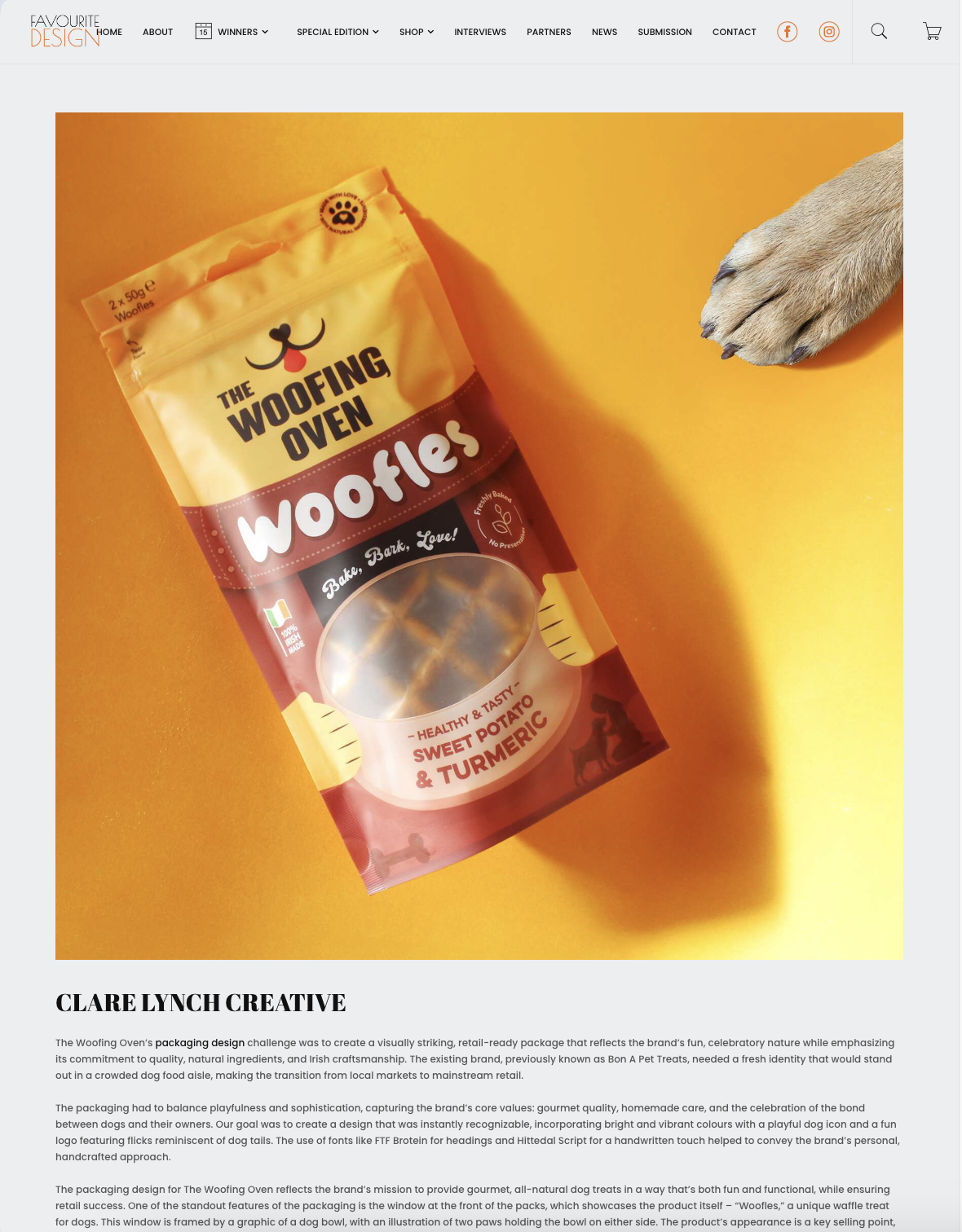
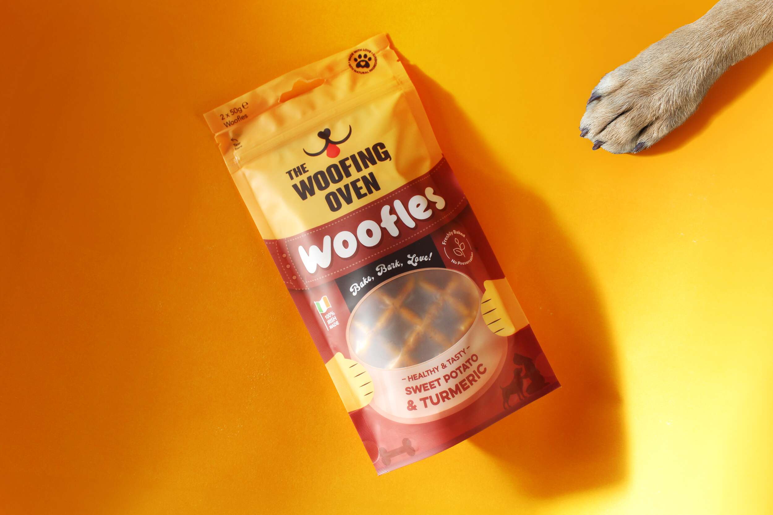
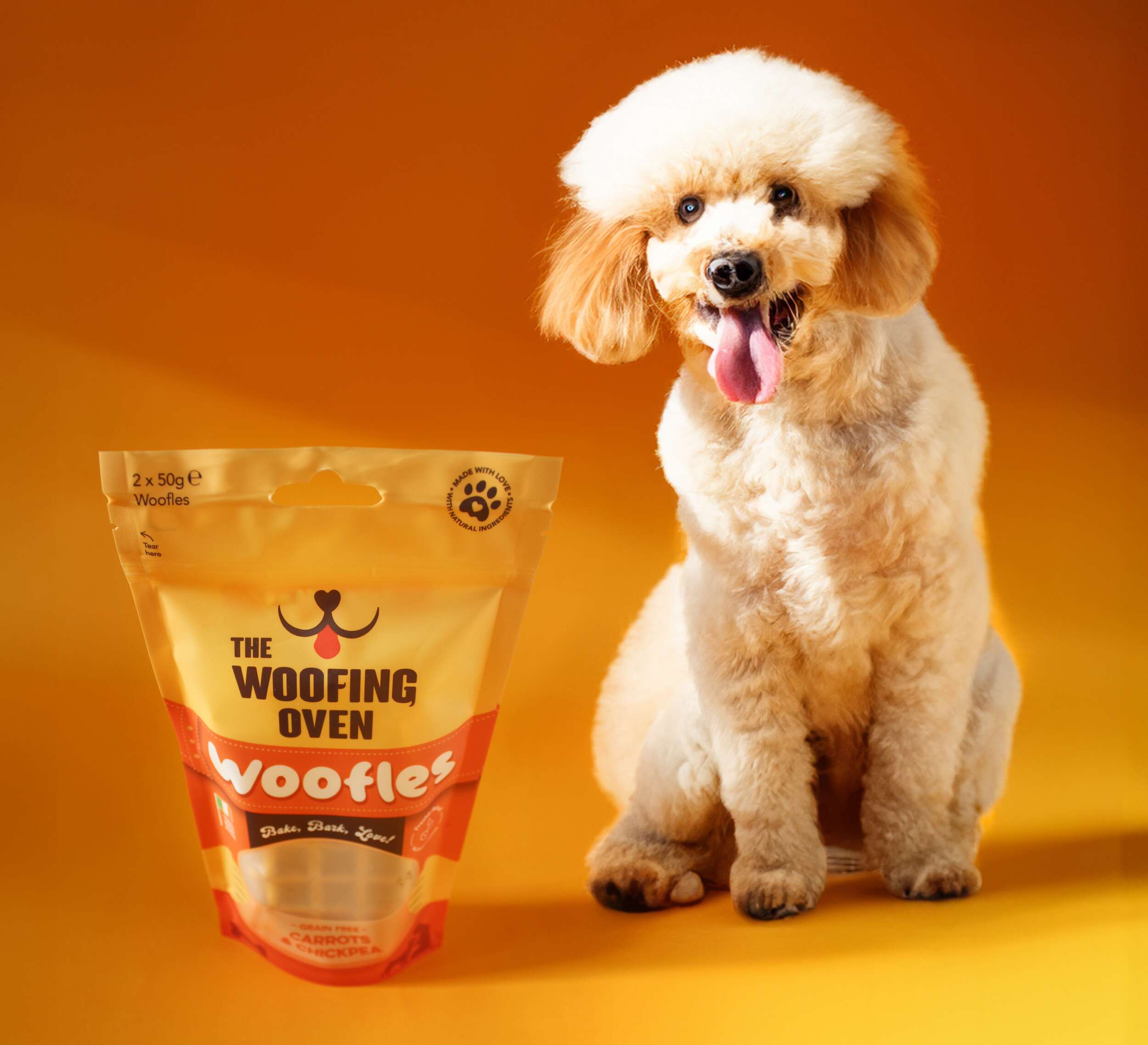
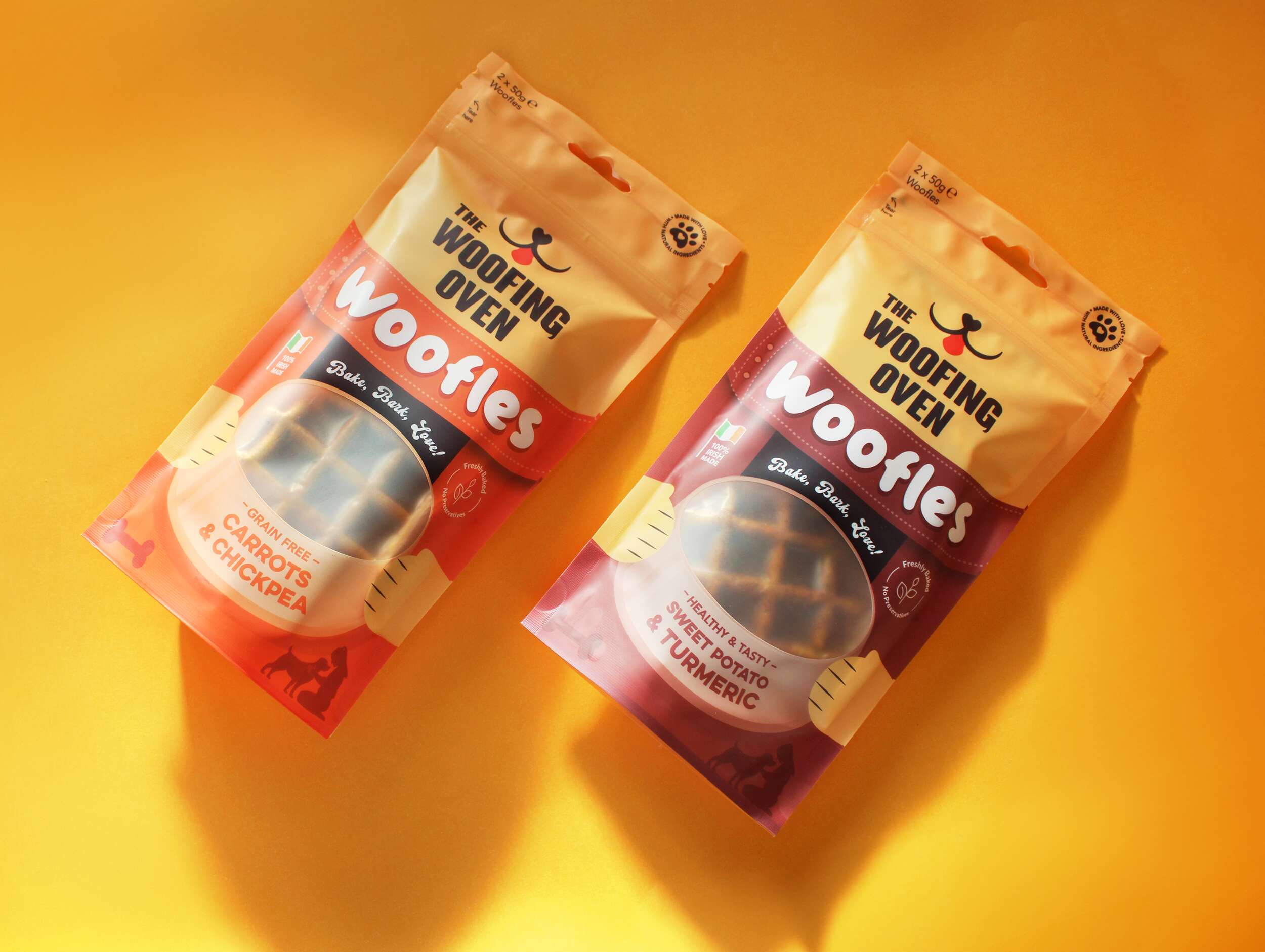
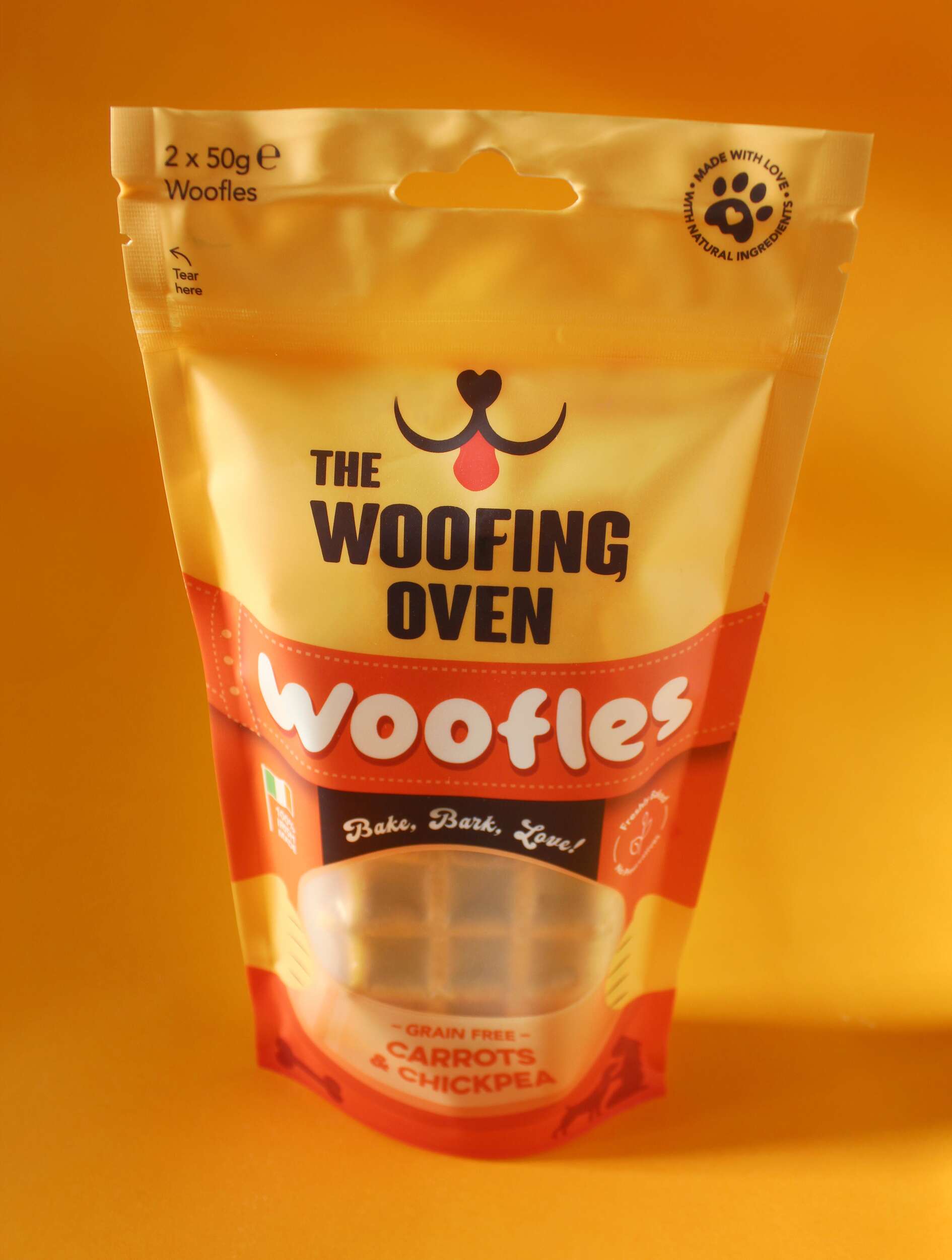
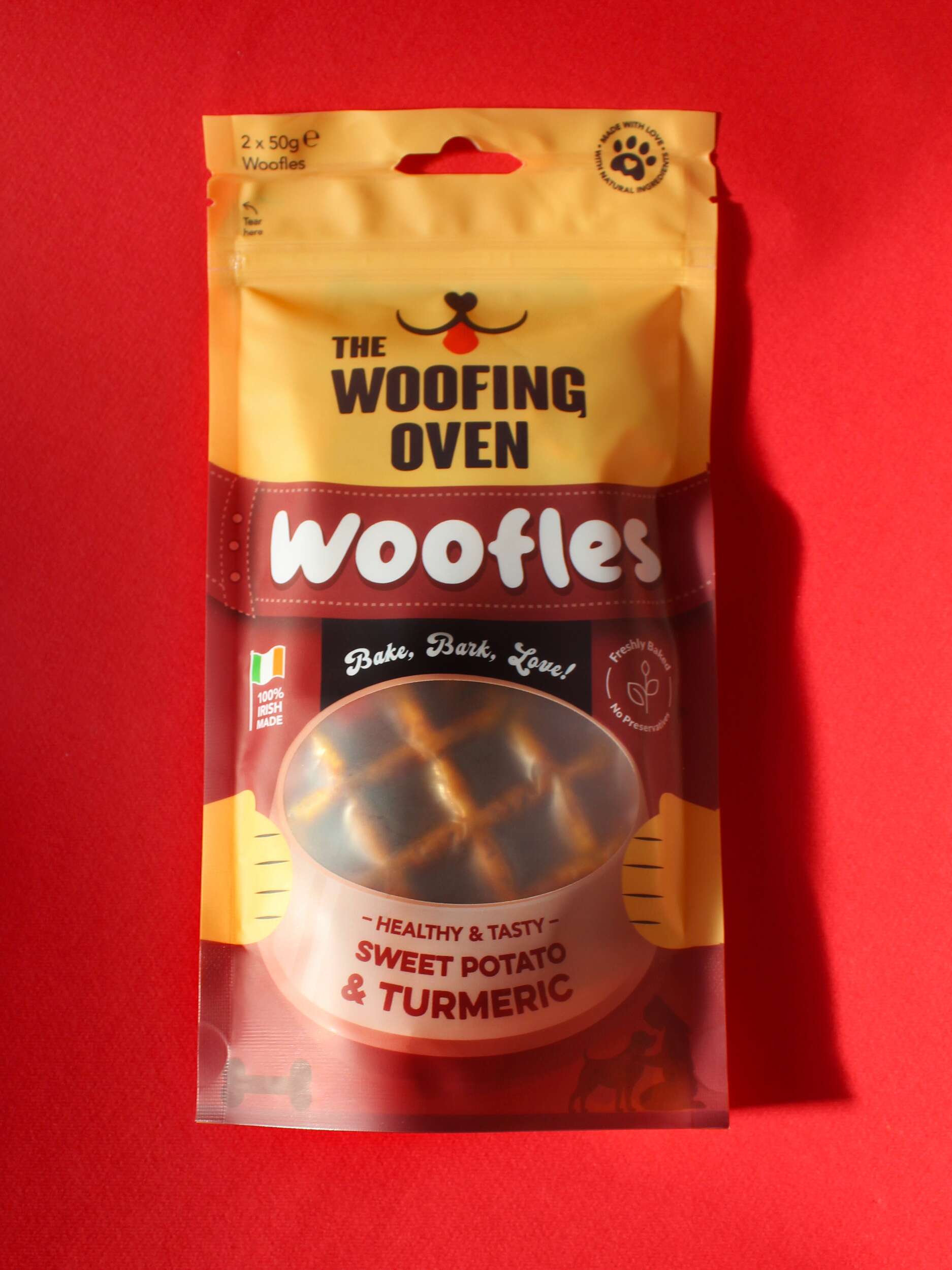
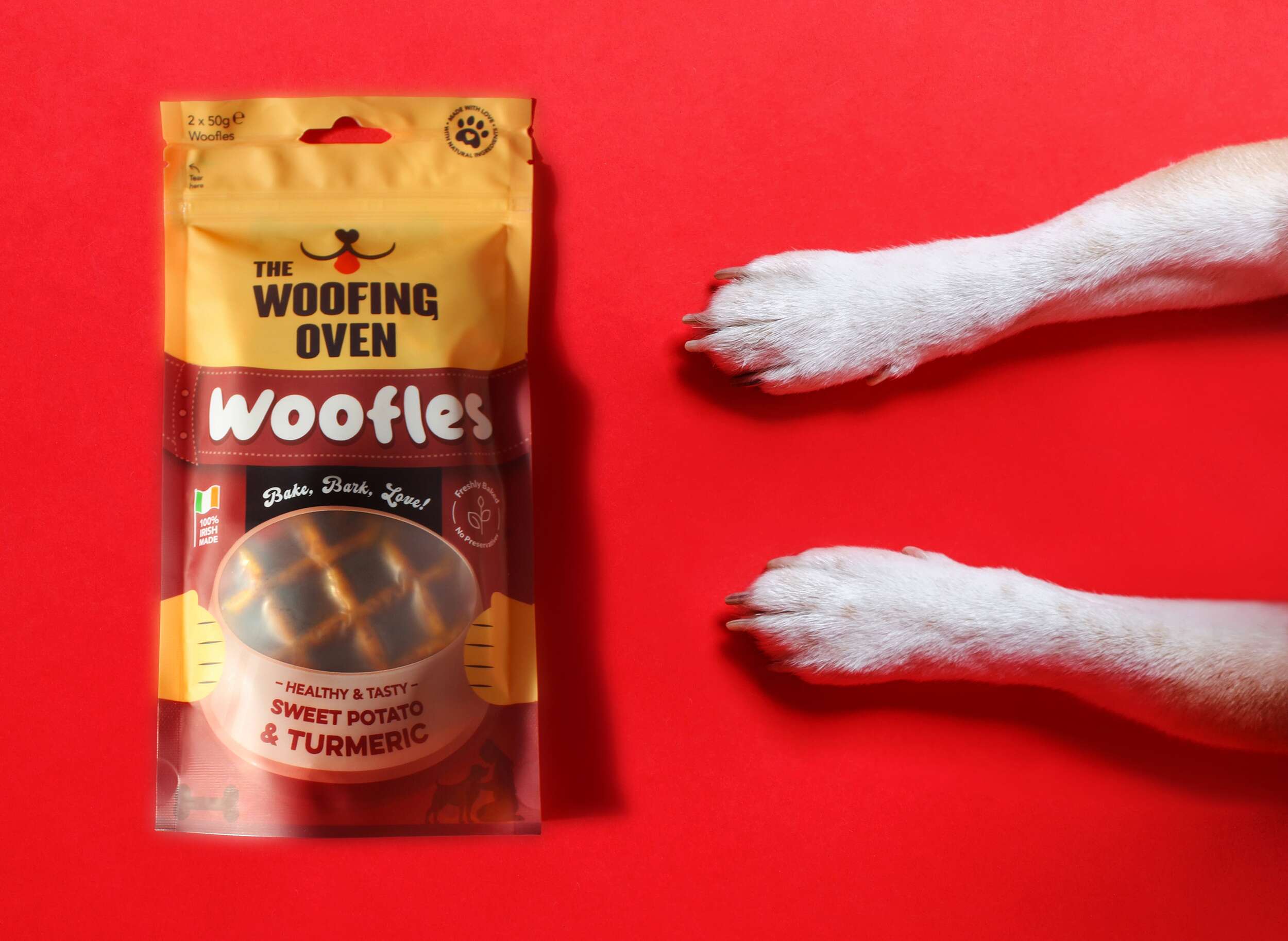
Thanks to the Favourite Design blog for the feature of our Brand Packaging Design project for The Woofing Oven dog bakery on their website, Instagram and Facebook pages. The Woofing Oven crafts a fun and creative range of gourmet treats to pamper your furry friends with the love and care they deserve.
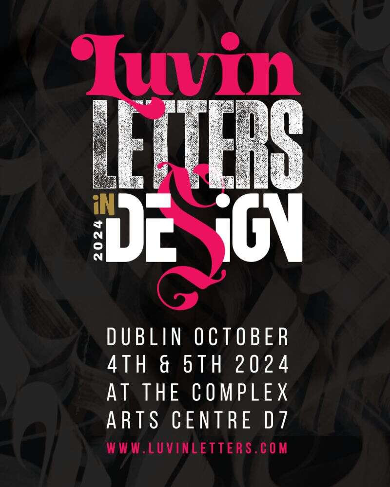
Great to attend the recent Dublin design event Luvin Letters In Design – for Typography & Lettering lovers, which ran over the 4th and 5th October in the Complex Arts Centre, Dublin 1.
There was an inspiring line up of speakers and some live mural painting with artists Theosone (Berlin), Milen Balbuzanov (Bulgaria), Horhay Design (Spain) and Calligrafreaks (Berlin).
Here’s to more of these design events returning to the Dublin design scene!
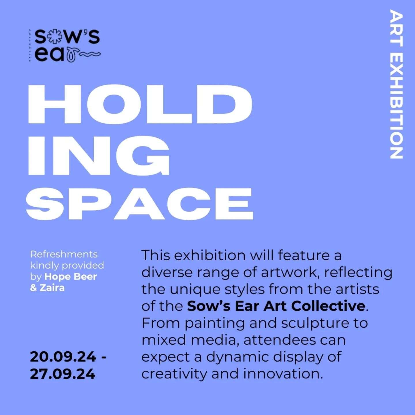
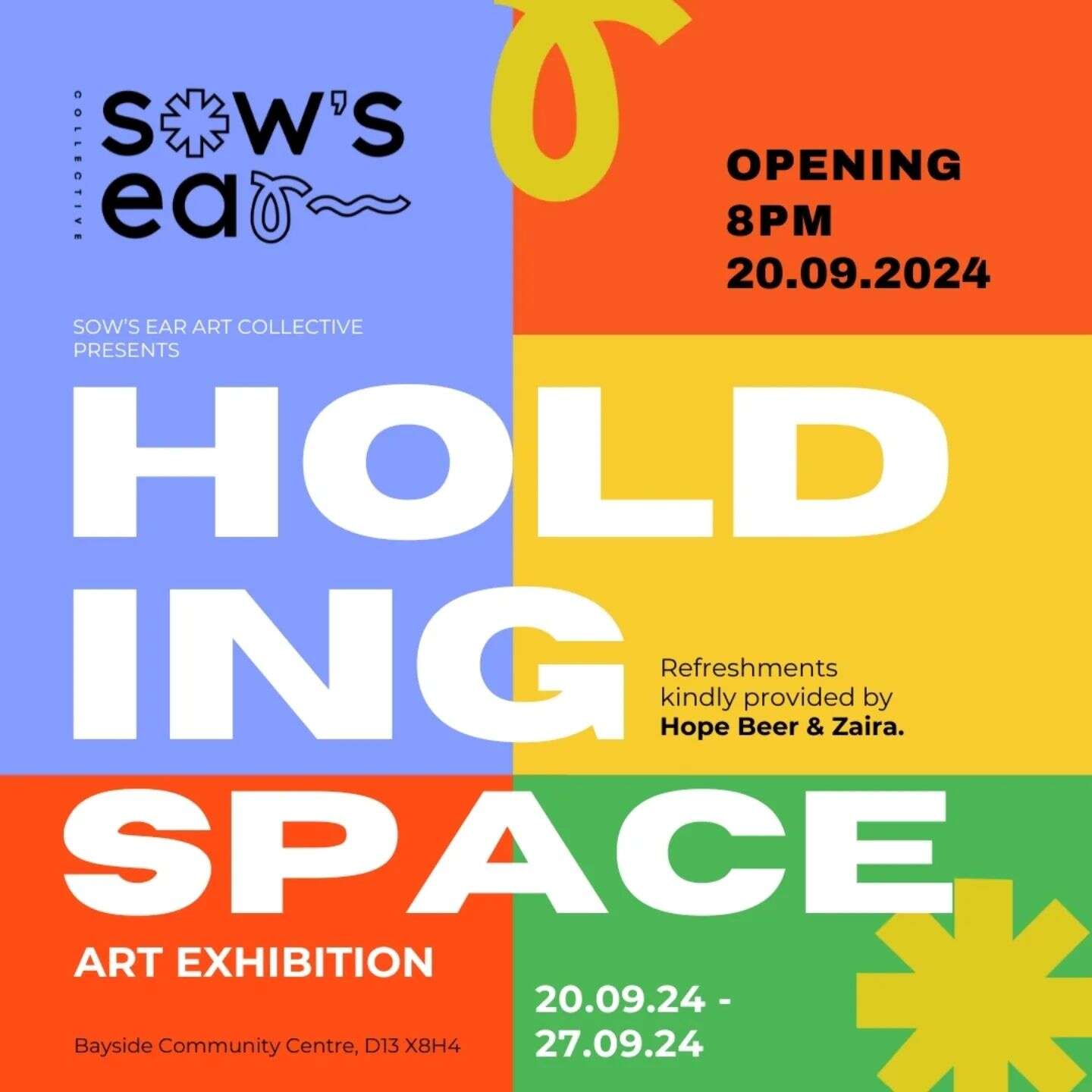
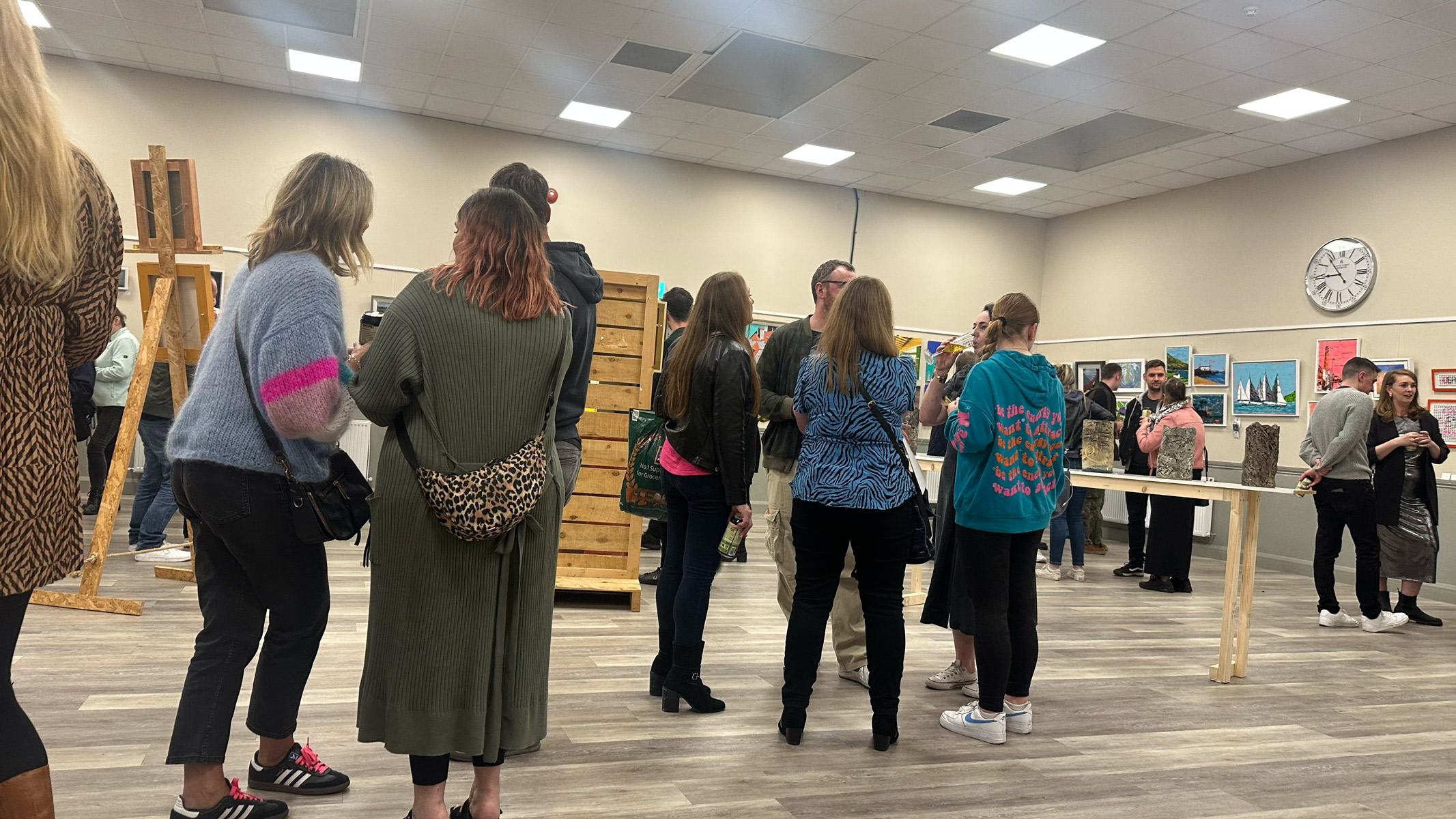
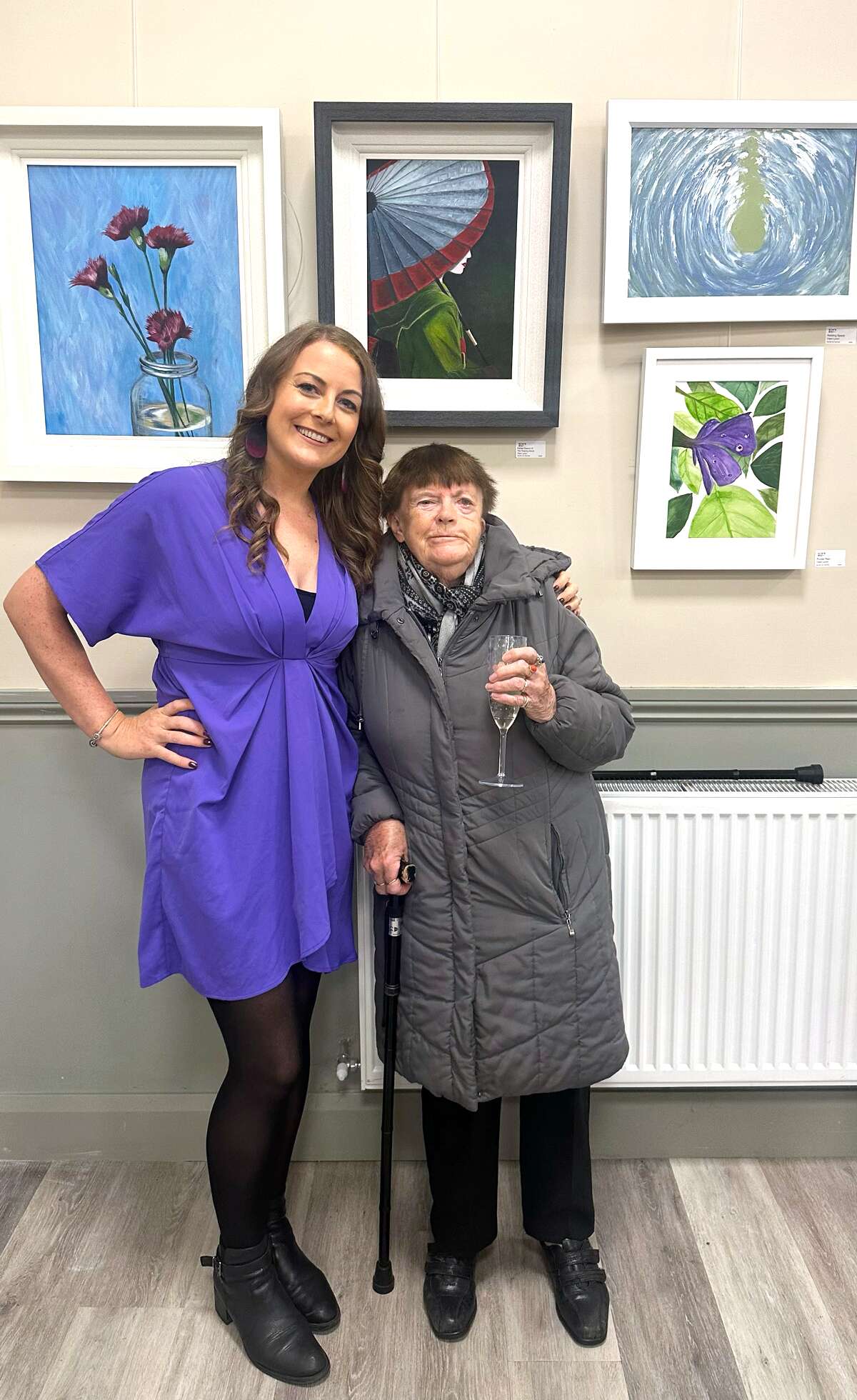
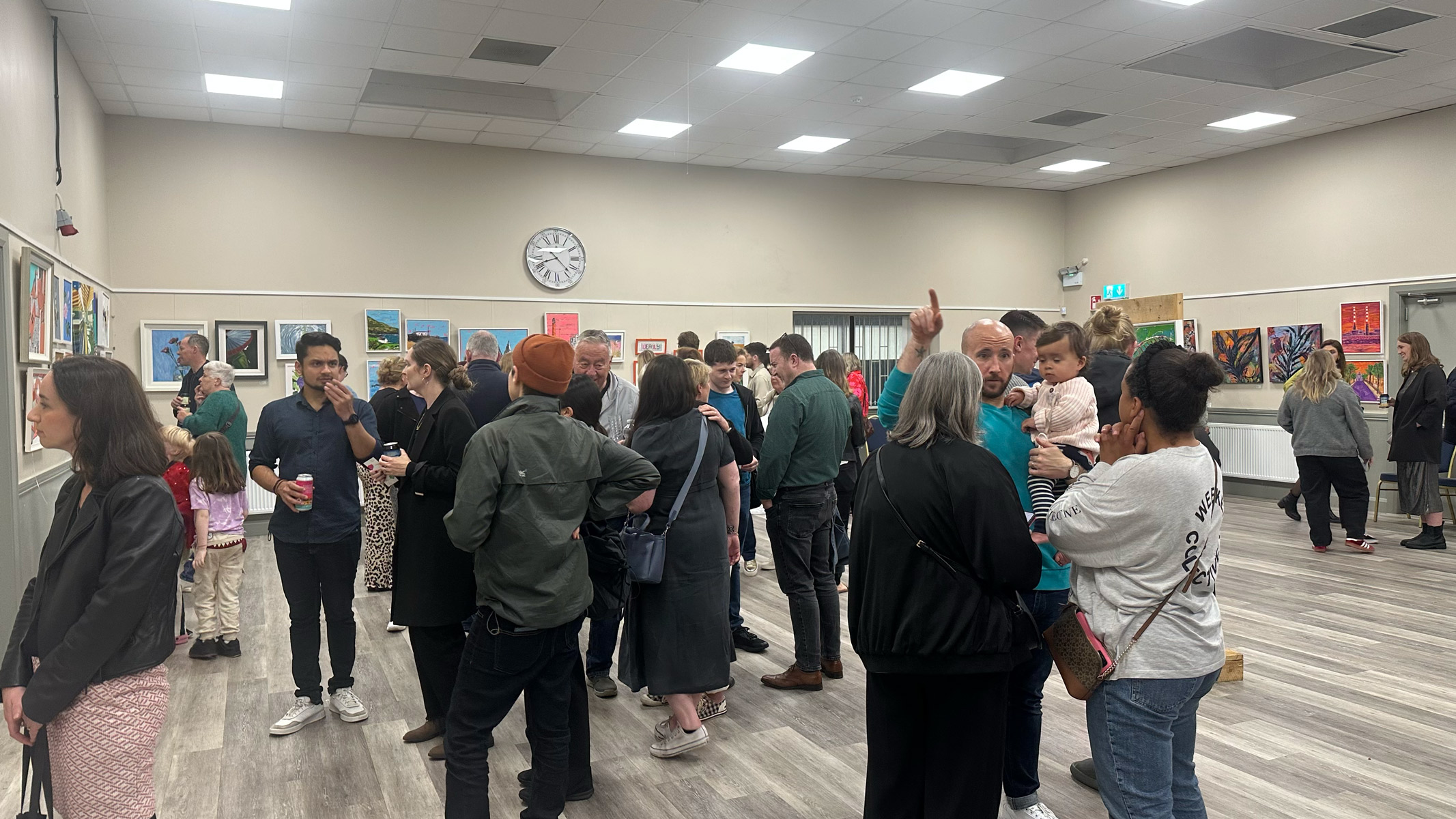
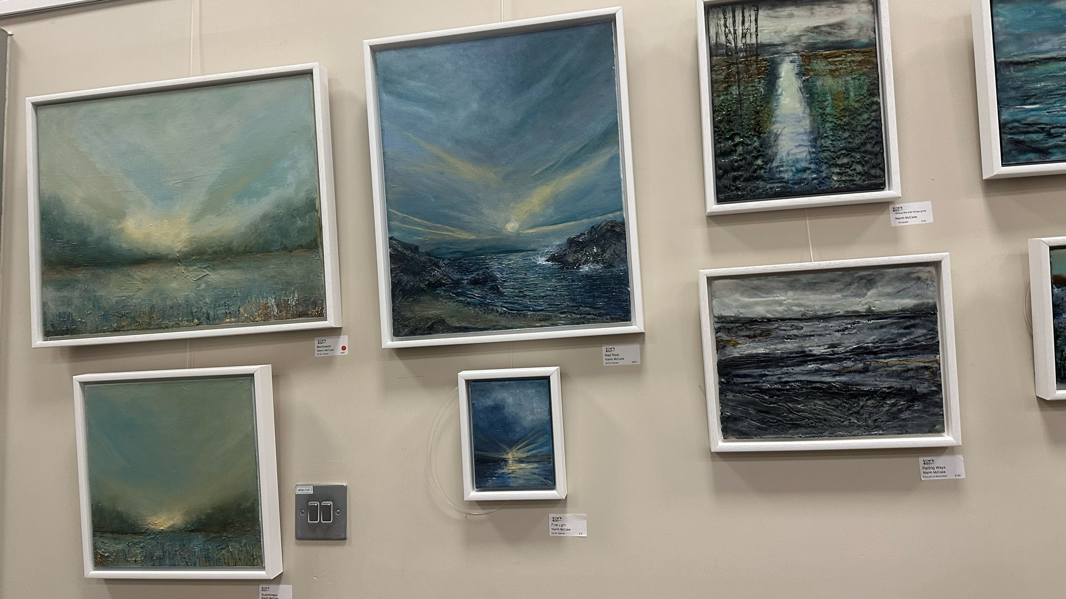
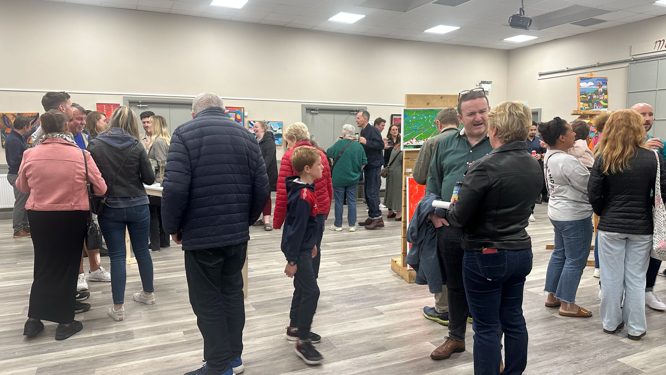
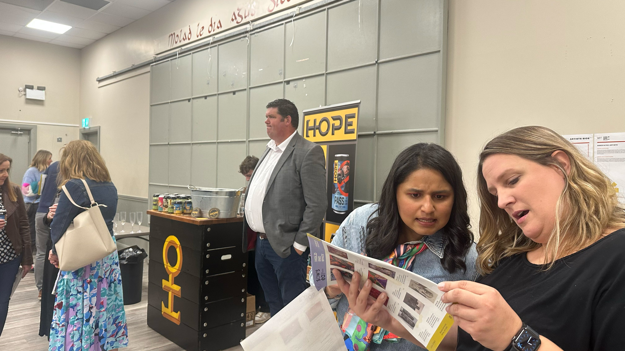
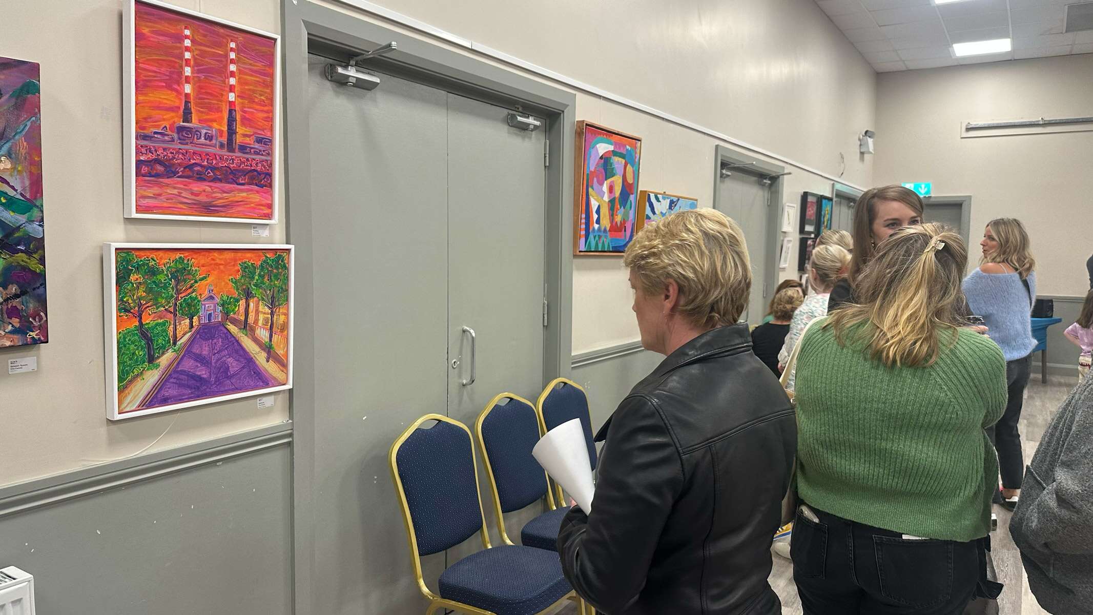
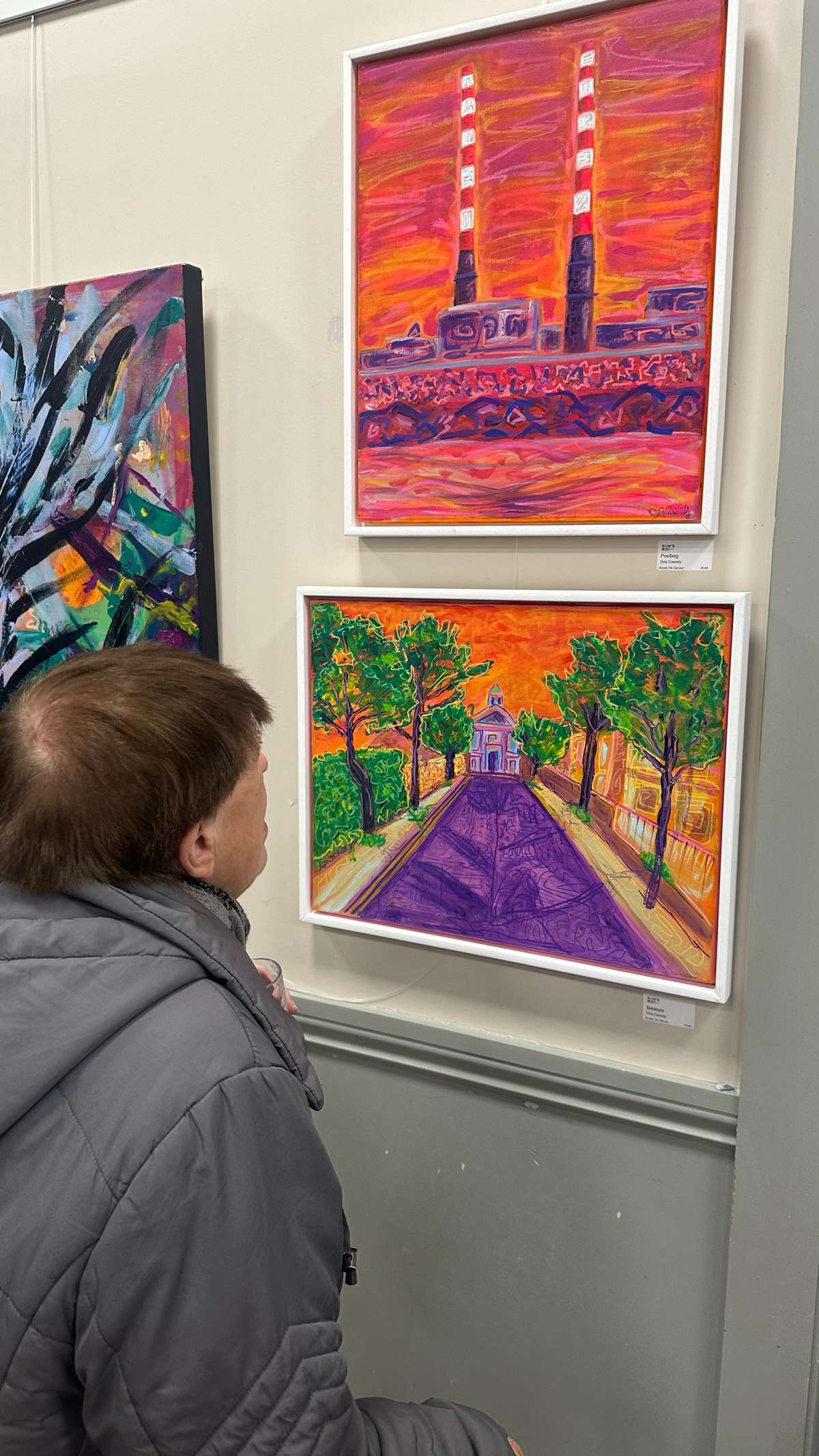
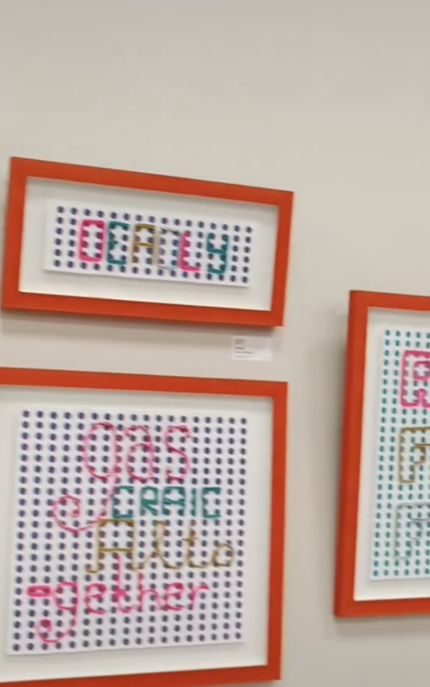
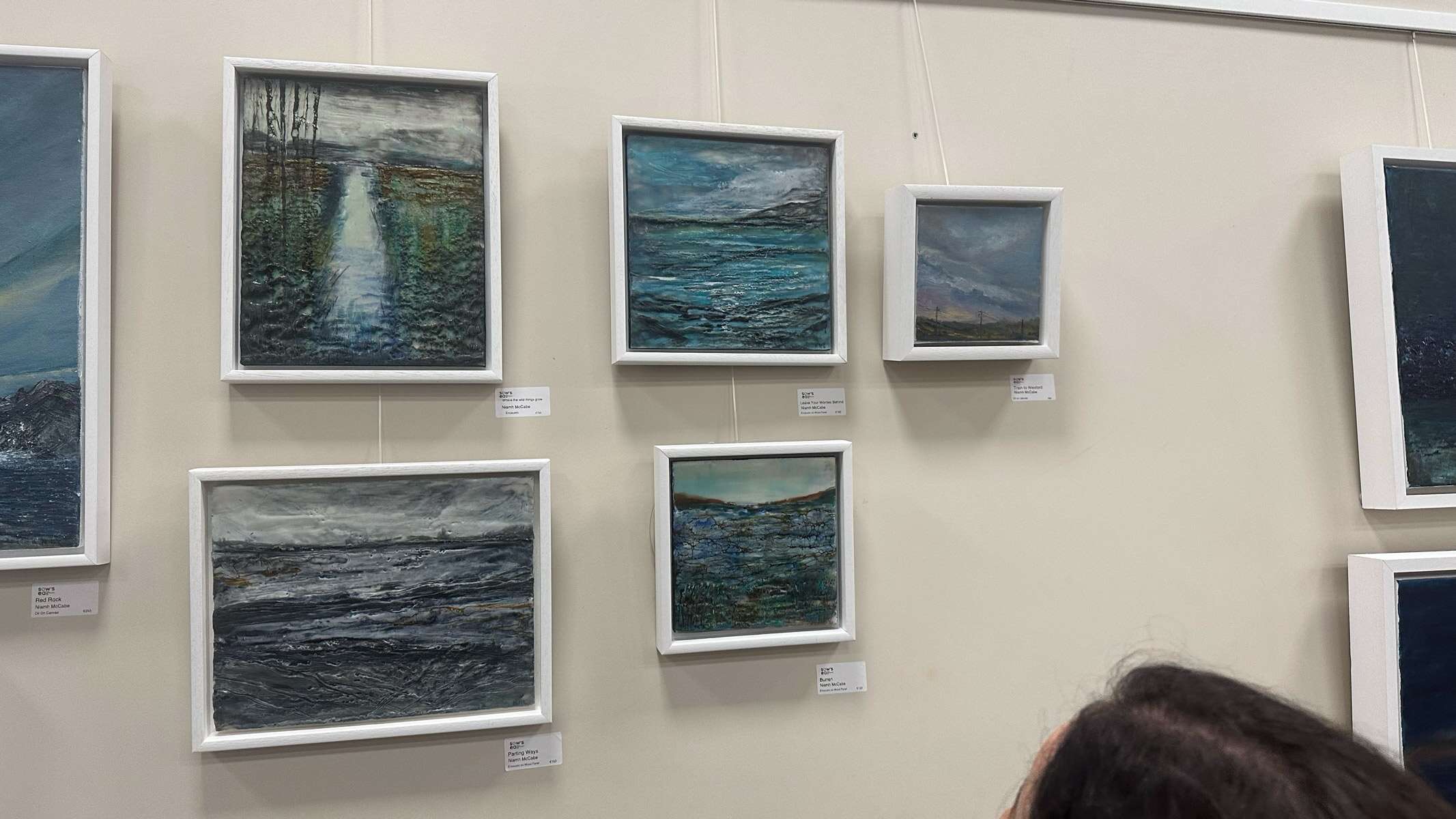
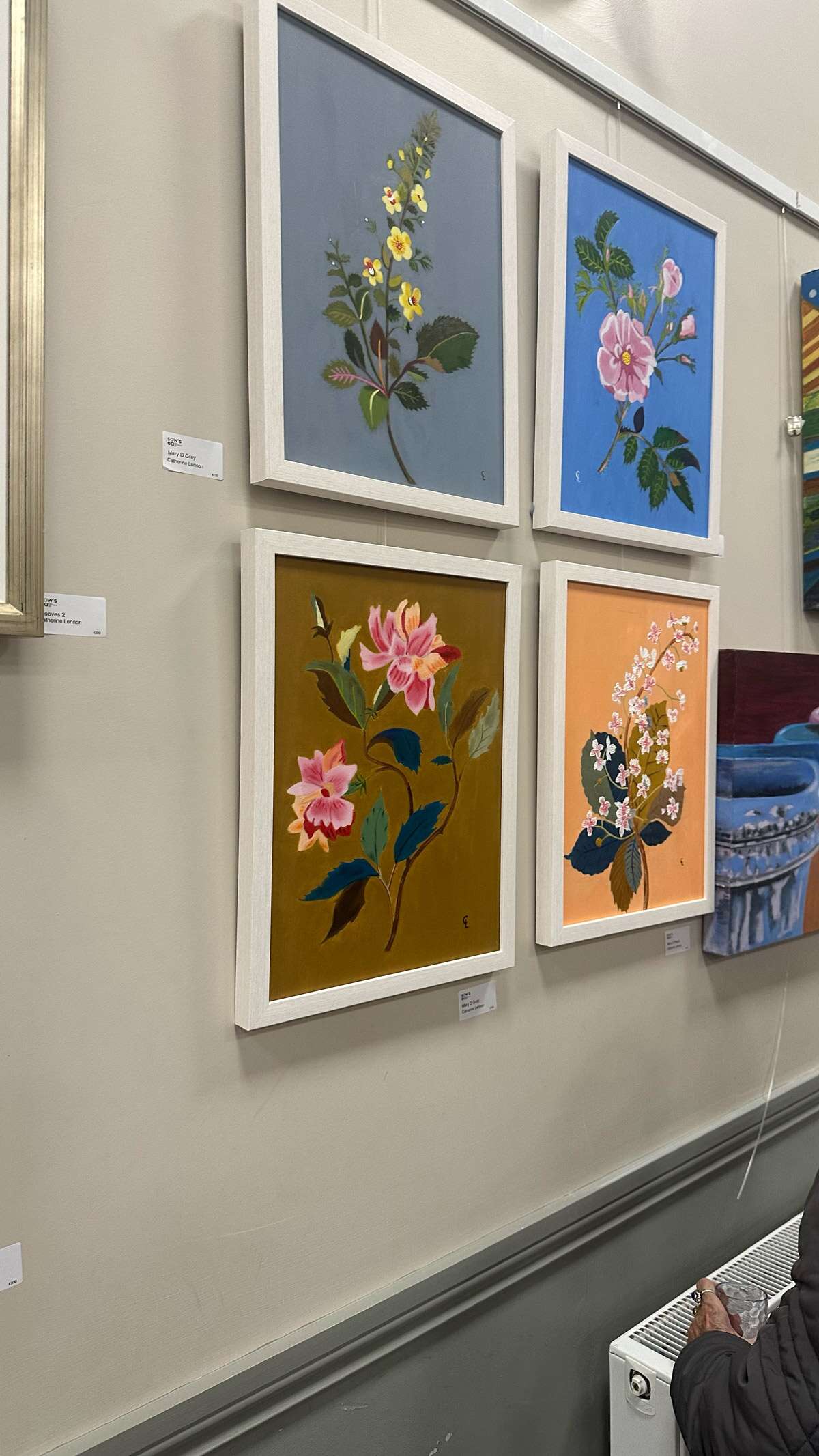
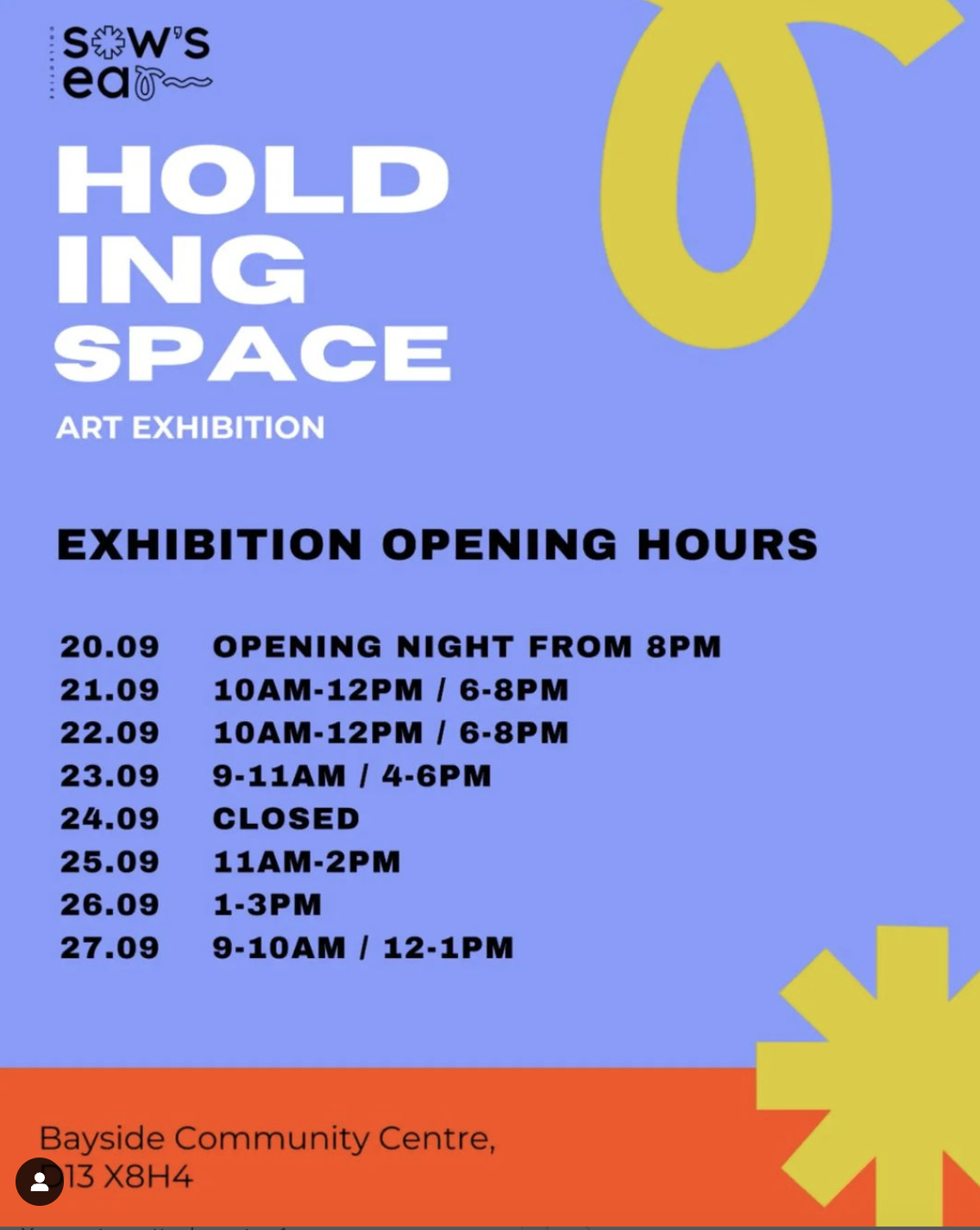
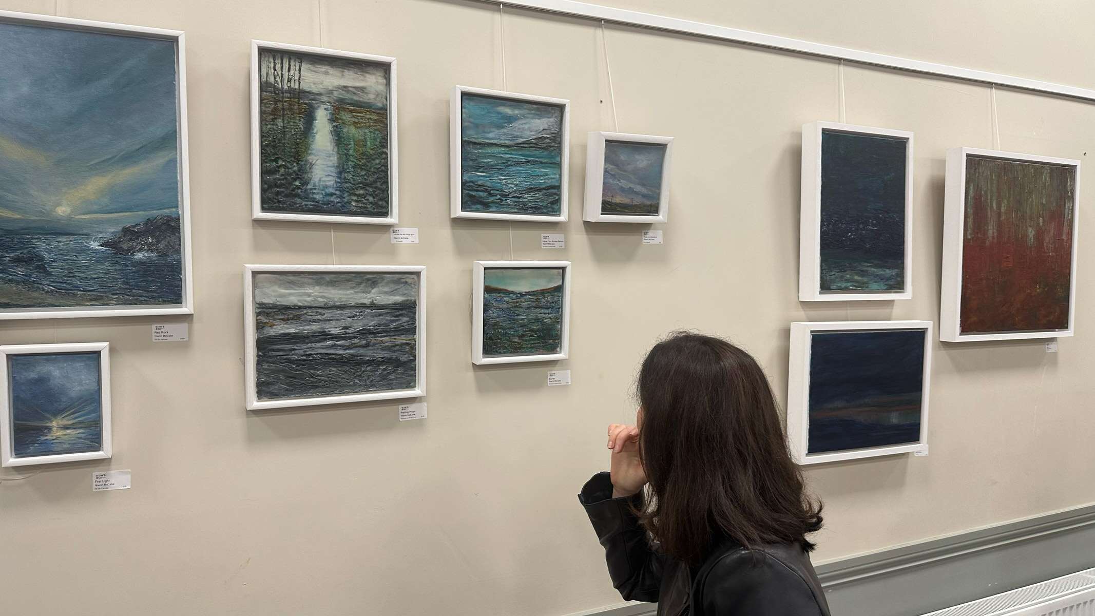
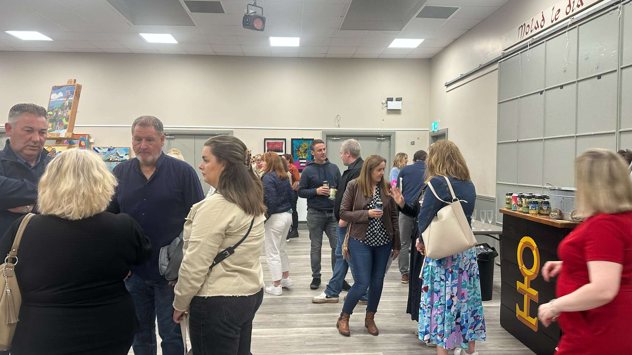
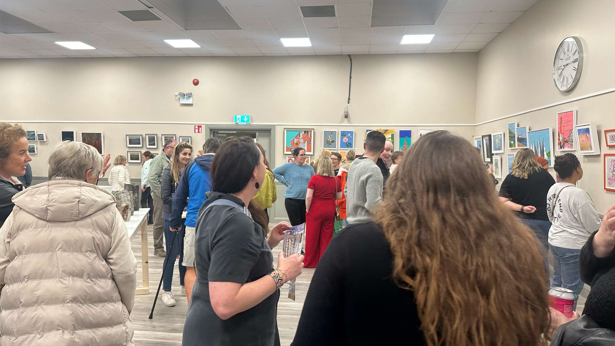
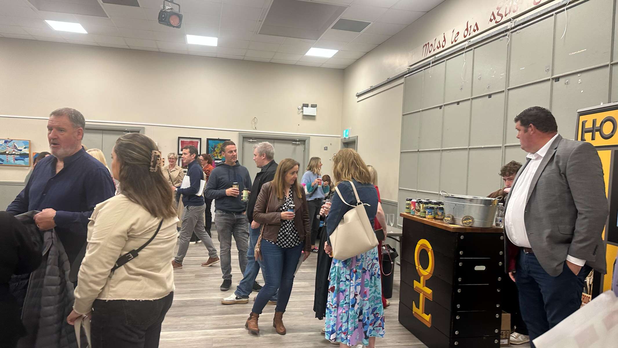
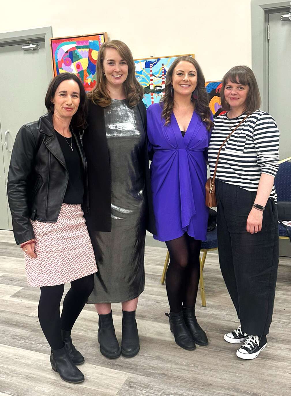
‘Holding Space‘ Sow’s Ear Art Collective: Culture Night 2024 Exhibition
It was great to be part of Holding Space, the inaugural exhibition of The Sow’s Ear Art Collective, which took place as part of Culture Night 2024, Friday, 20th September, at Bayside Community Centre. This special event marked the beginning of an exciting journey for our collective, bringing together a diverse range of artistic voices in a shared creative space.
The exhibition was a celebration of expression, connection, and the power of art to transform and engage. It was incredible to showcase my work alongside such talented artists, each offering a unique perspective that contributed to the rich tapestry of the evening.
A huge thank you to our generous supporters, Hope Beer Dublin and Zaira.ie, for helping make the night a success.
I love being part of this art collective group, it’s great to be around these other inspiring, friendly and supportive creatives and see all the various different types of mediums of art that they create. For those who attended – thank you for being part of this memorable night! And if you missed it, stay tuned for more exhibitions and projects from the Sow’s Ear Art Collective.
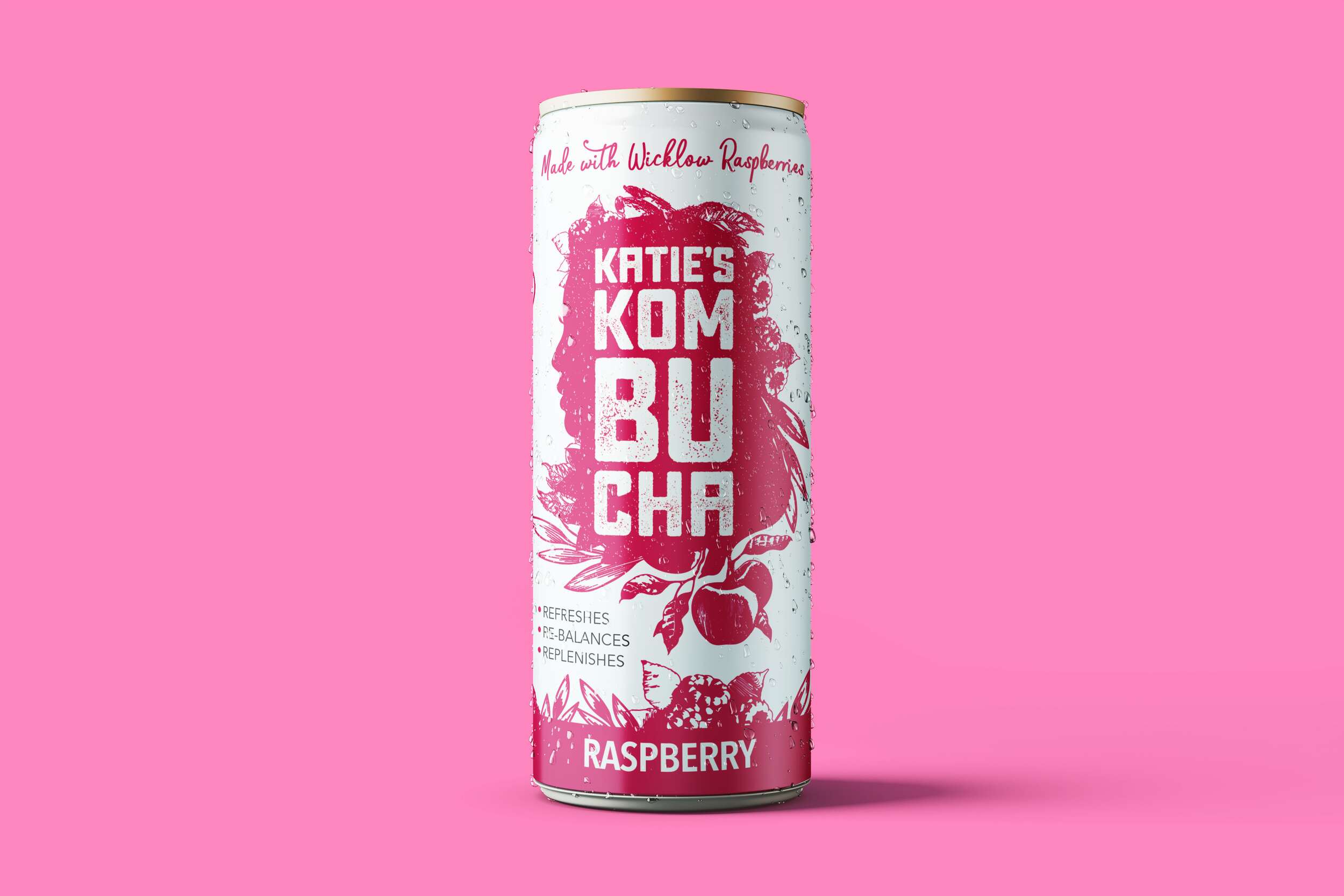
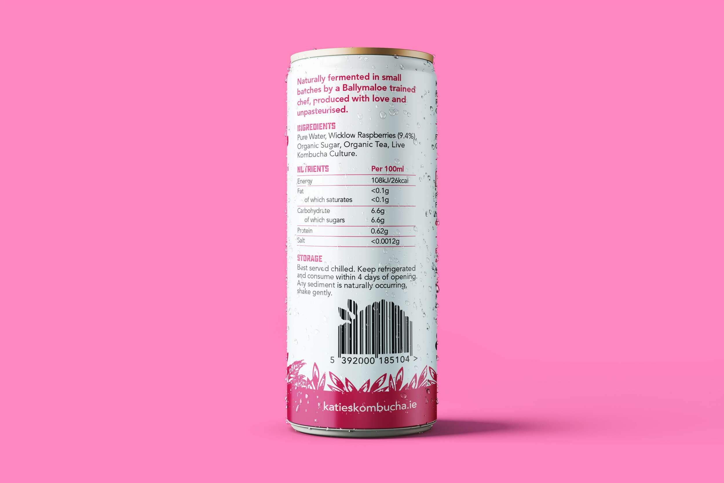
We are loving how well the brand packaging design of the Katie’s Kombucha range translated from the original glass bottles to these lovely slim cans. They are now available in both the bottles and cans in three tasty flavours.