Clare Lynch Creative – Graphic Design Services Dublin – Branding and Packaging Design
  • Home
  • About
  • Work
    • All Work
    • Branding & Identity
    • Packaging
    • Communication
    • Illustration
      • Hello Hinterland Book Illustration
  • Services
  • Testimonials
  • Blog
  • Contact

double-height

BK Coaching Branding

BK Coaching Branding


Brid Kehoe Coaching

Brid Kehoe Coaching are a holistic coaching practise who support clients in taking steps forward to change for the better and help them to uncover new routes to get there. They guide clients to improve wellbeing and focus, change career and much more through support, encouragement and introducing new creative strategies.

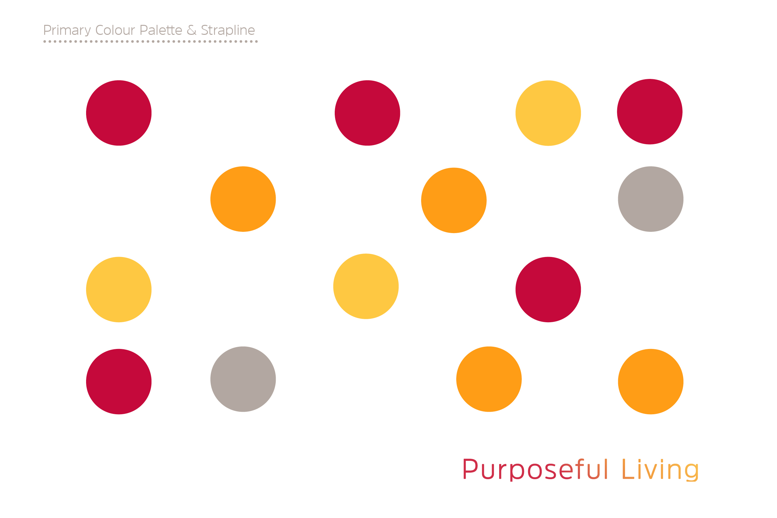
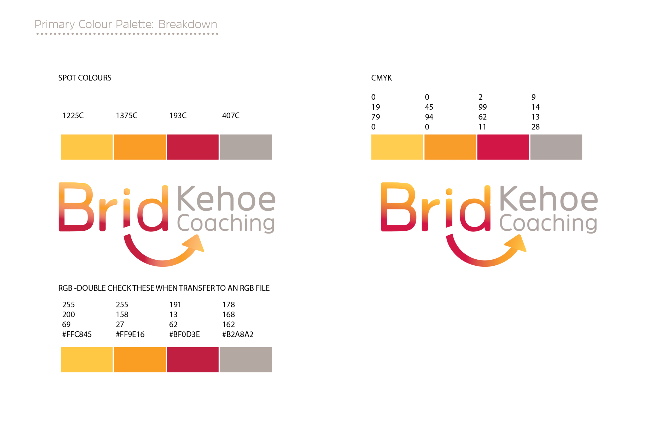
The arrow in this identity lockup represents how Brid Kehoe Coaching focus clients in an upwards direction in their life; the subtle smile and bright colours communicate the positivity and fresh outlook that they bring to all their clients.

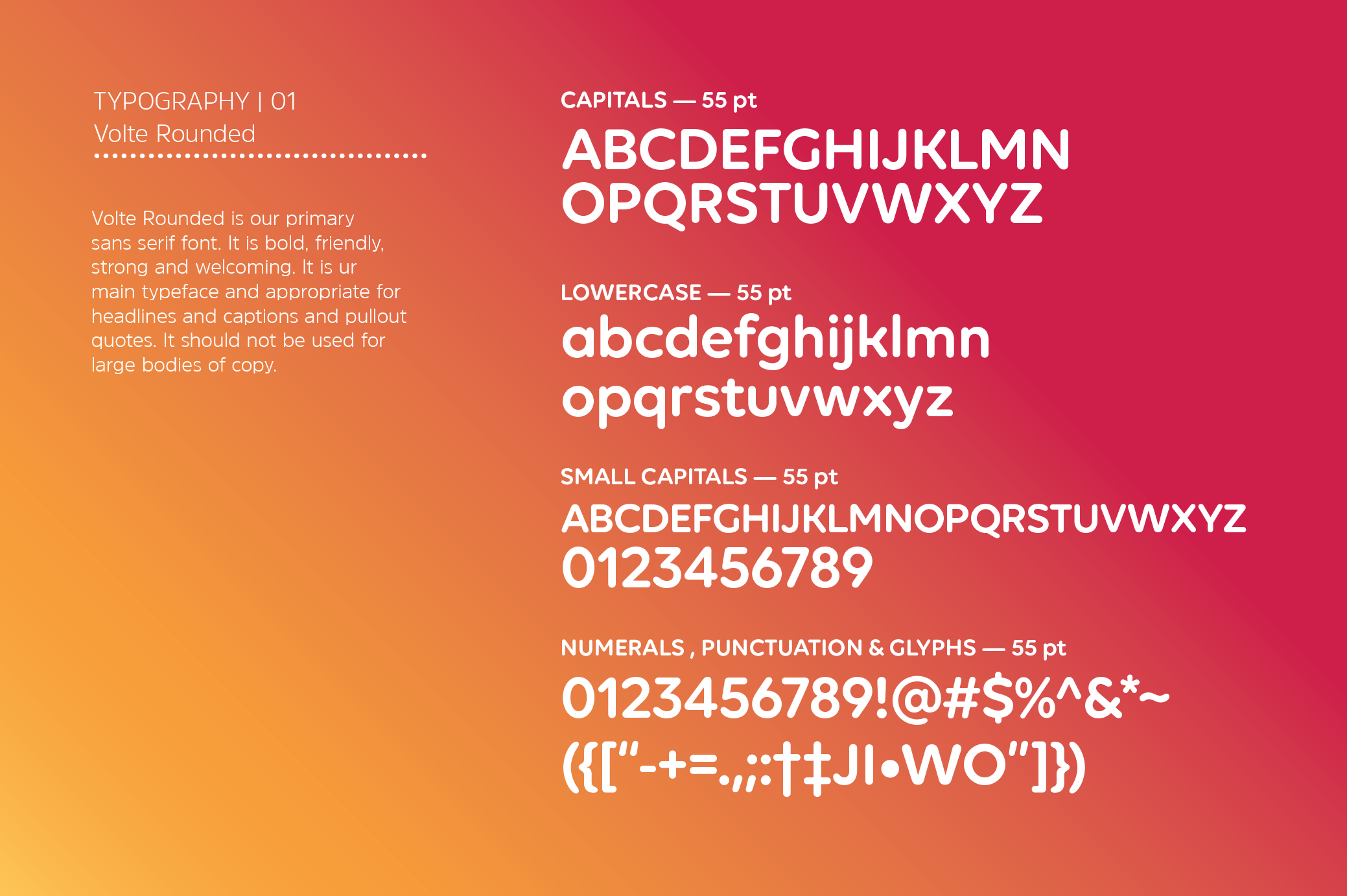
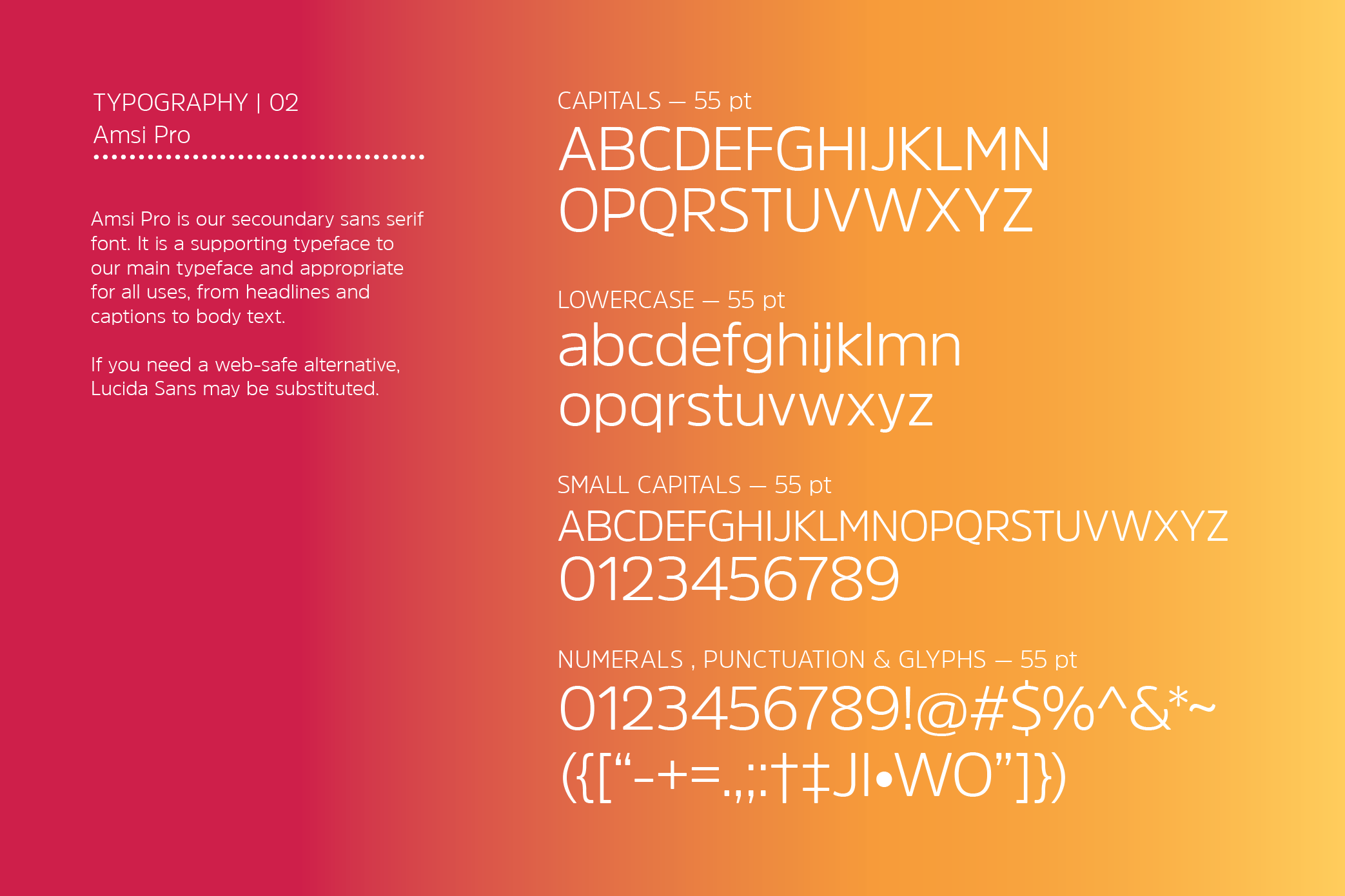
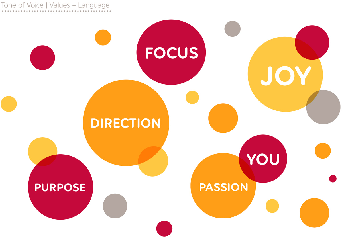
The visual identity kit includes the stationery suite and brand guidelines featuring the photography style, visual language, typography and colour palette which maintain a consistent brand style through all BK Coaching’s communication and points of contact with their potential clients.

See also Brid Kehoe Coaching Brand Booklet and BK Coaching Client Toolkit is to follow soon.

*This work received a graphic design award in the International Design Awards with an Honorable Mention.

February 21, 2018 /  

Esri UK – Design of Educational & Promotional eBooks

Esri UK – eBooks Design


01: Making the Connection

IPAD1xx

ipad7c

ipad7


02: Geospatial Intelligence


ipad5

ipad6


03: The Internet of Things


laptop2
laptop1
laptop4


04: Operational Intelligence


Esri UK ‘Bring Meaning to Maps’. Their technology combines maps with data so that you can see the world in a smarter way. They do this using powerful mapping software ‘ArcGIS’. ArcGIS connects people with maps, data, and apps through geographic information systems (GIS). It is a location platform that’s accessible to anyone, anywhere in the world at any time. Esri’s software is used by leading brands, government, defence, utilities and tech start-ups throughout the world.

Esri UK came to Clare Lynch Creative seeking to create a range ebooks to easily explain what they do and what they have to offer to both their existing and potential customers. These ebooks provide information about how their software works, along with up-to-date industry information and relevant key case studies. This content is displayed throughout the ebooks in an easy to follow visual style – using infographics, large imagery, block quotes and icons.

eBooks and online content are becoming more and more popular today, as it’s so easily accessible to everyone and also can be more cost-effective to businesses as opposed to printing and postage costs, so it’s great to work on such relevant digital projects with Esri UK. You can find out more about them here.

The ebooks have been highly commended to date, the client’s comments on the latest ebook were:

“Thanks – it looks great to me. It’s emerged as an excellent high quality piece of content that will prove very valuable.” – with the copyrighter we collaborated with adding: “The end result looks superb, I am very pleased with it and I think Esri are too.”

February 7, 2018 /  

Hotline.ie Annual Report

ISPAI Hotline.ie Annual Report


The brief was to design a mini-annual report for Hotline.ie publishing results for the year of 2013, with a greater focus on infographics to achieve a strong immediate impact. The client’s aim was for it to be more visually-appealing than their previous annual reports which were quite text-heavy and to make it easy to read and understand. It was designed along with a suite of other supporting collateral for their launch event including an invite and flyer.

As Hotline.ie rely on reports made about illegal content to them online, the cover symbol represents both the recognised WiFi internet signal icon and a loudspeaker for the awareness alerted through reports. The colour scheme is primary representing the innocence of the children needing protection. The clients were very satisfied with the results and said it helped them get their message across well on the day of the launch event. See Hotline’s feedback here.

March 27, 2017 /  

Pizza Pack Co Branding & Packaging

Pizza Pack Co
Identity, Packaging & Advertising


Pizza Pack Co is a fun home pizza-making kit, which equips the customer with ingredients and instructions to make their own fresh and tasty pizzas at home in just 10-15 minutes. Each pack comes supplied with pizza dough, tomato sauce and topping ingredients for the chosen flavour / type of pizza. This is a fresh and innovative new idea to the market that creates a whole new enjoyable experience out of the usually-mundane task of making dinner.

It is primarily aimed at a young, interactive target audience but can also appeal to different categories. For example, it is an easy and fun activity to do as a couple’s date-night / as an adult & child bonding activity or as friends having a night in together. The brief was to create branding and packaging for Pizza Pack Co that embodied youth, colour and brightness while evoking a feeling of energy and life.

Some elements considered when creating this branding were: the raw feel of pizza fresh from the oven, the light-heartedness and fun of making the pizza from scratch along with emphasizing how the ingredients are fresh. I chose imagery which conveyed the energy of the target audience enjoying the experience along with fun, quirky baking tool icons. There is a D.I.Y. feel incorporated into the layout and typography in the collateral, giving a sense of action and movement. The language used is open and friendly, using slogans that are bright and fresh to appeal to the vibrant, fast-paced target audience.

Displayed is the range of collateral designed for Pizza Pack Co, which includes the logo and colour variations, business card, outdoor advertisements, wobbler tag and the box & pot images. The client was very happy with the result and felt it embodied all the values that they wished to portray to consumers correctly.


*Whilst at Bravo Outdoor Advertising.
August 21, 2014 /  

Esri Ireland Direct Mail Campaign

Esri Ireland Direct Mail Campaign

Esri_DM_Flyer_1
Esri_DM_Flyer_2
Esri_DM_Flyer_3b
Esri_DM_Flyer_4
Esri_DM_Flyer_5b
Esri_DM_Flyer_6

Esri Ireland are a software and services organisation specialising in the application of geographic information systems or “GIS”. GIS is based on the simple principle of attaching a location to every piece of data. They help customers record where things happen and analyse why, to give business insight on which to make better decisions. Clare Lynch Creative has worked with their Irish and UK offices on many projects over the past year, including online marketing & advertising campaigns, ebooks, printed mailers and infographics.

These two promotional pieces, a DM and an A5 info-booklet provide information on one of their popular software packages ‘Workforce for ArcGIS’ which helps field workers optimise how they work – tracking and scheduling jobs easily, creating a much easier information-capturing system for these companies. Location-based data and tracking play a big role in influencing the design when working with Esri. The client was pleased with the overall result;

“It looks great, thanks a million, delighted with how it all turned out. Nice work!”

August 21, 2014 /  

Posts navigation

About me

Clare Lynch Creative are a Dublin based graphic design practice specialising in the design and development of unique brand identities, packaging, visual communication and print design.

Popular Posts

  • Favourite Design Feature: Grásome! May 13, 2025
  • Incognito Art Exhibition 2025 April 14, 2025
  • ‘Creative Convergence: Where Art & Design Meet’ Exhibition March 13, 2025
  • Paris Packaging Week 2025 February 4, 2025
  • Bounce Design Event January 14, 2025

Archives

  • May 2025
  • April 2025
  • March 2025
  • February 2025
  • January 2025
  • November 2024
  • October 2024
  • September 2024
  • August 2024
  • July 2024
  • June 2024
  • May 2024
  • April 2024
  • December 2023
  • June 2023
  • October 2022
  • April 2022
  • March 2022
  • February 2022
  • January 2022
  • November 2021
  • October 2021
  • July 2021
  • November 2020
  • August 2020
  • July 2020
  • June 2020
  • April 2020
  • January 2020
  • December 2019
  • November 2019
  • October 2019
  • June 2019
  • May 2019
  • April 2019
  • January 2019
  • November 2018
  • August 2018
  • July 2018
  • May 2018
  • March 2018
  • November 2017
  • September 2017
  • August 2017
  • July 2017
  • June 2017
  • May 2017
  • February 2017
  • January 2017
  • December 2016
  • September 2016
  • August 2016
  • July 2016
  • May 2016
  • April 2016
  • March 2016
  • February 2016
  • January 2016
  • June 2015
  • April 2015
  • March 2015
  • December 2014
  • March 2014
  • December 2013
  • November 2013
  • October 2013
  • April 2013

Categories

  • Blog
  • Brand Identity
  • Branding
  • Logos
  • Packaging
  • Uncategorized

Tags

2017 2022 Advertising art artist awards best design brand brand design brand identity branding brand packaging design clarelynchcreative Clare Lynch Creative communication creative Creativity Design designer design event designinspiration dog treats Dublin exhibition feature featured graphicdesign Graphic Design graphic designer Illustration ireland irish Irish design logo design packaging packagingdesign packaging design pet food Poster design print tara gartlan chocolate temple bar Typography whiskey wishes

Clare Lynch Creative


Clare Lynch Creative

Graphic Design Services
Tara Building, Dublin 2, Ireland
hello@clarelynchcreative.com instagram.com/clarelynchcreative
©2025 Clare Lynch Creative

Award Winning Design Studio Specialising in Branding, Identity and Packaging Design Services