Thanks to the Favourite Design blog for the feature of our Brand Packaging Design project for Blarney Bees Irish honey on their website, Instagram and Facebook pages.
Blarney Bees Honey Products create traditional and modern Irish honey infusions, using 100% Pure Raw Irish Honey, crafted by their Irish honeybees in Blarney, Co. Cork. The small-batch production method guarantees a distinctive flavour for each batch, while preserving the aroma, texture, and taste of raw Irish blossom honey.
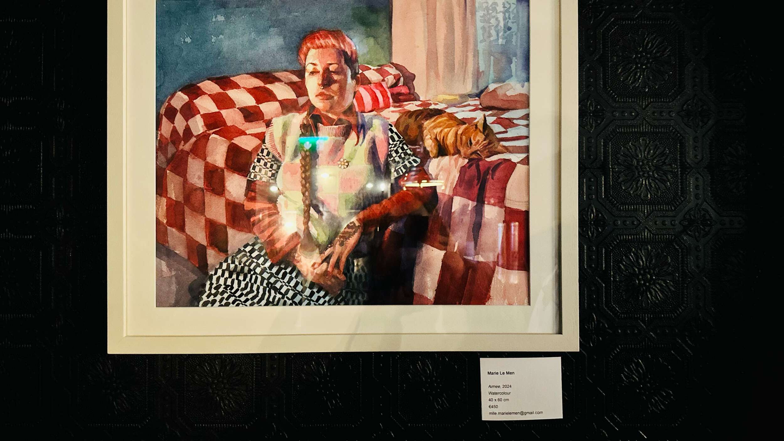
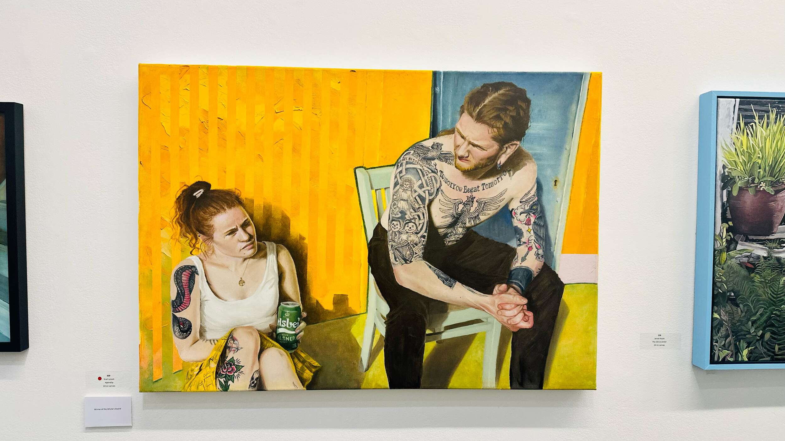
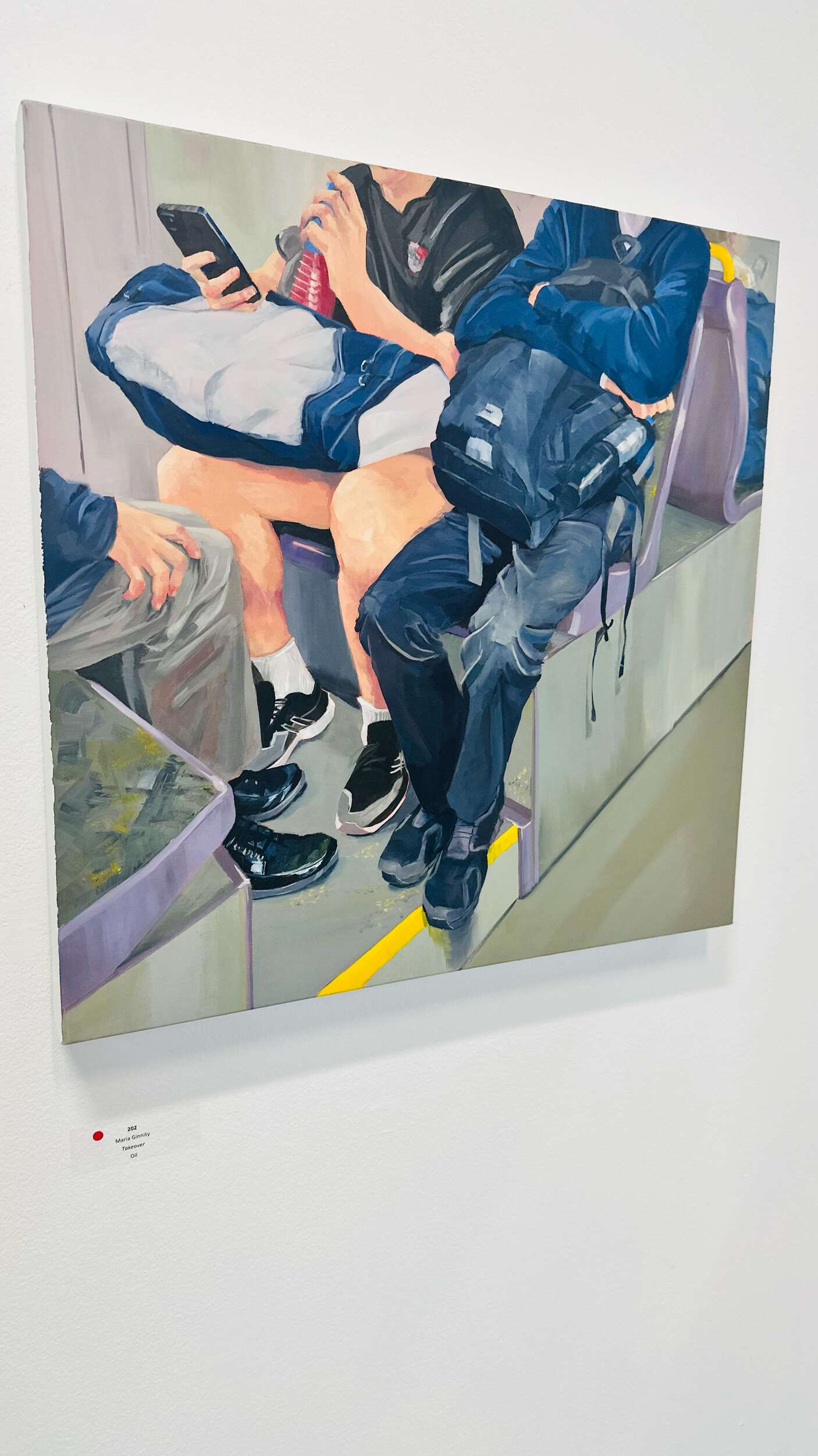
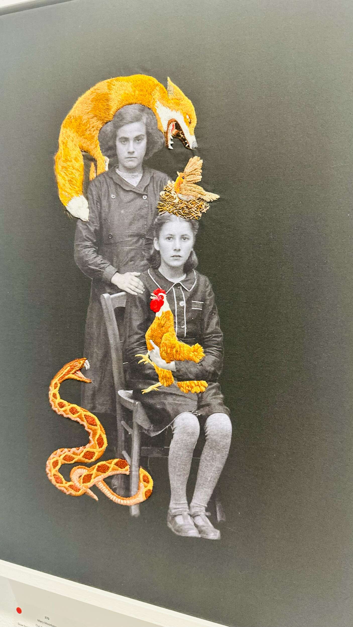
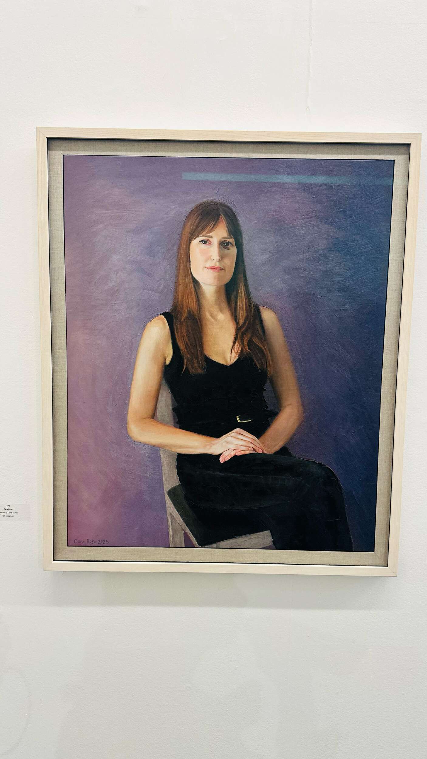
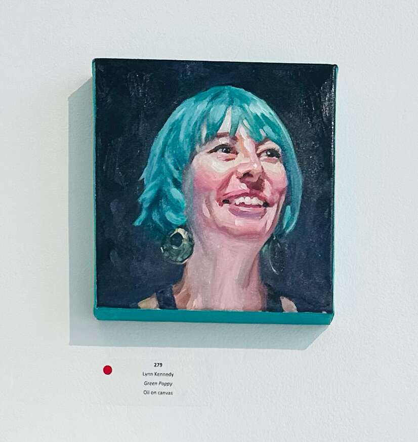
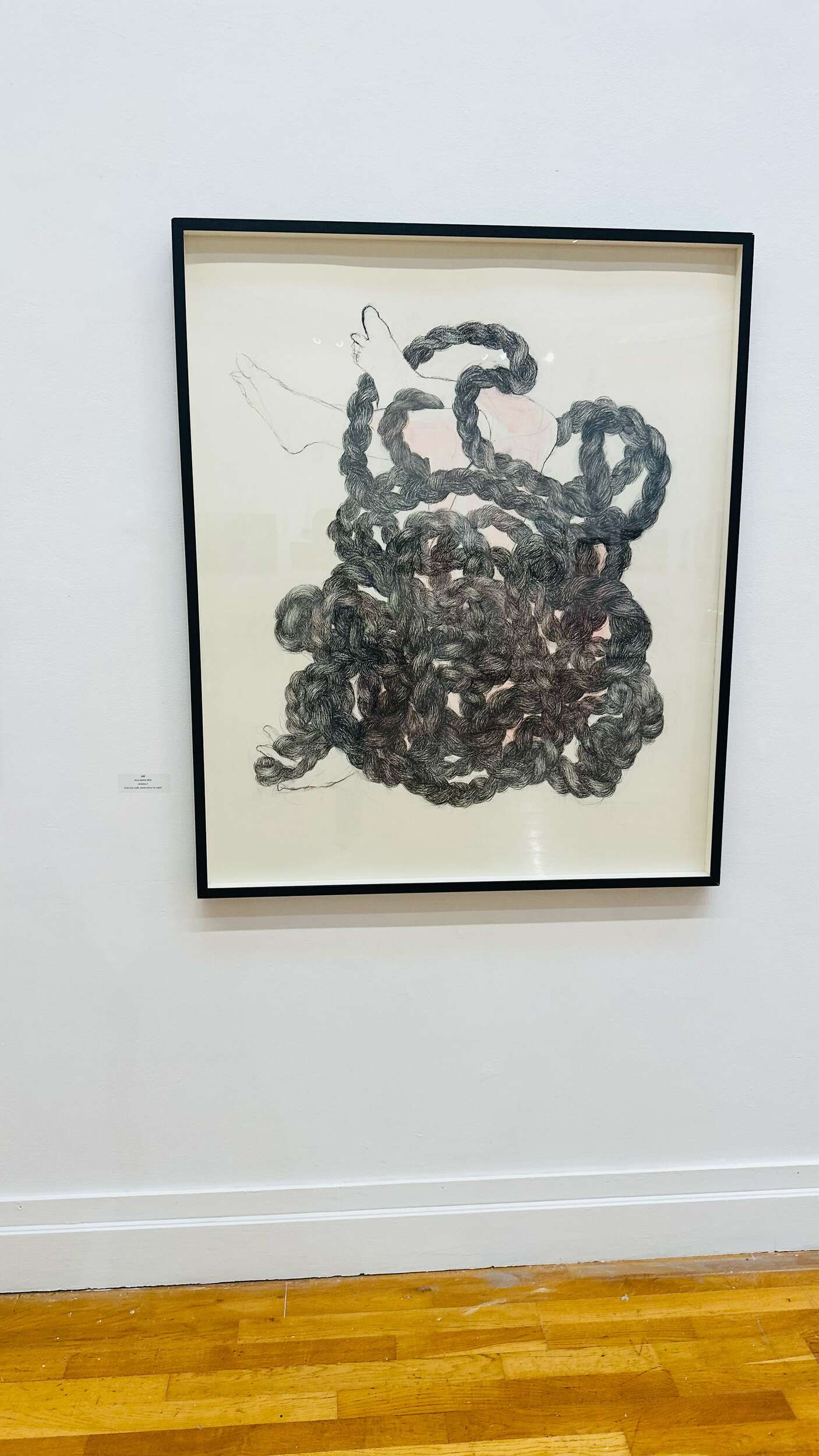
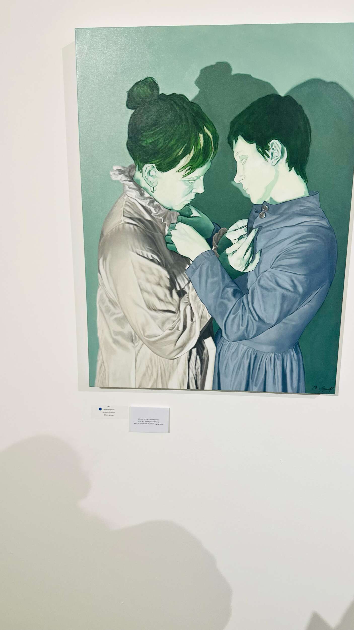
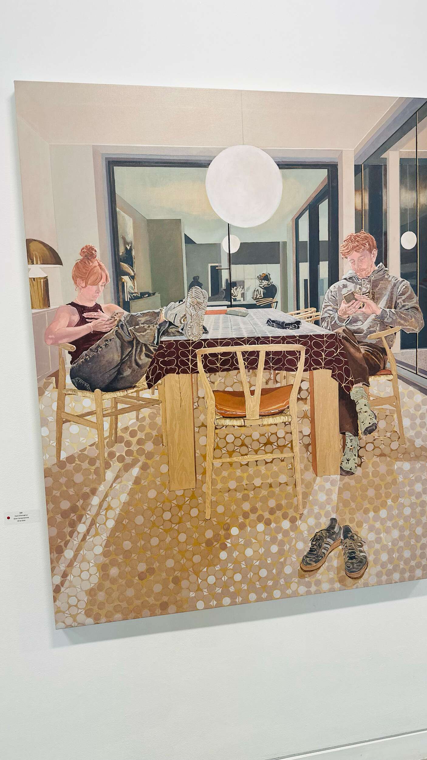
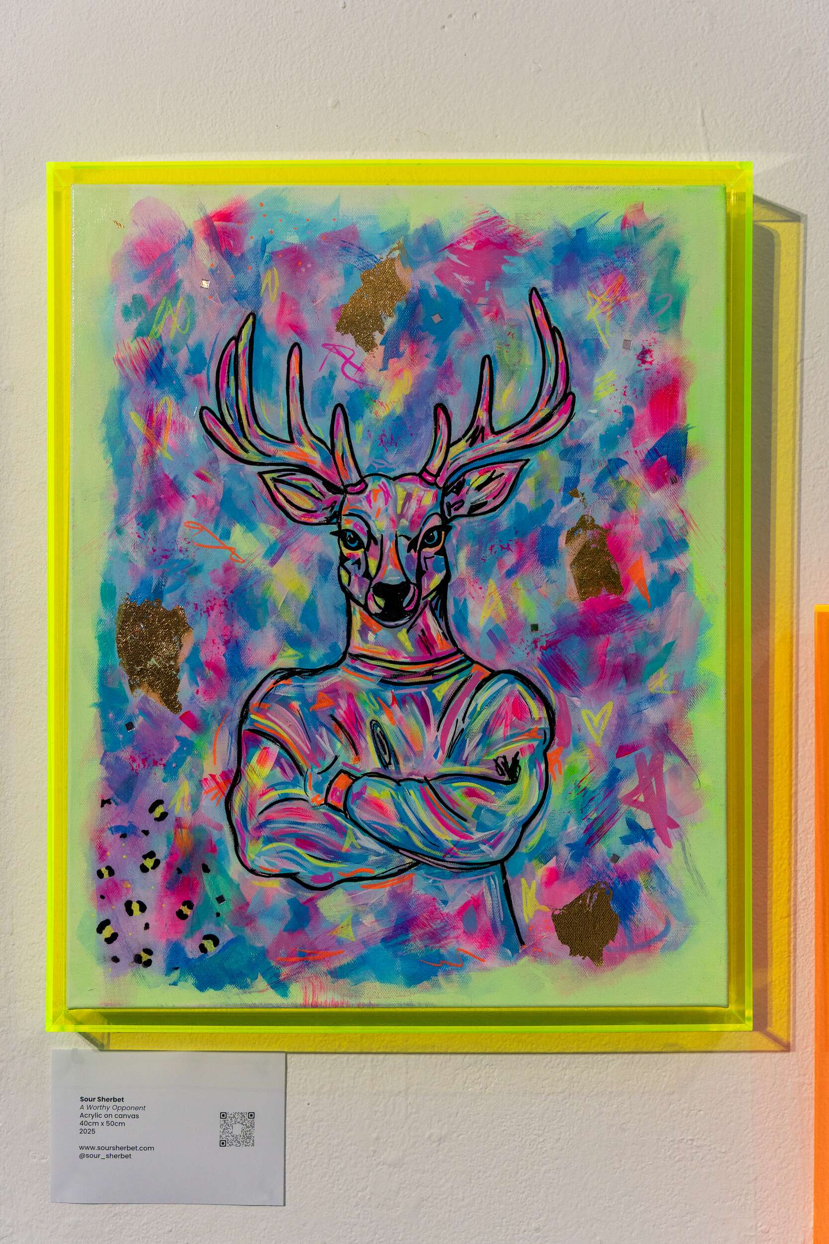
I love to visit art and design exhibitions to stay creatively inspired. It’s always exciting to see how there are so many different styles of art and every artist is unique and brilliant in their own way. Below are some exhibitions I’ve visited over the past few months. I enjoy painting and drawing myself, so seeing these artworks motivates and inspires me to what is possible to achieve. It also often inspires my design work. I find keeping active in creative interests and outlets outside of graphic design fuels and enhances my design work.
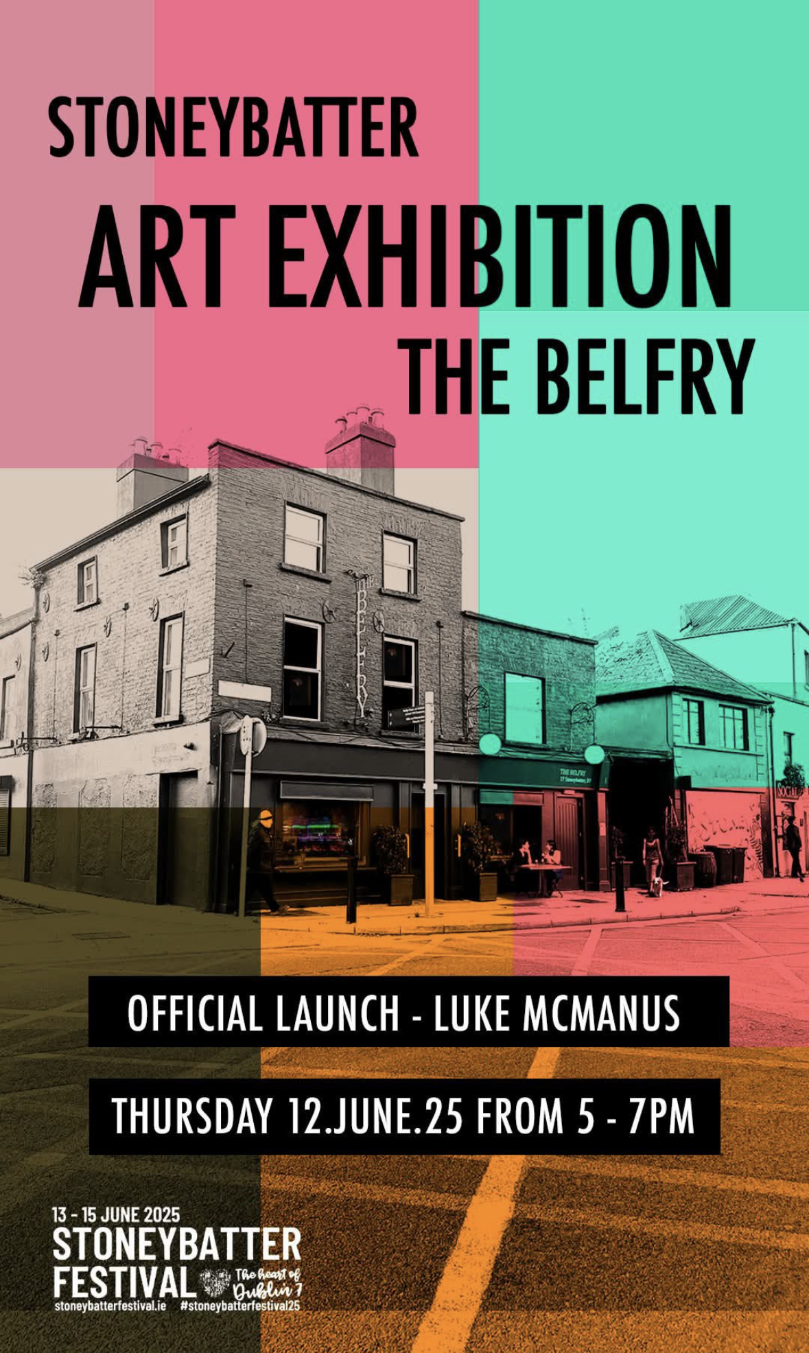
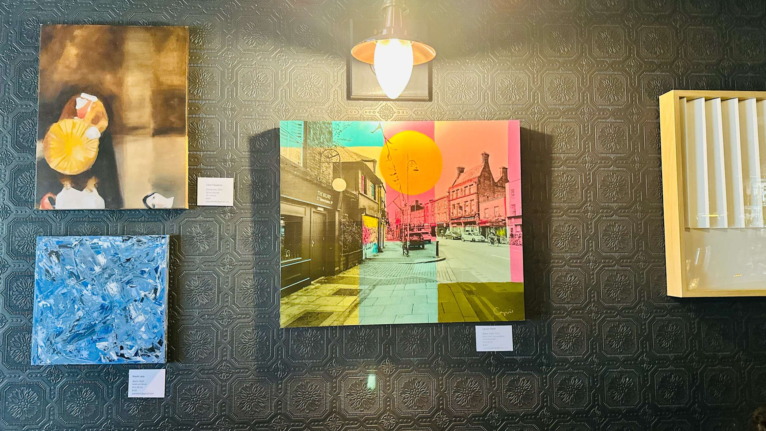
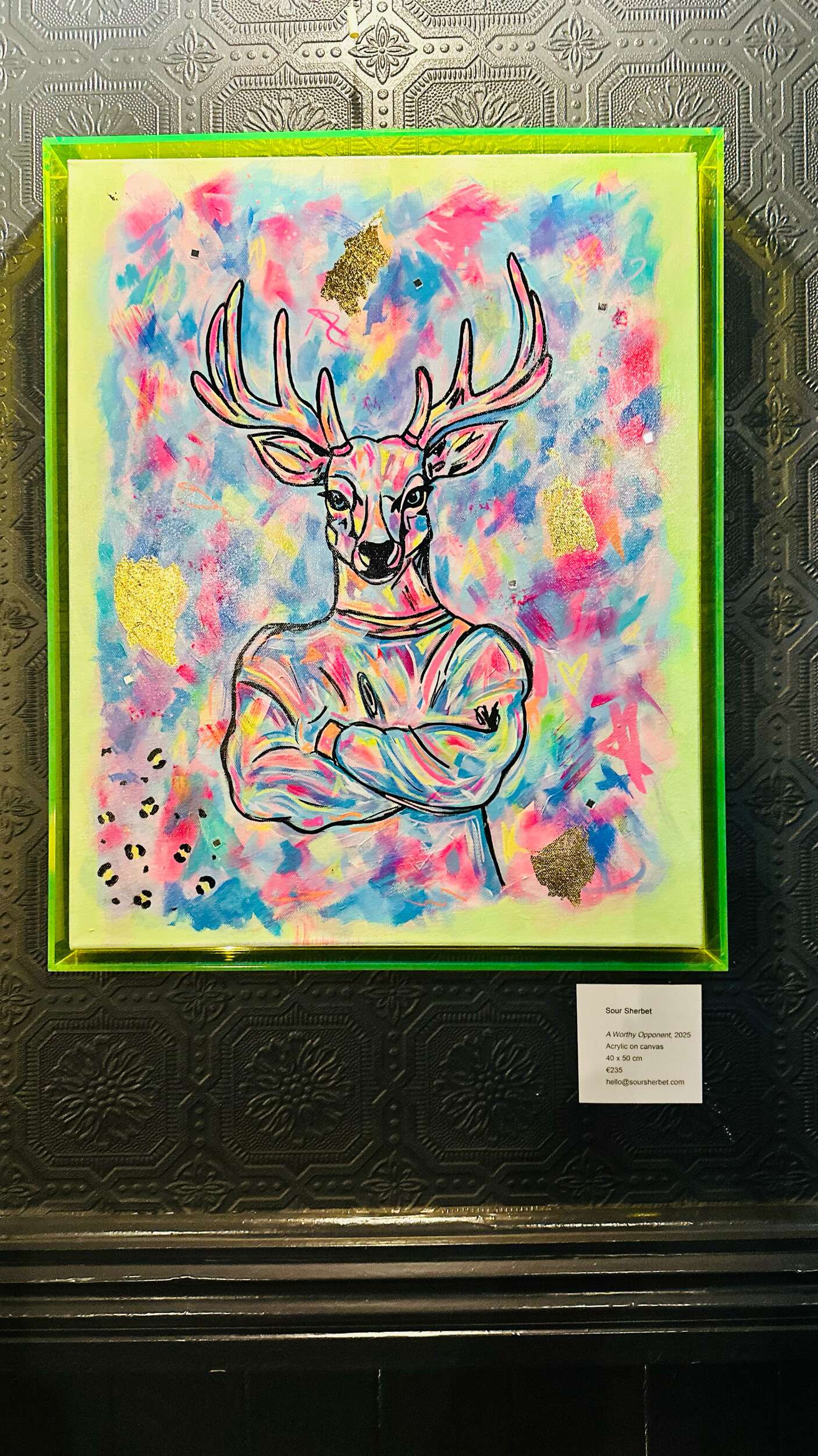
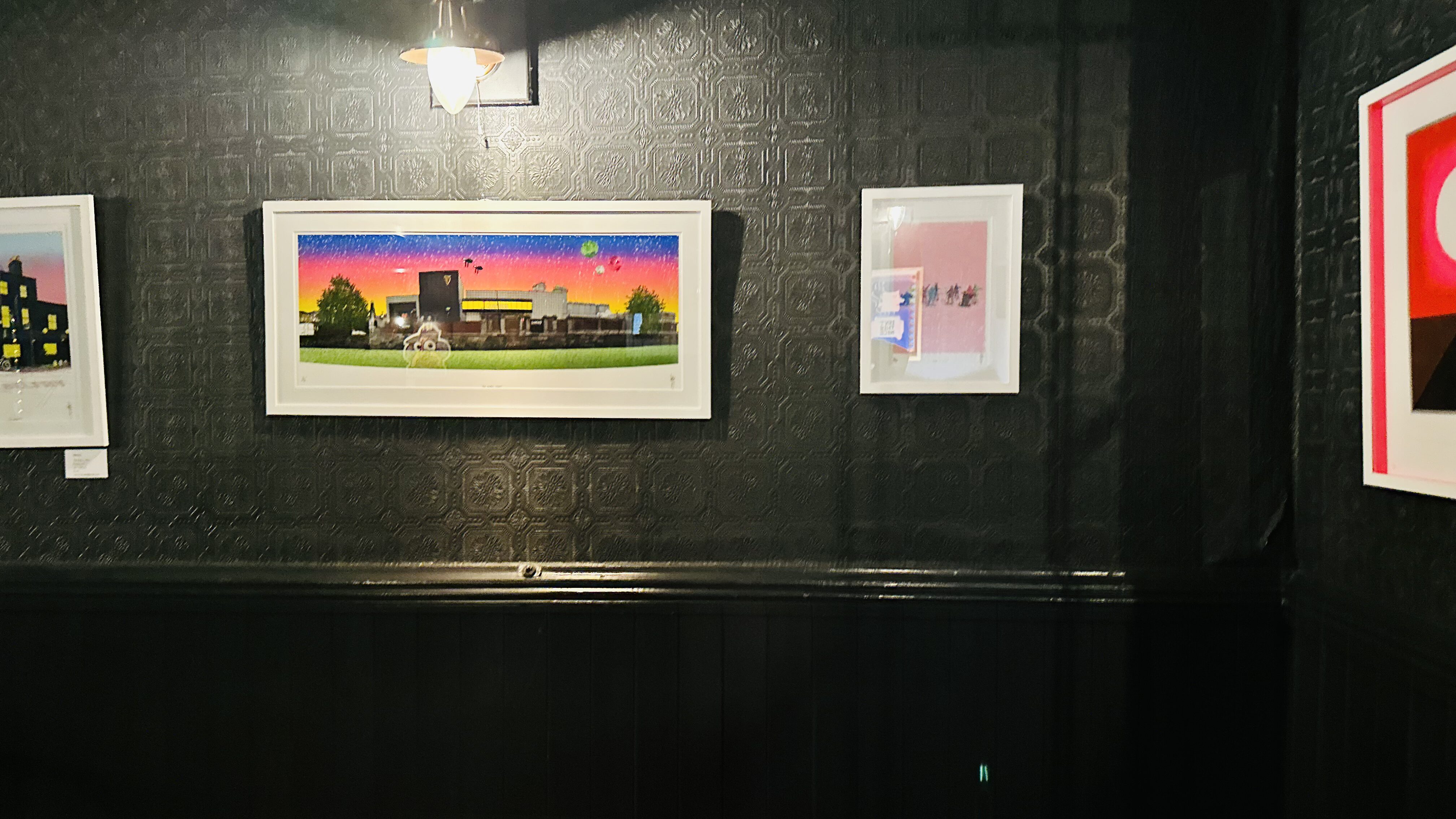
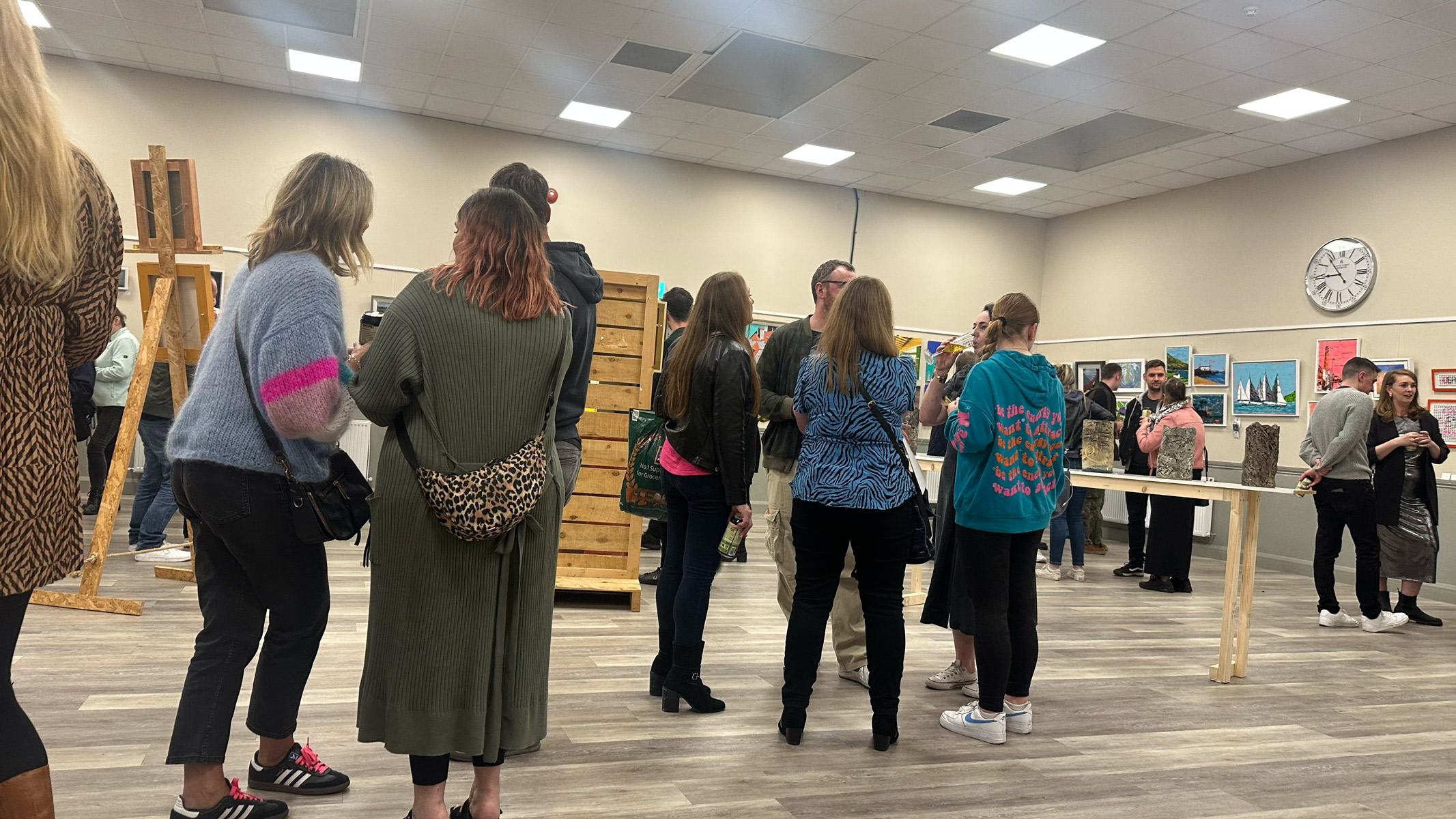
Stoneybatter Arts Festival Exhibition at the Belfry
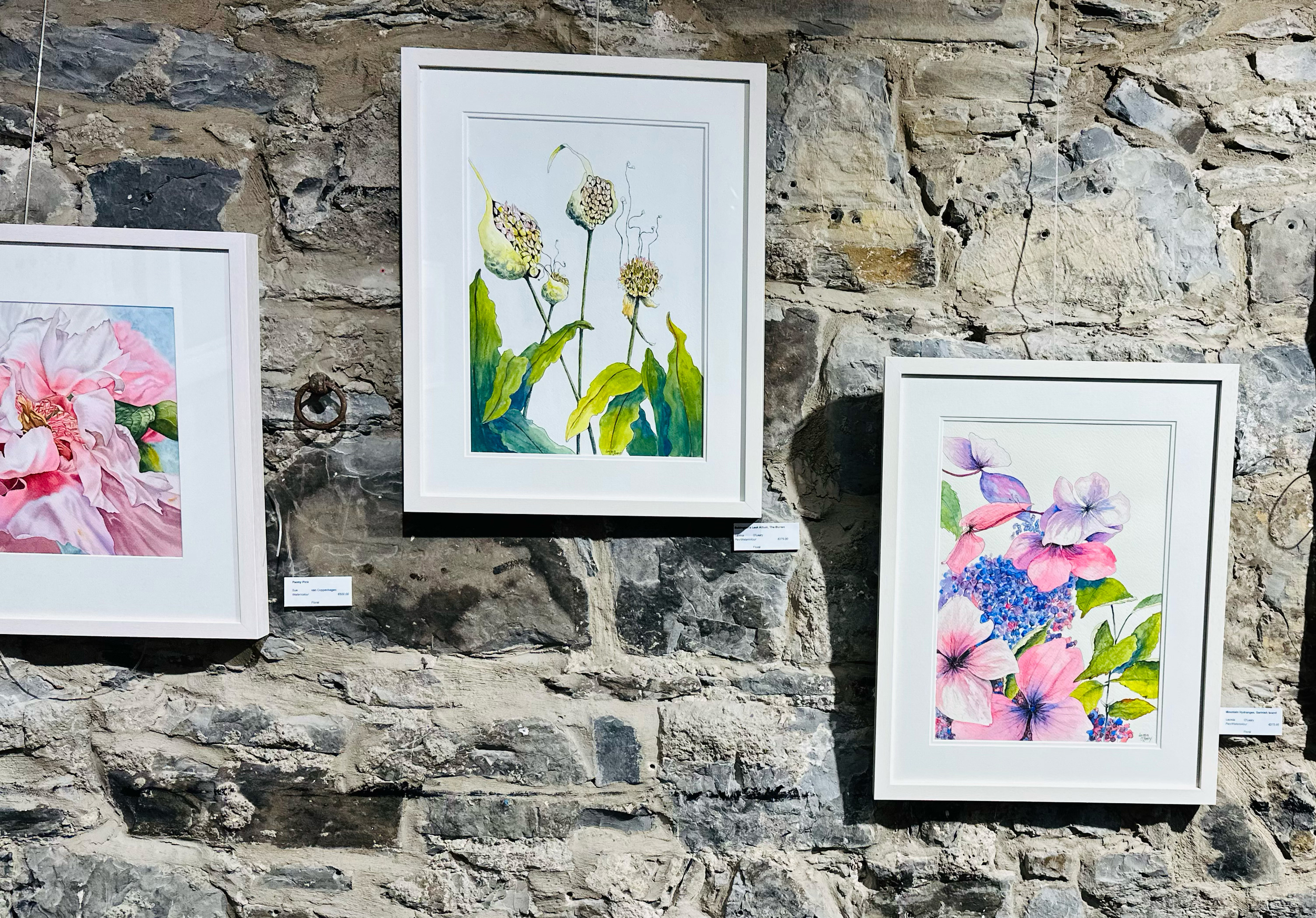
3. Bloom Art Exhibition at the Phoenix Park Visitor Centre
Great to see the stunning botanical art from Lavinia O’Leary at the 11th annual Bord Bia Bloom 2025 Art Exhibition in the Phoenix Park Visitor Centre in Dublin recently.
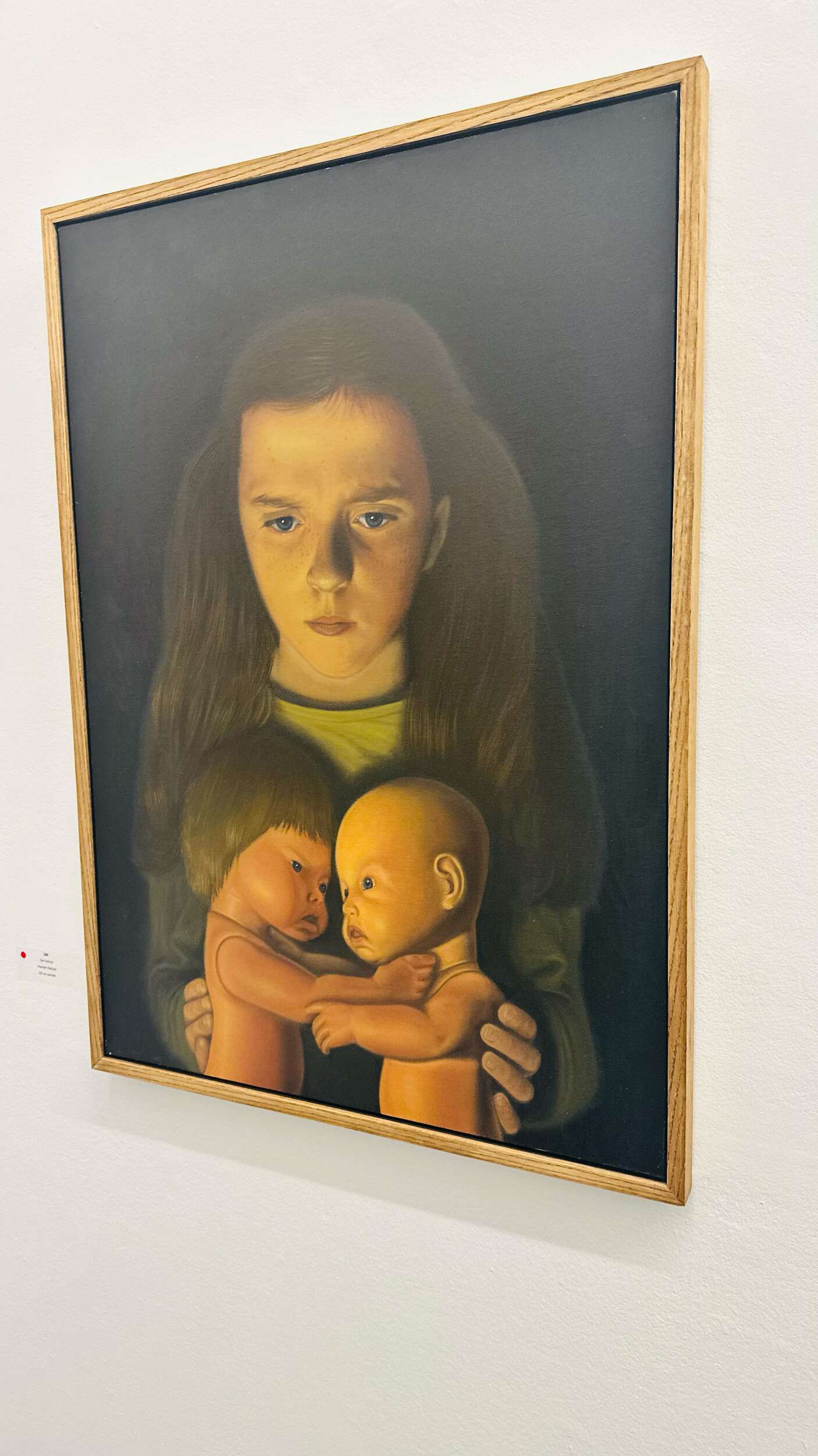
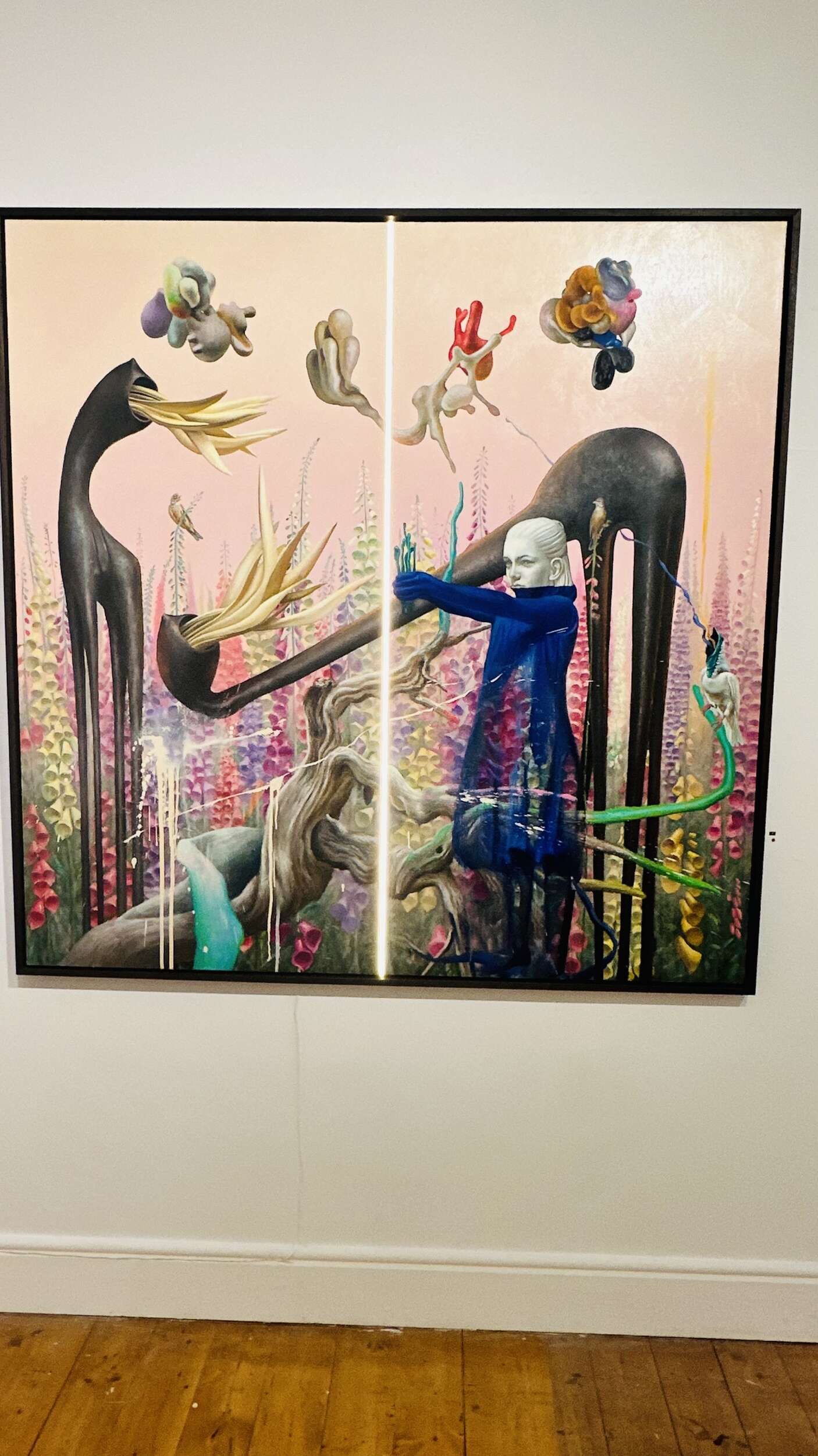
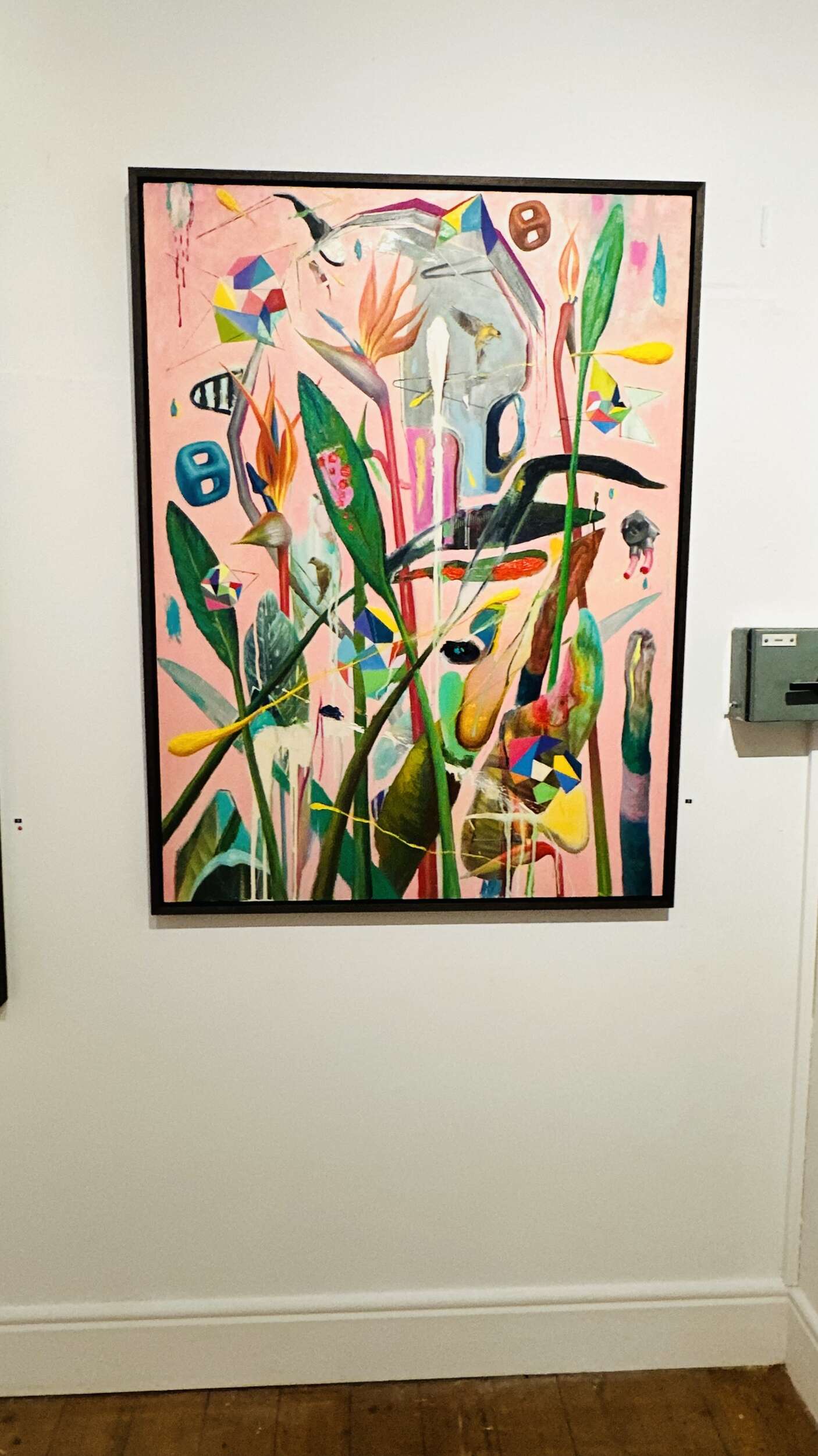
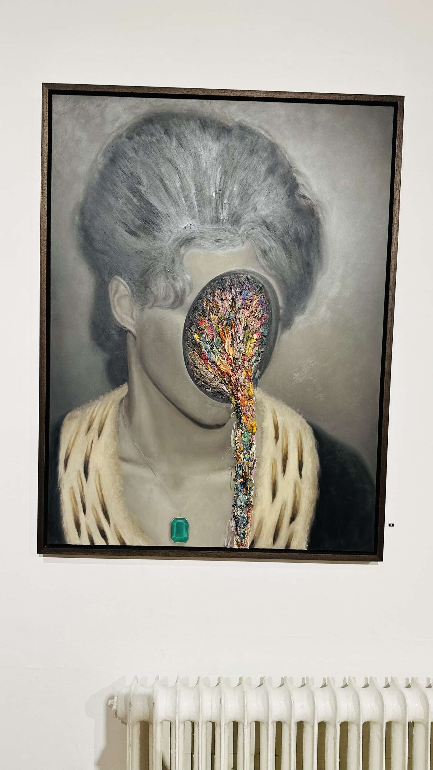
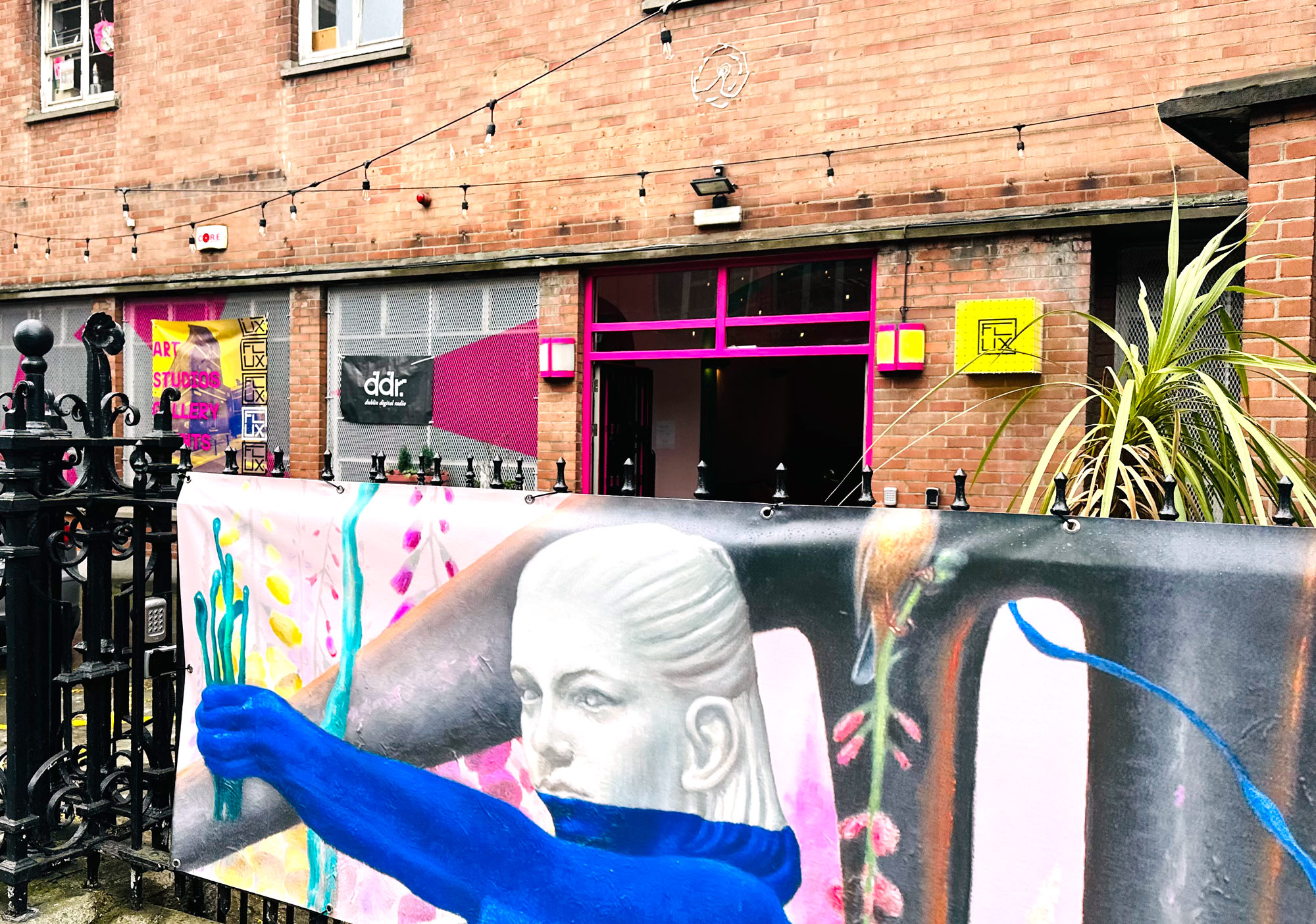
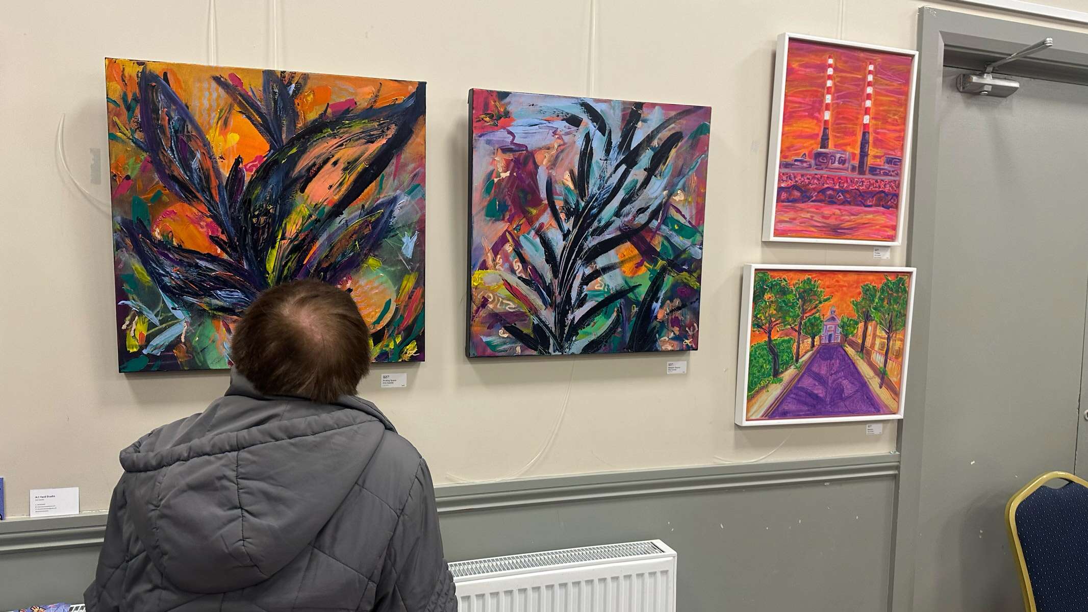
Rasher aka R. M. Kavanagh’s art exhibition ‘Don’t Anger the Gods’ showcased at FLUX, Dublin 2, in May 2025. His emotionally-charged figurative oil paintings focus on the human condition, blending abstraction, realism, and surrealism to create this unusual and uniquely thought-provoking style in this recent body of work.
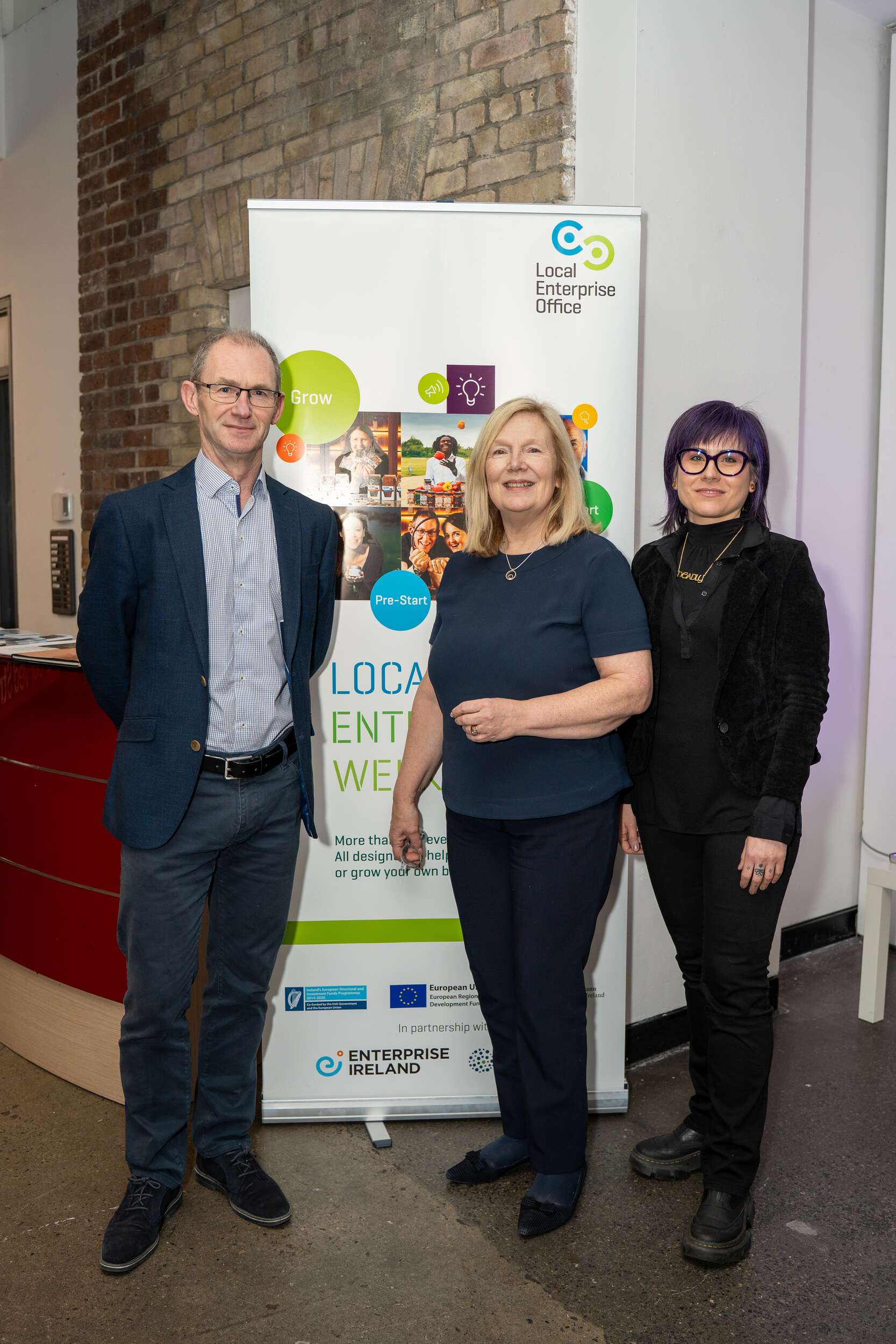
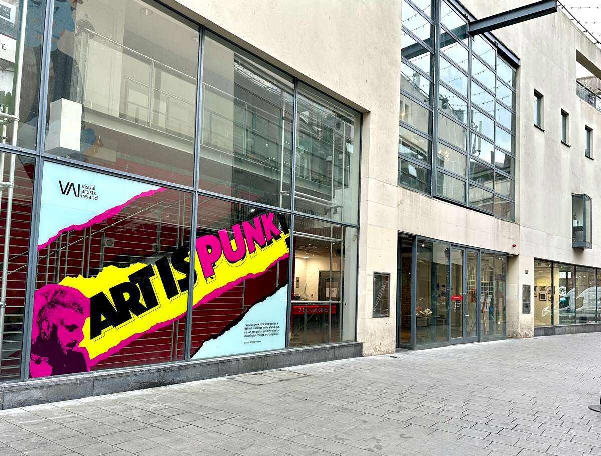
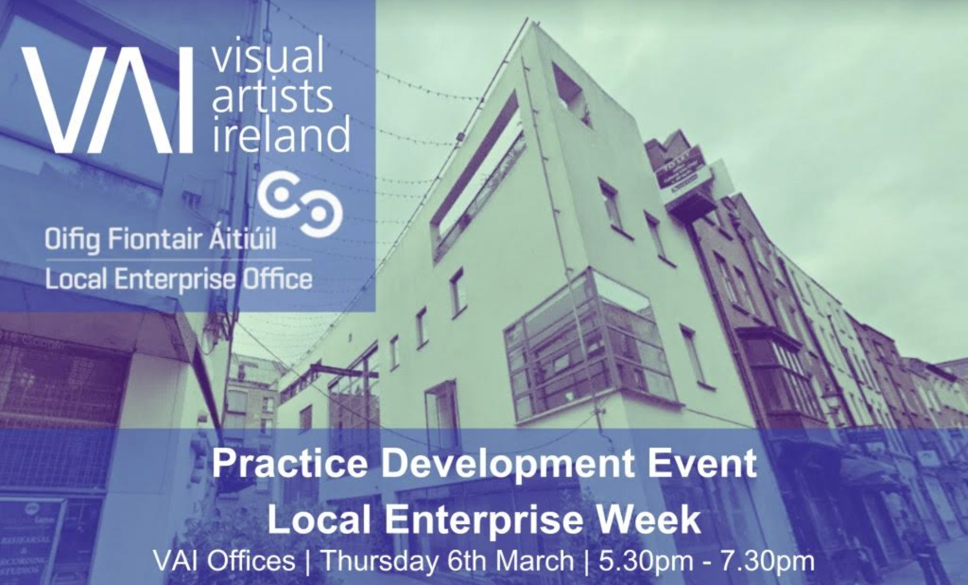
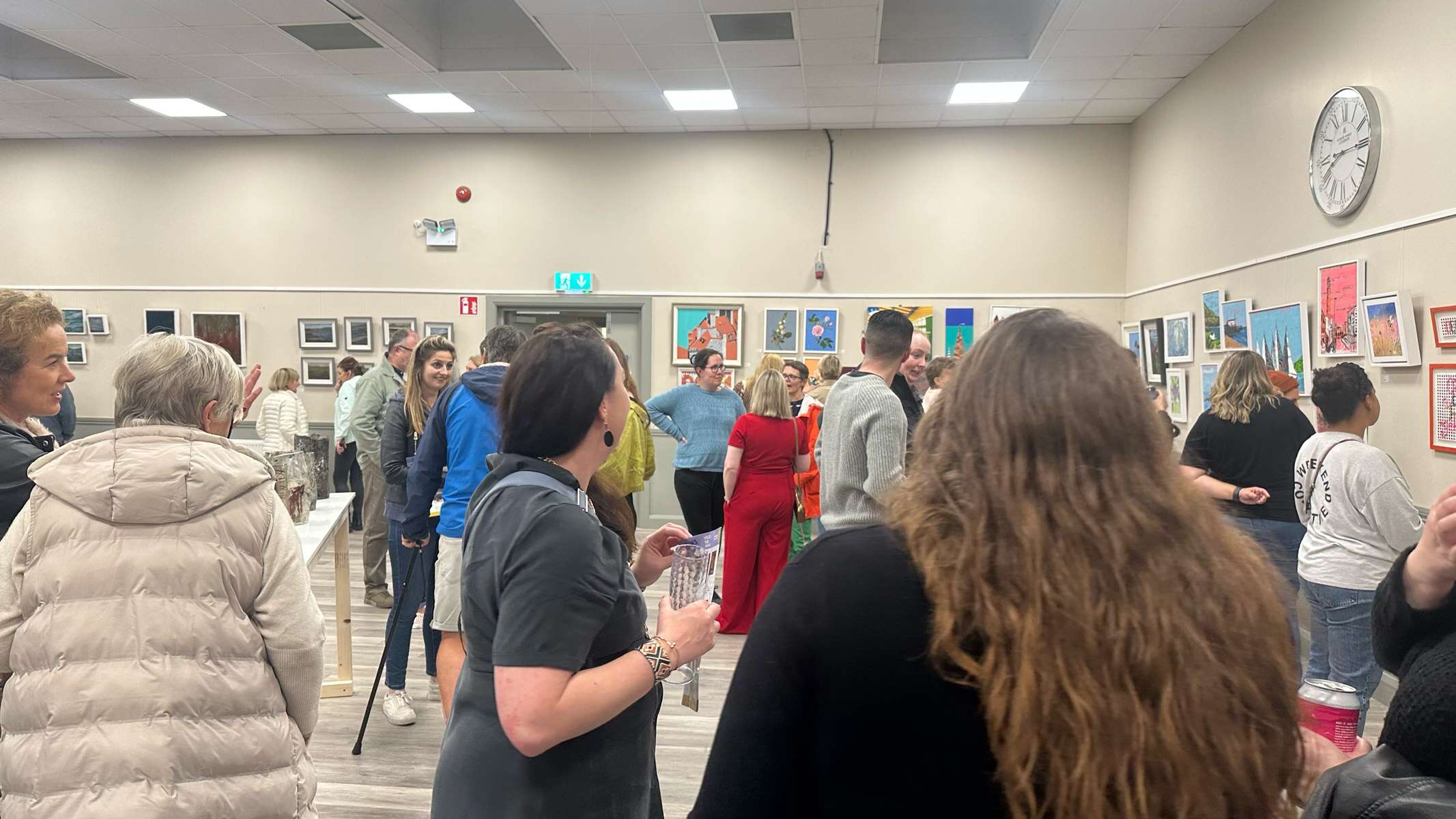
Let’s Talk Creative Dublin City LEO & VAI Creative Business Programme Venue: 2 Curved Street, Dublin 2
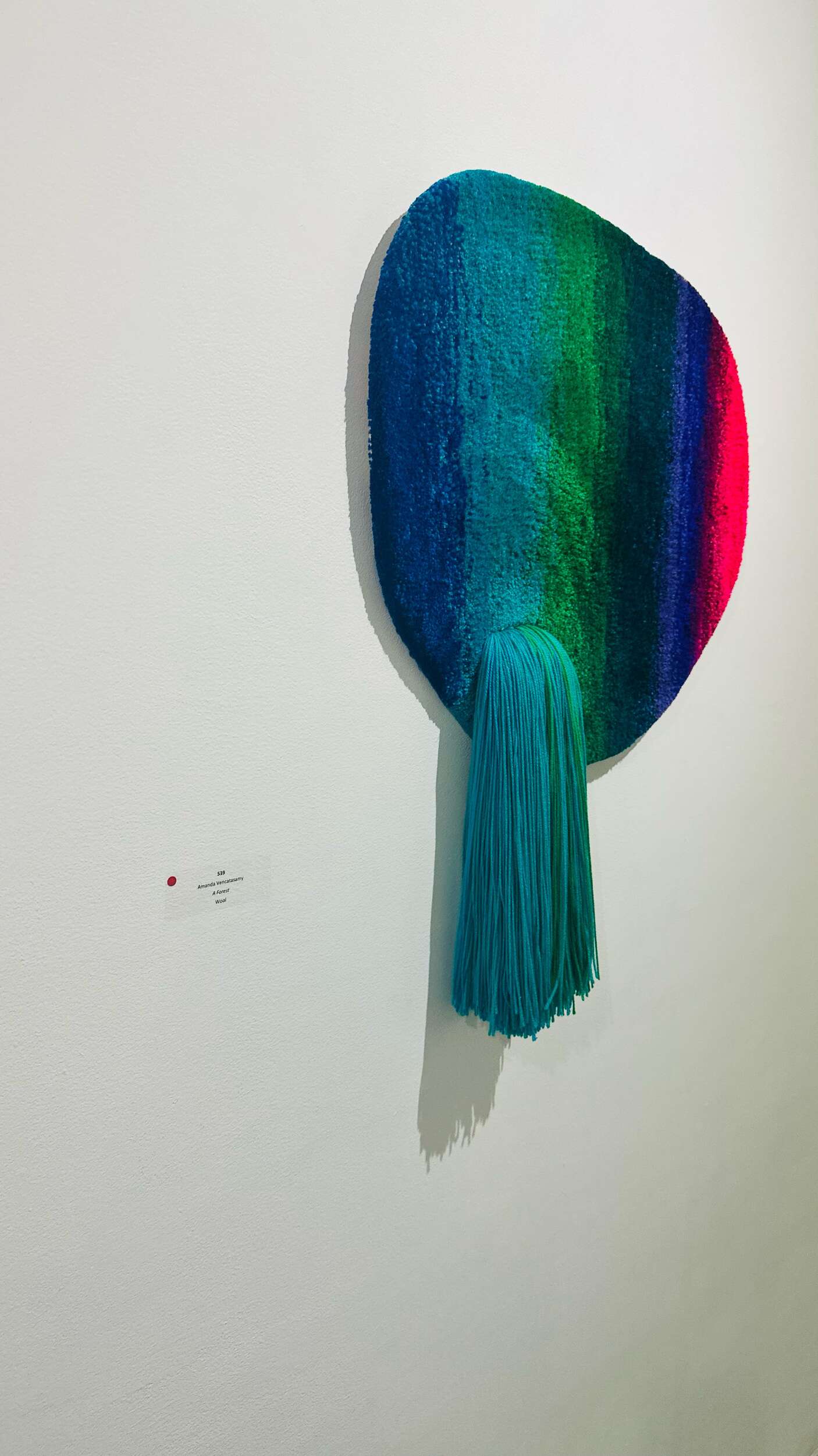
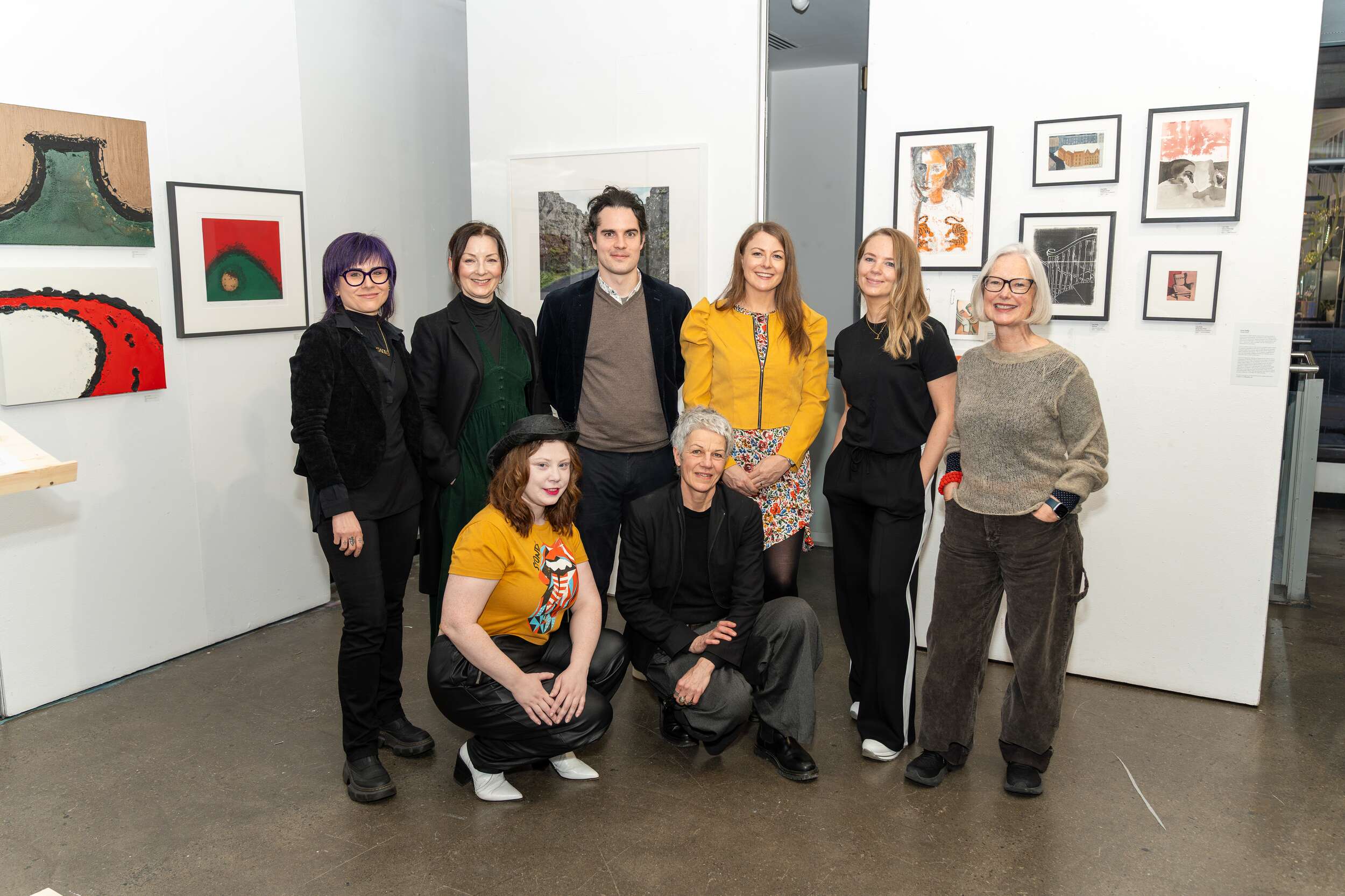
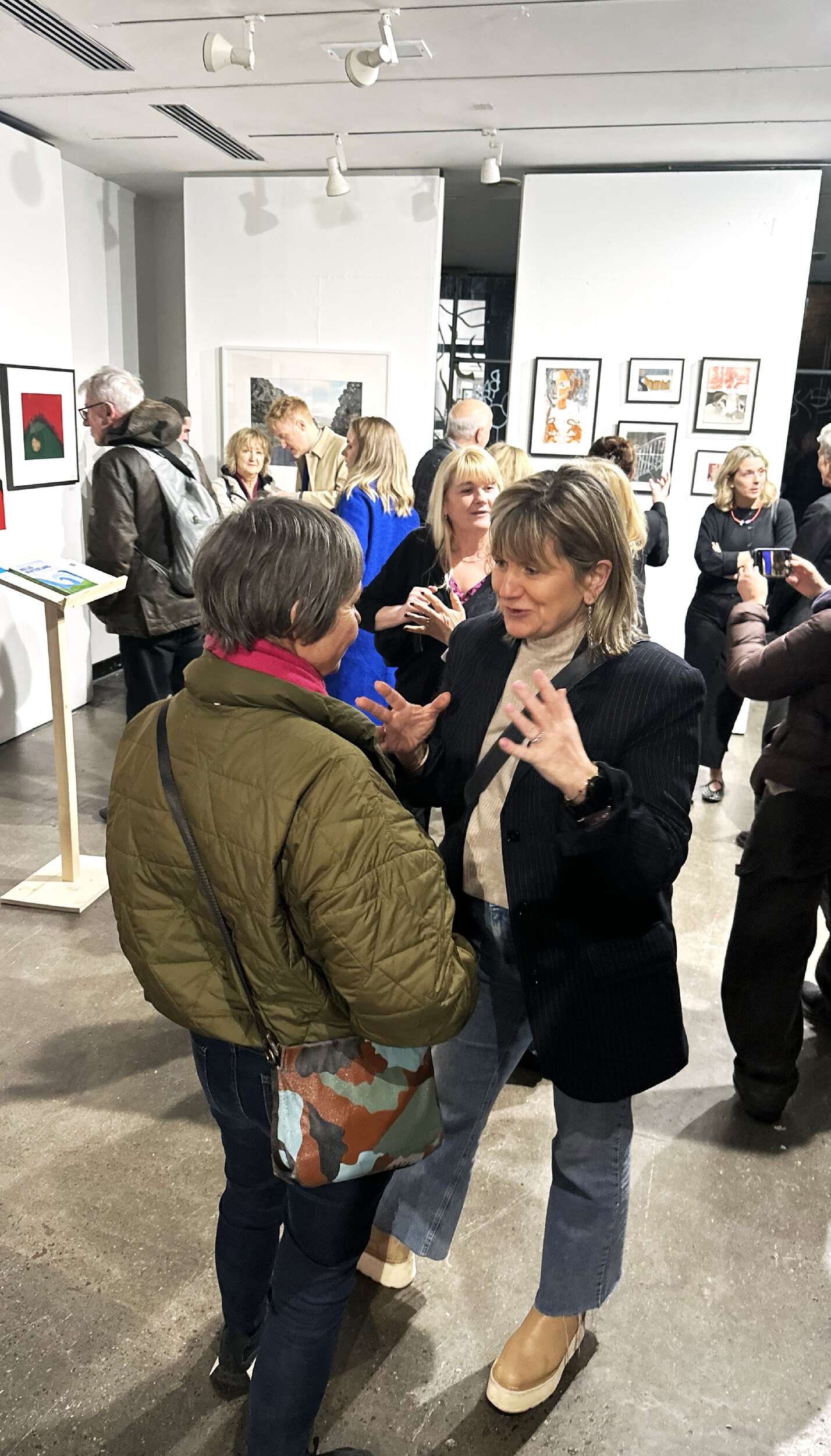
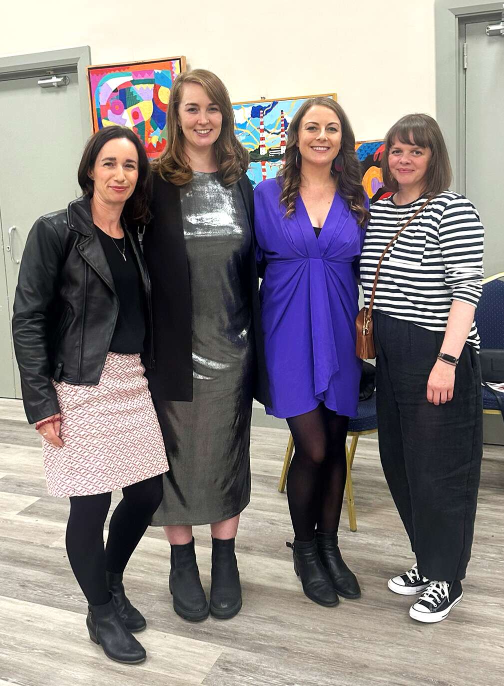
It was great to be part of this art and design pop-up group exhibition, organised by Dublin City LEO & VAI Creative Business Programme, curated by Valeria Ceregini, featuring myself Clare Lynch along with fellow artists, creatives and designers: Amanda Vencatasamy, Carolyn Walsh, Chris Judge, David Killeen, Derval Turbidy, Helen Mooney, Liv Webster, Liza Kelly, Katherine Shankey and Melissa Carton.
This exciting showcase featured a selection of works by a unique and original mix of Dublin’s artists and designers, highlighting the dynamic fusion of art and design in the city’s creative landscape. The exhibition, which took place on the 6th of March at the VAI exhibition space at 2 Curved Street, Dublin 2, celebrated the ongoing dialogue between the two disciplines, emphasising their ability to inform and inspire each other.
As part of the Dublin City LEO & VAI Creative Business Programme, which aims to support emerging creatives, Creative Convergence showcased visual art, design, limited-edition prints, photography, sculpture, books and originals pieces, each of which reflects Dublin’s vibrant cultural identity. This exhibition brought together local talent, offering visitors a chance to experience the diversity of the city’s creative scene in one captivating space.
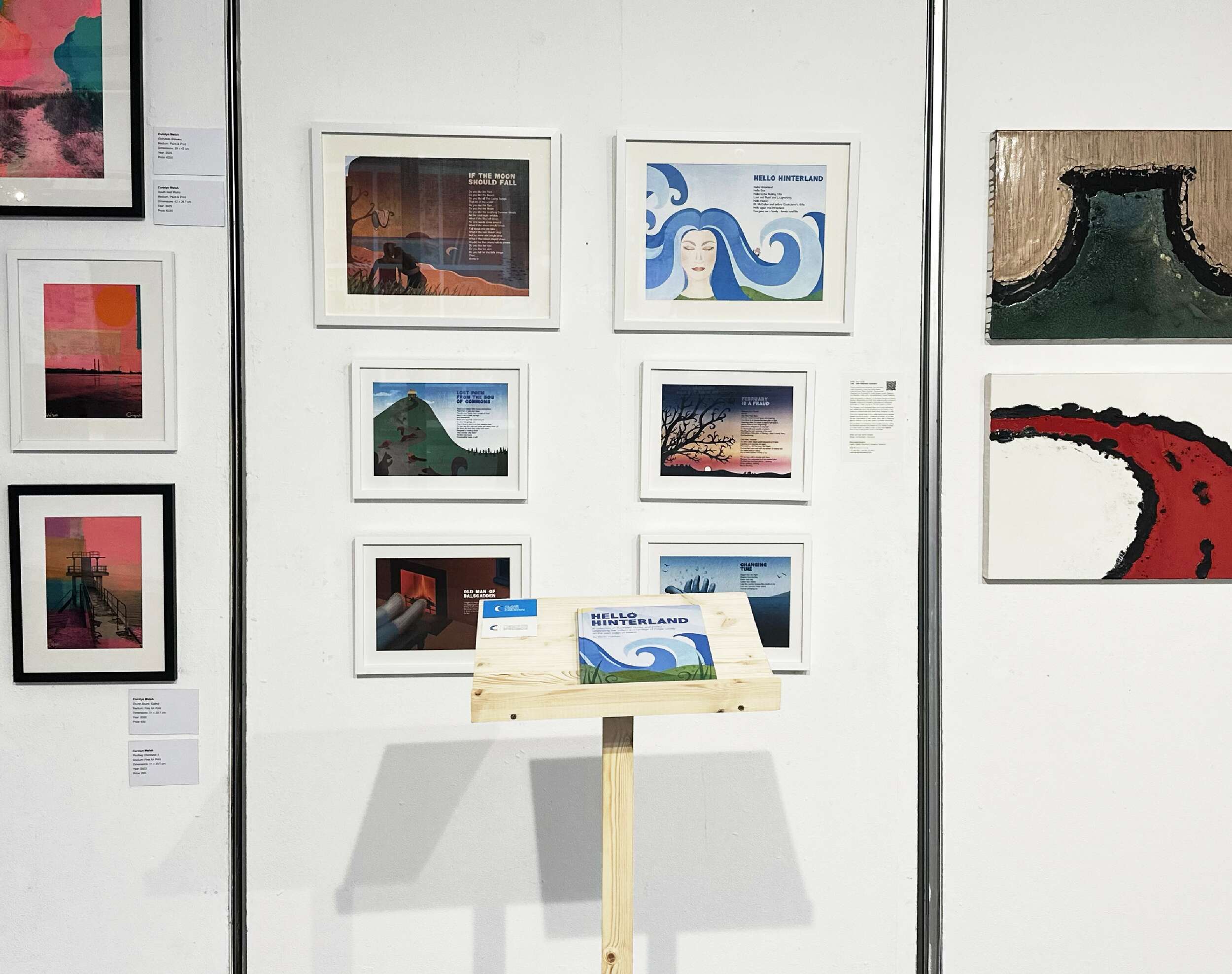
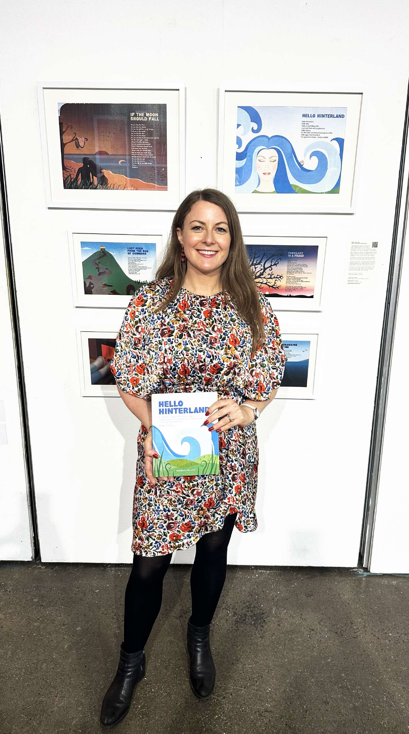
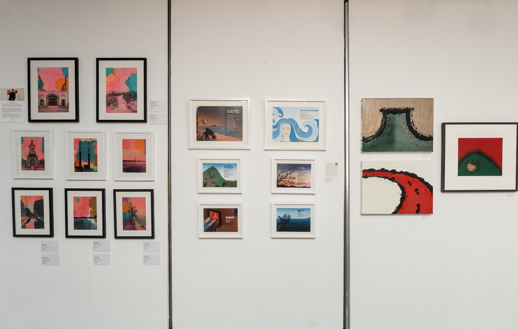
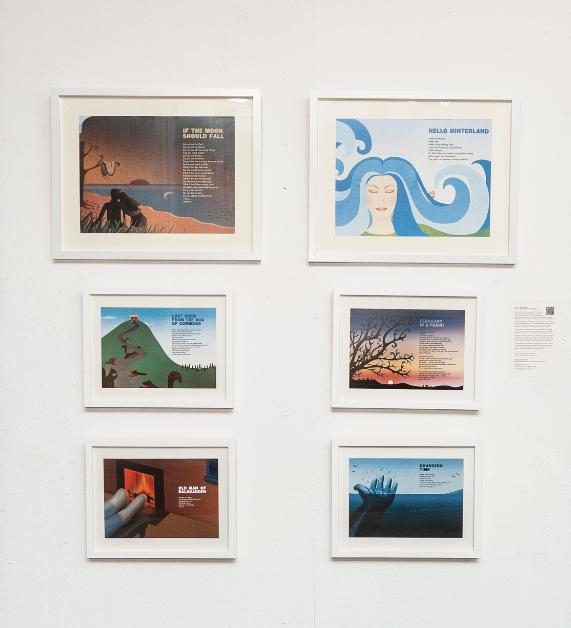
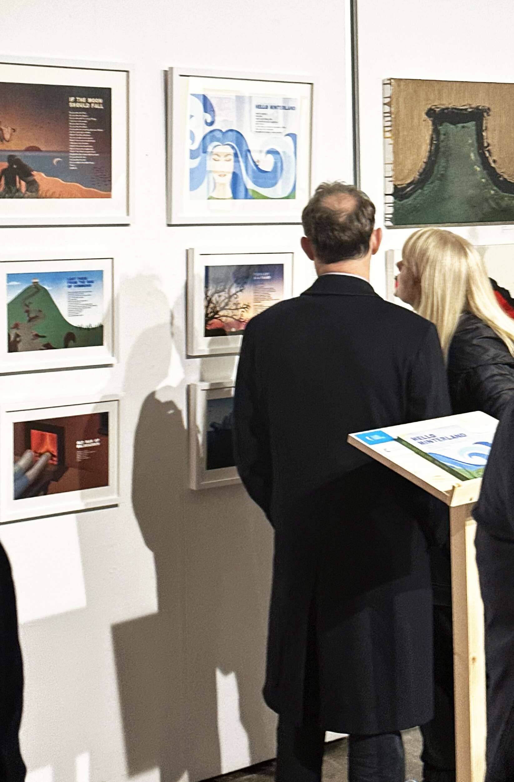
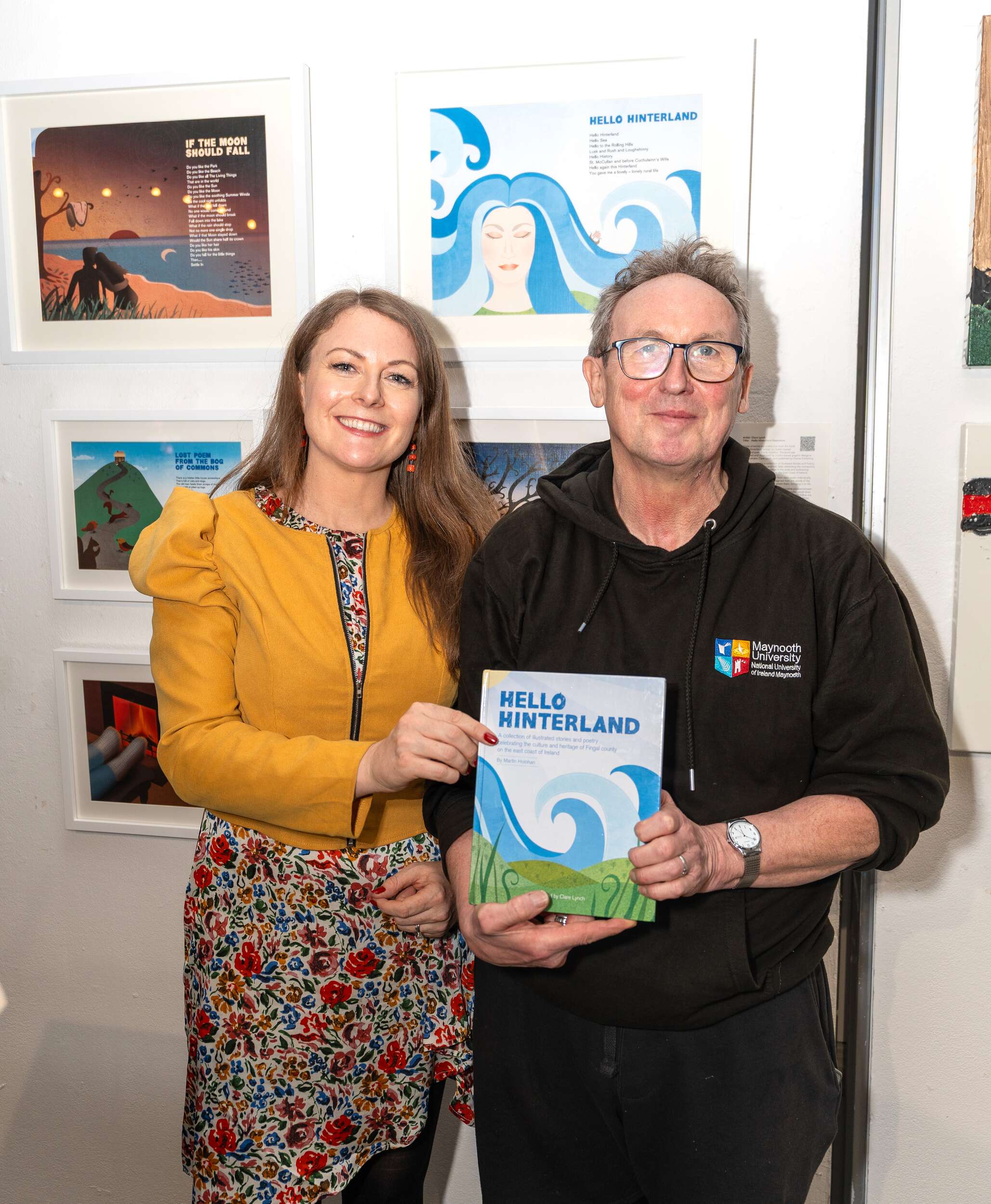
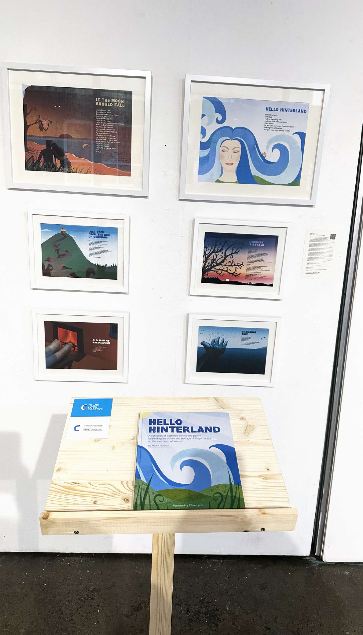
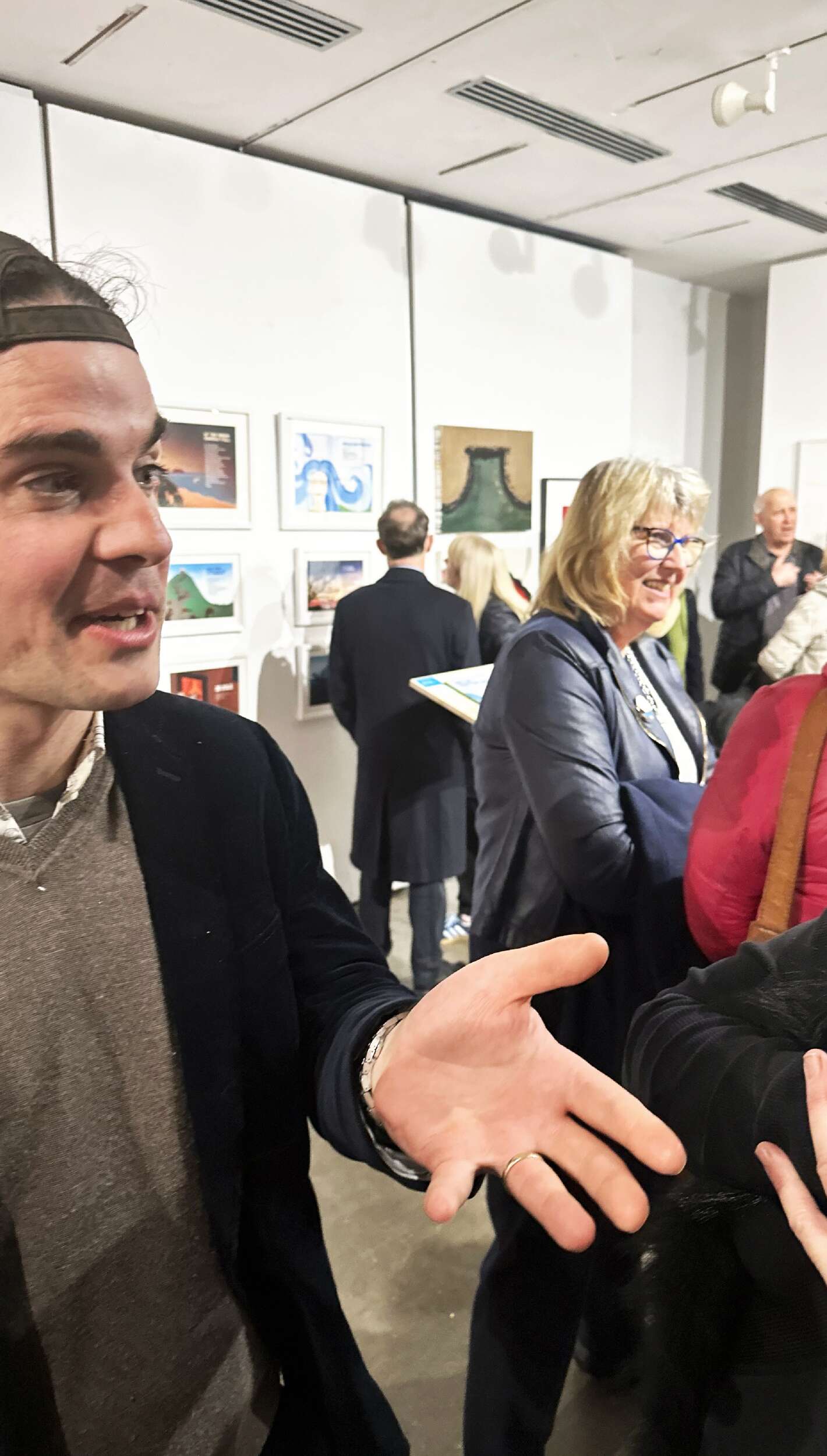
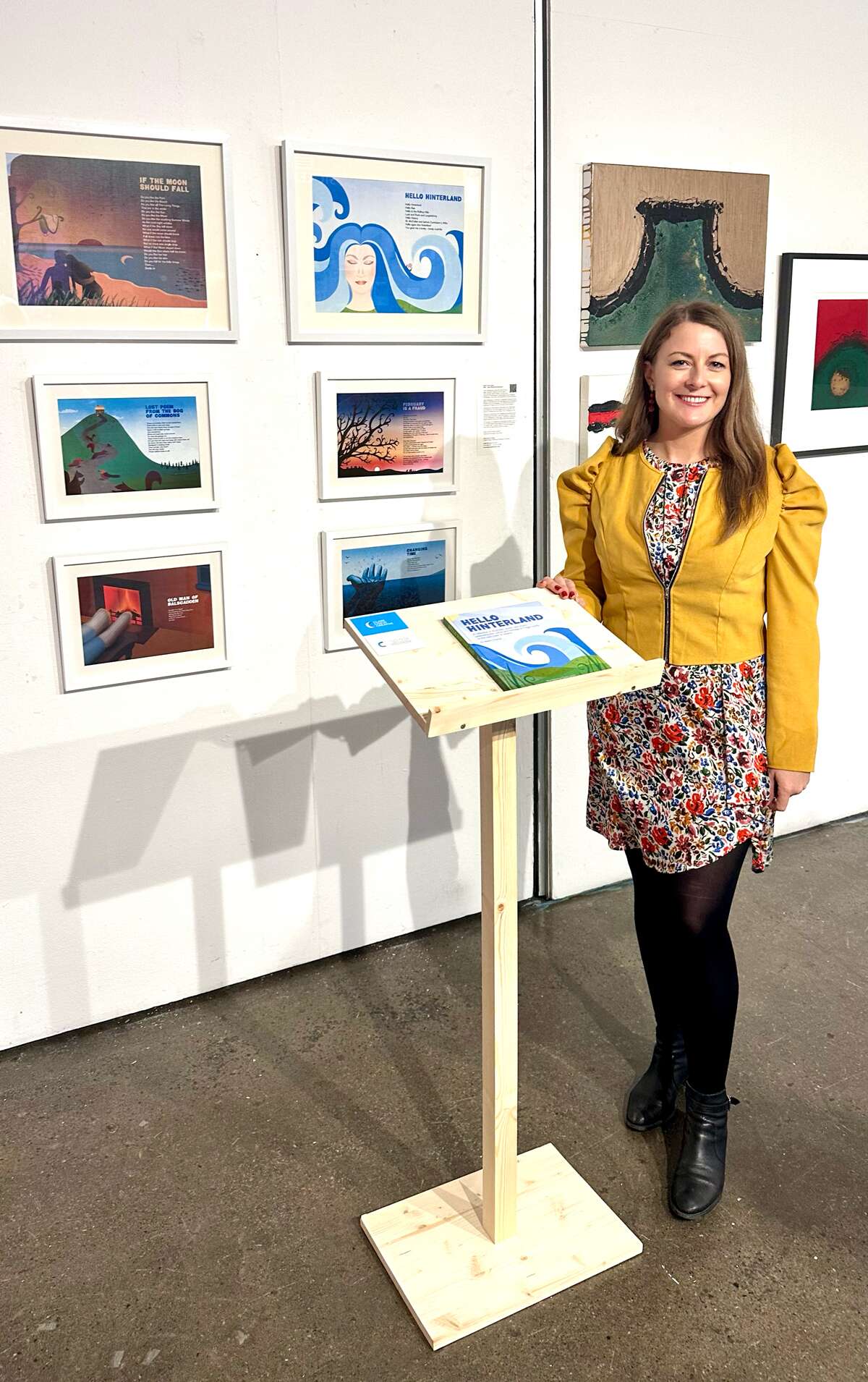
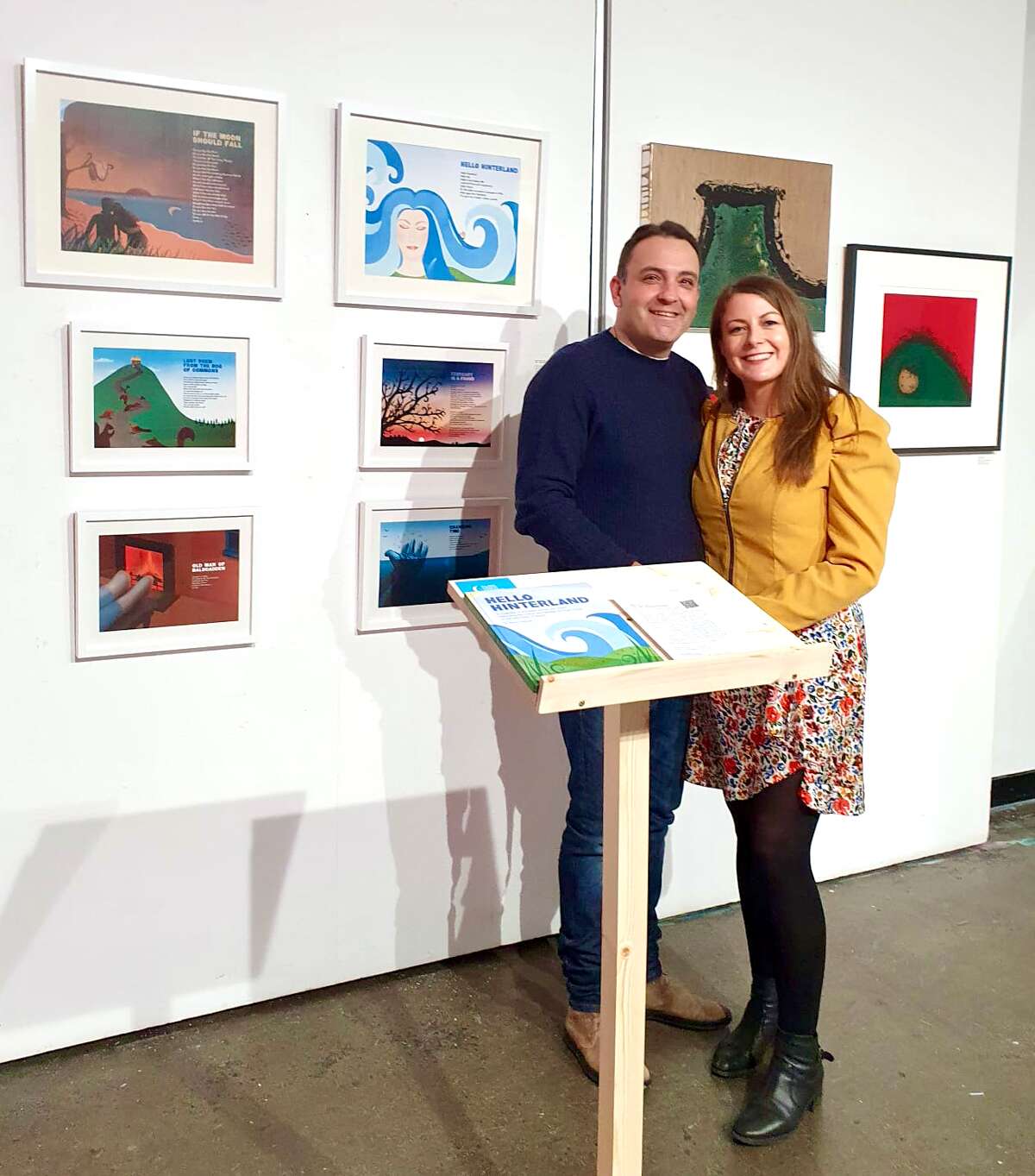
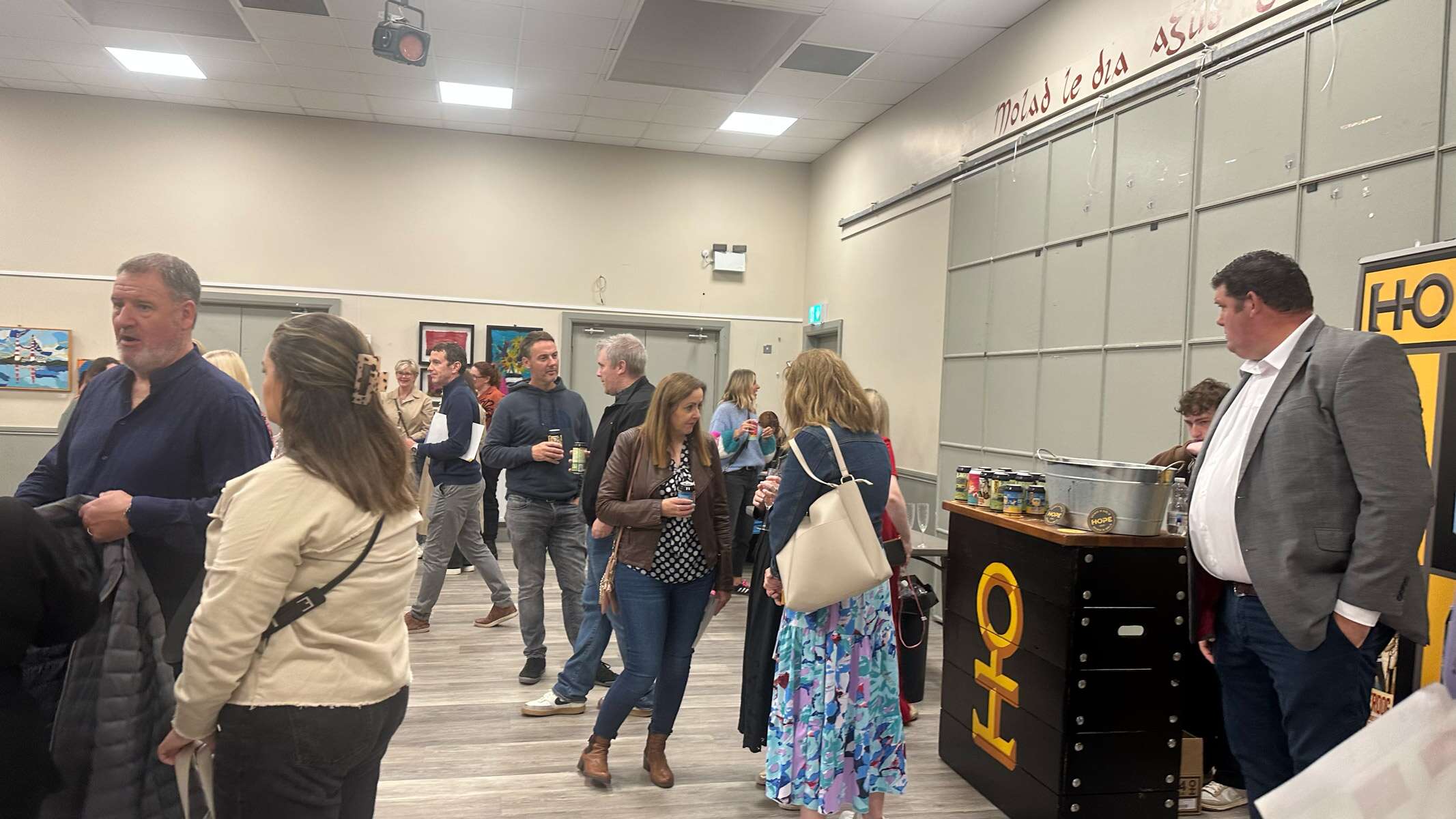
Included are some framed high quality prints of my illustration work from the book, Hello Hinterland, written by Dublin-based poet and writer Martin Holohan, which I designed and illustrated. The book was displayed on a wooden stand, in front of the prints, to allow exhibition attendees to look at the full range of illustrations. Martin Holohan came along on the night to see his words on display with the illustrations. It was good to reminisce with him about the good times during the process of creating the book. It was a great experience to be part of the exhibition and come together with the other talented artists. There was a range of creative business advice talks on the night, which added to the evening.
Valeria Ceregini’sCuratorial Vision: “This exhibition is a demonstration of the power of cross-disciplinary dialogue. The curation of work from diverse artists, designers and creatives serves to elevate the conversation around what defines art and design today. Creative Convergence does not merely present objects but explores the relationships between form, function, and emotional engagement, creating a space where boundaries blur, and creativity thrives. The show is a celebration of how art can influence design and how design can elevate art.
The concept of Creative Convergence is rooted in the idea that art and design are not isolated from one another. They are intertwined—each discipline feeding off the other to create new experiences and interpretations. In Dublin, a city known for its rich history of both artistic expression and innovative creatives, this exhibition is an opportunity to highlight the exciting collaborations that are pushing the boundaries of both fields. I’m incredibly proud to present such a talented group of artists, creatives and designers, each offering their unique perspective on how art and design meet in our world.
Pop-up Exhibition: Featuring works from local artists, Creative Convergence: Where Art and Design Meet demonstrates the dynamic and diverse artistic practices thriving within the city. The exhibition will offer a unique opportunity to experience Dublin’s artistic scene, featuring a wide array of mediums and styles.“
During the event we had a photographer, Sherii Shapoval, who took some fabulous shots of the opening night – See Serhii Shapoval
The exhibition was supported and promoted by Dublin City LEO & VAI Creative Business Programme. Visual Artists Ireland (VAI) is the representative body for visual artists in Ireland, supporting their professional development through advocacy, services, and opportunities.
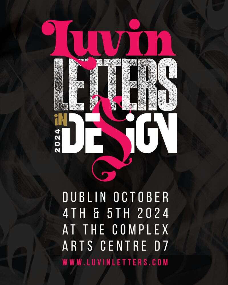
Great to attend the recent Dublin design event Luvin Letters In Design – for Typography & Lettering lovers, which ran over the 4th and 5th October in the Complex Arts Centre, Dublin 1.
There was an inspiring line up of speakers and some live mural painting with artists Theosone (Berlin), Milen Balbuzanov (Bulgaria), Horhay Design (Spain) and Calligrafreaks (Berlin).
Here’s to more of these design events returning to the Dublin design scene!
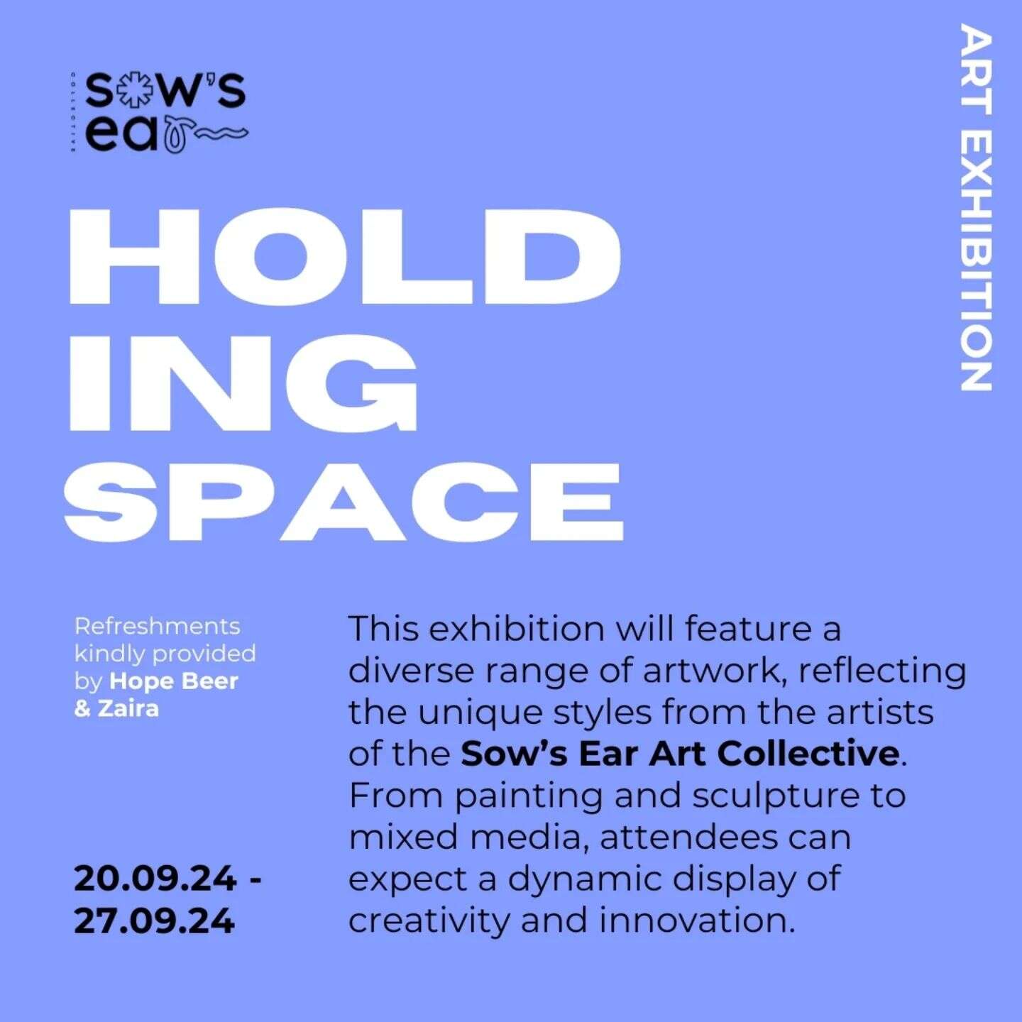
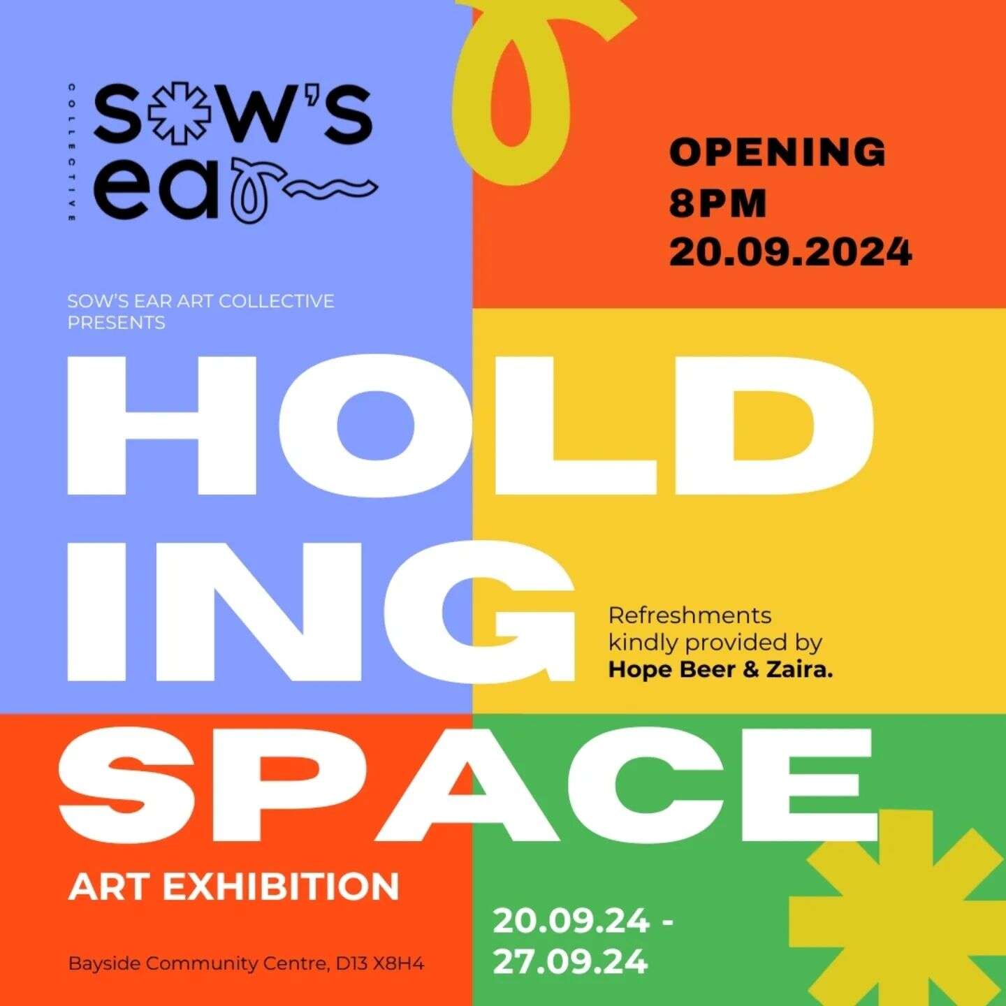
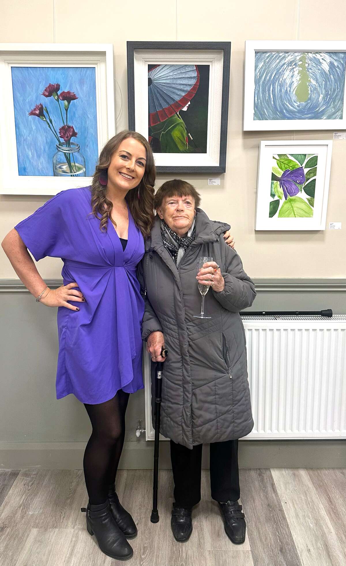
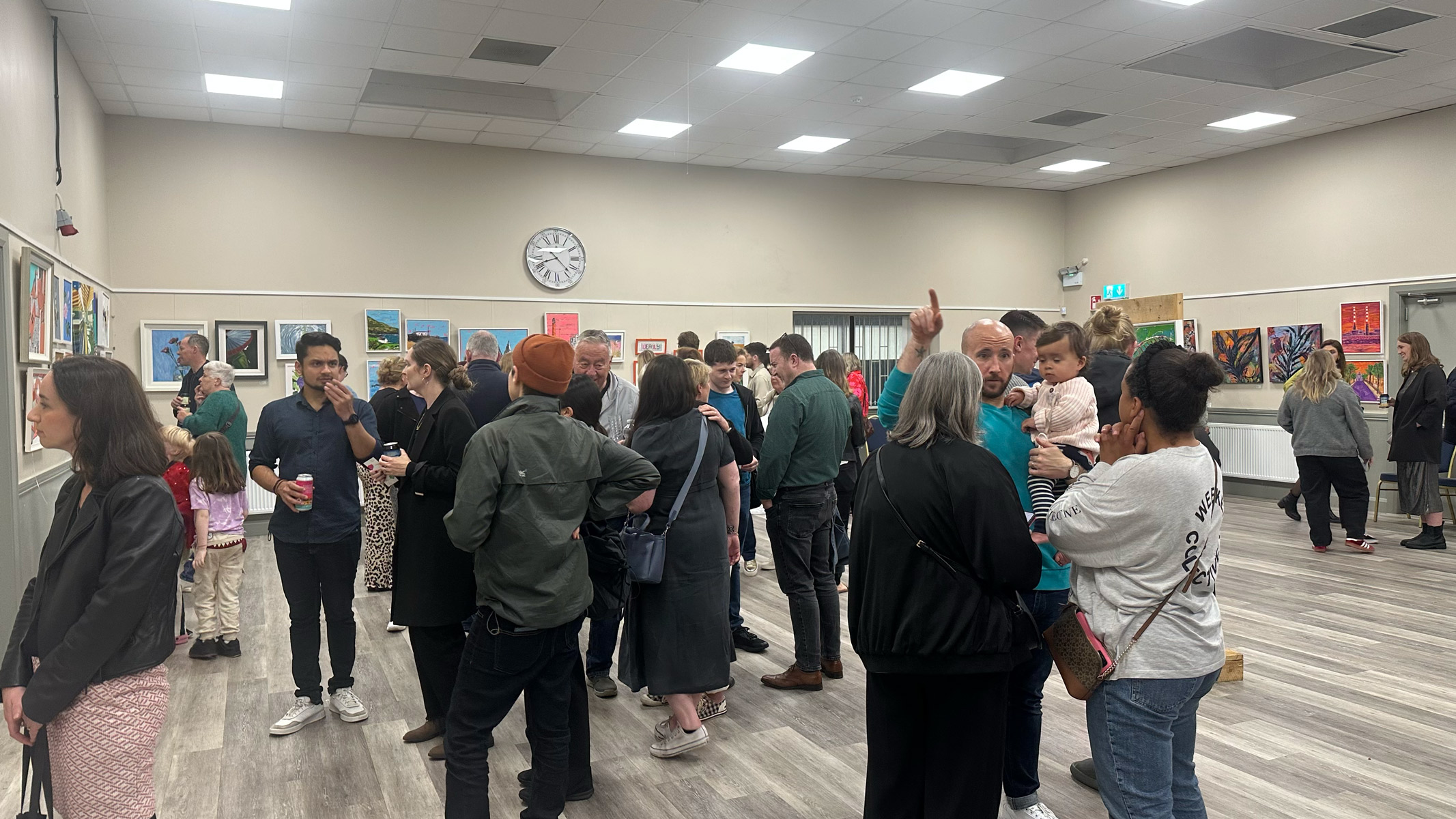
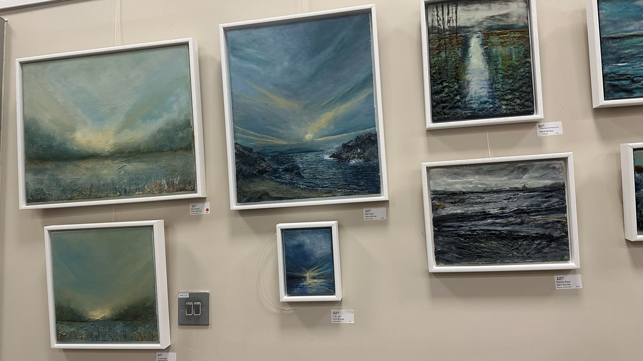
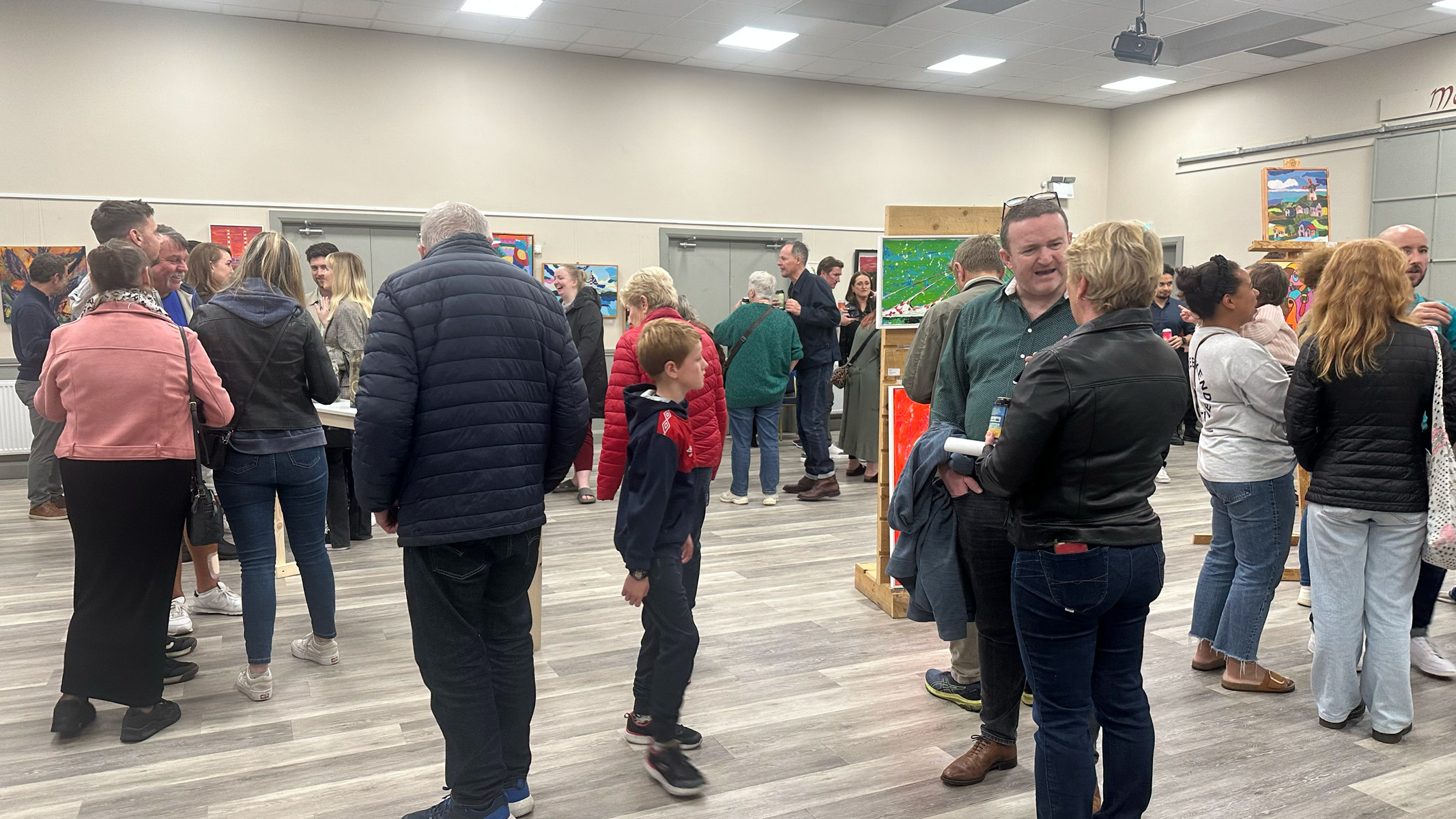
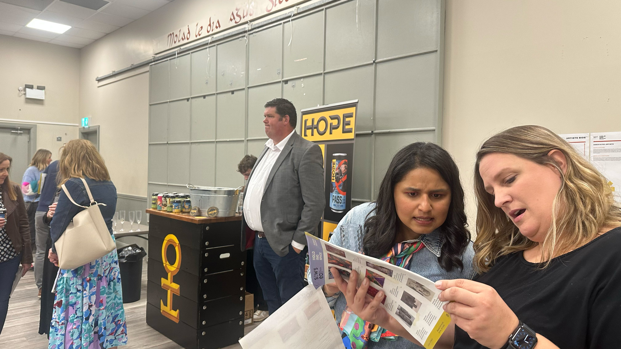
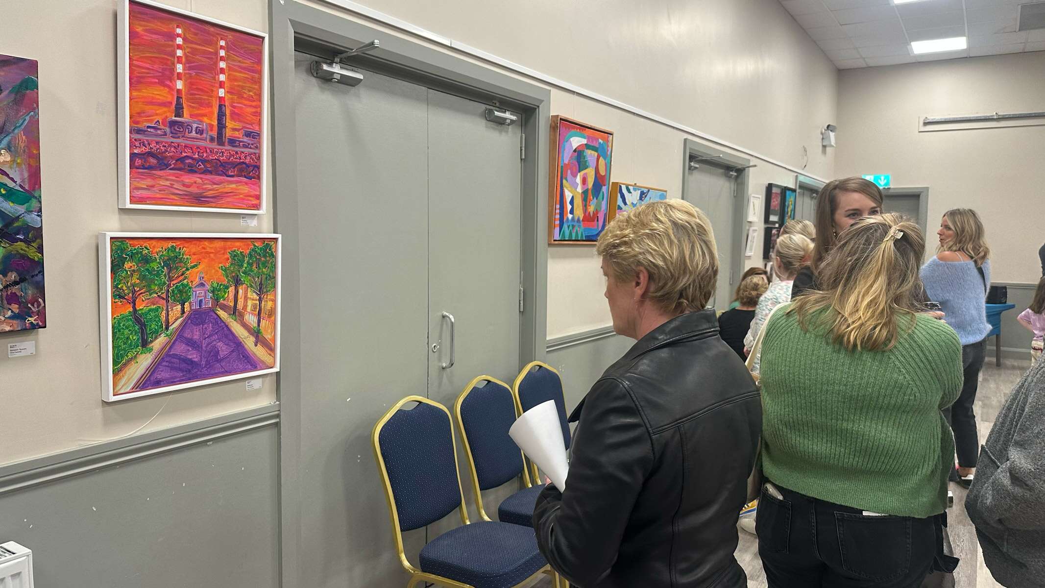
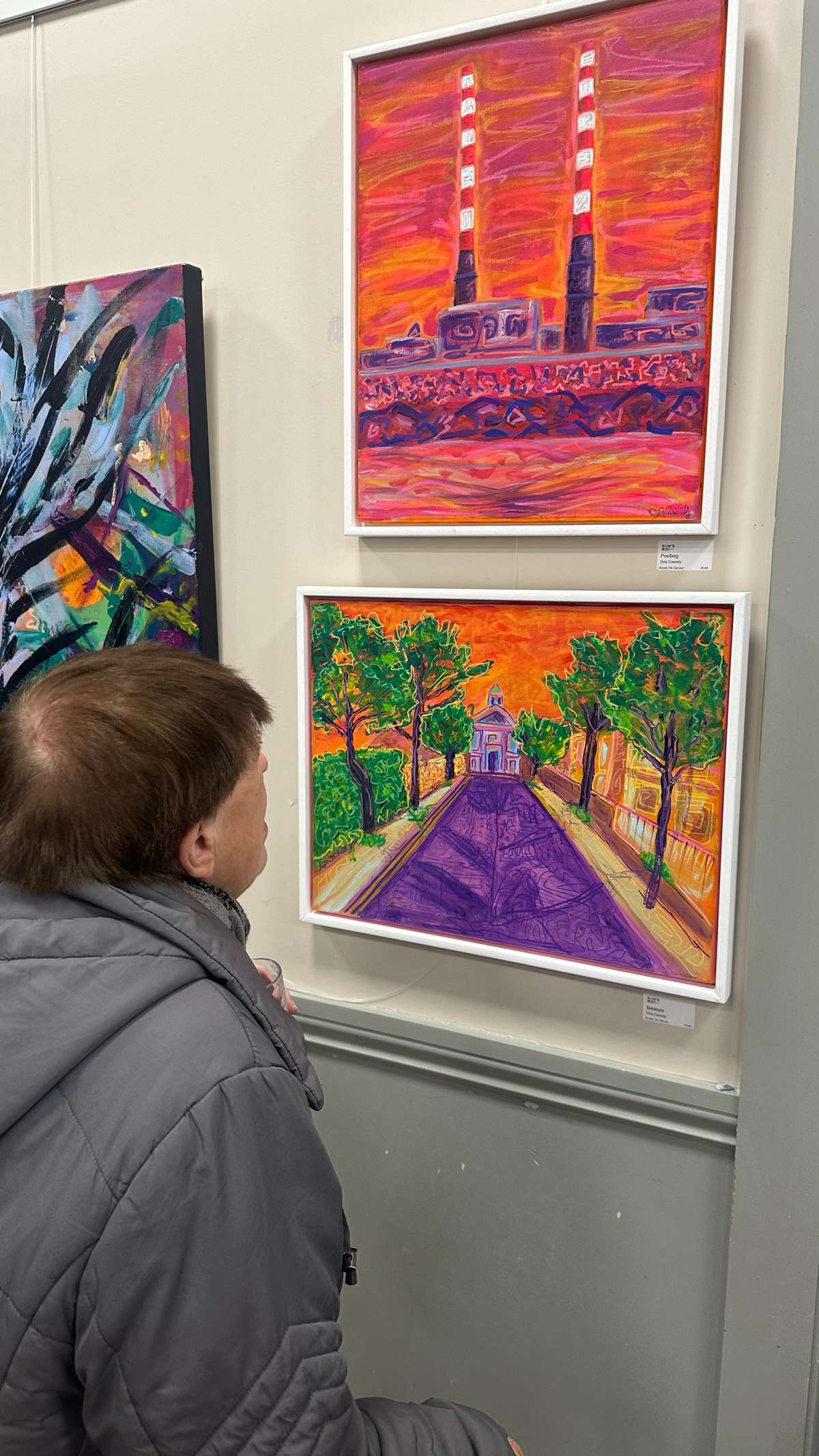
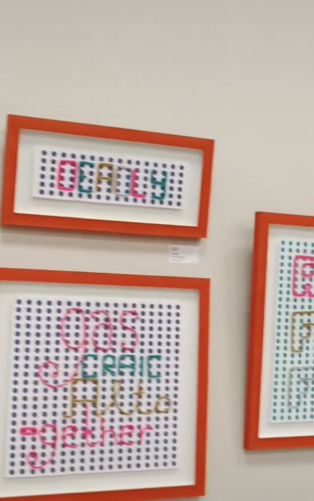
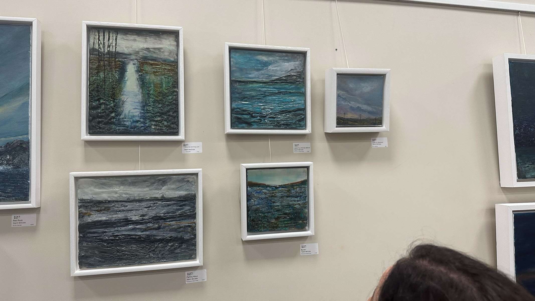
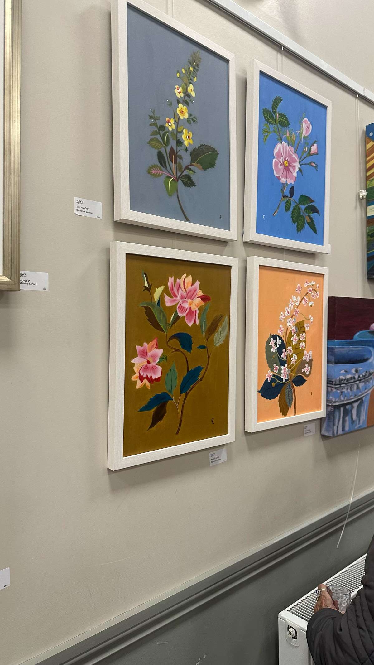
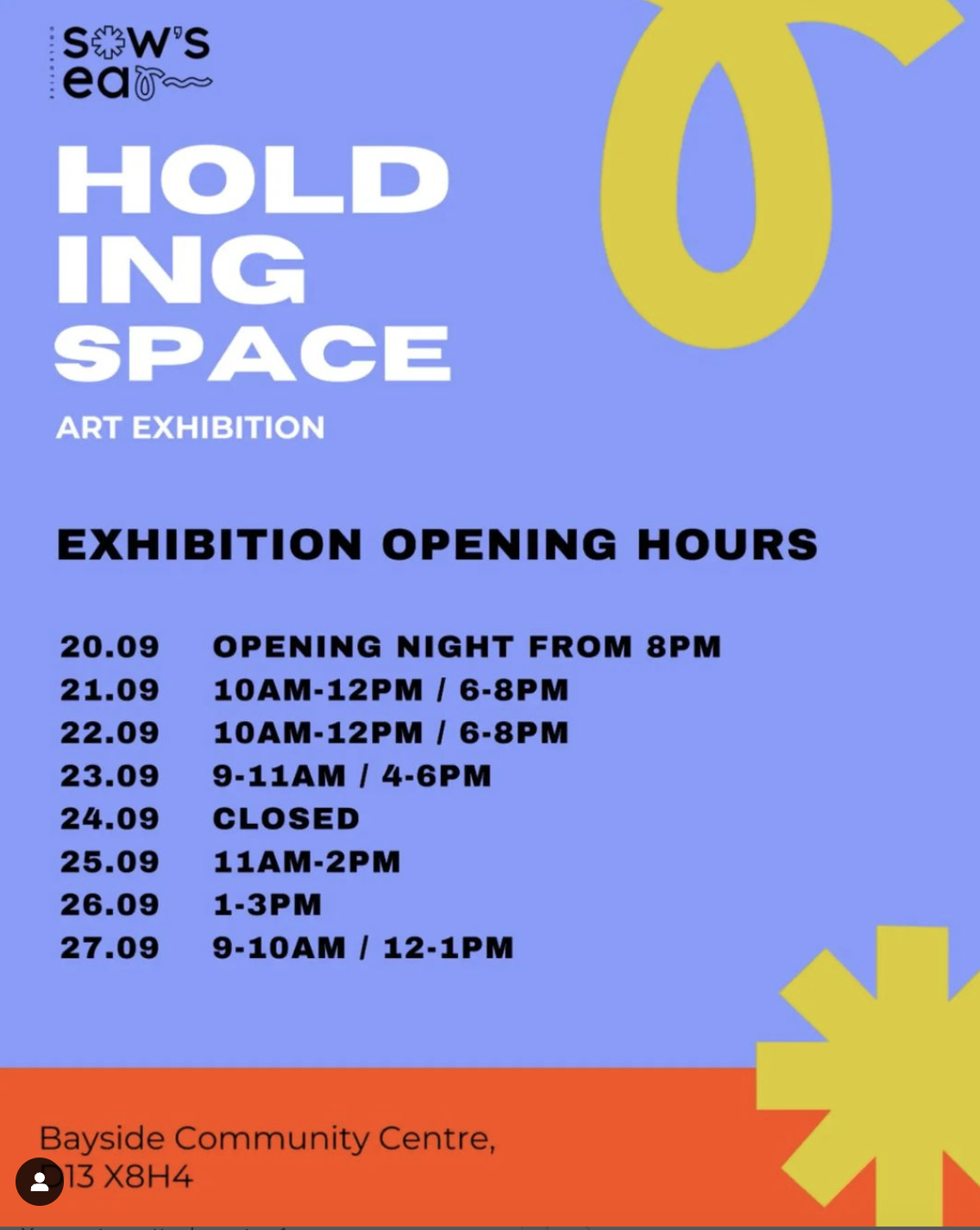
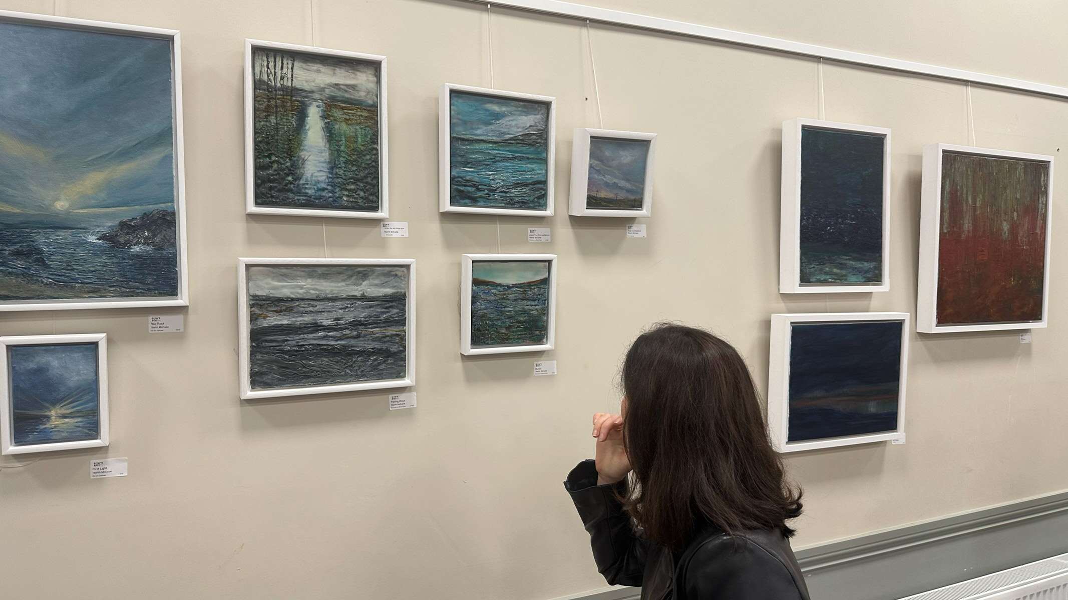
‘Holding Space‘ Sow’s Ear Art Collective: Culture Night 2024 Exhibition
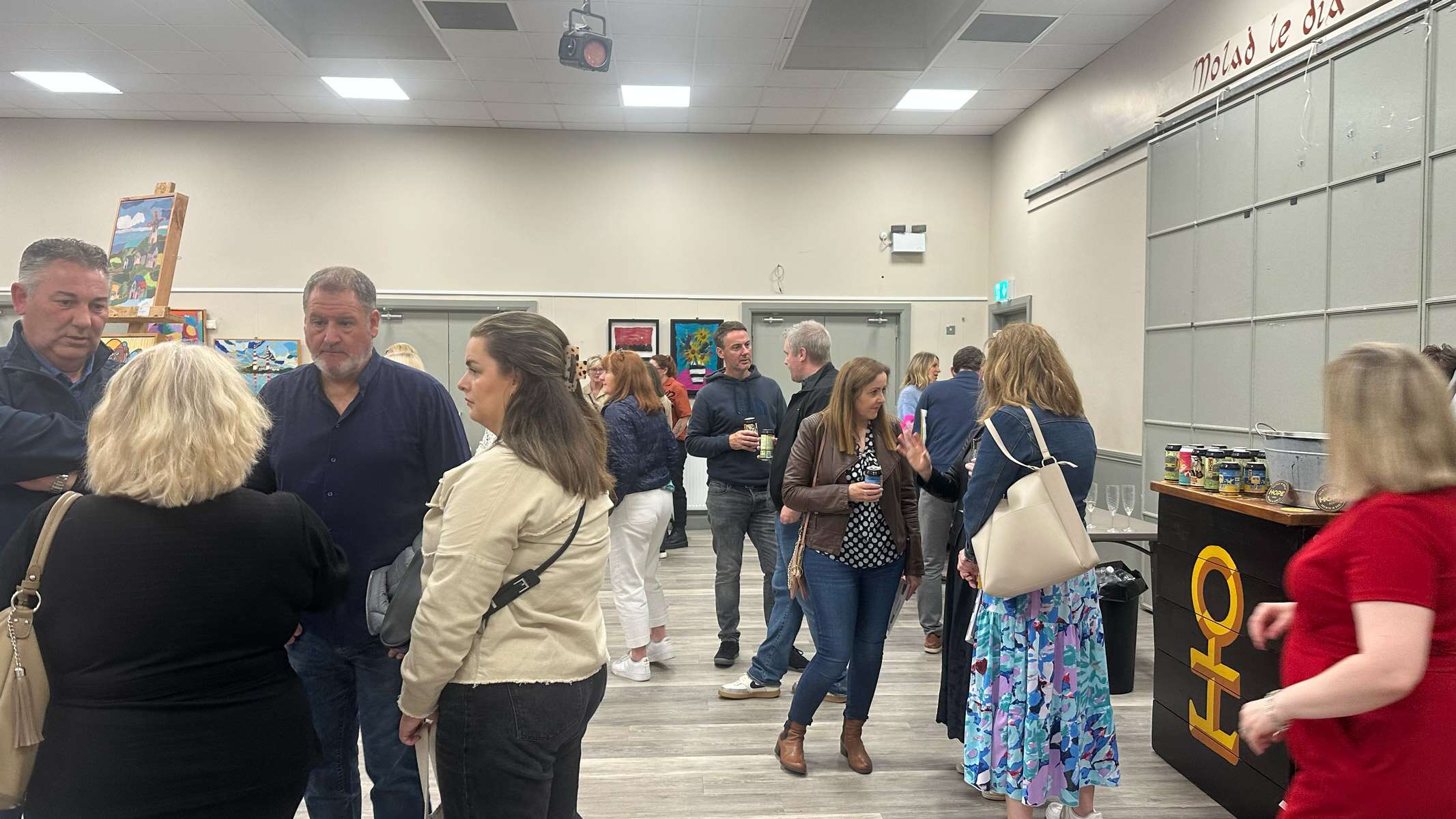
It was great to be part of Holding Space, the inaugural exhibition of The Sow’s Ear Art Collective, which took place as part of Culture Night 2024, Friday, 20th September, at Bayside Community Centre. This special event marked the beginning of an exciting journey for our collective, bringing together a diverse range of artistic voices in a shared creative space.
The exhibition was a celebration of expression, connection, and the power of art to transform and engage. It was incredible to showcase my work alongside such talented artists, each offering a unique perspective that contributed to the rich tapestry of the evening.
A huge thank you to our generous supporters, Hope Beer Dublin and Zaira.ie, for helping make the night a success.
I love being part of this art collective group, it’s great to be around these other inspiring, friendly and supportive creatives and see all the various different types of mediums of art that they create. For those who attended – thank you for being part of this memorable night! And if you missed it, stay tuned for more exhibitions and projects from the Sow’s Ear Art Collective.
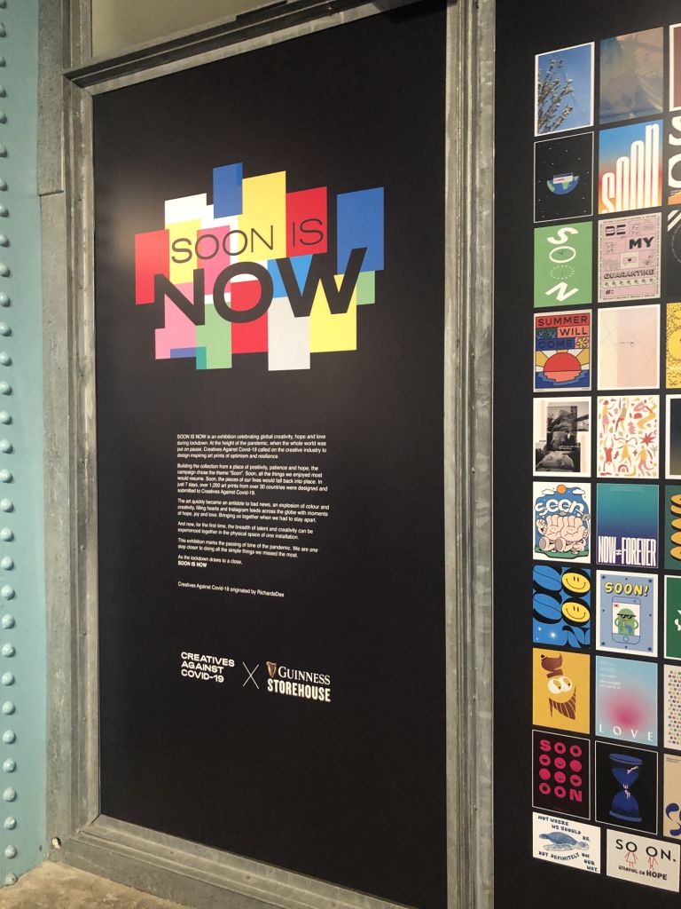
Creatives Against Covid-19 called on the creative industry to design and donate inspiring posters to raise funds for vulnerable women and children during the current crisis.
I was honoured to take part in this initiative. The organisers went on to create an exhibition in the Guinness Storehouse, displaying over 1,000 posters of all of the graphic designers, illustrators and creatives from over 30 countries who took part. Tickets for the exhibition can be bought here.
The posters can be purchased here at A3 size, with all proceeds being donated equally between ISPCC Childline and Women’s Aid.
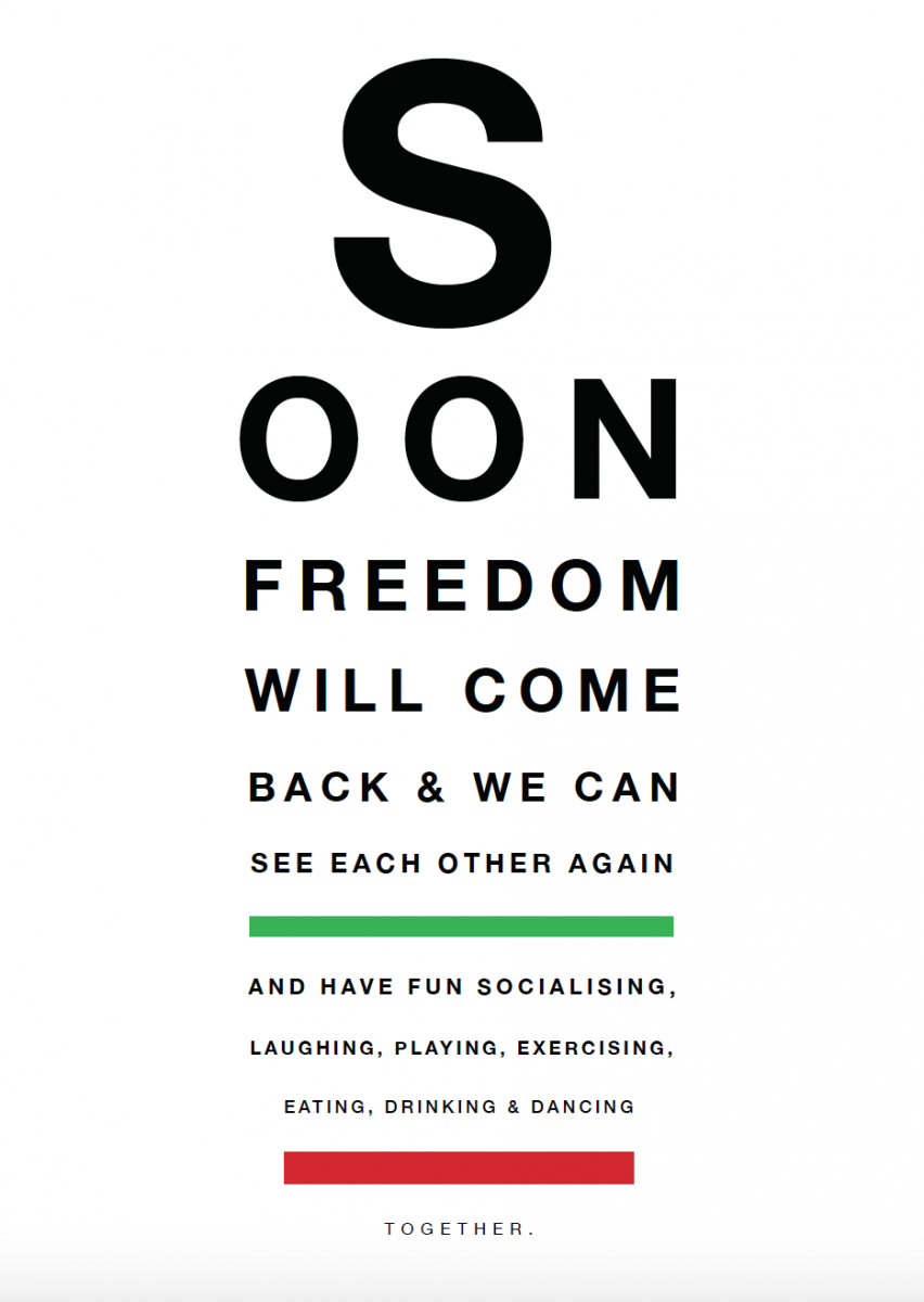
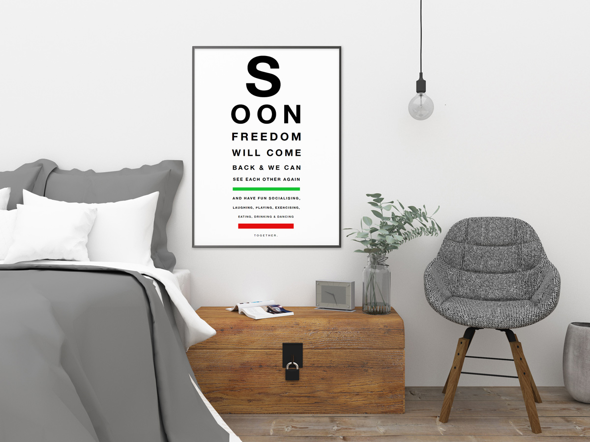
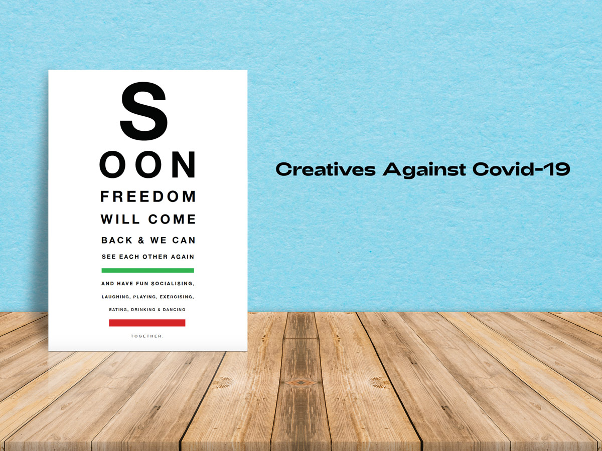
My submission ‘Clear Vision Ahead‘, was a play on an optician’s eye chart and offering optimism towards what we can envision ahead post quarantine. It can be purchased in the ‘Typography’ section of their website here.
Creatives Against Covid-19 Exhibition at Guinness Storehouse 1
Creatives Against Covid-19 Exhibition at Guinness Storehouse 2
Creatives Against Covid-19 Exhibition at Guinness Storehouse 3
Creatives Against Covid-19 Exhibition at Guinness Storehouse 4
Creatives Against Covid-19 Exhibition at Guinness Storehouse 5
Creatives Against Covid-19 called on the creative industry to design and donate inspiring posters to raise funds for vulnerable women and children during the current crisis.
The result was over 1,000 posters from over 30 countries, were designed and submitted. The great selection of posters from graphic designers, illustrators and creatives are currently on sale on their website here at A3 size, with all proceeds being donated equally between ISPCC Childline and Women’s Aid.
Here is my poster submission, ‘Clear Vision Ahead‘, playing on an optician’s eye chart and offering optimism towards what we can envision ahead post quarantine. It can be purchased in the ‘Typography’ section of their website here.
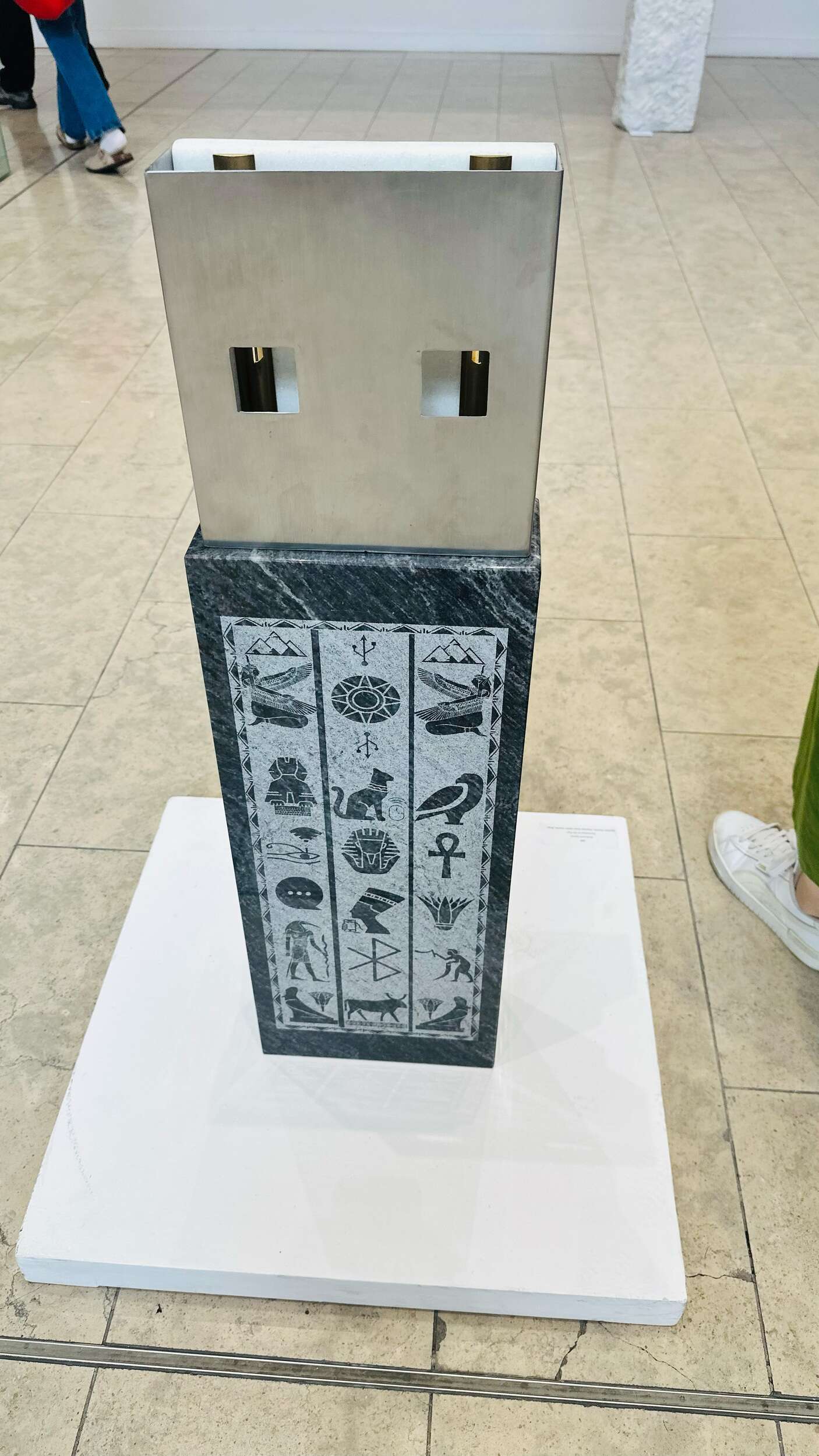
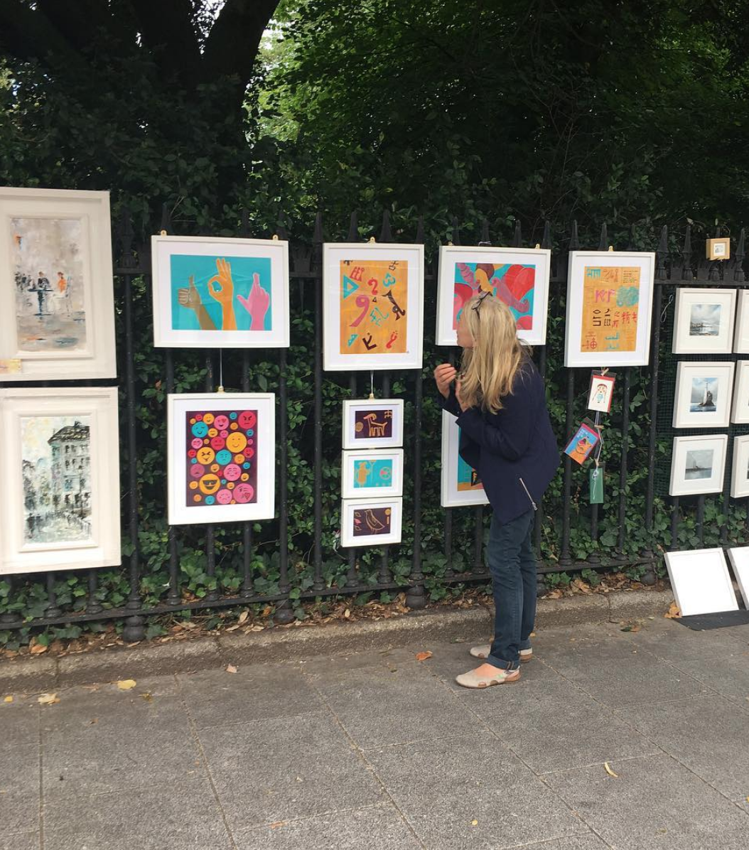
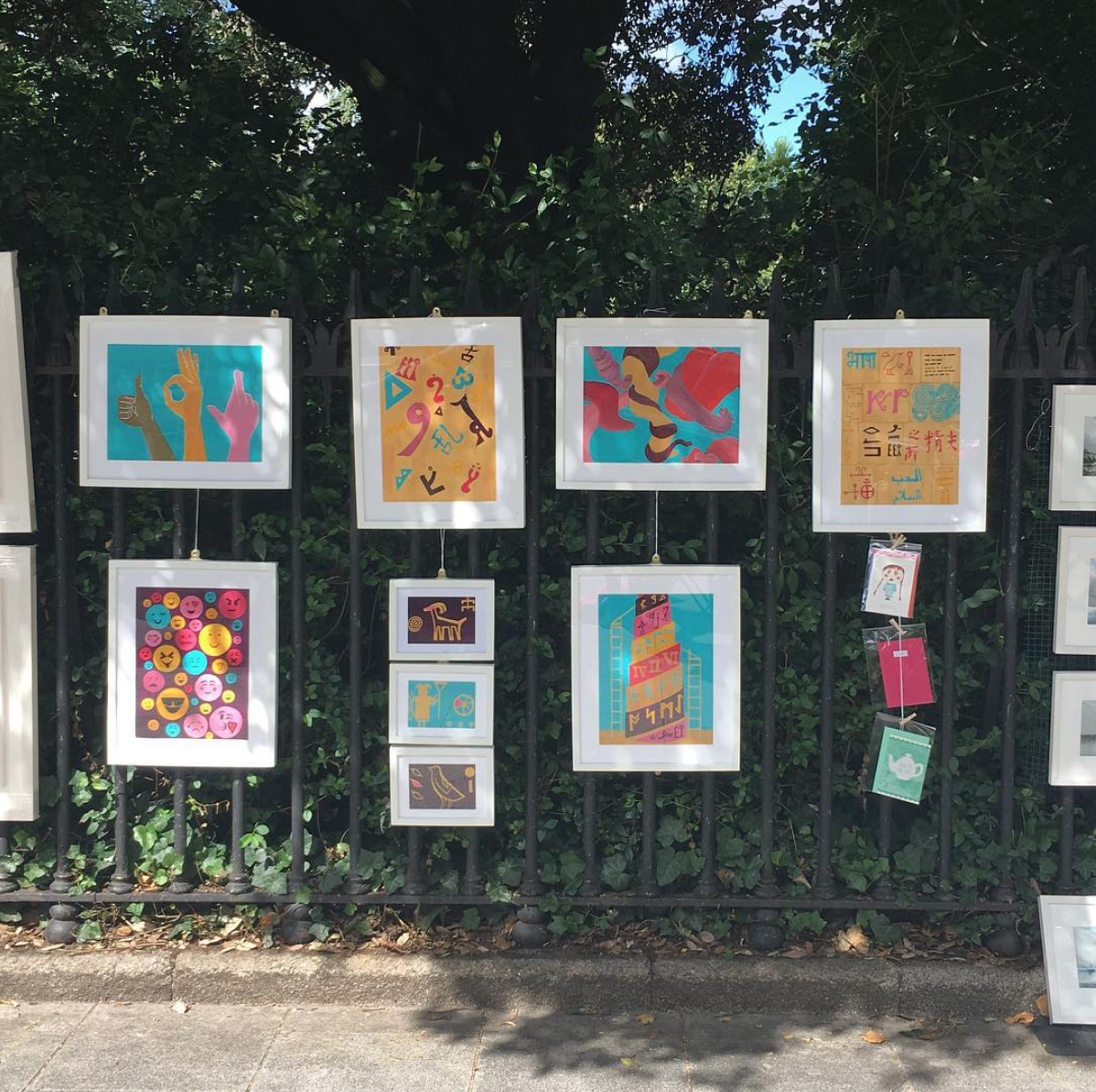
It was great to take part in the monthly St Stephens Green Art Exhibition, where artists feature their paintings all around St Stephens Green Park, where passers-by can enjoy the art and purchase paintings.
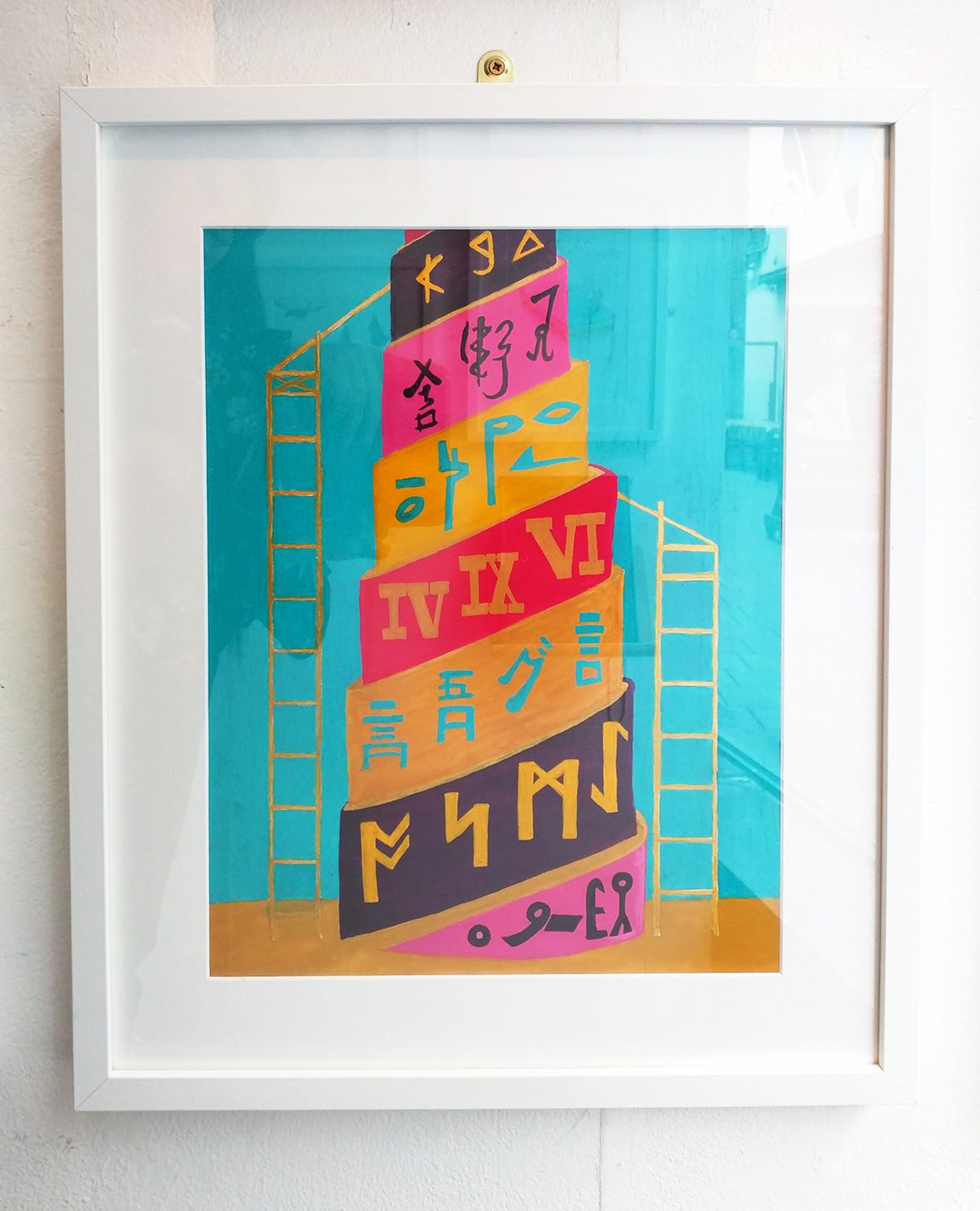
I chose to display a collection I had created based around the concept of communication and the wonder of the story of ‘The Tower of Babel’; the story of how we all ended up speaking different languages. The paintings represent the bricks that make up the tower of Babel, with each brick depicting a different language / hieroglyphic or form of communication; various symbols from different languages falling in confusion when the tower collapsed; being tongue-tied with the confusion of so many different languages in the world;tow modern communication such as emojis and the universal understanding in communication such as thumbs up / fingers crossed / the ok hand gesture. They are painted in gouache acrylic in a bright and modern graphic way, with colours that really pop. With art being subjective, the viewer can take their own interpretation of what each painting is and what it may represent for them.
Being part of the exhibition is a great experience – some highlights include meeting and being inspired by other artists and talking to the public about art and what it means to them. I also had some greeting cards available to purchase, which many people enjoyed. They can be purchased here and also ordered at a number of sizes and formats here.
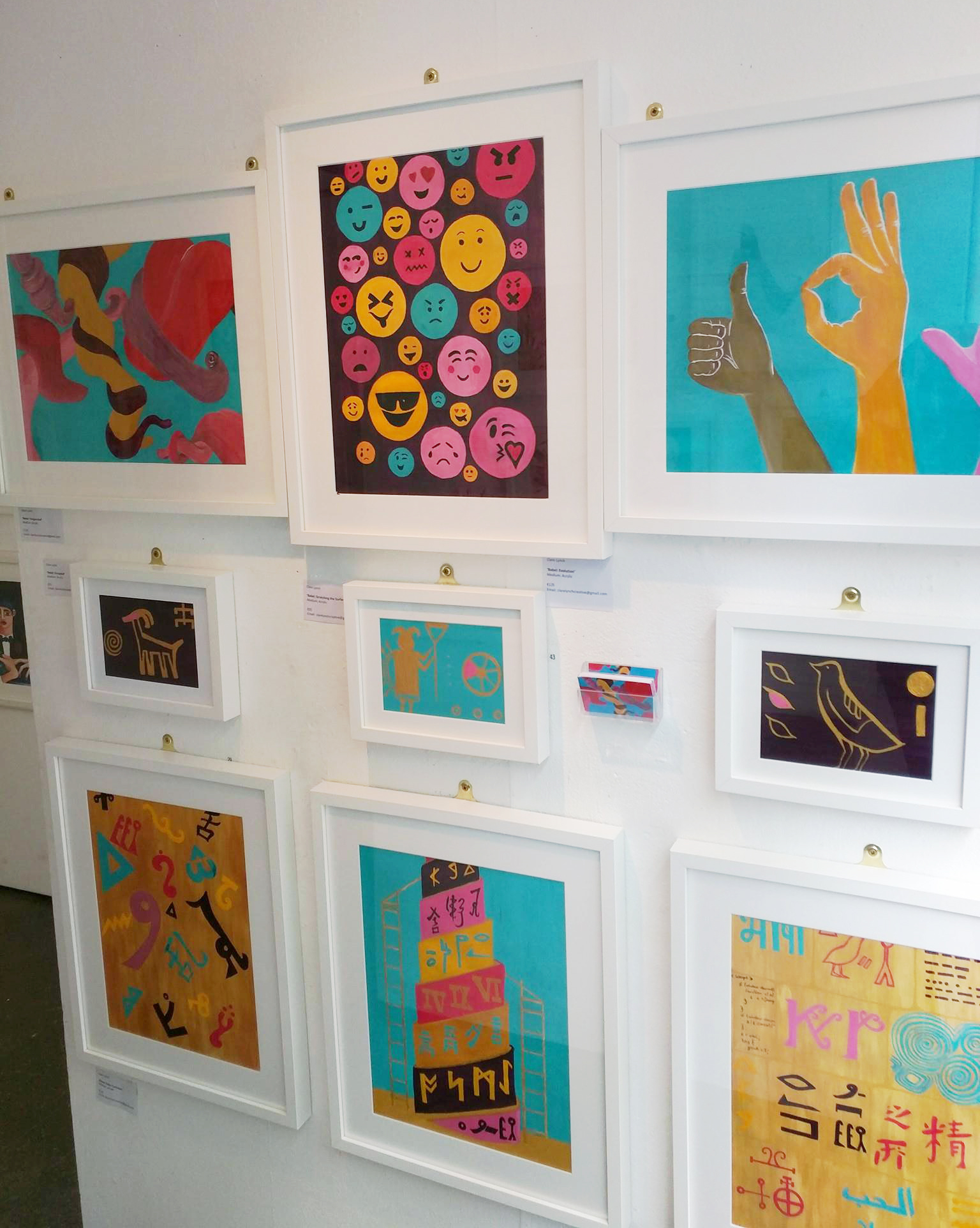
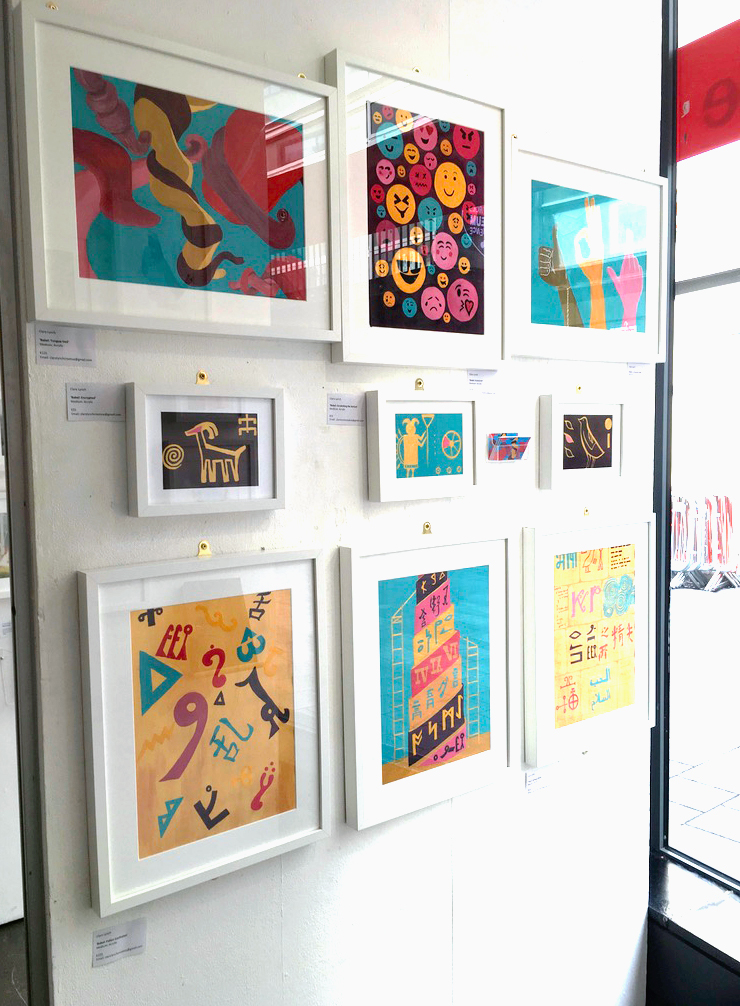
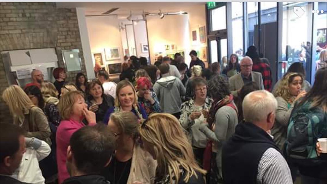
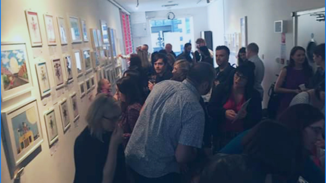
It was great to be part of the group illustration exhibition recently in Filmbase, Temple Bar in Dublin city centre. There was lots of excitement with putting up our framed art after a year of hard work in developing our illustration style leading to all the prep work involved preparing for an exhibition. There was a huge turn-out on the opening night, everyone agreed it was a great success.
The theme I chose was the wonder of the Tower of Babel – the story of how we all ended up speaking different languages. The concept shows the confusion that followed the collapse of the tower in the story where everyone began speaking different languages, with the tongue-tiedness that the language barrier brought. I featured some of the earliest forms of communication – ancient hieroglyhics and pictograms – in a bright and modern graphic way, using gouache colours that pop. I went on to show how language and communication has developed to today – where we use smiley faces and hand gestures to communicate which work through all languages. I enjoyed researching this theme, learning about the Rosetta stone and Egyptian hieroglyphics. There are some beautiful symbols used among all the languages and, although it would be simpler if we all spoke the one language, I would hate to see such individuality and beauty of each language’s unique symbols and form of communicating ever to become extinct.
One of the advantages of the location was that during the week, there was still a lot of visitors popping in as the artworks are displayed in the windows of Filmbase and attract plenty of passers-by and art lovers. Many of us had our own pop-up shops selling our giclee prints and greeting cards, which still continued to attract interest throughout the week.
My greeting cards and prints are available to purchase on Etsy at:
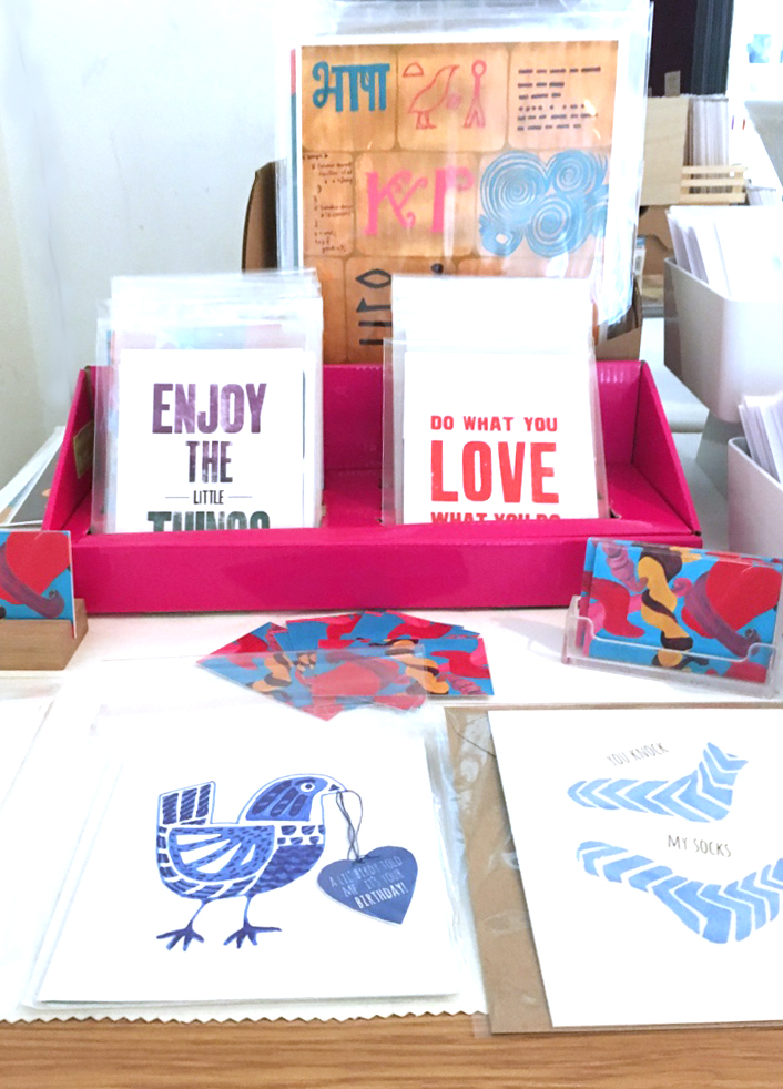
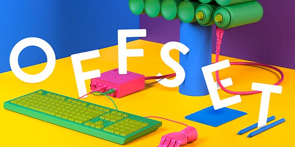
Dublin’s annual creative design event, hosted in Grand Canal dock, was full of talented speakers and designers eager to soak up inspiration and pick up some design tips and goodies. This year had a high focus on illustration, which was great to see. I am currently enrolled in a one-year illustration course, to develop my illustration style and bring more illustration in to my graphic design work, so it was great to hear about illustrators who are doing well in the industry. Here are a few of the talented designers and illustrators that caught my eye this year:
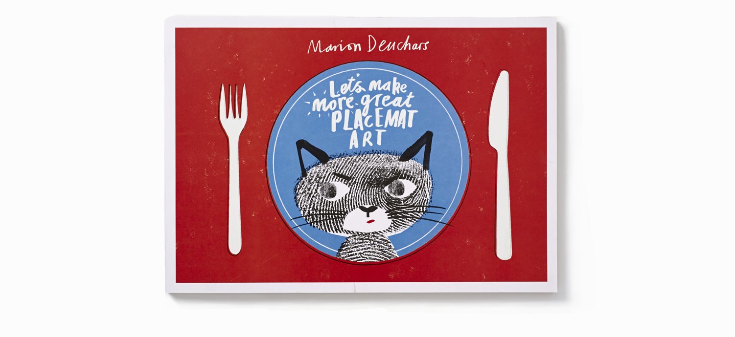
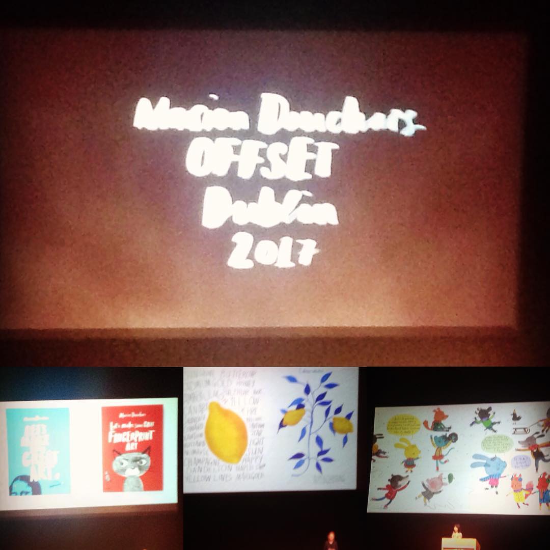
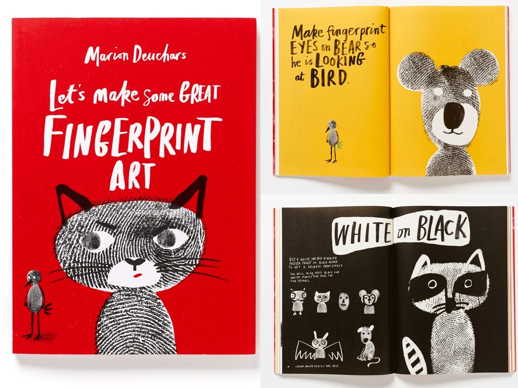
Marion Deuchars
Marion Deuchars is a Scottish award-winning illlustrator and hand letterer. She is well-known for her children’s book designs, an area of graphic design I would love to get in to in the future, so I found her talk inspiring. She also works with brand and advertising agencies. Her illustration style is playful and appeals to children and adults alike. See more of her work here.
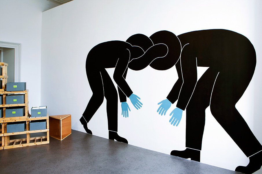
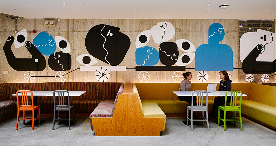
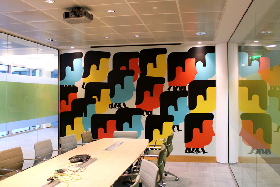
The Project Twins
Great to see young Irish designers speaking at such a big event. This duo hail from Cork and have accomplished a lot already in their careers. The printmakers have spent time in a residency in the Facebook offices, which sounds like it was a lot of creative fun and have been featured in a huge amount of shows and exhibitions. Their work is simple but quirky; their bright and playful illustrations clearly deliver each project message with accuracy and bring a smile to your face. Purchase a print for your home or studio here.
And last, but certainly not least, advertising agency Chemistry
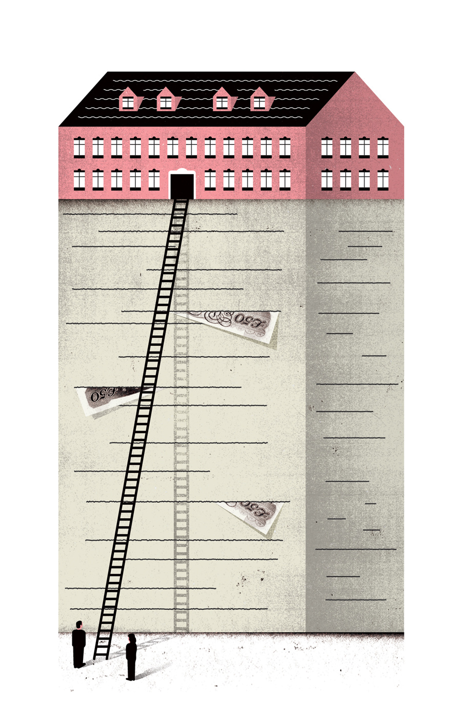
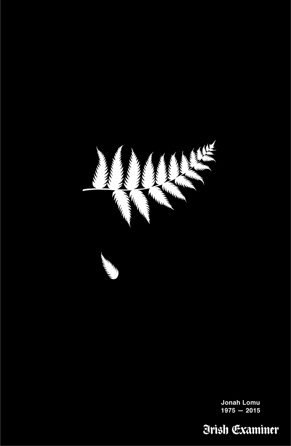
I love Chemistry’s ideas. Their work is the type of work I look at and wish I had done it myself! For the sad death of the All Blacks rugby player Jonah Lomu, they designed this beautiful image below of the New Zealand fern with one of it’s leaves fallen, which very simply and eloquently reflected the tragedy of New Zealand and the All Blacks loss of such an important player and Kiwi legend.
Another strong campaign they spoke about was the ‘I want to get Cancer’ campaign. I must admit this was quite a controversial one. When I first saw it on a bus stop and then on a TV advert, I had mixed feelings. I understood the point but still didn’t like to see those words as they seemed like a negative affirmation at first glance and because of it’s in your face nature, it could pose insensitive to someone with a family member dealing with or having lost someone to cancer. However, the talk really brought more insight to this campaign. They asked half of the audience to stand up and said that by 2020, it is predicted that 1 in 2 of us will get cancer. The figure was quite striking and by separating the audience like that, it really hit home. They said they needed a message that really got attention and drove awareness with people that this isn’t something we should be turning a blind eye to, that we need to be more proactive rather than reactive with fighting it. Some of the team working on this campaign had actually fought cancer themselves, so they were actually in a strong position to speak up about it, after having gone through it personally. They spoke about how the campaign had been really effective and brought in a lot more calls and awareness, therefore it hit the objective of the brief very well and brought the desired outcome.
I also loved their LIDL Christmas advert, which was touching and well created with the story based around families and coming together to be there for eachother.
View it below:
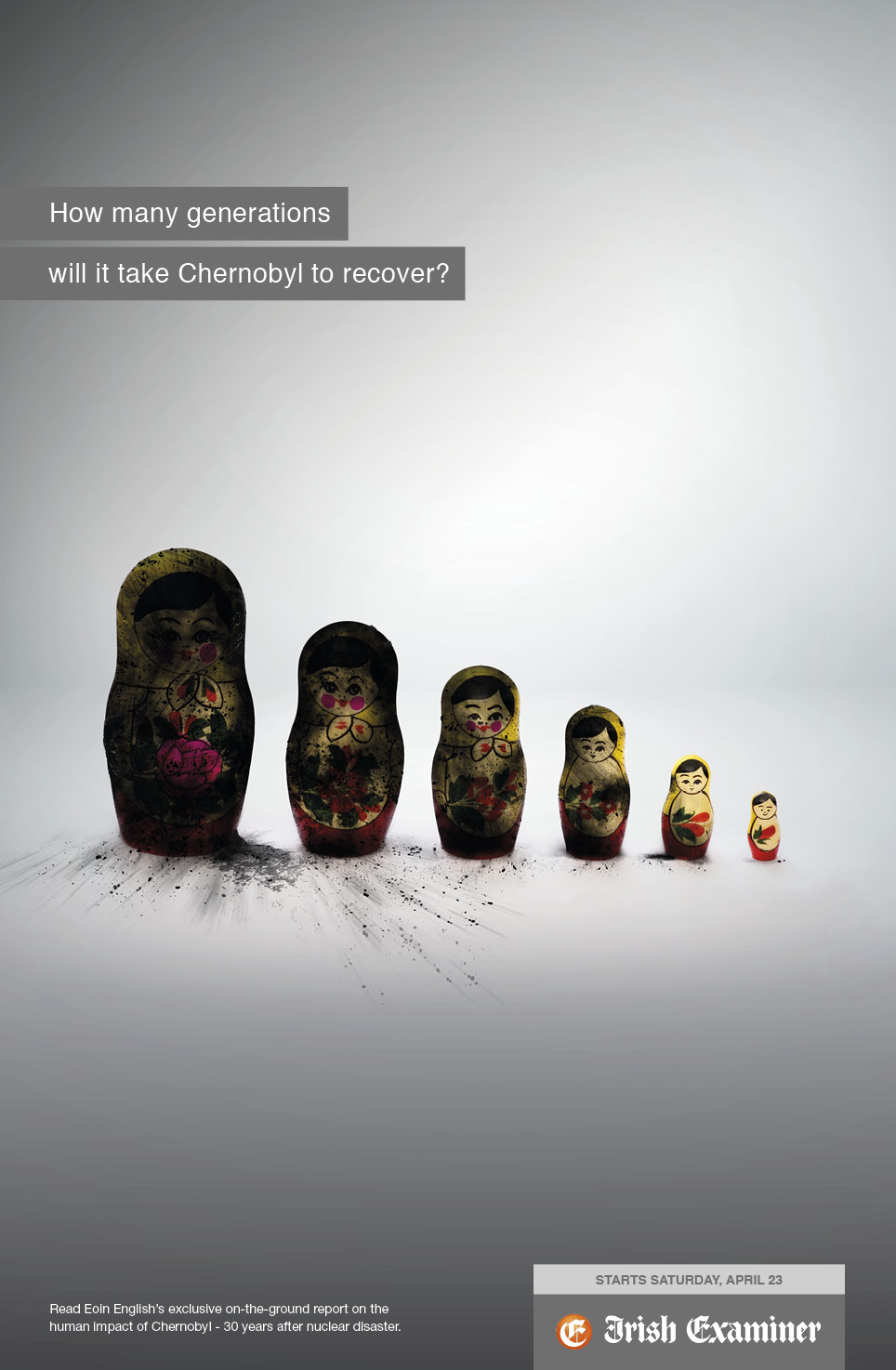
Another striking image they created for an article on the history of the events at Chernobyl, using charred Russian Dolls was also very effective. I think they have the ability to deliver a message effectively in a way that touches on your heart strings and makes you think about the issue.
So that sums up my Offset 2017 highlights – there were many more talented designers speaking but I could only pick a few! Now to put that inspiration to good use…
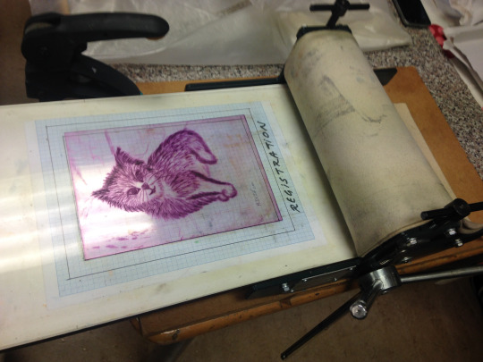
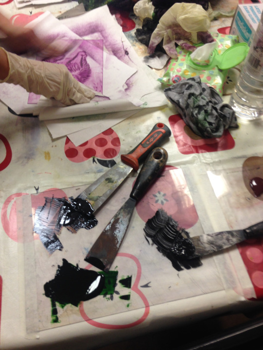
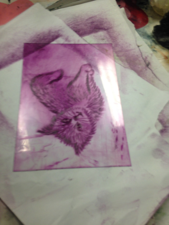
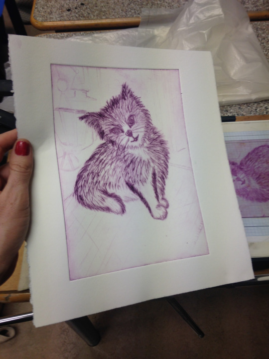
I recently attended some printmaking workshops, where I got the opportunity to create this playful feline print. Using drypoint as a technique, I focused on drawing textures and patterns to build up this image. Perspex (or plexi) is a great material to bring to these workshops because it is not as intimidating as a copper plate and because it is transparent, you can easily trace over the lines of an existing picture. The quality of the drypoints is also another important factor to pay attention. Investing on good tools show the possibilities that can be explored best.
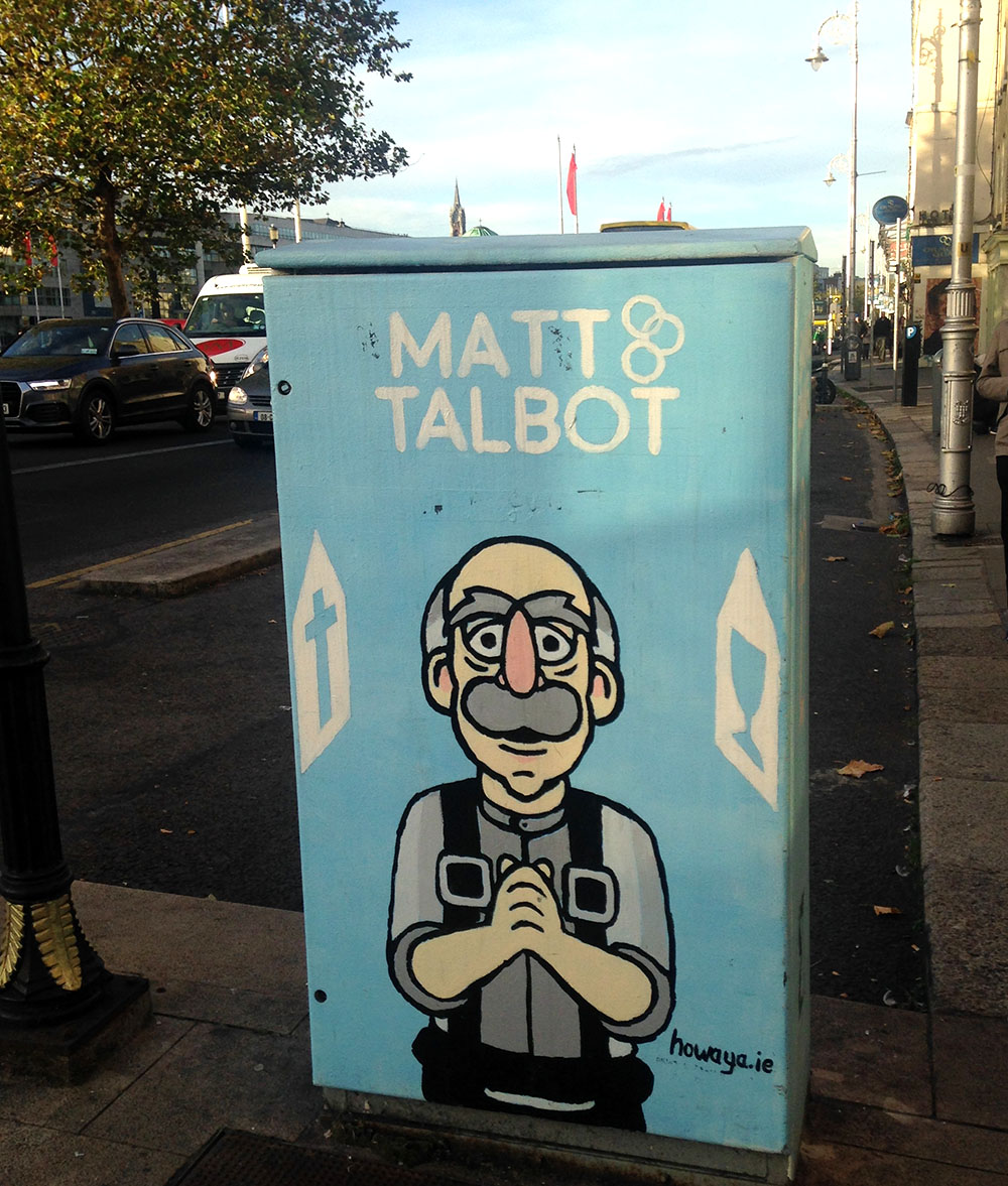
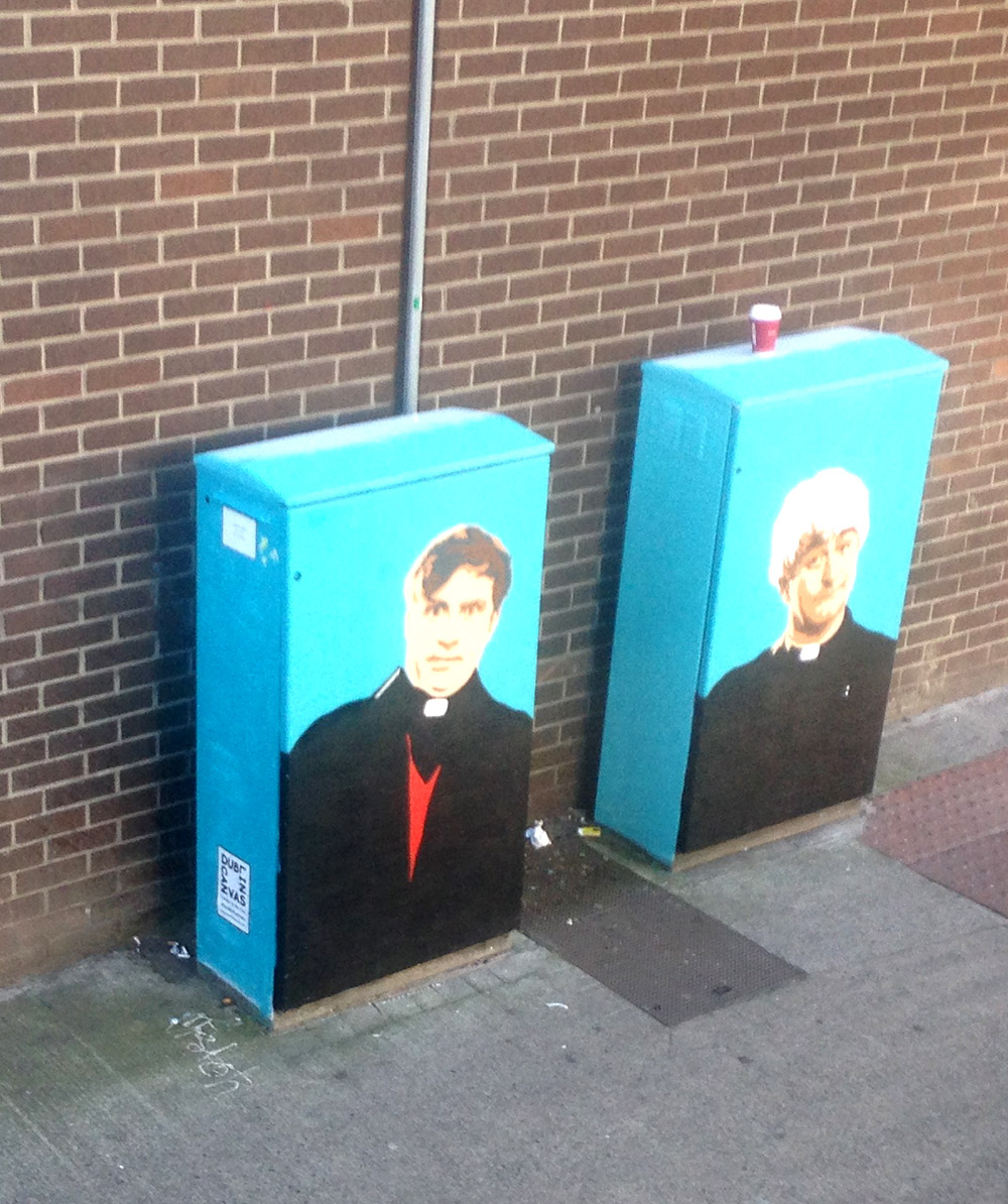
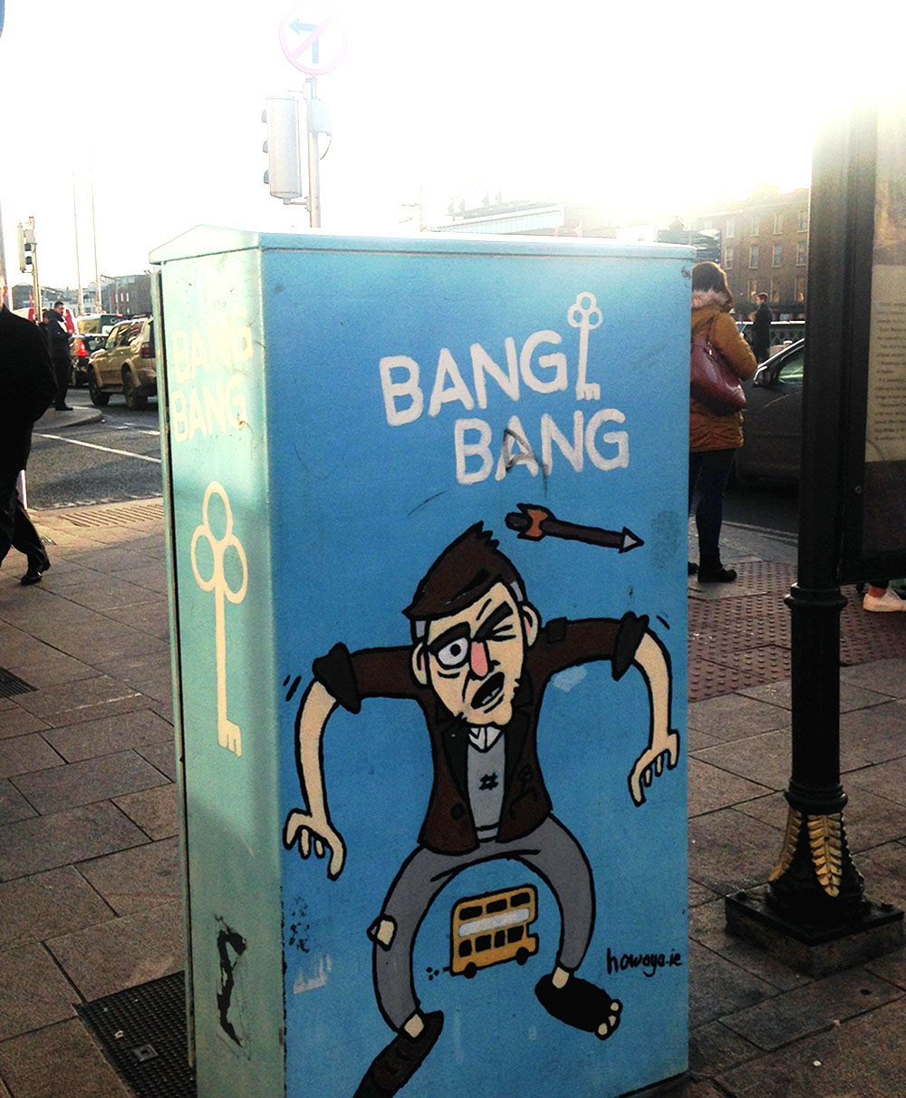
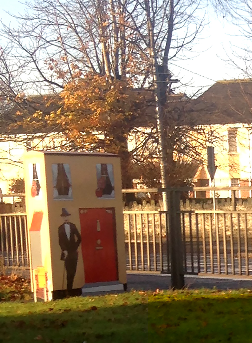
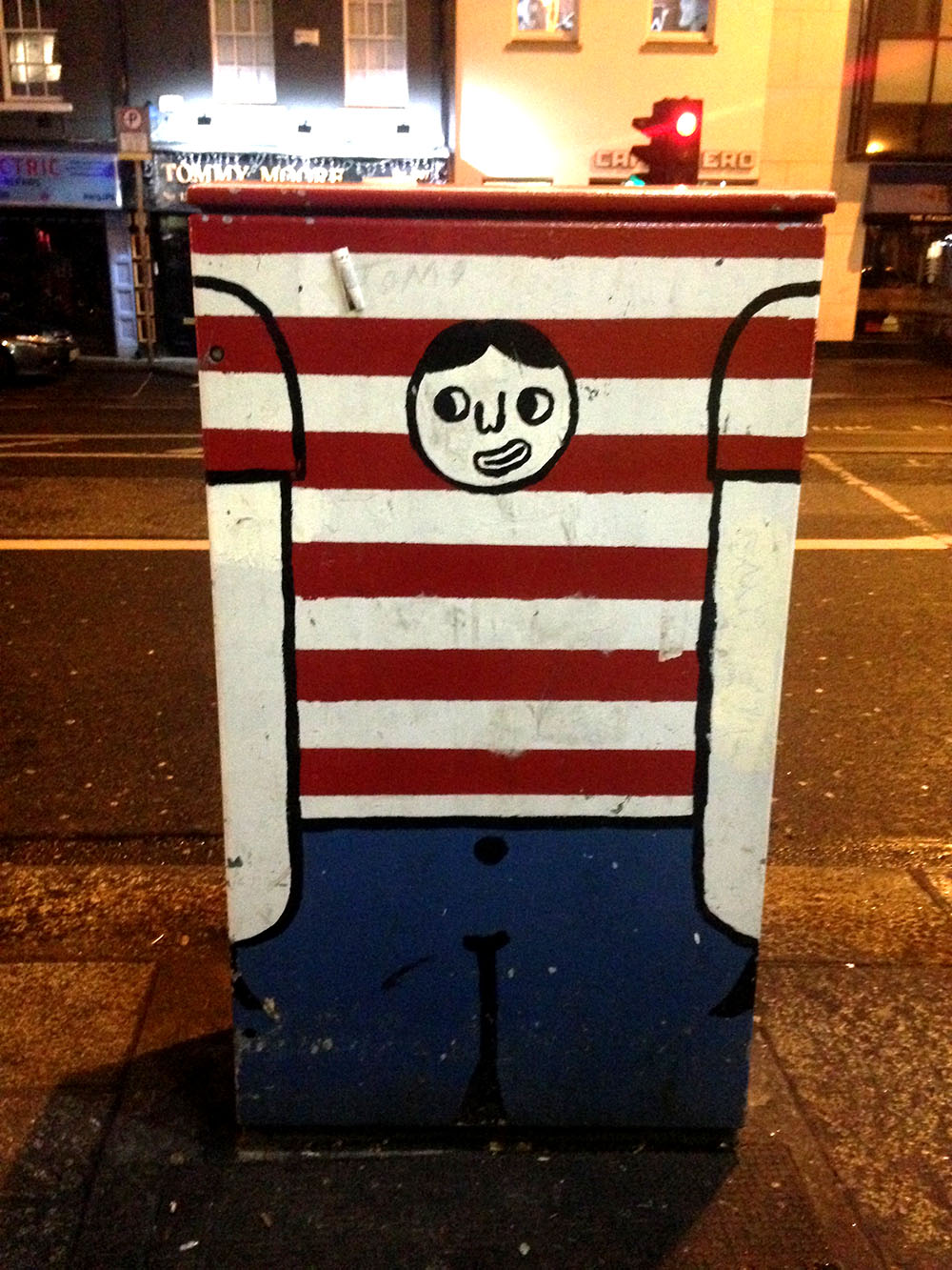
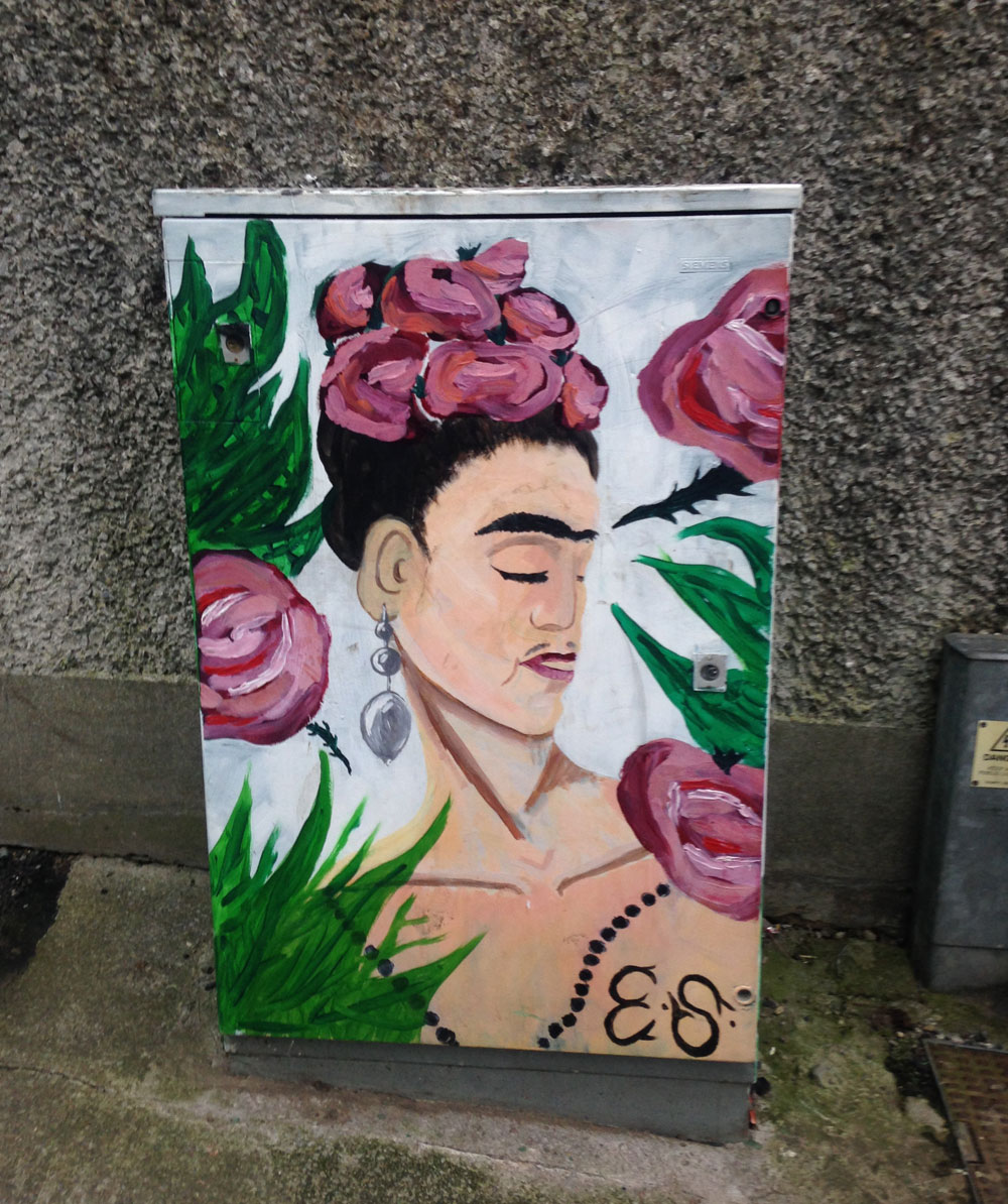
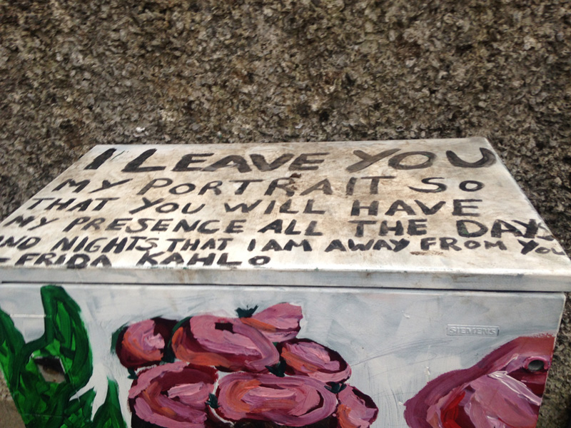
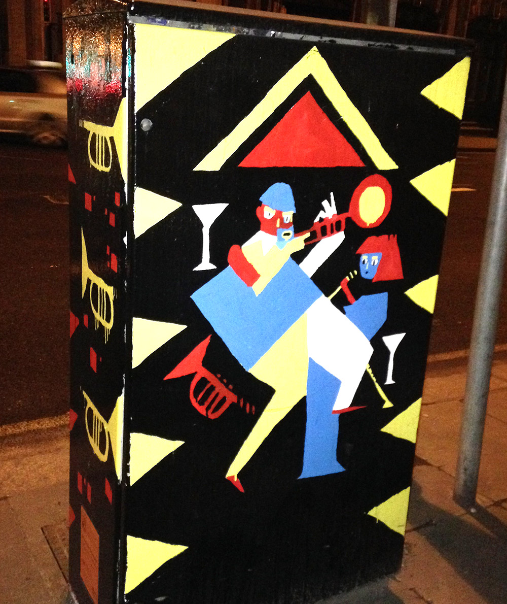
I love how these electricity power boxes around the streets of Dublin have been transformed into works of art. What a great way to add some visual interest to public objects that would normally be considered mundane! My favourite is the one which appears to be a little house – very endearing and clever! Have a look at some of the ones I have captured below:


