Excited to be a mentor with The Big Idea – Ireland!
A brilliant

Excited to be a mentor with The Big Idea – Ireland!
A brilliant

Delighted to win a Gold Award in the Muse Design Awards 2022 for the Packaging
Brilliant to recently work on the branding of Your Life Audit. Your Life

Delighted to get the printed copy of the Favourite Book Design, 2021 edition,

Excited to hear I will be receiving an Honourable Mention Award in the
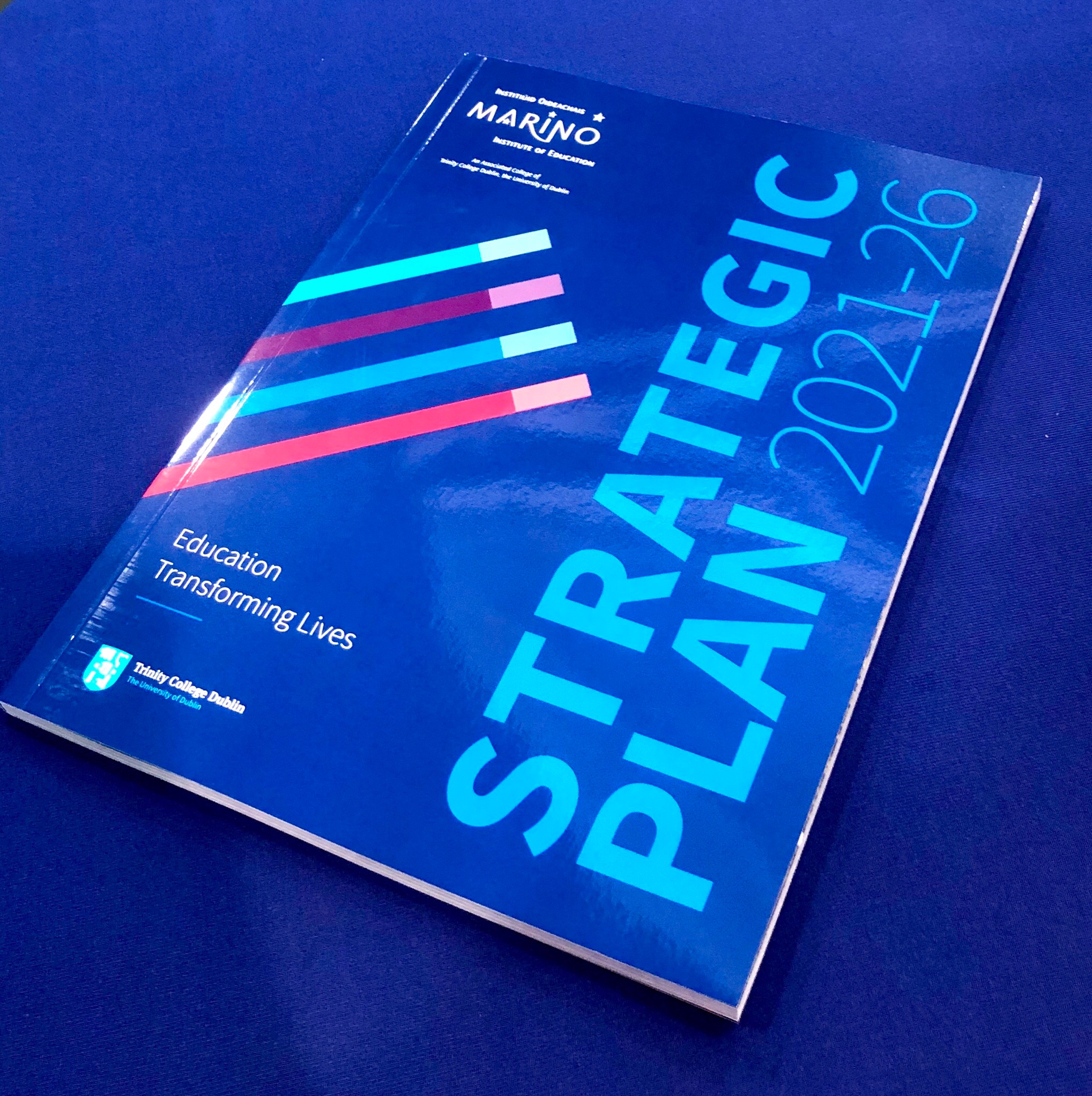
Marino Institute of Education ‘Education Transforming Lives’
Great to

A big thank you to the B4B network for such a lovely feature about Clare
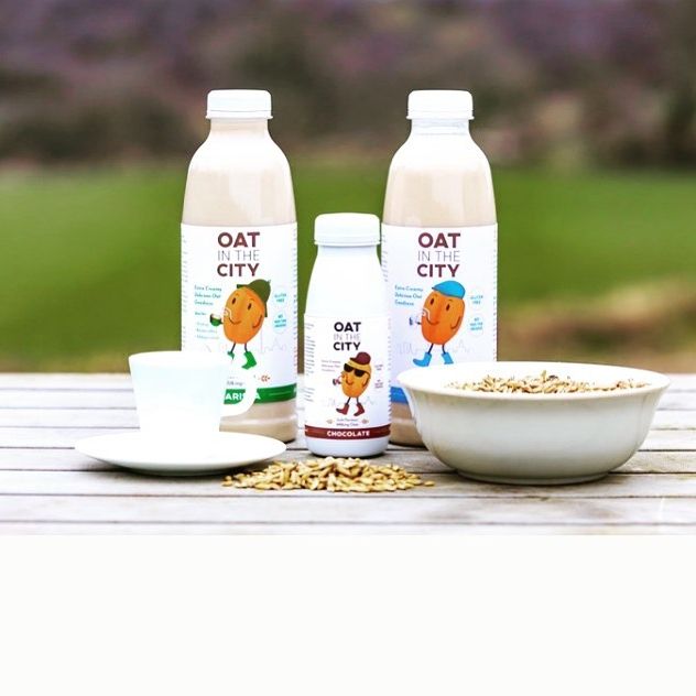
Our latest brand to launch ‘Oat in the City’ Irish oatmeal

These features included the German design magazine ‘Creativ Verpacken’

Great to get our work featured on The Dieline Packaging Design blog!
A Fresh

I love to see my client’s do well, it’s a sign that

After winning Gold in the Muse Awards 2020, their linked marketing company