Flying Squirrel Plant-based Cheese
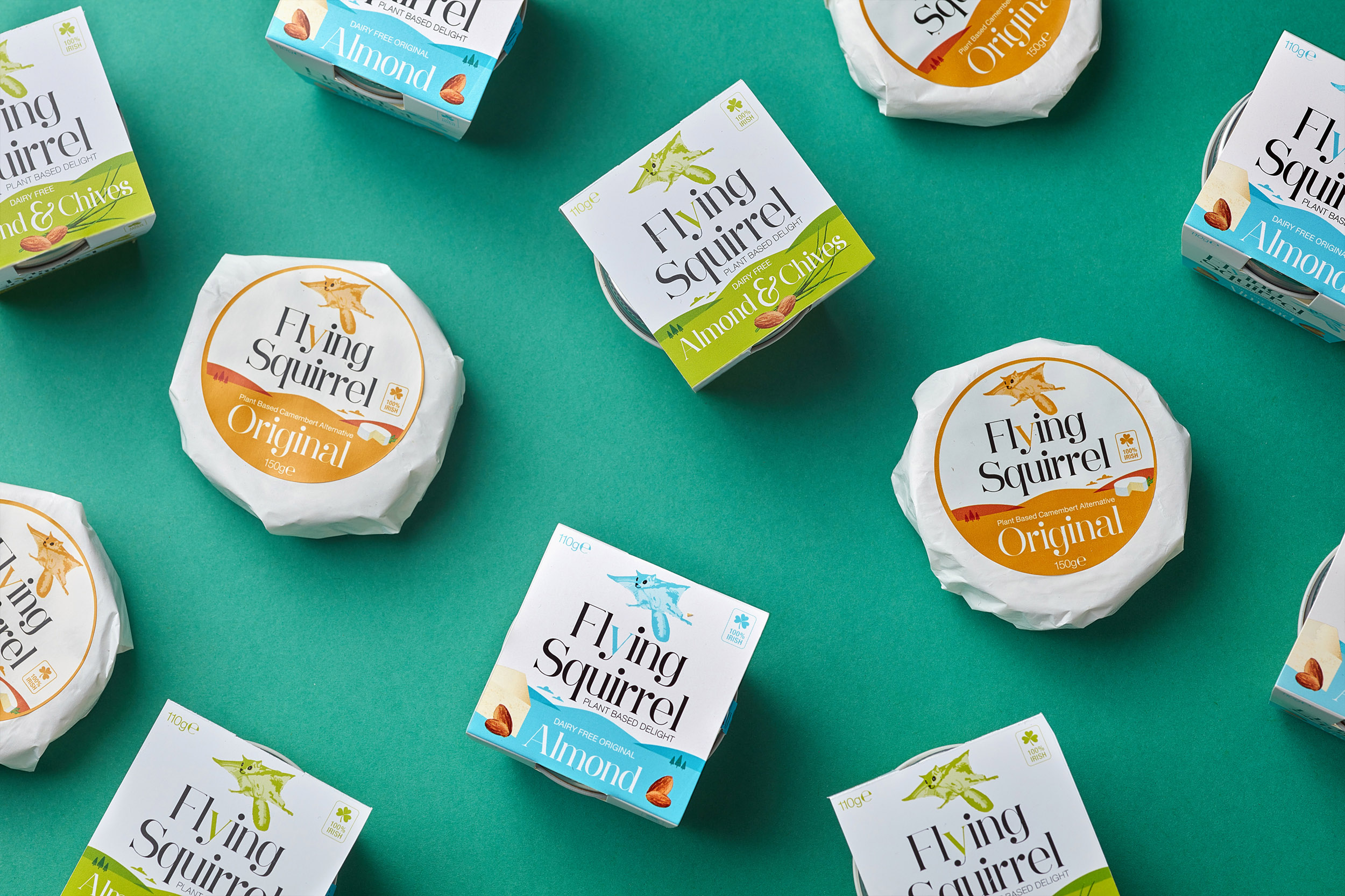
Flying Squirrel are a range of delicious, plant-based cheese alternatives, new to the market. The brand packaging and identity is fun, happy and vibrant; showcasing a quality, sophisticated product.
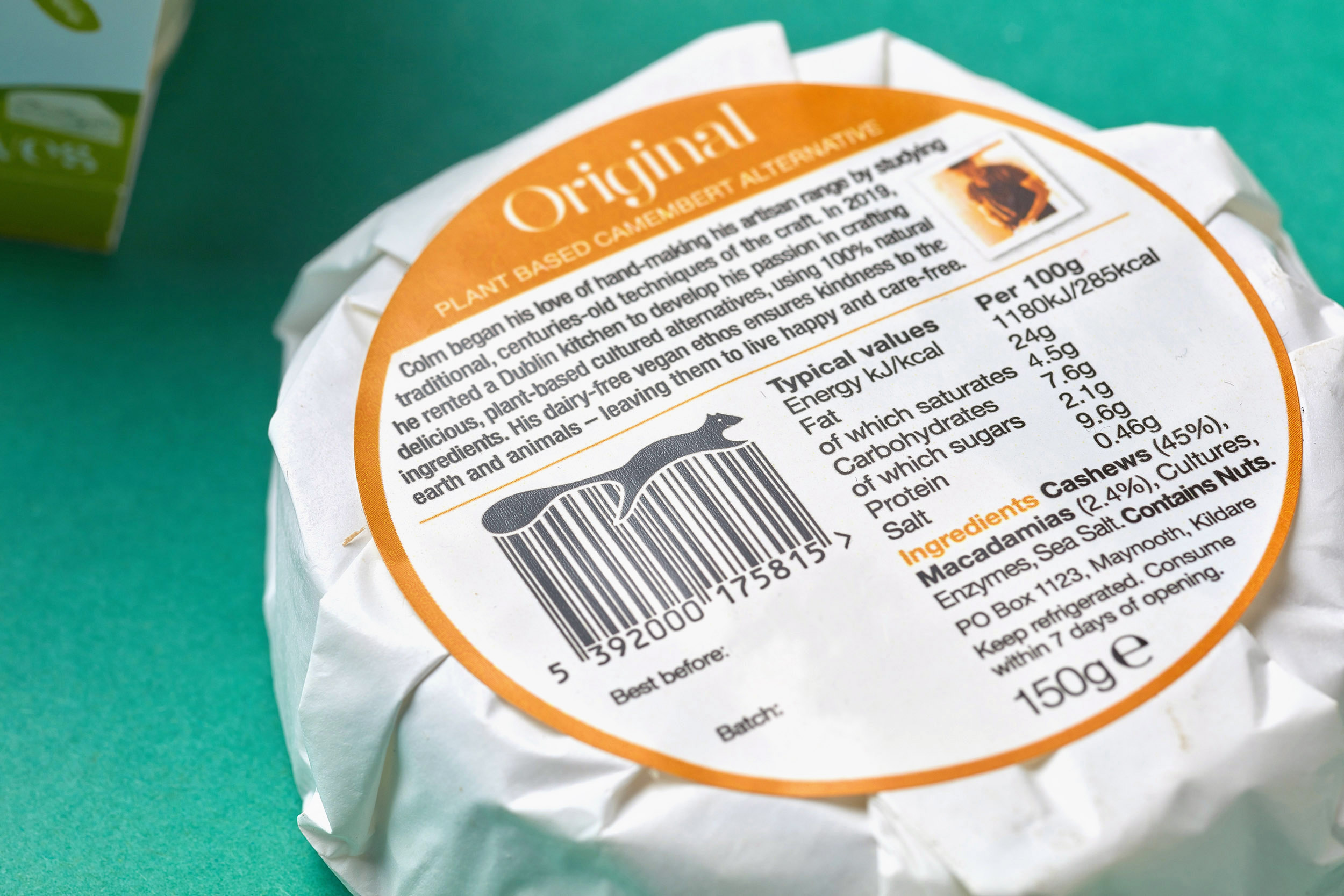
The artisan producer, Colm Farrell, grew up in the Irish countryside where he where he first fell in love with nature and animals and gained an appreciation for the environment. He went vegan in 2014 and one food he really missed was cheese. He noticed a gap in the market for plant-based cheese that tasted good and began attending cookery schools in the UK and Germany, studying traditional, centuries old techniques of the craft such as culturing, fermentation, coagulation and ageing and developed a real passion for food and cooking. His hand-made artisan range is carefully crafted in his Dublin kitchen with love and passion, using traditional techniques. All Flying Squirrel products are dairy and lactose-free and are suitable for vegans, vegetarians and those making a conscious decision to change their eating habits for health, ethical or environmental reasons.
We worked together in the naming process to define the name ‘Flying Squirrel’. It is inspired by the free-spirited energy of animals such as the flying squirrel, left to roam happy and freely in nature. This ‘cheese from trees’ is made mainly from nuts, and as squirrels are known to gather nuts, this is a further connection with the name to the cheese brand.
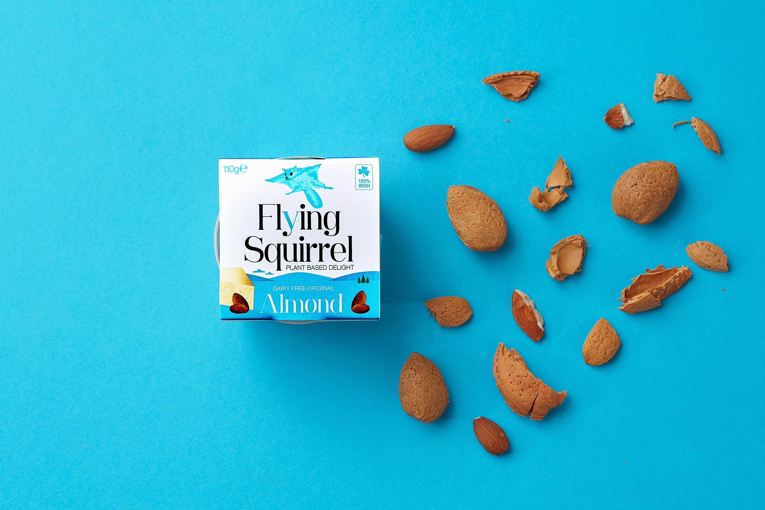
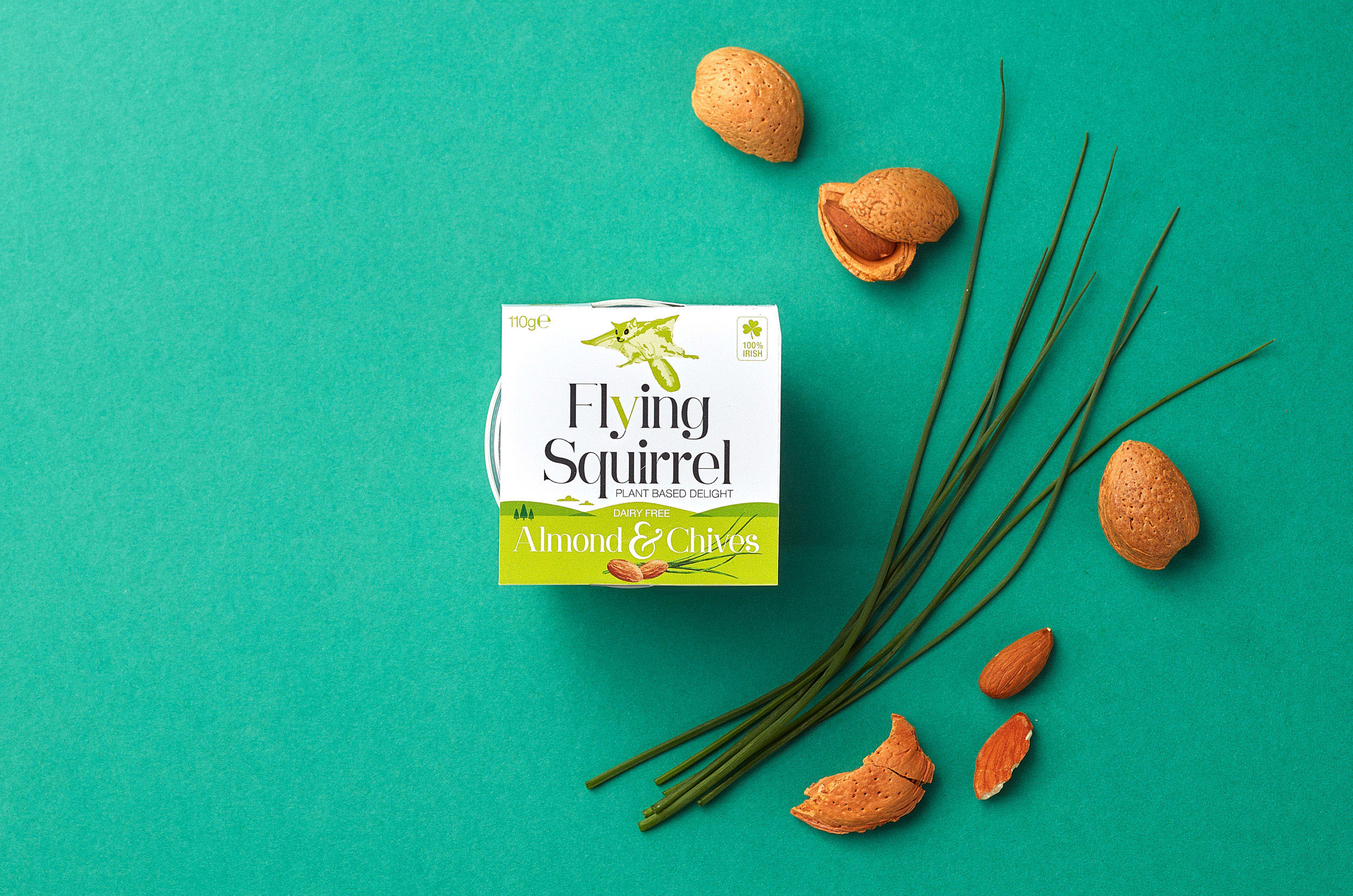
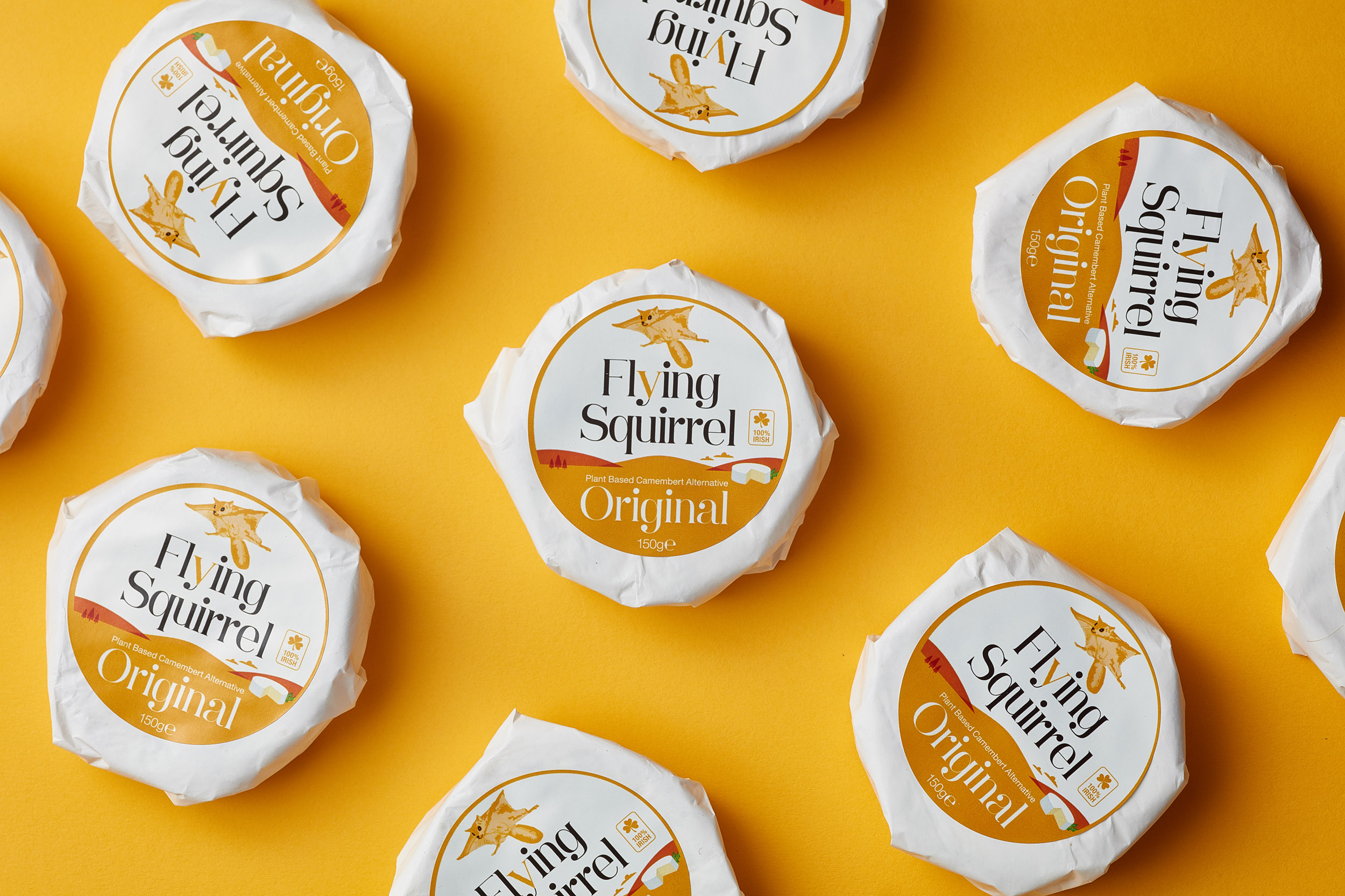
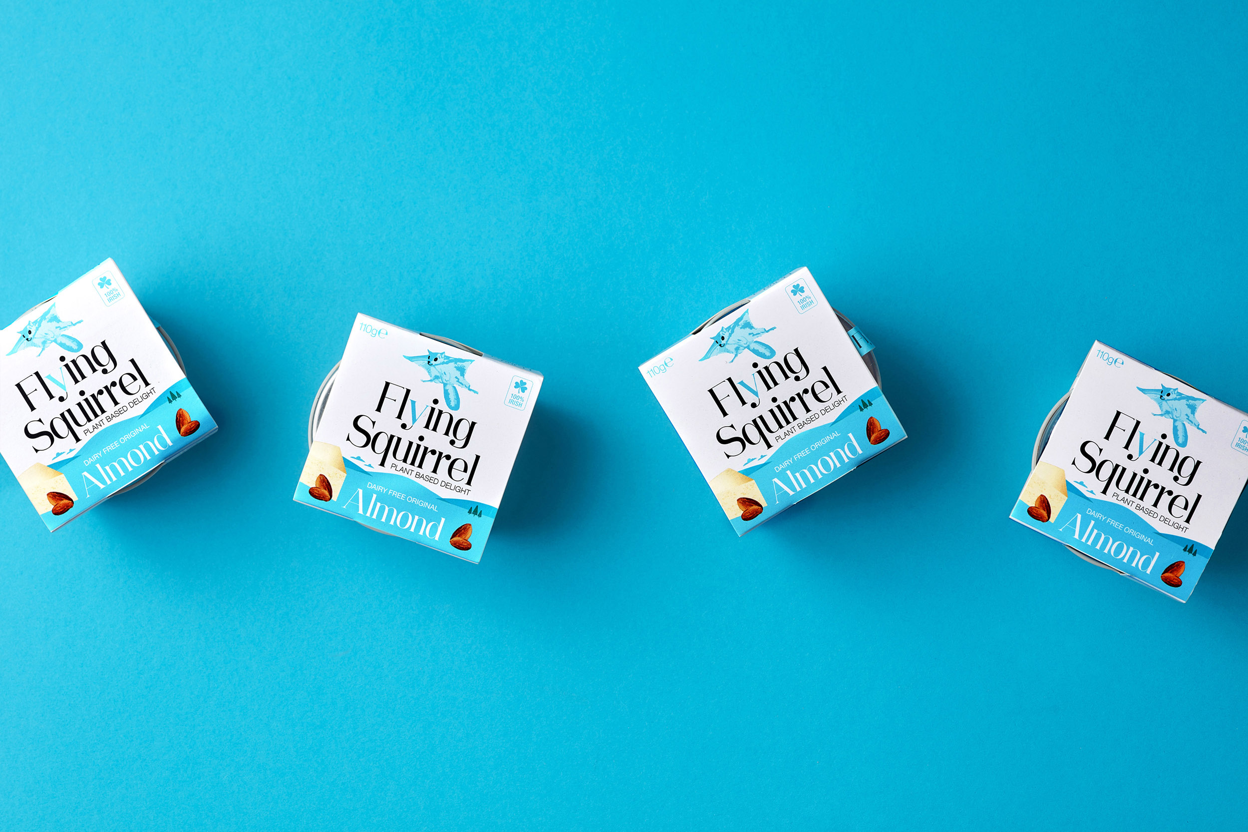
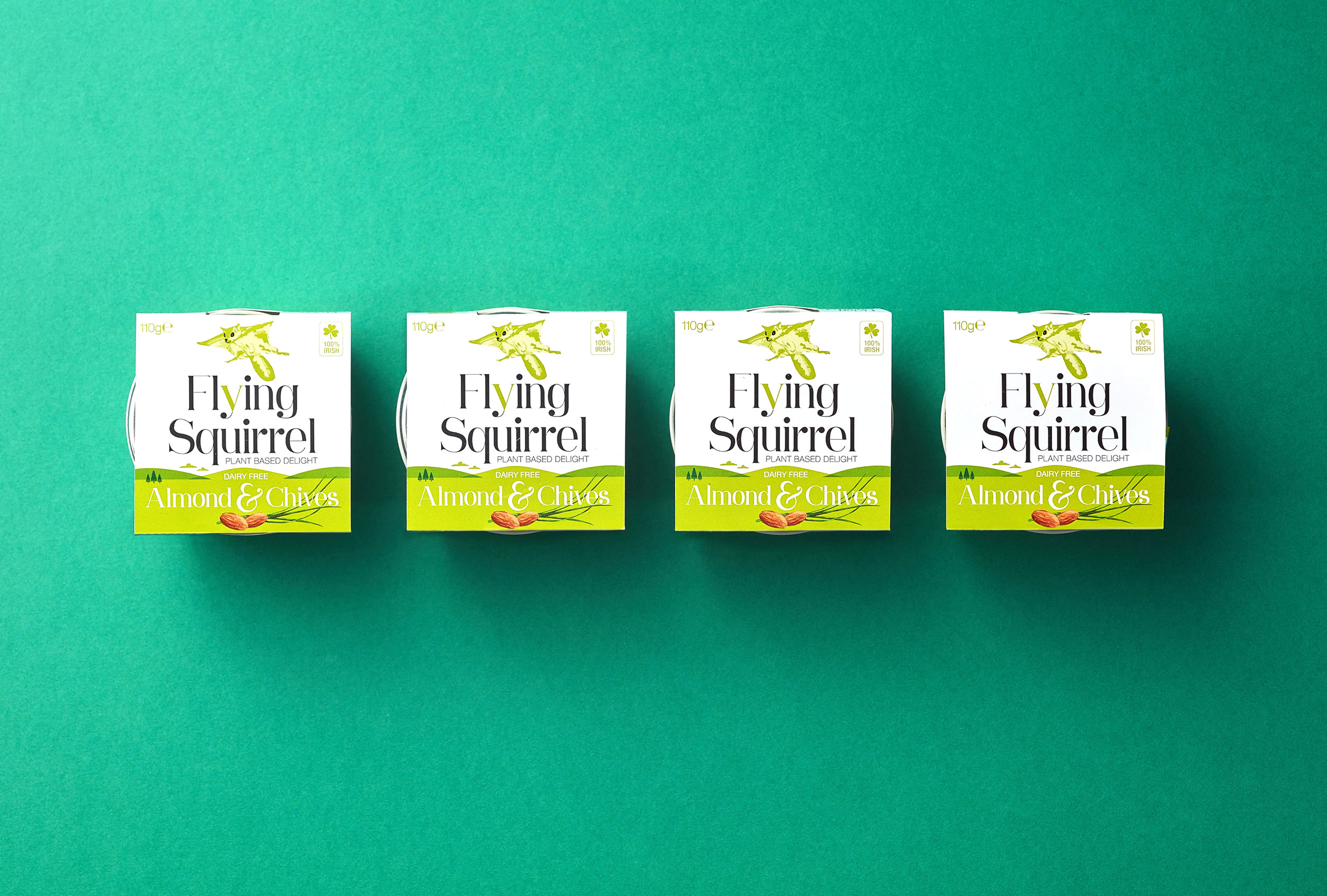
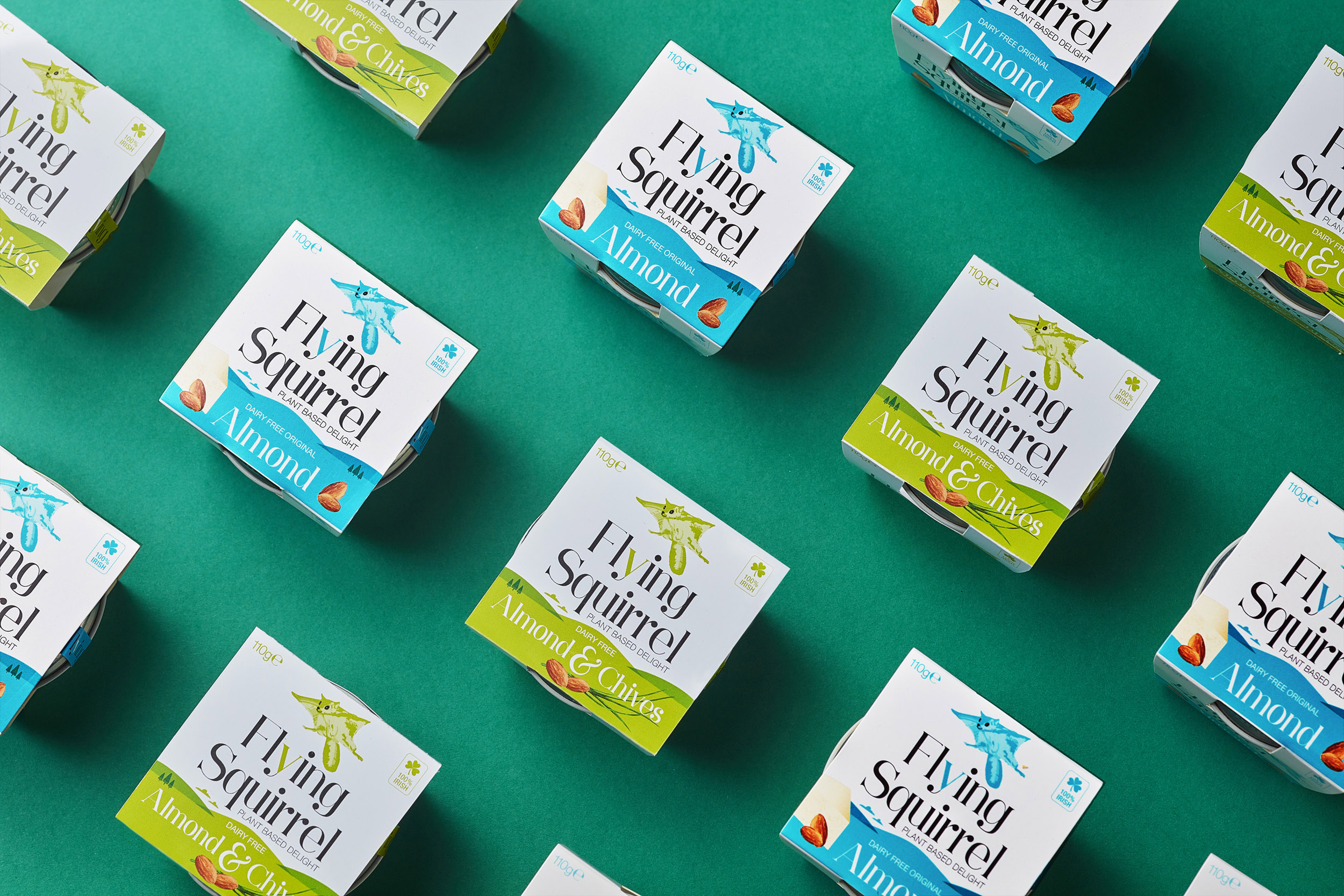
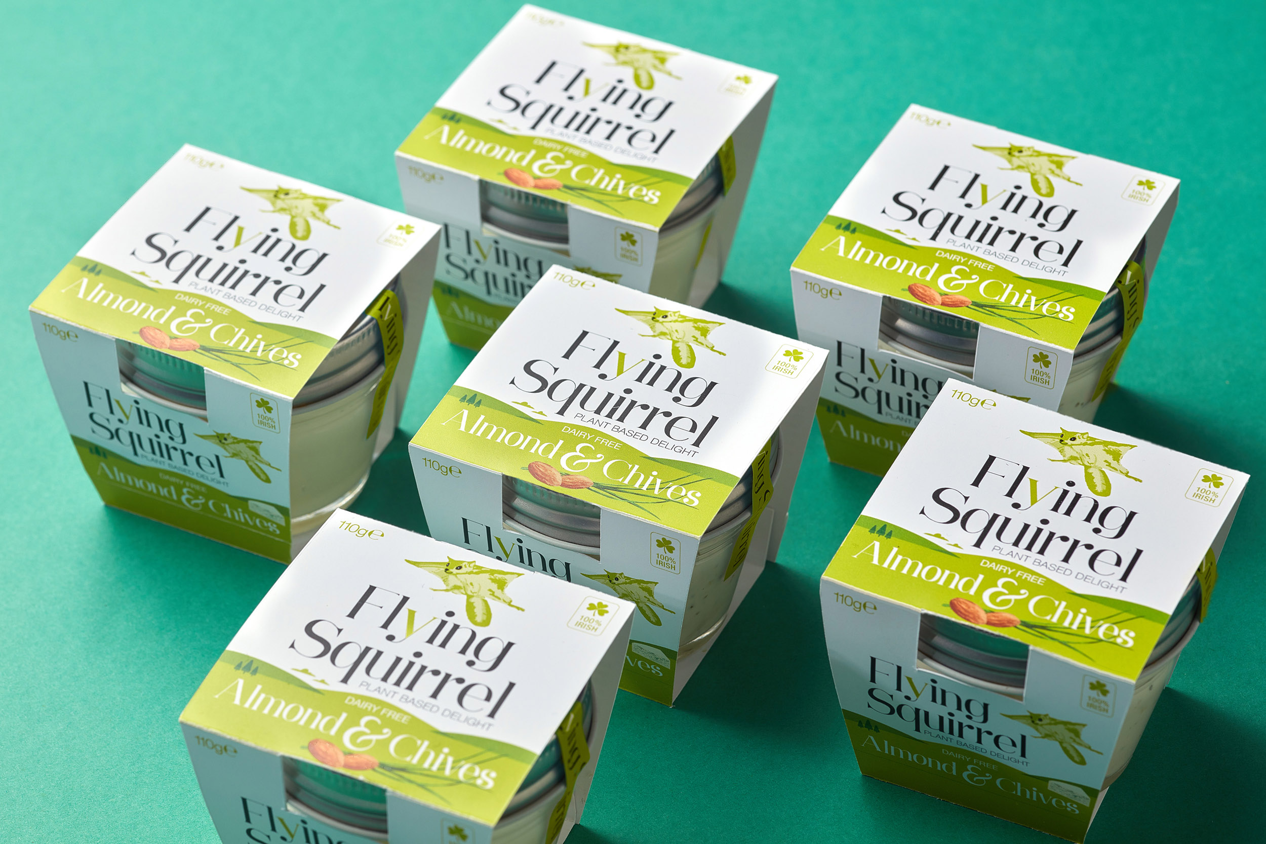
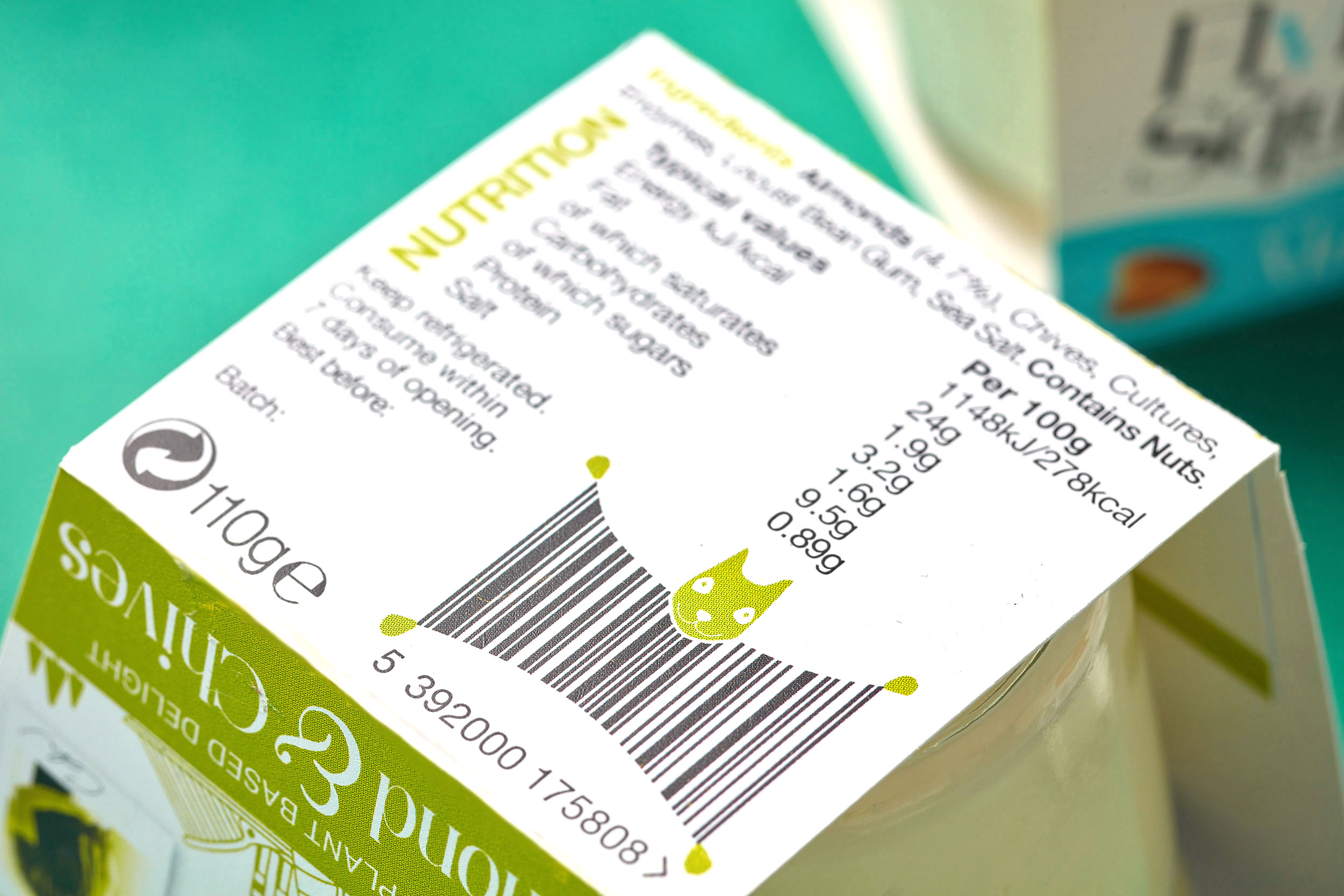
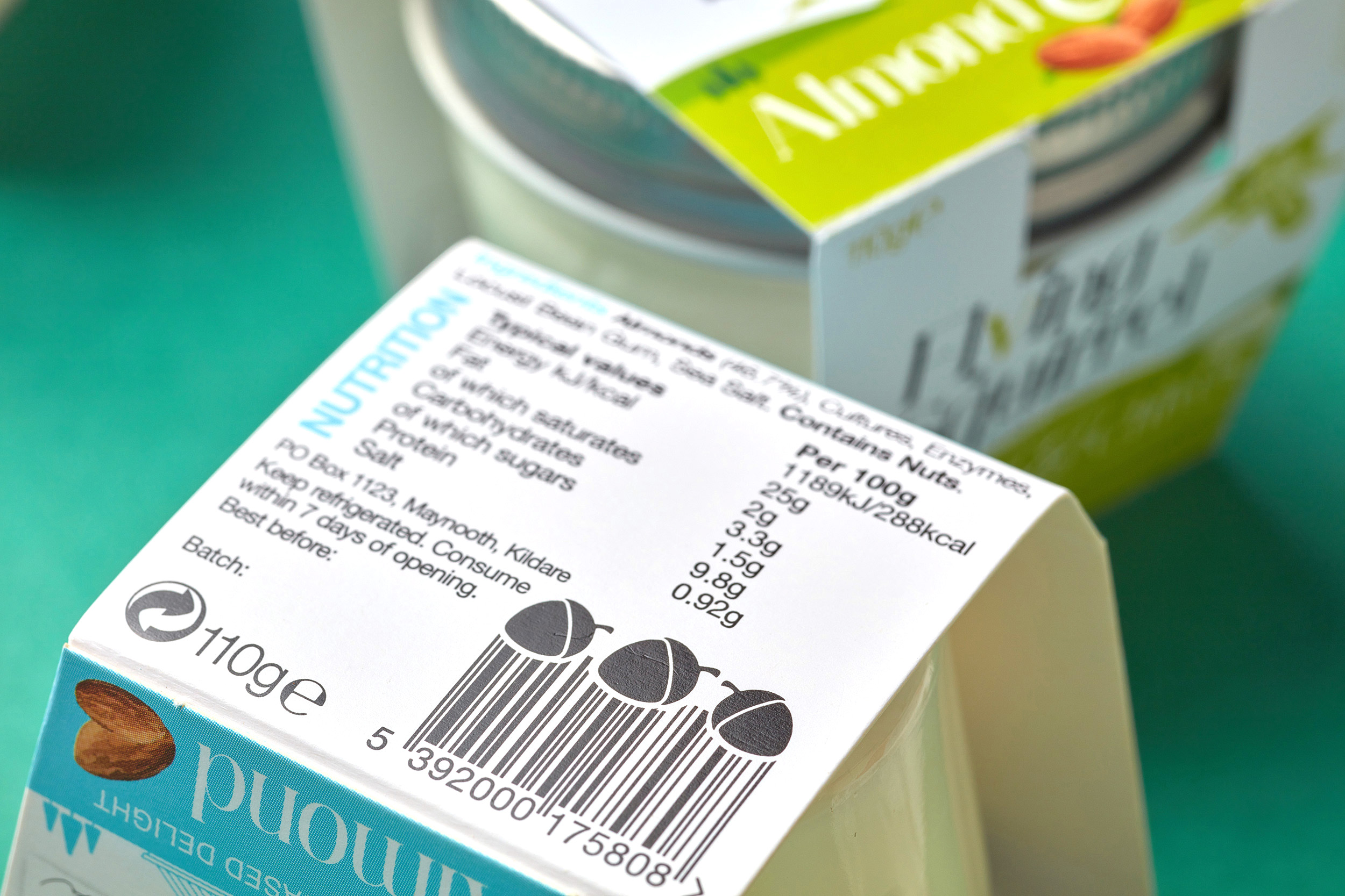
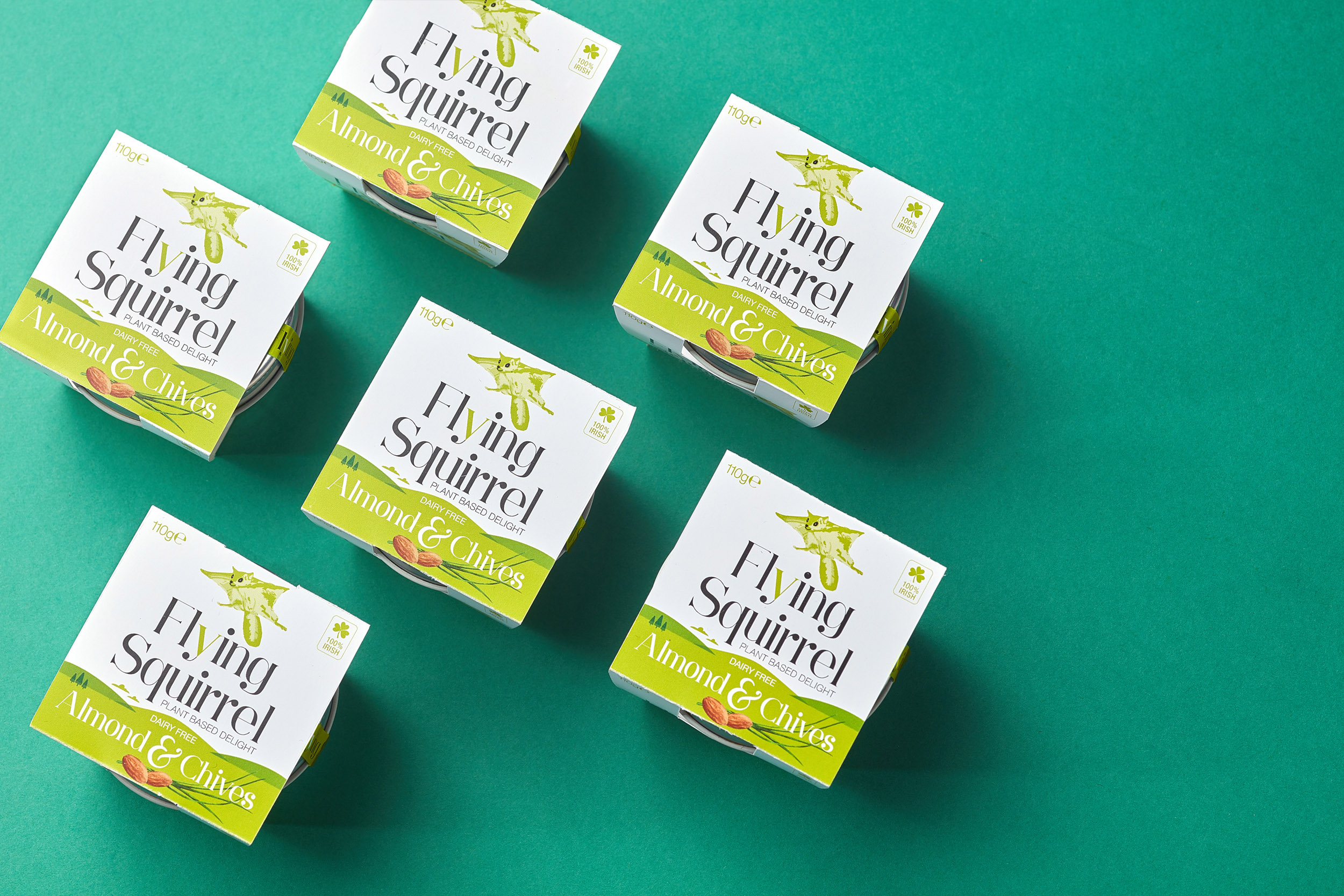
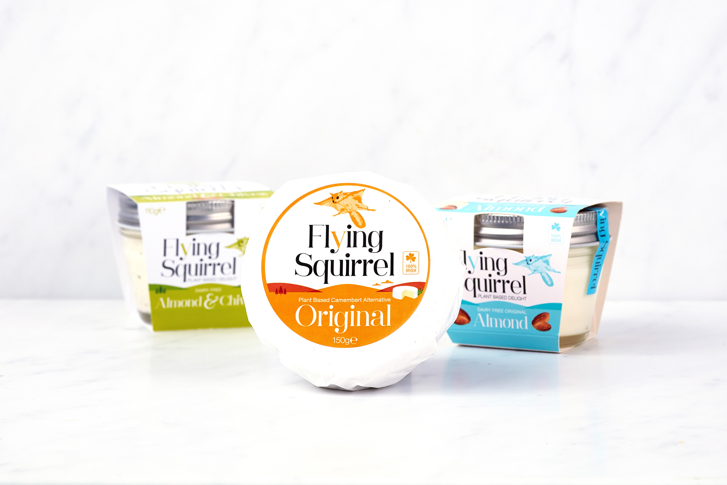
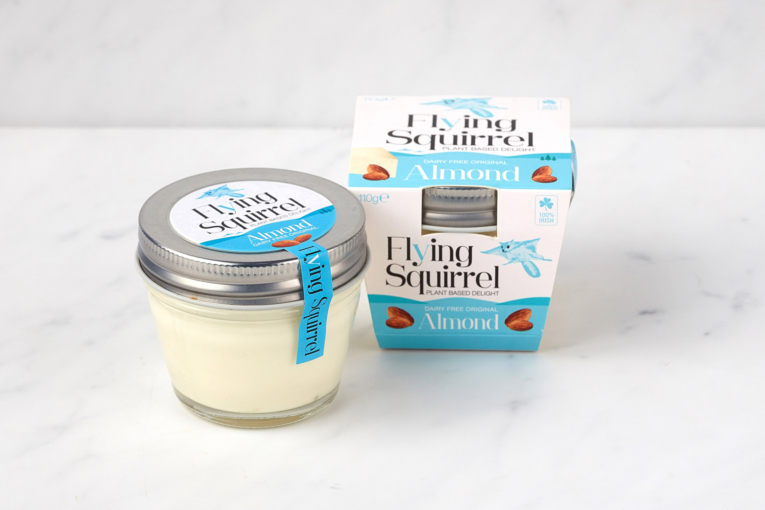
In the packaging, the illustration created depicts a flying squirrel character soaring over the natural outdoor landscape, connecting with how the cheese is made using 100 per cent natural ingredients and is naturally kind to the planet. We worked with Farrell to create a visual brand and packaging identity which best represents this philosophy. Although one of the key aims of Flying Squirrel is to provide a solution for consumers looking for a delicious alternative to dairy cheese, all cheese lovers can enjoy it. For this reason, the ‘v’ to signify it’s vegan appeal, is highlighted in a subtle manner within the ‘y’ in the brandmark typography. A small Irish shamrock symbol is included on the front of the packaging to signify its origin for consumers who like to buy local.
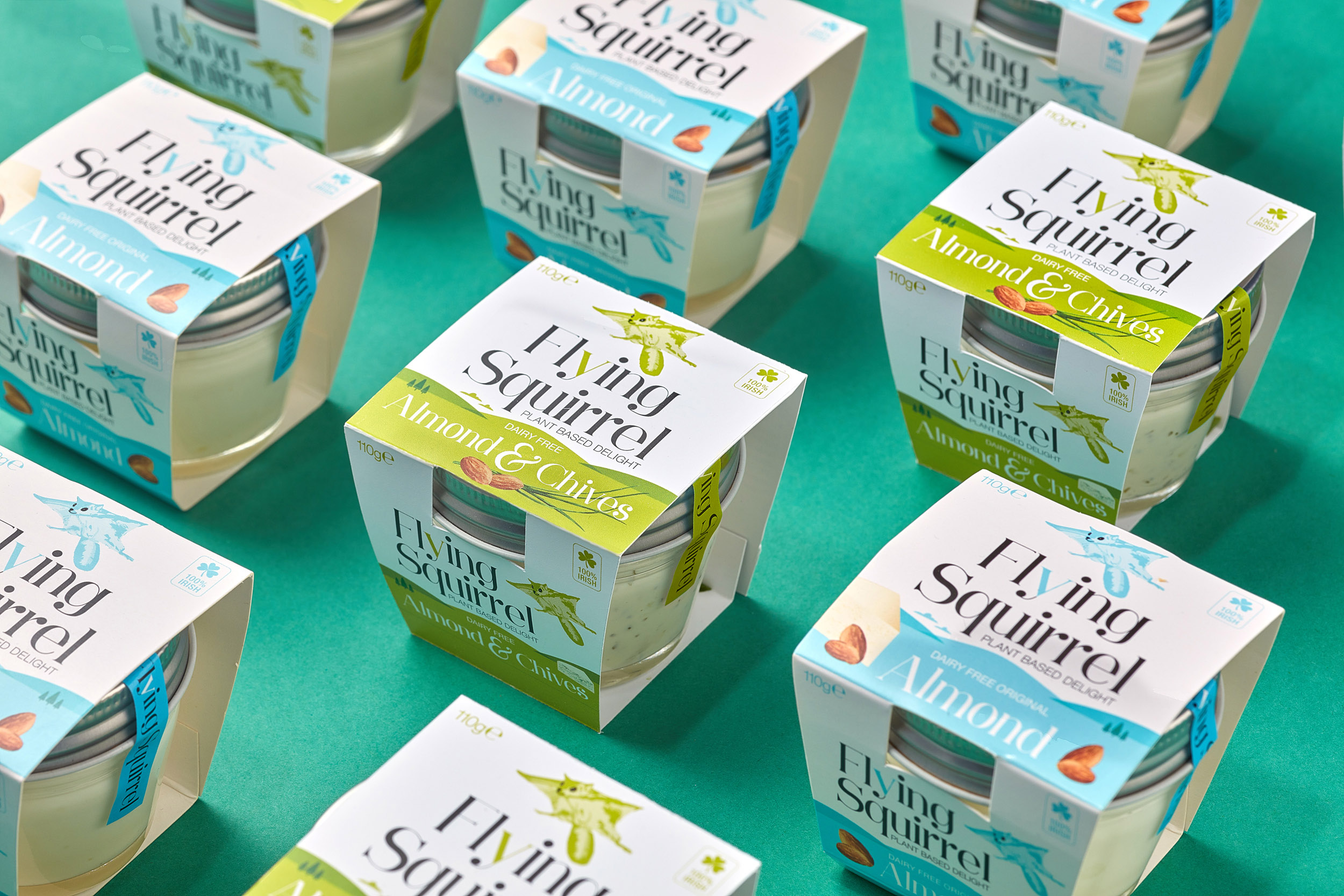
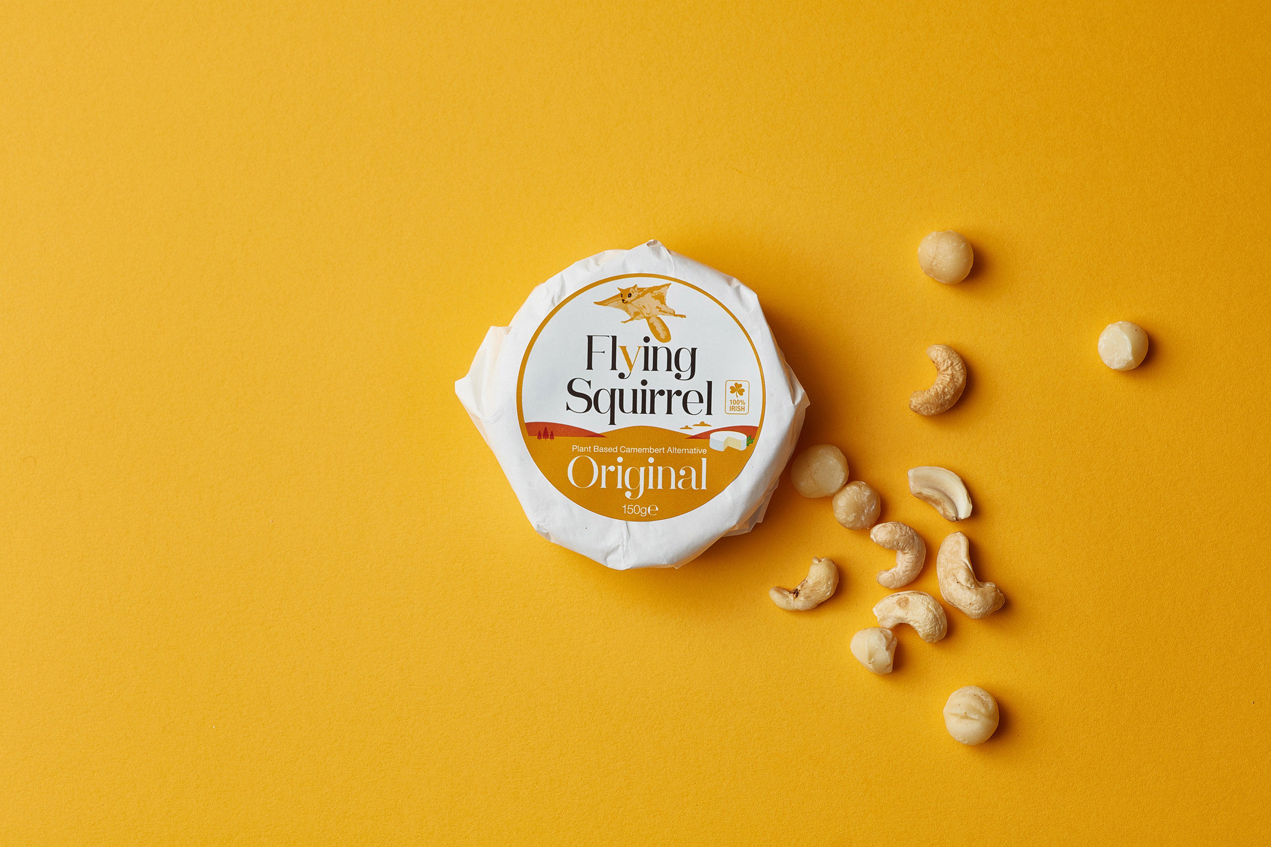
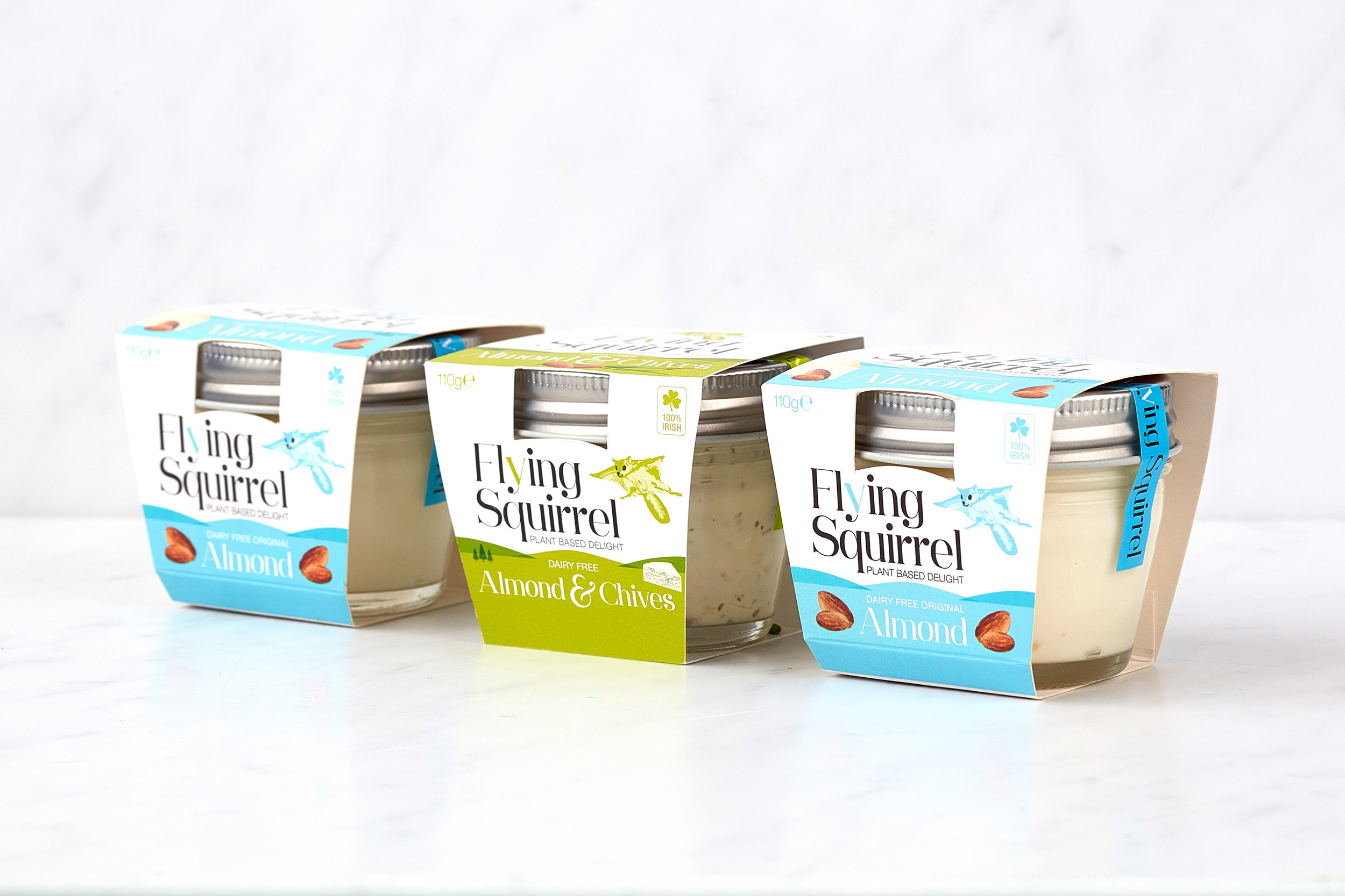
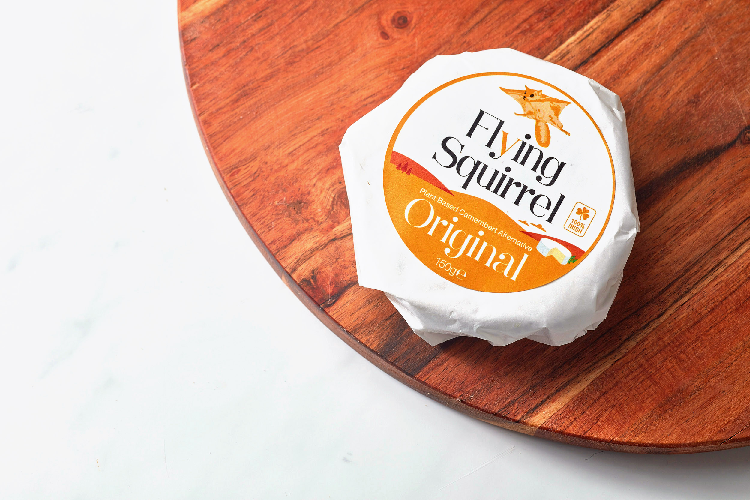
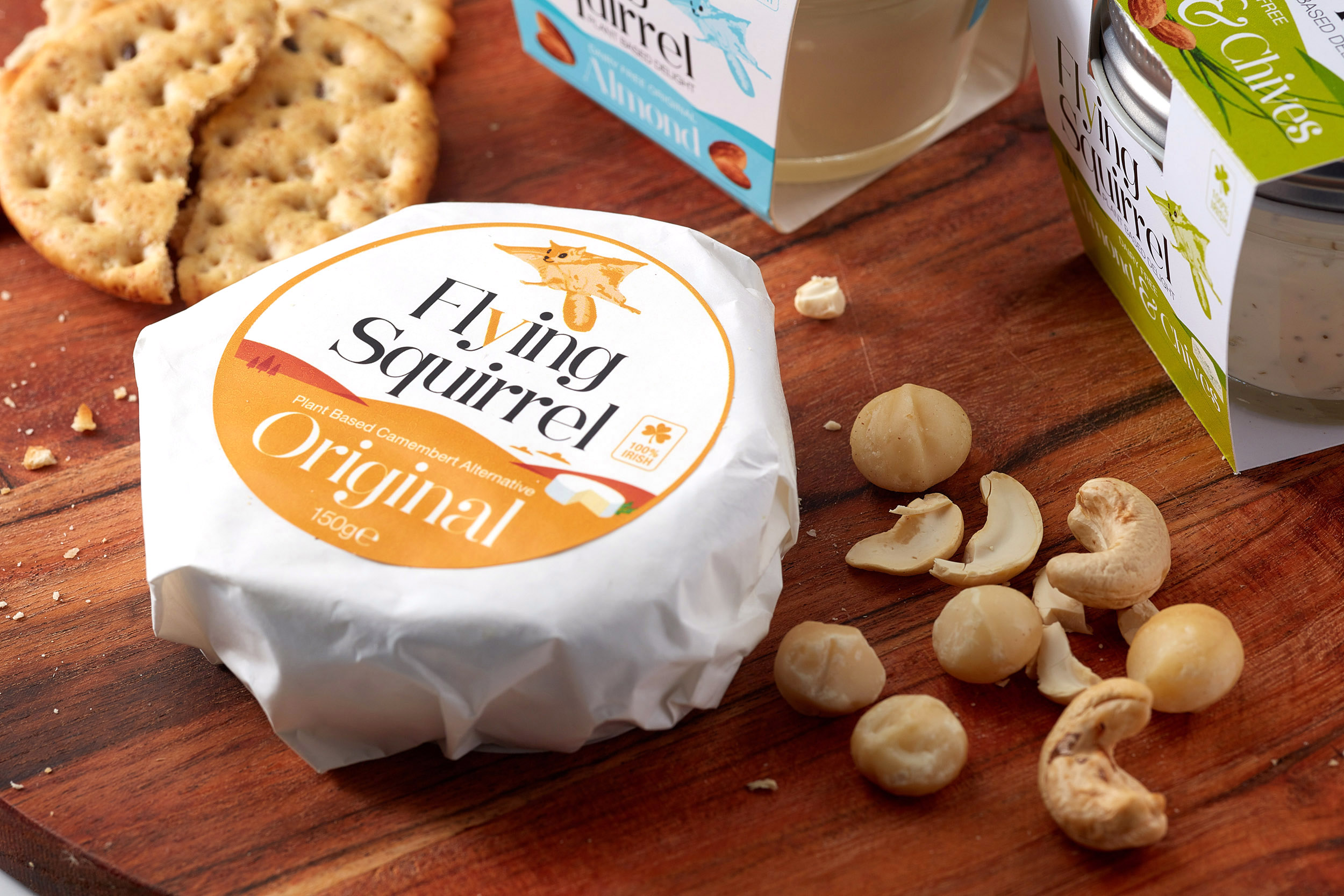
There are three flavours – Original (camembert) 150g, Almond 110g and Almond & Cheese 110g. Each have been separated visually using the brand’s colour palette and featuring illustrative taste cues. Each product has it’s own unique barcode, incorporating the squirrel character and nuts. Originally, we had mocked up plastic jars for two of the flavours. However, we then moved to glass jars, to become more environmentally friendly so that the packaging can all be recycled and have a lower carbon footprint. We art-directed the photoshoot with photographer Brendan Ryan, bringing out the bright, fun and vibrant essence of the brand, with colour paper backgrounds, linking with each flavour and the ingredients each flavour contains and taste cues, displayed around the packs playfully.
The combination of the elegant and clean typography with the vibrant and natural illustrations come together to create a fresh, memorable, and essentially, unique brand that consumers can align with. The results have proved successful, with market research showing that those purchasing Flying Squirrel in supermarkets are a mix of vegan and non-vegan consumers. Demand is high since its launch and it has already been requested for select health food stores and cafes.
See the positive feedback I received from the client Colm Farrell here.
***This project is featured on the Packaging of the World website and was a Gold Winner of the Muse 2020 Design Awards.
![]()