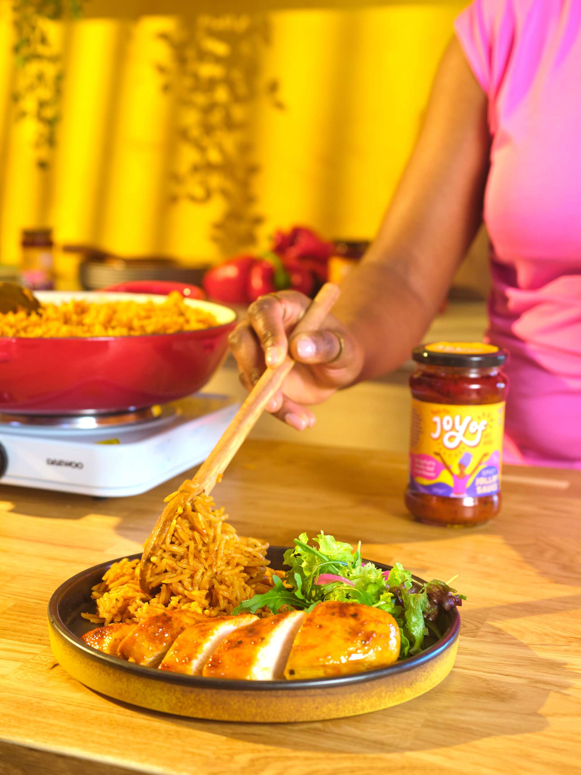
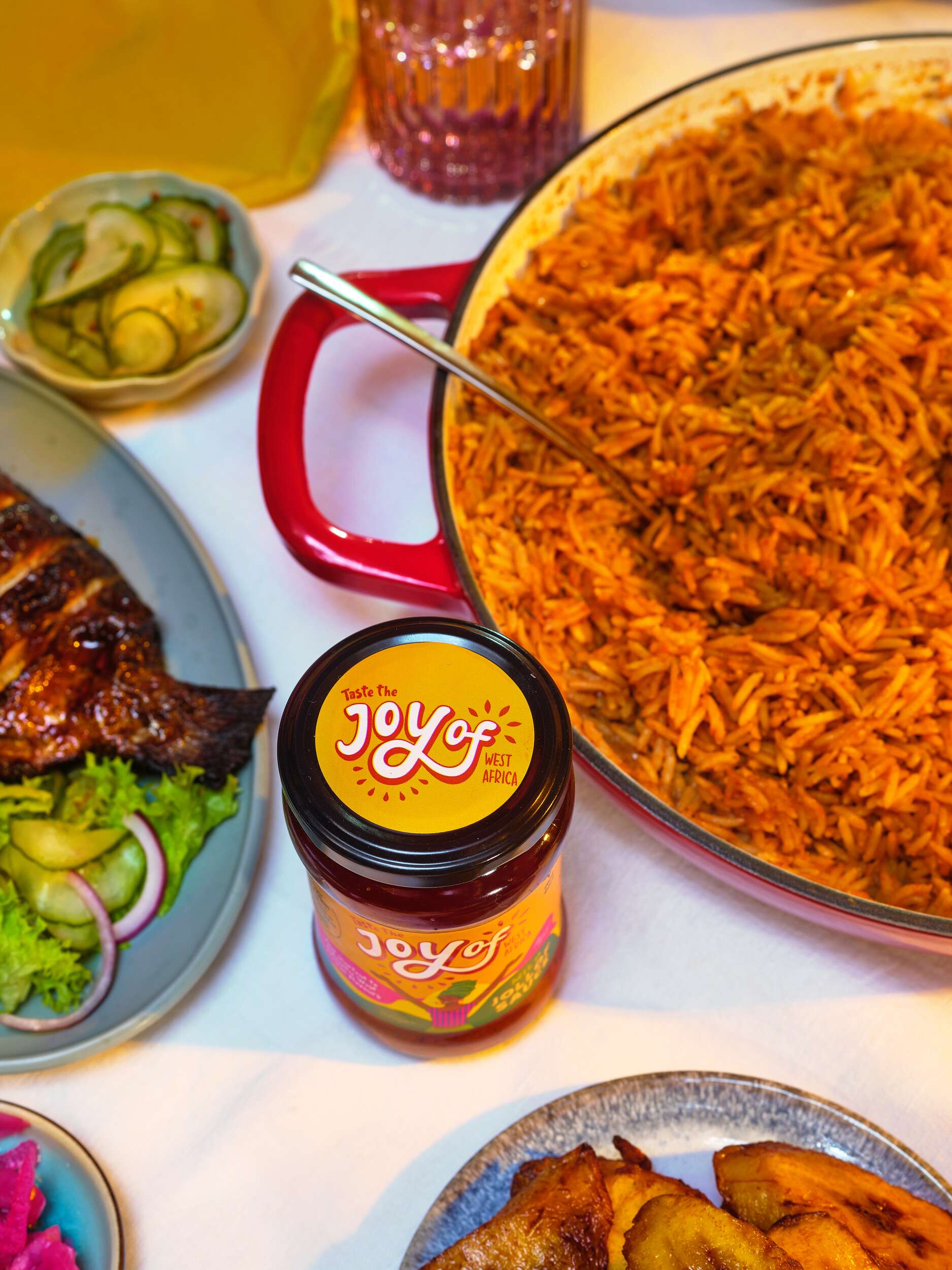
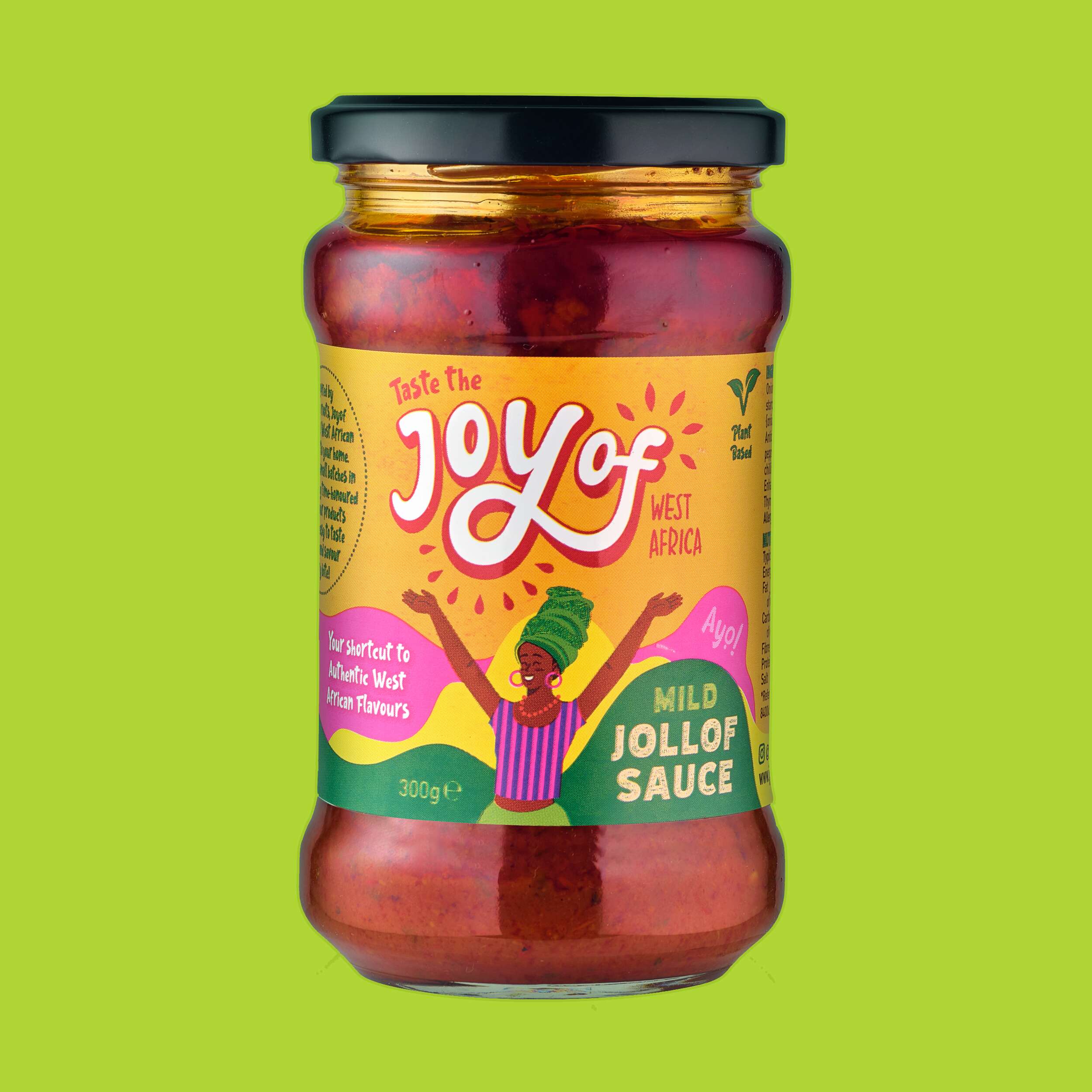
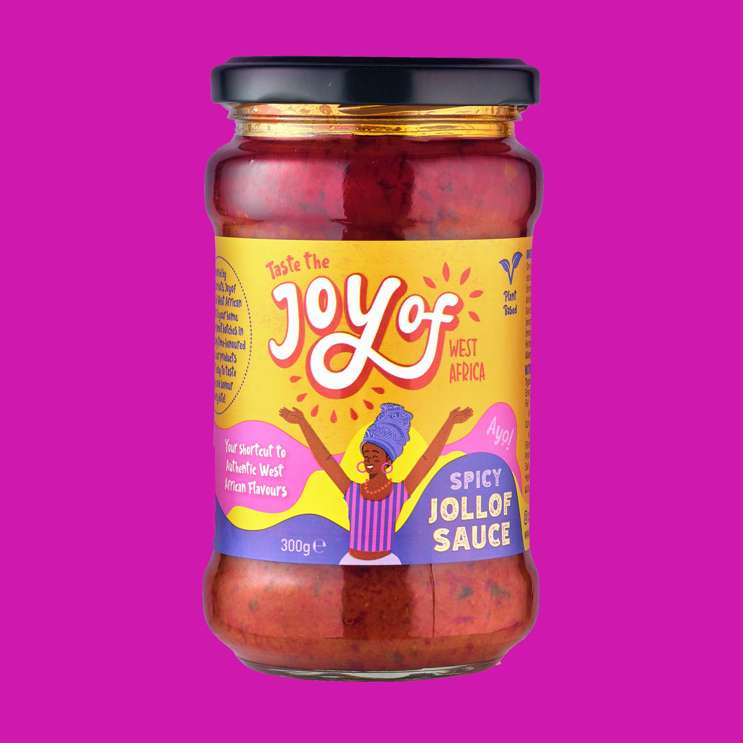
Greene’s Family Kitchen Brand Packaging Design
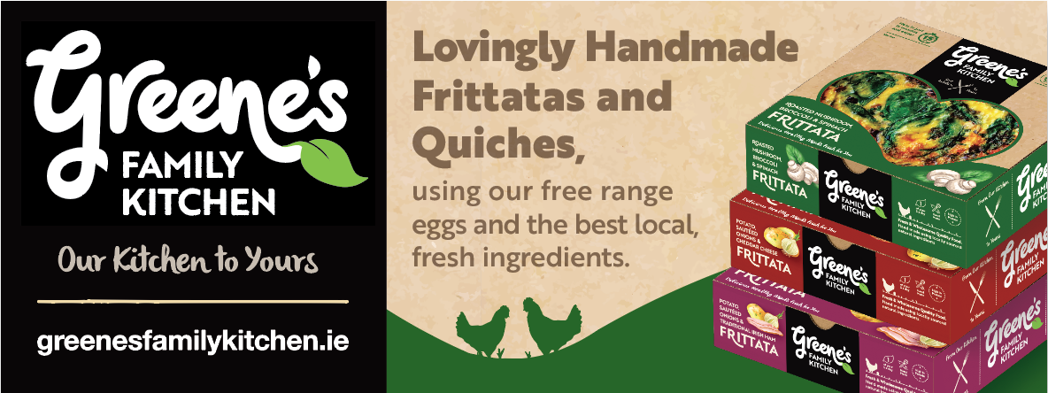
Greene’s Family Kitchen hand-create flavour-packed products with natural, authentic and honest origins. They use their own award-winning free-range eggs, produced on their family farm in Westmeath, and source other authentic, local ingredients for their recipes.
Greene’s handcraft all their food to ensure outstanding quality and taste before it reaches your table from their farm. These tasty and convenient meals are High in Protein and ready in just 15 minutes. They are passionate about offering consumers excellent quality products, using traditional methods and without the use of artificial additives or preservatives.
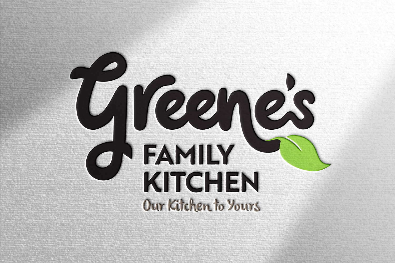
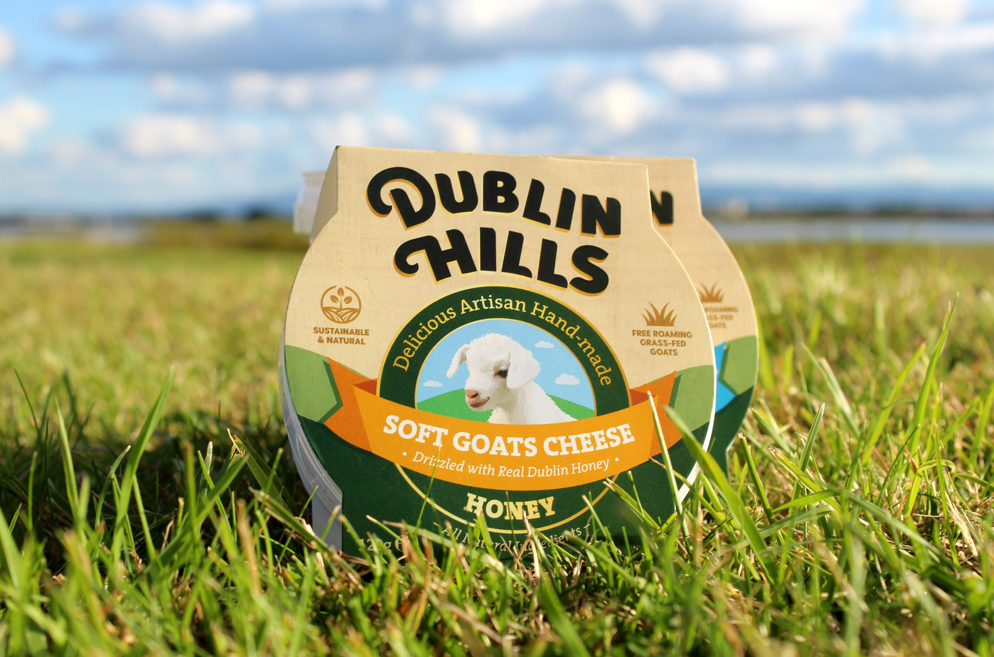
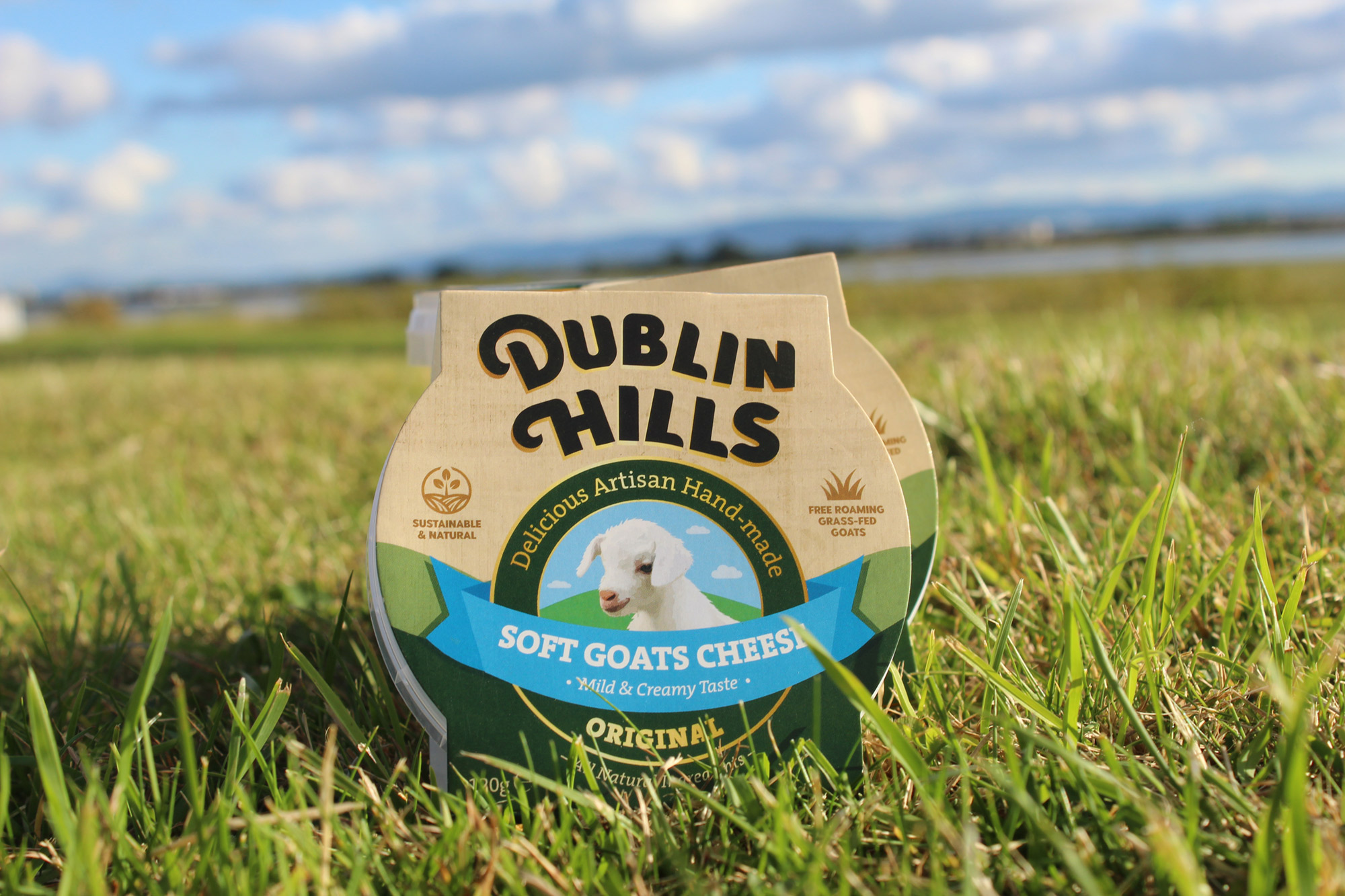
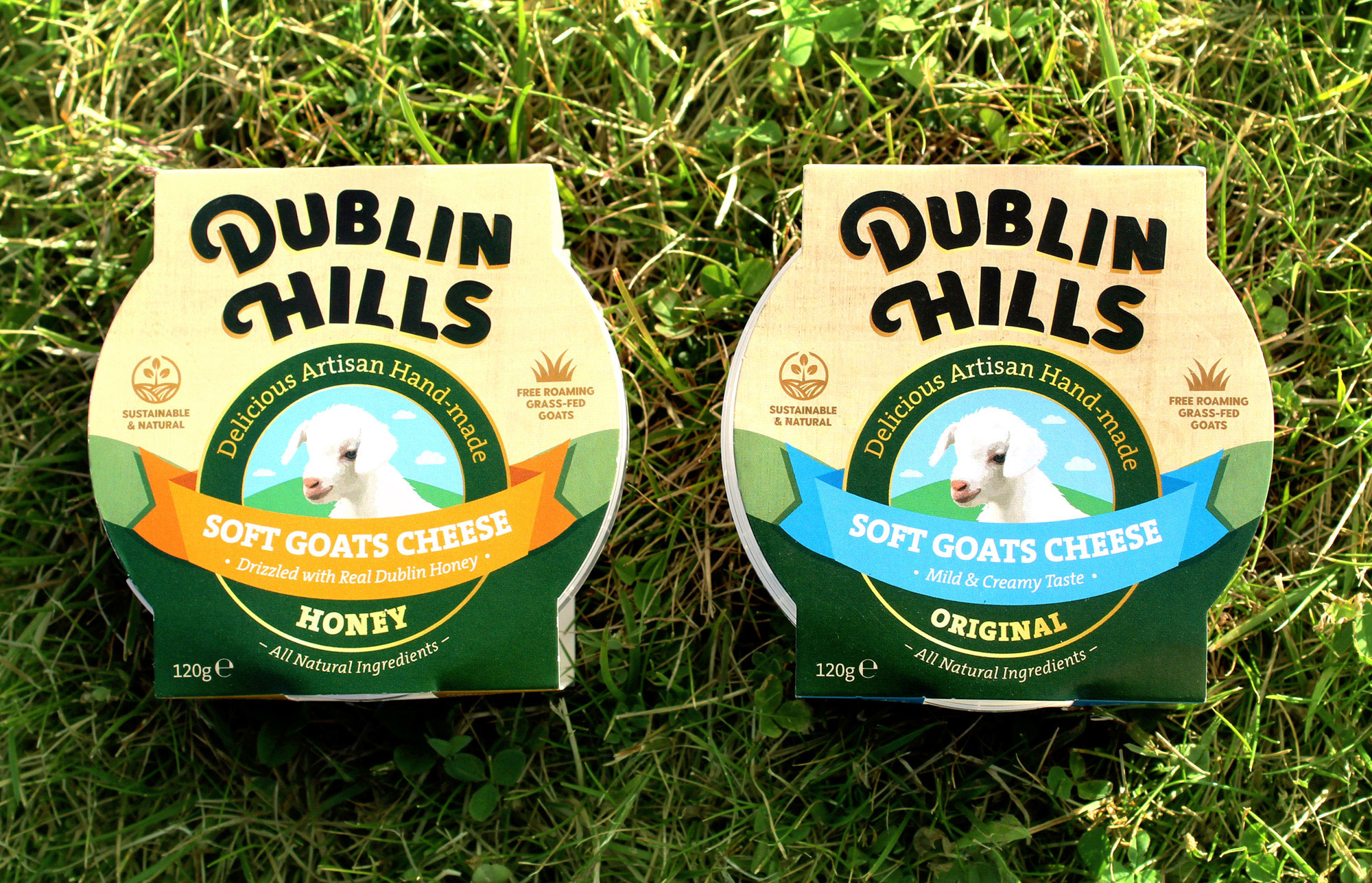
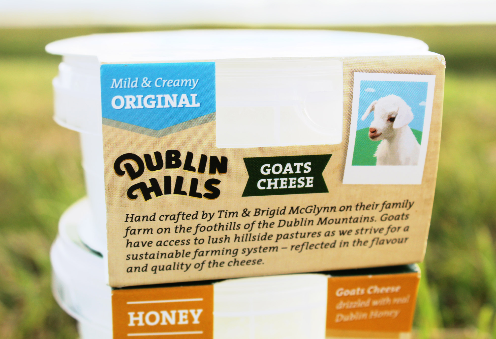
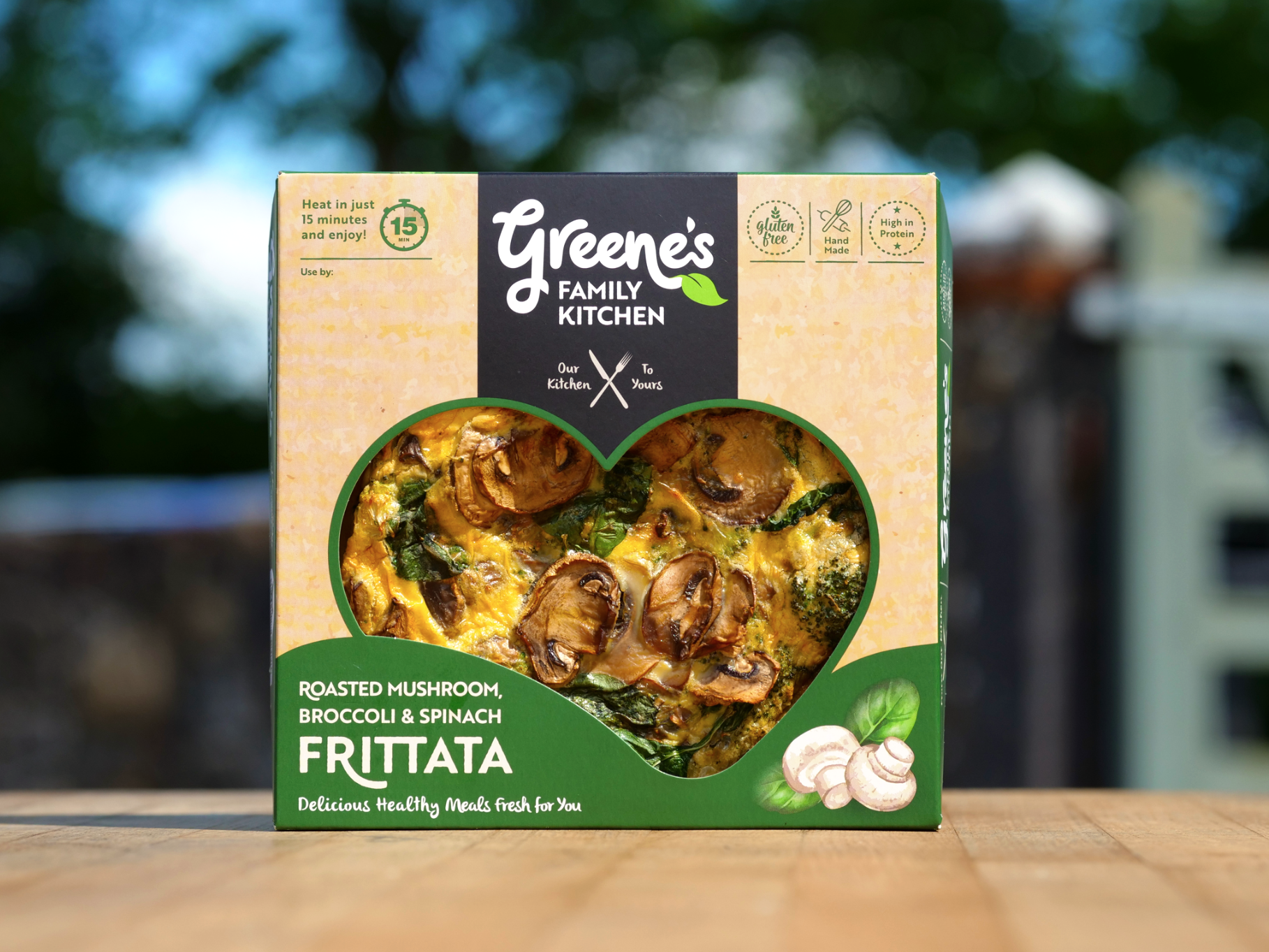
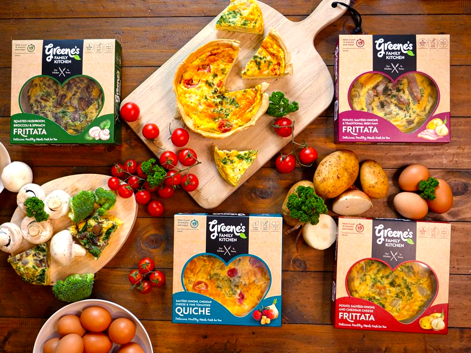
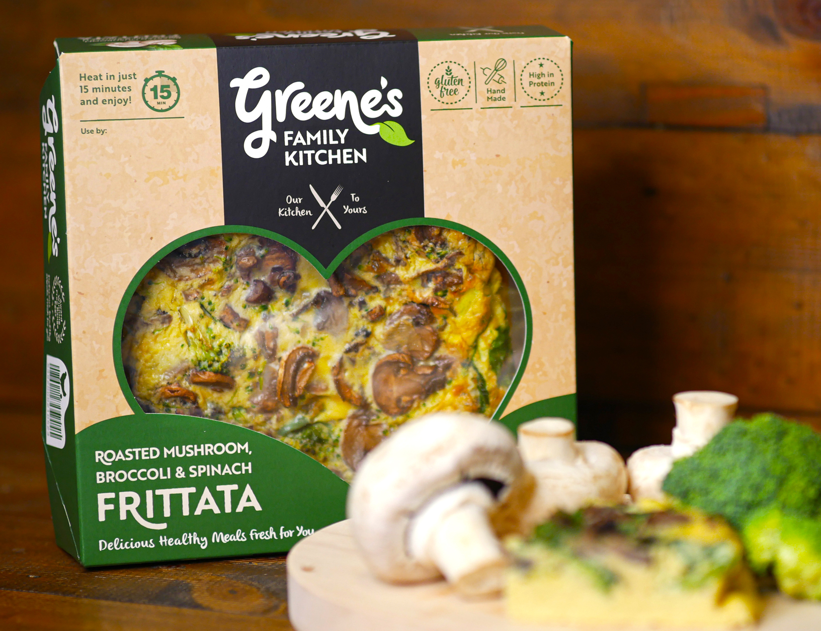
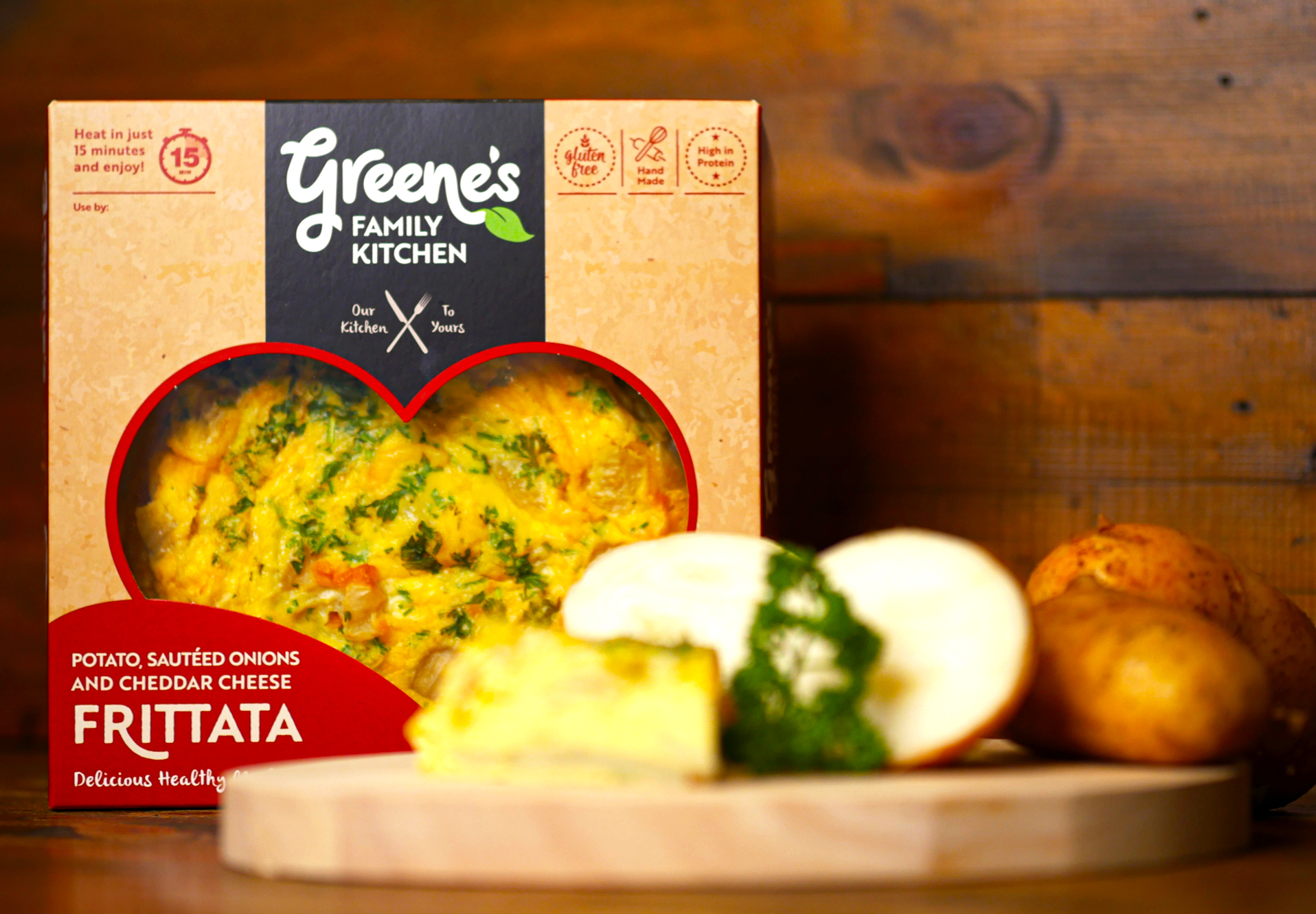
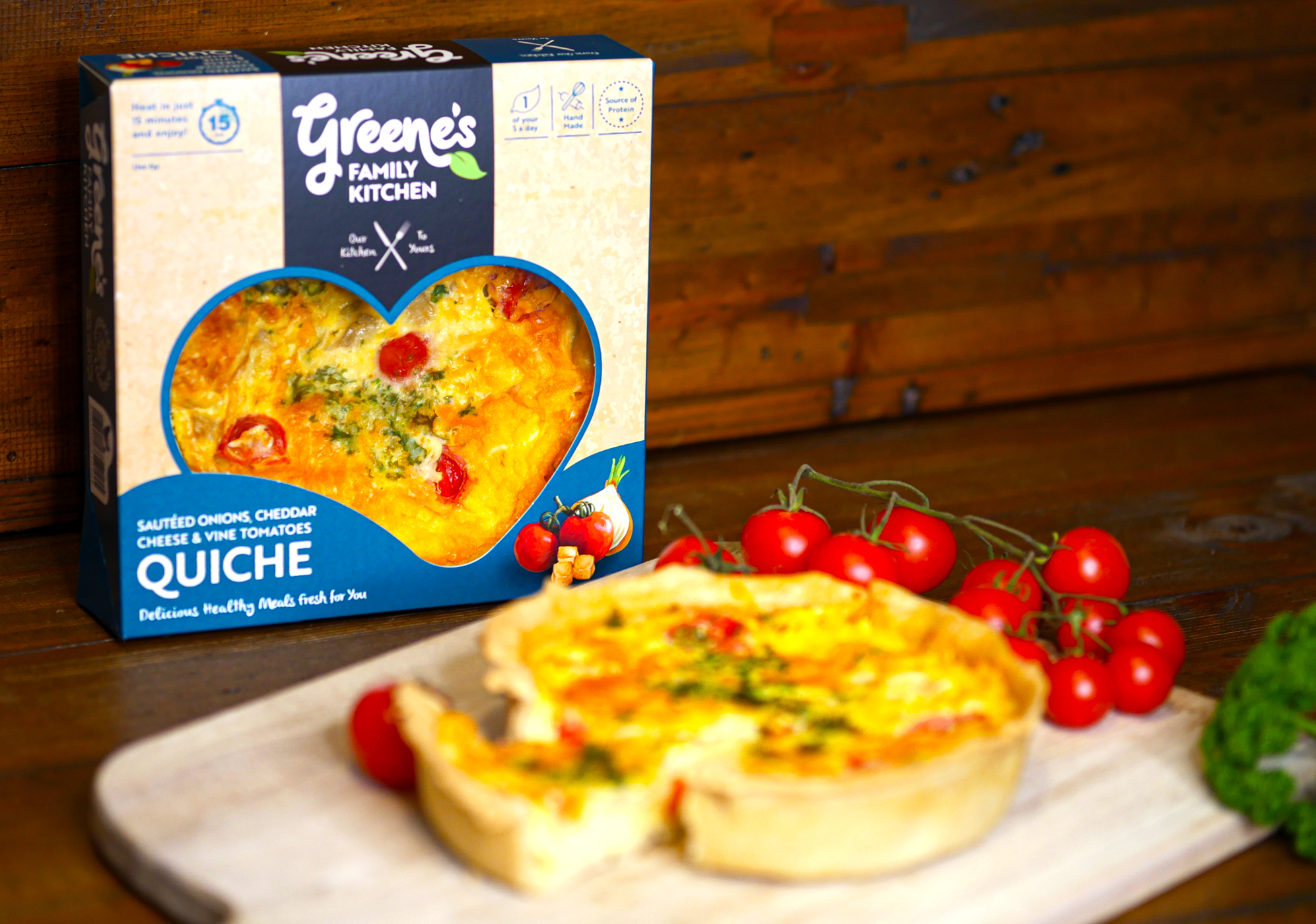
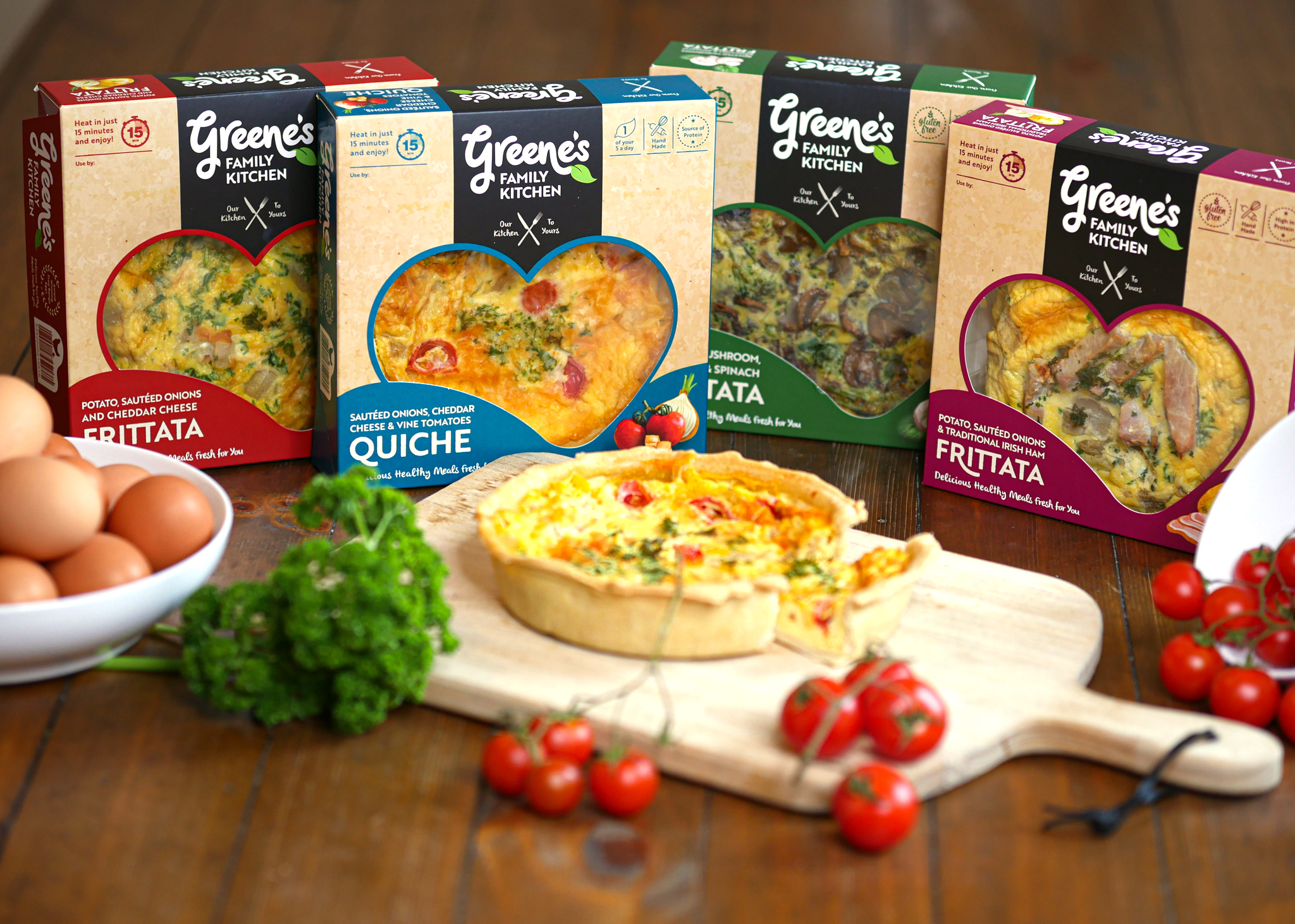
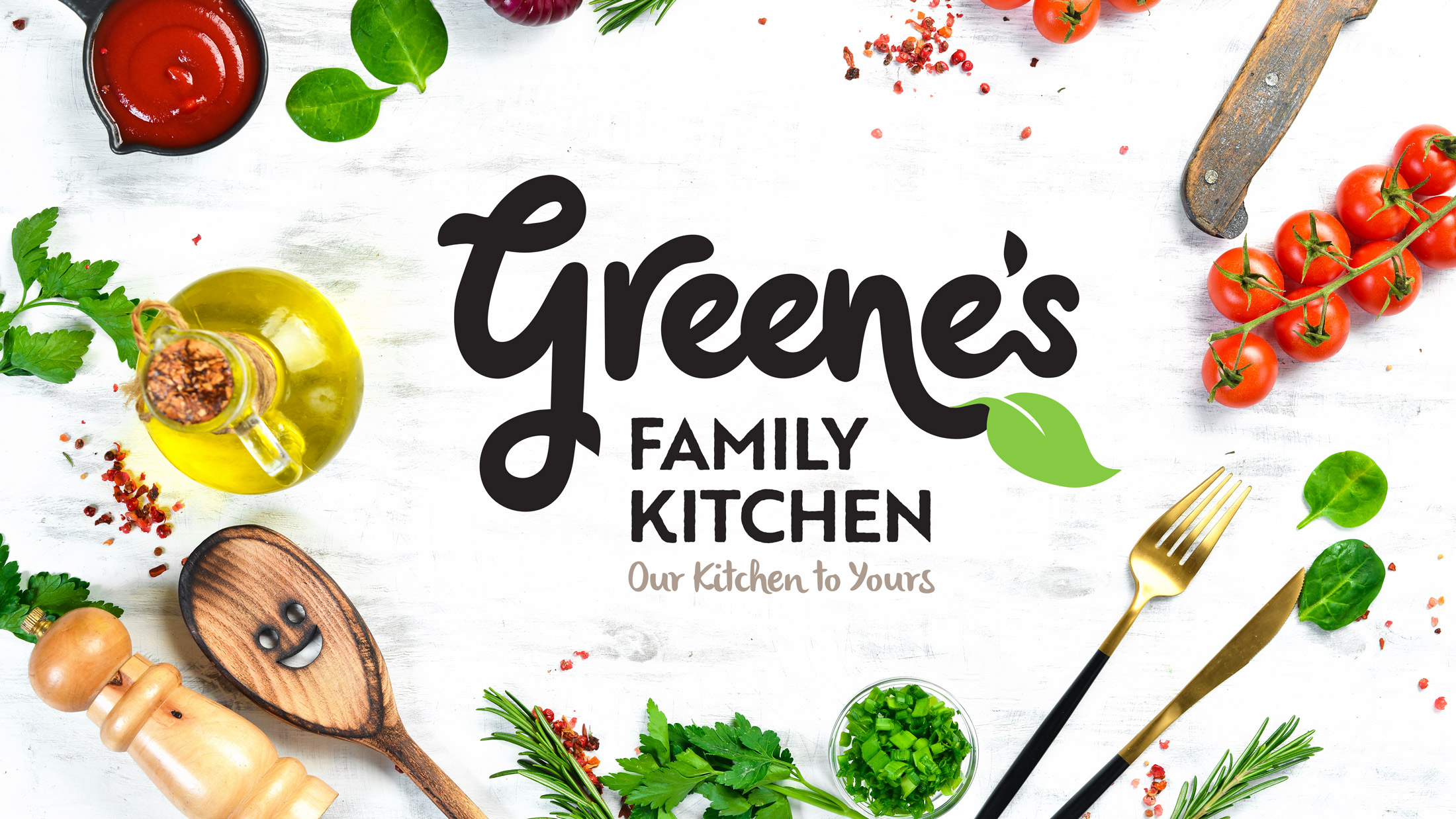
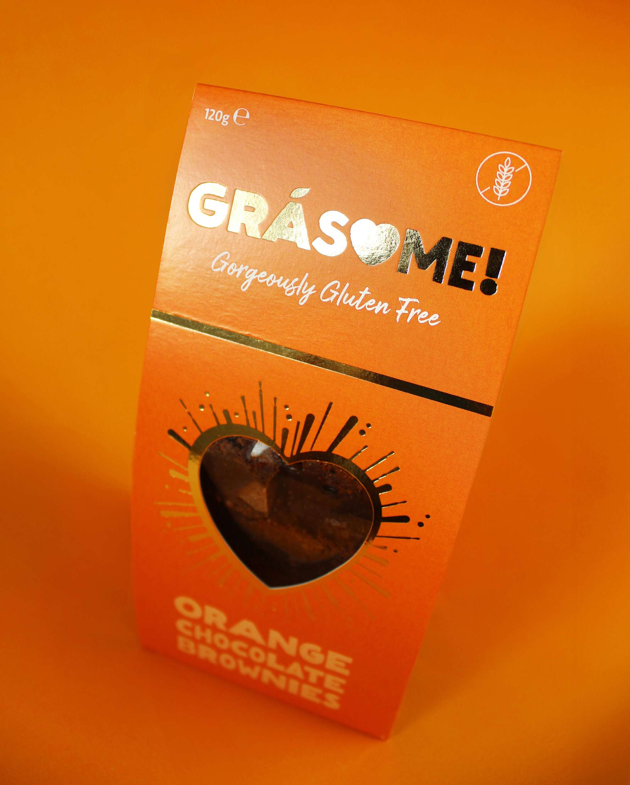
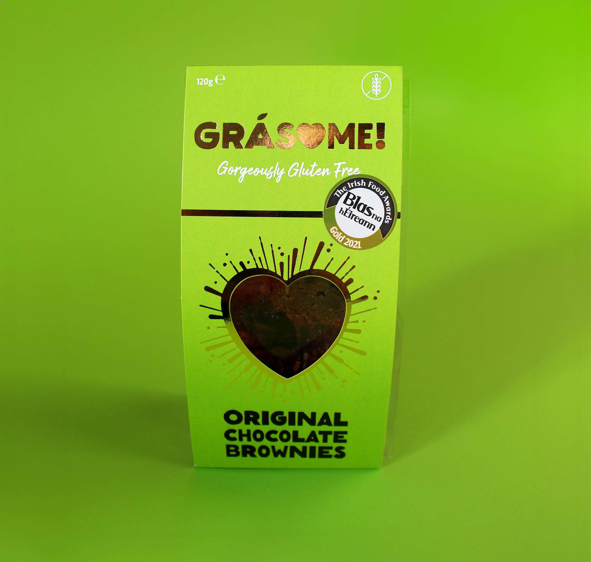
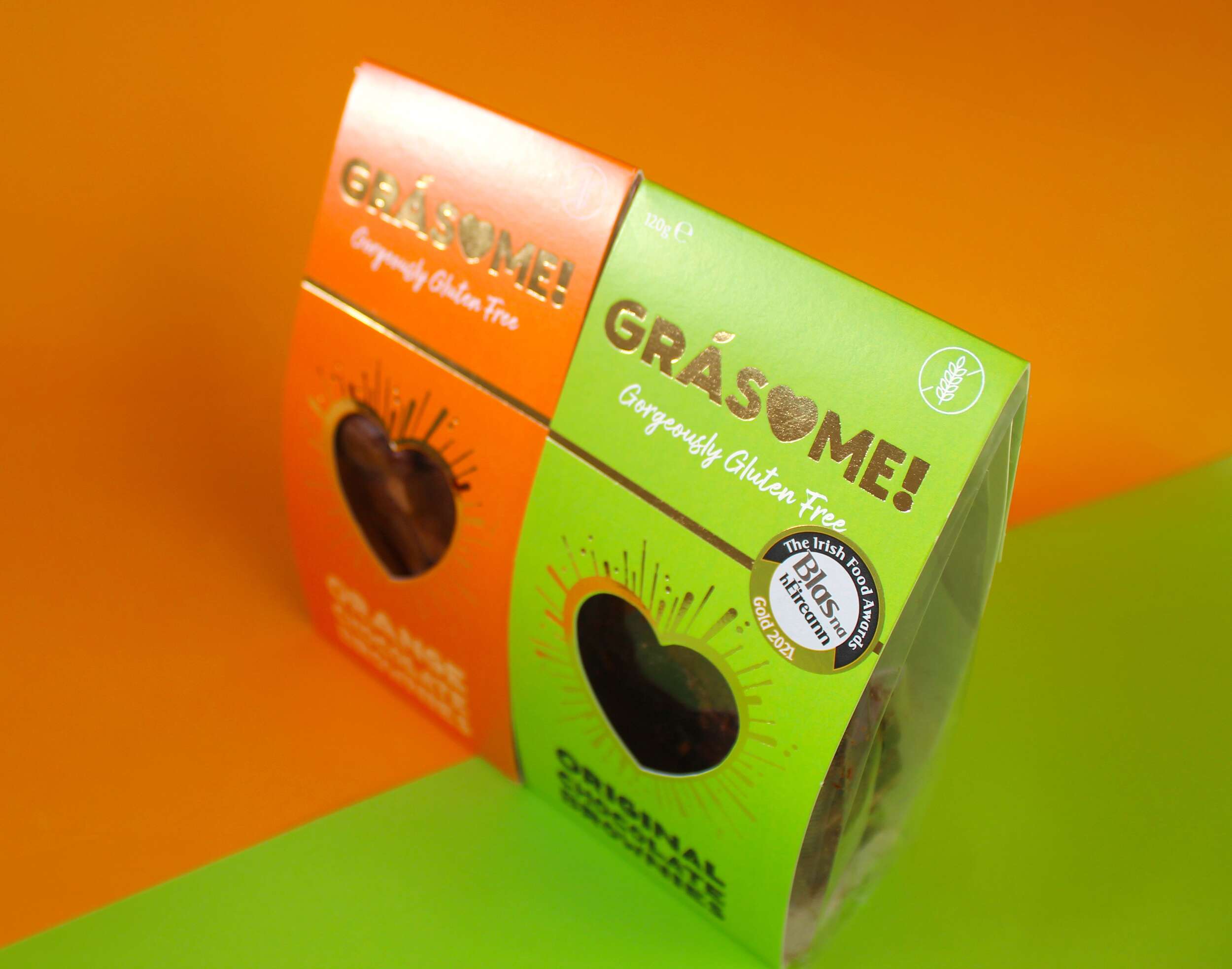
The Greene’s Family Kitchen logo is created using playful hand-written typography to emphasise how the food is made by hand. The letters link into each-other and overlap, to represent how the ingredients are sourced from local producers to come together to create each meal. There are two leaves incorporated with the type, to further emphasise the fresh and natural aspect of the products. The strapline ‘Our Kitchen to Yours’ clearly communicates the homemade and wholesome aspect of the meal quality. The logo brand-mark feels like a family – different sizes and shapes/characters, full of life and movement, non-uniform, bustling about together, but still with their own unique shapes and expressions.
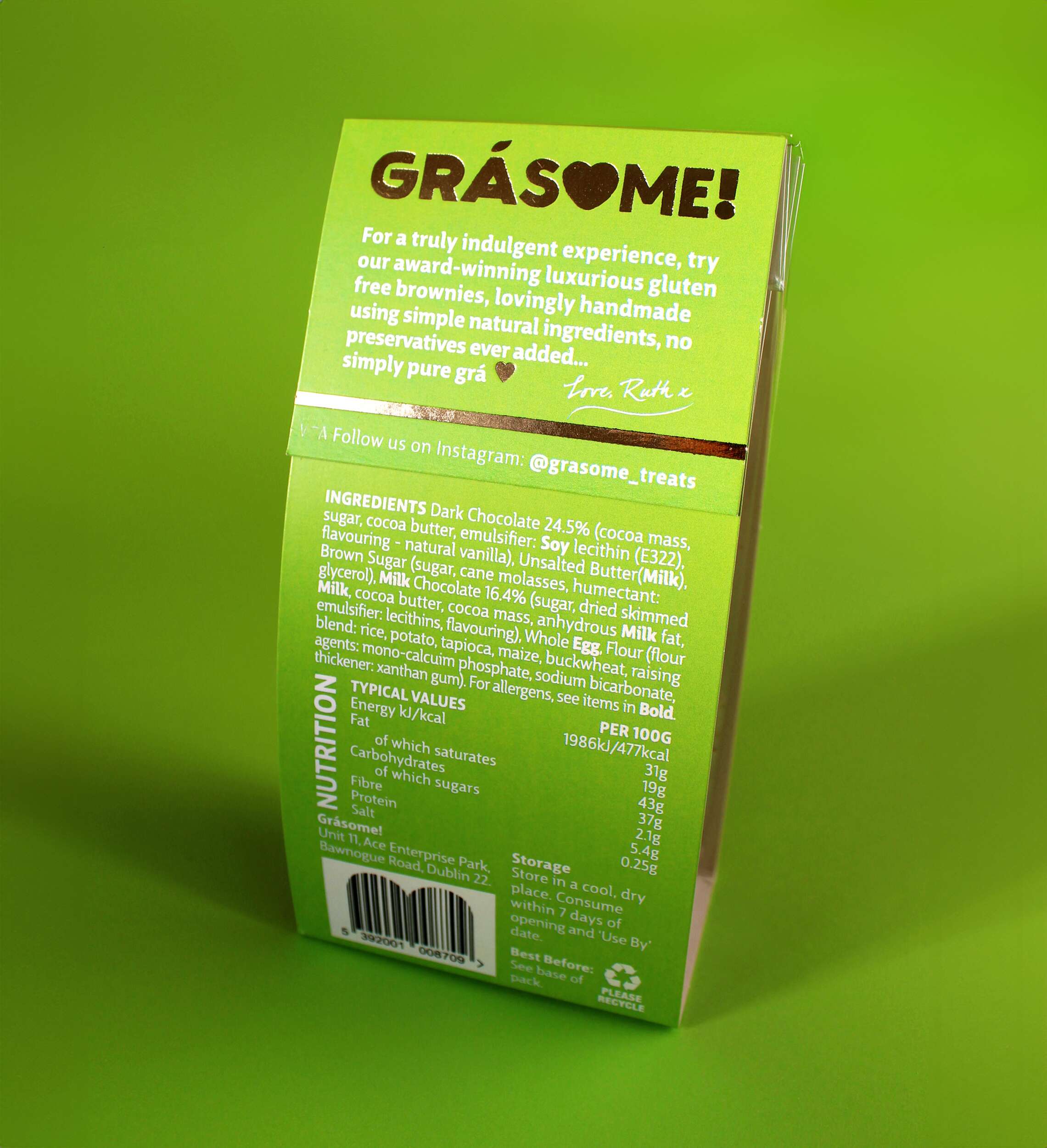
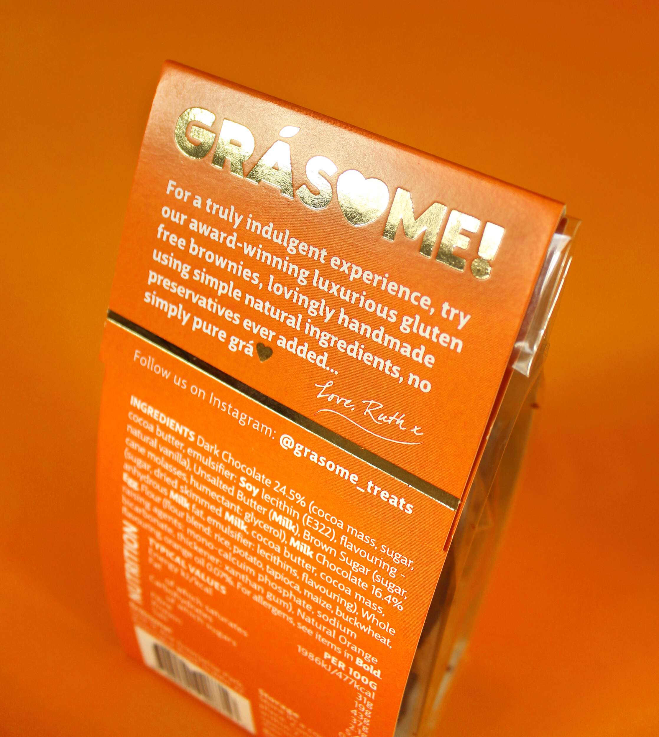
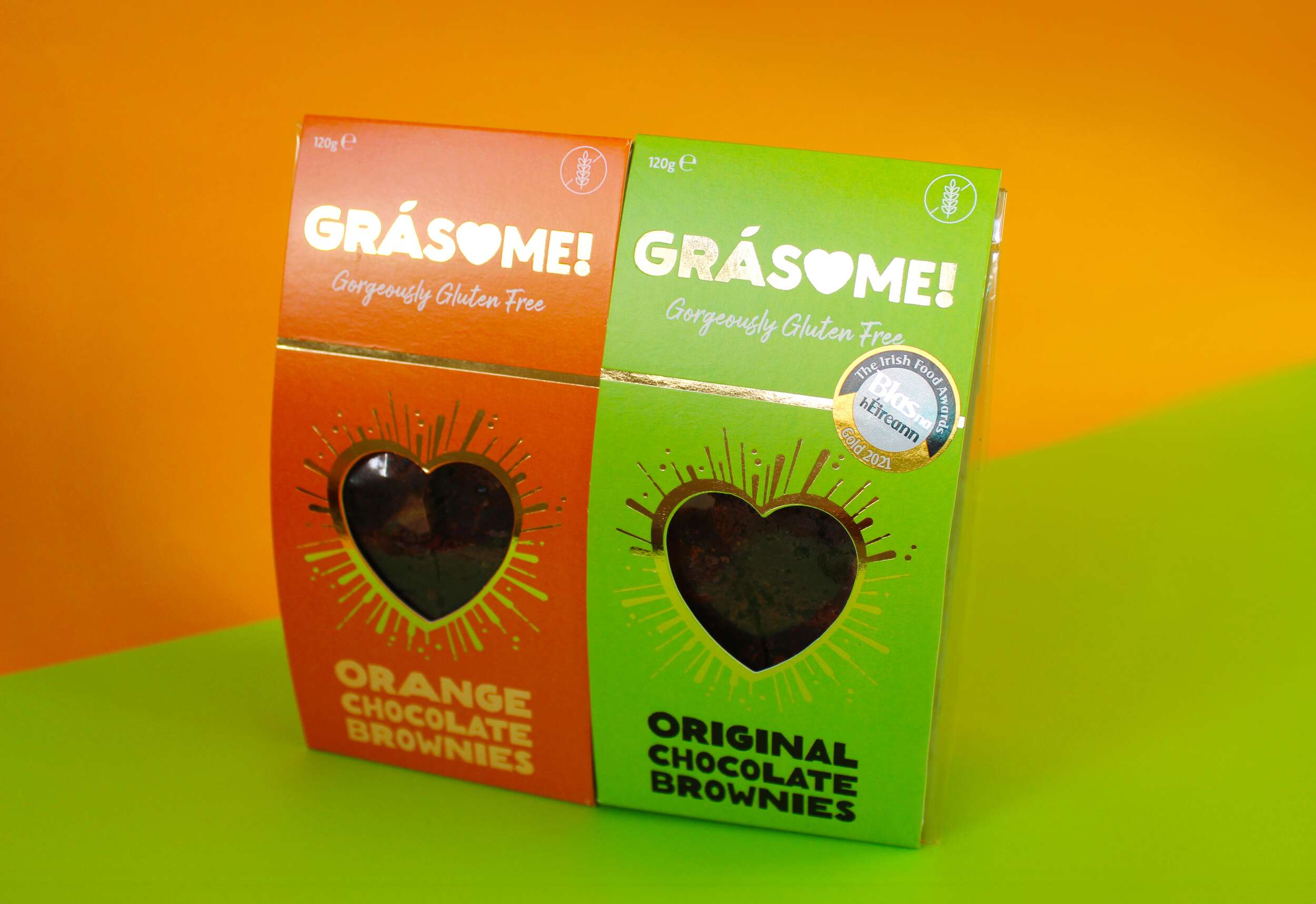
For the packaging design, the kraft cardboard background communicates the naturalness of the products. The hand-drawn style further emphasises the hand-made aspect of Greene’s foods and the authenticity of the product ingredients. The watercolour images of the main ingredients in each frittata are displayed alongside the name, to provide taste cues to the consumer. The packaging communicates that this is a tasty and healthy treat, that can be enjoyed alone as one slice or shared together with friends and family.
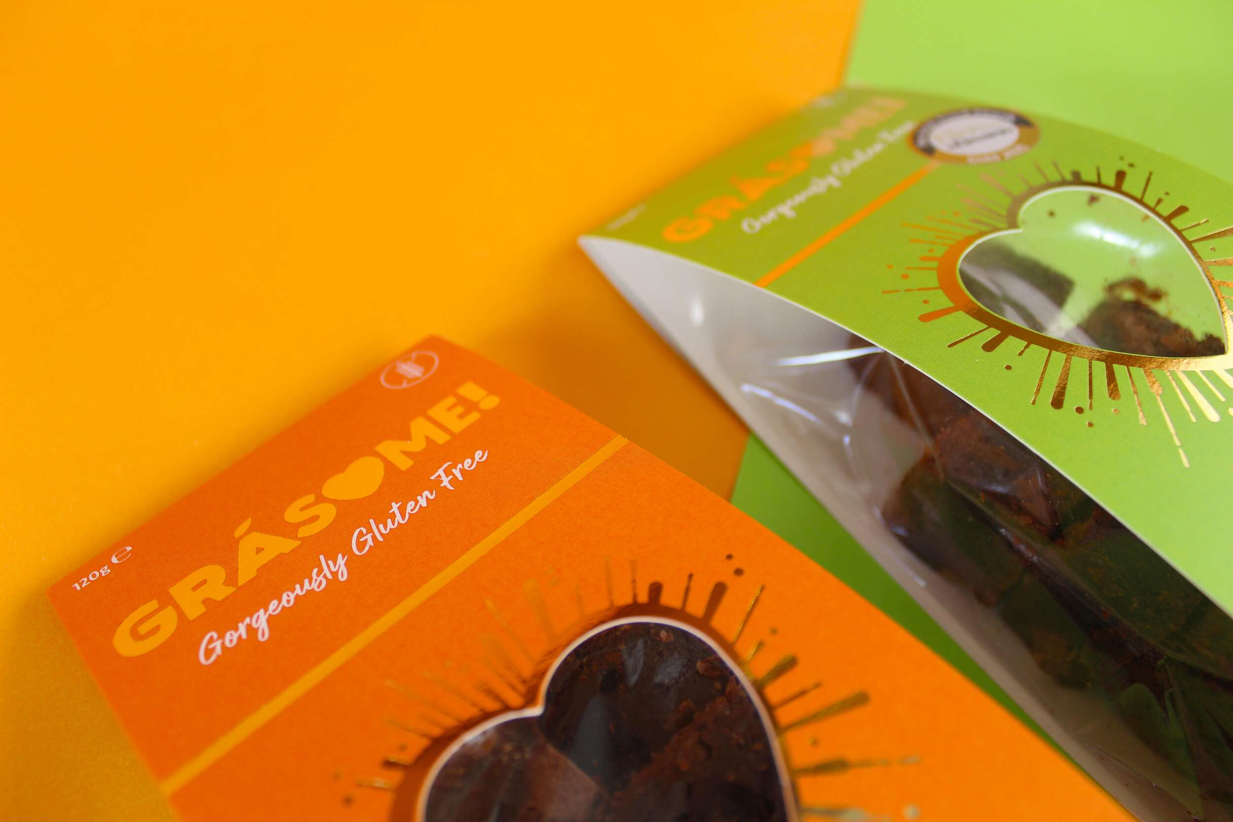
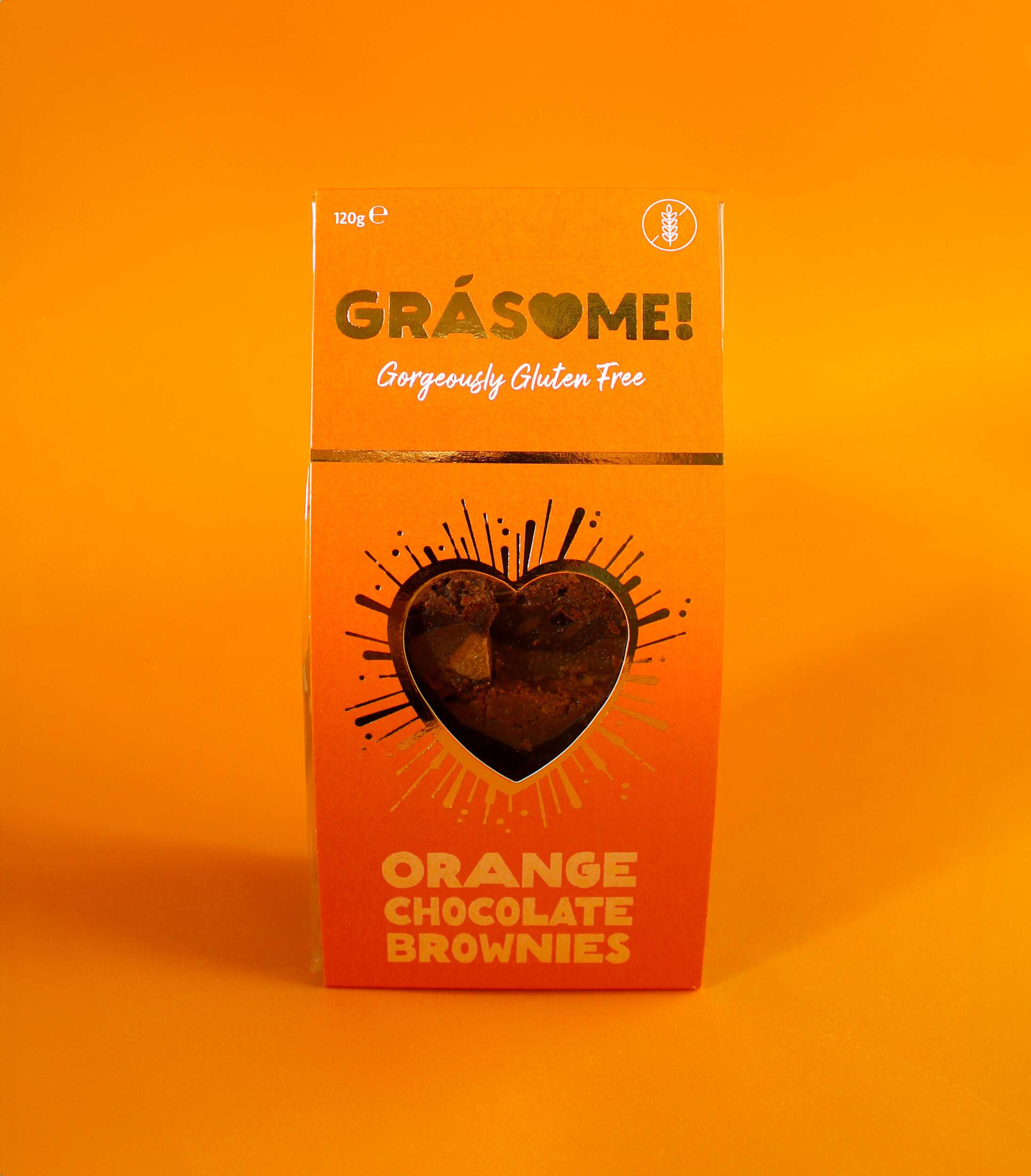
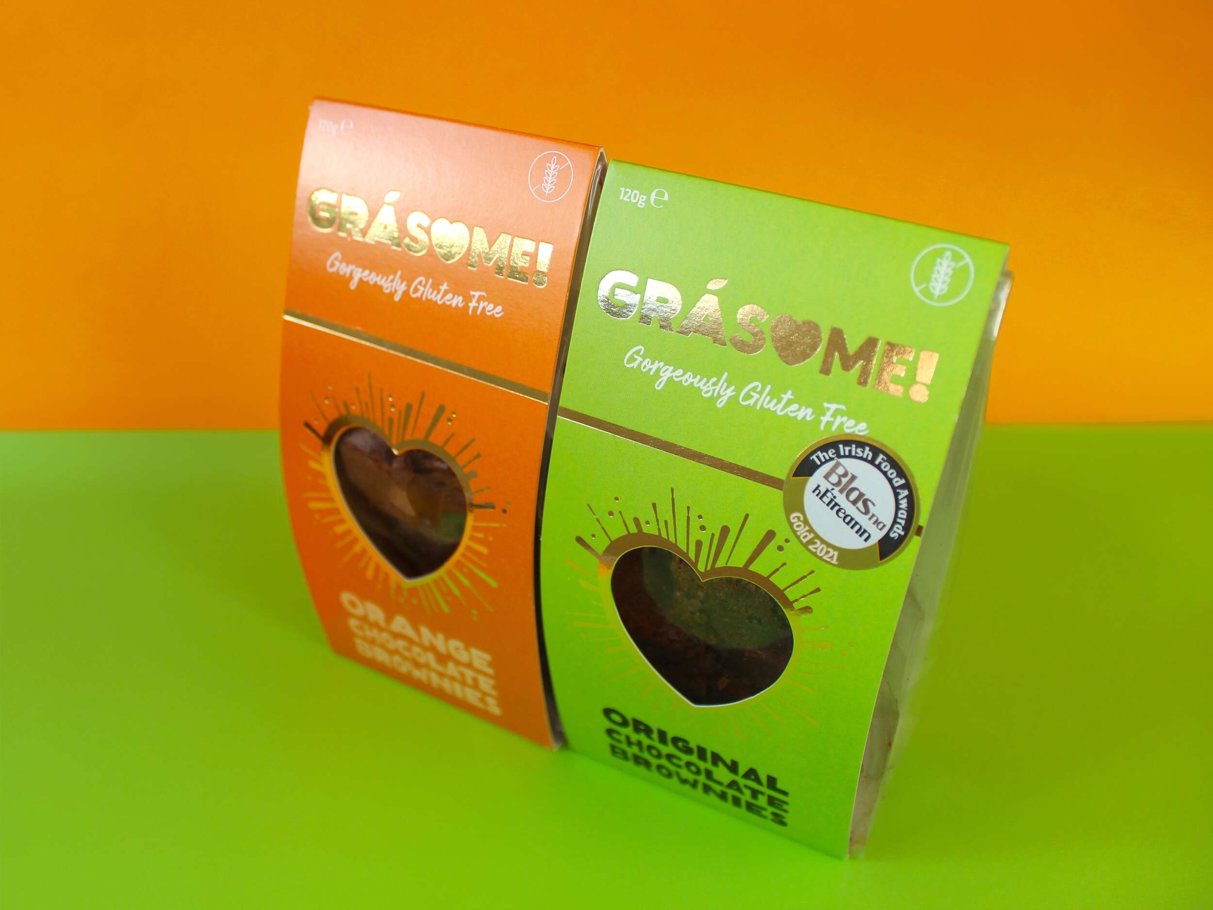
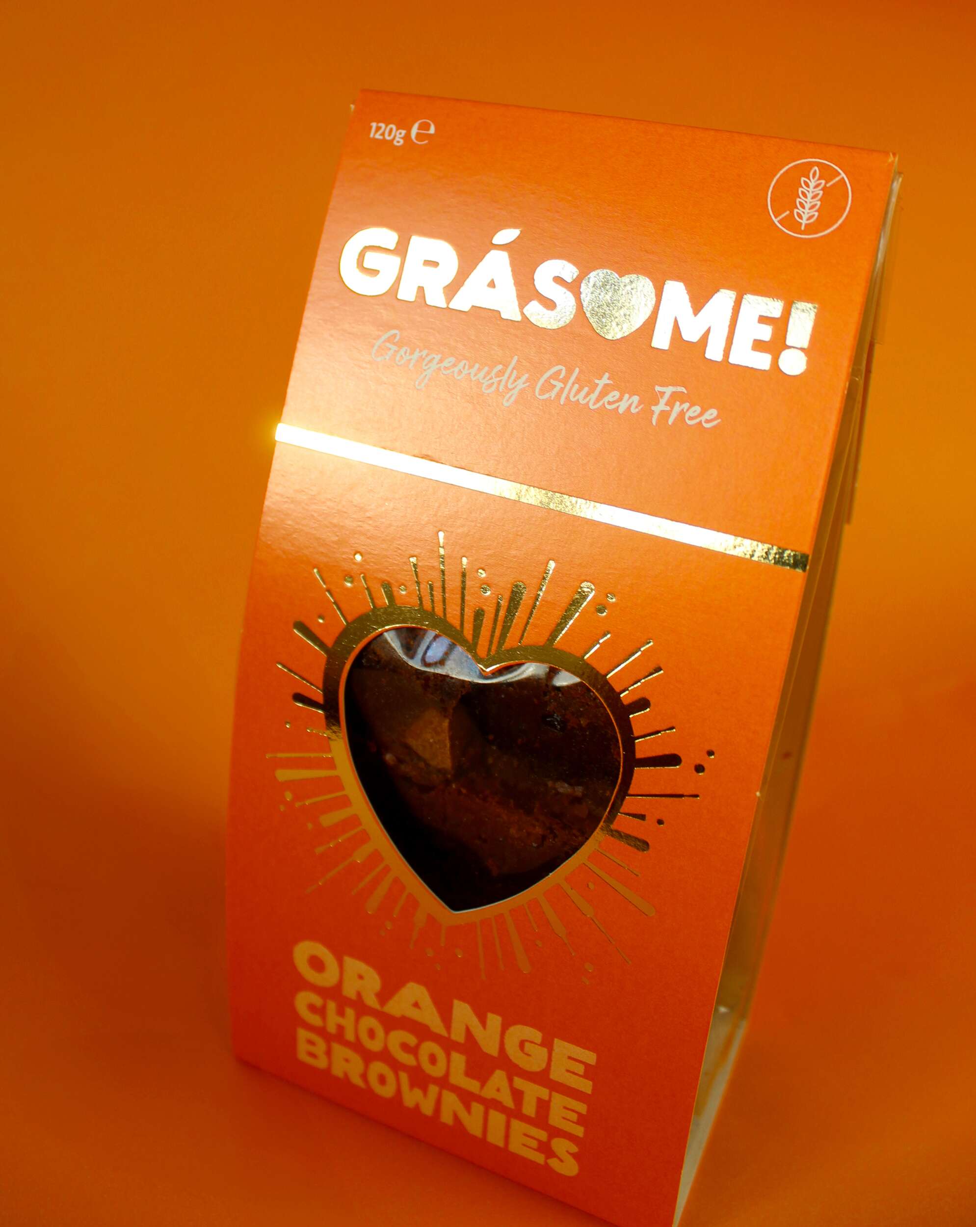
There is a cutout heart-shape in the cardboard box/sleeve to display a large amount of the tasty frittatas and quiches within, which is appealing to customers visually on shelf. The kitchen is known as the heart of the home and another common association is the way to one’s heart is through our stomach – so go on, eat your heart out and enjoy Greene’s Family Kitchen meals 🙂
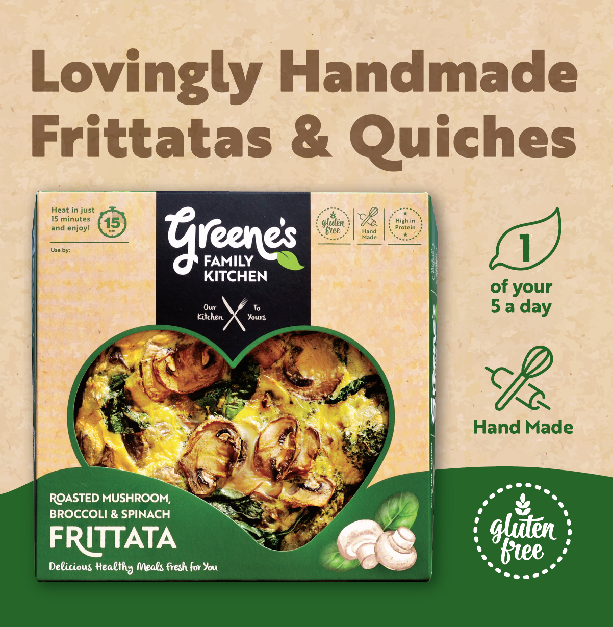
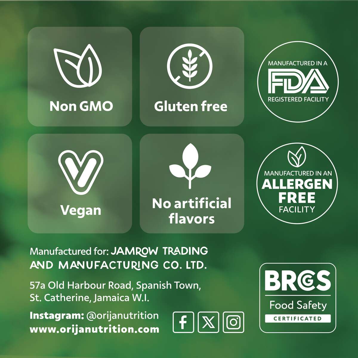
USP (unique selling point) icons are carefully placed within the packaging design. Different colours are used to indicate each flavour.
Where to Purchase:
Call into your local SuperValu stores to try these delicious meals. Greene’s Family Kitchen’s quiches and frittatas are already stocked in 17 SuperValu stores across Dublin, Meath, Westmeath & Kildare.
Dublin:
Fresh, Grand Canal Dock • SuperValu, Mount Merrion • SuperValu, Templeogue
Kildare (SuperValu stores):
Kildare • Sallins
Meath (SuperValu stores):
Enfield • Ratoath • Ashbourne • Navan • Trim • Dunshaughlin • Kells • Oldcastle
Westmeath (SuperValu stores):
Mullingar • Athlone • Monksland • Moate
See more at:


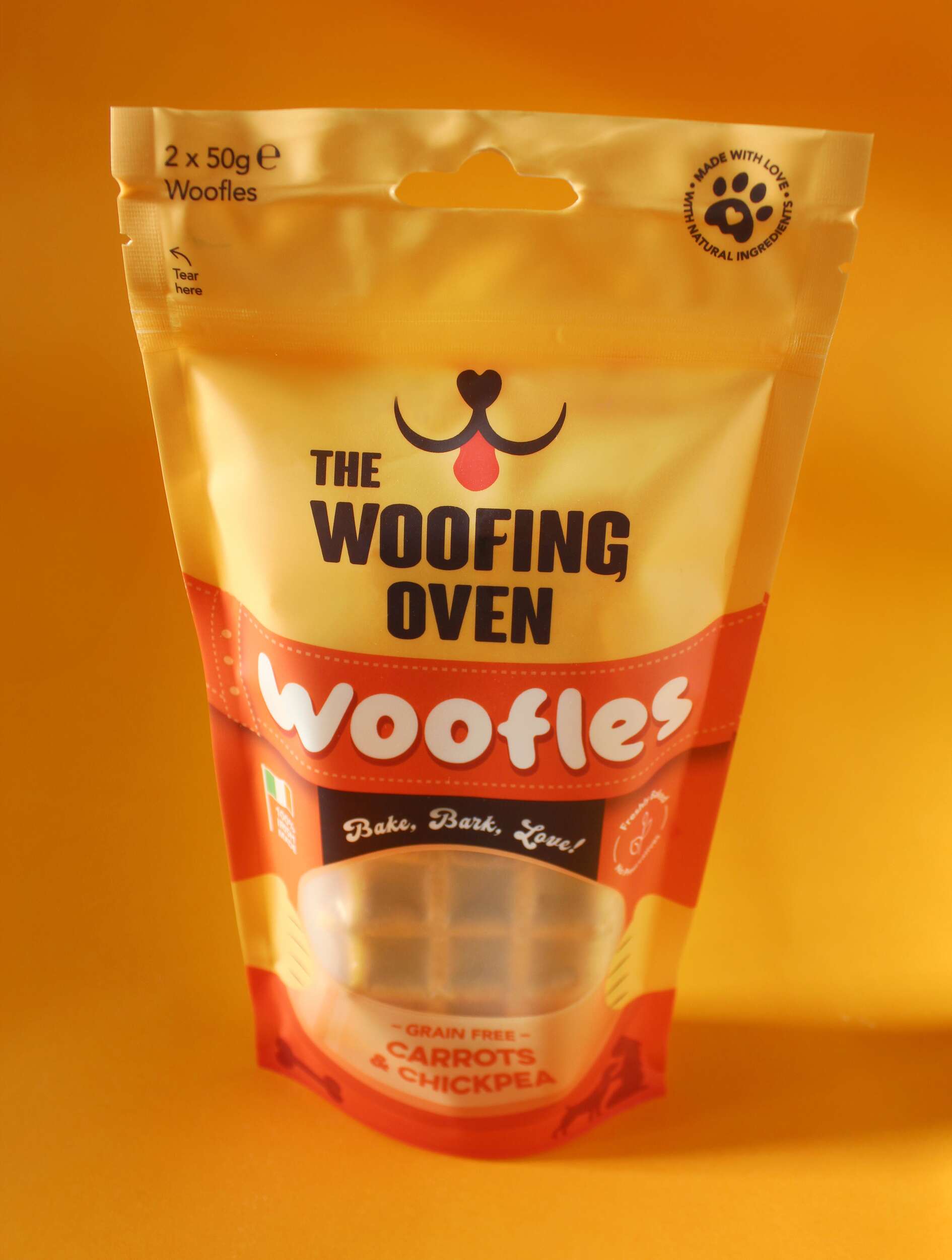
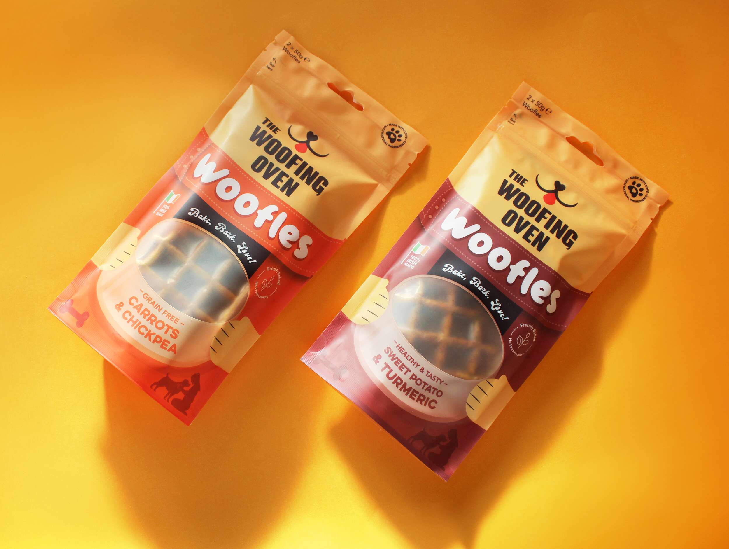
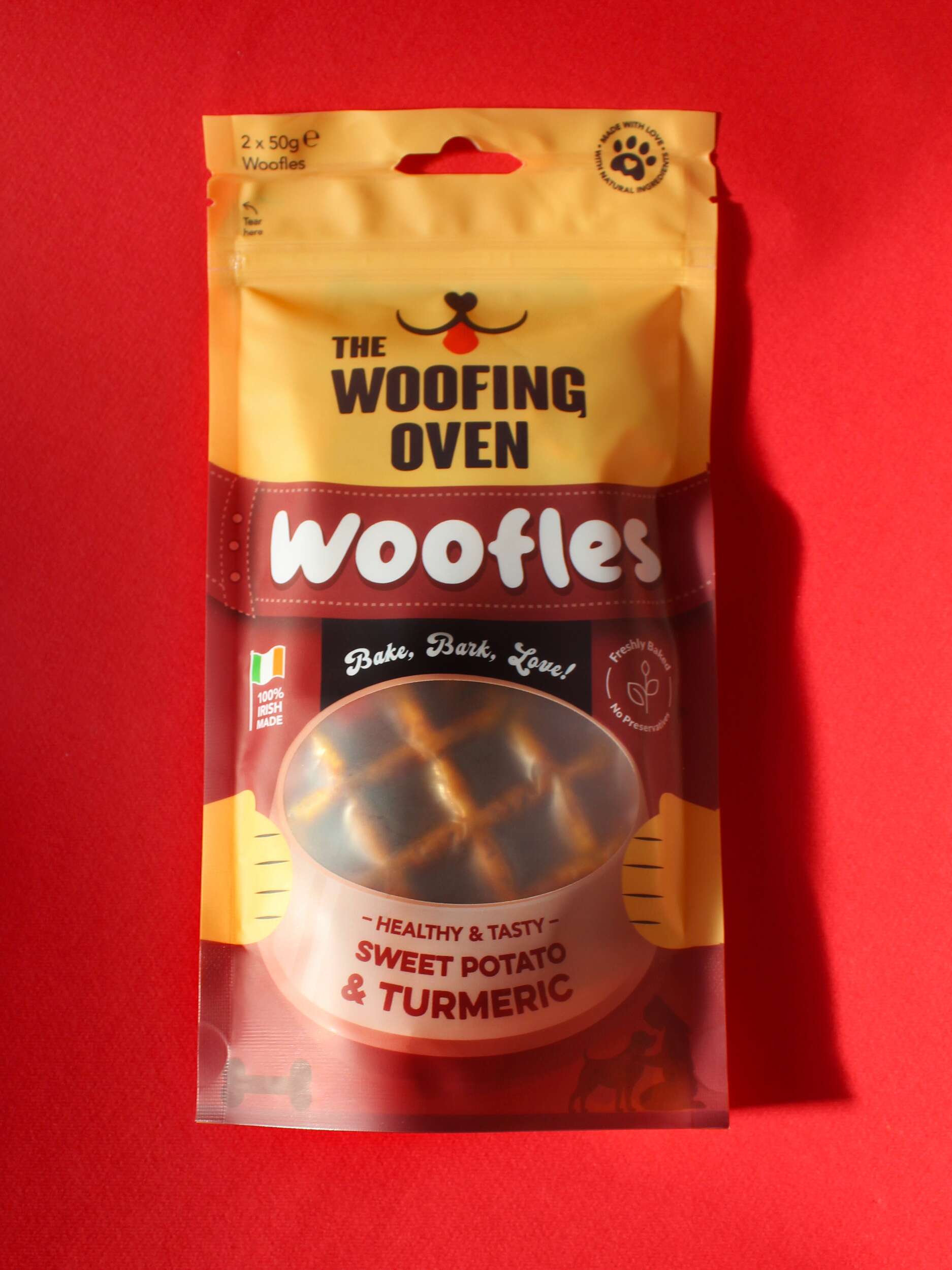
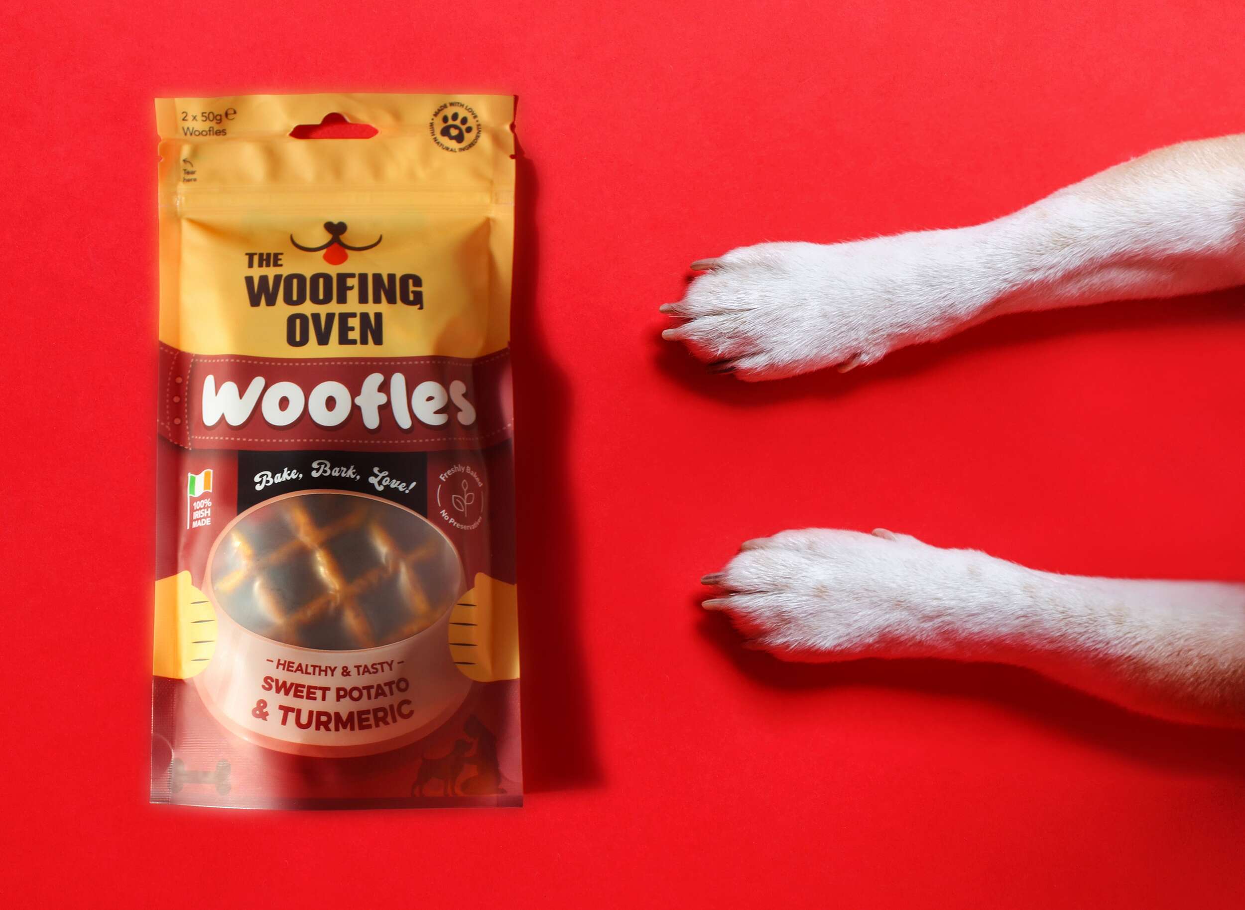

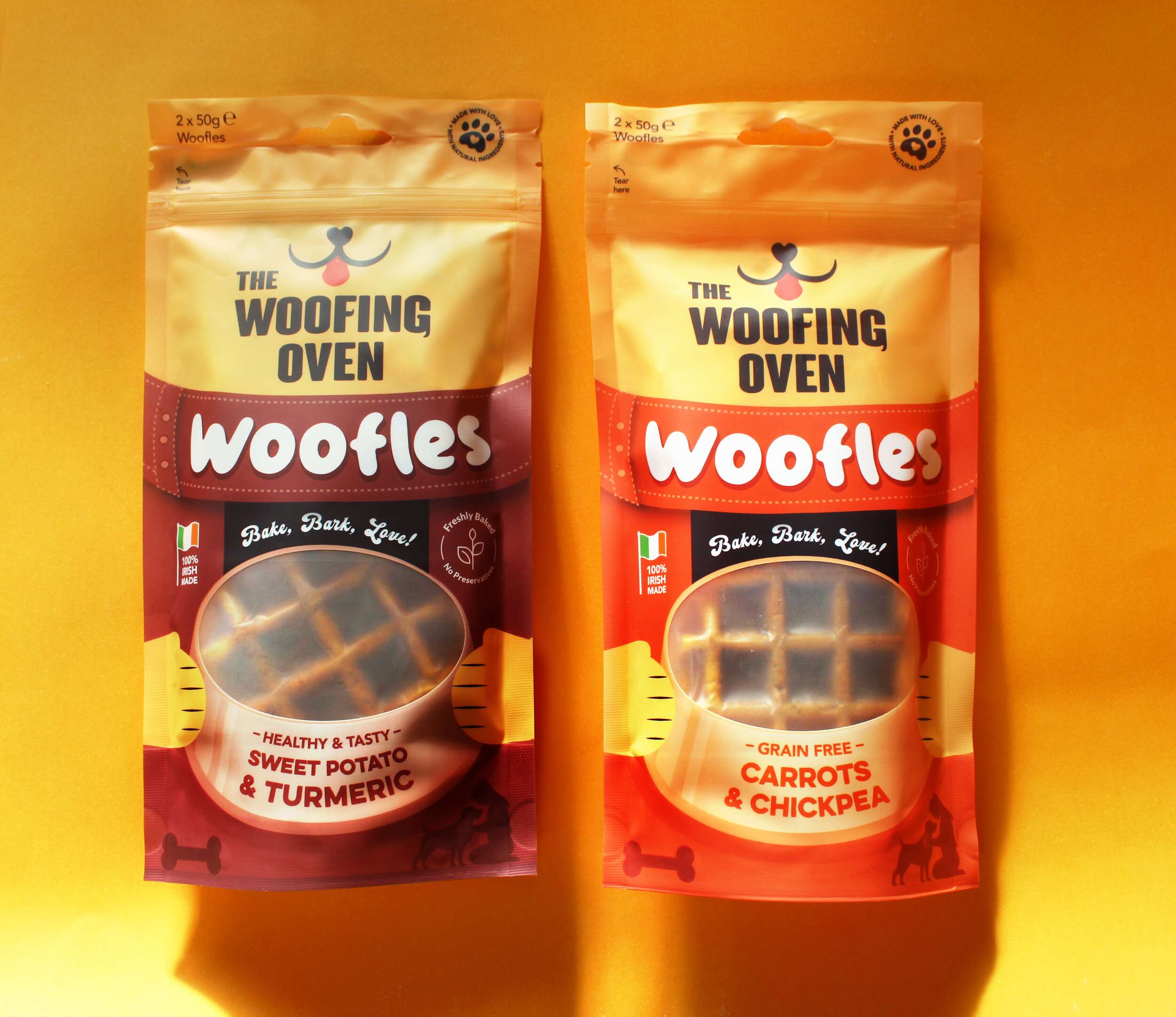
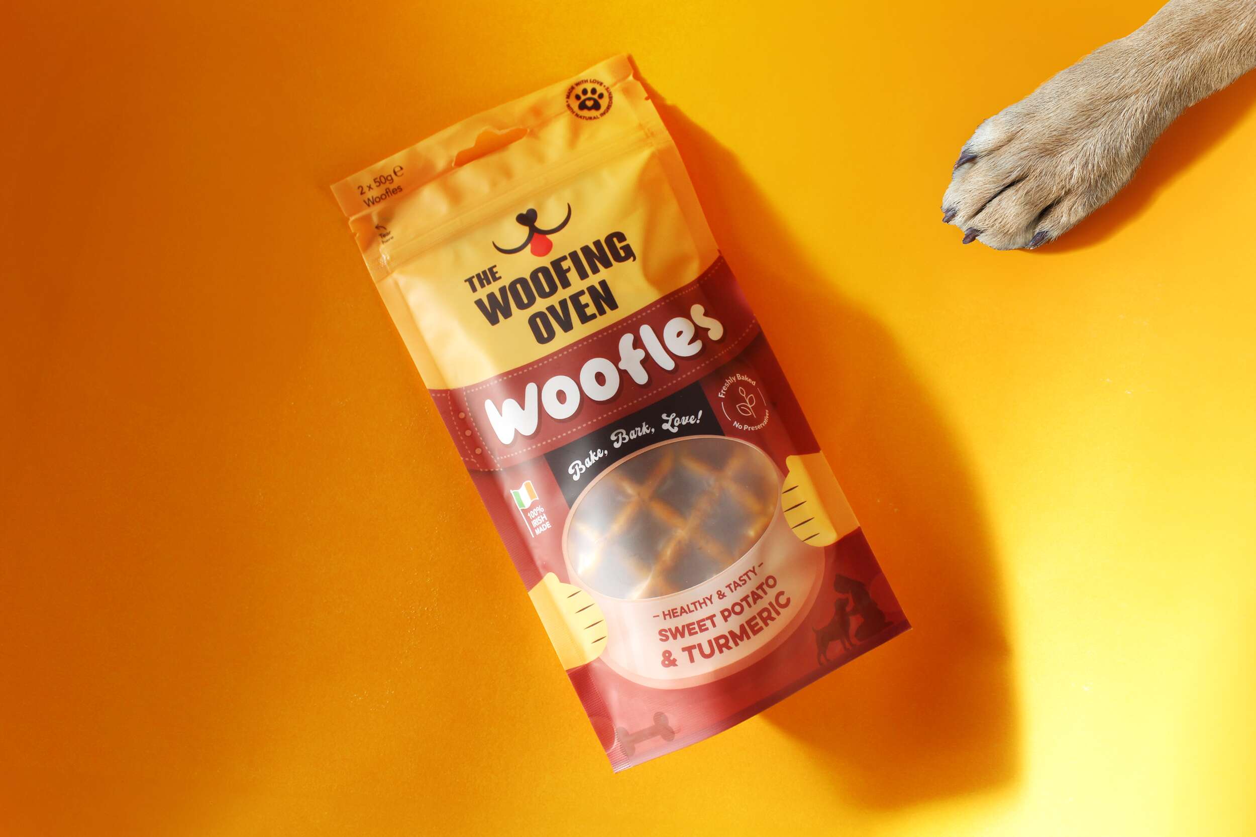
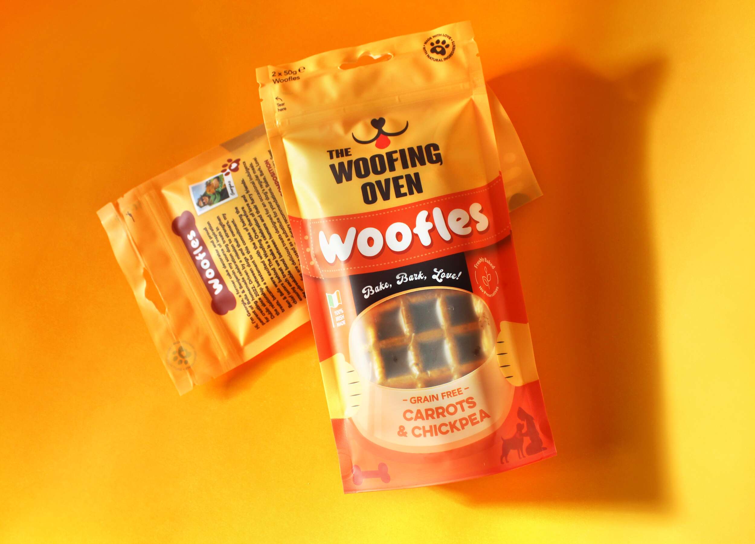
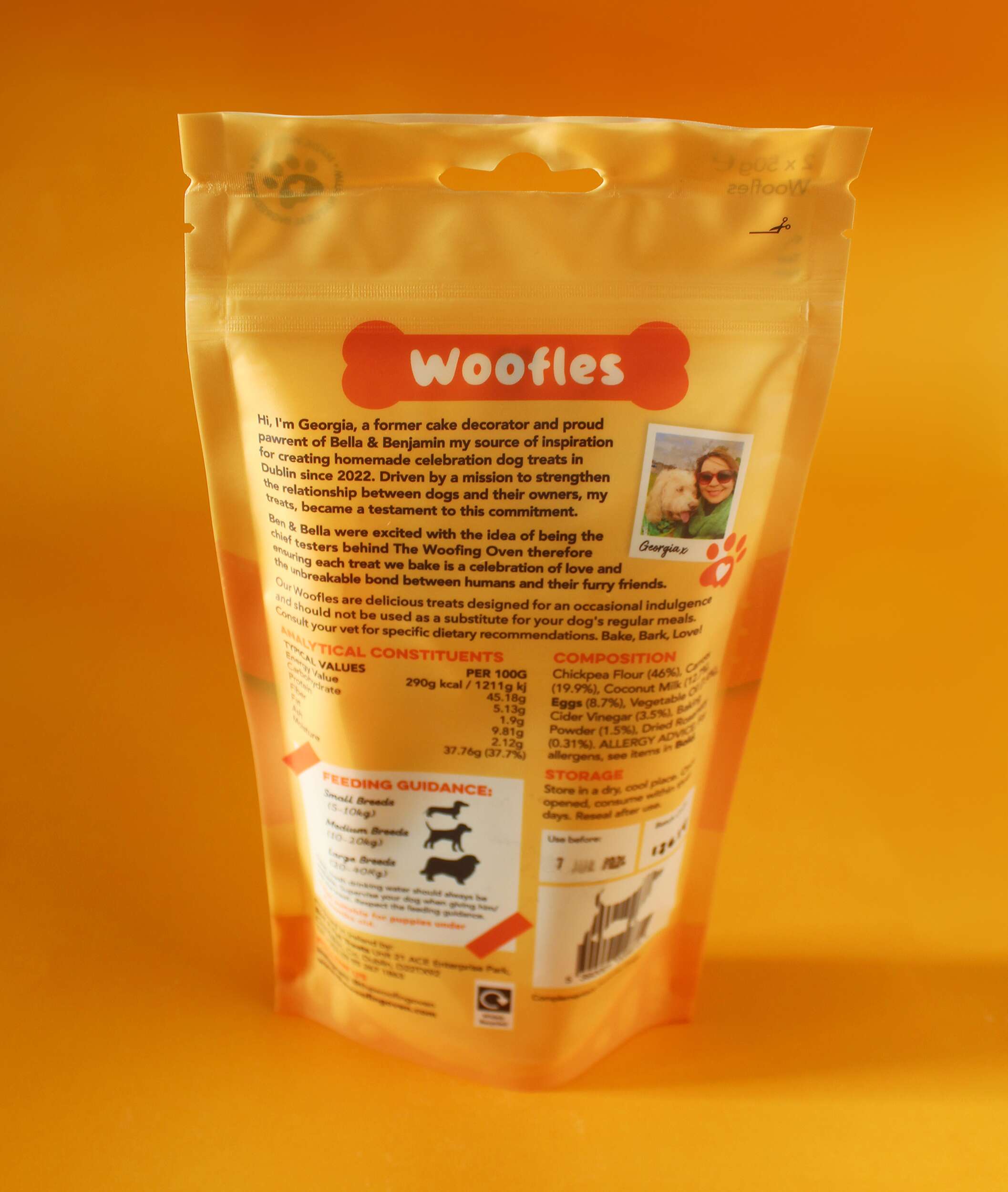
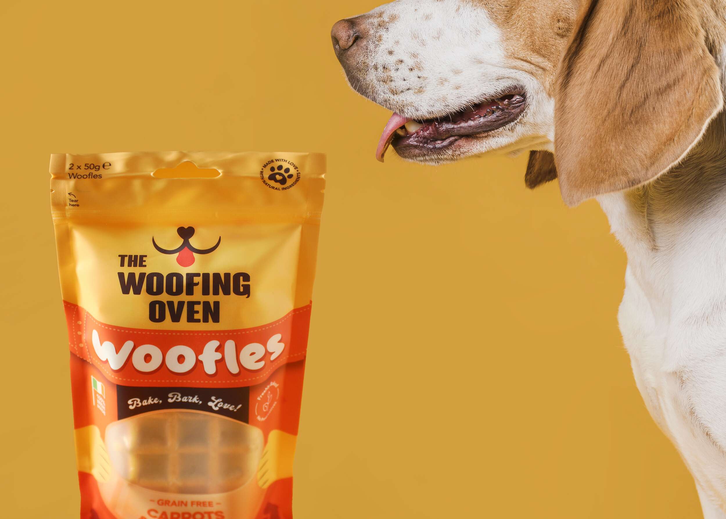
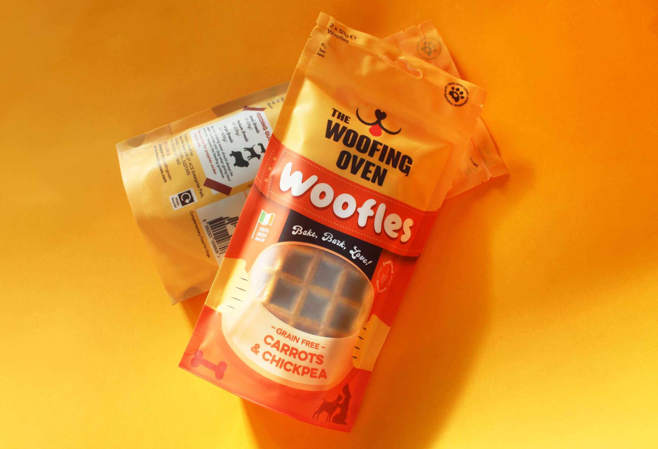
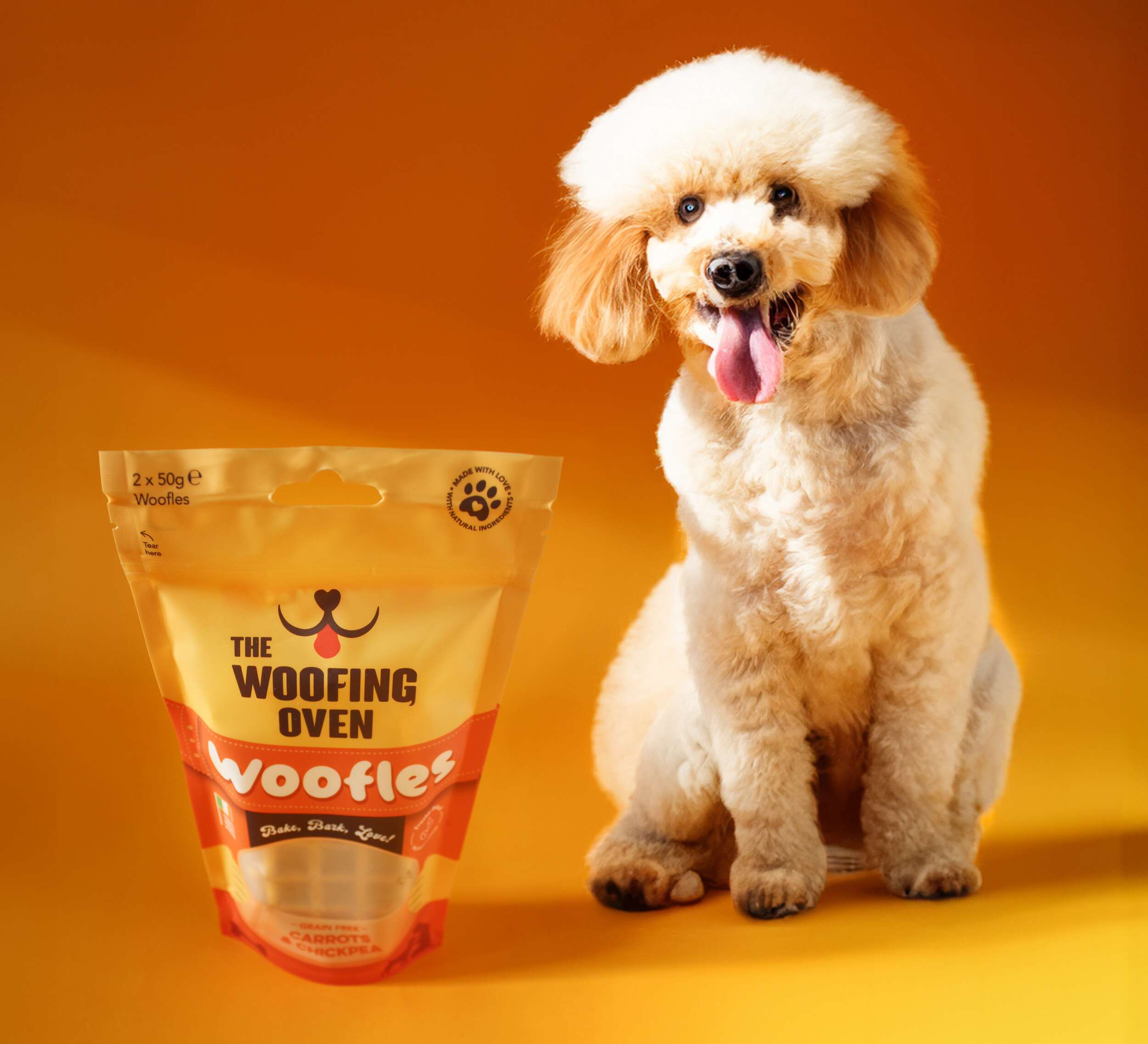 The Woofing Oven’s packaging design challenge was to create a visually striking, retail-ready package that reflects the brand’s fun, celebratory nature while emphasizing its commitment to quality, natural ingredients, and Irish craftsmanship. The existing brand (formerly known as Bon A Pet Treats) needed a fresh identity that would stand out in a crowded dog food aisle, making the transition from local markets to mainstream retail.
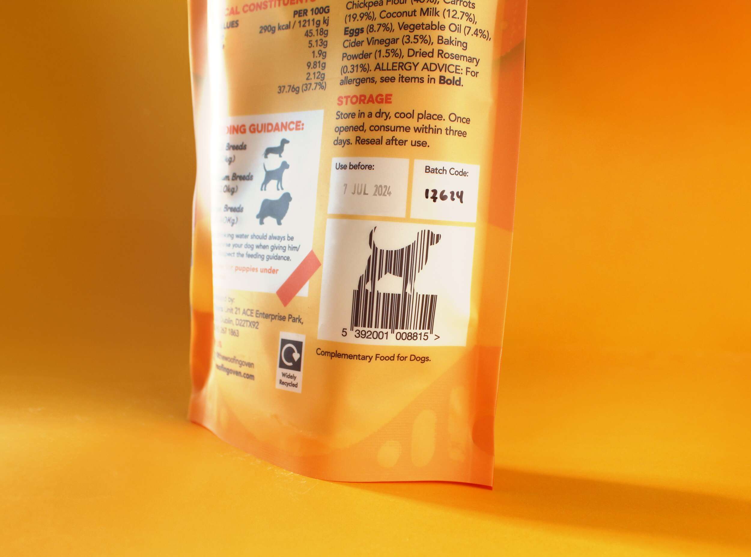


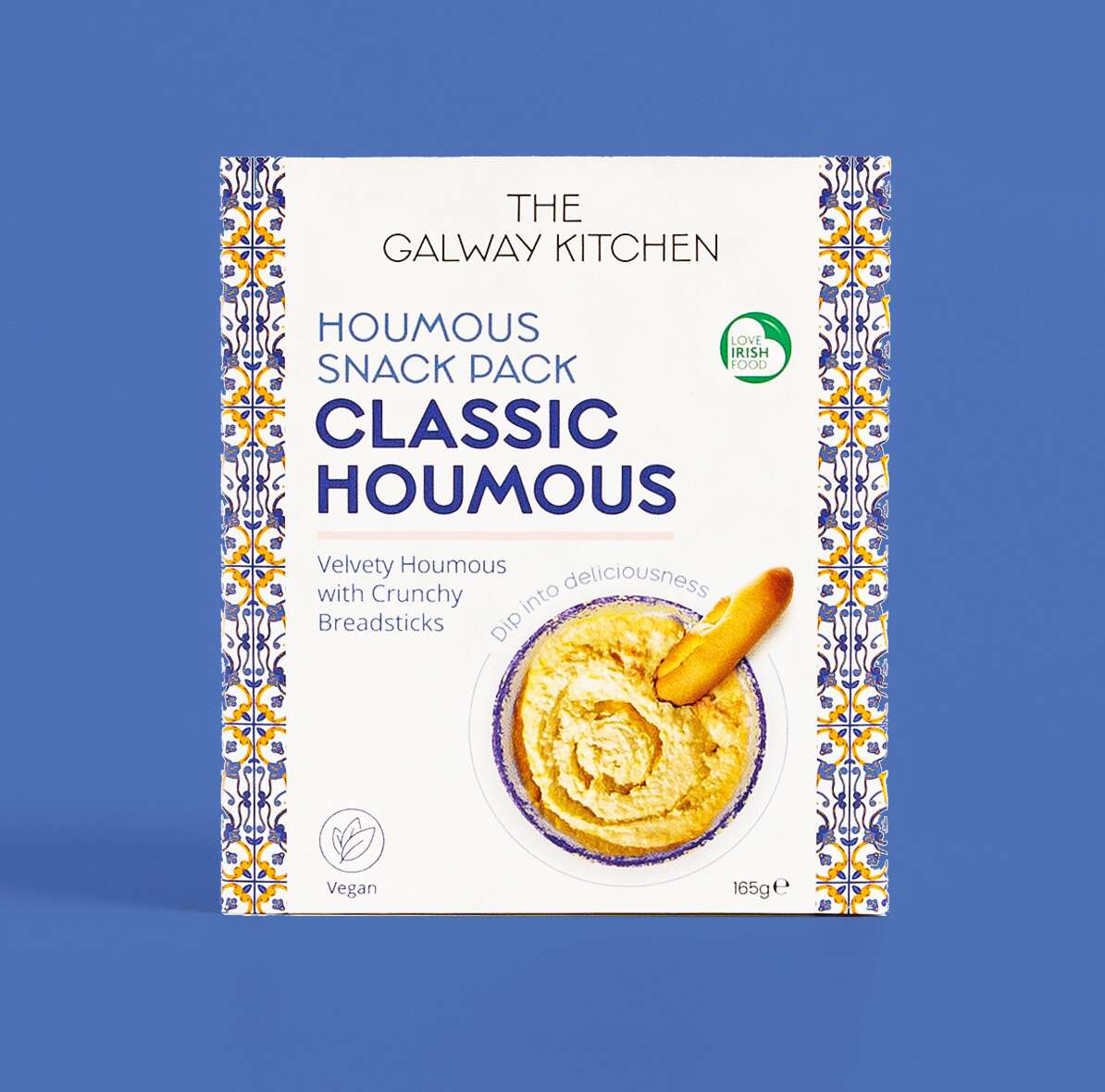
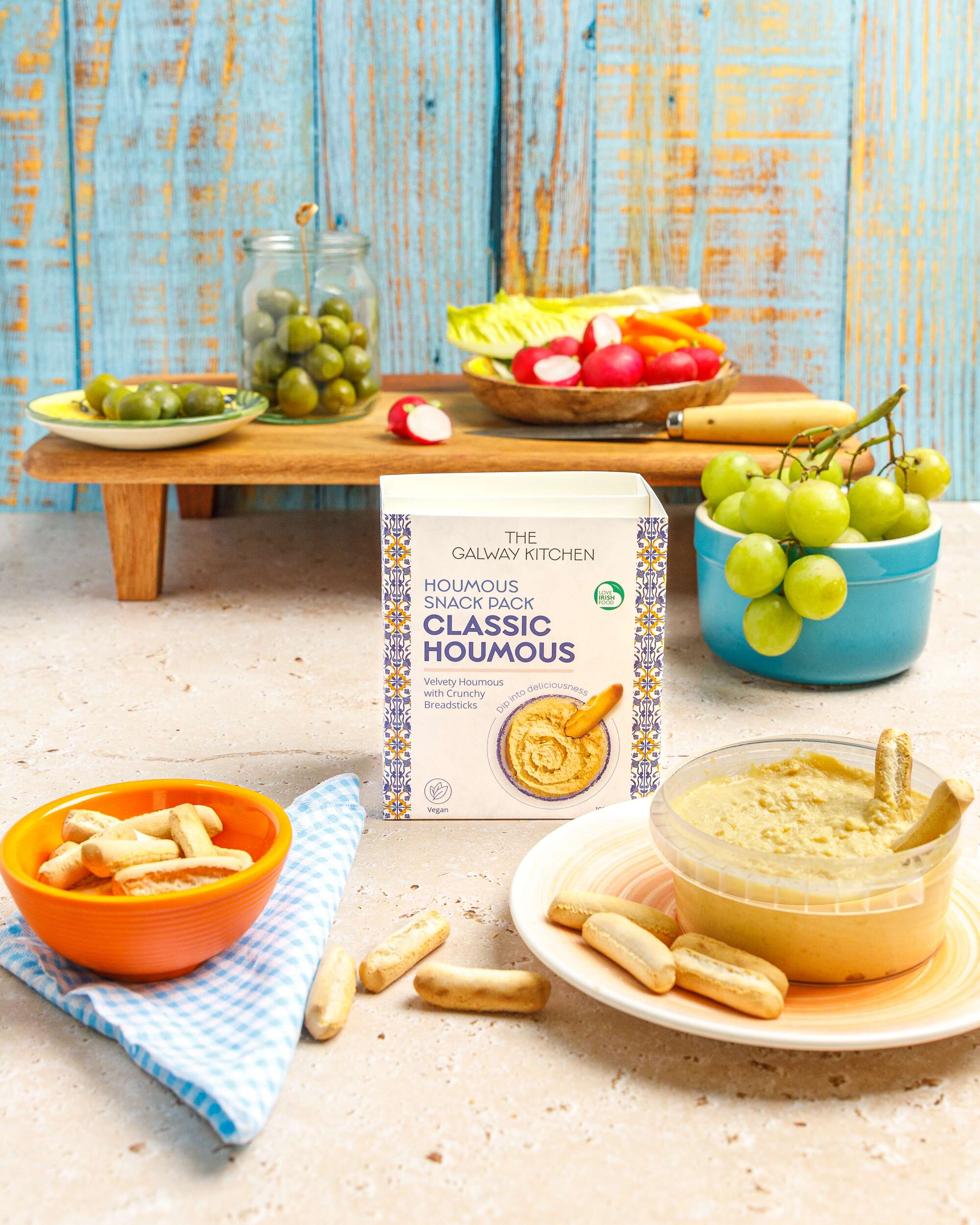
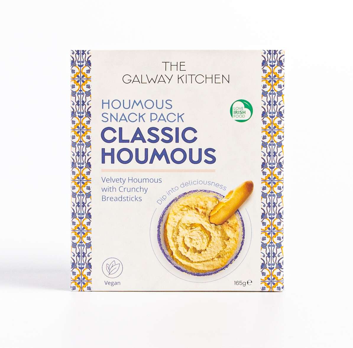
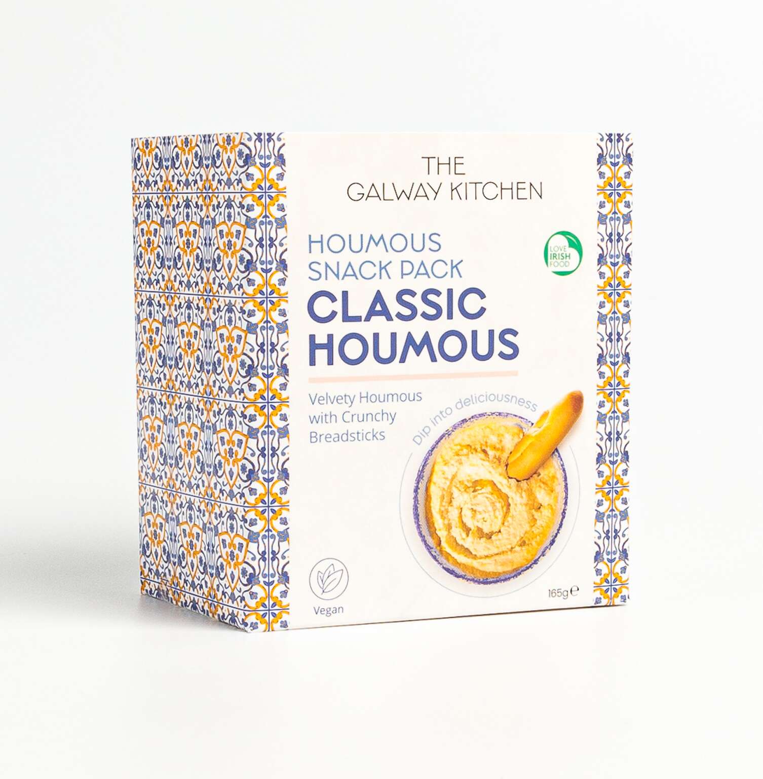
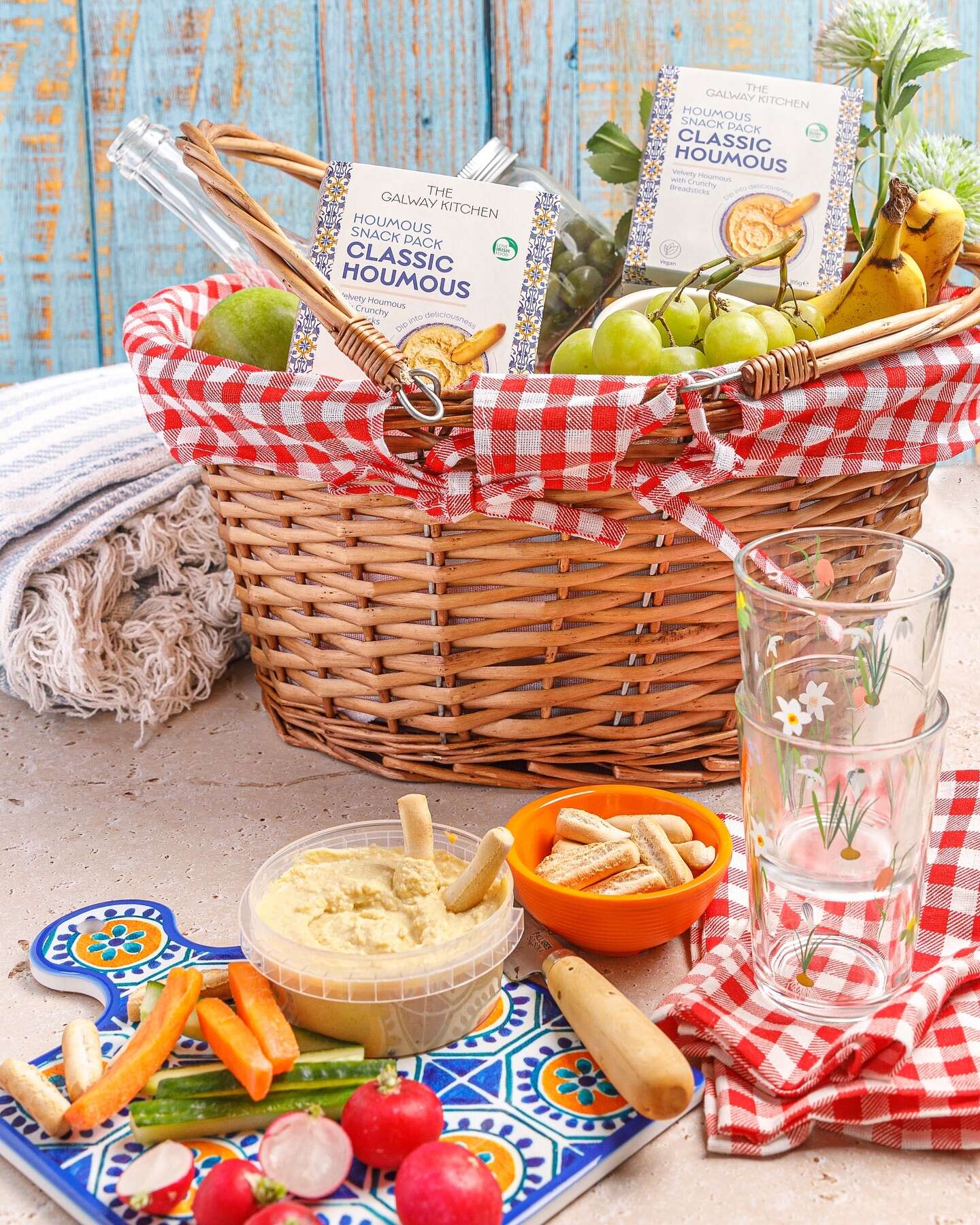
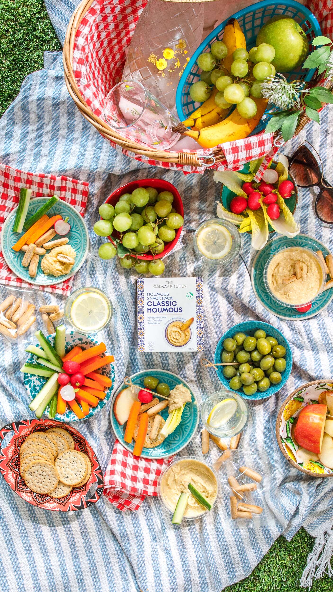
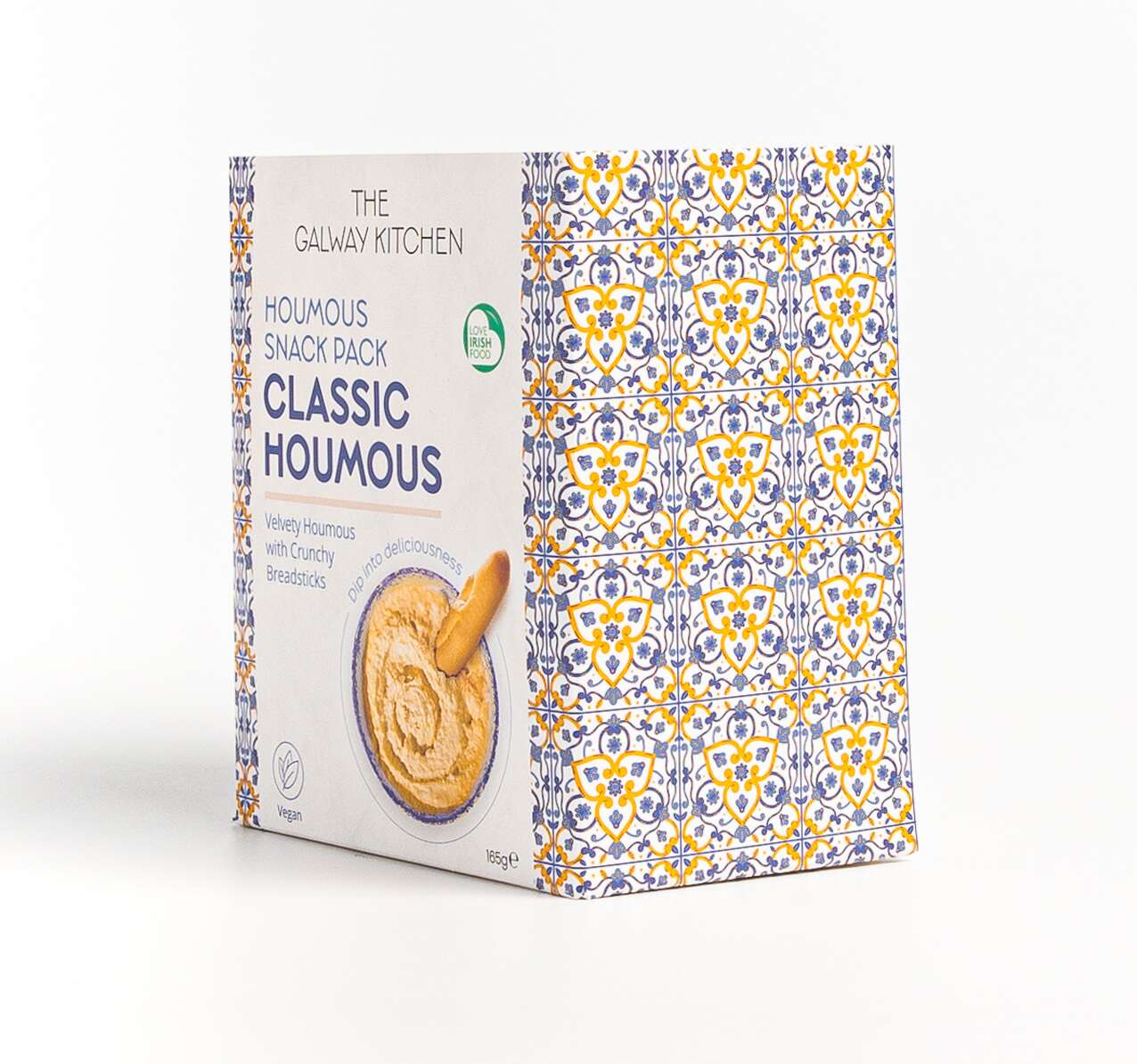
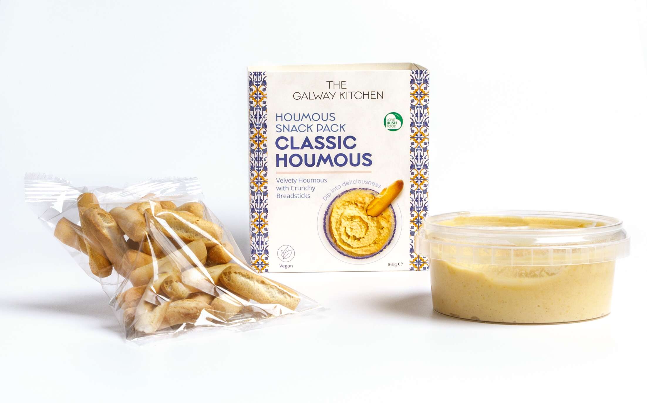
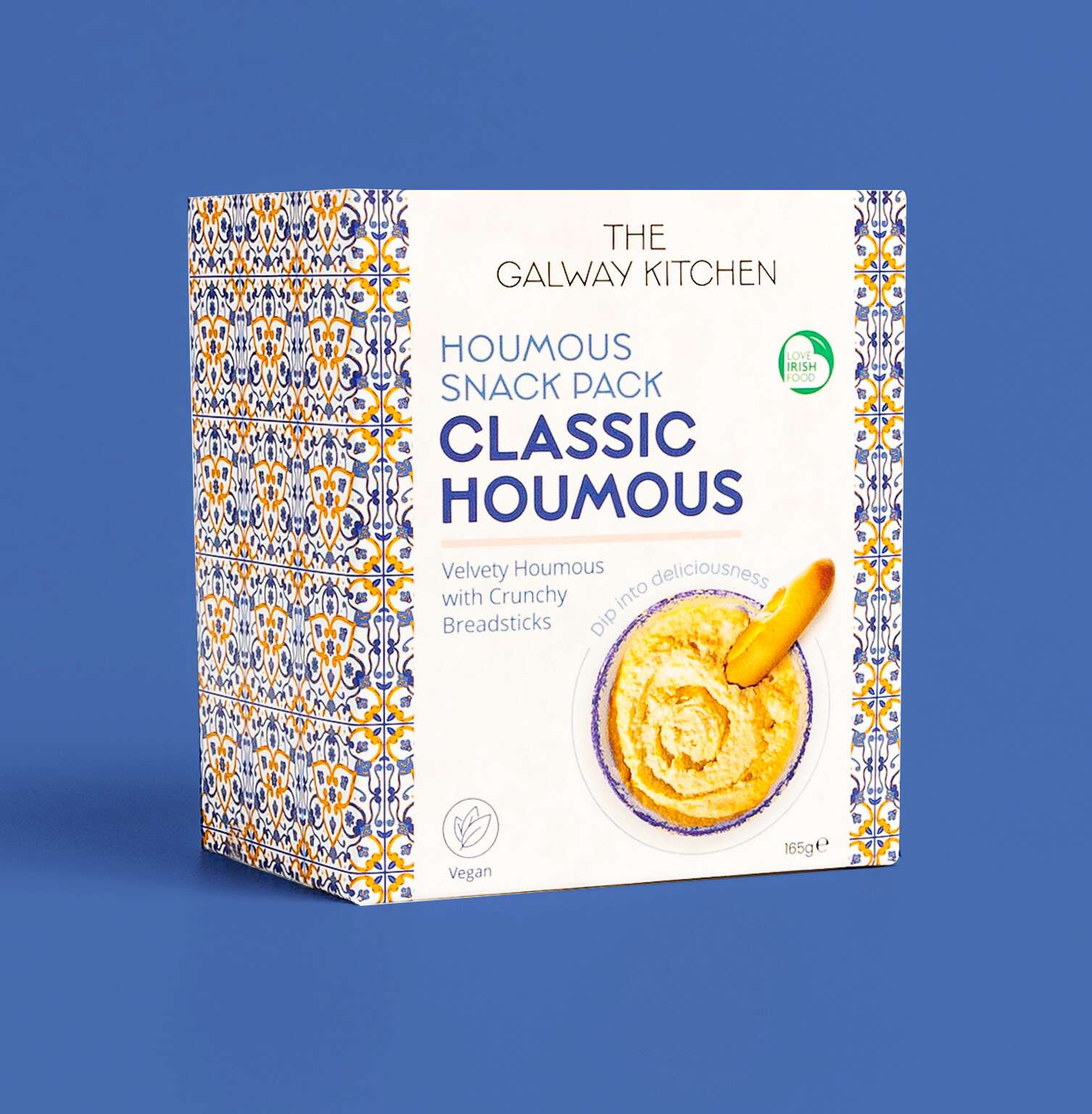 The new Classic Houmous Snack Pack by
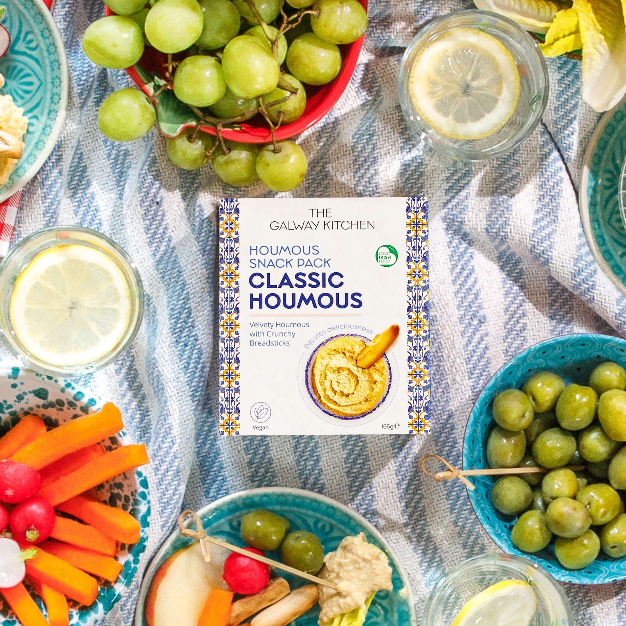

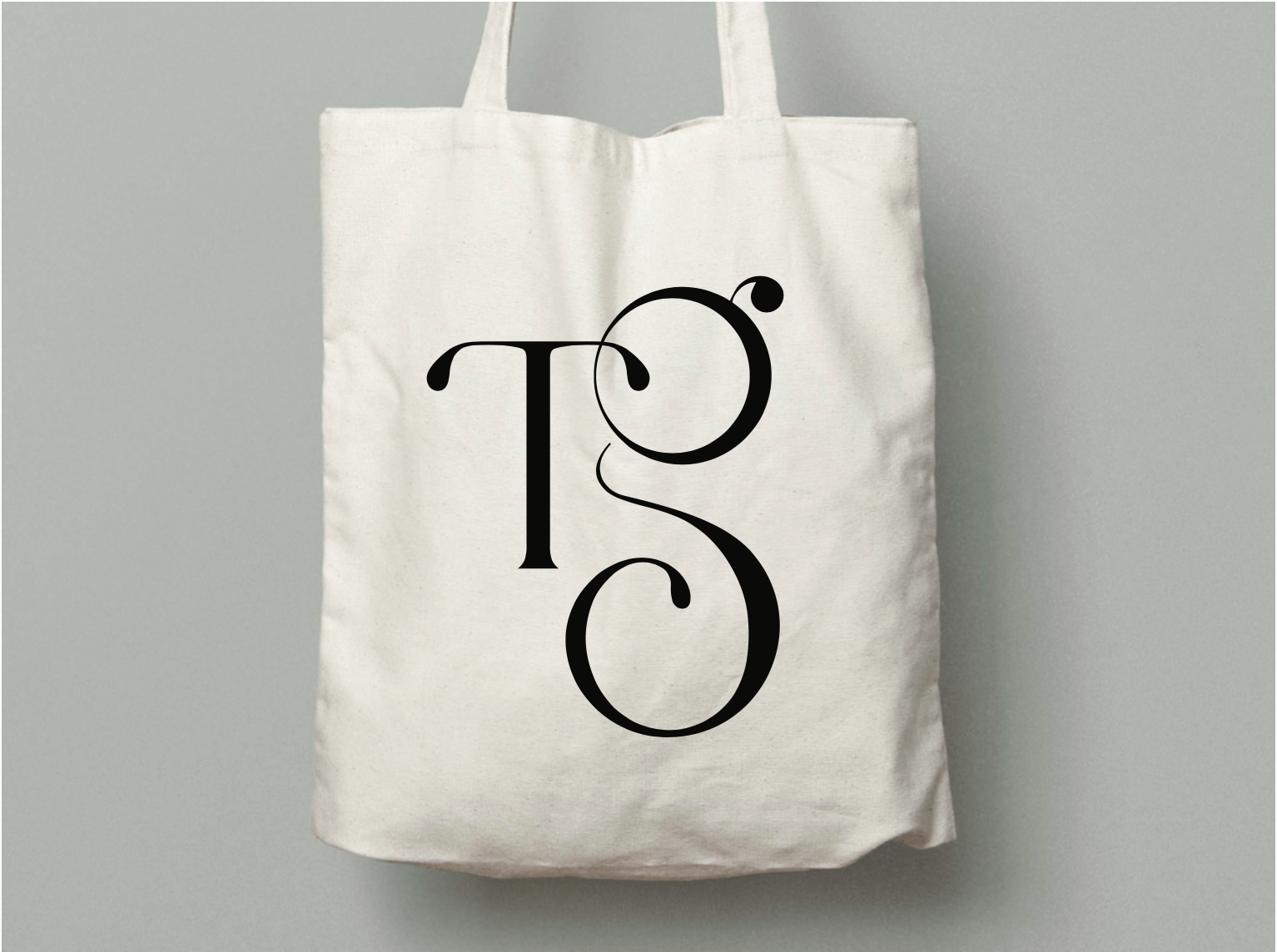

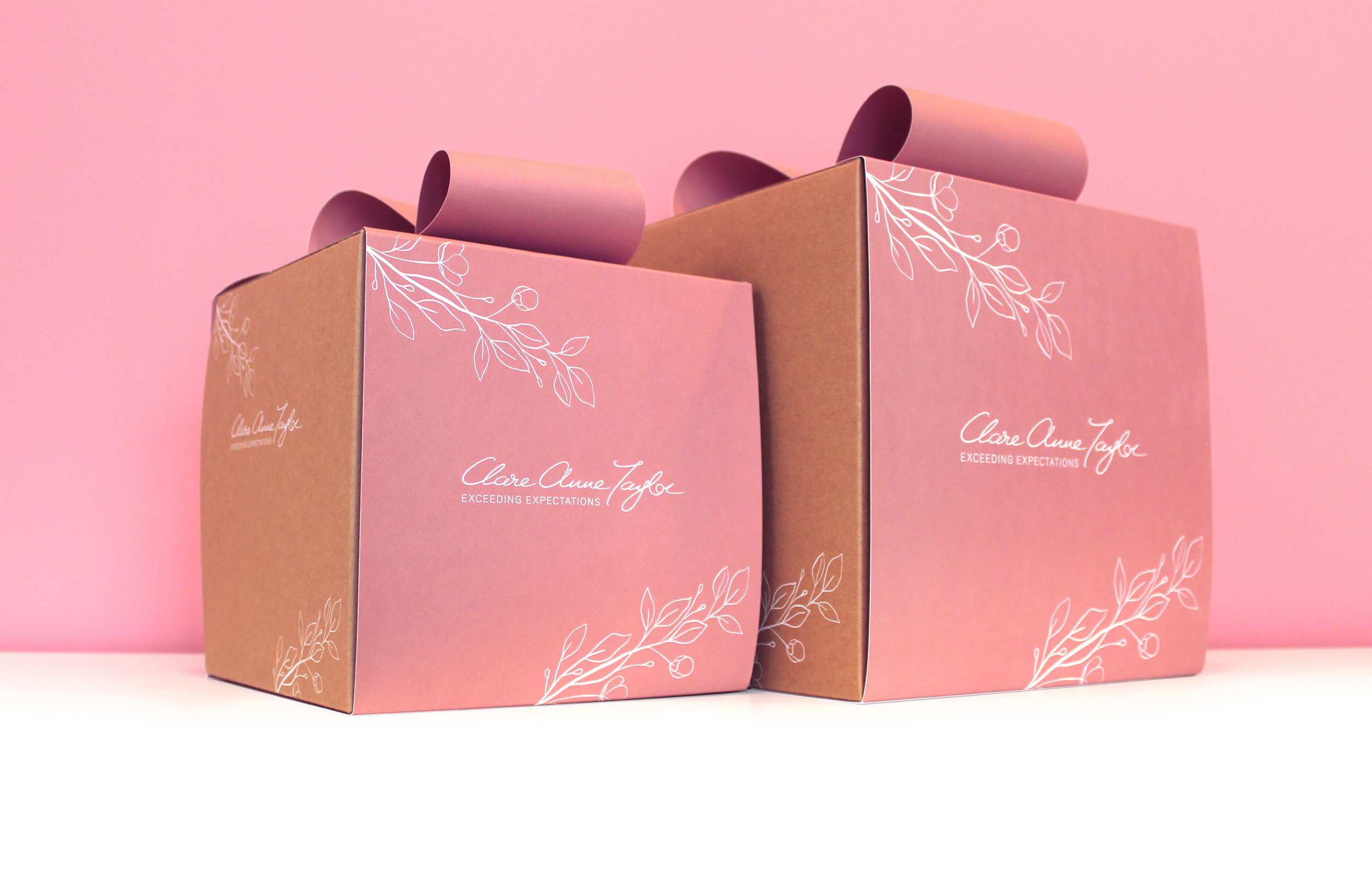
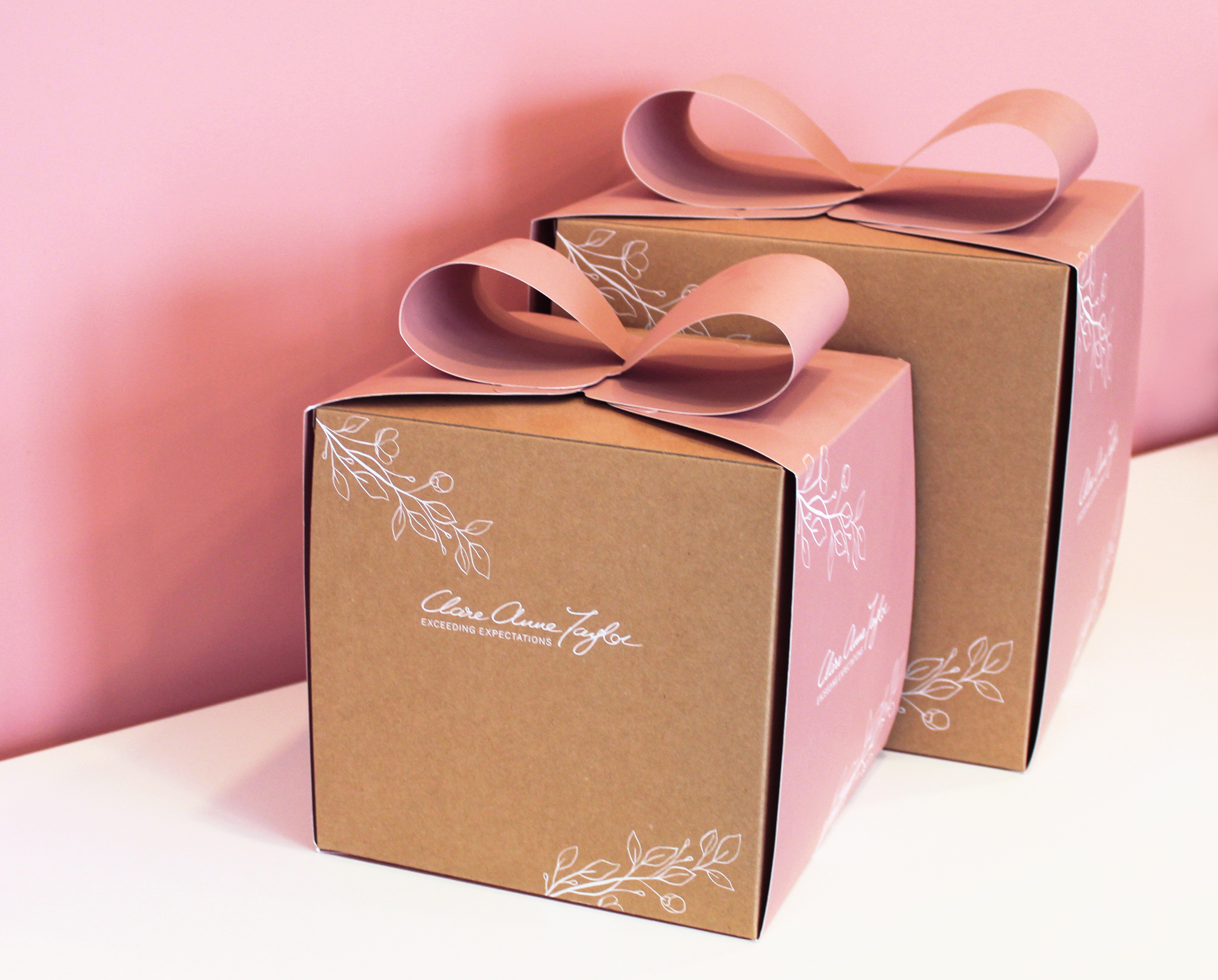
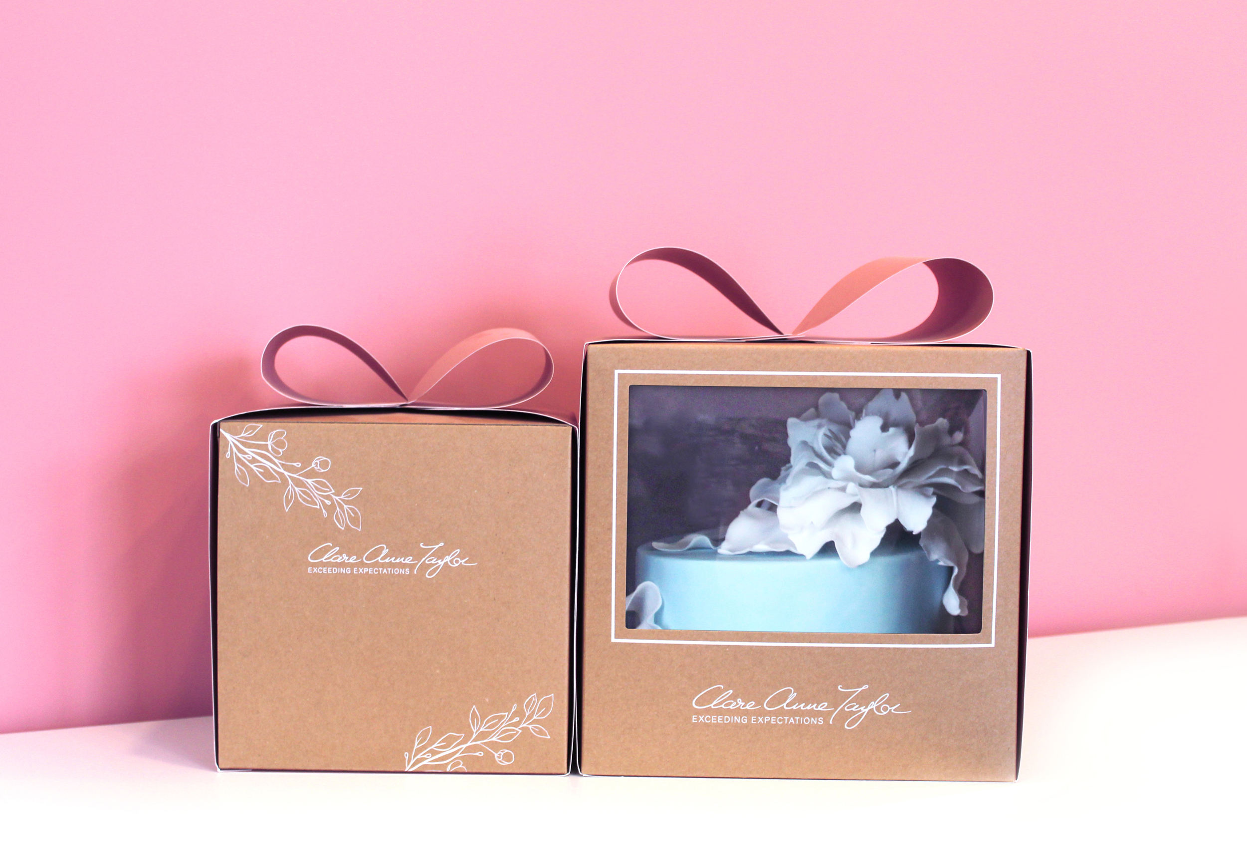
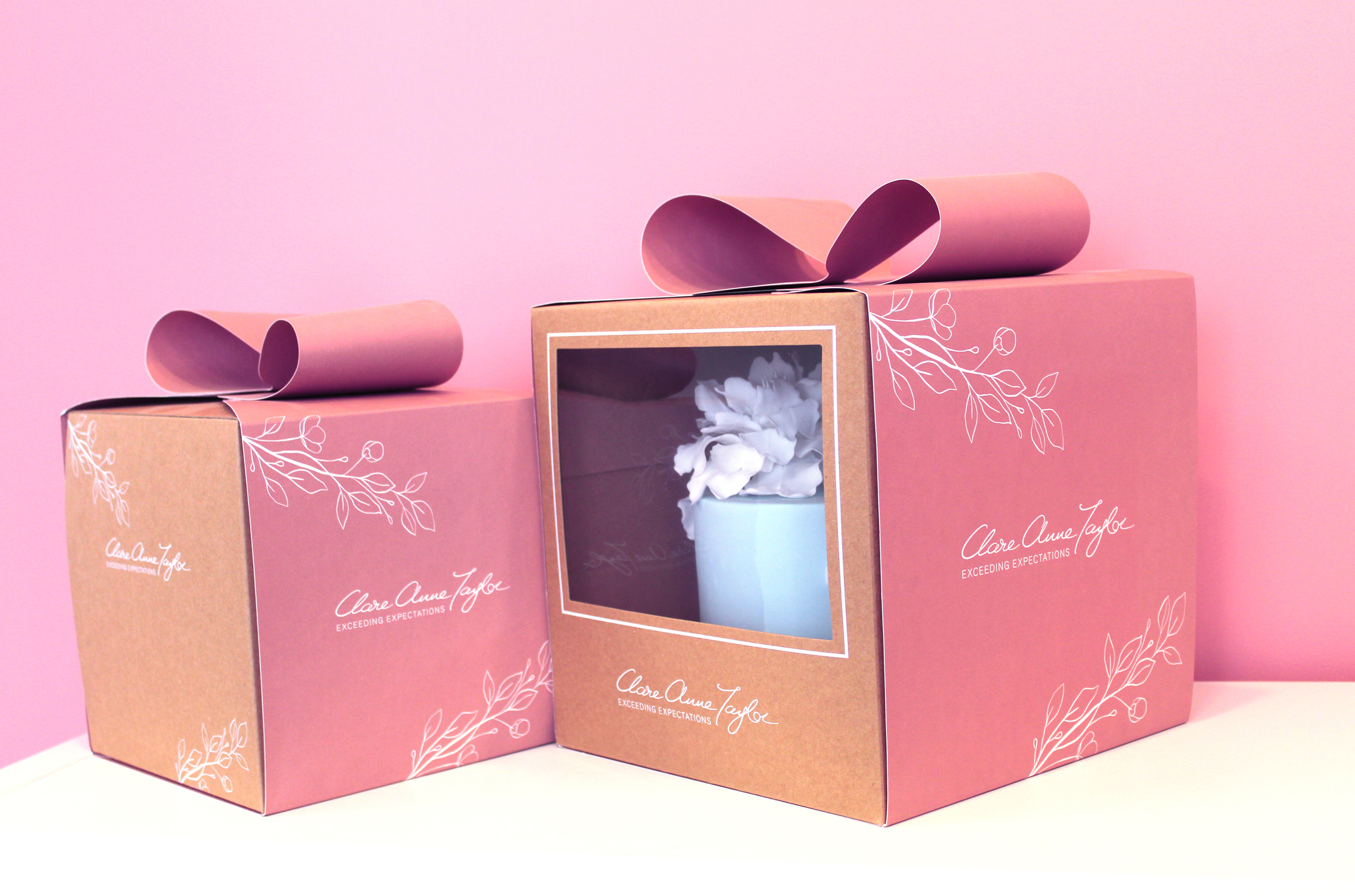
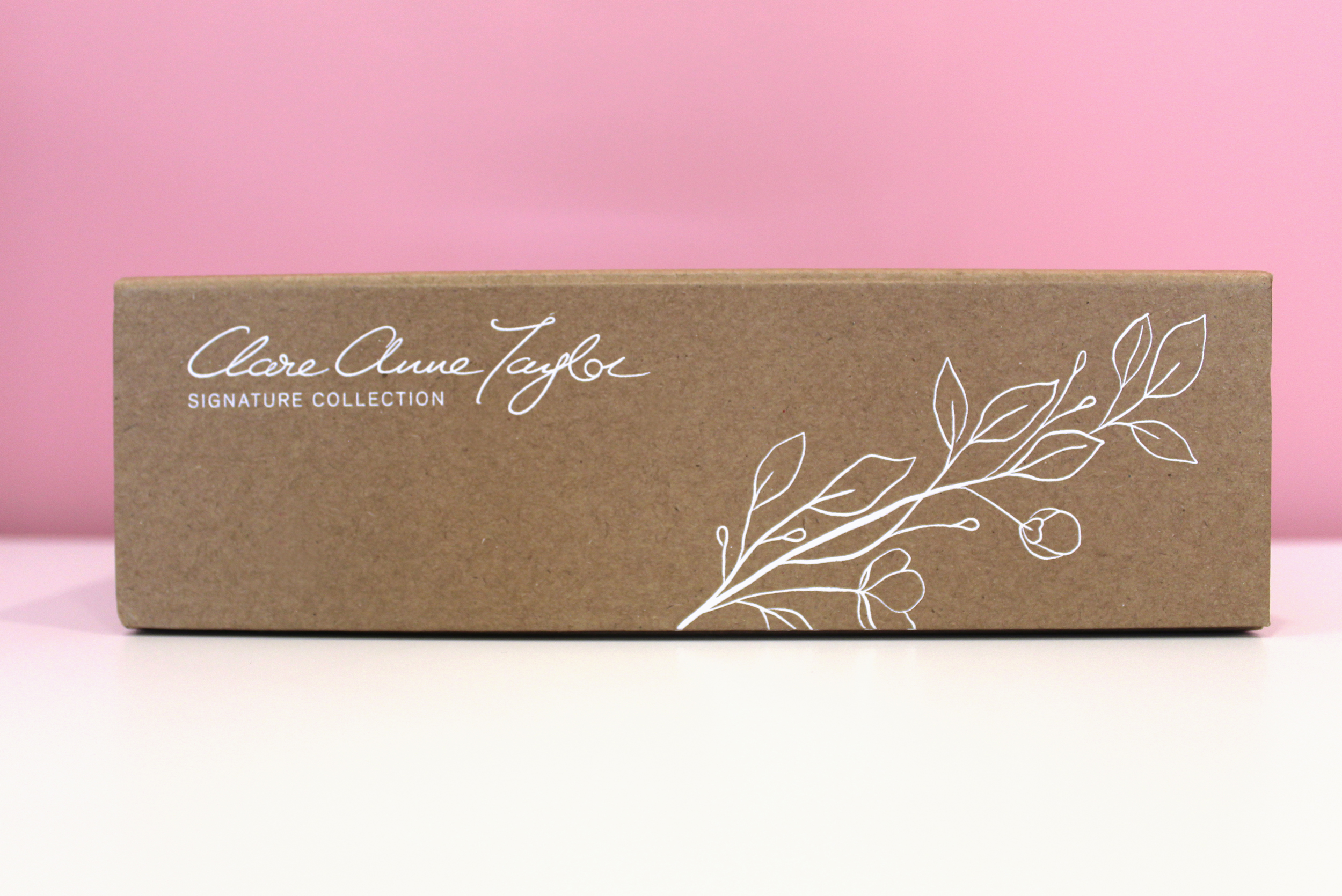
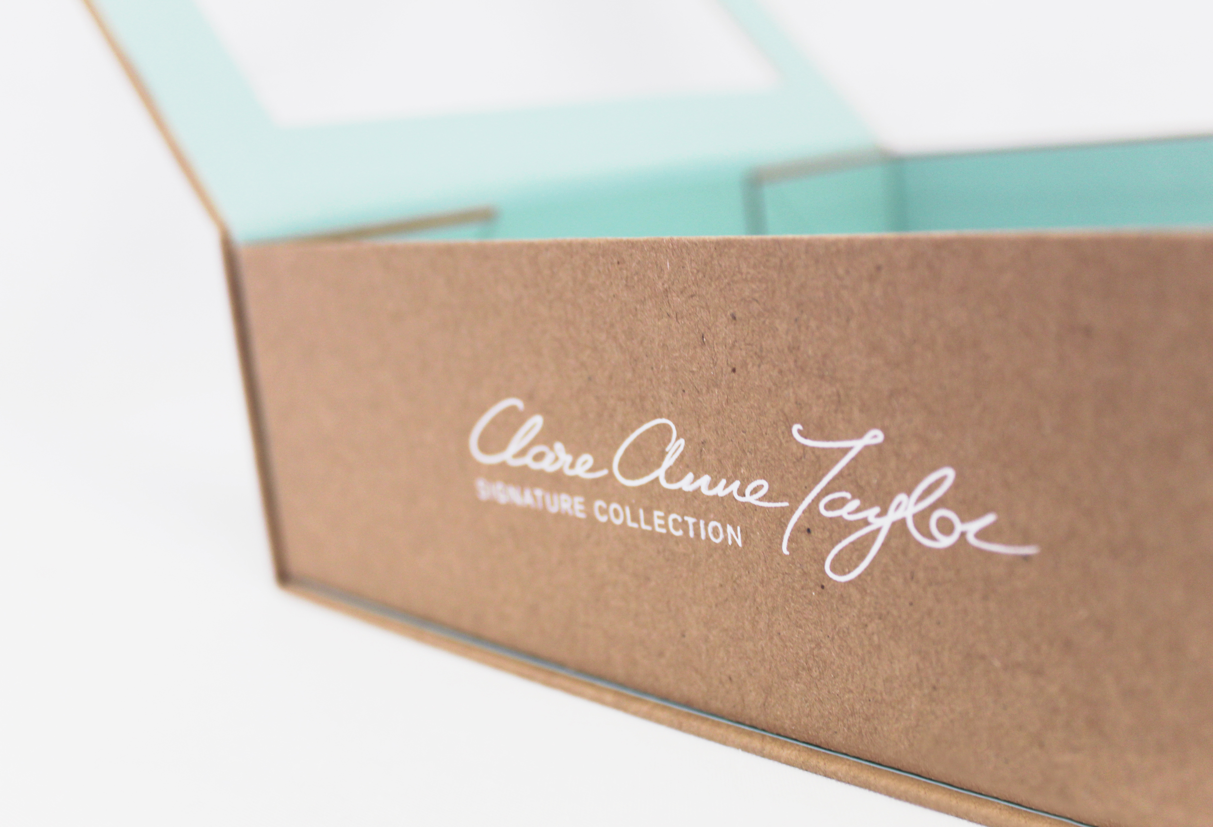
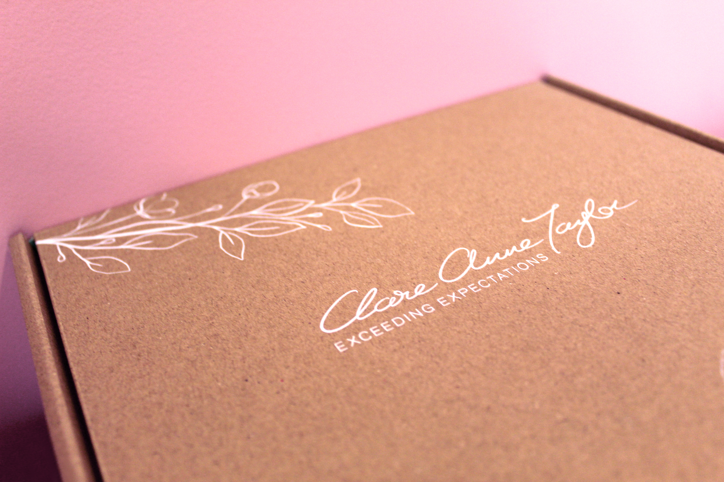
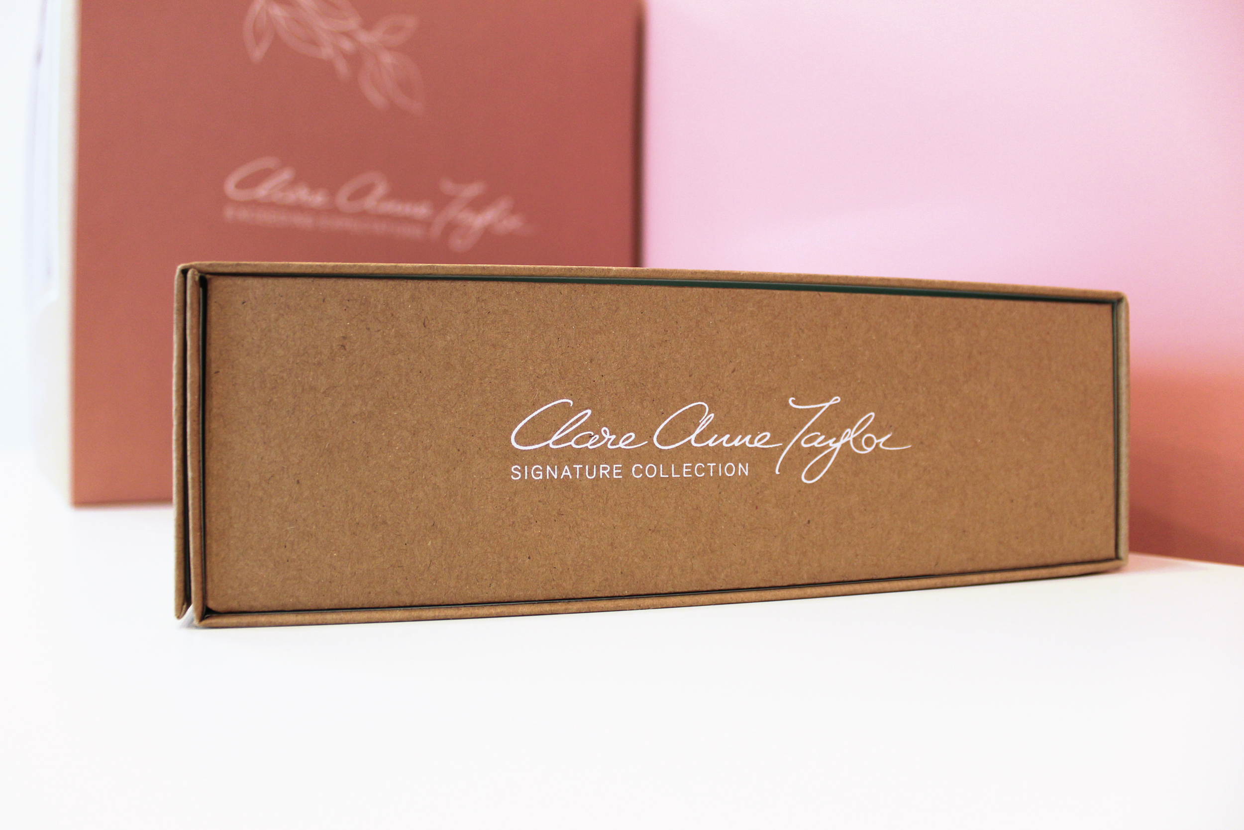
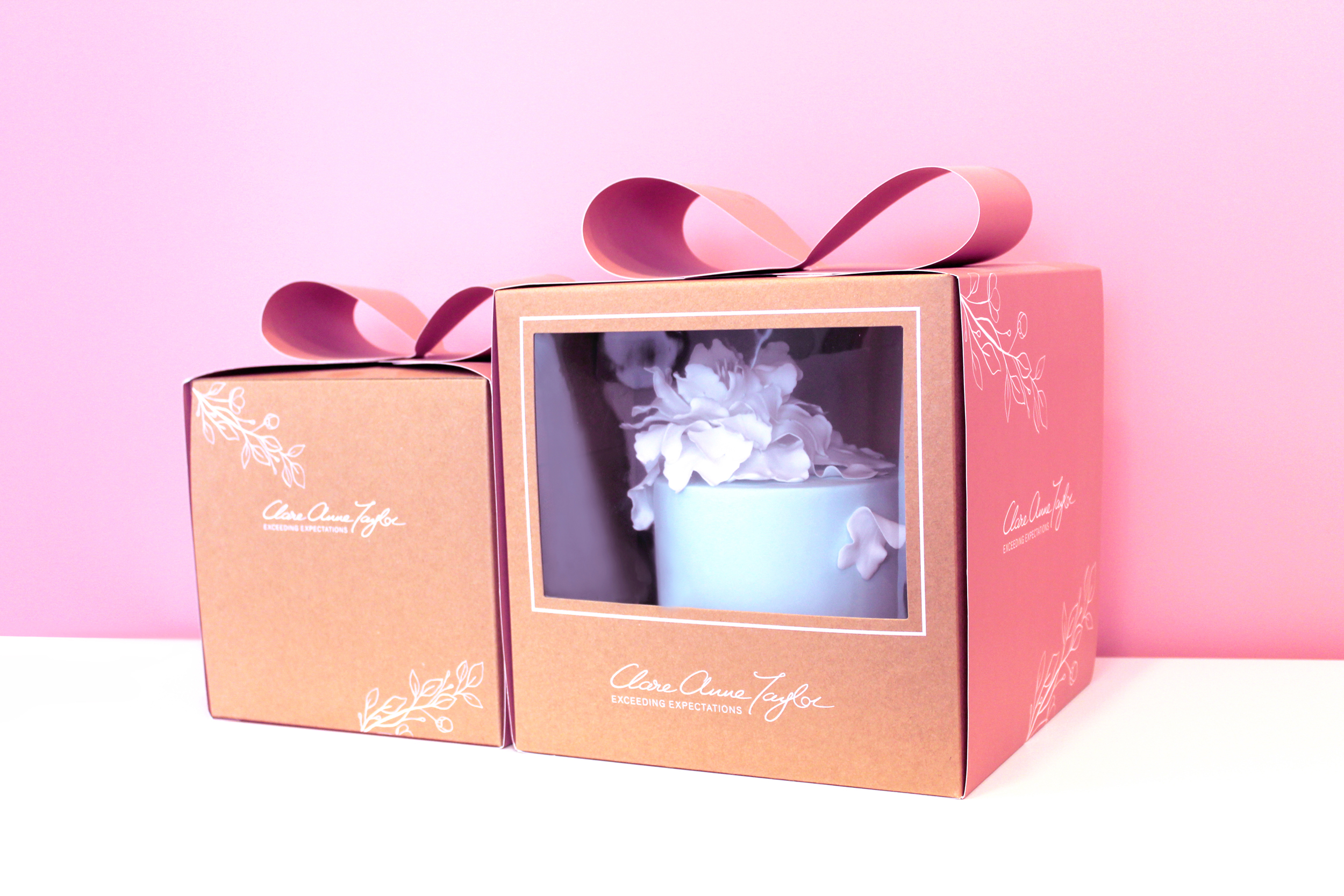
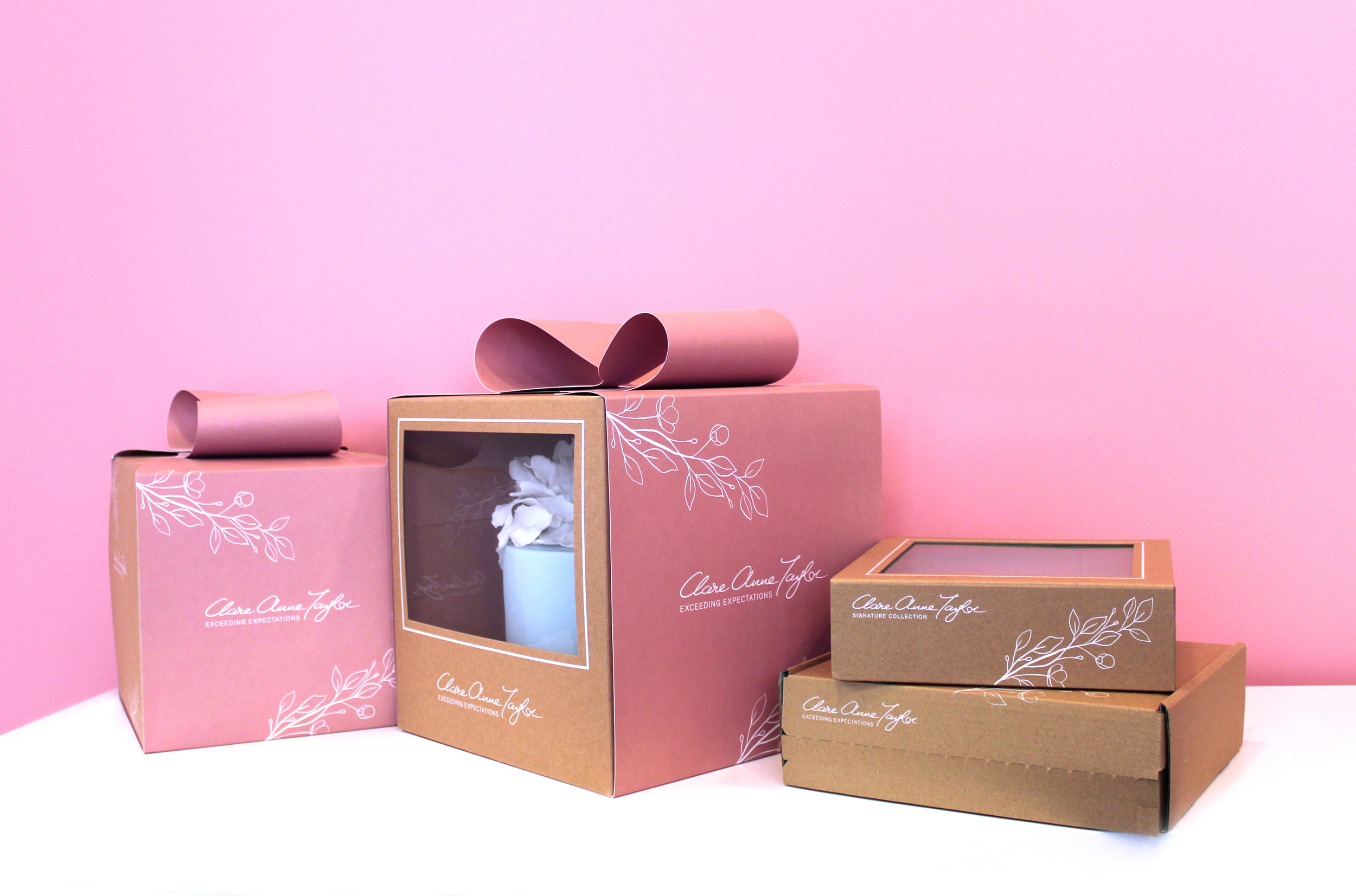 Clare Anne Taylor Couture Cakes are one of Ireland’s leading luxury cake designers for special events and weddings. The core of the business is luxurious quality and elegance in the design and craft of their cakes and confections.