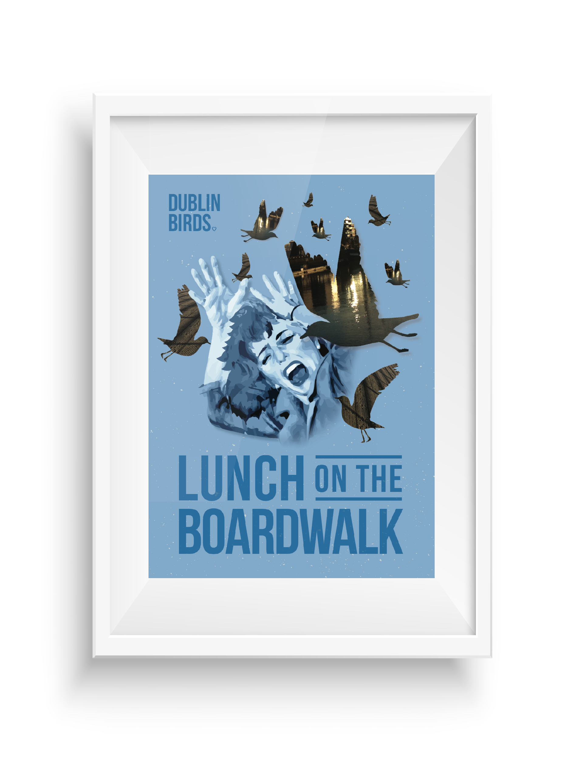
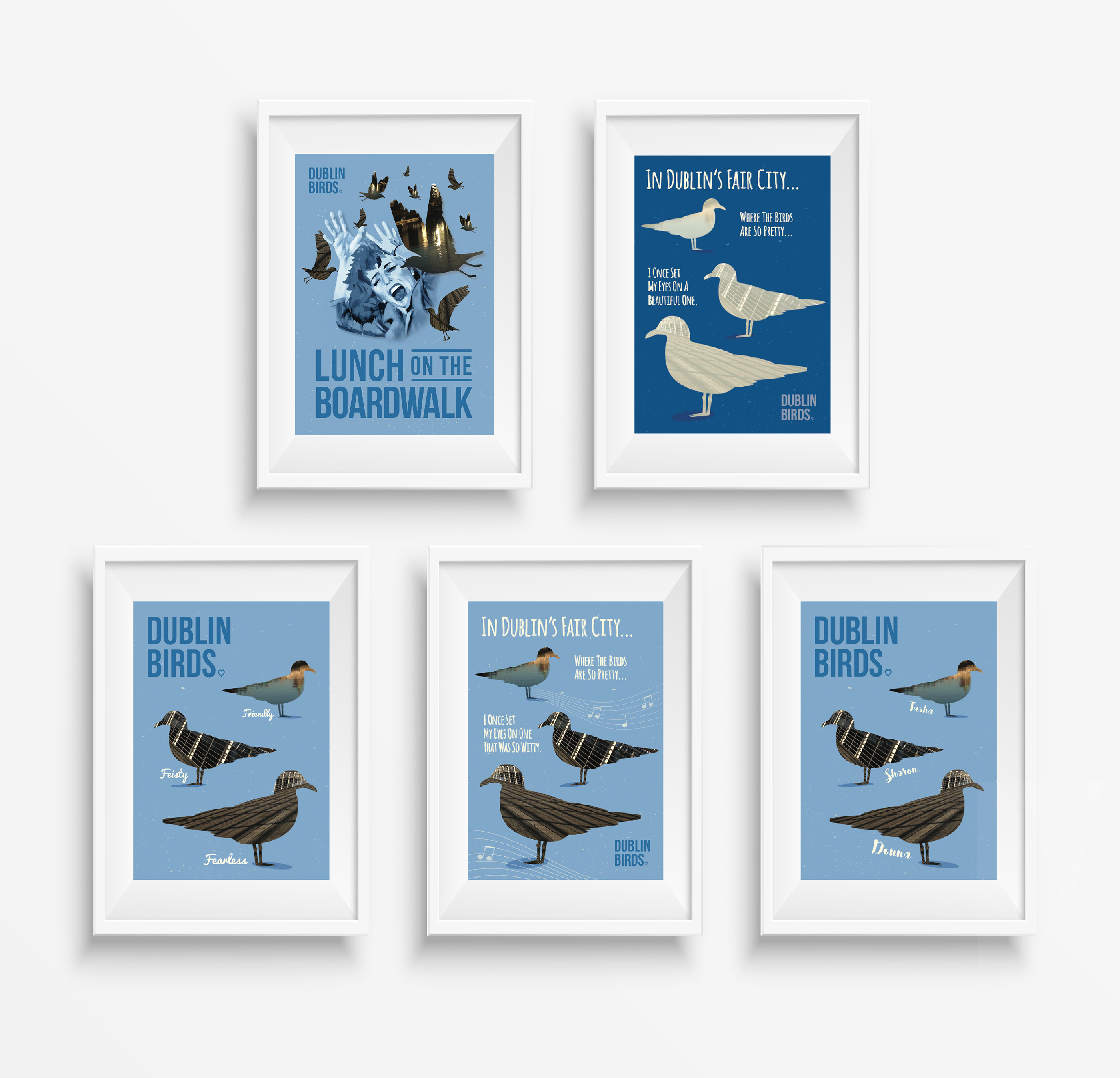
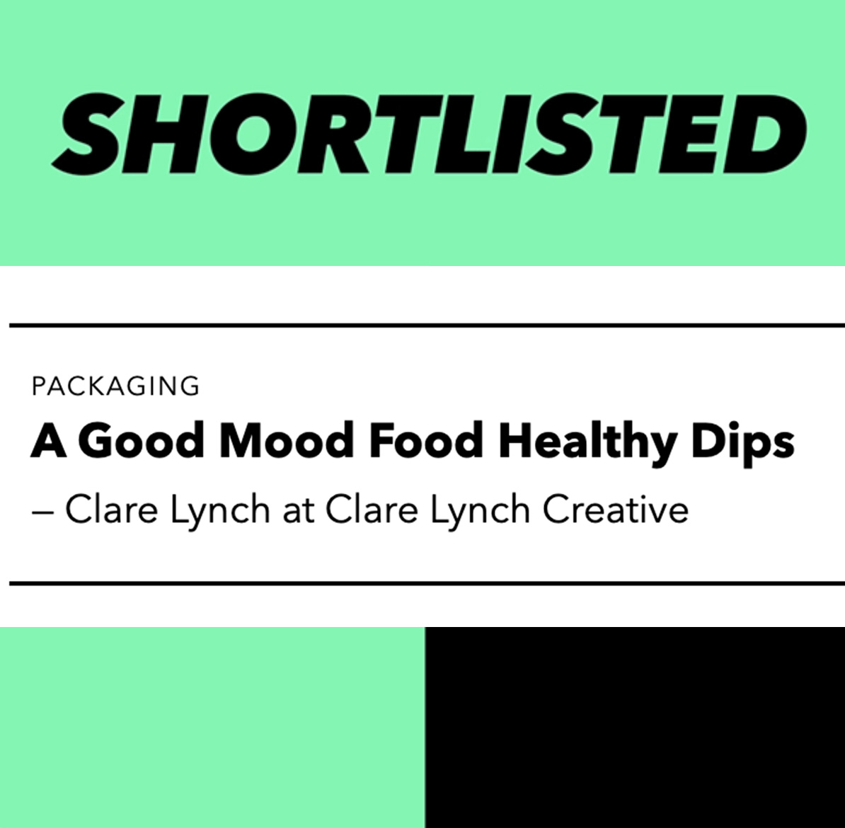
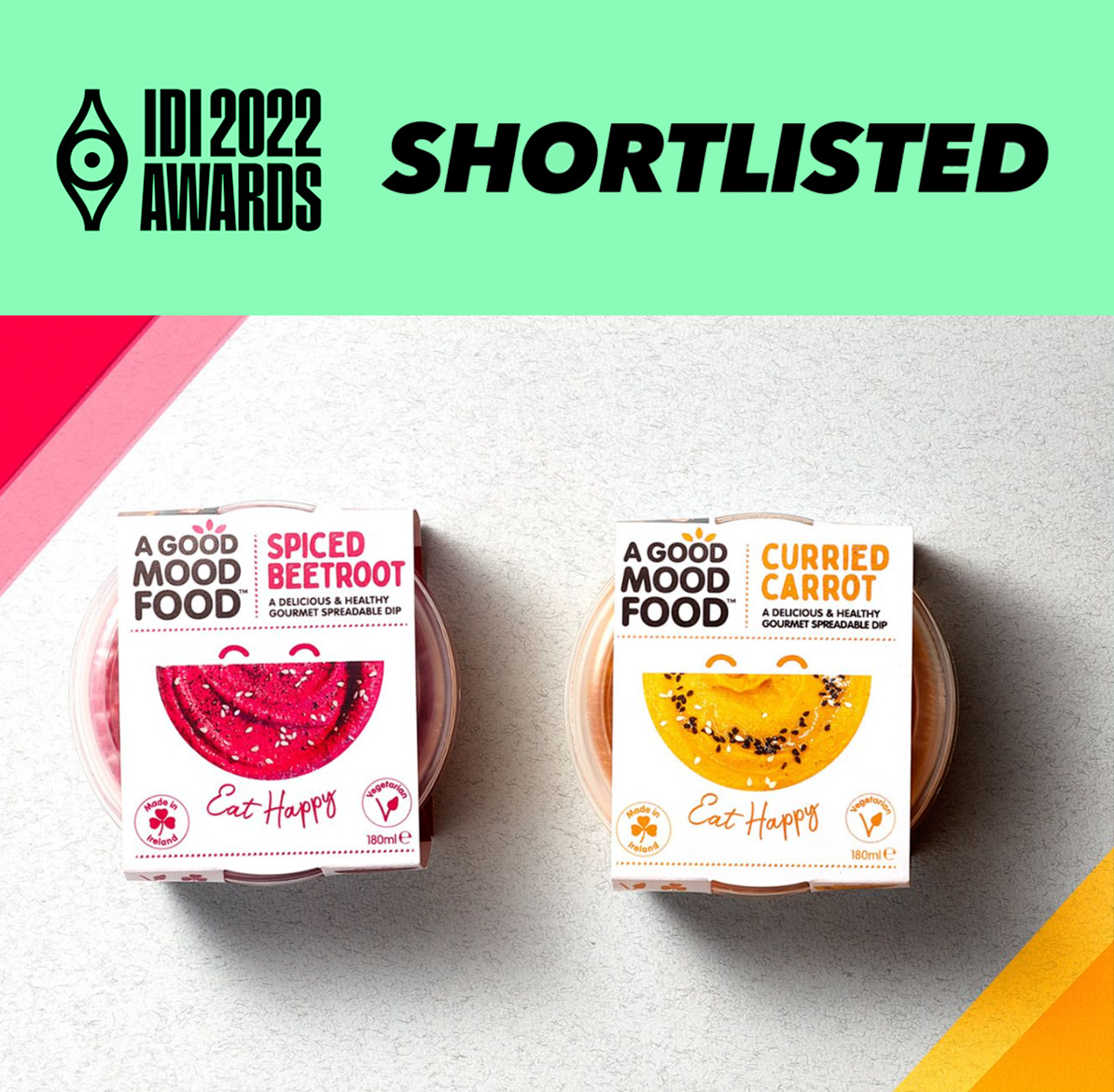
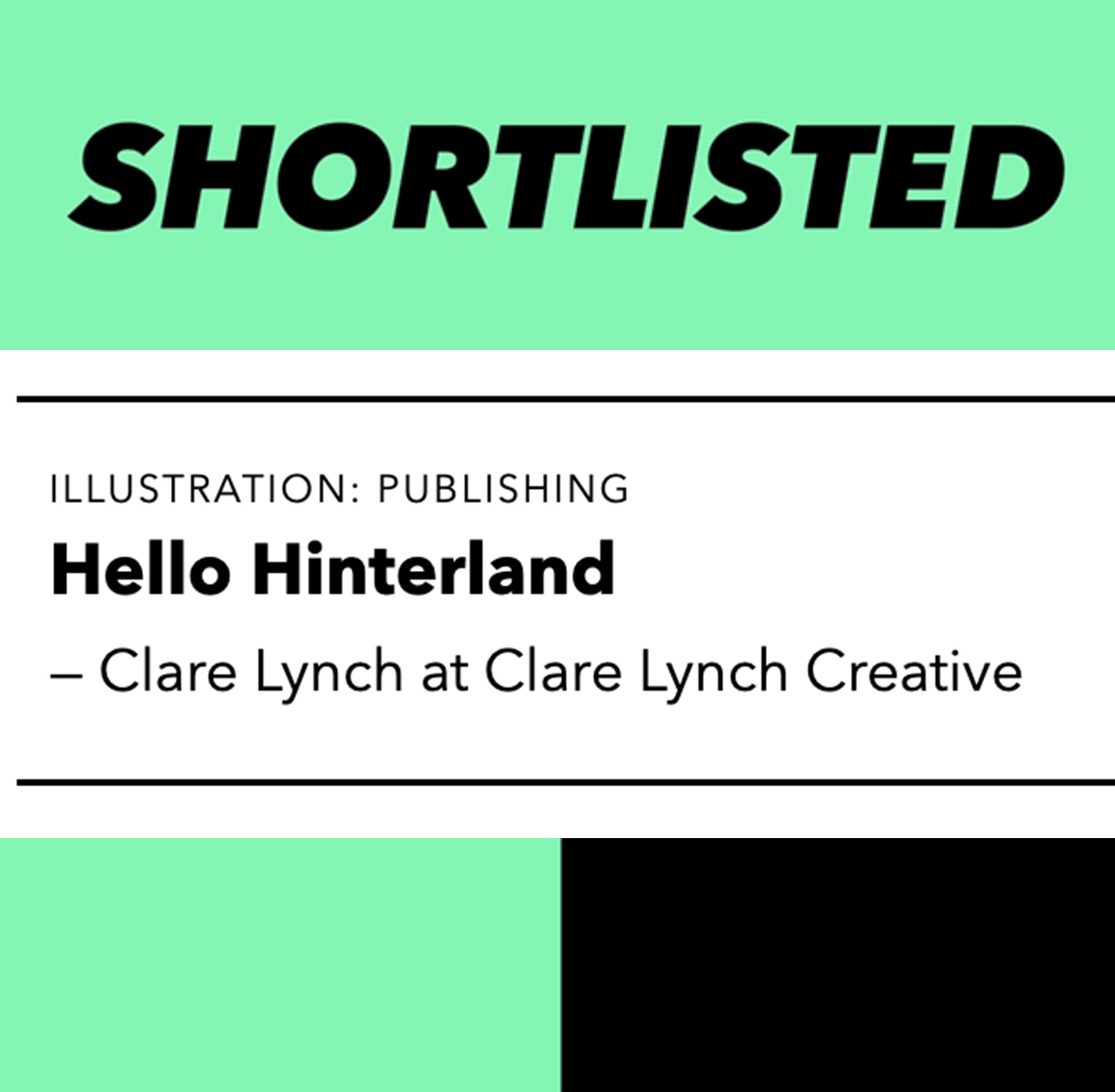
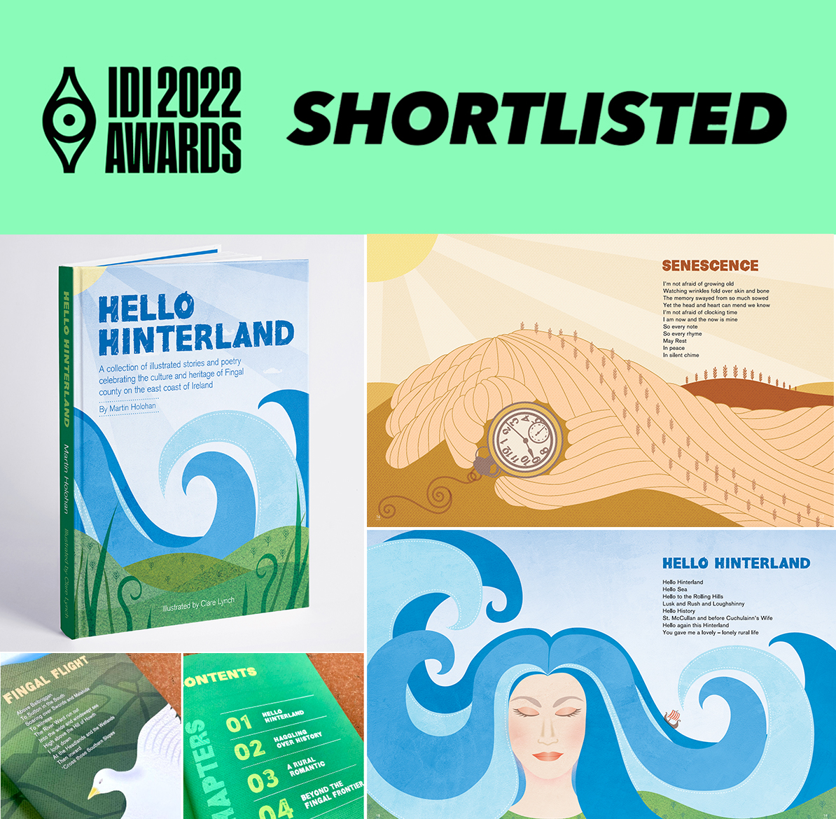
Clare Lynch Creative – Graphic Design Services Dublin – Branding and Packaging Design
  • Home
  • About
  • Work
    • All Work
    • Branding & Identity
    • Packaging
    • Communication
    • Illustration
      • Hello Hinterland Book Illustration
  • Services
  • Testimonials
  • Blog
  • Contact

Dublin

Design Awards Interview Feature

After winning Gold in the Muse Awards 2020, their linked marketing company ‘MuseDotWorld’ requested an interview with me on my thoughts on design, my experiences in the design industry, working with clients on their brand packaging. You can read more about it here.

August 7, 2020 /  
Creatives Against Covid-19 Exhibition at Guinness Storehouse

Creatives Against Covid Exhibition – Guinness Storehouse, Dublin

Creatives Against Covid-19 called on the creative industry to design and donate inspiring posters to raise funds for vulnerable women and children during the current crisis.

I was honoured to take part in this initiative. The organisers went on to create an exhibition in the Guinness Storehouse, displaying over 1,000 posters of all of the graphic designers, illustrators and creatives from over 30 countries who took part. Tickets for the exhibition can be bought here.

The posters can be purchased here at A3 size, with all proceeds being donated equally between ISPCC Childline and Women’s Aid.

My submission ‘Clear Vision Ahead‘, was a play on an optician’s eye chart and offering optimism towards what we can envision ahead post quarantine. It can be purchased in the ‘Typography’ section of their website here.

  • Creatives Against Covid-19 Exhibition at Guinness Storehouse 1
  • Creatives Against Covid-19 Exhibition at Guinness Storehouse 2
  • Creatives Against Covid-19 Exhibition at Guinness Storehouse 3
  • Creatives Against Covid-19 Exhibition at Guinness Storehouse 4
  • Creatives Against Covid-19 Exhibition at Guinness Storehouse 5
July 17, 2020 /  

MUSE Packaging Design Award Winner 2020

I’m delighted to announce that I’ve won Gold in the Muse Design Awards 2020 for the Branding and Packaging Design of Flying Squirrel vegan cheese! Brilliant news and results!

I’m so pleased to see my work has been recognised in these prestigious awards. It was an enjoyable and innovative product to work on, the client was easy to work with and passionate about his product range – this made for a collaborative and inspiring process from concept to completion in creating this successful packaging brand.

Out of 3820 submissions from 50 countries, Clare Lynch Creative has been awarded the prestigious Gold award in Packaging Design of the Year for the 2020 MUSE Design Awards competition. The winning piece was created by Clare Lynch Creative for Flying Squirrel Vegan Cheese.

The MUSE Creative and MUSE Design Awards are global competitions, which seek to commemorate the exemplary creative and design professionals of various industries. “These individuals truly embody the spirit of innovation” said Kenjo Ong, CEO of both competitions. “It is a privilege to award Clare Lynch Creative for their monumental work! It is always a humbling experience to witness what these creatives are capable of.”

MUSE Design Awards Team

See more on the MUSE Awards Website or in the project portfolio section of this website.

Flying Squirrel Vegan Cheese on Instagram: @flyingsquirrel.ie
Photography by Brendan Ryan, see Instagram: @brendanryanphoto


April 28, 2020 /  

Creatives Against Covid-19 Campaign

Creatives Against Covid-19 called on the creative industry to design and donate inspiring posters to raise funds for vulnerable women and children during the current crisis.

The result was over 1,000 posters from over 30 countries, were designed and submitted. The great selection of posters from graphic designers, illustrators and creatives are currently on sale on their website here at A3 size, with all proceeds being donated equally between ISPCC Childline and Women’s Aid.

Here is my poster submission, ‘Clear Vision Ahead‘, playing on an optician’s eye chart and offering optimism towards what we can envision ahead post quarantine. It can be purchased in the ‘Typography’ section of their website here.

April 26, 2020 /  

Halftone Exhibition

Halftone Exhibition


I was delighted to have my work selected to be in the Halftone 2017 exhibition, featured in the Library Project in Temple Bar, Dublin.

HALFTONE is an initiative by PhotoIreland Foundation, hosted every year at The Library Project. Running for 18 days, the fair brings together a large selection of works by established and emerging artists, showcasing Ireland’s exciting Art scene.

This humorous and playful collection, depicts the famous seagulls which heavily populate Dublin city centre’s boardwalk, along the River Liffey. These seagulls are known to circulate people eating their lunches, hoping to get a bite.
One print features these birds characteristics of being feisty, friendly and fearless. It also plays on the Dublin slang word for women or girls which is ‘birds’. On another print in the set, the birds have been given popular Dublin girls names. On two of the prints, there is a play on the famous Irish / Dublin song, ‘Molly Malone’, changing the lyrics to feature the birds. This again could refer to the seagulls or Dublin girls.
Images of Dublin’s boardwalk and Liffey in the city centre can be seen through the silhouettes of the seagulls.

See more on the Halftone website here or if you would like to purchase one of these prints, please see them on Etsy.

November 9, 2017 /  

St Stephens Green Art Exhibition

It was great to take part in the monthly St Stephens Green Art Exhibition, where artists feature their paintings all around St Stephens Green Park, where passers-by can enjoy the art and purchase paintings.

I chose to display a collection I had created based around the concept of communication and the wonder of the story of ‘The Tower of Babel’; the story of how we all ended up speaking different languages. The paintings represent the bricks that make up the tower of Babel, with each brick depicting a different language / hieroglyphic or form of communication; various symbols from different languages falling in confusion when the tower collapsed; being tongue-tied with the confusion of so many different languages in the world;tow modern communication such as emojis and the universal understanding in communication such as thumbs up / fingers crossed / the ok hand gesture. They are painted in gouache acrylic in a bright and modern graphic way, with colours that really pop. With art being subjective, the viewer can take their own interpretation of what each painting is and what it may represent for them.

Being part of the exhibition is a great experience – some highlights include meeting and being inspired by other artists and talking to the public about art and what it means to them. I also had some greeting cards available to purchase, which many people enjoyed. They can be purchased here and also ordered at a number of sizes and formats here.

September 29, 2017 /  

Designing for the future: trends we need to consider now

Designing for the Future: Trends we Need to Consider Now

Design is something that has been around since the beginning of time. From the ten commandments of Moses or the Egyptian and stone age petroglyphs – using design to communicate a message is something that remains consistent.

July 28, 2017 /  

Wonder Illustration Exhibition Opening

Wonder Illustration Exhibition Opening Night

It was great to be part of the group illustration exhibition recently in Filmbase, Temple Bar in Dublin city centre. There was lots of excitement with putting up our framed art after a year of hard work in developing our illustration style leading to all the prep work involved preparing for an exhibition. There was a huge turn-out on the opening night, everyone agreed it was a great success.

Wonder_Babel_Exhibition1
Wonder_Babel_Exhibition2
Wonder_Babel_Exhibition3
Wonder_Babel_Exhibition4
Wonder_Babel_Exhibition5


The theme I chose was the wonder of the Tower of Babel – the story of how we all ended up speaking different languages. The concept shows the confusion that followed the collapse of the tower in the story where everyone began speaking different languages, with the tongue-tiedness that the language barrier brought. I featured some of the earliest forms of communication – ancient hieroglyhics and pictograms – in a bright and modern graphic way, using gouache colours that pop. I went on to show how language and communication has developed to today – where we use smiley faces and hand gestures to communicate which work through all languages. I enjoyed researching this theme, learning about the Rosetta stone and Egyptian hieroglyphics. There are some beautiful symbols used among all the languages and, although it would be simpler if we all spoke the one language, I would hate to see such individuality and beauty of each language’s unique symbols and form of communicating ever to become extinct.

One of the advantages of the location was that during the week, there was still a lot of visitors popping in as the artworks are displayed in the windows of Filmbase and attract plenty of passers-by and art lovers. Many of us had our own pop-up shops selling our giclee prints and greeting cards, which still continued to attract interest throughout the week.

My greeting cards and prints are available to purchase on Etsy at:

www.etsy.com/ie/shop/ClareLynchCreative

The prints can also be ordered at a number of sizes and formats at the link below:

https://www.artify.com.au/clarelynchcollective/

CLC_Popup_shop_6


See more about the Wonder exhibition below:

www.wonder2017.ie


June 19, 2017 /  

Wonder Illustration Exhibition

Wonder Exhibition 2017

Looking forward to the exhibition of the illustration course I have been attending over the last year. It’s on in Filmbase in Temple Bar, Dublin 2, opening 6.30pm on the 6th June and continuing until 10th June. It’s been great fun to be part of and I’ve met some really talented and friendly people along the way.


There’s a pop-up shop selling our giclee prints and greeting cards also. Come along and check out all the great work.


Poster artwork by Virginia Fiorini, graphic design by Fintan Wall.

May 31, 2017 /  

Offset Dublin 2017

Offset Dublin 2017 – Highlights

Offset 2017 did not disappoint!

Dublin’s annual creative design event, hosted in Grand Canal dock, was full of talented speakers and designers eager to soak up inspiration and pick up some design tips and goodies. This year had a high focus on illustration, which was great to see. I am currently enrolled in a one-year illustration course, to develop my illustration style and bring more illustration in to my graphic design work, so it was great to hear about illustrators who are doing well in the industry. Here are a few of the talented designers and illustrators that caught my eye this year:


Marion Deuchars

CLC_OFFset_Marion_1

Marion Deuchars is a Scottish award-winning illlustrator and hand letterer. She is well-known for her children’s book designs, an area of graphic design I would love to get in to in the future, so I found her talk inspiring. She also works with brand and advertising agencies. Her illustration style is playful and appeals to children and adults alike. See more of her work here.


The Project Twins

projecttwins_3
projecttwins_2
projecttwins_1
projecttwins_4

Great to see young Irish designers speaking at such a big event. This duo hail from Cork and have accomplished a lot already in their careers. The printmakers have spent time in a residency in the Facebook offices, which sounds like it was a lot of creative fun and have been featured in a huge amount of shows and exhibitions. Their work is simple but quirky; their bright and playful illustrations clearly deliver each project message with accuracy and bring a smile to your face. Purchase a print for your home or studio here.


And last, but certainly not least, advertising agency Chemistry

I love Chemistry’s ideas. Their work is the type of work I look at and wish I had done it myself! For the sad death of the All Blacks rugby player Jonah Lomu, they designed this beautiful image below of the New Zealand fern with one of it’s leaves fallen, which very simply and eloquently reflected the tragedy of New Zealand and the All Blacks loss of such an important player and Kiwi legend.

View this clip to hear more about it here.

Another strong campaign they spoke about was the ‘I want to get Cancer’ campaign. I must admit this was quite a controversial one. When I first saw it on a bus stop and then on a TV advert, I had mixed feelings. I understood the point but still didn’t like to see those words as they seemed like a negative affirmation at first glance and because of it’s in your face nature, it could pose insensitive to someone with a family member dealing with or having lost someone to cancer. However, the talk really brought more insight to this campaign. They asked half of the audience to stand up and said that by 2020, it is predicted that 1 in 2 of us will get cancer. The figure was quite striking and by separating the audience like that, it really hit home. They said they needed a message that really got attention and drove awareness with people that this isn’t something we should be turning a blind eye to, that we need to be more proactive rather than reactive with fighting it. Some of the team working on this campaign had actually fought cancer themselves, so they were actually in a strong position to speak up about it, after having gone through it personally. They spoke about how the campaign had been really effective and brought in a lot more calls and awareness, therefore it hit the objective of the brief very well and brought the desired outcome.

I also loved their LIDL Christmas advert, which was touching and well created with the story based around families and coming together to be there for eachother.

View it below:

Another striking image they created for an article on the history of the events at Chernobyl, using charred Russian Dolls was also very effective. I think they have the ability to deliver a message effectively in a way that touches on your heart strings and makes you think about the issue.

So that sums up my Offset 2017 highlights – there were many more talented designers speaking but I could only pick a few! Now to put that inspiration to good use…

<< Back to Blog

February 27, 2017 /  

Printmaking

Printmaking

I recently attended some printmaking workshops, where I got the opportunity to create this playful feline print. Using drypoint as a technique, I focused on drawing textures and patterns to build up this image. Perspex (or plexi) is a great material to bring to these workshops because it is not as intimidating as a copper plate and because it is transparent, you can easily trace over the lines of an existing picture. The quality of the drypoints is also another important factor to pay attention. Investing on good tools show the possibilities that can be explored best.

Printmaking_1
Printmaking_2
Printmaking_3
Printmaking_4

January 27, 2017 /  

Dublin Street Art

Dublin Street Art

Turning the Ordinary into Art…

I love how these electricity power boxes around the streets of Dublin have been transformed into works of art. What a great way to add some visual interest to public objects that would normally be considered mundane! My favourite is the one which appears to be a little house – very endearing and clever! Have a look at some of the ones I have captured below:

Dublin_box_art_2
Dublin_box_art_1
Dublin_box_art_3
Dublin_box_art_4
Dublin_box_art_5
Dublin_box_art_7
Dublin_box_art_8
Dublin_box_art_6


December 13, 2016 /  

Posts navigation

1 2 3

About me

Clare Lynch Creative are a Dublin based graphic design practice specialising in the design and development of unique brand identities, packaging, visual communication and print design.

Popular Posts

  • Favourite Design Feature: Grásome! May 13, 2025
  • Incognito Art Exhibition 2025 April 14, 2025
  • ‘Creative Convergence: Where Art & Design Meet’ Exhibition March 13, 2025
  • Paris Packaging Week 2025 February 4, 2025
  • Bounce Design Event January 14, 2025

Archives

  • May 2025
  • April 2025
  • March 2025
  • February 2025
  • January 2025
  • November 2024
  • October 2024
  • September 2024
  • August 2024
  • July 2024
  • June 2024
  • May 2024
  • April 2024
  • December 2023
  • June 2023
  • October 2022
  • April 2022
  • March 2022
  • February 2022
  • January 2022
  • November 2021
  • October 2021
  • July 2021
  • November 2020
  • August 2020
  • July 2020
  • June 2020
  • April 2020
  • January 2020
  • December 2019
  • November 2019
  • October 2019
  • June 2019
  • May 2019
  • April 2019
  • January 2019
  • November 2018
  • August 2018
  • July 2018
  • May 2018
  • March 2018
  • November 2017
  • September 2017
  • August 2017
  • July 2017
  • June 2017
  • May 2017
  • February 2017
  • January 2017
  • December 2016
  • September 2016
  • August 2016
  • July 2016
  • May 2016
  • April 2016
  • March 2016
  • February 2016
  • January 2016
  • June 2015
  • April 2015
  • March 2015
  • December 2014
  • March 2014
  • December 2013
  • November 2013
  • October 2013
  • April 2013

Categories

  • Blog
  • Brand Identity
  • Branding
  • Logos
  • Packaging
  • Uncategorized

Tags

2017 2022 Advertising art artist awards best design brand brand design brand identity branding brand packaging design clarelynchcreative Clare Lynch Creative communication creative Creativity Design designer design event designinspiration dog treats Dublin exhibition feature featured graphicdesign Graphic Design graphic designer Illustration ireland irish Irish design logo design packaging packagingdesign packaging design pet food Poster design print tara gartlan chocolate temple bar Typography whiskey wishes

Clare Lynch Creative


Clare Lynch Creative

Graphic Design Services
Tara Building, Dublin 2, Ireland
hello@clarelynchcreative.com instagram.com/clarelynchcreative
©2025 Clare Lynch Creative

Award Winning Design Studio Specialising in Branding, Identity and Packaging Design Services