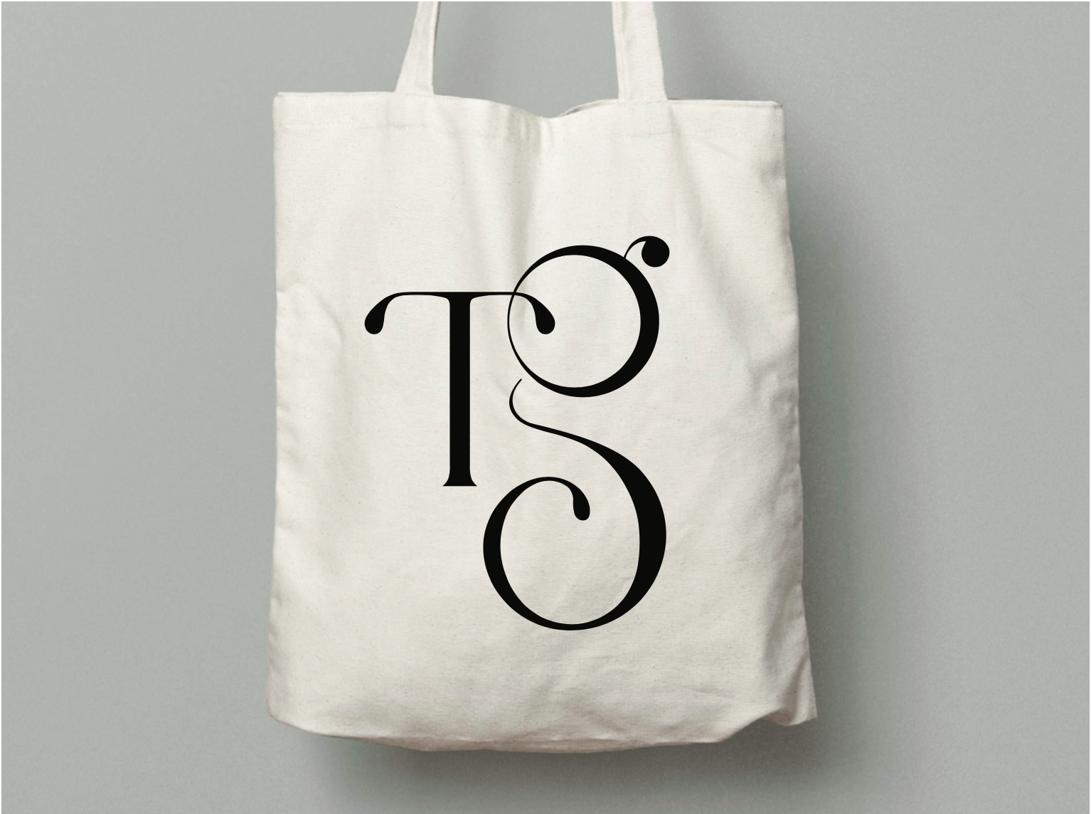
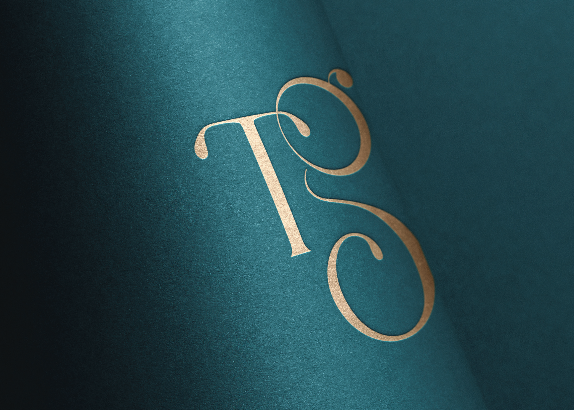
The Tasting Vault: Brand Packaging Design
Whiskey Tasting Subscription Services
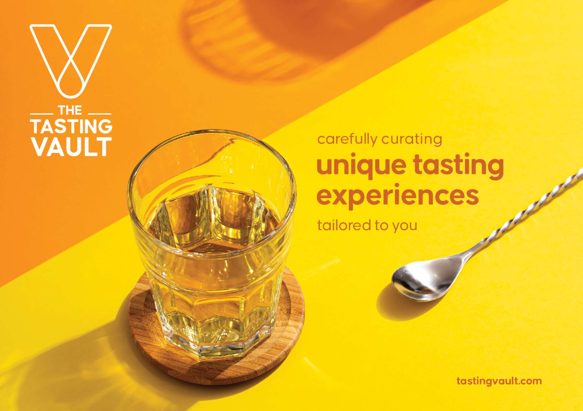
The Tasting Vault is a whiskey and spirits subscription service that provides consumers with curated tasting experiences, allowing them to explore a wide range of premium whiskeys from around the world. The company solves the “try before you buy” challenge by offering tasting packs that let customers sample new and famous whiskeys before committing to full bottles.
Their subscription service is designed to engage both beginners and seasoned connoisseurs through expert tasting notes, digital content, and invitations to exclusive events, both virtual and in-person. By working with distilleries in Ireland and internationally, The Tasting Vault offers access to a curated selection of world-class spirits, fostering a loyal community of whiskey enthusiasts, who have the option to connect and engage with each-other through this whiskey tasting club.
Their mission is to cultivate a deep appreciation for fine whiskeys and spirits through unique, curated tasting experiences. Their vision is to become the leading platform for whiskey exploration, creating meaningful connections among a global community of enthusiasts. Quality craftsmanship, community building, and an authentic whiskey experience are key values of The Tasting Vault.
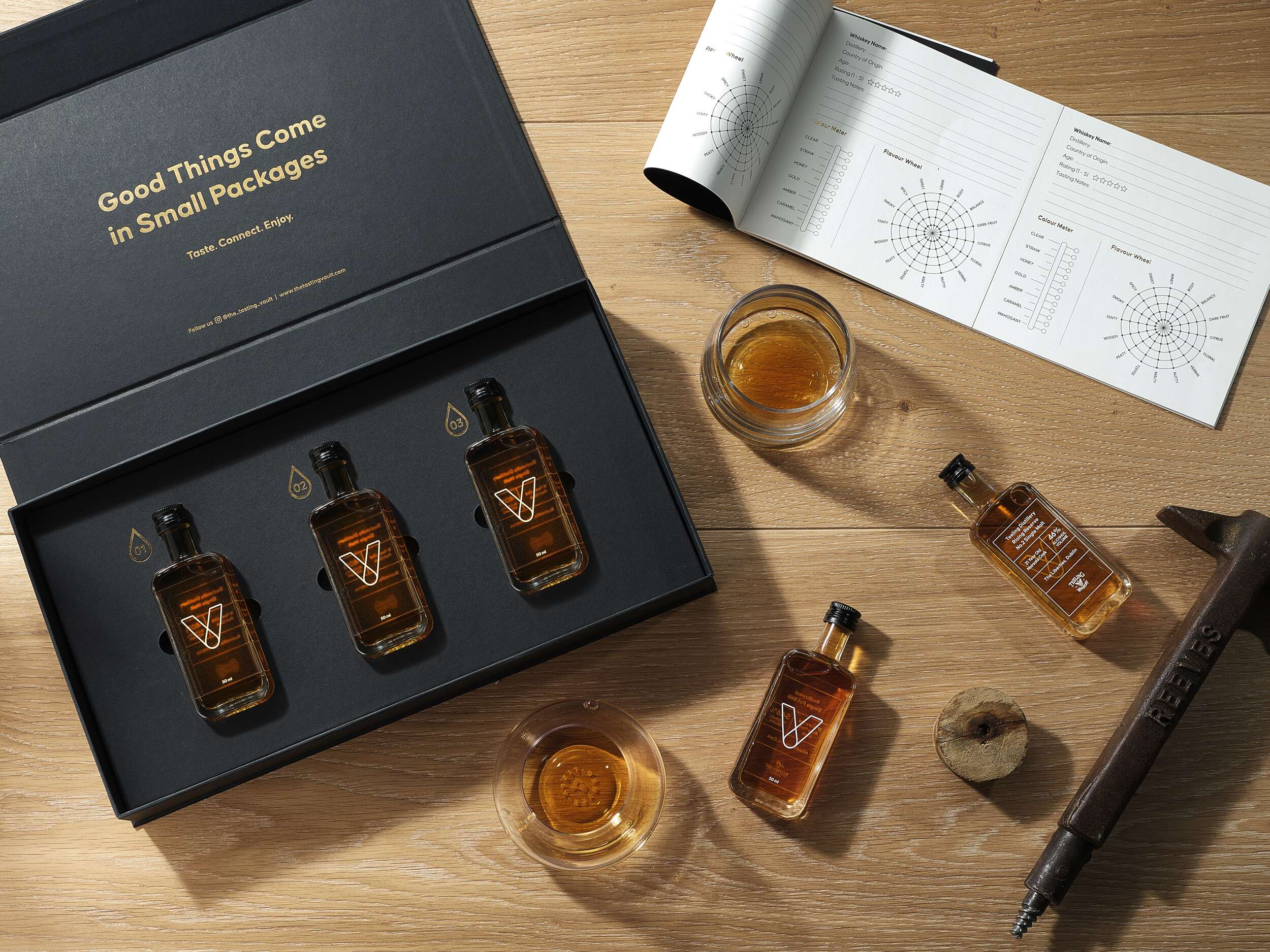
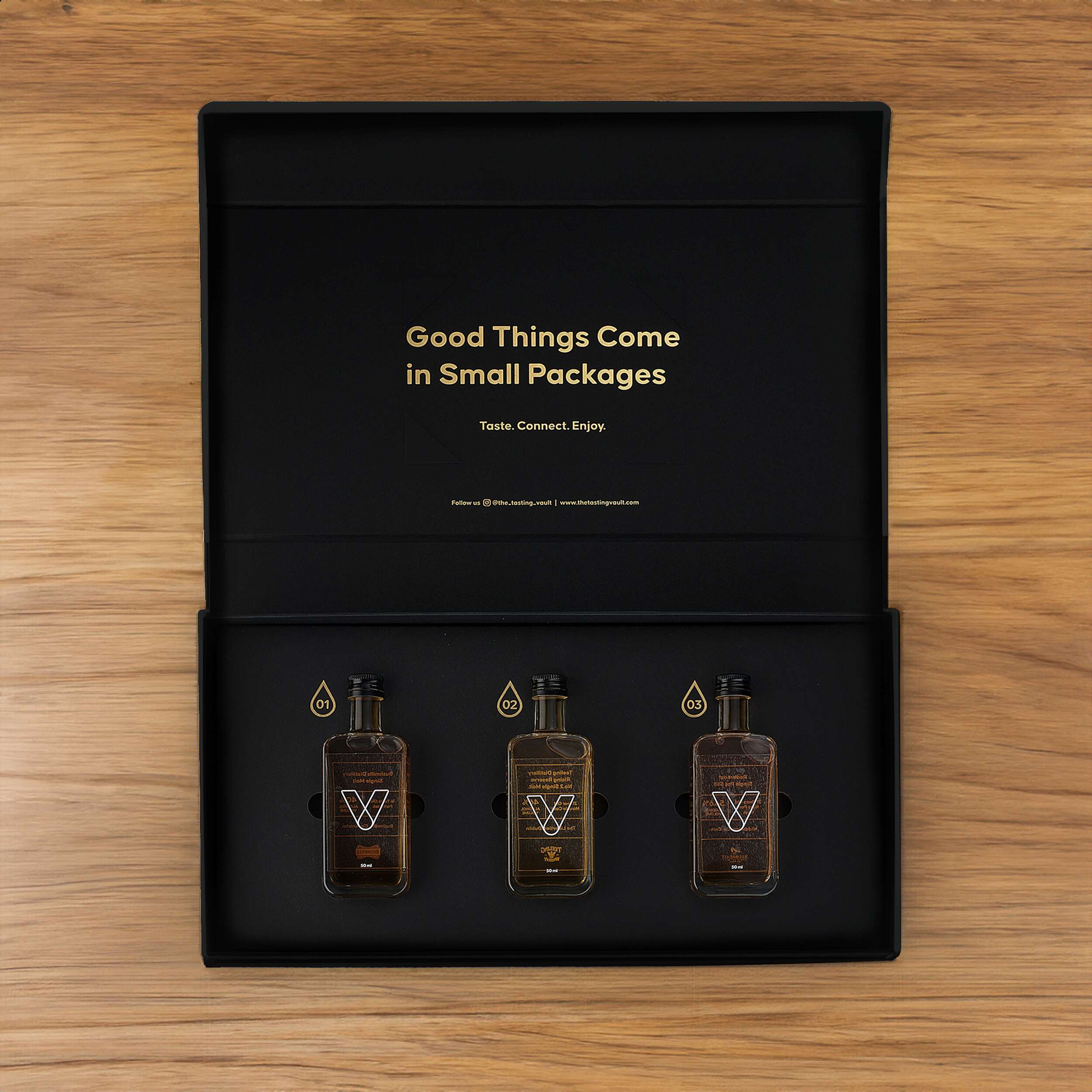
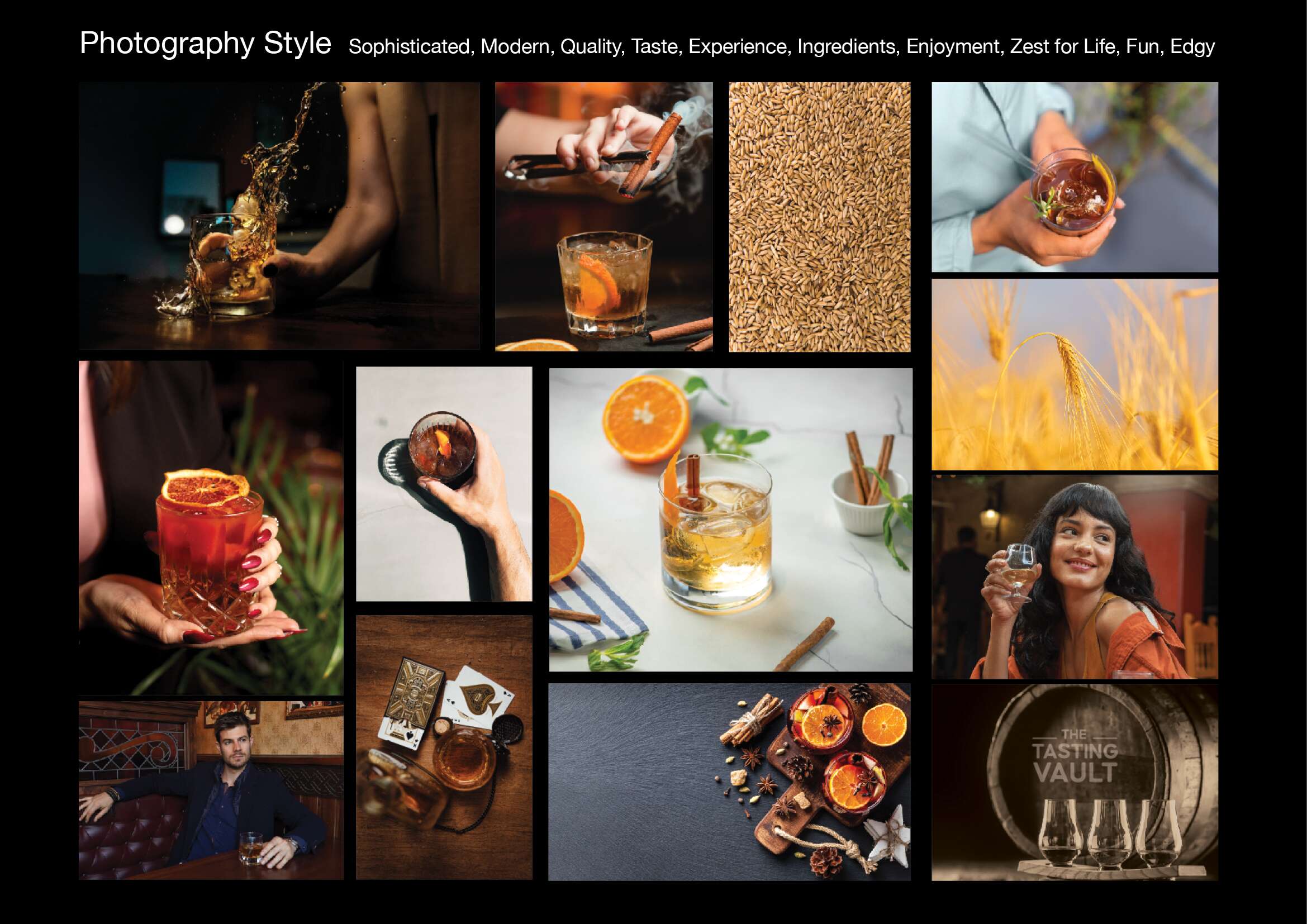
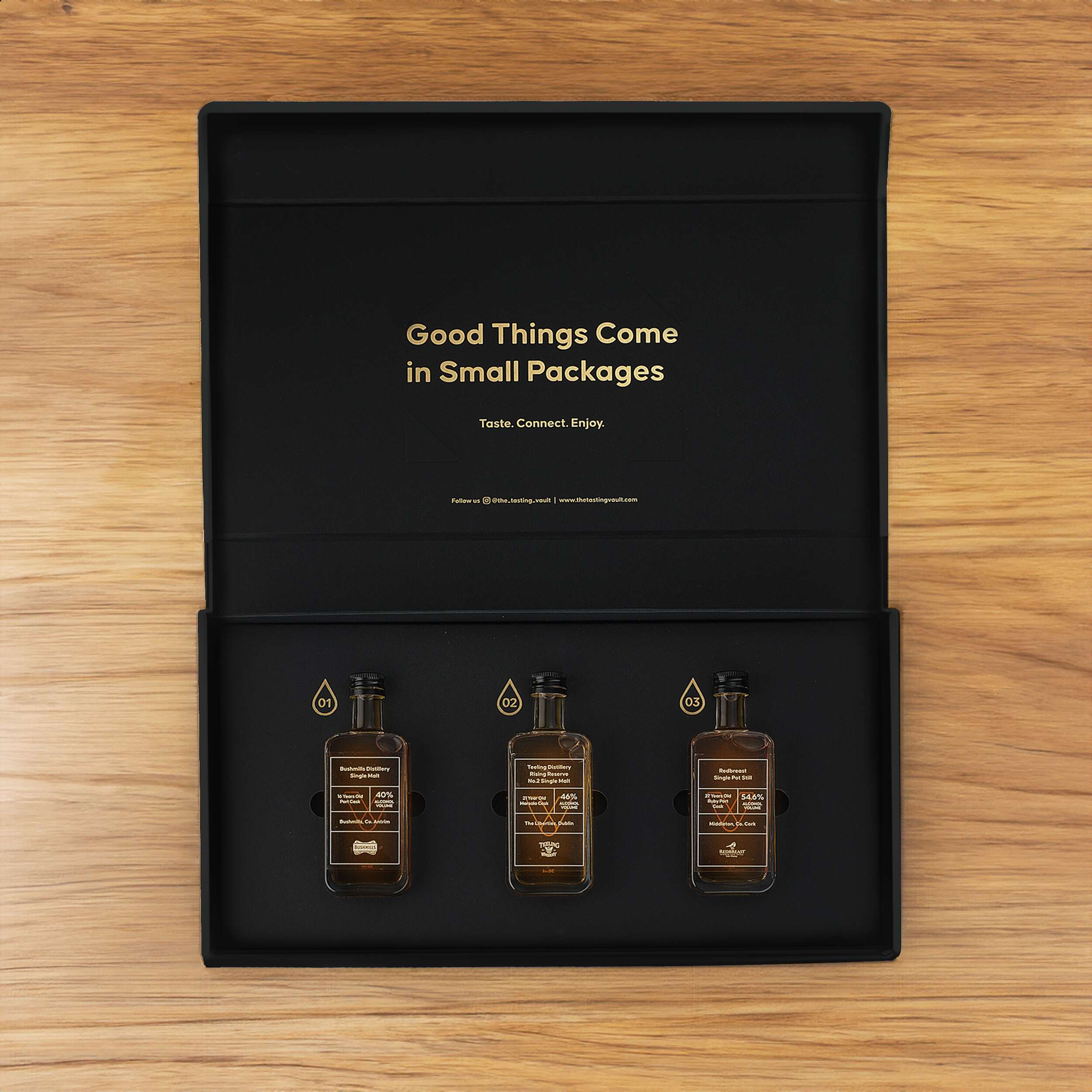
The challenge for The Tasting Vault was to create a packaging design reflecting the premium, sophisticated, and community-driven nature of their whiskey subscription service. The design needed to solve two key issues: communicating the exclusivity and luxury of the product, while offering practicality for repeated monthly deliveries of different whiskey varieties. The packaging needed to be functional yet visually compelling, enhancing the unboxing experience for consumers to share on social media. Furthermore, the design needed to accommodate 3 x 50ml whiskey bottles with flexibility for monthly variations, while remaining compact and easy to ship.
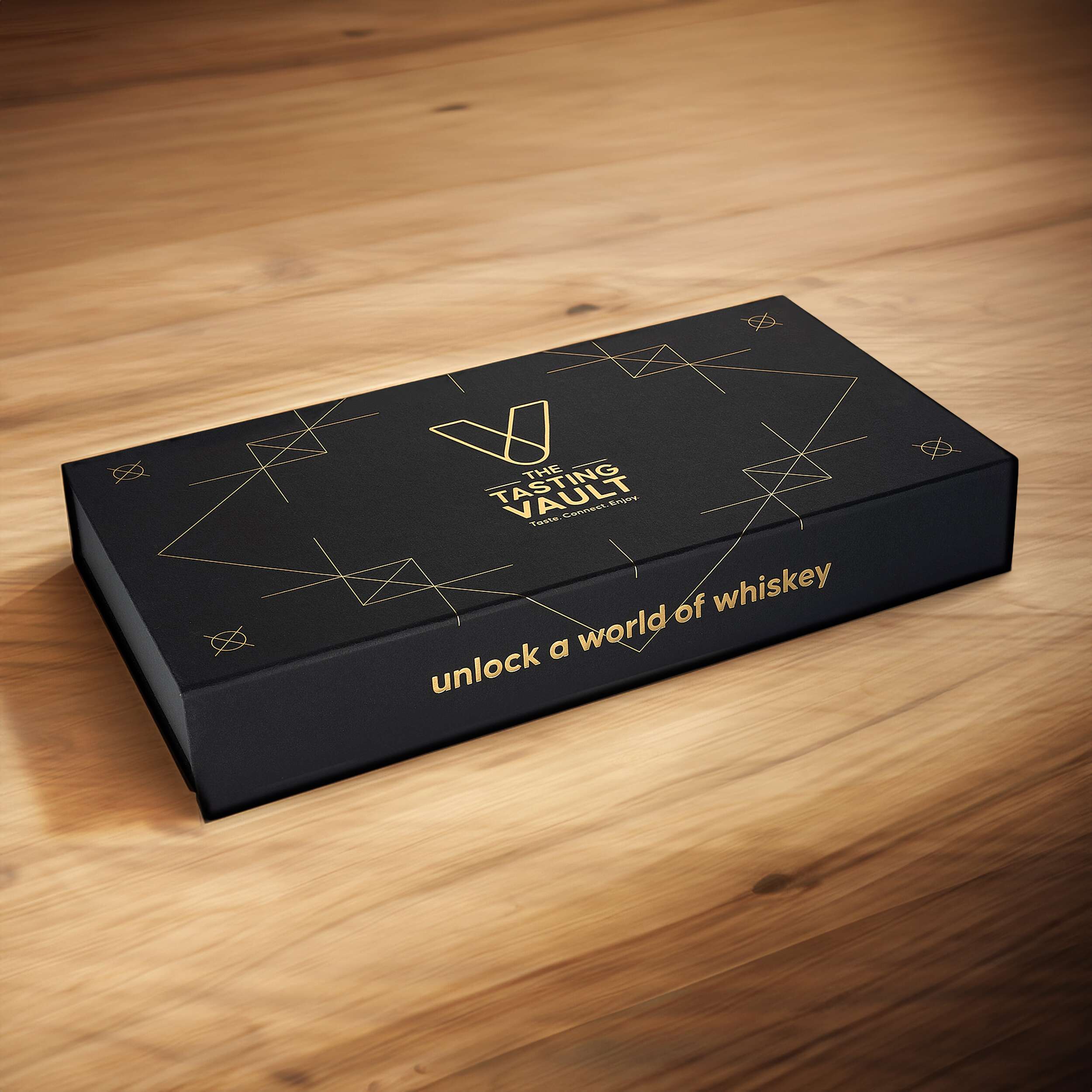
The core idea behind the design draws inspiration from the brand’s ethos of connecting people with fine spirits. The minimalist approach incorporates a modern vault symbol, subtly referencing the monthly “drop” of whiskey, and reinforcing the idea of treasured, curated experiences delivered directly to the consumer’s door. A blend of luxury, authenticity, and community was key.
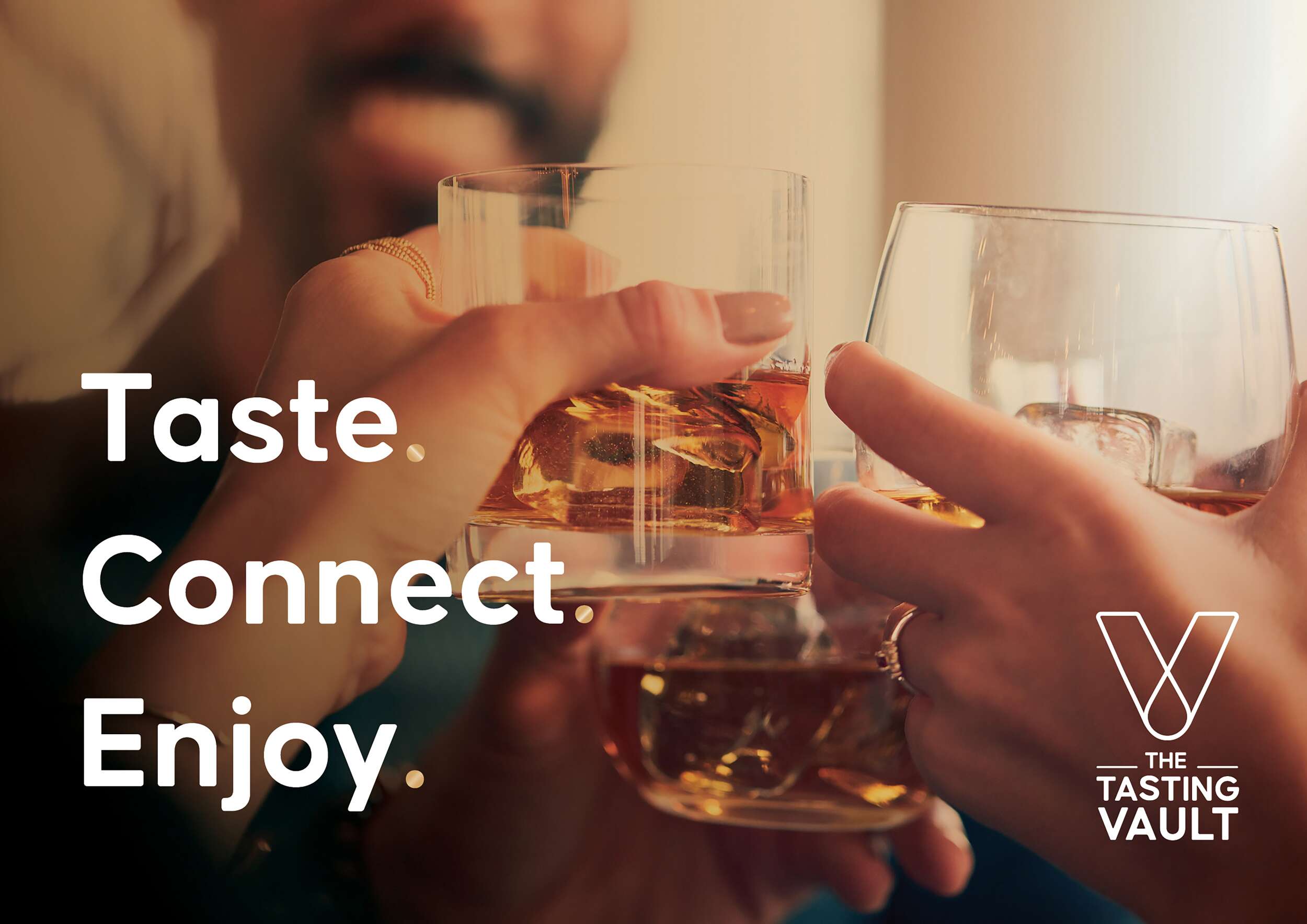
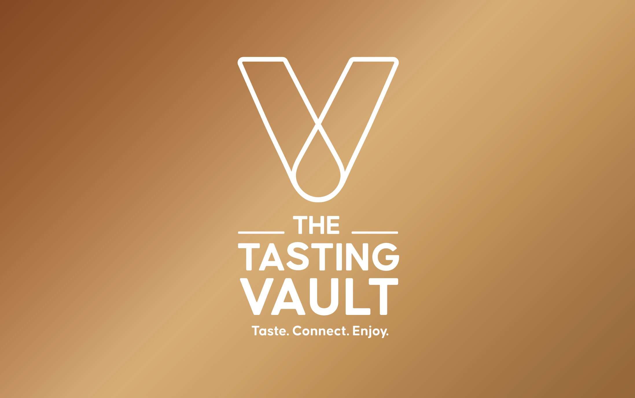
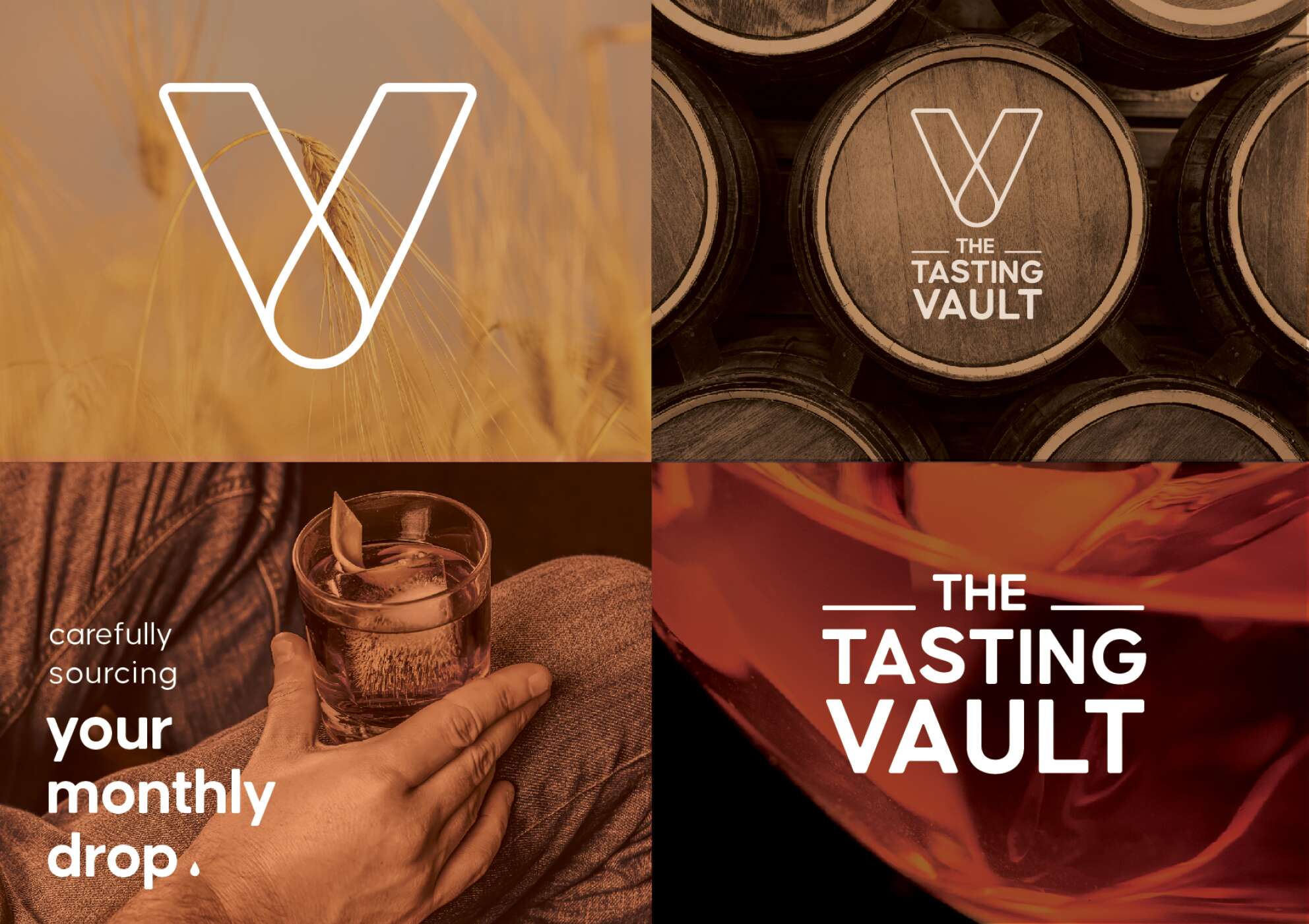
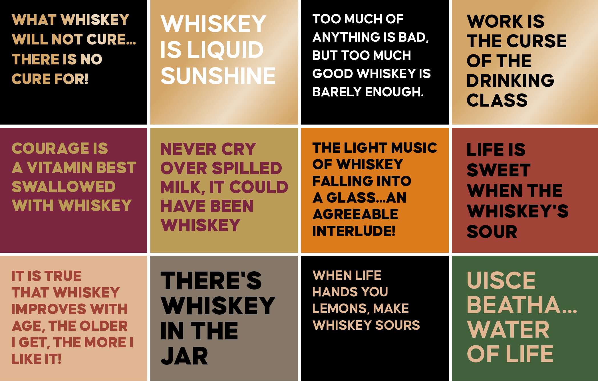
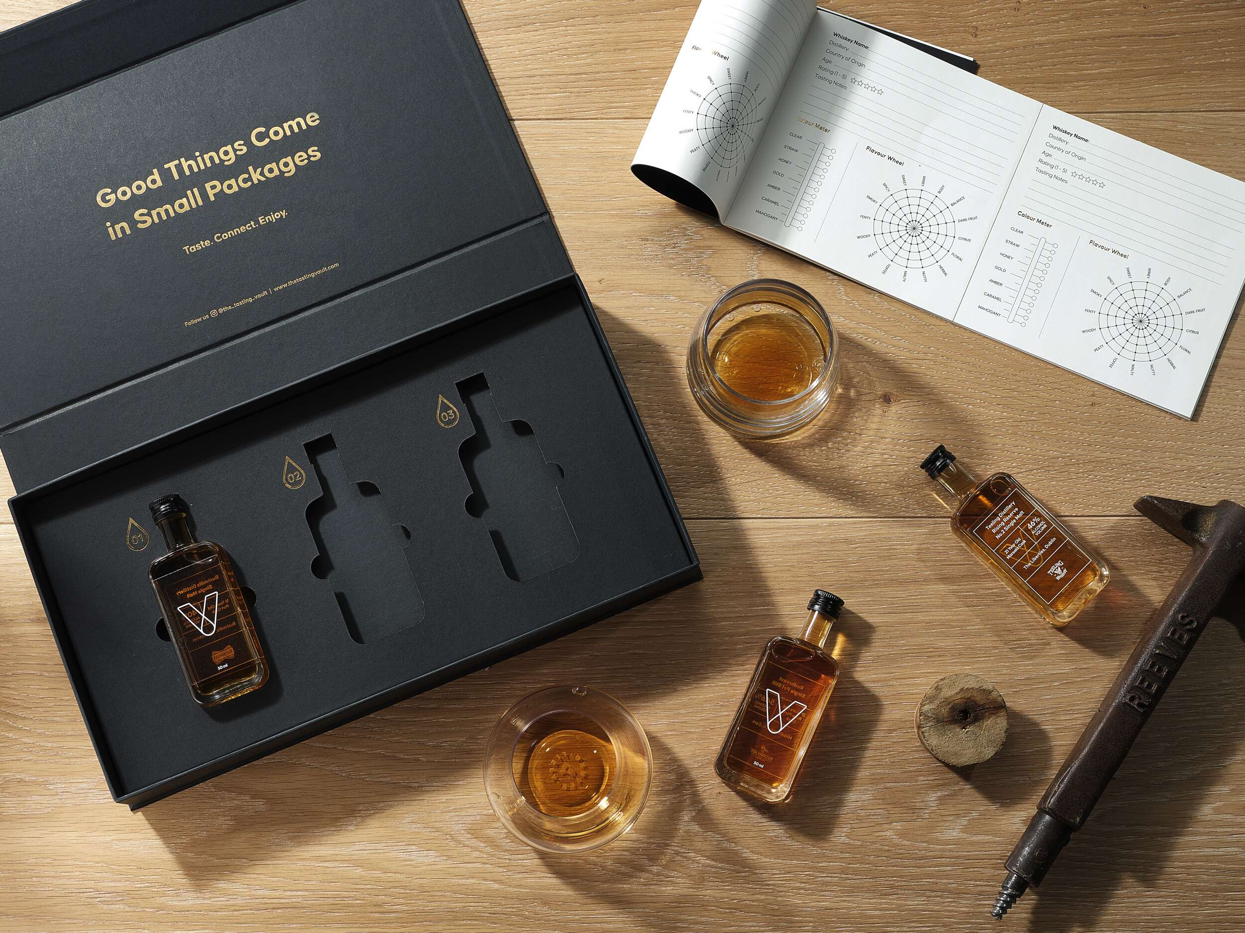
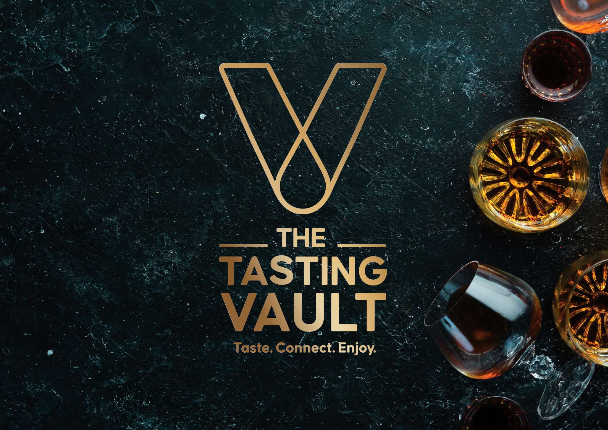
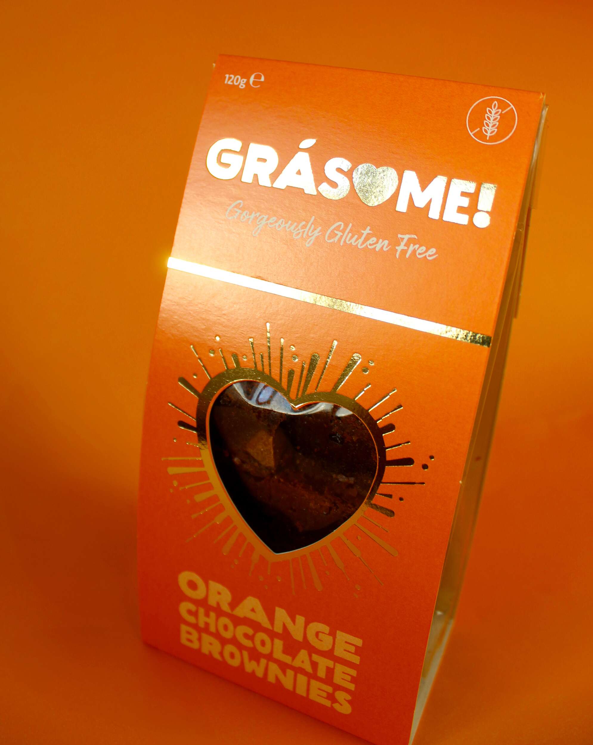
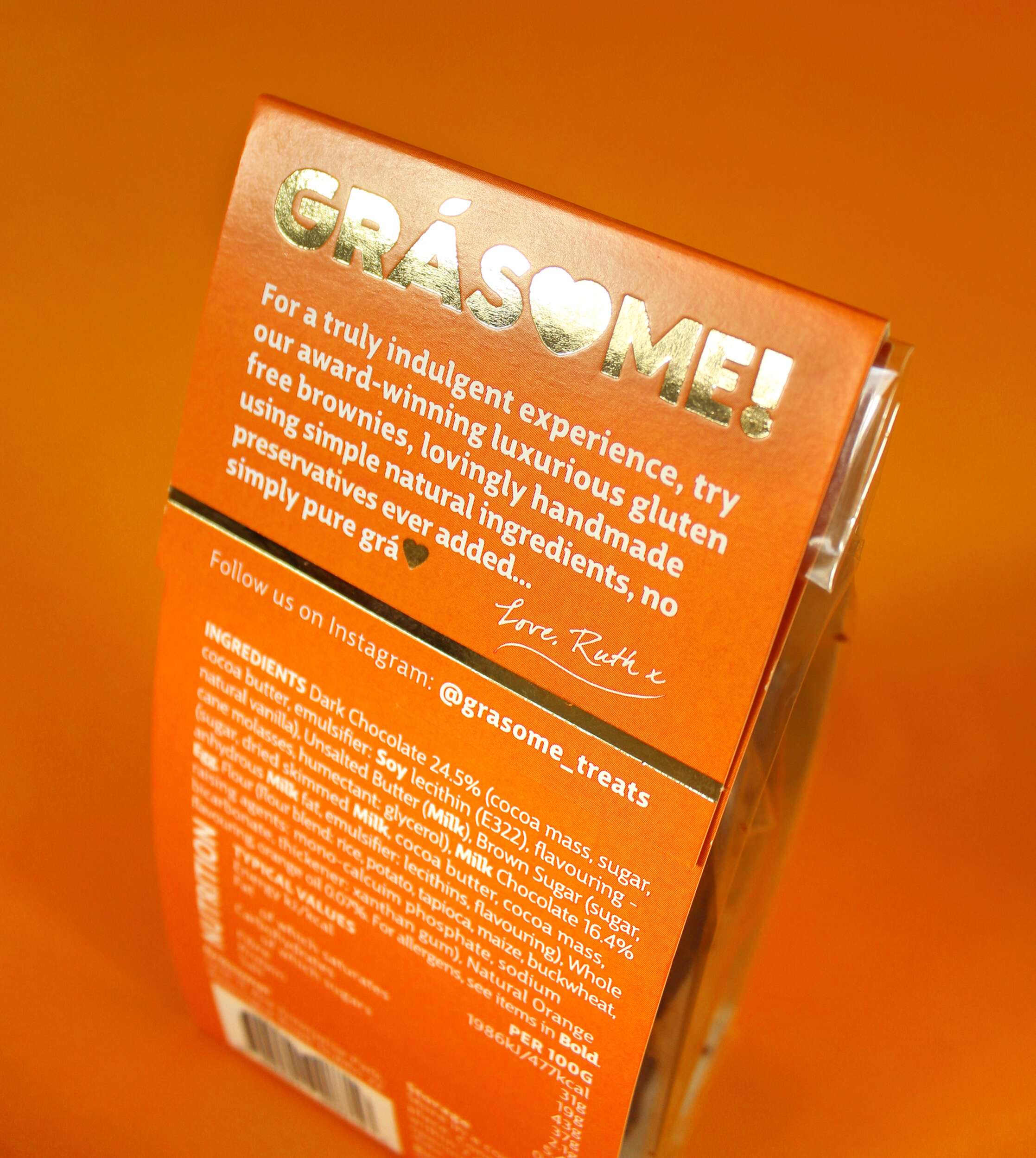
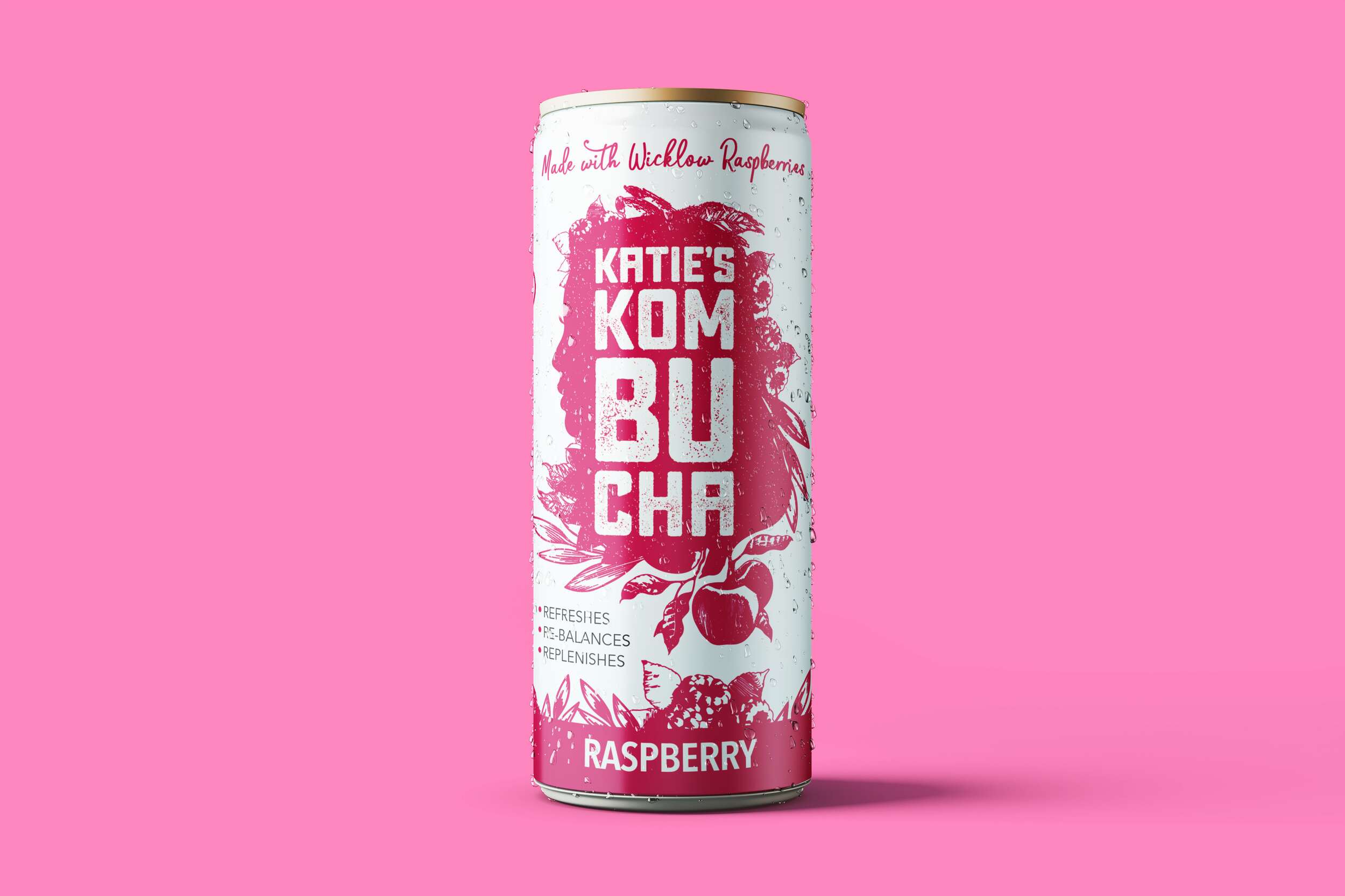
A key feature of the design is the brand’s “V” symbol, which represents the word “Vault” and subtly incorporates a whiskey droplet within the “V,” symbolising the monthly delivery of curated whiskey selections – their monthly drop. The tagline, “Taste. Connect. Enjoy.” captures the essence of the brand, communicating its message in a sophisticated yet friendly tone. The vault-inspired design is enhanced with gold foil debossing, giving the packaging an air of exclusivity. The ample spacing around the bottles adds to the luxury feel, while tabs ensure the bottles are easily accessible. Inside the lid, the playful message “Good Things Come in Small Packages” adds a light-hearted element, complementing the overall elegance. Social media details are included to encourage consumer engagement and help grow the brand’s online community.
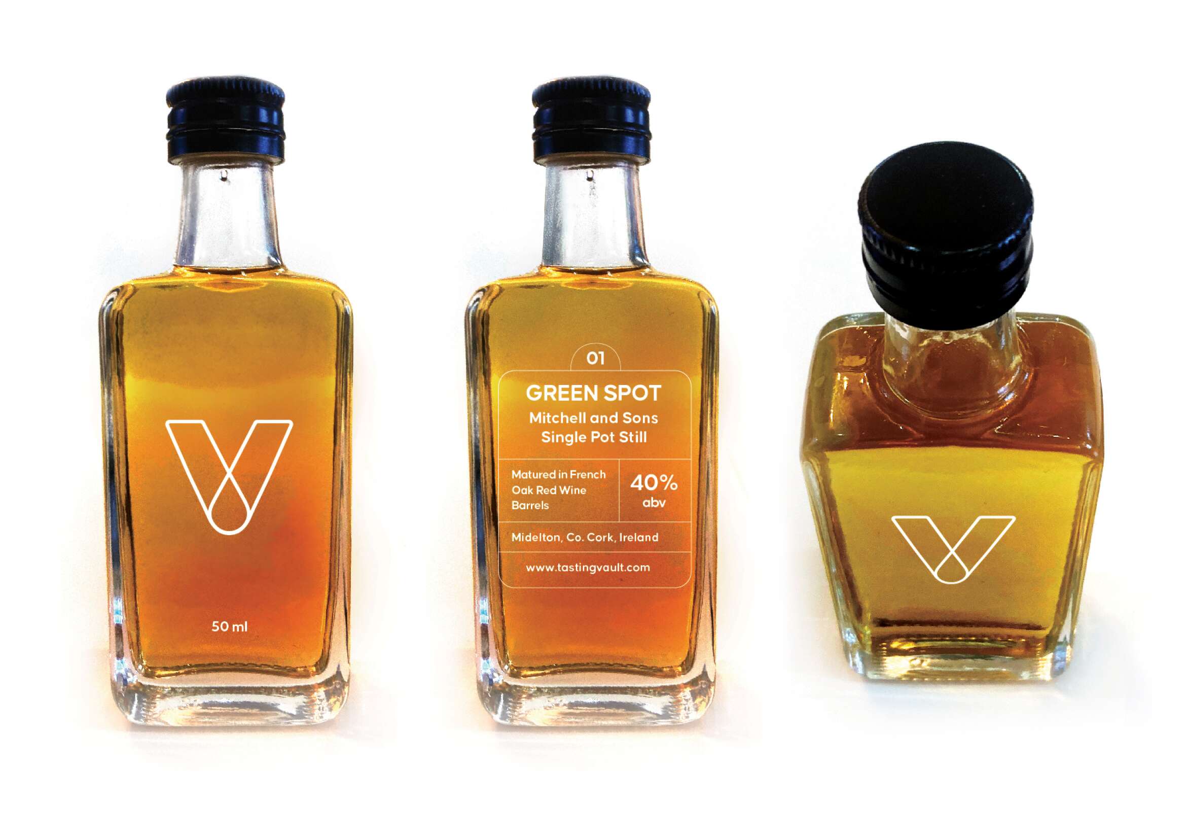
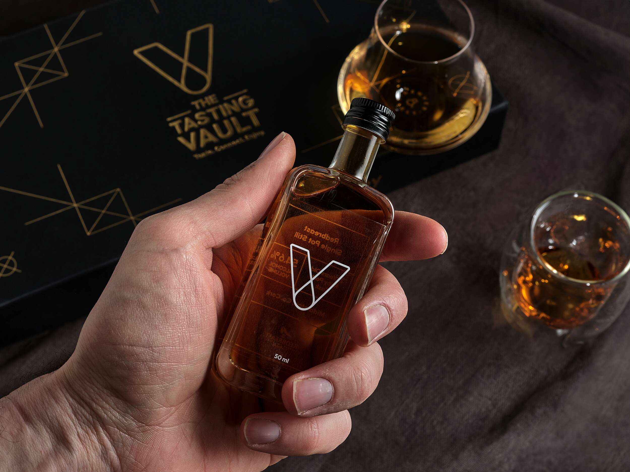
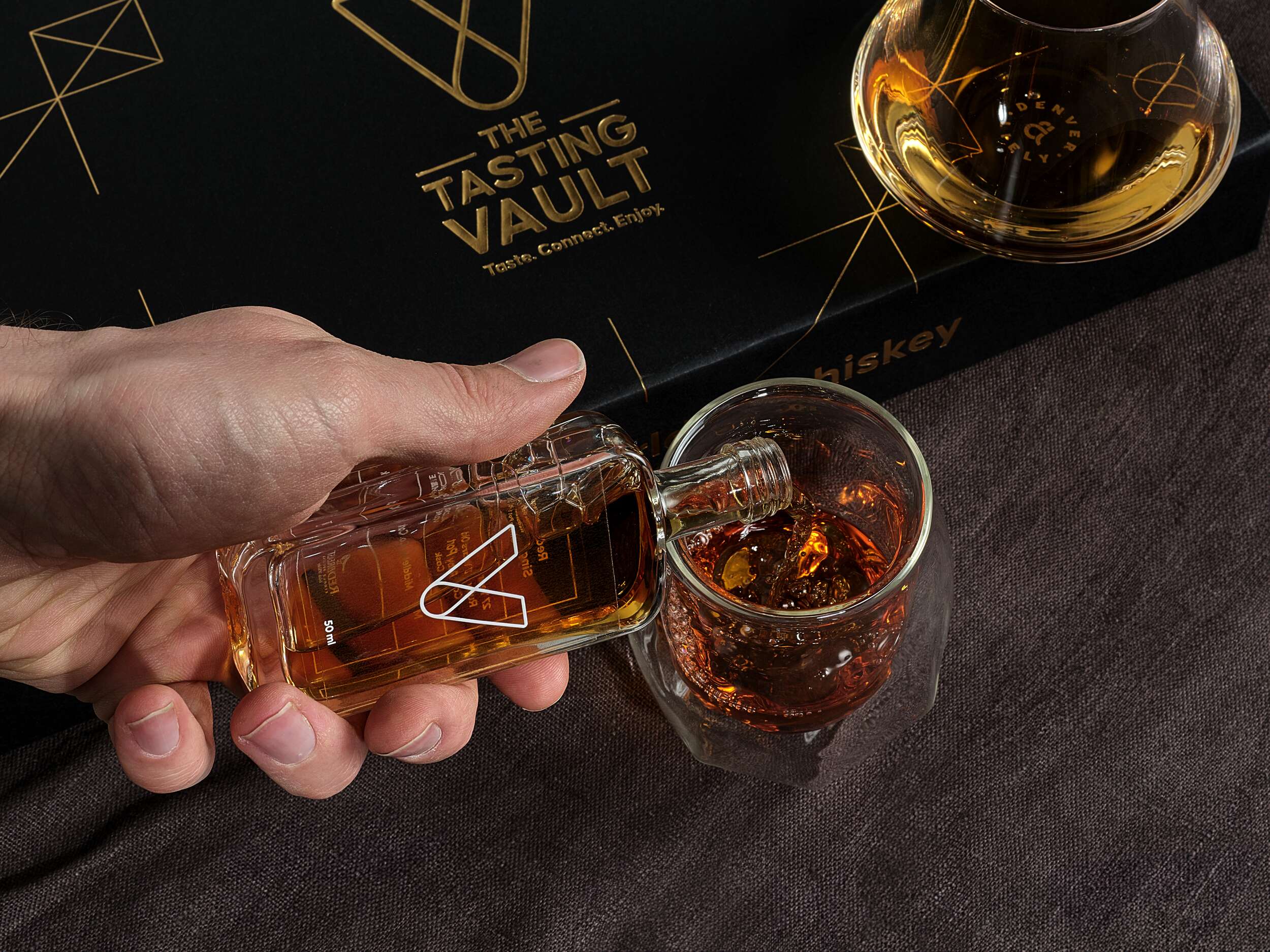
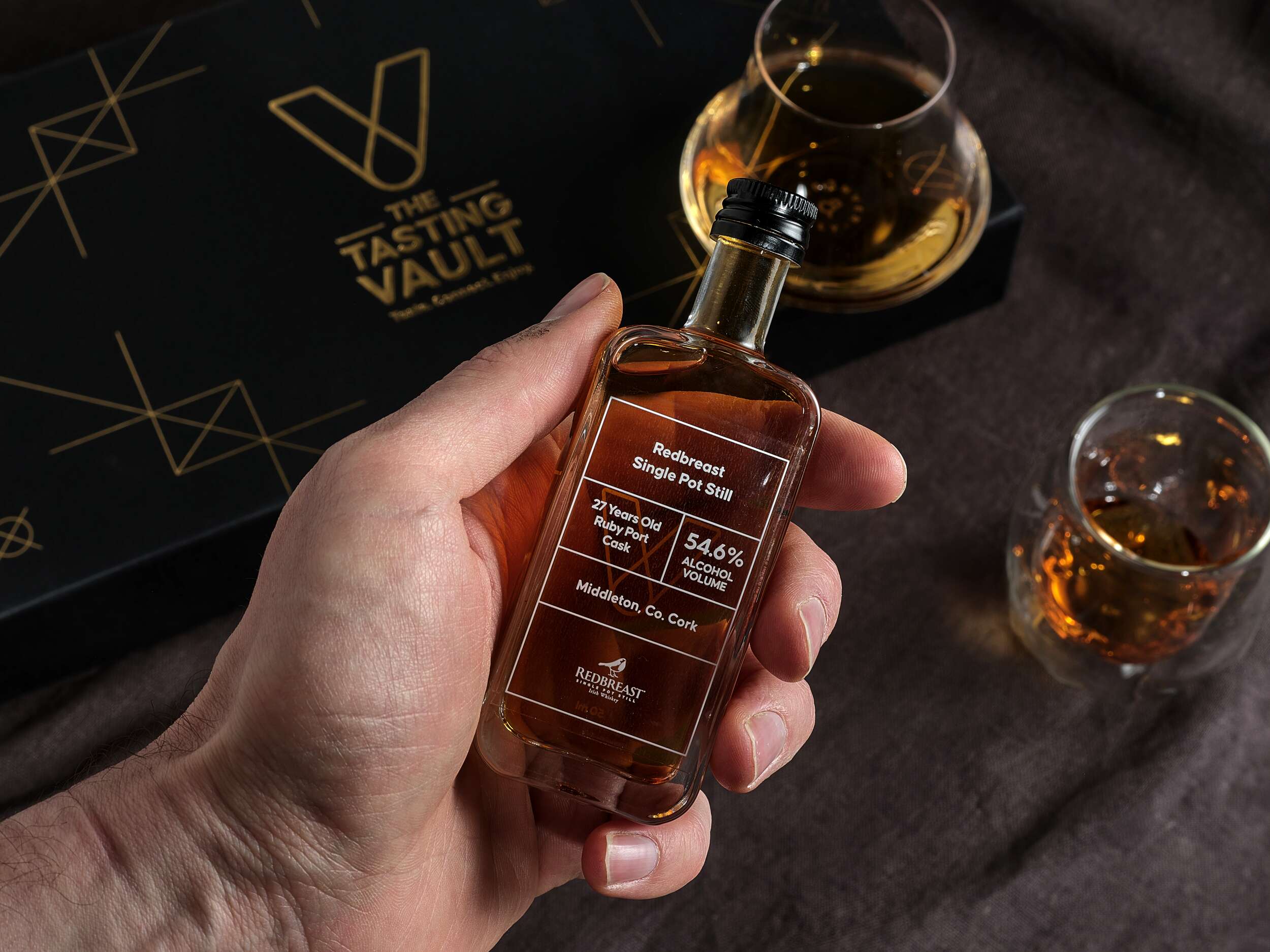
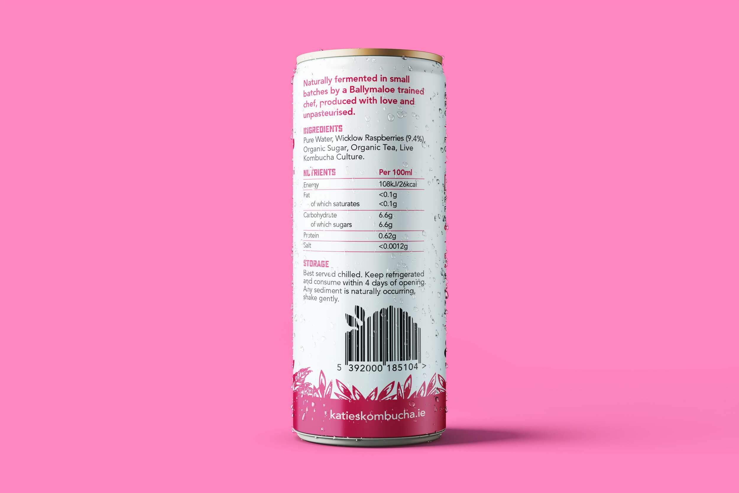
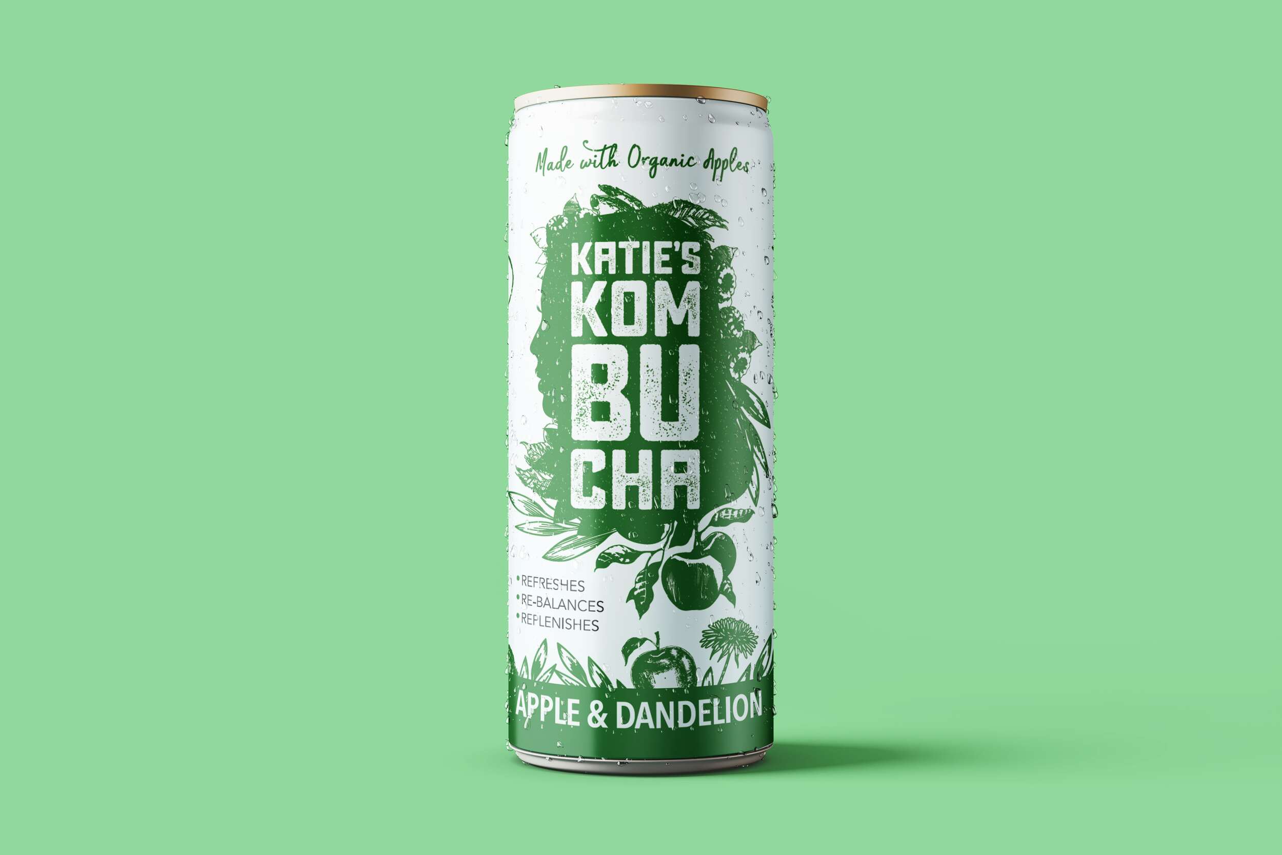
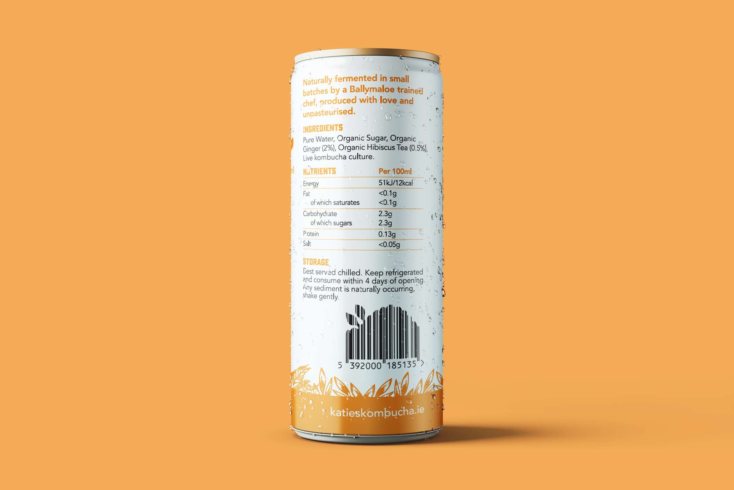
Each bottle is labelled with the brandmark and whiskey details on a transparent background, allowing the whiskey’s amber hue to shine through. These labels are designed for easy updating, adapting to the monthly subscription model. The bold Causten Rounded font combines softened edges with a sophisticated tone, conveying a friendly yet premium feel to the brand.
The packaging also includes a bespoke insert card with detailed information about that month’s whiskey selections, adding a personal touch. A 20-page tasting notes booklet further enriches the consumer experience, allowing customers to log their impressions and learn more about whiskey tasting. Clever phrases are used in the booklet such as “unlock a world of whiskey” to tie into the vault theme, reinforcing the brand’s identity.
This thoughtful and recyclable packaging design reflects the brand’s values of premium quality, authenticity, and community, offering a refined yet accessible experience that is both visually striking and highly functional.
The packaging design for The Tasting Vault strikes a perfect balance between luxury and functionality, offering a sleek unboxing experience, while showcasing the brand’s dedication to authenticity and craftsmanship. The packaging is made from 1000gsm greyboard and wrapped in black beater-dyed paper, giving it a solid, premium feel. Its rigid, hinged-lid design includes die cuts to securely hold three 50ml whiskey bottles, ensuring both safe transportation and a refined presentation.

Follow The Tasting Vault online:
Instagram: @the_tasting_vault
Twitter / X: @thetastingvault
Website: www.thetastingvault.com
Photography by Brendan Ryan Photography:
Instagram: @brendanryanphoto
Website: www.brendanryan.ie
Packaging printed by JJ O’Toole:
Instagram: @jjotoole_ie
Website: www.jjotoole.ie
Labels by BrandPack
Instagram: @brandpackireland
Website: www.brandpack.ie


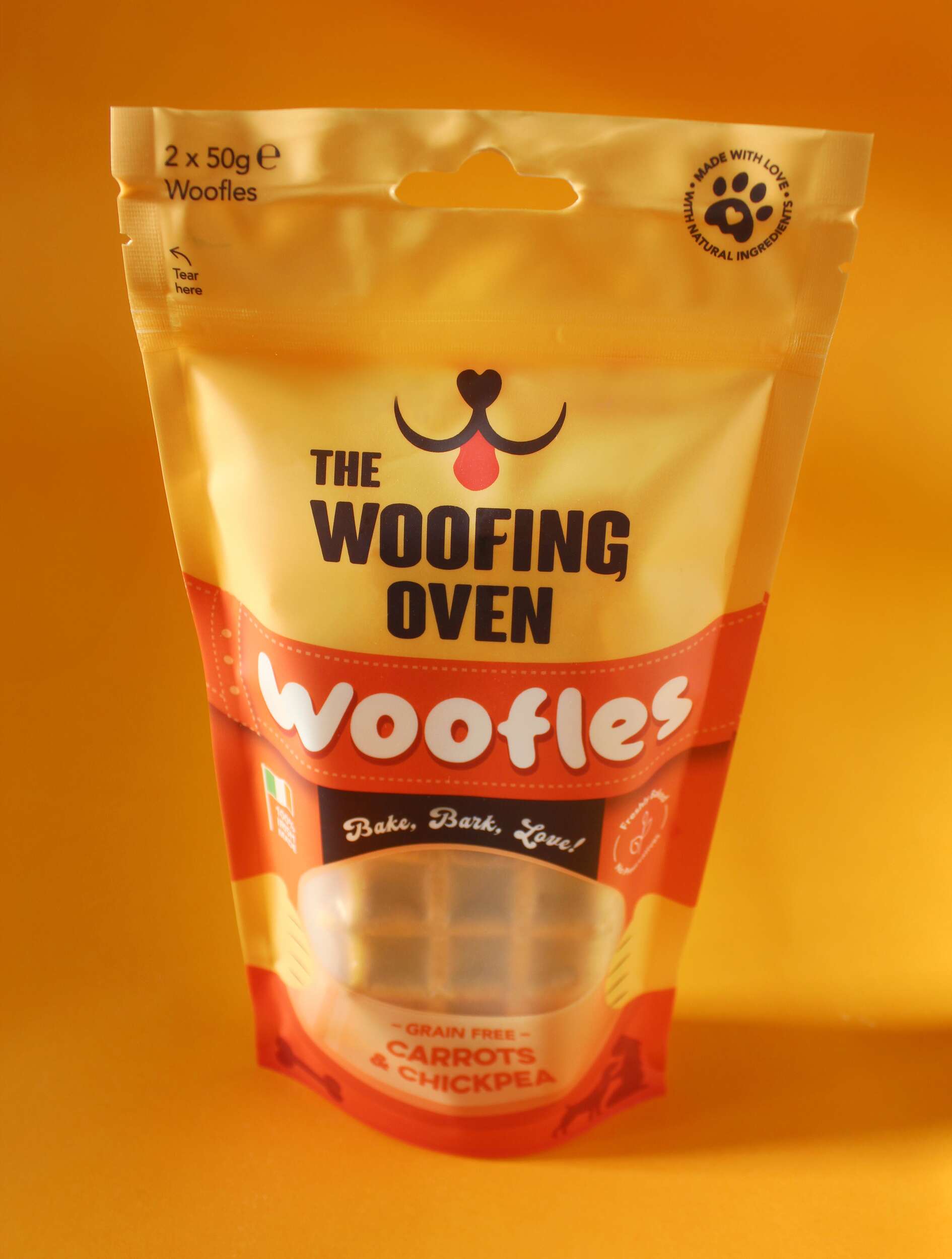
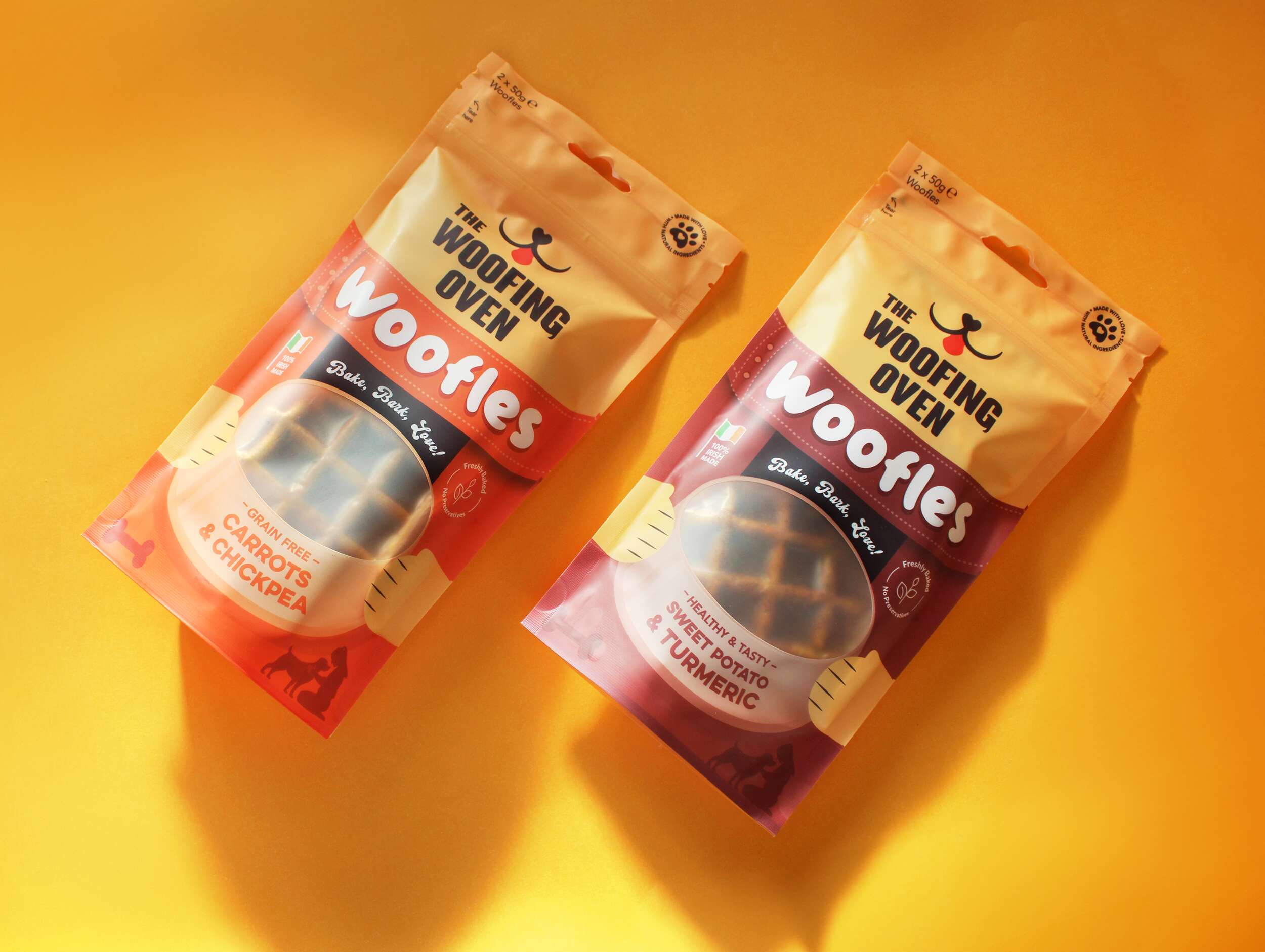
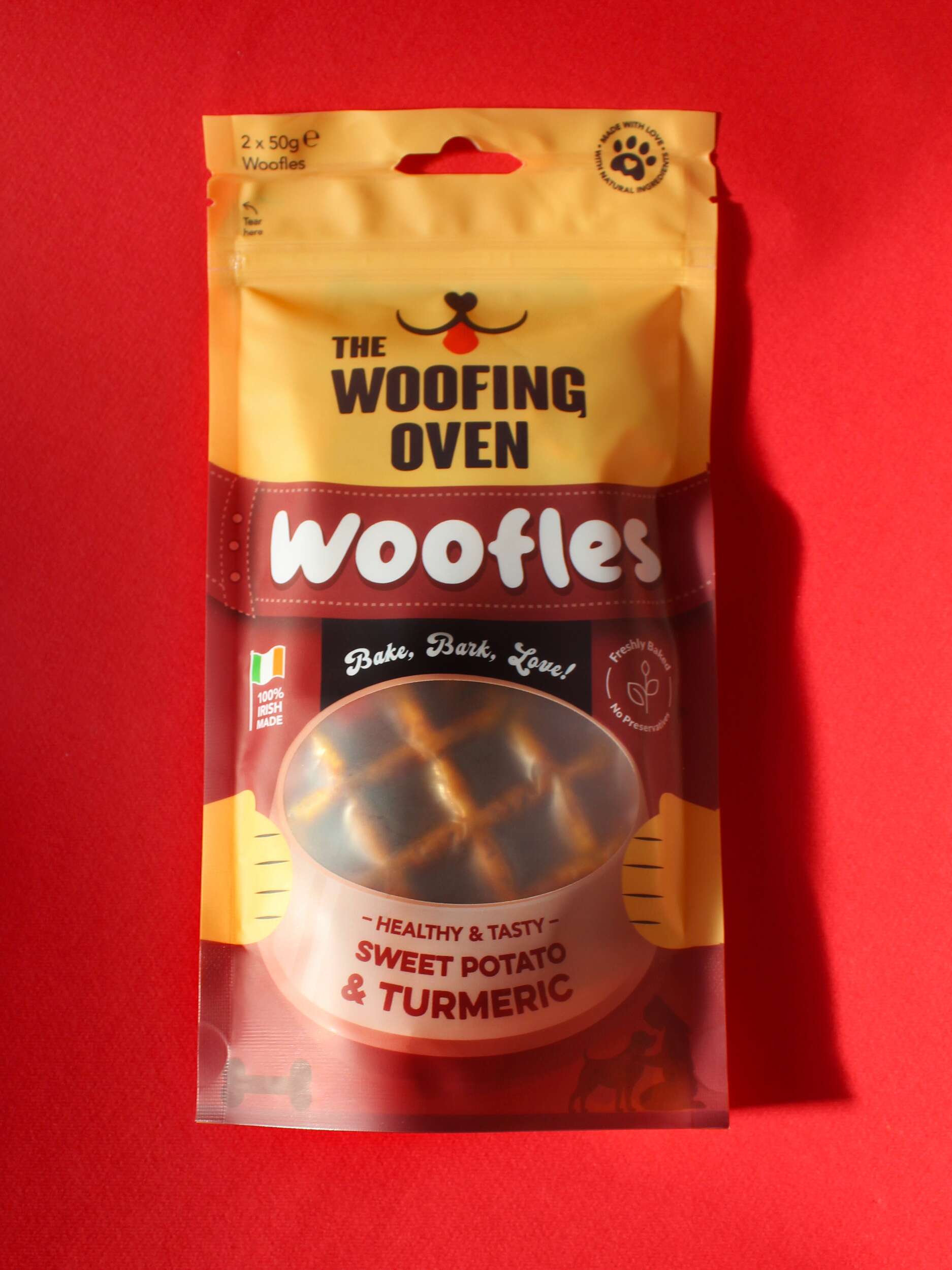
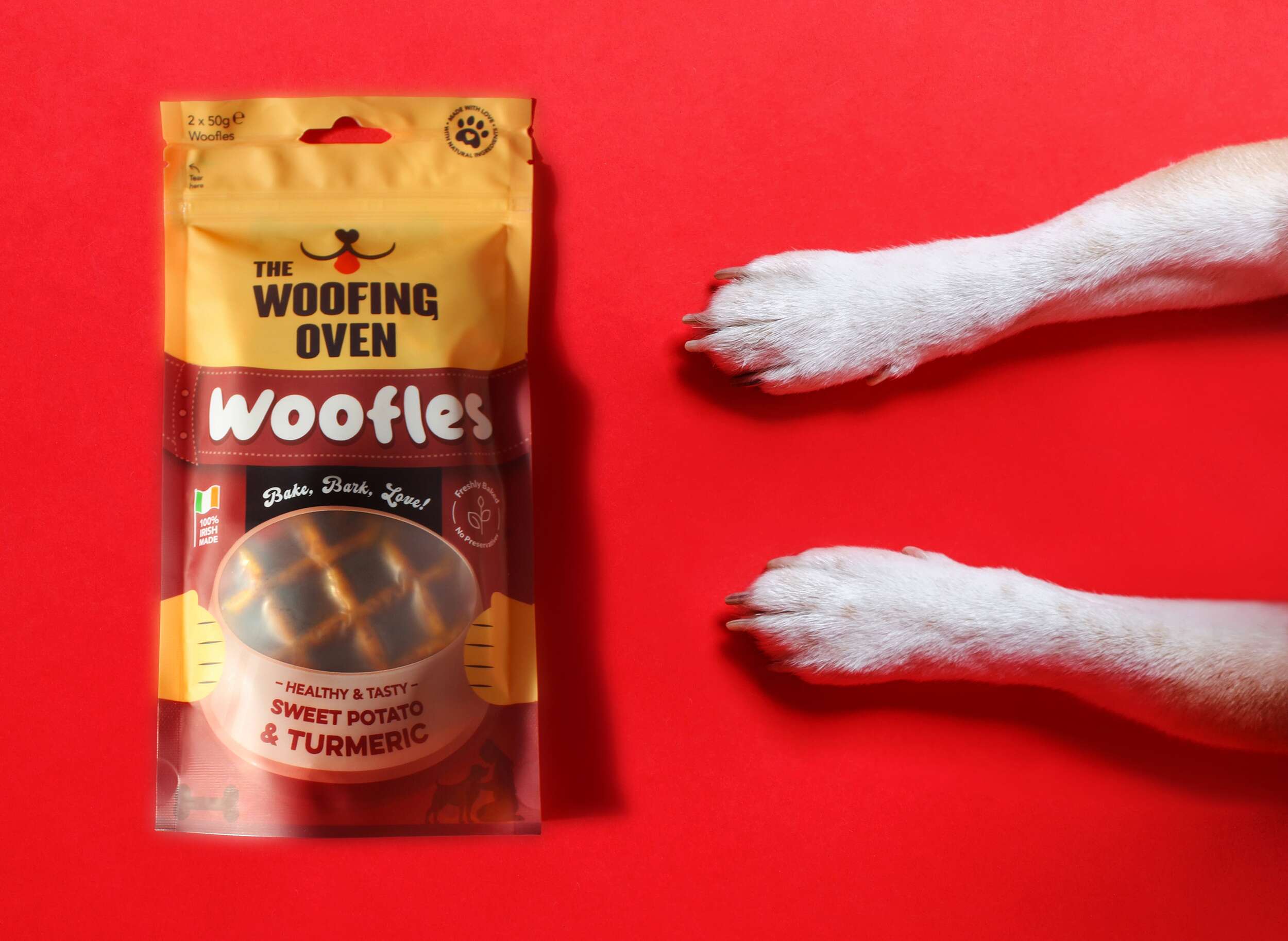

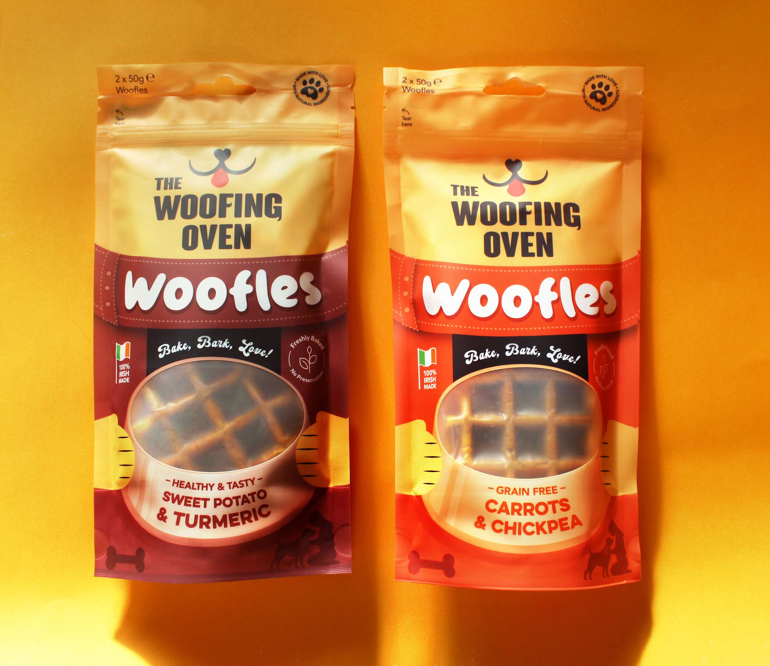
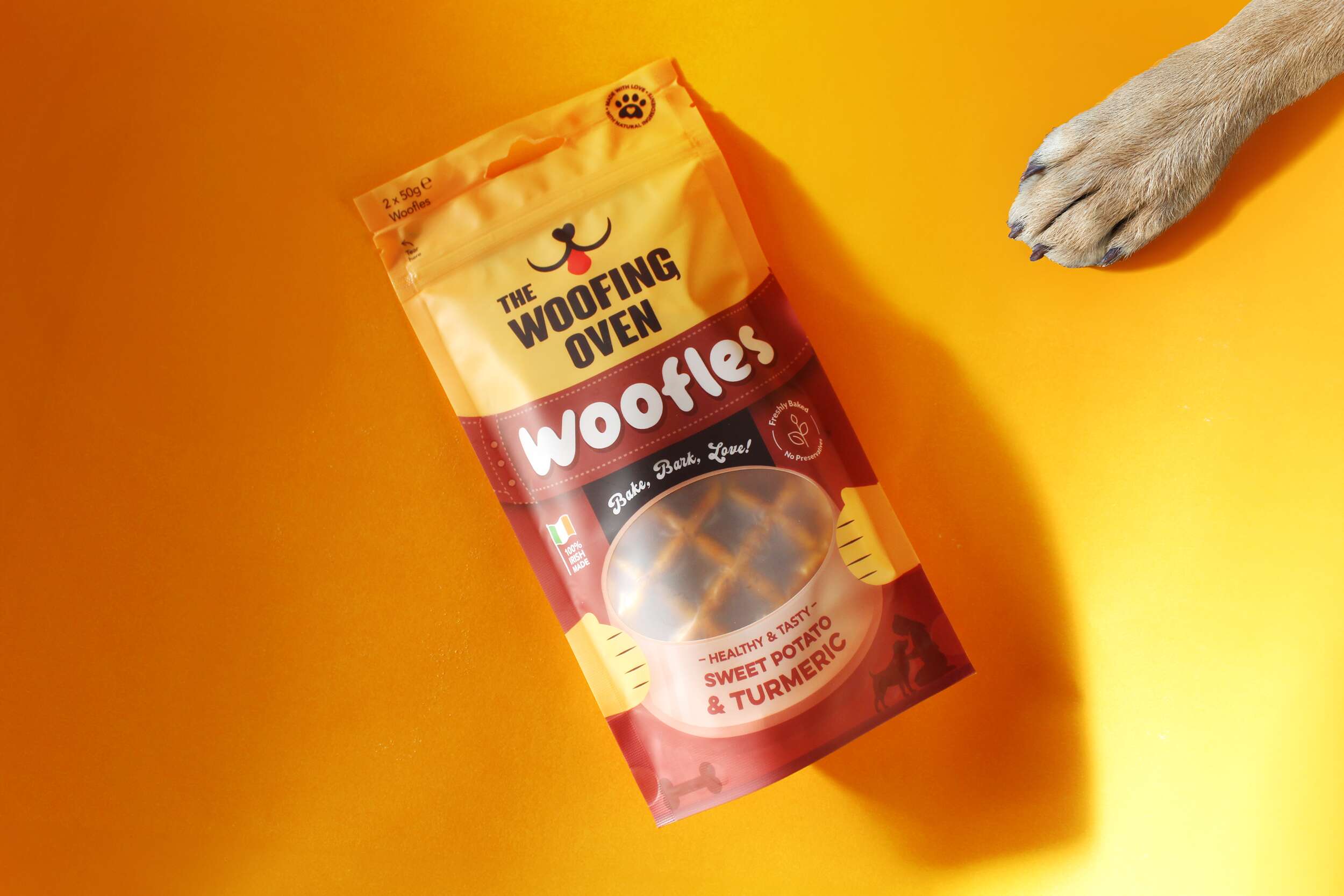
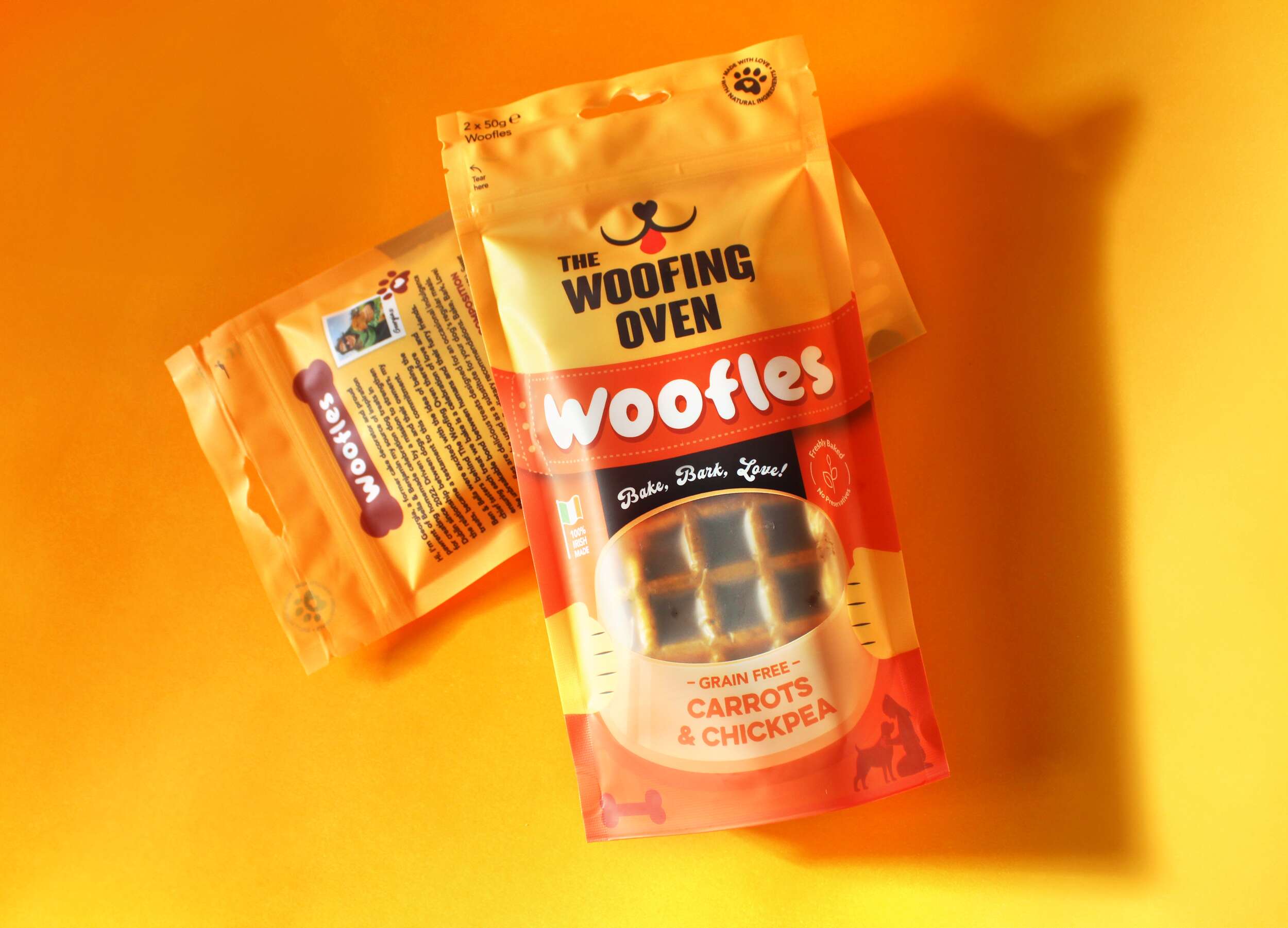
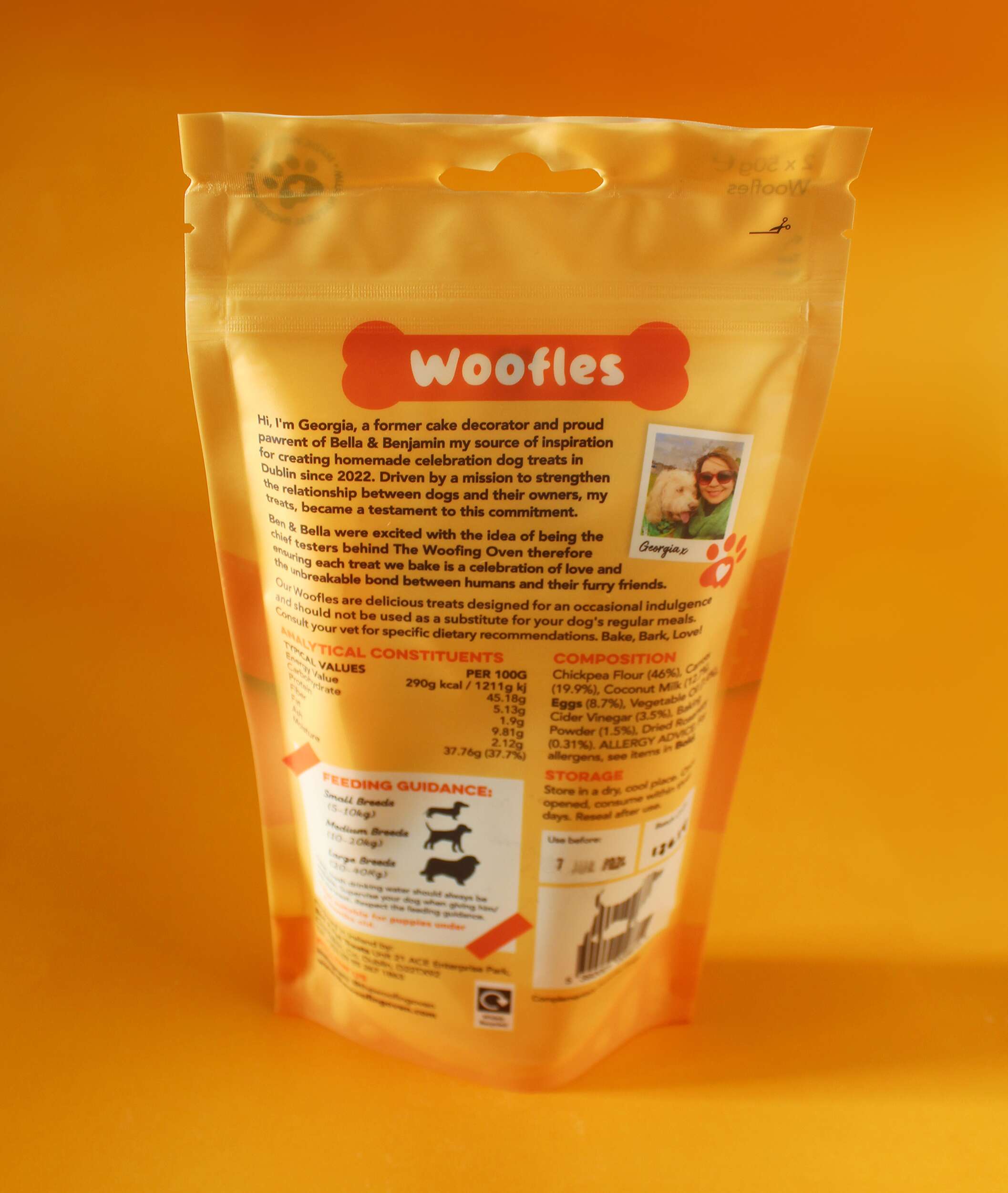
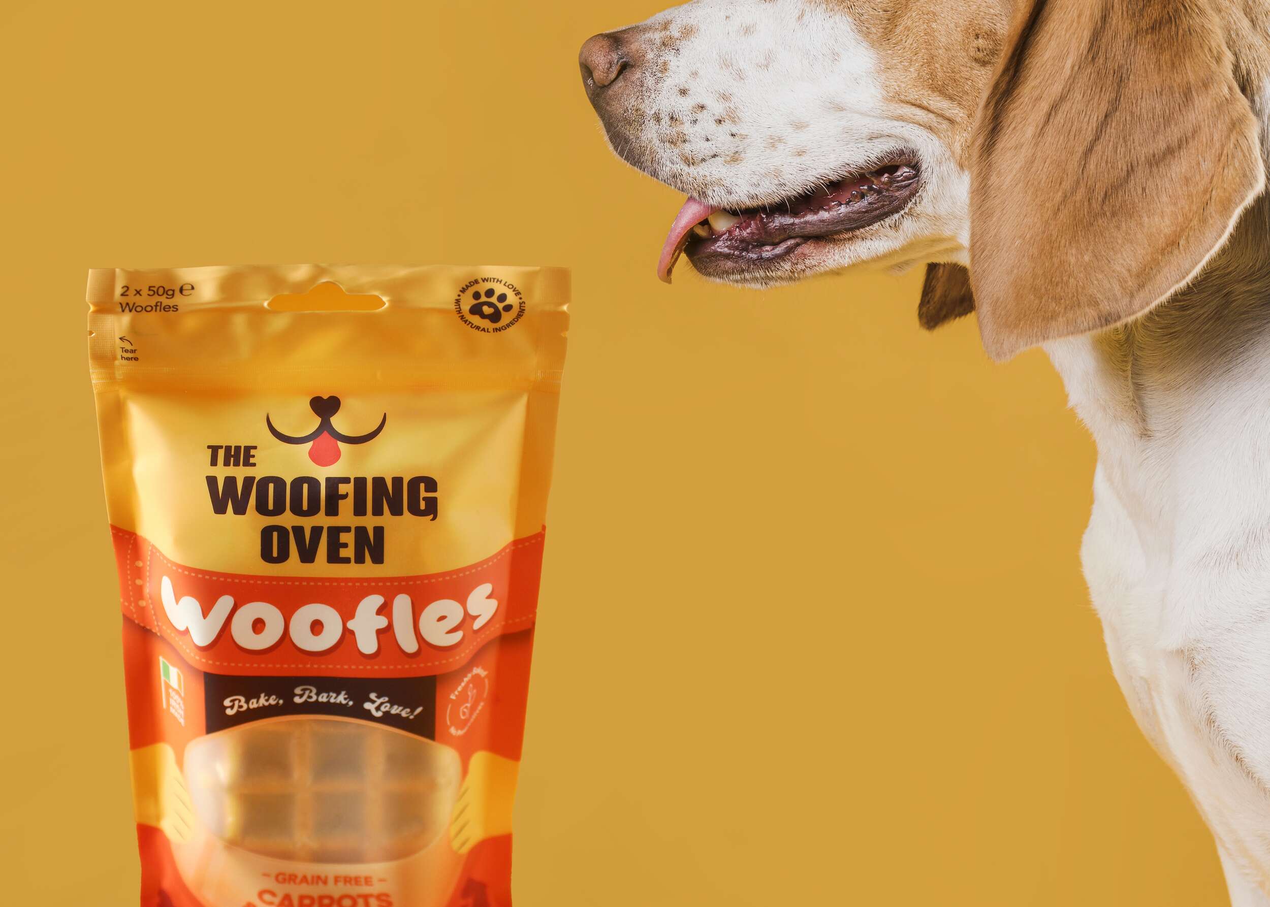
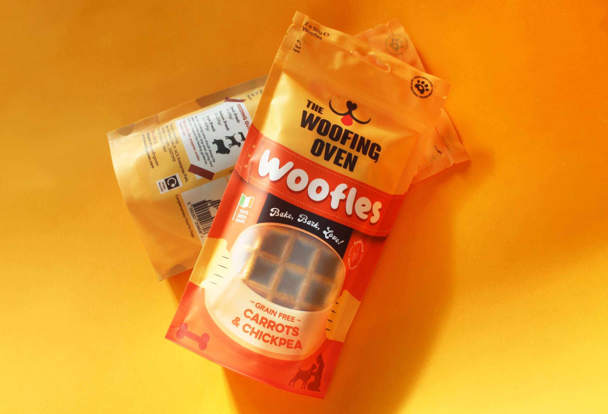
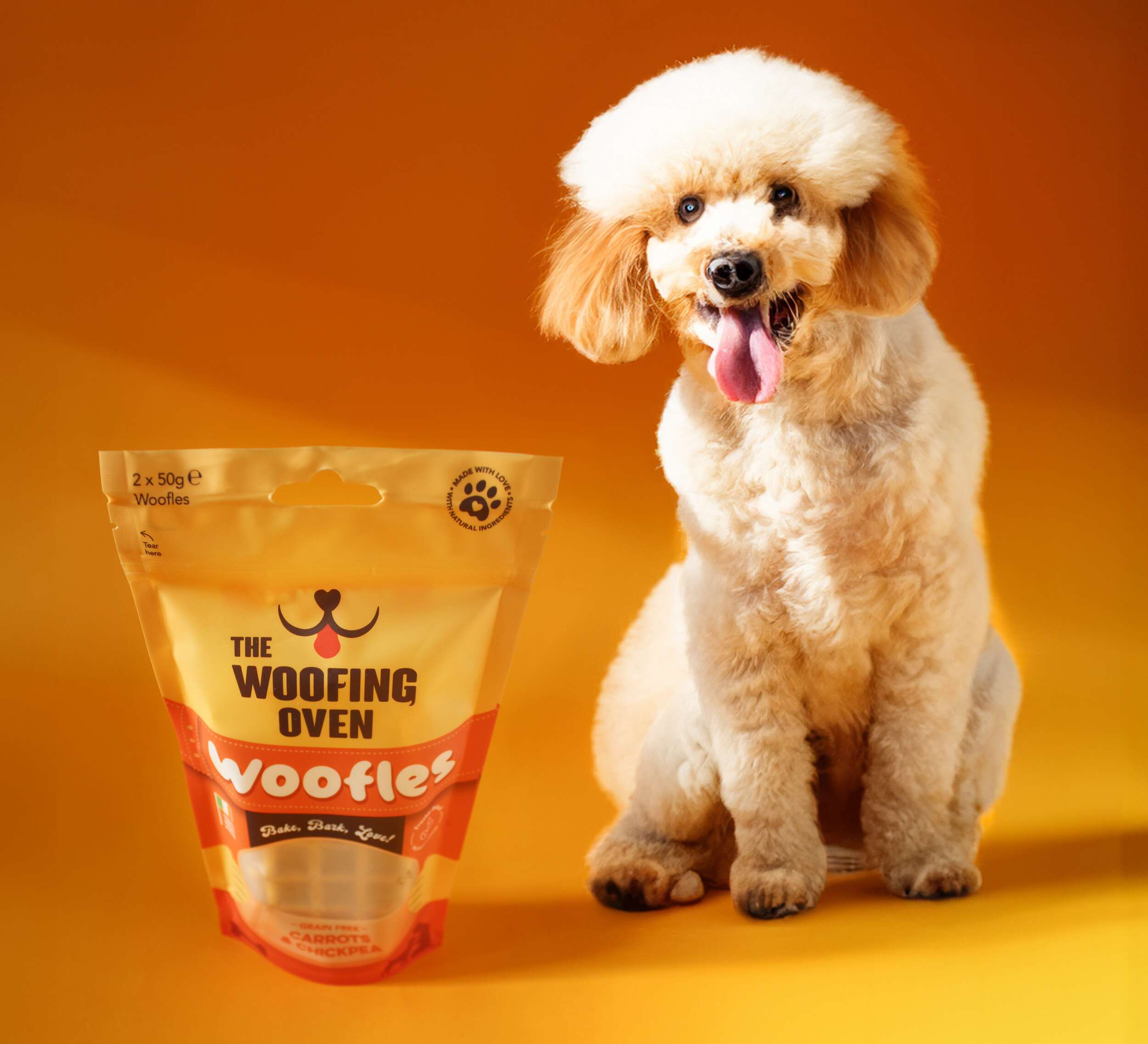 The Woofing Oven’s packaging design challenge was to create a visually striking, retail-ready package that reflects the brand’s fun, celebratory nature while emphasizing its commitment to quality, natural ingredients, and Irish craftsmanship. The existing brand (formerly known as Bon A Pet Treats) needed a fresh identity that would stand out in a crowded dog food aisle, making the transition from local markets to mainstream retail.
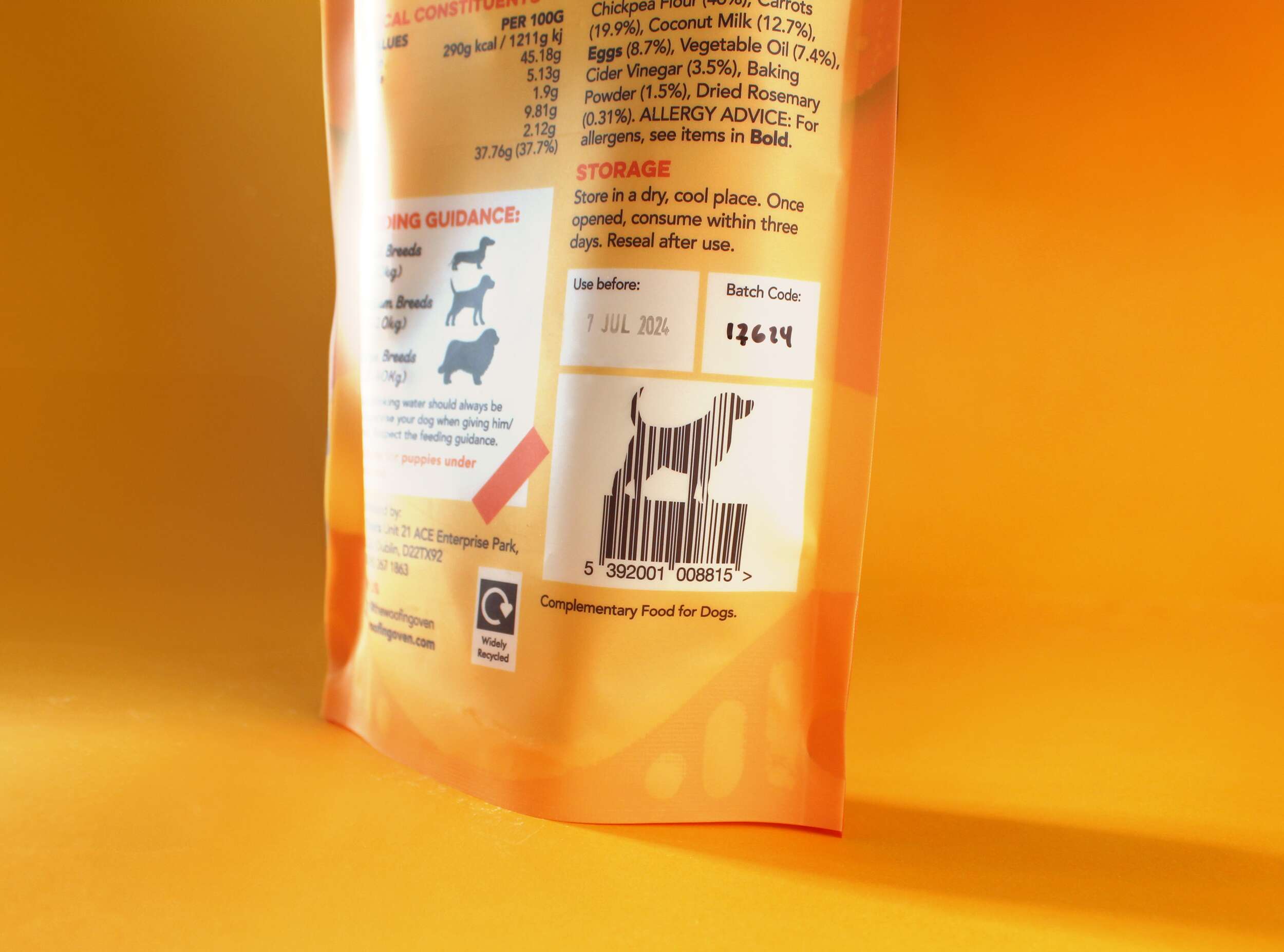


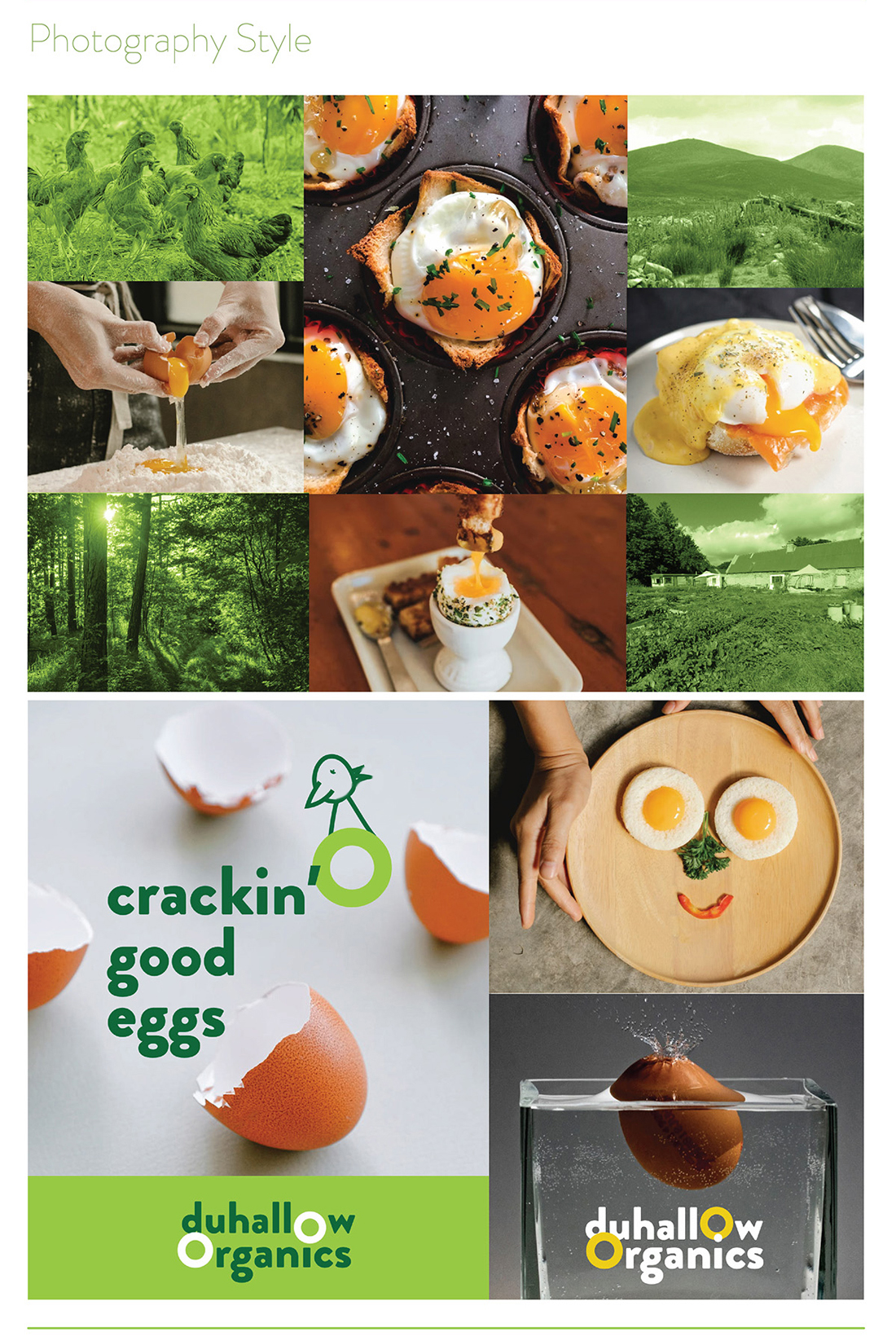
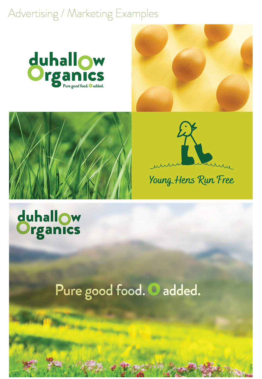
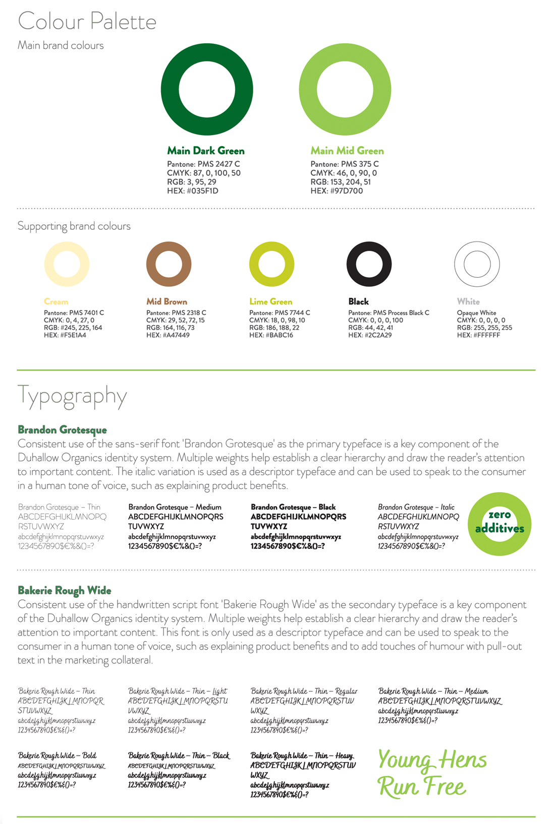
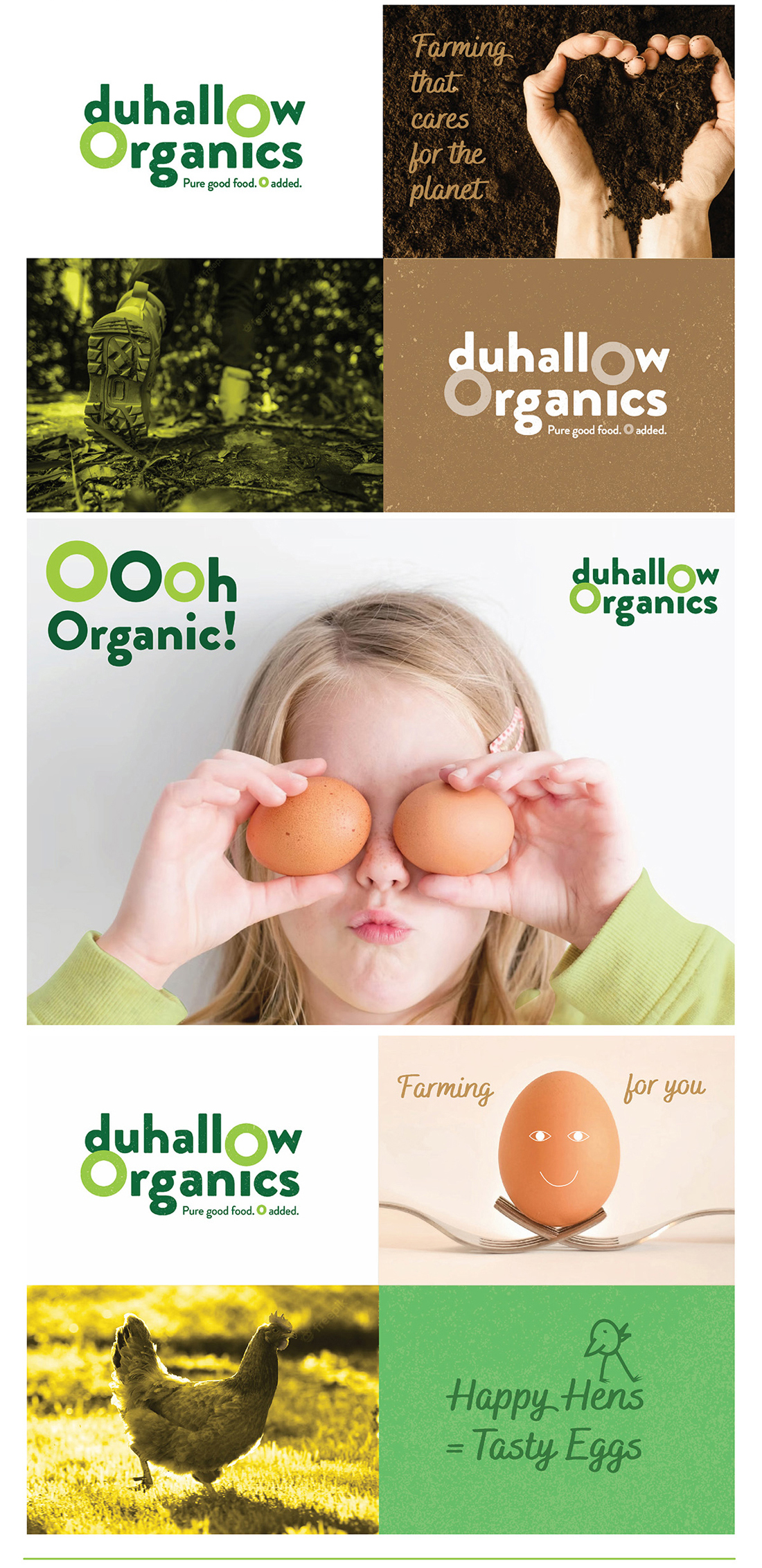
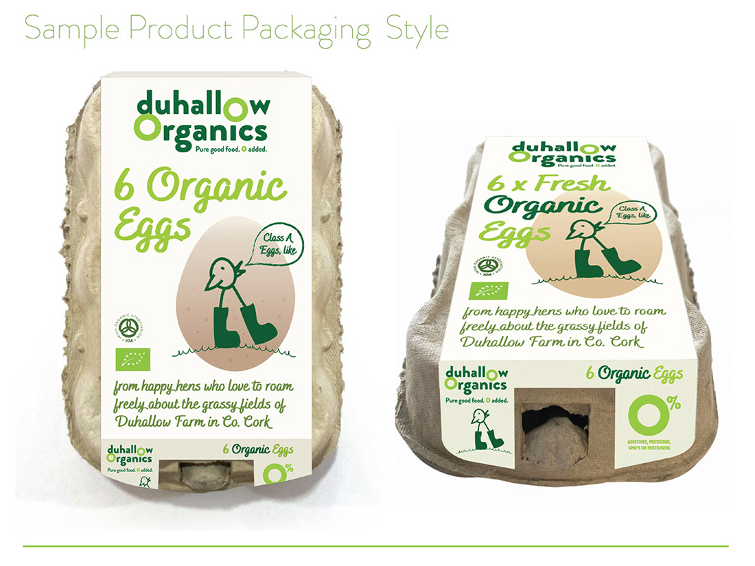
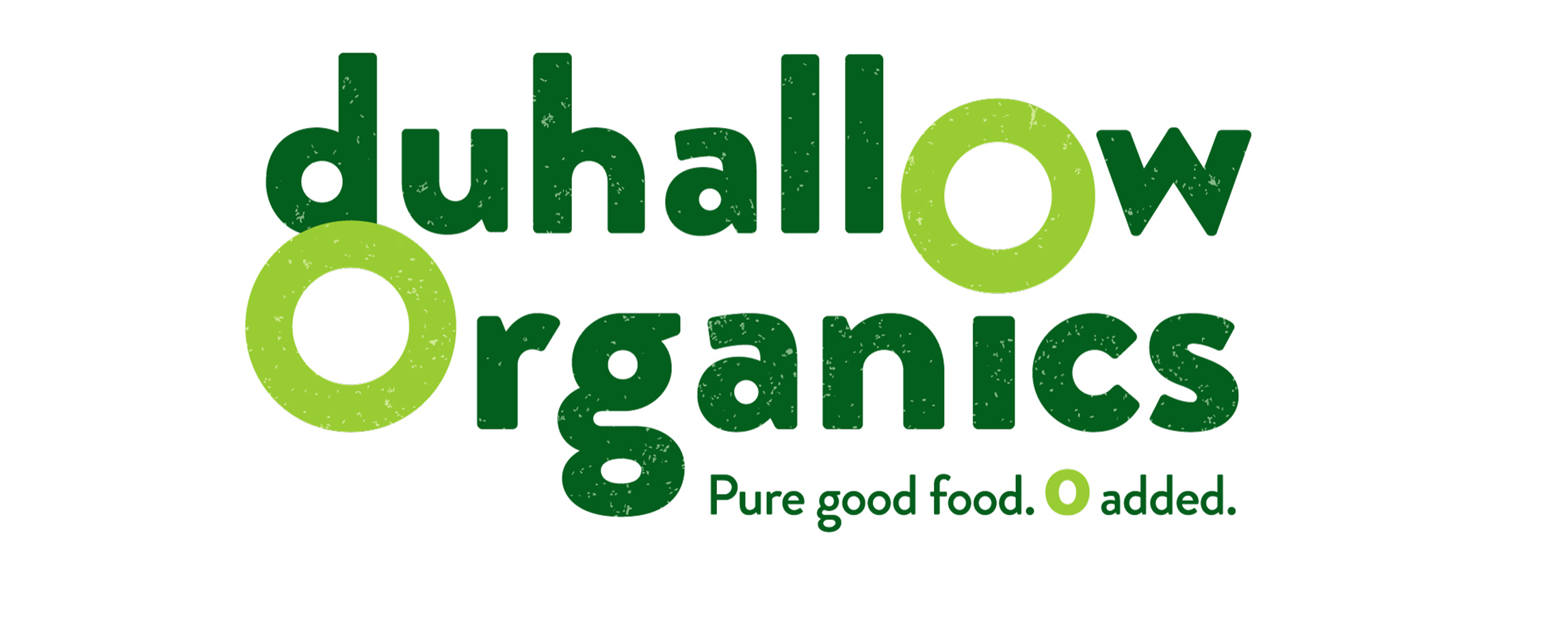 The Duhallow Organics farm is situated on the old Moynihan family farm in Boherbue in the heart of Duhallow, Co. Cork. Certified Organic since 2008, they produce Organic Eggs and grass finished Dexter Beef.
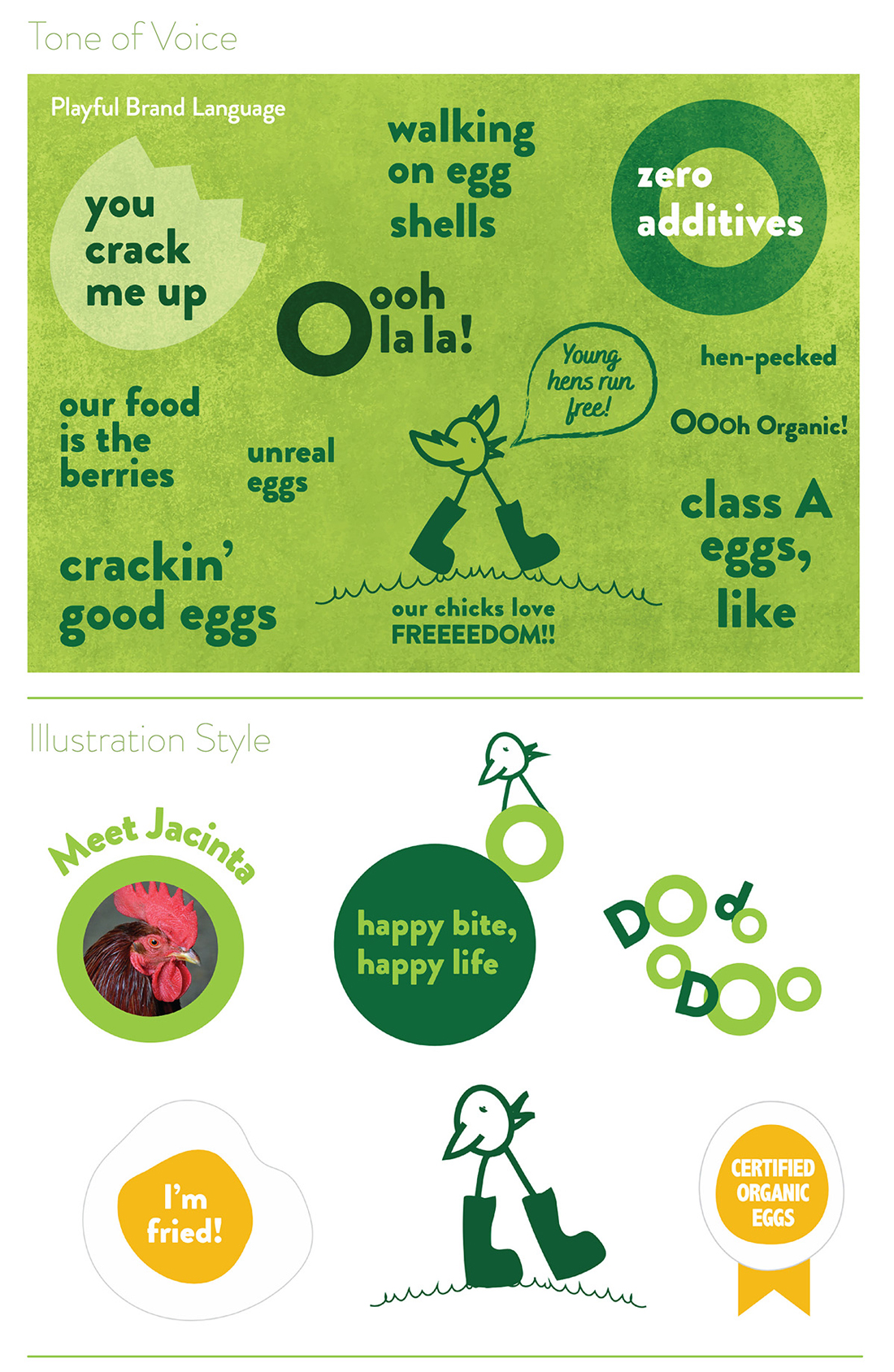

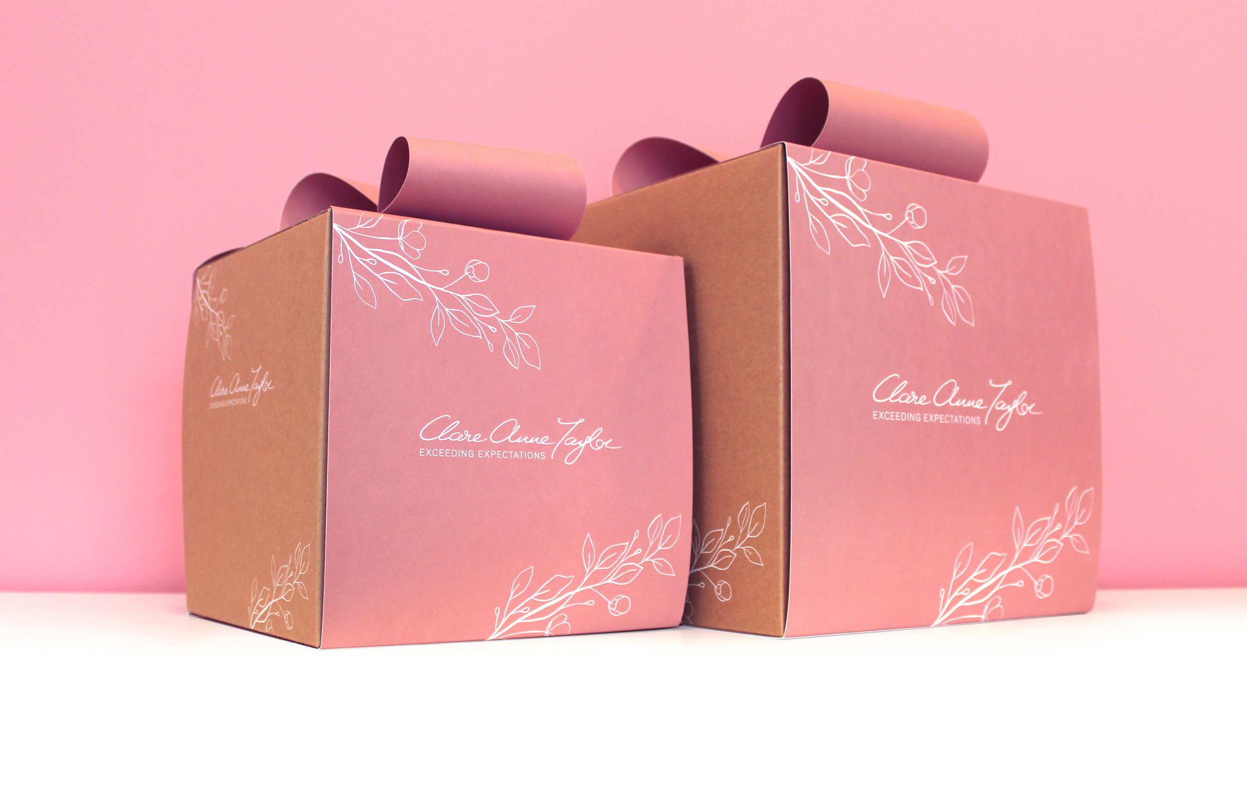
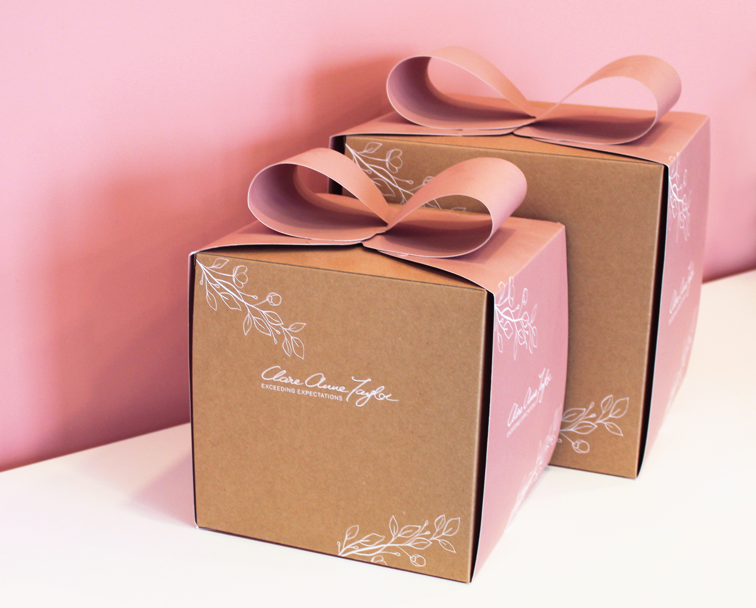
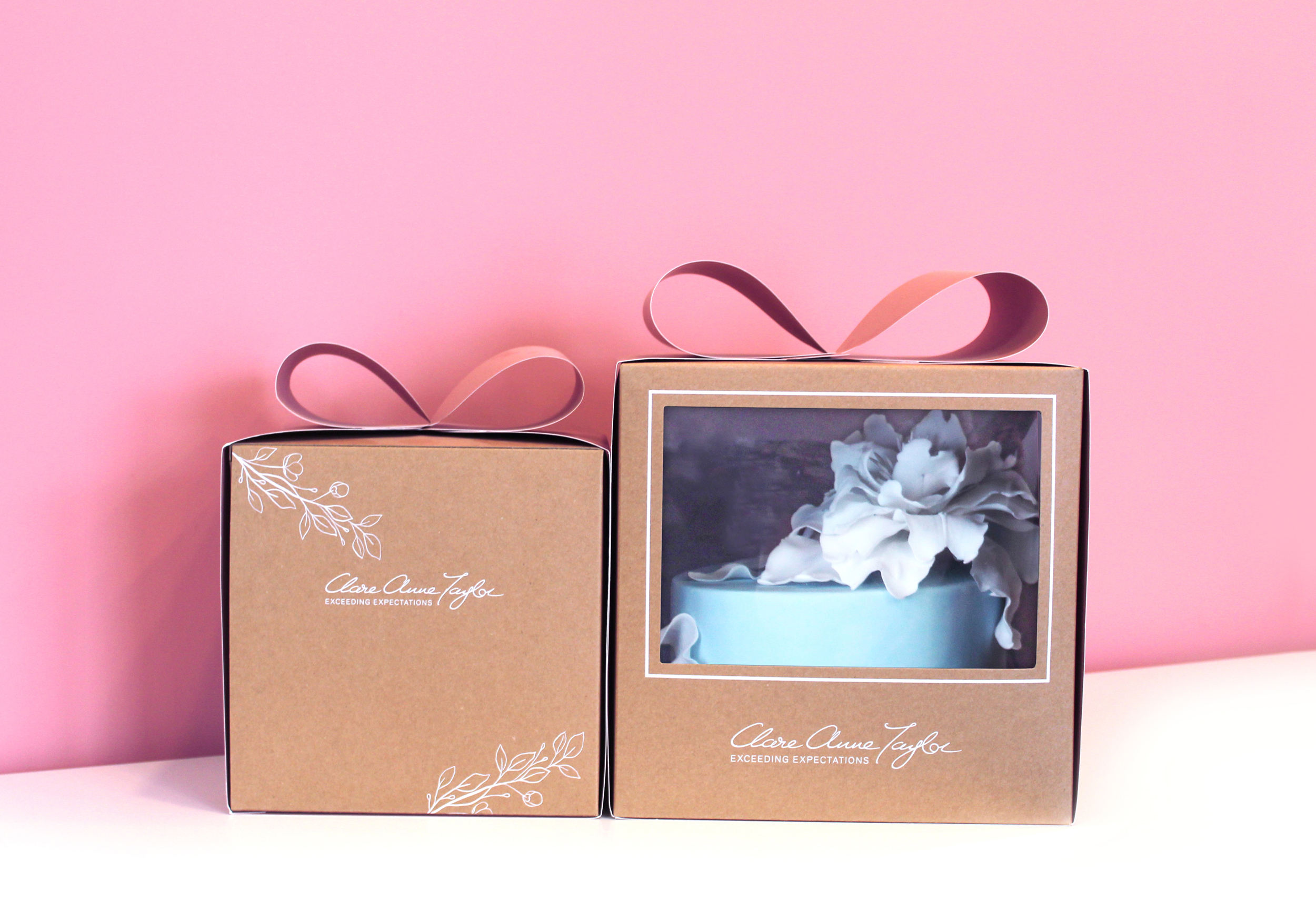
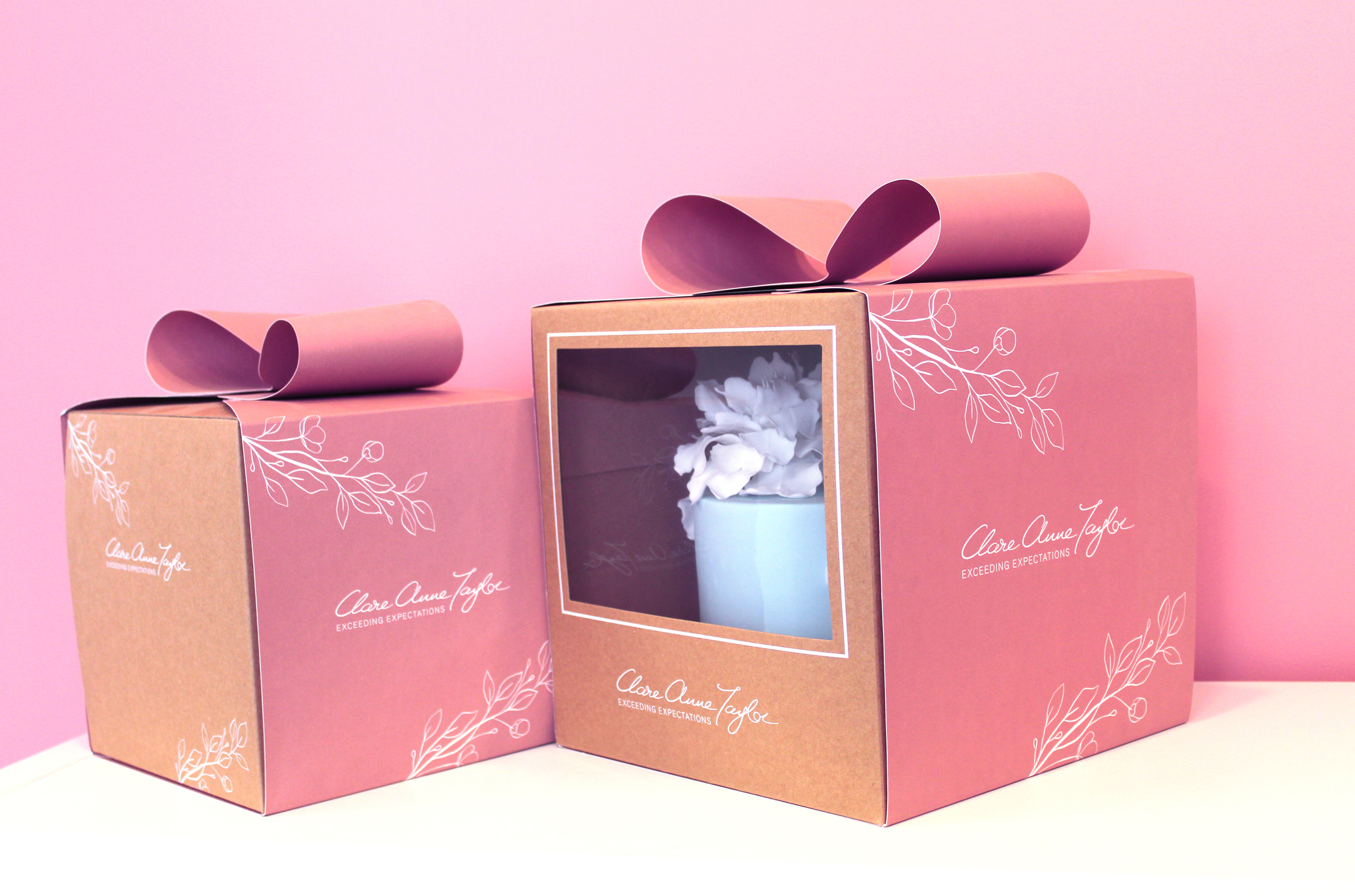
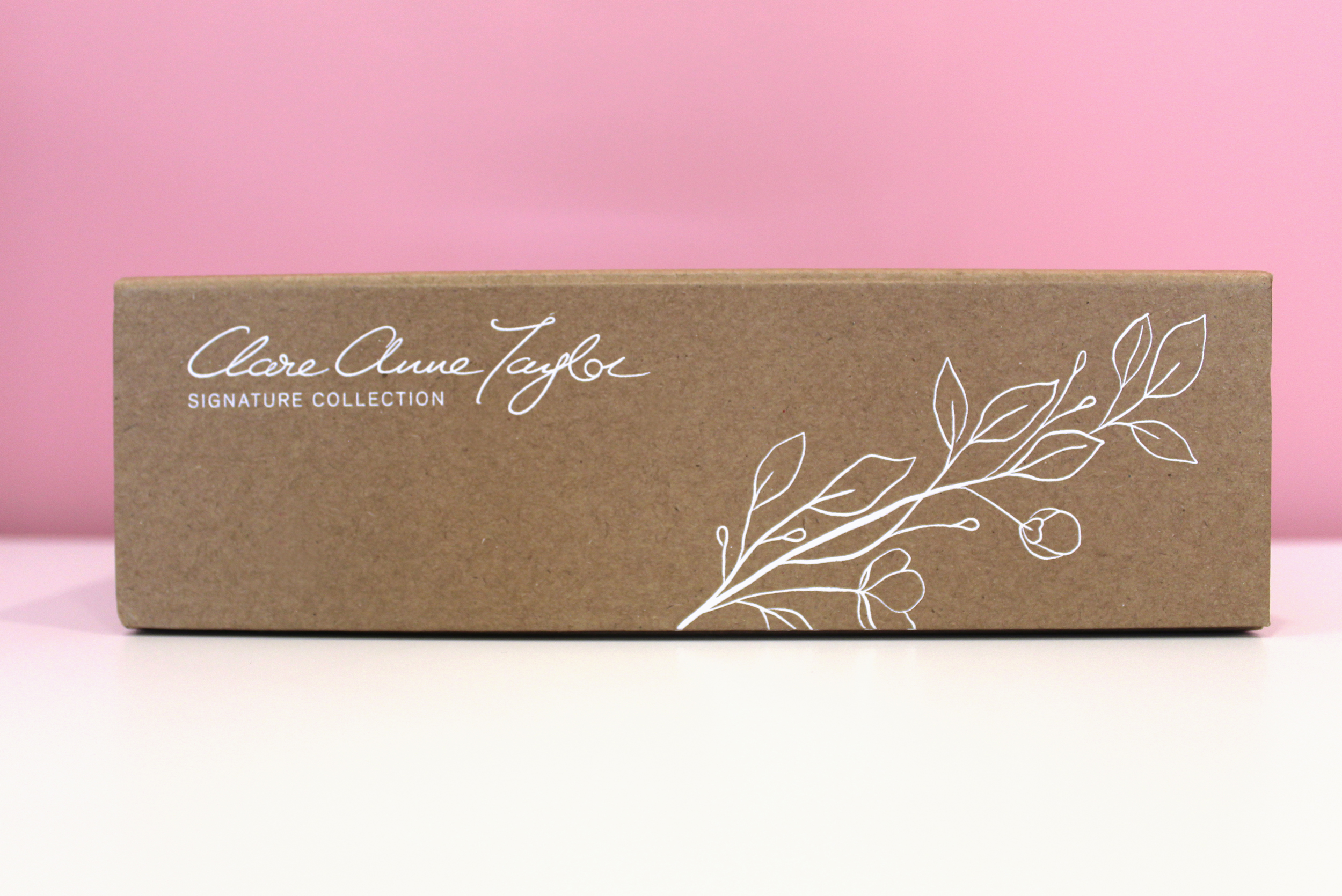
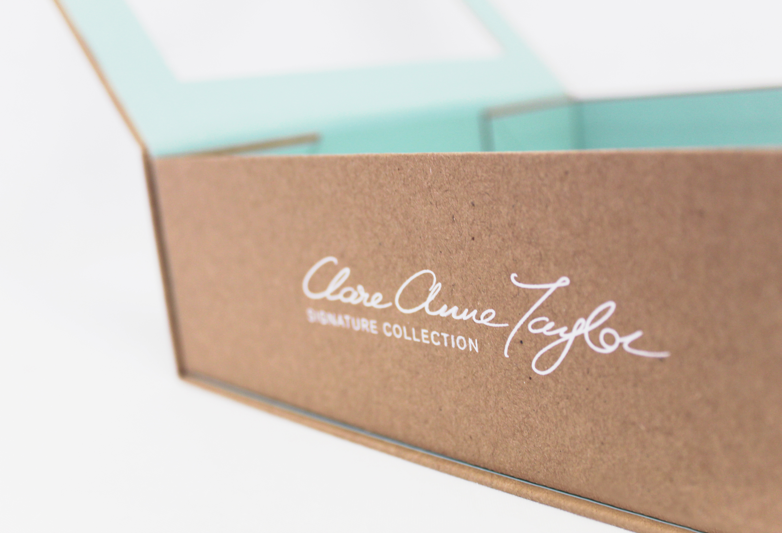
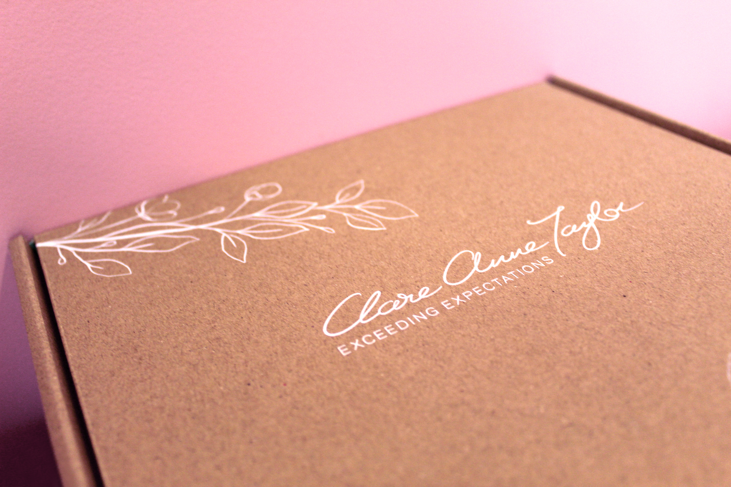
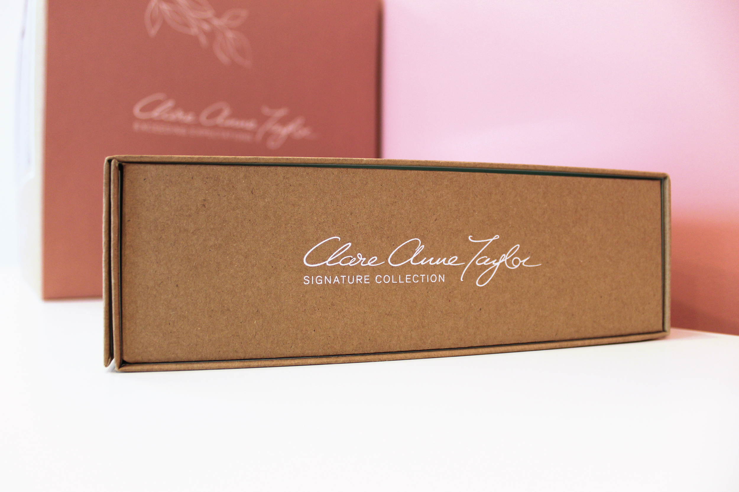
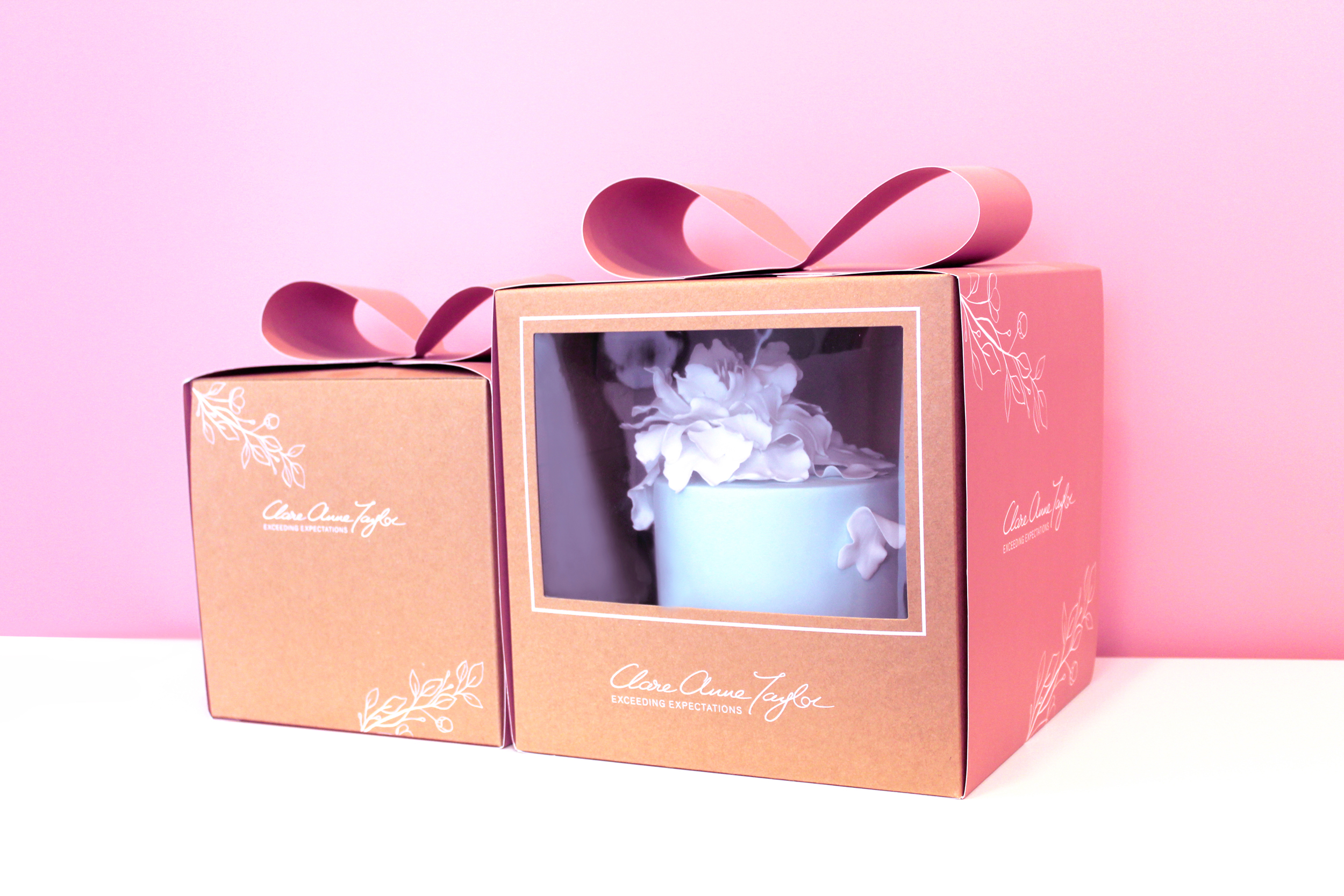
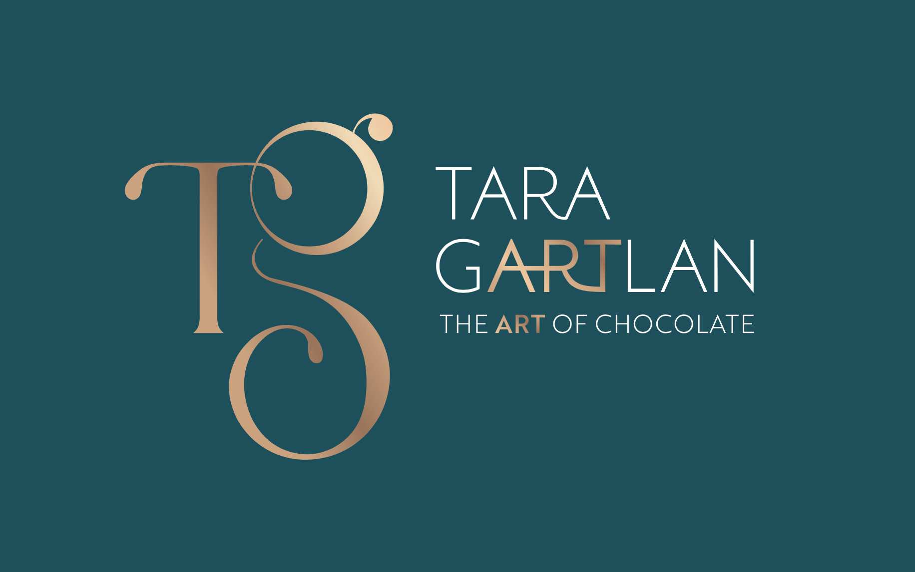
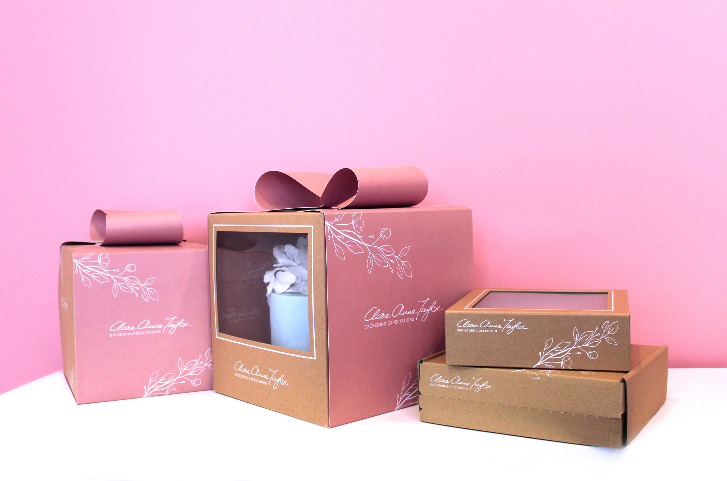 Clare Anne Taylor Couture Cakes are one of Ireland’s leading luxury cake designers for special events and weddings. The core of the business is luxurious quality and elegance in the design and craft of their cakes and confections.