Muckross Creamery Brand Packaging
![]()
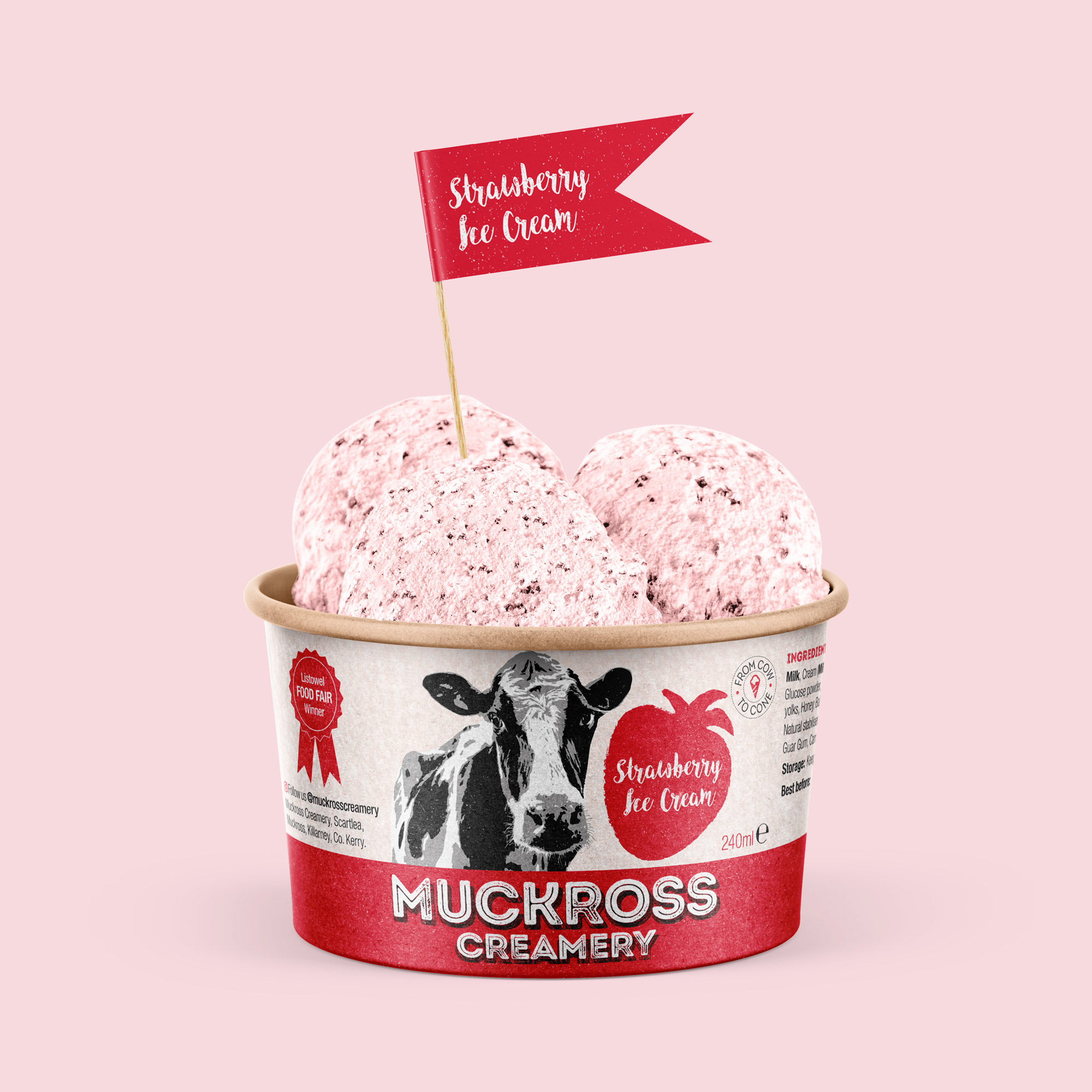
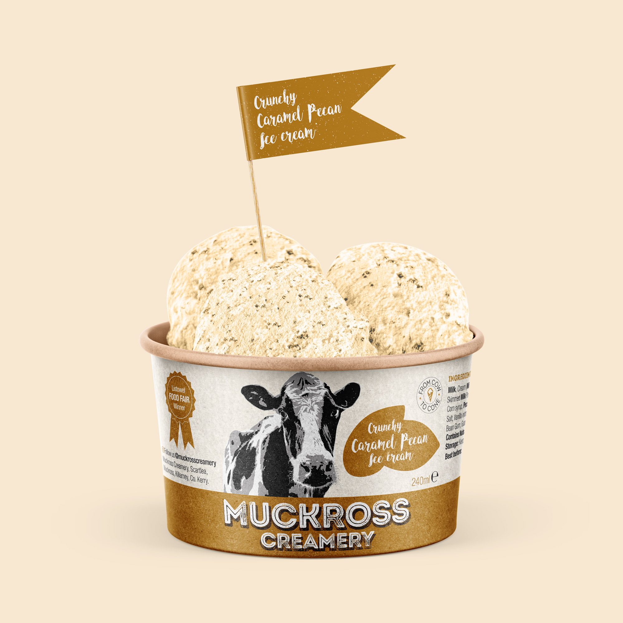
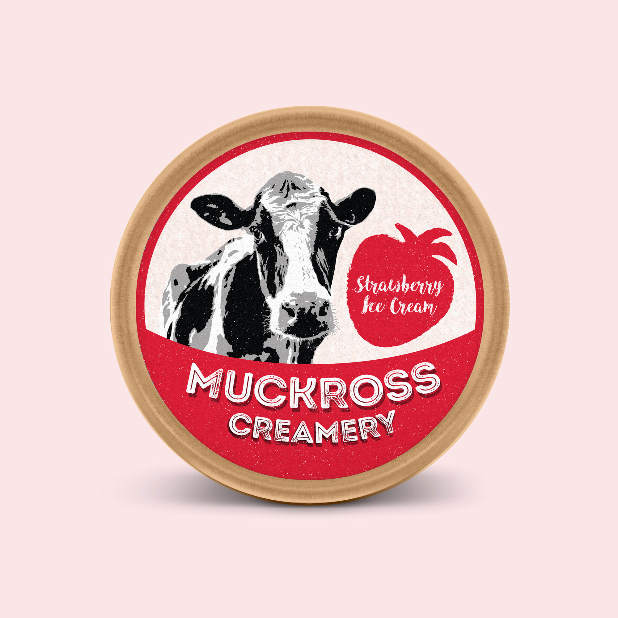
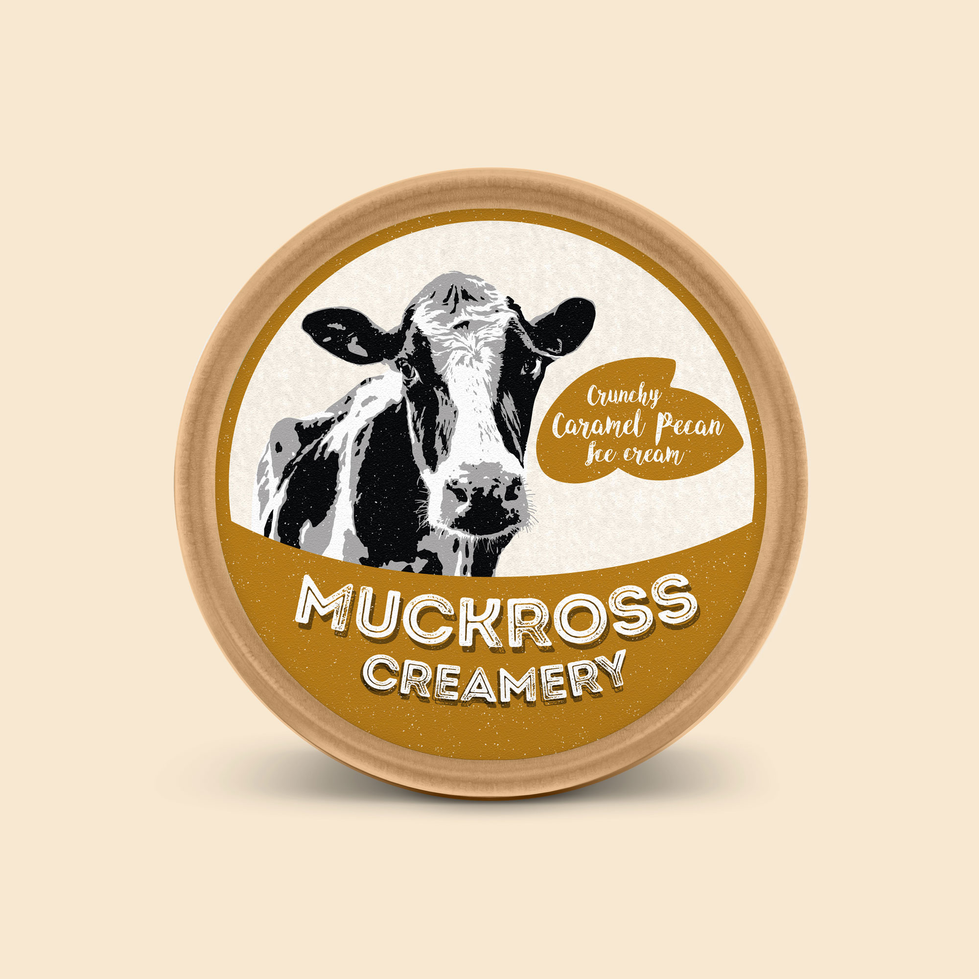
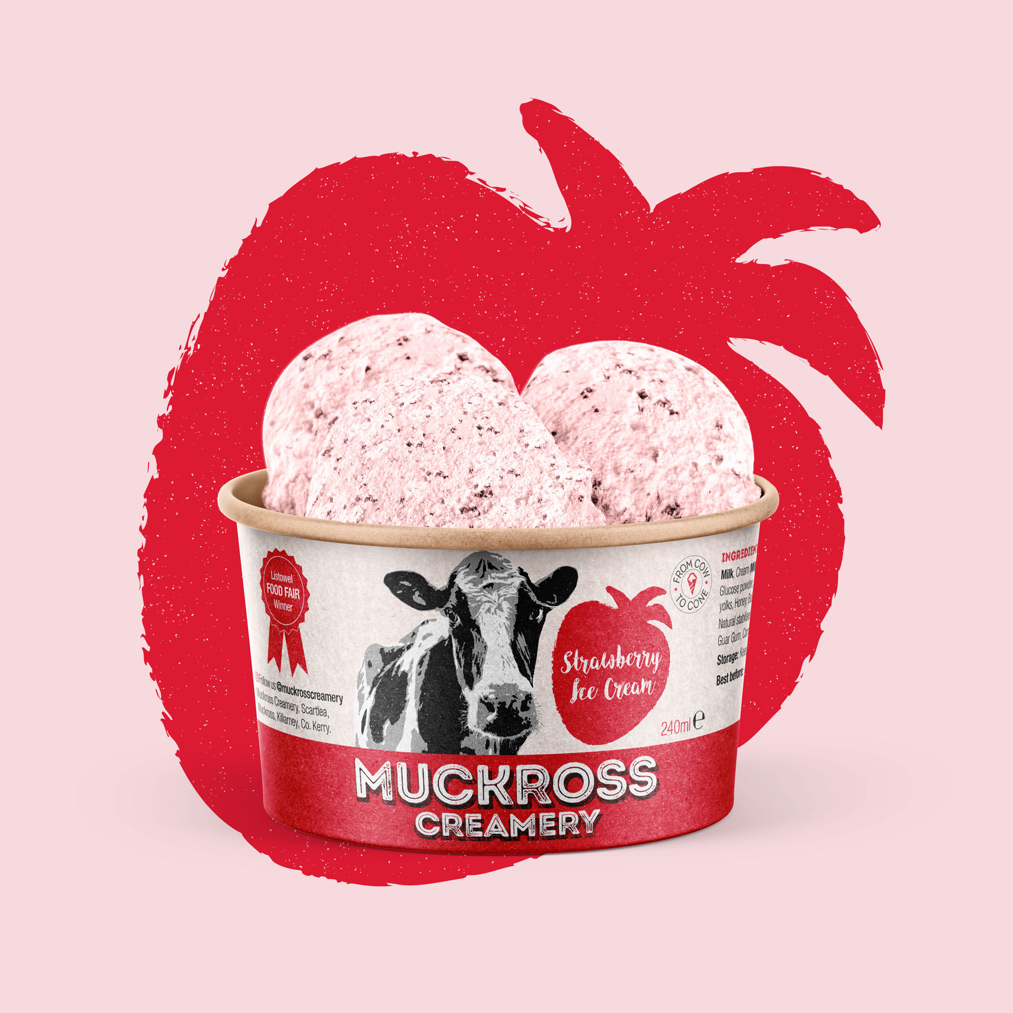
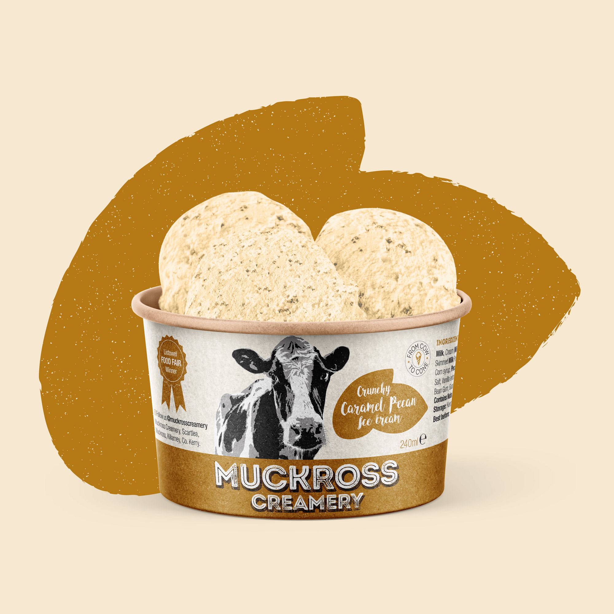
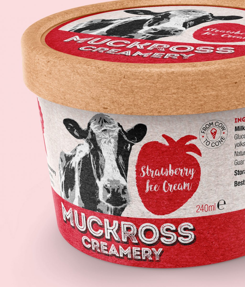
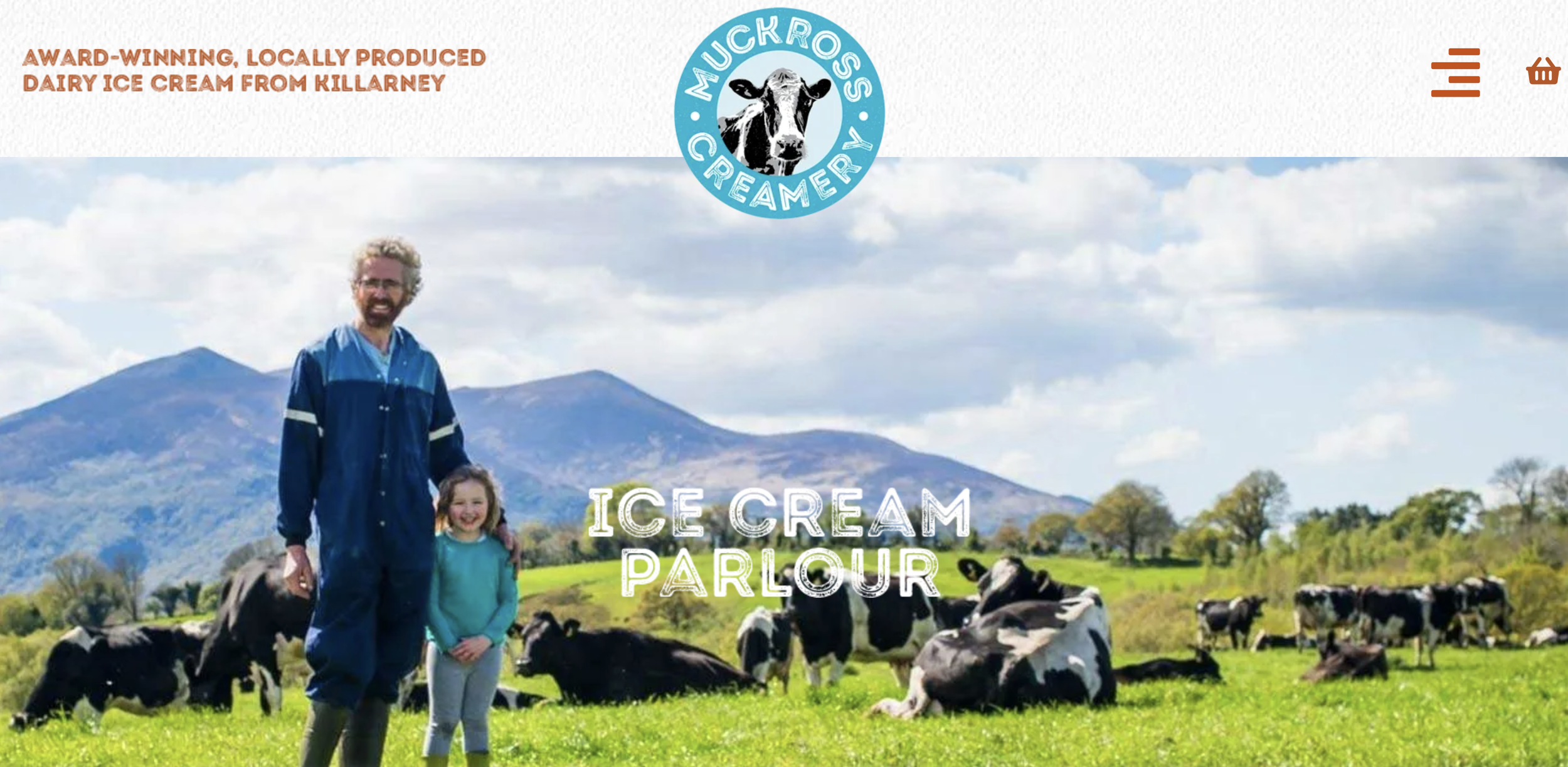
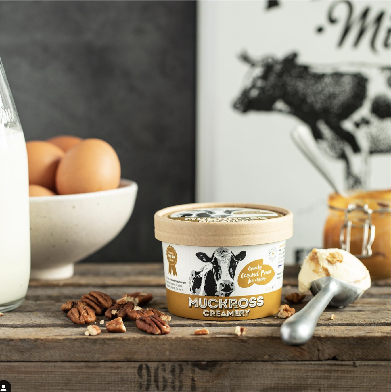
Muckross Creamery is an Irish ice cream brand range, hand-crafted by the Fleming family. Their strap-line is ‘From Cow to Cone’ – communicating the freshness of their delicious ice cream.
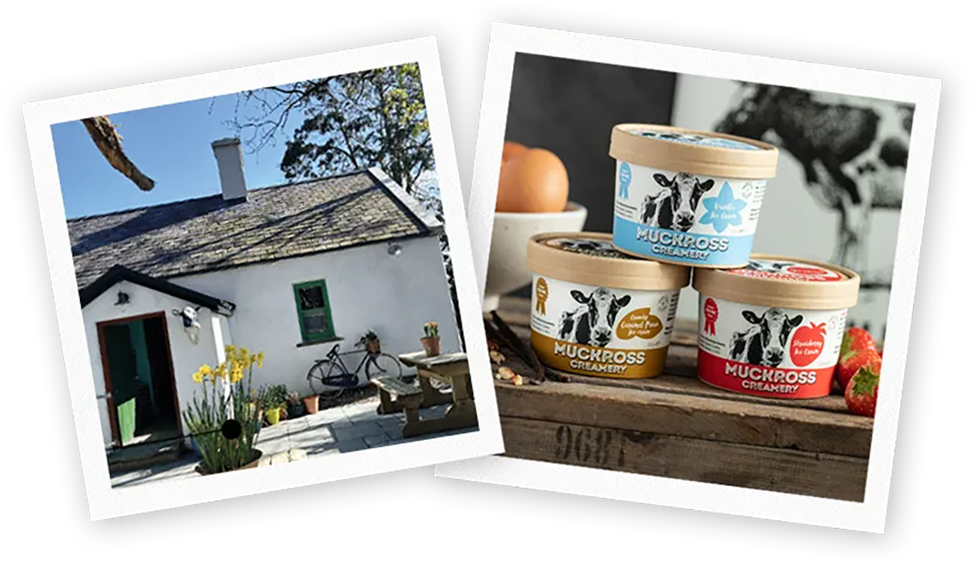
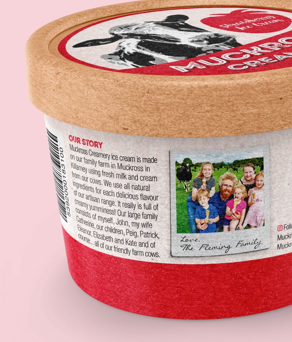
Catherine and John Fleming live with their lovely family of six children, and of course… all their friendly farm cows, on their charming farm in Muckross, Killarney. John Fleming is a fifth-generation dairy farmer. His family have been farming in Muckross, Killarney since the 1840’s. Their mouth-watering ice cream is made using their own fresh milk, fresh cream and free-range eggs. Being a farm-based enterprise in Killarney, they source all the fresh ingredients and supplies for each scrumptious flavour of their artisan range locally, to support the local economy. Their short supply chain and values of commitment to quality and sustainable production contribute to the great taste of their ice-cream.
![]()
![]()
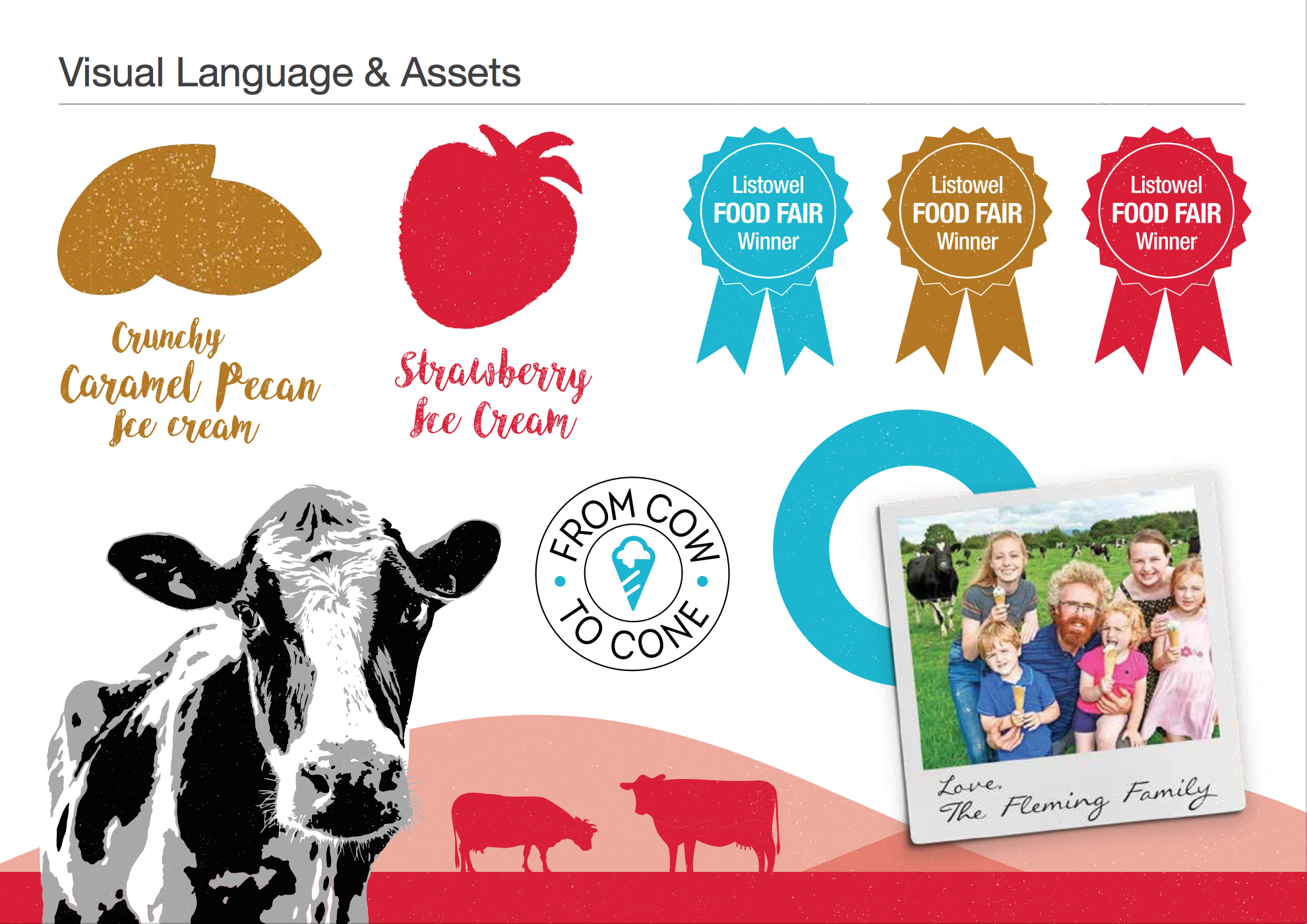
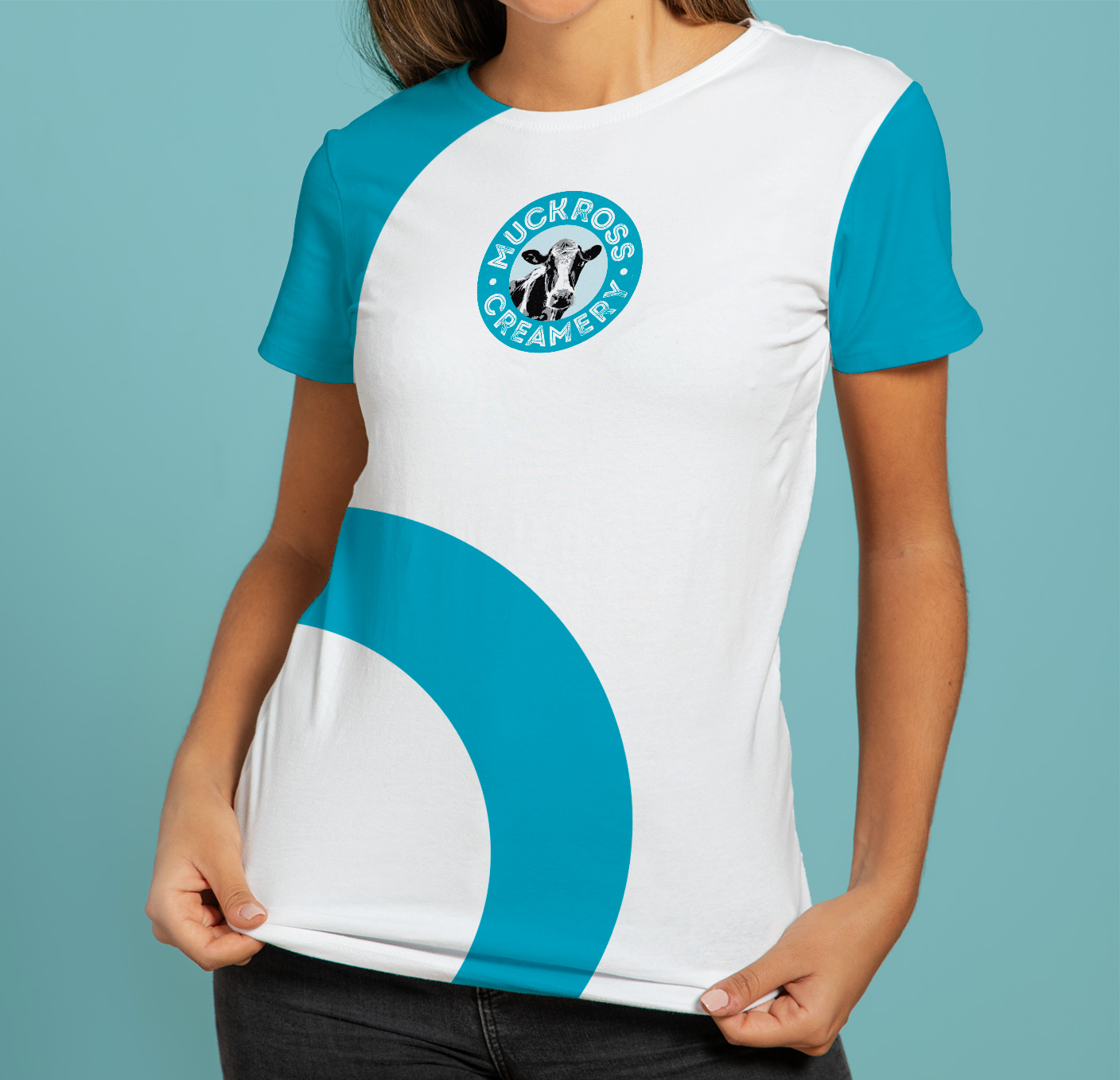
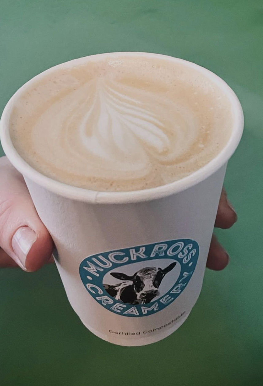
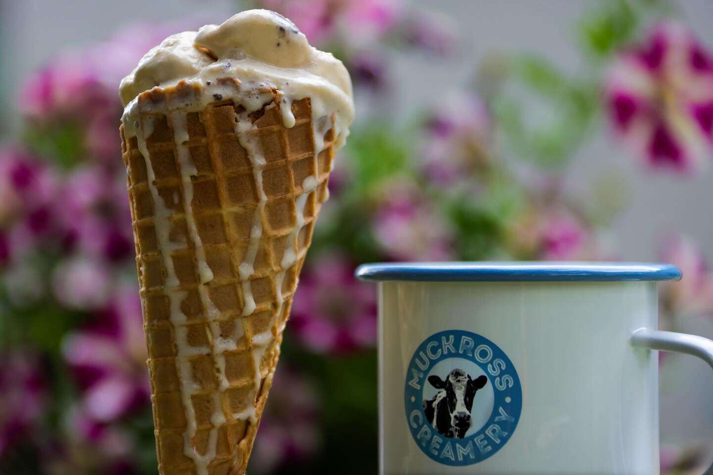
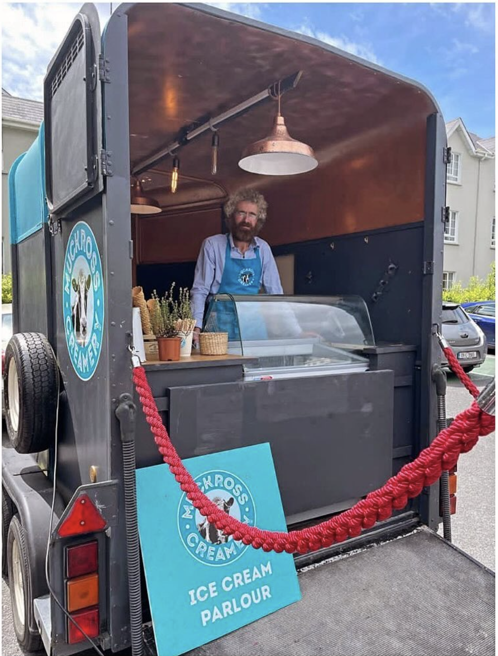
When they reached out to Clare Lynch Creative on re-branding, key aspects they wanted to convey were the natural and fresh qualities of their ice cream. Therefore, featuring one of their resident, friendly farm cows in their brand and packaging design was a natural progression. It was important to implement this in a well-crafted manner, to denote that they are a quality brand range of ice cream.
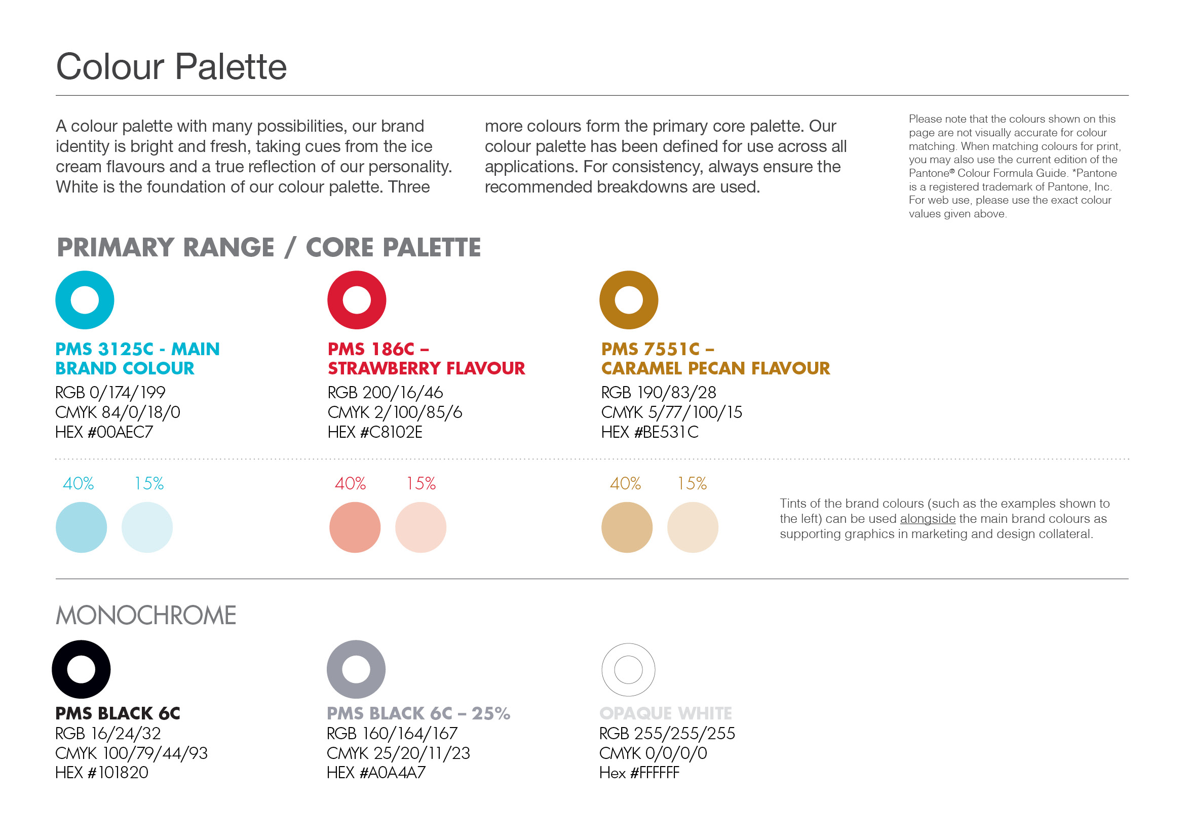
Further to that, the colours from the fresh ingredients used in the ice cream were used as an inspiration source to form the colour palette for the brand, along with the traditionally-associated dairy colour of blue – but freshened up in a slightly brighter and modern tone, linking with the summery feeling associated with ice cream.
![]()
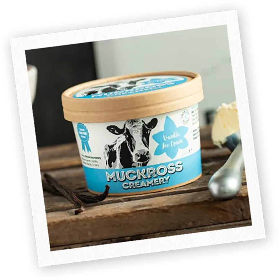
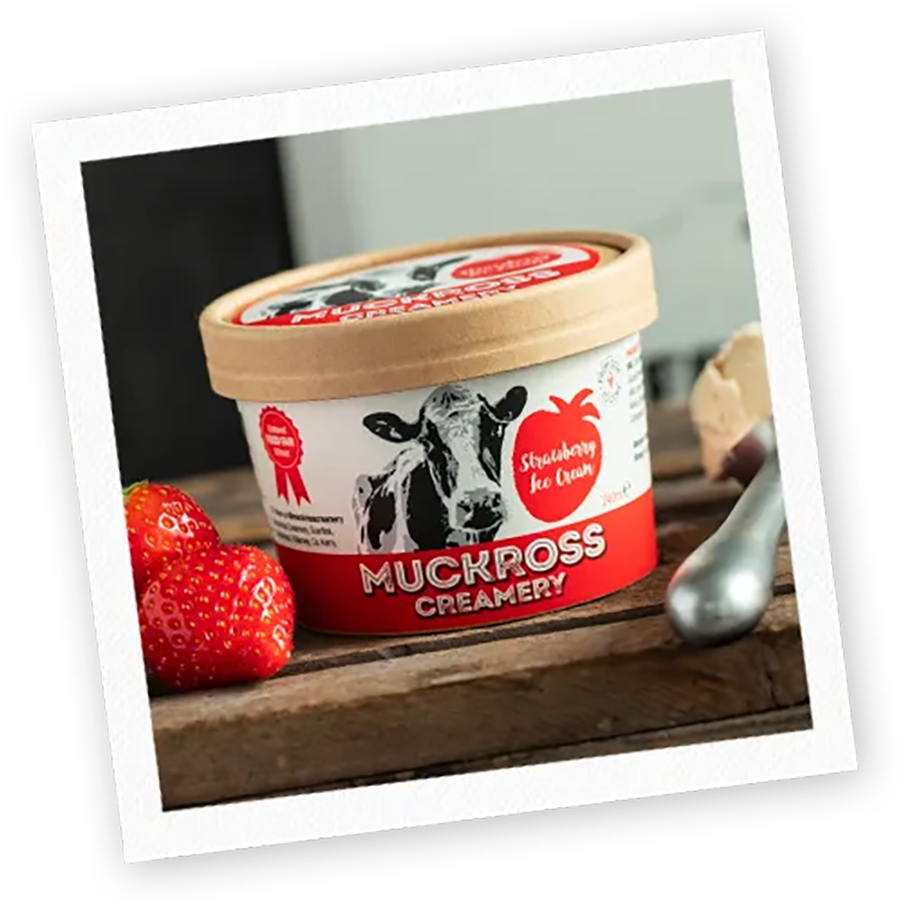
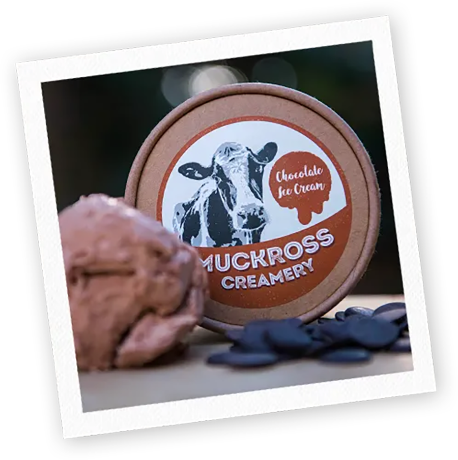
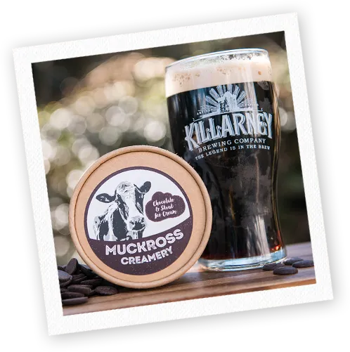
Muckross Creamery Ice Cream Brand Identity & Packaging Design
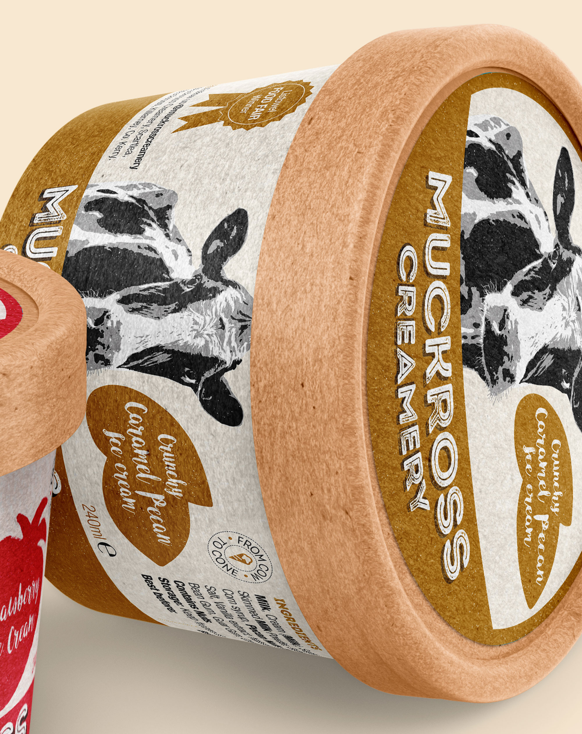
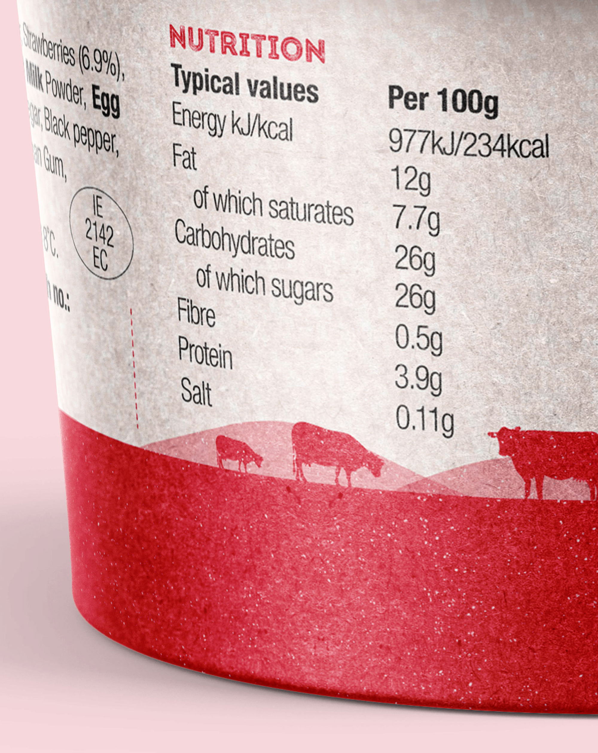
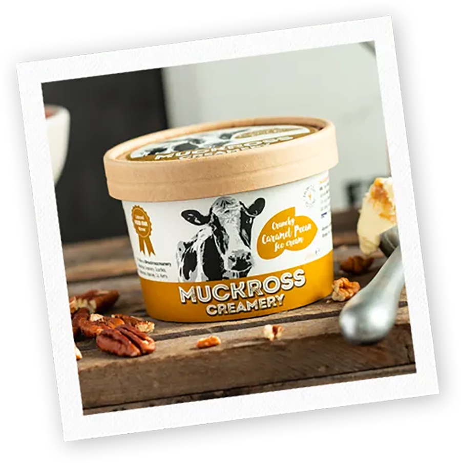
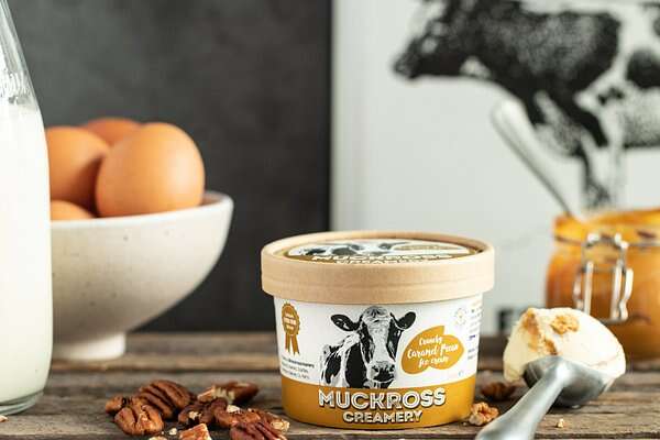
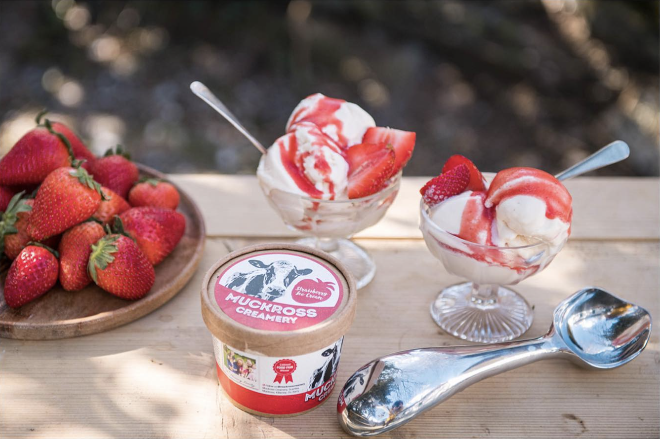
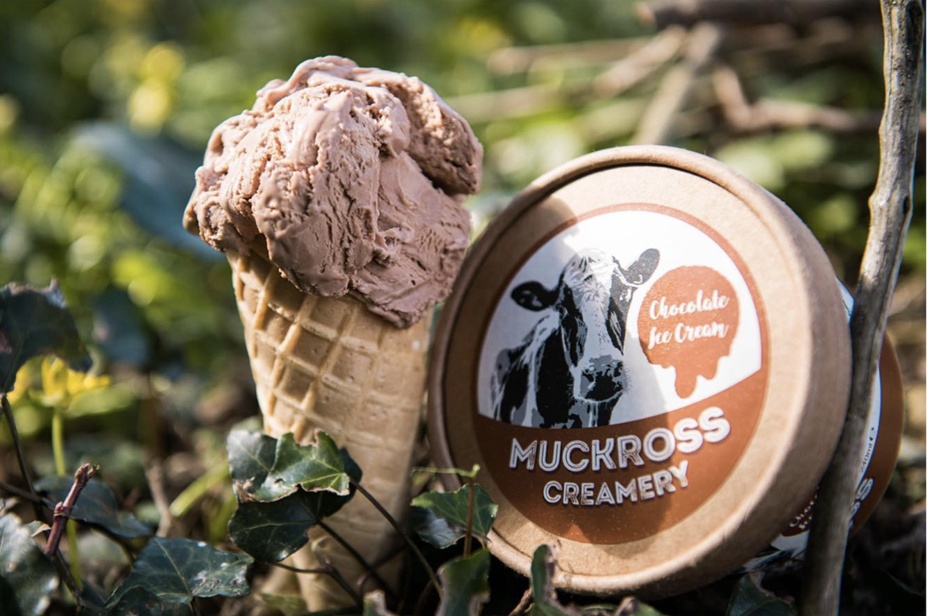
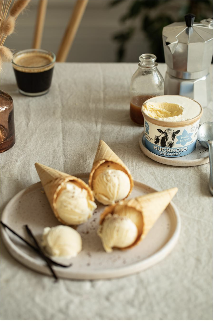
The brand typography has a traditional feel to it – with a bold, rustic font selected and hand-tailored for the bespoke brandmark along with hand-written descriptors; to support the values the client wanted to convey of how the ice cream is hand-made on their farm with fresh, local ingredients. The grain texture and the hand-drawn fruit silhouettes on the packaging further support and highlight this. As their brand story is an important aspect to the brand, it is featured on the packs with a photo of the family (which has since gained a new little member!). Muckross Creamery is a Listowel Food Fair winner for it’s flavoursome and tasty ice cream, and this key USP is highlighted on the packaging. The cute tubs are earthy and recyclable, which adds to their popularity, both as it communicates the rustic, traditional qualities to consumers, and also to how they are a conscientious and sustainable company.


 <img
<img