Dynamic Media Solutions
Bisque On Bolton Collateral
Bisque On Bolton is an elegant award-winning restaurant based in Wellington which is part of the Bolton Hotel. It offers a unique blend of contemporary New Zealand cuisine and has a traditional feel to it.
Whilst freelancing for UGP Design, I worked on a range of Bisque collateral, including the design and development of a new website, interactive email footers, sidewalk promos, email newsletters and lunch / dinner / wine-list menu designs.
Their brand is sophisticated, warm, welcoming and also a little quirky. I always sought to implement these values throughout any of the material I created for Bisque.
*Freelance whilst at UGP Design
Joe Lynch Electrical Brand Identity
A unique and stylish identity for Dublin based electricians, Joe Lynch Electrical. The J and L letters from the owner’s name where used to create a strong graphic brandmark which symbolises a bolt of electricity and also re-directs the focus to the company’s name. The colours used were bright and fresh, and veer away from the typical blues and reds used with electrical companies, making JLE stand out in the marketplace.
The website is strong graphically and drives clear messages to the visitor of the available electrical services.
The website has effective SEO which drives new customers to the site on a regular basis, whilst also being a good touchpoint for existing clients.
Fame Campaign Case Study Brochure
Fame Campaign Case Study
Brochure
The Fame Campaign was a competition run by Bravo to encourage small Irish businesses to compete to win €150,000 of outdoor advertising resulting in brand exposure and recognition – also known as the ‘Make Me Famous’ competition. The winner was Paddy O’s Granola.
The campaign helped to catapult his brand in to the public eye, with sales being quadrupled from 8% to 35%. This brochure was created to highlight the success of the campaign, using detailed research from the Irish market research company Figureheads.
The Fame case study’s two main goals were to show the success of the campaign and how well outdoor works as an advertising medium. Therefore it was to be used as a sales tool.
Taking this into consideration, I decided to make the book feature large images strongly – really highlighting the strong visual impact of an outdoor advertising campaign. I also made the market research statements large and prominent, using the range of the Bravo colour palette and simple graphics to re-enforce the message on each page.
The result was a strong and effective, visually appealing brochure, which clearly delivers the message of the success of the campaign using strong imagery and typography, simple icons and then beautifully printed & saddle-stitched on to an earthy, uncoated stock to give a matte finish, tying in with the winner’s wholesome identity and also the Fame Campaign theme of building up small Irish businesses through the natural medium of outdoor advertising.
**The case study was short-listed in The Media Awards 2013 and came second place, with the feedback within the industry highly commending the innovation of the overall campaign concept, the implementation of the winning advertising campaign and this solid piece of research displayed to a high quality standard in the overall case study brochure as above.
*Completed whilst working for Bravo Outdoor Advertising
Kokako Packaging
Kokako
Organic Bars Packaging
These Kokako bars are a new addition to the popular NZ-based, well-established Kokako food and coffee range for their café and other wholesale outlets. The client wanted to continue to use the friendly kiwi kokako bird used in their branding for these organic, healthy bars.
The characters I created for this range provide a friendly and fun feel, along with bright, diffrientiating colours, to attract attention on the store and cafe shelves. This brand has a quirky style to it and this is represented here also.
Displayed are the colourful and friendly healthy Kokako snack options, photographed having fun in their natural environment.
*Freelance whilst at Design Dairy
dublinbikes Promotional Brochure
dublinbikes Brochure
dublinbikes were celebrating their fifth birthday and are constantly looking for new ways to grow to expand their success. To mark their 5th birthday, they saw an opportunity on the mud-guards of the bikes where they could partner with a sponsor / partner to feature their brand on them, which would be an excellent advertising opportunity for a potential sponsor, as dublinbikes have become a strong presence in and around central Dublin.
They decided they need a brochure to use as a sales aid / point of reference to companies and agencies that they were aiming to approach. The brochure needed to hold a USB stick featuring the presentation with further information on the package which was on offer. This brochure needed to look different and be visually appealing to display how unique this advertising opportunity with dublinbikes could be.
As an important factor of this brief was to stand out as unique from a standard brochure, the shape was an important factor in achieving this. To highlight further attention to what dublinbikes were offering, the bike’s shape and materials were key in creating this piece. The brochure features rounded corners, drawing similarities with the round shape of the wheels of the bikes, whilst still leaving the actual brochure shape area large enough to feature the text and images that needed to be included.
The aim was to draw attention to both the mudguard and the presentation, therefore the die-cut out centre circle really draws the eye in to mud-guard shaped USB containing the presentation. The front and back cover design feature spokes which again connect with the theme of the bike and also draw the eye further in to the centre of the piece, highlighting the unique selling point of the branded mudguard-shaped USB displayed within. Throughout the brochure, landmarks of Dublin are depicted on each spread, with illustrations of various commuters on bikes highlighted in Spot UV throughout to enhance their attraction to the target audience, while keeping other areas with a clean matte finish.
The cover is made up of a metallic mirror board which has a number of benefits including connecting with the metallic spokes of the bikes, being highly appealing and different visually and being of strong enough support to hold the USB key, which is held in place on the back cover with a small glue dot. The font chosen for the headlines connects with the typography used on cycle tracks around Dublin.
The result is a bright, fun brochure and strong sales tool which succeeded in easily attracting the attention of the potential target audience and gaining a sponsor – Coke Zero who are now a proud feature of dublinbikes.
*Completed whilst working for JC Decaux
WebDoctor.ie Branding
webdoctor.ie are a safe and affordable Irish online doctor service that conveniently delivers prescriptions to your door. Customers can simply fill in an online consultation for their desired treatment and it is conveniently posted to their homes or prescriptions can be used at any Irish pharmacy.
The aim was to create a clean logo and website template with plenty of whitespace and less content for a clear user experience, as webdoctor.ie aims to create a simplified process in seeking medical aid so the logo and branding needed to represent this.
Their mission is to provide a dedicated team with the highest quality of medical care.
The final logo chosen uses the universally-recognised medical square cross symbol to create easy association with what the company does. We kept the ‘.ie’ within the logo to re-enforce the message of it being an online-only doctor service. The main brand colour chosen is a soft green tone to form an immediate connection on first impact with the medical field.
The result is a clean, professional, direct logo and website template which potential customers can connect instantly in the service webdoctor.ie offer.
Some of the nice feedback from the client:
“Many thanks for your great work!!! And thanks for being so responsive, we’ve already recommended you to some other people! We think you’ve done some great work, really looking forward to working with you much much more!”
Oisin Kim – Director, webdoctor.ie
Hotline.ie Annual Report
ISPAI Hotline.ie Annual Report
The brief was to design a mini-annual report for Hotline.ie publishing results for the year of 2013, with a greater focus on infographics to achieve a strong immediate impact. The client’s aim was for it to be more visually-appealing than their previous annual reports which were quite text-heavy and to make it easy to read and understand. It was designed along with a suite of other supporting collateral for their launch event including an invite and flyer.
As Hotline.ie rely on reports made about illegal content to them online, the cover symbol represents both the recognised WiFi internet signal icon and a loudspeaker for the awareness alerted through reports. The colour scheme is primary representing the innocence of the children needing protection. The clients were very satisfied with the results and said it helped them get their message across well on the day of the launch event. See Hotline’s feedback here.
ISPAI Annual Report 2016
ISPAI Hotline.ie Annual Report 2016

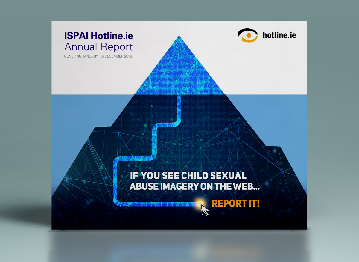
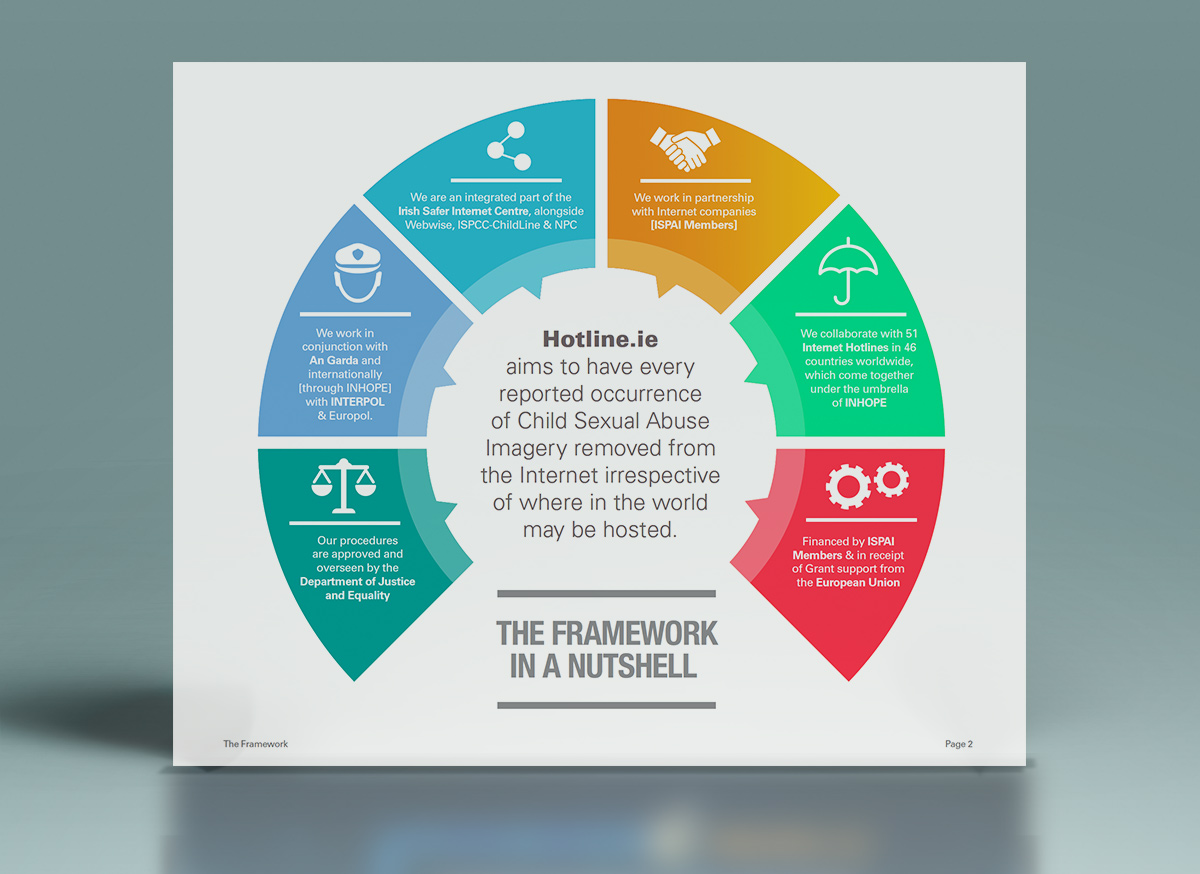
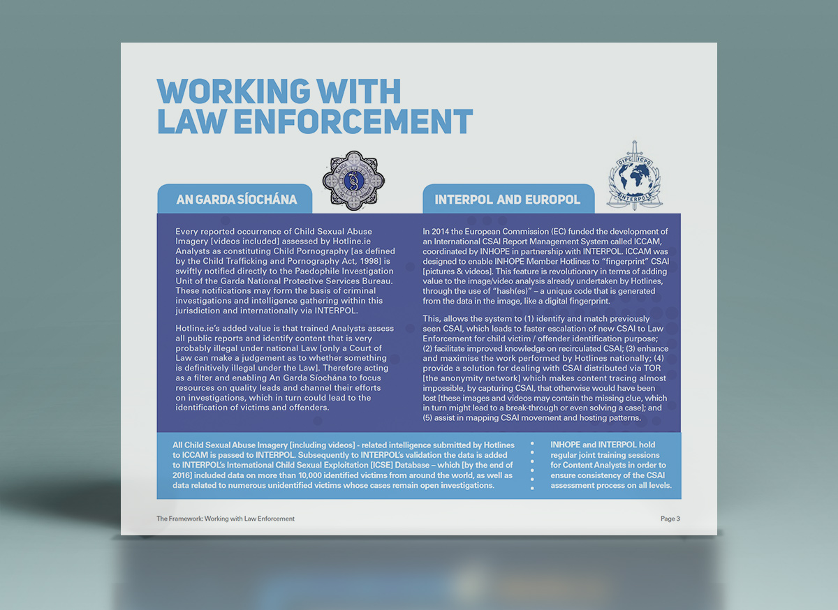
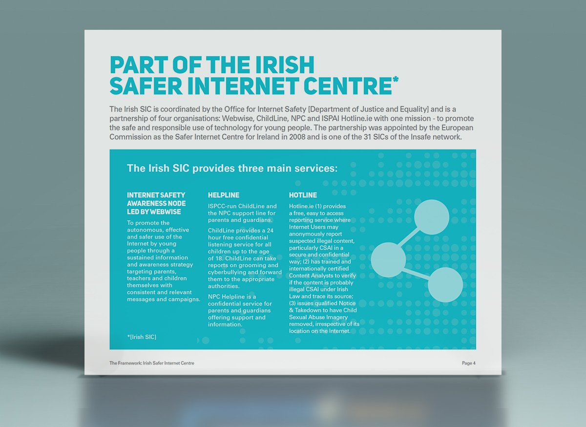
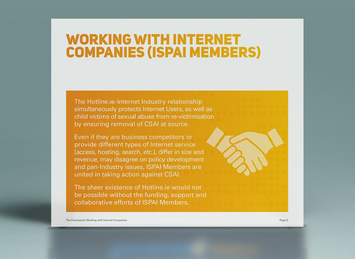
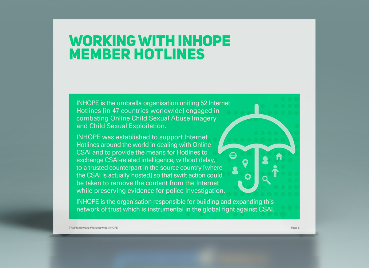
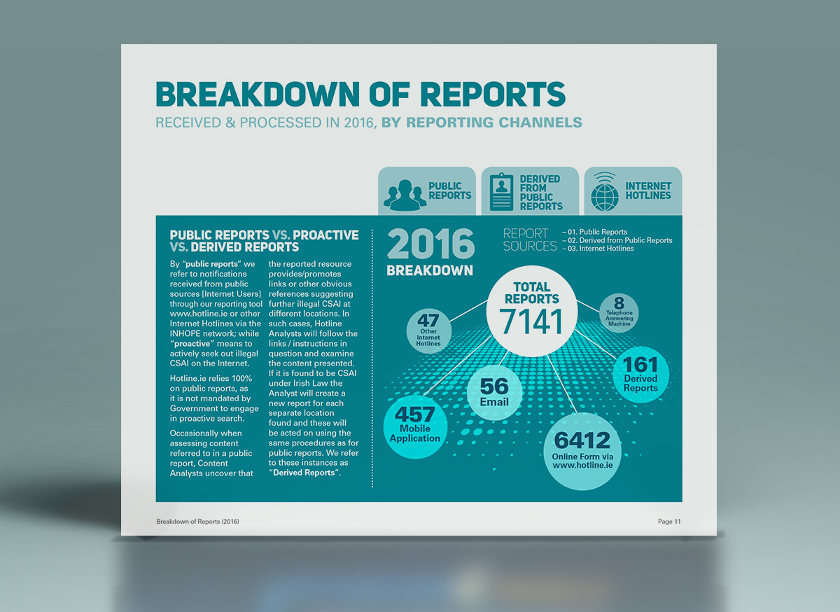
ISPAI Hotline.ie Annual Report & Twitter Cards 2016
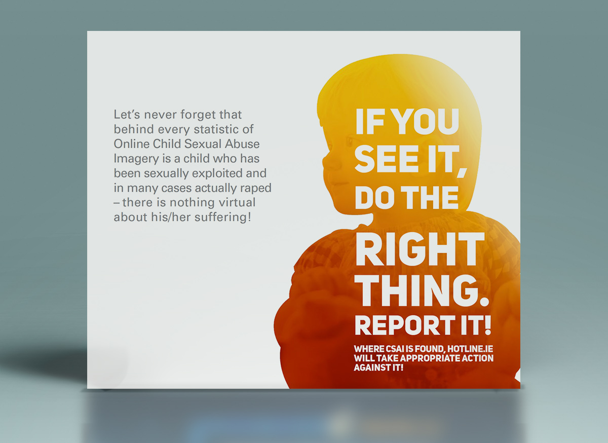
ISPAI Annual Report highlighting the successful work completed by Hotline.ie in 2016.
Esri Ireland Direct Mail Campaign
Esri Ireland are a software and services organisation specialising in the application of geographic information systems or “GIS”. GIS is based on the simple principle of attaching a location to every piece of data. They help customers record where things happen and analyse why, to give business insight on which to make better decisions. Clare Lynch Creative has worked with their Irish and UK offices on many projects over the past year, including online marketing & advertising campaigns, ebooks, printed mailers and infographics.
These two promotional pieces, a DM and an A5 info-booklet provide information on one of their popular software packages ‘Workforce for ArcGIS’ which helps field workers optimise how they work – tracking and scheduling jobs easily, creating a much easier information-capturing system for these companies. Location-based data and tracking play a big role in influencing the design when working with Esri. The client was pleased with the overall result;
“It looks great, thanks a million, delighted with how it all turned out. Nice work!”
Pizza Pack Co Branding & Packaging
Pizza Pack Co
Identity, Packaging & Advertising
Pizza Pack Co is a fun home pizza-making kit, which equips the customer with ingredients and instructions to make their own fresh and tasty pizzas at home in just 10-15 minutes. Each pack comes supplied with pizza dough, tomato sauce and topping ingredients for the chosen flavour / type of pizza. This is a fresh and innovative new idea to the market that creates a whole new enjoyable experience out of the usually-mundane task of making dinner.
It is primarily aimed at a young, interactive target audience but can also appeal to different categories. For example, it is an easy and fun activity to do as a couple’s date-night / as an adult & child bonding activity or as friends having a night in together. The brief was to create branding and packaging for Pizza Pack Co that embodied youth, colour and brightness while evoking a feeling of energy and life.
Some elements considered when creating this branding were: the raw feel of pizza fresh from the oven, the light-heartedness and fun of making the pizza from scratch along with emphasizing how the ingredients are fresh. I chose imagery which conveyed the energy of the target audience enjoying the experience along with fun, quirky baking tool icons. There is a D.I.Y. feel incorporated into the layout and typography in the collateral, giving a sense of action and movement. The language used is open and friendly, using slogans that are bright and fresh to appeal to the vibrant, fast-paced target audience.
Displayed is the range of collateral designed for Pizza Pack Co, which includes the logo and colour variations, business card, outdoor advertisements, wobbler tag and the box & pot images. The client was very happy with the result and felt it embodied all the values that they wished to portray to consumers correctly.