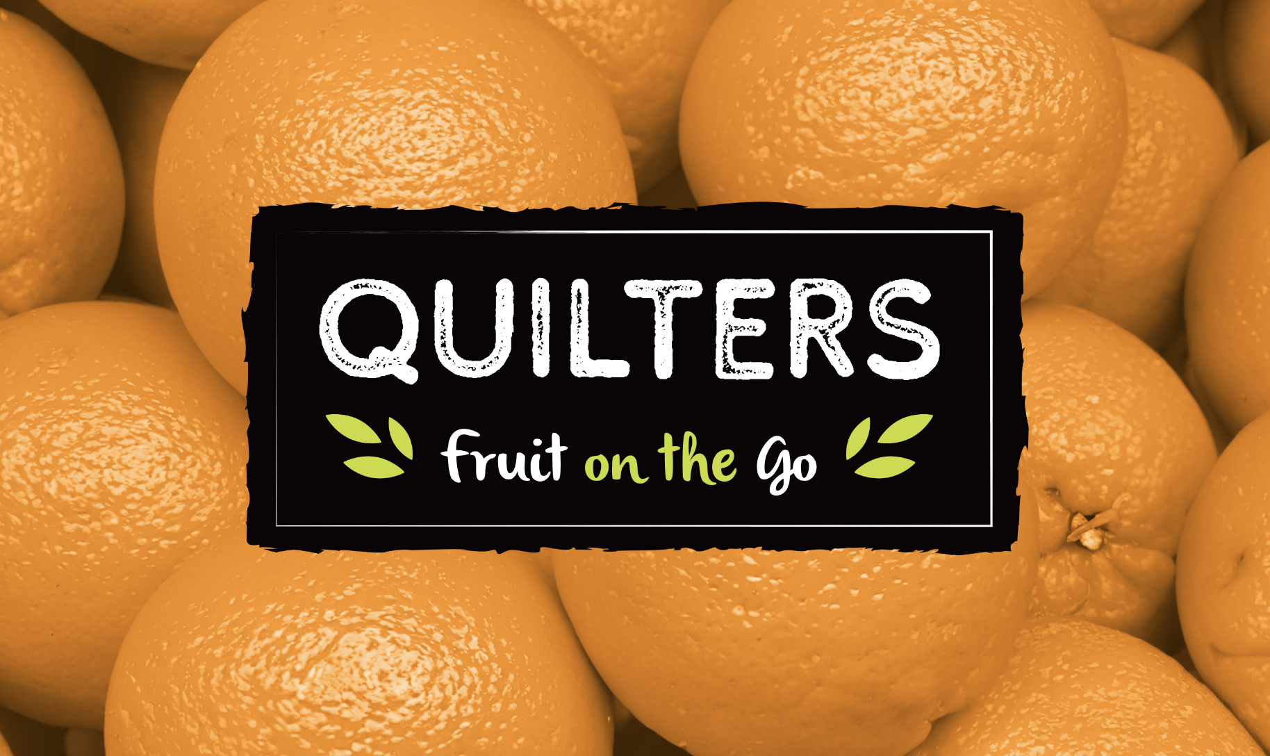
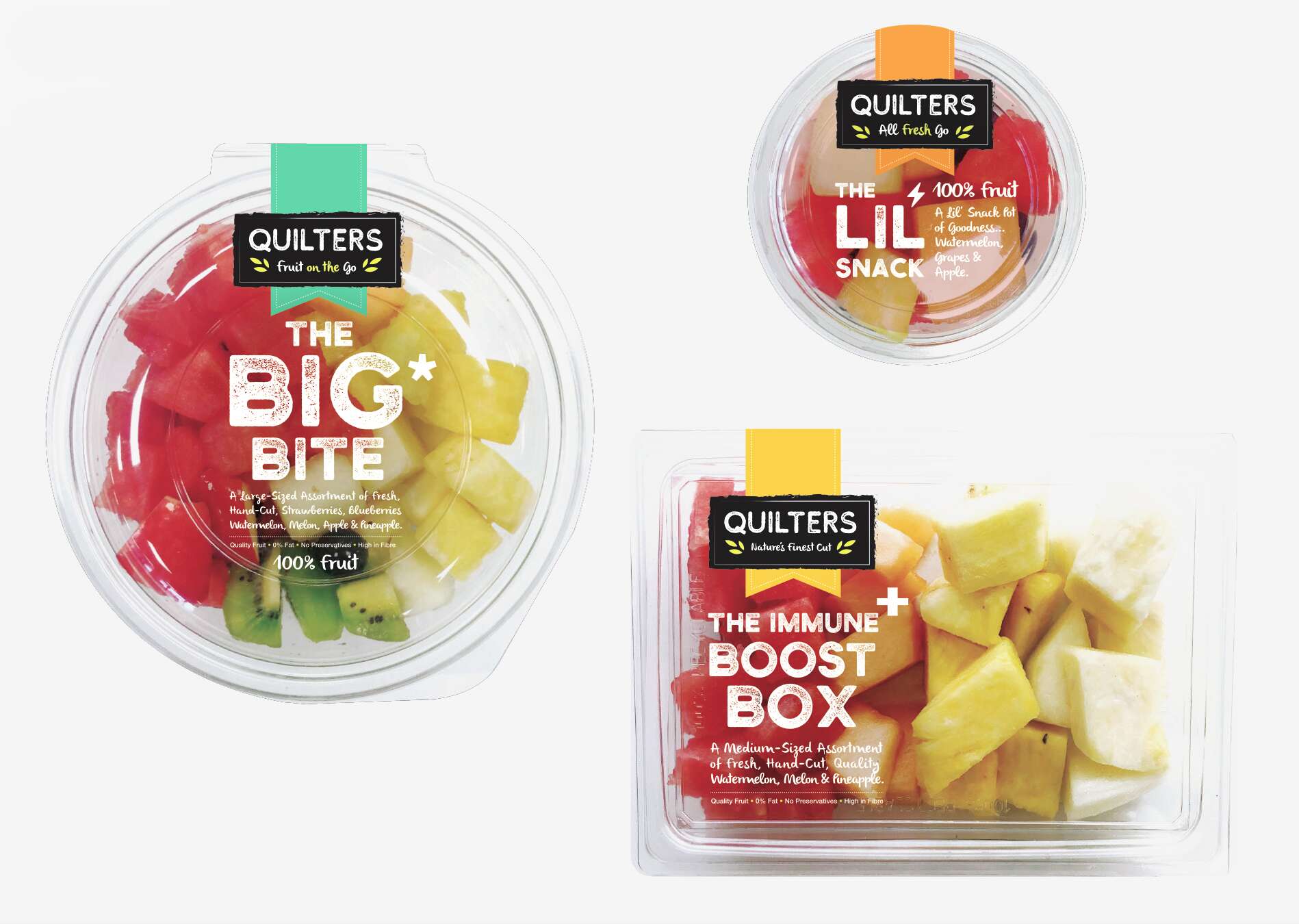
Tara Gartlan Chocolate: Brand Packaging Design
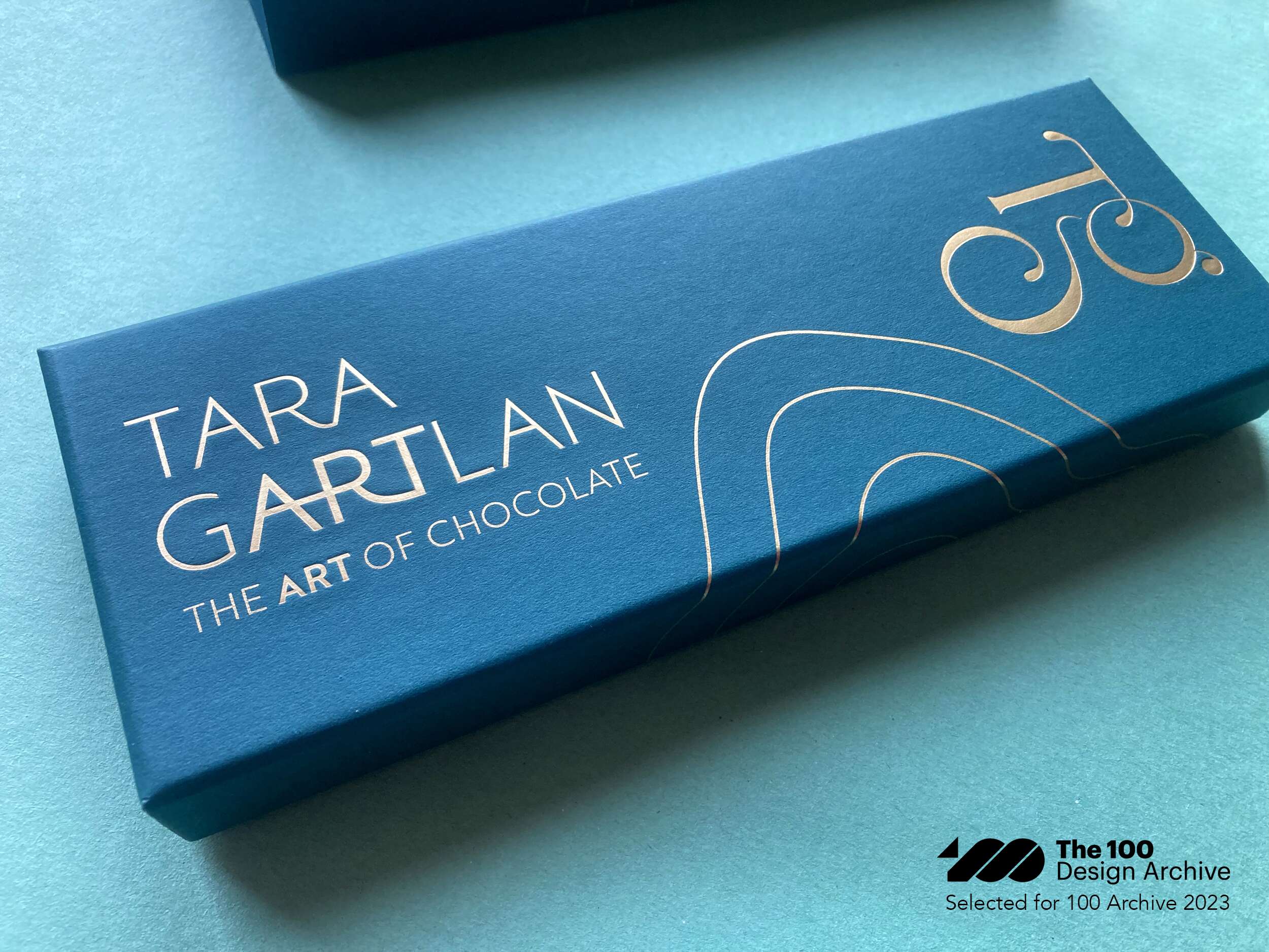
Introducing the Brand Packaging Design for Tara Gartlan Chocolate – luxury handmade chocolate bonbons, created by Michelin star pastry chef Tara Gartlan.
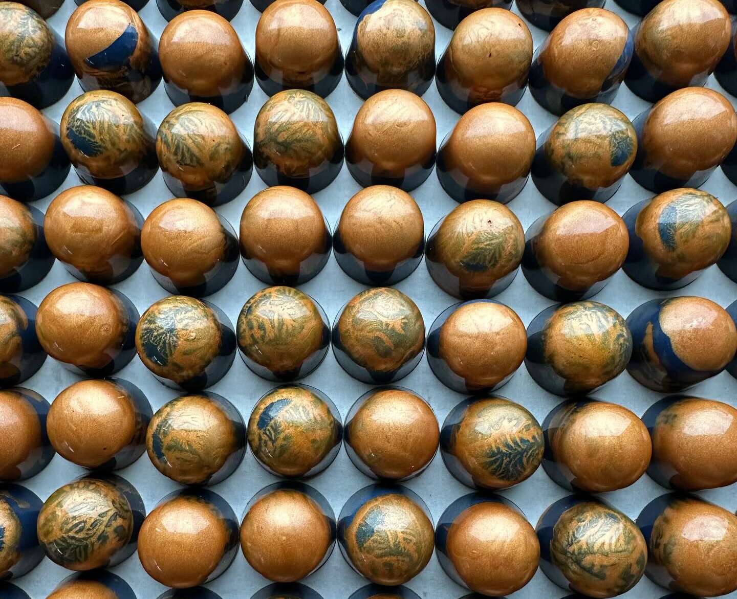
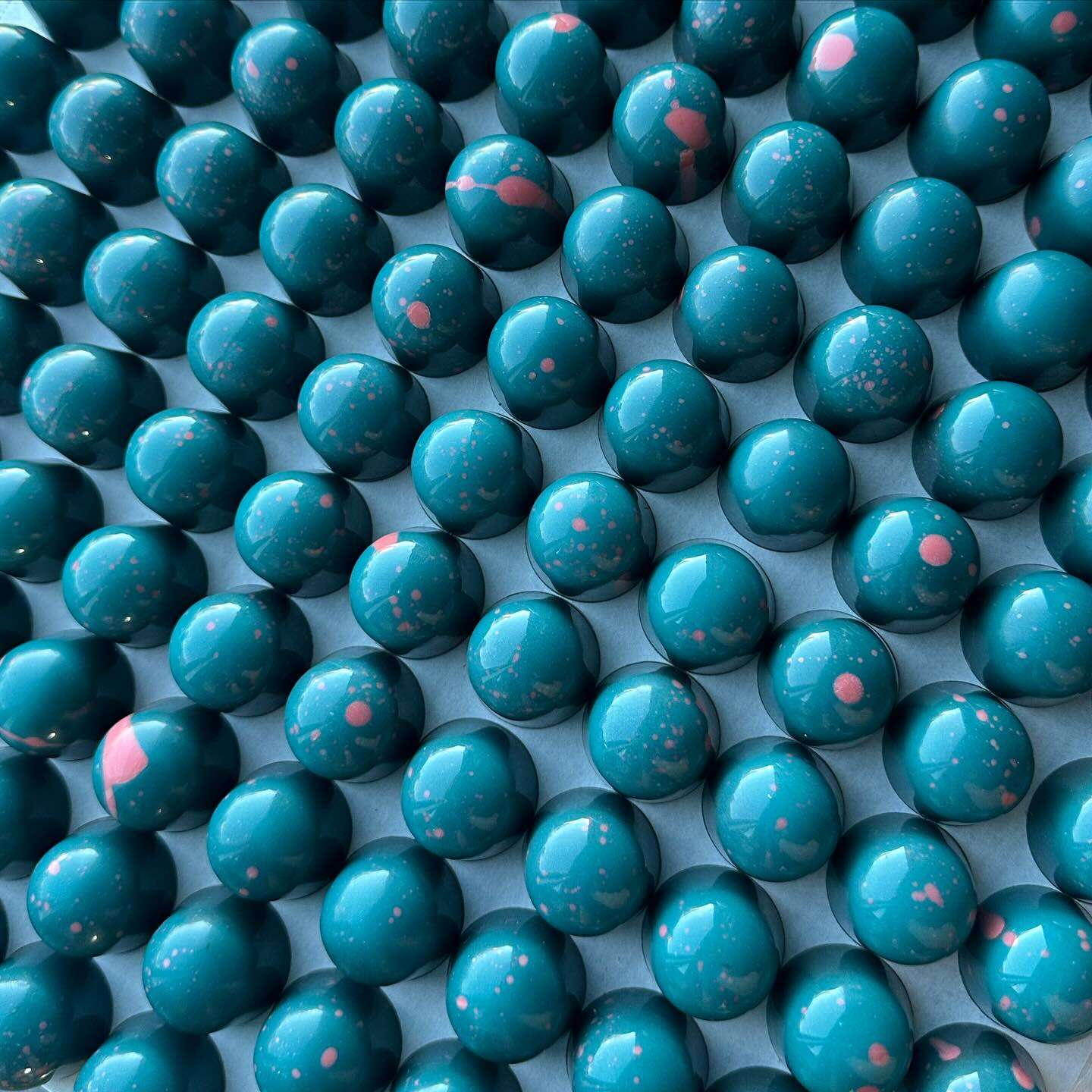
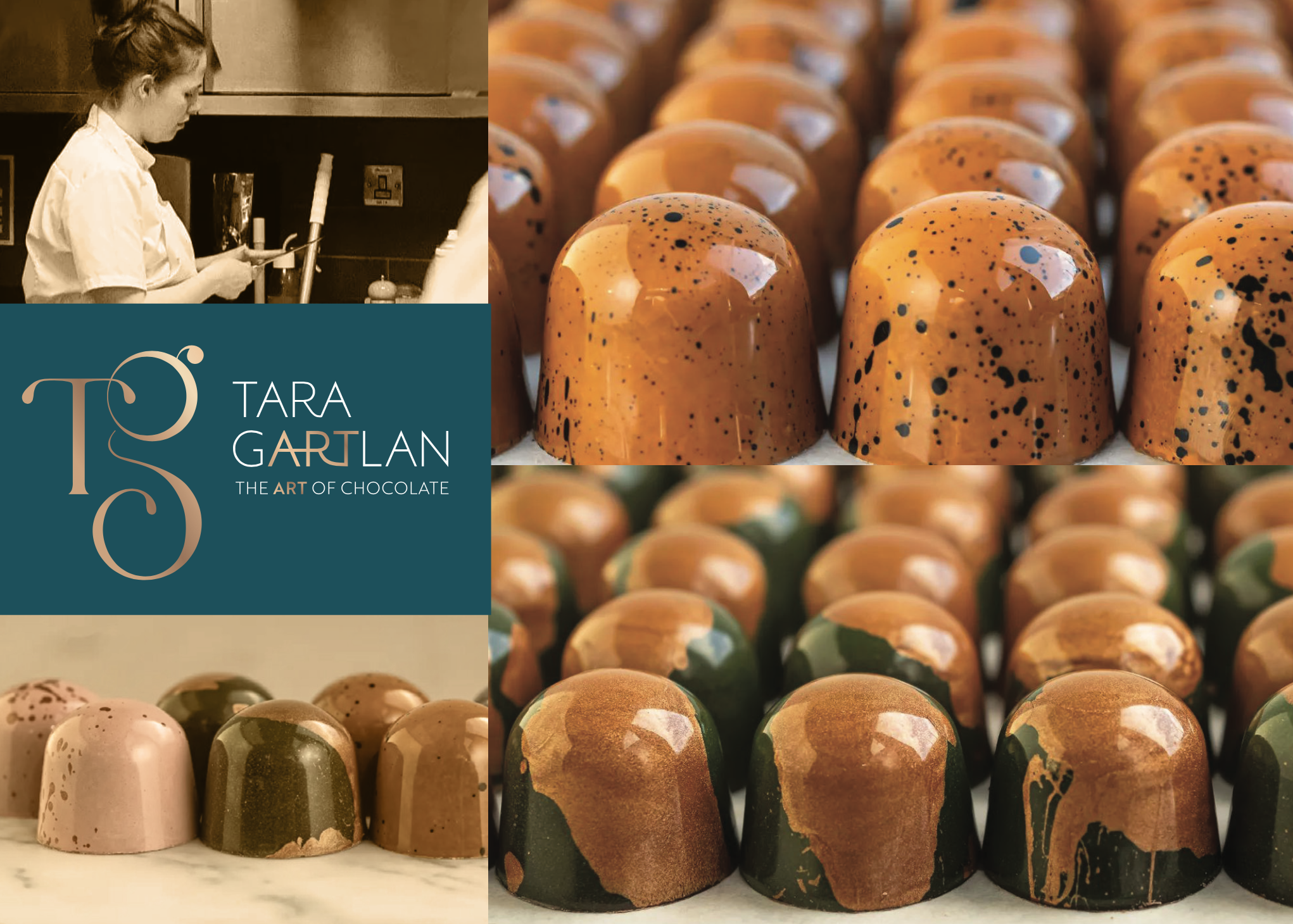
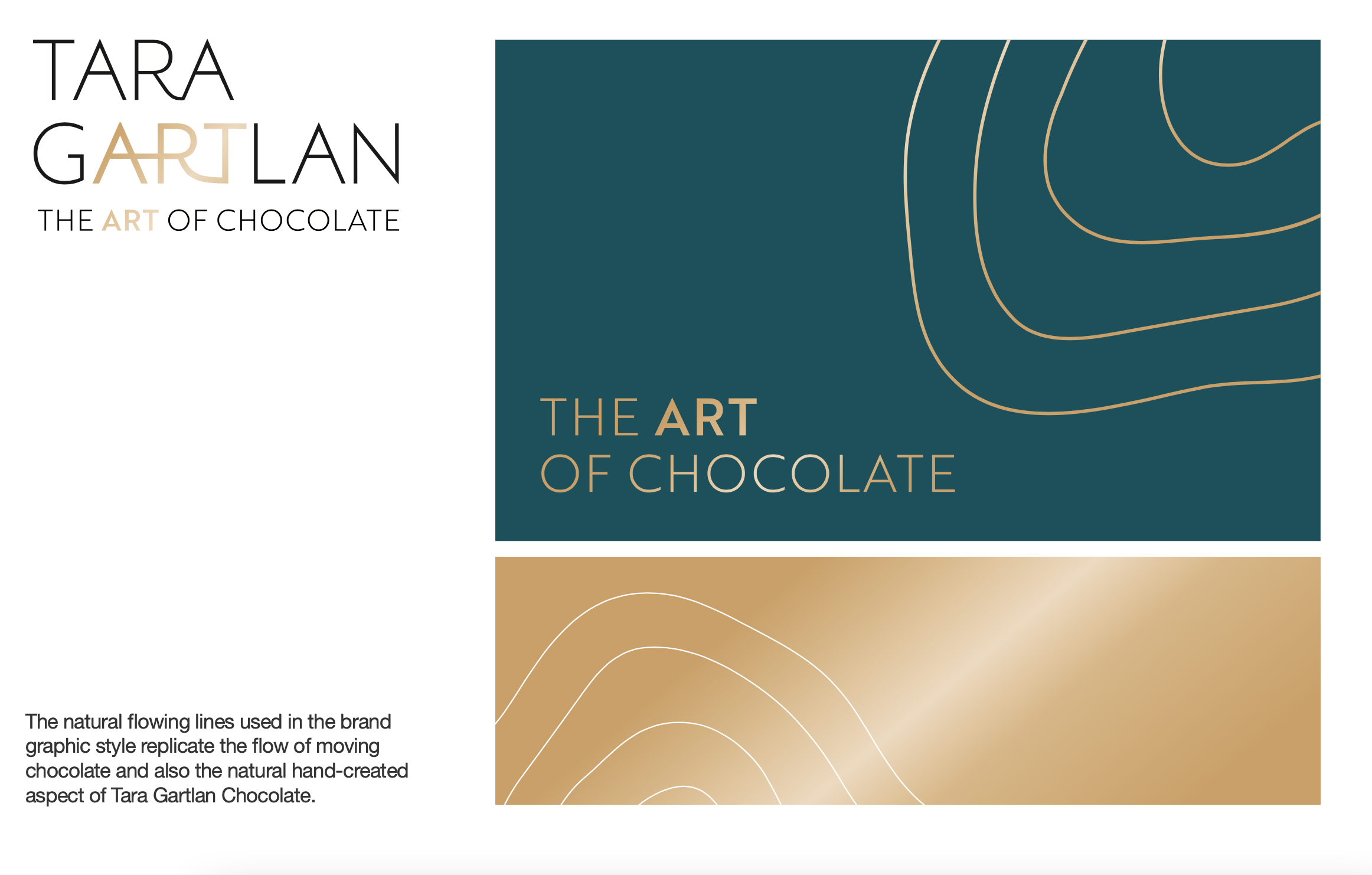
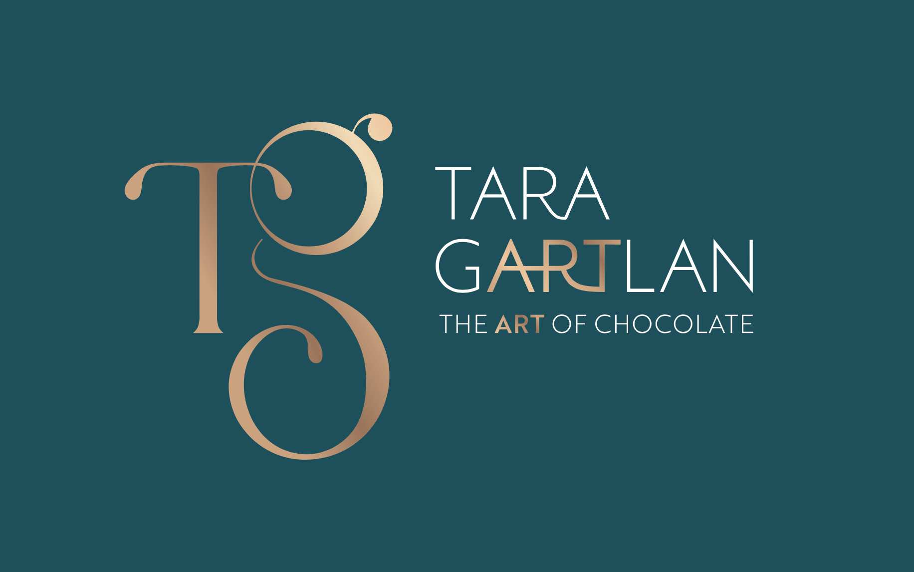
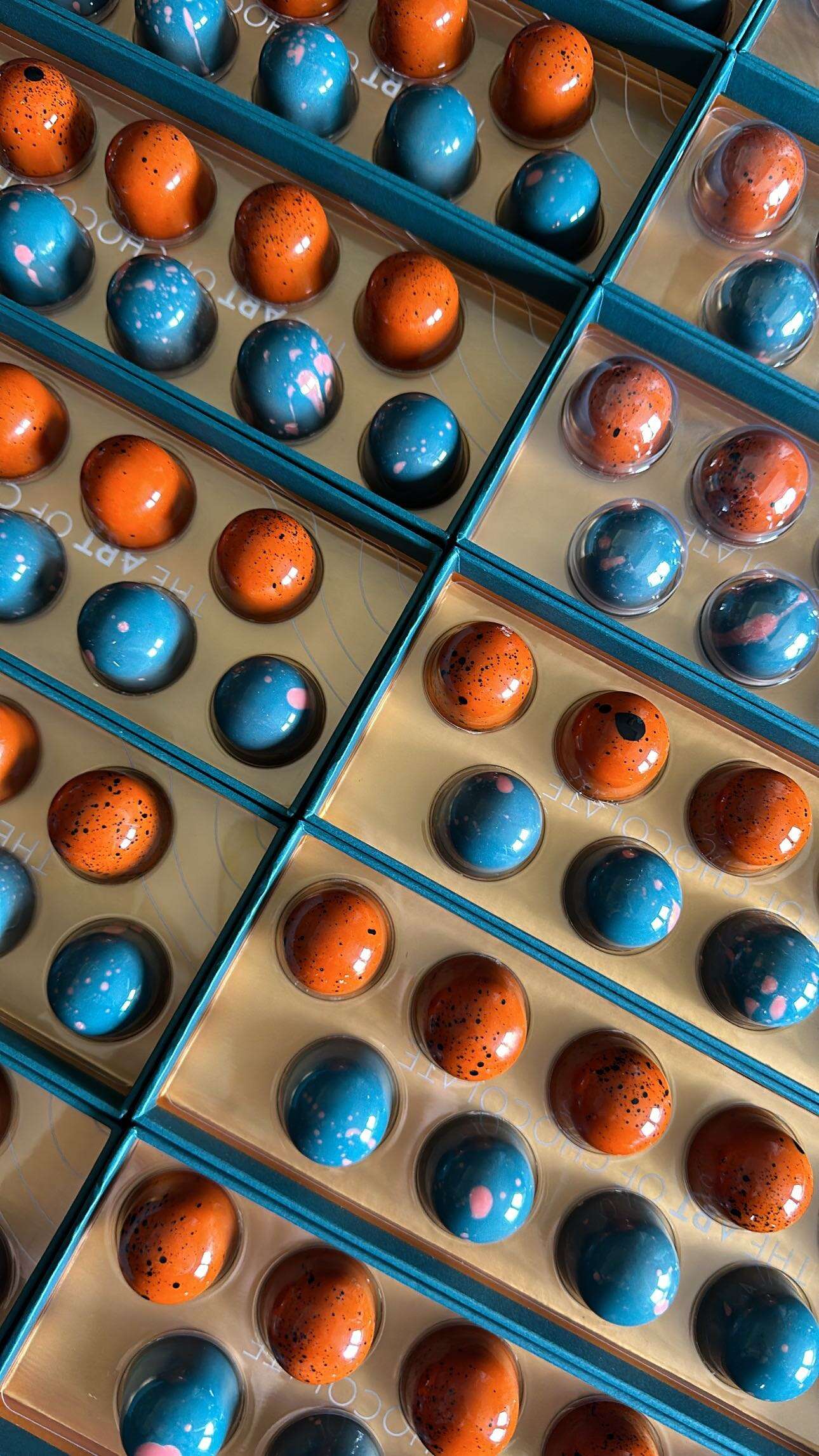
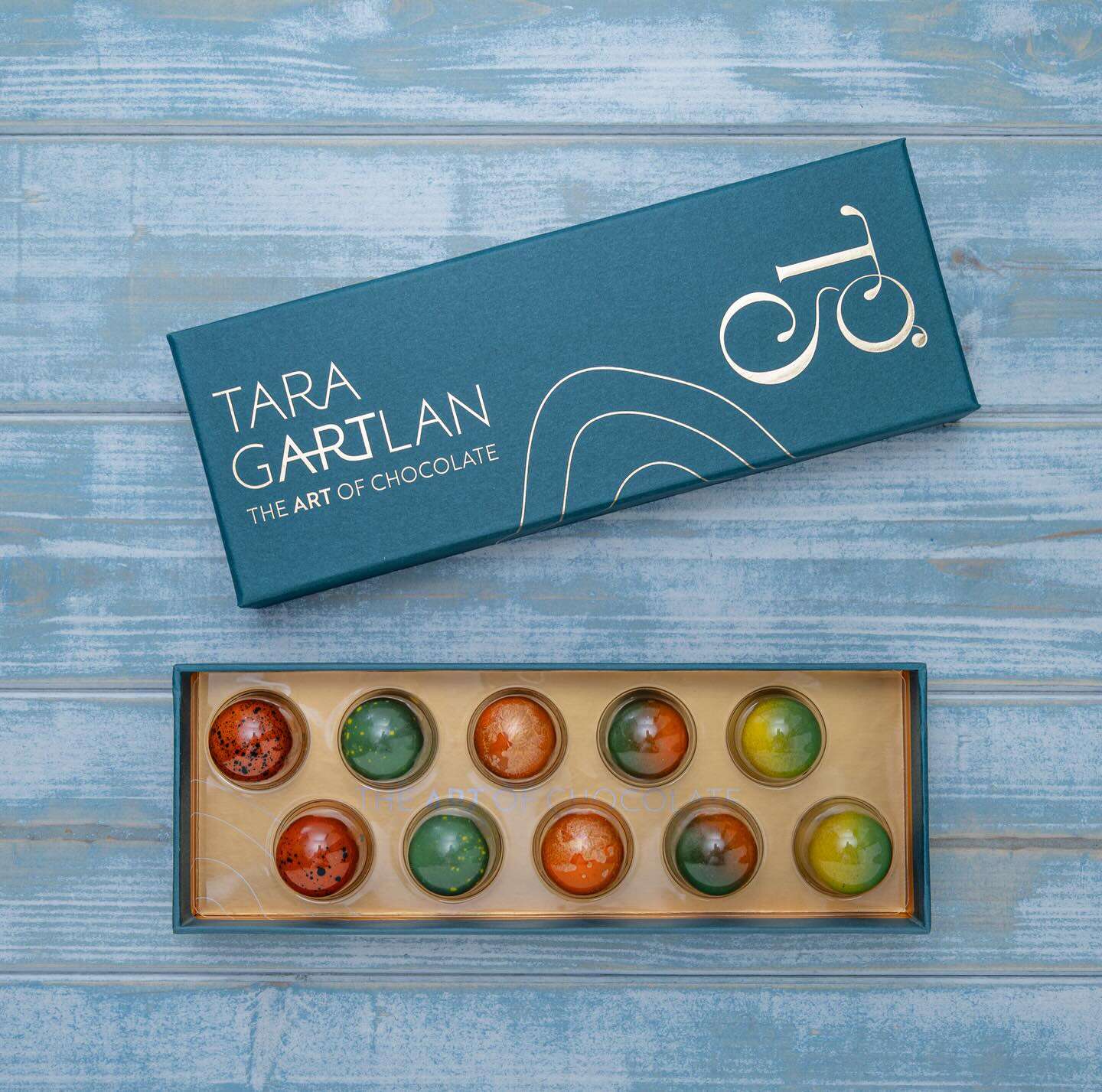
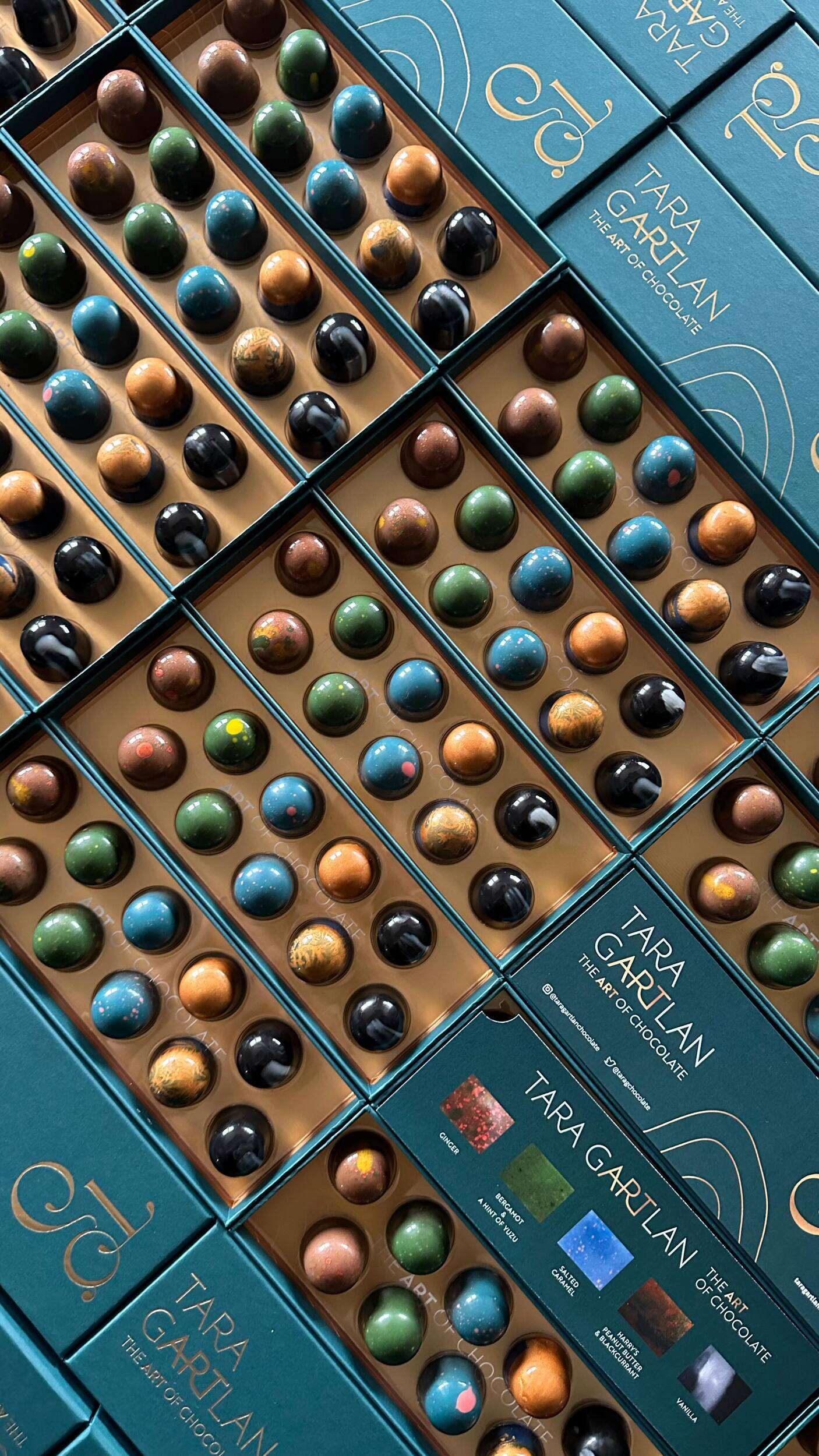
Each chocolate collection is like a work of art – every chocolate is meticulously handmade with beautiful designs, which lead to us creating the tagline ‘The Art of Chocolate’, highlighting the word ‘Art’ tucked within Tara Gartlan’s name. Cocoa butter is used artfully for decoration and all recipes are expertly crafted by Tara Gartlan. They look almost too good to eat! But once you do, you’ll be reaching for another one.
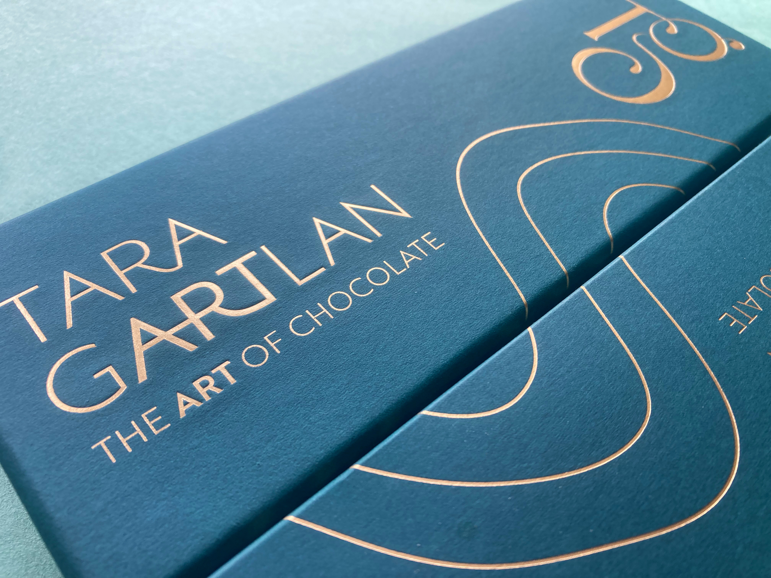
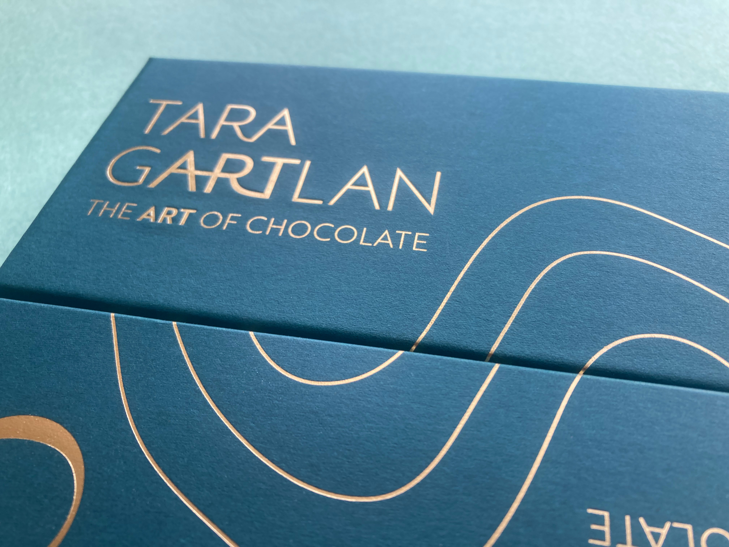
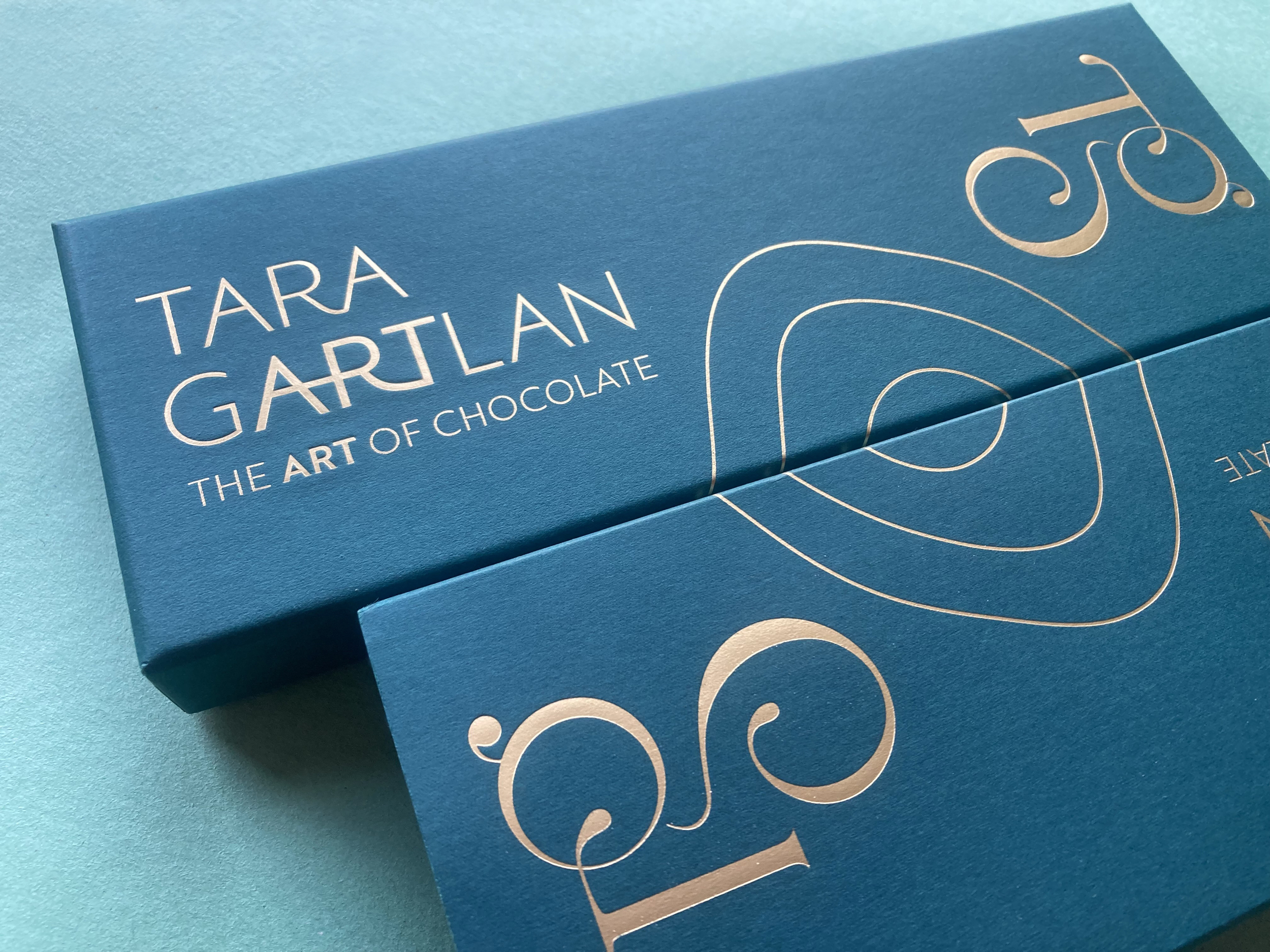
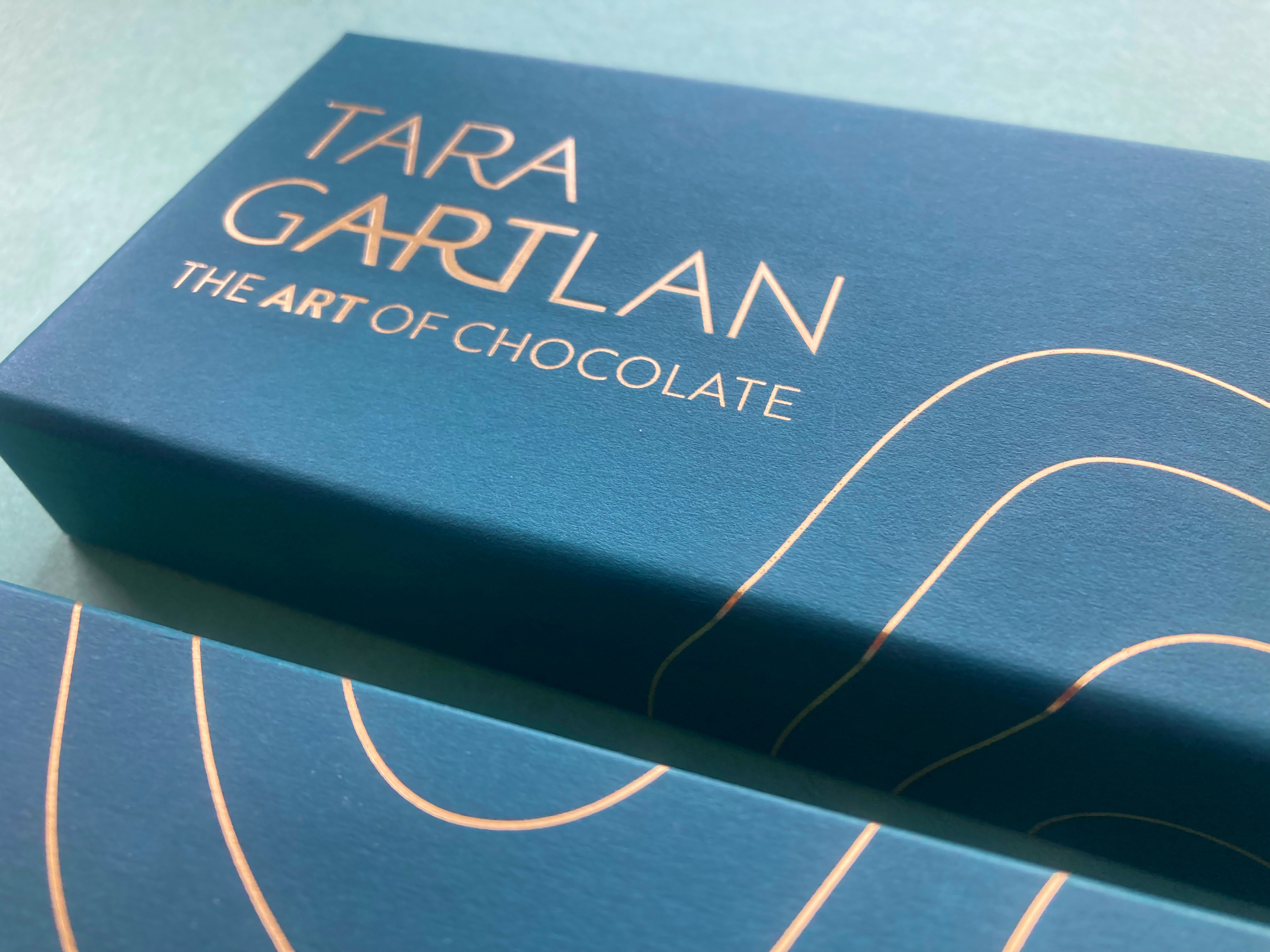
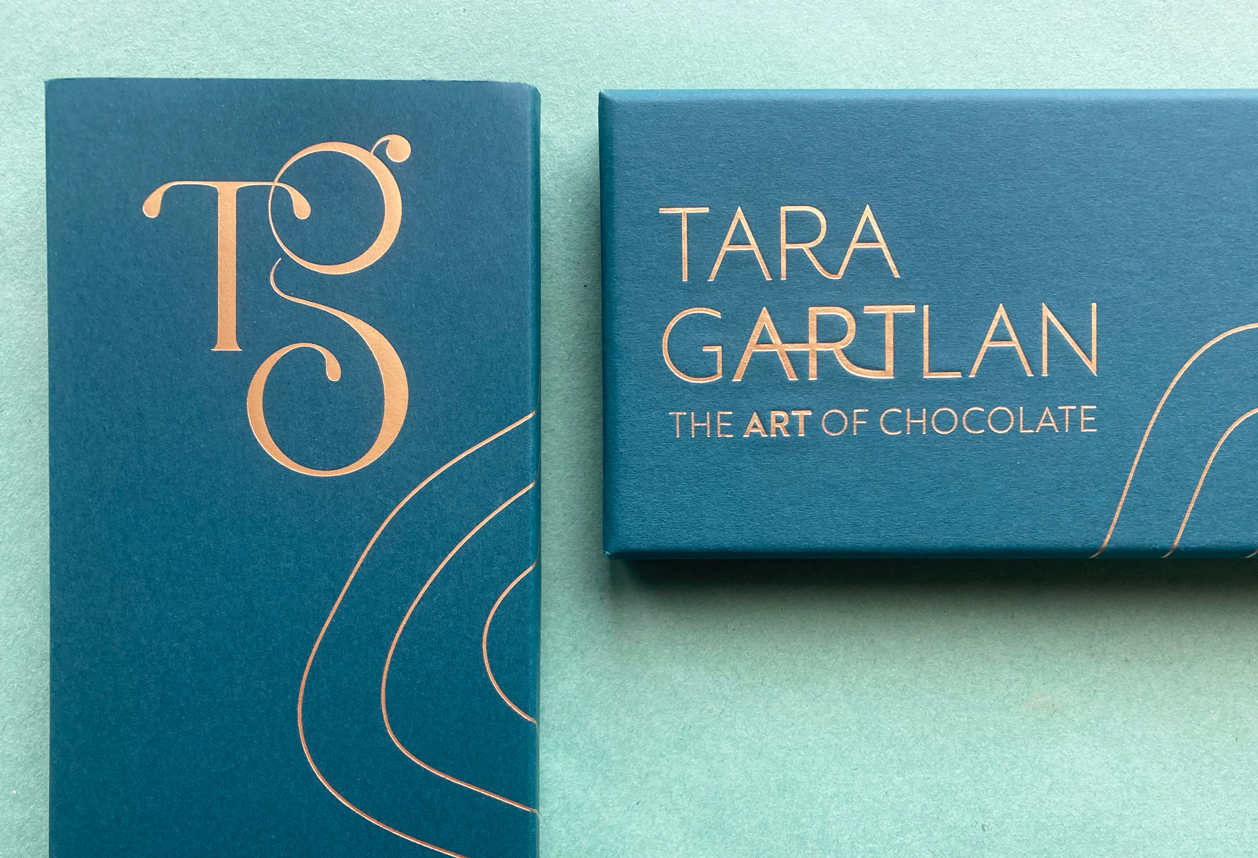
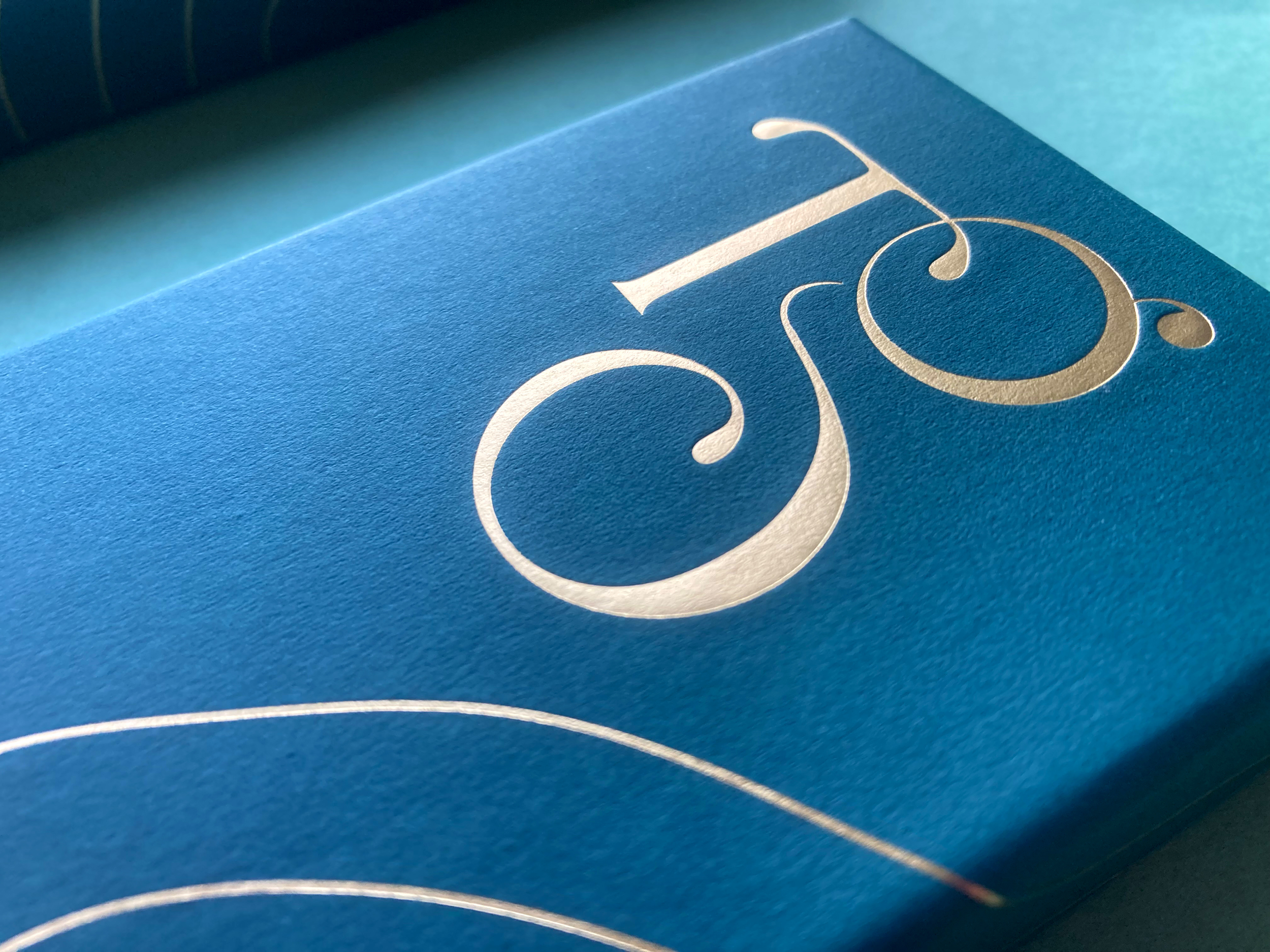
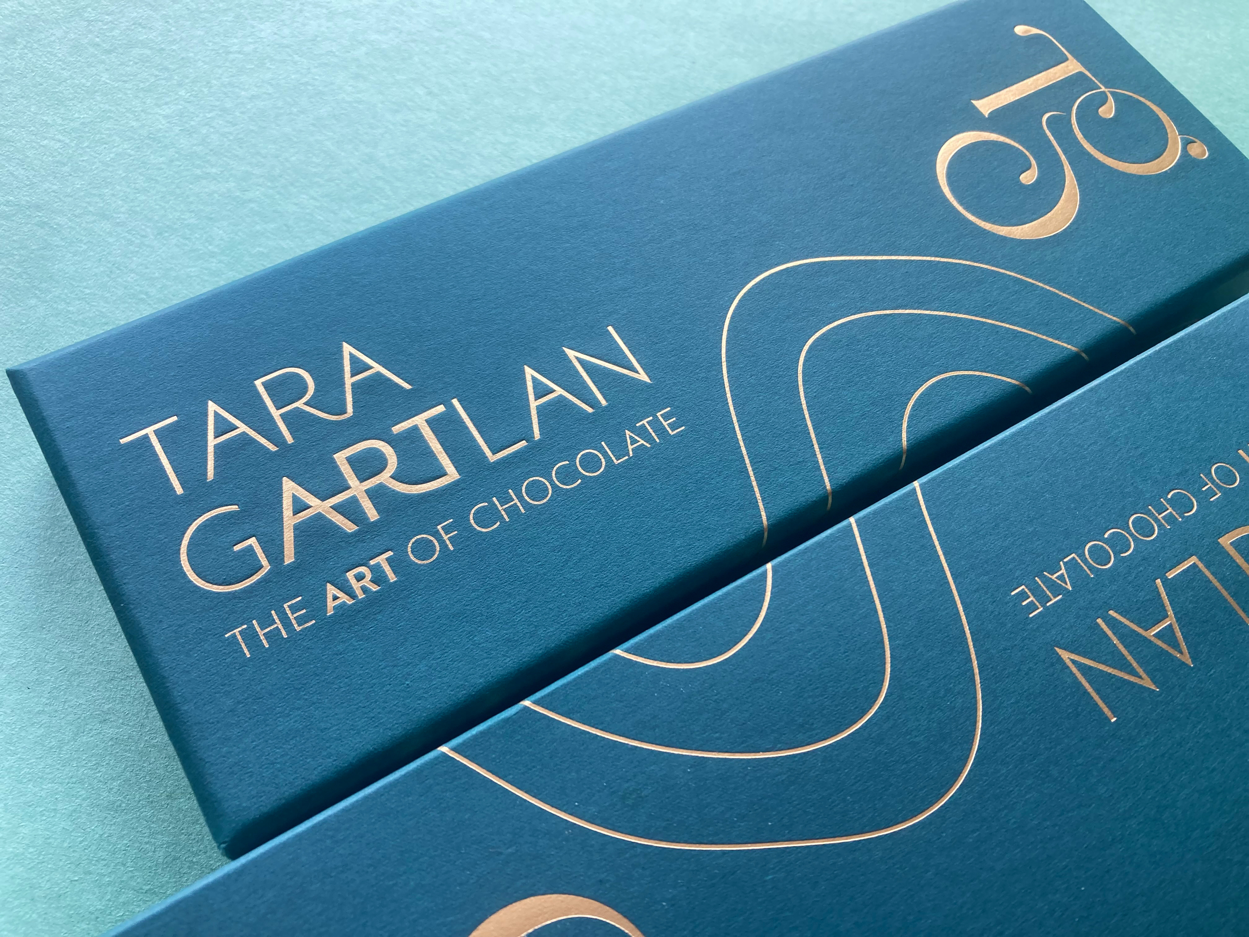
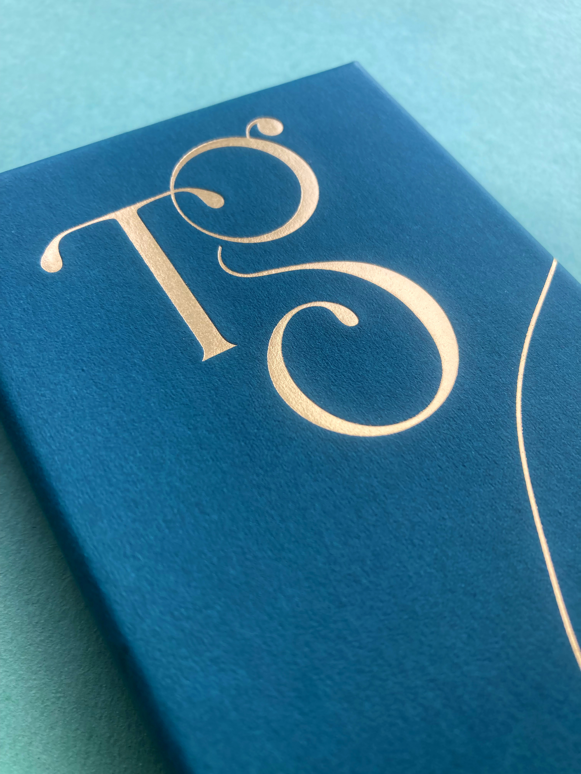
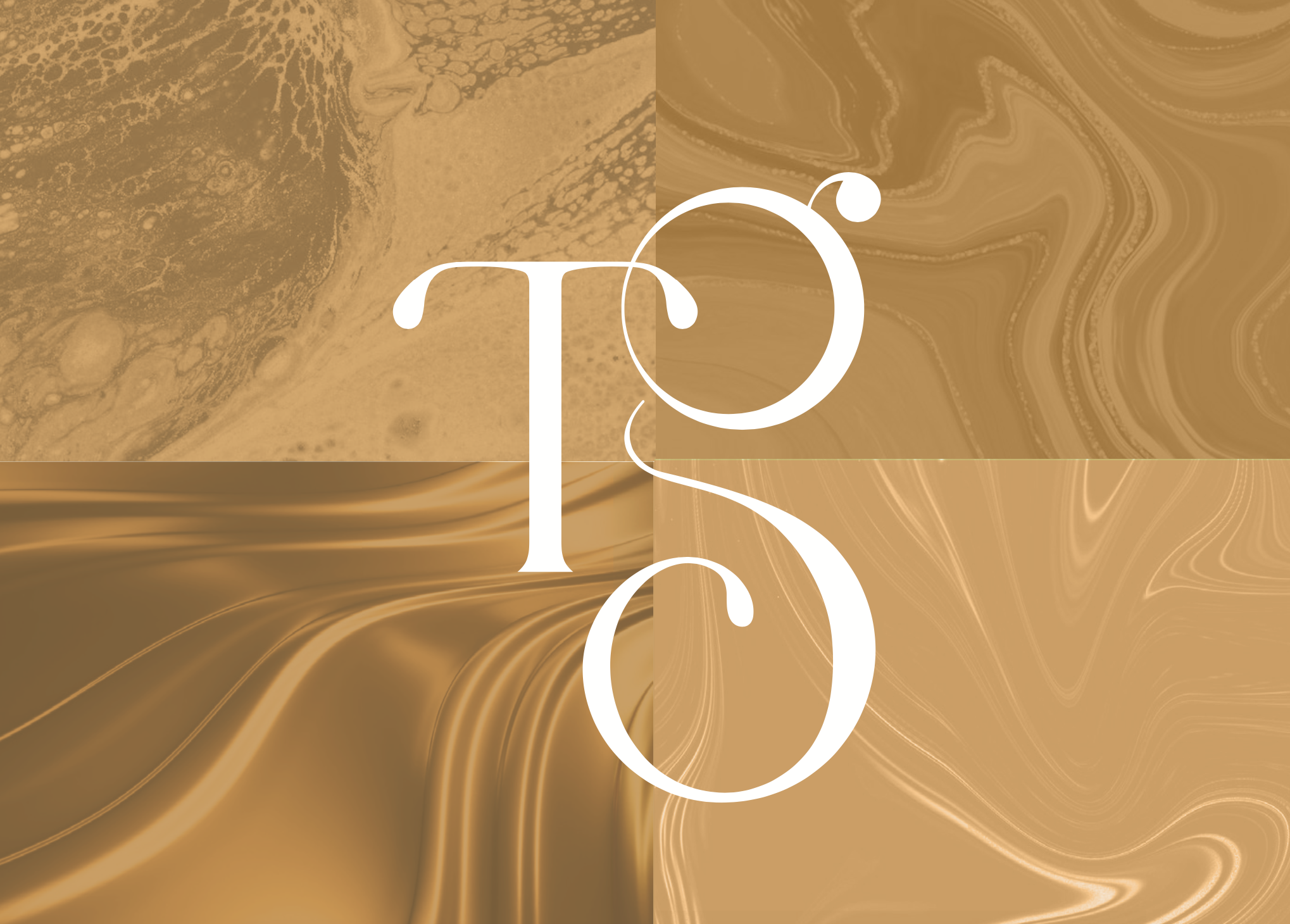
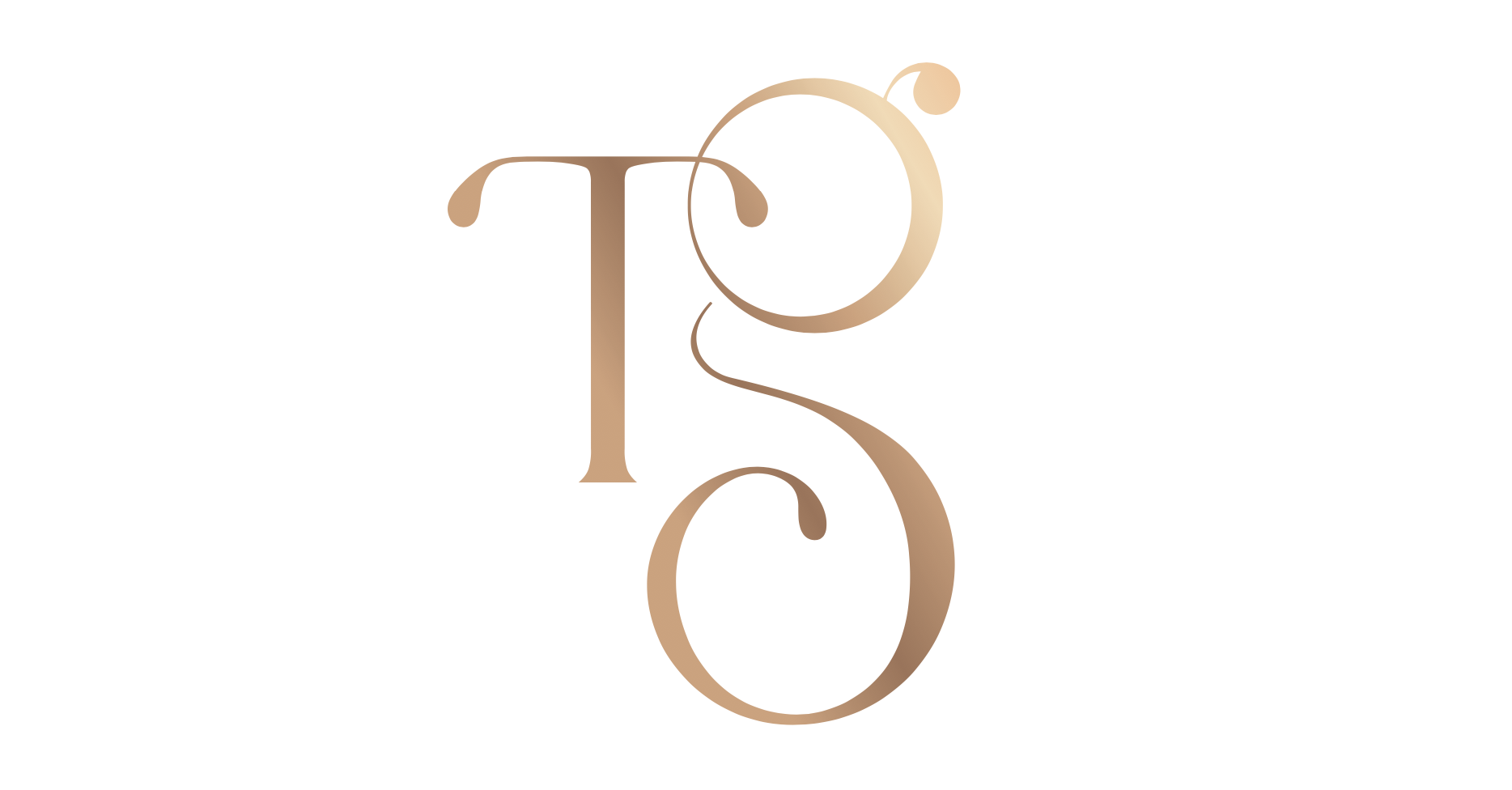
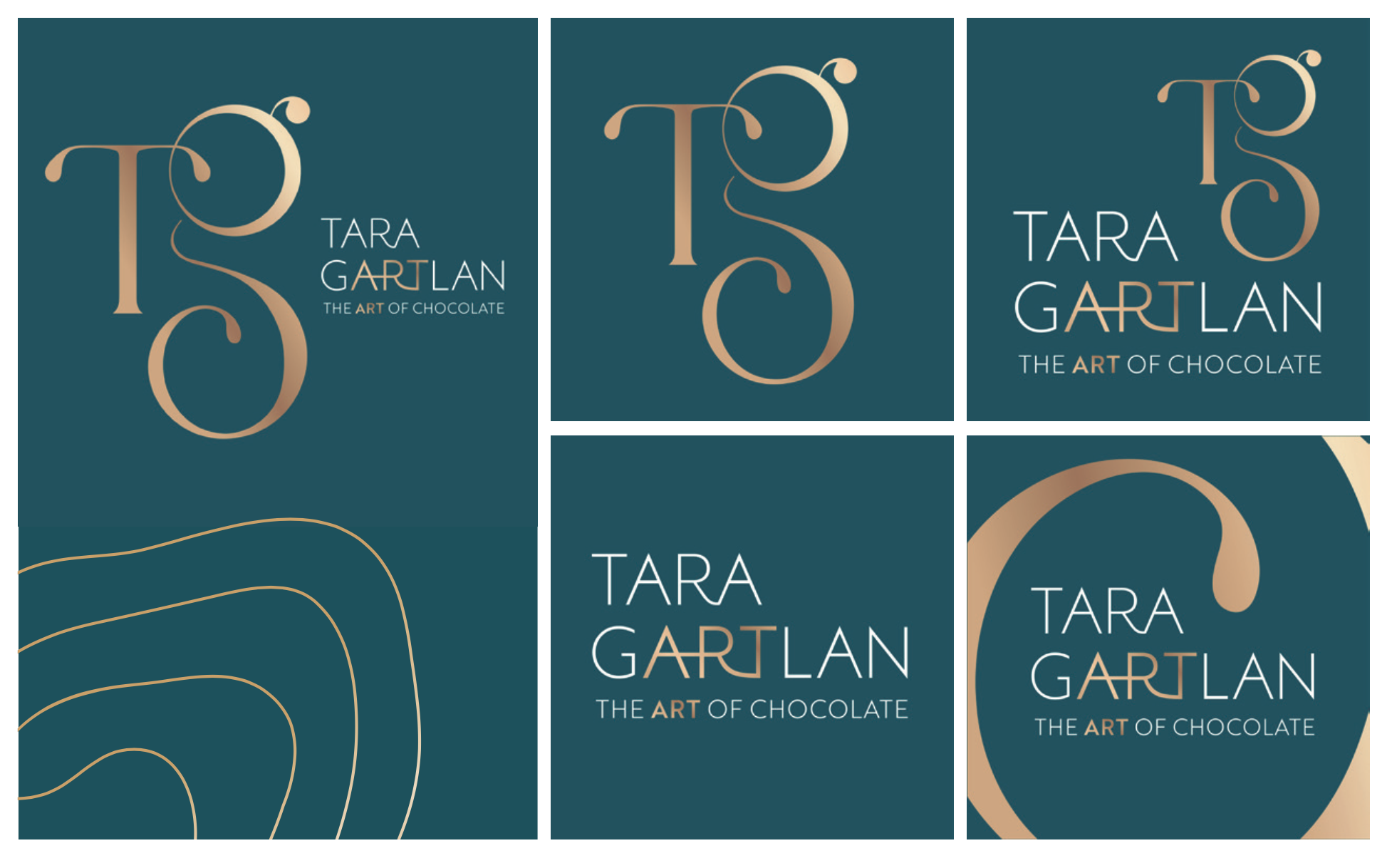
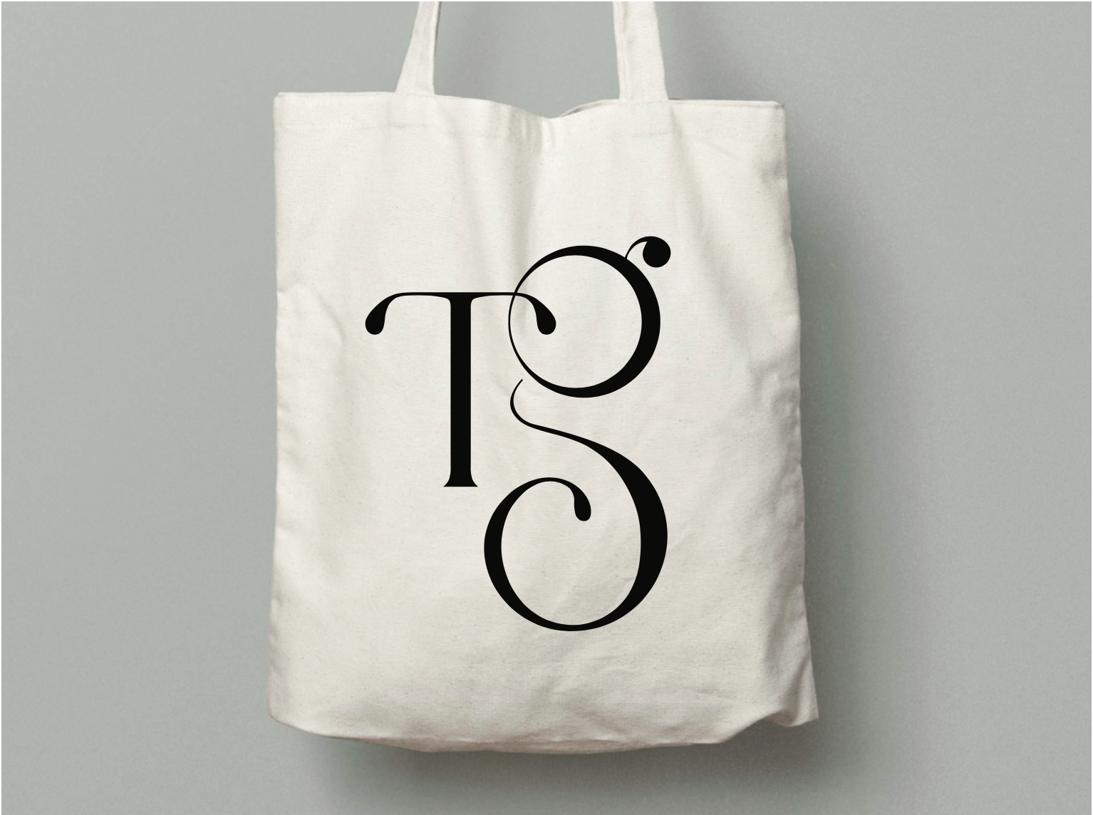
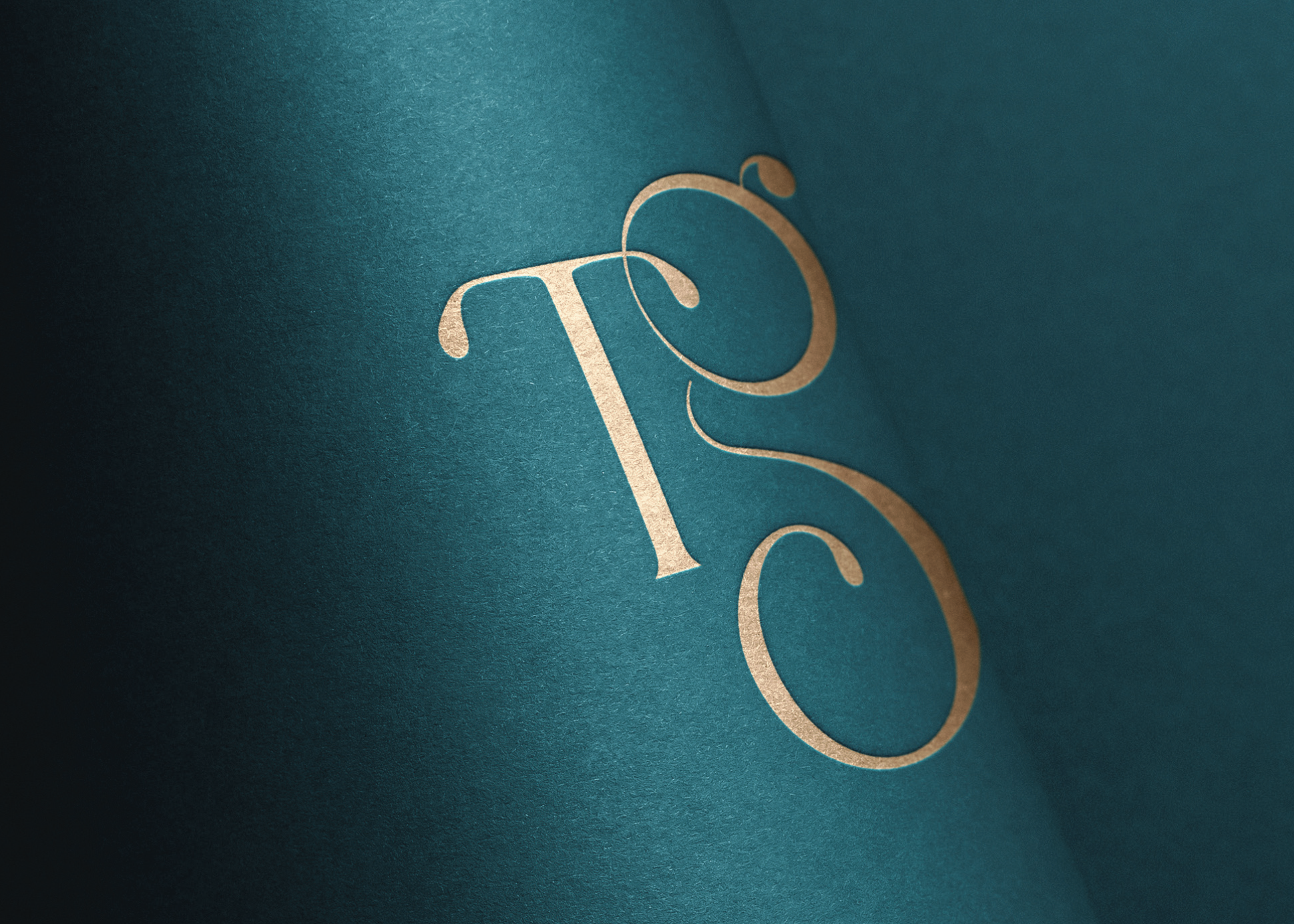
We took the initials ‘TG’ from Tara Gartlan’s name and created a strong graphic symbol with it, taking cues from the flowing nature of chocolate and incorporating droplets, like with chocolate dripping. There is a subtle ‘c’ within the base of the ‘G’ for the word ‘chocolate’ and also for ‘coeliac’, as these chocolates are coeliac-friendly.
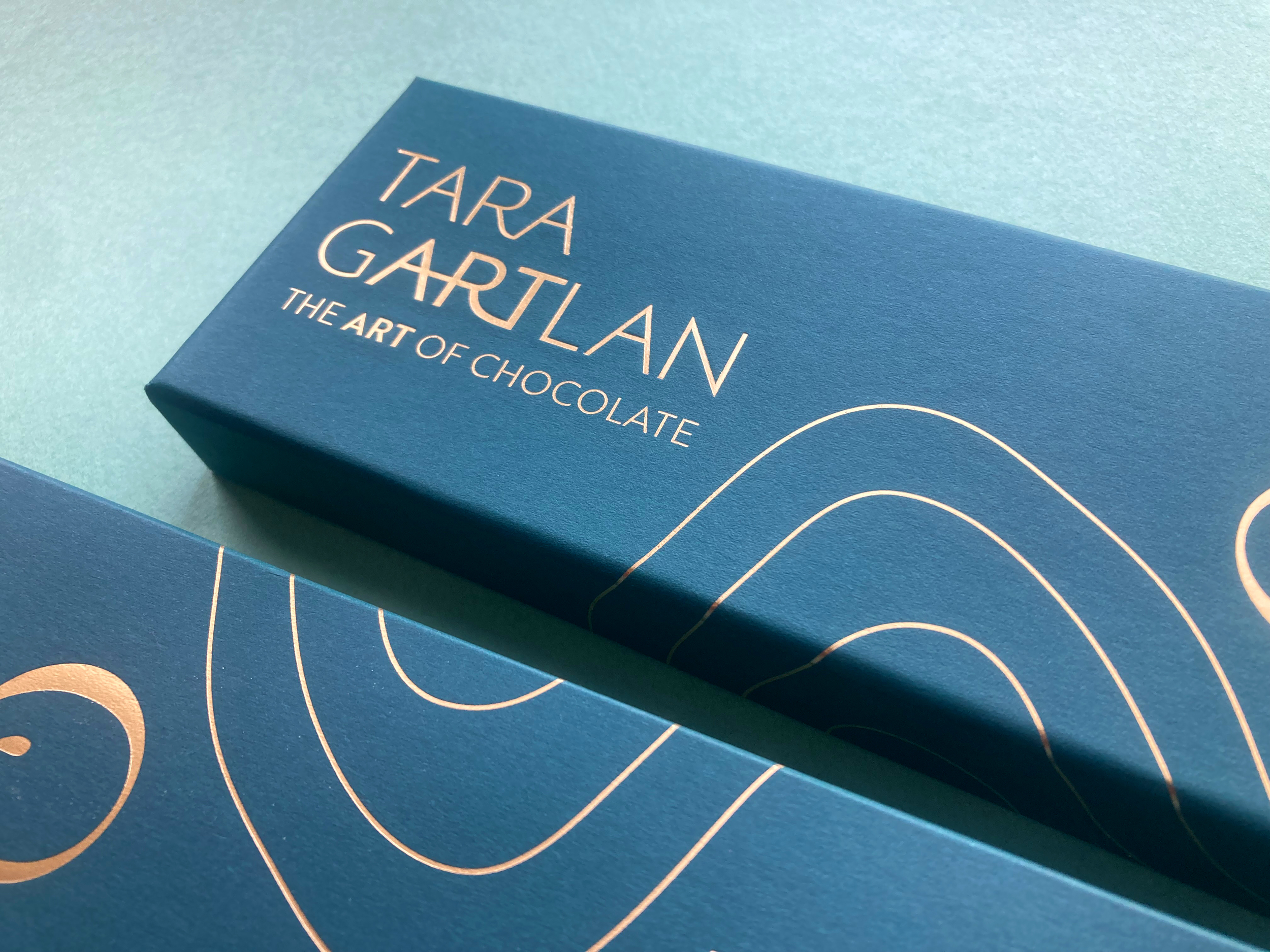
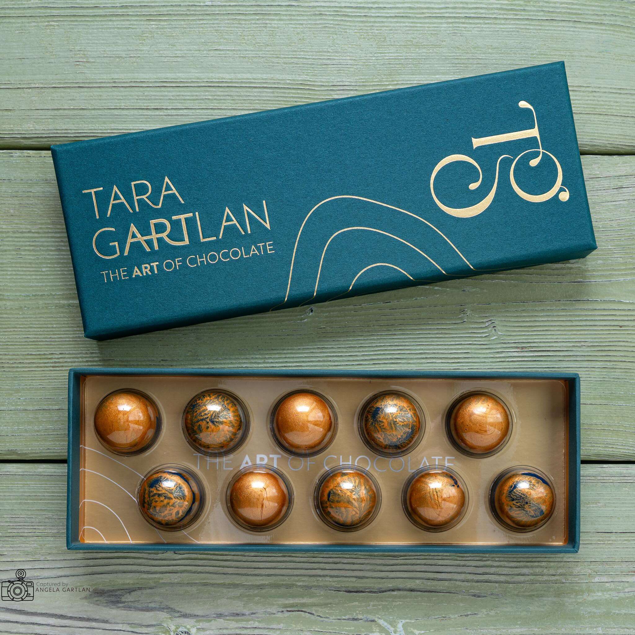
The beautiful boxes exude quality, the gold-detailed curvy lines take cues from the free-flowing way that chocolate is poured and the natural flowing lines in nature, as many of the ingredients are grown locally, guaranteeing the most fragrant flavours.
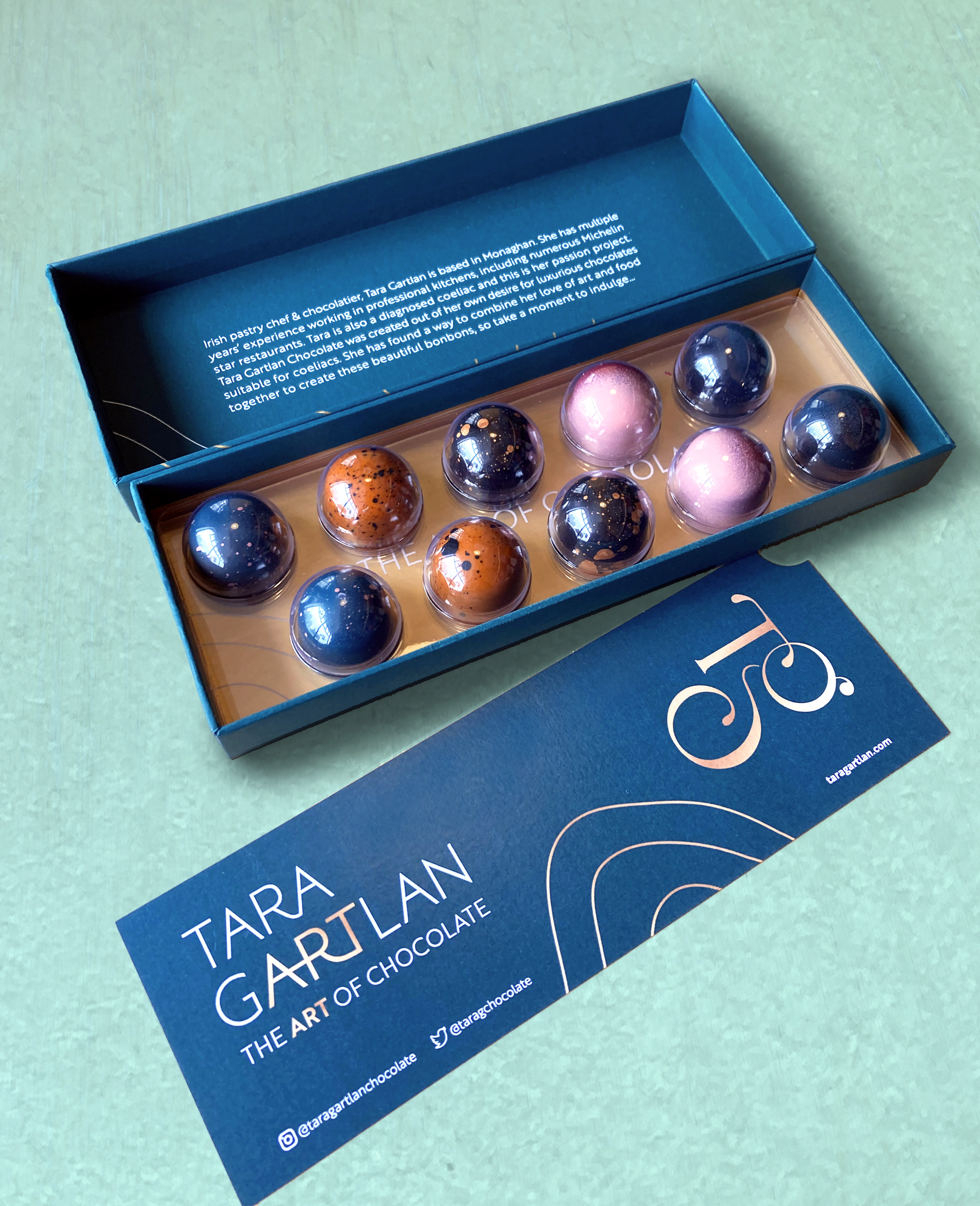
They are made with Valrhona chocolate and filled with beautifully seasonal ingredients. They are Gluten Free but the secret is – you wouldn’t know! Sometimes gluten free is perceived to be less tasty but I gave them to people to try and only told them after and they were shocked!
JJ O’Toole Ltd did a beautiful job on printing the packaging at a very premium standard – and are also a pleasure to deal with. All chocolate collections are available on www.taragartlan.com
Brand Guidelines & Assets
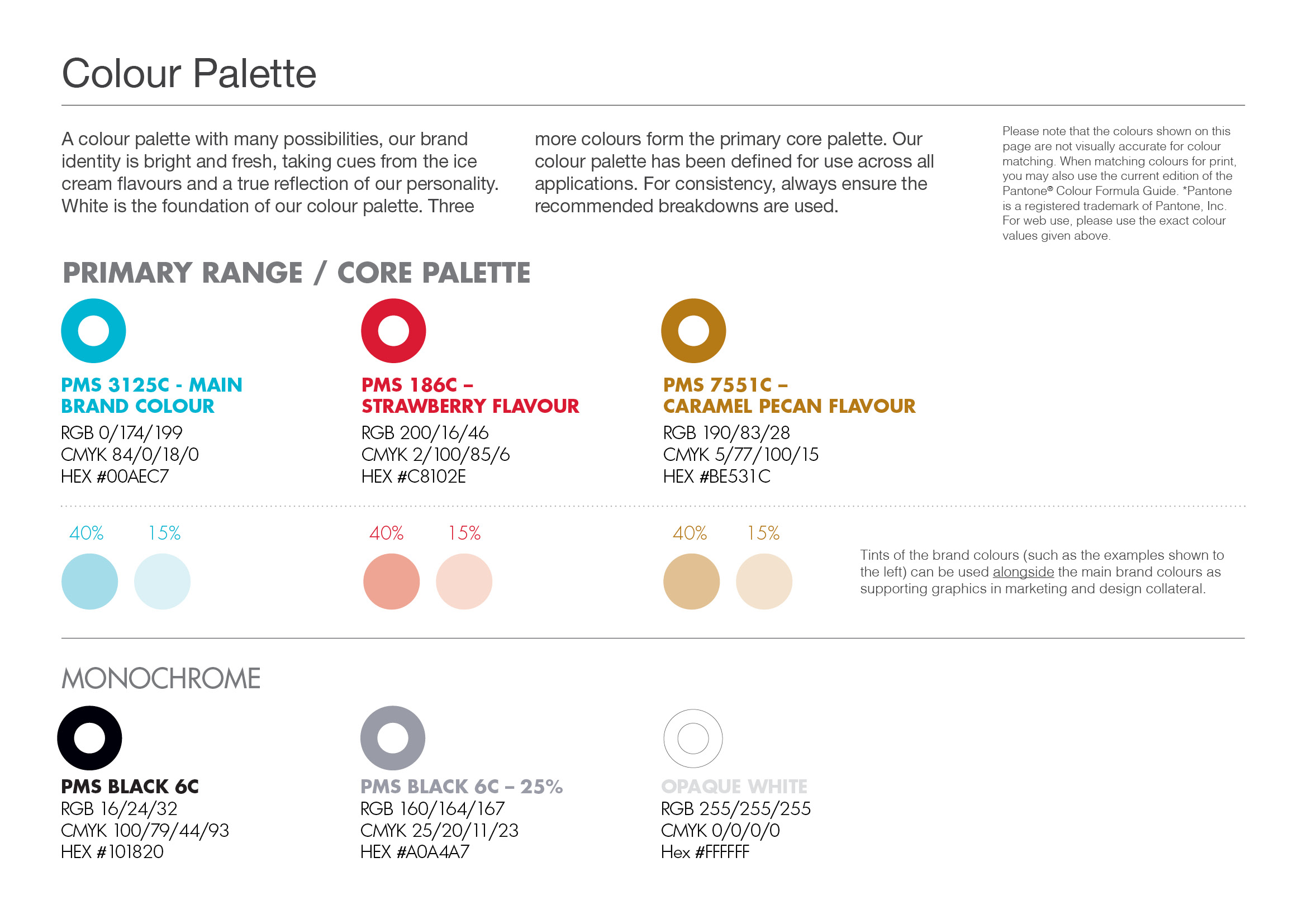
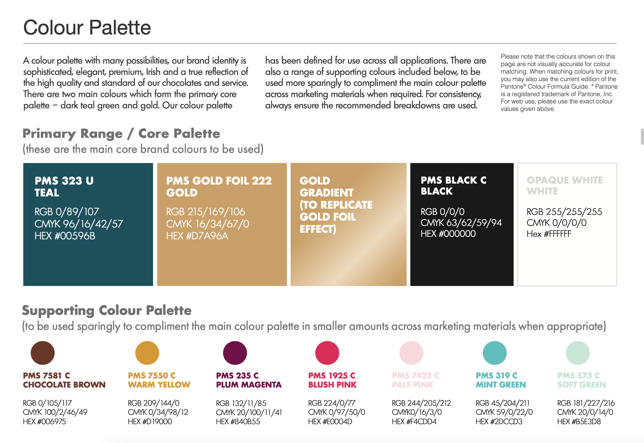
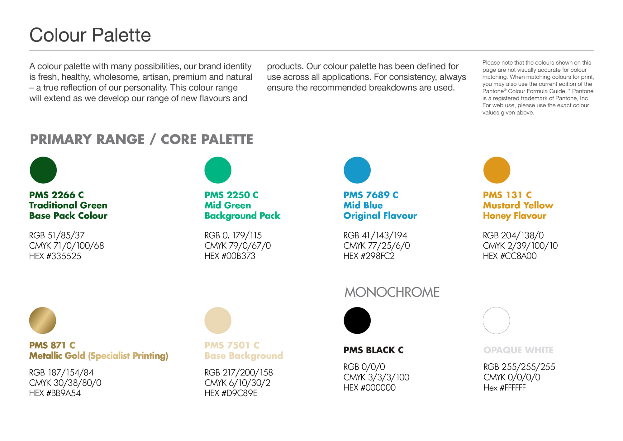
A colour palette with many possibilities, the Tara Gartlan Chocolate brand identity is sophisticated, elegant, premium, Irish and a true reflection of the high quality and standard of our chocolates and service.

Follow Tara Gartlan Chocolate on Social Media:
Instagram: @taragartlanchocolate
Twitter / X: TaraGChocolate
Facebook: Tara Gartlan Chocolate
Order Tara Gartlan Chocolates here: www.taragartlan.com
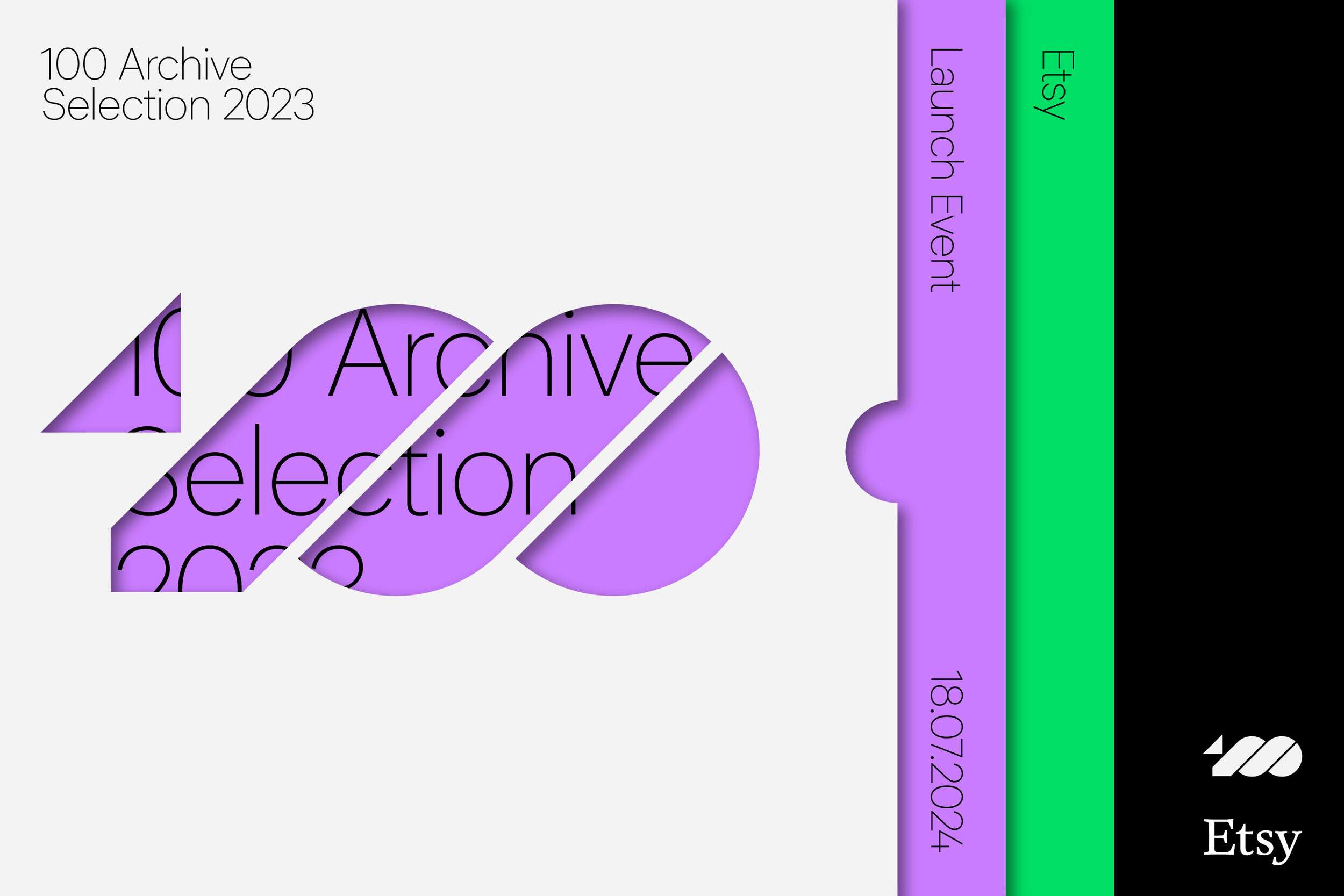
This project was selected for the 100 Archive 2023, which selects the best 100 designs in all disciplines of that year.
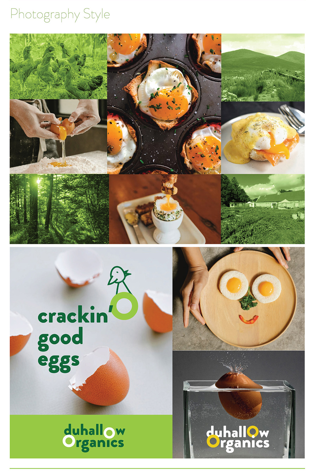
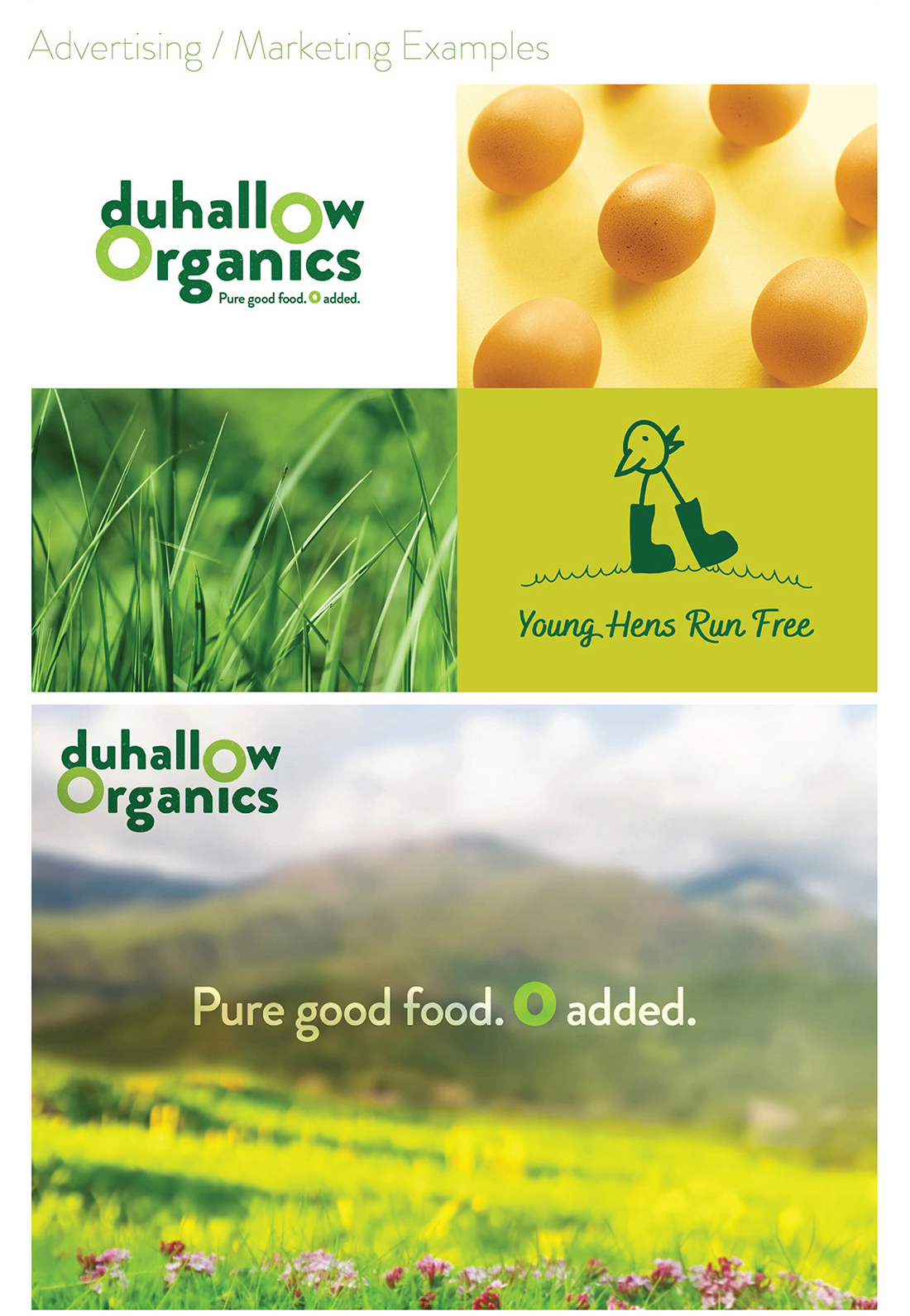
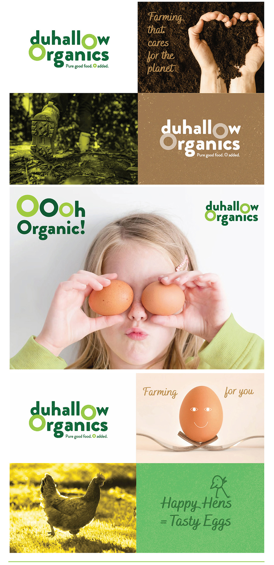
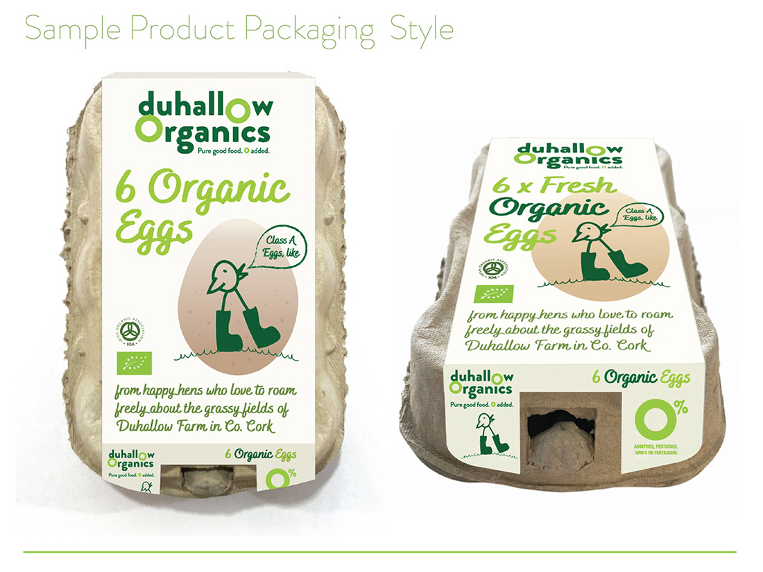
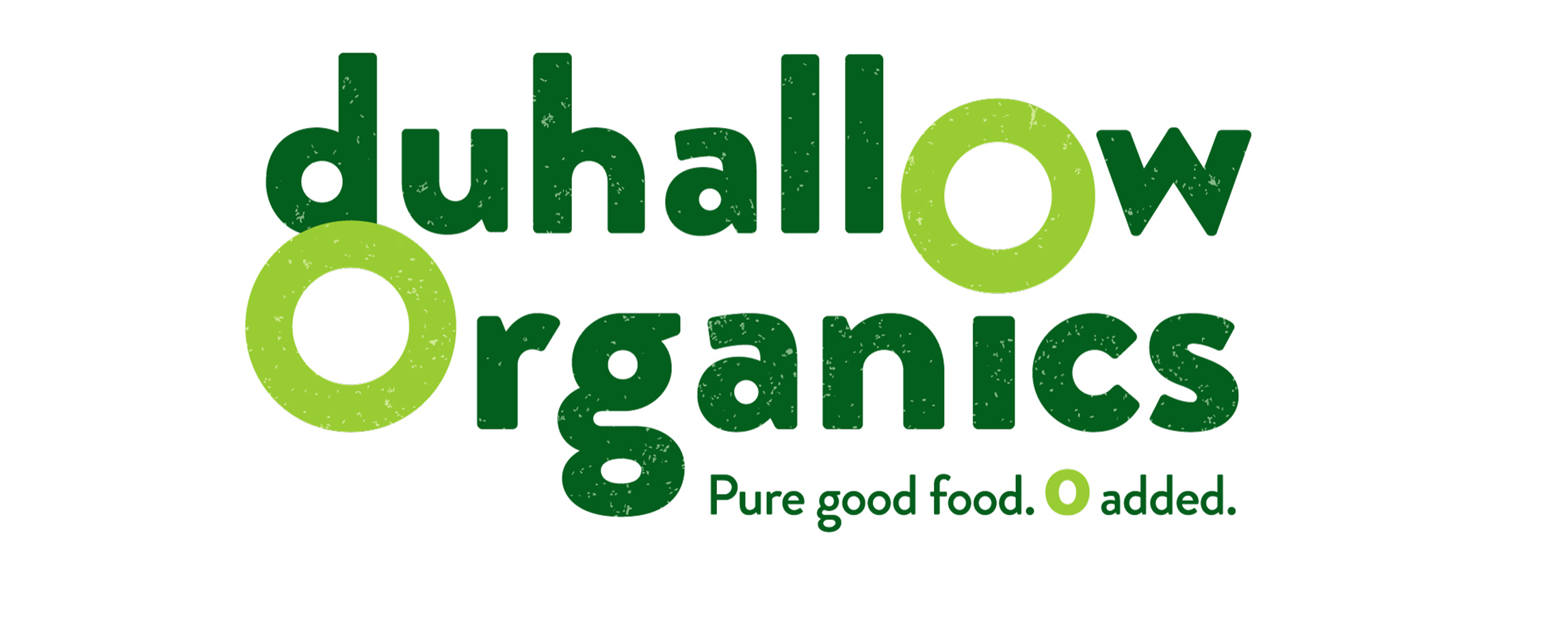 The Duhallow Organics farm is situated on the old Moynihan family farm in Boherbue in the heart of Duhallow, Co. Cork. Certified Organic since 2008, they produce Organic Eggs and grass finished Dexter Beef.
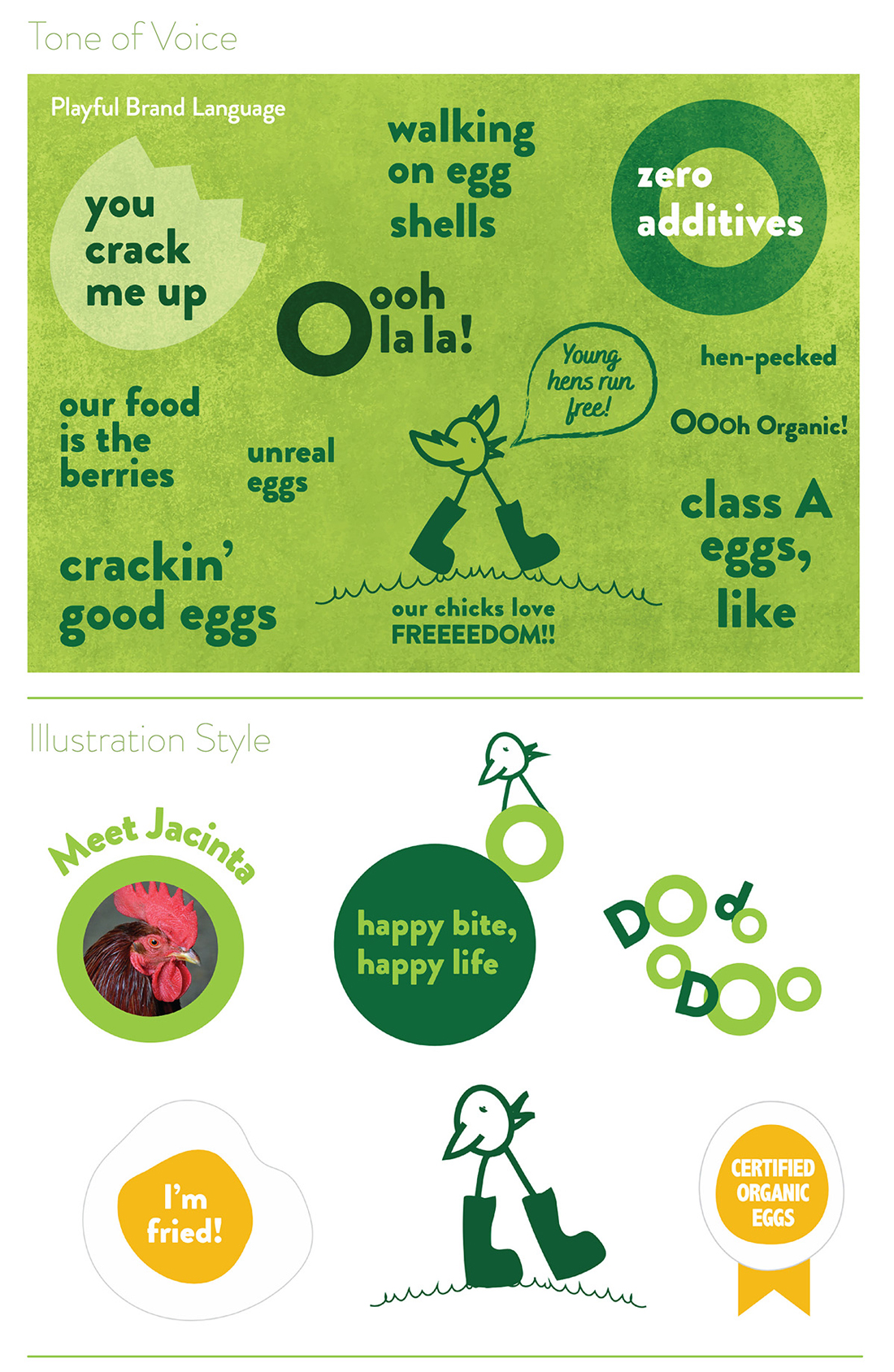

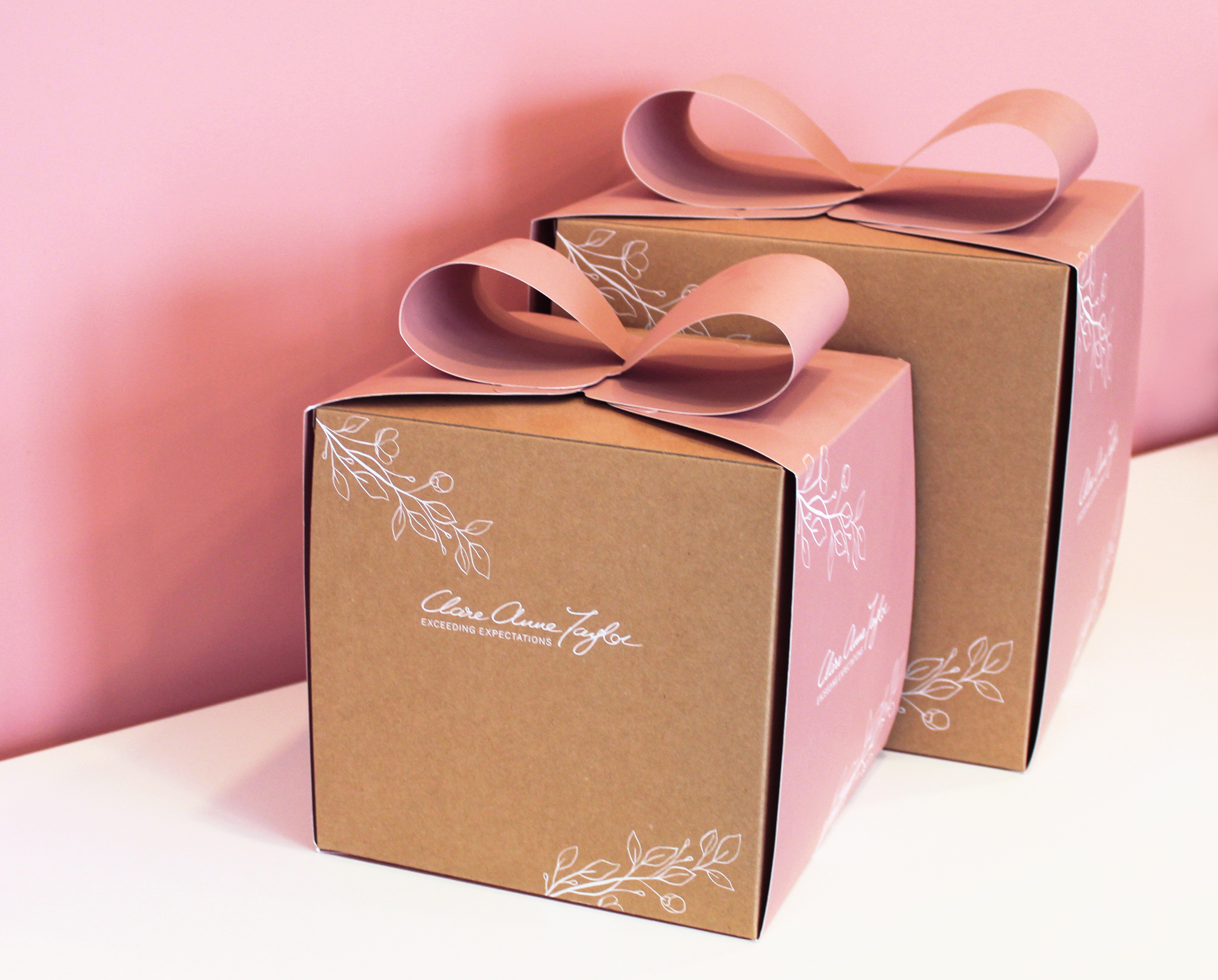
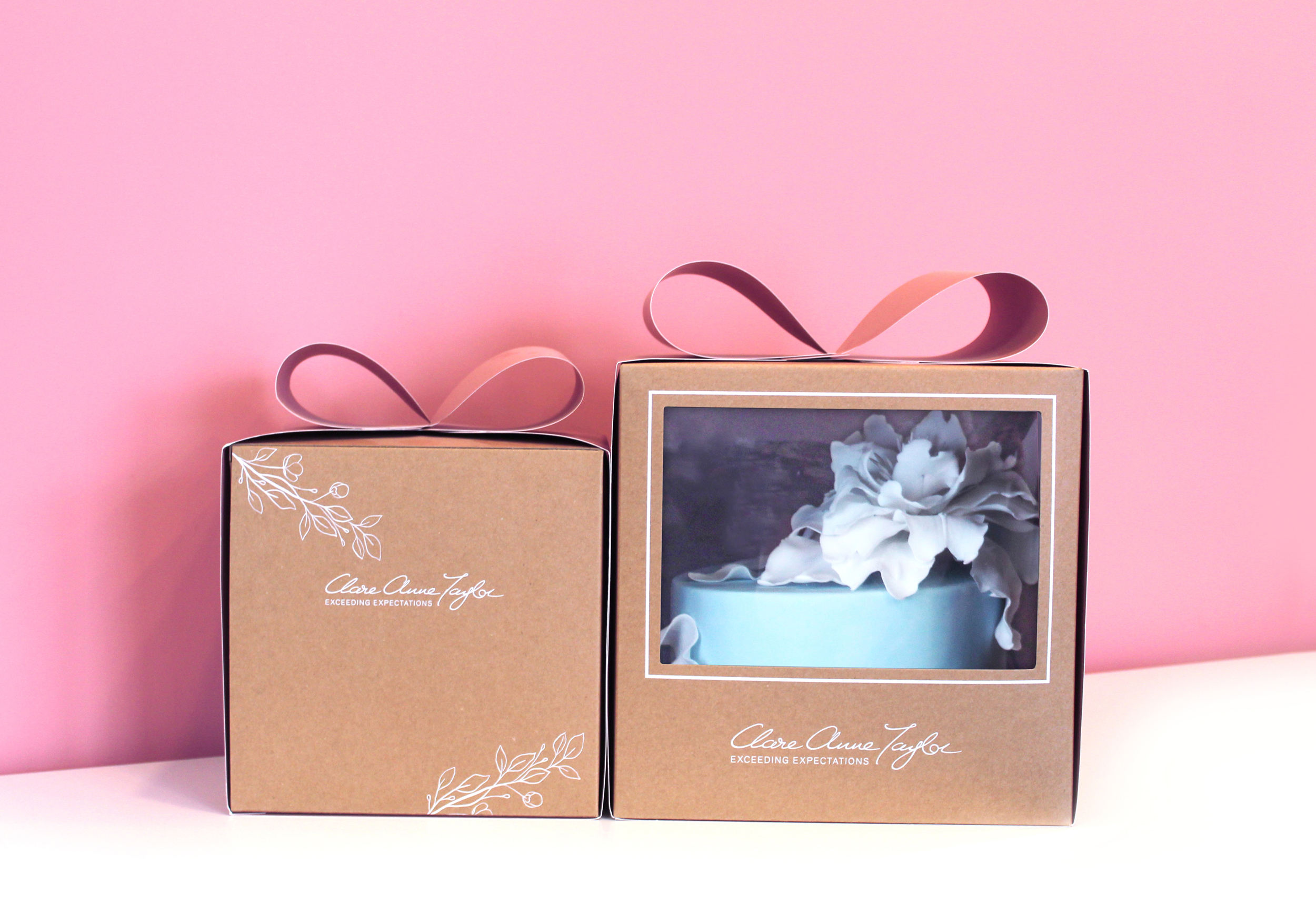
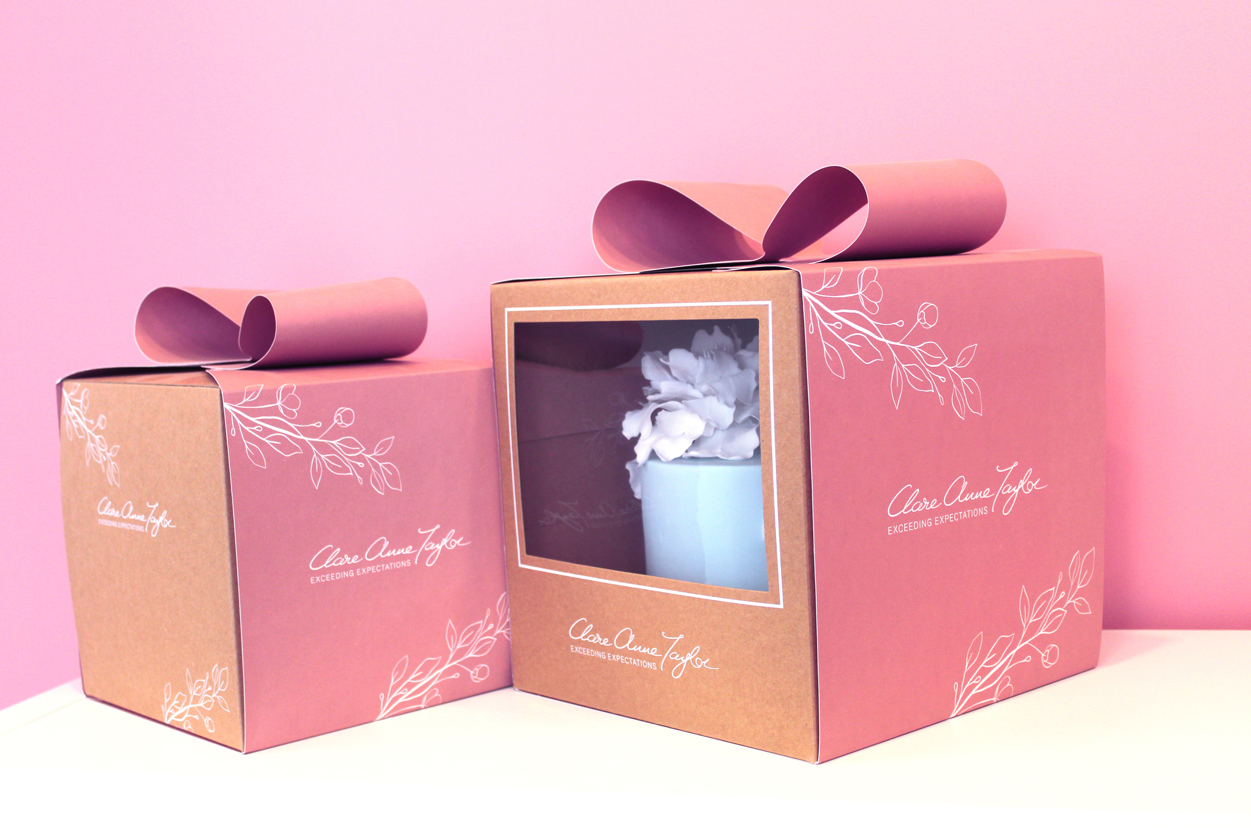
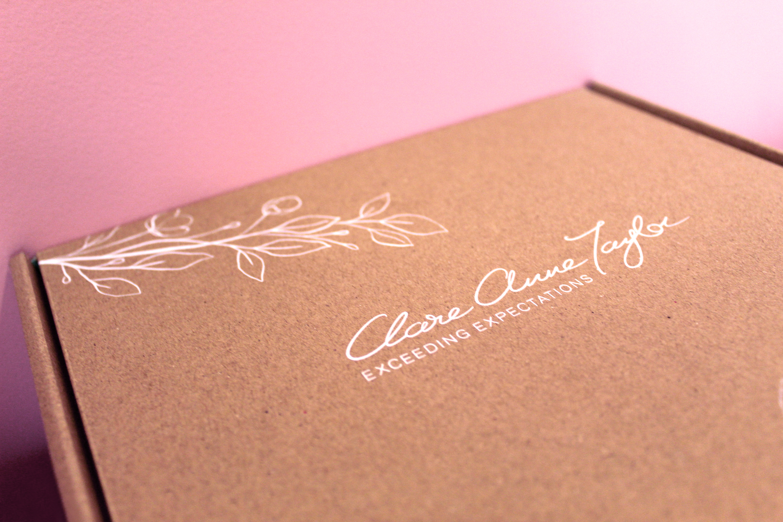
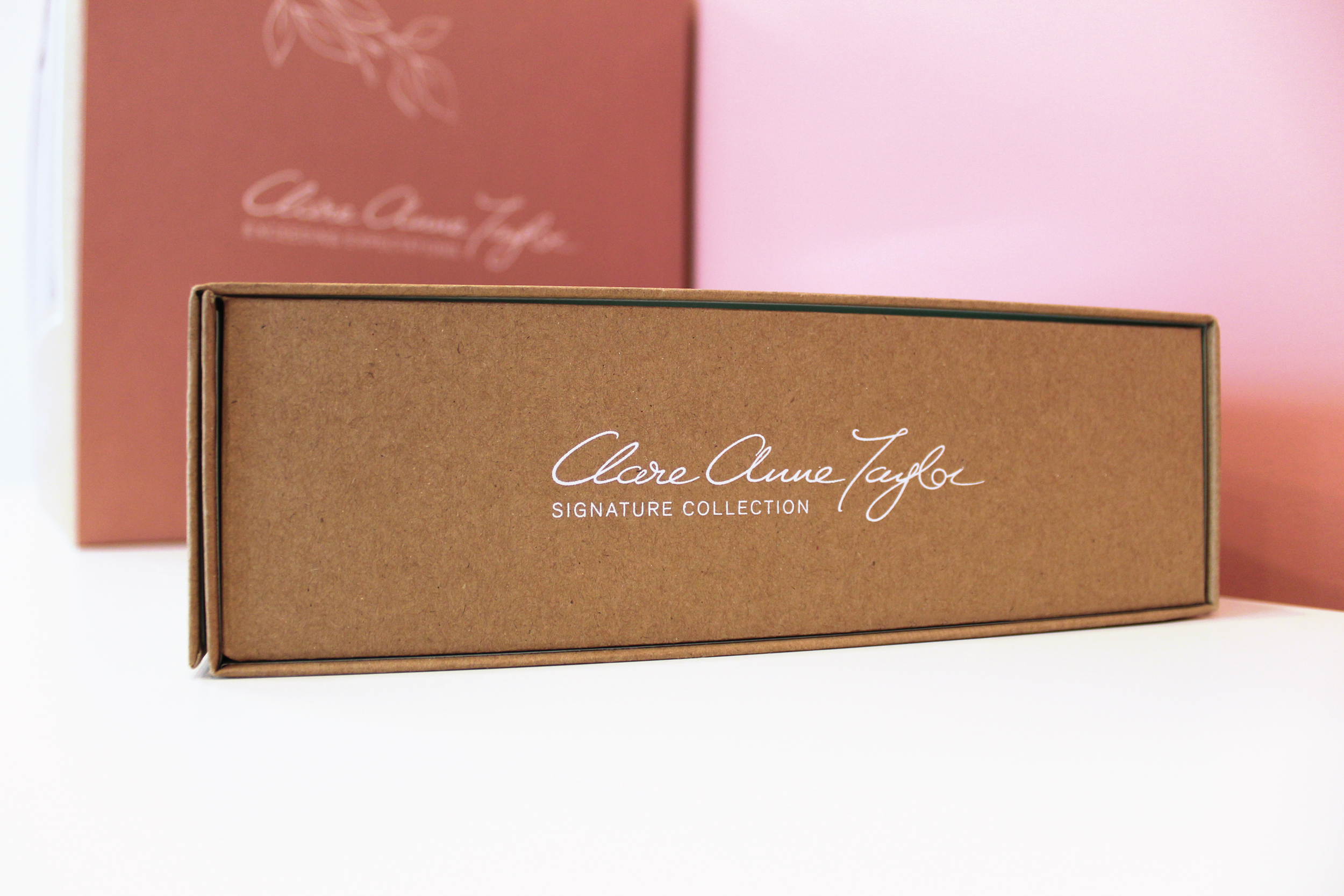
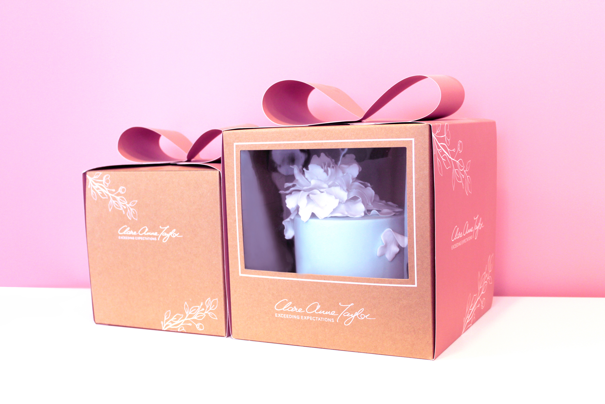
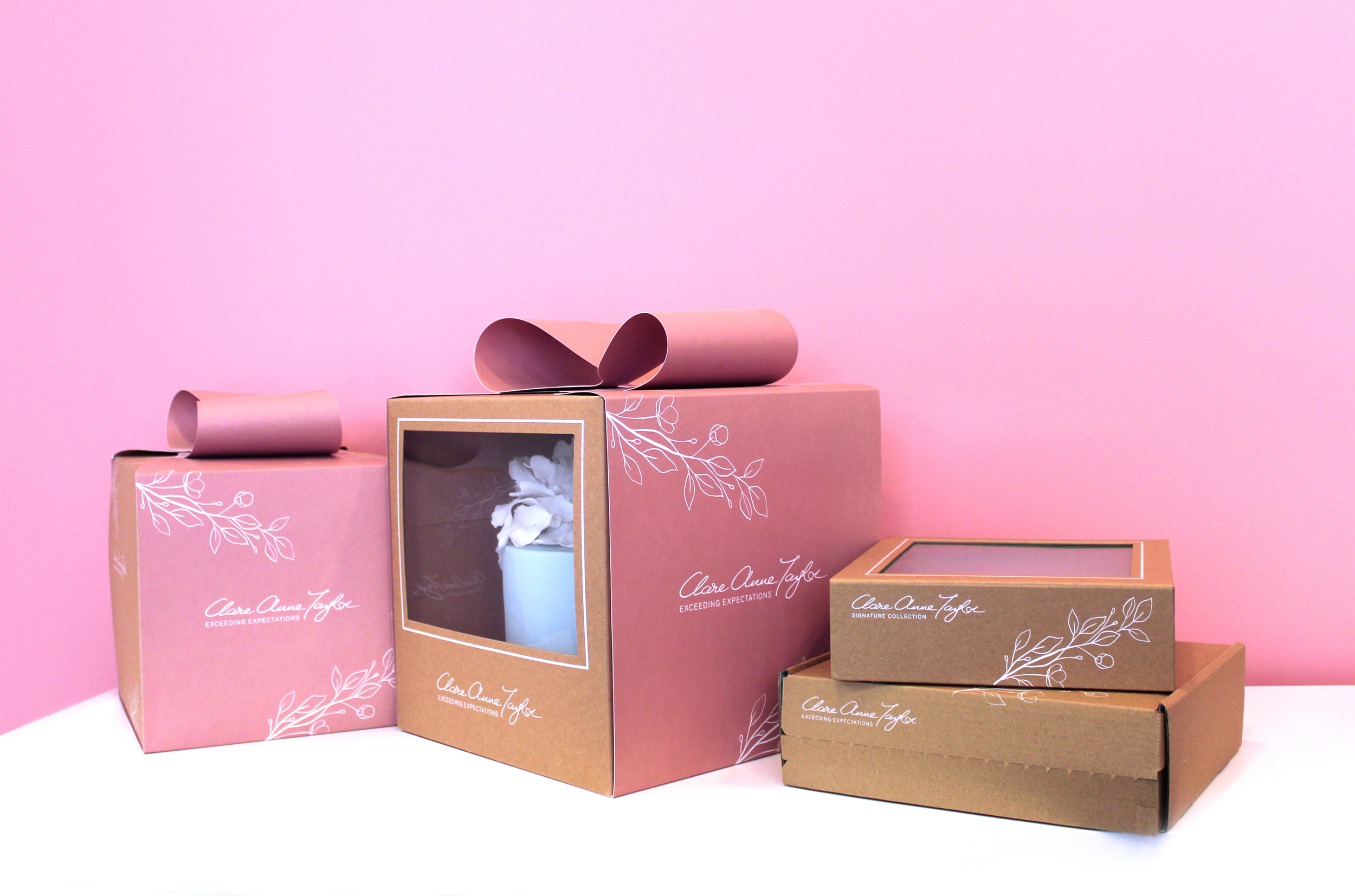 Clare Anne Taylor Couture Cakes are one of Ireland’s leading luxury cake designers for special events and weddings. The core of the business is luxurious quality and elegance in the design and craft of their cakes and confections.
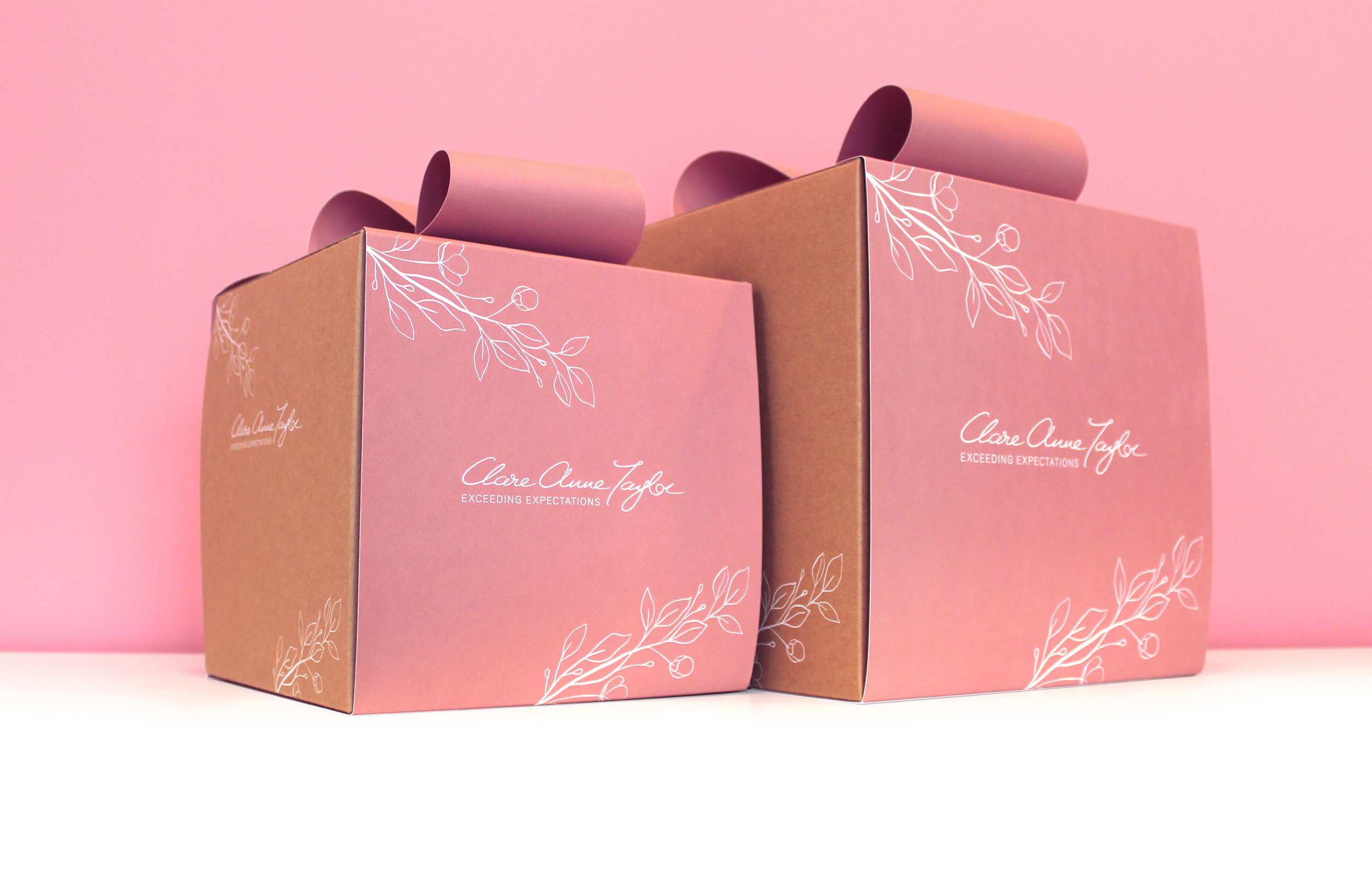


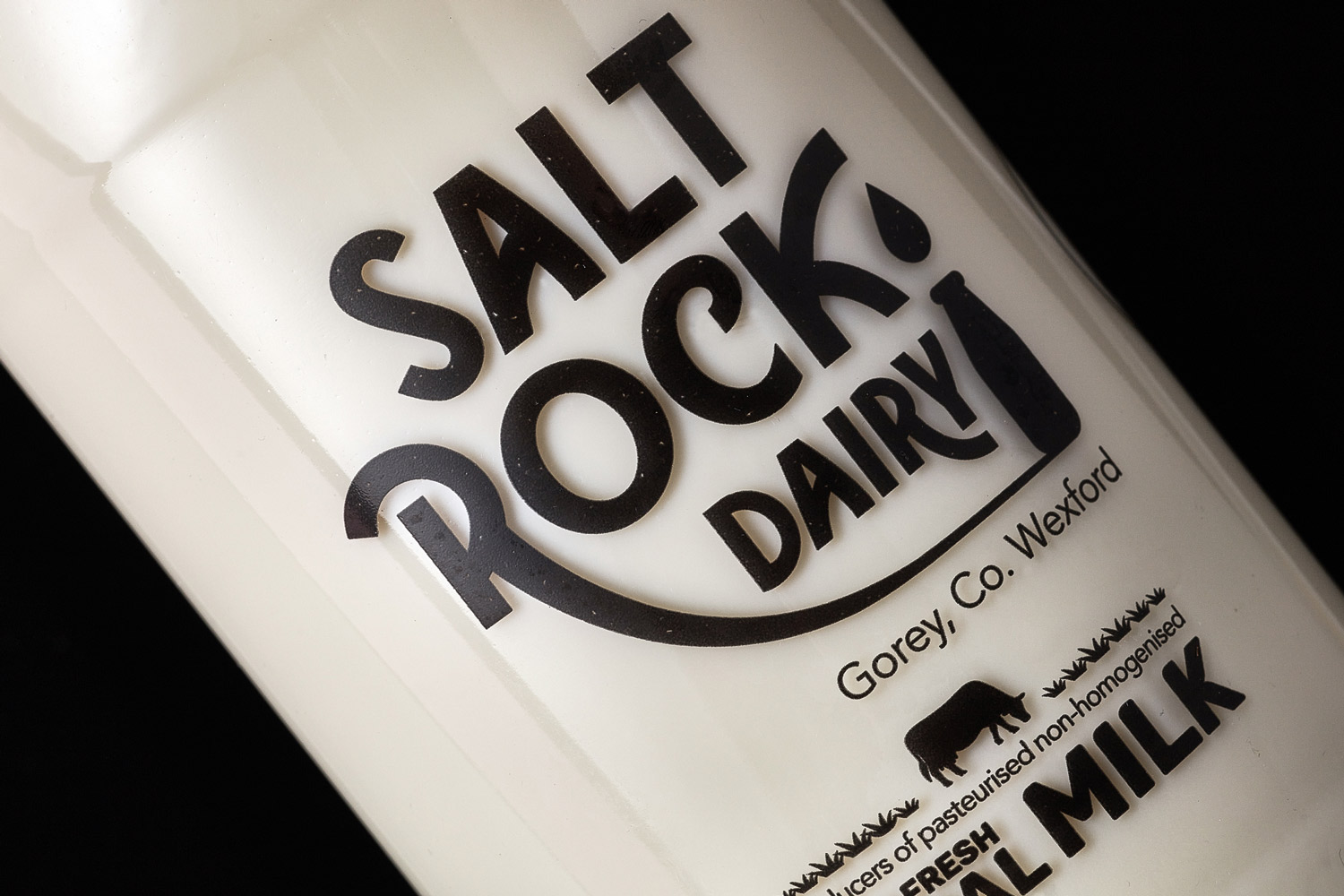
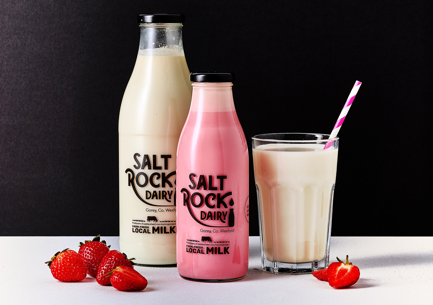
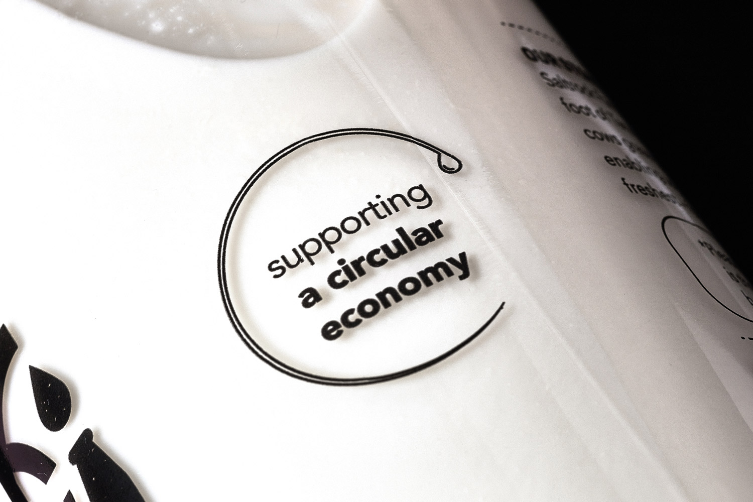
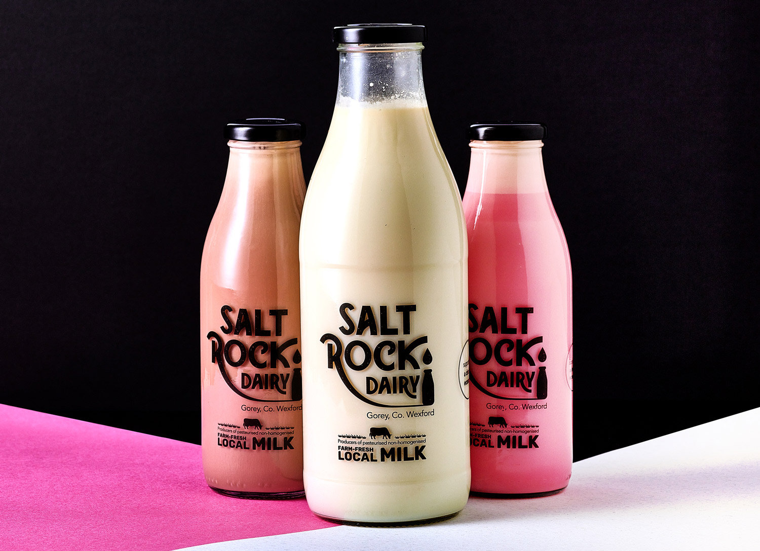
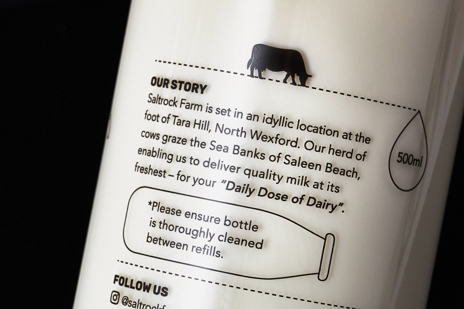
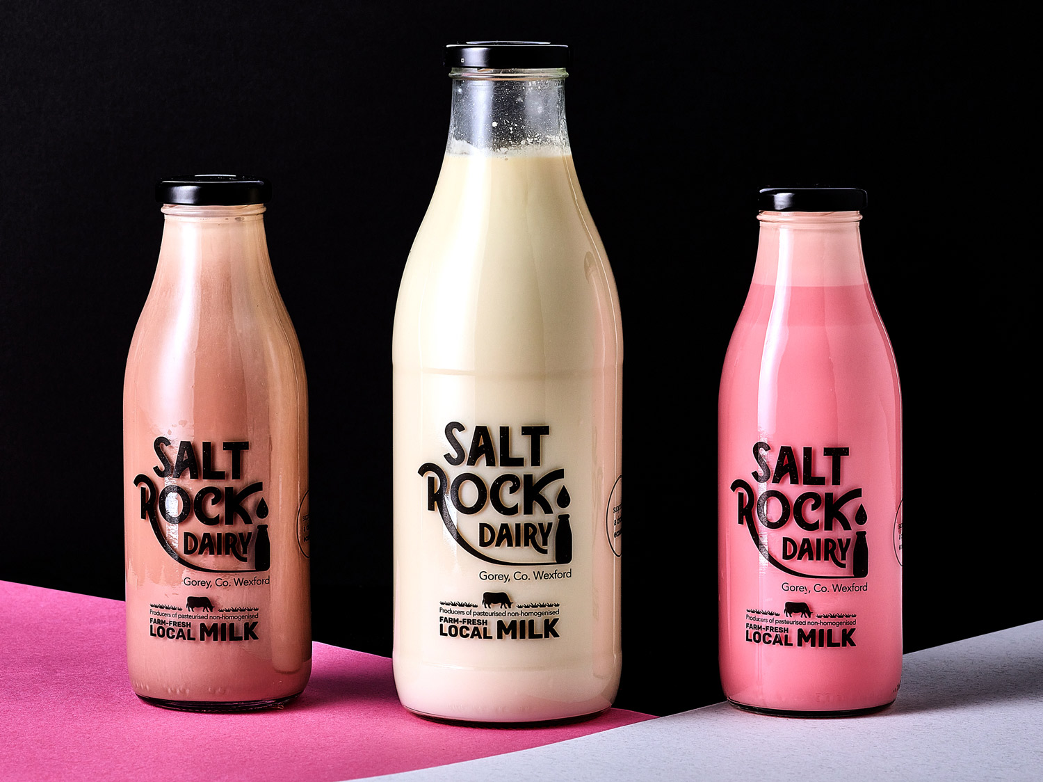
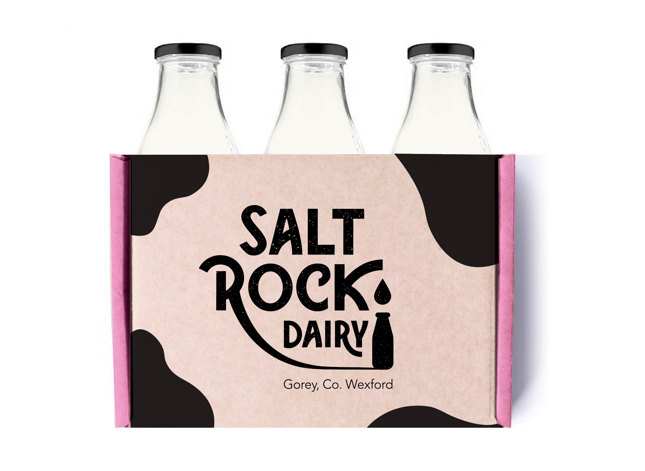
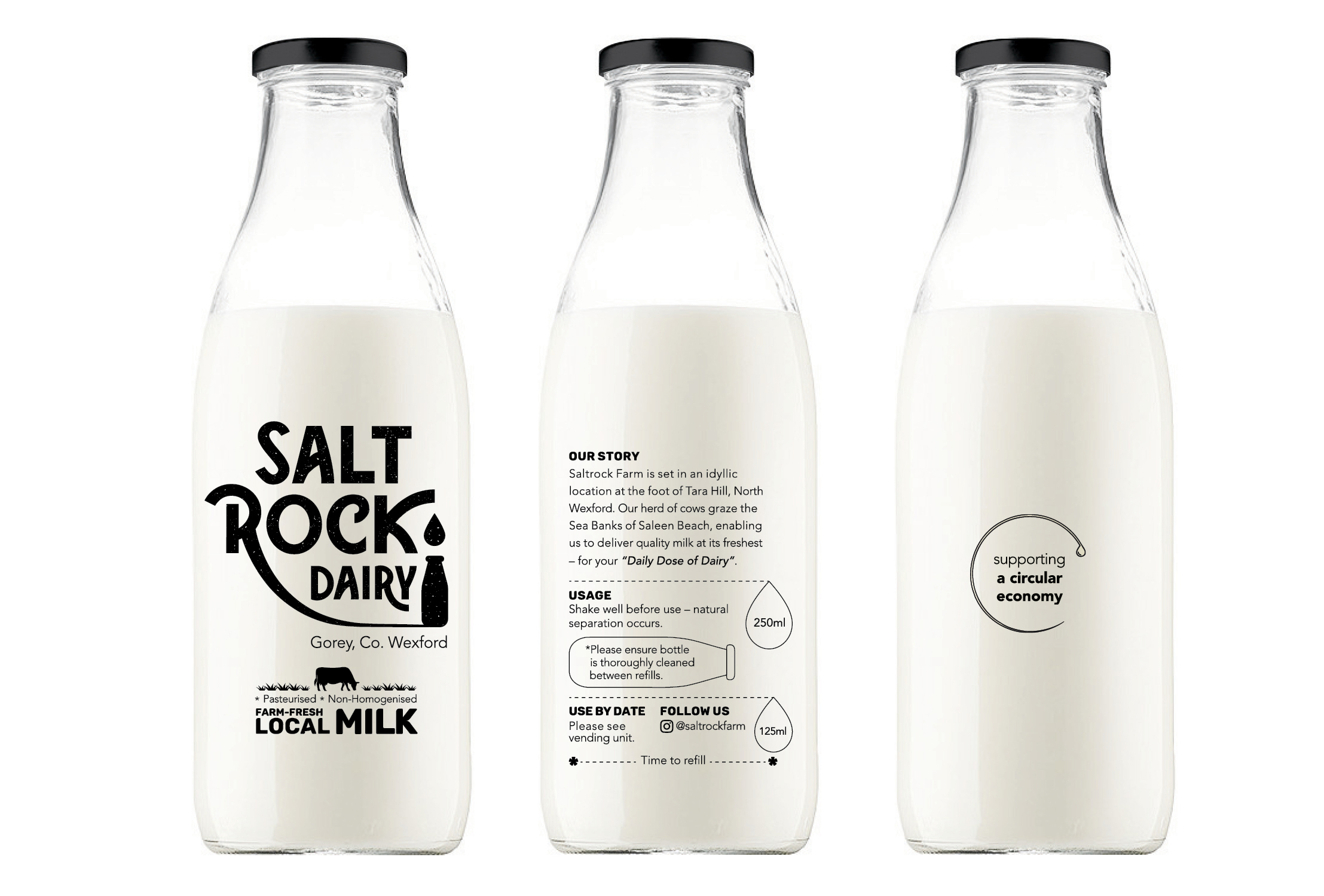
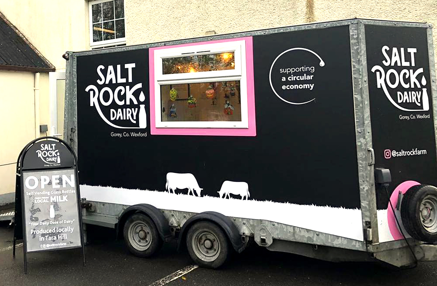
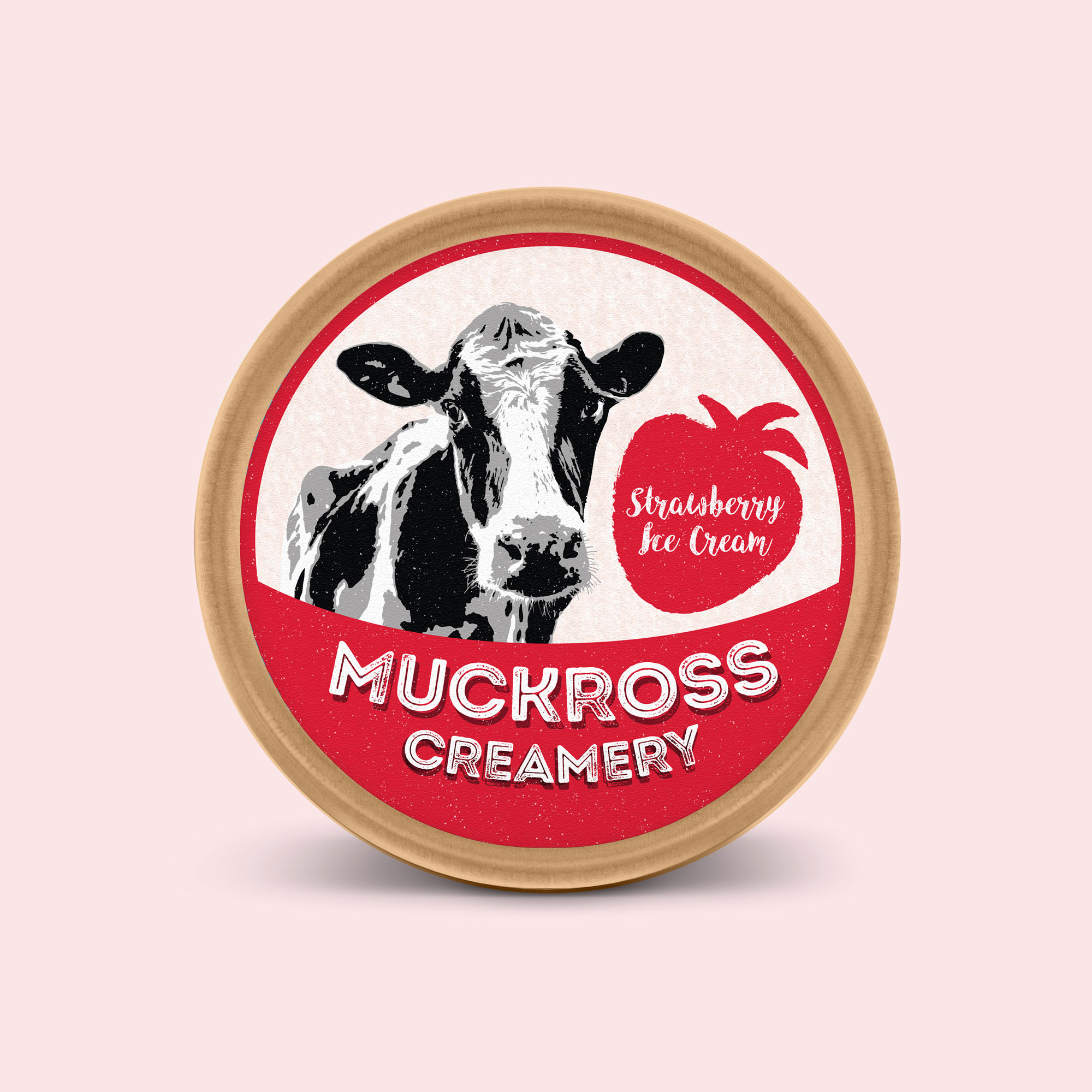
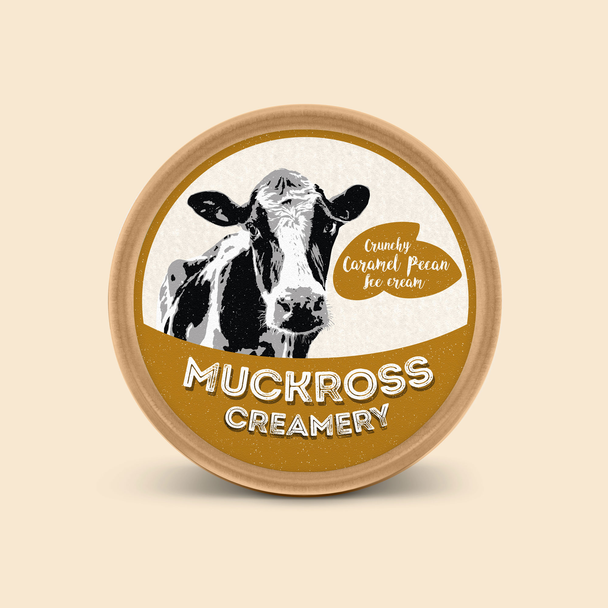
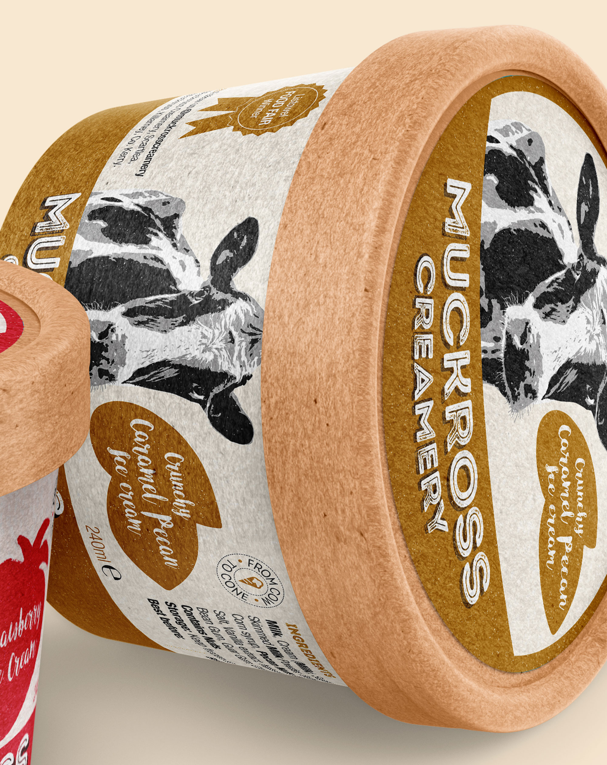
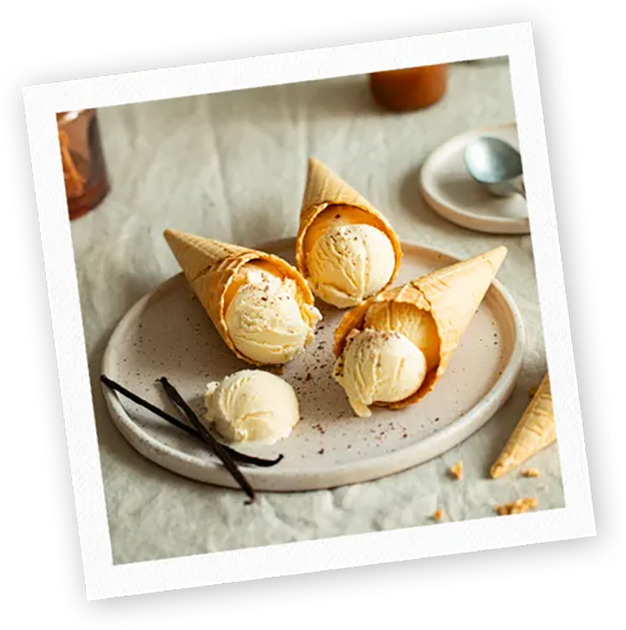
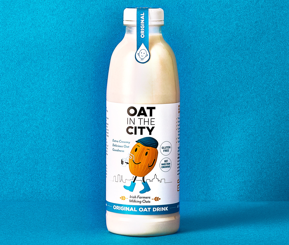
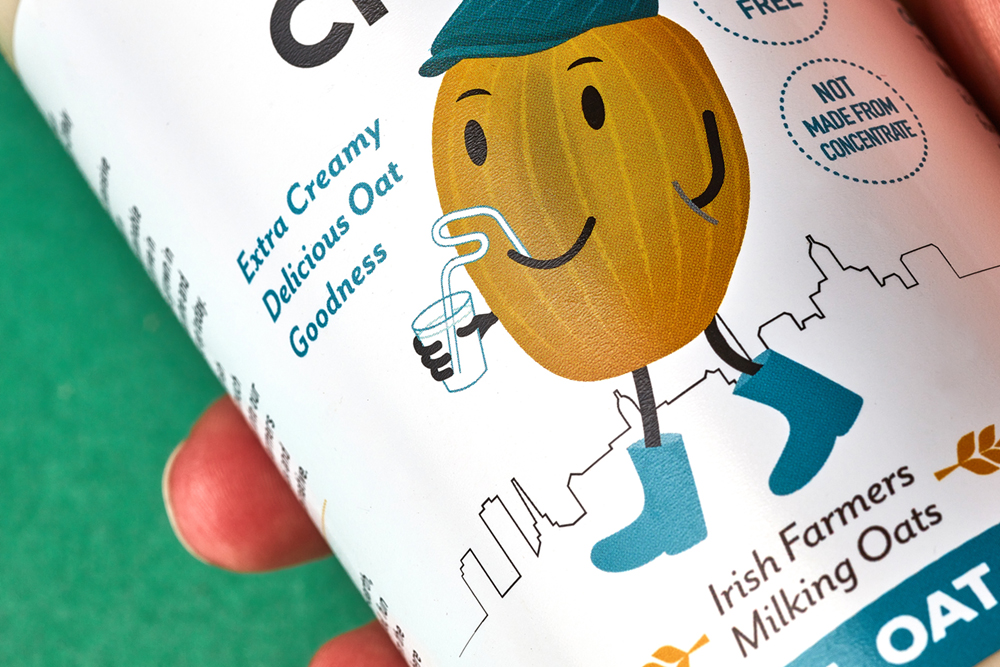
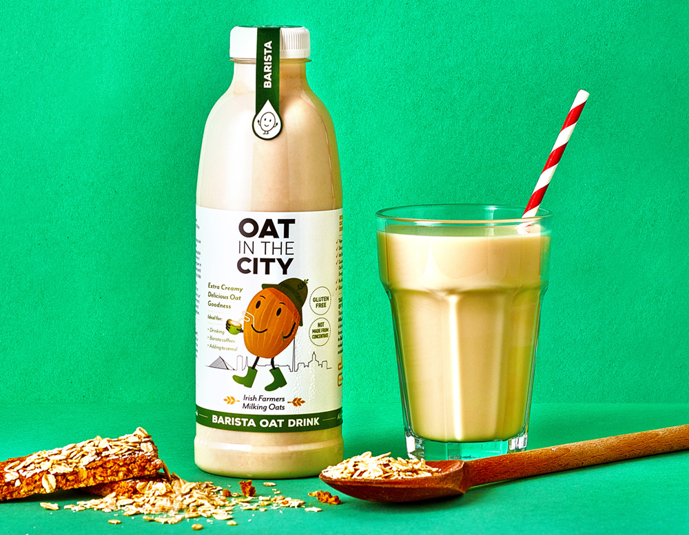
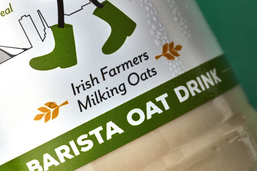
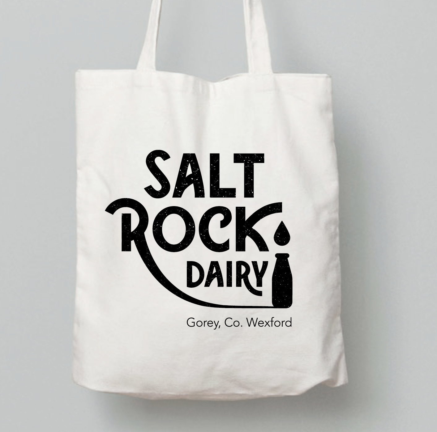 Saltrock Dairy is a contemporary fresh brand, bringing milk to consumers in a new, innovative and sustainable way. Saltrock Farm pasteurise their own milk from their family farm, cutting out unnecessary food milage to bring customers their ‘Daily Dose of Dairy‘. The milk is non-homogenised, local and farm-fresh

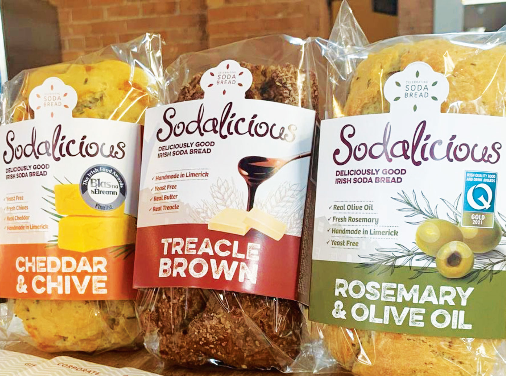
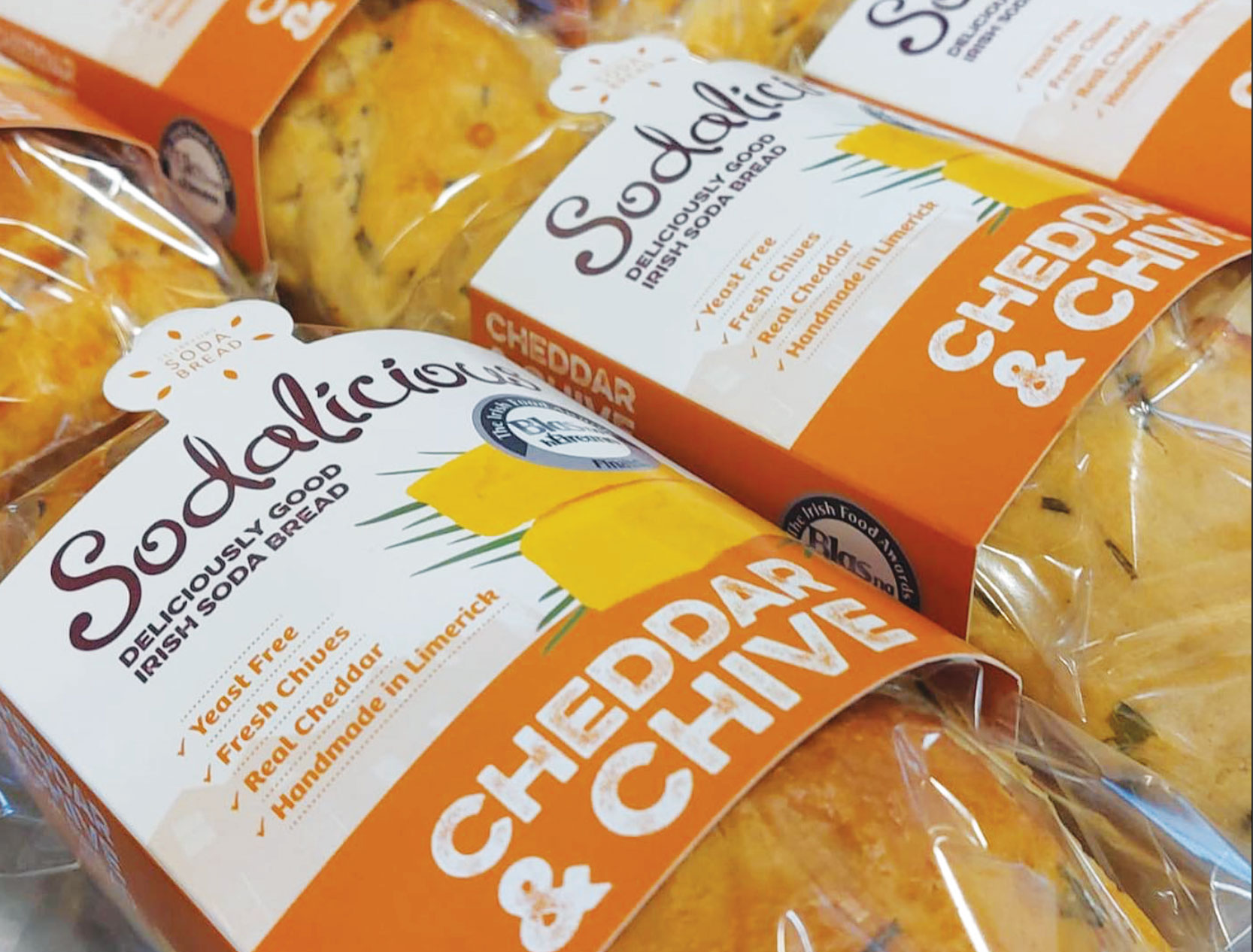
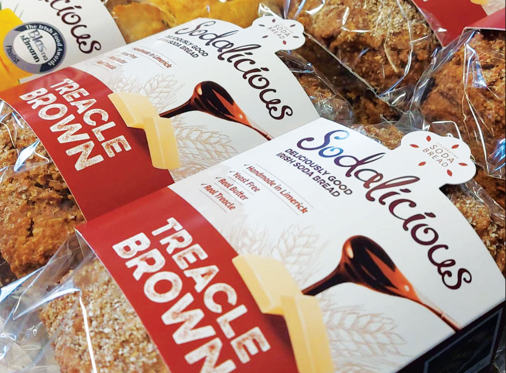
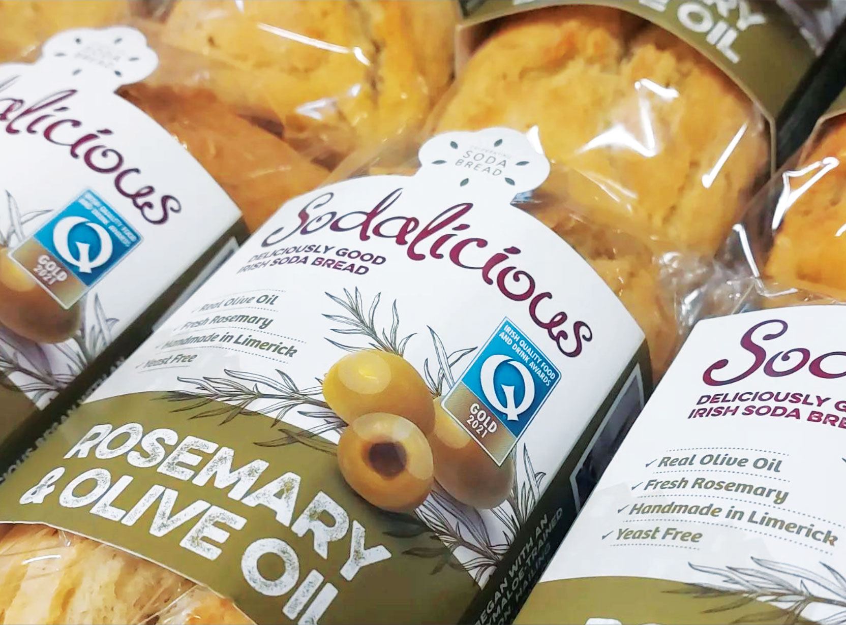
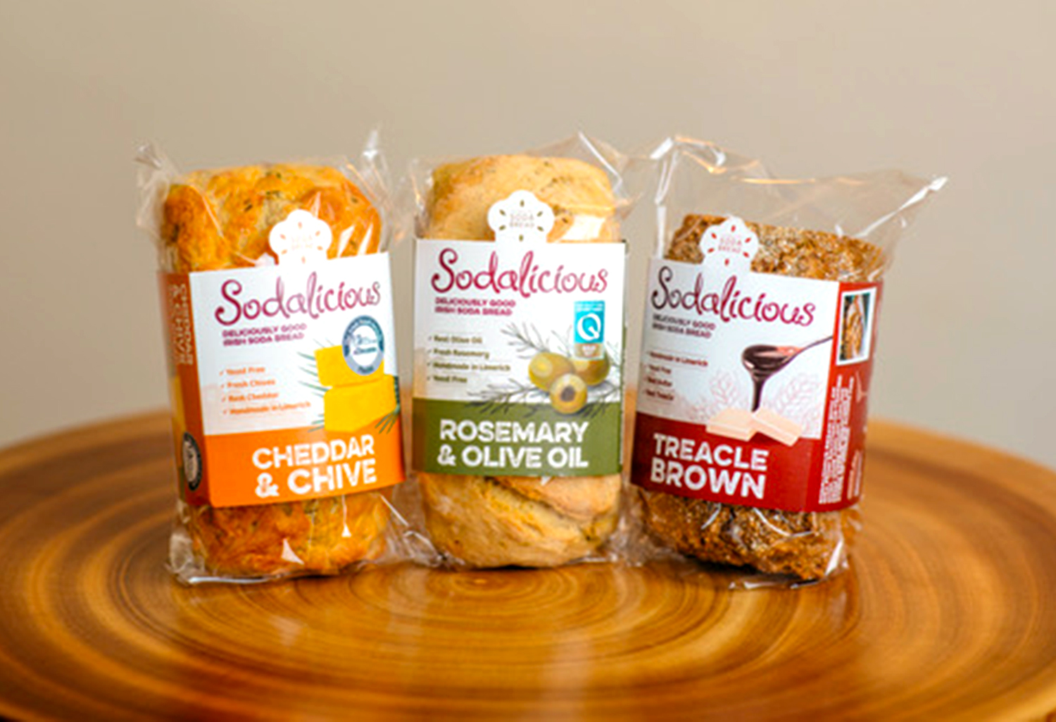
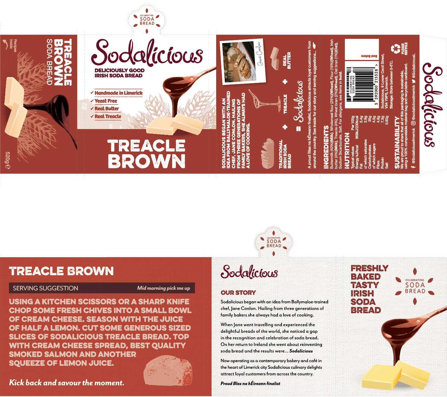
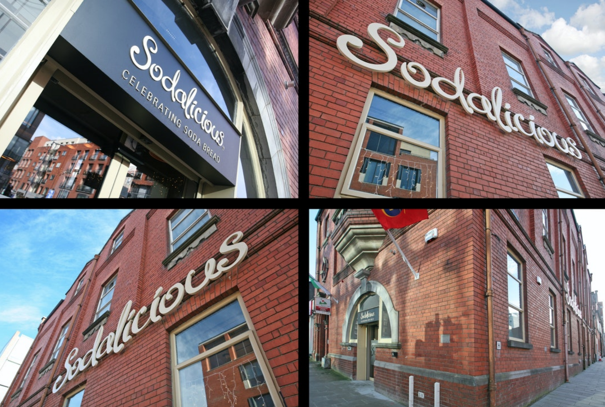
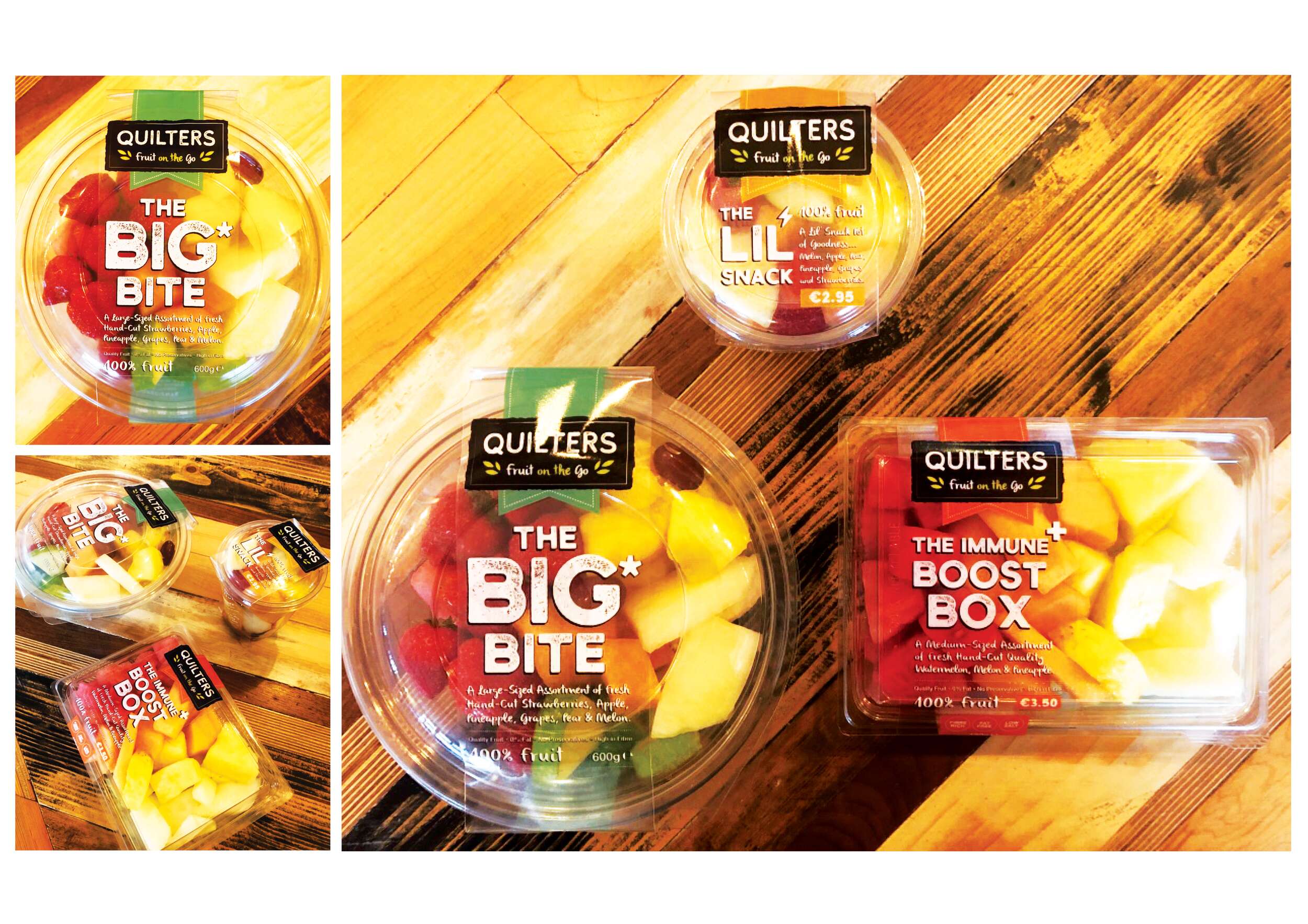
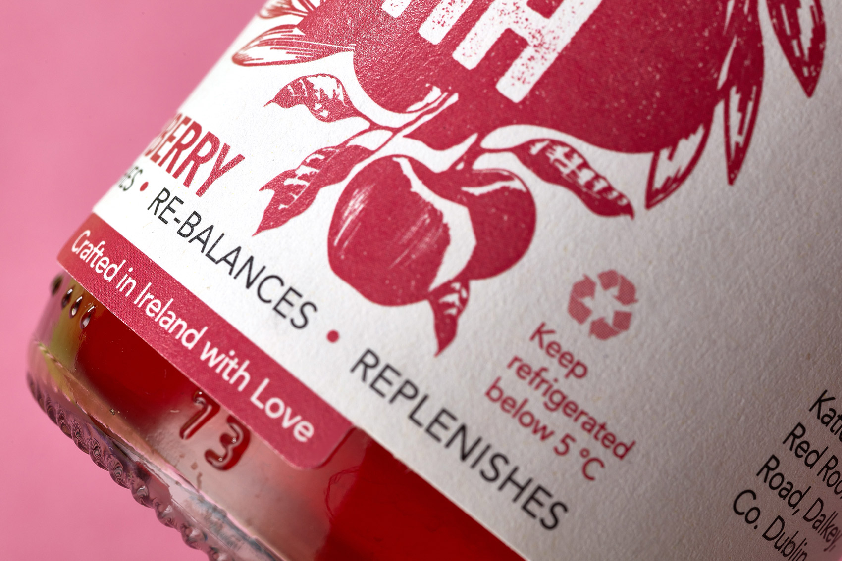
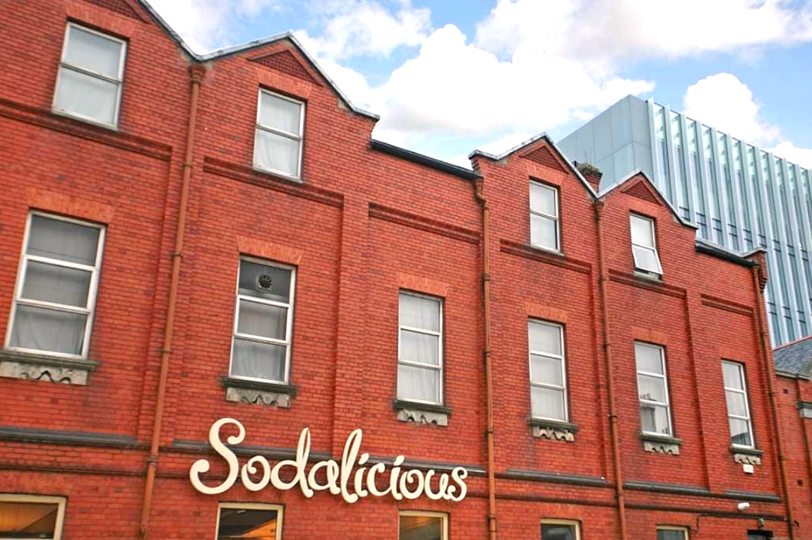 To answer the client’s brief, the packaging design highlights taste cues by featuring the main ingredients of the bread in a quality, vintage illustrative style. The Sodalicious cafe is situated in a beautiful historic red-brick building on Cecil Street in Limerick City, built between 1907-09, with an oriel window and a seven-bay side elevation. To incorporate the cafe’s unique location and heritage, a silhouette of the building is subtly featured in a light hue background of the packaging design.
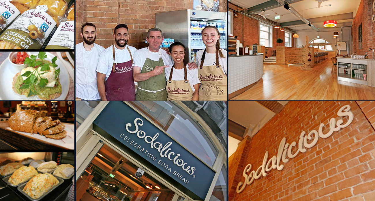 As the client was eager to make sustainability a priority in the packaging design, it was important to do research of sustainable options for bread packaging first. The findings were interesting, such as elite cardboard boxes with handles folding closed together, presented like a gift bag. This was fully recyclable and could give a premium, unique, quality feel to a bread range. However, the brief requested the bread texture to be visible, so this option wouldn’t work. This also wouldn’t facilitate much of a shelf-life in preserving and protecting the bread from outside spoilage, so it failed to meet these functional needs. “With packaging design, it is important to consider factors such as the construction, the material used, the production, durability, legibility and safety issues – it’s not just about graphics alone, the technical aspects are just as important as the design”
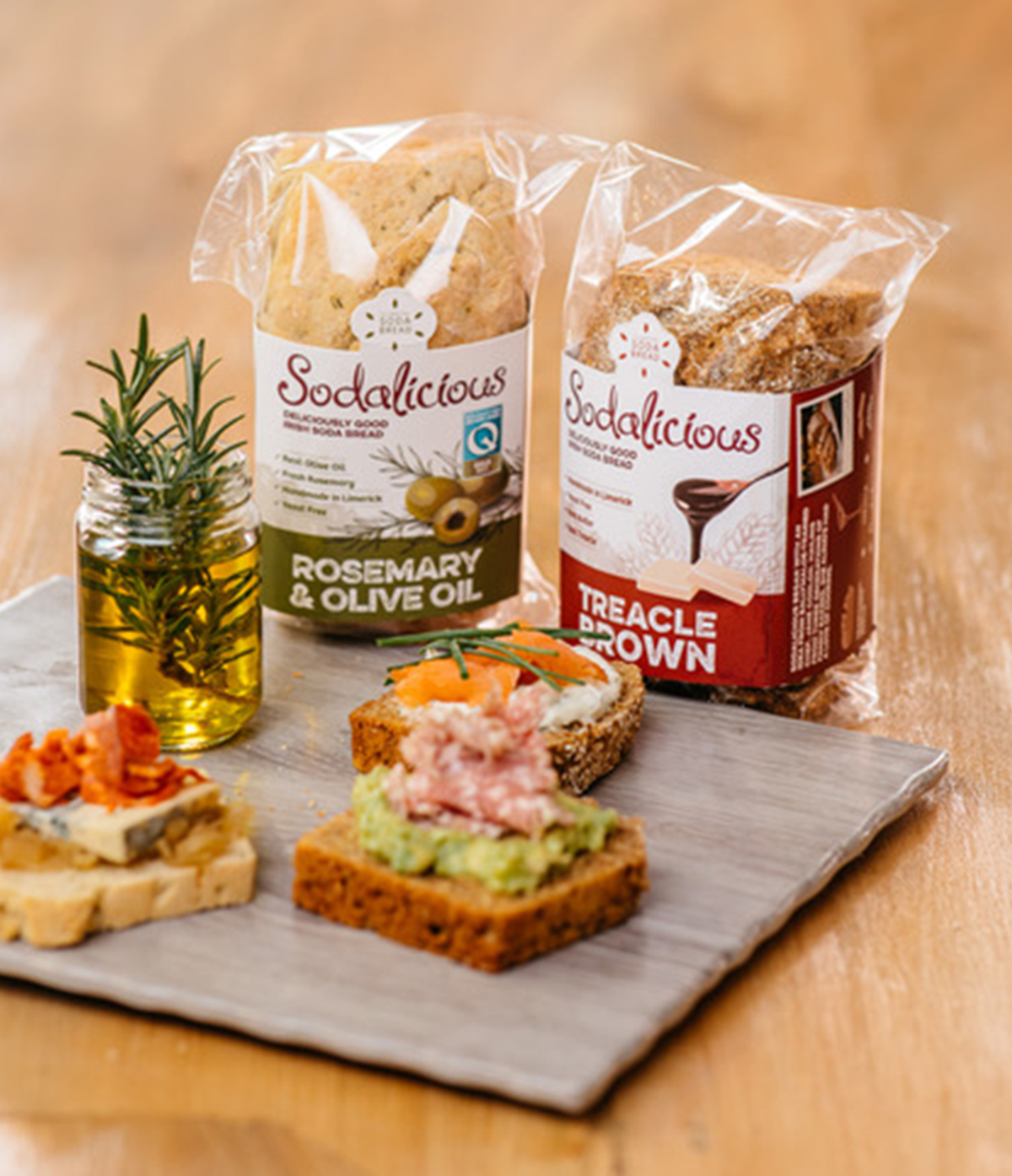
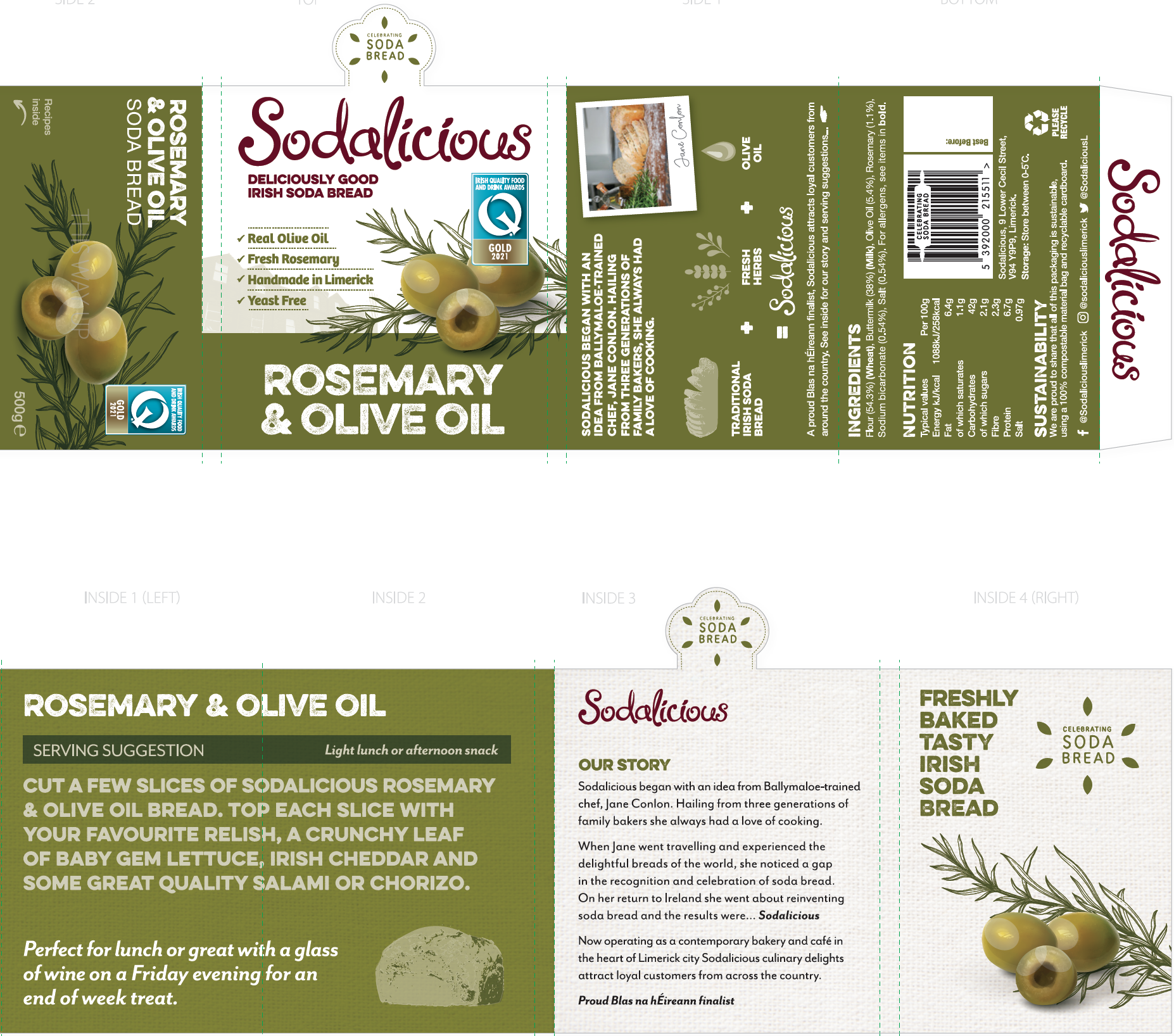
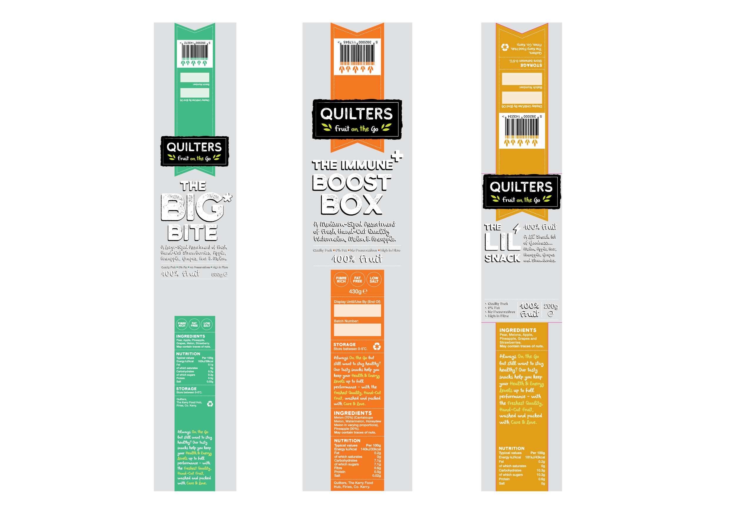
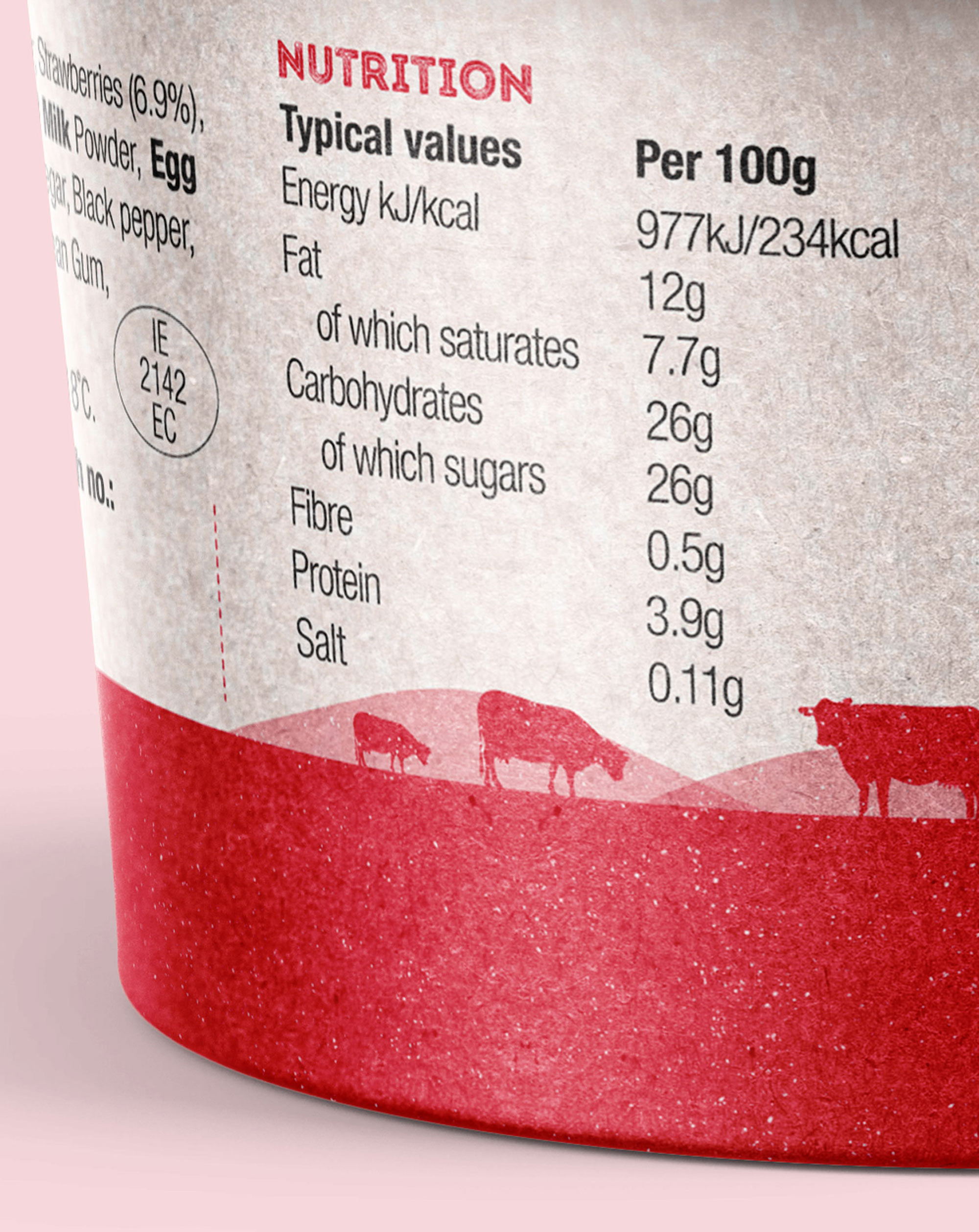
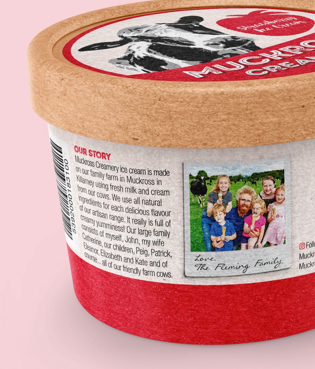
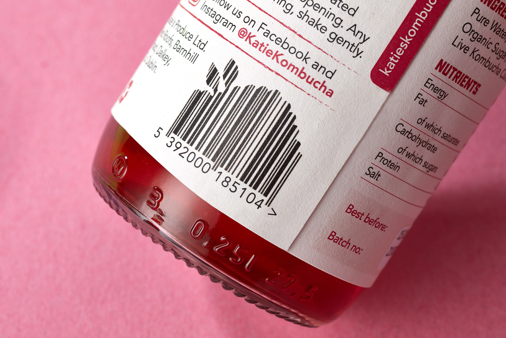
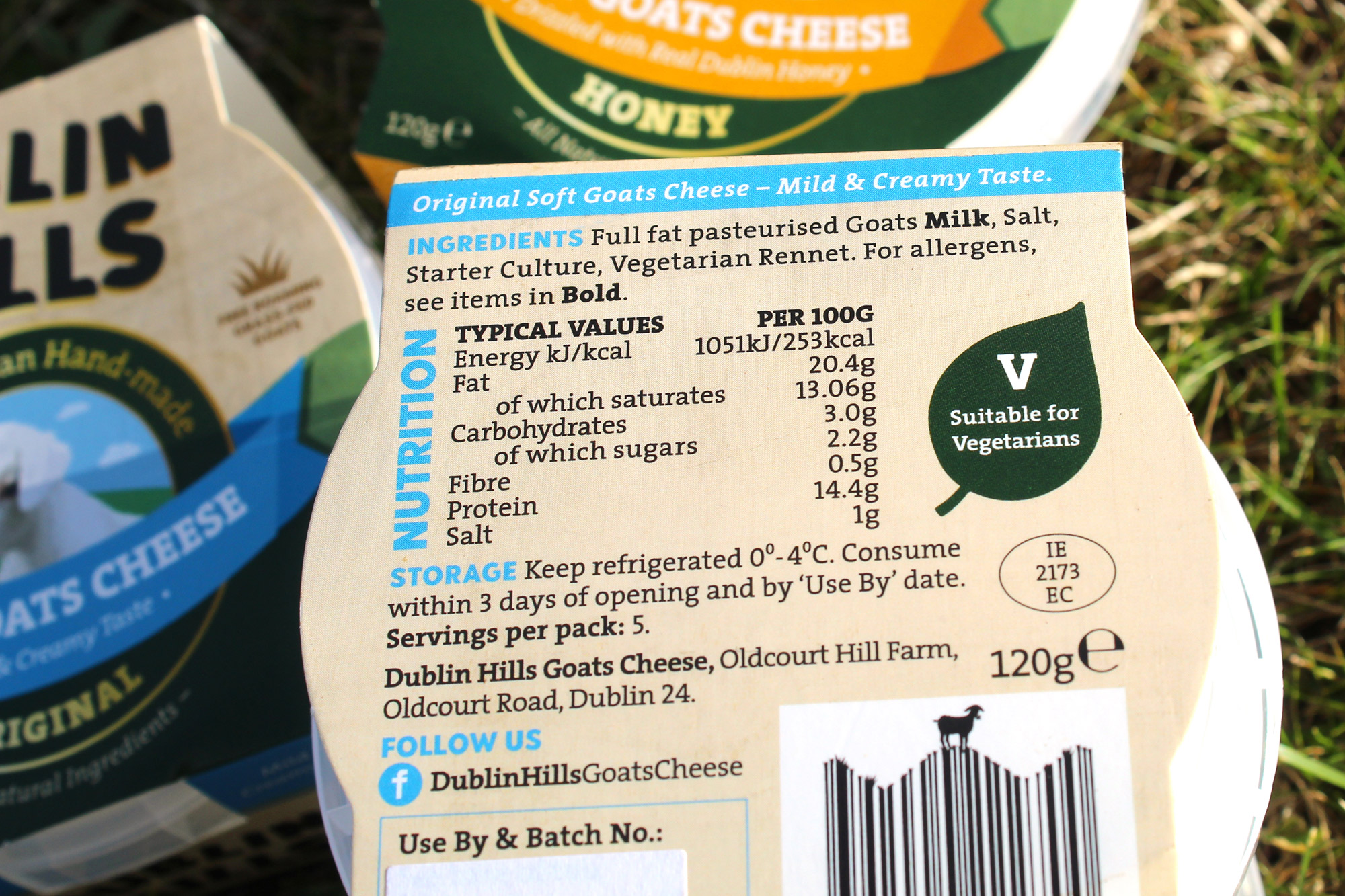
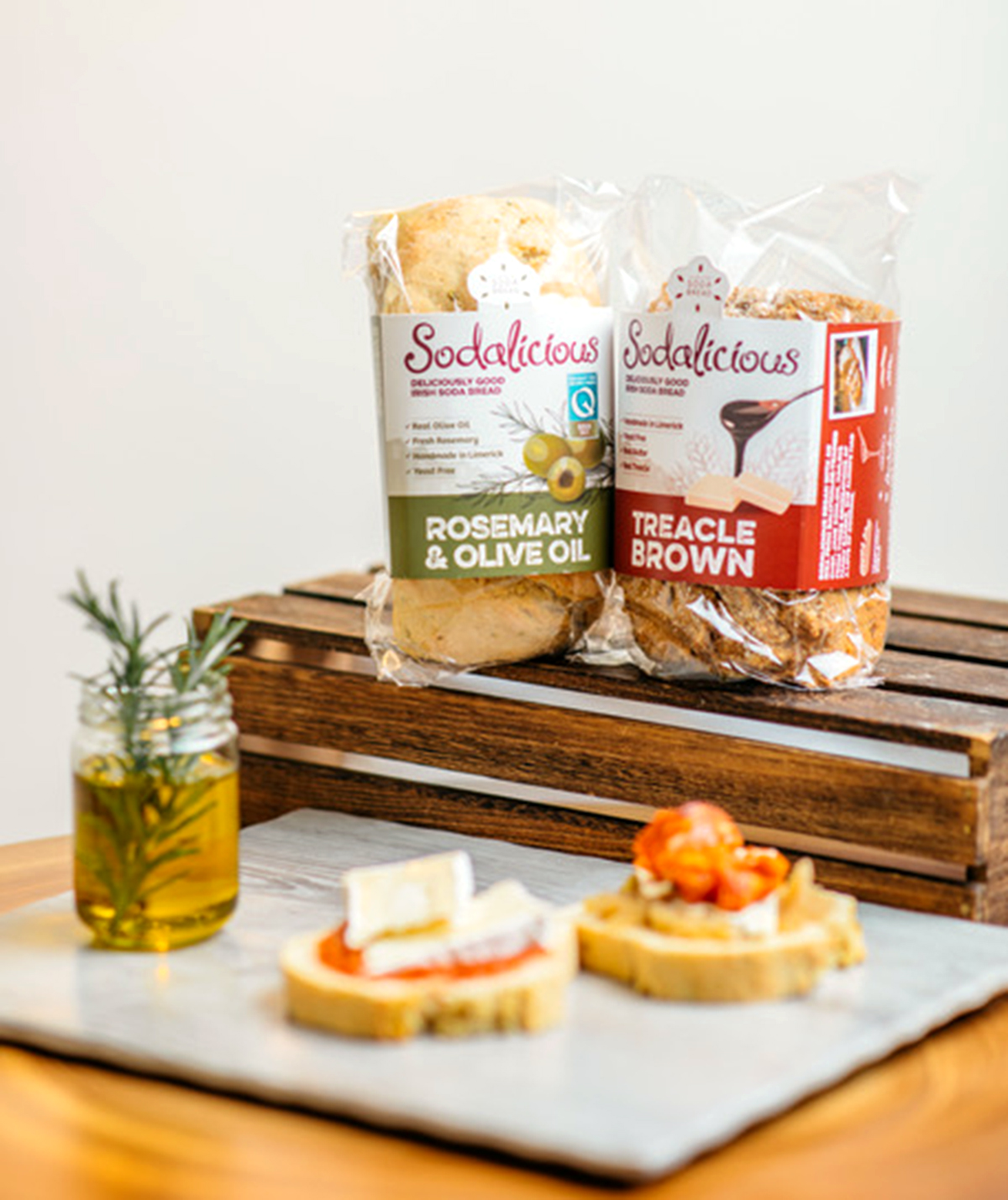
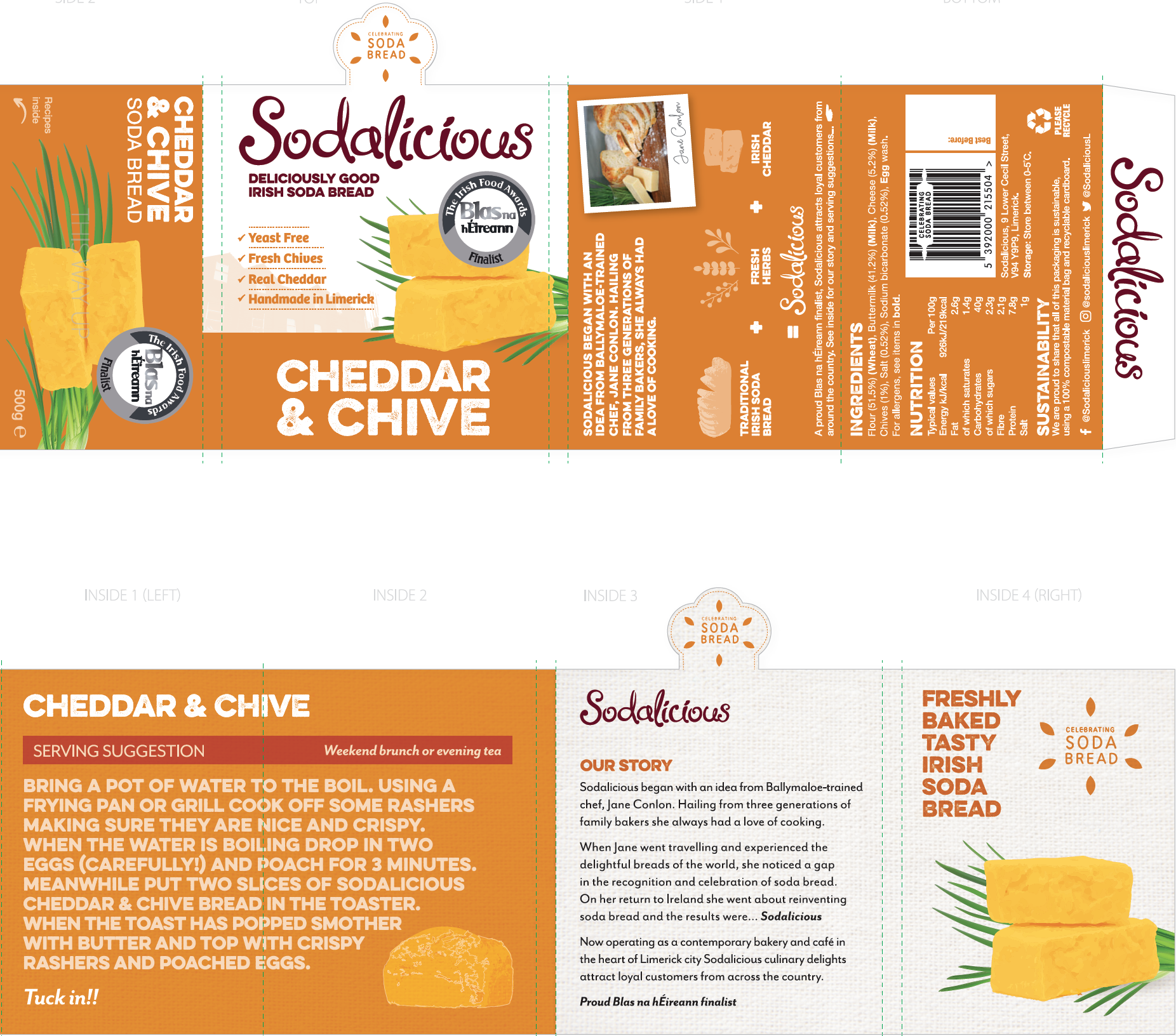 Required details were added to the back of packs, including a photo showing the bread in a tasteful style for each flavour, the ingredients and nutritional information, how to recycle and the clients contact details. Social media links were added, along with a fun and quirky barcode featuring a rolling pin within it. They chose a local printer, another factor which is aligned to their carbon footprint goals.