Clare Lynch Creative – Graphic Design Services Dublin – Branding and Packaging Design
  • Home
  • About
  • Work
    • All Work
    • Branding & Identity
    • Packaging
    • Communication
    • Illustration
      • Hello Hinterland Book Illustration
  • Services
  • Testimonials
  • Blog
  • Contact

Branding

CashAnalytics Re-Brand

CashAnalytics Re-Brand & Brand Guidelines


divider-line2


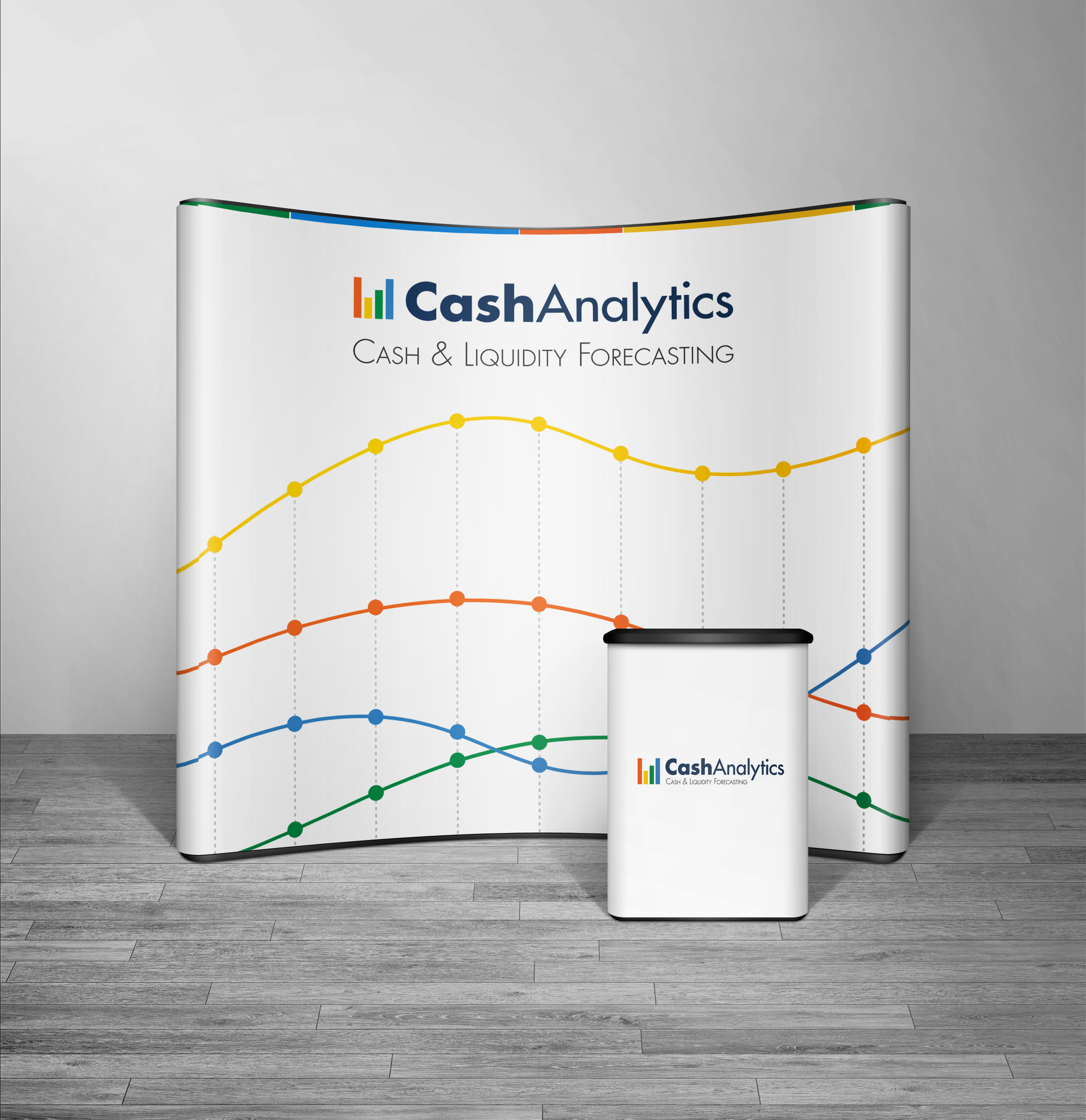
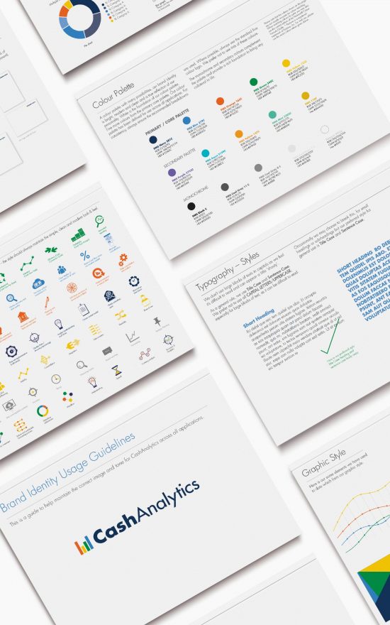
CashAnalytics Re-brand, Brand Guidelines & Marketing Collateral

CashAnalytics build software that solves problems using the latest cloud and web based technologies, that help large companies manage their day-to-day treasury, risk and compliance challenges in an efficient and controlled manner. They work with a broad spectrum of organisations ranging from mid-tier private equity backed companies to stock market listed multinational enterprises. They are experts in corporate cash and treasury management, compliance, software development, customer service and project management.

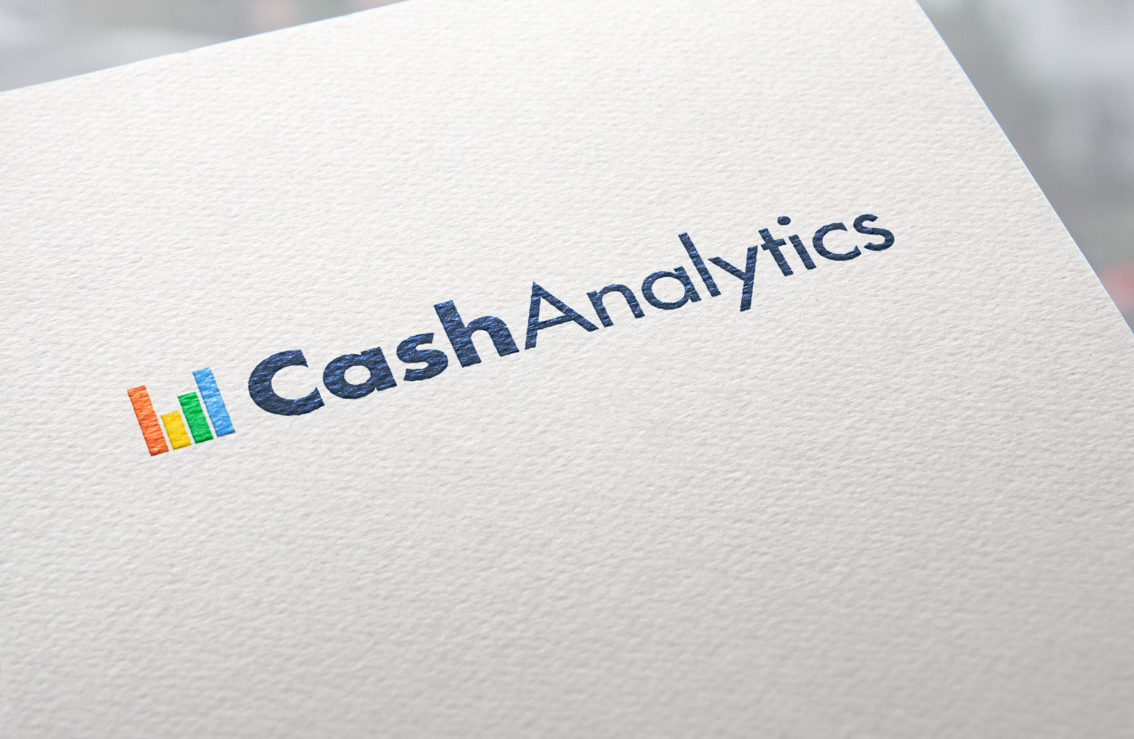
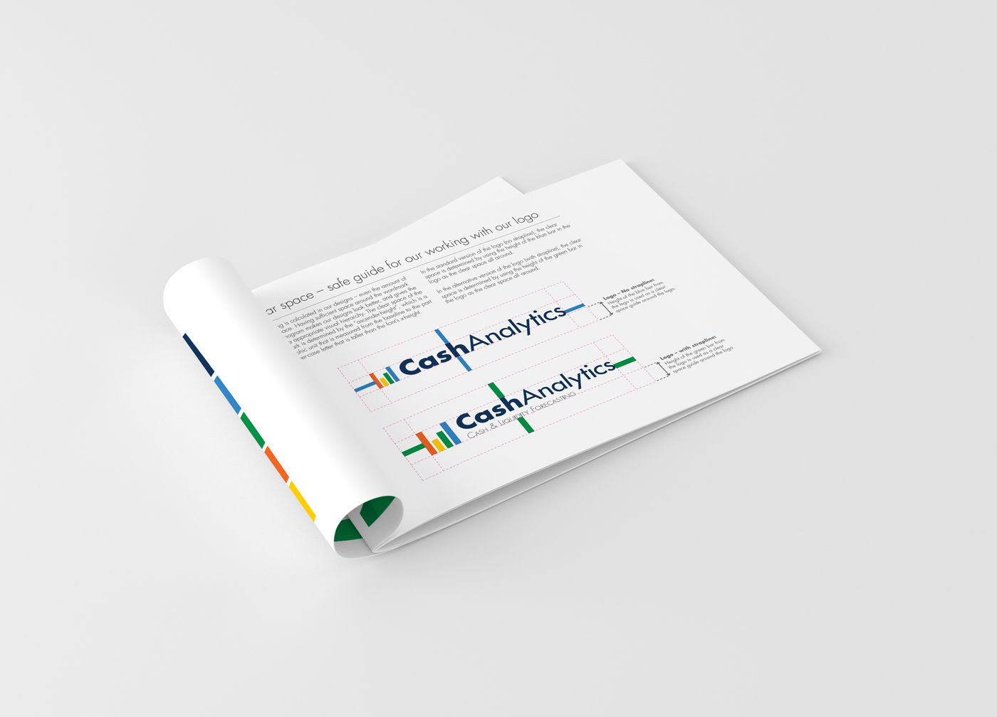
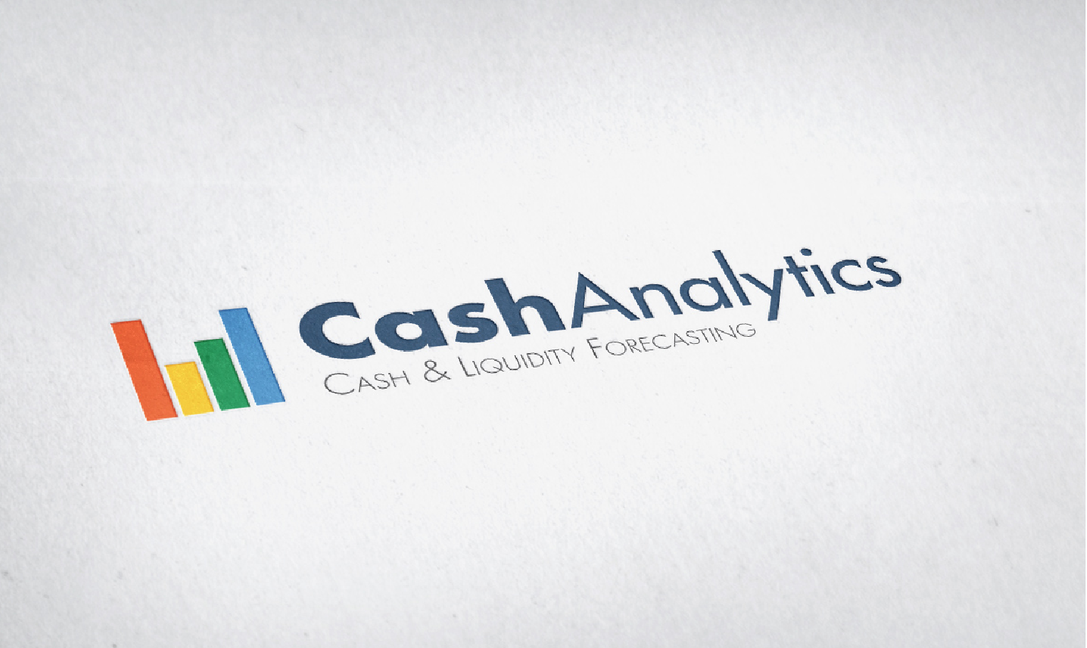
They liked their existing logo to some extent, but wanted a more modernised look and feel, to ensure their logo was contemporary and communicated how the services they offer use the latest software technology to create results in a fast time-frame compared to their competitors. To create this, the bars from the treasury building in the original logo were used to stand alone as a strong analytics symbol, along with the cleaner, modernised Futura typeface. This created a new, modern CashAnalytics logo, which still easily links to be an evolution of their previous logo. There is a secondary version of their logo, which includes their strapline ‘Cash and Liquidity Forecasting’, for more specific uses.

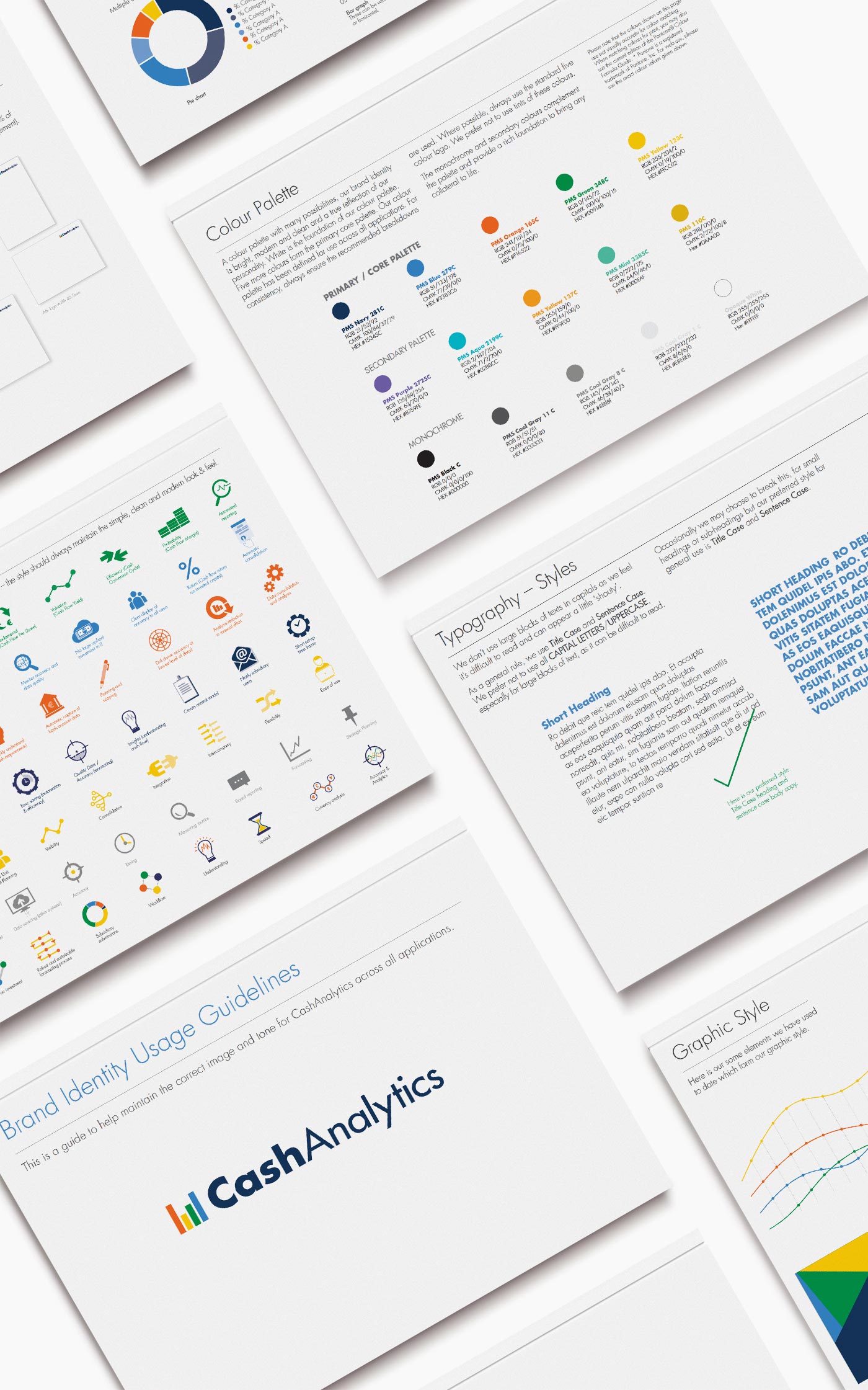
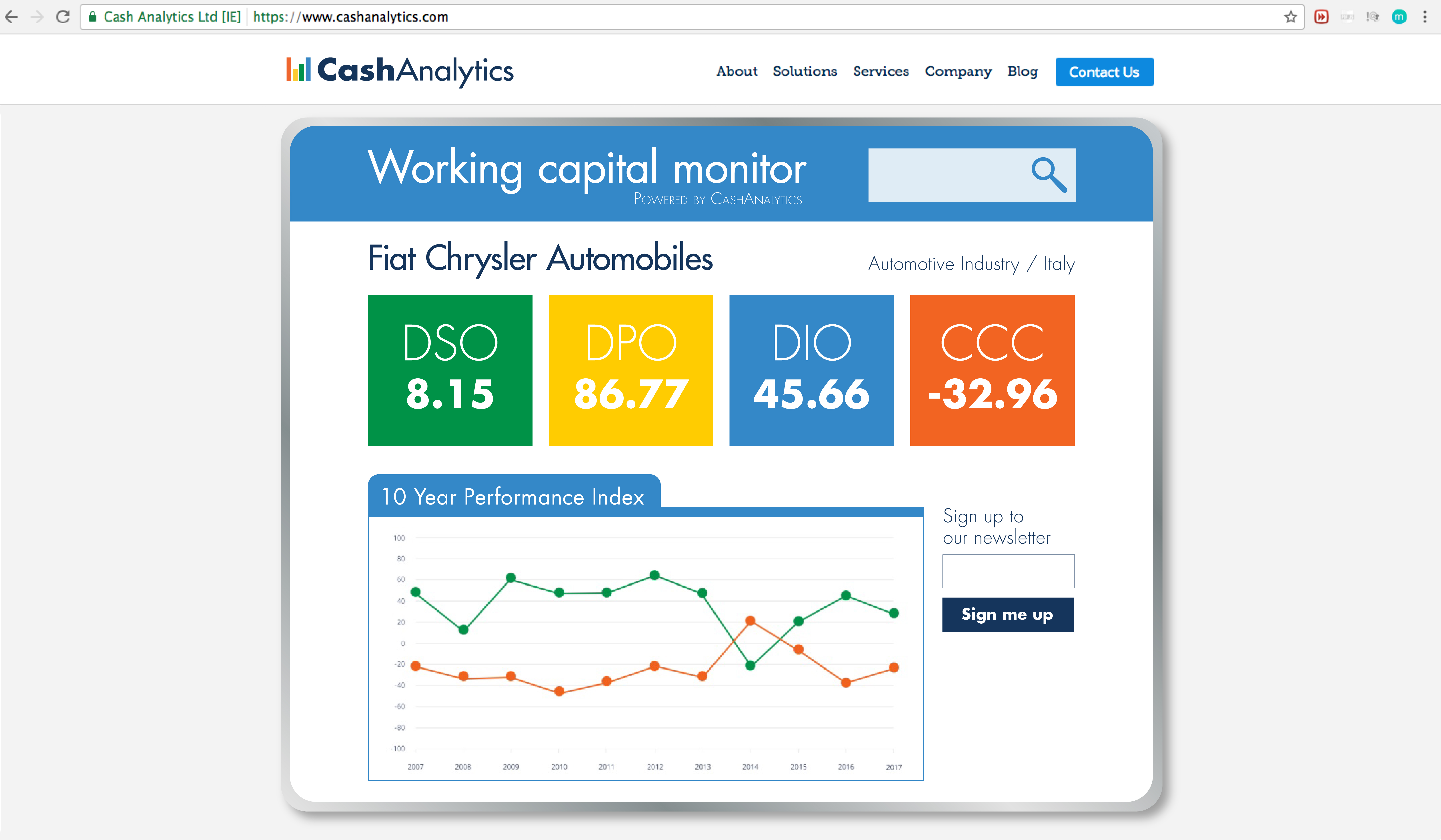
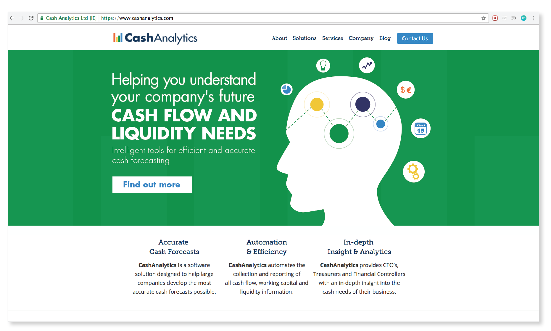
The brand was then further developed across stationery, infographics, web graphics, eNewsletters, eBooks, brochures, exhibition graphics and brand guidelines, to roll out the re-brand in a consistent manner across all CashAnalytics collateral. The client was very happy with the new streamlined result across all their points of contact with clients.
February 19, 2018 /  

Polski Bread Packaging

Polski Bread Packaging


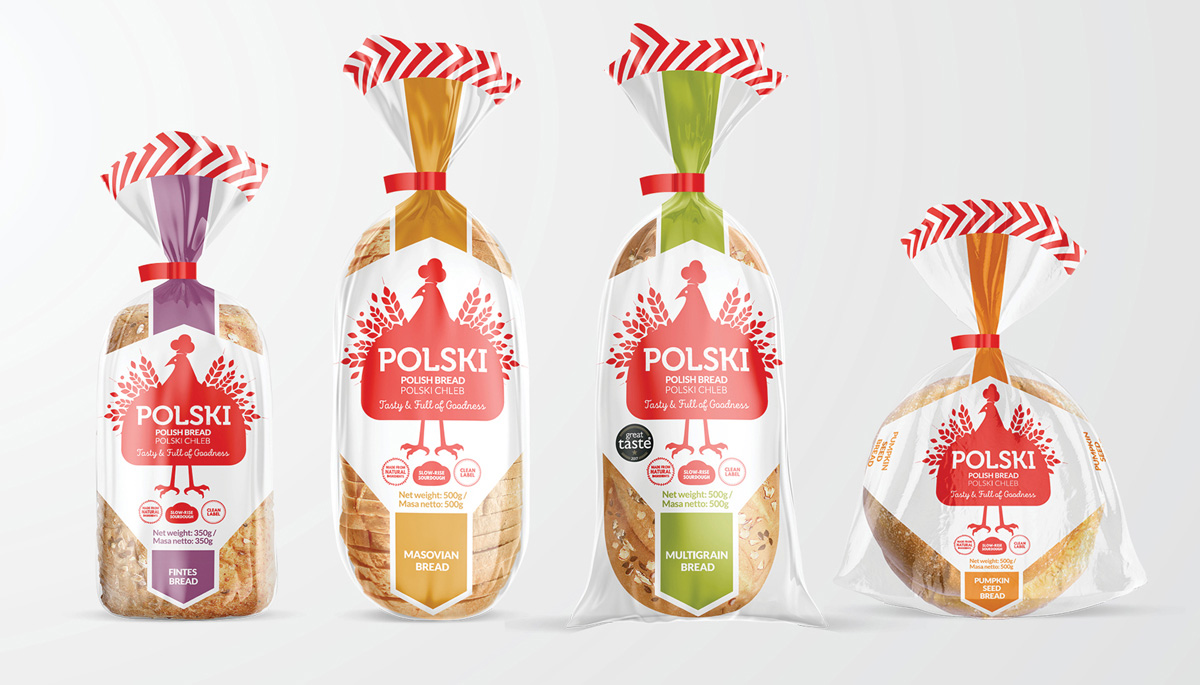
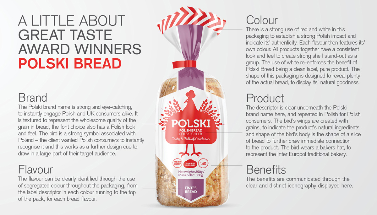
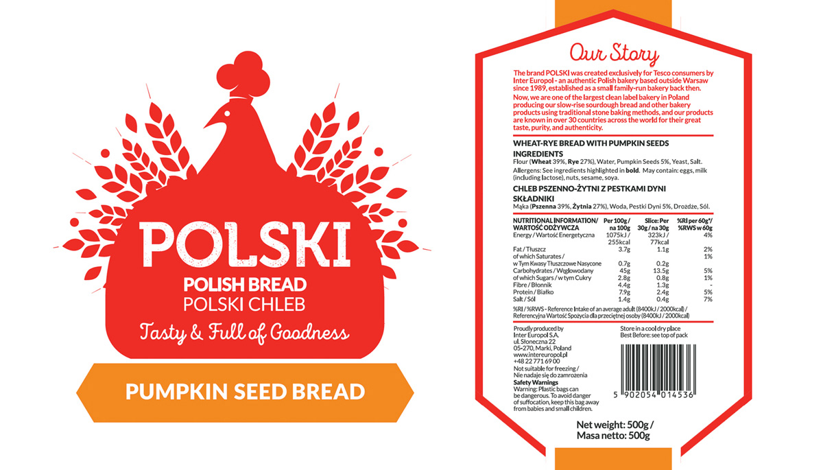
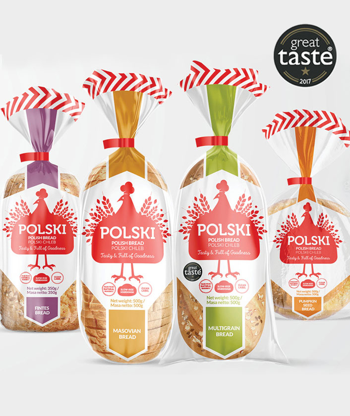
POLSKI Bread was created by authentic Polish bakery Inter Europol, exclusively for Tesco consumers. Known for their taste, purity, and authenticity, they’re the largest clean-label bakery in Poland, producing real slow-rise sourdough bread and other bakery products using traditional stone-baking methods for over 30 countries worldwide.

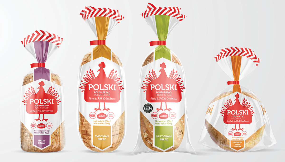
The brief was to design a new packaging brand for a range of Polish bread to be launched in Tesco stores across the UK. The main target audience is consumers who love Polish food, therefore it was important to ensure that the branding made a clear, instant connection to Poland, for strong shelf stand-out.

Some factors considered to answer this brief include:
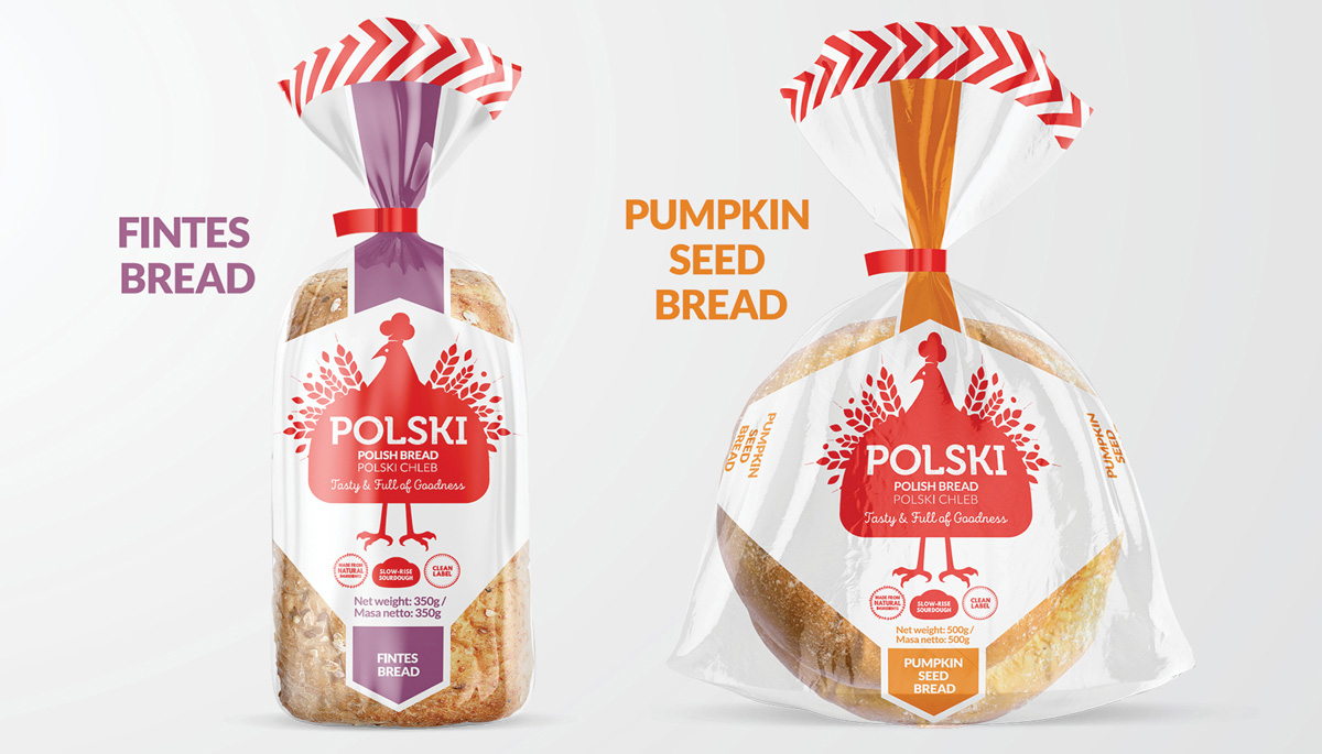
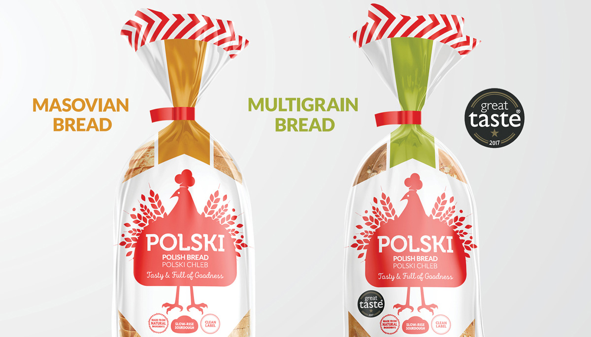
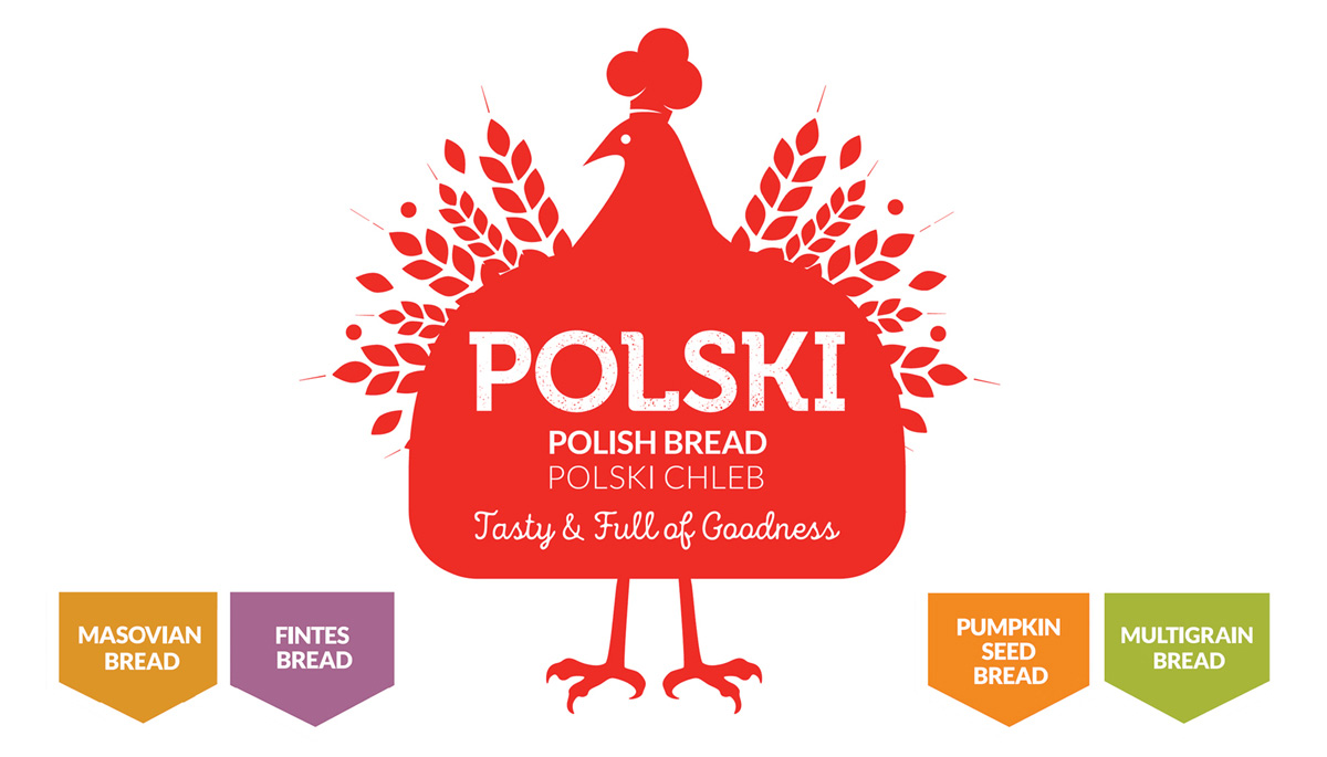
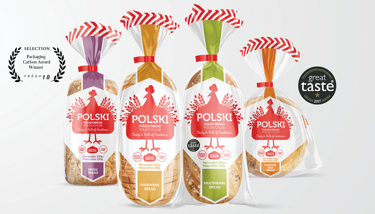
– Using the colour palette of the Polish flag (with colour variants per flavour) / the use of white to represent its’ clean label benefit.
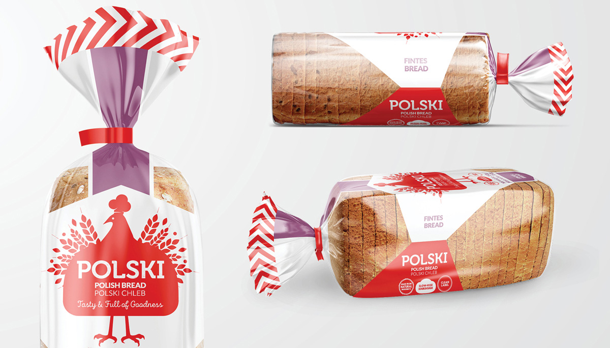
– Packaging shape designed to reveal the bread’s natural goodness.
– Featuring the Polish bird mascot – with wings formed from grain, a bread-shaped body and a baker’s dough-shaped hat.
– Simplified folk-art style ‘Wycinanki’ illustration.
– Traditional Polish typography in a modern style, containing an earthy, grain texture signifying the bread’s wholesomeness.
– Consistency across four different shaped packs, for strong brand impact.

The result is engaging design, carefully tailored to their target audience.


*This work received a graphic design award in the Frēsh 18 Design Awards.


*Featured on The 100 Archive and Packaging Design of the World.

February 15, 2018 /  

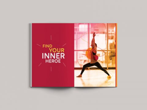
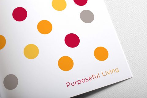
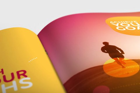
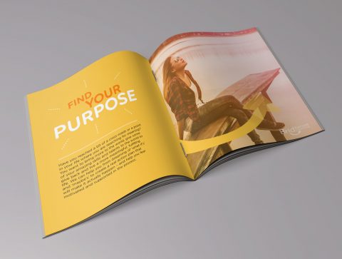
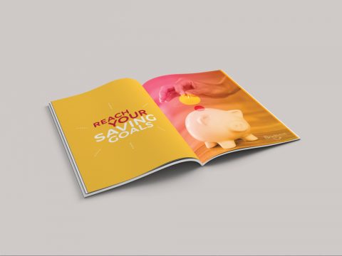
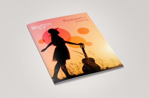
BK Coaching Brand Booklet

Brid Kehoe Coaching Brand Booklet


<img


BK Coaching Brand Book & Marketing Collateral
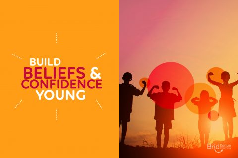
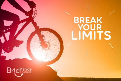
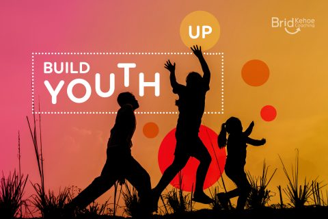
Brid Kehoe Coaching are a holistic coaching practise who support clients in taking steps forward to change for the better and help them to uncover new routes to get there. They guide clients to improve wellbeing and focus, change career and much more through support, encouragement and introducing new creative strategies.

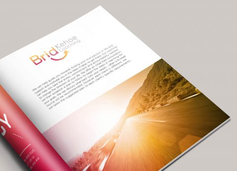
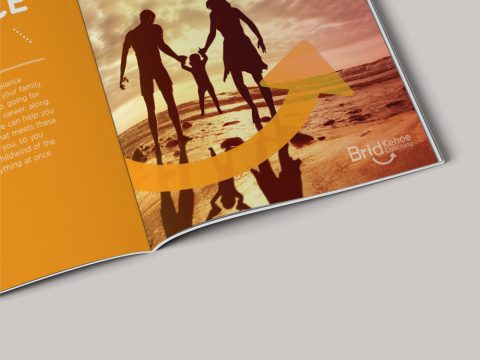
The arrow in this identity lockup represents how Brid Kehoe Coaching focus clients in an upwards direction in their life; the subtle smile and bright colours communicate the positivity and fresh outlook that they bring to all their clients.

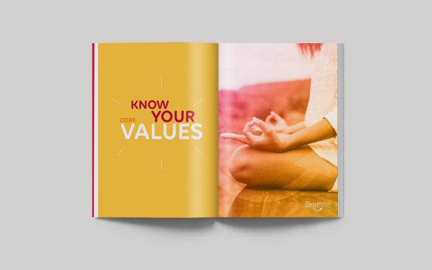
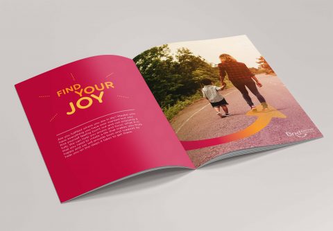
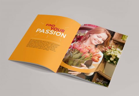
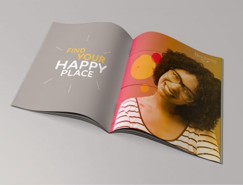
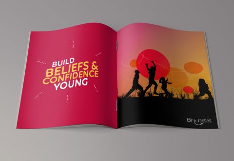
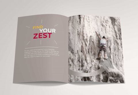
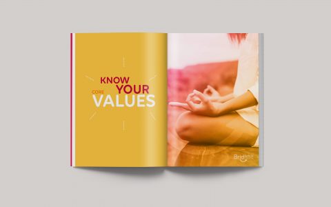
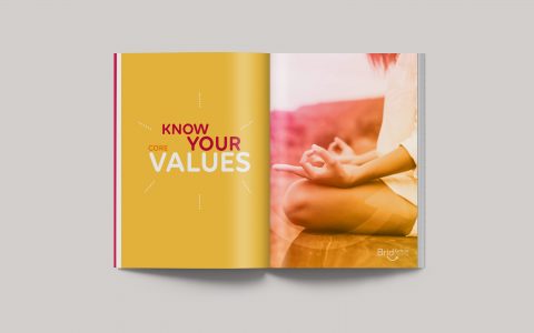
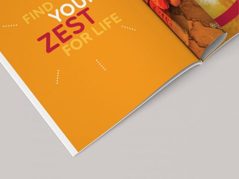
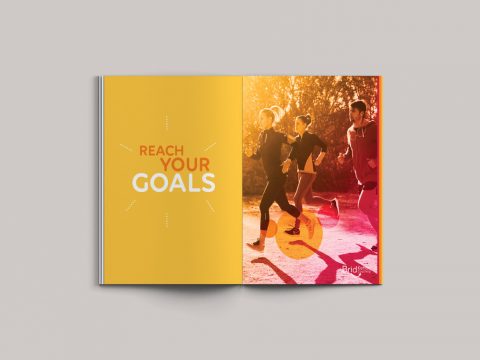
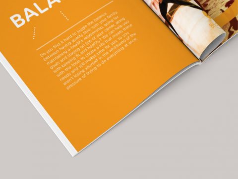
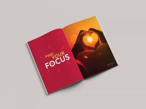
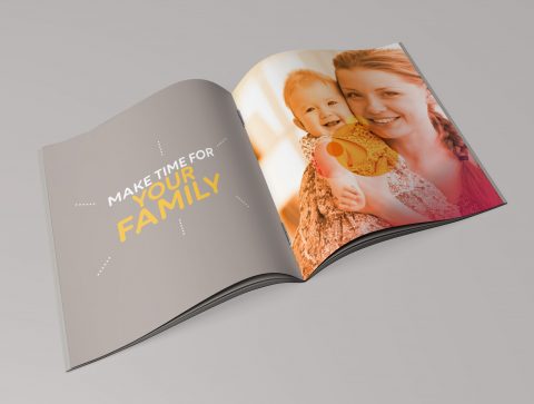
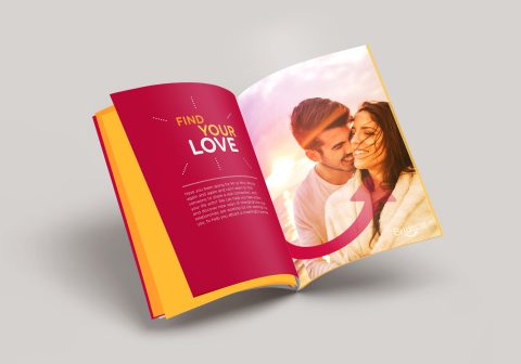
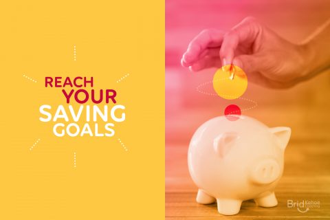
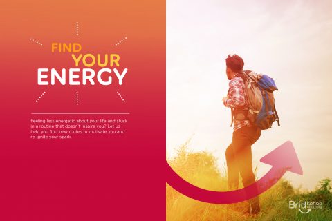
This booklet was designed to communicate BK Coaching’s brand mission and values of their aim to improve their client’s lives by helping them to choose a direction which leads them towards their goals and to find happiness in their lives. Brid Kehoe Coaching work on one-on-one coaching sessions with individual clients and also work with groups, both in the work environment and in youth work, empowering people to grow and become the best and happiest version of themselves. This booklet evokes and carries across the same feelings of joy, passion and enthusiasm for life that the BK Coaching brand represent.

See also Brid Kehoe Coaching Brand and BK Coaching Client Toolkit is to follow soon.

*This work received a graphic design award in the International Design Awards with an Honorable Mention.

February 12, 2018 /  

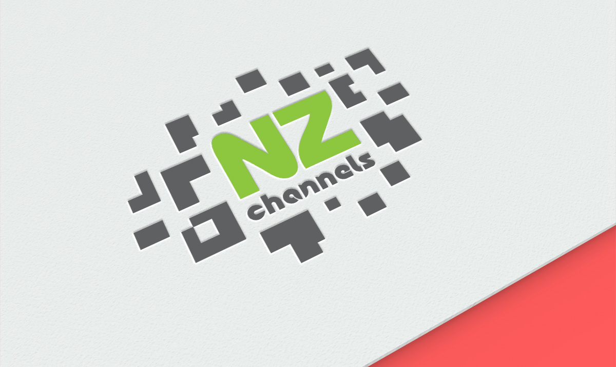
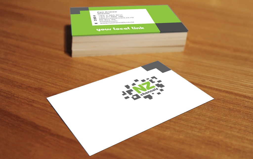
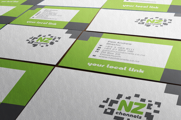
NZ Channels Branding

NZ Channels Brand Identity


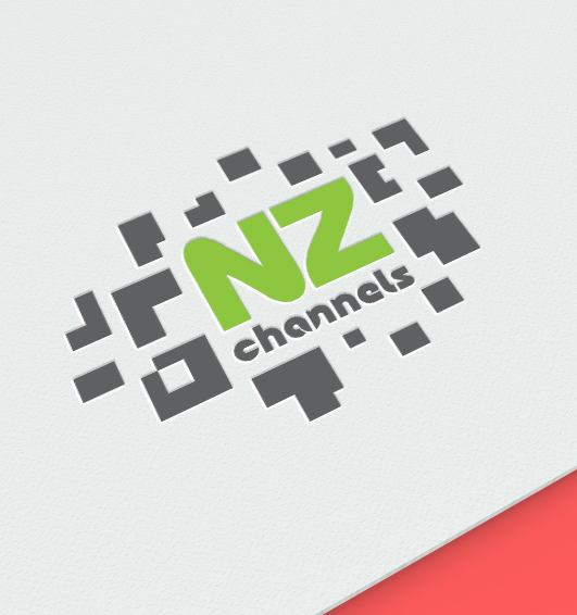
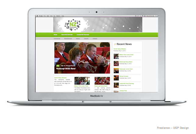
The aim with NZ Channels was to create an identity for a company who provides an online media and television network of all the towns and cities in New Zealand. NZ Channels provides videos, links and information on past and upcoming events in each town.

The viewer can go online and watch televised events in the town that they are interested in, whether it is their hometown or a town they will be visiting. The website also provides various other information from each town so that it is an easy online information source.

As it online-based, and a transfer from one media source to another, I chose a pixelated look for this logo. It is also designed to be open to animation as it will be seen in an interactive media platform.


*Freelance whilst at UGP Design
February 1, 2018 /  

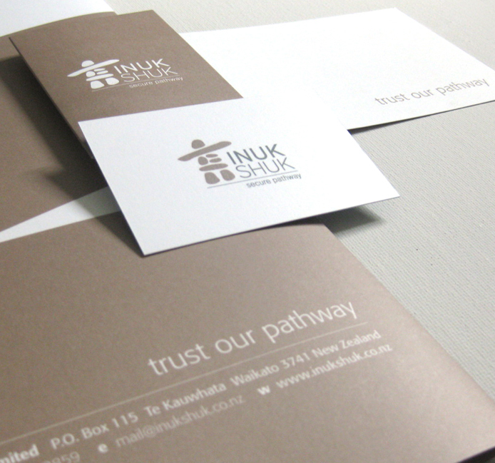
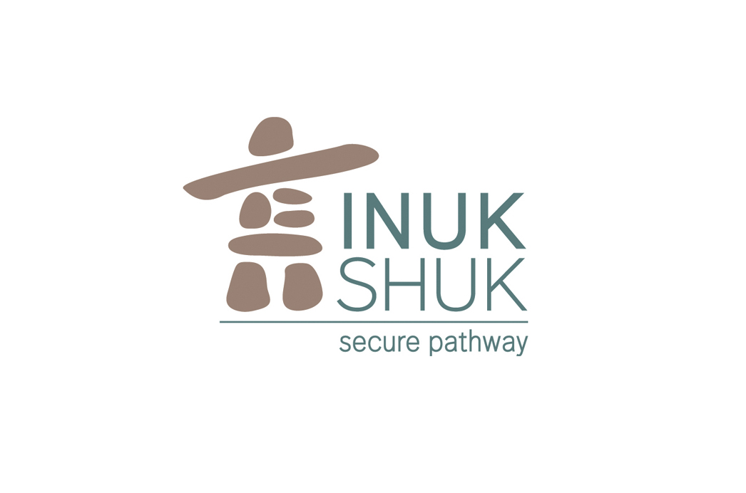
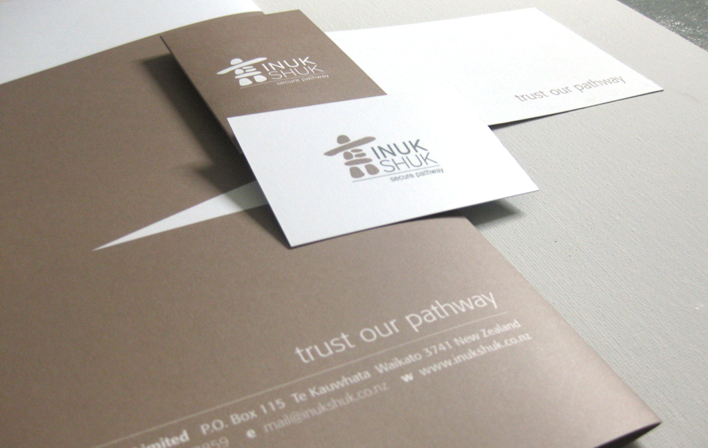
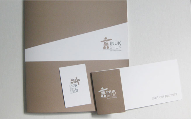
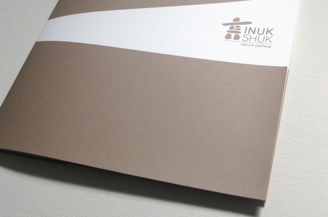
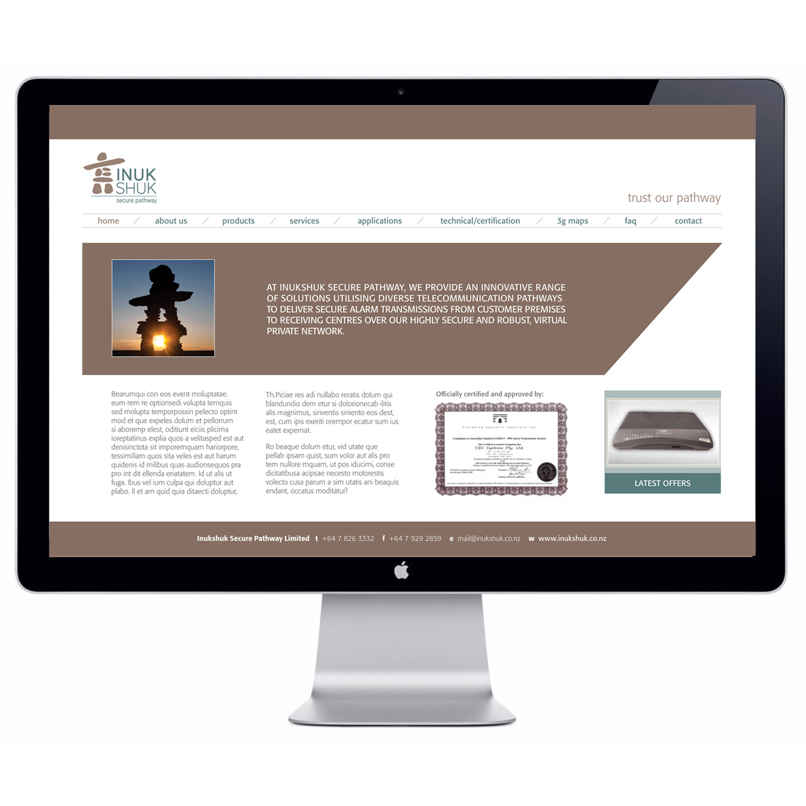
Inukshuk Brand Identity

Inukshuk Brand Identity


Inukshuk Secure Pathway provide technical and operational requirements of the security industry to deliver secure alarm systems and telecommunication pathways to their clients.

The client wanted to use an inukshuk as an element in their identity to represent the safe and secure telecommunication pathways they provide, as an inukshuk is a symbol of ‘safe pathways’ and a marker to guide people in the right direction. It symbolizes Inukshuk’s service.

I chose a muted and earthy look and colour palette to establish that that Inukshuk are a trusted, down-to-earth brand and the strong directional lines to denote the guidance they offer. I designed the brand identity and website look and feel for this brand.


*Freelance whilst at UGP Design
February 1, 2018 /  

Elevate Executive Selection Branding

Elevate Executive Selection
Branding

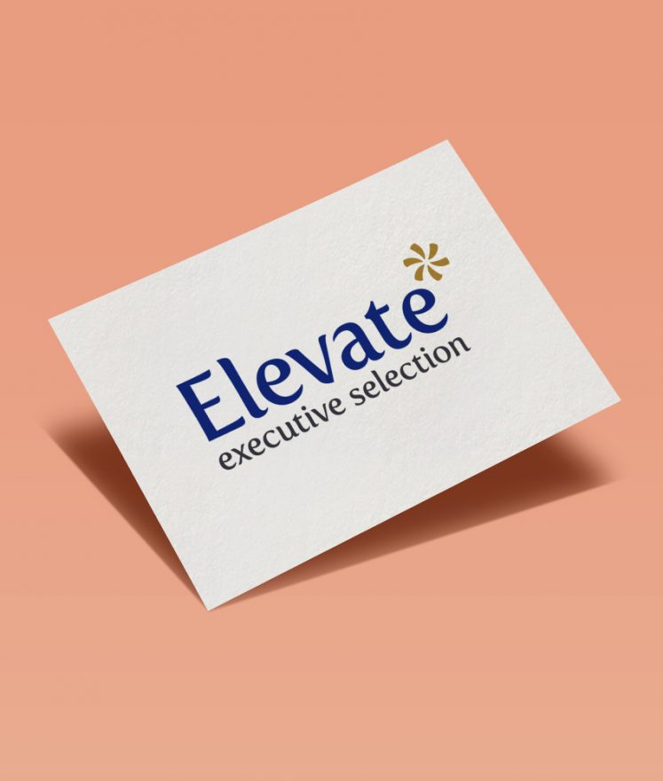
Elevate Executive Selection provides high-end recruitment services to it’s clients. The service offered by Elevate is innovative, professional, sincere, and results based. I created a brand that was high quality and professional, denoting the feeling of being specialized and selective, highlighting it’s point of difference from other recruitment agencies.

Another strong value Elevate wanted to portray towards it’s target audience is a feeling of optimism, fun and a brightness towards the future, whilst still maintaining a corporate feel. This is all tied in very well together with the unique brandmark created – a clean, simple and strong representation of what Elevate stands for in the current market.

January 30, 2018 /  

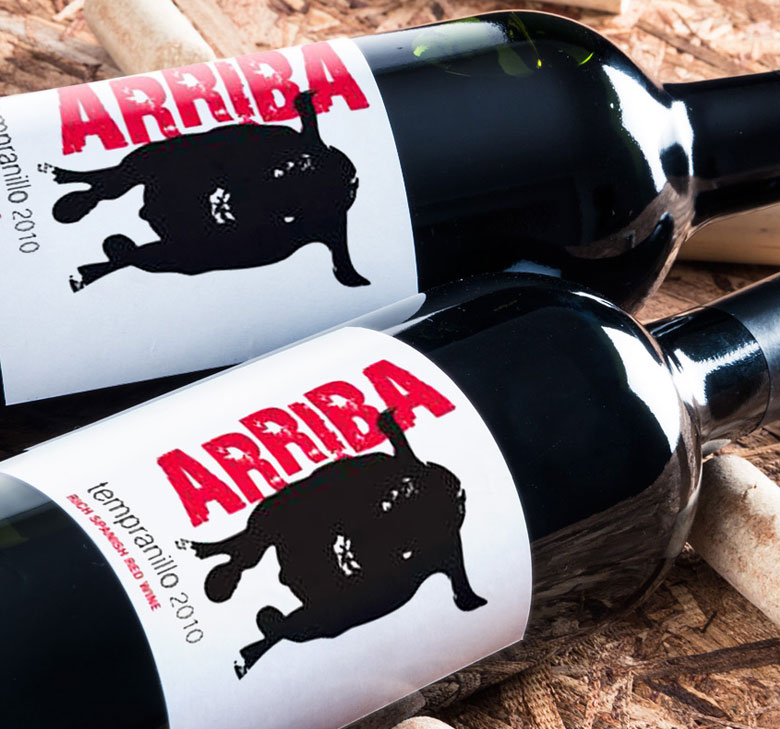
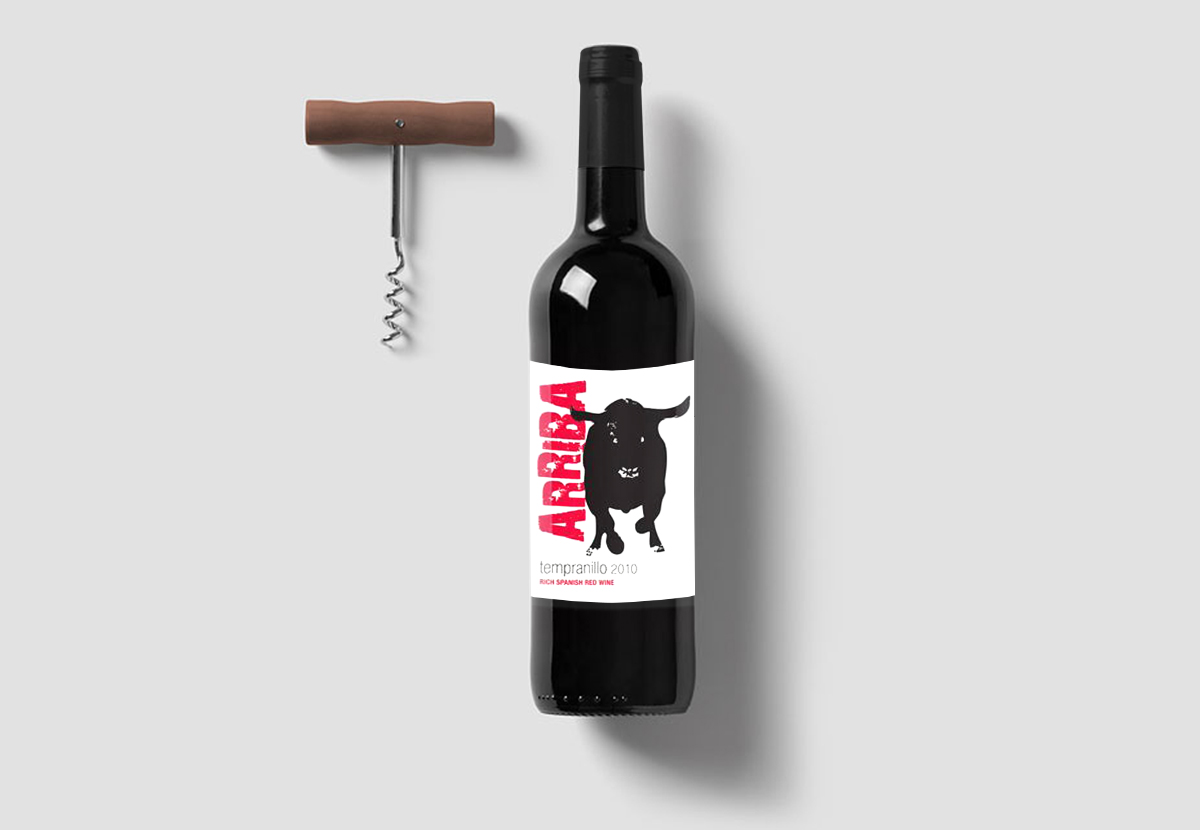
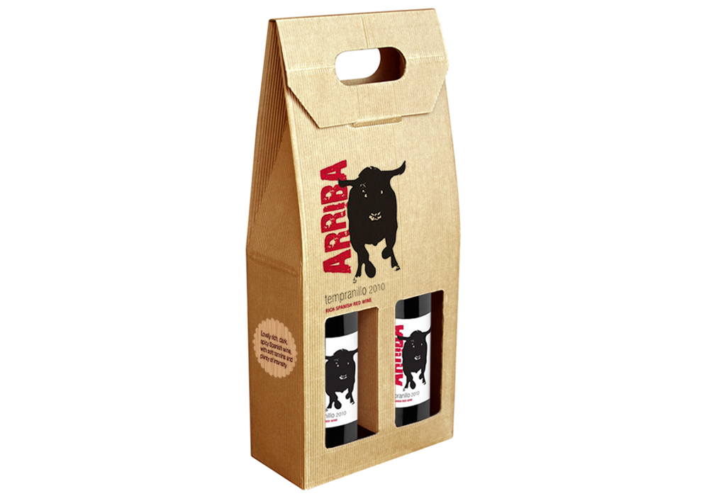
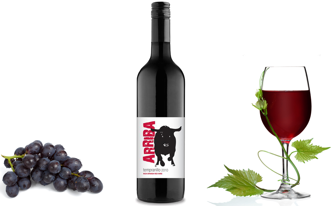
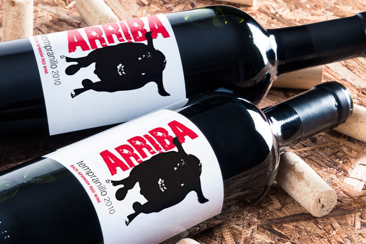
Arriba Wine Packaging Design

Arriba Tempranillo Wine
Packaging Design


Arriba wine is tempranillo, a full-bodied Spanish wine label. The client was interested in incorporating a bull in to the design for the label, as he wanted a strong association with it’s Spanish roots and strong, fruity taste. The look and feel of this label is strong and direct.

The word ‘arriba’ has meanings including ‘come on’, ‘hurry up’, ‘let’s go’ – all very action-based words. I have designed the font to represent this along with the lively, energetic spirit of the Spanish – an urgent movement which contrasts strongly with the strong, steady bull but compliments the bull’s fiery charge. The lid draws on the Spanish colour palette – overall a modern and contemporary wine label.


*Freelance whilst at Design Dairy
January 30, 2018 /  

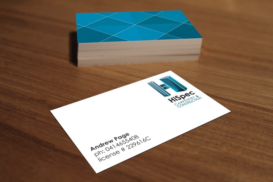
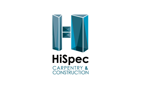
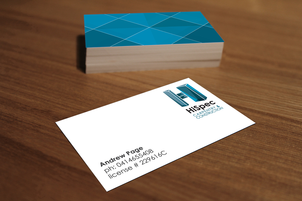
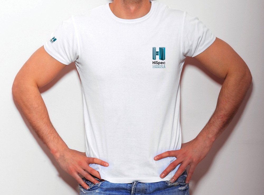
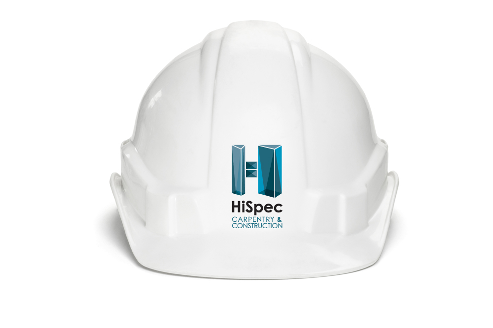
HiSpec Brand Identity

HiSpec Construction Brand Identity

HiSpec Carpentry & Construction are an Australian carpentry company based in Sydney, offering a quality and professional service. The client wanted a modern, polished and adaptable brandmark to appeal to the modern-living and trendy residents of Sydney’s suburbs.

The result is a clean and modern brand, which is clearly recognisable, helping them stand out from their competitors.

January 30, 2018 /  

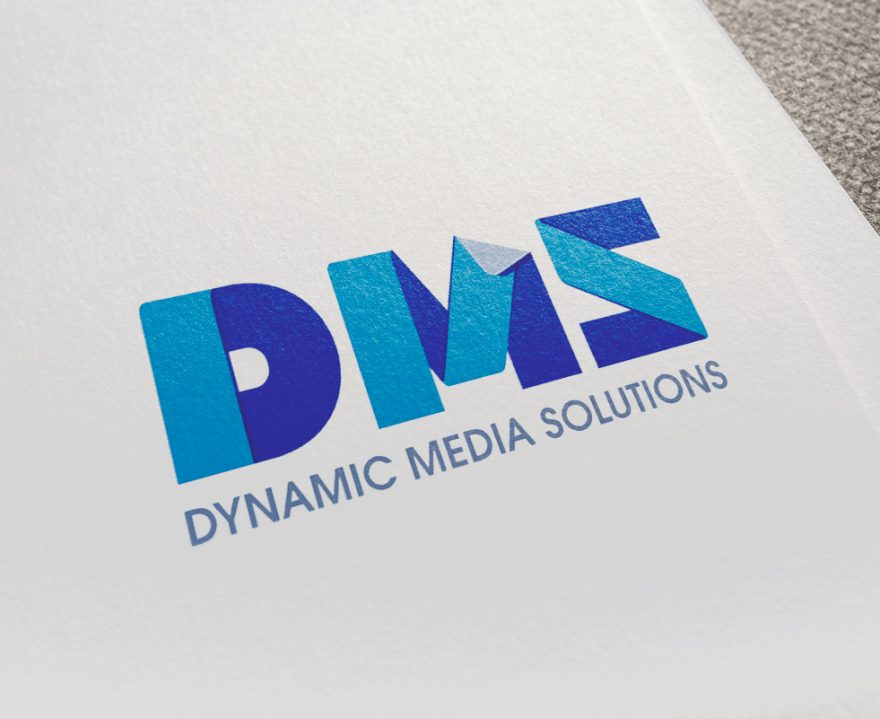
Dynamic Media Solutions Brand Identity

Dynamic Media Solutions
Brand Identity, Livery Design


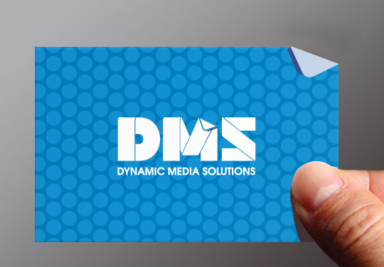
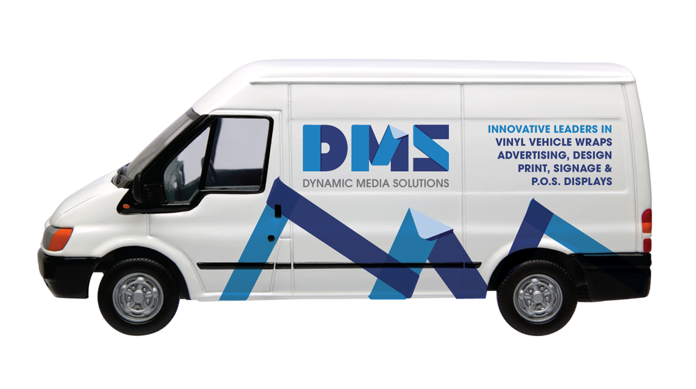
Dynamic Media Solutions are an innovate and leading company in Ireland that provide services such as vehicle wraps, environment wraps, in-store digital wallpaper, print and signage.

They specialize in vinyl wrapping of everything from vans and buses to building exteriors and tunnels. They are a new and fresh company and they wanted to portray this in their branding. They wanted to stand out in the marketplace and be an easily recognized brand.

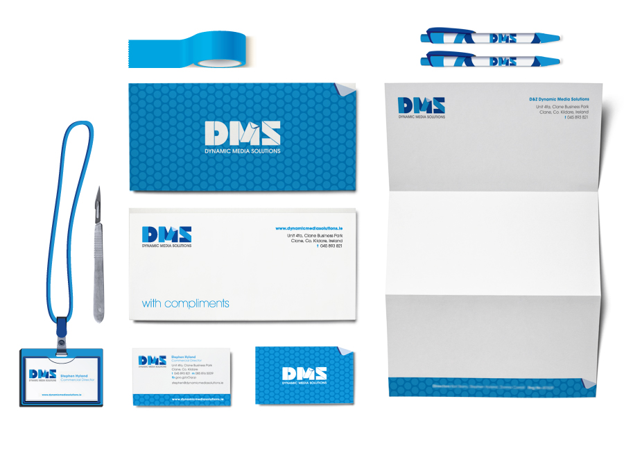
Their ethos is a can-do, flexible and innovative approach. Using their initials as a brand-mark, I created a logo typeface that generates this feeling of movement and also re-enforces exactly what they do. I used the mesh pattern which makes up vinyl as a graphic element on the stationery. The result is a clean, professional brand with it’s own unique personality, with a graphic style which has the potential to easily be translated onto other mediums such as posters and advertisements in the future. The client was very happy with the result.

January 30, 2018 /  

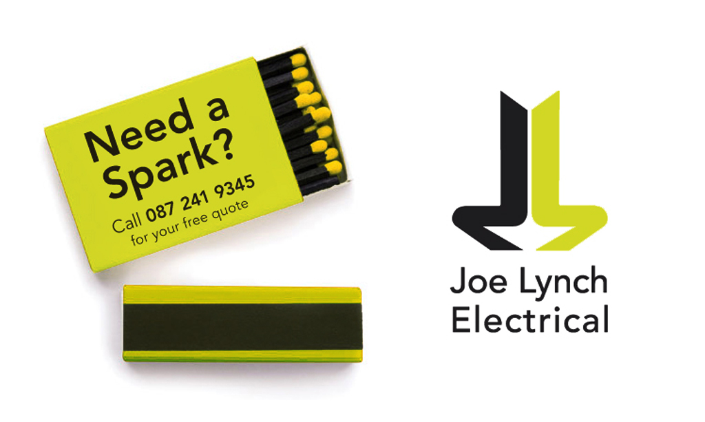
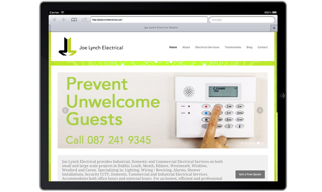
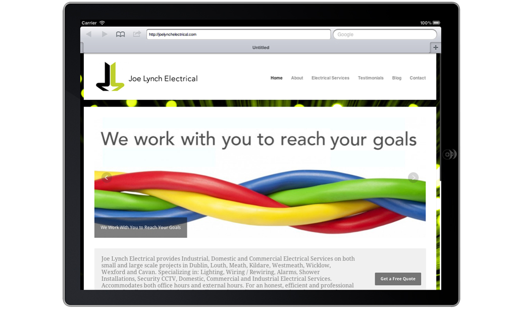
Joe Lynch Electrical Brand Identity


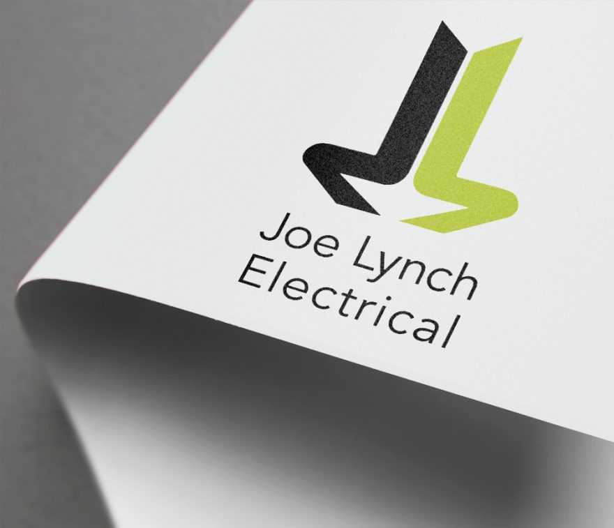
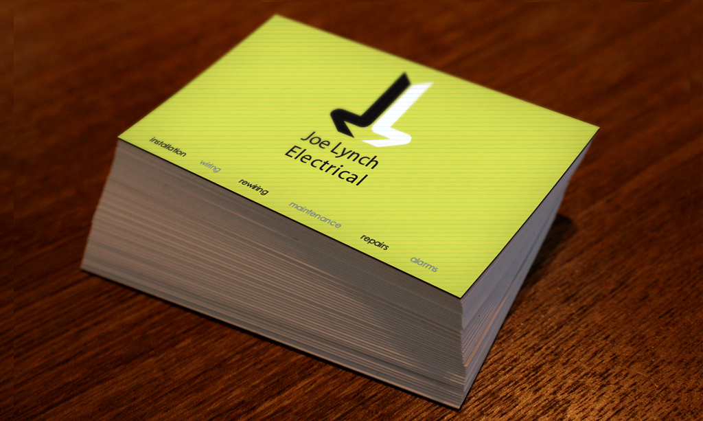
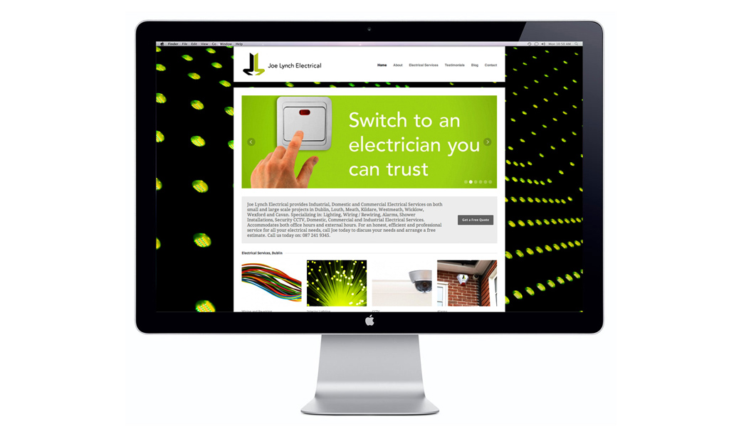
A unique and stylish identity for Dublin based electricians, Joe Lynch Electrical. The J and L letters from the owner’s name where used to create a strong graphic brandmark which symbolises a bolt of electricity and also re-directs the focus to the company’s name. The colours used were bright and fresh, and veer away from the typical blues and reds used with electrical companies, making JLE stand out in the marketplace.

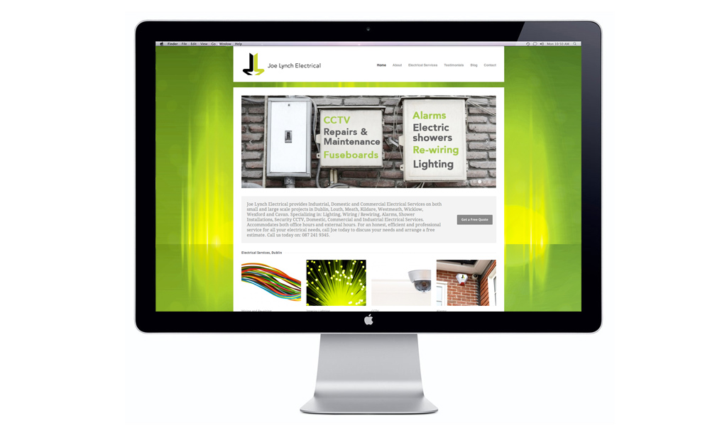
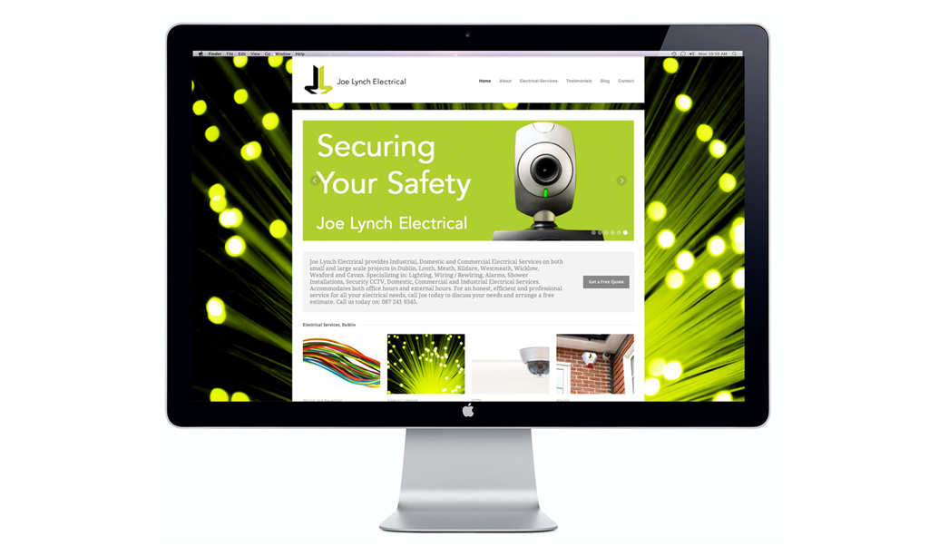
The website is strong graphically and drives clear messages to the visitor of the available electrical services.

The website has effective SEO which drives new customers to the site on a regular basis, whilst also being a good touchpoint for existing clients.

www.joelynchelectrical.com

January 30, 2018 /  

WebDoctor.ie Branding

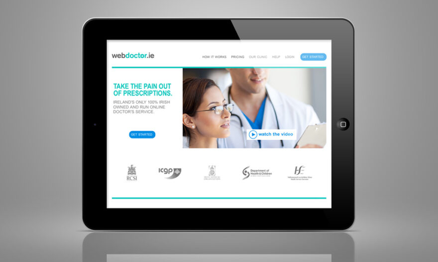
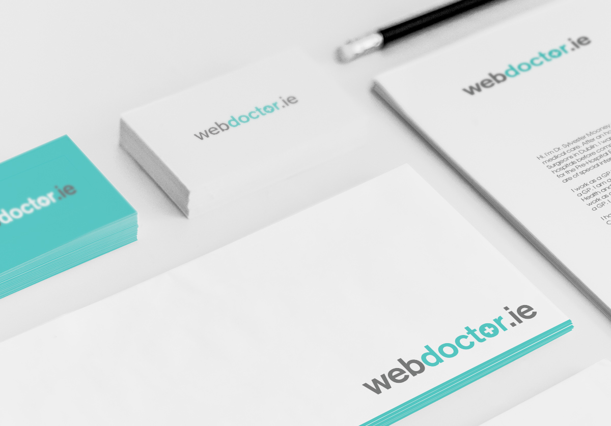
WebDoctor.ie Logo & Website Template

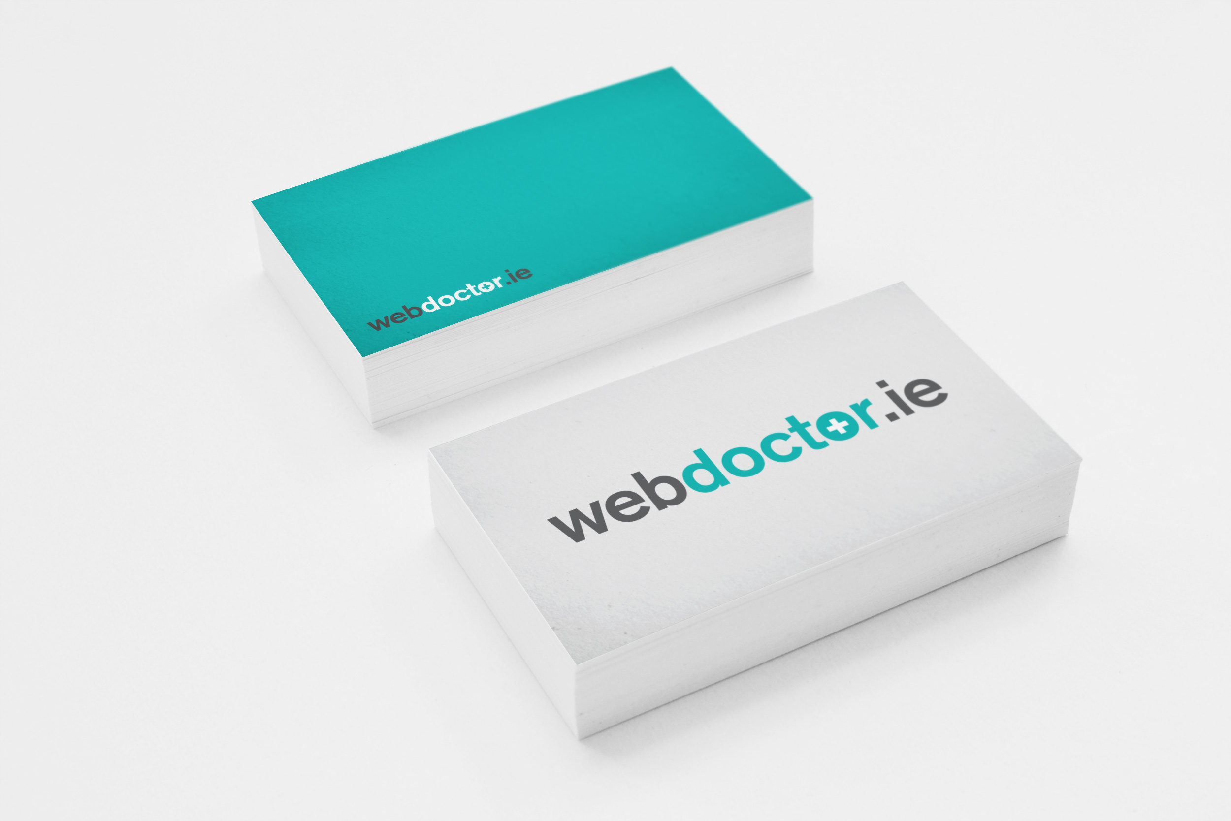
web_doctor_logo-visual_1
web_doctor_bus_cardsx2


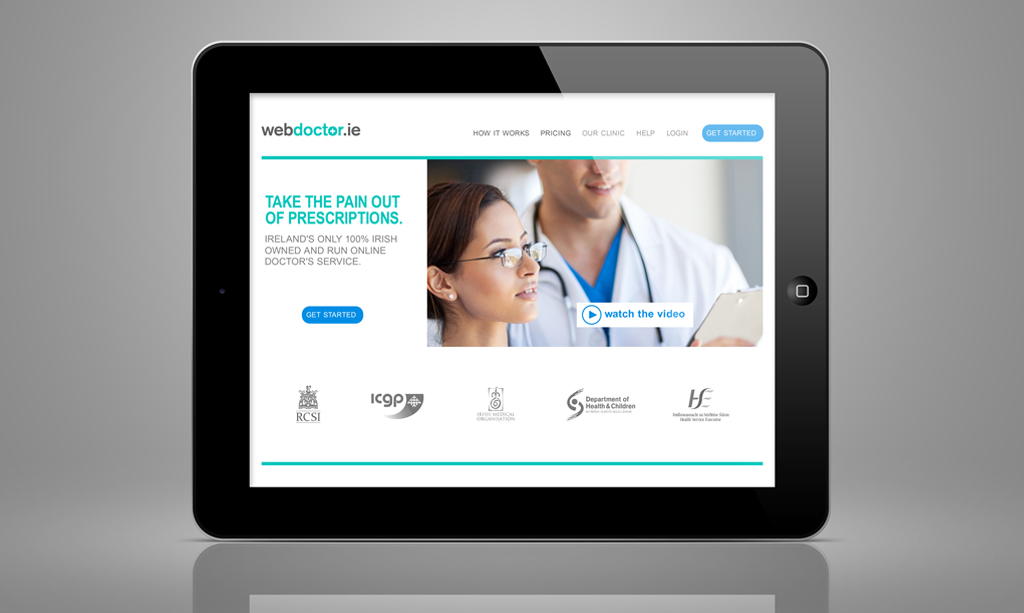
web_doctor_ipad_1

webdoctor.ie are a safe and affordable Irish online doctor service that conveniently delivers prescriptions to your door. Customers can simply fill in an online consultation for their desired treatment and it is conveniently posted to their homes or prescriptions can be used at any Irish pharmacy.

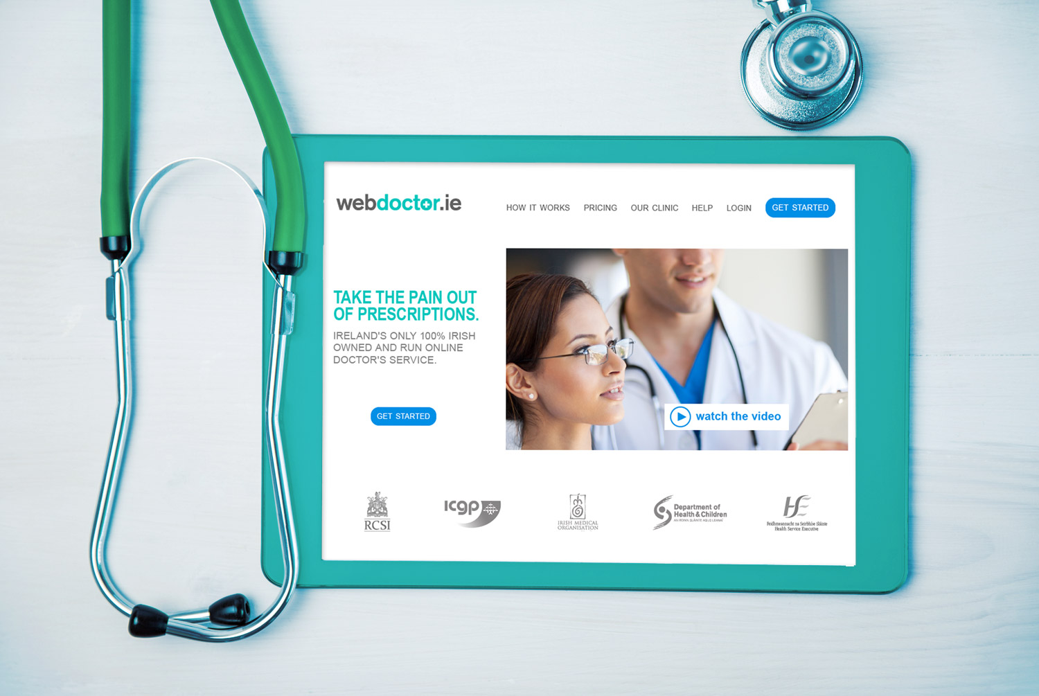
The aim was to create a clean logo and website template with plenty of whitespace and less content for a clear user experience, as webdoctor.ie aims to create a simplified process in seeking medical aid so the logo and branding needed to represent this.

Their mission is to provide a dedicated team with the highest quality of medical care.

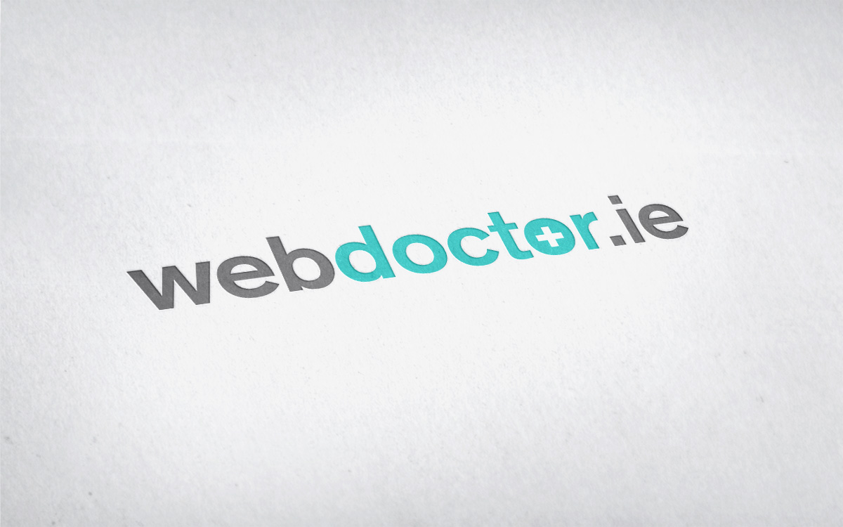
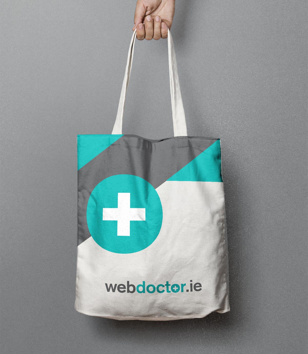
The final logo chosen uses the universally-recognised medical square cross symbol to create easy association with what the company does. We kept the ‘.ie’ within the logo to re-enforce the message of it being an online-only doctor service. The main brand colour chosen is a soft green tone to form an immediate connection on first impact with the medical field.

The result is a clean, professional, direct logo and website template which potential customers can connect instantly in the service webdoctor.ie offer.

Some of the nice feedback from the client:

“Many thanks for your great work!!! And thanks for being so responsive, we’ve already recommended you to some other people! We think you’ve done some great work, really looking forward to working with you much much more!”

Oisin Kim – Director, webdoctor.ie

January 29, 2018 /  

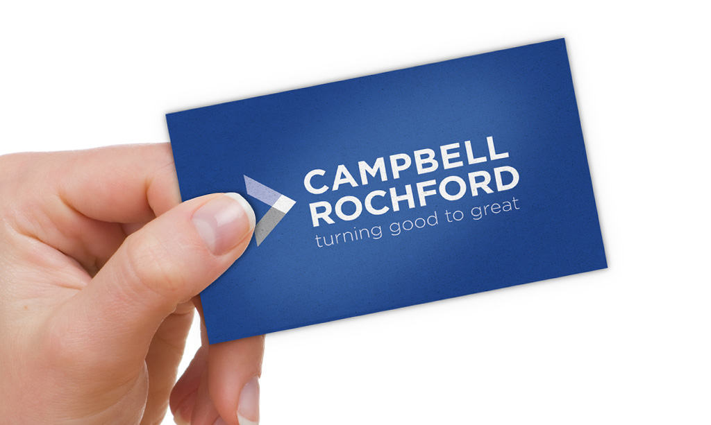
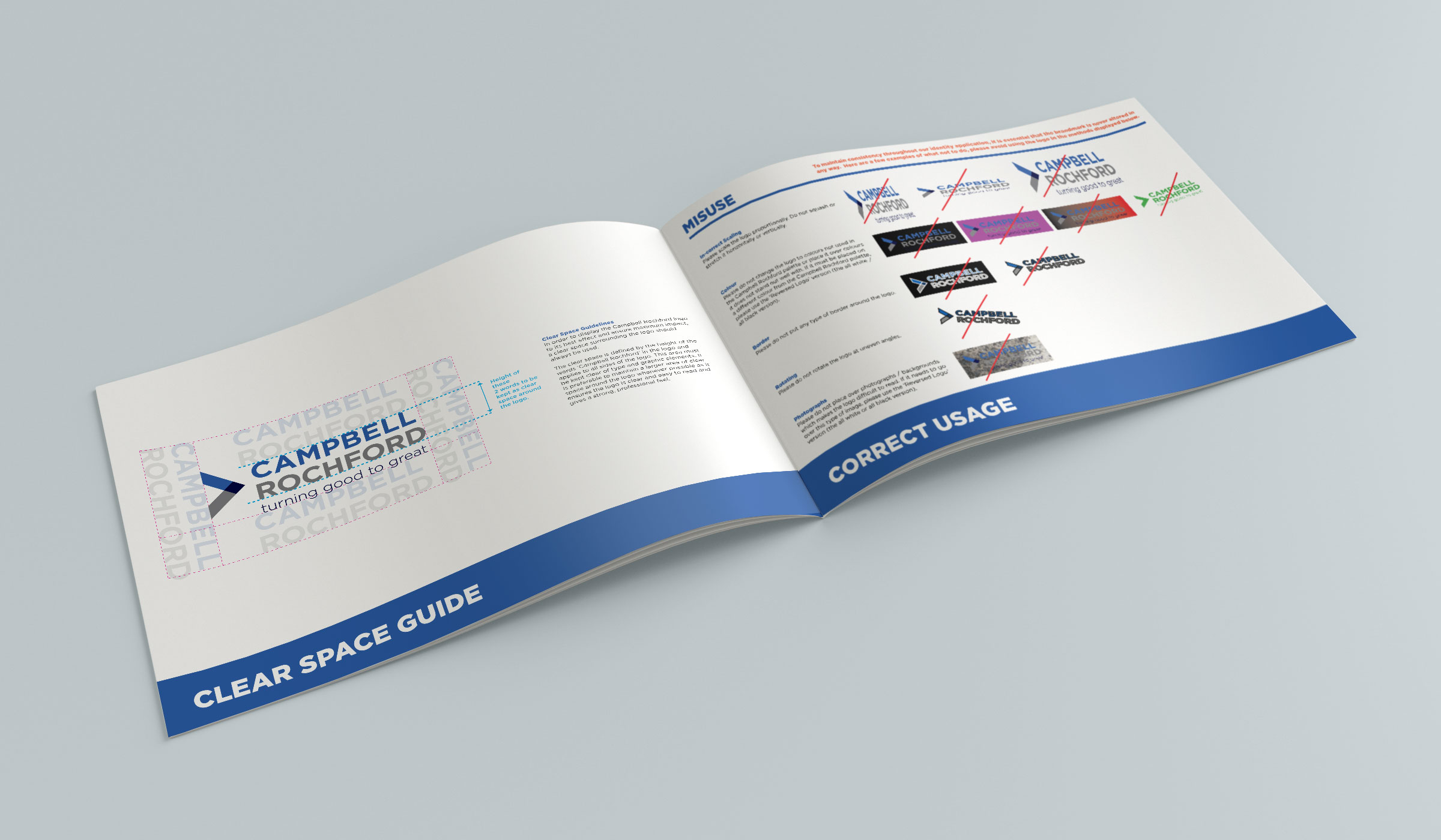
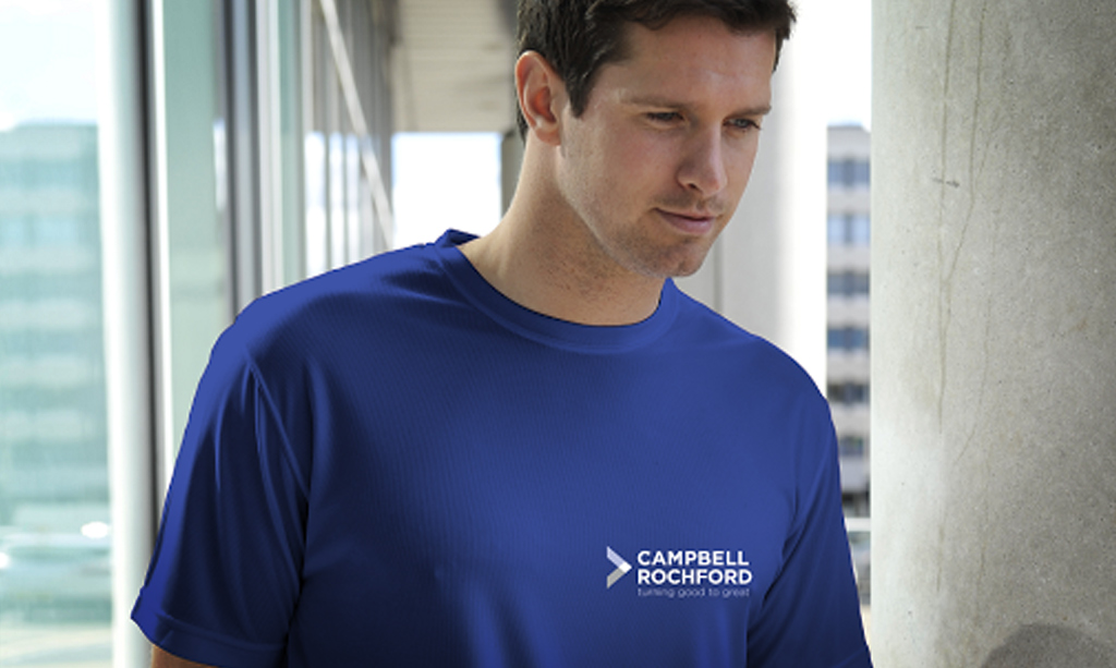
Campbell Rochford Branding

Campbell Rochford
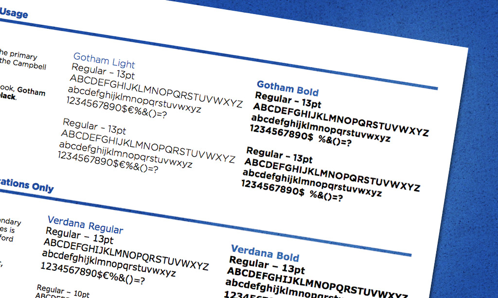
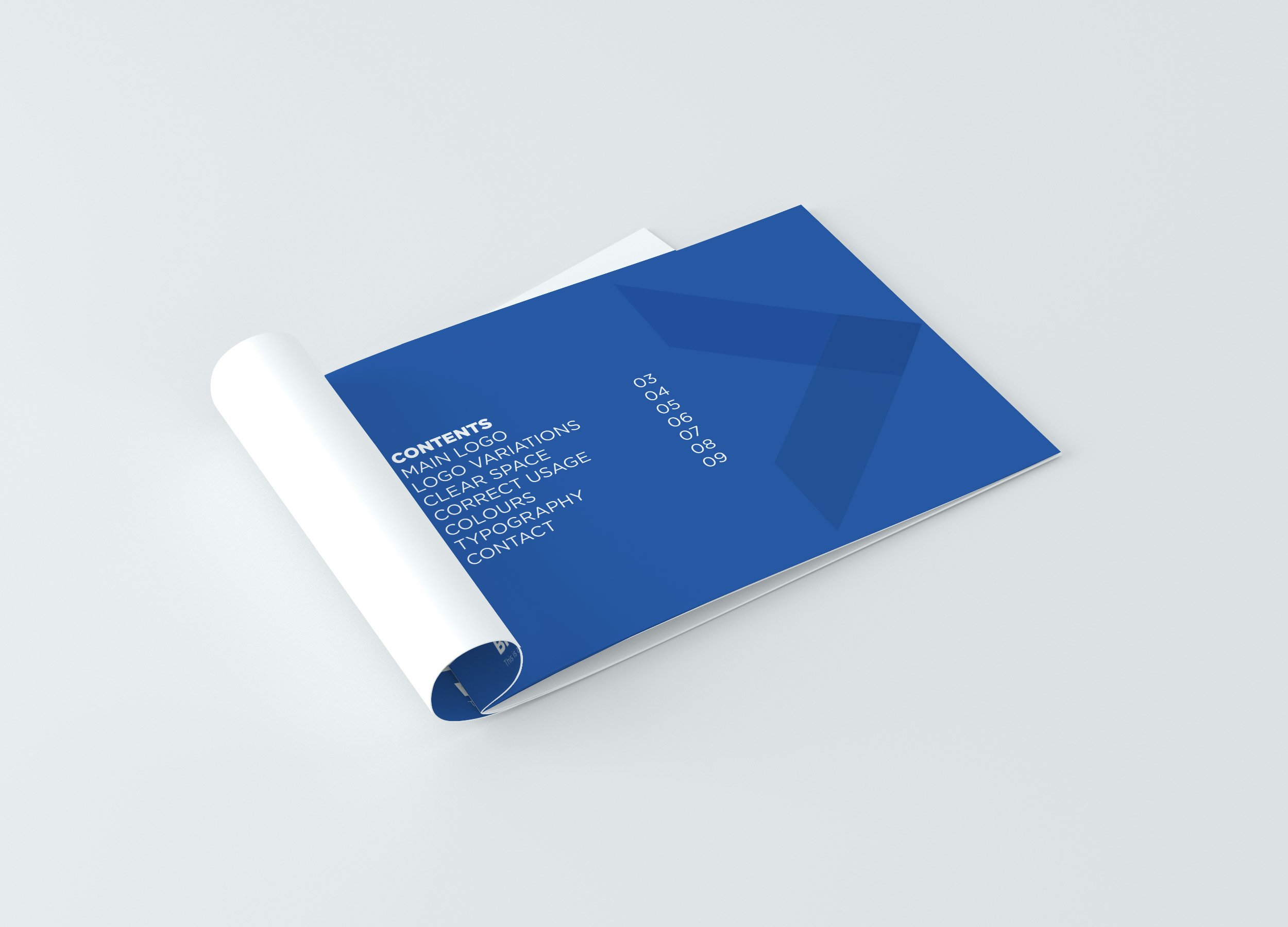
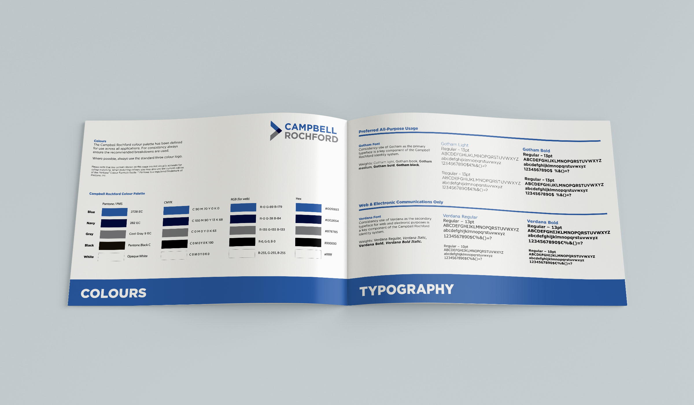
Branding & Guidelines


Campbell Rochford Branding & Guidelines

Campbell Rochford is a specialist Financial Services Recruitment company focussing on the recruitment needs of Banks, Insurers and Finance clients and candidates. Their aim is to grow the business incrementally each year by monetizing the goodwill and experience of previously working with select Financial Services clients.

The new logo needed to reflect a serious, professional company, one that gives a feel of a well-established firm with a reputation to match. Campbell and Rochford were names of late relatives of the company founder and the name was chosen to carry their legacy forward.

Some of the original logo concepts Clare Lynch Creative developed focussed on representing this unique heritage story of Campbell Rochflord, incorporating the C and R from the words Campbell Rochford to create a strong graphic corporate symbol and a recognisable brandmark.

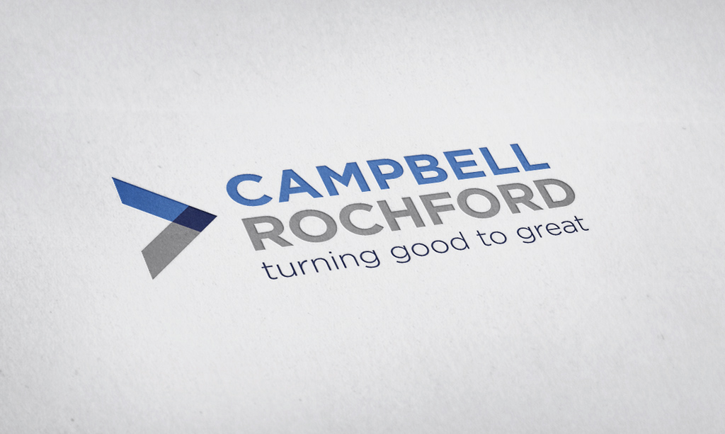
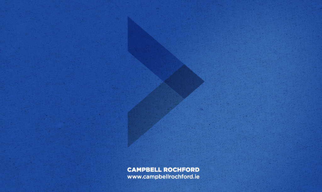
As development continued with the client, we decided to take another direction playing on the word ‘great’ using a direct connection with accounting and the ‘greater than’ mathematical symbol to form a graphic element.

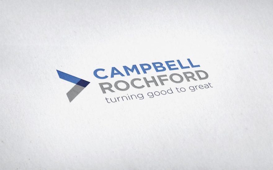
Campbell Rochford represents all that is great. They work with great staff and help people and companies connect to become greater. The strong graphic corporate mark created in the logo symbolises two entities being connected by Campbell Rochford (who are the centre-point in the connection). It also doubles-up to represent a positive step forward symbol for candidates / clients alike.

The overlapping and linking of the shape & colours in the symbol here represent the links and connections constantly flowing with Campbell Rochford and their clients and candidates. This symbol is a strong brandmark which evokes the feel of a quality and established company, keeping it simple and clean with a sophisticated feel. The font used is modern and clear, with a touch of elegance and the colour palette chosen convey the values Campbell Rochford aim to represent of trust, professionalism and confidence.

“I’m delighted with how my logo turned out and having shown it to people since, everyone was really impressed. The logo really helped my website and I’m glad it looks a lot more professional as a result. I also ordered my first batch of business cards so thank you very much for your advice in this regard on the print”.

Gerard Quinlivan – Director,
Campbell Rochford

March 28, 2017 /  

Posts navigation

1 2 3 4

About me

Clare Lynch Creative are a Dublin based graphic design practice specialising in the design and development of unique brand identities, packaging, visual communication and print design.

Popular Posts

  • IDI Design Awards 2025 – Shortlisted! October 16, 2025
  • Favourite Design: Blarney Bees Honey Feature July 14, 2025
  • Joyof Foods In-Store Promo July 11, 2025
  • Fingal Food Circle Event July 7, 2025
  • Favourite Design Feature July 4, 2025

Archives

  • October 2025
  • July 2025
  • June 2025
  • May 2025
  • April 2025
  • March 2025
  • February 2025
  • January 2025
  • November 2024
  • October 2024
  • September 2024
  • August 2024
  • July 2024
  • June 2024
  • May 2024
  • April 2024
  • December 2023
  • June 2023
  • October 2022
  • April 2022
  • March 2022
  • February 2022
  • January 2022
  • November 2021
  • October 2021
  • July 2021
  • November 2020
  • August 2020
  • July 2020
  • June 2020
  • April 2020
  • January 2020
  • December 2019
  • November 2019
  • October 2019
  • June 2019
  • May 2019
  • April 2019
  • January 2019
  • November 2018
  • August 2018
  • July 2018
  • May 2018
  • March 2018
  • November 2017
  • September 2017
  • August 2017
  • July 2017
  • June 2017
  • May 2017
  • February 2017
  • January 2017
  • December 2016
  • September 2016
  • August 2016
  • July 2016
  • May 2016
  • April 2016
  • March 2016
  • February 2016
  • January 2016
  • June 2015
  • April 2015
  • March 2015
  • December 2014
  • March 2014
  • December 2013
  • November 2013
  • October 2013
  • April 2013

Categories

  • Blog
  • Brand Identity
  • Branding
  • Logos
  • Packaging
  • Website Design

Tags

2017 2022 Advertising art artist awards brand brand design brand identity branding brand packaging brand packaging design Clare Lynch Creative clarelynchcreative communication creative Creativity Design designer design event designinspiration dog treats Dublin exhibition feature food branding food packaging graphicdesign Graphic Design Illustration ireland irish Irish design packaging packaging design packagingdesign packaging designer pet food Poster design print shortlisted SuperValu the tasting vault Typography unique packaging design

Clare Lynch Creative


Clare Lynch Creative

Graphic Design Services
Tara Building, Dublin 2, Ireland
hello@clarelynchcreative.com instagram.com/clarelynchcreative
©2026 Clare Lynch Creative

Award Winning Design Studio Specialising in Branding, Identity and Packaging Design Services