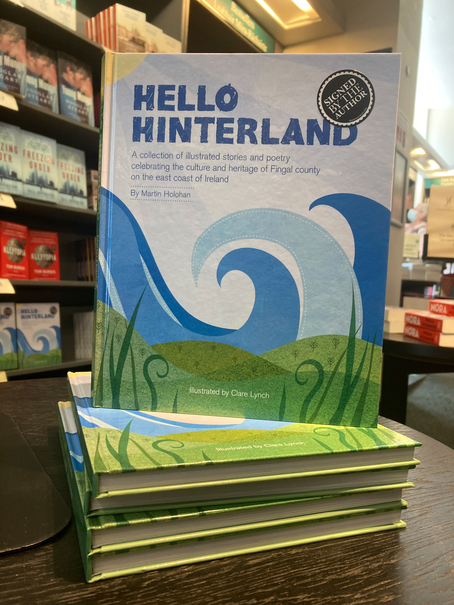
Hello Hinterland: Book Illustration
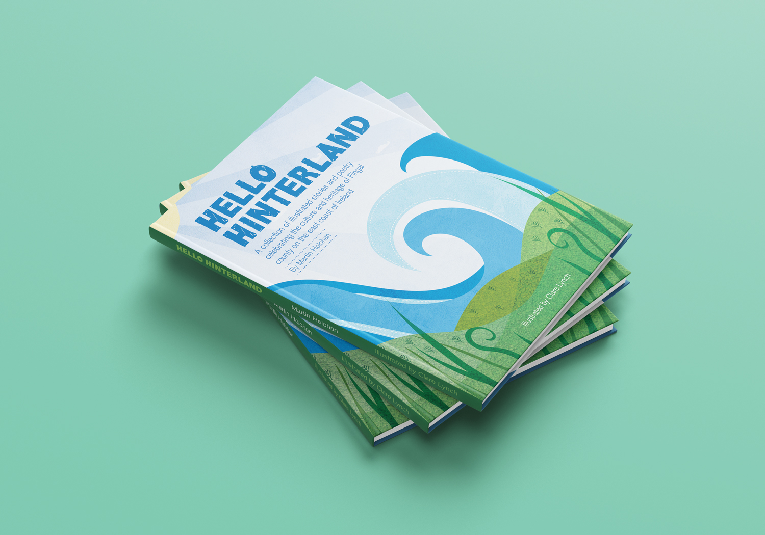
Hello Hinterland is a collection of illustrated stories and poetry, rhymes, observations and folk tales, celebrating the connections between culture and heritage in the wide and embracing landscape of Fingal County, on the East Coast of Ireland. This was my first book illustration project and I feel very proud and excited with the result.
The project came to life when poet and author of Hello Hinterland, Martin Holohan, approached me as he was seeking an illustrator for his new poetry book. I have done illustration as part of my graphic design, branding and packaging design projects and smaller side projects, but this was my first time to fully illustrate a picture book from start to finish, along with creating and putting the book together using my graphic design skills.
The process was really enjoyable. Martin gave me free creative range in terms of how each illustration could be. He wanted it to be a collaborative process, where I take inspiration from the words in each poem using my creative thinking, rather than him directing me on how each poem should look. There was a lovely freedom to this process. We began by working on the first five poems, where I presented him with the illustrations for these select few. His response was as it continued to be throughout, what we might call ‘the dream client!’ where he was blown away and completely enthusiastic and excited about each poetry illustration he was presented with.
When creating each poem, I loved deciphering the meanings of each one, many with clever words related to Irish culture and history, current times, Irish mythology and the local Irish Fingal landscape. The illustrations are full of life and character, reflecting the words in the poetry. Martin wanted the book to appeal to younger children, along with older audiences – therefore, I brought a lot of colour and brightness in to the illustrations – aiming to draw the younger audience in easily with an immediate impact, where as the words will naturally interest and entertain an older audience.
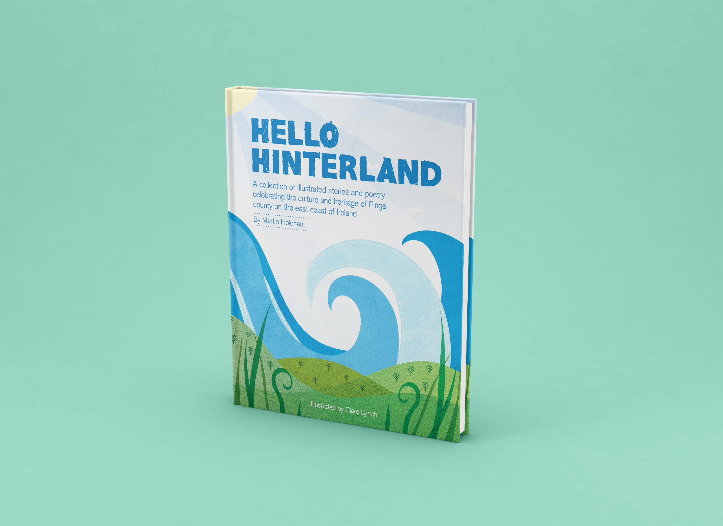
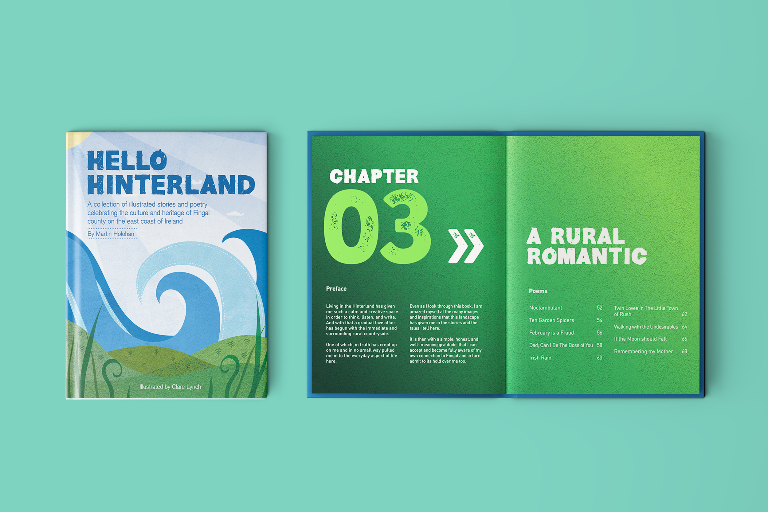
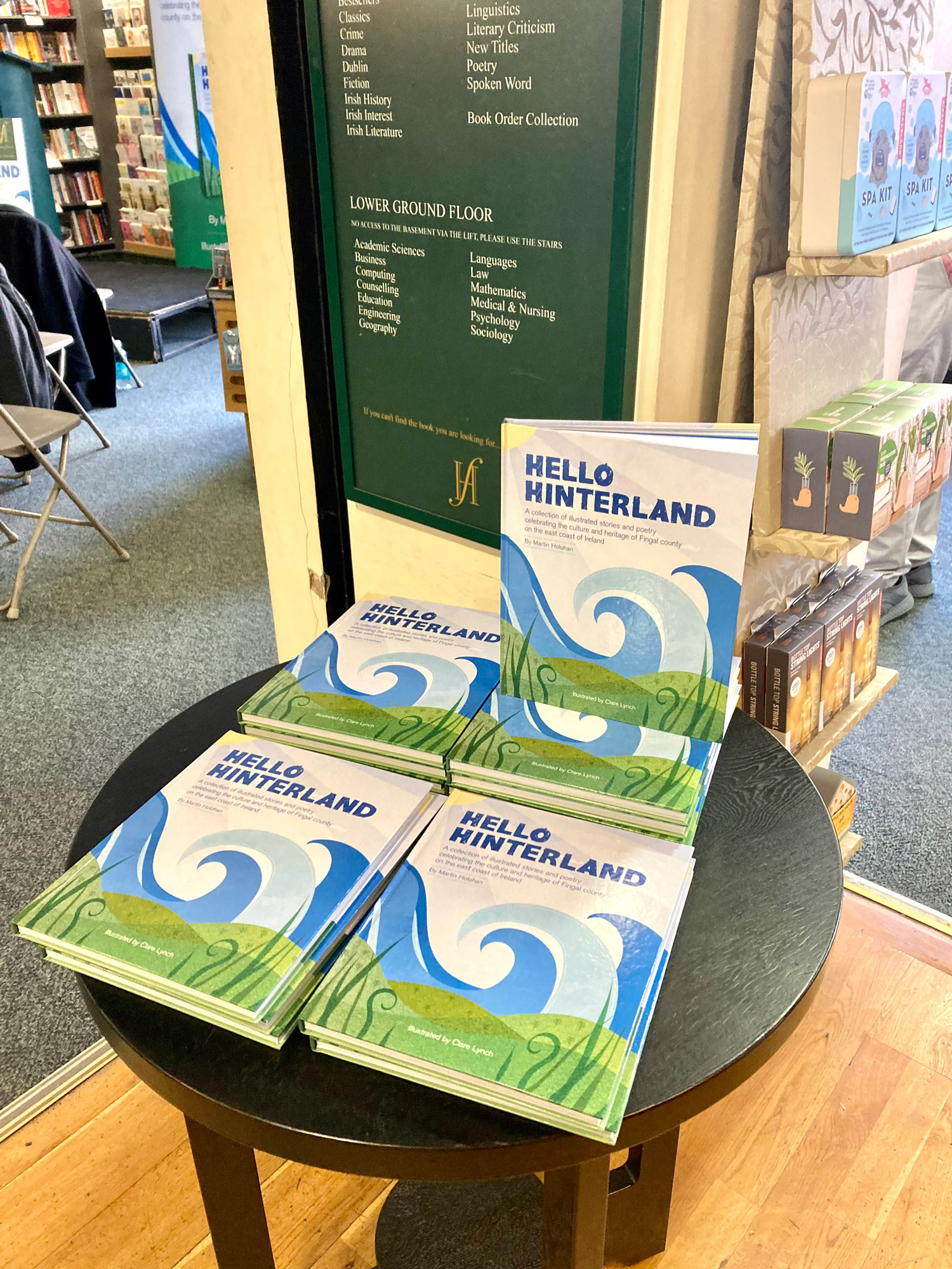
I began by drawing some loose sketch ideas for each one, and then developed them in Adobe Illustrator. I created the book structure in Adobe Indesign. I kept the text of the poetry in the same position on the double-paged spreads for each poem, and ensured that the illustrations I created fitted well with the text so that they could be both enjoyed in an easy-to-read style, with a natural flow to how the text and image are viewed together. The picture book is 100 pages, with almost 40 poetry illustrations, each one spread spaciously across two pages (a spread). Each chapter is clearly divided with a colourised spreads for each.
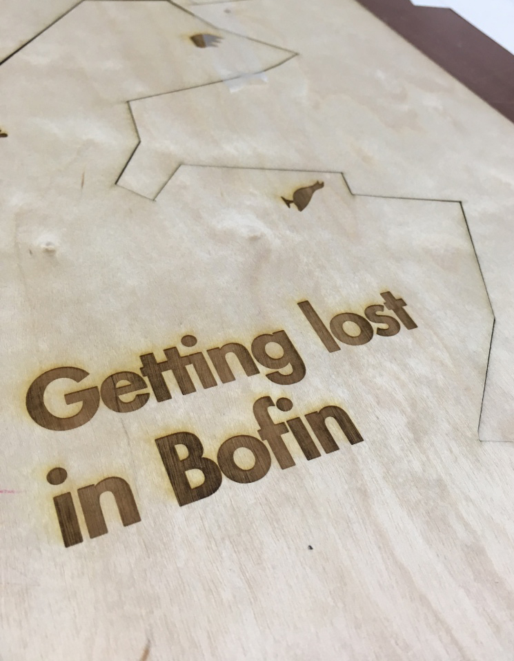
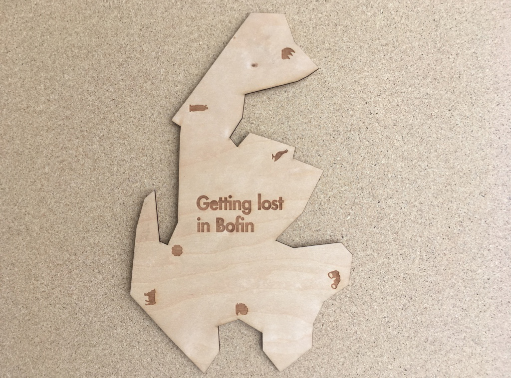
The aims for Hello Hinterland is for it to be a coffee table book in people’s homes, where they can often pick it up and have a read while enjoying a relaxing break from their day to get lost in the stories and themes of the poetry. Another goal for the book is for it to be enjoyed by schools and libraries throughout Ireland. It was printed as a hard-back book with heavy paper stock for this reason – it needed to be durable to withstand a lot of handling by children and the thick paper stock was also a way to present the colourful illustrations to the fullest. Martin would also like it to be seen and used as a ‘Walking Heritage Trail’ through the people and places living along the beautiful landscape of Fingal County, by the sea.
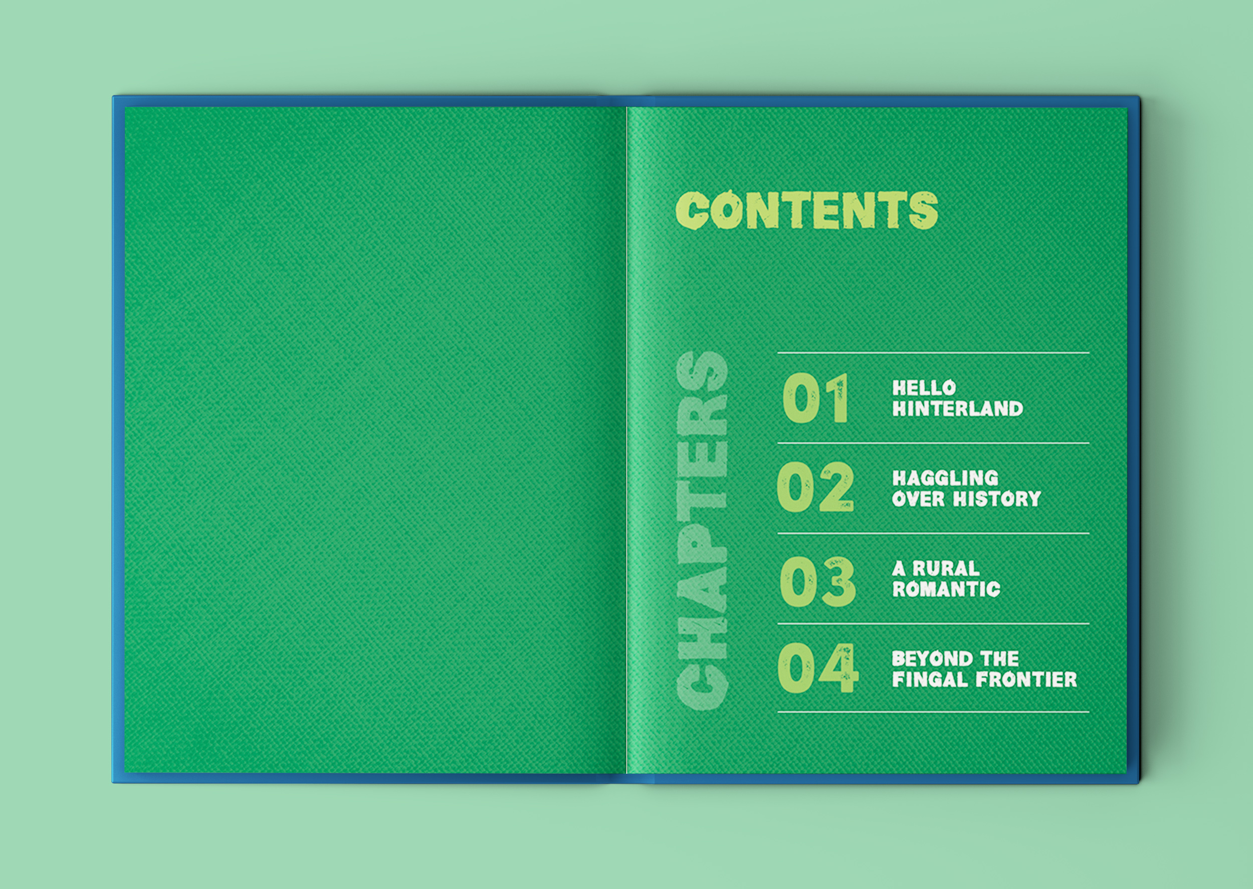
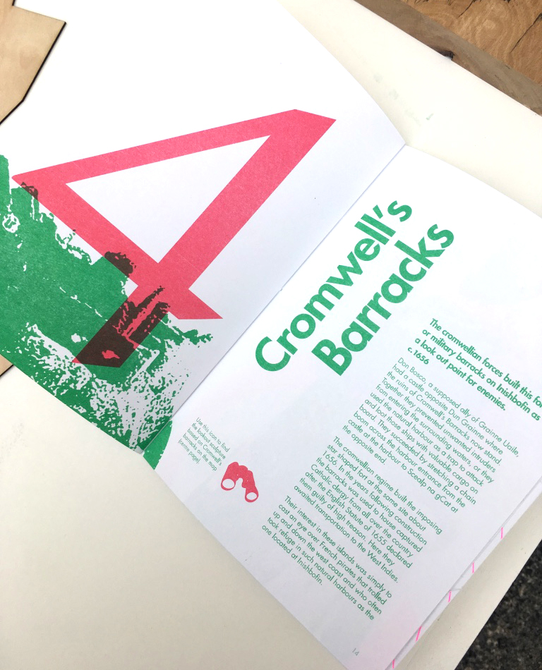
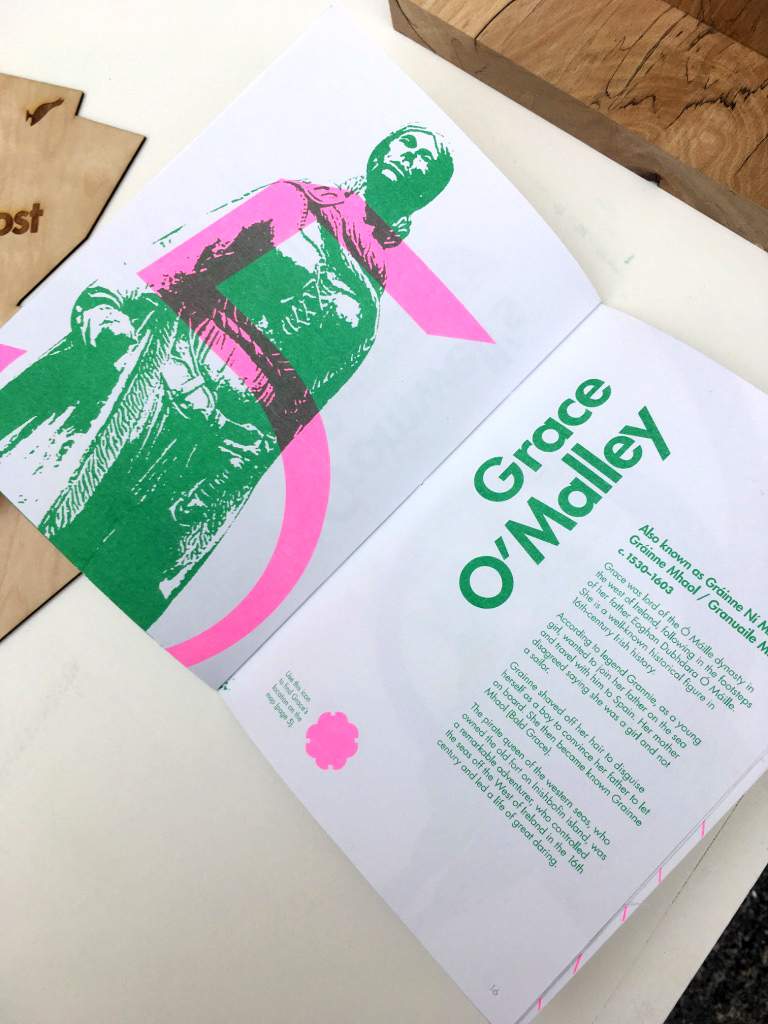
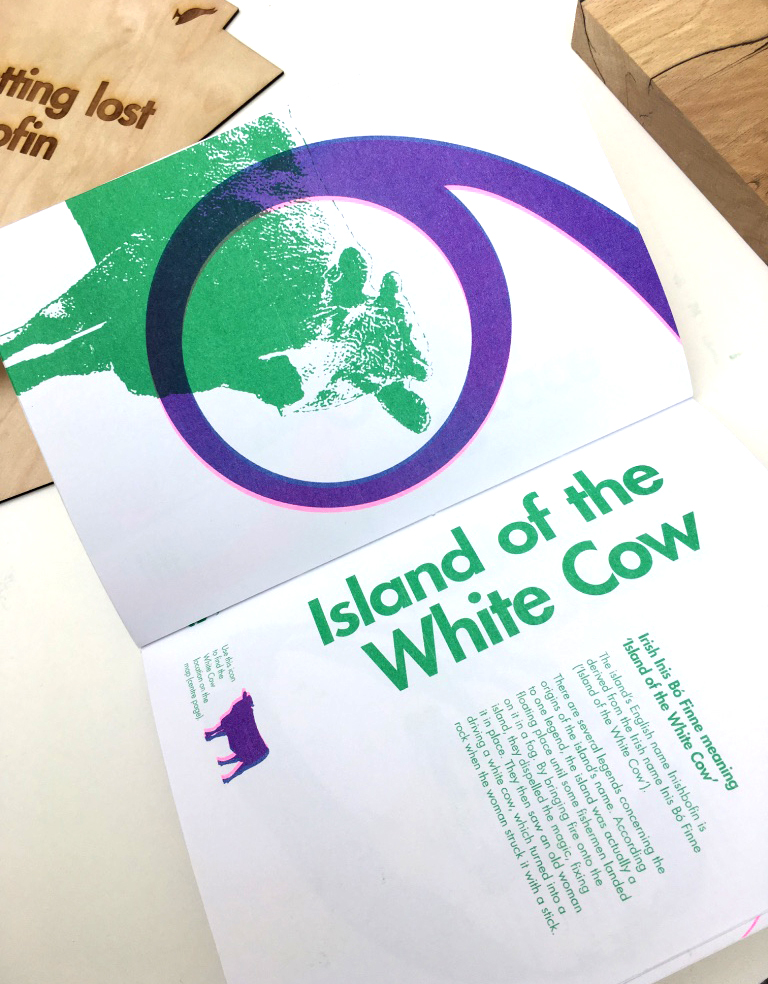
 Chapter 1: Hello Hinterland
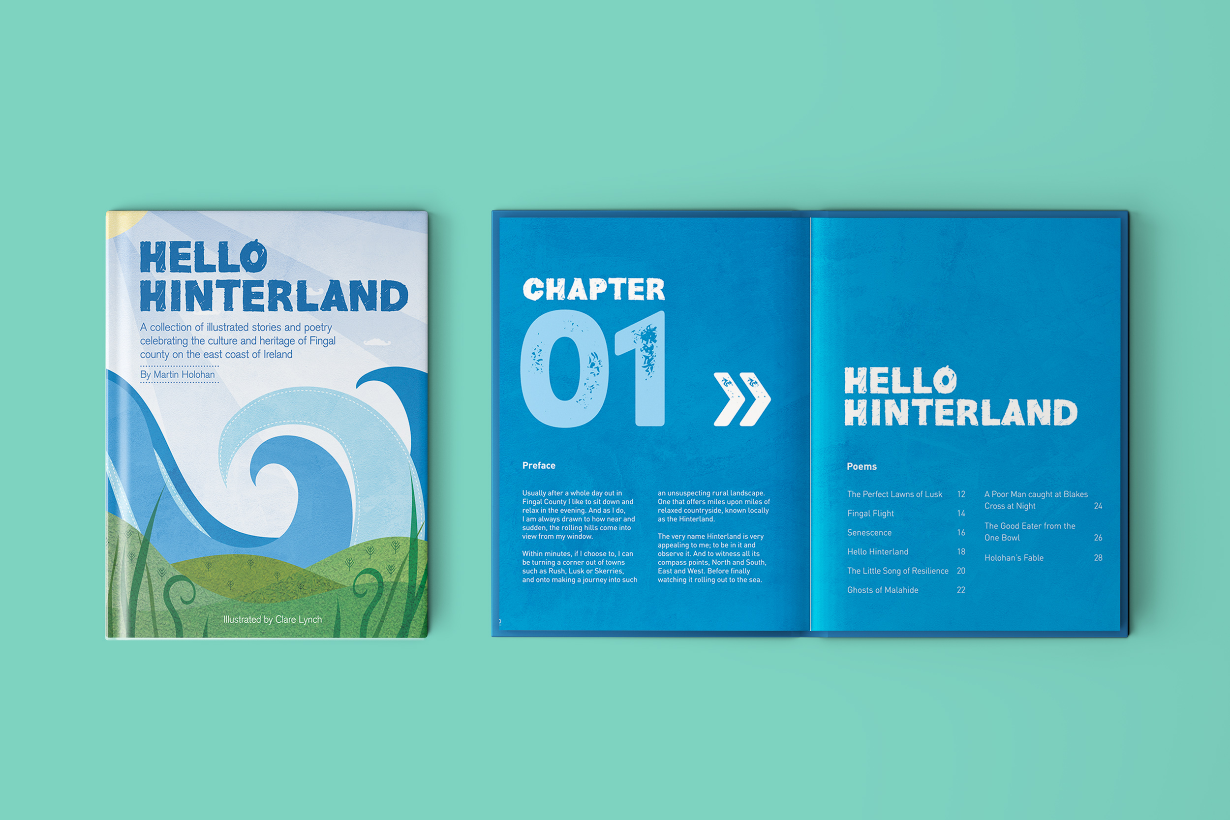
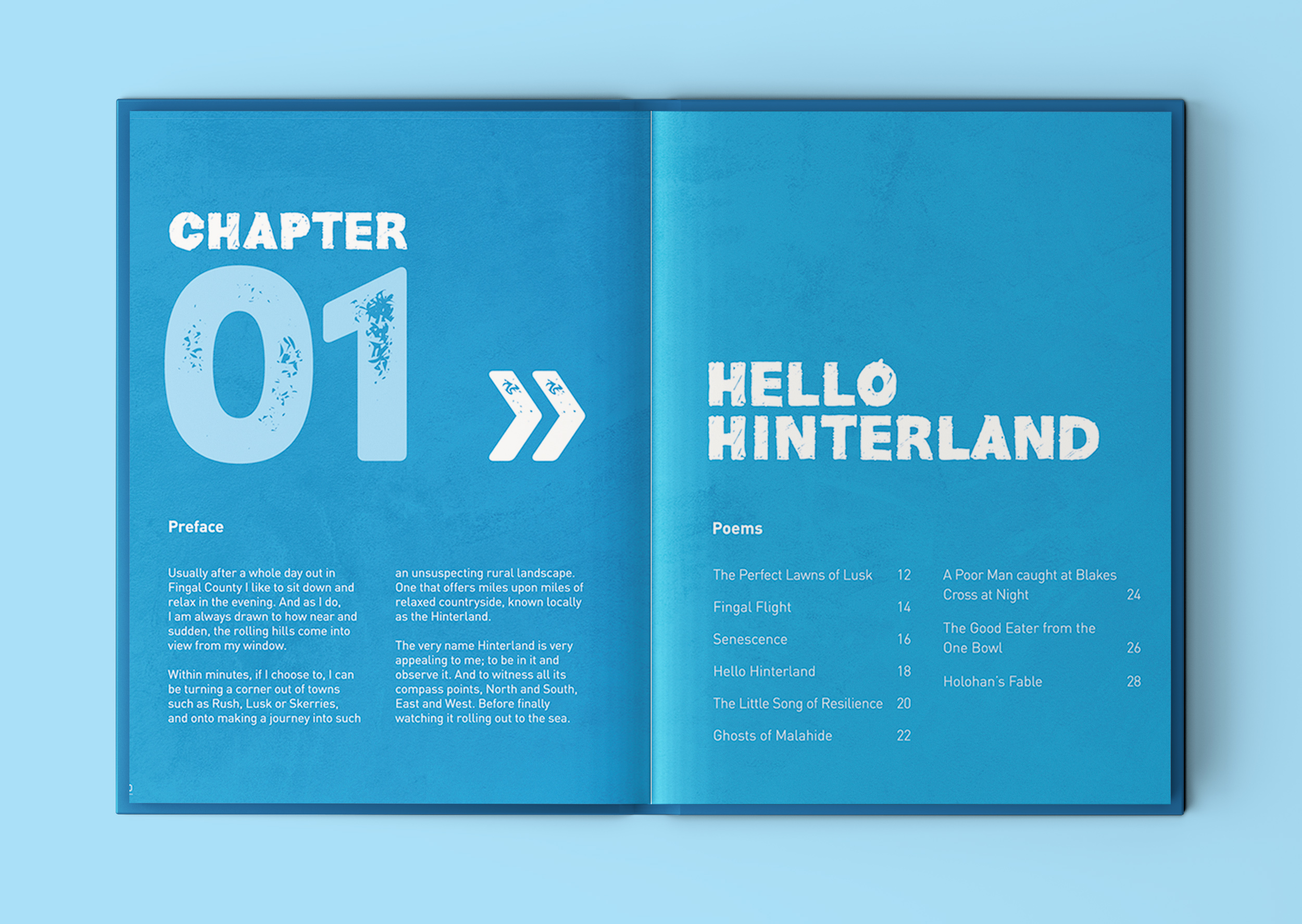
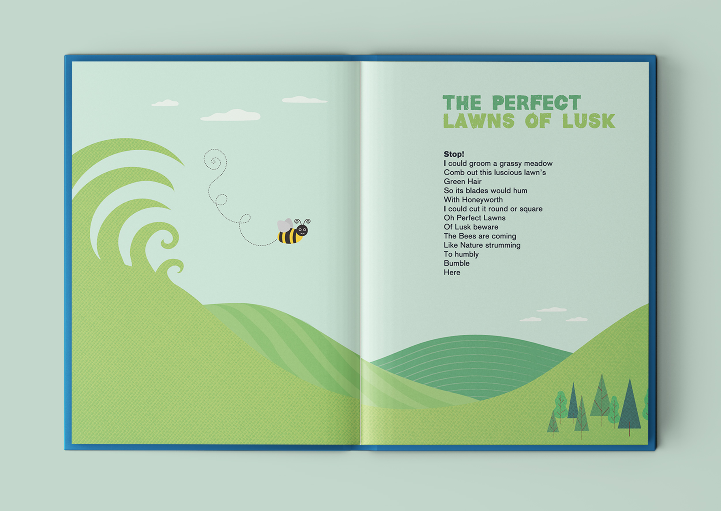
The Perfect Lawns of Lusk
Senescence
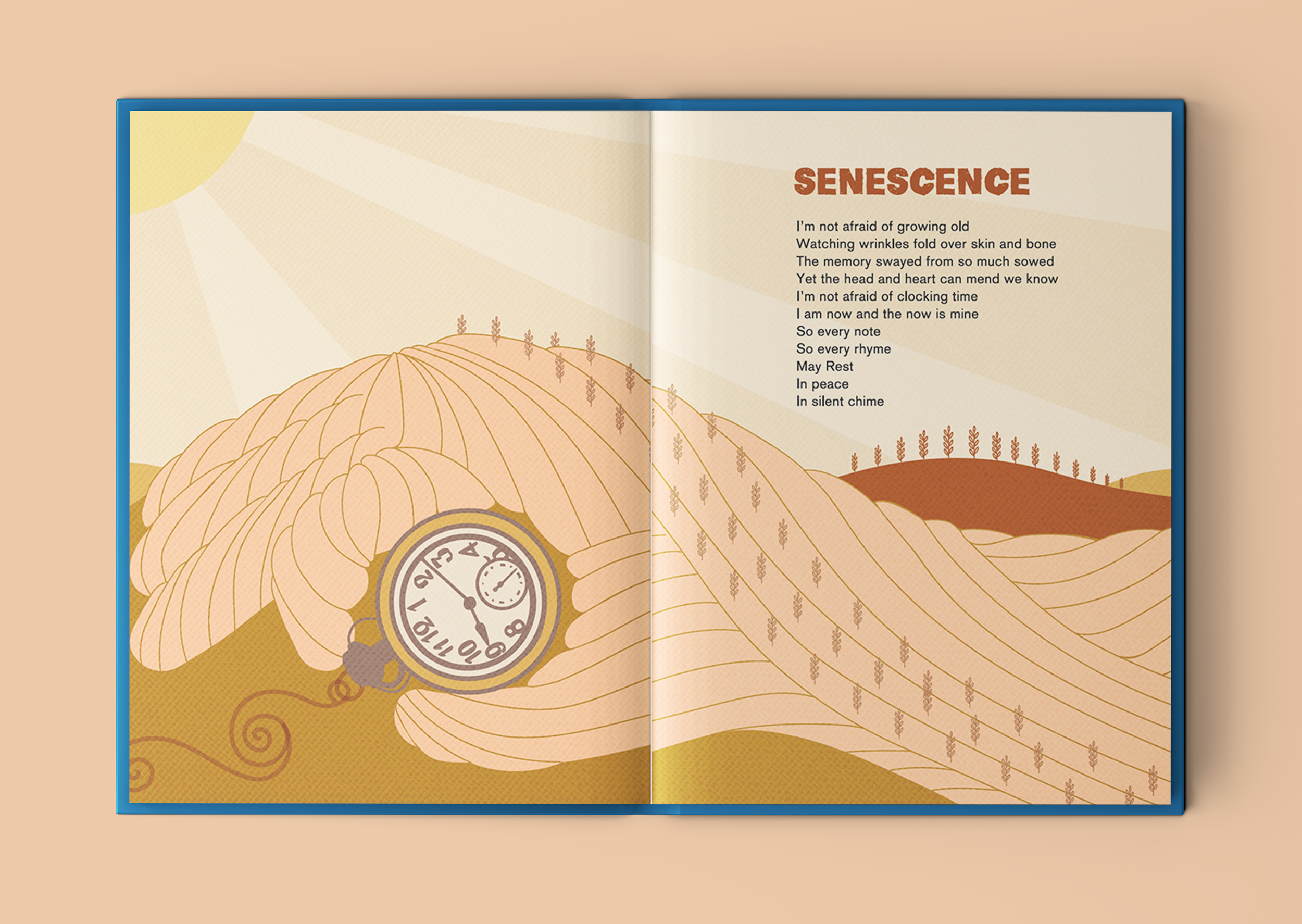
I like how this poem talks about embracing growing old – the illustration cleverly narrates the words from the poem.
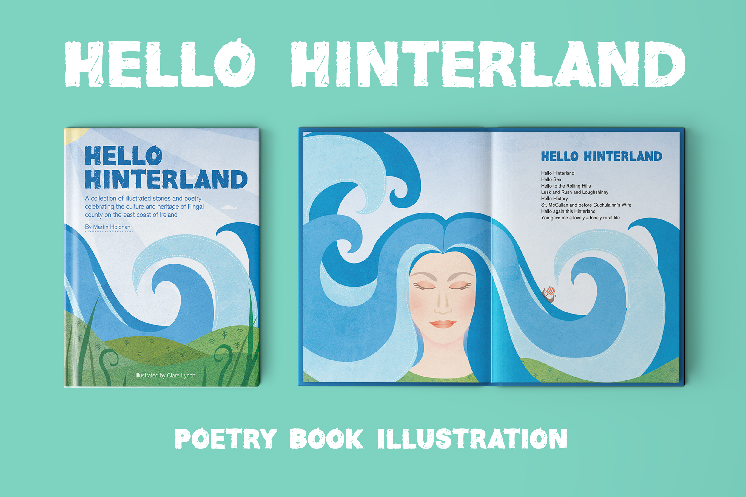
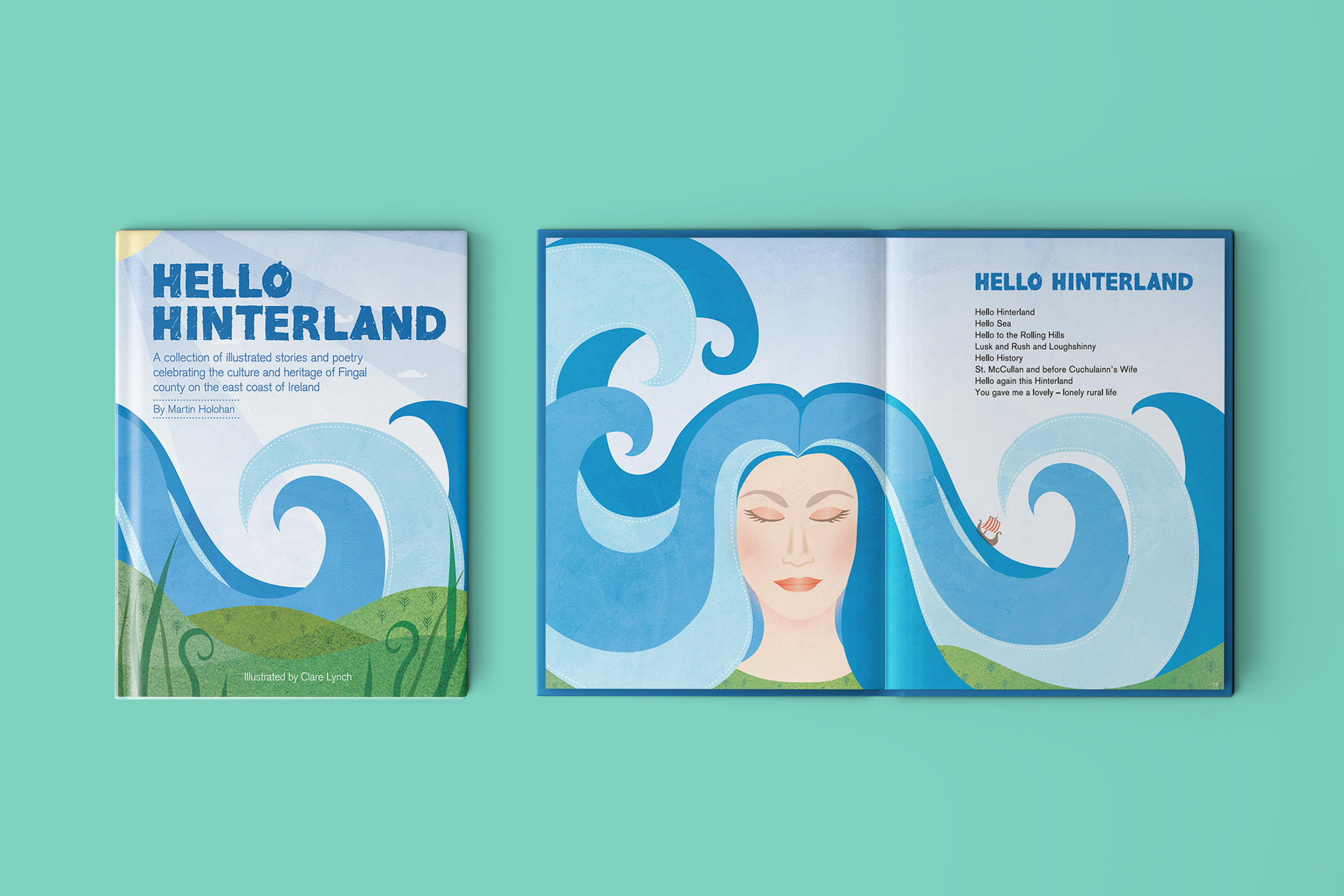
Hello Hinterland
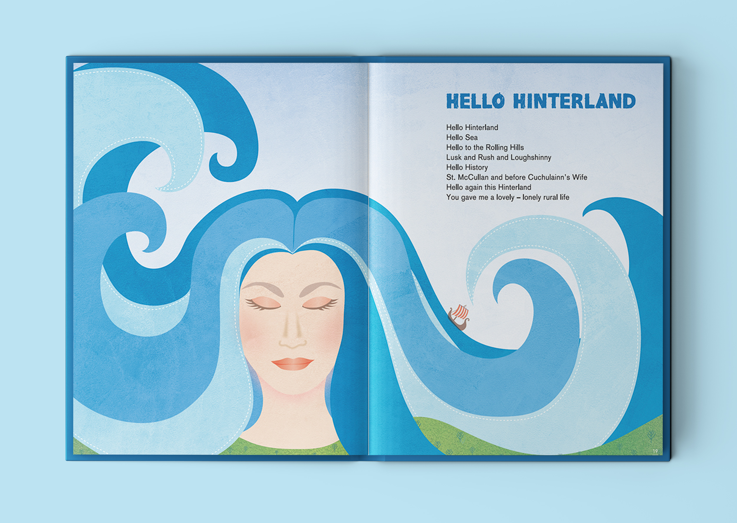
This illustration that depicts a female character, with long flowing hair that doubles-up as sea waves, is inspired by the lines in the poem that mention Irish legend Cuchulainn’s wife Emer, who is said to have hailed from Lusk. It incorporates the references to the sea and rolling hills of Lusk into her portrait.
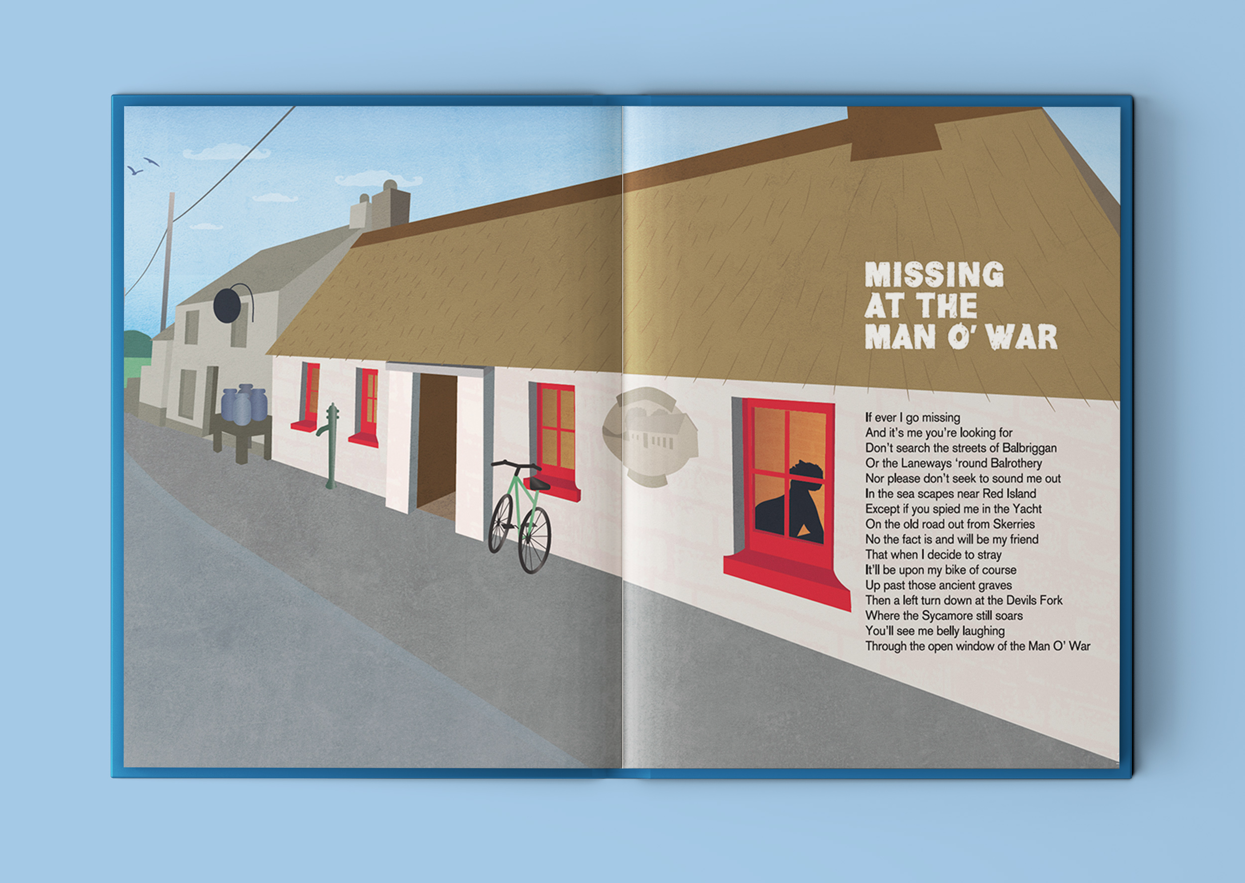
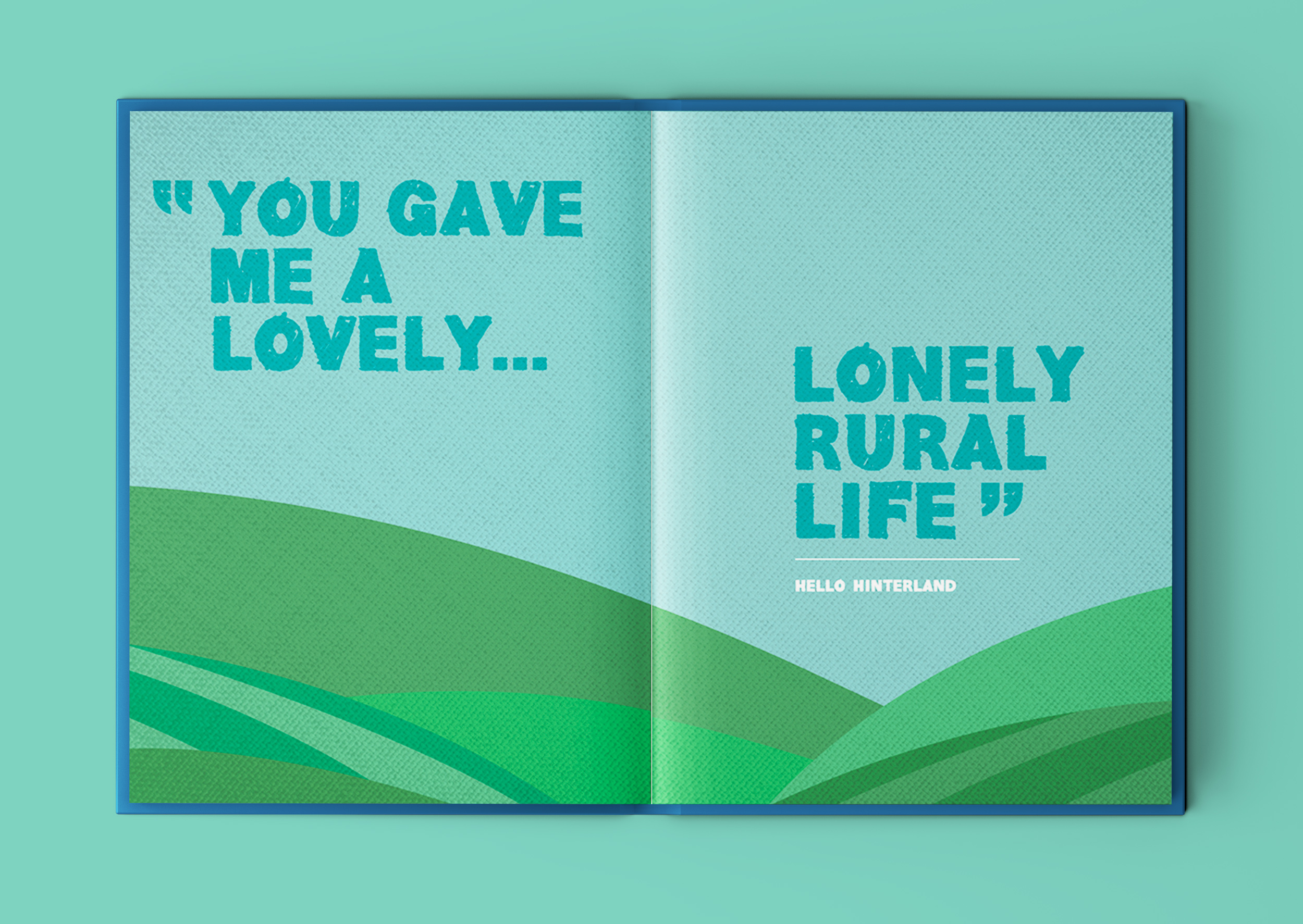
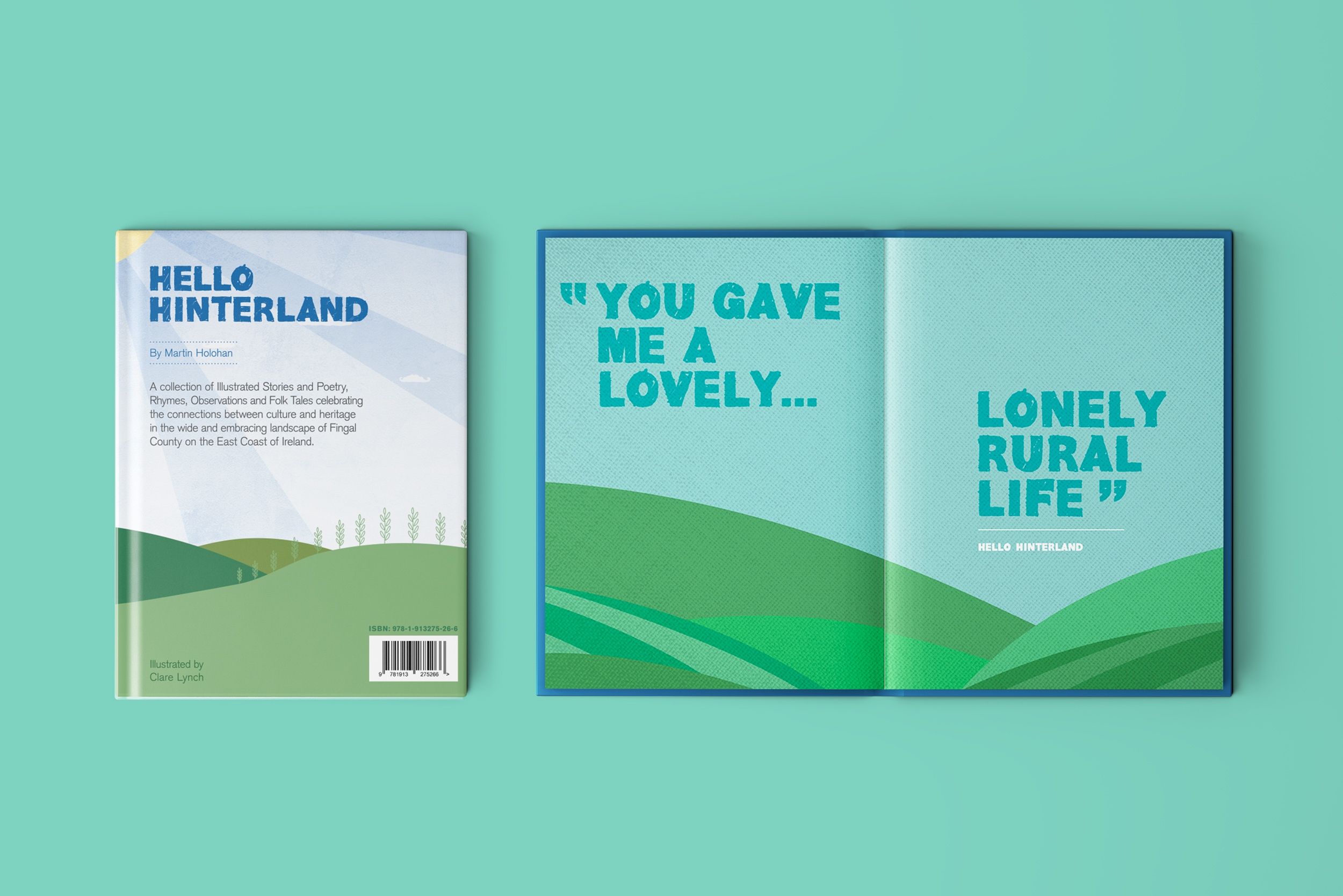
This poem features one of the strongest lines in the poetry book ‘You gave me a lovely… lonely rural life’. This refers to how author and poet, Martin Holohan, thought when he was moving from Dublin city to Lusk (in the hinterland rural outskirts area of Dublin) that he might find it too quiet and remote, but instead, he thrived in that loneliness… whether it be with long luxurious cycling trips out on his bike, the unfolding of his passion for writing and creativity and having the time and headspace free to indulge in it and let all his ideas flow out on to the page, all of this accompanied with an occasional trip for a quiet refreshment in the quaint ‘Man O’ War’ establishment. He found that he fell in love with this quieter ‘lonely’ life. The word lonely can have negative associations, but for Martin – he found moving to the hinterlands actually turned out to be an opportunity to embrace and fall in love with this loneliness and from it, creativity flowed from his heart unstoppably to create the book Hello Hinterland and many other writing projects currently in the pipeline.
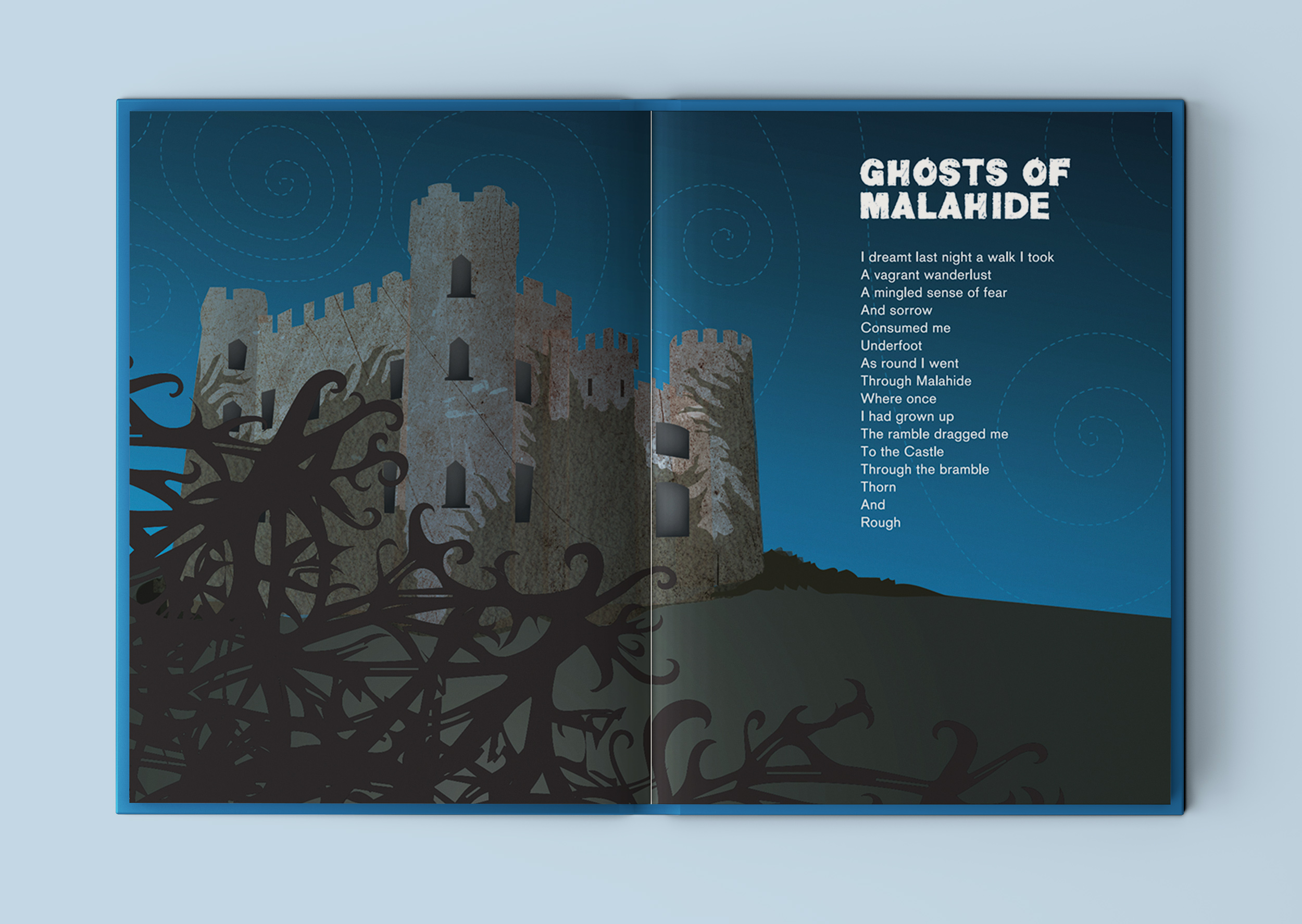
Ghosts of Malahide
Holohan’s Fable
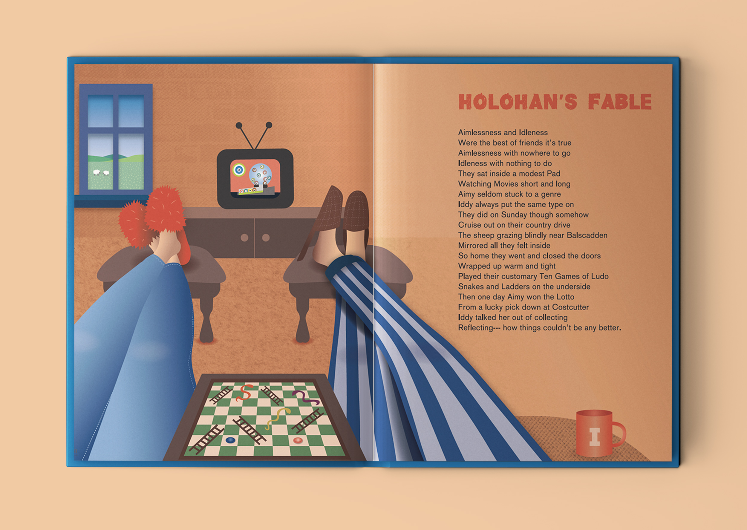
One of my favourite poems is ‘Holohan’s Fable’. It’s about a couple so content in their daily routine, that when they win the lotto, they decide not to claim it – as they couldn’t be any happier! It’s a fable with a message about appreciating what you have in life.
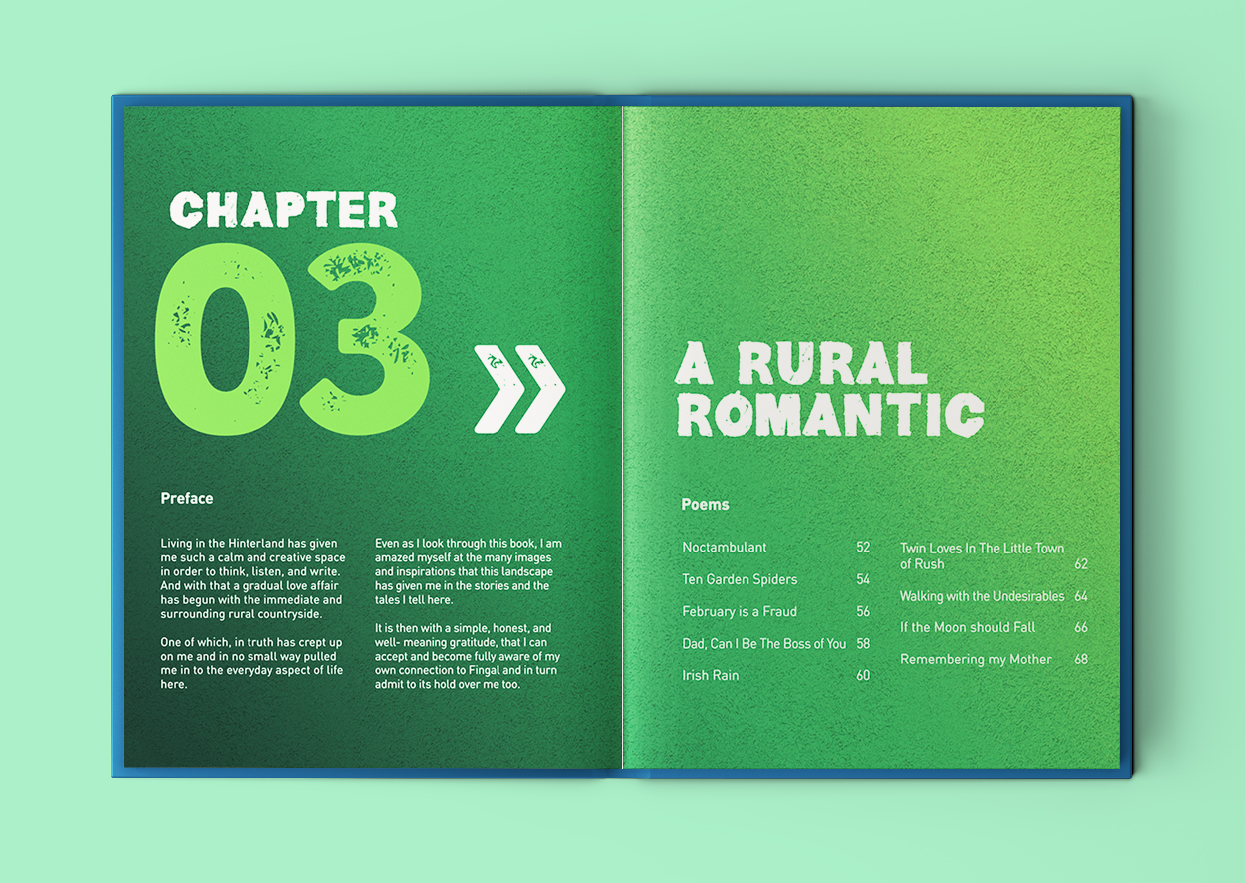
Chapter 3: A Rural Romantic
Noctambulant
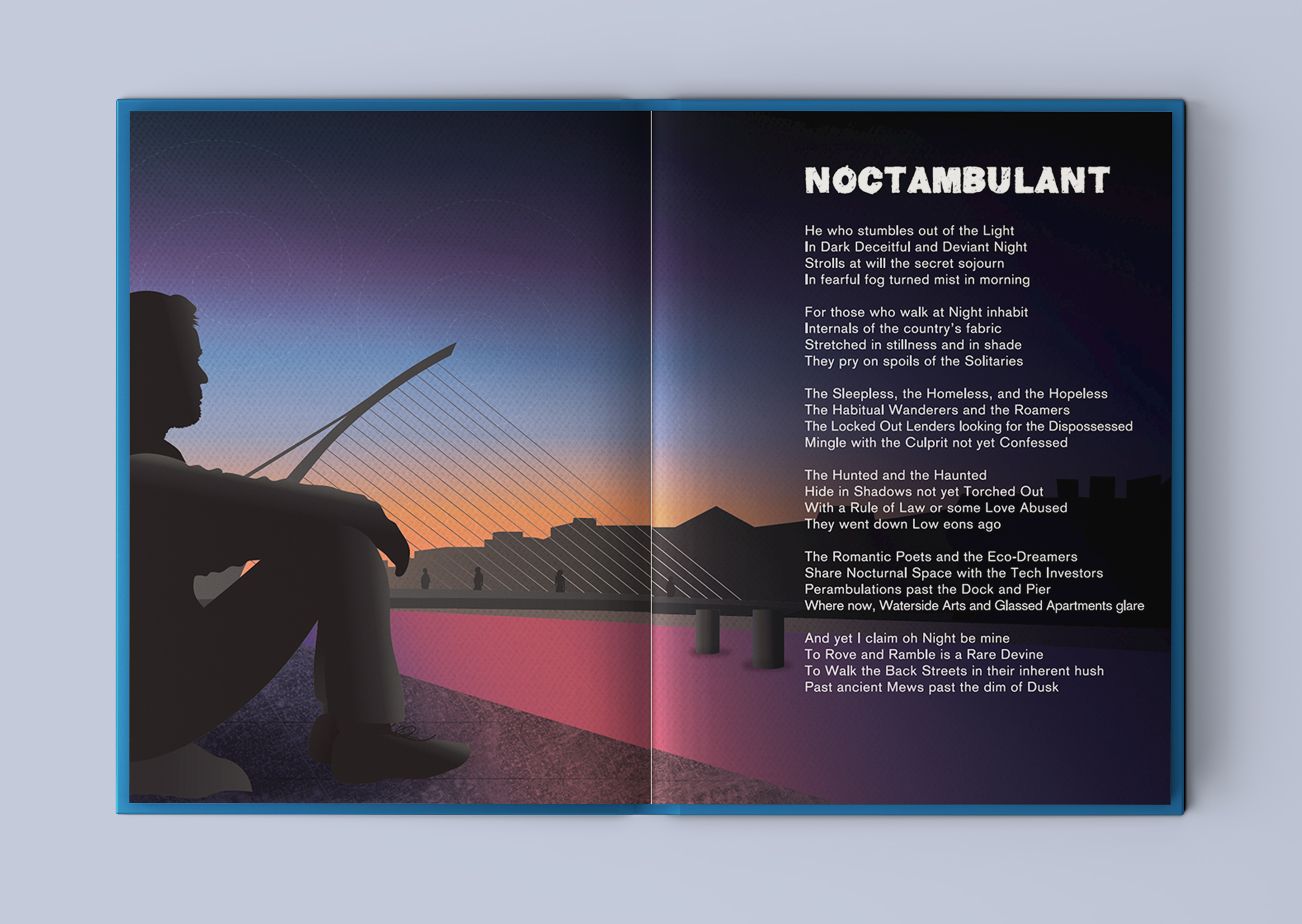
This beautifully illustrated book includes positive underlying themes of resilience, appreciating the little things in life, social inclusion and enjoying the local landscape, weaving through the book.
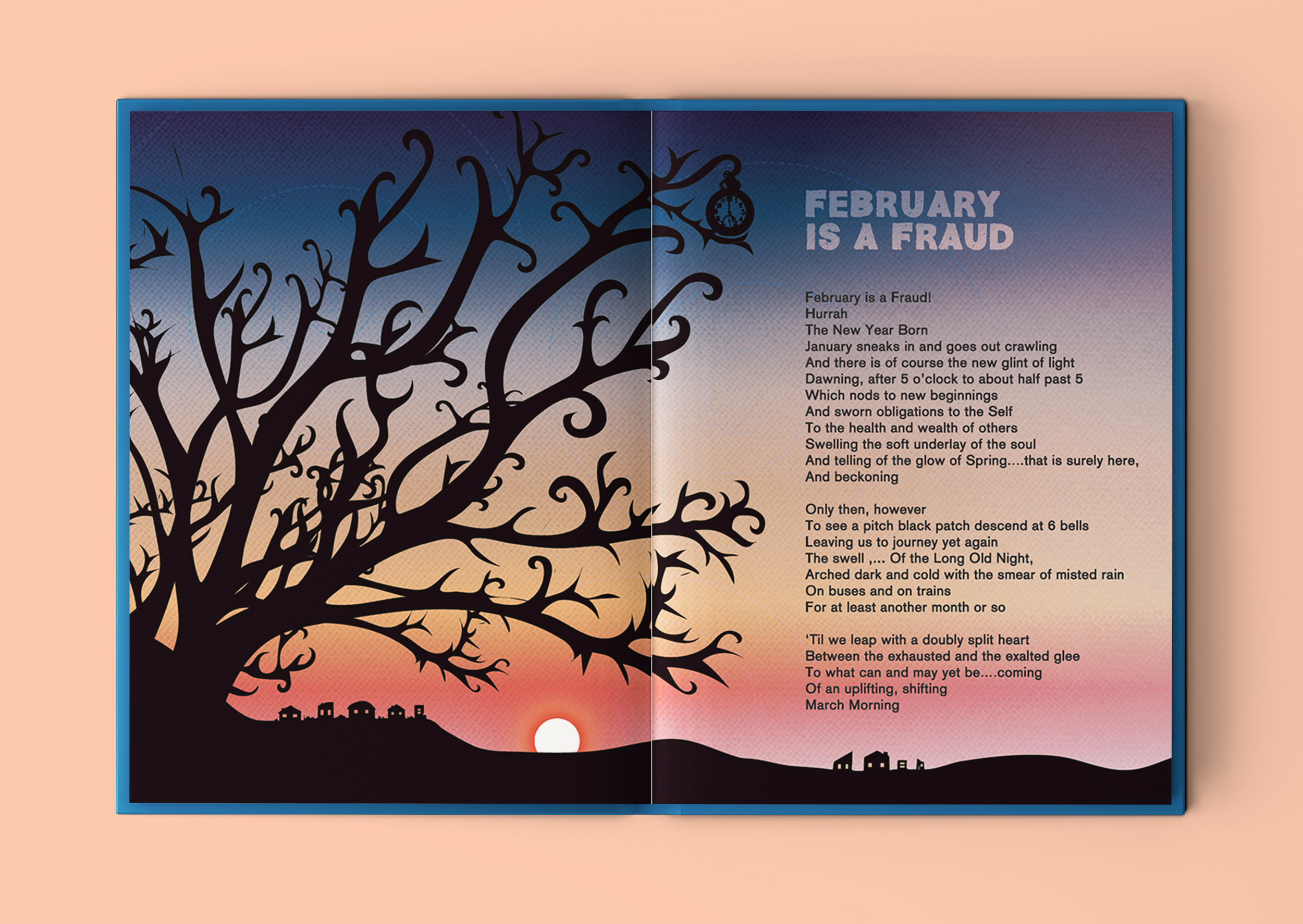
February is a Fraud
If The Moon Should Fall
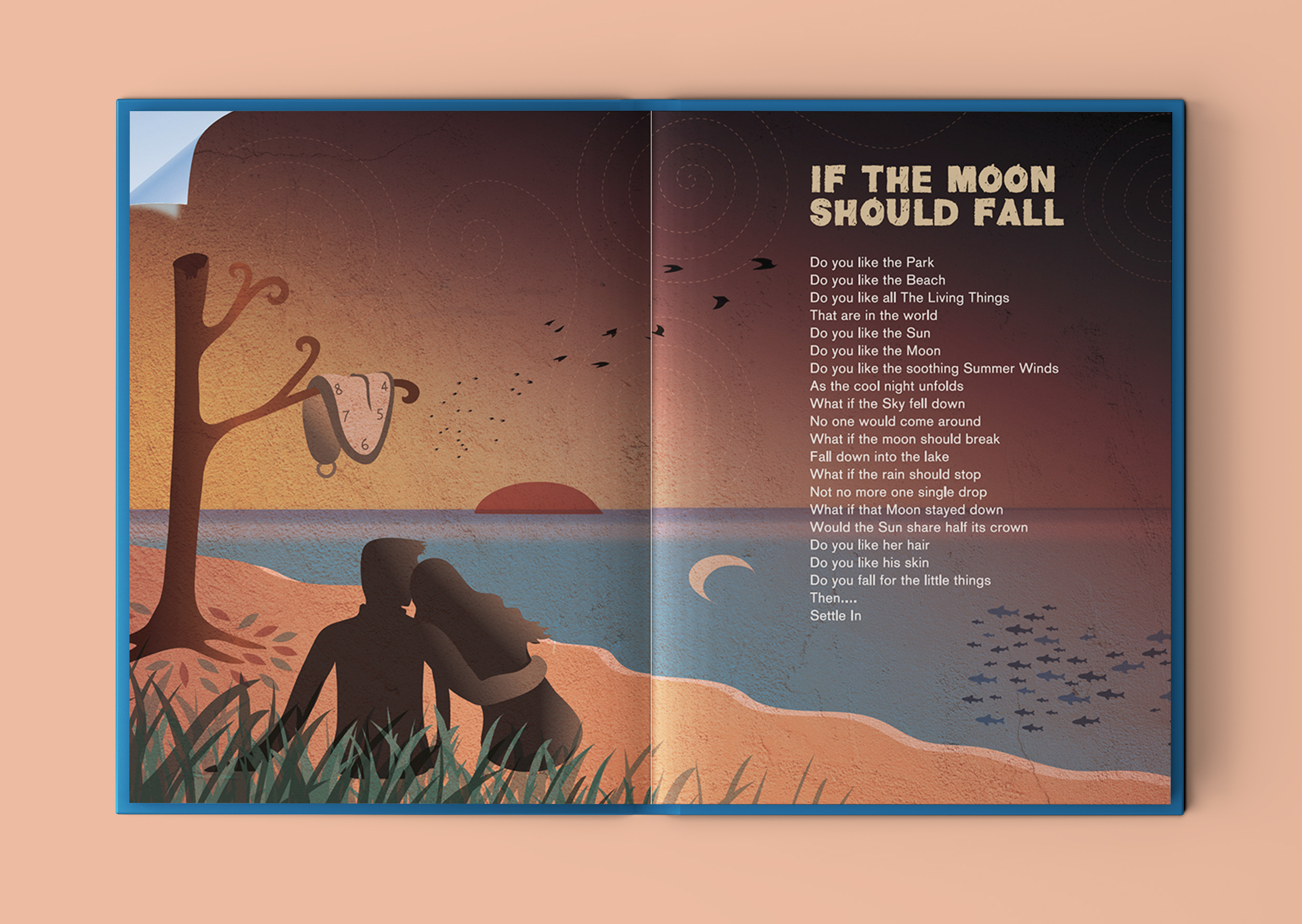
This is another of my favourite poems from the book. I took the meaning to be to enjoy an appreciate the little things that we have in life. Sometimes we can over-complicate things in life, looking for potential things that could go wrong or imperfections. When, if we focus on all the good right in front of us, we might be surprised how content we can be with everything that we already have. I saw this as a romantic poem, encouraging the reader to let down their walls to let someone new, that they know they like, in to their world and to go with the flow and enjoy it. I reflected this and all the words of the poem in the illustration, with a little wink towards Salavatore Dali’s ‘end-of-the-world-like’ surrealist paintings.
Missing at the Man O’ War
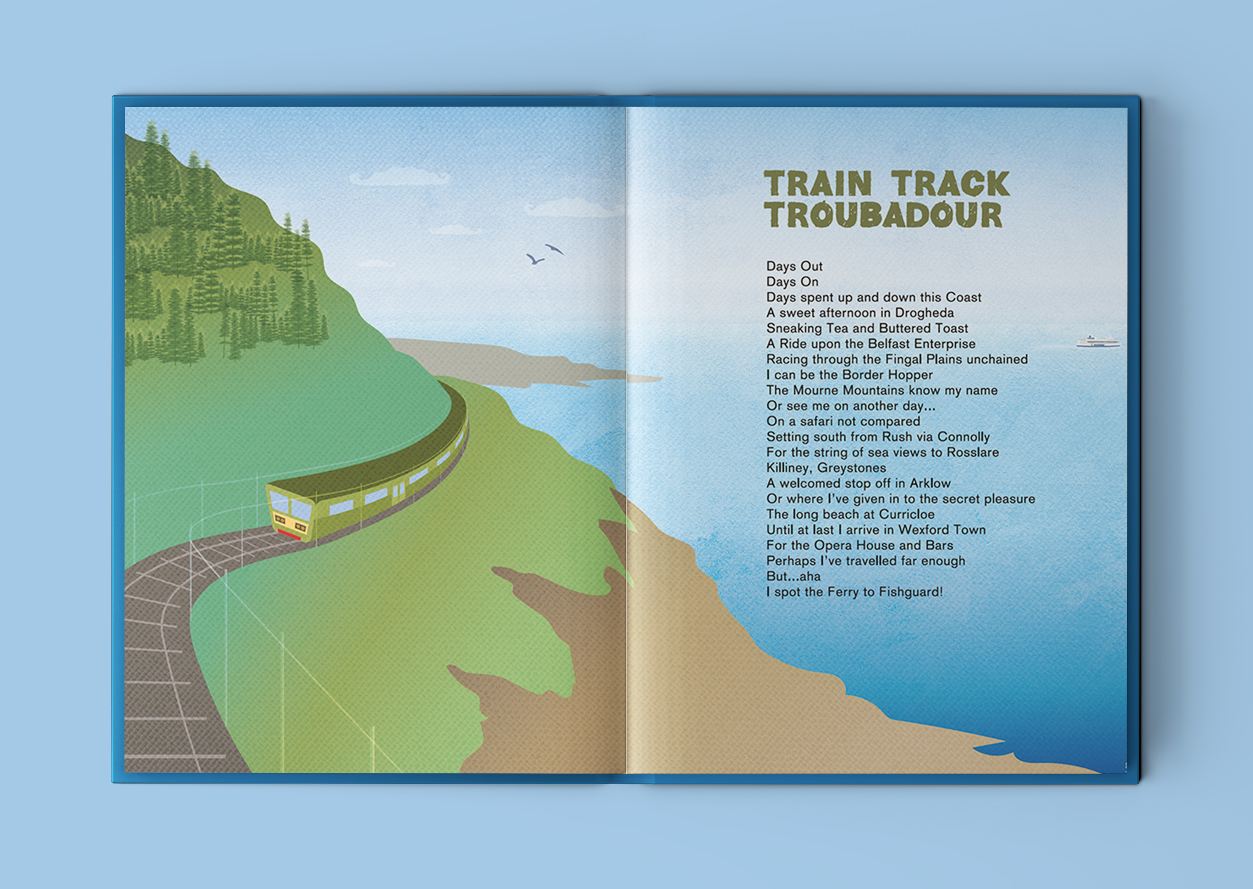
Train Track Troubadour
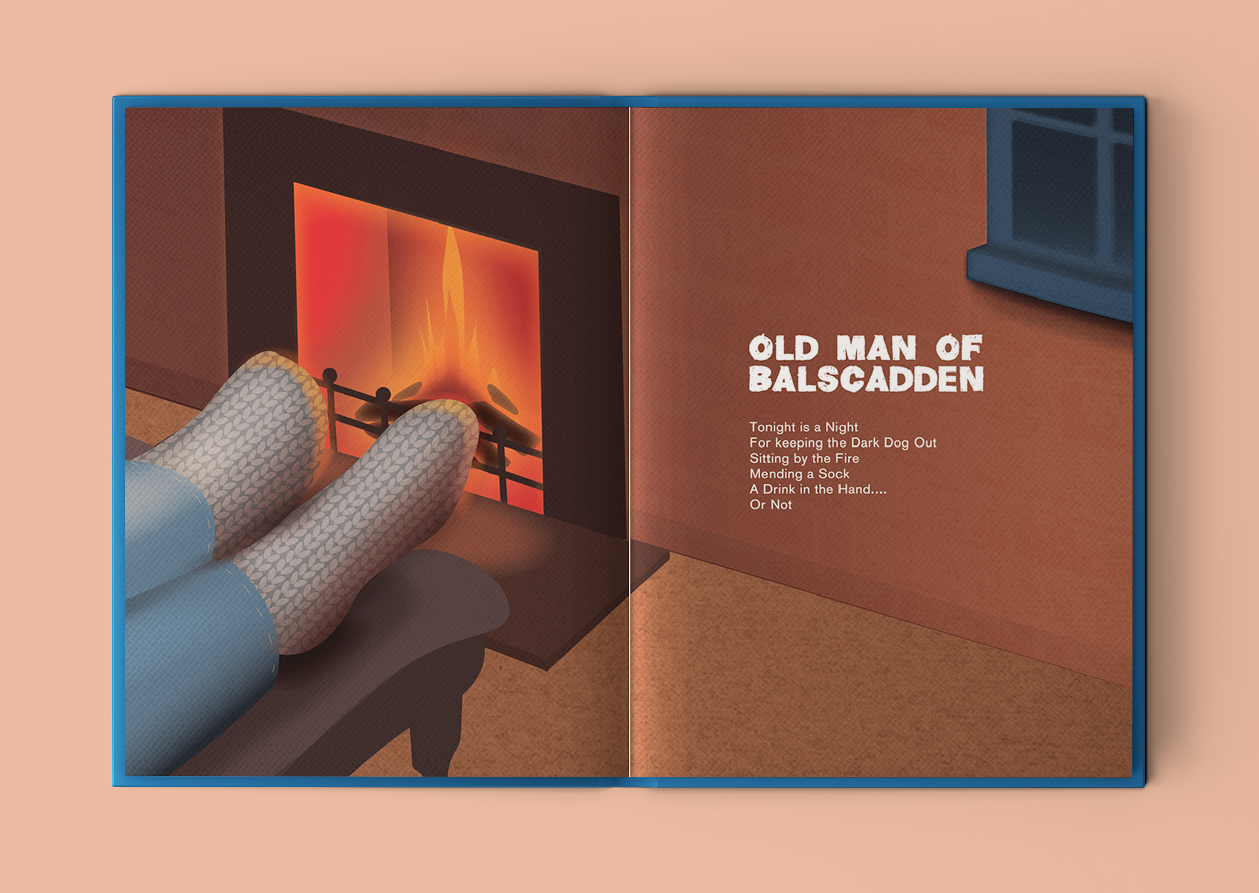
Old Man of Balscadden
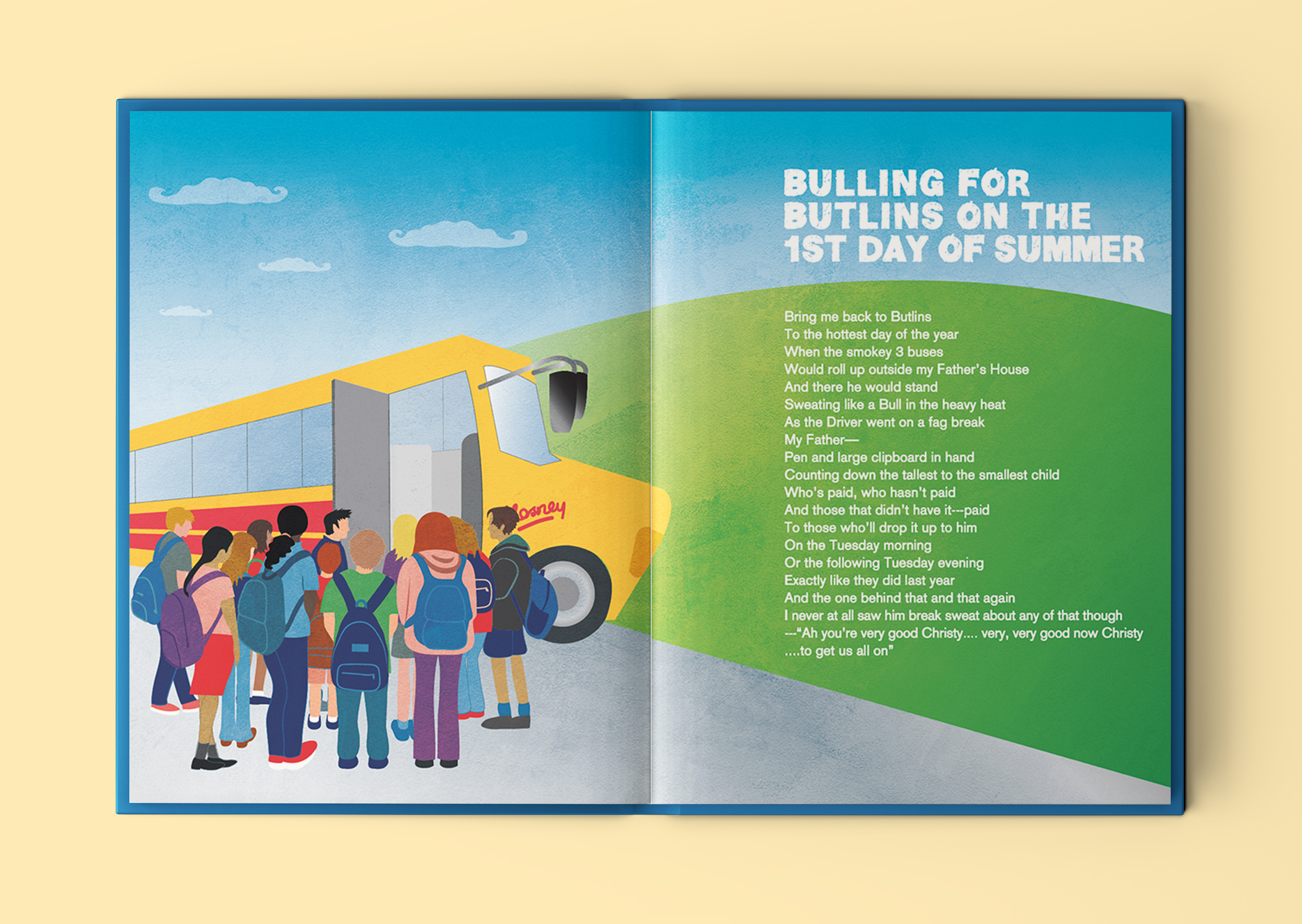
Bulling for Butlins on the 1st Day of Summer
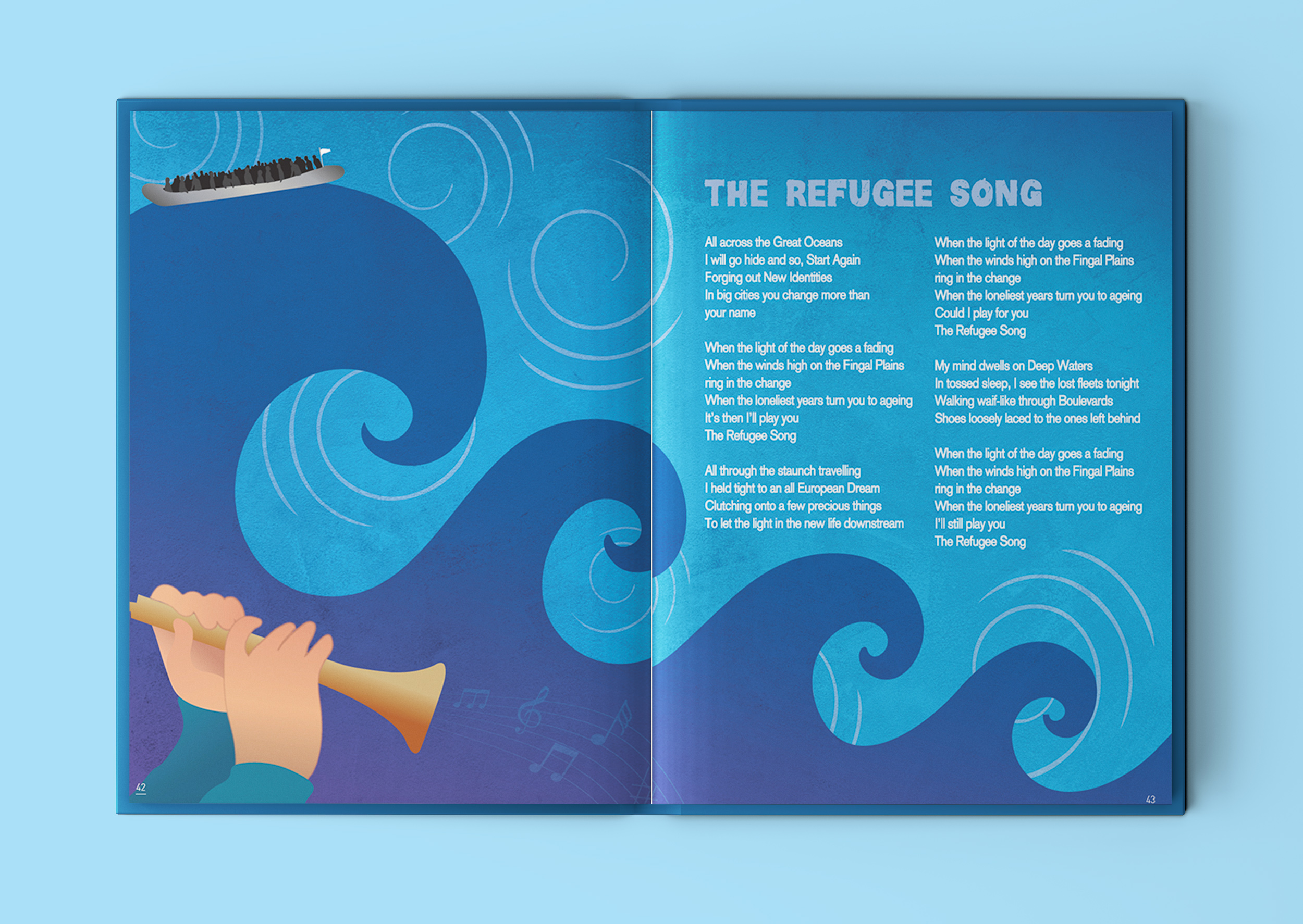
The Refugee Song
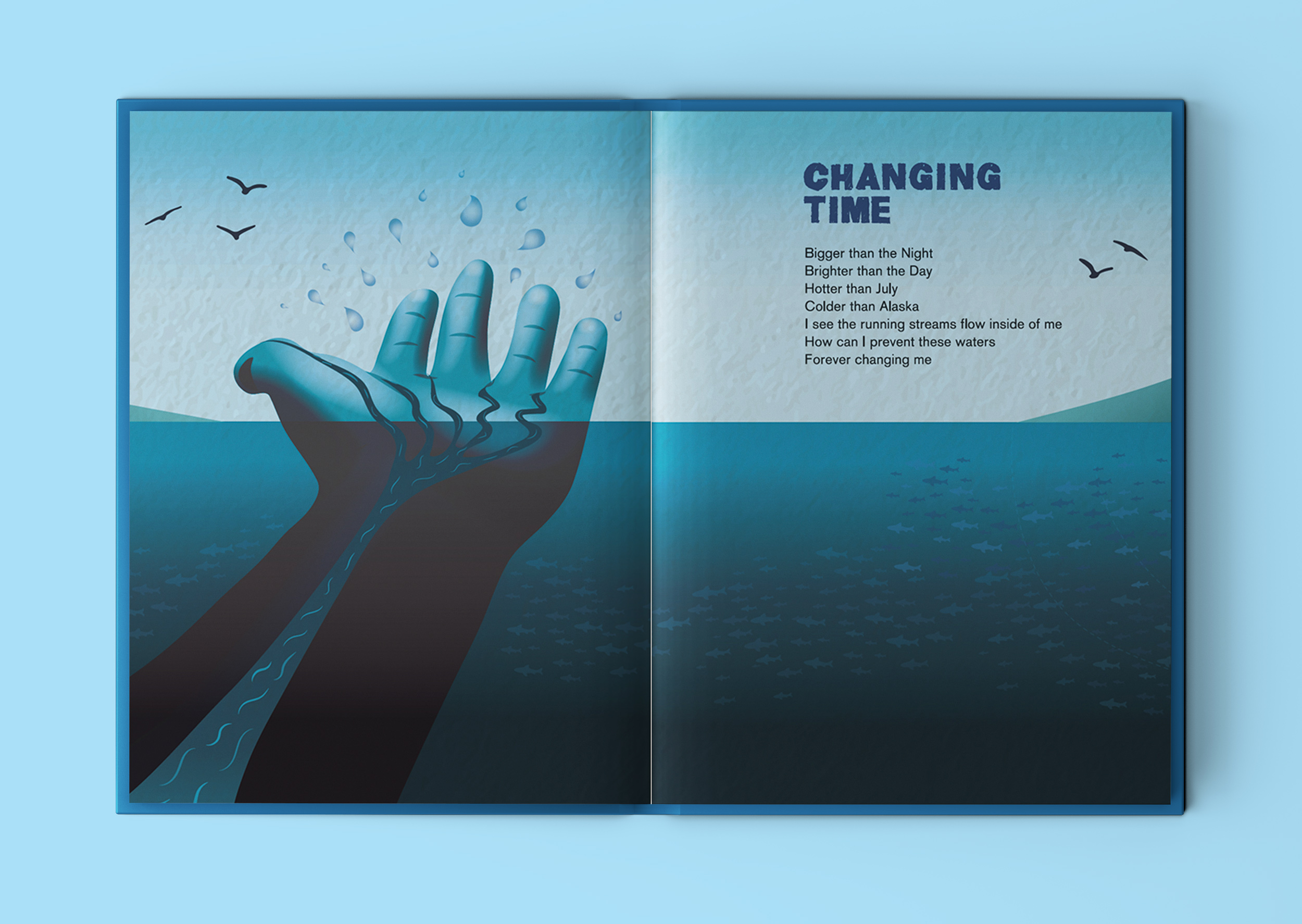
Changing Time
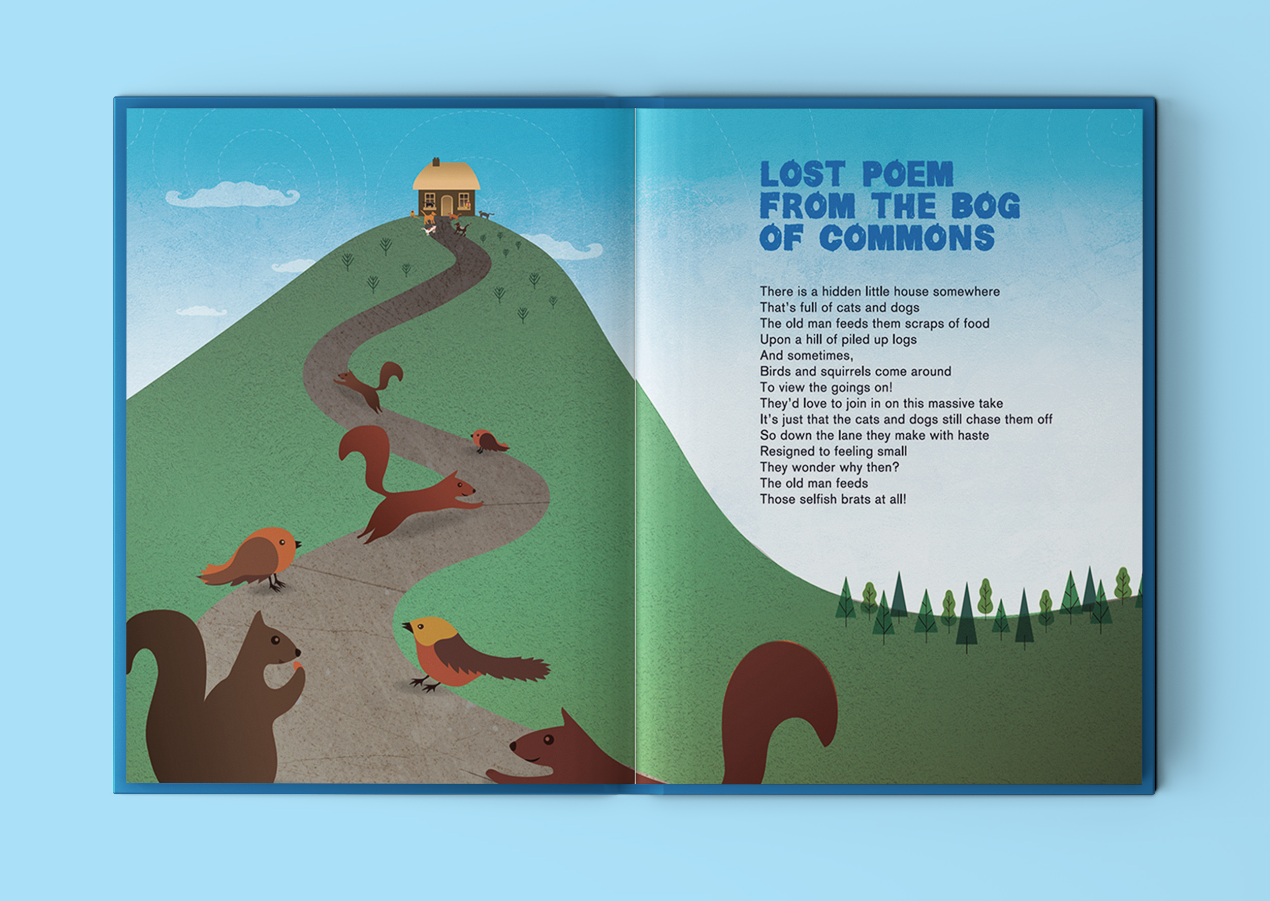
Lost Poem from the Bog of Commons
Quote: “You Gave Me A Lovely… Lonely, Rural Life”
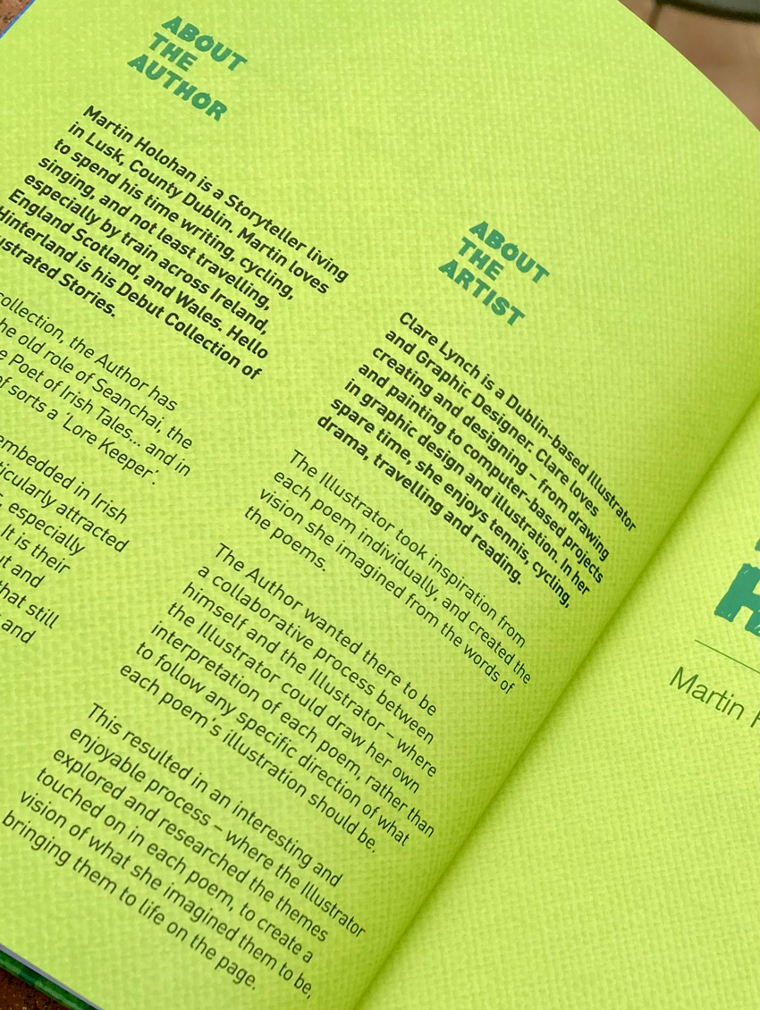
Martin Holohan is a storyteller living in Lusk, County Dublin. Martin loves to spend his time writing, cycling, singing, and not least travelling, especially by train across Ireland, England, Scotland and Wales. Hello Hinterland is his Debut Collection of illustrated stories.
In this collection, the author has adopted the old role of Seanchai, the Bard, and the Poet of Irish Tales… and in that regard is of sorts a ‘Lore Keeper’. Lore Keepers are embedded in Irish Folklore and are particularly attracted to the Land themselves, especially where they currently live. It is their defining attribute to seek out and explore the spots and places that still have a strong spirit of the Myths and Legends of old.
The Lore Keeper aims to mix and match the past and present so as to bring New Tales and Observations from our beautiful island, Ėire.
The book, published by Choice Publishing Ltd, focuses on the journeys Martin makes across a wide and sometimes rural region and aptly incorporates people and places living close to the East Coast of Ireland there in Fingal County. Moreover, his real contribution is highlighting the ‘aspects of the everyday’ in places around that particular part of the country, which are remarkably only a short distance by train or car out of Dublin City.
Most notable are the titles…’The Perfect Lawns of Lusk‘, ’Twin Loves in the Little Town of Rush’ and ‘Hello Hinterland‘.
“Hello Hinterland is more than just a modern Illustrated Poetry Book…it acts too like a folklore companion guide towards a walking Heritage Trail…through the people and places… living along the beautiful landscape of Fingal County by the sea”.
Martin Holohan, Poet & Author of Hello Hinterland
You can hear Martin talking more about the book in this Near FM interview here…
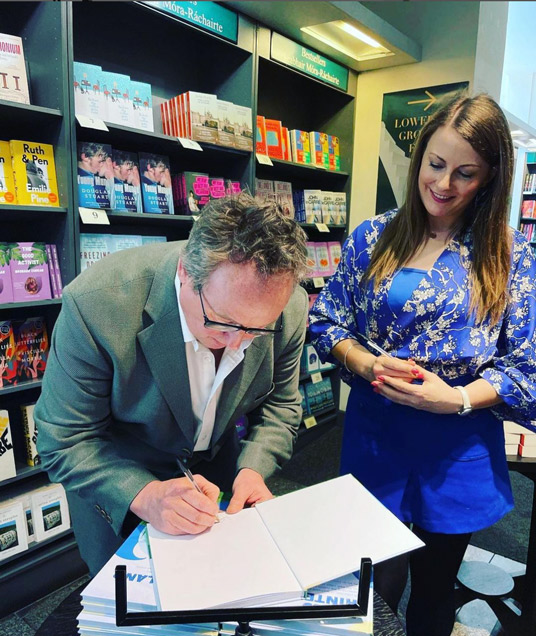
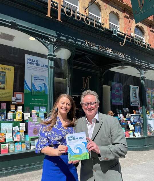
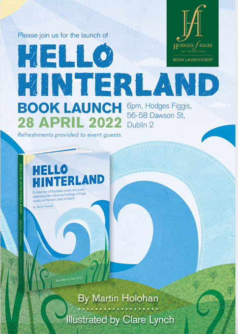
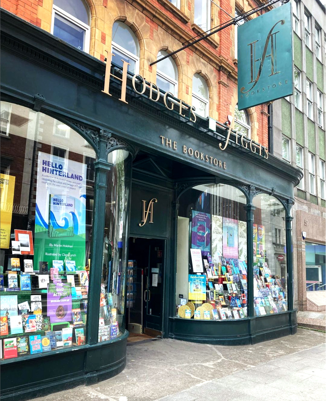
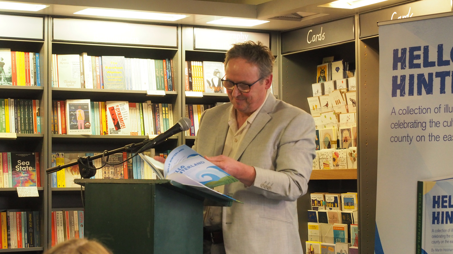
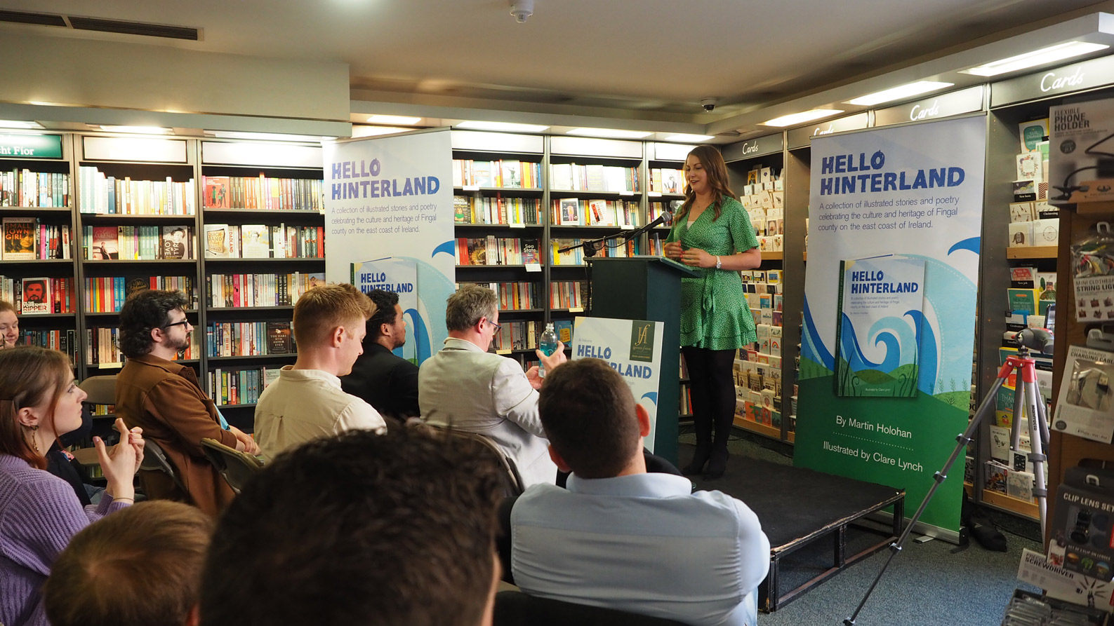
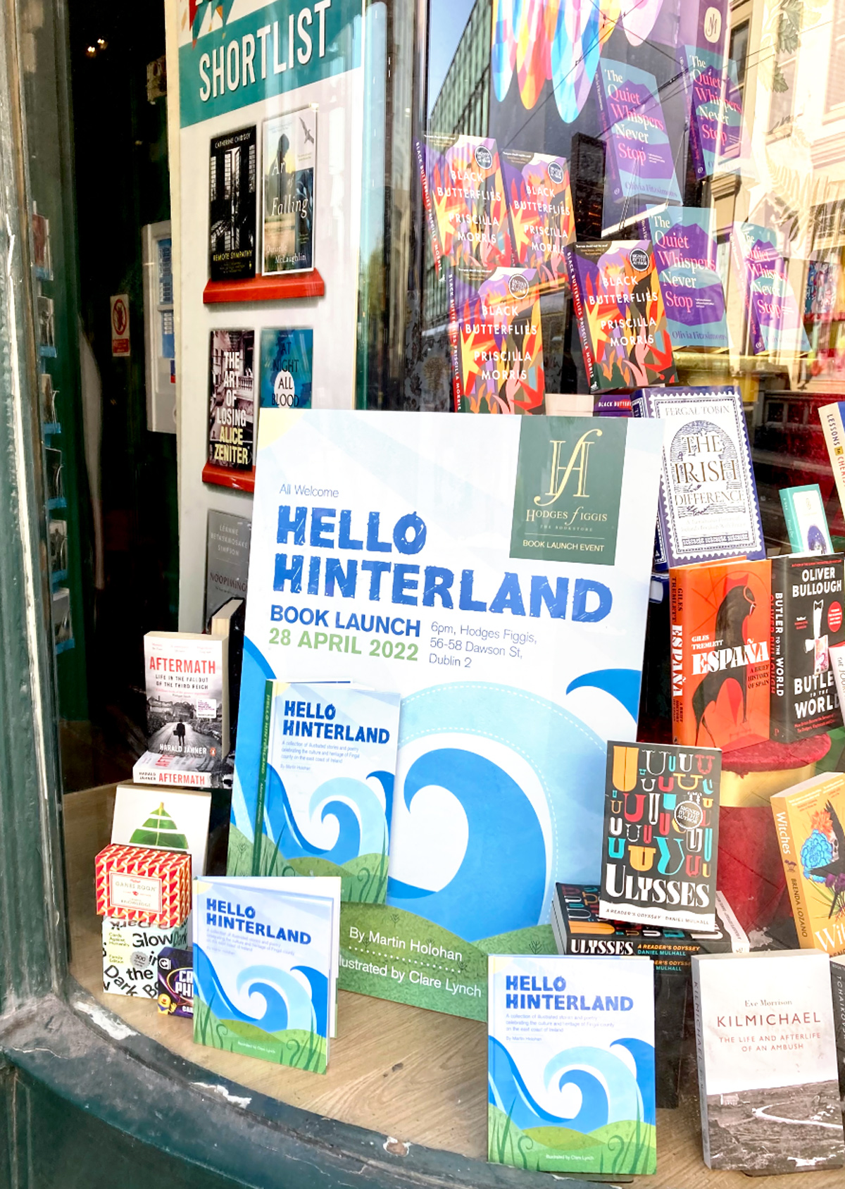
Hello Hinterland Book Launch at Hodges Figgis Dublin
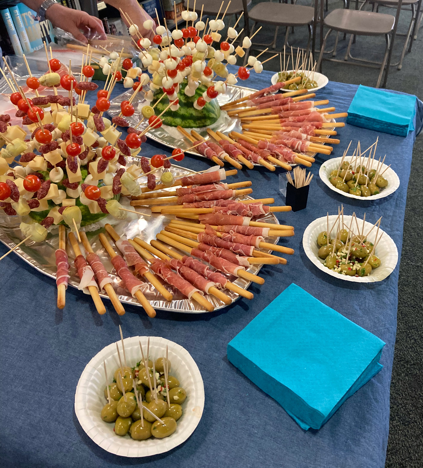
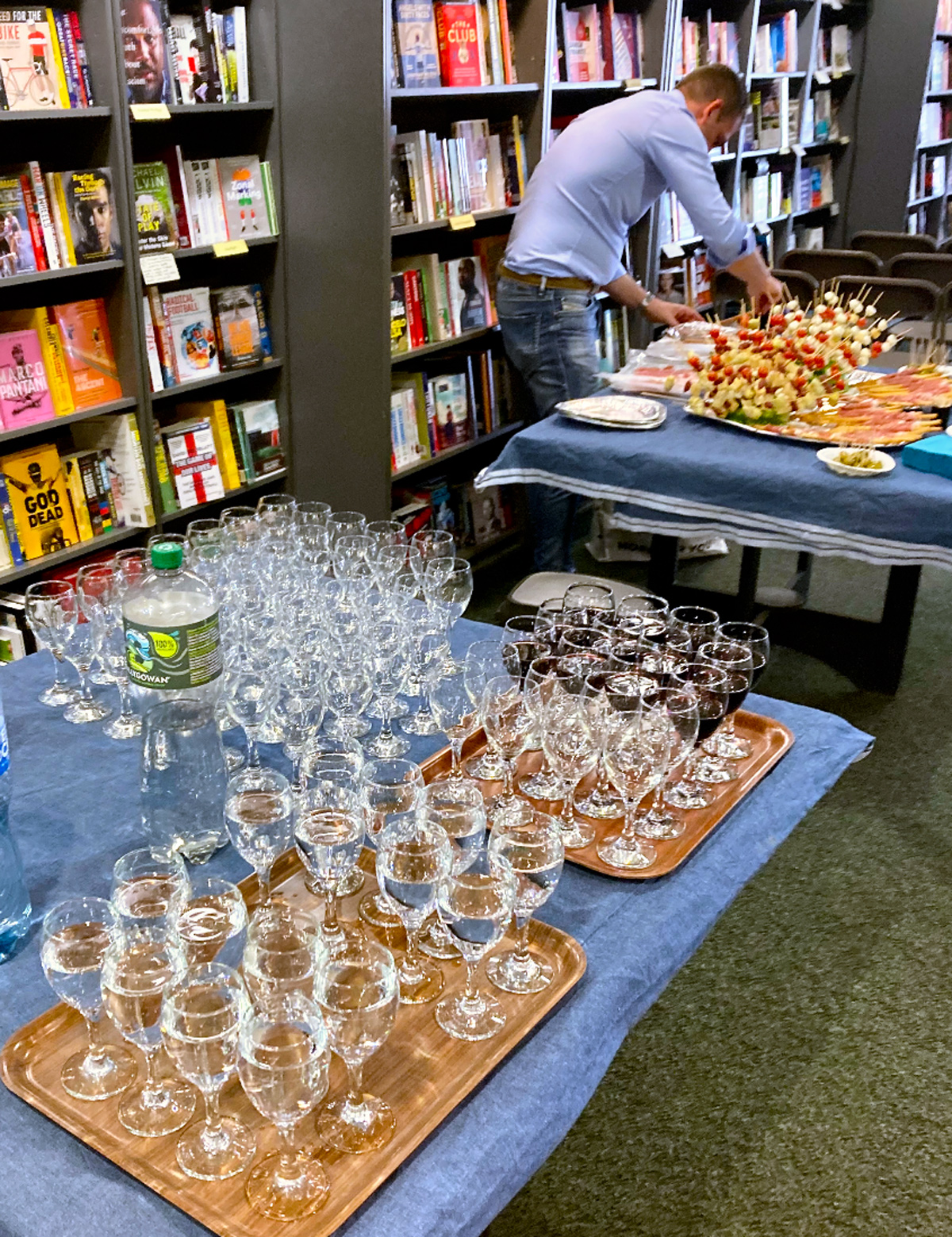
We held the book launch at the famous Dublin bookstore, Hodges Figgis, one of Dublin’s oldest bookstores, situated near Trinity college on Dawson Street. I designed the promotional collateral for the event, such as social media graphics, flyers, pull-up banners and large-scale posters for the front window display. This event was a lovely evening accompanied by refreshments, wine and cheese, where myself and Martin spoke to the guests about the creation of the book and the collaboration process and read some of our favourite poems from the book.

Book Signing at Hodges Figgis
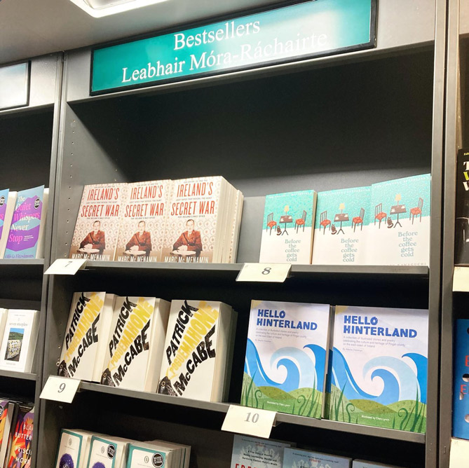
Featured in the ‘Top 10’ Bookseller List at Hodges Figgis
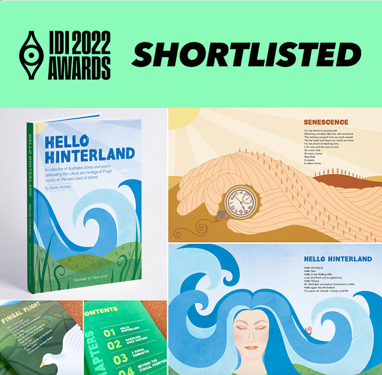
Shortlisted for the IDI Awards 2022
The IDI Awards select and showcase the best of Irish design. The awards provide designers with a platform to showcase their talents, benchmark against their peers and provide inspiration for all.It was so exciting to be shortlisted for the Illustration of the book Hello Hinterland in the 2022 IDI Awards. It was an honour and great achievement to be shortlisted and recognised in the creative field among the many talented designers in Ireland.
The IDI Irish Design Awards 2022 took place on November 17th, 2022 with a ceremony in the Marker Hotel in Dublin’s Grand Canal Docklands area in Dublin 2. It was a very special 50 year anniversary celebration named ‘JOY’, to mark the founding of IDI in 1972.
Thanks to
@idi_ireland for organising – it was an amazing night in such a lovely venue and a great way to meet up with fellow designers.
In-store
– Alan Hanna’s Bookshop, 270 Rathmines Rd Lower, Rathmines, Dublin 6 – See location on map…
– Tales for Tadpoles, 3 Albert Walk, Bray, Co. Wicklow, A98 TC03 – See location on map…
– Antonia’s Bookstore, The Gate House, Navan Gate, Trim, Co. Meath – See location on map…
– Choice Publishing, Drogheda, Co. Louth – See location on map…
– Hodges Figgis on Dawson Street, Dublin 2 – See location on map…
Browns Books:
https://www.brownsbfs.co.uk/
Library Stockists:
Maynooth Library, County Kildare
https://maynoothuniversity.com
Further Details about Hello Hinterland:
Written by: Martin Holohan
Illustrated by: Clare Lynch
Edited by: Isabel Aust
ISBN: 978-1-913275-26-6
Priced: €25.00


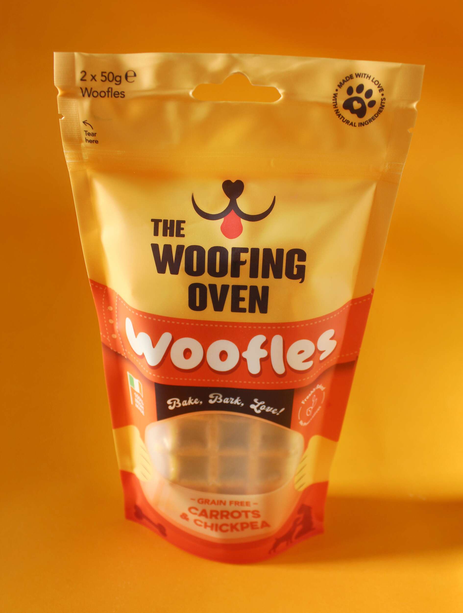
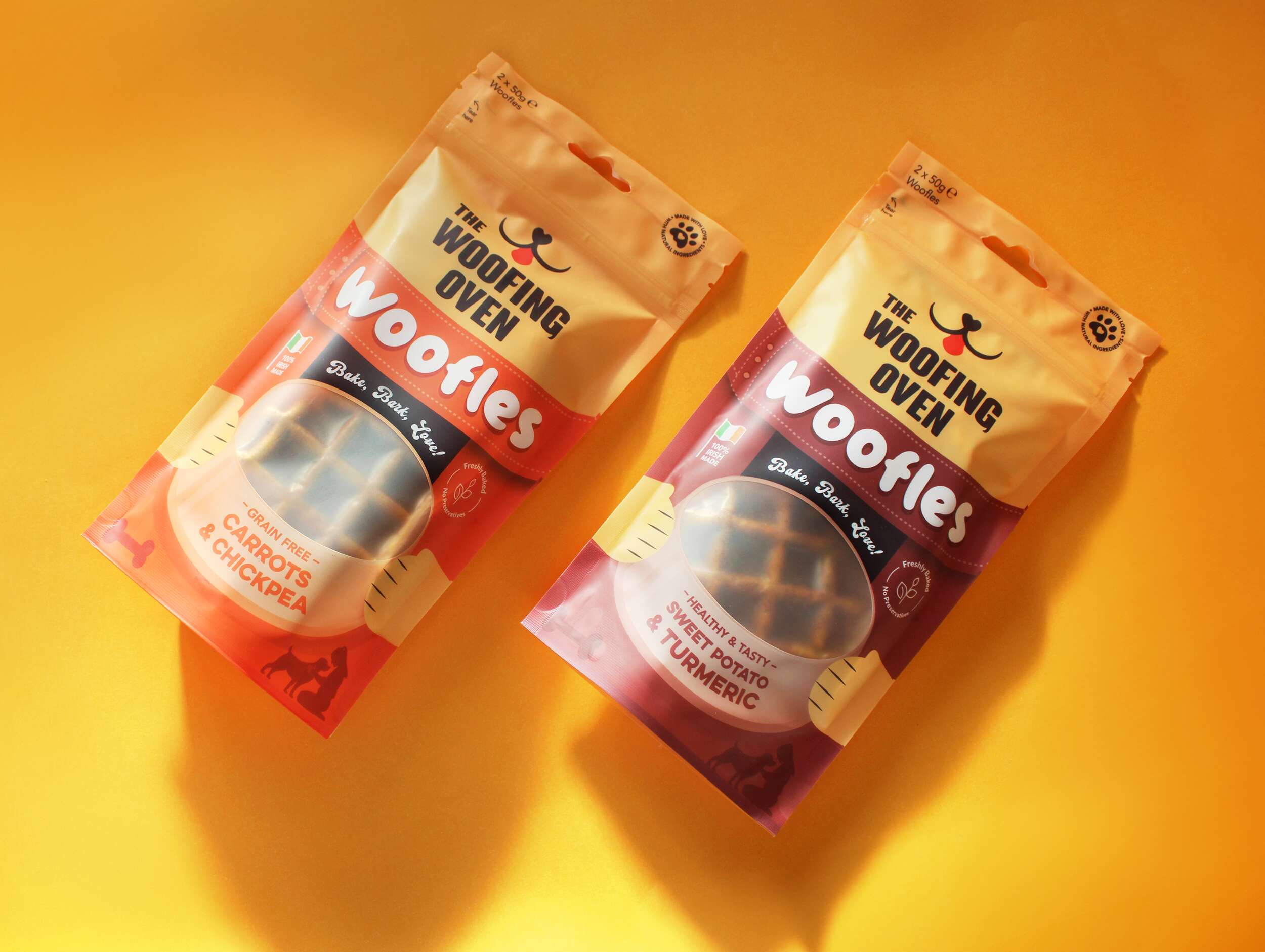
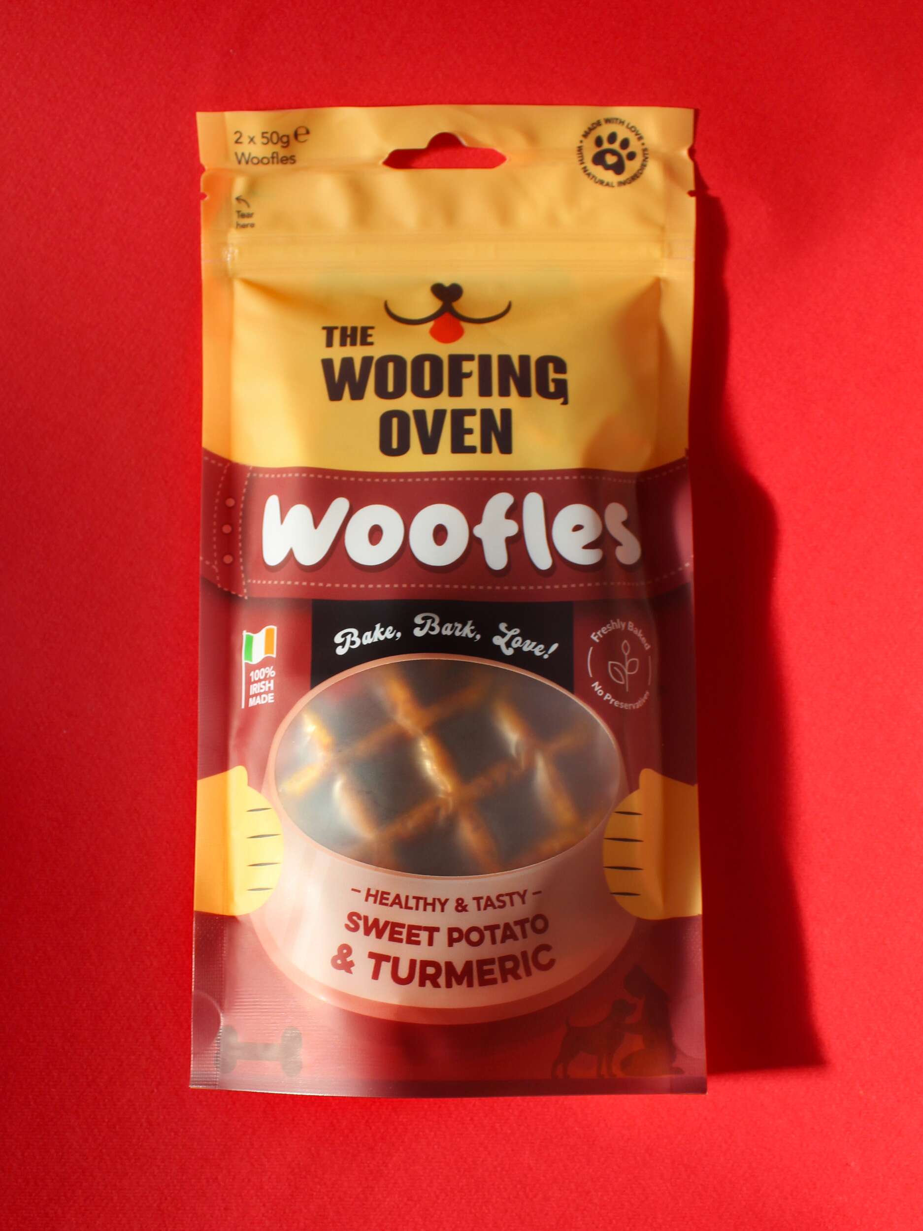
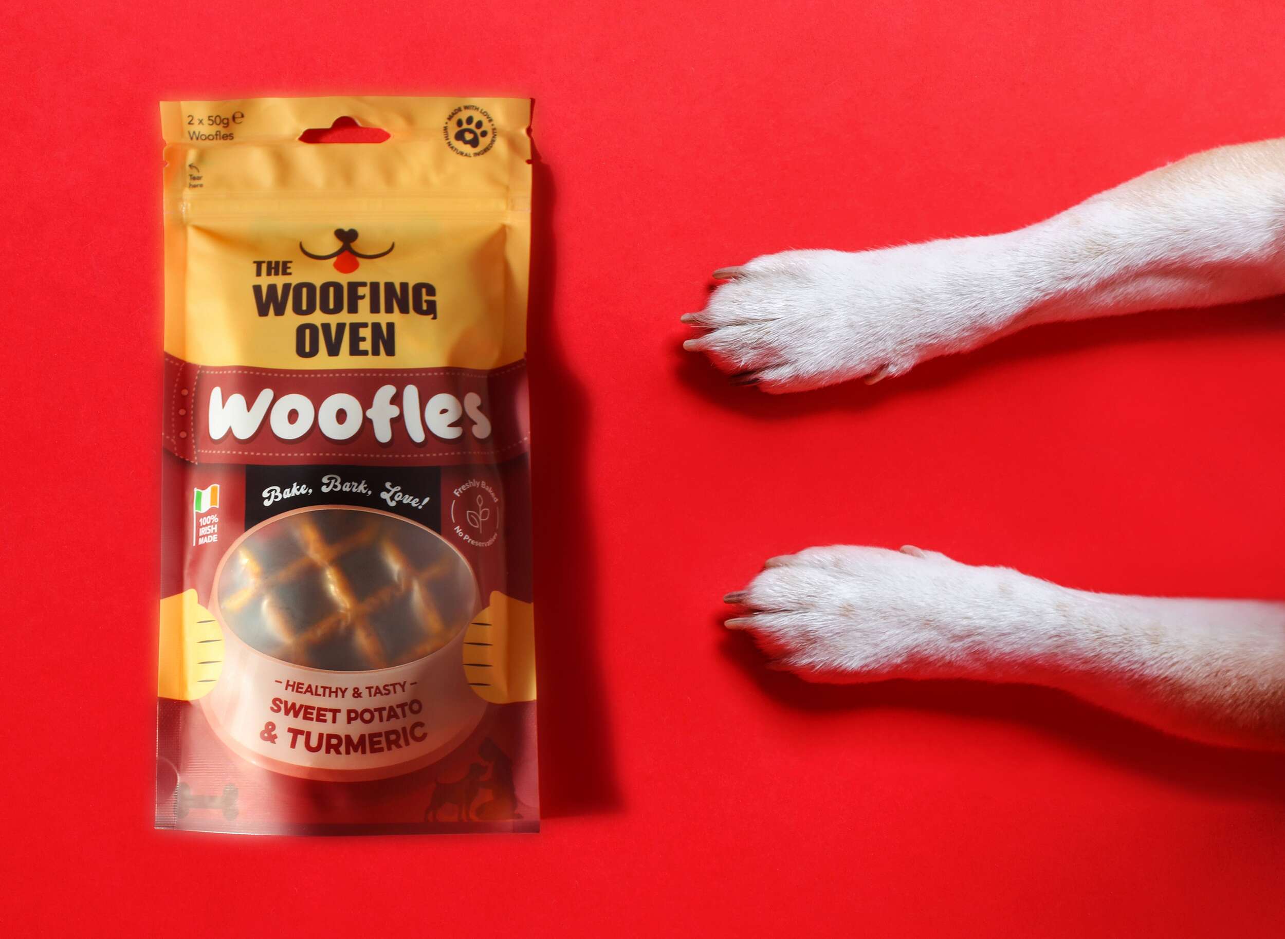

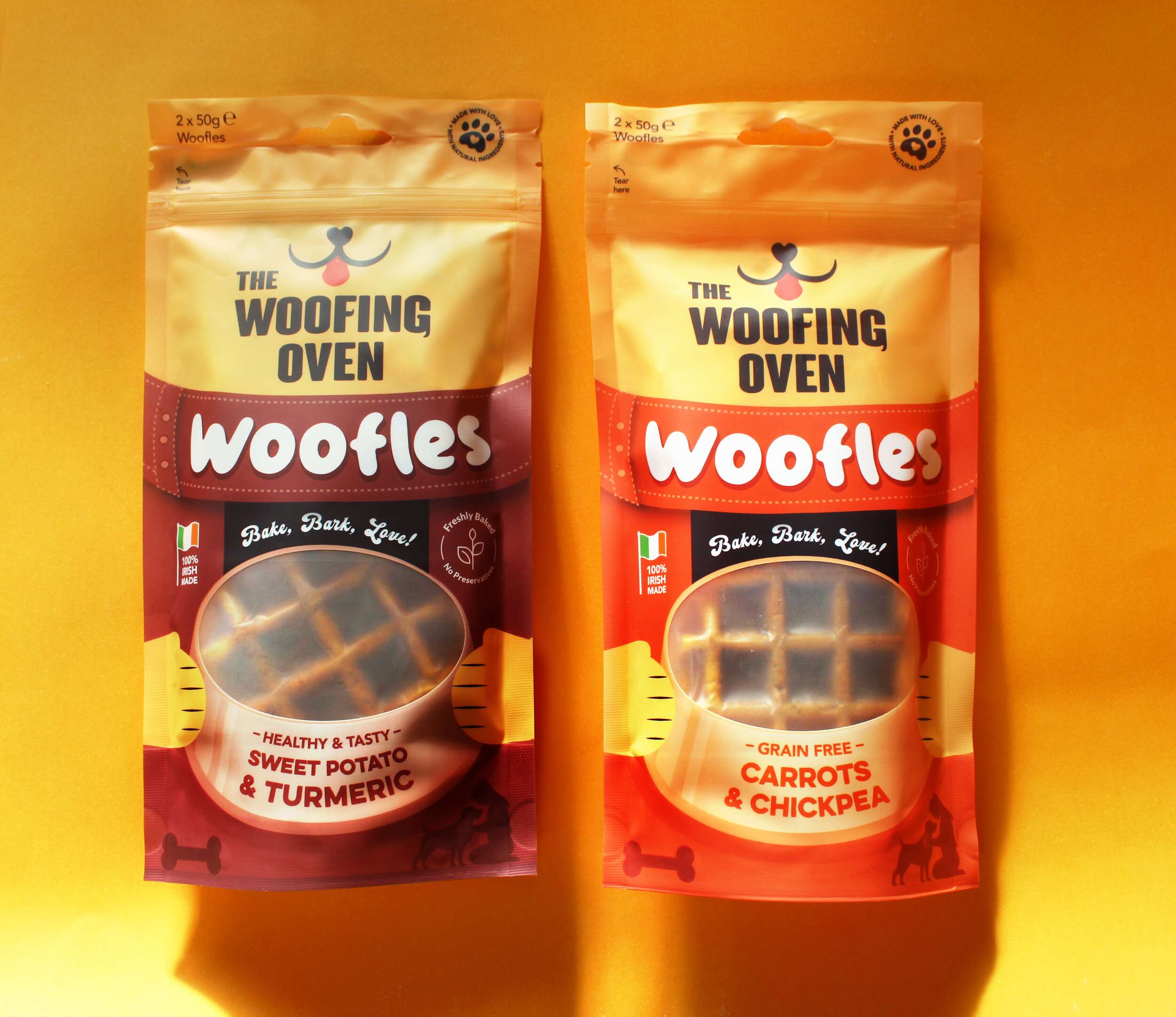
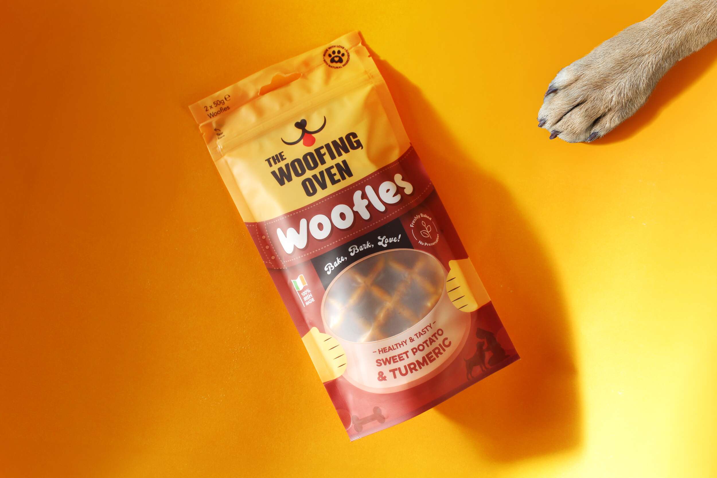
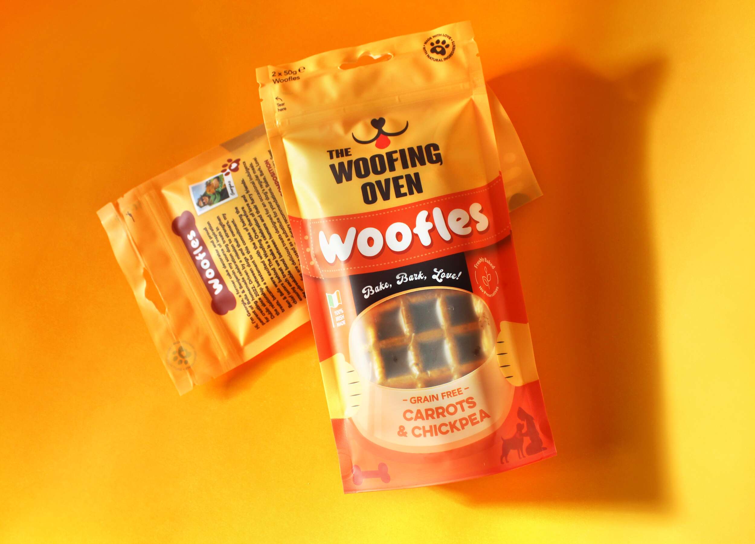
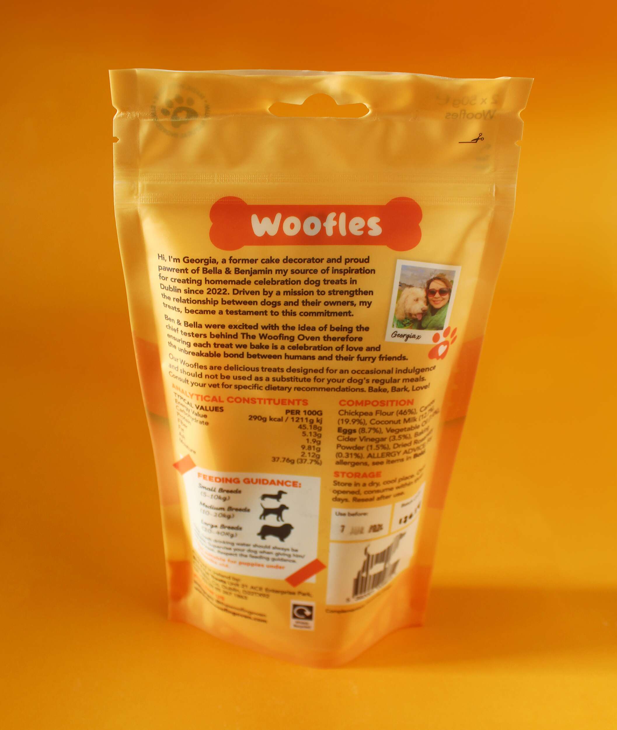
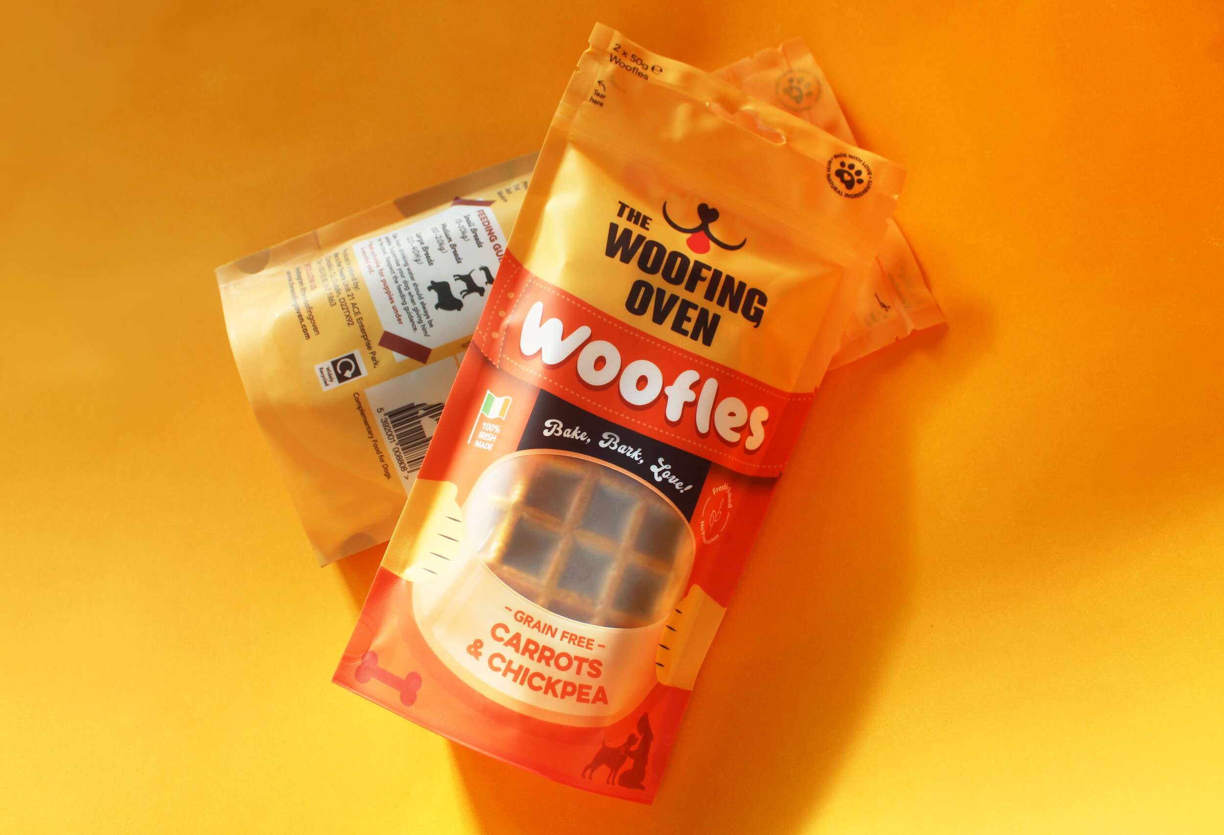
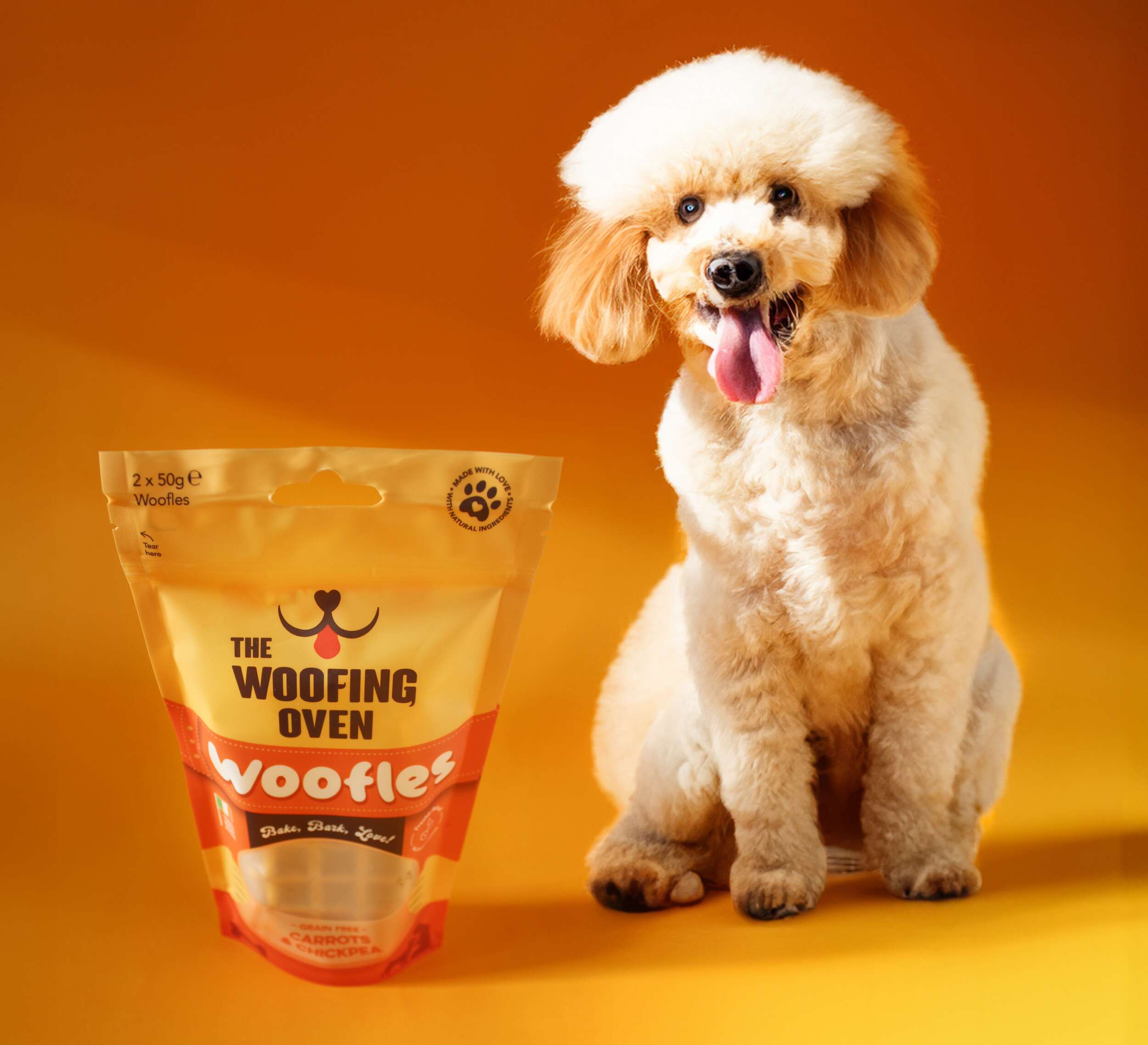 The Woofing Oven’s packaging design challenge was to create a visually striking, retail-ready package that reflects the brand’s fun, celebratory nature while emphasizing its commitment to quality, natural ingredients, and Irish craftsmanship. The existing brand (formerly known as Bon A Pet Treats) needed a fresh identity that would stand out in a crowded dog food aisle, making the transition from local markets to mainstream retail.
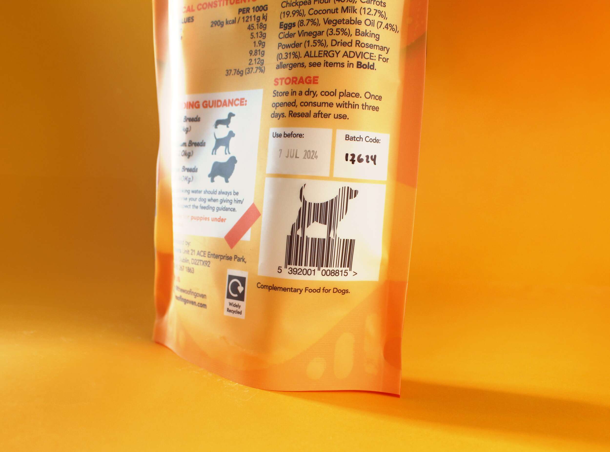


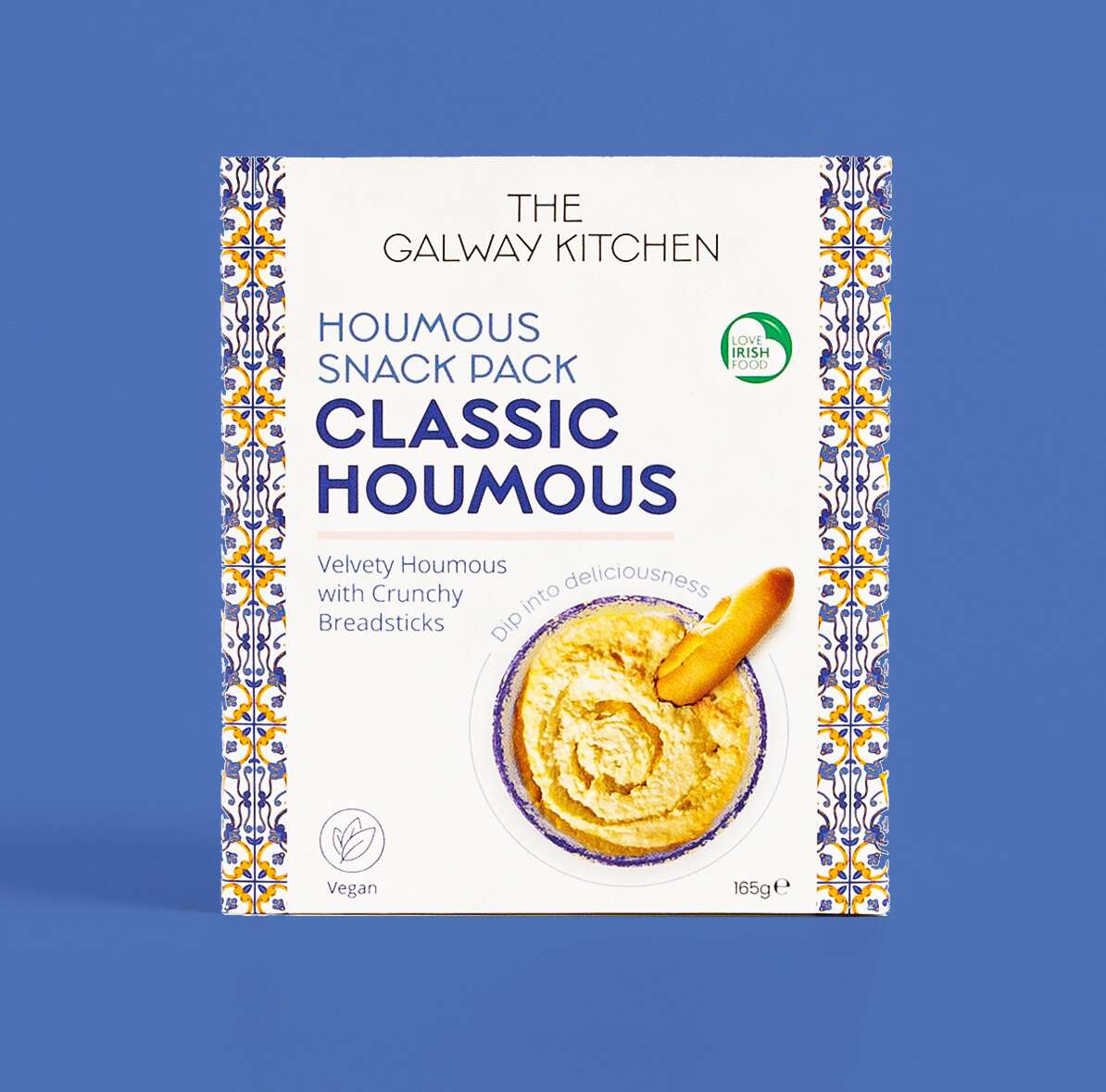
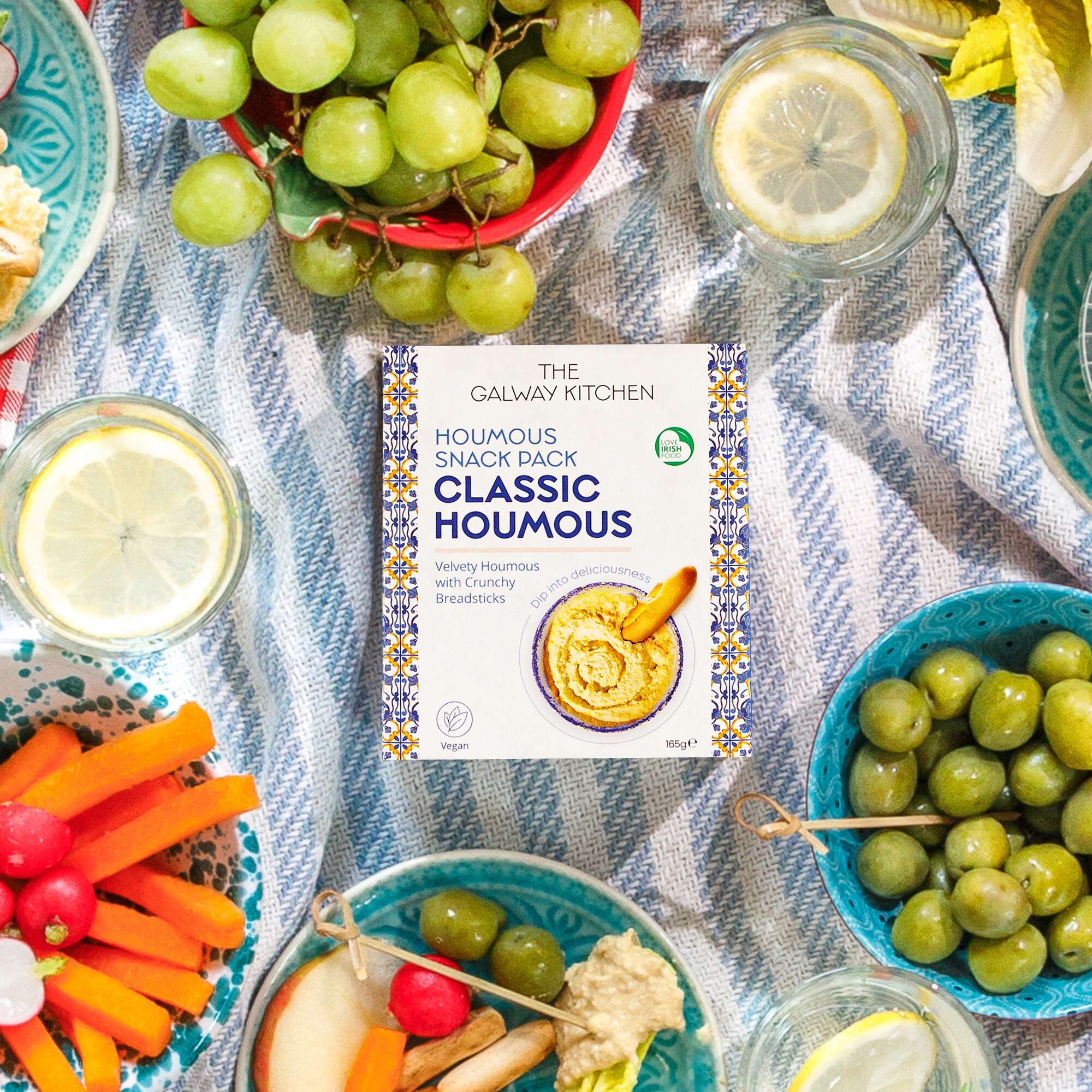
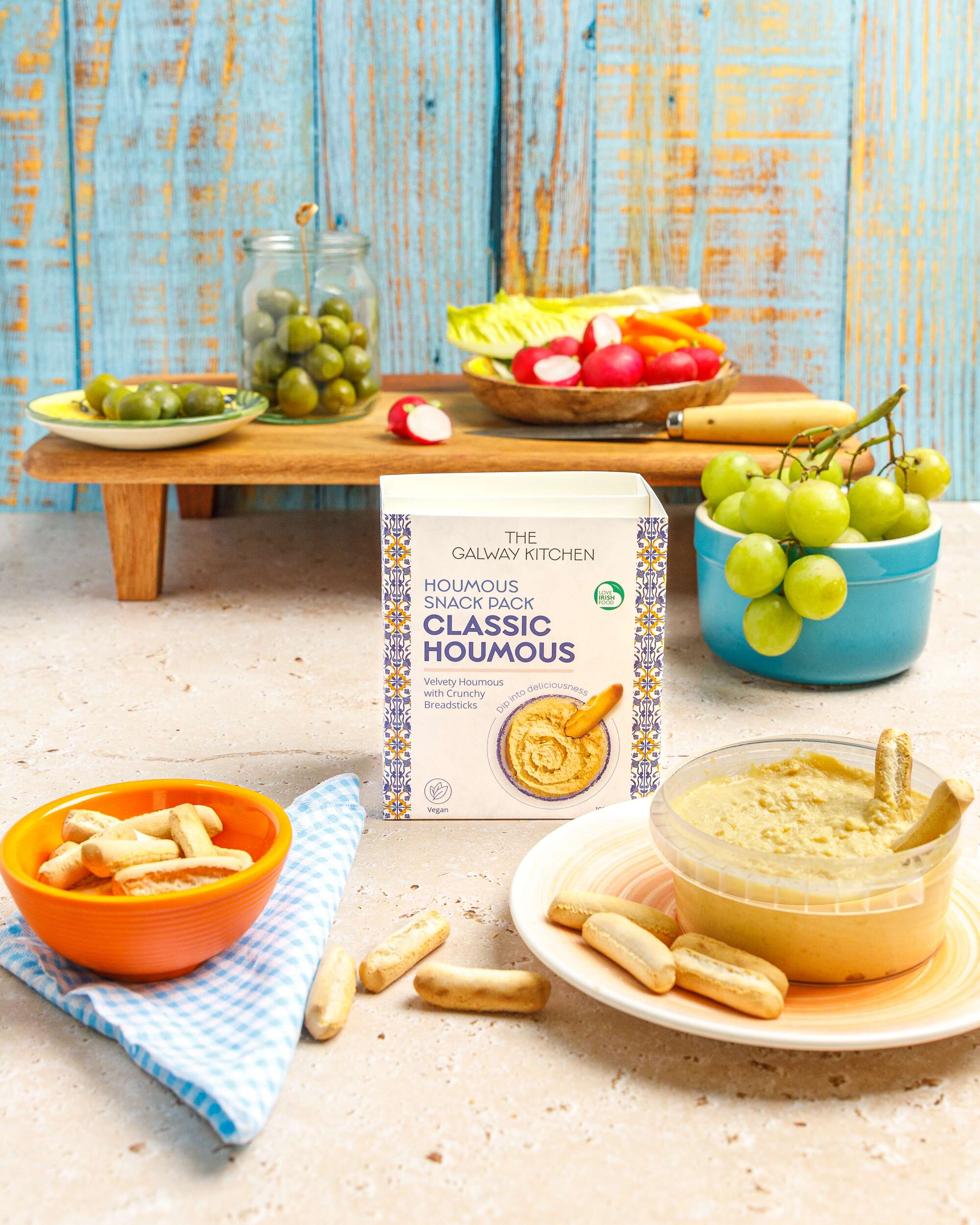
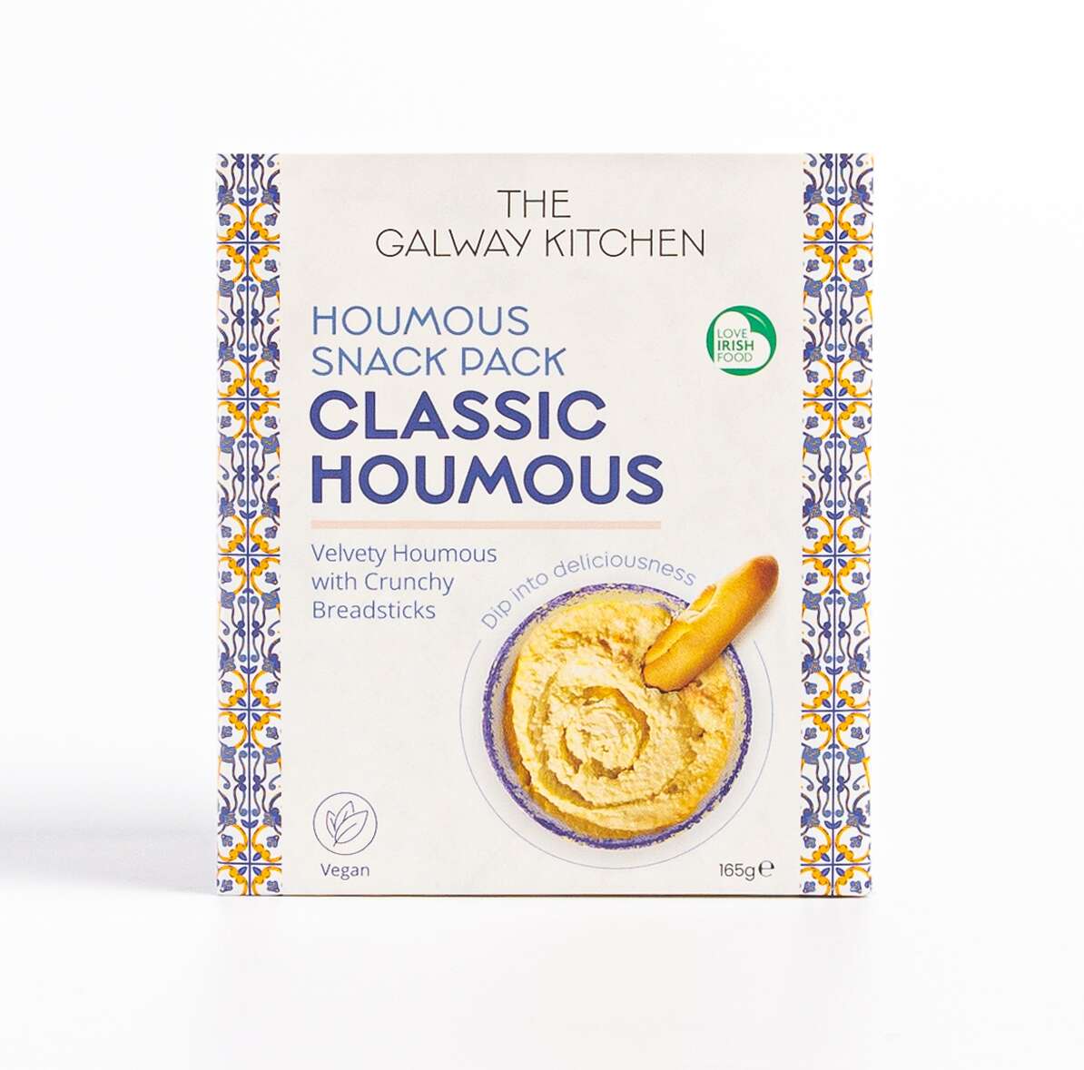
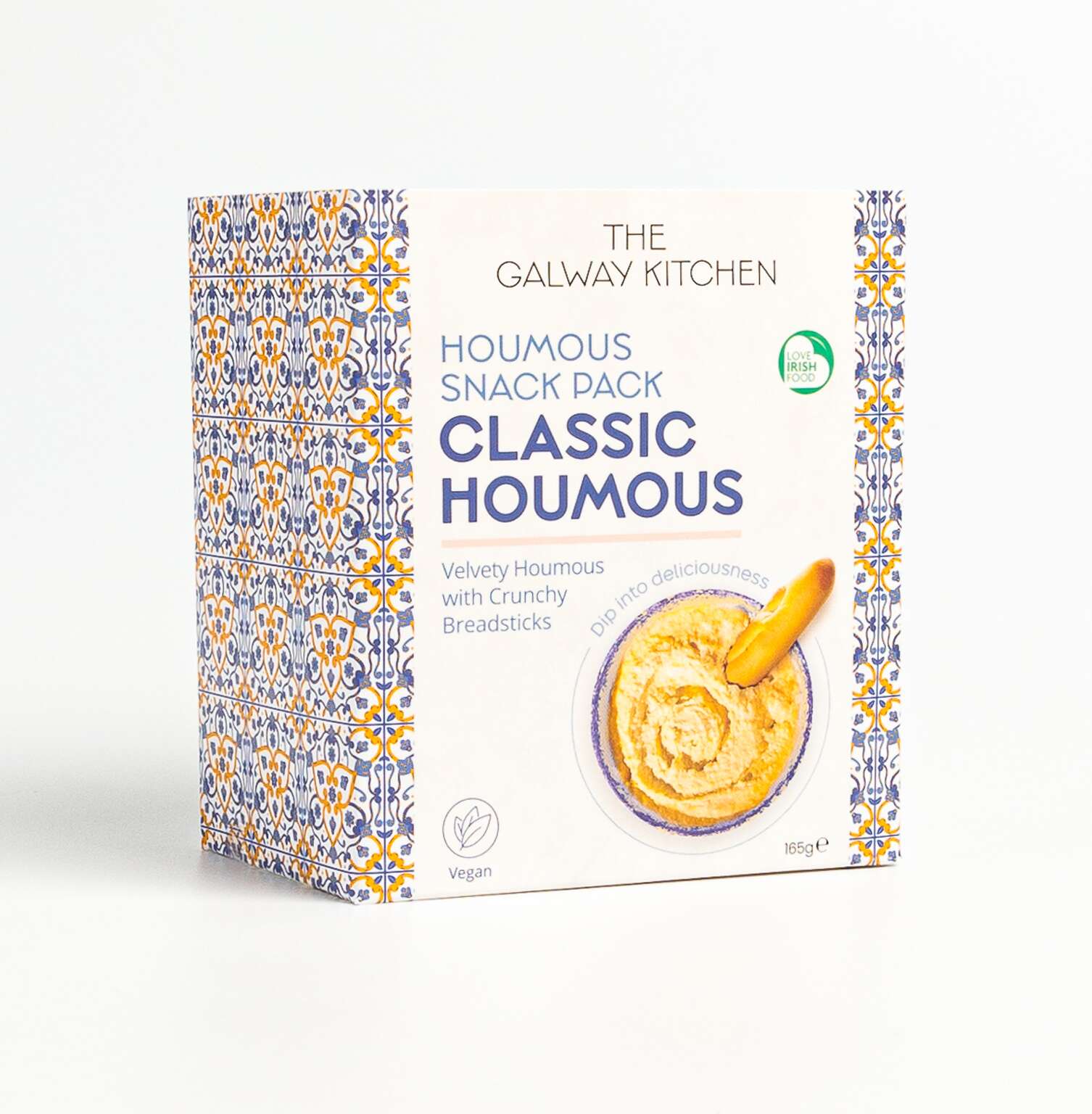
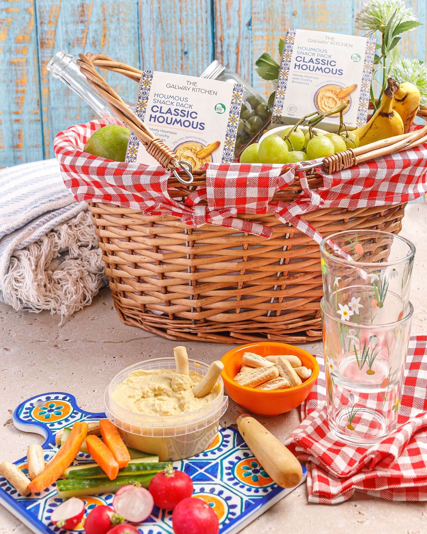
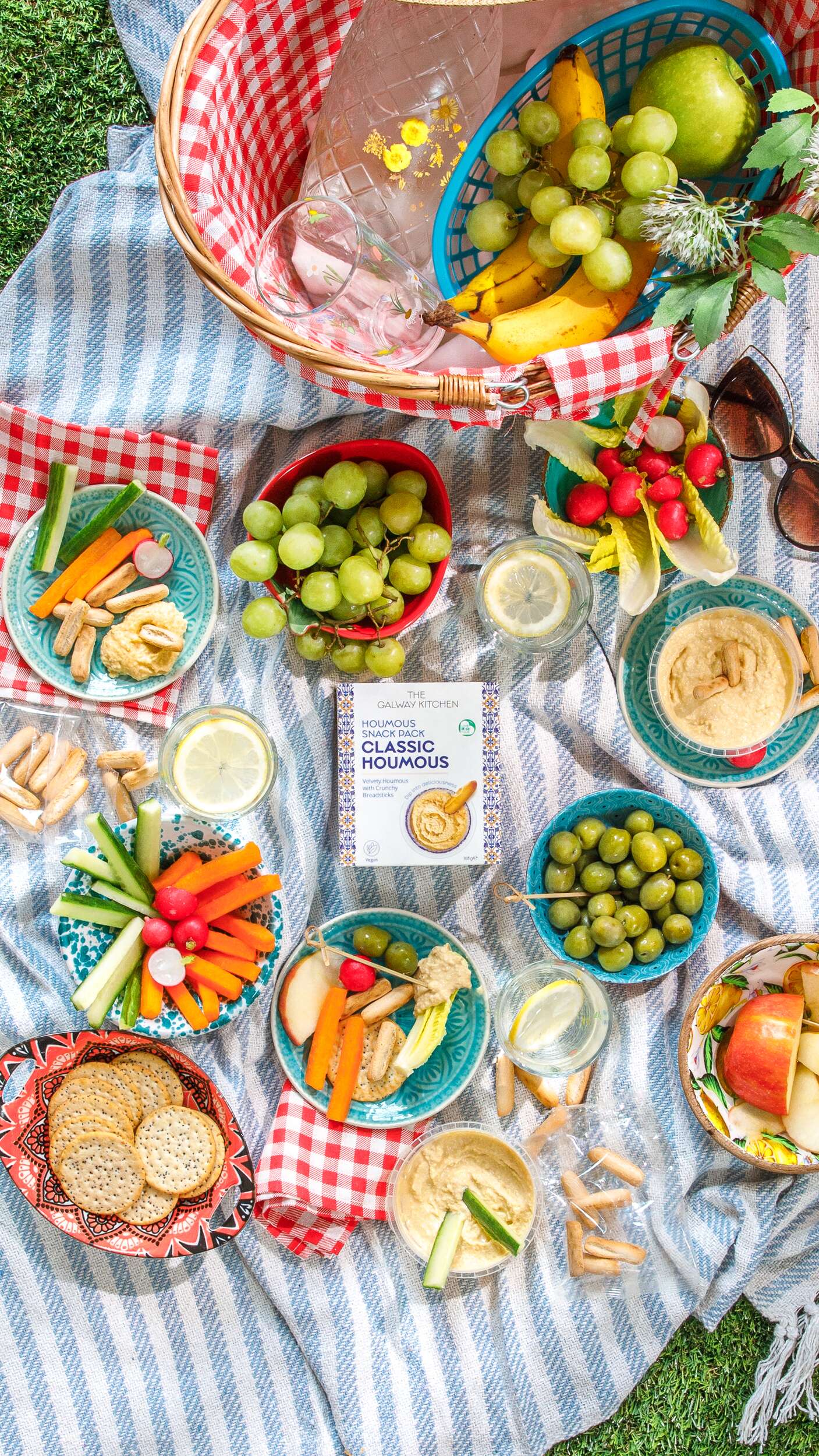
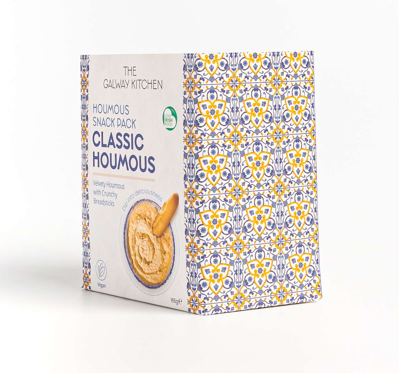
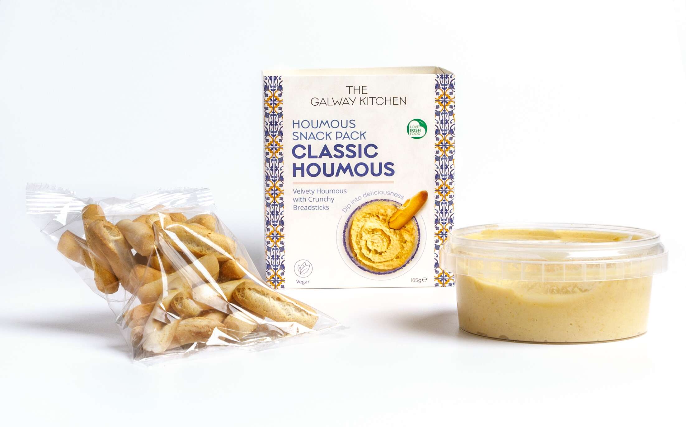
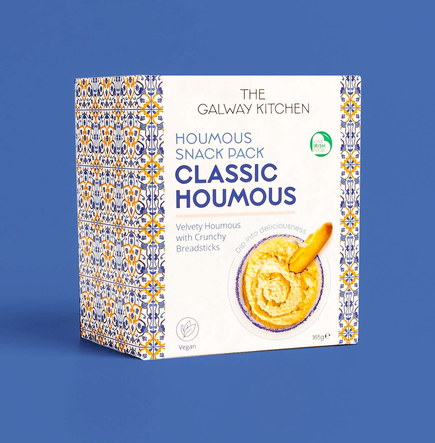 The new Classic Houmous Snack Pack by